Color Harmony: Complementary Mini Paintings - Color Theory in Watercolor | Tamas Benko | Skillshare

Playback Speed


1.0x


  • 0.5x
  • 0.75x
  • 1x (Normal)
  • 1.25x
  • 1.5x
  • 1.75x
  • 2x

Color Harmony: Complementary Mini Paintings - Color Theory in Watercolor

teacher avatar Tamas Benko, Drawing & Painting Classes

Watch this class and thousands more

Get unlimited access to every class
Taught by industry leaders & working professionals
Topics include illustration, design, photography, and more

Watch this class and thousands more

Get unlimited access to every class
Taught by industry leaders & working professionals
Topics include illustration, design, photography, and more

Lessons in This Class

    • 1.

      What's in This Class?

      1:38

    • 2.

      Red & Green Pairing

      5:44

    • 3.

      Blue & Orange Pairing

      10:27

    • 4.

      Yellow & Violet Pairing

      12:19

    • 5.

      What's Next?

      0:49

  • --
  • Beginner level
  • Intermediate level
  • Advanced level
  • All levels

Community Generated

The level is determined by a majority opinion of students who have reviewed this class. The teacher's recommendation is shown until at least 5 student responses are collected.

26

Students

9

Projects

About This Class

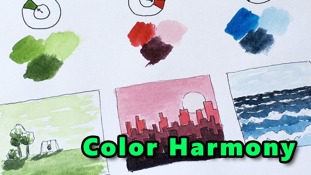
Let's explore how we can create aesthetically pleasing color combinations that “feel just right” to the viewer. This session is part of my Color Harmony series to help you understand color relationships better.

Links for other episodes:

  1. Color Harmony: Monochromatic (start here if you're new to the series)
  2. Color Harmony: Complementary (you're watching now)
  3. Color Harmony: Analogous
  4. Color Harmony: Split Complementary
  5. Color Harmony: Double Complementary
  6. Color Harmony: Triadic

Who this class is for

This class is for you if you are interested in Color Harmony, and you'd like to dive into it in a hands-on style fashion.

What you will learn

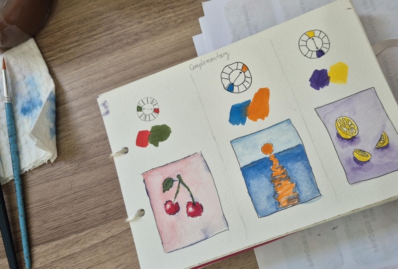
There are several Color Harmony types that have been proven effective. In this episode, we’re going to explore the Complementary color scheme. We will paint 3 simple mini compositions to see how these colors work together in practice.

Working with colors is so interesting, but it can be much more exciting if you actually understand the key principles. So, I encourage you to come with me, and let’s continue our journey in Color Theory.

What tools you need?

I’ll be painting with watercolor, but our focus will be on colors, and not on the technique how we apply them on paper. So, feel free to utilize this class using other mediums too.

If you choose to use watercolor, you just need the very basic supplies.

I’ll be using

  • some sheets of A5-size sketchbook paper, 120 gsm.

  • a water-resistant archival ink, alternatively a permanent marker with a thin tip will also do

  • a watercolor palette, if you have the 6 base colors like yellow, orange, red, violet, blue, and green + black and white, you’ll be just fine.

  • a size-8 round brush for painting the minis

  • and some common accessories like a water container, and some paper towels.

Learn & practice

I hope you’re excited. Whenever you’re ready… I’ll see you in the first video.

Meet Your Teacher

Teacher Profile Image

Tamas Benko

Drawing & Painting Classes

Teacher

I'm Tamas. I love to teach new skills to students. Join one of my drawing or watercolor painting classes for beginners! Learn the fundamentals of drawing and painting, and your journey in art will be less frustrating, and much more exciting.

Don't forget to hit the +Follow button to stay up to date with all my new classes.

See full profile

Level: Beginner

Class Ratings

Expectations Met?
    Exceeded!
  • 0%
  • Yes
  • 0%
  • Somewhat
  • 0%
  • Not really
  • 0%

Why Join Skillshare?

Take award-winning Skillshare Original Classes

Each class has short lessons, hands-on projects

Your membership supports Skillshare teachers

Learn From Anywhere

Take classes on the go with the Skillshare app. Stream or download to watch on the plane, the subway, or wherever you learn best.

Transcripts

1. What's in This Class?: Welcome to my introduction to Color harmony series. My name is Tomas, and we are here to explore how we can create aesthetically pleasing color combinations that just feel right to the viewer. Are new to this series, I suggest you start with the first episode. You can find link to that in the above section right below the video. Today, we are going to look into some complementary color schemes. We will paint three simple mini compositions to see how these colors work together in practice. I encourage you to come with me and let's continue our journey in color theory. I'll be painting with watercolor, but our focus will be on colors and not on the technique, how we apply them on paper. If you choose to use watercolor, you just need the very basic supplies I'll be using some sheets of A size sketchbook paper, 120 GSM, the water resistant archival ink. Alternatively, a permanent marker with a thin tip will also do the watercolor palette. If you have the six pace colors like yellow, orange, red, violet, blue and green, plus black and white, you'll be just fine. Asizee tram brrush for painting the minis, and some common accessories like a water container and some paper towels. I hope you are excited. Whenever you are ready, I'll see you in the first video. 2. Red & Green Pairing: I'm so glad you are taking this class. Today, we are going to paint some complimentary color harmonies. In complementary color schemes, we pair colors that are direct opposite each other on the color wheel. This is the most contrasting color relationship. Contrasting colors create visual vibration and excite the eye. Let's paint three mini compositions for complementary color harmony. As usual, let's start off by drawing the color wheel. From now on, we draw 12 step color wheels. It's easy. Draw two sections vertically opposite each other. Then do this horizontally. And split the remaining sections into half. And we have a 12 step color wheel with sections evenly distributed. Good. Let's start with the most powerful contras pair, green and red. They make each other pop creating a high impact. Green can tame the dominant thread. Nature likes this couple. Think of green steps with red flowers. Let's paint the samples real quick. I'm using my ruby paint as a red I'm cleaning my brush. I'm taking some sap green for the opposite side. And I'm cleaning my brush again. Now, let's make our ink sketch, which will be a pair of cherries. Stems are curving slightly. The shape of the fruit is an oval, squeezed a bit at the top. Let's draw a leaf as well. Cherry leaves have serrated edges. H. Good. We can start painting with our complimentary pair. I'm adding some white paint to my mixing palette, so I can make a lighter tint. We'll be painting several layers to create a nice light and shadow pattern. So mixing a light pink colour, adding some water as needed. Let's paint the background first. This painting will be kind of expressive, so don't worry about following the edges of the frame or the shape outlines precisely. Uh, Let's add the bit darker brush strokes here and there. Mainly to the upper half of the composition. I'm trying to make very loose brush strokes. Now, let's clean our brush. And let this layer dry. We'll come back to this mini in a minute. 3. Blue & Orange Pairing: Let's see a classic combination blue and orange. The cool blue and the warm orange neutralize each other. Blue brings in com and coolness, while orange provides warmth and energy, making them ideal for designs, requiring both excitement and comfort. I'm using my bright blue paint on the cool side of the color wheel. This is pretty close to serleanblue. I And my orange paint on the warm side. Blue and orange work great together in still life. Imagine some orange fruits with their cool blue shadows or think of a Mediterranean architecture with orange roofs and blue sky. Interior designers like this combination too for creating a balanced contrast. What we are going to paint is a seascape with the sun in the center. Let's mark the horizon line at the top third. A circle shape for the sun. And this will be the pattern of the reflection on the water surface. Very simple composition. Now, let's get back to our cherries. I'm painting a light pink layer on the fruits leaving some white gaps for the highlights. Let's assume a light source from the top left. Now, I'm taking a bit darker red and applying the paint. If it's too much, I lift up some paint from the paper. I guess I let this layer dry a bit. I'd like to have noticeable gradation between tone or you steps. If you applied the second layer on a damp surface, it would create a soft gradation. So let's paint the stem and the leaf with green. Something between light and mid tone. Okay, the first layer here seems dry enough, so we can apply a second darker pink. Something like this. And why not go through the let one again? All right. Now with a clean brush, we can go back to green. Adding a darker shade here and there. This will look nice. Now, let's paint the sky on our second mini with a very light blue. You can either use white paint or some water to make your original blue lighter. It's up to you. I'm leaving some paper white between my brush strokes. Maybe I'm taking it a bit darker. Or if it's too much, let's lift off some paint. Like that. I'm diluting my orange with some water. And painting the reflection and the sun. Good. Now, let it try a bit. Let's add the darker to the cherries. I'm painting a smaller and smaller area each time I use darker shade. Uh, This looks good. And the touch of dark green to the leaf and the stem. Nice. Now I'm taking the sun a bit darker and the reflection surface as well. The dark orange is supposed to be more dominant in the distance. Good. Now what's next? I guess we let both minis dry a bit. 4. Yellow & Violet Pairing: For our next complementary color scheme, let's see a versatile combination, yellow and violet. This bearing offers high contrast, vibrancy and balance with a deep tone of violet or purple, balancing the bright warmth of yellow. I'll be using my cadmium yellow medium paint. Okay. And my violet. For best results, use one as the dominant color and pair with a softer or pasta version of the other using that just as an accent. You can also incorporate neutral colors like white, gray or black to ground the high energy of the pairing. Now, let's draw some lemons. This one is cut in half. Slice over here lying on the table. And another slice standing over here. H. I'm planning to paint a background first with a wet diluted toilet. Like so. Yeah. Good. Now I'm cleaning my brush. And I'm adding a touch of black to my rat paint. This has already dried on the mixing palate, so I'm adding some water to it and mixing a dark rat shade for creating the dark side on the fruits. I guess I'm adding another layer of green too. Very good. Now, let's paint the sea on our second mini. We are going to have the darkest color in the distance. And by adding water gradually, we are making the blue lighter. More water to the brush. Some more dark on the horizon. That's too dark. Let's add some water. So final touches. Maybe I'm adding a touch of black to the mixture to make it darker, as well as to turn down the saturation at. And that's it. We can clean our brush now. Now, let's paint the lemons with yellow. Just a few touches here and there. Alright. One thing has left. Let's create some shadows on the table surface, making sure we don't touch the yellow with our brush. I'm dipping my brush into the water so I can make the shadow edges softer on this side. No. If you want to, you can add some black to the violet. And paint the occlusion shadow with this dark paint. This is the place where lemons make contact with the table. Finally, I'm adding some intense yellow here and there. A Now we can clean our brush. Our fresh composition is complete. We have painted three different complimentary color harmonies. We created high contrast, vibrant and energetic designs, complimentary pairings, balance a warm and a cool color, making elements stand out. To prevent visual chaos, use one color as the dominant background and the other as a subordinate accent. 5. What's Next?: All right. I hope you enjoyed this color harmony painting session and you made something that you like. Now I'd really like to see your own beautiful colors used in this painting session. Please upload your work in the project section right below the video. If you found joy in this activity, please leave a review on the review tab below the video player. Your feedback is important to me and it will also help others to find this class. If you like my teaching style and you are interested in other topics, I definitely have some more drawing and painting sessions for you. Make sure you check them out on my profile page. I hope you had a good time with me, see you in another class. I