Transcripts
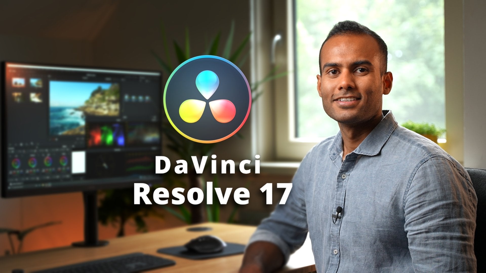
1. Introduction: Hello everyone and
welcome to a new class. In this class, you
will be learning everything about color
grading in da Vinci Resolve. If you are someone
who's a little bit intimidated by this software, or if you're someone who
has been already editing in DaVinci Resolve and
been doing color grading. But I don't know
What are you doing? Well, then you have
come to a right place. My name is Adi saying I'm a professional videographer
and a photographer. And in this class, you will be learning something like this. I'm going to take you from not knowing anything in resolve to be editing your
first professional gig in just a few minutes, you're going to be
learning this node based software in the
easiest possible way. So I'll be editing six different clips from all different
cameras like GoPro, my Sony A7, S3, the drone, and all
different other cameras. And we're going to be
editing them from scratch. And I'm going to take you with
me in the editing process. And that's why I've given all the clips and
description below. So you can literally
just download them now and start the
color grading with me. In all different clips, I'm going to be editing
with few different methods. So by end of this
class you will be knowing not one, not two, but at least three to
four different methods in which you can achieve a
certain look in the software. First five lectures after
this class would be mainly the basics of color
grading in this software. And I'll be going in details
about all the tools that we will be needing to
collaborate in this software. We're going to geek
out a little bit, but don't freak out. I'll be teaching you everything step-by-step and in the
easiest possible way. But if you want to
skip the basics and jumps straight
to the lecture, I will be collaborating
my first clip. You're welcome to
enough of talking. Let's start the class.
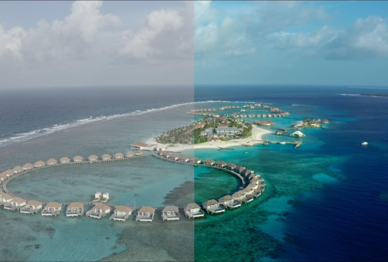
2. Best Color Management Setting: So let's stop resolve then. Let's do some color grading. So I already had my
project file open. But first thing
what we have to do is go to the corner here, project setting, and then here
are all different presets. The most important
thing you need to do is obviously master settings. Even if you're editing
a fork a file, keep the timeline resolution to high definition
because if you go to fork a file is just going to choke your system and make
the whole thing slow. You don't really
have to edit in for K to get the four key output. So this we would put
it to high-definition. And frame rates obviously
depends on your region. If you're living in
a palmar region, then you do 25
frames per second. I'm living in a paired region, Europe, so 25 frames. If you are living
in NTSC region, then you should do
your frame rate to 24. And all these things
would be the same. Also one more thing,
color management. This is the most important part. I have done this
mistake so many times and I see a lot of people
doing this mistake. If you're using
diamond tea 1718, you would have this option W, T, Y, RGB color managed. So what this does is that it sort of recognizes what
system you're using, what camera system using, and it's sort of optimizes
the color from that. And it sort of gets the
output the same way. Here you would be
selecting SDL rect 79, because rec 79 is
the color space. What we're gonna be working on. It's the same color space, what you see television, what you see YouTube videos, they are all rec center line and output color space should
be Rex seven or nine. Because if you just
select rec 79 scene, which would be the default, what's going to
happen is that you are watching a
really nice image. In result, you exported,
it looks really nice. But as soon as the
export on YouTube or any Internet or any sort of any place that on the internet, the color looks washed out. So that's why it
takes seven O 98 is the Internet friendly
color output color space. So this is really important. I wasted so many hours
just to figure out that y is my video looking
good on my computer. And when I upload to
YouTube or Instagram, It's looking
completely washed out. So we're just select this one. Oh, there you go. Deselect this one and
then general options. You have to just
keep it the same. There's nothing changing. I would just do cancel. But what you can do is that
whatever setting you have chosen or here you can
just make a preset. So I have one preset, Da Vinci wire GB, and one preset for DaVincis
rails for the vertical video. So I will just do cancel because I already had my
project setting here. And then one more thing
really important, if you are a Mac user, you go to here,
delta G Preferences. You go to General, and then you take use Mac display color
profile for yours. And also this one automatically tag like seven or
nine, The blah, blah. So these things should be selected or your display would
look completely different. It's not going to
be color accurate. So once we have done all this, then we're going to
jump onto the project. So with this, obviously,
as I mentioned, I would want you to have a basic knowledge of
editing in DaVinci Resolve. So that when we're going through all the shortcuts and everything,
you know how it's done. But if you're gonna
go really slow with each steps,
really don't work.
3. Color Page: We're going to go to Color tab, and this is our first image. But before that I'll
give you a little bit of introduction
for the color tab. So for the color tab, this is how it looks. If it's not looking
the same way. You might have
selected clips here, you see, you might have
selected timeline. So I just get rid
of that so that I have more real estate
here to work on. And there's also some lots from DaVinci Resolve or my own lots. So they're all here, so we're not going
to use them now, so I'm just gonna get rid of it. There's also media pool. So yeah. You can just change the layout. Just basic things which
is not really important, which these things you can
just experiment yourself. I don't want to waste your time on something which is
not really important. This is a timeline
and this would be if you turn on
and off this one, this is the setting for
whatever you have used. It's going to be, I'll show
you so it makes more sense. So whatever settings I have put, it's going to disable that and
show me the original clip. And this brings you to kinda, more full-screen is kinda
gives more real estate. Here there's more options. There is this option, hand option where you can use move all the notes and stuff. Here. Timeline option
this that affects, these are certain
effects which is available in the colors,
in the color page. And so we're going
to use some of them. So lightbox is just going to
show the frames and stuff. So what are we going to do? Click, click on light box again. I would get rid of effects. Yeah, if you get rid of
no notes all to go away. And here you're going
to see two things. There's 11 dot here, which gives me the
overall view of the node, node system for this
particular clip. But if I click here, this is the node system
for the entire timeline. So if I want to do like a little setting on
the entire timeline, then I can use this to I just, I'm just going to
add a new node here. So how do you add a new node in the Vinci Resolve
is by pressing Alt and S or Option and S depends
on what your system using. So I'm going to press
all the ns that gives me a new node and
whatever setting and we're gonna do on this node, It's gonna be the setting
for the entire timeline. So I am just going
to delete that and go back to the
individual node. And this is Clips
is just going to change the size of my nodes, which is not really important. And then we're going
to come down here. So this is how I'm
going to leave it here. So we have more room
to see our image. And this is not available
in the free version. This is the color
matching which is not really important if
you are studying out. And yeah, so now you're going to come
to the important part. So these are the
primary color wheels. This is one of the most important section of
the color page in Resolve. And we're going to
be changing a lot of exposure values using Lift, Gamma, Gain and offset. And then let's HDR panel. I'll give you maybe in one section I'm going to
use this because it's not as important
and I think it's going to make it too
complicated in the beginning. We're going to be sticking
to primary color wheels. And we're going to be also
sticking to the Log Wheels, which I'll show you in a bit. So this is also just RGB Mixer. So if you just go like this, if you lift the greens up here, lift the green, Live
the greens down. That's how it works. So that's kind of showing how the image is
looking right now. And this, we're going to
have it not be using it. These are the Custom curves which we are going
to be using it. And under curves there's a lot, a lot of section here. There's Hue vs Hue occurs. There's Hue vs Saturation. I think there's Hugh was as luminance,
luminance saturation. So I'm going to go through
all these curves briefly, and I'm also going to show you the function
of these curves. So everything, I don't want
to explain them already. It makes more sense that when
we are actually using them, then I can show you how, what is the function of that. And these spiderweb think we, I'll show you how to use it. It's not as important
if you're a beginner, but I'll show you how to use it. This is the selectors. If I'm selecting any thing, any, any color it's going
to select in my node. So you see there's
the selectors. If I selected, if I select blue is going to
select the year. If I select this. And then you can do all sorts of changes. We're going to use all
of this and don't worry, this is like a shape creators. You can create a shape and sort of do all sorts of
effects in that shape. So I'm just going
to go reset node. This is the motion tracker. You're going to
use this as well. These things are
not that important. This is a blur and
sharpness scale, so you can change this. This is kind of the Opacity. I'm going to go
through everything. I'm going to go
through everything in the tutorial to
read, don't worry, these are just some
little options which is going to
make more sense when you're actually doing it. Here is, here is just a color or a different representation of the primary color wheels. And this is the log watch. If you are coming from
Premiere Pro, you would have, or if you have been using
Lightroom Photoshop, you would be already
familiar with fewer terms like shadows,
mid tones, highlights. So these are here, log fields, but we're going to go
back to primary wheels. And there's color
boost, saturation, shadows contrast like
all these things. We're gonna, we're
gonna be using it. So it's gonna, it's
gonna make more sense. And on this side, you might not have
the same layout, but you just have to click here. So this is kind of the, the keyframing, which I'll
show you how it works. And if you go to sculpt, this is really important. And then there's also
different types of scopes. There's waveforms, there is
histogram, this vector scope. So you're gonna,
I'm gonna show you the function of all the scopes. And yeah, I know it might
look really overwhelming, but as we would go through all the examples and everything, it's all going to make sense. So yeah, that is it for the introduction
to the color page. In the next section,
we're going to learn about nodes because
for some of you, from, for most of you it's
going to be a new thing. So yeah, let's switch to nodes.
4. Nodes: In this section, we're gonna
be learning how node works, what our notes, first of all. And just, yeah, Just like how can you build efficient
node structure? So nodes, these
are called nodes. This is one node
to node like that. And you can sort
of buildup nodes according to what type of color transformation
you want on your image. So say for example, you can also sort of
disable and enable node. So say for example, if I
click all these three, and if I press Alt and D, or Command D or D, It's going to disable
that these nodes. And if I press this, it's going to enable this node. If I press Alt and D are, if I press, press Option and D, it's going to disable
all the nodes. So you see, this is like before. If you want to see
before and after, you can just go here. That kinda shows disabled
and enables all these nodes. So what are these nodes do? So in each node, you can set up a
different setting. Say for example, in this node, I can just do the
white balance setting. So you see if I disable this, you see I'm changing white
balance in this node. In this node I'm
changing the contrast. In the next node, I'm sort of changing the color of the sky. In this node, I think. Yeah, in this node I'm changing the color of some sort of enhancing
the color of the image. So that's how you can put different nodes in
front of each other. And all the nodes, they have their
different function. And how you sort of put them together is also a
little bit of pattern. So what happens is that what do I do
personally and how it, how it should be done is that, so if you have any image, what do you do first is that this immittance
is in front of me. It's image from a GoPro. So what I did was first step was to get the white
balance right, get the exposure right, and get the colors
right until here, until the first three nodes. My set of footage
looks a little bit neutral how it would
look to normalize. So say for example, if I also disable these three, this was the original photo. You see it's kinda washed out. And with these three nodes, I sort of made it look
a bit more neutral. And after this, I am sort of also doing
sort of color boost. The left here, D or Command D. So this is after
this I did it. I did a little bit
of color boost. Color boost is here. And that is helping me to
give a really neutral look. Once we have a basic
neutral from the image, because from each camera, sometimes it could be shot
in a wrong white balance. Sometimes it could be shot in a completely wrong exposure. Sometimes they shot in a
completely different format, like a log format. So it's like a raw file,
really flat profile. So we have to get
them in something called as rec seven
or nine colors space. So this is Rex 79 color space where everything
looks really neutral. And once we have achieved those looks in the
first section, indirect 79 colors phase. So I'm calling this
the first section. Then we would go to a
different node structure where we can change the colors. And that sort of is
like a color grading. So here what we did
was color correction. And now here what we're gonna
do is color grading with all these three nodes which
are parallel to each other. I'll show you, I'll show you how can you
make notes parallel? How can you, how can
you make notes in layers with an example
so it makes more sense. So with these three nodes, they are giving a color of a
certain look to this image. And after that, the final thing was a little bit of vignetting. So I'm sort of making the surroundings a
little bit darker. I just kept it
extra so that if I want to do some last
minute changes, so that's what the
node structure is. So it's like literally
like how in Premiere Pro, if you're coming
from Premier Pro, there's like different
layers and you just put layers on
top of each other. And in each layer you
made a different setting. So that's how, that's
what the notes are. These nodes would
make more sense obviously when I started
bidding example. So what we would do, Let's just start with the
codon creating process. So in the first section as the, as I mentioned before, I'll explain you how to
get the neutral look. And then in the next section, we'll be doing color grading.
5. Primary Color Wheels: Before going straight
into color grading, I'm going to explain
you the tools, what we are using and
why they are using, and what is their function. So it's going to take any, barely going to take time. But it's really
important to use that. So what I did was I
got a gray background. This is a background
which you can get. If you are in Resolve, you go to Effects, you go to generators. Then you go create scale. And then once you have gray
scale here, what do you do? Right-click new compound clip. I had this compound clip
and I want to show you some things so that It's going to make more sense when we are doing color grading. So here we have this
gray, gray scale. There's one side is fully white. One day they're fully blacks. And here we had the parade, which was looking super colorful when we were
in previous clips. So you see how
colorful it looks. And now here there's
just a straight line. So we're gonna go to
waveform and see that how, how these things, how the, how these tools are changing the colors are changing
the brightness level. Because with these tools gonna be changing the
exposure of the image. This is the most widest part, and this is the
most darkest part, and that's what this
line is representing. Everything is linear. And what I would do with Lyft
is that if I increase lift, so you see all the white
parts are disappearing. And if I go all the way up, the whole screen is wide. So that's what lift does. It sort of lifts the blacks and try to push it more
towards the whites. If the image looks super dark, they didn't, then we
can increase the left. And this is the gamma. So let's see what
gamma is doing. So gamma is sort of increasing
the exposure of the image, but not all the way as
how lift was doing. It's mostly increasing
the mid tones. That's why there is a
little bit of curve, but the curve is a little bit inclined towards the dark side. These are the shadow,
these are the blacks. That's what gamma is doing. And if I reduce the Gamma down, if I go the other way, so then it's sort of darkening the image is not going
to darken it fully. But it's gonna do is
it's best to darken it. So you see, that's how
much grandma goes. It has dark and all the blacks, all the shadows, but the whites
here, it remains intact. So then what is gain is doing? So if you see again, it's sort of increasing all
the white areas. But if I go here, it still cannot get rid
of the whole blacks. It's just going to go until
here and sort of stops. So that's what Lift
Gamma and Gain does. Guinea sort of
brightening the image. Gamma is sort of helping that image to go a
little bit darker, but not as harsh as the lift, because lift can make
the whole thing black. You see how harsh lift can be. So if I just go, this
is how you reset. So whatever value
of two then you just click here and reset. You see how lift, how
harsh the lifted. But if I go all the way up, it can make it wider. So I'm just going
to leave it here. So that's what lift is doing. But a lot of you
might have moved from Premiere Pro or some
other editing software. And there you had
these log views, the highlights, mid
tones and shadows. So what is the difference
between log and primary wheels? So the log v, what our primary wheel
is doing is that instead of taking all the, instead of taking the
whole image together and making change in
the entire image. And that's what Lift, Gamma and Gain is doing. And what are the difference
between these two? Now if you see the graph, What's going to happen is
that it's the highlights. If I swear, if I just
increase the highlights, which is also for the whites, you see it's only going to
go until a certain point. And if you see my craft, it looks like there's
a lock here and now highlight cannot
go past this point. You see. But with our gain, with our gain, it could
just go until all the way. Same with the mid tones is
only going to go until here. It's clamped here and here. And this is the shadows you see, say it's not increasing, the whole thing is just, just taking care of the
shadows in the image. Whereas these color wheels, they are taking care
of the entire image. So that's why I find
it easier to edit with my primary wheels
then the lobbyists. And this is also the reason
why color grading is more efficient and more
natural and resolve. Because of these kind of small, small tools, they
play a big role. These tools are not really available in all the softwares. And in this class, you will be learning exactly how this tool works and how can
you just change little, little values to get
a big difference in the image and everything would just look so natural still, in the end, if it's still not
making sense, Do not worry. We'll still go through
everything in depth.
6. Color Grading Using Curves: Let's start with
our first image. So you saw in the last section that I had
a lot of great on this one. So I got rid of everything and I would just
put parade here. So the first thing what we would just do is to
observe the image. So what I see is that this
image looks kinda flat. The exposure is good. It's not super exposure
is not super dark. So that's a little
less work for us. But I'll still show you if you want to bump up the exposure,
how you're gonna do it. So what do we see here? If you see up here, these are the highlights or
the whites in the image. And if you see down here, these are the shadows
and the blacks. So our goal with every
color grading is to get our colors
in-between these range. Because if it goes
super like this, you see how the blacks looked. Save, I'm just
reducing the left. And you see all the blacks
is going past this point. Or if I go all the gains, you see all the whites is
going pass this border. So our goal is to keep our
image in-between this. Here what we see is that
the reds and greens are, here, are kind of in
the same level in the, in the highlights,
in the white part. And you see blues, it goes a little bit higher. So what we can do, so what we can do is that
if I go to my curves, and if I go here, just one curve and if
I go to the blue line. So as I told in
the course before, that this part is
all the whites. This part is all the shadows, and these are all
the middle part, which is not supervisor, which is not super dark. And our images sort of
lying in this area. So you see it, just look at the graph when
I'm bringing this down. So let's see. Now I'm bringing the blues in the same level as
the red and green. So if I press Alt
D or Command D, you can see the
change in our image. Usually, naturally, the image should have
looked like this. A little bit higher. So naturally the image should
have looked like this. But because of some
cameras setting, the blues was a
little bit higher. So that was our white balance. So now we need to
get more nodes. So how do I structure? My note is that I have, if it's a GoPro footage, what I have is that I have four nodes and then
I add on later. So here you can do a node
labels white balance. Here, I would be
doing primary curves. Primary here, I would do. Here, I will do contrast. Now we just go here. And you can also do all these three things
in just one node. But just, just what
explanation of this video? I'm just putting it here and
when you're new to resolve, I think it's really important
to just get a separate node for everything so that
if you have to go back, you exactly know which
setting was where. If you want to change it, you exactly know where it was. So after contrast, then
what are we going to do is that I'll just leave a note
for some final adjustments. Maybe you say color boost. So if I want to
enhance the color, color, if I wanted to enhance the color,
I'll put it here. Then after this. After this, you can also just get a new
node here at a Serial Node, or you can just press Alt S. So I'll just go all tests and
this would be the node level. Then look for what look we want. So that's how I'm going
to structure it here. And first thing what we're
gonna do is we're going to be just gonna get
some pop in the image. So what I'm gonna do, bring
the lift a little bit low. So you see the blacks
are coming down. But I'm also making
sure that I don't not going past this point. So I would be just
going until here. And then I would also start
off expand this game. So all the whites are sort
of has gone up a little bit. And then what I
would do TC name, it has a little bit of pop, a little bit of bright, a little bit of contrast. If you can say that, then what I would do to add
a little bit more contrast. So we took care of all the
bright parts by gamma, we took care of all the
dark parts with lift. Now what I want to
do is that I want to bring the overall
image a little bit lower. So everything which
is lying between the most brightest
and darkest part, I'm going to bring
it a little bit low. So it goes. So I'm still going down. But I'm also making sure that
I'm not passing this line. So I would just go a little
bit higher with my lift. This is how you play. So just because I set up my
left in the beginning there, that doesn't mean that it should be there throughout
the whole time. It really depends on you, how you want your life to be. Tonight you see
the image, there's a little bit of contrast there. If you see that here, if you see here
the shadows are a little bit more visible. If you see here, you can
see like it's more visible, it just looks a bit more lively. Now, I would see
if I need to add contrast or null just to
get a little bit more pop. So what contrast does
is that you see this, just, just look at the graphs. It's going to sort
of open Lewicki, it's going to open
the graph a bit more. Contrast. We would increase
the whites a little bit more and reduce the
blacks a little bit more. So you see it's sort
of opening the image a little bit more
but still staying, still in a kind of control
the way that my blacks there. I'm just looking at
her hair and just seeing if the blacks
are not popping out. So I'll just go a little bit. Not really too much. I think it's already yeah. I mean, it kind of looks okay. Oh, maybe not sometimes you just I would just reduce it down or sometimes you just not even like it's not a hard and fast rule that you really have to do it, but I'm just showing
you all the functions. And then what you can do. And next is that what say If I increase
the contrast here? And I'll show you a
really good use of contrast in the later sections. So I would just leave
the contrast here. I don't think they
really needed. Yeah, I will just
reset the node here. I don't think we really need it. Then what I would do, I would go I press all day
because it got this selected. Here. I still see that the image
is a little bit desaturated. So what I'm gonna do, I'm going to increase
the color boost. I am not touching
saturation because you see, look at the graph, what happens if I
touch saturation? Saturation is only it's, you look at the sky. So I did saturation,
say until a 100. But if you look at the sky, the sky was barely, The sky was not as much
saturated as how her skin was. Like, really doesn't
look that balanced. So what I'm gonna do here, I'm just going to
reset the node. I would do color
boost and really gradually I go color boost. Cc here it looks, the whole image looks
kind of more saturated, so I'm just going
to do color boost a little bit until here. Yeah, that looks about right. Maybe just until here
should also look natural because we still have to add a few
more colors later. So yeah, that was color boost. So now we have achieved
a neutral look. Could have also done
this in just one node. I think it is just more clear and let it
looks more clean. So if I just go Alt and D, so it's just going to
de-select all the thing, deactivate all the nodes so you see how much we have gotten, how far we have gotten. So everything just looks how because I was there
I felt in this video, so I kind of remember that
this is how it looked. Actually. This was a little
bit desaturated. This also I felt in a
flat profile and GoPro. If I film in a flat profile, then I have more flexibility
to change the image. But if I already filmed
in a neutral profile, then I wouldn't have
that much flexibility to do male more changes
with any camera. Try to, try to
film in the, more, in the most raw profile as possible so that while
doing color grading, you have more options. Just activating this lookout. It already looks so cool. What I would do is that
I would go to looks, I'll just going to put here. Then first thing I was thinking is to get
these colors out, the, get these, get
these more popped up. So what are we going
to do if I go here curves and then
here versus here? So what is the hue? Hue, if you change
the color, here, it sort of changes the
color of the entire image you see because now here
all the image is selected. You see huge changes, goes through different shades. So if I select blue and
then change the hue, is going to show me all
different shades of blue. So that's what we're
going to go in this curve and see
what colors of blue for the sky or what colors of this
orange thing we like. See if I just personally
I went to Hue vs Hue. If I just press here than it already shows there
in the graph, does this color lies? So I would go a
little bit higher. So you see now instead of
showing all the colors which was associated with
the same color or pattern associated
with orange. So I can get, I have the option to get all these fancy colors. But what I would be doing, so this is going to
more green side. I would sort of get it a little bit like very
little pinkish. You see the color difference. Now what I would do, I would also get more
saturation just, just here. So then what I would do here, I was here versus hue. I have to search for
Hue vs Saturation. So here what would
happen is that if I increase the
graph like this, the whole graph
saturation goes up. So I just need to
select this part. It selects here as well. I'm going to start off, make
it a little bit more broad. So it's looking not that harsh. As I go up. You can see that the saturation, this thing is increasing. You see? And if I go before and after, Here's our getting more
colors out of the image. So yeah, that looks about right. And now what I would do, I want to change the
color of the sky. So I can probably
do it in the same, I can probably do it
in the same node. But then this whole things
would look a bit messy. Because if I do a sky as
well, It's going to be here. You can obviously change
the color of the sky. But I don't want it to be messy because if I have to
change some settings, then I know exactly
where my colors are. So what I would do, I would make up parallel,
parallel node here. So add a parallel node. And what parallel node
does is that it's kind of taking the output
from this, from this notes. If I just put these two here, just to avoid Can you, just
to make it be more clear. So parallel node is taking
all the information, not after we have
colored graded here. It's taking information
from this node. So whatever our final
color swatch here, that's what inflammation is
going to this node as well. I'll give you an
example. So if I select the color
of the sky here, and if I just make it say pink. So that was information which
is stored in this node. And this one here, the information is
coming from here. It has nothing to do with here. So even if I go here
and select the sky, it will still select
the blue area. So it doesn't matter what color it changing
because technically it should have selected the
red area or pinkish area, but it's selecting the blue area because that's how the image looked when we when
this was not there. Yeah. Does that make sense? That's why we use parallel
node to change the colors. But later in this section, I'm also going to show
you the use add layers. If they add layer that has a completely
different functions. So we're going to, I'm
going to tell you later. So here I'm going to change
the color of the sky because it's looking
a little bit dull. I select here. I'm just going to
broaden this so that, so that it can also change the color of similar blues
and all over the image. So we are in hue versus hue. So we have to change
the shade of blue. So I would go up to make
it a little bit more teal to see if I go down
instead of going this way, a little bit more teal. So all these changes has
to be really subtle. It does not have to be crazy, or the color grading
looks really bad. So we just go here and
let's go before and after. You see we are getting
teal in the sky. And the next one,
what I want to do, I also want to maybe
change the color of the water or maybe sort of enhance the
color of the water. So what I'll do, add node, add another parallel node. And I would go here, but we don't have to go
in here versus here. We have to just
enhance the color. We don't have to change
the color of the water, so we're gonna go Hue vs
Saturation. I go here. And then I'm going to
increase the saturation. This is going to expand
it a little bit. So all the different shades of blue there color
is also going up. You feel before and after
you see how much color. So we are getting say, if I just deselect everything, you see, we have
changed this one. We have changed
the color of here, and we have changed
the color here. So we are sort of kind
of getting somewhere. So I would just go here. I would also look. These were what
was the easy read I can say or I'll
just do a read. This was blue sky, can say non-labeled hot. This was sky and this was water. We have each node four
different for different things, whatever color we have changed. Here, it looks good. I just think that her skin is getting a little bit
too unnatural color. Just maybe what we can do here is that I'll
show you a new trick. Now we are getting the output
from all these things. And because we have
changed these reds that also kind of changing her
skin color a little bit. And it's not really it's looking
a little bit orange-ish. So what I would do, I just wanted the huts
to be orange here, not her skin color. So what I would do, I would just add
another parallel node. And then now I would
select her skin. So we're gonna go to
this selector here. It's a new trick. So you have to see this. So it's a selector, it's kinda selecting her
skin I just pressed here. But how do we know
what is selected? I can see my note that
something happened. But to see what all things
it has selected, I go here, you see it's selecting her
skin but not All the way. It's not like super
proper because I'm just pressing and dragging so that it selects all the skin. And see, I'm just pressing
here and dragging that. Now you see what happens. I have this whole chart. So here what we would be doing is I am going to expand
this a little bit. So as I'm expanding, you see all these
all these edges. I'm not worried
about anything else being selected as I'm expanding because I know that her skin would have gotten
different shades. So now I have just
her skin is selected. And I want to also get, because you see now they
are all the same color. So it's also selecting the
other things in the image. So what we will do, we'll try to play
with saturation. So if I go here, it's sort of selecting
more things. If I were just going to play around with this and
see what all things, if I make it a
little bit smaller, they are literally
the same color. So in this case, I really don't think
we can separate them. What I would do, at least
I don't want the floor. I want a full body. And now what we will do, we'll just play
with the luminance. Luminance is just the
brightness value. So this is going to select the brightest oranges
in the image, and this is going to
select the darkest. And our image lies
somewhere here. So you see the roof is more
brighter than her skin. But now at this point, a lot of her body is
coming as well too. They are literally, they
have the same light. So what I would do
this kinda nodding and Butler about it. Just let her my main priority is that her skin is
selected or not. So skin looks good, kind of. Skin looks good. And here what we're gonna
do in an odds ratio, so the blur, instead of
add a little bit of blur. So these edges are
not super sharp. And likely clean whites does increase everything
a little by little. So now we have all
our skin selected. But then the problem is we also have these
things selected. So what are we going to do? We're going to draw a
mask around her body. So, so what we can do now
is we have to draw a mask. And for drawing a mask, we need another
tool which is here. So I'm just going
to zoom out and use this pen tool to draw a
mask around her body. Now, it's only going
to select this area. So if I choose this, you see, it's only selecting whatever was selected from the
qualifier in this area. But if I go here, you see the thoughts are
sort of selecting the hot. But I would just
keep my image here. And now. I just need to
change the color of our skin to get rid
of these lines. You can just press this, you can just press on
some other node. Go back here, it's
going to stay there. I'm sorry. What what
are we going to do? It looks a little bit orange. So we have to reduce the orange. So there's a few different ways, but the easiest way is
to do this in offset. Our skin is somewhere here. Yeah. Like somewhere
here, orange-ish. So what do we do? We push this middle button in
the opposite direction. It's gonna kinda
compensates and keeps an, brings the orange back
to on the bluish side. So it's going to make,
it's going to make it come in the middle. So now if you got
before and after, It's not a lot of different, but it's a really
minor difference, but now skin looks a
little bit more natural. Yep. So that's what, so what we
did was we selected our, selected the color
from our image. Then we moved hue, saturation and luminance
to select the perfect, to select everything what
we could in her skin. And then with this
to reserve draw with the pen around her body just
to put it in the middle. We sort of drew around her body just to select
this path, not the huts. But now the problem is, if I play this video, she is running around. So at this 0.5 of our bodies there, half
a body is not there. So what do we do? Yeah,
you heard it right? I would just go
in the beginning. And now we're gonna
do some tracking. How so tracking what tracking would do is that this shape, what we have created. This is going to track her
throughout the whole image. The tracking is here. And I would keep my clip here all the way
in the beginning. And then I will try to see
if it could track or not. In most cases, they do, in most cases they don't. So let's try it. So I just press the play button. You see, after this point the movement is so bad
that it couldn't track. And I also think that
why is it zooming out? So let's de-select
3D and rotate, and let's try to track again. Yeah, that looks pretty good. So that's what we have to do
if it's not tracking well, you can select the select these things and see
because I was seeing that, because our body is changing, the track was also sort of
going this and this and that. So that's why I sort of
got rid of the 3D and now it's kind of a
bit more simple. Yep, She's not going out of bed. There's maybe 11 frame. That's a different
clip. So there's maybe one frame where she goes
out of the picture. So now we did all the tracking, but I still find that
there's something missing. So this was our hear frame. I just wanted to add
a bit more contrast, but I also don't want her hair and these
things to be super dark. So what do I do? What I can do is that I
can add another mask. So I see that the image
looks pretty good. But I also see that
in these areas, there's a lot of it's not that, it's not that popping, There's
still a lot of contrast. What we can add. So that would be the last step. So what we can do is that
I'm just going to make another sort of big
circle around doors. And now we don't drink
to track because it's gonna be like
kind of a rough thing. Because all these shadows
are already a bit too much. But all the things up here, they need a little
bit more juice. I would just keep my shape here and I will just
increase this to, I will just increase
this to get more blur. Do it probably here. And now what I will do, I will just reduce
the brightness. So I just go in the curve here, select y because
that's the luminance, that's the brightness value. I'm just going to pull it down. Now what is this doing it
that instead of pulling down by instead of pulling
down the girl. So I will just go
back, back, back. Then. I selected this. You see my note, it's
showing that it's selecting this
part of the image. But what we want to do is
completely opposite of economic changes in these parts. So then we go here in Word. So now if you see here, you see that all the
other parts are visible. Let's go a bit more up. So now we go here.
Or what we can do, just let the, let the
blacks down a little bit, get the brightness
a bit more here. So you see now just
with that tool, I'm getting more
detail in these area. I'm getting more shadows here. There is a little bit of her
hair also in the shadow. But I don't mind because
if I if I go here, I'm just scrolling in and out from the mouth
screen to do that. If I go like that. Then it just looks, it just looks like a
little, a little sphere. A little sphere. So that's why I am sort
of increasing the blur. And I would like it to be a bit more darker, not too much. Because I don't
want I don't want these things to be super dark. Then maybe I have to
expand my shadow. Probably go down a
little bit here, maybe. Yep. And now I see before and after. It looks a little bit
nice, more popping. So yeah. I think what do
you guys think is, does this looks good? So let's see before and after. So I'm just going
to press Alt and D or Option and D. Yeah, we got quite far. There's just a GoPro image, so you can get so
much out of it. Let's go through again and see what all things we learned. So I'm just going to
deselect everything. So first thing what we did was white balance because I didn't want it to
match everything. You wanted to get the
most neutral image possible in the beginning. So we did the white balance now that selecting everything, because I selected this, the first thing what we did
was change the white balance. And then we went to the primary curves in the second node and
change the exposure. So, yeah, so sort of the image
looked a little bit flat. The blacks looked a
little bit lifted. So I sort of brought
the blacks down, sort of gave more pop
with that again here. Change some things
with the offset, with the gout, change the
exposure with the offset. And then next one I tried
something with contrast, but yeah, I don't have to do it. So if you don't have to
do it, you don't do it. So that's why color
grading is it's a lot subjective because there
is no hard and fast rule. Whatever depends on your
taste. You should go with it. And then here I did
some color boost. Is so much difference already. So this was just like how neutral it was
looking through my eyes. And mind you the color of
the water that was the same. I didn't do any color
grading. That's how it was. Like. You see the sky looks
kind of neutral. And then we did
some color grading. So here we went to the huts, just popped the color in the
Hertz needed a bit more to the orange side with
these Hue vs Hue. Didn't go too far. And because I was doing that, that also changed the
skin off the girl. Then X to change the
color of the sky. It's the angle before and after. These are all really subtle, subtle changes, but they still
make a lot of difference. And then I enhance the
saturation in the water. I didn't change anything because the color of the water was
already looking so nice. And all the things what we
did was from these curves. Here we isolated her skin
first with the selector and then set off with
the help of the offset. We have sort of
brought it opposite to the orange side so that it can counteract and make
it look more neutral. And then in the end, I added a little bit
more contrast in these areas without changing
anything on the subject. So if I go before and after, easy to just buy
these little tools, there's so many possibilities. And in the next section we're
going to change the colors with the help of
just this selector. And I'll show you a
few more techniques to get the best color
from your image. So let's move on
to the next image. And meanwhile, if you
have any questions, please write down in
the comments below.
7. Color Grading Using Qualifier Tool: So guys, in this section, what I'm going to show
is completely different and how we color graded just using curves
in the last section, this would be
completely different. So let's start. So I'll give you a little bit of background of this image. That is short on DJI
maverick pro to. This is shot in decent, unlike decent it like at a different format in which
the drone requires the video. And it sort of, it, it makes the footage
a little bit flat, so that in color grading, we can choose our own
way of collaborating. But the only problem with
these flat images are, is that it looks flat to me. So I don't really know. In reality, how exposed was it that because whatever exposure
value I'm going to change, it would only be very
subjective because that's what I think how bright
it was that day. So to avoid these confusions, that result gives us a tool called color space
transformation. And that would transform the decent unlike photo
or decent unlike video. To wreck seven or nine, that's going to help us to
obtain the original image, how it looked while
filming this. So what I would do, I would make 45 nodes here. White balance. I'm not sure
if we're going to need it. Primaries. Here, here would be the
kernel space transformation, color space transformation. And here I will just put extra, if I need some extra changes before the coolest
race transformation. And once we have this
transformation done, then we're going to
start going into looks. So here we were gonna go say
Look, whatever it comes. So whatever comes. So, yeah, I would start with the
color space transformation. So in these cases, you
always first start with color space transformation
because you want to see how the
image actually is and how the image
actually looked that day. So you go to effects the third color space
transformation. This drag it on this node. Here. Here we have input color space. So input color
space is the space. What lot this image
has been shot at. So this was DJI D Gamma. So to use this property, you should really know what settings that camera
has shot the footage. So these are like, and we're gonna input
gamma is rec 709, which is the same
as our timelines. It's not really going
to change anything. But you see just with one click, how much we are changing. So you see just
before and after. So it's still really neutral. Look how it would have
looked through our eyes. But I see that there
could be a lot done here because the rates
are all over the place, but we can still get a lot
of our greens and the blues. And red is here out of the
place because if you see this area that's a
little bit dark. So we also going to take
care of it in a bit. So first, let's just change the exposure
of the overall image. To change the export of the overall image
we're gonna go to primary color leans cause
that's what we learned before. So what I am going to do, I would go to My Parade and you have to see
these settings. Sometimes your graph
is not that bright, or if it's like this, you
can go all the way here. Yeah, I want wire RGB curve. The reason is that because here, if I am changing the exposure, this thing going down, it's going to annoy me so much
because it's already here. So I'm going to take
care of this later, but I still want to see where
my overall image is going. So keeping this in mind, I would bring the
lifts down just to see if I'm not
crossing the line. I know it's getting
super dark here, but we're going to take
care of that later. But you see, just with this, you see how much blacks
we have gotten in. And then next one, what we do, we're going to increase
again because I think that the overall image is
looking a little bit dark. So increase the image. So we're not going to
be bothered about this. We are mainly bothered
about this one, so I don't want this
to clip over this. So I can push this
image maybe probably, you see as I go
just two or this, you see the clouds is
getting all blown out. So I am just going to leave
my image here probably. Yeah. And then I'm going to bring
the camera down just to get the blacks a little
bit more pop out. Yeah, probably here. I'll just lift it a little bit because I see that my image is going to low here
in the shadows. Yeah, that looks about right AC. If I go before and after, just look at the luminance, how it was like this. So how it was like this before. And our main goal was to expand it to throughout
the whole exposure, expect from it without sort
of blowing everything out. So let's go before and after. So this was before and
just many do after you see how much we can get
information out of our image. So that's why it's
really important to film in log profiles. So now we have got like
a basic kind of look. It still looks pretty good. Just for commercial work. This already looks so nice. And we're gonna do
few things extra. What I would do, I still think it's
a little bit dark. So I would just
increase the exposure. Quiet more probably until here. And then if you see
this whole thing is clipping, so don't freak out. Now I would go to extra
here and do something. Well maybe I'll do node
level extra one, extra one. And then because we're going to add one more
extra after this. But you'll see that my sky
is clipping like crazy. So what I can do is that
these are all highlights. If I reduce my gain, the whole image goes down here. This is the time where I
would use my highlights. So I would go to
the log profile and all the bright areas are where
my highlight is clipping. I will just reduce
the highlights down. So it's, it's barely doing any
sort of difference in the, in the, in these areas. But it's making my clouds
come back to neutral. And if you see the graph, it's not doing, it's
barely doing some changes. It's doing some changes here. But our main goal is
to bring it back here. So that's why we use highlights. So before it was all blown out and I brought my highlights back so
I can bring it down. Let's say until here. Let's say, Yeah,
so it looks kind of still be here because I want this image to be like
really poppy sort of commercial look. You see, what's happening
is that we're sort of losing the contrast
in this area. Yeah. But I'm also sort of blows out. So what I would do is that I
would do another selector, and this time I would
go to my selector here. I would go to my selector here. And what I would do is that
because I just want to put highlights in the
most brightest area. So I'm going to select this. And I'm going to choose
the luminance value. So I'm going to choose a
luminance. Just select this one. So I see that what's happening, the dominance is also obviously the brightness of the image. So illuminance would
only help me to get down the highlights in the most brightest
area of this image. I don't want the highlights
to be down everywhere. I just want my
highlights to be down in these areas because
they are the brightest. What I also did was I sort
of increase the softness. That helps me to select
the images better. So I want my oldest
sky to be selected. So now you see, now what's going on
is that I am just retaining the information
just in the sky and a little bit of sand, you see. But my graph still looks
a little bit blown out. So what I'm gonna do, go back and primaries reduce
the gain a little bit. Probably here. You see the, what they did here was I
would just go in brief, so I was changing the
highlights of the image. But he was also affecting the highlights everywhere
because this is also, There's also a bit
of highlights here. There's also a
little bit brighter, brighter part of the image. So what I did was with
my two selector tool. And luminance is the
brightness value of the image. So I just selected
with this tool, I just selected the
brightest part. And I use this tool, the soft, to select it better because it's
gonna be super harsh now. And it's sort of selecting
even the sky a little bit. It's not just
selecting the clouds. They thought selecting a
little bit of the sky as well. So yeah. Now you've seen
before and after. So we're still retaining
all the information. This is the kind
of natural look. From this image. And later on we do
the color grading. But let's see how
far we have come. So if I just go Alton, D or Option and D, You see my changes in the image. And I know this area
is a little bit dark, but we're going to take
care of that later. So now the color
grading process. So here, what are we gonna do? We're gonna do color grading in a completely different day. It's gonna be kind of similar, but maybe not similar
at the same time. So you have to see that here, I'm going to enhance the values of reds or change
the color of this one. So let's see what we can do. So node label, all those go red. And now what I would do, choose the selector
tool and just rub it around here and see
what all thing it can select. So I just go ahead
and highlight two. Yeah, it's selecting
all the huts. And I would just move around and see how far I can
go. Oh, not so easy. If I'm going this far, then selecting more things. We just go until here. Then I will just scroll on my saturated
because I think it's already selecting a
pretty good cool. Yeah, I think I'm
selecting all the hot, probably throughout
the whole image, but you see all
these little things which is also selected. So now maybe our luminance
can do the metrics. Or if I try to go more
this side so that it selects only the
brighter parts. Just do it a bit more soft. You have to really like
just play around with these three tools to select what you really
wanted to select. Maybe this is going to close it. Yeah, yeah, yeah. I think we are getting there. So here I have just selected
just this much color, whatever is in displays that can only be
celebrating the screen. Now to make it a bit more clean, what I do, I increase the ratio, increase the blur ratio, increases all these a little
bit so that there's no like a harsh line next to the things. Cilia. Now what we do, whatever changes you're
going to do is only going to change the
things which is selected. So we are going to be
changing the hues. So we change the hue last
time with this graph, but we already have
all the selections. I can just change the
colors with this one. So let's see. I want it a
little bit more orangeish. Maybe. Let's do 51. And these are all subjective, like you can just make it
how you want to make it. Then I would do a little bit of color boost is easy
if I go all the way, It's making it look
a little bit fake. So maybe I go say 75. Yeah. So if I go before and after, you see It's sort of just like it's like literally
coloring a box. I'm just coloring the huts. Yeah. So that was one
that was the reds. Now what I would do, I would also change
the color of the sky. So I'll just go parallel, say node labels, sky. But I think if I select the sky, there would be other
things which are similar color to the sky
that would be also selected. So I really don't mind if I
select this guy just here. But I also want to open this up. Now, just until here. I think that was
really good selection. Oh yeah. If bagels saturation
a little bit, it's also selecting the ocean, but I don't want it
to select the ocean. Then maybe the luminance
can do their magic. So you see, you just have to play around with these things. You know what I can do? I can select Yeah, I have just my sky selected. What I can do to get
rid of this selection, I can just put a
mask or the sky. So it's sort of just
choosing my sky. So what I would do, I would go here, get my mask on. Let's go down C30. And now I can just change
the color of this thing. So sky, we go towards
just changing color here. Not too much, maybe 50. So let's see. Where
do you see there is a little bit of a boundary
here which looks super weird. So what I'm gonna do, I go here. And then inside and outside. Get it a bit more soft. You see? Now, let's
go before and after. It's still looking
a little bit weird. So what I'm gonna do
is change the yeah, Just make it look a
little bit more neutral so not let it select. Yeah. Let's see, before and after. You've changed the
color of the sky. Now what we're gonna do, add node, Let's go parallel. And we're going to
change maybe the color. We're going to just enhance the color of this whole thing. So let's see. I want to make it a little
bit bigger. Go a bit more. This side. There you go. Just, you just have
to play around with these things and see what all
things you can select it. I don't want my sky
still be there. Just go in and out ratio
black glaze, clean whites, clean blacks, everything up
and let's see what we can do. So here, I don't want
to change the color, I just want to give more juice. You know. I also want to increase
the highlights here. Let's just go before
and after and see I changed the color boost
and the highlights. Now if you see the clip
you see before and after, you're getting so many things selected in the thing. Yeah. So these were the three color
things that we changed. You see, the whole
image kinda changes. Because our main goal was here to just get the most out of this image and make it look more poppy and
more commercial. Like. Yeah, that looks good to me. And what I would do, I think that here there's a bit more, too much highlights. So what I would do, I would just reduce the
gamma a little bit more. Yeah. See, one node can make so
much dear friend Jess, our primaries can make
so much different. So whatever you're doing here, you can always just go back
and change these values. And then next one, what are, what are you gonna do? Is we're going to take
care of this part. So I'll just get one more node. And I'm gonna go
to the end here. We're going to select
something called a gradient. So what would a gradient do? All the things
which is not great. That's gonna be all the
things which is not great that we're gonna
be working on them. They want a softer output. So you see, now what we can do. We can increase the exposure. So I just go in the middle or it's increasing exposure
completely out of the screen. So what you're going to, let's
bring it more in and see. I guess I would also go here
because it will select, I can do whatever I want. In this section. I would be increasing
the shadows probably. That's a bit too much. So I am gonna go maybe here and probably tilt
it that way. Yeah. So what do you guys think? This is before and after? I think that's a little bit
too much or you know what? A little bit too much. So I'm just going
to reduce my show. Yeah. Or yeah. That looks that
looks pretty good. So what I would do, I still didn't track my sky. It's not a super crazy
movement in this image, but yeah, just, just
for the sake of it. So yeah, that was it
for this collaborating. So I will just go through
it again and see. So the first thing, what we did was I'll just deselect everyone. So the first thing
what we did was color space
transformation because I wanted it to be in
rec center line. So I did that. And the next one, what we
took care of was primaries. Primaries just
boosted everything because that's what
I wanted to get. Here. I went a bit too much
because I want it like the pop the image
and white balance. We didn't do it
because it already looked kind of okay
even with the crafts. And then the next thing
what we did was because I saw that the sky is blowing out. I sort of reduce the
highlights also from the sand. If you see here, you would see that there's
more details coming back in. And then we did
the color grading. So that was the image which is a proper XOR line width,
contrast boosted. And so next thing what we did took care of the
red on the huts, increase the highlights there, increased the color
booths there. And we took care of this guy, made it a little bit
more teal Tracy, with collaborating, you
don't have to push it too much or it just
looks so artificial. Especially with sort of travel images or commercial
images. Not too much. But I'm also gonna show you later In which situation where you can push or if
you have a client which demands to be
like a dramatic image. There is a specific type
of videos that you can do. Obviously you can
do on this one, but it's not really
going to look good. We took care of this
guy, coming back to this image, take
care of the sky. And here I totally
forgot or the water. Yeah. You see? If I don't know,
I would never know. So here, the water yeah. We took care of the colors. So this is what
colors we did after our rec seven or nine
transformation, this. And then lastly, it took care of the shadows
in the corner. So yeah, that is our complete
image before and after. So let's play it and see how it looks. It looks pretty good. I hope you're learning a few
things from this section. In this section we did color grading by just
the selector tool. So we didn't use the graph like how we use in
the first time, we use the selector tool. So I hope all these
things are making sense. But if you have any questions,
please reach out to me.
8. How To Use Contrast And Pivot: I'm going to show here
a tool which is going to help you to reduce the
brightness or to gain more, gain back a bit more
information in the image. There's not a
collaborating tutorial, but if your camera has the ability to retain
the highlights, we can take care of
that and result. So here, I would
increase the contrast. And then if you see pivot, what I would do if
I increase it to 0, towards 0, it's going to increase the
contrast a bit more. It's going to make the
brightest part more brighter. It's going to make the
darkest part more darker. But if I go up, but if I move the pivot
to the other side, it's going to bring the brighter part and the
darkest part on the same level. So you see, I went to 0, it was like that,
and I went to one. It is like this here. But now there's also
one more thing what we can do, you just hold this. That's all I'll bring it down. So if you're going to
bring this side down, you're going to bring
more highlights. And if you're going
to bring more this, they're down, you're going
to bring more blacks. And so you see, I would just sort of bring it in the middle and then
just change the x. Plus I'm showing you
all these things in one because in one node
because I just want to show you how much exposure
and everything you can just retain by just
looking at these graphs. So it was in the beginning, look, it was like
here all the way. So we have already gotten this much information from
this little information, what we got in the beginning. So what I would want is
with the help of left, I'm just going to
bring down a bit more, bring down Gamma a bit more. I know it's getting a
little bit darker here, sort of pushing it
a bit too much. And just increase the
highlights a little bit. Dizzy if this goes above this, the highlights always
sort of blows out. So I am just going
to leave it here. And now I would go to the log
curve because these areas, they still look a
little bit dark. They will go to the
locker when I would increase the mid tones. Mid tones are, as I showed
you in the graph before, it's just going to increase the exposure of specific region. And I think these things, they all belong to
that specific region. So I'm just going to increase the Midtones until it
starts to blow out. So you see, our
image was like this. We got it here. If I increase the shadows because there's no shadow
in this image anyways. So I would go, I think I put you
in a bit too much. I would go just until here. Still we got so much
information from this image. So just by these tools, you can increase or
reduce the exposure. But obviously in
the end depends on what camera you have shot on. But yeah, I hope it
all makes sense. Now let's move on
to the next image and I'll show you one quick way to color
grade and this one. Let's go.
9. Color Grading Using Qualifier Presets: So this is a new image. So here we see it
looks kinda balanced. But from the parade, you can see that there's
a lot of highlights, a lot of exposed area, super exposed areas here. So what we can do make for now it's probably white balance. I would do primary. Just extra overall. If there is something wrong. Here, we'll do look,
maybe another node. Just overall. If we want some other changes. So what we can do here
first is I would reduce, bring this back in the picture. So we are in log v yields. I will just reduce
down the highlights. They see, reducing
down the highlights. It's only affecting
the highlighted area. It's not affecting
the image at all. So that was the good part
about also this tool. If I just go all the way down, you see just the
highlighted area goes down. But if we go and
reduce the gain, is it brings the
whole image darker. Yeah. So what we can be doing here, there's not much really
to do because it's already a little bit clipped. But I want to, but I wanted to have a
little bit more contrast. So what I'm gonna do,
I'm just going to play with Gamma and Gain. Reduce it down here. Increase the gain. Probably here, and reduce the
highlights a bit more. So let's see how
far we have got to enhancing all the colors instead of making the
darks a little bit darker, the brights a little
bit brighter. So my subject is also greater
than getting brighter. Yeah. It looks good to me. So I will jump straight
into the looks. And then in the end we can
do some global adjustment. Because I, my goal is
to get kind of like a dark theme in this image. So the image goes like this. Maybe. I'll choose this as
the hero of frame. So the image goes like this. And I want it to be like how they have in the
horror, horror movies, but a bit more
suspense kind of look, suspense film looks
so for this one, the graph is still
green, too happy. So what I'm gonna do, We can
use the selector from here, or we can use the graph, the hue versus hue. I select the grass and
then do the changes. There's also one more way. So I go to color, I go to preset, and then I select greens. So yeah, so if I go here
just to see the selector, it only selects all the
green in the image. And if I go to the selector, you see it has already done its own work and select it all just the greens
in the image. But I can obviously
move it here and here obviously depends on
how I want it to be. And if I go more this way, it's going to give
more saturated look. Yeah, So that's how it's
selecting all the greens. It selected all the greens, but I can always just change the values and get
more out of the image. But I see that it's also
kinda selecting my subject. So I would go sort of softness in
probably until here. That looks about right. What I want my greens to be is I can just
change the value of greens from here, from here. So I would go a bit
more this side. So I don't want it to
be super dark green. We want to have a little
bit more yellowish look. Yeah. That looks about right. Yeah. And then I also I see that her jacket is looking super
saturated, super dark. Wilson wanted to change the
color and change the values, change some values in there. So I go to parallel. Now, I will just
select a read from here and let's see if my
tracker and select it. Looks like it did. It
did all its value, then it's just selecting red. That's the only
reading the image. So now what I can do
is that I go here. And now what I can
do is that I can reduce the highlights
in the red, so I can just go here as well, get the highlights
down so you see. And I also want to change
the color of the red. Not green, but something which
is not super popping up. It looks a little bit
weird because I think I've pushed my greens a
little bit too much. Maybe around 52 is fine. Yeah. I'm here. They're probably
led the highlights go up a little bit easy. You just have to see the image
and see how it looks. You. Yep. That looks good. And now what I would do, I want it to be like a bit
more moody, a bit more dark. So here I will just reduce
the overall exposure of the image here. And then I also want it to be that blacks to be
a bit more black. This just the look
what I'm going for. That's why I'm pushing this
image a little bit more. But it's totally subjective
and it depends on you. So this was a global adjustment. Maybe I want it to
be a bit more dark. So what I'm gonna do, I go to my SDR curves,
don't freak out. And just toggle around. So these are the weeds or
you can just toggle around. I'm looking forward to lie. This one is here. So what I'm gonna do, I'm
just going to try to reduce down the light and
see what it does. If I play from the beginning, the reds are looking at
a little bit too much. So I would just reduce down
the saturation and say, yeah, let's see
from the beginning, Let's totally subjective
how it's looking, but it depends on how
you want it to look. So just by changing few values, if you already
have a usual clip, you can, just by
changing a few values, you can get the
colors, how you want, how you, how you want
the mood, Turkey. This was the before. This is after. You can go through
it one by one. So we didn't really
change the white balance because I thought
it was pretty okay. I took care of this highlight in the primaries and
sort of reduce the, reduce the gamma a little bit, increase the gain just to
get more pop in the image. And then extra, I didn't
do anything for the look. I changed the color
of the grass here, manipulated some
color of her jacket. And overall, I wanted to have a bit more dark
and moody look. So I just reduce the brightness with the help of these curves. So I reduced the
highlights from here, I reduce the whites. And I also went to
HDR panel and reduce, and reduce the here the light. And then we ended up with this. I think it looks pretty good.
What do you guys think? It's from here. We got until here. So yeah, that was
it for this one. And in the next section, I'm going to show
you how you can transform this image to this.
10. Color Grading Using Offset Tool: This image was shot
from the Sony A7 S3, and I was filming
in log profiles. So first thing what
I need to do with the color space transformation. So this label the node what? White balance primaries. First thing cause
phase transformation without asking any
questions as we go, this input color space was these things you
really have to know. Because if you don't know, then the whole image can be something
completely different. Input gamma was
Sony as log three. So you see them with one-click. It's easy. Just with one click,
I can already get how my image was looking exactly on that day and how I filmed it with all
the recordings and stuff. So you see the white balance. It is super spot on. So that's why every time when
you're filming really makes sure that the white in the image are white,
are looking white. This will just add
some extra step in the post-processing. And sometimes if it's not shot from a
good-quality camera, it might be really difficult to just get those natural colors. So if you just have to
make a commercial look without any sort of cinematic
look than what we would do. As you can see here, we still have a lot of things, what we can play around, kind of we'll see, we'll see because this
is the overall luminance over our light brightness image. I think I can just
give a little bit of pop and bring the shadows and the darks down a little bit so that her hair is a
little bit more black. So I'm in the primary.
Let's go here. Let's try to bring the left down until here and maybe
gain a little bit up. Let's see before and after already adding a little
bit of pop in the image. Yep. And then our next thing, what I can do is I'll just
increase the gain a bit more. Yep. It's giving like a really
good clue on her face. But then I also
see that this part is a little bit more bright. So what I'm gonna do, I would just make another
or just to wait an extra. So we're going to reduce
the highlights on this. So just as how we did before, I'm going to select
luminance and it's gonna choose the most brightest
part of the image. Probably this. And then I'm going to make a, make it a little bit softer. And then from there I
reduce the highlights. So I have all these paths selected with the
help of luminance. And then what I'm gonna do, I go to the log curve, I reduce down the highlights. You see my image was here, that my image was not my
middle of summer here. With the help of this, I can reduce down
the highlights. And did it change
anything you see? It's that are bringing more
details in her clothes. It's sort of bringing
more detailed look at the clouds binary. Or maybe I reduced it a bit too much. Maybe just suddenly. It looks kind of okay. So if we go to just, if you just deselect these two, let's see what we have done. This is what the
image looked after color space transformation
and we have gone here. So if you just want
a commercial look, this is already like
it's looking super nice. And it's also because how
we shot it in the camera. So it's always really
important to shoot it with the most neutral
colors as possible so that you have less drama
in post-processing. So now it looks pretty good. What I would do now is that I want to make it a little
bit of cinema kind of look. So what I want to do is I want these to be kind of blues
and a little bit dark. And I want the overall image
to be a little bit dark. And that's it like
more like a joker. Look if you, if you
know what I mean. You might have seen that
look in a lot of movies. So what I would do for that is I am going to
bring my offset down. Yeah. Because I want more
blues in the background. But if I select this, this, this is just
a white color. So it's not really going to
select anything specific. That I can change the color. Or even if I go with the graph
with the hue versus hue. If I select here, it's like it's barely going to do any difference
in the thing. So that's why I'm
just going to go to Offset and bring the overall
image to the bluish side. Let's see what we can do. So I am bringing not
like super blue, but a bit more towards the teal and a bit more towards the
teal and green each side. So let's see if we
can make that happen. Yeah, that looks about right. Let's try to as the green side. Yeah. That looks about right. What I also would want to do, I would also bring down
my gamma a little bit. I'll bring down my
grandma and increase the weight any to see the
picture without anything. So primaries, I would bring down the gamma a little bit more in this case. Because now we are
going for more sort of drama, more dark look. So overall, it looks okay because also if you
see her whole body is, her whole face is also greenish. So now you're going to use a layer node and water
layer node does, is that you're gonna, you're gonna see
if I do parallel. Nothing happens. If I do layer. What is, what it's
doing is go over here. What it is doing is just
adding an extra layer on this image so that they
don't see this image at all. So it's like an OpEx subject, which is sort of just
sitting on top of this node, just not letting me see
what this node is doing. And if I select
something in this node, then it's only going to affect that thing and leave the
overall image like this. So I'll explain you. What I would want to do is
that if I deselect that, I see that her face is also
kind of greenish and it has blended so much in this image and I don't
want that to happen. So what I wanna do, layer node, and I would just select her
face and see what we can do. So the first phase is selected. If I go here you see all the other things
are also selected. So what I would do, I would try to get rid of this thing by
the negative selector. But if I get rid
of the building, It's also just going to move it around her face because because we want this
face to be selected, that's like the most priority. I really don't care about the outside things because that we can take
care of that later. I can still move around and see what are the things
that you can just get out. Let's just zoom in. Faces good. With the saturation. Let's see if we can
just move around. Oh, no. Yeah, maybe saturation and
luminance is going to help. If I go more this side, because her face is the
brightest in the video. Maybe it can help
me to select that, but there's a few things which is not really helping me
to select everything. Video. I think this is good. We can always just put a mask on her face and just let it track, but the roads are fine. It's not really in the picture. I will just increase these two. Everything is nice and soft. It's not sort of blown out. Now if you see, it just looks a
little bit vague here because we're going to take
care of the buildings later. But if you see it,
just her face just looks a little bit
kind of odd one out because also I think that the face color is
not really proper. And that's also a
problem with Sony. That the face is more
towards the face. Colors are not
supernatural in Sony. So what do we do right now is
that we go to vector scope. And this is a really
good tool just to get the perfect face tone. So what I'm gonna
do, I just go here, show skin tone indicator, safe. Our skins are somewhere
here on this, exactly on this line, which means that we have
selected the perfect skin tone. So what I am going to do, I'm just going to
move the offset and see what's changing. So if I move it here, you see this little thing. This little guy is moving
away from this line and my main goal is to bring
this little guy on the line. Would just go a bit more
towards the pink side. And it looks okay, but it still looks like it's
sort of kind of popping out too much out of the whole image. So what I'm gonna do
now is that I want to, I want this node to be blended
in, in the background. But first, I need to
just select her body. So what I'm gonna do, I'm just going to make
a mask around her body. Let's go, go, go here. It's only gonna choose
what's in the image. So I'm just gonna go
here and let's see if it can tracker because that's
the most important thing. So I would go to
the tracking panel. Let it go track. That kinda does an okay job. Let's drive it to rotate in
3D and see what it can do. Yeah, I see that
her face is kind of Let's go track
backwards and see. Oh, I think we have
to get rid of that. Let's go here. Let's drag back again. Sometimes these tracking
can be really annoying. Oh, I think that
looks pretty good. Her hands were moving out, but it should be fine
for the most part. So now that we have
her face ready, her face is kinda popping
out of the green so we have to blend it in the
background. So what did we do? We go to here, to
the key eagle here, and then c0 output gain. I'm just going to
reduce it a little bit. So you see now her face is kind of blending
in the background, but it's not popping
out that much that how it was
popping out before, you see, it was
like this before. Then we have when we
raise it to say one, that's a bit too much. Maybe if we reduce
it down to 0.5. So yeah, if he just
with these two nodes, we change the whole image. You see it's like a more
sort of commercial, not a commercial look, but more sort of cinema look. And if you wanna do take care of her clothes so you
can do another node. But I'm not going
to explain that in this tutorial because you
can just do it by herself. Choose another parallel node, and just take care of this cloud so you can
change the exposure, change the color of the change. With change the color
of the clothes. It heals and you can
do just everything. So yeah, here, Let's
start again what V2. So first thing we did was color space
transformation to get into Rx Eleanor
nine color space. That will, this one
already looks so good. The next one we took, we went to primaries, brought the blacks down. We made the gain
a little bit up, also brought the gammas
now and just to get more details around
her and on her face. And then also sort of
increase the reduced the highlight because her
clothes was popping out. Just a little bit
of minor change, but we sort of reduce the
highlights a little bit. You can always just
go a bit more lower just to see how it, how it was. Probably here. Then what we did, we went to the loop section. So I didn't do
anything in this note. I don't know why an overall
we wanted this look. But then the problem was
her face was also sort of getting this color. So I went here and I
made her face pop out. And I can do one
more thing because we have her skin selected. And I think that what I
can do is I can go here. So this is a tool which canal, which is going to soften your skin or it can
add more detail. If I go the other way, you see that instead of adding
more detail in her skin. But if I go a little bit back and go a bit
more this side, so I'm adding a bit more
softness in our image. If I go back and forth. Yeah, that looks about right. Yeah, so this is how we can achieve a
cinematic look as well. So just by going into
just making it first, maybe just bring the image
back direct 79 curve space. And then maybe you
go to overall. And then when you go to
just make two nodes, you can bring the offset to
whatever value you want. And then you can
select the faces of people so that it's also not
about blending in the image. So here we're going to move to the next image and then I'll show you something really
cool in this image. I don't want to, I'm not going
to explain you everything because it's literally the
same thing what I did before, but I'll just go through
the image really quickly. So here I changed the color
space transformation, so it brought it back
to wreck seven or nine. I would just go to the parade. So in the beginning, I just had this much
information and we expanded the image to this much. But I wanted to expand a lot because there's a lot
of room in the shadows, quite a bit of room
in the highlights. So I went to the primary color wheels
and I did something, brought the lifts down, brought the highlights down
because it's a little bit too bright outside and a
lot of light coming. And then I still thought that I still need to give more
juice in the image. So I said I've used my contrast to make it a bit more brighter. But here I'm rotating the
pivot to get more contrast in the image so you see how much just this contrast is
helping this image out. The blacks are becoming blacks. And there's more, the brightness
is becoming a bit more. The next thing what
we did was brought my image to more sort of greenish tones of B not
going blues at all. And then selected my
subject out of this. And here, here what I'm doing is I'm sort of using
complimentary colors. So here, because my
image was all green, I'm going the
opposite way to make a bit of contrast in
between the image. And then what I did was I
still thought that there's a lot of light here outside
for coming from outside. It looks a bit weird. So I sort of reduce
the lights down with the HDR panel
of the whole image. I think it's a
little bit too much. But yeah, it's
really subjective. So I went here and I chose the light to come
down a little bit. I think I went a bit too much. One thing I didn't do probably here was too soft and
our face, I think. So. Oh, no, I actually did. So I soften a little bit more. I just thought. So usually
it would look like this. You see all these some
sort of pimples and stuff. So I would just reduce it, make it a little bit more soft. Yeah. So that is how the image looks. And this is how
it looked before. So yeah, this is how it looked before the
colors phase transformation. So this looks like
a commercial loop. Really popped really
high contrast, district seven or
nine colors space. But I did something
to put more colors, put more drama in the image. So this is how we can
color grade the images. We're going to move to the
next section and then I'll show you also something
completely different.
11. How To Get A Perfect White Balance: One thing I also
wanted to show you just an easy white balanced
tree because we have not really learning
about white balance because I had barely any images with the wrong white
balance, I found one. So here there's
two different ways to change the white balance. The first and the easiest is you go to the
primary color wheels, select this thing
because you can also change the white
balance with this one, the temperature and tint. But I would go here, this is a selector
and this is going to automatically choose
the best white balance. But the only thing you need to do is to select the widest, select the whites in the image. So that in an ideal world, what part of the image
would look white color? I think this was why it's, if I just select that color, just with one click, you have chosen the
perfect white balance. And there's another way to
get perfect white balance. What I explained you before, I go to the, I go to
the Custom curves. I can already see that the
rates are a bit too much. Green tea is kind
of in the middle and there's no blues at all. So I can just increase the blue because I want to make the
blue go a bit more higher. So I'm just going to
increase the blue and make it come to the same
level as my red. So you see now there is
a bit too much blue. So I'm just going to increase
the greens a little bit. Make it come to the
same level as I'm just going to make it
come to the same level. So now you see the whites are kind of getting a
bit more closer. But here, bring the red
down a little there. So now you see all of them are
kind of in the same level. And we go from this
to this though sometimes the auto white
balance don't work. So that's when you
can use these curves. So now the image looks balanced. Do you see the red star here, the greens are here
and the blues are here and before it looked like this. So that's what I was
saying, that even if your screen is not color, calibrate it just by
using the scopes, you can already sort of
color correct the image. Color grading would be a
little bit of problem. But you can still color correct? All the images that you see before it looked like this
and now it'll look like this. So now we're going to move to one of the last
section of these. So now I'm just hoping that you are following
the whole thing. And yeah, I'm really glad that you are enjoying this course
if you're still watching.
12. Color Grading Using LUTs: In the next clip, we're going
to talk to you about how we can color grade using lakhs. So yeah. So that is in this section,
what are we going to do? I'm just going to
put four nodes. White balance looks pretty good. I am not going to
do white balance, but I would still leave a
note before node level. This would be primaries. This would be something extra if I want to take
care of something, this would be the lot. And this would be three or bot. And this would be over. Here. My image is
sharp, pretty good. I think there's everything, all the reds, greens, and blues are in the same level. The highlights is pretty good. So this is how, this literally how an ideal
parade should look like. But because I didn't shoot
it in a log profile, I really made sure that
my exposure is on point, my white balance is on point. So yeah, this was
not shot in a log, this was just shot in an S in a tone in my
camera and I have just made an auto
setting so that I could get the best
output from the camera. So yeah, that is a primary veal, but I would still want to get
some contrast in this one. So what I would do, I can see that there's
a little bit of room left here for my
blacks to go down. So I am just going
to push it down, maybe just until here. And then I'm going
to go down with my gamma and see how far I can push it down
before it's sort of crossing the line
here, but it is not. So let's see how
far we have come. They can already kinda bring
a lot of inflammation here, a lot of information on the mountains by just
reducing the gamma. And now what I'm gonna do, I'm just going to
put a load on top of this and see how it looks. So I have a lot of lots specifically for
rec seven or nine. I can give a few. Let's also in the comments, also in the description below, so you can download
that and also use an collaborated with me. So what I would do, I would set off, choose a
different one than usual. So I would go here. What do you guys
think of this one? That's a little bit
of strong light. Or maybe let's
just try this one. So I go with this one. I know it looks awful. So what we can do, as I mentioned before, I go here to the keys, maybe make the gain to 0.5. It looks pretty good. It's sort of changing the
color of the sky. Here. You should already understand what the light is
actually doing. So it's sort of changing
the color of the sky, is also sort of changing the color of the
greens a little bit. I think that's it. Sort of bring this leg is a
little bit boring. So let's try some other load. Let's go with blood 16. Yeah. This is kind of okay. Yeah. I think this looks pretty good. So it's sort of also bringing the contrast down off
the whole image as well. And the sky is kind of greenish, you can say, yeah. So overall, instead of making the image a little bit green, but also increasing
the colors and stuff. So yeah, that's how you
can just edit with a lot on all this change the opacity
of the load by c0 output. I'll just show you
one more example of how we can use lots. Here. I'm just going to quickly, do you see how perfect it is? Let's just look so beautiful. So what I usually do, I put the lot first and then image and then I change my primaries
according to that. So I would maybe just
put this lot already. Looks so cool. What I'm gonna do here, I'm just going to bring the lights down a
little bit of room, or maybe the Gamma down. I want it to be black and I want this to be
super dark and moody. But this lot, it's
kind of giving it. I'm liking what it's doing. But I want to do something
more on this one. Yeah. I'm really liking what
it's, what it's doing. What I'm gonna do because I want a dark and moody look so I might not touch the exposure because you see if
I touch it again, instead of making it
more happy image, I'm just going to leave it here. Yeah. So even if you have
applied a lot, after applying the lot, if you just like
what it's doing, but if you want to add
something extra, you can. So what I would do, I would sort of make it a
bit more dramatic here. So I would bring it more
towards the green side. Yeah, that looks
really, really good. Yeah, I really like that. Not super green, maybe. Just until here. So here my overall
image is kinda green, but I also want, but I also want
green in the sky. And all the bright areas
is controlled by gains. So if I just increase
the green here, instead of increasing the green, you see it was before and
after how dramatic it looks. And I just want
her jacket to pop out because it's just
getting too much green. So I'll do add layer and then maybe either select
through this way. Oh yeah, that's
not bad actually. Or maybe let's try
to select it via the preset and see
what it can do. Mirror was it color? Preset, Preset
treated here, red. So easy. Now it's also selecting
the whole the ground. That's why sometimes it's
just nice to do it yourself. Yeah. I think that was the only part of her
jacket which was visible. So you see now her jacket
is a little bit visible. What I can also do is increase the gamma to make her
jacket a bit more visible. But sort of reduce the saturation because they
shouldn't pop out too much. But just a little
bit tonight I see how or maybe a little bit
more saturation though. So you see how cool it looks. So what we did here are lots, we applied the lots are just
gave us until this part. But we also wanted to
add something extra, adds some more
drama in the image. So we sort of went to the offset and the offset down
to degree two, broad the opposite
down quite a bit. But I was still
missing some greens in the shadow in the highlights. So what I did, I pulled some greens down
or I'm going the other way. I pulled some greens up in the image to make it
a bit more dramatic. You can make it,
you can just push it as much as you want to see. And then what we did because my I want it to person
the girl to pop out. I said off, pull the
green a little bit here. And then what I can
do one more thing. What I can do one
more thing here, because that I want the subject to be a little bit
bright enough. So I would do it here. Maybe go a little bit like that. And now what I can do, stickiness and bring the
brightness a little bit higher. So what I would do, let's see if it's
doing anything. Yeah. It's kinda but I don't
want it to be too much. I just want it to be here. Yeah. I think that looks good. Because I don't want my subject to be blended
in the background. And what I can do, I'll just go here. I'll try to track it. Dragging it. The most tricky part, because
it doesn't depend on u. If the image is
super sort of weird, JavaScript, save the
image a superset of view, then it's not going to track. So let's look at again. Yeah, that looks pretty good. So we had this simple
image like this, really simple and we got some
thing like this out of it. So now you know, this
tool can do what? We can do what? So now the only
tricky part is to use which tool where to get
the perfect output. So yeah, it's more
about practice. You just have to
keep practicing. And if something, If one way doesn't work,
try the other way. If that doesn't work,
try the other way. Even for me. Sometimes getting a look. It just takes so much time because I have the
look in my mind. But just getting that
and just getting to that final position is
just takes so much time. Can be frustrating sometimes, but that's how you
learn when you are trying to achieve
that look next time, then you're going to do better. And one thing I want to show you is that because
say for example, I want to put this grid
on some other clip. So what I would do is I
would do go grab still. I have my gallery. I already
saved all these things. And if I want to put this
look maybe on this image, then I go here and I go Apply Grade C. It's the same look, but because we have
a super sunny day, the location is
completely different. It just looks so different. So that's why one light cannot work with all the other images. If I want to put this, if I want to put it on here, it just looks so bad. I want to put here, oh, this kinda works but yet still. So that's how you can just right-click and apply
grade to everywhere. Or if you want to
export this screenshot, or if you want to
export this screenshot, you just go right-click
and you go Export. And then you can just export the screenshot as a JPEG file. So there's a lot
more other things to be learned in Resolve color tab. And yeah, it's just
an amazing tool. And once you just
know the basics, you can just do so
much out of this. So yeah, I hope you enjoyed the class and for the project, I want you to select
any three clips from whatever I have showed you. I just do your own color
grading and submit it to me. I would be really glad
to give my input. Maybe also help you to get
more guidance in the loop, what he wanted and
how it will get it.
13. Conclusion: Guys, that was it for
this long tutorial. And I hope that you got
some value from this class. And if you have any questions, please feel free to reach out in the comments below or
on my social media. And obviously all the clips
are in the description below. And if you have any
problems downloading that or if you want a
lower resolution clip, please let me know so that I can provide you a separate link. For the project of this class. You can either edit three clips from the
description below, or you can either color grade your personal clips and show
me the before and after. What kind of look you achieved. Put them in a little video, may be thirty-seconds
just posted down below. And that's going to be the
project of this class. And I hope you
enjoyed the class. And if you want to learn
more about filmmaking, or if you want to learn
more about DaVinci Resolve, I have a basic editing
course for them and to resolve and an advanced
editing course. So yeah, I hope that you enjoyed this class and I'll see
you in the next one.
 Adi Singh, Videographer and Youtuber