Transcripts
1. Course Introduction: What You Will Learn: Hi, my name is Jason Georgiana. I am a commercial
filmmaker and video editor with over 16 years of
industry experience. If you're wondering how to make your footage look professional, stand out cinematic or
bigger budget using an easy minimalist approach to color grading and
Da Vinci Resolve, then this course is for you. I have worked as a
professional editor and filmmaker for
Warner Brothers, Hollywood Reporter, vice
attention media, and HBO films. I've produced, directed and
edited to feature films with the distribution from
1091 and gravitas ventures, my last feature film beneath green was edited
and color graded. Using Da Vinci Resolve, professional clients demand fast results that force you to think critically about the time you spend on each project. So the question really becomes, how can I cut down the time
it takes to do a color grade, but still make it
look high-quality. Over the years, I developed a practical and minimal way to improve your color workflow. And that's what I'm here
to teach you today. This course is for beginner or intermediate students who like me believed that less is more. When it comes to your time, I don't like working any harder than I have to when
I color grades. So I'll teach you how to use
fewer color grades to get great professional results in half the time and money it would normally
take you to do it. Also, you don't need any expensive equipment or
training to get started. We will use built-in
features into Vinci that tell us
what we need to know without having to buy inexpensive external monitor or trained for many years
to be an expert. So I'll be using a simple
step-by-step guide that requires you to
follow along with each demo using the video file provided to you in the
course resources section. But feel free to use your own. Your class project will be to use the minimalist method to color grade this clip and posted in the class
projects section. So if you're ready to
begin, let's get started.
2. Creating a Minimal Workspace: For reference, I'm running
Da Vinci Resolve 17. So if there are some differences
in what you're seeing, you may want to
update your version. Remember that there is
also a free version of the program you can
download absolutely free. And if you haven't
done so already, please make sure to download the sample clip in the course resources section to follow
along with these demos. Once you've done this,
please head over to the color page and Da Vinci by clicking on the bottom
color wheel icon, which will take you
to the workspace. What I'd like you to do
is toggle off gallery, let's and media
pool above left and turn off everything except
for nodes on the top right. If you have one or more clips, you may want to toggle
on clips in the future. But for this demo,
you don't need it since we're only
grading one clip. It also cuts down on screen real estate if you're working on a
laptop like nice. So let's just keep it off. The notes section
is where we will be doing our color grading. Every adjustment can be tracked
here, but not adjusted. On the bottom left corner is where we make color adjustments. And we're going to be doing our color adjustments
in the HDR panel, which is located here. The HDR, or high
dynamic range panel, gives us more tools to work with when color
grading our clips. To the right hand side, you may be seeing something
called keyframes. So go ahead and click this small little mountain icon to reveal your color scopes.
3. Key Vocabulary: What are Scopes used for? What when we color grade, we're really talking about
adjusting three things. Hue, saturation and luminance. Hue is just a fancy
word for color. Saturation is the vividness
of that color and luminance is the
brightness or exposure. The scopes are used to measure these values as we
work with each clip. The two we will use most, or hue and luminance or luma. It's also helpful to know that every color you
see replicated in a video clip is just
a combination of the colors red, green, and blue. That's how computers
make colors. And so that's how we'll
control them individually. So all that said when we take
a look at the color scopes, we can see parade
selected to the right, which gives us a graphical
view of how much blue, green, or red hues, That's colors
are present in our image. If they are equal, we call that balanced
color balanced. If any one of these
hues or colors or pushed higher or
lower on the scope, it will be unbalanced
and reflect that particular color in the
image that you're seeing. The only other scope I use is the waveform monitor
to check for exposure. This has nothing
to do with color. It's totally separate,
just exposure. So what I'm looking to do
in my clip, It's fixed. Our exposure if we need to, or brightness, that's the
other term for exposure. We'll cover that in
the following lessons. But for now, just understand
that these scopes are useful primarily because
we referenced these. If we don't have a super big, expensive monitor to
check the true colors. So as long as these scopes
look correct and balanced, we actually don't
need to reference any external monitors.
4. The Minimalist Workflow: So now that we understand
the workspace, color, and scopes, Let's have a look at the
overall minimalist workflow. The first step will be to
correct any exposure issues. The second will be to balance
the color of the image, also known as white balancing. And then finally, we'll also
add our professional look. Minimalism is all about
using less to create more, but really more
about efficiency. So how can I achieve a high-quality look in less
time with fewer effects? Well, the first
thing we need to do is set up our project for success using something
called color management.
5. Essential Color Management Settings: One of the major
problems students have when color correcting
is understanding why they're color
adjustments looks so very different on
a phone versus a TV, or uploading to
YouTube or a cinema. It's because every
single screen will display your color differently. Reds and blues on your
phone might not match the ones on your uncle's
brand new for k TV. Why does this happen? Well, the program doesn't
understand what you want to do with your clip in
terms of final display. Maybe you want to upload it to YouTube or projected
in a cinema. Well, what we're really
talking about here is something called
color management. And what we need to do is tell Da Vinci that we
would like to make our adjustments
to the clip based on where we want the
clip to finally display. We want our reds, blues, greens, and exposure corrections to look the way we
want them to look. When it comes time to
present our clips, phone or in a theater. So since most of
us export content that we share on
laptops, computers, and phones, Let's take
a look at how we can make sure Da Vinci
knows how to do that. In order for Da
Vinci to understand how we want it to decode or read our clip for input
and output to YouTube. We go into the gear icon and
head to color management. So I'm going to use the
following setting by default because it is
recommended by the makers of DaVinci Resolve and some
really top tier colorists in the industry to accommodate any clip you want
to color grade. So I'll just select Da Vinci. Why RGB color managed. Un-check automatic
color management. Select HDR, Da Vinci,
wide gamut, intermediate. And right here, under Output, this is where it all counts. You're telling Da Vinci
where this clip will end up in terms of
its final display. Is it YouTube or cinema? What I use for all my YouTube or Vimeo and an online purposes
like projecting it on a phone is either rec
709 gamma 2.4 or S RGB. Either one will work just fine. I tend to use the sRGB mode. If we do this, no matter what laptop
or computer people will use to view your content, the color you adjust on
your laptop or desktop. We'll match across all
those platforms and screens that use
this color space. Check save, and let's
start our color grading.
6. The Waveform Monitor: The first thing we need to do is understand what's going on with our clip in terms of
exposure or brightness. That's the very first thing
that we're going to check. How do we do this? Well, let's select waveform in the drop-down menu below here on the right
instead of the parade. I'll also want to select
this little option with three slider lines to adjust those settings so I can see the scope settings
a little bit better. Make sure mine looks like yours. All you have to do is
toggle this little y here. This is how computers shorthand the word luminance
or brightness. They use the letter Y and
please de-select, colorize. Okay, what we see here is a graphical representation of just brightness without
color, it's no color, right? It's just exposure. This is your waveform scope, and we'll be using this a lot. The bottom line on the scope represents your
shadows and blacks. The top line represents
your whites. Both of these lines
are really hard caps. You don't want any of this
graphical information to fall above or below
either of these lines. What I'm seeing here is all
of our brightness values. All of them are contained in the middle zone,
which we don't want. What we want is to
stretch these values out. We want values all
over the graph so that the brightness is evenly
distributed between the shadows, the mids, and the
highlights of your image. So now that we've identified
our exposure issues, let's go ahead and
try and fix them.
7. Correcting Exposure: Okay, Just a quick note here. If you need a little
bit more room to work, go ahead and adjust
this middle bar to see your notes section
a little bit easier. Again, the notes
section is where we track our adjustments. We don't do any
actual color grading or exposure adjustments here. This is a little like adding layers in Photoshop if you're familiar with that program or if you've never
used that before, it's kind of like adding tracing paper on top of an image where each piece represents
a different adjustment that can be changed
individually. One paper might be for exposure, another piece for color,
and another for hue. So when we stack all those
pieces of paper together, we get the overall look
adjustments working together. So why do we do this? What we don't want all of
our changes in one layer or ingredient because
it would be hard to manipulate and separate them. So it's a little like
buying a spice mix rather than individual
****** for your seasoning, you just get better control over your recipe if you can
separate the ingredients out. So you might want to
think of this like ingredients we can
see but not adjust. Da Vinci doesn't call it
layers or ingredients. It actually calls them nodes. Node layers work
from left to right. So we start on the left and add layers or adjustments
to the right. Each one adding a
different spice to our recipe if you
prefer that analogy. All the actual color or
exposure adjustments are done below in
the HDR section, which we'll cover later. For now, let's just
fix our exposure. Okay, so let's go
ahead and create a new node and new ingredient. This ingredient or
node will be for exposure only nothing else. So let's right-click on
the default node and select add node, add cereal. You'll see a new node
pop up now to the right, right, because things
move from left to right. Let's label our node by right-clicking
this new node again. And selecting node label
will title it exposure. Now, all my exposure
adjustments will occur just in this node. This is the spice we're
adding just for exposure. So let's adjust the amount. Head over to your curves
tab located below here. This is where I do all of
my exposure adjustments. And again, the
very first thing I always do in our workflow
for minimalists, what I need to do is
adjust this line to stretch out my exposure values. The bottom corner
represents my black values, and the upper right-hand
corner are my white values. Everything in-between are
the various mid tones and shades of white and black. So I'll start with my
blacks first by dragging the small little white
golf ball to the right. I'm just holding and dragging
the ball to the right. As I'm doing this, I'm looking at my waveform monitor trying to get the values down to that bottom line
which represents our shadows. Usually this occurs when the little white ball is on the side of my
color mountain. That's what I actually call it. I call this graph mountain of color because it kinda looks
like a mountain, right? So when that's done, I'll drag the other white golf
ball to the left, the one on the upper
right-hand corner here to adjust my white values. And I'm dragging the ball
to the left until it reaches the side of my
color mountain on the left. But it's also looking at
these values peaking up. I'm looking at these values to make sure my whites are nice and extended into that
upper range on the scope. You don't want to extend values too far to
the left or right. Otherwise, what you're doing
is you're causing clipping and losing color information. As you can see, if I
drag the balls here too far to the either side
of our color mountain, if I, if I dig them too deep
into the color information, it starts to get a little funky. When it looks right. I'll add something
called a contrast curve to adjust her
mid exposure values. So I'll just click
halfway to the bottom on my line to make a
point and drag it. Just a nudge below. And I'll do the same again, but this time to address
my white values to, I'm just doing a
little fine tuning here to make sure we have a nice even distribution of
exposure across the image. So keep an eye out on your scope as you do
these adjustments. If you miss any of this up, just hit Command
Z to undo or hit this little circular wheel
to reset your curve. Remember at this stage
to keep things minimal, don't be too aggressive
with these changes. Just because we're
inside the program doesn't mean we need
to spend all day. They're minimal
results in da Vinci, result in huge changes. Also, if you toggle this
little color icon above, you can see the change
and it's really dramatic. See how your exposure
goes from super smashed and ugly to nice
and evenly distributed. That's what we want. And we're all done
with exposure. So let's move on to our
hue or color adjustments.
8. Color Balancing: For hue, we don't
have to do too much. Remember, we want to
do less, not more. All I'm looking
for is making sure the shot is properly balanced, not to blue, green, or red. It doesn't have to be
perfect, just close. So how can I tell what? Let's have a look at
the parade graph. So we'll go under this little
tab here and select parade instead of waveform to see if my clip is off balance in
terms of the hue or color. Make sure your settings for this match mine by clicking on the little
icon to the right again, the one with the little,
three little sliders. Make sure RGB and
colorize are turned on. What you're looking at is
the color information of the clip represented
in three channels, red, green, and blue. These three colors
mixed together to form the color or hue
information in your clip. Every clip, everything
you ever see on computer screens is a mixture
of red, green, and blue. So if any one of these colors is out of sync with the others, meaning three are not lined
up next to each other in a straight configuration that your color balance is
considered to be off. So based on this kid, you tell me which color is off. This graph is telling
us that blue and a little green are not
lining up with red. So we need to add some blue
and green to match red. Let's first add a
new node for hue. And I'll do this by
right-clicking my exposure node and adding a new serial node. I will name my notes
like before and call it hue or color,
whichever you prefer. With this selected, I'll go
to the HDR section below. This is where we do
our adjustments. What I'll do now is
adjust the temp or temperature slider in
the bottom corner. A quick note. You may have seen colorist
auto white balancing their clips into Vinci using
another automated feature. But what if you don't have a white to reference for
this automated feature? Well, this is how you do it. I'll begin to slide the
temperature left or right until my three
parade channels look even. There. Can you see
how blue and green moved up to match
the red channel? And all three looks symmetrical or look
like they're in a line. Not convinced or
not good enough. How's this? So go ahead and right-click
on the image and select, Show picker RGB value. When we move the
cursor over the image, you'll see a numerical value tracing the value of each red, green, and blue elements in that particular pixel or region. So if all three numbers
are about even, you're in very good shape, you're close to color balance. They don't have to
be exactly perfect, but just super close like this. My ranges are good for me and
we are nice and balanced. This is a great way to check if your overall image
is color balanced by just dragging this
cursor over the image itself to check if all
the values are even. Exposure is good, as well
as our color balance. So let's move on
to the fun stuff. The pro look.
9. Creating a Pro Film Look: So getting a pro film look is pretty much a matter
of taste and your client, what you may like, may not be what
your client likes, so don't assume anything. If you're working
professionally, makes sure to talk with your
client to see what they like before going into
this final node session. I like to use a
separate node for this work because we
can keep it separate from the other major
fundamental adjustments we've made to hue and exposure. This is mostly subjective, but I think achieving a
pro film look is about doing very minimal things to
make it look very dramatic. I'm not a huge fan
of messing with saturation because
I think it tends to be overdone and your
skin tones might come out looking a little
bit more like an orange slice than
regular people. So when we're going to
step into da Vinci and approach color from a
minimalist point of view. What I want you to do is think minimal effective
color grades to achieve maximum
professional results. So let's take a look. So now that we've adjusted
exposure and color balance, Let's add a new
node for our look. Feel free to label this node. Look to keep track of your changes as we move
through this part of the demo. Next, I'll start to
target my shadows, mid tones and highlights
to attack color. What I love to do is add
blues into my blacks, which the HDR tab
allows you to do. More specifically, my old painting
instructor had us do this when we mixed our blacks, we would add a little
bit of cobalt blue, I still remember it to this
day into those blacks, which gives it this really nice full, shadowy, moody color. So notice that in the
HDR tab there are six wheels right here above the actual color wheels
that you see below. There's these really tiny, tiny six wheels here, three of which are
colored in and the other three remain ghosted. So there are six color wheels
to manipulate in total, but you can only see three at a time on a laptop
or smaller screens, which is what this
is telling me here. So in order to move to
the next set of wheels, just click over on the
ghosted or missing wheels, if that makes sense, to see the additional wheels
that aren't displayed. I'll make sure to see my
blacks and dark wheels first. That's what I'm going
to work on right now. So I'll slowly, slowly
pushed by dark. We'll towards blue to give my darks some bluish color in them. And I'm doing this
by just clicking the white golf ball in, dragging it ever so
slightly towards blue. You'll notice that just a
small little movement is all you need to make a pretty significant
change in the image. So just go easier. You don't need to do
anything super dramatic. For a more cooler overall, look in your shadows. Go ahead and push your
shadows into blue as well. Next, I'll jump into my lights. We're not going to mess
too much with the mids. I really just like focusing on my shadows and my
lights for mids. I really just like to
mess with the exposure, which we'll do in just a second. So for lights, just
go ahead and click the missing wheels above here to get over to the light wheel. And I'm going to start to
push my lights into red since my guy's face is looking
a little bit of a yellow. A quick note, if you wanna
get less of a color. So let's say your image is
a little bit too purple. Just move away from that color. Push the little golf
ball in the direction, the opposite direction
of that color. So in this case,
if it's too blue, just push it towards red. And you can tell by looking
at the wheel and looking at the opposite color
that it faces. So if it's gonna be red, it'll be blue, are
going to push towards blue to get rid of the red. Okay, So if you want
to step it up a little bit more
with that pro look, we're going to try to
attack a look that's a little bit more dramatic
in terms of flavor. So I might go back at this
point into my exposure curves by selecting it
here you remember this from the last lesson. Then playing a little bit more with this exposure
curves to create a moodier look or a boulder
contrast ear type of looks. So I'll add a little golf ball on my exposure curve
halfway down the middle of that line for exposure and sync it down just a
little bit like this. Okay, then the same
for my brightness. I'll add a golf ball up in the upper brightness
whites section and drag up that brightness
just a little bit to make a nice added contrasted look, looks really nice and thick. You can toggle your
does't look off and on by clicking on the
number where the node is. If I do that, you can really
see the changes we've made. Changes from our original
fundamental color corrections to the color, the hue, and the exposure, and the new node look
that we've made here. So switching on and off really shows you how far the
look has been pushed. Very, very minimal way. And I know it
doesn't seem like we did a lot in this node, but we really have, what do we look at the
difference between the new look node and our
previous corrections? Less is more for short, but the major changes
occur when we adjust our fundamental hue
and exposure values. I want to just
emphasize the fact that a lot of tutorials, a lot of demos, we'll have you adding
so many nodes, so many nodes, so many little, little tiny, tiny
changes here and there, you really don't need
half of those small, effective, minimal adjustments
can be extremely powerful. So I urge you to play
around a little bit. Less is more, you want
less cuts, not more cuts. So if you can learn what each of these wheels really does
in terms of their power, really don't need a
lot to go a long way. Give it a look,
have fun with it, and do your best. But remember, less
is definitely more. My overall advice for
personal looks is to try and think about the mood
you're trying to go for. Are you trying to
create a scary looked and make me feel afraid? Or maybe something
warm to make me feel a little bit more relaxed. Remember that in color, less is really more. Think about being
minimal and not overdoing things or
the color adjustments. Ask yourself, what
do I need to do at minimum in order
to achieve the mood? Or look, I'm going for, if you get to this point, just stop and move
on to the next clip.
10. Bonus: Correct for Skin Tones: If you're feeling up to it, let me show you a
quick way to tell if your skin tones are
accurate or looking real. We often use a lot of
footage with people in it. And we need to be able
to figure out what looks like natural
skin tone, right? Maybe your skin
doesn't look natural, but how can we tell
if it's right or not? And a quick note, this works for all visible skin tones in
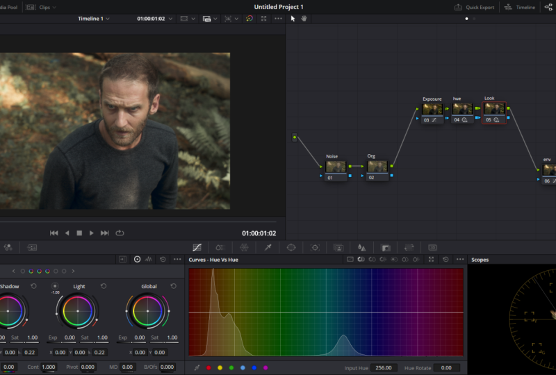
the human color spectrum, no matter the race. So let's create a new
node by right-clicking on the last node in our chain. I'll add a new Serial Node. Next, I'll select a new scope. This one is the vector scope, which want to make sure that's
turned on under settings. That's the little three
slider menu icon option here is that show skin tone
indicator is turned on. When it is, you'll see this
white line on the scope. So what this line is, is where you want all your color information
to fall for just skin tone. If there are spots
outside of this line or spots on the graph that
fall off this line, then your skin tone
won't look good. So let's say I just might
global settings wheel, you can see how much the
color is pushed off the lines showing us that's really not where we want to be
with our skin tones. So we gotta push
our color values over or on top of this line. And how we do that is by
selecting the Hue vs Hue graph, which is the second icon, the one with this little
double overlapping wheel in the line graph
adjustment area, this one right here. So once I'm there, I'll just click once
on the red color icon, down on the bottom, select our red tones. This will target
our skin red tones. So this is adjusting
our skin tones because there are a lot
of reds in our faces, again, no matter what the race. So once I do this, a small little white ball
appears allowing me to raise or lower it on that graph. Notice what happens as I
push the ball up and down. And all I'm doing
here is clicking and holding my mouse down on
that little white golf ball. The color values start to
get pushed to the left and right of that line on the
vector scope as I do this. So we want those reds
to be above the line. And there we have it. If I just do a little
bit of adjustment here, make sure you don't get
too extreme with this push because it will affect some
other reds in your image. Just give it a little nudge. That's all it takes. And as you can see, a ton
of color work can be done by just using monitors in scopes without the need for big, expensive monitors to
check the true color. At this stage,
please go ahead and export your clips so I can see it and upload it to the
class project page.
11. Final Words: I'm excited to see your work, so please don't forget
to post your clip in the class projects section
when you're finished. I want to give you good feedback there so we can look
at your work together. Also, if you've
enjoyed this course, please leave us a
review before you go. We would really appreciate the feedback and look
forward to seeing them. Lastly, we'd like to thank
you for taking this course. I hope you learned
a few things along the way and we'll see
you in the next one.
 Rosita and Jason, Learn By Doing