Transcripts
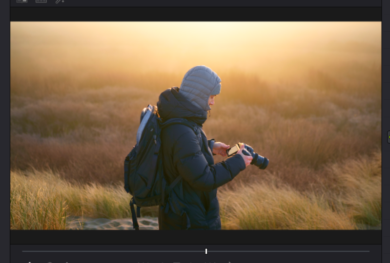
1. Class Introduction: Hi there and welcome to this color correcting and color grading course in the Vinci Resolve 17. In this course, we'll discuss everything that you need to know in order to color correct and color grade your footage and create beautiful grades from scratch. I'll supply all the footage that I use in this course for free. So check the links in the description below. If this is your first time in Resolve, make sure to check my other courses because I'll dive deeper into all the buttons and the entire layout. So you'll be able to develop very fast and efficient workflow before starting to dive deeper into the actual color grading process. Alright, so without any further ado, let's check the topics that we'll discuss in this course. The first one is how you can prep your grading suite. Some background information on different cameras, profiles, different techniques on color correction, different techniques on color grading. How you can build up a very efficient no tree, how to read scopes, some built-in effects inside the Vinci Resolve, creating and saving your own power grids. And let's how you can avoid overgrazing, tips on lighting and set design, tips on analyzing your own films. So now that's being said, let's jump into the course and have fun.
2. Prepping your Grading Suite: So the first topic we'll address here is how you can prep your grading suite. This is quite important because excess light from different angles can affect how you see the image on the screen. This is very important to eliminate. So make sure that you cut out on this key light, for example, and the ambient light behind you. So whenever I do a great myself, I make sure that my entire room is as dark as possible. And then I just start grading because I can see exactly what the monitor is showing. Then also a very important tip here is if you do this professionally, make sure you calibrate your monitor and get a good reference monitor in the first place. So this monitor right in front of me is a Ben Q. Monitor. It shows me a full spectrum of Rec 709, and it shows me a very accurate image. But I also want to calibrate my monitor using one of these devices. This is a IE display studio, and it makes sure that the colors that the monitor is showing are actually the colors that they represent. So red is red, green is green and it's not a different tint. So if you calibrate it, you know exactly that you can trust the monitor you're working on. And that's very important, especially if you make your money doing this.
3. Camera Profiles - Bit Depth & LOG: Okay, So next up, camera profiles. These days we have so many different camera brands on the market, and each of them shoot in a different camera profile. Which one is the best for color grading? Well, the rule of thumb here is that the more or the higher the bit depth is, the better it is for color grading, meaning an 8 bit image shoots, for example, 16 million colors, which may sound a lot, but 10-bit color shoots in over 1 billion colors. And what this does is, for example, 8-bit has 20 different shades of blue. 10-bit has 200 different shades of blue. I'm not sure if that's correct, but you get the point. There's a lot more gradient going on in the image. So if you see bending happening, that is partly the reason because it's an 8 bit image. So the more or the higher the bit depth, the better it is for color grading, keep that in mind. So another very important thing is to know if your camera shoots in log or not. So there are so many log profiles these days. For example, S lock to lock three, can unlock, can lock to lock three. Black magic film. Every log C, There are so many different profiles, V log Panasonic. And all of these profiles have one thing in common. They are super flat, so they look extremely grave. Log is a picture profile that is designed to retain the amount of dynamic range the camera has to offer. So by shooting and log, you have a lot more control over the highlights and shadows. So it's very important that if your camera has this option, you'll shoot in log. All right, so the last thing here is raw versus compressed. A compressed file is for example, an MP4 file. A raw file is for example, Blackmagic RAW or progress raw or airy raw or read raw. The difference between these codecs is that you'll have a lot more data inside a raw file. For example, you can change the ISO, you can change the white balance, you can change the shadows and the highlights. You can change so much more in a Raphael compared to compressed MP4 file. But that doesn't mean that an MP4 file is not easy to work with. Cameras these days shoot in a very efficient and high-quality MP4 file, which is usually good enough for most people. But if you want the highest quality possible, definitely try to shoot in RAW. Alright, now, all this basic information is out of the way. Let's start with our color correction.
4. CC: Color Space Transform: So the first color correction method we're going to talk about is the color space transform tool. That is a plugin which is built inside of engine result that lets you transform your footage from Locke to rec 709 non-destructively, meaning that all the data is retained and nothing is clipping. So let's drag a color space, transform plug-in onto our first node, and then go to your input color space, go down. This shot is shot on the Blackmagic Pocket for k with a Sigma 100 to 400 lens. And I shot this in Janet ration $5 signs as you can see when you click on the Camera Raw tab here, you can see that it is shot in generation five. So let's dial that in. Wide gamut. Generation 4, 5, and then our input gamma is Blackmagic Design film generation five. Now, our output color space is Rec 709, and our output Gamma is also Rec 709. So now that is done next week and continue with the rest of our primaries, which are Exposure, white balance, and contrast. So for exposure, I make a note before the color space transform tool, which you can do by pressing Shift S. So my white balance and contrast comes after to see you see note and you can do that by pressing Alt S. So, so the first thing you'll do is change your exposure or match your exposure. And you can do that by going to the wheel section here and then change the Lift Gamma Gain and offset. I usually start with the offset to affect the entire image. And once I'm happy with this, I'm going to dial in the shadows and highlights. Well, this is a pretty tricky image because it is very high in dynamic range, because we have a very bright sky and a very dark foreground. So this is pretty tricky to do. But of course, you can match it as, as, as good as you want. So if this is what you like, perfect. If you want, for example, silhouette, you can do that as well by dragging down shadows and lifting the highlights a little bit. So this is more of a silhouette image. I like this a little bit more because it brings up a little bit of the details into trees. So I tend to go for this look. Then we are going to check if the white balance is correct. This is a pretty difficult one because normally you want your whites to be white, but this was shot at sunrise. So of course the entire image is a bit warmer. So I tend to go for this or I am going to boost. It. Depends on what you like and it of course depends on what the output of this clip would be in the end. So there's a couple ways you can do this. Of course, if you are not shooting in RAW, this is the only way to change your white balance just by going into your primaries and then change it here with the temperature slider. But if you shoot in RAW, you of course have the option to change it in the Raw tab. So you go to the rod tab, you go to decoding using clip, and then you can change your white balance using this slider here. Of course, using it into Raw tab gives you a little bit more control because it is actually changing the metadata instead of the image by the image processor of results. So this is of course a lot better to use. Anyway, I was pretty happy with what we were having before, so I'm going to go back to what we had. Alright, Perfect. Okay, So next we're going to add in some contrast if we need that. So let's check what it does. I usually go to 1.2 and then I play around with the pivot. So I get exactly what I want here. Sweet little bit, too much, maybe. Good. Okay, So this is basically primaries, so you can build upon primaries here. So if you want to do a grade, if you want to change the entire image or graded very heavily, you can do it after this is done because this will set your image baseline. What I always suggest is to correct all your clips in the timeline first, and then you build out a grade that you can eventually copy over and tweak here and there. But to match all the clips first is a very smart idea because it saves you a lot of time in the long run.
5. CC: Doing it by Hand: So now that is done. Let's check how we can do the same method, but by hand without using the color space transform tool. So right-click somewhere in the node area, reset all grades, and then just do it by hand. So the first thing I always do, especially when using a log image, because it's so flat, we want to boost the contrast a little bit so we can see what the image would look like. So on your first node, add in some contrast just so that the image is looking nice and rigid or nice and full. And then play around with the midtone or like the pivot. So you can say you can position it right where you want it. Sweet. Then we make a note before our contrast. Now by Shift S. Then we change our exposure a little bit. I wanted the silhouette here, so that's what I'm doing. And then after our contrast node and make a new node Alt S, and we increase our saturation. So you can do that by using the slider here. That is a very easy way to do it, but you can also go to the curves, the third dot, and then raise this bar. The good thing about doing it this way is that you have a lot more control over which colors you want to be boosted. So for example, if I don't want the blues to be boosted, I just drag down this, this little dot here and you're good to go. But of course, since this images like yellow only, you don't see anything changing. But that is that. So now we have that we can of course play around with the white balance to match it a little bit better. Two different clips, if that is the case. But in this case, I think this looks kinda good and this is a good starting point for me to add on my grade. So let's continue to a different clip. Let's see what it does when I copy this clip over. So go to the next clip, press your forward slash and you see that our primaries are working quite good, but of course we drag down the exposure a lot. So I'd like to change that a little bit. Also a change to pivot because this pivot is a bit too low, the midpoint. And then our exposure is going up a little bit because now I want the dress to be nice and vivid. So you can see that now I copy the grade over, I changed some minor things and it already looks very good. So that is a very simple and easy way to do your primaries. I personally always use the CSD tool because I feel like it is a very fast and efficient way to transform your footage from Locke to Rec 709. But of course, if you don't have this for some odd reason, you can do with this, but I would always suggest you just use the CSD tool because it's an amazing plugin. So, all right.
6. CC: Color Checker: Okay, so the next method of color correcting is by using a color checker. So we now use our primaries and the CSD tool to get accurate colors in the frame. But there is another way to do this. So go over to this little button over here. This is the color match tool and you can see a grid full of colors. Okay, so the first thing we wanna do is you want to match the color checker in the frame with this one of the winter results. So I used a color checker passport video. So now you can see that the colors match with this color checker in the frame. That is very important. There's one downside here and that's pretty unfortunate, but DaVinci Resolve has not updated source input gammas yet, so there is no generation five option in this and color match tool. So what I want to do here first is go to clip in my Raw settings and change the color space to generation for. Otherwise you won't have inaccurate match, but I hope they will change this soon. Okay, so now that is done, make sure your input gutter space is Blackmagic Design for k film. Then go over to this drop-down menu here and make sure you press this color chart option. And I'll zoom in a little bit and make sure you align the outsides of this box to the outside of the color checker so that all of these little squares align with the colors inside the color checker. Zoom in a little bit more. Oop. Oh, sorry, that's it. So make sure you align it with the corners over there. It's very tedious work. Pay you go. All right. Now you can zoom out. And then once you have dialed in all your settings, so Blackmagic, forget film Rec 709, Rec 709. So leave the temperature at 6500 Kelvin because this is the white point. It's not necessarily meaning that this is to Kelvin that you shot in. Alright, so leave it at 65, 100 and press match a can see that you have an amazing image right out of the box because this tool matches all the colors exactly how the word design. So this is super easy and fast and you can see that the skin tones look very nice. Now you can of course do the rest of your primaries such as little bit of contrast and all that good stuff to get a nice image. Okay, So I literally just add in a little bit of contrast and you can see that the image looks quite nice. So that is what I do whenever I do talking heads or interviews. I always use a color checker because it saves me so much time in post.
7. CC: Skintones: Okay, so the next method of color correcting is by getting accurate skin tones. Having accurate skin tones is super important because this will make your actors pop and it is actually very easy to do. And I'm going to show you how. So we have our color checker done here and our frame is looking nice and clean. But let's build out our primaries first. So Shift S to create a node before our color checker. Change the exposure a little bit. I wanted to be a little bit brighter. And I like that. That's good. Then we make a note here. We leave this no, because this is going to be our qualifier node. If we make another node and this is going to be our grade. And then we make another layer note and pressing Alt L. And this is the node that we are going to use to change our skin tones on. Alright, so let's make a very simple color separation here. Let's drag in a little bit of blue. Let's de-select this one because since this one is not letting through anything, you can see what's happening on the top node. Change a little bit of the low range. Okay, so now you can see that the shadow areas have a little bit of blue in them. All right, So that's nice, but we don't want that affecting our skin tone. So while you can do here is by selecting your layer node, of course not everything is gone because in a layer node structure, the bottom layer is overruling the top layer. And so it's a little different. For example, in Premier Pro or Final Cut, the top layer is overruling the bottom layer, but in Resolve for some reason it's different. So the bottom layer is overruling. The top layer. Keep that in mind. So I go to the previous node and I go to my qualifier. Then I select my skins. And when I press down on my mouse and I let go, nothing's happening but press Shift H to see your selection. And now you can see that we are selecting our skins. All right? Okay, so you see that there's a lot of noise and a lot of grain in there, so that's something we do not want. So what we can do now is make our selection a bit cleaner. So drag up the blur radius a little bit. And then player with your clean blacks and clean whites and didn't get it clean, nice-looking image. Which you can then do is press this Feather button and then go over the edges to feather it out a little bit more and to get even a cleaner selection like that, sweet press Shift H again. So you get out of that selection and now connect this node to the bottom layer node. And now this is transformed onto this node. And now we can make adjustments due to skin tones on this node. And that is only affecting the selection that we just made. Yeah, cool. So let's go to our primary window. Go to the Log Wheels here, and then add in some midtones and push it towards orange. Now, play around with the high range and the low range and see what happens. You see that the reds and the oranges are way to present now. But if I drag them out, you see that my skin is super pale and that's something that you do not want. So drag it in until you are satisfied with what you're seeing here. And then play around with the low range to get an even better selection. And then once this node is selected, press Command D to de-select what you're doing. A can see that it makes an amazing difference. So to make sure that your skin tones are accurate, go to your scopes, over to your vector scope does window here and it makes sure that your show skin tone indicator is selected. All right, so now you get this line here and press Shift H again, and go to your power windows, create a circular power window and select only a little part of the skin. So now the Vinci Resolve is showing us exactly where our skin tones are. Okay, so if I deselect this, you want it to be a little bit on the right side of the skin tone line. So that's good. So now we can play around with the offset a little bit to really push him towards a place where we want them to be. So I think that should be right about we wanted so now you can de-select your power window again, press Shift H to get out of that window. And you can see that our skin tones look a little bit too orange. So you can just go over to this area, go back down a little bit, and then play around with that low range or higher range depends. And now you can see that my skin is just a little bit more vivid. Yes. So this is what it was and this is what it is now. And I think that pops, that really sort of shows me that I'm alive at least. So that's what you want to create here.
8. CG: Log Wheels: So the next topic is color grading. How you can create a simple color separation on one node using the loc wheels. So let's do that. Okay, so let's use the same image that we just created. And I'm going to talk you through these changes I made over here. All right, so the select our skin tone nodes and then reset this node. Okay, so what I want here, as you can see, the image looks nice, but everything is a bit orange. Some go back to my waveforms here, but everything is a bit too orange. So what I want is to have a little bit of color separation. So what I want is to have my shadows a bit more towards the bluish side and then my highlights to stay and remain nice and orange. Of course, this is your typical teal and orange look, but if you don't overdo it, it can do wonders to your image. So let's see how I do it. So the first thing I do is I make sure that my note is selected here. I go over to the primaries and then go over to the Log Wheels. Alright? Then the first thing I do is drag in a little bit of blue. Okay? So if you keep your fingers on the Command and D, you can de-select the node and can see exactly what you've changed. So that's very nice. Okay, so now you can see that the black's turn a little bit more towards blue. All right, that is not exactly what we want. We just want to have this area to be little bit more towards the blue end. Alright? Okay, so there's a few ways to control this, and that is by using the low and the high range. So drag down the low range until 0 and then slowly introduce it. All right, and then keep on clicking Command D to see what you've changed. And then you can do this until you're happy with the results. That looks about right, all right, and then the higher range to give it even more control. Sweet. Okay, so now that is done. Of course, we change our skin tones by utilizing the technique that I've just shown you guys. But there's another technique that I use in order to make sure that my blacks remained nice and black. So after the layer nodes here, I click on this connection node, press Alt S, and in this note, I will make sure that my blacks will remain black. So go over to my curves, go over to the second to last dot, omega dot right here in the shadow area, drag down the end dot. So everything from, you know, every true black will remain true black. And you can check it by dragging this dot over. And you can see that all the colors are sort of fading away from the shadow part until the high part. Yeah, so to highlight parts. So just make sure that you leave it right in between. And now you can see that our shadows are actually black. Yeah. So it turns from bluish to black. Let's nice. So if we deselect these two nodes, so you can see that it makes quite a lot of difference. And personally, I like this because it creates a little bit of separation between the light here and the darker areas in the corner of the room.
9. CG - YUV Color Space: Okay, so the next method for color grading is using a different color space. So I like to grade in a YUV color space. This color space uses colors different, and I just found a way to use this in a very interesting way. So make a new node and go to Color Space. Go all the way down to why UV. Now, go over to your RGB Mixer and then play around with these levels. See what happens if I change these levels just slightly. A convent, explain what they do. I mean, they they they treat colors differently and I I don't know. It just it works fantastic, especially on on footage that has a lot of color bit depth. So this one is 12-bit, meaning you have so much detail into colors. And as you can see, I changed a few sliders and you can see it makes such a difference. Now of course the trees are a bit too yellowish. You can do that by dragging the green slider and a green output down a little bit. But it makes so much difference and it just pops some colors. That is sometimes very hard to achieve when you grade using sliders or curves menus in a regular color space or Rec 709. So it is nice to experiment in the YUV color space. And I would highly suggest you do the same because it is a lot of fun. And by using the RGB Mixer, you can get some crazy results. Look at that. It's not the best of course, but, you know, it's just playing around with some sliders and you get such interesting looking colors. So, yeah, go ahead and check it out because it's a lot of fun.
10. CG: Curves: Next up is how you can modify colors using the curves menu. So we just stick around with the same clip. We go over to the curves, go to the second dot, that is the u versus u sliders or curves rather and make a dot where you see a lot of color happening. Yes, so we have a lot of greens and yellows in a frame. So make a dot right here, make a dot somewhere, like halfway and at the end. And then look what happens if I drag this up. You see that all the greens start to become more yellowish. So if you would see this, this would give you the idea that it is like adn or like late summer perhaps. So you can play around with the colors here, or you can make them very vividly green, maybe even right here, and then make sure that the yellow dress remains yellow. All these things are possible in the curves. And again, the more bit depth you're working with. So for example, if I would do this on an 8-bit clip, it's a lot more difficult because you have, you don't have that many shades of a particular color inside that inside that clip. So I would always try to be gentle on eight-bit footage or at least try to see if your see some artifacts happening because then you're pushing the image too far. But if you work with a 12-bit rock lip like this, you can go nuts into colors. Okay, so now we have modified the colors a little bit by using the UK versus US sliders. What I'd like to do then is to create a parallel node to keep everything nice and tidy together. And then on the second node here, I am going to the next dot here. So this is vs Saturation slider. So now you can determine which color gets a boost in saturation or is being lessened in saturation. So for example, I want to take out the yellows. I can do that by dragging down on the yellow bit here. And just have to play around with it until you find the right spots. So you can see that now, okay, let's do green. So I just drag down to greens. It can see that the yellow dress is still remaining its color. And that is very interesting sometimes that really works. For example, in the series on Netflix dark, they use this technique a lot because I don't know what the name is of the carrot domain character, but he wears a yellow jacket and the rest of the image is very moody, but the yellow jacket really pops, and this is the technique they use. So they popped the yellow color, probably by the sliders, you know, giving it a little bit extra boost. And then they sort of eliminated the rest of the colors. So your eye is fixated on that yellow jacket. So you can use a lot of these techniques in color grading to really and hands what the director wants you to see. So that's really cool. So this is how you can play around with colors. So of course it can go way further. So you can make more parallel nodes and maybe you do a luminance difference. So you booze particular luminance levels of particular colors. That is possible as well. There are so many things you can do and basically the possibilities are endless. So I always suggest you just check this out. Make sure to use these clips as well and send it in in the class project so we can all see what you guys create it. So.
11. CG: Film Look Emulation LUTs: Alright, next up is film loops. And this is very interesting because there's a big debate on whether you should use Lutz or not. Well, personally, I think you should in a particular way because film looks are basically film print emulation. So it is what film stock back in the day looked like when Ada was shot on a film camera. And luckily we can emulate this look inside the Vinci Resolve very easily. There's one thing you need to know about film print emulations and that is they work on lock footage. So whenever you made your grade, for example, like this, and you just smack on that Lutz. So let's do that. So just go here, film looks and then let's do the Rec 709 Kodak D6. You see that it is extremely contrast C, and that is because these lots are designed to work with log footage. So how can you do that? Well, it's very easy. Go to your last node. So let's say this is our final grade. Were completely happy with how it looks like and what we've done. And we're ready to transform it into its final stage. So create a new node, go to your open effects and drop on a color space transform tool. Your input is Rec 709 because that is what we changed it into. Because this is our primaries and we transformed it basically from a logo image into a Rec 709 image. And then our input gamma is Rec 709 as well, too far. And then we want to transform it into every block C. Alright, so now you can see that our image is super flat. Make another node, and then add on that film luke. So go here. And then D6. See. Now you can see that it is a lot better to the eye, so it's not too contrasty. It actually looks quite nice. What I like to do is I like to combine these two in a compound node. So I can lower the intensity in the key output here. So you have a little bit more control over this entire film, luke. But of course we took out a lot of the colors. So you can bring it back like that. Play around with the primaries a little bit to give it a little bit more boost. And see what a difference this makes. So deselect this film look. You can see the moody feeling this creates and this can really sell your look. And sometimes it's necessary to create a, a film look based grade. So let's copy this one over m. So right-click on this image, go to grab still, and now it is saved in your stills folder. And let's copy that over onto this clip. Let's see what it does. Okay, so now you can see that it is way too overexposed. So we're going to drag this down. And you can see it's pretty cool-looking grade already. And I've made a few tweaks. Just because this already works quite good. Now it is maybe a bit too contrasty, so it can go up to the contrast here and take it out a little bit. And now you can see that our image is looking quite cool. I must say. If we zoom in, Yeah, that's pretty nice. Maybe a little bit more light on the face. So that is it. So that is what film looks can do to your image. It can really change the way it looks, obviously because that's what color grading is all about. But yes, sometimes you can just not get these loops by herself. Of course, if you're a very experienced scholar is you can create these entire loop to yourself. And one guy that you should check out is one, malaria. He is like crazy guy. He's very good at color grading and he created some of these codec 2023 looks all by himself, which is quite difficult because it involves a lot of tweaking. So definitely check him out because he's really good. But yeah, these things are just built into resolves. I would suggest you just check them out because they're really cool and there's a lot of different options you can choose from. And it will give you the idea of what your footage would look like if you shot it. Don't film back in the day. So pretty sweet. All right.
12. Note Tree: Okay, so now let's talk about no trees. Yeah, So I discussed this in previous courses as well, but I'm just going to go over this really quickly. As you can see throughout this course, we have made quite a few different no trees. So there's a couple of notes that I use for a particular project. So for example, when I shoot skin tones like this, I make sure that I always do a qualifier node, a node that I make my adjustments for my skin tones on, and then a simple color separation, great node, and then a fixed node to make sure that my blacks remained black. And then I probably would add in a little bit of sharpness. Usually don't go further than 48 and just tweak everything until you're satisfied with your image. And if this is what you are after, then great. If not, keep on tweaking. But this is a typical node that I would use for my YouTube talking heads or an interview setting. And if the image needs it, I add in a little bit of noise reduction. So a, make a node before the first node because your noise reduction, you want it always before every adjustment you make because you want it clean output. So you go over to the noise reduction note motion effects, it's called then on your temporal noise reduction go to three better. And then you add in until like, what is it, eight or something. And this will get rid of all the noise in your image and you have a clean output to work on. The only downside is you're probably not able to play this back properly because it is very heavy on your computer. So I usually grade in it, but then afterwards I just take it off by pressing Command D and then I do the rest of my grade because otherwise my computer is flying to the moon or wherever he's going. So you try to always look into your image if you need noise reduction and if you do, definitely do it because it will help you get a better quality image, the end. Now for example, on an easier great where there's no skin tones. I usually just go with like a simple no tree like this and then maybe some color separation nodes up here. And then a little bit of tweaking over there, some sharpness over here, and then maybe some grain. And it can be as simple as that and no tree doesn't have to be looking like this. And then, you know, I like 10 nodes here and then 14 parallel nodes you can, but it is usually not necessary, especially if you output for YouTube or anything or your own projects just go easy on the nodes, go easy on their grade. In particular, because I sometimes see no trees. They scare me really. But of course, if you do a commercial project where your director is right behind you and he really wants like this little tiny piece of blue to be different then of course make a new node for every adjustment you make and label them because this will help you to get it nice and organized. So node two or one or whatever, or adjustment one depends on how you want to call it. So that's really nice to keep your nodes nice and organized.
13. Read Waveforms: So next up, waveforms. So the waveforms are very useful to use in resolve. And I think they're essential because this will make sure that either all the clips in your entire timeline will be on the same luminance values, but also if you're clipping or not. So the thing that I like to use is waveforms because you see the blending of the colors. Yes, so it's nice to have a clear overview if your white balance is correct or if something is clipping or not. So make sure to check out all the different ones because some people just like to work with the parade more because you have a bit more an idea of which color it's clipping. But I personally loved the wave forms because it just gives me a very clear overview. So for example, if we take off the luminance or the exposure node, you can see that there's a lot of things changing here. So let's see what happens if I drag up the highlights. Basically, you can create by only looking at your scopes because this will tell you exactly where your levels are at. And you know, usually you don't really want to clip any of the blacks. But of course, if you're working with silhouette, that's a different story. Yeah, so having having your your blacks clipped right now, it's not a big deal because this is the look that you want to go after. But if you have a nice controlled environment where your shadows should be vivid and your highlights should be vivid. Then definitely try to look at your scopes and make sure that nothing is clipping. This one, for example. So let's just copy this grade over that we just copied over. Yes. So now you can see that our shadows are our clipping dramatically, so everything here is black and we are losing that data. So what you want to do is you want to change up the the exposure note here, and you want to make sure that everything is in frame and that you aren't not flipping any data drastically. Of course does node is not really work in along because that will sort of compress the colors a lot more, the film look node. But right here, this will work just fine. So you can see that now the shadow areas are nice and dark, but it's not clipping. You can see still a little bit of detail in here and that's what you want to go after.
14. OpenFX In DR 17: So next up some built-in effects inside of inner resolve. So go over to the Open Effects window and just have a scroll, just go through them all and just have a look at what DaVinci Resolve has to offer because there are so many different effects that are useful in so many different scenarios. But there's a few that I really like and I think are very, very good to have inside this program. And that is the analog damage, this one. So you can see that it sort of creates a VHS effect. These old cameras that we use to shoot our skateboard videos on back in the day. Or film grain is a very abused, probably the most used plugin here. Camera shake is very nice because it creates a very natural looking handshake if you have a still frame from a tripod, for example. These ones are very cool because you can create very interesting. Rarely affects, I don't know if you ever use them, but you can check them out and sometimes it pops up in your head and you're like, Oh wait, this effect is built-in, you know. So, okay, so one effect that I really like and that is actually really useful is to glow effect. And that is especially nice in higher, like brighter situations, just like this one. So let's make this exposure a little bit normal. So what the glow effect essentially does, it is sort of creating a nicer roll-off in the highlights. So just by dragging this one on there, you can see that the highlights are not like breaking off. So this image is obviously clipping. You can see that this is sort of a weird grayish white and that is not always as nice. Yeah, So it can, it can ruin your image. So by dropping on the glowing effect, it looks like it is sort of shot with a mist filter. And that can definitely create a very interesting look. I personally would, would like this a lot more than this because it looks dull. Yeah, so using this, you can just play around with the settings until you're satisfied with the outcome. And you can of course, overdo it. Like you can do it, but a lot of things in grading, but I think it is a very easy and useful tool in your color grading workflow. So have a look and perhaps you can use it in one of your projects.
15. Save Your Grades & LUTs: So the next thing we'll talk about is how to save your power grades. And let's saving power grades is super useful if you want to use this grade for another project, for example. So we go over to the gallery section here, and then we click on Add power grid album. We call this Skillshare bursts. And for example, I'm very proud on this grade. I just click Grab Still. And then if it's saved into stills one folder, it gives make sure to drag them over here. And now once you close out on the Vinci resolve and you'll open up a different project. This stills folder is still present, so everything that is in the stills one folder will be bound to this project, but everything that is saved inside the Skillshare course folder. So in your power grid album will be available for you in different projects. So that's very useful. You can also save this as a Lutz if you want to, for example, used is this great in Premier Pro for example, you can do that very easily by going over to the thumbnail here, right-click, and then generate lot and use the thirty-three point cube. Save it, give it a name, and you can just upload it to Premier Pro and use it as your, as your blood. So that's very easy and simple, yet very effective.
16. Avoid Overgrading: Okay, So next up some extra tips that may help you in your color grading career. So the first thing I want to talk about is over grading. Color grading is a very tedious task that takes a long time to do. And the same with smell. At some point you don't really recognize particular smells anymore. The same goes for color grading. At some point, the colors that you are changing will become normal and you don't see the difference anymore. So make sure that you just tried to color grade your project. If you're done, you're done. Leave it for the next day and you can start it up with fresh eyes. And then suddenly you see so many different tweaks or you see things that you would do differently. Do it, export it, and finish it, or let it rest for another day and do your final checks there. Because grading for ten or 12 hours straight, you'll see things different from the moment that you started until the 12th hour. So make sure you keep that in mind. If you do very long projects.
17. Tips on Lighting & Set Design: The next thing we'll talk about is lighting and set design. If you are shooting your own videos and you're grading your own videos, keep those things in mind because lighting is seen is essential for nice and good skin tones, and especially the CRI, value of a light. If you have very cheap Ikea bulbs, they have a very poor light quality, meaning they have a very bad Chlorine cost. So if you put up that light and you use as a key light, you can see that the skin tones look like greenish and not as nice as you would want it. So the thing that you would want to try out here is to get your hands on good quality light and you'll see it makes all the difference for your skin tones in particular. And with the set design, I mean that you can try to use different colors inside the set that you're working with. For example, what I just mentioned that in the Siri dark they use a very saturated yellow code in a dark forest. And that of course, is a very massive big separation between the actor and the rest of the frame. You can also utilize this in your own production. So if you have a very boring setting with a lot of white, you can use a very vivid color to make the actor pop. Or, you know, it's, it's difficult, of course they are set dressers and art directors for that. But if you have to do everything yourself, these things are important to think about. So keep that in mind as well. The last thing we'll talk about, and then we'll wrap it up is analyze your favorite films. If you, for example, like the Joker. Go have a look and try to actively check what kind of colors they use. What I always do when I watch a film is I have Google open and I just check for lighting setups. I just check how they they shot particular scenes, what kind of lights to use. And you'll be surprised at how many behind the scenes photos there are on Google or online. So it gives you a better understanding of how particular scenes or shots.
18. Thank You!: Make sure you guys use these clips and create your own grade and upload them to the class project because I would love to see and of course I can give feedback on them if you'd like. And with that being said, thank you so much for watching this course. Make sure to leave all your comments and questions down in the discussion section below because I would love to help you guys and make sure to check out my other courses because there's a lot more common. And then with that being said, thank you so much and have a great day. Bye.
 Sjoerd Wess, Cinematographer / Director