Transcripts
1. What You'll Learn: Hello there, and welcome
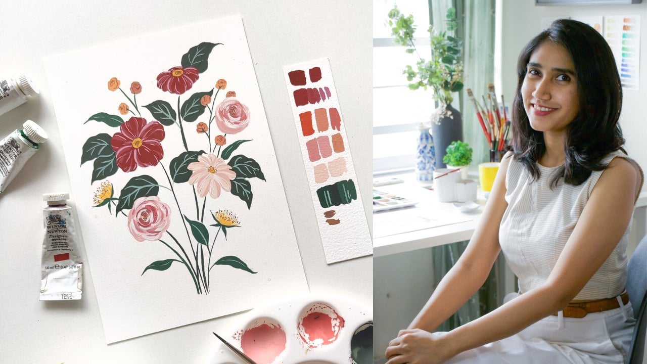
into this class. My name is Shivani, and I'm a gouache artist, surface
pattern designer, and color mixing geek, based in the Sunny city of
Chennai in the south of India. If you've already checked out my previous class on color
mixing and color theory, you would know that I
love all things color. As compared to that class, which was a more
general overview about the basics
of color mixing, this class is going
to dive a little bit deeper into a
specific color group. This is the first in a series of three classes
called Color Camp. Each class in the color
camp series is going to dive deep into one
specific color group, and I'm focusing on color groups that artists particularly
tend to struggle with. Learning how to mix colors
can be such a superpower, and I learned that right at the beginning
of my art journey. Through this series
of three classes, I want to empower you to
feel the exact same way. It really doesn't
matter if you're a beginner or seasoned artist. This class has something
for everybody. No matter where you
are in your journey, you can always improve your
skills with color mixing. So in this class,
we are focusing specifically on greens
and in the next lesson, I'll tell you a little bit more about what we're
going to learn.
2. The Class Project: So the project for
this class is simple. You're going to create your
own color recipes with green. You can do this in
your sketchbook or on a separate sheet of paper. As you go through the lessons, I want you to play
with the pigments that you already own. As an artist, it can be a really powerful tool to be able to mix your
own colors rather than going to the art
supply store and buying a fresh tube of paint every
time you need a new color. Imagine if you could
just mix up any color you see in nature or any
color that you dream up. So try to work with the
pigments that you already own, and I'll take you
through all of it. Don't forget to upload
your project to the project gallery
so that I can look at it and
provide my feedback. I'll be using gouache
as my medium, but you can do it with any
medium of your choice. The principles still apply. And if you have
questions at any point, please feel free to drop them
in the discussions tab below. So grab your brushes, your paints and your paper, and let's get started.
3. What is Green?: As kids, we have learned through this very simplistic diagram that yellow plus
blue equals green. But is it really
always that simple? When you go to an art supply
store to buy pigments, you realize that there are
so many different shades of yellow available and so many different shades
of blue, as well. And often when you try to
mix any two random shades, you don't get the color
that you're expecting. You don't get greens that look realistic like you
see them in nature, and sometimes you want it to look more bright and saturated, but it looks too
dull or sometimes you want it to look
more muted and pastel, but you end up with
a green that just looks so bright
and overwhelming. So understanding
color temperature and basic color theory gives you the foundation to be able to mix exactly
what you're after. You can get your colors
to behave the way you want them to. There are so many
different shades of green, even just in nature, and green is such a
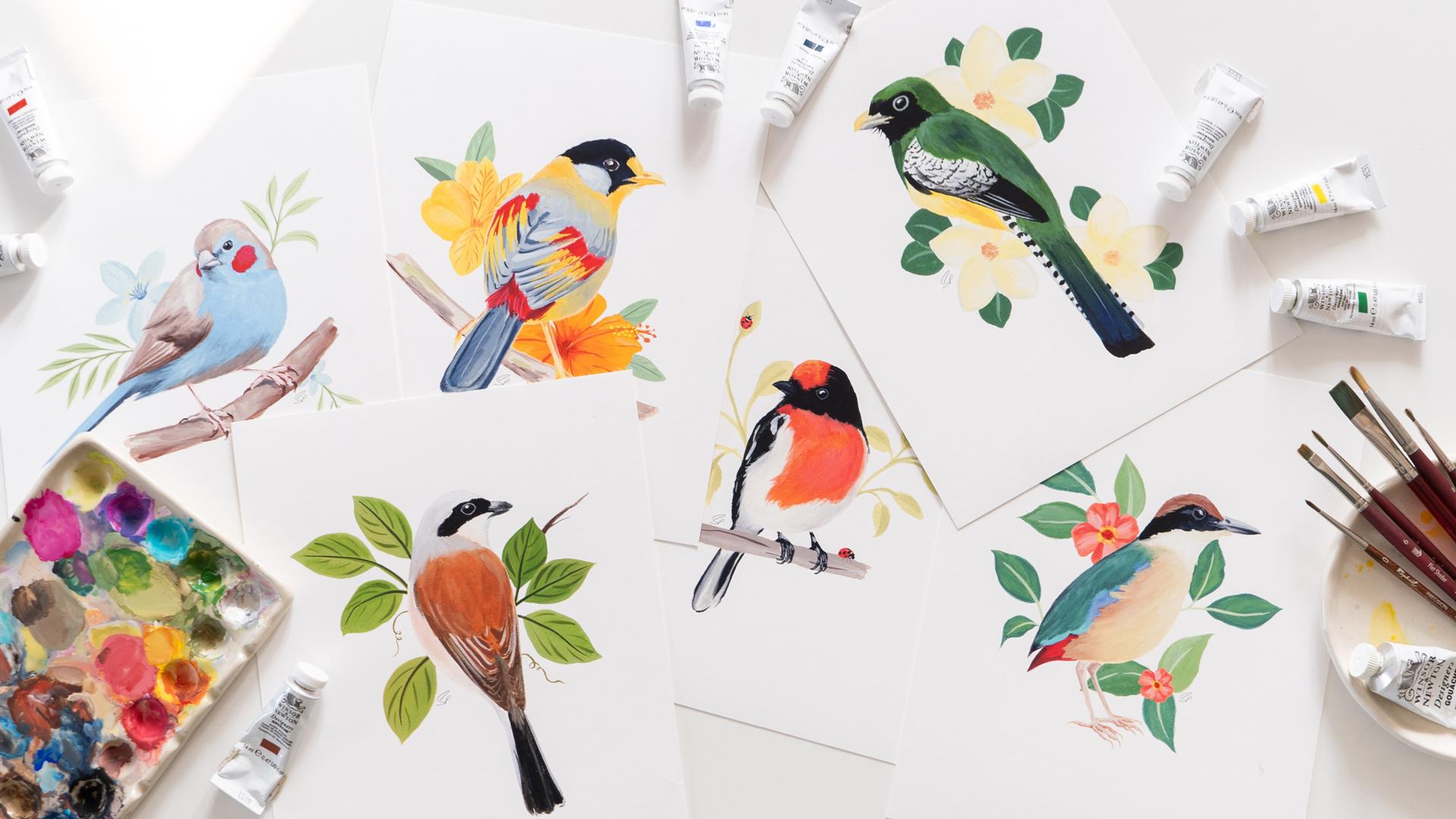
foundational color in every artist's palette. Here are some examples
in fine art paintings. So like I said, depending
on what you're painting, you might want to use a
bright or a dull green, a warm, leafy green or
a cool forest green. Each of these colors can completely change the
mood of your painting. I want to enable you to mix
whatever shade of green you want to, ideally with pigments
that you already own. So in the next lesson, let's
start learning how.
4. How To Mix Green: So these are the materials
that I'm going to be using. Firstly, I have all my
paints laid out here, and don't worry whenever
I'm using a color, I'm going to tell you
exactly what shade it is so that you can use the same
or something similar. All of these are Winsor and
Newton designers gouache. Then I have some water here. I've got a paper towel
just to dab my brush. I've got my brush, of course. I've got my white paint here because I don't have
that on this palette. And I've got a
mixing palette here. I've got two sheets of
paper so that I can do all my experiments with
the colors on these. And I've also got
a sketchbook here. So this is where
I'm actually going to collect the color
recipes that I like, and that's what I recommend
you doing as well. So let's move that
aside for now, and let's start playing
with the colors. The first thing I
would like to do just to understand since we're
talking about greens, the first thing I
would like to do is watch the greens
that I already have. So these are straight
out of the tube greens, and this one is sap green. Let's first swatch that. And then I've got
this other shade, which is permanent green middle, so let's swatch that, too. Like I said, you can, of course, use greens straight
from the tube. There are so many other greens that are available as well. But what you're going to
find is that they lack that natural look and the colors lack a
certain depth to them. And when you're
painting something, you always need to have
variations of the color, too. So it's much better
to understand how to mix your own greens and how to manipulate these
greens as well. So now let's go to the
formula we spoke about, which is yellow plus
blue equals green. So you can see here that I have two yellows on my palette. One is a warm yellow and
one is a cool yellow. This is the cool yellow,
which is primary yellow, and then I have my warm yellow, which is permanent yellow deep. And similarly with my blues, I have these two shades, and I also have an indigo here, but let's ignore that for now. This is my cool blue, which is primary blue, and this is my warm blue,
which is ultramarine. We discussed this in
a lot more detail in my detailed class
on color mixing, so I'd recommend checking
that out if you're interested in the theory of how
all of this works. But what we're going to
do now is we're going to try these different
combinations to mix green. We'll start with cool
yellow plus cool blue. Then we'll do a warm
yellow plus cool blue. Then a cool yellow
plus warm blue. And finally, a warm
yellow plus warm blue. And as you can see,
these four combinations give us such different
shades of green. So when you vary your
blue and your yellow, you're going to see
completely different results, and what can happen
is that you're going after something
more earthy like this, but you end up
getting something so vibrant like that and you don't
know what to do about it. That's a very common issue
that you can run into. What I'd recommend is to
also play around with other shades of blue or
yellow on your palette. I've just given you an
example of these four shades, but I could also play
with the naples yellow, for example, and say my
turquoise blue that I have here. And you can see that I get such an interesting shade
of green with that mix. So try out multiple
different mixes, and if anything really
stands out to you, anything looks really
interesting and you'd like to collect
that color recipe, then take your sketchbook
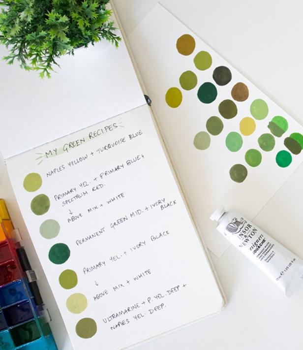
and just add it in there. I really like this one, so I'm going to add it
into my sketchbook. And you can write the recipe right next to it so
that you never forget. Another thing I'd
recommend playing with is the degree of the two
different colors in your mix. So you can have one mix that has a lot more
of the yellow in it, and then you could
have another mix which has a lot more
of the blue in it, and your results are going to
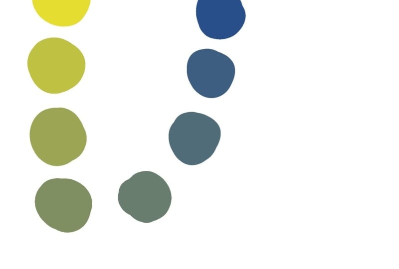
look completely different in both of those cases. You could even have
it as a gradation. And I have created gradations of different mixes from all the different
colors in my palette, and that gives me a really
clear understanding of all the different
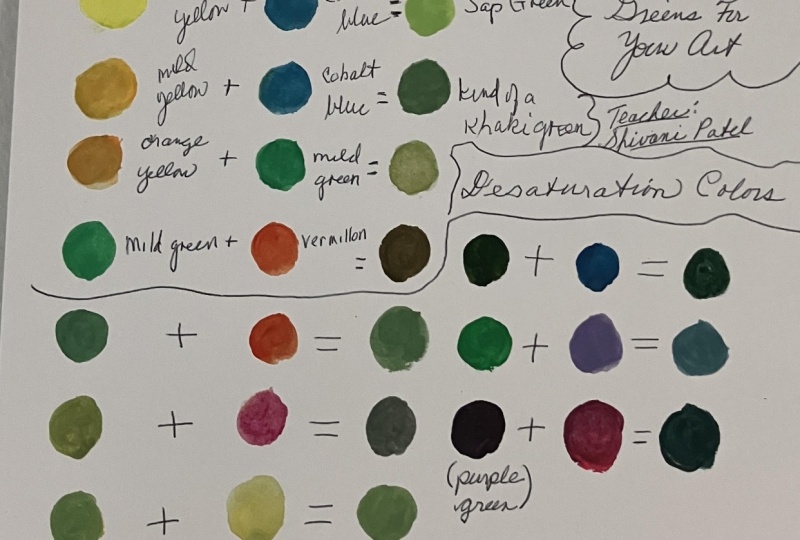
possibilities with my colors. I have an entire set of
sheets like this where I've just played around with all the mixes that are possible with the colors that I own. And so I definitely recommend playing around with
the colors that you have, try to create a gradation and understand all the
different possibilities. In the next lesson,
let's talk about how to desaturate your greens to
make it more earthy looking.
5. How To Desaturate Green: So in this lesson, we're talking about how to
desaturate your green. A simple concept for you to
understand is that when you add the complimentary
color into any color, you will desaturate it. So in the case of green,
the complimentary color, which is the color
exactly opposite to it on the color wheel is red. So when you add red to green, you're going to desaturate it. Again, I'm not going to go
too much into the theory. If you're interested in that, do check out my other
class on the subject. We're going to keep it
practical in this class, and we're going to
just try things out. So you can either work with any mix of green that
you already have on your palette or
you can take one of those straight from
the tube greens, I'm taking this sap green, and I'm going to show
you what happens when I add red to it. I have multiple
different shades of red. I've got a crimson red here. This is primary red, and this is spectrum red. Spectrum red is the
warmest red that I have. These two are cool reds. So I'm going to go
with spectrum red, but I would again
recommend that you play around with all the different possible mixes
with your palette. Try the same green mixed with all the different reds that you own just to understand
what's going to happen. Looks like I've put in
too much red into that, so I'll take some more
of the sap green. And again, it does
look a little too red, but we're just
experimenting here, so keep trying it out until you reach a color that
you're satisfied with. And there you can see we
have this really nice, earthy olive kind of green, and just look at
the difference from the original sap green
that we had mixed. You can see such a
huge difference just by adding some red
into the color. It's completely desaturated it, which means it's killed
the vibrancy of it. It's made it more earthy
and more natural looking. So the best way to do that is to use the complimentary
color, which is red. And you can do that with
any of these mixes as well. It's not just about using a green that's
straight from the tube. I can use a mixed green too. And see, this is a really beautiful earthy
green that we've mixed up. Again, contrast it with the original mixture of
that blue and that yellow. And you can see when
there's red added into it, there's such a huge difference. So this mix was created
with primary yellow, primary blue, and spectrum red. Again, this is
something I quite like. So I'd like to add that into
my little swatch book here. The next thing you can
do with your greens, of course, is change the
lightness or darkness of them. So let's take some white
into this green here, and let's see what happens. Again, I would highly recommend creating a gradation
when you're playing with these colors so
that you add very little at a time and
see what's happening. It's again, a nice,
really beautiful, mossy sort of green, and I'm going to
collect that as well. Then you could add
black, of course. Black is another way
that you could kill your saturation a bit and make
the color darker as well. But adding red is a way to
preserve the depth of color. Black tends to make
colors look quite dead, as you can see here. So even if you add black, I would recommend adding
it with restraint. A better way to
deepen and darken your colors is to add
the complimentary color. Let's see what happens if we add the black into a
much more vibrant green. So I'm using this
permanent green middle This is an interesting
shade as well, even though it has become
quite dark and quite dead. But I still do like it. I think it can have
certain applications, especially when
you're looking for cooler greens for
your paintings. And it's a great idea to have all these different
variations so that you know the breadth of what's
possible with your colors. Another thing I would
recommend doing is adding other earthy tones
that you already own into these colors
to see what happens. So let's take this mix and I'm going to add some
yellow ocher into that. I've got too much
ocher in there and too little of the original mix, so I'll add some back in. This is another great way to add a more natural
look to your greens. So you could do this
with yellow ochre, burnt sienna, burnt umber. Any of these colors can give you a much more toned down and
natural look to your greens. And all these colors are very useful when you're
painting nature, natural landscapes,
anything of that sort. And the final recipe I'd like to show you is one
of my favorites, which is black with yellow. So I've got my black here, and I'll first do it
with my cool yellow, which is primary yellow. And you're going to
see that when you mix these two colors together, you're going to get
a very beautiful, earthy and still bright green. This is one of my
favorite greens to use. And it's such a simple recipe and it's not something
you'd usually expect, but black has blue undertones. And again, this is something
I discuss in my other class, we talk about undertones of
colors and biases of colors, but black has a blue undertone, so that's why this tends to happen when you mix
yellow into it. You can put more
yellow and see what happens or you can put more
black and see what happens. And then we can do the same
with black and a warm yellow, which for me is the
permanent yellow deep. But you could even try it
out with naples yellow, or yellow Ochre,
whatever you have. Okay, so try out all
the different mixes that you can think
of and fill out your recipes and
don't forget to click a picture or scan it and upload it to the
project gallery. I would love to see it, and I'm going to go ahead and
upload mine as well.
6. Summing Up: So I hope you found that
simple and easy to understand. We learned exactly how to mix green in a variety
of different ways. We also learned how
to mute the green or desaturate the green
through basic color theory. So once you're done with
your color recipes, I can't wait to see them. Please upload them to the
projects gallery below, and you can access that
through the projects tab. Drop your questions at anytime
in the discussion tab, and I'll be happy to help out. Don't forget to follow me here
on Skillshare so that you know when the next two classes
in this series come out. We're going to be talking about jewel tones and skin tones, which is going to be very
fun and interesting. You can also find a lot of my free videos over on YouTube, and you can follow my
journey on Instagram. As a next step, I would
highly recommend checking out my more comprehensive class on color theory
and color mixing. This class has received some extremely positive
reviews from students who were either completely
new to color mixing or have already been mixing
colors for a long time. Even they found lots to
take away from this class, so I hope you'll
check it out as well. Thank you so much for watching. Congratulations on
completing the class, and I look forward to seeing you inside another one
of my classes. Bye.
7. Get My Color Mixing Charts: Now that you've seen
how much you can achieve with just a few colors, you might be wondering,
what else is possible with the
paints I already own. Over the past five years of painting with Gouache
and mixing colors, I created detailed color charts of every single
color in my palette. You might have seen these charts featured through this class. I tried mixing each one of the paint tubes that I own with every other
color that I own. It was incredibly time
consuming and tedious work, but also very
rewarding because it completely transformed
how I approach color. I've compiled all of
those experiments into my guide book called
pigment of your Imagination. So you don't have to go through
the same lengthy process. You'll find over 120
individual color combinations plus techniques for mixing any shade of gray using
just your primaries, which is something
I go through in detail in my other
class on color mixing, and you can mix all
of these shades of gray without any black required. So it's really
exciting. Can download this guidebook immediately and start using these charts for
your next painting session. The link is in the
description of this class. Whether you want to expand on
what you've learned through this class or explore
completely new color families, this guidebook will give you the confidence to mix
any color you can imagine for less than the cost
of three new paint tubes. You can even print out
these color mixing charts and keep them on your desk with you for reference anytime. So go ahead and get
your hands on this. The link is in the description
right below this video, and students of
this class get 15% off with discount code CAMP.
 Shivani Patel, Gouache Artist | Creative Entrepreneur