Transcripts
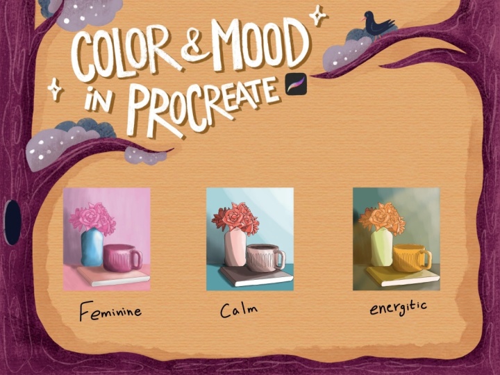
1. Introduction: Let's talk about color, how to turn one
single sketch into three completely different
emotional worlds. Same drawing, same
composition, different colors. Hi, I'm Alexandra,
AKAD Artmother. I'm an artist, illustrator,
and online educator. In this class, we are
going to explore how to use colors intentionally, not just to make
illustrations look beautiful, but to make them feel something. And here's the thing. Many
artists struggle with color. Maybe you feel stuck when
choosing a color palette, or you always end up picking
the same safe colors. Or use too many colors, or you finish an illustration and think something's missing. And that something is often
intentional color decisions. There are so many things
you can achieve with color. You can guide the viewer's eye. You can add
perspective and depth. You can affect mood
and create feelings, and, of course, tell stories. For a beginner, this might sound pretty overwhelming.
But don't worry. In this class, we'll
go step by step. I will help you to
simplify color theory, understand emotional impact, and explore possibilities you
might not even know you have. The class comes
with worksheets and resources that will guide you
through the entire process. So, you are not just watching. You are actively experimenting. It will be super fun. By
the end of this class, you will understand how to
choose colors based on mood, how to build intangial
color palettes, and how to transform
one single sketch into multiple
emotional experiences. So are you ready to explore color with me? See you in class.
2. About The Class : Okay, welcome to the class. I'm so happy that you are here. In this video, we are going to talk about the class structure, the class resources, and the class project. So
the class structure. In the first part of the class, we are going to work through several worksheets and
explore color theory and different perspectives
when it comes to creating palettes and
intentional color choices. In this part, we
are going to just play with color carefree. You know, there will be
no really pressure to, you know, create
something magical. You will just explore your
feelings, your connection, your relationship with color, and play a little bit.
It will be really fun. Then we are going to create a still life together
from simple objects. So you might want
to start to think about some objects that
you like, but don't worry, there will be a
part where I will show you what to keep in mind, and I will also show
you inspirations so that you know what we are
going to create at the end. Then we are going to go for the illustration
part where we are going to create
one illustration. And again, don't worry. At that time, we will
have the sketch, the color palette, and
all the knowledge, okay? So we are going to
create one illustration, and I will show
you how to create different variations
of that artwork. That will have different moods
and these emotional world. In the resources, you can find worksheets and the
color palette that I'm using and creating during the class and
also a brush set. I will also give you
my original file for reference and my own sketch. So if you don't
feel like creating your own composition
or still life, you can just use
my sketch, okay? And of course, you
have artistic freedom, so you will be able to
choose your own colors, create your own color palettes, and use your own
illustration style. In the illustration part, okay? I will be showing you a
new illustration technique that I just invent
during the class. But again, it will be super fun, so you can just come
with me on that journey, or you can just take
it your way and create the
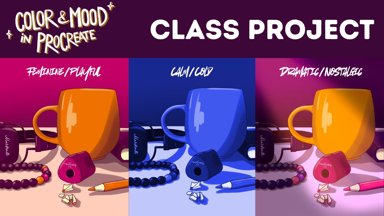
illustration as usual. So our class project
will be to create a still life from
your favorite object. And we are going to work with the colors of that illustration. So as our goal is to depict different emotional
worlds or moods, we are going to create
three different versions of the same illustration. I will show you tips and
tricks how you can do that fast so that you don't need
to re illustrate everything. But the goal will be to have three different versions
of your artwork. So that's what you are going to upload into your
project gallery. Okay, I think that's all. I'm sure that we are going
to have so much fun, and I can't wait to see
what you create and all the emotional worlds and moods appearing in
the project gallery. So yeah, that will
be super cool. I can't wait. So let's
just get into it. See you in the next video.
3. The Rules: H Alright, so let's just talk about
the dry stuff, the rules. Many artists, beginners
feel blocked by color because it's often
thought as a set of rules, but rules are there
to be broken, right? But in order to own what you
are doing with the colors, it is really important to
know these rules, okay? So I'm sure that you have
seen a color wheel before. What I'm going to
tell you right now, you probably learned
in kindergarten, but let's just go through it. So there are three primary
colors blue, yellow and red. It is mostly important
when you are painting with pigments because if
you mix these pigments, you get secondary colors. So for example, if you
mix yellow, red, blue, you get green, yellow and red, you get orange and blue
and red, you get purple. And it goes on and on and on. So if you mix a primary color
with a secondary color, you get a tatterary color. So this one, if you mix
this, you get this one. If you mix this,
you get this one, this one, this one, and this one. Okay? So if you go to procreate palettes and colors
and click on the disc. You get a kind of color wheel, but this is a CNYK color wheel. So there are colors that are not really mixable by paints, for example, magenta, but you have colors
that work on display. But let's just not
go into that part of color because this class is not really about
these rules, okay? There are several rules that
are called color harmonies. Which are basically about which colors look good together, if you place them
next to each other. You also have these harmonies
ingredient Procreate. So if you click here
and two hominy, let's just choose color. You get a color wheel like this. Again, a CN YK color wheel where you can
set color harmonies. So if you click here,
you get complimentary, plate complimentary analogous
tradic and Tetrati. If you click those, you
get different versions. Of color harmonies,
which might not always work well when you're
choosing your colors. But let's just get into it. So complimentary color
harmony is when there are two colors opposite
to each other on the color wheel and they
like complement each other. They look good together.
They are a match. So, for example, yellow with purple look good,
make each other pop, green with red and red
and blue and orange. Then there are analogous
color armonies when there are these
colors next to each other. So these ones look
good together, these ones, these ones. It can be three colors
or four colors. And triadic is when you draw a triangle over the color wheel, and they're evenly placed on the color wheel
from each other. So, for example, this green, orange, and purple
look good together. For example, this one,
this one, and this one. This is basically
my color palette if I choose these
colors, et cetera. But colors chosen this way. Do not necessarily help you
to express your emotions. So when I said that rules
are there to be broken, it is because color is not
just a decorative element. It speaks. It has
psychological meanings. And instead of thinking
of color as rules, I want you to think of
color as a language. Alright. So now that we went
through the basic rules, let's go to the next
video where we are going to talk about color
as a language.
4. Color As Language: Okay, so let's just
talk about color as a language because
while we are using color, we are using color to express our ideas, thoughts,
moods, emotions. So we are using it as a
language to communicate. If you think about
shape language, if you have heard
this expression, you know that you
can use shapes to communicate as well to make
something dangerous or cute. So you can do this
with color as well. But just like words, colors don't have
one fixed meaning. Generally, everything
in life is neutral. We are the ones that
add meaning to them. So for example, if
you take blue, right, blue color can feel cold, lonely or distant, but it can also feel very calming, right? If you think about red, red can feel warm and lowing
or intense and aggressive. What matters is context. Also, when you put a color
next to another one, it can feel
completely different. So when we are
using coloring art, we are sending emotional
information to the viewer. We are saying something, even if we don't realize it. So in this class, whenever we talk about color, we'll always ask
one question first. What do I want
this to feel like? And that question is more important than choosing
the correct color. Let's just do a short exercise. So let's just choose a color
that you like just randomly. Write down three emotions
it could express in different situations
or circumstances. So I'm going to go for one
of my favorite colors this, this reddish, magenta,
purple, whatever. If you go to the worksheet, you will have the circles, choose the upper one, and just drop your
color there and let your imagination flow, okay? So just look at the
color that you've chosen and imagine
different scenes. So I'm pretty visual. So for me, there are several things that
pop up in my mind. I will just choose sketching pencil and black to
write my things, and I will also
create a new layer. So for me, this color, as it is pretty cold, because, yeah, I forgot
to tell that there's also a rule that there
are warm and cool colors. So it is basically
somewhere here, this line. So these colors are
more Oh, no, like this. So these colors are more warm
and these are more cold. It also adds to
that set of rules. So at first when I
look at this color, what it reminds me
is playfulness. So I will write playful here. But also, if I look at
this color a bit more, it appears to me that it
is more cold than warm. And what pops up in my mind, mainly in combination with
this white that is here, it reminds me of
a robot in space. So you can just let your
imagination go, okay? So I will say robotic, a bit distant, a bit, you know, not natural,
unnatural, maybe unnatural. It feels like for me, again, I'm the one who
is giving meaning or adding meaning to that color. And what also pops up in
my mind is a pop figure. She has it in her hair, but maybe it is more cool, but it can be very feminine. And it is also wild and bold, right? So I can just go on. Let's just choose three
different circumstances or emotions that color gives you, okay? I will do another one. So I will just create another layer and go
back to this one. And what color I like
really much is this blue. So I will just put it here. And when I look at this blue, it reminds me of the ocean, you know, with this white sand, so it is very luxurious. So I will write luxurious color, you know, with that ocean wipes. But it also is a bit distant. So if I imagine that this is a hole and I'm
looking at the sky, it is calm, but
it's also distant. So I will write calm here, but also distant.
Yeah, and cold. Like, it's if I look at this color and I imagine
water, it feels cold. Maybe if it was a
bit more greenish, let me try how much
my feelings change if I change it a bit to oops. Me greenish. So it is it is now
totally different. If I imagine a water
that has this color, I imagine it warmer
warmer and quiet. Right? That color was darker, so it is more of
a movement there. So, what your job is now
to choose colors and just stare at those colors and really just
without pressure, just write down anything that comes up to your
mind and scenes, you know, and you
don't even need to think about artworks, okay? So let's not put it into
the box of art right now. Just feel the colors. What do they evoke in you? Maybe memories. Alright. And now let's move to the
next video where we are going to talk a little bit
more about moods. Oh.
5. Mood Before Palette: In this class, mood comes first. So before we choose
colors, we choose mood. Many artists start coloring
by picking colors they like. The problem is that it often
leads to illustrations that are pretty but
emotionally confusing. For years, what I did was I created a signature color
palette for myself for that year and tried
to create cohesion within my illustrations by
using those colors constantly. And that is not bad. That's a strategy, okay? That's an artistic
strategy when you are learning and you want
to make things pretty. And it also carries
emotional weight. I usually chose
these color palettes based on what was
going on in my life. So let's just take a look on
a color palette from 2022. As you can see,
there are lots of earthy colors, bold colors. I really loved those as well. I have these very oceanic
colors here as well. So it was kind of contrast between these neon
things and nature, which is kind of defining still my colors
that I love to use, but it changed over time. So for example, here in 2023, I had more of these
natural colors and my bold colors
shifted a bit. So basically, if you are
an artist, of course, if you want to build
your portfolio, build signature color
palettes for yourself. But now maybe think a
little bit outside of the box to explore other
colors that, you know, touch you in a way or help you to feel more when
you are creating and maybe your viewers
will feel more of you when they are looking
at your illustrations. So right now we are going to reverse the
process, and first, we decide how we want the illustration to
feel rather than, you know, just illustrate and then decide,
Okay, this is sad. Okay, this is joyful, et cetera. So some common moods in illustration that I just
collected here is calm, joyful, nostalgic, tense,
quiet, and playful. And mood isn't just
about the hue. And this is what I want
to introduce you here. It's also about softness, versus sharpness,
contrast, versus subtlety. Brightness versus darkness. So for example, col
mood often uses a softer contrast, fewer colors, gentle transitions,
and a tense mood often use a stronger contrast,
more dramatic differences. And in your own work, you don't need to label
moods perfectly. Even something
simple like soft and quiet or heavy and
dark is enough. And mood is a direction,
okay, not a rule. So we are going to explore this in a short exercise again. So we are going to go
through these moods and choose free colors for each
of them and just randomly, you know, how you feel. Let's just replicate
that feeling with color. And you can use
traditional supplies for this or Procreate. As we are working in
Procreate right now, I'm going to do
this in Procreate, but I really love
to do this exercise on paper and with
traditional media as well, because I can't
touch the colors. You know, I really love to put color on my
fingers and just, you know, throw it around
and help me feel something. Alright, so what we
are going to do now is that we are going to
go into the worksheet. You will find these shapes here. Okay? They are alpha locked, so you can paint over them. And let's just go
through these moods. And again, you can
just, you know, close your eyes and think
about things that are com and choose three colors, what you are seeing,
what you are feeling, and just put them there. I'm going to use
my texture shaper that comes with the class, but you are totally free to use whatever brush that you want. I love to use the classic
color wheel here, but you can use a disk, as well. And yeah, I already
have this color here, so I will just choose it. And okay. I will go here, and I will just put it here. And what comes to my mind
is a very light yellow. Into it and maybe light pink kind of
It's very coral color. Can you see it is not
that sharp transition. The colors are basically
similar to each other in value. And now I'll go for joyful for joyful I love this
love this pink, so I will go for bold
colors more or less joyful. I need a greenish yellow here. Yeah. And maybe blue. Mm hmm. Orange? Yeah. Orange
is pretty joyful for me. Can you see compared
these two or, you know, it is more calm. There are no like,
popping colors. And here is like, Wow, it is very intense. Nostalgic. Okay, I immediately
see light orange, kind of muted
colors. Indigo blue. What pops up in my
mind Indigo blue. Nostalgic. And I
can feel a green. Oh, yeah, this
green is beautiful. Okay. So these muted colors
are pretty nostalgic. Tens. It's definitely
a red there. Oops. Oh, okay. I'm in the
second row now. Okay, red. And I will choose Black. Oops. And what else? Mm. A gray. A gray color. S pretty tense for me? What's he quiet? Mm. Quiet. I feel a light blue. Another blue. And a darker blue. It is pretty quiet for me. Its monochromatic. So there are less, you know, huge changes in
the quiet for me. And playful. It is similar to joyful. I haven't thought about that,
so you can just change it. Well, let's just go for playful again. Joyful and playful. What is the difference
between joyful and playful? I'm not sure. Okay,
but let's just go. And uh playful. Playful and playful.
So let's play. Let's play. I will
add pink again. And I will add yellow. And that's almost
the same, but okay. Okay, so now not yellow, but let's add blue. Playful playful, playful. And green again. Okay. Okay. So this playful, again, bold colors, neon colors for me. It is really pretty interesting, but I love how it turned out. And if you know what the
difference can be or what you feel is the
difference between joyful and playful in color palettes, you can write it into
the discussions. So I'm really curious
how you see this. But this exercise
is so much fun. I had so much fun, actually. What popped up in my mind that I I wanted this
worksheet to be playful. So basically, these colors
could be playful, as well. What do you feel? I don't know. I worked for me like
this right now. So also, of course, moods change, and maybe the meanings that
we put to moods change. So maybe if you are sad, your nostalgic color palette
will be more dark and less, you know, less color
will be in that. It will be more of maybe
a black and white thing. And if you are in a good mood, it will be maybe just
these muted colors. And, yeah, so I hope that you
get what I want from you. And also, don't forget to post this interclass project when
you are building it up. It will be really fun to see how these little moods
come out of you, what color palettes you
choose for these moods. And of course, it is always
good to read your words. So if you decide to describe your experience during this exercise in
the class project, I would be super happy
to read about it. Alright. So while I was filling
up these color palettes, I mentioned value mainly here that these colors are pretty close to each
other in value. So in the next video, we are going to
talk about value.
6. Value First: H so value first, color second. One of the biggest reasons color doesn't work is actually
not about color. It's about value. So value means how light
or dark something is. Even the most beautiful
colors won't communicate clearly if the values
are too similar. A simple way to
think about this is if I removed all color, would the image
still make sense? So if someone who has color blindness
looks at your image, can he see anything? Because even if there
are two colors, on the image, and they
are the same value. Without color, it would not be seen that there
are two colors. Let me just demonstrate that. In Procreate, we can
easily check values by temporarily viewing our
illustration in gray scale. Let me just show you this. If you go to the worksheet, you can find these shapes here that are again
alpha locked. What I'm going to
do is to create a value check layer,
how you do that. So at first, you
create a new layer, choose a middle gray and fill the whole page
with that color. You go back to that layer, click on the blending modes, go down to color. And now you can see the
whole image in gray scale, and you can just
turn it on and off. And let me just demonstrate
you what I was talking about. Let's say that I don't have texture hers because it will
just be seen, but whatever, if I just pick up this color
right next to this circle, if I go here and just
fill that circle in, you can immediately
see that it is almost unrecognizable,
but it has texture. So let's just do this
with two colors here. If I keep this circle
at the same darkness, so same value because here
is the darkness, okay? And I just change the hue
and let's choose a green. I will fill this
with that color. These two colors
have the same value. You can really differentiate between them because
this in context, is really blending into the
color around it, right? Now, we'll just turn on
the value check layer. Can you see these colors
are identical in value. So if I create an image with
these two colors that you can clearly differentiate
without the value check layer, there will be no
contrast in image, and this is basically
what contrast is, and this is why we need values. Even a slight change in
values, let me just show you. So I will just make
it a bit darker. We'll make. Okay, now
this blinds a bit more. But it makes a big
difference in twakes, okay? Let's just try even darker one. And it is the same,
a darker green. But can you see how much
difference there is? So when values are clear,
mood becomes stronger. Darker values often feel
heavier or more serious. Lighter values often
feel airy or cong. This is why we focus on value
first and color second. You don't need perfect
values, just clear ones. Another thing that is
important is saturation. If we go back to the color
that we just had here, we have so this is the hue here. This is the value,
how intense it is, and how mute the color is and
how saturated is this one, okay? This is very green. And if I toss it down, it is more grayish. Okay? This is tone, basically, how toned it is toned
down or muted, okay? Highly saturated colors feel louder and muted
colors feel quieter, as in the nostalgic color palette that
I've shown you, right, those colors were more muted, closer to the gray ones, less harsh, less
peaking, less bold. And not every illustration
needs loud emotions. In fact, many moods work better when saturation
is reduced. And contrast works the same way. So if you have a strong
contrast within the colors, there's a lot of value
variation within your artwork. That's basically
strong contrast. It creates tension and energy. A low contrast creates
calm and softness. So instead of asking, is this color nice, try asking, is this color too loud or too quiet
for the feeling I want. This gives you control. A short exercise that we
are going to go for now, here, again, without
any pressure, you don't need to use
these color palettes. I want you to choose
six colors for a mood. So you can just have this as, you know, as a base
for your idea, okay? So maybe this will
help you to, you know, start off your creativity
also for the final piece. So I'm really feeling
this nostalgic thing. So I will go for the
nostalgic mood now. I will just write it up here. Nostalgic, so that I'm reminded. Nostalgic. And I will
choose a color palette, six colors for this
nostalgia feeling. So, and you don't need to make
it in order, how you feel. Okay, so let's just try to
replicate that feeling. And let's just also think about values now and saturation. Okay? So in a nostalgic feeling, I don't think we
need big contrast. So there will not be too much variation
within the values. I can check it always with
my value check layer, right? And also not really
saturated colors, but also not very much muted. If I choose a light yellow, I will go for the ocher color, more of these brownish colors. Maybe I will choose brown even. And I want a green. Let's go for a green. Oh, yeah, it will be dark. These are pretty dark colors. And with the blue I
want this indigo blue. Okay, it is also already
giving me AD's colors, right? Um, maybe red, red. Not very red, rather
this violet reddish violet and not really purple. A bit of an orange orange color. Like this. Okay, this is
pretty 80s color palette. And let me check the values. Okay, so I think this
color palette works because even though there
are similar values here, maybe I would need to take two colors lighter so that
I have free darker colors, or free lighter colors so that maybe if I did
an illustration, it wouldn't feel that very dark. So I will just show you
how to do it easily. So I want to make this
green a bit lighter. So I will just make it lighter. But that's not very Okay, I will change change it
maybe a bit for this one. Let me check the values. Yeah, I have two lighter colors. Maybe this is the third one
and three darker colors. So maybe this would work. And these two are the same
value, but that's okay. And we are going to talk
about this hierarchy in the next video where we are going to decide
more on colors. But right now, you did really well if you
already thought about the values and the saturation and the feeling that
you want to replicate. Okay? So again, I'm
not telling you rules, but maybe perspectives
that will help you to approach color differently
than you did before. Right. So a limited color
palette always helps you to convey
your emotions better. So let's just talk about limited color palettes in
the next video.
7. Limited Palettes: All right. In this video, let's just talk about
limited color palettes. Using too many colors doesn't make an illustration
more expressive. Very often it does the opposite. It creates chaos and confusion. A limited palette helps us
to stay focused on the mood. So for this class, I recommend starting with three
to five colors. One dominant color. One or two supporting colors and one or two accent colors. The dominant color
carries the emotion. Supporting colors,
help it breathe. The accent colors at
interest or focus. Limiting your palette is
not about restriction. It's about clarity. When fewer colors are competing, emotion becomes easier to read. So here we already talked
about hierarchy, right? And I think you also felt
that it was a little bit confusing to
just throw around colors into a palette
without any direction. But if you create this
hierarchy within your palette, it will just help you
to stay focused, okay? So we are going to create
a color palette again, thinking about a mood
that you can choose. So right now, I
want you to choose a mood and try to think
about the hierarchy, the values and the saturation and keep in mind the
mood that you really want to intentionally create
in your final illustration. And still there is
no pressure, okay? So this is just a color palette. You can change it anytime, and we are going to have
some exercises where you can just try out
if your palette works, maybe it will not. So what? You can just create
another palette, okay? So really, no pressure.
This is play. This is, again, just
another perspective, how to how to start
creating a color palette. And you are the
creator. So you don't even need to limit
yourself to five colors. So if you choose
five colors while illustrating and you feel
something that would, you know, fit there, you
can just do so, okay? Now, what I'm going to do is to replicate the color palette
that I have here in this in this little
playful worksheet that I wanted, okay? And let me just tell you
my intentions, okay? So, I wanted to have trees, but I wanted it to be playful. So a brown tree is
not very interesting and is not really
giving playful vibes. So what I wanted
for my main color is this purple, mainly. And you can see that it is
competing with this orange, but orange is just
the background. It is not carrying the artwork. This is carrying
the artwork, okay? So now, this is obviously
a supporting color. You can really see
it, but it is there. And what is another color that is supporting
this main color? Now I'm just asking
this question so that you can feel a bit more how choosing colors and having intention
is connected. Yes, this purple. So if I would say, what are the three main
colors in this image, I would say this purple orange, and it's light purple. There's more of this light
purple than this blue. Yes, so it is an accent color. This blue is an accent color. And there is only
one dark bird here. It is only used once. So this is how the hierarchy
in this image is built up. But now let's do this. I will just duplicate it
so then you can see it. I will choose white
and fill layer again. Now let me explore
another mood so you have a little bit more
insight. How would I do this? So let me choose a mood. And I already
explored nostalgia. What I can do is to, you know, take these colors and work on the hierarchy that I
think would work well. But now I will choose a different mood and
let me choose calm. What are the calm colors for me? Right now, it is
this minty blue, but maybe bit more
greenish and more light. Maybe that would
be my main color. And to sport this color, and now I can think
about color harmonies, what color would fit this blue? Remember? We are going to
have more than two colors. So maybe I can think
about the triad. So maybe a light orange, yellow, and a little
bit of light pink. Let me see. So this
is how you can use the rules to help you
when you are stuck, okay? So not restricting
yourself with the rules, but using the rules as tools. Wow, I just invented saying. Okay. So an orangey red. Can support a blue, but maybe more
yellowish light yellow. Maybe I can I can work
on that value a bit. They Oh, it works. Cool. And in the color harmony, I can it was was
a purplish color. Lavender. Wow, yes, Lavender. But they are very much
in the same value range. And I love how these two
colors work together. So I will just go back to
this blue and make it darker. Yes. Yes. This is
playful and also calm. Can you see that
with the values, I don't have a value
check layer here, but I can just create because now we know how to
do that, right? So I will just do a
value check layer here really quickly. So I can check my values. This is light. This is
a bit darker, okay. Let's see what color can
support this color palette. And I will just
pick up this color and go to color harmony here, and I had to try it, right. So this is pretty dark. Let's make it lighter. Can you see I always guessed
the good colors there. But let me go back to
this little color wheel. So kind of we are here. And I think another blue and another green in a different
value would complement it. Because if we turn this off, can you see that these
are warm colors, and they are free cold colors. And there is no green, but it's still sports. If I would add green
to this color palette, it would add confusion. To discolor with an
accent color and maybe an orange as an accent color,
it would work well. But now let's again,
see the saturation. I want calm color palette, so I don't want
very dark colors. One dark main color
would be good, but maybe main color
shouldn't be that dark. So let's just rearrange this. Maybe this color can
be my main color, and this should be not blue, but maybe a darker purple. And can you see I
totally love the blue. I'm very much influenced now with the background,
to be honest. Maybe it can be com. I can imagine it as com
calm colors, calm mood. It is more playful to me. So it can be a playful calm, not a, you know, dark column. Okay. I can restart. So if I'm not very satisfied
with what I've done, I can just restart. So, what if I think
about calm colors and I stick to that Minty color. And I still have my
beach in my imagination. I have a very light beach
color to support this color. And maybe a darker orange can
be supportive to that one. Maybe I will need a bluish green more this yellowish green color. This is pretty natural. Okay. This is pretty calm to me. But nothing supports
the main color, and that's bothering me. I will need a calm blue.
It is pretty calm. Let's see. Okay. This is
very light. It is very good. And these four colors are pretty similar to
in their values. So there is a variety, but
they are not the same. And there's one dark color that, you know, that you
can use for shading, for example, because that's also important to think
about what you are going to shade things with. But of course, when
you are building a color palette, you are free. So if you are using this color
and you want to shade it, you can just choose
a color to shade it. But we are going to
talk about that a little bit later when we
are going to illustrate. Right now, what your
job is to build a color palette based on a feeling that you
want to replicate. And now there is a little bit pressure
because we are going to use this color palette and work with this one
with the illustration. And of course, you will be able to change it and
work on it more. But right now, please spend
a little time on building a color palette with a main to supporting and to accent colors, expressing a feeling, thinking about value
and saturation. Okay, so when you are finished, we are going to leave
colors for a little bit, and we are going to work on
our sketch. See you there.
8. Let's Sketch : Oh Alright, so let's
get into sketching. Now, what are we
going to illustrate? In this class, we are going
to illustrate a still life, and it might sound
pretty boring to you. But let me just show
you what I mean. I created this Pinterest board. What I have written
into Pinterest is still life illustration. Let me show you the
images that I have chosen so that you
can see what I mean. So these are basically not that dry still lives
that we are used to. But these are everyday objects. Illustrated, basically
in a pretty fun way. So I love how this cup has
these little objects here. It looks pretty cool, and it is not very, you know, um, Complex. This is a bit more complex. There are many objects here. It is complex, in a sense
that it is time consuming. Okay? Here is a bigger
scene, you know, so you can just zoom out and create a scene
where there are walls or window and plants, et cetera, or you can go into
a close up and, you know, just choose a few objects, place them very randomly, and, you know, illustrate them. What I wanted to show you
is basically the colors. So as we are talking
about colors, you can see in most of these that there is dominant
color. Here is purple. Here it is, I think the pink. There's most of that pink there. Um, here as well, it is very feminine. And you can see that there
are different styles. So this is not very
much rendered. It is a very simply
illustrated image. This is more realistic. So there are shadows and
more color variation. This is, again, even though
it is a complex composition, it is pretty simple. So the rendering, the shading, the texture is not overdone. It is plain simple
colors with, you know, sharp but not very
contrastive shadows. This is very stylized. So it is even less work
around shadows and texture, and I love this one very
much because of the colors. So these are, you know, these nostalgic little objects, and the colors
really reflect that. So if you can see
the dominant color is this orangy muted color, so it gives it that
nostalgic feeling. So you can just go through Pintres if you write
still life Illustration. You will see so many
little artworks that are really,
really beautiful. So I recommend you to spend a little bit of time with
this to get inspiration, you know, what kind
of objects you can find, maybe color inspiration. Or just, you know, just to analyze what is a
dominant color? How do I feel when I
look at those images, what feelings they are evoking
or want to evoke with me, what the artist wants to evoke
in me with that artwork. So what your option is is to, you know, there is a sketch
provided in the resources. So if you really
want to go for sure, or you are a beginner and
don't want to play around with the composition or
you have a limited time, you can just use that sketch. Or you can write into
a stock photo site, for example, on Splash, you can write still lives, and you can choose
a photo from there, or you can create your
very own still life. And basically, this
is what I've done. So in this video, you can see that I've chosen
several objects, a headphone, a mug,
a sharpener, pencil. Here is my bracelet
and a sketchbook. That's a lot of
objects, actually. I recommend you to get, like, free objects to be comfortable in the process so that it is not
that time consuming. But I really wanted
to play around. And actually, I really started
to enjoy the process of, you know, placing the object around and finding a
great composition. I was doing, you know,
photos during the process. I was recording my screen on the phone so that I can
document the process. And I came up with several. Let me just make it quicker. So this is my play around. It's so fun. Let me just
show you the images. So here are some images, and I don't like all of them, but they are really usable. I really love this side view. So I probably Oh, you can also cut from
these images, okay? So this is a great square
image, for example. I just screenshot at it. Um, but I also love
let me show you. This looks also great.
I love this one. This composition of, you know, having these free spaces here. And it is, like, as if in a line composed. So all of the objects are
following this direction. And it is really great to guide the viewer from one
point to another. And there is empty
space out here. I really love this one.
This looks really good. There's everything in there. There's a nice reflection. So the question is,
this one or this one? This one or this one? This is more kind of organized, and this is more messy and maybe more naturally
placed around. I will go with this one. I'm going to send this
image into my iPad. You can directly create
a sketch right here, but I think we should
illustrate for Instagram. It would be really fun to have an illustration
like that there. So I will create
a new canvas and the new dimension for
Instagram post is this one, 1080 and 13 and 50. So you can create
a new canvas and add these dimensions,
but I already have it. Okay. I will just add the image. Okay, so I added this bigger one because this is not
a square, okay? This has kind of
different dimension. What is bothering me? Is that I wanted the
headphone to be in the image, and I also want this part
of the book to be closer. But this is like drawing. I
can just do a collage, right. So I will try to duplicate this image
and do with this base one. I will just turn off this one, and I will just make
this one this big. And I will turn this on. Select the other image,
the smaller one. I will select the
part of the book. I will free finger swipe and cut and paste and basically
make it bigger. And let me see. So I can place it kind of more here as if the
book was behind it. I can play with that and let me do something about this
little headphone, as well. We're against free
finger swipe. Oh, okay. I need to be at the
layer of the image. I sometimes forget that. Okay, free finger swipe, cut and paste, and I
will make it bigger. I turned this off. And hoops, I can make it, like, closer. This part, you know, I'll erase from it.
Something like this. So let me explain again
what I wanted, okay? So I wanted this part of
the headphone to be seen on the image and the
edge of this book, okay? The focus is here
on the sharpener, the pencil, basically,
and the bracelet. So there are actually
six objects here. So maybe it will be a bit more complicated
than unplanned. But let's just go with it. And see where it takes us. I will merge these layers. I will lower the opacity, create another
layer, choose black, and this catching pencil. And now I'm going to
outline, okay? So It is not cheating.
If you want to spend time on observational
drawing so that you, you know, have the
reference photo and just draw the objects,
you can do that. But you can just save a
little bit of time by, you know, outlining the objects. You can then change them their shape or add or
remove things. But, yeah. Okay, so I'm going to speed
this process up and yeah, let's just see what
I end up with. Okay. So it looks pretty nice. I love how it looks like. I miss somehow the desk so kind of difference
that it is on a desk. I will just draw
horizon line randomly, but we will be able to, you know, erase it if we wish. And I also want to draw these
little highlights because that will really give
us a realistic thing. Feeling. I wanted to
illustrate not that, you know, in plain way, but maybe we'll
see how it turns out. Okay. Also, the shadows.
So there are shadows around these objects and yeah. Turn off. And it
looks good. Oh, wow. I love it. So maybe this edge on the wall
is not that great. I will place it kind of here, and I love this sketch. It looks amazing. Alright,
so now we have our sketch. And we have a color
palette prepared, right? It was like a C
little color palette. And what I'm going to do is
to create a new palette, and I will just pick up these colors and
place them there, and we will see how
we can work with that sketch with a
completely different feeling that I have now since I
created this color palette, and we are going to see
what we can do with it. Alright. So, seeing
the next video.
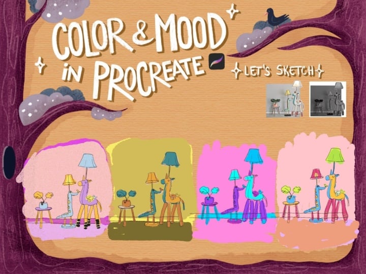
9. Color Thumbnails : In this video, we are going
to create color thumbnails. Why? Because working
with color can be scary. Mainly, if you have
a color palette that just doesn't feel
right for some reason. This is what is happening in
me right now that I don't feel a match between the sketch and the color
palette that I prepared. But with color thumbnailing, we can work on this. So what I want you
to do right now, I want you to get your sketch. I will duplicate it. Hold down. Go to Gallery, go back to this color thumbnail thing and just create a
little thumbnail. Okay. Let's create four of them. Okay? So I have one duplicate. To duplicate free. And to have more place
here for the fourth one, I will make them a bit smaller, duplicate one again,
and we are here. If you have already
a background color, so now we have this orange. I will affect the whole, you know, feeling of it. To be honest, I kind of would
love to change the feeling of this still life because it reminds me even the
calmness, so it is calm. Let's imagine this scene. When can it happen on a
desk or in your life? So I'm done listening to
music and probably drawing. Maybe I drank coffee and went out to the toilet or
to do something else, and there is peace.
So it is calm. But I have some feelings
coming a bit more, and that's feminine feelings, and that's mainly because of that praislide that I
have here, actually. So it is not a very
feminine color, you know? This is black and
the Chakra colors, but there is a little
bit of coolness. So there is a book, and there is some music. So I think I need to create
a new color palette, but I don't want to throw
away what I've done before, so let's just try out how this image would look
like with these colors. I will go here and create a layer below all
of the sketches. I will pick up the first color, my main color that I've chosen. And I can keep the
sketching pencil or I will choose
the texture shaper, and I will just draw
with my main color. And what I thought right at the beginning is that this is
going to be my main color, so I will just maybe
put it on the g. Okay. And maybe this
pencil will be this blue. And all these
little things here, maybe one pearl is
going to be blue. And then I will choose
this light Big, it doesn't even look that
bad. I need to admit Okay. It is interesting. I start to like it. I will choose dark
bluish colors, so darker than this blue, for this or this
is even, you know, gray for the headphone. This becomes my other accent
color here. This gray. There are these little pearls. They're also kind of black, and I can choose
different colors for the, you know, these things. You'll add maybe yellow here. And this is the other accent color? Maybe the background
can be this color. Okay, so this is
not looking bad. I will keep this here. But let's just go for a little
bit more feminine feeling. So if I imagine this
thing, I don't know. I just feel purple. So, you know, you can be
intentional with your feelings, but you don't
necessarily need to abandon your own state, okay? So colors always communicate, and I'm not feeling
like this right now, so let's create a kind of
feminine and playful version. Actually, I'm pretty
influenced by this little artwork
here as well. So I already shown you this color palette that
is here, this one. There are kind of muted colors, but I will try to use
this color palette. And this is in my comfort zone, so I need to tell that I'm guided inwardly to
my comfort zone again. So let me just do it. This color thumbnail.
Oh, my God, I painted onto this worksheet, but whatever, I will
create another layer here. And I will just try to
create a version that just within my comfort zone
and let's progress from there so that I feel like, more aligned with what I'm creating because that's
pretty important. So I'm not sure why I'm doing this purple on the on the mug. But I actually love this gray. So I will keep this
gray here for this one. Maybe it can be a
darker purple, too. We'll see that.
Maybe this purple for the whole desk. Mbe the purple for the
pencil. It can be lighter. Okay? Maybe the background can be bold and pink
as it is feminine. Maybe I need to choose
an accent color, maybe an orange one. H. I don't know. I don't like how dark this is. And let's just create
a value check layer again to see how
these colors work. Okay. So let me clarify. This value thing looks better. Can you see how more, you know, guided the viewer is
with this white or very light as if rod to this mug. And these are just,
you know, side pieces, and this is in the front. This is very much flowing
and merging into each other. And as you can see, I did
this pretty intuitively, based on what I feel, and it is just not working, even though it is, like,
you know, feminine. So this is the difference. This works better, but
I don't like the hues. So maybe I can work with
that. So value first. This is pretty good with values. Lighter things are
here in the focus, the backgrounds not taking
away the attention. Works pretty nicely. Okay, and now let me show you
something pretty powerful. So if we are talking
about values, right? I already told you
that I really love that this is bright,
this is bright. The background is
also different, and these objects are really
dark next to each other. So let's just create a value
map, if I may say that. So I will create
another layer here. So we are going to work
only in gray scale. So from light to dark, And I will choose a kind of middle as gray
here for the mug. I will show you in a second what we are going to do with it. It will be mind blowing. And I love this method
when I don't really know how to work with the colors
or what colors to choose. And then I will choose an even lighter color
for the background. Okay. And I will choose a
bit darker one to the front. And an even darker gray to these side
objects, even darker. And a bit lighter gray
for this one here. Okay, so I have kind of a
gradient I mean a value map, and I foreshadow what
we are going to use. We are going to
use gradient map. So if you have this layer selected where you
are, you know, just put the colors on, go to adjustments and
go to gradient map, and it will immediately
color it for you. You can choose from several preset color
moods, et cetera. But let's just
create another one. Just for ourselves. Gradient Map is a color adjustment that replaces the colors
in your artwork based on their
brightness values, and not their original hue. It's one of the most
powerful tools for recoloring illustrations
while keeping on the values in the artwork. The core idea is that reads your artwork in gray
scale the dark areas, the light areas,
and the mid tones, and it recolors
these ones, okay? So we have one, two, three, four, five values. If I click here, it opens up a color
wheel for me. So if I choose a color, oh, let me just place this around. Okay. Let's keep it like
that. I will put it here. So, if I choose a color, it will immediately apply that
color to the whole image. This becomes monochrome, okay? So as this is white, okay, let me just show
you in a second. So I will add maybe this
color here to the darks. So now I try to define
the darks of mine. I can go even darker or grayer
and I can add color to it. So I said I wanted something
feminine, a bit of purple. Let me see how it works. Now I can set the highlights. So every light in this artwork, I can make it dark. Can you see that? This
is the value range. So if my outwork goes from
dark to light or dark to dark, there is no contrast. If I go lighter, this
is my value range. This is how
contrastive my images. If I go to fully white, it is in full contrast. So this is really good
to help me control how contrastive my
image is going to be. So if I want to
you know, oh, God. If I want to keep my artwork less contrastive to play with the
mood, I can do that. Okay? I can do that. So but I want I want contrast. So, as it is daytime
in my scene, if I may say that, Kind of this. So this that's my value range. Now I can tap to the middle and create another circle and choose
a different color. So I can choose this range or this intensity of color
and change that hue. Can make it kind of orangy. So you can go and play
around with these. You can add up to, I don't know how many of them, but you can really
recolor everything and make these colors, you know, separately,
all the way different. So it goes to this really
yellowish, and down here, I can add another one and
add a different hue to it. I can make it lavender. I love that lavender. So I want you to spend
a little time on this. And we are going to
use this tool later. Now our point is to choose a color palette
that works for us, be intentional with the value, with the color hierarchy, and set the mood of
our illustration. Also think about the
contrast and and saturation of the
colors and keep in mind always the emotion
that you want to recreate. And now I'm going for something calm,
feminine and nostalgic. So that's how I feel now. I really love these
nostalgic colors. I'm going to play with it a bit. I click here. And I have my own gradient
that I can apply to anytime. So you can create your
very own gradient library, which is really, really fun. And I can, like, you know, click it and move around in
this little gradient library. And let me them a color palette. So I went from something
pretty emotionally neutral for me to something
feminine that didn't work, and I arrived somewhere here. I love how these
colors look like. So what I'm going to do now is that I'm going to pick up the colors from
here that I've found. Oh, let me just
check it in values. And yeah, maybe this
should be a bit lighter and there should be
a bit more contrast here. But yeah, let's not
be that technical. We'll see in a second. So I love this orange. I love this pink. I love this dark purple. And this is analogous color
harmony, if you can say that. But I also love this light Big and maybe this lavender, I will maybe remove this
lavender and put this here. So let's take a look
at this color palette. So this orange is going
to be my main color. The supportive colors are
going to be these two, and these two are
going to be accents. So I will implement
this slide B somehow, maybe change a little
bit of the value. So this last thing is going
to be me trying out myself, these colors and then
checking the values again. Let me try. This first one. Let's apply my
gradient map on it. So, gradient map.
And my gradient. Okay. I think I solved it. Yeah. So, this gradient
map thing is cool. This is how I'm going to
approach this illustration. I'm going to have a
darker background, an char kind of yellowish
mag this object, and this is going to be white, and there will be like
some cool shallows on it. So, yeah, I think that's how we should
go and approach it. Okay. So what I'm going to do is I actually
illustrated it here. So I'm going to select
this little dumb nail, free finger swipe
and cut and paste, and I will also merge it with its sketch so that
they fit, merge down. I will duplicate it and select and the illustration thing and just put it here
as a reference. Alright, so let's just
move on to the next video. And yeah, start illustrating.
10. Blocking In Colors: All right, so let's just
get into illustration. Now, what I want to
say is that you are totally free to illustrate your way that you are
used to, you know, you need to make the decisions, how you are going
to approach it, if you are going to, you know, go with a very rendered style
or a very simple style, or you are going to uh, you know, follow
me step by step, and we also going to use this
color thumbnails our base, but you are going to be able
to change colors on the way, you know, based
on your intuition and feelings, and your judgment, basically, you are totally free to go for your way
of doing this. Now, what I usually do is that I lower the opacity of
this catch and then create a layer
below it and build up every single element on
their own on a separate layer. Now, not everybody does this. Some people are working
on the same layer or, you know, working with
layers differently. In this video, I'm just
going to block in colors. Block in the color of each
element on their own. I will have a separate
layer for the mug, separate layer for
the sharpener, the book, the pencil, the bracelet, and
the headphones. Now I don't really want
to make this video long because this is going
to be what I'm going to do, really, creating a new layer and filling it everything with
the clean shape or brush. That I have here and that you have in the brusse that
you get with the glass. But you are totally free
to use whatever brushes. It has to be a solid
brush if you are going to illustrate
with me so that it has, you know, clean edges
and things like that. So now I'm going to
speed things up. You can see how I'm
building up the elements. Now I'm paying attention
and spending time in getting the shapes clean and I'm going to
follow these colors. I might add some new
ones on the way, but it doesn't really matter. By the end of this little video, you will have each element on a separate layer and
you need to get there. I recommend you to just
watch this video and then, spend some time doing the same, and then we're going
to see each other in the next stage that is going to be more detailed
commented on. So let's just get started.
11. Linework : Alright, so let's move on to rendering the image after we
have every color blogged in. However, I decided that I'm not going to render this illustration
the way I used to do. So I'm not going to do
a detailed shading, but I pretty much want to go for the style that I've shown
you in the inspiration part, you know, where there
are these outlines and very simple basic shadows. I don't want to overdo it and kind of challenge myself
with a different style. So let's just get into it. So what I'm going to do is to
create a top layer and I'm going to outline everything and do linework and some details. And then below that, I will
just throw basic shadows. We will get into
it, but right now, we'll just choose black. And let's find a brush
that is kind of inky. Use this dry ink on the
gel pen and technical pen. Let me just try out
how that works. So I will go with
a technical pen. Oops, that's too thick. I want thinner.
That's too thick. Okay. Let me try another one. I will try the fine
tip. That's too fine. Oh, The gel pen.
Okay. No. Ink bleed. No. Let's stay with
the technical pen. I don't really want to
have it fully black. So what I'm going
to do is to choose a darker purple and
select the layer, hit select, I said hit
select and fill layer. So now the outline is kind
of this darker purple. Maybe I can go even
darker and basically select this layer
of the outlines. Choose a brush. I will
choose the clean shaper. I will make it bigger.
And for example, at this bracelet, I will
just make it darker. Also even on the earphones. So it can be a bit darker. Okay, so there is a
bit of a variation. So here is a darker outline.
Here's a lighter one. Yeah, let's see what
the shadows will do. Okay.
12. Shading: H. So for shading, I'm going to use the drop shadow brush that
you can find in my brush set. It is a transparent brush. I will show you it does shadows like this.
Can you see that? So I can shade with it pretty
well and pretty smoothly. And I don't need to
play around with choosing colors for
shading because we can play with that and give more color variation
into the artwork. But let's just stay simple. And I will basically
offload my objects. And go through them. So I will start with the mug. I think that the light is
coming from this side, okay? So let's set light direction. And as you can see, this brush
is pretty nicely blending. You can create sharp
shadows with it. You can layer these shadows. And you can also go
into adjustments, Ghenbler and create a
really nice render, you know, more realistic one. But right now I want
to stay bit simpler. And it is pretty hard for me, to be honest because I'm so much used to these smooth gradations and notice that my shadow
is this purple still, okay? So I will just create
one sharp shadow. Like here. With two layers. Cool. I will add a smaller
shadow below this earth. There will be a bit
of a shadow here. Like this, maybe. I will add. Yeah, not that easy,
not that easy. So let's start again.
So I added two here. I will add one line lighter one here to keep the
shape of the mug, I will add a layer here. This is completely new for me. I'll add a line here. Okay. I will add the line
into the middle of this ear. I think I need to
add stabilization, so I will go to
stabilization and add 30% of stream line because it is picking up too much
of my hand movement. Yeah, the Spielberg batter. Even if I hold down, I can
use a quick shape function. Let me see if the light
is coming from here, this will be fulling in This lower part is
going to be in the shadow. Just add another shadow here. Looks cool. And this up here
will be even more in shadow, so I will add a
second layer to it. Cool. I will go
to the sharpener. I will add the shadow here. I will darken this
whole thing here. Yep. And I think I will just
make darker this part. So maybe I can just, you know, use the Lasso tool. I will just select this part of the sharpener, choose the brush, and I will just go through
it and make it even darker so that this side is, you know, in shadow. Cool. It looks cool. Okay. Now, let's add
a bit of a shadow to this part of the front. No. Just a very light one here and into the middle parts
into the middle part here. You can even play
around with just simply coloring in shadows, you know, with simple brush, but I just really want to
try out this technique. Okay, so let's go
to the book part. I think it will be
completely dark down here. And what I love about
this brush is that it immediately just darkens
the color, you know? You don't need to pick colors. And I will just
darken this part. And as you can
see, I immediately darkened this part below. Can you see that? That's cool. And I can add a bit of a
shadow into the front, right, like this
because probably the light will hit the
book from behind as well. Let's go to the pencil, and the pencil will have
shadow like this here, and maybe another layer below. And don't worry about
the drop shadows now. I will take care of
that a bit later. And we have these things here. So I will probably make
the brush a bit smaller and add these darker parts
here that should be in, you know, the shadow. Probably here and here. Cool. And let's go to the bracelet. So what I'm going to do, I'm at the layer of the bracelet, okay? So I will shade it in this round shape because
it is a round object, so the light is going
to behave like this. Okay. Very simple shading. It is totally out
of my comfort zone, and it will probably
not be perfect, but I love a bit of a challenge. And as you can see, this shadow works perfectly with
different colors. So I really don't need to worry about color
picking right now, and it will just, you
know, make it easier. I will add a bit
of a shadow here. Maybe also here. Okay. I think it looks good. It's getting volume. I love it. Let's go for the earphone. And yeah, I will just
draw this shadow here. Here as well. Here as well. Below this thing. And I will add the
shadow here, too. And yeah, it looks cool. And Okay. I will need to make this
brush a bit bigger and add Shadow like this. Cool. I will also draw on top. With the sketch, I need to put the sketch to high opacity so that I can add
this writing there. And I don't know. It is actually white, but I don't know if I
want to go fully white. I've chosen this kind of grayish color,
the technical pen. I will just transfer Cool. It is not that harsh. I will lower the opacity
of the sketch again. I meant the sketch. Okay. Okay. Looks pretty cool. I
want to add a bit of a shadow to the background. So I will go to this pink, go back to my purple color, and the drop shadow brush. I will make it big, and I
will kind of add a gradient. To it. And I will guh and blur that one so that there are no
very much layers. But it's a clean gradient. Cool. And onto the desk, now we are going to go
for the drop shadows. So I will go to this
background color. I will create another layer, choose this shading color again and the drop shadow brush. And now I can turn
on the sketch a bit more so that I can
see the shadows. Okay. Yeah. Looks cool. There will be another shadow
below the headphones. Okay. Another one below the mug, actually behind the
mug, like this. And I have an extra shadow
here that I'm going to erase. Okay, I have small
shadows here for these. Thanks. Shadow here. Shadow here. Oh, wow.
It looks so good. For the pencil. And I will add a little bit of
layered shadow below this. Uh, bracelet. Like this. Oh, looks so cool. What I forget is this
faber costal thing that I can do with this color that
I did the Marshall thing. So I can go back to that layer. And with the technical pen, I will just write it here. No, I can't. I need to
add the new layer above. It's too thick, so I
will make it thinner. Oops, it doesn't look good Cool. And now let's add light. So basically, I can add this very light
yellow Biji yellow. With that drop shadow
brush as the light. So I'm going to
create another layer and basically do the same
as with the shadows. But now I'm going to add light. Like this. Okay. As you can see it again, works with the colors
that are below them. So just like that, I will
make it a bit bigger. And hoops. At this light. You can work on the layer
of the object again. Now I just want it to Stay. Okay. Here are two dots. Cool. Oops. I let the beautiful light
here to this edge. Maybe to this edge like this and maybe a bit of
light onto the pencil. Like this. Maybe to the end of this book. Here. I will turn off the sketch. And with the outlines, I
think it looks super cool. Wow. I love it. I love
how it turned out. I will turn off this
little color thumbnail, and I think it turned
out pretty well. This is my first time
doing this style, and I'm so happy that I
could share it with you. So what we are going
to do now is that we are going to basically work with the mood and play with the
lighting a little bit more. So let's do that in the next.
13. Playing WIth Moods: Oh All right, so
let's play with mood. So in your resources, you will find this
worksheet where you have three limited color
palettes prepared for you because what's
your class project, it is to create an illustration
in three different moods. You have your first one,
okay? That's your base. In this video, I'm
going to focus on showing you methods and ways how to recolor your illustration
so that you don't need to do it or re illustrate
it three times. So choose free moods. You have your first
one. Let me just add here what I've done. I had a feminine playful. And I will try to kind
of do the opposite, so do a cold, calm mood. And I'm going for a
little dramatic one. Dramatic nostalgic one. So you know that there is
a little bit of contrast between the three different
versions of my illustration. So I progressed a
lot intuitively, even though I had intentions
and preparation and these, you know, color thumbnails that are very much
helpful in this process. So you can you know, prepare these little color
palettes for yourself, or you can just trust yourself. And that's what I'm
going to do now. And yeah, let's
just get into it. So you can create these
color palettes for yourself. I'm not going to do right now, and I will just focus mostly
on the tricks and tips. Okay. So the first
thing I want you to do in your
artwork is to select every single layer and group. I think this is and group it. And I will duplicate this
group and flatten the top one. Now, why do I need
to flatten it? We are going to use the
gradient map again. We used it with the thumbnails and it would be really
interesting to see what a simple gradient
map can do to our illustration
and not just a row, color thumbnail, but how it
recolors a full illustration. For that, we need
a flattened image. Also, what we why we need these layers is for the next tip that I'm
going to show you. So it is always useful
to keep your layers. What else I'm going
to do is today I'm going to exit
to the gallery, select my artwork and duplicate it two times
so that I don't need to lose my original
one and to have a backup file if anything goes wrong because
it can always. I will keep my original one. I will go to the second
one and I have, you know, this flattened image already, so I can just go to
adjustments and gradient map. And it applies a gradient map to my artwork and I can just go through this and see if any is standing out
for me that I like. So you can just, you know, choose one, or, again, you can create a new one. Now, what I also wanted
to say about gradient map is that this is the value range, I think we already
talked about that. So when you are thinking
about the new mood, you can just decrease
the value range. Okay? When you have
two end points, this is, a black
and white image. You can change the
color of these notes, but you only have shadows
and highlights and to more dominantly change
the color of the image, you need to add the mid tone. When you select the
mid tone and apply, for example, a blue color, it will immediately create
a monochrome image for you. You can change, of course,
the darkness, the hue. I will make it more blue. And you can play with the contrast right now
within that hue, okay? So you can make
the whites whiter. You can make the
blacks more black. And yeah, so to make this short, I think I will just
keep it like this is very good to keep, you know, this
monochromatic feeling. It is cold, it is calm. It is, as if it was a
night scene, you know, the same scene and
the nighttime when everyone is asleep and the
lights are turned off, maybe here is a window and the little moonlight is
lighting up this little dusk. So I think it looks
pretty amazing. I'll make it a bit more blue. Okay. Cool. I will keep this and I will
go back to the gallery, and I will show you how you can recolor individual objects. Okay? In this third one, you can just turn off the flattened image
you don't need it, but you have your group
and you can go one by one and test out
different colors. I will go for the
background and go for the hue saturation brightness
and you can change the hue. You can change how intense that color is and how dark
or bright that color is. I will try to make
it a bit darker. I will change the background
a little bit to a different, more cold background. Now I will take a
look at the mug. I will choose again, the adjustment, hue
saturation brightness. I can change the color of it. I can make it colder, I can make it different. I want to keep it this orange, but maybe make it a bit lighter. Okay. I can work
on the foreground, so I will go again and just if you have
anything prepared, you know, a color
palette, you can use it. I will keep this part
a bit colder as well. I think I should
recolor the headphones. I will make it a bit darker. Maybe the book as
well and the pencil. Yeah, if you want, you can just select this part of this book pencil
layer and, you know, have them on a separate layer and recolor them separately. If you think it will help. I'll make it a bit
darker as well. I want to do that actually. I will select the pencil and just re finger
swipe and cut and paste and hue
saturation brightness and change the color
of this pencil. I think I will keep
it this bright pink, and I will go to the bracelet, and I will go for u
saturation brightness and make it also a
little bit cold. Now, this is a recoloring thing. And this is a good tip, but I'm not really going
for this vibe right now. But what I wanted to achieve is a little dramatic
nostalgic mood, as I already told you, and I want to show you
another tip that will help you to achieve
a dramatic mood like that, for example. I will create another layer, choose this orangey
color, let's see, and the drop shadow brush, make it bigger, and you
can just add light. And if you go to
the blending mode, you can change the
blending mode. You can have, for
example, screen. The screen blending mode is super cool for a
light like this. It brightens everything. It affects the colors behind it. It adds this little
dramatic effect, and we need to darken the sights as well to
have it like darker. I will create another layer, choose black and
add that shadow. Okay. And you can go
with that layer as well and see how the blending
modes react to it. I love the hard light one because it makes
this light cooler, you know, or this linear
light looks amazing as well. And as you can see, there are these layers that I
don't really like. So if you want to make
this light smoother, you can go to Goshenblur and just smoothen out
this shadow and you can do the same
with the light as well. So you select it, you go to Goshen blur and
just blur that light. Well you have a
dramatic little artwork where you did a little bit of recoloring of
individual objects. But yeah, you can spend some
time with playing with this, this dramatic light,
this recoloring, preparing this little
color palettes. The point is to have three little Otwexs
in different modes, and then you can put them together into a
worksheet or a separate, something where you can display
them next to each other. So what I'm going to do now is that I'm going
to save these and add them to that worksheet, so I share PND Okay. And you can even write on top of them what
moods did you want. So I will write playful feminine. Calm, cold, and
dramatic. Nostalgic. Okay. So you can aplod this to a project gallery
and I can't wait to see what you come up with. And yeah, let's just see you in the last video where
we can sum it all up.
14. Final Thoughts: Congratulations. You
finished the class. I'm so proud of you. And I'm sure that your
artwork looks incredible, and I can't wait to see
the emotional world and the moods that you depicted. So make sure to upload your project to the
project gallery. Let's just do a little recap on what you have
learned in this class. In this class, you have
learned how to use color intentionally to create specific moods and
emotional impact. You learned a lot about
your own relationship to color your own limits
and possibilities. You have learned how to transform the same
composition into different emotional
experiences simply by changing color decisions. I hope that you enjoy the class. Don't forget to
leave me a review. It is really good to hear about your thoughts
and experiences. And it is really important
for others too so that they know what to expect and decide if the class
is a great fit for them. If you want to stay up to date, follow me on Instagram
and Facebook. And here on Skillshare so that you know about the latest
challenges and classes. And yeah, sometimes my class recommendations
and weird thoughts. It was a pleasure
to have you here. I hope to see you in
my other classes, too. I wish you all the best
and happy creating.
 The Artmother, Professional Art Teacher and Artist