Transcripts
1. Introduction: Welcome to my class on Clip studio pain, learning the basics. Clip pseudo paint is an amazing software that lets you design illustrations in comics, all with the built-in tools. This class will show some of the basics that everyone should know while using the software. Understanding the tools and what options can be applied to these tools are important to getting the most out of your art journey. Some features shown could completely change the field to your overall artwork. I will show you how to change the settings in a brush to look completely different, as well as changing the entire interface so you feel more at home with it. I will show you how important it is to use Eclipse Studio cloud service for sharing our work between your own devices or with a group of friends or colleagues on a collaboration piece or project. It also allows you to share the settings of your brushes and Workspace Layout so everyone your devices will look and feel the same. Lastly, I'll show you how extremely valuable clip studio assets is. This is an optional download for your computer, but it's far worth it for the features that you get within assets, you'll be able to download thousands of brushes, pencils, materials, textures, and even 3D models to reference and use within your artworks. Some are official materials, some of them uploaded by users. And you can contribute to this asset community, to, this is a lot to cover, but stick around for the next four videos and the future auxiliary videos I'll be doing to get the most out of this powerful program.
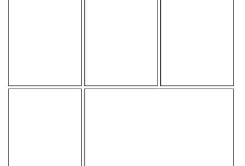
2. Class Project: This class has a lot of information for getting setup, but most of it doesn't show what you've actually learned. And it is important to know that progress has been made in your art journey. So there are a couple of projects that I would like you to post for your class project. The first being that you are able to set up a comic page as shown in understanding and customizing tools part two video. At the end of the video, I show how to set up a few sheets of a comic and then layout panels in place, monochromatic patterns. This is the first sheet that I would like to see in your class project. Second, I would like to see custom interfaces that everyone has set up to improve their work process. And this is shown in the setting up your studio video. And all I'm looking for are screenshots of your interface. Let me know if you have any questions on these two projects for this class. And I hope you enjoy the class that I've set up for you.
3. Understanding & Customizing Tools Part 1: In this first video, I want to show you some of the basic operations that are available. I like to use this program because it feels like I'm at my desk on a piece of paper with tools that I actually, ONE nice thing about the program is I can completely customize the tool's so they're not even recognizable from the originals. Simple things like the starting brush stroke could be tapered or super blunt, or applying a texture to the overall tool. Almost all settings can be changed and let's quickly jump into that so you can see what I'm talking about. So let's select the tool that you wanna change. I'm going to change the G Penn. After selecting the GPA. I wanna go up to the window and sub tool detail. And that'll pull up this palette here. Everything in here can be customized. Yeah, the brush size, which you can typically find when you're under the tool property, I highly recommend having this palette up. And then you can go further into the EEG. You can get the opacities in here, which can be set as a default. And then you can customize in your tool property without a half-an-hour. Pull up this window. Further down, you can go through all of these settings. You can change the brush shape. So you have all these stock brush shapes that you can select from. You can change the brush tip like I was talking about earlier. The hardness, the thickness, the angle of the brush, and the brush density. And we'll get into this further, but you can see how customizable a tool can be. Now that I've shown you a quick idea of what we're going to go into. Let's keep talking about these tools. So you can modify and create any tool you need, any kind of art style that can be used in program from like intense contrast of the India ink to the heavy oil paints and even light airy watercolors. There's already tools built in even chiseled edges of the cell shading and the animate Universe with vector tools and those are built-in as well. So I want to get deeper into what I just showed you and show you more of what you can do with different pins. So I've got this painting that I have here. This is a painting that I did and I started learning all of the ways that you can customize the brushes. So what I've done is I made a new layer and just put some black here so you can kinda see what's going on. And we're gonna try to somewhat mimic what's going on here. I don't want to show you completely how to draw clouds. I just want to show you how to change and edit your tool so you can draw and paint clouds. So I really like to come over to my brushes and go to watercolour. This should be built in and then the transparent watercolor. So again, that's brushes. And then the sub tool window. It's watercolor, transparent watercolor. And if you don't see this, you may have to come up to a window and open up your sub tool and then your tool property, and then your brush side if you need. So those are the three I like to have opened when I'm working with any of my brushes. So a quick, easy way to change some preferences in a brush is to come over to here. And like this one has checked checks. Sometimes it has a box or like an arrow. Depending on what you have selected. So you can do like your pin pressure, your tilt and everything like that. And I do recommend changing these and setting these so it feels more natural to you. Sometimes, for instance, when I'm in my mechanical pencil or my darker pencil, I'll come in and actually changed a seller's no pin pressure when I'm using it. And I can completely change the way a brush looks just with one check mark. I don't go back to what that was because I jump back and forth. But so I'm gonna go to brush and transparent watercolor. And then down here in tool property, you have this wrench and this is the same as coming up to the window. And sub tool detail that I showed you earlier. So you can either open it through the menu or you can use this little wrench to open as well. So again, we have the brush size like I just showed you. We have the ink. If you wanted to change the opacity and the color mixing and everything. And then further down you can go into your brush shape and brush tip. I'm going to be particularly working in the brush tip. And what you can do is you can add in different materials and such. So I'm going to cover the material. I'm going to click here to add a shape. And then you get this new window that pops up. This new window is the powerhouse, being able to paint clouds and other painterly style pieces. So once we're in here, we wanna come down to the user tag of painting material. And what I really like to use with clouds as blur and b. And so I'm going to click that. Say OK. And now I have that loaded into my transparent water brush. So I can change this or close this, go to just bigger tool. And you can see this is just barely coming in. And you really have to hold down on this. So you can do really, really soft or E can really start given at some pressure and work your way up. And that's a quick way to get those clouds. Now if I come over here and this black area and start painting in, I'm gonna get a darker mix. Where if I come into the lighter area, you're gonna get this lighter color here. And even then we're starting to get some basic forms going on here. I'm gonna go even smaller. Try to put some smaller highlights on here. And then I can bulk this backup. For instance, I want to give more of an area here. Okay? So that's the basic way to start getting more texture in there. And another thing you can do is add a different texture as you're working. Let's say I got a big base of for my clouds are going to be plus just say this is my big bass. And I can come back into my wrench tool. You have to select this down arrow. And I'm come back to painting material. And I can choose a different material or work with. I like to start using this Petite fog. Once I have my base down, click OK, and I come back in here, maybe I want to come in with a darker color and work this area back here and start getting some more texture and see how much more texture brings into that. Now don't even have to go download a new brush. If you hold down Alt or Option on the Mac and click, you can select that colour and start working that into your clouds again. And just work in small circles when you're working in clouds. We select this color again. I come back in here, just keeps, keep doing that swirl to it. Now that I have some of those and select a lighter color. Maybe even lighter than that, maybe even smaller than that thing, and see the texture that we're really building up here. Now let's add even more texture. Let's go back to our ranch. In, in our brush tip, we're gonna drop this down again and painting material. And found this really good texture to use for clouds. Oddly enough, SoundCloud for and see the other clades are kind of specialty, but this has got us a nice texture that we can really work with and it still keeps it more random than these other ones. So let's apply that. Close that. I'm going to slide this wheel here and then go to a smaller brush and start working in some of these. So that's not giving nearly enough what we need to get those highlights on there. So I'm gonna do some more Brush modification in that can be done all in the tool property. I'm going to choose colors, stretch and drop this down to maybe like 40. I'm gonna take density of paint up to 70. And the amount of pain, let's push that up to 85. And we'll leave opacity. That'll pray, give us more of what we need c now we're really starting to get vote, that kinda texture we would need in here. In fact, I'm going to undo that. I'm going to sample this color that we currently have there. And then just bring up. Then you can really start work in some of these highlights that are coming in here. In fact, you can go as high as like an eight to start work in these textures, in the highlights. Remember to keep those circles ci didn't circle earlier in there and you're starting to get more of that streaking going on. We don't want that, so we're going to try to work those out by doing circles. The way to do some highlights. Again, this isn't a cloud tutorial, but the way to do highlights, I recommend doing your highlight and then pushing. Your actual cloud. And then pushing your actual cloud color back into those highlights. And then you can push those highlights where you want and still have some decent looking clouds without trying to force highlights in there. Rather, you've got a cloud that's allowing highlights to be cast upon it. Now let's talk about node. Node is a nice way to get even more ability to control what's going on in your painting. The transparent watercolor does not have this mode. If I go to wrench ink, I can have a blending mode. I don't think know. The transparent water brush doesn't allow this, but that's okay because now that we have a good amount of texture in here, it's actually go over to airbrushed. Once in there, let's decide on what airbrushed we want to use. I don't necessarily want hard, so I'm gonna do soft. And then I can choose the wrench to go to eat in my blending mode. And I can choose my blending mode, whatever I prefer to be doing with my cloud at that time. In this case, I'm gonna go with overlay. Depending on your canvas size and that kinda clouds you want. You can use your tool property window to be able to change how your brushes acting. For instance, I want my brush density to be more like 80. I want a little bit more punches. I'm using my brush. I'm gonna stabilize it just a little bit more. And now I can get into my brushing. Nine, come in here with maybe a seven and start putting in more form and depths here. Say I'm really starting to push some of these clouds back. This one seems farther in the background. And then I'll come back to my watercolor. Sample, this lighter color here. And then come in and do my highlights again in circles trying to get some variety to what's going on. So a lot of people will be using a tablet for this. I found that if you actually grab your mouse and try to do this, most people's Now skills are pretty terrible. You can get a little bit more variety rather than trying to do it with your pencil. So I'll select this color and start pushing back my highlights. And they're starting to look more and more like clouds. The more you work it. Thing about doing clouds is you really need to keep pushing what you're doing with clouds. If you think you've gone far enough, usually go in just a little bit further is better. I'm going to grab a bigger rush for this. Try to push these back just a little bit more. And then you continue on with that. Keep work in a tweed molding it. Don't try to overthink it. Petite molding it with randomness rather than trying to keep everything even. Now let's jump back into. Our transparent watercolor. And we'll choose that lighter color again. And we can come back in here and do more of a bleaching effect rather than just like circles. So I'll go even brighter is try to get almost some white going on there. And you can see that this is making it more of a toughy tufts of cloud rather than just these flowing clouds here you can see that this is more of a tough of cloud going on than anything else. So that's a way to use textures for clouds. Let's talk a little bit more about how I did this grass. Now typically I would like to paint grass all by hand, but sometimes you just don't have time for that or sometimes you just want to get a piece done. So let's talk a little bit more about them. I'm going to turn off this layer here. I'm gonna make a new layer. And i'm just going to paint over what we already have. So I'm going to zoom in and see most of this grass was made by hand. But I wanted to show you a little bit of a shortcut that you can do with brushes. Still working with the watercolor, transparent watercolor brush. As you can see, I'm almost using the same tools for everything. I can use. The same tool for clouds, grass, ground. In fact, this piece that I worked on here, I think I averaged only about five different brushes with applying different textures. So I'm gonna show you that now. So in transparent watercolor will open up wrench again. Go over to brush tip up the down arrow. And we can come over to landscape. Now, it might be cheesy to use some of these. In fact, I've added quite a few because I was painting some different stuff. But you can start with something like grass b, which does quite frankly look weird. But let's go ahead and put that in here and choose a brush size that we want. Let's just click just to see how big it is, so that's big enough. In fact, we could be smaller than that. It will drop down to a six. In fact, I want more opacity. So you can see, you can actually paint with this Windows still up and be able to edit. So I'm going to opacity, put it all the way to 100 and we know the density. I'm going to slide that amount up to a 100. So I'm just going to max this out just for this case so that I can get a nice solid profile. So I can get the black going on in the background. Now I can close this. I'll grab my eraser, grab a big enough brush to erase down below this little grayed here. So now I can lock my opacity. I could even grab white. Come back to my light pencil and I can't brush outside of that grass that I put down. So now I can select my highlighted grass and come in here and put highlights down. I think I'll go closer to y. And I can put in some of these tips that are in here. So you can see, you can use different materials without degrading your overall picture. Which looks funky when I'm close. But when you zoom out, its not like you're thinking about that grass there when you're looking at this overall picture. And yet you still get the texture that you need without spending a whole lot of time over thinking how blades of grass work. So that's how you use different brushes. I, any brush Yuan, apply textures and get the effect that you really want to get out of the piece that you're working on.
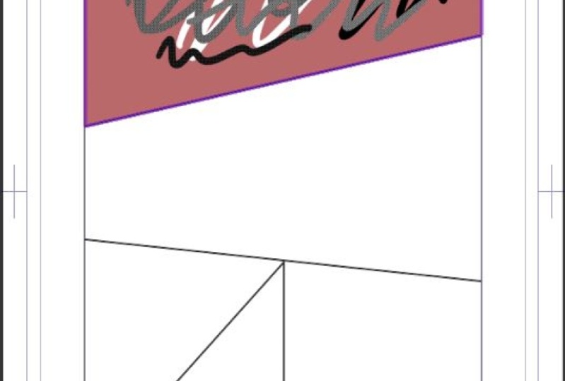
4. Understanding & Customizing Tools Part 2: So as you can see, I was heavily modifying the brushes in this painting overall with a little bit of editing we did, we got the effects that we got very quickly. But you can tell that I heavily modified constantly while I was working with the clouds, the cliff side in the grass, and all that was handled under texture settings without ever having to leave the program and going and looking for more content to be able to use or brushes to be able to get something done. You can always save that brush over the top of the one existing. Or you can also make a brand new brush to use later. And then if you do save over occurring brush, you can always reset that brush to factory settings. Restoring and brushes super easy. So let's go back to our transparent watercolor. And if I click, we're going to have grass. Obviously that's not what we want if we're gonna go back and use our transparent watercolor, all you have to do is come down to this little dial and click that. You want to restore the selected sub tool to its default settings. Okay? And then we can see that it's back to what it normally is. So if you ever say whether the top, it's OK. You can just reset it. And then if you make heavy modifications, like in our subtitle detail, save all settings as default. Or you can save the brush has its own new brush. The best way to do it is to actually close this out, as currently has all the settings that we had done with the grass. And then create a copy of this. So water color. In this case we did grass, watercolor, grass. We can even leave it in the watercolor, or we can actually put it under a different thing. So for instance, I would typically stick this under vegetation as a new brush. And you'd click OK and a duplicates that brush. And then we can go back to our transparent watercolor and reset that to default settings. So that's the best way to do it. If you ever do any modifications, you want to keep that duplicated, rename it, place it wherever you want, and then come back and reset the original tool to where it's supposed to be. And you can always delete this later if you're never gonna use it again by selecting it and pressing delete. And yes, I do want to proceed. In my last class, I showed how to make this RPs here. You can see how clean and clear the light artists. I accomplish this by using the vector layer instead of the raster layer. Typically when you make a new layer, you'll come over to your layers palette and click this button for new layer. And you can see it says new raster layer. Next to it you can see new vector layer. And that's what I use to get this clean and clear. Art. Basically rest or runs off of pixels. And vector runs off a mathematical calculation. That's not pixels. It's actually an element that's a vector. You can study that more if you want to. But basically, it's, it's clean. It's clear. If I were to zoom in on this art. They may show as pixels. But when they actually print there who very clean lines. So what I do is I click a new layer. And you can see a little boxes here. This is a raster layer and this is a vector layer. And you can tell because it looks like a box. Now any tool that I use over here is actually going to react and act like a vector tool. So in the G pin, let's choose something that's closer to what these line arts are. For instance, maybe five. And I were to draw that. I can actually select this because it's an element rather than pixels. So I can come up to my operation, select the object. And you can see it's an actual object with points that I can move. The nice thing about vectors, you can correct your vector objects. You can come down to correct line. And over in your sub-2 all you'll have correct line. And I can simplify a line. What this does is, if I were to select this again, you can see all of these points. If I simplify it a lot, this is how much you simplify it very little to most. And I highlight this line, it'll simplify that line. And then if I select it again, there's only two points. Now typically you wouldn't wanna do that. You'd still want a little bit of that curve that's there. So you can do less simplifying. Highlight that again. And you can see it still has the basic shape, but it's not nearly as wildly as mine. You can see there's fewer points. You can even get more technical with it and decide what points you don't want. You can do a control point. You can select it and you can move control points, add control points, and delete control points. You can come in here and say, I don't want this one. I don't want this one. I just want these few. And maybe you want to even maybe you don't want to middle and not 123 middle, so you can delete that one and it's far more even. So you can move these end. Even adam, Say you wanted one on each side of this. And then you can move those points. And once again, you can see how clear these are because they're vector. So all of these lines in here, actually vector lines. And then I did the painting process over the top of it. Doesn't stop there with vector though. Typically when I'm doing a piece, I'm very messy. So let's say for instance, I were drawing this part of the line here for the arm. I come into my pin and draw the line down. And then come in here for the arm here and bad representation, but you get the idea. Now, you can be your whole piece very sloppily with these lines and fix it later by coming back to our correct line. And there's multiple things we can do here. First, let's simplify them because they're shaky in terrible. We can highlight all of this and correct those so they're less shaky and we'll do it one more time here. Now that's far more smooth. But then in our Eraser tool, we can click this vector eraser and then we're going to select this erase up to intersection. And then you can just click any part of that line and it'll auto trim it without you having to manually trimmed down and not lose your line thickness. So once again, I could do a hashtag or pound symbol. I can come back to eraser with my vector in my trim on. And that stays that way until you change it. And I can just click or drag to correct all these lines. And then if it's not clean enough for you, you can always come back to the control points and move these control points along. For this case, I'll simplify this. And then I can actually move all of these control points around your first ones, typically your paper. So if you move your tape or your taper gets long, but if you move the next point, that changes for that taper technically ends. So in this case there's only four. So this is the thickest it can be, and this is the thinnest it can be because the first always controls the taper. If you have a taper in your brush, in the case of the G pin, I have a paper. If I were to come over to marker, I wouldn't really have a taper. See how the end doesn't taper, because the pin, our marker itself does not have a taper. It just controls the endpoint. So keep that in mind when you're using different pins and how you're modifying those pins. Now again, the marketer can be modified. So if you like the marker and you want to edit it, you can come into your tool being come in your brush tip. And you can change the thickness, the angle, and everything that you want in that brush to get it to act the way you want. Here's probably the most powerful thing that I see with using a vector tool. For instance, I usually do lines and I just get distracted and just kinda start cruising along and don't pay attention to the overall feel that the lines are giving my artwork. And come down here and unlock my ON liner. I click in this light lock button. And then I'm gonna go back to our correct line. And I'm going to correct the, the line width. Sometimes I'll start a piece and think it needs to be this thick. And then I get out and realize that the lines are far too bulky and it distracts from my overall feeling of the peace or maybe that are too thin and I want to pick him up just to give a little bit more bulkiness to it. Well, this tool lets me do it without having to redraw everything. Let's say I wanna thick in this up to a one. And then I can choose my highlighting tool and highlight all of my lines. And it will recollect that and you can see how thick all of my lines became. Let's say, I still want to go up more. Maybe let's do, in this case 1.5. And I really want to get the thickness going. There has how thick you can make it. Of course you can make it thicker than that. Or for instance, this is what the line art originally looked like. And I like how thin it is and the hair. But I really want some bulkier lines in the suit area. So we can come back to, let's just say one here. And I could get a smaller brush. But for demonstration purposes, I wanted to highlight only the suit line work. And thinking up the suit line work. And then you can see that it's a boulder feeling material. But your hair still has that light flowing this going on. So you can decide where you want thicker lines for the material feeling and where you want thinner lines for more of an eerie feeling. So that's one of the most powerful things that you can get from using a vector. Let's talk about some cool tools you can use if you're wanting to create some comics. I'm sure you saw some of the developers advertisements that you can do, automatic tones effect lines in frame borders. So let's see how easy it is to use some of these tools. First thing we need to do, create a new file. And you'll want to select your comic template. And for now I'm not going to change any of this as this usually pertains to what publisher you're going to use. I'm just gonna leave this as is for this demonstration. Click OK. And this is the layout you get. Right now my setting is setup for a Japanese style layout. So our pages go from right to left. You can always change that in your settings when you're making your template. But for now let's click on number one. So we'll double-click and then they'll pop up this border here. Now that are pages up, let's create our first border. So we want to come down here to our borders or frame border button. But in our sub tool, we wanna click Create frame. And we're gonna make a rectangle FT. You've decided what you want to create, whether it's a rectangle or any kind of other options you have here. You want to select how thick you want your border. I like to go with about a seven. Sometimes I'll bump it up to a one, but typically I'll leave it at a 0.7. So I'm gonna select there. And I'm going to drag down to this corner, which it will snap and might go. Now you can see we have a white canvas here and the rest is purple doubt showing that we're only working within this frame right here. Also in the layers folder, you'll see frame one. And this is made of frame border file. And if I drop that down, you're gonna see the background has white and a layer that I can start drying on right away. And you can always add more layers, but it gives you one default because they know you want to put something in there. So we're gonna collapse this. And now let's make another frame within this page. To make another frame, we want to still be in our frame border in an R sub tool. Use the cut frame and then divide frame folder. Start by visualizing where you want your first window to be. And then hold off of the canvas. And then while holding, drag your mouse across the canvas and you'll have border show up. So I'm clicking off of my border and I'm going to start dragging across. And you can see that it's pivoting from this point that I originally clicked on. If you want the straight just hold down shift and it'll snap. Or you can go out and exact 45-degree. So it's at an ortho and a polar snapping. So in this case I'm going to let this be diagonal and I'll release now I'm on this frame. And then if I select my other border folder, it will go to this frame. Okay? Now let's keep doing this. And I create another one. This one will be at an angle. Created another one in this time will snap. It's straight down and with our shift key, I'll make one more here. Now one thing it doesn't do is name them correctly. So you will have to rename all of these folders over here. But as you can see, every one of them has given you a white background with a layer you can start drawing on. So let's collapse these. And then also you'll see that horizontal borders. So the borders that are more horizontal are thicker. And that's because it's the horizontal gutter. And then my vertical gutters are less typically you'd wanna keep these same, but sometimes you want to change them. So you have that ability to change those. So I'm gonna go to the top and I'm going to select this frame. This frame is frame one, so double-click the name. I'm going to rename that to 01:00 AM. I next frame looks like it's actually frame to MS1 is frame for that one's frame five, and that one's frame three. And then you can drag that folder to wherever you want to put it. Now let's talk about this first frame. We're going to open up this frame folder. And in the background you can double-click this white and change this to a color if you want a different color. So you can always change this to a red. It'll default that background without Hafner repainted in or do any other changes with a brush? It's immediate. Now, if you're doing a black and white, we'd want to leave this white. And we wanna go to our layer. And then you want to have your Layer Properties window up. If that's not up, it'll be near layer. I'm layer property. So there is a couple settings we want to change here. The first one is this tone button. Select the tone button. And then I'm going to scroll down to select, instead of monochrome, I want to select grace. What this does is any kind of color you use turns into a tone automatically without you having to think about it. So if I go to a simply black pen, I can draw. And it's black when it's black. It is white when it's white. And if I do any other color, I'm gonna get different tones with every single color. And this is an automatic way to be able to get with your comic very quickly without having to overthink it. Now if you do end up doing your tones from colors, I recommend limiting your color palette. And that can be done with this color set. And again, that's up in window and color set. In this color set you have different drop-down. So I'm going to select this color, standard color set. And I would recommend choosing one of these more limited ones. Like you could go a light pale tone and that'll limit your color tones. C, you have fewer tone patterns inside your comic, makes it easier, it doesn't matter, you're not gonna see the colors. So to recap, anything that is not completely black, that program will auto choose a tone for you. So for instance, if you don't want to tone on your liner, you need to be using a black or a white colored for your line art. Otherwise, it will automatically assign HE tone for you. Okay, that's it for this first video on tool usage. Hopefully you already feel more powerful. Now let's jump into customizing your digital art studio that works just right for you.
5. Setting Up Your Studio: Now let's talk about your digital art studio and setting it up for the type of artwork you'll be doing. The interface can be completely customized to your liking. And I'll show you two ways of doing that, but it doesn't stop there. After I finish showing you, you can continue to completely customize it to your liking some. Let's get into it. First, I will show you how to change the interface color in the top menu, go to Preferences. And this new window will pop up and you need to go down to interface. This is where you can change the color of the interface quickly. I prefer to use the dark color. But if you would rather use the light color, you can change it to that. You can also adjust the density. I prefer to use the dark color and typically I leave it in the middle, but sometimes I'll drop it down if I'm working in the morning or evening. Also, if you're lucky enough to be using a touchscreen computer or append display. You can also change the size of icons here to better select it with a finger press. You'll have to check the box to switch to tablet interface. And that is what I use when I'm using my iPad. This option is not available on my computer though. Now let's start to customize the workspace. If you're already used to working with another software and want to keep the interface similar. This is how you will change everything. First, I'll show you that there are defaults that you can select from impossible get you close to what you're used to. Up in the top menu, select Window, Workspace. And the selections are down here at the bottom. Illustration and comic are the defaults as you customize the interface and save those layouts for later use or reloading. Those will show up just above the defaults. The interface you see right now is the illustration layout. And I'll select the comic and click OK to verify the switch. Now you can see the difference between the two in the way the interface was changed. And now I'm going to go back through the menu and select my illustration layout, window, workspace, illustration. And confirm. Here I've switched to what's called the clip studio. This is you're managing software for your clips studio paint and your 3D modeller. What I'm showing you here is there are more workspaces online that you can download from the asset services, which I'll be showing you later. But I'll talk about that more in a later video. Now that we're backing clips, studio paint, I want to note some important settings if you decide to download another workspace from that assets services. So in Window Workspace, and if I were to switch back to comic, I would recommend not selecting these three boxes. Particularly because I want to keep my shortcuts, my command bar and unit settings always to say the same as to what I'm used to in what I've set up in the past. One thing that a change a lot is the palate width. While I'm working on the iPad because of the limited room, I'll be working with layer palettes to show this, the pellet size can be adjusted by dragging the edges of most programs. This is the same thing in clip studio paint. The main reason I adjust this is because some of the less used icons will disappear when they're smaller. So during this illustration, I would like to focus on the Layers palette, and that's over here. This is where my layers arm and I have a few icons that I can use here. If I were to grab this grip, I can pull this out and see more of that pallet. Now if you notice some of those icons will disappear, such as the blue and white boxes. So talking about the blue and white boxes, I like to change the layer color when I'm putting down a sketch so I don't have to worry about the color. As the layer color will be permanent for the entire project unless I purposely change it. That way, I don't have to remember what my sketch color was. So if I were to select that and use a black pen, all of my line work is still going to be blue and that can be selected in the layer property palette, and that can be opened from the window. Layer property. I tend to have this pallet up. So you can change this here, and I'll have to do is select another color. And it will change everything on that layer for my sketch layer. And I never have to remember what color I was using to sketch with. Sometimes I use blue on my initial and then my second round, I'll use like a red or a green. Another way to keep a messy sketch together is you could use blue for all of your body work. Read for all of your clothes, in green for all of your background. And then once you go into inking everything, of course it'll be black or whatever color you decide your line mark should be. If you would like to use this blue color that I use for sketching, you can copy the hex code here. 38 C E, c. Of note, your color does have to be black for this to work. If I were to change my color, my blue will change. So just know that when you use this sketch layer, use black and it'll always be the color that you set that layer to be. Anyway, getting back on focus here, let's continue setting up our studio. While working in the Layers window, you can change where some of these icons rest. This command bar down here at the bottom can be moved. I personally like a down here at the bottom. But if you want all your icons bunched together, you can come to this try bar and a menu will pop up. Down here at the bottom, you can see set command bar below list. If I deselect that, it bunches all the icons together. So they're all in one place. Personally, I like it at the bottom. So I'm gonna select that again. So if you notice there are tabs in almost all of my palettes and my layers palette. I also have history, and I have auto action. And you have layer property, Kwikset, search layer animation cells. And down here at the bottom I have color, we'll color slider and color set. The reason I personally use this is to save a ton of time without having to go up to a window and constantly open or have far more pallets open, then I need to distract me. Well, I'm actually working. Although I still want quick access to those pallets. The nice thing about these tabs is they can be even quicker to access. Let's say I just finished an illustration and I'm ready color it. And I already have all the colors I want in my color palette for the character or painting the number can on, I can always drag this out and have it floating for quicker access. And then once I'm done, I can put this back into a tab for later use. Another thing to note is I have a pallet over here that I regularly access. Right now I have it. So just the icons pull up. I can do a fly out and get better access to everything that's going on. I can get patterns, my background, textures, 3D, and my favorites that I want to access. Once I'm done, I can select this arrow and it'll collapse it. Now let's say I'm done using that altogether for this illustration. And I just want a little bit more real estate on my screen. I can click this double arrow and it will hide it. And then I can drag my window over to get a little bit more room. That space may not be much here on this larger screen. But when I'm on the iPad, this can make a world of difference while working on my illustration. As always, you can slide that one down and you can slide others over. Or let's say that I'm working in the G pin and all my settings are correct and I don't need to change this for awhile. You can always collapse this down. Drag over and you would have more access. And then if you need a quick fly out, you can do a quick fly out to be able to access that. Typically I'll do this when I'm sketching or putting down flats, knowing that I'm not going to change anything about my brush settings. The last thing I want to show is that a pellet can be docked anywhere. If you grab a palette by where the title is, you can see that it wants to dock in certain places. This is to put it to the side of the rest of the palettes that I have set up. And I can pull that back out. Additionally, I can put it under between. And again, add two tabs. So you can really dock this wherever you would like. I can even docket far over here. So depending on how you want your space setup, you can really set it up any way you want, so it works best for your needs. Now let's change over the document setup when making an illustration or that web comic that you've always wanted to create. Changing units is a must. Under the preferences, clips, studio paint, preferences. There's a ruler unit selection for all digital work. I typically set the units to Px for pixel. And for works go into print. I set the units to m, m for millimeter. Personally, I leave it on millimeter because I typically print a lot of my art works, whether it's just to hang up in the house or to sell. While on this topic, I would like to share a little bit of my personal experience going from traditional art to digital art, offend a hard to tell what the canvas size was and really feel the space of paper. But setting the document up and having the settings adjusted to meet my needs made the transition far more smooth. What I'm talking about is working with the same tools that I would use traditionally. When I make an illustration, I use the same paper size that I use on my desk. Personally, I like to use an 11 by 17, and that's this canvas that you can see here in clips Studio. Let me show you my preferences that I use file new. And in this case I have the width to be 11 and the height to be 17. And I prefer to use the 350 resolution since I know my document is set up like this, I know exactly how it's gonna work digitally because it's the same way when I worked traditionally. What I mean by that is when I use my tools, it will make the same mark digitally on this canvas space as it would traditionally on my desktop. For instance, if I use a mechanical pencil and I come down here to brush size. And I use a 0.5, that's gonna make a mark of 0.5, just like a 0.5 mechanical pencil would make on my canvas, on my desk. And if I were to jump up to a 0.7, it would make the exact same Mark. So I know exactly what's going to happen on my canvas and what to expect when I start sketching. For me, having these settings already done brings me into an art mindset. As soon as I start working and off I go without worrying about our block or other problems because I already know exactly how everything is going to interact. And I can just start creating immediately with the thought or inspiration that I have. Setting the program up with little changes like this can completely revolutionized your process for U2. Going into more of a comic setup now we can further set things up for today and then all your future workflows. We're gonna go up to preferences again, clips, studio paint, preferences. So let's select layer frame. When you're making a comic, adjusting the frame border gap horizontally and vertically here in these preferences will leave it the same every time that you make a comic. As you saw earlier, I can manually change that, but this way I know that I never have to adjust it. Of note, this is not the border of the page, just the border between the frames as we saw earlier. I like it when the border was thicker. So I'm going to bump this up to 1.5. So they're all the same rather than that thinner vertically that we saw earlier. Once you click OK to accept that, you know that every time you use that frame border divide, it will always be the same and it'll be constant and you don't have to think about it so you can keep moving forward without worrying about technicalities. Display. Next, Basically, we're changing the resolution, actual display size. Basically we're changing the resolution to display our comic in their actual print sizes, regardless of what display sizes you use on Clip studio paint. Let's go up to preferences, clip studio pain preferences. And we're gonna go down to capitalize and we're gonna go down to the, once you're in here, you're going to see the selection for display resolution. You want to click settings. And once this box pops up, use a ruler, like an actual ruler that you own to line up the digital ruler with your real-world ruler, you may not get an even number, but I assure you that you're getting the sizing to be real-world just right and customized for your monitor. Once you've learned these numbers up with your ruler. So you should see 0, enforce should line up with 48 and so on. You can click OK and accept the changes. And then to see your changes, you can go up to view and print size and it's going to resize your canvas here. You may need to go to the bottom of your screen and click this little square button to get 100% zoom to see your changes. Basically what we just did is if you were to print off your page and hold it up to your screen, it would be the same size on paper as it is on screen. You may not be able to see your whole page, but the line should line up with what's on your printed paper. Lastly, let's start a new comic. Let's go up to File New and choose comic under the selection. Now change your pages to be eight. Minds already defaulted to aid, but change yours to aid if you need to. You may need to set a folder for the comic pages to save two, as you can see, mine or go into the documents. Here, you can make all the changes you need to, depending on who you're printing with. Once you're satisfied, click OK. As you saw before, I have my layout going from right to left. If you ever close this window and you needed to bring it back up, it's called the page Manager window. Now as before, let's double-click on page one. And then my canvas will come up to be able to work on that comic page. Of note, you can see comic 81 of eight. And that is a tab. If I were to double-click on to, it will pull up another tab. Having all the tabs open in your comic can slow your computer down. So you want to be sure to keep these closed when you're done working in one, if you don't have to jump back and forth from one, that way you don't slow down your computer while you're working on it. Now that your art studio setup, let's continue on to sharing artwork.
6. Clip Studio Sharing: Let's talk about the clip studio program to manage your digital art realm, as well as store and share your work between your own devices. Let's take a look at the interface. This may be confusing, but there is a program they call clips studio from the software developer. Within this software, you can access the paint program and also a program called modeler. Both are clips studio paint includes studio modeler. And these programs are managed by the clip studio program. If you haven't installed this yet, there's a link in the information below that you can follow to install this program. If you're working on an iPad though, it will have already been downloaded when you downloaded the app originally from the App Store. If you're on a computer, there'll be an icon in your apps or in your program files to be able to access this. But if you're on an iPad, you will need to go to the top left corner where the eclipse studio logo is. Click on that. And under the menu that pops up, you'll see a open clips studio, and that's how you access on an iPad. So what we're looking at right now is the interface of the eclipse studio program. I believe this is the most underrated assistant program out there for artists. Think of it like you're organizer and portal for everything art. You can manage and store your works and materials and you will have access to many more services that will link directly to this program. I'll talk about that later though. Back to the managing and storing them. Like I said earlier, this will manage everything for you and store everything. So up in the top corner, you'll see that I have paint installed, and you'll see that I have modeller installed. So this software will run it directly. If I were to click on paint, you would open the program for me without having to go and click on the icon or in the program files. Also, if you already have the program open, you can just click this button and it'll switch back to it. If you haven't already checked out to a model or a program, is pretty awesome to use. I haven't installed because I can make and use custom 3d models for reference when I'm working on different difficult pieces of art. Next in the side menu we had the managing tab and under that, you have licensing options, enter activation code, manage works, and manage materials. These first couple is how you license your software or you can enter an activation code. But I'm going to jump down to manage works. Under works, you'll see what you have stored on this device, particularly on my computer and on this tab, this device, you can see what I have stored naturally on my computer. Although if I were to jump to cloud, you can see that it has many more projects and some are not even sink, some I'll leave just particularly on my iPad. And some as you can see, I leave just on my computer device. As you can see on this device, I have a couple of folders that are default, all favorites in work. You can make a new one of these folders, name it, and add any works that you would like to, to keep everything fully organized. Not only can you put them in different folders, but you can also put tags on everything. So if you're doing character studies, you can tag study and be able to search up here, study to find everything that you've studied, or certain other tags that you want to apply to your artworks. This is one main reason that I love the clip Studio software. I can work either on my Mac or I can work on the iPad. And it doesn't matter because I can throw them from device, device seamlessly and always have it stored on the cloud just in case I forgot to transfer something from one of the devices. One thing of note is it does need to be enabled to upload to the cloud sinking. So these checkmarks need to be checked for them to upload. And once you check mark them, they'll need time to upload. So be sure to let them upload. And you can see that process with this button here, a little icon will show up, and then once it's uploaded, that icon will go away if you're doing one and it'll show one. If you're doing tan and it'll show a ten. Not only can you work from device, device, but you can work as a team. So if you have personal projects that you're working on and you don't want to sink to the cloud. Don't sink them. Storm in your folder and transfer them from your computer and your own device, rather than transferring them to the team to be able to see that one's fairly simple. Now let's look at the next button here in our Managed tab. Manage materials. These are all the materials that I've downloaded. It's the same layout. This device in this cloud with a selection menu, organizing everything for you that you downloaded. Personally, I don't usually transfer anything from my computer to the iPad as I worked differently if I'm working on a computer and differently if I'm working on the iPad. But if you do want to synchronize them, you can synchronize them between devices. So as you can see, manage materials does stuff like brushes, 3D, image, manga, monochromatic patterns, and color patterns in much more that you can download from the store. Being able to download this to one device. And if you want to sync it to another device, it's very quick and easy to transfer between devices rather than searching for the same thing on every device that you're working on. An important thing about this is you can download everything and it goes into clip studio, but you do need to load it into clip studio paint to be able to use. I'll be talking about that in the next video. What's nice is you can have it on your account that you've downloaded it, but it won't show up in every single device that you use. If you would rather not have those things in that device. Also, if you're working on a company account, if you want to download a customer brush for your workflow, but someone else doesn't want that. It doesn't auto load into their interface. Please check out the next video on how to actually load these materials into your clips studio paint. I recommend taking the time to learn the storage system for all things clip studio paint or modeller. That way you'll never lose anything on your computer or anywhere in the cloud for years to come. Now let's talk about some of the more fun things about assets.
7. Clip Studio Asset Materials: Now let's talk about some of the services that you can access in the clips to view a program, such as downloadable brushes, materials, and 3D models. Some are free and some are paid for the, let's take a look at the interface. So one great thing to know about the clip studio assets is if you can't find something on there one day, it might be added the next day. So check in regularly, can give you new tools constantly that you can use to access the content you'll need to make an account. You can sign up for an account directly from the clip studio program near the top middle of the interface where it says login. Then a window will pop up and then select the Register Account button, go through the sign-up operations with the instructions they provide, and then come back to the program and log into your account and then come back to the video. Now that I'm logged in, we can start browsing stuff and downloading stuff to access the assets. We can go under the services tab and then go to clip studio assets. If you're on a computer, the assets webpage will open directly within this program. But if you're on an iPad, it will switch to Safari and you may need to login again. So Safari can link directly to the program and everything will be seamless between the 2D for downloading. Now you can see the webpage. All of the stuff you can see can be instantly used while you're creating stuff. I've been in the middle of an art piece and realized I needed a new brush just for that piece. And rather than taking the time to customize a brush, I hopped onto the acids page, downloaded one that I needed and started using within minutes. Now at the top you can see a search bar. If you know exactly what you're looking for, you can search in there. Otherwise, you can manually browse yourself. In the search bar. Keywords are used, for instance. So if you want to type something, you want to type it, press enter and it will add a keyword rather than searching for the name of the brush. For instance, if I were to come up here and search Inc. and press enter as a keyword. And then if I were to type another word, say wash and press enter, it will add another keyword. And now it's narrowed down to just this one brush set that I can use rather than manually browsing for hours on end, I instantly found that brush set. Alternatively, you can click the detail Breton. It'll suggest what to search for detail, for instance, will let you add other keywords that may help you find what you're looking for. I can put in brush in close and as you can see, since it's narrowed down so much, you're not gonna get anything else. But it will suggest what things the search for when you're trying to find something and you don't know exactly what to type in. So if you're unsure what you're looking for, but just something new to work with. You can select the tray bar menu and it will drop down with options to select. So over here you have your tribe bar. And as you can see, you have recommended materials that include drawing and painting, comics, manga, design and patterns, animation and 3D models. I do enjoy seeing what are the top rated items under ranked. So if you come back up here and click on rank, you can see what are the top items and you can manually change this to top daily, weekly, or monthly items to see. Let's go back up to the tribe bar menu. And we can also check out limited license materials. Limited license materials are provided by the developer themselves with the permission of the copyright holders. The permitted use and other conditions are listed in the information for each material, I would recommend reading through those if you start using 3D models, it's nothing to scare you off. Just read the simple rules and adhere to them. I'll show you what I look for in the 3D models. If I were to select this leaf of the piano, and it'll load that page. And then if you scroll down, you'll be able to see the Terms of Use. And you just read through these to make sure that what you want to use that model for, well, adhere to these rules that are listed by the developer. Now let's go back to the tribe. Our menu. Looking at either drawing and painting are comics and manga will narrow it down to help you get started on illustrations or comics. Downloading content from some of these categories will help you quickly get started on your next piece or bring inspiration for something that starts. So definitely check these out. So now that you know there's a massive library out there, let's actually download a material. I'm gonna go to drawing and painting. And let us select a material that I would like to download. Checking out this realistic pencil really inspires me. So I'm going to click on this material, load the page. Sometimes they'll show illustration. This one does have illustrations. So we have a pencil with Tilt. A pencil was sharp. Abroad. Our eraser texture. And in a sample of what you could do with this brush, I'm definitely sold on this. So let's scroll back up to the top and let's look at some of these tags. It's a material catalog. And for what versions of paint you can use a width. Since this brush is free, it's simply involves downloading it. Let's click download. A new window will pop up telling you the Terms of Service to read. In this case is the generic assets term of service. And then you can go to clip studio assets Terms of Service. I'm going to skip the time it took me to read these and now close the window. Now what you didn't see is that the top-right window, you'll see what would have been showing a one icon on the downloading. This is you're downloading. So if you were to click this, you can see that I have downloaded realistic pencil. Now the next thing to do is to actually load it into the clip studio paint program. Let's double-check that it actually downloaded. So let's go to manage materials. And then we can go to Download tab. If you don't already have that open, click on that drop down if you need to. And now you can see the three pencils with an eraser. So we got all four of those that we can add into the clip studio program. Now I'm not going to show you how to load it in quite yet because I want to show you what happens if you were to pay for a material. So let's go back to clip studio assets and let's find something that's paid. If we were to go up to the trie bar menu again, and then dropped down to DR1 and painting. And then we change detail to Gold, which is what their currency is. So it's paid as gold. And you can see that there's listed for 200 gold, 300 gold. And this is just the currency that they use. So you actually need a purchase currency. And then you'll be able to download anything that's paid content. I really like what's going on with this 3D model stall. So let's click on this. And you can see it's listed on how to use it, which is easy because you just access it through the 3D part of clips studio. Let's go back up to the top so we can check out now. And if I were to say check out now, you can see that I actually have a 0 balance. So what I would do is I'd follow this link, purchase with 300 gold. And then you can see that the window changes to purchase gold from here. Once you click that, it'll open up a web browser and then you'll sign in. And then a new window will pop up saying buy gold charged code. And we can click buy. And then you'll go through a checkup progress like any other checkout progress out there on the web. Once you're done, check it out. It'll auto load into your account and then you can use that in the clip studio program. Once the funds are added, downloading material is just the same as downloading free content. It's just you're using the goal that you just purchased. Now that you know how to download and purchase content, let's actually load that into clips studio paint. So let's click Paint. And once were loaded, we can go into our pencil. In my case, I downloaded the pencil, so I want to put it in pencil. And then in my sub tool palette I wanna go to pencil because I'm loading the pencil and not a pastel. Down at the bottom of this sub tool page, you'll see this box with the down arrow and you'll click it the import. And you can see my brushes are right here. So in this case I'm going to load the three pencils into the pencil and then I'll deal with the eraser later so I can multi-select all three of those. Click, okay. And then, uh, my sub tool palette, you can see that I have the tilt sharp and broad. And the icon will change to what the original person who made it decided they wanted to button to look like. We can also add that other eraser into the eraser. So let's jump over to the eraser. Look at the sub tool palette again. Go to the box with a downer for importing. Select our eraser. Click OK. And you can see a racer has been added. Now that the three pencils and the eraser has been added into the program. I don't have to import them ever again. I will only have to go over to the Tools, select that I want to use a pencil. Let's go with tilt and I can begin drawing right away. I recommend taking the time to use this Assets Program and download all the free content that you can. That way you don't get bogged down making your own stuff when you can get 90% of the way there and then finish customizing your models or your brushes. Anyway, this is a great time-saver and I hope you get into it.
8. That's A Wrap: And that is a wrap for this series. Now there are some more selections that you can make in the essence program that I highly encourage you to look through. If you need any help. The section and the tips section are great places to be able to get some of this information. Also using the Eclipse studio share is a great way to showcase some euro or work and create fancy buttons will help you through publishing some of your own digital comics to the web. Let me know if you have any questions about this heart series that I can answer. And if I get enough, I'll make some auxiliary videos with those tips and tricks that you and others can view in the future. Thank you for sticking around to the end and good luck with your creative side.
 David Samuelson