Transcripts
1. Welcome To The Class!: Hello everyone. My name is will Elliston, and in today's class, we're going to dive
into the colorful world of citrus fruits, will be focusing on creating a vibrant and easy
illustration of the delightful fruits
using watercolours. Citrus fruits are not
only visually appealing, but also hold a special place in the world of Bob's
bright colors, juicy textures and tangy flavors have inspired artists
for centuries. In this class, we will
explore how to capture the essence of citrus fruits through watercolour techniques. I've been a professional
artist for many years, exploring lots of
different subjects, from wildlife and portraits to cityscapes and countrysides seems I've always been entranced by the
possibilities of watercolour. But when I started,
I had no idea where to begin or
how to improve. I didn't know what
supplies are needed, how to create the
effects I wanted, or which colors to mix. Now I've taken part in many
worldwide exhibitions, been featured in magazines, and been lucky
enough to win awards from well respected
organisations, such as the International
watercolour society, the Masters or watercolour
alliance, Winsor and Newton. And the SAA. Watercolour can be overwhelming for
those starting out, which is why my goal
is to help you feel relaxed and enjoy this medium
in a step-by-step manner. Today, I'll be guiding you
through a complete painting, demonstrating a variety
of techniques and explaining how I use all
my supplies and materials. Whether you're just starting out or already have some experience, you'll be able to
follow along at your own pace and improve
your watercolor skills. If this class is too challenging
or too easy for you. I have a variety of classes available at different
skill levels. I like to start off with a free expressive
approach with no fear of making mistakes as we create exciting textures
for the underlayer. As the painting progresses, we'll add more details to bring it to life and
make it stand out. I strive to simplify
complex subjects into easier shapes that
encourages playfulness. Throughout this class, I'll be sharing plenty of
tips and tricks. I'll show you how to turn
mistakes into opportunities, taking the stress out of
painting in order to have Fun. Also provide you with my
Watercolour Mixing Charts, which are an invaluable tool when it comes to choosing
and mixing colors. If you have any questions, you can post them in the
discussion thread down below. I'll be sure to read and
respond to everything he post. Don't forget to follow
me on Skillshare by clicking the Follow
button at the top. This means you'll be the
first to know when I launch a new class
or post giveaways. You can also follow me on Instagram at will Elliston
to see my latest works. So let's get our
brushes ready and paint some stunning
fruits and watercolour
2. Your Project: First of all, thank you so
much for choosing this class. I'm very happy that
your head during me. Watercolour is such
a wonderful medium that allows us to express ourselves with its unique blend of transparency and bluesy. It's perfect for capturing
the vivid Hughes and delicate textures
of citrus fruits, which are known for their bright and
refreshing qualities. Throughout this class
will be focusing on a step-by-step approach
that will guide you through the
entire process of creating your own
vibrant citrus painting. The techniques you'll
learn today can be applied to future projects, allowing you to further develop your watercolor skills and
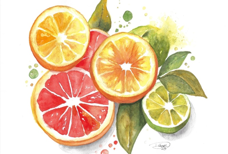
explore your creativity. In the resource section, I've added a
high-resolution image of my finished painting
to help guide you. You're welcome to
follow my painting exactly or experiment with
your own composition. As we're going to be focusing on the painting aspect
of watercolour. I've provided templates
you can use to help transfer or trace the
sketch before you paint. It's fine to trace when using it as a guide for
learning how to paint. It's important to have the
under drawing correct? So that you can relax and have Fun learning the
watercolour medium itself. Whichever direction
you take this class, it would be great
to see your results and the paintings you
create through it. I love giving my
students feedback. So please take a
photo afterwards and share it in the Student
Project Gallery. Under the project
and resource tab. I'm always intrigued to
see how many students have different approaches
and how they progress with each class. I'd love to hear
about your process and what you learned
along the way. Or if you had any difficulties. I strongly recommend
that you take a look at each other's work in the
student project gallery. It's so inspiring to see each
other's work and extremely comforting to get the support
of your fellow students. So don't forget to like and
comment on each other's work
3. Materials & Supplies: Before we start the painting, Let's go over the
materials and Supplies. I years. Having the right materials can greatly impact the
outcome of your artwork. I'll go over all the
supplies I use for this class and beyond that, very useful to have
at your disposal. And we'll make it easier
for you to follow along. Let's start with the
paints themselves. Unlike most of the materials
will be using today, it's a lot to do
with preference. I have 12 stable
colors in my palette, and I fill up from tubes. They are Cadmium
Yellow, Yellow, Ochre, Burnt Sienna, Cadmium
Red, Alizarin Crimson, Ultramarine blue, cobalt blue, Cerulean blue, Lavender,
Purple, Viridian, Black. And at the end of the painting, I often use White Gouache
for tiny highlights. I don't use any
particular brand. These colours you can
get from any brand. Although I personally
use Daniel Smith, Winsor, and Newton
or Holbein paints. So let's move on to brushes. The brush I use the most is a synthetic round
brush like this, a Skoda polar brush or
this Van Golf brush. That very versatile because
not only can you use them for detailed work with
their fine tip, but as they can hold
a lot of water, they are good for
washes as well. That also quite affordable. So I have quite a few
in different sizes. Next are the mop brushes. Multiple brushes are good
for broad brushstrokes. Filling in large
areas and creating smooth transitions are washes. They also have a nice tip that can be used for smaller details. But for really small details, highlights or anything
that needs more precision. I use a synthetic
size zero brush. All brands have them and
they're super cheap. Another useful brush to have is a Chinese calligraphy brush. They tend to have long bristles and a very pointy tip that perfect for adding texture or creating dynamic lines
in your paintings. You can even fan them
out like this to achieve for or feather
textures as well. And that's it for
brushes onto paper. The better quality
of your paper, the easier it will be to paint. Cheap paper crinkles easily
and is very unforgiving, not allowing you to
rework mistakes. It's harder to create
appealing effects and apply useful techniques like
rubbing away pigment. Good-quality paper, however,
such as cotton base paper, not only allows you to read
work mistakes multiple times, but because the pigment
reacts much better on it, the chances of
mistakes are a lot lower and you'll be more likely to create
better paintings. I use Arches paper because that's what's available
in my local Art Shop. Award spray is
absolutely essential. By using this. It gives you more time to paint the areas you want
before it dries. It also allows you to
reactivate the paint if you want to add a smooth line
or remove some paint. I also have an old rag or teacher which I use
to clean my brush. Cleaning up the paint
before diving is in the water will make the
water last a lot longer. It's always useful to
have a tissue at hand whilst painting to
lift off excess paint. Also, you never know when an unwanted splash or drip might occur that needs
wiping away quickly. I also have a water droplet
to keep the paints wet. When you paint, it's
important to have them a similar consistency to what
they're like in the tubes. This way, it's easier to
pick up sufficient pigment. A hairdryer is useful to have, speeding up the drying time and controlling the
dampness of the paper. And lastly, masking tape. And this of course it's just a whole paper down still on to the surface to stop it sliding
around whilst painting. Also, if you plan on
painting to the edge, will allow you to create a
very crisp, clean border. That's everything you
need to paint alone. I encourage you to experiment and find out what
works best for you. Now let's get ready
to start the painting
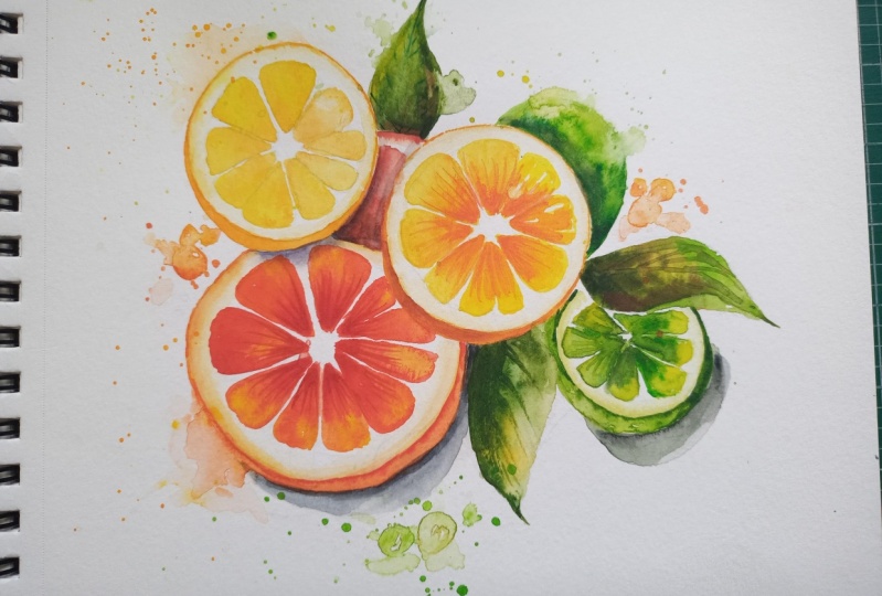
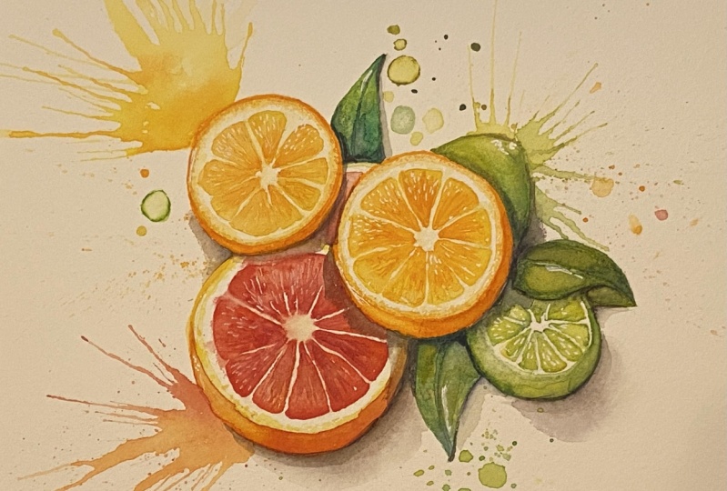
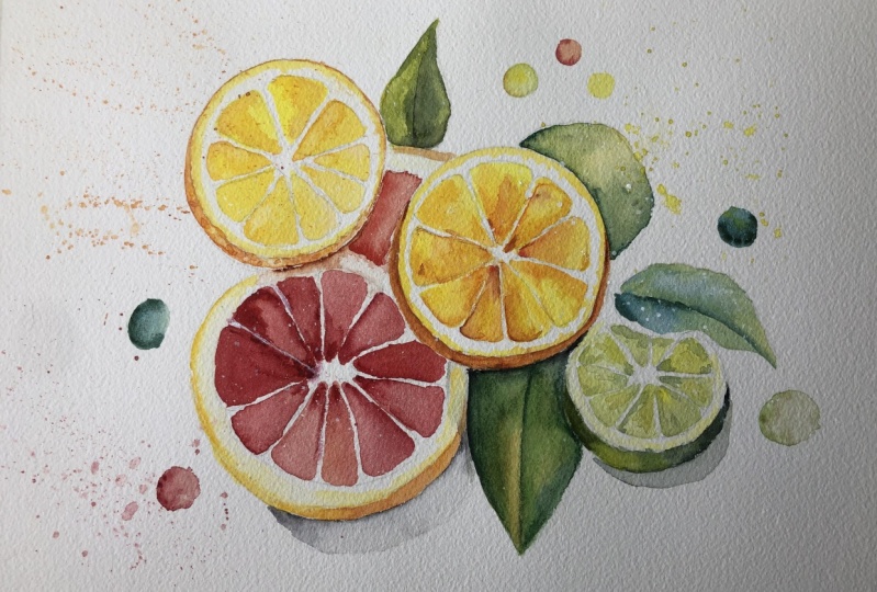
4. Drawing The Main Shapes: So to sketch this out, I'm going to break it down
into very simple steps. Starting off with just circles. Circles, various sizes. Maybe one there, one here. You could do them at
different angles as well, depending on how
you want the slices of the fruit,
wherever it's orange, Grapefruit Lime, coming out one behind another. The other one. Then maybe have a leash. A leaf coming off here, few dots here, maybe
another shadow coming off. They're using very light using the side of my pencil
just to do a light stroke, not indenting the paper at all. That maps out quite quickly. Then you go into the details, find the middle few lines going out. The different segments. Starting on this one. Unless size decide. I'm just going to drawing
whatever Segments. Of course you can use my outline in the
resource section and keep it nice and organic. It doesn't need
to be super neat. Then we'll come back
entirely up later. I'll do that off camera at my own speed so that
it doesn't bore you. So good practice
for drawing because he had to draw lines
at different angles. So I'm going to finish this
drawing off by myself. Get it all nice and neat
so that I can scan it in and creates a nice template
for you to follow along. And I'll see you in
the painting stage
5. Painting The First Slice: So I'll put the tape on. Not because I'm
going to paint to the size just to
hold it in place. And said that if it's
the paper starts to curl when it gets too
wet or dry, flat again. Now I'm going to start off with this Slice on the left
and work my way across. If you're left-handed, work way, work your way from the
right to the left. And because citrus colors are
so vivid with their colors, we're going to have
quite limited palette. We're going to use
nice bright yellow, nice bright orange
and some green. And that's virtually
all the colors we'll be using list here. Cadmium yellow, lemon yellow, cadmium red, and viridian green. So I'm going to start here. And they're going to start. Was the, The Pith. I guess. The Pith
is not so vibrant, so I'll add a bit of
yellow ocher into that. Just go down there. I liked working with
a bit of speed just because it keeps things
spontaneous and Fun. If I slow down and
focus on the details, it often ruins their energy. And they were all
unity of the painting. That tissue just to dab it parts off to give it a bit
of interesting texture. Now, go going with the yellow, pure cadmium yellow to paint
the different segments. Very vivid ones, obviously. Quite. But it's, it's it's
orange, this one I think. But I got to start with
the yellow in there. Because even though an orange
is an orange, some of them, the interiors are slightly
yellow, like this one. David bit of orange in there. Just to make it a
bit more orange. You can vary the colors. You can vary what kind of citrus route you want to paint wherever
you want it to be, an orange, Lime, a Grapefruit. Whichever colors you want, is quite relaxing. No pressure. Just filling in the lines. Was The makes me think why
more people don't do this. It's interesting
seeing the trend of coloring in books when it's not so much more difficult
just to do this instead. And then you get
your own painting at the end to your own
original painting. You can gift or frame yourself. If it's a bit too orange, I water it down a bit. I always do a test stroke
before I fully commit so that I can add more water and dilute it or pull a bit of
water away like that. That's too much orange. So what I'll do is I'll add a bit more water to spread it out to the
rest of the painting, rest of the segment rather. That's a perfect
amount of orange. Now, then I'll just add
together to even this out. Same again here. Now maybe in where it meets the center, I'll add a few more
strokes with this orange just to add some texture. Those little bubbles or I don't know how to
explain in words. That's why I'm attracted to Art because I
can do it visually. The little pockets of liquid that you have
in the segments. Segments within the Segments. Now I'm going to go back. They said two bits
and add a bit more. Because when you slice
an orange or a lemon, there is a bit of transition
between the white of the Pith, the skin. I'm just adding a bit more. I think a bit of texture. I'm not looking at the
reference image that much. Just dabbing my brush along, splat some water. As it's Drawings to create
a bit more texture as well. To set the translucency of
the White Paper comes through and just illuminate the segments because that's what
makes the citrus glow. You see the light go inside and disperse and it
makes it very vibrant
6. Painting The Pith: I could do a similar thing here. While I'm waiting for,
Let's try another orange. I think I have
these two oranges. This one a Grapefruit
and this one a Lime. Making sure that overlap. This one will be the
center of interest, the one with the most detail. These ones can be looser. And then because they're looser, It will focus it in a bit like a camera when you
have an auto-focus. So you got part
that you want with extra details and
rest just blur out. If you add it all
equally focused, it'll be a bit distracting and disorientating for the viewer. What your viewers eyes
won't know where to land. So you can, you can
just delete it. Bit better. Grapefruit.
Even though it's got a red center, it still has an orange Pith. So I'll just paint that in. Whereas having a
tissue at hand to dive out some pigment
that I've ever done. The nature of watercolour is making mistakes and
then correcting them. You never know how
it's going to go. It's so unpredictable. You just have to work
with what happens. If it doesn't go your
way as perfectly normal, it never goes anyone's
way directly. You just have to work
with what it does. Don't feel bad about that. Yellow Pith there too. So mainly we're just focusing
only LAs at the moment. And then I'll bring in the red
and then The Greens later. Now, for this, orange, can
then go back here and paint the skin course at vibrant orange lattice
maybe to vibrant eye-catching for where
it is on the edge. Remember that's the
center of interests, so I don't want it to compete. Just going to put some yellow into it to
neutralize it a bit. Good. And now painting and ten, going into the first
stroke of orange. And I'm going to go in some more yellow bit more orange. Sun palettes. Swirl this around. I'm gonna get to let that dry. And just on the edge here, I'm going to carry that
all the way around. A very fine line. Getting around. If you don't have a small enough
tip or your brush, go to a smaller brush. It's a bit drugs, I'm drawing
some liquid out there. Now I'm going to
paint The Segments. Not I'm not yet actually
going to do that. I wanted to paint the
shadow first before I play in that. Thinking about it
7. Painting The Segments: I'll paint the
Segments on this one. Again with the vibrant
yellow to begin with. Adding lots of liquid in there. This one, I'll make a bit more dynamic by changing the tones around having some dark areas and want some lighter areas. Posing some orange and some areas and
letting it spill out. Don't worry so much
if you go over the small lines
because you can come back at the end with whitewash. Even though it's orange. I'm making it quite
Yellow in some parts just to make it a
bit more diverse, add a bit of variety to it. Looking a bit of water on it. Keep it exciting. Make it darker in the middle. And then as it goes
towards the edge, then it goes more Yellow. Do some strokes
coming out middle. And then starting from the
other end with the Yellow. Leaving a few white gaps. Few more white splatters. Few more drops of Yellow. Really have Fun with where
you drop the pigment. That's what it's all
about. Otherwise, you may as well painting
a different medium. It's about really
exploiting the medium, seeing what they can do. Now using that similar orange, they're a bit of yellow into it. Going to paint outside again. Outside peel using a bit of Burnt Sienna, because Burnt Sienna is
actually a Burnt Orange, a darker hue of orange. So it looks like
orange in the shade. The shadows. Now, just as it's drying there, I'm just going to go
over those white lines. Just disturb them a tiny bit because I don't want
them to be pure white. But I made sure that it's
almost dry before doing that, I didn't do that straight after. Like what I did there with
the Burnt Sienna cell. Just going to drop that
in a few more places. Adding a few more
strands from the middle to the outside of
that Burnt Sienna. And like I said, it's dried a bit is had
about 4 min to dry. So it's still damp but
it's not glistening wet. So when you do a
stroke like that, it softens it and it
bleeds out, blurred out. It's all a hard edge. Now I'm going to do a
few slats of pure water. Then tap with the tissue, refine that edge a bit. Refining the edge of a center on the outside to make
it looked like being inside of the
PIL Slice rather
8. Background Elements: Again now that's dry. I'm just going to paint a soft shadow that's on
top. Coming off Stan. To do that, I'm just going
to use a bit of black, a bit of warmth to it, a bit, bit of burnt sienna. Maybe a better Alizarin crimson. Can disbelieve it out. Say need. Maybe make that
shadow a bit harsher and dark and peel just
to separate it by that. Okay. Now I'm going to
wait for that dry. Now maybe it's time to
paint one of these leads. While I'm waiting for
everything else to dry and to mix a green, I'm going to use
that same copy in yellow and a tiny bit
of viridian green. It's very potent. So just
to tie a little bit, a bit of a time, always easier to add a bit
more than to take away. The timeless little drop. Changes it to a green salting of that side quite light. Adding a bit more water
to the middle there. Then I'll make it darker.
A bit more Viridian. Then a bit of ultramarine blue. Because by itself, Viridian is a bit too artificial I find. So adding a bit of blue will
make it a bit more natural. One strong stroke there. Now I'm gonna go straight
from the yellow onto the painting and it will mix itself organically on the paper. Going down to the bottom. Connecting it up, touching bit of yellow there
on that side. Again, connecting it. Why allowing it to do its own
thing and mixed together. Now I'm just going
to let it dry. I'm trying not to
interfere with it. Now that's nice and
dry to the touch. So let's painting that section. We're going to use
Cadmium Red for that. Nice vibrant Grapefruit. Cadmium Red is quite
potent pigment that stains the
paper so you have to make sure it doesn't dry
when you are applying it. Because otherwise it will
be difficult to blend. You have to work
quickly with it. Some colours. A low staining, which means you can just
rub the pigment off and it will be white paper
again, the wideband away. But pigments like this, like the red Cadmium,
Cadmium red. It stains so you can't rub away. It says that on the tube, it shows you the staining values on the different tubes of paint. You know what you're getting
when you buy a tube. You know what to expect?
9. Painting The Grapefruit: I let that dry as it will. Now I'm going to paint this
red section here. Same color. Nice. Great. Fuchsia, red. Maybe a touch of
Alizarin crimson just to give some warmth
or coolness to it. Robert, coolest. Cadmium Red is quite a warm. Red. And Alizarin crimson, slightly cooler on
the color scale. I'm careful with my brush
marks, how I leave them. When I'm painting, I lead them in the direction of
where they're going. So if they do happen to dry, at least it won't look out of place if I
just left a mark like that and then dried
than it would look obviously quite unnatural. So if I'm starting to paint, I at least do it like that in the direction so
that if it dries, it's not a complete disaster. Sometimes I have to keep
on reminding myself to talk because I just get
so relaxed and into the, into the moment of painting. Getting in touch with what maybe want to start painting
in the first place. Again, we can come back with the White Gouache
whitewater color later to do any corrections if we happen to
go over the line. Now we're going to
use this war spray because I've let it dry there. And I can't just use the
brush because it will enter pair can it's dried too much. So if I just do a
light spray like that, evenly distributes more
water so that it worked. Great, ugly textures. Let's give it a few seconds. The water to reabsorb. Now I can go back and I want
to make it a bit lighter, so I'm taking some liquid
off there and putting it at cleaning my brush and just going to add a few splatter water to
make it more interesting. Now I'm going to use
the color already on my paper to paint this one. As a good thing
about watercolor, you can just remove what's
already on the paper around. That's a good way to
unify the colours. Mixing and matching what you've
already got on the paper. You put some really thick
pigment on the side, just say that bleeds out. Careful not to go over the
edge here. Can easily happen So there's actually not much
technically going on here. It's good for beginners
because you can learn, experiment with the basics, basic ideas of how to
manipulate Watercolor. Without too much pressure off doing lots of technical details. Few dabs of the orange. Just again to add
a slight bit of interests, bit of variety. So painting each
segment quite lightly. And then the very tip
where it gets the center, we add some thick pigment. It's a bit darker. Like that. Just bleed while it's still wet. It'll bleed downwards. And create a bit of
depth and realism to it. Even though we're
not trying to do a realistic painting here. Just having a bit of Fun. Racing, using vibrant colors. Can add a bit more
orange to his heel. Down here in the shadow. There's another shadow here. Pretend the bit of black. Ashley, now it's too
wet to do that now. So I'll just leave it
at the time being. If I, if I add that now, it will interact
with that and it'll, it'll ruin the effect. S-plus a bit more water
10. Adding Shadows: See how the leaf has dried and create some nice
natural textures there. Now let's try. We can go back and emphasize some of the anatomy I'll delete. Mixing a bit of mixing is using, but as your black paint, a shadow coming here. The black I use is
called Neutral Tint, because Black by itself is quite intense. Stub and colour.
But Neutral Tint, even though it looks
just like black, it has the ability to mix with
other colors a bit better. It doesn't look so
flat or boring. Adding a bit of blue shadow. Then painting from the top-down that can bleed into their
11. Painting A Whole Lime: Now I can paint this line here. And Robert, rather than a slice, is just going to
be a full-on Lime. Again with the viridian. Green and Cadmium Yellow. Top of the line will be
quite bright and Yellow. Then the second half will
be a bit more green. Again, you don't need to put that much pigment
of green to make it look like a Lime. It's a very potent pigment. Viridian by itself is
quite a dead color. So you need to put in some yellow to really
give it some life. Now we're actually very lightly bring out splat, bring out some of that pigment. Let it bleed out. Give
me a bit of vitality. She's splat so pure water
to create the texture. Now go back to this
shadow down here. Feel that it needs
a little bit more. Now I'm going to paint
that shadow here. But I tried to do earlier. I wanted to do it
earlier but I couldn't because the other
section was too wet. Going to emphasize the edge
of this orange up here. Okay, I'm going to add
a light shadow here. I should have really
done that before, but it's okay and you
can work around it. No shadow around here. Now that dries it will
12. Painting A Sliced Lime: These line segments Now, bit more intricate
here because there's a leash just going over it. We don't want to share
it because it will affect the light tones. You dabs of yellow
in the middle. Doing this all with an
eight number eight brush. It's so handy, gets the perfect size because
it's got a nice tip. And we're not doing
any large washes, so you don't need to go
any larger this stage. This painting. You do the
whole painting of this brush. And only three colors, three or four. Big lens. Again a bit darker. Now the tips, the end
than in the middle. Might feel uncomfortable. Might be difficult to paint all these segments
to begin with. But after doing it,
after about 30 of them, it actually becomes
quite quickly. It's taken me much less time to paint this one as
it did that first one. So everything takes
a bit of practice. Drawing water out and
pigment from the middle, make it a bit lighter. Using the hairdryer to dry
it off, speed things up
13. Painting The Leaves: Now to pay it, the rest of the leaves and the
skin of the line. The few bubbles here,
Bubbles I'll splat. So does some
interesting visuals. Cerulean blue, I want to
slightly different green. Some Viridian, very thick contrast here will merely
really make the orange pop. Really loading my brush
with a thick pigment and paint the stem
of that leaf to in my brushes, I'm actually
going to paint the shadow. Shadow. I want to add going over the Lime
before I paint the leaf, because it goes over starts here. Okay, Here's along here. Going back to that
dark Viridian. They're really painting it
very thickly in that corner. Maybe even a bit of pure black right at the
very end of it. Now I want the green
on the Lime to be more vibrant than
the green on the leaf. So I'll add more yellow to the line and leave
this a bit muted. I'll even put in a bit
of muted yellow ocher, which is a more
muted down Yellow. Then let it interact with that green that we
just put up there. Connect it. Add the water just
to wash it all down. Vibrant streak right there. Who maybe have pure
water and pigment was a rush out of it.
Ten to the bottom. Paint. The rest of this PL,
actually, I missed that. So now for this leaf, leaf textures
14. Varying The Greens: Have to make it a
different green to the Lime as well
as it will look like it's the same. Then the Ochre based green here. Bit darker at this edge, darker on that tip right there. It's very satisfying having
a fine tip on your brush. This isn't even an
expensive brushes either. To cheap one
15. Finishing Touches: Now it's going to add
a lovely yellow here. And then add the nice vibrant green. Right there. I went more yellow, they're actually more vibrant. I was too much there. Went over the line tool. Can draw that out
using the tissue. Following that. Yeah, there were no you tabs me go right on that edge. Right up there too. Lettering is going to add
some pure water just to agitate it and get it to mix in
16. Adding Some Bubbles: Now to add a few bubbles
around the outside. I'm going to add a few bubbles because citrus fruits remind me of juices, some drinks. So adding Bubbles is quite a
nice way to associate that. Come from single green ones With bit more of a
yellow one here. This yellow ocher, orange ones here. Few more orange ones up there, I think. Pure yellow. You can add another
green when THE then some red, some
red ones here. To complement the Grapefruit. More orangey, red maybe. Here. Few wall Sri, Yeah, diluted reds here. One in here. Okay, Now I'm going to completely dry off and rub out the pencil lines. And we'll review the
painting. In the next step.
17. Final Thoughts: Welcome back and congratulations
on completing the class. I hope you've had been watching. And if you haven't already
given this painting and go, now's the time to put what
you've learned into action. Throughout the course,
we've observed the unique characteristics
of citrus fruits, their vibrant Hughes
subtle textures, and the interplay of
light and shadow. By paying attention
to these details, we were able to create an exciting and
vibrant illustration from brushstrokes to
layering techniques. Each stroke or the brush added energy and life to our artwork. The techniques you've
learned today can be applied alternating
to citrus fruits, but also to other subjects
who wish to paint. Watercolours offer endless possibilities
for creative expression. I recommend you to continue to explore this approach
with different fruits. Remember, watercolour
painting is not just about technical skills, but also about expressing your creativity and
personal style. I encourage you to continue
exploring, experimenting, and pushing your
boundaries to create your own unique
watercolour masterpieces. As we come to the
end of this class, I hope you feel
more confident and comfortable with your
watercolour painting abilities. Practice is key when it comes
to improving your skills. So keep on painting
and experimenting. I want to express my gratitude for each and every one of you. Your passion for watercolour
painting is so inspiring. And I'm honored to
be your teacher. If you'd like feedback on your painting, I'd
love to give it. So please share your painting in the student projects
gallery down below. And I'll be sure to respond. If you prefer, you can
share it on Instagram. Tag me at will Elliston as I would love to
see it. Skillshare. I also love seeing
my students work. So tag them as well at Skillshare after putting
so much effort into it, why not share your creation? If you have any questions or comments about today's class, all want any specific advice
related to watercolour? Please reach out to me in
the discussion section. You can also let me
know about any subject. Wildlife will see me lightly
to do if class home. If you found this class useful, I'd really appreciate
getting your feedback on it. Reading your reviews fills
my heart with joy and helped me create the best
experience for my students. Lastly, please click
the follow button up top so you can follow
me on Skillshare. This means that you'll be
the first to know when I launch a new class
or post giveaways. Once again, thank you
for joining me today. Keep painting, keep exploring. And may your artistic
journey be filled with vibrant colors and
endless inspiration until next time, happy painting
 Will Elliston, Award-Winning Watercolour Artist