Transcripts
1. Introduction: Hello, and welcome
to a new class. We are going to explore
how to draw kids at different ages from
toddlers to older children. Hi, I'm Eva, and I'm a full
time artist and illustrator. We are going to focus on
using a stylized approach with simplified shapes and
clear body proportions. This method helps you build
confidence in your sketches. We will start by breaking down basic proportions and
using simple shapes. You will learn how to spot
the key changes as kids grow and how to sketch them
using simple relatable forms. We will practice with the
real life references, sketch a character lineup, and plan out clear composition for our final project
illustration. By the end of the class, you will create an
illustration featuring kids in different ages in a
consistent and stylized way. And whether you are
into character design, storytelling or just want to
sharpen your visual library, this class will give you tools you can use
again and again. So let's get started and
see you in the class.
2. Toddler Proportions: In this lesson, we will start looking at the
toddler proportions, specifically around age two, and we will start sketching
from the front view. And for sketching,
I will be using one of my brushes
from the sketch set, and I currently really like
the expressive pencil, but you can use any
brush that you prefer. And I will be using a brown color for
sketching right now. And as you can see, I have this, like beige warm background. So you can set up your canvas in a way that you
don't start with a white color because a lot of people don't like starting
with just white colors. So this kind of reminds me of
some old sketchbooki paper. Anyway, so for a
start to warm up, I suggest you to draw a few circles because
we'll be drawing some head and we will use the
head size as a proportion. So I think this is
a good warm up, so you feel better about
your sketches later on, so you don't feel like rusty or the shapes are not exactly
as you want them to be. So just fill the page with more circles and
try different sizes. Alright, I think that's fine. I will delete this layer, and I will sketch on
a different layer. So for a toddler,
we can start with the head because that's
big part of their body. Then for the body, I will sketch
another circle which is approximately the same size. Then I will draw a few lines, so this will be our guidelines. I just adding lines to the
edges of these circles, and then I will create a box And now I will
divide this box. So in each of these circles, I will add three lines. So kind of like in the middle, then divide it again
the same here. So you don't have to be
super precise. All right. Now I will reduce the
opacity of this guideline, and then we'll sketch
on a layer on top. So for the top part, well, let's zoom in. We can actually make this
guideline a little bit bigger. I'll delete this layer
so we can see it better. Okay, so on a new layer, let's sketch the head. This will be the top
part of the head. And the bottom part, I will
draw a little bit wider. Basically, this is a suggestion
of cheeks. And a chin. And the eyes will be
around this bottom line. So if we want the
character to be smiling, we can have this
half closed eyes, it's kind of like a cute
placement of the eyes. So of course, this is not realistic because normally you would have them anatomically
a little bit higher, but this is just cuter. So here we will have nose and the mouth will
be somewhere here. Okay and now for
the bottom part, we will have the torso in the top part of our bowl and the bottom
part will be legs. We will divide this line. We will add one more line
between these two lines. Now you will have four, so you can see better here. Now you can draw the torso So it's a little bit thinner on the
top and wider on the bottom. So it's kind of like a teardrop shape
without the top part. And now I will draw the
legs just like this. So basically, like a rounded
triangle with kind of gap, so the character can walk, and the feet can be super tiny. So this is up to you how
you want to style it. But for this class, let's make the feet
very, very tiny. And then the arms will
be somewhere here. So they are quite short, and also quite chubby. And again, the hands
can be super small. And then you can add
some hair on top if you want, but
we don't have to. All right. And I have a full turnaround sketch
also in the other class. So if you want the
turnaround of the toddler, you can check out that class. So for now, let's
just sketch a few of these toddlers as a practice.
3. Toddlers in Different Angles: In this video, we will
break down how to simplify the shapes and draw toddlers from
different angles. Right. So I put our
sketch into a corner, and now when you want to draw the toddler from
different angles, you can think about the torso as a bean or as a bean shape. So we can play with
the placement of the legs and also
turn around the head. So if you want to draw maybe the toddler
just from the side, you can just start
with a simple head, and you can adjust the shape
of the head also later. So you can twist the torso. So kind of the bean shape, and we can put the feed here And then you can add arms here. So just placing 1
ft in front of the other and you can see that
the head is quite small. When this happens to you, you can always
select the head and make it a little bit
bigger in your sketches. Then let's say you want the character to be sitting
down so you can use the same bean shape and then add the legs here, and then maybe the
arm is just here. Again, I made the head
a little bit too small, so I can make it a
little bit bigger. So let's say you want to draw the toddler kind
of from the side. So you can emphasize the bean shape with the
belly kind of going out. And sometimes, you know,
they have diapers, right? So the butt looks even bigger. And then you can add short feet and then quiet short. Hence. Now, I will reduce
the opacity of these sketches and I can
adjust the head shape. So we also have the cheek, like we sketched here. I can emphasize the belly here. Okay, the same goes here. So we have also the face shape a
little bit, the arms. And smaller legs here,
I think works better. And then also some detail here.
4. Age Comparison: In this video, we will
sketch and compare two kids, one younger and one older, and I will point out deeps what to focus on
while sketching. Now, let's keep this
as a reference in the corner and we will
sketch two different ages, not specifically
with any target age. We will do that a
little bit later. So let's start with
just two characters, and then we'll do longer lineup or lineup with more
characters in different ages. So as we sketched here, we have certain proportions
for a younger child. So I will sketch that once
again so we can practice. So it doesn't have
to be perfect. So we will have two circles approximately in
similar or same size, and then try to sketch
another circle, which is kind of in
between these two, and then we will
add one more here. So it's kind of like the
warm up that we looked at. All right. And here we
will add a half circle. Perfect. Now I'll reduce the
opacity of our guidelines. First, as we practice, we will just draw the smaller
character or younger one. With a bigger cheek, Now, I will show you very quick
way how you can draw these characters if the legs
are not in this position, the feet are a little
bit wider apart. So what you can do is simply create this
type of a triangle. Which looks almost like
a part of a starfish. This is really, I think, great way to sketch
characters quickly because you can guess
where are these legs. So first, try to practice
the proportions so you get it right or it's in
your visual library, and then you can
sketch characters with these shapes quite easily. So I can just add the eyes approximately in that
height as we talked about, and a small mouth. And now for this
bigger character, we'll start with
similar head shape. Also a little bit of that cheek. It's harder to do the
lines from this angle. So I'm not rotating the canvas, so you don't get dizzy. But otherwise, I would
just rotate the canvas, so it's easier for me to sketch. So you can do that
when you're sketching. Let me erase this decline here. All right. Now for
this taller character, let's do this shape just to
follow the same approach. I will place the feet
in the same height on the ground and I will try to keep the
similar proportions. You have two thirds for the torso also here and
one third for the legs. So of course, this is a
very simplified approach. But I think it's
great for practice. Especially when you
want to just sketch character poses when you are figuring out your composition. Then we can place the
eyes slightly higher and then we can add arms in the same
way as we did before. It's a little starfish. But I think it's
still pretty cute. So on this one, let me go back. So this one will already
have little bit longer arms. Because of course, when the characters are getting
older or the kids, they will have
longer limbs, right? So this is a very quick
simplified comparison. Now let's look at the
characters in a longer lineup.
5. Kids Lineup: In this video, we will
sketch a lineup of kids in different
ages side by side, and to keep things
simple and clear, we will use simple shapes, basic proportions, and we will
also use the frontal view. Now we will practice drawing characters
in different ages, and I created like a overview with the same
circles as we did before. So this will be a head side. So you can create file like
this for yourself as well. Or I also prepare
this as a download, but this is not necessary for you to download if
you don't want to, it's just extra thing. If you don't want to create
this document yourself, if you want to
create it yourself, you will just draw the
head sizes and then add simple lines in between
each of the circles. And let's start
with younger child. I will move here to the side. And the first one, we
will do just two circles. So the youngest child, and I will have this
here on the side so we can compare them
from the distance. So first, I will sketch the head in between
these two lines, which is the second and third. And then I will add
simplified body Again, this starfish approach. Then the second character
will be on the third line. So the head will be approximately the same
size as the first one, but the head is a little
bit higher like we did with those
previous sketches. Then the feet are a
little bit longer. I mean, the legs, the
feet are just short. Then I will add the arms. The next character will
be somewhere here, so you will draw the head in between the third
and fourth line. And now we will elongate. So basically, you are
drawing kind of like a triangle without a sharp top. And the legs are again a little bit longer than
the previous one. Okay. And we can add the
arms relative to the legs. I think this looks fine. All right, so we can move on. So the next one will
be on the next line, as you guessed, probably. So let's say
something like this. Oops. I need a little
bit more space. Perfect. Now even more
elongated triangle. All right, then the arms
will go somewhere here. Let's move on to the next one, which we have the head here. Now, adding the body shape. And when you move on from
basically left to right, I'm always elongating the legs. So we are moving the corner of the triangle here a
little bit higher. And this is just a guideline
for your sketching, which is quite
simplified in this way. So you can always sketch
on top of this later on. And now when we move
to the next one which we can fit here will
be placed around here. And we can elongate
the shape even more now because we have
older child or almost already pre teen And depending on the lineup that you are creating
of the characters, you might want to
have a variety. So if you have only
two characters, maybe there is a bigger
difference in age or if you have, maybe siblings, maybe you can take this proportion
and this one. So kind of you have variety. It depends on the story that
you are creating, of course. So here I just
edit some text for me to see what I sketched.
You can do the same. So you can write how many
heads when you are sketching. I also edit this to the overview
that I kind of created. So this will be two heads,
2.5, obviously, three. So kind of you know
what you are sketching. And then when you have maybe three heads character that corresponds to
2-year-old child, then when you have 3.5 heads, that might be four years, then if we have four heads, it might be eight years and 4.5 heads can be
8-year-old child, but you can play around with slim limbs or long
legs or longer neck, and then the child will already
look a little bit older. So with these proportions, you can play around with
these like eight year olds or almost pre teens or
something like that. Alright, now let's sketch this from a side
because there will be a useful exercise for the illustration that we will do as a project for this class.
6. Kids Lineup in Different Angles: In this video, we
will sketch the kids in different ages in
the lineup again, but this time in different
angles. All right. So for the illustration that we will do in the project section, I think it would be nice to have characters which are
in different ages. So here I will sketch the
character with three heads, proportions, not with
three heads, obviously. So I will start in
displacement for the head, and then I will create
kind of like a side view. So one of the legs will
be more in the back and the other one is more in
the front with a bent knee, but still creating
that starfish shape just for these sketches. And then the torso will
be somewhere around here. Then I will create another
character here just for a practice and this character
will have 1 ft forward. Different running pose and then the other leg will be bend. And then I will add a torso. So if you add feed, we can have feed here. And then if we add the character with the
proportions of four heads, We can first draw the torso
and then add one leg here. Other one here basically
more lifted from the ground. If you are thinking,
how do I add the legs? Basically, you just need to decide which leg is
in front of another. So if in this case, we have this leg here and these two legs
are kind of similar. So they are not
overlapping that much. Now, if I add also older child, I will draw the head here So here, I will place one of the
legs here more to the back, and then we can lift the other leg kind
of a little bit more And here we can create
different overlap. So we can imagine
that this leg is in the foreground and then this
leg is in the background. So very much simplifying, but we'll practice more when
we draw from references. Right. And now let's look at a few more tips before we
move on to the next part.
7. Neck and Shoulders: In this video, we will talk about the proportions
of the neck and shoulders in relation
to the body when you are drawing kids in
different ages. All right. So now, let me point out some of the tips or things to
think about when it comes to the neck and
shoulders of the characters after you saw or
practiced the lineup, so you will be creating
characters in different ages. And when you're creating
older characters, you need to pay attention also how you change the
neck and the shoulders. If I keep this just as a
reference on the side, we can start with
the younger version. So of course, we have the
bigger head as before. And as we created here, the shoulder part and the
neck part, is quite small. So what you can do in
this part is to create bigger head as a circle and then when you
create the shoulders, you can just create
a line basically, which is curved and the shoulders are
not very pronounced. Now, we can just add yes so we know that it's like
a cute, small character. Now, if we create a little
bit older character, we can again place the head a little bit higher Now, when you're creating the
shoulders and the neck, already there will
be a little bit of definition for the shoulders. So you can start
with a thin neck and then create small shoulders. What to pay attention
here is that the neck is still quite narrow, pay attention to
the neck is narrow, and then the shoulders compared to the head
are also quite narrow. Let's say, approximately the width of the head that
you just sketched. Then if we create a little
bit older character again, Okay then we can create the neck little bit
wider than the previous one, but also not too wide just yet. So let's say this
is like a teenager. So now we can create the shoulders that are
maybe a little bit wider, and of course, you can play around with different
characters. Some have maybe wider shoulders
and some more narrow. So this will be kind
of like a young adult. So here we would have the eyes already kind of
like a little bit higher, and you can check
the proportions in the other class
that we looked at. So here, the neck is already
wider than the previous one, and the shoulders will be a little bit
wider than the head. I will move all of these
a little bit to the side, so I have space to sketch
the next one here. So here, we can create a little
bit smaller head already. So if we are creating
suggestion of a head for adult, then we can add the jaw as well, so it's not so round as we sketched with
the previous versions. And then here, the neck
will be already wider. So if we are drawing
adult male, let's say, you can also add more
shoulders, and more muscles. So this will be more
like adult human. So the older the characters are, you can play around
with the size of the neck depending if you want to have the character
more muscular, or if it is a female, you can keep more semi
realistic proportions and keep the stereotypical
thinner neck, which is used often in illustration and semi
realistic characters, but pay attention to the width
of the neck and width of the shoulders as
you are creating the characters from
younger to older. And now, let me
share another tip when you're creating a
lineup of your characters.
8. Arms and Hands: And in this video, we will talk about what to
pay attention when you are drawing arms and hands in relation to the
body proportions. For this next dip, I will use
the lines as a reference. So first, again, as before, I will sketch a character
here on the bottom. What I want to point out
here is the length of the arms for the smaller kids because that ends usually
around the waist. You can always think about this approximate
placement for the hands. Now I will just sketch
all the character here, but not full character
proportion, just the top part. So I'm sketching a
smaller head here. And as we talked about a
little bit wider neck. And we can sketch a female character with
not so white torso. The shoulders are
also not super wide. And you can watch, of course, the other class
where I talk about the proportions of the joints, torso, the hip
placement, and so on. Alright, so when you have two characters going from
younger to older character, what you want to
pay attention to is the placement of the hands
and the length of the arms. With the younger character, the hands will be
around the waist area, which is somewhere here, and the relative length of the arms will also
end around here. So when you move around the
arms, something like this, maybe, just think about how long they are compared
to the rest of the body. And when you have an older
character, pay attention to, of course, also the neck
thickness, the shoulders, but also the length of the arms because
now the hands will be just below the hips around
the top part of the thigh, and then the elbows will
be just above the waist. So think about the
placement of the hands. The elbows, the shoulders, and overall longer
and thinner limbs compared to the
younger character, the same goes for the
size of the head. The older the character is, it will make the
head a little bit smaller and in
toddler proportions, you will make the head
a little bit bigger, and it depends on the
design of your characters. Of course, you can play around with exaggerating
different proportions, but this is something to pay
attention to when you are exaggerating and elongating
the proportions and so on. All right. And now let's go and sketch some characters
from the references.
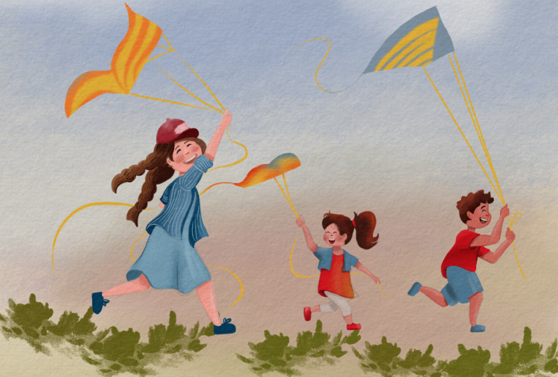
9. Warm-up Sketches: And in this video, we will look at some
real life references, and we will do some warm
up practice sketches. So now let's do some
practice sketches. You can collect your
favorite references, for example, from Pinterest or splash or some other website. So this one is from
Envato Elements, and I found a lot of different kids in
different poses when running with kites
because that's what we will as a project
illustration, so now we'll just do
different warm up sketches. And I have characters
in different ages. So these are a little
bit younger looking. So the proportions are closer to these sketches that
we previously did. And then I have a little
bit older characters. You can see that the legs are a little bit longer as well. And then we have also
some boy characters, and I try to collect
images from the side view, so it's easier for us to sketch. Of course, the torso is a
little bit more twisted, so the perspective is
a little bit harder. But if we focus on this kind of a starfish shape for sketching, that should make
our life easier. And if you also watched
my other class where I draw the adult characters
also with simplified shapes, we are taking similar
approach here. So here you can see we have
also older characters, kind of like pre teens, and I think this one
might be young adult, but it's a little bit hard to see from this reference photo. All right, so let's start sketching some of
these references. So I will take this character. So I will just start
on a new layer. Focus on that bean shape for a torso that we
sketched previously, and then one leg in the back. And one more in the foreground. I'm still using the same brush as before, just as a warm up, and then we see if any of these poses work
better than the other. So here is our kind of
like a star fish shape, even though I'm already
adding some knees, but I'm basically using these
type of shapes for legs. So it's kind of like
a carrot shape, and then I'm adding feet in that same way as we
did before here. So here we can sketch
the placement for the shoulder and the arm
is a little bit higher. So I will do, again, the kind of like a carrot shape, and then the other arm
is here in the back. And the face is turned
this way. We'll have eyes. We will follow the
head placement, which is looking upwards. I will make this
sketch a little bit smaller and just
move it up here, and I will take a
different reference. Let's try a little
bit different pose. So this one is kind
of tilted forward. So I will start with the head. Then we have the torso. Here we don't see it as much because we have
the jacket here. But if I continue with
these kind of like a erot shapes for the legs, this is the leg here
in the foreground. Then this one is
kind of tilted here. So the weight of the
character is on this foot. Here we can exaggerate that
shape and then the arm is somewhere here and the other one is just here in
the foreground and the character is
looking to the front. Basically this
direction, and then the kite will be somewhere here. And then we can have, like, nice hair of this character floating if we decide
to do this character. All right. Let's try
a different one. I like that this one has
kind of more movement to it. And it's also a little
bit older character than the previous ones. So we can make the
torso slightly longer. I think I tilted
the torso too much. Here, the action line
would definitely help. You can also watch the class
where I talk about more about action lines and
the dynamic poses. That helps you with
the characters. Here let's just sketch
what we see using those carot shapes
or how to call them. Then the other foot is
more in the foreground. This other one is in the
air, as you can see, but there is this
nice movement in this pose and we can simplify these lines by
connecting them here, and then the shoulder goes here. And then it flies behind here, and then the other hand is here, there is a little bit of foreshortening with
the perspective, so the arm looks a little
bit shorter than it is. But we'll not focus on
that one just this second because also the hair
is covering the face, but the character
is looking more towards us and we
can make the hair flow even more just to suggest more movement in this pose. I will make all the characters
a little bit smaller, so we have more space to sketch, but you can create a new canvas if you want to keep the
size of the characters. Let's see. I also
quite like this pose, but we don't see the head there. And let's look at
the characters. This one has a
tilted leg as well. So we can try something
a little bit different. So here we can try to
sketch this character, which is a little bit
tilted towards us, so not all of them need
to be from the side view. So this one is a
little bit younger. She's looking this way. Then we have this leg
in the foreground. And this other leg is
more in the background. And then one hand is kind
of holding the kite, and the other one is
stretched around here. And of course, we have
that cute funny tail. And I can do a class
about outfits and hair for small characters if
you're interested as well. But there are many
references you can look at when it comes to kind of
toddler and kids fashion. So there are actually quite cool references
that you can find. All right, so this
is pretty cute. So we can move that
here and let's try one more before we
move to the next part. So we can sketch a boy character because we
don't have that yet here. So I'm thinking which
head tilt would be nice. So maybe we can try this one because we have the other ones like
looking different directions. So we have the shoulders
and the waist here. Then one of the legs is in the foreground, more in the air. But and then this one is still bend, but maybe not as
much as this one. This one is a little bit
more in a running pose. You can differentiate those. Actually, these poses
are quite similar, but then here he has both
arms in the foreground. His head is tilted
more towards the kite. So here we can add the tilt
and pay attention more approximately of
the placement for the arms. All right. So I think these warm up
sketches are great for now. And now let's start
building our illustration.
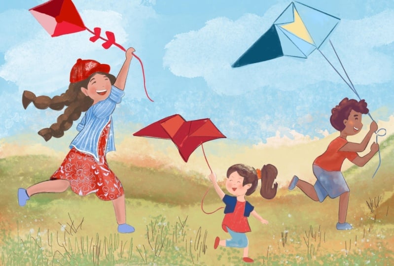
10. Project Sketch: In this video, we will start
our project illustration. We will redefine our sketches and improve the composition. So now I will take the sketches from the
warmup exercise and import it to a bigger canvas where I will be creating
the project illustration. So you can create a new canvas in whatever size you prefer, maybe a four or a
five or even bigger. And when you have the canvas
created in the gallery, you can take these sketches from this file by just tapping and dragging this folder away from the layer panel and
tap on the gallery. Go to your new canvas. You can open the layers, and now you can drop your layer with sketches
into this new canvas. And I am using my procreate file with
Aquarel cotton paper. So I will have a background, which I can add later and
also layers with ar texture. So that will be
eddied to my colors. But you don't definitely
need this one. It's just for extra effect. If you want to have more traditional look
and feel. All right. So from these sketches,
if I zoom out, I quite like this pose, so I can go to Selection
Tool and select this one. Then I would swipe down with three fingers and
select cut and paste, and I will have this sketch
on a separate layer. Then with the arrow
or the move tool, I can just move
this character to the side because I want to have a variety in
these characters. Then I will select
maybe this character. I think that works quite
nicely because it's different. I will go back to the layer because if you
have this one selected, it will not cut
out the character. Repeat cut and paste. I will move this one here, go back to this layer, and I think this one is
quite cute because again, it's a little bit different
than these other two. Then I can place it here
and see if that works. I'm not fan of this sketch, so I can just move it away here, exit the arrow tool and then
move back this character, and I can check if it's
better than maybe this one. These two are quite similar. If you want maybe
four characters, this wouldn't be
such a bad lineup, but I think three characters are good enough for this one, and then you can also play
around with the positioning. For example, if this
character is maybe first, or you will create this
kind of composition. I think it's also quite nice. Or you can put the smallest character
kind of in the middle. And then this one
will be in the front, which I think creates
kind of nice composition. So you can decide how you place your
characters. All right. Now I will select all three
and move them in the middle, make them a little bit bigger. Then I can delete this layer
because I don't need it. Then I would make
sure that all of these characters are aligned, so they are using
the same ground. This one can be a
little bit bigger. Then I can merge these
layers together. I will reduce the opacity here. Then I will sketch
on a new layer. For this one, I will
take a different brush, which is a little bit more defined or I can
create more defined lines, which I can do with
this six B pencil. I created this pencil mostly
for outlines and sketches. I like to use that one when
I'm redefining the sketches. So I think it would be nice
if there is a combination maybe two girls and one boy or two boy
characters and one girl, you can decide when
adding details. I think this one
can be maybe a boy, which means I can
look at some of the references what these
characters are wearing. So maybe this one where we
have just shorts and a shirt. I think that's quite nice. So I'll sketch that on top. So I'll just add simple shorts. Maybe they can be a
little bit wider. Then the top of
the shirt can have a little bit of a
curve in the movement. Then I'll just add a line here. Then here we just
need to add a sleeve. And here I can create a simple
hand holding the string, and then the back will be
more or less straight, and then we can add that
curve of a T shirt here. Then there is the
bend on the shirt. There is a little
bit of movement. Then I can draw the other arm here Maybe it would be nice if the other
arm is here on the top, or we can place it here, it's on our reference. We can do that trying to keep the same length
and the position of the hands are basically they are under each other. Mm. Combining the curves
and straights, I think here this line
can be more straight. I'll adjust that. Perfect. Now I will add the
legs and I think I'll just make them a little bit more skinny so they don't
have to be so round, but this is more design choice. Of course, you can make
them also more round. And here we can just
add simple shu. And then the same goes. Here, I think it would be
nice here to add pokit. Um, And here, I'll just draw the other leg
a little bit off the ground. So I'm just adding it
a little bit lower. And then first drawing the sole of the shoe
and then the rest. Then make sure that the
feet are the same size. I'll just make this
one slightly larger. Then check if everything works. Here I need to actually adjust this part because it
doesn't look anatomically correct because we
want to have it attached to the rest of the
body. I'll just do this. So here I'll create new lines, so it looks more realistic but still keeping this type of pose. If you want to have
it more realistic, we can move this leg higher. I think that will work
a little bit better. Let's compare it with this one. Then it's very similar
We can keep it here. Then here first, I will make a ear just to see the placement of the eyes will
make closed eyes. Then I will create messy hair. And then you can make
them happy and smiling. I can move the eye a
little bit lower here. Perfect. And we need a
little bit more hair here. All right. Now on to
the next character, which is this small girl. This is definitely
easier because we have the dress here so we can make the dress kind
of floaty as well. And then these lines of the dress. This is pretty cute already. Then we can make the leg a little bit skinnier
like some of the more skinny kids because we have that big
head, that's pretty cute. Then we need the other
leg, which is here. And maybe we can even give
her a simple small jacket, which can be cute. And then we can draw
the other hand. And we still need this one, so we can add a few
fingers and the thumb. And, of course, I
have the class about drawing hands if you want to
kind of refresh your memory. I think this cute
bony tail is nice. I'll keep this
haircut here as well. As you might know, I also have a class about drawing hair, the decisions, how you
can stylize the hair. If you're interested in that, you can check out that class if you want to practice more. And here, you can either
actually make the dress a little bit longer or you
can give her leggings, which I think that's
pretty cute as well. So now let's do so let's add some details on
the last character here. I think dress is quite nice because you can
add more movement to the fabric compared to some of the when
you just have jeans. I will create the dress also
for this character from that perspective that it's nicely flowing or you
can add actually shorts, which could be nice too. Here, I'll just
create the dress. Or here I can actually
add skirt, which is nice. We can add some movement there. And here maybe she
will have a shirt. Maybe the shirt is open here, and then there is another
a shorter shirt just here, and then we can add the dress. We can add more
movement to this shirt. I'll swap to Canvas for now. And then add a movement here
to the shirt and the skirt. Then here, we'll just add the leg the same as with
the other two characters. This one because it's a
little bit different, maybe I can move the leg even higher or we can
do it for this character. Let's do it for this character, and then this one will have
the leg more stretched. Here, I'll just add the second arm more
behind the character. Just to simplify the silhouette, I think that works fine. Here we can add some
nice floaty hair. Maybe I can add
ponytails almost. I think that adds quite nicely
to the overall movement. Maybe I will change this arm. I'm still not sure because
I think it might be nicer, but maybe we can just
hide this other arm behind the silhouette
works a little bit better. I think it's nice like this. Here we can maybe add
stripes on the shirt. I think that would work as well. I think work quite nicely. Maybe she can have a hat. Maybe a baseball cap that
could be quite cute. And then she's smiling as
well as the other characters. So we need this one. So the thumb but All right. This will
have the strings. Perfect. We just need to
decide how we do the strings. I said, I wanted to
change this leg. There is more variety
in the poses. I think this is quite nice. Maybe this is too high. I think this works. We need to adjust, of course, the pants here, and
then add the knee, and then we have the foot here. I think this line can be a little bit pushed because when we look
at the small preview, it doesn't work that great. Okay, I think this is better. And I can also move this part a little bit. All right. So I think this
works quite well, and now we can go into coloring
and also ed the kites.
11. Adding Color: And in this video, we will start adding colors
to our project illustration. Now let's add some color. Here, you can use your
favorite color palette or you can use similar
colors as I'm using. I thought for this illustration, it would be nice to use
some colors which are inspired by summer
and primary colors. For example, I think
using red color might be nice for the character outfits
and for the skin tones, you can experiment with
variety, of course. But I thought for
this color palette, I think the mid orange tones would work nice with this
bright red color and so on. All right. From the brushes, I think I will be using the gouache brushes
which work quite well. Again, you can use any other
brush set that you like. So for the first part, I will be using a brush
which has more opaque look, and then I can experiment with textures on top of these shapes. So I'm using the
brush number 23 from the gouache set for
the basic shapes, and I will be following the
sketches that we prepared. Until now. So in
order to do that, I will reduce the opacity of
these sketches even more, and I will set these
layers to multiply so I can sketch under them and to access
the drop down menu, just tap on the
letter on the layer. I will also rename this layer and I will
sketch on that layer. For the hair, I thought brownish colors will
look quite well. I will start with
those and then I can adjust the colors
later on as well. I'll just follow the
sketch that I prepared. When I have the outlines, I can just drag and drop
the color into a shape. Then if I have some gaps, you can always
adjust the threshold or fix some of these details. Then for the color here
more in the background, I will use darker
brown and I will draw on a separate layer for the objects which are
behind each other. So it's easier for me
to add some shading. Make sure that the
objects are closed, and then you can drag
and drop the color and with sliding
adjust the threshold. Now I will go and take the
bright red for the head, which I think it's quite nice and I will draw on
a separate layer. Here, I will go back to the layer with hair because
here we have the hair. We will outline the face. Perfect. I'm keeping an eye on
the smaller preview, so everything is aligned. Now I will create another
layer for the outfit, and you need to keep an eye on the amount of
layers that you have, and I can always
duplicate the canvas so I have more available layers
in case you are running out. So here, I'm using the same layer for the
arms and the face. And I will fill in some of
these gaps and then of course, draw the legs based
on the sketch. So now, again, dragon
drop and the clothing, I will draw on a separate layer. So it's above the face, creating new layer so I can always rename them so
I'm more organized. For the dress, I will
take a blue color just following the
outlines as before. Then I can drag and drop
the color into the shape. Then I can check and turn on the textures which
I had on the paper layer, which I think it adds
very nice detail. For the shirt here, I think we can add
lighter blue shirt, maybe with stripes or actually darker blue would
work quite well, I think. I will create shirt
on this layer. Again, drag and drop,
adjust the threshold. Here I will add a little
bit darker color. So it's more readable. But we can always
adjust that part. And now another
layer for the face. And for that, I will take darker color so we
can draw the eyes. Then the eyebrows a little bit darker color to suggest the nose. So basically, we
are kind of like drawing the shadow
under the nose. And then we'll make like
smiling mouth Yeah. I need to add a little
bit darker color there to suggest the shadow. Then we can add teeth
here on the top. So we just need a lighter color, and then we can always
adjust if it is too much. I'm just looking at
the smaller preview. I think I can make the
mouth a little bit smaller. I think this works quite well. I need to add the
neck here as well. And here we can already add the darker shadow
under the neck. So it's readable from the distance so you
can see what is where. Perfect. Now I can add some gradients
to this one so we have more color variety
similar like I did in the class
about color balance. So let's create new layers on top of these to add textures. If you have a problem
with amount of layers, you can always
duplicate the canvas. Make sure you are
happy with everything here before you
enter the gallery. Here, I can select the file
and I can duplicate it. Then you can get rid of some of the elements which
you don't need. Every time you can merge them. For example, I can delete this layer if I don't
want to keep it, and then you can always merge layers which are not
next to each other. For example, the
face with a shirt, you can merge them because
they are not touching. Everything which is not
right next to each other, you can merge if you
don't have enough layers. The all right, so I will
create new layer here. I will create clipping mask by just stepping on the layer. And then from the textures, I like to use a bristly brushes so you can take any other
brush that you like. I like this one for some of the additional
colors and textures. And then I can actually
sample the color from the hair and then make it
a little bit brighter. I will add it to a
new color palette, so you will have all the colors if you want to use
the same ones. And here, I'll just
make the brush. I need to move this
layer because I was on a wrong layer and
create a clipping mask. Now I can add some
highlights here on the ends and then I can move it
even further and add a few more I think here, what would be nice, I will go to pastel set and I will take something which is
even more texturing. You can have two
different textures. You can select some brushes
from your own that you like that is more bristly
and with more texture. I will test these ones. I think that works quite well. I will take this one, which is number 20, just
to add additional texture. Then I will sample the colors from the bottom
of the hair here, and I will add
more texture here. And then I would swap
the guh set again, and I will take a sharper
brush just to add few lines. In lighter and darker strokes. I will also add a shadow
on this side of the face. So I'm adding shadows
to the bottom part and under the head. All right. Let's do the same for
the hair in the back, creating a clipping mask, and adding lighter on top
and darker on the bottom. I will go back to the
pastel set and add some of these lighter brushstrokes and also the darker ones. And then take a thinner brush. So maybe from this, I will take brush number one. I think that fits better
actually than the previous one. I think that works quite
well for the hair. But there are also hair
brushes that you can use. But I feel it's a little
bit more painterly. If you're happy with
the textures here, you can merge the layers, you have all of it together, so you don't need to keep
it on separate layers. Now let's add some shadows and gradient to the skin
in the same way. So for the skin, I will take the lighter values
now so I can add the highlights just
here on the top, and then on top of
the legs as well. And then darker colors as a
shadow here from the skirt. And also here on the arm and a little bit
under the head here. Let's see how that works. And then we can add lighter
color on her cheeks and then a lighter color on her forehead and
top of the nose. And then when we are happy, you can merge these together, same as we did before. And now let's add some shadows and
highlights to the dress. We need some darker
color here under the shirt and here behind
the leg can be a little bit darker here I can take the pastel brush as well again just to
create more definition. And now we can merge
them again together. Now we can add
details to the shirt. I will take lighter color
and bristly brush and we can highlight the edge
of the shirt at the top of the sleeve and top of the arm a little bit and see how that works here
in a smaller preview This was maybe a
little bit too light. And here I can just add
the darker color in the back then we can merge it if you're
happy with all of this, and then I can create new
layer and we can add stripes and see if that works
nicely for this one. I will follow the
shape of the shirt. In creating these stripes. And I need to
create the clipping mask as before, of course. I will create the clipping
mask for the stripes, for the shirt, and I
will follow the shape. Here, I will create the
stripes, the other direction. A. I can reduce the opacity
of these stripes. You can also later decide if you want to add maybe
flowers on the dress, which I think would
work quite well. We just need a highlight
on top of the head. I will take the bristle brush. The top of the head a
little bit lighter. Maybe this can be some kind of logo here if you want
to design something, and then the bottom of the head can be darker. Perfect. Now we can move on to
the secondary character.
12. Coloring All Characters: Now let's add some colors
to the other characters. Right. If you have a
limited amount of layers, you can again
duplicate the canvas. So I will duplicate
the whole canvas, then take the newest
one and I can merge the whole layer
of this character, maybe keeping the face on a separate layer if
I need to adjust it. So I'll just merge all of these. This will be character one. And now we can create layers for these two other
characters and we can color them in the same way. I will start again with more opaque brush and then create shapes for
these two characters. I will keep them with a similar skin tone because
maybe they are siblings, but you can create
different skin tones for these characters
depending on your story. I will create shapes
for the skin here. So not two. I'm keeping this kind of
like a mid tone color. Maybe we can make
this a little bit. Darker, but it still needs
to work with this red color, which I wanted for the outfits. So we can test it out and see if that works
with the red color. Otherwise, we can adjust
the hue either of the red or of these mid
tone color tones. So you can watch also my other class where
I talk about combining different color tones
when you want to draw different skin tones versus
the hair colors and outfits. So it's just a portrait class which you can practice with. So now I will create shapes for the the same
as we did before. Dragon drop the color and
continue filling the shapes. You can always adjust
the silhouettes if you need to clean up
some of these shapes. Now let's move on to the legs, and I'm always keeping
eye on the small preview. Now I will combine these two
characters into one layer. Maybe this character can have a little bit different skin
tone compared to this one, just to differentiate
them a little bit. So I'll just drag and drop
a different color here. All right. And I can give leggings to this character because she
has quite short dress. For example, you can make the
dress a little bit bigger. I mean longer or shorter. I saw this type of
outfit a lot in North when smaller kids have shorter dresses or just long
shirts and then leggings. I'm sure that type of outfit is popular all around the world, but this is basically
my reference. Now I will add a new
layer with clipping mask. And make the color a
little bit lighter and swap the brush I can
add highlights easier. So we have this one, so I just need a lighter
color for the boy. So now I can just add a
little bit of highlight to top of his head and
the cheeks, the hands. And you can add a
clearer highlight even on a separate layer
if you want to have the highlights
more defined. Then I'm adding shadows with a darker color around the clothing and at the
bottom part a little bit, of course, under the neck and then the detail around the ear, I will use the pastel brush
because that's easier for the details here I
need a darker color I need to add the neck, of course, to the
character which I forgot. When you are happy, you
can merge these layers. Now let's create a dress. I will use the bright red color, as I mentioned, which I think
would be super nice here. H And then I will add it to the shoes. So we have the same
color in more places. So maybe also the band, the scrunchy in her hair
can have that color, and then we can add the
same color for the boy, maybe for the shirt. All right. Now, the pens can be more desaturated,
like grayish color. And actually, I think that could work also for this character, maybe a little bit better. So I might change her shirt
for a grayish color tone. So let's see, when you
dragon drop the color, you need to adjust the threshold so it doesn't color
also the dress. Yeah, that color
might work better. So I will import later the character from the other file because
we already merged it. And if you keep it on a
separate layer, of course, you can change the color easier or you can use
the selection tool. So now off to the other colors for the
other two characters. And here, maybe we can
add yellow shorts. That could be nice. So kind of like a warm yellow
and see if that works. I think the blue tones are
a little bit better here. So I will swap this
to darker blue. So it really depends on the colour palette
that you prefer. Now I can add shadows to
both of these layers. So I will create new layers
with clipping masks. Always make sure that you
are on a correct layer. Now I will go to the bristly brush to create
a little bit of gradient. And So here, I can just add lighter color and also darker in the shade,
kind of in the shadow. The same goes here. And then under the other shirt, and here behind the arm, Now I will swap to the pastel because then it's
easier to control the edges. Perfect. And let's do the same for the other parts
of the clothing. And then shadow as well. Let's add hair for the
characters and the faces. Switching back to
the opaque brush. I want to keep the lighter brown or darker
brown hair color, maybe lighter for the boy
and darker for the girl. Now, I will add the face. I will try this brush number 25. I think that would work nice. I decided to turn the pace a
little bit more towards us. Again, always checking
this one if that works. And then like smiling mouth. Maybe this is, again, a little bit too much, so I will erase
part of it and add darker shadow there
and the teeth. And then we can add a
little bit of cheeks, something in pink tones. Perfect. Now I need to add highlights to
the hair as before. I need the clipping mask. And, of course,
darker part as well. Then I will swap to pastel brush just to add
some of the details. And I need to adjust this detail because
the perspective doesn't work how
I want it to be, so I actually need to adjust
this part of the hair. Because the ponytail is behind. So that means it needs to
have this angle because I turned her face from
the previous concept. So the hair bend needs to
have more shape like this. All right. Now I
will do the same for the boy character with
the same brushes. And And of course, I will add the highlights. And also a little
bit of darker tones. And then I will add a face Perfect. So I think everything
works quite nicely. You can create stronger
shadows or lighter shadows. And you can also add
some details maybe to a dress of the girl like
small flowers and so on. Now, I will add the kites
and we'll be almost done.
13. Drawing Kites: Now, let's bring back
some of the references so we can draw the kites
and fill the composition. So for this new part, I imported the character from the previous concept
in case I need layers, but you can always duplicate the content if
you need to merge some of the layers if you are running out of the amount of
layers that you can use. So you can always merge the layers you might
not need, for example, the skin tone with
the clothing and you can keep the textures on a
separate layer and so on. Or you can flatten the whole group if
you need more layers. You will have the characters second and third one
and the character, first one, and you can keep
them in a separate canvases. For now, I will just
rename this one. And I will draw the kites
on a separate layer. For that, I will
open the references again because here we
had some nice kites, I think, as a reference. So you can choose the ones from your reference images
that you like the most. I think here, it
would be nice to create some kind of
flow with these lines. So maybe I can have more side view here in the front and then maybe something
like this here in the back, which I think would
be quite nice. I will start actually
with this shape because I like how this
one is floating here. It reminds me of stingrays. For this one, I think I
can do a yellow kite. So let me check the other ones if it
doesn't have a nicer shape. I also like this butterfly
one, which is quite nice. All right, so I actually like this simple one for this
character here in the middle. So that's what I will do. But she's holding it more here, so we need to make sure that
the line kind of works here. Or we can actually move these two characters forward
so we have more space. I can also hide this
layer with the sketches. I don't need it anymore. Now I can add this kite. Actually, let's move the
kites behind the characters. Here we can add the string from the kite because I think that
creates very nice shape. We need to make sure that the kite is straight
at the bottom. Then textures on a
separate layer as before. So for that, I will
go to the pastel. I think that works
quite well here. I think this is pretty cute. You can also add other
colors if you prefer. All right. Now swoping back
to the dry shader, and I will go find
the other kite, which was this one. Let's see if I create
more straight line here, and then here there
will be a bigger kite. So this one can be
also this angle. Actually, this would
work quite nicely, maybe a different shape here. I will change the
shape of this one. For the composition, probably
this one work better. But let's first sketch this
one and see if that works. So this is quite
interesting shape, I think, but the kite needs to be
higher for the lines to work. So imagine the wind
is coming from here, so the lines kind of
need to make sense. So it looks realistic. I think this is nice. I will swap back to
Canvas to see the shapes. I think here what is nice about this kite is that
it's quite angular. So it's a nice contrast
in composition. So now let's look at
the references again. And I mentioned this
classic kite look, at least that looks
more classic to me. And then I will add that
approximately to this height, I guess, and see how that works. So basically, I will swap back to the canvas so I can see how everything looks. So here I think the
line should be shorter. Yeah. I think that works. And here you can, of course, use the help of Procreate
when creating the lines. Perfect. I will change this middle
kite to be more like a triangle composition
because I think it will fit better here now after seeing
this composition here. So what we need to do is just to adjust the silhouette,
and of course, then we can change
also this other part, which I think works
quite nicely. For now, I'll just delete this part and we'll
create that triangle. So we need to move it a little bit because the line is
attached kind of sideways. And I think if we create
a little bit better, bigger size, it can
also work well. All right. So we need these parts to be
aligned with each other. Then the lines connect to
the middle of the kite. Now we can add some
of the details. I will take the bristly brush and we can play
with those shapes. We can actually create
the same coloring as we see here and
then we can adjust. So I'm adding some highlights here based on the reference. And you can play around with the design of the kite
even more if you want to. These are just the basic
designs that we see in the reference or they
don't have to be basic. What I mean, we are not being super creative when
drawing these designs. Here, I'll just add the red Approximately again, how it's on the reference. I think this works quite well. Anything I like more just
two colors on the kite. So I'll just adjust this one. I think that works a little
bit better to reduce the complexity or maybe if you want to add
even more colors. As I said, design
a different kite. All right. Let's add
color to this last one. I reduced some of
the details here, maybe it's actually
nicer if there is less detail on the kites. A little bit less
complexity on this one, and I like this color combination
more than with the red because then we can have more
focus on the characters. So you can really play
around with these designs. And depending what
is your inspiration, you can just add simple shapes. So for example, we can
keep it more simplified. Alright, so I like these abstract shapes
a little bit more. So you can explore what type of shapes you
like for the characters. And as I said,
when you're happy, you can merge the layers
by selecting the group and just flattening them if you are happy
with everything, and maybe you copied the canvas. Now, if you want to
add simple grass, you can take a green color, and we can add a
simple detail here. So I'm using the pastel brush. You can combine these two
brushes to sketch the grass, just to have a
simple background. And basically here, it's
also a foreground, right? I can create another
separate tutorial just to create the environment for these characters because
this would take, again, a little bit
longer if you want to create more details
in the environment. So here, I'll just add a
little bit of the grass, so we can kind of
place them here. And then I will add
maybe beige color. So it's reminding us of beach, and I will need to move this layer behind all
these characters. So you can imagine a beach here. And here, I'll add
also a little bit of the lighter color and a little bit of the shadow
under the characters. And then I can add
few longer blades of grass just with
a darker color. And I can merge
the grass layers. All right. So I would call this
illustration done for this moment because we have all the characters
and simple details. If you want to take the
illustration further, you can add details
on the outfits, as well as maybe on the kites. So you can add, small
dots or flowers, and then you can also
add a full background, maybe a be with waves or you can add a sand
castle in the background, which we created in
the other class. So you can watch that
class and you can add a background of the sand castle or other ideas that
you might have. And I will also create full illustration for this
one, for the background, and then if you're interested, you can look at that one as
well for the inspiration. All right. So I hope
that you enjoyed drawing these characters and I see
you in the next video.
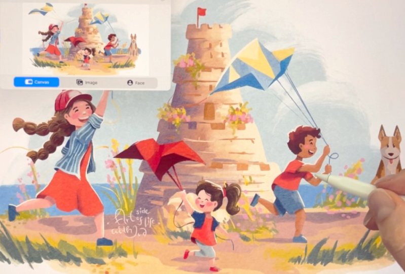
14. Characters in a Scene: And in this video, I will show you an example
on how you can implement the characters into the full environment
illustration. And now I imported
the characters into the other background from the class about the
kid illustration. And there I also
showed you how you can achieve this kind of sand
castle simple background. So you can watch that
class if you want to create this type of background
for your characters. And other than that, I will also create another video where we create a different background for these characters
specifically. And I was thinking maybe a nice river and
maybe nice cloud. Anyway, that will be
a different video. And as you can see here, I also adjusted
some of the colors. I tested out different
versions and different color combinations for the characters and the kite. So you can play around with
different color combinations, and you can try different colors as well on the sketch level. If you want to just color the characters. Also,
the other option to test out different colors is to go to layers and then when you have enough
layers in your canvas, you can just drag and drop
the colors into the shapes for the characters outfit like
we did during the process. If you don't have enough layers, you can always merge the layers which you are
already happy with and you will not change anymore
and you copy them in a different canvas in case you need them later
in the future. So here, what you can do, you can just flatten
the background, and that one is on
a separate layer, and that gives you even
more layers to work with if you want to play around with more things in
the illustration. So here, I will just
keep it as it is. And here, what you
can also do is to activate also the paper
layer for the file, if you worked with the same paper cotton, procreate
template as I used for this illustration
because that adds super nice texture and more
traditional look and feel, which I currently enjoy a lot. I can deactivate
the paper as well, and just zoom in on
the illustration. So it depends on the
look that you prefer. Alright, I hope that
you enjoyed creating this illustration with different characters
in different ages, and I hope that you
learned something new and I can't wait to
see your illustration. So either please upload them in the project section or when
you share on social media, please don't forget
to tag me so I can reshare your illustration
and artwork with others. So how did it go? I hope that you enjoyed
learning something new and creating this
project illustration. Thank you so much for watching, and see you in the
next class. Bye.
 Iva Mikles, Illustrator | Top Teacher | Art Side of Life