Transcripts
1. Intro: About the Class & Project Overview: Finally, the Burmans are here, and all around us, the world is slowly
transforming into these beautiful vibrant
shades of reds, yellows, rust, and faded greens. There is something
about autumn mornings that I absolutely love, that soft mist
hanging in the air, the gentle autumn light, the sun barely up
and the whole world glowing as though it lit from somewhere
just out of the frame. It's that kind of morning that makes me want to grab my coffee, my paints, and just
sit there for a while. And for years, I tried
to paint that feeling, and for years, it fought me. Because that soft golden he looks so effortless when
you're standing in it, but the moment you try
to put it on paper, the colors turn muddy, the light disappears, and
somehow the magic is gone. Hey, my dear friends. I'm
Nilmoy, a watercolor artist, art educator, and
a brand ambassador for Shinhan Art
and Silver Brush. Over the years, I
have taught thousands of students online and offline, and have been fortunate enough
to have my work featured in various international watercolor exhibitions
worldwide. Nature has always been at
the heart of my paintings. And when I was a beginner, many of the concepts
like colour temperature, value mapping, creating
contrast through the use of warm and cool colors felt
completely alien to me. I knew the terms, but understanding how to
use them in a painting took years of experimenting and figuring things
out the hard way. And in this class, I want to share what I have
learned along the way. Together, we are
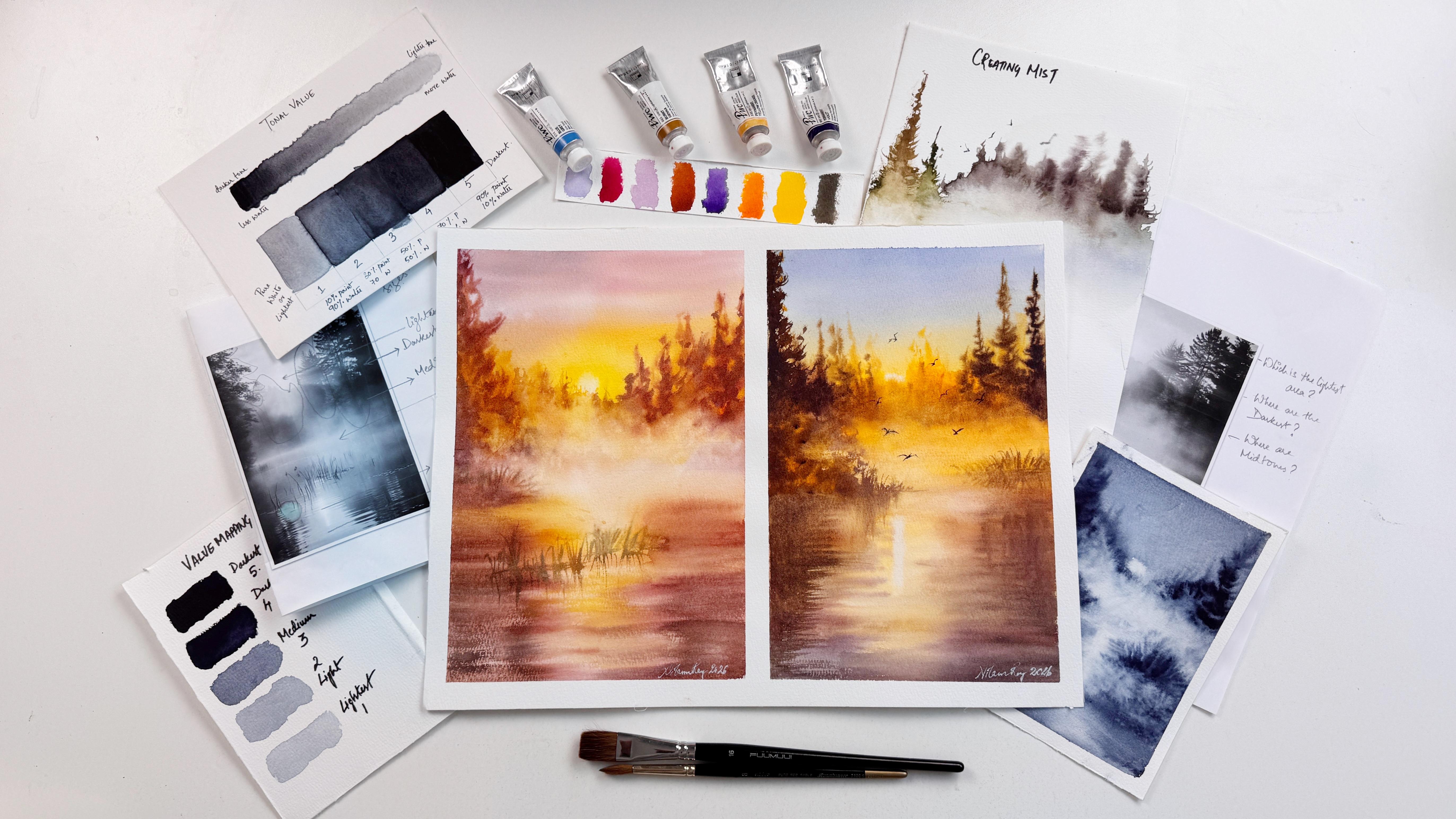
going to paint this beautiful, misty
autumn landscape. This class isn't just about following along and creating
one beautiful landscape. It's about understanding
why certain colors, values, and techniques work together to create light and atmosphere, so you can apply
the same principles to your own paintings. We will begin by revisiting the concept of
color temperature, understanding how warm
and cool colors interact, and how even subtle
shifts between them can create contrast depth and
illusion of glowing light. We will then explore how to read a reference photograph
through value mapping, identifying the
lights, midtones, and darker areas before
we begin painting. I will also show you how thoughtfully placing
warm and cool colors within these value
structures can completely transform the mood and
atmosphere of a painting. And the best part is, you don't need a huge
collection of paints and brushes for this,
a good quality, 100% watercolor paper,
a limited palette, mostly your primary watercolors, and a few good brushes will
take you surprisingly far. And here is the part that I'm
most excited to show you. The same reference can turn
into two beautiful paintings. By shifting the palette or
moving few elements around, one piece can go from warm
and golden to cool and moody, and suddenly, it's
not a copy anymore. It feels like yours, and I'll show you exactly
how I approach this. The class is perfect
if you already know the watercolor basics and want
to bring more atmosphere, depth, and confidence
into your painting. But if you're a brave beginner, and this is the kind of painting that you have
been wanting to try, you are welcome here, too. My hope is that, by
the end of this class, you won't just have one
beautiful autumn painting. You will have a simple
framework that you can take to any golden misty
landscape that catches your eye and a better
understanding of how to feel and express the light that you see and feel
onto your paper. And once we have finished
painting together, I'll give you a little
challenge to take these techniques beyond
this one project. You can choose any
other similar reference or simply a landscape that speaks to you and try applying the same ideas
of color temperature, moisture control, soft ages, and the atmosphere that you feel and see in the reference. You can share both
the references and your finished piece in the
submit project section. I would love to see
what you create and offer you some personal
feedback along the way. So if you're ready,
grab your paints, put on a cozy sweater, and grab a cup of coffee, and let's go and chase some
autumn light together.
2. Supplies Needed : He. Let's take a look at the supplies we will be using in this
class. Don't worry. I have kept the list to the essentials
because I don't want supplies to become a thing that gets between you
and the painting. Let's start with our
most important supply. That is our paper. Here in this class,
I will be using Medan arts watercolor paper, which is of the size
16 in to 12 inch, 100% cotton, and the thickness
of the paper is 300 Juasm. This paper is also acid free, as you can see here
it is labeled, and you can see rough being
labeled on the paper surface. But here is something
interesting. If you look closely at
the grain of this paper, you will notice that it actually resembles the
coal pressed texture. You might find in papers from many other
professional brands. It isn't as heavily textured as you might typically expect
from a rough grain paper, although it does have a little
more texture than the coal pressed or the grain
fine variant of its own. I have experimented
with this paper quite a bit and have been
happy with the results. It's a good budget friendly
option for practice, especially if you're a
beginners starting out. Okay, let's talk
about our paints. We will be working with
a limited color palette, so your basic watercolor set will work perfectly
well for this class. Before we dive into
our main project, I will also walk you through a separate lesson on
color swatching and mixing so you can get familiar with our colors before
we start painting. Let's talk about brushes. I'll be using a few
different brushes, each serving a specific purpose. First, I have this short
handled flat brush from Hen which I find really handy for certain
techniques such as laying the flat wash or
covering larger areas. Next is the size
16 flat squirrel blend soft brush from Fumi. It's lovely for covering larger areas and
working with washes. Then we have the size four reservoir round brush
with an extended tip. Now, if you do not have this particular
brush, don't worry, you can substitute
it with a size two or four liner
or rigger brush. Okay, now coming to my two of my absolute favorites
from silver brush. The first is this go to mob quill brush
from Atalia series. The second is this
Kolinski red sable brush from the Renaissance series. This one is incredibly soft
and holds water really well. It's a pleasure to work with. But remember, you
don't need to own the exact brushes
to follow along. Just pick any similar
soft bristle brushes from your existing collection,
and you'll be good to go. Next, moving on to our basic
sketching accessories, we will be needing
a four bay pencil. You can also go ahead and
use your mechanical pencil, a ruler and an eraser. You can also use a needed
eraser if you have one. It's particularly useful for gently lifting and
lightning graphite marks without damaging the paper. Next, we will be needing
a misting bottle. I'm here using a
200 Ebel bottle, but a smaller spray bottle
will work just as well. This is in case if the paper runs dry in
between your painting. We will also keep some
tissue paper or towel handy to clean our brushes and gently dab away the excess
water whenever needed. And of course, we will
need two jars of water, one for rinsing our brushes, and the other for
picking up the water. I'll fill this up later. Now, here is one of the little vital
helpers in this class, a natural sea sponge. You can use a piece of
natural sea sponge, but if you do not have one, feel free to use any light pooh synthetic sponge
that you have at home. And last but not the least, we will need some
masking tape to create this lovely crisp edges
around our painting. Masking tape comes in
various widths and sizes, and I usually switch
between a two inch tape and a narrower half inch
tape depending on the borders or the effect that I want and the area
that I am masking. And that's pretty much
for our supplies. As you can see, you don't need an overwhelming collection
of materials to get started. Just gather what you have, keep things simple, and let's focus on what
really matters.
3. Revisiting Color Temperature: Part 1: Before we derive into
our color palette, let's first understand our fundamental
concept in watercolor, that is a color temperature. We often describe
colors as warm or cool. But interestingly enough, the same primary
colors like your red, yellows and blues have both
warm and cool variations. Now, this description
of color of how warm or cool it is is called
its color temperature. Now let's take a look
at our primary colors. Each of our primary color can have either a warm
or a cool bias, depending on which
neighboring color it leans towards on
the color wheel. Let me explain this. Now, if you look at the split
complimentary color veil, a red that leans towards orange and sits next to
orange is a warm red. While a red that leans towards purple and sits next
to it is a cool red. Similarly, a yellow that leans towards orange
is a warm yellow, while the one that leans
towards green is a cool yellow. Examples of cool yellow can be your lemon yellow
or yellow light, which has a greenish
undertone to it. Same goes for the blue, as well. A blue that leans towards
purple is a warm blue, while the one that leans
towards green is a cool blue. If you take a look here, I have grouped the
primary colors according to their
temperature bias, along with the examples
of the pigments to make it easier for you to
understand and follow. Now you may ask, why
does this matter, and why is it important to know? Understanding color
temperature helps us mix the colors we want. For example, combining
a cool yellow with a cool blue generally produces a cleaner, more vibrant green. But mixing a warm yellow with
a warm blue often creates a more muted green because their color biases
introduces hints of red, which neutralizes the green. Let me show you a
quick demonstration of what we just discussed. Watch closely as I
mix my cool yellow. Here I'm using my lemon yellow light where
I'm using the pigment PY 81 with my cool blue PB 15 to create a bright
and vibrant green. Now, depending on
the proportions of the two colors that
you are mixing, you can achieve different
variations of green. Adding more yellow will give you a brighter
yellowish green, while adding a little
bit more of blue will shift the mixture towards
a deeper bluish green. So simply by adjusting
the proportions, you can create a whole range of beautiful greens using
just these two colors. Similarly, when I mix my warm
yellow with a warm blue, I will get a more muted
and darker green. Here, you can see that there is too much of
blue into the mix. There is too much of blue paint loaded onto the tip of my brush, so I need to rinse my brush
and load more with yellow. I'll try to balance
this mixture. Notice how the
resulting green isn't as bright and vibrant
as a previous mixture. Instead, we get a
more saturated, earthy and muted green. And remember, whether a green is warm or cool depends
on whether it leans towards yellow or blue and not on how bright or
muted it appears. Now the same principle applies when mixing complimentary colors that are the colors that sit opposite to each other
on the color wheel. For example, blue and orange
are complimentary colors, and when mixed together, they can produce
beautiful early browns. Similarly, mixing violet
with yellow can also give us a range of browns depending on the pigments and the
proportions that you mix. This browns can vary
in temperature too. A brown that leans
towards orange, red, or golden yellow
will appear warmer, while the one that leans towards blue or green
will appear cooler. For example, adding more orange to your mixture will give you warmer
reddish brown, similar to burnt sienna. We will explore this further
in our color palette lesson, where I'll demonstrate
how mixing violet with both warm and cool
yellows can give us different variations of
warm and cool browns. So remember, even when working with muted
colors like browns, you can control
the temperature by simply adjusting the pigments
and their proportions. Here, I have demonstrated a few possible combinations of complimentary colors using
different color biases, and you can see the
beautiful range of browns we can create. When a brown leans towards red, orange or yellow,
it appears warmer. On the other hand, when
it leans towards blue, green, or purple,
it appears cooler. I encourage you to try creating your own color mixing chart and explore
these combinations. You will be pretty amazed at the variety of colors you can achieve And one very
final and important thing to remember is that the colour
temperature is relative. A color can appear warmer or cooler depending on the
colors placed alongside it. Let me give you an example. If you place Indian yellow
next to lemon yellow, you will immediately notice that Indian yellow appears warmer because of its orange undertone. Now let's take this
a step further. If I place orange in the center and Indian
yellow on its left, and lemon yellow on its right, you can observe a
gradual shift in temperature from
warmest to coolest, the order would be orange, Indian yellow, and lemon yellow. So remember, color temperature
isn't always absolute. It's also about how one color relates to the
colors surrounding it. I hope from this lesson, you have clearly
understood what is color temperature and how it affects the mixing
of our colors. It's also a powerful way to create a sense of light,
depth, and contrast. In the next lessons, we will compare my
reference photo with two of the painted versions demonstrating how changing
the color temperature can transform the mood, light, and overall feel
of the same scene.
4. Understanding Light & Contrast- Part 2: And before we paint, I want you to slow
down and really take a look at this
photograph because one of the biggest mistakes I
made when I started painting atmospheric landscapes
was looking at the objects instead
of looking at the light. I would see trees, water, grass, and sky, and I would try to paint all
of those things all at once. But what we are really
trying to paint here is the atmosphere holding
everything together. Look at this area where the
sunlight is coming through. The light feels warm, but notice that the
surrounding colors aren't simply warm too. There are cooler, quieter notes sitting
around that warmth. That contrast is what makes a golden area
actually feel golden. And then there is value. I have removed the color
from this photograph, and you can see the
brightest part of the scene is actually
quite simple. We don't need a lot of different colors to
create that globe. Let's understand from
this reference clearly. We need to protect
our lightest values first and then build
everything else around it. Now, in watercolors, we preserve the lightest
values first, gradually building up the
medium and darker tones. You can see this in my
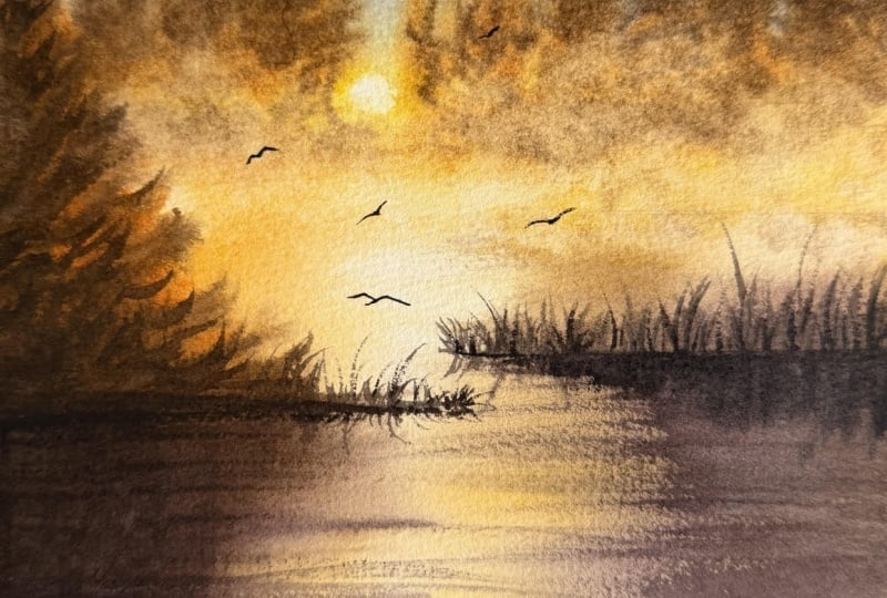
little thumbnail study where I have used negative
painting to create the sun, building depth and
contrast through the surrounding medium
to darker values. Now, once you are happy
with your value mapping, the next step is to translate
those values into color. This is where we introduce
warm and cool colors along with different tonal values to create that depth and contrast. Now, if you look here, yellow is our
brightest color and the key to create
that glowing effect. So we will keep it
light and luminous. From there, we will
gradually transition into yellow orange to create
that warm radiant glue. Finally, we will
enhance that glow by introducing the
complimentary color of yellow, which is violet. When yellow and
violet are mixed in their respective warm
and cool variations, they create a range of
warm and cool browns. We will use this browns to
paint the surrounding trees, foliage and their
reflections in water, enhancing the glow and
contrast in the painting. In the color palette lesson, I have shown you how to create the brighter and
more muted browns. I hope this helps you understand how warm
and cool colors, along with their tonal values influence the overall atmospheric
mood of your painting. The next lesson,
I'll explain this further by showing you
two painted versions of the same reference using warm and cool colors to create two distinct atmospheric modes.
5. Making The Reference Your Own - Value map & Temperature: Welcome back. In this lesson, we are going to
explore a new way of looking at your
reference photos. One, that might completely
change how you approach them and ultimately how you
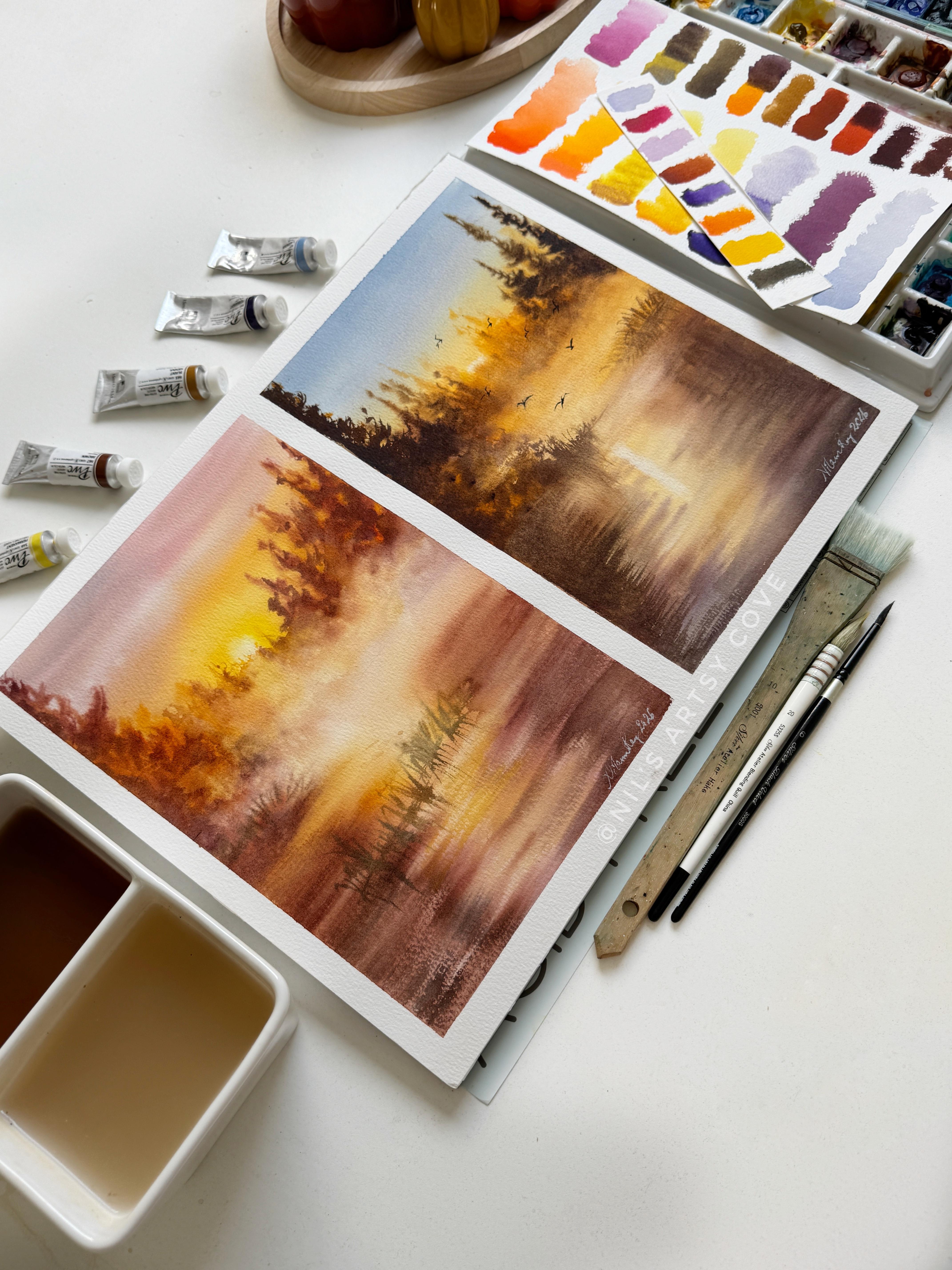
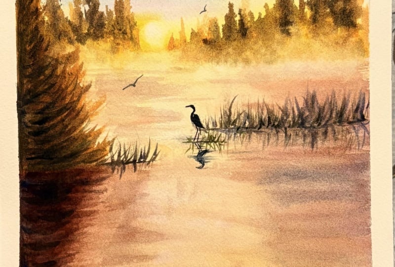
bring your paintings to life. Here are two paintings that I did from the exact
same reference. They shared the
same composition, the same direction of light, and the same basic story, and yet they feel like two
completely different pieces. Why? Let me break
it down to you? Now, if you look at the
painting on the left, you will notice how harmonious
and peaceful it feels. That's because we
are leaning towards a predominantly warm palette. Look at how the golden yellows gradually transition
into soft pinks. This beautiful shift in color
creates the illusion of a golden haze almost as if the sun is gently peeking
through the morning mist. Now, let's quickly brush up
on our colorful knowledge. If you look at the split
complimentary color wheel, you will notice that the
warm colors like red, orange and yellow sit
next to each other. When the colors are positioned next to each other
on the color wheel, we call them analogous colors. And in our painting on the left, we have used the
closely related hues in the sky and his surroundings to create a beautiful
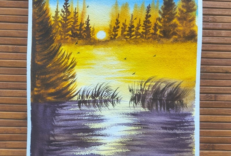
sense of harmony. Now let's shift our attention to the painting on the right. Here our eyes are
immediately drawn to the striking contrast between the cool blue sky and
the warm yellow oranges. Now, if we look at
the color wheel, blue sits opposite to orange, making them
complimentary colors. While, similarly, violet
sits opposite to yellow. So while we are not using a strict complimentary
color scheme here, but we are still creating
a strong contrast by placing a cool light blue
next to warm golden colors. And this is where things
get really interesting. Our eyes are naturally drawn to differences in
color temperature, particularly when
warm and cool hues sit next to each other. The cool blue makes the golden yellows appear
warmer and more luminous. The warmer tones make the blue feel even more cooler
by comparison. This interplay creates
a visual interest, which gives the painting
a little more vibrancy. And that's really the idea. Your reference photo is just information,
not instructions. It tells you where the light is, where the shapes sit, and how deep the scene goes. But it does not tell you
which colors you have to use or exactly where
every element has to go. Now, here is something
I like to do. Whenever I choose
a reference photo, I convert it into a
black and white first, so I can focus on the
bigger shapes and the values without getting
distracted by the colors. I start by identifying
the lightest areas, the places where I want to preserve the light
in my painting. Then I will simplify the details into larger
and smaller shapes, gradually mapping out the values from the mid tones to
the darkest areas. Now, if you look closely
at this reference, you will notice that the
little reads of grass, you could keep them where
they are or move them around, perhaps positioning
them closer to those misty, bloody
tree silouetes. Small changes like this can make a difference in how you
interpret the scene. The idea is to simplify
the reference first, understand its
underlying values, and then let the colors become
your own creative choice. Now, if you look at these
two painted versions, you will notice
that the one on the le stays quite close to
the original reference, whereas in the
version on the right, I have added birds of varying
sizes to create a sense of movement and bring a little bit more of life into the painting. Also notice how I have shifted the clusters of grass
reads on the right. This might seem like
a small adjustment, but they can make
a real difference in how we interpret a scene. And that's the whole idea here. We are not simply trying
to reproduce a photograph, we are learning to use it as
a starting point and make thoughtful choices that allow our own artistic interpretation
to shine through. Now, before you commit to a full sheet of
watercolor paper, I highly recommend spending just 2 minutes of your time
on a quick thumbnail sketch. Use this little study to taste the placement of
your main shapes, map out your values, and experiment with
your color palette. It's a simple exercise, but it can give you so
much more confidence when you begin your
final painting. Instead of feeling restricted by your reference or
wondering what to do next, you will have a clearer
idea of where you want to go and the creative choices
that you want to explore. Now it's your turn. Take a couple of
minutes to create a small thumbnail sketch
of your reference, mapping out the main shapes and values before you move on
to your final painting. And if you would like a little more guidance
on this process, you can revisit lessons
seven and eight of my class, learn to paint many
moods of water, a seven day watercolor challenge
where I walk you through the concepts of
thumbnail sketching and value mapping
in more detail. So go prepare your
thumbnail sketch and don't forget to share it alongside your final painting in the submit project
section of the class.
6. Color Palette & Mixing: H Okay, so let's watch
out the colors first. Don't worry if you don't own the exact colors that I'm using. I'll be sharing alternatives
and showing you how to mix colors to achieve similar use using the paints
you already have. The first color is
from blue gray, from Shinhan PWC range. This is a cool blue mixed with a little bit of white
pigment into it, giving that soft
muted appearance. Now, if you do not have
this particular color, you can swatch out a
bright, cool blue, such as a cerulean blue, which typically contains PB
35 or PB 36 as this pigment. And add in a little
white watercolor or gouache to achieve a
similar color to mine. This will give you that soft, cool, slightly opaque
blue gray tone. Now, the next color that
I'm swatching out is my permanent yellow light from the same ShinhansPWC
watercolor range. This is a bright yellow with
a cool temperature bias, which makes it great choice for creating fresh and
luminous yellow tones. If you do not have
this particular shade, you can easily use lemon
yellow as an alternative, as it also has that characteristic cool
yellow bias to it. The next color is a
very warm yellow orange from again Shinhans PWC range. This is known as
permanent yellow orange. Now, don't worry if you do
not own this color either, because you can easily
mix it yourself. Simply take about one part of red and add two parts
of warm yellow to it. Mix them together,
and you will get this beautiful warm
yellow orange hue. Remember to add the
red gradually as even a small amount can significantly change the
color to reddish orange. So even if you own just
a basic watercolor set, you can still mix your
colors to create hues that are quite similar to the
ones that I'm using here. The next color that I'm going to spot is my permanent violet. Violet is generally
considered a cool color as compared to your warm
reds, yellows and oranges. And it's also a color which is commonly found in most
basic watercolor sets. Now, if you look at
the color wheel, violet sits opposite to yellow, making them
complimentary colors. When you mix complimentary
colors together, they tend to
neutralize each other, creating more muted tones. In this case, mixing violet with a warm yellow can give
you a warm eardy brown. Take a look here how I
form this rich, warm, eardy brown just by mixing violet with my
permanent yellow deep. Similarly, when you mix
violet with a cool yellow, such as your lemon yellow
or permanent yellow light, you can obtain a more muted,
slightly cooler brown. The exact result will depend on the pigments in your paints
and the proportions you use. So feel free to experiment
with your own colors. In my case, you will notice
that the brown that I have obtained here is a very
muddy, muted, greenish brown. Now let's take a look
at another scenario where I'll be using my
warm burned sienna. This color is readily available in most
watercolor tubes and is also commonly available in basic 12 colour
watercolor sets. So you may already have
it in your palette. When you mix burnt
sienna with violet, you can create a
rich deep brown. And if you mix this combination
further with sap green, you can push the color further towards a darker,
more muted brown. These combinations
are particularly useful when you want to create natural looking shadows
and earthy tones without introducing too many different colors
into your palette. So these are the warm and cool colors we are
going to use for our project to create that
warm, evocative atmosphere. By understanding how color
temperature influences the way colors interact and how you can mix them to create
different hues, you'll be able to develop a beautiful range of
harmonious colors without needing to own every
single color tubes that you see available
in art stores. So take a moment to swatch your colors and have
your palette ready. Once you are all set, let's dive into our
project and bring this warm evocative
autumn landscape to life.
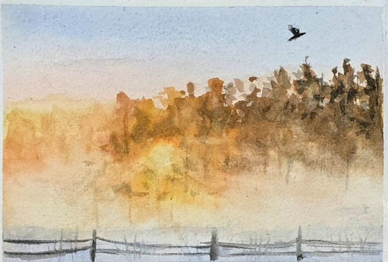
7. Techniques to Create Misty Background & Foreground: Let's take a look at these different misty
autumn references. One thing you will
notice across all of them is the disappearing edges. As we move towards
the background, shapes and edges become softer and quieter while moving
into the foreground, forms become more defined and the contrast
gradually increases. For our project reference to, we are going to use the same method or techniques to create
that misty effect. But first, I will create
the sloout of the trees. Here I'm keeping them
loose and expressive using just the tip and belly
of my reservoir brush. Now to build a little
bit more depth, I will introduce darker tones along the pine
branches on the left. Then using a watery mix
and the tip of my brush, I will create a
soft blurry effect around the base of the trees. You can add as many
trees as you like, allowing some of them
to merge from the base. While the base is still damp, I'll take my natural sponge and gently dab around the
bottom of the trees. This is a lifting technique. The porous fluffy texture of a natural sponge creates a
beautiful, airy misty effect. You can achieve something similar using tissue
paper as well. Just slightly dampen the edge of your tissue before
lifting the paint, and there you have it. This is the dry on wet approach where we have the crisp
edges of the trees, well the misty and soft
blurred effect at the base. Now let's try the same
technique using wet-on-wet. I'll start by using my clean damp sponge to
evenly moisture the paper. With the same size
four reservoir brush, I'll then establish a baseline from where the
trees will emerge. Since the paper is already damp, I'm using a creamier
consistency of the paint to establish
the shape of the trees. Observe here how loose and expressive my
brush strokes are. You just need to have the
basic cone shaped trees of the pine that is broader at the base and narrower at
the apex or at the top. So when you have
that shape in place, you just need to refine
the outer fringes of your trees using the pointed tip of your brush, and that's it. Next, using the
same damp sponge, I'll gently remoisten
the base of the trees. Now, if you do not have this
kind of natural soft sponge, you could also use the belly of a large round brush
for this dip. Make sure that it is
damp and not too watery. Now with a soft natural
hair round brush, I'll introduce another
layer of color. Here I'm using lavender blue mix from the cool blue,
purple family. I'll gently blend
it into the base, making sure not to over mix
it with the warmer greens. We want to preserve
that beautiful, clean lavender hue for
that misty effect. Now, you can use the same
technique to create mist rising from our water body with the sunrise softly
reflected through it, creating this beautiful
ethereal atmosphere. As you can see, simply
laying a wash of color and selectively lifting paint from certain areas can create that
beautiful dreamy effect. We will be using
this very technique in our final project to create the mis let my lavender wash sit
for a little while. The paper is still damp, so I'll go in with a clean, damp sponge and gently dab to lift paint from
selected areas. Notice how I'm continuously
rotating the sponge to use the clean surfaces
for lifting rather than spreading the pigment
back onto the paper. Now, let's quickly
take a look at adding a few birds using just the
pointed tip of the brush, and that's pretty much it for the techniques that we
are going to apply.
8. Prepping the Paper & The Golden Sky: Let's begin by taping
down our paper on all four sides
using masking tape. I'm also dividing the
paper into two sections. One half is for our painting, and the other half is
for watching our colors, and our paper is ready. Now, if we look at our reference and look
at the composition, I'll lightly sketch
a horizontal line roughly one third of the
way down from the top, and this will serve
as a horizon line. I am not going to sketch the trees or background
elements in advance. I prefer to work directly
with my brush and colors. But if you're more comfortable
having a little guidance, feel free to lightly sketch the shapes and
placement of the trees. My four B pencil has
left slight dark marks, so I'm lighting them
using a needed eraser. This is particularly important because we are going to create a misty effect and we don't want those pencil lines showing through the lighter
transparent washes. Now I'm straight going
into painting the sky, using the wet-on-wet technique. For this, I'm evenly coating
the paper with clean water, using a flat brush, making sure the surface is damp but
not too overly wet. If needed, go over your paper
two or three times with a slightly damp brush to keep the surface evenly
moist for longer. Not rush this step, take your time and moisture
your paper surface evenly. Here is a closer look at how
your paper should appear. It should have a
uniform machine across the surface without any puddles or excessive water
collecting on it. Getting this moisture
level right is very important because
it allows the colors to blend beautifully
while giving us better control over
the soft transitions that we are aiming for. I'm preparing a milky
consistency of lavender by mixing my blue gray with
a little bit of violet. This will be our first
color for the sky. I'll begin applying the
wash from top of the paper. Usually, I prefer to start at the horizon and work
my way upwards, but here I'm approaching
it a little differently. You will soon see why. We are going to create a
beautiful variegated wash using two complimentary colors, allowing them to mingle
naturally on the paper. And if you would like to
explore different types of washes and learn how to
approach various skies, you can always refer
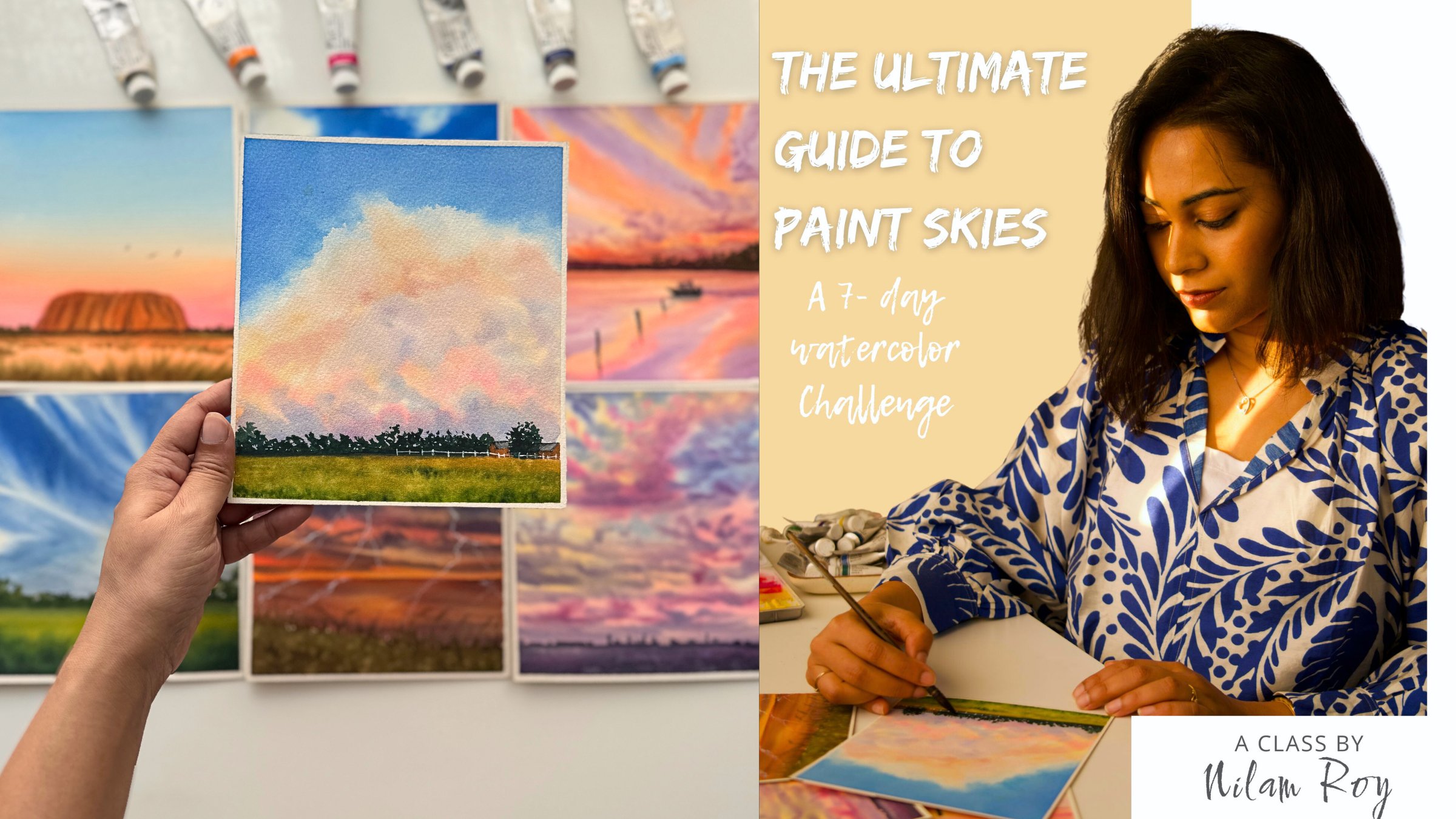
back to my class, the ultimate guide to
paint skies in watercolor, a seven day challenge. I will start with
my cool yellow to create the sun at the
horizon line over here. So I'll gently paint around a small circular area
to indicate the sun. Make sure that the brush
is not too watery. You need creamy consistency
of paint to do this. Now I'll gently spread
the yellow around the sun extending it towards the
sides and along the horizon. This is our first layer, setting the foundation for that beautiful golden glow
radiating from the sun. I'm using a damp magic
sponge to gently lift away any color and preserve the white of the paper
inside the circle. Now you can also do this
using your tissue paper. This is called negative
painting where we paint around a shape rather than
painting the shape itself. Essentially, here we are
preserving the light. Before you begin this step, if you feel that your paper has started drying around
the horizon area, simply go over that area
with a clean damp brush to rewet it before
introducing your yellows. This will help the colors blend softly without creating
unwanted hard edges. Now I'll load the tip
of my mob brush with the lavender blue mix and
start again from the top, lightening the brush pressure
as I approach the yellow. This creates a soft
uniform blend. Next, I'll introduce a
milky consistency of warm yellow over the
cooler yellow layer to enhance that
beautiful golden glow. I'll carefully start
near the horizon and work my way upwards
painting around the sun. Now, once that is done, I will go ahead and
rinse my brush, squeeze out all
that excess water, and reload it with
a milky consistency of my lavender mix. Now, here is something
that beginners often do. They tend to introduce the
lavender directly over the yellow instead of
working from the top down. This can create distinct
separate band of color rather than a smooth seamless transition
we are aiming for. Now, to correct this,
I'll use the dam tip of my mob brush to soften the transition all the
way towards the top. Finally, I'll take my damp
magic sponge again to lift any residual color that may have crept into
the white of the sun. Using gentle circular motions, I'll carefully lift the pigment and bring back that
beautiful glowing effect. Now here is why I
started painting the sky from the top rather than working upwards
from the horizon. We are going to create the background for the sun's
reflection in the water, and I want to keep the horizon area workable
for this next step. I'll take my flat
brush and lay down an even wash of clean water
beneath the horizon line. We are going to
work wet-on-wet to create the reflection
of the sky in water. Since the horizon
area is still damp, as I introduce the warm
yellows along its base, using my flat brush, I can gently smoothen and unify the transition without
creating an uneven edge, and we will continue building this reflection in the water
in our next lesson, too.
9. Distant Background Pines & Misty Waterbody : Let's continue building the
reflection in the water. Using the flat edge
of my flat brush, I'll create horizontal strokes
close to the horizon line, deliberately leaving
a few spaces in between the center of the water body to suggest
the sun's reflection. I have began with a mixture of cool yellow and yellow orange, keeping the tonal
value quite light to establish that beautiful
golden glow on the water. We will gradually build
depth and contrast by introducing darker tonal values
in the subsequent layers. For now, I'll extend this yellow wash towards the bottom half of
the paper as well, completing the first
layer of our water body. Next, I'll take my damp magic
sponge and gently lift out more color around
the white spaces to preserve those
areas of light. You can also use a clean, damp flat brush for this step in case if you do not have
magic sponge with you. Finally, I'll introduce a
few more golden yellow, orange tones around
the lighter spaces to make the reflection
glow even more. Now, I'll quickly
start establishing the distant pine canopy along the horizon using a combination of short and long
vertical strokes. I'll walk around
the sun extending the silhouetted towards
both sides of the horizon. Here I'm using a mixture of my yellow orange with a little
bit of my burnt sienna. Since my paper is still damp, the strokes will
naturally soften, creating a beautiful,
hazy background. Once the basic sillouette
of the pines are in place, I'll use the tip of my brush to suggest a few pine
needles along the edges. Do not worry about
making them perfect. Just use loose
connecting strokes to create the
impression of foliage. With the first layer in place, we will gradually build more
contrast using a creamier, darker consistency or burnt
sienna near the base. Next, I'll introduce darker
muted browns by mixing violet and green into the same yellow orange
sienna mixture. Using these deeper tones, I'll then establish
the silhouetted of the foreground pines on
either side of the horizon. Notice how all my strokes
remain loose and expressive. We don't need to define every branch of the tree or
every needle of the pine. It's about suggesting
the shapes and allowing watercolor
to do its magic. An important note
before you begin. If your paper starts
drying before you get to painting the
distant background pines, don't try to continue working on a partially dried surface. Instead, use a heat gun or a hair dryer to dry
the paper completely. Once it's fully dry, re wet the entire sky evenly and then begin painting
your distant pine slouttes. This will help you avoid unwanted hard edges and ensure a consistent,
soft, misty background. Now, I'll quickly grab my misting spray bottle and lightly miss the bottom
section of the paper, which is our water body
along the base of the pines. It's time to bring
out a natural sponge, dip it in clean water, and give it a good
squeeze to remove all the texas moisture until you have a soft,
fluffy, damp sponge. Using this damp sponge, I'll gently start lifting
paint from the selected areas, beginning around the
base of the pines to create that
beautiful mist effect. I'll rinse and squeeze the sponge in between to
keep it clean and prevent any unwanted color
from transferring back into the lifting
areas of the paper. Now you might notice that
some of our layers are fading a little in saturation
as we lift the paint, so I'll quickly go back in with my damp brush and reinforce the background pines
with a few darker and cooler browns to bring back some of the depth and contrast. Now let's start working on the larger pine lovat near
the water body on the left. I will first establish
its basic shape using a lighter tonal value of yellow orange mixed
with burnt sienna. Now, once the base
layer is in place, we will then gradually
build depth and contrast by introducing the
cooler brown tones over it. Now you will see me introduce cooler tones over
the warmer base to build depth and contrast, but notice how I'm
leaving little pockets of those warm undertones peeping through between the
darker strokes. The interplay of warm and
cool values will give her pine foliage more dimension and help enhance that
beautiful golden glow. I will furthermore introduce a few more darker values
towards the left edges of the tree to intensify
the contrast and make that golden glow
stand out more vividly. And with that, we are
done with this layer. Next, it is to move on to building reflections
in a water body.
10. Creating Contrast in Reflections: Okay, so now here my
paper is still damp, but it is no longer too wet, so I will use a creamy mixture of purple with a little bit of burnt sienna mixed
in it to create the reflections of a
pines lovat in the water. I'm using my size 16
natural hair flat brush, working with its flat edge to create short
horizontal strokes. Notice how I'm bringing the strokes only halfway
towards the center, leaving some breathing
space in between. I'll repeat the same process on both sides of the water body. Pay attention to my wrist
and brush movements as these short horizontal
strokes help suggest the reflections without making them look too rigid or uniform. At this step, it
is important that your paper is damp
and not overly wet. This moisture level allows
the reflections to soften beautifully while
still retaining the characters of
your brush strokes. If you feel your
yellow base layer has faded out a bit too much, you can introduce few touches of burnt sienna mixed with yellow orange between
the violet strokes. Keep this warm cens subtle. We do not want to overpower
the cooler reflections. Next, I will add only a few light irregular
foliage strokes near the base of the horizon
to create the illusion of the mist rising
from the water, catching the glow of the sun. Go ahead with this step, only if the horizon
area is still damp. If it has started drying, gently dab the area with a clean damp sponge to reintroduce some moisture
before adding the strokes. Okay, so now I will introduce darker tones of violet
mixed with brown, working just beneath
the left pines love to deepen the shadows and strengthen its
reflection in the water. I'll begin with a few
longer vertical strokes to suggest the pine reflections. Then using the pointed
tip of my round brush, I'll sharpen certain edges with short horizontal strokes to give the reflection a
little more definition. Next, I'll move towards
the right side using the same brush to introduce a few grass wreaths
emerging from the water. For this step, we are
working on a damp paper with a creamy consistency of paint loaded onto a
slightly damp brush. Be mindful of how much
water your brush carries. Too much moisture on a paper surface that's
already beginning to dry can cause unwanted blooms and leaves in areas where
we don't want them. I'll add a few more strokes
to this grass roots to introduce some movement and
dynamism into the water. You can now really start to see that beautiful golden misty glow of the sun becoming
more pronounced, especially as we have
started building the reflections using
cooler tones in the water. Now, if you look at
the left pine in comparison to its reflection
and the surrounding shadows, I feel the tree still
appearing a little too warm, so I'll balance
this by introducing some darker cooler tones along its leftmost edges to
bring out the shadows. Even though the paper has
started drying in this area, using a creamy consistency of paint on a slightly
damp brush will help me achieve the effect
I'm looking for without introducing too
much unwanted moisture. Keep observing how
the subtle shifts in warm and cool tones
helps strengthen the overall contrast and brings
the golden glow to life. I will now balance
the reflections in the water using the
same paint mixture, bringing tonal values
closer to the trees above. I'll repeat the same process on the right side of the
reflection as well. But when I go with the right, I will use my damp soft natural hair flat
brush of size 16, loaded with the same paint mix. Since the paper has already
dried in this area, we still want to retain those soft diffuse reflections without creating harsh edges. And hence, if you have a
natural hair flat brush, this can be of advantage to you, but make sure your brush
is not too overly wet. And from here, it's really about fine tuning the overall
balance of the painting. Take a step back, observe
your composition, and see where you
want to introduce a little more contrast
or definition. And if you are perfectly happy with it, that's all about it. We will add some
character and movement in the painting by introducing
birds in the next lesson.
11. Final Touches: Really happy with how the overall painting has turned out. We have enhanced
that golden globe by surrounding it
with cooler tones. Now we will let the paper dry. Once it is dry, you
can certainly go and add movement into the
sky by adding few birds. I'll be adding the birds using my size to liner
brush by creating a.in the center and then connecting it to its
wing and its body. You can also simplify
the shape by using a white letter M or
an inverted white W. So now let's go ahead and add a
little few birds in our painting just to
add that dynamic movement. I usually prefer working with odd numbers following the basic principles
of composition. So you can play around with the placement of your birds
into this misty area. Just be mindful of the shape. It should follow the
principle of perspective. The birds in the distant
will be smaller in size, and those in the foreground
will be larger in size. So just have this in mind and play around
with your birds. Oh Remember that it is entirely up to you how you want your
landscape to look. We are not trying to copy the reference
element by element. We are simply trying to
capture the essence and atmosphere we feel when
we look at the reference. So with that, we are
done with our painting. I hope you enjoyed
painting along with me. I'll see you in the
next lesson where you will get to put
everything you learned into practice through your
independent challenge. H
12. Independent Challenge & Outro: Congratulations on
finishing this class. I hope you enjoyed this class as much as
I did creating it. If you painted along with me, share your finished piece in
the submits project section. And if you feel inspired
to take the techniques and interpret a different reference of your own, feel free to do so. To make that easier, I have added a few
similar references under Projects and Resources, or you can browse splash or pixels and pick any reference
that speaks to you. Don't worry about making
it look exactly like mine. Your interpretation of the light is what makes the
painting truly yours. Thank you once again
for joining this class. If you truly enjoyed this class, do consider leaving a review. Your reviews help my class reach a wider audience and motivates me to bring such
new classes to you. Until next time, keep painting, keep experimenting, and enjoy the beautiful season of autumn.
 Nilam Roy, Art Instructor