Transcripts
1. Introduction: Want to wave energy and personality into your
picture book characters. This class is part
one of a series. In this class, we learn how
to create our characters and then how to get
them moving around. In the next class that's
going to be part two, I'm going to show you my
best tricks on how to draw characters consistently
when you have to draw a full bookworth
of characters. And then in the third
part for this class, I'm going to show you how I develop and draw
animal characters. So in this class,
we'll start from the basics on how to
design characters. We'll talk about
finding your style and kind of your shape language
that you're comfortable with, and then including details that help tell the story
of your characters. And then we'll spend some time breathing life into
our characters by learning how to draw
active expressions and poses. By the end of the
class, you'll have a set of two characters
that you'll be able to use in your portfolio or in a picture book dem. Hi. I'm Mirka, and I'm an award winning author
and an illustrator, and I worked with publishers big and small for
the past five years. I've created a
range of books from graphic novels to picture
books and non fiction. I'm passionate about kids
books and love sharing what I've learned along the years as an artist and an illustrator. This series is
great for beginners to learn how to illustrate
for children's books and for intermedia illustrators
who might still feel insecure in one or more
areas of posing characters, expressions or drawing
people or animals. I can't wait to see
the cute characters you create in class. Let's go.
2. Class Project: A. Hi, I'm so glad that
you join me in this class. Now, if you think about
character design, there are a lot of classes that are geared more towards kind of animation
or for game design. And while some of those
principles that apply to those character designs are kind of universal and
they go for all of them, I feel like there's
a lot of things that are different when it comes to picture
book character design. For example, if you think about character design
for animation or, like the games that I mentioned, those characters have to be able to move in kind
of three dimensions. They are they move in
space, we see them moving. And so it's not just like when you're illustrated
in a picture book, it's just a snapshot of
just them in one pose, but we have to be able
to see them in always. And so those characters are always a little
bit more fleshed out. They may or may
not have outlines, but they're kind of rendered in even if
they have flat colors, they're still kind of
three dimensional in the way that they move in space. Now, on the other hand,
if we think about picture book illustration,
there is a much, much wider variety of illustration styles
that appear in picture books compared
to movies and TV. Because like I said earlier, the characters only have
to be in that kind of one pose per page
or on the spread. And so, you know, the outlines can be really sketchy or it can be watercolor, and it can be washes. And so picture book
character design just allows for a lot more variety
than what game or, you know, movies
and TV animation. Might allow. And so kind of the
general guidelines that I think about when I work on picture book
characters is in general for picture books because it is for
younger audiences. Simpler lines, simpler
just a simpler style in general general works
a little bit better than if you think about animation or game design where the
characters have a lot of lines and they're drawn a lot of times a little bit
more in detail and they have a lot more details in their dress and
stuff like that. For picture books,
a lot of times it works a little bit better
when it's a little bit simplified and just simpler lines and simpler kind basic shapes that you
are working with. And then because we
are not animating, we are not moving our
characters on the page. I also feel like another
important point is being able to that one pose that you're putting
your character in, you have to be able to convey the mood not only in the
face of the character, but only in also in the
way that they're posing. So if somebody is
bored, you know, they're not just like
bored in their face, but you have to show you how, you know, if they're
slumping or, you know, however in their body language, how they are feeling as well. And so because the
body language is very important when we are
looking at still pictures, the movement that you are conveying and the action
and the energy that you have in your
illustrations and in your characters is
also very important. And as the fourth point, I feel like in picture book, it's also important to be
aware of appealing kind of shape language and
appealing characters and appealing color palettes. So at the end of the class, you'll have two characters that you've had designed that are from the same story
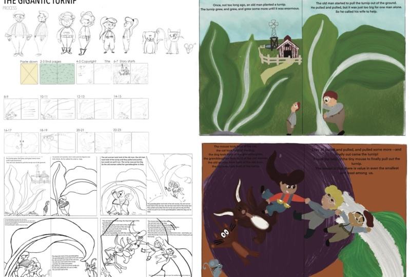
that you can use for your portfolio or for a dummy. For the class, I've chosen the
story of the giant turnip, and I chose that story
because it's a folk story, so it's in the public domain. And also that story has a
whole cast of characters. It's got a grandpa, a grandma, a granddaughter, a dog,
and a cat, and a mouse. And so you can pick
two characters for this class from that story. Or then if you have
your own story or a dummy that you
are working on, you're welcome to pick any
other characters as well. But I'll be working
from the Giant turnip. The manuscript for that story is in the resources
section of the class. You can download it from there. And because I'm planning on another part of this
class that will cover how to do animal sketches or animal
characters for books. For this class, I'm going to be concentrating mainly
on human characters. So I'll pick two of the people from that story to work on. During the class,
I'm going to be sharing examples
from my own work, and we are going to be
looking at a lot of other books and characters that other people have designed. And then I'm going to be sharing some exercises and tips on how to think about creating style your style and characters, and also to build up your
character design skills. So all the resources, the books that I'm
using in this class, the story of the Giant turnip, those are all going to be in the resources section as a PDF that you can download
as part of the class. And you can choose
to share any of those exercises
that you've done in the project section
in our class or in the discussions if
you are looking for feedback for your
character designs. Or you can share a final
scene that you create with the two characters interacting using all the skills that
you've learned in this class. I'm going to be using Procreate on the iPad for this class, but you are welcome to
use paper and pencil or photoshop or any other digital program
that you might have. The skills that I'm teaching are not specific to the
programs that I'm using, but I've learned that
using Procreate or Photoshop or other digital
programs just makes for a little bit of a faster
workflow because I can copy layers and
then draw on top. But you could also do
that if you have tracing paper or a lightbox to just have your underlying
sketch and then put another piece of paper on the top and
then draw through. Now, let's get ready to design some cute characters full
of energy and personality.
3. Character Exploration & Gut Reactions: Okay, so let's get started
with our character design. If I have a manuscript that I'm already working
with, what I do is, I usually read it
a few times and then scan for the
following things. So one, I look for the easy
kind of low hanging fruit. I look for any kind of
character descriptions, anything that has to do, you know, obviously
with their gender. If there's anything
about hair color, clothing they might be wearing the time period that
they're living in. You know, just anything that you can see that's there that describes the character and
kind of where they live. So number two, is I
kind of look at how they act or behave
or react in a book. I look at, you know,
are they submissive, or are they really spunky
or fiery or you know, kind of what their kind
of general character is and how they
react in situations. And then that will kind
of guide me in, you know, giving me ideas or
kind of gut reactions on what kind of clothing
I want them to wear or, you know, and like, if they do kind of
specific things, then I know like, if they're I don't know, a ballerina or something, then obviously, you know, to put them in a ballerina outfit. Or then if you have
really strong characters, that might also
affect or give you ideas of some of the
accessories they might have. So for example, Fancy Nancy, she has a lot of
kind of jewelry, and she's kind of
over the top all the time or Olivia, the pig. She usually wears kind
of very plain outfits, but then she's got this
artistic flair to her. And so a lot of times you'll see her in some kind of interpretive outfits,
I guess, you could say. Or if you look at the book, know David by David Shannon, you'll notice that in a lot of the pictures,
like, David has, like, saw tooth, saw teeth, and
that's kind of, you know, goes with the characteristics
of the book where, you know, David is doing all
these kind of bad things. And so, you know,
these are kind of things that I try to
note down and get kind of gut reactions
on how I feel like the character is and
who they are and how they're going to be
behaving in the book. So third, what I try
to do is pay attention to the scenes or kind
of the background, where the book happens,
if it's on a farm, they might be dressed in overalls or if
we're in the city, what time period it happens, or are we going into the woods? Not only does it affect the clothing that they
might be wearing, but it also can affect the
colors of the clothing. I recently worked on the book
that happened in the fall. And so there was usually I dress my characters a lot of times they'll have red
on their outfit, but it happened in the fall, and there's going to be
a lot of yellows and reds in the foliage all
around the characters. And so I went exactly
the opposite way with, you know, the forest
being all warm colors, with the characters. I went with cool
colors with blues. And so that way, they
were able to stand out in the in the backgrounds
of all the warm colors. And four. I'm also aware of the intended audience
for my book. Picture books can kind of range in general from
about, you know, a couple of years old up until
about eight, 9-years-old. And there's a difference in the way that I
would illustrate a book for a
3-year-old compared to the way that I would
illustrate for an 8-year-old. Kind of, in general, the
younger the audience, the younger, the who the
book is intended for. I try to do more
simple characters, more simplified shapes, cutter, kind of younger characters. And then kind of the older
that your audience gets, the more kind of
complex the characters get in the way that
they're designed and in the way that
they're drawn, and there's a lot more
kind of line work and just kind of modeling
in the characters. And granted, with picture books, it's never kind of a
one size fits all, but those are kind of like the general general
guidelines of how I design characters when I'm working
with picture books. And if you are
working on characters that you don't have
a story for yet, you are just trying to work on a portfolio piece, perhaps. You can think about those above steps and think
about who they are, what their personality is, kind of think about a little interview with that character, what are they afraid of, what their favorite food is, what gets them excited. You know, do they have
maybe some hobbies? That might, you know, give you some clues into
what they might be wearing, you know, again,
the time period. And then that way,
knowing your character, you know what their
personality is, will help you then design that character and
make it unique. And I wanted to just make a
quick note about art notes that you might have when you receive a manuscript
from an editor. So sometimes these manuscripts
will have some art notes. And a lot of times they're
kind of suggestive for you. It gives you ideas of what
might be happening in scenes. And sometimes your editor
might also give you kind of a little bit
of a description of who they kind of see in their mind's eye as being
the character for the book. And in general, for
the art notes, like, you don't have to do exactly What they're more
like suggestions. So if you feel like
you have a better idea of what the scene
could look like, then I've changed what you know, what was intended
in the art notes to the final illustration. But if my editor has some specific things that
they are looking for, I usually kind of heed their
advice or their opinions. Unless I feel like, I have a better idea, and then I don't just bring a finished book with
something else in it. I usually, then
if I think I have a better idea or have an idea of how I want
those characters to be, then I kind of consult
and talk with my editors and art directors just to make sure that
everybody's on board, and so there's no surprises
when I turn sketches in, and it's something
different than what they had envisioned kind
of in the beginning. Right, so for this class, we are working on the
story of the giant turnip. And so the gist of it is
it happens on a farm. The farmer plants vegetables, and one of the turnip grows so large that he
can't pull it out, and he increasingly enlists
more characters to help him. So he asks his wife and
then their granddaughter, the dog, the cat, and the mouse, and then the turnip
finally comes out. So after I read the
story a couple of times, I start I kind of make, you know, sometimes
it's a mental list, and sometimes I'll actually make a physical list of kind of just some of the things that are going on with the book. So it happens in the garden, and there's going to be turnip. And then since this story is
just kind of a suggestion. And, you know, we're not working with a publisher
with this one. You can either kind of stick with the basic
idea of the story. So this one happens, you know, kind of at a I would think, like a traditional farm. Maybe it could happen a
little bit earlier, then, you know, you know, people could be wearing kind of
traditional clothing. But if you wanted to, you could also kind of take the story
and make it your own. So you could think
about, you know, does it happen in a city, and maybe it's like a
rooftop garden, or you know, could it be in space or could it be animals,
who have, you know, maybe it's rabbits and they have a giant
carrot that they grow, or you know, you kind of get the gist of what
I'm talking about. There's so many different
ways that you can take a simple story like this to make it more interesting
and to make it more, kind of rich with the illustrations that
you're adding to it. And so for this one, I know I wanted to do people, so I'm thinking I'm going
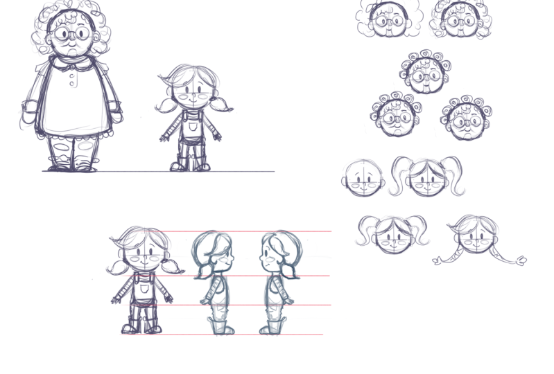
to do the grandpa grandpa, and then I'm going to be doing the grandchild, or it's a girl. And so these are kind
of the main characters that I'm going to
be thinking about, and let's say, for this one, I'm just going to stick with that's going to be traditional. I mean, is it
traditional American, traditional, you
know, some other culture or if you're
from, you know, a different country with a
different cultural heritage, you know, use that heritage. You know, you can
draw characters. I'm from Finland, and so the characters in general
are kind of, you know, would probably be wearing
fairly similar clothes to what they would have,
you know, here in America, if I'm thinking, you know, maybe this happened in
the I don't know, early 1920s or
something like that. So traditional kind of clothing. And so I'm just trying to stay fairly traditional
with this one. And just to I'm thinking
that maybe that'll be, you know, something nice
to add to my portfolio, just to have kind of
some basic characters where when you look
at the characters, you can immediately
tell who they are. You don't have to
have guesswork. Oh, and then thinking
about the personalities, If I'm thinking about the
old man or the grandpa, you know, he's probably
lived kind of hard life. He's lived in the countryside. So he's probably pretty rankly. And if he's been, you know, farming for a long time, he might be kind
of hunched over, not like hunchback
of Notre Dame, but maybe he's a
little hunched over. You know, he's
probably also kind of dedicated or how would I say it? Kind of stringy, like
he's been through a lot. And then I'm thinking
the girl, like, he could be she could maybe
she's visiting from the city. So maybe that would
be kind of fun. That might be kind
of fun. Maybe she's visiting from the
city or something. And so maybe her clothing is
a little bit more fancier. Maybe she's more lazy. Or maybe, well, if she's helping grandma grandpa,
maybe she's not lazy. Maybe maybe she's
kind of spunky. Maybe she'll have like
headphones on her, you know, something like that or Walkman or I don't
know something. And so maybe Grandpa's
got traditional clothing, and I'm just going to put city clothing as a
note for myself. So these are kind of maybe
some general things that I'm starting to think about when we start working on
these characters. And so you can kind of
make some general notes for yourself on how you want
to start going on this. And for the next video, I just wanted to make a quick distinction between
character and plot driven stories
and how some of that might affect the
character design.
4. Character vs Plot Driven Stories: In this video, I just
wanted to make kind of a short distinction
between character and plot driven stories
and how that might affect your character design. So a character driven
story is one that has a strong character who
leads the narrative. We focus a lot on their thoughts and their feelings and the
decisions that they make, and the character often changes or develops
during the book. And so with character
driven books, the characters are
usually strong, and we get a lot of insight
into their personality. In a plot driven book, the story with the
actions and an event that unfold is usually the
main focus on the story. A lot of times there might be more characters than in a
character driven story, and a lot of kind of nonfiction books or concept
books fall in this category. And in a lot of these books, the characters don't
even have names. And so here's just a few character based books
that I brought. You know, we have Pete The Cat. For example, Im andata
Fox, and in this book. So this is Ina of Fox by
arena Wolf and Chuck Running. And so in this one,
it's all about this fox and how they're feeling and how they want
to be friends and fit in. Um, same thing kind of
for my shape is Sam, by Amanda Jackson
and Lydia Nichols. I'm sure everybody's familiar
with the pigeon books. He's a very strong character
with Penelope Rex. We don't eat our classmates. Another example, Swim
gym, by Kaz Winnes. Another one, Betty Goes Bananas. And so in this book,
for example, you know, we're immediately
given, you know, everything about Betty.
Betty was hungry. She saw banana. She
wanted to eat it. But the banana would not open. And then we go, you know, it's all about her
and what she's trying to do and her emotions. And, you know, we have
this really fun kind of gorilla character
in this book. Same thing. I have one
Olivia book over here. She's a very
precocious little pig, and you can see,
and she's always, you know, dressed very well. And she's kind of rsi Psi, and so, you know, over here, she's not even wearing
any clothes, but, you know, you can see the
types of things she does. She's just a really
fun character to see. And then I have one more book. This is a newer book. It's
called Farah Loves Mangos. And so in this book, it's all about Cara, and and how much
she loves mangoes. And then one year, her ground
Bas mango tree was empty, and then we go into a big
um thing about, you know, she's trying to trying
to figure out how to get the mango tree
to bear fruit, and you can see there's
a lot of emotion. But it's, you know,
all about her. And so with the
character den books, you know, we usually have
very strong character. We get a lot of insight
into the personality. And that is helpful
and gives us a lot to work with when we're
working on character design and to make them a little bit more specific because
we're getting so much insight into their
kind of internal world. And but for these
kinds of books, it's also important to nail the character design
for these books because they are the main
subject and kind of the center stage of
what the book is about. And the way that we design the characters can really kind
of make or break the book. And so we want to make sure that in character
based books, our characters are memorable. And so, here's just a
few plot driven books. So there's usually
less information about the characters
who they are. And so we have a little
bit more freedom in choosing how to design them. And I feel like the
characters in these kinds of books are a little bit more general in
the way they look, and it's also a little bit less stressful for
you, but, you know, that's just kind
of generalities, and it's not always the case. Um, and so this one, it's
about there's a nome. And so it's a little bit
about the character, but it's not as much of like the internal thoughts and
workings of the nome. It's really about this
garden and how the nome, like destroys it, and how everybody else
kind of reacts to it. So it's more about kind of the story instead
of just the nome. Then I have grab that rabbit by Polly Faber and
Briony Mae Smith. And so this one, we have
kind of two characters. We have the lady and the rabbit. And so it's kind of the
struggle between, you know, the bunny wanting to eat, the food in the garden, and then the lady
wanting to stop it. I Mary Poppins, you're
probably, you know, familiar with the
story of Mary Poppins. And so it's not even though Mary Poppins is
the main character, you know, there's
other characters that are also important, and, you know, it's kind of the story of, you know, how the children, how Mary Poppins, you
know, kind of comes into the life of the children and
all the things that happens. Then just ask, this is almost more like a nonfiction book. And it's, you know, about
different different people and how kind of different
how they're different. And so somebody that, you know, Bianca has dyslexia, LJ sees the world differently
because they're deaf. And so it's more
about, you know, each page, so the plot of
the book or, you know, every page is a
different kind of disability and how
those people are. And then everything you need for a treehouse is, you
know, pretty obvious. It's all about
building tree houses, and there's no, you know, specific characters
in this book. And then collecting cats is
also a really funny book. And it's, you know, no specific characters
in this one. And it's, you know,
about, you know, collecting cats
and how the author decides they don't want to
collect cats after all. But then there's also
a lot of books out there that are
kind of, you know, they're character based
or plot driven stories, but then they also have
kind of characters. And so this is just an example
of that where we have, you know, the grandma is
kind of the main character. We don't have a name
for the grandma, but she's kind of the thing that's leading through
and her frustration. And so I was having a hard time deciding
which one it was. And so there's a lot of
books kind of like this one. And then this is one of
my favorite books too, Oh Nuts by Tammy
Sauer and Dan Kraus. And it's about these three. You can see, we've
read this book a lot. It's already broken.
But it's about these three squirrels
who live or chipmunks, who lived at the zoo, and they all kind of have
different. And it's really fun. You know, they have
their different personalities with
like one's cute, and then the other ones,
you know, kind of the guy. And then this one's
kind of, you know, chunky one, and you can
see when they're moving. You know, the chunky one is
having kind of hard time. And, you know, the cute C will blink her eye
lashes and whatnot, and somebody Cute
C fluffed her fur. And, you know, they all have a little bit of
different personalities, but it's still kind
of their story on how they get annoyed at how everybody else loves all the
other animals in the zoo, and they're not getting any They're not getting any
attention at the zoo, and so it's a story
of them getting the attention and they decide that they didn't want
the attention after all. And there's a pretty fun plot, but also the characters
are strong in this one. It doesn't necessarily have
to be one or the other. It can be a little bit of both. I just wanted to make
the distinction between two different kind
of stories and how you might think about um, creating kind of more
general characters for plot driven books and for
character driven books, a little bit more important
on what kind of how you portray the character and how they behave
in all the books. And in the next video, we'll
briefly discuss about books that where historical accuracy is important and how to do
some research for that.
5. Historical Accuracy Tips: I wanted to make a really
quick video just to talk about historical
accuracy and how I would research that and work on creating
character designs and, you know, clothing
and stuff like that. So if you get a manuscript
or you're working on a piece for your portfolio where historical accuracy
is important, then you need to do a
little bit more research for those illustrations. And so in general, I just end up working
doing a whole bunch of Google Google searches, and if you are working on a
famous person who's lived, for example, like AlbertEinstein,
or Princess Diana, A lot of times you'll be able to find pictures of them online, and then that way
you can reference the clothing and you'll
be able to research where they lived and what the environments that
they lived in looked like. And then that way you can
use that for a reference. But if you're working on a little bit more kind of general, like let's say something like Anne of Green Gables or that happens kind of
in a very specific time. It was the late 1800s when, you know, that book takes place. And so I've looked that up, and it's called
the Edwardian era. And then what I would
do is just go online and research Edwardian era, for example, just kids. And so let's see
what a search like that would bring. Okay. So this is just so this is just a search I did on
Google, an image search. And I typed in warden era, kids. And we also know from the book that Ann is
about 11-years-old. And so when I'm looking
for these pictures, I'll kind of, you
know, try to reference kids who are around that age. And so what I would do is I would just find
some of these pictures, like here's a nice
picture of, you know, some kids in the schoolhouse, and I would save
maybe this picture. A lot of times, you know,
the stuff underneath will also bring you
some more ideas. And so this one's up let's see. Well, there it is. And so I would either
take a screenshot of this and then save
it into my gallery, and I could either just
choose to save maybe, like, these two girls over here. And then once I have a bunch
of these pictures saved, then most of the time I will go and kind of type
put everything onto kind of one
canvas in procreate. And then that way, I can kind of reference
everything together. And so if we look over here, so here's that school picture. A lot of these pictures, it looks like most
of these they have, you know, they have kind of
big poofy arms over here. I know a lot of them
are kind of a lot of them are kind of blurry. These ones seem to be
maybe a little bit richer, but we know that Ann
was kind of poor. We see some poofy
arms over here, and then a lot of the it
seems to kind of end, you know, kind of short. Like the sleeves seem
to end kind of halfway, you know, up their wrists,
same thing over here. We have some poofy shoulders. Maybe a little bit less
over. Well, actually, it looks like it's
underneath over there. She's got poofy shoulders. Same over here. And
same over here. So we probably, you know, she'll end up having some
sort of a poofy shouldern. I think there was a scene
in the book where she talks about the poofy shoulders, too. And then it looks like a
lot of these, you know, they kind of live in the
country a little bit, and so a lot of
these have aprons, so maybe she might have
been wearing an apron too. And so it's a great idea to
kind of look at, you know, take a general picture of,
you know, a general idea, get a general idea
of what everybody is wearing or what the kids in that time period
were wearing, and then you can kind
of go from there. So maybe she is wearing
some sort of an apron. And It seems like the way that the aprons
in general look like they're either at the waist
or a lot of them seem to be kind of they seem to be
kind of tighter on the top. And then it seems to kind
of balloon out. Like that. And then a lot of
them have ruffles. Some of them have ruffles,
some of them don't. Maybe if they're a
little bit poor, maybe hers doesn't
have ruffles on it. And then maybe she's got these poofy kind of sleeves
with then the. And this is kind of how I would start working on sketching her. And then if you look at shoes, I know it's very blurry, but most of them are
wearing these kind of lace up lace up boots and
all these pictures. I think pretty much everybody
is wearing it looks very dark kind of lace up boots. And so maybe Ann is wearing even the kind
of younger kids. And so maybe she's
wearing Lisa bots, too, and then we already know
the color of her hair, and we know her age and so Rt, she's got red hair and freckles. And then she's got bids. And so, you know, I would
use all this to kind of start working on a
character sketch for her. And then obviously, the books happen kind of over a
long period of time, so you could put her in
different outfits too. But, you know, this
just gives you a general idea of
how I would start working on designing
a character for something that's kind
of a period piece where you want it to be
historically accurate. And I would also
do the same thing for architecture and
houses and props. You know, if I need
an interior scene, I would try to find
as many kind of interior scenes from that era, and then you know, look at what kind of things
they had on the tables or on the background or pictures on
the walls, rugs, and then, you know, kind of
get a general idea and then kind of
based off of that, draw the scenes that that
character would live in. In the next video, we are
going to start talking about shape language
for storytelling.
6. General Shape Language: So in the previous video, we kind of started hashing out what the character
were like, and, you know, maybe
starting to getting some gut reactions of what they might be wearing and
how they might look. And when you're
thinking about this, it's also kind of good to think about the basic shapes that you're going to be using to design the character and
the silhouette of them, and then how that kind of
plays into your storytelling. And as a caveat, I kind of see these
characterizations used a lot of animation and
a little bit less in books. But as a general education for learning about
character design, I think it's good to be aware of these
general principles. And so in general. So thinking about square. So a lot of times, if we
have kind of square shapes, those shapes are often
associated with traits like being proper or kind of a grounded person,
reliable or rigid, a lot of times men
are, you know, kind of shown in as a kind of square or squared up
rectangular shapes. And then we have rounded shapes. Then we have rounded shapes, and those are oftentimes associated with being
kind of soft or sweet, Happy, friendly, welcome and, you know,
kind of, you know, a lot of positive, happy, pleasant kind of traits. A lot of kind of triangle
and pointed shapes are often associated with
either kind of sharp, you know, cunning, kind of wit kind of characters or
characters who can have wit, or they could be evil. A lot of times,
you know, I books, we don't get villains, but
in a lot of, you know, animation and cartoons,
we have villains, and those characters
have a lot of kind of, you know, pointy shapes in them. But I can think of some
fair tale retellings, like the big bad
Wolf in like Ninja, Red Riding Hood, where we get a lot of these kinds
of very sharp. Pointy shapes are also
in, like, no David. If we think look at his teeth,
his teeth are, you know, triangle, kind of, like shark
teeth giving him that edge. Or another kind of general
shape that I see a lot is this per pair or
kind of a drop shape. In general, it's just
kind of skinny on the top and kind of
thicker on the bottom. And a lot of times I see
those as being kind of slow. A lot of times, especially with this pair shape,
they're feminine. They might be kind of
slouchy or lazy characters. One example is this
grandma character from the book by Leo Espinoza, or the dad character
from the storm whale. And so another shape
I see a lot is also this kind of
a top heavy shape, and a lot of times that's, you know, you think about
kind of big shoulders. A lot of times those
characters are male, they're sporty,
or it can also be somebody who's kind of
menacing and looming. It kind of depends what you
are, combining it with. So, you know, we might have
somebody over here like this, or then we might have you know, it just depends kind of how
you shape that character. So these are kind of the general shapes that
I think about. And so as you're thinking about your characters that we are
working on for this book, you can think about, you know, if those character characters
embody any of those shapes. So maybe like the grandpa can
be more of a squared shape, or maybe he can be well, I don't know if he's going
to be lazy or you know, if he's going to
be more masculine, you know, what kind
of shape he might be. And then for the girl, if if she's kind of
spunky and, you know, kind of electric,
then maybe she's going to have a little
bit sharper shapes. Um, and so you can think about those kinds of
things and see if there's some of that shape
language that you can apply when you're designing
these characters. But like I said, I see
a lot of this a lot more in animation and kind
of game character design, then I see it in
picture book design. I feel like for picture books, we usually just want to
have cute characters, and a lot of times, the
characters are very rounded, and there's a lot
less of this kind of positioning with the shapes of the character and
how they line up. For example, if you compare it to this character lineup from A. And in the next video, I created a fun little exercise that we're going to do
together that will just kind of help you play
with shapes and help you combine things in different
ways to hopefully, you know, kind of loosen up
your brain and help you come up with some interesting
things for the future.
7. Character Exercise 1: A little warm up exercise. In general, when I'm working
on sketching characters, I divide the bodies up
into three sections ahead, a torso and the legs. And then by changing the proportions of
the three sections, you can change your character. And you can spend some time exploring shapes
and proportions this way and see how they change the feel and
look of your character. In general, I end
up kind of liking my human characters fairly proportionate and
natural looking. But it's also fun to push
things a little bit and find new angles of
looking at things. I also divide the face up
into three general sections, and so I put the eyes
on the top cross hairs, and then the nose goes
in that area in between, and then the mouth goes on the
bottom line in the middle. And you can change
the way that you draw this grid and that will also change the way
that your face looks. This was exercise one, and we'll look at exercise
two in the next video.
8. Character Exercise 2 (Gameify it): So I created this fun
exercise so that you can kind of explore shapes and loosen up with your character designs. And all you really need
is you need some sort of a pencil or a pen
and a paper clip, and then a piece of paper. And I've kind of made
this game ready for you, but you don't even
need to print it out. You could also just
draw a circle, divide it up with lines, and then draw different
shapes in each one. And so the way that
you play it is you put your paper
clip in the middle, and then you spin it. It's like a spinner. And
then you see where it lands. And so I have a teardrop shape. And so if you want to
work on faces or bodies, it kind of depends. So if I want to work
on faces first, I'm going to spin first. And so I got a pair shape. So I'm going to draw
or a drop shape. And so I'm going to
draw a drop shape. And then I will divide it up. And so with this one, you can divide it up
in different ways. So I can And I'm just drawing kind of
lightly to begin with. And so you can divide it
up in different ways. I can have my things
really close together. I can have them far apart. You know, you can change your grid structure
however you want, and it's going to be a
different looking character. And so over here, so
let's draw some yes. So I usually draw my eyes kind of where the top lines meet. And if you want to make
this more challenging, you can spin two times, and so I could spin
a second time. Let's do something
else. There we go. So it looks like a triangle. And then I would incorporate my triangle into this
character design. So let's say, so I could have either a triangle little mouth or I could have a triangle. Nose would obviously
be very obvious. And so let's go so we can
go with a triangular nose. My eyes look a little lop
sided, but that's all right. Then my mouth could
go over here. Maybe this character has
some sort of a qui fee. That kind of goes up. Oh, it could be I
see like a man, and he's got this kind of this
kind of like swoopy hair. I don't know. He
looks like kind of like maybe we'll give
him some kind of iris. Once he start drawing,
everything kind and so he's kind
of chubby, maybe. I don't know, maybe
he's now he's starting to look more like a woman. And here's kind
of one character, and then we'll draw
another one over here. So maybe we'll do bigger eyes. And then maybe he's got
a triangle nose to, so let's do the same for both. This could be a hat.
Maybe he's a nome. Maybe he's got kind
big cute ears. Give him some red.
Well, it's not red, but give him some rosy cheeks. All right. So then we have a
cute little known character. With the same shapes
that we spun, we could come up with
different characters. Then if we're using bodies. What I usually try to do is I start out with some
sort of a rectangle. You can divide it up
into threes so you can come up with maybe this
one has really long legs. We'll do a second one here.
Each one can be different. You can do one at a
time or two at a time, and then let's say there's a big let's say they've got short legs, and
then we'll spin again. All right. I got a circle. And now I need to incorporate
a circle somewhere. Most likely my head's
going to be a circle, but maybe our body is
going to be circular too. Then let's do something
else for the other one. I got a tear drop shape again. Let's do tear drop
body for this guy. You can make it harder or easier depending on how
many times you spin. Let's say I'm going to this in there and then let's say I'm going to do
it one more time. And I got a circle. I'm going to add these two shapes in there too. So
let's have some fun. All right. So we have a
really long legged boy who showed up over here. He's probably maybe
not the best one. All right, let's see. So I have a tear tear shape
over here. Let's see. Imagine this character has
red hair for whatever reason. All right. So this is
my second character. And so, you know, first character maybe
not that successful. This character I would
have never come up with the character design
like this on my own. So, you know, it's just
a fun way to explore. And like I said, I might not be using these as something in this
particular book, but it just gives me ideas of when I'm
working on a future book or if I'm just looking for a fun character to
draw for a portfolio, maybe, you know, one
of these characters might be something fun that I might use as a kind of a basis on working
on a character. Going forwards. And so hopefully this will be kind
of a fun game for you. And if you can post some
of your character sketches in the project section
of our gallery, and that way,
everybody can kind of enjoy what people came up with. And in the next video, we are going to talk
about body part library.
9. Body Part Library: Character parts library. I often have a general idea of what I want my
character to look like, but especially in the beginning, I needed a little bit of extra
help to get myself going. And so visiting the
library and bookstores, as you may have noticed, is my number one way
of solving a problem. So for character design, what I've done is
I've kind of created this kind of mental
library of body parts. And so I've looked
at a lot of books, and I've made sketches to
kind of keep track of things. But by now, everything
is kind of in my brain, and so I have this kind
of library of, you know, what an eye could look
like or what a leg or an arm could look like
or what hands look like. And then when I'm working
on a character sketch, I kind of borrow things from that library and I
try different things out. And so I'll have like
a face of a child, and then I'll try dot eyes, and then I'll copy and paste, and then I'll make another one, and then I'll try circles or I might try
big eyes, little eyes, oval shaped eyes, just
kind of different things, and different mouths, noses,
you know, you get the point. And then I kind of have everything laid out
on the same sheet. And then from there, I kind
of look and see and feel which character feels like the right way to draw this
character for the book. And then secondly, when you
start drawing that character, you'll also notice
that you kind of default to certain
ways of drawing. You know, you're
comfortable drawing a certain specific way and
things like for myself, I don't really like oval eyes. And for me, they always
look a little bit off or these seed shape eyes. For myself, I usually
like either dot eyes or then circle eye
with the pupil in it. Those are the two types
of eyes that I use in My character designs, but once you start looking, it's interesting to see all the different
ways that you can draw an eye or like I said, ear or whichever body part. So I've gone through some
of the books that I have, and I've created this library of characters or a character, you know, sheet for you. So I've gone through
my books and taken some photos of
different characters to make this character
sheet for you. Most of them, I'm
trying to kind of make them around the same age. So most of these characters look like they're somewhere between, I don't know, eight to 5-years-old or
something like that. And so you can see in this
top corner right here, we have characters
that look very, you know, like they have a
photo not photo realistic, but they definitely look like they've been referenced
from photos. It's very realistically painted. And then over here,
you can see on these two characters
on the top corner. You can see that
they have, you know, calves and knees, and, you know, they've been
rendered really nicely, and then, you know, these other three are a little
bit more simplified, but, you know, still getting
a lot of details in them. And then I had kind of
these two groups over here. And you can see in the top one, everybody kind of has
outlines to them, except for maybe this
one right here by Mali Idol And you'll see it starts getting a
little bit more simplified. Mostly, everybody pretty
much has a round head, except for there's maybe a
little bit more stylization right here for this little
guy from Peter Reynolds. And then in the corner, you can see that things are starting to be a little
bit more stylized. For example, these characters
from Ben D Davies. In these illustrations, they
don't even have mouths. Most of them have dot eyes, you know, maybe a little
bit less expressive eyes. There's a lot more areas
of kind of flat color. There's not a lot of shading
going on in some of these. Some of these just have
like texture on here. And so you can see how it starts getting a little bit simplified. And then we have this set
of characters that are even kind of more
stylized from, you know, the ones that we saw
before where, you know, over here, we have these
really nice outlines, but, you know, there's no
outlines for the hair. It's just all kind of
indicated with color. And with this in a lot of
Oliver Jeffers characters, his legs are just little sticks. He doesn't even have
feet at the end of them. Which is kind of a fun way. And just so you know, all the books that I've taken these kind of
character shots from, they're going to be listed
in the resources section, so you can find all these characters
and all the books for you to look at later. And if you look at, you
know, the character from Wolf and the snow
by Matthew Codell, his character is just a red triangle basically
with, you know, some arms and legs
coming out of it and then a circle where the coat, you know, where the face
is showing from the coat. And so, you know, some
characters have thick legs, some characters
have skinny legs. And then I have one
more set over here, which I kind of felt this was kind of the style
when I look at it, and I'm thinking that this illustrator has a
background in animation. A lot of times or something they've done
with movies or they have a degree or they've worked
for a studio like that. And a lot of times you'll
notice that you know, they're just rendered people
who work in animation. Usually, the characters are just rendered a little
bit differently. But but you can see, there's a lot more details. There's a lot more
kind of shape. Remember when I was talking
about that shape language, the way you know, everything
is kind of built, it's built with kind of
more definitive shapes, and there's usually kind
of very dramatic lighting in them, and their characters. I don't want to say they don't
look the same, but for me, there's always kind of a look where I can tell that, you know, that person has also, you know, maybe illustrated
for Disney or Pixar. And so when we're looking at
all these pieces together, you can just see and, you know, this isn't
even the range. There's much more
sketchier style if you look at Matthew
Cordel's work. He has a lot of kind
of sketchy lines, line work in his work. And so this isn't
even the full range of picture book
styles out there, but it just gives you
an idea that you can draw characters
for picture books in all these different ways. And when I'm
developing characters, when I was talking
about the library, you can look over here at
the way legs are drawn, or hands are drawn or eyes or noses or whatever it may be, and you kind of figure out
what you're comfortable with and what fits the story that you're
trying to illustrate. So when you're working
on different books, just picking one
style of eyes for this book doesn't mean that you always have to draw
that shape of eyes. You can change eyes for different picture
books or the way that you draw different things. But in general, as a kind
of a guideline for myself, I try to keep it consistent when I'm working
within a book project. So if I'm creating multiple
characters for a book, I try to draw all the
eyes the same way. The legs, you know, it's
not as big of a deal, but kind of facial features, I try to make sure
that you know, these characters look
like they belong into the same project to just make everything
look more cohesive. All right. So now that you
kind of have an idea of what this body parts library that I was talking
about is all about. Now, let's get to actually
sketching our characters.
10. Building With Basic Shapes: Starting with general shapes. So as you start sketching and
working on your character, I usually try to when
I'm just sketching them, I usually try to reduce them to basic shapes that
are easy to draw. So boxes, cones, tubes, spheres, you know,
kind of bean shapes. And it's easier for me to
pose those and turn them in space and imagine how
they would be seen from, you know, kind of
different angles. And as I am revising
my sketches, then I start adding
more details to them. In general, for
picture books that range from ages three to eight, we're looking for acute
and relatable characters. And in most cases, the main character
in this age range is also a young character close
to the age of the reader. And I found that in general, the younger the
book is meant for, the less detail is needed. And as you illustrate
for older audiences, the style usually
ends up being more complicated with more realistic
proportions and details. But those are just like I
said, general guidelines, and there's always going to be exceptions and people
drawing in their own styles. And so if we look at these characters that I placed on the character sheet earlier, you can see that, all the
characters are really cute. They have different
personalities. They are engaging and we want to know what st what stories
they're going to tell. And so no matter how you
draw or what your style is, it can be a variety of different things from
sketchy to very realistic. The main idea is usually to have appealing characters
that are cute. Just another note,
if you're working on a little picture book
character over here, and then you're working on an adult character over here
and they have longer legs, my general advice would be, don't give your child character a head that is much larger than the heads that
you're drawing for your adult characters because if you imagine this
child growing up, they're just going to
have a ginormous head compared to the adult. We if I have a book that has both kids and adults in it,
and they're interacting. I always make sure that
whatever head I design for my children's character
is going to be no bigger than whatever head that I draw for my
adult character. Or just a little something to be mindful about and check yourself on when
you're designing. So I wanted to add another
side note about relatability. And we have kind of the
two different extremes of representation over here. So we have basically kind of
a stick figure over here, the crossing the street sign, which is like the
universal symbol for man. You know, we don't know the
age, we don't know anything. It could be man woman,
it's just a person. And then on the other hand, we have a photograph
that is very specific. You know, this is
a specific person, you know, who exists in time. And so then we have
everything in between. And so when we think
about relatability, when we're at this
extreme over here, he's relatable to everybody, when we're at this
extreme over here, it's a very specific person. And so you can also
think about that when you are designing
your characters. And once we start moving
from this end down this way, you obviously, you know, I put a second piece over here, and now we have
distinction, you know, we have man and a woman, and then it would kind of
keep going from there. And then we have this whole, you know, this would
be kind of simple. And then we would get all
the way more complicated to some of the pieces
over here that are drawn from photo references. And so when you're thinking
about your character and thinking about
your story, you know, some stories, it's a
very specific character that has very specific
traits in some stories. It's a more general character, where it's maybe more of a plot driven story where
we're concentrating on sounds or sites or some other senses where it's not as specific to
have a specific character. And so when you are thinking about the details that you're
adding to your character, think about where your character would fall on this line between a very general character and a very complicated,
individualized character. All right. So I just brought up my characters
of Masi and tweed, just to kind of show how
these characters are shaped. And I know I talked
a little bit about this in my other class, and we'll talk about this in
part two of this class two. But if you look at the way the characters
are kind of shaped, they are made with simple
shapes that it's easy for me to turn them in space
and move them around. And so you know, if we're
looking at Masi over here, we can tell that he's
made with an oval, and then his hat is, just kind of a circle
on top of that, that's just slightly
bigger than his head. His ears are half a circle
or kind of letter Cs. His body is kind of
I think of it that his body is kind
of a square where the top is a little
skinnier than the bottom. So I don't even have to have specific names for
the the shapes, but in my mind, that's
how I think about it, and then his arms are
just tubes in my mind, they bend at the elbows, and then wherever the
elbow is in the middle, that's where he has got
these little marks. Then their legs are
two little sticks, and their boots are basically square with a little
triangle for the tip. And then there's designs
and other things. Then the way that I was thinking about his nose was I
was basically thinking about it in space where it was kind of kind
of a triangle, but it's a little bit concave. And then if you look
at it from the bottom, you know, it would be
kind of like that. And then if you look
at it from the side, it would kind of be
like that where it would be convex or concave. I can't remember. But anyways, it would be going kind
of down from there. Depending which
way I was drawing it or from what direction I was looking at
it, I would know, which way to add it
onto the face and their eyes are ovals with ovals inside and the mouths are just mouths are just
a half a circle. Then as far as hands, hands are usually a little
bit more complicated. But most of the time, the way
that I think of hands is, if this is where
the wrist comes, I think of hands as
it's kind of like a square that's a
little bit bigger on the top then on the bottom, and then the thumb
comes out from there, and then there's fingers when
I think about the fingers, I usually think that
the pinky fingers, the shortest one, and then that would be the
way that I would draw. Then a lot of times I would
just end up you know, making it a little bit
simpler like that. A lot of times if I'm having
a hard time, drawing a hand, grabbing something or
however it may be, I'll either take a
reference photo of it, or I'll ask somebody to pose
for me or I'll look for photos online where people are doing an activity similar
to what I'm doing, or what I need my character
to do and then I'll look at the way that their
hands are posed in the air like if
they're jumping, how are their hands in space when somebody's
jumping or running. And then I kind of
take note of that and then draw my hands based
on reference photos. Really quickly, just
to show this is cat from my series,
Kitty and at. So the way that I draw
cat in Kitty and cat, I have a very kind of
specific way of drawing. So cat's face is hexagon with
two triangles on the top. You know, they can be
angled different ways. And then there is kind of the nuzzle or muzzle
is kind of a oval shape. The the nose is a heart shape, and then there's a
circle around this side. And then depending, you know
what kind of an expression. But in general, I have two
lines with half a circle is underneath and that's
cat with eyebrows. Then as far as his body goes, it's kind of a beam shape or in a little bit
like a rectangle. And then a little bit
softened tail on it. And then if you
look at the legs, the legs are pretty
much just triangles. It's a little bit of
a longer haired cat. And then with little
sticks coming out of them, and then the paws are at
the end of the stick. In very, very simple terms, this is basically the way
that I drew cat and then just depending on how how
he or she is laying, you know, I would just kind
of round those things up. And so with this part for the back leg, it
would be kind of, you know, if it
curls its leg in, then I would round
this triangle up. But those are kind of
like the basic shapes that I used to draw
cat for Kitty and cat. In the next video, we'll go over some common mistakes that I see a lot of
beginning illustrators make with their
character designs.
11. Fix Common Mistakes, pt 1: Okay, some common mistakes. The main guideline I feel like for picture book characters
is that you want your characters to be
appealing and reflect the spirit of the story
that you're illustrating. Sometimes you might
get feedback that your characters could
be more appealing, but if you have a hard
time seeing where your illustrations fall short, if it's possible to
ask the person who critiqued if they can be more specific with
their feedback. Like, is it facial features or the way that
things are drawn? But here are some of
the common pitfalls that I see when
looking at portfolios. The first thing is
if your character is anatomically balanced for the
age that you're portraying. Main characters for
books are most often young and when drawing
children or young creatures, we usually want round heads with eyes sit under
the middle line, so there's a big area
for the forehead. The nose and mouth go in
the space under the eyes, and then the ears on the sides. As we were talking
about the mental library for body parts, you can change the
way that you draw everything defined what
you're comfortable with. You want to keep the details
in the face to minimum. The more you add details, the older or odd the character
will end up looking. And so a lot of times
with younger characters, if you think about the
middle line of their head. For younger characters,
the eyes are usually kind of below
the middle of the head, and then the nose is, you know, pretty close to the
eyes, and then the mouth is somewhere in between
the nose and the chin. But as your character grows, kind of everything grows down. So these the distance from the eyes to the
nose, it becomes bigger. Usually this space
stays about the same, but this space gets bigger. And also the way
that the head grows, the eyes end up being more
closer to the middle. For an older character. If we age of this character up, I'd move the nose
lower and then I'd keep about the same
distance over there. And so then this
could be a version of the character as they've aged
up a little bit in life. And I'm trying to keep the eyebrows kind
of about the same. And so now this
immediately with having a little bit longer
distance between here, it immediately starts looking
like an older character. And that's how I usually
age characters up, and then once they
become teenagers, this movement stops a
lot of times older, people will have
kind of bigger ears. And then if they start
being the grandpa age, then once we add
lines to places, then that will age
the character up. And that's how I in general age my characters
when I work on them. Then if we look at whole bodies, and if I'm looking at
whole bodies in general, what I do is for
younger characters, my head is about the
same as the torso, which is a lot of times either
the same or even shorter. Sh sh than the leg. This would be kind of
a young character. As far as arms go in general, if you think about where
the belly button is, belly button is about
the middle of the torso, that's where the elbow goes
and then the rest of my arm, they go a little
bit past the hips. And this is where you know, this is kind of where
I would draw my arms. He's looking kind of funky. Then when I start
aging my character up, as you probably have heard, then you end up having you
can have the same size head, but then torso ends
up being longer. And then by playing
with relationships of how long your
torso and legs are, that's kind of how I play with my character and I feel like a lot of times if
it's a teenager character, their torsoes are still long, but I feel like
they're always gangly. I would in general, for teenagers or teens, I would draw longer arms and
legs and a shorter torso, and then once you
get to a grown up, then they're a little
bit more proportionate with the way that
everything is shaped. Those would be my
general guidelines for getting your
characters in proportions. There are lots of guides on the technical aspects
of the amount of, you know, how many
heads go into a body. But I feel like in
picture books in general, a lot of times I feel like
the heads are a little bit bigger than if it was a
photograph of a person. And so I don't always go with, you know, it's a specific
amount of heads per the height. I go also by clothing and just the way when I draw the
character, how it looks. And so as an example, I just wanted to show you
this grandpa character from a book that I just
recently finished. And as you can tell, the
head put another layer. So the head is, let's see one, two, three, there's about four, just about under four for that, and then I've done
you know about 2.5 for the legs or Maybe
if I start the hips, maybe it's about 3.5 for the
torso and 3.5 for the legs. The head is definitely bigger than what it would
be in real life, and the head for the
boy is about this size. The head for the grandpa
and the head for the boy they're close
to the same size, and then if we jaw
kind of the torso. Of the boy here, then the boy would be kind of
he's wearing kind of an oversized sweater
from his grandpa. And this is where H
Belly button would be. That's basically
kind of how I have when I start drawing
my character sketches, I always kind of
draw an armature underneath, my clothing, just so I kind of know how big and how big my
characters are, in relation and make sure I draw in the same
way for every page, and then it's easy
for me to kind of follow the same thing
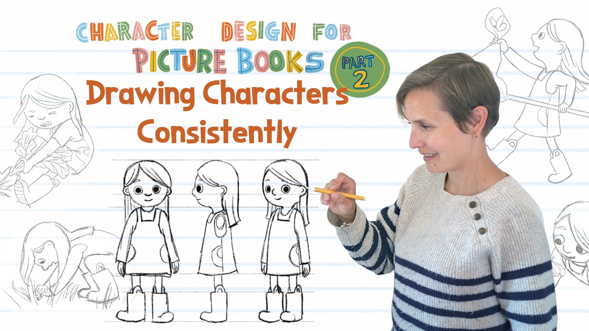
over and over again. In part two, for this class, we will also talk about
character consistency and how to draw your characters consistently through
a whole picture book. So that's my general thoughts
on character design. And then the next video,
let's look at how to correct some styling
issues with characters and what to do if
somebody tells you that your color palette is off or your characters
look dated.
12. Fix Common Mistakes, pt 2: So the second point is, how detailed is your character? And so if there's a lot of kind of lumps and
bumps in the body, it becomes kind of
very confusing. And it also doesn't really help. Your character ends
up looking kind of muscular rather than kind
of soft like a child. The general guidelines are, if you're drawing arms or legs, instead of drawing two lines
and making kind of a bubble, I would recommend making one if you want to draw
more natural characters, drawing one line straight and
then drawing another one. And then oftentimes it would go the other way on
the other side of the body. And if we want to take this character and simplify
it and make it look, the first thing that
I would do is I would work on giving it more
of a rounded head. And simplifying I'm going to add my nose to
the top over there, add my mouth over there, add acute little ear. We can still keep the
same eye size if we want. And then as far as the hair
goes instead of adding a ton of instead of adding a ton of
detail into your hair, it's a good idea just to think about hair as
more of a shape. In general, and you can add some general kind of
lines in it if you want. Instead of drawing each
strand for the hair, it usually looks a
little bit nicer if we simplify a little bit, and then you can add some
lines in there if you want. Then for same thing
goes with the clothing. I'm going to eliminate
just some of these. Maybe there's going to be
two little lines actually, I don't like Just going
to If you think about the way that if it's pushed
if she's running this way, if it's pushed against her body, then this side would
actually be straight. And if I wanted to
add maybe a bubble. I she's she's going this way, her fabric is kind
of coming this way, then maybe I'd add
one line over there. But in general, I don't add any a lot of lines inside
of the clothing either. Maybe just one or two,
I'm going to instead of giving her all these lumps
and bumps over here, we'll kind of simplify
these shapes. And then with the lines that
I'm putting inside of here, that's kind of what
I'm indicating which leg is forwards
and which leg is back. And then I'm going to
simplify my leg shape. Then four feet, I usually
think of them as triangles. Then if I want to add a little a little toe in
there, I usually do. For children, a lot of times
when you think about adults, we'll have there might be a
little bit more of a wrist, but when you actually
look at children, their legs and like ankles and wrists it's all kind
of the same size. And so that's also
one way that you can differentiate between
adults and children. And so I'll add a little
bit of a crew there. But as far as her,
a lot of times, people will draw even
children's hands really big and with
long skinny fingers, and so I'm going to
keep the hands small. There we go. Then if I
delete some of my catchy. So you want to keep fingers
kind of short and chubby. A lot of times I'll go back and, you know, hands are
really important. And so a lot of times I'll
make sure my hands look nice, my lines, and so there we go. And that would just
be a little bit more aesthetically pleasing
looking character where everything is just a
little bit more simplified compared to what
we started with. Some other feedback you
might be getting from your work is that your
characters might look dated. And the biggest thing, if you've gotten the feedback that your characters look dated. What I would do is look at a bunch of picture books that
are being published today. And then you can, you know, paste them on a
sheet like this and then and then make comparisons
compared to your own book. And just for this example, I only took covers of books, but if you're doing a
comparison for yourself, you might want to
actually look on the insides of books to get
the characters in action. But I wanted to cover
so that you can actually see which books
I'm talking about. And so if somebody's told
you that your books, your characters
are looking dated, I think a lot of times
what that refers to is to this kind of illustration style where you have black outlines, and then a lot of times it's
been kind of water colored. You know, in the
80s and the 90s, they didn't really
have digital art yet. And so a lot of these
were, you know, they were hand
drawn, hand inked, and then they were water
colored on the top. And so I feel like
that's oftentimes when you hear something
being looking dated, that's kind of the style
that they're referring to. And secondly, the
other thing might be that you might get feedback
about your color palette. If you look at a lot of these color palettes for
some of the older books, a lot of them also have par have very primary colors or a lot of the colors
of the rainbow. When I look at newer books
and compare that with them, I feel like newer books
a lot of times have a little bit more
sophisticated color palettes. For example, if we look
at this piece over here, everything is we've
got a really bright primary yellow,
primary blue, pink, everything is kind of fighting against each other
on this cover, whereas in over here, it's more softer colors, more broken colors and we have. It just seems to flow and
go together a lot well. So to summarize,
if you're getting the feedback that there
is something kind of going on with either
your characters looking to dated or
your color palette, your color palette just
doesn't look right. Then what I would do is look at, be aware of current books, current trends, what is
being published today, go to the bookstore, go to the library
and look at books published in the last
three years and really pay attention to color palettes and really pay attention
to character design. And and kind of what makes those characters tick and what makes them interesting. And if you wanted to, let's say I let's say
I'm working from here and Let's say I love the
color palette over here. What I could do since
I'm working digital, I could even just pick colors from here and see how
the A lot of times, I'll try to put similar
colors together. Maybe I'll pick a
few of the greens. Let's see, I'll pick a
lighter green maybe. Then there's greens up here. We got some yellows. Then there's some
reds, oranges, broken. Nothing's really
a primary color. All these colors
they're the grass, but if I compare it to what
I'm getting from, Over here, you can just see the
stark difference between I guess I could
put it over here, just between the colors and how much there's a lot
more fighting going on between the colors
over here than what this more harmonious
color palette. Then we have some of
these purples over here. Obviously, this illustrator has used a lot of different
colors in their illustration, but everything is a
muted broken down color rather than something
that's straight off. Straight up primary colors. Maybe there's some even
some browns in here. I'll delete these. This is just a nice color palette you
could do the same over here and if you look at Vashti
Harrison's, cover, we've got just pink for
the girl and then gray and even her leggings
are bluish gray, so it goes well with
dad over there. And so looking at everything. Everything just goes
together pretty nicely. And so I just
wanted to give that as some ideas because
it's really hard to say, Oh, it's just this one thing or it's just that other thing. It's more kind of
like the feeling. You know, it's hard to
put your finger on it. It's just kind of the feeling
you get when you look at these older older books and
the way that they look. And so just making a comparison
and looking at, you know, like over here, you
have a lot of details, and everybody's kind of in a
very stiff pose over here. I just there's a difference
between what was published, you know, ten, 20 years ago, compared to what is being
published right now. And then a second tip is if you are also in a
critique group, that is great
because that way you can get feedback for your work from your peers who are kind of at the
same level for you. And if you have a chance to get a paid critique from an
industry professional, either agents or art directors, but also asking current
working illustrators if they are open to
giving critiques, you can offer to pay for them, and a lot of illustrators
might be up for that. Just giving you some feedback on how to improve your work. That is one avenue to
go as well. All right. So now that we've looked at
some common kind of missteps, let's start sketching our
characters in the next dia.
13. Sketching Grandpa Character: L et's start sketching our characters for
the Giant Turnip. So I know that
there was going to be the grandpa character, and I wanted to work on him. And so I might, you know, do some exploration, just kind of basic shapes
and try to think of how I want him to feel like. And so I usually just kind of start with kind of basic shapes. So this is kind of
like a bowling pin. I was thinking debating between
overalls or suspenders? I was thinking my grandpa used
to wear suspenders a lot? He wasn't a farmer, but he
used to wear suspenders a lot. I was thinking maybe
instead of doing the o obvious overalls overalls, maybe my character is
going to be wearing. Maybe he's going to be
wearing suspenders. I'm also trying to think
what is this is side view? How do I want my
character to look? I oftentimes feel like older characters they end up having a little
bit more hunched. Their head isn't on top
of their head anymore. I feel like it's oftentimes
it's like in the front. I don't know if I
like that profile. But right now, this is
still from the side. I don't know if I want
to wear some a hat. He needs to be pulling. He needs to have legs
long enough that I can I need to be able to make him look like
he's pulling on something. Or he could be really lanky, like a goofy type
of a character, but I don't know if I feel like I like him more
chunky like this. Maybe I'm just looking at
all these and thinking. Maybe I'm going to go with
something shaped like this. He's going to have suspenders. He needs to have some shoulders. If you're feeling stuck,
you could also just look up farmer on Google and see how you feel. You can also start drawing your characters in
different poses just to feel like how a lot of times I have
issues with drawing hats. I oftentimes look up
pictures of hats online or people wearing hats so I
can get the rim positioned. I think a lot of farmers
wear plaid shirts. I still kind of see how
it hits differently. Over here, I have it
and I like this where it's a little bit higher maybe. Then I need to
figure out the head. Yeah, well. He's got a little bit more of a
square head, I think. I could draw this
multiple different times or over here, I'm just testing. I got big bushy eyebrows. I still feel like I don't
I don't like the eyes. I'm just going to test
out some different eyes over here and see
which kind of eyes. Which eyes I like. They could be val this way in of I'm debating between
these two ones. I think maybe I'm
going to go with dot eyes and let's see. I'm going to go with dot eyes, and then I could take this guy. This just makes it a little bit easier for me to play with. Now when I bring
this head over here, I can figure out
what where it is. S. I feel like my character is
a bit crooked over here. If you need to just move them, going to move his shoulders
over just a little bit. Where where is his head going
to land on his shoulders? Because he's a bit older, I feel like his head's going to land lower on his shoulders. Maybe like over here. Is that the same right size, maybe the head needs to
be smaller. There we go. I'm just going to explore some other facial features
while I'm at it. I think he just doesn't
have the same spunk. I'm wondering things
up a little bit. Give them a little bit more of a longer face. Longer nose. Then since he's older, maybe his eyebrows need
to be a little bit lower. Since older people
have droopy eyes. That could be something too, maybe it could still move it. I think maybe his eyes
need to come down to. This is oftentimes
how I play with my characters and
see what I can come up with and just spend some
time moving with them. Wondering if the rounder
face would work better because he's got
the rounded body. Needs a bit more
work. So let's see. I need to make some
more room over here. So after kind of figuring
out this guy at first, I thought I was going to
give him a farmer hat, but I just wasn't feeling it. So then I thought kind of like an old person hat
would look better. And so what I do is I copied and pasted this
onto a different layer. And then I ended up
working on it a bit. I, you know, put
his feet a b apart. And so he ends up having
a little bit more of a He ends up having a little bit
more of a square shape when his legs are apart. And then if I kind of, you know, I drew horizontal lines across just to get everything
kind of figured out. And so this would be what he
looks like from the side. So I'm pretty happy with that as my main character
for the grandpa. I figured he's going
to wear a plaid shirt. I don't know. Maybe
his shirt I still kind of like this being
up high over here, so maybe I might try
to hike hike this up, and I could even try that
with the liquefy tool. So I don't know if
that's better or worse. So what we could do
is, this is before. This is after, which
one do I like better? Maybe for now, I'm going
to keep him like this and maybe once I start sketching
him in different poses, I might change it
up a little bit. Usually, I get my basic
character sketch down, and then once I start putting
them in different poses, the design might end up changing just a little
bit because I'm having to put them in poses and see
what I'm comfortable drawing and how I want to kind of
work on this character. And I think this is
going to be my old man, and then I will turn
that layer off. And then older characters for me are always
harder to draw. And then if we start working on on the girl, I kind of had
14. Sketching Little Girl Character: And so for the girl, I
had kind of an idea of, I wanted her to be a
little bit spunky, and I was thinking about my own I have a
6-year-old daughter. And so I was thinking
about her catching bugs, and I thought it might
be a fun kind of a side plot on there
that in the beginning, while the farmers
planting and, you know, getting help from the grandma that maybe we'll have
this little girl who's kind of running
around the farm, and she's trying to catch, like, a butterfly or a bug or
something like that. And so I think she'll end up
having kind of, like a net. And so I'm thinking So I don't want her
to be super juvenile, but I'll start kind of sketching her and
feeling my way around. Doesn't have to be perfect. Maybe I'll have her once
I start drawing her, I don't know if she'll be
missing a tooth or something. And then I was thinking of doing kind of like a triangular body. I know my kids will wear
rubber boots out everywhere, so maybe she's got a
little bit of a side part. I just kind of feeling my
way around over here and maybe She's got a little
bit of long hair, not super long, but maybe
something kind of like this. And then so she's going to
have kind of skinny legs, but then she'll
have rubber boots. I don't know if I want to draw. A lot of her boots seem
to have handles on them, so I don't know if I'll
draw. I'll see. We'll see. And then she'll have, my daughter loves
wearing dresses, put little pockets on here. So I'm just, you know, working around and my first sketches, you know, they're
a little sketchy, and then I'll usually I will usually try
to copy this layer. And, you know, my first kind
of poses are always kind of very plain just to kind of
figure this character out. So maybe she's wearing
this little tunic thing. So maybe like a pin four. I don't know. Could be something
like that, too, maybe. Then a lot of times,
what I'll do is I'll just duplicate this layer, bring it over, and then
just draw on the top. I was thinking, I
wanted her hair to be a little bit in
front of her face, but we don't want it to be, so maybe to move my eyes a little bit
further and I don't know, it could be, her nose could be could try different
kinds of noses. I don't that. I don't know. My kid is missing one tooth. A lot of times I'll even
draw the other eyebrow, even though it's
behind the hair, a lot of times I'll kind of indicate it back
behind over there. I want to make sure
my her pinafore is going on her shoulders
and not on her neck. I don't know, maybe
she's wearing I don't know should she be
wearing a T shirt? I don't know. Can be a
long sleeve shirt for now. This is a fairly basic shape. If I imagine her body
inside over here, I'm thinking it's
probably going to be something and
something like that. Her legs can't go
all the way out. I don't know if it's going
to be too tedious of a detail to be drawing
these handles over here. We'll see when I start drawing her in her different poses. Then for boots, a lot of
times I will kind of draw, you can do a flat,
and then there's usually a little bit of a heel, and then a lot of
times they'll come up. So if this leg goes all
the way out to the side, it would be kind of
something like that. It's coming all the
way to the front, then I would just draw as
kind of a rectangle with, with a little loop
on the top and then handles go out from there. All right. So I'm thinking,
then I can take this one out. And so that's looking
kind of cute. Once we get our moving, then they'll liven
up a little bit. And I just wanted to
make a little note about clothing that you're
going to be drawing. If whatever clothing you're going to be drawing if it
has stripes or if it has, you know, let's say
it's got I don't know, a flower over here or, you know, a funny or whatever maybe it's
a cat tunic or something. Just be aware that
whatever, you know, whatever details you think are cute and that you're
putting into, you know, articles of clothing, it's going to have to be drawn, you know, kind of consistently through the whole
thing, or, like, if you have stripes,
you should, you know, kind of know how many
stripes you have on the sweater or
shirt or whatever. And then however you're posing your character
and drawing them, you know, the shirt
should kind of have about the same
amount of stripes. In each pose that you know
on each page of the book. And so if you're drawing a very elaborate design
on somebody's shirt, just be aware of that then you're going to
have to draw that every time you draw your
character to keep it consistent. So that's why when you
look at picture books, a lot of times
characters will have very simple articles of
clothing or their clothings, you know, it'll have stripes, or it'll have some
sort of poka dots or basically something a
design element that's just very easy to repeat from from one
illustration to another. So keep that in mind when you're designing your character
that you'll have to do that design on every character through the whole book and
keep it consistent. In the next video, we'll talk about posing and line of action.
15. Line of Action: We spent a lot of time figuring out who our characters are, what their motivations are, and how they kind of feel to us. And so now it's time to get
them moving and shaking. When looking at portfolios, directors want to see a
lot of movement in them. They want to see the feelings of your character not
only on the face, but also in the way that your character
is moving their body, and the way that they're
kind of acting out. So for example, you know, if your character is
in love, You know, are they just like, like,
is it just on their body? Are they coming forwards?
What are their hands doing? What are their feet doing, or if they're sad or
if they're bored? You know, I shouldn't just
be a look on their face. Shoals you should be able to figure out what the
emotion is also based on the way that
they're moving their body. And so in book illustrations, whatever the feelings are and whatever the body movements are, you want to make
sure that you're almost kind of
exaggerating those a little bit sometimes so that you can really
tell the story. When working on my characters, I oftentimes think about the story that the
characters go with, and I try to imagine
the poses that I might want to be drawing my
characters in for the book. I usually have kind
of a separate piece of paper or I use, just the canaas on my iPad, and I will draw the character in multiple different poses. A lot of times the poses will have a direction
of the movement. So if they're running, they might be extending or
if they're reaching, they're going up or
however, They might feel. They might have a direction
of the movement that a lot of times extends from the tip of their toes to either the hand, it goes up the spine
into the neck or it can go up the arms to the
tips of their fingers. That is called a line of action. Usually animators use that term, but you can also use it to describe the way the action goes in your illustrations too. If you Google the
term line of action, you'll find lots of
different k tutorials and lots of examples of how to of how illustrators use line of action to
help them illustrate. And so when I was talking about that kind of
exaggerated movement. So if you think about
the line of action, if you're reaching for
something, you know, if you're just a kind of
normal person in real life, you're reaching for something,
it might go one way, but then or go this way. But if you are illustrating it and you really want to show
you know the line of action, somebody trying to reach
something, you, you know, you might extend that
a little bit further and almost stretch
your character to try to make it really
look like they're really trying to reach something high up or the
same thing if they're, you know, you know, they're scared and
they're recoiling. You know, you really
want to, you know, bunch them up into a
ball instead of just, you know, halfway kind
of going for the motion. And so in that sense, the lines
of actions are important, and a lot of times they kind of get exaggerated a little bit to give clearer kind of silhouettes of the actions that your characters are doing. So I've made a list of different feelings that you could illustrate
for your character. And when you're illustrating
these feelings, you can just make a sheet that just shows faces
with these feelings, but then also practice some
of these feelings in the way that with like a whole
body sketch showing, how that character would either standing up or
you could even have them just sitting on a chair and how that character would act out that feeling through their
whole body showing it. When you're drawing
specific poses, sometimes it can be hard to kind of draw your character
in a specific pose. If I'm having a hard
time, a lot of times, I'll act it out and see if I can figure it
out for myself. If it's hard for me
to kind of imagine them the pose just
by me doing it, then I'll ask for somebody to act that scene out for me
and I'll take a photo, or I might act out the scene myself
and ask somebody to take photos of me doing it. And a lot of times
instead of doing like, you know, holding a pose and then asking for somebody
to take a picture, a lot of times I'll do the pose and then ask somebody to take
kind of either a video of it or take multiple photos of me doing that pose or do
the pose multiple times and then kind of get
the sense of how the line of action goes
and how I can best kind of tweak it and how to get
the body to look natural. In the pose that
I'm trying to draw. And then, especially for drawing facial kind of expressions, a lot of times I
will use a mirror or the selfie setting
on my camera, and I'll do the poses myself
and kind of figure out, you know, if it's a
angry fate, you know, I figure out how is faces squishing in or if
it's a surprised face, if my face is going out, and
then I'm making sure that I kind of exaggerate what whichever way
my facial features are going when I'm
doing an expression, then I try to exaggerate
those a little bit. Or then sometimes if I'm just
having a really hard time, then what I might do is
just google, you know, the feeling like a board person or board man or board woman, and then I'll see kind of what kind of
expressions come out. You know, what kind of come
in the search results, and I might see if there's
something helpful in there that I can use to help me with getting the
expression just right. And lastly, what I wanted to emphasize is when you're
drawing facial features, a lot of times,
especially with eyebrows, there is we read faces so well. There is such a
minimal changes in the way that eyebrows can
move if they go in or out up or down
that it can really change how your
character is feeling, like how it looks
like they're feeling. And a lot of times
when I'm trying to get the character's
face just right, it might take me
sometimes, ten, 15, 20 tries, just drawing some eyebrows over and over
and over again or eyebrow eye combinations over and
over again just to get it right so that it's showing
the exact emotion. If it doesn't seem right or feel like right in that first
time when you draw it, just erase it or start a new
sketch or however you feel like sketching the
best and just keep working on the expressions
until you get the right one. And really study
study expressions. And so if you Google board or a board person and
you just look at, like, what is the same? Same thing as what we did
with when we were looking at those dwardan dresses
for girls. Same thing. So if you look at, you know, 20 different faces that you find of people
being bored, like, what's kind of the same
thing and all of them, are the mouth drooping? Like how are the eyes, are the eyelids coming
on top of the eyes, and then kind of find
similarities and then see if you if those are some things that you can tweak on your face to get the expressions
just right. In the next video,
we'll talk about posing your character
in recognizable sets.
16. Silhouette: So, when you're posing
your character, whether it's for your
picture book dummy or for just kind of practice sketches that you're doing or
portfolio pieces, you want to make sure that
you're posing them or kind of picking angles and poses that
are easily recognizable. So we don't want your character
to be kind of all jumbled up so that if we look at
it just as a silhouette, that we cannot tell what
your character is doing. So if we look at these silhouette right
next to each other, we can now tell much easier
what this character, what they are trying to do. And then I just made
a third kind of segment to show even further, over here, we're not really
seeing the other arms. So if I wanted to switch, which leg is going forwards and which leg is going backwards, then we're able to see all
four limbs on this character. And then I thought, Well, you can also think, how else could you
pose your character. Over here, I put the hands up to show that they're
kind of coming down. And so now if we turn on all
of our silhouette layers. Now it's even easier to see what the
characters are doing. And so that's kind of the
main idea of just creating recognizable silhouettes so that when somebody just
glasses your work, they immediately know what
your characters are doing. So in the next video, we'll talk a little bit about how to take the story into account to make your
character stand out.
17. Background vs Character: So as you're working on
your character poses and trying different things out, starting to add
some color into it. Start thinking about details for your character
that help identify it and separate it from its surroundings and from
the other characters. What color of clothing does it need does your character need? Does it need more
than one outfit? What color in the
hair is going to be? Do they have accessories
like earrings or hats or something else that they carry around that helps identify them? So, for example,
in Masi and Tweed, they're identified not only by just the way that they look, their shapes, but they
also wear you know, the same shirt through
the whole kind of series. And then the other important
thing is to make sure that your characters are sticking
out from their environment. And so in Masi and Tweed,
they wear, you know, a lot of a lot of the book
happens in the woods, and a lot of it is mostly
kind of greens and browns. And so in order for the characters to kind of
stick out in the book, they both wear red hats and sweaters that are gray and this kind of a
bluish gray color. And so these colors don't really come up anywhere
else in the book, and then they also
have red highlights in their shirts, and, you know, patterns that don't
appear, you know, kind of these hard
patterns that don't appear anywhere else on the book
are like in the nature. And you'll notice when you start looking at details
and picture books, a lot of illustrators
will use red as a character color somewhere in their clothing to
kind of pop them out, and then we'll talk
about that in a minute. In a spoonful of frogs that's
illustrated by Vera Brosko, you can tell that
Her character is basically stands out from the background because she's kind of the darkest character, and also this character
has, you know, the darkest, you know, clothing and the hat, and but she also has
the lightest skin. So there's a big contrast in this character
throughout compared to everything else where everything
is a lot more kind of similar value so that
this whole stove, even though it does have
different kind of colors in it, it's all kind of visually, it looks like a big block. And so it's easy to see the character from the
background in each scene. When she is kind of
very high contrast, and she's the darkest kind of thing outline thing
in the whole scene. So that's another way to think about to make your
character stand out. And then, as I was saying, a red is another way of making
your character stand out. And so in Farah loves mangoes, that's illustrated
by Sarth Acina You'll see that Farah wears red. And and it's not a
super duper bright red. She's also a triangle. She's got a lot of
triangles in here, which kind of separates her from all these other organic shapes that are happening in the book. And so you can find her easily on the page because she also has high contrast
with the hair, and then she's got the
triangles and the red color, which helps you kind of pick her out in these
kind of busy scenes. And then kind of another device that Ryan Higgins uses is that he oftentimes In a scene, for example, like over here, he will do the background
in all kind of one color with different values. You know, kind of like
a gray scale picture, but, you know, in a
scales of kind of red. And then all the characters and things in the
foreground are the colored And there's a
couple of other, you know, the whole background of
the house is all gray, and then just the colors or just the main characters
are shown in color. So that's another way that you can make your
characters pop out. And also, Penelope is, you know, very bright yellow and a pink, which, you know, has
some contrast in it. So she's also pops out. You know, It's easy to see her on every page where she is. Nobody else kind of has that
same color combination. And then my shape is Sam, which is illustrated
by Lydia Nichols. If you look at this book, it's very easy to pick Sam
out in each one of the pages. He's the brightest
shade of yellow, and then everything else is much more kind of mute
a tones in the book. So there is some yellow,
but it's not as bright as the shape as Sam
is in each page. So Sam is over here, the brightest one, and then everything else
is kind of muted. And so this page doesn't
even have yellow, except for where Sam is, and so he's easy to pick out
in each one of those ones. And then in becoming a good creature that's
illustrated by Rebecca Green. I wanted to share this one. So here's kind of
our main character. And it's kind of it's based
on a longer book for adults, and these are kind of snippets from there, like
little chapters. And so the character is wearing different
clothes in each one. But there are visual devices
that Rebecca has used to kind of separate her and
to draw our eyes into it. So over here, there's a lot
of kind of framing devices. And then wherever our
main character is, she's created kind of a calm area that doesn't
have any patterns. And so she's framed our character really nicely
over here so that we can see, high contrast where she
is. Same thing over here. You know, it's a fairly simple
image but we can see where our main character is and
same thing over here. We have kind of this
grouping of emus that are on one side, and they're all kind
of the same value. They're kind of one grouping, and then we have a
very light background with our main character in it. And same thing over here. She stands out because she's the only kind of blue that
we have in the scene and also kind of a lot of
detail in contrast around an area that does not
have a lot of details in it. So then all her hair and all the little
details of her face really kind of stand
out over here. So I just wanted you to
be aware of these things as you are thinking about your character and
your character design. Think about the story that your character is
going to be living in, what the background
is going to be, and then kind of design
your character and design your illustration so that we always know where
your main characters are. Next video, I'll give you a real life example
of a book that I've illustrated to
show the process that I went through for
designing the characters.
18. Example From a Book Project: So in this segment,
I wanted to give you a short example from a recent book project
that I just finished. The main manuscript
for the book does not describe or have any
dialogue for the characters. The two specific clues given for the characters
were that there was a sweater and a hat and that there's two
characters in the book. And other than that,
there was you know, no pronouns or anything that
would tell me the age or, you know, any other clues to who the characters were or
what they were doing. The whole manuscript
was more descriptive of the forest that the
characters were walking in and the
kind of sensations of, you know, touchy
feely things that they, encounter over there. So it's crunchy leaves or a soft sweater or a cosy
hat or squishy mud, or a rough turtle shell, you kind of get the idea. And so the whole book just talks about how
the forest feels, and it doesn't really give us anything about the characters. And so when I discussed the
project with my editor, the manuscript also had some
very minor art notes of what the author had visualized
for some of the scenes. And when I discussed
it with my editor, They confirmed that
they you know, want a grandpa and a grandson, and they were looking
for the grandpa of being maybe a little bit younger
and kind of outdoorsy. And based on what I had
posted in my, you know, the pieces that I have
in my portfolio online, they liked my more
realistic style, instead of kind of my more stylized characters with, like, big eyes from from Kitty and at Mass and Tweed and some of the other
books that I've done. And they asked also for the illustrations to
be done in watercolor. And so I had some direction of what was going
to be happening. Also, and then also I knew that the book was
happening in the fall. And so there was some direction, but it was pretty general, and I was kind of free to do whatever I wanted
with the characters. And so kind of what
I started with was this is what I
ended up sending to the publisher And I just started exploring and
trying different things. And especially for the
grandpa character, I was looking at examples
from other books, and I looked up pictures
online of, you know, grandpa characters or
hiking people to look at, you know, ideas for clothing and different way I could
characterize a grandpa. And then the same thing
I did for the boy. You can see that I
tried, you know, different kinds of noses, I tried different kinds of eyes. And actually, for the grandson, because the book was
kind of general, I really wanted a more general
look for the character. So I didn't even want the main character to be
specifically a boy or a girl. I wanted it so the main
character ended up. So here's kind of what
what the publisher liked. So they liked these two
kind of stylezations, and then they liked these ones. And so what I did was I, I just cut and pasted those into a document and
then kind of started sketching my
characters from there for the book and all
the different poses. And so what I wanted was
for the main character, the little boy or a
girl to have kind of hair that could be either or. So it's not super descriptive. And I ended up, you know, we ended up doing
dot eyes instead of really expressive eyes
because, in general, dot eyes, are more
general eyes than, you know, if you're
doing trying to do an Asian eye or a
Western eye or whatever. And so then I also picked
dark hair color for them because I
figured that's also going to be more
general than having, you know, a blonde
haired little kid. So I just wanted the characters to be more kind of general so that more people
could kind of identify themselves in the story that
they're going on or, you know, in this
kind of exploration that is happening in the story. And then, kind of as
a secondary story, because the book
manuscript was all about the touchy feely things
through the illustrations. I also added kind of a
secondary wordless story about the relationship that
has a relationship between the grandchild
and the grandpa. And because I wanted people to, you know, fall in love
with the characters, I also wanted the characters
to kind of look cute, especially the little
child in this book. And so there's a couple
of scenes that are interior scenes in the book before the characters
go out on the walk, where the main
character is actually not wearing the sweater they're going to be wearing outside yet. And so for this outfit that
I wanted them to wear, because I wanted it
to be gender neutral, I also chose gender
neutral colors for him. And so he's got a green
shirt with green stripes, and so that way,
you know, it can be their girls or a boy shirt,
you know, we don't know. So in addition to wanting to have kind of gender
neutral clothing, I also needed to take into account where the
scenes were happening. So I knew that there
were going to be a lot of scenes where
there was going to be red or kind of yellow
behind my main character. And usually, I'll use, you know, red or a bright yellow for my main characters to
really pop them out. But because, you know, because of what the
backgrounds were going to be, I knew that red and yellow probably wasn't going
to work all that great. And then I also knew that there were going to be water scenes. So I figured blue might
be a little bit hard too. So I was really I
was really waffling, like what color
it's going to be. And then as another
consideration was that the main the little kid is going to also put
on grandpa sweater. And if you think about,
like, grandpa sweaters, you usually think that
they're kind of gray or brown or they're usually
not super patterned, and they're not really colorful. And they're usually
pretty muted and simple. And so I did end up
putting the Grandpa in this kind of a
green and brown shirt. That was kind of Scandinavian
inspired hand knit sweater with a little bit of a kind
of a yolked pattern on it. And then for the main character, I figured it could be a blue, kind of a striped sweater. Like it's going to be
oversized for him because, you know, he's technically
wearing his grandpa sweater. And so it was a tough
choice to figure out what color to
make everybody. I figured with the Grandpa, he's going to stand I don't have a ton of
green in the book, and so I figured
green would kind of stand out with the brown
and with the pattern in it. And then the blue in general
was going to stand out. And also for the water scenes, I was trying to pop him out with just making him darker in value. And another way that
I made them stand out was that I added
detail to their sweater, so that they obviously
had the pattern that wasn't anywhere
else in the book. And then I added
pencil marks on there, just to add a little
bit of extra texture because I did add
lines and texture, and there was a lot of kind of details going on in
the rest of the book. And kind of one of the
general general guides or kind of rules that I
use when I illustrate is that my characters or my background should not have more details in it than
my main characters. My main characters should have at least the same amount of
detail as the backgrounds. And so if I'm spending time
and drawing a lot of little, you know, little lines and making a lot of little
marks in the background, I want to make sure that my characters I'm
using the same amount of detail and time to
really draw my characters. So adding some of
those lines into my characters clothing really
helped them kind of pop off the page and keep them separate and help you find them visually where
they are on the page. In the next video, I have one last quick tip of
just making sure when you're sketching your
characters that you're drawing through to make sure that your
characters are believable.
19. Anatomy Tip: Drawing through: Before we wrap up
our class as you are undoubtedly starting
to get ready to sketch, if you haven't already
your characters, I wanted to make sure that I remind you about
drawing through, making sure that your
characters are kind of anatomically correct
underneath their clothing. And so I don't know
if you noticed. I realized after I had put this together that
there's actually one of the characters in here who
has a very questionable arm. And so if we look at this
character right here in the way that she's built. If you actually
look at, you know, this is her one arm, and she's holding on to
her her baby brother. But then if you look
at her other arm, body's somewhere over here, and then her legs, you know, connect to her hips over here. But the way that
her other arm goes, it goes, it's a very, very long arm to be coming all the way around over here and
connecting on the other side. And so it's not a super huge huge exaggeration,
but it does, once you start looking at the anatomy and how
things connect, m the way that it's coming it's coming kind of
at a angle this way. And so it's kind of like a
snake arm coming around. And so I wanted you to be just aware of that when you're
drawing your ectors and putting them into
different poses to always make sure that
you're drawing through. And so drawing through
would mean, you know, drawing your ector all the
way through different, you know, wherever you're
putting them to make sure that they're anatomically. So really her arm
should only be about, you know, that size if
it's the same as this one. And then the whole thing
should be moved over. And so, you know, whether if your character is
wearing a, you know, let's say she's
wearing a ballerina, you know, a long
dress or something, you want to make
sure if this is, you know, and her
legs are over here. You want to make sure you draw those feet underneath over here. So you don't end up with pinky toes over
here and then like abnormally long leg over
there or whatever it may be. So before you put cloths
on your characters, just make sure you do
those simple shapes first before putting or if there's things in front or
whatever it may be so that, you know, then you can just
erase things afterwards, but Making sure that you draw everything underneath
properly will help you just make your characters
believable and make sure that they end up not having any broken limbs
as you go forward. And follow me along to the next video for some
quick final thoughts.
20. Final Thoughts: Thanks for joining
me in this class. I hope you've learned
a ton and are excited to practice your new
skills in character design. When creating characters
for picture books, in general, you want your
characters to look cute. So as a recap, when you want to create
cute characters that are appealing for both art
directors and readers alike, here are a few of the
key points to remember. First, you want to
have rounded shapes, and you want to
simplify details, not too many lines in
the hair or the face, and you know more
rounded shapes. And second of all, you can keep hands and feet kind
of small in general. Things are kind of tapered, and even arms and legs
can be a little bit shorter compared to head size in a lot of the
character designs. And then you should have
a pleasing color palette to kind of pull everything
together and have good storytelling
with the actions and the poses and the expressions that you're showing on
your character's face. When you keep those
things in mind, you'll be able to create characters that are going
to win hearts over. This class is part
one of a series. In this class, we learn how
to create our characters, and then how to get
them moving around. Then in the next class
that's going to be part two, I'm going to show you my
best tricks on how to draw characters consistently
when you have to draw a full bookworth
of characters. And then in the third
part for this class, I'm going to show you how I develop and draw
animal characters. If you love this class, I hope that you would leave a
quick review for it. It takes less than a minute if you even just
want to leave stars. And I hope that you'll
also be able to post your character designs
into the project gallery. And if you have any
questions about them, you can stick them in
the discussion section. And then that way, I can answer any questions
that you might have or if you want a kind of a feedback or a critique
on your character designs. Or if you if you,
did the fun game, if you wanted to post the goofy characters that
you did for the game, if you don't feel
comfortable posting your final character designs
in the project gallery. If you post on social
media on Instagram, I'm with the Tag Mirca Draws, and then everywhere else, I'm at Mica Hokan. If you can tag me, then I'm happy to repost and L and comment
on what you've created. To see all the other
classes that I've created, you can click on my name above. I've created several other
picture book classes, or you can go to my
website at mica.com. Thanks for joining my class. I can't wait to see
what you create. I'll see you in
the next one. Bye.
 Mirka Hokkanen, Illustrator/Author/Printmaker/Educator