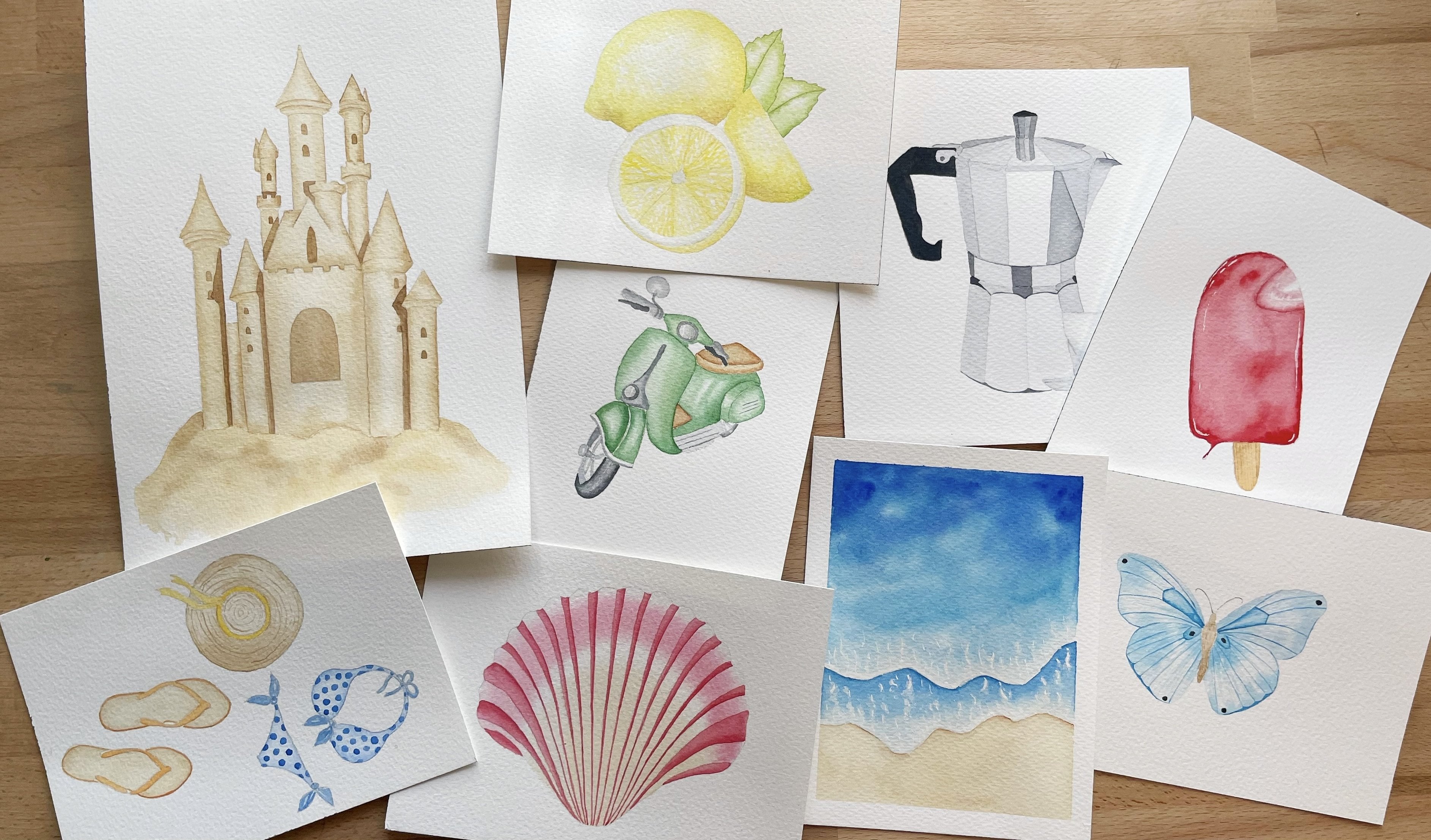
Transcripts
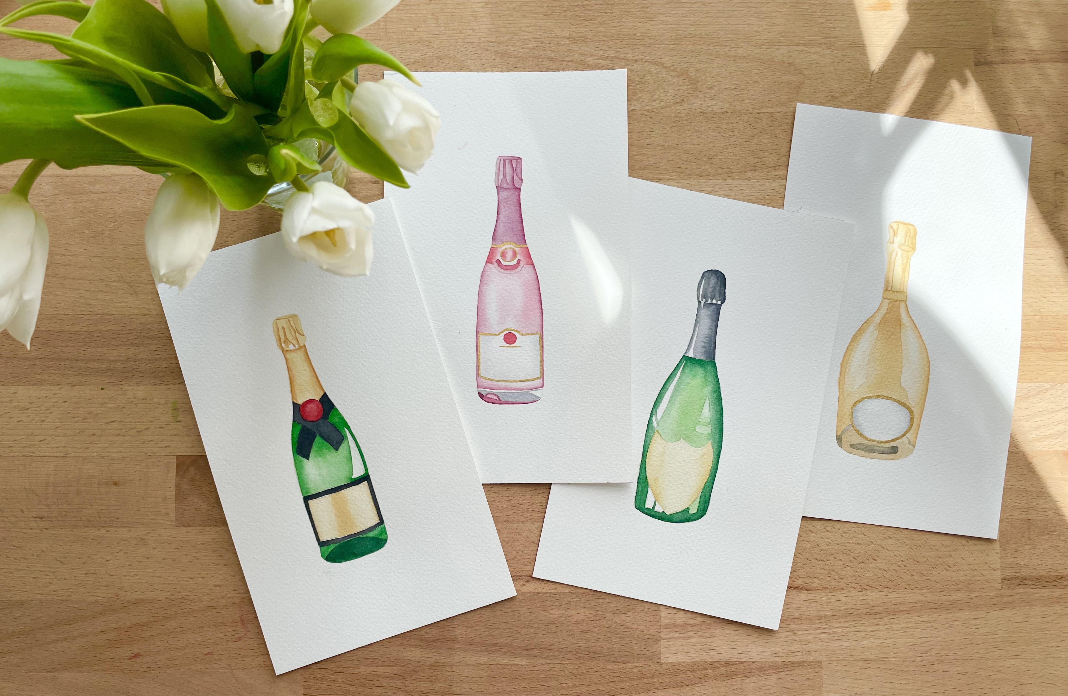
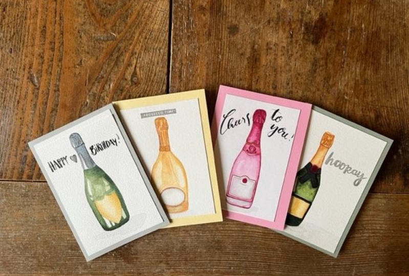
1. Introduction: Welcome to this tutorial. Thanks so much for tuning in. Today we are going to paint those four beautiful and
fun champagne bottles. Yes. All four of them. Don't be intimidated. This is a very beginner
friendly tutorial, and these are very
quick to paint well, not very good, but
fairly quickly to paint. It doesn't take a lot of time. And if you're new to
painting glass bottles, transparent or
reflective surfaces and you're a little
bit intimidated, which I do understand. This is a great way to start, and these are great
for greeting cards, birthday cards,
anything that has to do with any sort of
celebration really. Or if you're like me and you just enjoy
drinking champagne, then you'll have a great
time painting them. There's not much more to say. Let's just dive right in.
2. Materials: So let's quickly go over the materials that
we're going to need. I have 300 gram cold press, watercolor paper, then a ceramic palette
to mix my colors. Then a mechanical pencil
to trace the outlines, three synthetic round
brushes, numbers 246. And then my colors
that I'm using and a glass of water
and that's it.
3. Mixing Colours: Let's start mixing our colors. I like to wet my
pans before I use them just so that they're
ready whenever I need them. We're going to start mixing the colors for the
green bottles. That is bottle number 13. This is hookers green dark. I'm going to need
quite a bit of this. This is for the
darker green shade that we're going to need for the outside lines of the bottles to make them appear a bit more
three-dimensional. I'm just getting
some more of this. And I'm also using hookers green dark for the lighter
shade actually. And I'll be mixing that
with a bit of sap green. For all the colors. We'll be having one darker and lighter
version of the color. And that's how we'll get some transparency into
those glass bottles. Some more sap green. This is yellow ocher
for the labels. It's just pure yellow ocher. And again, we'll have a very diluted version
and a thicker mix. Love. Then for the top of the bottles that have this like
black aluminum foil, I'm using Payne's gray. If you have black
like Mars Black or lamp black in your palette, you're also welcome to use that. I don't use black, I
just use Payne's gray. Here again, we have a thicker, a darker mix and a
diluted payne's gray mix. I like to test out my colors, not just to show it
to you right now, but also so that I know I have the right mixers for
what I actually need them. And I don't need to
start fasting while I'm painting and my
paper is already wet. So here I'm realizing that my dark mix is actually
not dark enough. I'm getting some more
Hooker's green dark and I'm going to mix it with some
Payne's gray to darken it up. Now I have three green mixes. I might not need them, I might just need
the very darkest one I'm doing now and the light one. But yeah, I decided to do that in the third
world for some reasons. This is the lighter one
that's hookers green, dark with some sap green. This is going to be
nice and translucent. Here we have the yellow ocher, very diluted for the highlighted
parts of the labels and then a thicker mix for when we want to add a bit
of shadow or form. Then this is the
darker Payne's gray. Again for the shadow areas and then one more, not thick enough. Yes, this is nice and dark. Then the diluted 14
highlighted areas. This is pretty much it. This
is all the colors we're going to need for bottle 13.
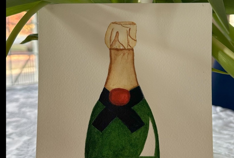
4. Bottle 1: So this is bottle number one. All of the outlines
are attached to this project in the
attachment resources section. You can trace them onto your watercolor paper
like I did here. I'm starting with
the top section, that aluminum foil part
of the champagne bottles. And I'm wetting it first
with water and then I'll put a very translucent wash off the Payne's gray
all over it except for a few bits and areas that
I'm going to leave white. Just to suggest some highlights. This section is fairly small, but I decided to
do it wet in wet anyway just because
I didn't want any hard lines where
I didn't want them, where I don't want them. What we'll do for
all of those bottles is basically paint
in two layers. We're going to have a very
translucent first wash. Just, just to establish the
colors and already suggests some highlighted areas and some shadow areas so that
the form of the bottles, the shapes of them will already appear a bit more
three-dimensional. And then we're going to let
it dry and then put down a second layer just to deepen all of those areas of
shadow and highlights. And that's pretty much it. Now while it's still wet, I'm going in with some more
of the diluted payne's gray. And I'm suggesting some
folds and crinkles in the foil by
painting some stripes. Basically, we're going to
do this wet and wet on this one and then wet on
dry for the next bottles. Just so that you can
see that there's not one way of doing things. And you can choose the
technique that suits you most. Gm, just lifting out some color to accentuate
the highlighted areas. I don't want everything
to blending completely. Now the bottom part
of this section, my paper is still wet. Again, this is the
diluted payne's gray. I'm just being careful
with my edges here. Sometimes I don't draw inside
the lines and then you need to kind of like
correct it again. But just taking my time here, this is very relaxing. Again while it's still wet. I'm going in with the darker
Payne's gray on each side. Then we'll get a sense of the bottle being
three-dimensional and not completely flat. Same thing on this side. Again, on that side
wasn't quite dark enough. I'm just making use of the fact that the
paper is still wet. I'm going I'm cleaning out my
brush a little bit and with the damp clean brush
going into just smooth over those areas and make sure there's no hard
line and it bends in. Now that the top section
has dried completely, I can move on to the actual
glass section of the bottle. And I'm doing so by
wetting the whole thing except for the label and the
highlights on the left side. We're also going to paint over the highlight
on the right side, which is why I'm
wetting it with water. As that is going to
be a little area where the light shines through the bottle and it just
appears brighter. Whereas the highlights
on the left side of the bottle are going to
be reflective light, which means that
they're going to appear completely
white to the eye. I'm just taking my time
here with the water a, because I think it's such a meditative and
coming thing to do. And also I want to make sure I have the
water down evenly. It's not too much,
not too little. So that it gives me
enough time with my light green wash that I'm going to be using in a minute. Again, you put down
water for wet and wet so that you don't have to worry about hard hard paint lines. Now this is the light
green wash that we mixed. I'm starting on the right just because I'm
left-handed. I guess. I'm also putting it over the highlights on
the right side, like I just mentioned, it's going to stay light green. The highlights here on the left side are
going to be white. Also at the bottom here,
bottom left corner. I painted a bit outside
the lines here, so I'm just getting a paper
towel to get it stains. I'm going for the
medium green mix, which is the pure
hookers green dark. And I'm trying to paint swiftly along the right
edge of the bottle. Again. This helps us to create the illusion that this bottle is actually a
bit more three-dimensional. And I'm also adding some
medium green on the top. On the bottom of course, because there's
usually less light hitting the bottom
of the bottle, so it appears doctor,
at the bottom. Now, I've cleaned my
brush a little bit and dried it off
on a paper towel. So it's clean and damp. And I'm using that to blend
out the edges a little bit because I don't
want any hard lines between the dark green
and light green areas. I want it all to be
blended in smoothly. After I've painted with
the doctor green mix, I usually clean up my
brush a little bit and just wipe over it
to blend out the edges. Just making sure I don't paint
over my white highlights. Blending it again a little bit so I don't get any hard edges. I'm also taking some
of the green dark of our green highlights. The darker mix has bled
into it a little bit. So I'm just taking that off again so I don't
lose my highlights. So I've let the
green areas dry off completely and I'm now
getting started on the label. This is pure yellow
ocher on dry paper. I'm painting this on dry
paper because I have a very watery wash of color
and the area is not too big, so I know I can get
it on there quickly enough without worrying about getting any hard main lines. Once you're done with that, we're going to let
it dry completely again before moving on
to the next In section. While the label is drying, we can move back onto the very top section and just deepen the shadows
and the highlights. So again, I'm putting down
a bit of water to wet it, but this time, not over
the whole gray area, but just the very top part. And I'm using the
thicker Payne's gray mix to just deepen the shadow areas that we suggested
in the first layer. Mostly the darker areas will be on the right-hand side,
a bit on the top. And then I'm also accentuating the folds and the crinkles that we have in
this aluminum fold. I'm also painting
over the doctor. Kind of like stripes
in the middle. I'm just making sure
that I don't paint over the very small white areas
that we have at this top part. Once I've put down
a bit of paint, I clean out my brush. I blend it in, lift out some of the color
if it spreads too fast. Sometimes if you
have too much water, either on the paper
or in your paint mix, the water just spreads too
much too fast on the paper. And you're about to lose all of the shapes
and highlights and shadows that you're
trying to paint. When that happens, you can
just clean out your brush, damp it off on a piece of
cloth or a paper towel. And then you can lift out
the highlighted areas again. That's just what I'm doing here. And I'll keep doing that
until I'm happy with it. And I feel like
the dark areas are really dark enough to make the spot look
three-dimensional. I'm done with the top
section and I've let it dry. Now I'm moving on to
the lower part of this blackish gray area. I'm basically doing
the same thing. I'm wetting it with water again to make sure that my
gray mix will blend in evenly. And then I will take a very
concentrated mix of Payne's gray and just the paint across the right
side of this bottle. This one is very dark, but I do want that
dark area to really bring out the form
of the bottom. And then also a little
bit on the left side. Not as much, not as
dark but slightly. Then to blend it in. Just swiping over it again
with a clean, damp brush. As my paper is still
wet and I looked at it, I can decide where I
want to go even darker. Just add a bit more
of the Payne's gray. Now that the gray area at
the top has dry completely, I'm moving onto the green
glass section again. I'm going to paint the
second and last layer of this bottle using the darkest
green that we've mixed, which is the hookers green
dark with Payne's gray. I'm going to try to use
it to really bring out that sense of the bottle being translucent and
three-dimensional. So as before, I'm wetting the whole thing except for the label and the
highlight areas. This time I'm also
not going to wet the highlight area that we have on the right
side of the bottle. We did paint over it
in the first layer, but not this time, so we're going to keep it dry. Now I have the
very doctrine max. I'm starting on the
right side and just swiftly painting along
the edge of the bottle. And also on the bottom. I know that I want the bottom
to be really dark green, so I'm not afraid to use
a lot of paint down here. And I'm just trying to
do all of this while it's still fairly wet so that my green mixed
blends in nicely. Just be mindful of
that highlight. We really don't
want to paint over it or any other highlights
for that matter. Because lifting off
this very dark mix will be a bit more difficult. If you paint over a highlight, you might just end up
losing a completely So more paint on
the bottom here. Like I said, this is going
to be very dark green. And I'm also using the dark
green on the left side here. Like I said, while
it's still wet, I really want to I want this rights right side of the bottom to be darker
than the left side, like we have on the top section. Here. It's already
dried a little bit, so I'm just using a bit
more water to wet it again. If you're worried about
what is called a backwash, you can also let it
dry off completely and then re-wet the areas that you haven't
painted over yet. Again as swiftly as I can along the edge of the bottle and then trying to blend in nicely. I'm also trying to be
mindful of all of my edges. The label as well as the, the, the outer edge of the
bottle and the highlights. I'm just blending
with a clean brush and just adding more dark green to make the bottle pop
off the page a bit more. It's still wet on
the right side, so I'm confident to
put down more paint. I'm cleaning off my brush again and blending it with
the damp clean brush. When you put down
your darkest areas and darkest use of colors, sometimes the rest of your painting will
appear a bit unbalanced. Now that I've painted
the darkest areas, I get a feeling that I want the lightest areas to be
a bit darker as well. I'm re-wetting the middle
section which has dried while I painted the the outside areas. And I'm being very careful with my water so that I don't
paint over my highlights. Then I'm going to use the
light green mix again just to darken that middle
section a little bit and then it will all appear a bit
more balanced and in sync. This is the light green mix. Adding it here in the middle. Careful not to paint
over my highlights. What I mean in sync, I basically mean harmonious. I'm adding a bit of dark green, the edge of this highlight
just to bring it out more. And now I'll just keep adding a bit of color
here and there until I feel like I'm happy with
the result and I have a nice balance of light
and dark reflective areas. The green section of the
bottle is completely done. I think I'm happy with it. Now. I'm just going
back to the label. I'm going to add a bit of
pure yellow ocher again, to simply create a sense of
roundness of the bottlers. So I'm wetting it completely so that my colors blend in nicely and I don't get
any hard paint edges. Now, I'm using the
pure yellow ocher and I'm painting it on the
right side of the label. I'm doing the same
thing on the left side. Now I'm cleaning off my
brush and I'm just blending those areas that I don't
get any hard lines. That everything looks
nice and smooth. And it appears as though the
sun or the light is hitting the middle section of the label and the outer parts are a
bit more on the shadow. Everything has dried and the
painting is basically done. If you are happy with
yours as it is now, feel free to stop
and call it a day. I've looked at mine again and
decided that I actually do want my darkest areas
to be a bit darker yet. I'm just adding a bit bit more
paint in my shadow areas. I'm doing this wet-on-dry. So I'm using two brushes now. I have the smaller
one which is the size to I'm loading that up with the very dark
Payne's gray mix. And I'm adding it where I feel I want I want to darken
it a little bit. Then I'm using a larger brush, which is the size for I think. And it's clean and damp but only has a little
bit of water on it. And I'm using that brush to blend out the
colors a little bit. I'll just keep doing
that here and there. Where, like I said, where I feel like I need I need the bottle
to be a bit darker. You don't have to do this, but you can if you want to. It's just those little
finishing touches. And I've also
decided I'm going to add a bit more dark green. This is the hookers green
dark with Payne's gray mix. Just like I just did before
with the size two brush. I'm taking it along
the right edge of the bottle on dry paper. And then I'm using a
slightly larger brush that is clean and just
stamp with a bit of water. I'm just running it along the paint that I just put down to blend it in a little bit. It just makes the
highlights pop more. Now, I'm actually happy with it. And except for a little bit
more here on the bottom. But I'm basically done. More blending. This is it. This is offers bottle. I hope you've enjoyed it. And I hope to see you
in the next section.
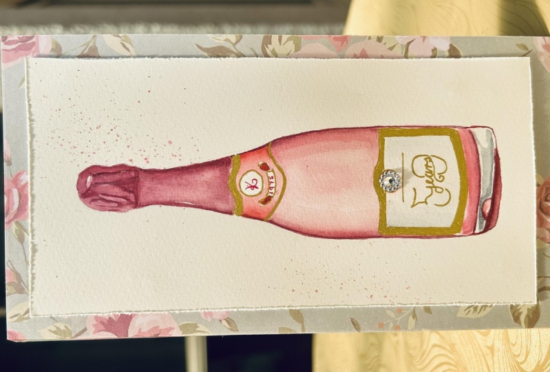
5. Bottle 2: Welcome back. This next bottle is going
to be a rosy champagne, and I am mixing a lighter
and darker shade again. The lighter shade is some
Winsor red with permanent rose. The darker shade is Winsor red, permanent rose and some violet. I've cleaned up my palette, but feel free to keep
the greens that we mixed previously because
we're going to need them again for
the third bottle. I just thought it would be fun to continue with a
different color. And we're also keeping
the Payne's gray and the pure yellow ocher
that we just used before. Basically you just
want a light shade of pink and one that
has a bit of violet. And I think I'm
happy with those. We're going to start by painting the first layer and we can
do that fairly quickly. I'm going to start
at the top again and I'm painting wet
on dry this time. I'm using the mixed
width violet for the aluminum foil at the
top and then the more pinkish makes for the
glass at the bottom. So this is a very watery mix because it's the first layer and I don't want
it to be too dark. I'm just making
sure that I don't paint outside the lines again, just so that I don't have
to correct any errors. But I'm also being quick enough so that the paint doesn't
dry while I'm still busy. So I don't get any
hard hard paint edges. Then while it's still wet, I'm going to add
a bit more paint of the same mix on
the right-hand side. Again to create a sense of roundness and shadow right away. And then we're going to deepen that when we paint
the second layer. Not just grabbing a bit
more of the same paint. I'm adding it here to the right, just stippling it in. It's still damp enough the paper so it lends quite easily. But if I want to blend it more, I can just swipe over
it with a clean, damp brush like we did before. I'm just blending it in. Adding a bit more even still. While this dries, I can move on to the glass section
of the bottom, which is the lowest section. Again, I'm just wetting
it evenly except for the labels that we have. I don't have a drawn in highlight like I did
on the last bottle. Because I want to do it
differently this time. I'm creating a highlight
this time by just lifting some of the
color with a damp brush. Just to show you that there's different way of doing things. Now I'm grabbing the sorry, you can't see, okay, now, this is the pinkish
mix that we have. Oops, making a mess. This is again very watery because we don't want to
go too dark too quickly. Just adding it on either side and then letting
it blend towards the middle where maybe the light hits the
bottom a bit more. It'll be not as dark. Then I'm going to leave a highlighted area
towards the left side. Painting downwards a little bit, cleaning off my brush. And then I'm putting some more water on the,
in the bottom here. We're going to have a bit of reflections on the
bottom there this time. Just some gray areas and some weird shapes of
dark and light pink. That just happens with
bottles when the, when the light hits it and
breaks in a few areas. Now I'm adding just a tiny
bit of the light pink mix. I'm not going all the way down. I penciled it in for
you in the outline. I'm just being
mindful of my edges. I don't want to paint
outside the lines. I also don't want to
paint onto my label. So this is the number two brush. If you need a smaller brush, few free to size down
to a number zeros. So the brush sizes are
really just suggestions. I'm just lifting off
a bit of color here. But if you're more
comfortable with a bigger or a smaller brush, few free to choose whichever
one you are. Happier with. Size two works really
good for me here. I'm letting the the glass
section dry and while it dries, I'm moving onto the upper
label and I'm wetting it. This is a very small area. If you're confident enough
to paint wet-on-dry, feel free to do so. I'm wetting it just to be consistent with the technique
that we're using here. Making sure I don't paint
into that round section. Now I'm adding a very
concentrated version and mix of the pink mix that
we have on either side, on the right side, and
then on the left side. Then I'm going to blend
it in towards the middle. Just trying not to paint over the other two
parts of the label. It's a bit like I'm fidgeting. I'm just blending it in the bottom section,
painting across. It's still wet so I
can add some more. On the left side here, trying to keep
most of the paint, the most saturated paint on the outer edges and then blending it in
towards the middle. Adding some more paint
while it's still damp. There's a lot you can do
it in just one layer. Cleaning off my brush and
wiping it off a little bit and then swiping over the edges
and just blending some more. I'm doing the same thing
on the right side. The left side, sorry. I'm letting this
dry and I'm moving on to the lower part,
the lower labor. There's a round dot in
the middle and I'm using the same concentrated
pink mixed to just paint that in wet on dry. Not fascinated with it too much. It's fairly simple. Now, the top section, the part where the
foil is has dried completely and like we did at
the end of the last bottle, I'm just deepening
the colors and I'm doing this wet-on-dry again, just so that we can
practice that as well. Again, I'm using two brushes, the number two and the
number four brush. The number two is loaded with
paint and the number four is wet and damp. And I'm using the number
four brush to blend over the color that
I just put down. The good thing about
wet on dry is that you can be much more precise
with what you're doing. I could also do this wet on wet. I just wanted to mix
it up a little bit. So now I'm just blending again
with a clean, damp brush. It in. Also at the bottom here. I painted in some lines at the very top
where the cork is. And I'm also working
wet on dry now. And I'm painting
over those lines and then just blending
them out to one side. So I'll have one side that has a very crisp edge and the
other side has a blended edge. That's how we create form. You can just paint
along these and then on one side of your line you're going to blend
it out a little bit. That's going to help
us create those, those folds in the foil. Last time we did it wet on wet. Now we're doing wet-on-dry. You can decide for
yourself which techniques suits you better or which
result you like better. I'll just keep doing this. And I think some more. Even if you don't follow the lines that I
painted in exactly, it doesn't really matter there. There isn't really a right
or wrong. In this part. You can, yeah, you can just
create forums as you wish. Even if you feel like you've
messed it up a little bit, no one will actually know
that you've messed it up. Now I'm going back over the
lines that I just painted. I feel like I want to
deepen those colors right away and just make them
a bit more pronounced. Non adding a little bit of
color at the bottom here just to separate
those two sections of the bottle a little bit. Blending it out again
with a clean, damp brush. I'm doing the same
thing at the bottom. Now I'm also using the violet mix and not
the pink mix again, because the violet is just, just has a darker hue. And I want to add those
when I add that at the, at the outer edges
off the bottom. So this is permanent rose and violet and a
bit of Windsor red. I think we used making sure
I don't paint over my label. Again, a clean, damp brush
to just blend it out. This is how we create form. I have yet to paint in the very bottom
part of the bottle, but we're trying to
do that in a second. Just adding a bit more violet
mix to make it even darker, bring up the shadows even more. Blending it in. It looks very pronounced now, but it's going to balance
out once I'm done with this left side here. So I'm repeating
the same technique. I have the darker violet mix. This is on dry paper. Painting slowly at
the bottom here because I don't want to
paint over my label. Now I have the slightly
larger brush, clean and damp, and I'm blending over it, making sure I don't
get any hard lines. I'm blending it out into
the highlight area. What's the bottom here? Somewhere? Blending you can
have a practice blending. Now, I'm starting to paint in
the bottom section where we have this kind of like reflective area where
the light breaks. And I'm going to use
pure Payne's gray. It's a fairly light mixture. Then painting in this sum, this biggest section
that doesn't go right until the very bottom, there's a fine line. You can see it in the outline
that I provided you with. This is also wet on dry. I'm just trying to
make sure that I stay inside those little
abstract forms. This right here is line
also with Payne's gray. There's going to be a
white line remaining. I'm trying not to paint over
that little gray dot there. You don't have to mind
that if you don't want to. And I'm cleaning off my brush and I'm using the
pink mix again, quite watery, it's very dilute. And I'm painting in
those lowest sections. Actually, I wanted to get
started with the darker shade, which is the very
bottom of the bottle. It's basically just a
line that goes across. This is also a wet on dry cleaning off my brush. Splattered a little bit. That was a very passionate
cleaning off the brush. I made a whole mess,
but it's okay. I'm letting the
bottom section dry completely and in the meantime, I'm coming back
to the top label. I'm wetting the circle. Although that's
actually really not necessary because it's
such a small area. This is again, the lighter
pink mix that we have. And I'm painting it on
either side of the circle, leaving a little highlighted
area in the middle. And then I'm cleaning off my
brush and just swiping it over it to blend out
the edges a little bit. Don't want to fuss
with it too much. Now I'm coming back to the sides again because I feel
like I do want to darken those a little bit
and I'm wetting it before putting down some paint. And then again with
a bigger brush, I'm just blending it out. We really just repeating
the same techniques over and over again for different sections
of the painting. Again blending it some more. Same as with the
last bottle that we had once we put down
the very darkest, use. Your doctors tones. Sometimes you feel
like your mid tones need a bit of adjusting. That's pretty much
what I'm doing here. Now. I also need to darken
that circle a little bit. I'm doing it wet
on dry this time, using my smaller brush to put
down paint and then using the slightly larger
clean damp brush to blend out the edges. Same thing on the
left side here. Just make sure you don't paint
over the middle part where the light hits it and you
have a have a highlight. I'm just smoothing it out
until I'm happy with it. Now, I'm moving on
to the big label. This is going to remain white, but I don't want it to be
bright whites like the paper, so I'm wetting it. And I'm going to
add a very, very, very diluted mix
of Payne's gray. The corners, just to have the hint of a shadow
on the white label. This is very, very thin mix. Putting it on either sides. And a little bit on
the bottom here. Just again, to create a sense of roundness and to
create some form. I'm just going to let
that blend and dry. And meanwhile I'm back
up at the top labor. And there's this little
banner that I'm just painting in with a
concentrated pink mix. I'm doing this wet on dry
because it's just so small. I'm painting the middle
section of this ribbon. Then once that's
dried a little bit, I'm just adding the sum, the outer parts
where it's folded. This is just a tiny
details so I'm not fussing with it too much. Drying it off with my hairdryer to speed things up a little bit. Again, using the pink
mix to add those. The ends of the folded
within. You know what I mean? All we need now is to add
some gold highlights. And I forgot to mention this
in the beginning when we make the paint because
I just, I just forgot. You can do this with gold watercolor if you
have it or silver, or if you have a, a gold pen, then
you can also paint that in with a pen because
it's just a few lines. A line at the top
of the upper label and then around the
middle circle and painting wet on dry. Then there's also a gold, gold line around the bigger part of the label, the bottom label. This is also wet on dry. The label has dried completely. And I'm very happy with
how the light gray has. Just blend it in. I didn't touch it at all. I just put it on the wet paper
and it just did its thing. Now I'm just adding the gold. If you don't have
any metallic color, you don't have to do this. You can either just
not added or you can choose any colors that you feel like would
be a good fit here. I just thought cold
would be a nice touch. Then there's also a bit of gold underneath that round circle. Now all that's left
to do is to go back to the very bottom
of the bottle again, where we have these
abstract shapes. They are now completely dry. And I'm just now I
have a size 0 brush. And I'm adding a dark line of the dark violet mix
that we've used. This is also wet on dry. Also outlining this half
rounded half-moon shape. Then I'm going to add a bit of the lighter pink
mix in the middle. Also with the size 0 brush. Just a tiny bit of paint. This is basically it for
bottling number two. I'm just finishing tidying up this bottom
section a little bit, adding a bit more of the dark, darker pink violet
mix. Then we're done.
6. Bottle 3: Welcome back. This is bottom number three. We are basically going to use the same colors as for
bottle number one. I'm only adding a dark shade of red for the dots in the
middle of the label. I'm going to do this by just
adding a bit of Windsor red to some of the Payne's gray that I have
left in my palette. I don't want it
to be too bright, which is why I'm just
darkening it a little bit. Just testing it out on
my piece of paper again so that there aren't any bad surprises when
I actually paint. This was much more red
than will actually need. Then for the aluminum
foil part of the bottom, we're going to need
some burnt sienna. I'm also going to mix with
a bit of yellow ocher, adding some more yellow
ocher for my labels. That's again, we're going to start at the top with
the aluminum wrap. And this is pure yellow ocher. It's fairly diluted. And I'm putting
this on dry paper. I'm basically painting all
across the top part except for two tiny bits at the
very top where the cork is. Just to have some small
highlights there. If you feel like you have too
much paint on your brush, just add a little bit of water and then you
can dilute it. I'm just being mindful of my
edges trying not to paint over anything where I don't
want the yellow ocher to go. I'm just blending it
out a little bit. Taking off some of
the pigment where I feel might be too dark. While this dries, I'm going
straight to the label at the bottom section of the bottle and I'm doing the
exact same thing. I have the pure yellow ocher and I'm painting
it on dry paper. This is just a first wash
to establish the colors. Just making sure I'm
staying inside the lines. Now I'm moving on to the
glass section of the bottle. I was about to do a wet
on dry but I thought No, Let me wet it first. I'm putting down the water just like we did with
Button number 12. I'm not wetting the
highlight that I have on the right side
of the bottle here. This is going to be reflective light or
reflective highlight. It's going to appear
white to the eye. So I don't want to
get any water on it. I'm just painting with water as I would with
paint very carefully, making sure it's nice. And even then I'm using the lighter
green mix which was hookers green dark
and with sap green. And I'm painting
it evenly where I wanted careful not to paint over my highlight or
into my highlights. And also over the labels
that we have here. I'm adding a bit more pigment on the outer edges
of the bottle, on the right and also
on the left side. Just as we did before, to create a sense of roundness. I'm trying to do this while
it's still wet or damp, at least that I don't
get any hard edges. I'm also adding the light green. I did paint on my highlights. Just trying to lift the color. I'm also adding some
more pigment again, just underneath that label. My paper is still wet. The lighter green will
also go on the bottom. I'm doing this wet on dry. There's no need
to wet this area. It's fairly small so you
can just paint it on like I am here. Then let it dry. While the green
parts are drying. I'm moving back up to
the aluminum foil. As this is a golden wrapping. I'm trying, I'm not using
actual gold pigment, but instead I'm using
yellow ocher and burnt sienna to create the
illusion that it is gold. So now I'm painting on dry paper and we've used
this technique before. I have my number two
round brush with, that's loaded with pigment. And then I'm using a
slightly bigger brush that is clean and damp to blend out the colors so that I don't get
any hard edges. This is the shadow color of
the for the yellow ocher. Basically. I'm repeating
this on the left side, trying to paint in one
swift motion and then using my bigger clean damp
brush to blend it out, just swiping over it. Adding a bit more
color here because I wanted even darker on
the left side as well. I had some issues with my
camera during the section. It kept crashing while
I was recording. But you didn't miss too much. So basically all I
did was paint along the lines at the
very top section, like we did with the pink bottle and
then blending it out. And here I just
started painting in those black parts of the
label. They are black. I'm using Payne's gray again. I'm going to paint a few
layers of concentrated Payne's gray to
make it look black. If you just want to use a Mars Black or lamp black
that you have in your palette. Feel free to just
go for black here, and that will save
you a bit of work. I'm just doing it
in Payne's gray. This is also wet on dry. Sorry, I missed that part. But my phone just yeah. Technical issues. It happens sometimes. I'm just painting it in wet
on dry. It's fairly simple. Just mixing up some
more Payne's gray and while the top part dries, I'm going straight in and start painting on
the label at the bottom. This is also wet on dry. And again, it's
fairly concentrated. Payne's gray. And I'm just going to paint in the outer edges of this label. I'm taking my time
here with this because even though I have my smaller
brush, the number two, I'm really trying not
to paint into the green or the beige
part of the bottom. Usually I would turn
my paper a little bit just to make the
motion easier for my hand. But because I'm filming, I'm trying to keep it straight. That's why I'm a bit slower. Just go all around
the label and paint in your concentrated gray
or black if you have it. Now that's done. We can move
back up to the top again. And we're going to use the dark red that we
mixed and paint in, circle in the middle here. This is very quick. On dry paper. I'm not fascinated
with it too much. I'm just making sure that the paint is
even. And that's it. If you want to add a bit
of shadow here, you can. But I thought I'd just
leave it like that. Then we can move onto
the glass section again. Just same as before, same procedures every
year where we're going to wet it with water first and make sure that we don't wet the reflective highlight
that we have here. Putting water everywhere before
we add more darker color. Now I'm using the darkest
green that we've mixed, which was hookers green
dark with Payne's gray. And I'm going to paint along
the outside edges here. I'm starting on the right side. I'm trying not to paint into
my highlights. That label. Adding more paint because
I do want it much darker so I can just
as well I do it now. No need to let it
dry and rewrite it. Then. I'm just going to
clean my brush and blend it out like we did before because I don't want
any hard paint edges. I'm also adding a bit
more pigment here. I do want the top to be
darker as well with this one. Again, blending it in, mounting a bit more
water because the paint, the paper is almost
completely dry. So I'm adding a bit more
washer and then I'm going back in with
the dark green mix. Nice and smooth. I think a bit more
color straightaway. Just to match it
to the other side. I'm blending it out again
with a clean damp brush. The bottom part
will be very dark. I'm not wetting
the area before I start painting because
it's fairly small. I'm using the dark, dark green mix and I'm
painting it straight wet-on-dry across
the whole area. Then we have a bit of an
oval shape that we're going to accentuate even more. While this dries, I'm
going to come back to the upper part of
the bottle again. I'm painting another layer
of concentrated Payne's gray over the black
part of the label. If you've used thick black
paint during the first layers, then you probably
don't need to do this, but I need to get it
much, much darker. So I'm painting over it again. But also one section at
a time because we have these two parts of the the foil which are supposed to be
written, I guess crossing. We want to make sure that
those remains separate. I'm not painting over
everything at once, but in sections letting them dry and then painting the rest. I'm also adding another
layer of red here. I put down a little
bit of water first, which is completely unnecessary. You can just paint that wet on dry like we did the first time. While all of that dries. I'm moving down to the label which we are
painting in yellow ocher. We're just adding a
bit more shadow to it. So I'm wetting the
whole area with water. Then. Just writing
it out evenly. Then we're going to
add pure yellow ocher. This time in the
middle of the label. I thought I'd try
something different. Let's see how that turns out. I'm grabbing the paint. This is still my size
two brush, I believe. I'm just adding yellow ocher, the middle of the label and
then I'll be blending it out. We'll also a bit on the
side, just a tiny bit. So we have two highlighted
areas on this label, basically, tiny bit on
the left side as well. I have a clean brush and I'm swiping over it just
to blend it out. We're letting this dry and we're going to paint in the bottom
section of the bottle. This is very, very dark green with Payne's
gray that I have here. I'm painting on dry paper and my color mix is
quite concentrated. I'm just following the
lines of this oval shape, just one layer of it. Then I'm drawing
everything off with my hairdryer to speed
things up a little bit. You can also just wait
until everything is dry. Make a coffee, stretch. Now we want to deepen
the colors a bit more. Again, I'm going into this section of the
label, I'm going over it. I think this is the third
layer of Payne's gray. I should have just used black. I'm painting yet another layer. And I'm also going
over the outlines of the labels just to match it to the upper
part of the labeled, basically because it's
the same material. So it should have the same, the same hue, the same
deepness of color. I'm also giving this upper
part one more layer. It's not going to
be quite as part as the ribbon on the bottom, just so that the eye
can differentiate it. But it doesn't need,
it doesn't need another coat of Payne's gray. This is it. We're done
with bottom number three. I'm actually very
happy with this. I hope you've enjoyed it and I hope to see you
in the next chapter.
7. Bottle 4: So let's get started
with our last spot. Here. The color of the glass
is completely transparent. So you'll be able to see the golden color
of the champagne. And for this, we're going
to use yellow ocher mostly. And I'm just starting to paint in the top
as we did before. This was pure yellow ocher. I'm painting wet on dry and I'm just putting down
a light first wash. The top part has
dried mostly and I'm continuing with the glass
section off the bottom. I'm painting this wet on dry. And because I'm using
such a diluted mix of the yellow ocher that it doesn't really
need to be wet. I'm really using mostly
water in my brush here, just a little bit of pigment. And we're going to paint all over the bottle
except for the label. I'm also painting over the highlight areas that I've penciled in on either
side of the bottle. Because I wanted these not to be completely white and bright, but just a bit lighter
than the outer edges. I think it was the first
bottle When we also had a highlight that was painted
over in the first layer. And it's the same in this one. I have a son doesn't
bother you too much. It's coming in through the
windows at this time of day, but I did close the close the window so the curtains
aren't moving anymore. I hope you can see. Now I'm grabbing
my smaller brush. This is the size two brush
and I'm loading it up with a bit more concentrated
mix of yellow ocher. And I'm painting along the
outer edges of the bottom to give it form and bring out
the roundness of the shape. I'm doing this while
my paper is still wet so that the colors blend
into each other nicely. And I don't get any hard edges. Some more in the middle as well, just so that it brings out the highlights on either
end. On either side. Sorry. Now I'm taking my biggest brush. I think this is the size four. And I'm just lifting
out a bit of the color on my highlight
areas because it bled into it, because my paper is still wet. When you're done with this, try to rub out the pencil lines as much as possible
because you don't really want to you don't
want them to show through, especially around these
highlighted areas. This is some more
concentrated yellow ocher. I'm just continuing
with this process until I feel like I've, I've created some
sense of roundness, some more in the
middle ear as well. All of this while my
paper is still damp, if yours has dried already, you can dry it off completely. Either you wait or
you dry it off with a hairdryer quickly and then
you can just re-wet it. And that way you won't
run into any trouble with your and paint creating hard edges or not really
doing what you wanted to do. My paper is dry enough that I can actually move
on to the label. And I'm wetting the
inner parts of it. Then I'm coming in
with a diluted payne's gray just on the outer edges of it to give it some
shadow and form. But the label itself
will remain. Why? For the most part, cleaning off my brush and blending it in. Blending it out. I didn't
know it was a blending of lending out. Either way. Blending. I'm lifting off some of the color, some of the pigment that's
led onto my highlight areas. I'm doing this with
a clean damp brush. You can see how the
pigment is coming off, how the highlight are starting to be a bit
more pronounced. And I might add some more
of the yellow ochre, letting everything
dry and moving back onto the top
section of the bottle. We've done this before. I'm adding yellow ocher on dry paper and then
I'm cleaning off my brush and smoothing
out the edges. Again, we're doing
this to create form. Make it look a bit more
three-dimensional. Adding a bit more color. You can do this until you
are happy with the results. If you feel like you
just want everything to be fairly light,
you can do that. If you want shadows to be
very pronounced invisible, you can add as much
color as you like, just as long as the darker tones and the mid tones
are all in balance. Now I'm adding yellow ocher onto this ribbon section of the foil. I'm painting this on dry paper. I'm smoothing over my
shadow area again. Now. I'm grabbing a bit
of burnt sienna and mixing it in with the
yellow ocher because I do want my yellow ocher
to be a bit darker. I'm using this mix to add some more shadow on the
right side of the bottom. My paper is dry at this point. I'm trying to paint
in one swift motion. Then I'm using my
slightly bigger brush, which is clean and wet or damp. And I'm running it along the
pigment to smooth it out. Some more of that same
slightly darker mix goes into onto the top middle
part of the glass. Again, using a clean wet brush. Just move it out. I don't
want any hard edges. The same thing again, on the left edge of the
bottle. Darker paint. The sides of the bottle, the lighter my
highlights will appear. So it's all relative and you just On need to look at your
painting and try to decide, okay, how, how light should
the highlights actually be. And then you can dock and
everything else accordingly. Here I'm just smoothing
everything out a bit more. I'm adding some more of the yellow ocher
burnt sienna mix, just about the label
in the middle here. I could have probably used a darker mix in the
very beginning, but I just wasn't sure
how it would turn out. So I draw the paint an
extra layer then go to dark in the very
beginning because then you can never
really go back. Not just looking at it, blending here and there. Until I feel like everything is smooth and I'm happy with it. This is some more burnt sienna and that goes on the
bottom. Off the bottom. Like we had in the last part of the bottom section will be darker because there's not
much light reaching it. I'm painting this on dry paper. And I'm just painting
along the outlines, gonna have penciled in. Now everything is
completely dry. I'm going back in on the top
of the bottle, the wrapping, and I'm using the burnt
sienna wet on dry to create those folds in the aluminum that we've
done this before. This is just the
same process I'm painting along the lines
that I've penciled in. Then I'm smoothing
them out a little bit. And I'll keep doing this until I feel like I've created some
sort of shape and form. And I'm happy with it. I'm using the smaller brush, the size two brush
to paint the lines. And then I'm using the clean
damp number four brush to smooth it over. Not really painting this off any reference photo
at the moment. There's no right or
wrong way of doing it. I'm just suggesting
a certain shape and your brain will do
the rest of the work. So it's not hyper realistic, it's just suggesting What's the air and then your
imagination will do the rest. So this is not super
detailed and it's just detailed enough so that you know what
you're looking at. I'm just painting over
these, adding some more. Now, I'm going back in onto the bottom
part of the bottom. I'm painting wet on dry. This is pure Payne's gray. I'm filling in some of these abstract forms
that are penciled in. This is just whether
where the light reflects, where it breaks. These shapes. They don't really make a lot of sense to the eye, but they're just there. I'm not going to obsess
about it too much. Like I said, I'm not trying to paint hyper-realistic here. I'm just suggesting
these kind of shapes and forms and that's pretty much it. Some drilling happening
in the building. I don't know if you can hear it. I hope it's not too loud. Sorry about that. Now we're going to use some
of that gold pigment again, just for the highlights
around the labels. Like I said in
previous chapters, if you have metallic
watercolors, that's great. If you have a metallic
pen of some sort, you can also use that. It really doesn't matter. I'm just adding a few lines
here on the top of the foil. Then I'm going to paint
around the white label. This is on dry paper and it's just one line
around the label. Nothing too complicated. Like I mentioned earlier,
the pencil lines, especially around
the highlights here, a very, very visible, sorry. But I drew them in quite, quite thick so that you
can see on the camera. But of course you don't
want to be able to see them in your
actual painting. So just try to rub them
out as much as you can. When you're done in
everything is completely dry. That's pretty much it. This
is button number four. I think. I'm happy with it. If you want to make some last
adjustments like I am here, you're happy to do so. If not, you can just
leave it as it is. I felt like I do want a
bit more color here in the middle just because my
highlights are barely visible. But you don't have to do it. You just need to look at
your own painting and see if you need to make
improvements or if it's finished, that's completely up to you. I've just wet the area
a tiny bit again. I'm using the yellow
ocher burnt sienna mix just to add a bit more pigment. That's it. We're done.
8. Last thoughts: So let's just look at
what we've painted today. These are absolutely beautiful. Thank you so much for watching and painting along with me. I hope you're happy
with your results. I would love to get in touch
and stay in touch with you. You can find me on
social media here. And I hope to see you in one
of my next tutorials again. Bye.
 Sophia Neumeister, Watercolour Artist. Published Author.