Transcripts
1. Introduction: Welcome to the studio. It's Froyle here, and I'm so excited that
you've joined me. As a mixed media artist with over 30 years experience
painting and exhibiting, I'm passionate about
empowering you to create art, to find your creative voice, and to help you find the
tools that's going to enable you to express yourself through
mixed media applications. And today we begin class 14. 100 days of collage, it's time to bloom. And I can hardly believe
I'm saying that the final class of a
14 class series. And if you've been creating along with me from
the beginning, we have explored an
incredible amount together. We've experimented with color
and texture, gel printing, collage papers, image transfers, stencils, mark-making,
fabrics, found materials. And so many different ways of approaching mixed media art. And now we've arrived
at day 92 100. This final class is
a little different because it's not really about learning another new technique. It's about bringing together everything we've discovered and allowing ourselves
to create with more confidence,
freedom, and trust. The theme for the class
is it's time to bloom. It's about celebrating
your creative self after all of the days
and prompts and classes, exploring the different
techniques and art materials, now you have a greater
sense of who you are, how you like to create, and your creative voice. We begin from seed to flower because every creative
idea starts somewhere. Sometimes it's just
a color, a mark, a piece of paper, or the
smallest spark of inspiration. We don't always know what it's going to become and
we don't need to. From there, we'll explore blossoming potential in
our inner creative garden. We'll create abstract florals, celebrate resilience, take
inspiration from the seasons, and then completely embrace
abundance with color, layers, texture, and
beautiful blooming forms. And as we move towards day 100, we'll also take some
time to look back. What techniques did
you love the most? What challenged you?
What surprised you? And perhaps, most importantly, what have you discovered about yourself as a creative person? Then, of course,
we reach Day 100, and we really do have to
celebrate because whether you've created every single prompt join me for a
handful of classes, or you're simply discovered
this class today. Every time you make the
decision to show up and create, you're building confidence
in your own creative voice. As always, I'll be creating
right alongside you. I'll share my process and my materials, the
decisions I make, and probably a few moments where things don't quite go
according to plan. Because that's all part
of the creative process. That's how you grow. That's how you bloom. And that's how you really
get to express who you are. So come and join me for this
final class of the series, celebrate your creative
self, experiment, explore, and really stretch
your artistic muscle, grab your materials, bring your gel plate,
your collage papers, your mark-making tools,
a little bit of courage. And let's make art.
2. Material List: Welcome to Class 14. Now, seeing as this is class 14, you definitely should have
all of the art materials that you will need to create
your fabulous artworks. Now, I've been working in
an art journal through the entire series of our
100 days of collage, and this is the
third in the series. It's quite fat, as you can
see, absolutely glorious. Look at those pages. But what I like about
using the art journal is all of my fabulous artworks
are together in one place, and I can look back over
the incredible journey and remember what I liked or what I didn't like,
what worked out? Maybe what didn't work out. But definitely ideas
for future projects. You don't have to use a
commercial art journal. You could be working
on loose pages, binding them together,
or you might have made your own art journal. You could, of course,
be working on canvas boards or creating on
other different substracts. Now, of course, I have my favorite selection
of acrylic paints. Remember, you don't have to
use the colors I'm using, all the brands that I'm using. Use what you have and what it is that you're
most excited about. I will give you a
full list of all of the art supplies
that I'm using in this class in your class notes. So you can have a look
there if you really want to know exactly what
the color is or the type or brand of
paint that I'm using for different mixed media
projects along the way. Of course, we're going to
be doing jelly printing. I absolutely love
jelly printing. And what's quite
fascinating about all of these classes is that I've increased the jelly printing
papers with each class. That I've made.
Class one started off with a simple
jelly printing lesson, and by the time we get
to class 14, oh, man. We've learned some incredible
techniques along the way. We've made some amazing
prints and papers, and I really have
enjoyed the progress that I found in my jelly
printing techniques. I'm using a little bit of
the liquitex soft body. I've also pulled out my
favorite Miden 100 color pat. But remember, you can use what you have and the
paints that you like. A little bit of my favorite
acrylic spray paint. I have used that a few times
in the different classes. And in this class, I pulled
out some of the Chinese ink. I've got the fabulous
liquitex acrylic inks, and, of course, my favorite lunar paste and stentil butter. Now, the only thing
really new to this class would be these little
golden open paints, which I use on the gel plate. It's the first time I've
used the open paints, and I have this
fabulous intro set. They're pretty tiny. And the colors are limited, but they stay wetter longer, so it really is a
different way of printing. I've got some of
the fabulous zincs so sad that they're
discontinued, but I still managed to
find some in my drawers, and I'm using some of
these fabulous paint pens. These are a really great brand. I found them to
work exceptionally well where other
brands have failed. So that's always good to know. Now, I'm using some gloss
medium for an adhesive, also my favorite liquitex
matt gel medium. And I have, of course, pulled out my scrap bag with
the fabulous Coso paper. We're going to be
putting on a little bit of copper leaf
absolutely beautiful. Of course, this is
totally optional. And then you want to
have all of the basics, your brushes, your scissors,
spray water bottle. We always need one of these. Pull together your
favorite texture tools, your stencils, your stamps. What it is that you have in
your cupboards and drawers. Pull it all out because this class really is
about you creating with your artistic expression how you want your artworks to look and what it is
you want to say. After all of these
classes and lessons, getting down to 100, I know you will have developed
your creative voice. And I really hope you
allow yourself to express that through all of these
proms and this inspiration. Right. So let's pull the
materials together. Let's gather all
our art supplies. It's going to be so much fun, and it's time to bloom.
3. Day 92: From Seed to Flower: It's time to bloom. Welcome to the studio. I'm so excited today because
we are starting class 14 of our 100 Days of Collage
epic amazing journey. And it's time to bloom. Well done to us what an
incredible achievement. This class is going to be such a celebration
of the journey we've been on where
we are now and the incredible beauty
of creativity. Look how far we've
come in the journey, so many themes, so many days. So so many techniques and materials and applications
along the way. So today, I wanted to start with some beautiful
fresh flowers. And I went along to my florist in the little
village where I live, and I was talking to
the owner about what I wanted to create on the gel
plate with the flowers. So she gave me some
seconds of flowers, some ones that she
couldn't sell, some ones that were
damaged or marked or that she didn't
wrap them up into some brown paper
and have a look at my absolutely fabulous bouquet. I was so excited
and blessed that she was so willing to
give me the flowers. This beautiful bouquet
only cost me $5. So there's an idea
if you want to create some jelly prints with some beautiful
fresh flowers, but you don't have a garden
'cause I don't have a garden. Wander along to
your local florists and tell them what
you're doing and see if they're willing to
give you some of their second flowers for
not very much money at all. I think this is a wonderful
place to start with our incredible
celebration for class 14. And today, I'm going to start
in a jelly printing frenzy. I've got my 16 by 20
inch gel elf plate. And first of all,
I'm going to put on a little shimmer of gold. What a fabulous way to start. And then I've pulled out these fabulous
golden open paints. I haven't used them before, and I have this
fabulous intropack with six colors,
quite small tubes, and I'm going to use
these today with my jelly printing frenzy because they are a paint
that's slow drying, and I'm thinking, I'll probably mess around
on the gel plate, getting the flowers on,
pushing the leaves down. So I want to use a paint that's
going to be slow to dry, so it gives me more time. I'm starting with my favorite. I've got the Nath pole red
light and the benzi yellow, putting that on the gel
plate and giving the paint a little mix together to create a beautiful,
deep orange color. And then I'm laying
down some leaves and some of the flowers
from my bouquet. Now I'm not trying to get
a perfect botanical print. Really just want to create some background papers because I'm not sure what I want
to create in the collage, but I do know I want
some beautiful colors. My leaves and flowers are
not entirely flat or dried, and I'm just wanting to create
some shapes and textures. I'm pushing them
down with a piece of wet strength tissue to get in and around the
flowering shapes. Then I'm putting down some of the Coso studio jelly
printing mulberry paper. It's very soft. It's a really nice paper, and I absolutely love using it. And then I lifted up
the print straightaway. Have a look at this. It's
absolutely beautiful. So I'm creating a
fabulous background with using the flowers
and the leaves, pushing them into the
paint on the gel plate, and I'm pulling it straight
away because it's still wet. Hmm, haven't used
these paints before. It is all a little
bit of an experiment, and I think that's what I've personally really enjoyed about this incredible adventure
of our hundred days series, is that it has allowed me
to really stretch my ideas, to push my techniques, to try things I
wouldn't normally try. Definitely prompts I may not
normally have thought of, and I've really enjoyed
that aspect about it. I've learned a whole lot
creating these classes and enjoying this process with
then I'm using the red again, and I've pulled out some
of the ultramarine blue, and I'm blending those
two on the plate. Of course, it's going to make
a beautiful purple tone. Then I'm putting down
the leaves again and this weird looking
flowery branch as well, pushing them down with the
same wet strength tissue to get in and around the leaves and the
branches and the flowering stems to see what kind of pattern and
textures I can create. The paint color looks
absolutely beautiful, and again, I'm using
the mulberry paper. What I'm absolutely loving about the gold and open paint is that you can pull the
print straight away. And then I put on some more blue onto the plate with a
little bit more of the red, creating more of a
deeper purple colour. This time, I'm picking up
some flowers and pushing them onto the gel plate
to create some texture. I'm pretty much using the
flower heads like stamps, pushing them on and
pulling off the paint to create some marks and
textures and patterns. Of course, I couldn't
stop there. At it. I returned to the red
and the yellow with a little bit of white paint on the plate, mixed
it all around, and put down some ferns and some leaves and some of
that flowering branch, which really was too thick to be trying to create
botanical prints with, but I was absolutely loving the shape and
texture it made. When I pulled this print up, it had fabulous marks because there was still paint on
the leaves and the flowers, and that created another
color on the print. Of course, I kept going. This time, I added a little bit too much
paint to the plate, and I thought I'd try
this super big leaf and see if I liked the shape
that that was going to make. Pushing it all down with
a different piece of the mulberry paper to get in
and around those textures. And when I pulled
them up, oh, man. Those colors worked really well. It's looking
absolutely beautiful. So I decided to put down the very first print that I took because I wanted to
add another layer. I wanted some more textures
and some more marks on it. I wanted to create
the colors deeper. So I put that straight
onto the plate, and when I pulled it up, I was really happy
with how it printed. Think that's what
I'm loving about these open paints is
you don't have to wait. You don't have to wait for
pickup paint or drying time. You just get to put the paper on straightaway
and pull the print. That's really working for
the impatience that I have. Then I added some of the beautiful ultramarine blue
and permanent green light, creating a fabulous
turquoise color. Big, beautiful leaf
back on some of the ferns and some more of the
other texture leaf shapes. Now my messy painted piece
of paper that I'm using to push down those shapes is really getting some fabulous
shapes and texture. And have a look at how
beautiful this print looks. The leaf shape still had some of the paint
leftover on it. It was still quite wet. So that picked up in the print, and it's looking
rather beautiful. What a great place to start the class with a jolly
printing frenzy. I absolutely loved it. And I really liked working with some paints that
I hadn't tried before. The golden open
paints were beautiful and buttery and spread
well across the plate. But they do take
quite a while to dry, which works really well
if you want to put your paper down straightaway
and pick up that print. It doesn't work so
well if you want it to dry and use a pickup
paint colour. Hmm. Yes, you're yet to see that one. But I had a lot of fun
creating these prints, and I think they're
absolutely beautiful. This is the one that had
a second layer on it, and I'm really loving the mulberry paper
from Coso Studio. It prints so super well. Look at the texture of this one. You can see where it's a little bit darker
in these shapes from where the paint was still wet on the branches
and the leaves. I didn't set out to create
perfect botanical prints. I really wanted just to create something along those lines, the filling of the flowers and the leaves to create
beautiful background papers. Have a look at this one.
It's really beautiful, too, and it did take
quite a nice print. And the turquoise one with the super big leaf.
Look at that. That printed really well, and I really love these shapes. Here. That picked up paint
that was still wet on the leaf and transferred
it on to the print. It looks beautiful. So
I'm going to use one of these prints to start with the first collage of
our series today. Day 92 from seed to flower. Design a collage that visually
depicts the transformation from a small seed to a
vibrant fully bloomed flower. Use layers, textures and
colors to illustrate the gradual journey of growth and the beauty that
emerges over time. And that's how I'm feeling. The development over the
time that we've spent creating all of these
beautiful collages in our art journal, I have found such
a personal growth from just the
process of creating, making the art, pushing
the boundaries, trying different techniques,
trying different mediums. There's always
something new to try. So today's collage is going
to be from seed to flower. Here's my Fabulous art journal from The Wonderful Adventure
We've been on. This is the third of the series, and this will complete
my hundred days. So which of these prints
am I going to use today? I'm really liking this one, but I love these colors as well. So perhaps I'm going to put
the gel print right across the two pages and then create a story of seeds to full bloom. And then I've got all of this beautiful
background texture, which I'm really loving. And I had a lot of fun. With my $5 bunch of flowers, there were so many
to choose from. So many different
textures to try. This one I ended up
using quite a few times. And look how thick
and chunky it is. It is. So it did
require pushing down. Oh, there it is there. But
it made fabulous marks, so have a look, see what you can find and
what you can use. You don't have to have
perfect specimens or perfectly flat specimens. You can use anything. To create those
marks and textures, I really had a lot of
fun with this one. So perhaps the
beautiful purple or I'm going to go with one of
these beautiful orange ones. I just haven't decided
either that or that, I like the color
of the turquois, but it really does
depend on what I feel like doing today. So I think I finally
settled the purple one. I did mana for quite some time, and I'm very tempted with the beautiful orange
ones as well. But, you know, I can use that in another lesson for
this fabulous class. That's what's so fun about it. And have you made a ton
of papers along the way? Maybe you don't want
to do jelly printing. That's fine. You can create your beautiful papers just
with mixed media techniques. We've made a few of
those papers, as well. So I'm going to go with
this beautiful one because I'm loving that you can
see all of this texture. So I'm thinking I'm going to put that there because you can
see all of that there. And we're going from
seed to flower. And then you've got more of
the leaf shapes on this side. I think what I might do is
put a stencil on this side, and that's got the
beautiful flowering shapes. And I think this
particular one works really well for these shapes that are already on the print. This is a PMR Distidio stencil. I'm going to put it there. In either maybe
bronze, maybe copper. Not sure. I'll have
to have a rummage and find probably some stencil
butter and put that on. And then I think I'm going
to use some of these, which are some little
mother of pearl shells. Pieces, and I'm going
to put some of these onto here as my seeds. So from seed to
flour, full bloom. And I'm pretty
excited because it's going to look pretty beautiful. And it's a whole lot of fun, and I may be a little
excited through this entire class because I think it's such an
incredible achievement. Having got to the point of 100
days of creating fabulous, beautiful artworks really
does merit celebrating. Thank. Right. The pages are all dry and I'm pretty
happy with it. I think it looks
rather beautiful, and I had a lot of
fun making the pages. And isn't that what
it's really all about? So once the background
was glued down, I used the stencil and put the beautiful lunar paste
in the refined copper. And then when I was putting
the seeds on the other side, I added that little
piece of red, the Agura lace, favorite paper straight out of my scrap
bag and put the seeds on. I think they look fabulous. And, of course, once I did that, then this side had
to have more colour. I pulled out this one, which is called Game Over in una pace, a strange name, but magnificent. It's like the stencil butter, really thick acrylic paint
with some kind of medium. But it's super easy because you just open the top
and you dig it out. And away you go. So I'm pretty happy with my
pages from seed to bloom. The first one of this
last class all about becoming and blossoming
and the fullness of time. Of course, once I got
the scrap bag out, I added another
little piece there. Beautiful texture.
Love the coso paper. Don't forget to check your class notes if
you want to know exactly what the paints are or where to get
the paper from, and there'll be a discount
code for the Czo paper. Right, so I'm pretty happy
with the first of the pages. I really like the colors
and the textures, and I can't wait to get
on to the next one. Mm.
4. Day 93: Blossoming Potential: Day 93 blossoming potential. Create a collage that symbolizes your journey of growth and the realization of
your potential. Use imagery of blooming
flowers, unfurling leaves, and other symbols of growth to represent the stages of
your personal development. You can use experiences from this art class to direct
your creative expression. Personally, my
creative growth has really shne through the
jelly printing techniques. I didn't set out to start a jelly printing
technique class. I was really focused
on teaching you techniques for how to create
mixed media and collage. But somewhere along the line, I just got a little obsessed. We started in class one with a really basic jelly
printing lesson, and then it continued. Each class, I created more and more lessons
with jelly printing. And in this class here, there's a whole bunch. There's a whole
bunch of techniques, and I've learned so
much along the way. So I continued with my
jelly printing frenzy, and I created this
beautiful print here. I've got the Nath pole red and the beautiful
ultramarine blue. I've put them on the plate, blended them together, and I
pushed in the flower shapes. So many unusual shapes, so many fabulous textures. I really had a lot of fun
creating the patterns on the gel plate with these
fabulous botanical forms. And the gel plate
was looking great. But it wasn't drying because
I was using the open paint. I've never used the
open paint before, and I really didn't understand the best principles for
this type of medium. So I didn't wait long enough
for the paint to dry, and then I rolled on the
iridescent bronze fine, thinking, Ah, it'll be alright. As I usually do, I put the paper down, and then I had to wait
a super long time for that to dry before
I pulled the print. And when I pulled the print up, it really was very disappointing because I'd lost that
beautiful purple color. You really couldn't see
the fabulous flower shapes that I'd spent all
that time putting onto the gel plate
and it all just mushed together because
the layers weren't dry. And I did learn a fabulous lesson about
this particular paint. And I think that's
what I've enjoyed so much about this course
and this journey is discovering along the
way so many ways to use different techniques or
mediums or styles or textures. What works? What doesn't work. But learning what doesn't work helps you to understand
what does work. Because when I pulled the prints straight off
the plate with the paper, with the wet golden open paint, they turned out
absolutely beautiful. But when I tried to use that
paint like regular paint, oh, man, I failed miserably. But what a great
lesson to learn. Then I had this terrible
print that I didn't like. And when I saw an
opportunity to add some more color to it,
of course, I took it. I added some of the beautiful
orange and red tones onto the print because I basically had too much on the
plate for this one. And then that looked
slightly better, but I still wasn't convinced. So I pulled out some of my topography image transfers that I've been loving lately, rolled on the white
onto the plate, put the transfer down, and then pushed the print
into sections of that. And I'm thinking, It's
looking pretty good now. It's a lot more interesting. And look how much I've
learned in the process. Of course, now I've pulled
out some image transfers. I decided to continue. And that's how it is when we're creating one idea
leads to another idea, and then we can end up in a completely
different direction. So I used the liquitex
muted turquoise, put it on the plate, and
put down my portrait image. I decided because
she had flowers in her hair that it really
does work with my theme. I put down more of the
white paint and added the topography
letters because I'm really loving the patterns
of this transfer. Now, when this layer
was completely dry, I added one of my favorite
red violet colors from the Amsterdam range. This was just ordinary
acrylic paint, and then put the leaves and
flowers back on the plate. I wanted to create that
beautiful textured background around and behind her that I'd
already been playing with. And the leaves and the
flowers still had wet, open paint on them. And that put more colors
onto the gel plate. Then when that layer was dry, I rolled on a layer of light blue permanent
for the pickup paint, and I'm using the beautiful
Coso mulberry paper. I did give it a
good length of time to dry before I
pulled up the paint, and I think it looks
absolutely fabulous. You can see some textured areas of the leaves and of
the flowery shapes. It's very abstract, but that's what I really
like about it. Now, I don't think
I'm ever going to forget the lesson I learned
in creating this print. I didn't wait long enough
for the open paint to dry, and it just smudged together when I rolled
on the pickup paint. That's not a great way to
use those particular paints. But I did manage to salvage it. I'm pretty happy with
it now pushing it onto the gel plate to get those colors onto
what was really good. And then I've got
a little bit of the topography there
on the edge, as well. And when I look at
it, I do think of blossoming potential
because I think of how much I've learned with the jolly printing process
throughout this entire course. And also, I think
the courage to try different mixed media
elements without being fearful that it might not work or when it
actually doesn't work, having the courage to push
on and try something else. I really hope that's what
you've learned the most of this course is being able to trust yourself,
try another idea, keep going forward,
keep pushing on, having the courage to pull out another technique or paint or texture or paper or anything. And keep creating. Don't give up on your ideas. Don't give up on yourself. And I think that's what
I really want you to grasp the most out of all of the techniques
I've shown you, from all of the hundred days, I want you to have the courage to really develop
your creativity, to find your creative voice, and to be so entirely not only satisfied but excited at your
own creative expression. So I'm loving this print
for all of those reasons. I don't mind it now. I think it's got a really
interesting layers to and I'm loving
this one, as well. Of course, because this one ended up in this place
with the topography, it pushed me on to want
to have another go with those letters and add the beautiful leaves
and flowers behind her. I really like the textures. It worked out really
well on this print. You can see all those
fabulous leaves. You can see the veins
there and that cluster. There's that fabulous
flowering branch that I loved the most. And I think it suits her with
those flowers in her hair. So I'm going to use, I think, maybe a part of each of these prints for my collage
today because I think they both really represent my
journey in the development over the process of all of these incredible
lessons. Right. So once I put the two prints
onto my art journal page, I could clearly see that not
very much was going to fit. I really loved both
of these prints, even the one that was
a massive big mistake. And I had to keep working on it to get it to a place
of really liking it. Now I think it's fabulous, and it's definitely a
blossoming potential telling the story of the ongoing
drama of Jelly printing. So I liked both the
prints too much. I decided I couldn't just chop little pieces of them to
put them in my art journal. I had to use the full
two page spread. So I put the first one down. Look how fabulous it's looking. I mean, for a print
that didn't work how I wanted to now,
I'm just loving. And then once that
was all glued down, I put the fabulous
fabric flower. I really think. It enhances it. It also has that
blooming feel to it. And then I scumbled over
it with a little bit of the iridescent bronze fine just to blend more
into the background, and I'm really happy with it. You can see the topography there of the words from
the image transfer. You can see all the
smoogy colors and the background shapes of
the leaves and the flowers. And now, now I love it. So I want you to
think about that as you're creating your pages
and making your artworks. When something doesn't work, don't automatically think you failed or even that
the print failed. Just look at it and go, Okay, that technique didn't work. What did I learn from that? And then push on and find another way to create another
layer or add another shape, wait for it to dry. And add something else to it. Just because a print
doesn't work doesn't mean you're a failure
or you're a bad artist. On the contrary, it actually means that you're experimenting
and you're trying, and you're pushing
on, and you're finding wonderful ways
of making prints work. Sometimes finding
out how they don't Really does teach us
how they do work. I learned a great
lesson in this print. Now I actually really like
it when I look at it. And I think that's
a great part of the journey of not
just this class, but the whole series and the course that we've
been working through. So loving this page, of course, I had to
use both the prints. So the second printer I
put down onto this page, and that worked really well. Once the beautiful
print was glued down, I had to think about
what I wanted to add, and I added the
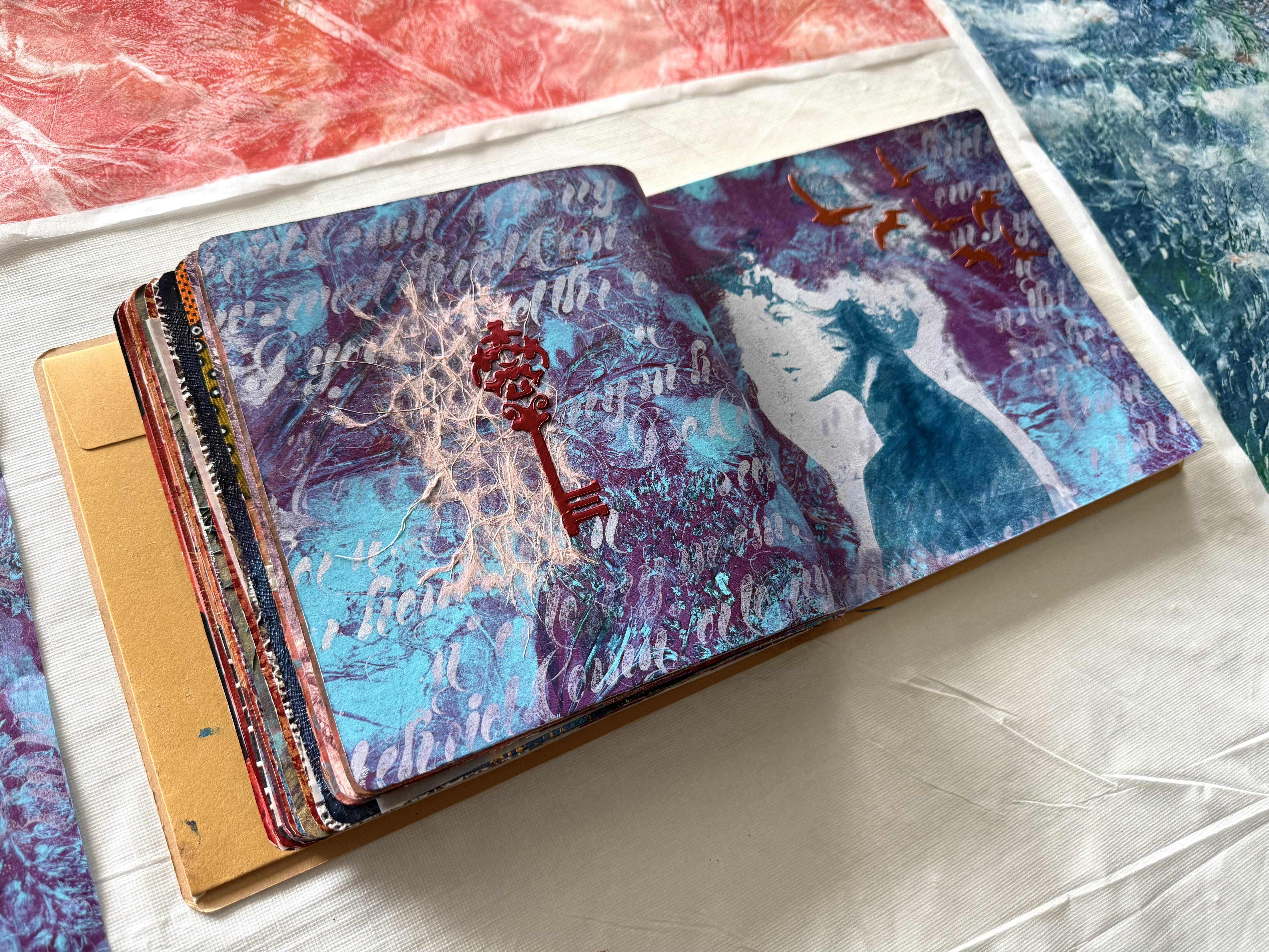
beautiful birds here. These beautiful stencils are in the stencil
butter and copper. That's this estencil butter. Copper penny, it's called
gorgeous color because what I was thinking about was
this symbol of freedom. Birds to me are a
symbol of freedom. So the freedom in developing your creativity and
become blossoming into the artist that
you already are is really about allowing
yourself to make mistakes. That's the key, and I put a key this side and a little
bit of texture paper. I know I'm going to get a
bit deep with this class because it's our last
one of the series, and I'm quite reflective. The key to really developing your creative voice is allowing yourself the freedom
to make mistakes, to stuff things up,
to get it wrong, to try to experiment, to push through,
because that's how you find different areas of your
own creative expression. That's how you work out what you like, what you don't like. Also, that's how you learn the techniques and you
understand the mediums. There really isn't
another way around. You have to actually go
through the process. So that's what these pages
are all about today. It's the freedom
to allow yourself, which is the key allowing
yourself to make mistakes, get things wrong, stuff it up, so you can push on and be the artist that
you already are, find your artistic voice, and become extremely excited and proud about the art
that you're making. Right. So I'm very happy
with these two pages. They did expand over
the area because I couldn't just put them
on one little page each. And because this is the
last class of the series, I can use as many pages
as I want because because I could even fill up the whole rest of
this art journal, and it wouldn't be
a problem because I don't have any more things
I want to put in it. So I just may do this with
a few more of the lessons, especially when I really like
the prints or the papers, or I'm really just wanting to have my say about something. So I think these
pages are really expressing my
blossoming potential. I hope you're encouraged
and inspired to really push through and
experiment with yours. Right. So next, we're
moving on to in the garden. Doesn't that sound a
little more tranquil? I guess you'll have to wait and see if it works out that way.
5. Day 94: Inner Garden: Day 94 in a garden. Design a collage that
represents your inner world as a garden ready to bloom with creativity and
self discovery. Use imagery of lush landscapes,
intricate patterns, and budding flora to reflect the potential within you
waiting to be realized. How very exciting. So I'm going to start with this print from my
jelly printing, frenzy. I was using the beautiful
golden open paint in the ultramarine blue and
the permanent green light, putting it on the gel
plate and blending it together to create this
beautiful turquoise color. Then I put on the leaves
and the flowers and all of the branches and
pushed them onto the gel plate with this
piece of mulberry paper. Now, these are not flat, ready to go beautiful
botanical specimens. These are thick and
chunky branches and flowers and leaves, and I had so much fun pushing them down and
pushing the paper in and around them
because I really did just want to
create an abstract, patterned background
and see what kind of textures I could create with all of these fabulous blossoms. And when I pulled them all off, because it was the
golden open paint, I put the mulberry paper straight down and
pulled the print. The print turned out beautiful. I really love the textures
and the patterns. From the branches, you can actually see them quite clearly, considering they were
quite a big chunky bundle. I really had a lot of fun
creating these prints, and the beautiful open paints worked so well now that
I'm getting used to them, now that I've learnt my lesson. So this is where I'm
going to start today. Now, because my art journal
is relatively small, I think what I might do is go
over both pages like this, and I'll choose a section of it that I like the
textures the most, which I'm thinking is probably
like something like that. I really love this.
Look, you can see the different green and blue
and the beautiful marks from that branches of
flowers that I was using there and the
gorgeous leaf shape there. So I'm thinking I
like these the most. And then I'm not sure what
I'm going to do next with it. This is my starting point. I am going to add some other
kind of texture or stencils or lines or drawings or collage paper or
coso or something. But I'll start with
gluing this down, and then we'll see
where that leads us. So first of all, I decided
I was going to glue this beautiful gel print
onto my art journal pages. I'm doing the double
page spread because I just wanted to run
over both sides. I think the print's
absolutely beautiful. And then once that was dry, I pulled out a stencil and
decided to draw around the shapes in the stencil
with a beautiful gold marker. This gold marker is
working really well. It's a deco color marker. Sometimes it's tricky getting the right pens because
they don't often work, and that's so annoying. But this one was working
beautifully well. I filled in a couple of
the little flower shapes. I drew around some
of the petals. I just wanted to create a layer of beautiful
flowering shapes. And I was thinking that
the gold on top of the turquoise would look
absolutely beautiful. It was really
therapeutic, actually. I really enjoyed doing this. So when that was
finished, I pulled it up, and Tara, tada it looks
absolutely beautiful. So, of course, then I
decided I was going to do the same on the
other side of the page. But this time, I pulled out the same pen
in copper colour. I thought the deeper
orangy tone of the copper might look really
good against the turquoise. Just giving it a little bit of difference from the first page. So I did the same technique. I drew around the petal
shapes and the branches. I filled in some of the shapes, and some of them I left open. I just wanted to create a really nice pattern
across the pages, building up a kind of
jungle like feeling. And when I'd finished that, I was pretty happy with
how the pages look. Now, I didn't really know what exactly I wanted
to do with them, but I did want to create
some more layers. So I found these stickers in my drawer and
pulled them out. They are a white clear sticker, so I thought they would just
create leaf like shapes and textures on top of the stenciled that I already
had on the page. They're not going to
overpower the page. They're see through
and transparent. So I thought that
would work really well just to build
up another layer. And then I did the same for the other side on
top of the copper. I'm pretty happy with
how this is looking. I'm not usually a
sticker type person. But I thought they
were so delicate and I love the way
they were transparent. And I thought I could build up the layers that
made it feel like a forest without actually just overpowering
all of the shapes. So looking at the pages, I was pretty happy after I
decided on the stickers. But then I'm thinking,
This is my inner garden. And if it's my inner
garden, we need some red. Or at least some magenta. So I pulled out a foam stamp. This one is an Elizabeth
St. Halia stamp, and I rolled on some of
the beautiful magenta. I just wanted to put it in
some places here and there, just adding a pop of the
beautiful color onto the inner garden
because I have to have that color on my pages. Now, I really did like the shape the foam
stamp on the pages, but I wanted to
smooge it around. I wanted to spread out
the magenta color. And I also wanted to take
off some of the shapes, so it wasn't so dominant, but I did really like them. On the page, it was
just a matter of then wiping it with a baby wipe, taking away some, spreading out the magenta color until I was really happy
with how it looked. So the pages are all dry now, I'm pretty happy with them. It really was quite a
therapeutic approach to creating these
art journal pages. Starting with the
printed jelly print, it had that thick lush
jungle like feel to it. So I really wanted to enhance that by creating
more of the layers. I think the stickers
looked good. I absolutely loved drawing around the stencil with
the metallic pens, and that was really therapeutic. And then I had to
add the magenta. I liked it a lot better once. I smudged it around, spread around some
of that color, and wiped off some
of the shapes. I wanted a little
bit there because it is my inner garden.
We needed some red. But I didn't want
it overpowering the pages because I really
like the way you look at it. It looks like you're
standing in a jungle. And I just love the
gold, of course, and those subtle shapes there of the flowers
and the branches, the potential, and
the blossoming. And all of the ideas that are in seed form in my inner garden. I really enjoyed
making these pages. I really liked the fact
that I had an idea, which led to another idea, which led to another idea. And that's the process
of creativity, and that's what I'm hoping
to encourage you with your art journal
pages that you allow yourself just to develop,
let them evolve. Think about the themes and the creative reflections that's in your notes and just respond to how it makes you feel and
the colors that you want to create and the textures that you want to
put on your page. Pretty happy with my
inner garden jungle. See, I really liked that I
created all of those layers. The colors worked well, and the jelly print was a
great base to start from. Right. So what are
we doing next? The next lesson. Oh, I think we've got a little
bit of abstraction. So that could get a
little bit crazy.
6. Day 95: Floral Abstraction: Day 95 floral Abstraction. Create an abstract artwork inspired by the shapes, colors, and patterns found in flowers, allowing your imagination
to guide your composition. Be led by your intuition
and allow yourself to symbolically create
your time to bloom. I love that. It's
your time to bloom. That is so exciting. So how are you going to
approach this prompt? Where will you start with your abstract expression
or reflection? Well, when I was creating the beautiful jelly prints
with the golden open paint, I was using a push down paper, that's what I'll call it, to get in and around all of
those beautiful flowers. And when I finished
pulling all of the prints, that push down paper
looked amazing. So, of course, I had to develop it into a finished
artwork in its own right. Nothing is ever wasted when
we're creating like this. I think the paper has so
much incredible potential, especially with all of those
marks and colors and shapes. So I decided to use the
beautiful rose as a stamp, putting some of the fabulous violet color on a palette and pushing the rose
into it and then literally stamping
it onto the paper. This was just so much fun. Then when I finished putting
my rose shapes on the paper, I pulled out some of the
fabulous I zinc sprays, gave it a spray with some rusty saffron and
some beautiful gold mine. Oh, so unfortunate that these particular sprays have been taken out of manufacturing. You can no longer buy them. That is heartbreaking. I also added some turquoise
to deepen some areas and really enhance the
beautiful colors and patterns that were now
on my piece of paper. So don't forget
when you're jelly printing or making
other papers that what you use for a roll off sheet or a push down piece can become an amazing
artwork in itself. So unfortunate about
the Isaac sprays, I've got quite a
few left from when I rushed out and bought them before they
were discontinued. But you could also
use other spray inks, and you can put the
acrylic inks into little bottles from the dollar
store and spray with them. I have done that
quite a few times. So pull out what you have from your cupboard or your art
space or your crafting area, blash it around on
some paper and see what abstract marks and
textures you can create. I had so much fun using
the rose as a stamp. And it worked really well. The paper turned out
absolutely beautiful. So then, of course, I
couldn't stop there. I had to do the next one. I pulled up the other piece
of the mulberry paper that I was using to push down the flowers for my jelly prints, added some more of
that rose idea. That was a pretty
good idea using the rose to create
shapes on the paper, and then some of
the beautiful in, splashing it around, spraying
on different colours. I think I used some honey, definitely the rusty saffron and filled up all of the
spaces on the paper. I had one more piece of paper, so I couldn't stop there. I pulled that up onto the table, and I used that other flower. It's got such an
interesting shape to it. I thought it would create
wonderful abstract marks. And then I sprayed on the
sings, and, of course, I added some of the rose shape, but this time, I covered
it in the beautiful gold. That's what I love about
mixed media techniques. Use whatever you have. Especially if you've got
some leftover jelly prints, maybe some didn't work so good, or maybe you printed onto
tissue paper. Love that. Pull them out, splash
some paint on them, some spray inks or some ordinary
ink, some acrylic inks. Oh, it's endless. There's no rules here. You can't get it wrong. Do whatever you want to
to create and express yourself onto some paper and have a really
beautiful time doing. Look how fabulous these
papers turned out. Now, this is the Coso studio mulberry jelly printing
mulberry paper. This one is a little thinner than the ones I
was printing with, and I thought it
would make a fabulous push down paper, and it does. And look how glorious it looks with all that
spray ink on it. There's a little bit of
shimmer spray there, too. The dilusion shimmer spray. A fabulous, pearlescent
look to them. So if you can't get
the zinc or you don't have any because
they are discontinued, then have a look at the
dilusion shimmer sprays. They have beautiful
effects to them. This one looks beautiful. Now, this one, that feels like it's on the
wet strenk tissue. Oh, I think I've got two
on wet strength tissue, and one on the mulberry
paper. So fun is that? Look at my glorious rose shapes from stamping with the flower. It. Yes, I did have a bit
of fun. I'm loving it. We're blooming.
It's time to bloom, and we'll use the
flowers anyway we like. This one looks glorious because I put the gold
on with the rose. Look at all those shapes
and textures and colors, little bit of purple up here. Oh, and that flower. This shape here. Oh, it's
a little bit mangled now. It's been sitting there. But this printed so well
with a little bit of paint. I did have a lot of fun
creating these shapes. But look at that
splattery pattern from this particular flower. It really was fun. So, pull out what you have, pull out some papers, have a mighty fine time with some acrylic mixed
media techniques and see what you end up with. Now, I'm not sure which
one I'm going to use. I really like all of them, but I know that the leftover
prints are going to get used in the lessons
further on in the class. So I'm thinking one of them is going to happen
in the art journal, and what am I going
to do next with it? I'm just not sure. So I decided on this
particular print. I really like it. I like the moody feel of it and
the deep colors. I like the way you
can see the shapes of the rose flower on the print, but they're not
exactly clear or cry. I think it really suits the
floral abstraction theme. And once I cut it and then
glued it onto the art journal, I just had to decide what I
was going to do next with it. I didn't want to create
clean and clear images of flowers because it is an abstract work
that we're creating. So I pulled out the
weird looking flower. It's a little bent out of shape. It's a little dry now. It's looking a little rough. But what I wanted to
do was just to create some wispy lines,
some abstract marks. I'm literally mark-making with the half dead flour that I
now have sitting on my table, putting some white on to lift the colors and just smudging
it around the page, a little here, a little there, just to create a
bit of movement and texture and a splash of white. Then, of course, I had
to pull out the gold, and I picked up the rose, which is also looking
a little beaten up, but put on some rose shapes onto the page in the
beautiful gold color. Then I put down some
red and decided to stamp on some red
shaped roses, as well. I'm adding some water
spray because I wanted the paint to blend and move
and to not be too stiff. I wanted it to soften and really kind of be absorbed
into the paper. On a little bit of
the zinc spray, but not too much because the print already has quite
a lot of color on it. A little dash here,
a little dash there, some of the rusty saffron, some of the gold mine, and a little touch of
the turquoise color. Then I returned to
using the water spray and sprayed it quite
liberally all over the pages, giving it a little tilt
to move it around just to soften that paint and to
get more of it blending. I'm pretty happy
with how it looks. It definitely has a flower feel, but it is still very abstract, and I absolutely love the mark-making patterns
of using the flowers. Dipped in the paint and
splashing them across the paper. And it was just so much fun. So this is how the
pages dried up, and they're pretty beautiful. I did dip the rose back into some more deeper violet
colour and added it on top. I kept fiddling with it for quite some time 'cause I
was having a bit of fun. And then there's a splash
of the gold mine on there. Doesn't it look beautiful? See how blended these
colours are here? That's from spraying
it with the water. When it was still wet, to soften the paint
color so that it kind of bled and moved on the pages. And as long as you've got a good art journal with
mixed media papers, it should all handle
the loving pretty fine. I think it's pretty nice. I like the abstract quality
of the flowers, but, you know, it does
feel like a big, beautiful bunch of flowers. The colors worked out great, and it was so much
fun painting with the actual flowers on the page. So don't be afraid to try some wild and crazy ideas
with your floral abstraction. Turned out beautiful.
It's all dry now, and I can't wait to move
on to the next prompt.
7. Day 96: Flower of Resilience: Day 96, flower of resilience. Craft a collage that
symbolizes the concept of resilience through the
image of a blooming flower. Use this artwork to
convey the idea that, like flowers, we can thrive and blossom even in
challenging conditions. Now, I've definitely had
some challenging conditions. And I'm pretty sure
you have, too. So, today's prompt is to create a beautiful mixed media
collage that's going to express blooming through
those difficulties. Now, I'm liking the idea of
using these off cut pieces. These are strips
from the prints that I've already used in this class, and I like the idea of using these pieces for
the collage today. I'm not sure why I do
just like this idea. I think it's a great place to start with my background colors, and what am I going
to add to it? Well, I really like the
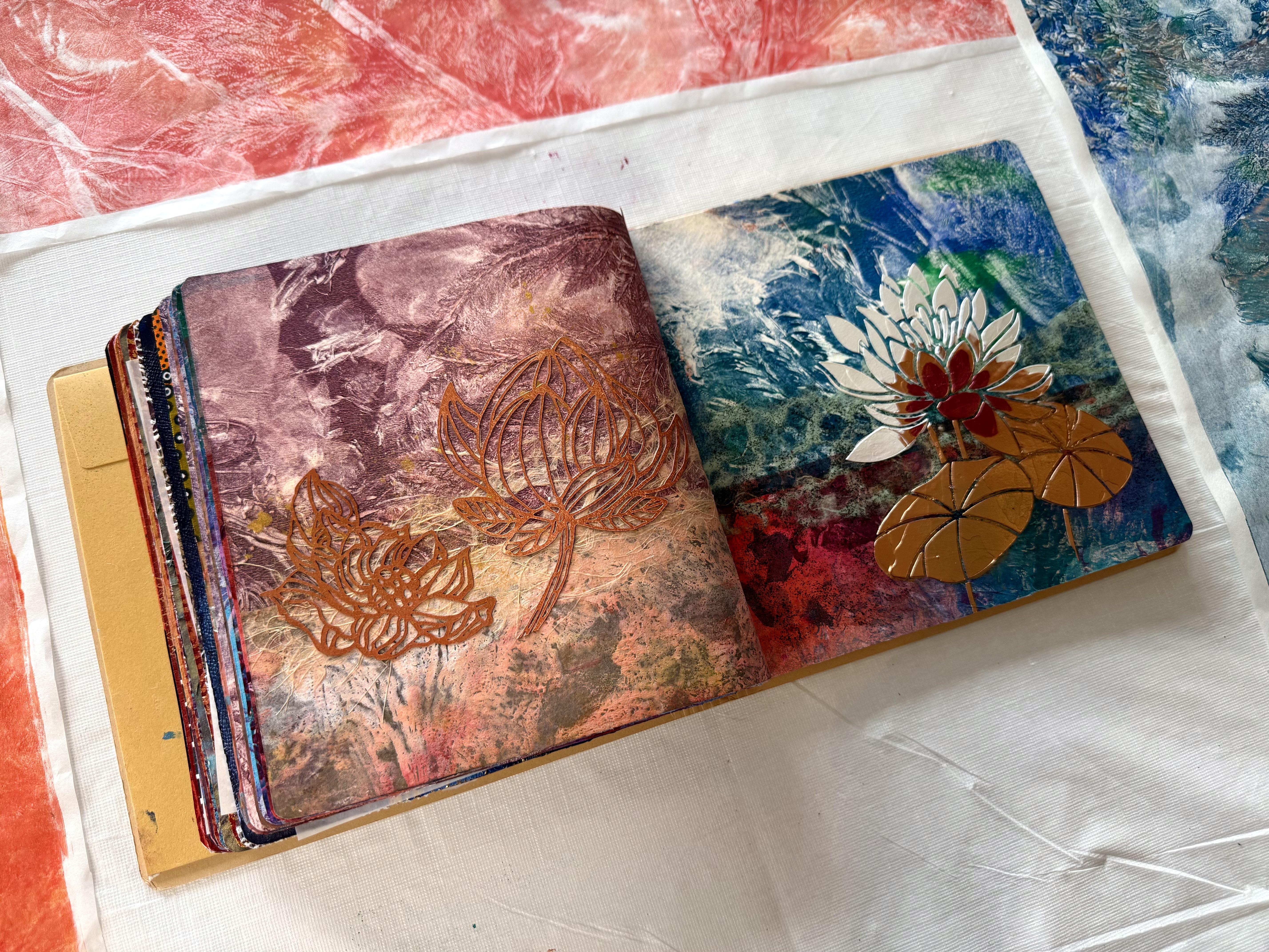
symbol of the lotus flower. As it blooms, it pushes through the mud and
rises to the top. And I love the symbolic meaning of this fabulous and
beautiful flower. So I think I might go and
dig out to see if I can find a stencil that's got a
beautiful blooming lotus. I'm going to use some of
these papers to start with. And then I guess I'll see
from there where I end up mmm Well, that was a lot of fun, and I think my
pages are beautiful in my flowering
blooming lotus flower. I liked the idea of using
the leftover strips of the prints because I
think that to be resilient, you have to be resourceful. And using what you
have sometimes can be a little frustrating if
you don't have what you want. But I do find that being resourceful can really
be a superpower when you're a creative person because even though you have
boundaries and restrictions, it really can push you on with your creativity because you have to come up with solutions. I know that when my
kids were young, it was a really hard season. I didn't have a lot of money, and I would spend my last
$20 on a pot of paint. But of course, I couldn't, and I needed a lot
of resilience to get through those years
using what I had, finding resources to create
the way I wanted to create. It really does
strengthen you and empower you when you can
push through. It's not easy. There is no way that
those seasons are easy, but it does build
strength and character. So resilience using
what you have. Pull out anything old or unused from art storage or
your craft bins. Because the art supplies
don't last forever, anyway, best to use them up. So I liked using the leftover
strips of the print. And what's really funny about this page here is this
print down the bottom, that's the one that failed
miserably. But look at it. It looks absolutely
beautiful in this place. Of course, I had to add some of the fabulous Coso paper because I love that
beautiful texture. The fibers of that
paper is glorious. And this sits beautifully. These lotus flowers here were actually masks from
PMR to studio, and I'd printed with
them, of course. They were in a
gorgeous copper color. So I had to use them. I think they look beautiful. And the little spritzer of
gold mine at the end really does complete the beautiful page of pushing through
the difficulties. That's the mud,
the difficulties. But we can rise above. I know I'm being dramatic. But I'm so enjoying
this class and these lessons that you're getting all of my
reflective thoughts. I really do like creating
art that's beautiful, especially in the expression of overcoming and pushing through because I just think
that's how life is. We have to keep going. And if you are a
creative person, then you have to create art. No matter how difficult the
season is, this side, again, using those fabulous
strips of off cuts, and then I added the
beautiful Coso paper. And then what I painted on there was the meat
and gleaming paints. They're called gleaming paint. In reality, they just look like they glitter in suspension. I really do like them. I came across them a while ago, and I just like the way it's got little speckles of
different colors in, like, a clear, transparent
acrylic medium. So I added that to
this section here because last year was a
little muddier than usual, and it it took a lot
to push through. So I added the extra
mud on this side, and I really like
the texture of it. It's fun. It's a little gritty. I do really like the texture
of the gleaming paint. And then, of course, the
beautiful lotus stencil. I use both the pearl white
of the stencil butter and that beautiful refining
copper of the lunar paste. I just now put a little
bit of that color, which is a stunning pearlescent
kind of a red violet, even though it's
called Game Over. I mean, that's a really weird
name to call something, but it's a stunning color. So my lotus flower, I think, is looking
really beautiful. That one's like full bloom, pushing through the hardest, muddiest section to end
up being beautiful. Pretty much, that's
describing where I'm at now. And I think that's
what I'm really enjoying about these pages. They are really a celebration
of where we've come, what we've come
through, the journey, the experience,
what we've learned, the techniques, the pages, the difficulties, the days
where it didn't work out, the prints that failed. All of it builds into who we are not only as an
artist, but as a person. And I think that's really
worth celebrating. So I hope you can
find a lotus stencil. Of course, you don't have to, but something that's
going to express the beauty of blooming through
the difficult seasons, 'cause I know we all have them. Pretty happy with my pages. I have to now wait for that to dry properly
before I can move on to the next prompt but I'm enjoying the
journey so much, and I really hope you are, too. This print worked really well for the background,
don't you think? I'm really happy
with these pages. I think they turned
out beautiful, and they're so meaningful. Right, oh, I'll let it go. We can move on. What
are we doing next?
8. Day 97: Seasonal Bouquet: Day 97 seasonal bouquet. Pay tribute to the changing
seasons through your collage. Select a season that inspires you and compose a bouquet of collage elements that captures the essence and beauty
of that time of year. Well, this might be a bit
of a surprise for you, but I really love autumn and the rich lash colours of gold
and oranges and warm tones. So today, I'm going to
start with this print here. This was the push down piece that I was using when
I was jelly printing. And then I painted the fabulous roses on
the piece of paper, sprayed it with
the glorious eks, and it looks beautiful. Look at the rich warm tones and the glorious gold spray
on it. I'm already ahead. This is definitely
autumn, don't you think? So I'm going to start
with this print. I'm going to glue this
onto my art journal, and then I'm going to add some other paints,
maybe some pens. Which way do I like it?
Think I like it up this way. I'm actually not sure what
I'm going to add to it, but I'm going to add
more layers to it. Maybe some paper. I think
we're just going to have to see where I end up once I actually start
creating the collage. So I first of all, cut
the gel print to size, and then I glued it
on to my art journal. I'm really loving
the colors in this. I think it will work well
with my autumn theme idea, but I really don't know
where I'm going to head with it or what
I'm going to do next. So it's going to be just a
matter of taking the journey. Ten embracing the adventure and seeing where
each idea leads me. So once the print was
glued down, nice and flat, I pulled out my Medan
100 color pack. I absolutely love these paints. They're beautiful and
thick and buttery. The tubes are a little small, but it doesn't matter
too much when you're working in a small art journal. What I love about the
paints is how they're put into these fabulous
palettes of colors. So I pulled out some and
put them onto one of my paper palettes I'm
thinking I'm just going to add some shapes
around the roses, maybe, or in between the areas where I
can see the flowers. But once I started pulling out the paints and putting
them onto my palette, I did get a little carried away. I think I'm already veering
off my autumn theme. The colors are just so beautiful and there's
so many to choose from. I just love using so I'm putting them on
in different sections, different shapes in and
around the flowers, just adding the
colors as I feel like it and putting in
some painted areas. A few colors here,
a few colors there. Then I thought I
would add some of the boon umba to give it
a little bit of depth. And before I knew it, I was already covering
my entire gelprint. So once that first
layer was dry, I pulled out a stencil. Now, this is a PM
artist studio stencil. Because I thought
I'd add some bronze, some bronze and some
copper and some gold, some of those beautiful
earthy metallic colors. I also added a few more of the paint colors that I
already had on my palette. And when I pulled
up the stencil, Oh, man, it's looking
absolutely beautiful. The second layer
really does enhance the colors and the shapes of
what I'd already painted. Although I don't think
I'm going to see much of this jelly print
by time I'm finished. I added a few touch ups, a few more areas of color, but it's looking pretty nice. I'm really liking the
shapes and the colors and just the overall feel of
it, my seasonal bouquet. And then when that was all dry, I thought I'd add
another stencil using the beautiful
stencil butter. So I've got some
champagne and I've also got some of the lunar
paste in Weeping Willow. This darker color,
which is really a burnt umber is
called Weeping Willow, and it's beautiful and metallic. I'm also going to put some of that gorgeous red violet color on 'cause then I'm thinking, maybe it'll look like the
changing color of the leaves. Just maybe. Anyway, when I pulled
up the stencil, I was pretty happy with it. It's looking rather beautiful and all of those
metallic colors. Oh, I just love
the way it shines. So, have a look at how beautiful
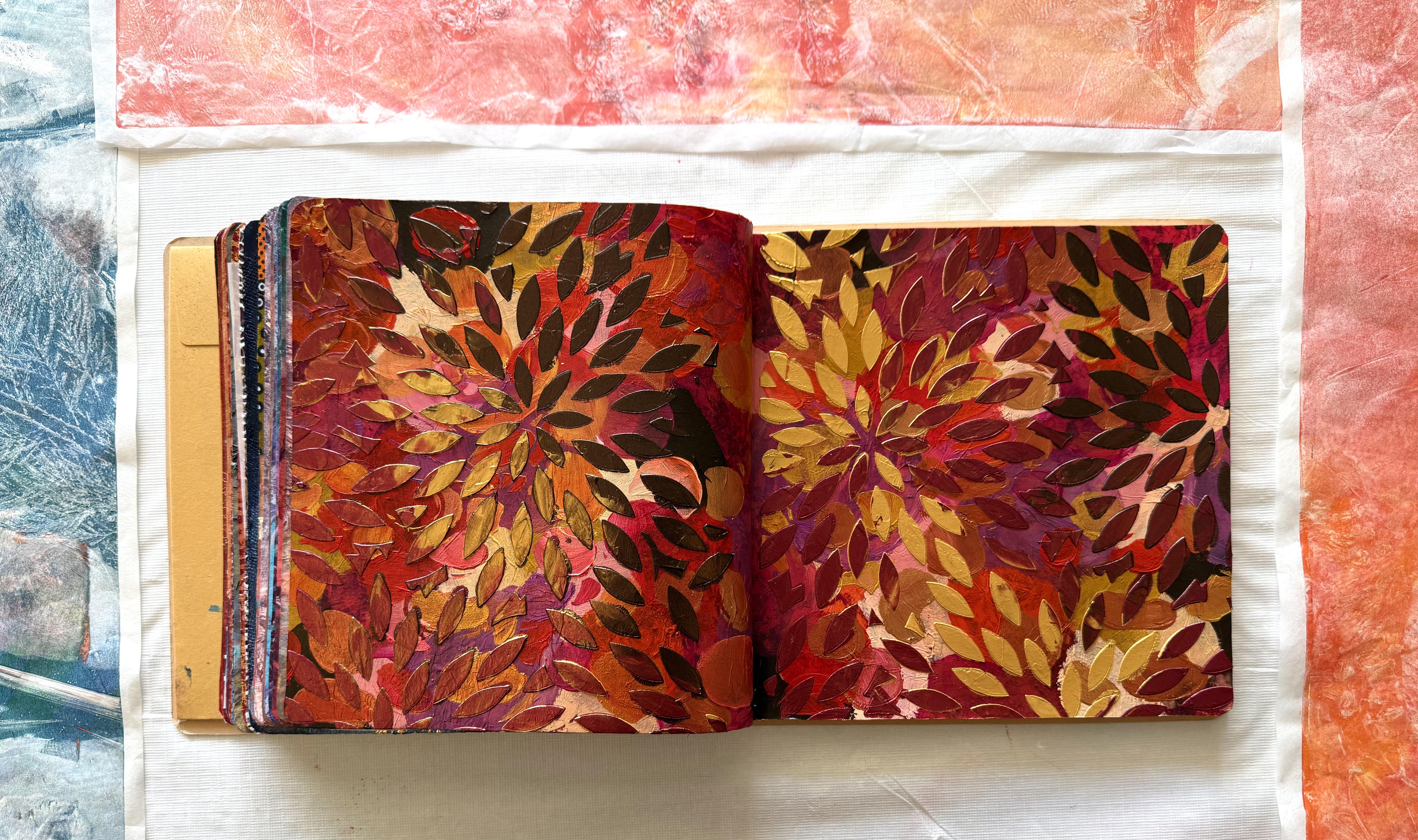
my pages have come out. I absolutely love the rich, warm colors and, of course, all of the beautiful metallic. The shape of the
stencil looks fabulous. It looks like the changing
colors of the leaves. Well, I think it does, anyway. And the prompt and the theme is all about changing seasons, cycles, rhythm, and change. So what I've really
enjoyed about creating these pages is one idea
led to the next idea. I had absolutely no idea where I was going to head or what
I was going to create. I did have the
fabulous jelly print. Now, you can't really
see much of it. There's not much of the
original gelprint left, but it was the springboard. It was the starting point. It was the inspiration
because without it, I wouldn't have created
all those original shapes on the first layer. The gel print gave
me the direction. So don't be afraid to
head off somewhere, start with something
that's going to inspire you and see
where your ideas go. Change, move, pivot,
allow yourself to really create and express what you want to on the page with the
materials you have. Don't have to do it
like I've done it. Do it how you want to do it. I just want to inspire
you with these prompts to really motivate you and get you moving with
your creativity. I really love being able to
just create in that moment that spontaneity
that that motivation to try another idea, and that idea leads
to the next idea. The jelly print gave me the
form to create the shapes. The first layer led on
to the second layer, and then I could have
finished it there, but I think the third layer really makes these pages
absolutely special. I love the leaf shapes of them, and it feels like the change of the season and the falling of
the leaves from the trees. Well, that's my
imagination, anyway. I think this is a great
idea for approaching any of these fabulous art
journal pages or mixed media artworks or what
it is that you're creating. Allow yourself to
have an idea and to just get moving and see
where the idea takes you. Don't be afraid you're going to mark it up or get it wrong. Just trust yourself and keep trying ideas until you're happy. Well, I think the colors
are absolutely beautiful. I really love these lunar
paste and the stencil butter. These are the three that I
used for the last stencil in the fabulous leaf shapes
and the 100 color pack. Oh, man. I just love those palettes. The paint is just beautiful and all of those
fabulous colors. I'm very happy with
my seasonal bouquet. I think it worked out
absolutely beautiful, and I can't wait to get
started on the next one.
9. Day 98: Blossom in Abundance: Day 98, Blossom in abundance. Embrace the idea of
abundance in your collage. Craft a piece that overflows
with a profusion of blooms, allowing them to burst forth in a joyful riot of color and form. Embrace this feeling for
your life and your art. You are and have
more than enough. I absolutely love this idea
of blossom in abundance. You can use bright colors, put lots of things into your
collage, have a lot of fun. Create with the textures
and shapes and colors that make you feel joyful
and happy and alive. I'm going to start
with this print first. And I was using the red of the golden open
paints on the plate, and then I put some
of the blue with it, mixing it together and making this beautiful
purple color. Then I'm using all of
the fabulous flowers, pushing them onto the plate, pulling off the paint, and creating those fabulous
shapes and textures. I was using as many
as I could get. All of the different shapes,
the beautiful flowers, the weird ones, the bigger ones, the smaller ones, even
the beautiful rose. I put it on to create the
shapes and the print. I filled up the plate. I even put on the
beautiful leaf shapes, making sure the whole
area was covered. And this time, I didn't record. I put the Coso studio
mulberry paper straight onto the wet paint
and pulled the print, and it looked
absolutely beautiful. Of course, I couldn't stop added some of the gold with
the beautiful rose shape, then some of the red with the smaller flower and a
little enhancement with the inc spray inks to deepen the color and to have
more of a visual impact. So I'm going to start
today with this print. And you know what
happened yesterday? Just because you start
somewhere doesn't mean you're going to
finish in that same place. This is the inspiration,
the springboard, the place where the
ideas can explore. I'm loving it. I think
it's rich and opulent and all of the gold
definitely screams abundance. I think also, I'm going to
pull in this one, as well. I think the colors
work really well. Also, this one is covered in the fabulous gold rose shapes. It's got some of the purple. So I'm thinking I'll put both these prints together
on the art journal page, and then I'll decide from there. What's going to happen next? I'm not sure exactly, but we're going for opulence. We're going for bold and
beautiful and extravagant. So it could be a
whole lot of fun. These are such rich, opulent colors. I
could wear them. It is a beautiful purple. It's very royal
and rich looking. More than enough. Yes. Love that. So I think I'm going to tear it rather than
cut it this time, and I'm really loving the
beautiful gold rose shapes. Note that rose
printed really well. I'm so surprised. It's a little bit
tired on it now, but it did make a
fabulous print. I'm not going to get
very much on my page. Thing as my art journal. It's not a huge size. So let's just rip
some pieces, perhaps, add some of the glorious color, the purple and the gold. Yeah, so I'm feeling it. Look at that. These
colors are beautiful. But then I also
might put in some of the beautiful Czo Paper. Look at that the momagumi. Think it's mama gummy paper. In this beautiful, rich gold
color. I have to have some. I'm not sure how I
want to put it on the art journal because I've got such big pieces
of everything. How am I going to put it down? Because once I put something
down, then it's covered. Oh, I like that idea. Maybe we'll start there, and
then we'll add some there, and we could go across
the page like that. And then I could put
some of this on there. That could work a little
bit more of the gold. Perhaps more of that
shape could go on here. Somehow, I'm really not so sure. But I think it's gonna
go something like this. Oh, yes, baby. And maybe maybe a
few more of these. I like the beautiful
magenta flower, as well. So I think we need
some of that on there. Somehow, I'm gonna put it like that with some of
that gold in between, 'cause I think that copper
gold's really nice, too. Oh, man, I think I need a
bigger art journal. Next time? Now, did you think
I was going to leave the pages with
just the collage paper? Of course not. I had to
pull out this stencil. Now, this is a very old stencil. I don't remember where I got it from I've had it
a really long time. I love these flowers. I think this really does
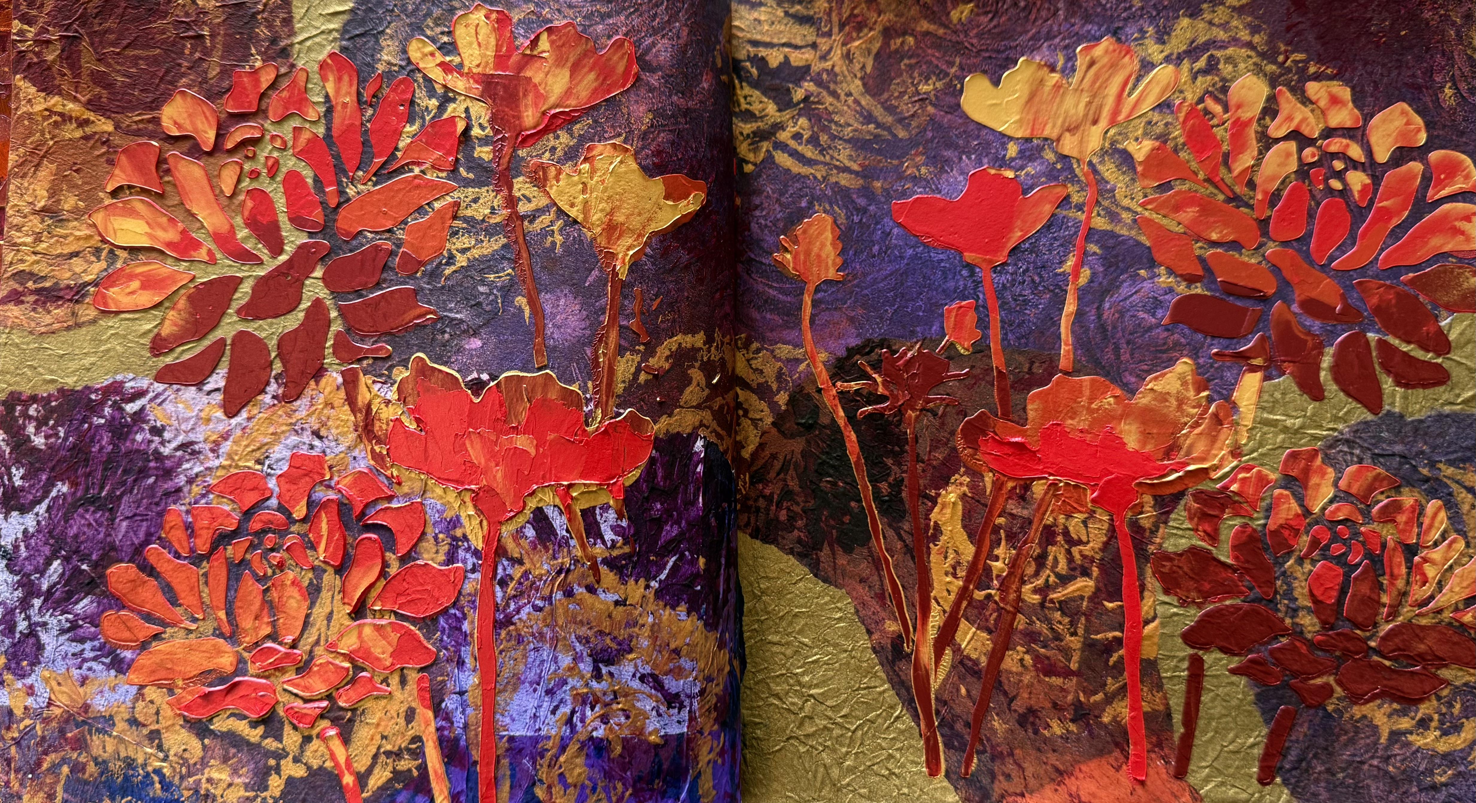
express bloom in abundance, especially with the beautiful thick stencil butter
and lunar paste that I used to put the flowers on the page and
have a look at it. It's absolutely
gorgeous. Of course, the stencil butter and
the lunar paste has got the beautiful
metallic in them, so they shine in the light, and I did use the glorious gold. The champagne gold of
the stencil butter. I used crimson in
the stencil butter, and then I've got this traffic
cone in the lunar paste, and, of course, the one I've
been using the game over. I've really given these pastes a good workout in this class. But what I love
about this is how thick and chunky
the flowers are. They look absolutely glorious. You can see them quite raised off the page with
the thick paste. And I love that for
our abundance theme. And sitting on top of the
glorious gold, mamagami paper, and the beautiful gel print that I already had behind them, I'm loving the pages. They're all nice and dry now. They look absolutely fabulous, thick and blooming and lush
and full of abundance. So I hope you'll have fun with this prompt and this theme. Make sure you use
the colors that you absolutely love
in ways that make you feel happy and
abundant and in a way that your art is really going
to express who you are. Right. So I'm very happy with these pages
with my flowers. Uh, blooming in abundance. What are we doing next? Hmm, I think we're taking
a creative journey.
10. Day 99: Your Creative Journey: I Day 99, your creative journey. Design a collage
that reflects on your personal journey throughout
this creative adventure. Combine some of your
favorite techniques and elements used in the class. What did you like best? What did you find
most challenging? How incredibly exciting. We're really getting to the
pointy end of the stick now. Day 99. I have so loved creating this
whole mixed media course. I've learned so much
personally, creatively, and I've really had to push through some techniques
and prompts that I definitely may not have chosen to do or create if I hadn't already
made the course. I absolutely love Day, too. I just love this page spread. It's definitely my favorite of all the creative
mixed media artworks. From this course,
I'm loving this one. I think it's the colors,
it's the textures, and it just came
together so well. I just really love it. I also really love this
technique from class two. We were splashing on ink
creating in leaf shape marks. In this class, we
were using leaves. And so I'm thinking today I might pull this technique into today's lesson
because I loved it so much and it really
suits our theme. I think, overall, I
absolutely loved class ten. That was one of my favorites
with the travel theme, and I particularly
enjoyed creating all the beautiful
little postcards. That was a whole lot of fun. Mm. I'd like to do that
again another day. Oh, also, I loved class 12,
abstract expressionism, my absolute favorite art movement, technique,
expression, philosophy. Abstract expressionism. Oh, I loved that class. So today, I also might pull in some of
the techniques that we did in that class because they were definitely some
of my favorites. Oh, and I think this page, I absolutely loved this page. I know it looked really simple, but I just love how
it came together. Yes, my favorite colors, but also in the jelly
printing process of it, I really enjoyed
the outworking of creating the techniques that produce this particular collah. I think what I've learnt
the most in this course is definitely the jelly
printing techniques because in class one, we started with a simple
jelly printing lesson, and then now in class 14, look how many jelly
printing techniques we've learned, developed, pushed through,
tried, experimented, and explored along the way. And I think for me as an artist, that has definitely
developed and pushed forward those
skills and techniques. So I'm going to create
some pages with the loose scribbly
leaf splattering with the inks and maybe some
abstract expressionism, as well on paper. Or the gel plate pretty
tapped to pull it out again. So I'm starting with one
of the gel prints that are already pulled with the
fabulous golden open paint, and I'm using parlne
maroon color. What a gorgeous color. A deep maroon color. And I'm just putting on the fabulous leaf shapes with the eyedropper straight
out of the bottle. Now, this paper that I pulled the gel print on is very porous. It's one of the mulberry papers. So it's going to
suck up that ink. It's going to seep into and it's going to create
some fabulous shapes, such a beautiful color. Then I pulled out the
Chinese gold ink, and I'm putting that
on with a stick because that's what I
was so excited about from that other class
and I did using the stick and creating the
layers of leaf shapes, I just really enjoyed it. I think it's the freedom and the expression and just
the painterly quality. Now, the stick wasn't putting as much gold
on as I wanted, so I did pull out a
small little brush and put some of the leaf
shapes on with a brush. But it's not really
what I wanted to do. I wanted to get that
messy scribbly line that I got last
time using a stick. So next I pulled out
this other Chinese ink. It's a black gold. So it is black, but
then it does turn gold, which is pretty cool. You just have to make sure
you shake it up really well. Because last time I think I didn't it doesn't turn as goldy
if you don't shake it up. So I've got the stick again, which I'm absolutely loving. I love the messy scribbly
mark-making of the lines that I can create with the stick that I'm flicking
some dots on it, scribbling, just creating
some leaf shape. And I'm thinking
it looks good with the maroon color and the gold, and then the black gold on I'm really liking how
this piece is looking, and it is just a
whole lot of fun. I did find last time
when I was doing this technique that
the less you stress about getting the shapes
right and the more fun you have just splashing around
with a stick and some ink, the prints turn out
so much better. So if you're going to try this, definitely, don't stress about getting the shapes perfect. Just throw it on, let it be abstract and have a lot of
fun creating the marks. I do find the print just turns out so
much better when you allow yourself to freely just create those
expressive lines. So then I put on the
table the other print that I had from the gel
plate with the open paint. It's got quite a
nice color to it. It's quite beautiful. And I've pulled out the
Madan 100 color pack. I've got my little daubs
of beautiful colors, and I've also got some bronze and some copper and some gold. And, of course, we can't get too traditional with
our mark-making, so I've pulled out the branch
that I was really enjoying taking the prints of in the beginning in the first
class on the gel plate. By now, it's quite
dry and brittle, but I'm thinking I really could
get some marks from this. They definitely
won't be perfect, and I won't be able to really create any kind of
specific shapes, but I'm thinking just
to scrape it across the colors and kind of
splatter it on the paper. What happens if I seriously
just go splatplatplat, with with the paint and the branch of the dried
flowers and leaves. Look at that. It's pretty cool, really. It's a whole lot of fun, and the colors are really pretty. So I'm just wanting to
create some mark-making, get a bit of a
pattern happening, and also have a whole lot of
fun with this dried branch. You definitely can't get
too worried about it. You can't be too specific with
this kind of mark-making. And I think it's really good for us to allow ourselves
to experiment, to explore and to see what
happens if I do this. Then when I was happy with the covering of that layer
of the marks and the colors, I like the scratchy element. I like the energy that the
branch created on the page. It's definitely not
something you can control. So then I pulled out a stamp. Now, this is from PMR to studio. It's a fabulous leaf stamp, and I'm thinking that
the shape of that would look really nice on
top of these patterns. So I'm using the paint
that's still on my palette. I've got some gold there, rolling it onto the stamp, and then pushing
it onto the paper. I like the contrast of the leaf shape on top of all those abstract
marks and colors. So I continued with this idea putting the stamp
across the paper. The paint's still wet, but that doesn't matter
because as I push the gold leaf shape
down onto the paper, it blends with the other paint, and it's looking
really beautiful. The other paint is kind of squishing through the stamp and the gold sitting on top in the leaf shape this is
going to work out great. Of course, the
idscent beautiful, rich gold paint looks
magnificent in the, and I'm loving that
spread of the leaves. So now with my papers
drying nicely on the floor, I decided to pull out the gel
plate again because by now, you must realize that this is my most absolute favorite tool
for creative mark-making. I'm rolling on some of the turquoise blue from
the Miden 100 color pack. I've still got those other
paints on the palette, and then I'm going to continue with the stamp
shape on gel plate, putting the wet paint onto it. And covering it with those
fabulous shapes of the leaves. Now, that's what I find when
I'm creating like this, especially if I'm
mark-making or making papers or jelly printing or
just really creating. One idea as to the next idea, which leads to the next idea. So now that I've
pulled out the stamp, I'm going to put that
on the gel plate here, but I'm going to
leave it all wet. The turquoise is wet, the leaf shapes are wet, and then I pulled out some
of the liquitex soft body, what I call the scribbly paint and scribbled that
across the plate. Of course, it's in the
beautiful idscent rich gold because what I'm
going to do is put the gel print on top
while it's all still wet. I'm not going to
wait for it to dry. I'm just going to
pull a print like I did with the abstract
expressionist class. Oh, man. I loved that class. I think because it's pretty much the core of who I
am as an artist. So I've pulled out this
gel print that I'd previously taken
with the open paint, and I've pushed it on the plate, just giving it a good over rub to pick up all
of that wet paint. Look how fantastic it looks. With all that dynamic energy and the colors and the leaves
and the scribbly gold. So then I decided
I wanted to use up all of the paint that
was left on my palette. So I'm just stamping it
across the gel plate, just covering it this
way and that way, trying to put the
leaf shape on in different angles just to
use up the paint, really. There was still a bit
of the turquoise left, and some of the gold scribble. So I'm just going
over the whole thing, covering it all in the
leaf shaped stamp, using up all the paint from the palette because we
don't waste anything. Nothing gets wasted. Everything gets used. Now, of course, I had
to wait for that layer to dry before I put
on the pickup paint, and I couldn't decide
which color I wanted. I'm using the toning
gray, pinkish. I'm also using a
dolop of parchment. I thought, seeing as I couldn't decide which
color I wanted, I'd just use both. I've rolled on the two colors
and then I've put down the Coso Studio jelly
printing mulberry paper. And then, of course,
I had to let it dry. But have a look now at this
absolutely magnificent print. I'm so happy with it. It looks beautiful.
And not only that, it picks up all the paint from the gel plate and
gives it a good clean. We used up the palette paint. We cleaned off the gel plate. Oh, that's a good day. So now I've got all of these
absolutely beautiful prints. Which ones am I going to put in the art journal for
today's collage? Well, I'm thinking I'm probably going to have to use
some of all of them. So the question is, am
I going to fully cover my art journal pages with the prints or am I just going
to use one small section? Because I could put
them like this. I could put this
one with this one. That would be a nice
color combination. A or I could run the paper over the whole page because I love these prints. They turned out so good. Now, this is definitely one
of my favorite techniques scribbling with the stick or
a brush or the eyedropper, loose expressive not worrying about getting absolutely
perfect lines or marks. I love it. And I think that's one of the
things that I've really enjoyed about this whole course is allowing yourself
to really experiment, to play, to make a
mistake, to mess it up. So I really enjoyed that. I'd love to know what your
favorite techniques have been. And what didn't you like? That's really interesting, too. This one turned out
fabulous, don't you think? Especially as I was
painting with the blossom. Have you ever painted
with a dried blossom? I think it turned out great. The texture on it
looks fabulous. And then, of course, the gold leaf stamp
worked really well. I like the combination of both the splattery pattern and the defined
shape of the leaf, especially in the
beautiful, iridescent gold. What's not to love. This one, of course, was
huge amounts of fun with my abstract expressionist style of wet and wet on the plate. I printed onto the gel
print that I already had after I put the fabulous
paint on the plate. I love doing this. Class 12 abstract expressionism, one of my favorites. I think it's the
freedom that I really like and the movement, the energy of abstract
expressionism. I like it up this way. So again, am I going to put the whole
thing on over the pages, which I really could do? Or will I just put
this section on. I really like this section here, and then some of this print. And didn't this one turn
out beautiful? I love it. This was using up all
the leftovers from the paint palette and
covering the gel plate. Using up all the paint, clearing off the palette, covering the plate, and pulling up what was left
on the gel plate. That's always good. So it's
basically a clean up sheet, but it's absolutely stunning. The colors are beautiful. It's got a slight shine
from the gold and the bronze paint that I've
stamped on with that stamp. So they would sit really
well together, as well. So I think I might do that. Think I'll do those
two prints and then stick these two
prints together. I might add a few little
collage elements. Not sure. Haven't decided, but I'm going
to head in this direction. So the pages have dried up and they are looking
absolutely beautiful. What I love about this
course in creating the works of art in an art journal is that you
can come back to them. You can come back to any of the 100 lessons and have a look and see
what it is that you liked about particular technique or idea or colors or the way you put
your collage together, or the way you took your prints, and it might bounce
off some fresh ideas and send you in a new
direction of your creativity. Now, you don't have to do this
course in an art journal. You can do it on loose
pieces of paper. You could even bind
them together. Or you could create
individual artworks. Imagine 100 artworks. I don't think I could have that many sitting in my studio, but I love having it all together in the
fabulous art journal. Now, this is the third one for me in the series,
and I love that. I love looking back through it. It becomes an absolute treasure trove of ideas and
possibilities. So these pages have
turned out beautiful. I love the glorious gold. On the stamp here
in the leaf shape. And, of course, this is one
of my favorite techniques. And then we have
this page as well. Look at the beautiful colors, the turquoise and the magenta. And using that stamp, repeating it in a
few of the prints really works well for sitting
them together on the pages. I like the fact
that this print was using up all the paint that
was left on the palette, and I got to also clean
off the gel plate. I love this one because
it reminds me how much of the abstract expressionist
style I absolutely adore. So that's a bit of fun. Oh, yes, I put these
little leaves here. Little ones that I had
found from somewhere. I think they work really well amongst the
abstract design. Don't these pages
sit well together? The colors really worked. And I think, yes, I added some little orange ones
onto this page as well. I also love these pages. I think both of them
are my favorites. And I think that's the
fun part in picking your favorite techniques
is you get to do it again and create more
beautiful pages that you love. So now we're on to day 100. Can you believe it? Can
I can hardly believe it. 100 days of incredible
art making, prompts, ideas, techniques,
and incredible fun.
11. Day 100: Celebrate Your Creative Self: Day 100 Celebrate your creative
self. Can you believe it? We got here. Round
of applause for us. I think we're
absolutely amazing. Create a collage to commemorate the completion of
100 Days of Collage, adding a touch of mixed media to symbolize growth
and achievement. How has this creative
journey changed you? How has the experience
changed your art? Such great questions.
So what's the answer? I know for me personally, I have learned so much
creating this course, and I've absolutely loved it. As I told you in
the last lesson, which techniques and which are the themes I like the best, I think what I
struggled with the most wasn't so much the
themes or the prompts, but I was pushing through
the perfectionism. I do tend to be a bit
of a perfectionist, and I want my artwork
to be finished. I want them to be beautiful,
they have to be right. So with some of the prompts, it was really testing
to see whether or not I actually liked
my finished artwork, my art journal page. And that really stretched me. Some of them I just
didn't like in the end, and I had to let it go. I had to let go of
the perfectionism and allow myself to create something that I didn't
think was very good. That was what I think
stretched me the most. I also had to allow
myself to make a mess, to get things wrong, to mess up. And I know I encourage
you with that, but I found it really
challenging myself. That's probably why I can encourage you with that
because I know how hard it is to push through when things don't turn
out the way you want. But after 100 pages, well, actually, I did
two page spreads. So does that make it 200 pages? After 100 themes and
prompts and 14 classes, I think I finally allow myself to let things go to
let things be messy, to let things not work out, even not to like
something when it's done. And I think for me,
that's a pretty big step. Also, I have found an incredible love for
the gel printing process. When we started in class one, it was a simple gel
printing technique. We could make some
papers for our collage. I was so focused on
making the collage. But with each class I created, I experimented
more and more with the gel printing technique
until now class 14, it's what I love the most. And for all of the themes and prompts in each
of the classes, I was stretching
those techniques and those skills and the ability to create imaginative ways of using that particular
mixed media application, and I've absolutely loved it. In fact, I think I could
almost do 100 days of jelly printing if I was
brave enough to start again. So I think that is what in
this experience has really changed my art is how much I love the gel
printing techniques. So I think today,
I'm going to do a gel plate collage I
absolutely love it. What I have found that I love is building up those layers
on the gel plate. Specially image
transfers, and then putting the mixed media
materials with it. So maybe some gold leaf
or some coso paper, building up the paint layers, different applications of paint. This is where I'm finding
I'm absolutely loving. I think what I love
about the technique is the endless possibilities. And if something doesn't work, which happens all the time, then you can create
another layer or put on another color or
add some more paper. There's always so many ways
to fix the beautiful print. And then once we pull the print, we can always add
touch ups to it after. Then it can become a finished mixed media
artwork on canvas. So I'm thinking that's where I'm heading in the development
of my artwork personally, and it's from doing this fabulous course that's
brought me to this place. Isn't that pretty cool? I think that's quite a
significant journey. And I'm so loved
that you're here with how has this
course impacted you? Has it changed you as an
artist or a creative person? Has it changed the way
you approach your art? Have you done all
of the 100 prompts? I. I know it's quite a journey to actually keep going through. But what I find it's the
consistency of doing the art, creating the prompts, even if
you're not sure about them, creating a simple
art journal page, the regular rhythm
of actually doing the work is what improves
your creative skill, but also it's what
gives you courage and confidence to really put your ideas together
in your artwork, to put yourself out there, to allow your heart to really be expressed through
what you're creating. I do hope you have
really enjoyed the journey and that you
have taken on the prompts, even the ones that you
weren't so sure about. Right. So I'm going to pull out my 16 by 20 inch gel plate, and I'm going to put a gel
plate collage together, building up those layers, and let's see how it turns out, because sometimes
it doesn't always go exactly how I
have in my mind. Right, so I'm going to start
with a couple of images. I took these photos in one of my visits to
my kids in Sydney. I've got them printed out
as laser copy prints, and I'm going to start
with some image transfers, not necessarily to create
actual images or pictures, but to really put down some
shapes and some layers. First of all, on the gel plate. I'm using my favorite
liquitex muted violet. I find this paint works really
well for image transfers, and of course, it is one
of my favorite colors. Paint goes down,
covering the gel plate, and then I'm putting
down the image. Like I said, I was just wanting to create some shapes
and some texture. So these are
architectural images of buildings and spaces that I found really interesting in their texture and their shapes. So what I like about the
image transfers is it's so super easy to wipe off
the bits you don't want. I didn't like the hard line. I didn't like some
of the other areas. So with a baby wipe, I just give it a taking off the paint that I
didn't want on the plate. Next, I decided I was
going to put down some lettering from
a topography print. This is also an image transfer, and I thought in my mind that it might take off some of
the previous image, but possibly not too much. However, when I pulled
it up, oh, man. I realized I had lost most of the first
image I'd put down. Now, I'm not sure if maybe the image was just still
too wet because, yes, I didn't really wait long
enough for it to dry, or perhaps that was just
how it was going to go. But not to worry, we always push on. Like I said, This
kind of process and application doesn't always
go exactly how I want it to, but I do like that part of it, because it just makes me
come up with the next idea. And sometimes you get results that you could
never have imagined. So I'm rolling on my
favorite golden fluid, transparent red iron oxide
right across the plate, patchy in areas so I can just get some texture of
that beautiful color. Then when that layer was dry, I decided to pull out my
intersection or crosses stencil and put some
of these shapes on in the beautiful panes gray, lovely rich dark color. I'm just spreading it on
with a spreader so that the shapes were actually
going to be nice and thick. The only problem is it would then take a fair
amount of time to dry. So looking at the other side, I decided to put a
stamp in between the two sections of
the image transfers, and I'm thinking a
nice pop of white would look really good
to connect those shapes. Now, remember, I am actually just deciding on this
as I'm creating it. I'm pretty much just making
it up as I'm going along. I didn't really
have a huge plan. I liked the idea of starting
with the image transfers, but really that was as
far as the plan went. So now I'm just putting
down the marks or adding the colors or putting on some shapes and then deciding
from the look of that, what do I want to do next? So when after I put the first
line through the middle, I decided, Let's add some more of these shapes because
I'm really liking them. Then, of course, I had
to pull out the bling. So I went and grabbed some of these copper leaf sheets and put them over the stencil area. Now, I'm hoping that
the paint is still going to be wet enough for the copper leaf to stick to it. You do need to have
that surface wet so it sticks and it doesn't
just stay on the gel plate. I think white
paint's wet enough, but I wasn't entirely sure. I was, however,
willing to risk it. So I put the copper leaf on in all the areas where
I had just stamped, hoping that most of it would
come up off the plate. Then I decided I wanted
to add some more shapes. I pulled out the
liquitex spray paint in unbleached titanium, spraying it through
my Dashers stencil. The shapes are really cute. I just wanted to
add another layer, and I'm not how
much of it I'll see in the end because it is
sitting behind the other paint, but I'm hoping that the
shapes will show through. Now, once all of these layers were
completely dry and it did take quite a while for those crosses to dry because
they were fairly thick, I did leave it on my Table with the fan on
it for half an hour, just so it would give
it a bit more dry time. And then I rolled on the unbleached titanium
for the pickup color. Now, I'm using my
favorite Coso studio, gel printing, mulberry paper. I absolutely love this paper. It pulls off really well, but it's nice and thin. And it's super strong. Absolutely perfect for
gel plate printing. So then I gave it a few
hours on my table so it would dry completely before
I decided to pull it up. And slowly, slowly,
inch by inch, I've pulled up the
print and rara. Look how beautiful it looks. Now, when I get it
in the right light, you can see how fabulous
that copper leaf is shining through the
stamp shapes on the print. Although I absolutely love
that crosses section. I think that turned out so good. Absolutely love this technique. This is where I've come to after 100 Days of Collage is creating
the gel plate collage. I love using all the
different paints and the applications, although really, it
doesn't always go to plan, but you have to push past that and allow yourself
to come up with another idea or try a different layer of putting
on the paint and the shapes. I was so surprised when I put the second image transfer
over the first one, it pulled off all the first one. I thought some of it would stay. But I do have a few
little aspects of that color in the beautiful
muted violet there. But look how good it looks in
the color of the white and the violet over the crosses and through this section here. I'm absolutely loving this. In fact, this section
of the print, I would probably love
to do this whole thing again on a bigger piece
of paper just by itself. I just really like it. I like the look of
it. And this side looks great with the copper. When you get it on the
right angle in the light, you can see it shining
through from the stamp shape. So I think it worked
out right in the end. And, truly, you never quite know how it's exactly
going to pull up. You have a bit of an
idea in your mind how you're hoping it's going to work or how you think it might work, but you never quite know. So it's always a surprise. Maybe that's why I like it, too. I'm definitely going to
put a piece of this right across like that or like that
in my art journal today. I'm not sure if I'm going
to add anything else to it. I really like it as it is, although this section,
to me, is the winner. I'm going to do that again. Now, when I pulled up the
first print from the plate, it had left behind a fair
amount of the gold leaf. And I'm thinking that that was because some of the paint that I put it on wasn't wet enough to stick to it to pull
it up off the plate. So I decided that I'm just going to have
to do another print, even if it is just
to clean the plate. So I'm putting on
some gloss medium. You have to have a wet medium on the beautiful copper leaf for it to stick to whatever you're
going to put with it. And I decided I was going to use some of my off cut strips of paper that I have the leftover gel prints from putting them
into the art journal, and I'm going to
use that to pull up all of the copper leaf
that's left on the plate. So putting the gloss medium just make sure it all
sticks together. So I'm using the leftover
strips of gel print on the three areas where the copper leaf was
left on the plate, and then now what
am I going to do? Then I decided I was going
to use some of the zo paper, and I'm putting the
gloss medium onto the edges of the paper so
that they stick together. I really want to pull it all
up together in one big po. The gloss medium is going to
help stick it all together, so it all comes off at once. Well, now I've got that
side of the plate covered. What am I going to do
on the other side? I did tell you I make
this up as I go along. So I decided to put a few of the beautiful medium colors that I've been playing with
in the gel prints, roll them onto the plate. I wanted it to be like an
abstract looking painting, so I've just roughly
put the colours on with a really small bra and then rolled over it with the bigger
one just to smooth it out. I'm hoping that it will leave all sorts of abstract
marks on the plate. Then I decided to
scratch into it with a catalyst tool just to
make some more texture. Having a bit of a play, really, I know these colors are
going to be beautiful, so I just wanted to
add a few lines. Then when that paint was dry, I rolled over it with
the idscent bronze, hoping to see some
of that come through those scratched areas
once I pull the print. Now, what I like about
using the coso paper in the gel plate
collage like this is whatever paint you put on it is going to come through
that white paper. It looks absolutely fabulous.
I have done it before. So I've put on cad red deep, knowing that it's going to
come through the paper, and then I'm putting on pins gray around the
rest of the plate. Giving it a good
thick layer of paint, so it soaks through the paper. Also, so it pulls up everything together when I
lift off the paper. I really did a terrible job of putting the paper
on straight this time. It's absolutely so crooked, but I left it overnight because it was quite
late in the day by the time I finished
this second print, and then I pulled it up
this morning and have a look absolutely
beautiful tratara. I'm loving it. The
shapes look fabulous. The colors work well, and I absolutely love
that coso paper. So I definitely
achieved the goal. I basically created
another print so I could clean
off the gelblade. And you can see the fabulous, glittery shine of
what was left of the copper leaf on the gel plate A beautiful
on these papers, don't forget to use the gloss medium when
you're wanting to do that, to pick up what's
on the gel plate. And see how fabulous the paint looks coming through
the coso paper. Just love it. These colors look
great on this side, although maybe my scratching, I could have perhaps taken out more so you could see
more of the bronze. You can't see a lot
of it coming through. Oh, well, the texture
still looks alright. And I love the abstract quality of just putting the paint on, lightly rolling
it, so it creates these shapes and leaves
that on the plate. Do love the abstract
look of the paint. I think the print
turned out beautiful. Gel plate collage,
what can I say? It's my new obsession. It and I never thought starting this series at class number
one and day number one, that in day 100, I would be obsessed
with gel plate collage. Never saw that coming. But I'm loving the process. I like the combination of
the paint and the paper and the collage elements
and then pulling it all off in one big print. I think that's what I really
enjoy about it, as well. So from here, I'm probably going to
explore that some more, creating different textual
elements on the plate, seeing how many
layers I can add to the plate and then pulling it off and maybe touching it up, putting it on a canvas, and creating a mixed
media artwork. That's where I've got to
after 100 days of colos. So I can't wait
to find out where you get to in this
fabulous journey. Now, I'm going to cut some of this and put it into
my art journal. I might even put
some extra prints in my art journal because there's not too many pages
until I finish it. And you know how we do love
to finish those art journals. So that's what I'm going to do. Am I going to add
some more to it? I'm not sure. The pages have all dried, and I'm pretty happy with them. Now, this one here
didn't turn out how I had in my mind with
those image transfers, but the way it has
turned out with the fabulous
different colours of the topography writing
from that transfer, I really like it. I'm going to try
and do it again. Because I like it so much. So don't get stressed out
if something doesn't work, 'cause you just don't know
where it's going to lead you and what you might
discover along the way. I absolutely love
this. I'm going to do some more prints
like this and see if I can recreate it or even try and recreate it
in different colors. Ooh, there's an idea.
And then what I think I might do is
add those prints, perhaps to the back of the book, because I do like
finishing art journals. And on this side, oh, I had to add the
beautiful dance moves. It just felt so right. And it just needed a little
something and finishing off the 100th day with my dance
moves just felt good. Have a look at the beautiful
copper leaf on there, the way it shines. Yes, I do like a bit of bling. It looks absolutely fabulous. You've just got to get
it in the right light. I love these colors. They
are some of my favorite. And I absolutely love
these techniques. So, of course, I had to
put in the next print or. It would be wrong not to and the way it turned
out, I just love it. So I ended up simply
adding one of the Coso studio handmade
roses onto the side there. I used to use them a
lot in the collages. In fact, throughout
this whole journey and series of art journal pages, I have quite a few of
the handmade roses. So I think it was a great way to finish the hundredth collage. And on the print here, you can also see the remnants the copper leaf that was
still on the gel plate, which was why I just had
to create another print. It's not because I'm obsessed
and I love creating them. Oh, no, no, no. I had to clean up the gel plate. I had a lot of fun with this. I love the way the paint
comes through the Coso paper. I discovered that in one of the lessons in
one of the classes. It might have been the abstract expressionist class when I was playing with the gel plate
collages quite a lot on there. Yes, it was. It
was in that class. In one of the
lessons, I was using the zo paper exactly like this, and I absolutely loved it. I have gained so much
from doing this course. So many techniques
that I've explored, so many ideas, and it
has been so much fun. Now, let me tell you a secret. It is all about the mixed
media techniques, the collage, the jelly printing, how
to put them together, the compositions, the materials. But really, it's
actually about allowing yourself to create what it is
you really want to express. It really is about you
celebrating your creative self. So allow yourself to
explore, experiment, make mistakes, mess
it up. Try again. Use what you have in the
cupboard, pull everything out, and really enjoy
those techniques and the materials. Have fun. See what you create and allow
your own artistic voice to really shine through in the art that you're
making. That's the goal. That's what the real
achievement is, and I the consistency of making the art really does
get you there to the journey of
self discovery and an appreciation for your
own creative expression. If you get to that
place on this journey, then I feel like I've
achieved the goal. And, of course, we've made a beautiful artworks
along the way. I would like to go
through my art journals and have a look
and pick out some of the pages that inspired me, probably bounce into
a few more ideas. I'm definitely pursuing the
gel plate collage further, especially with some more
interesting image transfers, little more experimental. Maybe you'll mess
some more up and find some incredible
discoveries along the way. I think the pages are fabulous. It's amazing where I've come
to in the journey and how much I absolutely love
this particular technique. Right, so we've got one
more lesson together. We have to celebrate what an incredible
achievement and an absolutely fantastic journey.
12. Let's Celebrate: I Congratulations on finishing 100 days of collage.
Now that's a bunch. I'd love to know what techniques
did you love the most? What did you not like? That would be really
interesting, too. Don't forget to show me some of your photos and your
beautiful artworks. Give yourself a pat on the back. It's been an absolutely
fabulous journey. I hope you've learned some
wonderful new techniques, discovered some ways that you like to create,
but even more so, allowed yourself to
really shine through, to express your creativity and to celebrate your creative self. Hope I've given you courage, but also permission
to really be who you are and how you want to express the art that
you want to make. That's what it's
really all about. Now, don't forget to check your class notes for
more information, especially the paints and art materials that
I've been using. I really hope you've enjoyed
this incredible journey and the fantastic
course as much as I have in bringing it to you
and creating it with you. Thanks for being with
me on the journey. It's been such an
incredible pleasure. You can find out what's next
on my website, frolt.com. And don't forget to jump
into the Facebook group and share what you've been creating with the rest of the
creative community. Now I'm going to leave you with a visual feast of
my journey 1-100. I really hope you enjoy this, and I hope this course has been a life changing
experience for you. Wishing you all the best on
your creative adventures.
 Froyle Davies, Mixed Media Artist