Transcripts
1. Welcome To The Class!: Hello everyone and
welcome to this class, we'll be capturing the magic of a city at sunset in watercolor. I'm Will Elliston, and I'm really happy
that you're here. We'll be exploring a number
of fun techniques and expressive color
choices that makes cityscape painting so
vibrant and atmospheric. Regardless of your level of
experience of watercolor, you can follow along at your own pace and improve
your painting abilities. By being a professional
watercolor artist for many years now, exploring many
different subjects, from wildlife and portraits to cityscapes and
countryside scenes. I've taken part in many
worldwide exhibitions and been lucky enough to win awards from well-respected organizations, such as Winsor and Newton, the International
Watercolor Society, the Masters of
watercolor Alliance, and the SAA artist
of the Year Award. I also have collectors that buy my paintings around the world. Watercolor can be
intimidating for beginners. My aim is to allow
you to relax and have fun learning this
medium step-by-step. Hopefully, by the end, you'll surprise yourself
with a nice painting. If this class feels too
intimidating or too simple, please check my
other classes as I have them available
across all levels. My approach to watercolor
starts off loose and expressive with no fear
of making mistakes, because we're just
creating exciting textures for the underlayer. Then as the painting goes on, we'll add more details, bringing the painting to
life and making it pop. I tried to simplify
complicated subjects into easiest shapes that
encourages playfulness. From the warm
oranges and pink of the sunset sky to the deep blues and
purples of the building, we'll be using a range of
watercolor effects to create a stunning lead composition that captures the magic of this
fleeting moment in time. When you enroll in my class, I'll give you the
high resolution image of my painting to
use as a guide. Today's focus is about
painting rather than drawing. I have included
templates you can use to help you sketch out the
drawing before you paint. I'll also include
my color charts, which are an
invaluable tool when it comes to choosing
and mixing colors. Throughout this class, I'll be sharing plenty of
tips and tricks. I'll show you how to use
mistakes to your own advantage, taking the stress out of
painting and having fun. I'll explain which
supplies I'll be using, so you can follow along exactly. I'll also cover how to choose
and mix harmonious colors. I'll be splitting everything
up into short videos, so it's easier to take in. You can also pause at any moment if you want
to take more time. If you have any questions, you can post them in the
discussion thread down below. I'll be sure to read and respond to everything
you guys post. Don't forget to follow me on Skillshare by clicking the
Follow button at the top. This means you'll
be the first to know when I launched
a new class. Post giveaways, or just to have an interesting announcement
to share with my students. You can also follow me on Instagram to see
my latest works. If you're interested
in learning new, enjoyable watercolor
techniques while creating your own masterpiece, I'll be thrilled to
have you in my class. Grab your brushes
and let's begin.
2. Your Class Project: First of all, thank you so
much for joining this class. I deeply appreciate it. We're going to have a
good time learning about watercolor using a fun,
easy-going approach. As seen in the
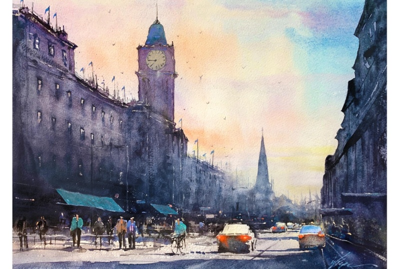
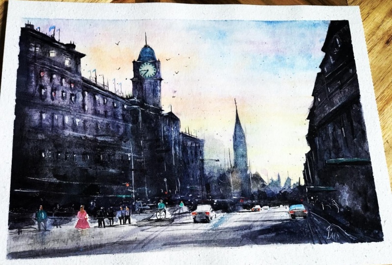
introduction video, today we're going to paint
a cityscape seen at sunset. This class we'll be focusing on the painting aspect
of watercolor. So to save time, I'll be starting the class
from the painting stage having the drawing
already sketched out. Watercolor can be unpredictable, so I tend to make
changes as I go along. And because of this,
it's a good idea to watch the whole
thing through first, a full painting along, so you can see what's to come. You're welcome to copy
my drawing and follow it exact or experiment
with your own. I will put my painting in
the resource section so you can use it as a reference
throughout the process. There's also a
template you can use to trace and transfer
it onto your paper. Don't feel guilty
about tracing when using it as a guide for
learning how to paint. It's important to have
the underdrawing correct, so that it doesn't
inhibit your ability to practice and learn the
watercolor medium itself. Whichever way you
use this class, it would be great
to see the outcome and the paintings you
create in this class. I'd love to give you feedback, so please take a
photo afterwards and share it in the student
project gallery. You can find the gallery under the same Project
& Resources tab. On the right, you'll see a green button that
says Create Project. Tap that and once you're there, you'll have the option to upload a cover photo and a title and
write a little description. I would love to hear about your process and what you
learned along the way. Once your project is uploaded, it will appear in the
student's project gallery. You can view other projects
here and I'd highly encourage you to like and
comment on each other's work. We put so much time and effort into creating
our paintings, why not share it with
the world and help support each other
along the way? Now that you have a
good idea this class, let's get stuck into it, starting with the materials
and supplies I'll be using.
3. Materials & Supplies: Let's go over the
materials and supplies I'll be using so you
can paint along. We'll start with
the colors I use. Unlike most of the materials
we'll be using today, is a lot to do with preference. I have 12 stable colors in my palette that I
fill up from tubes. They are cadmium yellow, yellow ocher, burnt sienna, cadmium red, alizarin crimson, ultramarine blue, cobalt
blue, cerulean blue, lavender, purple, viridian,
black or neutral tint. At the end of the
painting, I often use white gouache for
tiny highlights. I don't use any
particular brand. These colors you can
get from any brand. Although I personally
use Daniel Smith, Winsor & Newton or
Holbein paints. Let's move on to brushes. To keep things
simple, I'll only be using a small
selection of brushes. First is this mop brush. Mop brushes are good for broad brushstrokes and filling
in larger areas or washes. But they also have a tip
for some smaller details. So they are one of my
favorite types of brushes. Next is this,
Escoda Perla brush. I use various sizes, but for this painting, I'll use size 8. These brushes allow for
more precision because they have a finer tip and
last quite a long time. For even more precision when painting final touches
or highlights, for example, I use a
synthetic size 0 brush. All brands have them and
they're super cheap. This here is a sword
brush or a rigger brush. It's quite long but thin. It's only used for
very small details, much like the size 0 brushes, but it holds more
water and pigment, saving time and
effort refilling. The only drawback is it's more difficult to control
as it's more flimsy. That's it for brushes. You're of course welcome to use your
own favorites as well. Onto paper. The better
quality your paper is, the easier it will be to paint. Cheap paper crinkles easily
and is very unforgiving, not allowing you to
rework mistakes. Good quality paper, however, such as cotton base paper, not only allows you to
rework mistakes over multiple times but because the pigment reacts
much better on it, the chances of
mistakes are a lot lower and you'll more likely
create better paintings. I use arches because it's what's available
in my local art shop. Next are few supplies that
will come in very handy. A water spray is
absolutely essential. By using this, it
gives you more time to paint the areas you
want before it dries. Also, it allows you to
reactivate the paint if you want to add smooth lines
or remove some paint. Lastly, masking tape. This will just hold the
paper onto the surface and create a nice clean border at the end
of the painting. That's all you need
to know to follow along. Let's start
with painting.
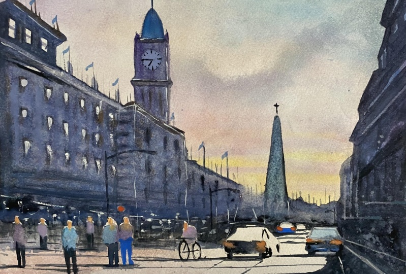
4. Painting the sky: This time we're going to paint a sunset scene of a
town or the city. This is actually Edinburgh
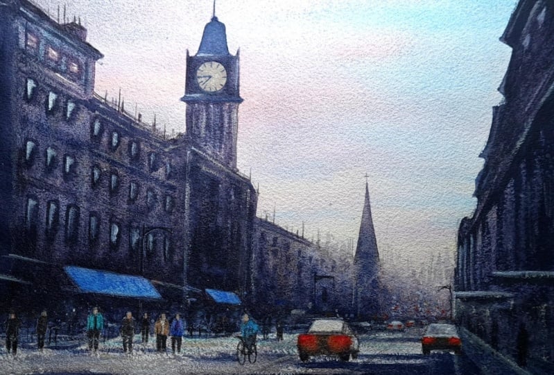
we're going to be using today. This is the reference
image that I'll be using. It's quite a dark image, but I'm just going to be using the silhouettes of the building, the shape of the building
as my main composition. I've changed it around a bit, and I've moved the building, the main building over
to the left a bit more. I put my vanishing
point there and basically composed everything
around that vanishing point. As we paint, we'll draw attention down there
Kriging a bit of depth. I just got my color
charts here to try and work out which
colors I should use. I think there's some nice oranges,
they're yellowy orange. I'm going to do some
cadmium red with cadmium yellow just for
those little highlights. But most of it will
be cerulean here. Then got to go into some purple there. Maybe
some lavender. But yeah, purple as
well, just there. Of course, you can
mentally prepare for this, but when it comes to
actually painting, watercolor has a
mind of its own. It could go anyway, I might have to scratch that. I have just work with what
happens with the pigments. But as long as
you're having fun, that's the right
mindset to have. Let's get on with it. One of the most important
things when painting the sky is making sure
you mix all your colors beforehand and you have enough of them so that you don't run out just when you need it because it's a lot
of space to cover, and you're going to
be putting them down specific times depending
on the wetness. You could have a pair
your washes beforehand. Even you can load, you
can have like a couple or three brushes preloaded with the paints before
you even start. I'll do that when
the time comes. First of all, I'm going
to mix the blue section. This is cerulean and
a bit of lavender. I'm going to add
a bit more water there. That's one color. Next, a bit of this. Purple. Again, some lavender. This yellow, a bit
of cadmium red. Now, I prepared three brushes; blue, yellow, and orange. I'll be using that
for the main brush. I'm just going to spray the
water just to activate it so that it's easy to mix the colors in and it
doesn't dry out too quickly. Starting with lightly, I'm
just going to put that in. Going in with the blue now. Putting in some water by itself. But more blue here actually. When it's this wet, the colors will blend much more than when
the painting is dry. Now, time to add some orange. That's very powerful orange
actually. Do another spring. Can be quite
intimidating this orange because it looks so bright. But it will fade, it will spread and
fade and look again, I hope, especially because
it changes as it dries. What it looks like now
when you put it on, won't be what it looks
like in five minutes. Wispy clouds all way
to the horizon there. Let me get a bit
fiddly up there, but I had to fix it. See what I did. I made him
a little bit of a mistake. I added a brush with too much water on to paper that was already
drying and it was colorful. I'm going to dry that now and
come back when it's done.
5. Starting the First Layer: Now, we're going to move on
to the buildings themselves. I'm going to start this
side and basically do one big wash over all
these buildings here, merging into the distance there, and then in fact, I'll do that after
merging in there as well. But I'm just going to take
some time now to make a big pool of water here enough to cover
the whole of the area. I'll do that off camera and
come back because it'll be a lot of time where I'm concentrating and not talking and it'll be off camera. I've mixed a few colors here. This one's a lighter
more diluted wash, this one here is a bit thicker. It's basically ultramarine with some black or neutral
tint and a little bit of Alizarin Crimson
to turn it to purple because I'm going to keep with the purple
influence on this painting. I'm going to paint
straight over the windows, I'm not going to
worry about them because I can come
over them next time and I'm not going to be focusing on that many darks
at the moment, I'm just going to concentrate on blocking off these
buildings basically. I'll leave a few white gaps
for interest intrigue. It's quite important
as I'll try and explain to have the
painting on a slope, the paper on a slope because
you want to have this water build-up at the bottom because you can lift
the water back up, it gives you more time, more control because you
know it's running down. Rather than if it's flat, it could be rolling anywhere. I expect you explain
you to tap a few of the color near like that, leaving a thin white line there. That's too much. That's okay. I can just use a tissue
to draw it out again and go back in with
the opposite color. In fact, I think
I'm going to change to this larger brush. It takes a bit of concentration this part. I'm just going to make that dome a bit green. Then back to the purple
and I can let it run down. It'll merge back into purple. I'm just looking here, I think I want it to
be a bit dark here. That's a building going there, so I'm just going to do that. Maybe another dark
line there. there. Now, I'm going to flick, get some pure water on my
brush and just flick it. Before I go into this area, I'm just going to wet the paper a bit because I want it
to bleed off a tiny bit. I want it to be a bit darker
there and just adding these darks at this
stage when it's this wet will blend it
quite smoothly. The wetter the paper, the more smooth the marks will be, the more it will blend,
and the drier it is, the less it will blend more, the harder the lines will be. Just testing out. I
think that's okay. That's a bit too much, a bit too dark so I'll go over with
water, lighten up a bit. Let's make it a bit
more interesting. Dabbing some of the
colors in there. I think I'm going to destroy that a bit more. It's too clean-looking,
too boring.
6. Adding Mid Tones: Now, I'm going to mix
some quite heavy pigment, burnt sienna and ultramarine. I'm just going to dab
some bits in here because at this wetness, at this dilution, it will create some
really nice effects. I'm going to make
that a bit heavier. Now I'm going to go, again, keeping with this dark, almost black color, I'm going to go across here, basically at least marking
the tops of these figures. I'm just going to paint
upwards here quite textured. I'm trying to paint the ground. I'm going to get some
very wet water here. I mean, a very wet brush full of water and then let it run. And even here, keeping in mind where
the horizon line is, I'm just going to
drag that across. I'm just going to dry it with
a hairdryer now and I'll save you the noise by
switching to it later. After drying and having a look, I think I want this to
be a lot lighter here. So I'm just going to take
this big flat brush and rub it, and then dab it. I'm using a spray gun
because I'm about to add in some windows or indication of some windows, and I want the markings to bleed in rather than
just have a hard line. I can just about see
my lines underneath. I'm afraid to use my finger. Now I want it to
be a lot darker, and the time for that is now. It's got a emphasis of burnt sienna on that stroke, and then cobalt
blue on this one. Break it up a bit. I'm doing a lot of
dry brush here, and I use this to churn. If I've got two wet brush, I use this to dry it out a bit. I'll turn those into
flags later on. I put more of an emphasis
on the top ones and then the bottom ones can just be a suggestion. The
windows, that is. I'm going to go back over some
of these with some water. Oops, that's a bit
too much pigment. By the way, there's no flags in the actual reference image. I just feel like the need
to put them in there. I can actually put
this down now. I'm going to [inaudible]
a bit. [NOISE]
7. Painting the Clock: Now I want to add [NOISE]
the clock in the tower. I'm just going to paint
it with some pure water. Wait for a few
seconds and then rub. [NOISE] [NOISE] I'm
going to try it again. Dried a bit, but then I decided I want to try
something a bit adventurous. As it's drying in a flick, just a bit of that lavender in. I'm going to paint
that clock out. Moving the details
of it down here. [NOISE] Just decided I wanted a softer there over the harder. Just use this brush
that I don't care about it getting
dirty, rubbing away. I definitely want it significantly
dark in these places. I'm going back in
with the black. Using the small
brush to put that final darks onto
the windows here. I will come back later with
a little bit of light. Now I think this is dry enough. I'm just going to
put a clock in. What should the
time be for sunset? On the reference
image looks like it's about quarter to eight.
8. Starting the People: I'm going to do this
one, this side. Similar color to keep in
the same color scheme. [NOISE] Let's do that as the base
color and then later on, come back in over the
top with some darks. Now I'm going to prepare
some of these pedestrians. A bit too much. A bit bright at the
moment but it's okay. I'll sort that out as it goes.
9. Painting the Darkest Darks: [BACKGROUND] I want to put
some highlights there later, so I have to make it quite dark in order for the
highlights to pop. I won't turn that background
building to be less light, I want it to be
lighter. [BACKGROUND]
10. Contining with the People: I'm going to start. I'm going to bring the
buildings to the ground. I want to make the
heads a bit shorter.
11. Painting the cars: Going to start
painting the cars now, [NOISE] I should have made
the cars bigger really because it's difficult to get nice cars at this size. Doesn't really give it room. There's noise outside. [NOISE] Some tires. [NOISE] Then in the distance just implying more roofs. [NOISE] That shadow across. [NOISE] Another shadow cross. I don't know where these
shadows are coming from but I think they'll look
okay in the end. [NOISE]
12. The Right-Side Buildings: I'm going to deal
with these people later.There the people are
drawing, painting obviously. Here we go. [NOISE] Run a bit of
water over certain areas. I want this area to
be a little messy. [NOISE] Now I have
to position myself because I'm going to bring, connect it to the shadow that
go or going to cross here. [NOISE] I don't think I even need to worry about these
people [NOISE].
13. The Ground Textures: [BACKGROUND] A bit higher. It's going to have
a very thin line. Let's get the right brush. There we go. There's
the vanishing point. I'm just going to let it dry. What should I put here? Let's
put a person. [BACKGROUND]
14. Rubbing Away Pigment: Dry brushstroke people. It can be messy there. Few signs here, I have some for that. Want this car to be a bit
lighter now. It's okay. I do few more of these rub-out effects
though I put water on. [inaudible] and then wait a few seconds then
rub. [BACKGROUND]
15. Adding Highlights: [NOISE] The figures are a
bit too bright, so I'm just going to
bring them down a bit. [NOISE] Now going back up
to these windows, I'm going to do some very
small highlights. [NOISE]
16. Finishing Touches: That's very subtle for this way. In fact, that's too much. This thinnest line. I'm thinking that's where the vanishing point
is right there. It's going to create
a little marker there just so that I
know that's the line. Going with a different
color now, orange. Coming close to the end now. Let's clear that up a bit. We're very close
to finishing now. I'm just going to do the flags, which is the Scottish flag. I don't think I'll bother with the white cross in the middle. The birds. Thank you very much for
joining me for this painting.
17. Final Thoughts: Welcome back. I hope
you enjoyed watching. Now it's time for you
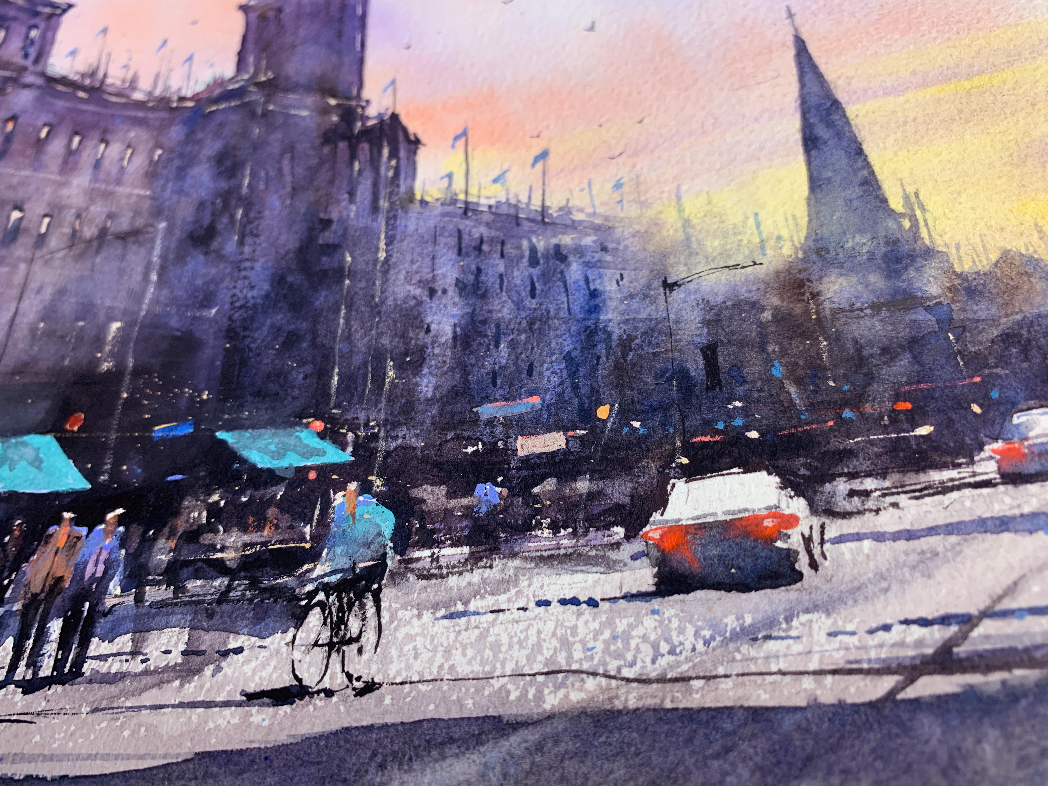
to paint the scene. Let's have a close-up
look at the painting. It's always a good idea to disconnect from the
painting a bit after finishing so that you can have a fresh eye for any
corrections or alterations. I decided to add a
few more details like this green awning. Try not to compare
your painting with mine as no two paintings are alike and everyone has their own individuality
and nuances. In fact, painting in
this style should be very liberating
because it encourages loose brush marks and it gives an opportunity to
discover your own style. If you would like feedback on your painting, I'd
love to give it. Or if you'd like any advice
related to watercolor, please share your painting in the student projects
gallery down below and I'll be
sure to respond. If you prefer, you can
share it on Instagram, tagging me @willelliston
as I would love to see it. Skillshare also loves
seeing my students' work, so tag them as well @skillshare. After all that effort
we put into it, why not show it off? Remember, please click
the Follow button up top so you can follow
me on Skillshare. This means you'll
get a notification as soon as I published
my next class, or have important announcements
like free giveaways or sharing some of my
best student artwork uploaded to the project gallery. Thank you so much again
for joining me today. Please leave a
comment down below in the class discussion
area if you have any comments or questions
you have about this class. If you have any
subject, wildlife, or scene you'd like
me to do a class on, let me know about it then the
discussion section as well. If you found this class useful, I'd love to hear
your feedback on it. I hope you learned a
lot in this class and inspired to paint more
in this glorious medium. Until next time, bye for now.
 Will Elliston, Award-Winning Watercolour Artist