Transcripts
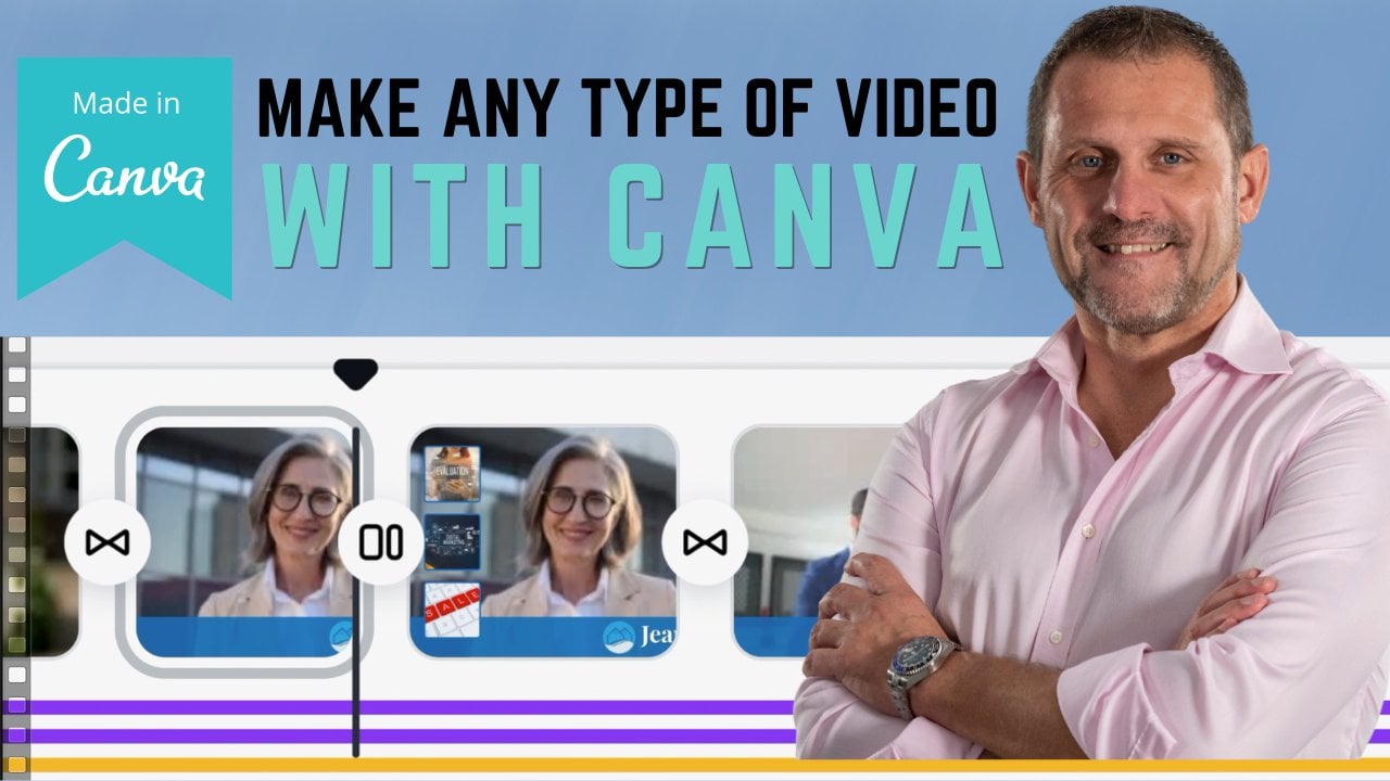
1. Learn Canva in an Hour ...and a bit :): Hi, my name is Adam and I'm the instructor on this Skillshare course all about Canva. Canva is of course, a free, easy to use online graphic design. Tilda is literally used by millions. With Canva, you can design just about anything you put your mind to really. Now this course starts off from an assumption that you know, nothing about camera or graphic design. And then we proceed to build on each of the skills that you learn until you're producing a quite complex professional. Now saying that if you do already have some experience with Canva and you're just looking for a refresh on certain points. Then in the first 30 seconds or so of each lesson, I discussed what specific topics that lesson will cover. So if you are just looking to brush up on a few Skillshare in that, then you can quickly find what you need just by watching the intro to each of the lessons in this course. Now in this course will take you from 0 knowledge of Canberra and design to you being able to produce your own static graphic designs. You're going to learn how to make designs that contain moving elements and animations. And you'll even learn how to make an edit short movies with audio and music soundtracks. Movies that you can use on social media, YouTube, just about anywhere you want. This is a practical hands-on course where you and I will work together to create graphic designs for social media sites such as YouTube and Facebook. But the skills you're going to learn can be applied to any type of graphic design, such as posters, magazines, documents, greeting cards, tickets, websites, and so much more. During this course, you're going to learn how to work with Canva templates to quickly create your own unique designs. You're going to learn to edit photographs using Canvas, huge range of photo editing options to achieve professional looking results. Perfect for your designs. I'll show you how to ensure the text stands out in your designs. And I'll show you how to save lots of time by using Canvas, predefined text color, and font combinations to quickly produce a polished, professional looking work. You're going to learn how to edit movies and canvas and create animated images. Great for social media posts and AdWords. You can learn how to use light and shadows to create raised 3D effects. How to mask backgrounds and photographs to achieve professional looking results that will elevate your work. Now, I've purposely designed these lessons to be respectful of your time and to move along pretty quickly without hopefully any needless delays wasting that time. This way, everyone can follow along with the course at their own pace. The fastest students among you can follow along with the lessons in real time. Or you can pause the lesson anyway, you wish complete the stamps being discussed and then restart the lesson and continue. So if anybody needs more or less time on a particular topic, you have the flexibility to control the pace of the lessons to meet your needs. Now, I really personally dislike taking lessons have drag on needlessly. So I'm hoping that this approach to lesson design will work well for you. And please let me know if it does. Suddenly, if it doesn't. So with all that being said, I'd like to thank you very much right now for your time. And if you're ready, let's begin.
2. Open a Free Account.: Well, hello and welcome to the course. For those of you that already have a Canva account. Well, thanks for watching, but you can skip this video and move ahead to the next one for everyone else. Now is the time to go to canva.com and sign up for your free Canva account. Now, this account is free forever. Well, that's assuming camera don't change their pricing model. And in this course we exclusively use the free Canva account functionality. So you're going to be able to follow along with every lesson from start to finish and produce each of the designs that we spoke about in the intro video. So let's not take up any more of your time. Please go to canva.com, sign up for your free account. And you can sign up using your Google account. You can sign up for the Facebook account, or you can just sign up using your email address and then meet me in the next lesson. Thanks for your time.
3. Understanding Layers: Well, hello and welcome back. Now, before we dive into all the various Canvas tools and get our hands dirty, there is one design concept that you'll need to understand first. And that is the concept of layers. Okay, so here we have a blank design template too, which I'm going to add a background. And there we go. Here we have a wooden fence. Now don't worry too much about backgrounds at this point, what they are or how or why we use them. We're going to cover that very shortly. Right now. I just wanted to add a background to this design to help demonstrate the concept of layers. Now, any element I now add to this design is going to sit in its own unique layer. And let me demonstrate what that means. Here we have element number one. Element number one now sits in a newly created layer. You can't see all of the layer. The layer is transparent apart from the element that we've added. But as you can see, that element now sits on top of our background. We can see a 100 percent of element one, but we can't see a 100 percent of the background because it's obscured by element one. We can move elements around as necessary. Now let me add a second element to this piece, which in turn will then sit in a newly-created layer. And here is element number two. Element Number 2 now sits in a layer, most of which is completely transparent apart from the element itself. And this new layer now sits on top of number one's layer and the background layer. So now I can see a 100 percent of element two, but I can't see a 100 percent of element one or the background because element to obscures that any new element we continue to add to our piece will be created in a layer that sits at the very top of the layer stack. So here's element three. It now sits in a new layer which sits on top of the elements stack, which sits above elements 12. And of course the background, the background is always the bottom was peace. Now by using layers, we can create some very interesting complex designs using straightforward geometric shapes. However, layers wouldn't be much use to us if we couldn't change the order of an item in the layer stack and move it down or up the layer stack as we need. And we do that in one of two ways. I've clicked on item 3 here. I'm coming up to the position option and I'm going to click to send it backwards. As you can see, an item 3 has now gone back one layer, so it sits underneath layer two, but above layer one. If I wanted to send it all the way to the back position, I would click Send Backwards a second time. If I wanted to bring item 1 forwards into the top most layer, I can click Position and forwards, or I could use the keyboard shortcuts shown here, which will be different for a Mac or a PC. So I shall click it and I use my keyboard shortcut to bring it forward. Now, if I want to save time, rather than sending a layer backwards or forwards one layer at a time, I can right-click the layer where I also have my Send backward option, but I can also click here to send to back. And that will take layer one, and it will put it at the very bottom of the layer stack, just above the background. Let's try that with layer to right-click it, send to back. And again, if I want to bring something forward all the way to the uppermost top layer, I can just right-click it. And in this case I would say Bring to Front. Let me demonstrate that with a fourth layer. So here's layer number four. I click the Send to Back and it will put it underneath all the other layers above the background. And now it's invisible. Until I move the other layers out of the way. I once again, if I wanted to bring it all the way to the top of the layer stack, I simply write cricket and choose bring to front. And there you go. That's the concept of layers. Every item you add to a design sits in its own unique layer. And you can move items up and down through the layer stack as needed to help create your designs. As always, thank you very much for your time.
4. Menu Changes June 2021 : Well, hello and welcome back. And in this quick video, I just want to show you a couple of changes that can have made to the design menu. And they've made these changes in May and June 2021. If you look in the imaging, our design here, I'm showing you the left-hand menu as it used to be set up and used have the options of templates, upload photos, elements, text, audio, videos, backgrounds, and, and the backgrounds which I've cut off in that image there, you will see the option folders. Now, Canada have streamlined and simplified their interface. If you look on the left-hand side here, you'll see the new Canva design interface, which simply says templates, elements, uploads, text and videos. So now if you're looking for anything to put into your design, if that's an element, an illustration, a gradient, a frame, or a photo, audio, video, or a background. Then you're going to find it all under the elements tag. And as you can see by scrolling here, we have the usual choices, have recently used lines and shapes and graphics. We also have a photos and videos and an audio option. And as usual, you can click See All to go into the video section there. Or you can scroll to the top and simply search for, let's look for an image of a new car. So we search for new car and we've got some graphics, come up with photos, illustrations. Here's a video, and if you want to refine your search results, you simply click on this horizontal menu here, and it will show you all the photos, all the graphics, Video, and all the audio choices you have available. So the intention is obviously to make things a lot easier for you to find, for you to include in your designs. However, for those of you that might like to go back to the old way of working and add specific photos or video or audio links into your left-hand menu. There is a way to do that, and you can come here to the More option, click that, and you'll see a whole list of different options available to you if you wanted to add the photo selection to back to the left-hand menu, simply click photos. And here it is. You can add the audio. We can put the background option there. And let's put the folders option. And there you go. Your left-hand menu now looks roughly like it did before. And if at any point you want to remove one of these options from the left-hand menu. Simply hover over it and click the cross to remove it. So kinda have greatly simplified their interface and they've given you the flexibility to set up the interface to suit your own preferences. In the rest of the course, I will of course be referring to the older style Kanban menu, where the photos, the video, and the audio options were all preset options on the left-hand side. So if you don't see those options on the left-hand side, you now know that you can click on the Elements option to find them. Or you can simply add them back into the left-hand menu by using the More option. And just one final note about backgrounds. If you want to add the background menu option back into the left-hand menu, then you can do that by using the More option as I just showed you. However, in the new layout, when you click on the Elements option, you will not see specific background choice available to you. Now you can search for backgrounds and Canvas will show you a selection of images, illustrations, and videos that you can use as a background in your design. But there is no longer a specific background option available to you in this new menu layout. As so many of the images, illustrations and photos and camera can be used as a regular design element or a dedicated background. Then I presume canada have just removed the background choice as it was somewhat unnecessary duplication. However, as I say, if you like having a dedicated Background menu option available to you, then just click on More and add the backgrounds menu option back into your left hand design menu. If you've got any questions, please let me know. And as always, thank you very much for your time.
5. Working with Templates: Well, hello and welcome back. Now in this lesson, we are going to look at the many different types of designs that you can make with Canva. We're going to look at how to navigate the Canvas website and find a template to work with. Now, you don't always have to work with a template. You can make a design from scratch if you wish. But in this lesson, we are going to specifically work with a template. We're going to look at how to use backgrounds, photos, text, and other elements in our designs. We're going to learn how to search for and find the perfect photo or element that we need for our designs. I'm going to show you where you can also get some free professional photographs for your work if you wish. And finally, I'm going to show you how to mask an image with a color or a color gradient. Now, you can work along with me as we design a new piece of YouTube channel art for a YouTube channel that I'm currently planning. So you can work with me to create exactly the same design as I do. And then you can use your new found knowledge to create your own original pieces. If you'd like to do that, then all you need for this lesson is the photograph shown here called machine-learning dot JPEG. And you can find that any acids file that you downloaded earlier. Later in this lesson, we will upload this image to camber. But for now, just make sure you know where this photo is on your computer. Now, Canva offers you a large number of different design types for you to create. Navigation through the Canvas website is very straightforward. Up here you have a search box where you can simply type in the type of design that you're interested in. And Campbell will present you with different options to choose from. Alternatively, you can use the top menu shown here to achieve the same thing and you can browse through the different available design styles. Also importantly, if you want to change the language of the Canvas interface, you do that, yeah. Okay, well, let's design something. Come up here in the top-left to templates under social media, look for YouTube channel art. Now if for any reason that link doesn't show up and the social media, then just type it into the search box. The template we want to work with is called green and pink photo, digital brutal ism, travel influencers. Youtube channel art is quite a mouthful. Now you can simply search for this term or parts of this term search bar here. And you should find the template. If for any reason you are unable to find this template in Canva as Canvas do rotate some of their content from time to time. Then in the downloadable files there is a link to a copy of this template that you can use openly cause templates tax file. And you'll find links to the templates and designs used in this course. Simply copy them, paste them into a browser, and the template should open up in a webpage for you to use. In this case, I've chosen this template as it allows me to demonstrate a number of options from the canvas design menu frontier on the left-hand side of the screen. So first, let's look at backgrounds. As we discussed in the lesson on layers. Backgrounds are the permanent background piece of our design. They can be solid colors, photographs, patents, gradients where one color gradually changes to another color. Or backgrounds can even have a texture effect. But in our design, we're going to change the background to a new photograph of our choosing. Now to find a photograph to use in our designs, you can choose the photo option shown here, and you can then scroll down the images to find a photo you like. Or you can use the search bar to refine your search. Now, you'll notice these little icons in the bottom corner of each image. They say free or they display a little crown and the word pro. Obviously, free images are just that. The cost you nothing and you can use them in your design. The pro images are available to users who have Canva pro account or you can use a pre-image in your design. But before you download or print your finished design, Canva will charge you a small fee for the use of that pro image. Now, if you happen to open a template that has a pro element in it, as we do in hours, then there is a cross pattern watermark, as you see here. And a small message is displayed asking you to remove that watermark. And as you can see, Canberra is asking for €1 for the use of this image. Now if you don't find a suitable free image for your piece and you also don't want to pay for a pro image. And I recommend you open an account at unsplash.com. And Unsplash, you can search for images by the context of the image, and also by its shape or orientation. And the selection is really pretty good. So at Unsplash, I found this image which you should have a copy of in your course files, and it's called Man learning dot JPEG. So now I will upload this into Canvas using the uploads option on the left so that I can use this image in my design. Now you can click here to upload a file from your computer or your social media accounts. Or you can simply drag the file from its location on your computer into the uploads area. And Canvas will automatically take care of the upload. The final image again, I click on uploads, and here it is. So right now I simply drag the image over to our template. I right-click the image and I choose Replace background. And there you go. Our design has a completely new background. But there is one more thing I'd like you to do. Click up here in the photo editing menu, which we will look at in more depth throughout this course and choose the Flip Horizontal option. And there you go. So please pause the video now and upload your image into Canvas. Once you've done that, added to our template, Right-click and replace the background, and then use the Flip Horizontal option. So your template looks like my template here. So that's backgrounds. So now let's look at how to use text. Now canva allows us to put taxed anyway we want by placing text boxes in our design. You can then move that box around your design by clicking it and dragging it into place. You can resize the box using your mouse, as well as being able to edit that text by using the tax menu shown here, where you can change colors, font types, and sizes. And there are some other less standard text effects that you can use. Which we'll go into in a little more depth later on in the course. So I'm going to edit the tags shown here to display my chosen YouTube channel, him. And I'm going to change the colors of the underlying boxes or elements so they match the colors in my background for the graph. And when I click on an element and then choose the color change option in Canva. Canva very cleverly analyzes the photos used in my design and presents me with a choice of complimentary colors for me to use, which is a feature I really like. So why don't you pause the video here and make the same changes to your piece. Now, these boxes which underlie our texts are referred to as elements. And you can choose them from the elements option here on the left-hand menu. And there are a number of different elements that you can add to your designs. From ships and animations, from predrawn illustrations, gradients, and even frames for photographs or grids that allow you to partition your design into different compartments. And we'll be using a number of these different options throughout this course. But the main concept I'd like you to grasp right now is that what you see here is only part of the total elements offering that Canva has. If you're looking for a specific item for a design and try using the search box in the elements section. And you'll be surprised at the amount of possible content that camera has to offer. Now a lot of this content is pro content, just like the photograph options. But you can still find great free choices of content for your designs by searching in the elements section. The final reason I chose this template is that it allows me to demonstrate masking and gradients. Masking is when we apply some form of change or edit to a specific part of a design. And in this design, what we're going to do is we're going to apply an element, in this case a square. We fit entirely over our image. And then we change the color of that square to a shade of blue. Now once we've done that, obviously we can't see our underlying photograph. So we come up here to the top right. We select our square and we change the transparency of this element so that you can see through it to a certain degree. And you change that transparency degree with this slider. Or you can simply type in your choice. And you can see now the effect of having this semi-transparent blue mask over our image. But now our mask sits in the very top of the layer stack. So what we want to do is right-click it and click Send to Back. And then our mask will sit directly over our background. And every other element in our piece was set on top of our mask. Now, gradients are simply ships in which the color changes gradually from one part of the ship to another. In our design here is our gradient, and you can find gradients in the left-hand menu of the elements section where there is a very large choice available for you. This one is called gradient that fades to transparency and appear on the left or the color choices for this gradient element. By changing these colors, we see changed the look of the gradient. And at this point, I'm simply going to leave this design alone. There you have it. This is our final design. Well, it's the final design for now. What I like to do when I finished the design is to close it and then come back to it a few hours, or even a day or two later. And then I create multiple copies of the design using the Copy option shown here. Then I create a number of different versions of the original piece, each with one or two small changes in them. By working like this, you can really identify what elements in the piece you like and what you think works well, and what you can remove or edit to arrive at a very polished finished design. And over the rest of this course, I'll show you to make similar edit yourself quickly and easily. But for now, I'm going to leave this piece right here and this lesson. And as always, thank you very much for your time.
6. Youtube Thumbnails Part 1: Well, hello and welcome back. In this lesson, we are once again going to work with the template. We're going to take this YouTube thumbnail template and tourney into the Skillshare thumbnail that I actually use for this course. As we do this, we're going to learn how to use Canvas photo effects to edit and adjust photographs we work with. And we will use the text effects to make our texts more noticeable to the eye. We're also going to look at how to group individual elements together to make our job of designers easy as we can. In doing so, we'll learn an advanced method of working with backgrounds and how to ensure consistency across a design using the copy styles function will also cover Canvas styles palette of pre-made color and font combinations. And we'll take a look at how you can create your own brand kit of predefined design options. So we've got a lot of learning to pack into a short lesson. So let's begin. Okay, the template you want to search for is called pink and purple sporty gradient fitness YouTube thumbnail. And of course you only need to search for a few of those words. And you should find this template. If for any reason you can't find the template, then open the course templates textFile in the cause acids that you downloaded. Copy the URL and the YouTube thumbnail lesson, paste it into a browser. And a copy of the template will be shared with you for you to follow along in this lesson. So the first thing we want to do now is to upload the photo that we're going to use in our thumbnail. And on the left-hand side on Canvas, please navigate to uploads. Please open the folder where you downloaded the course assets. Select the image that is photo Adam PNG, and just drag it right across to the upload section and Canvas will upload it for you. Okay, so our photo is uploaded. So the first thing we're gonna do now is change the background of this piece. So I'd like you to bring your mouse into the image, right-click and select it, detach image from background option. And as you can see here is the image that was the background of our template, simply highlighted and click to delete. At this stage, we're just going to replace that for graph with a solid color. So click the white part of your design, the background, and come up here to the background color option. Now instead of choosing one of the predefined background colors that cameras offered us. I want you to click in the new color box. And the new color box allows you to drag your mouse around and select a color that you like. And you can change the palette of colors that you have available by dragging the slider to the right or the left. And that's certainly one way you can choose a color using the color picker. But we're not going to do that. If you notice here, every new color has a six digit code. And what you can do is you can directly enter the code of your color choice. So I'd like you to click in this box, delete the Calico data is there, and enter the code for 23, E for echo, three, a for alpha. And then simply click Enter, and this is the color we're going to use, at least for now. If you don't like it later, we can make a change. So now let's add our image to the piece. We simply go to the left-hand menu, click on uploads, and then drag the image into our design. Let's position that image to the bottom right-hand corner and expanded. So it takes up most of the piece. Now you'll notice that our image has a transparent background. The image size is actually quite rectangular, even though we can see through this image to work with it later on in the design. If we leave it this size and ship, it's going to be a little awkward to work with. So right now we're going to crop this image to change a chip. So if you haven't selected the image, do so now so that there's a light blue border highlighted around it. And click here for the crop option. And then I want you to go to one of these white corners on the left-hand side of the image. Grab it with your mouse and just slide across until the image is more of a square shape. And then hit the Enter key. Okay? And we've cropped our image now to make it more of a square ship, this would be a lot easier for us to work with later on in this lesson. Now you'll notice if we look at our finished design, there's a lighting effect behind my head and in front of the background. And this is missing in our piece. So how do we add a lighting effect? Well, in professional design packages such as Photoshop or Illustrator, you have many different preset functions to add lighting into an image. In Canvas. We do not have those, so we have to improvise. So I'd like you to do, go to elements on the left-hand section here. Click in the search box and type in Blur. Be ALU are. And as you see, we have a selection of blues to work with. So when you're looking for is circular and color and it's called Blue blurred dot. When you find that, please click on it to add it to the design. I'd like you to put it approximately in front of my face and drag the corners to make it larger. And once again, pretty much centered on my face. When you're happy with the size of the blur and its location, right-click it, and use the Send backward option. And as you can see that blue now sits behind the photograph of myself and in front of the background. And gives us the impression that there's a lighting source in our image, which of course there isn't. And if you want to move the blurred this point, you can select the foreground photograph. Just drag it so it's small and out of the way. And then you can select the blur and put it exactly where you want. Once you're done, you can click on the image and expanded to the size that you like. The next thing we're gonna do is change the colors of the left-hand side of our image. Now if we click on this purpose ship to the left of our image, you can move that around as you wish. And as you move around, you realize that it's a square and it's a gradient. Once you've realized that simply click Command Z or Control and on a Mac to put the piece back in its original place. Or you can put it back approximately in the simplest manually if you wish. As it's a gradient up here on the left, Canva give us control over the colors we're using that gradient. And what I'm gonna do now is I'm gonna give you the exact colors I want you to use in this piece. Don't worry if you don't like these particular colors or you'd like to experiment with different colors. We'll be doing that towards the end of this lesson. So in the right-hand column box, I want you to click that. Click on New Color. Select the color code box and type in seven, C for Charlie, 898, B for Bravo. And click Enter. And in the middle box, we do the same thing. We select the color. And in the color code bugs, we type in B for Bravo, 29, E for echo 84, and hit Enter. And then any final box, this purple box here. You click that. Come to the color box and type in 25 3439. We can see we have a very light brownish color to the left. It's slowly changes to a very darker, almost a shade of green. The forms, the diagonal line in our design. Okay, and now we're going to work with the text. The first quick and simple change we're going to make is to click on the word beginners and change the text size to 35.5. Just type it directly into the text size box. Click Enter. And then if you need to click and expand the shape of the text-box so that the word is on one line. Then by grabbing the icon with a crosshair on it underneath a textbox, we can move our textbooks around and we can line it up with the text 2021. Now we simply need to change your text. Click in the box, double-click so that you see a flashing cursor. Delete the text that's there, and simply type. Then Canada. And if your box has done the same as mine and condense, two lines, go to the outermost black box until your icon turns to a double-sided arrow and then drag that box just until they learn candle message appears on one line. Now we do the same in the bottom box, we double-click it so we get a cursor. We typed the words in one hour and incidentally, the other icon that appears underneath an element when you select it, the one that looks like two circular arrows allows you to rotate that element in your design. And there you go. That's all there was to this. This is the first iteration of our thumbnail design. Now at this point, when I reach the stage of InDesign, where I'm happy with it as my first draft. I tend to leave this piece alone for a few hours or even a day and come back to it and make multiple copies of this design where I make multiple changes until I arrive at a design that I'm absolutely certain is the piece I want to use. And that's exactly what we're gonna do right now. So how should we go about making these changes and making new iterations of this piece? Well, if we look at this piece of logically, then we can see there are only really three elements that we can play with and make changes to. We've got a selection of colors. We've got some text, and we've got a photograph, and you make an exact copy of your piece by using the duplicate page. I got to click it once, come down to the duplicate, you just made click it again and do that one more time. There we go. We have three copies. So let's come to page 2 and click on the image to highlight it. And the photo editing menu will now appear in the top left of our design screen. Now we've used some of these controls before. We've used flip and we've used crop. Let's look at the others that we adjust option brings up all the various elements of our peace and allows us to make adjustments. Now the first of these adjustments are self-explanatory brightness, contrast, saturation, tent, and blur. Xt process can boost certain hues and enhance individual colors in an image. Not every image will suit itself to this. I'm not going to do that. You and our last option here, vignette, this will add shadows to the edge of any photograph you apply it. And if you look into the corners of our piece, you'll see that shadow encroaching. So we're gonna do in this photo is we're going to increase the brightness. Just drag it until you hit the brightness that you're happy with. I've increased it, my designed to about 25. I'm going to increase the contrast slightly to deepen the shadows and the ripples of the shirt. I'm going to end that at about 30 and I'm going to increase the saturation to about 8. Now we can compare this photograph with the one above it, but an easier way to do that, particularly as we're working on the thumbnail, which is going to be a small image shown on a website. It's come down here to the bottom row and change our zoom magnification. And I'm going to change that down to 25 percent. As you can see, the difference between the photograph in page two that we've been working on and photographing page one is quite striking. So there you go. I'm going to return the zoom option to fit. It'll choose the best magnification for my screen. I'm going to move on to our third piece. Now, in our third piece, I'm going to make another change, this time to text. But before we make edits to the text, I want to make sure that the photograph in page 3 is exactly the same as the photograph in page 2, that it has all those edits we just made. Now we could do that simply by just duplicating page 2. And that's usually the easiest way to do that. But there is another option that I want to show you. Now. I could manually click on the photographic go to adjust and repeat all the changes that I made. I'm not going to do that. If we go back to design to click on the photograph and click Adjust. At the bottom of the page you're going to see a filter code. There is a unique number. You have a different filter code for every possible combination of the adjustments the camera offers you. And this filter code is unique to this combination of adjustments. So I simply need to copy this filter could come down to design number three. Click in the photograph, delete the filter code, it's there, paste a new one. And there you go. I'll photograph InDesign three is now identical to our photograph in design two. And if I was working on multiple photographs in the same design, I would copy and paste that filter code into a text document. And I would apply the same filter to every photograph in my design to achieve consistency. Again. So there are two other options in the edit photos menu. You have filter, which basically applies preset filters or preset combinations of adjustments to a photograph. If you don't want to adjust all the elements of a photograph manually as we've just done. You can simply click to choose one of the preset filters. And then you can change the intensity of that filter using the slider the camera gives you. And this is a good way to change photos from color to black and white, but we're not going to be using the filter option in this lesson. And the other option is called effects. Once again, you can implement predesigned design changes to your photograph using effects. There are far too many effects for us to go through in this lesson. So when you're ready to play with the facts, I suggest you upload a photo into a design and click around the effects and the filters option to see what affects filters you like and you don't like. I tend not to use effects and filters too much in my own designs. My designs tend to be minimalist and business oriented. But if you're doing something more artistic mosaic, I'm sure you'll find something here that you'd like to work with. Now I've made quite a dog's dinner of design number 2. I'm just going to delete the entire design.
7. Youtube Thumbnails Part 2: So let's make our text edits. Highlighted office textbox here. And on text menu appears in the design window. Most of these options are fairly straightforward. You can change font sizes, colors, bold and italic, and of course, alignments. And you get a bullet points if you wish. Or you can change the spacing of your piece. You can either put more spaces between the letters so you could compact or extend your text. And if you had multiple lines in your textbooks, the line-height option or put space in or take spaced out of the gaps between the lines. But let's look at effects. When you click on effects, a panel opens up on the left of your screen. And this allows you very quickly to add things such as drop shadows. If you'll notice the gray drop shadow behind my text though, I can increase how far the shadow is away from the text. I can change the direction of that shadow. I can make the shadow more or less distinct by using a blur. I can tick the transparency of their shadow up or down. And of course, I can change the color of a shadow. Drop shadow is a fantastic for helping texts stand out against the background that the text is on. But as we've got white text on a black background, I'm not going to use a drop shadow. Some of the other options here allow you to make hollow text. You can make a text glow is if it's neon. And you can do variations of a drop shadow. And you can even click and curve that text if you so wish. The only other thing I want to point out about a text boxes is that the text sits on the black square elements underneath. And if we move them around, it moves as one piece, but in fact it's two pieces. So I'd like you to click on the Learn Canva, come up here to where it says ungroup. And click that option, click off the box and back on the box. And now move your piece around. And you see this textbox had been grouped or stuck together with the square that was underlying it. And by doing that, you can ensure that to design pieces that are supposed to remain in a consistent position to each other, do not get moved inadvertently, or if they do, they moved in unison. So once again, let's carefully highlight the black-box by going to the corner here. Click that, hold down the Shift Key, hover over the text. Click that as well. Come back up here to the group option. And Canva no groups those two items together again. And let's put that box back roughly in place and we'll be using group and ungroup in later lessons. So you'll get plenty of opportunity to practice that. Now let's say we made a number of changes to this text. Let's say for example, we changed our font, we change the size, change the color, and we added some text effects. Now if you'd like those changes and you wanted them to be consistent across the piece. You wouldn't have to click the other textboxes and make exactly the same changes. You can copy the style that simply by clicking on it. Here to these three dots where it says more. And using the copy style icon, the one that looks like a paintbrush. Once you click it, once it turns black. And then simply click on the text or element that you want to paste the copied style into. That's how you copy and paste styles to ensure consistency in your design. But I don't want to do that in our piece. So I'm simply going to use on a Mac command and zed Windows machine, you'll be controlled in Zed to go back to our original design. And then we go, and that's a quick overview of the tax change menu and the effects that you can use on your text in Canva. So what I'd like you to do now is delete item three, page three. So far, pinch two is the iteration I like best. And using the duplicate page option, I'd like you to make another copy. Now we've edited the photographs, we've looked at how to edit text. The last thing we can do is play with colors. And I'm talking about the color of the background, the color of our gradient, and the color of these boxes that the texts sits on and the text itself. Now, we can play with this all individually if we wish, or we can use to preset options that camper gives us. Let's look at the first. I would like you to come into the left-hand menu and at the bottom click more. And in the menu that pops up where it says More from Canvas, you should see an option called styles. Please select that. This Styles option should now move permanently into your left-hand menu. The styles option is a collection of preset color choices, color combinations, and font combinations that the design is in Canvas. I've put together for us to quickly apply into our designs. By applying font and color combination changes. You can choose just to change your colors, or you can choose just to change your fonts. And I'd recommend you to do colors and fonts individually. And you'll probably see why in a minute. So first of all, let's click on Colors. Now let's choose a palette of colors that appeals to us. I'm going to come down here to fit it Frost and change the colors in all the elements in my design, I simply click the color palette, and there you go. And Canada has applied different colors from the fitted frost color palette to different elements in our design. If I'm not entirely happy with combination, then I can click freely Frost a second time. And Canvas will change around which color goes into which element in our design. And we can simply play with this by clicking it until we see something that you like or until we decide to go and look at a different color palette. For example, we could come up to 90 as our kid and keep clicking. I personally don't see anything. I like there. You might. We could come down here to Bohemian terracotta and keep trying. Now, I'll be honest, whilst the stars option does seem phenomenally useful, you're going to spend a lot of time here until you chance across a color combination that you like. But that's fine and it is fun to play with. Now, what I'm going to do is I'm going to delete page three that we've just been working on. And once again, make another copy of page 2. Let's click on fonts. And if we choose these fun combinations, exactly the same thing is going to happen. Canva will make changes to the fonts in our piece. And you can rotate through your designs until you come up with a font combination that you really like. Personally, I find the font combination styles more useful than the colors, but you might have much different results from me and your pieces. Now I'd like you to delete item three and once again, make another copy of item 2. So the final thing I want to talk about in this lesson is how you can create your own predefined set of colors to use in your designs. And you do that by putting together your own brand guide. To do that, we need to come out of this design. So let's come up here in the left-hand corner and click Home. And don't worry, camera automatically saves our work as we go along. And here we are in the main menu. And as you can see here on the left, and there's an obstacle blanket. Most of these options for logos and for fonts are for pro user accounts. For one we can use here is called brand colors. And you should see something that looks like this. It says untitled palette, and there's a square with a cross in it. So let's click where it says untitled palette and type in my branding guide. And now by clicking on this box, you can select colors for your guide. Let's just choose some colors at random. Canva limits you to one branding guide and three colors only as a free user. So this gives you some, albeit limited functionality to help you use colours consistently in the various designs that you build with Canva. I must admit I don't use it a lot. You might find value, and this is a free user. You might not. That's completely up to you. Okay, so let's go back to our Design homepage and select the template we've been working on. And scroll down to item number three. As it happens, this is the finished template I'm going to use, but I'm gonna show you one more thing. And to do that, I'm going to duplicate the page. Now, instead of using a solid color as the background, we could actually put an image behind the photograph and the blur here, just to see if we prefer the piece with an image instead of a solid color. So on the left come over here to background. And let's scroll through some of our background options. Here's one called gray painted wall background. Search for that. If you can't find it in the selection, just search for that. Here we are grey painted wall and click on that. And as you can see, a great painted wall has now appeared behind me in our piece. I'd like you to click on the, in the bottom corner here where my icon is. You select the background and come up here to background color. Because you can actually apply a color and a photograph to the background at the same time. So what I want you to do is go through where it says document colors until you come to 43 C3a, which was the original color of our background, and click that selection. So now what we've done, instead of having a solid color in the background, we've actually put a photograph of a wall there and added some texture. Now, is that necessarily going to look better than our first design? Well, let's go back to a 25 percent zoom and take a look at our thumbnails. Remember, here's our original thumbnail. Page two and page three are identical. I should have deleted one of those for this section. And in page 4, there's the photo. And that to be honest, when thumbnail is this size, you're going to have difficulty picking out such a subtle background image. And by using that image, it blurs the distinction between the background and the diagonal line. Now, I could play with other background images. And by all means please do. I mean, we could, we can play with multi-colored images like that. We can play with a wall colored length nerd. You can play with some photographs. Pictures of the sea and rocks. Different designs. By all means in your own designs, please play with backgrounds in this way. And please change the colors also of those backgrounds to give the new background design different colored hues. Now, I'm not sure if I like that. It's certainly striking. So when you come across a design that you like or you're not completely certain of, and simply use the duplicate page to create another option and then make further changes in the new iteration of your piece. May go. Now I've applied the water background. Let me duplicate that. Make another PCR and an abstract painting. And then once you've created a number of iterations of your design that you like. Simply leave it alone, go away for a few hours or a day or two, then come back and look at all the various options you've created. You'll know when you've come across the design that you really like. In my case, thumbnail I'm going to use the course is Page 3. So I'm just going to type next to page three here. And I'm going to give that particular page a name, final design. And they go, that's approximately the process that I went through to select a template, make changes, worked through multiple iterations, edit photographs, edit text, and arrive at the final template design for this course. Nano suggesting you have to work with templates exactly the way I've laid out here. But you can pick and choose different elements from these lessons to come up with your own workflow to design your pieces exactly the way you want to. I hope you enjoyed this lesson. I realized it was a little long. And as always, thank you very much for your time.
8. Animation Changes July 2021: Well, hello and welcome back. In this update which I'm recording in July 2021, I just want to talk to you quickly about some changes Cambria have made and the way you can add animations to your camera designs until the street that right in front of us, I've got a very simple Instagram posts. It's one page and it's got some texts, a background and an image, as you can see of a doctor. Now in the old way of working candle with give you some animation options. And it would apply those options to every element in your design. And that worked quite well, except there were problems. Sometimes you didn't want to animate every element in the design, or sometimes particularly when you're working with videos, canvas animations could actually put pauses in your video playback, which just made everything looks very unprofessional. But now that's no longer a problem. So if I click on the background of our peace and click on animate, I can see up here page animations. And a page animation will apply to everything on my page. As you can see as I'm clicking the various different animation options. Those animations apply to every element. Let's do something different. Let's just click on this text headline work from home. And as you can see on the left now, I have the choice of page animations and text animations. So let me go to page animations and click none to remove. Every animation on this page could attack animations. And just for this headline here, and I'm going to have this bounce into place. And then we click the Play button up here on the top right to see ERPs. And there you go. Only one element is animated. Everything else remains static. I also have the option to apply different animations to different elements. So let me click on our image here. And the element animations option opens up in the top left. And I want this piece to rise up in an opposite direction from the way the headline comes in. So that's, again, take a look at what we've got. And that very quickly is how you can add different animation options to different elements in your designs. This is particularly useful, as I've said, when working with video. And to illustrate that here is a simple presentation. It has two slides and a video of a sushi restaurant. On slide number 1 is half of our video with the headline, you'll kind of sushi and a logo. And on slide number two, we simply change the text. In the past, had I had animations on slight to Canada would have paused the video. Was they put those animations into effect. And that would have made our video look unprofessional. Now, that's not a factor. So for example, if I play this and as you saw that we had different animations on the headings and the logos, but the background video on the music played seamlessly. I hope this has been helpful. As always, if anyone has any questions, please put them in the Q and a below. But for now, thank you very much for your time.
9. New video course: Well, hello and welcome. As I'm sure you've already seen, the last lesson
in this course is all about how to build
videos using Canva. Now, since I originally
recorded this lesson, Canada have made a number of important changes in
their video design tool. They've made so many changes and they've improved
the two so much. But I felt it was worth having
a separate course here on Skillshare dedicated to how
to make videos in Canva. If you are interested in
making videos using Canva, social media videos,
YouTube videos, frankly, whatever you need. Then instead of watching the
last lesson in this course, I suggest you search for my Skillshare course
called Learn Canvas, updated video designer tool. The easiest way to find
that it's just good to the Skillshare search bar in
the top left of the browser. Search for my name, Adam Daniel. And you'll see a list
of the courses that I have in Skillshare that
should pop up for you. And of course you want looks exactly like the image that's
shown on your screen here. Canvas new video editor
is really excellent. I really encourage all
of you to give it a try. As always. Thank you very much
for your time.
10. Facebook Video Ads: Well, hello and welcome back. Now in this video, we're going to build a video-based advert for Facebook. And in doing so, we're going to learn how to use Canvas, video and music functionality. You learn how to use Canvas, pre-designed text options. Learn how to animate elements in your designs. So they have movement-based effects as your piece loads in the viewers browser, we're going to learn how to use light and shadow to add depth to elements and give them a raised almost 3D effect. I'll show you how to edit and cut videos so that the scenes in your video flow in our natural way that viewers will be accustomed to from their time watching TV and movies. And finally, I'll show you how to build a branding outro to end your video adverts to avoid them looking as if they ended to suddenly. Okay, well let's begin. So from within the Canvas Start Menu. Let's choose to make a Facebook post. And we're going to start working from a blank design this time we're not going to use a template. Once you've got your design screen open, come here to the videos tab on the left-hand side. And we're going to select a video for us to use. The video we're looking for is called C coupled ocean. So please put that in the search bar and it's completely free for us to use. Now, if for any reason you can't find this video, then I have created a canva template that you can access, which contains the piece that you need. So if you can't find the video, just go to the course templates file in the course assets folder that you downloaded and copy the link for the Facebook video post lesson. Then paste that link into your web browser and the Canva template that you need, we'll open up for you to use. However, if you did manage to find the correct video, then simply drag it from the video section into your piece and set it to be our background by right-clicking and choosing Set Video 2 background. Now, our video is seven seconds long. So up here we have a Play button. And let's see what we have by pressing Play. Okay, Now, in our Facebook ad, there are two messages that I want to convey. The first is the branding of the business, and the second is the proposition we're offering the customer. So to do this in a natural way that follows the action in our video, we're going to cut this video into two different scenes. So we're going to have two separate pages in this Facebook ad. And each of those pages will have a different part of the video playing on them and a different text message for the viewer to read. The view is not gonna be aware there's two parts to our Facebook advert. It's just going to look like one seamless video to them. To do this, we want to come up here to the video editing icon. This is us and click on it. We now have a simple video editing control that allows us to select exactly which section of this video that we want to show on our Canvas page. Now, you'll find that when editing videos in Canvas, that to find the exact part of a video that you want to use is simply a process of trial and error. But to save time in this lesson, I'm going to give you the exact settings that we will use. Now we want to edit this video in page one at the 3.62 mark. So drag the video slider from the right-hand side until the length of our video is 3.6 seconds. After this, we come here to the duplicate page option and make an exact copy of our page. And now we do the same thing. We click on the background and select the Edit Video option. We drag the highlighted section of our video to the far right of the timeline. Then by clicking and dragging the left-hand blue control, we edit the length of this piece of video to begin a D3 0.72 mark. So the video on page 2 begins where the video on page one ends. Now let's add the boxes that we want to put our text and select the elements option from the left-hand menu and search for rectangle that drop shadow. Now you have a few choices here, but the one we want to work with is simply called rectangle drop shadow. There are usually two of these elements with the same name. Choose the one where the shadow is not as far from the rectangle as the other one. So drag that element into place onto page one on the left-hand side and make it approximately the same size and shape as you see here. Then I want you to come up to the color options and use the following colors. Now, depending on which of the elements you choose, you may actually have two or three colored boxes showing in the left-hand corner of the screen here. If you have three color boxes, That's fine. It just means you've actually got a border around the edge of the PCI selected when not going to have a separate border color on our textbox. So we're simply going to make that third border color, the same color as the main part of the box. The main color selected from the right is going to be 000 for AAD alpha, alpha delta, and that's a bluish color. If you have three color boxes showing up here on the left, then also make the center box the same as the right-hand box. So click on it and make it 0000 for AAD. And the box on the left, we're going to use pure black color. So either select black from the option there, or you can put 000, 000, 000, 000 into the color picker. Once you've set the colors we want to use, then select the rectangle and then change its transparency to around 70 percent. Now select this element and copy it using Control and C, or Command C on a Mac. And then paste it into page to using Control and V or Command and V. And I'll page to move the text box to the right-hand side of the advert. Okay, Well, it's time now to add our text. And remember that in Facebook, there will also be some tax above and below or add. So we don't need to go into massive detail in the ad itself. The ads purpose is to capture the attention of the viewer and get them to click. So for Page 1, we're going to go to the Canvas text selection. And now I'm going to want to use some of Canvas pre-built texts choices so that I can quickly find something that looks good for my advertisement. And here is a favorite of mine. It's called tasty beer. The one that has the words cold, smooth and test the unit. And if for any reason you can't find this piece of text, then simply search for the word cold in the search bar. So let's select that text element, drag it into our piece. Let's position it roughly in the right position. Click on it and edit it to say sun sand and see, which just happens to be the tourism motto of the Caribbean nation about tiger. Then here in the subheading, I want you to click on that and type out and trigger diving towards, which is the name of our fictional diving company. Now, I'm not completely happy with the formatting of the main text here. So let's select it and go to effect and see if we can improve on what we have. Now, when I was designing this piece originally, I played with the various options here. And I absolutely encourage you to do that in your own design work. But to save time, I'm gonna give you the exact settings that I arrived at that I want you to use. I want you to select displace option, set the thickness to 50, the offset to 44, and the color to 000 for AAD alpha alpha delta, the same color as our blue text box. And I'm going to drag the corner of our textbooks here just to make all the texts that little bit bigger. And there you go. These are the tax and tax effects that I want you to use in our ad. Now let's go back to our text elements choice and look for the elements called stats. Once you've found that, drag it into page one at the bottom of the tax box. Put it roughly center. And then I simply want you to only change the bottom line of text to say successful students. And that's it. Now then make a copy of the top taxed and paste that into page to put it onto our textbox and change it to say, too weak, not weeks, week. Then I want you to come to the alignment option appear in the text bar and center that text. Now change this subheading to say paddy urban water course, which is a type of introductory dive course for new learners. Now perhaps you agree with me when I say that the subheading looks a little out of place with its alignment here. So we'll go ahead and center it. But after you've said it, I also want you to come up to the Spacing Options shown here and change the letter spacing until our subheading is the same width as our main heading. And finally, for tax, I want to add a small blurb at the bottom of page 2's textbox. So I'm going back to our tags menu to choose a sub-heading. And I'm going to change that to say includes all instruction, course materials and dive costs. And I'm using the symbol for and as well as capitalizing the main words. Now once again, at this point, I played with different font and effect combinations to make this text really stand out. And I arrived at the following settings. Change the font to Open Sans and uses size of 25. Then go to Effect and choose the ACO option. Set offset to 50 direction at minus 45 and the color to black, 000, 000, 000, 000. And we position that text as you can see here. Okay, so now we want to add the price of our course into page 2, and we'll do that with the image of a price tag. So go to the left-hand design menu and select elements and search for tag. And you will see the element I want to use right here. Drag it into our piece selected, and then use the flip and flip horizontal options. Now use the rotate button underneath this element to rotate the element until we get to 25 degrees. And you can see the amount of degrees is shown to us by camera as we adjust the element. If for any reason your tag is not colored black at this point, then change it to black using the color change control. Then adjust the size of the tag by clicking on it and dragging the edges of the element. So the tag is approximately the same size and in the same position as shown here. So now we're going to create a raised effect using lights and shadows. And this is an effect that you can use on elements and on large text to really good effect. So I want you to copy and paste a new copy of the tag, once again, Control and C or Command C, and then Control V, command V. Now and you did change the color of the new tag to be white and place that new white tag directly over the black tag. Canvas should make this easy for you by snapping the new element exactly into place. Now with the top white elements selected, use your arrow keys to move the white element one pixel at a time to the left. So click the left arrow key three times, and then click the bottom arrow key twice. In this way, our white price tag slightly overlaps the black one just around the edges. Now we're going to make a third copy of the price tag. So copy and paste the white tag into your design and change its color to 0, S5, a, C2. And then move this new element directly on top of the white elements so it snaps into place. Then once again, using the arrow keys, select and move the top blue element around until you arrive at roughly the same effect shown here with the various white and black edges of the underlying elements. Just about showing to give us the effect of this design being a raised three-dimensional shape. Now I can't give you the exact keystrokes needed to move the blue price tag into place. As from my past experience of teaching this technique, there's gonna be a few differences in everybody's designs to my own. So just play with the top element using your arrow keys until you get an effect as close to that one shown as possible. Or you might find a different lightened shadow combination that you prefer, in which case I just use that instead. Now we're going to add some tags to our price tag. Go to the Text Options and select a subheading, type out the dollar sign and 600, 600, 800. And select the text and change the font to glacial indifference with the size of around 90. Then by using the rotate option, adjust the angle of our texts until you get to about minus 20, and then place that text onto the top price tag. Now let's show the viewer that this is a sale price by showing them the original price of the course with a line right through it. So come back to the text option and select body texts. Once again, type in the dollar sign and 900. Keep using the glacial indifference font and change the text size to 31. Change the text color to what Canva tell you is bright red, which is color FFF 16, 16. And then put it approximately in the location shown here. Okay, now to add a line into our piece, just simply press L. And there you go. Here's our line. If you select the line, then up here you will see the line Edit menu where you can change the width or weight of the line. And you can make the line appear as dashes or dots. You can add arrowheads to either end of the line. But for our purposes we need a simple thin white line. So come here to the weight selection and select the thinnest line widths available. And then by using the controls at either end of the line, we're going to move it to be the right length, position, and angle simply by clicking and dragging those controls until we're happy with the lines location. Now, I'll be honest with you, if this was an actual Facebook ad I was going to run, I would make the point that this is a sale price in the text below and above my Facebook ad. I only included this element in this design. So we can have a chat about how to work with lines and camera. Well, that's it. We've now added all the graphical elements to our piece. So now let's add a few finishing touches. What we're gonna do now is animate our elements so that they move into and out of our pages as our pages are displayed to the viewer. Now, there are a number of different animation options available in camera. But let me say right now that when it comes to animation, usually less is more. You don't want to use very dramatic animations in most of your videos. Animation usually, but not in every case. It should be quite subtle. Could a page one and click on the background. And then select the animate option. And you will see a selection of free and pro animation options. We're going to use the rise animation in R2 pages. But right now please feel free to play with the other options just to see what they do. And when you're ready to proceed, choose the right option for Page 1 and then do the same for page 2. Now let's press Play to see our animated effect in action. Now that's pretty good, but it still needs a little work. So let's add some music. Now, even though most Facebook users what actually hear this music as they'll watch this video on their cell phones, it's still good to learn how to add music to a camera video. So let's do that right now. Go to the left-hand menu and select the music option. And in the search bar, use the search filters to find a free music piece that you can use. As you can see, at least at this point in time, there are really not many options for you to choose from. The piece we want is called take you. And if you don't see it in the list of choices, simply search for it in the search bar. So select the, take you peace, and drag it into our design. And you will see the music choice icon appear here in the bottom left. If you'd like a larger selection of free music, then there are lots of sites online where you can find royalty-free music to use in your designs. And you simply download that music as an MP3 file and uploaded into Canvas. And of course, you can upload your own voiceovers in the same way. Now this music piece is much longer than our advert. So what we do is we double-click on the music icon to bring up the music edit and Selection Tool. And this highlighted section shows us the piece of music that is currently selected play on our video. And we can slide that selection back and forth along the length of the audio track to select exactly which seven seconds of music we want to play during our video. Again, this is simply a trial and error process, which I've already gone through. So I'd like you to set the beginning of the music to play at the 5 second, as you can see here. Now, ideally, the seven segments of music would fade at the end. But this is not a feature that camera currently offer. Sometimes you can work around this by using the final seconds of a musical piece so that you incorporate the pieces own fed into your video. But in this case, that's not going to work. And if you listen to the last seven segments of this track, you'll see why. So considering that most users won't hear the audio on this ad, I am prepared to live with this at this point, at least for the purposes of this demonstration. Now finally, if we watch the video again, we realized that the ends very suddenly. Now one way to transition the viewer out of a video so they feel it's reached a natural end. And also to push your brand image to the viewer, is to use what's called an outro, which of course is the opposite of an intro. So let's come down here to page 2 and add a new page to our piece, a clean new page, not a copy of page 2. Then let's go to the Elements option on the left-hand design menu. And I want you to search for a dolphin logo. Now, sadly, these logos are all pro designs. And obviously when it comes to pre-designed logos in Canvas, obviously going to charge you. But this logo here will work for our learning needs right now. And it'll help us illustrate how to build an outro. If you can't find this exact logo, then you can search for it in the search bar, or you could use any logo that you wish. So just drag this logo into our page and make it larger. Make it this size you're happy with. Then click on it and come up to the position option here in the top right. And use the middle and center options to place your logo dead center on the page. Or you can simply click on the logo and drag it into position. And Canvas will show you some guidelines which will tell you when you're dead center. Now let's go back to text and select a sub-heading and type in Antigua diving tours, change the font to Sanchez, which is the same font as the anti-gay diving towards taxed on page one. And then drag the edges of the text-box until the text is approximately the same width as a logo. If you have difficulty estimating that width, then just drag the text box over the logo until you have the right width and then move the text box into place underneath the logo. Now I'd like the electrode to be displayed for a few seconds before it ends and the play video button reappears and obscures our branding. So I'm going to select the background of page three, and the timing option will appear here in the top left. I'm going to click on that and I'm going to change the timing of this page to be five seconds. Finally, click on the background of Page 3. So the animation option shows and choose the fade animation for this ultra pitch. And there you have it. Congratulations, our first iteration of this design is now finished. Why not play it and see what you've got? And there you go. That's it. That's our finished piece. Similar to previous designs. I personally would now leave this design alone for a few hours or a day or two, and then come back to it with fresh eyes, make multiple copies with a small change in each to see if I can improve upon this design. Now I know this was a long lesson, but I'm sure you'll agree we covered a lot of ground and there was a lot to learn. And as always, thank you very much for your time.
11. Animated Ads & Downloading your Designs: Well, hello and welcome back. In this quick final lesson, I just want to cover how you can download your finished designs from Canada. Now, you have three main options for downloads. You can download the document. You can download a movie file in mp4 format, or you can download an image file, and that includes animated images as well, animated gifts or gifts as some people refer to them. You can also publish your design directly to your Facebook account. If you connect your Facebook account to your Canvas account. So let's take a look and find out how we do all of this. So let's begin by looking at how to download an image file. I'll just open this static page here. And the download option you want is this downward facing arrow to the left of the published a Facebook button. Simply click that, and here are your options. Now with a free account, a number of these options are locked and not open to you. For example, you can't download an image with a transparent background and you can't compress the file to lower quality. But here are the options that are open to you. You can download your image in various file types, PNG and JPEG. You can download your document as a PDF. You can download as a PDF Print. You can download it as an MP4 video along with a static image. Let's kinda pointless. And again, you can download it as an animated image, but with a static image, that's kind of pointless. And we'll cover those last two options in a little bit. Now if you happen to have multiple pages in your design, I'm just going to add a few pages. Yeah. When you come to the download option and you choose your download format, let's say a JPEG file. Down here, you're now going to have an option to select all pages or specific pages to download. So you don't have to download the entire design. You can just download the pages that you want to. So that's downloading a static design. And as you can see, that's very simple and straightforward. Okay, so how do we download a movie file? Well, very simply, once again, you come up to the download option here. And if you want to download it as a video, you only have the one option and that's to download it as an MP4 video. Okay, so how do we go about creating an animated image, an animated GIF? Well, come to the search bar and you need to search for a video collage. This several ways to create an animated GIF in Canvas. You don't have to do it this way, but this is where I find is just the simplest and easiest. Now of course, you can use a template, or in our case, we're going to create a blank Design. Here's my blank page. The important thing that we need when creating an animated GIF is that we have this timing option available to us. So I'm going to come to photos and I'm going to pull down number of different photos which I will set as the background. Okay, so there's four images in our college. I'm going to change the timing of each of these ten seconds. So each image will be displayed for ten seconds at a time. I'm going to come to download. And instead of the suggested PNG option. And it come down here to give short clip no sound, and download my file. And here is my finished image. As you're about to see 10 seconds from now, the image will start to change. And you can use animated gifs in advertisements. You can use them as background for a webpage where you want photos change. You can use them in a lot of very creative ways. So that's a quick lesson on how to create and download an animated GIF using Canva. Okay, if you happen to have created a document in camber, like a resume and menu, business plan, a flier of some kind. Then you simply go to Download and download that as a PDF standard document or a PDF print, a high-quality multi-page document. The PDF Standard is a smaller file size, more useful for sending and sharing over e-mail. And the PDF print is a better document for finished print quality. Finally, let's look at how to publish the Facebook. Here we are looking at our finished video ad. I simply click the Publish the Facebook option. Canva will ask me to connect to my Facebook account. Then you'll be prompted to login to your Facebook account. And from there, you can simply click publish the Facebook, follow the on-screen prompts to publish any Canvas design directly to your Facebook account. And there you have it. We've come to the end of this course. I certainly hope you've enjoyed the last hour or so that we've spent together and that you've learned something valuable in this course. If you have any comments or questions, please let me know and I'll be only too happy to address them. But for now, I wanted to thank you very much for the time you spend on this course. And I really do hope you enjoyed it. Thank you very much indeed.
 Adam Daniel