Transcripts
1. Introduction: Welcome to the brand new course, where you can learn
about how to build a personal portfolio website from scratch with only
three core technologies, HTML, CSS, and JavaScript. If you want to create
your own portfolio, which will help you to represent yourself in the best
way and get hired. Then this is the
right course for you. If you ask any of
the employers or project managers how to choose the best developers, every one. But the most important thing
about the developer to represent himself or herself
with a good default. If you're familiar with
HTML, CSS, and JavaScript, then you all already can create a really good personal
portfolio website that will allow you to express
yourself and show everyone your
skills and knowledge. Throughout this
course, we will build a portfolio website
template that will be full of modern and beautiful
features and effects. Because if you want
to create a website using just those three
core technologies, than it should be definitely
an advanced and cool one. We don't say that it will become your own portfolio website
and you can copy it. But it will be a
huge inspiration that will help you to create your own portfolio websites or enhance it if
you all have one. As we already said, we will build this project
from absolute scratch. We won't use any of the third party tools,
libraries, and frameworks. Once we build a website, then we'll teach you how to
host the project and make life in order to make it
available for everyone. And also, you will be able
to learn about how to make the form work in order to get
feedback from your guests, will make the project which
parts are great sizes so that every user could access the website from
any optical device. I think this course will be interesting and
helpful for everyone. I mean, it's tartar or
experienced developers. So do not wait and join us
2. Setup: Hello and welcome to the course. We're glad that you're here and we hope that you will enjoy the course before we dive deeper and start to
create our projects. First of all, we have to prepare
our working environment. I'm sure that most of you are already prepared
to write the code. If so, then you can
feel free to skip this video and jump into
the projects right away. But if not, then that's
not the problem. Let's go ahead and
set up some tools. Throughout this course, we
will need two main tools, which are modern web
browser and a text editor. As the web browser, I'm going to use mostly Google Chrome. And also in some cases
we'll need the help of Mozilla Firefox as well. I'm sure that you
already know how to install this web browsers, and I think you all
already have them. But anyway, let's see
how to download them. In order to get
the Google Chrome, we have to go to this URL here and download
the web browser. The installation process
is quite simple, so I'm not going
to go through it. As for the Mozilla Firefox, you have to use this URL and download the web
browser from here. Both links will be
attached to this lecture. Alright, let's move on and
talk about the text editor. We're going to use Visual
Studio Code because right now it's one of the best texts
editors in the world. Of course, you can feel free and use your favorite text editor. It's up to you, but I
recommend to use the VS code. In order to download
the VS code, you have to visit
this website and get the text editor either for
Windows or Mac or Linux. This link will be attached
to this lecture as well. The installation process of the visual Studio Code
is very simple too, so I'm sure that it won't
have any trouble with it. Alright, so once you install both tools that you
will be good to go. So let's jump right
into the projects
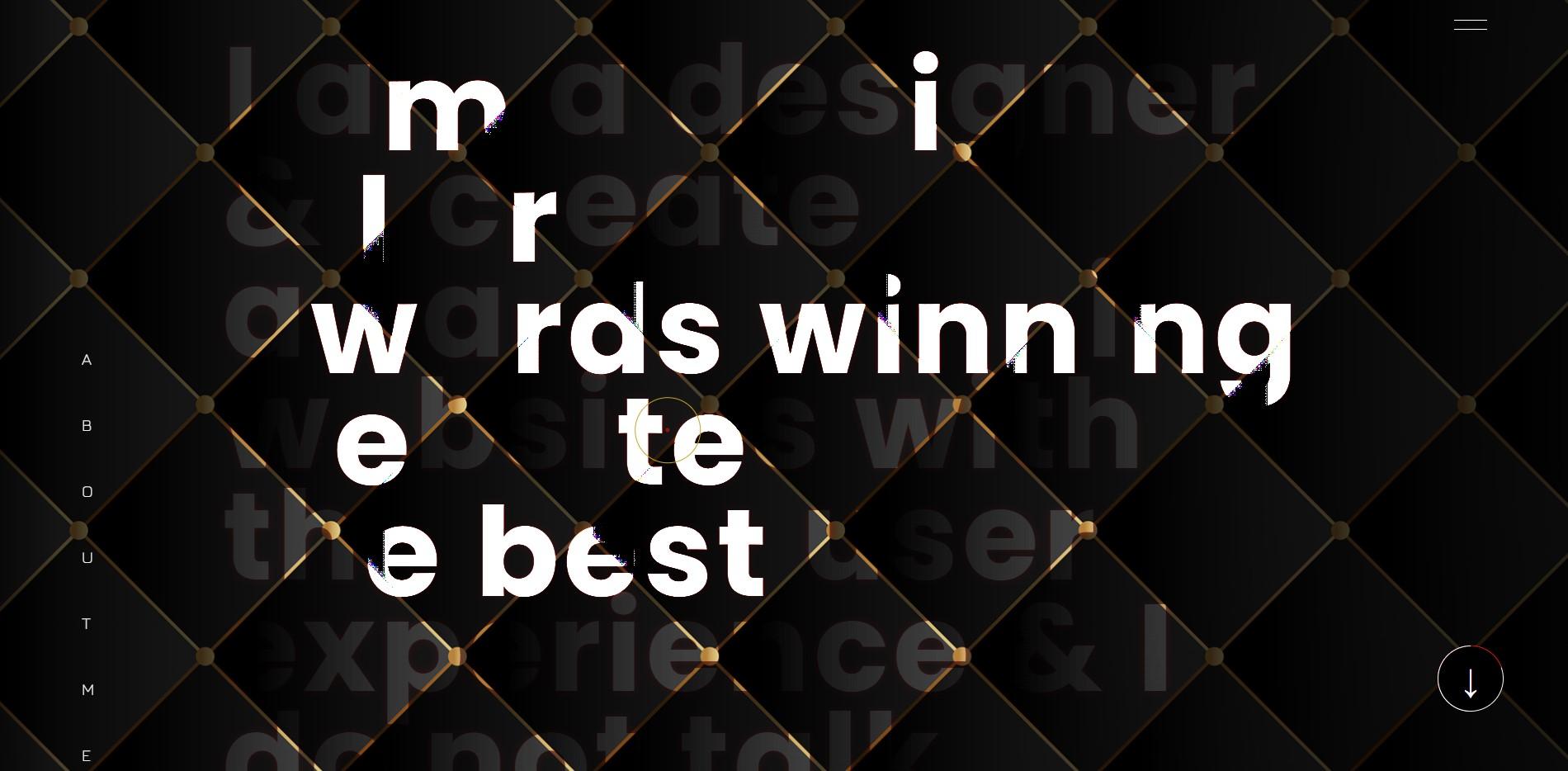
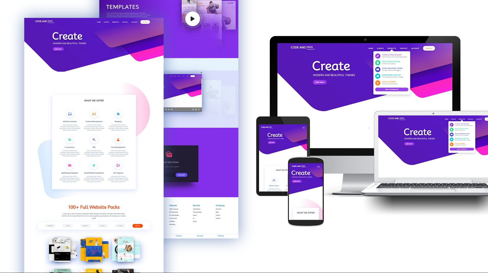
3. Project Preview: Hi and welcome to the very first lecture
of this course in which I'm going to go through
the project and describe all these
sections in detail. Before that, I would like to mention that the project will be created based on HTML,
CSS, and JavaScript. So you should have a
basic understanding of those technologies in order
to follow all the lectures. Alright, let's go ahead and
go through the projects. The first section
that we're going to build will be landing, in which we have those
animated circles. They move. Once we
move the cursor. Also in the center
of the lending, we have the picture of the web designer and
unlikely circles. It moves inside its own circle and it creates this
nice and cool effect. Also, the picture is blended
with the background. So you will learn about how to create this effect using CSS. At the top right
corner of the page, we have a couple of
navigation items. They are connected to
the proper sections. If we click them, then we will navigate to the
relevant sections. Also, if we start
to scroll down than the navigation items will
transform into the menu icon. And if we click it, then they will display back. At the top left
corner of the page, we have the logo, the full name of the designer. On the left and right
sides of the lending, you can see the text
which is sticky. If I start to scroll down, it will be stuck
for a while. Okay? Besides that, we
have here button with a nice hover effect. If I click this button, it will navigate us to
the projects section. Alright, that's it
about the landing. Next we have the
About Me section. It includes large texts which by default is blended
with the background. And if I start to
hover over the text, then the electrons will become lighter with a nice
animation effects. Besides that, we have here a similar button which allows us to navigate
to the contact section. Okay, that's it about
this second section. Next comes the project section, which I think is one of the most interesting
sections in the project. By default, we see here
six different projects. If I hover over them, then the images will
start to scroll up nicely in a 3D environment. If I click any of the projects, then they will expand. You will be able to scroll down and check the project in detail. We have here closing button. If I click it, then the project will be closed. Besides that we have
here, Show More button. If I click it, then a couple of hidden
projects will display. The page will be scrolled
down automatically. Text in the button will be
changed into show less. And also the arrow will rotate according to
the scroll direction. If I click the button than
the projects will hide. Alright, next comes
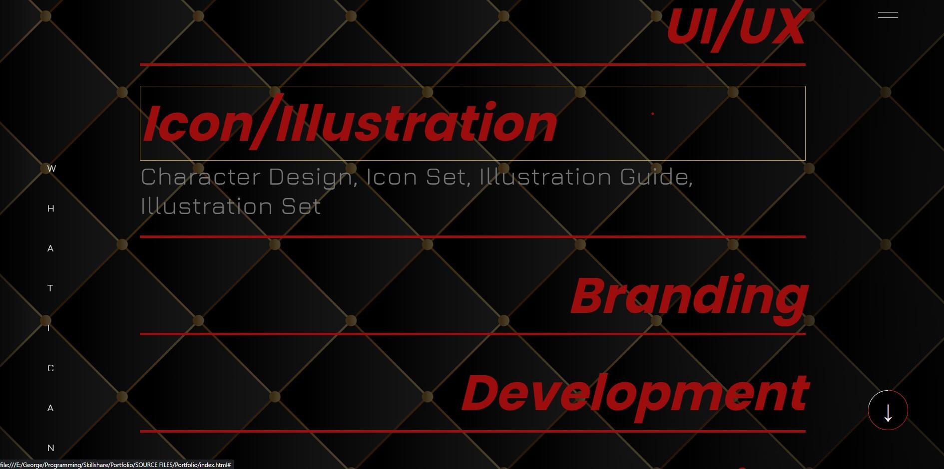
the Services section. We have here a couple of different services
displayed in a large font. If I click them, then they will expand and some
descriptions will display. Okay, after that will be the
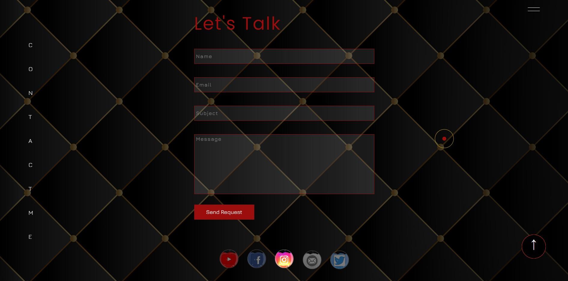
last section of the project, which is the contact. It consists of a couple of
different input fields. And also we have here
a Submit button. Actually this form works. I mean the fields are validated and also the user
can send a message. Because once we
build the project, we will host it
and make it live. If I feel the fields. And then click send request, the form will be submitted and you will
receive the message. As I said, the
form is validated. For example, if I leave the fields empty and
submit the form, then we will get
some error messages. Right at the end of the page, we have a nice slideshow
of the social media icons. Besides that, we
have a couple of additional features
in the project. As you can see, the cursor
has the circle and the dots, and they move with
the cursor nicely. Next, if I hover
over some elements like projects or services, then the circle will
change its shape and we'll get the shape
of the Harvard elements. Besides that, we
have a nice effect with the Menu icon
and the progress bar. If I hover over them, then they will become
sticky to the courser. But if I move the cursor far from their initial positions, they will get their
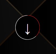
default places. Lastly, I'm going to talk
about the progress bar. It is placed at the
bottom right corner and it has a fixed position. Once we start to
scroll down the page, then this white circle will start to feel
with the red line. Once we go all the way down to the page than the entire
circle will be filled. And also the arrow will rotate. If I click the progress bar, then we will navigate
to the top of the page. Besides that, we can
click the progress bar. It will allow us to navigate
down section by section. The progress bar works
with the project section. If I expand the project, then the progress
bar will update and it will start to work
according to the image. But if I close the project than the progress bar will continue to work
according to the page. Alright, so that's all about these sections and
features of the project. As we already said, it's going to be responsive to the different screen sizes. If I inspect the page, switch to the responsive
mode and check the project. On the different screen sizes. You will see that
it is responsive. I would like to mention
here one thing, the project is built on
extra large screen size. In this coincides with 1920 pixels width and
1080 pixels of height. If you are using the relatively smaller screen size
than the project, might not look good
during the lectures. So I recommend switching to the responsive mode and set
the width and height like so. Anyways, you don't have to worry because at the
end of the project, we will make the
website responsive. As I already mentioned, we will host the project and
make it live using Netlify. So I think we're ready to start. Next, we need to set up some tools and we
will be good to go. So let's move on.
4. Prepare Background and Create Common Styles: Alright, so we're ready to
start building our projects. I've created a new folder on the desktop in which I
have just the images. I mean, we have here a couple of different folders for
different images. Let's go ahead and
open this folder in VS code and create
our working files. We need three different files. The first one is going
to be index.html. Then the next one is
going to be startled CSS. As for the third one, it
should be scripts dot js. Then open the index.html file and create the basic
HTML document. For that, I'm going
to use one of the built-in VS code
package is called emmet. We have to put an
exclamation mark and then hit Tab or Enter. We have here basic HTML tags. The first thing that
I'm going to do is to change the title. Let's insert here. Nick Brown, creative designer. After that, let's link
CSS and JavaScript files. I'm going to open link
tag in the head elements. And then we have to specify
here the path of the file. For the JavaScript file, we have to open script tag right above the
closing body tag. And then in the source attribute we have to specify
the path of the file. Alright, so all three
files are linked and now we can run the
project to the browser. For that. As I already
mentioned previously, I'm going to use Live Server. Again, it allows us to run the project live in
the browser and make updates and changes without refreshing the page each time. Finally, I'm going to
place the browser and the text editor like
so we can get started. So the first thing that
I'm going to do is to create these dark background. And also we will create some
reset and common styles. First of all, let's go ahead and start with the HTML markup. Let's insert your comments. Page container. And off-page container. Then open div tag and assigned
to its class container. So this element will include the entire content
of the webpage. Next, I'm going to create another div tag for
the page background. But first, let's insert
your new comments. Actually, I prefer to separate
code with comments because it will allow us to write cleaner and more
understandable code. So let's insert your
page BG and off-page vg. Alright, so that's it about
the HTML markup right now, let's go to the CSS file. As I said, I'm going to prepare some reset
and common styles. So let's insert new comments. Common styles. Of common styles. Then select every elements
using an asterisk. So first of all, I'm going to get rid of default, margin and padding
from every element. Let's set both of them to zero. Then I'm going to make the
box-sizing border-box. In this case, the padding and border will be included in
the size of the element. Next, I'm going to remove the default underlying
from the links. So we need to use text
decoration with the value none. Also, I want to get rid of the default bullets
from the list items. Let's set list
style, type to none. Then I'm going to remove the default outline
from the elements. Let's set it to none. Actually in outline,
I'm in the border that appears once we focus on
the forums and buttons. So the last thing that I want to do is to define the font-family. Throughout this
project, we will be using two different
Google fonts. So let's go ahead and visit
the Google Fonts website. So the first font that I'm going to search for a is called euro. Let's select all the styles. In order to link the font, we have two different ways. We can either copy the
link here and paste it in the head element
in the HTML file. Or we can click Import, grab this URL and paste
it in the CSS file. This phone is going to
be our default one. Let's define it for
every elements. We need here, the name of
the font, JIRA and sensory. Alright, the next phone
then I'm going to search for is called Poppins. I'm going to select all these styles except
the Italian wants. Then grab the link and paste it into the
CSS file as well. Alright, so all those
styles will be applied to every element that will create
throughout the project. Next, I'm going to take care
of the measurement unit. Throughout the project, we will use ramp as the
measurement units. By default, one RAM
is equal to 16 pixels because the font size of the HTML element is
equal to 16 pixels. I want to convert one RAM into
ten pixels because I think it will be more convenient
and easy to calculate. In order to do that, we have
to decrease the font size of the HTML elements and
make it 62.5 per cent. So in this case, one rem will be
equal to ten peaks. Alright, that's it regarding
the common styles right now, let's go ahead and take
care of the background. Let's insert new
comments for page we need n of page BG and
select div elements. So the background is
going to be fixed. If we take a look at
the finished project and scroll down, you will see that it's
fixed and doesn't move. So let's set its
position to fix. Next, I'm going to define
this width and height. Let's set width to 100%. As for the height, I'm going to make it 100% of the viewport. Therefore, we need
here has to be h. Okay? After that, I'm going to set
the image as the background. First of all, let's use a linear gradient function because I want to make the
image a little bit darker. Let's insert you RGBA value with a black color and with
the opacity points seven. And then use again the same RGBA value with
the opacity to 0.7. After that, I'm going to define the path of the image URL. And we have to specify here
the path of the image. We have images folder and the
image for the background, which is called bg dot JPG. Besides that, let's
set the position to center and also set background. Repeat, no repeat. And lastly, when it's defined the
size of the background, let's make it color. Alright, so here we have our full-screen
background image. Next, I'm going to take
care of the cursor. So let's move on.
5. Create Animated Mouse Circle: Okay, So once we have prepare Background and Create
some Common Styles. Next I'm going to take
here off the cursor. I mean that Circle and the dot, which moves according
to the mouse movements. Besides that, if we
stopped the mouse, you will see that the circle
and the dots are animating. Also, if we live the page, then they will disappear. Alright, so that's what we're
going to do in this video. First of all, let's create those two elements
in the HTML file. I'm going to do that
outside of the container. Let's insert new comments, mouse Circle and
of Mouse Circle. So we will have two
different elements. The first one is going
to be the mouse Circle, and the second one is
going to be the dots. I mean mouse dot. Alright, let's sit
about the HTML. Next. I'm going to
style both elements. So let's insert new comments in CSS right after
the Common Styles. We need mouse Circle. And of Mouse Circle. Then select Mouse Circle. At first I'm going to define
its width and height. Let's set both of
them to six RAM. Then we need border with
the values 0.1 run solid. And as the color, I'm going to use C7, a six to two. And also I'm going to
make the element rounded using border-radius 50 per cent. Alright, so here we
have the circle. Next, we need to take
care of its position. I'm going to set
position two fixed. So right now the
circle is no longer feasible because it ended
up behind the background. And in order to fix that, Let's use the z-index property. We need to assign to it some
higher value than zero. Let's say 300. Alright, that's it regarding
the circle. For now. Let's go ahead and take
care of the second element, which is a dot. Let's select it and define
its width and height. I'm going to make
both of them point fibrin and also change
the background color. Let's use nine P 0 D E.
So here we have the dots. Now we need to take
care of its position. We have to make its
position fixed. Actually, some of these
tiles will be similar for both elements so we can
select them simultaneously. Then we can grab those three lines of code
and paste. Then you. Alright, that's it. Right now, both elements
are styled and now it's time to make them
work using JavaScript. The first thing that
we need to do is to select both elements. So let's create new variable. I'm going to call
it Mouse Circle. Then select it using
query selector method. We need to specify here the
class name, mouse Circle. Next I'm going to
select mouse dot. Actually we can duplicate
this line of code. Then change the name
of the variable. It's going to be mouse dot. And also change the class name. We need mouse dot. Okay, After that, we need to create a function
in which we have to define the top and left
positions for both elements. At first, let's
insecure comments. Mouse Circle and
of Mouse Circle. Then create an arrow function. I'm going to call
it Mouse Circle N. This function will take
two parameters, X and Y. Those parameters will be the values of the top
and left properties. In order to define them, I'm going to use style
and CSS text properties. Let's attach style
property to Mouse Circle, followed by the
CSS tax property, in which we can define
multiple CSS styles. So as we said, we have
to define top and left positions as the value
of tough position. I'm going to pass
here parameter Y, followed by the pixels. And then we need left property
with a value X pixels. Let's go ahead and
duplicate this line of code and change circling two dot Alright, so now we have to
call this function and define the proper arguments
for X and Y parameters. We have to execute this
function when the mouse moves. I mean, we have to attach the mouse move events
to the body elements. And once this event is fired, then we have to
call this function. At first, let's attach an
event listener to the body. When a document
dot body followed by the add event
listener method. Then we have to pass here
the type of the events, which is going to be mouse move. And also we need here
a callback function, which will be executed
once the event is fired. Also, I'm going to pass
here event object. At first. Let's see the console, how this event works. Let's open developer tools and
switch to the console tab. So once we start to move the mouse than the
event will occur. Right? Now, I want to look
at the event object, which we passed here in
the callback function. So now if we move the mouse, we will get the mouse event
object in the console. If we dropped down eight, then we'll find here lots
of different properties. We're going to use client X
and client. Why properties? Actually, they give
us the distance from the top and left edges
of the viewport. So those values should be the
arguments of the function. I mean those values will be the top and left positions
of the circle and the dots. So first of all, let's
create variables. I'm going to use
let declaration. Let's name the variable as X. It should be equal
to E dot client X. Then duplicate this line of
code and change X into Y. After that, we have to call the function I mean
Mouse Circle F N, and we have to pass X
and Y as the arguments. So now if we move the mouse than the circle and the dots
will move with the course. Right? Now, as you can see, we need
to change the positions of both Elements
slightly because we need the cursor to be in
the center of the circle with a.in order to achieve that, we have to move both elements according to the X and Y axis by -50 per cent Transform
Translate function. And we have to pass here
-50 per cent twice. Okay, so now the positions
of both elements are fixed. And the only thing that
we have to do is to add a little animation
to both Elements. For that, we have to
use CSS keyframes. First, let's create the
animation for the Mouse Circle. So during the animation, I'm going to increase
and decrease the size of the elements a couple of times. Create keyframes. I'm going to name it as
Mouse, Circle and him. I mean animation. So at 0%, the width and
height will be six RAM. Then let's duplicate this code. Next is going to be 25%. I'm going to increase
both values to eight RAM. Then again, duplicate the code. Next step is going
to be 35 per cent. The width and height are
going to be full RAM. Next, we will have 70%. The values will be a tram. As for the last step, I mean 100%, we need again
default values, six ramp. Alright? So the keyframes are ready, and now we have to apply those
rules to the Mouse Circle. Let's go ahead and use
animation property. First, we need to specify the name of the keyframes,
Mouse Circle Anime. Than to specify the duration
is going to be 10 s. Also, we will run the
animation infinitely. And then I'm going to use one of the animation timing
functions, linear. Alright, so as you can see, the circle is animating. Let's do this similar
to the Mouse dots. In the case of Mouse dots, I'm going to increase
the size only once. So let's create CSS keyframes. I'm going to call it
Mouse dots, Anime. So at 0%, I'm going to make
width and height 0.5 RAM. These are the default values that the next step
is going to be 55%. Let's change the values, make them 1.5 g. And then at the end of the
animation, I mean 100%. We need, again default
value is 0.5 g, right? So the keyframes are
prepared for the mouse dots. Let's go ahead and assign to
it and animation property. We need here the name of the
keyframes, mouse dot anim, followed by the duration
10 s. Then again, we need infinite and linear. Okay? So as can see, both elements are animating and we have here a nice effect. Before we finish this lecture, I'm going to do a
couple of things. Once the cursor leaves the page, I want to hide both Elements. For that, I'm going
to use one of the events called mouse leave. Let's attach event
listener to body. Then we need to specify
here the event mouse leave, followed by the
callback function. So in order to
hide the elements, I'm going to use opacity
with the value zero. So when Mouse Circle dot style dot opacity
with value zero, then duplicate this line of code and change
circling two dots. Now, if we leave the page, then the circle and the
dot will disappear. And if we get back, then they will appear again. Alright, we're almost done. We just need to do
one more thing. Actually, we have
here a tiny issue. If I reload the page and keep them mouse outside of the page, then the circle and
the dot will end up at the top left
corner of the page. We don't need that. We have to fix that problem. I'm going to hide both
elements by default and then make them visible only wants the mouse
move events occurs. So we need to assign to both Elements opacity
zero by default. Then we need to pass opacity one with the top and let positions
inside the function. So now if I reload the page than the
problem will be fixed. Alright, Finally, we are
done with the mouse Circle. Let's move on to
the next lecture.
6. Create and Customize Website Header: Alright, now it's time to start to work on our first section, which is going to be
this Landing page. We have here a couple of different elements with
nice animation effects. Those circles are moving
once we move the mouse. And as you can see, they move
in the opposite direction. Also in the center
of the Landing, we have a large circle
in which you can see the image of the designer
with some nice effects. Besides that, we have a logo at the top left
corner of the page, and also some texts elements on the left and right
sides of the Landing. Let's go ahead and start
to create an HTML markup. Let's insert new comments right after the page Background. We need Section one
of Section one. Then open the section tag
with the class Section one. So as we said, this section will include a
couple of different elements. The first one is
going to be the logo. Let's insert new
comments for logo. Then I'm going to open link
tag with a class logo. And as the content, I'm going to institute
you, Nick Brown. Alright. Next we will have
Animated circles. So let's insert new comments
for animated circles. So overall we will
have five circles. Four of them will be small ones, and also will have one
big circle in the center. Let's open a DIV
tag for the class. Circles. It's going to be the
wrapper of small circles. The circles will be
created using DIV tags. So let's open TikTok with the classes Circle
and Circle one. The first one is going to be
Common class name as well. The second one, we will use
it for individual styles. Let's duplicate this
line of code three times and then change the class names. Alright, besides that, we need another circle in which will have the image of the designer. Lets open DIV tag. It will be the wrapper. Let's assigned to the
class Main Circle. And then insert your image tag. Let's specify here the
path of the image. We have images folder that we need to select
folder called Landing. And then the image is going
to be designed dot JPG. Alright, that's it,
about the circles. Next, I'm going to
create heading elements, which will be placed on the left and right sides of the Landing. Let's insert new comments. Featured text. And of feature text. I'm going to open H4 heading
tag with the classes featured text and
feature text one. Again, the first-class
name will be used for Common Styles. As for the second one,
we will use it for individual styles
as the content. Let's insert your creative. Then I'm going to duplicate
this line of code. Change the class name we
need to feature text to, and also change the
content you should design. Alright, so let's it
about the HTML markup. Right now, nothing is
visible here because the background is fixed and the elements ended up behind it. Let's fix that problem at first. Let's insert new comments for section one in the CSS file. Then select this
section Elements and change its position, make it a relative. So now the elements are visible and then we can
start to customize them. Let's define the width and
height of this section. I'm going to set
with 200 per cent. As for the height, it's going
to be 100% of the viewport. Alright, now it's time
to Customize the logo. Let's insert new
comments for logo. Then select the link elements. First of all, I'm going
to define its position. Let's make it absolute. As you remember,
it's going to be placed at the top-left
corner of the page. So I'm going to set
top position to RAM as both the left position
is going to be five ran. Also, let's increase the
font size, make it to Ram. I'm going to transform
text into uppercase Also change the color, make it white, right? That's it about the logo. Now we have to move on and Customize the rest
of the elements. Before we start small circles, I want to take care
of the main circle because right now
as you can see, we have here a big image that covers almost the
entire lending. First of all, I want to place the content of this
section, the center. And for that, Let's use flexbox. We need to set display to flex. Then in order to send to
the elements horizontally, we need justify-content center. As for the vertical centering, we need align items. Center. Okay, So the contents
is centered and now we have to start to
work on the main circle. First of all, I'm going to insert comments,
animated Circles. And of Animated circles. Then select the main Circle
and define width and height. I'm going to set both
of them to 55 RAM. And also set the
position to absolute. Right now the image is too big. We need to keep the
size of the image, but also we need to apply with an high to the
parent element. I'm in the main circle. So I'm going to use
overflow hidden. Alright, so now the
problem is fixed. Let's make the element rounded
using border-radius 50%. Besides that, we need to send to the image inside of the circle. For that, we can use, again flux books in order to avoid writing the same
code over and over again, I'm going to create a new
class in the Common Styles. Let's call it center and
assigned to it display flex, justify content center,
and align items center. Then I'm going to get rid of these styles from
the section element. And instead of
that, we can assign the class center to the section and the
main circle as well. In the HTML file. Right now the image is centered and we have to
customize it a little bit. Let's select Image. Now, I want to use one of the CSS properties
called mix blend mode. It will allow us to blend the image with this
dark background. This property can accept
different values. You can play around with them. In this scenario, I think
the best one is Color. Dodge. Alright, that's it
about the main circle. Let's move on and take care
of the rest of the Circles. Let's select wrapper,
give Elements. And at first define its
position, make it absolute. And also set top and
left properties, both of them to zero. Next, I'm going to expand this element to the
entire Landing. For that I'm going to set, we can hide both of
them 200 per cent. As you remember, we have created four different small circles. I'm going to align
them using a CSS grid. We will create two
columns and two rows. And we'll place each circle
in the separate grid cell. So at first let's set display to grid than in order
to define columns, I'm going to use property
called grid template columns. As we said, we will have
two similar columns. So I'm going to use
repeat function, which will take two arguments. The first one is going
to be the number of the columns to. As for the second one, it will
be the size. As the size. I'm going to use one
fractional unit. Let's duplicate this
line of code and change columns into rows. Alright? In order to see the grid layout, I'm going to inspect the page. And in the Elements
tab, find the circles. As can see we have here a
little button called grid. If I click it than the
grid layout will display. We have here four
different cells and each circle will
go in a separate cell. Let's go ahead and select Circle and define its width and height. I'm going to set both
of them to 20 to run. Also in order to
make them rounded use for the radius
with the value of 50%. And then I'm going to use
some temporary color. I mean, the background color. Let's set it to red. So as you can see, all four circles are
placed in a separate cell. They are aligned automatically because we have four cells. And for circles,
we don't need to define a grid layout
for its Circle. The only thing that
we need to do is to place circles in the
center of the cells. And for that, we can use
a line, self center. It will send to the
elements vertically. And also we need
justify self-centered, which will send to the
element horizontally. Alright? Now we have to Customize
each Circle separately. Let's go ahead and start
with the circle one. I'm going to define
the background. Let's use URL and specify
the part of the image. We need folder
images than Landing. And then we have to select
Circle one, IMG dot JPG. Next, I'm going to specify
the position, make it center. And also we need to set
Background repeat to no-repeat. And finally, let's define
the size of the background, make it cover. Came. So we have here a nice
background image. Next I'm going to
create a border. Let's set its width 2.5 RAM than the style of the
border is going to be dotted. And as the color,
Let's use a B14 be 18. Besides that, I want the border to be outside of the image. And for that we need to use Background clip with
the value content box. Alright, let's see there. Well, the first
circle, right now, I'm going to duplicate
this code three times. Then change the class names. Also, I'm going to change
the names of the images. And besides that, I'm going
to change the borders. For the second-order, we need the same width as for the
style is going to be dashed. And also change the color. We need F, F, B, D, 07. Then for the third circle, I'm going to increase the width. Let's make it one RAM. Then change the style. It's going to be double. And also change the
color, make it nine. Doe. As part the last Circle, the width is going to be 0.7. It should be double. And as the color,
Let's use white. Alright, so all four
circles are Customize. The only thing that I'm going to do is to decrease their opacity. Let's assign to Circle. I'm in the common class
name opacity 0.5. Alright? So finally, with
the circles we are done. Next, I'm going to take
care of the texts Elements, which should be placed on
the left and right sides. Let's go ahead and
insert new comments. For featured text. Let's select both headings with a common class
name featured text. I'm going to increase the
font size, make it to run. Also. Change the color, make them white, and transform
text into uppercase. Alright, after that,
I'm going to align both headings on the
left and right sides. For that, I will use margin. Let's select the first heading with its individual
class Feature text1, and use margin with
the following values. I'm going to set it
to zero at the top, then R0, the right side. Then we will have zero at the bottom and turn
around on the left side. Let's duplicate this code. Change the class name. We need Feature text2, and also change the values. I'm going to leave the value
of the top side as zero. Then we will have tan brown
than zero and then auto. Alright, so let's consider the elements are aligned
in the right way. Next, I'm going to place the letters vertically
in a column. For that, we need to
set width to zero. And also we need to use one
of these CSS properties called word wrap with
a value break word. So the electrodes are
placed vertically. Next I'm going to increase the
space between the letters. For that we can increase
the line-height. Let's make it 3.5. Alright, so we are almost
done with the Landing. The only thing that
I want to do is to change the position of
those heading elements. If we take a look at
the finished project and scroll down, you will see that the headings
become sticky for awhile. So let's define their
position and make it sticky. So if we want to stick the elements at the top
edge of the viewport, then we have to set the
top position to zero. Alright, Finally, we have
customized a Landing page. Now it's time to
make it dynamic. I mean, we have to add to it some nice animations
and effects. So let's move on to
the next lecture.
7. Animate Circles: Alright, so we have Customize a Landing page
in a previous lecture, and now we have to
make it dynamic. We have to animate those
circles on the mouse movement. Before we start to work on it, I want to pick the
one tiny issue. We have two words on the
left and right sides. The second one would have
been a design, not designer. So let's change it
in the HTML file. Right? So we're going to make the animation work using JavaScript. Let's go to the script.js file. The first thing that
I'm going to do is to select circles and the image. Before that I want to
make you a quick change. Actually, this file
is going to be large, so it would be
better if we place those two variables
inside the comments. Okay, after that,
I'm going to create new comments for the
animated circles down below. Then, as we said, I'm going to select the
circles and the image. Let's create new variable. I'm going to call it Circles. We have multiple circles, therefore, I'm going to use
query selector all method. Let's specify here the
class name Circle. Next, I'm going to select image. Let's create new variable
and call it main IMG and select Image using
query selector method. We have to specify here the class name of
the parent elements, main Circle, and then
the target name, IMG. Alright, after that, I'm
going to create a function, let's call it animate Circles. This function will
take three parameters. The first one is going to be an event object and also will
have X and Y parameters. They will help us to define the directions of
the mouse movements. So again, we have
to move circles, wants the mouse moves, and we have to move them
in the opposite direction. Which means that if
the mouse goes to the left than the circles
should move to the right. And the same we need vertically. If the mouse goes upwards, then the circle
should go downwards. Alright, so first of
all, I want to mention here the main thing
of dysfunction, which is that we have to
define the position of the mouse using
client X and client. Why properties in the
position of the mouse? I mean the position of
eight when it stops moving. Then we have to compare these values to the
new position of the Mouse and we will get the direction of
the mouse movement. So let's go ahead and
start to write the code. It will be more understandable
and the practice, we need to create two variables for client X and
client. Why properties? I'm going to call the
first variable X. It should be equal to zero. Then duplicate this line of
code and change X into Y. After that, we have to store the values of decline
X and client. Why properties in
those variables. So we need here, I'm
asked to be equal to E dot client X and the same
we need for y-direction. So again, those
variables will store the last position of the mouse. Now, if we want to get the direction of
the mouse movement, we can simply compare X and Y parameters to the
amex and M Y variables. For that, we need to use
an if statement in which we have to define if
X is less than M X. If this condition is true, then I'm going to
run to the console some texts like
moved to the left. Then I'm going to create
another if statement in which we have to define
the y-direction. So we need Y is less than MY. And then I'm going to run to
the console, move upwards. Right? Now we can call
this function when the mouse move events inspired, we have all already use
this event previously. So we have to call
this function. Here. We have to pass the
arguments E, X, and Y. Okay? So let's inspect the page and
switch to the console tab. If we move upwards, then we will get
it in the console. And if I move to the left side, then we will get the proper
result in the console. Now we know how to
get the directions of the mouth movements and were able to define the
movement of the circles. In the same way we can
define the direction of the mouse movement to the
right side and downwards. Alright? So when the mouse
moves to the left side than the circles should
move to the right side. And in order to do that, we have to increase the values
of their left positions. First of all, we have to
look through the Circles We selected them using
the query selector all method which returns and array-like object
called node list. So we have to look
through the node list and change the lag
position for each Circle. In order to look
through the node list, I'm going to use one of the array helper methods
called for-each. We have to attach
it to the circles. The forEach method
takes one argument. It's going to be the
callback function, which itself takes one parameter and it's the current
item during the loop. So as we said, we have to change the left position of the circle. Therefore, we need
here property called Style, followed by left. And I'm going to change the
position by hundred pixels. Now, if I move the
mouse to the left side, than the circles
won't move because right now they have a
default static position. So we have to change
it and make relative. So now if I move to the left side than the circles
will move to the right. Right now they moved
without any effect. We will fix that using the
transmission properties sun. At first, let's take
care of the movements. Besides those circles, we have
to move the image as well. So we need to Main
IMG style, not left. And the value hundred pixels. Like the circles, we need
to change the position of the image and we have
to make it relative. So if we move to the left
than the circles and the image will move to
the right side, right. Let's go ahead and take care
of the movement upwards. We can simply grab
this block of code and paste it inside the
second if statement. The only thing that
we had to do is to change the left position to top. So if I move the mouse upwards, then the Elements will go down. Right? So two
directions are ready. Now we have to take care of
the rest of the directions. I mean, when we
move the mouse to the right and downwards, for that we have to
use else if statements where we have to consider
opposite conditions. So we need here X is
greater than M X. If this condition is true, then we have to move the
elements to the left side. Therefore, we have to decrease the values of the left position. Let's copy this code. Paste it here and
add minus signs. We need the same for the
second if statement. Let's create else-if statements
as the condition we need, Y is greater than MY. Then grab the code
from here and again, add the minus signs. So as you can see, all four directions work fine. Now we have to make
this fact smoother. For that we have
to use transition. We need to, you're
left with a duration 2 s. And top 2 s. Actually, we need the same transition
for the image as well. So let's grab this line of code and paste it for the image. Alright, so now we have
a nice smooth effect. Actually, we have
here a tiny issue. If I reload the
page and start to move the mouse than the
circles will jump upwards. And in order to fix that, we need to define the top and
let possessions by default. Let's set both of them to zero. We need the same for
the image as well. Alright, so finally,
we are done. Before we finish this lecture, I want to do one more thing. We used here, 100 pixels
a couple of times. And you might need to change
this value in the future. And for that you should
change it everywhere. So I think would be better
if we store this value into the variable and then use
this variable down below, Let's create variable Z and
make it equal to hundred. Then I'm going to change
how the pixels with the variable Z.
Alright, that's it. We have finished working
on the animated Circles. Let's move on.
8. Create and Customize Main Button: Alright, so in the last lecture we created those
animated circles. And now I'm going to work
on this button here. It has some nice hover effects. Once we hover over it, then this yellow circle will
expand to the entire button. It doesn't matter which
side you hover over. The button from.
This yellow element will appear from every side. And also the button
will rotate slightly. Right now we see
here the projects, and if we click it, it will navigate to
the project section. But in this lecture,
I'm just going to create and customize it. As for the navigation will
take care of it later on. Before we start to
work on the button, I'm going to add a couple of
more things to the lending. I want to move those little
circles a little bit far from the main circle because they will have more
space to move. As far the main circle, I want to expand it a
little bit on hover. Okay, first of all, let's move the circles. I'm going to do
that using margin. So for the first
and third circles, we need margin-left with
value minus ten RAM. As for the second
and fourth circles, Let's use margin-right
with value minus ten ran. Alright, that's it about
this small circle. So let's move on and take
care of the main circle. I'm going to increase its
width and height on hover. So let's select main circle with hover and then set
width and height, both of them to 75 run. Besides that, I'm going
to use transition. For smooth effect. We need with a
duration points at second and then height
with the same duration. So if I hover over
the main circle, then nothing will happen. The reason is that we have
here the circle and the dots. They are in front of the mouth. And they block the
pointer events. In order to fix that, we have to assign
to both elements. Pointer events, none. Alright, so now everything was fine and we can start
to work on the button. First of all, let's
create HTML markup. Let's insert you knew comments. For main button. I call it main
because we will have a couple of search
buttons on the webpage. The button will be created
using a link elements. Let's assign to it
class main btn. So the button will consist of a couple of different parts. We will have an arrow which will be created
using three lines. And also we will have span element with
the text projects. Let's open div tag, which will wrap the
contents of the button that's assigned to it
class main btn content. Then I'm going to create
lines using div tags. With the class main BGN line. We need three of them. And then finally,
we need to span element with the
content projects. Let's insert new comments
in the CSS file. For main button. Then select link elements and set its position
to absolute. So now it is placed in
the center of the page. If I select all the elements, then you will see
it in the center. Okay, let's add to
it some more styles. I'm going to define
width and height. Let's make both of them 13 RAM. Also change the
background color. I'm going to use
you call or 90 E, 0 E. And also make the button rounding
using border-radius 50%. Okay, Next, I'm going
to change its position. I want to place it at the
bottom of this section. So let's set bottom 23 ramp. So the last thing that
I'm going to do right now regarding this element
is to create a border. We need it with the
values point to RAM than the style is
going to be dotted. As for the color, it's
going to be white. Alright, let's move on and
customize the content. Select it. And first of all, let's define its
width and height. I'm going to set both
of them 200 per cent. And also I'm going
to create border. Let's assign to it a
point to ram dotted, and also use the color E7 P E 08 So right now the content has
the shape of this query. I'm going to make it rounded. So let's use border-radius
with a value of 50 per cent. Okay? Next, I'm going to create a little space
between those borders. For that, I'm going to assign to the main button a
little padding. Let's make it 0.1 ramp. By default, we set box-sizing border-box
for every element. And it allows us
to keep the width and height of the
elements unchanged. And it pushes the
content of the element. Alright, let's see about
the content right now. Next, I'm going to
create the arrow. For that we have three
empty div elements. First of all, I'm going to hide this panel meant for awhile. And then select the lines. First of all, I'm going to
set position to absolute. Then I'm going to
define top position. Let's make it for RAM. Also, we need to define
width and height. The width is going
to be three RAM. As for the height, I'm going
to make it 0.5 gram and also create a border with the
value is 0.1 RAM solid. And the white color. Here we have the lines. At a glance, it seems that
we have here just one line, but all three lines are
placed on top of each other. We need to position each
of them separately. But before that, I'm going to center them inside
of the content. For that, I will use flexbox. We can assign to the content class center
and the HTML elements. Alright, so now the lines
are placed in the center. Next, we have to
position each line separately in order
to create an arrow. Let's start with the first line. I'm going to select
main btn line with nth child selector. And we have to specify
here the number one. So I'm going to rotate
the line according to the z-axis by -45 degrees. So the first line is rotated. Let's do the same
for the second line. Actually, I'm going to
duplicate this code, then change the
number we need to, and also get rid
of the minus sign. So as you can see, both lines are rotated, but that's not what we need. Right now. They are
rotated from the center. I mean, the origin of the
transformation is center. We need to change it. In the case of the first line, we need the origin of
the transformation to be left center. As for the second line, we need right center. So now we have a better result, but still we need to
make some changes. I want to move both
lines horizontally. I mean, we have to move the
first-line to the left side. As for the second one, we should move it
to the right side. So I'm going to do that
using translate x function. For the firstline, we
need here -0.65 RAM. As probably the second line, we need the same value, but without the minus sign. Alright, so finally, the first two lines
are placed correctly. The only thing that I
want to do is to get rid off parts of the borders
from both lines. For the first one, we need
for the ride, the value none. As for the second one, we need border left. None. Alright, let's move on and
take care of the third line. Let's select it using
again nth child selector. So in the case of
the third line, we have to rotate eight according to the
z-axis by 90 degrees. And also we need
to move it using translate x function
by 0.5 ramp. As for the border to
border left, none. Alright, so finally,
we have here an arrow. Let's move on and customize
this span element, which right now is
hidden from the HTML. Let's get rid of this
comment from here and then select span elements
in the CSS file. First of all, I'm going
to define this position. Let's make it absolute. And then move it a
little bit down using bottom position with a value of three ramp and also change
the color, make it white. So here we have
this span element. Let's add to it a
couple of more styles. We need to change the font size. Let's make it 1.1 RAM. Also, I'm going to
increase the font weight. Let's make it 600, and then transform
text into uppercase. Alright, so that's it
about this span element. The only thing that
I'm going to do in this video is to rotate
the button itself. So let's assign to it transform. Rotate 40 degrees. Alright, let's see. The button is created
and customized. Next we have to create
a hover effect. So let's move on to
the next lecture.
9. Add Ripple Effect to Main Button: So in the previous lecture, we've created and Customize the main button on
the Landing page. And now we have to
create a hover effect. Let's take a look at the
finished project once again. So once we hover
over the Button than the yellow circle will
cover the content. It appears from the exact
side where we enter the mouth and also the
content is rotating slightly. We will create this effect using JavaScript and CSS animations. Alright, let's go to the script.js file answer
to write the code, insert new comments, Main
Button and of Main Button. So the first thing that
we have to do is to get the coordinates of the
cursor inside the button. I mean, we need to get the
top and let positions of the cursor measured from the top and left
edges of the button. Before we do that, we need
to select the button itself. So let's create
variable main BTN and select the bottom using
query selector method. We have to specify here the
class name Main be ten. After that, we have
to attach to it and event listener with a
mouse enter events. So we need add event
listener method than the event called mouse enter and also the
callback function. So the mouse enter method fires only once when
we hover over the element. So as we said, we have
to get the left-hand top positions of the cursor
inside of the Button. In order to get these positions, we need to use the client X
and client why properties? As remember, they give us the
top and left positions of the cursor measured from the top and left edges
of the viewport. So in order to get the positions of the course
are inside the button, we need to find the
difference between the client X and Y properties and the left and top
positions of the course. So to make it more understandable,
Let's write the code. At first. Let's pause here
and event object. Next, I'm going to show you how to get the information
about the elements. For that, we can use one
of the methods called get bounding client rect. Let's run to the console and see what this
method gives us. We need E dot, target, dots, get bounding client rect. So if I hover over the button, then we will get an
object called DOM react. If I dropped down it, you will find here a couple
of different properties. We have the positions, I mean bottom, left
to right and top. Also we have here the width
and height of the elements. Besides that, you can see
here X and Y properties. And actually they are the same as the left
and top properties. So we can use those
values to calculate the left-hand top positions of the cursor inside the button. I'm going to create
new variable. Let's call it left. Then we need E dot client X
minus E dot, target dots. Get bounding client rect method. And we have to use
here left position. So let's see this
variable in the console. When we hover over the buxom, then we will get the left
position of the cursor. But now inside of the Button. I mean, it is measured from
the left edge of the button. Alright? In the same way, we need to define
the top position. We can simply
duplicate this code, then change the name of
the variable we need top. Also we need to your client why? And then again top. Alright, so both positions
are defined and now we need to create a new
elements on those positions. We will do that using one of the dom methods called
create Elements. I'm going to declare a new variable outside of the events. Let's call it ripple. Then down below, we need to
create a new Div elements. Using create element method. We need to specify the tag name inside
of the parentheses. After that, we need to define left-hand top positions
of the Ripple. And we will use the values
that we defined here. So we need here Ripple
dot, style, dot left. Then open backticks and
insert your variable left, which we have just defined. Then I'm going to
duplicate this line of code and change left into top. So the element is created, but we need to append
it to the button. For that, we have to use one of the methods called prepare, and it will add the elements as the first child of
the parent element. We need to pass here
the value ripple So in order to prove that the element is
creating on hover, Let's switch to
the Elements tab. And then hover over the button. So as you can see, the deep element is
created inside the button. And also we have here the
left and top positions. Alright, next one into Customize this element in the CSS file. Let's create a new class. I'm going to call it ripple. In order to make the
left-hand top positions Work, we need to define the
position of the Ripple. Let's make it absolute. Then I'm going to define
width and height. Let's set both of
them 200 per cent, and also change the
background color. Let's use your color, u0, v0. Oh eight. Alright, that's it about these tiles of
the Ripple right now. In order to apply
them to the elements, we have to add this class
to the elements class list. So we need Ripple
dot class list. Then we need to use
method called add. And we have to pass here. Ripple. Okay, So if
hover over the button, then the new elements
will appear. If I hover over the
button multiple times, then the multiple
elements will be created. But actually, we
will fix that soon. First of all, let's make
this Elements rounded using border-radius 50 per cent. And also we have to
move it to the left and upwards by -50 per cent. For that, Let's
use Transform than the translate function with the values -60% and again -50%. So now we have a better result and it's time to
create an animation. So by default,
width and height of this element will be zero. And once we hover
over the button, then the size of the report should increase with animation. So we need to create
CSS keyframes. I'm going to call
it Ripple Anime. So we will have two steps. At zero per cent, the width and height of the elements are
going to be zero. That's what 100%. I'm
going to make them 100%. Alright, so the
keyframes are ready. Now how to apply these Styles? So the elements using
an animation property, we need to specify here
the name of the keyframes, Ripple Anime, and
also the duration, which is going to be 0.5 s. So now if I hover
over the button, then the element will
appear smoothly. But as you can see, we have
here a couple of issues. Once the element
appears and it's sizes increased, then it hides. So we need to maintain the
status which we have at 100%. For that we need to use
a value called forwards. So now this problem is fixed and the element no
longer heights. The next issue is
that the size of the element is not enough
to cover the button, so we have to increase it. Let's make within height, both of them 200 per cent. So now this size
is twice bigger, but still it's not
enough because if I enter the mouse and stop it
at the edge of the Button, than Ripple won't cover it. So let's increase
within hide slightly. Let's make them 210%. Alright, now the
problem is fixed. The next thing that I'm
going to take care of is to hide the outer
parts of the Ripple. For that, we can use
simply overflow hidden. Alright, so now we have
a much better results. The next thing that I want to do is to get rid of the Ripple, wants the mouse
leaves the button. We have to use one of the
events called Mouse leaf. So let's attach to Main BTM event listener with mouse live events and
with a callback function. In order to get rid
of the elements, we have to use one of the
methods called remove child. And we have to specify here
the name multivariable. Alright, so now everything
works perfectly. The last thing that
I'm going to do is rotate the contents of
the button on hover. And also we need to change
the color of the border. So let's go ahead and
select main BTN with hover, followed by the
content of the Button. So I'm going to rotate the
elements by 60 degrees. We need Transform, Rotate
six to eight degrees. And also I'm going to change the color of the border
that's assigned to it, point to run dotted. And as the color, I'm going to use 90 II. Besides that, we need a
transition for smooth effect. And actually we have
to use it twice. I mean, we need to use it by default for the elements
and also on hover. So by default, we need
transition Transform 0.2 s than border with
the same duration. As for the transition on hover, we need the same values, but Transform will
have little delay, 0.5 s. Okay, so
finally, we're done. The Button works perfectly. It has some nice
effects and animations. I think what's interesting
and different, and I hope you liked it. Now we have to move on and
take care of the next section.
10. Create and Design About Me Section: Alright, we have
finished working on the first section in
the previous lecture, and now it's time to take
care of the next section, which is going to be about me. This section consists
of a heading and some texts which has nice
and cool animation effects. By default, the tax
is not quite visible because it is blended
with a dark background. And once we hover over it, it will change its color. And also the lectures
will start to animate. Besides that, we will
have here the button, which is similar to the button that we have created
in the last lecture. So that's it about
the second section. Let's go ahead and start
to create an HTML markup. Let's insert new comments
for section two. Then open section tag with
the class section two. So overall we will have
three different elements. The first one is going to
be this section heading. So I'm going to insert your comments,
section two heading. Then end of section two heading. Then let's open H1 heading
tag with the class, section two heading with
the content about me. Alright, Next we will have
a paragraph for the text. Let's insert new
comments about me texts and of, about me text. And then open P tag with
the class about me text. Actually, I'm going to leave
this element m typicals. We will insert here the
text using JavaScript. Alright, let's see
about the HTML markup of the second section, we will add here the main
button I listed a bit later. So right now the heading is not visible because it's placed
behind the background. We will fix that soon. Let's go ahead and start
to customize this section. I'm going to insert new
comments in the CSS file, section two and section two. Then select a section element and set its position
to relative. So now if I select
all the elements, then we will see the
heading about me. Let's create some space
inside of this section. I'm going to do
that using padding. Let's set it to ten
RAM at the top, than ten RAM on the right side, 15 RAM at the bottom, and ten rem on the left side. Okay. So right now I'm going
to take care of the texts. I think will be better if we comments be heading
out for awhile. So as I said, we will create
texts using JavaScript. But first let's select the paragraph which
will wrap the text. I'm going to insert your
new comments about me text of, about me text. Then create a new variable, I'm going to call it About Me text and select paragraph
using query selector method. Let's specify here the
class name about mutex. Alright, after that,
I'm going to create a new variable which will store the text of the paragraph. I'm going to call this variable
about me text content. The text itself is going
to be the following. I am a designer and I create Awards winning websites. The best user experience. And I did not talk
much, just contact me. So we're going to transform this string value into an array. Each character, including
the whitespaces, will be the separate
items of an array. And then we will create span
elements for each item. And we will store these
characters in span elements. In order to transform this
string value into an array, I'm going to use array
dot from method. We need to pass here the
name of the variable. Let's go ahead and see in the
console what it looks like. I'm going to inspect
the page and switch to the console tab. So as you can see here, we have an array in
which you can find all the characters and the whitespaces as
the separate items. So now we need to store each character in
the span elements. For that, we have to
loop through the array, create span elements and
assigned to them each character. So in order to loop
through the array, I'm going to use one of the array helper methods
called for each, which will take one Parameter, it's going to
be the callback function, which itself will
take one parameter. And it's going to
be the current item of the array during the loop. So now we have to
create a span elements. And for that I'm going to
use create our method. Let's create a new
variable and call it span. And then use create
element method. We have to specify the tag name inside
of the parentheses. So the span elements are created and now
we have to assign to them array items
as the text contents. So we need to span
dot text content and it should be
equal to character. Finally, we have to append these elements to the paragraph. We need about me, text dot append child. We have to specify
here variables pan. Alright, so as you can see, the paragraph is
displayed on the page. Now we have to style it. First. Let's select a paragraph. Insert new comments about mutex, and off about new text. Then select paragraph. I'm going to decrease its width. Let's make it eight per cent. Then place the paragraph in the center using margin or row. After that, I'm going to
select this span element. So first of all, let's change the font family. In this case, I'm going
to use phones called Poppins san-serif than
increase the font size, make it 15 RAM. So I'm going to make the font bolder using font-weight bold, and then change the color. Make it a k. Okay, next, I'm going to add to
it a couple of more styles. Let's increase the spacing
slightly, make it 0.5. Rem. Also decrease line-height,
make it 0.9 and use text shadow with values 001 RAM. And as the color, I'm going
to use 90 E 0 E. Okay? So the text looks good. Next, I'm going to set
its position to relative because we need to change its position during
the animation. The last thing that
I want to do is to blend the paragraph
with a background. For that, I'm going to use CSS property called
mix blend mode. And I'm going to set
it to color dodge. Alright, so the text is styled. And now we can create
the animation. During the animation, we
will change the color of the letters and also will
change the position slightly. Let's create CSS keyframes. I'm going to call it
about me texts, anime. So at zero per cent, I'm going to set color to AAA, which is the default one. And also I'm going to
define the top position. Let's set it to zero. Then from 10% to 90%, I'm going to change the
color and the top position. Let's set color to white. As for the top position, it's going to be to ram. As for the hundred per cent, we need the same styles
which we used at 0%. Alright, so the keyframes are
ready and we have to apply the styles to the text once we hover over
this panel elements, I'm going to do that
using JavaScript. We need to attach an
event listener to this span element with
mouse enter event. So we need to add
event listener method. And we have to pass here the event mouse enter and
also the callback function. Next I'm going to pass
here an event object. And then we have to
define the animation for the target of
the event object. So we need to target
not style animation. Then we have to specify here
the name of the keyframes, which is about me text. And in the next value is going to be duration
10 s. And also, we need to run the
animation infinitely. So if I hover over the text, then we will get a
nice animation effect. Alright, So actually with the
About Me texts, we're done. And now we have to take care
of this section heading. And also we should add to
this section remain button. At first, let's
customize the heading. Right now it is hidden, so let's get rid off the comment Then insert new comments in the CSS file,
section two heading. And of section two heading. Then select the
heading elements. I'm going to set its
font size to to run. Then make it slightly lighter
using font-weight 300, also change the color, make it white and transform
text into uppercase. After that, I'm going to
take care of its position. Let's set it to absolute. I'm going to center the
elements vertically. So I'm going to set
top 250 per cent. As far to the left position
is going to be tan RAM. And then in order to
center the element perfectly when you transform, translate y with the value -50%. Okay, so next I'm going to
place the heading vertically. For that we need to be zero. And also we have to use one of these CSS properties called word break with the value break off. And lastly, I'm going to
increase the line height. Let's set it to four. Alright, so that's it
about the heading. The last thing that
I'm going to do in this lecture is to insert the main button
in the second section. I'm going to grab it from the first section
and paste it here. Also change the
content we need here. Let's talk. Okay, So
here we have a button, but we have some issues. Actually, it is not centered. And also if I hover over it, we won't get any ripple effect. At first, let's take
care of its position. I'm going to institute
new comments. Section two main button. And of section two main button. In order to apply the styles to only this particular button. I mean, if we want to override the default styles
with the new ones, we need to select it with the combination of
its parent elements. So we need to section two, followed by the main button. I'm going to set its left
position to 50 per cent. Then I'm going to
change bottom position. Let's make it minus five RAM. And then in order to center
the element horizontally, we need to transform,
translate x -50%. So the button is centered, and now we have to take
care of the ripple effect. Before we do that, I'm
going to grab the styles of the main Batson and paste
them into the common styles. Because throughout
this project we will have a couple of such buttons. Finally, we need to fix
the ripple effect problem. It is going to be quiet simple. We need to select
all the buttons. So let's change the
name of the variable. I'm going to call it main btn. And select them using
querySelector all method. As you know, this method
returns a node list. So we had to loop
through this list. We need main BTS with forage. Let's pass here the btn. Then we have to grab this
entire code and insert it here. And we have to change the
main btn and btn everywhere. Alright, so now everything
goes perfectly. We have here a ripple effect. And finally with the second
section, we are done. Let's move on to the next one.
11. Create and Customize Projects Section - Part 1: Alright, so once
we are done with the second section in which we have created an animated text. Now it's time to move on
and start to work on one of the most interesting
and important sections, which is my work. So this section will include the projects of the designer. Actually, those projects
are the parts of our previous course
where we build ten pretty large responsive
websites from scratch, so you can check it out. In this case, we use here
the images of the projects. Right now only six
projects are displayed. But down below we have
a Show More button. If I click it, then the rest of the projects will appear
with a fade effect. The button now is
displaying, show less. And if I click it, then we will get back
only six projects. Again. If I hover
over the project, then it will scroll up nicely. And besides that, if I click
the project, it will expand. And you will be able to
look at the entire project. Actually, those are
similar images, but with different sizes. Those big images are creating on the fly when we
click the project, actually Delos is not to
overload the webpage, right? This section has lots of
cool features and effect, so let's start to build it. First of all, as usual, I'm going to start
with the HTML markup. Let's create new comments in the HTML file for Section three. Then open the section tag
with a class section three. So overall we will have
three different parts. The first one is going
to be the heading. Let's insert new comments. Section three heading. And of Section three heading. Then open the H1
heading tag with the class section three heading. And as the content, Let's Institute my work. Alright, Next we
will have projects. So we need here new comments. Projects and of projects. Let's open the div
tag with a class. Projects. It will be the
wrapper of the project's. Overall will have ten
different projects, I mean, ten different images. And each of them will be
wrapped by a div element. So let's go ahead and open
it with the class project. And then insert here an image. When you specify here
the path of the file. Let me just select
Project one JPG. Okay, Let's duplicate this
project nine times and then quickly change the
names of the images. We need to use the numbers 2-10. Alright, so that's
it about the images. Besides that, we will have the main button in this section, but we'll take care of
it a little bit later. That's it about the HTML markup. Right now, images are not visible because they are
placed behind the background. So let's go ahead and
customize this section. I'm going to insert new
comments for Section three. Then select the section element and define its width and height. I'm going to set both
of them to 100%. Then I'm going to create some space inside of the
section using padding. We need 20 RAM at the top
than zero on the right side, tantrum at the bottom and
zero on the left side. And also set the
position to relative. Okay, so now we see here
the images and the heading. Actually like the
previous section. I'm going to take care of the
heading a little bit later. So let's go ahead and comment it out and start to work
on the projects. We need new comments
for the projects. Then select a div elements. So first of all, I'm going to align the projects. And for that, Let's use Flexbox. As you know, we have defined a class center for
the flex layout. So let's go ahead
and assign it to the div element
in the HTML file. Next, I'm going to place the
projects on different lines. For that we have to use flex
wrap with the value rab. And besides that, let's create some space
at the bottom of the projects using padding
bottom with value 15 ran Alright, let's see about the wrapper div
elements. Right now. These images look kinda ugly. They have different sizes. So let's go ahead
and customize them. I'm going to select
the project itself. First of all, let's define
the width and height. I'm going to set width
to four to ramp. As for the height is
going to be 45 ran. Once we define the width
and height of the images, then they covered each other. In order to hide the outer parts of the images, we need to use. Overflow, hidden, and also create some space around the images using margin, the value five ran. Right. After that. I'm going to change the
background color of the projects. I mean, I want to create black
space around the images. So let's change the background
color, make it black. Next, I'm going to
select the image and decrease its width. Let's make it 90%. And also, in order to maintain
the quality of the image. I mean, in order to
avoid shrinking it, I'm going to use
object feed cover. So we have here the
black background, but as you can see, we
have to center the images. And for that Let's use flexbox. We need display flex. And then for centering, I'm going to use
justify-content center. Alright, for now, we have a black space on the left and
right sides of the images. And we need to display it at the top of the images as well. For that, I'm going to move
the images a little bit down. So let's set the
position to absolute. Then we need position relative
for the parent element, which is the project. And after that, I'm going
to change the top position. Let's make it to run. All right, so now we have
black space on three sides. Next, I'm going to create a
border around the projects. Let's assign to it
point to run dotted. And as the color, Let's
use 90 E 0 E. Also, I'm going to make the
border slightly rounded. Let's use border-radius. We devalue 0.5 g. And finally, let's change the title,
the cursor pointer. Alright, so that's it. The projects are
customized and I'm going to create hover effect. Let's take a look at
the finished project. If we hover over the
projects than the images, we'll scroll up nicely. Also, you will notice
that the images are skewing in the
different directions. I mean, the odd and even images. For that we will
use CSS keyframes. Alright, at first I'm going to manage to scroll up
the image on hover. And after that, we'll take
care of this queuing part. I'm going to create a hover
effect using JavaScript. So once the mouse
enters the project, then we should define the
top position of the image. And we need that for
all the projects. So first of all, we
have to select them. Let's insert new comments in the JavaScript file.
We need projects. And projects. Then create variable
and call it projects. So I'm going to select them using query selector all method. Let's specify here the
class name project. Okay, So the projects
are selected. Next, we have to look
through them and attach each project
event listener with mouse enter event. So we need for each method which takes one parameter
is the callback function. The callback function
itself takes one parameter, which is the current
item during the loop. So as I said, we have to attach event
listener to each project. So we need to use add
event listener method with mouse enter events. And with callback
function which will be executed once we hover
over the project. Okay, Now as I said, we have to change the
position of the images. First of all, we have to
access them. For that. I'm going to use one
of the dome properties called first element child. So we need project dots. First element child. Now we have the access to the image elements and then we have to define
the top position. So we need style the top. So all images have
different heights. And we need to find
out how much we need to scroll up each image We have to subtract
the height of the project from the
height of the image. Because of that, we have
to scroll up the image. The value of the two position
is going to be negative. So now we need to define
the height of the image. Therefore, we need
here project dot, first element child
dots offset height. And we need to subtract
the height of the project. Therefore, we need projects
dot offset height. And then we need to your pieces. Alright, so the last thing
that I'm going to do right now is to make the
scrolling effect smoother. So we need to
transition with top. And the duration 4 s.
So as you can see, the images are
scrolling up smoother. But we have here a
couple of issues. Once the mouse
lived the project, we need to scroll down the image back to its default position. And also we need the black
space at the bottom that we can simply add here, 20. As for the mouse leaf, we need to attach a new event
listener to the project. So we need addEventListener
method with mouse live events and also
with callback function. So in this case, we have to set the
position to run. So we need project dot, first element child dot style, dot top equal to, to run. Okay, so now everything
works perfectly and we can move on and take
care of this cueing effect. For that, we have to
create a CSS keyframes. First, I'm going to create
them for the old images. So during the animation
we have to rotate images a couple of times,
horizontally and vertically. Let's call the keyframes
Alt, IMG, anime. So at zero per cent, we don't need to
rotate the elements. So we need to transform,
rotate y zero. Then on the next step, at 25%, I'm going to rotate
elements according to y-axis by minus two degree. And also we need to rotate the elements according to
X axis by two degrees. Then add 30%. I'm going to copy this line
of code and paste it here. We need the value of rotate
y to be two degrees. As for the rotate x function, we need here minus two degrees. As for the 100%, we don't need to
rotate the element. The keyframes are ready. Next we need to
select all images. So we need here project followed by the
nth child selector. And we have to specify here than we need hover
followed by image. So in order to apply
the CSS keyframes, we have to use animation. We need here the name of the
keyframes out, IMG, anim, followed by the duration 4 s. And also I'm going to use here a little delay time, 0.2 s. So right now, if I hover
over the first image, then nothing special
will happen. We don't see here
a skewing effect. It happens because
we have to create 3D environment for the
elements and for that, we have to use one
of the CSS property is called perspective. Let's set it to 20 ramp. So now if I hover
over the image, then it will skew
in 3D space nicely. Alright, let's go
ahead and do the same for the even images. We can duplicate
this entire code. Let's change all into even
asphalt the keyframes. We just need to
change the places of the transform properties
at 25.50 per cent steps. So now it's can see
everything works fine. Next, I'm going to add a little delay time before
the image scrolls up. Let's make it 0.2 s. Alright, so before we finish
this lecture, I'm going to do one more thing. I'm going to
decrease the opacity for every image by default. Let's make it 0.5 and then
increase it in hover. We need opacity one. And also add here
the transition. Alright, that's it right now. Next, we're going to create a click event and
expand the images. So let's move on.
12. Create and Customize Projects Section - Part 2: Alright, so in the
previous lecture we create it and
customize the projects. I mean, we have
aligned images and also we have created
a hover effect. The next thing that
we're going to do is to expand the project
once we click it, like it is in the finished
version of the project. Before we do that,
I'm going to fix a little issue that we have
in the previous section. If I hover over the button
from the bottom side, then nothing will happen. The reason is that
the project section covers the button partially. So two peaks that I'm going to decrease the padding
top for this section. Let's make it ten RAM. And also I'm going
to add here margin top with value Tan ran. So now as you can see, the problem is fixed. Alright, let's go back
to the project section. So when we click the project, then we have to create
a new elements. I mean, this big image. By default, it doesn't exist. It is only created onClick. So it helps us to not
overload the webpage because those images are
really the big ones. The first thing that I'm
going to do is to attach the event listener to the
project with the click event. At first, let's insert
your new comments. Big projects image. And I'll pick project image. Then attach event
listener to the project. We'll click events and
width a callback function. So as we said, we have to create a
new element onClick. But before we create the image, at first, we need to create
a wrapper of the image. I'm in the dark background
that appears at first. In order to create the element, I'm going to use
the create method. Let's create new variable. I'm going to call
it big IMG wrapper. And then create the elements
using create element method. When you should specify
here the tag name, the element is created. Next, I'm going to assign
to it a class name. Actually, we can do that in
a couple of different ways. In this case, I'm going to use the property called className. So we need big ING, rapper dot class name. And the value is going to
be project IMG rapper. Right? Now we have to add a new
element to the container. First, let's select
the container itself. I'm going to create
a new variable. And then select container
using querySelector method. When you just specify here
the class name container. After debts. In order to attach the image
wrapper to the container, we need to use one of the
methods called append. Child will have to specify
here big IMG, Robert. Alright, let's see
about the wrapper. In order to see that the
element is creating onclick. Let's inspect the page and
look at the Elements tab. Once I click the project, then the elements
will be created. Okay, before we create
the image itself, at first, I'm going
to style the wrapper. Let's institute new
comments, big project image. And of big project image. Then select the wrapper. The position of the wrapper
is going to be fixed. Also, I'm going to define
top and left properties. Let's set both of them to zero. Then I'm going to expand
elements of the entire viewport. And also I'm going to change
the background color. Let's set width and height, both of them to 100%. As for the background color, I'm going to use RGBA value. Let's insert your black
color with the opacity 0.9. Alright, now if I
click the project, then the wrapper
will be displayed. As you know, the
wrapper should display from the top with a
little animation. So I'm going to create
the CSS keyframes. Before that, let's decrease the height of the
wrapper, make it zero. And then create CSS keyframes. I'm going to call it
IMG wrapper anime. So overall we will have
two different steps. At 0%, the height is
going to be zero. As for the 100%, I'm going to increase
the height to 100%. Then I'm going to use
animation property. We have to specify
here the name of the keyframes IMG wrapper anime. Than the next value is going
to be duration one seconds. And besides that, I'm going to maintain height hundred percent
when the animation ends. So we need here forwards So if I click the project, then the wrapper will appear
from the top side nicely. Alright, that's it about
the image rapper right now. Next I'm going to take
here of the image itself, like the wrapper, we have
to create this element. So I'm going to create
a new variable. Let's call it big IMG. And then create elements. Let's specify here
the tag name IMG. So the element is created. And next I'm going
to assign to it a class name for the CSS styles. So we need big IMG
dot class name. And the value is
going to be project. I am right. Now in order to test if the
image is displayed on click, I'm going to define
its name in the source attribute and give it the
name of any of the images. In order to define the
attribute for the elements, we have to use one of the
methods called set attributes. It takes two arguments. The first one is the
name of the attribute. In this case, we
need SRC source. As far as the second argument is going to be the
part of the image. So we need images than the Projects folder and the
image with the name project, one, big dot JPG. And lastly, we have
to attach an image to the wrapper using
append child method. So now if I click the project than the big image will display. Right now, if I click
any of the projects, the same image will display. I mean the first one. Because we define the
part of the image with the first image, we
don't need that. We have to display the similar
image for every project. In order to do that, we
have to get access to the path of the image
which is clicked. Let's go ahead and
create a new variable. I'm going to call it IMG path. In order to get access to the
source attribute at first, we need to access the
image element itself. So we need project dot,
first element child. Then we need to get this source attribute using get
attribute method. We have to specify here name
of the attribute as RC. Let's see in the console
what this variable gives us. If I click the project, then we will get the path of
the image in the console. If we click any other projects, then we will get the
proper path of the image. Alright, so from this path, we need everything
that is placed on the left side of the dots. Because big images
have a similar path, but the actual image
names are different. They have big after the numbers. So in order to grab the
first part of the path, I'm going to use one of the array helper
methods called split. We need to split
the path on dot. Now if I click the project, we will get an array with
two different items. The first one is the path
without extension of the image. As for the second one
is the extinction JPG. In order to select
the first item, we need to define the
index number as zero. Now, if I click the project, then we will get the
first array right? Right. Now we have to use
this item and add to the name of the
image, big dot JPG. In order to do that, we have to change this
path and make it dynamic. Let's open backticks
and insert here the variable image path, and then add to it
dash, big dot JPG. Okay, so now if I
click the projects, then we will get the
proper images, right? Everything was fine and we
have to style the images. I mean the big ones. So let's select them. Let's set the width to 100%. Also, I'm going to make the
Congress like the rounded using border-radius
with the value 0.5 rem. Also, let's create padding. I'm going to make
it seven rem at the top and bottom and 20 RAM on the left
and right sides. And also decrease the opacity
slightly, make it 0.9. Alright, so the
images look good. Now we have to add to
them and animation. By default, I'm going to
hide them and display once we click the project
and the rapper appears Let's go ahead and
create CSS keyframes. I'm going to call
them IMG anion. So overall we will
have two steps. At 0%, I'm going to set scale
of the elements is zero. As for the 100%, I'm going to make scale one. And also use animation. We need here the name of
the keyframes, IMG anime, also the duration 1 s.
And we need delay time, which is going to be
1 s. In this case, we need to make scale zero as the default
style of the image. And also we have to maintain scale one wants the
animation ends. In order to do that, we can either set the transform scale to
zero by default and then use forwards in the
animation property as we already did it
for the image wrapper. Or we can simply use here
the value called both, which will do the same job. So if I click the project, then the image will appear. Right now it appears
from the bottom, and I want to display
it from the top. So we have to change the
origin of the transformation. We need top center. Alright, so now we have
a much better result. Right now we cannot
scroll down the image. We scroll the page
itself, which is hidden. In order to do that, I'm going to use
overflow property with the values hidden. Scroll. Now we are able to
scroll down the image, but as you can see, we
have two scroll bars here. One for the image and the
second one for the page. In order to fix that, we should assign to
the body element overflow hidden
using JavaScript. So we need document dot, body, dot style, dot overflow
y with the value hidden. Alright, now everything
works perfectly. And the only thing that
I'm going to do in this video is to create
the close button. Once we expand the image. First of all, let's create the HTML markup for the Buxton. I'm going to institute new
comments, project Hide button. And of project Hide button. Then open the button tag with a class project height, btn. I'm going to pass here one
of the HTML5 entities. It's going to be the arrow. We need here, l AQ, U0, semicolon, followed
by the word close. After that, I'm going to
customize the button. Let's insert new comments in
the CSS file for the button. Then select it. First of all, I'm going to define the
position of the button. It's going to be placed
at the top right corner. So I'm going to set
position to fix. And then I'm going to make
top and the right properties, both of them five ran. Next. I'm going to make the
background color transparent. Also get rid of default border. Then I'm going to change
the color of the text. Let's make it white. Then increase the font size, make it to Ram. Next, I'm going to create some
space between the letters. Let's make it 0.1 RAM and also change the type of the
course will make it point. Okay, so here we have
the closing pattern. If I click the projects than the image wrapper will cover it. So we have to fix that. And for that, let's use the z-index property with some higher value than
zero. Let's say ten. Alright, so by default, we need to hide the
button and display it. Once we click the project. In order to hide the elements, I'm going to use Transform. Scale with a value of zero. Also visibility hidden. In order to display
the button back, once we click the project, I'm going to use a
new class in CSS, in which we will
define the new styles, these styles to
display the button. So I'm going to call
the class change. And then we have to
select project hide, btn. We didn't use here space between those two classes because we select the same element with
two different class names. If the element doesn't
have any of those classes, then those styles won't be
applied to the element. So we need to transform scale
one and visibility visible. Alright, Next we should
add class change to the button onclick
using JavaScript. As far as we need to
select a button itself. Let's create a new variable
and call it Project hide btn. Then select a button using
querySelector method. Let's specify here the class
name, project hide, btn. Then we have to add
class change to the button once we
click the projects. So we need here
project height, btn, dots, class list, dot add. I don't have to specify here the name of the class change. Besides that, we should remove it when we click
the button itself. In this case, I'm going to use onclick event handler because in the case of the
event listener, the click event is added multiple times and
we don't need that. We need to fire a
click event only once. So I'm going to write
here project height, btn dot onclick, which should be equal
to an arrow function. And here we have to remove class change from
the class list. Besides that, we need to remove the wrapper of the big image. So I'm going to write here
big IMG, rapper dot, remove. And also we need to change
the value of the old flow. Why property for the body
element back to scroll. So we need document dot, body, dot style, dot overflow,
y values call. Alright, so everything
works fine. The only thing that I'm
going to do is to add a little transition
to the close button. We need to transition only
when the button appears. So we need to institute
with the class change. Let's set it to transform
and duration 0.5 s. Alright, so finally we're done. Everything works perfectly. Next, we have to take care
of this Show More button. So let's move on.
13. Add "Show More" Feature to Projects - Part 1: Okay, So we created and
customize the projects. We added a couple of
different effects to them, like the hover and click events. Right now, all ten projects
are displayed on the page, and I think it doesn't
look quite good. And also it won't look
good when we made our project responsive
to smaller screen sizes. So I'm going to hide
some of the projects. Also add here a
Show More button. And once the user clicks it, then we will display
all ten projects. Instead of show more, we will display, show this. And also we will change the
direction of the arrow. Actually, the arrow shows us the direction of scrolling,
which happens onclick. Besides that, the
projects are displaying and hiding with
some Fade Effects. Alright, so that's it. What we're going to
do in this video. Let's get started. The first thing that
I'm going to do is to hide the last four projects. And I'm going to do
that using JavaScript. We all already have
here for each method. In order to loop
through the projects. Projects is a node list and each project has its
own index number. We need to hide the
last four projects. The projects which have index numbers from
six through nine. So we need to access
those projects. For that we have to pass
here another parameter, which will be the index number. Now, we need to use an if statement in
which we have to define if I is greater than
or equal to six. If this condition is true, then we have to
hide the projects. So we need here project and
dot style dot CSS text. And we have to pass
here to CSS properties. The first one is going to be displayed with the value none. As for the second one, we need opacity zero. So as you can see, the last
four projects are here. Actually this code, I mean
the if statement works fine, but we can write more concisely. Instead of the if statement, we can use logical and operator. So we can get rid of if keyword, also the curly braces. And we have to add
here and operator, which is expressed
by two ampersands. So if the left side is true, then we can simply add a block of code on the right
side of the operator. So as you can see, we have
here the exact same result. Now, it is time to
add here the button. It will be remained button, which we have already
used a couple of times. So let's go to the
index.html file. Grab the button from the previous section
and paste it here. I'm going to change the content
we need here, show more. And also let's add to it
another class, projects, BTN. And also change the comments
we need here projects. But as you can see here, we have the button right now, it is placed on the
left side of the page. So we need to center it. Let's insert new comments in
the CSS file Project button. And of projects button. Then select button
with the newly added className projects btn. In order to center the element, I'm going to use left
position with a value of 50%. And then for perfect censoring, we need to transform translate X with the value -50 per cent. So as you can see, the button is placed
in the center. Alright, now I'm going to add an event listener to the
button with the click event. Once we click it, we have to display
the hidden projects. First of all, let's
insert comments. Project button and
of Project button, and then select
the button itself. I'm going to create
new variable. Let's call it Projects
btn and select button using query
selector method. We need here Class Projects btn. Alright, next we
need to attach to it an event listener With click events and with
a callback function. So the first thing
that we're going to do is to prevent the
default action. When we click the
button, I mean, once we click the button, we will navigate to the
top side of the page. So we don't need that. I'm going to pass
here an event object. And then we need dots. Prevent default. Now as you can see, we no
longer navigate upwards. Right now it's time to manage to show and hide the projects. For that at first, we need
to loop through the projects So I'm going to use for each method with a
callback function. I'm going to pass you two
different parameters. The first one is going
to be the project. As for the second one, we need again index number. I mean, i now we need to get access
to the hidden projects. As you remember, we did that
using the index number. The index number is greater
than or equal to six, then it means that we have access only to the
hidden projects. So I'm going to use here and if statements which we
have the defined, if I is greater than
or equal to six. So if this condition is true, then we have to manage to
show and hide the projects. For that, I'm going to
create a new variable, which is going to be
the Boolean value. I'm going to call
it Show, Hide, Bu. And by default, I'm
going to set it to true. Next, we need another
if statement in which we have to check if the boolean value
is true or false. So I'm going to pass here
the name of the variable. If it is true, then we have to
display the projects. So we need project dot
style dot display. It should be equal to flex. Then I'm going to duplicate
this line of code. And we need here opacity
with the value one. Then if it is false, we have to hide the projects. So we need the else statement. Then I'm going to
grab those two lines and change the values. We need display
property to be none. As far the opacity, It's going to be zero. Alright, Finally, we have to
switch the value of these show hide bull variable is true, then we have to make it
false and vice versa. So we need Show Hide bull to be equal to Not Show Hide book. If I click the button, then the hidden
projects will display. On the next week,
they will hide. All right, after that, I'm going to change the
textContent of the button. Once we display the
projects than the button should have the content
like show less. And besides that, we have to
rotate the arrow at first. Let's take care of
the text's content. First of all, I'm going
to select a span element. Let's create a new variable. Actually, I'm going to
duplicate this line of code, then change the name
of the variable. It's going to be
projects btn, text. And also I'm going
to add here span. Alright. So when we display the projects, we should make the
textContent show less. We need here projects btn texts, texts contents to be
equal to show less. When we hide the projects, we should change show
lesson to show more. So I'm going to duplicate
this line of code. And we need to change
here less than tomorrow. So if I click than the textContent of the
buxom will change. Alright, next, I'm going to
rotate the arrow onClick. For that, I'm going to
create a new class and CSS and select the
lines with this class. We will define new styles, and then we will
add this class to the parent element of the lines. I'm in the button content. At first, let's add the class
didn't mentioned elements. We need projects BTN. Then we have to get access the first child element
of the button. In this case it's going
to be the ripple. So we need first element child, and then we have
to get access to the contents which will be
the sibling of the repo. So I'm going to
use here property called next element sibling. So now we have to access to the content and we have to
add to it class change. In this case, I'm going to
use a method called toggle. It allows us to add the class to the element if it
doesn't have it, and remove the class
if it does have it. So we need class
list dot toggle. And I'm going to specify
here the name of the class as change. Alright, let's see
about JavaScript. Now we have to define
styles and CSS. We need to select lines
with the class change. Next we need one of
the CSS combinators called Child selector, which selects all
the elements that are the children of the
specified elements. And now we have to specify
the class name of the line, followed by the nth child
selector within number one. Alright, so we have to
rotate the first-line according to the
z-axis by 45 degrees. And besides that,
we have to move it slightly according to
the x-axis. Which value? -0.65 round. That's it about the first-line. I'm going to duplicate this code twice and then
make some changes. For the second line, we need rotate Z with a
value of -45 degrees. As for the value of the translate x function
is going to be 0.65 rem. Next comes the third line. We need rotate Z with
a value 90 degrees. As for the Translate, X
is going to be -0.5 RAM. And besides that, we have
to set border left 2.1 RAM, solid and white color. And also we need to get rid
of border on the right side. Okay, so if we click the button, then the arrow will rotate. Everything works fine. So far. We need to add a fade
effect to the projects. Next, we have to make our
code a little bit cleaner. And also we have to customize
the heading of this action. For that, Let's move on
to the next lecture.
14. Add "Show More" Feature to Projects - Part 2: Alright, so in the last lecture we managed to show and
hide the projects. Once we click the
Show More button, now we have to add to
them some fade effects. And also once we
click the button, we have to scroll down
the page smoothly. In order to create
different effects. We have to display the
projects with some intervals. And therefore we are going to
use the setTimeout method. So we need to define the
different delay times for display flex
and opacity one. At first we have to assign to
the projects display flex. And then after some time
we have to start to display the projects with
different intervals. So I'm going to use the
set timeout method. Then I'm going to insert
this line of code inside of the function as the
second argument. I mean the amount of
time I'm going to pass here 600 milliseconds. So now once I click the button, then the projects will
display after a little delay. Okay, now we have to take
care of the opacity. As I already said, we need different delay
times for each project. Let's use again
setTimeout method and paste here
this line of code. Now we have to define
the second argument. I'm in the delay time. In order to define different delay times
for each project, I'm going to use
the i parameter. And we have to multiply it by some amount of time,
let's say 200. So now if I click the button and the projects will appear
at some intervals. Right? Now we don't
have the fade effect because we need to
use transition. We need to assign
it to the projects. We need opacity and
the duration 0.5 s. So as you can see, now we have the fade effect. Right? Now, once I
click the button, the page doesn't scroll
down automatically. We have to do it manually. So let's go ahead and
fix that problem. I'm going to use
one of the methods called scroll into view. And we have to attach it
to the section elements. So first of all, let's select it and wanted to
create new variable. Let's call it section three. And then select elements
using query selector method. We need to specify here the
class name section three, and then pass the following in the first setTimeout method. When to attach scroll into
view method to section three. It will take one argument. It's going to be the object. We need here, property
called block with a value. And now when I click the button, the page or scroll down, but without any smooth fact. In order to fix that,
we have to assign to the HTML elements one of the properties called scroll
behavior with the values. So now as you can see,
everything works fine. Alright, now we have
to do the same things. Once we hide the projects. We have to hide the
projects will fade effect. And again, with some intervals, we need to assign to the
projects opacity zero with different intervals
until the projects will get display none. So we need to use again
setTimeout method. But now in the else statement, let's insert here
this line of code. And as the second argument, I mean the amount of time. Let's insert 1,200 milliseconds. Besides that, we need to
hide the projects using opacity with
different intervals. So again, we need
setTimeout method. Then let's place this line
of code inside the function. And as the second argument, I'm going to pass here,
I multiplied by 100. Now if I click the button, then the projects will
hide with fade vets. And the only thing
that we have to do is to scroll up to page. So we need, again scroll
into view method. Let's grab this line
of code, paste it you. So right now we have
the same result because we don't have the content
after the section yet. Once we add the content, then it will work like it's
in the finished project. Alright, Before I move on and customize the
heading of this section, I'm going to make this
code a little bit cleaner. I'm going to create two
different functions for showing and
hiding the projects. Let's create a new function
outside of the click event. I'm going to call the
function show projects It will take two parameters. The first one is going
to be the project. As for the second one, it
should be the index number. Then I'm going to grab this
setTimeout methods from the if statements and paste
them inside of the function. And then we have to call
this function inside of the if statement
as the arguments. We have to pass your projects. And let's do the same
for the else statements. Let's create new function. I'm going to call
it height projects. It will take two
parameters as well, projects and I then grab the setTimeout methods
from the else statement, paste them inside the function, and then call the
function inside the else statement with
the arguments projects. And I can see everything
works in the same way. But now we have a little
bit cleaner code. I want to do a couple
of more things. Instead of the if statements,
I'm going to use, again, logical and operator. Let's get rid off the if
keyword and the curly braces. And then add here
two ampersands. As for the second
if else statements, I'm going to use a
ternary operator. Let's open parenthesis
and insert the condition, I mean the Show, Hide bull. Next, we need a question mark. So if the boolean value is true, then we have to call the
show projects function. And if it is false, then we have to call the
height projects function. Alright? Next I'm going to take care of the textContent
of the button. We don't need this code
to be inside the for each method because it will execute this code
on each iteration. So I'm going to place it outside
of the, for each method. We need the Boolean value. I mean, Show Hide bull, followed by the
ternary operator. So if this condition is true, then we need the text
content to be show less. So let's grab this
code from here. If it is false, then
we need to show more. So I'm going to grab
this line of code. Finally, let's get rid of the if else
statements from here. Alright, so again, everything
works in the same way. Actually, I noticed
you that the arrow is changing its direction
without transition. And it doesn't look quite good. So let's go ahead and add
a transition to the lines. We have to select projects btn, followed by main PT in line. Let's use transition
with your values all and 0.5 s. Alright, so now the problem is fixed and the arrow is rotating smoothly. Finally, we have to take care of the heading of this section. It's going to be similar to the heading of the
previous section. So in order to avoid writing the same code over
and over again, I'm going to assign to them
a common class name and use the same code for both headings and also for the headings which we will create in the future. First of all, I'm
going to get rid of the comments from the heading. Then let's assign
to both headings, class, section heading. Then I'm going to grab
the code and paste. It's in the common styles. Also change the comments. We need section heading
and the class name. Alright, so we have here the
heading of this section. So in the future, we will
just add the class names to headings and they will be automatically
positioned and style. Alright, that's it.
Finally, we have finished working on the project
section. Let's move on.
15. Create and Design Services Section: Okay, so once we are done
with the project section now it's time to
move on and start to work on the next section, which is going to
be these services. Let's take a look at
the finished project. So here we have a couple
of different services. They are displayed
in a large font. And if we click them, then some text will appear
with some nice fade effects. Also, the services will move
to the left side smoothly. That's what we're going to
create in this section. I'm going to start
with the HTML markup. Let's insert new comments in the HTML file for Section four. That open section tag with
the class section for. This section will consist
of two main parts. We will have a section heading
and then the services. Let's insert new comments
for section heading. Then I'm going to open H1 heading tag with a
class section heading. And with the
content. What I can. Alright, Next we will
have the services. Let's create again new comments, services and of services. Then open the gift tag, which is going to
be the wrapper of the services I'm going to assign to each cluster
services wrapper. So overall we will have
six different services. Let's open the div tag, which is going to be
the service itself. Each service will consist
of two different elements. The first one is going to be the link tag with a
class service, btn. Then I'm going to insert
your span element. It's going to be
heading of the service. Let's insert your UI UX. As for the second element
inside the service, it's going to be the text. Let's open P tag with
a class service text. Actually, I prepare the
service tags for each service, so I'm going to
copy the first one from this text document. It will be attached
to the source file so you can
download and use it. So as I said, we will have six
different services. So I'm going to
duplicate this code five times and then
change the content. The second service is going
to be Icon illustration. Then we will have branding. The next one is going
to be development. Also, we will have motion and then photography. Alright, so that's it
about the HTML markup. Right now the content
is not visible, it has ended up behind
the background. Let's go ahead and start
to customize this section. I'm going to insert
new comments in the CSS file section for
end of section four. Then select section element
and define its position. I'm going to make it a relative. And also I'm going to
set with 200 per cent. So as you can see now the content of this
section is possible. We have here a heading that is already
positioned and style. And also you can see
here the service. Alright, let's see about
this section element right? Now. Let's move on and customize the wrapper
of the services. Let's insert new comments, services and of services. I'm going to set the width
of the wrapper to 100%. Next, we have to align these
services using flexbox. I'm going to assign to
the wrapper class center. It includes a couple
of Flexbox styles. And besides that,
I'm going to add to the wrapper flex
direction column. So it's considered
the services are placed in the center
of this section. Alright, after
that, I'm going to customize the service itself. So let's select it. First of all, I'm going
to define the width. Let's set it to 70%. Also, I'm going to
create some space at the top and bottom
of the elements, let's say margin to,
to RAM and zero. And then create
border at the bottom. We need here 0.5 rem solid. And as the color, I'm
going to use 90 E 0 Alright, next I'm
going to define the width for the
service bottom. Let's select service btn and
set its width 200 present. After that, Let's customize
the span elements. First of all, I'm going to
change the font family. In this case, I'm
going to use phone called Poppins, sans serif. Then increase the font size, make it ten RAM. Also, I'm going to change
the style of the font. It's going to be Italica than we need font
weight to be bold. And finally, change the
color. Let's use again. Alright, so as you can see, the headings of the
services are customized. By default. We have to place
them on the right side. Let's do that using positions. I'm going to set
position to absolute. Then we need to position
relative for the parent element because we're going to position span elements according
to the parents. Now, as you can see, the layout is kinda messed up. In order to fix that, we have to set display property for the service
parts into block. Because by default the
link element is in line. And also we need
to define height. Let's make it 15 ramp. Alright, so now it's
considered the problem is fixed and we can move this
services to the right side. So let's set right to zero. Right? That's it about
the link element. Let's move on and
customize the text. Let's select service taxed. I'm going to increase
the font size. Let's make it five rem. Also change the color. Make it 777. Next, I'm going to create some space
between the letters. Make it 0.1 room. And lastly, change
the height. 15 ran. Alright, so that's it. Everything is customized and ready to add some
effects to this section. So by default, we're going to hide the text of the service. For that, let's make the
height of the texts zero. And besides that, I'm
going to use visibility hidden and opacity zero. Alright, so the text is
hidden and now we have to display it once we click
these service button. So I'm going to create
a new class and CSS with new styles. And then we will
add these cluster, the paragraph onclick
using JavaScript. Let's go to the script.js
file and insert new comments for Section four. So first of all, we have
to select a link elements. Then we should look
through them and at such an event listener
to each of them. So I'm going to
select link elements using query selector,
all method. We have to specify here the
class name service btn, than we need for
each method with a callback function
as the parameter, I'm going to insert
your service. And then we have to attach
an event listener to the service with a click event and with a callback function. Alright, so first of all, I'm going to prevent
the default action of the link elements as
we did it previously. I mean, once we click the link, then we will navigate to
the top side of the page. In order to avoid it, we need the
preventDefault method. At first, let's pass here
the event object and then use prevent default method. So now the problem is fixed. Next, we need to get access to the paragraph and store
it into the variable. Let's create new variable
with the name service text. We need here, service dot. Next elements sibling, because paragraph is a
sibling of the service btn. Now we need to add to this
element class change, which we'll define
in the CSS file. In this case, I'm going to use the toggle method
because we have to add class of the element onClick and
then we have to remove it. On the next click. We need to serve as text
dot class list, dot toggle. And we have to specify here
the class name change. Now we have to define new
styles in the CSS file. Let's select service
tags with class change. In order to display the text, we need the following styles. We have to set height
back to 15 RAM. Then we have to make
visibility visible. And also we have to increase the opacity. Let's make it one So now if I click the headings, then the proper service
tags will display. Right now we don't have here
and it's smooth effects. So we need to use transition. We have to define
translation in both cases, I mean, by default and
with the class change. So in the first case, we need to transition with the values all 0.2 s. As for the second case, we need you to specify
height and opacity. So the duration is going
to be 0.5 s in both cases. But with opacity, we
need some delay time. Let's say 0.5 s. So as you can see,
everything works fine. The only thing that we
have to do is to move this service button to
the left side onClick. For that we have
to use JavaScript because we need
some calculations. You may think that we
just need to change the position of
this panel element, but that's not enough. If we use the lag position
with a value of zero, then we won't be able
to use transition. So for example, if we changed the right position
and make it 100%, then you will see where the
span elements will position. So in order to adjust
their positions, we have to subtract the width of this
span element to 100%. I'm going to create
a new variable. Let's call it right position. So as we said, we have to define the right
position of the service btn. And we have to change it only when they service
tags has the class change. So we need to insert here a conditional statement
where we have to check if this service desk
contains class change or not. So we need service tax dots, class list, dot contains. And we have to specify
here the class change. If this is true, then we have to subtract the width of this
span element to 100%. So I'm going to use one of
the methods called calc. Then we need 100% minus. So in order to get access to
the width of span elements, I'm going to use
one of the methods called get computed style. This method returns
an object with the values of all CSS properties
that the element has. Inside the parenthesis, we have to specify the span elements, which is the child
of the service. So we need service dot
first element child. And now we have to
access the width. So this will happen if
the condition is true, but if it is false,
then we have to make the right position zero. Alright? Finally, we have to assign to the span elements
right position. We need service
dot first element, child, dot style dot, right. And it should be equal
to right position. Now, if I click this
surface plots and it will move to the left side, actually, we need to make
this moment smoother. So let's use transition. We need the right
duration, 0.5 s. Alright, so as you can see,
everything works perfectly. And with this
section, we are done. Next, we have to take care
of the content section. So let's move on.
16. Create and Customize Contact Form: Alright, so in the
previous lecture, we finished working on
the project section, and now it's time to move on and take care of the next section, which is going to
be a contact me. This section consists of a
couple of different parts. We have here the
heading followed by a couple of input fields
with a submit button. And also down below we have a slideshow of the
social media icons. In this lecture, we will
take care of the form. As for this lecture,
we'll create it later on. The heading which is
placed at the top of the input fields is dynamic. I mean that by default, we see here the text. Let's talk. But if I
focus the input fields, then it will change dynamically. Alright, let's see what
we're going to create. As usual, I'm going to
start with the HTML markup. Let's insert new comments
in the HTML file. Section five. Of Section five. Then open section tag with
a class section five. So in the first part
of this section, we will have a section
heading and the input fields. Let's insert new comments
for Section five heading. Then open H1 heading tag with
the class section heading. And with the content. Contact me. Next, I'm going
to create a form elements, but before that we
need a form wrapper. Let's insert new
comments form of form, and then open a div tag
with a class for rubber. So this element will include the heading and the form itself. Let's open H2 heading tag
with a class of form heading. And with the
content. Let's talk. Right. After debts,
I'm going to create a form element itself that's
assigned to each class. Contact form. So overall we have three
different input fields, text, area and a submit button. Let's open the input tag. The type is going to be taxed. Also, we need here
a class attribute, contact, form inputs. And then we need placeholder. With the content knee. Let's duplicate this
line of code twice. The second input field is
going to be for email. So I'm going to change the type and also the
placeholder attribute. The next input field
will have type text. As for the placeholder
attribute, I'm going to insert
your subject. Alright, after that, I'm
going to create a text area. It will have two
different classes. One for the common styles, I mean Contact Form Input. As for the second one, It's going to be for
individual styles. Let's insert your
contact form text area. Also, we need placeholder attribute with the
content message. Finally, let's create
a submit button. I'm going to create it
using an input elements. The type is going to be submit. Also we need class attribute with the value form submit btn. And then we need attribute called value with the
content send requests. Alright? So the HTML
markup is ready, but right now it's not visible. It is placed behind
the background. So we need to start
to write some CSS. Let's write new comments
in the CSS file, section five. Of Section five. Then select this
section elements. First of all, I'm going
to change the position. Let's make it a relative. And then I'm going to
define the height. Let's make it 100%
of the viewport. So as you can see now
the content is visible. I'm going to place it in
the center of this section. And for that, Let's use flexbox. I'm going to assign to the
section element class center. So it's considered
the content is placed in the center
of this action, and now we can
customize the elements. Let's go ahead and start
with the form heading. I'm going to insert
new comments for form. Then select the Form heading. And at first, let's
define its font family. I'm going to use here Poppins San-serif than increase
the font size, make it six RAM. Also, I'm going to make
the font slightly bolder. Let's set font way to 400
and then change the color. I'm going to use the U color 90, E 0 E. Next, I'm going to create some
space between the letters. And also we need some space at the bottom of a heading as well. So let's use lateral spacing
with value 0.3 around. And then we need margin
bottom with value three. Ramp. Alright, let's see
about the heading. Let's move on and take
care of the input fields. I'm going to align
them using Flexbox. So let's go ahead and assign to the form element class center. And also we need to
change the flex direction in order to place
the input fields vertically in a column. So let's select Contact Form and set the flex
direction to column. Alright, so as you can see, the input fields are aligned and now we
have to start them. Let's start with the
contact form inputs. First of all, I'm
going to define width. Let's make it 60 RAM. Then I'm going to create
some space inside of the input using padding. We'll get value 0.5 RAM. And also, let's create some space at the
top and bottom of the input fields
using margin with values one, RAM and zero. Alright, next, I'm
going to change the background color
and also the border. I'm going to set
background color to white. But with a lower opacity, I'm going to use RGBA value with white color and
with the opacity 0.1. And also change the border. Let's assign to it
point 1 g solid, and we color 90 E 0 E. Alright, after that, I'm going to
take care of the font. Let's increase the font size, make it 1.7 rem. Also, I'm going to
make the font bold. Then change the color. You use your color AAA, and also create some space
between the letters. Let's make it 0.1 rem. Alright, so the input
fields look much better. Next, I'm going to take
care of the height of the input fields and
also the text area. They will have
different heights. Let's set the height of the contact form
inputs to five RAM. Then select text area and
set its high to 20 ran. Alright, so as you can see, the input fields and also
the text area look nice. Before we move on and
customize the submit button, I'm going to fix
here a little issue. In case of the text area, we can change its width
and height manually from the bottom-right corner where we have the resize controller. Once we change the
size of the text area, then it will break the layout. So I'm going to
disable this feature. For that, we need to use one of the CSS properties
called resize. And we have to set it to none. Alright, so as you can see, we can no longer change
the size of the text area. So the last element
that we need to customize this submit
button, let's select it. First of all, I'm going to
define width and height. Let's set the width to 20 RAM. As for the height, I'm
going to make it five RAM. Then change the
background color. I'm going to use here
the same red color. And then get rid of
the default border. Let's make it none. Okay, next, I'm going to
place it on the left side. For that I'm going to use
property called align self. We could value flex, start. Also increase the font size and change the
color of the text. Alright, that's it. All the elements are
styled and now it's time to make the
form adding dynamic. Once we focus on the
different input fields, we have to display
the proper heading. For that. I'm going
to use JavaScript. Let's go to the script.js file and insert new comments
for Section five. First of all, I'm
going to select the Form heading and also
all the input fields, including the text area. Let's insert your new
comments form of form. Then I'm going to
select from heading. So let's create a new variable Call it from heading, and then select these elements using query selector method. Then we need to
select the inputs. So I'm going to duplicate
this line of code, then change the name. We need form inputs. Also, we need here query,
selector, all method. And then let's specify here the class name,
contact form input. Alright. After that, we need to loop
through the input fields and Use the event called focus. So I'm going to use for each
method with form inputs. Let's pass a callback function
with the parameter input. So we need to attach to the inputs event listener
with the event called focus. So once we focus
the input fields, then we have to change the
text content of the heading. So we need here form
heading, dot text content. Then I'm going to
open backticks. The text will start with your. And then we need the value of
the placeholder attribute. So I'm going to pass here
inputs, dots, place, holder. It will give us the value of
the placeholder attribute. So if I focus any of the inputs, standard contents of the
heading will change. Everything works fine,
but we need to change the content of the heading
with some fade effect. Once we focus the inputs, we have to hide the heading and display it after
some amount of time, which should be equal to the duration of the
transition effect. So first of all, we need to hide the heading institutional
form heading dot style, dot opacity equal to zero. Then we need to use
a setTimeout method. Let's place this line of
code inside of the function. And also add here from
heading dot style, dot opacity equal to one. The duration of the transition
is going to be 0.3 s. So I'm going to pass
here 300 milliseconds. And then we have to
use transition in the CSS file with the values opacity 0.3 s. Alright, so as considering now we
have a nice fade effect. The only thing that we have
to do is to get back here the default content
of the heading once we unfocused
the input field. In order to achieve that, I'm going to use another
event called bluer, which occurs once we
unfocused the input fields. Let's go ahead and
duplicate this code. Then change the event
we need here, bluer. And also we need to change
the contents of the heading. It's going to be the
default content. Let's talk. So if I click anywhere except
the input fields, then the constant
will change and the default one
will be displayed. Alright, so that's it about the first part of
the content section. Next, we're going to create a slideshow of the
social media icons. So let's move on to
the next lecture.
17. Create Slideshow of Social Media Links: Alright, so in the last video we created and customers
the first part of the contact section. Now I have to take care of this slideshow of the
social media icons. As you can see, they are placed underneath
the input fields. I mean, at the
bottom of the page, the icons are moving
with some intervals. The icon in the center
is becoming lighter. As for the rest of the icons, they are darker by default. Alright, let's go ahead and start to create the HTML markup. Let's insert new
comments for slideshow. Then open the div tag, which is going to be the
wrapper of this slideshow. So overall, we will have five different
social media icons. They will be represented
by the images, and also they will be wrapped
by the link elements. So I'm going to open link tag with the
class slideshow link. And then I'm going to pass
here in which elements. Let's specify the
source attribute. We need folders, images, social icons, and then the
image slideshow, MG F1, PNG. So overall we will
have five icons. Let's duplicate link
element four times, and then quickly change
the names of the images. Okay, so here we have the icons. Right now they are too big
and the layout is messed up. So let's take care of that. I'm going to place the
icons horizontal in a row. So let's use Flexbox. As far as I'm going to insert your comments for slideshow. Then select the
wrapper div elements assigned to it. Display flex. Also, I'm going to
define its width. Next we need to select a link elements and
change the width. I'm going to set
the width to 20%. And finally, we need to define the width of the image itself. So let's select image. Set its width to 100%. In this case, the
image will take up 100% of the width of
its parent element. So now as you can see, we have here a much
better results. Right now the input fields
and the icons are placed side-by-side to place them
on top of each other. So let's go ahead and change the flex direction of
the section element. We need to make it column. Alright, so now we need some space between the
inputs and the icons. Let's use margin top, the value ten RAM, and also create some
space on the left and right sides using padding. Let's set it to zero and to run. Lastly, I'm going to
assign to the icons a padding on the left
and right sides. It will shrink the images. So let's set padding to 0.1 run. Alright, let's see
about the CSS. For now. We have to make the slideshow
work using JavaScript. So let's go to the
script.js file. First of all, I'm
going to insert your new comments for slideshow. Then we need to select
the wrapper development. Let's create a new variable. I'm going to call
it slideshow and select it using
querySelector method. Alright, so let me tell you how we're going to make
this slideshow work. We will remove the first
icon from the list, and we will add it back to
the list as the last icon. We will do that
with some intervals and also with some
smooth transitions. Let's all about the
process of this slideshow. So as we said, we
need some intervals and for that I'm
going to use one of the built-in methods
called set interval. It takes two arguments. The first one is a
callback function, which is executed
after each interval. As for the second
argument is going to be the amount of the
integral itself. We're going to change
the images after 3 s. So I'm going to pass
3,000 milliseconds. Okay, so as we said, we have to remove
the first icon and then add it to the
list as the last one. So first of all, let's
select the first icon. I'm going to create
new variable. Let's call it first icon. Then we need slideshow
dot first element child In order to get access
to the first icon. Now the first icon is
selected and in order to remove it from the
wrapper development, I'm going to use one
of the dome methods called removed child. So we need slideshow
dots, remove child. And we have to specify
here for a second. So as you can see, after every 3 s, the icons are removing. As we said, we have to add
them back to the list. And for that, I'm going to use another dome methods
called append child. By default it adds an
element as the last child. So we need slideshow
dot append child. And we have to specify
here again for his icon. Okay, so as you can
see, the slideshow, all of the works, but we need to add to it a couple of
different effects. The first thing that I'm
going to do is to remove the first icon smoothly
with a fade effect. In order to do
that, I'm going to create a new class and CSS, Let's call it faded out. So this class will
include two cells. In order to fade
the elements out, we need to make the opacity
and width both of them zero. And besides that, we have to use transition for the first icon. In order to select
the first icon, I'm going to use
f child selector. Then let's Institute transition. We need width, the
duration 0.5 s, and then opacity with
the same duration. Okay, That's it about the CSS. Let's go back to the
JavaScript file. Now we need to add class, faded out. The first icon. We need first icon, dot, class list, dot add. And we have to specify here
the class name faded out. So now the icon is
removing but without any fade effect because transition effect
meets some time, actually half of the second. So we need to wait
for half of this second before we remove
the element from the list. In order to do that,
I'm going to use one of the metrics called setTimeout. We'll have two arguments. The first one is going to
be a callback function. Let's insert here
those two lines. As for the amount
of time I'm going to use 500 milliseconds. Now the icon is removing
with a nice fade effect. Now we have to add it back to the list again
with fade effect. In order to do that, we have to remove class
faded out from the elements. So we need to first
icon dot class list, dot remove, faded out. So now the icon is
added to the list, but without fade effect. Because again, we have to
wait for half of the second. So we need to use again
setTimeout function with the same amount of
time, 500 milliseconds. So now still we don't
have here the fade effect because we need to define the transition for
the last icon. Actually, we need
the same transition that we used for the first icon. So I'm going to add here just the selector
for the fifth icon. So right now, everything
works fine and we can move on and take care
of the second effect. I mean, we have to make the
icons darker by default, and we have to make
them lighter once they take the third
place in the list. First of all, let's make
all the icons darker. For that, I'm going to use
one of the properties called filter with a function
called brightness. After that, I'm going to
create a new class and CSS, which will include the
higher brightness. And we will add this class to be elements using JavaScript. Let's call this class
light and assigned to it filter brightness
with the value 1.5. So now we need to select
the third icon and we have to add to it a newly
created class light. Let's create a new variable, call it third icon. In order to get access
to the third icon, we need slideshow children. And we had specify
here the number three. So now we have selected
the third icon and we need to add
to its class light. So we need a third
icon, dot, class list. Dots, light. Now as you can see, the
icon becomes lighter, but it keeps the brightness. We don't need that. We have to remove back the class light. So we need to remove it
from the previous sibling of the third icon
because once it moves, it's no longer the third icon in the list, but the second one. So we need third icon dot,
previous elements, sibling, dot, class list, dot, remove the class name light. So now everything works fine. We just need to add a
transition to this effect. So let's go ahead and
select third icon using f child selector assigned to its transition with
the values filter 0.5 s. So now we have
much better results. Icon is becoming
darker smoothly. But as you can see it,
we need transition once the icon becomes
lighter as well. So let's add here transition filter and the duration 1.5 s. Okay, so now everything was fine. And before we finish
this lecture, I'm going to do one more thing. If I reload the page than all
five icons will be darker. Actually, we don't need that. We need to make the Food
Icon lighter by default. And to do that, I'm going to add a class lied to the third icon in the HTML file. Okay, that's it. Finally, we are done. We have finished working
on the contact section. Let's move on.
18. Create and Customize Navigation: Okay, so once we're done with
the contact section now, I'm going to create and
customize the navigation. Let's take a look at
the finished project. As you can see, we have here a couple of different
navigation items. Once we scroll down the page, then the navigation menu
will transform into an icon which consists
of two lines. If we click it, again, the menu items will display. After that, if I scroll
than the items will hide, the Menu icon will display. If I scroll up all the way
to the top of the page, then the menu items will
display automatically. Besides that, if I
click the menu items, then we will navigate to the
proper sections smoothly. Alright, that's where we're
going to do in this lecture. Let's go ahead and start
to create an HTML markup. I'm going to insert new comments right after the page background. Then I'm going to
insert here again new comments for the Menu icon. Then open div tag with
the class menu icon. So as you saw, the menu icon will
consist of two lines. So I'm going to
open div tag with the class menu icon line. Then let's duplicate it. Next, I'm going to create
a navigation items. Let's insert your new comments, navbar and off now work. Then open HTML5 nav element
with a class navbar. So overall we will have five
different navigation items. Let's open link tag
with a class nap or link with the content home. Then I'm going to
duplicate link elements four times and
change the content. The second item is
going to be about me. Then we will have projects,
services, and contacts. Alright, so that's it
about the HTML markup. Everything is prepared, but
right now nothing is visible. We'll fix that soon. Let's start to write CSS. First of all, I'm
going to display and customize the navigation items. Let's insert new comments, navigation and of navigation. Then we need again
comments for navbar. Let's select nav elements. First of all, define its
position is going to be fixed. And also I'm going to
define top property. Let's make it 2.5 rem. So now the now four is visible. I mean, if I select
all the elements, you will see the
navigation items at the top left
corner of the page. We need to place them on
the right side for that. I'm going to use flexbox. First of all, let's
define this width. I'm going to set it to 100%. Then use flexbox. We need display flex. And in order to place the
items on the right side, we justify content
with value flex end. So as you can see, the navbar is placed on the right
side of the page. Alright, let's
create some space on the right side using padding. I'm going to set
padding right, 23 ramp. So let's see about
in upper right now, next, I'm going to
customize the links. So let's select now per link. First of all, I'm going
to define its font size. Let's make it 1.5 ran. Then I'm going to make
the phone bolder. Let's set font-weight to 700. Also transform text into uppercase and change the
color, make it white. Next, I'm going to
create some space between the items using margin. Let's set it to zero
at the top and bottom and 2.5 rem on the
left and right sides. Alright, so as you can see, the menu items are customized. If I scroll down the page, you will notice that the items end up
behind the elements. I'm going to fix that using
the Z index property. Let's set it to 100. And besides that, I'm going to add a little shadow
effect to the items. Let's use text shadow
with the values 0.3 RAM, 0.5 RAM, and the black color. Alright, that's it. Within our part, we are done. Now, I'm going to
style the menu icon. At first. Let's go ahead and
hide the number using opacity zero and
visibility hidden. Then insert new comments for
the Menu icon and select it. First of all, I'm going to make the position of the
menu icon fixed Then let's define this
width and height. I'm going to set with 212 RAM. As for the height, let's
make it seven RAM. And besides that,
I'm going to use some temporary background color. Let's set it to red. So here we have the menu icon. Right now, it is placed at the top left corner of the page, so we have to change
its position. Let's set top to zero and
right position to six ramp. Alright, now it is time
to display the lines. So let's go ahead and
select menu icon, line, defined width and height. I'm going to set
width to four RAM. As for the hybrid is
going to be 0.1 RAM. And also change the background
color, make it white. So here we have the lines, but as you can see, we need
some space between them. Let's create space using
margin 0.5 rem and zero. And also let's add to the
lines a little shadow effect. Using box-shadow will
give values 0.31, 0.5 RAM, and the black color. Alright, after
that, I'm going to place the icon in the
center of the box. For that, we can simply
use a class center. And besides that, we need to
change the flex direction. Let's set it to call them. Alright, so the Menu icon
is customized and we can get rid of the red background. The icon is ready and now we have to make the
navigation to work. By default, I'm going to hide the menu icon and display
the navigation items back. So we need opacity zero,
visibility hidden. And also we have to get rid
of those two lines from here. So once we scroll down the page, we have to hide the menu items
and display the menu icon. So we need to use
the scroll event. Let's go to the JavaScript
file and first of all, select the menu icon. And then Albert, at first, let's Institute comments,
navigation, navigation. Then I'm going to
select the menu icon. Let's create a new variable
and call it menu icon, and then select the elements
using querySelector method. Then I'm going to duplicate
this line of code, changed the name
of the variable. We need, navbar. And also I'm going to
change the class name. We need again now for
alright, after that, we have to attach an
event listener to the documents with scroll event. So as we said, we have to manage to hide and display the menu
icon on scroll. I'm going to create new classes and new CSS file
with new styles. And then we will add them to the elements using JavaScript. So let's create a new class, I'm going to call
it show menu icon. In order to display
the menu icon, we need opacity
one and visibility visible in case of the number, we need to hide it. So I'm going to
create new class. Let's call it Hide now bar. In this case we need opacity
zero and visibility hidden. Alright, so the
classes are ready, and now we have to add
them to the Menu icon. And then our upper menu, I can dot class list, dot add. And we have to specify here the class name, show menu icon. And next, in case of an
airport we need now port dot, class list, dot, add the
class name, height navbar. So if I scroll down the page, then the navigation items will hide and the Menu
icon will display. We need to make this change
smoother using a transition. Let's add to the Menu
icon transition with the values opacity and
0.2 s. As for the navbar, I'm going to use again
transition opacity 0.5 s and also visibility
0.5 s as well. So now if we scroll down, then the items will hide and display with some fade effects. Besides that, I'm going to add another effect to the napa. I want to move it to the
right side once it hides. So let's insert your transform, translate X with
the value ten RAM. And also add a
transform property to the transition with
the same duration, 0.5 s. Now, I think we
have a much better effect. The next thing that
we're going to do is to display the
navigation items back. Once we scroll up to page. For that, we need to use If statements in which
we have to check if the page is
crawled up or not. So we need window dot scroll. Why? Actually, this
property returns the number in pixels that the page is currently
scroll vertically. So if scroll why
property equals to zero, it means that the page is called up all the way to the top edge. And we have to display
the menu items and hide the Menu icon. So we need menu icon
dot, class list, not remove the class
show menu icon. And in the case of now what we need now for dot class list, dot remove, height, number. Alright? If I scroll up authentic menu
items will display, the menu icon will hide. Okay, So we're almost
done with the navigation. The only thing
that we have to do is to display the
navigation items. So once we click the menu icon, and also we have to connect the menu items to
be proper sections. Let's go ahead and attach an event listener to the Menu
icon with a click event. And then we have to pass
here those two lines. So if I click the menu icon, nothing will happen
because right now the menu icon is placed
behind the mouth circle. So we need to use a
z-index property. Let's make it 100. And besides that,
I'm going to change the cursor. Let's make it point. Alright, so as you can see,
everything works fine. The last thing that
we'll have to do is to connect the menu items to the sections so that we could navigate to the
section properly. Once we click the items. In order to do that,
we need to use the h reference and
the id attributes. We have to specify the h reference attributes
of the links so that they match the values of the attributes
of the sections. Let's go ahead and specify
the h reference attributes. I'm going to pass your
sections with the numbers. After that, we have to assign to each section element the id attribute with the
similar values. We need section numbers
from one through five. So if I click the menu items, then nothing will happen. We might have something
wrong in CSS. Let's go ahead and check. So as you can see, I have assigned the
z-index property to the nav bar link and
not the number itself. So let's go ahead
and fix that issue. So now as you can see,
everything works perfectly. And finally, within
navigation, we are done. Next, we are going to
create the progress bar. So let's move on to
the next lecture.
19. Design Progress Bar - Part 1: Alright, so in the last video, we created and customize
the navigation, and now it's time to take
care of the progress bar. Let's take a look at
the finished project. So here we have
the progress bar, which has the shape of the circle and its
position is fixed. In the center of the circle. We have the arrow. Once we start to scroll down the page than the red
line will appear, and it will fill the circle. When we go all the
way down to the page. Once we scroll down, then the arrow will
change its direction. If we start to scroll up, then the red line will
start to disappear. The progress bar works
with projects as well. I mean, if we expand any
of the projects than the red line will disappear and the progress bar will start
to work with the project. I mean, it will be filled once
we scroll down the image. If we close the project than the progress bar will continue to work according to the page. Alright, so let's go ahead and start to work on
the progress bar. I'm going to create
the HTML markup. Let's insert new comments right after the page background. We need progress bar
and of progress bar. Then open a link tag with
a class progress bar. Inside the link element, we will need four
different elements. Right now let's just create
them and then we will explain and show why do
we need those elements. Let's open a div tag with
the class half circle, then duplicate it three times. Actually, we don't need to
touch the second div elements. The third one is going
to be a hub circle top. As for the last div element, it's going to be a
progress bar circle. As the contents.
Let's insert here one of the HTML5 entities. We need ampersand than
dashed line 8595, semicolon. Alright, that's it
about the HTML markup. Let's go ahead and start
to write some CSS. Let's insert new comments in
the CSS file, progress bar. And of progress bar. Then select the link elements. First, I'm going to set
it to position fixed. Then define width and height. I'm going to make
both of them a tram. And also change the background
color, make it white. So as you can see,
the progress bar is placed at the top left
corner of the page. We need to change its position. I'm going to define bottom
and right properties. Let's set both of
them to eight round. Alright, so the progress
bar is positioned and it's placed at the
bottom right corner. Next, I'm going to
make it rounded. For that we need border radius with the value 50 per cent. Alright, that's it
about the wrapper. Let's move on and take care
of the progress bar circle. Let's select these elements and define its width and height. I'm going to make
both of them 7.8 RAM. Then change the
background color. I'm going to make it black. Next we need to make it rounded using border-radius 50 per cent. Also change the color, make it white, and then increase the font size of the arrow. Let's
make it for rent. So this element is titled, but we have to take
care of its position. It should be placed in the
center of the wrapper. And also we have to center
the arrow inside the circle. In both cases, I'm going
to use a class center. Now is considered,
the problem is fixed. Alright, so the progress
bar is prepared. It has the default Luke, and now we have
to make the work. As you remember, we created a couple of different
developments. The first developments which
have a class half circle, will manage to feel the
progress bar with a red color. The first thing that
I'm going to do is to hide the black circle for a while in order to explain and demonstrate
things better. So I'm going to assign
to display none. Alright, so the black
circle is hidden, and now we have to take care of the three div elements which will help us to make
a progress bar work. Let's select all three
elements simultaneously. I mean, we need half circle
with half circle top. Let's define the position,
make it absolute. Also, we need to be 50 per cent. For the height. I'm
going to make it 100% And besides that, I'm going to define top and left properties. Let's make both of them zero. So right now the elements
are not visible. And in order to fix that, I'm going to assign
to each of them a different temporary
background color. Let's select half circle
with nth child selector. So the background color for the first half circle
is going to be green. Then I'm going to
duplicate this code. Let's change the background
color, make it blue. And then select half circle top. Make its background
color orange. Alright, so all
three div elements are placed on top of each other. That's why we see
here the orange. Only. If I comment
this line out, then we will see here
the blue elements. First, I'm going to make
the progress bar work on hover in order to make it
simpler to understand. And then we will
change the hover and use scroll events
using JavaScript. We need to rotate the first
half circle by 180 degrees. As for the second half circle, we have to rotate it by 360 degrees because we have
to fill the entire circle. As for the half circle top, in this orange elements, we have to make it hidden. So let's select progress
bar with hover, followed by the
first half circle. As I said, we have
to transform it with Rotate function with
the value 180 degrees. Then duplicate this code, change the nth child number. We need to ask for the value
of the rotate function. We need 360 degrees, right? Besides that, we need to use the transition to make
the rotations motor. So we need transform 1 s. And also I'm going to use transition timing
function linear. Let's copy this line
of code and paste it. For the second element. We need to increase
the duration. Let's make it 2 s. So now if
we hover over the elements, then nothing will happen because the mouse doesn't
allow us to hover. That speaks that using
the z-index property. Let's set it to 200. So now if I hover than
the elements will rotate. Right now we see here just the blue
element because the green one is underneath it. If I post the blue
background here, then you will see
the green elements. So the elements are rotating, but in a wrong way. I mean the origin of the transformation is set
to center by default. But in our case, we need to make it right center. So let's use transform
origin with values right? Center. In this case, the origin of the transformation
is going to be the center of the element, but on the right side. Okay, so once we hover
over the progress bar, we have to hide this
orange elements. So let's select progress
bar with hover, followed by the half circle top, and set opacity to zero. So now the element heights once we hover over
the progress bar. But actually it hides too early. We need to hide it once the green element
finishes rotating. So we need to hide it after
1 s. Let's use transition. With opacity. The duration is
going to be zero, and then we need delay 1 s. Alright, so now
everything works fine. We have to change the colors and also we need to make those
elements around it. The first two developments
should have a red color. I mean the color
B6 and the zeros. As for the third element, it's going to be white
because the progress bar itself has the white background. So now we need to hide those
outer parts of the elements. For that, Let's use
overflow hidden. Alright, now we have a
much better results. Finally, we have to make
the black circle visible. Let's remove the display none. Right now the part of
the circle is visible because it ended up
behind the div elements. In order to fix that,
Let's use again, there's the index property
with the value 200. Okay? Now, if I hover over the
progress bar than it will be filled with the
red color nicely. Alright, so we
have shown you how to create such progress
bar using CSS. And now we're going to
show you how we can make it work on scroll
using JavaScript First, let's comment
those styles out. I mean this towels on hover. Then go to the JavaScript file. First of all, I'm going to
select the div elements. I mean, for div elements which are placed inside
the progress bar. Let's create new comments
for progress bar. Then I'm going to
create a new variable, let's call it half circles. And select the first
two div elements which have the class
names half circle. I'm going to use query
selector all method. Next, let's duplicate
this line of code. Change the name of the variable, it's going to be
half circle top. Also, we need here query, selector method and then
change the class name. And finally, create the variable for the last development, I'm going to call it a
progress bar circle. Then select it using
querySelector method. And also specify here the class name,
progress bar, circle. Alright, next, I'm
going to create a new function which will
be called on scroll. Let's call it progress bar f n. So as you know, one complete rotation is
equal to 360 degrees. We have to convert these crowd portion of
the height into degrees. Before we do that, we have to define a couple of
different variables. The first one is going to
be page viewport height. It's going to be equal to
Window dots in your height. The next one is going to be the entire height of the page. So let's create a new variable, call it page height. In order to get the entire
height of the page, we need documents, Dots,
document elements. And then we'll have to use the property called
scroll height. And the last variable
is going to be these crawled
portion of the page. It should be equal to
Window dot page Y offset. Alright, so now
everything is prepared to convert the height of this called portion
into the degrees. Let's create a new variable. I'm going to call it
scrolled portion degree. Now we have to use the formula. We need to divide. It's called portion, the difference of page heights
and page view port height. And we have to multiply
the result by 360. So we need is called portion. Then the division. Next we need page height
minus page viewport height. We have to multiply it by 360. Okay, Let's see in the console
or this variable gives us, let's pause here
scrolled portion degree. Actually, we need to call
the function on scroll. We have already used the
scroll event with navigation, so let's call the function here. Let's inspect the page and
switch to the console tab. So once we scroll down the
page and go to the end of it, we will get the
proper values 0-360. Alright, so now using this variable will
rotate half circles. So we need to look through them and rotate each half circle. And then the first
and the second development inside
the progress bar. So we need a half circles, dots for each pass here, the callback function
with a parameter EL, which stands for elements. Now we need to
rotate the elements. So let's pause here. Element dot style dot transform. It should be equal to
rotate and have to pass you the variables
called portion degree, followed by degrees. So now if we scroll down, then the scroll bar
will start to feel. Once we reach the half of it, then we need to stop
the first half circle. And also we need to hide the third div elements and
then the half circle top. So we need to use an if statement
where we have to define is called portion degree
greater than or equal to 180. So if this condition is true, then we have to give the
first half circle the fixed value equal to 180 degrees. So we need you half circles. Then the index number zero, then style dot transform. And we'll have to
make the value of the rotate function 180 degrees. And also we need to hide
the half circle top. So let's insert your
half circle top dot style dot opacity equal to zero. So now once we scroll down, then the entire progress
bar will be filled. But we have here a tiny issue. Once we scroll up and
scrolled portion degree will become less than 180 degrees. We have to display
back half circle top. So we need to create
the else statement. Then let's grab
this line of code, paste it here, and change the value of opacity,
make it one. So now, as you can see,
everything works fine. We have to do a couple of more things with
the progress bar. And for that, Let's move
on to the next lecture.
20. Design Progress Bar - Part 2: Alright, so in the last video, we started to work
on the progress bar. Once we scroll
down the page than the red line will
feel on the circle. And now I'm going to add a click event to
the progress bar. Let's take a look at
the finished project. So once we click
the progress bar, then we will scroll down the
page, section by section. And once we go all the
way down to the bottom of the page than the
arrow will rotate. On the next click, we will navigate to the top of the page. Also, if I go down and
then start to scroll up, the arrow will rotate again. And if we click
the progress bar, then we will navigate to the
bottom of the page. Right? So that's what we're going
to do in this lecture. We have already created a
function for the progress bar. Let's go ahead and start
to write the code. The first thing that we
have to do is to attach a click event handler
to the progress bar. In this case, we're going to
use onclick event handler because it will attach the click event only
once to the elements. Let's institute new comments. Progress bar, click and
of progress bar click. Then select a progress bar. I'm going to create
new variable. And then select the elements
using query selector method. Then we have to attach onclick event handler
to the progress bar. So the first thing that we
have to do is to prevent the default action once we
click the progress bar. So I'm going to pass
here an event object. And then we need to use
prevent default method. After that, we have to select
all this section elements. So let's go ahead and create a new variable,
call it sections. And then select all
section elements using query selector all method. I'm going to specify here
the tag name section. Next we have to define
the positions of this section elements and
store them in the array. So I'm going to create
a new variable. Let's call it section positions. In the positions of
these sections, I mean, where are the section starts from the entire page and
not in the viewport. In order to get this position, we need the sum of the
scrolled portion and the distance between the
top edge of the viewport and the top position of
this section itself. So as we said, we have to store these
values in the array. And for that, I'm
going to use one of the array helper
methods called map. It allows us to run
the function for each array item and store
the values in the array. In order to use the map method, we have to transform
node list into an array. Otherwise it won't work. So in order to transform the
node list into an array, we need to use
array from method, and we have to pass
here sections. Then we need method called map, which takes one parameter. It's the callback function, which itself takes one argument, the current item in the array. In order to get the
position of this section, we need to do the
following calculation. At first we need to
use keyword return. Now we need the sum of the squared portion
and the distance between the top edge of the viewport and the top
position of this action. So when it's called
portion plus section dot get bounding client rect. Here. Property called Top. Actually ES6 syntax allows us to write this
code more concisely. We can get rid of curly braces. And also we can remove
the keyword return. Okay, let's go ahead and run to the console this variable
and see what it gives us. Let's inspect the page and
switch to the console tab. If I click the progress bar, then nothing will happen. But if I scroll down and
then click the elements, then we will get an
array with five items. Each of them represents the position of this
section on the page. Those are the pixels. So it didn't work until
we scroll down the page because the function is called only when the
scroll event occurs. Therefore, we have
to call it once more outside of
the scroll events. Now, if I click, then we will get the
result in the console Alright, so we need to use
those positions in order to scroll down section
by section onclick. At first I'm going to use those values manually
to see how it works. And then we will make
this process dynamic. In order to scroll
down the page, I'm going to use one of the
methods called scroll too. And we have to attach this
method to the window object. This method takes two arguments. Those will be the coordinates. The first one is the pixel along the horizontal axis of
the elements as well. The second one is
the pixel along the vertical axis
of the elements. In our case, the
first argument should be zero because we're going to scroll vertically and horizontally as the
second argument, I'm going to pass one of
the values from the array, let's say the third one. So if I click the progress bar, then we will navigate
to the third section. Okay, So as we
said, in this case, we specify the position manually and we have to define
it dynamically. For that, I'm going to use an array helper
method called find. This method returns the
value of the first item in the array that
satisfies the condition. Let's create a new variable. I'm going to call it position. And then we need to
attach fine method to the section positions. It takes. One parameter is the
callback function. And also we need here
another parameter, section position, and then
again keyword return. So now we have to define the
condition we need to know, which is becoming section. To scroll and navigate
to that section. In order to get
this information, we have to compare
the position of this section to this
called portion. So we need Section position is greater than
scrawled portion. Once this condition is true, then the statement will stop executing and we will get the position of
the coming section. So instead of this value here, I'm going to pass position. And besides that, Let's see in the console what this
variable gives us. So if I click the progress bar, then we will scroll down the
page section by section. Also you see here clearly how
the position is changing. Once we reach the bottom of
the page and click again, we will navigate to
the top of the page, but the position will
become undefined. It happened because there
wasn't found any other cases where the
condition would be true. Actually, that's what we need. We need to scroll up onClick. But it would be weird if
we leave it this way. And it will be hard to
understand for other developers, I think would be better if
we write some condition. Let's go ahead and create a variable in which I'm going to define if we reach the
bottom of the page or not. So I'm going to call the
variables called Bu. And it should be equal to scroll portion plus page viewport
height equal to page height. So if this variable is true, it means that we reached
the bottom of the page. And therefore we
have to navigate to the top of the page on click. I'm going to create a conditional statement
using ternary operator. We need scroll bull. So if this is true, then we have to navigate
to the top of the page. Therefore, we need
windows dot scroll too, with the arguments
zero in both places. And if this condition is false, then we need this
expression here. Alright, so everything
works fine. Next we have to change the
direction of the arrow. Once we reached the
bottom of the page, then we have to rotate it. For that, I'm going to use
the if else statement. Actually that's
interfere new comments, arrow rotation and
off arrow rotation. So we need to check the
same Boolean value. I mean scroll bu. If it is true, then we have to
rotate the arrow. Let's write here progress bar, circle, dot style dot transform. It should be equal to
rotate 180 degrees. And if it is false, then we need the else statement. Let's grab this line
of code and change the value of the rotate
function we need here zero. Lastly, let's use transition with the values transform 0.5 s. So if I reached the
bottom of the page, then the arrow will rotate. If I start to scroll up, then it will rotate again. Alright, so everything
works perfectly so far. And now we have to
make the progress bar work once we
open the projects. For that, Let's move on
to the next lecture.
21. Design Progress Bar - Part 3: Alright, so in the last lecture we added a click event
to the progress bar. We can scroll down
section by section. Once we click the progress bar, it works perfectly on the page, but we have to make
it work once we click the project and
expand the image. Before we take care of that, we have here a little issue. Once we open the project, we should hide the Menu icon. I'm going to fix that using
the z-index property. Let's assign to the
project image wrapper z-index property with
a value hundreds. So right now the
navigation if you didn't, but as you can see,
the closing button ended up behind the project. In order to fix that, I'm
going to increase the value of the z-index property for
the project Hide button. Let's make it 200. Alright, so now everything
was fine and we can continue to work
on the progress bar. As we know, once we
click the project, we create a big image
and it's wrapper. So we need to check if the image wrapper
is created or not. And then we have to make the progress bar at
work accordingly. We need to insert
here a new parameter. Let's call it big IMG rapper. By default, I'm going
to make it false. So in this case, we say that we are working on the page because the
element does not exist. So we have to create an if
else statement in which we have to define if the image
wrapper exists or not. So let's pass you
big IMG wrapper. So if this condition is true, then it means that the project
is opened and we have to insert here the code that
will work in that case. But I prefer to insert here
the code for the page. So we can simply add
here a NOT operator. Now we have to insert
you those two lines. Actually, I'm going to declare those variables outside
of the if statement. Let's use the let keyword. I'm going to make both
variables equal to zero. So as you can see,
the progress bar works fine on the page. Now we have to create an else statement
where we have to define the code for
the image wrapper. Actually, we can grab
those two lines. The page height is going to
be the height of a big image. So we need big image rapper dot, first element child, because the image is the
child of the wrapper. For this crowd portion
is going to be big, AMG, rapper dot scroll top. This property gives us
the number of pixels that an element's content
is scrawled vertically. Alright, so now we have
to call a function. Once we click the project, we need progress bar f n. And we have to pass here
the argument big IMG wrapper. So now as you can see, the progress bar is updated. But once we scroll
down the project, it won't work because
we have to call the function on
this call as well. So we need big IMG wrapper, dots on scroll event handler. And then we have to
call the function. So now, as you can
see, it works fine. But we have here a little issue. Once it was called
down the image than the arrow won't rotate. Let's check in the
console if the condition in the if else
statement is true or false, I'm going to run through
the console, scroll Bu. So if we scroll down and
reach the end of the imagery, cheaper than the Boolean
value will be false again, which means that
this expression is not equal to page height. Let's check them in
the console as well. I'm going to run scroll
portion plus page viewport height and also the page height. So if we scroll down, then we will get a
two pixel difference between those values. That's actually kind of weird. But the reason is that
image is an inline element. And in this case we
have to make it block. Alright, so now
everything works fine. Next we have to
make the progress bar work once we click it, because right now it still
works according to the page. We need this similar
if else statements with onClick event handler. Let's pass here the condition
not big image rapper. Also, I'm going to
grab this entire code and paste it inside
the if statement. After that, we need l
statements in which we have to check, again,
scroll Boolean. So if it is true, then we need big empty
rapper dot scroll too. With zeros, it means that the image
should be scrolled up. And if this condition is false, then we have to scroll down. So we need big IMG
rapper dot, scroll to. The first argument
is going to be zero. As for the second argument, we need to pick Angie
wrapper, dots, scroll height. So now if we click
the progress bar, then the image will scroll down, but without any smooth effect. In order to fix that, we have to assign to the
image wrapper property called scroll behavior would
devalue smooth. So now as you can see, everything works perfectly and we're almost done with
the progress bar. The only thing
that we have to do is to update the scroll bar. Once we close the project. Actually we need to call the function when we
click the button. So let's pause here
progress bar f n. Alright, so now everything works fine. And actually with the
progress bar, we are done. See you in the next lecture.
22. Code Refactoring: Alright, so in the
previous lectures, we managed to work the
progress bar on the page. And also when we
open the project, before we move on and start
to work on the next thing, I'm going to refactor our current progress bar
code and make it cleaner. Before that, I want to
fix one little issue. Once we click any of the
projects and expand them. And then if we inspect the page, the progress bar
won't work properly. It will continue to work
according to the page. The problem appears once
we resize the window. It happens because
for some reason the scroll event is fired. In order to prove that, Let's run something
to the console. So as you can see, we have here scroll, which means that the
scroll event occurs. So in order to fix that issue, we have to grab the code from the function
in this call event. Then declare a new
function outside. I'm going to call it scroll f n and paste the code
inside that function. After that, we have to call that function with scroll event. So right now, nothing
is changed here. Everything works
in the same way. But now using the function, we can remove scroll
events and we have to do it once we click
any of the projects. So we need here document, dot remove event listener. Then we have to specify
the scroll event. And also we have to pass here the function that we
created, scroll f n. So now when we open the project, the progress bar will work fine. We won't have any problem
once we resize the window. But if we close the project, then the progress bar
will no longer work. So in order to fix that, We have to attach
the scroll event to the document back when
we close the project. So we need here document.write
at the event listener. Then scroll event. And the function is called
f n. So now if we check, you will see that
everything works fine. And now we can start
to refactor our code. So right now we have
one big function in which we put everything
regarding the progress bar. So the first thing
that I'm going to do is grab a onclick
event handler, put it out of the function. Next, I'm going to declare a couple of variables
outside of the function. I'm into variables
that are common for the function and the
onclick event handler. So let's place the
scroll portion outside of the function. Also, we need to declare
the scroll bull variable. Let's set it to false. Next, we need to get rid of
the const keyword from here. And besides that, we need to declare another
variable, image wrapper. And we have to set it to false. Alright? So as you can see, we have here a parameter big IMG wrapper
equal to false by default. I'm going to get rid of it. And instead of that, we need image wrapper to be
equal to big IMG wrapper. And now we have to
change everywhere big Andrew wrapper
into image rapper. Okay, Lastly, we can change the onclick event handler
into click event listener. So we need to add
event listener. I don't have to get rid
of this equal sign. Alright, so now if we check, then everything will
work perfectly. But now we have much
cleaner code than previous. Okay, let's move on
to the next lecture.
23. Sticky Elements: Alright, once we are done
with the progress bar, now we have to move
on and start to work on the next
feature of our project, which I call a sticky element. Let's take a look at
the finished project. If I hover over the menu
icon or the progress bar, then those elements will
stick to the cursor. But once we move the cursor far from the default position of the element than the elements will place back to
their own positions. I think it is a nice
and cool effect. So let's go ahead
and get started. This effect should happen
on mouse move events. At first, the code is
going to be written here, and then we will
create a function, and we'll call the
function here. Let's insert new comments.
Sticky elements. Of sticky elements. We need to create an effect. Once we hover over the menu
icon and the progress bar, I'm going to assign both
elements, additional classes. Sticky. Next, we need to find out which element
we're hovering over. For that we can use one of the built-in functions
called elements from points. I'm going to create
a new variable. Let's call it hovered
elements over E L. It should be equal to document dot elements
from points. This function will take
two arguments, x and y. Let's see in the console
what this variable gives us. Let's run hovered elements. So if I hover over any of
the elements on the page, then we will get
them in the console. Right? Now we have to check if a Harvard element contains
cluster Tiki or not. So we need to use
an if statement in which we need the
following condition. Hovered elements, dots,
class list, dot contains. And we have to specify
here class sticky. Also, let's run to the console. Sticky. So now if I hover
over the menu icon, we will get sticky
in the console. But if I hover over
the progress bar, we won't get sticky
in the console. It happens because the
progress bar circle covers the progress bar itself. And we cannot hover
over the progress bar. In order to fix that problem, we can disable pointer events for the progress bar circle. Let's set pointer events to num. By the way, let's delete these
commented code from here. So now if I hover over
the progress bar, then we will get sticky
in the constant. Alright, so everything
works fine so far, the next thing that
we have to do is to store the positions of the
elements in the array. So I'm going to create a new variable outside of
the mouse move events. Let's call it hovered element position and set
it to an empty array. So again, we will store here the position
of the elements. I'm in the top and
left coordinates using offset top and
offset left properties. First of all, we
have to check if the array is empty or not. If it is empty, then we have to store the
positions. I'm going to use. If statements in which I'm going to check if the
array is empty or not. So we need to compare Harvard element's position
dot length to one. If this condition is true, it means that an
array doesn't contain any items and we have to store the positions
in the array. So we need hovered
element position to be equal to an array
with the following items. We need hovered element of set top and then Harvard
elements of set. Alright, let's go ahead
and test if it works fine. And once you run to the console, however, element position. So if I hover over
the menu icon, then we will get its
positions in the array. Now, if we hover over
the progress bar, then we will get again the
positions of the menu icon. Because the condition in
the if statement is false It doesn't update the
positions in the array. If I reload the page than
the array will become empty. And if I hover over
the progress bar, then we will get here the
positions of the progress bar. Alright, so now we need to
change the top and left positions of the
hovered elements. So we need here
Harvard elements, dot style, dot CSS text. Then I'm going to
open back ticks. The top position
is going to be y. With pixels. As for
the left position, it's going to be x. Alright? So now if I hover
over the elements, it will move, but
not quite correctly. It's not sticky. In order to fix that, we have to move the elements by -50% upwards and
to the left side. For that, I'm going to use Transform Translate with
-50 per cent twice. Now the positions of the
menu icon is changed, so we need to adjust the
top and right positions. Actually, we moved the
elements by 50 per cent. So it means that we
have to decrease the positions by 50% of
the width and height. The top position is
going to be 3.5 RAM. As for the right position,
it's going to be zero. Now, as you can see, the element is
positioned correctly, and also once we hover over it, it will become sticky. Right now it moves
on the entire page, but we'll fix that soon. Let's do the same for the
progress bar as well. We need transform, translate with the values
-50 per cent twice. And also we have to change the bottom and right positions. We need full RAM for
both properties. Now, if I hover over
the progress bar, it still won't work correctly. It seems that from
the left side, the whole world doesn't happen. The reason is that
we have to disable pointer events for
the half circles. So let's use pointer events. None. Alright, so now
everything looks fine. Next we have defined how far
we want the element to move. It's going to be 100
pixels on all four sides. So we need to create
an if statement in which we have to
define the positions. As you know, we store default
positions in the array. The first item in the array is the position of the
hovered elements. I mean offset top. So we need to add and subtract
100 pixels to disposition. And you have to compare it to the top position of
the Harvard element. So let's go ahead and create an if statement in which we
need the following condition. When you hovered elements
dot offset top is less than hovered element position with the first item -100 pixels. So if this condition is true, then we have to get back the element to its
default position. So we need hovered elements. Dot style, dot css text
equal to an empty string. And also we have to
clear the array. Hovered position. It should be equal to an
empty square brackets. So now if I start to
move the elements upwards after 100 pixels, it will move back to
its default position. Alright, so in this case
we just make the effect work only in one direction. We need all four directions. Let's use here
logical OR operator. Then I'm going to
copy this condition. Now we have to add 100 pixels. And also we need to change the less than sign
into greater than. Now the effect works once
we move down the cursor. Next, we have to take care
of the left and right sides. Let's use again
logical OR operator and paste the condition. In the case of the left
and right directions, we need to check the
second array item, I mean offset left. So we have to change
the index number. It's going to be one. Also we need to offset left. Now the effect works
on the left side. And lastly, we need
the right direction. So let's go ahead and
copy this condition. We need here plus sign. And also the greater than sign. So as you can see, sticky element works
fine on all four sides. So we're almost done
with this effect. We just need to fix
one little issue. If I move, for example, the Menu icon upwards, then once the cursor
leaves the page, the elements won't get
its default position. It happens because in this case the distance that is covered is less than 100 pixels and the if statement
is not executed. So we need to assign to the elements default position once the mouse
leaves the element. So we need Harvard elements. Dots on mouse leave. Then we need to function. Let's grab those two lines
and paste them here. Alright, so now everything
works perfectly and we have here a
nice and cool effect. Before we finish this lecture, I'm going to change the code slightly in order
to make it cleaner. Let's create a new function outside of the
mouse move events. I'm going to call this
function sticky elements. It will take three parameters. We need x and y coordinates
and also the whole element. Then I'm going to grab the
entire if statement from here. Let's paste it
inside the function. Actually, I'm going to change
this if statement here. Let's use logical and operator. After that, let's call this function inside
the mouse move events with the arguments x, y, and Harvard element. So as you can see,
everything works perfectly. Finally, we're done. See you in the next lecture?
24. Mouse Circle Transform Effect: Alright, so it's time to add another feature
to our project, which I think is a
nice and cool effect. If I hover over
some elements like the navigation items
or the projects, also the services,
and the input fields. Then the mouth circle
will transform into the shape of
the Harvard element. And then once we mouse
leaves the elements, it will get back
its default shape, I mean the circle. Alright, so let's go ahead and add these effects
of the projects. I'm going to insert
new comments in the Java file right after
the sticky elements. Let's insert your mouse circle transform and of mouth
circle transform. And then create a new function. I'm going to call it
mouse circle transform. It will take one parameter and it's going to be
the whole element. So first of all,
I'm going to create this effect on projects. And then at the end of the day, we will add this feature
to other elements as well. I'm going to add new classes to all the projects as we did it in the case of
the sticky elements. So let's go ahead and add a new class to the
wrappers of the images. I'm going to call this
class pointer Enter. Next we need to
define if the hover happens on the element that
has these newly added class. So we need to use an if
statement in which we have to define if
hovered element contains class pointer enter. So we need hovered
elements dot class list. That contains will have to specify here the class
name, pointer enter. Let's test if it works fine. I'm going to run
something to the console. Let's say pointer Enter. And then call this
function on mouse. Move events. Alright, let's go
ahead and inspect the page and switch
to the console tab. So if I hover over the projects, then we will get a pointer
enter in the console. But if I hover over
any other elements, then nothing will happen. Alright, so everything
works fine so far. Next we have to start to work on changing the shape
of the mouth circle. Once we find the
needed elements, then we have to use the
mouse move event handler. And on mouse move, we have to change the
shape of the circle. We need. On mouse move
with Harvard elements. Next we have to
define a couple of different CSS styles
for the mouse circle. So we need mouse circle
dot style, dot css texts. Let's start with the
width and height. Actually, in order to get the width of the
Hubbard elements, I'm going to use a method called get bounding client rect. And we have to attach it
to the Harvard elements. Next we need here the property
called with with pixels. In the same way, let's
define the height. After that, I'm going to define the top and left properties. We can duplicate
this line of code and change height into top. And then the same we need for
the left position as well. So right now, if I hover
over the projects, then nothing will happen because now the most circle
function is working. So once we hover
over the elements that have the class
pointer enter, we have to stop executing the code in the mouth
circle function. And I'm going to do that
using a Boolean value. Let's go ahead and
create a new variable. I'm going to call it a
mouse, circled bull. And I'm going to set it to true. Then we need to create an if statement inside of the
mouth circle function, where we have to
check if the mouse recoup Boolean is true or false. So if this condition is true, then we have to execute
this line of code. Actually, I'm going to use here a logical and operator
instead of the if statement After that, we have to
change the value of this Boolean variable inside the mouth circle
transform function. And we have to make it false. So right now it's still, nothing is happening
because by default, mouse circle has
opacity to zero. And we stopped executing the code where it
has the opacity one. So we need to institute
new opacity one. So now the code is working, but of course, that's
not what we want. The mouse circle by default has transform translate
with -50 per cent. Actually, we don't need that. We have to make the values of the translate function zero. So we need to transform
translate and we need zero for
both directions. Now the position of
the circle is changed. Next, I'm going to stop the
animation because as I said, the circle is animating. So we need here animation, none. So now the circle
no longer animates and also it gets the width and height of the hovered elements. Next, we have to define
the border radius. For that, I'm going to
use one of the methods called gets computed style. We have to specify
here hovered elements. And then we have to use
property called border-radius. So now if I hover
over the project, then the mouse circle will get the shape of the
hovered elements. Actually everything works
fine in Google Chrome. But if I check the project
in Mozilla Firefox, then you will see that for some reason the border
radius doesn't work. Let's check in the console what border-radius gives
us in both browsers. I'm going to run
through the console. For the radius.
In Google Chrome, we are getting five pixels. But in Mozilla Firefox, we're getting an empty string. That's a little issue
for Mozilla Firefox. And the solution that I
thought of is to change the border radius to the border radius of
any of the corners. Because all the elements on
which we are going to use this fact has the same
border-radius on all four sides. So I'm going to use here, Let's say border,
bottom, left, radius. Let's go ahead and check if this works fine both browsers. So as you can see,
everything works fine. Alright, Before we move on, I'm going to fix one
political issue. If I start to hover from
the bottom of the project, then the shape of the
circle bone change because right now we're
hovering over the image. Therefore, we have to disable pointer events for
the project images. So let's assign to the
project image pointer events. None. Alright, so now
everything was fine. Next I'm going to add a
transition to this effect. We need here a couple of
different properties. Let's start with, with, I'm going to use your
transition duration, 0.5 s. Next we have height
than top and left positions. Next comes transform. And finally, for the radius. Okay, So now as you can see, we have a much better result. But still we need to
pick some issues. Once the mouse
leaves the elements, we have to change back
the shape of the circle. For that, we have to use
mouse live event handler. We need to attach it to
the Harvard element. Wants the mouse
lived the elements, we have to transform the value of the mouth
circle boolean to true. Now, if the mouse leaves
the project than it will Get baggage default shape. Next, I'm going to
fix another issue. If we scroll the page than the mouse circle and the
elements won't match. So we need to use scroll event handler and we have to attach
it to the document. Once we scroll the page
than the top position of the mouse circle and the
Harvard elements should match. But it should happen once
the Boolean value is false, which means that
we're hovering over the element that has
class pointer answer. So we need here an if statement. And as the condition we need
not mouse circle Boolean. So if this condition is true, then the top positions of the mouth circle and the
hovered elements should match. So we need mouse
circle dot, style, dot top equal to
Harvard elements. Not get bounding. Client rect dot top with pixels. Alright, so now the
problem is fixed. Next, I'm going to take
care of another issue. If I click the project and expanded than the shape of the project will
be still displayed. So we need to get
rid of it on click. We have to make the opacity of the mouse recall zero once
we click the project. So we need to insert your
mouth circle dot style, dot, opacity equal to zero. Alright, so now
everything was fine. And the last thing that
we have to do is to create this effect with
other elements as well. I'm going to use again
class pointer Enter. Let's go ahead and add it
to the navigation items. Next, we need to add this
glass to the services. And lastly, let's
add the class to the input fields and
the submit button. Let's check this effect
with the navigation items. So as you can see,
everything works fine. Then I'm going to check
it with services. As you can see, we have
here a little issue, actually the same issue that
we had with the projects. The services include the
span elements and we have two disabled pointer
events for the spans. So let's assign to them
pointer events, none. So now the problem is fixed. As for the input fields, everything works fine.
Okay, that's it. We have finished
working on the feature. Next, we have to start to make the project responsive to
different screen sizes. So let's move on.
25. Make Project Responsive - Part 1: Okay, So we have finished
building our projects. I'm in all the
sections are created. And now, as we already said, we have to make our project responsive to different
screen sizes. The project is built on
extra large screen size. Screen size with
1920 pixels width and 1080 pixels of height. And we have to make it responsive
to smaller screen size. Throughout this part, we will
be using CSS media queries. Before we start to
write the code, let's inspect the page. Switch to the
responsive mode and check the project on
different screen sizes. So as you can see, it looks good on smaller
screen sizes as well. Alright. I have already prepared different break points on which we are going to
make some changes. So I'm not going to waste
time on finding them. In general, you have to
make the changes and set the break point where
the project needs them. I think that's the best way to make your project
responsible. So we're ready to start. Let's insert new comments in this CSS file for responsive. So the first breakpoint on
which we are going to make some changes is going
to be 1,500 pixels. On the breakpoints. I'm going to make the circles
smaller on the landing. So let's go ahead and
create a CSS media query. Then specify max-width
as 1,500 pixels. Then I'm going to select circle
and set width and height, both of them to 15 ramp. Besides that, I'm going to make this main circle
smaller as well. So let's go ahead and select it and set its width and height, both of them to 45. Rent. Also, we need to
decrease the size of the main circle once
we hover over it. So let's go ahead and select
main circle with hover. And then make width and height. 55 ramp. Besides that, I'm going to change the size of
the image itself. So let's select main circle, IMG, and set width and height. Both of them to 160%. Alright, so that's it
regarding the first section, let's go ahead and take a
year off the About Me text. I'm going to decrease the
font size of the text. So let's select About Me text, followed by the span elements and set font size to 11 rent. That's it about the
second section. Next comes the project section, but we don't need to
touch it right now. The next thing that we
have to do is to increase the space between the services
and the contact section. So let's go ahead
and select section four and set margin
bottom to turn ramp. Also, we need to decrease
the font size of the service Batson and the
service texts as well. So let's go ahead and select
service btn with span. Make its font size nine rem. And also select service texts and set its font
size to call RAM. Alright, so that's it regarding this breakpoint,
everything looks good. We can move on and find
the next breakpoint, which is going to
be 1,350 pixels. Let's create a new
CSS media query and specify max-width
as 1,350 pixels. On the breakpoints, I'm going to decrease the size
of the main Batson. Select main btn and set
its width and height, both of them to 12.5 g. Alright, after that, I'm going to
hide the circles at all. So let's select circle
and assigned to it. Display none. Alright, so as you can see, the circles are hidden. Next, I'm going to
change the positions of the progress bar
because as you can see, it covers the texts partially. So let's go ahead and
select progress bar. I'm going to set its right
position to one RAM. As for the bottom position, Let's make it zero. Okay, So the progress
bar is positioned and the last thing that
we'll have to do on that breakpoint is decreased The font size of
the About Me text. Because all other
sections look nice. So let's select About Me text, followed by the span elements, and set the font
size to ten ramp. Alright, that's it
about this breakpoint. Let's move on and
find the next one, which will be 1,150 pixels. So let's go ahead and create a new CSS media query with
the max-width 1,150 pixels. So the first thing that
I'm going to do is to decrease the font size
of the HTML element. It will affect the sizes
of all the elements. So let's go ahead and set font size for the
HTML element to 55%. So it's can see all the
elements became smaller. And with the line of code, we have a much better result. Next I'm going to hide the mouse and the
mouse dot at all, because on smaller screen sizes we no longer have a mouse. So let's select both elements, mouse circle and mouse dot. And assigned to
them display none. Alright, after that, let's take care of the
navigation items. I'm going to decrease
the space between them. So let's select navbar link and assigned to it margin with the values zero at the top and bottom and two RAM on the left and right sides. Okay, next, let's decrease
the size of the main circle. And also I'm going to decrease
its size on hover as well. So let's select main circle
and set width and height, both of them to four to Ram. Then I'm going to duplicate
this code at here, hover. And also change the
values we need here. 45 run. Okay, That's it about
the first section. Next, I'm going to
decrease the size of the above me text. So let's select these elements, followed by span and set
font size to 7.5 round. Alright, so as you can see, the text becomes
smaller. It looks nice. Next, I'm going to take
care of the project. I mean, once we expand it, you can see that we have large space on the left and
right sides of the image. So let's take care of that. I'm going to select
projects IMG. And I'm going to define
potting as seven rem at the top and bottom and 11 rem on the left
and right sides. Besides that, we need to move the closing button a little
bit to the right side. So let's select project hide btn and set the right
position to run. Alright, so the
project looks good. Next, I'm going to take care
of the Services section. First of all, let's decrease the height of the
service button. Select service btn. And said hi to 12 rem. Next, I'm going to
decrease the font size of the span elements and this
service taxed as well. So let's select service btn, span, set the font
size to eight RAM. As for the service text, I'm going to make its
font size 3.5 ramp. Alright, so the Services
section looks nice. Also, we don't need to
change the contact section. As for the slideshow of
the social media icons, I'm going to decrease
the space at the top, and also I'm going to create
some space at the bottom. So let's go ahead and select slideshow defined margin as five rem at the top and bottom and zero on the left
and right sides. Alright, so that's it. Regarding this breakpoints,
everything looks good. So we have to move on and
find the next break point. And let's do that in
the next lecture.
26. Make Project Responsive - Part 2: Alright, so we have already created a couple of
different break points. The last one was 1,150 pixels. Let's move on and find
the next breakpoint. So the next one is
going to be 900 pixels. As you can see, some of these
sections are messed up. So let's go ahead and create
a new CSS media query. Let's specify here the
max-width as 900 pixels. So the first thing that
I'm going to do is to change the position
of the menu icon. Let's select it and
set its right position to minus four RAM. After that, I'm going to
customize the navigation items. Let's select an app or link. First of all, let's
change the font size, make it 1.5 RAM. And also I'm going to change
the space between the items. Let's set the margin to 0.1. Run. Alright, next, I'm going to move the feature text close to
the edges of the page. Let's select first text and define margin
as zero at the top. Then our row on the right side, zero at the bottom end, five rem on the left side. Then I'm going to
duplicate this code. Change the class name we
need here featured text too, and also change the values
of the margin property. We need 05 rem, then again 0.0. Alright, that's it about
the first section. Next, I'm going to move the section headings a
little bit to the left side. So let's select section heading. As you know, it is a
common class name. Let's set left
position to five ran. Alright, after
that, I'm going to take care of the above me text. So let's select About Me text, followed by the span element and set font size to 5.5 ran. Also, I'm going to make the
font a little bit lighter in order to make the text
visible on smaller devices. Let's set color to
a light gray ccc. Alright, Next, I'm going to customize this services section. Let's decrease the height of the surface button and also I'm going to decrease
the font size. So let's select service btn
and set height to nine RAM. Then we need to select
service btn span. Let's change the font
size, make it six RAM. And also we need to
select service texts. Let's set its font size
to three-point to run. Alright, so let's consider
the Services section. It looks good. And actually on the
break point, we're done. Let's go ahead and
find the next one, which is going to be 700 pixels. So let's go ahead and create a new CSS media query with
the max-width 700 pixels. So the first thing that
I'm going to do is to decrease the font size
of the HTML element. Let's set its font size to 50%. As you can see, the
elements became smaller. And almost every section looks good except
the contact section. We need to decrease the
width of the input fields. So let's select
Contact Form Input and set width to 50 ran. Alright, that's it
regarding this breakpoint, Let's move on and customize
the project on the next one. So the next breakpoint is
going to be 550 pixels. Let's go ahead and create
new CSS media query and specify the
max-width as 550 pixels. Again, I'm going to decrease the font size of
the HTML element. So let's select it and
set its font size to 40%. Next, I'm going to
change the size of the image inside of
the main circle. So let's select main circle
followed by the IMG tag. I'm going to set
width and height, both of them to 180 per cent Alright, so we're
lending, it looks good. Also. We don't
need to change the second and the third sections. As for the services,
I'm going to decrease again the font size. So let's select
service btn with span. Set its font size to 4.5 RAM. Then select service text and define this font
size as three rem. And also I'm going
to change slightly the color of the surface text. Let's make it beep, beep, beep. Alright, let's see about
the Services section. Next, I'm going to take care
of the contact section. Let's decrease the width
of the input fields. Again. I'm going to select a contact form inputs
and then define width. Make it for to run. Alright. The last thing that I'm going to do on the break point is to make the social media icons
a little bit smaller. First of all, I'm going to
select a rapper slideshow. Let's change its width, make it 45 RAM. Then select Image and
change the padding. I'm going to set padding
to zero at the top and bottom and 1.1 brand on
the left and right sides. Alright, so that's it. With this breakpoint,
we are done and now it's time to
customize the project. On the last breakpoint, which is going to be 400 pixels. Let's create new CSS media query with a max-width 400 pixels. First of all, again, I'm going to decrease the font
size of the HTML elements. Let's set it to 35%. Next, I'm going to change
the position of the logo. I'm going to place
it a little bit down and also in the
center of the lending. So let's select Logo. First of all, let's
change the font size, make it 1.7 rem. Then in order to place
it a little bit down, I'm going to change
the top position. Let's make it 13 RAM. And then in order to center
the elements horizontally, we need to set left
position to 50 per cent. And besides that for
perfect centering, we need to transform,
translate x -50 per cent. So let's can see the logo
is centered perfectly. Next, I'm going to place the knob or in the
center as well. So let's select it and set justify content
property to center. Right now, the navbar is not
centered perfectly because by default it has a little
padding on the right side. So we need to get rid of it. Let's set padding to zero. Alright, that's it
about navigation. Next I'm going to take care of the main circle and the
image inside of it. Let's look main circle
and decrease its width. Make it 38 RAM. Then I'm going to decrease
its width on hover as well. And change with make it 42 RAM. And also we need
to select image. Let's set width and height, both of them 200 per cent. So the landing and the rest
of the sections look goods. The only thing that
I'm going to do is to decrease the font size
of the form heading. Because once we
focus the subject or message that the layout
is a little bit messed up. So let's go ahead and
change the font size. Select from heading. Set font size to five ramp. Alright, so finally,
we are done. Our project is responsive. If we check, you will see that the project looks good on different
screen sizes. Came. The next thing
that we have to do is to validate the input fields. Because after that,
we're going to host the project
and make it live. So let's move on.
27. Form Validation: Alright, once we made our projects responsive to
different screen sizes, now it's time to move
on to the next part and add to our project
and other feature. I'm going to validate
our form because eventually we're going to host the project and make it light. Let's take a look at
the finished project. So all four input fields, including the text
area, are validated. If I leave them empty and
click the submit button, then we will get error messages. Actually the form is validated
in a different ways. We get error messages if we
leave the input fields empty. Also, if we don't protect
the length requirements. For example, if I enter just one character into
the first input field, then we will get a
different error message. Also, if we miss the add
sign in the email field, then we will get also a different error message saying that e-mail is not valid. Let's go ahead and start to
work on the form validation. First of all, we have to do a couple of things
in the HTML file. I'm going to assign the IgA attributes to all
form input fields. The first one is
going to be name. Let's copy it and paste
it for the email. Then we will have
subject and message. Alright, next, I'm going to add a paragraph after
each input field. These elements will be used
to display the error message. So let's open P tag
with the class message. With the content error message. Alright, that's it regarding
the HTML right now, before we start to
write some JavaScript, I'm going to style the paragraph is the part
of the contact section, so I'm going to insert the
code in the fifth section. Let's create a new
comments form validation. And of form validation. Then select Paragraph.
First of all, I'm going to define
the font size. Let's make it one point to RAM. Then I'm going to
make font bolder. Let's set font weight to 700. Also change the color. I'm going to use your
color F phi phi e, phi e. So here we have
the error message. I'm going to make it uppercase, and also I'm going to
place it on the left side. So let's set text
transform uppercase. Also, I'm going to create some
space between the letters. Let's set it to 0.1 run. And then I'm going to place
the text on the left side. So let's use margin with
the values 01 brand, and then again zero. Alright, that's it about
the CSS right now. Now we can start to
write some JavaScript. Let's go ahead and insert
new comments in the file. We need to form validation. Then end of form validation. First of all, I'm going
to create a couple of different variables in order to select all needed elements. Let's go ahead and
start with a form, create new variable,
call it form. And then select form elements
using querySelector method. Let's specify here the
class name contact form. Next, I'm going to select
the first input field. Let's create a new
variable, call it username. In this case, I'm going to
select the elements using id. I mean, I'm going to use method
called get element by ID. We need to specify
here the ID name. Let's duplicate this line
of code three times. So the next input field
is going to be for email. Then we will have subject. Then the next one
will be message. And besides that, I'm going
to select all messages. I mean the paragraphs. So let's create new variable, call it messages, and then select all paragraphs using query selector, all method. Alright, so all needed
variables are prepared. And the next thing
that I'm going to do is to create a function which will allow us to check if the input fields
are empty or not. So let's create a new function. I'm going to call it
check required fields. This function will take one parameter which is
going to be an array. And it will include
all the input fields So in order to check if the input fields
are empty or not, at first we need to
loop through the array. And for that I'm
going to use one of the array helper methods
called for-each. It will take one parameter. It's going to be the
callback function, which itself will
take one parameter, the current input
fields from the array. So now we need to check if the value of the input
is empty or not. So we need to use
the if statement. And as the condition, we need to compare input dot
value to the empty string. Actually, input dot value
is not quite enough here because if we enter something in the input fields
with a whitespace, then this whitespace
will be recognized as the part of the value
which we don't need. So to avoid this kind
of thing, I mean, in order to ignore
the whitespace, we can use one of the
methods called trim. If this condition is true, then we have to display
an error message. In order to do that, I'm going to create
a new function. Let's call it error. It will take two parameters. The first one is going to
be the input elements. As for the second one, it's going to be a message. Alright, so the
function is created. Now we have to get access to the paragraph and
define this content. Besides that, we need to
hide error message is by default and we need to display them once
we have the error. So let's go to the CSS file and height paragraphs
by default. For that, I'm going
to use visibility hidden and opacity zero. Then I'm going to
define a new class, which then will be added to the paragraph once they accuse, I'm going to call it error
than we need message. And actually we don't
need here space because we need to
add this cluster, the element itself,
and not its parents. In order to display the message, we need visibility
to be visible. And also opacity one. Besides that, I'm going to use transition in order to display the error
message smoothly. Let's use opacity with
the duration 0.3. Alright, so now we need to add this class to the paragraph. And also we have to define the text content of the message. In order to get access
to the paragraph, I'm going to use one
of the properties called next element sibling, because the paragraph is the sibling of the
input element. So we need to input dot next element sibling
dot class list. And we have to add class
error to the class list. As for the textContent, It's going to be the message that we use here
as the parameter. So we need input dot
next element sibling. Doubt textContent
equal to mass. Okay? So the function for the
error message is ready. We can call it down below
inside of the if statement. It will take two arguments. The first one is
going to be input. As for the second one, it's going to be the message. Let's open backticks. First. I'm going to pass you input ID. It will give us the name
of the input field. And then the following text
is going to be, is required. Okay, so everything is ready. We just need to add an event listener to
the form elements and call check required fields function once we
submit the form. So we need to form the
add event listener. The event type is
going to be submit. Also we need here callback
function with event object. The first thing that
I'm going to do is to prevent the default
action of the form. We need e dot prevent default. And then we need to call the function check
required fields. As you know, this function
has one parameter, which is the array
of the input fields. So as the argument
we need to pass here an array of
the input fields. I mean, we need to
pass your username. Email Subject and message. Alright, so now if I leave the input fields empty and
click the submit button, then we will get error messages. Than if I fill the input field. And click again
the submit button, then the error
message won't hide. Actually, that's
not what we want. We need to create
another function for success in order to
remove the error message. So let's create new
function, call it success. It will take one parameter, it's going to be the input. So inside that function, we have to remove class
error from the paragraph. So we have to get access to the paragraph
using input dot. Next elements sibling. Then we need class list. And we have to
remove class error. Next, we need to
call this function once the input
field is not empty. So we need to create an else
statement and we have to call function success
with the argument input. Alright? Now if I click
the submit button, then we will get error messages. And if I feel the input field and click again
the submit button, then the error message will remove that sit about the
first part of the validation. We can check if the input
fields are empty or not. Now it's time to move
on and check the length of the characters that we
enter in the input field. For that, I'm going to
create another function. Let's call it check the length. This function will
take two parameters. The first one is going
to be an input as well. The second one is going to be the minimum number
of the characters. So if the length of the value of the input field
will be less than the minimum number
of characters, then we should display
the error message. So we need to create
an if statement in which we have to compare the length of the value of the input field to the minimum
number of the characters. So we need to input
dots, value, dots, three dots, length,
less than min. So if this condition is true, then we have to display
the error message. Therefore, we have to
call the error function. As you know, it
takes two arguments. The first one is the input. For the second one
is the message. So we need here input dot id
than the tax is going to be, must be. At least. We have to pass here the
second parameter mean. And then we need characters. If this condition is false, then we have to call
success function. So we need to L statement than the function success
with the argument input. Alright, finally,
we have to call the check length function for all the input fields
except the email. Because for the
e-mail validation, we will create a
separate function. So it's called Check length. First for the username. Minimum number of characters is going to be, let's say two. Let's duplicate this
line of code twice. The next input field is
going to be subject. And then we will have message as the minimum number of
characters for the message. I'm going to pass ten. Alright, let's go ahead and check if
everything works fine. I'm going to answer
just one character in the first input fields. If I click the submit button, then we won't get
any error messages. For the first input field. It happens because the else statement works in the check
required fuel function. So we need to get rid of it. Now if I test again, then we'll get the
proper message. And actually the
same will happen for the rest of the input fields. Alright, now, it's time to
take care of the email inputs. As I said, we're going to
create a separate function. Let's call it, check email This function will
take one parameter. It's going to be the input. So to validate the
e-mail address, we have to use a
regular expressions. Actually, I'm not going
to write them manually because it consists of lots
of different characters. And it might be quite confusing. We can simply search
for it on Google. Let's search for JavaScript, reg ex for email. Let's go to the first link
and grab these variable here, and paste it in the function. Let's change the name
of the variable. I'm going to call it reg X. So now we have to check if the e-mail input value matches those
requirements for that, we need to use if statements, then we need to use a
method called test. Let's attach it to
the reg X variable. And as the argument, we have to pass
here an input value again with the tree method. So if this is true, then we have success. And if it is false, we need l statements
where we have to call error function with inputs
and with a message. Email is not valid. Alright, Finally,
we have to call this function with
the argument email. Besides that, I'm going
to change the type of the input elements
because as you know, by default, HTML has the
validation for the e-mail. And actually we don't
need it right now. So it's changed the
type, make it text. Okay, so now if I
enter some characters which don't look like
the email address, then we will get
an error message saying that the
email is not valid. But if I enter here, Let's say john@gmail.com, then we won't get
any error messages. Alright, so that's it
regarding the form validation. Before we finish this lecture, I'm going to do one more thing as you see it once we focus the inputs than previously entered characters
will be displayed. In order to disable it, we can use one of the
attributes called autocomplete with a value. Okay, So now it's
can see everything looks perfectly. Let's move on.
28. Website Hosting on Netlify: Alright, so in the
previous lecture we have validated our form
and the content section. And now as I said, it's time to host our website
and make it live. In order to do that,
we're going to use one of the most popular and
commonly used services called Netlify. It is a really great tool today. You can have a free
account with lots of different features and you can host your website very easily. You can also have a Pro account with some additional features. The first thing that
I have to do is to register on the website. As you can see,
there are a couple of different ways to sign up. So you can take your
time and register. We have already signed up, so I'm not going
to waste time on that because it is
a simple process. So right now, we don't have
here any websites hosted. I'm going to do that
step-by-step with you. So the first thing that I'm
going to do is to open up the common prompt and
run it as administrator. Actually, if you're using Mac, then you have to use
the keyword sudo in order to run the commands
as an administrator, then we have to
access the projects. In our case, the project
is placed on the desktop. So at first, we need to
exit those two folders. I'm going to run city
with forward slash. And then we need the
path of the folder. If you don't know the part
of the project folder, then you can open the
terminal interviews code and it will give you the part of the project automatically. I'm going to copy the path. Actually, in my case, all for ordinal names
consists of just one word. But if you have the folder
names with multiple words, then you have to wrap
them with quotes. Let's go to the project folder. Now we have to
install Netlify using the node package manager npm. For that you should
have installed Node JS. Otherwise you won't
be able to use npm. In order to install NodeJS, You have to go to Node js.org. Then download any of the
versions from here and install. Once you install the Node.JS, you will be able to use
a Node Package Manager. So in order to install Netlify, you have to run the
following command, npm I, which stands for install, dash g, Netlify, CLI. It will take some time. So once it is installed, then we have to create
a config file called Netlify dots TO and l. So this is a
configuration file that specifies how nullify builds and deploys your website. In that file, we have to
specify the Build folder. And then we have to
define a directory that will contain the
deploy ready HTML file. In our case, we don't have here any separate folder
for our HTML file. So we can simply specify the directory in
the following way. We need to publish to be
equal to dot with quotes. Okay? The next step is to
initialize the Netlify. For that we have to
run Netlify in it. Now, it asks to create
and deploy the website manually or connect
directory with GitHub first. Right now, I'm
going to choose to create and deploy
this site manually. Then it asks the
name of the team. You have to use the upper
arrow key and enter. The next step is the site name. You can either
leave it blank for some random name and nullify
will generate it for you. Or you can use some unique name. In our case, I'm going
to call the site code and create portfolio website. Now, if we check our projects, you will find here a new
folder called Netlify, in which we have
a JSON file that includes the unique
ID of our website. Right? Now if we reload the page, then we will get here, our portfolio website
in the site section. Next, we have to run
Netlify, deploy. It will give us a draft URL. And if you think that
everything looks good on your draft URL, then you can run Netlify, deploy dash, dash, prod. Finally, we will get
here the website URL. If we go to that URL, then we will see
our website live in the browser so that
everyone can access it. Alright, so once the
website is live, now I'm going to
make the form work. I mean, once we enter the information into the input fields and
submit the form, we should receive it on
our Netlify dashboard. Let's take a look at the
forms documentation. I'm going to search
for Netlify forms So here we have
the documentation. You can check it out and learn
how to set up the forms. Let's go to the index.html file. We need to do here a
couple of more things. We have to add two attributes
to the form elements. The first one is
going to be action. With a value posts than we need data amplify
the value true. Next we have to
add name attribute to each input elements
and also the text area. The first one is going to be
name than we need e-mail. The next one is
going to be subject. And finally we need message. Alright, that's it
about the HTML. Next, we need to do a couple of things in the JavaScript
file as well. Right now we have here
prevent default function, which doesn't allow
us to submit a form. We need to make
these methods work only when we have the error. In order to do that, I'm going
to create a new variable. Let's call it not valid. So in order to find out if
we have an error or not, we have to look
through the messages. Once we find if the
error message exists, then we have to execute the
preventDefault function. First of all, we have to
transport messages into an array because right
now it is a node list. So we need array dot from and we have to
pass your messages. Then I'm going to use one of the array helper
methods called find. This method breaks the loop once the condition which I'm going
to pass here will be true. So we need to find with
a callback function, which will take one
parameter and it's going to be the current
message in the array. So if the message
contains a class error, then it means that we
have an error message. So we need to check if message class list
contains class error. So once we have
the error message, then we have to run the
preventDefault function. For that, I'm going to use
a conditional statements. We need not valid, followed by the
logical and operator. And then we need e
dot prevent default. Alright, Finally,
we have to get rid of the preventive foot
function from here. And also, we need to update our website with
newly added code. For that we have to run again, Netlify, deploy dash, dash prod. So now the website is updated and we have
to fill up the form. Now click the submit button. As you can see, we received here a little message which tells us that the
form was submitted. If we check the dashboard, then we'll get the information that we have just submitted. So everything works fine. And actually we have finished
working on our project. I hope it was interesting, helpful and you'll learn some new stuff which
will help you to create your own personal
portfolio website that will look modern, beautiful and professional with just pure HTML, CSS,
and JavaScript. Alright, so I hope you
enjoyed this course. Thanks for being with us. Wish you all the best. Bye bye.
 Giorgi Lomidze, UI / UX Designer