Transcripts
1. Introduction: Welcome to the brand new course, where you can learn
about how to create modern and beautiful design
templates for your websites. If you want to build and
customize your portfolio, become an experienced
developer and get hired, then this is the
right course for you. We will build together ten mega and conflict
and responsive websites with three core technologies, HTML, CSS, and Java. If you have some basic knowledge
of these technologies, and still you have some trouble
building their websites. Or if you want to level up your developers
and designers skills, then you come to
the right place. We created this course
in order to give students the best experience in three core technologies and give them the
opportunity to create the best design templates that will allow them to
excite their clients. We will build tangy for incomplete websites and not all of the parts of
them from scratch. They will be full of modern, nice and beautiful
effects and designs. We will start with
relatively simple projects and we will go through some
advanced parts as well. We can guarantee you
that you will master the front end web development after completing this course. Using this course, you can
get the inspiration that will help you to enhance your projects and put
them in your portfolio. Mastering just these
core technologies of front end web development. You can create awesome
and modern themes and simply get hired. Also, you will have enough
knowledge to move on and learn other technologies like some front-end frameworks
and libraries, which nowadays are really
popular and highly demanded. The course is not
definitely a small one. So be patient and try
to get out of the most from this course without just copying and pasting the code. If I were in your shoes, I would definitely dream
of a course like this. So join us
2. Setup: Hello and welcome to the course. We're glad that you're here and we hope that you will enjoy the course before we dive deeper and start to
create our projects. First of all, we have to prepare
our working environment. I'm sure that most of you are already prepared
to write the code. If so, then you can
feel free to skip this video and jump into
the projects right away. But if not, then that's
not the problem. Let's go ahead and
set up some tools. Throughout this course, we
will need two main tools, which are modern web
browser and a text editor. As the web browser, I'm going to use mostly Google Chrome. And also in some cases
we'll need the help of Mozilla Firefox as well. I'm sure that you
already know how to install this web browsers, and I think you all
already have them. But anyway, let's see
how to download them. In order to get
the Google Chrome, we have to go to this URL here and download
the web browser. The installation process
is quite simple, so I'm not going
to go through it. As for the Mozilla Firefox, you have to use this URL and download the web
browser from here. Both links will be
attached to this lecture. Alright, let's move on and
talk about the text editor. We're going to use Visual
Studio Code because right now it's one of the best texts
editors in the world. Of course, you can feel free and use your favorite text editor. It's up to you, but I
recommend to use the VS code. In order to download
the VS code, you have to visit
this website and get the text editor either for
Windows or Mac or Linux. This link will be attached
to this lecture as well. The installation process of the visual Studio Code
is very simple too, so I'm sure that it won't
have any trouble with it. Alright, so once you install both tools that you
will be good to go. So let's jump right
into the projects
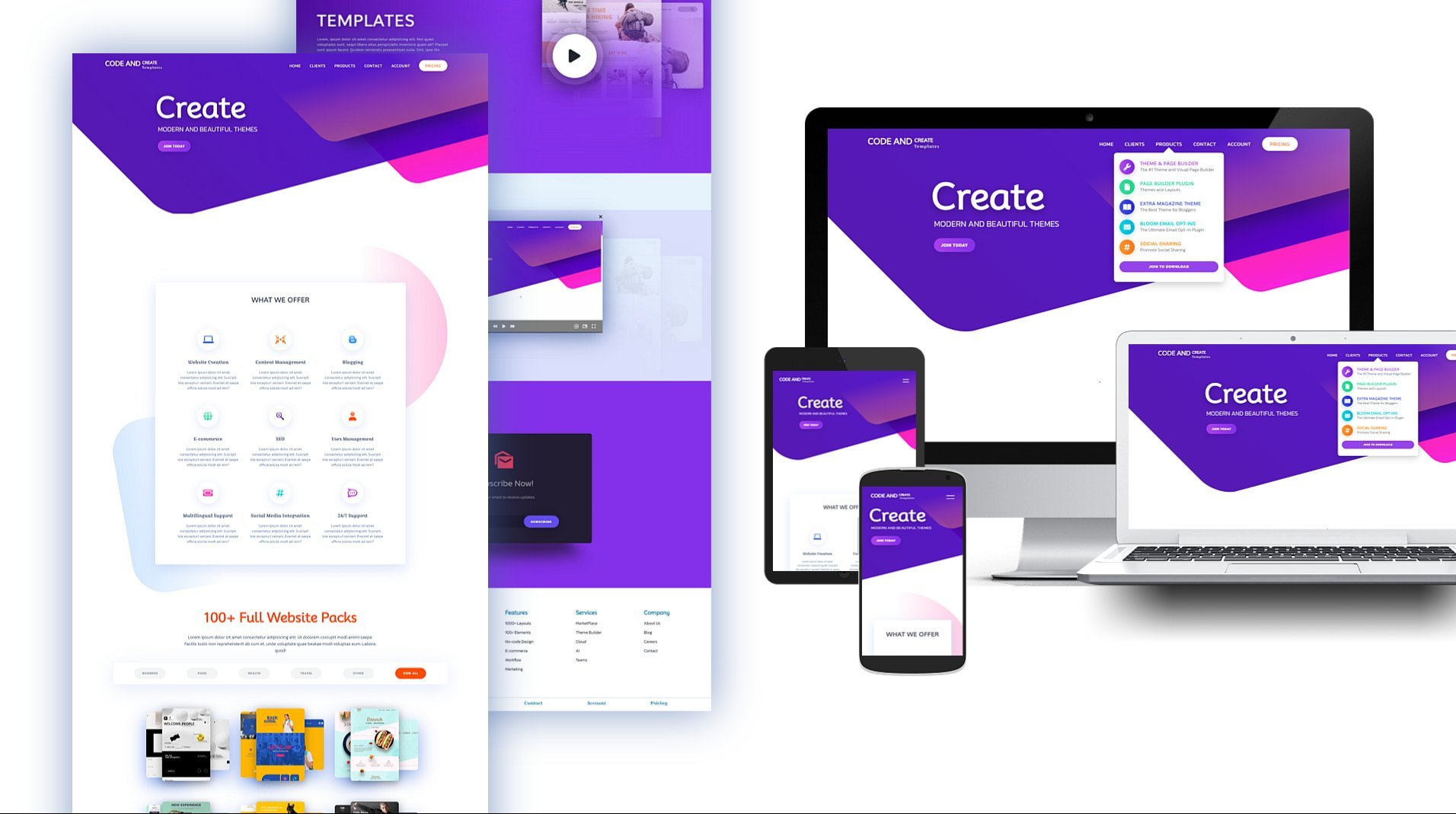
3. Project 1 - Project Preview: Alright, so once we have set
up all the needed tools, now we're ready to start to
build our first project. The project is going to
be about some foods. I mean, something like
selling different foods. And it will consist of a
couple of different sections. Before we start to
write the code, I'm going to go through the project and
describe each section. The first section is going to be the slideshow of different
Font, Awesome icons. Next comes the card section
in which we will have three different cards with 3D shapes and also with
some nice hover effect. Next comes the gallery. It consists of six
different gallery items. We have here images with
multilevel shadow effects. If we hover over them, then some information will display with pretty
nice and cool effects. After that, we will have
a simple filter with some text elements and an
input field with a button. Alright, so those are all the sections which
we're going to build. But besides that, we
have here a nice navbar. You can see here the Menu icon. If I click it, then
the number will display it from the top
side of the webpage. And the navigation
items will appear with some nice fade effects. If I click the icon back then
didn't albert will hide. Okay, so that's it
about the projects. We will build it using a
desktop force approach. I mean, it will be built on
extra large screen size, but then we will make it responsive to different
screen sizes. If I inspect the page and check the project on
different screen sizes, you will see that it's
responsive and looks good. One more thing to
note, as we said, the project is built on an
extra large screen size. So if you're using the relatively smaller screen
size than the project, might not look good
during the lectures. But you don't have to worry
at the end of the day, we will make it responsive. In the meantime, you can
use the responsive mode, set the width and height to 1920 pixels and 1080 pixels
and follow the videos. The last thing that I want
to mention is that you can download this starter
and final source files. They are attached to this
lecture. Let's move on.
4. Project 1 - Create HTML Markup for Landing and Define Common Styles: Alright, so we're ready to
start to build our projects. I've created a new folder on
the desktop called foods, in which I have another
folder for the images. Let's go ahead and open
this folder in VS code. The first thing that I'm
going to do is to create our working files for
HTML, CSS, and JavaScript. I'm going to call them
index.html, style.css, script.js. Then open the index.html file and create a basic
HTML document. For that, I'm going to use a built-in VS code
package called an image. We need to place urine
exclamation mark and hit Tab or Enter. So here we go. We have here the
basic HTML tags. First of all, let's go
ahead and change the title. I'm going to insert here Foods. Next, let's link CSS
and JavaScript files. So I'm going to open link tag. And then we need to specify
here the path of the file. We just need the name
of the file, style.css. As for the JavaScript, I'm going to open script tag right above the
closing body tag. And in the source attribute, we need to specify script.js. Besides that, I'm
going to bring in here one more link for
Font, Awesome icons. So let's go to the Google
and search for Font Awesome, CDN, JS, and grab the
first link from here. Then open a link tag
in the head elements and paste the link as the value of the h
reference attribute. Okay, So all three
files are connected and now it's time to run the
project to the browser. For that, I'm going
to use one of the VS code package is
called a live server, which allows us to run the project live
to the browser and make updates and changes without refreshing the page each time. Okay, finally, I'm going to place the text editor
and the browser, like so. And get started. We're going to build the
project section by section. We'll create the markup for each section and then
style each of them. I'm going to start with
the first section. It consists of the heading and a couple of Font Awesome icons, which as you can see,
are animating nicely. So let's go ahead and start
to create the HTML markup. At first, let's open
the div elements, which is going to
be the container. Let's assign to it a class
name container event. I'm going to insert your
comments section one. And section one. Then open section element
with a class, Section one. So as we said, this section
element will include the heading and a couple
of Font Awesome icons. So let's open the
H1 heading tag with the class section
heading. As the content. Let's insert a variety of foods. Next we need to insert
your Font, Awesome icons. But first, let's
open the div tag, which is going to be the
wrapper of these icons. I'm going to assign to it
class section one icons. So overall we will have
ten different icons. So let's go ahead and
create them quickly. I'm going to open, I tag with
the classes FAS, FAA egg. Then let's duplicate
this line of code nine times and quickly
changed the class names. The second one is going
to be Stroop waffle. Then we will have
cheese, hot dog. The next one is going
to be drumstick byte. Then we will have
apple out, ice cream. Next, we will have fish,
cookie and sibling. Alright, so that's it about the HTML markup of
the first section. Now we have to start
to write some CSS. Throughout this project,
I'm going to use one of the Google phones
called non-metal. So let's go to the
Google Fonts website and search for Nieto. Then I'm going to grab here all the styles except Italica. So let's check them. Then. I'm going to grab
the URL. For that. We need to click Import and
then copy this URL here. Let's paste it in CSS file. Alright, Next I'm
going to create a couple of common
and default styles. So I'm going to insert your
comments. Common styles. Then end of common styles. Then select every
element for that. I'm going to use an asterisk. So at first, I'm
going to get rid of the default margin and
padding from every element. Set both of them to zero. Then I'm going to
set box-sizing. Border-box. Also get rid off default on the lines
from the link elements. For that we have to use text-decoration.
We'll get value none. Then remove the default outline. We need to set it to none. Also, change the font family. Let's set it to new
Nieto sans-serif. And finally, change
the font weight. I'm going to make it 400. Alright, so as you can see, some of the common styles
are applied to the elements. The next thing that I'm going to do is to set the font size. So throughout this project, I'm going to use a ramp
as the measurement unit. By default, one RAM
equals 16 pixels, because the font size of the HTML element is
equal to 16 pixels. I'm going to convert one
ran into ten pixels. And in order to do that, we have to decrease the font
size of the HTML element. We need to make
it 62.5 per cent. So in this case, one RAM will be equal to ten pixels. Okay? So as you can see,
the elements became smaller and actually with a
common and default styles. We're done. Let's go ahead and
start to style section one
5. Project 1 - Style Landing Page and Create Slideshow: So I'm going to Customize
the section element itself. But at first, let's insert here new comments, section one. And off Section one. Then select Section elements. So first of all, I'm going to set the
width and height. Let's make with how did present.
That's probably height. I'm going to make it 100
per cent of the viewport. Therefore, let's set it 200 VH. Then change background color. Let's use your color 333. Okay, so it's can see this
Section one is extended to the entire page and it's
Background color is changed. Next, I'm going to place
the content in the center. And for that I'm
going to use flexbox. We need to set display
property to flex. Right now. Elements are placed
horizontally in a row, and actually we don't need it. So we have to change the flex direction
and Make It column. Next. In order to place the elements horizontally in the center, we have to use
align items center. So the elements are
placed in the center. And now I'm going to add
some space between them. For that, Let's use justify content property with
a value space evenly. Alright, let's sit
regarding Section element. Let's move on and
Customize the heading. I'm going to select it. First of all, let's set
font size to 12 RAM. Also change the font weight. I'm going to make
the heading bolder. Let's set it to 900. Also change the
color, make it white. And I'm going to align
the text in the center. After that, Let's make
your words capitalized using text transform capitalize. And also I'm going to
create some space between the letters using ledger spacing
with the value 0.5 rent. Okay, Finally, let's create
a little shadow effect. I'm going to use text shadow with a value is 0.3
RAM three times. And as the color, I'm going to add here, 000, which is the black hello. Alright, so the heading
is customized and now we have to move on and
take care of the icons. So let's go ahead
and select them. First of all, let's
increase the font size, make it 35 RAM, and then change the color. I'm going to use
your color, a 7982d. Okay, so we have here our icons, they are much bigger and
call it as remember, those icons should be placed in the center and we
have to animate them. First. Let's assign to
them position absolute. So right now I are placed
on top of each other. It happens because by default, position absolute jumps out the elements from the
normal flow of the page. Besides that, we need to fix
the positions of the icons. I think right now
would be better if we hide all the
icons except one, because it will make our working
process more convenient. So I'm going to comment all the icons out
except the first one. Right after that. Let's fix the
position of the icon. We need to place
it in the center. So we have to move it a little bit up and
to the left side. For that, Let's use
transform property with the translate function. Actually dysfunction allows us to move the elements
according to the horizontal or
vertical directions. I mean, according to x-axis
and y-axis. As the values. Let's Institute -50 per
cent for both directions. Alright, that's it about
the position of the icon. Finally, I want to add
to its shadow effect. So let's use again text shadow. Institute your point
to RAM or three times. Use again black color. Alright? So as can see, the icons are customized and now it's time
to create the Slideshow. First of all, let's get
back all the icons. So we're going to
hide and display the icons using the
scale function. At first, let's go ahead
and hide all the icons. By default, the scale function
has the value set to one. And in order to
hide the elements, we need to set the scale to zero So now the icosahedron. Next I'm going to
display the first icon because they Slideshow will
start with the first icon. For that I'm going to
assign to the first icon and additional class change. And then select the first I
can using this class name. We need Section one icons. I change. To make the icon visible. We need to set the scale to one. But besides that, we need to use again the translate
function because otherwise it would
be overwritten and the position of
the icon would change. Alright? The first icon is visible and all other I conserve, heat them. Now we have to create
the Slideshow, and for that I'm going
to use JavaScript. So let's go ahead and
open the script.js file. To switch between the icons. We have to remove an
edge class change to all the icons in order and
also with some interval. The first thing that we need to do is to select all the icons. So let's go ahead and
create new variable. I'm going to call the icons. That in order to select them, I'm going to use
one of the methods called query selector. All we need to specify here the class
name Section one icons, followed by the ion. So in general, query selector, all method returns an array-like object
called note least. Its items have zero-based
index numbers like array. Also, this object has a length property that
we will use a bit later. So as we said, we're
going to slide the icons with some integrals. I'm going to use one of the built-in methods
called setInterval. It allows us to run
the function over and over again with
some intervals. So this method takes
two arguments. The first one is going to
be a callback function, which will be executed
over and over again. As for the second argument
is going to be the amount of time and it should be
expressed in milliseconds. In our case, I'm going to set the interval as
4,000 milliseconds. Alright, as you
remember, right now, the first icon has class change. We have to select this icon to remove the
class change from it, and then add class
to the next icon. So let's go ahead and
create new variable. I'm going to call it icon. Then use query, select a method in order
to select the element. Let's select this element
using class change. After that, to
remove class change, we had to access the
classes of this icon. So I'm going to use one of the property is
called class list. It gives us all the classes
that the element has. We need to attach
it to the icon. And now we have to use one of
the methods called removed. Let's specify here
the class change. So now after 4 s, the item will hide because the class
change will be removed. Okay, next we need to display
and hide other icons. In order for that, we have to get access
to the next icon. In order to do that,
I'm going to use one of the properties called
next element sibling. Let's attach it to the icon. Then again, we have to access to the classes
of these elements. And finally, we have to
add to each class change. Actually, I want to show the entire cycle of the Slideshow and I
want to make it quick. So let's change 4 s into one. So as I see, the icons are changing
after each second. If I inspect the page and
display the elements, you will see how class change is added and
remote from each icon. Once it is removed
from the last icon, then we get an error saying that cannot read the property
class list of null. It happens because the last icon doesn't have any next sibling. To fix that problem, we have to do some
extra work when it tracks somehow each
switch of the icon. For that, I'm going to
create a new variable. In this case, I'm going
to declare it with a lead keyword because the value of this
variable will be changed. This variable is
going to be a counter and I'm going to set
it to one by default. So on each execution
of the function, on each change, this commentary
should increase by one. Once it is greater than
the length of the icons, we should set the
counter back to one. And also we need to display
backlit first icon. So in order to increase
the value by one, we have to use the
increment operator, which is expressed
by two plus signs. Next, we need to
create if statement. And as the condition, we have to check if I is
greater than icon's dot length. So if this condition is true, then it means that one cycle
of the Slideshow was over. So we need to display back the first icon and set
the counter to one. In order to access
the first icon, I'm going to use the
node list icons. And then we have to specify the index number
of the first icon, which is going to be zero. Then we need again class
least than the method add. And we need to specify here
the class name change. Besides that, we need to
set variable IBEC to one. Okay? So if this
condition is not true, that we need to run
this line of code. So let's create else statements and insert here
this line of code. Okay? So once the
entire cycle is over, then it starts again. You can see it
here in Dev Tools. Alright, we're almost
done with the Slideshow. The only thing that
will have to do is to add some transition effect. So let's use transition. Then. We need to specify
here transform. And as the duration I'm going to add here 0.3 s. Besides that, we need to add transition
down below as well. Because once the scale of
the ICD-10s decreased, the next coming icon should
wait 4.3 s. Therefore, we need some delay time. So let's Institute your 0.3 s. So now, as you can see, we have a much nicer effect. And the only thing that
I'm going to do is to change the time and make it 4 s. Alright, that's it. We are done with
the first section. Let's move on and take
care of the next one.
6. Project 1 - Create and Style 3D Cards: The next section
that we're going to create is going to
be the card section. We will have a section heading
and three different costs. They will represent
some popular meals. The cards will have 3D shapes, and also they will
include a couple of different elements like
images, names, and buttons. Once we hover over the cards, they will move up slightly
with some shadow effect. Alright, let's see
about this section. Let's go ahead and start
to create an HTML markup. Let's insert new comments, section two and section two. Then open section elements. I'm going to assign to
it class section two. Next, I'm going to create
an H1 heading element. Actually, this
heading is going to be similar to the previous one. They will have the same styles. So I'm going to assign to it the same class name,
section heading. As for the content, let's put here popular meals. So I'm going to grab this
towels of this section heading and paste it in common styles. Alright, so as we said, we will have three
different cards. I'm going to wrap them
with a div element, which is going to
be cards container. Next, I'm going to
open another div tag, which is going to
be the actual card. So it's assigned
to its class card. So as I said, the card will consist of
three different elements. The first one is
going to be an image. So it's open image tag. Then in source attribute, Let's select the image we
need here, card IMG one. And also I'm going to assign
to image class called IMG. Okay, Next we will
have the card name, which will be represented
by the heading. Let's open h3 heading tag
with a class called name. As for the content,
let's insert here. Let's say fish. Finally,
let's create here bottom. I'm going to assign to
it class called BTN. As for the content, let's make it a border now. Alright, so here we
have our first card. Also, you can notice that the heading is all over
this style because we add it to the same class
name, section heading. As we said, we will
have three cards. So I'm going to
duplicate the card twice and change the image names and also the names of the cards. So we need here img2, cake and then IMG
three, lobster. Okay, so let's see
about the HTML markup. Let's go ahead and
customize this section. I'm going to insert
new comments, section two and section two. Then select section element. So first of all, I'm going
to define width and height. I'm going to set way too hard
it present. For the height. I'm going to make it hundred
percent of the viewport. So let's 3,200 vh. And also change the
background color. I'm going to use
a new color too. Alright, next, I'm going to
align elements using Flexbox. I mean the elements heading and the
container of the cards. So we need here display flex. As you know, it places
elements side-by-side. So in this case we need
to change the direction. Let's make it column. And also I'm going
to create some space between the flex items
using justify contents. Space between. And finally, create
some space inside of this section using padding. Let's set it to ten rem at the top and bottom and zero
on the left and right sides. Alright, let's see about
this section element. Next, I'm going to take
care of the cards. First of all, let's
select the container. I'm going to place cards
side-by-side in a row. For that. Again, I'm going to use flexbox. Then in order to create some
space between the items, I'm going to use justify contents with a
value space evenly Alright, so the cards are
placed horizontally in a row, and now I'm going to
customize the card itself. Let's select it. At first. I'm going to define width. Let's make it to run. And then change the
background color. I'm going to use
your color a 79, a to D. Right now
as you can see, the images are too big. So let's go ahead and fix that. I'm going to select Image. And then let's set
its width to 100%. In this case, the image
will take up 100 per cent of the wave of
its parent elements, which is the card. Okay, so now we have
a much better result. Let's move on and continue
styling the card. I'm going to create
some space inside of the card using padding. Let's set it to for
RAM on all four sides. Then I'm going to align
elements using Flexbox. Let's set display
property to flex. Also, we need to change the
direction because by default, display flex aligns elements
horizontal in a row. Then let's create
some space between the items using justify
contents. Space between. And lastly, in order to align the items in the
center horizontally, Let's use the align
items center. Alright, lastly, I'm going to
create some shadow effect. Let's use box shadow with the values one RAM three
times and with a black color. Right now, That's it
regarding the card. Let's go ahead and customize
its name and the button. At first, let's
select card name. I'm going to increase font size. Let's make it three RAM. Also change the font weight. I'm going to make
the text bold color. Let's assign to it a 900. Also transform text into uppercase and create some space between the letters using electric spacing with
the value 0.5 ramp. After that, I'm going
to change its color. Let's use here 111. And also create some space at the top and bottom using margin. I'm going to set
margin to RAM zero. Alright, Finally, let's
create a little shadow effect using text shadow.
Let's interfere. 0.15 ran three times. And then again the black color. Alright, that's it
about the card name. Let's move on and
customize the button. Let's select called btn. First of all, I'm going
to set its width to 70%. Then I'm going to change
the background color. Let's use here 111, also change the
color of the text. In this case, I'm going
to use color or 888. And then I'm going to
make the corners of the box and rounded using border-radius with
value five ran. Right. After that. I'm going to take care of the text of the button. Let's change the font size, make it 1.5 RAM. Also, I'm going to
increase the font weight. Let's set it to 800. Then create some space
between the letters. Let's set it to point to ram. Next, I'm going to capitalize
the words using text, transform capitalize, and also get rid
off default border. Let's set it to none. Right? So the button looks good, but we need to add to it
a couple of more styles. I'm going to create space inside of the button
using padding. Let's set it to 0.5
rem at the top and bottom and zero on the
left and right sides. Next I'm going to change
the type of the cursor, make it pointer, and
also create some shadow. In this case, I'm going to
create it on the left side. For that, I'm going
to insert u -0.2 RAM, then again minus point to
RAM than point to ramp. And the black color. When you want to create a shadow
on the left side, then you have to use
the negative values. Alright, so the button
is customized and now it's time to give
the card 3D shape. For that, I'm going to use before and after
pseudo elements. Let's go ahead and start
with the left side. I'm going to use before
pseudo elements. First of all, we need to define the content which is
going to be empty. Then I'm going to change
the height and width. I'm going to set height
to 100 per cent. For the width, let's
make it one RAM And then change the
background color. I'm going to use
your color 817824. Okay, so right now the
element is not visible. And to fix that, I'm going to set its
position to absolute. Besides that, we need to set the position of the
card to a relative. We need that in
order to position the before pseudo element according to its parent element. So now the element is visible, but we need to
change its position. We need to place it on the
left side of the card. So let's go ahead and
define top property. Let's set it to zero. Also, we need to
define left property. Let's make it minus one ran. So now the position of
the element is fixed, but as you can see, we need
to skew it a little bit. Let's use transform property
with the skew function. In this case, we need to skew
the elements vertically. So we need to use here y-axis. Let's kill the elements
by 45 degrees. Alright, so the
element is skewed, but still it's position
is not correct. It's slightly missed by
default when we use transform property than the element
moves according to its center. So the origin of transformation
is set to the center. But in this case, we need to
change it and make it right. So now let's consider
the problem is fixed. The element is
positioned perfectly. And the last thing that
I'm going to do is to add to it a little
shadow effect. Let's use box-shadow with
the values -0.1 RAM. Then again -0.1 RAM that we need to 0.1 rem
and the black color. Okay, That's it
about the left side. Now, I'm going to take
care of the top one. And for that, Let's use
after pseudo elements. Actually we need to use
the same properties for the pseudo element as well, but with different values. So I'm going to
duplicate this code here and then I'm going
to make some changes. So we need to make
the height one RAM. As for the width, it's
going to be 100%. Next, let's change
the background color. In this case, I'm
going to use 8f83, 17. Then let's live position
absolute as it is. As both the top and
left properties, we need minus one RAM as the
value of the top property. As for the left property
is going to be zero. Alright, next comes
the transform property with this Q function. In this case, we need to scale
the element horizontally. Therefore, we need
to use here x axis. As for the transform origin, we need to make it bottom. Also, let's leave
box shadow as it is with the shape of the cards. We are done. Finally, I'm going to
create a hover effect. Before that, I'm going to rotate and scale the code a little bit. So let's use the
transform property. I'm going to rotate vertically
according to the y-axis. Let's insert your 20 degrees. As for the skew function, I'm going to skew the
elements horizontally. So we need here x axis. Let's interfere
minus two degrees. Alright, now I'm going to
create a hover effect. So once we hover over the card, we need to move it slightly up. We need transform. Again with the rotate
and scale functions. We need here 20 degrees and
then minus two degrees. And also we need to add here Translate function with the
y-axis and as the value, Let's interviewer
minus three ramp. Besides that, I'm
going to change the shadow effects on hover. So let's use box-shadow with two ramp three times
and with a black color. Okay, So once we
hover over the card, then they will move up and
also the shadow will change. Actually, those things happen
without any smooth effect. And in order to fix that,
Let's use transition. We need to specify here
transform with a duration 0.5 s. And also we need a box shadow with
the same duration. Alright, so the transition
effect works fine, and actually we are
done with this section. Let's move on and take
care of the next one.
7. Project 1 - Create and Style Foods Gallery: The next section is going to be the gallery in
which we will have six different food images
with some nice effects. Each image will have
several colored shadows. When we hover over the image, then some information will display like the
name of the food, some description and
two different lines. The image itself will
have some blurry effect. And also the shadow of the
image will extend nicely. And all those defects
will happen smoothly. Alright, let's go
ahead and start to create the HTML markup. As usual, let's insert new
comments, section three. And of section three. That open section element assigned to each
class, section three. Next minute here, the
heading of this section, which will be similar to
other section headings. So I'm going to copy it
from the previous section and then I'm going to
change the content. Let's insert here gallery. Alright, so overall we will
have six calorie items. They will be represented
by the link elements. And before we create them, I'm going to open div tag, which is going to be the
wrapper of those links. I'm going to assign
to the class gallery. Next I'm going to
open the link tag, which will have
class gallery link. Besides the class attribute, I'm going to use the
title attribute as well. It allows us to display some text once we
hover over the link, let's insert your order now. Alright, so each link
element will consist of an image heading
and the paragraph. Let's open the
image tag and then select Gallery IMG one
from the images folder. Also am going to assign
to image class food IMG. Next comes h3 heading elements. Let's assign to the class
food name as the contents. Let's insert your pancakes. And finally, I'm going to insert your paragraph with a
class full description. And as the contents,
I'm going to put here some dummy text. Okay, so here we
have the first item. As we said, overall, we will have six of them. So I'm going to duplicate
the link element five times and then
make some changes. We need here, img2. And the name is going
to be cupcakes. Then we will have AMG or three. Harmless. Then for the fourth item, I'm going to insert
here hamburger. The next one is
going to be Sahlman. As for the sixth item, I'm going to eat
your vegetables. Alright, so that's it
about the HTML markup. Now, we're ready to
start writing some CSS. I'm going to create new
comments, section three. And section three. Then select section elements. At first, I'm going to
change the background color. Let's make it dark
gray using color 333. And also I'm going to
create some space inside of this section at the
top and bottom of it. Using padding with the value
is five, rem, and zero. Alright? Before we start to
customize the gallery, I want to take care of
the size of the images because right now
they are too big. So let's select Image. I'm going to set with 220, 4% of the view-port
off the width. As for the height,
I'm going to make it 15 viewport width. I mean 15% of the
viewport width. And also I'm going to
use object feed cover, which will allow us to maintain
the quality of the image. It won't be stretched. Alright, then select Gallery, I mean the container
of the links. So overall we will have six links and I'm going
to place them into rows. I'm going to do
that using flexbox. We need to set display
property to flex. And also in order to place
images on two roles, we need to flex wrap
with a value wrap So now the images are
placed in two rows. Next, I'm going to place them in the center and also create
some space between the images. So in order to place
them in the center, we need to align items center, and to create some space
between the images, we need to justify
content space evenly. Finally, I'm going to create some space between the
heading and the gallery. Let's use margin top
with the value ten ramp. Alright, so with the
layout, we are done. Let's go ahead and customize
the elements of doing. Let's go ahead and start
with the foot names. So the name of the foot
should be played at the top-left corner
of the image. So I'm going to set its
position to absolute. Then we need to set the position of the link elements to relative because it is a parent element and we need to position
heading according to the link. And then set the top
and left properties for the food name to three ramp. I mean, both of the
properties. Alright. So headings are positioned
in the right way. Let's go ahead and
customize them. I'm going to change
the font size. Let's make it to Ram. So let's increase
the font weight. I'm going to set it to 700. Then let's transform
text into uppercase. Create some space between
the letters using letter spacing, 0.1 RAM. And lastly, change the
color, make it white. Okay, That's it
about the heading. Next, I'm going to
customize the paragraph. So let's go ahead and select it. First of all, I'm going to define its
position as absolute. And then I'm going to define
bottom and left properties. I'm going to set button property two or three, viewport width. As for the left property, I'm going to make it to random. So the paragraph is positioned. But as you can see, the layout of the gallery is messed up. I'm going to fix that. Let's go ahead and create
some space between the links using margin. I'm going to make it for
rem at the top and bottom and one rem on the
left and right sides. Alright, so now the
problem is fixed. Let's move on and add some
more styles to the paragraph. Next, I'm going to define
width and make it 70%. Then let's change the font size, make it 1.5 RAM, and also change the font weight. I'm going to make it
a little bit lighter. Let's set it to 300. After that, let's create some
space between the letters, make it 0.1 RAM. Also, I'm going
to transform text into uppercase N. Finally, change the color, make it white. Alright, so with a
paragraph, we are done. It is styled. And now I'm
going to create two lines. One under the heading and the second one on the right
side of the paragraph. I'm going to create
those lines using before and after
pseudo elements. At first, let's create a line on the right side
of the paragraph. Let's use the before
pseudo elements. First of all, we need
to define the content. Let's make it empty. Then I'm going to set the
position to absolute. And in order to make
the line visible, let's define a width, make it a point to RAM. Also, we need to set height to 80 per cent and then change the background
color, make it white. So the line is feasible, but we need to
change its position. We need to place it on the
right side of the paragraph. So let's set top position
to, to viewport width. As for the left property, I'm going to make it 80%. Alright, let's see regarding
the before pseudo elements. Now, I'm going to
create a second line. Actually both lines will
have the same properties. So let's go ahead and duplicate this code and then
make some changes. I'm going to change
the top position. Let's make it 30%. Also. We need to change
the left property. Let's set it to, to run that, I'm going to change the width. Let's make it 90%. As for the height, it's
going to be point to ramp. Alright? So the lines are created and actually all the elements
are almost customized. The only thing that I'm
going to do before we create a hover effect is to create
a multilevel shadow effect. In order to do that,
we just need to use box shadow property with a
multiple values like so. I'm going to create the first Shadow. Let's insert your 0.3, 0.3 RAM than 0.1 RAM, and the color E9
to nine to nine. So the first shadow is created, then go ahead and
create the next one. I'm going to insert
here 0.5 rem, 0.5 rem 0.1 RAM, and the color A2 e946. Then the next one is
going to be 0.7 rem, 0.7 rem, 0.1 RAM. And they call up to 97 CE nine. That's probably last one. Let's make it 0.9 ramp. 0.9 ran 0.1 RAM and
the color e92 999. Alright, so here we
have the shadows, and now we're ready to
create a hover effect. By default, those elements
should be hidden. So let's start with the heading. I'm going to make
its width zero. And also, we need to use your overflow property
with the value hidden. So the heading is hidden. Next, I'm going to
hide the paragraph. In case of paragraph, I'm going to use juice
opacity with value zero and also visibility hidden. So as you can see, the
paragraph is hidden as well. And now I'm going to
hide those two lines. I'm going to set height to
zero for the vertical line. As for the horizontal line, let's set its width to zero. Alright, so all the
elements are hidden, and now we can create
a hover effect. I'm going to start
with the lines because they should
appear firstly. So let's select gallery
link with hover, followed by the before
pseudo element. We need here to set
height to eight per cent. Let's duplicate this code. I'm going to change
before and after. And also instead of height, we need width with the
value nine per cent. Besides that, in order to
make the effect smarter, we have to use transition. We need here height 0.5 s. And also in a transition with 0.5 s. Okay, so once we hover over the image, tangent lines will
appear nicely. Next I'm going to
display the heading. So let's go ahead and select
gallery link with hover, followed by the food name. As remember, we decreased the size of the heading to zero. So we need to set
with 200 per cent. Also in order to make the
effect smoother, again, we need transition
with the values with 1.5 s. And besides that, we need here some delay time because at first the lines should appear and
then after that, we have to display the heading. So let's set the delay
time 2.5 s. Actually, this transition
effect will happen once we hover over the image. So as you see, the
heading is starting to display once
the lines appear. But when we mouse out than the heading
immediately heights. And in order to fix that, we need another transition, which should be part
of the heading itself. Let's set with 2.3 s. Okay, so now
everything works fine. Let's move on and do the
same for the paragraph. Let's select gallery
link with hover, followed by the
food description. So right now the paragraph has opacity zero and
visibility hidden. And now we need opacity
with the value one. Visibility visible. Also, we need here
transition opacity than the duration one
seconds and the delay time, but in this case 1 s. And in the exact same way we need to use the
second transition. We're going to pass opacity
with a duration 0.3 s. Alright, so the power
of group works fine. And now we have to move on
and take care of the image. As first, let's change
the shadow on hover. So let's go ahead and select again gallery link with hover. Then we need food image. Actually, I'm going to
copy this code from here and just change the values. We need here, 1 g twice. Then for the second
shadow we need to run. Then the next one is
going to be three RAM. Then for the last one, we need for RAM. Besides that, again, we
have to use transition. Let's interfere all and the
duration 0.5 s. Alright, so as you can see, the shadow is changing once we
hover over the image. Of course that's
not all we need to add a couple of more
things to the image. We need to make it blurry. And for that, we have to
use one of the properties called filter with
the blower function. Let's use blue and the value, I'm going to place
your 0.5 ramp. So as you can see, the
image becomes blurry. And once we hover over it, we can make this
effect much nicer if we decrease the
opacity of the image. Let's make it 0.5. Alright, so now we have
a much better results. And the only thing that we
need to do is to increase slightly the scale of
the image on hover. For that, Let's use Transform. With the scale function. I'm going to increase the
scale of the image to 1.1. Alright, so we're almost done. Everything works perfectly. But we have here a tiny issue. As you can see, the
vertical line is not quite visible because it ended
up behind the image. So in order to fix that, we have to use the
z-index property. Let's make it higher than zero, which is the default value. I'm going to make it ten. Alright, so that's it. We are done with the gallery. I think it looks really nice. We used here a couple
of cool effects, so I think you'll like it. Okay, now it's time
to move on and take care of the next section.
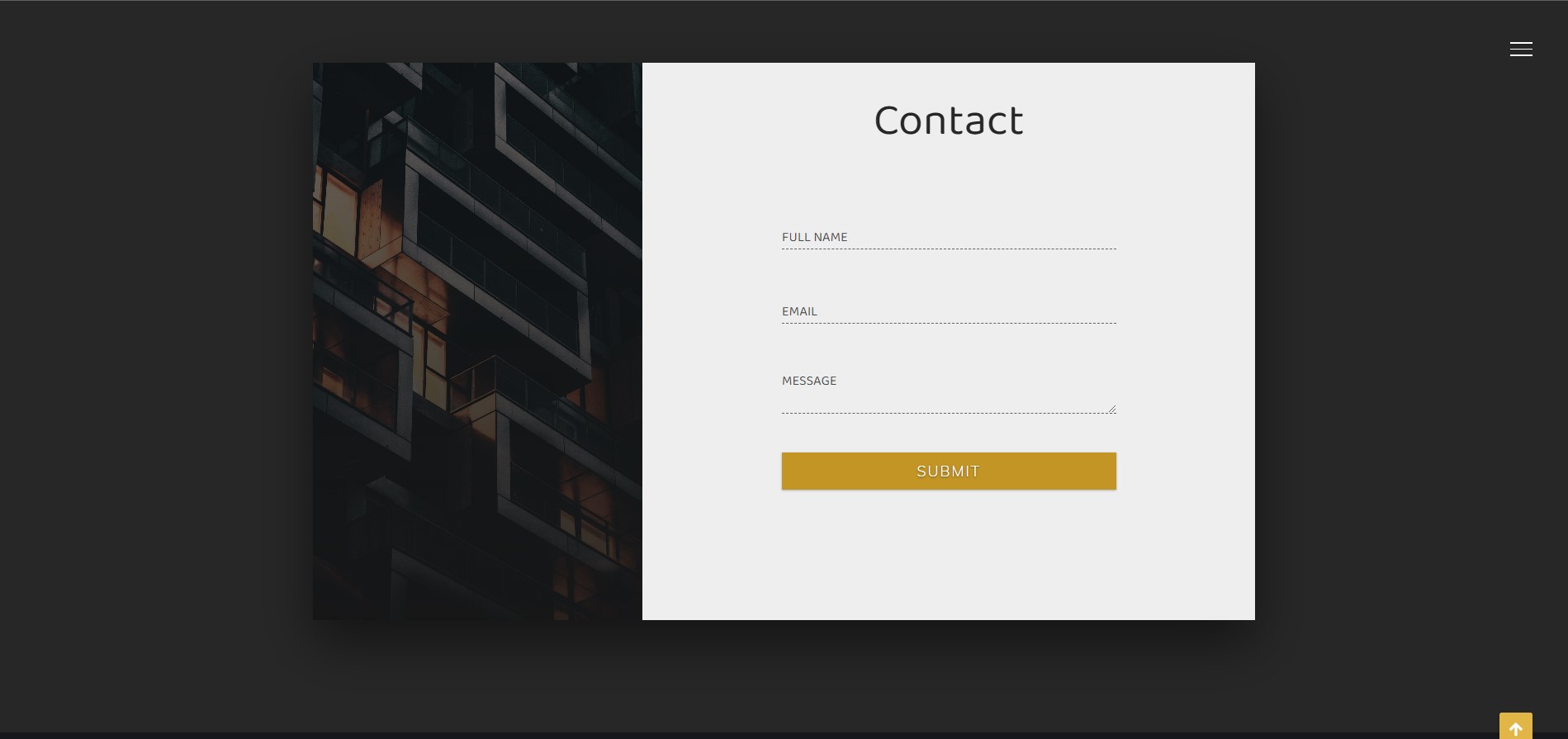
8. Project 1 - Create and Customize Footer: The next section is
going to be the footer, which will be a simple one. We will have a
heading paragraph, inputField with a button and some copyright
text down below. Let's go ahead and start
to write the HTML markup. I'm going to insert your
new comments section for end of section four. Then open section element
with a class, section four. So overall we will have three different parts
and the footer, the first one is going
to be the heading and the paragraph which are
placed on the left side. Let's open div element, which is going to be the
wrapper of those two elements. I'm going to assign to it
class section for text. Then open the H2
heading elements with the class
section for heading. And as the contents, I'm going to institute sign
me up for the paragraph. It should have class
section for paragraph. And as the contents, I'm going to instruct you be the first to know about
new products. Alright, so that's it
about the first part. The next one is going to
be the formed elements, which will include the input
element and the bottom. So it's open form with
the class sign-up form. Then I'm going to insert your
input with the type e-mail. Next, I'm going to insert your
class sign-up form inputs. And also let's use placeholder attribute with a value,
enter your email. Alright, that's it about the
inputs next Columns button. Let's set its type
to submit and also assigned to each class attribute with a value
sign up form BTN. Actually, the button will be represented by the
Font Awesome icon. So let's open I elements
with the class names FAS, FAA, arrow, right? Okay, That's it about
the form elements. Finally, I'm going to create the paragraph for
the copyright text. So it's open p element
with the class copyright. And then as the contents, Let's insert code and create, followed by the copyright sign. I'm going to use here HTML5, entity, ampersand, copy,
semicolon, and then Insecure. All rights reserved. Alright, so with
the HTML markup, we are done and we can
customize this section. Let's insert new comments
in the CSS file. We need to section four. Section four. Then
select section elements. At first, I'm going to
define width and height. Let's set with 200 per cent. As for the height,
I'm going to make it 30% of the viewport. And also change the
background color. Let's use here called 222. Okay, next I'm going
to take care of the layout of all three parts. I'm going to use Flexbox. Let's set display
property to flex. And then in order to
create some space around the items I'm going
to use justify content with value space around. And also besides that, I'm going to create
some space at the top and bottom inside
of this section. For that, Let's use padding with the values three, rem, and zero. Alright? So right now, all three parts are placed
horizontally in a row, but actually we don't need that. I'm going to place the
copyright paragraph at the bottom of this section. So let's take care
of exposition. I'm going to assign to
each position absolute. Then in order to align the paragraph according
to its parent element, I'm going to set the position of the section element
to a relative. And after that, let's define
the bottom position of the paragraph and
make it three rounds. Okay, with the
layout we are done. Let's go ahead and start to customize each of the elements. I'm going to select the
wrapper div elements. Let's assign to
it text transform uppercase because we
need both elements, I mean the heading and the
paragraph to be uppercase Next I'm going to take
care of the heading. So let's select it. I'm going to increase
the font size. Let's make it full RAM. And also make the text bold or using font weight
with a value 900. And finally change the color. I'm going to use
your color H7N9, A2. So they're heading. Looks good. Let's move on and
start the paragraph. Let's select it.
Change the font size, make it 1.5 round. As for the color, I'm going to use 888. Alright, that's it
about the first part. Let's move on and take
care of the form element. Inside of the form element, we have an input and button, and I'm going to place
them side-by-side. For that, I'm going
to use flexbox. And also in order to
center both elements, particularly, let's use
align items center. So right now we have a
little problem here. As you can see, the form element ended up a little bit down. And to fix that, I'm going to assign to the section elements, align items property with
the value flex, start. In this case, both
flex items will end up at the top
of the container. Alright, let's go ahead and
customize the input element. Let's select it. First of all, I'm going to define
width and height. Let's set with 235 ran. As for the height, I'm
going to make it five RAM. Create some space inside of
the input using padding. Let's set it to one rem on all four sides and also
change the border. I'm going to interfere point
to ram solid color a 7982d. Okay, Next, let's take
care of the text. Let's change the font size, make it 1.6 RAM. Also make the texts slightly bolder using font weight
with a value of 700. Next, I'm going to create
some space between the letters using
letter spacing 0.1 RAM. And also change the color. Make it again a 79
a to D. Alright, that's it regarding
the input elements. And before I
customize the button, I'm going to change the color of the placeholder attribute. So let's select input
element followed by the placeholder and
assigned to it color H7N9, a to D. Alright, now it's time to take care
of the button at first, let's change its position. I'm going to set its
position to relative. We use here position relative because we need to
use left property. And in case of static position, which is the default one, we can access this property. Let's set left property
to -4.5 random. Okay, so the button is positioned and now we
need to customize it. First of all, let's define
the width and height. I'm going to make
both of them for RAM. Then change background
color, make it 333. And also change the color. You use again H7N9 a to D. Okay, So the button
already looks good, but we need to add to it
a couple of more styles. I'm going to get rid
off default border. So let's set it to none. Then increase the font size, make it 1.8 RAM. And also change the type of
the coarser, make it pointer. Alright, that's it about
the form elements. Now we need to customize the last element
in this section, which is the paragraph. So let's change the font size, make it 1.7 run. Also, I'm going to make phoned lighter using font-weight
with the value 200. Then change the
color, make it e. And also create some space
between the letters. Let's make it 0.1 ran. Alright, next I'm
going to create the border at the top
of the paragraph. So let's use border top property with the values
point 1 g, solid. And as the color, let's use 888. And also let's create
some space using padding top with
the value six ran. The border is created,
but as you see, it's extended according to
the width of the paragraph. We need the border to take up the entire width of the page. So I'm going to increase
the width of the paragraph. Let's set it to hundred percent. Now the size of the
border is increased, but the paragraph has
ended up on the left side. And in order to fix that, Let's use text align center. Alright, so with the
footer, we are done. Next, we have to take care of the navigation.
So let's move on.
9. Project 1 - Create and Style Fixed Navbar: Navigation is going to be a
kind of an interesting one. As you can see by default, it is hidden and
the Menu icon is displayed at the top
left corner of the page. It has a fixed position. Once I click it, then the number will display
from the top nicely. And all the navigation items will appear with
some fade effect. Also, if I hover over them, then they will change the color. If I click the menu icon back down in Alberta will hide again. Let's see what we
are going to create. So let's go ahead and start
with the HTML markup. I'm going to write it
before the container. Let's insert new comments. Now bar. And of Navarre. Then open HTML5 nav elements
with the class now par. So overall we will have five
different navigation items. They will be represented
by the link ions, and each of them will include a Font Awesome icon
with some texts. Okay, Let's open
the link elements with the class now per link. Then into here, I element
with a class is FAS a home than the
Font Awesome icon will be followed by
the span elements. Let's insert here home. Okay, So overall we will
have five navigation items. Let's go ahead and duplicate the link element
four times and then change the class names and also the content of
the span elements. The second one is
going to be utensils. And as the content,
Let's write meals. Then we will have hamburger. The item is going to be burger. Then the next one is going
to be pizza slice pizza. And the last item is going to
be bland or phone contact. Alright, so here we have
the navigation items. The only thing that have to
do is to create a div element for the Menu icon that's
assigned with Class Menu. Actually this element
is going to be empty. We will customize it from CSS. That said, regarding
the HTML markup, Let's go ahead and
start to write CSS. I'm going to insert
new comments right after the common
styles we need here, navbar and of Navarre. Then select enough elements. And first of all, define width and height. I'm going to set width to 100%. As for the height,
let's make it 14 RAM, and also change the background
color, make it black. Okay, so here we
have the navbar. Actually it should be fixed. So we need to set
its position to fixed and also make
the top property zero. Alright, so if I
scroll down the page, then the number will maintain
its position as fixed. As you can see, once
we scroll down then some of the elements and
up on top of the navbar. And in order to fix that, I'm going to use
the index property with some higher
value, let's say 100. So now the problem is fixed. Let's move on and take care of the layout of the
navigation items. For that, I'm going
to use Flexbox. Let's set display
property to flex and then center items horizontally and so vertically using
justify-content center and align items, center. Alright, so the items are
placed in the center. And the last thing that
I want to do about the nav element is to create
a little shadow effect. Let's use box shadow. That seems to point to RAM
three times and as the color. Let's use black. Okay, So within that
element, we are done. Let's move on and customize
the link elements. Let's select now per link. First of all, I'm going
to change the color. Let's make it light
gray using color AAA. And also, I'm going to create some space on
the left and right sides using margin with
a value of 0.4 ramp. Alright, Next let's customize the I elements and
also the span. I want to make them bigger. So first of all, I'm going to
select Font, Awesome icon. Let's increase its font size, make it seven RAM. As for the span element, Let's change its font size. 2.5 RAM. Then I'm going to
make items bolder. Let's set font weight to 900. Also, I'm going to
create some space between the letters
using letter spacing, the value 0.5 RAM. And then create some space at the top using margin
top 0.5 round. Alright, so let's consider the navigation items
look much better, but we need to
change the layout. I mean, we have to place, I can end the span element
on top of each other. So for that, let's use flexbox. Then. In order to place
elements in the column, we need to change the direction. Let's make it column. And then place items
in the center. I mean both vertically
and horizontally. Use justify-content center
and align items center. The navigation items look nice. Before we move on and
customize the Menu icon, I want to create a
little hover effect. Once we hover over the items, I want to change
the color slightly. So let's select an
Albert link with hover and change
color, make it white. Besides that, in order to
make the effect smoother, Let's use transition with
the values color and 0.3 s. Alright, that's it. Right now, within navigation
items we are done. Let's move on and
customize the Menu icon. First of all, I'm going to
define width and height. Let's set width to fall RAM. As for the height, I'm
going to make it six RAM. And also change the background
color, make it black. So right now the
menu icon is not visible because it is
placed behind the navbar. So I'm going to place
it a little bit down, like the navbar menu icon should have a fixed
position as well. So let's set position to fix. Then define top property, make it 15 RAM. As for the left property, I'm going to make it five ramp. Alright, so now as you can see, the menu icon is visible. Next, I'm going to take
care of its shape, will change its shape
using border-radius. Actually, you can define different border radius
on different sides. Let's use border-radius. The first value belongs
to the top left corner. I'm going to make it 30 RAM. Then the next one is
for top right corner. Let's make it through
to ram as well. Then we will have
bottom right corner. I'm going to make it 15 RAM asphalt the
bottom left corner. Let's make it 15 RAM as well. Okay, so as you can see, the shape of the menu
icon is changed. Next, I'm going to add to
it a little shadow effect. So let's use box-shadow. That's Institute 0.13
times with a black color. And besides that, I'm going
to add here another shadow, but on the left side. So I'm going to use here 0.1 ran twice with the minus sign, then 0.1 RAM, and
again the black color. And lastly, let's change the type of the cursor,
make it pointer. Alright, that's it,
about the Menu icon. Next I'm going to create a line which is going to
be the part of the icon. And we'll create it using
the before pseudo element. So let's use before. First of all, define
content, make it empty. Then I'm going to
set, we can hide. Let's make with 0.3 RAM. As for the height, I'm
going to make it 15 ramp, then change background
color, make it black. And also set the
position to absolute. So the line is visible. As you can see, we have
to fix its position. Let's set the top position, two -15 RAM asphalt
the left position, we need to place the
line in the center. The width of the line
is equal to 0.3 RAM. We need to move it to the
left side by 50 per cent. But also we need to take
into account the width of the line in order to
center it perfectly. So to do that, I'm going to use calc function, where we should calculate
50 per cent -0.15 RAM, which is the half of
the width of the line. So again, in this case, the line will be
perfectly centered Okay, lastly, let's add some
shadow effect to the line. Use box-shadow with
the values 0.1 RAM, zero, then 0.1 RAM, and the black color. Okay? So with this
style we are done. Now we have to make
the nap or work. And for that, I'm going to use a little bit of JavaScript. Before that, I'm going
to place him now bar and the Menu icon in their
default positions. I mean, when they now
pore is hidden and the Menu icon is placed
a little bit up. Let's change the top position of Naropa and make it -14 RAM. As for the Menu icon, we need to change its position, the top position, and
make it one round. Alright, so everything is
ready to make up our work. We're going to attach a click
event to the Menu icon. So let's go to the
JavaScript file and select menu using
querySelector method. Next we need to attach to
it add event listener. It takes two arguments. The first one is the
type of the event. In this case we need clique. As for the second argument is going to be the
callback function, which will be executed
once we click the element. Now we need to select it
now pore and the Menu icon, actually we can do
that separately, but would it be
better if we assigned to both elements the same class, and then select both of
them simultaneously. So let's assign to
them class target. Now, in order to select in
Napa and the Menu icon, I'm going to use the query
selector all method. Then inside the parenthesis
as the class name, I'm going to specify targets. So we're going to add some new styles to both
elements once we click the icon and then get rid of those styles on
the next click. For that, we need to look
through the node list which is returned by the query
selector all method. We have to add to each elements a new class using toggle method. After that, we will define new styles using
this class from CSS. So in order to look
through the node list, I'm going to use one of
the array helper methods called for each. Actually forEach method
takes one argument, which is a callback function. And this function
will be executed for each item in the node list. So let's insert here
an arrow function. This callback function
itself takes one argument, which is the current
item in the list. Throughout the loop, I'm
going to call it item. So now as we said, we need to add to both elements a new class using
the toggle method. For that, let's use one of the properties
called class list. We need to attach
it to the item. It gives us all the classes
that the element has. And also it allows us to access different methods in order to manipulate the
classes of the element. In this case, we need
to use a toggle method, which allows us to add class to the element
if it doesn't have it, and remove class if the
element does have it. Okay, now we have to pass
here the class name, let's call it change. That's it about JavaScript. Now we have to write some CSS. But before that, I'm
going to show that both elements are getting
a class change onClick. So if I inspect the page
and display the elements, and then click the icon, you will see that both
elements get classes. If I click again, then they will be removed. Okay, now we have to define new styles using class change. Let's select the
menu with change. So once we click the icon, we need to move it down. Let's change its top position, make it 15 RAM. So if I click the icon, then it will move down. And the next week it
will move up again. Let's make this effect smoother. Transition. With a
value is top and 0.4 s. Now it's can see we
have a much better result. Next I'm going to
display the navbar. So let's select it
using class change. I'm going to define
top position. Let's make it zero. And also use transition
for smooth effect The values top and 0.4 s. So if we click the icon than the
novel will display smoothly, and then it will hide
on the next click. In order to make this
effect a little bit nicer, I'm going to add some delay
time to the Menu icon. Let's add here 0.2 s. Now the icon is
moving with some delay, but that's not what we want. We don't need the delay
time on the next clique. So I'm going to use
another transition, but with class change and
without any delay time. Okay, now we have
a better result, but still it's not what we want. We need delay time
within now port as well. So let's go ahead and add a new transition with a value is top 0.4 s and 0.2 s, which is the delay time. Alright? Now as you can see,
everything works perfectly. The only thing that had
to do is to display navigation items with
some fade effect. First of all, we need
to hide all the icons. So let's set opacity to zero. Then we need to
display items onclick, but with different delay time. So we need to select the
number link with class change. Let's set opacity to one. And after that, we need to
define transition property for each navigation item
with a different delay time. Let's go ahead and start
with the first item. We need. Again change. Then, now put link followed by the nth child selector
as the value. Let's interview one. It means that we have selected
the first Nobel link. So as we said, we need
here transition with opacity 0.4 s. And
as the delay time, let's insert your 0.5 s.
Overall we have five items. So let's duplicate
this code four times and change the values. For the second item
we need 0.6 s. Then the next one
is going to be 0.7 s. For the fourth item, I'm going to pass here 0.8
s. And for the last item, Let's make delay time 0.9
s. So if I click the icon, then the navigation items will appear nicely with
some fade effect. Actually, we are almost done. We have here tiny issues. If I hover over the items, then we will no longer have
a smooth hover effect. And also when we close the novel items height
without transition. The reason for the
first issue is that the old transition of
Navarre link is overwritten. So let's go ahead and
add a transition, I mean, color to all
the items down below. Let's make the duration 0.3
s. As for the second issue, we need to add opacity to
the Navajo link by default. Let's make the duration
points 2 s. Alright, so now everything
works perfectly. And finally, we are
done within now where actually we have finished
building this project. The only thing that
have to do is to make it responsive to
different screen sizes.
10. Project 1 - Make Project Responsive: So as we said at the
beginning of this project, it is built on an extra
large screen size. I'm in the screen size with 1920 pixels width and ten
ADB, those of height. Now we're going to make it responsive on different
screen sizes. We have to create a couple
of different break points. And we'll make the
project responsive using CSS media queries. I've already prepared
the break points on which we have to
make some changes, so I'm not going to
waste time finding them. Okay, Let's go ahead
and inspect the page. And then switch to
the responsive mode. So as you can see, the width and height are set
to 1920 pixels and ten ADP. Okay, so the first breakpoint
on which we need to make some changes is going
to be 1,400 pixels. So we have to create a CSS media query with a
max width of 1,400 pixels. But at first, I'm going
to insert new comments, responsive and unresponsive. Then create CSS media query and specify the max
width as 1,400 pixels. So the breakpoint,
I'm going to decrease the font size of
the HTML element. Let's make it 50 per cent. It will decrease the sizes
of the elements where we have used RAM as the
measurement unit. Alright, so the first
section looks good. We don't need to
do anything here. As for the second section
where we have the carts, I'm going to increase
the space at the bottom inside
of this section. But in order to do
that, at first, we need to set the
height to our row. So let's select section
to set height to auto, because otherwise padding at
the bottom won't be applied. So we need here padding, ten rem at the top, than zero, than 12
RAM at the bottom, and then again zero. Next we need to create some space between the
heading and the cards. So let's select
cards container and assigned to it margin top
with the value ten ran. Alright, that's it
regarding Section two. Let's move on and customize
the next section, which is the gallery. Right now, each gallery link has width and height defined
in viewport width. It makes them smaller when we decrease the width of
the browser window. So I'm going to change
viewport width in RAM. Let's select gallery link and then define
width and height. I'm going to set
width to four to ram. As for the height,
let's make it 25 rem. And besides that,
we have to define the width and height
for the images as well. We need to set both
of them to 100%. Okay, So we have changed
the width and height. I mean the measurement unit. One more thing that I
want to do here is to create a little margin
around buildings. Because once we make the browser smaller than the images will
get too close to each other. And in order to avoid it, Let's set the
margin to five ran. Alright, actually with this
breakpoint, we are done. All these sections look good. And now we have to move on
and find the next breakpoint, which is going to
be thousand pixels. So let's go ahead and create new CSS media query with a
max-width thousand pixels. On the breakpoint,
I'm going to change the size of this
section headings. Let's select this element and
set font size to nine RAM. Besides that, we need to use your margin on the
left and right sides because otherwise headings will wrap later and it won't be nice. So let's set margin to zero at the top and
bottom and five rem, on the left and right sides. Alright, so the
heading is smaller. Now next I'm going to make
the icon smaller as well. So let's go ahead and select them and set their
font size to 25 rem. Alright, that's it about
the first section. Let's move on and
customize the second one. I'm going to wrap the cards and place them on
different lines. So let's go ahead
and select cards. Container And assigned to it one
of the flex properties, I mean flex wrap
with a value rab. Next, I'm going to
select card itself because I want to create
some space around each card. Let's use margin and
set it to five rem. Okay, so that's it.
Cards look good. And the only thing that I
want to do on the breakpoint is to increase slightly
the height of the footer. So let's select section four and assigned to its height with the value through to ramp. Right? So with thousand
pixels we are done. Let's move on and take care
of the next breakpoint, which actually is going
to be 900 pixels. So let's go ahead and
create new CSS media. Then specify max-width
as 900 pixels. On the breakpoint, I'm going
to take here of the null where all the other
sections look good. So let's go ahead and
select now bar link. I'm going to set margin to RAM. Then. So like the I element, because I want to
decrease slightly. So the font size.
Let's set it to forum. And also let's
select span element. I'm in the text values
and set font size to run. Alright, that's it
now, but looks good. And we have to move on and
find the next breakpoint, which I think is going
to be 700 pixels. So let's create new CSS media and specify max-width
as 700 pieces. So on the breakpoint, I'm going to decrease the
size of this section heading. Let's go ahead and
select section heading. Set font size to seven RAM. And besides that, I'm going to increase the gain margin
on left and right sides. So it's assigned to
zero and tan run. Okay, Next let's take
care of the icons. I'm going to decrease
their sizes as well. So let's select them and set
their font size to 20 ramp. Alright, Before we move
on to the next section, I'm going to move the menu icon to the left side
eye a little bit. So let's select menu and
define its left position. Make it to run. Alright, So the icon
looks good and actually all the other sections look
nice except the footer. So let's go ahead
and take care of it. First of all, I'm going
to increase the height. Section four, set
height to four to run. Next, I'm going to
place the elements in the column on top of each other. For that, we have to
change the flex direction. Let's make it column. Then we need to place flex items at the top inside
of the container. Use here justify
contents flex start. And also we need to center them horizontally using
align items center. So as you can see, the elements are placed
in a column vertically, but we need to create some space between those texts
and the input field. So let's select section for texts and define margin bottom
with the value eight Ran. Alright, that's it
on the break point. Now we have to customize our project on the
last breakpoint, which is going to be 550 pixels. So let's go ahead and create new CSS media and specify
a width as 550 pixels. Let's go ahead and
decrease once again the font size of
the HTML elements. I'm going to make
it 40 per cent. Next, we need to decrease the space between the
navigation items. So let's select now by link and set margin
to zero and 0.7 ramp. Alright, actually,
we are almost done. But I see here a little issue. You can notice
that the menu icon ends up behind the
gallery links. These might be a problem on
other breakpoints as well. So let's go ahead and fix that. I'm going to assign to it a
z-index property by default. Let's make it 100. Alright, so the
problem is fixed. And finally, we have finished
working on our project. I think it looks good on
different screen sizes, so we can say that
it is responsive. Okay, so I hope that this
project was interesting. You enjoyed it and
learned some new stuff. Now we have to move on and start to build the next project.
11. Project 2 - Project Preview: Alright, so now it's time to start to build our
second project. I call it creative design, because throughout this project, we will use some nice
and cool effects. Before we start to
write the code. Let's go ahead and
describe the project. It will consist of a couple
of different sections. So let's go through
each of them. Right now you're looking
at the first section, which consists of a couple
of different parts. We have here four different
navigation items. They are aligned vertically
and once we hover over them, then they will start to place horizontally and also they
will get the background. Next we have here a
nice-looking heading. Down below you can see
the logo of the website. And also we have here a floating background which
looks like the waves. And I think it
looks pretty nice. Alright, Next we have
carts of the customers. Each car includes some
Font, Awesome icons. Also, we had images of the
customers and the ratings. The cards have a
nice hover effect. Next comes the team section. It includes the cards as well, but those cards are different, represent the team members. And also they include
some stories about the members which we can display
by clicking this button. Right. After that we have
a contact section. It includes the image and
a couple of input fields. They are placed in
a 3D environment and also they have a
nice hover effect. Down below we have
a simple footer with some copyright text. Okay, so that's it about these
sections of the project. The navigation items allow us to navigate to the proper sections. If I click them, then we will go to the relevant
sections smoothly. Besides that, we have here a fixed button at the bottom
right corner of the page. If I click it, then it will scroll up to
page two, the first section. Alright, so that's it
about the project. It's going to be responsive to all different screen sizes. If I inspect the page, switch to the responsive
mode and check the project, then you will see
that it looks good on different screen sizes. Alright, so we're ready to
start to build this project. You can download the starter
and the final source files. They are attached
to this lecture
12. Project 2 - Create HTML Markup for Landing and Define Common Styles: Alright, so we're ready to
start to build our projects. I've created a new folder on the desktop called
creative design, in which I have another
folder for the images. Let's go ahead and open this
folder in VS code and create our working files for
HTML, CSS, and JavaScript. I'm going to call them index.html, style.css
and script.js. Then open index.html file and create a basic
HTML document. For that, I'm going to use m it, Let's insert here
an exclamation mark and then hit Tab or Enter. Alright, so here we
have basic HTML tags. First of all, I'm going
to change the title. Let's insert your creative
design. After that. Let's link CSS and
JavaScript files. I'm going to open link tag and specify the path
of the CSS file. As for the JavaScript, I'm going to open script tag right above the
closing body tag. And then we have to specify path of the file
in the source attribute. Besides that, I'm
going to bring in one more link for the
Font Awesome icons. So let's go to Google, search for Font
Awesome, CDN, JES. Then grab the first link, open the link tag in
the head elements and paste the copied link here. Okay, Finally, let's run
the project to the browser. For that, I'm going
to use one of the VS code package is
called a live server. It allows us to run the project
live to the browser and also make updates and changed without
refreshing the page. Okay, Let's go ahead and
place the editor and the browser. Like so. And get started. We're going to build the project
section by section. We'll create the HTML markup for each section and
then style of them. So let's go ahead and create the HTML markup for
the first section. First of all, I'm going
to open a div tag, which is going to
be the container. Then open section element
with a class section one. So the first section will include a couple of
different parts. We will have a navbar than the heading
followed by the logo. And also we'll have this
floating background. Let's go ahead and
create the navbar. I'm going to open HTML5 nav
element with the class now for that interfere link element with the class now per link. And as the first item, Let's insert your design. So overall we will
have four nav items. Let's duplicate
this line of code three times and then
change the contents. The second one is
going to be customers. Then we will have
team and content. Okay, so that's it
about now for next, I'm going to insert a div tag, which is going to be the
floating background. I'm going to assign to
each cluster floating PG. After that, I'm going
to create a heading. So it's open H1 heading tag with a class section one heading. And as the content that's
right here, creative design. And finally, let's create a logo which is going to
be the Font Awesome icon. First of all, let's open div
tag with the class logo. It's going to be the
wrapper of the icon. And then insert your eye
element with a class is FAS. I have a Bezier curve. Alright, that's it. Regarding this section, one of the elements
are prepared. And now we have to
start to write CSS. At first, I'm going to create some common and default styles. Actually, throughout
this project, we're going to use two
different Google Fonts. So we need to bring in the link. Let's go to the
Google Fonts website. Then I'm going to search
for font called monotone. Besides that, we need
bellow type text. Actually, I'm going to select
here a couple of styles. Let's select all these
styles except Italian. Then grab the link from here
and paste it in CSS file. Alright, so as we said, we're going to create
some common styles. Therefore, I'm going to select every element using asterisk. First of all, let's
get rid of default, margin and padding
from every element. Let's set both of them to zero. Then I'm going to set
box-sizing border-box. Also get rid off default underlying from the link
elements using text decoration. None. Next one is going
to be list-style-type. None. It will get rid off
the default bullets from the LI elements. I mean the list items. After that, I'm going to remove default outline
from every element. So let's set outline to none. Next, I'm going to
define the font-family. Let's use here bellow
ton, texts, cursive. And lastly, let's set
font weight to 400. Okay, so as you can see, all the styles are applied. So I'll just project, I'm going to use RAM as
the measurement unit. Right now, one RAM is
equal to 16 pixels because by default
the font size of the HTML element
equals 16 pixels. I'm going to convert
one RAM into ten pixels because I think it will be more convenient
and simple to use. So in order to do that, we have to decrease the
font size of the HTML and make it 62.5 per cent. So as you can see, the
elements became smaller and now 1 g equals ten pixels
13. Project 2 - Create Waves Effect using Floating Background: Alright, so finally we can start styling the first section. Before we do that,
I'm going to add some comments
because I forgot it. Let's insert comments
in the HTML file. We need here, section one, end of section one. Then in the CSS file, I'm going to insert here common styles and of common styles. And then we need to section
one and of section one. Okay, let's go ahead and
select section elements. First of all, I'm going to
define width and height. Let's set with 200 per cent. As for the height,
I'm going to make it 100% of the viewport. Then I'm going to set
background to white. Actually, by default the
background is white, but anyway, let's define it. Okay, now I'm going
to take care of the floating background and
to demonstrate how it works. At first, I'm going to
make it smaller and show you how it works and then after that it will
increase its size. So let's go ahead and
select div elements, the class floating background. First, let's define
width and height. I'm going to make
both of them 70 RAM. Then change background color. I'm going to use RGBA value. Let's insert your 50231255
and then the opacity 0.8. Okay, so here we
have a background. Next, I'm going to
place it in the center. Let's set the
position to absolute. That in order to position the element according
to its parent element, I'm going to set position relative for the
section element. After that, we need to define the top and left properties. Let's set up to 15%. As for the left property, in order to center the
element perfectly, I'm going to use
the calc function. We need to subtract
half of the width of the elements to 50 per cent. In this case, the element will
be centered horizontally. So we need here calc
and the calculation is going to be 50 per
cent -35 ramp. Okay, So right now That's it
about the first background. Next, we need to
create a second one. And I'm going to do that using
the before pseudo element. So let's go ahead and select the floating PG followed by
the before pseudo elements. First of all, let's define
content, make it empty. Then I'm going to define
width and height. Let's make both of them 100%. Also change the
background color. I'm going to use the same color but with different opacity. So we need RGBA 50231255
and the opacity 0.1. After that, I'm going to
set position to absolute. And then we need to define
top and left positions. I'm going to make
both of them zero. Right now the element
is not visible because it is placed behind
the first background. And in order to prove that, we can just change
the left position, Let's make it, let's say 20%. So now you can see it clearly. Now the before, so the element I'm in the second
background is visible. Okay, let's get back here zero. Next, we need to change the
shape of those elements. We need to make them around
it using border-radius, but we will use different
values for each element. So for the main background, I'm going to set
border radius to 45%. As for the second element, Let's make border-radius 40%. Okay, so now
everything is ready. We just need to
animate both elements. Then I'm going to
use CSS keyframes. It allows us to create
some CSS rules and then apply them to the elements
using animation property. Let's create CSS keyframes. We need to add sign, then the keyword keyframes, followed by the name
of the animation. I'm going to call it rotate. We're going to define
two different steps, the starting point
and the ending point. I mean 0% and 100 per cent. And we need to rotate the
element by 360 degrees. So at 0%, I mean, at the starting point, we need to transform with the rotate function and
with the value zero. As for the 100%, as the ending point. We need to transform,
rotate 360 degrees. So during the animation, the element will rotate
once by 360 degrees. Alright, so to apply this
style to the backgrounds, we have to use animation
property for both elements. At first, we need to
define the name of the animation, which is rotate. Then we have to
define the duration. It's going to be thirty-seconds. And also, we need to make
the animation infinite. So let's insert your infinite. So as you can see, the elements are rotating and we have a nice
animation effect. Now we have to change the size and the position of
those backgrounds. By the way, we will use viewport width as
the measurement unit because it will allow us to make the element responsive to
different screen sizes. To demonstrate why we're
going to use viewport width, Let's change RAM, make
it viewport width, and also decrease the size. Let's make it, Let's
say 40 viewport width. And also change here, 35 ramming to 20 viewport width. So if I make the window
smaller than the background, will change their
sizes accordingly. Alright? Actually, we need to increase the
width and height. Let's make both of them. 150 viewport width. Also change 20 into
75 viewport width. Besides that, we need
to fix the position. Let's set top position
to -125 viewport width. Okay? So the background is
placed correctly. We have here just one problem. We don't need this
scroll bar down here. So in order to fix that, I'm going to assign to body
element overflow x hidden. Alright, let's sit regarding
floating background. It looks pretty much
nice and modern, so I hope you like it. Now we have to take care of
the rest of the elements. I mean, now for
heading and the logo
14. Project 2 - Customize Landing Page: Let's go ahead and
start with the now bar. We have four different
navigation items, and I'm going to place them
horizontally in a row, but each item will be
aligned vertically. Let's go ahead and
select navbar. Right now the navbar is placed behind the
floating background. So in order to make it visible, I'm going to use the
z-index property. But before that we need
to define the position because otherwise the
z-index property won't work. So let's set position
to relative. And then use the index with the value that is going
to be higher than zero. Let's make it 20. Okay, so then, now
four is feasible and I'm going to
change its position. Let's place it a
little bit down. So I'm going to set top
position to four ramp. Next, I'm going to create
some space between the navigation items and also
align them using Flexbox. So let's go ahead and set the
display property to flex. And then in order to create
space between the items, I'm going to just justify content property with
the value spaced evenly. Alright, that's it
about the navbar. Let's go ahead and
customize in Alba link. Let's select it. And first of all, increased font size make it
to point to RAM. Also, I'm going
to make the links bolder than create some
space between the letters. Make it point to RAM. And change the color. Let's set color to white. Okay, So the items look nice. As remember from the
finished project, the item should be
a line vertically, and once we hover over them, then they should place
back horizontally. And also they should get a
background color, right? In order to place
them vertically, I'm going to decrease the
width of the nanopore link. And besides that, I'm going
to use one of the properties called Word Wrap with
the value break word. So let's set width to 1.5 RAM. And then use word wrap
with the value break word. Alright, that's it
about the Napal link. Now it's time to
create a hover effect. Once we hover over the item, we need to increase
the width and also change the
background color. So let's go ahead and select
noble link with hover. Then set with 215 RAM. As for the background color, I'm going to use RGBA value. I mean, the white color. And the opacity points to. So once we hover over the items, then they will play
it horizontally and also they will get a
new background color. As you can see,
the items are not aligned in the
center of the box. And also we need a transition
to get this smooth effect. So first of all, let's
align them in the center. Using text-align center. We need two different
transitions, one on hover and the second
one for the link itself. So let's use transition
with the values all 2.5 s. And also we need to transition all 0.5 s. This second transition
will allow us to align the items vertically
a little bit faster. All right, so
everything works fine. We have here a
nice hover effect. Actually, you may
notice here that we're getting a scroll
bar on the right side. But that's not a problem. It will be fixed once we proceed and add other section
to the project. Okay, next I'm going to
style a heading element. So let's go ahead and select it. At first. Let's increase its font size, make it eight RAM than
change the font family. In this case, I'm going to use phoned called
monotone corrosive. Next, I'm going to take care of the position
of the heading. We have to place
it in the center. For that I'm going
to use position absolute than we
need top position. Let's set it to 18
viewport width. And also I'm going to define a left position with value 50%. Right now the heading
is not centered. We need to move it
to the left side by 50 per cent of its width. And for that, we need
to use transform property with
Translate function. In this case, we need to
translate with x-direction. And as the value I'm going to
insert here, -50 per cent. Now, the element is
perfectly centered. Okay, after that, Let's
create some shadow effect. I'm going to use text shadow. We need 0.33 times
and the color 888. Next I'm going to
change the color. Let's make it white. Also. I'm going to set background
color to white as well. And then increase the
width of the element. Let's make it 85 rem. Okay, so now the heading
looks much better. We need to center it
inside of the box. And for that, Let's
use text-align center. Also creates some space
inside of the box. I'm going to set
padding to 0.8 rem at the top and bottom for
the left and right sides, Let's make it 1.6 RAM. And also I'm going to
make corners of the box slightly rounded
using border-radius with value 0.8 round. The last thing that
I'm going to do is to decrease slightly the opacity. Let's make it 0.9. Alright, so with the heading we are done. Let's move on and customize the last item in this section, which is the logo. First of all, let's take
care of its position. I'm going to place it down below in the center of the page. Let's use again
the same technique that set position to absolute. Then define top
position, make it 70%. As for the left property, we need to set it to 50%. And then we need to transform with the Translate X function. Let's insert here -2%. So the logo is positioned, and now let's go ahead
and customize it. Let's select I elements and
increase its font size, make it 15 RAM. Then I'm going to
change the color. Let's use here RGBA
value 50,231,255.8. And also I'm going
to use text shadow. In this case, I'm going to
use multi-level text shadow. So first instinct
to your 0.1 RAM, 0.1 rem point to ram. And they called or D, d, D S for the second shadow. Let's make it on the left side. We need here negative values, -0.1 RAM, -0.1 RAM, then point to RAM. And the same call.
Alright, that's it. The logo is customized and actually with the first
section, we are done. Let's move on and take
care of the next section.
15. Project 2 - Create and Customize Customers Section: The next section is going
to be the customer section. It will consist of the heading
and three different cards. Each of the cards we'll have a couple of different elements. I mean, the quotes, then the paragraph followed by these tours and the image of
the customer with its name. Alright, let's go
ahead and start to create the HTML markup. Let's insert new comments, section two and section two. Then open section element
with a class section too. I'm going to create
H1 heading elements with the class section
heading and with the content. Customers. Then
open div element, which will be the wrapper of the cards I'm going to assign to the class customers wrapper. Then we need another div tag, which is going to be the card itself that's assigned
to your class customer. Okay, So as we said, we will have here a couple
of different elements. The first one is going
to be the quotes, which will be represented by the Font Awesome
icon. So it's open. I element with a class
is FAS, FAA, quote left. Next we need a paragraph with
the class customer texts. And then let's instead
to use some dummy text. After that, I'm going to
create a customer rating. We will have five stars. Four of them will be filled. As for the last one, only it's half part
will be filled. So at first, I'm going
to open div tag, which is going to
be the wrapper of the rating that's
assigned to it. Class customer rating than open I elements and assigned
with classes FAS, a star. I'm going to duplicate
it four times. Then change class name
for the last element. We need here, f k
star, half out. Okay, That's it
about the rating. Next I'm going to
insert here and image. Let's select image from the images folder we need
here costumer IMG one, and also assign
class attribute to the image with the
value customer IMG. After that, Let's open H4 heading tag with a
class customer name. And insert here the
name of the customer. Let's say Jane Lee. Alright, that's it
about the first card. Overall, we will
have three of them. So let's go ahead and duplicate the card twice and then
make some changes. So here, for the fifth star, we need class a star because
it will be filled as well, like the four other stars. Then change the name of the
image we need here, img2, and also change the
name of the customer. That's the Institute, Bob Smith. As far as the third card, the fifth star will be empty. So I'm going to change here the class name instead of FAS, we need here FAR. Then f a star, then changed the
name of the image. We need here, three, and also as the name
of the customer, let's Institute and brown. Alright, so all three cards are created and now we have to
customize this section. Let's create a new comments, section two and section two. Then select section elements. And first of all, define width and height. I'm going to set
with 200 per cent. As for the height, let's make
it 100% of the viewport. Before I proceed to start
this section element, Let's go ahead and decrease
the size of the images because right now
they are two bigger. So let's go ahead and
select customer IMG. I'm going to set within height
both of them to ten ramp. And also I'm going to use here object feed cover in order to maintain the
quality of the image. Okay, After that, let's align elements inside of this
section is in flux books. I'm going to set the
display property to flex. Then we need to place
items in the column, so we need to change the
direction. Let's make a column. And then in order to create some space around
the flex items, I'm going to use justify
content, space around. Alright, that's it. Section on, it's customized. Next I'm going to take care
of the heading element. So let's select it with
the class section heading. First of all, I'm going to
increase the font size. Let's make it ten RAM Also change the font weight. I'm going to make it bold. Then I want to transform
text into uppercase N. Finally change the
color, make it 999. So next we need to place
the heading in the center. And for that I'm going to
use text-align center. Also, let's decrease the
opacity, make it 0.1. And lastly, add to the heading some shadow effect using text shadow with
the values to RAM, to run for RAM and
the color AAA. Alright, so the
heading is styled. I think it looks quite nice. So let's go ahead and
take care of the cards. First of all, I'm going to select the wrapper div element, which has a className,
costumers wrapper. So I'm going to place the
cards horizontally in a row. And for that, Let's use flexbox. Then in order to create some space between
the flex items, Let's use justify content. We devalue spaced evenly. And then in order to
align items center, Let's use and then items center. Okay, so the elements
are aligned and now we need to start
the car itself. Let's select it. At first defining the width, make it 35 RAM. Then I'm going to set
height to 50 RAM. And also change the
background color, make it e. Okay, next I'm going to
align the elements inside of the card
using Flexbox. So let's use display flex. Then we need to place
elements in a column. So let's change the
direction, make it column. And then after that, Let's centered the elements horizontally using
align items center. Alright, besides
that, I'm going to make the corners of
the card rounded. Use border-radius with
a value of 0.5 RAM. Also, I'm going to
create some space inside of the card
using padding. Let's set it to two
RAM on all four sides. And finally use box shadow. I'm going to create
multi-level shadow. Let's insert here one RAM, one RAM than to RAM. And the color or D, d, D. And also create a
shadow on the left side. We need here minus one room, then again minus one rem to
RAM and color E. Alright, so with the cards, we are almost done. We just need to align
them in a different way. And then we'll customize the
elements inside of the card. So I'm going to
change the position of the first and third cards. I will place the first
card a little bit down. And for that, use,
again, flux books. I'm going to select
the first card. So we need here costumer, followed by the pseudo-class
called first-child. It will select the first card. And then in order to
place a little bit down, we need align self
with value flex end. It will place the card at
the bottom of the container. So right now nothing is changed because we need to define
the height of the wrapper. So let's assign to it
height with the value 70%. So now the first card is
placed a little bit down. Let's go ahead and move
the third card as well. Actually, I'm going to
duplicate this code and then change first-child,
last-child. And also instead of flux, and we need to flex, start. Alright, so the
cards are aligned. Let's go ahead and start to customize the items
inside of the card. Let's start with the quotes. I'm going to select it, but it's class FA, quote left. Let's increase the font size, make it for RAM, and also change the color. I'm going to use
here color f080f. Alright, next I'm going to
take care of the paragraph. Let's increase its font size, make it 1.8 RAM. Then I'm going to
create some space at the top and
bottom using margin. Let's set it to
2.5 rem and zero. And also I'm going to justify the text using text-align
in justifying. Okay, before I move on
and style the ratings, I'm going to create a
little indentation. So I'm going to select first
letter of the paragraph. Let's select
paragraph itself and then attached to
it first letter, which is the pseudo elements. Then defined margin
on the left side. Make it one ran. Okay, That's it
about the paragraph. Let's move on and
start the ratings. Select elements,
increase the font size, make it to run. As for the color, Let's use again f080f. Okay, so the ratings look nice and we have to move
on to the image. Let's create some
space at the top and bottom of the image and
also make it rounded. We need margin with
values to run and zero. Then in order to make
the image rounded, we need border-radius
with value 50 per cent. Okay, That's silly
about the images. Finally, we have to customize
the name of the customer. So let's select this element. Increase the font
size, make it to Ram, and also make the font slightly bolder using
font-weight 700. Alright, so that's it. We are almost done
with this section. The only thing that
I want to do is to create a little hover effect. Once we hover over the cards, I want to change the shadow. So let's select card with hover. Then define box-shadow. The following values we
need here to run twice, then three rem,
and we call it d d t. Then we need minus two REM. Again minus two run three
rem and the color II. Besides that, Let's use transition with the
values box shadow and the duration 0.5 s. Alright, so we have here a
nice hover effects. And actually with this
section we are done. Now we can move on and
take care of the next one.
16. Project 2 - Create and Style Team Section: In the next section we
will have again cards. This section is going
to be about the team. It will consist of
the heading and three cards representing
the team members. So each curve will include
the image of the team member. Then we will have a full name with the position
of the team member, followed by these skills. And also we'll have a button
at the bottom of the car. Besides that, you can see here another button at the top
right corner of the car. And if I click it, then
this line will rotate and some information
will display nicely. Okay, so that's it
about this section. Let's go ahead and start
to create the HTML markup. I'm going to insert
your new comments, section three. And
section three. Then open section element
with the class section three and institute
H1 heading tag. I'm going to assign
to the same class that we used for the
previous section heading. Because both of them will
have the same styles. So let's assign to each
section heading the content. I'm going to insert your team. Okay? Next we have to create cards. So first of all, open a div tag, which is going to
be the wrapper. I'm going to assign to
a class team wrapper. Then open another div, which is going to
be the card itself. Let's assign to it
class team member. The card will consist of a
couple of different elements. The person one is
going to be the image. So let's open image element and select team member one dot JPG. Also I'm going to assign to
a class team member IMG. Alright, next I'm going to
open the H2 heading tag, which will include the full name and the position of the member. So I'm going to assign a
class team member name. Let's insert your Nick Smith. Then I'm going to open span tag and insert here the position
of the team member. Let's write designer. After that comes skills. I'm going to create a list. Let's assign to a class
team members skills. So overall we will
have five list items. So let's create the first one. It's going to be Photoshop. Let's write here the
abbreviation P, S, then duplicate LI element four times and change the content. The second one is
going to be Figma. Then we will have HTML5, CSS3, and then Ai, which stands for
Adobe Illustrator. All right, Next I'm
going to create a button for projects. It's going to be
the link element. Let's assign to
the class projects btn and as the content
right here, projects. Okay, now I'm going to take care of the story
of the team member. At first, I'm going
to create a button. So let's open div tag
with a class story btn. Besides that, I'm going to use another attribute called title. It will pop up some texts once
we hover over the button. So let's insert my story. Next, we need another div tag, which is going to be the line assigned to each
cluster story btn line. And leave this div
element empty. Okay, and so this part will consist of two
different elements, will have a heading
and the paragraph. Let's create a div
element with class story. It's going to be the wrapper. Then open H4 hiding
elements with a class story heading and the
contents about me. After that we need paragraph with the class Tory paragraph. And then it's up to
you, some dummy text. Alright, so the
first card is ready, as we said, overall, we
will have three of them. So I'm going to
duplicate it twice and then make some changes. I'm going to change
the name of the image. It's going to be
team member too. Then change the full
name we need here. Let's say Bob Brown. As for the skills, Let's insert here a, e After Effects, then PR, which stands for Premiere Pro. Then let's leave HTML and CSS as they are
for the last item, Let's insert here,
let's say Inkscape. Okay, That's it about
the second team member. Let's make some changes. For the third one, we need here, team member three than
the name John Doe? Next, I'm going to change
the position we need here. Developer. As for the skills, Let's insert your JavaScript. Then React js. The next one is going to
be no JS than MongoDB. And for the last item,
Let's insert Python. Okay, So HTML markup is ready, and now we can start to
customize this section. Let's go ahead and create
new comments. Section three. And section three. Then define width and height. I'm going to set width to 100%. As for the height, let's make
it 100% of the viewport. After that, I'm going to align the heading and the
rapper using flexbox. We need to set display to flex. Then. We have to place flex items vertically in a
colon so we need to change the direction.
Let's make it column. And then after that,
in order to create some space between the items, we need, justify contents
with the value space between. And finally, create
some space at the top and bottom
inside of this section. Let's use padding. Let's set
it to five RAM and zero. Alright, let's see about
this section elements. Next we will have a heading
which is already styled. And before we move on
to the next element, I'm going to grab
the styles from the previous section and paste
them into common styles. We will make the code
cleaner and understandable. Okay, let's go ahead and
select team wrapper. I'm going to align cards
horizontally in a row. So let's use Flexbox. Then. I'm going to create some
space between the cards using justify content
space evenly. And also, I'm going to place cards in the center vertically
using align items center. Besides that, I'm
going to define the height of the rapper as well because we're going to align cards like it was in
the previous section. So let's set height to 70%. Okay? After that, Let's
select the card itself. I mean, a team member. First, let's define this width, make it 35 RAM, and then change the
background color. I'm going to use your
color F, F, F, E, E. Okay, next I'm going to create the
space inside of the card. So let's use padding with
the following values. We need one run, then one RAM. Then make the padding
to rem at the bottom. Then again, use one run. Besides that, Let's
use box shadow. I'm going to use
multi-level box shadow. So let's insert your
1RM, then again, one RAM than to ram, and they call it t, t, t. As for the second shadow, It's going to be placed
on the left side. So let's use your negative
values minus one RAM, then again minus one RAM
to RAM and the color E. Alright? So before we proceed, I think would be better if we
hide the story for awhile. It will make our working
process more convenient. So let's select story and
assigned to display none. Okay? So the story is hidden. And now I'm going to style each of the elements of the car. Let's go ahead and
start with the image. I'm going to define its width. Let's make it 100 per cent. And also, I'm going to
make the corners of the image slightly rounded using border-radius with
value 0.5 ramp. Okay, next I'm going to customize
the name of the member. So let's select it. First. Let's increase the font size, make it 2.3 RAM. Then I'm going to make phoned bolder using font-weight 700. Also change the color. I'm going to use
your color 796717. And also create some
space at the top using margin top
with a value to run. Okay, so the name looks
good. Let's move on. And customers the
position of the member. Let's select name
followed by the span. And then change the font size, make it 1.7 rem. Alright, let's move on and
take care of the skills. I'm going to place list
items horizontally in a row. So at first, select
the UL elements. I'm going to use again flexbox. We need to set the
display property to flex. It will place the
flex items in a row Then, in order to create some
space between the items, use justify content with
a value space between. Besides that, I'm
going to create some space at the
top and bottom. So let's use margin, set it to one rem at
the top than zero, than to ram at the bottom. And then again zero. Alright, so the list items are aligned and now I'm
going to style them. Let's select LI element, change the font size, make it to 1.5 RAM, and then change the color. I'm going to use your
color 5050, then again 50. Okay, let's go ahead and
move on to the bottom. Let's select it. First of all, I'm going to change
the background color. Let's use here F, a b348. Then change the color of
the text, make it white. Also, I'm going to create some space inside of the button. Let's use padding and set it to 0.5 rem at the
top and bottom, and then 1.5 rem on the
left and right sides. Besides that, I'm going
to make the button rounded using border-radius
with value five rem. So as you can see the
button all or D looks good. Let's go ahead and
increase the font size. Make it 1.5 RAM. And also I'm going to
create some space between the letters using letter
spacing point to wrap. Okay, So that's it regarding
the first part of the card. Next, I'm going to
customize the button, which will be placed at the
top right corner of the card. So let's go ahead and
select story btn. And first of all, define
its width and height. I'm going to set both
of them to fall ran, and then change the background
color, make it too. So here we have the button. First of all, we need
to fix its position. So let's set its
position to absolute. Then, in order to align it according to the parent element, we need to define the position
relative for the card. And then define the top
and the right properties. I'm going to set both of
them to minus one rep. Okay? So the button is
positioned in the right way. Let's make it rounded. Use border-radius. We devalue five rounds. Okay, So right now, That's it about the button. Now I'm going to take
care of the line. So let's go ahead and select it. Let's define its
width and height. Make with 100%. As for the height, I'm
going to set it to 0.1 RAM. And also change the background
color and make it white. So right now the
line is not visible because it is placed at
the top of the bottom. So we need to fix its position. Actually, I'm going to place it in the center of the button. And for that, Let's use Flexbox. So now the line is visible and the next
thing that I want to do is to create a little
space inside of the button. Let's use padding with
the value 0.5 RAM. And also change the type of
the coarser, make it pointer. Alright, so with a button,
we're finally done. Now, I'm going to take
care of these tori, which right now is hidden. So at first let's
make it visible. I'm going to get rid off
display none from here. So as you can see
now, it's visible and we have to customize it. Let's define its
width and height. I'm going to make both
of them hundred percent. And then change the
background color. Let's use your RGBA value. Let's insert here 2536969, and then the opacity 0.9. Next I'm going to take
care of its position. It should be extended
to the entire card. So let's set position
to absolute. And then make left
and top properties, both of them zero. After that, let's
align the elements inside of this story
using flexbox. I'm going to place
them in the center. So let's set display
property to flex. Then we need to change the
direction, make it column. And then after that, in order to place the
flex items in the center, both horizontally
and vertically, I'm going to use
justify-content center and align items center. Okay, lastly, let's create some space inside of the story. Let's use padding
and set it to Ram Alright, with this Tory, I mean, with the
wrapper, we are done. Let's go ahead and customize the heading and the paragraph. Let's select this tori heading and increase
its font size, make it a full RAM. Then I'm going to make the font folder using
font-weight 700. Change the color
and make it white. And also, I'm going
to create some space at the bottom using
margin bottom, we devalue to run. Okay, after that, Let's
select paragraph. Increase the font size, make it 1.8 gram. Then I'm going to
change the color. Let's make it e. Also, I'm going to justify the text using
text-align, justify. And then create
some space between the letters using letter
spacing 0.1 ramp. Alright, so the paragraph
is customized as well. The only thing that
I'm going to do is to create a little indentation. And for that, I'm
going to use text. Indent property would
devalue to run. Okay, that said
regarding the story, now we have to make it work. But before that we have
here a tiny issue. The button is placed
behind this tori. So in order to fix that, I'm going to use the
z-index property. We have to set it to some higher value than
zero, let's say 50. Alright, so we are ready
to make this button work. So then I'm going
to use JavaScript. At first. Let's hide the stories for that. I'm going to use Transform
with the scale function. In order to make
the element hidden, we have to set the
scale to zero. Okay, so as you can see, the storage or hidden, Let's go to the JavaScript file and first of all,
selected buttons. For that, I'm going to use
query selector, all method. We have to specify here the
class name, story, BTN. Actually query selector all
method returns the node list, which is an array-like objects. Each item has its
index number and also the list itself
as a length property. Okay, so we have to look through these buttons and attached to each of them and event
listener with the click event. In order to loop
through the list, I'm going to use one of
the array helper methods call for each. It allows us to
execute a function for each list item separately. So let's go ahead
and use forEach. It takes one parameter which is going to be
the callback function. And this function will be
executed for each list item. This callback function
itself takes one parameter, which is going to be the
current item from the list, I mean the button. So let's insert your btn. And next we need to attach an event listener to the button. Let's specify here the type of the event which is
going to be clique. And besides that event listener excepts the second parameter, which is the arrow function, I mean the callback function. And it's going to be executed
once we quickly element. Okay, now let's go ahead and
test if click event works, I'm going to run to the console. Let's say clicked. So if I inspect the
page and switch to the Console tab and
then click the button, we will get clicked
in the console. So it means that
everything works fine and now we have to make
the story work. I mean, we have to
display it unclick and also we need to
rotate the button. So let me explain what
we're going to do. We will create a
new class and CSS, and we will define
styles with this class. Then we'll add this className to the story and to
the button itself. We will do that using the toggle method because
we need to display the story on the first click
and hide it on the next one. So as we said for that, we have to use a
method called toggle. So let's go ahead and add
a new class to the bottom. We need btn. And now we have to use one of the
properties called class list. It gives us all the classes
that the woman has. And also it allows us to access the different methods like
toggle, add, and remove. We need class list followed
by the toggle method. Inside of the parenthesis, we have to specify
the class name. Let's call it change. So now if I display elements
and fine story, BTN And then click it. You will see that it gets
the class change onclick. And then on the next
layer in is removed. Okay, now we can rotate
the button onclick. Let's go to the CSS file and we have to select story
btn with class change. Then use Transform with
the rotate function. I'm going to rotate
elements by 405 degrees. Then use transition with
transform and with the duration 0.5 s. So if I click the button, then it will rotate nicely. Now, in the same way we
need to display the story. Let's go back to
the JavaScript file and add plus change to
this story as well. Actually this tori is the
sibling of the button. So I'm going to use one of the properties called
next element sibling. We need btn followed by
the next element sibling. Than again, we need to use class list followed
by the toggle method. And as the class name, we need to insert your change. Okay, let's go to the CSS file and select story with change. Then use transform. In order to make
the story visible, I'm going to increase
scale back to one. And also use transition
with the values all and 0.5 s. Alright, now if I click the button, then the story will display. So it works fine, but that's not what we
want is considered. The scale is increasing
from the center. But in our case, we need to increase it from the top right
corner of the card. In order to achieve that, we have to change the
transform origin property. By default, it is
set to center and in our case it's going
to be top right. Okay, so now it comes from
the top right corner, but still, it's
not what we want. In order to make the
effect much nicer. I'm going to manipulate
with border-radius. By default, I'm going to set
the border-radius to 50 RAM. It belongs to the
top left corner. Then we need zero for
the top right corner. And then 50 ran for bottom right corner and for
bottom left corner as well. Also, I'm going to
set border radius to zero with Class change. Okay, so now everything works perfectly and before we
finish this section, I'm going to do a
couple of more things. I'm going to align
cars differently. I'm going to place
the first card at the top of the rapper. As for the third card, I'm going to place it at
the bottom of the wrapper. So let's go ahead and
select the first card using one of these pseudo-classes
called first-child. In order to place the card
at the top of the wrapper, Let's use a line self with
the value flex start. Then let's duplicate this code. I'm going to change
first-child, last-child. And also instead of flex
start, we need to flex. And so as you can see, the cards are aligned. Then lastly, I'm going to
create a little hover effect. Actually, I'm going to
decrease opacity by default. Let's set it to 0.7. Then increase eight on hover. So let's select team
member with hover. Set opacity to one and then use transition with
the values opacity 0.5 s. Okay, so finally, we are done. We have finished working
on this section. So let's move on and take
care of the next one.
17. Project 2 - Create and Style Contact Section and Footer: The next section is going
to be the contact section. Let's take a look at
the finished project. So as you can see that the conduct section consists
of three different parts. We have an image
on the left side than a couple of input
fields on the right side. And down below we
have a little footer with some copyright texts. The first two parts, I'm in the image and input
fields are placed in a 3D environment and they
have a nice hover effect. Actually, I want to
mention here one thing, while we were working
on the project, I've noticed that
sometimes for some reason the entire page goes
to the left side, and it happens in Google Chrome. So the solution that I
have thought of was to assign overflow hidden to the container
instead of the body. Besides that, I'm going
to define the width. Let's make it 100%. All right, that's it. Let's go ahead and start
to create the HTML markup. I'm going to insert your
new comments section for end of section four. Then open section element
with a class section for this section element will consist of a couple
of different parts. The first part that I'm
going to create is heading, which will be similar to the
previous section headings. So let's open H1 heading element with a class section heading. And as the content, let's insert your contact. Next. I'm going to take
care of the form. But first of all, let's create a div tag which is going to
be the container of the form. Let's use here class
foam container. Then insert an image. I'm going to select Form IMG dot PNG from
the images folder. And also let's assign to the image element
class form IMG. Okay? After that, I'm going to
create the form itself. Let's assign to it
class contact form. So the formula consists of
four different elements. We will have two input fields than the text area and
also the submit button. So let's create an input
element with type text. And also, I'm going to
use your placeholder attribute with the
value of your name. Then I'm going to duplicate
this line of code. Change type attribute
when it here e-mail. As for the placeholder, I'm going to insert
here your email. Next comes text area. I'm going to assign to it a placeholder attribute with
the value your message. Okay? After that, I'm going
to create a submit button, and I'm going to do that
using input elements, but with type submit. And also we need here value, which is going to be sent. Okay, so the last element that we need to create is the footer. I'm in the paragraph. Let's insert it outside of the form element with
the class copyright. And then insert you some
texts like copyright, followed by the copyright sign, which is going to be
the HTML5 entity. We need here, ampersand, copy, semicolon, then code and create. And also all rights reserved. Alright, that's it. Everything is prepared to start, to start this section. Let's go ahead and insert
new comments in CSS file. We need Section four. Then end of section four. Then select section elements and define its width and height. I'm going to set width to 100%. As for the height, let's make
it 130% of the viewport. Okay. After that, I'm going to
align the section heading, the form container and
the footer using flexbox, we need display flex. Then we need to place elements
vertically in a column. So I'm going to
change direction. Let's make it call. Also. In order to create some space around
the flex items, Let's use justify
content space around. And then in order to place elements horizontally
in the center, Let's use align items center. Okay, that's it about
this section element. Let's move on and customize
the phone container. At first, let's
define this width and height. Let's make width Eight per cent. As
for the height, I'm going to set it to 40%. And also change the
background color. Let's use your
color or E5, E9, F, F. Okay, now we need to
place the image and those input fields side-by-side. And for that, I'm going
to use again flux books. We need display flex. Then in order to place the elements in the
center vertically, Let's use the align
items center. And then create some space between the items using
justify content space evenly. Alright, lastly, let's create a little shadow and make the
container slightly rounded. So I'm going to use box-shadow. It's going to be the
multilevel shadow. So let's insert
here 0.3 RAM twice, then point for RAM
and the color CCC. As for the second shadow, I'm going to make it
on the left side. So we need to use
negative values, -0.1 gram twice than zero point for RAM
and the same color. And also use border-radius
with the value 0.5. Ramp. Alright, now we can
customize the image. So let's go ahead and select it. And let's first
define its width. I'm going to make it 55 rem. Next I'm going to change
the background color. In this case, let's
use RGBA value. We need here 50231255
and the opacity 0.8. And also create
some space inside of the elements using padding. Let's make it five rem
on all four sides. Okay, let's move on and add a couple of more
styles to the image. I'm going to decrease
its opacity. Let's make it 0.8, also
create some shadow effect. It's going to be
on the left side. So we need here
minus three RAM than three RAM for RAM
and the color AAA. And also create
little border-radius. Let's set it to 0.5 round. Alright, let's sit
regarding the image now, I'm going to customize
a form element. Let's select it and
define its width. I'm going to make 45 RAM. Now, then change the background
color, make it white. Okay, next, I'm going to align elements
inside of the form. And for that, let's
ease again Flexbox. Set display to flex, and then change direction, make it column in order to
align elements vertically. So it's considered the elements are placed vertically
in a column. Let's go ahead and add a couple of more styles to the form. I'm going to create space inside of the element
using padding. Let's make it three RAM. Then set border radius 2.5 RAM. And also I'm going
to create shadow. The values three RAM twice, and then for RAM
with the color AAA. Alright, that's it
about the form element. Let's move on and customize
the input fields. Actually, we have
here two inputs and the text area and also
the submit button, which is represented
by the input element. All of those elements will have a couple of common styles. So let's go ahead and select input and also the text area. First of all, I'm going to
define margin and padding. We need to create space around the elements and
also inside of them. So let's set the
margin to one RAM. As for the padding, I'm going to set it to one rem as well. Next, I'm going to
change the font size, make it 1.3 RAM. Also, I'm going to create some
space between the letters. Let's set it to 0.1 RAM. Then get rid of default border. I'm going to set it to none. I'm going to make
the corners rounded. Let's set border-radius to run. And lastly, I'm going
to create box shadow. In this case we need shadow
from the inner side. So I'm going to
insert your inset. The value is 0.1, rem, 0.1 RAM, then point to RAM
and the color di, di, di. And also I'm going to create the same shadow
on the left side. So it seems to me to
your inset -0.1 RAM, -0.1 RAM than 0.2 rem, and the same color. Alright, that's it about
the common styles. Now I want to customize
the text area The button separately. Let's start with a text area. As you know, we can change the size of the
text area manually, but then it will
mess up the layout. So I want to limit
its width and height. So let's go ahead and
select text area. I'm going to define max
height and also min-height. Let's set max height to 15 RAM. As for the mean height, I'm going to set it to ten RAM. Besides that, I'm going to define max-width and min-width. So let's set a max
width to 100%. As for the min-width, let's make it 70%. So now it works much better. Let's move on and start
the submit button. Let's select it using
the type attribute. So in this case I'm
going to select Contact Form followed
by the input elements. And in square brackets we have
to specify type as Submit. Let's change the
background color. Let's use here RGBA, 50231255 and 0.8 also change
the color, make it white. Now the button
looks much better. Let's go ahead and add
to it some more styles. I'm going to make
the font bolder. So let's set
font-weight to Boulder. Also create some space
between the letters. Make it 0.5 rem. And finally, change the type of the coarser, make it point. Alright, so the button is customized and
before we continue, I'm going to add to it
a little hover effect. So let's grab this
selector from here. And to it hover. I'm going to change
the background color. Let's make it 327ff. Then use transition with background color and
with a duration 0.5 s. Alright, so the
formula is customized. And before we move on and start
the paragraph down below, I'm going to create
some 3D effects. First of all, in order to
create a 3D environment, we need to use one of the
properties called perspective. We need to assign it
to the parent element, which is the foam container. So let's set
perspective 200 ran. In general, a
prospective property defines how far the element
is away from the user. Now, we need to
rotate both elements. I'm in the image and the form. So I'm going to use Transform. With rotate function. We need to rotate elements vertically according
to the y-axis. Let's Institute 20 degrees. Then we need the same
transform rotate for the form. But opposite direction,
we need -20 degrees. Alright, so as you can see, the elements are rotated
and the only thing that we have to do is to
create a hover effect. I'm going to move the
elements a little bit up once we hover over them. And also, I'm going
to change the shadow. So let's go ahead and
select Form IMG with hover. Then use Transform. We need here Translate
function with y-direction. So in order to move
the element up, we have to insert
your negative value, let's say minus two ramp. And also we need again
rotate y with 20 degrees. Next I'm going to
change the box shadow. That's Institute or minus
five RAM than five RAM. Ram. And the color AAA. Also, let's use
transition with the value is 0.5 s. Next, we need the same hover effect
with the form element. So let's select Contact
form with hover. Then I'm going to grab
those styles from here. We need here to change 20
degrees into -20 degrees. And also instead of minus
five RAM, we need five ran. Also, let's use transition
with the values 0 and 0.5 s. Alright, so everything
looks pretty nice. And the only thing
that we have to do is to customize this
paragraph here. So let's select it with
the class name copyright. Then increase the font size, make it to Ram. Change
letter spacing. Make it point to RAM. Also, I'm going to set color to 444 and create space at the top using margin top
with the value five ramp. Alright, so that's it
about the contact section. We are done with it
and actually we have already created all the
sections of this project. Now the next thing
that I'm going to do is to make the NEP or work. And also I'm going
to create a button which will allow us
to scroll up smoothly
18. Project 2 - Create Scroll up Button and Make Navbar Work: Alright, let's go ahead and
start with the navigation. We have here four
different navigation items and their proper sections. So once I click the
navigation items, then we should navigate to the
relevant section smoothly. In order to do that, we have
to connect nav links to these sections using h
reference and ID attributes. The values of those
attributes should match. So let's go ahead and assign to all nofollow links h
reference attributes. The first one is
going to be home. Then we will have customers. The next one will
be team as body. Last one is going to be contact. After that, we have to assign to all four section elements, id attributes with
the same values. So let's assign to the first
section, insert your home. Then for the second section, it's going to be customers. Next we will have team. And lastly, contact. Okay, so now if I click
the navigation items, then we will navigate
to the proper section. But right now without
any smooth effect. In order to fix that, we have to use one
of the properties called scroll behavior, and we have to assign
it to the HTML element. The value is going to be smooth. Now if we click the nav links, but we'll navigate smoothly. Alright, let's sit about
the navigation now. As I promised, we're going
to create a fixed button, which will allow us to scroll
up to the first section. I mean home. At first, let's create a button
in the HTML file. It's going to be
the link element. Let's assign to it
class, scroll up BTN. Next I'm going to insert
here the Font Awesome icon. Let's assign to the classes
FAS, FAA, arrow up. Then select it in CSS file. First of all, let's
define width and height. I'm going to make both
of them five rem. Then change the
background color. I'm going to use
here RGBA value. That seems to Tier 50231255
and the opacity 0.8. So the button is
going to be fixed. It should be placed at
the bottom right corner. So let's set position to fixed and then
defined bottom and right properties both
of them as five ran. Again. So here we
have the button which has a fixed position. Let's add to it a
couple of more styles. I'm going to make it rounded. Let's say border-radius to 50%. That increased font size. Let's set it to 1.6 RAM. Also change the
color, make it white. Lastly, I'm going to place
the icon in the center. So let's use flexbox. We need display flex, justify content center
and align items center. Alright, so the button is customized and before
I make it work, Let's add to it a
little hover effect. Let's select button with hover. Once we hover over the button, I'm going to change its
background color slightly. So let's use your
color three-two e7ff, and then use transition with background color and with the duration 0.5 s. Alright, so everything is ready. Now, we just need to
make this button work. And for that we have to specify the h reference attribute. We need to insert your home. Now if I scroll down and
then click the button, then it will scroll up
back to the first section. Alright, so that's it. We have finished
building our project. The only thing that
we need to do is to make it responsive to
different screen sizes.
19. Project 2 - Make Project Responsive: Alright, so as you know, this project is built on the
extra large screen size. I'm in. This coincides with 1920 pixels of width and
1080 pixels of height. Now we have to make it responsive to different
screen sizes. Let's go ahead and
inspect the page and switch to the
responsive mode. So I have all already prepared different breakpoints in which we need to make some changes. So I'm not going to waste
time on finding them. The first breakpoint on
which I'm going to make some changes is going
to be 1,400 pixels. As you see, the project
needs some changes. So let's go ahead and insert new comments, responsive
and unresponsive. Then create a new
CSS media query and specify max-width
as 1,400 pixels. So the first thing that
I'm going to do is to move the floating background
a little bit down. So let's go ahead and select it and change its top position. I'm going to make it
-120 viewport width. Next, let's take
care of the heading. So let's go ahead and select it. At first. I'm going to decrease
the font size. Let's make it six RAM. Also change its position. Let's set top 225
viewport width. And also I'm going
to change its width. Let's make it seven to run. Alright, so as you can see, section heading is looking good. Next, I'm going to
decrease the font size of the navigation
items slightly. So let's go ahead
and select now by link and set its
font size to run. Okay, That's it
about the navbar. Let's move on and take
care of the logo, which right now is to bigger. And also I'm going to move
it a little bit down. So let's select Logo. Set its top position
to 75 per cent. After that, I'm going to
select the Font Awesome icon. Let's decrease its font size. Make it turn around. Okay, so that's it about
the first section. Next, I'm going to take
care of the second section. At first, let's
customize the heading. I mean, all section headings. Let's select them. I'm going to decrease
the font size, make it eight RAM. Also change margin bottom,
make it turn around. Okay? So the heading looks
good right now, each section has the height
defined in viewport height. And I'm going to change
it and make the height. Although in this case, this section will take
up the height that is required to display the content. Alright, next, I'm going
to take care of the cards. I want to place them
on different lines. And also I'm going to create
some space around each card. So first of all,
let's select wrapper. I mean customers wrapper. In order to place the
cards on different lines, we have to use
flex wrap property and we need to set it to wrap. After that, Let's
select cord itself. We need customer
and define margin as five rem at the
top and bottom and ten RAM on the
left and right sides. Okay, that's it about
the second section. Let's move on and do the
same for the third one. Let's select Section three
and said hi to auto. Then we need to select a rapper, I mean team wrapper and
set flex wrap to wrap. Lastly, select the card itself, I mean team member
and define margin as five rem at the top and bottom and trying to ramp on the
left and right sides. Okay, lastly, I'm going to take care of the
contact section. Let's increase the size
of the background. Select Form container and
set its height to 60%. Next, I'm going to
hide the image at all. So let's select Form IMG Assigned to display
what the value, none. So it's can see the
image is hidden. Besides that, I
think we no longer need to rotate the form itself. So let's select Contact Form. Then use transform property
with Translate function. We need to set it to zero. And finally, let's
change the hover effect. Right now the form moves up by two ramp and I'm going to
change it and make it one. So let's select Contact
form with hover. Then grab this line of
code and instead of zero, Let's insert here minus one run. Finally, let's create some space at the bottom of the paragraph. Right now it has a margin
top with the value five rem. I'm going to add to it margin
at the bottom as well. So let's select Paragraph and defined margin with
the following values. We need five rem at
the top than zero on the right side for RAM at the bottom and zero
on the left side. Alright, that's it. I think the project looks
good on that breakpoint. So let's move on and
find the next one, which I think is going
to be 1,150 pixels. So let's go ahead and create new CSS media and specify a
max-width as 1,150 pixels. At first, Let's move the
floating background down. So let's select it and setup positioned to -110
viewport width. After that. As you can see, we need to
customize the heading element. So let's select it. I'm going to set its
font size to five RAM. Then change the top
position, make it 30. Report. As for the width, I'm going to decrease
H.263 round. Alright, lastly, let's decrease the size of the logo slightly. Let's select Font Awesome icon, and set font size to nine ramp. Alright, so as you can see, the first section looks good and actually all other sections
look good as well. So I'm going to take care
of the next breakpoint. The next one is going
to be 950 pixels. So let's create new CSS media and specify here at the
max width as 950 pixels. On those breakpoints. I'm going to take care of
the first section again. So let's select
floating background and again change its position.
I'm going to move it. This will be down. So let's set top to
-100 viewport width. And also take you
off the heading. I'm going to change
its position. Let's set top two
for viewport width. Right? The only thing
that I'm going to do on the break point is to increase space between the
navigation items. So let's select now power and use justify content property
with the values pace around. Okay, so that's it
on the breakpoint. Let's move on and
find the next one. I think it's going
to be 750 pixels. So again, I'm going to create new CSS media query with
the max-width 750 pixels. The first thing
that I'm going to do on the break point is to decrease the font size
of the HTML element. Let's set it to 50%. Actually, it will affect
all the elements. So as you can see, the sizes of the elements are decreased. Next I'm going to move again the floating background
a little bit down. So let's select it
and set top position. In this case, two minus
nine to viewport width. After that, I'm
going to move the heading a little
bit down as well. So let's select it. We find top property, make it 48 viewport width. And finally, I'm
going to decrease space at the bottom of
this section heading. Let's set margin
bottom to five ran. Alright, so that's it. On a breakpoint, all
these sections look good. And now we have to
move on and make some changes on the
last breakpoint, which is going to be 550 pixels Okay, let's create
new CSS media and specify the max-width
as 550 pixels. Let's decrease again the font
size of the HTML element. In this case, I'm going
to set it to 45%. After that, let's take care of the floating background
and the heading as well. I'm going to change
the top position. Let's make it -70
viewport width. Then select Section one heading. I'm going to change
its top position. Let's make it 65.
Viewport width. Also change the width, make it 42 RAM, and then decrease the font size, make it 3.5 Ran. Okay, so the first
section looks nice. Next I'm going to
decrease the font size of the section headings. So let's select them and set
the font size to six RAM. After that, I'm going
to customize the cards. As you can see, we
need to increase the width of the cards. But actually each card all
already has enough width. And the problem here is the margin on the
left and right sides. So let's select customer. I'm going to define margin as five rem at the top and bottom and zero on the left
and right sides. Let's do the same for
team member as well. Let's set margin to
five rem and zero. Alright, that's it about the second and the third sections. Cards look good. Let's move on and customize
the fourth section. I made the contact section. At first, I'm going to change the height and set
it to overall. Next, I'm going to
hide the background. So let's select Form container. I'm going to set background
color to transparent. And also get rid of box shadow. Let's set it to none. Alright, so it's considered
background is hidden. Next, let's take care
of the form itself. I'm going to decrease
the box shadow. Let's select Contact Form
and set box shadow to 1 g twice than to
run the color AAA. Next, I'm going to change the box shadow on hover as well. Let's duplicate
this code here at hover to contact form
and change the values. Let's use here to RAM twice. Then three Ran. Okay, That's it about
the form element. Lastly, I'm going to
customize the paragraph and also I want to move the
scroll button to the corner. So at first let's select paragraph with the
class copyright. I'm going to decrease
the font size slightly. Let's make it 1.8 RAM. Then set margin to five rem. And also use text align center. For the button. I'm going
to set both positions. I'm in bottom and
right to, to run. Alright, That's it. All these sections look good and we have finished
working on it. I hope you enjoyed it and
learned something new and interesting
stuff. Let's move on.
20. Project 3 - Project Preview: Alright, so it's time to
build our next project, which is going to be
the clone of one of the most popular and commonly used websites called Paypal, will create the user interface
of the different pages. I'm in the main page, login and sign up pages. Of course it won't
be the exact clone with the full functionality. As I said, we will
build just a UI with HTML, CSS, and JavaScript. Paypal looks different
in different countries. The user interface is frequently changing
from time to time. So do not worry if this is not the exact clone of
the current UI. Alright, so before we jump
right into writing the code, at first, let's describe
what the project looks like. So as I said, we'll build
three different pages, main login and sign up. We'll start with the main page. It will consist of a couple
of different sections. The first section is going to be the banner with navigation. We have here several
navigation items. If I hover over them, then the drop-down
menu will display. It will switch once we hover over another
navigation item. Also, we will have here two different buttons
for login and sign up. If I click them, then we will navigate to the proper page. So the banner will be followed
by the second section. It will include three
different parts with Font, Awesome icons, some text
elements and buttons. Then we will have
this blue section with some different paragraphs. Next, we will build this
little section here with an image and
three different steps. Down below, we will have
a button to sign up, followed by the footer. Alright, so let's see
about the main page. Let's have a look
at the login page. It will be quite similar to
the original login page. We will have here two
input fields with buttons. That's probably sign-up page. It will consist of two parts. On the left side, we will have several images of the customers. As for the right side, it will include two different options. Whether we want to create a
personal or business account. Alright, so that's it
about the project. As usual, we'll make it responsive to different
screen sizes. If I inspect the page and
switch to the responsive mode, you will see that
it's responsive. One thing to note here, on smaller screen sizes, we will no longer
have the drop-downs. They will transform to
the menu like this. Okay, So that's it. We are ready to start to build the project. So let's move on.
21. Project 3 - Create and Customize Landing : Alright, so once we
described our next project, now we can start to build it. I've created a new folder on the desktop called
Business Agency, in which I have another
folder for the images. Let's go ahead and open this
folder in VS Code and create our working files for
HTML, index or HTML. Then for CSS, Let's call it
style.css and script.js. Then open the index.html file and create a basic
HTML document. For that, as usual, I'm going to use
one or two views code package is called emmet. We have to insert here an exclamation mark and
then hit Tab or Enter. Here we go. We have here
the basic HTML tags. First of all, I'm going
to change the title. Let's insert a year
business agency and then link the CSS
and JavaScript files. Let's open link tag and
specify the part of the file. That's probably JavaScript. I'm going to open script tag right above the
closing body tag. And then let's specify the part of the file in
the source attribute. So all three files
are connected. Next, I want to bring
in one more link. Throughout the
project, I'm going to use the Font Awesome icons. So let's go ahead and search
for Font Awesome, CDN, js. Then grab the link from here, open the link tag in
the head elements and paste the link as the value of the h reference attributes. Alright, so now we can run the project to the
browser for that. As you already guessed, I'm going to use one
of the VS code package is called a live server. It allows us to run
the project life for the browser and make the changes without
refreshing the page. Alright, lastly, let's
place the browser and text editor, like so. And get started. So we're going to build the project
section by section. We'll create the HTML markup for each section and then we
will customize it using CSS. The first part that
we're going to build is going to
be the landing. Let's open the gift tag, which is going to
be the container. Then institute new comments
for the section one. And then open section element
with a class section one. So the first section
will include the banner, which itself will
consist of the heading, paragraph and a button. So let's open div tag
with the class banner. Then inside that element, I'm going to open H1 heading elements with a class
band we're heading. As remember, the heading
will have the CSS animation. It will consist of four different text elements and they will be represented
by the span elements. So I'm going to insert year span with a
class heading one. And with the content
business ideas. Let's duplicate this code three times and change the class
names and also the content. The second one is going
to be consulting. Then we'll have
digital marketing. And the last one is
going to be strategy. Alright, so that's it
about the heading. Next, we need to
create the paragraph. So it's open p elements with
the class banner paragraph, and then interfere
some dummy text. Finally, we need to
create a button, so it's open button tag
with the class banner btn. And then insert your
content discover. Now. Alright, so the HTML markup is created for the
first section, and now we have to start
to write some CSS. First of all, I'm
going to create some common and reset styles. Let's insert new
comments, common styles. Of common styles. Then select every element
using an asterisk. So first of all, I'm
going to get rid off default margin and padding
from every element. So let's set both
of them to zero Then I'm going to set
box-sizing border-box. Let's get rid off
default outline. Let's set it to none. Next, I'm going to
get rid of default underlined from
the link elements. So let's use text decoration
with the value none. And finally, I'm going to remove default bullets
from the list elements. Let's use list-style-type, none. Okay, so as you can see, all common styles are
applied to the elements. Next, I'm going to take
care of the fonts. Throughout the project, we will use a couple of different fonts. Some of them will
be Google fonts, but besides that, we will
use other forms as well. Let's go ahead and visit
the Google Fonts website. And then search for bellow dA2. I'm going to select all
the different styles here. Next, I'm going to
search for Oswald. Let's select all
these styles as well. Then I'm going to grab the
link and paste it in the head. So the Google fonts are linked. But besides that,
I'm going to use other phones called
made Saul maize, which I think is pretty nice. This phone is used in a couple
of places in the project. I mean, for instance,
the logo of the webpage. I've already
installed this font. It is attached to this lecture. So you can go ahead and
download it and install. Alright, the last thing
that I'm going to do here, I mean the styles of every element is to
define the font-family. By default, I'm going to
set font family to buy Lu Da two courses. So as you can see, the
font-family is changed. Throughout the project.
We are going to use RAM as the
measurement units. Right now, 1 g equals 16
pixels because by default, font size of the HTML element
is equal to 16 pixels. I want to convert one
ran into ten pixels. And for that we have to decrease the font size of
the HTML elements. Let's set it to 62.5 per cent. Okay, so as you can see, all the elements became smaller. And now one RAM is
equal to ten peaks. Let's go ahead and take
care of the first section. I'm going to insert
your new comments, section one. And section one. Then select the section element. First of all, let's
define width and height. I'm going to set width to 100%. As for the height, let's make
it 100% of the viewport. Besides that, I'm going to set the image as the
full-screen background. So let's specify here
the URL of the image. So we have Images
folder and we need to select Dark BG dot jpeg. Also, let's insert
here no repeats. Besides that, I'm going to set the background
size to cover. So as you can see,
this section element has a full-screen
background image. So that's it about
this section element. Let's move on and take
care of the banner. First of all, I'm
going to define its position and place it
in the center of the page. So let's select banner and define its
width, make it 100%. Then I'm going to set its
position to absolute. Then in order to position it according to its
parent elements, I'm going to set position relative for this
section element. And then define top
property, make it 20%. As for the left, I'm going
to set it to 50 per cent. Now, for the perfect centering, we have to move the element to the left side by 50 per cent. So let's use Transform, then translate with x-direction, and we have to place here -50%. And finally, let's align text in the center using
text-align center. Alright, so let's
consider the banner is centered and now we have
to customize each element. I made the heading
paragraph and button. Right now, heading includes
four different span elements. Eventually we're going to create nice animations with
those span elements. But now we just need to
customize the elements. So I'm going to comment this panel elements and
leave just one of them. Then select the heading and create some space at the bottom. Using margin-bottom. For RAM. Also, I'm going to define
the height of the heading. Let's set it to 20 ramp. After that, Let's select
this span element itself. So first of all, I'm going
to define the font-family. In this case, let's
use font called Oswald san-serif that
increase the font size, make it 12 RAM. And also, I'm going to
define font weight as 400. Okay, Let's add a
couple of more styles. The span elements, I'm going to transform text
into uppercase. Also change the color
and make it white. And besides that, I'm going
to use little shadow effect. Let's use text. Shadow
with a value is 0.3 rounds twice than 0.6 RAM. And as the color, I'm going to use RGBA value with black color and with
the opacity 0.5. Alright, so let's see about
the heading right now. Let's move on and take
care of the paragraph. I'm going to select
final paragraph. First of all, let's define a font size,
make it a full rank. Then change the font weight. I'm going to make it 400. Also transform text
into uppercase. Then change the
color, make it white. And also I'm going to set background color
to the RGBA value. Let's use here black color
and the opacity 0.6. Okay, Let's move on and add a couple of more style
to the paragraph. As far as I'm going to
decrease the width. Let's make it 30%. Next, I'm going to create
some space at the bottom. And also we need to center
the paragraph for that. Let's use margin. I'm going to set it
to zero at the top. Then we need aldol on the
right and left sides. And for RAM at the bottom. After that, I'm going to create
some space at the top and bottom inside of the
paragraph using padding. Padding to one rem and zero, and also create
some shadow effect. Let's use box-shadow
with the values one ran twice than five RAM. And use again RGBA value with a black color and
with the opacity 0.5. Alright, so the
paragraph is customized. And next we have to take
here of the bottom. Let's select it. First of all, let's define width and height. I'm going to set with 23 to run. As for the height,
let's make it six RAM. Then change the
background color. I'm going to use here
linear gradient function. It will consist of
two different colors. And I want the direction of the transition of the
colors to be, to write. As for the colors, Let's insert here the first one, it's going to be 90 e0e. For the second one, I'm going
to interrupt you 71010, and then change the color
of the text, make it white. So here we have the button. Let's move on and add
some more styles to it. I'm going to increase
the font size. Let's make it to run and also transform text
into uppercase. Then I'm going to make the button rounded
using border-radius. Let's set it to three brand and also change the default border. I'm going to set
border 2.1 ramp solid. And as the color,
let's use 800505. Okay, After that, I'm going to create some shadow effects. I want to create shadow for the button and for
the text as well. So let's use box-shadow
are the values one run, then to run three RAM and the RGBA value with the black color and
with the opacity 0.5. Next I'm going to
create text shadow. Let's set the values 2.6
RAM than 0.3, 0.2 RAM. And use again RGBA with a black color and
with the opacity 0.4. Finally, let's set
the cursor to point. Alright, so the button is styled and it
looks pretty nice. Now we have to add the animation and some effects to
the banner elements. So let's move on.
22. Project 3 - Add Animations to Landing: Alright, so we have
customized the landing page, and now we have to
move on and add some animations to
the banner elements. Let's go ahead and
start with the heading. As you know, it consists of
four different span elements. Right now three of them are
commanded out and hidden. So first of all, let's make them visible. So here we see all
four headings. Next, we have to place
them on top of each other. And for that we need to set
their position to absolute. So now the headings are
placed on top of each other, but we need to place
them in the center. For that, Let's use flexbox. First of all, I'm going
to set width to 100%. And then we need display flex
and justify content center. Alright, so that's it. The headings are positioned
and now we have to move on and start to work on
the CSS animations. So let me explain what
we're going to do. We will move the headings
close to the user with the translate the function
in the 3D environment. And also we will hide them. This will be the default
state of the heading. After that, we'll
display the headings in order with some intervals. So first of all, let's
create a 3D environment. For that, we have to use one of the properties
called perspective. It shows us how far the
element is away from the user. I'm going to assign it
to the heading elements. So let's set
perspective to 50 ramp. After that, let's move the
headings and also high. Then let's use Transform
with Translate Z function. I'm going to use here eight RAM. And then in order
to hide headings, Let's use opacity zero. And besides that, in order to
make the effect look nicer, I'm going to increase the
space between the letters. Let's set that spacing
to three ramp. Alright, so the
headings are hidden, but right now we have
here a tiny issue. This scroll bar appeared
here down below. So in order to fix that, I'm going to use overflow hidden and we have to assign it
to the heading element. So as you can see, we no longer have
here the scroll bar. Now it's time to create
the CSS animations. And for that I'm going
to use CSS keyframes. We need to add sign followed
by the keyword keyframes. And then we have to set
the name of the keyframes. Let's call it animate heading. So we'll have a couple of steps. Let's take a look at
the finished project. The first step, from 0% to 3%, the headings will be hidden. They will have the
exact same properties that we assigned to
them by default. I'm in those three properties. After that, from
3% to 25 per cent, we will display it back the heading to its
default position. In the default position, I'm in the position when
the heading is visible. So let's go ahead and define the first step. Zero per cent. We need here Transform, Translate Z eight RAM
than opacity to zero. Egn lateral spacing, three rem. Next we need three per cent. So at three per cent, we need Transform
Translate Z with zero. Then we have to make
the element visible. Let's set opacity to one and also decrease
lateral spacing. Make it 1.5 rent. After that from 3% to 25%, the heading will be visible. And then from 25 per
cent to 28 per cent. During this 3%, it
will hide again. We need here 25%. Let's grab those three
values and paste them here. As for the 28%, we need to make some changes. We need to translate z
function with a tram, then opacity zero and
lateral spacing three ramp. And finally, from
28% to 100 per cent, the heading will be hidden. So at 100 per cent, we need Transform Translate Z, a tram, opacity zero, and letter spacing three ramp. So we will add this cycle
to all the headings, but with different delay times. Therefore, they will
display in height in order. Again, all the headings
will perform the cycle, I mean hiding than displaying. And then again hiding. But they will do that with
different delay times. Alright, so it's time to
execute this animation. We need to select all headings separately and assigned to
them animation properties. Let's start with
the first heading. Let's assign to it animation, followed by the name
of the animation, which is animate heading. Then we need the duration 12 s. Then the delay time is going to be 3 s for the first heading. And also we need to run
the animation infinitely. So let's add here infinite. Okay? Let's duplicate this code three times and change
the class names. And also the amount
of delay time. We need heading 2.6 s. Then
for the third heading, we need 9 s. For the fault
hiring, we need 12 s. So as you can see, we have here a pretty
cool animation effect. Alright, so that's it about
the heading elements. Next, I'm going to create animations for the
paragraph and the bottom, and also will create a nice and cool hover
effect with the button. So once we reload the page, I'm going to display
the paragraph and the button with some
fake defects in order. So again, we have to
define the CSS keyframes, and we have to execute those CSS rules with
animation properties. Let's go ahead and
start with a paragraph. First of all, I'm going to
hide the paragraph by default. Let's set opacity zero
and visibility hidden. So as you can see, the paragraph is hidden
and now we have to create the CSS keyframes. Let's call it fade animation. Actually, we will use this
animation for both elements. I'm in the paragraph
and Boston as well. So overall, we will have
two different steps. The starting 0.0 per cent
and the ending 0.100%. The only thing that we need to do is to make the element hidden at zero per cent and make it
visible at hundred per cent. So we need opacity zero and
visibility hidden at 0%. As for the 100%, we need opacity one and
visibility visible. So the keyframes are ready. Now we have to execute this code using the
animation property. So let's assign it to the
paragraph with the values fade animation 1 s duration, and then we need delayed time, 1.5 s. So now as you can
see, the animation works. The paragraph appears
with a fade effect. But we have here one problem. Once the animation is over, then the paragraph
heights again. It gets, again, it's
default styles. I mean opacity to zero
and visibility hidden. We don't need that. We need the paragraph
to maintain the styles that are defined
on the second step. I mean, this tells
that the 100%, in order to achieve that, we have to add here
another value, which is the value of the
animation film mode property, and it is called forwards. So now if I reload the page, then everything will
work perfectly. Okay. So that's it
about the paragraph. Let's do the same for
the button as well. As we said, we need
the same animation, so we don't need to define
the keyframes over again. We just need to assign to the Bateson and
animation property. But before that, let's
hide the button. We need opacity zero
and visibility hidden. And then use animation. With the following values. We need fade animation
than the duration 1 s as the delay time.
I'm going to use 2 s. And then we need again forwards. Alright, so now
everything works fine and we have here nice
animation effects. Alright, next I'm
going to create a nice hover effect
for the button. Let's take a look at
the finished project. Once we hover over the button, then it will shine. This shining effect will be created with a pseudo element, will create these
little white elements, and we will move on hover. So let's go ahead and select button with a before
pseudo elements. First of all, as defined
content, make it empty. Then I'm going to set
width and height, both of them 200 per cent. As for the background, I'm going to use linear
gradient function. So the direction of the transition of the colors
will be from left to right. And I'm going to use
three different colors. The first one is going
to be transparent. Then we will have
the white color. And the third one is going
to be again transparent. So right now the
element is not visible because we have to
define the position. Let's set position to absolute. Then. In order to position it
according to its parent element, which is the button, we have to define the position
of the button as relative. Then use Top position,
make it zero. As far the left property, I'm going to set it to -100%. Okay, so here we have the
before pseudo elements. Before we make it work, I'm going to skew it a
little bit horizontally. So let's use the transform
with the skew x function. And as the value, Let's
set it to 30 degrees. Alright, so everything is ready
to create a hover effect. I'm going to move the before pseudo element
to the right side on hover. So let's select
button with hover, followed by the before
pseudo element. And then set left
property to 100 per cent. Besides that, we
need to transition. We've values left
end, 0.5 s. Okay? So everything works perfectly. The only thing that
we need to do is to hide this element by default. For that, Let's use
overflow hidden. Alright, so that's it. With the first
section we are done. Now, I'm going to move
on and create the napa
23. Project 3 - Create and Customize Navbar: Alright, so now we have to
start to work on the navbar. Let's go ahead and take a
look at the finished project. So here we have the Napa with
a logo and the Menu icon. If I click it, then
the navigation will appear with a couple
of navigation items. They will have a
little hover effect. We will change the color
of the items on Harvard. Besides that, the Menu icon will transform into this arrow here. If I click it, then
to nap or will close. Now Paul will have the
animation as well. If we reload the
page, by default, it will be hidden and then
it will appear from the top. Alright, let's go
ahead and start to create the HTML markup. I'm going to place the navbar
outside of the container. So let's insert your comments, navbar and of Navarre. Then open HTML5 nav elements
with the class nav bar. So the number will consist of a logo and the navigation items. Let's go ahead and
create a logo. I'm going to open div tag. The logo is going to be
the text code and create. The only thing that
I'm going to do is to use a different style
for three letters. So I'm going to wrap them
using span elements. At first, let's
insert a link tag. And then we need text
code and create. I'm going to wrap the first
letter with span elements. Then insert ODE. Then again, I'm
going to wrap letter a and then wrap
letter C with span. Next, let's open a div tag, which will include
the navigation items. Let's assign to the
class nav list. Then open link tag with the class nav link
and with the content. So overall we will have five
different navigation items. Let's duplicate link elements four times and then
change the content. The second one is going to be about then we will have pricing. Next one is going to be blog. That's probably last one. Let's insert here contact. Alright, so that's
it about the Napa. The other thing that
I'm going to do is to create a menu icon. Let's insert new
comments for menu. Then open div tag
with the class menu. The menu icon will consist
of three different lines. I'm going to create them using developments that's assigned
to each class's line, which is going to be
the common class name. And also we need here line one. Let's duplicate this line of code twice and change
the class names. We need line two, line three. Alright, so that's it
about the HTML markup. Now we have to start
to start the novel. Let's go ahead and insert
new comments in CSS file. Navbar then. And of navbar. Then select nav elements. I'm going to define
width and height. Let's set with 200%. As for the height, I'm
going to make it eight RAM, and also change the
background color. Let's use here RGBA
value with black color and with the opacity 0.9. Okay? So the number will
have a fixed position. It will be placed at
the top of the page. So let's set position to fixed. And also I'm going to set
top position to zero. So now the navbar is hidden because it ended up
behind the banner. In order to fix that, I'm going to use
z-index property that's assigned to it some higher value than zero, let's say ten. Next, let's create some space inside of the navbar
using padding. Let's set it to three
rem on all four sides. Okay, So right now That's
it about the navbar. Let's move on and
customize the logo. First of all, I'm going to
take care of its position. Let's select it and set
its position to absolute. Then I'm going to define
top and left properties. I'm going to set top
position to 1.5 RAM. As for the left property, let's set it to four ran. Okay, next, I'm going
to style the logo. So let's select link elements Then define font-family.
In this case, I'm going to use font
called may seoul maze. San-serif. Then
increase the font size, make it 2.5 RAM. Change the color. I'm going to use you
call or E. And also, let's create some space
between the letters. Use ledger spacing with
the value 0.1 ran. Alright, so now the
logo looks much better, but as you can see, we have to customize those three letters. So let's go ahead and
select span element. Let's define font-family.
I'm going to use, again made soulmates san-serif. Than increase the font size. I'm going to make it 3.5 RAM. Also, let's make
the phone bolder. Use font-weight,
would devalue bold. Then I'm going to
change the color. Let's use you call
nine E 0, E 09. Alright, so that's
syllable, the logo. Let's move on and
customize the Menu icon. Before we do that,
I'm going to hide the navigation items for awhile. So let's go ahead and select novelist assigned
to display none. So as you can see, the navigation items are hidden. Let's move on and
customize the Menu icon, which right now is not
visible because we have here just a
empty div elements. So let's go ahead and insert
new comments for the menu. Then select the wrapper div
elements with the class menu. First of all, I'm going
to define width and height and also the
background color. So let's set width and height, both of them to fall RAM. As for the background color, I'm going to use here, a temporary background color. Let's make it ie. Right now, the menu
icon is not quite visible because it ended
up behind the napa. I'm going to fix that using
the z-index property. But as you know, in order to use the z-index property at first, we need to define the
position for the element. The Menu icon should
have a fixed position. So let's set its
position to fix. And then define the
index property. I'm going to assign to it some higher value,
let's say hundred. Alright, so here we
have the menu icon. We need to place it at the
top right corner of the page. So let's go ahead and define
top and right properties. And I'm going to set the
position to, to ram. As for the right position, Let's make it four ramp. Alright, so the Menu
icon is positioned. Now I'm going to take
care of the lines. First. Let's get rid of this
temporary background. And then select the line. Let's define its
width and height. I'm going to set width to 100%. As for the height, let's
make it point to ramp. And also use background color E. E. Now the lines are visible, but as you can see, we have to create some space
between them and separate. I'm going to do
that using Flexbox. So let's set display to flex. Then in order to place the
lines vertically in a column, we need to change the direction. Let's make it column. In order to create some space
between the items we need, justify content space evenly. And also, I want to change the type of the coarser once
we hover over the menu. So let's assign to
menu cursor pointer. Alright, so as you can see, the lines are separated. Next, I'm going to
change the sizes of the first and third lines as they are smaller
than the second line. So let's select line one. Set its width to 50 per cent. Then I'm going to
duplicate this code, change line one into line three. And besides the width, I'm going to add here, margin-left auto,
it will allow us to place the line to
the right side. Alright, so that's it
about the Menu icon. It's customized and position. And now I'm going to take
care of the navigation items. Let's take a look at
the finished project. So by default, the
navigation items are hidden. Once we click the menu icon, then the number will expand to the entire page and the navigation items will
appear with a fade effect. First of all, I'm going to customize the navigation items. We will make them look like so. And then we will
program the Menu icon. So at first, let's expand an
airport to the entire page. Right now it has a
height set to eight RAM and I'm going to change it and make hundred viewport height. Alright, now it's
time to customize the navigation items right
now they are hidden. So let's get rid
off display none. The first thing that
I'm going to do is to position the items. I'm going to place
them in the center. So let's set position
to absolute. Then I'm going to
define top property. Let's make it 25 per cent. The left position is
going to be 50 per cent. And then in order to center
the items, as you know, we have to use Transform
with translate x function. And we have to move
the elements by -50%. Alright, so the
list is positioned. Now I'm going to align the navigation items
vertically in a column. Let's use display flex. Then I'm going to place the
items vertically in a column. Let's change the
direction, make it column. And also, we need to
align the items in the center using
align items center. Alright, so that's
it about the list. Now, I'm going to customize
the navigation items. Let's select link elements. First of all, let's
change the font family. I'm going to use here font made. So maize, san-serif. Then increase the font
size, make it for RAM. Also, create some space between
the letters using letter spacing 0.3 RAM and to change
the color, make it white. So now as you can see, the navigation items
look much better. Next, I'm going to create
some space between them. Let's use margin and
set it to two rem at the top and bottom and zero
on the left and right sides. Alright, that's it. The navigation items
are styled and now I'm going to
create a hover effect. I want to change the color
of the items on hover. So let's select nav link with
hover and change the color. You see your color 99. And also we need to use
transition for smooth effect. Let's assign to the color and
the duration 0.4 s. Okay? So the hover effect works fine. And now we have to
make the napa work
24. Project 3 - Make Navbar Work: Alright, once we
customize in now pourer, now we have to make it work. First of all, I'm going to
hide the navbar by default, I mean, to decrease
the height of it. Then once we click the menu
icon, it should expand. Besides that, we
need to transform those lines into an arrow. First of all, let's hide
the navigation items. I'm going to use opacity
zero and visibility hidden. Next, I'm going to
decrease the height of the nanopore and give
it the default shape. Let's set height to a gram. Okay, so now it's time to
program the Menu icon for that, I'm going to use JavaScript. Once we click the icon, the navbar should expand to the entire page and the
navigation items should display. So let's go to the
JavaScript file and let's first
select the menu icon. I'm going to insert
new comments. Now far off now bar, and then create a new variable, I'm going to call it menu. Let's select the menu icon
using querySelector method. We have to specify here
the class name menu. Besides that, I'm going to
select it now port as well. So let's create
another variable, call it now bar and select number using again
querySelector method. Let's insert your class now. Okay, so now it's time to attach an event listener
to the Menu icon. Let's specify here
the click event and also pass an arrow function, which will be executed
once we click the icon. So let me explain what
we're going to do. We will add a new class
called change to the navbar. Using this class, we will
create new styles and CSS, which will be applied
to the navbar onclick. Then on the next click, the class change
will be removed, and therefore the new styles
will be removed as well. We will manage this
using a toggle method. In general, the
toggle method adds a new class to the element
if it doesn't have it, and removes the class if
the element does have it. So in order to add a new
class to the element, I'm going to use one of the
properties called class list. It gives us all the classes
that the element has. And also it allows us to access different methods like
add, remove, and toggle. So let's attach class list to number and then
use toggle method. Let's specify here the
class name change. Alright, so that's
it about JavaScript. Let's go ahead and write CSS. So we need to expand
the napa onclick. Therefore, we need here
now with class change. And then we have to
specify the height. Let's make it 100
viewport height. And besides that, I'm
going to use transition. Let's assigned to hide
the duration 0.5 s. Okay, so now if I click the menu icon, then the navbar will expand and it will close
on the next click. Alright, so next I'm going to display the navigation items. Let's use this technique. We need change. Not least. In this case, we need space here because not least is the
child of the navbar. So let's set opacity to one, and then we need
visibility visible. Besides that, I'm going to use transition with the values 0.7. S is the duration. And besides that, I'm going
to use little delay time. So let's insert here 0.5
s. So if I click the icon, then the navigation items will display that on the next
week, they will hide. But in this case without
any fade effect. In order to fix that, we
need again transition, but in this case for
the nub least only. So let's specify here
all the duration 0.2 s. Alright, so now
everything works fine. And next we have to take
care of the menu icon. As remember, we
have to transform it into the arrow unclick. The first line
should move down to the right side and then rotate. We don't have to touch
the second line at all. As for the third line, we need to rotate it. Let's start with the first-line. At first I'm going to create the arrow and then we
will make the icon work. Let's use Transform with
the translate function. So in order to move the
elements to the right side, I'm going to pass the year 100% as the value
of the X-direction. As for the y direction, Let's set it to one rent So the line has moved
down to the right side, right now both lines, I'm in the first and third lines are placed on top of each other. And now I'm going to rotate the first-line by -35 degrees. So we need to rotate
function as the value. Let's pause here -35 degrees. So as you can see, the line is rotated but
it's not placed correctly. The line is rotated from its
center because as you know, the origin of the transformation is set to center by default. In this case, I'm going to
change it and make, right? So finally, the first-line
is played correctly. Let's move on and take
care of the third line. We need to move
it up and rotate. So we need to transform. Then translate function
with y-direction. Let's insert here minus one RAM. And also we need
to rotate function with the value 45 degrees. Like the first line, we need to change the origin
of the transformation. Let's set it to, right? So now we have here
the perfect arrow. Alright, now it's time to
make the menu I can work. We need all of these
things to happen. Once we click the icon, I'm going to use
again class change. We have to add it to the Menu icon using
the toggle method. So let's go to the
JavaScript file and density U menu dot class
list, dot toggle. And the class name change. After that, we have to select the first and third lines
using class change. Let's grab those two lines
and insert them here. Then select the third
line and do the same. So as you can see, once we click the icon, then the lines transform
into an arrow. The only thing that we have to do is to make this
effect smoother. And for that, Let's
use transition with transform and the
duration 0.3 s. Okay, so everything works fine. We have here a nice
and cool effect. Before we move on to the
next part of our project, I'm going to do one more thing. I'm going to move the entire
nail bar up and hide it. Then once we reload the page, I want it to appear smoothly
from the top of the page, like it's in the
finished project. So first of all, I'm going
to hide the null part. I mean, I'm going to move it up. Let's set top position
to minus eight RAM. Then we need to
create CSS keyframes. I'm going to call
it animate navbar. So overall we will have
two different steps. We will move down then
Albert from 0% to 100%. So at zero per cent, we need to use the
default position. Let's set top two
minus eight RAM. As for the 100%, we need top with zero. Okay, So the
keyframes are ready. Let's use the
animation property. We have to specify
here the name of the keyframes
animate navbar than the duration of the animation 1 s. And also I'm going to
use a little delay time. Let's make it 0.5 s. If I reload the page than the navbar
will move down smoothly. But eventually it
will hide again. We have to maintain the position which we specified at 100%. In order to do that, we have
to use one of the values of the animation film mode
property called forwards. So now as you can see, everything works perfectly and we have finished
working on the napa. Let's move on antique here of the next part of our project
25. Project 3 - Create and Style About Us Section: Alright, so we have finished
working on the nav bar, and now it's time
to move on and take care of the second
section of our project, which is going to be
the About Us section. Let's take a look at
the finished projects and recall what this
section looks like. So as you can see, we have
here three different parts. On the left side of this action. There is placed the
heading with a line. Then we have here the video with costume play,
pause control. And down below we have a
paragraph with some dummy text. Again, Let's go
ahead and start to create the HTML markup. I'm going to insert new
comments section too. And off section to
then open section tag with a class section two. So as we said, this section will consist of
a couple of different parts. The first one is going
to be the heading. So let's open H1 heading element with the class section heading. And with the content about us. Then we will have the
line which is going to be placed on the left
side of the heading. Let's open div tag with a
class section heading line. Okay, After that, Let's
Institute the video. I'm going to open a div tag, which is going to be the
wrapper of the video. Let's assign to the
class video wrapper. Then let's insert the
HTML five video tag with a class video. Then we have to specify
the part of the video. It's placed in the
Images folder. Let's select About Us video. So in general, you can
create the controls from HTML using the attribute
called controls. But in this case, I'm going to create
the custom controls, which then will be
programmed with JavaScript. So I think it will
be more interesting. Let's open a div tag, which is going to be the
wrapper of the controls. It will include the duration bar of the video and
the Play button. So let's open another div tag. It's going to be the
wrapper of the bar. Let's assign to it class
video about wrapper. And then institute
a new div elements, which will be the bar itself. Alright, so next we need
to create the buttons. I'm in the play pause buttons. There will be created using
the Font Awesome icons. That first let's open a div tag, which is going to
be the wrapper. Let's assign to
the class buttons. Then insert here a button tag in which I'm going to pass
the Font Awesome icon. By default, I'm going to insert here just
the Play button. We will switch it into the pause button later
on using JavaScript. So let's assign to Ireland
class is FAR FAA play circle. Alright, let's see
about the video. The only thing that
we need to do is to create the paragraph. So it's open P tag with the
class section two paragraph. Inside the paragraph, we
will have the text and also to Font Awesome
icons for the quotes. Let's open the I tag with a
class is FAS, a quote left. Then I'm going to
institute some dummy text. And finally, let's pass here the second
Font Awesome icon. We need classes,
FIS, a quote, right? Alright, So the markup
is created right now. It looks really messy, so we need to take care of it. The first thing that I'm
going to do is to decrease the size of the video because
right now it's too big. Let's insert new comments in
CSS file for section two. Then select the video wrapper and defined width and height. I'm going to set with 200 ramp. As for the height,
let's make it 50 ramp. Then select the video itself and define its width
and height as 100%. And besides that, I'm going
to use object feet cover. So as you can see now
the size of the video is smaller and we can start
to customize this section. So let's go ahead and
select the section element. First of all, I'm going to define width and height
of this section. Let's set with 200 per cent. As for the height, I'm going to make it 100% of the viewport. And also, let's define
the background color. I'm going to make it dark gray. Let's use color to 22020. Okay, Next, I'm going to align the elements
using Flexbox. Let's set display to flex. It will align elements
horizontally. Then I'm going to place them
in the center vertically. So use align items center And also creates some space on the left and right
sides using padding. Let's set it to
zero and tan ramp. Alright, that's it. Regarding the section element, Let's move on and customize
the heading elements. Let's select section heading. First of all, I'm going
to set font-family. Let's make it bold Sans-serif. That increase the font size. Make it turn around. And also change font-weight,
make it lighter. Let's set it to 300
and change color, D. D. So as you can see, the heading is styled, but it doesn't look
quite good right now because there is
not enough space. I'm going to take
care of the alignment of the video and the paragraph. I'm going to set the position to absolute for the video wrapper. Then we need position
relative for this section element because
it's the parent element. And we have to position
the video wrapper according to the section. And then after that, define the top and
right properties. I'm going to set top
property to fibrin. As for the right position, Let's make it 15 ramp. Okay. So the video
is positioned. Now I'm going to take
care of the paragraph. Let's go ahead and
select this element. Let's set width 200 ran. Then I'm going to set the
position to absolute. Then defined bottom
and right properties. I'm going to set bottom
position to eight, ran as for the right position, Let's make it 15 ramp. So the paragraph is
position as well. And now the heading looks good. Let's move on and
customize the line that will be placed on the
right side of the heading. So let's select
section heading line. I'm going to define
its width and height, set with 215 RAM. As for the height, I'm going
to make it a point to ramp. And also change the
background color, make it di, di, di. Okay, so here we have the
line, as you can see, we have to create some space between the heading
and the line. So let's use margin-right. I'm going to assign it
to the heading element. Let's set it to for rent. Alright, so now we
have a better result. Next, I'm going to add a shadow effect to
the video wrapper. Let's use box-shadow with the values three,
run three times. And then the RGBA value with a black color and
with the opacity 0.7. Besides that, let's decrease the opacity of the video.
Let's make it 0.3. Alright, so that's it
about the video for now. It's time to move on and
customize the video controls. First of all, I'm going to
take care of their position. Let's select the
wrapper div elements. At first defines
which make it 100%. Then set position to absolute, and then defined bottom
property, make it zero. Besides that, I'm going to
change the background color. Let's use again RGBA value with a black color and
with the opacity to 0.7. Okay, so the wrapper of the
controls is customized. Next, let's take
care of the button. And then after that, we will customize the
video duration bar. Let's select the
rapid development and create some
space inside of it. I'm going to create
space using padding. Let's set it to two rem
at the top and then one RAM. Three times. After that, I'm going to
stop the pattern itself. I'm going to get rid of
default, background and border. Let's set both of them to none. And also change the type of
the coarser, make it pointer. Right after that, Let's
customize the icon itself. I'm going to increase
its font size. Let's make it 2.8 RAM and
then change the color. Make it white. Okay, so the button is customized,
it looks good. And now I'm going to take
care of the video bar. Let's select the
video about wrapper, which is going to be a kind of background of the video bar. So I'm going to
define its width. Let's make it 100 per cent. Then set height two 0.7 run and then change the background
color, making black. After that, I'm going to
take care of its position. Let's set position to absolute. And then we find top
and left properties. I'm going to set both
of them to zero. Alright, that's it
about the background. Now, I'm going to
style the bar itself. Let's set its height to 100%. So by default, the width of
the video bar will be zero, and then we will make it
work using JavaScript. But right now I'm going
to give it some width, let's say 20 per cent. And also change the
background color. Make it D3, 0819. Alright, so the video
bar is customized. Before we make it work, I'm going to start at first
paragraph down below. So let's set font size to RAM
and also change the color. Use your color D, D, D. Next I'm going to create the borders
at the top and bottom. So let's use border top, set it to 0.3, run double, and the color AAA. Then I'm going to duplicate
this line of code. Let's change top into bottom. After that, I'm going
to create space inside of the paragraph
using padding. Let's set it to two
RAM on all four sides. Alright, after that,
I'm going to align the quotes and the
text using Flexbox. I want to place them
vertically in the center. So let's set display to flex. Then I'm going to
use flex direction. Let's make it column. In order to center elements
vertically and horizontally, we need to use justify-content center and align items center. So as you can see, the
elements are aligned. Next, I'm going to justify
the text of the paragraph. So let's use texts align
with the value justify. And also let's create a
little shadow effect using text shadow with values
one ran twice than to run. And the RGBA value with the black color and
with the opacity 0.7. Alright, so now it's time
to take care of the codes. I'm going to place the
first one on the left side. As for the second
one is going to be placed on the right side. So let's select left quote. In order to place it
on the left side, we have to use align self
with a value flex start. Besides that, I'm going to
add here font size five rem, and also creates some
space at the bottom. Let's set the margin
bottom to, to run. Alright, let's go ahead and take care of
the second element. I mean, write code. In this case, we need
to align self to be flex and then increase
the font size, make it five ran. So the quotes are customized and the paragraph
overall looks good. Lastly, I'm going to decrease
the line height slightly. So let's set it to 1.5. Alright, so will the paragraph we're done. It's customized. And now I'm going to
take care of the video. I mean, I'm going to make
it work using JavaScript.
26. Project 3 - Make Custom Video Controls Work: Alright, so we have customized the About Us section and now I'm going to make
the video work. This part will be created
with the help of JavaScript. Before that, I'm going to do
a couple of things in CSS. I want to move the controls
a little bit down, and also I'm going to
hide it partially. Once we hover over the video than the
controls will appear. In order to move the controls, I'm going to use Transform
with Translate function. In this case, we
need y-direction. So as I said, I'm going to
hide the controls partially. So we don't need to move
the element by 100%. In order to achieve that, I'm going to use
the calc function. I'm going to subtract
point for RAM to 100%. So in this case, little part will be
visible of the controls. So let's consider
the controls are placed down and in
order to hide them, I'm going to use
overflow hidden. Alright, so the
controls are hidden. Next, I'm going to display them once we hover
over the video. So let's select Video
wrapper with hover, followed by the controls. And I'm going to set transform
translate y to zero. Also, let's use transition. We need to transform 0.4 s. Okay? So the hover effect works fine. Next, I'm going to make
the controls work. Let's go to the JavaScript file. First of all, let's entity your new comments
section to video. Then end of section two video. Then I'm going to
create a couple of different variables to
select several elements. The first one is going
to be the video. So let's create a
new variable and select video using
query selector method. The next one is
going to be button. So let's create a new variable, btn and select Hi Elements. Let's select it using
querySelector method. And also I'm going to
select a video bar. We will take care
of it a bit later. But anyway, let's
select it as well. Let's create a new variable, I'm going to call it bar, and then select elements using again query
selector method. Alright, so all needed
elements are selected. Next I'm going to create a
function in which we will program whether to play
the video or pause. And we will execute
this function once we click the buttons. So let's create a new function. I'm going to call it play pose. So when we click
the Play button, we have to switch it
to the pause button. And also we need
to play the video. In order to play the video, we can use one of the
built-in methods called Play. So we need video dot play. Now to see the results, we have to call this function, but we have to call it
once we click the icon. So I'm going to attach an event listener to the
button with a click event. Also, we need to pass
here the arrow function, which will be executed
once we click the button. So now we have to call
the function playbooks. So if we click the button, then the video will play. Right now the button
is not changing. So let's go ahead and
take care of that. As you know, the button is represented by a
Font Awesome icon. So once we click it, we have to change the class name so that it would transform
into the pause button. I'm going to change the
class name of the button using one of the properties
called the class name. We need btn dot class name. And we have to pass
here the classes FAR, FAA, Pose, circle. Now if I click the button, it will switch to
the pause button and the video will play. But then on the next click,
nothing will happen. So once we click
the Pause button, we have to pause the video. And also we have to switch
the button back to the plate. So we need to use an
if else statement in which we have to define if
the video is paused or not, then we have to set the
class names of the icons accordingly in order to check if the video
is paused or not, I'm going to use one of the
properties called post. So we need video dot
post as the condition. So if it is true, it means that the video is not playing and the play
icon is displayed. So we need to play the video and switch the icon to
the pause button. We have to institute
those lines. If this condition is false, then it means that
the video is playing. So we have to pose it and we had to switch the
icon to the play. But let's create
an else statement Then copy those two lines and paste them in
the else statement. So instead of the method
play, we need pose. And also we have to change the class name instead
of posts, we need clay. Now if I click the Play button, then the video will start to play and the button will change. And then on the next click, the video will pause and the icon will switch
back to the Play button. So everything works fine so far. Next, I'm going to change
the opacity of the video depending on whether
it's playing or not. If it is post, then we will
keep the opacity as it is. But if it is playing,
then we will increase it. Right now the opacity
is set to 0.3. So we have to increase
it in the if statements because here we are saying that we have to play the video, video dot style dot opacity
equal to, let's say 0.7. And then we need to
make the opacity 0.3 in the else statement because we're going to pause the video. So I'm going to grab
this line of code. Let's paste it here and
change the opacity. We need 0.3. So as you can
see, everything was fine. The only thing that we
have to do is to make the effect smoother
using transition. Let's use transition
with opacity 0.3 s. Alright, so now we have
a much better result. Now, it's time to take
care of the video bar. Right now, it has
some fixed width. So at first, let's
set it to zero. So we have to increase the
width of the video bar according to the update
of the video duration. I'm going to use one of the DOM events
called time update. This event occurs once the
video or audio is playing. So let's attach to
the video and event listener with a time update. Events. Also pass here,
the arrow function. On every update of the
time of the video. This function will be executed. Alright, so now
we have to define the width of the video bar. For that, I'm going to use
two different properties. They are current,
time and duration. At first, I'm going to show
you them in the console. Let's run through the console. Video dots, current time, and video dots duration. Let's inspect the page and
switch to the console tab. So once I click the Play button, then we'll get the
current played amount of the time and also the
duration of the video. In order to define the
width of the video bar, we have to divide
the current time of the video by the duration. And we have to express this
amount in percentage value. So let's create a new variable, I'm going to call it bar. Width is going to be
equal to video doubts, current time divided
by video dot duration. Now, we have to
multiply this amount 200 and express
it in percentage. The result of this calculation will be the width of the bar. So let's insert your
bar dot style dot width equal to bar width
multiplied by 100, followed by the percentage sign. Okay, so now if we
play the video, then the video bar
will start to load. So everything works
fine right now the loading effect doesn't
look quite smooth. We need to use transition. So let's Institute here
width than the duration 0.2 s. And also I'm going
to make transition linear. Okay? So now we have a better results. Actually we're almost
done with this section. We just need to add a couple
of things to the video. Once it is played. I mean, once it is ended, I want to change the icon
back to the play button. And also I'm going to
decrease the opacity in order to figure out whether
the video is ended or not, I'm going to use one of the
properties called ended cell. Let's create an if
statement where we have to check if the
video has ended or not. So as the condition we need
here, video dot Android. So if this condition is true, we have to change the icon. We need btn dot class name. It's going to be
FAR a play circle. And also we have to
decrease the opacity. We need video dot style
dot opacity, 0.3. So if I play the video
and wait until it is, and you will see that the icon is changed and also the opacity
is decreased. Alright, so finally, we have finished working on
the second section. Let's move on to the next one.
27. Project 3 - Create and Customize Pricing Cards Section: Okay, So we have finished
working on the second section, which was an About Us section. And now we have to move on and start to build the next one. The next section is going
to be the pricing section. Let's recall what this
section looks like. So we have here a heading and
for different pricing cards with different pricing offers were able to drag
them with a mouse, will create this
effect using one of the JavaScript plugins
called swipe or the JS. First of all, I wanted to
create and customize the cards. And then we will use the
plugin and make them work. Let's go ahead and start
to create the HTML markup. I'm going to insert
new comments, section three. And
section three. Then open section element
with the class section three. So as we said, this section will
consist of the heading and for pricing cars. The heading with its
line will be similar to the heading that we created
in the previous section. And also it will be similar
to the next sections heading. So I'm going to open the H1 heading tag and let's assign to it a similar class
name, section heading. As for the content, I'm going to pass your
pricing than open a div tag with the class
section heading line. So as you can see, the heading all already
has some styles. Alright, let's move on
and create the cards. Let's open a div tag, which is going to be the
wrapper of the cards. I'm going to assign it to
class pricing card wrapper. Then we need another div
tag for the call itself. So each car will consist of
a front side and backside. Let's open the div tag, which is going to be the
front side that's assigned to the cluster
pricing card front. The front side will consist of a couple of
different elements. Will have two headings for the name of the
author and the price. Then they will be followed by
the list in which you will have some offer items
with Font, Awesome icons. And lastly, we will
have a button. As for the back side, we'll have just a
single link element. Alright, let's go
ahead and insert here all these elements. I'm going to start
with the headings. Let's open H1 heading, tag, Class pricing card heading. This is going to be the common class name, but besides that, I'm going to add to
it another class for some individuals tiling. The first column is going
to be about a free offer. So it's assigned to it
a class heading free. Okay, Next we need another heading element
for the price that's open. H3 heading tag with the
class pricing card, price. And the price, I'm going
to insert you zero. That's syllable the headings. Let's move on and
create the list. I'm going to open UL tag with the class pricing card list. And also I'm going to use another class for the
individual styling. Let's insert your least free. Then open LI tag. I'm in the list item. So each list item will consist of a Font Awesome
icon, and some texts. Let's open I tag with a
class is FAS, FA, check. It's going to be the check mark. Then open span tag. Actually, I'm not going to
specify here different items. Let's just insert
pricing card item. You can feel free and
use different items, but I'm not going to
waste time on that. So in the first card we
will have five list items. Let's duplicate the LI
element four times. The only thing that I'm
going to do is to change the Font Awesome icons
for the last three items, the first two icons
will be checkmarks. As for the last three icons, they will be accessed. So we need FIS f a times. Alright, so the last element on the front side is going to be a button that's assigned to the cluster
pricing card, btn. And also we need here
another class for individual styles, btn free. And as the contents I'm going
to insert here choose plan. Okay, so that's it
about the front side. Let's move on and take
you off the backside. Let's open div tag with a
class pricing card back. And also we need here
another class back free. Let's insert you link elements with the
content order now. Okay? So here we have the first card. Overall, we will
have four cards, so I'm going to duplicate
the code three times. Then we need to
make some changes So the second card is
going to be basic. Then I'm going to change
the class of the heading is going to be heading
basic than we need here. Different price, let's say $299. Also change the class of the list elements we need
here, at least basic. As for the Font Awesome icons. In this case, the
first four items is going to be checkmarks. As for the last one, it should be x. Also, let's change the
class of the button. We need here, btn basic. And then we need you back basic. Alright, let's see
about the second card. Let's move on to the third
card is going to be standard. Also change the class
of the heading. We need heading standard. Price is going to be $699. Then change the class
of the UL elements. We need at least standard. So in this case we will have all items with a checkmark icon. Next, I'm going to
change the classes for the button and for the backside. We need standards in both cases. Okay, let's move on
to the last chord. It's going to be premium. Change the class of the heading. We need heading premium
also changed the pricing. We need here $999. Then we need here
at least premium. So in the case of premium offer, we will have six items. So let's duplicate
LI element wants. Make all icons check marks. Next, let's change the classes of the Bateson and backside. We need premium. Alright, so that's it regarding
the HTML markup, all the elements are created and now we're ready
to start styling. Let's insert new comments in the CSS file for Section three. Then select a section elements. First of all, define within height and I'm going
to set width to 100%. As for the height, it's going to be hundred percent
of the viewport. And also change the
background color. So I'm going to use
color 0, 3o7oe. Okay, next I'm going
to align the elements horizontally in a
row using Flexbox. Let's set display to flex. And also place the elements
in the center vertically. For that we need to
align items center. And lastly, I'm going to create some space on the left side
inside of this section, let's use padding left
with the value Tan ramp. Okay, so as we already said, we don't have to touch
the heading and the line. They are all of these tabs. The only thing that I'm
going to do is to grab the CSS code of both elements and put it
into the common styles. Okay, Next I'm going to
select the courts wrapper. I'm going to place the cards
side-by-side horizontally. At first, let's define
the width of the wrapper. I'm going to make it 100%. Then set display to
flex and also create space between the cards using justify content space evenly. Alright, so as you can see, the cards are aligned and now I'm going to start
to style them. Let's select the card and
define its width and height. I'm going to set
width to 28 RAM. As fairly high, it's
going to be 45 RAM. And also change the
background color. I'm going to use
here color 181, B1. Alright, so now the cards are all already visible quite well. Next I'm going to
make them rounded, and also I want to add
them a shadow effect. So let's set the
radius to one RAM. And then use box-shadow
with values to RAM, twice than six RAM. And as the color, Let's use RGBA with a black color
and with the opacity 0.7. Okay, so that's it
about the card. Next, I'm going to take
care of the front side. So let's select it and
define it within height. I'm going to make
both of them 100% Next I'm going to align the
elements using again Flexbox. Let's set display to flex. That in order to place the
items vertically in a column, we need flex direction
to be column. Then I'm going to place them
in the center horizontally. For that, Let's use
align items center, and finally create some space between them using
justify content. Space between. Okay, so that's
it about the front side. Next I'm going to take
here of the heading. I'm in the first
heading element of the car. Let's select it. First of all, let's
define its font size, make it to run. Then I'm going to make
the font lighter. Let's set font way to 300. And also change the
color, make it white. Okay, next I'm going to define the width and
height of the heading. And also I'm going to change the position of
the texts lightly. So let's set with 200 per cent. As for the height,
let's make it five Ram. Next, I want to place the text vertically in the
central using Flexbox. So I'm going to set display to flex and then align
items center. Lastly, let's create
some space on the left side of the
text using padding. Padding left. Let's
set it to run. Okay, so now it's time to add the background color to
the heading elements. As you remember, they have
different background colors. I have assigned individual
class name to them. So let's go ahead and select them separately and define
the background colors. I'm going to start
with a heading three. So the background color
will have some gradient. Let's use linear gradient. The direction of the transition is going to be from
left to right. As for the callers, let's use here 087285. And also we need ODA five, D3. The first heading has
the background color. But right now we have
here a tiny issue. At the top-left and
top-right corners. We no longer have
the border radius. So let's go ahead and fix that. I'm going to use border-radius. Let's use up to you
the following values. We need 1 g twice, I mean, one RAM as the value of the
top-left, top-right corners. As for the rest of the values, that should be zero. Alright, so now the
problem is fixed. Let's move on and change the background colors for
the rest of the headings. I'm going to duplicate
this code three times and then
make some changes. The second heading is
going to be basic. And as the colors,
Let's use 946809. Then the next one is
going to be bd, be AOE. Then we will have standard. As for the colors that
are going to be a 1014. Then we will have a0 to a3. Be freebie. For the last heading
is going to be premium with the
following colors. 0748 and then three be286. Alright? So all heading elements have the proper background colors. And actually with the first
headings, we are done. Let's move on and take
care of the price. Let's select pricing card price. First of all, I'm going to
define the font-family. Let's use your
phone calls made so maize san-serif than
increase the font size, make it seven RAM. Make the font lighter. Let's set it to 300. And then change the
color, make it white. Alright, so the
price looks nice. Next we have to take
care of the list items
28. Project 3 - Make Pricing Cards Work using Swiper: Alright, let's move on and customize the rest of the
elements of the card. Next we have the list, which consists of the Font, Awesome icons, and
some text values. First of all, let's select the island and increase its
font size, make it 1.8. Run. Next, let's take here
of the span elements. Let's select them. I'm going to define font size, make it 1.8 RAM. Then set the font-weight to 300. And also create some space
between the letters. Make it 0.1 rem. Alright. So now I'm going to create the same space between the
icons and the text elements. For that, let's define the
width of the I elements. I'm going to make it three ramp. Okay, so now it's time to change the colors
of the list items. As a guess, I'm going to define a different color for each list. Right now, each list element has the individual class name. So let's go ahead and select
list items separately. We need at least three, followed by the LI element. In this case, we will change
the color for both elements. I'm in the Font Awesome icon, and also the span element. Let's set color to zero, d Phi d three. Let's duplicate this
code three times and then change the class
names and the callers. So we need least basic. And the color is
going to be BD BA II. Then we will have list standard. And the color is
going to be a0 to a3. Be freebie. Finally, we need at least
premium with the color 3286. Alright, so the list
items look nice. The only thing that
I'm going to do is to increase space between
them slightly. So let's select LI elements and set margin bottom 2.5 ramp. Okay, so that's it regarding
the list, they look good. And now we have to move
on to the next element, which is going to be a Batson. So let's select it. First of all, I'm going to
define its width and height. Let's set with 218 RAM. As for the height,
let's make it five RAM. Then create some space at the bottom using margin bottom
with the value three Ran. Okay, let's move on and add some other styles to the button. Let's make it rounded using border-radius with a
value of three RAM. Also am going to get
rid of default border. Let's set it to none. Then increase the font
size of the text. Let's make it a 1.6 RAM, and also make it uppercase. Alright, So the
buttons look nice. Now, like other elements, we have to define different background colors
for the buttons. They have the individual
class names as well. So let's go ahead and
select them separately. I'm going to start
with a BTN free. Let's set the color
to zero, DA five, D3. The background color of the
first button is changed. Actually, we need to change
the color of the text. And also I'm going to add to
it a little shadow effect. Let's set color to white. Then use text shadow
with a value of 0.3. Run twice than we need 0.6 RAM. And the RGBA value with the black color and
with the opacity 0.5. Okay, so now we have
a much better result. Let's go ahead and change the background colors for
the rest of the buttons. I'm going to duplicate
this code three times and then change the
class names and the colors. The second button is
going to be btn basic. Actually, we need
the same colors which we used for the list. So I'm going to grab
them from here. The next button is
going to be standard. Let's copy the color. And the last one is going to be btn premium with these color. Alright, so that said
regarding the buttons and actually with the front side of the card, we are done. Next, I'm going to
customize the backside. And after that we will use the JavaScript plugin
called swipe or dot js. First of all, I'm going to
rotate the card by 180 degrees Display the back
side of the card. So we need rotate with y-direction and as the value as infinity here, 180 degrees. Next, I'm going to
select the backside. First of all, let's
define this position. I'm going to set it to absolute. Then define top and
left properties. I'm going to set both
of them to zero. Then in order to expand the
backside to the entire card, we have to set width and height, both of them 200 per cent. And then use some temporary
background color. Let's set it to white. So here we have the backside. I'm going to place the content in the center using Flexbox. As you know, we need
to use display flex, followed by the
justify-content center and align items center. So as you can see, the link element is displayed
in the opposite direction. So we need to rotate it. Let's use Transform, Rotate Y as the value less
Institute 180 degrees. And besides that, I'm going
to make the backside rounded. We need border-radius
with value one ran. Alright, so now it's time to
customize the link element. But before we do that, I'm going to change
the background colors. All four cards should have the different background colors. They will be similar to the
background color that we used for the first heading
elements of the card. So let's select bug-free and then go ahead and grab the background color from
the heading element. Let's duplicate this
code three times. We need to change
the class names. The second one is going
to be back basic. Then again, go up and grab
the background color. Next, we will have standard. And finally, we need
to back premium. And also I'm going to get rid of the temporary white
background color. Okay, So it can see all the back sides of the cards have different
background color. Finally, I'm going to
start the link elements. Let's select it. I'm going
to increase its font size. Let's make it 2.5 rhyme. And also set the color to white. Alright, so the cards
are customized. I mean both sides,
front and back. And now it's time to use the Java plugin called
swipe or the JS. Before that, I'm going to
rotate back the cards. So let's get rid off transform with Rotate
function from here. Let's go ahead and
visit the website. I'm going to search
for swipe or dot js. So this is the website
of this plugin. Let's go ahead and
click the demos. So here we can check out different demo versions
of this slider. On the left side of the webpage, we have a sidebar where you can find lots of different
versions of this slider. I'm not going to
waste time on that. You can feel free
and try them out. I'm going to use slider called 3D cover flow
effect. So here it is. In order to use this slider, there are a couple
of different ways. You can either download the source files and link
them to the project, or we can simply
use the CDN links. Let's go to the first page. I mean, get started. So here we have the CDN links
for CSS and JavaScript. You can find here two
versions of the plugin. The first one is irregular. As for the second one, it's
the minimized version. I'm going to grab
the first links. So we have to paste the CSS
link in the head elements. As for the JavaScript link is going to be
placed down below. Alright, Next, let's
go back to demos and Click the source code here. We will navigate to a
GitHub page where you can find the source code for
HTML, CSS, and JavaScript. Let's take a look
at the HTML code. So we have here a swipe per
container and swipe a rapper, followed by this Wipro slides. Those swipe or slides will
be our pricing cards. Then this y per container
is going to be created. As for the swipe or wrapper, It's going to be our
pricing card wrapper. So let's go ahead and assign to the pricing cards wrapper a
new class, swipe or wrapper. Then create a new div elements outside of the swipe, a wrapper. We need className
swipe per container. Let's wrap up with this
element, the entire content. Besides that, we
had to assign to each pricing card the
class name, swipe slide. So as you can see, everything is messed
up here because behind the scenes and other code is
working from the plug-in. What we will fix those
things in a minute. Right now the cards are too big. The width and height
are no longer apply to them accordingly. In order to fix that, I'm going to add to both values. Important. So now the
problem is fixed. Next, I'm going to grab the JavaScript code
from the GitHub page. Let's go to the script.js file and insert
your new comments. Section three pricing cards. Section three pricing
cards and paste here. The JavaScript code. Actually, we don't
need the pagination, so let's get rid of
these property from you. So now, as you can see,
everything works good. Before we finish working
on this section, I want to do a couple of things. As you can see, we
have here an object called the overflow effect. There are some different
properties here. One of them is rotate. Right now it's set to 50 and
I'm going to increase a. Let's make it seven. So now I think we
have a better result. The last thing that I'm
going to do is to create some space inside
of the wrapper. So let's go ahead and
set padding to five rem. Alright, so that's it. Finally, we have
finished working on this section. Let's move on.
29. Project 3 - Create and Style Contact Section: Alright, so step-by-step,
we are moving forward and now it's time to create one of the last sections
of this project, which is called contexts. Let's take a look at
the finished project. So the contact section consists of a couple of different parts. We have a heading
on the left side. As for the right side,
you can see here some contact details and a couple of input fields
with a submit button. Let's go ahead and start
to create the HTML markup. As usual, let's insert new
comments for Section four. Then open section tag,
Class Name section. For next, I'm going to create
the heading and the line. So let's open H1 heading tag with the class
section heading. And with the content contact. Next we need the line. So let's open div tag with a
class section heading line. Okay, next I'm going
to open the div tag, which is going to be the
wrapper of the content. The content on the right
side of this section, I'm going to call
it contact wrapper. So this element will include
three different parts, but we'll have the
contact details, heading and the form itself. Let's open another div tag
for the contact details. So this element will
include phone numbers, addresses, and emails
with Font, Awesome icons. Let's open a div tag
with the class phone. So we will have here a Font Awesome icon
heading into paragraphs. Let's open I element with a
class is a s, a mobile Alt. Then I'm going to
open h3 heading tag with the content phone. Then create paragraph with
some dummy phone number. And then create another paragraph
again with some domino. After that, we will
have addresses. So let's open div tag
with a class address. Then we need Font Awesome icon. So it's open I element
with the classes FAS, a map, marker, ALT. Next, we need h3 heading tag
with the content address. And finally, create
two paragraphs with two different dummy addresses. Okay, so the next
part is going to be an email that's open div
tag with the class email. Then again we need IS elements
with the class is FAR FA, envelope than the heading
is going to be email. And finally, let's
institute two paragraphs with two different
e-mail addresses. The first one is going to
be supported@gmail.com. And then let's call this second email
address sales@gmail.com. Alright, so that's it
about the contact details. Next I'm going to
create a heading. Let's open H1 heading
tag with a content. Get in touch. And now we have to create the last part of the
contract section, which is going to be deformed. Let's open form tag with
the class contact form. So I'm going to insert
you to input elements, text area, and the
submit button. Let's open input tag with type text with the
placeholder attribute. Let's insert your name. Then duplicate this line
of code, change the type. It's going to be e-mail. As for the value of the
placeholder attribute, it's going to be your e-mail. Next we need the text area, which will have the
placeholder attribute, would value your message. Finally, we need Submit button. It's going to be
created using input. Element. Type is
going to be submit. And also we need to
value sent message. Alright, so here we
have the HTML markup, the heading and the line
are all already styled. As for the rest of the elements, they look really ugly. So let's go ahead and
take care of that. I'm going to insert
new comments in the CSS file, section four. And off section four. Then select this section
elements and define its width, height, and also the
background color. The width is going
to be 100 per cent. Then we need height
to be 100% of the viewport as probably
background color. Let's use your color 171718. It's going to be the dark gray. Okay, next thing
I'm going to align the elements
horizontally in a row, and also I want to place them
in the center vertically. For that. As usual, I'm going
to use Flexbox. Let's set display to flex Then we need to
align items center. And also I'm going to create
some space instead of this section on the
left and right sides, Let's use padding with a value
of zero and turn around. Okay, let's move on and take
care of the contact rapper. It consists of three parts. We have contact details,
heading, and form. I'm going to align
them using Flexbox. So let's select
wrapper div element. I'm in contact rapper. First of all, I'm going to
set width to 80 per cent. Then use flexbox. We need display flex. Then we need to place the
elements vertically in columns so we need to change the direction was making column. And then use align items center. Okay, so right now all
three parts are aligned. Next, I'm going to take
care of each of them. Let's start with the contact
details, like the wrapper. So I'm going to place all three parts
horizontally in a row. So let's set display
to flex and then create some space
at the bottom using margin bottom eight Ran. Actually, we don't have here
the icon for the address. Let's check the code. So as you can see, we have to get rid off
the dash from here. Alright, so after that, I'm going to separate the
wrappers of the details. So let's select div elements. Set its width to 25 RAM. Then I'm going to
place the text in the center and also
create this space around the elements
using margin. Let's set it to for rent. Okay, so each div
element consists of a Font Awesome icon
heading, empty paragraphs. Let's go ahead and
customize them. I'm going to start
with the icons. Let's select I elements. Increase its font size, make it five RAM, and then change the color,
make it 781010. The icons are styled. Next I'm going to
customize the headings. Let's select h3
heading elements. First of all, I'm going to
change the font-family. Let's use here made soul maze san-serif than increase
the font size, make it 2.5 RAM. Also, I'm going to
create some space at the top and bottom
of the herring. Let's set margin to RAM and zero and also
change the color. I'm going to use your color ccc. Alright, that's it
about headings. Let's move on and take
care of the paragraphs. Let's select p elements. I'm going to define
the font size. Let's make it 1.6 RAM, and then change the color. In this case, I'm going
to use color or AAAA. Okay, so as you can see with the contact details,
we are done. Now it's time to
start the heading. And then the form itself. Let's select H1
heading elements. I'm going to increase
the font size. Let's make it full RAM. Then change the color. Let's use here call or CCC. Then I'm going to transform
text into uppercase. And finally creates some
space at the bottom. Use margin bottom with
value three ramp. Alright? So as you can see,
the heading is styled and now we have to move on
and take care of the form. So let's select Contact Form. First. I'm going to set
its width to seven to RAM. Then I'm going to align
elements using Flexbox. Let's set display to flex
and change the direction. Make it call them. Okay, So the input fields are placed
vertically in a column. As you know, we have here two
input fields, a text area. They will have some
common styles. So let's go ahead and select
both input and text area. So first of all,
I'm going to create some space inside of the fields. Let's set padding to 1.5 ran, then change the
background color. I'm going to make it dark
gray using for four. Then change the
color of the text. Let's make it e. Also, I'm going to get
rid of default border. Let's set it to none. And then create some space at the bottom is in
margin bottom to run. So now the elements look much better and we have to
take care of the fonts. Let's set font family
to Oswald san-serif. Then I'm going to
increase the font size. Let's set it to 1.8 RAM. Also, make the font lighter. Let's set font weight to 300 and increased space
between the letters. Let's set it to 0.1 ramp. Alright, so the
inputs and text area, or a style, they look good. We have used some common styles
for inputs and text area, but we need a couple
of other styles for the text area and Submit button. As you know, you can change
the width and height of the text area manually from
the bottom right corner. If we do that, then it
will mess up the layout. So we need to limit
the width and height of the text area somehow. For that, I'm going to use
properties like max-width, max height, and a mean height. So let's select text area. I'm going to set
maximum width to 100%. Then let's define
maximum height, set it to 15 RAM. As for the minimum height, I'm going to set it to 5.5 ramp. So now as you can see, we can increase the size of the text area
just a little bit. Alright, so the last
element that we have to customize is the submit button. So let's take care of that. And I'm going to
select Submit button using type attribute
we need here Submit. Let's change the
background color. I'm going to use
your color 781010, then transform text into uppercase and also change the type of the course
are making a pointer. So the submit button is
styled, it looks nice. And lastly, I'm going to
create a little hover effect. I want to change the
background color of the button slightly on hover. So let's select submit
button with hover. Change background color. Let's use your color 50303. And then use transition
with the background color. And with duration 0.3 s. Alright, so that's it. The contact section
is created and style. So let's move on.
30. Project 3 - Create and Style Footer: Alright, so we have almost finished
building our projects. It's time to create
the last part, which is going to be the footer. It will be a simple one. We will have the navigation
items on the left side. As for the right side,
we will place here the paragraph with
some copyright texts. Besides that, we will
make those links work. If I click them, we will navigate to the proper
section smoothly. Okay, let's go ahead and start
to create the HTML markup. I'm going to institute
new comments. Footer and a footer. Then open HTML5 footer
element with a class footer. So the photo will consist
of two different parts. We will have the footer, navigation and the paragraph. So let's create
div elements with the class footer nav than Institute link elements
with the content home. So overall we will have
four different links. Let's duplicate it three
times and change the content. The second one is
going to be about us than we will have pricing. And the last one is
going to be contact. That's it about the first part. Let's open a p tag with
a class copyright, and then insert you
some copyright text. We need here HTML5 entity, I mean the copyright sign, followed by code and create. All rights reserved. Alright, so that's it
about the HTML markup. Let's go ahead and
customize the footer. I'm going to create
new comments in the CSS file for footer. Then select the footer and
define its width and height. I'm going to set width
to 100%. For the height. Let's make it 12 around. And also change the
background color. I'm going to use your
color to 0 to one to two. Next I'm going to align the
elements using Flexbox. Let's set display to flex. Then I'm going to create
some space between the flex items we need justify
content space between. Then in order to place
the items in the center, vertically align items center. And also I'm going to create some space on the
left and right sides. Let's use padding with
the value 0.10 ramp. Alright, so the elements are aligned and now we
have to style them. Let's start with a
footer nav links. I'm going to change
the font family. Let's make it made
so maize san-serif. Than increase the font size, make it to Ram and
change the color. I'm going to use
here color C, C, C. As you can see, we need to create some space
between the link elements. So let's use margin, right, with a value
of three rem. And also increase the
space between the letters. Use letter spacing, 0.1 ramp. Okay, So the link
elements or style, before we move on
to the paragraph, I'm going to create a
little hover effect. I'm going to change
the color on hover. So let's select link
elements with a hover. Then change the color
I'm going to use here color age six to three to three. And also use transition with the values color 0.3 s. Alright, so that's it about
the nav items. Let's move on to the paragraph. I'm going to increase
its font size. Let's set it to two RAM. And also change the color. Make it d, d, d. Okay, so that's it. The footer is customized. And before we finish, I'm going to make
those nav items work. Once we click them, We have to navigate to the proper section. In order to achieve that, we have to connect the
sections to the links. We will do that using the h
reference and ID attributes. As you know, H link element
has an H reference attribute. We have to assign to
each section element and ID attribute. And then the values of both
attributes should match. So let's insert a new home. Then About Us
pricing and contact. After that, let's assign to each section elements and ID attribute with the
proper values. The first section should
have id with the value home than the second one
is going to be about us. Next, we will have pricing. As for the last section, it's going to be content. So now if I click the links, will navigate to the
property section, but without any smooth effect. In order to fix that,
we have to use one of these CSS properties
called scroll behavior. We have to assign it
to the HTML element and we have to set it to smooth. So now the problem is fixed. And finally, we are done. The project is finished. All these sections are
created and customized. And now we have to
move to the last part. I mean, we have
to make a project responsive to different
screen sizes. So let's move on.
31. Project 3 - Make Project Responsive: Alright, so we have finished
building our projects. And as I said now
it's time to make it responsive to
different screen sizes. As usual, we have built this
project with the desktop. First approach is built for
extra-large screen size. Screen size with 90, 20 pixels of width and
1080 pixels of height. And now we have to
make it responsive to smaller screen sizes. Let's inspect the page and
switch to the responsive mode. So as you can see, the width and height are
set to 1,920.10, 80 pixels. So we need to find the
breakpoints on which the project needs some
changes and adjustments. I've already prepared
the breakpoints, so I'm not going to waste
time on finding them. So the first breakpoint on which we need to make some changes is going to be 1,800 pixels. Because as you see, the second section
doesn't look good. So let's go ahead and
create a CSS media query. Before that, I'm going
to insert new comments, responsive, unresponsive. Then create the CSS media query. I'm going to specify who the
max-width as 1,800 pixels. So on the breakpoint, I'm going to decrease
the width of the video wrapper
and the paragraph. And also I'm going to change
slightly their positions. So let's select Video wrapper. I'm going to set
its width to run. Then the height is
going to be 45 brand. As for the right position, Let's make it ten ramp. So that's it about
the video wrapper. Let's move on to the paragraph. Let's select it. I'm going to define its width. Let's make it 90 RAM. And then change the
right position, make it tan ramp. Okay, so the second
section looks good. The only thing that I'm
going to do is to create a little space on
the right side of the line in the food section. As you know, the lines have the common class name,
section heading line. So in order to select the
line of the foot section, we have to use the combination of these electrodes like so. At first we need to
specify here the section three and section heading line. Let's set margin on the
right side 23 ramp. Alright, so with
this break point, we're done because all
other sections look good. The next breakpoint is
going to be 1,650 pixels. So let's go ahead and create a new CSS media query and
specify who the max-width. So on the breakpoint, we have to take care of
again, the second section. But before that I'm
going to decrease the font size of
the HTML element. It will make the
elements smaller. I'm in the elements that
are measured in RAM. So let's set the font
size to 57 per cent. So the elements became smaller. Now I'm going to take care
of the second section. Let's grab this code from
here and paste it down below. So the width of
the video wrapper, which is going to be 85 ran, then change the value of height. Let's make it four to ram. As for the right position, I'm going to make it five ran. Then change the width
for the paragraph, make it 85 RAM than we
need, right position. Make it five rem. And also I'm going to add here, bought some property
with the value ten ran. Alright, so that's it
about this breakpoint. The next one is going
to be 1,500 pixels. On the breakpoint,
I'm just going to hide the heading lines. So let's create a new
CSS media query and specify the max-width
as 1,500 pixels. Then select the heading lines and assigned to
it. Display none. Alright, so the
lines are hidden. Let's move on and find
the next breakpoint. So the next breakpoint is
going to be 1,400 pixels. So as you can see, we have a lot of things to
do because the project is almost messed up on such
a smaller screen size. Let's create a new
CSS media query The max-width, 1,400 pixels. First of all, I'm
going to decrease again the font size
of the HTML element. Let's set it to 45 per cent. So as you can see, we already have a
much better result. Manipulating the font size
of the HTML element is really a powerful thing when you try to make the
project responsive. Next, I'm going to decrease the font size of
the banner heading. So we need to select
the span element. Let's set its font
size to turn around. Okay, After that, I'm going to take care
of the paragraph. We need to increase
the width of it. Let's select B9 or paragraph. Increase its width, 45 RAM, and then change the font
size, make it a 3D ramp. The paragraph looks good. Now I'm going to take care
of the rest of the sections. From this break point, I want to change the
layout a little bit. Right now beheadings a
place on the left side, and I'm going to place them at the top of the sections
in the center. In order to achieve that, Let's select all three sections. Section to section
three and section four, and change the direction
of the flux layout. I'm going to make it call them. Alright, so now the headings are placed at the top
of this section. Let's move on and customize
the second section. I'm going to
increase its height. Let's set it to 120
viewport height. Then I'm going to
place the video and the paragraph in the
center of the page. Let's select Video wrapper
and defines two position, make it 20 per cent. Then we need left position. I'm going to make it 50%. And in order to center
the element perfectly, we need transform translate
with the x-direction. And as the value I'm going to
institute or -50 per cent. And also decrease likely the
width of the video wrapper. Let's make it a two ramp. Okay, let's move on and do
the same for the paragraph. Let's select it. In this case, I'm going to define
just the left position. Let's make it 50 per cent. Then again, we
need to transform, translate with the x-direction
and with a value of -50%. Then lastly, change the width, make it 80 RAM. Alright, so that's it
about the second section. Let's move on to
the next section. I'm going to set the height
of the third section to oral and also
define the padding. I'm going to set it to
five rem at the top, then zero on the right side. Then we need ten ramp at the bottom and zero
on the left side. Next, I'm going to create some space at the
bottom of the heading. In order to select
the heading of the third section specifically, we need to select that
first section three, followed by this
section heading. Let's define March important
with value seven ramp. Okay, Finally, let's
increase the width of the swipe per container to 100%. Let's select it and
set width to 100%. Okay, so with the third
section we're done. Let's move on and customize
the contact section. I'm going to set its
height to auto as well. Then defined padding, I'm
going to set it to five rem at the top and bottom and zero
on the left and right sides. Alright, so that's it regarding 1,400 pixels or these
sections look good. Let's move on and find
the next breakpoint. I think it's going
to be 900 pixels. So let's create a
new CSS media query and specify the max
width as 900 pixels. So the first thing that
I'm going to do is to decrease the font size
of the HTML elements. Let's set it to 40%. Then. I'm going to decrease the font size of
the banner heading. Let's select this path element and its font size to eight run. So I think we have a large space between the
heading and the paragraph. And also it would
be better if we move down the banner slightly. So at first let's select banner and change its top position. I'm going to make a 25% And then I'm going to decrease the height of the
banner heading. Let's set it to 15 run. So now the binary
looks much better. Also, we don't need
to touch the second, third, and fourth sections. Let's move on to the footer. Let's select it and
we find padding. I'm going to decrease the space on the left and right sides. Let's set padding to 0.5 ran. Then select the link elements
and change its font size. I'm going to make it 1.8 Ran. Alright, so let's see about this breakpoint of
these sections. Look good. Let's move on
and find the next one. The next breakpoint is
going to be 700 pixels. Let's go ahead and create a new CSS media query with
the max-width 700 pixels. At first, I'm going to decrease the font size of
the HTML elements. Right now it's set to 40%, so it's decrease it and
make it 35 per cent. So the elements became smaller. Actually, the first
section looks good. Let's move on to the second one. I think we need to decrease
the height of this section. Let's make it 100
viewport height. The second section,
it looks good. So we don't need to touch
the pricing section. As for the content section, I'm going to decrease likely the space between
the contact details. So let's select div
elements and specify margin with values three rem at the top and bottom and two rem on the left
and right sides. Alright, Finally, let's
take care of the footer. I'm going to place the
navigation items and the paragraph vertically
on top of each other. So let's change the direction. I'm going to make it column. Next, I'm going to place them
in the center vertically. For that, Let's use
justify-content center. And lastly, create some
space underneath the links. Let's select footer nav and assigned to it margin
bottom with value to run. Alright, the full
term looks good and actually on the
break point, we're done. Now it's time to make
our project look good on the last breakpoint, which is going to be 500 pixels. So let's go ahead and create a new CSS media query and specify the max
width as 500 pixels. So again, at first, I'm going to decrease the font
size of the HTML elements. Let's set it to 30%. Actually, before we
customize the first section, I'm going to get rid of the whitespace that we have on the right
side of the page. It is caused by the second
and conduct sections. So let's select Video wrapper and set its width to 60 RAM. Then select Paragraph, set its
width to six dram as well. The second section looks good. Let's take care of
the contact section. I'm going to select
a div elements. I mean the div of
the contact details. Let's set its width to 18 RAM. Also change the margin. I'm going to set it to three
rem at the top and bottom and one rem on the
left and right sides. And also decrease the
width of the contact form. Let's set it to 60 run. Alright, so the contact
section looks good as well. And finally, we have to take
care of the first section. Let's select banner
heading, span. I'm going to decrease
its font size. Let's make it 4.5 RAM. And also I'm going to decrease the space between the letters. Let's make it to run. Actually. As you know, the span elements
in a heading change the letter spacing
during the animation. So we need to decrease it in
the CSS keyframes as well. Otherwise, you can
see that some of these span elements
are broken on two lines and they
don't look good. I'm going to copy the
entire CSS keyframes. Let's paste them here and change the amounts of letter
spacing we need to run. And then one RAM instead of 1.5 g. So now everything works really nice and
actually we are done. The project is responsive
to different screen sizes. So we have finished
working on that. Hopefully it was interesting
and you enjoyed it. Now have to move on and start
to build the next project.
32. Project 4 - Project Preview: Alright, so it's time to start
to build our next project, which is going to be one of the biggest and the
interesting ones. We're going to create
something like the APL e-commerce website. Before we start to write
the code as usual, let's go ahead and
describe the project. It will consist of a couple
of different sections. We will start with the landing. It will include several parts. We will have here a logo and the navigation
with hover effects. Then we will build these nice
box here with controllers. We can move the box using these controllers in
a 3D environment. We will manage this using
CSS and JavaScript. Also, we will have here some texts elements
and these nice parts, which as you can see it
has nice hover effect. Besides that, lending will have the animated
background images. They will change
with Fade Effects. Alright, so the next
section includes the heading and the
images of the iPhone 12s. If we hover over the image, then it will change with
a nice hover effect. Besides that, we have
here two buttons, and once we hover over them, some links will these play? After that comes the
section about MacBook Air. Once we scroll down, then MacBook will open the logo and the loading
progress bar will appear. And then Mark Wu will turn on, will create all of
those things using just CSS and JavaScript. Okay, let's move on
to the next section where you can find
the Apple Watches. In this section, you can
choose your favorite cases and also the bands using
those controllers. Okay, Next we will
have a section about airports followed by the footer, where we will have the icons
and the copyright text. And actually those icons are connected to the
proper sections. If I click them, then we will navigate to
the relevant section. Besides that, the navigation
is working as well. If I click the navigation items, then we will navigate
to the proper section. Alright, so that's it
about this project. Of course, we will make it responsive to different
screen sizes. Now it's time to start
to build a project. So let's move on.
33. Project 4 - Create and Customize Landing Page: Alright, let's go ahead and
start to build a project. I've created a new folder on the desktop called
a pool e-commerce, in which I have another
folder for the images. Let's go ahead and
open this folder in Visual Studio Code and then
create our working files. I'm going to call
them index.html, style.css and script.js. Then open the index.html file and prepare the
basic HTML document. For that, I'm going
to use one of the VS code package
is called Ahmed. We need to place here
an exclamation mark and hit Tab or Enter. Okay, so here we have
all basic HTML tags. First of all, I'm going
to change the title. Let's see, institute
April e-commerce. And then after that, let's link CSS and
JavaScript files. I'm going to open link tag. And then we need to
specify the path of the file in the h
reference attribute. As for the JavaScript file, Let's open script tag right
above the closing body tag. And then in the
source attribute, let's specify the
path of the file. Besides that, I'm going
to bring in one more link because throughout
the project I'm going to use Font Awesome icons. So let's go ahead and search
for Font Awesome, CDN, js. Then grab the link, open the link tag in
the head elements, and paste the link as the value of the h
reference attribute. Alright, Finally,
I'm going to run the project to the browser
using a live server. It allows us to run
the project life to the browser and make the changes without refreshing
the page each time. Before we move on, let's
place the browser and the text editor, like so. And get started. As usual, we're going to build the
project section by section. The first section includes a
couple of different parts, like the slideshow of the background images,
also the cube. I'm in this box. Those parts will be
kind of complex. So first of all,
I'm going to take care of the rest of the parts. And after that, we will
create them as well. Let's go ahead and start
to create the HTML markup. I'm going to open the div tag, which is going to
be the container. Then insert your new comments, section one and section one. And then open section tag
with the class section one. So I'm going to
start with a logo. Let's insert your new
Comments, logo and logo. So I'm going to create logo using the link and the
Font Awesome icon. So let's open a tag with the class logo and then insert your eye elements with the
classes FAB, FA apple. Okay, so here we have the logo. Let's go ahead and
create the navigation. Let's institute new
comments, navbar. And off now pore. Then I'm going to open HTML5 nav elements
with the class navbar. And then insert here the
first navigation item, open link tag with the
class now per link. And as the contents, Let's
insert your iPhone 12. So overall we will have four
different navigation items. Therefore, I'm
going to duplicate this line of code three times. And then change the content. I'm going to insert
your MacBook Air. Then the next one is going
to be Watch AirPods. Okay, That's it about
the navigation. Next, I'm going
to create banner. I mean the text elements
and the bottom. So let's create new comments, banner and of banner. Then open div tag with the
class section one banner. The banner will include
four different elements. I mean the heading paragraph, span element and the bottom. So it's open H1 heading tag. And we're going to insert
here HTML5 entity, which is going to
be the left arrow. So we need ampersand, then hash sign 8592, semicolon, followed
by best gift. Next I'm going to open p tag, the paragraph with
the following text. Creativity is just
connecting things Next comes span elements. Let's insert here the author
of these words, Steve Jobs. And finally Create button with type button and with
the content by now. Okay, so that's it about
the mark-up right now. As we said, we will take care of this slideshow and the
box a little bit later. It's time to start
writing some CSS. First of all, I'm
going to create some common and reset styles. Actually, throughout
this project, we're going to use one
of the Google fonts. So let's go ahead and
bring in the link. Let's visit the
Google Fonts website. Then search for the
phones called exons. I'm going to select all
these tiles except Italica. So let's select them and
then import the URL. From here. We have to paste this
URL into the CSS file. Okay, after that, Let's create
comments, common styles. And of common styles. Then select every element
using an asterisk. So first of all, I'm
going to get rid of default margin and padding
from every element. So let's go ahead and set
both of them to zero. Then I'm going to make
box-sizing border-box. Then gets rid off
default bullets from the list element using
list-style-type none. Also, we don't need
default outline. Let's set it to none. Next, I'm going to
get rid of default underlying from
the link elements using text decoration none. And finally, let's set font
family to work sounds. Sans-serif. So as you can see, all common styles are applied to all the elements
throughout this project. Like the other ones, I'm going to use the RAM
as the measurement unit. Right now, one RAM equals
to 16 pixels because the font size of the HTML
element equals 16 pixels. I want to convert 1
g into ten pixels. And for that, we
have to decrease the font size of
the HTML element. Let's set it to 62.5%. Alright? So as you can see, all the elements
became smaller and now 1 g is equal to tan peaks. Next, I'm going to
create a couple of CSS variables for the
colors because we're going to use several colors
frequently in I think would be better if we
use CSS variables. In general, CSS variables can have a global or local scope. In this case, we need global
variables because they can be accessed through
the entire document. As for the local variables, they can be used only
inside the selector. To create variables
with a global scope, we need to declare it
inside the root selector. The root selector matches
the documents root element. After that, we need to specify the names of the
variables and the values. The names of the
variables should have double hyphen signs. I'm going to call the first
variable primary color. And as the value,
let's use here six, e, d e six. Next, I'm going to
create a white color. And the third one is
going to be black color. Alright, so that's it
about the common styles. Let's go ahead and start to customize this section element. Insert your new
comments, section one. And section one. At first, let's define its
width and height. I'm going to set
with 200 per cent. As for the height, let's make
it 100% of the viewport. Then I'm going to change
the background color. In this case, we will be using a temporary background color, but then we will
create the slideshow. So now I'm going to use
one of the variables. And in order to do that, we have to use a
function called var, which stands for variable. Then we have to specify
the name of the variable inside the parenthesis. Let's use here primary color. Alright? So as you can see, the
background color is changed. After that, I'm going to align the elements using Flexbox. So let's set display to flex. Then I'm going to place the elements in the
center vertically. For that, we need to
use align items center. And in order to create
space between the elements, Let's set justify content To spaced evenly. So as you can see, the elements are placed in
the center horizontally. The last thing that I
want to do regarding this section element is to
change its shape a little bit. Let's take a look at the
finished version of the project. As you can see, the part of this section is cut off at
the bottom right corner. In order to achieve that, we have to use one of
the properties called clip-path with polygon function. To choose the shape and
get the proper values. We can visit one
of the websites. Let's search for clip-path CSS. Then visit the first link. So here's the website, or you can choose any shape you want and grab the proper
values from here. In our case, I'm going to use
a pentagon because here we have five different points and we can define different
shapes with the help of them. So in our case, we need the shape like this one. We need to cut off the
bottom right corner. Then grab the code from here and assign it to
the section element. Alright, so it's considered
the shape is changed. And actually with this
section element, we are done. Let's move on and
customize the logo. I'm going to insert
new comments for logo. Then select Logo. First of all, I'm going to take care of
the position of the logo. It's going to be placed at the top left corner of the page. So let's go ahead and set
its position to absolute. Then in order to define its position according
to its parent element, I need to assign to this section element
position relative. And then define top
and left properties. I'm going to set both of
them to three rounds. Okay, so it's considered
a logo is positioned. Next, I'm going to
customize the icon itself. So let's select I elements. First, let's increase
the font size, make it ten ran, and then change the color. I'm going to use your RGBA value with the black color and
with the opacity 0.8. Okay, That's it about the logo. Let's go ahead and take
care of the Navbar. Let's insert new
comments for the navbar. Now bar is going to be placed
at the top right corner. Let's select it and set
its position to absolute. Then I'm going to define
top and right positions. Let's set top property
to three RAM. As for the right position, Let's make it 10%. Okay, So the navbar
is positioned, it is placed at the
top right corner. Let's go ahead and
customize the link, select an upper link and
increase its font size, make it to Ram. Next, I'm going to
create space between the navigation
items using margin. In general, the link element is an inline elements and therefore margin
won't be applied to. So we need to make links
in line block elements. Let's set display
to inline-block. So when the element is
an inline-block level, you can assign to it with
height, margin and padding. And they will still behave
like an inline element. I mean, they won't take up
the entire width inside of the container and they won't be placed in
different lines. Let's set margin to zero at the top and bottom and three rem on the left
and right sides. Okay, After that, Let's change
the color of the links. And also I'm going to
create a hover effect. I'm going to increase the size
of the elements on hover. So first of all, let's
change the color. I'm going to use here,
variable black color. Then select now per
link with hover. So in order to increase
the size of the elements, Let's use Transform
with the scale function because if we increase
the font size, it will push other items and
it will break the layout. So let's set scale to 1.5 and also use transition
for smooth effect. We need here transform. And as the duration, let's insert a 0.5 s. All right, That's it about the Napa. Let's move on and
customize the banner. Let's insert your new
comments for the banner Then select banner with the
class section one banner. So I'm going to align elements vertically and also place
them in the center. For that, I'm going
to use flexbox. Actually, we will use this technique frequently
throughout this project. And in order to avoid using the same properties and
values over and over again, I'm going to create a new
class and common styles. Let's call it center and
assigned to it display flex. Then justify content center for horizontal centering and also align items center for
the vertical centering. Then assign this class to do
banner in the HTML document. So the only thing that we
need to do is to change the direction because we need to place elements
vertically in a column. So we need to set the
flex direction to column. So let's consider the
elements are aligned. Let's move on and
customize each of them. I'm going to start with a
heading. Let's select it. First of all, I'm going to
increase the font size. Let's make it 13 RAM than
make the font lighter. Set font weight to 300. Also transform text into uppercase and create some space between the letters
using letter spacing. 0.5 rem. Okay, let's
see about the heading. Let's move on and
customize the paragraph. Let's change the font
size, make it for RAM. Also, I'm going to set
the font-weight to 400, then create space
between the letters, make it 0.1 RAM. And lastly, I'm going to create some space at the top
and bottom using margin. Let's set it to six
rem at the top, zero on the right side, forearm at the bottom, and zero on the left side. Okay, so let's consider the
paragraph is styled as well. And after that I'm
going to customize this span element.
Let's select it. I'm going to increase
the font size. Let's make it three RAM, and then create some space at
the bottom of the element. Let's set the margin
bottom to five Rhyme. Alright, so the
only element which we're going to customize
is this button here. So let's go ahead and select it. First of all, I'm going to create some space inside of
the button using padding. Let's set it to two
rem at the top and bottom and forum on the
left and right sides. Next, I'm going to
increase the font size, make it to Ram. Also change the
background color. Let's use here black color. Then I'm going to change
the color of the text. Let's use your primary color. And then change the font
weight, make it 400. Okay, let's go ahead and add a couple of more
styles to the bottom. Next, I'm going to create some
space between the letters. Let's set it to 0.1 RAM. Also, I'm going to get
rid of default border. Let's set it to none. Then make the corners
of the Bateson slightly rounded using border-radius
with the value 0.5 RAM. And finally change the type of the cursor, make it point to. So now we need to change
the shape of the pattern. If we take a look at
the finished project, you will see that it
has a different shape. And its shape changes. Once we hover over the button, I'm going to use again
a clip path property. But I'm not going
to create the shape manually because it
may take too long. I have already prepared
they needed values. Let's just copy and paste them. Here. I will attach this file to this lecture so you can
easily find those values. So as you can see, the shape is changed. Now we need to create
a hover effect. Let's select the
button would hover. Then grab again the
values from here. And finally use transition. We need here clip-path and
the duration 0.5 s. Okay? So as you can see, we have here a nice hover effect and with a banner, we are done. Now, let's take care
of this slideshow
34. Project 4 - Create Background Images Slideshow: Alright, so some of the parts of the
landing page are done. Now we have to take care of this slideshow of the
background image. Most of the slideshow I'm in, the functionality will be
created using JavaScript. In the HTML document will create just a single div element that will represent
the slideshow. So let's go ahead and
insert new comments. Slideshow and off slideshow. And create a div element
with a class slideshow. Okay, That's it about the HTML. Let's move on and go to
the JavaScript file. It's institute the
comments as well, slideshow and off slideshow. So overall we will create five developments and we will define for each development
background image. We could do this
using HTML and CSS. I mean, we could create five
different developments. And then we could
assign to each of them background image from CSS. But we will do the same more conveniently and dynamically
with JavaScript. Alright, let's go ahead
and create a function. I'm going to call
it slideshow deeds. So as we said, we will create
five div elements. And for that I'm going
to use for-loop. We will loop through 1-5. And on each iteration we
will create a div element using one of the dome method
called create element. So let's create for loop. Then we need here counter I, which is going to
be equal to one. Then as the condition we need I less than or equal to five. And finally, I plus, plus. After that, I'm going to create a new variable.
Let's call it div. So as we said, we're
going to use one of the dome methods
called create element. So let's use it and then specify the tag name in the parenthesis.
We need deep. Okay, that's it about
creating a new elements. Now we have to assign to the newly created elements
a proper background image. For that, Let's use
the style property. We need to assign it to the div. And then it should
be followed by the property name
background image. We need to write
it in camel case. So now we need to define
the path of the image. If we check our images folder, then you will find here another
folder called slideshow, in which we have five
different background images. As you see, the only
difference between the names is those numbers here. So we need to set all of
those background images to the newly created div
elements dynamically. We need your URL, then the folder name images. Next we have another
folder, slideshow. And then we need to specify
the name of the image, which is going to
be Section one, B, g. And instead of the number, we have to pass the variable i, followed by the extinction JPG. So on the first iteration, I will be equal to one and the first background
image will be used. Then on the second iteration, the second image will
be used, and so on. For loop will continue working until all five images are used. Alright? So in order to add newly
created div elements, to do wrapper div element which we created in
the HTML document, we have to use another dome
method called a parent-child. First of all, we need
to select wrapper. Let's use query select method and specify here the
class name slideshow. Then attached to it
method called append child and as the arguments
into your D. Alright, so in order to execute
this function, we need to call it. So if we inspect the page
and check the Elements tab, you will find that we have here five different
developments. And each of them has background image property with
the proper image. Okay, so everything
works fine so far. Now, we need to make
this slideshow work. Right now, the background
images are not visible. So first of all,
let's take care of that and write some CSS. Actually, I see here
that I'm missing the ending comments for the
banner for some reason. And also we don't need here this ending common
style comment. So let's go ahead and
fix those things. Then insert your new
comments for the slideshow. And then select
wrapper div elements. First of all, I'm going to
define the width and height. Let's make both of
them hundred percent And then set its
position to absolute. Also, we need to define
top and left properties. Both of them should
be equal to zero. Right now, images still are not visible because they don't
have width and height. So let's go ahead and select DB itself and set its
width and height, both of them 200 per cent. Okay, So now one of the
images is displayed. The rest of them are
placed down here, but they are not visible. We need to place all the
images on top of each other. And for that, Let's
use position absolute. Besides that, I'm going to use a couple of background
properties. The first one is going
to be background size. We need to set it to cover. Then as the position
of the background, I'm going to use Center. And also we need here background repeat with value, no repeat. Okay, So now we have
here one problem. The content of the
landing page ended up behind the images
and it's not feasible. So in order to fix that, Let's use z-index property
with a lower value than zero. So let's make it minus one. Alright, so now the
problem is fixed and we have to move on and
make this slideshow work. So we will hide all
the images by default, and then we will display
them using opacity. We will use a new class in CSS, where we will define
opacity with the value one. And we'll add this new class to the developments in
order from JavaScript. So let's go ahead and hide all the div elements
using opacity zero. So as you can see,
images are hidden. Next, I'm going to display
the first image by default. For that, we will use the
above-mentioned new class. So in order to assign to the
first development class, which will be called change, we need here a little
conditional statement. So when I is equal to one, then it means that it
is the first iteration. The first div
element is creating. This is the moment when we need to assign to each class change. So for that we need
here AND operator. And then we need to add to
the development class change. For that, I'm going
to use one of the properties
called class list, which gives us all the
classes that the element has. And also it allows us to get access on a couple of
different methods. One of them is at. So let's specify here
the class change. So if we check again
the Elements tab, you will find that the first
element has a class change. Now, in order to
display the image, we need to go to the CSS file, select the div element
with a class change. And we need to set
opacity to one. Okay, so as you can see that the first background
image is visible. And now finally, we have to
make this slideshow work. So we have to remove
and add class change to the div elements in order
with some intervals. And we need to make it infinite. So let's go to the
JavaScript file and select all the div elements. I'm going to create new
variable, let's call it d, dz. And then in order to select
all the div elements, I'm going to use query
selector, all method. We have to specify
here, class slideshow, followed by the
tag name D. Okay, next I'm going to create a new
function called slideshow, in which we have to use one of the built-in methods
called set interval, allows us to execute
the function over and over again
with some intervals. This method takes two arguments. The first one is the
callback function, which will be executed
with intervals. As for the second argument is going to be the interval itself. And it should be expressed
in milliseconds. So let's insert your
arrow function. And as the amount of
time of the integral, let's insert 1,000 milliseconds. Eventually we will
change and increase it. So now we need to select the development which
has the class change. Then we need to
remove the class from this element and add it
to the next div element. So let's create a new variable. I'm going to call it div, and then select development
using querySelector method. We have to specify here the glass slide show followed
by the class change. So once the div element with
class change is selected, then we need to remove
class from this element. So we need again
class list property. But in this case with the
method called remove, let's specify here
the class change. And finally, we have to add
it to the next div elements. For that, I'm going to
use one of the properties called next element sibling We need to attach it
to the div elements. Then again, we have to use class least property and we
need to add class change. So in order to
execute this code, we need to call the
function slideshow. Alright, so as you can see, after each second, the
background image is changing. Once all five images
are shown up, then we get an error and this
slide shows stops working. It happens because once we
reach the last element, then the JavaScript engine
cannot find another sibling. It doesn't exist. So once we reached the
last background image, we need to start over this slide show from the
first background image. So let's go ahead and do that. We need to create a new variable which is
going to be the counter. In this case, I'm going to use, Let's declaration because
its value will be changing. Let's call this variable a and by default make it equal to one. So we need to increase
the counter by one. And once it is greater than the length of
the div elements, it means that we need to start this slideshow with
the first image again. And we have to make a
equal to one again. So in order to
increase a by one, we need to use the
increment operator, which is expressed by
double plus signs. Then we need to create IF
statements in which we need to compare if a is less than two the length of the div elements. So if it is true, then it means that there are
remained other developments. So we have to run
this line of code. If it is false,
then it means that we no longer have
another sibling. And we have to start slideshow
with the first image. So we need Q else
statement where we have to access the first
development and we have to add to it class change. And also we need to
make a equal to one. So in order to select
first div elements, we need devs followed by
the index number zero. Then we need again class list property
with the method add. And we have to specify
your class change. Besides that, we need
to make a equal to one. So now you can see
the slideshow is running infinitely
without any errors. And we need to create some
fade effect for that. Let's use transition. Let's assign to the opacity
and the duration of 1 s. So now everything
works perfectly. The only thing that
I'm going to do is to increase the amount
of the interval. Let's make it 20
s instead of one. And also increased duration
of the transition. Make it 5 s. Okay, so that's it. This slideshow is
created, it works fine. So let's move on.
35. Project 4 - Create and Customize Cube: Alright, so once we are done with this slideshow
now we have to move on and take care of the last part of
the landing page, which is going to
beat this iPhone box. I'm going to call it the cube. Actually in real math
it is called cuboid, but for simplicity, I'm going
to call it just the cubed. So as you can see,
it has a 3D shape. By default, it is rotating. Down below. We have controllers. Once we hover over them, then cube will stop. And then we can rotate it using those controllers
on different sides. Let's sit what
we're going to do. All of those things
will be created using pure CSS and JavaScript. First of all, let's go ahead
and create an HTML markup. We have to write it before the banner because it is going to be placed on the
left side of the lending. First of all, let's go ahead
and create new comments, cube and off cube. Then open the elements, which is going to
be the wrapper. So I'm going to assign to
it class cube wrapper. Next we need another div, which is going to
be the cube itself. After that, I'm going to
create another div element, which is going to
be the front side. And it will include an
image of the iPhone 12. So let's insert your image and select iPhone dot PNG
from the images folder. Next, we need to
create a backside. So let's open another div tag
with the class back side. On the backside we will
have an icon of the apple. So let's insert your eye
element with a class is FAB, FA, apple. Alright, so that's it about
the markup of the cube. We will take care of the
controls a little bit later because right now I'm
going to style the cube. Let's go ahead and insert
your new comments. Cube and of cube. Then select the cube and
define its width and height. I'm going to set width
to throw to ram. As for the height, I'm
going to make it 55 ramp. And also I'm going
to assign to it a temporary background color. Let's make it red. So here
we have the red background. Right now the image is too big, so let's go ahead
and take care of it. I'm going to select that first front side and set
its width and height, both of them 200 per cent. And then create some space inside of the front
side using padding. Let's make it 2.5 rem
on all four sides. After that, I'm going
to select image. Let's define its
width and height. I'm going to set both
of them 200 per cent. And then also I'm going to use object feet with the
value contained. Okay, so now the image
became smaller and we see here the red
background of the cube. Next I'm going to take
care of the front side. So let's go ahead and change
its background color. Let's use your color F E. Next, I'm going to create a 3D environment in order to see better how the cube
is going to be built. In order to create
a 3D environment, we have to use one of the
properties called prospective, and we have to assign
it to the cube wrapper. So let's select it and then use perspective
with the value 100 ramp. In general, the property
perspective defines how far the element is
away from the user. Now we have to move with the front side in
a 3D environment. And for that, we need the space for the front side as well. And for that we
have to use one of the properties called transform style with the
value preserve 3D. We have to assign
it to the cube. After that, it will share the 3D environment to
its child elements. Alright, after that,
we have to move the front side and a
little bit to the front. So for that, I'm going to
use Transform where they translate the function
and as the value, Let's entity or five ran. Right now, nothing
is visible here, we just have a white background. So in order to see
clearly what's going on, I'm going to rotate the cube. Let's rotate it
according to the y-axis. And as the value, let's insert, let's say 72 degrees. Right? Now you can see clearly the front side of the
cube in 3D space. Let's go ahead and take
care of the backside. I'm going to set its
width and height, both of them 200 per cent. Also change the
background color. Use here color F, E. And then again, we need to move the backside
like the front side. In this case, we
need to translate z function with the
value minus five rounds So here we have the backside, but its position is not correct. We need to fix that. And for that, Let's
set positions of both sides to absolute. Actually, as you can see, most of the properties and values are the same
for both sides. So we can add here backside. Then we can select the
front side separately. Let's assign 2D padding
and transform properties. As for the backside, Let's leave you just
transform property. Okay, so now both
sides look good. In order to see it better, I'm going to inspect the
page and use Elements tab. Let's select cube. Then down below, focus the value of
Rotate function. And then using upper arrow, Let's change the value. So it's can see the cube is rotating and both
sides look good. Okay, Before I move on
to the other sides, I'm going to customize the
April icon on the backside. First of all, let's
take care of it. The position of the icon. I'm going to place it in
the center of the backside. So let's go ahead and
use the class center. Actually, let's
change the value of the rotate function in
order to see the icon. Well, let's make it 140 degrees. Okay, Let's go ahead
and style the icon. Let's select it. At first. Let's increase the font size, make it 12 rhyme. Then change the color. In this case, I'm going
to use primary color. Besides that, Let's
use text shadow. I'm going to create
a multilevel shadow. The first one is going
to be 0.1 rem twice, then point to RAM. And the color AAA. As for the second shadow, It's going to be left shadow. So let's insert here
-0.1 gram twice, then points to RAM
with the same color. So the icon is styled,
but as you can see, we have to rotate
it by 180 degrees. So let's use Transform with the rotate y function
and as the value, let's insert your 180 degrees. That's it about the backside. Now we have to take care
of the other sides. Next, I'm going to take care of the top and bottom sides and we will create them using before
and after pseudo elements. First of all, I'm going
to rotate the cube in a different way in order
to display both sides. So let's change, rotate y into, rotate x as positive value. Let's insert here 91 degrees. So right now the bottom
side is close to us. And I'm going to take
you off the top side, will create it using the
before pseudo element. So let's select front side with it before pseudo elements. First of all, let's define
content, make it empty. Then I'm going to set, we can hide that
set width to 100%. As for the height, I'm going
to make it turn around. And also change the
background color. Make it F E. Right now the
element is not visible. We have to define its position. So let's set its
position to absolute. Then after that, define
top and left properties, Let's make both of
them zero. Alright? As you can see, still the
element is not visible. It happens because
the 3D environment is not shared for the
before pseudo element. And in order to fix that, we have to use again
transform style preserve 3D, and we have to assign it
to the parent element. Then down below, rotate
the elements according to x-axis by -90 degrees. Now the element is visible, but it's not placed
quite correctly because it is rotated
according to the center. It is a default origin
of the transformation. So we have to change
it and make it top. We need to transform
origin the value top. Alright, so that's it
about the top side. Let's move on and take
care of the bottom one. Actually, most of
the properties and values will be the
same for both sides. So I'm going to add here
after pseudo elements Then select it before
pseudo elements separately. Grab those four properties
and paste them here. Then I'm going to
duplicate this code. Change before, into after. Then we need bottom
instead of top. Next, let's get rid of
the minus sign from here. As probably transform origin
is going to be bottom. Okay? So if we rotate the cube, then you will see that top
and bottom sides are ready. Let's move on and take care
of the left and right sides. I'm going to create
them using before and after pseudo elements
of the backside. So let's rotate again the
cube according to the y-axis. With the value -91 degrees. We will create those sides. Similarly, let's start
with the left side. I'm going to create it using
the before pseudo element. So let's select
backside with before pseudo element as the content. I'm going to insert your iPhone. Then define width and height. I'm going to set the
width to turn around. As for the height,
let's make it 100%. Then change background color, make it F. So right now the left side is
not visible because again, we need to use positions
and the rotate function. So let's set position
to absolute. Then define top and
left properties. I'm going to set both
of them to zero. And after that, we need
to transform with rotate y function with the
value -90 degrees. So now the element is
visible, but as you can see, again, we have to change the origin of the
transformation. Let's set it to left. Okay, so now the
element is positioned, and now we have to take
care of its contents. I'm going to text iphone. First of all, let's
rotate again the cube. Let's get rid of the
minus sign from here. And then go ahead and
customize the text. I'm going to place
it in the center. For that, Let's use flexbox. We need display flex. And for perfect centering, we have to use justify
content center, followed by the
align items center. After that, let's increase the
font size, make it to Ram. Also, I'm going to make the font weight 300,
little bit lighter. And as the color, let's use your color EC 1919. Alright, that's it
about the left side. Now in the same way, we have to create
the right side, which is going to be
similar to the left one. So I'm going to add here
after pseudo elements. Then select before pseudo
elements separately. And grab those four
lines from here. After that, select after
pseudo elements and insert you the following
properties and values we need top zero, then write zero. Then we need to transform
rotate y with 90 degrees. And lastly we need to transform
origin the value, right? Okay, so that's it
about the cube. All sides are prepared. If I rotate it according
to both directions, then you will see that
all sites are created. Now, I'm going to get rid of the red background
color from the cube. Let's remove it. And besides that,
I'm going to create a box-shadow in order to display the edges
of these sides. So at first, create a shadow for the
front and back sides. It's going to be
multilevel shadow. First of all, we need
here inset is going to be inner shadow with the
values 0.1 RAM three times, and the color D, D, D. Then copy this
value, paste it here. And insert minus sign, where the first two values. We need the same shadow for before and after pseudo
elements as well. So let's grab this code
and paste for them. Okay? If we rotate
again the cube, you will see that
everything looks good. Right? Next I'm
going to customize the controls and also
make the cube work
36. Project 4 - Create and Customize Cube Controllers: Alright, once we created
the end customers, the cube, now I'm going to
take care of the controls. Let's go ahead and
create an HTML markup. The controls will be a
part of the cube wrapper, so we need to insert
it inside of it. Let's create your comments,
controls of controls. Then open the div elements
with the class controls. So overall, we will have
six different controls. They will be represented
by the Font Awesome icons, and they will be wrapped
with the link elements. So let's go ahead
and open link tag. Then institute IS
element with a class is FAS, a arrow up. Besides that, I'm going to
add to it another class. Actually, we will
rotate the cube according to the
x-direction with this icon. So I'm going to insert
your top X control. So as we said, we
will have six arrows. So let's duplicate
the link element five times and then change
the class names. The second one is
going to be a arrow down than we need here,
bottom X control. The next one is going
to be arrow left. Left. Why control than we need you? Arrow right and right? Why control? The next one should
be narrowed down. Top Z control. And for the last one we need
arrow up bottom Z control. Okay, so here we
have our controls. Let's go ahead and
customize them. I'm going to insert
here new comments, controls and of controls. Then select wrapper
div elements. So first of all,
I'm going to take care of the position
of the controls. Let's set its
position to absolute. Actually, the controls should be positioned according
to the parent element, which in this case
is a cube wrapper. You may think that we need a position relative
for the wrapper, but because of that, it is a flex item. As remember the section
element has display flex, then we no longer need position relative for the cube wrapper because you can show us will be positioned according
to the cube wrapper. So let's define bottom
and left positions. I'm going to set
bottom to -15 RAM. As for the left, it's
going to be 50%. And then in order to
send to the elements, we need to move eight to the
left side by -50 per cent. So we need here transform, translate X with the
value -50 per cent. So the wrapper of the controls
is positioned correctly. Let's move on and customize it. I'm going to define
it within height. Let's set both of them to ten RAM and also change
the background color. In this case, I'm going to use RGBA value with the black color
and with the opacity 0.9. After that, I'm going
to make the background around it and also
create the border. So we need here border-radius with a value of 50 per cent. And then create border with
the values one RAM, solid. And as the color, I'm
going to use again, RGBA value, black color
and the opacity 0.8. Alright, let's sit
about the wrapper. Actually, we need some space between the cube
and the controls. So let's go ahead and
move the cube up. I'm going to assign to
each position relative. And then set top position
to minus two RAM. So in case of the
position relative, the element will move up by two ramp from its
current position. Okay, let's go ahead and
customize the arrows. First of all, I'm going to
take care of their positions. Let's select the
link element and then set position to absolute. Next, I'm going to
define the position for each arrow separately. So let's go ahead and start
with the first link elements. I'm going to select it
using nth child selector. We need to specify here one
for the first link element. So this arrow is
going to be placed in the center at the
top of the wrapper. So let's set top
position to zero. And then we need again
left position 50%. And then transform
translate x -50%. Okay, So the first
arrow is positioned, but as you can see right now, it's not quite visible. So let's go ahead and
fix that problem. I'm going to select I elements. Let's increase its font size, make it 1.5 RAM. Then change the color. You see your primary color. And besides that, I'm
going to decrease the opacity. Let's make it 0.5. Okay, now, as you can see, it looks much better. Let's go ahead and
position the second arrow. It's going to be
placed in the center, but at the bottom
of the wrapper. So let's duplicate
this code here. Change one into two. And also we need here bottom position with
the value zero. Okay, let's move on and
position the third arrow. It's going to be
placed in the center, but on the left side
of the wrapper. So let's select
third link element and then define tough position. Make it 50 per cent. The left position is
going to be zero. And then in order to
send to the elements, we need again transform. But in this case we need
to translate function according to Y direction
with the value -50%. The next arrow will be placed
in the center as well, but on the right side. So let's go ahead and
duplicate this code. It's going to be
fourth link elements. And we need to hear right
position with the value zero. Okay? So as you can see, four
arrows or position, there are left,
just two of them. Let's move on and
select the fifth arrow. Actually, it's going
to be placed in the middle of those two arrows. So we need here top and
the right positions, both of them ten per cent. Then we need to transform. But in this case, I'm going to use the
rotate function. I'm going to rotate the
element by 45 degrees. Okay? So we need to position
the last icon. Let's duplicate this code here. It's going to be the sixth item. Instead of top and right, we need here Boltzmann left. So as you can see, all six arrows are ready,
they are positioned. The only thing that
we need to do is to create a little hover effect. I'm going to increase
the opacity of the icons back to one. So let's select controls. A hover, followed
by the I elements. Let's set the opacity to one. Then use transition
with the values opacity 0.5 s. Okay, let's see, the controls are customized and now we
have to make them work. So let's move on.
37. Project 4 - Make Cube Work: Alright, so everything
is ready to start to program the
cube and the controls. First of all, I'm going to make the cube rotating automatically, and then we'll
program the controls. Right now, the cube is rotated with y direction by 91 degrees. So I'm going to
comment this line out. Next. Let's go to the
JavaScript file and insert new comments
for the cube. Then select the cube. I'm going to create
a new variable. Let's select the cube using
querySelector method. We need to specify
here the class name q. So we will rotate the cube according to the
y-axis by one degree. And we will rotate it with
very little intervals. I mean, just hundred
milliseconds. So I'm going to create
a new function. Let's call it play pose. Let's create a new variable and assigned to it
and arrow function. Now, we need to use a
method called set interval. As you know, it
takes two arguments. The first one is a
callback function, which will be executed
with some intervals. As for the second one is the amount of the
interval itself. So as we said, the interval is going to be 100 milliseconds. Alright, now we have to rotate the cube according
to the y-axis. So we need to use
the style property. Let's attach it to the cube and it's going to be
followed by transport. Now we have to specify the
value of the rotate function. As we said, we need
to rotate the cube by one degree after each interval. In order to do that, at first, I'm going to create
a new variable. Let's call it y, and by default, set it to zero. Next, we need to pass
here, rotate y function. So after each interval we need to increase the value by one. So we need here dollar sign. Then we need the variable y. And in order to
increase it by one, we have to use here the
increment operator, which is expressed by
double plus signs. It's going to be
followed by degrees. Okay? Now let's call the function. So as you can see, the cube is rotating. If we inspect the page and check the cube in
the elements tab, you will see that after
each hundred milliseconds, the value of the rotate
function increases by one. Right now, the rotation
effect doesn't look quite good because we
need to use transition. So let's insert
your transform and the duration 0.5 s. Alright, so now we have a
much better effect. Next I'm going to take
care of the controls. Actually, we will use
a similar technique. We will rotate the cube
in different directions. But in this case, we'll do that once we click the controls, Let's go ahead and attach to each arrow the event listener
with the click event. Let's start with
the top control. We need to attach a click
event to the link elements. In the previous video, we added additional classes
to the I elements and actually would be better if we assign those classes
to build link elements. Because again, we need to select link elements
and not the icon. So let's assign those
classes to be lean elements. Quickly. I'm going to cut them out and paste them as the
values of the class attributes. Alright, after that, Let's select the first link elements. I'm going to use again,
query selector method. And then specify here the class top X control
and the paranthesis. Next, I'm going to
attach to it event listener With click event. And also we have to pass
here the arrow function, which will be executed
once we click the icon. So once we click
the top control, we need to rotate the
cube with x-direction. So I'm going to grab this
line of code from here. Then change y into x. Here. We don't need
plus plus sign because we are going to increase
the value by one, but by 20 degrees. So we can write here
either x equals x plus 20. In this case, the value will increase by 20 on each click. Or we can simply write here Plus equals sign. Those expressions are the same. Okay? Besides that, we need to
create a new variable. Let's call it x and
set it to zero. Actually, before we
program all controls, I'm going to pause
this function for a while in order to see
the results better. So if we click the top
control than the cube will rotate with
x-direction by 20 degrees. Okay, let's go ahead and do
the same for bottom control. Let's duplicate this code. Change the top into the bottom. And also instead of the plus
sign we need here minus, because we need to rotate the cube in the
opposite direction. Okay, so everything works fine. Let's move on and program
the left control. Let's duplicate this
code once again. We need here left y. Also change the direction. We need y-axis. Now, if I click the left control than
the cube will rotate. But we have here a
little issue if we click the left arrow and then if
we click the top control, at first the cube will get its default position and
then it will rotate. We don't need that. We need to maintain the
previous position of the cube. And in order to do that, we need to define
all three directions no matter which direction
we are changing. So we need to add here rotate y. Let's insert your y degrees. Then we need to rotate Z. With Z degrees. Actually, we need to create a variable for the z-direction. So let's create it
and set it to zero. Okay, let's add the rotate
function here as well. We need rotate x
and then rotate z. Okay? So now if we check, you will see that
everything works perfectly. Alright. Let's go ahead and take care
of the rest of the controls. Let's duplicate this code
and change left to right. And also instead of the
minus sign here, plus. Alright, so the right
control works fine. Let's move on and program
those two arrows. Let's duplicate this
code once again. So we need here top Z. So in this case we need to
rotate the cube z direction. So I'm going to
live here just y. As for the rotate Z function, we need here, z minus equals 20. Okay? So this control works good. Let's move on and take
care of the last one. Let's duplicate this code here. Then change top to bottom. And also instead
of the minus sign, Let's insert here plus. Alright, so all the
controls worked perfectly. We are almost done
with the cube. We just need to add to it
a couple of more things. Let's get rid off
comment from here. As you see, transform property has just the rotate
y function here. So we need to add here
other directions as well. Otherwise it won't
work properly. So we need here rotate
x and then rotate Z. Alright, so now
everything works fine. The only thing that
I'm going to do is to stop the cube from rotating. Once we hover over the controls. For that, we need to create a new variable which will
have the Boolean value. Let's set it to true. And then we need to create an if-else statement
inside the function. As a condition, I'm going
to insert your pool. So if it is true, then we have to
run this function. So let's grab this code
and paste it here. And then if it is false, we need an else statement
in which we have to stop executing this function using
the clear interval method. So in order to clear
the interval at first, we need to store it
into the variable, and then we have to
pass this variable into the clear
integral function. So let's go ahead and
create a new variable. We need to declare it
without any value. Then store, sell integral
function into this variable. And finally, pass it into the clear integral function
in the else statement. So right now
everything works fine. Cube is rotating. But if we change the value of the boot variable and assign
to it false by default, then the cube will
stop rotating. Okay, let's get back here too. Now we need to use
the mouse over event. Let's go ahead and
select controls. I'm going to use again
querySelector method. Let's specify here the
class controls and then adhere event listener
with mouse over event. So once we mouse
over the controls, then we have to stop rotating. Therefore, we have to
set Boolean true, false. And also we need to call
again the function in order to clear the interval
and stop rotating. So now if I hover
over the controls, the cube will stop rotating. But once we mouse out that
it won't continue rotating, so we need to fix that. Let's duplicate this code
and change the event. We need mouse out. And also instead of
false, we need you to. Okay, so now everything
works perfectly. The only thing that I'm
going to do is to change the value of the y-variable. Let's make it 20, because once we reload the page, I want the cube to be slightly rotated at the starting point. And besides that, we need
to change this value from CSS by default. So let's get rid of the
comment from here and add here rotate x and the
rotate Z functions. We need to set both
of them to zero. As for the rotate y, it's going to be
20 degrees. Okay? So that's it. Everything works perfectly. And actually we have finished
working on the cube. Let's move on and take
you off the next section.
38. Project 4 - Create and Customize iPhones Section: Alright, once we are done
with the first section, now it's time to move on
and create the next one. Let's take a look at the
finished version of the project. This section is going to be
a relatively simple one. We will have a couple of
elements like heading. Then the images which change on hover with some fade effect. And those two buttons also
with the hover effect. Okay, So that's it we
are going to create. Let's go ahead and start
to create an HTML markup. I'm going to insert
new comments, section two and section two. And then open section element
with a class section two. Next we will have heading. And actually I'm
going to separate all parts of this section
again with comments. So let's insert a
huge section two heading of section two heading. And then open H1 tag
with a class section two heading with the
content iPhone 12. Okay, Next we will
have the images. Let's insert again new
comments, section two images. Then end of section to images. And open div tag, which is going to
be the wrapper I'm going to assign to
the class iPhones. So I'm going to insert you
to defer image elements. Let's open the first one
and select the image. We have folder called images. Then inside that folder, we have another folder
called iPhones, where we need to select
iPhones one, Im2 dot PNG. Also I'm going to assign
to the image element class attribute with a
value iPhone IMG one. Let's duplicate image element and change the
name of the image. We need here, iPhones to IMG. And also I'm going to
change the class name. We need here, img2. Okay, That's it
about the images. Next, we need to create the
last part of this section. I mean the buttons. So let's create new comments. Section two buttons, then
end of section two buttons. Then open div tag, which is going to
be the wrapper. I'm going to assign to
it class iPhone BTS. So we will have two
different buttons and they will be presented
by the link elements. So let's open a tag with
the class iPhone btn. Besides that, we need span
element for each button. They will be displayed
once we hover over the buttons as the
content, let's insert. You'll learn more than duplicate elements and change the
contents of the span element. We need here shop. Okay, so that's it
about the HTML markup. Let's move on and start
to write some CSS. Let's insert your new
comments for section two. First of all, I'm going to
define width and height. Let's select a
section two elements and set width to 100%. As for the height, I'm going to make it 120% of the viewport. Besides that, let's
create some space at the top and bottom inside of
this section using padding. Let's set it to 10%
of the viewport at the top and bottom and zero on the left
and right sides. So the height of this section
is 120% of the viewport. But the constant itself takes
up 100 viewport height. A padding at the top and bottom gives us space
between the sections. Because the box-sizing
property is set to border-box
in common styles. Right after that, I'm going to align the elements
using Flexbox. So let's set display to flex. Then we need to align
elements vertically in a column so we need to change
the direction of the flux. Let's make it a Column. Next, I'm going
to align items in the center horizontally
using align items center. Lastly, in order to create some space around
the flex items, Let's use justify contents
with the value space around. Okay, that's it about
this section element. Let's move on and
customize the heading. Let's institute new comments. Section two heading. Of section two heading. Then select the heading elements and increase the font
size, make it ten RAM. Then I'm going to make the font lighter using font-weight.
Let's make it 200. And also, let's set
the color of the text To black. Alright, that's it
about the heading right now, let's move on and take
care of the images. Let's insert new comments. Section two images. Then, and off
section two images. And select the
wrapper div elements, which has the class iPhones. I'm going to define
width and height. Let's set height to
60% of the viewport. That's for the width.
I'm going to make it 50% of the viewport. We need 50 viewport width. Okay, Next I'm going to
select the image itself. And we need to define
width and height. In this case, I'm going
to inherit both values. So we need to inherit
for width and height. And also I'm going to
use object contains. Now the sizes of the
images are smaller. And next I'm going to place
them on top of each other. For that, Let's use
position absolute. Okay, for now that's
it about the images. Let's move on and
customize the buttons. I'm going to insert
new comments. Section two buttons. And of section two buttons. Then select the
wrapper div elements. So I'm going to align. But since using flexbox, so we need here display flex. After that, I'm going to
customize the button itself. So let's select it. But before that, let's go ahead and hide span
elements for awhile. Let's select them and set
display property to none. And then start to
customize the buttons. First of all, I'm going
to set width and height, both of them to six RAM. Then change the background. I'm going to use your
linear gradient. First of all, let's define the direction of the transition. I'm going to make it to right. Then use the first color. In this case, I'm going
to use RGB value. Let's insert your 5013 times. And also I'm going to
insert an additional value, 60%, which means
that the transition of the callers will begin
after 60% of the first color. Next, I'm going to
insert the second color. Use again RGB value. Let's insert here a
two to three times. Next, let's create
some space between the buttons and also
make them rounded. Use margin. I'm going to set it to zero
at the top and bottom, and then three rem on the
left and right sides. As for the border-radius, let's set it to 50%. Okay, right now That's
it about the buttons. Next, I'm going to
create those frames inside of the buttons using
the after pseudo elements. So let's select iPhone btn, followed by the after
pseudo elements. First of all, we need
to define content. Let's make it empty. Then I'm going to define
the width and height. Let's set both of them to 50%. Also, I'm going
to set display to block in order to make
the elements feasible. And lastly, create
border with the value is 0.1 RAM solid. And as the color, Let's
use six E D a, E6. So here we have the frames, but as you can see, we need
to fix their positions. They should be placed in
the center of the buttons. And also I'm going to make
them slightly rounded. So first of all, let's use border-radius with
value one RAM. In order to center the frames
inside of the buttons, we need to use Flexbox. As you know, we have
all already created a cluster center with
some flexbox properties. So I'm going to assign to
both buttons, class center. Alright, that's it about
the after pseudo element. Now I'm going to take care
of this panel elements. By default, they should
be hidden and we need to display them once we
hover over the buttons. Before we create
the hover effect, at first, I'm going to
customize the span elements. So let's make them visible and get rid off display
none from here. So as you can see, once the span
elements are visible, they have messed up the layout. So first of all, we need to
take care of their positions. I'm going to place them at
the top of the buttons. So let's set their position to absolute than in order to position span elements according
to their parent element, which is the button, we need to assign position
relative to the button And then after that, I'm going
to set the top position. Let's make it minus three ramp. Alright, so this pan
elements are positioned. Next, I'm going to
customize them. Let's change the font size, make it to 1.6 RAM. Also, I'm going to set
font weight to 400. Then transform text
into uppercase. Also create some space
between the letters. Let's make it 0.1 run. And then change the color. I'm going to use
here primary color. Now the elements or customized. But as you see, we have
here a tiny issue. The first span element is
broken on two different lines. And in order to fix that, Let's define a width with
a value max content. So in this case, as the name of this
value suggests, the element will take
up the width that is required to display the
content of the element. Alright, so the
span elements are customized and now we have
to create a hover effect. First of all, I'm going to hide those span elements by default. And for that, I will use transform property with
the scale function. In order to hide the elements, we need to set the
scale to zero. So the element is hidden. Next, let's select a
button with hover, followed by the span element. So in order to make
the animal visible, we need to set the scale to one. And also let's use
transition with the value is transform 0.5 s. Alright? So once we
hover over the buttons, the span elements
will appear nicely. So most of this section is done, but we have to do a
couple of more things. We need to add background to
the heading and the images. And also we need to create another whole row
effect for the images. Let's go ahead and start with the background of the heading is going to be created using
before pseudo element. So let's go ahead and select it. First of all, we need
to define the content. Let's make it empty. And then define
width and height. I'm going to make the width
of the background 130%. For the height, let's make
it 30 viewport width. Besides that, we need background with linear
gradient function. I'm going to insert
your two colors. The first one is going
to be the primary color. For the second one is
going to be white color. So right now the
element is not visible. We need to define its position. So let's set it to absolute. Besides that, we
need to position relative for the
heading because it is a parent element and
we need to position background according
to the parent element. So here we have the background. Next I am going to define
the top and left properties. Let's set both of them to zero. Besides that, we need to skew the element with x direction. So let's use Transform, then the function called skew X. And as the value I'm going
to insert here -50 degrees. So now the background
looks much better, but still we need to add to
it a couple of more styles. Right now. It is skewed
according to center, because as you know
by default the origin of the transformation is center. In this case, we need to
change it and make a left top. So let's go ahead and set
transform origin to left top. So the background is
positioned correctly. But we have here a tiny issue. They hadn't ended up
behind the background. And in order to fix that, Let's use the z-index property. I'm going to set it to
lower value than zero. So let's make it minus one. And besides that,
I'm going to make the corners of the
background around using border-radius with the
value one rep. Alright, let's see about the background. Before we move on to the images, I want to increase the space between the heading
and the images. So it's assigned to it, margin bottom with
the value five ran. Right? So now we can take
care of the images. First of all, I'm going
to create the background. I'm going to use again linear gradient with
two different colors. The first one is going
to be primary color. As for the second one, it should be white color. And then use border-radius
with value 0.5 rant. Okay, so here we have
the background and the only thing
that we need to do is to create a hover effect. By default, I'm going to hide the second image and
display it on hover. So let's go ahead and
hide this second image. Let's select it and
set opacity to zero. Now we need to create
a hover effect. Let's select wrapper
iPhones with hover, followed by the first image. Let's set opacity to zero. Then I'm going to
duplicate this code. We need here G2 and
the opacity one. And finally, use
transition with the values opacity 3 s. So now if we
hover over the images, you will see that
everything works perfectly. With this second
section, we are done. Let's move on and take
care of the next one.
39. Project 4 - Create and Style MacBook Section - Part 1: Alright, so once we are done
with the second section now it's time to
move on and start to work on the next section, which is going to be
the MacBook section. First of all, let's take
a look at it finished projects and see what
this section looks like. So once we scroll down the page than the
MacBook will open, the logo and the progress
bar will appear. After that, the magma will turn on and some contents
will display. So let's see what we
are going to create. Let's go ahead and start
with the HTML markup. I'm going to insert new
comments for Section three. Then open section elements
with the class section three. This section element will
consist of two main parts. We will have the heading
and the contents, which itself will include a
couple of different parts. So let's insert
your new comments for Section three heading. Then open H1 heading tag with the class
section three heading. And as the content, let's insert your MacBook Air. Next we need to
create the content. So let's insert new comments. Section three content of
Section three content. Then open div tag with a
class section three content. In this part, we
will have images. I'm in the images of the top and bottom parts of the MacBook. Initially it was one image
and I have separated it into two parts to create a
MacBook opening effect. Let's insert new comments. Section three images. Than end of Section
three images. I'm going to open image tag and then specify here
the part of the image. We have Images folder. Then we need to
select MacBook folder and the image MacBook
screen dot PNG. Besides that, Let's use class attribute with a
value MacBook IMG one. Let's duplicate this line of code and change the image name we need here multiple keyboard, lot PNG as public class name. It's going to be MacBook img2. Okay, next I'm going to create your logo and the
loading progress bar. So let's institute new comments. Section three loading. Then end of Section
three loading. Then institute div tag with
a class loading wrapper. Next, I'm going to
create another div tag. With a class loading. It will consist of two
different elements. The first one is
going to be the logo. I'm in the Font, Awesome
icon, that's open. I element with a class
is FAB, FA, apple. As for the second element
is going to be div, which will be the progress bar. Alright, after that, I'm going
to create the last part of the content is going to
be Section three info. Let's insert your comments. So I'm going to open div tag, which is going to
be the wrapper. Let's assign to its
class MacBook info. Inside of that element, we will have three
different elements. I mean the heading
paragraph and the bottom. Let's open H2 heading tag
with a class MacBook Info heading as the content. Let's insert here light speed. Next, I'm going to
open P tag with a class MacBook price
as the content. Let's insert here
starting at $999. After that, we need
to create button. Let's assign to
it class MacBook, btn, and then interfere by now. Alright, so the HTML markup is created and now we have
to write some CSS. Let's go ahead and insert your new comments
for Section three. Then I'm going to select
section elements. And first of all, let's
define we can hide, I'm going to set both
of them 200 per cent, and also change the
background color. Let's set it to black. Okay, Next, I'm going to align elements in the
center using Flexbox. Let's use cluster center, which we have prepared in the common styles and assign
it to the section element. Besides that, we have to change the direction in order to align elements
vertically in a column. So let's set the flex
direction to call them. Lastly, I'm going to
create a little space at the top and bottom
inside of this section. Let's use padding. Set it to 15 RAM at the top and bottom and zero on the
left and right sides. Alright, that's it about
this section element. Let's move on and
customize the heading, which right now is not visible because the
background is black. So let's insert your new
comments, section three heading. End of Section three heading. Then select this
section element. First of all, I'm going to
increase the font size. Let's make it ten RAM. Then I'm going to make
the font lighter. Let's set font weight 200. Also change the color. I'm going to use
your color primary. And finally, let's create
some space at the bottom using margin bottom 15 run. Alright, let's see
about the heading. Next. I'm going to take
care of the content. Let's take a look at
the finished project. So at first I'm going to
customize the MacBook like so without any opening
and loading effects, we will add the background
image to the loading wrapper. And also we will customize
the MacBook info. First of all, I'm
going to decrease likely the size of
the MacBook images. Let's insert your new comments
for section contents. Then I'm going to
select Section three content and set its
width to 80 per cent. Next, I'm going to institute
new comments for the images. We need Section three images
of Section three images. So in this case, I want the image to inherit the width from
the parent element. So let's Institute with inherit. So now as you can see, the MacBook is smaller. Next, I'm going to
align elements of the content using Flexbox. Let's add a class center to the content and also change
the direction, make it color. Besides that, I'm going to use your property
called perspective, because eventually we will
create some 3D effects. I mean, we will open Mac
book in a 3D environment. I'm going to set
perspective 2000 ran. Alright. Next I'm going to add the background to
the loading wrapper, but before that, we need
to feed it to the screen. So let's insert new comments
for Section three, loading. Then select wrapper and set
its position to absolute. Then in order to position it according to its
parent element, let's set the position to relative for this
section contents. Next, I'm going to set the width and height of the wrapper. Let's set width to 60%. As for the height,
let's make it 85%. I chose those values
manually in order to fit the loading wrapper to
the screen of the MacBook, I use for your percentage
values in order to make the background image responsive to different screen sizes. Let's set an image
as the background. First of all, I'm going
to use linear gradient. Let's insert here RGBA value. I mean the white color
and set opacity to 0.4. Then use here the same color. After that, I'm going to
define the path of the image. We have images folder than
another folder, MacBook, and then select MacBook
one desktop dot PNG. Besides that, I'm going to
define the position center. And also we need
here, no repeat. Okay, so here we have
the background image, but right now it's not fit to the screen because we have
some content down below. I'm going to place
it in the center. So let's institute new comments. We need sections we info than end of Section three info
and select MacBook info. I'm going to set its
position to absolute. So now let's consider we
have a much better results, but still we need to hide this little part of
the background image. And also we need to
move it slightly up in order to hide the
bottom part of the image. I'm going to place it
behind the screen. And for that, let's use
the z-index property. I'm going to set it to
lower value than zero. Let's make it minus one. Next, I'm going to
move the image a little bit up using
the top position. In general, when you
use position absolute, top and left positions are
set to zero by default. But in this case the loading
wrapper is a flex item. It is centered using
Flexbox and so the position is changed and the top is no longer
equal to zero. So let's go ahead and set
the position top to 6%. It will move the elements
a little bit up. Alright, let's see, the background is
positioned correctly. Next, I'm going to
customize the MacBook info
40. Project 4 - Create and Style MacBook Section - Part 2: Alright, so now we have to
style them MacBook info, but before that I'm going to
hide the logo for awhile. So let's select loading and
assigned to display none. Okay, next I'm going to take
care of the MacBook info. I'm going to define width. Let's set it to seven to run. And also I'm going to place elements in the center
using text-align center. Alright, next, let's go
ahead and style the heading. Let's select MacBook
Info heading. First of all, I'm going to
increase the font size. Let's make it six RAM. Then I'm going to make the
font a little bit lighter. So let's set font way to 400
and also change the color. In this case, I'm going
to use primary column. So the heading, it looks good, but I think it's
not quite visible. So I'm going to increase the opacity of the linear
gradient colors slightly. Right now they are 0.4. So let's increase them
and make them 0.6. Okay, now I think it's better. Let's move on to the paragraph. Let's select MacBook price. Then increase the font size, make it 2.5 rem. Also, I'm going to
make the font lighter. Let's set font weight to 200. And besides that,
I'm going to create some space at the top
and bottom using margin. Let's set it to three rem
at the top and bottom and zero on the left
and right sides. Alright, that's it
about the paragraph. Let's move on and
customize it button. I'm going to select MacBook BTN. Let's set the width to 25 RAM. Then I'm going to define height. Let's make it five rem. Next, I'm going to
change the background. Let's use background
image and then linear gradient function
with two different colors. The first one is
going to be D, D, D. I'm in the light gray. As for the second one is
going to be the white color. Next I'm going to get
rid off default border. Let's set border to none. Also, I'm going to
make the corners of the button rounding
using border-radius. We value 0.5 rem. Besides that, Let's
use box-shadow. I'm going to use
multi-level box-shadow. The first one is going to
be 0.1 round three times. And the white color. As for the second one, it's going to be the same
shadow but on the left side. So we need here -0.1 room twice, then 0.1 RAM, and the
same white color. Okay, So it's considered
button looks much better, but I'm going to add to it
a couple of more styles. So let's define font size, make it 1.5 RAM. Then I'm going to set
font-weight to 500. Also create some space
between the letters. Let's make it point to RAM. Also change the
color of the text. Let's use here primary color. And then finally, change the type of the
coarser, make it point. Alright, let's see
about the MacBook info. It is customized and now I'm going to take care
of the loading part. Right now the Apple
icon is hidden, so let's make it visible. I'm going to get rid of
display none from here. Then set width and height, both of them 200 per cent. Next I'm going to take
care of its position. Let's set position to absolute. And then define top
and left properties. I'm going to set both
of them to zero. Besides that, Let's change
the background color. I'm going to make it black. So it's can see we need
to hide in MacBook info. I'm going to do
that using opacity. Let's set it to zero. Alright, let's move on
and customize the logo. Select the Font Awesome icon. Let's increase its font size, make it ten RAM. And also change the color. Let's make it white. So
here we have the logo, but we need to fix its position. I'm going to place the logo and also the progress
bar in the center. For that, I'm going to add a cluster center to the loading. And also we need to
change the direction. Let's make it column because we need to place the
elements vertically. Nicole. Okay, let's take
care of the progress bar. Right now it is not
visible because we just have here the empty div element. So let's go ahead and select it. And first of all, Define its width and height. I'm going to set with 222 RAM. As for the height,
let's make it 0.3 RAM. And also change the background
color, make it 888. So now the progress
bar is feasible, but it is placed too
close to the logo. Let's go ahead and fix
that using margin. I'm going to set
margin bottom to ramp. Alright, so the only
thing that I'm going to do with a progress bar
is to make it rounded. So let's use border radius
with the value of five rem. Alright, that's it
about the progress bar, as you remember eventually, when we scroll down the
page and the MacBook opens, the progress bar should feel we will create this effect using
the after pseudo elements. So let's select it. First of all,
define the content. We need to make it empty. Next I'm going to set
position to absolute. Then in order to position the element according
to its parent, let's assign to the progress
bar position relative. And then add some more styles to the after pseudo elements. I'm going to define top
and left properties. Let's set both of them to zero. Next, I'm going to
define the width and I'm going to make it
50 per cent for awhile. Eventually, it will
be zero and it will increase once we scroll down and the progress
bar will appear. After that, Let's set high 200 per cent and also
change the background color. Make it white. So everything is ready. And now we have to add some
effects to the MacBook. Let's go to the Java file and
insert your new comments, section three. And section three. So we need to create
effects and display them once we scroll down the
page to the section three. So we will use a scroll events. And besides that, I'm
going to add a new class. It is Section three content. And then using that new class, we will define
different CSS styles. First of all, let's select
Section three contents. I'm going to create
new variable and then select these elements using
querySelector method. We need to specify here the class name,
section three content. After that, I'm
going to attach to the window object event
listener with scroll event. Actually window is
the global object. Let's specify here
they scroll events and also pass here
the arrow function, which will be executed once
we scroll down the page. After that, we need to create IF statements in which
we have to define whether we scroll
down to this section three contents are not in the condition of
the if statement. We will use a couple of different properties.
At a glance. It might look a
little bit difficult, but I will try to explain it. So the first property
that I'm going to use is called page Y offset. We need to attach it
to the window object. This property
returns the pixels. The current document
has been scrolled from the top edge of the window. In other words, it
is the length of the part of the webpage
that was scrolled up. Next, we need to use
another property, which is called an inner height. This property returns
the height of the viewport of the window. And we need to add this
property to the page offset. So this expression will give us the total distance from
the top edge of the webpage. I mean, the part
which was scrolled up plus the height
of the viewport. We need to compare this distance to the position
of this section three content in order to
figure out whether we scroll down to the needed
part of the webpage or not. So we need here greater
than or equal sign. And now we need to
use another property which is called offset top. But in this case, we need here offset top of
the section three contents. So this property gives us the position of the
elements in pixels. I mean, it measures the distance from the top edge
of the webpage. So if this condition is true, then it means that we scroll down to this section
three content. But actually, that's not quite enough because I want to start effects when we scroll down and reach to the half of the
section three content. And in order to
define that point, I'm going to use another
property called offset height. It gives us the height of
the element in pixels. And we need to divide it by two Okay, So if this
condition is true, then it means that we need
to display the effects. Before that I'm going to
test if this works fine. So I'm going to run through
the console, scrawled. Let's inspect the page and
switch to the console tab. So once we scroll down and reach the half of this
section for content, then we will get
scrawled in the console. Alright, everything works fine. Now we need to add a new class to the section three content. Let's use here one of the
properties called class list. As you know, it gives us all the classes that
the element has. And also it allows us to get access to the different
methods like add, remove, toggle we need here at. And I'm going to specify
here the class name change. Alright, that's it
about the JavaScript. Let's go back to CSS. So we need to do a
couple of things. First of all, I'm going to
hide the loading wrapper. So let's assign to
it opacity zero. Next we need to
close the MacBook. For that, I'm going to rotate the first image,
which is the screen. So let's select the first image and then use Transform, Rotate. We need to rotate it
according to the x-axis. As the value, I'm going to
insert your -80 degrees. So as you can see,
the image is rotated, but of course that's
not what we want. As you know, by default, the element is transformed
from its center. But in our case, we need to
transform it from the bottom. So let's go ahead and change the origin of the
transformation. Make it Watson. Okay, so now the
MacBook is partially closed and we have to open
it once we scroll down. And that's the moment when
we have to use class change. Let's select MacBook IMG one. Next, we need to transform, rotate x, and we have
to set it to zero. Besides that, lets
us transition with transform and with
the duration 3 s. So if I scroll down and reach the section three content
than the MacBook open. Okay, so that's it
about the first effect. Now we have to display the
logo and the progress bar. Let's use again class change, followed by the loading rapper. Right now it's opacity is zero and we have
to set it to one. Next, we need to use
transition with the values opacity than the duration
1 s. And besides that, we need to hear a little
delay time because at first the MacBook should open
and we have to wait for it. So let's add here 2 s. Okay, so once we scroll down, then the MacBook will open. And after that, the logo and the progress bar will display. Right now the progress
bar doesn't work. The half of its width is field. So let's go ahead and
take care of that. I'm going to make
its width zero. Then use again class change, followed by the after
pseudo elements. So once the progress
bar appears, then we have to increase the width of the
after pseudo element. Let's set it to 100% and
then use transition. We need to deal with than
duration one seconds. And again we need
some delay time. Let's set it to 3 s. So
now if I scroll down, you will see that
everything works perfectly. Alright. After that, we need
to hide the logo and the progress bar and
display the MacBook info. So let's use again change. Then. Select loading and
set opacity to zero. Use again transition 1
s and then the delay time 5 s. Okay, so once we scroll down, then the logo and the
progress bar will hide. The background
image will display. After that, we need to
display MacBook info. So let's use again change. With MacBook info. We need to set opacity to one. And again, we have to use transition opacity
1 s and the delay time 6 s. Okay? So it's can see everything works perfectly and we're almost
done with this section. The only thing that
I'm going to do is to change the shape
of the background of this section using
the clip path property. Actually, I have already
prepared the values, so I'm going to copy them from that text file and I will
attach it to this lecture. So you can either
download it and copy the values are just
right in manually. Alright, so finally we're
done with this section. Hopefully it was
interesting because we have created a couple of
nice and cool effects. Let's go ahead and take
care of the next section.
41. Project 4 - Create and Style Watches Section: Alright, so have finished working on the MacBooks section, and now it's time to take
care of the next section, which is going to be the
Apple Watch section. Let's take a look at
the finished project. So here we have
the Apple watches. I mean, the customer can
try different case and bands using those controls in order to choose the
favorite combination will create these effects
using CSS and JavaScript. First of all, we need to
start with the HTML markup. So let's go ahead and insert your new comments
for Section four. That open section element
with a class section four. Next, we need to
create a div tag, which is going to be the
wrapper of the watches. I'm in the bands and cases. But before that, let's
insert new comments. Section for watches and
off section for watches. And then open div tag
with a class watches. This element will include
two different parts, I mean the bands and cases. Let's insert new comments
for watch bands. Then open div tag, which will wrap the
images of the bands. So I'm going to assign
to it class watch pants. Then open the image tag
and select the image. We need folder images. Then another folder watches. And we have to select
watch band one JPG. Besides that, I'm
going to assign to the image element
class attribute with a value watch band, IMG. So overall we will have
nine different images. I'm going to duplicate this
line of code eight times and then quickly change
the image names. We need numbers from
two through nine. Okay, That's it
about the band's. Next, we need to watch cases. So let's insert
your new comments. Watch cases then
and of watch cases. Then I'm going to grab this
entire code from here, paste it, and first
let's change the class. I mean, when to
change bands into cases than we need case
instead of banned everywhere. And also, I'm going to
change the extension. We need PNG instead of JPG. Alright, let's see about
the bands and cases. Next, I'm going to
create the controls. We will have four
different controls. So let's insert
your new comments. Watch controls than
n of Watch controls. Next I'm going to open the link tag with the
class watch control. Actually it's going to be
the common class name. But besides that, we need individual class
watch, top control. And then inside
the link element, I'm going to pass Font Awesome
icon with the class is FAS, FAA, angle up. So overall we will have
four different controls. I'm going to duplicate
link element three times and then we need
to change the classes. So the second one is going
to be watch, right control. As for the Font Awesome icon
is going to be angled right. Then we need watch bottom
control, angled down. And lastly, watch left control. As for the icon is going
to be angled left. Okay, Finally, we need
to create bottom. Let's insert again new commons, watch Batson and
of watch button. And then Create button
elements with the class watch, btn and with the content by now. Alright, that's it
about the HTML markup. Let's move on and start to
customize this section. At first we will
style it and then we will make it work
using JavaScript. So let's go ahead and insert
your new comments section for end of section four. Then select section elements and define the height
of this section. I'm going to make it
140% of the viewport. Besides that, I'm going to
create space at the top and bottom inside of this
section using padding. Let's set it to 20 viewport
height at the top and bottom and then zero on
the left and right sides Before we move on, I'm going to decrease the size of the images. I mean both bands and cases. So let's insert new
comments section for watches than end of
section four watches. Besides that, I'm
going to insert here another comments
for watch pants. Then select watch band, IMG. I'm going to define
the width and height. Let's set both of
them to 35 RAM. And also I'm going to
use object fit contain. Next when it is same for
watch cases as well. So I'm going to
duplicate this code here and then change
bands into cases. And also instead of watch band, IMG, let's just watch case IMG. Alright, so as you can see, the images became smaller
and now we have to take care of the
alignment of them. I'm going to use flexbox. So we need to add a class
center to the section elements, also to watches and
then bends and cases. Next, we need to change
the flex direction for section elements and
the cases as well. Let's select watch cases and set the flex
direction to column. So right now the bends
are placed horizontally. As for the cases they're
placed vertically, but still the layout
is messed up. Now we have to manipulate
the positions. I'm going to assign
two div elements, position absolute, I mean, wrappers of bands and cases. And I'm going to use one of these CSS combinators
called Child selector, which selects the
direct child elements, in this case direct
div elements. Let's set position to absolute. Next, we need
position relative for the parent elements
I'm in watches. So let's select it and
set position to relative. And besides that, I'm going
to define width and height. Let's set both of them to 100%. Okay, So now the images are aligned nicely and we
just need to hide some of them because as you see
we have here a scroll bar and also some of the cases are placed in
the MacBooks section. So in order to fix that, we need to use overflow hidden. Alright, let's sit
about the watches now. I'm going to take
care of the controls. Let's insert your new comments
for the Watch controls. First of all, I'm going to
take care of their positions. As you know, they are direct children of the section element. So I'm going to position them
according to this section. Let's select the watch control and assigned to it
position absolute. Then we need position relative
for this section element. Now, I'm going to define positions for each
control separately. Let's go ahead and
start with the top one. First, let's define top
and left positions. I'm going to set top
222 viewport height as probably left position. I'm going to make
it 50 per cent. And besides that,
we need to send to the control vertically. And for that, we
need to move it. I mean, you need to use here translate x function
with the value -50%. So here we have the top control. Right now, it is really
small and hard to see, so I'm going to style it. Let's define its
width and height. I'm going to set both
of them to for RAM. Then change the
background color. Let's use your RGBA value. Let's insert here 22013 times
and then the opacity 0.4, and then make them rounded
using border-radius. Let's set it to five rem. Next, I'm going to place
the icon in the center. And for that, let's
use the class center. I'm going to assign it
to all the elements. After that, Let's
customize the icon itself. So let's select elements. First of all, I'm going to
increase its font size. Let's make it three RAM, and then change the color. Let's make it primary. Okay, so the control is styled. I'm going to move on and
position the second control. I mean the right control. Define top position
as 50 per cent. Then I'm going to set
right position to, to run Besides that, we need to send
to the control vertically. So we need here Transform,
Translate, Y -50%. Okay, next comes
the bottom control. Let's select it. I'm going to define left
position. Let's make it 50%. Then we need bottom. I'm going to set it to
20 viewport height. And again, we need to transform
with Translate function. In this case, we
need x-direction with a value -50 per cent. Alright, so let's consider the bottom control
is positioned. Actually. We have here the button which ended
up behind the control. And we will take care
of that a bit later. Before that, let's
position the last control, which is the left one. So let's select it and define
top and left properties. I'm going to set top
position to 50 per cent. As for the left property, I'm going to make it to Ram. And besides that, we need again transform with
Translate function, in this case with y axis and with the same
value -50 per cent. Okay, let's see
about the controls. Let's go ahead and take
care of the button. Let's insert new comments
for the watch button. Then select the button
and defines position. I'm going to set it to absolute. And besides that, we need to define bottom and
right positions. I'm going to set bottom
property to 30 viewport height. As for the right position, Let's set it to 25 per cent. So the button is positioned, and now I'm going to
make it look good. First of all, let's
define within height, I'm going to set
width to 13 RAM. As for the height,
let's make it five RAM. Then change the
background color. I'm going to set it to black. And besides that,
we need to change the color of the text. Let's make it primary. Okay, after that, I'm going
to change the default border. Let's use here border
with values 0.1 room. I'm going to make it dashed and also change the
color, make it white. Next, let's make the button rounded using border-radius
with a value for Ran. Okay, So button looks good. Let's add to it a
couple of more cells. I'm going to take
care of the text. Let's change its font size, make it 1.6 RAM. Also, I'm going to
make the font lighter. Let's set won't wait 200. And lastly, change the type of the coarser, make it point. Alright, so that's it. The entire section is customized and now how to make it work?
42. Project 4 - Make Watches Section Work: Alright, once we have customized the watch section now we
have to make it work. We have here four
different controls. And once we click them, then the image is will
move and you will be able to choose your
favorite case and band. So we will create those
things using JavaScript. Let's go to the
script.js file and insert new comments section for end of section
for first of all, I'm going to select all
the needed elements. I'm in bands, cases and all
for different controls. Let's create a new variable. I'm going to call
it watch bands. Then select element using
querySelector method. We need to specify here
class watch bands. Let's duplicate
this line of code and change bands into cases. After that, I'm going
to select controls. Let's start with
the top control. Create new variable and
call it watch top control. Let's select it using again
query selector method. I'm going to specify here the class name,
watch tab control. Let's go ahead and
duplicate this line of code three times and change the names and the class
names we need here, right? Then the next one is
going to be bottom. And finally, we need left. So all the elements
are prepared, as you know, controls are created using the link elements. And once we click them, then we will navigate to the
top of the page by default. And actually we have
the same problem with the cube controls as well. If we click them, we will navigate to the top of the page. Let's select all those controls. I'm going to write
this code at the top. Let's insert your new comments, CommonJS than n of common JS. Then I'm going to select all controls using
querySelector all method. First, let's specify
here the class name. Watch control, than
we need controls of the cube when to separate
those classes using coma. And finally integer a. So in order to fix that problem, we have to look
through the node list which is returned by the
query selector all method. It is an array-like object. Then we have to attach a
click event to the controls and use one of the methods
called prevent default. So in order to look
through the list, I'm going to use one of
the array helper methods called for each. It takes one argument, which is the callback function. This callback function itself
will have one argument. It's going to be the current
control in the list. And next, we have to attach to the control event listener
with click events. Also we need here
callback function. I'm going to pass
here an event object. And then we have to attach to the event object method
called prevent default. Now if I click the controls, they will do nothing and we won't navigate to
the top of the page. Alright? So once we
click the controls, we have to move the
wrapper elements. I mean watch bands
and watch cases. And we'll do that using margin. So the width and height of
each image or equal to 35 rem. And in order to move one
image and fit it to the band, we have to move the entire
element by seven to ramp. So in order to
control the distance, I mean the movement
of the elements, I'm going to create two
different variables. One for the vertical direction, I mean for the cases, and the second one
for the horizontal direction for the bands. So let's call the variable x is why it's for the
vertical direction. I'm going to set it to zero. And then we need x is x with
a value of zero as well. So those values will
increase or decrease by seven to ram according
to the direction. I'm going to start
with the top control. Once we click it, we should
move watch cases to the top. So let's go ahead and attach to the control event listener. We have to pass here click
event and the arrow function. So now we have to move the
elements using margin top. It means that we
have to decrease the value of margin
top by seven to RAM. And we have to do
that on each click So we need here watch case is followed by the
style attribute. And then we have to use
margin top as the value. I'm going to subtract seven to RAM to the current
value of the y-axis. So we need here x is y
equal to x is y -70. Run. Or we can simply write
this expression like so. X is y minus equals 70. Run, right? If I click the top control
than the cases will change. But right now without
any small defect. So in order to fix that, I'm going to use transition. We need margin top 1 s. So now we have a
much better effect. Okay, So we need the same for
the rest of the controls. Let's duplicate this code. The next control is going
to be the bottom one. And also instead
of minus equals, we need here plus equals. Next, we will have
the right control. So let's duplicate this code. In this case, we have
to move watch pants. So let's change watch
cases into watch bands. Then instead of margin top, we need margin right? Also in the case of bands, we have to change the direction
we need here, x axis. Let's duplicate this code. Change right into left. And also we need
here minus sign. Okay? Like the watch cases, we need to transition
for watch bands as well. So let's select watch bands
assigned to transition. The values margin, right? 1 s. So now if we
test them all for, controls will work fine. As you can see, bands in
case some moving smoothly. But once we reach
the last image, I mean in both directions than the element will continue
moving infinitely. So we don't need that. Once we reach the last image, we had to hide the control. For that, I'm going to
create a new function. Let's call it height control. So we need to check if we reach the last image or
not. It will happen. Wants the value of
the y axis or x axis become 280 RAM depending
on the direction. I mean, sometimes we will need 280 RAM or sometime
it's -280 RAM. In order to prove that
we need this amount, I'm going to run
y-axis to the console. So on each click, the value will
decrease by 70 RAM. And once we reach
the last image, then the value will be
equal to -280 ramp. So we have to hide the
control wants the value of the y-axis will be
equal to -280 RAM. Let's create if statement
where we have to check if x is y is equal to -280 RAM. In order to hide the control, I'm going to create
a new class and CSS, where we will define some CSS styles to
hide the elements. I'm going to call this
class hide control, and then assigned to it opacity zero and visibility hidden. So if this condition It's true, we need to add that newly
created class to the control. So we need watch top control, followed by the
class list property. Next, we need to use one
of the methods called Add. And we have to specify the class name inside
of the parenthesis. And if the condition is false, then we have to display
the control back. So we need to remove
class high control. Let's use l statements. Then I'm going to copy
this line of code. We need to change,
add into removed. Right? Lastly, let's call
this function onclick. So if we click the
top control and then reach the last
image, it will hide. We need the same for the
rest of the controls. Let's go ahead and
duplicate if statements. Then gets rid of the minus sign and also change
the top into the bottom. Next, we will have
the right control. In this case, we need x axis. And also we need to
change the control. We need here, right. Next comes left control. Let's add here the minus sign. And also instead of
a right control, That's entity here,
left control. So the only thing that
we need to do is to call this function down below
for every control. Now, if I test and
click all the controls, you will see that
everything works fine. Okay, that's it. We have finished working
on that section. Let's move on and take
care of the next one.
43. Project 4 - Create and Style AirPods Section: Alright, so we have
finished working on the watch section
and now we have to move on and take year
of the next section, which is going to
be the airports, is going to be a kind of
simple but nice section. We will have here
the heading with two different images and also
with two different buttons. Let's go ahead and as usual, start with the HTML markup. Let's insert new comments. Section five of Section five. Then open section
elements with the class. Section five. Next, I'm going to insert a
guy in New comments for this section five contents. Then open div tag with
a class airports. This element will include the entire content
of this section. So we will have here a
heading, images, and buttons. Let's create new comments
for the heading. We need Section five heading
of Section five heading. And then open H1 heading tag
with a class section five heading with the
content, airports. Okay, after that, we
will have the images. So let's create new
comments for Section five. Images. Then open image tag and select Image folder images. Then another folder, airports, and then select
airports, one PNG. Let's duplicate this
line of code and change the name of the image we
need here, airports to PNG. Alright, Finally, I'm going
to institute the buttons. Let's create new comments. Section five buttons. Then end of Section
five buttons. I'm going to open div tag, which is going to be the
wrapper of the buttons. Let's assign to the class
name airports Watson's. And then Open button tag
with the class airports btn. And with the
content, learn more. Let's duplicate the button
and change the content. I'm going to insert here by. Okay, So the HTML
markup is prepared, all the elements
are created and now I'm going to customize
this section using CSS. Let's go ahead and insert new
comments for Section five. Then select the section element and define its width and height. I'm going to set with 200%. As for the height, let's make
it 100% of the viewport. Okay, next I'm going to take care of the wrapper
div elements. I mean the content wrapper. Let's Institute
your new comments. Section five content of
Section five content. And then select div elements
with the class airports. First of all, I'm going to
define width and height. Let's set with two 90%. As for the height, I'm
going to make it 80%. And then I'm going to align the elements
horizontally in a row. For that, Let's set
display to flex. Right. After that,
I'm going to take care of the alignment
of the elements. Let's start with the heading. I'm going to place it in
the center horizontally. Let's insert new comments
for the heading. We need Section five, heading. Of Section five heading. Then select heading elements and set it's position
to absolute. Okay, in order to position according to
its parent elements, we have all our deep down
that lots of times we need to assign to the parent
element position relative. After that, let's define
the top and left positions. I'm going to set top to zero. As for the left, let's
make it 50 per cent. Then in order to center
the elements perfectly, we need to move it
to the left side. So we need to transform, then translate function
with x direction. And we have to pass
here -50 per cent Okay, so the heading
is positioned next. I'm going to take
care of the Batson's, which right now are placed on the right side
of this section. I'm going to place
them in the center. So let's create new comments
for Section five buttons. Then select the
wrapper div elements, which has the class
name airports buttons. First of all, I'm going to
take care of their positions. Let's set position to absolute. And then I'm going to place buttons perfectly in
the center for that, I'm going to set top
and left properties, both of them to 50 per cent. Then we need transform, translate and we have to
specify both directions. We have to set them to -50%. Alright, so the elements are aligned and now we can
go ahead and style them. Let's go back to the
heading elements. I'm going to increase
its font size. Let's set it to 15 ramp. Then make the font lighter. I'm going to set
font-weight to 300. Then change the color. Let's use here white color. And lastly, I'm going to
create some shadow effect. Let's use text shadow
with the values 0.1, 0.1, RAM non-zero,
and the cold or 999. Okay, so they're having a style. Let's move on and take
care of the images. I'm going to create
new comments, section five images of
Section five images. And then select image elements. I'm going to
decrease their size. Let's set with 250 per cent. Then make height 100%. And also use object
feet, contain. The image is becoming smaller. And now as you can see, they are not placed perfectly in the center
of this section. In order to fix that, I'm going to use
the class center. Let's assign it to
the section element. Alright, so now we
have a better result. The only thing that I
want to do regarding the images is to change the background color
of the second image. First of all, I'm going
to assign to eat a class. Let's call it airports img2. Then select it and change
the background color. In this case, I'm going to
use the primary column. Okay, That's it
about the images. Let's move on and take
care of the buttons. I'm going to create some space
at the top of the buttons. So let's use here margin top
with a value of five rem. Then select the button itself. First of all, I'm going to take care of the
width and height. I'm going to set width to
15 RAM. For the height. Let's make it for RAM. And also change the
background color. Use your primary color. Right next, I'm going to create some space
between the buttons. And also I'm going to get
rid of the default border. So let's create
space using margin. I'm going to set it to
zero at the top and bottom and two rem on the
left and right sides. And also set the border to none. Alright, let's go ahead and add a couple of more
styles to the buttons. I'm going to make them rounded. Let's set border radius 2.5 rem. Also change the color
of the content. Make it white. And finally, change the type of the coarser, make it pointer. Okay, So right now the first
button over D looks good. As for the second one, we need to change its
background color, and also the color of the text. So in order to select
the second button, I'm going to use one of the pseudo-class is
called a lost child. Then change the
background color, make it white as the
color of the text. I'm going to make it primary. In this case, the
common background color and the color of the text
will be overwritten. Okay, so that's it. Everything looks good. And with this
section, we are done. Let's move on and take
care of the next one.
44. Project 4 -Create and Customize Footer: So it's time to create the
last part of our projects, which is going to be the footer. It will be a simple filter, will have five different icons relevant to the five
different sections. And they will allow us to navigate to the proper sections. Besides that will have a paragraph with
some copyright text. Okay, so let's go ahead and start to create the HTML markup. I'm going to insert new
comments for section six. Then open section tag with
a class name, section six. So inside that section element, we will have two
different parts. The first one is going
to be the development, which will wrap all the icons. Let's assign to each
class section six icons. So overall we will have
five different icons and they will be represented
using link elements. So I'm going to open link tag
with the class. I can link. The icon itself
will be an image. So let's pause here image tag, and then select proper image. We need images folder, then icons, and we have to
select Home icon dot PNG. Alright, so as we said, overall, we will have five
different icons. Let's duplicate
link elements four times and change the
names of the images. The second one is
going to be iPhone. Then we will have
MacBook than watch. And the last image is
going to be AirPods. Okay, Finally, let's go ahead
and create the paragraph. It will have class copyright. Then I'm going to insert to use some text copyright than
insecure HTML5 entity. Emily copyright sign,
we need ampersand copy. Semicolon is going to be
followed by code and create. All rights reserved. Alright, that's it
about the HTML markup. Let's go ahead and
customize this section. I'm going to insert your
new comments, section six. Of section six. Then select the section elements and define its width and height. I'm going to set
width 200 per cent. As for the height, let's
make it 40% of the viewport. Okay, let's move on and
style the elements. Actually, we won't have many
styles in this section. Let's decrease the
size of the images. Select them and set
with two tan RAM. Then I'm going to increase
the space between the icons. I can link and use margin
with the values 0.5 rem. Okay? So right now the
elements are placed on the left side of
this action and we need to place them
in the center. So let's go ahead and assign the class center to
the section elements. Alright, now I'm going to
customize the paragraph. First of all, let's take
care of its position. Let's select it and set
its position to absolute. Then we need to define
the position for this section elements
because it's the parent. So let's set position
to relative. And after that, let's define the bottom position
for the paragraph. Let's set it to five ramp. Okay, So the paragraph
is positioned. And finally, let's go
ahead and style it. I'm going to increase
the font size. Let's make it 1.5 RAM, and then create some space
between the letters. Let's set letter
spacing to 0.1 ramp. Alright, so all the
elements are styled. And now as I said, I'm going to make
those icons work. Once we click them, We have to navigate to
the proper section. For that, we need to add to
each section element id. And then we need to connect h reference attributes of the
link elements to these IDs. So let's assign to
the atria for us attributes, proper
section names. We need to pass your
section names from Section one through
Section five. Then go ahead and assign to
each section elements id, attribute with the same values. Let's start with
the first section. Then I'm going to grab
this code and paste it for each section elements and also change the section names. We need to section five. Okay, so now if I
click the icon spoon, navigate to the proper section. But that's not what we want. We want to navigate with
some smooth effect. In order to do that, we have to use one of these
CSS properties called scroll behavior with
the value smooth. And actually we have to assign
it to the HTML element. Okay, So now as you can
see, everything works fine. Once we click the I
because we navigate to the relevant sections
with small defect. Actually, before we move on, I'm going to do the same for the navigation items as well. We have here four
different links and we have to specify
the proper sections, starting with section two
through the section five. So let's pass here
the section names. So once we click the
navigation items, then we will navigate to
the relevant sections. Okay, So we're almost done. But I'm going to do a
couple of more things here. As you can see, the
finished project has the Apple icon in the title bar. So let's add it to our
working project as well. We need to open link tag
in the head element. Then we have to pass
your shortcut icon. And then we have to specify
the path of the file. It's going to be home icon, which is placed in
the icon's folder. Okay, so now we have the
logo in the title bar. The last thing that
I'm going to do is to prevent the default actions of those two link elements
in the iPhones section. Because once we click them, we navigate to the
top of the page. In order to do that, we just need to add
their class names here in the query selector. All method need to
pass your iPhone btn. Alright, so now the
problem is fixed and actually the entire
project is created. The only thing that we
need to do is to make it responsive to different
screen sizes.
45. Project 4 - Make Project Responsive: Alright, once we finished
building our project, now it's time to
move on and make it responsive to different
screen sizes. As you know, the
project is built on an extra large screen size. We use the desktop
first approach, and now we have to
make it responsive to different breakpoints. Let's inspect the page and
switch to the responsive mode. So right now the
width and height are set for extra large screen size. I have all already prepared the breakpoints in which I'm
going to make some changes. So I'm not going to
waste time finding them. In general, there are no strict
rules about breakpoints. Some of the developers
set break points according to the
popular devices. But it's better to set the
break points on every website individually in order to make it look good on every
different device. Okay, let's go ahead and
set the first breakpoint. I think we need to
make some changes once the screen size is
less than 1,500 pixels. So let's go ahead and
create a CSS media query. But first I'm going to
insert your new comments, responsive and offer responsive. Then create a CSS
media query and specify the max width
as 1,500 pixels. On the breakpoint,
I'm going to decrease the font size of
the HTML elements. It will decrease the sizes of the elements that
are measured in RAM. So let's set this
font size to 45%. So as you can see, all the sections look good. And now we have to find
the next breakpoint, which I think is going
to be 1,100 pixels. So let's go ahead and
create a new CSS media with the max-width 1,100 pixels. At first, I'm going to
decrease the font size of the HTML element and
let's make it 40%. Next, I'm going to make
those navigation items bolder because they
are not quite visible. So let's select it now per link and set font weight to 700. Okay, after that, I'm going
to decrease the size of the heading on the banner and also we need to make
the paragraph smaller. So let's go ahead and
start with the heading. Let's select it and set its
font size to eight RAM. As for the paragraph, I'm going to make its
font size three ramp. Okay, so that's it about
the first section. The only thing that
I'm going to do on the breakpoint is to move the button of the watches
section to the right side. So let's select watch btn and set its right
position to 25%. Alright, so that's it
regarding this breakpoint, all other sections look good. Let's move on and take
care of the next one, which is going to be 900 pixels. So let's go ahead
and create again a new CSS media query and specify the max
width as 900 pixels. So on the breakpoints, I'm going to increase
the size of the MacBook. So we need to select
Section three contents. And I'm going to
set width to 90%. Next, we need to
increase the size of the loading wrapper
because as you can see, it's not fit quite well. So let's select loading wrapper
and set its width to 70%. Okay, lastly, I'm going to
decrease the size of the logo. Let's select the
Font Awesome icon and set its font
size to six ramp. Okay, that's it
about this section. The only thing that I'm going
to do on the breakpoint is a decrease the size
of the heading in the airport section. So let's go ahead and
select Section five heading and set its
font size to 12. Run. Okay, So with 900
pixels, we are done. Let's move on and find
the next breakpoint. It's going to be 700 pixels. So let's go ahead and create a new CSS media and specify
the max width as 700 pixels. On that breakpoint, I'm going to hide the cube controls at all. Let's use display none. So as you can see, the
controls are hidden and now we need to move the
cube a little bit down. So let's select it. I'm going to move it
using top position. Right now it's set
to minus two r1. And I'm going to make
it 3D ramp. Next. I'm going to decrease
the size of the logo and also I'm going to
change its position. So I'm going to move
it to the corner. So let's set top
position to zero. As for the left one, I'm going to make it to ramp. Besides that, I'm
going to select element and let's set its
font size to eight Ran. Okay, That's it about the logo. Next, I'm going to
change the layout of the banner and the cube. I'm going to place the
queue behind the banner. For that, I'm going to
set the position of the banner as absolute. So it's considered the cube
ended up behind the banner. Right now the text of the
battery not quite readable. And in order to fix that, I'm going to decrease the
opacity of the cube wrapper. So let's go ahead and select
it and set opacity to 0.7. So now we have a
much better result. Next, I'm going to
hide this arrow here. As you remember, it
is an HTML5 entity, is the part of the
heading elements. And in order to select it, I'm going to use one of these pseudo elements
called the first letter. So first let's select
H1 heading elements, followed by the first letter. In order to hide the element, I'm going to use visibility
hidden and opacity zero. Okay? So the arrow is hidden, but now the heading element
is not placed in the center. We have to move it
slightly to the left side. For that, Let's use positions. Let's select H1
heading elements. And at first I'm going
to set its position to relative and then set left
property to minus five ramp. So in this case, we will move the element
from its current position. Okay, so now it
looks much better. Before we move on to
the next section, I'm going to take care of the
button of the banner ads. Remember once we hover over, the button will
change its shape. We no longer need that because the cube is placed
behind the banner. So once we hover over
the button and we need to maintain
its default shape, Let's select button with hover. Then go up and find the clip path property
with its values. I'm going to copy it and
then paste it down here. Okay, That's it about
the first section. Let's move on to the second one. I'm going to increase
the size of the iPhones. I mean the wrapper div element. So let's select it and
define its height and width. I'm going to set height
to 70 viewport height. As for the width, it's going
to be 70 viewport width. Okay, that's it
about this section. Next comes the MacBook
section, which looks good. As for the watch section, I'm going to move the
button to the right side. So let's select it and set
its right position to 15%. Okay, So the watch
section looks good. Let's move on and take
care of the airports. I'm going to hide
the first image at. All, right, now the first image doesn't
have any class name. So let's go ahead
and assigned to class with a value
airports, IMG one. Then select it and make it
hidden using display none. As for the second image, I'm going to increase its width
and make it 100 per cent. So let's select the second image and set its width
to 100 per cent. So as you can see, this code doesn't work Because initially, when we defined the
width of the images, we still like to them using the parent elements class name, followed by the tag name. And actually it has
a higher precedence. So we need to add here the class of the parent
element, AirPods. Alright, now the
problem is fixed and the width of the
image became 100%. Next, I'm going to change the background color of the first button
and make it white. Let's select button. Change its background
color, make it white. As for the color itself, I'm going to use
here primary color. So it's considered background
and the color changed. Besides that, I'm going to add a little shadow effect
to the buttons. So let's use box-shadow and institute 0.1
RAM three times. And as the color, I'm
going to use the D. Okay, That's it about the
airport section. The last thing that
I'm going to do on the breakpoint is to take care of the icons
and the footer. We need to decrease the
space between them. So let's go ahead and select
I can link and use margin. I'm going to set it to
zero at the top and bottom and two RAM on the
right and left sides. Alright, that's it. About this breakpoint
of the sections. Look good. Let's move on and take
care of the next one, which is going to be 550 pixels. So let's go ahead and create new CSS media query with
the max-width 550 pixels. So the first thing that
we have to do is to decrease the space between
the navigation items. So let's select Number
Link and set margin to zero at the top and bottom and 1.5 RAM on the left
and right sides. So the first section looks good. Let's move on to the next one. I'm going to decrease the
font size of the heading. So let's select Section two heading and satisfied
size to eight Ran. Okay, let's move on
to next section. Let's decrease the font size of this section heading as well. Let's select Section
three heading. Set its font size to eight. Run. After that, I'm going to decrease
the font size of the MacBook Info heading. And also I'm going to decrease
the size of the button. So let's go ahead and
select MacBook Info heading and set its
font size to fibrin. Next, select the MacBook button and define its width and height. I'm going to set
width to 15 RAM. As for the height, let's
make it three RAM. And also decrease the font size. Make it 1.3 ramp. Okay, That's it about
the MacBook section. Let's move on to
the next section. It looks good. So we have to move on
to the airport section. As you can see, the buttons are placed on top of each other. We need to separate them. So let's select a rapper, airports buttons and
define its width, make it 50 RAM. And then in order to place
the content in the center, we need text-align center. Okay, so that's it about
the airports section. The last thing that
we need to do on that breakpoint is to decrease the size of the icons
and the footer. So let's still locked icon
link followed by the image. And set width to eight RAM. Alright, so that's it. We're done with this breakpoint. Now we have to move on and take care of the
last breakpoint, which is going to be 450 pixels. So let's create new
CSS media query and specify the max
width as 450 pixels. First of all, I'm
going to decrease the font size of
the HTML elements. Let's set it to 35 per cent. Now, I'm going to take care
of the logo and nav bar. I want to place them vertically
on top of each other, and also I want to place
them in the center. So let's go ahead
and select Logo And define its positions. I'm going to set
top position to ten RAM than we need left
position, 50 per cent. And in order to center
the element horizontally, Let's use transform
translate with x-direction. And that value, I'm going to
pass the year -50 per cent. So the logo is
positioned correctly. Next, let's take
care of enough bar. I'm going to set its lag
position to 50 per cent. Then again, we
need to transform, translate X with -50 per cent. So the number is
placed in the center, but we need to define
its width because the alignment of the
navigation items is messed up. I want to now bar to take up
the maximum available with. So let's set with
two mux content. Okay, That's it about
the navigation. As you can see, we have here the whitespace on the
right side of the webpage. And actually it is caused
by the MacBook info. Right now it has a large width and we have to decrease it. So let's select MacBook info
and set width to 40 ramp. Okay, so now the
problem is fixed. Let's go back to
the first section. We need to place the
paragraph in the center. So let's select p elements and assigned to it
text-align center. So that's it about
the first section. Let's move on to the second one. I'm going to increase
the width of the wrapper of the images. So let's select iPhones and set its width to
75 viewport width. So now it looks better. Let's move on and
decrease the font size of the heading of the
third section. Let's select it and set
the font size to six ramp. Besides that, I'm going
to change the sizes of the heading and the paragraph
of the MacBook info. Let's start with the heading. I'm going to set
its font size to three RAM than silicon
MacBook price. Define font size,
make it to Ram. And also, I'm going to make
the font slightly bolder. Right now the font
weight is set to 200 and I'm going
to make it 300. Okay, That's it about
the MacBook section. Next, we need to take
care of the watches. Let's move again to
button to the right side, select watch BTN, and set
right position to 5%. Okay? Lastly, I'm going to
decrease the width of the icons and the footer. So let's select icon link
followed by the image. And define width. Make it six Ran. Okay, so that's it
about our project. It responsive to
different screen sizes. And actually we
are done with it. Hope you liked these
projects because we use lots of interesting
and cool stuff. So let's move on to
the next project.
46. Project 5 - Project Preview: Alright, so it's time to
build our next project, which is going to be
the clone of one of the most popular and commonly used websites called Paypal, will create the user interface
of the different pages. I'm in the main page, login and sign up pages. Of course it won't
be the exact clone with the full functionality. As I said, we will
build just a UI with HTML, CSS, and JavaScript. Paypal looks different
in different countries. The user interface is frequently changing
from time to time. So do not worry if this is not the exact clone of
the current UI. Alright, so before we jump
right into writing the code, at first, let's describe
what the project looks like. So as I said, we'll build
three different pages, main login and sign up. We'll start with the main page. It will consist of a couple
of different sections. The first section is going to be the banner with navigation. We have here several
navigation items. If I hover over them, then the drop-down
menu will display. It will switch once we hover over another
navigation item. Also, we will have here two different buttons
for login and sign up. If I click them, then we will navigate to the proper page. So the banner will be followed
by the second section. It will include three
different parts with Font, Awesome icons, some text
elements and buttons. Then we will have
this blue section with some different paragraphs. Next, we will build this
little section here with an image and
three different steps. Down below, we will have
a button to sign up, followed by the footer. Alright, so let's see
about the main page. Let's have a look
at the login page. It will be quite similar to
the original login page. We will have here two
input fields with buttons. That's probably sign-up page. It will consist of two parts. On the left side, we will have several images of the customers. As for the right side, it will include two different options. Whether we want to create a
personal or business account. Alright, so that's it
about the project. As usual, we'll make it responsive to different
screen sizes. If I inspect the page and
switch to the responsive mode, you will see that
it's responsive. One thing to note here, on smaller screen sizes, we will no longer
have the drop-downs. They will transform to
the menu like this. Okay, So that's it. We are ready to start to build the project. So let's move on.
47. Project 5 - Create and Customize Landing Page: Alright, I think
we're ready to start. I have created a new folder on the desktop called
portfolio website, in which I have another
folder for the images. Let's go ahead and open
this project in VS code and create our working files. So overall we will have three
different files for HTML, CSS, and JavaScript. Let's create them. After that, I'm going
to open index.html file and insert a basic
HTML document. For that, Let's use Emirates. We need to place an
exclamation mark and then hit Enter or tab. Let's change the title. I'm going to insert
your portfolio website. Then I'm going to link CSS and JavaScript
file to the HTML. Specify here the path
of the series is file. Then I'm going to open script tag right above
the closing body tag. And let's insert here part of the JavaScript file
in the source attribute. Besides that, we need to
bring in a couple of links. Throughout the project,
we are going to use Font, Awesome icons, and also
one of the Google fonts. So let's go ahead and search
for Font Awesome, CDN js. Then go to the first link
and select here CSS. Then grab the link. Next, I'm going to open a link
tag in the head elements. Then paste here the URL. After that, I'm going to go
to the Google Fonts website. So throughout the project, I'm going to use
font called geost. Then select you all different
styles except the Italica. Grab the link, and
paste it in the head. Okay, Finally, let's run
the project to the browser. For that I'm going to use one of the VS code package is
called Live Server. It allows us to run the project
life to the browser and make changes and updates without refreshing
the page each time. So I recommend to
use this package. Alright, the last thing that I'm going to do is to
place the editor and the browser, like so. And then get started. We will build the project
section by section. At first we will
create the HTML markup and then we'll customize
this section using CSS. Let's go ahead and start
with the lending page. Let's open developments, which is going to
be the container. Actually, I want
to use comments to define the start and
end of each section. So this is going to
be the first section. Then we need here N of Section one that opens section
element with a class. Section one. As we said, the first section is going to be the landing page. We will have here, headings, image, and the button. Let's open H1 heading element
with a class section one heading with the
text web developer. Next we will have an image. I'm going to select Image, the name John Smith dot JPG
from the images folder. Then as the value of
the alt attribute, I'm going to pass
here, John Smith. And also we need class
attribute, value person, IMG. So the image is followed
by another heading in which we will have the
full name of the person. So let's open h3
heading element with the class person name and
institute John Smith. And finally, we need a button which will be represented
by the link element. Let's assign to it. Class with value is
section one, btn. And also insert
you text projects. Alright, so the HTML markup is created for the
first section. Now it's time to start
to write some CSS. Let's open style.css
file and add first, create some reset
and common styles. Before then I'm going to
insert your comments, reset and common styles. And then n of reset
and common styles Next, I'm going to select every element using an asterisk. So I'm going to get rid of
default margin and padding. Let's set both of them to zero. Next, I'm going to remove default outline
with outline none. Also, let's set
box-sizing border-box. Next, I'm going to get
rid of default styles for the link and
also list elements. Let's use text decoration none. And list style type, none. After that, Let's set the font family to
Joseph sans-serif, which is the Google Fonts. And finally, I'm going to
set font weight to 400. Alright, so let's can
see the rosette and common styles are
applied. As usual. I'm going to use a RAM as the measurement units right now, one RAM equals to
16 pixels because the font size of HTML is equal
to 16 pixels by default, I want to convert one
RAM into ten pixels. And for that, we need to
decrease the font size of HTML. Let's set it to 62.5 per cent. So as you can see,
the font sizes of the elements have decreased. Let's go ahead and start to customize this section elements. I'm going to insert your
comments, section one. And then end of section one. Then select section elements. First of all, I'm going to
define width and height. Let's set width to 100 per cent. As for the height,
I'm going to set it to 100% of the viewport. So we need 100 vh. Then I'm going to set image as the
full-screen background. So first let's use
linear gradient. I'm going to use your RGBA value with white color and
with opacity point to. Next, we need again RGBA with white color and
with the opacity 0.3. After that, let's define
the URL of the image. We need here the
path of the image. The image name is going
to be bg dot JPG. Url is going to be followed
by center and no repeat. Okay, Finally, let's
set the size of the background to cover. So as you can see, this section has the full-screen background. Next, I'm going to place those elements in the
center of the page. For that, Let's use flexbox. We need display flex. Then I'm going to
change the direction because we need to place
the elements in the column. So we need flex
direction column. Then in order to send to the flex items inside
the container, we need justify content center
and align items center. Right? So that's it about
this section element. Let's go ahead and customize
the individual elements. I'm going to start with
the first heading. Let's select it. Increase the font size. I'm going to make it six RAM. Also change font-weight,
make it 700. Then I'm going to set the
color of the text to white. And also change the
background color. I'm going to use here
call or E for 1c6f. The heading looks good, but we need to add to
it some more styles. I'm going to create some space inside of the
elements using padding. Let's make padding zero
at the top and bottom. And three ran on the
left and right sides. And also I'm going to create
some space at the bottom of the elements using
margin bottom Five ran. Next, I'm going to transform
the text into uppercase. And also I'm going to create some space between the letters. So we need text transform
uppercase letter spacing with a value of
one rep. After that, Let's create a border
at the bottom of the heading and also
create some shadow effect. Let's set for the
bottom 2.3 RAM, solid and the white color. And then define text shadow
with the values points to Ram Point to RAM than one RAM. And the color 555. All right, the last thing
that I'm going to do with the heading is to
skew it a little bit. For that, Let's use Transform
or this Q function. I'm going to skew the elements
by minus ten degrees. Okay, So we're
heading, we're done. Let's move on to the image. Let's select it. First of all, defined width and height. I'm going to set both
of them to 25 RAM. That in order to maintain
the quality of the image, we need object feed cover. And also in order to
make its shape circle, Let's use border-radius,
the value 50%. Okay? Next I'm going to
create a border. Let's set its size 2.7 run than the style is
going to be dotted, and the color will
be E for one, C6, f. Also change the
background color. I'm going to use RGBA value with white color and with
the opacity 0.7. And then create some
space using padding, make it 0.5 RAM. And lastly, decrease
the opacity slightly. Let's make it 0.9. Alright, that's it
about the image. Next I'm going to customize
and other heading elements. So let's select it, increase its font size, make it to ramp. Then change the
color, make it white. And also change the
background color. Use again color E4 one, c, six. Next, I'm going to
create some space at the top of the heading
and also inside of it. Use margin and set
it to five rem at the top and bottom and zero
on the left and right sides. As for the padding, I'm going to set it to 0.5 rem
at the top and the bottom, and three rem on the
left and right sides. After that, let's create
some space between the letters using
letter spacing 0.3 RAM. And also I'm going to skew the heading slightly
like the first heading. Use Transform skew with the
value minus ten degrees. Alright, so with
the second heading, we're done and now
it's time to customize the last element
of this section, which is going to be the button. Let's go ahead and
select this element. First of all, let's
change the font size, make it 1.7 run, and also set font-weight to 700. Next I'm going to
change the color. Let's make it 333 and set
background color to white. After that, Let's create border. The value is 0.3 ran solid
and we call her 333. Also, I want to create some space inside of the
button using padding. Let's set it to 0.5 rem
at the top and bottom, and one rem on the
right and left sides. Then transform text into uppercase and create some
space between the letters. Let's make it 0.3 round. Alright, so with
the first section, we're done. It looks good. And now we have to move on and take care of the next part, which is going to be the navbar
48. Project 5 - Create and Style Navigation: First of all, I'm going
to create and style it and then we'll make the
navbar work later on. Let's go ahead and
create the HTML markup. I'm going to insert your
new comments navbar. Then n of not work. Then let's open
HTML5 nav elements with the class now apart. So overall we will have
for navigation items, they will be represented
as the links. So it's open link element with the class number link
with the text home. Let's go ahead and duplicate
link element three times and change the content. The second item is
going to be about. Then we will have portfolio. Finally, we need to contact. Alright, so right now the number is placed at
the end of the page. So it's not quite feasible. I need some space
at the bottom of the nanopore to show
you things clearly. So I'm going to use a
couple of B are tags. Let's use Emmet. We need to be our
than asterisk and 50. So now here we have some space. So that's said about HTML. Let's go ahead and
start to write the CSS. Let's go ahead and
insert new comments. Navbar and then n of nobler
than select nav elements. First of all, I'm going to
define the width and height. Let's set width to 100 per cent. As for the height,
let's make it for RAM. And also change
background color. Let's use here called
or E for one, C, F. Okay, next I'm going to position the navigation items in
the sense of the Napa. And for that I'm
going to use flexbox. Actually, we have already
used this technique and we're going to use it a couple of times
throughout the project. And in order to avoid to
write it over and over again, I'm going to create a new
class in common styles. Let's call it center. And then insert here, display flex, justify
contents center, and align items center. Then in order to
apply those tiles, we need to assign class
center to the elements. We use those tiles
with Section one. So let's go ahead and assign
to it a cluster center. Then get rid of these
styles from here. And then assign class center
to the nav element as well. Alright? So as you can see, nothing
is changed for the lending. As for the nav bar, the items are placed
in the center. Right now, the last
thing regarding the Napa is to create a little
shadow effect. So let's use box shadow with
the values point to Ram. Point to RAM than 0.5 RAM. And the color 555. Okay, That's it about
the navbar nav element. Let's customize link elements. So first of all, I'm going to change
the font size. Let's make it 1.7 rem. Also, I'm going to set
the font-weight to 600 and then change the color
of the text, make it 333. Okay, next we need some
space between the items. Let's create that
space using margin. I'm going to set margin zero
at the top and the bottom. And then three RAM on the
right and left sides. Besides that, Let's create
space between the letters. Let's use letter
spacing with value 0.3 RAM and also transform
text into uppercase. Alright, so the last thing
that I'm going to do regarding navbar is to
create a hover effect. Let's take a look at
the finished project. So once we hover over the items, they change their color. And also the line is displayed
underneath the item. This line is going to be created using before pseudo elements. So let's go ahead and select the link element with
before pseudo elements. First of all, let's
define content. I'm going to make it empty. Then I'm going to
set width to 130%. Also, define height, make it points to RAM and change
background color. Let's make it white. So right now the
element is not visible. And in order to fix that, Let's set position to absolute. Then we need to position
relative for the upper link because I'm going to position the line according to
the parent element, which is a nap or link. The lines are visible, but they are not placed
in the right way. I'm going to define right
and bottom positions. So I'm going to set
the right position to -15% because the width of
the line is equal to 130%. And when it displays the items will be
placed in the center. As for the bottom position, Let's set it to -0.3 rounds. Alright, so everything is ready
to create a hover effect. By default, I'm going
to hide the lines. So let's go ahead and
make their width zero. Then select the number
link with hover, followed by the
before pseudo element and set the width to 130%. Also, let's use transition. We need here width
and 0.2 s. Okay? So as you can see, hover effect works fine. And lastly, I'm going to change the color of the items on hover. So let's go ahead and select
now Berlin with hover. Then change color,
make it white. And also use transition
with the values color and 0.2 s. Alright, so everything works perfectly. The novel is customized, and now it's time to move
on to the next section.
49. Project 5 - Create and Customize Progress Bars: The next section is going
to be the About Me section. It will consist of a heading, a couple of progress bars
that show different skills of the developer and several social media
icons with some services. Let's go ahead and start
to create the HTML markup. Let's insert new comments, section two and section two. That open section element
class section too. So inside the section element
will have three main parts. The first one is going
to be the heading. Let's open H1 heading government with the class section two heading and insert
here about me. Next we will have progress bars. So I'm going to
open a div element, which is going to
be the wrapper, sign to it class
progress bars, wrapper. So overall, we will have
seven progress bars. Let's go ahead and
create the first one, and then we will
duplicate it six times. So assigned to the
development progress bar. Then insert your paragraph
with the class progress text. We will have here
different technologies. The first one is
going to be HTML, then open span element, which will include the
number of the percentage. Let's write here 97, followed by the percentage sign. And finally, we need div
element for progress. Present. The first
progress bar is created. Let's duplicate it six times
and then change the content. So the second one is
going to be CSS with 89%. Then we will have
JavaScript 85 per cent. Then next one is going
to be Sass, 87%. Then React js 80 per cent, NodeJS with 70%. And finally, we will have
Mongo DB with 50 per cent. Okay? So we have here heading
and progress bars. Next, we need to
create the third part of the second section. It's going to be Services. So let's open developments
with the cluster services. So overall we will have
four different services. Let's create the first one, open development with
the class service. It will include two
different elements. The first one is going to
be Font, Awesome icon. So open I element
with the classes, FAR, a light bulb. Then we need H2 heading element with the class service heading. Let's insert here created. The first service is ready. Let's duplicate it three times, change the class names
and the headings. Second one is going to be
FASFA cut problem solving. Then we will have FAS, a taco meter out, and the heading is
going to be fast. And for the last service, I'm going to use hi econ
classes, FAS, a rocket. And as the heading, Let's insert here dynamic. Alright, so the HTML
markup is ready. Next we have to move on and
customize those elements. Let's go ahead and
insert new comments. Section two and section two. Then select section elements. And first of all, defined
width and height. I'm going to set both of them. 200%. Also creates some
space using padding. I'm going to set
padding to 15 RAM at the top than zero
on the right side. Ten ran at the bottom and
zero on the left side. Also, I'm going to set
background color to white. By default, it's white. But anyway, I'm
going to define it. Alright, next I'm going to
center elements horizontally. Let's use flexbox. In this case, we don't
need cluster center because we're not going to use all the styles from this class. So we need display flex, then we have to change
flex direction. Let's make it column. Then place elements in the center horizontally using
align items center Alright, let's see the
About section element. Let's move on and
customize the heading. Select Section two heading. Let's increase its font size, make it five RAM. Also change the
color we need here. 333. Then transform text into uppercase and create some space between letters using
letter spacing, the value 0.5 rem. Next we need some space at
the bottom of the heading. Also, I'm going to add a border bottom and
some shadow to it. So let's set margin
bottom to 15 ramp. Then create border at the bottom with
values 0.3 RAM solid, and the color 333. And also use text shadow with
the values point to ram, point to ram 0.5 rem
and the color 555. Alright, so that's it
about heading element. Let's move on and
customized progress bars. I'm going to select wrapper, which has the class name
progress bars wrapper. And create some space at
the bottom using margin, bottom value Tan around. Next I'm going to select
the progress bar itself. First of all, let's
define width and height. I'm going to set
width to 60 RAM. As for the height, let's
make it three RAM. And also change the
background color. Use your C. C, C. Okay. Now we have two
separate progress bars, so we need some
space between them. Let's create space using margin. I'm going to set it to 1.5, ran as a top and bottom and zero on the
left and right sides. Also, I'm going to make the
corners slightly rounded. Use border-radius with
the value 0.3 RAN. Finally, use box-shadow
with values point to ram, point to ram, one RAM
and the color 555. Okay, That's it about
the progress bar. Let's move on and
customize the text. So select Paragraph and set
its position to absolute. Also, we need to position relative for the parent element. Then set left
property to one run. After that, I'm going to
increase the font size. Let's make it 1.5 rem, and also make the text white. Alright, after that, I'm going to customize
span elements. I mean those numbers. So let's go ahead and select it. First of all, I'm going
to create some space on the left and right
sides using margin. Let's set it to zero
as it top and bottom. 0.5 rem on the left
and right sides. That increased font size, make it 1.8 Ran. And also change font weight. I'm going to set it to 700. Alright, so with the
text we are done. Let's move on and style
progress percent div elements. Right now I'm going to
set percentage manually. I mean, all the progress bars will have the same percentage, but eventually we will
change it with JavaScript. So let's select
progress present. Set its width to nine per cent. That's probably height.
Let's make it 100%. Then I'm going to change
the background color. Let's use your color, E4, e1, see six F. And also make the corners rounded using border-radius with
the value 0.3 rat. Alright, so let's see the
bar, the progress bars. Let's move on to the third
part of this section, which is going to
be the services. Let's select rapid development. First of all, define
width and height. I'm going to set width to 100%. As for the height, let's
make it 30% of the viewport. Next, I'm going
to place services horizontally in a
row with some space. And for that I'm
going to use Flexbox. Let's use here display flex. That in order to create space. I mean even space
between the items. Let's use justify
content space evenly. Then for vertical centering, use align items center. Alright, so with the
wrapper we are done. Let's go ahead and
customize service itself. I'm going to place
elements in the center. So let's use text align center. Okay, let's move on and
customize Font Awesome icons. So first of all, I'm going
to increase the font size. Let's make it ten RAM. Then change the color. Use your ate, ate, ate. Also create space at the bottom. Use margin-bottom to run. And then create
some shadow effect. Use text. Shadow with
a value is 0.11, 0.1, 0.5 rem, and the color 555. Alright, let's see about
the Font, Awesome icons. After that, we need to
take care of the headings. So let's select service H2, increased font size,
make it to Ram. Change color. Make it white. Also, I'm going to change
the background color. I'm going to use color or 777. And then define width, make it 25 ran. Next, I'm going to create some space between
the letters using letter spacing with
the value 0.3 RAM. Also going to skew
the heading slightly. So let's use Transform skew with a value of
minus ten degrees. Finally, I'm going to
create some shadow using box shadow with
the values point to ram, points to run 0.5 RAM, and we call her 555. Alright, so the
services are styled. We're almost done
with this section. The only thing that I'm
going to do is to change the positions of the first
and last service is slightly. I'm going to move them up. Let's select those elements using first-child,
last-child pseudo-classes. I'm going to select both
of them simultaneously. Then use align
self, flex, start. Okay, so finally, we are done
with this second section. It is customized. Looks good, and now we have to move
on to the next section.
50. Project 5 - Create and Customize Projects Section: The next section is going
to be the project section. It consists of a heading and a couple of
different projects. If we hover over them, then some details will display with nice
transition effects. We have here also a
button, go to video. It includes the link of the proper video on
our YouTube channel. Alright, let's go
ahead and as usual, start to create the HTML markup. Let's insert your new
comments. Section three. Then end of Section three. Then open section element
with class section three. In this section we will
have two main parts. The first one is going
to be the heading. As for the second part, it's going to be the project. Let's open H1 heading
elements with the class, section three heading with
the text, my projects. Next I'm going to
open a div element, which is going to be the
wrapper of the projects. You should have class
projects wrapper. So overall we will have
nine similar projects. I'm going to create
the first one and then we will duplicate
it eight times. So let's open a div tag
with a class project. Each project will have
three different parts. The first one is going
to be the project texts, in which we will have
two different headings. The first one is going
to be the project name. Let's open H2
heading element with a class project name and
insert you architect website. The next heading
elements will show the technologies which are
used to create a project. So I'm going to open H4 heading elements with the class
project technologies. Let's insert your HTML,
CSS, and JavaScript. Alright, let's sit
about the first part. Next, we have an image,
open image elements. Let's specify here the path
of the image. We need. Project one dot JPG
from the images folder. And also I'm going to assign to image class attribute
with value project IMG. As for the third part, it's going to be a button which will be
represented as the link. So let's assign to it
class project link. Besides that, I'm going
to use the target attribute with a value
underscore blank. It will allow us to open
the link in a new tab. Finally, let's insert here
the text go to video. Okay, so the first
project is ready. I'm going to duplicate it eight times and then
make some changes. The first thing that
I'm going to do is to insert the link of the video. Actually, I have prepared
those links in a text file. So I'm going to grab them
and insert them here. Actually, you can include
those links or not. It's up to you. The second project is
going to be budget up, created by React js. Then we need here
project to JPEG. And also insert you the link. Okay, the next one is
going to be White House, which is created based on
HTML, CSS, and JavaScript. So let's leave them
here as they are. Then change the image name. We need to project three dot JPG and insert here YouTube link. Okay, Next we have Task
Manager with React js. Also we need here project four. And then the link. The next project is going to be the road with HTML,
CSS, and JavaScript. Then we need project five. And also the link. Next we have food recipe up. It's created using React js. We need here to project six. And the link. Next
we have slideshow. It's created based on
HTML, CSS, and JavaScript Change the image name, we need project seven and
then Institute the link. Next project is going
to be hamburger menu. It's created using HTML,
CSS, and JavaScript. Also, let's change
the image name. We need project eight
and instituted the link. And the last project is
going to be CSS Grid menu, created again with HTML,
CSS and JavaScript. And the image name is
going to be Project Night. Also paste here the last link. Alright, so the HTML markup is prepared and now we have to
start to write some CSS. Let's insert new
comments. Section three. Then end of Section three. Then select section elements. Define its width and height. I'm going to set both
of them 200 per cent. Also, I'm going to
create some space inside of this section
using padding. Let's set it to ten
rem at the top and the bottom and make it zero on
the right and left sides. And also change the
background color. I'm going to use here color E, F. Next, I'm going to place
the content in the center of this section. For that, Let's use flexbox. We need display facts. Then I'm going to
change the direction. You see your flex
direction column. And finally, use
align items center. Alright, so the content
is placed in the center, and now I'm going to
customize the heading. Actually it's going
to be similar to the heading of the
previous section. So instead of writing the same styles over
and over again, I'm going to assign
to both headings, the same class names, and the styles will be applied to both of
them at the same time. So let's use the class section heading and also change the class in CSS file as well. And then place those
tiles in common stats. So as you can see, the heading of the third
section is styled. Let's move on to the projects. I'm going to select
wrapper div tag. Let's define width, make it 80%. So I'm going to place projects in the center
of the wrapper. And for that, I want
to use flexbox. And actually instead of
writing this towels here, let's just use the
cluster center, which we have
prepared previously. And besides that,
I'm going to use flex wrap with the value wrap. So as you can see, the projects are placed side-by-side nicely. Let's go ahead and customize
the project itself. First of all, I'm going
to place the content of the project in the
center for that, we need to use
again, flux books. We can either assigned to each project cluster center or we can define again,
this tells here. In this case, let's use
flexbox properties here in CSS because assigning
cluster each project will take more time. So we need display flex, then flex direction, column. We need justify content center
and align items center. Next I'm going to create some
space between the projects. Let's do that using margin. I'm going to set it to one RAM. Also as defined
background color. Make it white. And finally, use box shadow with
the values 0.3, 0.3 RAM than 0.5 rem. And we call those 777. Alright, that's it about
the project right now. Let's move on and customize
the elements of the project. And then we will
create a hover effect. I'm going to select
project texts. Let's assign to a
text-align center And also I need lateral spacing for all
it's including elements. Let's make it 0.1 ran. After that, Let's select
the project name. Change its font size, make it three round. Then I'm going to set
font weight to 700. Also define the
color, make it 333. And finally, I'm going to make project names capitalize
using text transform. Capitalize. The
heading looks good. Let's move on and customize the technologies
that's selected. I'm going to change
the font size. Let's make it 1.8 RAM, and then set color to E4, e1. See six F. Okay, next I'm going to decrease
the width of the image that's selected and make
its width for dram. Okay, so finally, we
need to customize link. So let's go ahead and select it. At first. Let's
define font size, make it to run. Then change font-weight,
make it 500. I'm going to set
called a2, a3, a3, a3. And also creates space
between the letters. Let's make it 0.1 ran. After that, I'm going
to create a border. Let's assign truth values point, we ran solid and
the color E4, e1, see six F. Then I'm going to create some space inside
of the link using padding. Let's make it zero
at the top and the bottom and one rem on the
right and left sides. And finally, set
background color to white. Alright, so all the elements are customized and now we have
to create a hover effect. Let's go ahead and start
with a project text. I'm going to define
this position. Let's make it absolute. Then we need position
relative for the project, which is the parent element. And then set a top property
to minus ten ramp. So as you can see, the position of the project tax is changed. Let's select the
project with the hover, followed by the project texts. Let's say top
position to five RAM. And then use transition with
a value is top 0.3 s. Okay? So once we hover
over the projects than the project tax will
move from top to bottom. Now I want to do the same
for the link element. Let's change its position. I'm going to set it to absolute. Then we need the bottom
position minus five RAM. After that, I'm going to
select projects with hover, followed by the project link. So on hover, I'm going
to set button to fibrin. And also I'm going
to use transition with values partisan 0.37. Alright, so now if I hover over the project standard link
element will move as well. After that, I'm
going to decrease the opacity of the image. Let's go ahead and
select the project would hover followed by
the project image. So I'm going to set
opacity to 0.2. Also, let's use transition
with the values opacity 0.3 s. So now the effect
looks better. And next I'm going to hide
the content by default. For that, let's assign
overflow hidden to project. Now the content is
hidden by default. And once we hover over the
projects, they will display. We have here a tiny issue. The project texts ends up behind the image and we're
not able to select it. So I'm going to use Z index
with a value, let's say ten. Okay? So now the
problem is fixed. The next thing that I
want to do is to add some delay time to the project
texts and also the link. Once we hover over
the project first, I want to decrease
the opacity of the image and then
display the content. But once we mouse out, then we no longer need a delay. Therefore, we need
to use transition with the hover pseudo-class. Let's use your top
with a duration 0.3 s. And then it is specified
the delay time 0.3 s. Next we need to transition with bottom and with duration 0.3 s and the
delay time 0.3 s as well. Alright, so now we have
a much better effect. The last thing that I want
to do with this section is to create a shadow
effect on hover. So let's select project with hauler and set box
shadow to one run. Then a one rem, and then again one RAM
with the color 777. And lastly, let's
use transition with the values box
shadow, 0.5 s. Okay? So the shadow effect works fine. And actually we are
done with this section. Now we have to move on and
create the content section
51. Project 5 - Create and Style Contact Section: The contact section is
going to be a simple one. We will have a
heading and a couple of input fields with
this submit button. Let's go ahead and start
to create the HTML markup. Let's insert new comments. Section four, then
n of section four. And open section element
with a class section fork. So overall we will have
two different parts. The first one is going
to be the heading. So it's open H1
heading elements. I'm going to assign to the
heading two different classes. The first one is going to be the common class name
section heading. As for the second
one is going to be the individual class section
for heading as the text. Let's insert here, contact me. Okay, so that's it
about the heading. The second part of this section is going to
be the formed elements. Let's open it with the
class contact form. So the form element will
include two inputs, text area and the submit button. Let's open input element
with the type text. And where the
placeholder attribute, which will have value name that I'm going to
duplicate this element. Change the type. I'm going to use your email, and then change the value of the placeholder attribute.
Let's make it email. Next we will have text area. I'm going to assign to it placeholder attribute
with a value message. And finally, we need
a submit button which is going to be created
using the input elements. In this case, the type
is going to be submit. Then we need value submit. And also I'm going to use
your class contact for BTN. Okay, So the HTML
markup is prepared. As you can see, the
heading has some styles, but it doesn't look
quite good right now. We will fix that in a minute. Let's go ahead and
insert new comments in the CSS file section for
end of section four. Then select section elements. And first of all, define
width and height. I'm going to set
width 200 per cent. For the height. Let's make it 70%
of the viewport. And also change the
background color. Make it 333. Okay, next I'm going to place
the content in the center. And for that, Let's use flexbox. We need display flex,
flex direction column. Next, I'm going to center
the content horizontally. For that use, align
items center. And finally, in order
to create some space between the flex items, Let's use justify
content space evenly. Alright, so that's it about
this section element. Let's go ahead and take
care of the heading. Right now. It has some default styles from
this section heading class. And I'm going to
change its color. So let's select section for
heading and make color white. Then gets rid off box shadow. I'm going to set it to none
and also change the color of the border using
border color property. Let's make it white. Okay, so the heading is customized and now we have to move on to the form elements. Let's go ahead and select
it and define width. I'm going to set it to 50 rem. Next I'm going to place the
items vertically in a column, and also I'm going to
place them in the center. So we need to use flexbox. And in this case,
let's assign to the form element class center. And then change flex direction, make it a column. The input fields and the
buttons are aligned, and now I'm going to style them. Let's select inputs and
text area together. Then define width, make it 100%. Then create some space inside of the fields using padding. Let's make it 0.5 rem
on all four sides. And besides that,
I'm going to create space at the top and the bottom of the
fields using margin, let's set it to 0.5
rem at the top and bottom and zero on the
right and left sides. Next, I'm going to change
the background color. Let's use your color E F.
Also change font size, make it 1.5 g. Then create border with the
values point to run solid. And the color E4, e1, C6, F. And finally, change the color of
the text, make it 555. Alright, next, I'm going to
customize the text area. As you know, you can increase or decrease its width
and height manually. And actually we don't need it because it will
break the layout. So let's select text area. First of all, let's
define this height, make it ten ramp. And then I'm going to define
max height and a max width. Let's set max high to 15 RAM. As for the max-width, let's make it 100%. Okay, so that's it
about the text area. The last element
that I'm going to style is the submit button. So let's go ahead and select it. We need here to select
that first contact form, followed by the
contact form BTN. Let's change background color. You see your color. If for 1c6f, then change the color of
the text, make it white. Also, I'm going to transform
text into uppercase. Then create some space
between the letters. Let's make it one RAM. And finally change the type of the coarser, make it pointer. So all the elements are styled and with the content
section we are done. Next, we have to move on and customize the last
section of the project, which is going to be the footer
52. Project 5 - Create and Style Footer: Actually, before we
move on to the footer, I want to decrease the space
between the heading and input fields because
I think it's too big. So let's set margin
bottom to five Ran. Okay, Now it's better. So the footer is going to be a simple one like
the contact section, where we'll have a couple of social media icons and
the copyright text. Let's go ahead and start
to create the HTML markup. Insert your new comments
section five. Section five. Then open HTML5 footer element with the class section five. We will have two
different parts. The first one is going to
be the social media icons. Let's open div element
with a class social media. Overall, we will have
four different icons. Let's open link element with
a class social media link. And insert your
Font Awesome icon. The classes will be
FAB, a, GitHub, square. Then duplicate
link element three times and change
the class names. The second one is going
to be f a b, f a YouTube. Then we will have f a b, f a Facebook square. And finally, the last one is going to be
Instagram square root. Okay, That's it about
the first part. Next, I'm going to create a paragraph which will
include some copyright text. Let's assign to the
class copyright and insert new copyright, followed by the copyright sign. It's going to be
the HTML5 entity. We need ampersand, copy, semicolon, then write
code and create. All rights reserved. Alright, so with HTML
markup, we're done. Let's go ahead and
customize this section. Let's insert here new
comments, section five. And all section five. Then select the footer elements and define width and height. Width is going to be 100%. As for the height,
I'm going to set it to 30% of the view. Then finally, change
the background color. It's going to be 222. Okay, Next I'm going to place the content in the
center using Flexbox. So let's assign to the footer element class center and then change flex
direction column. With a footer
element. We're done. Let's move on and customize
the social media icons. Let's go ahead and select
the wrapper div elements, which has class
social media and set margin at the bottom
to five round. Next I'm going to select
the link elements. So I'm going to create space on the left and right sides
of the links using margin. Let's set it to
zero at the top and the bottom and two rem on
the right and left sides. Besides that, I'm
going to create some space inside of
the link using padding. Let's set it to 0.7. Rem on all four sides. Also change background color. I'm going to use here
color E for 1c6f. And finally, let's use
border-radius with value 0.5 g. Okay, let's move on and style the
icons, select elements. Let's increase the font size, make it three run, and also change the
color, make it white. So as you can see right now, link elements do not
look quite good. By default, they are
inline elements and we have to make
them inline block. So now they look much better. Okay, so with the social
media icons, we are done. And finally, we have to
customize the copyright text. Let's go ahead and
select a paragraph. Let's change the
color, make it a. Then I'm going to increase
font size, make it to Ram. Create some space
between the letters using letter spacing
points to RAM. Also, I'm going to
make the font lighter. Let's set font
weight to the 300. And finally, aligned
text in the center. Alright, so with the footer, we are done and actually all
these sections are styled. Now we're ready to add some functionality to our
website using JavaScript
53. Project 5 - Make Navbar and Progress Bars Work using JavaScript: Okay, so the first thing that
I'm going to do is to make the navbar fixed monthly
scroll down and reach to it. So we're going to create
a new class and CSS, I'm going to call it sticky. Let's define the
position, make it fixed. And also set top
property to zero. So we will add this
cluster number once we scroll down
and reach eight. Let's open script.js file and first of all,
select enough elements. Create new variable,
call it now bar and select nav element using
query selector method. So again, once we scroll
down and reach the number, we need to assign to
it a new class sticky. So we need to use
a scroll events. We have to attach to the global window object
method called event listener, which will take two arguments. The first one is going
to be event scroll. As for the second one is going to be the callback function, which will be executed once
the scroll event is fired. So now I'm going to use
two different properties. They are called page
offset and offset top. So I'm going to run
through the console, both of them, and show you
how they actually work. Let's run to the console
window dot page, offset and the offset top. Let's inspect the page. Switch to the Console
tab, start to scroll. So the first property, I mean page Y offset, returns the distance in
pixels that have been scrolled up vertically as well. The second property, it shows the distance from the top edge of the page to the element, in this case the Naropa. Once those values are equal, then it means that now has reached the top
edge of the page. And in order to prove that, I'm going to use
an if statement, Let's Institute the
condition window dot page Y offset is greater
than or equal to. Now bar dot offset top. And then run to the console
some text, Let's say sticky. Once we start to scroll
down and enrich the navbar, then we will get sticky
in the constant. So if this condition is true, then we have to add to
the navbar class sticky. And if it is false, then
we have to remove it. So let's get rid of a
console log and insert here. Now Upwork dot class list. Actually class list
property stores of the classes that
the element has. Next, we need a
method called add, and I have to specify clustered sticky
in the parenthesis. As for the else
statement, as we said, we need to remove
sticky from the navbar. We need now bar dot
class list, dot remove. And then the class is sticky. So if we scroll down, then the number
will become sticky. But we have here a
couple of issues. It ends up behind the elements. And also if we scroll up, then the number will still be sticky at the
top of the page. So to fix that, we have to store now bar offset
into the variable. So let's create new variable and call it now more offset top, assigned to it now,
not offset top. Also, pass the variable here. So we're doing that
because we will compare the page offset to the initial
position of the navbar. Also, we need to define
Z index for now. First of all, let's set
position to absolute. And then you use Z index with some higher value,
let's say 300. Okay, So the navbar works fine. Next I'm going to
make the navbar links highlighted when we reach
to the proper section. But that at first Let's select all these sections and
also all the navbar links. Let's create a new variable
and colleagues sections. I'm going to select
all the sections using query selector all method. We have to specify here
the tag name section. Next, let's select
now Bar Links. I'm going to use again
query selector all method. Let's specify here the
class name. Now bar link. We will create a new class
in CSS called Change, in which we will define the same styles that
we used on hover. So let's go ahead
and insert here. Plus change followed
by the Navajo link. As you see, we don't
use here the space. Let's set color to white. Next, I'm going to select again
change with Navarre link, followed by the before
pseudo element. Set width to 130%. Alright, after that, we have to look through
these sections and check if we reach
the proper section. So we have to attach two sections for each
array helper method. Let's pass a callback function
with a parameter section, which is going to be the current section throughout the loop. So now we have to check if we scrolled down to
the proper section. So we need each statement
with a following condition. Window. Page Y offset greater than or equal
to section offset top. Actually I want to
highlight now Berlin ink a little bit earlier
once we scroll down. So I'm going to subtract ten pixels to the
offset property. So if this condition is true, then we need to highlight
the navbar link. And in order to do that, we have to add to the callback function a new parameter I, which is going to be the index. And now we have to add two
novel links, the class change. We need now Bar Links. Then we have to specify the index number in
the square brackets. Next, it should be followed by the class list property
with ADD method. And we have to specify class
change in the parenthesis. So if we scroll down that the number of links
will be highlighted. But as you can see, we have here a little problem
once we continue to scroll down than
the previous sections are highlighted and actually
we don't need that. In order to fix that issue, we have to loop through
the novel links and remove class change
from all of them. Then we need to add class
change to the needed link. So we have to attach to novel links for each
array helper method. Then pass here
callback function with the parameter which
is going to be current item
throughout the loop. So as we said, we have to remove class change
from navbar links. So we need now bar
link, node class list, dot remove, class change. Okay? Now the problem is fixed and our links are
highlighted correctly. Alright, so there is one
more thing regarding navbar. When we click the
number of links, then we should go to
the proper section with smooth scrolling effect. In order to do that at first, we need to assign to the
HTML element property called scroll behavior
with the value smooth. Next, we need to assign to each section elements
and ID attribute. I'm going to use
the multi cursor. Again, we need ID attribute, and each of them should
have the proper value. I'm in this section name
we need at section one, section two, section three, and section four. After that, we need to assign to the h reference attributes of the navbar links
the proper values. Those values should match the
values of the attributes. Therefore, we need
here section one, section two, section
three, and section four. And finally, I'm going to
assign to the h reference attribute of the projects
bottom section three, because when we click
the projects button, we should navigate to
the projects section. If I click the knob or link, then we will navigate to
the different sections. Also, if I click the
projects button, then we will go to
the project section. Actually we have
here a little issue. If I click the social media
icons and the footer, then we will navigate to the top of the page with smooth scroll. Actually we don't need it. So I'm going to insert none as the value of h
reference attributes. So now the problem is fixed and actually within
Alberta we are done. Next, I'm going to take
care of the progress bars. So we need to feel progress bars once they
appear on the page. And in order to
manage it, again, we need the help of page Y, offset and offset top properties First I'm going to select
progress bars wrapper. Let's create a new variable. I'm going to call it progress. And then select
progress bars wrapper using querySelector method. Let's specify here the class
name progress bars wrapper. Next we need an if statement in which we need the
following condition. Window dot page Y offset plus
window dot inner height. So this sum should
be greater than or equal to offset top
of the progress. We used here window
dot inner height, and we added it to the
window, the page offset. So the window, the inner height returns the height
of the window, height of the content that
is visible on the page. If this condition is true, then it means that
progress bars start to appear and we have to fill them according to their
percentage values. I'm going to create
an array where we will store those
percentage values. Let's create new variable and call it progress
bar presents. Let's pass here the
following values. We need 90, 780-985-8780, then 70.50. Then I'm going to
set the width of the progress person
div elements to zero. Right now it equals to 90%. So I'm going to select
progress, present developments. Then I'm going to
look through them and define their width
from this array. So let's select progress present using
querySelector all method. That's institute class
name progress present. It should be followed
by the forEach method. Let's pass your
callback function, which will take two parameters. The first one is going to be the current item of the list. Let's call it
elements, I mean EL. And also we need index in order to define
proper width from the array for each element. So as the block of code, we have to insert here
element dot style, dot width. Then open back ticks. Grab the values from
progress bar presents array. We have to indicate index
number in square brackets as i, followed by the present. So as you can see,
the progress bars are filled according to
the percentage values. Let's go ahead and add a
transition effect to them. Here's transition with
the values width. Then we need duration 0.5
s. Then the delay time 0.5 s. And also use one of the transition timing
functions called ease in, out. So now the progress bars are feeling with a nice
transition effect. The last thing that I
want to do is to display those percentage values from
JavaScript dynamically. Right now they are hard-coded
values in HTML document. So we need to get access to this span elements
for that at first, get access to the paragraph. So we need to write
here elements dot previous elements sibling. Once we have access
to the paragraph, then we have to find
its child elements, which is the span. So we need to use property
called first element child. And we need to change
its content using text. Content property. It should be equal
to progress bar presents with the
index number i. In order to see clearly that we display person's GI
values from JavaScript, Let's remove them from
index dot HTML file. Alright, so as you can see, everything was perfectly and with progress bars, we are done. Before I move on and start to make the project responsive, I need to do a couple of
things in JavaScript. So all those things, I mean, this entire block
of code here runs. Once we scroll the page. Actually, I want
to run this code once by default
before we scroll. In order to avoid
some unexpected and strange behavior
of the webpage. For that, I'm going
to create a function, let's call it main F, and then grab this entire block of code and paste it here. So I'm going to call
this function twice. At first, Let's
call it outside of this scroll events
on a global scope. And the second time
it should be called inside of a scroll event. I mean inside the
callback function. Okay? So because of that, the entire
JavaScript code is working based on properties like
page offset and offset top. Then we could face
some problems when we change the size
of the window. So we need to reload the page. Once we resize the window, I'm going to use resize event. Let's attach event listener
to the global window object. Then specify the event type. It's going to be resized. Also, we need here a
callback function. So in order to reload the page, we need window dot
location, dot reload. So if I change the
size of the window, then the page will revolt. Okay, so that's it
about JavaScript. Now it's time to move on to
the last part of our project. I'm going to make the project responsive to different
screen sizes.
54. Project 5 - Make Project Responsive: Actually, before we
start to write the code, I'm going to pause the last code that we have written
in JavaScript because we will need to resize
the window lots of times. Next, I'm going to inspect the page and switch to
the responsive mode. As we said at the beginning
of this tutorial, we built this project on large
screen size with a width of 1920 pixels and a
height of 1080 pixels. I have already prepared the breakpoints on which we
need to make the changes, so I won't waste
time on that here. So the first breakpoint
on which we need to make some changes is going
to be 1,200 pixels. So let's insert new comments, responsive and unresponsive. Then I'm going to
create CSS media query, where we have to
specify the max width. As I said, it's going
to be 1,200 pixels. We have to customize
the second section. I'm going to place
services on two lines. So let's go ahead
and select them. I mean, the wrapper div element. Let's set height to oral. And also I'm going to
set flex wrap to wrap. Besides that, let's
select service itself and refine margin. I'm going to set it to three
rem at the top and bottom and two RAM on the
right and left sides. The second section looks good. Let's move on and customize
the contact section. The only thing that
I'm going to do is to change the height
of this section. Let's make it 80
viewport height. So I think that's it
on the breakpoint. The next one is going
to be 800 pixels. So let's go ahead and
create new CSS media query. Specify the max
width as 800 pixels. On this breakpoint,
I'm going to decrease the size of the heading
on the landing page. And also I'm going to decrease the width of the progress bars. So let's go ahead and
select Section one heading. Set font size two for RAM. Then select progress bar
and make its width 50 run. So all other sections
look good and we have to move on to
the next breakpoint. The next breakpoint is
going to be 600 pixels. So let's go ahead and create new CSS media query
and specify max-width. Make it 600 pixels. Let's go ahead and
decrease the size of the heading on the lending. Select Section one heading and set its font
size to three ramp. Then we need to
customize the navbar. So let's select Number
Link defined margin. I'm going to set it to
zero at the top and bottom and two rem on the
left and right sides. Also change the font size, make it 1.5 ran. Southern Alberta. Looks good. Let's move on to the
section to select it and set padding on all
four sides to turn around. I'm going to select
Section two heading. That's decreased. Margin at the bottom. Make it to turn around. And then I'm going to decrease
the width of progress bar. Let's make it 45 rem. Next I'm going to
set the width of the project image 200 per cent. Also decrease the width
of the form elements. Set width to 40 RAM. And finally, I'm
going to decrease the width of the copyright text. Let's make it 70%. Alright, so everything looks
good on the breakpoint. Let's move on and start
to work on the next one, which is going to be 500 pixels. Actually, on the breakpoint, I'm going to decrease the
font size of the HTML right now equals
to 62.5 per cent. And I'm going to
make it 55 per cent. Okay, so we don't need to do
anything else on 500 pixels. Let's move on to the
next breakpoint, which is going to
be the last one. Let's create new CSS media and set max width to 450 pixels. I'm going to decrease again
the font size of the HTML. Let's make it 45%. Then decrease the size of
this section one heading. I'm going to make it 2.5 RAM. After that, I'm
going to decrease the space between
the navbar links. Let's select now bro link
and set margin to zero at the top and bottom and 1.5 rem on the right
and left sides. Okay, next let's align heading of this second
section vCenter. Use text align center, and also decrease the
width of the progress bar. Make it for to run. Alright, so I think we are done because
everything looks nice. So we can say that
our project is responsive to different sites. We have finished
working on our project. Finally, I'm going to get rid of those comments from here. Alright, so the
project is finished. Hopefully, it was
interesting and helpful and you'll
learn some new stuff. Now we can go on and
build the next project.
55. Project 6 - Project Preview: Alright, so it's time to start to create
our next project. It's going to be about
something like classic cars. In this video, I'm
going to go through the project and show
you what it is about. The project consists of
a couple of sections. The first section
is a simple one. We have here just the heading
and the image of the car. Next we have a section
called popular course, which includes three
different cards of the popular course. Cards have a little
hover effect. After that comes
to video gallery. We have here two
rows of the videos. By default they are not playing, but once we hover over them, they will start to play. Alright, so after
the video gallery, we will have an image gallery is going to be an
interesting section. As you can see, we have here two different shelves with
three images on each of them. The images have some
nice hover effects. In this section, you
will learn about how to create 3D elements using CSS. Next comes the contact
section with a couple of input fields and
the submit button. And down below we have the paragraph with
some copyright text. Okay, so those are all five
sections of this project. Besides that, you see
here the fixed menu icon. If I click it, then the lines will
transform into an x. The number will display. This actions will rotate
nicely in the 3D environment. If I click the different
navigation links, then we will navigate to the proper sections
with a smooth effect. Right? So that's the project
which we are going to be building throughout
this section. Besides that, the project is responsive to different
screen sizes. If I inspect the page, switch to the responsive
mode and check the project, you will find that it's responsive and looks good
on different screen sizes. Okay, Like the
previous projects, I want to remind you one thing, the project is built using
a desktop first approach. It is built for extra
large screen size. Screen size with
1920 pixels width and 1080 pixels of height. So if you're using a
relatively smaller screen size and the project might not look
good during the lectures. But you don't have to worry
at the end of the day, we'll make it responsive. In the meantime, you can
use the responsive mode, specify the width and height of the extra large screen size, and follow the project
56. Project 6 - Create HTML Markup for Landing and Define Common Styles: Alright, so once we are ready to start to
build the projects, I'm going to begin with
creating the HTML markup of the navigation and
all five sections. I mean, just this
section elements will manage to make
the money work. And then we will customize
this section themselves. Let's go ahead and open our
working folder in VS Code. As you see we have here just
a folder for the images. Let's create three
different files for HTML, CSS, and JavaScript. I'm going to call
them index.html, style.css and script.js. Then go to the index.html
file and first of all, create a basic HTML document. For that, I'm going
to use one of the packages called Emmet, which is a built-in
package in VS code. I'm going to place here
an exclamation mark. And after hitting Enter or tab, it will generate the
basic HTML tags. Let's go ahead and
change the title. I'm going to insert
here classic cars. Next, I'm going to link the
CSS and JavaScript files. So let's open link
tag and specify here the path of
the file style.css. As far as the JavaScript file, I'm going to open a script tag right above the
closing body tag. And then I'm going
to specify the path of the file and the
source attribute. Alright, let's go ahead and open the project in the browser. For that, I'm going
to use one of the VS code packages
called a live server. It allows us to run the project life to
the browser and also make updates and changes without refreshing
the page each time. So I will come in to install
and use this package. Okay, Finally, let's
plays the editor and the browser, like so. And get started. As we said, we're going to create
the navigation and all five sections. Let's start with the menu icon. I'm going to insert
your comments menu and then end of menu. Then open div tag, which will have two
different classes. The first one is
going to be menu. Asphalt is second-class name. I'm going to insert your target. We will use this class
and the JavaScript file. So the Menu icon will consist
of two different lines. Let's open div tag
with two classes, menu line, which is going to
be the common class name. And then when my new line
one for individual styling, let's duplicate this line of code and change the class name. We need here menu line too. Okay, So right now the
menu icon is not visible because we have here just
the empty div elements. Let's move on and
create the navbar. Let's insert your comments. Navbar. Then end of navbar. Then open HTML5 nav element
with classes navbar, and then use again
class targets. So overall we will have five
different navigation items. Let's open link tag with
the class nav bar link. Then insert Q home. I'm going to duplicate
link element four times and then
change the content. The second item is going
to be popular cars. Then we will have video
gallery, then Image Gallery. As far as the last item, it's going to be contact. Alright, so that's it about the number we have here,
the navigation items. Let's move on and
create the sections. Let's insert here again
comments section one, then end of section one. So each section will
have its wrapper. So it's open div tag
with the class wrapper. And then interferes section
element with a class is section one and then target. Okay, So overall we will have
five different sections. Let's go ahead and duplicate
this code four times. And then change the numbers. Accordingly. We need to
change the numbers of the comments and
also the class names Alright, let's see about
the market right now. Let's move on and start
to write some CSS. First of all, I'm
going to create a couple of common
and default styles. Let's interview comments,
common styles then, and of common styles. Next, we need to
select every element. And for that, I'm going
to use an asterisk. Then give it some styles. First of all, let's get rid of default, margin and padding. I'm going to set both
of them to zero. Then let's remove
default outline from every element
using outline none. Also, I'm going to set
box-sizing border-box. Next, let's get rid
off default underline from the link elements
using text-decoration none. And also get rid
of default styles from the list elements using
the list-style-type none. Alright, after that,
I'm going to define a font family for every
element of this project, we will use two
different Google fonts. So let's go to the
Google Fonts website. Then I'm going to search
for special elite. Select this single style here. Next, let's go ahead and
search for Josephine Sans. I'm going to select here
a couple of styles. Font weights 400-700. Grab the link and paste
it in the head element. Alright, after
that, I'm going to define font-family. By default. I'm going to set the font
family to special elite, coercive and also
define font weight. Let's make it 400. Alright, so let's can see the common and default styles are applied to the elements. Throughout this project,
we're going to use RAM as the measurement unit. Right now, one ramp
equals 16 pixels, because by default
the font size of the HTML element is
equal to 16 pixels. I'm going to convert one
ran into ten pixels. And for that, we
have to decrease the font size of
the HTML element, make it 62.5 per cent. Okay, So as you can see, the size of the
elements has decreased. Next, I'm going to change the background color
of the body elements. So let's go ahead and
select this element and make it's background color, light gray using color ccc. Alright, so right now, that's it regarding
the common styles. Next, we need to take
care of the menu icon. And in now for as well
57. Project 6 - Create and Make Navigation Work: Alright, so at first we are
going to make the menu work. I mean, once we
click the menu icon, we have to display the navbar and also
rotate these sections. Once we manage that, then we will style
the entire project and make it look good. Let's go ahead and
insert the comments here. We need menu. Then and off menu. I'm going to make the
menu icon visible. So let's go ahead and select it and set its width and height, both of them to fall RAM. And also use hear some temporary background
color, let's say red. Next, let's take care
of its position. I'm going to make it fixed. And also let's set top
and left properties, both of them to run. Alright, so the Menu
icon is positioned. Next, let's take
care of the knocker. I'm going to insert
here the new comments, now four, then n of Navarre. So then now Korea is
going to be placed on the left side of the page
and it should be fixed. So let's go ahead and select it. At first, I'm going
to define its width. Let's make it 15 viewport width. In this case now, but we will take up 15% of
the width of the viewport. Height. I'm going to make
it 100% of the viewport. So let's set it to be h And also change the background
color, make it white. After that, I'm going to
make its position fixed. And also, let's set top
and left properties, both of them to zero. So as you can see, once
we made the navbar fixed than the Menu icon
has ended up behind it. It happened because
the navbar is placed after the Menu icon
in the HTML document, and therefore it has
a higher precedence. Let's go ahead and
fix that problem using the Z index property. I'm going to set it to a higher value than
zero, let's say ten. Now the menu icon is visible, but we have to change
its position when the number is displayed than the Menu icon should be placed
on the right side of it. So let's make its left position. 15, viewport width. Okay, next I'm going to
place the navigation items, particularly in a column. And for that, Let's use flexbox. We need display flex. And then we have to change the flex direction
and make it column because display flex
aligns elements in a row. Finally, let's create
some space inside of the knocker using padding. I'm going to set the
padding to full rem at the top than zero
on the right side, zero at the bottom, and full rem on the left side. As you remember,
we set box-sizing, border-box, and
the common styles. So that's why the size of
the navbar is not increased. When you use box-sizing
border-box with padding. That it moves the
elements inside of the box and doesn't increase
the size of the box. Alright, let's move on and
take care of these sections. I'm going to insert here the new comments,
section styles. And then end of common
section styles. Then select the wrapper
of this section. Right now, I'm going
to assign to it with property with the
value hundred percent. Actually, you may be wondering why do we need this
element at all? Basically, we will
use it to create a 3D environment
for the sections. Alright, let's go ahead and
select this section element. First of all, I'm going to
define its width and height. I want to set its width
to A25 viewport width, because right now we
have the nav bar on the left side and its width is equal to 15 viewport width. I want to place
them side-by-side. As for the height, let's make it hundred percent
of the viewport. And also change the
background color. I'm going to use here
called or E F, E, F, E F. Okay, so now this sections
ended up behind the Napa. And in order to fix that, we need to change
their position. Let's set it to relative. Then I'm going to set left
property to 15 viewport width. Now the problem is fixed. Next, let's separate
sections using margin I'm going to use margin bottom
with the value three ramp. So as you can see
that these sections are separated and now it starts to rotate them and
create a 3D environment. At first, let's use transform property with the
rotate function. Actually, we need here rotate y. Because we need to rotate
the element according to the vertical direction,
I mean y-axis. So right now this
section so rotated, but we don't see
here any 3D effect. So in order to create
a 3D environment, we need to use one of
these CSS properties called perspective. We have to assign it
to the parent element, which is a wrapper. Let's set it to 50 ramp. So in general, the perspective
property defines how far the element is away from the user and eventually
creates the 3D environment. Now we have a much
better result, but actually that's
not what we want. Right now. These sections are rotated according to the
center because by default the origin of the transformation
is set to center. Actually, we need to change
it and make it left. So in this case,
the elements are rotated according
to the left side. And that's why the sections and the novel are placed
side-by-side. Alright, let's go ahead and increase the width
of these sections. Make it hundred per cent. And also create
some shadow effect. Use your box shadow with
the value is 0.5 rem. Then again, 0.5 rem, one RAM, and the color AAA. Before we start to
make the money work, I want to do here
one more thing. As you can see, the shadow
is overlaid to the navbar. And in order to fix that, I'm going to use again z-index
property with a value ten. In this case, the
number will have higher precedence and the shadow will be ended up behind it. Alright? So this is the situation after
the click, the menu icon. By default, we need to hide the navbar and rotate these sections back to
the normal position. Let's go ahead and hide the
number that's assigned to it. Left -15 viewport width. Then change the position of the menu icon we need here
left with a value of two rem. Next, we need to change the
position of this section. Let's set that to zero. And also comment this line out. So we are ready to
program the Menu icon. But before that, I'm going
to do one more thing. I'm going to create
some space on the right side inside
of the body element. For that, Let's use
padding, right? With a value of three ramp. Alright? So the styles which
we have just changed should be applied
to the elements once we click the menu icon. And also they should
be removed once we click these
sections themselves. So I'm going to
create those styles with a new class called change. Then we will add
this class to be elements and remove
it using JavaScript. Let's go ahead and start
with the menu icon. We need to select a menu
with the class change. As you can see here,
we didn't use space between those classes
because we need to add this class
to the menu itself. Let's set left position
to 15 viewport width. Next, we need to change the
position of the navbar. So let's select now bert with change and set left
position to zero. As for the sections,
we need to change their positions and also
we need to rotate them. So let's select section
with a class change. Then set left property to
15 viewport width and use here Transform, Rotate function. Alright, so everything is ready. Let's go to the JavaScript
file and select the menu icon. For that, I'm going to use
query selector method. We need to specify here
the class of the menu. Then we need to attach
to it event listener. This method takes two arguments. The first one is click. The second one is going to
be the callback function, which will be executed
once we click the element. So once we click the icon, we need to add class change
to the menu network. And these sections, remember, all of those elements have
the common class target. So we will select them using class target and
add class change I'm going to use here
query selector all method. And we have to specify
here the class target. Actually query selector
all method returns and array-like object
called node list. We need to look
through this list and add to each list
item class change. In order to look
through the node list, I'm going to use
one of the array helper methods called for H. It takes one parameter which is going to be
the callback function. This function will be executed
for each item in the list. The callback function will take one argument and it's going to be the current item from
the list during the loop. Now we need to add to
the item class change. And for that, I'm
going to use one of the methods called toggle. In the case of the
toggle method, we add class to the element
if it doesn't exist, and remove it if it exists. So on the first click, the element will get the class change and the next
one, it will be removed. So we need to use item followed by the property
called class list, which stores all the classes
that the element has. Next, when you toggle method. And we have to specify the class change inside
of the parenthesis. So now if I click the menu icon, then everything will work fine. In order to make this effect
nicer, Let's use transition. For the Menu icon. We need to transition with values left, 0.5 s. Next, we need the same transition
for the navbar as well. Asphalt the section. We need to transition
where the value is left, 0.5 s, and then transform
with this same duration. Okay, so now we have a much
better and smoother effect. Alright, so with the
Menu icon, we're done. Now we have to close the menu. Once we click the sections, we will use a similar technique. At first, Let's select
all this action wrappers and attached to them
event listeners. We need again query
selector all method. Then pass here the
class name wrapper. In order to attach event
listener to each wrapper, at first we have to look through them because
query selector, all method returns a node list. Let's use again for each method. Then pass your callback function
with the argument item. Next, we need to attach
event listener to the item with the click event and with
another callback function. So now we need to remove the class change from
all three elements. Actually, I'm going to go ahead and grab this
code from here and then change
toggling to remove. So now if I click
the menu icon and then click the selection
menu will clause. So everything works perfectly and with the menu we are done. Next, I'm going to
make those links work. I mean, once we click them, We should navigate to
the proper sections. For that, we have to
do a couple of things. At first, let's increase the size of the
links that select. Now Berlin, set its
font size to 1.5 RAM. And also I'm going to
separate links using margin. Let's set it to two
rem at the top and bottom and zero on the
left and right sides. Alright, next let's go
to the index.html file and assign to each section
element id attribute. So in order to navigate
to the proper sections, the values of the id and h reference attributes
should match. So let's go ahead
and assign to them this similar values
using a multi cursor. For the first item, I'm going to pass your home. Then for the second item, we need popular cars. Next comes video gallery. Then we will have Image Gallery. And finally, we need content. Now, if I click the links, then we will navigate
to the proper section. At a glance, it's
hard to notice. But if you look at
this scroll bar, then you will see that we are navigating to the
relevant sections. In order to make this
effect smoother, we can use one of
these CSS properties called scroll behavior. And we have to attach it to the HTML element with
the value small. So now as you can see, we are navigating between
different sections smoothly
58. Project 6 - Style and Make Hamburger Menu Work: Alright, so once we managed
to make the navigation work, now it's time to style the Menu icon and also
the navigation items. Let's take a look at
the finished project. As you can see them anywhere. You can consist of two lines. Once we click it, they rotate and
transform into the x. So that's what we're
going to do right now. We have here just a red box. Let's go ahead and select lines with common class menu line. At first, let's define
width and height. I'm going to set width
to how to present. As for the height, let's
make it a point to ramp. Also change the
background color. Make it white. Then I'm going to create some space at the top and bottom of the lines
using margin. Let's set it to
0.3 rem and zero. And then create
some shadow effect using box shadow with
the value is 0.1, 0.1 RAM than 0.3 ramp. And the color too. Okay, so here we have the lines. Next, I'm going to
align those lines. And for that, I want
to use Flexbox. Let's set the display
property to flex. Also change the direction. Let's make a column that in order to place the lines
in the center of the menu, Let's use justify content
center and align items center. Okay, so as you can see, the lines are aligned and actually it's time to get rid of this red background and also change the type of
the course will pointer. So as we said, we're
going to rotate those lines in
order to make it X. And this should happen
once we click the icon, add forest, let's transform the lives and to
x, Let's select. The first line is in
class menu line one. Actually we will
transform the lines into the cross and then we will
rotate the menu itself. So let's use Transform
with the rotate function. I'm going to rotate the
first-line by 270 degrees. Let's duplicate this code. Change the class name. As for the value,
I'm going to rotate this second line by 360 degrees. So right now we don't have
here the perfect cross. And in order to fix that, Let's move the
lines a little bit. I'm going to do that using
the translate function, which actually allows us
to move the element both vertically and
horizontally according to the x and y-axis. So in case of the first line, we need to translate X with the value minus point for RAM. As for the second line, we need Translate Y with a
value minus point for RAM. So now we have here
the perfect x. And lastly, we need to
rotate the Menu icon itself. So let's use again transform, where they rotate
function as the value. Let's pass here 45 degrees. Alright, so finally, we have transformed the lines into x. But this should happen
once we click the icon. For that, again, I'm going
to use class change, which is added to the element
onClick using JavaScript. Let's add class
changed to both lines. In this case, we have
space between the classes because the lines are the
children of the menu. Finally, let's grab this line
of code and paste it down. If I click the icon, then we will get an x. Alright, in order to make this
effect smoother, Let's use transition
with transform and 0.5 s. As for the menu, we already have here
the transition, but where the left property. So I'm going to change
it and make it all. Alright, so with the
menu, we're done. Let's go ahead and
customize those links. We have all the selected. Now by link. Let's add
here a couple of styles. We need font weight
with a value of 600. Also change the
color, make it 777. Then I'm going to
create some space between the letters
using lateral spacing, 0.3 RAM, then transform
text into uppercase. So as you can see, the
links are customized. And lastly, I'm going to
create a little hover effect. I'm going to change
the color on hover. So let's go ahead and select, now will link with a hover, change color, make it 111. And also use transition for smooth effect with the value is color and the duration point. Alright, so within navigation, we are done and now it's time
to customize the sections
59. Project 6 - Create and Customize Landing Page: I'm going to start with
the first section. Let's take a look at
the finished project. As you can see, the first
section is going to be a quite a simple one. We will have a dark background and two different elements, the heading and the image. So let's go ahead and
create the HTML markup. Right now, we have
here the wrapper and just the empty
section element. So let's insert your
H1 heading element. It should have two
different classes. The first one is going to
be section heading as Paul. The second one is going to be Section one heading
as the content. Let's insert here classic cars. Next I'm going to
insert here the image. Let's select the image from the images folder is
going to be Section one. Also let's adhere
class attribute value is section one image. So that's it about
the HTML markup. Let's go to the style.css
file and insert new comments, section one. And section one. Actually, all five sections will have the similar headings. On the first one we'll have some additional
individual styles. So I think instead of writing the same styles over and over again would be better if we
create some common styles. Let's use class, section heading and adhere
couple of styles. I'm going to increase
the font size. Let's make it ten RAM. Then make the
font-weight bolder. Also change the
color, make it white. Then I'm going to
add some space at the bottom of the elements
using margin bottom. Ten ramp. Also create some space between the letters using letter
spacing. One ramp. Let's align text in the center. And finally use text shadow
with a value is 0.3, 0.3 around 0.5 ramp caller 555. Alright, after that,
I'm going to align those two elements and also
take care of the background. So let's go ahead and select the section element with
the class section one. To align the elements in
the center of this section, I'm going to use
again flux books. Actually we need to
use similar properties and values that we used
in case of the menu. So in order to avoid writing the same Flexbox styles here, I'm going to create a new
class and the common styles, let's call it center and
assigned to it display flex than justify-content
center and align items center. Then I'm going to add
this class to the menu. And section one as well. Also get rid of
those three lines. Come here and leave just
flex direction column. Besides that, we need to flex direction column for
section one as well. Alright, so the elements
are aligned and now I'm going to take
care of the background. Let's specify here the URL. I'm going to select BG section one dot JPG from
the images folder. Besides that, Let's add here
center and I'll repeat. And also define the
background size. Make it cover that sit regarding background and actually this section element. Let's go ahead and add
a couple of stars to be heading that's selected. Let's use here section one. Section one heading. I used here section one. And if I missed it, Dan, this task wouldn't be
applied because we all already created common
styles for section headings. In this case, some of the defined styles
will be overwritten. So let's add here margin bottom with a
value of three RAM. Then transform text
into uppercase. And also use text shadow with the values one RAM, three times. And the black color. Actually, I'm going to add
here to additional shadows, which eventually will create
a multilevel shadow effect. So let's adhere to
run three times. And the color 111. Then I'm going to add three rem, again three times
with a color to two. So as you can see, we have
here nice shadow effect. Finally, I'm going
to define the width of the image that's selected and set its
width to seven per cent. I used to hear the percentage
value because it will make the image responsive
to different screen sizes. Alright, so let's see
regarding the first section, let's go ahead and move
on to the next one.
60. Project 6 - Create and Customize Popular Cars Section: The next section is going
to be popular cars. Let's go ahead and take a
look at the finished project. So in this section we will have a heading and three
different cards. Each card will consist of image, car, name, price,
and the button. Let's go ahead and
create the HTML markup. I'm going to start
with a heading. Let's open H1 heading
elements with the class section heading
and with the content. Popular cars. Let's insert here div, which is going to be the
wrapper of the cards. Next I'm going to
create the card itself. So let's open div tag
with the class card. I'm going to insert you
a couple of elements. The first one is going to
be H2 heading element with the class Car name
as the content. I'm going to put
here just carbonate. Next we will have an image. Let's select car one dot
JPEG from the images folder. And also I'm going to assign to the image element
class called IMG. Next we will have
h3 heading element, which is going to be
the price of the car. Let's put here 200,000. And finally, I'm going
to institute button with the type button with
a class called btn. Also lets you see more. Alright, so this
is our first card. Overall, we will
have three of them. So let's go ahead and
duplicate it twice and then make some changes. The second image is going
to be called to JPG. Also change the price. Then we will have car three. And the price is
going to be $150,000. Alright, so that's it
regarding HTML markup. Let's go ahead and style
this second section. Let's insert here
a new comments, section two and section two. Then select the section element. Actually, I'm going to align
the elements using Flexbox, but before that, let's place
the cards side-by-side. For that, I'm going to assign to the carts wrapper class center, which we have already
defined previously. After that, Let's make
this section element flex container
using display flex. Then we need to
change the direction. Let's set it to column. And finally, let's create some space around the flex items using justify content with
the values pace around. Alright, that's said about
this section elements. Let's move on and
customize the cop. I'm going to set its
width to 50 ramp. Actually, before we add
other styles to the car, let's define the
width of the image. Let's select it and
make its width 100%. In this case, image will take up 100% of the width of its parent element,
which is the COD. Okay, let's move on and add
some more styles to the card. I'm going to create some
space on the left and right sides using margin with
a value of 0.3 ramp. Also change the background
color, make it white. Then I'm going to set padding to one RAM
on all four sides. And lastly, let's create some shadow using
box-shadow with the values 0.6 RAM three times, and then the color BBB. Next, I'm going to
create a hover effect. I want to change the
shadow on hover. So let's go ahead and select
the card with the hover. Then defined box shadow, where the values 0.8 RAM three
times and the color BBB. And also let's use transition. We need here box shadow, where the duration 0.5 s. Okay, so that's it regarding the card, Let's move on and customize
the heading elements, which is the current name Let's select it and change the
font size, make it to RAM. Then I'm going to set
font weight to 600. Also transform text
into uppercase. Then change the color
and make it white. Right now, the
heading is no longer visible because it
has a white color. I'm going to place it
a little bit down. So let's go ahead and set
its position to absolute. Then in order to position it according to its
parent element, which is the card, we need to set this position to relative. Then define top and left
properties for the heading. I'm going to make
both of them to run. And also in order to be the car name always at
the top of the image, I'm going to use
z-index property with a relatively higher
value, let's say ten. Alright, so now the
heading is visible. Next, I'm going to
create a hover effect. I want to increase the opacity
of the image on hover. At first, let's set
it to, let's say 0.8. Then select card with a hover. It's going to be followed
by the car image. And then set opacity to one. Also, I'm going to use transition with the
values opacity and 0.5 s. Alright? So the hover effect works fine. Let's move on and
customize the price. Let's select this
element and at first, change the font size, make it 1.8 RAM. Then I'm going to
set color to 777. And also creates some space
at the top and the bottom using margin with values
point fibrin and zero. Okay, so the last element
that we need to style is going to be the
button. Let's select it. At first. I'm going to set
its width to 100%. Then change the background
color, make it white. Also, I'm going to set
font size to 1.7 rem. Then create some space
between the letters. Let's make it 0.3 rounds and then transform
text into uppercase. Okay, So button looks good, but we need to add a couple
of more styles to it. Let's get rid of
the default border. Using border none. Then I'm going to create
some space at the top of the button using
margin, top, one rank. Next, let's create some space inside of the button
using padding. I'm going to set it to 0.5 rem and then change the
color, make it white. Finally, I'm going to
create some shadow effects. At first, let's use text shadow, where the value is 0.1, 0.1 ramp, then point, we ran black color. And after that, I'm going to use box shadow with the values 0.1, 0.1 run, then point fibrin
and the color be BB. And lastly, let's change the title of the course
or make it point. Alright, so with the
button we are done. And actually, that's
it about this section. It is styled and looks nice. Let's go ahead and move
on to the next section.
61. Project 6 - Create and Style Video Gallery: The next section is going
to be the video gallery. We have here a section heading
and six different videos. By default they are post and
once we hover over them, then they will play. Alright, let's go
ahead and as usual, create the HTML markup. I'm going to start with
the section heading. Let's open H1 heading element with a class section heading. And as the contemplates, insert here video gallery. Next, let's open
the developments. It's going to be the
wrapper of the videos. Overall, we will have two of those wrappers and each of them will include three videos. Let's open video tag with a class video and specify
the path of the file. We have video called car, video one in the Images folder. Besides that, I'm going to
use two different attributes. The first one is
going to be muted. It will mute the
sound of the video. As for the second one, it's going to be the loop. It allows us to play
the video infinitely. And besides that, we can use another attribute
called controls. Let's also define the
width of the video. Make it 500 pixels. So here we have a
video with controls. As you see this
sound is Mildred, and also it is
playing over and over again because of the
attribute a little bit. Okay, actually, I'm going
to get rid of controls. I'm not going to use them. Let's just use hear,
muted and loop. We will have three
videos in this wrapper. Let's duplicate it twice
and change the video names. We need here, 2.3. Then I'm going to duplicate
the wrapper itself and change again
the video names. We need here, 45.6. Alright, so the HTML markup is
ready right now. Everything is messed
up here because the videos are high-quality
and they are too big. Let's go ahead and
customize this section. Let's insert your new
comments, section three. And section three. Before we start to
customize this section, at first, Let's decrease
the size of the videos. Let's go ahead and select them
and set the width to 25%. Okay, So now the
videos are smaller and you can customize
the section element. Let's select it. I'm going to make it flex
container using display flags. Then we need to
change the direction. Let's make it column.
Also. I'm going to create some space
around the flex items. Let's use justify
content space around. And also change the
background color, make it dark gray using to two. That's it regarding
this section element. Next, I'm going to align the videos that I want
to use again, Flexbox. So let's go to the
HTML file and assign to the videos wrapper
class center. Alright, so as you can see
at the videos are aligned, but we need to add a
couple of styles to them. First of all, let's create some space on
the left and right sides of the videos using
margin with the values zero. And to run, then I'm
going to make the corners of the videos rounded using border-radius with
the value 0.5 rem. Also, let's decrease the opacity slightly. Let's make it 0.8. And lastly, I'm going to create a little shadow effect using box shadow with the
values 0.3, 0.3 rem. Next one is going to be
0.5 RAM and the color 111. Alright, so we're almost done. We just need to
create hover effects. And also we need to play
the videos on hover. For that, we will use a
little bit of JavaScript. At first, Let's
increase the opacity and change the shadow on hover. Let's select the video with the hover pseudo-class that increase the opacity,
make it one. And also change the box shadow. I'm going to insert
the values like 0.5, 0.5 RAM than one RAM, and the color one, one-to-one. And also use transition. The value is all 0.5 s. Alright, so as you can see, the
hover effects work fine, and now it's time to play
the videos on hover. Let's go ahead and go
to the JavaScript file. And at first, select
all the videos. I'm going to create
a new variable, let's call it the videos, and then select all the videos using query selector all method. We need to specify
here the class video. So in order to play
the videos on hover, we need to use mouse over
and mouse out events. And also the method's
called Play and pulse. Before that, we need to
look through the videos and attached to them
event listener. So I'm going to use one of the array helper methods
called for-each. It should take one parameter. It's going to be the
callback function. We need to pass an argument
which is going to be the current video
during the loop. Then we need to attach to
the video event listener. Let's insert your
mouse over event. And also pass here the
callback function, which should be executed once
we hover over the video. Now, in order to play the video, we need to use one of the HTML5 video APIs methods called play. So now if I hover over
the video, it will play. But once we mouse out, it will keep playing. Actually, we don't need that. We need to pause the
video once we miles out. So we need to use another
event called miles out. Let's attach to the
video event listener with the event miles out. And then use a
method called pulse. Okay, so now
everything works fine. And actually with this
section we're done. Let's go ahead and move
on to the next one.
62. Project 6 - Create and Style Image Gallery: Alright, so it's time to
create the next section, which is going to be
the image gallery. This gallery is going to be a kind of different
and interesting. One. We will have two shelves, each of them with three
different pictures of the cars. In this section, you
will learn about how to create 3D elements using CSS. Let's go ahead and
create the HTML markup. I'm going to start with
the section heading. Let's open H1 heading element
with the class section heading with the
content image gallery. Next, I'm going to
open a div tag, which is going to be the
wrapper of the gallery. It's assigned to
the class gallery. So overall we will
have two rappers, like it wasn't the
previous section. Each of them will encode
the shelf and three images. So let's go ahead
and open a div tag, which is going to be the shelf I'm going to assign to
the class gallery shelf. It should be the empty element. So the shell is going to
be followed by the images. Let's open image tag and specify here the
part of the image. We need. Gallery car one dot JPG
from the images folder. And also I'm going to assign the image element
class attribute with a value gallery IMG one. Let's duplicate it
twice and change the image names and
also the class names. We need to add three. Next, I'm going to duplicate
the gallery itself. And then I'm going to change
again names of the images. As for the class names, we need to leave
them as they are. Alright, that's it
regarding the HTML markup, Let's go ahead and start
to customize this section. At first, I'm going to place the images
side-by-side in a row. For that, Let's use flexbox. I'm going to assign to
both galleries class. Alright, let's go ahead and insert new comments in CSS file. It's going to be
section for them. And off section four. Then select section element. I'm going to make it flex
container using display flex. Also, I'm going to place
the elements in the column. So let's go ahead and change
the flex direction column. And also I'm going to
create some space between the items using justify
content space between. Next thing that I want
to do is to decrease the size of the images because they are too big right now. So let's go ahead and select
them and set with two 15%. Now, it's much better. Let's move on and
select Gallery. I want to create some space
at the top and bottom. Let's do that using margin. I'm going to set
it to ten rem at the top and bottom and zero
on the left and right sides. Alright, so now it's time
to create the shelf and I think would be better if we
hide the images for awhile. So let's Use your display. None. Then select the shelf. First of all, I'm going to
define its width and height. Let's set with 280 per cent. As for the height, I'm
going to make it 3D ramp. Then define background color. I'm going to use
here RGBA value. Let's insert here 38126199
and the opacity 0.8. And finally, in order to place the shelf in the
center of this section, let's use margin, the value R0. Alright, so this is the
front part of the shelf. As for the rest of the part, we will create it using
a before pseudo element. So let's go ahead and select Gallery shelf with
before pseudo element. First of all, let's
make the column empty. Then I'm going to set its
position to absolute. And in order to position this element according
to its parent, which is the gallery shelf, we need to assign to the
parent position relative. After that, let's add a couple of stars to do before
pseudo element, I'm going to define
its width and height. Let's make the width
hundred per cent. As for the height, I'm going
to set it to ten ramp. And also change the
background color. I'm going to use here
color with the RGBA value. Let's insert here 34152248 and the opacity 0.7. Alright? So right now it's not
positioned correctly. I'm going to move it up So let's define
the top position. Actually, we need to place it at the top of the front part. Its height is equal to ten ramp. So we need here top property with the
value minus ten rep. Right? After that, we need
to rotate before pseudo element horizontally
according to the x-axis. So I'm going to use Transform property with
rotate x function. And I'm going to put
here 20 degrees. So the element is rotated, but that's not what we want. The problem is that by default, element is rotated
according to its center. I mean that the origin
of the transformation is centered and we need to
change it and make it button. So let's use transform
origin and make it bought. Now the problem is fixed and the element is
rotated correctly. The only thing that
had to do is to create a 3D environment and make those shelves look
like the real ones. In order to create
a 3D environment, as you already know, we have to use a property
called perspective. Let's set it to ten run. Alright, so as you can see, now we have a much better
result with a shouts. We're almost done. The only thing that
I want to do is to create a shadow effect. So let's go ahead and use box shadow with a
values one ran, one ramp, fibrin and
the color for four. Alright, so finally, with
the shelf, we are done. Let's go ahead and
display the images back. Let's get rid of display none. As you can see right now, the layout is messed up, so let's take care of that. I'm going to set
position to absolute. So now the images are
placed behind each other. At first, Let's move them up and place them on the shelves. I'm going to define bottom position where
the value is six RAM. Then I'm going to
select each image separately and define
the left position. Let's go ahead and start
with the gallery IMG one. I'm going to set its left
position to 50 per cent. Then let's go ahead and
duplicate this code twice. Let's change the class name. We need calorie img2. As far as the lead position, we're going to use here 30%. As for the third image, Let's make its left
position seven per cent. So now we see all the images, but they are not positioned
quite correctly. In order to fix that, I'm going to move them
to the left side. And for that, Let's use Transform with the
Translate X function, which most of the
elements horizontally. I'm going to put
here -50 per cent. And besides that, I want to rotate the image
is horizontally, I mean, according to the x-axis. So let's use Rotate X with
the value 0.5 degree. Besides that, Let's create a little shadow effects and
also make the images rounded. Let's use box shadow with
devalues point to round. Then I'm going to use
a negative value point to RAM in order to change
the direction of the shadow. Next, one is going to be 0.5 ran as the color. Let's use 888. And also, let's
make the image is rounded using border-radius
with a value of 0.5 ran. Alright, so the last
thing that we have to do is to create
a hover effect. Once we hover over the images, we need to rotate them back
to the normal position. And also we need to
change the shadow. So let's go ahead and
select gallery image with the hover pseudo-class
than use Transform. Actually, we have to use here Translate function again
because if we miss it, then the position of
the images will change. So we need to
translate x with -50%. Then we need to rotate x
function the value zero. Besides that, Let's use box
shadow with the values 0.2, 0.3 RAM, and the color 888. That in order to make
the effect smoother, Let's use transition
values all and 0.3 s. So we have here
a hover effect. But actually it doesn't look quite good because
the images are rotating from the center and we need to rotate
them from the bottom. So again, we have to change, transform origin,
make it borrow. Alright, so now the problem is fixed and we have
here a nice hollow. Or actually before we
finish this section, I have noticed that we need some space at the
top and bottom of this section because the heading is not positioned nicely. And besides that,
I think we need space for the other
sections as well. So I'm going to go
to the comments, section styles, and assign to the section element. Padding. Value is fibrin and zero. Okay, now we have a
much better results. And actually with the
image gallery, we're done. Let's move on and start to
work on the next section, which is going to
be the last one
63. Project 6 - Create and Customize Contact Section and Footer: Alright, so it's time to
create a fifth section, which is going to be
the contact section. We will finish building the
project with this section. And after that, we'll make it responsive to different
screen sizes. Let's take a look at
the finished project. So this section is going
to be a simple one. We will have full-screen
background image with a section heading, form element, and a
little copyright text. Let's go ahead and
create an HTML markup. Let's insert here and H1 heading element with a class
section heading. And where the
content contact us. Next we need form elements
with the class contact form. So the form will consist of
four different elements. We will have two inputs
for full name and email. Then we will have text area
and the submit button. So let's interfere input element
with a class for inputs. And also with the
placeholder attribute, which will have the
value your full name. Then I'm going to duplicate
this line of code. Let's change here, type, make an email, and also as the value of the
placeholder attribute. Let's insert your email. Next, we need text area with
a class of form inputs. And also use again placeholder attribute with
a value enter message. Finally, let's create button, which is going to be
represented using input element that's assigned to the cluster form BTN as the
type I'm going to use submit. And also we need value submit. Alright, that's it about
the form elements. Next, we need to create a paragraph with the
class copyright. Let's insert here
some copyright text. I'm going to use here. The copyright sign
with HTML5 entity. It should be ampersand
copy, semicolon. Then I'm going to
insert your code and create all rights reserved. Alright, so that's
it about the markup. Everything is ready to start
to customize this section. Let's go ahead and insert
new comments in CSS file. We need Section five
and off section F5. Then select this
section elements. So the first thing that
I want to do is to add the image as the
full-screen background. First of all, let's
use linear gradient. We need here RGBA value, where the black color and
with the opacity 0.6. Next, we need the similar color. But with opacity 0.8. Alright, after
that, let's define the URL path of the image. It's going to be BG
Section five dot JPG. Also, let's insert your
center and no repeat. And finally, I'm going to define the size of
the background. Let's make it cover. So
here we have an image. Next, I want to align the
elements using Flexbox. Let's make the section element flex container
using display flex. Then we need to align elements
in a column vertically. So let's change the
direction, make it column. Then create some space around the elements using justify
content space around. And finally, I'm going to place the items in the center
using align items, center. Alright, so the elements
are aligned and now I'm going to move on and customize the formed elements. Let's go ahead and select it. First of all, I'm going to
define its width and height. Let's set with 260 RAM. As for the height, I'm
going to make it 45 rem. Next, I'm going to change
the background color. Let's use your RGBA with the white color with
the opacity point. To. Finally, I'm going to create the border with
values to ram solid. And then use again RGBA
value with the white color. And with the opacity 0.8 Next I'm going to
align the elements inside of the form for that, Let's use again Flexbox. In this case, I'm going to make the form flex container
using display flex. Then again, change
the direction. I'm going to place the elements
in a column vertically. Next, I'm going to place elements in the
center vertically. Use justify-content center. And finally, create some space
inside of the form element using padding with a value of
five rem on all four sides. Alright, that's it
about the form element. Now have to customize the inputs text area
and the Bateson. At first I'm going to select
the input elements and the text area because they
will have some common styles. So let's select both elements. First of all, let's
define width and height. Let's set with 200 per cent. For the height. I'm going
to make it for ramp. After that, let's create some space at the top
and bottom using margin. Let's set it to Ram and zero. And also I'm going to make the background color of the input elements and
the tax area transparent. Alright, let's move on and add a couple of more styles
to those elements. Let's create some space
inside of them using padding. The value 0.5 RAM
on all four sides. Then change the border. I'm going to assign 2.1 run
solid and the white color. Next I'm going to
change the font size. Let's make it 1.5 RAM. Then create some space between the letters using
letter spacing 0.1 RAM. And finally change the
color, make it white. Alright, so the inputs and
the text area or style. And before we move on
and style the button, I'm going to add a
couple of more styles to the text area. Right now. It has just width and height, which may cause the
problem in the layout because we can manually change
the size of the text area. So we need to define the
max width and height. So let's select text area
and define max-width. Make it 100 per cent. As for the minimum height, I'm going to make it eight run. Alright, so now the problem
with the text area is fixed. But we have here another issue. The height of the input
elements decreased and happen because now the text area became larger and it pushed the
rest of the elements. So in order to avoid
this kind of thing, we can use one of the flex
item properties called flex shrink and we
have to make it zero. Alright? Next thing that I
want to do is to change the background color for the inputs and the text
area once we focus them. So let's select inputs and the text area with a common
class name for a put, which should be followed
by defocus pseudo-class. Let's change the
background color. I'm going to use RGBA with the white color and
with the opacity 0.5. Also we need transition with background color and the
duration 0.5 s. Okay, so finally, we can
customize the button. Let's go ahead and select it. We need to use at first the
class of the form element because otherwise some of these styles won't be
applied to the button. As you know, the button is created using the input element, and we all probably have some
styles for the April down. Let's change the
background color. I'm going to use RGBA, where the white color and
with the opacity 0.8. Then let's change the
font weight, make it 600. So let's create
some space between the letters using letter
spacing 0.3 ramp. Then change the
color, make it 444. And also change the type of
the cursor. Make it point. Alright, so with the
button, we are done. And now we have to take
care of the last element, which is the paragraph. So let's go ahead and select it. First of all, let's increase its font size, make it to run. Also change the font weight. I'm going to make it 300. Then let's make it color white. And also align the text set. Alright, so the paragraph is customized and actually we are almost done with this section
and with a project itself. Before we move on and make
the project responsive, I want to do one more pig. The contact section is the
last section of the project and I want to get rid
of space at the bottom. So let's go ahead
and assign to it a margin bottom with
a value of zero. Alright, so finally we are done. The project is built successfully and now
we have to move to the last step and make the project responsive to
different screen sizes.
64. Project 6 - Make Project Responsive: Alright, so before
we start to create CSS media queries on different breakpoints and
make the project responsive. Let's take a look at the
finished project once again. So if I inspect the page, then switch to the
responsive mode and check the projects are
on different screen sizes. Then you will find that it
looks good and ads responsive. Alright, so we need to
achieve this result. Let's go ahead and
inspect the page. So as you know, the project is built on extra
large screen size. I'm in the screen size with 1920 pixels width and
1080 pixels height. I have already prepared different break points on which we need to
make some changes, so I'm not going to waste
time on finding them. The first breakpoint is
going to be 1,500 pixels. As you can see on
the breakpoint, we need to take
care of the navbar. And also some of these
sections need some changes. Let's go ahead and
insert new comments. Responsive and off responsive. Actually, before I
write here any code, let's split the window of
the VS code into two parts. And display style.css
file on both sides. I think it will make our work-in-process and
more convenient because we'll find current
styles quickly and then create a new
CSS media query. I'm going to specify
here the max-width. Let's make it 1,500 pixels. The first thing that
we need to do is to increase the navbar. I mean the width of the Navbar. Let's go ahead and select it. Let's set its width to
20, viewport width. And also I'm going to decrease
the padding slightly. Let's make it to
RAM than 00.2 ramp. So the width of the
novel is increased, but now the menu icon is hidden. And also, once we close enough or it is
partially visible. So we need to change
the left position. Let's make it -20
viewport width. And also we need to
change the position of the menu icon on click. Select menu with
the class change. And let's set its
lead position to 20. Viewport width. Alright, so
that's it regarding Navbar. Let's take care of the sections. Once the number is displayed, then this section,
so partial hidden. So let's take care of that. I'm going to select section
with the class change. And I'm going to set
its left position to 20 viewport width. Besides that, I'm
going to change the value of the
rotate function. Let's make it 15 degrees. Okay, that's it about
this section element. Let's move on and take
care of the first section. I think we need to add some space between the
heading and the image. Right now. Section one has the
cluster center. So they justify content
property is set to center and I'm going to change
it and Megan space evenly. Okay. Let's move on and take care
of this section heading. I want to decrease its
font size slightly. So let's select this element
and set font size to seven. Run. Alright, that's it about
the first section. Let's move on and take
care of the second one. I'm going to align the
cards on multiple lines. And for that, we have to set the flex wrap property to wrap. So let's select cards, wrapper and assigned to flex
wrap with the value wrap. So as you can see
that the cards are wrapped and placed
on different lines, but had to take care of the
height of this section. I'm going to set it to auto and also increase the
padding at the bottom. I'm going to set
padding to five rem at the top than zero
on the right side. Tan ran at the bottom and
zero on the left side. Alright, the next thing
that we need to do is to create some space
between the cards. And also I'm going to
decrease their width. So let's select the card And set its width
to four to run. And also I'm going to set
margin to three round. Alright, that's it about
the second section. Let's move on and
customize this third one. I'm going to increase
the width of the video. Let's go ahead and select it. So I'm going to set width
two, so to present. And also I'm going to
change the margin. Let's make it to RAM
on all four sides. And also I'm going to
increase the padding on the left and right
sides of this section. Let's select Section three
and set padding to five rem. And then three ramp on
the left and right sides. With a video gallery. We are done under
the breakpoint. Let's move on and customize
the image gallery. The first thing that
I'm going to do is to increase the space
between the shelves. So let's select Gallery and set margin to 12 rem at the top and bottom and zero on
the left and right sides. See it right now the
layout is messed up because the height of this
section is no longer enough. So we need to make it R0. Let's select section four
and set height to auto. Alright, the next
thing that I want to do is to increase the
size of the shelf. So let's select it and
set its width to 90%. Also, I'm going to increase
the size of the image. So let's select Gallery IMG
and set its width to 20%. The images became larger, but they are placed too
close to each other. In order to fix that,
I'm going to change the positions of the
second and third images. So let's select
Gallery in which two. Let's set its left
position to 25%. As for the third image, I'm going to make its
left position 75%. Alright, now they look good and where the image
gallery we are done. Let's move on and take
care of the last section, which is going to be
the contact section. The first thing that
we need to do is to change the height
of the section. So let's go ahead and select Section five and
make its height R0. Next, let's take care
of the form elements. Select Contact Form. I'm going to change its
size at set with 255 ran. As for the height I'm
going to make for to run. And also change the padding. Let's make it to ramp. Finally, we need to create some space at the
top of the paragraph. So let's select it with the class copyright and set
margin top to five round. Alright, so I think we are
done on the breakpoint because of these
sections. Look good. So let's go ahead and move
on to the next breakpoint, which is going to
be thousand pixels. I'm going to create
new CSS media query. Let's specify max-width,
make it thousand pixels. The first thing
that I'm going to do on the break point is to get rid of padding
on the right side. So let's select body and
set padding right to zero. Alright, Next let's
customize enough or because it doesn't
look quite good. Actually, I'm going to grab the code from the
previous breakpoint. And let's change
20 viewport width into 25. Viewport width. Also am going to increase the value of the
rotate function. Let's make it 20 degrees and get rid of
this padding from here. Alright, so the
number looks good. Let's move on and take
care of the first section. I'm going to increase
the width of the image. So let's select Section one, IMG and set its width to 90%. I think the first
section looks good and we don't need to
change anything else. The same we can say about
the second section. As for the video gallery, Let's go ahead and customize it. I'm going to place the videos
vertically in a column. So let's go ahead and
select videos wrapper And then change the flex
direction, make it call. The videos are
placed in a column, but now the height of this
section is not enough. So I'm going to make it all row. Let's select Section three and
set its height to our row. Then increase the
width of the videos. Let's make it 70%. And also I'm going to
change the margin. Let's make it three
ran at the top and bottom and zero on the
left and right sides. Alright, so the video
gallery looks nice. If we check other sections, then you will find that
they look good as well. So it's time to move on
to the next breakpoint, which is going to be 750 pixels. So let's create new
CSS media query where the max-width 750 pixels. So again, we need to
customize the navbar. Let's go ahead and grab the code from the
previous breakpoint. I'm going to change
25 viewport width in. Third to viewport width. As for the rotate function, Let's make its value 25 degrees. Okay? So then, now bar looks good. Next I'm going to take
care of the headings. Let's select section heading. Set font size to 5.5 g. Alright, so the first three sections
look good as well. The image gallery, we need
to make some changes. I think we need to make
the shelves thinner. So let's select Gallery shelf. Let's make its height
1.5 RAM as poly width. I'm going to set it to 95%. Then I'm going to take care of the second part
of the shelves, which is before pseudo element. So let's select Gallery shelf, followed by the before
pseudo element. Let's make its height five RAM. As for the top position, I'm going to set
it to minus five. Ran. The shelves look good, but now we need to take
care of the images. And let's select gallery image. I'm going to define
its width as 25%. As for the bottom position, Let's make it fall wrap. Lastly, we need to change
the positions of the images. So let's select
Gallery in which two. I'm going to make its
left position 22 present. As for the third image, Let's make its
lead position 78%. Actually, we are almost
done with this section. And before we move on, I think when it's
decreased the size of the space at the bottom
of this section. So let's select section four. And defined padding with a
value is six RAM 01 run, and then again zero. Alright, that's it. Regarding this breakpoint, Let's go ahead and
create the next one, which is going to be 600 pixels. So let's create new
CSS media query and specify max
width as 600 pixels. First of all, I'm going to
decrease the font size of the HTML element because it will decrease the sizes
of all the elements. So let's set font size to 55.5%. Next, let's decrease
the font size of all section headings. So let's select section
heading and make its font size 4.5 Ram. Next, I'm going to take
care of the first section. Let's select Section one image and set its width 200 per cent. Then move on to
the video gallery. I want to increase the
width of the video. So let's set width to 100%. As for the margin, I'm going to make it to Ram at the top and bottom and zero
on the left and right sides. Alright, let's sit regarding
the video gallery. Next, I'm going to customize
the image gallery. So let's select
Gallery and set margin to nine RAM and zero. That's it about
the image gallery. Let's move on and customize
the formed elements. Select it. As far as I'm
going to change the width, let's make it four to RAM. And also I'm going to set
border to one ran solid. And the white color
with the opacity 0.8. Alright, so all
these sections are customized and now we have
to take care of the navbar. I'm going to increase
again in size. So let's grab the code from
the previous breakpoint. Actually, I'm going to
change the width and the positions for the
Napa and the Menu icon. Let's make it four
to viewport width. As for this section elements, we don't want to
rotate them anymore. So let's set let
position to zero. As for the rotate function, Let's make its value zero. Alright, so that's it
about this breakpoint. Let's move on and
create the last one, which is going to be 400 pixels. Let's create new CSS media query and specify the max-width. Make it 400 pixels. On that breakpoint,
I'm going to decrease the font size of
the HTML element. Let's make it 40 per cent. And finally, let's decrease the width of the copyright text. Let's make it a 2%. Alright, so finally,
we are done. The project is responsive
to different screen sizes, and actually we have
finished working on it
65. Project 7 - Project Preview: Alright, so it's time to move on and start to build
the next project, which is going to be
one of the biggest one. As usual, before we
dive deeper into our project and start
to build it at first, let's go ahead and describe. So if I reload the page, then we will get here this painter is displaying
for a couple of seconds. After that, the
project is loaded. The first thing that you
see here is a landing page with an animated banner
and the Menu icon. Once the project is displayed, the banner moves from the bottom with a nice and
smooth transition. Besides that, we have here an animated full-screen
background. The scale of the image is
decreasing with a transition. Alright, so as I said, we have here the Menu icon which is placed at the
top right corner. If I click it, then the sidebar will display
from the right side. Also the Menu icon will
transform into an X. The navigation is going
to be a simple one, but we have here a
nice and cool effect. If I hover over the
navigation items, then they will change their
color from the left to right. Besides that, we have here a
couple of social media icons at the bottom of decidable
with some horror effects. If I hover over the
x closing button, then the tooltip will
display with a text close. And if I click the X, the sidebar will close. Okay, let's see about the
lending and the sidebar. Let's move on to
the next section, which is going to be about us. We have here the heading
with an underline followed by some
texts and icons. In the center of
this section we have a small image of the house. This section is going
to be built based on the CSS layout module
called CSS grid. Next comes the code section. We have here three cards with a nice and cool hover effect. It is going to be
created with one of the JavaScript plugins
called tilde dot js. So you'll be able to learn about how to use these plug-in. After the card section, we will build the
contact section. As you can see we have here the background image on
the left side of this box. As for the right side, there are a couple of elements. I made the headings, several inputs and
the Submit button, each of the input
fields as its label. And if I focus the input and the label will move up
with some transition. This effect is really popular
and commonly used today. So you'll be able to
learn how to create it. Right after the contact section, we will build this simple
footer where we have the copyright text and
some social media icons. So the one last thing that
I want to mention here is this fixed yellow button
with the up arrow icon. If I click it, then the page will scroll up
smoothly to the top right. So the project is going to be responsive to all
different screen sizes. If I inspect the page, then switch to the
responsive mode and check the project on
different screen sizes. Then you will find that
it is responsive and looks good. As usual. I want to remind you one thing. The project is built based on
the desktop first approach, and we built it on the
larger screen size. I'm in the screen size with 1920s vehicles of width and
ten AD big source of height. So if you're using a relatively
smaller screen size, then the project might not
look good during the lectures, but that's not a problem. Eventually, we will
make it responsive. In the meantime, you can use the responsive mode
and set the width to 1920 pixels and the height
to pixels and work like so
66. Project 7 - Create and Customize Landing Page: Alright, so I think
we're ready to go. Let's get started. I have created a new folder on the desktop called
architect website, in which I have another
folder for the images. Let's go ahead and open
the folder in VS code. I'm going to create three different files for
HTML, CSS and JavaScript. Let's call them index of HTML, then style.css and script.js. Next, I'm going to insert the basic HTML document
in the index.html file. Let's use m it. We have to
place here an exclamation mark and then hit Enter or
tab. So here we go. Alright, wants to basic
HTML document is ready. It's time to run the
project to the browser. In order to do that,
I'm going to use one of the VS code packages
called Live Server. This package and also to run the project to the
browser life and make changes or updates without
reloading the page each time. So I recommend installing
and use this package. Okay, so the project
is up and running. We have to set up a
couple of more things. First of all, let's
link these three files. I'm going to open link tag. Then in the h
reference attributes, I'm going to specify the
path of the CSS file. As for the JavaScript, let's open a script tag right
above the closing body tag, and in the source attribute to specify the path of
the script file. Besides that, Let's
change the title. I'm going to insert
you architect website. Alright, so all three
files are connected. And next, I'm going to bring in a couple of links.
Throughout the project. I'm going to use some Font, Awesome icons, and also a
couple of Google Fonts. Let's first take care of
the font awesome link. I'm going to search for
Font Awesome, CDN, js. Let's go to this link. Select CSS, and grab the link. I'm going to open
a link tag here and paste the link as the value of the h
reference attribute. Right? After that, I'm going
to search for Google fonts. So this is the Google
Fonts website. Overall, I'm going to use
three different fonts. Let's search for Lu dA2 and select some of
these different styles. Next we need Josephine slab. I'm going to select a couple
of styles here as well. And finally, search for movie. Then I'm going to
grab the link and paste it in the head element. Alright, so I think
we're good to go. I'm going to build the
project section by section. At first, we will prepare the HTML markups and
then write some CSS. Let's take a look at
the finished project. So the first part of
our project that is going to be built is a header. It has the banner with a
heading paragraph, and button. Once we reload the page. And the spinner finishes loading than the banner will appear with
a nice animation. Also, we have here a
full-screen image that has some animation
effect as well. Besides that, I'm going
to create a menu icon. Technically, it's not
a part of the header. It has a fixed position. But anyway, I'm
going to create it. Alright, enough to talk,
let's get started. I'm going to open a div tag, which is going to
be the container. Next, let's open
HTML5 header tag. With a class header. The header will consist
of two main parts. The first one is going
to be the image. As for the second part,
it should be the banner. I'm going to open div tag
with the class IMG wrapper. It's going to be the
wrapper of the image. And then inside
that div element, Let's open the image tag
and the source attributes. I'm going to specify
the path of the image. We need bg dot JPG from
the images folder. Okay, Next we will
have a banner. So it's open div tag
with the class banner. It will consist of three
different elements. The first one is going to be H1 heading elements
with the text, architecture and
interior design. Next we will have paragraph With some dummy text and also button with a
tax discover now. Okay, so here we have the
header with its elements. Next, I'm going to create the
markup for the Menu icon. So let's open div tag with
a class hamburger menu. So the lines of the icon will be represented
with div elements. Let's open div tag
with the class line, which is going to be
the common class name. But besides that,
we need here line one for some
individualist styling. Then duplicate this line of code twice and change
the class names. We need line two and line three. Alright, so that's it about the HTML markup for the header. Now it's time to start
to write some CSS. First of all, I'm
going to interview some reset and common styles. Let's get rid of
the default margin and padding for
all the elements. In order to select
every element, we need to use asterisk and then set margin and padding
both of them to zero. Besides that, I'm
going to get rid of default outline
from the elements. We need outline none. Also, let's set
box-sizing, border-box. Next, I'm going to get
rid of default styles. For the list. I mean, we need list-style none. And also I'm going to get rid of default styles for
the link elements. Let's pass your text decoration. None. Alright, so as you can see, all the common and
reset styles are applied throughout this project, I'm going to use RAM as
the measurement unit. Right now, one RAM is equal
to 16 pixels because by default the font size of the HTML element
equals 16 pixels. I want to convert one RAM
into ten pixels because I think it will be more convenient
and easy to calculate. So to do that, we have to decrease the font
size of the HTML element. Let's make it 62.5 per cent. Now, one RAM is
equal to ten pixels. You can see the sizes of the
elements have decreased. Let's go ahead and
customize the header. Let's select it. First of all, I'm going to
define its width and height. That set with 200 per
cent as probably height. I'm going to make it
100 viewport height. It means that we
set the height of the header 200% of the viewport. Next, I'm going to take
care of the image. Let's select its wrapper
and set width and height, both of them 200 per cent. And besides that,
I'm going to define background color to make
the image look good. Let's use your RGBA value with black color and
with opacity 0.8. Finally, I'm going to
customize the image itself. So let's select it. Then, set width and height, both of them 200 per cent. Also, we need here object feet cover to maintain the
quality of the image. And finally, I'm going
to decrease the opacity. Let's make it 0.5. So as you can see, the image looks good. We no longer have
here the scroll bars, and now it's time to
customize that banner. First of all, I'm
going to change the position of the banner. Let's select it and set
position to absolute. In order to define
the position of the banner according
to the header, which is its parent element. We have to set the position
of the header to a relative. Then I'm going to make the
top position of the banner 30% S for position. Let's make it 15 per cent. So the banner is
positioned and now I'm going to customize
its elements. Let's start with the heading. Let's select it. First of all, I'm going to
define this font-family. Let's use a font
called bellow dA2, the font group serif. Then I'm going to
increase the font size. Let's make it eight RAM. Also. I'm going to
make the font a little bit lighter
using font-weight 300. And then change the
color, make it white. So the heading looks good. I'm going to decrease
its width in order to break it on two
different lines. Let's make its width 50 per cent Besides that, we have to
decrease the line height because there is two big
space between the lines. So let's make line
height nine ran. Okay? Now it looks much better. Let's add here a
couple of more styles. I'm going to create
some space between letters using letter
spacing point to RAM. And also create a
little shadow effect using text shadow
with the values 0.3, 0.5 RAM, and the RGBA with black color
and with opacity 0.4. Alright, that's it about
the heading element. Let's move on to the paragraph. Let's select it. I'm going to set font family
to Josephine slab serif. That increased font size, make it foreign and
change the color. Make it white. Alright, Next, I'm going to decrease the width
of the paragraph as well. Let's make it 70%. And also create some
space between the letters using lateral spacing
with the value 0.1 ran. After that, let's create
some space at the bottom of the paragraph and also
add to it some shadow. So we need margin bottom
with a value of three rem. And also text shadow. Value is 0.3, 0.5 ramp, and RGBA with black color
and with opacity 0.4. That's it about the paragraph. Let's move on to the bottom. Let's select it. And first of all, I'm going to define
its width and height. Let's set with 225 RAM. As for the height, I'm
going to make it seven run. And also change
background color. I'm going to use here
color, see 29525. Okay, let's move on and add some other stars to the bottom. I'm going to get rid
of the default border. Let's use border none. Also change the font family. In this case, I'm going
to use font called Molly. Then increase bone
size, make it to Ram. Also transform text into
uppercase and change color. Make it white. Alright,
so step-by-step, the balloon is
getting much nicer. I'm going to add to it
some shadow effects. Let's first use text shadow with a values 0.2 ram, point for RAM. And the RGBA with a black color and with
the opacity point to, Let's duplicate
this line of code, change text shadow
into box shadow. Also, instead of 0.2, we need 0.3, then 0.5, and the opacity 0.4. And finally, let's make the
type of the cursor pointer. Okay, so that's it about the Batson is customized and
I think it's pretty nice. Next I'm going to
style the Menu icon. And after that, we will
take care of the animation. So let's go ahead and select hamburger menu and define
its width and height. I'm going to set
both of them 23 RAM. And also use hear some
temporary background. Let's make it red. So we have to take care of
the position of the icon. It's going to be placed at the top right
corner of the page. So I'm going to set position
of the icon to fixed. And then define top
and right properties. I'm going to set both
of them to five run. The icon is positioned. As you can see, it's
not quite visible. Let's fix that with
the z-index property. And also I'm going to
make the lines visible. So let's use here Z index with some higher
value, let's say 200. Then select line. As you know, it is the common
costly for all the lines. So first of all, let's
define width and height. I'm going to set
with 200 per cent. As for the height, let's
make it point to run. Also change. Background
color is here, white And then use box shadow with the values 0.1
RAM than point to RAM. And the RGBA with three
zeros and opacity 0.2. Alright, so now the
lines are visible, but they are placed
on top of each other. We need some space between them. And I'm going to create
it using Flexbox. So let's make the hamburger
menu flex container. Then we need to change
flex direction. Let's make it column. In order to create even
space between the lines, Let's use justify contents
with the values spaced evenly. Then change the type
of the cursor pointer. And also I'm going to get rid of the red background color. Alright, so with the
Menu icon, we're done. It is customized
and it looks good. Now as I said, I'm going
to create some animations. I'm going to start with the
full-screen image animation. It's going to be
kind of simple one. I will increase the scale of the image and then decrease
it during the animation. So I'm going to create CSS keyframes as the
name of the animation. Let's use scale. So overall we will
have two steps, starting point and
the ending point. We will increase the
scale of the image to 1.3 and we will decrease it
to one during the animation. So on zero per cent, we need to transform
with the scale function. I'm going to insert here 1.3. And all the hundred per cent. We need, again transform, scale the value one. So the animation is ready. We just need to apply
it to the image. For that, we have to use a couple of animation
properties. I mean animation name and
the animation duration. So as the name of the animation, we need to use a scale. As for the animation duration. Let's make it 25 s. We used here two
different properties, but actually we can use here
just the animation property. And avoid writing a couple
of different properties. We have to specify here
the name of the animation, followed by the duration, 25 s. So as you can see, the animation is working. The scale of the
image is decreasing. But we have here a tiny problem. Wants the scale of the
image is increased. We see here these scroll bars. And in order to fix that, we had to use overflow hidden and we have to assign it
to the image wrapper. Now is considered,
the problem is fixed. Alright, so the first
animation works fine. Let's move on to the second one. I'm going to animate the banner. It should move from the bottom, wants to page is loaded. So I'm going to create
another CSS keyframes. Let's call it moved banner. Like the previous animation, we will have two steps
on a starting point. I'm going to move down the elements and also
rotate them a little bit. Then during the animation
they will appear from the bottom and rotate back. First of all, let's hide all three banner
elements by default. Let's use opacity zero. Actually, the rotation
effect is going to be a 3D. So we need to create
a 3D environment. And for that, we
have to use one of these CSS properties
called Perspective. I'm going to assign
it to the header. Let's make it hundred dram, and then add some styles
to the keyframes. So on zero per cent, we need to transform. With Translate Y function. It will move the elements
according to the y-axis. Let's insert here for 2M. And also we need rotate y. It will rotate
elements according to the y-axis as well as
past year -20 degrees. On hundred per cent. We need to set both
functions to zero. So we need to transform, translate Y zero and
rotate y zero as well. And besides that,
we have to make the elements visible
using opacity one. Okay, so the
keyframes are ready. Now we need to define the animation properties
for each banner elements. They should have the
same name and duration, but a different delay time. So let's assign to
all three elements. Animation property. Within a move banner. Duration is going to be
1 s. And after that, I'm going to define
different delay times for the heading we need 0.5 s. Then for the paragraph, I'm going to use 0.7
s. As for the button, let's make the delay time 0.9 s. Alright? So as you can see, the elements
are hidden by default. If I reload the page than they will appear
from the bottom. Once the animation is finished and the elements
disappear again. Also during the animation
we see the scroll bar. So we need to fix those issues. Once the animation is finished, the banner elements
should keep these tiles from the second step
of the keyframes. I mean translate and
rotate functions with zero values
and opacity one. In order to achieve that, we can add to those values one additional value
called forwards. It belongs to the animation
film mode property. And also to get rid
of this scroll bar, we need overflow hidden. Alright, so now everything
works perfectly. And with a header, we're done
67. Project 7 - Create and Make Sidebar Work: Let's move on and start to work on the next part
of the projects. I'm going to create
the sidebar and also make the
hamburger menu work. Let's take a look at
the finished project. So once I click the menu icon, then the sidebar we'll display, it will move from right to left. We have here a couple
of menu items. If I hover over them, then they will change
their color nicely. Also, we have here several
social media icons down at the bottom
of the sidebar. If I hover over the
x closing button, then a little tool tip will
appear with the text close. And when I click the X, the sidebar, we'll close. That said what we're going
to create in this part. First of all, let's
create the HTML markup. I'm going to open section
tag right after the header. Let's assign to
it class sidebar. The sidebar will consist
of two different parts. We will have the
navigation items and some social media icons. So let's open UL element
with the class menu. Then we need LI element with
a class name menu item, followed by the link elements, which should have
class menu link. And as the first menu item, I'm going to insert here home. So overall we will have
five different menu items. So let's duplicate LI element four times and
change the content. The second one is
going to be about us. Then we will have team
pricing and contexts. So as you can see here, we have the links. Next, let's add a couple of social media icons
to the sidebar. I'm going to open div element
with a class, social media. Then I'm going to pass
your link elements, which will include
Font, Awesome icon. The first one is
going to be Facebook. So we need here class FAB, a, Facebook, F. Let's duplicate
link element twice. And to change the class names, we need here, FAB,
FAA, Instagram. And the third one is going
to be f a b, f a tweeter. Alright, so with the
HTML markup, we're done. Let's go ahead and start
to customize the sidebar. I'm going to select it and
define its width and height. Let's make its
width for two RAM. As for the height, it's going to be hundred viewport height. Also, I'm going to define the position which is
going to be fixed. And then we need to top
and right properties. Both of them equal
to zero. Alright? So the sidebar is placed
in the right way. And in order to see it better, Let's change the
background color. Let's use here white color. Okay, let's move on and start to customize
the menu items. I'm going to select
the menu itself and position it somewhere in
the center of the sidebar. So let's define its
position, make it absolute. Then set top property
to 40 per cent. Next we need left with
a value of 50 per cent. And also in order to center the element, Let's
use Transform, Translate, and pass year
-50 per cent twice. The menu is positioned. Next, I'm going to
customize the items. Let's go ahead and
select the LI elements, which has class menu item and assigned to
text align center. After that, I'm going
to select the links. First of all, let's
define font-family. In this case, I'm going to
use font called value dA2. Serif. Then increase
the font size, make it for RAM. And also change the color. Make it dark gray using 555. Okay, That's it about the
menu items right now, let's move on and take care
of the social media icons I'm going to select div element, which is the wrapper
of the icons. First of all, let's define
position, make it absolute. As you know, social media icons should be placed at the
bottom of the sidebar. So I'm going to define bottom
property with a value of three rem and also make
the width hundred percent. Okay, Next, I'm going to place the eye constantly
center for that. Let's use flexbox. We need display flex and
justify content center. Alright, let's move on
and customize the icons. I'm going to select elements. First of all, let's
increase font size, make it to point to RAM. And create margin. Three ran. After that, let's define
the width and height. I'm going to set both
of them to 4.5 RAM. Also change the
background color. Make it dark gray using 777. And then change the color. Make the icons white. So I'm going to place the icons in the center of those boxes. And also we will make
the boxes circles. In order to center the icons. I'm going to use Flexbox. Let's use display flex and
then justify content center. And align items center. As for the making boxes circles as border-radius
with the value 50%. Okay? So the icons look good. And the last thing that
I want to do regarding them is to create a
simple hover effect. I'm going to change the
background color on hover. So let's go ahead and
select elements with hover and change
background color. I'm going to use color C2 9525. Besides that, we need
transition values, background color, and 0.3 s. Alright, so with the social
media icons, we are done. Let's go back to the
menu items and create. The hover effect is going
to be a different one. It won't be this simple hover
that we used a minute ago. So once we hover over the items, they should change the
color from left to right. Let me explain what
we're going to do. We will create the before
pseudo elements for each menu item with the
exact same content, but with a different color. E.g. the home will have the
before pseudo element with the text Home About Us will
have about us and so on. They will be placed on
the actual menu items, but they will have the
width of zero pixels. Once we hover over the
items than the width of the before pseudo element will
increase to 100 per cent. And it will create the
color changing effect. Alright, let's
write the code and it will become more clear. Let's select it before
pseudo elements. The first thing that we have to do is to define the content. As we said, each pseudo element will have the same contents. So we can either select the
pseudo elements for all menu links separately using
the nth child selector. Or we can use a little trick. I'm going to assign
to all menu links the attribute called
data content. Then I will specify the contents for each
menu link separately. For the first one, we need WHO. Then about us? Than we need a team. Pricing and contact. After that, we just need to assign to the content property a
function called attribute, which is expressed as a TTR. And we need to specify
here the attribute name, which is data content. Alright? After that, I'm going
to define the position. Let's make it absolute. We need position relative for the menu link because it
is the parent elements. And we need to position before pseudo element according
to the menu link. After that, let's define the
top and left properties. We need to make both of them
zero and change the color It, C2 9525. Alright, so what do we see here is the before pseudo elements. Now I'm going to make
its width zero by default and increase it
200 per cent on hover. So right now the before pseudo elements
are still visible. And also the second item
is broken on two lines. In order to fix those issues, we need to use overflow hidden, which will hide it
before pseudo elements. And in order to
avoid wrapping text, we need whitespace with
a value no rep. Alright, so now we're ready to go. Let's use the hover effect. I'm going to select
menu link with hover, followed by the before
pseudo elements. And we have to make
with hundred percent. Also, I'm going to
use transition with the values width 0.3
s. And besides that, I'm going to use one of the transition timing
functions called ease in, out. So as you can see,
the hover works perfectly and it creates a
really nice and cool effect. Alright, so with the
menu items we are done. Next, we have to make
the hamburger menu work. I'm going to hide this
sidebar by default and display once we
click the menu icon, also we have to
transform the lines into X and display the tool tip
once we hover over the x. First of all, I'm
going to manage to display in
hiding the sidebar. And we will do that using a
little bit of JavaScript. So we will create a new
class and CSS called change, which will include some
styles for the sidebar. We will add this class name to the container when we
click the menu icon. So let's go to the
script.js file and at first select
the menu icon. I'm going to do that using
query selector method. We have to specify
here the class name, which is hamburger menu. Next we need to attach to the elements event listener using add event listener method, which will take two arguments. The first one is going to
be the type of the event. Click. As for the second argument is
going to be arrow function, which will be executed once
we click the elements. After that, we need to
select the container. Let's use again query
selector method and pass your class
name container. So again, we have to add the class to the container
when we click the icon, and then we have to remove
it on the next click. So we need to use
a toggle method. At first, I'm going to use
here class list property. This property returns all the classes that
the element has. Next, we need to attach to
it a method called toggle. And we have to specify here
the class name. Change. Alright, so that's it
about the JavaScript. Let's go back to CSS. I'm going to hide the
sidebar by default. For that, Let's change
its right position. Right now it equals to zero
and we need here -40 ramps, because the width of the
sidebar is equal to 40. Ran. After that, we need to
select a class change, followed by the sidebar. We have to set the
right position to zero. Lastly, let's use
transition with the values right and 0.5 s. So if I click the icon than the sidebar will display with a smooth transition and it will close once we
click again the Eigen. Alright, so the
sidebar is moving, but the Menu icon
doesn't change. As you know, we had to
transform it into x. But before that
I'm going to make the menu icon move on click. I mean, it should move in the same direction
as the sidebar does. For that again, we need to
use a new class change, followed by the hamburger menu. And I'm going to change
its right position. Let's make it 33 ramp. Also use transition. We need here, right? And the duration 0.7 s, it's going to be
slightly higher than the duration of the
transition of the sidebar. It will create a nice effect So let's consider the icon is moving with some
nice transition. Alright, Finally, let's go ahead and transform icon into x. We need to transform the
first and third lines. As for the second line, we have to hide it at first. Let's change the
background color because the sidebar has a
white background and the icon is
not quite visible. I'm going to select
the line once again, because eventually we will
add to it the class change. So let's change its
background color. I'm going to use here RGBA value with a black color
and with the opacity 0.8. Then I'm going to
select the lines with the individual class names. Let's select the first line. So once we click the icon, the first-line should
rotate and also move slightly according
to both directions. I'm in x and y-axis. So we need to transform
with the rotate function. I'm going to rotate
lines with 45 degrees. As for the translate function, I'm going to pass here 0.3
RAM and then 0.8 ramp. As we said, the second line
is going to be hidden. So let's select it
and assign to it opacity zero and
visibility hidden. Okay, That's it about
the second line. Next we have line three. I'm going to copy
this code from here. Let's change the class name. We need line three. And also we need -45
degrees and -0.8 RAM. Okay? So as you can see,
we have here the x. And in order to make it work, we need to add to all three
lines the class change. Alright, so the hamburger
menu works perfectly. And actually we decide
where we are almost done. The only thing that I want
to create is the tooltip, which should display once
we hover over the x. First of all, I'm going to add a span element in
the hamburger menu. Let's insert your clothes. As you see right now it has messed up the lines
a little bit. We need to style it. So let's go ahead and
select spinal bones. First of all, let's define its position, make it absolute. And then set left
property to five ran. The span element is positioned. Let's go ahead and define
its width and height. I'm going to set its
width to ten RAM. As for the height, let's make it for RAM and also change
the background color. I'm going to use here
color E to be 646. Okay, Next I'm going
to place the text in the center and customize it. Let's use flexbox. We need display flex and then
justify contents center. Also align items center. Let's change the
color of the text and also take care of the font. I'm going to make color white. As far as the font family, I'm going to use
bellow dA2 serif. Then change the font size, make it 1.6 RAM. And also create some
space between the letters using lattice spacing
with value 0.1 ran. Alright, so the tooltip
is almost ready. We need to add to it a little
arrow on the left side. And I'm going to create it using a before pseudo elements. So let's select span element with the before pseudo elements. Let's make the contents empty. And defined position. Make it absolutely. So right now the pseudo
element is not visible, but we will fix that. I'm going to create its shape with the help of the borders. So we need to define
border on all four sides. Let's start with the left side. We need border left
with the values one ran solid and transparent color. Next, I'm going to
use border right? Values one RAM, solid, and the caller e to be 646. Next, I'm going to
use border bottom. Let's actually grab those values from here and paste them. Then duplicate this line of code and change bottom to top. So now the element is visible, but we need to
define its position. Let's make its top
position 50 per cent. Then I'm going to
define left position. Let's make it minus two RAM
and also use Transform. Translate y with the value -50%. Alright, so that's it. The tooltip is ready. I'm going to hide it by default. And once we hover over the icon, it should be displayed. So we need here opacity
zero, visibility hidden. Then I'm going to select
the icon with the hover, followed by this span element. Let's make opacity one
and visibility visible. And also I'm going
to use transition with the values all and 0.2 s. Alright, so once we
hover over the icon, then a tooltip will display. But actually we have
here a tiny problem. If I hover over the icon
while the sidebar is hidden, then the tooltip will
display any way. We don't need that,
we need to display it once the icon is
transformed into an x. And in order to achieve that, we need to use
again class change. Alright, so now everything works perfectly with this
side, but we're done
68. Project 7 - Create and Style About Us Section using CSS Grid: It's time to move on
to the next section, which is going to be
the About Us section. Let's take a look at
the finished project and seemless again what
we're going to build. So this is the About Us section. It consists of a header which includes the heading,
the underlying. Then down below we
have a couple of paragraphs with headings and
some Font Awesome icons. In the center of
this section we can see the image of the house. This section is going
to be a kind of simple, but at the same time, the interesting one, because
we're going to create the layout using CSS grid. Alright, let's go
ahead and start to create the HTML markup. I'm going to open this
section tag right after the sidebar with the
class name about us. Next I'm going to
insert here the header. Actually we will have the same header in
other section as well. So I'm going to use here are
some common class names, Let's say section header. So as we said, the header will consist of a heading
and the other line. So I'm going to institute H1 heading element
with the class section heading with the
content about Us. And down below open div tag
with the class underlying. Alright, next we have to
take care of the services. Overall, we will
have six of them. Each service will
consist of a heading, Font, Awesome icon,
and the paragraph. First of all, I'm going
to open a div tag, which is going to be the
wrapper of the services. Then open a div tag for
the service itself. So we will have two main
parts in each service. The first one is going to
be the service header, which will include the Font
Awesome icon and the heading. Then inside it open I elements
with the class names, FAS, a pen, nib. Next I'm going to open h3 heading element with
the content interior. And also we need paragraph with the class service texts
and with some dummy text. Alright, As we said, overall, we will have six surfaces. So I'm going to duplicate
this code five times and change the class names of the I elements and
also the headings. So the second one
is going to be FAS, a paint roller as
probably heading. Let's make it exterior. Next we will have FAS, a pencil out and
they heading design. Then the next one is going to be FASFA paint, brush decoration. Next we will have
FASFA ruler combined. And the heading is
going to be planning. As for the last service, let's use class FAR a building
and the heading execution. Alright, so here we
have the services. The only thing that
have to do regarding the HTML markup is
to add the image. So I'm going to open div tag, which is going to be the
wrapper of the image. Let's assign to the
class about us image wrapper that open the
image tag itself. In the source attribute. Let's specify the
path of the image. We need House dot PNG
from the images folder. Okay, so that's it
about the HTML markup. Everything is ready to
start to write the CSS. As I said, the layout of most of this section will be
creative using CSS grid. So I'm going to
switch the project to the Mozilla
Firefox for awhile. Because nowadays,
Mozilla Firefox has the best developer tools
for the CSS grid module. It will make our working process more convenient and flexible. If you're not familiar
with the CSS grid module, then you can check out our CSS
quick tutorial on YouTube. You can find the link
in the description. Alright, let's go ahead and
start to write the CSS. First of all, I'm going to
select this section elements. Let's define its width. Make it 100 per cent Also change background color. I'm going to use a light
gray color, F5, F5, F5. And also create some
space at the bottom using padding bottom
with the value 15 ramp. Okay, so now I'm going
to customize the header. Let's select section header. At first, we have to
center the elements. And for that I'm
going to use flexbox. So let's make section
header Flex container. Then we need to change the direction. Let's
make it column. And in order to
center flex items, we need to align items center. Besides that, I'm
going to create some space inside of the
header using padding. Let's make padding on top seven RAM than zero on the right side, tan Rome at the bottom and
zero on the left side. Alright, so the header is
centered and now I'm going to customize the heading
and then the underline. Let's go ahead and
start with the heading. Let's select it. And first
of all, define font-family. In this case, I'm going to
use font called movie serif. Then increased font size, make it five rem. Also, I'm going to make font lighter using font-weight 300. Then change the color. I'm going to use color for B, for B, for B. And create space at the bottom using margin,
bottom six round. Alright, so the
heading looks nice. Let's move on and take
care of the underlying. Let's select the elements. Define its width and height. I'm going to set
width to 12 RAM. As for the height,
let's make it 0.3 ran. And also, in order to make
the underlying feasible, we have to define
background color. Let's use here C2 9525. Alright, so with the
header we are done. Let's move on and take
care of these services. As I said, I'm going to
align them with CSS grid. So let's go ahead and select the wrapper with
the class services. First of all, let's define
the width and height, make both of them
hundred per cent, and then make the services a grid container
using display grid. So right now, nothing
is changed here because we haven't defined
rows and columns yet. So overall we will have
16 columns and six rows. So we have to define
grid template columns. Let's use the repeat function and specify here the
number of the column 16 and then the size of the
column, one fractional unit. Next we have grid template rows. So we will have six rolls. Use again repeat function, where the argument six, as for the size, I'm
going to use six RAM. Finally, I'm going to create
space between the rows using grid row gap
with value for R1. Alright? So as you can see, the elements have changed their positions. It happened automatically
and now we have to define their positions manually
and build the layout. Before we do that,
I'm going to inspect the page and display
the grid layout. On the right-hand side
of the developer tools, we have a layout section where we can find a div element
with the class service. So if I check here, the little box, then the
grid layout will display. You can find here
the columns and the rows with proper
line numbers. So Mozilla, Firefox,
they'll also to display the grid layout like so. Alright, I'm going to decrease
the size of the image for a while because I think
it's too big right now. So let's go ahead and select Image and set its
width to 50 RAM. After that, let's define the positions for the
services separately. In order to select
them separately, I'm going to use the
nth child selector. So let's start with
the first service. Let's select it with
nth child selector. And as the number of the
service, let's specify one. So now we have to define grid column line numbers
and grid row line numbers. Let's start with grid column. I'm going to place
Forest Service between 4.7 lines. So let's use here
for slash seven. As for the grid row, the service is
going to be placed between the first
and third rows. Let's move on to
the second service. I'm going to
duplicate this code, change the number of
the service and also the number of liquid
column and row. So in case of second service, we need grid column
line numbers 3.6. As far as the grid row, it's going to be 3.5. Actually, I'm going
to define quickly the line numbers for the rest of the services because
you all are this. So the way that I'm going
to use to align them. So for the third service, we need grid column for seven and grid row
five minus one. Next counts for service. We need grid column,
line numbers 11.14. Asphalt the grid
row. We need 1.3. For the fifth service. I'm going to define grid
column as 12, 15, S4, the grid row we need three
and 5.4, the last item. For the sixth service, we need grid column
line numbers 11.14. As for the grid row, we need five minus one. Alright? So all six services are aligned, but that's not what we want because the image has
broken the layout. Let's go ahead and define
its position as well. I'm going to define
position for wrapper. Let's use grid column
and set it to 7.11. As for the grid row, I'm going to set it to 2.6. So now we have a much
better situation, but we need to add a
couple of more styles to the image wrapper
and the image itself in order to make
the layout perfect. So I'm going to set the width of the image wrapper 200 per cent. As for the image, Let's make its width
hundred per cent as well. Also, we need objects feed cover in order to maintain
the quality of the image. And besides that, I'm going
to decrease opacity slightly. Let's make it 0.8. Alright, so now the image is placed perfectly
and we're done with it. Let's take care of the services. I want them to take up
100% in their grid cells. So let's select service and
make with 100 per cent. And also creates some
space at the bottom. Using margin bottom to run. After that, Let's customize the individual elements
in the service. Let's start with
the service header, where we have the Font,
Awesome icon and the heading. So let's select this element. I'm going to make it flex
container using display flex. Also, let's align items in the center and create some space at the bottom
using margin bottom one ramp. Actually, something's
wrong here because the there should be placed
at the top of the paragraph. Let's check the HTML markup. So as you can see, the paragraph is placed inside the header and
that's the mistake. It should be outside
of the header. So let's quickly fix that
for all of the services. Right? After that, I'm going to
style the Font Awesome icon. So let's go ahead and
select this element. First of all, let's
increase the font size, make it for RAM. Then change color. I'm going to use
for B three times. And also create some space on the right side of the icon
using margin right to run. Alright, so the icons look good and next comes the heading. So let's go ahead and
select these elements. First of all, I'm going
to define font-family. Let's use here by Lou dA2. Serif. Then change the font size, make it 2.6 RAM. And also define the line height with the same value, 2.6 RAM. Besides that, I'm going to make the font lighter using
font weight 400. And creates a space at the bottom using
margin bottom to run. Alright, so the
heading style as well. And finally, we have
to take care of the paragraphs,
select service texts. At first, define font-family. And this case I'm going to
use Josephine slab serif. Then define font size, make it 1.6 RAM. And also I'm going to use text align property with
a value justify. Alright, so the
paragraphs look good. And actually we have finished working on the About Us section. Now it's time to move on and start to work on
the next section, which is going to
be the team section
69. Project 7 - Create and Customize Cards with Tilt: First of all, I'm going to remind you what we're
going to build. So let's take a look at
the finished project. So here we have
the team section. It consists of the
header and three cards. If I hover over the cards than some information with
a button will appear. And also is can see we have here a nice and
cool hover effect. The current moves according
to the cursor's direction. This effect will be
created using one of the JavaScript
plugins called JS. Alright, so let's see what
we are going to build. As usual, let's start
with the HTML markup. I'm going to open a section tag right under
the About Us section. Let's assign to the class team. So overall we will have
two parts in this section. The first one is going
to be the header. Actually, I'm going to grab the code from
the previous section. Let's paste it here
and just change the heading we need
here, our team. The second part of
this section is going to be the cards wrapper, which will include
all three cards. So it's open div tag with
a class cards wrapper. Then we need another div, which will be the card itself. So each card will consist
of two different parts. The first one is going
to be the image. Let's open a div tag, which will be the wrapper
of the image I'm going to assign to it class
card image wrapper. Then open in which
target itself. Let's specify the
parts of the image. We need image called Person one dot JPEG
from the images folder. And also I'm going to assign
to the alt attribute, the value, let's say CEO. The second part of the
card is going to be the card info where we have some information
about the person. So I'm going to pass here
H2 heading elements, which will include the
full name of the person. Then we will have
another heading, I mean, h3 heading elements, which will specify the position
of the person. Let's insert your CEO. Then we will have little
paragraph with some dummy text. And finally, I'm going to insert your button with the
text, read more. Alright, so here we
have the first card, which right now it
looks quite ugly because we have here
just pure HTML. So overall we will
have three cards. So let's duplicate
the first card twice and then
make some changes. I'm going to change the name of the image is going
to be person to JPG. Also change the alt attribute
we need here designer. The full name of the person
is going to be n Brown. And the position designer. Next, we need to change the name of the image
for the third card, it's going to be
person three dot JPG. Also the alt attribute is
going to be architect. Then I'm going to
change the full name, is going to be married TO. And finally, change
the position, right? Architect. The HTML markup is created and everything is ready to start
to write the CSS. As first, I'm going to customize the entire section
and then we'll move on and use the
tilde J as plugin. So let's go ahead and select
this section elements. I'm going to make it flex
container using display flex. Also change the direction
we need here column. And then in order to center flex items horizontally
and vertically, Let's use justify content
center and align items center. Finally, I'm going
to create some space inside of this section
using padding. Let's make padding at the top. Zero, then five rem
on the right side, 20 ramp at the bottom, and five rem on the left side. Right. Next I'm going to take
care of the cards wrapper. So let's go ahead and
select this element. Make it flex container. Next, I'm going to create
some space between the cards using justify
content space evenly. And lastly, let's create
some space at the top of the cards using margin top
with the value eight Ran. Okay, so as you can see, the cards are placed
horizontally in a row. Let's go ahead and
customize them. I'm going to solo card. Let's define its
width and height. I'm going to set with 237 RAM As for the height,
let's make it 45 rem. So right now as you can see, each of the cards has
a different width and height because we have
the images to bigger. So we need to
define their sizes. Let's select Image wrapper
and define width and height. I'm going to set both
of them 200 per cent. Then select image itself and
define width and height. Let's make both of
them hundred per cent, and also use object feet cover. As you can see, we don't have here the space between the cards because we haven't defined the width for the Keras wrapper. So let's assign to it a
width and set it to 100%. Alright, so now we have
a much better results. All the images have
the same size. Let's go ahead and use a
couple of more styles. I'm going to add shadow
using box shadow with the values 01 ran for RAM. And then RGBA value with the black color
and with opacity point. For. Next, I'm going to add some stars to the image wrapper and
the image itself. So for the wrapper, I'm going to define
background color. Let's make it 262626. And also we need border-radius to make
the corners rounded. Let's make it 0.5 ramp. Next, I'm going to add
some stars to the image. I'm going to decrease
the opacity slightly. Let's make it 0.8.
And also we need to use border-radius with
the value 0.5 rem. And besides that, we need
border-radius for the cart as well in order to create perfect for the
radius for the card. So let's make it
0.5 ramp as well. Alright, so now we have to
take care of the card info. As you already know,
it's going to be placed down below and
it should be hidden. And then once we hover over
the card, it should display. Right now I'm going to
place it on the card. And once we customize it, then we will take care
of the hover effect. So let's go ahead and
select card info. And may its position absolute. Next we need position relative for the card
because I'm going to position card info
according to the card, which is the parent element. Then define bottom property for the car info and make it to Ram. And also create some
space inside of the elements using
padding, value to ramp. Alright, let's go
ahead and customize the individual elements
in the card info. I'm going to start
with a heading. So let's go ahead and select it. Define its font family. I'm going to use font called
bellow, the A2 serif. Then change font size, make it two points by Ram. Also, we need to use your line-height with
the same value 2.5 ran. Make the font lighter
using font weight 300, and also change the color. Make it e. Alright, so the first heading looks good. I want to add to it
a little shadow. Actually, I want the shadow for the rest of the
elements as well. So I'm going to assign it
to the card info itself. So let's define texts
shadow with the values 0.2, 0.5 RAM, and the RGBA value with black color
and with opacity 0.4. Alright, let's move on and
customize the second heading. Let's select it. Defined font-family. I'm going to use
here moly serif. Then change font
size, make it to Ram. Also make the font lighter
using font weight 500, change the color of the text. I'm going to use here
called or A5 to A12 eight. And finally, let's create
some space at the bottom of the elements using margin
bottom with value one run. Okay, so that's it regarding
the second heading, Let's move on to the paragraph. Let's select it And define font-family. Let's use here bellow dA2 serif. Next, I'm going to
change the font size. Let's make it one point for RAM. Also, I'm going to
define line-height. This case, let's
make it 1.6 RAM. Change the font weight. Use here 300. Then also, I'm going to change
the color of the text. Let's make it e. E. After that, I'm going to decrease the width of
the paragraph slightly. Let's make it 80 per cent. And also create some
space at the bottom using margin, bottom to ram. Alright, so the
paragraph looks good. And the last element
that we need to customize here is the button. So let's select it. Define its width and height. I'm going to set
width to ten RAM. As for the height, let's
make it three RAM. And also change
background color. Let's make it c29, 525. Okay, let's add a couple of
more stars to the button. I'm going to get
reductive volt border. Let's use border none. Then change font-family. Let's use bellow the A2 serif. Next I'm going to
define font size. Let's make it one point for RAM. And also define line-height. Make it 1.5 rem. As far as the color. Let's make it e. Alright, so finally I'm going to
make the buttons slightly rounded and create a
little shadow effect. Let's use border-radius
with value 0.3 ramp. And also use box-shadow with
values 0.1 rem, 0.8 RAM, and the RGBA value with flat color and with
the opacity point for the button is customized and actually we're ready to create a hover effect. At first, let's change
the position of the car info and
also make it hidden. We need here Watson property
to be equal to zero. And also we need opacity
zero and visibility hidden. Then I'm going to select
a card with however, followed by the card info. Once we hover over the card, we have to move up the card
info and make it visible. So we need bought some
property with the value to RAM than opacity to zero
and visibility visible. And besides that, Let's use transition with the values all and 0.3 s. Alright, so as you can see, the
hover effect works fine. Actually, I want to add
here one more thing. Once we hover over the card, I want to make it
slightly darker. So let's select
card with however. Then it should be
followed by the image. Let's decrease the
opacity, make it 0.5. And also use transition Values, opacity and 0.3 s. Alright, so as you can see, everything works perfectly and actually we are ready to use the plugin called tilde
J S. First of all, I'm going to visit its website, search for tilde dot js. So here is the website
of tildes JS plug-in. You can find here
different information. I'm in the different usages of the plugin with
different options. Also, we have here the instructions how
to use this plug-in. I'm going to click
the link download. We will navigate to the GitHub repository where we can find different
files and folders. We need to go to
the source folder. You can find here the file. Let's open it. So this is the entire
code of this plug-in. I'm going to copy it. Let's click the
Edit button here, select the entire
code and copy it. Then go to the VS code and
create a new file called tilde dot js and
paste here the code. After that, we need to link this file to the HTML document. So let's open script tag. And in the source attribute
specify the path of the file. Besides that, we have to
bring in the jQuery as well. So let's go ahead and
search for jQuery CDN. Go to the first link. Actually you can choose here
different jQuery versions. I'm going to click the uncompressed version
and grab the link. Let's paste it here. Alright, so that's it regarding
the setup of tilt js. Let's go back to the website. So as I said, here, we have some different effects
with the instructions. You can use a parallax effect, glare, keep voting, and so on. In our case, I'm going
to use the basic one. So if we wish to use
different options, you can find the
instructions here. The only thing that we
have to do is to assign to all the cards the attribute
called data tilde. So let's go ahead and
use the multi cursor and insert for all the cards
attribute called data tilt. Alright, so if I
hover over the cards, then the effect will work fine. I think it's pretty
nice and cool. Okay, so finally we're done with the team section and we can move on and start to work
on the next section.
70. Project 7 - Create and Style Contact Section: Let's take a look at the
finished version of the project. So the next section is going
to be the contact section. It has a dark background and the contact form itself is placed in the center
of this action. It consists of two parts. On the left side we have an
image as the background. As part the right side you
can see here the heading, a couple of input fields
and the submit button. Each input field
has the label which moves up nicely once we
focus on the fields. So that's what we're
going to build before we start to
create the HTML markup, I'm going to fix
one little issue. If I click the menu icon
and display the sidebar, you will notice that it
ends up behind the cards. So to fix that issue, I'm going to use the
z-index property with some higher
value, let's say 100. Okay, so now the problem is fixed and we can
go ahead and start to write the HTML markup
for the contact section. Let's open section elements
with the class contact. Then I'm going to open div tag, which is going to be the
wrapper of the contact form. So as we said, the contact form, we will have two
sides, left and right. So let's open div tag, that is going to
be the left side. Let's assign to the
class contact left. Next we need the
right-side open div tag with the class context, right? So the right side will
consist of two main parts. The first one is going
to be the heading. As for the second one,
it should be deformed. So let's open H1
heading elements with the class contact heading. And as the content
right here, content. After that, let's open
the formed elements. The formed will include three different input groups
and the submit button, that's open div tag with
the class input-group. The first input group who
will have the input element for the full name and the label. So let's open input
tag with a type text and with class field. Next we need to label. Let's assign to it
class input, label, and also institute
the text full name. Okay, Let's duplicate this code. Then change the type
from taxed into email. And also instead of full name, Let's insert your email. Alright, the third
input group is going to be different because instead
of the input element, we will have text area. Let's open div tag with
a class input-group. Then insert. We need texts area where the
class name field. Then after that, I'm
going to create label. Let's assign to
it class message, and also institute
the content message. Okay, finally, I'm going to
create the submit button. Let's do that using input
element with type submit. Also we need here class submit, btn and as the value
that's inside you submit. Alright, so that's it regarding the HTML markup of
the contact section. Now we have to start to write some CSS and customize
these elements. Let's go ahead and select
this section elements. First of all, define
width and height. I'm going to set
with 200 per cent. As for the height, let's make
it 100% of the viewport. Use here 100 vh and then
change background color. I'm going to use
here color to seven, to seven, to seven. Alright, next I'm going to place the content in the center. And for that, Let's use flexbox. First of all, I'm going to make the section element flex
container using display flex. And then in order to
center content vertically and also horizontally use justify-content center
and align items center. Alright, so the content is centered and with this
section we are done. Let's move on to the
contact wrapper. First, let's define
width and height. I'm going to make its width
60 per cent S for the height. Let's make it 75 ramp. Also, I'm going to place
the left and right parts side-by-side
using display flex. And then let's use some temporary
background color in order to make the
context proper visible. Let's use white color. And finally, I'm going to
create a little shadow effect. Let's use box shadow
with the values 03 RAM Sudden run and the RGBA value, the black color and
with opacity 0.5. Alright, so that's the way how the contact rapper
looks right now. Let's go ahead and start to
customize the left side. Select Contact. Laughed. At first,
let's define its width. I'm going to make it 35%. Then I'm going to set the
image as the background. But first of all, let's
use linear gradient. Then I'm going to
pass you RGBA value. Let's insert here 153
times and the opacity 0.6. Then I'm going to use
another RGBA value. Insert here 2023 times
and the opacity 0.9. After that, let's specify
the URL of the image. We need. Contact PG dot JPG
from the images folder. Also, let's place here
center and no repeat. And finally, we need to
define background size. Cover. Alright, so that's
it about the left side. Let's move on and take
care of the right side. Select contract, right? It should take up the
rest of the width. So let's make with 65 per
cent change background color. I'm going to use your color
E. And also define padding. I'm going to make padding
at the top three rounds. And then tan RAM on
the rest of the sites. Also, let's get rid of the temporary white background
from the contact rapper. Alright, so now I'm going to customize the individual
elements on the right side. Let's go ahead and
start with the heading. First. Let's define
this font family. I'm going to use here bellow dA2 serif than increased
font size, make it six RAM. Also make the font lighter. Using font weight 300. Change the color,
make it to seven, to seven to seven. Then I'm going to
create some space at the bottom using margin
bottom five ran. And finally, let's place it in the center using
text align center. So the heading is styled. It looks good and I'm going to move on to
the form elements. So let's go ahead and select it. First of all, let's define
its width, make it 100%. Let's make the form flex
container using display flex. Then change the direction,
make it column. And align items center
using align items center. Alright, so that's said
about the formed elements. Next I'm going to customize
the input fields. I mean the inputs
and the text area. They have the
common class field. So let's go ahead and select it. Let's define width,
make it 45 rem. Then make the background
color transparent. Also gets rid of default border. And then define border
bottom with values points. To run. I'm going to set the style of the
border two dashed. Then define the color 636363. Okay, let's add a couple of
more stars to the fields. I'm going to create
some space at the top and bottom using margin. Let's make it three
RAM and zero. Besides that, I'm
going to use padding. Let's set padding to
one rem at the top. On the right side,
at the bottom. As far the left side,
Let's make it zero. Next, I'm going to
define font-family. In this case, let's use
font called Molly serif. Then define font size, make it 1.6 RAM. And change the color. Use here for b three times. Alright, so the input
fields look quite good. Now I'm going to
define the height for the inputs and the
text area separately. So at first let's select
inputs and said hi to for RAM. Then select the text area. So in case of the text area, I'm going to define the
max height and max-width. Because as you know, we can
change the size of the field manually and it would
break the layout. So we need to
disable this option. Let's set max height
to seven ramp As for the max width, let's make it 45 Brand. Alright, let's see about
the inputs and text area. Next, we need to take
care of the labels. They should be placed inside
the input fields by default. Let's select label and
defining position. I'm going to make it absolute. Then we need to position
relative for the input group. Because it is the
parent element. Then define left
property as zero. As per the bottom position. We will define it separately for the inputs and the text area. So at first, let's
define here font-family. Make it palatable dA2 serif
than increased font size. Make it 1.8 ran. Change the color.
I'm going to use here color for B, for B, for B. And then transform
text into uppercase. As you know, labels should place inside the input elements. And we won't be able to
focus on the inputs. Therefore, I'm going to use
here pointer events, none. Alright, let's select the
labels of the inputs and the text area separately and
define the bottom position. I'm going to start
with the input label. Let's make bottom position. We ran. As for the text area. I mean the label
of the text area, which has class message. Let's make bottom position six. Alright, so everything is ready to create a focus effects. I'm going to do two
different things. When I focus on
the input fields, I want to transform the
dashed border into a solid one and also multi-label up
and make it slightly smaller. So I'm going to
select the field with the focus pseudo-class and
define border button style. Make it solid. So once I
focus on the input fields, then the border
will change and it will transform into solve it. Okay, next let's move
on to the label. I'm going to select
field where the focus. Now we have to select the label. And in this case we
need to use one of these CSS combinators called
general sibling selector, that is expressed
by the tilde sign. So I'm going to move to label using Transform
Translate function. So we need to translate Y. Let's Institute value
minus three run. Also am going to decrease
the font size of the label. Let's make it one point to run. And finally, use transition
with the values 0 and 0.3 s. So if I click again and
focus on the input fields, then the labels
will move nicely. Alright, so we're almost done
with the contact section. The last thing
that we have to do is to style the submit button. So let's go ahead and
select these elements. First of all, define
the width and height. I'm going to set width to
45 RAM. As for the height. Let's make it five rem. Then change background color. Let's use your color. See 2955. Then change the color of
the text, make it white. Gets rid of default border
using port or none. And create some space at the
top using margin top to run. The button looks much better, but we have to add to
it some more styles. Let's define font family. I'm going to use here
font called Moly serif. Then change font
size, make it to Ram. Also make the font lighter
using font-weight 300. Transform text into uppercase. After that, I'm going to
create some space between the letters using the letter spacing with the
value point to round. Then make the cursor pointer Finally, I'm going to create some shadow effects for the text and for
the button itself. So let's use text shadow
with the values 0.1 rem, 0.3 rem, and the RGBA value with a black color
and with the opacity 0.5. Then I'm going to duplicate
this line of code, change text and to box and
also make the opacity 0.3. Alright, so that's it. The contact section is ready and actually we can move on to
the next part of our project, which is the footer. The footer will be a simple one. We have here just
the copyright text and a couple of
social media icons. Once we build a filter, then we will create that
fixed scrolling button, which will allow us to scroll
up to the top of the page. Alright, let's go
ahead and start to create the HTML markup. And I'm going to open footer
tag with the class footer. Next I'm going to
open the div tag, which will wrap the
content of the photo. So let's assign this
class footer content. Inside the div element, we will have two parts. The first one is going to be the paragraph with
some copyright text. So let's open p element
with a class copyright. And then Insert, use some text. I mean copyright followed
by the copyright sign, which should be expressed
by the HTML5 entity. We need to write here
ampersand, copy, semicolon, then 2020 code and create. All rights reserved. As for the second part, it's going to be the list
of the social media icons. Let's open div tag with
the class social list. And pass here couple of link elements with
the Font, Awesome icons. The first one is
going to be Facebook. So let's use your class names. Fab, FA dash, Facebook, dash F. Let's duplicate this line of code twice and
change the class names. For the second one we
need a BFA, Instagram. As for the third one, it's going to be Twitter. Alright, so the HTML markup
is ready for the footer. Let's go ahead and
customize it quickly. Let's select footer and
define its width and height. I'm going to set
with 200 per cent. As for the height,
let's make it 15 RAM. Then change background color. I'm going to use
here color 17181. Next I'm going to place the content of the
filter in the center. And for that, Let's use flexbox. We need display flex. Then justify content center
and align items center. Alright, let's move on and
customize the footer content. Let's select these
elements and define width. I'm going to make it 60%. Then make the footer content flex container
using display flex. And then create space
between the flex items. I mean the paragraph and the social media icons
using justify content, space between the elements
are aligned in the right way. Let's go ahead and style them. I'm going to start with
a paragraph that's selected and first of all,
define the font-family. I'm going to use here,
bellow dA2 serif. Then define font size, make it 1.6 ran for the color. I'm going to make it A7, A7, A7. So as you can see, the
paragraph is styled. Let's move on to the
social media icons. I'm going to select
the link element that's defined margin. I'm going to set it to zero
at the top and the bottom. As for the left and right sides, Let's make it to run. Then select ions, increase the
font size, make it to run. And change the color. Here. Color A7 three times, right? So with the footer we are done. It is customized
and now we have to take care of these
crawling button. At first, let's create the
button in the index.html file. Actually the button will
be represented as link. So let's assign to
it class scroll, BTN Then insert here I elements with the classes FAS, arrow up. Alright, let's go ahead
and style the button. Select it. It should
have fixed position. Then defined rights
and bottom properties. I'm going to make both
of them five rem. Then set width and height. I'm going to set both
of them to 4.5 rem. And also define
background color. Use your color E2, B64 six. Alright, so here we
have the button and now we need to style
the Font Awesome icon. It should be placed in
the center of the box. Let's use flexbox. We need here justify
content center, and also align items center. That increased font
size, make it to Ram. Change the color, make it white. Also, I'm going to create a little shadow effect using box shadow with the values 0.11, 0.6 RAM, and the RGBA with a black color and
with the opacity point to. And finally, use border
radius value 0.3 ran. Right? So the button is ready, we just need to make it work. For that, I'm going to use a couple of lines of JavaScript. So once we click the button, but we'll assign to the
HTML elements property called scroll behavior. And we will set it to smooth. Then after a second, we will remove it. Because if we don't do that, then the smooth
scroll will work. If we click any of the
links on the page. Let's go ahead and first of all, select the scroll button with
the query selector method. Then attach to it
event listener. I'm going to pass
your click event and the arrow function. So next we need to select
the HTML elements. Let's use again query
selector method. Then use style and the property
called scroll behavior. As we said, we have
to set it to smooth. After that in order to remove the property from
the HTML elements. After 1 s, I'm going to use
method called setTimeout, which will take one argument is going to be the
callback function. And it's going to
be executed after 1 s. Once we click the button. Let's grab this line
of code from here. Paste it. And instead of smooth,
Let's use onset. And also we need to
use second argument, thousand, which is
thousand milliseconds. So if I click the button, then we will navigate to the
top of the page smoothly. Alright, so that's it. We have built all the
sections of our projects, and now it's time to make it responsive to different
screen sizes.
71. Project 7 - Make Project Responsive and Create Loading Spinner: Let's go ahead and
inspect the page. Then switch to the
responsive mode. Actually, I have already
prepared different breakpoints. Where are we to
make some changes? So we won't waste time on that. The first breakpoint on which we need to make some changes is going to be 1,500 pixels. So let's go ahead and create CSS media query and specify
max-width as 1,500 pixels. On the breakpoint, I'm
going to change slightly the position of the image
in the About Us section. Let's go ahead and
select the wrapper of the image and set its grid row line numbers
as three, n minus one. Next, I'm going to decrease slightly the width of the card. So let's select it and
make the width. For RAM. After that, I'm going to take
care of the contact rapper. I'm going to increase its
width and decrease the height. So let's select contact rapper. Set its width to eight per cent. As for the height, I'm
going to make it 65 ramp. Alright, so the last thing
that I'm going to do is to increase the width
of the footer content. So let's go ahead and
select this element and set its width to 8%. Okay, so that's it. We don't need any other
changes on 1,500 pixels. Let's go ahead and work
on the next break point, which is going to
be 1,400 pixels. So I'm going to create a new CSS media query with
a max-width 1,400 pixels. So the first thing that
I'm going to do is to customize the banner elements. I made the heading
paragraph and the Bateson. So let's go ahead and
start with the heading. I'm going to change
the font size. Let's make it six RAM. Then decrease the line-height. Make it seven. Run. Next I'm going to
select banner paragraph. Let's decrease its font
size, make it three ramp. And also select bottom. Let's decrease its
width, make it 20 RAM. Then change height. I'm going to set it to five rem. As for the font size, let's make it 1.6 round. Alright, so the
header looks good. Let's check the sidebar. As you can see, we
need to decrease the font size of the
menu items slightly. So let's go ahead
and select menu link and make its font
size three ramp. Right? After that, let's take care of the About Us section. I'm going to change slightly
the layout of the services. So let's go ahead and
grab the code from here, paste it and change the
grid column line numbers. Actually, we need to get rid of grid row from every service. Then change the grid
column line numbers. So for the Forest
Service, we need 37. Then it's going to be 26. For the third item, we need 37. Then for the next one, it's going to be
11, 15, then 16. Again, 11, 15. Alright, so the About
Us section looks good. And actually we don't need any other changes
on this breakpoint. Let's move on to the next one, which is going to
be 1,300 pixels. So let's go ahead and create a new CSS media query with
a max-width 1,300 pixels. We have to take care of the team and conflict section
on that breakpoint. All other sections look good. Let's start with
the team section. Let's select it and Decreased the padding
at the bottom. Let's make it five ramp. Then select cards wrapper. So on the breakpoint, I'm going to change
the direction. Let's make it a column. Also, in order to place
cards in the center, use align items center, and change margin at the top. Let's make it for Ran. Okay, so next we need to create some space
between the cards. Let's select it and define margin bottom
with value eight round. Okay, So after that, let's take care of
the contact section. Let's select contact rapper. I'm going to increase its width. Let's make it 90 per cent. And also decrease the height. I'm going to set
it to 55 rounds. After that, Let's
select contact heading and change the space
at the bottom. Let's set margin bottom to ramp. Next, I'm going to select field. I mean inputs and the text
area and change margin. Let's make it two rem at the top and bottom and zero
on the left and right sides. Alright? So as you can see, with 1,300 pixels, we are done. Let's move on to the
next breakpoint, which is going to
be thousand pixels. So let's go ahead and
create a new media. Specify here the max-width
as thousand pixels. So at first I'm going to
customize the banner. Let's select heading element. Change the font size, make it five ramp. Then decrease
line-height. Make it six. Ran. After that, I'm going
to select paragraph. Let's decrease its font size, make it 2.5 ran. After that, we need button. I'm going to decrease its size. Let's make its width 18 ramp. Then set its height to four RAM. And also change the font size, make it 1.5 rounds. Alright, so the
binary looks good. Let's move on to the
About Us section. So under the breakpoint, we no longer need
the grid layout. I'm going to use flexbox. I will place all the services and the image
vertically in a column. So let's go ahead and select services and make
it flex container. Then change the direction,
make it a column. And also use align items center. Right? As you can see, we have to decrease the
width of the services. So let's select service. Make its width for two RAM. And also define margin
bottom as six ran. Next we have to take care of the image because right
now it's two bigger. So at first, let's select the wrapper and set
width to four to run. Next, we need to select
the image itself and we need to set its
width 200 per cent. Alright, so with the About
Us section, we're done. It looks good. Also, we don't need to do anything
with the team section. So let's move on and customize
the contact section. Actually I'm going to hide
the left side at all. So let's select conduct left
and set its width to zero. As per the contract, right? We need to make its width 100%. Alright, let's take care of
the inputs and the text area. I'm going to select field. Let's make the width 55 rem. Then I'm going to
select text area because we need to define
max width for the text area. Let's set it to 55 rem. And also change the width
of the submit button. Let's make it 55 rem as well. Alright, so that's it
about the contact section. Let's move on and
customize the footer. I'm going to place
the paragraph and the social media icons
vertically in a column. Let's select footer content and change direction,
make it column Next we need align items center. Also text-align center. And I'm going to set
width to 50%. After that. Let's select paragraph
because I want to change the places for the paragraph
and the social media icons. I want to place
icons at the top. So let's change the order of
the paragraph, make it one. And also define
margin top three run. Alright, so that's it about
the footer and we have finished working on
thousand pixels. Let's move on and create
the next breakpoint. It's going to be 700 pixels. So let's create new media
and specify the max-width. Make it 700 pixels. Actually, we don't have to
do much on a breakpoint. We just need to customize
several elements. So let's select
heading of the banner. I'm going to change its size. Let's make it font size for RAM. And the line height five. Rem. Next select Paragraph and set
its font size to, to run. Alright, Next, let's take
care of the contact section. I'm going to select field. Let's make the width 35 RAM. Also select text area. Because again, we need
to define its max width. Let's make it 35 RAM. And then change the width
of the Submit button. I'm going to set it
to five rem as well. Alright, so that's it
regarding the breakpoints. And finally, we have to
customize the project. On the last breakpoint, there is going to be 500 pixels. So let's create a new media and specify the max
width as 500 pixels. At first, I'm going to
decrease the font size of the HTML because it will reflect on all of
the elements sizes. So let's make this
font size 45%. Next, let's take
care of the sidebar. I want to expand it
to the entire page. So let's make its
width hundred percent. Actually we have
here a tiny issue because once the
sidebar is closed, it is still visible. So we need to define its right position and make
it minus hundred per cent. So now the problem is fixed. Next, I'm going to
change the position of the menu icon because it's
too far from the edge. So we need to select
hamburger menu, but with the change class, Let's set right
position to 38 round. Alright, so next, let's decrease the width
of the services. Select service and set its
width to throw to ram. The last thing that
I'm going to do is to increase slightly the
height of the footer. Let's make it 18. Run. Alright, so finally, we're done. We made the project responsive to all different screen sizes. If you check it, you will find that it looks good on all different
screen sizes. Okay, So we're almost
done with our project. The last thing that I'm
going to do is to create a spinner which appears
before loading the project. So let's go ahead and start
to create the HTML markup. But at first, I'm going to
hide the entire container. So let's go ahead
and select container and assigned to
it, display none. So the container is hidden. But actually we see
here the scroll button. I suppose that I placed it
outside of the container. So let's go ahead and
inserted inside of it Okay, So we're ready to create the HTML markup
for the spinner. I'm going to create it
outside of the container. It's open developments, which is going to be the
spinner container. Next we need div element with a class circles in which I'm going to place
eight empty div elements. Right now we see here
just a blank page because the developments are empty and they don't have any styles. Let's go ahead and start
to write some CSS. I'm going to select
these painter container. Let's make its
position absolute. Then set top and
lacked properties, both of them to zero. Also, I'm going to
define width and height. Let's make with
hundred per cent. As for the height,
I'm going to make it 100% of the viewport. After that, I'm going to
change the background color. Let's make it dark using 262626. And also I'm going to place
the contents in the center. And for that, Let's use flexbox. We need here
justify-content center and align items center. Alright, so what do we see here is just the
dark background. Now we start to create the circles and then
we'll make them work. The circles will be
represented as the after pseudo elements
of the developments. At first, Let's select our wrapper circles and
define its width and height. Make them eight RAM. And also change the
background color. I'm going to use here some
temporary background. Let's make it white. So now I'm going to
create the circles. Let's select div elements. Were they after pseudo elements? First of all, let's
define the content. I'm going to make it empty. Then change the position,
make it absolute. And also I'm going to assign
to the circles position relative because I want to position after pseudo elements
according to the circles. Next, I'm going to
define width and height. Let's make both
of them 0.7 ramp. Then in order to change the shape of the
element and make it Circle US border radius
with the value 50 per cent. And change the background color. Make it C2 955. Alright, so now you
can see the circles. Actually they are placed
on top of each other because they all have the
position set to absolute. Let's go ahead and define
their positions manually. I'm going to select the
first pseudo elements using nth child selector. Let's set top to 6.3 RAM. That's probably left.
I'm going to make it 6.3 Rama as well. Let's move on and position
the second circle. I'm going to
duplicate this code. We need here nth
child to I'm going to make tough position 6.8 RAM. As for the left, it's
going to be 5.6 round. Alright, let's go
ahead and define quickly the positions for
the rest of the circles. For the third elements, we need top position
to be 7.1 RAM. As for the lab position, it's going to be 4.8 RAM. Then for the next elements, I'm going to set top
to seven point to ram. As probably left. It's
going to be for RAM. Then for the fifth item, the top position is
going to be 7.1 RAM. As probably left
position is going to be three point to run. Next comes sixth item. Let's make it stop
position 6.8 RAM. As for the left, it's
going to be 2.4. And then for the
seventh elements, Let's make tough
position 6.3 RAM. And the left, 1.7 run. For the last item. I'm going to set the position to 5.6 ramp and left
position to 1.2 ramp. Right? So these are the starting positions
for the circles. Actually, we no longer need
that white background. So I'm going to get rid of it. Okay? So now we have to create
the CSS keyframes. In the keyframes we need to
define just one CSS rule. The circles should
rotate by 360 degrees. So let's create keyframes I'm going to name it circles. So on zero per cent,
on starting point, we need to transform, rotate to be zero. For the 100%. I'm going to make transform rotate 360 degrees. The keyframes are ready. Let's select the div
elements and assigned to it the animation property in order to make those
CSS styles work. So we need the name of the
animation, which is circles, followed by the duration 1.2 s. Now as the animation
timing function, I'm going to use cubic Bezier, which allows us to create a
custom animation effects. Actually, you can visit the cubic Bezier website where you can define the different animation
effects manually. And once you define the one, you can grab the
values from here. Alright, in our case, I'm going to use cubic Bezier
with the following values. That's easier to your 0.50, 0.5, and then one. And also I'm going to use here another value called infinity, which will allow us to run
the animation infinity. So as you can see, the
circles are moving, but of course it's
not what we want. The next thing that I'm
going to do is to define the origin of the
transformation. When we use the
transform property, then by default, the element is moving according to the center. So by default the origin of the transformation
is set to center. You can define the origin
like left or right. Or you can even
define origins for the x-axis and y-axis separated. In order to get more information about the transform
origin property, you can search for MTN transform origin and check out this page. So here we have a couple of examples that show how the transform origin
property works. In our case, I'm going to use the third approach
where we define the origin of the x-axis
and y-axis separately. So I'm going to use transform origin with the
following values. That's a severe fall RAM. And then again for RAN. Now, as you can see, we
have a much better result, but not the perfect one. We need to change the alignment
of the circle slightly. And for that I'm
going to use margin. Let's set margin to minus four rem at the top
than zero on the right side, zero at the bottom, and minus four rem on
the left side. Okay? So now the circles are
moving quite nicely. But again, that's
not what we want. I'm going to add some effects to the animation using
animation delay property. I will add to the developments different delay
times separately. Those values are
going to be negative. When we use the
negative values with the animation delay
property than the animation
starts as if it had already been playing for
some amount of time. E.g. if the animation
should run during, let's say 5 s. And you define the animation
delay property as -2 s than the animation will
start right from the third. Second. It will omit the
first 2 s. Alright, so let's select the div
element separately and define the animation delay
property for all of them. I'm going to start
with the first div. Let's use f child selector and set animation delay property to -0.036 s. So if you take a closer
look at the circles, you will notice that
the first one is moving in a different way. Let's go ahead and define
the animation delay for the rest of the
circles as well. Let's copy this
code, paste it here. So for the second development, I'm going to set
animation delay to -0.072 s. Then for the third div, we need -0.108 s. Then for the next one, I'm going to set animation
delay to minus one for 4 s. Therefore the fifth item. Let's set it to -0.18 s The next one is
going to be -0.216 s. For the Simons item. Let's use -0.252 s.
For the last one. I mean, for the eighth item, Let's set animation
delay to -0.288 s. Okay, so now the spinner
is working perfectly and it creates a really
nice and cool effect. Alright, so we're almost done. The only thing that we
have to do is to display the container back after
a couple of seconds. So I'm going to use a
similar technique that we used previously with
the change class name. We will add a new class to be body elements using JavaScript. Let's open the script.js file. Once the page is loaded, the spinner will be moving for 4 s and then the
container should display. So once the page is loaded, then after 4 s we
have to add two body, a new class, let's say display. In CSS, we will
manage to display the container using
that new class. So we need the
global window object and we have to attach to
it onLoad event handler. It should be equal to
an arrow function. This function will be executed
once the page is loaded. In order to execute the
function after some delay, we can use method
called setTimeout. Let's pass here the
callback function. Then select body elements
using querySelector method. As we said, we need to
add to it new class name. So we need to class list
property, then add method. We have to specify here the
class. Let's say display. The setTimeout method
takes the second argument, which is the duration. In this case we need
4,000 milliseconds. Alright, so now
we need to select a class display with this penal container
and also the container. So let's start with
this peanut container. We need to hide it. So therefore, we need here opacity zero and
visibility hidden. Also, I'm going to
use transition with the values all in one seconds. And besides that, in order
to make the transition work, I'm going to use
z-index property with the higher
value, let's say 300. After that, we need to
select again display class, followed by the container. Right now it has
display property is set to none and we need to
make display block. So now if I reload the page, then the spinner will
be displayed for 4 s, and then the container
will appear. In order to make those
effects perfect, I'm going to create a little
animation for the circles. I want to display and hide the circles with
some fade effect. At first, let's hide
the circles by default. Let's use here opacity zero
and visibility hidden. Then I'm going to create
new CSS keyframes. Let's call it display circles. So we will have here a couple of steps from zero per cent to 25%. I'm going to use opacity
zero and visibility hidden. So the circles will
be hidden during 1 s. Then from 25% to 90%, the circles will be displaying. So we need opacity one
and visibility visible. And then from 9% to
hundred percent, the circles will start to hide. So we need here opacity one
and visibility visible. And then on 100 per cent, we need opacity to zero
and visibility hidden. Alright, so the
keyframes are ready. Let's assign to the circles
the animation property. Let's specify the
name display circles and the duration 4 s. So now it's can see we have
here a much better effect. Alright, so finally we have finished working
on the project. I hope it was
interesting and useful. You enjoyed it and learned
something new. Let's move on.
72. Project 8 - Project Preview: Alright, so it's time to
build our next project, which is going to be
the clone of one of the most popular and commonly used websites called Paypal, will create the user interface
of the different pages. I'm in the main page, login and sign up pages. Of course it won't
be the exact clone with the full functionality. As I said, we will
build just a UI with HTML, CSS, and JavaScript. Paypal looks different
in different countries. The user interface is frequently changing
from time to time. So do not worry if this is not the exact clone of
the current UI. Alright, so before we jump
right into writing the code, at first, let's describe
what the project looks like. So as I said, we'll build
three different pages, main login and sign up. We'll start with the main page. It will consist of a couple
of different sections. The first section is going to be the banner with navigation. We have here several
navigation items. If I hover over them, then the drop-down
menu will display. It will switch once we hover over another
navigation item. Also, we will have here two different buttons
for login and sign up. If I click them, then we will navigate to the proper page. So the banner will be followed
by the second section. It will include three
different parts with Font, Awesome icons, some text
elements and buttons. Then we will have
this blue section with some different paragraphs. Next, we will build this
little section here with an image and
three different steps. Down below, we will have
a button to sign up, followed by the footer. Alright, so let's see
about the main page. Let's have a look
at the login page. It will be quite similar to
the original login page. We will have here two
input fields with buttons. That's probably sign-up page. It will consist of two parts. On the left side, we will have several images of the customers. As for the right side, it will include two different options. Whether we want to create a
personal or business account. Alright, so that's it
about the project. As usual, we'll make it responsive to different
screen sizes. If I inspect the page and
switch to the responsive mode, you will see that
it's responsive. One thing to note here, on smaller screen sizes, we will no longer
have the drop-downs. They will transform to
the menu like this. Okay, So that's it. We are ready to start to build the project. So let's move on.
73. Project 8 - Create HTML Markup for Landing and Define Common Styles: I've created a new folder on the desktop
called Wine House, in which I have another
folder for the images. Let's go ahead and open
this folder in VS code. I'm going to create
three different files. Index.html, style.css
and scripts dot js. That open index.html file and generate the
basic HTML document. I'm going to use m it. Let's put here the
exclamation mark and press Enter or tab. Next, I'm going to link
those three files. So let's open link tag and specify here the path
of the CSS file. Next I'm going to open
script tag down below, above the closing body tag. And in source attribute, let's specify the path
of the script.js file. Okay, besides that,
I'm going to use one of the Google fonts
throughout this project. So let's go ahead
and grab the link. Let's go to the Google
Fonts website and search for font called
cormorant Garamond. Let's select here couple
of different font weights and then grab the link. I'm going to paste it
in the head element. Next, I want to change the
logo in the title bar. We need to open link tag as the value of the REL attribute. We need here icon. Then I'm going to
specify the type. He's going to be
imaged slash PNG. And finally, we have
to specify the path of the image and the H
reference attributes. We have here, images folder, and then we have to
select a logo dot PNG. Finally, change the title. We need Wine House. Let's go ahead and run the
project to the browser. For that, I'm going
to use one of the VS code package is
called a live server. It allows us to run the project
life to the browser and make changes without
refreshing the page each time. So you can install and
use this extension. So the project is
live to the browser. Also you can see here the
logo in the title bar. Lastly, let's organize our working environments
a little bit, placed the editor
and the browser, like so, and get started. Alright, so we will create and customize each of the
pages separately. And then after
that, we'll program the scroll effect and also
some other different things. Let's go ahead and
start to create the HTML markup open div tag, which is going to
be the container. Next we will have
another div elements. It's going to be the wrapper. So overall we will have
five different pages, I mean, five different sections. So let's go ahead and create this section elements
for all of them. I'm going to assign to
it class section one. Then let's duplicate it four times and change
the class names. We need class names
from two through five. Alright, so I'm going to
start with the first section. I mean the homepage. It includes the heading with the underline and the
full-screen background. You see here the navigation
arrows and the progress bar. They are fixed and they are displaying on all of the pages. We will take care of
them a bit later. Okay, let's go ahead and open the deep elements inside
the first section. This element will have
two different classes. The first one is going to be the common class
section wrapper. For the second one is going
to be the individual class. I'm going to call it
section one rapid. Actually we need
this section wrapper for the rest of the
sections as well. So let's copy this element
and paste it for all of them. Also, we need to change
the class names. We need two numbers
from two through five. Okay, Let's go back
to the first section. We need to insert a div tag
which will wrap the heading. Let's assign to it a class name, section one, heading wrapper. And pass here H1
heading elements. I'm going to assign to it
class section one heading. And also, let's place
here the following text. The best wines around the world. So that's it about
the first section. Now, I'm going to start
to write some CSS. First of all, I'm going to
create some common styles. Let's select every element using an asterisk and put here some
common and reset styles. I'm going to get rid of margin and padding from every element. Let's set both of them to zero. Also, I'm going to make
box-sizing, border-box. Next, I'm going to get rid
of some default styles. I mean, let's set
outline to non. Also, I'm going to set the
text decoration to learn. Then gets rid off default
styles from the list elements. Let's make list-style-type none. And finally, I'm going to set font family to call
Moran caramel. Sorry. So throughout
this project we're going to use RAM
as the measurement unit. Right now, 1 g is equal
to 16 pixels because the font size of the HTML
element is equal to 16 pixels. By default, I want to
convert 1 g into ten pixels. And for that we have to decrease the font size
of the HTML element, and we have to make it 62.5%. The size of the
heading has decreased. After that, let's take
care of the wrapper. I'm going to set its
width and height, both of them 200%
of the viewport. So let's assign to the width property hundred viewport width. As for the height,
I'm going to make it hundred viewport height. Next, let's select
a section element itself and set width and height, both of them 200 per cent. Then I'm going to make
its position absolute. And besides that,
we need to make the position of the
wrapper relative because I want to
position sections according to their parent
element, which is rapper. After that, Let's make the lag position of
the section zero. After that, I'm going to
select section wrapper. Let's define its
width and height. We need to inherit both of
them from the section element. So let's set width and height
both of them to inherit. So right now the first
section ended up behind the rest of the sections because of the
position absolute. As I said, I'm going to customize it first,
the first section. So in order to place it at the
top of the other sections, Let's use the Z index property. Select the first section
and set the index to 50. After that, I'm going to set the image as the
full-screen background. Let's select Section
one wrapper. Then I'm going to use
here linear gradient. Let's put here black color. I mean RGBA with three zeros
and with the opacity 0.5. Next, we need again RGBA, black color, but with different opacity.
Let's make it 0.4. Next, we need to specify
the URL of the image, the path of the image. We have folder called images, and we have to select
Section one, PG dot JPG. Next, we need Center
and also no-repeat. Then finally, let's
set the size of the background, make it covered. Alright, so as you can see, we have here a full-screen background image for
the first section. Now let's go ahead and take
care of the heading out, select its wrapper div. First of all, I'm going to take you off the position
of the wrapper. I'm going to place the heading down close to the
bottom of the page. So let's make its
position absolute. Then define top property
and make it 70%. As for the left property, I'm going to make
it 50 per cent. And also we need to transform with the
translate function. We have to pass you -50 per
cent for both directions. I mean, for the x and y axis. So the heading is placed
in the right way, but right now it's
not quite visible. So let's go ahead and fix that. I'm going to select
heading itself. Let's make its font size. Ten RAM. Also change the
font weight, make it 300 And change the color. I'm going to use here, white. Okay, next I'm going to transform
text into capitalizing. And also create some space between the letters
using letter spacing. With the value 0.1 ran. After that, let's add a border at the bottom
of the heading. So use border bottom with
values points to ram solid. And as the color, I'm going to use D5
with four zeros. Alright, so the
heading looks nice. Lastly, I want to align
it to the right side, and also I want to disable
the user selection. So we need to text align
with the value, right? And then user select none. Alright, let's see about
the first section. It looks nice and we can
move on to the second one. First of all, let's go ahead
and create the HTML markup. So the second
section will include two different images
and the button. Let's go ahead and open a
div tag with the class sale. So we will have an
image and a button in that development that's
open IMG element. The source attributes. I'm going to specify
the part of the image. We have to select bag dot
PNG from the images folder. Also, I'm going to assign to
the alt attribute sail back. And also we need to class attribute with a
value sail back. Next, let's insert here a button with a class
name, sale, btn. And as the tax, I'm going to pass your order. Now. Besides that, I'm going to
insert here another image, but it's going to be
placed outside of the div. Let's specify here the
path of the image. We need wine bottle dot PNG. Also, let's assign to
the alt attribute, the value wine bottle. And besides that,
I'm going to add a class attribute with
a value wine bottle. Okay, so that's it about the markup of the
second section. Right now, the second section ended up behind the first one. That's why we don't see
here some of the elements. I'm going to fix that issue using again, the index property. I'm going to change
here the class name. Let's use Section two. Right now I wanted
to use this way, but eventually we'll
define different values of the index property for
all of these sections. Alright, so now we need to set the background for
the second section. Let's go ahead and grab
this code from here. And then make some changes. We need Section two wrapper. Then change the opacities. Let's make them 0.8 and 0.9. And also change the
name of the image. We need Section two, PG. Okay? So that's the way how the
second section looks right now as we have here,
the scroll bars. And I want to get rid of them. For that we have to assign to
do wrapper overflow hidden. After that, let's take care of the layout of those elements. I'm going to use Flexbox. Let's use here display flex. Then we need a
align items center to center the
elements vertically. And also I'm going
to use justify contents with the
value space evenly. Alright, let's go
ahead and start to style each of the elements. As far as I'm going to select div element
with the class sale. Let's use again flux books. I want to make it
flex container. Then we need to
change the direction of the flux. Let's
make it column. And after that, for vertical
and horizontal centering, let's use align items center
and justify content center. Alright, after that, let's go ahead and customize
the first image. Let's decrease slightly
the opacity, make it 0.9. And also I'm going to change
the width of the image. Let's make it 45 rem
than selected button. It has class sale, btn. First of all, let's define
the width and height. I'm going to set
width to 20 RAM. As for the height, let's
make it five ramp. Next, I'm going to
take care of the text Let's increase the font size. Make it to Ram. Also
change the font weight. Make it lighter. Then transform text into uppercase and create some
space between the letters. Let's make it 0.1 rep. Okay, after that, I'm going to set the background
color to transparent. Also, change the
color, make it white. Then create some
space at the top of the button using margin top
with the value for RAM. And finally, Let's create
border with the values 0.1, ramp solid, and use white color. Alright, so the
Buxton is customized. Lastly, I want to create
a little hover effect. I'm going to change the
background color on hover. Selected button with a hover. Change the background color. Use here again this red color. And then in order to make the effect a little
bit smoother, use transition with a
value background color and with it duration 0.2 s. Alright, so the
button is styled and the last element that I want to customize is the second image. So let's go ahead and select it. I'm going to change opacity. I mean, I want to decrease it to 0.6 and also change the width. Make it a two ramp. Alright, so with this
second section we are done. It is styled and we have to move on and take care of
the third section. It's going to be, again,
kinda simple one. We will have the full
screen background image. Also, we will have other
images in the center of the page and these
texts right here. So first of all,
let's go ahead and create again the HTML markup. We will have three
different elements here. The first one is going to
be the heading open H1 tag with the class section
three heading. And pass here the text,
the best quality. Next we will have image. Specify the path of the image
in the source attribute. We need to select frame dot PNG. Also add here the value of
the alt attribute right here, let's say grapes frame. And then add a class attribute with a
value frame dash IMG. Let's duplicate
this line of code. Change the name of the image we need here, grapes dot PNG. Also as the value of
the alt attribute. I'm going to leave
here just grapes. Event changed the class. We need here, grapes and G. Okay? So right now, this
section is not visible and the
reason is the same. It has ended up behind
the second section. So let's fix that again
using z-index property. I'm going to change
here the class name. We need Section three. Now the elements are visible. Let's go ahead and
customize this section. First of all, let's set the image as the
full-screen background. Let's select Section
three wrapper. Actually we need
the similar code for the section of
three rapper as well. So let's grab this
code from here. Paste it down for the third section wrapper
and make some changes. Let's change the opacities. We need here. 0.3, 0.9, then change the
name of the image. We need three. And finally, we need here justify
contents with the value center instead
of the space evenly. Alright, that's it
about the wrapper. Let's go ahead and
customize each of the elements separately. I'm going to start
with the images. Let's select the first image, which has class frame IMG. Let's set the width to 100 ramp. Also. I'm going to make
its position absolute. And finally, decrease the
opacity, make it 0.5. Okay, Next, I'm going to select this second image, grapes IMG. Actually we need similar styles for the second image as well. So let's go ahead and
grab this code from here and just change the values. I'm going to set
width to four to run. As for the opacity,
Let's make it 0.7. Finally, I'm going to take
care of the heading elements. So let's go ahead and
select these elements. First of all, let's
increase the font size, make it to 20 RAM. Then change the color. I'm going to use here,
light gray color, I mean CCC, and also transform
text into uppercase. Next we need to
rotate the heading. So let's use Transform
with the rotate function. I'm going to rotate
image with 20 degrees. Also, use your
text align center. So the heading looks nice. I want to add to it a
little shadow effect, and also I'm going to
disable the user selection. So let's go ahead and use
text shadow with the values 0.5 RAM than 1.5 RAM. And as a color, I'm going to use 000, which is the black column. And finally, use your
users select none
74. Project 8 - Customize and Make Landing Page Work: Let's open developments, which
is going to be container. Actually it will include the entire content
of the project. So we're going to
create the markup of the header and then we
will add to it some CSS. So we will build our
project section by section. Let's open header elements and assigned to
the class header. The header will consist
of three different parts. The first one is
going to be the text, which was placed
on the left side. So let's open a div element
with a class header text. The text will be represented
by heading in paragraph. So we need to open the
H1 heading element with class heading and with
text around the world. Next, I'm going to open p elements with the class
name, header paragraph. Then let's institute some texts. Traveling. It leaves
you speechless. Then turns you into
a story teller. Alright? Next I'm going
to insert here an image. I'm in the image of
the air balloon. Let's specify here the
path of the image. We have the folder images, and then we need to select
a air balloon dot PNG. Next, I'm going to insert
here the text header image, I mean as the value
of the alt attribute. And finally, let's assign to the image element
class attribute, the value header image. So here we have the
air balloon image, and finally, we have
to create a logo. As you remember, we will use an animated text as the logo. So let's open a development
with the class logo. Next I'm going to institute
the H1 heading elements. So each letter and the heading will be represented by
this panel element. Because we need to
create animations with a different delay
time for each letter. So let's open span element and insert here the first letter T. Then duplicate it six
times and change the letters. For the second one
we need h, then E, then R, 0, a, and D. The road. Alright, so that's it about the
market for the header. Now, it's time to
customize this section. Before that, I want to take
care of the container. So let's go ahead and select it. I'm going to change
the background color. So as you know, we created a couple of variables
for colors. And in order to use them, we have to use here
the var function, which actually stands for
the variable as an argument. We have to pass here the
name of the variable, in this case, secondary color. As the background color is
changed for the container. Next, I'm going to create some space around
it using margin. Let's make it 3.5 rem. Besides that, let's create
some shadow effect. Let's use box shadow with
the following values. We need zero, then
one RAM, three RAM. And as the color, Let's use again var function, the color. Great. Alright, So right now, That's it about the container. Next, we need to start
to work on the header. First of all, let's
define width and height. I'm going to set width as
100% asphalt the height. I'm going to make
some calculation. Let's take a look at
the finished project. As I see at the top of the header and at
the bottom of it, we have the same
amount of space. Each of them equal to 3.5 RAM, because the size of the
margin equals to 3.5 rem. Now, in order to create the same space at the
end of the header, I'm going to use the
following calculation. We need to use calc function, which stands for calculate. Then we need to subtract 200
viewport height seven RAM. Actually 100 viewport
height is equal to 100% of the viewport. And the seven RAM is the sum of the space at the top
and at the bottom So as you can see, now, we have the same space
around the header. Okay? Next, let's define the
background for the header. I'm going to set the
image as the background. First of all, let's
use linear gradient. I'm going to use
two similar colors, but with different opacities. So the color is going to be 1811455 and the opacity 0.5. Next we need the same color. But with opacity 0.3. After that, I'm going
to specify the path of the image using
the URL function. So we have folder called images, and we need to select
header dash BG dot JPG. Next minute center
and no repeat. And finally, let's define
the size of the background. I'm going to make it color. Alright, so as you can see, the image is set as the background and it
already looks good. The next thing regarding
the header is to align its child elements that
I'm going to use flexbox. Actually, I will not assign flux properties to it manually. As you know, we have all
already created cluster center, and I will just assign this class name to be
header in the HTML. So all three parts of the header are
centered inside of it. Let's go ahead and
customize the header text. So we need some common styles for the heading and
the paragraph as well. And for that, we can add some styles to their
parent elements. So I want to center the
text inside of the box. Let's insert your
text, align center. Then transform text into uppercase and create some
space between letters. Let's set letter
spacing to 0.1 wrap. And now we can customize heading
in paragraph separately. Let's start with the heading. I'm going to increase
its font size. Let's make it a tram. And then change color. I'm going to use
your white column. Okay, That's it
about the heading. Next, let's take care
of the paragraph. Let's go ahead and
select these elements. Increase the font size, make it three RAM. Then change the font weight. I'm going to make it 500. And finally change the color. In this case, I'm going to
use secondary column, right? So the paragraph
is styled as well. But I think it is
stretched too much. So I'm going to define the maximum width
for the paragraph. Let's use max-width property
and make it seven to ramp. Finally, in order
to center the text, Let's use margin R0. So no, I think it
looks much better actually with Heather
texts, we're almost done. The only thing that
I want to do is to add some shadow effect
both of the elements. So let's add text shadow
to the parent element with the values 0.3, 0.5 RAM. And as the color,
Let's use gray color. Alright, so finally, we are
done with the header text, and now we have to move on and
start to work on the logo. It should be placed at the top right corner of the header. For that, we need to
use the position. Let's select the logo and
make its position absolute. Next, I'm going to
make the position of the header relative because we need to define
the position of the logo according to
its parent element. And after that, Let's define
top and the right positions. I'm going to make both
of them for rent. So the logo is placed at
the top right corner, and now we have to customize it. As you know, each letter is
wrapped by this span element. Let's go ahead and select it. Let's increase the font
size, make it to RAM. Then change font-weight. I'm going to make them bolder. So let's assign to 900,
then change color. In this case, I'm going
to use primary color. Then transform text
into uppercase And finally, change
the background color. Make it white. Now we need to define the width and height of each letter. Let's make both of
them 3.5 brand. As you can see,
width and height are not applied to letters. The reason is that
this span element is an inline element. Therefore, we cannot define
the width and height for it. In order to fix that, I'm going to make it a block
level element for now, because eventually
we will use flexbox. So let's use your display block. Now the width and height
are applied to the letters. And also they are placed
vertically in a column because it's the
default behavior of the block level elements. Alright, now in order to
place them side-by-side horizontally, Let's use flexbox. Select H1 heading element is the parent element for this pans assigned
to it display flex. Ok. Now we need
some space between the letters and also
make them rounded. Use margin with
the value 0.5 rem. And then border-radius
50 per cent. Besides that, I'm
going to get rid of display block from
here because right now these span elements are flex items and we no
longer need this property. Alright? The last thing that we
need here is to place letters in the center
of those circles. For that, Let's use again cluster center and assign it
to all the span elements. Right? So the logo
is customized. And now it's time to
create the animation. For that, we will
use CSS keyframes. We need add sign keyframes, which should be followed by
the name of the animation. Actually, you can name the
animation whatever you want. Inside the keyframes. We can define some CSS
rules with some steps. And then we can apply those rules to the elements
using the animation property. So we will have five
different steps. They will be represented
by the percentage values. I'm going to start with a zero per cent and go
through 100 per cent. 0-10% will letters
should not move. So therefore, we need
here the following. We have to indicate here at 0%. Then inside of the curly braces, I'm going to use Transform
with Translate Y function, which should have
the value zero. Because we don't need
to move the letters. Next step is going
to be ten per cent. And actually, we need here the same transform translate Y zero. After that from 10% to 15%, I'm going to move
the lectures up. So next step is going
to be 50 per cent. And we need here transform, translate y with
the value -100%. Then from 15% to 20%, we need to drop letters down
back to their positions. So on 20 per cent, we need again transform
translate Y zero. And finally, from 20
per cent to 100%, letters should stay
on their positions. So we need again transform,
translate Y zero. Alright, so these are the rules which we should apply
to the letters, but with a different delay time. We need a different delay
time to move them in order. We have to select each
span elements separately. And for that, I'm going to use the nth child pseudo-class. So let's like logo
H1 and then span, followed by the nth
child selector. And we have to specify here
the first span element. Now we need to assign to the element different
animation properties. The first one is going
to be animation name. Then it should be followed by the duration of the animation. For that, we have to use the property called
animation duration. Let's set it to 5 s. Next, we need the delay time
for the first letter. I'm going to use 0.1 s. In order to define
the delay time, we have to use animation delay. Let's assign to it
0.1 s. Finally, we need to specify the value of the animation iteration
count property. In our case, we need to run
the animation infinitely. So we need here infinite. Alright, so we have defined the animation for
the first letter. For that we have used here a couple of animation
properties. Basically in practice, we
can use a shortened way. We just need one CSS
property called animation, instead of using several
animation properties. So we can use it here. Animation and the
following values. The first one is
going to be the name Then we need duration 5 s, followed by the delay point 1 s. And finally,
we need infinite. We can simply get rid of all
those properties from here. Let's go ahead and duplicate
this code six times. Because we have seven letters. Then change the
number of delighters and also change the delay time. For the second one,
we need 0.2 s. Next we need 0.3 s. Then
for the fourth letter, when 0.4 s, 0.5 s. Next one is
going to be 0.6 s. And then finally, we need 0.7 s. Alright? So as you can see,
the animation is working and we have
here nice cool effects. Actually, we are done
with the logo and now we have to move on and
take care of the image. I mean the air balloon. Let's go ahead and
select an image. First of all, let's
decrease its size. Make its width 35%. Let's take a look once again at the finished version
of the project. So as you can see, air balloon is moving through the headers background in
which to achieve that, we need to create
a 3D environment. And for that in CSS, we have a property
called perspective, which we need to
assign to the header. In general, the perspective
property defines how far the object is
away from the user. The lower value will create
a more intensive 3D effect. So in our case, we need a little
bit higher value. So let's assign to
it 100 grand, right? Like the logo, we have to use
CSS keyframes here as well. I'm going to name the
animation as image float. So overall, we will have
five different steps. We will move the balloon
through the image using the transform with
translate z function. It allows us to move
the object in 3D space. So from 0% to 40 per cent, we need the following
properties and values. We need here Transform, Translate Z with
value for to run. In this case, we use a positive value and it actually moves the object
close to the user. In order to show it, I'm going to assign it
to the image directly. So that's the way how
Translate Z function works. If we make the value negative, let's say -400 rounds, then the image will be placed
deep inside the header. At a glance, you may think that the size of the
image is decreased, but in fact, the image is
far away from the user. Alright, let's get rid of
this line of code home here. So besides the
transform property, I'm going to use opacity
during the animation will change the opacity slightly on zero per cent.
Let's make it one. Actually, you can omit
this property at all here, because by default, opacity for every element is set to one. But I use it any way to make
the working process clearer. Alright, that's
it, about the 0%. The next step is going
to be 40 per cent, 0-40%we need to move air
balloon deep inside the image. Therefore, we need
here Transform, Translate Z value -500 g. And besides that,
we need to move the pattern a little
bit to the right side. So I'm going to use
translate x function. The value 150 ran. We need this because
the baton moves to the center of the
image by default. Lastly, let's use opacity. I'm going to decrease it's
slightly, Let's make it 0.8. Alright, the next step
is going to be 70%. Let's duplicate this step here. I'm going to change the
values. We need 70%. From 40% to 70%. We need to move the balloon
even deeper inside the image. So I'm going to pass
here -1,500 ramp. As for the x direction, we need to change
the direction of the balloon explicitly
at the same time. So I'm going to
increase the value of the Translate X function. Let's make it 800 ramp. And finally decrease the
opacity, make it 0.6. Okay, The next step is
going to be 80 per cent. So once again, let's duplicate
this code from 70% to 80%. We need to move the balloon back and in closer to the user. So let's change the values. Let's insert here -50 RAM. Then we need 100 ramp
and the opacity 0.8. And finally on 100%, we need to make the value of Translate Z property function equal to the starting point. So when you transform translate
Z with a value for t, run the opacity one. Alright, so with the
keyframes, we are done. And now we need to
apply those rules to the image using the
animation property. Let's assign to it
the name image fold. Right now, I'm going to
define the duration as 5 s. In order to see quickly
the entire animation process. Also, we need here to make
the animation infinite. So as you can see,
the balloon is moving in the right way. The only problem that we have
here is those scroll bars. And actually we can fix that simply by using overflow hidden, which should be assigned
to the container. Alright, so everything
works fine. Let's just increase the
duration of the animation. I'm going to make it 1/52. Alright, so that's
it about the header. Everything works
perfectly and now we have to move on and start to
work on the next section.
75. Project 8 - Create and Style Most Popular Tours Section: Actually step-by-step,
the code becomes larger because the
project itself is big. Therefore, before we start
to build the next section, I think it will be
better if we add some comments in our
HTML and CSS files. We have here a header. Let's insert header. Then of header. The next section is going
to be about popular tours. So let's add here popular tours. And then end of popular tools. For the CSS. At the beginning
we have some common styles. So I'm going to put
here common styles. And then at the end, right? And of common styles. Then we have the header, then n of header. And finally I'm
going to add here popular tours and
of popular tools. Alright, let's take a look once again at the
finished project. So we're going to build the second section called
the popular tours. It consists of heading and
three different cards. Each card has two
sides, front and back. On the front side we
have a button image, image background with heading. And down below we have
some conditions about H2. If we collect the price button, then the backside
will display with the price and the
button for booking. If I click the back button here than the front side
will display back. Alright, so that's sick
what we're going to do. Let's go ahead and start
to create the HTML markup. I'm going to open
section element with class, popular tourist. Next, I'm going
to insert here H1 heading with the class name,
popular tourist heading. And with the text
the most popular. Towards. Next we
need development, which is going to be the
wrapper of the cards. So let's assign to it a
class name cards wrapper. After that, I'm going to
create the card itself. So let's go ahead and open a
div tag with the class card. So we will create one card and then we will
duplicate it twice. As we said, each card consists
of two different parts, the front side and backside. So let's insert
another development with the class name front side. So in that div element, we will have an image heading, list and the button. So let's insert you IMG
element, the source attribute. Let's specify the
part of the file. We have images folder. And then I'm going to
select forest dot JPEG. And the alt attribute. I'm going to put forest. And also I'm going to add here class attribute with
a value card image. Next we need the H1 heading elements with a class name name. Let's insert here
the name of the Tor, which is going to
be the wild forest. So the conditions of the torque will be
represented by the list. Let's open UL element with
the class name card list. So overall we will have
five different list items. Let's open LI element with a
class name card, list item. And insert here the first
condition, seven days Then I'm going to
duplicate it four times. And also we need to
change the content. The second item is going
to be up to 20 people. Next, we will have
for tour guides. Also slip in private tense. And finally, I'm going
to put here difficulty. Medium. The last element in the front side is
going to be the button. So let's open button tag with a class name, navigation button. I use your navigation because
we will navigate between the front and back sides with
the help of this button. Let's insert here. Price. Besides that, I'm
going to use HTML5 entities. I want to display the
greater-than signs. So for that, we need to
insert here and present GT, which stands for greater than. Than. We need semicolon. Once again, the same characters. Alright, so that's it
about the front side. Let's go ahead and
create the backside. It's going to be
smaller because we will have just three
different elements. Let's go ahead and open div tag with a class
name back side. Then let's go ahead and
copy this button from here. So instead of the price, we have to put here back, but we need to write it
after the HTML5 entities. And also instead of the
greater-than signs, we need less than signs. So instead of GT, we need U, L, T. Okay, next comes the heading. So let's open h3 heading tag with the class
name toward price. I'm going to put here $399. And finally, we need
another button for booking. So it's open button tag
with the class card button. And then insert here, booking. Alright, so that's it
about the first card. Overall, we will
have three of them. Let's go ahead and duplicate
the entire card twice. And then change a
couple of things. We need to select here. River dot JPG. Also change alt attribute. We need here River.
Then as the heading, I'm going to put here
along the river. Next, I'm going to change
the conditions we need here. Nine days tore up to 30 people, seven tour guides. The next condition is
going to be the same. So I'm going to
leave it as it is, as per the difficulty.
Let's make it hard. And also change the price. Let's make it $499. Okay. Let's go ahead and change those things for the
third card as well. We need here, C dot JPG. Also change the value
of the alt attribute. I'm going to put here, see, the heading is going to
be the island beach. Then change the conditions. We need here five days torr. Next one will be
up to 40 people, ate, tour guides,
then slip in hotel. Then I'm going to make
the difficulty easy. And finally change the
price, make it $599 Alright, sell the
HTML markup is ready. Right now, Cards look ugly because we have here
just the pure HTML. Let's go ahead and start
to write some CSS. First of all, I'm going to create some space
on top and bottom. So let's select section element, which has the class
popular tours and assigned to it padding. I'm going to make
padding on top, fibrin, then zero
on the right side. Tan ran at the bottom. And finally zero
on the left side. Next I'm going to take care of the heading of this section. Let's select this element. So first of all, let's increase the font size, make it eight RAM. Then I'm going to
put the heading in the center using
text align center. Next, I'm going to
create some space at the bottom of the heading
using margin, bottom. Let's set it to eight. Ran. Change the color. Let's use your color primary. And finally, I'm going to
create some shadow effect using text shadow with the
following values. We need here, zero, then 0.1 RAM, point to RAM, and the primary column. Okay, So as you can see, the heading is styled
and it looks good. Next, I'm going to take
care of the cards. First of all, let's align them
side-by-side horizontally. For that, I'm going to select card wrapper assigned
to it, display flex. Then in order to create even
space between the cards, let's use justify
content space evenly. So the cards are
placed side-by-side, but right now we don't have
this space between them. The reason is the
width of the images. So let's go ahead and
take care of them. First of all, select the card itself and
define its width. I'm going to set it to 35 ran. Then select an image with the class card image and define
its width, make it 100%. So in this case, the image will inherit the
width from the parent element. Now, as you can see, images are smaller and we have this space
between the cards. Alright, now let's go ahead and start to work
on the front side. I'm going to select it. At first. Let's
place the tax and the center using
text-align center. Then change the
background color. I'm going to use
here white-collar. After that, I'm going
to make the front side a little bit rounded using border-radius point
rerun. Alright? So right now we see a border-radius only at the
bottom because of the image. So we need to make
the top corners of the image rounded as well. So let's assign to
image border-radius. When you want to make
the individual corners of the elements around it, then you can assign
several values to the border-radius property. The first one belongs
to the top left corner. Let's make it 0.3. Rem. Next comes the
top right corner. I'm going to set it to
the same value, 0.3 RAM. Then we have the
bottom-right corner. Let's make it zero. And finally, we need to specify
the bottom left corner. Let's make it zero as well. Alright, now we have border-radius on all
four corners of the car. Let's go ahead and customize
the heading element. First of all, I'm going to
increase the font size. Let's make it 2.5 around. Change the font weight, set it to 700, and also transform
text into uppercase. After that, I'm going to change the position
of the heading. I want to place it at the bottom right
corner of the image. So let's make its
position absolute. Then in order to position it according to its parent element, which is the front side, we need to assign to the
parent position relative And after that, let's define the top and
the right properties. I'm going to set it up to 30%. As for the right position, Let's make it 1.5. Run the cell, the
heading is positioned. Next, I'm going to
change its color. Let's make it white. And also add to it
some shadow effect. Use text shadow with the values 001 run and the black column. Alright, so that's it
about the heading. Let's go ahead and
move on to the list. Let's select list
elements using card list. I'm going to define its width. I mean, I want to
decrease its width. So let's make it 80% than in
order to center the list, we need to use margin auto. And finally, let's create some
space inside of the list. I'm going to set
padding on top to run. Then zero on the right side. Three rem at the bottom, and zero on the left side. Alright, now it's
time to customize the list items and so let's
go ahead and select them. First of all, let's
define the font size. Make it 1.6 RAM, than change the font weight, set it to 500, and change the color. In this case, I'm going
to use light gray column. Okay, So the items look better, but we need to add to
them some more styles. Let's create some space
at the top and the bottom of the item using margin with
the values to RAM and zero. Then I'm going to create
a border at the bottom. So let's use property
called border bottom with the values 0.1 ran solid and the
primary column. So as you can see,
each list item has a border at the bottom, but they are too
close to each other. So we need to add some space. And let's create the
space using padding. At the bottom with
the value 1.5 ramp. Alright, so everything is
styled except the price button. Right now we're
not going to style it because both buttons, I'm only priced button and the back button have
the same class. And I think it would be
better if we start at first the backside and then
take care of the buttons. So let's go ahead
and select backside. First of all, I'm going to
take care of the position. Let's make it absolute. Then in order to positioning
according to the card, let's assign to the
card position relative. Then define the top position. Let's make it zero and
change the background color. Let's set it to
the primary color. Alright, so that's the way how the backside
looks right now. I'm going to expand it
to the entire card. For that, Let's set
width and height 200%. Alright, next, let's make it rounded and also add to
it some shadow effect. I'm going to use border radius
with the value 0.3 ramp. And then box shadow with the
values zero to Ram. For RAM. And the color 777. Okay, now we have to
align the elements inside the backside and then we
have to customize them. I'm going to place the elements
in the center for that. Let's use flexbox and just add the class name center
to the backside. In HTML. The elements are
placed in the center. They're placed side-by-side and actually we don't need it. We have to change
the flex direction and make it a column. Right? Next, let's go ahead and customize the price and
the button for booking. Select Total price. Let's increase its font size. Make it five rem. Change the font weight. I'm going to set it to 300 Then make the color white and also creates some space at the bottom using
margin bottom three ramp. Alright, so the
price looks nice. Let's go ahead and
move on to the button. Let's select it. I'm going to change the color. Let's make it primary. Then change the
background color. I'm going to make it white. Get rid off the default
border using border none. And then change the font size, make it 2.5 round. Alright, let's go ahead
and add some more styles. I'm going to create some space inside of the button
using padding. Let's set it to one
rem on top and bottom and two rems on the
right and left sides. Also, I'm going to
increase the space between the letters using lateral
spacing points to run. Then make the button around
using border-radius. Let's set it to five rem. And finally, change the type of the coarser, make it pointer. Alright, So the price and
bottom are customized, and now it's time to style
the navigation buttons. I'm in the back button
and the price button, which is placed on
the front side. So let's select the
navigation button. First of all, I'm
going to place it at the top-left
corner of the card. So let's set its
position to absolute. Then define the top
and right properties. I'm going to set both
of them 2.5 ramp. Okay, so the button
is positioned. Now let's go ahead
and customize it. I'm going to set
padding to 0.5 RAM, then change background color. And this case I'm going
to use RGBA value. I mean the white color
with the opacity 0.8. Then change the color. I'm going to use your
light gray color. Then make the button rounded
using border-radius 0.3 RAM. And get rid of the default
border using border none. Okay, Finally, let's
customize the text. Define the font size, make it 1.5 RAM. Then set font weight to 600. Also, transform text
into uppercase. Then create some space between letters using letter spacing. Point to RAM. And finally,
make cursor pointer. Okay, So both sides, I'm in the front and
back are styled. Everything is prepared
to make the card work. First of all, we need to
display the front side back. For that, Let's use
the index property. Let's set it to ten. After that, we need to create a 3D environment
because as you know, the front side and backside
should move in 3D space. So in order to create
the 3D environment, we have to use a property
called prospective. Let's set it to 150 ramp. Then we need to
move the backside where the translate Z function. So let's use Transform. Translate Z with a value
of minus five ran. And besides that, we need to move it a little bit
to the right side. For that, Let's use
Translate X function with the value three ramp. Alright, so both sides are
placed in the right way. Next, I'm going to decrease
the opacity for both sides, but with different values. I'm going to make the opacity
of the front side 0.9. As for the backside, Let's assign to it opacity 0.5. Alright, so now we're ready to create the
click event and make the hard work that we're
going to use JavaScript. So once we click the button than the
backside should display, and also the opacities and
shadows should change. So let's go to script.js file. First of all, we need
to select both buttons. Both of them have the same
class name, navigation button. And in order to select them, I'm going to use a query
selector all method. Inside the parenthesis, we have to specify the class name, which is navigation button This method returns a node list, which is an array-like object. We need to transform
it into an array. Then we have to look
through the buttons and attach to both of them
onclick event handler. In order to transform
node list into an array, we need to use ES6 array from method than to look through the items and to attach to them onclick event handler. Let's use one of the
array helper methods called for-each. Actually, this method
helps us to execute the function for each
array item separately. We have to pass a
callback function, which should take one argument. And it's going to be the
current item of the array. And now we need to attach to the item onclick event handler. So we need item dot onclick. We have to assign to
it an arrow function. Alright, so let me explain
what we're going to do. Actually, we are going to
create a new class and CSS, which then will be assigned
to the card from JavaScript. This class will help us
to define new CSS styles, which that should be applied to the front and back
sides onclick. So now we need to assign to
the card deck fast change. It will be the name
of the new class. In order to select the card, I'm going to use DOM Navigation. In this case, item refers
to the navigation button. Then we have to move one level up using the parent
element property. Then we need to move
again one level up. And finally, we will
reach to the card. Now we have to use a
property called class list, which stores all the
classes the element has. Then we have to use the
toggle method cell. They toggle method adds the class name to
the element if it doesn't exist and removes it from the element
if it exists. Finally, let's insert
here the class name. Change. Alright, so that's
it about the JavaScript. Let's go back to CSS file and select the class name change. It should be followed
by the front side. But we need to use here one of these CSS combinators
called Child selector, which is expressed by
the greater than sign. Actually, the child
selector selects all elements that are the children of a
specified element. So once we click the button, then the car will get a new class change and this entire selection
will be valid. Now we have to define
the styles that we want to assign to the
front side onclick, both sides will exchange
their positions, shadows, opacities, and the z-index
property for the front side, we need here Transform, Translate Z function
value minus five RAM. Also we need to translate
X value three RAM. Next comes box shadow, where the values zero to ram, foreign and the color 777. Next I'm going to
set opacity to 0.5. As for the Z index, it should be equal to zero. Alright, next we need the
same for the back side. I'm going to copy this code from here and paste it down
below. With the backside. We need backside instead
of the front side. Let's change the values here. We need zero. And Stan again zero. As for the box shadow, it should have 0.5 rem to RAM. And the color AAA. Next I'm going to
set opacity to 0.9. As far as Z index. I'm going to get
rid of it. Alright? If I click the button, standard card will work fine. The only thing that we have to do is to make the
effect smoother. For that, we have
to use transition. Let's insert here opacity
with a duration 0.4 s. Next, we need to transform
with the same duration. And also box-shadow 0.4 s. Actually we could use here all instead
of those properties. But then in all we would include the index as well and it
would break the effect. Okay, let's copy this line of code and paste it for
the backside as well. Alright, so now everything
works perfectly. We have nice cool
transition effects. Actually, we're done with
this section and it's time to move on and start
to build the next one.
76. Project 8 - Create and Customize Testimonials Section: The next section is
going to be the stories, the stories from the customers. Let's take a look at
the finished project. So we have two customers with their stories and
the video background. So 12, this part, you will be able to learn how to set the video as the background. Alright, as usual,
let's go ahead and start to create HTML markup. Actually, first, we
will build this torus, and then after that we'll take care of the video background. Let's insert new comments, stories. Then of stories. And open section
element Class stories. Next we need a div elements
which will wrap both stories. So let's assign to it a
class stories wrapper. So overall we will
have two stories. Let's open developments
which will be used to create and manipulate the
background of the story. So assign to it a class story, be G. And then put here
this tower itself. I'm going to open another
div tag with a class story. So each story will consist of an image heading, the paragraph. Let's insert here IMG elements. In the source attribute. I'm going to specify the path of the image inside of
the images folder. I'm going to select story, IMG one dot JPEG. Then as the value of
the alt attribute, I'm going to put
here customer image. And finally, I'm
going to add here class attribute would
devalue story image. So the image should be followed
by the text of the story. As we said, it's going to be the heading and the paragraph. They will be wrapped
by the development. So let's created with a class story texts that insert your H1 heading tag with the class
name story heading. I'm going to put
here some texts. Let's say These were the
best days of this year. Next I'm going to create a paragraph with the
class story paragraph. And I'm going to put
here some dummy text. Alright, so this is
the first story. We need two of them, so let's duplicate it once
and then make some changes. I'm going to change the name
of the image is going to be storing img2 dot JPG. Also. Change the heading here, right? I enjoyed these. Great. Alright, So right now, That's it about the HTML markup. Let's go ahead and start
to write some CSS. I'm going to insert
new comments, stories. And stories. Then select this
section elements and create some space at the top and bottom using padding. We need here tan ran and then zero on the left
and right sides. After that, Let's select
the wrapper of the stories. So I'm going to place stories in the center
of this action. And they should be
placed vertically. For that, Let's use Flexbox. I mean display flex. In general, display flex aligns elements
side-by-side horizontally. Therefore, we have to change the direction and we
need to make it column. So we need flex
direction column. Then in order to center
the elements horizontally, we need align items center. Next, let's select
background of the story. It has className, story PG. So eventually the background of the story will be
similar to white color. But right now, before we take care of the
video background, let's make the background
color of the stories light gray in order
to make it visible. Before we move on and add some more styles
to the background, Let's take care of the images because right now
they are two bigger. So I'm going to
select the image. First of all, let's define
the width and height. Let's make both of them 20 ran. Also, I'm going to
make them rounded using border-radius with
the value 50 per cent. And besides that, we
have to use object. We'd cover Okay, Let's go back
to the background. I'm going to create some
space inside of it. For that, I'm going
to use padding. Let's set it to five rem. Then we need some space
around the background. For that. Let's use margin and set
it to five RAM as well. Right? After that, let's increase
the width of the background, make it 70% of this section. And then create some shadow
effect using box shadow with the values zero to run five rem. And as the color, I'm
going to use RGBA value. Let's place here 5013 times
and then the opacity, 0.4. Alright, so step-by-step,
the story looks better. Let's take a look once again
at the finished project. As you can see, the
shape of the background is different. It is skewed. And we're going to
achieve that using transform with skew x function. Actually it allows us
to scale the element according to the x axis. So we need to transform. Then skew x function. And inside the parenthesis, I'm going to insert 20 degrees. So as you can see, the
background is skewed, but we have here
a little problem. The content of the story
is skewed as well. In order to fix that, we can skew the story itself
back by the same degree. So we're going to select story. And I'm going to pass
here Transform Skew x. And as the value, I'm going to pass -20 degrees. Alright, so now the
problem is fixed. Next, I'm going to
place the image and the text side-by-side. For that, Let's
use display flex. After that, Let's customize
heading and a paragraph. But besides that, I
think we need to add some space between the
image and the text. So let's use margin-right. Five. Let's go ahead and
select heading elements. It has class name
is Tori heading. First of all, let's take
care of the font size. I'm going to make
it to point fibrin, then transform it
into uppercase. Also, change the color. In this case, I'm going
to use gray color. Lastly, let's create
some space at the bottom using margin bottom with
the value one ramp. That's it about the heading. Let's go ahead and
select paragraph, the className story paragraph. Let's increase its font size, make it 1.8 rem. Then change the color. You see your light gray column. Alright, so the heading
and paragraph look good. I want to add here
two more things. Let's indent the paragraph a little bit and also create some space
between the letters, I mean, between the letters of heading and the
paragraph as well. So I'm going to select
their parent element, which is div with a
class story text. Let's use here
letter spacing 0.1. Run that in order to
indent the paragraph, I'm going to select
its first letter. For that, we need to use pseudo element
called first letter. So at first let's select Paragraph and then add
here pseudo elements. First letter. We need to create some
space on the left side. So use margin left with
the value one round. Alright? So that's it about the stories. Everything is ready to start to work on the video background. First of all, let's
go to the index.html file and adhere HTML
markup for the video. I'm going to open div tag
with a class video container. Then we have to use a video tag, which actually is new in HTML5. I'm going to assign to
it className video. Also, we need to add
here a couple of Attributes. The first one
is going to be autoplay. This attribute allows us to
play the video automatically. The next one is
going to be muted. It will play the video
without a sound. And finally, we need a loop which will play the
video without stopping. After that, we need to specify the source of the video using a source tag is actually
the self-closing tag. Then we need here
source attributes in which we have to specify
the path of the video. It's placed in the
Images folder. Besides the source attribute, we need to use a type
attribute as well, in which we should specify
the type of the video. I'm going to set it
to video slash MP4. Alright, so as you can see, the video is playing and now we need to take
care of its position. Let's go ahead and select the container and set its
position to absolute. We need to position it according
to the parent element, which is this section. So let's add to it
position relative. So as the video is all over
the place as the background, Let's define the top
and lacked properties. I'm going to set both
of them to zero. Also, we have to define
width and height. Set both of them 200 per cent. And besides that, let's decrease the opacity, make it 0.4. Alright, the last thing is
to add a couple of styles, the video itself, in order to maintain the
quality of the video. I mean, to avoid stretching
it or things like that, we have to use the
following styles. Let's select PG video and assigned to it
width and height. Both of them set
to 100 per cent. And besides that, we need here object's speed with value cover. All right, Finally, let's change the background
color for these stories. I'm going to get rid of
the current background. Then I'm going to set
background color to RGBA. Let's pause here 2383 times. And the opacity 0.85. Alright? As you can see, everything
looks really nice. And actually we have finished
working on this section. If you want to find
some free videos, you can go ahead and
visit the website called cover with two rs.co, where we can find lots of
different free videos. Alright, that's it
about these stories. Let's go ahead and move
on to the next section.
77. Project 8 - Create and Customize Contacts Section with Animated Background: First of all, let's take a
look at the finished project. So after these tourists section, we're going to build
the contact section. In the center of this section, we have a couple of input
fields with a submit button. At the top of the form, we have a heading contact us. And besides that, a section has a full-screen background
with some animation effects. As you can see that the
color is changing and it creates something like
the day and night effect. Alright, so that's it,
what we're going to build. Let's go ahead and
insert new comments in HTML file contacts, and then end of contract. Then I'm going to open section element with
a class name contact. So inside this section element, we will have two
different parts. The first one is going
to be a heading. As for the second one, it
should be the formed elements. Let's go ahead and
open H1 heading tag, which will have class
name, contact heading. And then insert you, contact us. Next, we need form elements
with the class contact form. So inside that form, we will have three
different groups of inputs and a submit button. So let's go ahead and open div tag with class input group. The first group who will
have label and the input. Let's insert your full
name with the asterisks. Then I'm going to open the
input tag with type text. Then I'm going to add here class attribute with a
value conflict input. And also we need
placeholder with a text. Enter your name. Alright, so the second group is going to be
slightly different. It will consist of two
different input groups. I'm going to open div tag
with a class input groups. Notice that I'm using
q group in the plural. So now we need to create here
two different input groups. Let's grab this code from
here and paste it twice. I'm going to change labels, types, and also
placeholder attributes. We need your email. Then they type e-mail. And also I'm going to change the value of the
placeholder attribute. We need to enter your e-mail. As for the second input group, it's going to be for the phone. Let's change here. The value of the placeholder
making answer phone number. Alright, so now it's time to create the
third input group. It will consist of a
label and text area. And once you open div tag
with the class input-group, then insert your label
with the text message. So the label is going to be
followed by the text area. I'm going to add to it class attribute with a
value form text area. And also we need placeholder. Your message here. Alright, so the last
thing that we want to do is to create
the submit button. I'm going to do that
using an input element. We need to type submit, then the value submit. And also I'm going to add
here class attribute for btn. Alright, so the HTML
markup is ready. All the elements
are created and now we have to move on and
start to write some CSS. I'm going to insert new
comments for contact. And of contract. Let's select section element and create some space on top
and bottom using padding. I'm going to make
padding 15 RAM on top than zero on the right side, 20 RAM on the bottom, and zero on the left side. Also, I'm going to
place the content in the center using
text-align center. Okay, next I'm going to set
the image as the background. Let's specify the part of the
image in the URL function. I'm going to select a
witch called Contact Us G dot PNG. Then we need
center and no-repeat. Besides that, I'm
going to define the size of the background.
Let's make it cover. Okay, So right now, That's it about the
section element. Let's go ahead and
customize the heading. Let's select it. First of all, let's
increase the font size. Make it seven RAM. Then I'm going to make
the text a little bit bolder using font weight
with a value of 700, transform text into uppercase. And also create some
space between the letters using letter spacing, 0.5 rem. Next, I'm going to
change the color. Let's use your white color. Next, I'm going to add
some shadow to the text using text shadow with
the following values, 01 RAM to RAM and
the black color. And finally, create some
space at the bottom using margin, bottom, a tram. Okay, so the heading
is customized. Right now it's not
quite feasible, but once we add an animation
to the background, it will look much better. Next, we have to take
care of the form element. So let's go ahead and select it. And first of all, let's
define its width and height. I'm going to set its
width to seven to run. As for the height,
let's make it 50 RAM, then change the
background color. In this case, I'm going
to use white color. But with the RGBA value, we need to place
here to 5053 times. And also I'm going to add
here the opacity 0.95. Okay, let's consider the form is placed on the left side
and we need to center it. For that. I'm going
to use margin. All right, next, I'm going to center the
content inside of the form. For that I'm going to assign to the form element class center. The content is centered, but input groups are
placed side-by-side. And in order to fix that, Let's change the direction of
the flux and make it cool. Okay? After that, I'm going to make
the form slightly rounded. For that, I'm going to use border-radius with
value 0.5 rem. And also let's add
some shadow using box shadow with values 01, RAM, three rem, and
the black column. Okay, That's it about the form. For now, let's go ahead and
select the input group. First of all, let's set
its width 200 per cent. Then I'm going to use flexbox. We need to make input-group flex container
using display flex. And also we need to change the direction. Let's
make it column. Okay? So right now the first
input and the text area are stretched and they take up
the entire width of the form. As for the second and
third input elements, they are the parts of the
input groups element. So let's select input groups
and make its width 100%. Alright, so now all the inputs and the text area or stretched, we need some space
inside of the form. And that's created space using padding with the
value five rounds. Okay? So now we have
a better result, but actually it's
not what we want. We need to place the e-mail and the phone you put side-by-side. And for that, I'm going to
use again display flex. Now we need some space between
the input fields for that, Let's add first,
decrease their width. So I'm going to
select output groups, followed by the input group. Let's go ahead and set
with 248.5 per cent. Then after that, I'm going to
assign to the input groups, justify content space between. Alright, so the inputs are aligned and next we'll
have to customize them. First of all, create some space
between the input groups. Let's assign to the
input-group margin with values one rem on top and bottom and zero on the right
and left sides. Okay, let's go ahead and customize the inputs
and also the text area. I'm going to select
both of them. At first. Let's select inputs. Then duplicate this line of code and change input into text area. First of all, I'm going to create some space
inside of the fields. Let's use for that padding. Actually, we need a
little bit more space at the top because we're going
to place the labels there. So we need here the values
in the following way. The first one is going
to be three ramp and the rest of the values
are going to be one run. Okay, next, let's change
the background color. Let's use your secondary color. Also. Define the border. Let's add here 0.1 rem solid, and again the secondary color. Alright, so the fields
look much better. What do we need to add to
them some more styles? Let's decrease the font size. Make it one point for RAM. Also change the color. Let's use here light gray color. Next, I'm going to create some
space between the letters. Let's make it 0.1 RAM. And finally, let's make the input and the text area around it using
border-radius 0.5. Alright, so we are almost
done with the input fields. I'm going to customize
them on focus. I mean, once we
focus on the fields, then I want to
display the border. So we have to select a gain
input and the text area, but with a focus pseudo-class. Let's add here border points, one run solid. And the collar C. C. C. Also lets you see your little transition in order to make the
effect smoother. Right border and the
duration 0.3 s. Alright, so that's it regarding the input fields
and the text area. Now we have to take
care of the labels. I'm going to customize and
place them inside the fields. So let's select them as first, let's define the font size, make it one point to RAM. Also, change the font
weight. Make it 600. Then I'm going to transform
text into uppercase. Then use letter
spacing, 0.1 room. And lastly, change the color. Make it great. Alright, So the
labels look nice, and now I have to place
them inside of the fields that we need to make
their position absolute. Then we need to
position relative for the input group because we need to position the label according to the parent element. Next, let's set top
and left properties. Both of them to one round. Alright, that's it
about the labels. They look nice and
actually there is left on the one
element to customize, which is a submit button. So let's go ahead and
select these elements. First of all, I'm going
to define its width. Let's set it to 100%. Then create some space inside of the element using padding
with a value of one RAM. Next, I'm going to define
the font size as 1.6 RAM. Also create some space between the letters that we need some space at the top
using margin, top, one ramp. And then change the
background color, make it light gray. Alright, so that's the way how they submit button
looks right now. We need to add to it
some more styles. Let's change the
color of the text. I'm going to make it white. Also, we need to make the button rounded
using border-radius 0.5 RAM. Then get rid of the default
border using border none. And finally, change the type of the course are made pointer. Alright, so the last
thing regarding the button is to
create a hover effect. I'm going to change
the background color slightly on hover. So let's select Form
btn with hover. And to change the background
color, make it gray. Also, let's use here transition. We need background color and the duration 0.4 s. Okay, so now we're almost
done before we move on and create the
animation on the background. I want to mention here
about one little issue. As you know, by default, you can increase the
size of the text area. And if I do that than the layout of the form
element will be messed up. So in order to avoid that, I'm going to set max height and max width for the text area. Let's go ahead and select it. Let's set max height to 15. Run. As for the max width, let's make it 100%. Alright, so now everything
works perfectly with styling. We are done, and now we have
to create an animation. Actually, the animation is
going to be a simple one. Overall, we will have
five different steps and we will change the
background color on each step. So let's go ahead and
create keyframes. I'm going to name the
animation as contact PG. So on 0%, I'm going to make
background color 3D, 3D, 3D. Then on 25%, I'm going
to make it c e, d h e. For. Next, we will
have 50 per cent. As for the value, it's going to be 181. At three. Next comes 75 per cent. I'm going to make the
background color ff78, 42. And the last step, I mean, on 100%, I'm going to make
the background color again. 3d, 3D, 3D. Okay, so that's it
about the keyframes. They are ready. Let's assign the animation property to
this section elements. At first we need to specify
the name of the animation, which is contact BG. Next, let's define the
duration. Right now. I'm going to set it to 10 s, but we will change it later. And also, we need to run
the animation infinitely. So we have to write
here infinity. Alright, so as you can see, the animation works fine. It runs a little bit faster. So let's change the duration. Make it 35 s. Alright, let's see about the
contact section. We have finished working on it, and now we have to move on
and take care of the filter
78. Project 8 - Create and Style Footer: First of all, let's insert
new comments in HTML. Footer and of footer. And then open HTML5 footer, semantic element with
class name footer. The footer will consist
of two different parts. The first one is going to be a list of a couple
of navigation items. As for the second
part, it should be paragraph for some
copyright texts. If we hover over the
items than they will rotate and we will get some
3D effect using shadow. At a glance, it seems that
the items are moving up. Let's go ahead and
create a list. It should be represented by div element and a
couple of links. Let's open div tag and
assigned to class footer list. Then insert here
link element with class footer link
and with a text. So overall we will have
five different items. Let's duplicate it four times
and change the content. The second item is
going to be towards. Then we will have about
us offer and content. Okay, That's it about
the first part. Let's go ahead and
create a paragraph. Let's assign to p element
class footer paragraph, and put here some contents. Copyright. Then for the copyright sign, I'm going to use HTML5 entity. We need ampersand, copy, semicolon, then code and create. All rights reserved. Alright, that's it
about the markup. Let's go ahead and
add to it some CSS. First of all, I'm going
to insert new comments. Footer, Footer. Then select the footer element. And first of all, let's change the
background color. I'm going to use gray color. And also I want to create some space inside of the
filter using padding. Let's set it to four, run on top than zero on the right side to Ram at the bottom and
zero on the left side. Alright, next I'm going to
place the least in the center. And for that, let's go ahead
and select footer list. I'm going to make it flex
container using display flex. And then in order to place
the items in the center, Let's use
justify-content center. Alright, so the list
items are placed in the center and now we
can customize them. Let's go ahead and
select the link. At first. Let's increase the font
size, make it to ramp. Then change the color. Make it white. And also, I want to create some space on the right
and left sides of the items using margin
with a value of 0.2 ramp. After that, we're
going to create some space inside of the
wings using padding. But before that, in order
to make this space visible, let's change the
background color of the links for awhile. Let's make it red. And then create some
space. Use padding. Let's set the space on
top and bottom 2.3 RAM. And then three rem on the
right and left sides. And also increase the space between the letters
using letter spacing. 0.3 ramp. Alright, that's
it about the links. Let's change the
background color. Make it great. Okay, before we move
on to the paragraph, I'm going to add a hover
effect to the links. I'm going to rotate
them and also add to the box shadow on hover. So let's go ahead and select
footer link with the hover. Then I'm going to use
Transform, Rotate function. Let's rotate links by
minus ten degrees. And also adhere box
shadow with the values zero to run three rem
and the black color. And finally, let's
use transition. We need here all the
duration 0.2 s. Okay? So if we hover over the links, then we will get a
nice and cool effect. Alright, that's it
about the links. Let's go ahead and take
care of the paragraph. Let's select it. First. I'm going to align
the text in the center. Then to find the font size, make it 1.5 ran.
Change the color. In this case, I'm going
to use secondary color. Then let's create some
space between the letters. Make it point to ramp. And finally, I'm going to create some space at the
top using margin top five or n. Okay, so where the footer we are done. It was kinda simple one, but I think it looks nice. Actually, step-by-step, we're moving to the
end of this project, but we still have
some work to do. Next, we have to start
to work on navigation
79. Project 8 - Create and Make Navigation Work: First of all, let's take a
look at the finished project. As you can see at the top
left corner of the webpage, we have a fixed menu icon. If I click it, then the
output will display. Links are coming from top to bottom with nice
transition effects. They change opacity on hover. And also now four has its full screen background
or presented by the image. Besides that, we have x closing button at the top right
corner of the nanopore. And if I click it, then we'll get back
to the main page. Okay, So that's it, what
we're going to build. I'm going to insert this
part right above the header. So let's insert new comments. Now part of Napa. Then open a div elements and assigned to it
couple of classes. The first one is going
to be open for icon. As for the second
one, it should be. Now for icon. The menu icons will
consist of three lines. There will be represented
by the developments. So let's open it
with class line, then duplicate this line twice. Next, we need to open
another div elements, which would be the wrapper. So assigned to each cluster. Now for wrapper, next we need
nav element with the class. Now for inside the nav element, we will have two
different parts. The first one is going to be
x closing button as well. The second one, it should
be the navigation list. So let's go ahead and
open div elements. And assigned to
it crosses close. Now per icon and now per acre. Than institute two lines, open development and
assigned to it two classes. The first one is going to
be the common class line. As for the second one
which should be vine one. Then duplicate this
line of code and change the class name
we need here, line two. Alright, let's go ahead and
insert you the second part, I mean the list of
the navigation items. Let's open developments and assigned to the class nav list. And then pass you a
couple of link elements. Let's assign to it a
class name, nav link. And insert here the first
navigation item home. Let's duplicate
link element four times and change the items. The second one is
going to be towards. Then we will have
about us and contact. Alright, so that's it
about the HTML markup. I'm going to start
to write some CSS. Let's go ahead and insert
new comments right after the common styles we
need here, navbar. Then end of navbar. Then select the not-for icon. Actually this class name
belongs to both buttons. Let's define the
width and height. I'm going to set both
of them to 5.5 ramp. And also change the background
color. Make it white. Right now both buttons are visible right now it's
hard to distinguish them. So it could be better if we hide the second button as
well as the list. Because right now we're going
to work on the first part. So let's select nap or wrapper and assigned
to it, display none. Alright, let's go ahead
and position the icon. I'm going to select it
with its individual class, which is open now for icon. Let's go ahead and set
its position to fix. Then define top and
left properties. I'm going to set both
of them to 6.5 run. Okay, As I see right now, the icon is not
visible because it has ended up behind the header. And in order to fix that, Let's use z-index property
and set it to 200. Alright, now the
problem is fixed. Next, I'm going to
make the Icon rounded. Actually, we need both
buttons to be rounded. So let's assign to the NAACP or icon border-radius, 50 per cent. And also change the
cursor, make it point. Okay, next, I'm going to
take care of the lines. First of all, let's go
ahead and display them. I'm going to select lines
using the common class. Now for Icon wine. Let's define its height, make it point to run, then set width to 3.5 rem. And also change the
background color, light gray. So right now the items are
placed on top of each other. We need some space
between them and also we have to place them in
the center of the eye. For that, I'm going to use
our predefined class Center. We need this class
for both of the icons Also we need to change the flex direction
and make it a column. Because display flex aligns the flex items horizontally
in a row by default. Finally, we need space
between the lines for that. Let's select again online, but now with open, now for Icon class and create space using margin with
the values point 3.0. Alright, so the first nap
or icon is customized and now we have to move on and start to work on the navigation. So right now it is hidden. So let's get rid
of display none. The wrapper will take
up the entire viewport. I made 100% of the width
and height of the viewport. So let's set with
200 viewport width. As for the height, let's
make it 100 viewport height. And also change the
background color. I'm going to use here RGBA
value with white color. Let's place here 253 times. And also the opacity points out. Alright, so right now, that's the way how nap
or wrapper looks like. We need to define which position it should have positioned fixed. And also I'm going to set left and bots and properties
both of them to zero. So right now, now for wrapper
ended up behind the header. And now let's use again the index property
to fix that problem. Let's set the index to 300. Okay, let's move on and start
to work on the napa itself. I mean the nav element. Let's select it and
define width and height. I'm going to set both
of them 200 per cent, and also change the
background color. Let's use your royal blue. So now the now port takes up the entire width and
height of the viewport. We need to add some
space around it, like it's in case of the header. Remember the amount of space on each side equals to 3.5 ramp. So therefore, let's
define padding and assign to it the
first value, 3.5 rem. The space is created. But as you can see, we have a little issue on
the right side. Here we have a scroll bar. Now for rapper has positioned, set a fixed, and it doesn't take into account
the scroll bar. We need to increase
the amount of space on the right side. The size of the scroll
bar equals to 20 pixels. So we need to make
the padding on the right side, 5.5 rem. Then we need 3.5 rounds twice. The problem is fixed. Let's go ahead and take
care of the closing. Now for icon, it's going to be placed at the top right
corner of the Napa. So let's select it and make
its position absolute. In order to place the icon according to its parent element, Let's assign to Napa
position relative. Then define the top
and right properties. I'm going to set top
property to 2.5 RAM. As for the right position, let's make it three round. Okay, So the icon is positioned. Let's place those lines in the right way and display the x. First of all, let's
select them with common costs name close now for Icon line and make the
position absolute. Now we need to rotate each
of the lines by 40 degrees, but with opposite directions. Let's go ahead and
select the first line. With cross line one. We need to use Transform,
Rotate function. Let's put here four degrees. Then I'm going to duplicate
this entire code, changed the class we
need here, line two. And instead of 40
degrees -40 degrees. Alright, so the snapper
icon is customized and it's time to move on and change the background for now pour. We no longer need
that blue background. So let's get rid of
it and insert here. Linear gradient
with RGBA values. I'm going to use
black color twice, but with different opacities. And the first case, the
opacity is going to be 0.5. As Paul, the second RGBA value. We need the opacity 0.3. Next I'm going to
specify the URL. I'm going to select image
called Napa, PNG or JPEG. It's class in images folder. Then we need center
and no-repeat And also define the size of the background.
Let's make it cover. Alright, so the image is
set as the background and now it's time to take care
of the navigation list. Right now, links are
not quite visible. So first of all, let's select them using class naphthalene. Increase the font size, make it three ramp. Then change the font weight. I'm going to make links folder. Let's set font-weight to 700. Change the color, make it white, and transform text
into uppercase. Okay, so now we
can see the links. And the next thing that I
want to do is to define the background color for
each navigation item. We can do it from CSS. I mean, we are able to select
each of the items with nth child pseudo-class and assigned to each of them
different background color. But I'm not going to
do that from CSS. Let's use JavaScript.
First of all, I'm going to create
an array of colors. Let's put here five
different colors. The first one is
going to be 6495 ED. Then the next one is
going to be seven, f, f, f, D4. Then I'm going to use F fa078. Then next we need f08, 080. And the last color is going
to be a f e, e, e, e. Alright? That we need to
select all the links. Then we need to look
through them and assign the background color
to each of the items. So let's go ahead and
select them using the query selector all method. Let's specify here the
class name naphthalene. So in this case, the query selector all method returns an array-like objects, which is called no lists. I'm going to transform
node list into an array. And then we will loop through the array using the
foreach method. In order to transform
node list into an array, we need to use
array from method. Then after that, we can
use the forEach method. For each allows us
to loop through an array and execute a function. For each array item, we need to pass a
callback function, which will take one parameter and it's going to be
the current item. Then we need to define
background color. For that, I'm going to use
style and CSS text properties. We need item dot
style dot css text. So now we need to pass here
some CSS code. For that. I'm going to use ES6
template strings. We need to open backticks. Then insert here
background color. So now we need to use the values from colors array separately. On each iteration, we need to define the index
number of the colors. And for that, I'm
going to create a new variable called I. Noticed that I used
here let declaration. This variable is going to
be something like counter. By default it should
be equal to zero. Now, down below, we have to use $1 sign with curly braces. Now we have to pass
your colors array. And in square brackets, we need to indicate
the index number. So we need to pass here i, followed by the
increment operator, which is expressed with
double plus signs. On the first iteration, the index number is going to be zero and the first
column will be used. Then on the second iteration, the counter will become one, and the second column
will be used and so on. So as you can see, each navigation item has
its own background color. Next, I'm going to
expand links all the way to the bottom
of the nanopore. So let's go ahead
and select novelist. Make its height 100 per cent. And also besides that, I'm going to make it flex
container using display flex. So now the items are
stretched from top to bottom and they take
up 100% of the height. Next, we need to take
care of the width. Those items should take out
the entire width as well. So let's define the
width and make it 100%. Alright, so right now, everything is going fine. I want to place those items in the center of those columns. For that, let's
assign to each of the link element class center Okay, After that, let's decrease the opacity, make it 0.8. C. The opacity has affected
on the button as well. So let's define Z index property for the button and make it 300. Alright, next I'm going
to create a hover effect. I want to change the color of the items and also increase
the opacity on hover. So let's go ahead and
select not link with hover. Make its opacity one. And also change the
color, make it primary. Besides that, I'm going to use transition where the
values all and 0.3 s. Okay? So the hover effect works fine. And now I'm going to
make the icons work. So by default, I'm
going to place now for wrapper down below
and make it hidden. For that, Let's
change the value of the bottom for an upper, upper and make it -100 per cent. And also make opacity zero. So the navbar wrapper is hidden. Next, I want to place
the navigation items up because once we
click the menu icon, they should move
from top to bottom. For that, let's assign to the
nothing position relative. And then define top position. Make it -100%. Right? Now we have to use JavaScript. Actually, we will create
class change in CSS, which will be added to the
container from JavaScript. So let's create a variable in which I'm going to
store the container. Let's call this
variable container and then select these elements
using query selector method. Now we have to select
the menu icon and we need to attach
to it click event. Let's select the element again using
querySelector method. I'm going to specify
the class name, open enough bar icon. And then that's attached to it. Event listener. We need here click event
and the arrow function. So once we click the menu icon, we have to add to the
container class change. Therefore, we have to insert your container dot class list. As you know, class list stores all the classes
that the element has. It should be followed
by the add method, which adds class
to the class list. And the parenthesis I
specify class name change. Okay, That's it about
the first item. Let's move on to
the second item. I mean the x closing button. Once we click it, we need to remove the class
change from the container. So let's go ahead and
duplicate this code. Then change the class
name we need here, close. Now per icon. And also instead of add
method, use, removed. Alright, sit about JavaScript. Let's go back to CSS. Now we have to create
the class change. Then we need to
select Napa wrapper. In order to display
the rapper back, we need to set its
bottom position to zero. And we need to
increase the opacity. We have to make one. Then again, we need
to change the class. But for the nav link, now, as you know, links are placed
above and we need to make the top position zero. So let's select Change, followed by a noun link and
make the top position zero. So if I click the menu icon, then the inoperable display, and if we click the
X, it should hide. So actually we are almost done. We need to customize
effects slightly. Also, we need to display the navigation items in
order with some delays. Let's assign to Napa
rapid transition. With the following values. We need bottom 0.5
s. Then opacity, 0.2 s. We need the same
transition down here, but with some delay. So let's grab this line of code, paste it here, and at here, delay 0.25 s. Now, if I click the icon, the number will display with
some smooth transition. But actually that's
not what we want. We need to display the
navigation items in the order. So we need to
transitions for each of the items but with
different delay time. Let's go ahead and
select again change. Followed by now link with
the pseudo-class F child. Specify here the first item, one, and insert your transition with the following values. We need top property with
duration 1 s and the delay time 0.4 s. Then opacity 0.3 s. The color 0.3 s as well. Let's duplicate this code four times and change the numbers of the items and the delay time. For the second item we need 0.6 s. Then for the third item, lets you see your 0.8
s. For the fourth item, we need 1 s. As for the last
item I made the fifth item, we need delay 1.2 s. Alright, so let's can see items
of displaying in order. And actually we are almost done. The only thing that
have to do is to make the items hidden while
they are placed up. For that, I'm going to
use overflow hidden, but according to
the y-direction. Alright, so now everything
works perfectly. And actually we're
done with our project. All these sections are
built and customized. And finally, we have
to make the project responsive to different
screen sizes.
80. Project 8 - Make Project Responsive: Alright, first of all, let's inspect the page and
turn on the responsive mode. As you know, we have built this project on the resolution. And now I'm going to find a different break points on which we will need
to make some changes. Throughout this part, we
will use CSS media queries. So let's go ahead and find
the first breakpoint. I think we need to make
some changes once we make the width of the window
lower than 1,200 pixels. On the breakpoints, I'm
going to place cards, particularly in a column. Let's check the null
part. It looks fine. The only thing that we see here is a little space
on the right side. We see that space because
in the responsive mode, the scroll bar is not visible. And that's the reason
of that issue. So you can just ignore it because on smaller devices
it will look good. Let's create a CSS media query. I'm going to specify the
max-width as 1,200 pixels. Then select cards wrapper. Change the flex direction. I'm going to make it column. And also we need a align items center in order to place the
cards in the center. Alright, so the cards
are placed vertically, and now we have to add
some space between them. So let's select the card
itself and add huge margin. Three rem on top and bottom, and zero on the left
and right sides. Alright, Finally, I'm
going to increase the width of the backgrounds
of these stories. So select story BG and
make its width 85%. Okay, So on that
breakpoint, we are done. Everything else looks fine. Let's move on and
find the next one. I think the next one
should be thousand pixels, because on that breakpoint, some of the elements
need to customize. So let's use against CSS media and specify the max-width As
thousand pixels. Let's check them now for I think it would be
better if we place navigation items
vertically in a column. For that, we need to
change the flex direction. So let's select the list and change the flex
direction column. So right now they are
placed vertically, but have here an empty space. Those items should
take up the space. And in order to achieve that, Let's use one of the flexbox
properties called flex grow. Let's select nav link and
set flex grow to one. This property allows
the flex items to take up the available space
inside the container. Okay, let's move on and
take care of the header. I'm going to place heading and paragraph in the
center of the page. So let's select the header text and define its position,
make it absolute. Then we need to set top
and left properties, both of them to 50 per cent. In order to send to
the element perfectly. We have to use Transform
with Translate function. And we have to pass here
-50% for both directions. I mean x-axis and y-axis. The heading and progress
are placed in the center. But as you can see, they ended
up behind the air balloon. In order to fix that, Let's set the index to ten. Okay, Next I'm going to decrease the font size of the
heading and paragraph. So let's select heading. Change the font size, make it six Ram. Next, I'm going to
select header paragraph. Let's make its
font size 2.5 run. Alright, we had our
texts, we're done. Let's move on to
the next section. We need to decrease here
the size of the heading. So let's select it and make
its font size. Six round. Okay, that's it
about this section. Next comes the story section. I think from this breakpoint, we no longer need to
skew the background. So I'm going to give them
the shape of the rectangle. Let's go ahead and
select story BAG. Then use Transform Skew
x and make it zero. Next we need the story itself. Let's grab this line
of code and paste it. You. Alright? Besides that, I'm going to place the
content vertically. For that we need to change
the flex direction. So let's make it column and also align
items in the center. Alright, so the last thing
regarding the storage is to create some space
under the images. Let's go ahead and
select the image. And assigned to it margin bottom with a value of three ramp. Okay, that's it about
these stories section. Finally, I'm going to
take care of the filter. I'm going to decrease the
space inside of the links and also am going to decrease
the space between them. So let's go ahead and
select the link than defined padding as 0.3 RAM on top and bottom and two RAM
on the right and left sides. And also we need to use
margin with 0.1 rem. Alright, so I think we
are done At breakpoint. Everything looks nice. Let's go ahead and
find the next one. So it should be 800 pixels. So let's go ahead and create new media with
max-width 800 pixels. On that breakpoint, I'm going to hide the paragraph at all. Let's go ahead and select it and assigned to
it, display none. Next, let's decrease the size of the heading of the card section. So let's select
popular tools heading, and make its font size five run. Alright, So actually
everything seems to be fine except for the contact
section and the footer. I'm going to decrease the
width of the form elements. So let's go ahead and select
it and set its width to 90%. As for the footer,
I'm going to place the links vertically
in a column. So let's go ahead and
select footer list. Change the flex
direction column. Also, we need to align
the items in the center. Lastly, let's add some
space between the links. Select footer link,
and add to it margin. One rem on top and bottom and zero on the right
and left sides. Alright, so actually, that's
it about this breakpoint. Let's go ahead and
find the next one. So the next one is going to be, I think, 650 pixels. So let's create new media query and specify the max
width as 650 pixels. On the break, breakpoint,
I'm going to extend this sections to
the entire page. So let's select the container
and gets rid of the margin. Make it zero Then I'm going to take
care of the Navbar. Let's start with icons. Select, open up our icon and change top and
left positions. I'm going to set both
of them to 2.5 ran. Before we move on
to the next icon, I want to get rid of the
space around the napa. So let's select now for wrapper
and set padding to zero. Then select the second icon, which has closed snapper icon, and change the right position. Make it 4M. Alright, that's it
about the navbar. Let's go ahead and
select header. I'm going to set
its height 200 vh. Alright, so we're
done with header. Let's move on to the
contact section. I'm going to decrease
the size of the heading. So let's go ahead
and select contact heading and make its
font size six round. Also, I'm going to add some
styles to the contact form. Let's change the
amount of the padding. Make it to ramp. As for the height, let's
make it four to ramp. Alright, so that's
it, about 650 pixels. And finally, we
need to customize the project on the
last breakpoints, which I think is going
to be 500 pixels. So let's go ahead and create new media with the
max-width 500 pixels. So the easiest way to make the elements look nice
on that breakpoint. I thought of to decrease the font size of
the HTML elements. As you know, right now, it equals to 62.5%. And I'm going to
decrease H2 45%. This code will have
effect on the size of every element because
throughout this project, we were using RAM as
the measurement unit. Okay, so I think everything
looks pretty nice. And finally, we are done. We have finished
building this project. So congratulations, I
hope you enjoyed it. Learned lots of cool
and interesting stuff. If you liked this project, please thumbs up, comment
below, share the video, subscribe to our
channel and click the bell to get notified
on coming projects. Okay. See you next time.
81. Project 9 - Project Preview: Alright, so it's time to
build our next project, which is going to be
the clone of one of the most popular and commonly used websites called Paypal, will create the user interface
of the different pages. I'm in the main page, login and sign up pages. Of course it won't
be the exact clone with the full functionality. As I said, we will
build just a UI with HTML, CSS, and JavaScript. Paypal looks different
in different countries. The user interface is frequently changing
from time to time. So do not worry if this is not the exact clone of
the current UI. Alright, so before we jump
right into writing the code, at first, let's describe
what the project looks like. So as I said, we'll build
three different pages, main login and sign up. We'll start with the main page. It will consist of a couple
of different sections. The first section is going to be the banner with navigation. We have here several
navigation items. If I hover over them, then the drop-down
menu will display. It will switch once we hover over another
navigation item. Also, we will have here two different buttons
for login and sign up. If I click them, then we will navigate to the proper page. So the banner will be followed
by the second section. It will include three
different parts with Font, Awesome icons, some text
elements and buttons. Then we will have
this blue section with some different paragraphs. Next, we will build this
little section here with an image and
three different steps. Down below, we will have
a button to sign up, followed by the footer. Alright, so let's see
about the main page. Let's have a look
at the login page. It will be quite similar to
the original login page. We will have here two
input fields with buttons. That's probably sign-up page. It will consist of two parts. On the left side, we will have several images of the customers. As for the right side, it will include two different options. Whether we want to create a
personal or business account. Alright, so that's it
about the project. As usual, we'll make it responsive to different
screen sizes. If I inspect the page and
switch to the responsive mode, you will see that
it's responsive. One thing to note here, on smaller screen sizes, we will no longer
have the drop-downs. They will transform to
the menu like this. Okay, So that's it. We are ready to start to build the project. So let's move on.
82. Project 9 - Create and Customize First, Second, and Third Sections: Hello and welcome to
our new YouTube video. In this tutorial,
we're going to be building the website
called Wine House. The project is going
to be created based on HTML, CSS, and JavaScript. You will learn about how to
create nice and cool effects. So I hope the project is going to be interesting and helpful. As we said throughout
this tutorial, we're going to use HTML,
CSS, and JavaScript. So I expect that to
all already know some basic stuff of those
three technologies. Alright, let's go
ahead and first of all, describe the project. It consists of five
different pages and they are aligned in
a different way. Mostly you may meet the
websites where you can scroll up and down the different
sections of the webpage. But in our case, you can scroll
the page is horizontally. I mean, once you scroll, you will navigate to the
different pages with some nice and cool
transition effects. Also, you can see that we don't
have here the scroll bar. Besides that, you can see
here the controllers, I mean, those little arrows. If you click them, then you will navigate to the different pages. Also down below, we
have a progress bar, which shows us on which
page we currently are. Also, we have here
a fixed navigation. And the navigation items have
some nice hover effects. Okay, So the project
is going to be responsive to different
screen sizes. If I inspect the page, then switch the responsive mode and check the project on
different break points. You will see that
it's responsive. On smaller screen sizes. We no longer have the
fixed navigation. It is transformed into
the hamburger menu. Alright, so actually this
is all about our project. Let's go ahead and get started. I've created a new folder on the desktop
called Wine House, in which I have another
folder for the images. Let's go ahead and open
this folder in VS code. I'm going to create
three different files. Index.html, style.css
and scripts dot js. That open index.html file and generate the
basic HTML document. I'm going to use Emmet. Let's put here the
exclamation mark and press Enter or tab. Next, I'm going to link
those three files. So let's open link tag and specify here the path
of the CSS file. Next I'm going to open
script tag down below, above the closing body tag. And in source attribute, let's specify the path
of the script.js file. Okay, besides that, I'm
going to use one of the Google fonts
throughout this project. So let's go ahead
and grab the link. Let's go to the Google
Fonts website and search for font called
cormorant Garamond. Let's select here couple of different font weights
and then grab the link. I'm going to paste it
in the head element. Okay, next I want to change
the logo and the title bar. We need to open link tag as the value of the attribute
we need here icon. Then I'm going to
specify the type. He's going to be
imaged slash PNG. And finally, we have
to specify the path of the image and the H
reference attributes. We have here, images folder, and then we have to
select a logo dot PNG. Finally, change the title. We need Wine House. Let's go ahead and run the
project or the browser. For that. I'm going to use one of the VS code package is
called a live server. It allows us to run the project
life to the browser and make changes without
refreshing the page each time. So you can install and
use this extension. So the project is
live to the browser. Also you can see here the
logo in the title bar. Lastly, let's organize
our working environments a little bit placed the
editor and the browser, like so, and get started. Alright, so we will create and customize each of the
pages separately. And then after
that, we'll program the scroll effect and also
some other different things. Let's go ahead and
start to create the HTML markup open div tag, which is going to
be the container. Next we will have
another div elements. It's going to be the wrapper So overall we will have
five different pages, I mean five different sections. So let's go ahead and create this section elements
for all of them. I'm going to assign to
it class section one. Then let's duplicate it four times and change
the class names. We need class names
from two through five. Alright, so I'm going to
start with the first section. I made the homepage. It includes the heading with the underline and the
full-screen background. You see here the navigation
arrows and the progress bar. They are fixed and they are displaying on all of the pages. We will take care of
them a bit later. Okay, let's go ahead and open the div elements inside
the first section. These elements will have
two different classes. The first one is going to be the common class
section wrapper. For the second one is going
to be the individual class. I'm going to call it
section one rapid. Actually we need
this section wrapper for the rest of the
sections as well. So let's copy these elements and paste it for all of them. Also, we need to change
the class names. We need two numbers
from two through five. Okay, Let's go back
to the first section. We need to insert a div tag
which will wrap the heading. Let's assign to it a class name, section one, heading wrapper. And pass here H1
heading elements. I'm going to assign to it
class section one heading. And also, let's place
here the following texts. The best wines around the world. So that's it about
the first section. Now, I'm going to start
to write some CSS. First of all, I'm going to
create some common styles. Let's select every element using an asterisk and put here some
common and reset styles. I'm going to get rid of margin and padding from every element. Let's set both of them to zero. Also, I'm going to make
box-sizing, border-box. Next I'm going to get rid
of some default styles. I mean, let's say
outline to none. Also, I'm going to set the
text decoration to none. Then gets rid off default
styles from the list elements. Let's make list style type none. And finally, I'm going to set font family to call
moron Garamond. Sorry. So throughout
this project we're going to use RAM
as the measurement unit. Right now, 1 g is equal
to 16 pixels because the font size of the HTML
element is equal to 16 pixels. By default, I want to convert
one remedy to ten pixels. And for that we have to decrease the font size
of the HTML element, and we have to make it 62.5%. The size of the
heading has decreased. After that, let's take
care of the wrapper. I'm going to set its
width and height, both of them 200%
of the viewport. Let's assign to
the width property hundred viewport width. As for the height,
I'm going to make it hundred viewport height. Okay, next, let's select
this section element itself and set width and height, both of them 200 per cent. Then I'm going to make
its position absolute. And besides that,
we need to make the position of the
wrapper relative because I want to
position sections according to their parent
element, which is rapper. After that, Let's make the lag position of
the section zero. After that, I'm going to
select section wrapper. Let's define its
width and height. We need to inherit both of
them from the section element. So let's set width and height
both of them to inherit. So right now the first
section ended up behind the rest of the sections because of the
position absolute. As I said, I'm going to customize it for
the first section. So in order to place it at the
top of the other sections, Let's use the Z index property. Select the first section
and set the index to 50. After that, I'm going to set the image as the
full-screen background. So let's select
Section one wrapper Then I'm going to use
here linear gradient. Let's put here black color. I mean RGBA with three zeros
and with the opacity 0.5. Next, we need again RGBA, black color, but with different opacity.
Let's make it 0.4. Next, we need to specify
the URL of the image, the part of the image. We have folder called images, and we have to select
Section one, PG dot JPG. Next, we need Center
and also no-repeat. And finally, let's
set the size of the background, make it covered. Alright, so as you can see, we have here a full-screen background image for
the first section. Now let's go ahead and take
care of the heading out, select its wrapper div. First of all, I'm going to take you off the position
of the wrapper. I'm going to place the heading down close to the
bottom of the page. So let's make its
position absolute. Then define top property
and make it 70%. As for the left property, I'm going to make it 50%. And also we need to transform with the
translate function. We have to pass here -50 per
cent for both directions. I mean, for the x and y axis. So the heading is placed
in the right way, but right now it's
not quite visible. So let's go ahead and fix that. I'm going to select
heading itself. Let's make its font size. Ten RAM. Also change the font
weight, make it 300. And change the color. I'm going to use here. White. Next I'm going to transform the text
into capitalizing. And also create some space
between the letters using ledger spacing with
a value 0.1 ran. After that, let's add a border at the bottom
of the heading. So use border bottom with
the values point to ram. Solid. And as the color, I'm going to use D5
with four zeros. Alright, so the
heading looks nice. Lastly, I want to align
it to the right side, and also I want to disable
the user selection. So we need to use text align
with the value, right? And then user select none. Alright, let's see about
the first section. It looks nice and we can
move on to the second one. First of all, let's go ahead
and create the HTML markup. So the second
section will include two different images
and the button. Let's go ahead and open a
div tag with the class sale. So we will have an
image and a button in their development that's
open IMG element. And the source attributes. I'm going to specify
the path of the image. We have to select bag dot
PNG from the images folder. I'm going to assign to the
alt attribute sail back. And also we need
your class attribute with a value sail back. Next, let's institute a button with a class name, sale, btn. And as the tax, I'm going to pass your order. Now. Besides that, I'm going to
insert here another image, but it's going to be
placed outside of the div. Let's specify here the
path of the image. We need wine bottle dot PNG. Also, let's assign to
the alt attribute, the value of wine bottle. And besides that,
I'm going to add a class attribute with
a value wine bottle. Okay, so that's it about the markup of the
second section. Right now, the second section ended up behind the first one. That's why we don't see
here some of the elements. I'm going to fix that issue using again, the index property. I'm going to change
here the class name. Let's use Section two. Right now. I wanted to use this way, but eventually we'll
define different values of the index property for
all of these sections. Alright, so now we need to set the background for
the second section. Let's go ahead and grab
this code from here. And then make some changes. We need Section two wrapper. Then change the opacities. Let's make them 0.8 and 0.9 And also change the
name of the image. We need section to be G. Okay? So that's the way how the
second section looks right now, as I see we have here
the scroll bars, and I want to get rid of them. For that, we have to assign to the wrapper overflow hidden. After that, let's take care of the layout of those elements. I'm going to use Flexbox. Let's use here display flex. Then we need a
align items center to center the
elements vertically. And also I'm going
to use justify contents with the
value space evenly. Alright, let's go
ahead and start to style each of the elements. At first, I'm going to select div element
with the class sale. Let's use again flux books. I want to make it
flex container. Then we need to
change the direction of the flux. Let's
make it column. And after that, for vertical
and horizontal centering, let's use align items center
and justify content center. Alright, after that, let's go ahead and customize
the first image. Where it's decreased slightly
the opacity make it 0.9. And also I'm going to change
the width of the image. Let's make it 45 rather
than select the button. It has class sale, btn. First of all, let's define
the width and height. I'm going to set
width to 20 RAM. As for the height,
let's make it five rem. Next, I'm going to
take care of the text. Let's increase the font size. Make it to Ram. Also change the font weight. Make it lighter. Then transform text into uppercase and create some
space between the letters. Let's make it 0.1 rep. Okay, after that, I'm going to set the background
color to transparent. Also, change the
color, make it white. Then create some
space at the top of the button using margin
top with a value for RAM. And finally, Let's create
border with values 0.1 RAM, solid, and use white color. Alright, so the
button is customized. Lastly, I want to create
a little hover effect. I'm going to change the
background color on hover. Selected button with a hover. Change the background color. Use here again this red color. And then in order to make the effect a little
bit smoother, use transition with a
value background color and with it duration 0.2 second. Alright, so the
button is styled and the last element that I want to customize is the second image. So let's go ahead and select it. I'm going to change opacity. I mean, I want to decrease it to 0.6 and also change the width. Make it a two ramp. Alright, so with the second
section we are done. It is styled and we have to move on and take care of
the third section. It's going to be, again,
kinda simple one. We will have the full
screen background image. Also, we will have other
images in the center of the page and these
texts right here. So first of all,
let's go ahead and create again the HTML markup. We will have three
different elements here. The first one is going to
be the heading open H1 tag with a class section
three heading. And pass here the text,
the best quality. Next we will have image. Specify the path of the image
in the source attribute. We need to select frame dot PNG. Also add here the value of
the alt attribute right here, let's say grapes frame. And then add a class attribute with a
value frame dash IMG. Let's duplicate
this line of code. Change the name of the image we need here, grapes dot PNG. Also as the value of
the alt attribute. I'm going to leave
here just grapes. Event changed the class. We need here grapes Dash and G. Okay, so right now this section is not visible and the
reason is the same. It has ended up behind
the second section. So let's fix that again
using z-index property. I'm going to change
here the class name. We need Section three. So now the elements are visible. Let's go ahead and
customize this section. First of all, let's set the image as the
full-screen background. Let's select Section
three wrapper. Actually we need the
similar code for the section three
rapper as well. So let's grab this
code from here. Paste it down for the third section wrapper
and make some changes. Let's change the
opacities. We need here. 0.3, 0.9, then change
the name of the image. We need three. And finally, we need here justify
contents with the value center instead
of the space evenly. Alright, that's it
about the wrapper. Let's go ahead and
customize each of the elements separately. I'm going to start
with the images. Let's select the first image, which has class frame IMG. Let's set the width to 100 ramp. Also. I'm going to make
its position absolute. And finally, decrease the
opacity, make it 0.5. Okay, Next, I'm going to select this second image, grapes IMG. Actually we need similar styles for the second image as well. So let's go ahead and
grab this code from here and just change the values. I'm going to set with 240 RAM. As for the opacity,
Let's make it 0.7. Finally, I'm going to take
care of the heading elements. So let's go ahead and
select these elements. First of all, let's
increase the font size, make it 20 RAM. Then change the color. I'm going to use here,
light gray color, I mean CCC, and also transform
text into uppercase. Next we need to
rotate the heading. So let's use Transform
with the rotate function. I'm going to rotate
image with 20 degrees. Can also use your
text align center. The heading looks nice. I want to add to it a
little shadow effect, and also I'm going to
disable the user selection. So let's go ahead and use
text shadow with the values 0.5 RAM than 1.5 RAM. And as a color, I'm going to use 000, which is the black column. And finally, let's use
here, user select none
83. Project 9 - Create and Customize Fourth and Fifth Sections: Alright, that's it about
the third section. Now we have to move on and
start to work on section for this part consists of
just heading and the image. And also we have a
full-screen background image. Actually it is the same
image with some blur effect. Alright, so this section
is going to be simple one. Let's go ahead and start
to create the HTML markup. Let's open div elements with
the class section four, b, g. We will use that div element to create a blur effect
for the background image. Next, we need the heading. Let's open H1 tag with
the class section for heading with the text
newly released wines. And finally, I want to
insert here an image. Let's specify the
part of the image. We need to select a section for bg dot JPG from images folder, then assigned to
the alt attribute, the value new wines. And also I'm going to add
here class new wines. Img. Alright, so with
the mockup we're done. But as usual, we need to
display new section on the page because it has ended up behind
the third section. So let's go ahead and use
again z-index property. I'm going to change
the class name from section to section. For this section is visible. Let's go ahead and
start to customize it. The first thing that
I'm going to do is to decrease the width of the image to make our working
process more convenient. Let's go ahead and
select new wines, IMG, and set its width
to seven to run. Alright, after that, let's place the elements in
the center of the page. And for that we have
to use flexbox. So I'm going to select
section for wrapper. Let's make it flex container. Then I'm going to
change the direction. Let's make it column. Next. In order to center the elements horizontally and vertically, we need to use justify-content center and align items center. So the elements are placed
in the center of the page. And now I'm going to take
care of the background. As you remember, we created an empty div element
for the background. Let's go ahead and
select elements. First of all, I'm going to
define its width and height. Let's make both of
them hundred per cent, and also make the
position absolute. Next, I'm going to
define the background. I'm in a full-screen image. In the previous sections, we assigned the background
to this section rappers. But in this case, we're
going to use a blur effect. And if we do that for
the section wrapper than all the including
elements will be blurred. So that's why we use
an additional element. Let's go ahead and
define the background. I'm going to use
linear gradient. With RGBA values. I mean the black color,
but the opacity, 0.8 and the first color, and then 0.7 and the second one. Next, let's specify
the part of the image. I'm going to select image
called section for PNG or JPEG. Then we need center
and no-repeat. Also. Let's set the size of
the background to cover. So here we have the background
image, but as you can see, the rest of the
elements are hidden because they ended up
behind the background. In order to fix that, let's go ahead and
use z-index property. I'm going to set it to
the negative value, let's say minus one. Alright? So finally, we need to blur
the background. For that. I'm going to use one of these CSS properties called filter. Then we have to assign to
it a function called bluer. And then as the value, Let's institute points by ramp. Alright? So as you can see, the
background has a blur effect. But we have here a tiny problem. If you look at the
edges of this action, then you will see that
they are not blurred. So I'm going to
increase slightly the width and height
of this section. Right now. They are equal to 100 per cent and I'm going to make them 110%. Alright, so let's see
about the background. Let's go ahead and move
on to the heading. Let's select these elements. First of all, I'm going to
increase the font size. Let's make it ten RAM Then make the tax slightly
lighter using font-weight 300. Also, let's align the text in the center using
text-align center. Then I'm going to create
space at the bottom of the heading using margin bottom
with the value seven RAM. Also change the color. You see here the red color. I'm in D5 with four zeros. And finally, I'm going to
disable the user selection. Let's use user select
with the value none. So the heading looks good. And before we finish
this section, I'm going to customize
the image slightly. Let's create a border around
the image assigned to it, 0.1 round, solid and
the white color. Then also, I'm going to create some space inside of
the box using padding. Let's make it one rem
on all four sides. And also I'm going to decrease the opacity of the image
slightly. Let's make it 0.7. Alright, so that's it about the fourth section.
It is styled. And now we'll have to move
on to the last section, which is going to be the photo. So it consists of an image. Also, we have some contact
information and there is a copyright text down below
at the bottom of the page. So let's go ahead and start
to create an HTML markup. I'm going to create the list with the class food or released. I'm going to pass you a
couple of LI elements. The first item is
going to be contact. Then we will have New
York than some address, let's say 1049 Stanley Avenue. Next, I'm going to
put here open daily. That's for the last item. Let's insert you by
appointment only. Right after the list. I'm going to insert
here an image. Let's select the image
from the images folder. It's going to be the image
with the name Footer, dash IMG dot PNG. And also I'm going
to add a class attribute with
value footer, IMG. Next we need to
create another list. Actually, I'm going to copy
the first list from here, paste it down, and
change the items. Let's pass here, connect
than the phone number. I'm going to put here
some dummy phone number, let's say 516,448.2, 763. Also, I'm going to put
here mobile number, let's say 63,174,284.2 zeros. Next comes the email. Let's put here example
at whitehouse.com. Finally, let's insert here, join our mailing list. Alright, Finally, let's create the paragraph for
the copyright text, open p elements with
the class copyright. Then place your copyright, followed by the HTML5 entity, which is going to be
the copyright sign. We need ampersand
copy, semicolon. Then let's write your
code and create. And all rights reserved. Right now this section
is not visible. So let's go ahead and use
again the index property. Change the class name 4-5. So that's the way how
our new section looks. Let's go ahead and customize it. First of all, I'm going to set the full-screen
background image. So let's select wrapper,
then define background. Actually, I'm going to
copy this code from here. Let's change the RGBA values. I mean the values of the
opacity we need here, 0.7 and then 0.5. Also change the
name of the image. We need to use Section five, BG. Alright, next I'm going to place all the elements in the
center of the page. So let's use flexbox. I'm going to make the
wrapper flex container. Then in order to center elements perfectly horizontally
and vertically, Let's use a line item center
and justify content center. Alright, let's go ahead
and customize the least. I mean the list items. So let's select LI elements. First of all, I'm going to
increase the font size. Let's make it to run. Then change the font weight. Let's use here 700. Next I'm going to create
some space between the letters with
the value 0.1 RAM. Change the color, make them
lighter using color d, d, d. And finally create
this space at the top and bottom of the
items using margin with the values one
RAM and zero cell, the list items are customized. I want to change the style of the first list
items slightly. And in order to select them, I'm going to use one of
the CSS pseudo class is called first-child. So let's select it first, the LI elements attached to
it, first child pseudo-class. So I'm going to make the text uppercase and
also change the color. Use here, white. That's it about the list. Let's go ahead and customize
the image. Select it. First of all, let's
define the width, make it 60 RAM. Then I'm going to create space on the left
and right sides of the image using margin
whose values 0.20 RAM. And finally has decreased slightly the opacity
make it 0.9. Alright, let's see
about the image. And the last element
that we need to style is going to
be the paragraph. So let's select
it. First of all, make its position absolute, and also place it at
the bottom of the page using bought some property
we devalue to Ram. Besides that, I'm
going to increase the font size, make it to Ram. Also change the font weight. I'm going to set it to 600. Then next we have
text align center. Also change the
color of the text, make it light using
E. And finally, create some space between
the letters using letter spacing with the
value point to wrap. All right, So this
section five is ready and let's move on to the
next part of our project.
84. Project 9 - Create and Style Navbar and Make Progress Bars: Next, we're going to do is
to create a navigation. Also the progress bar and the arrows on the left and
the right side of the page. All these elements will
have a fixed position and they will be displayed
on all five pages. Let's go ahead and start
to create the HTML markup. I'm going to place
those elements at the beginning in the container. So let's open div elements
with a class navbar. Navbar we will have a logo and the list of the
navigation items. So let's insert a
link element with the class logo link that I'm going to
insert here and image. Let's select logo dot PNG
from the images folder. Also, I'm going to assign
to the alt attribute logo. And finally, let's add a class attribute
with a value logo. After that, I'm going to open the nav tag with the
class name now at least. So overall we will have five
different navigation items. Let's open link tag with
the class nav link. The first navigation item
is going to be home. Then let's duplicate this item four times and then
change the content. The second one is
going to be vineyards. Than, grapes than wine. And for the last item, I want to insert content. Alright, so here we have a
logo and the navigation items. Before we create the
rest of the elements, let's add first style
the navigation. I'm going to select
the div element with the class nav bar. As we said, It's
going to be fixed. So right now the
navbar is no longer visible because it has
ended up behind the filter. I'm going to fix that issue by using the z-index property. Now for it's feasible, Let's go ahead and add
to it some more styles. I'm going to make its
width hundred percent. Actually, I think it would be better if we decrease
the size of the image. It's quite bigger. Now, let's define height and
make it six ramp. Now it looks much
better and I'm going to place the navbar slightly down. I'm going to do that
using top property. Let's set it to one
rep. And besides that, I'm going to use here Flexbox. Let's make the navbar flex
container using display flex. Also, I'm going to
create space between the logo and the list using
justify content space evenly. And finally, let's
use align items center in order to center
the items vertically. Alright, that's it,
about enough bar. Let's go ahead and
customize the novelist. Let's select this element. I'm going to make it a flex
container using display flex. And then we need
justify-content center. Okay, let's go ahead and
style the navigation items. I'm going to select
the link element, which has className nav link. First of all, let's make
the font size 1.5 RAM, and also change the
color, make it white. After that, let's
increase the width. Let's make it 15 RAM. Also create some space on the left and right
sides using margin. I'm going to set it to
zero as it top and bottom. As for the left and right sides, Let's make margin. We ramp. Also, I'm going to make
the text uppercase. Alright, so the items look nice. And next I'm going to
add the borders to them. So let's use border with
the values point 1 g, solid, and you call them white. As you see, we have to place
the items in the center. For that, I'm going to
use text align center. Also create a little space
inside the box using padding. I'm going to make it a point to ram at the top and the bottom. As for the left and right sides, Let's make it zero. And finally, create
some space between the letters using letter spacing with the value
0.1 rep. Alright, so the navigation
items are styled. And next I'm going to
create a hover effect. Let's take a look at the
finished version of the project. So once we hover
over the items than this little red box will
move from left to right Actually it's going to be
the before pseudo element. So let's go ahead and select nav link with the
before pseudo elements. First of all, I'm going to
make its content empty, then make its position absolute. Also, I'm going to assign to the link element
positioning relative because we need to position element according to its parent, which in this case is link. After that, Let's make
the element visible. I'm going to define
the width and height. Let's set width to 150 per cent. As for the height, I'm
going to make it five rem. And also change the
background color. I'm going to use here. Red color. I mean, D5 with four zeros. So that's the way how did before see the element looks right now, let's change its left position. I'm going to make
it -20 per cent. And also we need to rotate
it and move it slightly, horizontally, I mean,
according to the x-axis. So I'm going to
use Transform with the rotate and
translate x functions. I'm going to pass here -40 degrees as the value of
the voltage function. As probably translate
x function. I'm going to move the
elements with minus 4M. Okay? So the elements are rotated, but that's not the
perfect position. Right now. They are
transformed from the center. I'm in, the origin of the
transformation is centered. And I'm going to change it
and make it left bottom. So we had to use one of these CSS properties
called transform origin. And we have to assign
to it left bottom. And finally, let's
decrease the opacity. I'm going to make
it 0.8. Alright? So that's it about before
pseudo element right now. Next, I'm going to
create the hover effect. I want to move it
from left to right. So let's go ahead and select
the link element with hover and also with the
before pseudo elements. Let's define the left position
and make it 110 per cent. Besides that, in order to
make the effects model, let's use transition with
the value is left end 0.3 s. So once we hover over the item stand before pseudo element will move
from left to right. The last thing that
have to do is to hide the outer part
of the elements. And actually I'm going to do
that using overflow hidden. Alright, so now everything
works perfectly. And actually with the
navbar, we are done. Let's move on and take
care of the arrows. First of all, I'm going to
create the HTML markup. Let's open button tag
with the class page btn. It's going to be the common
class for both buttons. And also I'm going to use
here another class left btn for some individuals tiling. Next I'm going to
insert your image. Let's select arrow dot PNG
from the images folder. Then I'm going to
duplicate the button. Let's change the class
name we need here, right? Btn. Let's pull the image I'm going to use
here, the same image. We will just rotate both images for the
proper directions. Okay, so here we
have the arrows. Let's go ahead and
customize them. I'm going to select both buttons with the Como class page, BTN. Let's make the position
of the button fixed. And also, we need to use here Z index in order to
make arrows feasible. So right now the buttons are placed at the top-left
corner of the page. I'm going to place them in
the center of the page. I mean, to center
them vertically. For that, Let's use top position
and make it 50 per cent. And also I'm going to use Transform with the
translate y function. Let's insert here -50%. It will allow us to
send to the element perfectly according to
the vertical direction. Alright, after that,
Let's get rid of default background and
the border of the button. So let's make background
color transparent. And also in order to get
rid of default border, we have to use border none. Okay, That's it
about the button. Let's move on and
customize the images. Let's select them. First of all, let's define the width, make it for RAM. Also, I'm going to decrease
the opacity, make it 0.4. And finally, let's make
the cursor pointer Okay, so the images
are customized. Now we have to place them on
the left and right sides. So let's first
select a left arrow. I'm going to define
its left position. Let's make it for RAM. Then after that, I'm going
to select the image itself. I mean the left image. We need to rotate the
image by 90 degrees. So we need to transform, rotate. And let's pass here -90 degrees. So as you can see,
the left arrow is placed in the right way. Let's go ahead and
do the same for the right arrow as well. Actually, I'm going to
duplicate this code here and then change the
class names we need, right? Also we need here right
instead of the left position. And finally, change the value
of the rotate function. We need 90 degrees
instead of -90 degrees. Alright, so with the
arrows we're almost done. The only thing that
I'm going to do is to create a little hover effect. Actually, I want to increase
the opacity on hover. Let's go ahead and
select Image with hover. Then assigned to its
opacity with the value one. And also, I'm going to
use transition with opacity 0.2 s. Alright, so with the arrows we are done. Next, we have to move on
and create a progress bar. At first, as usual, create an HTML markup. Let's open development with
the class progress wrapper. Next I'm going to
open another div tag, which will include
the page numbers. Let's assign to it
a class progress. And then inside it, let's
insert H2 heading element. By default, I'm going to
pass here one slash five. Alright? After that, I'm
going to create the circles. Let's open div tag, which is going to
be the wrapper. It's assigned to each
class circle wrapper. And then let's eat. And here an empty
div element with class is circle and circle one. Then duplicate this line of code four times and change classes. We need numbers 2-5. Okay, So the markup of the
progress bar is ready, and now we have to customize it. I'm going to start
with the wrapper. Let's select progress
wrapper and first of all, make its position fixed. So the progress bar is not visible because like
the previous elements, it has ended up
behind the footer. Let's fix that again by
using the Z index property. Let's make it 100. Okay,
so now it's visible. Let's define this position. I'm going to place
it down below at the bottom left
corner of the page. So we need here bottom property
with the value two rem. And also left property with
the value three round. Alright, after that, Let's
customize the heading. Let's select it. First of all, I'm going to change
the font size. Let's make it 2.5 RAM. Also, I'm going to make heading little bit lighter using font
weight with a value of 300. And then change the
color, make it white. Alright, so the
heading is styled. Let's go ahead and move
on to the circles. Let's select them using
common class circle. First of all, let's define
the width and height. I'm going to make
both of them one RAM. And then I'm going to
assign to them border with the values 0.1 RAM solid
and the white color. Okay, So now the
elements are visible, but they don't have the
shape of the circle. In order to make
them the circles, let's use border-radius
with value 50 per cent. Alright? Now we have circles. Right now, they are placed
vertically in a column. We need to align
them horizontally. And for that, Let's use flexbox. I'm going to select
circle wrapper and then assign to
it display flex. Next, let's create some
space between the circles. I'm going to use margin. Let's make it zero at
the top and bottom. And then 0.3 ramp on
left and right sides. After that, I'm going
to create some space at the top and bottom of
the heading elements. And also I want to
place it in the center. So let's go ahead
and select It's wrapper div with
the class progress. Then assign to it margin, set it to one rem at
the top and bottom, and then use zero for the
left and right sides. And also, I'm going to use text align with
the values center. Alright, so right now with a
progress bar, we are done. We'll make it work using
JavaScript later on.
85. Project 9 - Create Horizontal Scroll Effect with JavaScript: Okay, So with styling, we are done all five
pages or a customized, and now it's time to use JavaScript and make
our project dynam. Right now, the filter is
displayed on the page and the rest of the sections
are placed behind it. I'm going to place the pages in order from the first page, throw the last one. And I'm going to do that
using the z-index property. Let's change the class name. We need Section one instead
of this section five. Then copy this code and paste it for the
rest of the sections. For the second section, I'm going to make the
z-index property 40. Then for the third section, it's going to be so t. Next
we have the fourth section. We need here 20. And lastly, for the Section five, Let's make the
index equal to ten. So everything is in order and we can start to
write JavaScript. Before then, I'm going to
remind you what we're going to do and how are finished
project works. So these sections are placed on top of
each other in order. We see here the first
section by default. And once we scroll down, then we will navigate
to the next section. We will go through the filter. And then if we
scroll again down, we'll get on the first page. Besides scrolling,
we can navigate to the different sections by
those controls as well. Alright, so all
those things will be programmed with JavaScript. And the first thing
that I'm going to do is to attach an event listener to the global window object and use one of the events
called the Wheel. This event will be fired once we move the will of the mouse. So let's attach to the window. At event listener. It should take two arguments. The first one is going
to be the event. As we said, we
need to use wheel. As for the second argument, it's going to be the
callback function. I'm going to pass
your event object. And then let's run
it to the console. Once we scroll the page, then we will get the wheel
event in the console. If I dropped down it, you will find here a couple
of different properties. And actually we're interested in the property called delta y. Right now, it equals hundred. It means that we
scroll the page down. And if I scroll up and check the value
of delta y property, that it should be equal to -100. So we will use this property to manage to navigate between the different pages when we
scroll the page up or down. Alright, so if the value of
delta y property is positive, then we have to navigate
to the next page. And if it is negative, then we have to go to
the previous page. I mean, scrolling to the
right side or the left side. We have to check if delta
y is greater than zero. Next, I'm going to create a new variable which is
going to be the counter. It will help us to define which section is
currently displaying. By default, I'm going
to set it to zero. So if this condition is true, then we need to increase
the counter by one. For that, I'm going to
use increment operator, which is expressed by
double plus signs. If the condition is false, then we have to decrease
the counter by one. So we have to use
else statements. We have to pass your counter
with double minus sign. And finally, let's run the
counter to the console. So once we scroll down, then the counter will
increase by one. And if I scroll up, then it will decrease by one. Alright, so based on that logic, we can navigate to the
different sections. And for that we have to
select section elements. I'm going to use the
query selector method as the value of the class name. I'm going to pass
here the following. Let's use backticks. Then I'm going to
pass your section. As you remember,
each section has a className with
the proper number. Section one, section
two, and so on. And as the number
of this section, we have to use a counter Okay, so once this
section is selected, then we have to
change its style. I mean, we have to
move this section to the left side by
hundred viewport width. So we need to style dot left and we have to set it
to -100 viewport width. Okay, so if I scroll down, then we will navigate
to the different pages. Once we reach the footer
and scroll again, then we'll get the
white background. Actually it is the container. And the next scroll
we will get an error because we don't have a
section within number six. Besides that, I
see here the part of the section
four, as you know, the width of its
blurred background is equal to 110 per cent. So in order to hide
this part, here, we have to use overflow hidden, and we have to assign
it to this section. And also in order to make
this color effects model, let's use transition with
the values left and 1.5 s. So now we have a much
nicer scroll effect. Alright, so right now we
can scroll down the page, but we cannot scroll up. In order to achieve that, I'm going to use some logic. If the value of delta
y property is 100, then we have to scroll down. And if it equals to -100, then we have to scroll up. So instead of just minus
hundred viewport width, Let's open backticks. Then use dollar sign
with the code braces. So we have to check if the delta y is positive or negative. We need the same condition here. I'm in the condition that we
used in the if statement. And actually it would
be better if we store this condition in the variable and then use this variable. So let's create a
constant delta y. And assigned to it E dot
delta y is greater than zero. That use this variable
in the if statement. And also pass it down here. So if this is true, then we have to move
this section to the left side by
-100 viewport width. And if it is false, then we need zero. So if I scroll down
and then try to scroll up, it will work. But with a little issue. As you see, we cannot navigate
to the previous page. When we scroll up, the
previous page is omitted. It happens because
when we scroll down, the counter is increased by one. And once we scroll up, then it is decreased. We need to maintain
its last value. So with just one counter, we cannot achieve that. So I'm going to create
another counter. Well, let's go ahead and change
the name of this counter, make it counter one. Then duplicate
this line of code. I'm going to call this
variable counter to. And then let's set it to one. After that, let's use this counter and the
FL statement as well. Okay, let's run through the console counter
one, encounter two. And instead of just the counter, we have to check
the same condition. I mean, if it delta y is
positive or negative. So if it is true, then we should use counter one. And if it is false, which means that we scrolled up, then we need to use counter to. So now if I scroll down or up, everything will work fine until we reach to the
footer and scroll up again. As well as we reached the
first page and scroll up. Alright, so now
we're going to fix those issues with two
different if statements. Once we reach the
filter and scroll down, we have to display
the first page. And also all the other sections should be aligned on
top of each other, like it's in the default case. First of all, let's go ahead and select all these sections. I'm going to store
them in a variable, let's call it sections. In order to select
all these sections, I'm going to use query
selector all method. Let's pass here the
tag name section. So if counter one equals five, then it means that the
footer is displaying and we no longer need
to scroll this page. We have to look through
these sections and make their left position zero. Besides that, we have
to reset both counters. I mean, we have to set both of them to their default values. So let's go ahead and create if statement as the condition. We need to counter one
triple equals five Next we have to look
through these sections. As you know, when we use
query selector all method, then it returns node list and we have to transform
it into an array. For that, Let's use
array from method. In order to look through
these sections array, I'm going to use one of the array helper methods
called for each. Then we have to pass
a callback function, which will take one
parameter and it's going to be the current
item in the array. I'm in the current section. As we said, we have to make a left position zero
for all the sections. So therefore we have to use your section dot style dot left, and we have to make it zero. Also, we have to
reset both counters. I mean, we have to
set counter one to zero and counter to one. And finally, I'm going to
use a return statement which will allow us to
terminate the execution of any other code
in this function. Alright, so if I scroll down
and reach to the footer, you will see that the
counter one equals four. And on the next scroll, the condition in the if
statement will be true. We will navigate to the first
page and all the rest of the pages will be aligned
as is in the default case. Okay, so the first
problem is fixed. Next, we have to take
care of the second issue. I mean, when the first page is displaying and we scroll up, then we'd get an error saying cannot read property
style of null. Okay, So now we have
to check the case when the counter one
equals minus one. In that case, we have to
move all these sections to the left side by
-100 viewport width, We have to display the photo. So let's create
another if statement. So we have to check if
counter one equals minus one. If it is true, we have to look through these
sections list. Then we have to give all the sections except
this section five, a left position with the
value -100 viewport width. So at first, I'm going
to transform sections into an array using
array dot from method. Let's pass your sections. Then use forEach method. We have to pass your
callback function with the argument section, which is going to be
the current item, I mean current section. So as we said, we have to
make the last position -100 viewport width for all these sections
except the second five. Let's go ahead and use here another if statement
where we have to check if the first-class name of the current item in the
array equals section five, we need section dot class list. And we have to specify
here the index number zero refers to the
first class name. Then we need triple
equals section five. So if this condition is true, then we have to
terminate executing of this function by using
the return statement. In all the other cases, we have to make the
left position of this action -100 viewport width. So we need to section
dot style dot left equal to -100
viewport width. And besides that, we have
to set counter one to four, N countered two to five
because in that case, footer will be
displaying on the page. So if we test, then you will see that
everything works fine.
86. Project 9 - Make Progress Bar Work with JavaScript: Alright, so once we managed
to scroll the pages next, I'm going to move on and start to work on
the progress bar, which is placed at the
bottom left corner. And right now it
doesn't do anything. So the progress bar, it should show which page is currently displaying and also the proper circle
should be highlighted. Let's go ahead and
create a function. I'm going to call it
a progress counter. So we need to do two things. We have to make this heading dynamic and also we have to
take care of this circles. First I'm going to
work on the heading. Let's go ahead and
select these elements. I'm going to store it to the
variable called progress. Let's select elements using
querySelector method. Pass your class progress
followed by the H2 tag name. So we need to change
the content of the heading as the
right side of it. I'm going to use
counter to because it is starting with one
and goes through five. As for the second
part is going to be the length of these
sections list. So in order to change the
content of the element, I'm going to use one of the properties
called text content. We need here, progress. Dot text content than open here. Backticks, followed
by the dollar sign and the colored braces. As we said, we're going to
use counter to then slash. And let's pass here
sections dot length. So we need to call this
function inside of here. Instead progress counter. And also we have to call it
inside of the if statements. So as you can see, the first part of our
progress bar works perfectly. Alright, let's see
about the heading. Let's move on to the circles. First of all, I'm
going to select them. Let's create
variable circles and then select all the circles using querySelector all method. I'm going to pass here
className circle. So we're going to look
through these circles and assigned to them a
transparent background color. Then once we scroll, the proper circle will get
a different background. In this case, we will use, again count to two. First of all, it's
transformed circles into the array using
array from method. Let's pass here circles then
use for each array helper. We have two paths here, callback function
with the current item of the array, I mean circle. And then as the block of code, we need to change
the background color and make it transparent. So we need circle dot, style, dot, background
color transparent. Okay, next we need to change the background color
for the proper circle. So let's go ahead
and select circle. We need document dot
query, selector. Then open here backticks. Because we need to define
the number of the circle. We need dollar
sign, curly braces. And again, counter to. After that, let's go ahead and change the background color. We need style dot
background color. Let's make it light gray
using the D. Alright, so if I scroll than the background color will
be changed for the circles. But actually we have
here a tiny issue. If I reload the page, then the first circle
won't have any background. So we have to
define it manually. Let's go to style.css
file and select the first circle and make
it's background color. Besides that, I'm going
to use transition with background color and with the duration 0.3 s. Alright, so now everything works fine. And with the progress
bar, we are done. Next, I'm going to move on and
take care of the controls. First of all, let's
go ahead and select both buttons and
attached to them, event listeners
with a click event. I'm going to start
with the left button. Let's use again
querySelector method with a class name left btn
and attached to it Add event, listener with click event and the
callback function. I'm going to duplicate this code and change left into the right. Alright, so once we
click the left button, we have to decrease
both counters by one. And in case of the right button, we need to increase them by one. So we need here
counter one, minus, minus and then counter to with
again double minus signs. In case of the right button, we need both counters
with plus plus signs. In order to navigate to
the different pages, we have to change the lead
position for these actions. So in case of the left button, we will define section
numbers by using counter to. As for the right button
we will need counter one. So let's write document
dot query selector. Then open back ticks and insecure section as the
number of this section. Let's use counter to. Next, we have to define left position and we
have to make it zero. Let's grab this code, paste it down here, change counter to
into counter one. And also make left position
-100 viewport width. Alright, so if I
click the arrows, then we will navigate
to different sections. And once we reach to the
footer and click again, we will face to the same issues which we had in case
of wheel event. The same will happen
if we click to the left arrow when they
first page is displaying. So to fix those issues, we have to use again
IF statements. And in order to avoid
using them twice, I'm going to create
a function and we will call this function
several times. So let's create a function
within a page controller. Then I'm going to grab
both if statements from here and paste them inside of the page
controller function. Also, we need to call
progress counter function. So now we can call this
function inside a will events. And we can get rid of
both if statements. So as you can see,
everything works still fine. Actually, if we
scroll down, I mean, if we use the wheel of mouth
and reach to the footer, then on next scroll, we will get an error saying cannot read property
style of null. It happens because
on the last call, if statement was executed inside the page
controller function, it made the counter zero. We don't have section with this number and therefore
we got an error. So when it happens, I mean, when one of the if
statements is executed, then we don't want
to run this code. Alright, so to fix that, we need to return
a Boolean value from the page
controller function. For that, Let's create a new variable outside
of the function. I'm going to call it Bu. And that's assigned
to it through. Then we have to set this variable to true
inside the function. In this case, on each
execution of the function, Boolean is updated to true. But if the if
statement is executed, then we have to set
Boolean to false. We have to do that in
both if statements. And finally, we need to
return the Boolean itself. So as we already said, we have to run this code, wants the Boolean is true. So we need here pool followed by the
logical and operator. So now if we scroll, then you will see that
everything works fine and we no longer
have any errors. Alright, let's go
back to the controls. We have to call page controller
function on every click. But we need here a
conditional statement. If the page controller
function returns true, then we need to run
this code here. And if it returns false, then just this function
will be executed, which is completely enough. So we need here page controller, followed by the
logical and operator Okay, let's check if
everything works fine. So we can see that
controls work perfectly. Alright, so with controls
were done an x. I'm going to take care of
the third section. If you take a look at
the finished project, you will find that we have
here nice hover effect. We're going to
create this effect using CSS and JavaScript. So let's go to the
style.css file and assign to the section three background color black. Then I'm going to select
graves image with hover. And I'm going to make
its opacity one. And also, we need to
increase the size of the image using Transform Scale. And let's insert here too. Besides that, we need to
transition with a value is all and 1.5 s. Okay, let's check how it works. So if I hover over the image, then it will become bigger and
the opacity will increase. Okay, so now we have
to take care of the background and we have
to do that using JavaScript. I'm going to use mouse
over and mouse out events. So let's go ahead and
select grapes image. Use again query selector method. Let's pass you graves IMG. Then attach to an
event listener. So once we mouse over the image, then we have to decrease the
opacity of section wrapper. And when we mouse out, we need to increase
it back to one. So let's pass your mouse over event than we need
arrow function. And as the block of code, I'm going to select Section three wrapper using
querySelector method. And then we have to
make opacity 0.5. So we need to style the
opacity equal to 0.5. Let's duplicate this code and change the events we
need here, miles out. And also we need to change the opacity. Let's make it one. Finally, I'm going to use transition for this
section three wrapper, which values opacity and 1.5 s. Alright, so as you can see,
everything works fine. We have here a
nice hover effect. Actually this section is getting darker because we assigned to this section elements a
black background color
87. Project 9 - Make Project Responsive: Alright, so most of
our project is done. And next, I want to
make our project responsive to different
screen sizes. Actually, it won't be the last part of this
tutorial because we're going to add a couple of more things to the project. Let's go ahead and switch
to the responsive mode. The project is built
for larger screen size. I'm in the screen with
1920 pixels the width, and 1080 pixels of height. So the first breakpoint on which I want to make some changes is going to be 1,600 pixels. I have already checked
those breakpoints, so I won't waste time
on that in the video. On the break point, I want
to Customize to Sections. It should be the Footer
and the second section. So let's go ahead and
create a CSS media query. Then specify max width
as 1,600 pixels. So first, I'm going to
Customize the second section. Let's select Image sailed
back and change its width, Make it 35 ramp. Then select the second image, which has the class
name wine bottle, and Define its
width as 65 brand. That syllable. The
second section, Let's move on to the Footer. I'm going to decrease the
width of the image and also the size of margin on
the left and right sides. So let's select Footer
IMG set with 245 RAM. As for the margin, let's make it 0.12 RAM on
the left and right sides. Alright, so the
Footer looks good and we're done
with a breakpoint. The next one is going
to be 1,300 pixels. On that breakpoint,
we will take care of those two sections again. So I'm going to duplicate this code and just
change the values. Let's make max-width 1,300 pixels as the width
of sail back Image. Insert here to RAM. Then make the width of
wine bottle Image 60 RAM. As for the footer image, Let's make its width 35 RAM. As for the margin, let's make it ten ran on
the left and right sides. Okay, so that's it,
about 1,300 pixels. Both Sections look good. Let's move on to the
next break point. We're just going to
be 1,200 pixels. So let's go ahead and create new media query with them,
max-width, 1,200 pixels. So the first thing that
I want to do is to decrease the space between
the navigation items. Let's go ahead and select nav
link and set margin to 0.1, 0.5 GB RAM on the
left and right sides. Then let's take care of the
heading of the first section. So first of all, I'm going to select
this wrapper which has class name Section
one, heading rubber. That's Make with 80 per cent. And then after that,
select the heading itself. Change its font size, make it a terrane. Okay, So that's it about
the first section. Let's move on to the second one. I'm going to decrease the
sizes of those three elements. I mean the images
and the bottom. So let's start with sailed back. Let's make its width. 25 RAM that I'm going
to select sale BTN. I'm going to change its width. Let's make it 15 ran. Then change height,
set it to forum. And also I'm going to
change the font size. Let's make it 1.7 ramp. And lastly, I'm going
to select wine bottle. Let's make its width. 50 Ran. Okay, that's it. About the second
section. It looks nice. And the only page that
we're going to Customize on the breakpoint is
going to be Footer. Let's go ahead and
select Footer Image. Change its width, Make it 25 RAM As for the margin, I'm going to make it 0.7 run. Alright, so with 1,200
pixels, we're done. This Sections look
and work fine. So we have to move on
to the next breakpoint, which is going to
be thousand pixels. So let's go ahead and
create new media and specify max-width
as thousand pixels. On the breakpoint, we have
to do a couple of things. First I'm going to customize all these sections
except the first one. And then we will take
care of the Navigation. I'm going to transform the Navbar into the
Hamburger menu. Let's start with
this section too. I'm going to select
Section Two Rubber. Right now the images are placed
horizontally in a row and I want to change the direction
from row into column. So we need to flex direction. And we have to set
it to call them. Also, I'm going to
change the order of the sale that's assigned to it. One. That's it. About the second section. Let's move on to the next one. As you can see, we need
to decrease the size of the elements because
they are two bigger. I'm going to start with
Section three heading. Let's change its font size, make it 12 run. Also, I'm going to
select frame image. Let's change its width
and make it seven to run. As far the grapes Image. I'm going to set its
width to 25 ran. Alright, so with this
section three, we're done. Let's move on to
the next section. I'm going to
decrease the size of the heading as well as
the size of the image. So let's select Section four heading and make its
font size eight round. As for the new wines image, Let's make its width 60 Ran. Okay, let's move
on to the Footer. Right now the elements are
placed horizontally in a row. And I want to change the direction and place
them in a column. And also I want to change
an order of the elements. I want to place the image
underneath of those lists. So let's go ahead and
select Section five wrapper and Make It's
flex direction column. Also select Footer IMG. Let's set its width to 20 RAM. And also change the order. I'm going to set it to one end. Lastly, I'm going to
select Footer least. Let's define its
width as 20 RAM. And also I'm going
to use margin. Let's set it to two REM at
the top and the bottom, and then R0 on the
left and right sides. Alright, so the Footer is
Customize and actually it's time to create
a Hamburger menu. First of all, let's take a
look at the finished projects. I'm going to inspect the page and switch to the
responsive mode. So after thousand pixels, the navigation items
are no longer visible. And we have here a Menu icon. If I click it, then
those lines will be transformed into an X and decide where we will
be displayed from the right side within
navigation items. So let's see what
we're going to do. First of all, let's
go to the index.html file and create the HTML markup. So the Menu icon will be
represented as the link in which we will have
three departments as the lines of the icon. So let's open a element
with the class Menu. Then I'm going to insert
development inside of the link. It should have two
different classes. The first one is going to be Menu line for the
common styling. As for the second one is
going to be Menu line one. It will be used for
individual styling. So overall we will have
three different lines. Let's duplicate
this line of code twice and change
the class names. We need here, Menu line
two and Menu line three. Okay, so at first we have to hide the icon by default
because we don't want to display it until the screen size will be
less than thousand pixels. So let's select Menu and
assigned to display none. Alright, Before we start
to Style the Menu icon, Let's take care of the
navigation itself. I'm going to build the Sidebar. So let's go ahead and select nav list and make its
position absolute Also Define the top
and right properties. I'm going to set top to fibrin. As for the right, it's going to be zero. Also change the direction. I'm going to place the
items in a column. So we need to flex
direction column. So as I see, the
navigation items are placed on the right
side in a column. Next, I'm going to define
the height of the list. I'm going to use here
some calculation. As you know, we set top position to five RAM and I want to make the height of the list hundred viewport
height minus five ran. In order to do that calculation, let's use calc function. We need here hundred viewport
height minus five R&. Also change the
background color. I'm going to make it
dark gray using 333. Okay, so that's the way how
the Sidebar looks right now. The navigation items
ended up in the center, and I'm going to move
them up for that, Let's use justify contents. Start. And besides that, I'm going to create some
space inside of the list using padding value to run. Alright, that let's create
some space between the items. And also I'm going to make the top left corner of the
Sidebar slightly rounded. So let's use border-radius
with values 0.5 g, followed by three zeros. Then select nav link and
set margin to one ran. The nav list is
Customize and now it's time to take care
of the Menu icon. But before that, I want to place the logo at the top-left
corner of the page. For that, Let's select Navbar and assigned
to justify contents. Start. And also create some space using padding
left with value to ramp. Alright, that's it
about the logo. Let's move on and start
to work on the Menu icon. So let's select it. First of all, I'm going to
set it to display block, because as you know, right now in this hidden
using display none. Next, I'm going to define
its width and height. Let's set with two for RAM. As for the height,
Let's make it 2.5 ramp. And finally, make the
background color white. I'm using this color in order to make the Menu icon visible. As you see, the
Menu icon ended up at the top-left
corner of the page. So we have to define
its position. Let's make it absolute. And then use top and
right positions. I'm going to set top
position to one RAM. As for the right position, Let's make it to ramp. Okay, so now the icon is
placed in the right way. And next we have to
display the lines. So let's go ahead and
select Menu line. It is the common class
name for all three lines. Let's set with 200 per cent. Then. I'm going to
define height as 0.3 ramp and also define
Background color. I'm going to make it red
using D5 and four zeros. So as you can see, the
lines are visible, but they are placed
on top of each other. We need some space between them. So let's go ahead
and use flexbox. I'm going to set display
property to flex. Then we have to
change the direction. Let's make it column. And in order to create some
space between the lines, Let's use justify contents
with the value space between. And also get rid of
the white background. So we have here the Menu icon. Everything is customized
and ready to make this Sidebar and the
Hamburger Menu Work. So once we click those lines, the first and the third line should be transformed into X. As for the second line, it should move down
underneath of the X. So first of all, let's select
lines and customize them. And after that, we will make the Menu icon Work
using JavaScript. I'm going to select
the first-line using className Menu line one. So we need to rotate line
and also move it slightly. So I'm going to use Transform
with Rotate function. That's passed here 40 degrees. And also I'm going to
use Translate function, which will allow us to move the elements according
to the X and Y-axis. So I'm going to
pass here 0.5 RAM, and then one ramp. Right after that, I'm going
to select Menu line two In case of second line, we don't need to
rotate function, we just need to use
Translate function. So use transform translate with the values
minus point to RAM. Then to R& S for
the third line, Let's go ahead and copy this code from here
and paste it down. I'm going to change class name. We need Menu lie
three instead of one. Also we have to rotate
third line by -40 degrees. While the translate function, we need Q minus one RAM
instead of one ramp. Alright, so we have
here X by default, but we don't need that. We had to transform the icon
into X once we click it. So I'm going to define
a new class in CSS which will be added to the
Navbar with a toggle method. This new class, we'll define new styles which will be
applied to the elements. Once we click on the icon and then they will be removed
once we click again the icon. So let's go to the
script.js file. And first of all, still
lacked the Menu icon. I'm going to create variable, let's call it Menu. Then select the element
using querySelector method. We need to pass your
class name Menu. After that. Let's attached
to it an event listener. We need to use add
event listener method, which should take two arguments. The first one is going
to be the click event. As for the second one, Let's pause here arrow function. Then inside the curly braces, we need to select Navbar. Let's use again query
selector method. As we said, we have to add
new class to the Navbar. For that I'm going to use one of the property is
called class list, which includes all the
classes of the elements, in this case Navbar. Next we need to toggle method. And finally we have to
pass you className, which come to be changed. Okay, that's it
about JavaScript. Now we need to add class
change to the lines. Let's use multi cursor
and insert here. For all three lines,
class change. Then I'm going to hide the
Sidebar by default, right now. Its right position is set to
zero and we need -21 run. And finally, we need to display it once you click the icon. So we need to again change. Followed by novelist. We have to make
right position zero. Okay? So if I click the icon, then it will be
transformed into X. And also decide where we will be displayed from
the right side. The only thing that we
have to do is to make those effects smoother
using transitions. For not least, we need transition with the
values are right. And 0.5 s. As for the Menu line, we need transition with
transform with the duration 0.5 s. So
everything works fine. And with Navigation we're done. We have to move on to
the next breakpoint, which is going to be 800 peaks. So let's Create New Media
with max-width 800 pixels. First of all, I'm
going to change the position of the Controls. Let's place them close to
the edges of the page. Let's select lacked Button and set its left
position to run. Then I'm going to
select the right BTN and make its right
position to run as well. Next, I'm going to
decrease the size of the heading of
the first page. So let's go ahead and select it using class
Section one heading. Let's make its font
size six round. Okay, that's it about
the first section. Let's move on to
the second section. I'm going to decrease the
sizes of those images. So still lacked sail back And make its width 20 RAM. Also, I'm going to
select wine bottle. Let's make its width for to run. Alright, so the Section
two looks good. Let's move on to the next one. I'm going to change the size of the heading and its opacity. And also I'm going to decrease the size of the frame image. So let's go ahead and
start with the heading. Let's select it.
Change its font size, make it 11 RAM. And then set opacity 2.7. After that, Let's select frame Image and make its
width 60 round. Alright. Next we have Section four in which we need to
decrease the size of the image. So let's go ahead and select
new wines image and make its width 45 ran the Section four and also
the photos look good. And the only thing that I'm
going to do on the breakpoint is to change the position
of the Progress Bar. I want to place it at
the top of the page. So let's go ahead and
select Progress wrapper. Then set its top
position to zero. Also, we need left 50 per cent. And in order to center
the elements perfectly, Let's use Transform,
Translate X, and insert you -50 per cent. Okay, So that's it with
800 pixels, we're done, and it's time to move on
to the next breakpoint, which is going to be 600 pixels. So let's select New Media and set max-width to 600 pixels. Let's start with the first page. I'm going to decrease
the size of the heading. So let's go ahead and select the heading and Make
font size four round. Next, let's move on to the
second section and again, Make those images
and buttons smaller. Let's start with sail back. Set its width to 15. Run. Then I'm going to
select wine bottle. Let's make its width. So to run and vastly. Take care of the Button,
Let's select it. Make its width 12 RAM than
Define height as three RAM. And also change the font size. Make it one point for ran. Next comes Section three. I'm going to decrease the
size of the heading and also the frame image. Let's select heading and
make its font size ten RAM. As for the frame Image, I'm going to make
its width 35 ramp. Okay, so this Section
three looks good. And next we have a Section four. I'm going to
decrease the size of the heading and also I want
to make the image smaller. So let's go ahead and select
Section four heading. Make its font size six round. As for the new ones Image, I'm going to set its
width to 35 g. Alright, so I think that's it
about this breakpoint. And now we have to define
the last breakpoints, which is going to be 500 pixels. So let's Create new media
with a max width, 500 pixels. So first of all, I
want to decrease the font size of
the HTML elements. Right now, N equals
62.5 per cent, and I want to
decrease it to 45%. So let's Make font
size of the HTML 45%. Next, let's change slightly
the position of the Controls. So lacked left Button. Make its left position. 0.5 RAM. As for the right button, I'm going to set its right
position, 2.5 as well. Okay, after that,
I'm going to change slightly the position
of the sidebar. Let's select not least and
make its top position. 6.5 g. Alright, Next, let's take care of
this Section three. I'm going to start with
Section three heading. Let's make its font
size. Eight RAM Also like grapes Image, make its width 15 ran. And besides that,
I'm going to change the width of the image on hover. Let's select grapes image with over and set with 225 ramp. Alright, so finally
we made our project responsive to different
screen sizes. I think it looks nice. So we can say that we are
almost done with the projects. But before we finish
this tutorial, I want to add one more nice
effect to the project. Okay, let's go ahead and take a look at the
finished projects. So if I scroll the page than the scale of these sections
will be changed smoothly. By default, the size
of this Sections are bigger and once we scroll
or click the Controls, then the scale will
decrease in overall, it will create a nice
and cool effect. The only issue that we have
with this effect is that browsers have a little trouble
to perform this effect. So sometimes you may say that it doesn't work quite perfectly. So anyway, I'm going to create
this effect and you can add it to the project
or not. It's up to you. Okay? So the first thing
that I have to do is to increase the scale of this
Section rappers by default. So let's assign to them, transform with this
scale function and make the scale 1.5. Also I'm going to use
transition with the values all and 2 s. As remember, we assign transition to the wrapper of this
Section three. And I'm going to get rid
of it because it will overwrite the
transition that we have just assigned to this
section wrapper. So as you can see, the sizes of all the pages have increased. Actually, when we
load the project, we need to scale to be one by
default for the first page. And I'm going to do
that from JavaScript. Let's select Section one rapper. I'm going to create
new variable. Let's call it Section one wrapper and then select the elements using
querySelector method. Let's pause here class
Section one rapper. After that, Let's
make its scale one. So we need Style dot
transform equal to scale function with value
one. Alright? So we need to change
the scale of the pages, wants to be Scroll and once
we click the Controls. But first of all, let's take
care of the wheel event. Here we have a little
conditional statements where we check if the
bull is true or false. So if it is true, then we have to decrease the
scale of the proper section. So we have to transform this conditional statement
into an if statement. Let's pass year Bu
as the condition. First, I'm going
to write the code and then I will
explain how it works. So we need to select
this section wrapper. Let's use querySelector
than open here backticks and pass your
class name Section dash. Now we need to define the
number of this section wrapper. And in order to do that, we have to use again the conditional where we check
if Delta Y is true or false. If it is true, then
we need counter one. And if it is false, then we need counter two
followed by the wrapper. Okay, so once the proper
section wrapper is selected, then we have to decrease the
scale or leave it as it is. So we need here Style dot transform that again,
opened backticks. Use scale function. And as the value, I'm going to pass again here the conditional
statements where we check if Delta Y
is true or false. If it is true, then as the value of
the scale function, we have to pass 1.5. And if the Delta Y is
false, then we need one. So when we scroll
down the page than the number of this
section wrapper will become counter one. Suppose that we are talking
about the first page. So we will select the first page and it's scale will become 1.5. Because again, Delta Y is true. If we scroll up than
delta Y will be false. The number of these Section
wrapper will become counter to which
on the other hand, will decrease by one. And we will select
again the first page. And in this case, it's scalable with decreased
because Delta Y is false Make sense? Alright, so the
scale effect works partially. I mean, the coming pages
are not increasing. And in order to fix that, I'm going to
duplicate this code. So because of that, we need to manipulate
the next page. We need to increase
both counters by one. So let's add here plus one. And besides that,
we have to change the places of those values. Okay, so now if we scroll down, then the next coming pages will change the scales as well. And let's same will
happen if we scroll up. So everything works
fine until we reach to the Footer
and then scroll again. So as you see, the first page is displaying with a larger scale. It happens because
boolean is false and if statements are working in the
page controller function. We need to define the scales in the if statements as well. Right now we have to work on the wrappers of Section
one and Section five. We have all of these selected
Section one wrapper. Let's do the same for this
Section five as well. I'm going to duplicate
this line of code and just change one into five. So if the condition in the first if statement
is true, I mean, if we navigate from the
Footer to the first page, that we need to decrease the scale of the first
section wrapper. And at the same time we need to increase the scale
of the Footer. So we need Section one, rapper dot style dot transform, scale with the value one. Let's duplicate
this line of code. Change Section one wrapper
into Section five wrapper. And also as the value of the
scale function we need 1.5. Alright, we need is similar
in the second if statement, but with opposite scale values. Let's grab this code, paste it here, and
change the values. We need 1.5 and down below one. Now, if we scroll up and down, everything will work fine. Alright? So we'll event, I mean, with scrolling,
we are done. And finally we have to
take care of the Controls. We need the same
transition effects once we click the
Latin white arrows. So if the Boolean is true, then we need to define the scales for this
section wrappers. If it is false, then the
page controller function will manage it automatically. We need if statements where we check if bull is true or false. If it is true than in
case of the left button, we have to select this section
wrapper with counter two. So let's use querySelector. Then open backticks and
insert your section. As the number of this action. We need to pass
your counter two, followed by the wrapper. We have to decrease
its scale to one. So we need Style not transform equal to
scale with value one. So this code refers to the coming Page As
for the leaving one, Let's duplicate this code. In this case, we need
counter two plus one and we have to
increase the scale to 1.5. Okay, let's see the
About the left Button. Let's copy the
entire if statements and paste it for the
right button as well. So we need to leave the
first part as it is as part the second one instead
of counter two plus one, we need just counter one. So if we check and
click Controls, then it will work perfectly. Alright, so congratulations. Finally we have
finished the project. Hopefully it was
interesting and useful. Maybe it was a little
bit challenging, but I hope you made it
88. Project 10 - Project Preview: Alright, so it's time to
build our next project, which is going to be
the clone of one of the most popular and commonly used websites called Paypal, will create the user interface
of the different pages. I'm in the main page, login and sign up pages. Of course it won't
be the exact clone with the full functionality. As I said, we will
build just a UI with HTML, CSS, and JavaScript. Paypal looks different
in different countries. The user interface is frequently changing
from time to time. So do not worry if this is not the exact clone of
the current UI. Alright, so before we jump
right into writing the code, at first, let's describe
what the project looks like. So as I said, we'll build
three different pages, main login and sign up. We'll start with the main page. It will consist of a couple
of different sections. The first section is going to be the banner with navigation. We have here several
navigation items. If I hover over them, then the drop-down
menu will display. It will switch once we hover over another
navigation item. Also, we will have here two different buttons
for login and sign up. If I click them, then we will navigate to the proper page. So the banner will be followed
by the second section. It will include three
different parts with Font, Awesome icons, some text
elements and buttons. Then we will have
this blue section with some different paragraphs. Next, we will build this
little section here with an image and
three different steps. Down below, we will have
a button to sign up, followed by the footer. Alright, so let's see
about the main page. Let's have a look
at the login page. It will be quite similar to
the original login page. We will have here two
input fields with buttons. That's probably sign-up page. It will consist of two parts. On the left side, we will have several images of the customers. As for the right side, it will include two different options. Whether we want to create a
personal or business account. Alright, so that's it
about the project. As usual, we'll make it responsive to different
screen sizes. If I inspect the page and
switch to the responsive mode, you will see that
it's responsive. One thing to note here, on smaller screen sizes, we will no longer
have the drop-downs. They will transform to
the menu like this. Okay, So that's it. We are ready to start to build the project. So let's move on.
89. Project 10 - Create and Style Landing Page - Part 1: Alright, so we're ready to
start to build the projects. I've created a new folder on the desktop called papal clone, in which I have another
folder for the images. Let's go ahead and
open it in VS code and create our working files for
HTML, CSS, and JavaScript. I'm going to call
them index.html, style.css and script.js. Then open the index.html file and create the
basic HTML document. For that, I'm going
to use one of the VS Code built-in
package is called image. We need to place your
exclamation mark and then hit Tab or
Enter. So here we go. We have here the
basic HTML tags. The first thing
that I'm going to do is to change the title. It's going to be sent money, pay online, or set up
a merchant account. Next, we need to
link the CSS and JavaScript files to HTML. So let's open a link tag and specify the part of the CSS
file we need style.css. As for the JavaScript, I'm going to open the script tag right above the
closing body tag. And then we need to
specify the path of the JavaScript file in
the source attribute. Alright, so all three
files are linked. Next, I'm going to bring
in another CDN link. Throughout the
project. I'm going to use Font, Awesome icons. So let's go to the Google and search for Font
Awesome CDN js. Then grab the first link. From here, open a link tag in the head elements and paste the link as the value of
the h reference attributes. Okay, finally, I'm going to run the project to the
browser using one of the views code package
is called a live server and allows us to run the project to the
browser life and make the changes and updates
without refreshing the page. Each time. Let's place the
actor and the browser. Like so. And get started. We're going to build the
project section by section. In each section we will
create the HTML markup. Then we will write some CSS. I'm going to start with
the first section, which will include enough
pore and the banner. First of all, let's
open the div tag, which is going to
be the container. It will wrap the
entire contents. Next, I'm going to
open another div tag which will include the
content of the front page. But first, let's insert your
comments for front-page. Then open div tag with
a class front page. Next, I'm going to insert
new comments, section one. And section one. Then open a section element
with a class, section one. So as we said, the first section will consist of two main parts. We will have a
navbar and a banner. So let's go ahead and
start to create the napa. First of all, I'm going
to open a div tag, which is going to be the
wrapper of the navigation. I'm going to call
it napa wrapper. Next, I'm going to
open the HTML5 tag, which is called nef,
with the class nav bar. So we will have a couple of different parts in the nav bar. We will have a logo, then a couple of list items
with drop-down menus. And also we'll have two buttons. Let's go ahead and
create a logo. I'm going to open div
tag with the class. Now for a logo. Next, I'm going to
pass your span tag, which will wrap the first
letter of the papal. That's essentially the
class P1 and insert here P. Besides that we need here another span elements
with a class P2. And then again insect
to your p.sit. So we will use those
two span elements to customize the logo. As for the rest of the letters, Let's just interrupt here. Paper. Alright, let's see
about the logo. Now, I'm going to create lists. We'll have the main list
with three list items. And those list items will have
their own drop-down menus. Let's open a list tag
with the class nav list. Then we need the
LI elements with a class name, nav list item. It should be followed
by the link element, which will have className
nav, list link. And as the contents, I'm going
to insert your personal. So the first two list items, we will have an arrow
on the right side. So I'm going to pass you
the Font Awesome icon. Let's open I element
with a class is FAS. Fa, Chevron down Let's duplicate the LI element twice and make some changes. The second item is
going to be business. As for the third
item is going to be partners and developers. And here we don't need an arrow because this item ONE
have a drop-down menu. Alright, so right now I'm not going to insert your
drop-down menus. We will take care of
them a bit later. Next, we have to take
care of the buttons. Let's open the div tag with
the class nav bar buttons. Then insert here
a button element with the class now for btn. And also we need
here another class for individual
styles, Login btn. As for the content,
let's insert your login. Then let's duplicate the button, change the class name. We need sign-up btn, and also change the contents. Institute sign up. Right, so we didn't
have poor, we're done. Let's move on into
Iike of the banner. Want to open a div tag which is going to be the
wrapper of the banner. So the banner will include
three different elements. The first one is going
to be the heading. Let's open H1 heading tag
with the class banner heading with the content. We've got you covered. Then we need paragraph. Let's open P tag with the class banner paragraph and
institute some dummy text. After that, I'm going to open button tag with the
class blue btn. And with the
content, learn more. I used here the class blue btn. It will be a kind of
common class name because we will have a couple of
similar blue buttons. Alright, so that's it regarding the HTML markup of
this first section. Now we can start
to write some CSS. Before we do that,
I'm going to bring in one more link for the font. Throughout the
project. I'm going to use one of the Google fonts. So let's go to the
Google Fonts website and search for font
called bellow. The A2. I'm going to select
all different styles. Then grab the link and
paste it in the head. Alright, so now we
can write the CSS. First of all, I'm going
to create a couple of common and reset styles. Let's insert your comments. Common styles of common styles. Then I'm going to select
every element for that. We have to use an asterisk. So first of all,
let's get rid off default, margin and padding. I'm going to set both
of them to zero. Then I'm going to make
box-sizing border-box. Also, in order to remove default underlying from
the link elements, we need text decoration none. Next one is going to be
list style type none. It will remove default
bullets from the list items. After that, I'm going to
get rid of default outline. Let's set it to none. And finally, as
defined font-family, let's use here bellow
dA2, coercive. Alright. So as you can see, all common and reset styles are applied to the elements
throughout the project. I'm going to use the ramp
as the measurement unit. By default, one room
is equal to 16 pixels, because the font size of the HTML element
equals 16 pixels. I want to convert 1 g
into ten pixels because I think it would be more
convenient and easy to use. So in order to do that, we have to decrease
the font size of the HTML element and
make it 62.5 per cent. So you can see all
elements became smaller. Alright, so finally,
we're ready to start to customize
the first section. Let's go ahead and insert your
comments for section one. Then select Section one and
define its width and height. I'm going to set with 200
per cent as probably height. Let's make it 65%
of the viewport. Next, I'm going to set the image as the background of
the first section. As far as I'm going to use here, a linear gradient function, which will allow us to darken
the background slightly. So the direction of the color transition is going
to be from bottom to top. Let's use here two
different RGBA values. And the first one,
I'm going to insert 3083 times with the opacity 0.7 As for the second
one is going to be the same color but with
a different opacity. Let's make it 0.6. Next, I'm going to specify the
URL of the image. We have folder called images, and we need to
select PG dot JPG. Also, I'm going to define the position of the
background image. Let's make it center. And then we need no-repeat. Finally, let's set the
background size to cover. Alright, so let's
consider the image is set as the background of
this section element. Next, I'm going to take
care of the Navbar. Let's select its rapper. I mean, Napa wrapper. I'm going to define its width. Let's make it 100%. Then I'm going to set
height to eight RAM. Then we need border
at the bottom. Let's assign truth values 0.1, run solid, and we call AAA. Alright, next, I'm going to
select it now for itself. Define it within height. I'm going to set
width to 120 RAM. As for the height,
it's going to be 100%. After that, I'm going to align elements horizontal linear row. And for that, Let's use flexbox. We need display flex
that we need to create some space between
the flex items using justify content
space between them. In order to align items
in the center vertically, we need to align items center. Alright, sold enough bar items
are placed horizontally. And now I'm going to place the navigation itself
in the center. For that, Let's
use again flexbox. We need display flex and
then justify-content center. Alright, so the
navigation is aligned and now I'm going to customize each element of the Navbar. Let's start with the logo. Select the wrapper. I'm going to define
font size 3.5 RAM. Then I'm going to make the font. Italica. Also make it bolder. I'm going to set
font way to 800 and then change the
color, make it white. Alright, so the logo
all already looks good, but we have to customize
it a little bit more. As you know, we have wrapped the first letter
with a span element. We did that because
the first letter is going to be a different one. Let's select it
with the class P1. I'm going to set font
size to 4.5 RAM. And then create some
space on the right side using margin right, one run. Okay, so it's considered
the first letter became a little bit bigger
than the other letters. Next, I'm going to customize
the second span element. Let's select it
with the class P2. I'm going to It's
font size to 4.5 RAM. And then change the
color, make it BBB. Alright, after
that, I'm going to change the position of
the second span element. I'm going to set its
position to absolute. Then in order to align it according to its parent element, which is the logo, I'm going to assign to the
logo position relative. And after that, let's
define the top and left properties for
the second span. I'm going to set top
2.4 RAM asphalt. The left position is
going to be 0.5 ran. So the position of the second span element is
fixed, but as you can see, it ended up above
the first P. I'm going to fix that using
z-index property. But at first, we have to define the position of the
first span element. Otherwise the z-index
property won't work. So let's go ahead and set
its position to relative. And then use z-index property with some higher
value than zero. Let's make it ten. Alright, so with the logo, we are done. Now it's time to take care
of the navigation items
90. Project 10 - Create and Style Landing Page - Part 2: Alright, so let's move on and continuous tiling
the first section, we have all already
customized the logo and now it's time to take care
of the navigation items. Let's select the
navigation list. I'm going to place
the navigation items horizontally in a row
so we need to display flex is considered
the navigation items are placed side-by-side
horizontally. Next, I'm going to
customize the LI elements. So let's select list item. I'm going to do fine height. Let's make it eight RAM, and then create some
space inside of the list. We need padding to ramp. Okay, next, I'm going to
center them vertically. For that, I'm going to
use again flux books. Let's set display to flex
and then align items center. Alright, after that, I'm
going to style the links. So let's select not least link. First of all, I'm going to
define width and height. Let's make both of
them 100 per cent. That increase the font size, make it 1.7 rem. Also, I'm going to
change font-weight. Let's set it to 400. Then make the text uppercase. And finally change the
color, make it white. Actually, the arrows
should be styled as well because they are the
part of the link elements. Let's check the HTML code. So as you can see, they are placed
outside of the links. That's not correct. So let's go ahead and
fix that quickly. Okay, so now the links
look much better. They're placed a little
bit up inside of the list items in order to
center them vertically, Let's use again the flexbox. We need to display flex
and align items center. Alright, let's move on and
customize those arrows. I'm going to make them
a little bit smaller. And also we need some
space on the left side. So let's select I element. I'm going to set its
font size to 1.5 rem, and then create space
on the left side using margin-left
with value 0.5 ramp. Alright, so let's see about
the links and arrows. They look nice. Before we move on and
start the buttons, I'm going to create
a hover effect. I want to display a white line at the end of the
navigation items. And also I'm going to
rotate those arrows. Let's start with
the white lines. They will be created
using the border bottom. So let's select a list item
with hover assigned to it, border bottom with
values point to ram, solid and the color white. And also use transition
border bottom. And then use a little
duration time, 0.1 s. Alright, so here we
have nice hover effects. As I said, we're going to rotate the arrows on hover as well. So let's go ahead and select
the list item with hover, followed by the I element. We need to transform and then Rotate function with
z direction as the value. I'm going to pass
here 180 degrees. And again use transition
with values transform 0.3 s. So once we hover
over the item stem, the arrows will rotate. Alright, so finally
we can move on and customize the
navbar buttons. We have two different buttons. They will have some
common styles. So at first, Let's select them using the common class
name navbar, btn. I'm going to define the width. Let's make it a tram. Then create some space inside of the buttons using padding. Let's set it to 0.7 rem. Also we need margin. Let's set it to 0.3
RAM and then make the buttons rounded using border-radius with
value. If we ramp. Alright, Let's move on and add some other styles
to the buttons. Let's define border. I'm going to set it
to point to one rem, solid and the white color. Then define font size. Let's make it one point for RAM. And also change the type of
the coarser, make it point. Alright, so let's see
about the common styles. Now we need some individual
styles for both buttons. Let's select the first one
using nth child selector. I'm going to set its background
color to transparent As for the color,
let's make it white. Then I'm going to
duplicate this code. We need here. Nth child with number two. Then the background color
is going to be white. As for the color of the text, I'm going to make it dark
gray using color to 62626. Alright, so the buttons are customized and actually
within our part, we're done. Let's move on and
customized banner. Let's select it. First of all, I'm going to define its width. Let's make it 100%. After that. Let's take care of its position. I'm going to set its
position to absolute. Then we need positioning relative for this
section itself, because it's the parent element. After that, let's define
the top position. I'm going to set
it to 25 per cent. And also plays the contents in the center using
text align center. Alright, so the
banner is positioned. Let's start to
customize its elements. I'm going to start
with a banner heading. Let's increase its font size. Make six RAM. Then set font weight to 300. Also change the
color, make it white. And create some
space at the bottom using margin, bottom three ramp. Alright, so the
heading is customized. Let's move on to the paragraph. I'm going to select
banner paragraph. Let's increase its font size, make it 1.8 RAM. And also change the
color, make it white. After that, I'm going
to decrease its width. Let's make it 50%. Actually, the
paragraph should be placed in the center
of the banner. So let's do that using margin. I'm going to set it to zero. Then we need 0 row on the
left and right sides. It will place the
element in the center. As for the bottom,
it's going to be for n. That's it about
the paragraph. Finally, we have to take
care of the bottom. Let's select blue btn. I'm going to set its width to 35 run than the height
is going to be five rem. Also change the
background color. Make it 036, B0, B1. And change the color,
make it white. Let's go ahead and add some
more style to the bottom. I'm going to make it round
using a border-radius. We ran. Then get rid of default
border, set it to none. And finally, take
care of the fonts. I'm going to increase
the font size. Let's make it 1.6 RAM, and also make it slightly
bolder using font-weight 600. Alright, so the
Buxton installed, and actually we are
done with the banner. Now it's time to move on and add the drop-down menus
to the navigation
91. Project 10 - Create and Make Dropdown Menus Work: Alright, so we're almost
done with the first section. The only thing that
I'm going to do is to create a drop-down menu. Once I hover over the first
two navigation items, then the drop-down menu will appear and will be able
to switch the menus. At first, we need to
create the HTML markup. The first drop-down
menu we'll go into the first LI element. Let's create here another list with the class nav drop-down. So each drop-down list will have four different list items. And each list item itself will
have two different links. So let's open LI tag with
the class nav dropdown item. Then I'm going to
pass here link tag with the class nav,
drop-down, link. One. We're going to
institute how Paypal works. Then duplicate this code, change the class name, and also change the content. It's going to be, what can you do with a personal account? Alright, let's duplicate
list item three times and change the
content. We need here. Pay online. Then online, payment
without borders. Then the next one
is going to be send payments than we need to
send payments abroad. As for the last
two link elements, we need here a search for deals and then pay with
PayPal and send money. Alright, so that's it regarding
the first dropdown menu. I'm going to copy it. And then let's paste it into the second LI element
in the main navigation. I'm going to change
quickly the contents. So we need here all
business solutions. Then we will have C
or range of products. Next we have except
online payments. Then get paid on your
website, send invoices. The next one is
going to be create an email online invoices. And finally, we need
sell internationally. And Paypal supports
your global growth. Okay, so here we
have the drop-downs. They have messed up the
layout of the nanopore, but we will take care
of that. At first. I'm going to build
a drop-down menus and then we'll make
them work on hover. Before we do that,
I'm going to hide the second drop-down
menu for awhile. Let's assign to it a
temporary firstname. Now, dropped down to then, select it in the CSS
file and assigned to it. Display none.
Alright, after that, I'm going to select
enough drop-down. Let's define its
width and height. I'm going to set width to 100%. As for the height,
let's set it to 20 RAM and also change
the background color. I'm going to use
linear gradient. First of all, let's define the direction of the transition is going to be from
left to right. And then I'm going to
pass three colors. The first one is
going to be 066399. Then we need to f, f, df. As for the third color, it's going to be the first one. So I'm going to copy
it and paste it. You can see we have to take care of the
position of the drop-down menu. So let's set its
position to absolute. I'm going to position the menu according to the
section element. This section element all already
has positioned relative. We need here top Eight RAM for the left
position is going to be zero. So the drop-down
menu is positioned. But we have here a tiny issue. The banner is placed
on top of the menu. Let's go ahead and fix that
using the z-index property. Let's set it 200. Alright, so now the
problem is fixed and we can start to customize
the drop-down menu items. Let's select them. First of all, I'm
going to set with 225 RAM and then create
space using margin. I'm going to set margin to
two rem at the top and bottom and Tanner M on the
left and right sides. As you know, each item consists
of two different links. They should be placed
on top of each other. Let's do that using flexbox. I'm going to set
display to flex. And then we need flex
direction column. Alright, next, I'm going
to customize the links. Let's start with the first link. We need to select
nafta of downlink one. Let's set its font
size to 1.6 RAM. As for the color,
let's make it white. Then I'm going to
duplicate this code. We need here link to. As for the font size, it's going to be 1.3 ramp. Alright, so the links look good, but as you can see,
we have to take care of their alignment. They should be placed in
the center on two lines. So I'm going to define padding. Let's make it zero at the top and bottom and zero to RAM on the left and right sides. And then again, I'm going to align elements using flexbox. We need display flex. And in order to place the
flex items in the sensor, we need justify-content center. So now the items are
placed in the center, but we need to place
them on two lines. I mean, we have to
break them for that. Let's use flex wrap
with a value wrap. Alright, so the
drop-down menu items are placed correctly. And now we can create
a hover effect. By default, the drop-down
menu should be hidden. Once we hover over the item, then it should display. And besides that,
we have to change the background color
of the navbar as well. We can create the overfed
with CSS for the drop-down, but we cannot create it
folding now for wrapper. Because if we select the
list item with hover, then we still like
its parent element or any of the grandparents. The hover will not work. So I decided to create horror
effects using JavaScript. Right now the second dropdown
menu has a display none. So let's go ahead and get
rid of this code from here. And also I'm going to remove the temporary class
name that we add it to the second dropdown. After that, I'm going to
hide drop-down menus. For that. Let's use opacity zero
and visibility hidden. Alright, so as you can see, the drop-down menus are hidden. Let's go to the JavaScript file and interview,
comments, navigation. Then n of navigation. Then we need to select the first and second navigation
items simultaneously. In order to achieve that, I'm going to assign
to both elements. The common class names. Let's call it
dropped down, hover. After that, Let's
create a new variable. I'm going to call
it dropdown items. And then select the first
and second LI elements using querySelector all method. We have to specify here the
class name, drop down hover. So now we have selected
both navigation items. In general, the query
selector all method returns an array-like
object called a node list. So we have to loop through
the list and attached to each navigation item
and event listener with a mouse over event. In order to look
through the list, I'm going to use one of
the array helper methods called for h. So we need to attach for each
method two dropdown items. This method takes one argument, which is a callback function. This function will be executed
for each navigation item. The callback function itself
will have one parameter, which will be the current item from the list during the loop, I'm going to call
it dropdown item. So now we have to attach an event listener
to a dropdown item We have to specify
here the event. It's going to be mouse over. And also we need
here arrow function. This function will be executed once we hover over the item. So we need two things. On hover. We have to display
the drop-down menu, and also we have to change the background color
of the Napa wrapper. Let's start with a
drop-down menus. So we have two navigation
items and two drop-down menus. We need to display the
proper drop-down menu once we hover over
the navigation item. So we have to access the drop-down menu from
the dropdown item like so. We need dropdown item. Then we need to access
the drop-down menu, which is the last child
elements of the list item. So we have to use here the property called
last element child. So once we have the access
to the drop down menu, now we have to make it visible. For that, let's use one of the properties called CSS text. I'm going to pass your opacity one and visibility visible. So if I hover over the
first navigation item, then the first drop-down
menu will appear. And if I hover over the
second navigation item, then the second dropdown
menu will appear. After that, we hover effect will stop working
because we just defined the mouse over event
and not the mouse out. Before that, I'm going to change the background color
of the Napa wrapper. Let's select it using
query selector method. Specify here the class
name Napa wrapper. Then we need property
called Style, followed by the background. I'm going to use here
linear gradient function. The direction is
going to be to write. And then I'm going to
pass here three colors. First one is going to be 066399. Then we need to f8f, the F, and then we
need again 066399. So now if we hover than the background color of the
novel, wrapper will change. Alright, so now we have
to use mouse out event. Once we mouse out, we have to hide the drop-downs. And also we have to get rid of the background color
of the novel wrapper. Actually, I'm going to
duplicate this code, then change the event, is going to be mouse out. Than we need opacity zero. Visibility hidden. As for the background, it's going to be none. Alright, so now everything works perfectly and with the
drop-down menus, we are done. Okay, so that syllable,
the first section, let's move on and
customize the next one.
92. Project 10 - Create and Customize Services Section: Alright, so with the first
section, we're done, and now it's time to move on and take care of the next one. At first, let's have a look
at the finished project. So we're going to build
the Services section. It's going to be a simple one, will have the heading and three parts that will
include Font Awesome icons, headings, paragraphs,
and buttons. Okay, let's go ahead and
create the HTML markup. I'm going to insert your
new comments, section two. And section two. Then open a section tag
with a class, section two. So as we said, this section will consist of two main parts. The first one is going
to be the heading. Let's open H1 heading tag with the class section two heading. And as the contents, I'm going to insert
your paypal is for everyone who pays or gets paid. Next, we need the
services that's open, a div tag, which is
going to be the wrapper. So overall we will have
three different services. Let's open div tag with
the class service. Each service will consist
of a Font Awesome icon, heading, paragraph,
and the button. Let's open I tag with a
class is FAS, a user tie. Then we need heading. I'm going to open h3 heading
tag with the class service heading with the
content individuals. Then the next element is
going to be paragraph. It's assigned to class,
service paragraph. And insert here are
some dummy text. Finally, we need a button
with a class service, btn. And with the
content, learn more. Okay, so that's it about
the first service. I'm going to duplicate it twice and then
make some changes. I'm going to change the class name of the
Font Awesome icon. It's going to be FASFA
briefcase as probably heading. I'm going to insert
your businesses. Then the next Font,
Awesome icon, is going to be FAR a handshake. As for the heading is
going to be partners. Alright, so that's
syllable, the HTML markup. Now we have to start
to style this section. Let's insert new comments in the CSS file for section two. Then select the section element. Let's define its
width, making 100%, and then create
some space inside of this section,
we need padding. Let's set it to ten
rem at the top. Then zero on the right side than 15 RAM at the bottom and
zero on the left side. Alright, next, I'm going to align the elements
using Flexbox. I mean, I'm going to
place the heading and services vertically
in the column. Let's set display to flex. Then we need to
change the direction. Let's make it column. And then place the items in the center using
align items, center. Alright, so the
elements are aligned. Next I'm going to
customize the heading. Let's select it. First of all, let's increase the font
size, make it five RAM. Then make the font lighter
using font-weight to 100, then change the
color, make it 333. And lastly, I'm going
to create some space at the bottom using
margin bottom we ran. So as you can see, the
heading looks good. Let's move on and take
care of the services. I'm going to place them
horizontally in a row. Let's select services
and set display to flex. Alright, after that, I'm going to select the
service itself. First of all, let's
define the width. I'm going to make 35 RAM than we need to align
texts in the center. And also create some space on the left and right
sides using margin. Let's set it to zero and fibrin. Alright, so that's it
about the service. Now we have to start to customize its elements
individually. Let's go ahead and start
with the Font Awesome icons. Select them, increase
the font size, make it six RAM. Then change the color. I'm going to use your
color or two to nine F E7. And then create some space at the top and bottom using margin. Let's set it to
two ramp and zero. Alright, so the Font
Awesome icons look good. Let's move on and
start the headings. Let's select service heading. Set its font size to three RAM. Then I'm going to
set font weight to 300 and also create some space at the bottom
using margin bottom one ramp. So the headings are customized. Let's move on to the paragraphs. So like service paragraph. Then set font size to 1.5 RAM. I'm going to make the
font slightly bolder. Let's set it to 600 and also
create space at the bottom. Let's set margin bottom to ramp. Okay, So the paragraph,
It looks good. The only thing
that I want to do, which will decrease
the line height of the paragraph slightly. Let's set it to 1.2. Alright, so with a
paragraph, we are done. Let's move on to the last
element in the services, which is a button. First of all, let's
define its width. I'm going to make it 20 RAM. Then make some space instead of the parts
and using padding, Let's set it to 1.5 RAM. Also, I'm going to make the
background color transparent. Then make the buttons around
it using border-radius. Three ramp. Let's add a couple of more
styles to the button. I'm going to change the border. The 2.1 run solid. And as the color, Let's
use O365, B0, B1. Then we need to
change the color. Let's use here again
color R36, b0, b1. Also, I'm going to
increase the font size. Let's make it 1.5 RAM
than make the font bold. And also change the
cursor method pointer. Alright, So the
buttons look good. And actually with this
section we're done. It looks nice. And now we have to take care of
the next section.
93. Project 10 - Create and Style Features Section: Okay, so once we have finished working on
the second section, now it's time to move
on and start to build. The next section is going to be about something like features. And it will be kinda simple
section will have a section heading and six
different features with a nice blue background. So let's go ahead and start
to create the HTML markup. Let's create new comments
for Section three. Then open a section tag with
a class, section three. So in this section we will
have two different parts. The first one is going
to be the heading. Let's open H1 heading tag with the class section three heading. The content is going to be
the world prefers payable. As for the second part, it's going to be the features. So overall, we will have
six different features. Let's open div tag with
the class feature. Each feature will include the
heading and the paragraph. Let's open h3 heading tag with
the class feature heading. And with the content
advanced protection. Then we need a paragraph with the class feature
paragraph as the contents. I'm going to insert
here some dummy text. Okay, so that's it about
the first feature. Overall, we will
have six of them. So let's go ahead and
duplicate it five times and then show you the content of
the heading elements. The second one is going
to be fast payments. Then we will have global reach. The next one is going to be easy integration than
simple and convenient. And the last one is going
to be 24-seven service. Alright, so that's it. The HTML markup is ready, and now we have to
style this section. Let's go ahead and create new
comments in the CSS file. We need here section
three and section three. And then select this
section elements. First of all, I'm going
to define its width. Let's make it 100 per cent. Then I'm going to
create some space at the top and bottom
inside of this section, let's use padding, set
it to five rem and zero, and then define background. I'm going to use linear gradient with three different colors. But at first, I'm
going to define the direction of the
color transition. It's going to be
from left to right, and then use RGBA value. The first one is
going to be three, then 303129, and
the opacity 0.9. This second color is
going to be 967153. And the opacity of 0.8. As far as the third color, Let's do 4321 to four. And the opacity point night, and also change the color
of the text. Make it white. Okay, after that, I'm going to align the elements
using Flexbox. The content is going to be placed in the center
horizontally. Let's set display to flex. Then in order to
place the heading and the contents on
top of each other, Let's use flex direction column. And then to place the
content in the center, Let's use align items center. Alright, so the
elements are aligned. Let's go ahead and customize
this section heading. First of all, I'm going
to define the font size. Let's make it five RAM. Then make the font lighter, set font-weight to 300. And finally creates some
space at the bottom using margin bottom five rem. Alright, let's move on and
customize the features. Let's select a wrapper div
elements and define width 70%. And then I'm going to place the features side-by-side
horizontally. For that, we need to
use display flex. Okay, so now we have to place the features on two
different lines. But before that, I'm going to define a width of each feature. I want each feature to take up one-third of the
width of the wrapper. So let's select feature,
then, define width. So now I'm going to use
calc function because we need to divide 100% by three. In this case, each feature will take up one-third of the
width of the wrapper. And after that,
Let's use flex wrap. To wrap. It will allow us to place the futures
on two different lines. Okay, so now we have to
solve the feature itself. Let's airline texts
in the center. Then I'm going to create
some space on the left and right sides inside of the
feature using padding. Let's set it to 0.5 RAM. And finally creates
some space at the bottom using margin
bottom five rent. Okay, so now we have a
much better results. Next we have to style the
heading and the paragraph. Let's future heading. First of all, I'm going
to define a width. Let's set it to max content. In this case, the element will
take up the width that is required to display the content. Next, we need font size. Let's make it three RAM. Also set font weight to 300. And then we need
to define margin. Let's set it to zero at the top. Then in order to
center the elements, we need to set margin to auto on the left
and right sides. As for the bottom, it's going to be one rent. Okay, Finally, let's take
care of the paragraph. Select future paragraph. Find Font Size, make it 1.5
RAM that we need font-weight. Let's make it 500. And lastly, I'm going to
decrease the line-height. Let's set it to 1.2. Alright, so finally,
we're the third section. We're done. It looks nice. Let's move on and take
care of the next section.
94. Project 10 - Create and Style Get Started Section: We have already created a couple of sections
of the front page. It's time to move on and proceed with building the next section. We have to build a
fourth section of the front-page, likely
previous sections. This one is going to be a
simple section as well. We will have a heading followed by the image and the list. Let's go ahead and
start to create the HTML markup and going to institute new comments
for Section four. Then open a section tag with
the class section four. So we will have two main parts
in this section elements. The first one is going to be
the heading of this section. Let's open H1 tag with the
class section for heading. The content is going to be
get started with Paypal. Then we need a div tag which will wrap the image
and the list. I'm going to assign to the
class section for content. So now I'm going to
insert an image, but at first let's
create a div tag, which will be the
wrapper of the image. I'm going to assign to the cluster section
for IMG wrapper. And then insert here on image. I'm going to select
MacBook dot PNG from the images folder. Alright, so after that, we need to create a list. Let's open UL tag with
a class section for at least the least will include three
different list items. Let's open LI tag with the
class section for list item. So each list item will
consist of two span elements. The first one is going
to be the number. As for the second
one, it should be the content of the
item that's open span tag with the
class number one. Then we need another span tag. Actually, inside
of that span tag, we will have link. Let's insert here a
business account. Let's duplicate the LI element twice and make some changes. So in the second and
third list items we will have some dummy text. Alright? So the HTML markup is prepared, and now we have to start
to customize this section. Let's insert new comments and the CSS file section for
end of section four. Then select a section elements and define the
width, make it 100%. Then I'm going to
create space at the top and bottom of this
action using padding. Let's set it to ten RAM zero. And then I'm going to align heading and the
content using flexbox. We need display flex. Then we need to
change the direction. Let's make it column. And also in order to place
the content in the center, Let's use align items center. Alright, so the
elements are aligned. Next, let's customize
this section heading, selected, defined font
size, make it five RAM. Then I'm going to
change the font weight. Let's make it 400. Also change the color. I'm going to make it 44 and then creates a
space at the bottom, use margin, bottom five ramp. Alright, let's move on and take care of this
section content. I'm going to place the image
and the least side-by-side. So let's select wrapper div and assigned to it display flex. The debts. Let's
customize the image. Actually, right
now it's too big. Let's select wrapper. I'm going to define the width. Let's make it 50 RAM. Then select the image itself. I'm going to set
with 200 per cent. In this case, the image
will take up the width of its parent element,
which is the wrapper. And then I'm going to decrease slightly the opacity
of the image. Let's set it to 0.8. Alright,
so the image looks good. Let's go in and
customize the list. Select UL elements. First of all, I'm
going to define the width. Let's make it 55%. Then create some
space at the top using margin top to run. Now we have to work
on the list items. Let's select LI elements
and define the font size. I'm going to make it 1.6 RAM. Then make the font
slightly bolder. Let's set font way to 600. And after that, I'm going
to place the numbers and the text elements side-by-side. Let's use display flex and also place the items
in the center. And finally create some space at the bottom using
margin bottom to run. Alright, so now I'm going to
take care of the numbers. Let's select them. First of all, let's define width and height. I'm going to make
both of them 3.5 RAM. Then we need to
create the border with the value is 0.1 RAM solid. The color 555. Also, we need to
make them around it. Let's use border-radius with
a value of 50 per cent. And also create this space on the right side is
emoji write 1.5 ramp. Okay? After that, we have to place the numbers in the
center of the circles. For that, I'm going
to use flexbox. We need display flex. And for centering,
we have to use justify-content center
and align items center. Alright, so we're almost done. The only thing that I'm going to do is to change the color of the link in the first list item and make it slightly bolder. Let's select link elements. I'm going to change the color. Let's make it o36, b0, b1. And also change the font
weight. Make it bold. Alright, so that's it. The fourth section looks
good. Let's move on.
95. Project 10 - Create and Style Footer: Alright, so step-by-step,
we are moving forward. Now it's time to create the last section
of the front page. It's going to be
the fifth section. It will consist of
two main parts. The first part will include
a heading and I bought some. As for the second
ball is going to be the footer of the page, it will include the lease
and a copyright text. Let's go ahead and start
to create the HTML markup. I'm going to insert new
comments for Section five. Then open a section tag
with a class section five. So as we said, we will
have two main parts. The first one is going
to be Section five. Top. Here we will have just two elements,
heading and Bateson. Let's open H2 heading, tag with a class section
five, top heading. As far as the content,
let things if you sign up and get started. As for the button is
going to be similar to the button that we have
created in the first section. I'm in the blue button. So let's use class. Blue. Btn. Content gets started. So as you can see,
it's already style. Alright, that's it
about the first part. Let's go ahead and
create the footer. I'm going to use
HTML5 footer element with a class footer. The footer itself will
consist of two parts. We'll have a filter
top and footer bottom. So the top side will include
two different lists. Let's open UL tag with
a class footer list. Then I'm going to
insert your LI tag, followed by the link tag with
the content help conflict. So in both lists, we will have five list items. So let's duplicate
the LI element four times and then
make some changes. For second list item is
going to be fees that we will have security features. And the last one is
going to be shot. Okay? I'm going to duplicate
the entire list elements and then make some
changes again. The second list is going
to be four languages. Let's insert your English. Then. The next one is going to be
Spanish, French, Italian, S4. The last item is going
to be the image. So instead of the text, Let's institute an IMG element. Let's select FLAC dot PNG
from the images folder. It's going to be the
Georgian National flag. Alright, that's it
about the fruit or top. Now we need Footer Bottom, which will include just
a single paragraph, will be class copyright. And with the following
texts, we need copyright, followed by the HTML5 entity, which will be the
copyright sign. And also let's insert you. All rights reserved. Okay, so finally
the HTML markup is prepared and we're ready
to customize this section. Let's go ahead and create
new comments and CSS file. We need Section five.
Of Section five. Then select the section elements and define it with making 100%. After that, I'm going to select the top part of this
section elements. Let's define its
width, make it 100%. And also I'm going to change the background color.
Let's use your color. F3, F7, F8. Okay, After that, I'm going to place the
elements in the center. And also I want to
create some space at the top and bottom
instead of the element. Let's use text-align center. As for this pace, I'm going
to make it using padding. Let's set it to seven rem. And then zero. After that, I'm going to
take care of the heading. Let's select it. First of all, let's
increase the font size, make it 3.5 gram. Then make the font
slightly lighter. Set font weight to 400. And also creates some space at the bottom using margin
bottom with a value for R1. Okay, so that's it
about the heading. As per the blue button. It is all over these tiles. We will have a couple of
blue buttons in the project. So I'm going to
grab the CSS code of the parson and put it
in the common styles. Also, I want to add
here one more style. Let's change the
type of the coarser. Make it point to So with the first part, the top part, we are done. Let's move on and start
to work on the footer. First of all, let's define
its width and height. I'm going to set width to 100%. As for the height,
let's make it 15 ran. Next, I'm going to align
the elements using Flexbox. Let's use display flex. I'm going to place the elements
vertically in a column, and also I want to align
them in the center. So let's go ahead and change the direction. Make it column. Next, I'm going to create
space between the flex items. Use justify contents,
space between. Then in order to place the
elements in the center, use align items center. And finally, create some space inside of the
footer. Use padding. I'm going to set
it to four runs at the top than zero
on the right side, three RAM at the bottom
and zero on the left side. Okay, so before we proceed, I want to change the
size of the image. It's too big right now. Let's make its width 3.8 RAM. And also I'm going to decrease
the opacity, make it 0.6. Alright, now, it's much better. Let's go ahead and take
care of the footer top. Let's set its width to 70%. Next, I'm going to place
both leads side-by-side. So let's set display to
flex and also create space between the lists using justify content
space between. Okay, after that,
I'm going to create a border at the bottom
of the foot or top. Let's ease border
bottom values 0.1 RAM than this tile is
going to be dotted. As for the color, Let's use 262626 and also create some space at the
bottom using padding. Bottom one run. Alright, now we can
customize the links. I want to place the list
items horizontally in a row. Let's select a UL tag. I'm going to use Flexbox. Let's set display
to flex and then place the items in the center
using align items center. Next I'm going to style the
list items of both lists. And use margin right?
With the value 2.5. Run. After that, Let's
select the links. First of all, let's
change the font size, make it 1.5 RAM. Then make the phone bolder. Font weight to 600, and also change the color. Make it to 62626. Alright, so finally,
we have to customize the copyright paragraph.
Let's select it. Make its font size
one point for RAM. Then set font weight to 600. And also create some
space between the letters using letter spacing, 0.1 ramp. Alright, so with the
fifth section we are done and actually we have finished
working on the front page. Now it's down to take
you have to login page. So let's move on.
96. Project 10 - Create and Style Login Page: Alright, so we have finished working on the front
page of the project, and now it's time to take
care of this second page, which is going to
be the login page. Let's take a look at
the finished project. So here we have the login page. We don't have that much content. We will create the
logo followed by the input fields
and two buttons. Before we start to
build the HTML markup of the login page. First of all, I'm going to
hide the front page at all. Let's select it and assigned
to it, display none. Okay, now, down below, right after the front page
and I'm going to insert new comments for login page. Then open a div tag with
a class login page. It's going to be the wrapper. Next, I'm going to open another div tag which
will wrap the content. Let's call it login
page content. The content will consist
of two main parts. We will have the logo
and a form elements. Actually, the logo will be
similar to the null for logo. We just need to change the
colors of the letters. Besides that, we will create a similar logo on the
sign-up page as well. So in order to avoid using the same code over
and over again, I'm going to do the following. Let's assign to the navbar logo another class, I mean logo. It's going to be the
common class name for all three logos that we will
use throughout this project. That I'm going to grab the code, paste it down, and
make some changes. We don't need the class name, navbar logo instead of it. Let's add here login page logo. Next, I'm going to
wrap half part of the word paypal with
a span element. And also wrap the second part with a span element as well. Actually, I'm doing that because both parts will have
different colors. Besides that, I'm
going to change the class name in the
CSS file as well. Let's call it logo and also put this code in
the common stocks. So as you can see, the logo already has the styles. Actually it's not visible
right now because it does have the white color. Okay, let's move on and create
the rest of the elements. The next one is going to be the formed with a class
login page form. So inside the form element, we will have a couple
of different elements. First of all, we need to
input elements and it's the scientist class,
form login input. Also we need
placeholder attribute, email or mobile number. Let's duplicate the
input elements and change the type is
going to be password. And also get rid off the
placeholder attribute. After that, I'm going to
create the button for login. Let's open input tag with
a class of form Login btn. The type is going to be Barton. As for the value
is going to be log n. So the Buxton is created. Next we need a link elements that's assigned to its
collapse form login link. And as the content, I'm going to insert you
having trouble logging in. After that, I'm going to create a span element as the
contents. Let's insert to you. Or finally let's create a
second button for sign up. Actually I'm going to copy it. The first button, change the class name is going
to be formed, sign up btn. As for the value, let's
insert you, sign up. Alright, so that's it
regarding the HTML markup. Now we have to style
the login page. But first, let's
insert new comments in the CSS file login page. Then and off login page. Besides that, I'm going to add comments for the front page. Actually, I forgot
it at the beginning. Then select the
rapid developments and define the width and height. I'm going to set width to 100%. That's what the height is going to be 100% of the viewport. Alright, Next let's select the contents and
define its position. I'm going to set it
to absolute value. We need to position relative
for the parent element. After that, let's define the
top and left properties. I'm going to set top
property to 12%. As for the left property, it's going to be 50 per cent. Then I'm going to center
the element perfectly. For that we need to transform than the function translate with x-direction and with
value -50 per cent. After that, I'm going to align the logo and the
form using Flexbox. Let's set display to flex. Then we need to
place the elements vertically in a column so we need to change the direction, make it column, and also
use align items center. Alright, next let's create the border around the contents. Let's set it to 0.1 rem solid, and as the color,
Let's use CF, CF, CF. Finally, I'm going to create some space inside of the box. Let's do that using padding. Make it three RAM
on all four sides. Right? That's syllable the contents. Now we have to
customize the logo. First of all, let's create
some space at the bottom, I'm going to select
login page logo. Let's define margin bottom. Make it one point to run. Next, I'm going to change
the colors of the letters. Let's start with a P letters. We need here login page, logo, followed by the class P1. Let's make the color oh, 64699. Then duplicate this code and change the class
name we need here, P2, because it's going to
be the second P letter. As for the color, Let's use
here three to four f 0. Okay, so the p
letters are colored. Let's move on and take care
of the rest of the letters. As you remember, we have separated the word
PayPal into two parts. Let's select the first part. I'm going to use
class login page logo than we need span followed
by the nth child selector. It's going to be
the third element. Let's change the
color, make it 064699. Then duplicate this code. Change the number we need here. Fourth child as well. The color is going to be
three to four f. Alright, so with the logo, we are done. Let's move on and take care
of the formed elements. Select it. First.
I'm going to align the elements vertically in a column for that,
Let's use flexbox. We need display flex, then flex direction column, and align items center. Okay, let's move on and start to style the
input elements. As you know, we have two
input fields and two buttons, which are created
using the input tags. All four elements will
have some common styles. So let's select them
using a tag name. First of all, we need to login page form followed by the input. So at first let's define
width and height. I'm going to set width to 37. Run. Let's put the height is
going to be 4.5 gram. Then creates space around the inputs using margin.
Make it one run. And also make the inputs
rounded using border-radius. 0.5 ramp came after that. Let's select the first
two input fields using className
form login input. Let's create some space
inside of the inputs on the left and right sides
using padding, make it 0.1, 0.5 g. Then I'm going
to change the border, make it 0.1, run solid, and the color 777. And lastly, increase
the font size, make it 1.6 ran. Right? So that's it regarding
the input fields, Let's move on and customize the login button.
Let's select it. First. I'm going to define
the background color. Lets you see your color. Oath we 6P1 Then change the color of
the text and make it white. Also, we need border with
the values 0.1 room solid. And as the color, Let's
use again o36, B0, B1. Then I'm going to take
care of the font. Let's increase the
size, make it 1.8 Ran. Also make it bolder, set font weight to 600, and finally change the type of the coarser, make it pointer. Alright, so the Login
button is customized. Next, I'm going to
customize the link element. Let's select it,
increase its font size, make it 1.6 RAM, then change the color. Let's use your color
or two to nine FC7. And then create some space at the top and bottom using margin, I'm going to set it to 1.2 rem at the top than
zero on the right side, one room at the bottom, and zero on the left side. Alright, so the link
element looks good. And now we have to take care
of these span elements. I'm in the word or
which we have here. Actually, besides this word, we need to create two lines
on the left and right sides as we have them in
the finished project. So let's go ahead and
select span elements. At first, I'm going
to define its width. Let's make it to run. Then set font size to 1.8. Ran, change the color. You see your color 888, and then create some
space at the top and bottom using margin
that's assigned to it. One run and then zero. Okay, and so this
span element is styled and now we have
to create your lines. I'm going to create them using before and after
pseudo elements. Let's start with the
before pseudo elements. It's going to be placed on the left side of
the span elements. First of all, let's define
content, make it empty. Then I'm going to
set width to 16 RAM. As for the height, it's
going to be 0.1 RAM. And also change the
background color, make it C, C, C. So right now the
line is not visible. We have to define this position. Let's make it absolute. Then we need to position relative for the
parent elements, which is the span. After that, let's
define top position. It's going to be 50 per cent. Then we need, right, let's make it 3.5 RAM. Then in order to center the elements vertically,
Let's use Transform. Translate Y with
value -50 per cent. Alright, so that's sin
regarding the first-line. We need the same
on the right side. So let's duplicate this code. Change before and after. Then instead of right
position, use left. Alright, so with the
lines we are done, Let's move on and customize the last element
of the login page, which is a parson. I made this sign up BTN. Let's change the
background color. Let's use your color, D, B, E, D, C. Next I'm going to
change the border. Let's assign two to 0.1 RAM, solid and the same
color, DBE ATC. Then I'm going to
increase the font size, make it 1.8 RAM. Then change the font weight. Make it bolder. Use 600. Lastly, change the type of
the cursor, make it pointed. Alright, so that's it. We have finished working
on the login page. Now, it's time to move on and take you of this sign-up page
97. Project 10 - Create and Style Sign Up Page: Alright, so we have
created the login page, and now it's time to build
the last page of our project, which is going to be
the sign up page. Let's take a look at
the finished project. So as you can see,
the sign-up page consists of a couple
of different parts. We have the top side, which includes the logo
and the Login button. Then down below, we have two different parts
of the contents. On the left side we have a couple of images
of the customers. As for the right side, it consists of two
options and a box. Okay. So that's all about
the sign up page. Let's go ahead and start
to create the HTML markup. Let's insert your new comments. After the login page. We need sign-up page
and sign up page. Then open a div tag with
the class sign up page. So as we already said, we will have two main parts, the top part and the content. So it's open div tag with
the class sign-up page top. We need to institute the
logo and the Login button. Like the previous page, I'm in the login page, we will need the same logo that we used on the front page. So let's grab it from the first section and
paste it down here. I'm going to change
the class name. We need to use
sign-up page logo. Besides that, we need to create
a button as the content. Let's Institute login. Alright, so let's see
about the top side. Let's move on and create
the rest of the content. I'm going to open div tag, which is going to be
sign-up page content. The content will
consist of two parts. We'll have the left
side and right side. Let's open div tag with a class sign-up page content left. The left side will include
three images and the heading, Let's open div tag, which will be the
wrapper of the images. I'm going to assign to the
class content left images. Then insert here
IMG elements and select person one dot JPEG
from the images folder. Then I'm going to
duplicate an image element twice and change the
names of the image. Alright, next we
need the heading. Let's open H1 heading
tag with a contents. See for yourself why millions
of people laugh paper. Alright, so that's it
about the left side. Now we need to create
the right side. I'm going to open div
tag with the class sign up page content. Right? So this part will include two heading elements
and a form that's open. H3 heading tag with the content. Sign up for paypal. It is free. As for
the second heading, it's going to be H4 heading
tag where the content choose from two
types of accounts. Okay, So next I'm going to
create a form elements. Let's assign to it class
sign-up page form. Inside the form elements, we will have to input
groups and a button. So let's open div tag with
the class input-group. The input group will
consist of a radio button and some text elements like
heading and paragraph. Let's open input
tag, a type radio. Also we need to use
attribute called name with devalue checkbox. And besides that,
I'm going to use another attribute
called checked. It means that the
first radio button will be checked by default. Okay, next I'm going to open
div tag with a class option. It will include
heading and paragraph. That's open h3, heading tag with the content, personal account. Then I'm going to open a p
tag with some dummy text. Let's go ahead and
duplicate this code. Once. I'm going to get rid off checked attribute and also change the personal account
into business account. Lastly, I'm going to create a
button which is going to be similar to the blue buttons that we created on
the front page. Let's open button tag
with a class blue btn. And then as the content
right here, continue. Okay, So before we start
to style the sign-up page, I'm going to hide login page. Let's assign to it, display none for awhile Okay, So now we're ready to start to start the sign up page. Let's insert new comments
in the CSS file. It's sign-up page. And off sign-up page. Then select the
wrapper div elements. I'm going to set
its width to 100%. As for the height, let's make
it 100% of the viewport. Actually, I think would
be better if we make those images smaller because
right now they are too big. So let's select images and
make their width 18 rent. Okay, so now it's much better. Let's go back to the
rapid developments. Next, I'm going to change
the background of the page. Let's take a look at
the finished project. So as you can see, the top side has a different background. We will create this
kind of background with a linear gradient function. So let's define background
with the linear gradient. The direction of the transition is going to be from
top to bottom. As for the colors, I'm
going to use RGBA values. The first one is going
to be 1123 times. And also at here opacity 0.9. As for the second RGBA
value is going to be the white color,
the opacity, 0.8. So I want the white
color to start appearing after ten per cent
of the transition. So we need to interview
ten per cent. So as you can see, we have here a darker background
color for the top side. Alright, Next, let's take
care of the layout. For that. I'm going to use again Flexbox. Let's set display to flex. Then I'm going to align flex items
vertically in the column, so we need to change
the direction. Let's set it to column and also align items in the center. Alright, so now
I'm going to take care of the top
side of the page. Let's select the development. First of all, I'm going to
define width and height. Let's set width to 120 RAM. As for the height,
let's make it ten ramp. Besides that, I'm going
to use again Flexbox. Let's set display to flex. Next, I'm going to create space between the flex items
using justify content space between and also align items
vertically in the center. And finally, let's
create some space at the bottom using margin
bottom five ramp. Alright, so the elements
are aligned nicely. Actually the logo looks nice. We just need to
change one thing. We have to change the color
of the second P letter. So let's select
sign-up page logo, followed by the P2 class. Let's set the color to E9. E9, E9. Alright, let's see,
regarding the logo, Let's move on and
customize the button. Let's select it. At first. Let's define this width,
make it eight ramp. Then I'm going to
create some space inside of the button
using padding. Let's make it 0.7 rem
on all four sides. Then I'm going to change
the background color. Let's make it transparent. Create the border,
make it 0.1 rem solid. And as the color,
let's use white. And also I'm going to make
the button rounded using border-radius with
value three ramp. Okay, After that, let's
take care of the text. Let's set font size to 1.3 RAM. Then I'm going to make
the phone bolder. Let's set the
font-weight to 600, change the color of the
text to make it white. And lastly, I'm going to change the type of the
coarser, make it point. Alright, so finally, with
the top side, we are done. Let's move on and take
care of the content. Select the developments. And at first let's define width, make it 120 ran. Next I'm going to align the
elements using again Flexbox, set display to flex, and then create
some space between the flex items using
justify content. Space between, alright,
so both sides, I mean left and right sides
are placed side-by-side. And now we have to
customize them. Let's start with the left side. Select the wrapper development. So the left side will take
up 60% of the content. So let's set width to 60%. Then I'm going to
create a border on the right side with
value is 0.1 RAM solid As the color, Let's
use B1, B1, B1. And besides that,
I'm going to create some space inside
of the elements. Let's set padding to three rem, at the top, on the right
and at the bottom side. As for the left side,
Let's make it zero. Okay, after that, I'm going
to take care of the images. I'm going to select a
wrapper of the images. Let's use again Flexbox. And then create some space at the bottom using margin
bottom five ramp. Alright, next I'm going to
customize the image itself. First of all, let's
make them rounded using border-radius 50 per cent. Also create border. Let's insert you 1.5 gram solid. And as the color,
Let's use C, C, C, and then create some
space on the right side using margin-right five rem. Okay, So the images look good. Let's move on and start
the heading elements. Let's select it. First. I'm going to increase
the font size. Let's make it for RAM. Then make the font lighter, set font way to 300. Also. Change the color, make it 333. Lastly, I'm going to decrease the line height of the heading. Let's make it 1.1. Alright, so that's it about the left side. Let's move on and
customize the right one. Let's select the development. Actually it will take up 40%
of the width of the content. Then I'm going to
define the padding. Let's set it to three
rem at the top. Then zero on the right side. As for the bottom
and left sides, Let's make them 3D ramp, then change the
color, make it 555. Actually, I see here
that the headings and input groups are
placed side-by-side. They should be aligned
vertically on top of each other. So we might have a
mistake in the HTML file. Let's check it. As you see, the form is placed
outside of the wrapper. So we need to fix that. Let's move it inside the rapper. Okay, next I'm going to start. The headings overall will
have two different headings. Let's select the first one, which is the h3
heading elements. Let's set font size to 2.4 RAM. Then make the font weight 300. Then I'm going to
duplicate this code. Let's change H3 and H4. Also as the font size, I'm going to use 1.6 RAM. As for the font weight,
let's make it 500. Okay, So the headings
are customized. We have here a tiny issue, actually not really the issue. The headings in the
input groups are h3 tags and their size are changed
as well. Let's fix that. I'm going to select
option H three, then set font size to 1.7. Run. As for the font weight, I'm going to make it 600. Alright, so now the
problem is fixed. Let's go ahead and
select the input group. I'm going to place the
elements side-by-side. So let's use display flex. Then. I'm going to create
some space around the wrapper using margin
with value 1.5 round. Next, let's customize
the paragraphs. Select option P. I'm going to set font size
to 1.5 g. Alright, so finally we have to take
care of the radio buttons. Let's select them
using type attribute. First of all, let's
increase their size. I'm going to set width to 30%. As for the height,
let's make it to run. So now they are bigger, but we have to adjust
their position slightly. Let's do that using margin. I'm going to set the
margin to 0.5 rem at the top than one rem
on the right side. At the bottom, it's
going to be zero. As for the left side, let's make it -1.5 ramp. Alright, so as you can see, finally, we are done. The sign up page is
created and customized. And actually the entire
project is built. Now we have to
make it responsive to different screen sizes. Before we go, I want to
do a couple of things. By default, we have to
display the front page. And then once we click the
login and sign up buttons, we have to navigate
to the proper pages. Also, once we click
the logos of people, we have to go to the front page. For that. I'm going to use
a little bit of JavaScript. Before that, I'm
going to assign to the login and sign up buttons, some common classes
that will be used in the JavaScript to select the
elements simultaneously. All three logos have
the common class logo, so we don't need to touch them. Let's assign to the login
and sign up buttons. In the Napa, the
following classes. We need login for login button and sign up
for the sign-up button. Next we have a button down
below in the fifth section. Let's assign to it, sign up. So actually, that's it
about the front page. On the login page, we
have a sign-up button. As for the sign-up page, we have a button for login. Alright, so the HTML is ready. Before we use that to
write the JavaScript, I'm going to hide both
login and sign up pages. Actually the login page
is already hidden. Let's assign to sign
up page display none. As for the front page, Let's get rid of display none. Alright, so I think we are ready to start to write
some JavaScript. I'm going to insert new
comments, pages of pages. Next, I'm going to
select all the logos. Use here, query, selector, all method, and then specify
here the class name logo. Now we need to look
through the list that was returned by the query
selector all method. And we have to add such an
event listener to each logo. Click events. Let's use one of the array helper
methods called for-each. It will help us to
loop through the list. So the forEach method takes one argument is the
callback function, which will be executed
for each list item. The callback function
itself takes one argument and it's
the current item, the list, during the loop. So now we have to attach
an event listener to logo with click events and
with an arrow function, which will be executed
on the clique. So onclick we have to display
the front page and height, the login and sign up pages. Let's select front-page
using querySelector method. So we need then style property
followed by the display. It should be equal to block. Let's duplicate this
line of code twice. Second page is
going to be login. We have to hide it. So display is going to be none. As for the third page, it's going to be Sign up. And again, we need display none. Okay, next we need the same for the login and sign up buttons. Let's duplicate this code twice and then
make some changes. So we need here class login. So I'm going to change
here the argument. Let's make it Login btn. So in case of login buttons, we need to hide front
and sign up pages. Asphalt the login page. We need to make it visible. So we need here block. Okay? As for the sign of buttons, Let's change here
the class name. Also. We need here sign-up btn. So in case of the
sine of buttons, we have to hide frontpage
and login page. As for the sign-up page, you need to make it flex because by default
it has display flex. Alright, let's go ahead and test if everything works well. So as you can see,
everything works fine. The last thing that I
want to do is to make the cursor pointer once we
hover over the logos. So let's assign to
it coarser point. Alright, so finally we are
done with the project. The only thing that we
have to do it to make it responsive to different
screen sizes. So let's move on.
98. Project 10 - Make Project Responsive - Part 1: Alright, so we have finished
building our projects. I mean, all these sections
and pages are created. The only thing that we
have to do is to make the project responsive to
different screen sizes. Right now the
project is built for an extra large
screen size. I'm in. This coincides with 1920
pixels of width and height. We use a desktop force approach. Let's inspect the page and
switch to the responsive mode. So as you can see, the width and height
are set to 90, 20 pixels and 1080 pixels. Now we have to find
the break points on which we need to
make some changes. Actually, I'm not
going to start to find the breakpoints you because I
have already prepared them, so I'm not going to
waste time on that. The first breakpoint is
going to be 1,500 pieces. Because as you can see, the drop-down menu is messed up. And also we have to customize
the third section slightly. So let's go ahead and
insert new comments and the CSS file for the
Responsive Code. Then I'm going to create
new CSS media query. We need to specify
here the max-width. Let's set it to 1,500 pixels. So as I said, we have to
take care of the drop-downs. So let's select the drop-down and decrease the padding on
the left and right sides. Let's make it 25 ran. After that, I'm going to
select the dropdown item. Let's define margin. I'm going to set it to
two rem at the top and bottom and six rem on the
left and right sides. Alright, so let's consider
the drop-down menus. Look good. Let's move on
to the third section. Let's select wrapper
with the class features. I'm going to change its width. Let's make it 80%. And then select the
feature itself. Let's change padding. I'm going to make it zero
at the top and bottom, and then three rem, on the left and right sides. Alright, so the third
section, it looks nice. And actually all other
sections are good. Let's check the login
and sign up pages. As you can see, they don't
need to touch for now. Okay, so let's see
about this breakpoint. Let's move on and take
care of the next one. So the next breakpoint is
going to be 1,400 pixels. Let's create a new
CSS media query with a max-width, 1,400 pixels. So first of all, I'm going to decrease the font size
of the HTML element. Let's set it to 55%. It will make the elements
relatively smaller. So as you can see, we
have much better results. But still we need to
make some changes. I'm going to change the
width of the Navbar. Let's make it hundred ran. After that, I think
we need to increase the height of the first
section a little bit. So let's select it and set the height to
70 viewport height. Next, I'm going to increase the width of the
banner paragraph. Let's select it and
set its width to 70%. So I think that's silly
about the first section. Let's move on and customize
the Services section. Let's select a rapid
developments and defining sweep, make it 90%. So the Services
section looks good. Next we have the
feature section. Actually, it looks good, but I think would be better if we increase the width
of the wrapper. So let's select features
and set width to 90%. Okay, let's move on to
the fourth section. I'm going to change the
width of the content. Let's select section for content and set
its width to 80%. Also, I'm going to decrease
the size of the image. Let's select wrapper
development. Define its width as 40 per cent. And also change the amount of space on the right side
using margin right, with a value six ran. Alright, so that's it
about the fourth section. And actually with the
front page, we are done. Let's move on and
check other pages. Will login page looks good. As for the sign up page, it needs some changes. I'm going to
increase the size of the background color at the top. So let's select sign-up page. Then. In order to avoid writing the
linear gradient function, I'm going to copy
it from the top. Let's paste it down and change the percentage
value we need here, 12%. Alright, so I think with this
breakpoint, we are done. All three pages look good
until the screen size becomes 1,200 pixels because the sign up page
needs some changes. For the rest of the two pages. We don't need to touch
them on 1,200 pixels. So let's go ahead and create a new CSS media query and specify max width
as 1,200 pixels. On the breakpoint, I'm going to change the layout of
the sign-up page. First of all, let's decrease
the width of the top side. I'm going to make it 90 ran. Next. I'm going to change the
alignment of the contents. Right now they are
placed side-by-side, and I'm going to place them vertically on top of each other. So let's select sign
up page content. First of all, let's
define its width, make it night Ram. Then we need to change the
direction of the flux layout. Let's make a column. And lastly, align
items in the center. Alright, so as you can see, the layout is changed, but the content itself
doesn't look good. So let's take care of that. I'm going to select
the left part. We need sign-up
page content left. Let's set its width to 100%. And also I'm going to get rid off border on the right side. Let's set blue-white to none. Okay, next, I'm going to place the elements in the
center for that. Let's use Flexbox. When you display flex. Then we have to change the
direction of the layout. Let's make it a column and then place the flex
items in the center. We need align items center
and also text align center. Alright, so now we have
a much better results. Next, I'm going to create
the border at the bottom. Let's use border bottom with
the values 0.1 RAM solid. And as the color,
Let's use B1, B1, B1. Okay, so that's it
about the left side. Let's move on into EQ
of the right side. Select sign-up page
content, right? I'm going to define it with, let's make it 100% and also
change the amount of padding. I'm going to make it three
rem on all four sides. Right? After that, I'm going to take
care of the radio buttons. I'm going to decrease
like nuclear width and also change their positions. Let's select inputs with
the type attribute. It's going to be a radio. Let's set with 210 per cent. Then change slightly margin. We need 0.5 rem at the top
than zero on the right side, bottom is going to
be zero as well. As for the left side. I'm going to make
it minus three run. Alright, so finally I'm going
to take care of the button. I want to increase its
width 200 per cent. Actually, as you know, the button has a common
class name, blue btn. So if we select this element using just
the class name blue btn, we will affect all blue buttons. In order to select this
particular button, we need, at first, its parent element, sign-up
page content, right? Followed by the
class blueback t n. Let's set with 200 per cent. And also change margin
at the top and bottom. I'm going to set it
to three run and then zero on the left
and right sides. Alright, so everything
looks good. And with this
breakpoint, we are done. Let's move on and
find the next one. The next breakpoint is
going to be 1,100 pizzas. Because as you can see, the drop-down menus
are messed up. Actually on the breakpoint, we have to fix that problem
only because the rest of the sections pages look good. So let's go ahead and
create new CSS media query. With them, max-width,
1,100 pixels. Then select the drop-down
item and change the margin. I'm going to set it to two
rem at the top and bottom and 3.4 rem on the
left and right sides. Alright, so that's it. Let's go ahead and
make the project responsive to the
next breakpoint.
99. Project 10 - Make Project Responsive - Part 2: Alright, so we have
made our project responsive on a couple of
different break points. The last one was 1,100 pixels. Let's go ahead and continue. The next breakpoint in which
we have to make some changes is going to be thousand pixels. This breakpoint is going to be a complex one because we have to make some
important changes. On the breakpoint. We will modify the
navigation menu. Right now the navigation items are placed at the
top of the page. If we hover over them, then the drop-down
menus will appear. After thousand pixels, we will no longer have such a menu, will place and hide it on
the left side of the page. Also, we will
create a menu icon. And once we click
the menu icon will display the menu
from the left side. Besides that, we will highly
drop-down menus as well. And they will display once we click the proper
navigation items. So that's what we're going
to do on thousand pixels. Let's go ahead and create a new CSS media query and specify max-width
as thousand pixels. So the first thing that
I'm going to do is to decrease the font size
of the HTML element. Right now, it is 55 per cent, and I'm going to decrease
it to 50 per cent. So the elements became smaller and now we have a better result. Next, I'm going
to hide the novel least for awhile
because we have to create the menu icon
and also we have to change the alignment at
the top of the webpage. Let's assign two
novelist display none. Okay, So the navigation
items are hidden. We have here just the
logo and buttons. Let's go ahead and create a menu icon in the
HTML document. I'm going to open div
tag with the class menu. Then we need another div
with the class menu icon. It will include three lines. So let's open div
tag with a class this line and line one. The first one is going to
be a common class name. As for the second
one, we will use it for individual styles. Let's duplicate
this line of code twice and change
the class names. Besides that, I'm
going to open span tag you because we need reward menu. The menu icon is
created and now we have to customize it as first, let's create some space on the left and right
sides of the nail bar. Let's select it. Define its width, make it 100%, and then create
space using padding. I'm going to set it to 0.5 rather than select
the menu icon. Define its width and height. I'm going to set with 211 run. As for the height, it's
going to be for RAM. Besides that, let's
define background color. It's going to be a
temporary background color. Let's use here e. After that, Let's make the
Icon rounded using border-radius with
value three RAM. Then change the border. You see your 0.1 RAM solid
and the white color. Then also, I'm going to change the type of the
course will make it pointed. Alright, so as you know, the Menu icon consists
of two parts. We have the lines
and we span element. They should be
placed side-by-side. And also they should be aligned
in the center vertically. For that as usual, I'm going to use Flexbox. Let's set display to flex. Then we need to
align items center and justify content
space evenly. So right now the first
part is not visible, but once we display it, it will be placed
on the left side. Let's go ahead and
display the lines. Select them using
common class name line. At first, define its width. I'm going to make it to RAM. Then the height is
going to be 0.1 RAM. And also change the
background color. Make it too. So here we have the lines, but right now they are
placed on top of each other. We need to separate them. So let's go ahead and select menu icon and define its height. I'm going to make it 1.5 RAM. Then use again flexbox. We need display flex. Then we have to
change the direction because the lines should be
placed vertically in a column Finally, in order to
create space between the lines we need justify
content space between. Alright, so now the
lines look good. Let's take care of
this span element. We're going to increase
the font size. Let's make it 1.8 Ran. Okay, Actually with the
Menu icon, we are done. I just want to change
those temporary colors. Let's get rid of the background
color from the menu. Then change the colors for the
line and the span element. We need to your
background color to be white for the color
of this panel, and then it's going
to be white as well. Alright, so finally,
the menu icon is ready, and now we have to start
to work on the navigation. Let's take a look at
the finished project. The first thing that
I'm going to do is to make the navigation items look. So I mean, we will
align the items, particularly in a column. We will change the
background and also will move the menu
icon to the right side. So first of all, let's
move the icon using transform, translate x function. Let's insert 16 ramp. So the icon is moved. Next I'm going to display
the navigation back, but without the drop-down menus. So let's get rid of
display none from here. As for the drop-downs, I'm going to make them
hidden using display none. So the navigation items are feasible, but without dropdowns. Right now, the layout of navbar
is completely messed up, but we will take care
of that in a minute. Now, it's time to move the navigation to the
left side of the page. I'm going to set its
position to fixed. Then define top and
lack properties. I'm going to make
both of them zero. Also define the
width and height. Width is going to be 20 RAM. As for the height,
I'm going to make it 100% of the viewport. That's, that. Let's take you up
the background. I'm going to use linear
gradient function. The direction of the
color transition is going to be from
top to bottom. And then I'm going to insert
here three different colors. The first one is
going to be 032181, that we will have 094399. That's for the third color. It's going to be 04207. See? The navigation is moved
to the left side, but the navigation items
are not placed correctly. Let's fix that. I'm going to change the
direction of the flex layout. Let's make it a column. And also creates some space
at the top using padding. Let's make it to run. Now
we have a better result. As you can see, the banner covers the navigation
a little bit. That speaks that using
the Z index property, I'm going to make the index 200. Alright, so the
problem is fixed. Let's take care of
the navigation items. I'm going to select
nav list item. Let's set its width to 100%. As for the height, I'm
going to make it auto. Also create some
space using padding. Let's assign to 0.1 run. And also I'm going
to create space at the top and
bottom using margin. Let's set it to point 4.0. Alright, so next, I'm going to decrease the font size
of the link elements. Let's select nav list link and set its font
size to one point. For Rent. Came after that, I'm going to decrease the size of the arrows, and also I'm going
to rotate them. Let's select nav list item, followed by the I element. Let's define its font size, make it one point to ram. As for the rotation, I'm going to use Transform with the rotate function as the value I'm going to
insert here -90 degrees. Alright, so the
navigation looks good. Actually, if we hover
over the items, then they will get the
border at the bottom. And also the novel will
change the background color. Those are the default
effects which we defined for the extra
large screen size. Right now I'm going to get
rid of the border effect. As for the navbar, we will
take care of that a bit later. So let's select nav, list item with the hover and set border at
the bottom to know. Alright, that syllable,
the main least. For now Next I'm going to take care
of the drop-down menus. At first. Let's take a look at
the finished project and display the drop-down menu. So as you can see,
the drop-down menu looks a bit differently
from the default one. We have here an additional
item like the heading. And also the second
drop-down links are no longer visible. So we have to make some
changes to the HTML document. First of all, I want to add individual class names to the drop-down lists
because we have to style them and also we need those classes for
JavaScript as well. So the first item is going to
be NEF drop-down personal. As for the second one, it's going to be enough
drop-down business. After that, I'm going to
customize the drop-downs. I think would be better if we
hide one of the drop-downs, it will make our work in
process more convenient. Right now we have here naff
drop-down with display none. Let's change the class name
and make it not dropped down. Let's say business. Right now, nothing
is changed here because by default the
drop-down menu so hidden. And they appear only on hover. I'm going to display
and customize the first drop-down menu as we have it in the
finished project. Actually, we need
some similar styles that we have used for
the nav list itself. So I'm going to add
another class name. Now, drop-down personal. Then select it separately and assigned to it opacity
one and visibility visible. So here we have the
drop-down menu, but it doesn't look nice. We have to customize it. First of all, I'm going
to decrease the padding. I'm in space on the left side. So let's set padding to one RAM. After that, I'm going to hide
the second link elements. So let's select
naff drop-down link to an assigned to display none. Okay, next, I'm going to move
the contents up. For that. I'm just going to change the value of the justify
content property. Let's set it to flex. Start. Alright, so now
the drop-down menu is placed at the top
of the navigation. As we said, we're going to add one item to the drop-down menus. They will be kinda
headings for them. So let's add the LI
tag to the list. I'm going to assign to
the classes enough, dropdown, item,
drop-down heading. Then insert your link tag, which will include
Font Awesome icon with the class is FAS, FA, Chevron down, followed
by the text personnel. Let's copy the LI elements and paste it for the second
dropdown list as well. I'm going to change
the contents. Let's make it business. Alright, let's go ahead and customize the newly
edit list item. First of all, I'm going to
select naff dropdown item. Let's set its width to 100%. And also define margin. I'm going to make margin one run on all four sides
except the bottom one. The bottom is going to be zero. After that, I'm going
to select link tag. So we need to hear
drop-down heading a. Let's define font size, make it 1.6 RAM. Also transform text
into uppercase. Change the color, make it white. So as you can see, the
link element looks good. We have to take
care of the icon. Let's select dropdown heading, I, defined font size, make it 1.5 gram. Also, we need to transform
with the rotate function. The value is going
to be 90 degrees. And then create some space on the right side using
margin-right one ramp. Alright, so finally, let's decrease the font size
of those link elements. Let's select enough
to uptown link one and set font
size to 1.4 round. Alright, so the drop-down
menu is customized right now on the
first dropdown style. But you can assume that
both dropdowns are ready. We will just add the soul
actress for the dropdown. And all these styles will be applied to the
second list as well. Okay, so now we have to make
the money work. For that. We will use JavaScript
100. Project 10 - Make Project Responsive - Part 3: Alright, so now it's time to
make the navigation work. First of all, I'm going to
hide the entire navigation. I mean the novelist
with drop-downs. And also I'm going
to apply the styles to the second dropdown
menu as well. As you know, it's
been hidden so far. So in order to hide
the navigation, I'm going to change
the left position. Let's set it to -20 RAM. Also, let's add
here the class name for the second dropdown menu. I mean nafta uptown business. Then do the same down below. And also get rid of
this code from here. Okay, so the
navigation is hidden. We need to move
the parts and back to its default position as well. So let's get rid of this
line of code from here. Alright, so everything
looks good. Now we can add a click event to the button and display
the navigation. Let's have a look at the
finished project once again. So besides displaying
the navigation, we have to move the icon to
the right side on quick, change its style and we
have to make it fixed. If we scroll down the page, the menu icon should
have a fixed position. At first, let's take
care of the button. We need to attach to it an event listener
with a click event. Then once we click it, we have to assign
to it some styles. I mean, we have to
transform the lines into x. Also, we are going to
change the colors. And besides that, we have to
move it to the right side. Let me explain how we're going to manage all of those things. We will define the
mentioned CSS styles with the help of a new class. We will add this
class to the nav bar. And then in CSS, we will use the combinations
of the selectors so that the new styles will
be applied to the elements. Let's go to the JavaScript file. I'm going to create
new variables. Let's call the first variable
menu icon and select it using query selector method. Let's specify here
the class name menu. Then I'm going to
duplicate this code, change the name of the variable. It's going to be nav bar. And also I'm going to change
the class name we need here. Now for alright, after that, I'm going to assign to
the Menu icon and event listener With click events
and with an arrow function. So as we said, we have to add a new class
to do now for unclick. Actually, we need to add a new class to the
novel unclick, but then we have to
remove it on the next, because when we click
the icon first, we will display the navigation. But then on the next
league we should hide it. So we have to use
a toggle method. In general, the
toggle method adds a class to the element
if it doesn't have it, and remove it if the
element does have it. So we need to select enough bar. Then we have to use one of the properties
called class list, which includes all the
classes that the island has. And then we need toggle method. We have to specify here the
class name, call it change. Alright, so that's it
about the JavaScript. Let's go back to the CSS file. Now, we can apply the
new styles on click. The first thing that
I'm going to do is to move the menu icon
to the right side. So we need to select change
followed by the menu. And in order to move the icon, I'm going to use
again transform with Translate X function
as the value. Let's insert here 16 ramp. So as you can see, the icon moves to the right side
on the first clique. It goes back to its default
place on the next click. Okay, so before I move
on to the navigation, I want to finish working
with the button. We have to assign to
different styles and click. As we said, we have to make it fixed once the
navigation will display. So we need here position fixed. Also, we need to define
top and left properties. Top position is going to
be to run as far the left. It's going to be six ran. Now, once we click the icon, it will become fixed. But we have here the issue. As you remember, the menu
icon is a flex item. Once it becomes fixed, then it jumps out of the
flex container and the logo, the second flex item
takes its place. We have to fix that. We need to define the position
for the logo manually. So let's select navbar logo. I'm going to define this
position as absolute. Then we need top position. Let's make it for RAM.
And then we have to Center it perfectly. So I'm going to set left
position to 50 per cent. And also we need to transform, translate with the
values -50 per cent. And again -50 per cent. Okay, So the logo looks good, but we have the same problem
we've been now for Batson's. So let's go ahead and fix that. Let's select navbar buttons and assigned to them
margin-left, a row. Alright, so now
everything looks good. Let's go back to the menu
icon and customize it. We need to transform
lines into x. So we have to select each
line with a class change. Let's go ahead and start
with the first one. So like change, followed
by the line one. So I'm going to rotate
the first line. We need here transform, rotate with the
value 45 degrees. Then let's duplicate this code. Change the class name we
need here, line three. As for the value of
the rotate function, we need -45 degrees. And besides that, we have
to hide the second line. So let's select line
two with change and assigned to it opacity
zero and feasibility hidden. Okay? So right now, we don't have here the x. The reason is that by default the lines are transformed from the center because the origin of the transformation
is centered by default, we have to change
it and make left. So we need to transform
origin the value of that. Alright, so now the problem is geeks. And we have here the x. Next we have to
change the colors, the background
colors of the lines. Let's make it 444. Also, we have to change the background color of
the menu icon itself. Let's make it e, e. And lastly, let's change the
color of the span elements. We need to select menu
span with change. Let's set color to 555. Alright, so the last thing
that I'm going to do is to a transition to the icon. So we need to transition transform with a duration
0.6 s. And besides that, I'm going to use a function
called cubic Bezier. It allows us to create
a custom transition. So in our case, I want
to make the transition slower at the beginning
and then fast at the end. In order to achieve that, I'm going to pass here the
following values. We need 100. And again one. Actually, you can play around
with different values, but I think this transition
looks really good. Alright, so finally, with
the Menu icon, we are done. Now we have to take
care of the navigation. So we need to use again
the class change, followed by the novelist. And in order to display
the navigation, we have to set left
position to zero. Besides that, Let's use again the transition with
the same fact. In this case we
need left 0.6 s and the same cubic Bezier function
with the values 1001. Alright, so everything
works fine. Now we have to display
the drop-down menus. Once we click the links, I mean the personal
and business. Before we do that, I want
to take care of one thing. Right now, the hover effect, steelworks or the navigation
items after thousand pixels, we no longer need
the hover effect because we modify the
entire navigation. So in order to cancel
the hover effect, I'm going to do the following. We need to use an
if else statement where we will define
the screen size. If the screen size is
less than 1,000 pixels, then we need to apply
this code here. And if not, then we should execute this code,
the whole fats. So let's create if statement in which we have to define
the width of the screen size. So we need a window
dot inner width. It should be less
than thousand pixels. So if this condition is true, then we need to grab this
code and insert it here. And if it is false, then we need an else statement where we should put
this entire code So now the background color of the Napa no longer changes. But we have here a tiny issue. As you see the
arrow is rotating. We don't need that as well. We have created that
hover effect from CSS. So we can remove
it in the CSS file and create the same
effect in the JavaScript. As you know, we all already have a hover effect here in
the else statement. So we just need to add
the code for the arrows. But first, let's get
rid of it from CSS. So I'm going to access
the arrows from the list item we need
here, dropdown item. Next, we have to access
the link elements, which is the first child
element of the list item. So when you hear the property
called first element child, the arrow is represented
with the Font Awesome icon, which is the child
of the link element. So again, we need to u
first element child. After that, we need
style property, followed by the transform. As the value we need
here, rotate 180 degrees. Let's copy this code and
paste it down below. Once we mouse out, we have to make the value of
the rotate function zero. Alright? So as you can see, we no longer have here
the hover effect. Now we can move on and take
you off the drop-down menus. Once we click the links, we had to display the
proper drop-down menu. So instead of adding the event listeners to
building separately, I'm going to use again
the forEach method. But before that, we
need to assign to both link elements the
common class names. Let's call them, show dropdown. Then select them using
query selector all method. Let's specify here the
class name show drop-down. After that, we have to
loop through the links and attached to them
and event listener. So we need for each that's
easier to you and arrow function with the parameter,
let's call it link. And then attach to it event listener with
the click event and with an arrow function. So now we have to display
the drop-down menus. Actually, they are the
siblings of the link elements. So we need to hear
link followed by the property called
next elements sibling. Than we have to define style
property with left position. Let's set it to zero. So if I display the navigation
and then click the link, the proper drop-down
menu will display. All right, we are
moving forward, but we have here a tiny issue. If we click the menu icon
than the icon will be gone, but the drop-down
menu won't close. We need to fix that. So we have to hide
the drop-down menus. Wants the class change will be removed from the North Pole. So I'm going to use an if
statement where we will define whether the navbar
has the class change or not. So let's create an if statement with the following condition. First we need to place
here logical NOT operator. Then we need navbar class list. And we have to use a
method called contains. This method shows
us if the element contains the specific class are not inside the parenthesis, we need to place change. So if this condition is true, means that the class change
is removed from the navbar. And so we have to hide
the drop-down menus. Let's select them using
querySelector all method. Then specify here the
class name nafta uptown. Now we need to use
for each method. Let's insert here the parameter I'm going to call
it dropped down. So in order to hide
the drop-down menus, we need dropdown style, followed by the left property. And we have to set
it to -20 run. So now everything
works perfectly. The last thing that I'm going to do regarding the menu is to hide the drop-downs and once we click the drop-down headings, first of all, I'm going to assign common classes
to the links. Let's call it dropped
down heading link. We need this class for
both link elements. Then go back to the
JavaScript file and Select them using
querySelector all method. We need to specify here
the class name, drop-down, heading link that we have to
loop through those links. So we need, for each method. Let's insert here a callback
function with a parameter. I'm going to call
it heading link. Then we have to attach
to link elements, event listeners
with click events. And also we need here
an arrow function. So we need to hide
drop-down menus. And we have to access those drop-down menus
from the link elements. So we need to use heading link. Then we have to access
to the parent elements. And for that, we
have to use one of the property called
parent elements. So right now we have
access to the list item. And next we have to get access
the least element itself. So again, we need parent element followed
by these tile property. Then we need left. And the value is
going to be -20 run. Okay, so if we click the navigation item and then click the drop-down
heading link, the drop-down will hide. Actually, we have
here some issue with the second dropdown because
we have two headings. So we might have some
mistake in the HTML file. Let's go ahead and check it out. So as you can see, for some reason, I have
inserted here two headings. Maybe you don't have this
issue in your own HTML file. So let's get rid
of it from here. Alright, so as you can see,
everything works perfectly. And actually what the menu, we are almost done. I said almost because
if we increase the screen size back
to extra large, we will have some issues. As you can see, we have the menu icon at the
top left corner. And also if we hover over
the navigation items, then we will see the two uptown heading which we
added to the list. So we need to hide
them by default. Let's select menu and
assigned to it. Display none. Then we need drop-down heading. Again, we need display none. And then down below, I mean, in the Responsive Code, we need to select
dropdown heading. We have to assign to display block in order to make the
job done having spaces. Right? So finally, with
ammonia, we are done. Let's continue and make
the project responsive
101. Project 10 - Make Project Responsive - Part 4: Alright, let's move on and continue making our
project responsive. Right now, we are working on the screen with a max-width
of thousand peaks. We have modified the
navigation and now I'm going to customize the
other sections a little. The first section looks good. Let's move on to
the next section. It looks good as well, but I think we can decrease the font size of the
heading slightly. Let's select Section two heading and set font
size to fall around. Alright, next I'm going to customize the features section. Select the rapid
development with a cross features and
set its width to 95%. Also, I'm going to select
the feature itself. Let's change the padding, make it zero at
the top and bottom and 1.5 rem on the
left and right sides. Came that syllable, the feature
section. It looks good. After that, I'm going to take
care of the next section. I want to change the direction of the alignment
of the contents. Right now the image and lists
are placed side-by-side, and I want to place them
on top of each other. So let's select section for content and change
the direction, make each column, and also
align items in the center. Next, I'm going to center
the image perfectly. Let's select its wrapper. So in order to center the image, I'm going to use margin
where the value auto. Okay, Let's customize the list. Let's select section for at least I'm going to set
its width to 100%. And also I'm going to place the list items in
the center for that. Let's use Flexbox. We need to set display to flex. Then we have to
change the direction. Let's make it column. And lastly, we need to
align items center. So that's it about
the fourth section. Let's move on and take
care of the footer. I'm going to align the elements
vertically in a column. So let's go ahead and
select filter top. Change direction,
make it call them. And also align items
in the center. Okay, let's create some space
at the bottom of the list. Let's select footer list and set margin
bottom to one RAM. Also, I'm going to select
the copyright paragraph. Let's change the amount of
space at the top and bottom. Let's set margin to
1.5 RAM and then zero. Alright, so that's it
about the front page. Let's check the
rest of the pages. So as you can see, everything looks good and we can move on and find
the next break point. So the next breakpoint is
going to be 800 pixels. Let's go ahead and create new CSS media query and specify
max-width as 800 pixels. So first of all, I'm
going to decrease the font size of
the HTML elements. Let's set it to 45%. Next, I'm going to take
care of the second section. Let's set padding at the
top and bottom to ten RAM and then zero on the
left and right sides. Also, I'm going to select
Section two heading. Let's customize it a little bit. I'm going to set
with 280 per cent. Also, we need to align
text in the center. And besides that, I'm going
to define the line height. Let's make it 1.2. Alright, next, I'm going
to customize the services. So let's select wrapper
div element with a class services and
define width, make it 95%. Then I'm going to select
the service itself. Let's define its width and
make it through to RAM. And also change the amount of space on the left
and right sides. Sit margin to zero
and then to run. Alright, so now we have
a much better result. Next, I want to decrease
the font size of the Font. Awesome icons. Let's
select service. I change the font
size, make it for RAM. And also I'm going to
customize the buttons. Select service btn, change
the width and make it 15 RAM. And also set padding to
one RAM on all four sides. Okay, so that's it about
the second section. Next, I'm going to customize
the feature section. I want to place the
features on three lines. So let's select features
and set its width to 100% Then I'm going to select
the feature itself. Let's set its width to 50 per cent and also change
the padding, make it zero. And for ran. Alright, so I think that's
it about the front page. All other sections look good. Let's check the login page. It looks good as well. As for the sign-up page, we have to make
some changes here. So let's go ahead
and select topside. We need sign-up page top
and set its width to 50. Rem. Next I'm going to
take you off the contents. Select sign-up page content, set its width to 85%. And also define padding. It's zero at the top and
bottom and three rem on the left and right sides. After that, I'm going to select the left part of the content. So we need to sign up
page content left. Let's set its width
200 per cent. Also change the padding,
make it to three RAM. Then I'm going to
select the images. Let's define the width
and make it 14 RAM. Also changed the margin. I'm going to set it to 0.1, 0.5 g, and also decrease
the width of the border. I'm going to set
it to 1 g solid. The color CCC came in. After that, I'm going to select
the H1 heading elements. Let's change its font
size, make it three ran. Alright, so the left
part looks good. Let's move on to the right one. Select sign-up page
content, right? So first of all, I'm going to align elements using Flexbox. Let's set display to flex, then change the flex
direction column. Next I'm going to align
items in the center. And finally, change the
padding, make it three rounds. Okay, finally, I'm going to
customize the radio buttons. Let's select them using the
type attribute or radio. I'm going to change its width. Let's make it 20 per cent. Then. Change margin. I'm going to set
it to 0.5 rem at the top than 1.5 rem
on the right side. As far as the bottom
and left sides, both of them will be zero. Alright, so let's say
regarding this breakpoint, Let's move on and
work on the next one. The next breakpoint is
going to be 550 pixels. Let's create a new
CSS media query with a max width 550 pixels. On the breakpoint,
I'm going to hide the navbar logo at all. Let's select knob or logo and
assigned to display none. Next, I'm going to take care
of the banner elements. Let's select the panel heading, change its font size, 4.5 rhyme. Then select band or paragraph and defining the
line-height, make it 1.2. That's it about
the first section. Let's move on to the second one. I'm going to place the services
vertically in the column. So let's select
rapid development and change the flex
direction column. And also I'm going to align
the items in the center. Next, let's take here
of the service itself. Let's set its width to 60%. And also, I'm going to
define margin at the bottom. Let's make it four n. Alright, that's it. Regarding
the second section, Let's move on to the third one. I'm going to change the font
size of the heading element. So let's select Section three heading and set
its font size two. For RAM. Also, I'm going to place the features
vertically in a column. So let's select wrapper and scientific flex direction
with the value column. And also we need to
align items center. Okay, so let's select feature. Let's define this width,
make it 80 per cent. Okay, let's move on
to the next section. I mean the fourth section. I'm going to select
the heading elements. Let's change the font
size, make it fall around. Then I'm going to
select the contents. Let's set width to 100%. Also change the padding, make it zero at the top and bottom and three ramp on
the left and right sides As for the image, I'm
going to hide it at all. So let's select wrapper
and set display to none. Okay, lastly, I'm going to align the items to the left side. So let's select least assign to the align
items with a value flex. Start with this section. We are done. Let's move on
and customize the footer. Let's select footer top and
defining sweet, make it 90%. Okay, so that's it
about the front page. Let's check the
rest of the pages. So the login page doesn't
need the changes. As for the sign-up page, we have to customize it. Let's take you off the top side. I'm going to set its
width to four to run. After that, Let's
select the sign up page content and set
its width to 100%. Alright, Next I'm going to hide the left part of
the content at all. So let's select left and
assigned to display none. Finally, let's increase the
width of the wide part. I'm going to set it
to handle present. Alright, so that's it
about these breakpoints. And now have to customize the project on the
last breakpoint, which is going to be 400 pixels. Let's create new CSS media query and specify max
width as 400 pixels. So first of all, I'm going to decrease the font size
of the HTML element. Let's make it 40 per cent. So everything looks good. But I'm going to customize the Menu icon and we
displayed in alpha. Then the icon will cover the login button and
actually doesn't look good. So I'm going to hide the
Word menu from the icon. Let's select menu span and
set it to display none. So I'm going to decrease the width of the
menu I can solve. Let's select it and set
its width to five brand. Now, can see we have
a much better result. The only thing that
I don't like here is the second list item
in the fourth section. Because the number
is a kind of shrunk. So I'm going to fix that. Let's select number and
define its minimum width. Make it 3.5 g. Alright, so finally, the project is responsive to different
screen sizes. Before we finished the project, I want to do one last thing. Actually, if we make the
screen size bigger and then hover Over the
navigation items, then the drop downs
won't display. We need to refresh
the page for that. So in order to avoid
refreshing the page manually, I'm going to make an automatic once we resize the screen size. So for that, I'm going to
attach event listener to the window object with
the event re-size. Also, we need here
the arrow function, which will be executed
once we resize the window. So in order to reload the page, we need the following window, dot location, dot reload. So if we test, then you will see that
everything works perfectly. Alright, so we have
finished working on our tenth projects,
Paypal clone. It was the clone of the
UI of this website. Hope you liked the project
and learn some new stuff. With finishing working
on this project, our course is over as well. Hopefully, it was
interesting and useful. We have built ten different modern and responsive
websites from scratch. So I hope you got a
huge practice and front-end web development
and learn lots of different things in HTML,
CSS, and JavaScript. Those are three
core technologies of front end web development. So it's really important to learn and practice them today. Alright, so I would
like to thank you for being with us.
Wish you all the best. We are planning to release a new course soon,
again with projects. So stay tuned. Good luck. Bye bye.
 Giorgi Lomidze, UI / UX Designer