Transcripts
1. Introduction: And Hi, everyone. My name is Nia, and today, I'll be taking you through this class where
we'll be painting some beginner friendly leaves with simple basic
watercolor techniques. Leaves are one of
those things that I go to when I don't know
what else to paint. It's a great subject to doodle
and fill your sketchbook with because with only some
simple repetitive shapes, and just by changing small things like
size and positioning, you can create
something beautiful on your sketchbook or on
any paper you have. After this introduction,
I will take you through the supplies that I'm going to be using for this whole class. But before we start painting
the final composition, I'm also going to go through some warm ups or you
can also treat it as exercises where we can
build confidence little by little in order to prepare ourselves to paint the
final composition. And these are just small things
like applying pressure to your brush and learning about different brush strokes to create different
types of leaves. Also, understanding
different brushes as well. This class is made so anyone
can follow along to it, including if you're
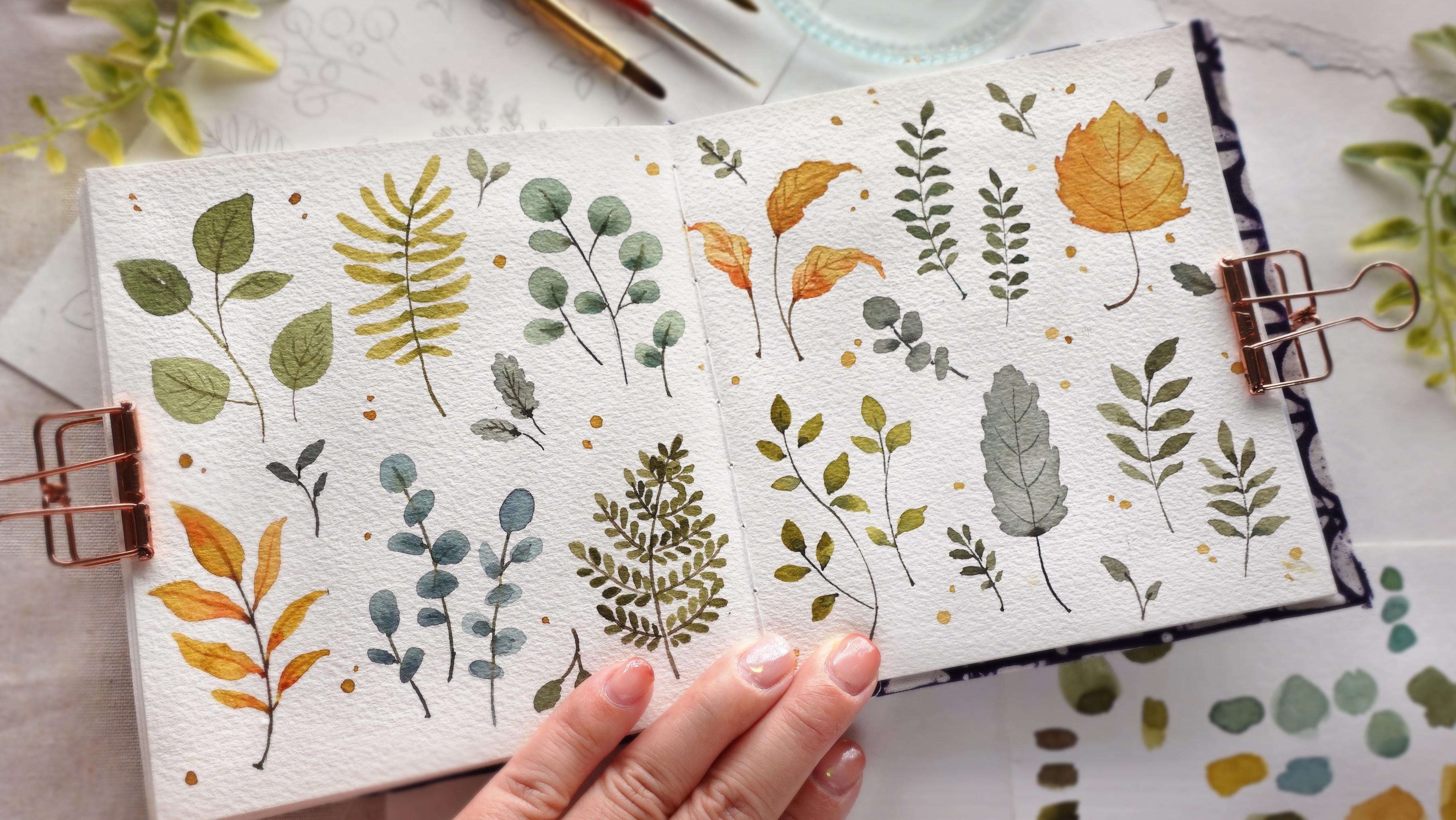
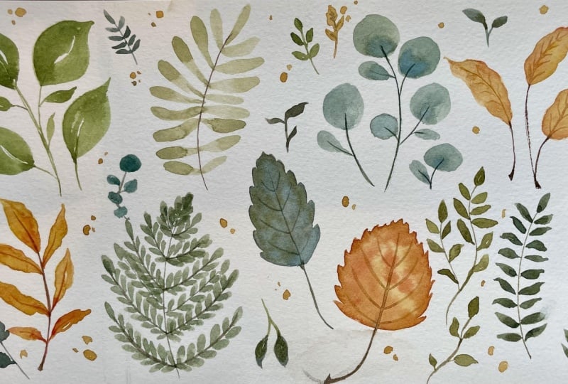
new to watercolors, then on the final composition, I'm also going to have 12 different types of leaves
laid out very simply. However, if you're feeling
inspired or you have any other ideas on top of the leaves that I've shared
with you in this class, feel free to add it on or swap any of the leaves
with your own ideas. So the project is very flexible. You can interpret it
however you'd like. I will be freehand painting
throughout this whole class. However, if you're
new to watercolors, I understand that this can
be quite nerve wracking. Depending on my
mood, I can still be quite intimidated
by it sometimes too. So if this sounds like you, I will have the outline
available for you to download in the projects and
resources section of this class in case
anyone needs it. Whether you're a
beginner painter, looking for some simple
exercises for you to do to build confidence or if you're an intermediate to
advanced painter, looking for something
simple to paint and just a quick project to fill your sketchbook with
and to relax too, you are all welcome
to take this class. Just a heads up if you're new to my classes on Skillshare, though this class is
mostly done in real time, I'll still be making
some small cuts if my hand is either inactive
or off the camera. Sometimes I'm waiting
for things to dry or I'm just taking my time
thinking through the steps. So if you decide to paint
side by side along with me, feel free to pause in
between each step. This way, you can repeat any of the exercises as many
times as you would like, and you can also paint and learn according
to your own pace. And if this sounds
like something you'd be interested in trying, come join me in this class, and let's get on to
the next lesson.
2. Supplies: Now, let's go over the
splies that I'll be using. Firstly, these are the
three brushes that I'm going to use for
all of the leaves. We have the round brush. This one is by
Princeton velvet touch, and it's a size five. You can also use any
round synthetic brush that you have on hand. And this is Filbert brush. This is also a cheap
synthetic brush by Georgorn and this
one is a size four. You can see that
the tip is rounded, which is perfect for
leaves with rounded tips, and you can see the difference between this one and
the round brush, which has a pointy tip. As for the smaller details like the veins and the mid rib, as well as the stems
of the leaves, I'm going to be using
this size zero brush. This one is by Windsor Newton, and this is a scepter gold too, but you can also use a sizzerosynthetic
rum brush, as well. Anything that's small, so
it's easier to control. Here, I have two extra brushes. I'm not going to use these. I'm going to show you
a comparison between the size brush and a liner brush as well
as the Decker striper, which is actually
my favorite brush to use for small details. They are a little bit more
tricky to paint with, but I just want to share a
bit of extra information in case you want to experiment
with these different brushes. But for the final painting, I'll only be using these three. For the paper, I'm going to be using this sketchbook
that I made. This sketchbook that I
made is a mixture between hot press and a little
bit of cold press paper. For these paintings
or for beginners, I always recommend for you
to use cold press first just because I find that it's
a bit easier to control. You can also use hot press, but if you're not used to it, sometimes you might
create unwanted blooms. And you'll see that this one is a bit different
because this isn't the final painting
as a trial that I did beforehand, so
don't worry about that. I'll also be using
some scrap paper just to swatch my colors as well as to draw out the sketch before painting
all the lease freehand. For the swatch, you can see this is a different
type of paper. This is just a cheap Canson
XL, but I would highly, highly recommend when
you're swatching your colors to use a scrap
paper of the same brand. Sadly, I didn't have any
archs scrap paper with me, so I just use CansNXl which is a very different
type of paper. Arches is 100% cotton, whereas CansNXL is cellulose. So the paint will
behave differently, but generally different brands takes the paint
differently as well. So for this 11 I'm
using as a consistency, the color doesn't come
out as vibrant on the Canson XL
compared to arches. However, I'm very used
to using both papers, so I know the way it's
going to react differently. You don't have to use
the exact same brand of paper that I'm using. But please if you're a
beginner, I would highly, highly recommend for you to
use the exact same brand for your scrap paper as you're swatching and your
final painting. Next, this is the palette
that I'll be using. This is just a cheap
plastic palette that I got from Diso. And you can see I've
used this so much that the palette was
originally white, and now it's yellowing. But because I've
used it so much, I've created some
my crow scratches. So my paint doesn't beat up, whereas this is usually an issue when you're using
plastic palettes. And if beating is an
issue for you and it's hard for you to control the load on your brush
because of this, you can also use
porcelain palettes, but I would recommend for
you to use a light color, something like white preferably, so it's a bit easier to see the colors that you're mixing. I'm just very accustomed
and used to using this palette since I've had
this for many, many years. I'm only going to use this limited color palette
for the final painting. This is key to creating a consistent tonality of
colors for your painting. But I will go over
the specific brands and name of the colors at
the end of this lesson. You will also need a glass jar. I'm only going to be using one, but you can also use
two jars of water. One is for dirty water to clean your brush and the other
one to reload your paint. But personally, I
just like using one and if the water
gets too dirty, I will just change it
out, it's completely up to you which system
you want to choose. This is very important, but I always have
tissue or paper towel right next to me as I paint. This is key to controlling
the load on your brush. If your brush is a bit
too heavy with paint, you can always take
off the excess. You can see how
much I use it here. I personally would not paint if I don't have tissue
right next to me. This is as important as
any other supplies here. For the sketching section, I'm going to use an
eraser and pencil. My eraser is by Boxy, and my pencil is
bipentl Sharplet. I like to use HB
or to be hardness. And finally, this is optional, but I find it very useful. I like to always
have a hair dryer right next to me is just
an ordinary hair dryer, just to make the drying
process much quicker. Now as for the colors, and the first one
here is Indigo by Schminke sub green by Holbein, permanent yellow deep BHbine, CPA by Holbein, and
Vermilion Bholbin. And here are the list of supplies in case you want
to get things ready, you can take a
screenshot of this or download it in the projects
and resources section.
3. Brushes: Before we start to
draw our paint, let me just introduce you to the brushes that I'm going to use. The first one is
the round brush. This is probably the most
versatile brush, in my opinion. This is the type of brush that I first use when I
started watercolors. And even though I'm going to
use a flip brush for some of the leaves for
the final painting, I'm going to show you
an alternative way of painting it with
a round brush. You can see it has a round
barrel and a point tip, but minus just a
little bit frayed. Now let's move on to
the second brush. I'm going to be using
my Filbert brush, and as you can see,
this one is different. It has a flat barrel and
the tip is also rounded. The front and back is
thick and sides are thin. And for this brush, it's great to create
rounded edges like rounded tip leaves or
rounded flower petals. So these are the two
brushes that I'm going to use for the leaves
and for the stems, as well as the
little details like the mid ribs and
veins of the leaves. I'm going to use this
small size zero brush just because I feel
like this is the most available for people
in my opinion. This is what I started out with. This is a size zero round brush. You can see that the
bristles are so thin, which means it doesn't
hold much water, which makes it easier to
control if you're a beginner. But I'm also going to show you a comparison with other brushes that I like to paint little details for
the other brushes, this is a liner brush. You can see the
bristles are longer, so it holds more water. The third one here
is a dagger brush. This one is a dagger
striper brush. You can see how thin the tip is, but the barrel is flat
like the filber brush, but because it has
more bristles, it holds even more water, and I feel like you can
create such fine details. This one is actually
my favorite to use when I'm painting
tiny details. So just for the sake
of availability, I'm going to use my
size zero round brush, but I just want to show
you a comparison in case you want to experiment if you have access to
these brushes or you want to expand your
watercolor collection.
4. Long Basic Brush Strokes: In this lesson, I'm
going to show you some basic brush strokes
using this round brush, and we are also going to practice a bit of
brush pressure so we can get used to the shape of the brush and also
paint more efficiently. You can basically treat this as either exercise if you're new to watercolors or a
warm up for those of you who just wants to
relax to this class. So firstly, I just want
to lightly wet my brush. And for the color,
I'm only going to use one for this
part of the class. This is just sap green. You can use any
hue that you have. My round brush
here is quite old, and you can see it's frayed because this is the
most used brush I have. So when I paint
the leaves later, the tip of the leaves as well as the bottom point
won't be as sharp compared to those of
you who are using a brand new brush or a brush that still comes
to a really fine point. But either way,
I'm just going to show you this fray brush. You can see I'm pointing
the pointy part upwards, which will be the
tip of my leaf. As I move down, I slowly
take off the pressure until I reach the tip of my brush
for the bottom of the leaf. As you're doing this,
you want to also be mindful of the load your brush. This, I would say,
is a good load, but if you feel like you
have too much paint, you can always take off
the excess with tissue. I'd say I've taken too much out. Let's see what the leaf
would look like if I don't have enough
water and paint. I'm going to follow
the same pressure. You can already see the tip
isn't touching the paper. And you can see the
edges are a bit rough. It has a dry brush texture. Now, let's add a bit
more water and paint. The bristles will open
up more if we have more paint and it'll distribute the bristles
a little bit wider. The thing is depending on the size of leaf
you're painting, the brush load will also
be a bit different. So this is a good
time to practice and get to know the correlation between these two variables. You can try to repeat painting the same thing over and over again until you're used to the brush pressure
and the movement. Then you can also practice
painting different sizes. Now let's paint
slightly larger leaves. I've used a heavier load
here, and this time, you can see I'm
directing my brush to the side slightly as I'm
putting pressure on it. Let's try to do
it again. You can see my brush is at
an angle this time, and because there's
more surface area on the side of my brush, you can create slightly
thicker leaves. Again, you can also
see the paint flows better because I'm
using a heavier load. I've also added more pigment. Now let's try to reverse this painting from
the bottom upwards, so we can get used
to different angles. So with these brush strokes, I just want to mention
that this is not really necessary to paint the
leaves in single strokes, but it does make it a
little bit more efficient. And the more you're
used to using your brush with
different pressures, hopefully you can also build on the accuracy as
you're painting. So this exercise is just
to get you a little bit more flexible with your
brush, which, in turn, hopefully you'll feel a bit
more comfortable with using different pressures and the tip or the side of your bristles. You can repeat
these brush strokes as many times as you would like. So I'm just going to repeat
what I painted earlier, starting from the
vertical brush strokes, which I feel is the simplest. Again, you can do this as
many times as you would like, but just get this lesson going. I'm going to move
on to the next one, which is to use the
side of my bristles. It's actually very satisfying
and therapeutic to do this. Enjoy your time painting it slowly or quickly depending on what is comfortable for you. I'm going to do a
straight vertical one, starting from the bottom up now. Then after this, I'm going to go from the bottom up but
with the side of my bristles. And let's create
the same strokes, but much smaller in order
to create tinier leaves. So this time, we have to use a much lighter brush
load because the subject that we're painting
are going to be very tiny. So this is too wet. As you can see, the
brush is glistening, and this time I'm
only going to use a little bit of pressure
using the tip of my brush instead of putting pressure on the whole
length of the bristles. And again, you can repeat this as many times as you would like. After a few of these leaves, I haven't reloaded my
brush because we only need a little bit of paint and water for these tiny
little leaves. Okay. Next, I'm going to try to apply the pressure
sideways, just like before. Then after this, we're going
to repeat the same ones, but from the bottom
up this time. Here I use the side of my brush, but you can straighten it up and try to paint it in
different angles as well. Note that the paint will puddle wherever I take
off my brush last. Here since I've taken off
my paint brush at the top, the top part is darker because that's where
all the paint will be. But if you want more of an even coverage or
even a darker bottom, you can help move the wet
paint with your brush.
5. Curves and Frills: In this lesson, we're going to create some frilly leaves by using the same pressure
in the previous lesson. But this time we're going to add some zig zagging motion
to get some frilly edges. I'm going to paint it
vertically like before, and as I press down, I did the zigzagging movement. Then as I get to the bottom, I'm going to take
off the pressure. I'm going to repeat
this a few times. You can do this as many
times as you'd like. And I'm going to try
to do the same thing, but from the bottom up. Okay. This time, I'm going
to start at the bottom. You can see how I'm directing the tip of my brush
in the beginning, putting a bit more
pressure in the middle, then taking off the
pressure at the top. Depending on how much
movement you give, how wide the zigzags are, it will determine the
shape of the edges. But if you don't
like certain edges, you can also clean it out with your brush while the
surface is still damp. By adding extra
movement to the frills, I feel like this adds
more character to the leaves and it makes them
look more organic this way. Another way to make
this look less stiff is also to add curves
to the leaves. You can do this with the
same type of pressure, but you can just direct
it sideways instead. You can also do this
without the frills first, but for this one, I'm just going to add this zigzag motion. Depending on how heavy
your brush load is or even depending on
the size of your brush, you can really pull
this out a little bit further to create even
longer looking leaves, and these types of
leaves usually pairs well with larger
flowers like tulips. As an example, I'm just going to paint a really
rough one here. It's also green,
but this is just to show you an example of how
they can look together. You can also practice this
without the frills if you want and repeat the strokes as
many times as you would like. And just for some
extra exercise, you can also try
to do it sideways while doing the zigzagging
motion or any other angles. You can also play
with the pressure while creating a
line to get used to how snappy or maybe not
so snappy your bristles are.
6. Multiple Strokes: Now that we're more used to
applying brush pressure, we can try to apply the same type of pressure
but use more strokes. This is great for
painting wider leaves. We're just going to
start with two strokes. We're going to still apply
the same pressure so we don't have to do too many
little strokes in order to create
a single leaf. We're doing two strokes,
I'm just going to create a comma shape on the
left and on the right. You can see this leaf
is a different shape to what we've painted earlier
in the previous lessons. It's much more
wider, and this way, I feel like you can
control the shape a little bit more by having the flexibility of using
more brush strokes. But we're still painting
quite efficiently. Now I'm going to
do more strokes, but apply the same type
of brush pressure. Now that you've combined both the pressure and
the brush strokes, painting will
become much faster, more efficient and
more flexible when it comes to the shape
you're trying to make. This is not to make your
movements more rigid in terms of thinking less amount
of strokes is better. It's not really 100% necessary. These exercises is just to create overall flexibility
with your brush a little bit more
so you can take advantage of your movements, but still having the
freedom to move around as you please at this time with
the confidence as well. Now, let's try something else. I'm going to leave a
little white sliver at the center of the leaf. This is good practice for
accuracy as you paint. Again, just repeat the shapes as many times as you please. You can even paint smaller
ones to feel the difference of your brush pressure only
using the tip this time and, of course, less brush load. And you can also try to play with different
angles as well.
7. Novelty Shapes: In the previous
lessons, I've shown you typical leaf
shapes, I would say, but there are also
novelty leaf shapes like maple leaves and such, which is a combination of leaves that we've painted
so far grouped differently. By mastering the
basic leaf shapes, you can try different
combinations and group them differently
for other leaf types. Let's start with a
very basic maple leaf, which is basically
five leaf shapes in different sizes and
8. Filbert Brush Strokes: Now we're going to try
the Filbert brush. Again, this is optional. You don't need the
Filbert brush, but I just want to show
you the difference. We're going to paint on
the flat side first. You can see because
it has a rounded tip, it creates a perfectly round tip for the leaves straightaway. We get to the bottom though, because this is a
white flat brush. Instead of just
taking off pressure, sometimes I like
to rotate my brush slowly until I reach the
thin side of my brush. This is what the
movement looks like. You can either go to the left or the right,
but personally, I find rotating it to the
right is a little bit easier. And just repeat this as many
times as you would like. Then you can also try to do
this from the bottom up, can also create a slight curve. And if any of the ends
is a little bit wonky, you can always fix the sides. You can also paint some
whiter leaves using a few strokes. Like so. Now let's try to
use the thin side. I personally like to paint tiny little round leaves with it's actually my
favorite way to use it. I like to paint ferns. So with this, we're just going
to play with the pressure, and I like to do somewhat
of a quick flicking motion, so the bottom tip can be a little bit smaller
and sharper. Then I'm just going
to connect them all together using my Sisi brush. You can, of course,
paint smaller leaves using the flat side, but it does take a
bit more accuracy and a much lighter pressure. This is why I like to use the thin part of my
Filbert brush instead. You can also try to paint a longer leaves using the sides. In general, any
round leaves would be really nice to
paint with this brush. I don't have to paint an outline first because the
tip is not pointy. And you can also
group tiny leaves together in order to create
something like this. This works well with any type
of leaf with rounded tips, just like the oak before. When you're painting
round leaves, you can also add
some jagged edges. So even though the overall
silhouette is round, you'll have something that has a bit more character and a little bit more texture
around the sides. And you can also paint
it unevenly, like so. And I feel that
the slight bit of imperfection makes them
look a bit more organic.
9. Thin Details - Comparing Brushes: And Now I'm going to move
on to the thin brushes. Since I feel like this is the most widely available brush, I'm going to be using
the size zero brush for the final painting later as I paint the stems and also
the details of the leaves. This brush doesn't really
have many bristles. As you can see, it's
very small and thin. Even if you're using
a heavier load, you're still able to
create quite thin lines, even though it's preferable
to always paint either with a medium brush load to a light brush load when it
comes to painting thin lines. I see the second pair
of line is a bit thick. That's because I used
quite a heavy load, but that's what I would say
a thick line look like. And as I'm running out of paint, you can see the lines
are getting thinner. For this one, I'm going to try to apply a heavier pressure. You can see the line
is a bit thicker, but I feel like
this isn't really a natural thing to do when you're painting
with a thin brush. Generally, you want to use the
tip of your brush instead. Now, let's compare this
with a light brush load. Even if I apply and use
the sides of my bristles. The lines are still
going to be fairly thin. If this is the brush that you're going to use for
your final painting, try to use this time as a
little warm up or exercise to paint different thin lines in different directions and see how accurate you can
paint the lines. Let me try to show you a
close up of what I would consider is too heavy
of a brush load. You can see the bristles
are well soaked right to the very tip where
the water is glistening. I'm going to repeat the lines. You can see this is around the same thickness as this one
that I previously painted. I just want to show you again
as I run out of my paint, the lines will become a little bit thinner and more delicate. I can also apply a bit more
pressure without having too much paint come out of my bristles for more
controlled lines. If you're going to
use a liner brush, let me just show you this one. This is a size two, so it's not the
smallest liner brush, but it does have
longer bristles, so it holds more water. Because the tip
is nice and thin, just like the previous brush, I can still paint thin lines. However, as I apply
more pressure, you can almost see a long
but thin leaf shape. So though this brush is
still fairly easy to use, if you're not used to applying a little bit of pressure just by using the tip of your brush, there is a bigger margin
of error compared to using the previous brush with the
smaller and shorter bristles. So to get used to
the light pressure of using a liner brush, feel free to just repeat lines. You can paint curve
lines or even simulate the veins and the veins and mid
ribs of the leaves. Finally, I'm going to show
you my favorite detail brush, which is a dagger striper. You can see this one has a flat barrel and quite a
lot of bristles at the back, but it has a very,
very ultra fine tip. This is my favorite because
sometimes I just want to create very fine delicate
lines for certain details. I just feel like the
line quality is more natural and fine
with this brush, but it is a bit tricky to
use because of its shape. Just like the liner brush, this holds more paint. But if I'm not just
painting straight lines, meaning I paint wavy
lines like these, you can see the
tip where I start is much more delicate compared
to the middle section. Now, let's try to apply
a bit more pressure. You can see the line can
be quite thick, actually. And if I use the side, I can basically
create a leaf shape. This is quite a versatile
brush when it comes to creating different line
weights and line quality, but I generally like to
use it for detail work. Though sometimes
it's difficult to get a similar line
weight all throughout. This is actually what's quite
beautiful about this brush. I like to use it to
paint fine branches on a tree because I can angle
them in a certain way, and the lines look
very natural as it curves because of the slight
unevenness of the weight. This right here is the
type of mistakes sometimes I make if I paint too
quickly with this brush. So you do still have
to be very careful, even though it's a
really fun brush to use.
10. Drawing Plan: Since I'm going to be using a sketchbook for
my final painting, I'm going to do a double page spread on the square sketchbook. I've decided to divide each
side into six rectangles. Therefore, I'll have a total
of 12 leaves to paint. And because I want the freedom of painting the leaves freehand, I've decided to do some
sketches to get my ideas down and just to make sure I like all the leaves
together in the spread. If you have a lot of
ideas in your head and it surpasses the 12
allotted slots you have, you can always use this
opportunity to draw them all just to get it out
of your head really quickly and then
choose your favorites. Another way is also to figure out a more organic
way of placing all the leaves around the
page to fit all your ideas, especially if you're
using larger paper. For mine though,
I'm just going to stick with the 12 types. Then I'm going to fill in some empty spaces in between
with some filler leaves. You want to sketch your leaves
first, before painting, you can also go straight into your sketchbook or the paper that you're going to be using. Just make sure you draw really lightly because we're only going to use small
amounts of paint, since we're not going to
use a thick consistency, sometimes if you outline too thickly the pencil
marks will show through. You can also use the outline I've given you for this class. However, if you want
a bit of a challenge, you're always welcome to
try painting freehand. You can always practice the
individual leaf shapes in between the different types before going into the painting. This way, you can
also experiment with the color choices if you
want to create your own. As you can see, I like to
vary the size of the leaves in my collection as
well as the clusters. You can see some smaller
leaves from ferns, some long pointy leaves, round leaves, and even
larger individual ones. By the way, this sketch
is never set in stone, it's just to get some ideas out. If you get any other ideas as
you paint, just go with it. Since I'm just using
scrap paper here, the way that I've placed
some of the leaves, isn't actually ideal
for the amount of space that I've
allocated in the spread. So as I paint later,
I'm actually going to adjust the way I've
laid some of them out. Here is the last one, and I just want to
see if I'm happy with the combination of
leaves that I have. If you like how it looks here, you can just paint
it the way it is. But I think it'll
be nice to fill in some empty spaces
with smaller leaves. I'm going to repeat some
of the leaves here, but just paint them smaller to fill in the tiny
awkward spaces. And after I sketch this, if I like how it looks, I'm going to bring it across
to the final painting. If you don't, you can
leave yours plain as well.
11. Prepping The Paper: I feel like we had a
pretty decent warm up. So next I just want
to prep my paper. You see, I have a
square sketchbook here, and the paper is arches, cold crest, and I
feel like I have enough space for six types
of leaves on each page. So I'm just going to draw really lightly a horizontal line
which crosses both pages. Then I'm going to
divide it into three. Also use a ruler for this, but sometimes with a ruler, I find it a bit difficult to see the spacing because parts of it is
covered by the ruler. So I like to do it freehand, and then I'll just clean up the lines a little bit so the division is a
bit more accurate. I will only use a ruler if
a straight line is needed, which in this case, I don't
think it's necessary.
12. Leaf 1: Now let's begin to paint, and this will be the first one, as we've sketched out before. By the way, you
can always switch the positions if
you feel like it. And for the color, I'm going
to use a mix of saprene, indigo, and some burnt umber. With the color, I'm going to use these three colors
most of the time, but I'm just going to play
with the ratio in order to create different
variations of the color. Whenever you're unsure or you're not feeling confident
about the brush strokes, you can always try to practice
it using scrap paper. I'm only demonstrating here, but I'm not going to be doing this for the rest of the leaves, but this is an option
that you can do. You can also swatch the colors out first to make sure
that you like them. For the color of the stems, I'm going to again, use
the same three colors. But as you can see, by just
changing the ratio or even changing the thickness of the paint compared
to the water ratio, from a different value, you can create a totally
different color. This is the brown that
I've come up with. If you want the color a
bit more green, of course, you would need to add a
little bit more sap green. So I'm just adding a
little bit more little by little for you to see
the change in color. If you want the
color more muted, you can add more indigo, and if you want the
color to be warmer, you can add more burnt umber, even a bit of ermilon. The stems doesn't have to
look exact to the sketch, but this is just to show you what type of leaf
I want to create. But I'm just going to paint according to the
space that I have, and I just try to fill the
space as best as I can. Before painting on the leaves, I find it a little bit easier
to paint the stems first. This way I know where I
want to angle the leaves. Mm. I think I'm fine with the stems. I didn't add the small ones. If I want to add shorter ones, I'll add them after I've
painted the leaves. But I just want to make sure
I have the main structure down so the leaves can at
least face the main stems. Using the color that I've mixed, I'm just going to paint
some simple leaves. I try to paint the
outer part first, using a bit more
pressure at the center, then I'll just fill in
the rest of the space. For these leaves, I basically want them to
be on the thicker side. Whenever certain positions feel uncomfortable to paint with, you can always rotate your
paper or your sketchbook, so you won't need to twist your arms in uncomfortable ways. I've painted all the
leaves for all the stems, but I feel like there's a bit of space between the
ones on the right, so I'm just going to
add a smaller one here. I use the tip of my brush to paint the stem to
connect the leaves, but you can also use
your small brush. This is it for the first leaf.
13. Leaf 2: For the second leaf, I want
to do a simple fern with some long leaves on the sides and I'm going to create
rounded tips for them. For the painting, I
want to start with a dark color and I'm
using my Sisu brush here. Then I'm just going to indicate where the stem is going to be. Because I want the ends of
the leaves to be rounded. I'm going to use
my filbert brush and I'm going to use the sides. For the green, I use
the same mixture, but I'm going to add more
permanent yellow deep and a bit more burnt umber to make a green that is a little bit
brighter and warmer. I'm going to use a medium load on my brush, and
as I'm painting, I just want to direct it towards the center,
which is the stem. As I'm painting, I also
want to think about a leaf silhouette for
the overall shape. You can create wavy leaves
to give a bit of texture, but I'm just keeping
mine simple here, and you can see
sometimes I didn't do a very good job taking off my brush pressure at
the ends of the leaves, but it still looks okay. And what you can also do is while the
surface is still damp, is to add a slightly
darker value or a different tone of
green that is preferably darker and you can somewhat.it in near the center where the leaves are
connecting together. Unfortunately, I thought
about this a bit too late. So the leaves were
already a bit too dry. If not, the darker value
will spread nicely, giving a really soft transition to the rest of the leaves, as you can see for some of the leaves
on the bottom right. Generally, if we
want to do this, I like to plan ahead. As I'm painting, I like to
do a couple of leaves or three leaves at a time and swapping the colors in between. But there is a trick to this, which is to use a
clean damp brush to soften the blend between the two colors as
I'm doing here.
14. Leaf 3: Now moving on to
the third design. This will be another simple
one with round leaves, and for this, I'm going
to use my Filbert brush. For this one, I just
want to show you an option of drawing the
stems out very lightly with pencil first
because the stems will generally be
painted in a dark color. So if you're nervous about
painting straightaway, you can always use pencil
to indicate this spacing, then it's much easier to place the leaves according to the stems that you've
already drawn out. Feel like I've covered
a good amount of space. So next, I'm going to mix
the colors for the leaves. For the leaves, I want the
color to be a bluish green. So I used a lot of indigo
with a bit of sap green, and because the color
is quite vibrant, I've decided to add some warmth
with burnt umber as well. Since indigo is very
pigmented and dark, for this one, I'm going
to use a lot of water. I'm going to swatch
this one out first. I feel like I quite
like the green. It looks like a deep green, but on the cooler side. Again, because the color
is generally quite dark, I'm going to use a lot
of water for this one, and with my Filbert brush, I'm just going to paint the round leaves for
the main stems first. This time, I do
want to play with the value while the
surface is still damp. After painting a few, I quickly want to take
a darker value of the same mix and I'm going
to.it in near the stems. Just so the leave
doesn't look flat. I'm also going to add
some oval looking leaves. But mostly on the sides of the stems that
we've already painted. Again, for this, you
don't want to paint too many in one go unless you're painting fairly
quickly because we want to take advantage of
the damp surface. So here, after painting a few, you can see the first couple of leaves were starting to dry, but I think I still made it. And again, I just thought the area where it's
going to touch the stem with a darker value because I've painted
cooler colored leaves. I decided to add more
indigo into the mixture for the stems just so it
has more of a blue tone. And then I'm just
going to go over the pencil marks or
the pencil lines with my small brush and also
add additional stems to the extra leaves that I've painted next to the main stems. As you're painting on the stems, you do want to make sure that most of the leaves are mostly on the dry side if they're
still very, very wet. The really dark color is going to blend and bleed
out into the green, which is what we took advantage of when we wanted to
introduce the darker tones. For this one, I also want to add a very fine mid rib to the leaves just for
a bit more detail. And of course, for this,
you do have to make sure that the base
color is mostly dry. The drier the paper or the base, the more sharp and defined
your lines will be.
15. Leaf 4: Next for the fourth leaf, I'm going to paint these large
frilly leaves on one stem. For this, I'm going to use my round brush in order
to create the fine tips. As for the color,
I'm feeling like painting with something
a bit warmer this time. I'm going to use some vermilion. I took quite a bit and put it
on the side of my palette. Then I'm going to
add more permanent yellow deep to the
green that is already on my palette so the yellow is more
muted and a bit brown. This is what the
color will look like. You can see it's
quite a muted yellow, and I'm going to pair
this up by adding more vermilion to the ends of the leaves while the
surface is still damp. For the color of the
stem, I just picked the color that is
already on my palette. This color turned out to be
somewhat of a darker green. I tried to pick in an area where it has a
bit more burnt umber. However, because the leaves are more on the warmer
and yellow side, I think, looking at this now, I would prefer the stems
to be a bit warmer. It is a little bit too late, so I'm just going to go with it. Here I painted the first leaf. I feel, however, the color
is a little bit too vibrant. I want to play on the
value a bit more. I decided to use a
lighter consistency for the rest of the leaves, and I'm going to
add little dots of vermilion for each leaf as
I paint them one by one. You see, because I didn't
let the leaf dry at all, the surface is
still very damp and vermilion spreads out or
blooms out really easily. Mm. For the leaves here, I'm just going to
whittle my brush ever so slightly just to give this
leaf a bit more character, so it doesn't look too stiff because these are fairly large. And you can also play with
the thickness of the leaves. You can see on the
right the leaf is a little bit thinner, so it looks like
they're on an angle. And I'm going to finish
off the bunch with a couple of small ones on
either side at the bottom. When you add more color and
the surface is still damp, you can also use your brush to help move the extra
pigment around. Here I ended up
trying to go over the stem again using
some burnt umber. I think because I went over
it and I also tried to attach a very small stem under
some of the leaves. It does look a bit too thick, but I guess I don't mind it rather than
having a green stem. Since the leaves
are quite large, I feel like I have space
to add on some details. I'm just going to add the mid roof first
and see how it goes. But for this, I do want the base color to
be completely dry, so I use the hair dryer to
make the process much quicker. For the details, I'm
just going to use the same color as the leaves with more vermilion
mixed into it, and I'm going to use a
medium to light consistency, so the detail doesn't
stand out too much, but stays nice and delicate. After adding on the mid ribs, I don't think I need
to add the veins, especially for the
smaller leaves. So I think I'm just
going to leave it here and move on
to the next one.
16. Leaf 5: Now onto the fifth design, we're going to do something
similar to this one. It's like a
salvagllar eucalyptus and they will have round leaves. However, this one, I'm going to play with the
angle a bit more, so I'll add more ovals. I'm going to start
with the stems, but this time you
can see the paint is a little bit more watery because I'm going
to paint some of the leaves over the stem, so I don't want the
stem to be overly dark. I think three stems will
fit nicely in this space. And as for the color, I really like the blue
green from before, but I want to make this
a little bit different. So I'm using mostly indigo with the tiniest
bit of sap green. I switched to my fbot brush, and I'm just going to
paint some small leaves. These are smaller than the
previous one that we painted. I want the placement
of the leaves to be quite close to the stems, if not touching or
overlaying the stem. And to angle some of the leaves, I basically just
turn them sideways and also paint ovals
instead of circles. Can also make some of
the leaves a little bit longer for some variation. And while the surface
is still damp, I'm going to use a slightly thicker
consistency of the same color to.in the area
closest to the stem. I'm going to repeat
the same types of leaves on the third stem, but as I was doing
this, I realized that the color of the stem is very
different to the leaves. After painting on
all of the leaves, I'm going to wait for the paint to settle
a bit and not be too overly wet while I wait, I'm going to go over the stems again using more
of a bluish tone, so I just added or layered
on a bit more indigo. Have to go really
quickly after this because I feel like
the leaves are drying. But here, I'm just
going over them again, dotting, using a thicker
consistency near the stems. If they're sadly a
little bit too dry here, I'm just going to use
a clean damp brush to soften the blend. For a last bit of detail, I decided to add some of the mid ribs for the larger
looking leaves here.
17. leaf 6: For the sixth one on this page, I'm going to create
this fern right here. Going to start by painting the main stems so I can paint on the tiny leaves
around them later on. For the color, I want to use a really muted green
for the leaves. So for the stems, I want
to create a warmer color. I've added a bit of vermilon and also some burnt
umber on my palette, and I'm going to use a medium
too thick consistency. For the stems on both sides, I want them to be
slightly curved. And as I get towards the bottom, I want to extend the width. But right at the very bottom, I'm going to bring it
in ever so slightly. So the overall silhouette of those lines are going to look
like a basic leaf shape. The leaves, I want them to
be very small and round. So I'm going to use
my filer brush. And as for the color, I want it to be a
warm muted green. So I use some burnt umber
sap green with a touch of permanent yellow deep and also the tiniest
bit of indigo. Because the leaves are going
to be very, very tiny. I'm going to use the side
tip of my filberbush. And personally, I
like to work on one side first before moving
on to the next one because I'm going to rotate
my paper around in order to paint in a
comfortable position. And because these leaves
are very close together, sometimes I like to alternate on the stems that
I'm painting on. So in case the leaves are
going to overlap each other, I'll give it a bit of
time for them to dry. If not, I might accidentally
make a huge puddle. At the top, you can see some of the leaves merging together because it was overlapping and it was still a little bit wet. So I decided to just go over some of those lighter
leaves to separate them. Now I'm going to move
on to the next side, and you can see I've
rotated my page around, so I can still paint on more or less the
same angle as before. That's it for the fern. I'm just going to
rotate it back, and I feel like some of
the leaves are too light. So I'm going to go over
some of the leaves with a slightly darker value for
a little bit of variation. B
18. Leaf 7: We're finally on
to the next page. For this one, we're
going to do a simple one here of three fairly
large leaves. For the spacing, though, I feel like this is
a bit horizontal whereas we have more of
a vertical composition, so I'm just going to
try to fit it in. I'm just going to erase
a bit of the line here because the leaf might
go over it on the side. As for the color, I wanted to mostly be a muted
yellow with a bit of red. So I use permanent yellow
deep as the main color, and I took a little bit of
vermilion, sunburn umber, and also a touch of sap green that was
already on my palette. I'm just going to swatch it
to see if I like the color. I think I can work with this. And for this one, because
the leaves are quite large, I'm just going to go straight to painting the leaves
instead of the stems. For this one, I'm going to
use the wavy textured stroke, one side after the other. And if some parts are
a little bit unclear, I'm just going to go over them. And while the surface
is still damp, I also dotted in a
bit more vermilion. I felt like the first
leaf is a bit too dark, so I decided to add
a bit more water. So I'm using a much
thinner consistency here. But I'm going to
follow the same method for the brush strokes and also adding in that tiny bit of vermilion while the
surface is still damp. The dark valley of the leaf
was bothering me a bit. So here I tried to reactivate a bit of the paint
with clean water, and I just pick up
a little bit of that extra pigment with
my clean dry brush. To stick to the warm tones, I decided to just add more burn unburn to the dark
brown on my palette, and I'm going to continue down the leaves with my small brush. And because of the
lack of space and how close the two leaves
are on the right, I decided to just
join the two stems together because these
are large leaves, I'm going to add
details on them. So I want to make sure everything is
completely dry first. I still want the details
to be quite light, though, and fairly subtle. So I'm just using
the same color as the base in a light to
medium consistency. So it's still quite transparent. As you're painting
on these details, you want to make sure you're following the curvature
of each leaf.
19. Leaf 8: Mm. The next one is going to be a very simple type of fern with tiny little
leaves on either side. And for this one,
because they're going to be thin and long, I'm going to paint two of them
in the space that I have. I'm going to use
dark muted green for both the stems
and the leaves. So here I've mixed up the
same colors as before, which just sap green, burnt
umber, and some indigo. And I've started by
painting the two stems to make this look a bit more organic in
terms of the placement. I played with the position and also the height difference. I'm going to use the same
colors for the leaves. So this is a mix of sap cream, indigo, and burnt umber. Let's just try to swatch it
and see if I like the color. I'm quite happy with this. I actually like the deep green, and I'm just going to start by painting the top of the stem. Then I'm slowly going down
to paint the smaller leaves, making sure that
the tip touching the stem is very, very thin. So as I'm painting each leaf, you can see I'm leaving a
little bit of space in between, so I can go back with the tip of my brush to connect
each leaf to the stem, or I can do it the
other way around, which is to paint the
really thin line first and then continue with
the tiny little leaves. Being very careful with this because the leaves
are very tiny. So I just use the tip of
my brush to paint it. You can also use a smaller brush for this if it's a bit
easier to control. But because the
leaves are very tiny, I also want to make
sure that the load on my brush is very light, so the leaves doesn't puddle up. While the surface is still damp, I like to take a slightly thicker
consistency of the same color and, of course, dot it in where the leaf
is meeting the main stem, just for a little bit of color variation and more
of an organic look. I feel like there's still
a bit of space here, so I'm just going to
extend the stem down. And I'm basically
going to just repeat the same thing for the next stem until
I reach the bottom. And that's it for this one.
It's super, super simple.
20. Leaf 9: I haven't done a large leaf yet, and we're going to approach
this a bit differently. You can think of it as
an extra technique. You can use either
the Filbert brush or the round brush for this. But for this specific
one because it's sharp, I'm going to use my round brush. I sketched out two here, but let's just see how many
I can fit in the space. For the color, I'm going to use the same warm tone as
the previous leaf foe. So since I still have
the color on my palette, I just added some
permanent yellow deep. I still have a little
bit of vermilion, and I also use the green that was
already pre mixed there. For this one, I'm going to use my round brush to
create an outline. And I want to make sure that
the inside is filled with watery paint because
it's going to take a bit of time to complete
all the sides as well. And we don't want any
parts to dry yet because we want to connect the little points that
we're adding here. For the points, I want to introduce a
slightly warmer tone, which is why I've added more
vermilion to the base mix. Mm And because the
surface is still damp, I'm going to add that same warm tone and
just start it in randomly. And this is why we wanted to use watery paint before because
we keep adding and we don't want any unwanted lines if we paint on top
of a dry surface. Again, while the
surface is still damp, I'm also going to add the stem. For the stem, I've
just used burnt umber, but I've added it, of course, to the premixed
color on my palette. So it is a little bit darker. And I'm just going to
paint a very thin line. At the bottom of
some of the stems, you can see I've added
a very short line. So it looks like
it fell off from a tree or a larger branch. And after this, before
adding on the details, I want the base to be completely dry so the details doesn't
blur into the base color. For the mid rib and the veins, I use a mix of the base color
and the color of the stem. But in a medium
consistency, I would say. And I also switch to my size sewer brush to make sure that the lines
are nice and thin.
21. Leaf 10: For this next one, we're
going to paint this one with a very curvy and wavy stem
with some small tiny leaves. And as for the color,
I think I'm going to use a muted yellow green. I still have the previous
color on my palette, which has a permanent
yellow deep and vermilion. So I've just added some
saprene and burnt umber. And after swatching it, I think I'm fairly
happy with this color. Because of the warm toned leaf, I'm going to use
a bit more burnt umber on the palette where I
mix the color of the stems. Just going to paint one wavy stem for
now as the main one. I'm also going to attach
a tiny one on the left. That I'm going to
leave it and just go straight to painting
the smaller leaves. Of course, I'm going to paint a leaf on top of the stems
that I've already painted. But for the rest of the leaves, I'm going to place
them randomly. I'm also going to leave a
bit of gap for some of them. For these areas, I'll attach
them to a smaller stem. I just find that
this is a little bit more flexible
for me to position the leaves this way
instead of having dedicated spaces already if
I paint the smaller stems. This way I can also play with the distance and
things like that. Just like before, I like to
paint a few leaves at a time, and then I like to add a thicker consistency or
just a darker value green. This was a bit
dry, so I just use a clean damp brush to smudge
some of the darker values. Then I'm just going to
continue to paint more leaves, and of course, painting
a few at a time, so I can add the darker
values just like before. Once I feel I have a
pretty good amount, I'm going to add another stem on the right
just to fill in the space that I have and then continue to paint more leaves
the same way as before. But in general, I just want to make sure
that the stems for this one is very curvy with
a lot of fluid movement.
22. Leaf 11: We're going to paint
another large leaf here, and this time, I'm going to use the
filpet brush instead because I want those edges
to be a bit rounder. Just like before,
I've drawn up too, but let's just see how
much space we have. Actually, I feel like this is the perfect space
for just one leaf. Next for the color, I want this to be
a grayish green. I'm just going to use indigo
as the main color and I'm going to turn this into a
gray by adding burnt umber. This almost looks black, though. I want a little bit of green. But since we already
have indigo, I'm just going to use a touch of permanent yellow deep and
let me just watch this. I feel like this still looks a little bit too
gray for my liking. So I'm just going
to take some of the muted green
that I've already pre mixed and see
how this looks. I also added a bit
more burnt umber. I think this is looking much
better. It has more green. Let's paint just like before, I'm going to create the
basic shape for the leaf. This time it's an oval, but the bottom is slightly
wider than the top. I'm using quite a heavy
load on my brush, making sure that
the surface will stay damp for quite a while. Then this time with
the same color, I'm going to use the side of my brush to add the
rounded spiky edges. While the surface is still damp, I'm going to add the stem. And here I just use indigo
with a bit of burnt umber. I'm going to dot a bit of this color at the bottom
of the damp leaf, then I'm going to
pull it down to create a very delicate line. Just like the large
leaf of four, I have quite a bit of space to add on the mid
rib and the vein. So I just want to make
sure everything is completely dry first
by using a hair dryer. For the color of the details, I'm going to use the
same as the base, but in a slightly
thicker consistency. B
23. Leaf 12: Finally, this will be the 12 leaf,
which is the final one. And for this last one, it's going to be similar
to this, this one, you can see by just changing
the size of the leaves, it looks a little bit different. I feel like I have
space for two, so I'm going to paint two stems varying in height
and also position. Going to curve both of them slightly inward then
for the leaves, I'm going to use the
green that is already on my palette with
added burnt umber. I want this to be
dark muted green, but I'm going to use a
slightly lighter consistency. I'm just going to paint
standard leaf shapes without any wavy lines on the sides
just to keep things simple. You might notice that all
throughout this class, I've been using more or
less similar mixtures and even just adding certain hues
to or the premix colors, but you will see that the colors still have some
variation to them. Is because we're mainly just changing the ratio of
the color mixtures. And this really helps to
keep your whole painting consistent with each other because though the hues
might be different, it has tones of the colors which has been used for other
parts of your painting. The rest of this is
fairly self explanatory. They're nothing new on this one, so I'm just going to continue to paint on the leaves on this dm, as well as the shorter
one on the right.
24. Fillers: Hm. Now that we're done with
all of the 12 leaves, I'm going to erase the
extra pencil marks. Then after this,
I'm going to look around if you like the
composition the way it is, you can call it done, or for me, I just want to fill in the little gaps with
smaller leaves. I'm going to just make up random leaf shapes and you can group them
however you'd like according to the
size of the gaps that you have on your paper
in terms of the color, since I already have a lot of
mixed colors on my palette, I'm just going to use the ones I already have rather than
having them go to waste. You can paint completely
different leaves or repeat the same types
you've already painted or even just pick one single leaf
type that you might want to repeat all
throughout the page. This is just to fill in the
empty spots and to make the composition look
a little bit more lively and dynamic by
playing with the angles. For some of the
larger filler leaves, if you feel like you have space, you can also add in
a bit of detail. You can also use this time to adjust previous leaves
you've already painted. Here, looking at the first leaf, I feel like it looks empty, so I'm going to add the
mid ribs and veins using a light consistency of a warm green that I already
have on my palette, and I feel like this addition just makes the larger
leaves look less empty. For the rest of the
empty spots though, some of the spaces
are a bit awkward or they just barely fit a leaf. For these spots, I'm just
going to do little dots. Some dots are larger
and some are smaller, and I'm just going
to scatter them around using the warm
leaf color that I used. So it's from permanent
yellow deep, bit of vermilion and some green. So, feel free to adjust and add little details as you please at the stage to complete
your painting. You can also add some
pen doodles, maybe, or some gold shimmers, which is something that I
usually like to do as well. Oh And I think that's it. I'm just going to add
the stems to some of the final leaves and maybe add a little bit
more dots here and there, and then I'm going to
finish everything off.
25. Closing and Class Project: Congratulations for
completing this class. I hope you enjoyed
watching through the process of the
exercises and things. If you feel extra
inspired or have any other ideas on top of the ones that I've
shared with you today, feel free to change up any of the leaves or even
the full composition. And I would invite you to
try painting freehand. However, I know it can
be quite intimidating. So if you're not up
for the challenge, you can also use the outline provided in the projects
and resources section. You're done with the paintings, I'd love to see it posted
in the project section where you can share it with
me as well as other students. Let's keep encouraging each other and give each other
likes and comments. If you enjoy this class, I would really appreciate
it if you leave a review. I always enjoy
reading through them, and it helps to encourage me to create more classes
that you enjoy. It also helps spread the
class to more people, so hopefully more people
can enjoy it, as well. You enjoy my classes and you would like to see
more tutorials by me, I do have a YouTube
channel called Nianiani, where I post weekly
art related topics, mostly watercolor tutorials. And if you would like
to see more art by me, you can also follow
me on my Instagram at IG Underscore Nianiani or on
my TikTok at Nianiani Art. And that's it for this class. If you're still
here, thank you so much for sticking
right to the very end. I wish you luck and I hope you enjoy painting along and
creating your own projects. Cat wait to see it
posted as well, and hopefully I'll see you soon in a brand new class. Bye.
 Nianiani, Watercolorist and Graphic Designer