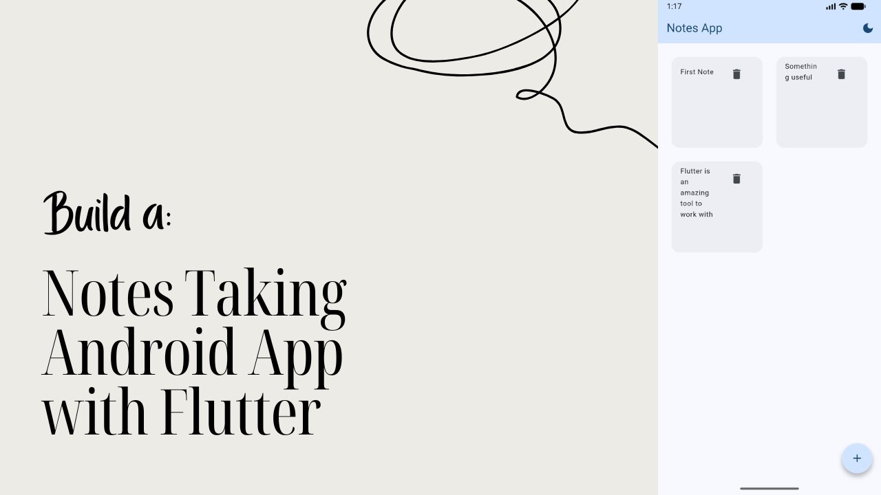
Transcripts
1. What you will learn & What you will build: Hey, there. I'm Flutter sense. And in this class,
we're going to bold something super fun
and incredibly useful, a complete flutter
layout from scratch. No complicated setup,
no overwhelming theory, just clean practical
steps that will make you fall in love with
building beautiful UIs. In this class, you will learn how to set up your flatter
project the right way, how to use padding, rows and columns to structure
your layout like a pro, how to use expanded for responsive design that
adjusts to any screen. How to create modular reusable widgets
like a dashboard c, how to add a content area at a bottom navigation bar to give your layout
a real app feel. Finally, how to make your
entire UI them adapter. It changes color dynamically
with a single twig. By the end of this class, you will have fully built a fully functional
flutter dashboard layout. You can customize for any
idea portfolio dashboards, admin panels, personal
tools, anything you want. Your class project will be to build your own version
of this layout, pick your own color theme, replace the icon and
text to make it unique. Share a screenshot
or screen recording of your final dashboard in
the class project section. Don't worry if
you're a beginner. I will guide you step by step
like a real sensor should. Grab your coditor,
stretch those fingers. Let's build something
beautiful together. I will see you in
the first lesson. What are you waiting
for? Let's get started.
2. Creating the Layout Practice Project: All right. Let's get started. The first thing we need to do is create a new flutter project. Let's open our terminal and navigate to the folder where you want to
create your project. I'm going to navigate to my desktop and inside that
I have flutter projects. Inside that, you can
create your project now. Flutter, create,
layout, practice. This will generate a brand
new flood project for us. Next, let's open the project
in VS code by typing CD, Layout Practice code dot. Now that's open, let's
close the terminal. Now in VS code, let's go to the lip folder
and then open main dot dart. You'll see a bunch of
default code inside. Let's clear everything
out and start fresh. Nice. We have a
clean canvas now. Let's set up the
basic structure. We'll start with import, package, flutter,
material dot dart. Then we're going
to say void, main. Then we can say run,
const, layout Practice. Next, we will create our
layout practice class. So we say class,
layout practice, extends stateless widget. And inside that we're going to say const, layout practice. Then we're going to
say super dart key. Let's all write the build. I'm going to get rid
of all the stuff that I have inside this. Then we can return material
App. Let's save that. Alright, now that we have
our basic structure, let's make it more complete
by adding a title, turning of the debug banner, and setting the theme
and home screen. For that, we need to get
inside the material App, and you can see that
I did type over here. This is going to be L.
That is layout practice. Make sure it's the
same name as this one. Yeah, now that's perfect. Now we can say title
and we can set the title to layout practice. Then we can set the
debug banner to falls. Then we can use a theme. I'll say them data. Inside this we'll say
use material three true then we can say seed color scheme seeds
add that to colors TO. Let's save that. After this, we're going to set
up a home screen. Say home, say const, then we can say
layout home screen. And there we go. We have
set up our base flood wrap, added a theme and declared
the layout home screen, which will be the heart
of the layout practice. In the next lesson, we will build that home
screen step by step.
3. Building The HomeScreen for Layout: All right. Now that we have set up the base of our project, it's time to build
our home screen. Now, instead of writing
everything inside main dot dart, we're going to create the home
screen in a separate file. Why? Because it helps us keep
our code clean, organized, and easy to maintain, which is a really good habit as your project grows bigger. Let's do this step by step. Inside the lip folder here, let's create a folder
called screens. And inside that screen folder, you're going to
create a file called layout underscore home,
Underscore screen Dt. Now that we have our file,
let's write some code. The first thing we need to do is import the flutter
material library. We'll say import package, flutter, material dot dark. We don't need to write
the main function or call the Runap here again. We have already done that in the main dot dark file,
and that's all we need. Here, we will only define the
layout home screen class. For that, we'll say
class and you can hold the control and space bar and you can see the class
theme show up here. Now you can here say extends stateless, which inside that, we're going to say CST, layout home screen,
then we can say super dot K. Here we
overwrite the build method. Let's get rid of
these things and then we're going to
return a scaffold. Let's save that. See how
we use scaffold directly. That's because material
app is already wrapped around this in
the main dot dart file. We don't need to call
material app twice. The scaffold here acts like
the body of the screen, while material app
in the main dart is the container that holds it. Next, let's import this screen
in our main dot dart file so that the red swiggi
thing over here goes away. To do that, you can go to
your main dot Tart file and here you can say import,
can say package, and you can see the package
name here is layout practice, and here we have screens, and then here we have the
layout home screen dot Tt file. Here you'll see that the
red underline is gone. Since we already
returned the scaffold, we can now run this
app and test it. I'll run this as a Windows app, but you can use whatever
platform you prefer. Android, IUS web or desktop.
Let's go ahead and run this. I'm going to choose Windows, and there it is a nice
clean blank screen. Let me align this beside our code editor so that we
can easily understand this. You can see the
layout and the code. Now I'm going to hide this
and let's close this. It's empty because we
haven't added anything inside this scaffold,
but don't worry. That's exactly what we are going to build in the
upcoming lessons. In the next lesson,
we'll start structuring the layout inside
the home screen and bring it to life. But
4. Understanding Padding in Widgets: Alright. Now that our
app is up and running, the start adding
little structure to it by introducing an appa. So let's go to our
layout home screen, and in sien scam food, here, we're going
to add in a appa. So we'll say app app and here, we'll add in the title, and we'll call the
title a text chat, and we'll call this
as layout practice. And then we're going to
add a background color. I'll say team dot of dot
color scheme, dot primary. Then we're going to add the
foreground color as them dot dot color scheme,
dot, on primary. Let's save that. You should
see the app bar up here. Pretty simple. Now it's time to work on the
body of our layout. But before we write
any more code, I want you to take a
look at this image. When we add padding, what happens is this. You content moves inwards, creating extra space around it, but still inside the element. Think of it like your content sitting comfortably
inside a soft cushion. Let's understand this
with a simple example. Let's get back to our code. Right now, if I write body, then let's add in a text which we'll call this as hello world. And let's save that.
You'll notice that the text sticks right to
the edge of the screen. That's not very pretty,
right? But let's fix that. We don't need to delete
the text widget. Instead, we can simply right
click it and then click on Refactor and then choose
wrap with padding. See that? Our text widget is now wrapped
inside the padding widget. The line here, edge inset all adds equal
padding on all sides, top, bottom, left and right. Now let's change that to 20. Now it safe. And
say this preview, the text shifts inside leaving a neat balanced
space around it. That's exactly how
padding works. It doesn't move the
container outwards, it pushes the content inwards, making everything look more
structured and breathable. In the next lesson,
we'll explore rows and columns and see how to structure multiple
widgets together. But for now, just
play around with the padding values and get
comfortable with this concept. You'll use it a lot
in froterayout later.
5. Understanding Rows and Columns: All right. Now that we
know how padding works, let's take it one
step further and understand rows and
columns in flutter. Before we touch the code, I want you to look
at this image. Here we can see that we have three cards
placed side by side. That's because they
are inside a row and Row places its children
horizontally next to each other. But notice the bottom card. It's sitting below the row. That happens because
the row with its three vertical cards at the bottom of the
card are wrapped together inside a
column and column place their children vertically,
one below the other. That's basically the superpower of rows and columns in flatter. Just remember this rows horizontal layout,
columns vertical layout. Let's try that out in code. Right now, your body looks
something like this. We got a padding, and then you got a child and
then a text widget. Let's wrap the text
widget in a column. Right click on the text, and click on refactor. Then you will see wrap with column and
just click on that. This gives us child
column children, and then there's text widget. Now, if we add more widgets
inside the children, they will appear one
below the other. That's how column works. But for this particular text, I actually wanted
to set in a row, so I can place other
elements next to it later. Let's refactor the text
and wrap it with a rope. Here I'm going to
right click refactor, and then we'll say
wrap it with rope. Now, since it's inside the row, anything else we add here, we'll sit beside the
text horizontally. Let's make the text look a bit nicer, like a
proper heading. So if I say this, you'll see that there's no
change happens here. So let's go ahead
and style this. Here you can say comma style. Then I'll say textile,
S font weight. I said, font weight, that bowl. I'll save that. After this, we're going
to save font size. I'm going to set that to 16. Then you can say color is colors do black,
and that's save. So now you can see
that the text is bold and this is how it looks. Now, I think this is too bold. I'm going to change
this to around W 500. That's going to make
it a little lighter. Now you can see that the
text actually appears in the bold styling and it's ready for more
which to join it. In the next lesson, we will add another row below this
one and inside it, we'll paste multiple cards to build the layout
step by step. Rows and columns are like
the skeleton of your UI. Once you understand these two, you can shape your
screen however you want.
6. Adding Multiple Items in a Row using Expanded: All right. Now that we have learned how rows
and columns work, it's time to make our layout
a little more interesting. We're going to add another
row inside our column, and this time, we'll place
multiple items inside it. Inside your code, right
below the first row, which is this one,
let's add another row. Let's save it.
Now, let's fill it with some placeholder widgets
to see how it behaves. For now, I will just
use the text widget. So inside the row, we can say children. And then inside that, we can add in text widgets. We'll call this as card one. Card two and card
three. Let's save that. Here in the pre view,
you can see there are three text appearing side
by side next to each other, exactly how the row works. But it looks a bit messy. Everything is clumped
up together on the left and the
spacing isn't equal. I want each of these items to take up the equal
space inside the row. To do that, we can wrap each text widget with something
called the expand widget. The expand widget tells
its child to stretch and take up all the available
horizontal space equally. Let's update our code.
Let's go to the text here and let me scroll
this a little bit. And it can right click here, and we'll say refactor. Then we're going to
say wrap width expand. If I save, you can see that took a lot of space and we do the same
thing for this one, refactor, rap width expanded. Then again, refactor,
rap width expanded. Let's head on save,
now that looks better. Each text now shares the
available width equally, creating a nice clean layout. By default, the text inside the expanded widget
is left align, which is why they appear on the left side of their
respective spaces. And just like that, we have built the structure
for our cards. In the next lesson,
we will replace these text widgets with
the proper card widgets, giving our layout a more
polished and professional look.
7. Replacing Text with Card Widget: Alright, it's time
to level things up. We have been using the simple
text widget until now. But let's replace them with something cleaner
and more structured. That is where cards come in. Before we do that, let's give our layout a little breathing
space between the rows. Right about the second row here. Let's add in A sized box. I'm going to set the
height to 20. Save that. This just adds a vertical
gap of 20 pixels, making our layout feel more
open and less cramped. Let's replace the first text
widget with a card widget. With that, what we can do
is you can just remove this and then we can say card, and this time, I'm going to use the filled version of the card. I click on safe. Notice that
dot filled constructor, that simply means the card
will have a background color, which we can easily
customize later. But a card can hold
multiple layers inside, padding icons,
text, even buttons. Let's build out the
first card fully. Inside this, first
thing I'm going to do is I'm going to add
an elevation to zero. And then I'm going to set
the color to colors dot T, and I'm going to set
that to 100, save that. After this, you're
going to add a chart. This is where things
will start to appear. We're going to add a padding
and we're going to say edge and set he I'm going to
set the padding to 15. Save that. Now you see
that card in the preview. Scroll a little bit so
that we can see the code. Now, after this padding,
let's add a comma. Then if you hit
Control and space bar, you can see next thing what we need to do is we
need to add a child. Here we're going to center align everything inside that center, we're going to add
another child, which is going to hold a column. In this column, I want the main axis alignment
to be in center. This column will have children, and the first children
is going to be an icon. We'll set the icon
to icons dot Person. Okay. And if I say that, you should see that
person icon there. And for this icon, right after the person, I'm going to set a size. I'm going to set the size to
30. Let's say that again. I can see that became bigger. And then we can actually
set the color here. So the color would be theme off dot color scheme. The primary. Save that, and you will see that we got
the person icon a color. Now, this is just the icon. After the icon, we're
going to add a cost, and then we'll add a sized box. I'm going to set the
height to eight pixels. And then we will
add a text widget, which would say profile. And then we can style it with theme dot of text theme. And that will take a title
Small. Let's save that. Now you can see how
our profile card looks inside the dashboard. Let's break that down quickly. Here, the first thing that
we have is card dot filled. This gives us a simple filled card with the
background card. Then we added a padding. This creates a space
inside the card so our content inside isn't
stuck on the edges. Then inside that,
we gave a column. This tags the icon
and text vertically. If you notice here, we did
also provide a center. This keeps everything
nicely centered. Then we here gave a cost of
sized box of eight pixels. This adds a little
breathing space between the icon and the text. When you say this, you will see a clean centered profile card. That looks pretty
nice, doesn't it? Now, of course, we
could just copy paste this same card
for the other two, but that's not the most
elegant way to build layouts. Instead of repeating
this big chunk of code again and again, we can make this modular. We will create a separate
widget file for our card and then call it with
different parameters like icon, text, and color. That way, our code stays
clean and scalable. We'll do exactly that
in the next lesson.
8. Making The Card Modular: Alright. Now that we have
built our first card, let's make it
modular. Why modular? Because instead of copy pasting the same card over
and over again, we can create one clean widget and simply reuse it
with different values, titles, icons, colors,
anything that you want. This keeps our code beautiful,
organized, and scalable. Let's start by setting up the
folder structure for that. So let's open our
folder structure here, and inside the lab, I'm going to create a folder
here and we'll call this as dashboard underscore widgets. Inside this, we're going
to create a file called dashboard underscore card dart. Now, inside this file, let's first build the basic
structure of our card Widget. So here, I'll say import,
package, shutter material, then we'll say class, dashboard card extends
stateless Widget. Inside this we'll say Cast, then we'll say dashboard card, superdt key then I'll
say at all right. And then we'll call a return. We'll call this as
card dot filed. Save. Great. Now let's bring in
the card code that we built earlier and paste
it inside this widget. So let's go to layout
homescreen dot and you can see the card
widget right over here. So if you click here, you can see this is our entire card. So take all of
that code, cut it, then go to your dashboard card, and then here, we're
going to replace that. Let it on safe. Now, this works, but
it's not dynamic yet. Right now, everything
is hard coded. Let's make this widget customizable by adding
a few variables. We'll start by declaring them inside the class
that is over here. The first thing we'll
do is we'll say final color card BG color. Here, the color is
actually the type, and final means we will not be able to customize
that variable later. So next we're going
to say final. We need an icon data, which is actually a type, and we create a
variable called icon. Then we create another final, we use a string, which
is going to be a title. Now, we need to add that
to our constructor. So here, we'll say required this dot card
background color. So required this dot icon. S required this dot
title, let's save that. So here's what each
variable does. Card big color that's going to control the background
color of the card. Icon allows us to
use different icons. Title gives each
card its own label. Now let's close this
folder structure here, scroll down a little bit. Now let's update the card
widget to use these variables. So the first thing
that you will see here is the card color. So I'm going to change this to the variable that we gave
that is card Biglor. And the next thing was icon. So here we're going
to remove this and we're going to just use
our variable called icon. And then we had the title. So here, instead of profile, we're going to simply say
title. Let's save that. And just like that, our
card is now dynamic. Can pass in different
icons, titles, colors, and the single widget
will adapt to everything. No copy pasting needed anymore. In the next lesson, we'll head back to our layout
and actually use this modular card widget to build our dashboard
with multiple cards.
9. Using The Modular Dashboard Card: Alright, it's time to bring
our dynamic card into action. We have already built
it in a separate file, so now we just need to import
it into our main layout. Head over to our
layout homescreen dot. And then in the top right
after the material dart, we'll say Import,
package, layout practice. You can see we have dashboard, and then the custom
card that we created. Let's save that. Make sure that the file name matches the
actual file that you created. If there's a typo, things
would not work as you want. Now, next, scroll down to the card widget where
we removed the card. And here inside this child, all we have to do
is hold Control and hit the space bar and
say dashboard card. And you can see here, it automatically took
the variables. Now we have card BG
color icon, and title. Now for the card BG color, what I'm going to do is
I'm going to remove this. And I'm just going to say colors that t and then set that 200. Save that. You can put an exclamation mark there if you want to
remove that error. Next, inside the icon, we can say icon dot person. Let's say that and
then in the title, we can simply say
profile. Let's save that. And just to make sure we're
going to rebuild this layout. So just hit on this
refresh button that's going to
restart our layout. And you can see nothing changed. That means our card
is working fine. Now let's go ahead and replace all the three placeholders
with real cards. So I'm going to get
rid of this one, and then we can say
dashboard card and here, the color is going to be colors dot To set that to
100 and then for icon, we're going to use icons
dot message and for title, I'm going to use
this as message. Let's save that. I can see
we got the message card. Let's do the same
thing for this one. I'm going to get
rid of this one. Let's say dashboard card. And here, the background
color is going to be colors dot TO that's
going to be 100. And the icon, we're
going to change that to icons dot app
underscore rounded. The title, I'm just going to call this as apps.
Let's save that. I can see we got three cards. The dashboard card is
now our reusable widget. The expanded ensures all
cards have equal width. And the sized box is actually one we are supposed
to use to give spacing. If you see we got good spacing here here, but not inside this. But actually looks good, but if you do want to
give some spacing, what you can do is you
can give that over here. We can say sized box with
a wedth of 20 pixels. Let's say that. Now
that's going to give the equal spacing
between those cards. And just like that, we have got three clean dynamic
dashboard cards sitting neatly side by side. No duplicate code, no clutter, just clean flutter magic. In the next lesson, we will
add a content area and set a navigation links to make this dashboard feel more
real like a real app.
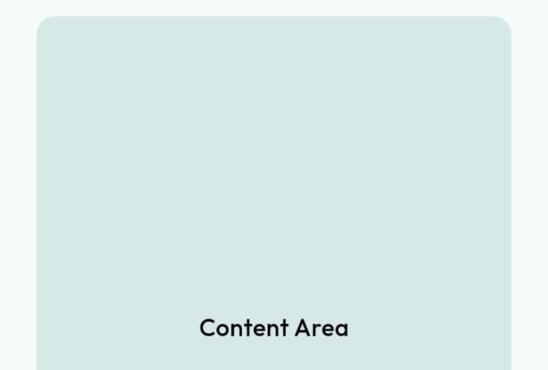
10. Adding The Content Area and Bottom Navigation Bar: All right, it's time to bring
in the dashboard to life. We already have a row
of cards at the top. But now we're going to add
a content area below that. Then finish the layout with
a bottom navigation bar. Let's start with
the content area. Now here, this is the row
which is actually holding all the cards here.
This is the main row. Right after that,
we're going to add a sized box of a
height of 20 pixels. Okay. And then below that, we're going to say expanded. And that expanded is going
to have a card dot filled. Okay. And let's hit Save. We still can't see anything yet, but that's completely fine. So here we're going
to add some color. So now what we can do is
we can set a theme here. So we can say them dot off. Dot primary color, and then
we can use it with Alpha. So basically, we set
the transparency here. So we can set that to 30. And if I don't save, well, we still don't see anything
yet because we have not given any kind of items
or any data inside it. So next, what we can do is we
can add in some elevation. I'm going to set the
elevation to zero, which is basically removes
the default elevation. And here, in the child, we're going to add center. And inside that center, we're going to add
another child. And here, we're going
to add the text widget. The text widget will
say content area. Save that, and there we have it. Now, inside this text widget, we can actually style this. So we can say style. And then we can say
theme that off. Then we can say text theme, and we can set the title
to medium or small. I'm going to set that to small. So it just bolds that thing. Now let's scroll a little bit back and if you see
here, what did we do? We used a theme with Apha. This makes the color
dynamic based on the app's current theme.
Here's what's happening. The size work that we added
with the 20 pixel that adds spacing between the
cards and the content area, expanded make sure
the content area fills up with the remaining
space on the screen. Card toot filled gives us
a nice background surface. So we basically got
everything that we needed. Now, coming back to this
Alpha thing, if you see this, we can actually change the color based on the theme that we
select in the material b. So here we gave a hard
coded color, right? So we can actually change that with this. So let's
go ahead and do that. I'm just going to copy this, and then I'm just going to
replace this with this one. And let's do the
same thing here. I'm going to replace this with
this one and this one too. So now next time when you change the material app seed color, the entire app color
changes with it. Let's go and actually try that. Let's go to our main dot dot, and you can see who said that to tear we're going to
change that to blue. Let's save that and boom, the card and the content
area updated together. This gives your UI a
unified dynamic clock. Now let's wrap up this lesson
with a navigation bar. We already have a nice
app bar at the top, so we'll add a bottom nap
part to that scaffold itself. So if you go to your layout
homescreen dot at the bottom, you can see the scaffold here. This is where the
scaffold actually ended. And if you want to just confirm it, you can scroll back up, and you can see
this is a scaffold, click on that so that you
will see the closing bracket. Okay, so this is the scaffold. So now we are inside
the scaffold. So here, all you have to do is just type in bottom
navigation bom, and then we can say
navigation bom. So it asks for
some destinations. So here, I'm going to create a cast and it's going
to hold some arrays. Now, inside this list, you need to have at least
three navigation destination. But we're going to add four.
Let's go ahead and do that. So inside this, we're going to say navigation
destination. Here it is. Now here you can see
that it takes in an icon and it takes in a label. Now, for the icon, what we can do is
we can say icon, say icons dot HOME. Because we want the home icon. Now, the label can be a
simple text like home. Now if I save this, you
see we get an error. Basically, here you can see that the destination length should be greater than or equal to two, which is not true right now.
Let's go ahead and fix that. What we can do is we can just duplicate this three more times. Basically, we have
four navigations now. Now if I don't save, well, I think came up,
that's completely fine. What you can do now is
you can actually hot reload it again,
restart the app. Now you can see we
have four NAB items. Let's go ahead and change
the data for this. Instead of hope for
the second one, I'm going to say search, and this is going to become
search for the third one, we're going to change
that to settings, and here we'll change
that to settings. Then for the last one, we're
going to call this as help. Here we can call this as help. Let's save that. Now you
can see we got the icons. Now the issue here
is this actually doesn't match the theme
that we actually created. We have a blue theme
and this one is gray. What we can do is
we can actually change or apply the
color for this. Inside the bottom
navigation bar here, you can say background color. And if you remember, we did at this one, which is actually pretty good. Theme dot of context an Alpha. Copy this, paste it here and we're going
to change this to 80. N five don't save, you can see that gave that
color for that. If you want, you can actually
change the opacity here. So you can set that to 30 to match the color
of what we have. Right, there's one more
thing that you need to note. So if you see here, the home
is actually selected, right? So maybe you cannot see that, so let me just change the
value here. Maybe we can. So let's add it to like 100. Okay, so now you can see this
it's highlighted, right? So if you want to shift
that from home to search, all you have to do is
it'll say selected index, it starts from zero. So zero is the home. One is the search, two is the setting, and three is the help. So you can easily navigate
between these buttons. So now let's get that back
to 30, let's head on save. All right, so the selected index controls which nav item
is currently selected. Background color uses the
dynamic primary color with Alpha for consistency. Navigation destination
creates each icon per label item in the Navbar. So now we have a
complete layout. Let's go and change the theme here so that it
looks much better. So I'm going to change
that back to tear, I'll save that, and
this one looks better.
11. Class Wrap up & Class Project: Awesome job, everyone. We just built a complete
flutter layout from scratch. We started with setting
up the base project, understanding padding and
basic layout concepts, building with rows and columns using expanded to
structure responsive UI, creating a modular
dashboard card widget, adding a dynamic content area, and finally bringing everything together with the
bottom navigation bar. Because we used theme dot of
contact with dynamic colors, you can now change
your app's entire look just by updating
the theme color. Watch this. If I switch
to purple now and boom, the entire dashboard adapts. You can actually change
this to blue or even amber, whatever your vibe is. This is the magic of building
layouts cleanly in flutter, one solid structure
infinite possibilities. For your class project, duplicate this layout and
choose your own theme. Replace the icons and titles on cards to match your own idea, like a travel app,
finance dashboard, or a task manager or
anything you love. Experiment with
different spacing colors and icons to make
it truly yours. If you want, you can add more navigation destination
and see how the UI scales. Once done, share a screenshot
or screen recording of your finished layout in
the class project section. I would love to see how
creative you can get with this foundation. And that's it. You now have a fully functional theme adaptive floater layout you can build on top of, whether it's for dashboards, landing pages or full Apps. I'm so proud of you for
following along step by step. Keep building, keep
experimenting, and I'll see you
in the next class.
 Flutter Sensei, Teaching Flutter from Scratch