Transcripts
1. Intro: Welcome back to
another awesome class with me, can Besser. It's always a pleasure
having you here. If you've been watching my
glasses, then you know, I like teaching
people how to design awesome landing pages with
Elementor and WordPress. Now, in this class, I'll be teaching
you how to design a digital downloads website where you can sell
your digital products. By digital products, I mean
things like logo templates, your music, if you
sell instrumentals, if you're a music producer, or if you design UI templates
using Figma and Sketch, and you want to be able to
sell them on your own website. If you've ever visited a
marketplace like graphic river, free peak, or Creative Market, then, you know, kind of a
digital downloads business. I'm talking about a platform
where a visitor can come and explore your library of digital products in
your digital shop. Select a digital products
to see more details, and then by and download
that digital product. That's the kind of business
I'm talking about. If you're in the
creative industry and your job involves the
creation of digital content. For example, fonts, graphic design templates like
flyers and logo templates, UI UX template such figma
or sketch templates. In this class, you will
learn how to set up a platform to which you
can sell those templates. Unlike my other
elemental classes where I mainly
focused on how to use Elementor to build a
single landing page without going into details
on how a website works. In this class, we'll be creating a fully fledged multiple
page website that is working and has the
potential to start earning new passive income
even while you're asleep. That's if you're willing
to commit to that. So if you've been
dreaming about owning an online platform
where people can come and download
digital products, where you can upload the
templates to create. Then this is the system
we're going to be learning. So I hope you're as
excited as I am. I want to show you just
what we'll be building and then we didn't get
started, so follow me. And there we have it. Now that we've had
an overview of the digital downloads
website will building. And because this class is designed to
accommodate people at all levels of experience in WordPress,
including beginners. We will start by
looking at what is a CMS without wasting
any more time. Let's get started.
2. What's a CMS: A content management
system, or a CMS, is an application that
allows you to create, publish, and modify
digital content. With a CMS, you can create a fully working
website in minutes and immediately start
selling products and services to
online customers. To use a CMS, you don't need
to know how to code because the application
provides you with tools to manipulate
your content visually. If you know how to point and click on icons on
a computer screen, you can use a CMS. Anyone can use a CMS. Then we'll be taking a look
at some of the examples of the most popular
CMS has shortly. But how does a CMS work? To understand how a CMS works, we have to look at it as two
parts that work together to produce a delightful
experience for the user. And these two parts include a content management
application or a CMA, which is basically
the front end or front-facing graphical
user interface that you interact with as you create and edit your
website content. This is represented
by a dashboard that provides you with
several tools and utilities that you can select and do different
things on your content. The other part is the
contents delivery application or the C, D, a. This is the backend
side of the CMS, which is responsible for
the delivery of the content you've created with a CMA
to your website visitors. To illustrate how these
two components relate. Let's think of a CMS as a
restaurant for a moment. If a CMS is a restaurant, the CMA is like the kitchen. He provides the kitchen
where needed to cook the food that
customers will be served. That's to say in a CMS, the CMA is the part that gives you the tools to
create an published, the digital content that
will be served to visitors, such as blog post articles, products displayed
on your website when you're creating them. It's the CMA that gives you the tools to create those parts. On the other hand, while still
on the restaurant example, the CDA is like the waiter in a restaurant who
receives meal orders, goes to the kitchen
to get the food and serves it to the customers. So going back to our website, that's to say that the CDA
is the part of the CMS that serves the pages that have been requested by
your website visitors. So when they request
for the homepage, they click on a
button supposed to be redirected to another
part of the website. It's the CDA that is responsible for delivering that page
they've requested for. There are two ways in
which you can use a CMS, and this is determined by
how the CMS is installed. You can either use a CMS as an on-premises CMS or
a Cloud-based CMS. If you download and
install the CMS on a server that has
been provided by a web host or on a server that you've created
locally in your machine. The CMS is say to be an
on-premises installation. Because it's installed on a server that you
have control over. You can make direct changes to the core of the application to meet your specific
website project needs. For example, you
can access and edit the source code of WordPress to customize how you
build your website. As for Cloud-based, CMS's, a seller of the CMS service, provides you with a
Cloud hosted environment on which you can create
and manage your website. For example, think of weeks. They provide you
with an environment on which you can
build a website, but they manage the main weeks platform that is
powering your website. With these type of installation, you don't have the
freedom to edit the CMS itself. The core. For example, you can
create a website on weeks, but you cannot edit the core of the weeks platform
itself because only the in-house
weeks developer team has access to the source code. You and other users
can use the tools provided on the WIX platform
to create websites. But the week's
team takes care of the backside and the backside
functionalities for you. So popular examples of
on-premises CMS's include Drupal, Joomla, and the
WordPress, wordpress.org. A few common examples of Cloud-based CMS
installations include weeks, Shopify, and the
WordPress.com platform. While every CMS is unique
to a certain degree, almost all CMS's share
certain crucial features. Let's look at some of them. Number 1, a CMS gives you the tools to publish different
types of digital content. A lot of people opt to use a CMS because it allows them
to assemble pieces of content with a few
clicks and publish them as blog posts or products in real time without
the need to code. Number 2. A CMS
provides you with ways to revise your
published content. As a website owner, you will always want
to edit or update some content that you've
already published. A reliable CMS should allow you to make
changes as you please, and also keep track of those changes so that
you can revert to earlier versions of your work in case you make mistakes
as you're editing. A CMS provides an
easy way to index, search for and retrieve content. This simply means that
a CMS should allow you or your users to
access content on your website easily through
search by providing a way to group content by predefined
categories or groupings. For example, flier templates,
magazine templates. When a user types
magazine templates, they should be able to
get a list or a gallery of magazine related results
right there on the screen. That's what we mean by indexing, searching for and
retrieving contents. So now that you understand what a content management system is, let's take a look at the
world's most famous and popular content
management system, WordPress. Let's do that in
the next lesson.
3. Online Wordpress Environment Intro: The first step in setting up an online WordPress
development environment is to get reliable web hosting. A web host basically
stores your website on a computer that is
connected to the Internet 24, 7, 365 days a year. So that ensures that your
webpages are available to visitors when they request them as they browse
your website. So let's choose a good
website for your business. Having been designing WordPress
websites for years now, I've come across and use quite a lot of web
hosts and some of the crucial factors
I've learned to consider when looking for
a good web host include, are there hosting services were press friendly
because there are web hosts out there who offer WordPress
specific services. What security
technologies do they use to keep your website safe? Do they provide a reliable
24, 7 technical support? Will they offer fast loading
speeds for your website? These are some of the few, as you need to consider as
you're looking for a web host. And with these factors in mind, a few of the most popular
WordPress Web hosts that are well-known for their consistently excellent
WordPress friendly services include TMD hosting, site ground, dream
host, bluehost. These companies provide
WordPress specific services as part of their
product offerings. And these are just four of the most famous WordPress
friendly web host in the marketplace. You can get a good web hosts for your digital downloads
business in your own country. But just in case you want
to save yourself that time and pain of having to Google everywhere for the
best web hosting services that the four that
I've mentioned already, that's TMD hosting site ground, dream host and Bluehost, the very popular among WordPress uses and you might
consider using them. So that's it for the web
hosting and domain name. It's time now to set up an online WordPress
development environment. So let's dive right in.
4. Demo - How to Set Up an Online WordPress Envir: Welcome to this lesson. In the last lesson,
we talked about the two different
WordPress environments we can set up to start
building websites. In this lesson,
we're going to set up an online WordPress
environment. And we also looked at a
few factors you need to consider when you're
looking for a web host. So now in this class I'll
assume you've already decided which web host we're going to use for the purposes
of my demos, I'm using these web hosts. So I'm going to login to
have access to my cPanel. So login to your web host in order to get access
to your cPanel. Inside my web hosts dashboard, I have these cPanel
login option. Look for the cPanel login option wherever it is in
your dashboard. So inside my cPanel, I'll scroll all the way to the bottom and look for
subscapularis apps, the installer, I'll
click Wordpress. And because you've
clicked WordPress, you'll be taken directly to the WordPress landing
page withins of calculus. And because I already have two installations of
WordPress on wheat, I have to live website. I have a list of the
current installations here. When I install another
copy of WordPress, it will be listed below
these two right here. So this will be the list of all your WordPress
installations. So the next thing we need
to do now is systole. Now. Now we will take into these page where we can fill in all the details about
our new website. So for the protocol, I'll click the drop-down
menu and select HTTPS. Make sure it's https, www dot, so that it's
www dot your domain. Leave the directory blank here, and this is the version of
WordPress we want to install. So it's 5.8.1. So give you a website and name, and let's give it a description. All right, so here you can
provide the admin details. These will be your WordPress
login credentials. So whenever you want to login to your WordPress in order to access the WordPress dashboard. These are the details
you will use. So so make sure it's
a strong password. Let me hide that and
set my password. So I would suggest you leave the defaults email that's in
the input field right here. Next, these are not mandatory. Yeah, and that's it. We're done. And in here, type the
email to which you want soft tackle us to send a notification when your
website is created. So once this website
has been created, so once this WordPress
installation is complete and notification
will be sent to this email. So I'll just put my
email and say install. Don't say that. We should say three
to four minutes. All righty. And now congratulations, the software was
installed successfully. And this is the direct
link to the main page, to the main page of the domain. So let me just click
and see where we have. So that's our website
at the moment. And this is the link
to our dashboard. It's the same domain, but with a WP hyphen admin. So that's the link
to the dashboard. If I click that, you'll be taken
to the dashboard. And wallah, there we have it. We've set up an online
we're pressed environment, and now our website is live. If we rightly that open link in new tab
and go to that tab, this is what we have. So now the next thing
we wanna do is see how to install a
WordPress theme. What's a WordPress theme? I'll see you shortly.
5. Demo - How to Set Up a Local WordPress Environment: In this tutorial, I'm going
to show you how to set up a local installation of WordPress and we'll
be using XAMPP. But first of all, what is XAMPP? Know zap is a completely free and open source
development environment that allows WordPress users to
build and host websites locally in their machines without the need for
internet connection. That means we can continue interacting with websites
that you've built without the need for Internet
connection. In full. Xampp stands for the X stands
for cross-platform Apache, MySQL or MySQL, PHP emperor. According to WordPress, in
the context of a network, a local host is a specific computer you're
working on right now. So if you're in an
office right now, the computer you're
using Israel local host. If you're working from home, your computer at home
is your local host. If you have a favorite computer, it a cyber cafe, that computer can be
your local host as well. You can have XAMPP on
any of these machines and install WordPress there and start building
websites from there. So let's look at how to set
up a local host using XAMPP. So here we are on the
official XAMPP download page. And the URL is www dot Apache friends.org
slash index.html. And you'll notice that we
have different versions of XAMPP creative for different
operating systems. Because I'm using Windows, I'll go ahead and click
XAMPP for Windows. The download should
start automatically, but I'm not going to download it because I had already
downloaded the, as you can see right here on my desktop, I
already have it. Next thing we wanna do is go
to WordPress download page, which is WordPress.org
slash download. Scroll downwards and
click this button right here to download the
latest version of Wordpress. And I already have a copy of it. I've already downloaded
and extracted it. It's on my desktop, as you can see right here. So download that WordPress and extracted to a place where
you can retrieve it from. So now that you have these two, Let's begin by installing XAMPP. So I'll double-click that. And you'll get this
warning prompt. Go ahead and say, yes,
continue with installation. Then follow the prompts. Should be pretty easy. Not complicated goal
the way to the end and installed XAMPP in its default. See the right, Sorry, I already have a copy
of it in my system, so I'm not going to install it. So once you've installed
XAMPP and go inside your control panel and look at the list of all
the programs you have, you have installed
in your machine, you should find Bitnami
WordPress module right there and
XAMPP at the folder. Let me go ahead and close that. And inside your C
drive or main dry, you will find a
folder called SAM that should tell you
that you've successfully installed XAMPP in your machine. And before we move on to
the WordPress folder, Let's make sure our
server is now running. So I'll open up XAMPP
from the start menu. I'll bring it right
here into focus. And you'll notice that it
has many buttons right here. But we're interested
in only two buttons. Apache, MySQL. So click Start on
both of them and you'll notice that
status has changed. Now MySQL is running
and Apache's running. Mysql is the database, and Apache is a server. So I'll go ahead
and minimize that. And let's move on
to the next step. The next thing we wanna do is pick the WordPress folder
you just extracted. And we could just
open it for a second. You'll notice that
it has many webpages here in a bunch of
other folders with more files that
will enable you to navigate your pages on
your local website. So now that we've confirmed everything you need
is inside there. Copy it. And then we'll open up Windows
Explorer and go inside C, open the Zoom folder
we just looked at and look for this
folder, HT docs. This is where all your
WordPress websites will be installed. This is where you will have all your locally installed
WordPress websites. So if we paste it in here. I think I had already
pasted a copy of it, so I already have
a copy of it here, but basically just paste this WordPress folder in these HT docs folder that's
inside the exam folder, inside the C drive. And once you've
pasted it in there, rename it to the name
of your website. So my web let me just
call it my web override. So now that we've installed
XAMPP in our system and it's running as you can see
by this status right here. And we've already
downloaded a copy of WordPress and created
a website from it, and named it my web
inside the XAMPP folder. Now we can go and access the
WordPress website dashboard, the dashboard of these websites. So let's go to local host. My web, the name of your website or the name you gave
to your folder, and will be redirected to
this page where we'll get started with the
installation of WordPress. So before we go
further than this, open up a new tab and go to
localhost, PHP, my admin. And the reason why we're
going inside here is because our website doesn't
have a database yet. So we're going to
create a database. Then we'll go back
to this page and continue installing
everything else. So inside PHP, my admin, go ahead and hit that a basis. And let's give it a name. So my, when I scored the B
or something of that sort, just give it any name,
doesn't really matter. So that was my web DB and
you'll find it listed here. Here it is my web underscore DB. So now we can come back
to this page and click, Let's go for the database name, give it that new name, we just named it. So it's my web underscore DB. For the username,
let's give it routes. And for the password,
leave it blank. Then hit Submit. All right, sparky, you made it through this part of the installation. So next, let's run
that the installation. So right here we'll just
provide basic information about our WordPress website and
set the logging credentials. So the website is my web. And then let's just go with
admin for the username. Use a nice strong password. But for now, for
illustration purposes, I'll just go with polite. Then I'll confirm use
of weak password. My e-mail, P at k.com. And I'll heat
installed WordPress. Let's give it a moment. So there we go. Success WordPress
has been installed. Thank you and enjoy. Let's login with the credentials
we just created, admin. Our password was let me just
reveal this was my pass, if I remember correctly, wha what was my password
for light or right. So there we have it. So in summary, or a quick recap, anytime you want to create a new website locally
in your machine, all you have to do
is copy this folder, paste it in here,
give it a name. Another website,
copy this folder, put it in here, give
it another name, and so on and so forth. Make sure it's the original
folder you downloaded, the one you downloaded
and extracted. So you can have 50, 7000 websites in here. And when you wanna go inside
the dashboard, first of all, make sure that your XAMPP, your XAMPP, let me just
bring this to focus. Your Apache and MySQL
are both running. So as long as these
two are running, you should be able to
open up your browser like that and go directly
to your local host, localhost, and the
name of your website. And that's how to do it, guys. I hope you found these helpful. If you liked this video, please give me a thumbs up. We always give the
motivation to keep going.
6. What's a WordPress Theme: A WordPress theme is a collection of files
that determine how any WordPress website
will look and behave when users are
interacting with it. So these files may
include PHP, HTML, and CSS code, images, plugin templates and
web page templates. By making changes to this
collection of files, you can change the
appearance and design of your WordPress
website to make it look and work exactly
as you want it to. For example, by tweaking
a few of your themes, appearance settings,
you can change how articles would be
displayed on your blog, how your products will appear
on your e-commerce store, how your menus will be
presented across the website, and how links or
behave when clicked. Anytime you install WordPress, it comes pre-loaded with the
default WordPress theme, typically named after the year
in which equals launched. For example, the WordPress 2020 theme or the
WordPress 2021 pain. You can always change to
a new theme if you like. And we'll see how to
do that in this class. There are three types of
WordPress themes when it comes to how much it
costs to get them. There are free themes. That means they're free
to use completely. You don't have to pay
any money to use them. There are freemium themes, which means they
are free but with additional premium
features that you have to pay to have access to. And then we have
premium themes which are only available to
you if you buy them, you can only use them.
If you've bought them. As a WordPress user, you can easily find any soul, thousands of free
themes listed in the WordPress theme repository
or theme directory. If you want premium themes, you can buy them from a digital marketplace
such as Creative Market, or pay a developer to
create one for you. How can you tell if a WordPress theme is
good for your project? Now, while there's really no one size fits all
answer to this question, generally, any well-designed
WordPress theme should have a few common
characteristics of a good theme. In other words, the
theme should look presentable and awesome
on all screen sizes. It should have a
consistent appearance on all major browsers. That means you should work
well with Chrome, Firefox, Safari, Internet Explorer,
and those others. It should be actively maintained
and regularly updated. It should be live and
therefore fast to load. That is, if it's written well, it should have clean,
well-written code. You should have extensive and
well-written documentation available online. You should be backed by a reliable customer care
and support for all users. It should be SEO friendly. The two WordPress
themes that I use in virtually all my web
design projects are. Number one, Astra. Astra is a very popular free and multipurpose WordPress theme that provides you with tons of beautiful pre-made
templates that are fully editable with any of the popular Drag and
Drop page builders, like Elementor, Beaver Builder, dV, and so on. The features offered in the
free version are sufficient for most website projects
you might want to work on. In fact, we'll be
using astro for our digital downloads
business project. The other theme that
I like using in many of my projects, iz dV. Dv is not only one of the most popular
WordPress themes in the marketplace today, also has an amazing
visual page builder that allows you to
edit all aspects of the team and design any type of website you want
without any coding skills. So whether you want to
start designing from scratch or from a
ready-made template, dv will provide you with the
ability to do so smoothly. As I have mentioned, every new WordPress
installation comes with a default theme to control the appearance of your website. Wordpress gives you the
freedom to switch to a different theme by
simply installing a new one through the WordPress appearance
feature in the dashboard. So let's install and activate our theme in the next lesson.
7. Demo - How to Install a WordPress Theme: So welcome back. In the last lesson, we looked at what a
WordPress theme ease. So in this lesson, we'll be switching from the default WordPress theme
to attain called astro. So with always in any more time, let's go straight to
appearance themes. And as I mentioned
in the last lesson, every brand new installation of WordPress comes with
a default theme. And the theme is usually named after the year in
which it's released. So right now we're
in the year 2021. The active team on every new installation
of WordPress is 2021. And we have these other
two, 2019 and 2020. We want to say Add New. And the theme we want to use
for this class and the PMI recommend for most
projects is Astra. Now just in case you
can't see Astra here, you can type in Astra in
this search bar, Astra. Let me just type
correctly. Astra. And there it is. And
we can go ahead and install it or ride. So now that it's
installed, let's activate. And now Astra is
our active theme. And that's how to install
a WordPress theme. And I want to just take
a moment and click on theme details just
so we can see why Astra is an awesome team
and why I recommend it to anyone who wants to build
a website on WordPress. If you read through this
description right here, you'll see why Astra is one of the best WordPress themes out there in the
marketplace today, and it's free for you to
install and start using today. The good thing is that it's a multi-purpose WordPress type of theme because you can
use it for your blog posts, personal portfolios, business websites, even
WooCommerce storefronts. But definitely there are many other awesome
WordPress themes out there. Definitely you should
check them out. I'm only showing
you what I've been using and because it's
been working for me, I think I should tell
more people about it. So going back inside here, now that we've installed
and activated our theme, time now to look at what a WordPress plugin is because
we'll be using Elementor and other plug-ins to
build a website to extend the power of WordPress as we build our digital
downloads business, I'm assuming that
not everyone taking this class has used
were pressing. So we have to start
from what's a plugin? Let's see that in the next
lesson. See you shortly.
8. What's a WordPress Plugin: At the moment of
recording this lesson, there are more than 58
thousand WordPress plugins available for you to
use on your website. But what's a plugin? A plugging is a third
party application or software that
can be installed in your WordPress CMS to add new features to
your WordPress website. It's like a small
software that is designed to be able to connect to a larger software to add features to
the larger software, which in this case
e is wordpress. With plugins, you can
add amazing features to your digital downloads business to serve your customers better. The fact that we're pressed
is open source and it's architecture allows for integration with
third-party software, is the main reason
why plugins are so popular amongst wordpress users. So now that you know
what a plugin is, let's see how to
install and activate a plug-in by installing and
activating Elementor. We'll do that in
the next lesson. See you shortly.
9. Quick Update The New Elementor Setup Wizard: Welcome back. Now, this lesson is
a quick side note or a quick updates to the
Elementor installation process. If you're taking this class
in May 2022 and beyond, you will notice that
Elementor activation now has a setup wizard that's made up of several steps
that you have to go through to set up the basic
parts of your website. While I was creating this
class several months ago, Elementor did not have
that setup wizard. So I just want us to go
through that setup wizard. But everything else
you're learning in this class does not change. It's still the same
process all through. The only addition is
the setup wizard. So as you can see right now, I have a brand new installation of WordPress and
we're at Version 6. And what I wanna do is
go to Plugins, Add New. So we can add Elementor and
go through that process. I'll search for
Elementor install now. And now when I click Activate will be redirected to
that setup wizard. And we can go
through it together. So here we are. I'll just zoom out a little bit so we can see more details. Alright, so now you'll notice that the first thing
elemental wants us to do now is create an account to get the most out of Elementor. So these are some of the
benefits for signing up for an account
with Elementor. But the thing is, you don't
need to have an account with Elementor to use Elementor. So I'll just go ahead
and skip this part. The second step is to accept, to continue with the
hallow theme that Elementor has made for us. This is made by Elementor, but we're using the Astra Theme, so we just go ahead and skip. Astra is a more powerful theme. The third step is to give
a name to our website. While you were installing
your WordPress. You gave the website a name. That's the name that
will show up here. But this gives us
an opportunity to change the name to any
other name we want. My website, and then
let's click Next. And if you have a logo for your website and you want to
add it right now in advance. You can just go ahead and
open the media library and pick it from
the media library or uploaded from your computer. But we're not going
to do that right now. So I'll just keep this step. And of course we
can add the logo later and I'll show
you how to do that. Let's click Skip. And now we get to
the very last step where we have two options. We can start editing
our homepage from a blank canvas with
Elementor editor. Or we can browse
from hundreds of templates or import our own
templates if we have them. But I'll go ahead and skip. That. Will be redirected to the canvas where we can now
start building a website. And here we go. So basically that's all I wanted to show you. It's a new updates. It was not there
some few months ago. Now, it's there. But everything else in the upcoming lessons
remains the same. The process still remains the same to build a landing page. So without wasting
any more time, Let's move on to
the next lesson. I'll go to this burger menu
and click Exit to Dashboard. Let's exit from this page. Now we're inside the
dashboard and we're ready to get started
building the website.
10. Demo - How to Install a WordPress Plugin: Welcome back. In the last lesson, we saw what a plugging iz. So now let's see how to install and activate a WordPress plugin. So because we'll be using
Elementor as our page builder, Let's go ahead and
install Elementor. So I'll go ahead and
click plug-in for beginners will be taken to the least of all plugins
we have currently. And because this is a brand new installation of WordPress, I have to default plugins here, get rid of them by
selecting them. Then in this drop-down menu, selecting, Delete,
then applying. All right, so we've
gotten rid of them. And I also want to get rid of these astral notification here. So let's close that and
now we have a clean slate. Let's click Add New so we can go to the WordPress
plugins repository. And in here I want to
search for Elementor. Elementor. All right, so it should be
the first result right here, and it's by elementary.com. And you will notice
that there are many other plug-ins here that have the name
Elementor in them. And these are
plugins developed by third party plugin
developers because Elementor itself is an
open source project. So that means you can, you can extend the power of the plugin just the
same way elemental was created to
extend the power of WordPress because
WordPress is open source. So these guys here have
created plug-ins, widgets, elements that can be added to elementor and make your
design process Reacher. So I'll go ahead and
click Install Now. Override, then I'll activate. And now it's active. And that's how to install and activate a WordPress plugging. In the next lesson, let's have a quick overview of the elemental workspace so you can get familiar
with the tools and features you'll be
working with so that you're comfortable as we build the
digital downloads business. I'll see you shortly.
11. Overview of the Elementor Workspace: Welcome back and
welcome to this lesson. In the last lesson, we saw how to install and
activate a WordPress plugin. We installed Elementor and because we'll be using
elemental to build a webpages, Let's have a quick overview of the elemental workspace so
we can get familiar with it. So with our spend any more time, let's go inside
pages and add new. But before we add mu, Let's just say pages. So click Pages. And because this is a new
installation of WordPress, we have these two
defaults pages. I want to delete them, so I'll select both of them. And in this drop-down menu, move to trash, then apply that. Now let's create a
brand new page so we can open up in a mentor
and take it for a spin. So let's give our page a name. Let's call it the homepage. Home. And on the far right
side of the screen, you'll notice we
have these settings right here. Under Settings. Go to template and select
Elementor full width. Arrive giving it a name. So let's publish that. Let's go inside edit
with Elementor. So here we are in the front end of the
page we've just created. And this is the
elemental workspace. Whenever you're building
a webpage or a header. This is how the elemental
workspace will look. Right here. This is
our page and will be dragging element
and tools from the left side onto our page and whatever
changes we make right here, we'll be able to see them take effect in real-time
and will be able to click Preview Changes and see the webpage without these
settings, without these blocks. So we'll be able to see that. Now starting from
the top right here, we have this burger menu. If you click it, we have some general settings for
the web page on the website, but will not go deep
into that for now. Just know that we have
some settings in there. And then before we get
to this icon right here, in this middle area, we have the different
elements will be dragging and dropping onto the space
to build the webpage. So if I could collapse this basic panel right there and then collapse
that pro panel. Let's collapse all the panels. Elemental provides these panels and nested within the panels are the different
elements we can drag to build our web pages. So for example, if I drag this image element
and drop it in there, now we have an image
elements and you'll notice that this area has
changed because the active element that
is currently selected on the page here is the image and that's why it says
Edit image up here. These are the settings
we can change to change how the image looks. And there are more panels in here to modify the
settings for the image. So let me delete that. Let's drag something
else in here, like the text editor. And now right here it's
the text editor settings, and up here it says text editor. So whatever element is
actively selected in here is the one that
shows up right here. And you're able to configure the different settings
for the element. And now because we
have an active element and its settings that
are showing up here, what if we wanted to add
another elements to the page? We can't see the elements. So all we need to do is
click this small icon up here and that will reveal
the elements again. So collapsing that now that we've seen that the basic panel holds free elements that
most websites need. Buttons, text, images, videos, dividers. Let's collapse that. If we go inside the Pro panel, you'll notice we
have pro elements. We can use these elements
unless we have elemental Pro. So if we try to drag
the elements in there, this pop-up prevents us and
says We need the pro version. So let me close that and
collapsing the Pro panel, expanding the general panel, we have more free stuff here so we can drag and drop
a testimonial in there. Let me just close that down then basically this is the
part of elemental we will be interacting
with most of the time because we'll be dragging
elements and then, and then modifying
their settings. Then the next thing right
here at the footer, we have the update button. As we make changes
to the website. Example, let me drag
a button there. If you want to save the
changes we've made so far, well, we need to do
is click Update. And now our settings
have been saved. If we exit this area,
when we come back, we'll still be able to continue
from where we reached in to see the changes without
this block of settings. Go ahead and click
Preview Changes. And it opens up the
page that we're building and we can
see how it looks. We also have the responsive
mode icon right here. When it's time to
make the web page responsive for
different screen sizes, we can click that
responsive mode. It'll bring up this bar up
here that has breakpoints. And right here we have
the device sizes, we have the tablet
and mobile screen. And in the class
will be able to use this responsive mode icon and settings to make sure our website looks awesome
on all screen sizes. Let me exit from there. I'll click that to
get rid of that bar. Next we have the history
icon right here. If we click that, we'll see every single move
we've made since we started editing the page
and we're able to go back to a specific
point in time. So for example, then go back to the point in time when
we had the image added. So clicking that
everything else that came after the image was
added is now undone. So this is a great feature
in the sense that if you've made any changes and you
don't like how things look, you can go back to
those settings that you had a moment ago
that looked better. Then we have the navigator here. So clicking that brings up this sort of outline and you can have a bird's eye
view of your website. So if we have many
elements in here, all the way to the bottom, and you want to have an
idea of where you are, a bird's eye view
of where you are. This navigator will help us. So let's just duplicate
this a few times. Duplicate that. Right-click that replicated. Now we have three sections
and if we expand them, each section has a column, this column that's
holding an image. And that way we're able to jump quickly to different sections, edit those specific sections. In here we have more settings about these particular webpage. And we'll see how to
use all these settings. So if I could exit from here, let me delete these. Let me delete that. And that's just a quick
overview of Elementor. Of course, we'll
get to understand how to use the different tools and panels in here as
we build our pages, we will learn by doing. So. That was just meant
to get you familiar with the workspace you'll be interacting with with
our spending more time. It's time now to get
started building their digital downloads
landing page. I'll see you in the next lesson.
12. Create the Web Pages: Welcome back. Now in the previous lessons, we've been looking
at both a CMS's, what we're presses in
how WordPress works. So now with that fairly
solid understanding of these concepts, it's time to get
our hands dirty. Sam, to start
building our website. So without wasting
any more time, let's go inside pages. And because this is a brand new installation of WordPress, I don't have any web
pages created yet, so I'll go ahead and add new. So this is going to
be our homepage. So I'll hit Publish or ride
in Now it's published. We can view the page, but I
just want to go back inside our pages least and create
the rest of the pages, then we can view them
as we build them. So going back there, I'll say Add New so we
can create a few more. I'll just call this
one downloads. This is where we'll display all our digital products
and it's published. I'll repeat two more times for the blog page and the
Contact page, I'll add new. And that's the blog page
published that published. And finally, let's create the contact page and
publish that override. So let's go back in here. And now we have four webpages ready to be
populated with content. Let's go ahead and create
our navigation menu. And we'll use these web
pages as our menu items. Menu items such as these. So let's go ahead and create
a brand new WordPress menu. In the next lesson,
I'll see you shortly.
13. Create a WordPress Nav Menu: Welcome back. In the previous lesson, we created our
websites, webpages. Now it's time to create our
website navigation menu. The menu that will be
at the top, like this. And so we will be using our
webpages as our menu items. So going inside
appearance menus. The first thing you'll
notice is that we have these create your first menu below, because we don't
have a menu yet. So we can give our menu a name. And let's make it
our primary menu. Then I'll click
Create menu or ride. So our menu is now created. And as you can see right here, we can add menu items from
the column on the left. This column here. And if I
collapse these pages pane, you'll notice we also have posts, custom links, categories. So these are all
different types of content that you can use as
menu items on your menu. But we want to use our
webpages as our menu items, the webpages we created. So I'll select all of them. And then I'll add to menu. And now they've been
added to our menu. Let me just drag
this home item to be the first downloads and then Blog contact will be the last item on our
navigation menu. I'll save menu. And now our menu is
saved and updated. So the next thing we wanna do, now that we have
our navigation menu is designed it in
the front end on the actual website
so that people are able to see and interact
with it just like this. So let's do that in the next lesson. I'll
see you shortly.
14. Design the navbar with Elementor: Welcome to this lesson. So to design the navbar, we will need to
install another plugin that is an extension
of Elementor. And it's called Header Footer builder plug-in for Elementor.
So let's go inside. Plugins, Add New. So let's go ahead and type
Header Footer builder. And here we have it. So let's install
Elementor header or footer builder by
brainstorm force. Yes, so let's go ahead
and activate it. And now it's active. So to access and use it, we'll go under Appearance. And you'll notice that it's now one of the menu items here. So let's click Elementor, header and footer builder. And once we create our
headers and footers, there'll be listed here, but for now we don't have any. So let's say Add New. And I want to skip this. All right, So let's
give our navbar a name. So now bar, that
would be a nice name. And under type of template, let's say it's a header. And let's say display
on the entire website. And just in case you
have people under you, you're the ad mean, and you have people working
on the website as well. You can give them
different roles. You can decide who can edit these navbar and
who cannot edit. So let's say all are allowed. And then on the far right
here under template, Let's select Elementor
full width because we want the nav bar to run
all the way from the left to the
right of the screen. And under Astro
settings sidebar. Let's select no sidebar because
we don't want sidebars. For the content layout. Let's say full width,
slash stretched. And let's disable the primary
header, mobile header, title and the footer, because we don't want to use the default Astra
headers and footers. We want to build our own, which is what we're
trying to do right now. So with those settings,
Let's say Publish. And then let's say
Edit with Elementor. So we can now go to
the front end and start building the
navbar visually. So here we are in the front end. We want to design the
nav bar visually. So I'll click that
plus button and I'll pick a triple column
section right here. The triple column here
will be in such a way that in this column
we have the logo. So let me just add
an image element, click the plus sign, then drag an image
elements in there. And I'll click in here so we
can select the logo image. And because I don't have
any images uploaded yet, we'll have to go inside, upload files and select files. So I'll prepare these folder
called project assets and you'll find it in
the description below. It has everything we need for this project,
including the logo. So here we have logos. Let me just drag, grab the two logos. One is like one is dark because we will need
one for the footer, but for the header
faces what we're using. So selecting it, insert media. And now the logo looks awesome. So let me just drag that to increase the size a little bit. And it looks nice. So the next thing, I'll go to this column here
and click the plus sign. And in here I'll type nav. And we'll have these
Nav options here. The one we're
interested in is the HF be head of food or
builder nav bar. So let me drag it
into that column. And the moment you
drop it there, the four menu items
we created earlier, that is, the webpages
recreated show up, up here. I want to show
something very quickly. So let me just click
that and exit dashboard. And you will remember we went
through Appearance menus. And we created these
menu and added these four menu items to the menu and made it
our primary menu. So now going back inside
elemental header footer builder, and clicking Edit with
Elementor on our nav bar. That is the same menu
that we're seeing here. So let me just select that. Remember we call the menu, and this is what we have here. So let's go ahead and style
the napa in the next lesson, I'll see you shortly.
15. Style the Elementor navbar: So now it's time to style our navbar and
specifically this menu. Because for example, when we
hover over the menu items, you'll notice there are green, but our theme is
yellow and black, so we gotta do
something about them. So selecting the menu
to make it active here, I'll go inside style. And if I could just collapse
this main menu for a second, notice we have three main items, three main drop-down menus. And so when we expand main menu, we can go ahead and
select typography. Let me just scroll upwards and let's change the
font to Montserrat. I like Montserrat. Enter. And I think it looks better. I'll click anywhere outside
the box to get rid of it. So somewhere there. And on hover, you'll notice
the color here is green, the text color is green. We want to change
that to this yellow. So let me just see if I can
grab a nice yellow here. There we have it.
So we need to act. It also needs to have
that yellow color. So I'll select this
yellow and copy. Then go inside active
and paste it in there. So now it's yellow on hover. And when active
it's also yellow. So let me update that. And let's preview the changes. So there we have it. So let's click Home. And now that it's active, as you can see, it's yellow. So that's how to
create the nav bar. A little bit later when
we will be creating the search functionality
for the website, we'll add the search
bar right here, but don't worry
about that for now. The next thing we want to
do is design the folder so that after tau will be able to create the main contents
of the webpage. So going inside here, let me update this nav bar
so we can say the changes. So let's go ahead and create
a folder in the next lesson, I'll see you shortly. Just
16. Design the Footer: Welcome back. So let's continue. We've already created
the navbar stamps to create the folder, to create the photo will do the same exact thing we
did with the nav bar. So now that we have our, our navbar saved, I'll click this burger menu and
Exit to Dashboard. And I'll go and appearance
Elementor header and put a builder once again. And of course you can see
our nav bar listed here now. So I'll say add new. This time it's a folder type of template course is for the display on the
entire website. We can edit it all the roles. Everyone, any person in any row. The template is Elementor
full width, no sidebar here. Content layout for
wheat stretched. Then let's disable
these defaults. Please, the poll sections here. And then let's say Edit
with Elementor or ride. And now that we're
editing the folder, of course now the
navbar is not editable because it's showing up because
it's part of the webpage. But we're not in the area
where we're editing the napa, so we can't select these and start dragging it around with, you just can't do that. Only the folder is now editable. And so I'll click the
plus sign here and add, let's say add this for now. And I'll drag these up
too bad points somewhere. Click this plus sign, and let's add our logo
here. I'll click that. And this time I want
to pick these lights, logo, insert media. And of course now you can't see the first half of the
logo because it's wide. So we want to give this
folder a background color. So clicking that middle
section right here. And going to style
background, background type. Click this box in here, and let's give it a dark color. Maybe somewhere
there, a color that matches these dark gray. This is not pure black. By, of course, you can give
it any color you want. Now that we have that, let's give this logo some room at the top
and at the bottom. So while this is still selected, I'll just right-click
and edit section again. I'll go to Advanced, and I'll go to padding, remove these linking and
give it a top padding of 50 and a bottom padding
or 50 000, right? So now we have some nice room
on the top and the bottom. Next, let's, let's add some text here, some
descriptive text. So I'll drag these
bedding in there. And let's say something like free downloads for, all right, And while
we're still here, let's go to style text color. Let's drag that all
the way to there. Click anywhere outside
that box to get rid of it and click
Topography so we can change the font family
to Montserrat like that. And I want to change
the typography. Weight will change the font
weight to something like eight hundred. Eight hundred. Looks good. And let's
go back to content. And let's put it in the middle, like that. Arrive. Next. Let's click this tiny icon right here to bring up the elements. And let's drag some
text editor in there. And while it's still active, let's go inside style, change this color to white. And let's put it in
the middle like that. Now think maybe let's add some social media
icons right here. So let's add click that. And then in here,
type social media. Let's drag this in there. Awesome. But now there are two big, Let's reduce the size
while it's still selected. Let's go to style size. I think I like that
point right there, and I want, I want to
push it to the left. So let's go to content and
push it to the left like that. Update that. And on the right, Let's
add maybe a list of links. So I'll go inside here and click that to bring up
the elements again. And in here, I'll type least. Yeah, let's say I
can list and let's drag the icon list in there. And by default it
has three items. So let's start with the first item here and
rename it may be something like a digital products
category like logos. Right? Number two, let's
say something lie. Magazines. Let's say we also sell Elementor templates and we can keep adding more
elements here as we please say something
like gradients. Update that. And now let's go inside
here and stylet. Under style, Let's
spell it texts first. Right now let's say
that color to white. Let's collapse
that for a second. Go inside icon and change
the color to be yellow. We copied a still have
it in my clipboard. But you can just
manually selected. But you can just manually
adjusting. So there we have it. It's yellow on normal state, but on hover we want
it to be white. So on however, it's
changing to white collar. Let's say on Hoover, the texts you
change that yellow. So on hover it changes
to that yellow. Awesome. While it's still selected, let's align it to the
right, like that. And let's pull this all
the way to the end. And let's update that. Preview changes. Perfect. This is a very simple footer. Of course, we can
do much better, and that's really up to you. The main point here is to understand how to put
the system together, but finessing everything and making everything
looks super awesome. It's all up to you
in your creativity. But of course we can
improve this a little bit. I want to push
this because I see these texts seems to be
too close to this logo. I first of all want to drag
this further to the left, to the right like that. And drag this out a little bit. But I want to select this
column here specifically. In going inside advanced margin, let's remove that margin. And for the left margin, let's increase it to something like throw any, Let's try that. Update, that preview changes. Yep, I think right now
it's looking much better, centralized and everything seems to be positioned properly. That's how to create
our folder and napa, the next thing we want to
create our main contents, like on these pages. And we want to start
with the hero section. The hero section E,
the area that you see the moment you open up
a landing page like this, it has some text and image, will not have our search
bar on the hero section. So let's go ahead and create the hero section in
the next lesson, I'll see you shortly.
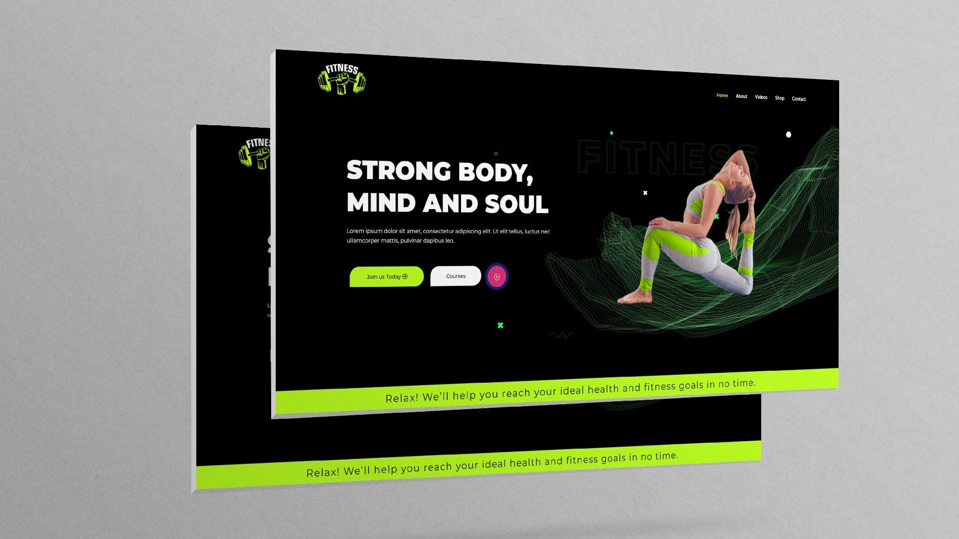
17. Design the Hero Section: Well, welcome back. So now that we have our
navbar and footer ready, it's time to start creating
the main content of the web pages and we'll
start with the homepage. So I won't go to this burger menu ones again
and Exit to Dashboard. And let's go inside pages. And now, as we mentioned, we want to start with
the homepage, so edit. All right, so jumping
over to the right side, over here under Settings,
go to template. And let's select
Elementor full width. And then let's click
the Astra icon right here to change some
Astro settings. And just like we did with
the navbar and the footer, we want to say no sidebar. Content layout
Elementor, full width, content layout for
width stretched. And we don't want to
use the defaults, primary headers, and all these other elements
that come with Astra. We want to create our
own with Elementor. So that's why we're
disabling all of these. And let's say Update. And now that it's updated, Let's go ahead and
click edit with Elementor because
we'll be designing it visually in the
frontier. Perfect. So now you will
notice that we have space in-between the
Napa and the folder. And we can start
populating the page with the different types
of elements we want. And just switching over to one of these reference
websites here, we're starting off
with the hero section, which has, let me just go to the homepage of
Creative Market for a second. So you'll notice here on
Creative Market they have these nice text that summarizes what the whole page and the
whole business is all about. And they have an image as an example of some of the content you can
find on the website. So let's create these heroes
section very quickly. And it looks pretty
much the same as the graphic river lending
page hero section. So going back inside
our project page, I'll say Add New. And of course we need two
columns. In this column. Let's go ahead and add. Let's click the plus
icon right there and drag a text
heading in there. Let's say something like
unlimited downloads. Like that. Let's go inside style and change the color right there
to something like 40. 40. 40. Yep. And while it's still selected, let's go ahead and change the
font family to Montserrat. And I want to give it
a font weight of 800. And I wanna increase in, let's go ahead and
increase the size, the font size, up to that point. Next, let's click this
icon right here to bring up the elements and
drag a text editor in there. And of course you can customize these texts to read
whatever you want to say. So for right, so let me just remove this
last sentence right there. Update that. Let's go ahead and add a button. So I'll drag a button
right below that text. And in here, I'll click this plus button to
add an image element. Clicking inside here is
go ahead and look for a nice image to have as
our hero section image. So I think we can go with
something like this. Open that insert media. And it's already
starting to take shape. But of course, just like
we did with the Napa, let's go ahead and
change this green color to match our website theme. So selecting this button style. I'll go to color under button. Color. And let's give it that 404040. And own Hoover, who
wanted to be that? Yellow? I still have it in my clipboard. So on however it's yellow, normal state, it's black. But now we want to change
what the texts say. So while it's still active, let's go inside content and
select the text area here and say explode downloads. Yup. And we can go ahead and
add an icon right before it. So I was still under
Content button. Let's select icon library. And let's say, Yeah,
something like that. I think I like this. Insert that. And now we have these beautiful icon
right before the text. And I've noticed we haven't changed the text to Montserrat, so I'll select the button again. Go inside style, typography, font-family, Montserrat
for uniformity. Just like that. And also want to increase the
padding a little bit. So while we're
still under style, I'll scroll downwards
and go to padding. Remove this link, and that will destroy
the button for a second. But what we wanna do is
give it a padding of 45 on the left. That's for 50. 45. And on the right, 45. For the top. Let's give it a 20. And the bottom as well. Right, So now we have
some nice padding all around that says update that. And let's rebuild it changes. We need some spacing
here above the heading. So let's go inside here and
select the column itself. And under Advanced, Let's
give you the top padding. Let's remove the
link on the padding. Let's give it a
top padding of 16. Update that. And let's
preview the changes. Awesome. So let's select the image and let's give it some
rounded corners just so that it doesn't have
these sharp edges like that. So while it's selected, I'll go to style border-radius. Let's give it something like 20. Update that. And let's preview the changes. Yeah, it looks much better. So I think now the
hero section is ready. Remember the goal here is not to create very beautiful
website at the moment, we're trying to
understand how to create the system itself that allows a customer to come
to the website, explore the products we have. Click on a product, open up the single product page description where they have all the information about that particular product and
they can buy or downloading. That's what we really
want to understand. So let's go ahead and create the products that will display
below the hero section. And we'll do that
in the next lesson. So I'll see you shortly.
18. Create your product categories: Welcome back. Our hero section is now ready. Let's exit to the dashboard. So clicking that burger
menu Exit to Dashboard. And let's make sure we've exited completely from the, alright, so now that we're
inside the dashboard, we want to understand how
we'll be working with our products as we progress. But right now, my
assumption is that you will be selling different
types of digital products. So for example, if you're
a graphic designer, you might want to sell logos, flier templates, poster templates, company
profile template. You might be selling
web design elements and graphic design elements. So those are different
ways of categorizing the different digital
products that you might sell. So how do you do that? Because if we could
just jump quickly inside Creative
Market, for example, as we've already seen, they categorize their products
into Canva templates, product mockups, Instagram templates in
all these categories. So going back to our
page right here, Let's go inside posts. I'll click posts. We're creating our digital
products as posts. And as we progress, you'll get to understand that WordPress
allows you to create different types of content
in different types of ways. In one of the ways to
create content for your website is by
creating it as a post. So your digital product
can be created as a post. If you publish articles, you publish them as
WordPress posts. You can create a podcast and publish podcasts episodes
as WordPress posts. So right now we want to publish our digital products
as WordPress posts. And you'll get to understand
why that's very powerful, because that's what will
allow us to be able to open up the post
in the front-end with Elementor and
design it visually in a beautiful manner to come
up with a nice single-page, the script shown a nice digital products
display and all that. So before we create any
digital products here, we want to create
the categories. So click categories. And of course I'll make
up my own categories. Now by default, there is always an uncategorized
category. Every content that does
not have a category goes inside the
uncategorized category. You cannot delete
these category. So let's create our own. So I'll start with logos. Hit Enter magazines. I'll say Elementor. Let's say those are the
three categories of products that I want to sell
on this website. But of course you will
have your own categories. Now that we have our categories defined and we can add more, we're ready to start creating
our digital products. So let's create our
first digital products. In the next lesson,
I'll see you shortly.
19. Design a Single Product Description Page: Welcome back. It's time now to create your
very first digital product. And as I mentioned
in the last lesson, we're going to create
your digital products as WordPress posts. So to create your very
first digital products, while we'll still under posts, let's say Add New or right, so let's give it a name. Something like I want to
create a product that will go to the Elementor category. Remember one of the categories
we created was Elementor. So I have some
elementary templates that I already
prepared in advance. And I want to create products for that
category to start with. So let's say
bodybuilder, templates. Template. And of course, as usual, I'll start by going inside the Astro settings and
setting this to no sidebar. Content layout, full
width stretched, then disable these five items right there and then the footer. And then let's go inside
the settings where proceedings under Template
change the defaults, templates to Elementor full
width and published there. Let's publish that. And our spelling here is wrong, so let me just correct
their update that. And with those settings, Let's go ahead and design it in the front end using
Elementor override. So here we are. We're going to design
it right here. And just to show you the
equivalent of what we're designing on a
different platform. Let's go to Creative Market. And let's open up
one of the products. I'll click this font
bundle to open it up. And now this is the
single product page that we're designing. We're designing a page that has all the details about that specific product
that you've clicked. Typically, you'll find
in most websites there is an image of the
product itself. And on the right side, typically you will find that
you have the payment button and a brief description of
what type of product it is. And below, probably samples of what if they're going
inside graphic river. Let's open up one of
the products here. Let's go inside. Let me open up this product. Same thing, a graphic river. We have this image. Then we have the Add to Cart
button and Buy Now button, a brief description of
the product M below here. Now we have all the
descriptions and links to important links
related these products. So what we're trying to do
is achieved the same thing. If I could just start by
creating a double column. In here, let's add
an image element. And let's click in here
to select an image. And because we don't have
a product image in here, let's go upload the
products from the folder. Remember, I mentioned
that you can find this project assets folder
in the description below. Download it. You'll find all these
images in there. And the images I need
right now are 12. Let's just upload all the images because we'll be using
them in the future. Like that. It's also
liked this image. Insert media. And that's how it looks. So let me just increase
the size a little bit. And on this side, I'll click the plus
sign here and drag. Let's write the heading first. And for the heading, Let's give the product the name we gave it in the backend, which was bodybuilder
template or RI. And let's make that a one. Update that. So let me just click that. You'll notice we have
one all the way to hate seeks and these are
headings, heading levels. One is the largest
heading in HTML, while HCX is the smallest and least in importance
in the hierarchy, a rule of thumb is to have one H1 on every single webpage. And that one needs to
have the key word for that particular web
page in order to rank on search engines
like Google and Bing. Because this is a product page, we need to have this bodybuilder
template as one which tells search engines that
this webpage is about this. And while this is
still selected, I'll go inside style
to change the color. I'll give it that 40, 40, 40. Let's go and change the
font family to Montserrat. And let's give it a
font weight of 800. I want to select
this column here, just so we can add some
padding at the top and push these body builder
template bonds downwards. So while the column
is still selected, I'll go inside advanced. Remove that link right
there and give it a top margin of
top padding of 50. All right, so that's some
nice spacing up there. And now click that
and let's go and drag some short description here
right below that text. And click that icon right here
to bring up the elements. And let's drag a button
right below there. For now, this is a place
holder button will replace this button with the actual
download or purchase button. So we're just leaving
it there for now. So this will go away at some
point in future lessons. So let's change this
text to download. Give it a capital
D, update that. And now notice that the image and the text are
too close together, so we need some space
between these two columns, selecting the section that's
holding the two columns. We want to say under Layout, columns gap, Let's say
wide, Let's say wider. Update that. And let's preview the changes
or write super awesome, it's now starting to take shape. Let's change this green to rhyme with the rest
of the website. So selecting that
button right there. Let's go inside style. Let's give it that yellow color. Update that now for
consistency, always, whenever you're using
any yellow here, make sure it's the same yellow. So just copied the code somewhere and anywhere you
want to place the yellow, use that same code. So right now that's
how it looks on hover. We want it to be black. So let's go inside hover color. That's how we'd looks. While we're still in here. Let's go to padding
and break that up. Then let's give it a
left padding of 45. 45. And that's 450 again. 45. Think maybe let's
give this a 15. 15. The likey they are now. And let's select the image. I like it having
rounded corners. So I'll select the image, coincide Style, and go down border-radius and give it a border
radius of 20. Yup, I lightly like that. Update that. And let's preview the changes. Or right, it's starting
to take shape. So if, for example, your business is selling
e-books or courses, of course this will be the
image of your courses. You need to make it
compelling and beautiful. Next thing we wanna do is add some description below here. So let's create a, let's make it a
double column again, and let's give it a select
that section itself, go to Advanced, break this
margin link right here. And let's give it
a top margin of 50 so we can separate it
from this other section. So let's give it a 50. And now there is this
room between them. So in here, let's click the plus sign there and drag
that in there. And I want to select that, and I want to change that to. Templates, this schon. So this is the description. Of course, let's
change that color to the color we like
for consistency, clicking anywhere out
there to get rid of that. And then go inside topography, font-family, change
it to Monterrey out. And let's give it
maybe that size. Let's drag that all the way to probably that point and
you'll see why shortly. So selecting that again, I want to give it a
font weight of 800. And then right below
it. Let's go ahead. Let's click that to bring up elements and let's add
some description here. I'll just copy all this and
duplicate it right there. Just as an example of your
description of your product, but it needs to be detail. Let me just update that. So that's what you provide here. All right, the next
thing we wanna do is copy this button. Copy that. Click anywhere within this text
editor and paste. Let's update that and
preview the changes. Let's scroll downwards. So that's what we have, but right here, there is no
space between these elements. So let's increase that
spacing below there. So that's this section. I'll select the section, go to the bottom margin and give it maybe
something like 90. So now we've increased
the spacing of 90 pixels at the bottom
of this section, right before where it
meets with a folder. So let's preview the changes. All right, so now we have
that nice gap right there. But we're not done. We need to add a few
more items there. When we need to add
probably related items, like related products and a few product descriptions here. So going back inside here, I'd like to come in here and
click the plus sign in here. I'll type list. Drag that icon
list inside there. And to increase the
spacing between these two columns here, I'll select the section itself. Go to Layout. Columns gap wider. I need them very wide. And now here's where we provide the product description
in brief, for example, things such as file size, let's say something
like 2.52.5 MB JSON formats or RI. Let's see what other
things would we want. Something like? Let's duplicate that, Let's
add another description. So this could be version or
write something of that sort. And of course, let's
tell these buttons to be consistent with a website. And I don't like
this yellow color. It's 2's creamy. We want the button black, but yellow own hovers. So let's switch them over. I want to copy that yellow going inside
here on hover state, paste it in there, and then go back to normal
and change that to like that. That's much better. Let's leave that is yellow, and let's leave that as black. So selecting this one's again. Let's go ahead and say style. For the icon. Let's change that to the yellow. We've just copied. Pasted like that. Let me give you a hover color. All right. Let's go to the texts. Also give it that hover effect. Now make it that same
yellow for consistency. Then let's review the changes. The single product right
here is taking shape. We have an image. The client can read the brief
description of whatever you want to tell them right here and making go
ahead and purchase. Remember we said we're going
to replace this button with the actual purchase or buy
now button or add to cart. If it's free products, we're going to have a
download button right here. And of course right here
the customer can read more details about the
product itself and have a quick overview of the important data about
that product right here. And they can go ahead and
download it or by once again. So we want to make it as easy as possible for the
customer to purchase. That's why we have
these buttons all over. We don't want to have
them have to scroll all the way to the top to
look for the download button. So if they scrolled to some point where they can't
see the download button, you need to have another
Download button or by button. And we have the folder. Once we create more
products will have related products right below
these Download button. We won't have that now. But that's how to create
the single product page. Now, all we need to do to
have products to display on a website is create more
products like these. So I want to create more
digital products like this. Let's say how to do that
in the next lesson.
20. Create a Product Description Page Template: Welcome back. In the last lesson, we saw how to design these single product
description page. Now, all we need to do to
have products to display on a website is create more
products like these. So I want to create more digital products like
this in the back-end. So going back here, I'll say that burger
menu Exit to Dashboard. And our legacy
completely from here. So our body build a
template, is ready. Now, all we need to do is
create many more products here. There will be listed right here, and we'll be able
to display them in the front end.
Let me just click. Will be able to list them below the hero
section right here. So going back in here, I'm going to say Add
New and I'll repeat the same process I did for
the bodybuilder template. So I'll say Add New. And I'll call these products something like waiter template. I'll go inside settings, template, Elementor, full width, and I'll go inside
the Astro settings. Once again, no sidebar. Full width stretched.
These, Abel, all these, all the
way to the title. And footer then published that. A now that is published, let's go ahead and design it in the front-end with Elementor. All righty, So here we are. If I could just open up a new tab and go
inside the dashboard, I want to show you
something very quickly. Let's go inside post. And now we have two products. Of course. Here we're trying to design
the waiter template, right? But we already created this. So if we open up with Elementor, I'll say Edit with Elementor. And here we have the single
product we already created. We like how it looks. And this new product will look exactly the same as
this other product, only that the details
will be different, the image will be different, but the layout will
remain the same. So we really shouldn't waste time rebuilding what
we already built. Is there a way to just reuse
what we've already created? Right here on another page. Yes, that's very possible. And that's what
we're going to do. But before we do that, let's sharpen this
page a little bit. Let's reduce this pacing right here by selecting this section. Go inside advanced. Remember we had added
some top margin. We want to reduce
that to something like Swanee, like that. And let's update that
and preview the changes. Now, that's more like it, but I want to increase
the spacing up here because it seems to
be too close to the top. So I'll select this
section advanced, remove that link and give it
maybe a top margin of 30. Somewhere there. Update that. And let's preview the changes. I like where it's located now. So there is even spacing between
this part and this part, so it looks evenly spaced out. A much more presentable. Now that we are satisfied
with the template itself, Let's go back inside these
page where it's located. And while we're now inside here, click this arrow icon
right here to Save. And click Save as Template. Let's give it a name like
single product page. Then hits, Enter or click Save. Now we have it here. It's available for us to use
on any other page we want. So let me now close
down the space because we're already done with
this bodybuilder template. We just wanted to say that. I'll close it. I'll
close that preview page. Close that. Let me close
down all these other pages. And now we're left
with this page where we're creating the
second template, which is the weighted template. So if I can just refresh the
page by hitting Control R. To refresh the page. Now with a page refresh, I'll click this tiny icon
right here to add template. And this window will pop up. I'll open up my templates
and now you'll find that the single product page we
just saved is now available. So click, Insert and
say Yes. All righty. So now we've populated our
second digital products with the template
that we can edit. And we can reuse
the same template all over as we create
more digital products. So let me update that. And let me change this
to equals waiter. So waiter template. So change that to weighted
template as well. Update that. And I'll click the image itself. Select the image. And let's select
this second image to represent that
particular product. So this is a, an elementary template
for such a website. Let's update that. And let's preview the changes. And there we have it. Our second digital
product is ready. So going back inside
our editor right here, now that we're satisfied
with that particular page, Let's go to this burger
menu Exit to Dashboard. Now, exit completely from here. And now we have
these two templates. So now I'll repeat the same thing for a
few more products, about six or seven of them. So we have a substantial number
of products to work with. And because this is the
same repetitive work, I'll just fast forward this section and I hope
you also take some time to create more digital products using the template
we've just saved. So I'll see you after I've created all the
digital products. So here we are. I'll just created six products the same way we created
the first to a. Now that we have these
six digital products, Let's go to the front end
and see what we have. So I'll go inside pages. And we want to see
what our homepage looks like because
next coming lessons, we'll see how to display
those products probably. So just switching quickly
to Creative Market, we wanted to display those
products in this manner. So how do we do that? Let's see how to do that
in the next lesson, I'll see you shortly.
21. Displaying the Digital Products in a Category: Welcome back. In the last lesson, we created our digital products. In this lesson, we want to
see how to display them in the front end for customers to be able
to explore them. So how do we do that? How do we display
our products in a presentable manner like this? Let's go ahead and do that. So going back inside
our dashboard, Let's go in here. Let's first of all,
view the page. So I'll right-click
and open the link in a new tab so we can see
what we have currently. That's what the page looks like. We have nothing after the
hero section is the folder. And we want something like
this or something like this. What we have on free pig or what we have on
Envato marketplace. So going back inside here, we want to come and say
Edit with Elementor. Because remember we created
this page with Elementor. So we can come up here and
say Edit with Elementor. And that will open up
the Elementor editor. All righty, So here we are. Now we can start adding contents right below
the hero section. So let's begin by adding a full width section,
single column. And let's add some margin at the top to separate you
from the hero section. So clicking that, I'll
go inside advanced. Remove that link and give it
a top margin of 50 or right. So now we have that
nice space and a quick tip I've just
remembered to mention here, when you hover over
this column or this section or
any other element that you can edit in here. It needs to show a quick pop-up that has some
quick shortcuts. And you do that by going
inside this burger menu, user preferences. Editing handles. Change that to yes
and say Update. And I'll show you
what that does. So now when you hover
over that column, it brings up these other options that can allow you to
quickly take actions. For example, if I want
to duplicate these, all I need to do is click there. And now we have two columns. I want to duplicate
this section. All I need to do is click
that, and there we have it. So now while we're inside here, let me delete that column
because we need only one. I'll click the plus
sign in there. And in here, I'll
search for greed. And we don't have a
post greed and we want to display our
products as a greed. If you look at this,
this looks like a greed. So going back in here, we need a plugin that extends
the power of Elementor. Remember, I mentioned
earlier that we have plugins that extend
the power of Elementor. So another plugin that does that is essential add-ons
for Elementor, it will give us the
option to add a greed. So let's go back
inside our dashboard. Plugins, add new. And in here I want to type essential add-ons for Elementor. Any should be the first. So I'll install now. Let's go ahead and activate it. Let's select Advanced
and select Next. Basically what this is, is if you select Basic, you will have less of
those features enabled. But if you select advanced, you will have more of the
features we want enabled, one of them being
greed, the grid option. So we want the
advanced option here, say next, and this
is what I meant. So by choosing basic, you would have had very
few of these selected. By now that we'd
selected advanced, we have more of these features checked and one of
them is post greet, which is what we
were looking for. So I'll say next, next, next, Dani stole
all those other things. Then Finish. So now that we have essential add-ons for
elemental installed, let's go to the front end. And first of all, let
me update that page. And then I'll hit
Control R to refresh the page so we can have access to essential
add-ons for Elementor. And now that essential add-ons for elemental is installed, let me collapse that and all these other
panels right here. And now you will notice
essential add-ons is one of the, one of the panels here. So I'll type greed. And this time it will
bring up post, we'd, I'll drag that post gradients
to the single column here. And the momentary drop it. We'll show the products
we've just created. Let's update that. And now the next
thing we wanna do is work on this display. How do we make it look
presentable like this? So going back in here, let's select this greed. And while this is selected and is the
active element here, we can now start making changes
to how the display Luke. So first of all, let's
collapse that query. And you'll notice we have
three panels right here. So the first panel is about where the data is coming from. So remember we had
categories by default. It's displaying the
products that are in the uncategorized category. So if we go back inside here and look at the
posts categories. Remember we created
these three categories and then we had the
uncategorized category. And if we go inside all post, remember while we were
creating these products, we did not give them a
product category in, so they all automatically fairly into the
uncategorized category. So now when we go
to the front end, that's why by default, they are displayed here. So what we need to do
is because these are elementary products and we
have an elementor category, can go back inside all posts. And now we can set the
category for each product. I'll show you two methods
and how to set the category. So the first method is going inside edit on any
of the products. And in here on the
right side under settings, right below template. Remember we said the template
to Elementor full width, a few panels below
template ease categories. If you click that, it will reveal all the
categories that are available. Uncheck the uncategorized
and set it to Elementor because this is an elementary
template. Update that. And now let's exit from here. And now you'll notice it's
changed to Elementor category. The second method is
doing it right in here with the quick edit
method. Quick edit. When you click that, it'll bring up all the options
that you can edit. Then one of them will
be the categories. So uncheck that and check
Elementor, then update. And let's repeat
that for the rest. So I'll just quick edit that
Elementor and check that. Update that. And now all of them are in the
Elementor category. So now going back
to our page here, I'll first update and then I'll refresh the page
by hitting Control R. So now with a page refresh, Let's select the grid again by clicking
anywhere within it. And now inside categories,
let's type Elementor. And now it'll bring up that
elemental right there. So now we're very
sure that all of these are elementary templates. They're not templates
in any other category. So the next thing we wanna do is go inside layout settings. And we don't need
all these details. So let's make a change to that. First of all, I'll update
this page or right. And I don't want
to show the date, the author name, an avatar. So that gets rid of all those things below
the Read More button. I want to show the
Read More button, but I needed to
say View Template. And I don't want to show
the excerpt either. Those details will be available
when they click these. Open the single-page, the single product page we created earlier. So let's update that page. And now we need to have an image for every single
product we've created. So how do we get
the images here? Let's go back to our
list of products. Unless go inside each product
and set a featured image. So for example, life
health template. So first of all, I want to see which product this one was. So I'll view that in a new tab. And it's this one or this lady. So we'll go inside
and edit that page. And under settings,
I'll scroll all the way down to featured image
and click Set Featured Image. And, uh, so I think it
was that lady were these, that image of this here Set Featured Image.
And there we have it. Update that. Let's go back. Let's right click and
view which product this was this guy right here. So I just want to edit that. Under settings. Let's scroll all the way to Featured Image. Click that. And it was
this guy right here. I'll repeat the same for
the rest of the products, setting the featured image. So let me fast
forward this section. And now I've just
been each setting the featured image for
all these products. Let's go over to
the front end and refresh this page just in case you haven't saved
your changes, update, then hit Control R. All righty, So here we are. Things are starting to
look better now on day. Let's go ahead and
select the grid. And with it selected, let's collapse the query and
expand the layout settings. We need to have three columns. I prefer three columns. And let's go back to
the query and say we need six products
per page for now. We'll change that shortly, but let's say six products
per page on display. So now we have a grid
of six products. And now let's collapse query again and expand
layout settings. Now we have three
columns, six products. Let's change these to h3. The title tags will
be hates three, because what we wanna
do is add a H2. Before this. I'll first update that. And let's click that and drag
a title heading up there. Let's put it in the middle. And let me just call it elementary templates because this is a category of templates, MAR elements of templates. Of course, let's style that. I'll change the font
family to Montserrat. I'll reduce the size a little bit and increase the
font way to 800. Update that. And now let's preview the
changes at the state. Let's scroll downwards
and see what we have. At least it looks much
better than what we had. And of course, we're
going to make it look much more presentable
as we progress. We're just getting
started right now. So going back inside here, while this is still selected, we want to go inside style. And now let me collapse
Post Greed style for a moment so you can see
all the panels we have. So we have the thumbnail style. So these image, meta style, that means the elements
we heat that we're here. Meta position, calotype,
epigraphy and spacing. Let's start with the Read
More button style. This year. We want to change it to white. But now the background
needs to be 40, 40, 40. As usual. And then let's remove that. Let's give it a
left padding of 20, right padding of 20, 10. And then let's give it a
border radius of five. Let's make it a yum update that. But now let's reduce
this to five. Top and bottom padding. Or ride a pay that. Let's collapse the
Read More button style and open the thumbnail style. Let's give it a
border radius of 20. Like that. For the
post GREP style. Let's also give it
a border radius of 20 because right now at
the moment you see it's still goes outside the image
that has a rounded corner. So let's also give that a Tony. And now that's hidden. Update that. Next, Let's collapse that and let's go
inside topography and spacing. And let's align the
text to the center. Let's remove this link. And for the bottom margin, let's increase it
a little bit so we can space it out, maybe 10. Let's collapse color and typography spacing
and go back inside the Read More button style so we can push it
towards the middle. So let's break the
link on the margin, and let's increase the left
margin up to the center. Use your eye to judge
where the middle point is. Think that's a nice
spot. Update that. And then let's
preview the changes. All righty, So now our products
are properly on display, but we need to do something
about the button. Push it to this
towards the right. So where is it? Let's update that in
view the changes. All right, We're almost there, so let's increase it much
more. Let's say a 100. So right here, well, we're on the editing page. It looks misaligned, but on the actual page,
Let's preview. Now it's almost probably a line. I think for now that's
almost satisfactory, but let's go ahead and
give it maybe a 110. So in my attempts to put
it smack in the middle, I've gone ahead and
given it a margin of a 100 on the right and
a 100 on the left. But for now let's
preview the changes. And I see we need
to do something about the padding on this side. So let's go back in here. We could reduce the
margin on the right. Now let's increase the margin
on the right a little bit. Maybe one or five. Update that. And let's preview the
changes or rides. And now I think
it's in the middle. I don't know what values
will work for you here, but these are the values
that are working for me. So go ahead and try different values until you get it right. All righty, So there we have it. Remember we say DC is not about creating a very beautiful
website for now. This is about showing you how to create the system itself. I'm pretty sure everyone who is taking this class right now we'll come up with
different looking website, but the underlying
system will be the same. The system that allows you to
display products this way, but you will sell your
products differently, your page and the
colors you will use. All that will be different. So our goal here is to learn
how to properly create a system that gives the customer
a nice customer journey. They come to your website, explore your products, and
when they click the product, for example, if I click this, Let's see Where will be taken
were taken to this page. We created these
page earlier and now we can read details
about this product. And if we like the product, we can go ahead and download it. So that's the kind
of system we're focusing on and
we'll try and build. So that's how to display the
products on your webpage. Next, we want to see how to add another category the same way we added the element
of templates category. Let's do that in the next
lesson. I'll see you shortly.
22. Displaying an Additional Digital Product Category: Welcome back. In the previous lesson, we displayed the elementary
templates category. So now we want to add
another category, and I chose the
magazines category. So before we created,
Let's select this. I want to make a
slight change to this. I want to display
only four columns, so we can have one row. So while this is selected, Let's go inside layout
settings, say for. So let's first of all
say show for products. So now only four
products will be shown. And let's collapse query angle inside layout settings as say, four columns that will display
all of them in one row. So let me just update that. Don't be deceived by a
watch seeing right here. If we preview the changes
in the front end, it's going to be one row. All right, so there we have it, just one row of four columns. So now we want to add another
row of another category. So just to correct the spot, Let's refresh the page. And there we have it. So one cool thing
about Elementor, as I showed a
little bit earlier, is that you can
duplicate elements, so we can duplicate
that row like that. And now we have two rows. So if I update that and
preview the changes, now we have two rows. So all we need to do is change the details on this
particular area. So let's change that to
magazine, magazine templates. And now all we need to do is change the source
of this data. So we change the category that the data is
being pulled from. So let's close
Elementor because these are not elementary templates
and let's select magazine. So typing magazine, it'll display magazines. And of course, because we
don't have any magazines yet, it will say no posts
found because remember we created these
digital products under the elementary template. So going back inside
the dashboard, we need to go under
posts and add new. So we can create a few
magazine templates as digital products, and then we'll be able to
display them in the front end. So let's, for
example, start with, let's go inside before
we give it a name, let's go inside this
featured image. And let's look at some of the
magazine templates we have. I want to upload a few templates of magazines I had
created earlier. So I'll import all these images and you'll find them
in the description below in the folder. As the rest load. Let's go ahead and
pick this one. I'll set that as
the featured image. And I see the name is body mass. So set featured image. I'll call this body mass. Body mass template. Well, let's call it Magazine. And of course now
under settings, Let's go say defaults, template, Elementor full width. Let's scroll downwards and
categorize it as magazines. And up here in the
Astra settings. Let's change that to no sidebar. Full width stretch. Let's be able those. And now we're good to go. Let's publish that. So now let's go
to the front end. Alright, and now we're in the front end of the
magazine products. So what we need to do
is use the template we used earlier for the
elemental templates. So let's go inside,
add template. Let's go to my templates
and insert this. Alrighty, So there we have it. Of course the first thing
we need to do is select the image and change it to
the current product image. And this is it. So let's insert media and
that's our product image. Let's make it a little bit
smaller up to that point. And let's change the name. I think it was body
mass magazine. Probably that. I'll select that and
then replace that. And there we have it. Let's preview the changes. Alright, so that's how it looks. Of course, you can
make these look much more beautiful than, than he does right now. So go ahead and make you as much more pleasant to look at. So going back inside here, I'll go and click that burger
menu and exits dashboard. Now exit completely from there. And now body mass magazine is one of the digital products. So I'll repeat that for
maybe a few more products, the same way we did with
the elements are templates. So I'll add Mu. Before giving it a name, I'll go inside Settings
and then change the template to
element 0 4 with no, that's not an elemental
template, It's a magazine. And let's go ahead and
select an image for it. Let's choose code Pantheon
magazine, set featured image. So that's fraud. Code Pantheon magazine. And then inside that
Astro settings, don't forget to say no sidebar. For width stretched
these Abel these five. And then the folder, and then publish that. And then we could go
to the front end. Alrighty, So let's do what we just did with the
other products. Coincide Add Template,
Add Template, my templates, insert
that template. And there we have it. So selecting the image. Let's go ahead and set
our featured image. Companion. Insert media. Think it was up to that point. Update that why
don't we just push it all the way there and
drop these a little bit. So I'll make that bigger. Select this column right here. Go to advanced,
despite this one, 150, like they're up to that
point and let's say update. Let's preview the
changes override. But now we need to
change this name from bodybuilder code Pantheon magazine. Then let's update that. And let's preview the changes. All righty, So there's
our digital products, There's our magazine template looking pretty
similar to the rest. And now let's go
back inside here. And because we have our changes
saved, Exit to Dashboard. And I'll do that
a few more times and create a few more
digital products. But to avoid making
these too monotonous, I'll just fast
forward this section. So I'll see you after
creating the products. So now I've just
finished creating these magazine digital products. We have five of them. So I want to switch
to the front end and see what we have or how
they look at the moment. So going over here to our homepage and refreshing the page by hitting Control R. So let's scroll downwards. And here we have our new
category Magazine template. But of course, as you can see, the buttons look a
little bit weird. So let's go back and
align them properly. So Edit with Elementor up here. So let's scroll downwards. Let's start with this. So selecting that,
Let's go inside style, Read More button style. And let's reduce the margin
on the left side to maybe 50. Let's update that. Let's do the same
for this section. Select that, go inside style. Read More button style. Let's give this a 50
or write update that. And let's preview the changes. Right? So let's push it
slightly to the right. So maybe 60, 65, or 70. Now let's say 60.
Let's select that. Going site style. Read More button
16. Update that. And let's preview the changes. Right, so they look
awesome at the moment. So from the top we
have the nav bar. Then we have our hero section. Then here are our products
in different categories. And we have our footer. But let's increase
the spacing right here below this section. So select the section
going inside advanced. And let's give it
a bottom margin of 90 like the other one. So now we have a 90
pixel space between this section right
here and the footer. So update that. And let's preview the changes. So scrolling downwards. Awesome. So now we have that nice
spacing down there, but we're not done
with this page yet. In a later lesson,
we'll be adding a sign-up form somewhere here on this page so that
we're able to capture user emails to be able to
stay in touch with them, informed them of new uploads
and such kinds of stuff. So for now, that's how
to create and display the different products as product categories
on the landing page. I think we're done
with this for now. The next thing we want to do is create the downloads page. So let me scroll outwards. We want to create these
downloads page and that's where now all the products
will be displayed. So let's create the downloads
page in the next lesson. I'll see you shortly.
23. Set the Elementor Page as the Home Page: Welcome back. Now, we've already created our landing page
or our homepage. But now if you look at the
URL in the address bar here, you'll notice that it has
these extension home. And just in case I
forgot to mention it, I used my domain name to
create these demo website. But you'll notice that
we're on the homepage. But it has these extensions
after the domain. So what we want is to not
have these homes so that it's dust www dot your website.com or dot whatever extension but
without slash anything. So just to show you
exactly what I mean, If I could just
jump over to free pic.com on the landing page, the URL is free PQ.com, It's not free
pic.com slash home. How do we set that in WordPress? Because what happens is if we do not set a homepage by default, let me, let me, for example, remove that home
and then hit Enter. It will be taken to a
weird page that has the default WordPress like page. This doesn't look good. We want people to be
taken to the page that we designed with Elementor. So how do we do that? So jumping inside our dashboard, let's go inside Settings
and click reading. One of the options here will
be your homepage displays. And by default, it will be
set to your latest posts. So change that to a static page. And from this
drop-down menu here, we'll get a list of all the
pages we created and we can set the homepage
as our homepage. Now with that said and
the settings saved, let's go back to the front-end. Just select that,
and now let's hit Enter. There, we have it. Now when people
type our base URL, there'll be taken
to the homepage we designed with Elementor. So that's how to set it. In the next lesson, I want to show you how to set the parameter links and
what are primary links. Let's find out.
24. Help Me Teach Elementor to 10,000 Students: Hello my friend. First of all, I just want to say thank you very
much for joining me in this class and
choosing to learn from me. And also want to
say congratulations for coming this far
into the class. The fact that you've
come this far into the class means you're
gaining value from the class. And so I really appreciate you and I hope you are
enjoying the class itself. That being said,
I need your help. I'm on a mission to teach at least 10 thousand
entrepreneurs like you to use elementary to build
their own websites or landing pages to
sell their products. And here's how you can help. You see when a new
student joins a class on Skillshare and then likes that
class and leave a review. It helps other students know what to expect
from the class. And when a class is getting a lot of reviews from students, Skillshare says,
Hey, you know what? This class is getting
a lot of engagement and a lot of reviews
from students. So it must be helpful. So it must be useful. And so let's push it upwards in the library to make it more
discoverable by new students. So the Skillshare
algorithm pushes that class upwards and
makes it more visible, more discoverable
to new students. Because it's been receiving
positive reviews. And that's where you come in. Please join me in this
mission and helped me teach at least 10 thousand
students how to use Elementor, how to build beautiful
landing pages, functioning websites
by leaving a review in this class and letting them know what to expect
from this class. It'll only take you about
two minutes and you're done. But your review will go a long way in helping
new students, prospective students, know
what to expect from the class. Class meet your expectations. Did it exceed your expectations? If you have any
questions, remember, you can always drop them
in the discussion area below this video and I will
be able to help you out. I always respond to
every single question or comments that students
leave in any of my classes. And with that being said, I just want to say
enjoy the class and I'll see you in the next lesson. Peace.
25. Design the Downloads Page: Welcome back. In the last lesson, we saw how to create and display our products in categories
on our homepage like this. So now in this lesson
we want to see how to display our products
on the downloads page. And the downloads page
is the page that will display all the different
types of products we have. So you can think of
these as the library. So the landing page here
give their visitors a sneak preview of what
they should expect. And when they click
the downloads page, you're supposed to
find all our products. So let's click download and see what the page looks
like at the moment. So this is how our page looks. This is a default
WordPress template. So what we need to do is edit this webpage with Elementor. So we need to build it
visually with Elementor. So we have a shortcut here, edit page, we can click this. The dashboard pages,
downloads, then Edit. And here we are. So the
first thing we need to do is go inside the Astro settings
so it's already active. And under sidebar, let's say no sidebar content
layout for width. Let's these Abel, these five
and then the sixth one here. And update that. Let's also make sure
inside settings, our template is set to Elementor full width
plate that also. And now that our
page is updated, let's go and edit
with Elementor. And here we have it. So what we wanna
do on this page is displayed the products
as a filterable gallery. And I'll show you
how to do that. So what we need to do is select a full width single
column section. Like that. Let's
select the section. And inside advanced. Remove that link up there, and let's give it a
top margin of 50. Or right. Click the
plus sign in there. Let's drag a heading inside. And let's change
this to something like Explorer downloads in while it's still selected. Go inside style. Let's change the color to
as coincide topography, change the font
family to Montserrat. Click outside there
to get rid of that. And then while we're
still insights, I epigraphy, let's change
the font weight to 800. And let's increase the
size of this font to maybe that point.
Somewhere outside. Click somewhere
outside, go inside content and let's put
it in the middle. Then right below there. Select that. Let's click that tiny icon, and let's drag some texts
right below the heading. And this could be something like right. And then let's go inside style
and push it to the center. And now we have a nice
brief description of what we are just about
to put below here. So the next thing we
wanna do now is add our filterable gallery below
this heading, this text. So let's go ahead and click this tiny icon right here
to bring up the elements. And I want to type filter
filterable gallery. It's one of the
elements brought in by essential add-ons
for Elementor. So let's drag it and drop it right below when that
blue line appears. And there we have it. So of course these
are place holders. Now it's up to us to edit these and turn
them into products. So first of all,
let's update that. And let's preview the changes. So that's what our
page will look like. When someone clicks. Zoom icon right here. It's supposed to bring
out the image so they can have a bit of view of the product and they can scroll through all the
different products. Let's escape that. And when they click this
link icon right here, there'll be taken to the single-page product of
these particular products. So let's see how to do that. And before we added the
products themselves, let's add some margin
right below here to have some nice spacing
between the two elements. So let's go in here. Select a section that's
holding all these content. And now we want to
add some margin below it while it's
still selected. Advanced margin bottom. Let's give it a 90 day. Is that 90 pixels spacing between this
section and the footer. So let's update that and
preview the changes. All right, so I
like how it looks. Let's go back and
edit the products. Going back in here, I'll select anywhere
inside here. And now the active eliminate
is filterable gallery. So let me collapse
settings first. And you'll notice we
have about four panels. So let's begin with settings. Inside settings. This determines how many
items you want to show. So currently it's set to six. We can set it to 12, for example, let's say 12. We can set it to 12, but of course we'll
have to create 12 products to be
able to show them. So currently they have six placeholders will see how to create all
these products. Next, let's collapse
the settings and go inside filterable controls. So now the filterable
controls are our categories. So remember we had a logo, logo category, elemental category, and
magazines category. So they go up here and they are our controls for determining
what is in view, what is visible at the moment. So under filterable controls, let's go here to gallery item. Click that, and let's change that gallery item to elementor. Alright, so let's click that to collapse it and
let's duplicate it. So now we have two
filterable controls. Let's click that and give
it another category logo. Let's collapse that. And now you'll notice we
have two categories up here. Let's add one more magazines that and let's
preview the changes. Right, so there we have it. Now, as I mentioned, when you click any
of these items, the products that are in that category will be
visible right here, and the others will be hidden. So when we click Elementor, only products that are in the elemental category will
show up when you click logo. The same case applies
when we click all, then all products in all
categories will be visible. So let's now create
the products. So I'll go ahead and collapse filterable controls and
expand gallery items. Those are our products and out. And as you can see, we have six placeholders
which we can now edit with our own content. The first item here, you'll notice we
have control name. That's to ask which
filterable control is controlling this item. And so our controls are these categories we've
just created up here. In the filterable controls. These are our controls. So let me collapse that, let's say elemental collapse,
that gallery items. The first item will be
an elemental templates. So I'll click that. It's controlled by
Elementor control. And it's called
bodybuilder template. Remember it? And I'll scroll downwards and you'll see where
we can change the image. So click in there. And I believe this
was the image. Pick that image
and insert media. And there we have it. There's our product. So I'll repeat the same
for all the products. I'll collapse this
bodybuilder template and expand the second product, which is also an
elementary template. So it's control is Elementor. It's name is, I'll just make up a name so we can say time. We had a waiter template, by the way, waiter template. And you can change
this brief description that's showing up right here. Let's scroll down here and
change that thumbnail. So let's give it this
image right here. Insert media. And there's our second product. Let's go to the third products. I'll scroll upward
and remember it. Now, in order for
this link to work, this is where you
add the link, so download or something
of that sort. And now when someone
clicks this link, they'll be taken to this URL. And if you want this link to
open up in a different tab, click this COG wheel here
and say open a new window. Let's update that. And let's preview the changes. So there we have it. When someone clicks this link, notice the URL we just
added a moment ago. It'll open up in a new tab. A page is still intact. And that's because we
say opening new window. If we uncheck that and update that and preview the changes. If we click that, it loads on the same page and we lose everything
we were working on. So let's go back in here and let's create
a third product. I'll scroll upwards and
collapse the second product. Expand the PRD product. Still an elementary product. So I'll scroll downwards and change the thumbnail. So let's select that. All right, Awesome. Now I'll go ahead and
create three more products here and add a few
more after that. And because this is all
the same repetitive work we've already done here, I'll fast-forward this section. Take a moment and create
all these other products. And let's meet after
we're done with that. So let's go. And so here we are. I'm back. I've just created
a few more products here. As you can see, we have
magazines and logos added, so we can have some items
under these categories. So I repeated the same thing we did for these two products. I just went inside. For example, this
logo, simple logo. I allocated the control name logos because
filterable controls. One of the controls
there is logos, so it's supposed to be logos. The name in the filterable
controls should be the same as the name you give
the control in here. So under simple logo, control name is logos. And I gave it a name, some description, and
selected an image for it. If I had a link, I
would add it here. So I did exactly
that same method for all these different
products here. And that's what you see here. So let's update that and
preview the changes. All right, So here
we are on the page. Let me scroll downward so
we can see what we have. And the page looks beautiful. I like how it looks because the user can
come to the page, have an overview of the
different products we have. And they can view
them by category. So if they want to see
only elementary templates, they can click that
and the products will be filtered by that category. So if they want to
see logos only, they'll see only the
logo products you have magazines as well. I didn't change
this category here. This is, this is an
element, a template. But you get the drill. Then other thing we want
to go back inside all, we see all products from all the categories
we've said here. And of course going
back in here, collapsing that and expanding
filterable controls. Remember we can always duplicate these categories
up here and add, and add new ones. So let's say gradients. And let's update that. So now we would be able to collapse the
filterable controls, go inside gallery items, duplicate any of
the products here. And now use gradients as
one of the controls there. And when someone
clicks gradients, they'll see products from
the gradients category only. And you can drag
these products and rearrange them exactly the way you want on your page so you don't have to stick to
how they are arranged here. And as we rearrange them, the change is taking
effect in real time. So if we want to move this
to the third spot here, you can just come here and drag the first logo
to the third slot. And there it is. So let's update that. And let's review the
changes one more time. Now that we have the products here and they're very
properly displayed. How do we link them to the single product description pages we created for them? For example, we had
a waiter template. So when we click this link, we're supposed to
be taken to the way the template description page. So how did we get there and which page am
I talking about? So let me first open the posts. And let's call downwards
to waiter template. I'll right-click View and
open link in new tab. And let's go to that tab. So this is where that link
is supposed to lead us. So what we need is this
linked to this template. So what we need to do is
copy this link like that. Go inside this page here. And because this
is our template, the template we want to link to, it's the weighted template. Let's look for it. This is it. So let's expand it
and scroll downwards. Right below the image
where we had this link. Remove that and paste
our link in there. Let's say open in a new
window and update that. So now if we preview
the changes, if we scroll downwards to wait a template and
click the link. Now, it'll open up in a new tab. And it will take us
to the page that has more details about
weighted template. So I hope now you're
starting to connect the dots and see how the customer
journey is shaping up. So we go to the homepage,
scroll downwards. We're able to see products in different categories, right? And when we go inside
the downloads page, we're able to view
more products and the different categories of products available on this page, available on this website. And we can go ahead and select
a product to view more. Read more about the
product and if we like it, we can go ahead and
finish purchasing it. So download. So that's the customer
journey and that's how to create this particular
filterable gallery. So selecting this filterable
gallery once again. And let's scroll down, let's grow outwards
and go inside content. Let's collapse gallery
and go inside settings. And as I mentioned earlier, we can determine how
many products we want to display at
any given time. So at the moment we
said them to 12. So that's why right now
we can see 12 products. So we can say, for
example, a product. So if you say a
scroll downwards, only aid are visible. Let's say six. And now only
six products are visible. So how do you see the
rest of the products? Let's collapse settings and go downwards to
Load More button. Let's click Load More button
and let's change it to yes. So now we have a lot more button down
here below the gallery. Let's update that. And we can set how many
more images we want to display every time
we click Load More. So every time we
click Load More, it, it will load six more. And we can change the
number two, maybe a 0, 10, and it will load
ten more templates. We can also change the
text itself to view more. And let's update that. And when there are no
more images and someone clicks the button and
there are no more images. This is the message
they all get. And we can also change
the size of the button. We have so much
control over this. We can also go inside style, collapsed general
styling, go to Load More button, scroll downwards. And here we can
change its color. For example, we can give it that yellow color if we want to. But I prefer to have
it as that color. And on hover now he can have
that yellow color like that. Then we can also increase the spacing between
it and the images here by dragging that
until we're satisfied. I like where it's located now. So let's update that and
preview the changes. All right, so let's scroll downwards as we
see our products. And here is our
Load More button. Remember the last setting
we've said was to have only six products
showing at any given town. But if we click View more, as you can see, it's
loaded six more. If we say View more, it's loaded one more. So now it's no longer
visible because there are no more
products to view. And that's a, that's
how to create the downloads page by adding
a filterable gallery to eat. And on the Filter
Blur Gallery we can add different
categories of products. And users can view the
different products according to the categories
you've assigned to them. And they can select a
product and view its image, or go to that product and view more details before they decide if
they want to buy it. So just like that. In the next lesson, we'll see how to create
the contact page. And to be more specific, we want to see how
to use how to create a WordPress form
so that users are able to send us an email with questions or comments
about our services. How do we receive and capture user e-mails and
messages on our website? Let's see how to do that
in the next lesson. I'll see you shortly.
26. Design the Contact Us Page: Welcome back. In the last lesson, we designed the downloads page and we saw how to create
these filterable gallery. Now we want to see how to
create the contact page. So let me just open it
up to see what we have. As usual, we have the
normal WordPress template. So we want to see
how to create a form that users can feel and send an email to us with feedback or a question or comment
on our services. Start designing
this contact page. We can go inside the dashboard and click Edit under pages. Or we can just use this
shortcut, click Edit page. And we'll go directly to the
editing page right here. So as usual, under Settings, let's go to template, and let's change that to
Elementor full width. And let's go inside
the Astros settings. Sidebar, no sidebar. Content layout, full
width stretched. Let's disable all
these out to there, and then the folder. And let's update that. Now that it's updated, Let's go and edit
with Elementor. And here we have it. So typically on a contact page, what you have is your
telephone number, social media icons,
and a form with different fields like
email and their message. So how do we do that? Let's go ahead and grab
a double column section. And as usual, let's give
it a top margin of 50. So let's remove that link. Let's keep out of 50 so that we have some spacing up here. And then in here, what we wanna do is
add a short code. So let's select that
icon up there to expose the elements
and type short code. All right, so let's drag
the short code in there. And the moment we release it, notice now here we
have enter your code. So we need to grab a code from our
back-end, our dashboard. And that code is what
will be our form. So let's go ahead and grab that short code
in the backend. But we don't have a short code. Why? Because they don't
even have the form itself. We've not created a form. So let's begin by
creating a form. But we can't create a form yet. Why we don't have the plugin. So let's begin by installing the plugin that
will create our form. So let's go to Plugins, Add New. Now there are many form plug-ins
out in the marketplace, but the one I really love
is called formulator. I don't even know if they
have an affiliate program. I don't market them. I just love talking
about products that are used there for me is
free and very powerful. So let's go ahead
and type formulator. And it's the first
one by WPA AMU dev. So install it now or ride. Let's activate. Perfect. And now it's one
of our Installed plugins. So to access it, Let's scroll all the way
downwards on this left menu. And it should be somewhere
almost at the bottom. Hover over, just
click formulator. And this is the landing
page where we directed to. So I'll just close these
messages are up here. And this is, this is
basically where you get a summary of all
the forms of missions, poles of missions, quiz of missions because you
can create forms, polls and quizzes,
and many more things. So I will not go deeper into formulator and
what it can do. Let's go ahead and
create a form. And the form we want, we can start with a blank
slate and create the form. Our, it's our self or we
can use pre-made templates. So we have a Contact
Us newsletter sign-up, login, registration form. We need a Contact Us form. So let's click that
and say Continue. And let's give it a name. Contact form. Let's say Create. And there we have it. So here is our form. Here's the name we gave it, contact form and we can
always change it from here. So we can change
it to contact us. And if we click this
cogwheel icon right here, you'll notice the first item
here is copy short code. And this is a short code will copy to take to the front end, but we'll get to that. Let, let's explore what
we have on our form. So here's the form. The form itself has
the first name, email, phone number,
and message. And if I preview that, That's exactly how
the form looks. The first name, email address, phone number, message,
and then send message. So FirstName, email
phone number message, and then send message button. And we can rearrange these. We can just grab this and
drag it and drop it right next to when that blue line appears on the right side there, drop it there, and now
they'll be in one line. So let's preview that. And now that's how they look. And we can get read
overfill, for example, if you don't want
the phone number, we can just delete that field. And now we're left with the
first name and email address. Let's preview that. And that's what we have. So let's publish our form. And now because it's published, the first thing we get is this
popup with our short code. So let's copy that short code
and we'll get this message. This short code with this number 392 is the same
short code that we can access by clicking
this code here and clicking Copy short code
is the same short code. Now if we switched the front end where we're editing our contact, remember we dropped
this short code element here and we were presented
with this field. Now we can paste that short
code in there and then apply. All right, so let's go
ahead and click Update. And let's preview the changes. Perfect, So that's how our
form looks at the moment. Let's add some margin
right below it. So selecting this section, going inside advanced,
Let's give it a 90 below. And now we have that
space down here. Let's update that and
preview the changes. Yep, that looks okay. Now of course, we need
to change this color to match the theme of the website. So let's go ahead and edit the background color
of the button. But now we can't edit bad
right here inside and a mentor because the form was
not created with Elementor. Remember what we've just done is paste the short code here. We created it using
four minutes. So what we need
to do is go under fields, appear,
There's appearance. So click appearance. And this is where we can
edit how the form loops. So first of all, the design style here can
be changed from defaults, which is what we have here. Two flat, no borders. So get rid of those
sharp borders. And this is the one I like, so I'll update that. But there are also a few more
depending on your taste. So scrolling downwards
under colors, this is where we can
change the colors of different elements on our
form, including the button. So let's go back
here under colors. Let's choose Custom, and that
will reveal more options. And these are the
different elements that make up the forms we
feed with formulated. So the last item here in
the list is submit button. And as you can see, the
color is currently at blue. So let's click that. And in here let's change
that to 40, 40, 40. And on hover, we want
to give it that yellow. So let me just drag this and
try to give it a yellow. Yeah, I think I like that. I'll just copy this yellow. And inside focus
pasted in there. Because on focus we want it
to still be that yellow. Press Enter. So on however, it's yellow and unfocused when it's
active, it's yellow. And let's update that. And now that it's updated, let's go inside our
Elementor page, select the short code
element and apply. So we can apply those
new color changes. And then let's
preview the changes. Alrighty, So I like
what I'm seeing. So now in hover, the button
is yellow on normal state, it rhymes with the
rest of the website. So let's add some message here just to talk
to the visitors. So let's drag that in and say. So. Going inside, it's
going inside style, color, inside typography. Let's go ahead and change
that to Montserrat. And let's change the
font weight to 800. And I like it big. So let's make it big
here, like that. And then let's click this
icon to display the elements. And let's drag some
text in there. All right, So something
of that sort. Now let's increase the
spacing between these two. So selecting this
section and going inside layout columns wider. And then below here, we can add a telephone number so we can just duplicate this. So I'll just select that. And then let's drag
it below this text. And while it's still selected, let's go inside here
and reduce the size. Let's give it that yellow color. But remember, use the same shade of yellow or any
colors you're using. Use the same color code. Don't just drag the
yellows around like that. It's good to make
sure you're using specific brand colors for your brand or right,
so update that. Maybe we could add an email. So I'll click that, maybe drag another
texts right here. And so that could be the email address. Update that. And now let's
preview the changes. And that's our contact page. Let me just scroll downwards. Let's decrease the spacing
between these two. So let's decrease the
spacing right here. Going back in here, I'll select the text here
and remove this margin here. And for the bottom margin, Let's start reducing it manually like that
till we're satisfied. So update that. Let's preview the changes. So that looks much better. A nice Contact Us page. And of course, it's
redundant to add social media icons here because we already have
them on the footer. So the Contact Us page has all the details that a customer would need to get
in touch with us. That's how to design
the Contact Us page. In the next lesson, I wanted to talk
about the blog page. So let's do that shortly.
27. Exercise: Design the Blog Page: Hello, and welcome back to another awesome lesson. In the last lesson, we created this Contact Us page. Now it's time to talk
about this blog page. How do we display our blog post? And now, as usual, our blog right now has the
default WordPress template. So we need to design
it with Elementor. But how do we design it? So you might have noticed, I went from the
downloads face to the contact page and
skip the blog page. So that was intentional. I wanted to give you
an opportunity at this point to do
something on your own, to design this blog page. Remember how we created
our digital products? These digital products,
we went inside our posts and say Add new. And in here we will
give a product and name and set all the configurations
on the right side, then go ahead and edit it in the front-end with Elementor. So that's how we created
our digital products. And remember we said, creating a digital product
is the same as creating a blog post or
creating a podcast. And all those different
types of content are created as a WordPress posts. So add new. And remember we also created categories for the
different products. So now if we add
articles as blog posts, articles as WordPress posts, here, we also need to
give them categories. So if we write an article
about artificial intelligence, we can have a category about
artificial intelligence. So that's the method to
create the blog post. Now, to display them
in the front end. Remember the same way we displayed these products
here on this page. We created these
greed and then we disable some of the
items like metadata, the author, and excerpt. You will have to make
sure that information we disabled from the grid of
these products is visible, is enabled on the blog post. So that's a quick challenge
for you to take up. I know it sounds a little
bit complicated now, but by now I believe
you've gained more confidence after
watching all those lessons. And you can always go back to the lesson in which we created this grid and see how to do that because it's
the same method. I hope you enjoy this challenge. Let me know what
you think about it. If you experience any
problems or issues, let me know what you
think in the discussion. Let's keep the discussion going. So that's how you're going
to create a blog page. And once you're done
with the blog page, It's time now to talk
about how to incorporate an actual Download button that can actually
download a product. Let's see that in the coming lessons,
I'll see you shortly.
28. Exploring the EDD Plugin: And welcome back. I hope you've taken some time
to create the blog page. And above all, I hope you
enjoyed the challenge. We saw how to create the contact page and
all these other pages. So right now we want to
work on the payment system. We want to add a payment
button to these product, but to do that, we need to install a third party plugin called
Easy digital downloads. So let's go inside
our Dashboard. And let's go directly
inside plugins, add mu. And in here, I'll search
for easy digital downloads. You should be the
first product by easily digital downloads with
over 50000 installations. I'll install now. Let's activate. All right, so now it's activated. And to access it, Let's go inside downloads. And of course we don't have any digital products
created yet, which is what we're about to do. But before we do that, I want to go inside settings. As you can see, we have
many different options, including add new. We can create categories for the different products
will do that. Tags, payment history,
customers, discount codes. We can view reports. I want us to go inside
settings to have an overview of the
different configurations. So here we are. As you can see, by default, the moment we installed
easy to install downloads, the plugin also generated a few default pages
that it needs to allow customers
to make payments, and that's the checkout page, that purchase confirmation page. Transaction failed if a customer is trying to pay and
the payment has failed, there'll be shown these
page and purchase history. And of course, all
these other settings. We have currency settings. And you can go ahead
and select the type of currency you want to
accept payments in. Then going inside payments, we have different types
of payments, stripe, PayPal, Amazon, and
all these others. We even have test payments. You can do your tests
before it goes live. Beneath payments, we have different settings
nested with the tab. Emails. We have
different email template and we can edit the
purchase receipts, new sale notifications, all these are different types
of emails we can set up, but this is a whole
course on its own. We cannot possibly
cover everything about managing your digital
products in this course. And we can also change some of the styles of the elements
in the front end, like the default button style. We can change it from button to plain text and you'll see
the button in the front end. We can change the button
color if you want to. And of course, many more
settings nested within here. But of course, as
I've mentioned, we're not going
into all of those. So now that we have some basic information about
digital downloads products, in the next lesson, Let's see how to
use the plugin to manage these products we
created as WordPress posts. So let's do that in
the next lesson. I'll see you shortly.
29. Connecting the EDD Plugin to PayPal: Easy digital downloads
has made it very simple to connect to
your PayPal account. So if we could just dump inside the PayPal
tab right here, all we need to do is click this button that's conveniently
placed right here. So I'll go ahead and click that. And these pop-up
will appear here, trying to connect us to paper. So you definitely need to
have a paypal account. And of course, if you don't
have a PayPal account, this is where you will
create a new account. So I'll just import the email
that I used for my PayPal. And then heat next. M because I already
have I'm account. As you can see, the message says I've been redirected
to the login page. So I'll just go ahead and
login to my PayPal account. And the two accounts
will be integrated. So let's go ahead
and say agree and connect him. That's it. Now, we've successfully
integrated PayPal with easy
digital downloads. And here we are. Voila. So now our
digital downloads plugin is ready to accept
payments on the website.
30. Managing Digital Products Using EDD Plugin: Welcome back. Now that we've had
an overview of the easy digital
downloads plugin, Let's go ahead and use it to
manage our digital products. So going inside downloads, I'll click Add New. And as usual, we need to
give these download a name. And the name should
be the name of the product it's
supposed to represent in the list of products we created for could just right-click all posts and open this link in a new tab so
we can have a look at it. Let me just open it up. These products have names, for example, the
bodybuilder template. So what I need to do is
copy bodybuilder template. And then let's go back
inside our products. And let's paste
the name in there. Because now we're creating a download button
for these products. So going back in here, so for the description, what we need to do is go inside here and let's right-click this and open link in new tabs or we can
view the front end. And now that description
needs to be taken from this single product
description page. So let's so I'm assuming here you would have some
description of your product. That's the same description. We would peak its copy
that and put it in here. So paste it in there. And this will be very
helpful for search engines because While this is what customers will
see on your page, what will show up in
search engine results is this description that is in the easy digital downloads
button you're creating. So that text is this
text right here. So scrolling downwards. Of course now here we
can set the price. I'll leave it at 0 because
this is a free download. And below there we have a few more settings
here we can set the name of that download file. So let's just give it the
same name because I would assume you've made your
template the same. So bodybuilder template, MM, the URL of the product
when the customer pays, this is the URL that they will get in order to
access the product. So I'll show you how
to create that link. But just to explore
these other areas here, as you can see on
the right side, we have an area for categories. We can add a new category
from here or click here. And remember how we created
categories for our posts. So we need to create
the same category. So going inside the posts tab, inside the categories, we had Elementor, logos and magazines. So we need the same categories. So instead of leaving this
page and going in here, let's create the categories. Well, we're still
in here. Add new. Let's give it a name Elementor. And let's hit Enter
and check that. Let's create another one. Hit Enter and check logo
magazines he'd enter. Now because this is an
elemental template, let's uncheck that and check
the Elementor category. Then let's publish it or ride. So now our button is published. So what we need to do
is scroll downwards. And on the right
side here below, Add to Cart days a
purchase short code. Copy that link in the box. And let's go inside our
products here under posts. So all posts. And let's grow all
the way downwards, the bodybuilder template
and edit with Elementor. So I'll just right-click
and open link in new tab. And here we are. So remember in earlier lessons
I mentioned this button would change with time has
come for us to replace it. So I'll select it and delete it. Inside here, I'll type
short code. Short code. Drag a short code elements
right there to that spot. And remember this short code
we just copied from here. Go back in here and
paste it in there. And now we have our purchase
button. Update that. And let's preview
the changes or ride. So there we have it. So we can do the
same for this part. Delete that, and I can
just duplicate that, drag it and drop it. The update that Let's
be really changes. And there we have it. So if I click Purchase, it adds the product to a cart. And now we can check out. So if I click Checkout will be taken to
the checkout page. And our product is
listed there with a price and the total
will require to pay. And right below, there
were provided with three entry fields where we're supposed to feel in our details. So I'll just use some
fake details here. And click Free Download
and purchase is confirmed. So now here are the details of our product and we can click
the products to download it. But now when I click
it, watch what happens. Would take into the spades, sorry, this file could
not be downloaded. So what's the problem? Because we have
not told WordPress where to get these product. Remember we had these
field where we were to enter the URL to
the product bath. The reason. So let's
see how to add the product link in the next lesson, I'll
see you shortly. Okay.
31. Adding a Direct Download Link to a Digital Product: And welcome back. So it's time now to
add the link that will allow customers to
download the products. So to do that, we will need
to have a Dropbox account. And the reason is
you don't want to store your digital products on your WordPress server because that will really slow
down your website. In normal circumstances when adding images to your website, you add them to the library. We would add them right here, and we can do that. But the problem is that will slow down your website
because you're now starting to add downloadable
files which are probably larger than
images to your website. And WordPress needs to
load all those materials. So that's the reason why we need a third party storage platform from which we only
need to pick the link. And I prefer Dropbox. So I've already opened up
my Dropbox account here. And I'm inside a folder where I have some elementary templates. And the way to get
the link is to first of all, zip your products. For example, if it's a logo
template in each row format, for example, Adobe Illustrator format or Photoshop format. Or if it's an elementary
template in JSON format, make sure you have that
product and then zip it. So whichever digital
products you're selling, you need to have it zipped. Once it's zipped, I'll
just drag this product in into my Dropbox folder. Let's assume this is a
folder you've allocated for these types of products
and a mentor templates. So I'll drop it in there. Give it a moment to upload. And now it's uploaded. So let's say for example, this is the product I
want to put on that page. So I'll copy the link. And now the link is copied, as you can see in
this message here. Go back in here, digital and let's edit
this digital products. And I'll scroll
downwards all the way to where we need the link. I'll paste the link in there. And then let's go all the way to the beginning
of the link. Replace the WWW with
DL for download. And after Dropbox, replace
that with user content. So now it's D2L Dropbox,
user contents.com, and then your product that
converts this link into a direct download link without the DL and
the user content. The default link
just basically opens up that product in Dropbox. But what we need is when
someone clicks the link, you just want a
pop up asking them if they want to
download the product. So with our link ready, let's go ahead and hit Update. All right, remember we're using these products link right here. So let me just copy it to make sure we're using the right one. This is bodybuilder templates. So let's go in here and
say Edit with Elementor. And let's switch to that tab. All right, so here's our button. I just wanna make sure
it's the same button. So paste that in there. Yep, still the same button. Let's update that. Let's click Update down here. Then let's preview the changes. So this time when you click Free purchase added
to cart, so checkout. Let's go ahead and see if we
can download our product. All right, let's go with the
default credentials here. And here are our
product details. So let's click the link. And now it presents us
with these option here. So I can say Save File. The file starts
downloading up here. And we can go ahead and open it. So that's how to add the link. All you need to do
is basically add your products and make
sure they are zipped. Add your products to Dropbox, and then go to your specific
product and copy the link. Once you've copied the link, go inside your product, pasted in there,
and then replace the WWW with df for download. Then after Dropbox, user
content, user content. And now link is ready. Then grab the short
code and place it in the front-end on
your page right here. And now your button is ready. So with that, that's how to add the purchase
button to your products. And that marks the
end of this lesson. I hope you enjoyed it. I'll see you in the next lesson.
32. Adding a Sign Up Form CTA to the Home Page: Welcome to this lesson. We're almost done
with a website, but there are a few more
things we need to do to improve the user
experience on our website. And one of those beings
is we need to add a sign-up form to capture user emails so we can
stay in touch with them. Remember I mentioned
that we would add a sign-up form right here on the homepage or
the landing page. So now let's go
ahead and do that. As usual, I'll go
ahead and click edit with Elementor so we
can answer the edit mode. And here we are
scrolling downwards. So I want to put that form in-between these two
template categories. So that's somewhere here. I'll click Plus. So we can add it here. And I'll go ahead and click plus and add these full
width section. And let's separate it from
this section up here. So let's select that
going inside advanced, remove that link,
and let's give it a 50 margin at the top. So there we have it. While the session
is still selected, let's go inside style and let's give it a
background image. So background image,
select that brush icon. And in here, this time we're not giving it a
background color, we're just giving it an image. So I'll select an image here. Of course, you have to look for a nice image that represents the products
that are selling. I think I'll use this. Insert media. Right? While we're still in here. For the position, let's say
center, center attachments, scroll, repeat,
Let's say no-repeat. And for the size,
let's say cover. Let's try customer. Let's just go with a
100 percent so that it fills the whole section
from the left to the right. And now of course, we need
to add some content in here to increase its height. The height of this
section will be determined by the
contents inside. So first of all, let's
duplicate this column. Now we have two columns, and I'll drag this a
little bit, resize it. And in here I want
to add a short code. So I'll drag that
short code in there. And now of course now we have to grab a short code
from the backend. Remember how we created the contact from on
the contact page, we're using formulator to
create another form that will, will bring into this page. So let's go back in the back-end and create a form
using formulas. But before that, click Update. Right, so let's
preview that for now. Scrolling downwards. So this is where
our form will be. So let's go inside the
dashboard, scroll downwards. Open UP coordinator. And as you would expect, we already have a form, our Contact Us form. Now we want to create a new one. So I'll go ahead and hit Create. In this, I'm want a
newsletter sign-up form. So I'll click that
and say Continue. Let's call it, sign up. Create that. And by default it's already
populated with two fields, first name and email address, then the subscribe button. So let's go ahead and preview
that before we publish it. All right, so the
users can enter their first name
and email address, then subscribe to
our mailing list. And we can be emailing them with any information we deem
important for them. So because we're satisfied with our form, Let's publish it. All right, I'll go ahead
and copy that short code. And let's go in the front end. And inside here. While this is selected, Let's paste it in there. Right, So it's already
starting to show up. Let's hit Update and
privilege changes. So it's just to see what
we need to improve. So scrolling downwards,
That's what it looks like. But now because the
background is a little bit, BZ were unable to distinguish the form
from the background. So let's do something
about that. So jumping inside here, I'll select this section and go inside style
collapsed background in, go inside background overlay. Because we want to
add an overlay. Click that background type. Let's give it a
color, maybe black. And that would just dark in the background so that
the form is more visible. We can also increase
the opacity, maybe up to that point. Let's update that and
preview the changes. Scrolling downwards. Right? So now the form is more
visible this time. Let's add some descriptive
text to the left side. So I'll select that to
add a text heading. So maybe here we can say free templates sense
straight to your inbox. Of course, let's change
the color there, give it a white for now. And then let's change the
font family to Montserrat. And I want to give
it a font weight of 800 and increase the
size a little bit. Maybe up to that point. I'll click this icon again
to expose the elements and I'll drag some text in
there, some descriptive text. And here we can tell
the users what they, what action they need to take in order to get
these free templates. So, all right, So that makes sense. This is enticing enough
because remember what we're creating is
a call to action. A CTA, we want customers or potential
customers to take action. And the action ease submitting
their e-mail to us, but they can't give
us their email if we have nothing
valuable to give them. So I think this is a good
way to capture user e-mails. So now let's add some
margin at the top here, just like we have some
nice spacing below. So selecting the section, I'll go inside advanced padding. Let's give it maybe a 50. Let's update and
preview the changes. But before we privilege changes, let me just select that, go inside style and let's
change the color to white. And then update that. All right, let's
preview the changes. Awesome. I like a
call to action, but of course we
need to do something about these blue color here. So let's do something
about that. Jumping inside the dashboard. Go inside appearance. As usual. First of all, let's
choose the flat design. And then let's go inside Colors, Custom, scroll downwards
to the button. And let's give it
that yellow color. Now remember, you need to use the same consistent
shade of yellow. But for now I'll
just drag these to find a nice yellow that
we can work with for now. So I think that's
satisfactory. On hover. We want it to be white. And on focus. Maybe white as well. For now. Because it's white, it's x cannot be wives. Let's make it lack on hover. Said should be black because the background of the
button will be white. So let's update that. And let's preview the changes. So that's how it looks now. With those changes, Let's
go to the front end. Let's select the form
itself and click Apply. Or ride in there we have it. So let's preview the changes. Scrolling downwards or righty. So I think that
looks presentable. We can work with that. Of course, you can
do much better. Definitely. Two more things. I want to do, our change, this font color right here, as you can see, it looks
a little bit gray. It's not the sharp white. So the label colors
need to be white. We'll see how to do that. And I also want to balance these padding at the top here with the padding
at the bottom, as you can see, these little
spacing here and up here. So we need to make sure
this is properly aligned. So going back inside here, I'll select a section and let's give it a bottom
padding of maybe, let's try 10, and let's try 15. So that should increase
the spacing below here. Update that. Let's preview the changes. How now it looks much better. So let's do something
about these labels going back inside our
formulator editor, let's go ahead and
expand the field basics. And under the fill basics
we have the label. So select the label there and give it maybe
that yellow color. Need to push that upwards. And then let's go
look for that yet. I think I'll go with that. And I'll copy that code just in case I need to use it
again, update that. We can leave the
asterisk as pink. This is the asterisk. Looks red. Can't really tell
that it's pink. And now because we
have these changes, let's go inside our sight,
our Elementor workspace. Let's select the form and apply changes because we already
updated them here. Scroll downwards. Let's preview the changes. All right, So our phone
looks much better now. So with that time
now to move on to the next important thing that we need to do before we
finish our website. And that's to make the
website responsive on different devices,
different screen sizes. Let's see how to
make the website look presentable on smartphones, tablets, because it already
looks good on desktop. We'll do that in
the next lesson. I'll see you shortly.
33. Making the Navbar Responsive: Welcome back. We're now almost done with our
digital downloads website. Now we want to make the webpages responsive on different
device sizes. And so what we wanna
do is start from the very top, going downwards, making every single element responsive and looking good on the different device sizes. And we'll use these
homepage as an example. And then you'll use
those same principles and skills to make the rest
of the pages responsive. So without Western anymore time, Let's start with the nav
bar and make it responsive. So going in here and
hovering over that, I'll click nav so we can enter the nav editing mode or
ride in here we are. So now we have our
editable nav bar. What we wanna do is click this responsive mode
icon down here, and that reveals
these responsive bar. What we wanna do is jump inside
the mobile, mobile view. And this is how the
menu will look. So typically what
we want is to have our logo on one side and our burger menu
on the other side. So now, because
these two elements are within the same section, which is this blue section. At the moment, the logo on mobile screens is occupying
100% of the width. We want it to occupy
maybe half of the week, and this burger menu will
occupy the other half. So what we do is
select this column. It's holding the logo
and under layouts, column width, Let's
give it a 50 percent. And now as you can
see from the outline, it's occupying 50% of the
width of the section. And you'll notice I
have this extra column in the middle here. We're supposed to have
a search bar in here, but we'll talk about
the search bar and search functionality
in the next lesson. So for now, I just
want to get rid of v. So now we're left with two
columns in just to be sure, let me go back to
the desktop mode. And those are the two
columns are left with. So dragging that first
of all to resize a logo and selecting the menu. I'll go inside layout and push it to the right
side. Like that. Because we got rid of the extra column that
was in-between here, we had to make
these adjustments. Now going back east
side mobile view, we have these two columns. This is already 50 percent. Let's select this. And under Layout column width, let's also give it a 50 percent. All right, so now they're
both on the same line. But what we wanna do is select that menu and under Layout, scroll downwards and
look for responsive. And let's push it
to the right side. Now it's on the far
right of the screen. Let's update that and
let's preview the changes. Or right. So now we don't have anything else we can
see here because we're, right now we're
previewing the menu so to see what it looks like
on mobile screens, Let's hit Control Shift
I on the keyboard. Control Shift I to
bring up the DevTools. And now that we've
brought up the DevTools, let's click these
responsive mode icon up here that will switch
to responsive mode. And now as you can see up here, we have different options
to mimic actual devices. For example, under
this drop-down menu, we have different
types of phones. Galaxy, iPhone 11, 12, all these types of devices. So right now, this is
what the website looks like on Galaxy S 20, linux. And if we click the
drop-down menu, that's how the
drop-down menu looks. Of course, you can do much
more to improve that menu, but I will just
leave it like that. I think I'm satisfied
with how it looks. So I'll click that to
exit responsive mode, and then I'll click that
to close the DevTools. Let's go back in here and let's look at what it
looks like on tablet. So that's what the website
looks like on tablet. And I think I like it as well. So and on desktop, that's how it looks. So going back inside
our dashboard, now that we're satisfied
with our responsive navbar. Let's go inside
pages, all pages. So we can preview the navbar
on an actual webpage. So let's view the homepage. I'll right-click View and
open link in new tab. Let's switch that tab and
now hit Control Shift I. So we can open up
the DevTools and let's enter responsive
design mode. And now with our content, this is how our menu looks. I think I like how the menu looks and how the navbar Luke's. So in the next lesson, let's make the rest of the page responsive
because as you can see, it doesn't quite look
responsive here. You need to do some work on it. So let's see how to make the actual page
content responsive. In the next lesson, I'll see you shortly.
34. Making the Home Page Responsive: Welcome back. In the last lesson, we made the navbar responsive
on different device sizes. This time we want to
make the main content on the webpage responsive on
different devices as well. So let me just exit this responsive design
mode by clicking that. And then let me
close the DevTools. Then let's go and edit
with Elementor or ride. So here we are. As usual. Let's
begin by clicking the responsive mode
icon down there. And then now it
reveals this bar. Let's start with
a mobile screen. So click in that. Here we are. So I'll begin by
selecting the column that's holding the textblock. So let me just go
back to desktop mode. This column that's holding these textblock is
the same column here. So selecting it, I want
go inside advanced. Let's give it a padding of 20. So that brings in
uniform spacing all around the content
from the edges. And of course, we need to
reduce the size of this font, selecting the font here, unlimited downloads,
go inside topography, grab that and start dragging. I think I like it at that size. I'll go back inside content
and go to alignment, align it in the
center, like that. Update that. Of course, let's
click the button. And while it's still selected, go to Alignment and
align its center. Update that. So let's have a look at what
the hero section looks like. Preview changes. Of course, it will open up the
page in desktop mode. Control shift I to open up web tools and go
into design mode. So I think I like
the hero section right now, looks much better. We can increase the
padding on the image, on the hero section image. So going back in here, Let's select the column
that holds the image. Go inside advanced padding
without breaking that link. And now we have that nice
spacing from the edge. Update that. And let's preview the changes. Override. So there we have it. But now this should be aligned
to the center as well. So I'll select that. Go inside style. Align it to the
center like that. Next, let's move on to the templates and
see how they look. So first of all, updating that and previewing the changes. Let's scroll downwards. We need to make some
adjustments on the button. Let's do something about this. All right, and then the footer. So going back in here, I first of all want to
select that section that's holding these
templates advanced. Let's also give it that
padding of 20, like that. So let's scroll
downwards and see what the other category
has installed. Or RI. So let's preview the changes. Alright, so let's do something
about these buttons. So going back in here, well, the elementary templates, greed is still selected. I'll go inside style. Read More button style. And I want to break
that padding. And let's configure the
settings for mobile view. So here we want to say maybe, maybe let's say left
20 and the right 20, top five and the bottom five. And let's update that. Let's preview the changes. So scrolling downwards. So we need to push it to the
right just a little bit. So let's go inside margin. So let's, let's give it
maybe a 70 left margin. Update that. And let's preview the changes. It seems the 70 pixel value
is pushing it off the cart. So we obviously need
to do something about the right margin. Let's try and give it
something like 90. 90. And let's make the
left margin a 90 as well. And let's update them. Let's preview the changes. Scrolling downwards. We're almost there now
looking at the position of the button in relation
to the text up here, the button is in the middle, but we need to increase the
padding on the text itself. So let's go in here. Let's see if we can increase the padding on the
left side, maybe 25. Let's update that and
preview the changes. And remember, this is
just mimicking devices. In the end, you
will have to test the website on an actual device. So if you have a smart phone, you can open up the website on your smartphone and
see how it looks. Because that's the
best way to test it. But that being said, I think for now, I'm satisfied with that. Go by it, just go
back to this place and see which values
you will end up with. All right, so now the elementary template
buttons are properly aligned. So for the magazine templates, we don't need to figure
out how to try and position the button again, all we need to do
is copy the styling on the element of
templates because everything about these two grids is the same when it
comes to styling. So let's go back in here. So clicking anywhere
within this grid that's holding the elementary
templates, I'll copy. Then I'll scroll
downwards and select this grid that's holding the magazine templates
select anywhere, right-click and paste style. So now as you can
see, the buttons have been pushed to the middle. And I want to select the
column that's holding them. And remember this other column
here had a padding of 20. That's why these seem to
have the spacing here. So I'll go in here, select this column
going inside advanced, give it a padding
of 20 or right. So let's update that override. So as you can see,
we still need to do quite some work
on these buttons. So I'll leave that to you, take some time and position
everything correctly. But basically that's
how to position everything properly
on the main content. So the next thing we want
to make responsive is, alright, let's do something
about the padding on this. Let's go inside here. I'll scroll upwards. Select this column
that's holding. Now let's select
the section itself. Go inside advanced,
and let's keep everything a padding of 20. So now all the content
has a spacing of 20 around it from the
edge. I like that. So let's update that. And the next thing we're
gonna do is the footer. So in the next lesson, let's make the food or
responsive as we head towards the completion
of this class. So I'll see you shortly.
35. Making the Footer Responsive: Welcome back. So in the last two lessons, we've made the navbar responsive and the
main body content responsive time now to make the food are responsive
without wasting any time. Let's go inside
Elementor folder. So here we are. Let's go and click
responsive mode. And let's start with
mobile screens. The logo seems to be okay, but what we wanna do is
select the section itself. And as you can see, I'm obstructed by
the navbar here so I can select the section. So all I need to do is hit Control I to bring
up the navigator. And now I can select
the section itself. So first of all, what I wanna do is go inside advanced and give it that
padding of 20 all round. Like that. And I like the logo in
the middle like that. Let's go ahead and put the social icons in
the middle as well. Let's reduce the
size of this title. So going inside style. So it can be in one
line like that. And finally, let's go
ahead and select the, select the Quick Links. And going inside style. Let's put them in the middle
like that and update. That's how photo looks. So going back inside our pages, I want to go ahead and open up our homepage so we can view it from top to bottom and see
it now in responsive mode. So right-click View,
open link in new tab. And let's go to that tab. All righty, so I'll hit
Control I so we can switch to the DevTools and
then responsive mode. So clicking that. So scrolling downwards. In, That's how our webpage
looks on smartphones. Take your time to
spice it up and make sure it looks
super awesome. What does it look like on
other devices like the iPad? So that's what it looks
like on the iPad. Let's do something
about the edges here. As you can see, we need
some padding on the edges, but otherwise everything else seems to be right on target. So because we're already
editing the footer, I'll switch to the footer
area and click tablet. And that's how it
looks on tablet. Let me close these down. So selecting the
section itself again. So once again, I need to
bring up the navigator, select a section on tablet mode. We also want to give it a
padding of 20 all round. All right, so as you can see now we have
that spacing all around, which is looking awesome. And now I'll switch to this
tab and close this down. Let's exit responsive
mode and close that down. Then let's edit with Elementor. So let's switch to
responsive mode, and let's go directly
inside tablet mode. So once again, I'm unable
to select this section. So Control I. And now selecting
the hero section, because it's the
topmost section, I'll go inside advanced and
a padding of 20 all round. Let's move that in C. So yeah, I think it
looks good right now, but we need to reduce the
size of this title here. So selecting that, I'll go inside topography and
reduce that size like that. Then let's pick this
section advanced. Let's give it another
20. Like that. Let's do the same for
this section, advanced. Same for this section finally. And let's update there. Preview the changes. All right, so that's what it looks
like on desktop mode. Hitting Control Shift I
to bring up the DevTools, go inside responsive mode. And now let's view
it on an iPad. So it's currently set to iPad. Let's start scrolling. And it looks amazing
on tablet as well. But now of course, you will
need to do something about these buttons here and see if
we can align them properly. Of course, I would
assume that you will go ahead and use the same skills you've used to make
the landing page responsive and make the other
page responsive as well. But because we've already
made the navbar responsive, you don't need to do
that on every page because it's already
responsive on every page. So what's remaining is the main body content on
all these other pages. So far you have a fully working digital
downloads business. Now you can upload your digital products templates and tell people about them. People can come to your website, explore those products,
those templates, and download the ones
they want to use. As we conclude in the
next and final lesson, I want to talk about the
search functionality because we still
haven't touched that. And it's important to
have it on any website that has products that people
might come in search for. So let's do that in the next lesson. I'll
see you shortly.
 Ken Mbesa, Web Designer | 3D Artist