Transcripts
1. Welcome To The Class!: [MUSIC] Hello
everyone. My name is Will Elliston and welcome
to the Skillshare class. For this class, I'll be showing you how
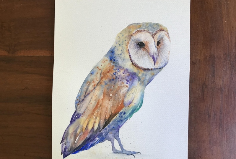
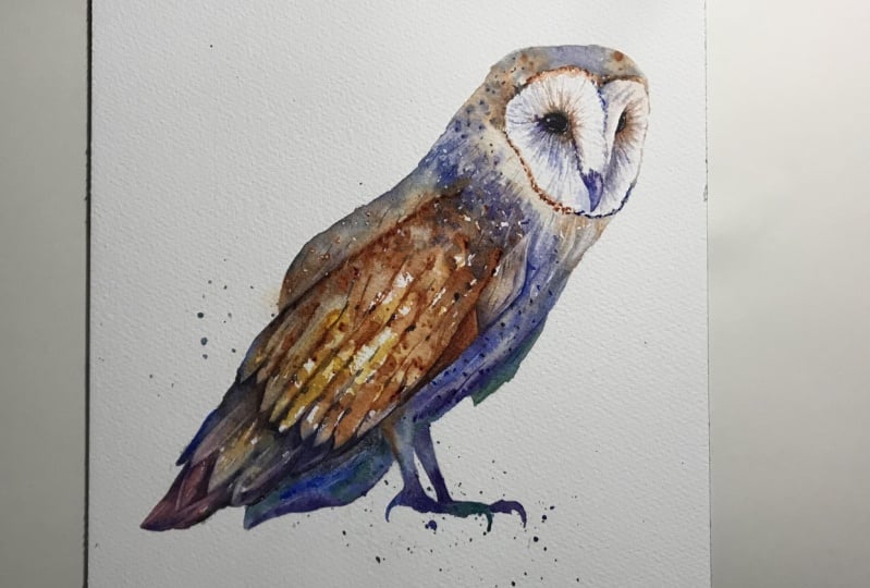
I paint a barn owl. Whether you are
new to watercolor or already have some experience, you'll be able to
follow along at your own pace and learn the most essential
watercolor techniques. Join me in this fun
painting as we explore exciting and expressive
ways to use watercolor. I've been a professional watercolor artist
for many years now, exploring many
different subjects, from wildlife and portraits, to cityscapes and
countryside scenes. I've taken part in many
worldwide exhibitions and been lucky enough to win awards from well
respected organizations such as Winsor & Newton, the International
Watercolor Society, the Masters of
Watercolor Alliance, and the SAA artist
of the Year Award. I also have collectors that buy my paintings around the world. Watercolor can be
intimidating for beginners. My aim is to allow
you to relax and have fun learning this
medium step-by-step. Hopefully, by the end, you'll surprise yourself
with a nice painting. If this class feels too
intimidating or too simple, please check my
other classes as I have them available
across all levels. My approach to watercolor
starts off loose and expressive with no fear
of making mistakes. Because we're just
creating exciting textures for the underlayer. Then as the painting goes on, we'll add more details, bringing the painting to
life and making it pop. I try to simplify
complicated subjects into easier shapes that
encourages playfulness. Barn owls have such a bold, mysterious energy to them. These are great attributes
to convey with watercolor, which is such an elusive
ethereal medium. It gives us the freedom to experiment with various effects and
watercolor techniques, enabling us to express
our own unique vision. When you enroll in my class, I'll give you the
high resolution image of my painting to
use as a guide. Today's focus is about
painting rather than drawing. I have included
templates you can use to help you sketch out the
drawing before you paint. I'll also include
my color charts, which are an
invaluable tool when it comes to choosing
and mixing colors. Throughout this class, I'll be sharing plenty of
tips and tricks. I'll show you how to use
mistakes to your own advantage, taking the stress out of the
painting, and having fun. I'll explain which
supplies I'll be using so you can
follow along exactly. I'll also cover how to choose
and mix harmonious colors. I'll be splitting
everything up into short videos so it's
easier to take in. You can also pause at any moment if you want
to take more time. If you have any questions, you can post them in the
discussion thread down below. I'll be sure to read and respond to everything
you guys post. Don't forget to follow me on Skillshare by clicking the
Follow button at the top. This means you'll
be the first to know when I launch a new class, post giveaways, or just have an interesting announcement
to share with my students. You can also follow me on Instagram to see
my latest works. If you'd like to create your
own expressive work of art or learning fun and exciting
watercolor techniques, please Click "Enroll"
as I'd love to have you in my class.
Now let's begin.
2. Your Class Project: First of all, thank you so
much for joining this class. I really do appreciate it. We're going to have a lot of
fun painting this by now. Learning about watercolor using impactful techniques that are simple to do but have
a powerful result. Whilst painting this owl, we learn how to balance
detailed parts of the painting, such as the head and feet, we've been loose and expressive
on the rest of the body. The style we're
painting in today doesn't rely on a heavily
detailed drawing, which means there's less
stress and gives us more freedom to express and
explore new techniques. This means you'll learn more and end up with a
better painting. You can choose to paint as loose or as realistic
as you want, depending on your level. You're welcome to copy
my drawing and follow it exact or experiment
with your own. I will put my painting
in the resource section, so you can use it as a reference
throughout the process. There's also a template
you can use to trace and transfer
it onto your paper. Don't feel guilty
about tracing when using it as a guide for
learning how to paint. It's important to have the
under drawing correct, so that it doesn't
inhibit your ability to practice and learn the
watercolor medium itself. Whichever way you
use this class, it would be great to
see the outcome and the paintings you
create in this class. I'd love to give you feedback, so please take a
photo afterwards and share it in the student
project gallery. You can find the gallery under the same project
and resources tab. On the right, you'll
see a green button that says Create Project. Tap that. Once you're there, you'll
have the option to upload a cover photo and a title and
write a little description. I would love to hear about your process and what you
learned along the way. Once your project is uploaded, it will appear in the
student's project gallery. You can view other
projects here, and I'd highly encourage you to like and comment on
each other's work. We put so much time and effort into creating our paintings. Why not share it with
the world and help support each other
along the way? Now that you have a good
idea of this class, let's get stuck into it starting with the equipment and
materials I'll be using.
3. Materials & Supplies: Let's go over the materials and supplies you'll need
to follow along. We'll start with
the colors I use. Unlike most of the materials, we'll be using today, it's a lot to do
with preference. I have 12 stable colors in my palette that I
fill up from tubes. They are cadmium yellow, yellow ocher, burnt sienna, cadmium red, alizarin crimson, ultramarine blue, cobalt
blue, cerulean blue, lavender, purple, viridian,
black, or neutral tint. At the end of the
painting, I often use white gouache for
tiny highlights. I don't use any
particular brand. These colors you can
get from any brand. Although I personally
use Daniel Smith, Winsor and Newton
or Holbein paints. So let's move on to brushes. To keep things simple,
in this painting, I'm only going to use a
small selection of brushes. First is this mop brush. Mop brushes are good for broad brushstrokes and filling
in larger areas or washes. But they also have a tip
for some smaller details. So they are one of my
favorite types of brushes. Next, is this, a Skoda per brush. I use various sizes, but for this painting, I'll use size 8. These brushes allow for
more precision because they have a finer tip and
last quite a long time. For even more precision, when painting final
touches or highlights, for example, I use a
synthetic size 0 brush. All brands have them and
they're super cheap. This here is a sword
brush or a rigger brush. It's quite long but thin. It's only used for
very small details, much like the size 0 brushes, but it holds more
water and pigment, saving time and
effort refilling. The only drawback is it's more difficult to control
as it's more flimsy. That's it for brushes.
You're of course, welcome to use your
own favorites as well. Onto paper, the better
quality your paper is, the easier it will be to paint. Cheap paper crinkles easily
and is very unforgiving, not allowing you to
rework mistakes. Good quality paper, however, such as cotton based paper, not only allows you to rework mistakes over multiple times, but because the pigment
reacts much better on it, the chances of
mistakes are a lot lower and you're more likely
create better paintings. I use arches because it's what's available
in my local art shop. Next, some various materials that will
come in very handy. A water spray is
absolutely essential. By using this, it
gives you more time to paint the areas you
want before it dries. Also, it allows you to
reactivate the paint if you want to add smooth lines
or remove some paint. Lastly, masking tape. This of course is
just to hold paper down strong to the surface. That's everything you
need to paint along. Let's get on with the drawing.
4. Drawing out the Composition: I'm going to start with
my soft 4B lead pencil. Two big circles and we can
always rub out afterwards. We will rub out afterwards. I always start with
these loose markings. There you go. You can see we
have had nice fluid lines just cutting off to different sections
using different curves, there is no straight lines yet. You can see how there is
no straight lines here. We just use different curves to block out the general shape. Then once we have done that, we are going to add
some smaller details, and we can change the pencil. I think I'm going to move to this mechanical
pencil. I usually do. I say that's how I usually do, but I actually change
my habits all the time. Always experimenting
with different things. Little circle there
for the highlights. I try not to let my lead leave the paper as much as
possible so it all connects. Some feather shapes. Can do a few light
circle dots here, just to imply some
splashing I'll do later with the paint. Claw. Second claw. Now I'll just take some time
to rub out these marks, and so it's just a
single clean line. I'll see when I've
done that and stuck it to the painting board.
5. Mixing the First Colours: With a lot of my paintings, I start off with very strong
pigment straight away. But with this painting, I can see it calls for a more subtle approach
to begin with. I think what I'm going
to do is going to create a large mix
of different colors. Do a big wash going
through the whole of it, and start dipping in different pigments
building up as it dries. It's a new approach
to what I usually do. Now as you can see,
I've already got some colors on my palette. I thought I'd leave
them on that to show you how I deal
with it each time. I'm not going to use
these colors as that, so I'm just going to re-wet the palette with my water spray. Definitely not going
to use this red. I just use the
complimentary color of red, which is green. It turns it into a
gray, a browny-gray, which we will use, can use
a bit more of that, maybe. A bit of blue. More red. I overdid it. That's a
completely different color. [NOISE] I think it needs to be
a bit more monotone, so I'm going to add
a bit more black. Black to make it very gray. It's a purply-gray color, which I can see there's a lot of purples in these colors, so I think that's a good
base to start off with. Maybe I'll make this one here, slightly bluer so that
we can mix and match. Scrape off below the
paint into that pool. Take off the excess paint on my rag. [NOISE] Clean my brush. This one, I think I'm going
to clean up completely. [NOISE] That's a good way. Not to waste colors
because we use that red even though we're
not using it as a red, we used it to mix a
color. We wanted this. I can clean that one too, I think as well because there's not much pigment
on there anyway. I could have done this
before I started, but I've purposely
left it to show you how I go about it daily. Quite a few oranges, that's why I'm going to
reuse these oranges I think, it's a burnt sienna. We can make sense
some yellow ocher. There's not much of it going on, so I think I'll keep it quite light to begin with.
Brush that off. [NOISE]
6. Starting the Painting: Now this area here, I'm going to leave
out, I'm going to paint a round here
to begin with. We're going to work my
way all the way down. There's a white area here also that I'm
going to leave out too. There are some areas
with more shadow and as it dries we'll start
adding more and more pigment. Start off very, very light. Also make sure you have a tissue and this
water spray very close by because some areas will
dry before you're ready. So this helps reactivate it. Now I'm going to add
this to a few drops. This yellow ocher, mixing it up between yellow
ocher and this burnt sienna. [NOISE] We start
spreading this down here. I think we can cross
that line here because that's why
we drew that line because it gets a bit
darker so it gives us a checkpoint so to speak
well we can relax. I'm going to take some
of this bluish pigment and drop it in there. I have my painting
on a bit of a tilt, which might make it
look odd on the camera. But it's useful to do because it allows the water to
run down to the bottom. I can just draw that liquid out and replace it
somewhere else. If it wasn't on the tilt of
the pool of water could be created anywhere and that's not necessarily
where you want it. By forcing it downhill it
gives you more control. Few tabs here. It's a bit of a warmer
[inaudible] there so I'm going to use
the purple here. Then is a bit of a soft
transition here so go back to the blue and put
that line in there. Needs to be darker at the top so I had a bit more
pigment there. It always dries lighter than
it looks when it's wet. Making sure there's not too
much water on my pigment, I'm going to drop a
bit more of this color , this bird sienna. Using the rag to dab away
there's too much pigment.
7. Painting with Check-points: Start bringing it
down a bit further. Now it starts to transition
to a proper gray. I'm going to add quite
a strong pigment there. I might switch to a smaller brush so I
have a bit more control. Had a bit more there. Now, I'm going to introduce
a bit of dark pigment. I need to suck out
a lot of the liquid here because it's going
to be a bit dry brush. Just going to do a few dots. It's been even thicker. While the paper is still
damp these dots will fade. I can go back to
this bit over here, I think I'm going to
wet this area here. Quite far away just so that it has enough space to fade out. If you do it too close, it won't be a gradation and there'll be harsh lines which I don't want
at the moment. Smudging needs a bit more. Go back to my blue and draw out some of the
liquid using my rag. Because when area is so
close to drawing like this, the last thing you want
is to add too much water. Now we've created a
little checkpoint for ourselves got to
smooth the edge. We can relax if we want to
do we could take a break. Because owl at a nice area to let it do what
it needs to do. Now what you can
do is the brush is still wet you could suck
out all the liquid. You could just go
over some areas. It sucks out some pigment from the paper then I will imply
the small little feathers. Then you can use
that liquid that you sucked up on the
brush to come around. Maybe we can add a
little bit more here.
8. Starting the Body: Now with these areas here, we can be a bit more abstract, but we still have to be careful. I want there to be some nice
vibrant highlights here, so I'm going to be quite bold. [NOISE] Let's go straight
in with this burnt sienna. Some yellow ocher there too. Even put some quite
thick pigment there. Little dots of thick pigment. You have to be brave and
hope that it works out, have faith in watercolor. We're going to use that purple. The purple will mix with the
yellow and we'll mix blue with this burnt
sienna [NOISE] and it will create a nice effect [NOISE] because they're
complimentary colors. [NOISE] Moving
quite quickly now, start filling in this area. I'm going to add some blue up here. Then I'm going to get
a bit of expressive. Move this pigment
around with some water, [NOISE] some splatters
with pure water. I can get this purple. That's a bit strong,
but never mind, we can move it around. [NOISE] We're trying
not to interfere with it that much after we cover the area because this is how we
create some nice effects. The more we touch it, the more
we risk losing the magic. Remember that area here,
we're not crossing that. [NOISE] Blue up here I
think. Dots and blue in. I want that area to
be a bit whiter, so I'm just brushing it out. The water falls down
and doesn't stay there. [NOISE] Just a mishmash of
different colors. You have a tiny little splurge of cadmium yellow there. Go back to the blue here a bit. I'm really exaggerating
the colors. [NOISE] Add some purple in. Makes a really strong
purple pigment here. Mixing my own cobalt blue
with Alizarin crimson. The same again with
this burnt sienna. Acting really fast
now because we need these thick brushstrokes
before it dries any further. [NOISE] I'm going to move to
this tiny little brush and do a few little dots of
pure paint just here. Got some splashes of pure paint.
9. Joining the Wings: Now I'm going to work
from the bottom-up , and connect them. That's quite orange,
and I know that blue mixes and makes gray. If I put a blue next
to that orange, it will dry mixed. I don't, actually, have
to mix it on the palette. I can add a few more drops
of this pigment here, because it needs to be
a bit more extreme. This stage where you can start
dropping in more pigment, where it needs to be darker, and then water where
it has to be lighter. I'm not going to be
too concerned about creating blooms or
cauliflower effects. I want it to be a
bit abstract now. Few dots of water. The water will spill out, and it'll give the
illusion of white dots. I like to leave some of
these white gaps here. You tad a bit more blue here. Also liquid that comes
down will come here, and then we can use that to
just draw it back up again.
10. Adding Thick Pigment: Now it's constantly drawing different stages,
sometimes quite unevenly. But also having this paper at a slight tilt means that it's more likely to dry faster up here than down here. You can go back up
to the top again. After you get a bit of
experience in watercolor, you can really tell how
the watercolor reacts differently depending
on what time you add it and at
what consistency. Now I'm going back to the
pure pigment stage now. I'm just filling my brush with
pure pigment and rotating my brush as I slide
it along just so that it falls
off onto the paper. I'm starting to be
concerned that it's a bit too colorful for a barn owl. Let me know what you think
in the discussion area, whether I should have kept
it a bit to more monotone. Well, of course it will dry more monotone than
it is when it's wet. Now another thing to do with
watercolor that involves patients is just to allow
it to do its thing. Often when I'm waiting, I just keep on
looking at it and do unnecessary touches that don't actually improve the painting. A good philosophy I once heard [NOISE] of watercolor
or painting in general, it's a bit like golf, you have to complete it with as little amount of
effort as possible. If you could do a painting with the smallest amount
of strokes as possible, it would be more magical. Flickers of white up here. Flickers of pure water rather. Now I'm going to wait a bit. I'm not going to use the hairdryer because
that'll be too quick. I'm just going to have
to be patient and wait maybe three minutes, and just add a few
more splatters at different timings
with the drying process. After I apply the water strokes, you'll be able to
see what it does. My tissue to pull
out some highlights. It's time for a spat
[NOISE] of paint now. Very small splats with
my smallest brush. Because they take a bit of
time to come into play. You splat them and then they
are visible a minute later.
11. Painting the Underbelly: I think I'm happy with how that's going so now
I'm going to start painting the underbelly side. I'm going to have this
underside a bit cooler so that means blue, because blue is
the coolest color. But let's start with
some warmth up here. Then fade in some
cool blue here. Some green actually, maybe
I should add some green. Not green on the palette. Just little mix of
green into the blue. Not enough water there so I'm constantly judging wherever
there's too much water or too little water and also the consistency
of the paint. Those three things I'm basically judging throughout the
course of painting. To very quickly summarize, the three things you got
to figure out while you're painting is the consistency
of the pigment, how thick it is or
how thin it is, whether it's tough, straight out the tube or almost
completely dry. Or whether you've mixed it
with a lot of water and it's almost looks
like a T color. That's how faint it could be. The second thing you
got to be aware of is how full your brush is, whether it's got too
much or too little on. Because if it's too
much liquid on it, if it's too full, the water will just bleed
out into areas you don't want it to and it
will dry unevenly. Can do a few more
splatters up here, and the third thing is
how wet the paper is. Whether it's dry,
like I'm doing here, I'm adding wet paint on to dry. Or whether you're
interfering with something that's already wet. The combination of
those things will affect how the textures will be. A few dark strokes here. See now I've filled up
my brush quite a lot with quite a medium consistency. Now I'm trying to get the
thickest consistency possible. Now, I'm just going to do
a few black dots here. I'm going to paint the claws. I'm not using enough water here, so I'm just going to be quite bold and dumped loads
of water in there. Go back to this turquoise
color. These claws here. Flicks white here to. Now using my thin
brush while it's still wet, but not dry. It's the stage where
it's quite damp, is on the verge of being
dry but not quite. Start adding these lines
to separate the feathers. Then I'm going to
wait again until it's completely dry to
add really crisp, fine lines with a hard edge. Then we'll do the head. I'm going to use
the hairdryer to speed up and dry completely.
12. Starting the Details: Now I'm going to add
some sharper wing lines or feather lines just to add a bit of structure to it because it looks a bit
chaotic at the moment. We've created a nice
abstract, expressive part, and now we've got
to just hone it in with some strong
burnt sienna or up here. I can rub out some highlights here I think, wetting the area
with pure water, and then rubbing away like that. Let me do a few
thinner ones here, and if you really want
to make them pop, you can go in the
other way like that. Now, put some bluish green here. Some lines here. These here, you can use
shadows to imply feathers. The blue on top of the brown, is very attractive, I think. Blue parallel dots because
of a reference photo, it looks like there's
matching dots on each part of the wing there. There's a nice purple bit here, I think, that fades out. To fade out I add water, then clean the brush, add more water, then
keep on going up, cleaning the brush,
adding more water until it's pure water, and I can let it
do its own thing. Then if you want to take
it to the next level, you can add a few dots with
other colors in there, like a brown, and just mix it in
together while it's still wet because on good paper, it'll dry off evenly anyway. Then you can fade
that out as well. Going to create a
bit more of a shadow there because I like dynamics where it's
dark on top of light and then light
on top of dark, really makes things pop when you include things like that.
13. More Body Details: Maybe I have a
sharper edge here. We can add a few more of those dots
that I see this owl has. We use the tip just to add some sharp textures this area
here again and rub away. [NOISE] Because I want there to be a nice sharp
edge as well there. [NOISE] I'm going to pull away a few more
things here too, [NOISE] just feather
shapes is all. [NOISE] Now, there's a nice
bit of contrast here, so now I'm going to go in
with a very strong pigment, even stronger,
actually pure black. I'm going to really balance the tone. We'll make everything look
a bit lighter now by adding this pure black, [NOISE] then merge that to a
nice burnt sienna. Cleaning the brush
and wiping off the liquid if it
gets out of control. I can add a few more
purple lines here, just to add to the feeling of flow or purple splats even [NOISE] and quickly
clearing them up. I had a bit of a shadow
on that claw rather. Can I go back to that dark
color to a line here I think? Dry brush mark there. [NOISE] Go a bit
dark here too maybe. [NOISE] There we go.
14. Adding Splatters: Now, I'm going to do
something a bit scary, but I want to get
out of the way, and that's adding
a couple splats, very subtle splats, and I'm aiming it purely
in this area here. If you're not confident,
don't risk it. You can just manually
paint them in. I'm going to just cover the
rest of the painting anyway. I think I'm going to go
for dark bluish-purple. If it goes bad, we can always
rub it out afterwards. Some of those did go bad, so I'm just going
to rub them out. If you've got a good paper, it should be no problem, you can just easily
rub them out; as long as you get them
before they start to dry. [NOISE] These might
not be necessary, but taking so much
time just to add some droplets does seem like
a bit of a waste of time, but there's something about the looseness of
them that really does add to the
feeling of watercolor. [NOISE] I actually find splatters one of the
hardest things to do, but if they're done well, I think they really
add to the painting. Now, I'm going to dry that.
15. Painting the Face: Now moving back up
here. We want that. [NOISE] Then pull away. This thick pigment just
go around this border. This is not wet. This is
just thick blobs of pigment. If it's too wet, it's not blobby, don't do it. Wait until it's dry or
use a rag to dry it down a bit because it's just won't be the same if
it's not thick enough. I'm going to change this blue. Might even clean
my brush for this. Few drops of this blue. Purple. [NOISE] Now I'm going to wet this area. Because we'll move to a
smaller brush actually. This will be easier. This brings some bits out. Add enough water so
that it stays wet for quite a while enough to activate that thick pigment. Problem with small
brushes you've got to keep on filling
up your brush again. I think we can extend
these bits out actually using a bit of dry brush just to
increase that shadow. Use this little
nail file just to scrape a few marks in there. I just happen to have it
on the table actually. Now I want to paint the
shadows inside here. Let me clean my palette. Actually I don't want that
red getting anywhere. I'm going to just
get rid of that. At this brown, put maybe
a bit of purple to it. [NOISE] I cleaned my brush. Now I'm going to wet
whole of this area. But I'm not touching
the edge yet. Now it's all got base of water. I'm just going to
pull out some areas that I want to dry quicker like down here or here. Then I'm going to
use very fine brush. Not much liquid so adding in little hairs or feathers. You can move around
the color wheel. Maybe I'll start adding
some green ones down here. That's too much. I'm a bit a sea urchin or
something very spiky I'm going around building up over time. More of a patient's
game this is. You can start doing it
on the other side too. [NOISE] Seem much. What you can also do
which I think I might do this side just
to save some time now is to fill out most of the shading with
broad strokes like this. Then we can pull away some
of the fine texts later. It's actually easier
to discover using this brush because it has more liquid on it so you
don't have to keep on going back and it's still
going to find point. This is the Escoda
brush. Escoda Perla. [NOISE] We can always blend it later. It's too sharp. That's what I'm planning to do. Want to be a bit bolder now. More purple here. Just
a burst of color. These little bits is
taking lot of time. It's not necessarily more
difficult though. [NOISE]
16. Painting the Beak & Eyes: Now I'm going to
paint the beak with this blue, purple tone again. Add a bit more purple to that. It's a tiny little dot. I'll wait a little bit
to dry up before I add thicker pigment otherwise
it'll just run away. I'm going to brush and mix
up these strands that we just painted so they
blend in a bit better. Some dark purple there. Bring it out a bit. Now, while it's
still a bit damp, I'm going to paint in
the eye, pure black. Maybe I want the
edge of this just to bleed out into the brown. This eye has got a soft edge to it rather than a hard edge, so I'm just going to use my
brush to soften that edge. Creates a little bit
of the eyelid there. I'm going to go back to the beak briefly just to define my edge
and make it a bit sharper. Now I think I'm going
to paint this eye. I'm going to start
with this brown, very deep dark brown on the curved side and then going back to this dark
black for the other side. Then keep on adding the
black until it's dark enough and it'll melt in there. I'll darken this a bit more.
17. Finishing Touches: While I'm waiting for
those bits to dry, I could go in with
a few highlights in a few places, like here maybe. Few white dots inside these brown ones bit like arrowheads, provided me a bit like that. They're not just dots, they're spiky dots with
white gouache, of course. Few white dry brush marks there. They're going to really
define that white there or go in with a black again. This is yellow ocher
mixed with white. Just going to do a very
little subtle highlight. Say on the other side, I'm going to take this lavender
make it slightly darker. I'm going to do a little
stroke across there. That was a bit too dark. Now right in the corner
of that subtle mark, I'm just going to add
a tiny blue circle. I'm going to dry that
off. A white dot like that really makes it pop. Final few touches. I think I'm on the stage now where I'm looking for things to do and nothing's
really sticking out. I'm going to give
it a rest for a bit and we're going to
sum everything up, and cause painting done.
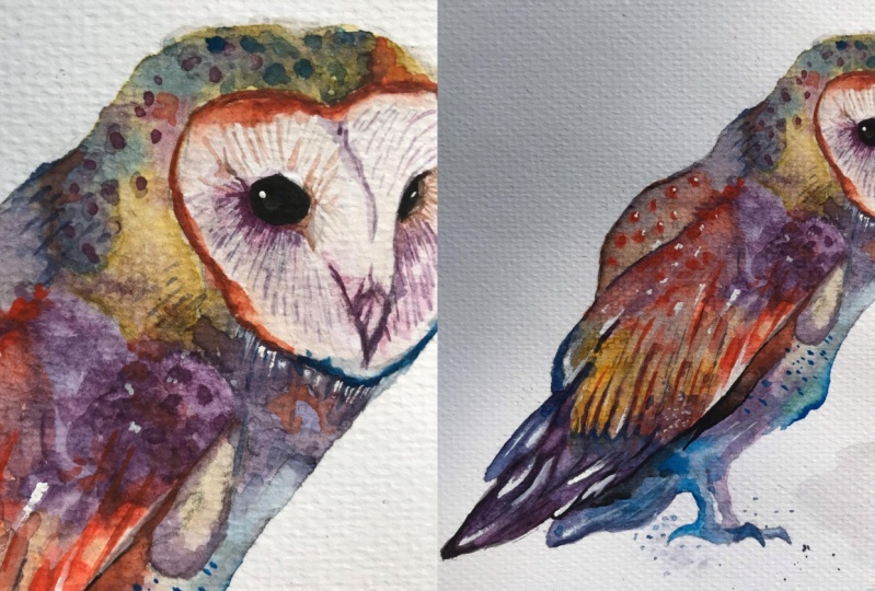
18. Final Thoughts: Welcome back. Now the
painting is finished. Let's have a
close-up look at it. I hope you have a painting of your own to look at as well. To paint this out, we
used a nice balance of complimentary colors to
achieve appealing contrast. We explored expressive
techniques and then brought the painting together with a few details at the end. Using this method always
creates a unique painting because we're allowing
the watercolor to do most of the work for us. Watercolor is an elusive medium that can have a mind of its own, and in that respect, it can often be
frustrating to work with, but the key to painting well is not so much to fully
control the medium, but to manipulate it in a
way that allows it to do its own thing and to form its own unique,
captivating textures. Sometimes it works and
sometimes it doesn't. Even the best masters make mistakes and create paintings
they're not happy with. What's important is that
you actually gave it a go. If you would like feedback on your painting, I'd
love to give it, or if you'd like any advice
related to watercolor, please share your painting in the student projects
gallery down below, and I'll be sure to respond. If you prefer, you can
share it on Instagram tagging me @willelliston
as I would love to see it. Skillshare also loves
seeing my students' work, so tag them as well @skillshare. After all the effort
we put into it, why not show it off? Remember, please click
the follow button up top so you can follow
me on Skillshare. This means you'll get
a notification as soon as I publish my
next class or have important announcements like
free giveaways or sharing some of my best student artwork uploaded to the project gallery. Thank you so much again for joining me in this class today. Please leave a comment below
in the class discussion area if you have any questions or comments about today's class. If you have any scene, subject or wildlife you'd
like me to do a class on, by all means let me know about it in the class
discussion as well. If you found this class useful, I'd really appreciate
getting your feedback on it. I hope it's been useful and it's inspired you to paint more
in this glorious medium. Until next time, bye for now.
 Will Elliston, Award-Winning Watercolour Artist