Transcripts
1. Welcome!: Hi. Hi, I'm Molly Suberthorp. I've been a professional
calligrapher and type designer for over 12 years, creating custom lettering for brands and individuals around the world and designing digital
assets for other artists. I'm also the author of
five books for people looking to learn lettering
and turn it into a business. My true passion is helping other lettering artists
hone their skills, opening doors to new creative
opportunities and careers. As such, I have a particular
passion for teaching. I designed this class for
anyone looking to learn script brush lettering using
traditional techniques. I'll share all the beginner
level fundamentals, starting with the basics
of using a brush pen. You'll learn how
to write a simple but beautiful script alphabet. I'll cover the basic
strokes, letter formation, lowercase and
uppercase alphabets, and other considerations for
beginner lettering artists. When it comes to the
key considerations for script brush lettering that looks effortless
and professional, the exact same principles apply no matter what
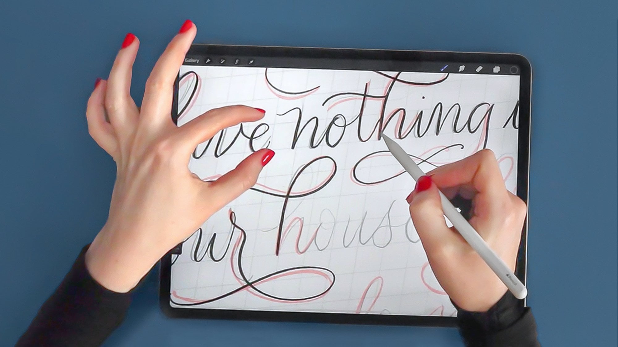
medium you're using. I will be demonstrating on my iPad using the Procreate app, but you can follow
along from home, even working with ink on paper. By the end of class,
you'll be writing a modern script brush lettering
alphabet with confidence. Plus, the bonus free
practice sheets that I've included will provide a roadmap for continued practice at home. Thank you so much for being here and I'm excited
to get started.
2. Procreate Canvas Setup: Let's set up our Canvas. No matter what digital
app you're using, whether it's Procreate or
Affinity or Photoshop, you can follow along and set up the same Canvas size
and resolution. The most important thing here is that your resolution
is really high. Whether you plan to print
this eventually or not, the higher your resolution is, the more that you'll
be able to zoom in without pixelation. For the sake of this class,
I'm actually going to set it at 600 DPI so that I
can zoom in really, really close and show you all the fine details
of the strokes. For size, I'm going
to set mine to 8.5 " wide by 11 " high, which is a standard
American paper size. That's in part because some of the materials that
I have offered you as bonuses will then fit
that canvas size perfectly. So if you want to follow
along using those bonuses, I recommend a canvas
like this 8.5 " wide, 11 " high, 600 DPI. With a blank canvas
in front of us, we're going to need to create some guidelines for our
initial stroke practice. But I've also offered
you one guide sheet that you can import
now if you'd like. So I'm going to do that, and you can follow along with the class materials
too if you wish. Here I have, the
guide sheet and I have this just here as a background for our
initial stroke practice. We aren't even getting
into letters yet, but I find it helpful
at the very least to follow along with these
baselines so that you're going to get
the practice in creating even lines
and even heights. Before we move on to the
next lesson, take a moment. It's your turn now to set up a high resolution canvas
and a lettering guide.
3. Procreate Brush Basics: To start our stroke practice, let's select black
from our color palette and select a good
lettering brush. Again, lots of lettering
artists have made these. I have one in my ultimate
lettering and calligraphy pack. There are some default
procreate brushes. But again, I have offered you a free one that you
can follow along with. It's the one that I'll be
using in this lesson today. So long as you install that, you can follow along
and use the same one. It's this felt chisel
tip marker brush. Now, I want to make
a quick note before we get too far along in
our stroke practice. I want to state that digital
lettering brushes are generally quite different
from paint brushes. The goal of a good
digital lettering brush, be it for procreate or affinity
or Photoshop is to create an experience as
close as possible to the experience of
actually lettering. So that doesn't necessarily mean that the brush behaves identically to the
way a pen would. It's true that if I were to take an analog brush marker and
make quick strokes like this, I would be able to freely and
easily make those strokes. However, some adjustments must be made for lettering
brushes and calligraphy brushes
that are digital to account for on the iPad, the glossy screen, the
plastic tip that has tooth, no grip to the actual surface. For Photoshop, if you're using a Wacomm tablet or
a mouse, again, accommodations need to be
made for various aspects of digital artwork that simply cannot exactly replicate
a real brush pen. For this reason,
you may find that a lot of digital lettering pens behave quite
differently than you're used to with digital
paint brushes. This can take a little
bit of getting used to, but I assure you that there is absolutely nothing
wrong with the brush, it's going to be a lot harder to make really quick
strokes like this. The ink won't necessarily
follow your pen as well. However, this is again, created to accommodate
or account for the slippery glass screen and the plastic
point of your pen. If you're using a
real pen on paper, you get a little bit of a grip, especially with felt
tip marker pens. You get a little bit
of a grip against the paper and it's
just enough to be able to stabilize your pen and
create straighter strokes, longer strokes,
smoother strokes, more natural looking strokes. So I get a lot of questions, and that's why I wanted
to address it from people saying, What's
wrong with my brush? Do I need to go
in and adjust it? I'd say no, I'd say, typically, especially if you're buying lettering brushes from
real lettering artists, trust that they have
a very good sense of how the brush is
designed to best replicate analog lettering and just
understand that it's kind of a new tool that
you might have to get used to if you've never used
a lettering brush before.
4. Downstroke Practice: Right here is page one of the stroke practice sheets
that I've provided for free. You'll see that there
are a number of strokes here and even
more on page two, and we're going to go
through them all now. I'm just showing
you this here so that you get an overview of where we're going with this
and you know that at home, you can follow along by
tracing if you'd like. We're going to start by making straight down strokes
and we're going to move only in between
these two horizontal lines. I want you to press down
with medium pressure. And try to make pretty straight, pretty even with downstrokes. We're not moving upwards
yet, that comes later. We're moving from
top down to bottom. On all of these, I'm
applying even pressure, and that's why I'm
getting even thickness. Lettering brushes, as
well as calligraphy pens, adjust their thickness
based on pressure. For that very reason, if
I reduce my pressure, I get a thinner stroke. This is the minimum pressure, and I have to go
even slower because the less you press
on a glass screen, the harder it is to
get any friction going that's going to grip
your pen to the surface. So the harder you press, the thicker it will be, the easier it is to make
relatively straight strokes. You can, in fact, move a
little bit faster than if you have absolutely no pressure these are the harder
strokes to make. It's a little bit
counterintuitive actually. What I want you to do right
now is get out your canvas, start, get out any
brush that you want, but I recommend this free
brush I've given you and work on straight down
strokes of varying pressure. I'm going from a thick to thinnest to slightly
thick again. Maximum pressure creates
this level of thickness. In my years of teaching, even in my analog
lettering classes, it's been really important
for me to tell students that no matter what amount of practice you have
with lettering, even professional
lettering artists, when they get a new tool, a new pen, any kind of tool, we have to sit with it for
a little bit and learn it. It's just like driving a
new car we've never driven. It doesn't matter if you have the basic fundamentals down. The specifics of the pen, the amount of pressure
required to make a certain thickness has to be
learned by your hand first. It's not even that
elementary to make strokes. Even professional
calligraphers do it. Now we're going to make
this one level harder by adjusting the width of
the stroke as we draw down. I'm starting with
minimal pressure. I'm getting thickest
in the middle and I'm moving back to
minimal pressure at the end. Thin to thick to thin. This is honestly one of the most difficult
skills to master, and we have to start with
it right at the beginning because it's also
for better or worse, the most crucial
skill for lettering. Varying your pressure
as you write, let me just go for a
second. Thin to thick. Any variance as you write is a crucial skill to develop for
lettering and calligraphy. You're always going to
be going from thin to thick to thin to thick to thin. That rhythm never, ever changes. You won't be going and
creating a thick stroke next to a thick stroke or a thin stroke next
to a thin stroke. You will always make fluid
strokes that go from thin to thick thin to
thick thin to thick. That's why we're practicing
these particular strokes now. You're training your
hand in something new and something
you've never done. I want you to really understand that this may take a
little bit of time. Your brain knows how this
is supposed to look, but your hand doesn't know
how to do it quite yet. Have a little bit
of patience with yourself and just work through these as many times as
needed until you start to feel at least a little bit
more confident in them. Now instead of downstrokes, we're going to make tapered
diagonal strokes. Okay. So again, moving downward only, we're starting with thick and getting thinner and thinner, meaning maximum pressure down to minimum, maximum to minimum. At this point, you can pause the video if you're feeling
like you need to spend a little bit more time getting even downstrokes and working with your pressure variation. But the next stroke
we'll be practicing are curves, and
again, downstrokes. We're not moving in an
upward direction yet. So a curve here is going to be a little
bit like a parenthesis. We're starting with increasing our pressure as
we move downward, then decreasing it again so that we're thin
at the bottom. Increase decrease. Increase decrease. I'm making these
counterclockwise now, but I also want you to
practice clockwise. You can go back and forth,
back and forth between them. I don't think I can emphasize enough that if you're not
used to lettering like this, just remind yourself
that you are currently learning a
new fine motor skill. No lettering artist
gets this right away. This is the absolute basis for the elegance of
hand lettering and it's going to take you a
little bit of time to make your hand and brain work
in perfect harmony here. If you feel a little bit more of a challenge,
make them smaller. You're going to see that
that's actually harder because you have less time and less
distance to move downward. Thus, you have less
time and distance to decrease the pressure
and increase it again. You may want to
move a little bit slower if you're
making them smaller. Oops. You can see that even
the pros make some mistakes. I would call this one not very good because I have
uneven pressure. The thickest part is not
actually in the center. I would call that a poor job. But you'd really want to
slow down that pressure, slow down that speed
for a shorter distance. Next, we're doing a
different type of curve and this will
be an S curve. Again, sticking
with down strokes. We're going to start
out thin, low pressure, increase as we move downward and decrease as
we get to the bottom. So counter clockwise first
or down into the left. I do not recommend making
big S strokes like this yet. I'm just talking about
very subtle S shapes. You can try these in the other
direction if you'd like. But this is taking that thin to thick to
thin to a new level.
5. Upstroke Practice: Now I've created
a new blank layer so that I can keep
doing my practice, and I'm going to move
on to upstrokes. So upstrokes are
always no pressure. Even though digitally,
it's possible to increase my pressure
on an upstroke, that is simply not
appropriate for lettering. Traditional lettering and
calligraphy utilize pressure on a downstroke and absolutely
no pressure on an upstroke. None. Your hand should feel like it's gliding
across the page. I don't care what angle you
make these at right now. Perfectly vertical is
actually the most difficult. You'll find that
writing at an angle becomes a little bit easier. You'll also notice that even though you're moving
very lightly, the uniformity of the stroke
may not be exactly even. That is mostly
because we're using a brush marker and not a
fine point calligraphy pen. It's a lot easier to
control the width and create very even upstrokes
with a calligraphy pen. But with a marker, you have a lot more flexibility
of that fine tip point. Even the slightest amount
of pressure variance will create variance
in the upstroke. You really have a
lot of practicing to do here just to create
uniform upstrokes. However, to move on
to the next step, they don't have to
be perfect yet. I want to reiterate that it's a process to get used
to creating these. So please don't be too
hard on yourself if you're struggling to have zero pressure at all and glide up the screen. For the next phase of upstrokes, let's make curved upstrokes. Again, I don't care what angle you do them, doesn't matter, but I just want you
to continue exerting zero pressure at
all across a curve. Remember how downstroke curves need to have a thick
point in the middle. However, upstroke
curves really need to be uniformly thin or as
uniform as possible. Now let's combine
them. We're going to combine downstrokes and
upstrokes in one of the most common types of curved strokes in any kind
of letter script lettering, and that is called an underturn. That's where you start
with a downstroke, you curve under and
come back up again. You go down, curve
under, and come up. To examine this, I use equal pressure
moving down like this. As I reached the bottom here, I had already
reduced my pressure. Remember when we practiced
these curves and we practiced reducing our
pressure here at the bottom, that's what you need
to be doing here. Equal pressure down, reduce my pressure as I
move around here. Then as soon as I make this turning point
at the very bottom, all my pressure
must be released. I have to go from
heavy pressure, minimal pressure up
to zero pressure. Pressure, up to zero pressure. Now again, these are
called underturns because when you
get to the bottom, you're turning under and up. But the related stroke
for this is an overturn where you create a thin upstroke followed by a downstroke. So up down. No pressure, pressure. In this upstroke, I had increased my
pressure very slightly, but that's okay because the contrast between this
stroke and this stroke is still really dramatic and it's that
contrast between thin and thick that makes
script lettering and calligraphy look so elegant. Here we have our underturns and our overturns.
Let's combine them. We go from an underturn
to an overturn. Underturn to overturn. You can keep going even longer. That's great practice
for what's to come when you're creating
entire words where you don't lift your pen and
you have to move across the screen horizontally
at larger distances. I want you to stop for a
moment, create some underturns, create some overturns and create some
combinations of both. The next common way to combine upstrokes and downstrokes
is with loops. So a loop like this obviously combines an initial upstroke
with a curved downstroke. With a curved upstroke again. So upstroke, down stroke, upstroke, up, down, up. You can double back
on yourself higher, right here, or you
can double back on yourself more toward
the baseline like this. Doesn't really matter for now. The point is about
coming up and then making this sort of
backward overturn, moving counterclockwise, coming back down again,
and then coming up. You can see these
are very similar to a lowercase E, in fact. And then we're just
going to connect them. This is the first time
now that you're creating strokes that are pretty
close to letters, pretty close to words
like E's and s. Speaking of s, let's try this same stroke with
double the height. If this were an E,
the L would come up roughly to double the height or at least in
most lettering styles. This is going to be a little bit harder because your initial
upstroke is going to be longer so you have a longer distance to
travel with no pressure, and that takes maybe a
little bit more practice. But again, I just want you
to think about your hand and your arm gliding up the
screen or up the paper. These exact principles apply even for hand
lettering on paper. There is absolutely nothing specific to this as
a digital technique. Now let's combine them. Now for an added challenge, let's combine this and this. You have, short, tall,
short, tall, short. You can already see most
likely that this again, even more closely emulates real script writing in the sense that actual lowercase letters really do vary between heights. You have acender heights, X heights, and then you
have descender heights, which we haven't gotten to yet, but you will constantly in script writing be moving higher, the lower, then higher,
then low again. This is a very, very good exercise to get to that
combines upstrokes, downstrokes, curves, loops,
and variation in height. And letter connections,
of course. Last but not least, we have the ultimate stroke
practice, namely circles. Now, circles, of course, combine down, curved downstrokes
and curved upstrokes. We've already practiced
each of these, but it can be beneficial to practice each of them
separately for a moment. Now, these circles are
going to start at the top. Think of it starting at 12:00. When you get to 6:00
or the baseline, that's where your
pressure is going to completely dissipate and you'll move from that downstroke
into the upstroke. I want you to ideally
not make these vertical, but try to make them
slightly ittallic. I don't care what angle, but slight italization
is what you'll be using 99% of the
time in lettering, so it's best to practice
that from the start. So you can see that
I'm starting at 12:00, increasing my pressure, decreasing it, and
coming up to join. Let's make this even bigger. I should say, by
the way that I'm enlarging this for the
sake of the class. I don't recommend practicing
this large because my hand actually has to move quite a distance to cover this space. You're going to find a space
that feels easiest for your hand to move when
I make it this height, which in reality is
roughly the height of an uppercase letter, a pretty large uppercase letter in lettering, it's easier. It's less distance for my hand. There's a happy
medium, go too small. Like I said, it's harder to control the pen in
a short distance. But I'm going to
make these large for the sake of your
viewing pleasure. These are the classic challenge, let's just say for lettering artists because making
perfect ovals and ellipses actually
completely combines all of the stroke
practice that you need. You have to have coordination
to connect them at the top. You have to have real control
of your downstroke and specifically real control of that curve where you
release the pressure. Here you have to have really consistent control
of your upstrokes. So it's kind of like the perfect combination
of all of the skills. And once you practice all those other strokes I showed you and you get to the circles, if you feel comfortable
to keep going with them, fill a whole page with them. Sit down. Every time
you go to practice, fill in a couple
lines with them. It's going to get
your hand warmed up. It's really the
best warm up drill. I want to remind you that
as freebies in this class, I provided two sheets
of stroke practice. There's this one of the initial
down strokes that we did. Then there's also this
one showing the S curves, various upstrokes and all of these combinations
of up and down. Your assignment now
after this lesson is to go through and continue
practicing these. Again, you don't have
to feel like you have them perfectly down pat, but I want you to feel if you've been
experiencing frustration, move a bit past that
frustration before we get to the letters
in the next lesson. I want you to feel
like your hand is warmed up, it's flowing. Have some ways to go, you
have practice ahead of you, but you don't feel like you're
out of control of the pen. You have a sense of
how much pressure it takes to make upstrokes, how much pressure it takes
to make downstrokes, and you feel confident at least combining them for a few curves, maybe not a long word length, but at least a few curves.
6. Learn the Grid!: Now it's time to move on
to the lowercase alphabet. This is really where
the fun starts. I want to note first that the lowercase alphabet
is not something that I teach in
alphabetical order. In my years of teaching, I have really found
that teaching letters based on the repeated
shapes that they contain is a lot more effective than teaching letters based on how
they rank in the alphabet. Once you understand
how many shapes repeat throughout
the alphabet and how practicing those
individual shapes will help you learn
letters faster. I think you're
going to understand why I go in the order that I do. That said, we will
be starting with the letter A. I have set up here the exact same grid
that I was using before and I'm using the same
felt tip brush pen. Our small lowercase letters that are referred to as spanning an X height will span this
distance in our grid. From the baseline
to what's called either the X height
line or the waist line. I'll teach you the
letters in a second, but I just first want to explain something about how they're
going to fit in the grid. That means that an A is
going to fit in this space. A D will extend one
block higher and a G, for example, would
extend one block lower. That's because the
A is a letter like NOX that fits from only the
baseline up to the waistline. Letters like DK, B H, those will extend above the waist height line
all the way up to the asender line because
this distance is called the Asender
and letters like G Y cursive Z have descenders and those are going
to extend below the baseline down to
the descender height.
7. Lowercase Letters: a, d, g, q: So the first shape
that we're going to do is the basis
of the letter A. It's this shape. We're starting right here, not at the top. We're starting right here
about a third of the way down and moving in an upstroke. So again, no pressure. We curve into a nice
thick downstroke and then again reverse
our pressure here. If this looks familiar, you'll notice that
this is basically an underturn that we already practiced in
our stroke drills. You have a little
bit of an overturn combined with an underturn, and then you meet up
together right here. Let's draw that one more time. This is an essential bowl shape that's going to be repeated
in multiple letters. I want you also to notate that this is not actually
a perfect ellipse. It's not perfectly round. This side is nice and round, but this side feels a
little bit more straight. Let's do it one more time.
I've curved right here, but now I'm going to
make a straight line to connect to my starting point. You'll see why that's crucial for the elegance of the
letter in just a moment. Now let's combine it with a simple downstroke
leading to underturn. I do not lift my pen here. Let me do it once
more, even larger. Now, let me show you that straighter line
that we created is what makes this
nice little carat of negative space
underneath the A. Watch what happens if I make
that bowl a lot rounder. That's more like an
O or an ellipse. But what happens
when I come back up here and make my downstroke, this space is much smaller. The center of gravity
of the letter moves from being nice
and even in the middle. Down. It actually
looks, if you can see, the letter looks like it's actually sinking
into the baseline. It does not look as elegant, it looks a lot clunkier and the extra rounded shape
really gives it a little bit more of an
amateur appearance. Now, optionally, you could start slightly higher and still
get an elegant letter. But again, I'm still making
a straight upstroke there. And all that does is decrease
this negative space. Nothing wrong with that at all. It's a matter of
stylistic preference. So why don't you go through
practice some bowls, separate out the two
elements if you want, bowl, downstroke and then combine them into
a number of A's. There are practice
sheets for all of these letters included in the
course materials as well. The next letter we're
going to do is D, and you're about to see that D is remarkably similar to A. We start with that
exact same bowl. But right here, instead of stopping at the waistline,
we'll just keep going. Curve down. We have an
overturn an underturn, another overturn, and
another underturn. Bowl AsenderUnderturn. Now, here's something crucial. I see this a lot with students. They get here to the bol and then they change
direction and go up. Well, we don't want that
because first of all, it makes the letter too upright. Second of all, it decreases
the width of this loop. I like to have a lot of nice negative space in
here inside of my loop. It complements the
negative space inside the bowl and it just overall
looks a lot more elegant. So what was the
mistake made here? The mistake was
made that a lot of students feel the need to
change direction here. And in a way that comes
from our writing of printed D because we feel like that stem
needs to be vertical. It absolutely does not. So when you get
here to the bowl, keep going in the
exact same direction. You will not change
your angle at all. So you come up here to the asenerline and that's
when you turn around. You'll see that as you play, you can get a lot of
variation in the width of the letter without adjusting
its height or ratio. For example, this one is narrower because I made the
bowl narrower and thus, I made the angle of
this a little bit less steep so that
when I came around, the loop itself was also
a little bit narrower. When you're following
the italics, a general rule of thumb
is that the down strokes, the thicker strokes
are what should look visually like they're
adhering more to the line. To start with, that will
mean that our bowl, the thickest part of our bowl is tangential to that italic line, and that our downstroke stem
here is parallel as well. Now we're going to do
another bowl letter. Again, using the
exact same bowl. But instead of D, we're going to do the letter G. So here we have our bowl
again and just like A, we're going to change
direction at the waistline, but we're going to move down to the descender line and make a counter clockwise
underturn and come back up in a
very long upstroke. No pressure on this
upstroke here. Again, Bowl descender. Loop up. Now, you'll notice that in the
lowercase letters, I have these exit strokes or the ending stroke
of the letter, and I'm just letting them flow beautifully
out of the letter. But of course, as soon as letters start to
connect to each other, you're going to notice that the exit strokes are
going to have to adjust according to the entry
point of the next letter. So an exit stroke plus an entry stroke will become
a single connector stroke. But learning the letters like this one by one in a vacuum, I highly recommend that
you make entry strokes, which none of these
letters have yet, and exit strokes
like these just look beautiful so that the letter
alone stands by itself. Now to zoom out a
bit, I want to make it clear how repeating
these bulls are. The A, the D, the G, that is such a
repeating shape so far and we're about to do one
more letter that contains it. That just practicing
and drilling, that bowl shape over and over, is going to get you halfway
to four different letters. It's a very important
repeating shape. That next letter,
of course, is Q. So Q and G are, of course, very related because this
downward stem of the Q, up to this point, it
looks exactly like a G. But right here, we're doing a clockwise underturn instead
of a counter clockwise one. Here we go again with our bowl, downstroke, upstroke, and out. This simple alphabet
that I'm teaching you intersects here at the baseline. That is a stylistic choice you're going to see
as your practice continues that there are lots of creative ways to
do most letters. You can make variations of most, you can intersect here. You can even intersect
past that downstroke. But this course is not
exactly about variations. It's about creating
a simple alphabet that you can then take one step further into the variation territory
if you so choose. Now, if you want
to take a moment, pause the video, go over
to your practice sheets. I recommend drilling these
a little bit if you'd like, before moving on to the
next set of letters.
8. Lowercase Letters: l, e, f, i, j, u, y: Now we're going to
work on letters that have loops in them, either identical loops
or very similar loops. But conveniently, we
already did one of them. When we just learned D, we also learned L
at the same time. You actually already learned it. Let's do it a few times. Start at the baseline, long curved upstroke, followed by a nice
curved downstroke. Now, similarly, and we did this again in
our stroke practice, we have an E. It's just
a shorter version. You will notice as
you practice and as you look at the work of
other lettering artists that some lettering artists
make Es with one added step, which is that rather than make their upstroke like
that to start with, they actually change
direction a little bit. And this is again
a stylistic thing. I would call it almost intermediate level
rather than beginner, but here's how that looks. And that is simply so that the angle and the shape
of what's called the I of the E takes on a smaller
and more elegant shape. Here are the two side by side. Here's the slightly simpler one and here's the
change of direction one. This is a good
moment to stop for a second and just practice a little bit of
letter connecting because these are two very
simple letters to connect, no lifting of your
pen is required. Let's do that with
that other form of E U, change direction. Up, change direction. Now I'm going to throw in a slightly more
challenging letter, but I think that's only fair because L and E are two
of the simpler ones. So we start at the baseline. We come up and make a loop. So far, this is very close
to L. And we have an F. But look, this is the
bottom of the queue. You already did this. This is again a repeating
shape or two repeating shapes. It's almost like an L
combined with the end of a Q. Almost. Look what happens
when I combine them. You almost get an F. Don't be intimidated by an
F. It is going to be a longer stroke for
your hand to move, and that's one of the
primary challenges is just learning
for your hand to glide up and down and get that
continuous smooth stroke. But you've basically
already learned it. Baseline up to Asender and
then up to baseline again. Now notice that I've made this downstroke basically parallel
to this italic line. That's another way to keep
these letters going italic. Now we can actually
already write a word. And I can write that without
even lifting my pen. If you feel like starting to incorporate simple
letter connectors, this is another good word
to start at this time. There are loop letters so far, EL and F. Now that we did
a slightly longer letter, let's go back to a simpler
letter, and that's I. Now I want you to
notice that this I is actually the
right side of an A. You already did
it. You've already learned the bottom of the I. If you want to incorporate
an entry stroke into it, simply do that. Enter up to waist line, down and do an underturn,
up down underturn. Again, I'm making this
parallel to the italic line. Now, for making the
dot of the eye, which is called a tittle, which many people
think comes from the words tiny and
little combined tittle, you just want to make sure
that that tittle falls along the axis of whatever the downstroke
angle is of your eye. In this case, whether
you have grid or not, you can just imagine
coming up from this axis and placing
the tittle right there. Yes, you can make
these into round dots. That's a stylistic preference. But for the sake of
this alphabet that's brushy and has these
flowing strokes, I tend to prefer these
little down strokes, almost like the shape
of an apostrophe. Now, the only other letter that has a tittle and
of course, that's a J. Again, keeping in my theme
of repeating shapes, you know that
you've already done this because this is
just the right side of a G. Your G is actually a J
if you take the bowl off. Again, coming up that axis, I'll draw the tittle
on right there. Now we're going to do some
repeating underturn shapes and let's start
with the letter U. Remember in our stroke practice, of course, we did
this underturn shape. Well, all you have to do
is add a little curve at the beginning and an I or
the right side of an A, that same repeated
downstroke right there. So we have underturn followed by this simple I downstroke
to combine them. We get a U. Now again, notice I'm trying to
make these as close to parallel with the italic
lines as possible. Turn, downstroke,
underturn, downstroke. But of course, you could have an entry stroke like
this if you'd like. For example, if we
did the letters L, followed by you'll see that the entry
stroke of the U does come from the baseline or the connector stroke that
would lead into the U comes from the baseline and goes all the way into
the beginning of it. Well, of course, related
to the we have Y. So far the same as
a combined with, depending how you think of it, a J or the right side of a G. You have, again, the exact same U underturn followed
by that J shape. Underturn, decenderline,
and loop back up.
9. Lowercase Letters: n, m, h: Now let's turn those Us
upside down to make an N. An entry stroke. This is kind of like an
upside down I, by the way. So you have a nice upstroke leading into an overturn
and a downstroke. We've already practiced
this in our stroke drills. It's that stroke drill overturn. Just missing the first
part of the upstroke. And in fact, in fact,
you can actually make your whole ends
with that upstroke, if you want to really practice how the letters
would be connected. We talked about that. The ways that these
ends can be varied a lot is far up or how far you double back again when
you're moving up before exiting out of the overlap
with that downstroke. Here's another way that
some people might do it. Here's yet another
here's yet another. So let's compare these. In this one right here
is that exit point. Here, it's down at the baseline. There's almost no
overlap at all. I came down and I
immediately moved out into the right, it's
all the way down here. Over here, it's even higher. It's almost halfway up the N. The differences between these
is completely stylistic, totally up to
personal preference. I tend to prefer this
because that's what comes most naturally to me and
it's my own lettering style. But you'll see that this one looks a little
bit more whimsical, a little more loose and flowy, and this one by contrast, looks a lot more formal. This one that I'm
teaching you is somewhere in between the two. Now, of course, you're probably
already thinking this. What repeating shapes would we find of the N
in another letter? Of course, that leads us to M. So we have three parallel
downstrokes, in the end. It's the only lowercase
letter that's going to have three parallel downstrokes. If you really want to be
a stickler or you're more into a very formal
classical lettering style, this is an example of a
letter where as so long as you're parallel and truly as close to parallel
as possible, you're going to look
formal and very elegant. But as soon as those
parallel lines separate and they don't
become parallel anymore, the eye immediately notices it and you get a
much funkier look. Right? That's a much funkier
M. We have this axis, this axis, this axis, not parallel at all,
but totally valid. I've never been a
person who said that any letter is
right or wrong. So long as it's legible
and you like it, then it's perfectly correct. But I do believe in sharing why certain things look
more formal and why they might look
more whimsical or care free so that you can make that as an educated preference when you develop your style. Now if you really
want a slightly challenging word to
practice with now, we can use one of the most classic parallel
downstroke exercises that even monks transcribing in calligraphy
ages and ages ago, also practiced in
their practice sheets. That is this word, minimum this is truly a real test of
downstroke consistency, letter space inconsistency, and parallel
downstroke conformity. So you have uniform widths
between these downstrokes. You have uniform metallic slant. You have equal width approximately
of these downstrokes, meaning that equal
pressure was used in the thickest parts of them to create the same
down stroke width. Then you have letter
spacing consistency. So between the
letters themselves, these connector strokes
look pretty even. Incorporating letters
side by side to work on letter connections and really
drill in that pressure, that thin to thick, that's
important at any stage. You don't have to wait
till you've learned A to Z before you start
combining them. Now what letter actually incorporates the shape
of an N into it? That would of course
be an Of course, we have an N built right
into the H and an upstroke or a left side stem that is
very similar to a D, in fact. You have a lot of
similarities with this loop. It's just that the exit stroke
comes up and out like an N. Down, up, overturn up. Up, down, up, down, up. Let's combine these.
This isn't a word, but it's just helpful practice. You can see how we've repeated these shapes just
like and Y related. N M and H are also very
closely related letters.
10. Lowercase Letters: b, k, p, z: So now we're going to take
that left side of the H. Let me draw it again here. I'll show you how it incorporates
into two other letters. The repeating shape
here is this one. You can practice
this a couple times. This is part of three
different letters. In fact, actually,
I take that back. It's very close to four because remember that
the F looks like this. So actually, in many ways, it's repeated in an F as well. So the first letter
that we'll be adding to the roster is B. Actually, there are a
couple ways to make B. I'm going to teach you
both because, well, this is probably the only letter where the differences between the two versions
are so great and people generally have a
very strong preference. We have here that
initial downstroke stem. Then we curve into a bol. This becomes an overturn
that curves backward, up, down, up, curve,
back, loop out. Let me just draw
the bowl for you by itself for a second.
That looks like this. When we add that down
stroke, it becomes a B. If you're struggling
a little bit with this stroke combination, work on making them
separately a few times and then combine them. When in doubt, break it down. There you go. The other way to make a B that's a pretty classical version is I like to think of
it almost like a chubby F. The width of the
loops can really change, but you do come up
into an L shape. Look, we have an L here. You come up into an L shape. And then up and out. Personally, my preference
leans towards this B because I like that this B
contains two downstrokes, giving equal weight
on left and right. You have a thick
downstroke here and here, so both sides feel
evenly weighted. Whereas on this B, you have only one downstroke and this is just an upstroke. The next letter that incorporates
that downstroke stem is a K. Downstroke stem like this, and then the right hand
side looks like this. So upstroke, small bowl, not a full bowl like the bee, small bowl and then a leg. So to combine them again. Now, you're probably
already wondering, is there some variation on this? Yes, you could stop right
here and lift your pen. And create a K like that. That's essentially this K
without this part of the loop. This is another matter
of personal preference. Many lettering artists
don't feel like stopping midway through
a letter and I get that. But depending on the
application of it, you may or may not want to incorporate this other
K into your repertoire. Combining X height letters with a sender letters
can also be helpful combining them then
with desender letters as well because now my
hand without lifting, had to move from here, eventually up to here
and down to here. My hand in one continuous
flowing motion had to stretch from a
center to descender, just like in the letter F, and most words are going to
require you to do that, so it's good to get that
practice of long movements. I should actually teach you one more K, which is like this. Instead of looping over,
you can actually come down. I call this more modern. It may be better suited
to brush lettering, which by its very nature is
a little bit less formal. Let's just look at
these three here and I'll let you make your choice. Moving on, I want to take
that bowl from the Be. Let's take this bowl and we'll show you how
that gets repeated. We have the bowl of the Be we already have learned it
and what we're going to do is just add an S curve and we're going
to make it into a P. You can enter into
that S curve like this and then either
you can lift, I'll show you the lifted
and non lifted versions, but you could lift
and create that bowl. Let's do that a few times. You come a bit
above the waistline because this point is in a way, so small and so delicate
that it looks more evenly weighted and
proportional if you come very slightly
above the waistline, and then down in an S
curve that is roughly parallel to the italics
and then make your bowl. Here it is without
lifting my pen. And this creates a loop. This tends to be my preference, but I actually
find that students find this a little bit harder. So if you want to start out
and find this too difficult, you can start with this
disconnected version. You have just your S curve, lift and make your bowl. Let's do a B and a P just
next to each other so that you can really see
how related they are. You can see these
exactly matching bowls and in many respects, almost exactly, actually, the P is a flipped version of the B. Not exactly because we have
this nice S curve at the top, but imagine it's slightly
like B being flipped over, mirrored vertically,
and you get a P. The next letter we're
going to do is a Z. While it's not exactly related to any of the
letters we've done so far, now that you've mastered
that bowl of the B, you can use that same stroke of the beginning of the bowl, but then loop back on yourself
and make a second bowl. So you have bull bowl up again. To get this to connect, you have to have an entry
stroke and an exit stroke that can enter into an exit
out of other letters. That's why the Z looks so different from a
print version of a Z.
11. Lowercase Letters: r, s, t, c, x: The next set of letters
or letters that I call miscellaneous ones, they don't actually repeat shapes from other
letters, but don't worry. They're not too
too difficult and it's not that big
a group either. The first set is R and
S. I just for a moment, want to draw here what print
versions of RNS look like. Because similar to a Z, the script versions of R&S are quite different from
the printed versions. Rs start with a thin upstroke. And then they make this
unique downstroke. This isn't repeated exactly
in any other letter. Let's do just that
downstroke for a second. This is
called a shoulder. It's because it's
a non sharp point. It's a curve in direction. If you're having
trouble with it, I want you to think of this. Put your left hand or your right hand against
your writing hand. Then it's like you're
going to push as you're making a
continuous downstroke, it's almost like you're
pushing yourself to the right. To make it more elegant takes
a little bit of practice, but it's really a
matter of making a continuous downstroke that flattens out here and
comes back down again. Yes, you can make
this with a loop. You can make this
with a big loop. That's a much funkier version. But your classic formal R
is parallel lines here, nice thin upstroke, going above that waistline
just like we did with P and then coming back down in a
continuous downstroke. I do recommend that if
this letter is new to you, you take a moment and pause so that you can really
get it under your belt. Now, the only way that this
R shares a repeating shape is this top part
and this upstroke. These are related
to lowercase S. Lowercase S is
similar to R in that. It has a nice smooth upstroke. It goes above the
waistline and it comes back down in this
continuous downstroke. Here's just the downstroke. And you loop out of it, by the way, just like you
did in that bowl of a B. So in that sense, there is
a repeated shape in here, but S does feel like
its own unique thing. It does happen to be one of
my favorite letters to draw. There is so much you can do with an S to vary it.
That's advanced. Don't worry about it now,
but I'm just letting you know that there's
more than one way. So let's do R&S together
just so that we can understand
their similarities. You can see same upstroke, same height reached
over the waistline, both moving into a
curved downstroke. It's really just that the curved shapes are different shapes. Remember that you have
traceable versions of these in the class materials, and it may really help
you to just drill in those downstroke
shapes a number of times. Since we just did
some difficult ones, let's move on to
quite a simple one, which of course is T. Honestly, the hardest
part of T is not the trunk or the downstroke.
It's the crossbar. And that's not even difficult. It's just that
there are a couple of variations I'll show you. The first is just
a straight line parallel to the baseline
or the waistline. It should always be thin. I never want you to exert pressure here because
you really don't want to have kind of destroys
the elegance to have a thick stroke
intersecting a thick stroke. You really want to keep
the contrast that is so important and special to brush
and calligraphy lettering, to have thin strokes and thick strokes intersecting
each other so that it's that variation between one and the other that
continues throughout. So upstroke, downstroke,
upstroke. Thin across. However, if you want to add some visual interest
or some curves, you can make a thin
little flourish there. Here's what I would say.
Make that flourish, very simple at first like this, moving up, then down a bit, then up again at the end. You want the beginning
and end of it to have an upward movement
up across, up. The reason or the difference between that and the opposite. So here's right? Here's down across
and down even more. Just take a moment to look at the differences
between these two. This, first of all, looks like
the one on the right here, looks like it's falling
forward a little bit. It's a little bit depressing. This looks like a
bit of a downer. If you stick with this style, you get the forward
and upward motion, which again, is what gives calligraphy and script
lettering so much elegance. You can exaggerate that curve. You can have a lot
of fun with it song as it's up down up. Up. You can even keep going. This is a great opportunity to flourish. Again, we're not dealing
with flourishing today, but it's a great goal
to get to eventually, to be able to utilize
that thin upstroke in a very visually appealing way on a letter that is
seemingly so simple. The next letter in this
mixed bag group is a C. It's not that Cs are difficult. It's just that they're
their own thing. Yes, they're similar
to this bowl. However, unlike in this bowl where you come up at a
pretty straight line, this one really
should be curved out. So to lead into another letter, it's going to look
a lot like this. You have to really curve out that exit stroke of the C to
connect to your next letter. You also start right here, it's up stroke, down
stroke, upstroke. Up, down. Up. C was actually not the
last of this mixed bag group. We have one more and that's X. X can be a little bit difficult to incorporate into words. It's a great example of a
letter that I want you to start practicing
immediately within words. X is really in script
like a T or an I or a J. It's a letter that
you write into the middle of a word,
mostly finished, and then you lift
your pen at the end, come back and cross it or
add the finishing stroke. So you can practice upstroke,
down stroke, upstroke, and cross it up, down, up and cross it. And the issues that I
often see people do, are they make them
too wide like this. But then what happens is,
if you make it very wide, as soon as you add it to a word, it looks completely
out of proportion. That just really looks wrong. You're also losing a lot of
the thin and thick contrast. I want you to think about
keeping the Xs width roughly the same
width as some of these other lowercase
letters we've been doing. It's just that it has
quite a different shape. Practice these separately, practice them on the
practice sheets. But next we're
going to move on to the very last segment
of lowercase letters.
12. Lowercase Letters: o, v, w: The final grouping of letters is just three letters and two
of them have related shapes. But what really makes them have something in common
is that they're the only three letters of the lowercase script alphabet that don't end at the baseline, but end at the waist line. Let me first say
what I mean by that. If you have an A,
when you're done with the A and you're ready to move into whatever
letter comes next, you find yourself right here. A moving into L, I can go
straight up from the baseline. My connector stroke starts
right here at the base. The same goes for all of these letters that
we've learned so far. My exit stroke of the H and the connector stroke starts here at the baseline. But if we have a letter like, Oh, I've exited the
O and I'm up here. I'm not down at the baseline. Os by themselves are
not difficult letters. They're actually pretty simple. We've already worked on
them in our stroke drills. They're counterclockwise
ellipses that loop out. In a moment, we're
going to talk about how they connect to
the next letters, but I just want you to be aware that one thing that
makes this unique is how this letter connects to whatever
letter comes next. There are your O's.
But here are Vs. This is the second
letter in the group, and we're going to teach
this together with W. The third and final letter
of this high ending group. All of these end up
here at the waistline. With V, you come down
just like an N. V is not this type of
angle in script. V comes down and then
it down out over. Here it is with the loop. W is similar except it has
more of a curved bottom. Again, you could loop out
the W or you could just make it a little flick of
the wrist like that. We have O V and W
in this grouping. Now, these letters connect to each other extremely easily. Let's write one word that
just uses those letters. I don't have to lift
my pen and I have no tricky connector stroke to think about when
connecting them. However, some of these
letters or all of them, the same principles are going to apply for all three of these. Some of them have to
be tweaked a lot, some of them don't really
have to be tweaked. One way that you aren't really going to
have to tweak them is when you're moving
into a sender letters, O to L, that's pretty easy. O to B, that's pretty easy. I'm moving into letters
that can start pretty high without having anything strange about them like a
That's pretty easy. You just go straight
up and down into the But what about
R, for example? O to R. Where am
I supposed to go? Well, like that. One technique is to come down and exit a bit lower
out of these letters. Let's try this with
V, for example. This is a bit of an
odd way to write VR, you'd want to have to adjust the V to come down
and then go up. It's a little bit tricky WR versus we could loop down
and up a little bit more. That would be a
great way to utilize a loop instead of
just a flick of the wrist to give you an excuse to exit out lower
instead of higher, giving you more space
into that upstroke. Same thing, of
course, goes for S, which was that related letter. Exit out a little bit lower. VS. I these are letter combinations that take a little
bit of practice, but are definitely worth
addressing head on, practicing exactly OS or OR, VS, especially OS and OR. Those are very common letter combinations
in many languages. So really something
to get your hand, your muscle memory warmed up with and just
really drill it in. That finishes up all
the lowercase alphabet. You now have all the
letters under your belt and I hope that you have
a very good sense of how the letters relate to each
other using related shapes and italic slant and ratio
width and proportion.
13. Uppercase Letters: A – L: Now that we've covered
the lowercase alphabet, it's, of course, time to move
on to the uppercase one. And while this is a
class for beginners and uppercase letters can be a lot more challenging
than lowercase ones, I do want to demonstrate each and every letter
of the alphabet, and I'll be going through
it alphabetically, unlike the lowercase alphabet. I do, though, want
to emphasize that it's going to be very
important for you to by yourself with the practice sheets that
I've provided in class. Uppercase letters, by
definition, they are taller, which means a lot more
movement of the hand, which is a beginner's skill
that you're still learning. They often have a lot of
flourishes built into them, much more so than the
lowercase alphabet. Even the simplest uppercase
letters do, generally, they have far fewer
repeating stroke patterns than the lowercase alphabet. So while I'm not trying
to intimidate you, I am just trying to emphasize
that working through these on your own is going to be
the best way to master them. But watching me in the video do the demonstration so you can see the stroke pattern and how I emphasize the weight
and all of that, that will help you
along the way. First up is A. I just
want to say that these uppercase letters will
all span the Asender height. Some of them will even extend down below where
the desender goes, but none of them will be just this height to
fill the X height. So starting with A, I'm
going to come up and down, making a very slight little
flourish on either side. Now, because this can be a
little bit bottom heavy, I tend to add a little bit of
a tail there up at the top. Again, like this, you're going to see that lots of lettering artists vary their uppercase
letters dramatically, and there's really
no one right way for any particular style. So I am providing you with
a very basic style here, but I really want you
to look at the work of other artists too and
find inspiration there. B contains one of the shapes that repeats
in a couple of letters. So we're starting
with an S curve that doubles back on
itself with a little loop. And then we're meeting
up there at the bottom. That does take a
little bit of skill to make sure that you meet
up at the right place, but I know that you
will be able to do it with practice. Moving on to C. C is a fun one, a lot of curves. If you want to extend this bottom part,
you can do that too. That's one variation
that I'll show you now. D shares this B
shape a little bit. We start with that same
S curve coming out like this and we connect
again at the bottom. E is another fun one
with lots of loops. You may notice that
these seem like they might be more italic than
the lowercase. They're not. That's just an illusion, but because they have more
flourishing to them, they can seem a little bit
fancier and more slanted. The slants become
more noticeable. F, J, and T are going
to be pretty similar. Here's your F. Even though we're going to do
these in alphabetical order, I'll just quickly show you
here that J is very similar. I just curl around even more and of course, leave
off the crossbar. But let's get to
that in a second and just truly go through
this alphabetically. This little crossbar
here by the way, I come across and then I make either a little loop or a
flick of the wrist down. You can make it a bigger
loop if you wish. That would look more like this. But either way,
whether it's a loop or just a filled in
little comma shape, you need to have something
there or else it looks too bare. It
looks unfinished. You see, if you do that,
it looks a bit almost like a that old style of T
that had a crossbar, so you really need to
finish it off over here. G starts out very similar to C, but it comes up here
and has a nice tail, so it extends all the way
down to the descender height. You can have fun with that tail. You can even connect it to the following letter
if you'd like. It's not that hard with a G. Depends on what
you want to do, but you can have a lot of
fun flourishing that tail without too much effort or
experience with flourishing. There are many styles of H, but for brush lettering, I prefer pretty simple
ones because I feel that that's most in
keeping with the loose, flowy, brushy style of
this particular pen. This does require
lifting your pen twice, making three individual strokes. But it's just a very simple
and intuitive letter. I can be a tricky one for
people because we're very much inclined to make them as one of the simplest
print letters, uppercase, just a straight line or with a top and a
bottom bar like that. But script I really has
to not only be slanted, but it has to have
curves incorporated. So to do that, you can just make a very simple curved upstroke leading into a downstroke into a counterclockwise
underturn. Obviously there are
lots of variations, but you don't want to curl
so much that it looks like a J and you want to keep it
pretty narrow so that again, it doesn't look
too much like a J. If I widen that eye shape a lot, you get a lot more of a J, almost a T shape. After I is J, which I already showed you when we were doing F. But here we
make it wider than the I. We add a big curl down here. You can get more dramatic. You can get kind of simpler
or more minimalist. But the more you curl this, the more you're really
emphasizing that it's a J. And of course, in context, depending on the word,
it looks more like a J. Moving on to K, we have an introductory stroke that's
very similar to the H, followed by a nice
arm and a leg. That's what these two
strokes are called. A little upstroke
in curl around. This is more curl than this.
That's personal preference. Arm, leg. You see that I weight
both of these. There are three
weighted strokes here. L is a nice, fun, loopy one that you can
have a lot of fun with. One piece of advice
that I always give is not to make this
top loop too small. It's a very common
mistake that I see. It's that people make
a very small top loop and this just doesn't
look proportional. One thing I like to
tell people is that when you're working
with florist strokes, it's better to make them
too big than too small. As soon as it's too big, it
looks extremely elegant. As soon as it's too small, it stands out and
looks pretty amateur. It looks like you didn't
really know where you were going and you didn't have a lot of intention behind the letter. You can bring out that
bottom stroke so that you can really underline a
word that comes after it. It's a lot of fun to
work with s in that way.
14. Uppercase Letters: M – Z: The style of M that
I've picked out for this particular
brush alphabet is one that's similar
to a lowercase M. It's a very loopy
version without any points. I feel like that
really complements the other curvy loopy
strokes in this style. This is one example of an
uppercase letter that is easy to connect to the
next letter if you wish. You can see that it just
seamlessly went right on in to the lowercase
letter that followed. N is, of course, related to the M in this style. But again, there are
lots and lots of versions of these uppercase
and you can make them pointy, more like a traditional
N. But this is the style that I feel best
suits this brush alphabet. Here it is without that loop. This is personal preference. If you want it
slightly more formal, get rid of the loop
and just double back on yourself and
come straight out of it. The only trick to remember with uppercase Os is to make them as loopy and indulgent
as possible. If you want to connect
it to the next letter, you absolutely can, or you can finish it out with
a dramatic exit stroke. Just have a lot of fun with this one playing with
your flourishes. Sort of similar to
the B and the D, the P contains an S stroke. But rather than coming out into the right like
we did with B and D, we're going to curl
out to the left and create a nice long bowl. Now, one mistake
that I see is that people make the
bowl hit too high. I see a lot of this. Now, that's not bad. That can be very beautiful
in some very formal styles. But depending on the
style that you're doing and this particular alphabet has a pretty
dramatic look to it, I would say go with
a very large bowl. You can either not intersect the bowl with the S curve
or you can intersect it. That's a matter of
personal preference. Now, script Q is
another one that looks very different from
the printed version. It almost looks like a very
flourished number two. I find it one of the most
fun uppercase letters to write actually, like the L, you can make that
final tail pretty long and you get a lot of beautiful flourishing
without much effort. R is similar to P, of course. Again, hit low, don't hit too high or the proportion in the ratio can look
a little bit wonky. If you want to make it
more similar to the K, you can cross that S curve
with a little bit of a loop. Here it is with slightly
more dramatic loop. S is another one of my
favorites to write, although it can take just a little bit
of practice because it's very dissimilar again
to printed versions. But if you're familiar
with cursive, this will probably come
pretty easily to you. You can either end your
flourish here with a nice inward curl or you can exit out of it for a
connection with the next letter. Either way, you
want to make sure that you get a nice bowl here, pretty elliptical shaped
bowl and that you extend out to the left of
your upstroke quite a lot. Just some very nice
loops in this. T is pretty similar to J
except you have to extend the top crossbar and I make the top feel a
little bit flatter. This is one of the
differences with J. Remember that J looked
a lot more like this. But here, I'm extending
the top so that it looks longer and I'm curling around a little bit
less at the bottom. For letters like this
that really can't connect very well to
the following letter, you just have to make a
very beautiful entry stroke to that letter and keep
going with your word. It will create a cohesive
look even though they're not connected.
U is a simple one. You have just these nice curved
down strokes and you can choose whether or
not you want to loop them coming down or not. That's really another
personal preference thing. This again is a letter
that would be pretty easy to connect to
the following letter. Uppercase V is always
a fun one for me. You could have a
lot of fun making this final upstroke really
curve over your word. I would definitely bring it
up above the Asender line. If you end at the Asenderline, then you risk bumping into an lowercase letter that
may or may not follow it. For example, if I had
an Asender letter coming pretty close after and this stroke went
to right there, they would look like
they're getting a little too close together. So nice curl and don't
make these two too wide. I like to make this initial
curve curve out a bit. It's fun to give it a little curve and not
make it straight down, followed by an upstroke. W is going to be very loopy and rounded the
way that the M was. But like the V, it's going to come up above the Asender line. This again is not one that can connect to
the next letter, so you're just going
to have to keep them disconnected but snugly together so that they look cohesive. While X may not be an
especially fun one, you can play with this
long upstroke crossbar. So you can actually
start it lower if you want and make it
nice and flourished, or you can make it
pretty straight. Y is always one of my most
favorite letters to write. Just like a G, it extends across three spaces from a sender
all the way down to D sender. You can loop this if you want, just like you had a choice with the U and you can
also just like the G, just end it here on a curve or loop back to connect
to the next letter. I always find that
connecting it to the next letter is
pretty satisfying because it creates a
really cohesive look and it's just fun to not
have to lift your pen. Uppercase Z is basically an enlarged version
of the lowercase. It also extends
across three so that your next letter would
go here at this height, it won't go down here. You have some loops followed by a nice
curve at the bottom. You could hypothetically
connect this to the next letter
too, if you wish. So there we have our uppercase. Please do download
the worksheet. You're going to be
able to practice all the uppercase letters individually and
then come back and practice with a worksheet that looks like
this where you have upper and lowercase letters
together so you can really see how their counterparts
relate to one another.
15. Bonus Flourished Layout: As a fun bonus to reward yourself for
doing a lot of practice, I have included an
intermediate level, traceable practice sheet of this nice, flourished
layout design. Now, this uses a
slightly different grid, and obviously it uses
much fancier lettering. So like I said, we aren't learning every one
of these techniques, but tracing this as part of the freebie that comes with
this course could be very helpful to you in moving to
that next level because I know that's one of
the skills a lot of people want to progress
to pretty quickly, flourishing and layout designs. You can pick any lettering
brush that you want. So for example, I'm going to demonstrate this using one of my watercolor brushes
that comes with my ultimate lettering and
calligraphy procreate kit. But again, you can use anyone. Don't just use black, start incorporating color and just
have some fun with this. I'm going to decrease
this opacity somewhat, make a new blank layer above, and then just get to tracing. Hello, Ramona. I can't shake the simplest
feeling beyond go. We stand on the opposite shore. Hello. I reach through
mysterious sealings. By home, home. If you're now ready
to move on to learning a lot more about
lettering flourishes, I highly recommend that
the next class you take is my lettering flourishes
master class right here on Skillshare because I give you a
really detailed overview into all of the
fundamental principles of lettering flourishing so that you can have a head start when you begin creating your own.
16. More Learning Resources: Thank you so much for
participating in my class. I hope that you feel inspired by the lessons and
examples that I shared. You've now learned a complete
script lettering alphabet in a modern brush pen style, and you have the
materials that you need to continue
practicing on your own. I absolutely love it when people share their work
in progress with me. So please tag me on Instagram if you choose
to share yours there. I also want to
make sure that all of your questions get answered, so don't hesitate to reach out to me if you have questions. I also offer a lot of
free practice sheets through an online
resource that I created called Molly's
lettering Toolkit. So if you're already itching for even more practice
sheets and brooches, head over to Molislettering
toolkit.com, so you can sign up
for free and gain access to all of my freebies. And with that, I wish
you all the best in your continued practice
and look forward to seeing you back
here again next time.
 Molly Suber Thorpe, Calligrapher & Designer