Transcripts
1. Introduction: Hi and welcome. In this class we illustrate a dynamic portrait setup in a magical midnight garden. You’ll learn how to create an energetic pose, Add layers of personality and complexity to your illustration. Completing a scene that tells a story. I'm Yifat an artist illustrator based in North Texas, I create all my illustrations on the iPad, and I love drawing in Procreate. In my character illustration class, I've shown you how to draw poses and gestures and find your individual illustration style. In this class, we demystify the complete illustration process. The class requires some prior knowledge of drawing in procreate, but is beginner friendly, as you're invited to draw along with me in easy-to-follow steps. For the more experienced illustrators, you'd peek over my shoulder, so to speak, sharing the style and drawing techniques that are used daily when creating my art, you'll get an insight to my workflow that you could apply to any future projects. In addition, I'll show you how to generate mockups with your own art project. By the end of class, you'll be able to illustrate a complete scene around a dynamic portrait with skill and ease. I'm looking forward to seeing you in class. Let's get started.
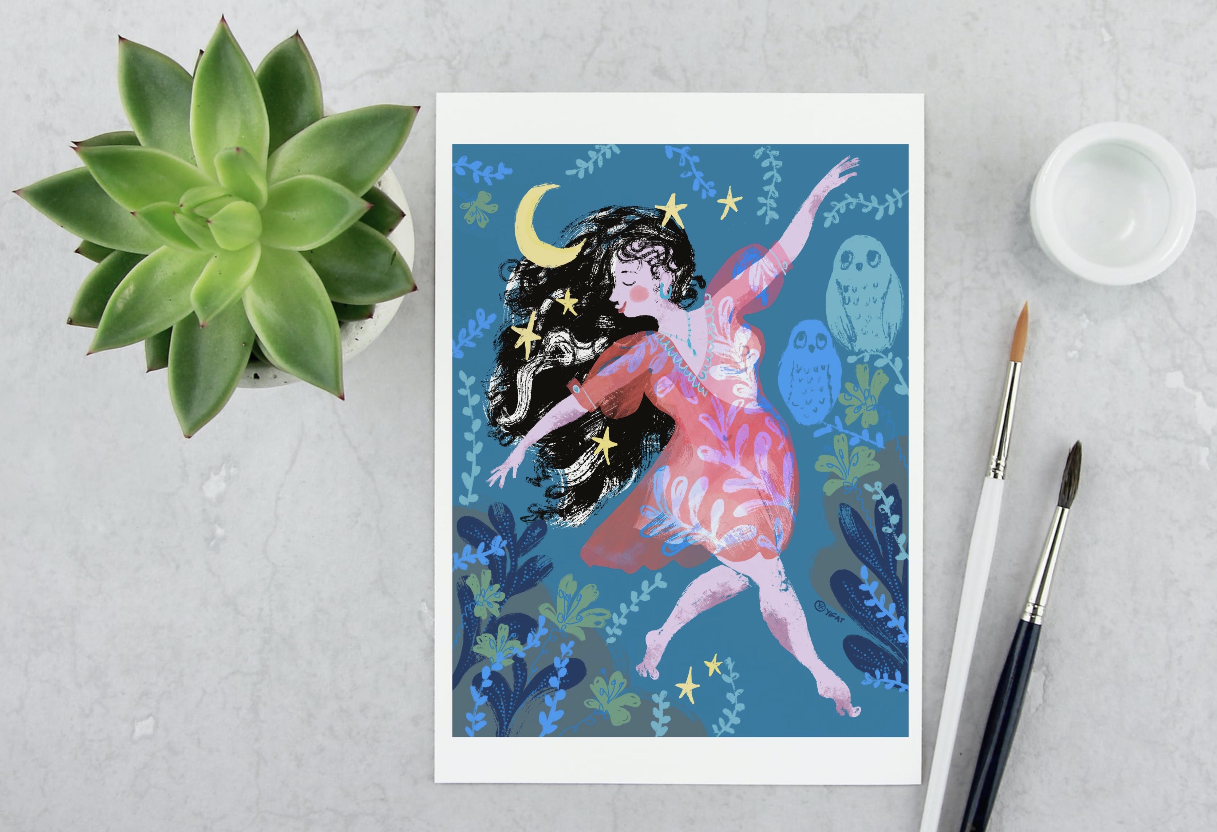
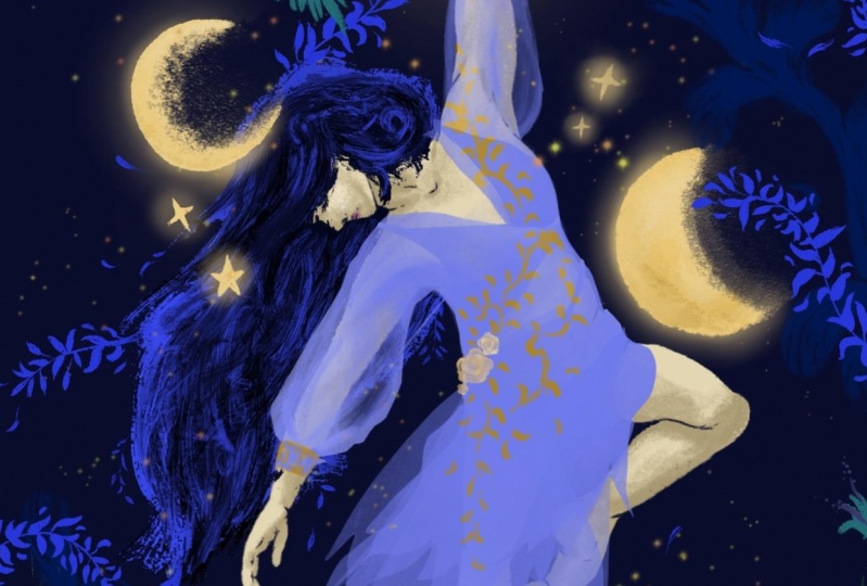
2. The Project: For your class project, you will draw a denser in the midnight garden. Throughout the class, we'll illustrate a dynamic portrait that can be someone that you know, even yourself or an imaginary character. The scene is set at midnight in an enchanted garden. Now we have the who, the when, and the where. We have our creative brief, so grab your pencils and let's start drawing.
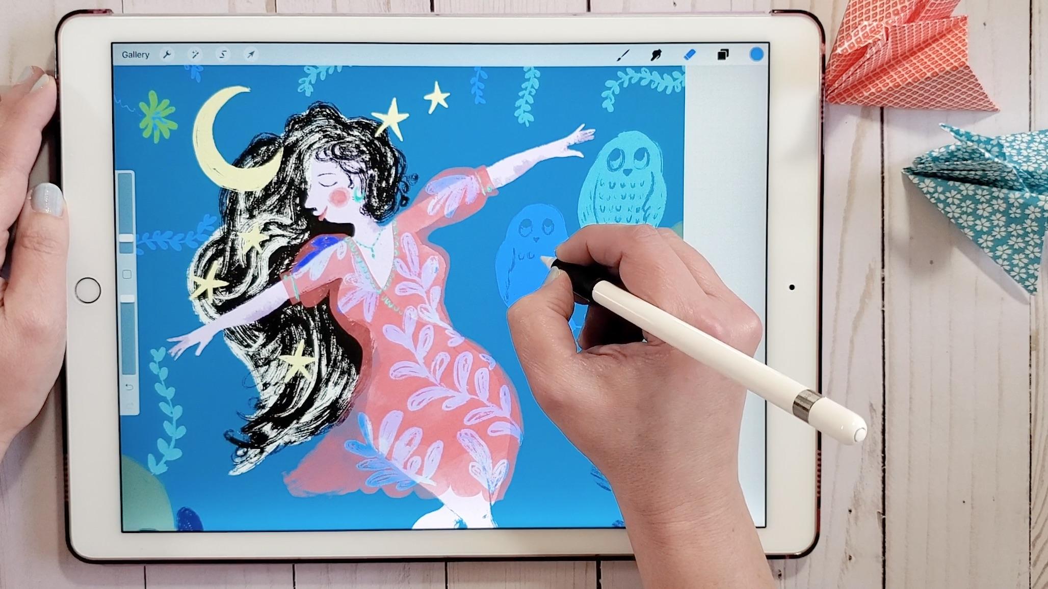
3. Dynamic Pose Fundamentals: Welcome to a new class. This class is going to be all about the art process with lots of tips and tricks that will help you develop good practice on your iPad. I like working with an 11''x14'' canvas set at 300 DPI, which is a high-resolution fit for printing your work. Let's hit the wrench tool and help ourselves to a reference photo. You can pull up one of your own photos, maybe take a photo of yourself dancing and use that as your reference photo for your portrait. I'm using one that I'm sharing with you in the class resources. I'm going to use it to start sketching up the character. Let's jump right into the drawing process. Let's start drawing a diagonal line. Diagonal lines rather than horizontal lines are just more dynamic and create immediate movement. From there we're going to continue drawing very basic stick figure. Think of your stick figure as the skeleton over which you're going to dress up your body. We're going to start sketching the character using very basic shapes, lines, circles, and ovals. I promise you that by the end of this process, you're going to have a human figure dancing on your canvas. I'm drawing one arm stretching upward and the other arm downward and marking the direction for which my character is looking with the hint for the nose. From there we can get into a little bit more details with some mention of the fingers and try to get a sense of how our character is placed on the canvas. Now I can start getting into a little bit more details and add volume to my figure. I'm actually drawing a female figure, so I'm placing some ovals to mark down where the breasts are, a larger oval for the hips. My female character, it's going to have an hourglass type of body, which is more full and rounded, but I am borrowing the energy from the reference photo. It inspires me to get that sense of energy on dynamic movement that the dancer has when I draw my own character. The figure that I'm drawing is going to be very different than the male dancer, but I just love the energy in his dance, and so I'm borrowing it and using it in my own illustration. I'm giving my dancer a lips to mark where her breasts are and larger lips for her hips. I'm checking in my reference photo to see how the muscles are on the male dancer and I'm trying to translate that in my work. When you draw your dynamic portrait, really take the time to place the character on your canvas because this is going to be the foundation of your illustration and the focal point. We're not trying to be very accurate, we're trying to capture pose and really focus on the energy of the character that we're drawing. We're trying to communicate a sense of movement in our drawing. We can do it with diagonal lines and with the whole pose of the dancer. This is just going to build up as we go through this illustration work and add more layers and elements to our painting. For my character, I want to make sure that I draw curves, paint in some muscles. This is something that I really love about dancers, they have these healthy bodies and pronounced muscles, so I want to show it in my work. My dancer is dancing on her tippy-toes and I think it adds more dynamic to the movement. As I draw, I gradually color in the body. At this stage of our work, we're trying to create a very rough shape and gradually we're going to refine and adjust our illustration and get into more details like the toes, the fingers, and the face. Once you have all the basic shapes in place, you can move on to refine your work. I like using the eraser to add details. Make sure that the eraser is set up at the same brush that you use for drawing. If you like working with outlines, you can pick up a new color and a new layer maybe and draw in some details and more lines. I like to actually erase those details and this is my style. Instead of separating the legs with a line, I'm just going to erase that space and create this line that is there just by erasing it. What are actually the basics of creating a dynamic character? The character is placing one foot in front of the other and that immediately creates a sense of movement. The body is tilted back in a diagonal lines. The arms are stretching upward and downward, keeping the balance with a diagonal line of the arms. The gaze of my character is to the side, to the opposite direction for which it's moving. It creates a tension between the opposite movements and adds to the dynamic of the posture. All these dynamics create an interesting posture that conveys movement. Draw your character and meet me in the next lesson where we start adding shading to our character and more details.
4. Shading: Let's draw in some shading for the character to add volume and interest to the illustration. We're going to do it in a new layer. I'm heading over to the color wheel and picking a darker color than the one that I used for the body. You can also pick a completely different color for drawing the shading. It's really hard to shade exactly at the spot that you need the color to be. It will always go beyond the dancer's legs or hips or whatever, so the best way to work with it is to set the shading layer as a clipping mask. That way, you're keeping all the color within the shape of the layer underneath. The brush that I'm using is heavily-textured, but it's also pretty transparent. Although if we use some more pressure on the stylus, we'll get more color and more opaque coloring. We want to draw gently. We will try to set the pressure that we apply over the stylus in-between very light and very heavy pressure. The way I like to draw in those shading textures is to push them in with my brush. I'm applying the shading in spots by pushing the textures with my stylus. I like to keep my shading very light, and use it to add interest and texture to the illustration. I would draw it in spots where the shade will fall on the character, but not everywhere. If you think about the light source coming from above the character, the shading will be under; under the breasts, under the arms, and mostly in the sides of the body. Look what happens when I add a little bit of shading to the back of the neck, it makes the whole head look more rounded and less flat. Now that we have that in place, we can move forward with some adjustments. If you remember at the first lesson, I told you, don't tweak everything right now, just draw, because the time to make correction is further on. You want to have your drawing flowing and moving forward and not peek at every little detail when you're trying to form a shape. Now that you have the shape and you have the shading, we can retouch the basic layer, the one that we drew the body on and refine all the details; the fingertips, the face, and any other detail that you want to correct before we move on. Now that we have our shading in, join me in the next lesson where we'll be adding more details drawing our character's face.
5. Character Design: I really like drawing the faces at this stage. I think drawing the face helps you connect with your character. Let's head over to the layers and on the layer just above the shading layer. Now, we can head over and pick our drawing brush and the color black. If we tap on the bottom right of the color wheel, Procreate will set the color to complete black, and I find black a good neutral color for drawing the eyes. Let's set up the brush to pretty thin. You want a line that you'll see, but you want the lines for the eyes and the eyebrows to be gentles. I really like the texture with this brush and so I want to see that texture pronounced with the eyes. I like to draw these closed eyes but we can also draw a circle and other types of eyes for your character. I like drawing these closed eyes that can show maybe an introspect or show that the character is looking downwards. It's just a matter of keeping the balance in the whole composition. Now is also a good time to readjust the facial expression, tweak all the little details, and make sure that you really enjoy the face that you drew. I'd like to create a rough portrait, but not too rough. I want to refine the facial features a little bit before I move on. The next thing that I would like to do is add some blush and lips to the character, and here's what I love doing. I like working with a broader brush. I'm going to go ahead and pick the brush that I've used for my shading. I'm going to draw just the bottom lip and then I can erase a little bit and play with a smile. I think a smile adds a lot of personality to the character. If I set this layer as a clipping mask, I make sure that I don't draw beyond the boundaries of the face. We can deepen the shadows of the lips and then we can pick another color for the blush. This adds a bit more definition to the face, and I think sweetens the character a little bit. Up next, we're going to draw some hair.
6. Drawing with Eraser Brush: There so many ways to draw the character's hair. I'll show you one that I'm using a lot in my illustrations. Let's start with adding a new layer and place it under all the layers that we drew so far. This is going to be a background of the character. We'll add definition to the hair in this layer. I'm going to pick a very light color and draw the shape of the hair. Notice that I'm drawing a very flowy shape that draws away from the character in the opposite direction of the character's movement. In this way, we create a tension between the forward step and the hair that flows behind the character. Now let's add a new layer and this one is going to be above all the other layers that we drew so far. I'm picking the black color and I'm going to set my brush to draw very small because I'm going to start with adding in the details. If my character hair is this wavy, slightly curly hair, I can draw some of these fine details in this stage. The hair adds a lot of energy and movement, so I will try to express that with my brushstrokes. I can add a new layer and place it under the character's body and keep on drawing without fearing that I'll be drawing over my character. I don't want to completely block the hair with colors, so I'll try to make sure that the brush texture shows up in the hair that I draw. If you feel that you've blocked too much of your hair with color and you don't see the brush's distinct texture, you can always go back to the eraser, make sure it's set up in the same brush that you've used for coloring and add some free space in the hair. Basically we can use the eraser pretty much as we use the brush to draw the hair. I can draw the hair flowing with my eraser and it helps with opening up the shape, making sure that I don't have a block of color. This way adds a lot of movement and volume to the hair. When I draw hair, I like to play with it, add some color and I'll erase some color until I feel that I've created just enough balance between colored spaces and erased spaces. I want to see movements and dynamic in the hair as much as I like seeing it in the character. Up next, we'll be drawing clothing. Join me in the next lesson when we start dressing up the character.
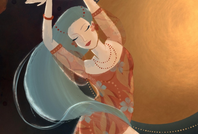
7. Dressing Up in Layers: Let's start adding more complexity and interest to the illustration, with dressing up the character. I like to do it in several layers to create more interesting design and add elements as I go. Let's start by grouping all of the layers for the dancer and add a new layer for the clothing. I want to introduce a new brush. This is a native Procreate brush. It's the wet acrylic. I love it. It's very big. It's pretty wide to draw with. It's good for covering big areas and it has a subtle texture. But the thing is, this brush is transparent and if we don't press too much on the stylus we'll get this subtle texture that resembles working with watercolors. We're not picking up this brush for its precision, so to draw a controlled shape, I would use a new tool, and that will be the select tool. Now, this is a fun thing about the select, it's not only good for changing and adjusting elements in your illustration, it's also great for creating a masked area in which we can paint freely. Let's start outlining the first layer for the dress. I draw with the select tool pretty much as I would with a brush. I can lift my hand from the canvas, Procreate will keep my dotted line intact. Then I can keep on drawing. Basically, you can take your time with drawing your shape, drawing at your own pace until you close up the shape. Once the shape is closed, we'll see the mask forming over our canvas. Now that I have my shape ready, I can start filling it with color. I like working with big settings of the wet acrylic brush and draw very lightly. It's not like coloring in in a coloring book. We want to keep the pressure on the stylus very light. We want to be able to see the brush texture. I'll try to make my brush strokes varying or sometimes I'll press a bit more, and sometimes I'll just touch up on places that I've already colored just to add in some more texture and interest. Now let's see this process again from up-close. Now we'll add a new layer and continue drawing the dress. For this layer, I'll try to overlap the other shapes. In a way, I'm trying to cover the dancer's body without covering too much. The more the work on the dress progresses the more l'll cover the dancer's body until she's not in the nude anymore. It's all a game of transparent layers playing together to cover the dancer gradually. I hope you're following me with your own illustrations and do try out this method. It's wonderful, and I use it often, and join me in the next lesson where we add more details and draw a loose pattern over the dress.
8. Painting Patterns: In this lesson, I'd like to show you a quick and fun way to draw loose patterns over your designs. Let's start with a fresh layer and pick up the drawing brush. I try to be consistent with the brushes that I use for each illustration. I'll alternate brushes. I'm going back to the Blackburn brush, it's really one of my favorite, and let's start drawing a very simple form basically. These are branches and leaves coming off of those branches. Now, one thing to pay attention to is that when I draw, I try to keep the texture of the brush visible. As I draw the shape of the leaf, I'm not coloring it in completely, I do leave some parts uncolored so that the coloring of the leaf is rough and we can see that texture coming through, and that will add a lot of interest to the work. The shape that you draw in this session can be very, very simple. They don't have to be intricate. We're using the texture of the brush as a way to add interest, and the way that I've positioned these elements is something that is important. These branches that I'm drawing are shapes that flow with the body of the dancer. Sometimes I use them to cover intimate parts, and sometimes I use them to enhance the pose of the dancer. These branches and these very simple leaves are flowing with my dancer. They add beauty to the dress, and they also help enhance the pose that I've created. I draw these shapes and these loose pattern wherever I think that the dress needs some embellishing, wherever I think that I have too much of space that is unattended to, that's where I'll add a little bit of details. Now that we have the basic elements of the dress in place, we can start playing around and tweaking things out and see what works and what doesn't. One way to try out is work with the layer blending modes and see if we want to change that. I'm choosing to keep the layers of the dress in the normal state and play around with the pattern layer because I would like my pattern to blend in with the texture underneath. I can change the opacity of that layer to do that. I find that a better way to help the pattern blend in is to use the bottom's layer blending modes. Choose one that feels right. There is no right choice here. There's just the one that you feel that works best with your illustration. Play around with blending modes and choose the one that works best for your artwork. Up next, we're going to keep on drawing and adding more details to the dress.
9. Adding Delicate Details: In this lesson, I'd like to show you how I add details to the dress and finalize this sectional view illustration. Once again, I'm using the same brush as before. I'm just going to scale it down. I'm keeping my color scale on the cold side of the color wheel. If I draw with blue, I will pick another similar color, which is green and it will work well to complement the reds. These cold green and the blue are both cold colors, so they compliment each other pretty well. I like to keep my lines light and whimsical. At this stage, you can go as detailed or as freestyle as you want. I was trying to compliment the shape of the dress and add a little bit to the denser without making it too heavy or too much. It really depends on your style and your approach to illustration. Up next, let's start tweaking and adjusting a little bit and finalize the dress. I'm going to pick a very heavy brush for the eraser and work around the edges of the fabric. I like to do this because it adds some more texture and interest to the fabric and opens it up a little bit. Let's take a closer look at this process. This is a good stage to make adjustment and refine your illustration. Join me in the next lesson as we start creating the scene for this illustration.
10. Painting Midnight Colors: In this lesson, we'll start drawing in the Midnight Garden scene. First, let's group all the layers together. I make sure that I have a group of layers for the dancer and another group of layers for the dress. Let's add a new layer and start drawing the magical night in which this dancer is dancing. I'm drawing a moon over her hair and adding some stars. Using this light yellow color adds light and fun element to this illustration since they're not really up in the sky, but the stars are glowing from within the dancer's hair. It's always a good idea to create groups of elements. Rather than placing one star here or there, I try to create groups of three or two stars and spread them around the character. When I draw the stars, I try to keep them fresh and irregular to create more interest. I try not to overwork these shapes. We can always go back and readjust the illustrations. I want to resize my stars and I feel that two stars are too similar in their size, so let's go ahead and reduce the size of one of the stars. The next thing that I want to do is start building up the settings. I'm going to work with very simple shapes. The thing that I would like for you to pay attention to is the colors that I'm choosing for drawing in the nighttime garden. Since the scene is dark, I'll try to go with darker shade and cooler greens. I can always go and readjust my colors just to make sure that the green is not too yellow, that it's more on the bluish side of the color wheel. Now let's add a new layer and add more elements to the illustration. I'm going to mimic the pattern design that I've created for my dancer's dress in the plants that I'm drawing all around her. The shapes are leaves coming out of a central branch. I'm trying to keep my brush texture visible. I can always go back and readjust the texture with my eraser. This is something that I really love doing, adding more texture with the eraser, roughing it up a little bit to open up the shape. To balance the color composition, I'll add some more of these branches on the other side of my denser. I feel that they add weight with the dark color and the big, robust shapes. I can always go in and add more gentle elements afterwards, but I want to start with anchoring the scene with these big bold shapes. Notice that they're very simple to draw. You don't really have to go into a lot of details. I'm aiming at creating movement and interest and gradually adding more layers and more elements to the scene, to make it more complex and more interesting. Something that is on my mind when I'm working is colors. I'm working with darker shades of green and darker shades of blue, just to set up the composition and create interest in the space. I've used the two corners to create the basic shapes of the garden, and I'm going to build on that. Here I'm using a brush that you can download from the class resources. It's just a fun little brush that creates this dotted line to add a more controlled texture to the leaf. I really love the graphic elements. Join me in the next lesson where we start adding more layers to the garden and build up more of the nighttime scene.
11. Garden Plants Drawing & Adjusting: Let's add the new layer and choose a brighter color to create gentle branches and add movement to the illustration. I want to show you a very simple branch that you can draw. The main element is a line that is growing from the perimeter of the page and it bends into the scene, and I'm just adding small leaves to that line to create a very simple branch. I think these colorful branches add color and interest to the scene. You can go into a lot of details in creating a detailed scene for the garden. But I feel that for me, I'm aiming at adding color and movement to my illustration, and I'm not really focusing on the botanical shapes at the moment. This is not the focal point of this illustration. You can use elements that you've already drawn in and duplicate them and use them in other parts of your illustration. It helps with creating consistency because you're using elements that are already there. It also saves you time and sometimes it's just easier to start illustrating with something that is already there and you can just build on it as you go. So for these simple branches, I've used two basic colors and they are variations of the same color. I've chosen blue colors for them because the scene is in the night, and I want to keep all the colors of the garden in the background of my dancer. The garden is made out of shades of blue and that helps put it in the background, whereas, the dancer is created with warm shades like pinks and reds. There's the yellow of the moon and that helps bring the dancer forward and takes the garden to the background of the scene. To add more interest and layers to the illustration, I want to add some flowers. Since it's a nighttime, I'm choosing to use a shade of colors that I've already used for the garden. So I'm using this green for this flower. Now imagine if I use a yellow or an orange or pink, it will compete with my dancer. It will take a lot of attention from the dancer to the garden, and I'm trying to keep the garden in the background. So I've chosen a color that is part of the color palette of the garden, rather than a color that is going to compete with my dancer, which I want to keep as the focal point. You can always choose to select an element and duplicate it and use it again. Sometimes I do it just to test my composition, and sometimes I do it just because it saves me time when I draw. We can add more complexity by just bringing in simple details, and I'm using the same colors. I'm not inventing more colors for these flowers. I'm borrowing a color from one of the branches that I used to add more details to these flowers. Again, this helps tie them in to the background. The last thing that we want to do is make some final adjustments before we move on. I'd like to merge down layers of the same elements. If I duplicate this flower, manipulate it, and move it around, I will merge that layer down with the layer below that has all the flowers in it. I'll see you in the next lesson where we complete the scene of the nighttime garden.
12. Drawing Nocturnal Birds: In this lesson, we'll add the final element to the garden scene. But before that, I want to move my dancer to make some more space for it. We can go over to the Layer menu and choose layer groups and then move them all to their new position. I can always choose to change the size of my character, tilt it and rotate it a little bit on the canvas at this stage. Let's readjust the position of the nighttime scene to make sure we're all ready to move on. I like to do all these final tweaks before I move on to the next stage. Basically I'm making some room that a certain area of the illustration where I want to add a couple of owls. Of course, I'll choose to draw the owls in a new layer. I want to make sure that each element is separated from the other elements because it helps move it around and change it, and adjust it, if you'd like to do that afterwards. For drawing in the new elements, I'm picking color from the canvas. Once again, I'm not choosing to use a new color, but rather a color that is already there to draw a new element. It helps it blend in and keep it in the background rather than take more attention from the dancer. I feel that this is particularly important because I don't want my owl to take more of the attention from the dancer. The owl shape is pretty simple, and the next thing I want to do is add some details. Of course, you can add details with an outline. I like to add details with my eraser. I use the eraser basically as much as I use the brushes, and I would use the eraser to draw in the detail of the owl, which is the wings, the eyes, the beak, and some mentioning of feathers. The main question that I'm asking myself here is, how do I tie in all the elements of an illustration together? How do I make sure that the owl is drawn in in the same style that I've drawn in the other element, like the dancer, for instance. This is a question that should be on your mind when you draw. You don't want to go in and draw another element with completely different styles, like getting into a lot of details of the feathers and the animal shape. I'm using the same brush that I've used for the dancer. I try to keep my brush strokes and lines very light. Now I feel that just one owl is not enough and I want to add another owl in another color. I think that's going to complement the scene really nicely. I've used the colors of the branches to draw in my owls. That helps tie them in with the whole garden scene. To simplify the owls' shapes, I'm asking myself what makes an owl an owl? This helps me know how little or how extensive I want to go with detailing the shape. For me I think what makes the owl what it is, are the big eyes, the small triangle for the beak, some mention of the wings, and the texture of the feathers. In that way I can draw a simple owl without going into a lot of details and add these two birds to the nighttime scene. With that, my friend, the illustration is done. Join me in the next lesson as we create a mockup with our artwork.
13. Creating Mockups of Your Art: Mockups are a visually engaging way to present your work as it would appear in real life on various prints and products. In this lesson, I'll be using photos that are copyright free and you can find links to these photos in the class resources. Let's insert a photo and adjust it to the size of our canvas. This particular image has a lot of empty space all around the subject of the photo, and so I want to draw more focus onto the paper. I'm enlarging the image a little bit to fit my design. The next thing that I want to do is import my final artwork into this file. I need to scale down my illustration a little bit to fit on the paper underneath. I'm heading over to the Layer menu and checking out the blending mode for the layer. I'll pick Multiply. Multiply helps the image blend in with the background below it. It will bring in some of the paper texture that I'm placing my image on. Next, I want to readjust the position of my image on the paper. I'm trying to create the illusion that this is a printout, so I'm leaving some edges all around my image, like a frame of the white paper, and I might need to tweak my artwork a little bit. We want to make these changes very, very subtle so that we won't distort our image just to fit it on the paper below. Let's try another approach to creating a mockup. Once again, I'm importing an image to my canvas and I'm going to readjust its scale. Sometimes we want to change the dimension of the photo that we were using to create the mockup, and sometimes we may want to change the canvas settings to fit the work. Let's head over to the top menu and pick "Canvas." From there, we choose "Crop" and resize the canvas, and then we can just drag the canvas' edges to fit the image. Now I'm going to import my illustration to this canvas and change the size. Using the "Uniform "option with the "Select" tool, rather than the free hand, helps me keep the dimensions of my artwork as I change its size, so I won't create distortion of the image. When my image is roughly where I need it to be, that's when I'll choose the "Distort" option and create very subtle changes in its dimension to fit it onto the paper below. Something that I really like about this particular mockup image is the shadows of the palm branches on the paper and I would like to reflect that in the mockup that I create. I'm going to head over to the "Layer" menu and choose the "Blending" mode that helps my image blend in with the image underneath. If I take a closer look, you can see how the shadows are now covering my illustration as well as the paper. Now we can go ahead and export and share it with friends on our social media accounts. I'm really looking forward to seeing what you create.
14. Final Thoughts: Congratulations on completing the class. We followed the creative process from rough cartoon sketch to cartoon design from finding the basic elements of energetic poses to illustrating an imaginary scene as we painted the garden in midnight colors. I'm looking forward to seeing what you create with the class. Share your project in the projects gallery on the class page so we can all take a look. Thanks for joining me today. Please stay in touch. Find me on Instagram and follow me here on Skillshare. I'll see you in the next class. Bye for now.
15. Trailer: Illustrating Dancing Characters: I discovered my love of drawing women when working on the dancers project. Dancers is a series of illustrations with female characters in dynamic poses. My name is Yifat, I'm an artist and illustrator. The greatest challenge in drawing people is not only to draw relatable characters, but to style each one as an individual. In this class, you will learn to draw dynamic dance poses and find your own illustration style with the final class project. The class follows a series of lessons and exercises designed to gradually build confidence and skills for your final dancer project. We'll start with creating a foundation of drawing energetic poses from observation. You'll learn to illustrate different body shapes, exaggerate dynamic gestures, design relatable characters, draw fabrics, and loose patterns. It helps to have a broad vision of your project. I saw my dancers as joyful, empowering images of women in large murals. Women doing their thing and loving it. I think that women in positive self-expression are a powerful image. I find that inspiring. If you want to be confident in drawing people, if you wish to discover your own illustration style, this class is for you. Grab your pencil and let's get started.
 Yifat Fishman, Artist & Illustrator