Transcripts
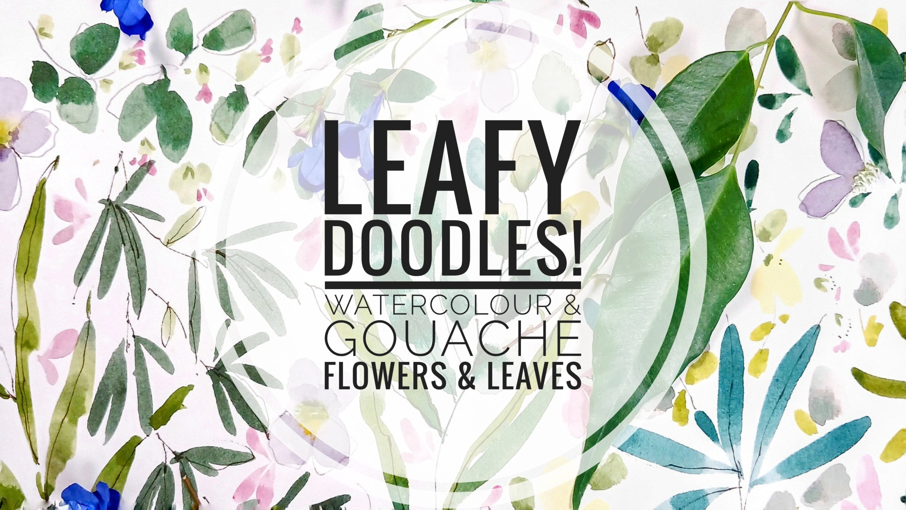
1. Welcome!: Hello, and welcome to Brdie. If you're not familiar
with me, my name's Holly. I live in East Lothian on the southeast
coast of Scotland. As well as being a teacher, I am a surface pattern designer,
specializing in bedding. In this class together, we're going to create a
reference or inspiration sheet. It's where we can
explore and practice floral and leaf shapes without the worry of it looking
like a finished painting. And it's something
you could definitely come back to time and time again to reacquaint yourself with the floral and leaf shapes. There are various
motifs and layers, and you can decide to
stop whenever you like, or continue through on the
whole journey with me. I'll be running through
materials for you and will also do a little bit of preparation with
our color palette. We're going to be keeping in
mind three art terms, Hue, which refers to the color
itself, red, blue, green, purple, et cetera, and is
also often called chroma. Saturation which
indicates how vivid a color is and value, which refers to how light
or dark a color is. An easy way to determine
value is to squint, and that simplifies
the tonal areas when looking at a painting. We'll be exploring how
muted neutral hues can work so well
with bright ones. I'll take you through some of our best loved floral
shapes roses, delphinium, garden and Michelms
Daisy shapes, as well as broad, elongated
and ovate leaves. We'll also be breaking out our favorite pen again
and having a wee doodle. So today is all about
creating pretty florals, which you can adopt to create
your own unique style. Subtitles are available for my deaf and hard of
hearing followers. Start your lesson rolling, and you'll see the subtitles
icon in the bottom right. Next to the volume icon. Subtitles are also
available in Spanish, Portuguese, French and German. Before we move on,
let me remind you that you can share your
project with the class. No pressure at all to do this. But it's a really fun
way to connect with others and share
tips and feedback. If you're new to Skillshare, you'll find our projects and resources area
underneath the class. And on the right, you'll see my project and submit project. So when you're ready, let's
move on with the class.
2. Materials: If we look at materials,
I'm using Osh, hot press paper, although cold pressed would be just
as good for this class. 140 pound, and it's
20 centimeter by 20. Quite like working in a
square every now and then. Now, it comes with this
black safety sheet on top, which does freak me
out a little bit, because I always think oh
I've ordered the wrong paper. But no, it's just
the safety sheet. Easier to remove than the
other pieces of paper, but I thought I'd
just show you how you do this in case you're
not familiar with blocks. I tend to use this wedge because it's
nice and soft and bendy, and it's not going to scrape
the paper underneath. A lot of people use
palette knives, but I find this a little softer. You'll find a gap at
the top of the page. And if you just slide
whatever you're using, palette knife or ruler
to the left and right, and I'm going to slide
right along the side there. Next corner. And I'm just going to be
really safe here and just go right the way round. And that's the
safety sheet away. We're left with this
gorgeous paper, and I've only just started using this recently, but I love it. So this is my Filbert
selection here. I got it from Amazon. It's called Master Touch, it was a set of filberts ranging from zero
to, I think, six. And I have two memory
points brushes. I've got the pointed
filbert size eight and a small
round brush size five. And you might also want to use a fine liner for
some of the stems. So running through paints, let's actually place our paints down as we run through them. So I've got prussian blue there. This is permanent green light. These are both gouache. Any bright green that you have. I've got wisteria, opera pink, and this is still all
gouache at this stage. Handsy yellow deep, or you could use any warm
yellow that you have. And I have white gouache and white watercolor running
a bit low on the gouache. And I also have one of my favorite colors at the
moment, perylene violet. If you don't have periviolet, you can achieve this by mixing a purple and adding a tiny
touch of warm yellow to it.
3. Colour Swatching: I thought before we move on with the class that we could
do some color swatches. We'll be mixing colors
as we go along, but these are some of the fundamental colors that
we'll be working with. I'm starting with a wisteria
which is a cool pink, adding a little white to it. And to create a peachy color, we could add some of
the handsy yellow deep and a little touch
of white to the wisteria. I love that. Neutral
pink, gorgeous color. So taking over some of the
white to the opera pink, and because we're working
with brights and neutrals, this is a lovely combo. You wouldn't think to
put these together, but because this page is going
to be so full of motifs, it's really going
to work together. But because we have such a
lot going on on this page, there's room for us to explore. Sauces are very, very pale pink, lots of white and just a
touch of the opera pink. So we got some
cooler and warmer, bright and neutral colors there. This is Prussian blue, so it's a blue leaning
towards turquoise. I spent some time
off screen there trying to find my
French ultramarine. I'm now thinking that I
want more of a mid blue, a true blue, so I'm going to bring some French
ultramarine in as well. Lends itself to mix really well. I'm glad I remembered the French ultramarine because I love it when it's
mixed with white. Get this lovely powder blue. Isn't that gorgeous. How about a creamy color? And the quickest way really is just to add yellow to white. Any warm yellow that you have
and lots and lots of white. The reason why I like this hands yellow deep gouache is it's
so vibrant. I love it. You don't lose any
of the vibrancy when you add white to it. Gorgeous. These colors,
apart from the opera pink, kind of remind me
of 1950s colors, particularly the color above the dusky brownie
pink and this yellow. And again, with the
permanent green light guash, it's a very vibrant green. It's not one that I would
use just on its own, but I love it for mixing. So if we mix some yellow in with that and a little bit
of the opera pink, we start to get a warmer green tones it
down a little bit. I like the control that using bright colours for
mixing offers. So that's a lovely forest green. Now, if we take some
of that over into this well and add some white, we can get almost a minty green. So what if we should
need a brown? And we've covered this in
a few classes where we can use all primary colors
to mix browns and grays. So let's move this round, and we'll start with the blue. And my primary here is the pink. It would obviously be red, but I'm leaning towards
the CMY color wheel, especially when we bring
in the Prussian blue, which is what turquoise. So we got our
French ultramarine. I'm having a love affair
with French ultramarine at the moment. That's gorgeous. And we're adding in our
pink or red or magenta. And that gives us that
lovely violet color. So a little bit more
of the blue and pink, just so that we can
then start to turn this into a lovely earthy brown. And then the final color, of course, is a yellow, and just a tiny touch of this, and it turns into
this plum color. This is one of my
favorite colors as well. Gorgeous berry colors. So that's leaning
towards the pink and blue with a
little bit of yellow. I now, if we add more blue and
replenish the pink as well, and we add a little more yellow, we start to get this
lovely neutral brown, like an earthenware color. So you can see we have
a lot of wiggle room. There are artists who use only the three primary colors
for all of their palettes. So I just want to note down
how I reach that color. So it was French ultramarine. Opera pink and
handsy yellow deep. Just to reiterate, you
can use all watercolor, all gouache, or a
mixture of both. And I just want to make note that that is permanent
green light. But any green of
your choice, really, let's move on and create
our lovely reference sheet.
4. Pastel Pink Roses: So let's start with our centers. And I'm just putting
some white gouache down. And let's pick up our
size five round brush. The size four or six would
be great for this, too. And I'm just taking over some of that permanent green light and mixing it with the handsome
yellow deep and white. So we're doing very
light touches, very loose and throw away. So let's go back to the
handsy yellow deep mix. And I'm just pulling
that out with a tiny touch of water
and adding white to it. It's such a bright,
joyful colour. Just dotting in some
yellow amidst the green. What we're aiming for here is getting a few colors
into our centers. So just moving between
a whiter yellow, a more creamy mixture
and the brighter yellow. And now adding just
a little bit of water to wake up the
brown that we mixed. So we have the two paler colors, and now we have a deeper brown, and adding this just really
starts to bring them alive. I found it helpful not to think about them as flower centers, but just little abstract shapes where I'm dabbing in
different colors. So adding a bit of white
to that brown now. Again, just to mix a slightly
different color to add. So we have the deeper brown and a much more neutral
brown with the white. And a little tip when
you're using a round brush, you can get an almost
flat brush effect by flattening out
to round brush and then turning it on its side and printing almost these little
dots into the center. And adding little sea curves of the minty green
that we mixed. So we want to create some lovely petals cradling
around the center. And let's go into
the Wisteria mix. And I'm adding some white. And this happens to
be white watercolor. So let's start by creating
our lovely rounded petals. This scribble movement, I think, is so easy and yet gives you these effortlessly
intuitive marks. So I'm picking up my
size, too, Philbert now. And I'm now adding just a
bit of that white gouache. A so going back to our little dabi movements
and little scribbles. And we can change
the direction of the flowers by the arrangement
and size of the petals. So this one is looking
up to the left. So I've done smaller petals on the top side and larger beneath. I'm just adding a little bit of white there over the pink. We start to see a
little bit of layering. So finishing off this flower, I just want to add a
few little petals. And also some petals that go
slightly over the center. I'm just going around now, and we're moving between
that opera pink, the white, and the Wisteria. When layering, using three
different hues around the same area on
the color wheel is a really gorgeous way of bringing interest and
detail to your work. So let's move on to
our next lesson.
5. Rose Leaves, Delphinium, Cornflower & Michaelmas Daisy: Let's add some leaves
to these flowers now. And I'm going back to the
green mix that we did earlier. Just waking it up and
adding a little white. I've just added a touch of yellow and a touch
of the opera pink. I'm trying to reach a more
natural organic green, a little bit more white. So I've got my
size two Philbert. So slightly over the center. So using just the tip of the brush and adding
little features. Remember also, we can add some
dry brush technique here, where the brush will be slightly drier and the paint very tacky. I'm also going into that slightly warmer
green on the right. I do like a bit of dry brushing, but you might find
that adding stems, you don't have the same control. And I'm just adding touches of that warmer green
against the cooler green. Why don't we mix up some blue? So I'm, first of all, adding white to the
French ultramarine. I'm aiming towards a mid blue
and a more turquoise blue. So over here, I
have Prussian blue, and I'm going to add
white to that, too. Again, with the petals
on the flowers, what we're trying
to do here is bring in two different
variations of blue. And let's start off with these tiny little
daby movements, moving down an imaginary stem. And you could always actually
paint in the stem first. Little scribbly marks again, tiny brush strokes, and a
few little marks and dots. And then interchanging between the French ultramarine
and the Prussian blue. They can be any
flower that you see. So I'm going to add a stem
now with my liner brush, and using that
same mix of green. I don't feel that it has
to touch every petal. I want to keep that
expressive style. So I'm just adding
little dots and dashes. Bringing all the little
florets together. So we've got a few
darker elements, and now it might be fun
just to go down to a zero, either a filbert
or a round brush. And I'm just picking
up a little bit of white and adding
little highlights, very gentle touch as we don't
want to overwhelm the blue. And now I'm adding a very
pale white blue mix. Let's do another blue flower. I'm just adding a very quick
center and some little dots. I've just mixed up a little darker French ultramarine
with that white mix. And I'm just starting
out by pulling in some very small petals. I don't really think about the name of the flower
that I'm painting, I just seem to paint flowers, and then afterwards, I kind of decide or can
see what they are. So I guess this could
be a cornflower. So I'm just slowly building on these petals and changing
their direction a little bit, just so the flour
doesn't look static. I'm mixing a paler green just by bringing
down some more white. And I'm dotting around the center to add some
highlights to that darker green. Going back to that darker
green and very sparingly, just adding a few
tiny little leaves in amongst the petals. So I'm still using my
size zero, Philbert. I've got white again, and
I'm just highlighting one side of the middle of the flower just to
create a dome shape. Let's do another one here. I'm starting out with
a very rough center, a little bit of white
in there as well. I do like to mix colors
on the page sometimes. So I've cleaned off my brush, and I guess I'm thinking more about maybe a Michelmas daisy. I'm mixing a very quick, almost like a lilac color using the opera pink and French
ultramarine with white. Just wanted to vary the blues. So I picked up my line
of brush and let's add some white dots
around the center. So I'm just putting down
some more hands yellow deep and dabbing
that in as well, just to vary that center. It's a technique that I've
started to use a lot more, adding a few colors
to the center of different value
and different hues. And drawing out
some little stems. And then going back
to my size five round brrushG back to a
warm green again. And I want to vary
the leaves this time. Why not do some slightly
more elongated leaves? And we can always add the tips of the leaves
separately afterwards. I love doing that. A
6. Opera Pink Flowers: So I've picked up my size four
fiilbt and we're going to create some lovely bright
opera pink roses or daisies. I tend to paint flowers and then decide what
they are afterwards. Mixing the opera pink
with some white. And we've got a lot of
paint on our brush, and the brush doesn't have
a lot of water on it, so it's quite a dry feeling. And what we're getting there
is an application of paint. And when it's lifted
swiftly like that, it provides these
textured brush strokes. It is really simple,
very swift movement. Pressing down the brush, flaring it a little bit, and then bringing
it up very quickly. And we're leaving space in
the middle so we can add details. Let's do another one. Using the side of the
brush there so that we get a half open flower or one that's pointing in
a different direction. What's great about gouache
or thick application of watercolor is that if you're not happy
with a brush stroke, you can always go back
in and correct it. So now let's pick
up our round brush, and we just need a
small round brush. This is size five memory point. So for the center, we can mix a deeper pink, and the way that we
can achieve that is to add some of our French
ultramarine to our opera pink. And then add some white to that. I and you can keep mixing those three elements until you get the
color that you'd like. What I was trying
to achieve here is just a deeper color
of the opera pink. So that was still the dominant color when I
was mixing those together. And I'm just doing these
little scribbly dots. Very light touch, not pressing down on
the brush too much. Using just the tip to
create very delicate marks. And just to make note of
that, again, that mix, it's French ultramarine,
opera pink and white, leaning heavily towards
the opera pink. And let's add another
color to the center. And I like to do a little
sea curve of green. So handsome yellow deep mixed in with the green that
we mixed earlier, and that's giving us a very
warm green and keeping in awareness that actually
very small slight touches can make a huge difference. So we're just doing
tiny little sea curves, and that's it.
Very, very simple. This is going to be
a very busy page, so we can always come
back and add details. So let's leave it simple for now and move on to our next motif.
7. Neutral Brown Star Flowers: So now let's mix handsy
yellow deep with a white, and this could be white
gouache or watercolor. And what we're
aiming for here is a buttery yellow, creamy yellow. It's one of my favorite colors. And there's a little green left in my palett, but that's okay. The handsy yellow
deep gouache is such a vibrant color
that you have to be really careful about
how much you add to white. And I've got a little area here where it has a little
more white added. And now let's mix a slightly darker neutral color that will complement this. And the easiest way
to do this is to use a color opposite
on the color wheel. So the opposite to yellow, of course, is purple. So if we add a purple to it and just keep mixing until we get the color that
we're looking for. There's so many variations, so you may plump for a
different color than me. Adding opera pink and
French ultramarine. There was still a little bit of purple left in the
palette there. So I just kept going and just adding a little bit more blue
just to cool it down. Just keep going between
the pink or red and blue and the yellow until you get the
color that you like. And that's a lovely,
kind of peachy brown. I love that. I'm so
pleased with that. So let's have a wee
practice with this color, and I really like the
idea of just doing some very sketchy, daisy shapes. And this, again, is
highlighting how we can mix neutrals
and brights together. And again, you can
play around with how much water you
add to your cue, and that's quite thick, so I'm just going to add a tiny touch of
water to the mix, still with my small round brush. And again, very
swift movements like the opera pink petals,
but more elongated. So I'm not pushing down
on my brush too much. I'm using the tip to about
a third of the way down, we can vary our petals that way. They remind me of stars. I really like this shape, and I love this color. I'm definitely going to be using this again
in the future. And some of these can be half open flowers pointing
away or to the side. So a mixture of pushing down a little on the
brush and using the tip. A little sketchy one there. And now we can go over
to our brighter color, getting my little
bit of scrap paper again and having
a quick practice. So I'm going to show the process here because as I'm
laying this down, I'm not really liking it. I don't think it works. So I'm just going to
pause for a minute. I really love that neutral, brownie pink color, and I'm not sure that
the yellow is working. What if I mix a little more of the neutral in with
the yellow? Let's have a go. How does that look? No,
I'm still not liking it, so I'm just going to stick with that lovely, neutral,
pinky brown. And, of course, not
all flowers can shine. It would be really overwhelming. So sometimes it's nice
to have flowers that are not the star, but
supporting actors. So I might bring in a
little bit of pen detail, and I have my pigma micron. This is a 01 in sepia and just practicing
those squiggly dots. So these are very
simple flowers. And this is one of my
favorite things to do. These lovely scribbly centers. Centers scared me for
the longest time, and now I realize that
actually they're a lot simpler and they look better
when they're kept simple. I think I felt I
had to really work hard on getting
the centers right. They're very
delicate, and they're going to showcase
the other flowers. And of course, this page is
gonna get really hectic, so it's nice just to
have some simple motifs. And while we're here,
we can always add a little touch to the centers
of the opera pink flowers.
8. Yellow Flowers: It might be nice to bring in some sprigs of yellow flowers. So I'm going back to
my size zero Filbert, and fancy yellow
deep and white mix. And this brush stroke
is somewhere between the neutral daisies and
the opera pink flowers. So just pulling
down very swiftly, fairly dry brush with lots of pigment and creating
very loose shapes. So I'm going to do
a few so that we can draw down some longer stems. When you're painting
flowers with stems, you may find it easier to paint the flowers first and
then add the stems. It keeps it nice and
random and natural. And as I move down, I'm just adding some larger flower heads. And let's add some green. So I'm going back to
our green mix and just adding a little
bit of the yellow mix. This will give us
almost like a lime green, nice and bright. And I'm just adding a
few little details. A So let's add some stems, and I'm picking
up my liner brush and adding a tiny touch of water and a little
bit more green. Now, here we're going for a much more watery feel because it will give us
enough paint to pull through. If it was very dry
and you may want to go with a dry brush effect. But I want these to flow, and therefore I
need enough water and paint on my brush
for that to happen. And I'm just pulling these
through quite quickly, not pressing down on the brush, but just continuing
that movement on the tip of the brush
and then quickly down. And, you know, again, these
are very loose flowers, so the stems don't
all need to connect. So I'm going to bring more
handsy yellow deep over to that green mix because I want a really zingy,
bright green. And let's have
another wee practice. So what we're doing here is very similar to the brush
strokes we've already done, but we're just pulling the brush through for a lot longer. And as we pull the
brush through, we can also add movement. You can take your time and
add different size of leaves. So going down to just
the tip, really, to a third of the way
down for those last two, I do like adding some tiny
little dots and details. I guess these could
be buttercups, but the leaves are
not buttercup leaves. They just belong
in my imagination. And I do like adding tin little dots to the
top of some other leaves. So cradling the
actual flower head. And of course, we can go over the flowers when
we're doing that. And I really like the way they look as if they're
growing away from us. That's because we've done larger flowers towards
the bottom of the sprigs.
9. Leaves: Let's move over to a
slightly larger Filbert, and I'm using my memory
point size eight. I'm going to practice
on this piece of paper because this is a very
intuitive process. So I'm just testing at things, making sure that what I
am envisaging in my head, I can actually
bring to the paper. So I have some
French ultramarine, and I'm going to
bring in some more of that permanent green gouache and adding some of the
French ultramarine to it. Because, as well as focusing on different shapes of
flowers and leaves, we can also think a little bit about warm and cool colors. So let's see what that
looks like on the paper. Adding a little bit more blue. This is such an
easy three step way of creating different greens. So we've added a
blue to the green. And now let's go
for either a red or pink because we've
already used opera pink, I'm just going to go with that, and I'm adding some of the permanent green
to the opera pink. That's a kind of a gray green. What we're aiming for really is like a khaki green,
olive greenish. And I could be a stickler
and bring out some red. But I also believe in mixing
with the colors that we're already using as that
brings a lot of harmony. So just as we did with
the blue and red or pink, we're going to do the
same with yellow. And because we're using enhanced yellow deep, we're
going to go with that. Adding a touch of white to that. So we've got three very
different greens there. We're going to do one of my
favorite little leaf shapes, and it's one we did
in the class mimos. So I'm starting with
that very bright green, and my number five round brush. Any small round brush
would be great. We're going to keep the
leaves changing direction, changing shape a little bit, so adding tiny little details. And as we move down, we get a little
larger each time. And again, I'm using
that technique where I'm putting my
leaves down first, and then I will add the stem. And I just find that it brings
out a more natural feel. So let's move over to
our olive green color. And I now have my
fine liner brush. And using just the tip, I'm adding tiny little stems. Not every leaf needs to be connected. And I love that. I really love this
shape of leaf. Talking about a glossary or
a reference sheet of motifs, this is one that I will
definitely be coming back to. So this time, let's
do the stem first. Still with my liner brush. And I'm creating
these broken lines just because I find I
have very wobbly hands, and I can never get the stem
just the way I want it. And it doesn't have to
be perfect, does it? I mean, I really like
the fact that it's a broken stem.
It's more natural. So this is size two Filbert. Still out of that range
of filberts that I bought a few years ago now. So with our filbert, let's pick up some of that
earthy olive gray green. Adding a tiny touch more blue. And just brightening it up a little bit with the permanent
green and the yellow. So just making sure that I have enough of that olive
green for this leaf. This is very similar to the
leaves on the yellow flowers, changing direction, changing shape and size of
each leaf as I go down. So some tiny leaves clinging to the stem and some
leaves branching out. And it's that very
swift movement again. Not a lot of water on the
brush and alter pigment, and that gives us control with this
particular leaf shape. So I'm adding two
larger leaves here, but that doesn't
look as balanced, so I'm now going to just go in, correct that a little bit by
drawing a leaf over that. Showing process, not perfection. I don't like that
leaf, but, you know, we're doing a whole page here, so there are gonna be elements that we love more than others. I feel bad for that leaf now. I do love leaf. So I've got my size
four, Philbert. So how about some wider leaves? Just dipped it in the water
and take the excess off. So it's nice and primed. And going back to that lovely limey green color that we mixed. So let me just show you that. So I'm going to add a touch of white and just mix that in. I think it might be
a bit too white now. So I'm just tempering that
by adding more green. Just adding a little
bit more pink, just a tiny touch. So these are a slower movement, and we're fanning the brush out, so down little wiggle, if you like, and fanning
the brush up to a tip. Such a simple and gorgeous leaf. I use this a lot in my work. We can then vary the leaves and do little
two stroke leaves, one large, little accent leaf. And this is where
our chaos starts, as well as we're going to start overlapping some of the
motifs we've already placed. And in the case of that one, it also helps out that
leaf that I didn't like. So good thing about these leaves is you can add a lot
of detail to them.
10. Perylene Violet Flowers: So it's time to bring in
one of my favorite colors, which is perylene violet, and this is a wood color. Too much of this
becomes overpowering, so I tend to use it a lot in my meadow paintings
as it's a very lush, deep color, and we're looking for a little
bit of contrast now. So I'm just cleaning
my brush and adding a little bit of
water to the peri violet. And I think it would
look nice as neutral. So let's add a
little bit of white. So it's like a dusky purple now. This is definitely a purple red. It leans very much to the red. And I'd like to create
some filler flowers. So these are very simple to do. It's like a miniature version
of the opera pink flowers. Little scribbles
and the odd dot. And as if they're
being blown around by the wind darting in and
out of the other motifs. And placing these next to a lighter value flower
really makes them pop. And I'm just doing a
tiny little second layer where I've added a
little bit more white. These touches are
small but significant. And these little flowers tend to allow the other
motifs to come forward, especially around
the paler colors. I just love the
way that the light and dark work together. And just as the leaves below, we're going to bring in
a little bit of layering where some of the motifs
are colliding a little bit. It's a little opportune
leaflet here, sewing to add a
little flour to it. So cute. Mm. And smudging in some of that paler violet. These little details are done when the petals
are still wet. So what we're doing is mixing
on the page, basically. Referring back to the intro, this is also where
we bring value as Perlin violet is
quite dark in color, as are some of the leaves in
the bottom half of the page. So I turned that into
a little flower, kind of borrowed one of
those tiny neutral flowers to leaves instead. I just adding some little impressionistic petals
randomly, really. I do believe in
finishing touches and one of my great loves
little petals and dots. So I'm adding a little
bit more white. And it's almost pure white. And I'm just adding a third little layer to these flowers. It tempers them a little bit
so that they all fit in, but also doesn't uh that lovely deep quality
that the peri violet has. And we've done this
movement very often, I think, in other classes. Very abstract, little
dots really of paint. It gives our brains a little
bit of extra work to do, which I think is a good thing
in art. It's very pleasing. Favorite little motif so far
is this little flower here. It's adorable. Mm.
11. Pen Doodles On Leaves: So I'm just going to
mix up some more green. And I'm using that
permanent green gouache. And I've got a little
too much water in there, I think, so I'm just going to lift a little
bit of that paint. Not all of it. I don't
want to waste the color, but I just want to take some
of the water out of it. Some opera pink. This makes a green more natural and kind of leans towards
an olive green. It just knocks it
back a little bit, but it's still
nice and cheerful. Just adding a little
bit more pink. So it's really nice that that little flower and
leaf motif happened. Now I can go in and do a similar thing to the
other peri violet flowers. Just those very simple
almost side sweep. It's like the tip going down to the right
side of the brush. And also using the side of the brush for
the smaller marks. It just lifts this
violet really nicely. And I also like that we've got these very small elements and the larger pink flowers
and large leaves below. So I'm still approaching this very much in the
sense of it being a reference page
that I can come back to just so I remember different
elements that I like. Yeah, I really like those. It's nice to have added
some leaves to them, padded them out a little bit. Now, might it be nice to add some details to
these larger leaves? So using the green that
we've just mixed up. I'm going to use the brush, as we have with the
smaller leaves above. I just add some little
details, maybe some lines. It looks like maybe
there could be buds or flowers that
haven't opened fully. So a mixture of lines
and small leaves. And I'm just outlining
some of the leaves there. Gives them a little
bit of character, makes them a little
bit more sketchy. This is my favorite
little sprig of leaves, and I'm loath to add too much, but I'm just going to add some little accents on this one. I don't want to go overboard. Sometimes simple is best. So we're wanting a
very small brush here. I'm using size zero Filbert. Hardly any water on the
brush and just pink, and that will give us the
control that we need. And then for these on the
left, let me have a think. It might be nice to
go back to our pen. So I'm using the pigma micron, but you could use a dip pen or any of your favorite
pens for this. And I'm just going to
outline the leaves. I'm not going all the
way around the leaf. I want to make them
slightly sketchy and messy. It's always nice
to go out beyond the painting or just
over it or off kilter. I quite like that
when you use a pen over some watercolor leaves
and it's slightly off. And do some stems. And go back to these
ones on the right. And I'm just using
Filbert on the tip. And maybe while I have
the green on my brush, I can add some details
to these leaves here.
12. Cream & Neutral Peach brown Roses: So let's go back
to the mix that we did for our little
neutral starflowers. And that was a mix of
hansi yellow deep, French ultramarine,
and opera pink. And now I'm adding some
green because I want to mix a nice kind of ginger colour for the centers of
the cream roses. And I'm just tapping
in the centers, doing very small rose shapes. Quite like that gingery brown. And just as we did with
the other centers, let's bring in a slightly
different color. So I'm mixing the
French ultramarine with the mix that
we've just used. So I'm going to switch up
to a size two Philbert. I'm going to turn my page round so I don't smudge my work. And I want it creamier
than the yellow flowers. And I'm adding white
this year's watercolor, giving my brush a
really good clean and mixing that very easy cream of white and hands yellow deep. I'm using my size
four Filbet here. And just as we did with
the pale roses above, we're going to add
these very soft petals. Slow and swifter movements. And going over the center there. And then some curvy petals
around this third one. Taking the petals
over the center there just makes them look
a little bit more real. And I'm adding some of the cream to that
gingery brown mix. So we can add some
very gentle shadowing. I'm using the full brush
and the side of the brush. I'm showing you here how
I develop the shapes. So there's a lot
of control because there's a lot of pigment and not a lot of water on the brush. It gives us these lovely
textural brush marks. And if you wanted to flesh
out the flour in any way, you could always pick up
a tiny bit more paint or add a tiny touch of
water to your brush. Just adding a touch
of the periviolet that will bring us to a
neutral violet brown. And let's continue to do a few
more of these rose shapes. And I mixed it a little
darker just because I felt that lighter ones weren't
really adding anything. You couldn't see them
against the white. And I also wanted, at this point to bring in that lovely play between the neutral hues and
the bright hues. So this is where we really
start to embrace that. Very quick movements like
the Christmas roses, actually, that we did in
the winter doodles class. Using the side of my brush. They're very easy to do. And they just take
moments per flower, which is really lovely. This color reminds me of white
mixed with caput mortem. Might it be nice to go over
some of our motifs now? Et's get this page
teeming with wildflowers. Might dot one up here where
there are some white spaces, and we can afford
to be quite throw away with these shapes because there's a lot
going on already, so they don't all need to shine. As I've said before,
some flowers are there to support others. Just doing some tiny buds. Oh
13. Highlights on neutral roses: So what about if
we add some white? Because I'm thinking we could
create some highlights. And let's use the
paint quite thickly and go for some brush marks. I think that would
look really sweet. So very swift. Gestural strokes, not obliterating, obviously, the color beneath,
but going over it. And what that does
particularly with the contrast in value
here is it creates really three D kind of
depth feel because we have the lighter petals at the
front and that lovely warm, rosy brown in the background. It's such a simple technique, and all we're doing
there is just adding one color over another. So I'm just casting my
eye over everything. It is getting busy, but that's what I'm wanting. And I think what would finish these off really nicely
are some leaves. So I have the Perlin
violet and some white. So going back into that
perivilet hands yellow deep and white because why
not do something different and use this
color for leaves as well. So it's slightly darker than the original layer
that we put down. And using that side sweep motion that we use quite a lot
in other classes as well. You could either go for
the stem first and then attach the leaves or
do the leaves first. Really relaxing to do. And adding some
little flyaway petals or leaves just to bring that
colour in across the page. And we're going over elements beneath now a little bit more. Quite often when I have quite
a busy piece like this, I like to use a color which is calming and also brings
everything together. We've got a little
bit of blue up there on the right, top right, and I think it might
be a nice idea to bring in some more
watercolor leaves in blue. So just got my scrap
piece of paper. So this is definitely leaning towards how you would
normally use watercolor. I'm just practicing
my brush strokes. I'm thinking maybe the size eight memory point
might be nice. So let me just see
how that works. It is lovely for watery marks, but also more gouache
thicker style as well. Okay, let's do this. So I'm going to
mix this blue up, take some of the white up there. And I just remembered that that is actually
Prussian blue. It's not French old tamarin, but I quite like it, though. It's nice when this happens. If we added some of the green, it would look more kind of like a duck egg blue or going towards
that, still quite bluey. But yeah, I love that. I've got a lot of green as well, so it'll blend really nicely. So this is very similar to the movement that we did
with the normal filberts. And this is a pointed filbert. So we're going to get a
slight point on some of them. It depends on how
you use your brush. If you're using the side sweep, you'll get a nice kind of
rounded petal or leaf. If you start with the top and
then pull down towards you, you'll get, like, a
spear shaped petal. And I want to thread these in
between all of the motifs. And already you can see how
balancing that color is. I really love doing this, especially when I'm unsure. I'm not unsure just now, but if I'm unsure about how
to bring everything together, I always like to add
either a blue or pink, and that's just my preference, but I just find those
very balancing. And I think the other
reason why this blue is working is because
it's a neutral. We've added white to it, and we've also done that with a lot of the
other colors here. So it's really working
on a few levels. Always a good time to
turn things upside down. It gives you a new perspective. Very similar shapes to the
ones we've been using already. At this point, you
might think that I would stop, but not me. Not when I have a nice
color on my brush. What we're doing here is
providing a pathway for the eye to follow like a
pathway in tall grass. Otherwise, our eyes can get stuck on one or two
colors or motifs. And in this way,
we can gaze over all of this and just follow through all of the
different elements. I love that this
is a greeny blue, and the delphiniums and daisy shapes are much more of a French
ultramarine mid blue, so really liking that. What I always suggest when
we get to this stage in a painting is to take a photograph of it and just
have a look at the photo, and it will start to give you some ideas about what you
would like to do to complete. This is slightly
different because it's a reference sheet, but I'm still going to do it.
14. Pen details on yellow flowers: So what I noticed from my photo was that the pink
flowers were still quite bright and slightly dominating and that this blue wasn't really showing up
over the green. I also want to add some
detail to the yellow flowers. So I think some more pen
work would be lovely. So I've got my 003
pigma micron in sepia, and I've promised
to myself that I would not use this
over wet paint. So I know that these
yellow flowers are ready, and I'm not going to spoil
the nib on this pen. So just some very simple
outlining of the petals. And some of the sepals. I'm going for a very
light touch here, and it certainly doesn't
need to be on every flower. I don't want the pen to overpower this element
because if we do that, then we have to start to
change the other motifs, and we're trying to
just keep a balance, even though it's a
reference sheet, it's still nice
to practice that. So just some very
swift light pen marks. Okay, so now I have
Moko, my main coon. Who's coming into the
room and demanding a hug. So I'm going to have to halt proceedings, while I do that. He's so cute, I
can't say no to him. So let's move on to the next lesson. He
15. Additional Blue Flowers: So so looking at these
pink flowers again, I was going to knock those back. But rather than subtract,
I'm going to add. And I'm still with my pilbet, and I think this
is the size tube. So when we get to the end
of an exercise like this, colors become a
little bit muddy, and so does the water. So I'm just trying to make sure that everything
stays fairly clean, and we're not getting
lots of colors that we don't want
the mixing in. Getting some of that
opera pink down again. And it wasn't neat, was it? I think I added some white, so let's do that again. So giving that quick mix, and it's not necessary, but I'm just going to
do a quick color match. I am aware that this page
is getting very busy. But I really want to echo some
of this pink in the page. So I'm just trying
to work out where I can fit some little
pink flowers in. I started out, I suppose, just keeping these separate, but now it feels like it's
come alive in its own right and looks like a lovely summer
meadow or cottage garden. So I'm just going
with the flow really and echoing some colors. Going over those
dark green leaves. And another way to
add this pink is to go over some of
the other elements. So I don't need to
create new flowers. H. And another thing to bear in
mind is when you're going over a darker
element underneath, use slightly thicker paint, and then it will
sit on top of that. So I'm still a bit bothered
about this flower here. It's not coming out from
the leaves underneath, so I'm just mixing up
some more pearl and violet and adding
some opera pink, which has a little white. Just adding a little
bit more brightness of color to that would help. And I'm just going to add a little bit more white on that. I'm now looking at
the blue flower, and that also is not poking
out from the leaf underneath. And I'm going with one
of my golden rules, which is, it takes
a bit of bravery. When in doubt, do more. It's an Angela fair. Angela FE HR, I think. You said that, and it
just stuck in my brain, it's been there for years. So when in doubt, just go in there because it's always going to be a learning opportunity. And this is exactly what
this sheet is for for experimenting and
being able to refer back not only to the
motifs that you like, but also the motifs that
needed a little bit more work. So while I have a
think about that one, I'm going to turn one
of these blue elements into a Dlthinum just so
that flour is duplicated. And I can remember how I did it. Moving between french
terrain with a little white to a
more opaque white. So almost neat white here
over the darker blue, starting with smaller petals at the top and working our
way down to larger petals. And I'm just weaving it
behind that pink flower. I have to keep reminding
myself that this is a practice page,
a reference page. So it's also a record of
the journey or the process, which is, I think, a really good thing to remember. So adding a few lighter
petals over the blue. Adding this second layer does make your paintings
more sophisticated, if you like, just
that level of detail. To me, I like that kind of
unruly wildflower look.
16. Finishing Touches: And because I want a
little bit more blue, I'm going to turn some of that neutral pink brown flower into the one on the right there. So like a Melmas daisy shape, different color, but
that nice shape, or maybe a cornflower. And another more
leggy flower here, just wanting to fill that space between
the larger leaves. So threading it
behind and around. And I really do like that. I know it's busy, but I like
that there's more blue. Feels like they're all working
together now a bit more. Adding tiny flowers in
French ultramarine. Adding details over
that delphinium working around and
beneath the flowers, that's so much better. I'm really glad that
I've done those. That looks a lot
more harmonized. Am I looking at this as a
whole painting now, probably? I started out with it
as a reference sheet, and it certainly still is that, but I do like to kind of make
everything sing together, so I'm trying to eke
out as much as I can of this green because I
only want a small amount, and I'm just creating a center like the blue
larger flower on the right. The tip of the brush, using the rose shape where
we're wrapping around and also just the tip
and almost tapping it on the page to
create little dots. Such a simple thing to do
and look so effective. And then I want to bring that
flower out a little bit, so I'm just going to add
some outer petals to it. Using blue and white
kind of 50 50, and then a darker blue, more of a neat
French ultramarine. There are a lot of
small elements, so, I quite like the
fact that we have a larger element now
going on over there. Blue is such a
harmonizing color. I'm using a very
dry technique here, which I've just started using where the
brush is very dry. You know, it's got paint on it, but it's almost
like dry brushing. So you put your brush down, and then you just
kind of bob up and down on the same area until you get to the texture and color
and shape that you want. So I'm going back
to my problem area. And again, process
over perfection. I'm going to see what
I can do here because the fear response is to try
and undo it or do less. Sometimes going in and doing
more is the only option. So don't be afraid to try that, especially with this thick
watercolor or gouache style. So I am going in with a lot of pigment on my brush
so that I can really start to make a
difference here and bring it up towards us away from
that dark leaf underneath. Sometimes we come across
problems like this. And, you know, I
almost didn't go ahead with the class
because I thought, you know, I was so
annoyed with this flower. But in the end, I decided it was really worthwhile
sharing this because there's always one or
two flowers or more that really irritate us or
that we wish were different. And the truth is they're not. So I wanted to show how I
got through this problem. So I'm mixing some of the French ultramarine
in there with the green. This is almost like a
deep turquoise color. I'm throwing in everything now. This is some of the
periline violet. Why not? Let's have an experiment while we've got all
of these colors. And I absolutely love
that green, actually. So that's another thing that makes this whole reference sheet worthwhile and just tapping in those little dots
into the center. So, already, I'm really glad
I did this and didn't give up because I'm now
seeing it come to life. Just tapping in a little bit
of the yellowy beige color. And while I've got
that lush green, I'm just going to add the
center to a flower here. Going back to that
blue and white. I'm just pulling down some
very simple petals just to add a few more of
the daisy motifs. I'm just going to mix
up a warmer green now, adding the yellow to the
mix that we've just done. Tiny bit of the bluey white, but mostly ring on the yellow. And I wanted to add just a little bit of
definition to these leaves, but that wasn't quite enough. So I'm adding some white. And that's showing
up much better. Just kind of making those feel a little bit more involved. They were quite flat before. Wants to have this color just a few swift leaves in
amongst the yellow flowers. And there is the time, believe it or not,
where we stop. So I put my brush
down. That's it. Here we have our brdy
vision of wildflowers, and I certainly learnt a lot. We'll definitely be coming
back to some of these colors, some of the flower shapes, the brush marks, and detailing.
17. Thank You!: Thanks so much for joining me in our wildflower watercolor
and gouache reference sheet. We've covered hue and we've
used warm and cool colors. Saturation, where we've mixed bright and muted
colors together. And value using dark colors like Perlin violet through to lighter yellow limes
and pastel pinks. I'm hoping it's a reference
sheet you can pin up on your Notice board
and consistently draw on for your future
floral artworks. Thanks again so much, and I shall see you over in discussions and on
Instagram. Thanks so much. Bye for now. And
 Holly Tomas Art, Watercolour | Gouache | Mixed Media