Transcripts
1. Introduction: Uncork your creativity. Join me as we transform regular bottles into
stunning works of art. In our class on glass. Hi there, I'm Michelle, your friendly
neighborhood artist. I am all about the live
event artistry such as calligraphy and bottle painting tailored to high end brands. I've also had the
privilege of creating two in depth online
bottle painting courses. And I also host a podcast
called Event Ready, where I'm on a mission
to inspire and empower fellow artists
to perform live art. My bottle painting journey
began in 2018 when I had a special request to
customize a champagne bottle, and I completely fell in
love with the art form. This allows me to transform everyday items into
personalized treasures. And it also adds a sense of magic to your gift giving game. Sure, anyone can gift
a bottle of wine, but will your gestures
stand out in their memory? Now imagine this, a beautifully painted
and customized bottle that is a game changer. In this class, you'll create your own floral
bottle masterpiece. We'll start with
the ideal paints and brushes for your
glass surfaces. And practice exercises with a simple method to achieve consistent coverage and results. Then we'll get into
our main project, where you'll select
a flower to paint on a wine bottle complete with
stems, leaves, and fillers. Throughout the process,
you'll learn how to create basic strokes to
paint on a smooth surface, create the illusion of depth
with the use of color, play shadows and highlights, and build a composition that is balanced and
emphasizes the label. I've also prepared a class
guidebook filled with tips, references, and guidelines
to help keep you on track. And a bonus lesson where
I'll reveal how you can use your new bottle
painting skills for thoughtful gifting
and potentially create a supplementary
income source. Absolutely, everyone
is welcome here. So if you're just starting out, I'll help you get comfy with loading paint
onto your brush, various brush techniques
and floral composition. For those of you who've got
some painting experience, get ready for a new challenge. Composing florals on a
cylindrical surface. And remember, painting
isn't just about art, it's a form of self care too. So if you find yourself with
a lazy weekend morning, why not pick up your brushes and let your creativity flow? I'm on a mission to empower
and inspire fellow artists. I truly believe that by sharing the skills that have fueled
my own creative journey, I can help you achieve your
creative dreams as well. I can't wait to have you join
us in our class on glass. It's going to be a blast.
2. Class Orientation: Hello feature bottle
painting artists and welcome to our
class on glass. I am absolutely thrilled
to have you here. Before we get into
the fun stuff, let's go over a few things to ensure that you make the
most out of this class. Throughout our time together, my goal for you is to have
fun and enjoy the process. There's absolutely no need
to rush through the videos, so take your time and
find joy in each moment. In your final project,
you'll select a flower and paint on a wine bottle
complete with stems, leaves, and fillers for a
full balanced composition. Here are the steps that
we'll go through together. Number one, selecting
our flower. Flowers are imperfectly perfect, which makes it great
for beginners. Number two, selecting
our colors. You can expect to choose about five to seven different
colors for this project. Number three, complete
practice exercises. This will help us get
familiarized with painting on a smooth
and slick surface. Number four, paint your
flowers on a wine bottle. A wine liquor or champagne
bottles will work well. This gives us ample space
for painting and it makes the perfect
canvas bottle painting. It's all about decorating glass bottles with vibrant
and intricate designs, purely for their
aesthetic appeal. Its roots traced back to
the 17th century China, where the elite would commission highly skilled artisans to
decorate their snuff bottles. These master craftsmen
would employ tiny bent paint
brushes to create miniature masterpieces
inside of the glass, also known as inner painting. Today we focus on
painting the exterior, infusing personality and
artistry into everyday objects. After you have
painted your bottle, I highly encourage you to post two to three pictures of
your final bottle artwork. In any painting,
the magic lies in the interplay of
shadows and highlights, creating the illusion of a
three dimensional flower. In your final project,
I'll be looking for depth through the use
of correct colors and shapes to achieve this
captivating effect and composition that is balanced and frames or
emphasizes the label. Also, in the continuing
your bottle journey lesson, you'll find a valuable
workbook filled with instructions in some of
our video resources. This workbook is meant to
assist you in absorbing the information in
an authentic way while working at your own pace. There is also practice sheets, materials, lists,
guidelines, and much more. Please print it out for
your convenient reference. Once again, thank you so much for choosing
to learn with me, and I cannot wait to witness
your artistic process. If at any point you wish to
have feedback on your work, please feel free to post
it in the project gallery. We're here to support and encourage each other
along the way. As the legendary
Bob Ross would say, there are no mistakes. Just happy accidents. So happy painting. See you in the next
video where we talk all about supplies
and materials.
3. Supplies & Materials: Now here are all of the
supplies and materials we need to paint a flower
on a glass bottle. First of all, this is the paint that I highly recommend using, and it's also the one that I use for all of my glass
painting projects. It's folk art, multi
surface acrylic paint. I actually did a
ton of trial and error on different types of
paint on glass surfaces. And I found this
to be the best one because it's made with
a polymer resin system, which means as soon as it
touches a glass surface, it starts to dry and
adhere very, very well. So you can tell that it's multi surface
with this sticker. If not, sometimes they
don't have a sticker, it's okay, just make sure
it says it on the bottle. Okay. So I highly
recommend getting a white and three different
types of greens for the stem. So I have the classic green, lime green, citrus
green, and wicker white. Now the other colors that you choose will depend
on the flower, and we will get into that
in a different video. Okay, so now I want to
talk about the brushes. The brushes that
you choose are so important because it will affect the way that
your painting looks. The ones that I highly
recommend using are brushes with a soft
synthetic fiber. This will help glide the paint
across the smooth surface. The ones that
you'll see me using throughout the course are the FBP bottle painting brushes. This comes in a pack of six, this is the beginner set. You'll get two wide brushes, two larger brushes,
they're both flat. You'll also get two
smaller flat brushes and two round brushes. You'll see me using this
throughout the class. If you have your own
brushes, great, use that. But also just make sure that your brushes are in good condition and you'll
want to do a bristle check. The first thing is
you make sure that your bristles are
aligned, are not frayed. You also want to make sure
the bristles are intact. The test that I do is slightly pull on the bristles
very lightly, just to make sure that none of the bristles
are falling out. Because one of the most
annoying things that can happen is that you get a
bristle hair in your painting, and then you have to
go and fish it out and you'll ruin your
painting by doing so. Just make sure that your brushes are in good
condition before using them. The next thing is
your mixing surface. This can be anything. I have seen people use a paper plate. I'm just using a thin piece
of cardboard paper here. This is something that we'll use just to mix our paint on. I also recommend getting the Deco art clear
gloss varnish. This is what we'll use
to seal our painting. When you do take a
look at this brand, there are different ones
like matt, high gloss. I recommend using the
gloss because it comes out shiny and it mimics
the glass surface. I'll be using this one
here then to apply it. I have two different tools. If you have these cotton buds or Q tips, you can use that. However, I would caution
you that the bristle, the fibers on this thing can come off when you're spreading
the sealer on the surface. Again, you'll get fibers
in your painting. If you have a separate designated brush
you can use for it, go ahead and use that or you can buy these
disposable brushes on Amazon. These are little makeup brushes, but I like it because
it's disposable and also because this gloss varnish will ruin your
brushes over time. Caution, do not use this varnish with your
bottle painting brushes. You need a separate
brush for it. I also have this cotton
pad and alcohol, this is rubbing alcohol
or isopropal alcohol. I use this to clean off the glass surface
before we start painting. I also have my water
container here. This is what I use to
wash off my brushes. You can basically use anything. You can use a cup or
whatever you have. It's just to wash the brushes. You'll also need
some paper towels. This is a sheet protector we'll be using this to practice on. You just
need a few of them. Wax pencil, this is the aqualable stabilo
pencil in white. I use this to draft the
flour on the glass surface, but it is optional, but I will show it to you, it makes it easier to see. Lastly, make sure you
have a glass bottle, so it can be any type of wine. I really like using
the dark bottles because the painting shows
up really, really well. So it can be full
or it can be empty. It doesn't matter, you
just need a glass surface. Here's another look at all of the supplies you
need for this class. It's also located in
your course guide book. So I will see you in
the next video where I guide you through
choosing your flower.
4. Choosing Your Flower: Now that you have all of
your supplies and materials, let's get into
choosing your flower. In this video, I'll go
over two different ways, along with guidelines
to look for so that you can pick
the perfect flower. This step is crucial in
the painting process, but it's also very forgiving. Nature's imperfections are what make it beautifully unique. Making flowers a perfect
design for beginners. Now here are some
guidelines to look for when it comes to your
first floral painting. Simplicity is key. Look for flowers with clear, well defined lines, a
limited color palette, distinct shapes,
and minimal folds. These characteristics will make the painting process
smoother and more enjoyable. Think of flowers like the sunflower daisy,
lavender, Hibiscus. All of these meet the criteria. Now a word of caution. While roses and peonies
are undeniably beautiful, they come with intricate
details, numerous creases, intricate shadows that can pose a challenge for those who
are just starting out. As you gain confidence
and expertise, you can certainly venture into those more complex
floral designs. But for now, it's
advisable to begin with simpler options to
build upon your skills. As mentioned earlier,
there's two ways to do this. We can take our own photo or we can choose from a
royalty free website. So let's get into
the first option, taking your own photo. So I'm going to
take you with me to choose a flower in the garden. Okay, And here are my puppies. They came with me too.
This is Charlotte, and this is Hammy over there. Hey, you so cute. Yes. A cute boy I know here, I found a yellow
hibiscus in my garden, and I thought it was so
beautiful. It's so perfect. This is actually
Hawaii state flower, so this would be
great for painting. You can see here that
there are five petals. They're very well defined, and if you take a
look at the colors, you see red in the center and
then yellow on the outside. This is what we're looking for. We want to see those
two color variations when we're choosing our photo. I'm showing you up
top, over here. You can see I didn't want to take that
picture because there's a harsh shadow on it,
like this one here. We don't want it
because the sun will, it'll mess with our
results to paint. You want to take a
photo that's nicely in the shade but still
using natural light. Here I am taking some photos. While I'm still doing the video, I think this is a perfect one. You can see that nice
pistile on the inside, and then five well defined
flowers with minimal creases. This would have been a really, really good one, now that we've gone over how
to take your photo. You can also choose
option number two, which is choosing a flower
from a royalty free website. In this case, I'll be using unsplash.com Okay. So
I'm here on the website. I'm just going to
search for flowers and I'm going to scroll
down to see what we find. Okay, I can already see a
flower that I would avoid. This pink one over here.
There's way too many colors, shadows, folds, and cresus. But right below that,
here's a daisy. This one would be a good one. It's front facing
minimal colors. You see all the petals in there. There's a well defined center with all the
pistiles and pollen. This one would be a
good one. I'm going to scroll down.
There's a sunflower. The sunflower is always a
good choice because it is front facing and it's very big. You can see all
the details in it. That one would be a good choice. I'm going to continue.
I see it, Rose. Please avoid that. Okay.
This one is really pretty. It looks like a anemone, but I just don't like how
the picture is taken. It's very blurry, so I'm
going to keep scrolling. All right. I see this one here. This is so pretty. This is a white anemone, minimal colors, front facing. I like it, but I do want to see it more
in its natural state. I'm going to search for it. All right. I'm looking
through the photos. Okay, I found this one here. This one is so pretty. You can see the well
defined shapes. The petals are very nice. You can see where each one you can count how many they are. Even the center, it's very clear and this one would
be a great one to choose. I highly recommend choosing a flower that you love or feel free to copy me and
my design so that you can get familiarized
with the process. Okay, I'll see you
in the next video, Practice Pressure Matters.
5. Practice: Pressure Matters: Before we start painting
on our glass bottle, let's do a little practice. This lesson includes
six different parts. First, we're going to
print out our guide sheet. Next, we're going
to place the sheet in the sheet protector. Third, we're going to
practice loading paint onto our brush with using the
one and done technique. Then we're going to paint
within the guidelines. And lastly, we're going
to check the opacity. The whole idea of painting on a sheet protector is to really
mimic the glass surface. Glass surfaces are non porous, which means that
it doesn't absorb paint like a canvas
or paper wood. We just want to
get the feel of it as we paint a smooth,
slick surface. Let's get started. Now that we have our guide sheet
in the sheet protector, let's start getting some colors. Now when we practice
or when we paint, you always want to choose two colors that are highly
contrasting with each other. High contrast colors would be
very two different colors. So like a orange and yellow,
these would be great. Or we can even do like
yellow and green. We have green there.
And I'm also going to use the yellow, two very different colors. Now when we start to do this, we're going to use the one
and done painting technique. This is so that we can
create a nice base layer. The way that we do this
is you're going to dip your brush into one color. I have the yellow at the bottom. Then at the top,
I'm going to flip my brush over and dip
it into the green. I have the two colors
directly onto my brush. Now what I want to do
is just blend it out on my surface so you can see
like a nice gradient there. When I'm holding my brush, I make sure that it is
resting on my middle finger. You can even use
your ring finger, whichever one is more
comfortable for you. But I'm resting it on
my hand and holding it at a 45 degree angle. This is how we're going to glide it directly on the surface. We use it flat side down. We start off at the point
area and then we're just going to glide our
brush across the paper. Go very smooth slowly. Okay. And you can see there, there is a bit of a
streakyiness in it, which is okay. We're
just practicing. That might mean we have
to load up more paint. What I am doing now is I'm just doing the
whole process again. I'm dipping my brush into green, the other side into yellow. Blending it out again, and I'm going to try that again. Same thing, holding
at 45 degree angle, pressing down and then just
gliding across the surface. You can start to feel
like it's very smooth. When you're gliding it,
it has a weird sensation. You don't want to press too hard because if you
press too hard, you can make it a little
bit to see through. You can see there I am like
squeezing down on the brush. It just becomes very
light and you're not able to control
it as well there. How much pressure you
apply really does matter. I'm going to put the time
laps on and I'm going to complete the rest
of these lines. Remember to have steady
hand pressure as you finish completing the
rectangles accident. You can see here that I
accidentally put the green. You can see there's green
on the yellow part. If that happens,
you just need to wipe it off. Clean
off your brush. Start all over again because
the colors are going to be messed up if you
continue to do so. I have a clean brush now. I just completed
this whole area. You can see that there is
some that turned out to be a little see through,
which is okay. Because right now we just use this to create a base layer. It's okay that there's
some streaks in it. The next thing that I want
to work on are these petals. My teardrop shape,
yellow at the bottom. And remember to use
your large flat brush. This is number five.
I have the yellow at the bottom and then
green at the top. And I'm going to blend
it out on the surface. Let me just get more
blending it out. You might even need to
add a little bit more green or add more
colors if you can see that the colors are not as thick when you
start to blend it out. And then from here you're
going to do the same motion, but you are going to curve
it as you're going through. You're going to start off
right down here at the bottom. Then slowly move your brush up. Pressing down as you get to the top and then
curving it around, you're going to lift
off very lightly. So you just created
your first petal, you're going to continue
doing that for all of them. Don't worry if some are
more streaky than others. If it's your first time
painting on a smooth surface, it's not going to
look as perfect, but that's okay.
Continue practicing. Okay. You can see here sometimes it looks a little bit too harsh. On this one here I have a very harsh line going
from yellow to green. If that happens, you might need to blend out your paints a little bit more, okay? And then you can do
that same thing again, pressing down, putting pressure. Pressure, pressure, and then
lifting off very nicely. Okay, so now that you've
got the hang of it, I'm going to turn it on
eight times the speed to finish up these
last two petals. I have just completed
the first page. Let's move on to the second one. Okay, so this is our
second worksheet. This is the leaves. Before you even continue, make sure that your brush still has the nice
colors on both sides. If not, you can wipe
off your brush, rinse it off, and
start all over. You don't want the colors
to be mixing too much because then you
won't be able to see a nice gradient in them. So I'm going to start off
fresh for this paper. I'm going to continue
doing the process. I notice I need to add a little bit more colors
over here running out. Okay, I'm just adding more, same thing, loading
up with yellow. And then I got the green, blending it out on my surface. So you're going to start off
with the pointy tip down, then as you're pulling it up, start to put pressure and
then lift off very lightly. Okay. And that's okay. If it goes out of the
lines, it's okay. These are just
guidelines for you, so you get the shape. It doesn't have to be perfect. Then I'm going to do that again. Pressing down very lightly,
pressure, pressure, pressure. And pull up very lightly, coming up very lightly, starting off with
light pressure, more pressure as you get to the middle and lift
off very lightly. Okay? The same thing where you see the thicker area right here. This is where you put pressure. Every thick area is pressure. Every thin area
is where you lift off very nicely,
very light pressure. I'm going to put this on
time lapse to continue. You may need to pause this
to work on your sheet or continue watching as I fill
up the entire roll of leaves. This area might be a little
bit more tricky because the wide area
requires you to put more pressure on your brush to fill up the entire outline. The last sheet that we're
going to work on is the stems. The stems are a
little bit different. Instead of holding our
brush at a 45 degree angle, we're going to hold
it straight up and down at a 90 degree angle. Same thing, loading up
our brush with paint. Be mindful where you put the
two colors, blending it out. Then from here, you're going to hold it straight up and down. Straight up and down. And then you're going to
pull the line down. I find it easier to pull down. You can even push
upwards if you want, but pulling it to the body is
just so much easier there. Your first line, you can see that I'm using my pinky
for stabilization. This helps me take the
pressure off of my hand. If not, you can easily rest
your hand on the paper. But doing something like
this hurts my wrist. I really just like resting my pinky there and
pulling it down. You're going to find the way that is most
comfortable for you. There really is no right
or wrong way to do this. You just want to take the
pressure off your hand somehow. I'm just following the
lines you can see here, some of them end up wider
than the others, that's fine. It really is about all the pressure that
you're putting on your hand when it
comes to making stems. Light pressure is best. Okay, I'm going to put this on. Time lapse as I
finish completing. You can place this on pause as you finish completing
your paper. After you're done
with this, make sure you clean off your brush. Always keep your brushes very clean because this paint
dries really quickly. If the paint dries
within your brush, that is a nightmare to remove. Also, do not let your
brush in the water, because if it sits in the water, you start to remove the
glue that's in here, and the bristles may
or may not fall out. And I always reshape
them after I use it, because I want the bristles
to continue to stay flat. I'm going to place
this on the side. Now we're going to
evaluate our work, looking at all of these here. The next step is to remove the sheet from the inside and we can take a look
at the first one. We can see here that
some of the areas are not as opaque as
we want it to be. Like this one here, it's very
streaky, it's very light. While this one up
here looks very nice, it has a very nice
gradient and color. Even the ones down over
here, they look really good. You're just evaluating to see what needs work
and what doesn't. Overall, this is
just our base layer. We are going to put
more colors on it. I like having a very smooth
base layer because it really affects the way the
paint goes on it afterwards, I try as much as possible to have it smooth just
like this one here. Be careful, because
the paint wasn't dry. I'm getting paint everywhere. Okay. This one here, you can see that the leaves. I love making leaves.
These are my favorite. Nice. I'm going to zoom in
so you guys can see it. The leaves, Very nice. I really like how
this one came out. This is, we're going to be
adding more colors to it, but you can see how it has a
very nice gradient in them. You can see the two colors. You can tell by the end
my brush was getting dirty because you can't really see a gradient in those here, but the shape is
still really nice. Then the last one
that we're going to evaluate is our stems. Now with the stems, you can see that I did
two different things. You can see some where I
made a very thin line, which is what I
started off with. Then I started to
play around with it. When I started adding
more pressure. I remember I was
talking about using your pinky to take
the pressure off. I stopped using my pinky to take the pressure off and
I went full pressure. And you can see that I
got a very thick line. This can be good for some of
the leaves that you create. It really just depends how much pressure you
put on your brush. How do you want your
leaves to look? If you want your stem to
be very thin, that's fine. Or if you want it to be very
thick, that's also fine. It's really up to you. And this is why pressure matters when it
comes to painting. All right, so if you
want to continue, feel free to do so. You can even make up
your own designs. You can practice on
these sheet protectors without the guide lines there. It's really up to you, and if you would like to
have feedback on your work, please post it in
the project gallery so we can see your progress. Okay, so I will see you in the next video where we talk
about our blossom breakdown.
6. Blossom Breakdown: All right, let's break
it down together. We're going to go
through a blossom breakdown where
we take a look at our flower and we see what
shapes and colors we can find. This will make the
process a whole lot smoother when we
start to paint it. By now, you should
have your flower. I want you to take a look at your flower as we go
through this process. We're going to take a look
at our flower right here. This flower has shapes in it and we're going
to identify that. If we take a look closely, you can see the outer petals. Right now we have
one in the back, they're all shaped
like a tear drop. We have the second one, the third one, and
the fourth one. Those will be painted first, then we're going to get
into the inner petals. The inner petals are the ones
that are closest to you, and there are 34.5 of them. With the inner petals,
you also have the crown, which is that green
thing in the middle. Then from there you
have the pistils. Now that we have broken down all of the
shapes in our flower, let's get onto the color. If we look closely, we can see different colors
in our flower. The way that we
create shadows and depth is through two
different colors. We have to have a lighter color, also have a darker color, So that we can create
those shadows. You really want to analyze it, and you can always see
two colors in the petal. Sometimes it may be more
noticeable than others, but the one that I
chose from afar, the flower looks
completely white. But when you take a
closer look at it, you can see there are
some grays in there. You can see grays in
between the petals. There's a petal right here, and it's also gray. This is how you
create the shadows. You also have white. There are white over here. This is where the sun is
shining directly on it. From there, we take a look
at the crown on the inside. It's as if the sun
was coming from this top upper hand
corner, the top right, the sun is shining
directly down, that's why the top of this crown is light green and the
bottom is dark green. This is where the
sun isn't hitting. Now, from there,
you take a look at the yellow pistiles and then there is orange pollen
on the outside. Altogether, we need gray, yellow, light green, dark
green, white and orange. We can even re use
light green and the dark green for
our stems and leaves. Now that we understand the blossom breakdown
of shapes and colors, let's move on to the next
video where we talk about framing it and emphasizing
the label on the bottle.
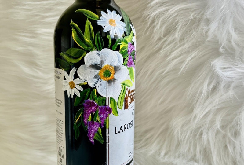
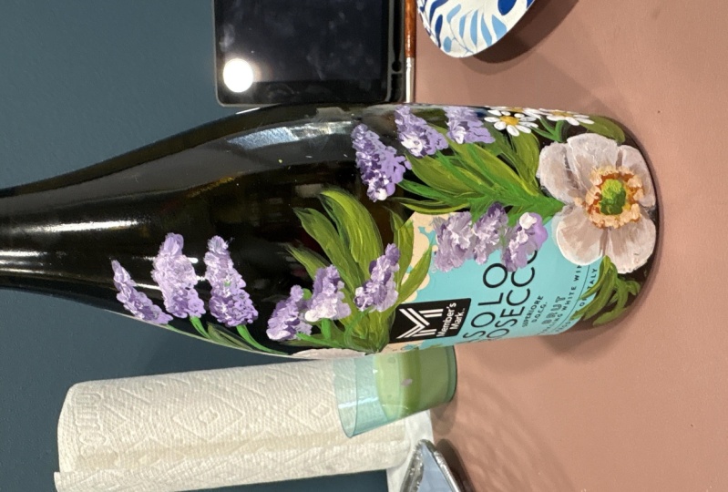
7. Framing & Emphasizing the Label: When gifting a bottle of wine. Framing and
emphasizing the label really makes your gift
feel more sophisticated, more thoughtful with your added
touch of personalization. Here are my two tricks
for simple composition. We can see here that
I have two examples. The first one would
be around the label. This is where you
make a bunch of tiny little flowers and you
frame around the label. The second one would be
the opposite corners. I have two tiny little bouquets, one in the top left corner and then one in
the bottom right. You could even switch
it up by putting in the top right and bottom left. Either one of them
is fine as long as you remember to
have them balanced. Here are some samples of
work I have previously done. Although they are
not wine bottles, they still follow the same
composition techniques, the first one around the label. If you take a look at
the Joe Malone box, your eyes immediately go to the Joe Malone
right in the center, and then they start
moving outwards, so you can see all of the
different green foliage. The second bottle, same thing. Your eyes immediately look at that black label
in the front. Then you look up top
and you see Joe Malone. You see the scent of it, English pear and frasia. Then the last thing
that your eyes look at is the flowers, even with the gelon bottle,
all the way on the right. Same thing. You're taking a look at the label and
then the flowers. When you receive this as a gift, it's very special, it's
very personalized. Even with the opposite
corners technique, it still works the same way. You're basically
using your flowers as an accent piece to really
accentuate the bottle. On the Mez bottle, you can see there's two
different bouquets on the side. I even copied it and put it on the baby bottle,
the chanel bottle, there's two bouquets
hydrangus on the last one, the girlon bottle,
you can see that I put orange flowers on both ends. Now it's your turn.
In your guide book, you'll find a picture of
two wine bottle drawings. You can use your flower
as an example as you practice the two
composition techniques. All right, I'll see you in the next video where we prep
our bottle for painting.
8. Preparing the Bottle for Paint: Let's prepare this bottle
for our paint now. We want the paint to get
here as best as possible. We need to clean the surface. Our fingerprints leave
a lot of oils on it. There may be dust and dirt,
we need to take it off. Right now, I have my
rubbing alcohol here and a cotton pad just to
wipe down the surface. But before I do that, I want to remove the label just
for aesthetic purposes. I have my razor blade here. If you use this, be very
careful when doing so. And I'm going to speed up the video so you guys
don't need to see me struggling now that
I have the label off. There's some excess
glue down there. I'm going to just remove it with the rubbing alcohol
and you want to be careful of where
you get the alcohol. Some labels are forgiving with a very thick paper
on it, some are not. Just be mindful of where you are wiping it because
sometimes it could really mark the label and
you'll see stains on it. Then now that I got all
of the sticky stuff off, I'm going to continue wiping
down the whole bottle. Okay. So mainly our
painting aerial will be on these two sides, but I'm just wiping
down the whole bottle. All right, and that's it. I will see you in the
next video when we start to talk about
floral composition.
9. Floral Composition: For floral composition,
it's really helpful to see the design
layout in a drawing. First, we'll draw
first on the ipad, and then we'll draw
it directly onto the wine bottle with
our wax pencil. Okay, So this is an extra step. I wanted to show
you the drawing on a two D surface before
we get to the bottle. As I'm going through
this process, keep in mind balance in
everything that we do. Not just balancing
it on the bottle, but also balancing the bouquet. The first thing we do is
we draw our main flower. The main flower is
the white anemone. I'm going to do on the
opposite corner technique, I have our main flower here. Then from here I do want to
put some tiny filler flowers. The filler flowers that I'm
going to choose are daisies. Okay? Then I'm putting three of them, because three is
the magic number. When you do this, you
want to make sure you have three flourishes. Three is the magic number. Three is said to be very
beautiful to the eye. In design, we want
to keep it to that. Going to have three
little daisies around our main flower, and then I'm also going
to put some lavender. Okay. Please keep in
mind that this is just a drawing and it may look different when we
start to paint. Okay, And then we're going to
have some leaves over here, then maybe even some buds. This is the bud for the anemone. Anemone. Okay, so we're making some leaves
down over here, and then we're going to
make some of the buds. Okay, now that we see
the drawing over here, let's draw it on
the wine bottle. I have my Stabilo wax pencil. I'm going to use this to
draft out our drawing. Some people prefer to cover
the label and protect it. If that's the case, you
can use Washi tape to protect it for my preference. I actually like painting
a little on the label. I think it looks really pretty, so I'm not going to cover it. And you'll see that we start
to paint some of the leaves, maybe some of the flower petals. They'll get the label. All right, now that
I have this here, I'm going to just draft it out. This would be the center of the flower.
This is the crown. And then we have the
pistiles around it. And then we're going to
have the five petals. So you can see already
that this is going to be quite a big flower. Then we even have
to leave some room for the petals in the back. Okay, this is just a
drawing for our reference. Remember we make that tear drop shape
when we draw the petals. Okay, so that's
the first flower. And then I'm going
to speed it up now, and I'm going to draw
the second flower. I have both flowers here. I am also going to draw tiny little daisies
coming up from the side. And then we're going to
have one of the buds. And you can see here that this flower is just going
to be anchored in there. My anchor is right
on the corner. Okay. And then I'm just going
to draw some leaves for it, and then I'll also have
some lavender coming out. I'm going to do the
same for the bottom, and I'll also speed it up because it will be
the same thing. Let's do a little recap
of everything we learned. You can use a wax pencil for
drafting on a glass surface. Don't forget to include the
details like the petals, pistils, stem
leaves, and fillers. And if you do add more flowers, remember the magic number three. Anchoring your
flowers to the label looks better than
floating flowers. Just remember, this
is just a draft, your design could vary
once you start to paint. Now that we understand
floral composition, let's move on to the next
video, palette preparation.
10. Palette Preparation: Let's prepare our
palette for painting. Now I'm pulling up a picture of my white anemone so that I
can get the colors correct. The most colors I'll be
using is white and black. I'm going to put the most, the other colors are just going to be a very small amount. Please keep in mind that
this type of paint, acrylic paints, dry
fairly quickly. So you don't want to put a lot because then you'll
be wasting it. You can always add more if you need more at
a different time. I'm just putting a small amount of every other color in order. I have the white, which is wicker white. I have black licorice. I also have yellow,
which is the daffodil, yellow, orange, pure orange. I also have the yellow ochre, Classic green, lime
green, and citrus green. Okay, so now that we have
all of our paints ready, let's get into perfecting your petals and placement
where we start to paint.
11. Perfecting Your Petals & Placement: So let's get our bottles out. Make sure you have all
of your supplies here. I have my water container here. I also have all of my brushes. I also have a paper towel
on the side just in case and we can get
started on this. Let's see, we'll be
painting this one first. Okay, so there are two
layers on this flower. We need to do the
back layer first. I'm going to be using the
number three flat brush. This one is a great brush
to create the petals. I think it is big enough to
do the petals, Not too big. The five might be a bit too big, so I'm going to use the three. Okay. When you do this, remember the one and
done technique now. Okay. When you do it, you want to
grab a little bit of black. Black is for the inside and
then white for the outside. I have the two colors
on my brush right now, and I'm just going to blend
it out on my surface. You can see right here
that I might have a little bit too much black because I don't see enough white on it. In that case, I'm just
going to pick up more white and blend it out. I might need to pick
up even more white so that there's a good gradient. You can see white
then gray than black. Okay. And then now I'm going to start
painting on my bottle. So remember you're
holding your brush at the 45 degree and you're
going to just go through it. Very nice, like a little
tear drop motion. Okay, starting off over here, I'm going to make
the first petal. Starting off at the
bottom and holding your brush at a 45 degree angle. You're going to start
by pressing down the pointed tip and
swipe it right through. There we go, I got
the first petal down, so that's the first one I might even need to add
more paint to it. So I'm just going to pick up
more paint on both sides. I'm blending it
out on my surface. I'm going to create the
second pedal in the back. Let's see, It may also be easier if you're holding
the bottle so you can manipulate it instead of turning your arm in a
weird position to get it. It's easier if you're
holding the bottle in one hand and then painting
it with the other. But I'm not going to do that for demonstration purposes
because I want you guys to be able to
see this on the camera. I am just turning the
bottle on the table. Okay. The next one is going to be placed right
down over here. This is the second outer petal. And then I'm going
to place the third one right down over
here at the bottom. But I do need to
pick up more paint, so I'm just grabbing more white. Also grabbing some black. Okay. And then you're
going to see me. I flip the brush over. I can't flip the bottle, but I am going to flip my brush. I have the white
facing towards me. Black facing towards the
center of the flower. And now I'm just going
to create the petal. Okay. Going down, Pressing down. Really just gliding it
across the surface. Okay. Don't worry if it's a little messed up like this,
a little bit streaky. We are going to
go over it again. This is okay right now. We just have the
three back petals going while we wait
for this to dry. Let's go ahead and work on the flower right
down over here. This is going to be
a little bit tricky, you don't want to
touch the table. And then I'm going to
do this one a little faster because you guys got
the hang of it already. I'm going to dip it again into black. Get it in the white. Blend it out on my surface. Maybe put a little
bit more white. Then I'm going to do
the three outer petals. I have one right over here. I'm going to need more white. Let's see, let's
put the second one. Oh, I'm sorry. There was
actually four back petals. Sorry, going back to this one, there was actually four. Let me just do another
one. Right here. There we go. We have the outer petals, and then this one
right over here. We're going to have
to do four on them. So let me just pick
up more paint. So I have 12, that's too much paint. It's a little bit globby. Then this one's
going to be three. I flipped my brush over so
that the black is facing towards the center of the flower and the white is
facing towards me. I'm going to start
right over here, press my brush down, putting a lot of pressure as
I come up towards the top. And then really
swooping it around. And then picking
up very lightly. And then I'm going
to do that again for the last outer
petal on this. So pressing down,
swooping around, and then pick up really lightly and it is
messed up right there. Don't worry about that. We're
going to cover it up later. Now what we want to do
is just wait here for a moment and wait for this to
air dry before we move on. All right. So now I'm
assessing my painting. I can see that it
is dry to touch. You're going to run
your finger over very smoothly and you can see that
nothing is on my finger. There are some areas
you can see here. It looks like there's a
little bit of a blob on it. If that happens, it does take a little longer to
dry, but you really, really want to make
sure that this is dry to touch
before we continue. Because when we put our
second layer on it, it could lift up the paint and
basically ruin everything. So you really want
to make sure that it's dry before
moving on from here. So I'm going to
get my paint brush and I want to start over fresh. Okay? I don't like it when my paint
is like slightly dried out, so I'm just going to wash
off my brush and get out the excess paint so that we can just start over new again. Okay. So I'm going to
do the same process again where I'm going
to have a little bit of black on one side and
then white on the other. And then I'm going to blend
it out on my surface. Okay, Be mindful where you
have the white and the black. Sometimes I get it mixed up. Okay, so now I'm going to do a petal right over
the top. All right. Let's see, Let me position
it so I don't have to, like, strain my arm doing that. Okay. So I'm going to start off down over here by the crown. And I'm going to make a petal
pressing and I'm coming up, okay, there is my first petal, and you can see it looks
so nice that it's layered. It's almost like a three D look. It looks very cool. I'm also going to pick up more paint
so that I can keep going. I probably could have
done another one, but I noticed that my
paint was running low, so I just added more to be safe. Then what I'm going to do
is another petal from here. So I'm going to start pressing down and then lift
off very nicely. Hey, there's my second petal. I'm going to pick up more
paint. Do that again. Instead of
manipulating my brush, I flipped it over so you can see the white at the top,
black at the bottom. I'm just flipping it
to where the black is at the bottom and white
is facing towards me. Did I say that correct?
Black at the top. White facing towards me. And then I'm going to
create the third petal. You really have to think about pressure when you're doing this. You don't want to
press too hard, because if you do, you start to pick up the paint
at the bottom. Oops, see I accidentally
made a mistake. I put the white into the black. When that happens, just wipe it off and
start all over again. Just wiping off all
the paint and cleaning off my brush again
because it got messed up. I'm going to start all over. I'm dipping it half into black, the other half in the white. Then I'm going to
blend it out on a new area just to
start all refresh, I have the white at the
top, black at the bottom. What I'm going to do is
make the fourth petal. This one is a little bit
too far from each other. I don't like that little
gap right over there. But I'm just going to make
this a very small petal. I have the black facing up, white facing towards me, and just going to make
it a small petal here. Then my last petal will
go right over here. You can see it's like
a deformed flower, but nature it's okay. Let me just go ahead
and finish up that last one, all right? I have the first flower done. I'm going to turn the bottle on the side so I can work
on the second flower and I'll also put it
on time maps because you guys are familiar
with the process already. Now that we have completed
the outer and inner petals, let's wait about five
to 10 minutes before we come back and do
another coat on top of it. I'll see you in the next video, making it opaque,
adding a second layer.
12. Making it Opaque: Adding a Second Layer: Now It is pretty dry. It's dry to touch.
I can touch it. Even the parts that I
put a lot of paint on and kind of globbed it
there, it dried up. Um, you can even
dry it faster with a fan because we
only put one layer. It dries within
five to 10 minutes, maybe more like 5 minutes
if you're using a fan. That's the really great
thing about using acrylic. If at any point you don't like what you did, you
can still remove it. It's still soft
most of the times. I just keep going because we can always cover
up our mistakes. Now the next thing that we do, we want to just really
redefine this flower. You can see that
in certain areas, it's a little bit like
a little see through, that's fine and all
because it makes the petals look really delicate. But I just want to make
it a little bit more, um, just a little
bit more opaque. And I also want to
redefine each petal. What I have here is
the flat zero brush. I'm going to use this
to pick up more white and really just start
adding more paint to it. The base that we created is
so important because we have a very smooth base
and now we can just start adding
more layers to it. We can also see where
the definition is. So we have the black in the center and then the
white on the outside. To keep that gradient going, it really looks like
a three D flower. Right now, I have just loaded
up my paint brush with white paint and I'm
putting it over the white areas to redefine it. I'm also making some of the
petals a little bit more pointy and uneven at the top
so it looks more natural. Anemone flowers don't
have perfect edges. I want to make it
a little textured. You can see right
here, there's like a very harsh line going from
the black to the white. We're going to blend that out. There's no harsh lines here. You want to have a very
smooth transition? I'm going to do this for
the rest of the petals. I'll also speed up the
video just a little bit because it's the same
process for all petals. Remember, as your painting, use a light dabbing movement. You can even do
some short swipes, but make sure it's very light. Because if you're
pressing too hard, you may pick up the paint that's already there and you
don't want that to happen. Even though the first
layer is dry to touch, it doesn't mean that it's
completely cured yet. Please be very careful when we're doing this second
layer over the top. Occasionally, you can take a second to look at
the overall painting. Is there anything
you want to change? Does it look well defined? Are we following balance? Is your color gradient
still visible? You can see now I'm getting into the center
of the flower and I'm losing that
grayish gradient. It's still slightly there, but I'm covering it up because I covered it up. Now I need to add a
little more black. Now, I'm adding some black to the background petals so that you can still
see the shadow. You can really tell
that there are four petals on the back side. I'll also add some
black between each petal so that the petals
become more defined. This is a very slow
process, really. Go ahead and take
your time with it. Don't feel like you need
to rush through this. I am continuing to add color, reassess, add colors,
change colors. You're always re evaluating. I think the top flower
looks good now. I don't want to
keep touching it. I want to take a break from it, maybe come back with fresh eyes. I'm going to work on
the second flower, and I'm also putting
this on the time lapse. I didn't really touch up the
petals in the back too much. I wanted the main focus on
the petals in the front. I'm just adding a little
bit more paint to it. We are going to be putting the crown and the
pistiles in there next. Before I even get there, I just want to add
a little bit of black to it to make the lines, the veins in the,
some of the flowers, a little bit of
gray veins in them. I am mixing the white in the black to make
a grayish color. And I'm putting a
bit of water in it. The water thins down
the paint so that I can create thin lines in the
center of the flower. If the paint is too thick, the lines won't be as thin. You can see here
that I'm just using very light feathering,
brush movements. This creates the veins and also more definition in
the center of the flower. I think the top
flower looks good. I'm going to move on to the
second flower at the bottom. I'm using the same process
with a thinned out gray paint. I'm pulling from the
center outwards. I will do that for all
of the inner petals. You can see how it just creates some more depth and a
little more details. Wonderful work at perfecting
your petals and placement. Let's go over a little recap of everything that we went
over in this lesson. First of all, you want to make sure you have all the petals. If your flower has five petals, make sure that your painting
also has five petals. Then we look at balance. If you drew a line down
the center of your flower, you want to check that
the right and left sides look equal, then there's color. Two shades give it
highlights and depth. This is how you take your
flower from being two D, very flat, to three D with
highlights and depth. Also variability. Nothing in nature is perfect. When you make your
petals uneven, textured edges, simulating
little tears or rips, that makes it look very natural. Now, some common mistakes that we run into would be
misplaced petals. If you're not happy with it, it's okay if it's
less than 10 minutes, you can still wipe it off
with a white paper towel. If it's more than 10 minutes, you can wipe it off with
alcohol and a cotton pad. This paint on glass
is very forgiving. Another common mistake would be not enough contrast or depth. This is when the painting
still looks very two D. Let's say I'm using the
white anemone as my example. If my painting has too much
white and not enough gray, it's going to look very flat. There's no shadows,
there's no depth to it. I need to go ahead and make
white on the outside with a little bit of
gray on the inside to create those shadows. Turning it from a
two D flower into a more three D looking
type of flower. Those are just some of the little things we
went over in this video. I will see you in
the next one where we start to work on the
center of the flower.
13. Center of the Flower: Now we're going to make
the detail in the middle. We're going to start
with the pistiles. I'm just going to get
some yellow first. I have the yellow ochre, and just a little
bit the daffodil. I'm just going to make little lines coming out
from the middle. Just lightly dabbing it. There we go. And
then I'm going to do the one on the other end. I have the two yellows, and then I'm going to
start fanning it out, light dabs with your brush. Now that we have the base there, we can go ahead
and start working on the center of the
flower at the crown. What I'm going to do is put that down and then I'm going to grab my round zero brush. I want to add the dark green. Let's see, let's add
both of them together. I have a little bit
of dark green and a little bit of light
green on my brush. And I'm just going to start dabbing it right in the middle, Really just making
that nice crown. It doesn't have to
be a perfect circle. You don't want it to
be a perfect circle, you just want to dab it down. A nice dabbing motion,
not too tight. Don't squeeze your brush. It's not a potato chip. Okay. I'm going to grab a
little bit of the dark green, little bit of a light green, and just start dabbing
it down in the middle. Keep dabbing it in
a circular motion. It's not a perfect circle,
can see that there. I'm just dabbing
it very lightly. Then I might need to add
just a little bit more here. You can see this flower looks
really flat, center area. We got to create a shadow. I'm going to pick
up a little bit of dark green and just put it right down at
the bottom. Okay. And then I'm going
to do the same thing on the other flower, getting some dark green and
then just dabbing it down. I globbed on a lot
over there. It's okay. I'm also going to pick
up some of the light green and then put it on the opposite side to
create the high light. Going back to the first one, getting the light green, and then dabbing it up at
the top over here. All right, now I am
done with the greens. I'm going to rinse off my brush. Then I'm also going to
add orange to the ends. This is the last
step for our flour. What I'm going to do is just dab a little bit of orange
on the outer edges. This is for the pistilesky. I'm going to get a little bit more
orange and then I'll do the other flour. I got my brush. I'm just dabbing
it right the edge. Don't make it too concentrated because you could still
see some space in between. Pick up a little bit more
orange if you need to, and just keep dabbing it around. Okay, I really, really
like where this is going. I'm also going to use a
little bit of vivid orange. I want to create a
highlight with this color. I need a very little, I'm going to add
this one right on the top of I have vivid orange. And I will add it right on top. And I'm using my pinky to
stabilize, adding vivid orange. Okay, I'm going to add
vivid orange to the bottom. Pick up some orange, pink, stabilizing and
doing little dots. Okay. I also noticed that I'm not showing as
much yellow in there. So I'm just going to pick
up a little bit of yellow, the daffodil yellow, and just define my lines just a little. I'm picking up more yellow, just defining the
lines in there, adding more yellow
to the center. I'm going to add
more yellow up here. I know we're going
back and forth. I like working on two so that one can dry while I
work on the other. You're doing an amazing job. We have just completed
the flower itself, so the placement petals
and center of the flower. In the next video, we'll
continue adding more to our design and I'll show you some possibilities for
adding stems and buds. Okay, see you then.
14. Adding Stems: Cover flowers. Let's talk
about adding some stems. In my case, my flower is really big and it's sitting right
on top of the label. Technically, the stem would be behind the flower and you
wouldn't be able to see it. However, if your flower is far from the label and you
can see a gap in between, I would highly suggest
adding a stem to anchor it, to make it stable
onto the label. Here's an example. Right here, you can see that my
flower has a little gap. I added a tiny green stem. This is so that it doesn't look like the
flower is floating. I always feel like anchored
flowers look the best because it almost looks like it's growing out from the label. For the rest of this lesson, I'll show you how to create little buds with stems
Going into the label, you'll see me add two buds for the top and
two at the bottom. Starting from the top,
I'm going to make a line that just comes right out. This is going to be
for our little bud. I'm going to just
make a little circle here, one of the buds. Hey, it's so cute. And then I'll create
the other one that's coming out on this side. Don't worry if it's not perfect, creating that round
circle for the bud. Okay, You can see I have like two arms coming out over there. It's like me here. I'm also doing a stem
with a bud at the bottom. It's a little covered
because you can't see it. But it's still the same
process where I'm adding two. You can see this one
a little bit better. If you go over the
flower, it is okay. It actually looks really nice when you start to
overlap things, there is the second bud. Okay? So that's it for
adding stems and buds. I'll see you in the next video, where we start to
add our leaves.
15. Adding Leaves: Okay, let's continue
with some leaves. I'm still using the
same number three, brush with the same colors and I'm going to
start by putting a stem that comes right
from behind the first stem. This is kind of like anchoring
it to the same area, so it looks like a bouquet with flowers just coming
up from the center. And now I'm using like
little dashing movements to create leaves coming
off from that stem. And keep in mind, I'm
also holding the brush at a 90 degree angle when I
create these short swipes. I'm going to do that
all across that stem. And I'm just adding
more paint to it so I can create a
little darker color. I want to see some variation in color, not just one color. That's why I added a
little bit of black in it. Now I'm working on
the second one, creating the stem first. And then I'm going to
add more color to it. I'm adding black, a
little bit of green, then some of that citrus green. Then I'm just going to start making the leaves coming
off of this branch. Okay, I also want to
make a little bit more, it looks a little bit
bare in this area. Again, I'm going to come
directly on this area, on the label, Coming
down, pressing down. I'm using my brush. I push down and then pick up very
nicely, so it's very light. Okay. And then you can even
do the same thing up top. I'm using my pinky
for stabilization. I'm going to press down putting pressure now and
then picking up very light. Hey, I'm going to do that again before I'm going to
add some more black. Adding black, adding green. Blending it out on my surface. All right, last one. Now I'm going to turn the bottle so that I can
start working on the leaves. For the second flower, I'm going to pick
up the same colors, green, black, and light green. As I'm doing this, I'm just gliding across
the glass surface. You're not pressing too hard, you're putting pressure
at the bottom. And as you lift up, make
sure it's very light. I'm doing the second leaf. I can already see that my brush
is running out of paint. I'm picking up, I'm
going to pick up black, classic green and a little
bit of light green. And do the same process
all over again. Let the brush glide
on the surface. There we go, very
light, very smooth. And I'm also going to fill
some in on the label. And don't forget to
hold your brush at a 90 degree angle anchoring
onto the label down there. All right? And then
I'm just going to fix my little bud over here. Fix this one. All right. We are done with the leaves. Very nice leaves. I want
to fix this one also. I just make it a little darker. I don't like that
it's too bright, just adding some color to it. Let's see, I may want to
add more leaves later. You can put as many
leaves as you want. There you go. You can even make them come up
from the top over here. I'm going to add another
one. Remember three? I'm actually going to cover that with more flowers
later, so it's okay. And then on this one over here, I'm going to add three. Let's see, 12 and then three. It's starting to look
really, really good. So in the next video, we're going to add our
fillers. I'll see you there.
16. Adding Fillers: Before we get into
adding the fillers, I just want to take a
moment to look at this, because when you see it,
it is very, very balanced. Okay? So if we split it right down the middle
of the flower, there's balanced
leaves on both sides. Okay? Same with this one
over here. Very balanced. This is what you're looking for. You don't want it to be
too heavy on one side, so keep that in mind as you start to add your fillers to it. Now, one of the
easiest fillers to add would be daisies and lavender. So for the lavender, I
brought in some purple. Okay. This is oh,
what do you know? It's called lavender. Okay. So I have lavender and then I'm also going to bring in
some light lavender. Oh, getting messy over there. For the lavender, I
wanted to bring it down. I really want to start
encasing this design. So I'm going to have
some lavender coming down over here on both sides. And then I'll make the three
daisies come up over here. I have my little brush here. This is the round brush. I am going to make a
little stem for it. So I want to make two lavenders. Really just coming out over here. Maybe I might make three. I have my lavender stems. I know it's really hard to see. We're going to
redefine it later. I'm going to wash
off those colors. Then what I'm going to do from here is just get
some of that purple, the lavender, and then just start making it in
a dabbing motion. Lavenders, Let's see, like triangular shaped,
just coming down. Going to make a
triangle, coming down, There's my first triangle. I'm going to make
another one over here, triangle coming down. It's moving more
towards the center, so you can see that it's
like coming inwards. So I'm just going to make three because it's going to look good. There we go. We have three
little sprigs of lavender. My light, so I'm actually globbing a
lot of paint on here. My light source is coming
in from the top part. So I want to add some of this light lavender to the
right side, just on the right. This is creating a
high light for it. Make sure you're using a
little dabbing movement. And then from here I'm going to grab more green and
some black in it. Mix the green and
black together, maybe a little bit more green. And then just really
redefine the stems. Maybe even make a leaf for it. It's coming out more black
than anything, but it's okay. Okay. So those are my
little lavender sprigs. I can't see the stems. I might even add like
some green to it. There we go. You don't want
it to look like a grape. Make sure that they're
curving inwards. Okay. And then I'm
going to do the same for this top area. I'm going to have three
lavender coming up. I'm going to do it on this. Now I'm doing the other
set of three lavenders. Following the same technique. I have it on four times, the speed time lapse. You can either watch the time lapse or pause
to complete yours too. And then I am even going to
add a little bit of white. Going back to the other one, adding just a little bit of white to it to brighten
it up a little, We can see it up top. Now I want to add in some
little daisies here and there. I think the daisies are just going to tie everything
in together. Before I even move on, I'm going to put some lavender on this flower right over here. I'm going to speed up
the video When I do so I'm going to have the
lavender coming inwards. Perfect. Now that we
have that going on, look how cute it
is so far. Okay. And then the last
thing is adding some little tiny daisies to it. So I'm still using
the round brush. I really like this one
to do the daisies. They're really cute, so
I'm just going to use. Some of that yellow ochre
to make the center of it. First I know where
my placement is. I'm going to have
one right over here. Just dabbing it on.
Dabbing the yellow. I'm also going to do another
one right over here. Then I'll do the last
one right over here. Remember three I have, this is the center
of the little daisy. Just dabbing it in there. Then I'm even going to
put a little bit of like the daffodil yellow just to
give it some definition. Wiping off my brush.
Now I'm going to use white for the petals. I'm just going to press and
just create little dabs. If you can press down and
then pick up very lightly, so you're pressing
and you're going to create a pointy tip press. Create a pointy tip press. Create a pointy tip. Then turn your bottle as you're working so you don't hurt your wrist. Okay? So there's a
little daisy flower. Okay. I'm going to
do the second one in the other camera so you
can see it up close. Place my brush down and
pick up so you create a wide base with a thin edge. And be mindful of where
you place your hand because you don't want to place
your hand into the paint. Some of your petals are
going to look deformed. That is okay. Like that one. I do not like that at all. I'm going to try that
again. Press down and pick up very lightly. Pressing down and
pick up very lightly. Ooh, I like that one.
That one's cute. Do it again. Press
down, pick up. Oh, pressing down,
press press pickup. Yours will definitely look
different from mine because everybody has different hand
placements and pressures. If yours is not
looking like mine, do not worry at all. As long as you have the shapes
and the colors, it's okay. This is your first time, maybe it's your first
time painting. It's okay. It takes time. It takes time to develop the skills you need
to find your pressures. I'm going to work on
the daisies here, but I'm going to
speed up the video because you guys already
know the process. And then clean your brush
before you start putting white. Okay, Then the last thing
I'm going to do is just add stems to my daisy. Okay? And then with the stems, you can even add some
leaves if you want to. Pressing down and
picking up very lightly. Okay. Right now I'm
using the citrus screen. Okay. So I added
some leaves to that. I'm also going to add some
leaves over here too, so this one has a
very short edge. And then I'm going to use it on the other camera so you
can see what I'm doing. Okay. I'm going to press
down and then pick up very lightly, pressing down. And press down and pick up, oh, this one needs like a
little bit of highlights. I'm just fixing the
little stem over there. Okay. I'm putting some
leaves over here. I am working upside down. So that's why it might
be looking like that. This one is very balanced. I love this one down here. I might need to balance this one up top a little bit more. Okay? So what I'm going to do
is just add more leaves to the up top area because I
need it to be like a balance, it just looking
very bare up there. So I'm just going to, I have the flat number
three brush and I'm just going to add like a
little bit more leaves. Okay. Oh, that's looking
a bit too green. I mean, we want
it to look green, but it's too much
of a light green. For the rest of the
video, I will put it on eight speed time laps. What I did was add
an extra set of three lavenders
to the top flower because it was very
bare at the top. After this, I'm adding more
white to all of the lavender. Just little dabs on the right side to create
more of a high light. And then I'm going to pick up the light green and
use this to brighten up the buds and add a little leaves to it just
to make it more visible. It was a little
dark, hard to see. And then I'll just
do the final check. So we've been painting a lot, so what you want to
do is stop working, let it dry, leave
it alone overnight, and come back to it the
following day with fresh eyes. So I'll see you in
the next lesson, sealing your work
and final details.
17. Sealing Your Work & Final Details: Today is a new day and I'm
coming back to my work. I let it dry overnight. In this video, I'm going to go over the final details and how to seal your work looking at it. First of all, this
is the top part. I can still see
some of the pencil markings from the other day. This is the stabilo pencil. You can just get your
Q tip and remove it just like that or you just use your finger.
It's probably faster. I'll put it on time lapse
while I remove the rest. It is dry to touch which means we can add our sealer to it. I have here the Deco
art juror clear sealer. This is in a gloss
varnish and the reason why we use this one is
because when it dries, it turns clear and mimics the
glossiness of the bottles. The way that we apply the
sealer can be done with either a Q tip or with
a designated brush. Now, with the Q tip, it's great if you
have no other option, but if you take a look closely, the fibers will come out. Use it if I have nothing else, but I prefer not to use this. I have a designated
makeup brush. This is actually a
disposable brush. The fibers are really nice and I got like a pack of I think it was 100 for maybe a
few dollar on Amazon. This works really great. I go ahead and just
give it a good shake. I open it up, then
from the cap you can get some of the
sealer on your brush. You're just going to
apply it directly on in a very thin coat. And let me zoom in
so you can see it. Hey, so you're just
applying it very lightly. Okay. I have it on time lapse while I complete
the rest of this, I'm only applying the sealer
to the painted areas. You do not need to
paint on the bottle. This is just to hold
the paint in place. I'm making sure that I
cover every part of it. If you are painting and you see that there's some
paint on your brush, I would stop and wait till it completely dries In a second, I'm going to stop the video
because I do make a mistake. And you can see what
that looks like. I lifted it up right here. Be careful when
you're doing this. Keep using a light hand. Don't press down hard on your brush because I just
made a mistake there. I put it on time laps to
complete the rest of the bottle. When I'm done, I just checked to make sure that
all areas were covered. I'll even do a dryness test with a thin coat of the sealer. You'll notice that it starts
to dry within minutes and I would say within
24 hours it'll cure. As a word of caution, this sealer does not
make it fully permanent. Like if you have a sharp
object and you scratch it, it'll still come off. This sealer just holds it
in place so that it can be put in a refrigerator
or a wine cooler. You can put it in
an ice bucket for a short while if it's
a champagne bottle, But it doesn't make it
completely permanent. Now that you've just
created a beautiful bottle, let's put it on the
side and let it dry. And I will see you
in the next lesson, continuing your bottle
painting journey.
18. Continuing Your Bottle Painting Journey: We've been through
a lot together and you've made it this far. I hope that by now I'm seeing your beautiful work in
the project gallery. In this video, I want to talk about all the things that
you can do with your bottle. We'll break it up into
three different steps. The first one, we'll
talk about how to take photos and post
it on social media. Second, we'll talk
about how you can turn your bottle into
a memorable gift. Lastly, we'll finish off by talking about
how you can turn this into a potential side
hussle. Let's get into it. Here are some key
points when taking photos and sharing
it on social media. First you have your
painted bottle. You want to think about how
to make it look the best. The first thing that
you want to do is make sure that you have
good lighting, natural light would be the best. You want to make sure that you have it near a large window, or you can even go
outdoors on a cloudy day, get a very soft, even lighting. The second thing that you can do is choose a good background. This means having a clean
and uncluttered area that really complements
the artwork but doesn't distract from it. The third one is using the
right camera settings. If you're using your smartphone
to take these photos, you can even put
on the grid lines. This helps with composition, so that you can
have it perfectly centered off to the side. I always like using it
because it just provides an extra level of assistance when taking
the photos. Okay. Number four, the
posting process. This is when you have
your photo and you're getting it ready to
post on social media. You can use different
apps or editing software to adjust the exposure contrast,
even color balance. I actually love using Light Room because it's free
on your smartphone. But please remember,
Don't overdo it. Try to keep the editing
as natural as possible. Okay. Now number
five, consistency. When you're starting to post
pictures on social media, make sure that it's
consistent with your style and
aesthetic so that it looks cohesive throughout
your social media or whatever platform
you're using. This one really helps your bottle gain more
visibility to a wider audience. You can use hashtags like bottle painting or you can use hash tag
painted wine bottle. All of these things
help to boost your photos to get
noticed by more people. Then number seven,
posting regularly. Consistency is always key when
it comes to social media. You can even schedule
your post ahead of time, or you can get yourself on a regular posting
schedule with a calendar. All of these things help keep your audience engaged and interested in what you're doing. Lastly, number eight, this is where you share
your progress. Believe it or not,
people actually love seeing the
behind the scenes, the BTS of the process, so don't be afraid to show it. Show how you're painting.
Show a little glimpses into your creative process. This really adds authenticity
to your content. Sure, it's great to see people posting beautifully
painted bottles, but what happens behind
it? How did you do this? People want to see
those little things, not just a fully painted bottle. Both are great, but having
more is really good. Okay, so turning your bottle
into a memorable gift, add a personal touch and make it even more special
for the recipient. Here are some steps to help
you create memorable gifts. With your bottle painting, you always want to keep
the receiver in mind. You want to choose the
right bottle for them. This means if a person is
really into wine, go with wine. If you can find out what
their favorite brand is, or if they like red or white, that makes it really,
really special. When you're gifting
a wine bottle, you got to make it look pretty. Of course, handing it to
them like this is nice, but you spent a lot
of time on this. You want to make it look good, so you can consider
putting it into a decorative box or even put it into a really nice wine bag. I mean, after your painting
is dry, of course, you can even tie a ribbon on
the top for extra points. Put a handwritten
note with it or tie a tag to it that
makes it extra special. Lastly, number four,
timing matters. Is it their birthday or
is it your anniversary? Is it a special
occasion or gathering? This all makes it even more special when you gift
it at the right time. Now that we've gone through
taking photos of your work, posting it on social media, ideas for gifting, let's
talk about how you can turn this into a
potential side. Hustle. Full disclaimer. I am nowhere near a business
coach and I'm not giving any financial advice or telling you how to
make money on this. These are just my ideas and what has worked
for me in the past. If you do decide
this is something that you want to do
as a side hustle, there are certain steps
that you must take so that you can really evaluate if
this is what you want to do. Prior to all of this, really ask yourself a few questions. Do you enjoy doing this? Is this something that you would do on your own free time? How long did you practice? Does this look good? All of those things are
things that you need to ask yourself before you want to
turn it into a business. Having a business is
a huge commitment. With the proper evaluation, you can really make
sure that this is something that you
can be committed to. All right, once you have
done a proper evaluation, the next step would
be to identify your target audience and
potential competitors. You really want to
understand what type of bottle painting styles
and themes are in demand. For example, or realtors. Brides are always
looking for floral, very romantic designs to
commemorate their wedding day. Or realtors are looking
for personalized gifts to give their clients when
they close on a new house. Those are just some examples
of your potential audience. Okay, from there, the next step would be to create
a business plan. This is where you outline your business goals,
your target market, pricing strategies, marketing plan, and
financial projections. You may also want to
consider turning it into an LLC or a sole proprietorship
to make it legal. Talking about legalities when you start to sell your bottles, it's not about selling
the bottle itself. You are actually
selling your artwork every time I paint
on a alcohol bottle. I don't charge the client for the client
brings the bottle to me and I charge for
the artwork only. I think there may
be legal issues if I was actually
selling the bottle. As you go through the
business process, you also want to think about
building up your profile. This is things like making
sure that you have a lot of bottles to showcase on your social media
or online platform. This really shows that
you can be versatile and to reach a broader audience. You also want to think
about pricing strategies. There are different prices. If you paint the whole bottle versus just painting
two flowers, there's going to be
a price difference. Now we've come to
my favorite part. I really love marketing
because it lets people know what you're
doing, what you're selling. Basic marketing strategies
is it's not about you. It's about how you can
create a need for them. For example, you would
not say something like, you should buy my bottle
because it's so beautiful. Instead, maybe you're
marketing to a bride. You could say something
like painted bottles, create a beautiful sake
of your special day. That's it. To help with this, you can also use your
social media platform. So like Instagram,
Facebook, Pinterest. This is all ways that you
can promote your artwork. You can make reels
and talk about it, engage with your audience, and even use hashtags
to reach more people. Those are just basic tips
that have worked for me. Of course, everyone's
journey will be different. No one is going to be the same, and that is completely okay. Maybe you might go
in different steps or take a different directions. It's okay. There's no set business
strategy, it's all different. Whatever you decide to choose, the main thing is
just get started. One more thing. You can continue to keep this as a
hobby just for you. There is no pressure to
turn it into a business, to take photos of your work. There's no pressure to gift any of this, let
this be for you. There's so many things
that we do today just because social
media tells us to, but it's also really fun
to just keep a skill to yourself and have it as self care that is
completely okay. All right, so now that we've
gone through things that we can do to continue our
bottle painting journey, I'll see you in the
final video where I give my last thoughts and do a little recap of
everything that we have done and
learned. See you then.
19. Final Thoughts: This is our final video. Let's go over a
few key takeaways. The first one is using
the right paint. This will help you achieve vibrant and long
lasting results. Number two, composition
techniques, This will help to frame the label and really
make it personal. Number three, keep in mind
shadows and highlights. This is to prevent your
painting from looking flat. Number four, having all the floral elements
in your design. This includes the petals, stem, leaves, and even fillers
for a complete look. Most importantly, keep
with any skill bottle. Painting improves with
time and practice. And remember, every artist has their own style and techniques that develops and
matures over time. It's okay to make mistakes and have challenges
along the way. This is all part of
the learning process. Embrace the fact that it takes
time and practice to truly understand and
refine your skills with patience and persistence. You'll not only create
beautiful works of art, but also develop
a deep connection with the craft of
bottle painting. I hope this inspires
you to continue your bottle painting journey as the possibilities
are endless, whether it's for gifting, personal hobby, or
even a side hustle. Keep practicing and always be learning if you
want to be friends. I'm also on Instagram
at Juniper Calligraphy. I also host a podcast, have a Youtube channel, and a website, which will
all be linked down below. If you decide to tag
me on Instagram, don't forget to use the
hashtag class on glass. Also, please post your work in the project gallery
so we can all see it. Don't forget to follow me for more future classes.
Leave a review. Tell me what you want to see or message me so
we can be friends. All right, happy painting.
 Michelle Clemen, The grass is greener where you water it