Transcripts
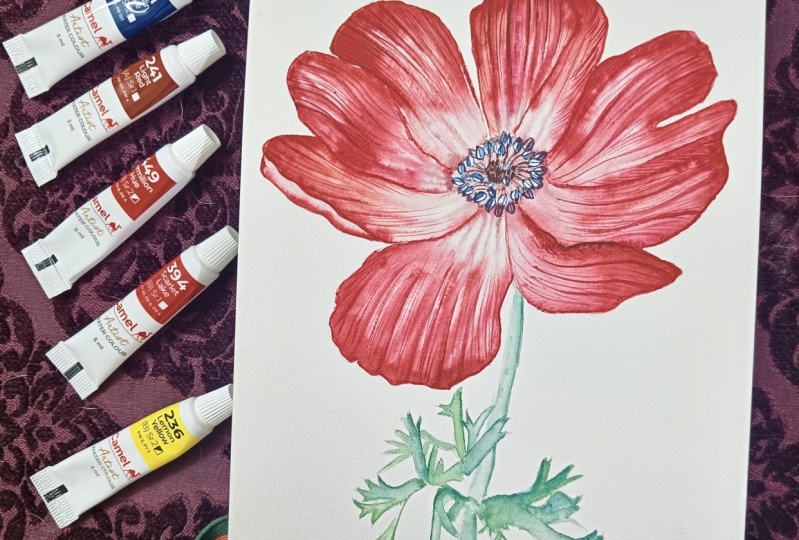
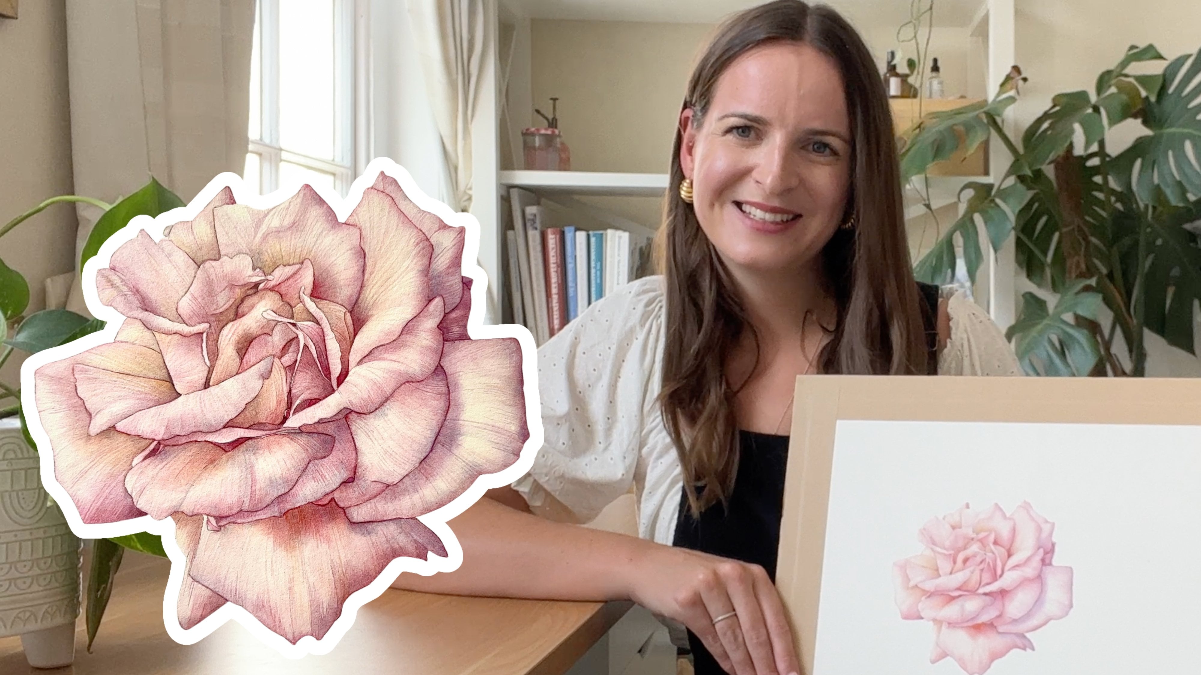
1. Welcome & Introduction: Hi, everyone. My name is Helen, and I am a botanical
artist and teacher. Welcome. Welcome back. I've been painting
botanicals for about 14 years now,
and in this class, I take you through my
entire process to create this gorgeous illustration
of Ann and Lena I will talk to you about
the materials that you will need and
guide you through the whole process step by step to create a beautiful
illustration of your own. I really hope that
you can join me.
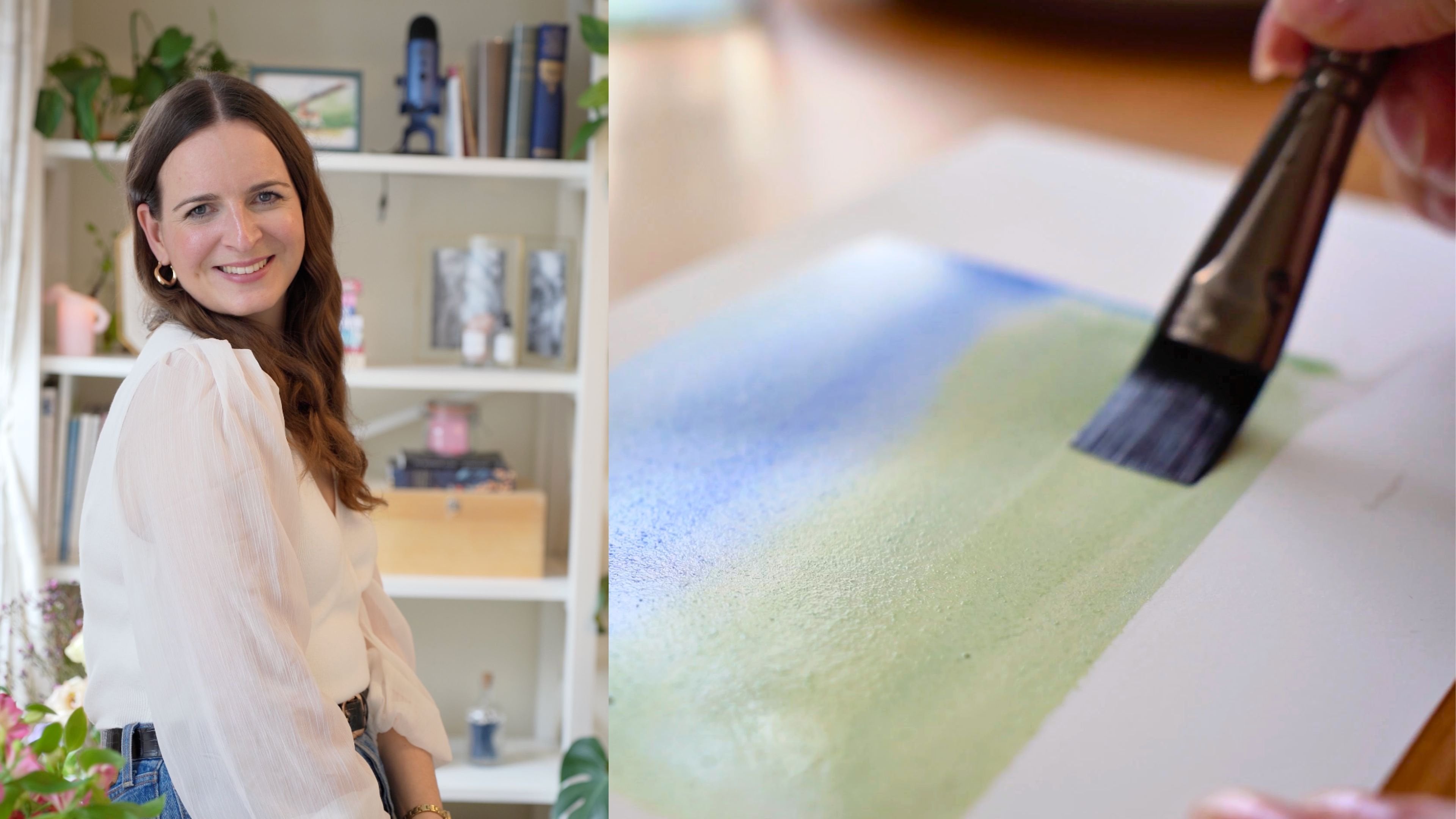
2. Materials & Set Up: Okay, so let's start by
talking a little bit about the materials that we are going to use for this neem painting. The first thing you'll need is a piece of watercolor paper. Mine here is a piece of arch, hot pressed watercolor
paper at a weight of 300 grams/square meter that I have stretched onto
my watercolor board, which is simply just
a piece of plyboard. I have then stuck the paper
down with a gummed tape. You can find out
all about how I do this in my fundamentals
of botanical art course, which is the course
where we paint the tulip and I demonstrate this
process step by step. I have then also transferred my anemone drawing onto
my watercolor paper. I use a transfer
technique for this, which essentially
involves tracing my drawing and then putting pencil on the back of that drawing and then finally
going over it once more, like you can see me doing here. I demonstrate this process
too in my previous class. You should end up with
a lovely pencil imprint on your watercolor paper. For the paints we will
be using in this class, I always choose to use Windsor and Newton professional
watercolor paints. And the ones that we
are going to be using today are Permanent Rose, Windsor Lemon, Pline maroon, and in Danthrene blue. I generally work with a
very limited palette, often just six paints because I love the feeling of unity
that it brings to a painting. In terms of the brushes
we're going to be using, the first here that
you can see is the haras short flat from
Rosemary and Co. I use this for mixing
on my palette, as well as lifting
paint off the paper. Using this brush on my palette
means that I'm less likely to damage my lovely
painting brushes with vigorous mixing. Then we've got the Rosemary and Co Series three oh seven brushes in size four, two and zero. These are synthetic brushes,
but hold water really, really well, and I
really like them as a great alternative
to sable brushes. Then you can see
next to me here, I have two water jars, one that I use for
cleaning my brush, and the other that
I use for putting clean water onto my paper. I've got a few palettes
here to play around with. I love these little
round stackable ones. They're from a company
called Jackson's Art. But honestly, any kind of
porcelain palette is fine. You'll find plastic ones
harder to use as the paint kind of runs away
from you on the palette. Finally, I want to show you my putty rubber in case you
haven't seen this before. It's a lovely, lovely soft eraser and perfect
for lifting off any pencil that's too dark on our watercolor paper
because it's really gentle. I'll always keep a piece
of kitchen roll nearby, too, just to dry off
my brush as I paint. And then finally, we
keep our reference image close to hand so that we can
see what we're painting. So that is all the
equipment that we're going to need
to paint this anon. So if you've gathered
those things, then let's get started
with painting.
3. Initial Washes: So let's start mixing
up some paint and get some initial washers
down on our lovely neom. The first thing
I'm going to do is just put some of the
paint on our palette. And I'm starting off
with the Windsor lemon, the permanent rose, and
the Perline maroon. So the only paint that I'm
not putting down right now is the danthrine blue because
we don't need that just yet. So I'm going to mix
up two paint mixers. The first will be a mix of the Windsor lemon and some
of the permanent rose. And just because that's
a little bit bright, I'm also going to
add a little bit of the Perlein maroon to
that mix, as well. You can see here
it's a strong mix. There's a good
amount of pigment, so I'm able to mix up a really,
really nice amount of it. I always start by mixing quite a lot of paint
on my palette, particularly when I'm painting a large piece like this anome. It just means that
I don't have to come back to my palette to keep mixing while I'm in the midst of
laying down washers. It just makes the
process flow better, but also I'm more likely to keep a consistent color balance
across the painting. If you run out of paint,
you're never going to be able to match the same
colors perfectly. And this doesn't matter
too much because there's always going to be a natural
variation across a flower. But I just find it
really helpful to mix up a really good amount
when starting off. It is a little bit easier
to mix up large amounts of paint when you're working
with tubes rather than pans. I've always used tubes
just because when I teach, I need to be able to
give students paint or be able to mix up large
volumes of paint at one time. It doesn't matter
if you've got pans. They're great, really
versatile and easy to use. You may just find it a
little bit harder to mix up, large volumes of paint
mixes like I am here. But just do what you can do. Once I've mixed up a really
nice amount of the wind the lemon permanent rose with a little bit
of the parolin, I'm going to do one
more mix as well, just so that we can add some
variety across our painting. So here, I'm starting
with a nice amount of the permanent rose,
again, large volumes. And then I'm adding in the
Perlein maroon to bring that sort of extra ready hue to it rather than the really, really bright vibrant pink
of the permanent rose. And here we should see that
we end up with a really, really lovely, rich red. I always like to test my colors out on my paper
before I get started. This process, as well
as being able to see what the colors
will look like on paper also helps me record
the mixes that I've used so I can return to
them at a later date. So this is what our first mix looks like with
the yellow in it. And then this is what our
second mix looks like, which is just the permanent
rose and the perylene maroon. I've labeled these as
our under washers, because that's
essentially what our first layer of washers are. Before I start painting, I'm going to use my putty rubber and just really
lighten that pencil on my watercolor paper so
it's as light as it can be while still being able to actually see
what's on the paper. This isn't so much of
an important step in the case of a vibrant,
dark flower like this, but it would be really
important if you were painting a lighter flower because you're more likely to be able to
see the pencil lines in, let's say, a white flower
than a bright red flower. And once you've put
paint on top of pencil, it's pretty much impossible
to lighten that pencil. So it's just a really
good habit to get into. We're going to be
working with a wet on wet technique for the
majority of this painting. If you don't know, a wet on
wet watercolor technique is simply the process of laying down clean water
first onto the paper. So we're using water
from our clean water jar and then laying paint on top of that
water layer wash whilst the paper is still wet. If you want to dive
into this technique in more depth and do
some more practicing, I'd suggest going
back and looking at my tip tutorial where I
demonstrate this in more depth. I'm using my size
four brush here, so I'm really able to cover a good amount of
paper at one time. If you use a brush
that's too small, it's harder to cover the
area that you want to paint, and you're going to end up
using more brush strokes, which may start to sort of irritate the surface of
the paper a little bit. Also, you might
actually find that your paper starts to dry while you're adding the water
and you just can't keep up, so it's best to use a nice
big brush for this stuff. What we're looking
for with a wet on wet technique,
just to remind you, is that lovely sort of glistening effect on the surface of the paper that
you can see here. We want it to be wet enough
that it really shines, but we don't want
puddles, really, because when you have
puddles on the paper, it can make the watercolor paint sort of sit on the surface of the paper rather than sort of blending into
the paper fibers. You'll know if there's too
much water on the paper, and you can easily remedy
that by just putting a slightly drier brush into that puddle and lifting some
of that water back off. But this here with the
glimmering paper surface is pretty much exactly the
effect we're looking for. Then we can start
adding some paint. So I'm using the
size two brush now, and I'm just picking up some of the paint that we've
already mixed. So this is the mix with a
little bit of yellow in. And I'm just looking
at the anon flower, keeping an eye on
my reference photo, and just adding some
of this colour in. I do find it quite
helpful just to start with laying some
paint down at the edges, first of all, like
you can see me doing. But there's no real right or
wrong as to where to start. I then start to add a little bit of that color
into the middle of the flower, those veins, and you
can start building up a little bit of interest and detail within the petal itself. Here I've picked
up a little bit of that redder mix to really start to add some
lovely bold color. With a flower like this neme, a flower that's
really this bright, you can really go quite bold
with your first washes. I always say, if
you're not sure or you're building up your
confidence with watercolor, always start paler with a
wash that has more water in it because you can
always add more layers. But if you can, be bold and just go for it because
ultimately, you know, we're looking to have a
really vibrant flower here, and there is going to be
quite a lot of paint on the paper to get that vibrancy and color
that we're looking for. Be mindful, of course,
that we're not taking the color directly into
the center of the flower. We want to show how the petal gently graduates into
that paler center, and we'll do that in the
next stage of the video. So for now, just focus on
the reds of the petals. Here, you can see, even when
I'm adding these lines, that the paint is still bleeding beautifully into the paper. And you can see that
it's still wet, but it is starting
to dry a little bit. I don't know if you can
see that sort of gleam, that glisten on the
paper is lessening. That's something
to watch out for, because if your
paper starts to dry, you really don't get that bleeding effect
across the paper, and you'll start to get
sort of quite harsh lines, which we really don't want at
this stage of our painting. And then next, essentially
what we do is just move on and repeat the same process
across different petals. You must remember to make sure that the petal you've painted is completely dry before you move on to the one
that's touching it. If you paint with two wet
petals next to each other, you'll find that the
paint will bleed across the petals and
you'll end up with just kind of a really messy look to your painting that's
quite hard to remedy. Remember to keep using
your different mixes. Hopefully you can see in the
petal that we've just done the variation in color that the different mixes
give to the petal. It really gives interest and dimension across the painting. Hopefully, you can see, too, that I'm always leaving white highlights when I'm painting, which may not always be visible in the flower
that you're painting. Highlights are so important
in botanical illustration. If you've watched
my previous videos or you've been to
one of my workshops, you'll know that I go on about
highlights all the time. This is because light
and shade is exactly how we demonstrate the form
and shape of a flower. Typically in botanical
illustration with watercolor, we avoid using white paint, preferring to use the white
of the paper as our white. We also typically have
the light coming from the top left of our
painting because this gives a unified feel across the whole piece by having
a consistent light source. If you're painting from life, you can usually set up
your painting space with the light landing
on your subject in front of you from
a certain direction. In reality, though,
particularly when painting from photographs
like we are here, the light source may be coming from all different directions, and so we have to use
our imagination to depict the light source
coming from one direction. So think about the
way the petals relate to each other
and to the light. Where on the petals
will be catching the light and where
will be in shade. You can then use more color
in the areas in shadow, such as where a petal is
tucked under an adjacent petal and leave the white
paper showing in areas that are really
catching the light. I'm going to speed the
video up a little bit now, and I'm going to miss out
each time the first stage of laying down water because it takes up a lot of
time for the video, and I'd rather focus on the
painting technique for you. So just don't forget to
add your water first. Remember, too, that
you can always change the speed of the video
at any point if you feel you want to see
things a little bit slower and in a little
bit more detail. You can change the
speed settings at the bottom of the screen. And do just double
check too that you have the video playing
in high quality two from the settings
at the bottom. I'll make such a big difference to your viewing experience. Oh. So well down on finishing those layers of washes
on your painting, hopefully you can see now that the neem is really
coming to life. We're going to carry on with this technique in the
next part of the video, but this time we'll
be focusing on building up the
depth of color even more and adding some shade to the very center
of the flower.
4. Final washes: So the next thing that
we're going to do is just start to build up the red
colour on the petals, but also start to fill in
that center where the petals fade from red to a sort of
softer pale gray color. So to do this,
we're going to add a little bit of
endanthrine blue to our palate and start to mix up what I call
a botanical gray. You may have seen me do this
before, but to remind you, to make a botanical gray, we simply mix up
three primary colors. I always like to use the colors
that I'm already using in my painting to again keep
that sense of unity. So here I'm taking some
of the endanthrine blue, a little bit of the Windsor
lemon and permanent rose. By mixing these three
colors together, you get this lovely gray. What I love about this
technique is that you can vary the color of
the gray that you make. So you can have a
slightly pinkier gray, a slightly bluer gray, a slightly yellower
gray, greener gray, purpler gray, depending on the amount of colors
that you mix. This allows you to
tailor your gray much more closely to the
subject you're painting and adds more interest to the
painting rather than using a color such as Payne's gray
straight out of a tube. You can see this when I
demonstrate it on my swatches, all of the different
colors that we can create. Just as a small note, I wouldn't ever mix more
than three colors together. This tends to lead to a dull, muddy color that won't be particularly
pleasing to the eye. Once you've mixed
your botanical gray, we are then going to repeat
our wet on wet technique again exactly as you have done in the first
layer of washes, adding a lovely,
clean layer of water across the whole petal and
then adding some color. We're going to use the same two red mixes as you did before. And so this is a
great opportunity to build up the depth of red across the petals if you started off a little
bit paler than me. Try not to forget to keep leaving those lovely
white highlights. As before, don't forget
to put your water wash down before you lay
paint on the paper each time. And do go bold with the
colors where you can, such as where you really think
that petal is in shadow. Don't be afraid to
put down a really, really good amount of pigment to really make the
painting pop off the page and give that contrast between those white highlights
that you've left. The difference
this time, though, is that we are also
going to start to use a bit of the
botanical gray to add that shadow and
finish off the petal as it disappears into the
center of the flower. You can see me doing this here, thinking about where
isn't catching the light and where is
going to be in shadow. Going quite dark in those areas, particularly where one petal
disappears under another petal and where it disappears under the stamens in the
center of the anomon. You can see that I'm
also adding in some of the lines in those petals
as well with the gray. So do have a go with this and
see if you can do the same. Once again, we're
going to repeat this process over
each of the petals. So I'm going to just speed up the video for the
purposes of time. Remember, though,
that you can slow the video down at the bottom of the screen if you want to
watch things at a slower pace. Well done. Wow.
We've got this far, and we've got washes
down on all the petals. I hope you can really
see it coming alive now, and you're pleased with
what you've done so far. Next, we're going to add some
details into the petals, practicing our dry
brush technique. H
5. Adding Details - Part One: So next is a really, really fun part because we get to add some detail
onto the painting. So we need to start by
mixing up a color that's very similar to the one we've just used in the
painting already, the permanent rose and
the paroline maroon mix. We're going to keep
the mix quite strong, so use quite a good amount
of pigment in the mix. We're going to work
with two brushes in our hand for this process. One of the brushes
is our size zero, which is what we're
going to use to add the detail into the petals, and the other is the size two. And this brush is
going to be clean with just a little bit
of clean water on it. We're going to use this to
soften and blend as we paint. This is called a wet
on dry technique, and I'll demonstrate it now. So here you can see I'm picking up a little
bit of the paint, and I'm just going to ticicle the surface of the
paper with my brush. Hopefully, you can see that
in order to get a fine line, the tip of my brush
hardly bends at all. I'm always trying to follow
the shape of the petal. So I'm thinking about
the way the veins are transporting water from
the inside of the flower right from the stem
all the way across the flower radiating out
to the edge of the petal. So start to just get
a feel for this and add some really delicate
lines onto the petal. Over time, we can then start to build up some
of the strength of these details and then add some sort of undulations
to the petal. This is all just adding
interest in depth and complexity to
our illustration. You can see me
demonstrating this here. I'm adding a little
bit more pigment to this petal to this line. And then I'm taking my size two brush that is
clean and damp, and I'm just softening the
edge and blending it out. So you end up with a little
bit more interest and detail. I'll show you that one more
time here in real time. So you can see I'm adding
a good amount of paint to this little corner and this line that I've already drawn
in with my small brush. It's quite dark. That's good. And then I'm blending it out, softening it with the
sized toothbrush. We just just got the
clean water on it. We can then repeat this
process lots and lots over the surface of the petal and it will really
bring it to life. And actually, by
the sheer volume and number of these little
lines that we can add, you always get that texture of the petal that
we're looking for. I'm paying particular
attention to where the petals actually
dip and curve away from the light
because the direction of the veins is really going to give you the
shape of the petal, and that's really important. So you'll see that as we go. So once again, as
I've done before, I'm going to speed up the video just a little bit
again for time. But you'll still be able to
see me do every petal in case you want to reference that as well as the
reference photo. And remember, you can
adjust the speed at the bottom if you wish
to slow things down.
6. Adding Details - Part Two: Oh. So that's it. That's all of the detail we've added
onto our petals now. So now we need to move
on to the center. And, oh my goodness, when we get this in, the whole flower
is really going to pop off the page.
I'm excited for you.
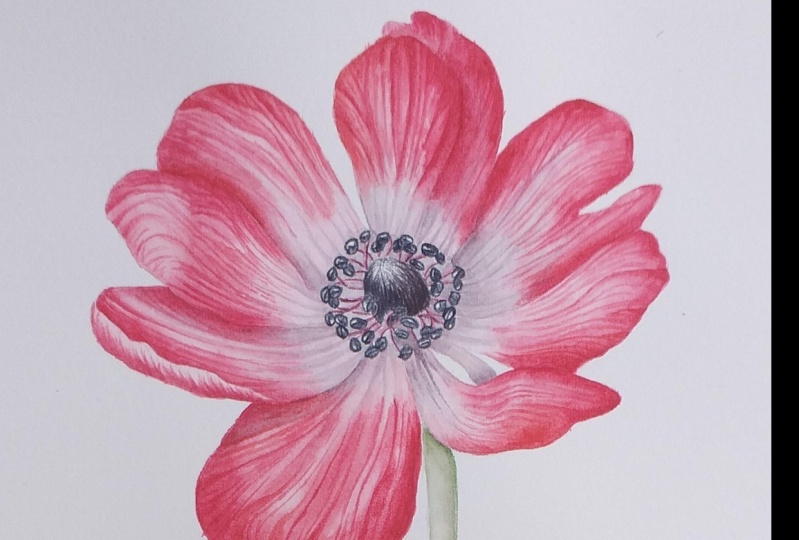
7. The Centre - Part One: So this next part is really fun because we get to mix up
some botanical blacks. We've done botanical grays, and botanical black is
essentially just a very, very dark color or a very, very dark botanical gray. This is always how I use
my paints to mix a black. I never use black
out of the tube, just like I don't choose
to use pains gray because, again, it's all about giving the painting
a feeling of unity. If we can use the same paints
that we've already used on our painting to create our
black, then that's great. And we can get the subtleties
of color that you just can't achieve with black or
gray straight from the tube. So here we've got
the endowthrnblue, perylene maroon, and
the Windsor lemon going onto our palette. We're just going to mix some really strong mixes of these paints together
and just have a play with how these come
out on your paper because sometimes it's quite
hard to see on the palette. So you can see here what I'm
trying to do is actually just change the color of the botanical black
a little bit. I've got some that are quite blue and then I've
got some which are becoming a little bit pinkier
and purplier and redder. It's very subtle, but that's exactly what
we're looking for. We're going to use these
botanical blacks to paint the stamens in the
center of the flower. Let me just show you with
a little drawing here, the shape of these stamens because it's quite hard to
see them in the photograph. Essentially, they're made of a structure that looks
very similar to this, the anther at the top with the
small stalk, the filament. And the reason I'm showing
you this is because understanding how
they are formed is going to help us paint them. What we're essentially going
to do is we're going to paint the outline of
these individual anthers, including the line
down the center. And then what that allows
us to do is just add a little bit of
color later on to the side of the anther
that's in shadow. So even though it's a
tiny little detail, painting them this way
allows us to capture the complexity and the detail and also how they
relate to each other. Here you can see me adding
another anther behind it, and we can darken the one behind to show how they
relate to one another. So let me show you how
we actually paint it. We're going to take
our size zero brush, our smallest brush, and again, as I said, we're going
to simply outline each anther with one of
our botanical plaques. Use whichever one
you feel is best suited. It's that simple. I'm just drawing in the
outline and the center line, and that's all we're going
to do at this stage. We're going to
repeat this process, almost like we're
just drawing in all the anthers
across the center. We don't need to add any
shadow at this stage. We're going to do that
a little bit later. You don't need to worry
about replicating the photograph exactly here. The most important
thing is that we get a feel for the volume of the stamens and that they're painted
cleanly and neatly. Do keep referring
to your photograph, but don't feel the
pressure to place the anthers exactly where
you see them in the photo. Just build them up steadily
in a way that works for you. I'm going to speed up
the video a little bit now just so that you can see the process
as it progresses. Eventually, you will end up with the anthers looking
something like this. And then what I'd like us
to do is add the filaments, which are the small stalks that connect each anther
to the flower. To do this, we're
going to mix up a reasonably strong pink color. We don't want it to be too dark, what I like to call a mid tone. So not a pale sort of tea wash, but also not as
dark as we've been using already,
somewhere in between. Then all we're going to do, keeping it really simple again, is just draw a line in
that pink color from every one of those
anthers that we've drawn into the center
of the flower. Just be really mindful of the direction these
filaments are going in. They're sweeping in and
underneath that center. So be really careful
of that direction and just curve them
in underneath. I can understand that it
can be a bit daunting and a bit overwhelming when we
see a center like this. But if you can break
it down as you illustrate it and you
can represent it in a way that's both accurate but actually allows
you to paint it and tell the story of what's
happening in the flower, then hopefully that makes it a little bit easier
and more fun to paint. As with the anthers,
you don't have to make the lines exactly where you
see them on the photograph. Just make sure that
they make sense that each anther is connected to the flower with a
filament and that you're creating a lovely
illustration as you go. M Now, next, once you've
got those lines in, even though they're
tiny, tiny, tiny, we do want to show
where the light is hitting them and
where is in shadow. So this is another test of our fine motor skills as we
pick up a darker red color, almost like a botanical black but with much more red in it, and we're going to
add a little bit of shadow to the right hand
side of each filament. Just do your best. It's not
easy to get this really, really fine detail, so
don't worry too much. If it's really tricky,
just do what you can. I think the part that's particularly helpful to do
is adding a little bit of shadow where the filaments
overlap each other because that will
show which one's in front and which one's behind. When you finish that process, you should end up with what
is now becoming a very, very complex center with lots of demonstration
of lights and darks, which is exactly what the flower would look like in real life. Now we're going to add in a little bit of
color to those ans. I would take a
botanical black but a bluer version of it
and water it down. So it's back essentially to a nice, subtle botanical gray. And then I'd like you
to supply that with a dry brush technique over the parts of the stamen that
are going to be in shadow. So typically that
right hand side, where one is behind another one. When I say a dry brush
technique, essentially, we're just putting the paint
directly onto dry paper. And then what you
should end up with is those really kind of
black stamens that we're looking for that really
pop off the page. But also, when we
look in more closely, we can see their shape and their form and
how they relate to one another. Well done. If you've got that far, that's a lot of really, really detailed work
involving high, high levels of concentration. So if you want to
have a little break, then now's a good
point to do so. Go put the kettle on or stretch your legs,
whatever you'd like to do. And what we're going to do next is we're going to start to fill in the areas of white
space behind the stamens, the areas that are
going to be in shadow. Oh
8. The Centre - Part Two: So to fill in these gaps, what we're going to do
is we're going to use the same botanical gray that
we were using on the petals. We're simply going to, again, use a dry brush technique. So that's the gray paint going directly onto the dry
watercolor paper, and we're just going to try
and fill in those gaps. Try not to pick up too much of the paint
from the anthers and the stamens and keep everything really crisp
and really clear. If you want to, you can
start to add in some of the more detailed lines
in the botanical gray, just to show those inner
parts of the petal as well. Do you just think carefully about which parts are
going to be really, really, very, very dark gray? And that's typically going to be the bits that are
really in shadow, so to the right hand side of the flower center underneath. But also tucking in on
that left hand side, as well will be
pretty dark where hardly any light is
going to be reaching. Once I've got all of the gray
in I'll then just go back in and add even
more depth of tone, making sure that it
really captured sort of the whole tonal spectrum from those white highlights
in the petal and the anthers all the way
through to the really, really dark black areas where no light is
reaching at all. The final part of the
painting of the flower is to paint in that
fluffy, hairy center. You probably thought, How
on Earth do I paint this? Because I had the same thought. But essentially, what
we're going to do, we're going to break
it down again, and we're going to paint
it as it is formed. And what I mean by that is, it's made up of all these
really, really fine hairs. And so we're literally
just going to paint in the hairs and paint
in so many of them that it starts to look dense and formed like
it does in real life. The main things to think about here are the color
and the shading. So first of all, think about
how dark your paint is. You probably want to start off quite light and then add in
some darker color on top, making sure that you
remember to leave lovely highlights where the light is going
to be catching, particularly at the top left. I'm using one of the
botanical blacks I created with a bluer hue
similar to that of the ans. So you can see me
here just slowly, slowly adding in
those fine hairs and building up that depth
of tone as I go. I'm always thinking
of the direction that the hairs are going in. You want to make sure that the hairs are kind of going from the base and then coming
upwards towards the top center. Paint them with a
lovey curve to them to give that center the domed
shape that we're looking for. You'll see as I build up
how we can get a really, really dark color that we want by just adding
more layers of color. It's lovely if you can also
vary the colors a little bit, vary the botanical
black in there just to give the painting a
little bit more interest. For example, you might want to add a slightly readier hue to the left and a
slightly bluer hue to the right where
it's in shadow. But you can have a little play and see what works for you. H Uh So there we have it. The center is complete.
That's pretty much as dark as we can get it and
as dark as we need it to be. What I'm doing here now is I'm just going to
go round and do any final little touch
ups, tiding the edges. And if there are areas where I think could be
just a little bit darker and increase the contrast a little bit, then
I'm doing that now. So please do some
final little touch ups as you feel are needed. But then that's the
flower painted. Next, we're going to move on to our leaves and then our stem.
9. The Leaves: When it comes to the leaves, we need to create
some lovely greens using the colors we've
already used in the painting. Windsor lemon and endanrineblue. If you find the mix looks a
little bit too artificial, then we can add in a tiny
bit of permanent rose. This can just knock
it back really beautifully and create a
much more natural green. See if you feel that's
something that you need. Here, I've mixed up two mixers, one that is a little
bit more yellow, and one that's got a little bit more of the endanthrine
blue in it. I have some variation of color that I can use
across the leaves. Now, the way that I tackle these leaves is with a
wet on wet technique. So you can see here again, just like we've done before, I've laid down some water, and I am then adding some paint. I'm working on these
leaves section by section. So rather than putting
colour over the whole leaf, I'm going to paint little bit by little bit in order to sort of build up that pillowy texture that's quite classical
of the neem leaf. I'm going to use a
slightly yellower hue of paint towards the
front of the leaves. And for the leaves that are more behind and more in shadow, I'm going to use a green mix
which has a bluer hue to it. So you'll see me
do this and change my paint mix over the
course of the painting. With these leaves and
these different sections, still keep in mind the shadows. Think about where the light is hitting and where
we'll be in shadow, even so much as where the
center veins run down the middle and the petal
surface undulate slightly. Try and capture these subtle
variations, if you can, and keep those lovely
highlights that we know make the painting glow just as
you've done with the petals. Just keep working section by section and building up
the color as you go. We'll add a little bit
more detail to the leaves once we've got paint
over the entire area. You might find
that you only need one layer of wash for these
leaves, but see how you go. You can always repeat the
process just like we did with the petals if you
feel you need more color. Once again, as before, I'm going to speed up
the video a little bit, just so that you can
see me work on all of the leaves in a
reasonable amount of time. But do slow it down again
as usual, if you wish. UU So here, I'm mixing up now a slightly
bluer hued green mix, even more so than
the one before, so that I can show these leaves that I'm
painting are very much behind the leaves
that we've just painted. You know, it's like
when you look at mountains in the
distance, typically, they look blue, and blue is often subject of things
that are further away. So this is just a really, really lovely way of
distinguishing the leaves that are further in front and the leaves
that are further behind.
10. The Stem & Finishing: So here we are. The final piece of the puzzle is our stem. Now, the stem of the nem has lots of different
variations in color. So we want to mix up a
nice green, of course, which you can see me doing here, exactly the same as
we've done before. So a bit of the yellow,
a bit of the blue, and a little bit of the
permanent rose as well, just to knock it back
just as with the leaves. You can see here again how much of a difference that
makes to the color. You've got a lovely green
that you're happy with. I'd also like us to mix
up a more neutral color. I do that by taking green, but then adding a little bit
more of the permanent rose. So you almost end up with a sort of greeny, brownie
neutral color, which we can use to add a little bit more
interest to our stem, as well as try and match what we actually see on the stem itself. When we add this to the
water alongside the green, you'll see what a lovely
effect it creates. You can see here when I'm
doing these swatches, the different variations
in color that can be achieved from just adding
these three colors together. When I'm painting stems, the most important thing
is the light and shade in order to demonstrate
the shape of the stem and the fact
that it's cylindrical. I'd recommend that
in order to get a lovely blend of
color across the stem, that we use a wet on wet
technique here again. So exactly as we've been
doing the whole way through, lay down that layer of water and then just start to add
a little bit of color. Be really careful as you
apply your water here. As anywhere you lay water
down, paint will follow, and we really want to
make sure that we have a stem edge that's really crisp and straight
with no wobbles. I'm starting here with
my greener color, and I'm running it down the
right hand edge of the stem, because this is the side of
the stem that's in shadow. I have now picked up a little
bit of the neutral color, and I'm going to keep changing this up as I move down the stem. Add a little bit of the green, and then a little bit of
the neutral and sort of create that variety and color
that we see in the stem. Whilst the paper is still wet, you can increase the
tone and increase the depth of color by
going over it again. We'll want a little bit of color down that left hand edge, too. So run your brush
gently down with quite a pale color just so
the stem feels complete. But go really
carefully and try and keep that highlight more
to the left if you can, as that's where our light
source is coming from. You can keep adding paint, as I say, whilst
the paper is wet. But always as we've
already spoken about, if the paper starts to dry, just stop because you will
end up with a harsher line. You can actually see here that my paper is starting to dry. So I'll take that opportunity to pause and move down and we can start to fill in
the other areas of the stem like these ones
in between the leaves. The most important thing here is to make sure that you've got a little bit of shadow where the leaf is
overlapping the stem, just to show what's
happening and make it clear to the viewer
of the painting. Then we can finish off
right down to the end exactly as you've
done already with differing amounts of the
green and the neutral. Now, it might be that you
want to do another layer of wash on your stem if
the stem is quite pale, and this is absolutely fine. Just repeat the process with a layer of water and
then layer of paint. I'm actually choosing not to do another layer on my painting, as I like the fact
that the stem is quite pale in my
own illustration. But if you feel you need to do a bit more colour
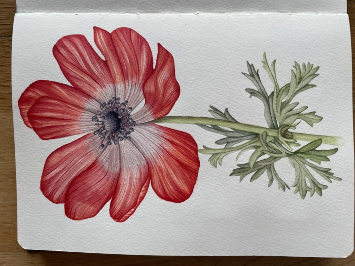
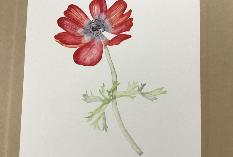
than by all means do. And there you have it. Our
neem painting is complete. I really hope that you've
enjoyed this and have a really fun and
beautiful illustration that you're really pleased with. I hope you've learned lots, and maybe this is another
piece that you can display in your home or gift to
someone that you love. If you've enjoyed the class
and you feel comfortable, please do share your project in the project
section below because I know that other
people would love to be inspired by what
you've created. Do also come and hang out
with me on Instagram. I'm at Helen Cousins Botanics and I show lots of
shorter clips of me painting and tips and
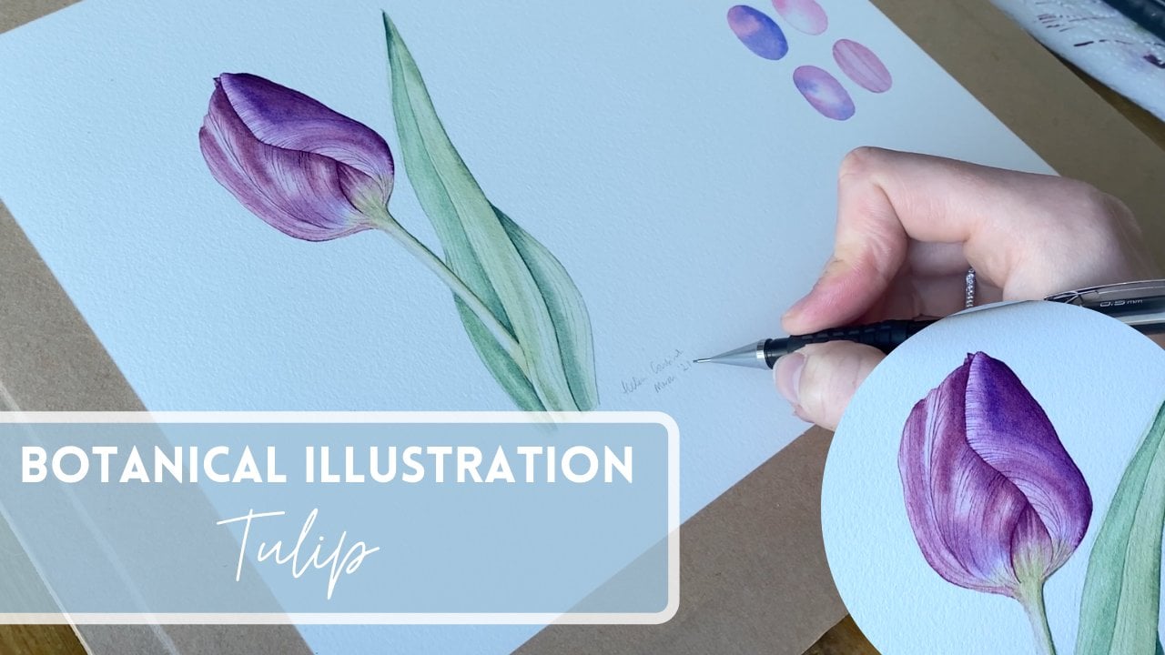
tricks and things that will hopefully keep you inspired on your painting journey. I've also got some
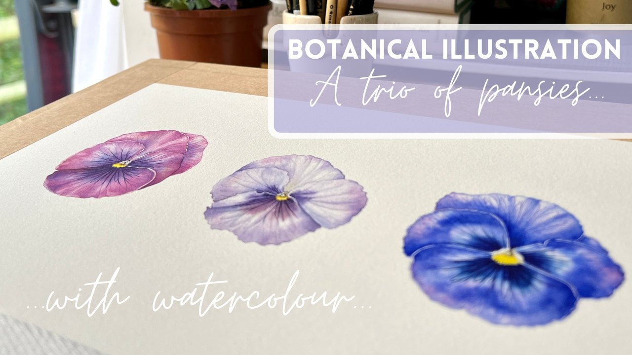
other tutorials on skill share that
you might enjoy, such as this rose, this tree of pansies. Then we go right back
to the fundamentals of botanical art in my class where we paint a
lovely purple tulip. Thank you so much
for being here, and I will see you again soon.
 Helen Cousins, Botanical Illustrator & Teacher