Transcripts
1. Introduction & Welcome: Hello, I'm Helen. I've been teaching
watercolor painting and botanical art for
the last 15 years. In this fundamentals
of watercolor class, I'm going to take you
through everything that you need to start
watercolor painting. I'm going to take you through how we can set up our space for painting and choose
the right materials to set us up for success, including the six paints. Yes, just six that you can use to begin your
watercolor journey. I'll also show you a really
simple way to stretch your watercolor painting
so that you have a beautiful surface to paint on. And I will, of course, guide you through all of the fundamental
watercolor techniques, including wet-on-dry
and wet-on-wet with some lovely projects that you can complete
along the way. And then we will pull
everything that we've learned together in this gorgeous
painting of a tulip battle. I can't wait to paint with you.
2. Setting Up Our Space: There are a few things
to think about when it comes to setting up our
space for painting, and it's worth dedicating a little bit of time
just to get this right. The first thing that
I want to mention is about the location of
your desque space. If you can, try and find a space that you can dedicate
to your painting. It doesn't have to
be a big space, but just try and find an area
of your home that is quiet and away from the hustle and bustle of daily
life if possible. Rather than setting
up your paints, for example, on
the kitchen table, try and find a space that's just a little bit
more tucked away and more private to minimize
interruptions and distractions. If you have a dedicated
space for your painting, it also means that
you're more likely to sit down and
paint because you don't need to rummage
through a cupboard and find everything that you need
each time you sit down. Whether or not you have
an hour or half an hour or even 10 minutes, you're more likely to just
sit yourself down and paint and be creative for the time that you have
available to you. The second thing to
consider is light. When we are painting,
it is so important to have as good a light
source as possible. Natural light is always better, so if you can set yourself up by a window,
then that is great. If you are right handed, you may find it helpful to have your light source
coming more from the left and if you are left handed coming
more from the right, this just means that
when you're painting, you're less likely to cast
a shadow onto your paper. This might seem like
a little thing, but it can actually
make the world of difference when it
comes to painting. If you don't have a window or natural light that
you can paint from, then an artificial light can be a really
good backup option. I would suggest though, that you think about
the light bulb that you're using because using a daylight bulb rather than a traditional household bulb
will make a big difference, particularly when it
comes to mixing color. The third thing to think
about is your posture. My mom is a physiotherapist
and so this has been drilled into me over
my 33 years of life. But do think about
the position of your desk and your chair
because when we're painting, we can often be sitting
for long periods of time if we're lucky and you really can start to
notice strains on different parts of your body if you're not careful
and aware of it. It can be so easy sometimes to get completely lost
in what we're doing, particularly if we find
that feeling of flow. We don't often think about it, but sitting actually impacts our whole bodies right
from our heads to our toes and you
can injure yourself just by sitting still
in the wrong position. Do you have a think about this and make sure that
your posture is right? I'll talk about this in a
little bit more detail when we move on in the next video
to talking about materials, but I often almost always
work on an art board. This means amongst
other things that I can tilt that board to
an angle that feels comfortable so that my
neck isn't craned over a flat board and is at a
more neutral position. Finally, the last
thing I like to do is make sure that my
desk space feels like a sanctuary and it's
somewhere that I can come that feels calming and
relaxing and peaceful. This could mean anything to you. I personally like to work
in a very tidy space. Clutter and mess is just not
conducive for my creativity, but I know that some
artists thrive on chaos, and they love the mess, and that's how they work best. So just think about
what will work for you. Along this line, I also like to set the tone for
my painting time, and I will often romanticize
that experience. So I like to light a candle
and have a hot drink with me, normally a cup of tea or maybe a hot chocolate if I'm
working into the evening. I might put a blanket over
my knee if it's a bit chilly or wear some really
comfy and cozy clothes. Do whatever you need to
do to feel comfortable, peaceful and relaxed because ultimately, this
is time for you. This time can be really sacred, really special and quite rare. So let's just make
the most of it and romanticize these moments. Your assignment
for this video is to set up your own
creative space. Try and make somewhere
that for you feel safe and peaceful and relaxing and somewhere that you want
to sit down and create.
3. Materials: Let's talk now about the materials that you can
use for watercolor painting. Now, the first thing I
want to say is that if you have watercolor paints and
brushes and things at home, then you do not need
to rush out and buy lots of new things for
the purposes of this course. Please use what
you already have. But if there are
particular things that you think that might
be really helpful, then by all means, slowly add these to
your collection. Saying that though,
what I'm going to do is I'm going to describe
everything that I would suggest a complete
ibi to watercolor Wood buy. This is what I would
go out and buy if I was starting afresh and
beginning for the first time. You can find a materials list in the attachment section below if you want to refer
to this as we go. As I mentioned earlier, I work on an art board. As well as giving me
a comfortable view of my painting and
protecting my neck. This board means
that I have a good, solid and smooth
surface to paint on. Finally, painting
on a board also means that I can stretch my
watercolor paper onto it, which I'll talk a little bit more about later
on in the course. The board that I use is simply
just a piece of plyboard. I can buy this here
in England from a local DIY shop such as B&Q, where they'll actually
even cut it to size. I would suggest a board that's approximately 35
by 30 centimeters would be a really
good place to start. But you may find that in time, you want something a
little bit bigger, too. In case you are wondering, I prop my board up on a
piece of stairail that I cut short and added a small piece
of non slip matting to. Pretty easy to make, but
you can always just prop it on a few books to adjust
the height to suit you. Now, I know this is
a watercolor course, but we do need to
talk a little bit about drawing materials
because drawing and painting are
connected because so often we need to draw what
we're going to paint. I keep things really simple. An HB pencil like this will
work perfectly for drawing. You can use a mechanical pencil, which can give you a little
bit more control with a finer point, but
it's not essential. Then a good rubber because there will inevitably be
rubbing out to do. A simple rubber like
this is just fine. There is one other rubber that I always recommend
to my students, and that is the Faber Castel
kneadable putty rubber. This is such a good rubber, particularly when we
are rubbing out on watercolor paper because it is really soft and
really gentle. So that's a great little
addition to your materials. A ruler is really useful and one like this is
absolutely fine. It doesn't have to
be anything fancy. Finally, a drawing pad, such as this one by Dela Rowe and a pad of tracing
paper, as well, like this one also
from Dela Rowe, are very useful things to
have in your collection. We won't be using these
pads of paper so much in this fundamentals
of watercolor course, but we will use them for the other tutorials that
you might like to do. Last but not least for drawing, the final thing that's useful
to have is an ink pen. I recommend the sakura
pigma micron pens, such as this one. I prefer the size zero, 05 because it has
the finest nib. So that wraps up everything
that we need for drawing. So let's move on to painting. So let's start with
watercolor paints. There are so many
different paints that you can buy from so many
different brands. Some of you may well have
some or many at home. So often we are gifted
with a lovely set of watercolur paints or we are so tempted when we go into
an art shop and we think, Oh, I'll just add something
to my collection. So what do I look for when
choosing watercolor paints? Generally, I choose paints
that are of high quality. I would much rather
have fewer paints of higher quality than lots of paints that are
of cheaper quality. There are a few reasons why professional watercolor
paints are superior. Firstly, the paints have
more pigment in them, and so they are stronger
and more vibrant. They also tend to
be nicer to use. They move across the paper
and blend together better. Finally, they are also of archival quality and
stand the test of time. That means that if you
hang your painting up on a wall, it's much, much less likely to
fade and deteriorate over time than if you are using cheaper watercolor paints. The brand that I
prefer to use is Windsor and Newton from their professionals
watercolor range. Do be wary of their
alternative Cotman range, which is their student range. These are the ones that are
cheaper but of lower quality. I choose to work with what
we call a limited palette. And so about 98% of the time, I work with just six paints. I know six sounds
like hardly any, but you'll see very soon how many different colors we can mix from just these six paints. If you talk to any artist that works in a limited palette, you'll likely get completely
different responses about the colors
they choose to use. There is no right or wrong, although understanding
a little bit about color theory will help you understand why often particular
paints are chosen. The six paints that I
have chosen to be in my limited palette are
French Ultramarine, anthrineblue, New
gamboge, Windsor lemon, permanent rose, and
perylene maroon. So if you are wishing
to buy the paints that I'll be recommending
throughout these courses, then these are the ones to get. I often get asked whether or
not to buy tubes or pans, and there actually
is quite a lot of difference between them. I usually recommend
that people buy the tubes because they are just a little bit easier
to use when mixing. It's easier to keep the pigment
really fresh and clean. If you have a tin
of watercolor pans, you might have noticed that they can get a little bit muddy. With tubes of paint, it's also easier to mix up
really large volumes of paint because you can squeeze
out as much as you need. The other personal
reason I choose to use tubes is just
because I teach a lot, and it's just so
much easier to give students paint from
tubes to work with. But once again, this
is a personal choice. There is no right or wrong, and it's often best to stick with what you're familiar with. The pigments will
generally be the same. For example, if you get a winds
renuten endanthne blue in a pan and a winds renuten endanthne blue in a tube,
they will be the same. So it really is just up to you. When it comes to
watercolor brushes, there are so many
different options and different brands
that you can try. As I said before, at the
beginning of this video, if you have some
already at home, then that is great.
Start with those. But let me talk you
through some of my favorites and what I look for in brushes
when I'm buying them. I tend to exclusively use
round brushes for painting. As a general rule, you'll find it much easier to control the watercolor paint if you have brushes
that are quite dense but with a good tip. As you'll be aware, brushes
come in different sizes. So you'll see them labeled as, for example, a size
six or a size two. A larger number
is a larger size. There are different types
of watercolor brushes. You can get brushes which
are made of animal hair. You may have heard of the
Kolinsky sable brushes. These are brushes
made from the hair of the Kalinsky weasel, which I believe
comes from Russia. It's been a personal preference
of mine to move away from sable over the last
five or six years to synthetic brushes, as I prefer to avoid using
animal products when possible. Sable, I think, will always
be the gold standard brush, but I find synthetic brushes are almost as good as
sable brushes now. The brushes that I would
recommend for this course are the Rosemary and
Co Series three oh seven in sizes
four, two and zero. If you're in America, I believe that these are quite
hard to get hold of. And so another
recommendation might be the Windsor and Newton
series seven brushes. The final brush I
want to show you is our mixing or magic brush, the charaz short flat
from Rosemary and Co. This brush is firm
and flat and is perfect for any kind of scrubbing action
that may be needed. For example, lifting
out paint if we've made a mistake or blending
any harsh edges. We'll talk a lot more
about this brush when we learn about
correcting mistakes. Finally, you'll need
a watercolor paper. Again, there are many different types of watercolor paper. What is essential
is that you do use a paper that is designed
for watercolor painting, as the paper has the
essential absorbent qualities to work with water and paint. Watercolor paper comes
in different textures, too, including hot pressed, cold pressed, and rough. A cold pressed paper or a rough paper will typically have a more
textured surface, which can be beautiful for landscapes or
seascapes, for example. As I am a botanical artist, I prefer to paint on
a hot pressed paper, which has a much
smoother surface, which means that it's easier to capture finer details without the distortion of
the brush marks across a textured paper. Finally, watercolor paper comes in different weights
or thicknesses. A really good choice is about
300 grams/square meter. This is somewhere in the
middle of paperweights. For many years, I
have chosen to use 300 grams/square meter hot
pressed watercolor paper. Although I will
continue to explore other brands and keep you
updated on what I find. Aside from paints and
brushes and paper, there are a few
other things that you will find helpful
for this course. Firstly, a paint palette. And again, it really doesn't
matter what you use here, but I would recommend
that whatever you choose is ceramic
rather than plastic. On plastic, you might find
that the paint sort of runs away from you and it's
just much harder to use. I'd also recommend that
you choose something white so that you can clearly see the paints
that you're using. This could just be a white
plate like I'm using here. But then there are, of course, lots of different palettes
that you can buy with different wells and
different sizes and shapes. And so, again, it's just
personal preference and choose something either
that you have at home already or that
you love to use. I always have two water jars next to me when I'm painting. One, I use to wash my brush and clean it when it's
got lots of paint on it. So this jar will get really, really messy over the
time that I'm painting. But the other one I will
try and keep clean, and I will use that water
to put either straight onto my watercolor paper
or to mix my paints. You can imagine if you take
water from a dirty jar, it's going to transfer some
of that color onto the paper, which can make things just
look a bit muddy and messy. So we try and keep
things separate. I also have a piece of
kitchen roll next to me, which I find is really
helpful to just remove some excess water
or excess paint from my brushes as I go. An alternative
would be a piece of muslin or even just a tea cloth. There are a couple of other
things that you'll see me use and demonstrate
within this course. This brown gummed tape, which is what we will use, along with our spray bottle to stretch watercolor
paper onto our board, and also some masking tape, which we will use
just for some of the fun little projects that we are going to do
throughout the course. It. That's all the materials that we will need
for this course. Remember though, it is okay
to use what you have already. Just be a little bit
mindful as you progress. If you're finding things
a little bit difficult, just think, could this be
because of the materials? I I made some tweaks to
maybe the brushes that I'm using or the quality
of the paints I'm using, could this make a difference? You may find that having
the right materials makes all the difference
to the quality of the paintings that
you produce and the enjoyment that you get from the painting
process itself. Don't forget, you can find the materials list in the attachment section
below this video. That is your assignment
for this video to simply download
the materials list and check off the items that you have and maybe make a note of the things
that you need to treat yourself to. A
4. Stretching Paper: Let's talk now about
stretching watercolor paper. This is something that I do for every single painting
that I work on. You may think, why do we need
to go to this extra step and why can't we just get
painting? Let me tell you. If you've painted with
watercolors before, you may have noticed
that when you apply water and paint to
the watercolor paper, it can buckle and
warp as you paint. This can make the surface
uneven whilst you're painting, affecting both the quality
of the work you produce, but also your enjoyment
of the process. It can be so frustrating, particularly if it means that your final painting isn't
flat when it's dry. Why does this happen
and how do we solve it? Essentially, what is
happening is when we apply water onto
watercolor paper, the fibers in the paper
expand absorbing that water, and that is what
causes the paper to buckle around the
paper that is dry. The easiest way to
solve this problem is to pre stretch our
watercolor paper. Essentially what happens is we dampen the entire
sheet of paper, allowing those fibers to
absorb the water and expand. We then tape it down, allowing the paper to dry
against that tension, we end up with this
beautiful drum type piece of paper that you can add as
much water as you like to, and you won't get any
of that buckling. It also means that when
you finish your painting, you end up with a flat painting, which means that you
don't have to bother ironing it or putting
it under books or doing all the other things
that you may have done in the past to flatten your
watercolor painting. So if you haven't tried
this technique before or you've had problems previously
with your paper buckling, please do give this
technique a go. It is so easy and it could make the world of difference to
your painting experience. Let me show you this
really easy step by step method that
will work every time. So let's start by
gathering what we need. That is simply our
watercolor paper, our piece of plyboard, brown gum tape, and a spray
bottle with water in. This doesn't need to
be filtered water. I've not noticed any harm come from using water
out of the tap, but please do use
filtered if you'd prefer. My watercolor paper here
is on a gummed block. So the first thing
I need to do is remove a piece of
paper from the block. This is pretty easy, although
it gets a little bit tricky when you're
on the last sheet of paper as I am here. A question that I
get asked a lot is, do I actually need to
stretch my watercolor paper, even if it's on a
gummed block where all of the pieces of
paper are glued together? Personally, I do still choose to stretch my
watercolor paper, even when I'm using
a gummed pad, because the buckling
and warping from my experience can still
very much happen. But the other thing
is, I actually prefer to paint on the
side of the paper that is faced down when it's glued to the block in the case
of this che paper. Now, there is a
difference between the two surfaces of
watercolor paper. It will vary slightly across
watercolor paper brands, but with the che hot
pressed watercolor paper, what you'll see if
you look really, really closely is that the sides of the
paper are different. One has a slightly
grid like appearance, and the other has a
more natural surface. I'm not sure if you've ever
made handmade paper before, but the process of doing
this helps to explain the texture of watercolor paper and the different surfaces. When you make homemade paper, you pick up paper pulp
from a vessel of water. And when you pick it up, you pick it up onto a really
fine mesh grid screen. You let some of the
water drain off, and then the paper settles and you transfer
that piece of paper, all the different
fibers of the pulp onto a piece of towel or
something else to dry it. So what I'm trying to
explain here is that one side of the paper has
the grid texture on it, whereas the other side has
a more natural surface. So which do we paint on? There is no right or
wrong, but generally, I personally prefer to work on the surface
of the paper that has a more natural appearance
rather than the grid. So just have a really
close look at your paper. You might need to use
a magnifying glass, but see if you can see
what I'm describing. As I say, every
watercolor paper brand may be slightly different, but just give it a
little bit of thought. So once you've identified which side of the paper
you want to paint on, we can then lay this on our
board with the side that we want to be painting on face
down to start off with. Cut lengths of tape that will cover each
edge of your board. If it needs to wrap around the sides, that's
absolutely fine. Then we take our spray
bottle with clean water, and we just gently mist this reverse side of the paper with a small
amount of water. It does not need
to be absolutely soaking, a good misting. Then we turn that
paper over now, so the damp side is
down on our board, and the side that we want to
paint on is facing upwards. And we just do the
same thing again. We missed the whole
surface of the paper, and then just pause,
wait and watch. What you should see over the next three to 5 minutes is that the paper starts
to warp and buckle. This is exactly what
we want to happen now. Once your paper has
started to warp, you can then simply
mist the pieces of gummed tape just like
we did with the paper, making sure that you do cover the whole gummed surface of the tape and you're
not missing any spots. And then simply start to apply these around the
edge of the board. Therefore, sticking the
paper to the board. Once it's all taped down, don't worry if the
paper starts to warp a little bit more over
time. That's fine. Just make sure everything is secure and then leave it
flat somewhere to dry. If you leave it propped
up on its side, what will happen is
all the water will drop with gravity down to
the bottom piece of tape, and it will end up coming off. I've made this mistake before. You can, if you are
really, really, really desperate,
use a hair dryer to speed up the drying process. But if you can, just try and
let the whole process happen naturally as it's not entirely clear what that
heat will do to the paper. Once the paper is dry, you should end up, as I say, with this beautiful
drum type piece of watercolor paper so that when you apply your
water and your paints, you don't get any
warping, no buckling, and it's a really lovely and enjoyable experience to paint. And at the end, you will have a completely flat
watercolor painting. I really hope that was helpful. Hopefully you can see how easy
and quick that process is. I know that if you've previously worked on warped
or buckled paper, you will notice the
world of difference working on a piece of
stretched watercolor paper. This is your assignment for this video is to simply stretch a piece of your watercolor paper following this step
by step process. Do you let us know
how you get on in the comments and if
you have any questions about how this works or if you have any stumbling
points along the way, do just jot them down below and I will get back to
you as soon as I can.
5. Watercolour Techniques: So now that we've
spoken a little bit about watercolor
and what it is and the materials that we can use to create some beautiful
watercolor paintings, and we've spoken about how
we stretch watercolor paper. We can move on to actually practicing some
watercolor techniques. You can move on to this stage, even if you haven't stretched your watercolor paper yet because perhaps it will give you an understanding as
to whether or not your paper is prone to
warping and buckling. Your assignment for
this video is simply to practice some of the
watercolor techniques as we move through this video. There are a few different watercolor techniques
that we're going to focus on in this fundamentals
of watercolor course. I'm going to take you through
each one step by step, demonstrating it, and then
you can follow along with me. Essentially, the majority of the watercolor techniques
involve putting down what we call
a watercolor wash. This is just a term to describe a layer of paint being
applied to the paper. Firstly, I would like us to just get to know our
watercolor paints. Now, forgive me if
this feels like I'm taking things back
to basics too much, but I'd like to explain
things for people who have never used watercolor
before in their life. Although these exercises,
I do myself sometimes to refamiliarize myself
with watercolor and warm up before painting. Essentially, watercolor
paint needs water. It may be tempting, particularly if you are squeezing
the paint from a tube to use it like acrylic paint and apply
it quite thickly. But this will be very
difficult for you, and it's not how the watercolors
were designed to work. You'll lose all
of the luminosity that we love about watercolor. The more water we mix
with watercolor paint, the lighter the colour becomes. So the first thing I'd
like us to do is just put a little bit of one
of our watercolor paints onto our palette. Here I'm going to
choose denthrine blue. Then just simply take a bit of the paint and add some
water and mix it up, so you end up with
a sort of creamy, milky consistency
that's quite dark. Test this mix out on
your watercolor paper and see what effect you get. Next, take a little bit
of that mix you've just made and put it in a new
spot on your palate. Add more water to this
and mix it up and see what happens when you
apply this mix to your paper. Then do it one final time. Add lots more water so that it's a really, really pale mix. Test this out on your paper
and look at the wide range of colors that you can achieve
with just one pigment. So now let's try our first
watercolor technique. This is the
wet-on-dry technique. Essentially, what we're
doing is we're taking wet paint and we're putting
it onto watercolor paper. To do this, I'd
suggest that you draw a rectangle on your
watercolor paper like this, 6 centimeters by 2 centimeters. Then divide that rectangle into three pieces so that you end up with something
that looks like this. I'd suggest that you
watch me demonstrate this process before painting
along with me because first, I'd like to show you
a few difficulties that can arise with
this technique. What we're aiming
for is a lovely, smooth and even watercolor wash over this entire rectangle, avoiding visible brush
strokes or watermarks. So what we're going
to do is take a medium strength mix of
paint from our palette, and we're going to apply this across the whole
of the rectangle. Picking up quite a lot of paint from my palette
to start off with. You'll see at points,
the paint is starting to appear quite dry and it's
leaving some brush marks. So what I do is I
keep picking up paint from my palette and
then returning to my paper. This really is key
to making sure that you don't end up
with brush marks and an uneven texture
across the shape because this is what happens when the paint starts to dry. Another difficulty that
can arise is if an area becomes a little too wet,
like you can see here. To solve this, you
can dry your brush on a piece of kitchen roll
and then return to the shape and let
that paint just reabsorb back into the brush
to remove that puddle. But notice here that we have ended up with a slight watermark where the wet paint has pushed back into the paint
that's starting to dry. That's something to look out
for when you're practicing. So now let me just
demonstrate on a second shape what happens
if the paint is too dry. Hopefully, you can see that it's much more difficult
to apply paint. I'm getting visible
brush strokes, and I'm finding
it hard to paint. Like I'm battling to move the paint to cover
the whole shape. I'm struggling to get that lovely smooth coverage
that we're looking for. So let me show you one more
time how I would do it, and maybe this time you
can work along with me. Start by picking up lots
of paint on your brush. I'm then going into the shape
and applying the paint, but I'm frequently returning to my palette and
picking up more paint. I keep moving across the shape, picking up paint, and
then applying it, picking up paint,
and then applying it until the whole shape
is completely painted. Hopefully, you'll end up with a beautifully smooth and even
finish across the shape. You might be tempted to
fiddle with the shape. You can do this whilst the
paint is wet, but again, do stop as soon as it starts
to dry because once again, you'll get brush marks. This is such an
important skill in watercolor as your
learning water control and understanding how much water
is needed on your brush and on the paper to create the effects you're looking for. The other fundamental skill to mastering watercolor is
the art of layering. When we layer watercolor
washes on top of one another, we get different effects. Make sure that the
first wash you've laid down is completely dry. Once it is dry, we're
going to just layer the same paint mix
that you've just used over the top of the
one we've just laid down. But only in two of the three sections that
we drew onto our paper, this section will now
be a shade darker. Once this section is
also completely dry, apply a third layer of paint, but this time, let's just
do one of the sections. This exercise demonstrates
how we layer paint in watercolor to get
different colors and effects, even with just one
single pigment. I'd like to suggest now that
you do the same exercise, but with each of your
different paints, just pure pigment
straight out of the tube, not mixed in any way. This will just help you to get to know the paints
that you have to hand when they are pure but
diluted to different amounts. If you want to, you can
also try experimenting with layering different colors over the top of each other. This will help you
understand how the colors may mix
together on the paper, but we'll get to color mixing a little bit later on
in this membership. So don't worry too
much about this now. This is a quick and fun
exercise that you can do anytime you feel you want to do something creative
with your paints, but aren't sure what to do. It gives you a few minutes with your brush in your hand just
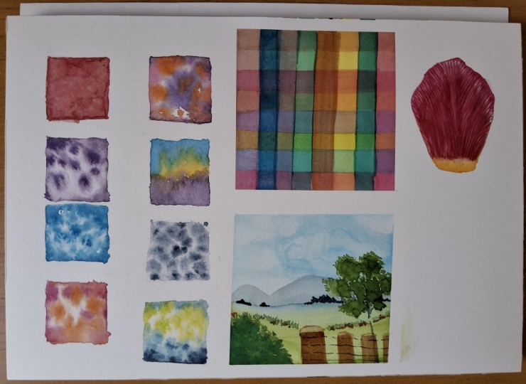
putting paint to paper. It can also be the start
of a collection of color charts that you may
like to create in the future. The graded wash is a slightly different
watercolor wash technique. A graded wash is
essentially where we take a fairly strong and
dark mix of paint, and we slowly lighten
it by diluting it as we move across the
area we want to paint. It's a really lovely way to get a transition from dark to light. We're aiming for a
smooth transition, avoiding watermarks,
like you can see on the study I've already
completed on the left. Let me demonstrate this. I'm picking up a
fairly strong mix of watercolor paint to
start with this time. I'm going to keep using
the endanthrine blue. I'm applying this to the
top third of my shape. I'm then going to dip
my brush in water, return to my palette, and diluting the
mix on my palette. I then return to my
painting and continue down from where I left off with this slightly lighter mix. Then I do the same thing
again, pick up more water, dilute this on my palette, and then return to my
painting moving down further. Finally, I'm going
to clean my brush, so it's pretty much
just pure water and then complete the final little section of the rectangle. So what you can see here
again is that we're aiming for that lovely
transition from dark to light, but trying to avoid
brush strokes and keeping everything
really smooth. Again, the trick here, as before with our
wet-on-dry technique, is to try and move
relatively quickly so that your paint stays wet on the paper and doesn't
dry as you're working. It won't be long until
you get a feel for this, but I'd suggest that
you practice this a few times until you get the hang
of it and then move on. A blended wash is a very, very similar technique
to the graded wash. But instead of going
from dark to light, we're going to go
from one color to another color blending
two colors together. Let's mix up two colors now on our palette of a
medium strength. So something that's quite
milky in consistency. Here I'm still using
the endanthrine blue, but I'm going to mix up
some other perylene maroon. I'm taking the
danthrine blue and laying this down across the
top half of my rectangle. Then working relatively quickly while the paint is still wet, I clean my brush
and pick up some of the perylene maroon and then continue down the shape until I've painted the entire area. What you should end up with is this lovely soft
blending of color in the middle where the two mixes join without any harsh lines. Once again, remember to stop
when the paper starts to dry to avoid getting any
brush strokes on the paper. I'd suggest you do
a few more of these just to get a real feel
fret before moving on. The final watercolor wash
technique that we're going to practice is the
wet-on-wet technique. This is really where
watercolor comes alive, and it's my absolute favorite
watercolor technique. We'll be using this
a lot in all of the tutorials and on other courses that are
here on the membership. I'm going to change things up a little bit here
and draw a series of squares that are three
by 3 centimeters in size. Once again, I'll demonstrate
this wet-on-wet technique, and I'd suggest that you watch me first and then
have a practice. To begin with, it's
really important to start with clean water
and a clean brush. You can see here that my brush is not actually clean enough, an accidental demonstration
of what not to do. Rather than applying
paint to the paper first, as we have done before, we lay
down a wash of pure water. We do this exactly like we've
been doing with the paint, but it's just water over the
entire area of the shape. Try to be very careful
where you put the water because anywhere that you put water down, paint will follow. We are aiming to
put enough water down that the entire
shape is glistening. A good trick is to move your paper around
in the light to see any patches that you've missed or any areas that are
a little too dry. We want to try and
avoid puddles of water. Although if this happens,
it's not a problem. You can just dry your brush a
little bit and then go back into the shape and keep moving
water around the paper. Then we take paint from
our palette and simply drop some of that paint into the water and see what happens. We should see really
beautiful blooms develop. Bloom is what we call
it when the paint just disperses out
into the water. I'd suggest maybe
as an exercise, try going around the outside
of the shape because this will help you practice
your brush control and keeping to the lines. Remember, if the
paper gets too wet, you can simply dry your brush
on your kitchen roll and return to your paper and absorb some of the
excess water and paint. Don't forget to stop as
soon as the paper starts to dry to avoid getting those harsh lines that
we've spoken about before. As the paper starts to dry, you just won't get
the same effect of the watercolor blending
softly with the water. So it's always my
advice that as soon as your paper starts to dry, stop. The beauty of watercolor is that we can do more
layers on top. So if you haven't finished
doing what you wanted to do on the shape before the paper starts to dry, it
doesn't matter. You can do it again
in another layer, just like we did when we
practiced our color swatches. Do a few more of these squares. Play around with
different colors, try dropping in different
colors of paint into the same square, and
see what happens. Try adding some second layers
on top of another once the first layer has completely dried and see what
other effects you get. You've done a lot of work
up till this point in listening to all the videos and practicing your techniques. So I thought it would be fun if we just pour things
together and do a little project to keep practicing the
wet-on-wet technique. So we're going to
make a bookmark. Do this, we'll draw
a series of squares, just like we've done before. But this time down in a
line underneath each other. I'd suggest that the squares are three by 3 centimeters
as before, with half a centimeter
gap between each one. Then we're simply going
to keep practicing our wet-on-wet washes on all
of these little squares. Have a play around,
do anything you like. You might want to mix
some different colors either on your palette
or on the paper, be creative and just
have fun with it. I'll let mine play out now at slightly faster
speed so that you can see how I choose to do mine. When we're done, we can
cut around the outside. And then we have a really
lovely bookmark that you can keep for yourself
if you're a reader like me, or you can gift it to
someone that you love, who you know likes to read. Do you share with us your
bookmarks when you finished? Because I know everyone will
be very inspired and it's always so fun to see the different things
that everyone makes? The final technique that
I'd like us to practice in this fundamentals of
watercolor course is what's called a
dry-brush technique. This is very different to the watercolor washers that we've been practicing already. It involves using normally
a much smaller brush to apply detail with a slightly drier mix
of watercolor paint. Essentially, what
we're going to do is practice our brush
control and how to achieve fine lines so that we can apply detail
to our paintings. Trick when trying
to get fine lines with watercolor is firstly, using a good brush with
a nice, fine point. It's really, really hard to get fine detail if you don't have
a fine tip to your brush. Secondly, it's about the
way that we use our brush. So if you watch closely here, when I'm doing these fine lines, the tip of my brush is
hardly bending at all. Let me show you what happens
when the tip does bend. You can see here
the tip is bending, and the line that I'm
getting is much thicker. The other reason you
may get a thick line is if you have too much
water on your brush. It's much easier to create
a fine line if you remove excess water from your brush onto kitchen roll
before you start. Sometimes we may want a slightly thicker line
when we're painting. But if we want to achieve
really fine lines, the trick is to just tickle the surface of the
paper with your brush, so it hardly bends at all. Even if the brush tip lifts off the surface of the paper
as you go, that's okay. That just shows that
you're painting with the delicacy that you need
to create these very, very subtle and gentle lines. There are so many different ways we can use this technique. We can use it to build
up depth of color in particular areas after we
apply watercolor washers. We can also use it
to add texture. Let's say we have
a very hairy leaf that we want to try and paint. We can use it for that or adding tiny little
thorns onto a rose. So it really is a good
idea just to spend a bit of time getting
a feel for your brush and how to control it in order to capture
those fine details. I suggest you do here is
practice as much as you can. If you want to, you can return to your
bookmark and add in some details like some lines or other shapes if you'd like. A dry-brush detail here isn't going to risk your paper
buckling or warping. So you can do this even if you've cut it off
your paper already.
6. Brush Strokes & Polaroid Project: No I did just want to
spend a little bit of time touching upon
different brush tricks. When you learn the fundamentals of watercolor as we are here, it opens the doors for you to paint anything that you wish, whether it's landscapes, people, pets, anything at all. The world is your oyster. But to do so, you
probably will need slightly bigger brushes and
slightly different brushes. Here are a few of
the ones that I have in my armory at the moment. I really don't have
many other brushes because I am a botanical artist through and through
all my brushes are tiny. But here are a couple. There is this larger
flatter brush, which is perfect for
landscapes and larger washers. A larger round brush here and
another slightly smaller, softer flat brush, too. So how do we use
these other brushes? Well, the beauty of
larger brushes is that they hold a lot more water
and a lot more paint, meaning that you can create larger washes and
cover greater areas. This flat brush, for example, gives a lovely even wash across a large area, as
you can see here. These larger round brushes similarly allow you to create different brush marks such as these almost leaf like
shapes and also give you the freedom to make
more impactful marks on the paper like this here. So I'd encourage you
to have a rummage in your supplies or
if you need to buy a very simple set of
watercolor brushes of varying shapes and sizes and see what marks you
can make on your paper. I have a little project now that you can do whenever
you're ready, which I'll tell you about now. I prepared a short
little project for us to do together that
isn't botanical related, but it will help us practice our watercolor
techniques and have a play with some
different brushes that you might have to hand. I thought what we could do
is paint a little polaroid. Now, I painted this one when I was traveling around
in my Campa van sky. This was in Wollacom in Devon. It took me about half an hour, and I really enjoyed it, and I keep it up on my bookshelves as a little
reminder of that time. In the attachments below, I've included a few
reference photos also from my travels in Sky. But please do use
anything that you feel drawn to perhaps a lovely memory that you've got of your own. For this project, please
remember there is absolutely no pressure about
what this turns out like. It is just a matter of getting to know your
watercolor paints, perhaps doing something
different that you've not done before and having fun. Just enjoy spending
half an hour to an hour being creative and
having some time for you. And so that is your
assignment for this video. To create a little
polaroid painting and please do share
your paintings in the comments below
where you can attach a photograph because I know that we would
all love to see. I'd suggest drawing out
your polaroid first directly onto your
watercolor paper for the purposes of this study. I'm drawing here a
rectangle that is 10 centimeters by
12 centimeters. But then inside is a square that is eight by 8 centimeters. The center square is
what we will paint in, and the surrounding edge
makes the polroid effect. The next thing to do is take some masking tape and run this around the outside of the square area that
we'll be painting in. Make sure that it's really
well stuck down around the edges to reduce the risk
of paint leaking underneath. I'm going to show you how
I paint my polarid image, but you do not need to
copy me exactly here. Please just enjoy the
creative freedom. I'm not gonna talk you through the exact paint mixers I'm using or take you
through it step by step, like I will in future tutorials. This is just about
you experimenting and getting to know the paints
and brushes that you have. You can paint a lot
looser than I will be, or you can paint with
a lot more detail. Do whatever you are drawn to do. Play around with wet on
wet washes, graded washes, blended washes, and a
dry brush technique, and just see what
effects you get. You'll see me using a mix of
olive these in my polaroid. A few tips and tricks on color. Get your palette nice and
messy as you do this. Mix up your blues and yellows
to get lovely greens, your pinks and blues
to get purples, and even a pink blue and yellow
to get a gray or a brown. I'm going to leave this video
of me painting playing now, but I'd suggest that you do jump to the end of
the video when you finished your painting to see how I cut my
painting from the board. Happy painting, and I will
see you in the next video.
7. Patchwork Polaroid: I wanted to share one more polloid exercise that
I think you'll love. It's one of the most
popular exercises in my watercolor and
botanical art membership. We paint this lovely
patchwork polroid simply by laying down lines of paint that
overlap each other. It's a great way of learning
how layering works in watercolor and a wonderful way of getting to know your paints. I also think it just gives
such a beautiful effect. As always with our
polroid videos, we're going to start by
drawing out our area, which is 12 by 10 centimeters with an eight
centimeter square inside. Once drawn, I'm lightening
the pencil on my paper and then laying down
some masking tape that will keep our
border free of paint. For this painting, I'm using some leftover paint
on my palette but use this as an
opportunity to learn more about your color
mixing and layering, as that's exactly what we're
going to do in this process. So use whatever paints
you're drawn to. All I'm doing to paint
this polroid is simply taking a flat brush
and painting in lines, varying the color each time. Importantly, I'm
waiting for each line to completely dry before
applying the next. Just observe as you paint the different color mixes and
variations you're getting. It's a great exercise in learning how to mix
colors on your paper, as well as on your palette and how we can adjust colors on paper as we work by applying different
color mixes on top. Keep working line by line, as you'll see me doing until you have a gorgeous
patchwork effect. Have fun and happy painting. A
8. Correcting Mistakes: We all make mistakes
from time to time. It is part of the
creative process and it is part of the
learning process. But what I would like
to do is give you a few tips and
tricks about how we can mitigate any
mistakes that we make and maybe even bring
something positive from them. I'd like to start
by talking about water control because as
we've already mentioned, so many of the problems and stumbling blocks that
people find with watercolor are when
we try and work when either the paper
is too dry or too wet. So let's dive into this in a
little bit more depth now. Let's start with what
happens when we put too much water onto our paper because we've
already covered this briefly. As you can see here, I'm
painting the square, and there's a lot of water sitting on the
surface of the paper. When I try to apply paint, it just sits on
top of the surface and it doesn't bleed and
blend as I would like it to. There are a few things that
can help in this situation. The first thing we can do
is take a clean brush, making sure that it's relatively dry by dabbing it on
some kitchen roll first. Then I can return my
brush to the shape, and when I gently
touch the water, you can see the brush is reabsorbing that
water on the paper. I can then return my
brush to my kitchen roll, dry the brush again, and repeat this as many
times as I need to. If you really do end up with a lot of water on your paper, then we can use the kitchen
roll directly in the water. You can see me
demonstrating this here. I'm just gently
touching the corner of the kitchen roll into the
area with too much water, and you can see how the water
is immediately absorbed, leaving us with a glistening
surface that we're looking for that's now
ready to paint on. Now we know how to rescue our painting when there's
too much water laid down. What do we do if
we've identified that our paper is a
little bit too dry? As I've already mentioned, when the paper is too dry, it's really difficult
to get a smooth and even finish across
the area we're painting. If you've just started painting and you realize
that the paper is too dry, the first thing to try is just immediately softening the
whole area again with water. This can be a little
bit of a gamble, but sometimes it's
possible to save the area, particularly if you're
going to be adding more layers of
washes over the top, as it doesn't matter
hugely if it's not a perfect wash
first time around. By working quickly, we
can readjust and quickly correct our mistake before we've added too much
paint to the paper. What happens if the paper starts to dry when you've
already been working on it for a while and
you've started to get some harsh lines
forming that you don't want, like
you can see here? Well, I wouldn't correct it with another layer of
water immediately, because the area that
you've added water to already will be drying
at different speeds, and you can end up with an
even more uneven finish. The first thing I
would do is just stop and let the
paint completely dry. We can then try adding
another layer of wash on top. You can see me
demonstrating this here. Even just applying
a water wash over the top of the paint softens
things just a touch. But when we start to add
a little bit more paint, you'll notice that those
harsh lines can fade. The next thing I'd like to show you is how we can
use this brush, our Trusty Rosemary and Co charad short flat
in size one or two, or any alternative that you might have to correct
any mistakes. The beauty of this
brush is that it's quite firm and
scrubby in nature, so it allows you to
lift the paint off the surface with a bit more
ease than a soft round brush. There are a number of
different instances where you might like
to use this technique. Let's start by using our previous examples where we have some harsh lines
that we wish to soften. This case, we can take the
magic brush that is clean and damp and gently tease at that
harsh line and soften it, helping to blend
it into the paper. You can also use
this technique on the edges of your painting
to tidy things up, either between washers or when the painting
is nearly finished. We can also use the magic
brush to lift out highlights. You'll learn about
this a lot more in the fundamentals of
botanical art course, but keeping highlights and a broad tonal range across
your painting from white to completely dark is really important to help your
painting pop off the page. It's very easy to allow
watercolor paint to creep across the paper when
we're applying washers, and we can lose areas that we would like to be
completely white. If this happens, you can use either a round brush or the
magic brush that is again, clean and damp and lift out some of that
paint from the paper, as I am demonstrating here, whilst the paper is still wet. However, if the paper has dried, we will likely need to use our magic brush rather
than a round brush because we will get more
friction on the surface of the paper and allow more
paint to be lifted up. You can see me demonstrating
this here where I am lifting out a small highlight
in this part of the square. Finally, we can also
use the magic brush to lift off paint where we
have put it accidentally. For example, let's say that you accidentally drop your
paint brush on your paper. Let me show you how we
can rescue this now. I am gently teasing
at the surface of the paper with a clean
and damp magic brush, returning to my water
and kitchen roll to keep removing that
paint and applying the clean damp brush again until we can remove as much
of the paint as we can. You can also use
the kitchen roll to dab on the paper and lift off a little more paint if you're struggling to get the
result you're looking for. Just make sure that that
kitchen roll is clean. It can be difficult to remove
these mistakes completely, particularly if you
are using a paint that has quite strong
staining properties. I explain more about this
in the color mixing course. This might not be a problem if it's an area that you
plan to paint over, but if the paint falls on an area that you
won't be painting, you may need to use some other tricks to solve the problem. Let me show you them now. The first is that we can
use artistic license and actually amend our drawing to cover the area where
the paint has spilled. For example, let's say I'm painting a flower and
I make this mistake. I might choose to add a leaf or maybe even a little insect like a bee to cover up that error. Sometimes, though,
this won't work in the painting and
in our composition, or maybe you just
don't want to do that. And so that is when a magic
eraser comes in really handy. You can buy these magic erasers from any kind of homeware store. They're typically
used for cleaning kitchens and bathrooms, but the reason that
they are so good at that job is that they
are slightly abrasive. To use them, I cut
off a little corner, a small wedge of the sponge, just like this, and I
dip it in clean water. You don't want it to
be too wet, though, so squeeze out a little bit
of the water afterwards. Then just like you've done
with the magic brush, I just tease the surface of the paper with
the magic eraser, and you'll be amazed at
how it lifts up stains. It really is like magic. The only caveat to this is
that it can be difficult to paint on top of this area once you've used
the magic eraser. Simply because it does
damage the surface of the paper somewhat because
of its abrasive qualities. Therefore, I would only use the magic eraser
right at the end of your painting when you're sure that you're not going to be applying any more paint
on top just to be safe. If you notice that
the paper surface is damaged from using the magic eraser like
you can see here, you can use something
clean, solid and smooth, like the bottom of a
bottle as I am here, or even just a
small smooth stone, and just burnish the area gently to smooth the
paper fibers back down. So there are a few of my
favorite techniques for correcting mistakes
with watercolor. Do you have any more? If you do, please let
us know in the comments below because that way we can keep learning
from each other. Your assignment for
this video is to simply spend some time with your
magic or lifting brush. Perhaps have a play on some of the swatches
that you've already done and try and lift off
some paint from the paper. You may notice
that some pigments come off and lift
better than others. That's not uncommon and is
something that I talk about in a lot more depth in
our color mixing course. Have fun. Enjoy and
I will see you for our final project where we will pull everything that
we've learned together.
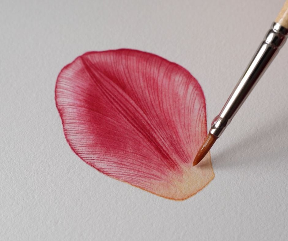
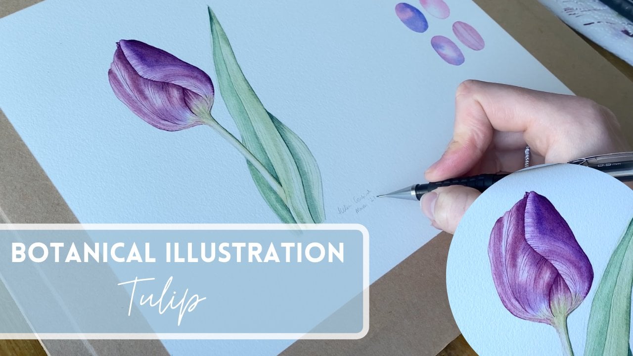
9. Final Project: Tulip Petal: Would like us to have
a small final project that we paint together to pull together everything
that we've learned in this fundamentals
of watercolor course. Now, I am a botanical artist, so it would only
be right that we choose something
floral to paint. Hopefully, this will
inspire you to move on to the fundamentals of
botanical art course, which is also included
in this membership. Have fun, enjoy. For this project, we are
going to paint a tulip petal. This will be perfect
for us to practice. All of the techniques we've
learned about so far, particularly our
wet on wet washes, dry brush detail and
correcting mistakes. You can find the workbook in the attachment section below, which includes the reference
photo and line drawing. So do download this
before you get started. To start off with draw or transfer the tulip petal
onto your watercolor paper. Although I usually prefer not to draw onto my watercolor
paper directly, because this is a
relatively simple shape, it's okay to do
this if you wish. If you think you'll end up with doing lots of
rubbing out, though, I'd suggest you transfer your image using
the line drawing provided and a piece of tracing
paper as I am doing here. To see my full process
on how I do this, please search for the word transferring in the
search bar at the top of the page or find
the video on how to transfer in the fundamentals
of botanical art course. Once you've got your
drawing transferred onto your watercolor paper,
let's get painting. Make sure you keep
your reference image nearby so that you can
refer to it as you paint. We're going to start
with applying some wet on wet washers to
our watercolor paper. So let's begin by
mixing up the paint on our palette so it's ready to go once our water is laid down. Mix up some pure new gamboge
and pure permanent rose. You'll notice that
a lot of the time I mix my paints on my palette
with my magic brush. I do this just to protect
my watercolor painting brushes from any unnecessary
damage as I mix. Once you've done this, let's
take our size four brush, making sure that it's clean. And then take some water from our clean water jar and apply the water over the whole
area of the petal. Now for this tutorial, I'm going to keep
things really simple. We are only going to
be using three paints. If you have some experience
with botanical illustration, you may see more complex
colors within this petal. If you're itching to
capture these colors in a little bit more depth and
detail than I'm doing here, then please do feel
free to do that. For the purposes of this,
I really just want us to focus on practicing the watercolor techniques
that we've learned, and so I've kept everything else a little more paired back. Once you're happy that you've
laid enough water down on your petal so that the
surface is really glistening, but you don't have any puddles, we can start to apply
some watercolor paint. Keep an eye on how the colors are distributed
across the petal. The base of the
petal, of course, is yellow, so I'm applying
new gamboge here. But I can see a
little bit of yellow creeping up towards the
center of the petal, so I'm taking the yellow a
little bit higher up too. I'm using my size two brush, a little bit smaller than the
size four I used to apply the water to give me a
little bit more control. Then I can apply some
of the permanent rose onto the petal whilst
the paper is still wet. I'm really keen to keep that lovely highlight that runs around the outside of the petal, because that really shows how the light is catching the petal. So be mindful of
this as you go too. I'm just running my
permanent rose around the outside of the petal
to start off with, just like we
practiced on some of our squares when
we were learning about watercolor techniques. I'm looking for areas that are a little bit darker
and more in shadow, and I can apply a
lot more paint to these areas and be
quite bold here. Don't be afraid to lay down
fairly strong washes in these areas because
ultimately that's going to help you build up the depth of color more quickly, and you'll need to use
fewer layers of washes. You can see here that
I'm adding some of those vein details,
even at this stage. I'm running my brush in lines in the direction that the
veins are traveling in. This is helping me get a feel
for the shape of the petal, and I'm steadily building up the detail within
the illustration. Remember that you can keep
working on your petal and adding more paint until
your paper starts to dry. That's when you stop. Here you can see me practicing one of our correcting
mistake techniques. My paint has crept a little bit into where I want to
keep my highlight. I'm simply taking a
clean damp brush, in this case, my size four, but you could use smaller if the area you want to
lift up is small, and I'm just running
it along that area of highlight to lift off some of the paint that's
crept a bit too far. In case it's not clear, I'm doing this whilst the
paper is still damp. I'm repeating this process with a clean damp brush until I'm happy that I've got enough
of my highlight back. Once you finish this layer of wash stop and wait for it to dry completely
before moving on. Whilst we're waiting, let's
mix up some permanent rose with a little bit of perylene
maroon now on our palate. You'll see that this makes a lovely rich pink color that is perfect for some of the
dark areas on our petal. Once that mix is ready, I'm taking my size four
brush again and layering another layer of just pure
clean water onto the petal. Some of the paint
already on your paper, you may notice picks
up with this water. But don't worry too
much about this. If you do think it's affecting
how you're applying paint, then a good trick is to start applying the washers
where the highlights are. This means that you're
less likely to drag paint into those highlight areas
as you lay the water down. Once again, I'm going to start by working
around the edge of the petal with this mix of permanent rose and
parlin maroon, because these are the areas
I know need a bit of color, but you could also
start in the middle where the color is really
dark, if you wish. Continue to add more color to any other darker areas such as down the
middle of the petal. You can see that I am continuing to move my brush in
the direction of those veins to help capture the movement and the
structure of the petal. I'm being really mindful
of my highlights and not allowing the paint to creep
too much into those areas. It's such fun to start adding a little bit more detail in
those highlighted areas, too. As you can see,
it's very easy to do this with a
smaller brush such as this size two brush
because you have a little bit more control
on where the paint goes. You'll also notice that it's a little bit easier
to do this as the paper is just starting
to dry a little bit, as the amount that the pink bleeds is less when the
paper is a little bit dryer. Of course, if it's
completely dry, then that's where
you'll get the clean, crisp lines that we
are going to want in just a moment, but
not quite yet. Once again, you can be
really bold in places by applying quite strong mixes of the permanent rose
and perylene maroon. Look how we can build up
the color quite quickly, even just with the
second layer of paint. Whilst the paper is wet, I'm going to lift
out a little bit of these paler areas where
the pink meets the yellow and just soften some of that area a little bit
with my clean damp brush. Once this layer of wash
is completely dry, then we can do one
final layer of washers. This final layer is all about really deepening that
color one final time, particularly in those
areas of shadow. Here, I'm applying just
clean water once again over the entire petal before applying an even darker mix of permanent
rose and perylene maroon. We are therefore doing exactly
what we've done before. I'm going over the
areas that are particularly dark and
not catching the light, really trying to keep
those highlights clear. I'm working until my petal
is really saturated with color with a really
lovely contrast between the lights and darks. You can also use this
layer of wash as an opportunity to tidy up
some of your edges, too. This could be either
with the paint on your size zero
brush or even with the magic brush if you
feel this is necessary. You can see I'm also once
again just lifting out a little bit more paint
where I feel the highlights should be more defined
using my clean, damp sized for brush. Watercolor really can be quite forgiving if we
know how to use it. I hope you can see that here. Whilst this layer is drying, let's go back to our
palette and mix up an even darker mix of the perylene maroon
and permanent rose. This will be
slightly darker than the last layer of paint that
you applied onto your paper. The reason we need this to be slightly darker is
because we're going to use this paint to apply
detail to our petal, and so it needs to show up on top of the layers of paint
that we've already done. Equally, though, we don't
want this to be too dark, because it needs
to, of course, be quite a subtle
effect on the petal. Then we're going
to take our size zero brush, our smallest brush, and using that dry
brush technique that we practiced with just the brush tickling the surface
of the paper, we are going to
start to apply more of the detail of the
veins onto the petal. I'd suggest you start with
the dark veins in the middle, because if these are
a little bit thicker, then that's okay.
Build up very slowly. You don't have to rush,
enjoy the process. Do keep an eye on your
reference image because then you can be really clear on the direction that the
veins are going in, because they fan out in a really beautiful way right out to the edges of the petal. Don't worry if your petal
starts to look a bit stripy, because there is always
the possibility of adding another wash on top if you feel the veins are a little
bit too bold once you finish this stage to
soften them slightly. I'll show you how to
do this at the end. It's okay, too, to
take the veins across the highlights because
the highlights will still remain and
you'll see this as I paint. I'm going to leave this video running
with a little bit of background music now because this process takes
quite a long time. I hope you enjoy watching it, but more importantly, I hope
that you enjoy painting it. I'll touch base towards the
end of this stage to show you a few more other things we can do to finish
off the painting. Now, for my petal, I feel like there
are a few areas that could be a little darker. Rather than applying
another layer of wash, what we can do is actually use our dry brush
technique and increase the strength of the color
by using our brush to apply denser detail to
these particular areas, as you can see me doing here. This is often called a
feathering technique. I'm doing this on the right
hand side of the petal here, but I'm going to do it on
the left hand side, too. Hopefully, you can see the
effect that this has on darkening a smaller
area without having to do a much larger or
wet wash. A couple of other final things to do when you're coming
towards the end of your painting is to soften any lines that are
a little bit harsh. And I'm using my damp
brush here just to soften the transition from the pink of the petal to the yellow
of the base of the petal. If you feel that your veins are a little bit harsh and stripy, like I mentioned earlier, then you can use a water wash over the whole of the area of the petal to soften some of that detail and help it
to settle into the petal. I'm demonstrating that here, but only over the right
hand half of the petal. I'm leaving the left
hand side as it is so that you can clearly see the
difference that it makes. If I was doing this not
as a demonstration, I would keep the same technique
across the whole petal. Finally, I'm taking
my magic brush, and I'm just using
this to tidy up any of the edges that I
feel are a bit uneven. Do be mindful that this could lift off
paint a little bit. So use it carefully
and cautiously. And that should finish off your petal painting
really nicely. Wow, well done for completing the fundamentals of
watercolor course and that final project. Please do share a photo
of what you've created in the comments below because I know everyone would
love to see it. To continue learning more about watercolor
and botanical art, I have more courses available to choose
from on Skillshare.
 Helen Cousins, Botanical Illustrator & Teacher