Transcripts
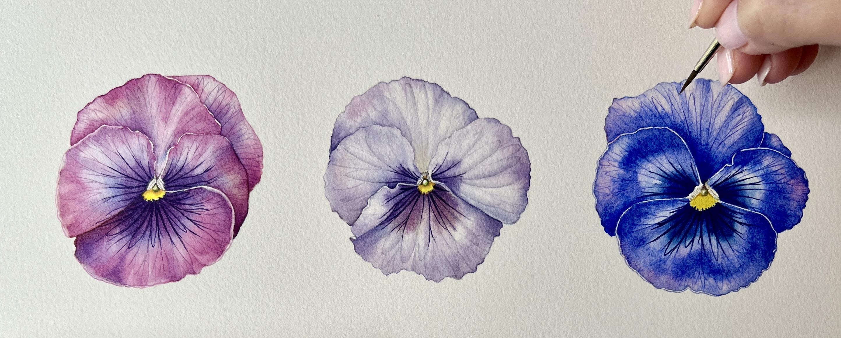
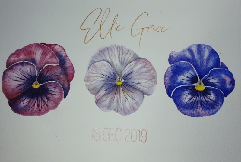
1. Introduction: Hello, I'm Helen, and I'm a
botanical artist and teacher. I've been painting
botanicals now for about 12 years and today, finally back in my art
studio and camper van sky. In this class, we paint together this gorgeous trio of purple
candies with watercolor. I will outline the
materials that you might need and take
you through the process step-by-step to create your own beautiful
botanical painting. This really is the
perfect project to dive deeper into the world of
botanical illustration. I hope that you can join us.
2. Materials: To begin this class, I'm going to talk you through
the materials that we will be using to paint
this trio of pansies. I'm going to be
working on a piece of hot pressed watercolor paper that I've stretched onto
my watercolor board, which is simply a
piece of ply board. You can see too that
I've transferred the pansies onto my
watercolor paper. If you would like to know more about the materials that I use, how I prepare my workspace, draw from life or
from photographs, how I stretch my watercolor
paper and transfer a drawing from cartridge
paper to watercolor paper. And why I do this, I would really
suggest that you take a look at my first
skill share video, which covers all
of these things. I have here next to me a porcelain palette where
I will mix my paints. I also have two jars of water. One I will use to clean my
brush and the other I will use to transfer clean water
onto my watercolor paper. I will be using
these three brushes for the majority
of the painting. These are the series three O
seven from Rosemary and Co. Sizes for 20. They are synthetic but
hold water really well. You will also see
me using my trusty mixing or magic brush
from various marine cone. This is the Shirazi
short flat in size one. I use this for mixing on
my palette as well as lifting paint off the
paper when necessary. In my little ball here, I have two rubbers, a normal firm rubber
and a potty rubber. I use the soft potty rubber whenever I'm rubbing out
on watercolor paper, such as lightening
the pansy outlines as it causes little to
no damage to the paper. The paint that I'll be using for these pansies are all
Winsor and Newton. Artist quality paints. Permanent rose in
damped green-blue, French Ultramarine, perylene,
maroon, and Winsor lemon. Finally, I keep a
piece of kitchen towel nearby to remove
any excess water and paint from my brush. So now we've collected the materials that we're going
to use for this painting, we can move on to
a short warm-up before we start on
our first patency.
3. Warm Up: Before I sit down to
paint on any given day, I always do a short warm-up, just like going for a run
or playing the piano. A warm-up will only improve
the outcome of your effort. I will map by drawing a few circles or ovals
onto my watercolor paper. Then I practiced the
watercolor techniques I'll be using in my painting. But first, we will
need some paint. For this class, we
will be focusing on two main watercolor techniques. Wet on wet and dry brush. Here on my palette, I have a small amount of
in-depth green, blue, but you can
choose any color. I'm adding some water to the
paint using my mixing brush, creating a nice
milky consistency. To practice the
wet-on-wet technique, I apply a wash of clean
water across the area. I want to work it. Be sure to be as
precise as you can. Because anywhere water
goes, paint will follow. You are looking for the whole
shape to be glistening, showing that the paper is wet. But try to avoid too much
water and puddles developing. If you do get puddles, you can simply dry your
brush on your kitchen towel, returned to the paper and lay
your brush while the puddle is that water will soak up from the paper
and into your brush. Then we take some of
that paint we mixed and gently apply this where
we want the color to go. See what happens if you just let the paint do
what it wants to do. But also try moving the paint around the
paper with your brush. Try to keep these
edges nice and crisp, like I'm doing here. If you're finding it difficult, try varying the
amount of water in your paint mix and see if the paint moves
around more easily. Just experiment and
have fun with it. I'd suggest doing a few
of these to warm up. You can experiment with
different mixes of colors and layering more washes
on top of the first ones, it has completely dried. Here, I am adding
a second color, permanent rose, to an
undamped three and blue wash. I'm watching how the
colors merge and blend. One of the most
important things to remember when you're
doing the wet on wet technique is to
stop painting as soon as he noticed that the
paper is starting to dry. If you work when the
paper is drying, dry, you will end up with
visible brushstrokes and you're really struggled
to get a smooth finish. Comparatively. Here I will show you what
happens when you have too much water on the paper. You can see that the
paint isn't absorbing into the paper that's
sitting on the surface. It can become quite
difficult to control. We can use the same
technique I demonstrated earlier to remove
this water and paint. We can dry our brush
on the kitchen towel, then returned to the paper, absorbing some of the
excess water and paint. You will see the paint
then settle into the paper nicely and you regain
control of the wash. For fun, I'm finishing
this wash by blending and damper in
blue and permanent rows together on the paper to create a nice gentle
color transition. The second technique
I always like to practice is a dry
brush technique. When painting our pansies, we will be applying
very fine details of the veins and the petals. And this is what we
need to practice. To create these very fine lines. I take my smallest brush and then some paint
from my palette. I then just gently tickle the surface of the
paper with my brush. Practice this as many
times as you need to. Try varying the
speed that you apply the paint and see what
feels right for you. If you're struggling to
achieve very fine lines. Look closely at the
tip of your brush. Ideally, the tip of the brush
should hardly band at all. If the tip of the
brush is bending, like you can see here, you'll get a thicker line. If you're still finding
this difficult. As before, try varying the amount of water
in your paint mix. Your brush, maybe a little
bit too dry or too wet. To dry will mean that you
struggled to get a line at all. And too wet, you will
get a thicker line. I also suggest that you try practicing drawing the lines in different directions to see if a certain direction feels
more natural for you. And don't worry if
as you see here, your brush lifts off the
paper from time to time. This is just a good
indication that you're working very lightly
with your brush, with a gentle touch. Once you feel warmed
up and ready to go, we can get started
on our first pansy.
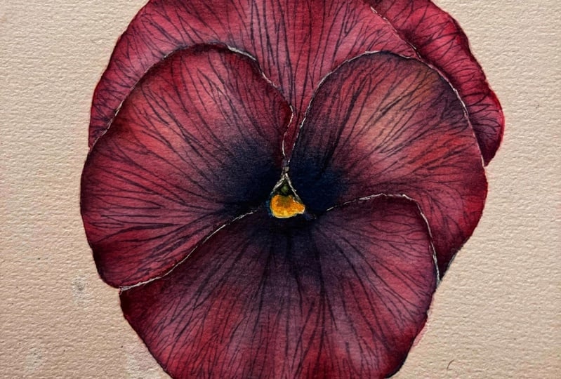
4. Pink Pansy - Initial Washes: So let's get started
on our first pansy. We will work petal
by petal applying washes across each
petal individually. I start here by
applying a wash of clean water across the
entire bottom petal. Make sure that your
brush is clean as well. And keep in mind what we
practiced in our warm-up. We are aiming for that
lovely glistening effect of the water without
too many puddles. Try to be accurate if you can, remembering that anywhere
water goes, paint will go. I'm using my largest brush
for this part of the process. The number four brush
allows me to cover the petal in as few
brush strokes as possible while still moving the water and paint with
precision across the paper. Watercolor paper is delicate. And if you are having to use
many strokes of the brush, you risk irritating the surface
of the paper over time. Additionally, if I was
to use a smaller brush, progress would be slow. And you might find that the
water on the paper starts to dry up before you've had a
chance to put any paint down. If you're working in a
very hot environment, you may even need to
apply a second layer of water to saturate
the paper further. If you're finding
that the water on the paper is drying too quickly. Next I switch to
my size two brush. To start to apply
paint to paper. I will use the permanent rose in density in blue and
perylene maroon. Searching for where I
see these predominant, he is on the petal. I'm always referring to my
photo reference as I work. I'm being mindful of where I would like
the highlights to be. Keeping these completely
white if possible. You'll see I am also
trying to keep paint from extending right to the
very edge of the petal. This is quite challenging, so don't worry too much
if you can't manage that. We may need to capture those white edges later
on in the process. And I will show you
how we can do this. You don't need to focus on the dark purple center of
the petal at the moment, we'll come to this a
little bit later on. You will see that at times
I use my number four brush, which is clean and damp, to move paint around the surface or lift
paint off the paper. I find this a really
helpful technique and often ends up
holding two brushes in my hand at the same time. One that's used for paint
and one that's clean. As it saves me having
to clean and dry my painting brush each time
I want to refine an area. The reason I'm applying
these colors as a base fast is that it will eventually give a
more subtle variation in color across the petals. These different
colors we're applying now will shine through
later layers of paint. And your painting
will appear a lot more complex and interesting. And remember, you can keep working on the same wash for as long as you need to until
the paper starts to dry. If he noticed the paper drying, just put your brush
down and stop and wait. Wait for it to completely dry. We can always add more
layers of wash on top, which is what you'll
see in the next stages. Next, repeat the same process across the other four petals. For these next petals, I'm going to increase the
speed of the video slightly. After watching it through, you may find it helpful to pause the video at the point that
this layer of washes is finished so that you have
an additional reference alongside the photograph to
refer to you as you work. If you are moving on to
paint a neighboring petals, the one that you've
just painted, make sure that the one you've
painted is completely dry. To wet washes touch. They will blend together
and you will lose the crisp petal edges
that you've created. When I am painting, I'm always thinking
about light and shade. The way the petals
relate to one another. Petals that are sitting behind another petal will have a
shadow cost across them. Painting these a
little bit darker or with a bluish hue will make your pansy appear more three-dimensional
and more realistic. Keeping areas that are
catching the light white, allowing the paper to shine through will make
your pansy glow. I always imagined that my light is coming from the top left of my paper to help me picture which areas will
be catching the light, which will be in shade. Here I am moving the paint
around to slowly start to demonstrate some of the veins and indicate the
shape of the petal. Try this yourself. It may take a little
bit of practice. As we spoke about previously, the right consistency
of paint or make this process a
lot easier for you. You can also always
use your clean, damp brush to control the paint exactly as
we've been doing. Watercolor is all about layering to build depth
of color and detail. Don't worry if your
washes the dark than mine or lighter than mine will have a chance to
adjust these as we continue to add more
layers to our painting. Make sure to you that
you're getting up regularly to have small breaks, stretch, and relax your eyes. Botanical illustration
takes a lot of concentration and I'm always having to remind myself of this. Well done. If you finished
your first layer of washes, if you've got some nice
pops of color on your pansy now that will shine through
the finished painting. Next, we are going to
deepen the color of our washes with a
further layer of paint. To start with, mix-up three
father washes of paint, varying mixes of permanent rose and indent three and blue. Ensure one is very pink. E with more permanent rose. One is very blue with
more in-depth in blue, and one is somewhere in-between. Next, we can apply
another layer of water, followed by further
wet on wet washes of varying amounts of the
paint mixes we've created. Again, I am being very mindful of the shadows
and highlights that we've already
identified and tried to capture on our petal already. Here I can also
start to build up the deep purple color in
the center of the petal. Be bold with the strength
of the paint mix you apply. So long as the paper
is wet enough, it will blend out
beautifully into the rest of the petal to get a
boulder deeper color, simply add less
water to your mix. You can see that frequently
the direction of my brushstrokes
follows the direction of the veins and the petal. With many of my brush strokes starting or finishing in
the center of the flower. This is all part of capturing
the essence of the flower. I'm beginning to indicate all the undulations
in the petal surface, as well as the veins
radiating outwards. Keep an eye on your photograph, as well as my painting
on the screen. And look for areas you feel
have a blue hue or pink hue, and apply the paint accordingly. Once again, repeat this process for each of the
following petals. I'm going to increase
the speed for the rest of the
petals like before. You may want to pause
the video at the end of this stage to have an
additional reference to work from as you paint. I really love this
stage of the painting. As you can see, it really
starts to come to life. You can see the
subtle effects of the base colors that we
applied in the previous stage. The white glow of the paper is shining through from
beneath the folds and undulations and the petals
starting to appear with the lights and dark starting
to the pansy shape and form. With each layer of
paint I'm playing, I'm always focusing on keeping my edges really crisp and clean. Being very intentional about
where I put my brush down. In certain very saturated
areas in the Pansy, such as in the center. I'm being bold with the amount
of paints I'm laying down. Just wait until you've added in the detail of what
you will do shortly. And then the final center point. I am so excited for you to
complete this painting. Your pans, you should
really be coming alive now, depending on how your pants
he looks at this stage, you may want to do a fad wash, a dark in the center
of the petal. For this, you don't
necessarily need to bring your water wash across
the entire petal. But makes sure to
extends far enough to allow for any bleeding
of the paint from the center to ensure you get a smooth transition in
your wash. Once again, just make sure that the
paint has completely dried before moving onto a wash
on an adjacent petal. Fantastic well done
for getting this far. Next, we will move
on to adding in some of the details on the petals.
5. Pink Pansy - Details: In this next stage, we can start to add some of the detail onto
our pansy petals. If you look very closely
at your photograph, there is a fine network of veins running
through the petals. We're going to try and capture
these in the painting now. Mix up a color that you feel matches the color of the
veins and the petal. This can be difficult
to see accurately, but it might be that
the mid tone of the Permanent Rose
and in damped three blue that you mixed up for the previous layer of
washes works well. Here I am also adding a very small amount
of perylene maroon. I personally will always do
another short warm-up of the dry brush
technique that we'll be using to add the detail. Before I move on to
the painting itself. Just a minute or so sometimes
is all it takes to get a feel for the technique before moving on
to our painting. Once you feel ready, slowly start to add in some
of those veins that you see. Try to keep your lines about the same darkness
as mine. Too light. And you weren't see all
your hard work when further layers of paint
are applied on top. Too dark and there'll be
two dominant on the petal. Don't worry about making the veins in the
center that very, very dark purple just yet. We'll get to that. Just focus on building the structure and
network of veins that you see. The most important
thing here is trying to keep the veins as fine
as you possibly can. Remember, just
tickling the surface of the paper with your brush. Keep going with this process
and keeping an eye on your reference photograph
to make sure that you're capturing the veins as
accurately as you possibly can. Once you've finished, you may take the pansies are looking a little bit stripy.
Don't worry. In the next step, we are going to
apply a final wash on top to help those veins to settle into the watercolor paper and settle into our pansy. Let's move on to that stage now.
6. Pink Pansy - Final Washes: For the next stage, we can mix up two final colors similar to the ones
we used previously. This time tried to see what
you feel your pansy needs. Does it need to be a little
bit more pink, for example? If so, mix-up one pink, your paint mix and another
darker purple mix. Then after applying a layer of water across the whole petal, just as we have done before. Start to slowly
apply your paint to the areas that you feel
need further color. I'm particularly focusing on the areas in the shadow still striving to keep my highlights
as white as possible. You'll notice that the
veins you've just painted in become a little
bit more subtle. But they should very
much still be visible, particularly in the paler
areas of the petal. What we're looking for
is that those veins to settle into the paper, almost like they're
becoming a part of the petal rather than
being stuck on top. Once again, remember
to wait for each petal to dry before moving on
to an adjacent petal. I'm going to speed
up this part of the video slightly
so that you can see me painting the rest of this petal and the
other four petals. So we really are so close to
finishing off first pansy. We just have a few final
details to finish off, which is what we'll do now.
7. Pink Pansy - Final Details: To finish off our painting, we can start to add
some final details. First, I'm going to add a little bit of Winsor
lemon to my palette. Once I've added a little
bit of water to the paint, I will mix a natural
green by adding a small amount of
indent three and blue. Then we can take some of the pure Winsor Lemon and apply this directly
to the yellow center. When you're doing this,
be careful not to pick up any of the purple
in the petal, as you will end up with
a muddy gray color rather than that vibrant
yellow we're looking for. You may have noticed the small green sphere in the center. This is the stigma for Pansy. We can paint this using
our mix of Winsor, lemon and indent three in blue. I start by just outlining
the sphere in a dark green, leaving a small amount of
the sphere perfectly white. Then add a small amount
of the lighter green, still keeping a tiny highlight, then adding more
shading if necessary. Next, the very small area above the green sphere and needs
to be extra dark as very, very little light is
reaching this area. To make it dark gray, we can add a small
amount of pink to our green mix to get a
lovely natural gray. I don't own a tube
of gray paint. I only ever mix my own with the colors already
on my palette. We can then carefully define
both the dark area above the green sphere and the
stamens on either side. Trying to add a little bit of texture to beat, if possible. Here I am mixing up
an even darker gray just to get that area
above and around the sphere a little extra depth. Adding a small amount of perylene maroon to the
Winsor yellow gives us a lovely warm yellow
we can use to add a little bit of shadow
to the yellow center. I'm then adding a tiny bit more dark gray to the petal
second from the back. These details may
not seem like much, but can really elevate
your painting. I always want to make sure in any painting I do
that I've included the full tonal spectrum from completely white
to almost black, as this will make the painting really pop out from the page. The final thing to do before we can say our
painting is finished, is to define these
very dark veins and the center of the petals. To do this, we can take
our darkest mix of purple that's more in depth through in blue
than permanent rose. Using our smallest brush, as with the veins before, we can gently apply this dark blue purple color to where we can see those
very dark veins. Remember just
tickling the surface of the paper with your brush. And if you need the
lines to be a little bit thicker than putting a
little bit more pressure through the brush tip. Finally, I am just going
around the edge of the petals, too, crisp them up. And to define the
very tiny white edge that can be seen on
some of the petals. I'm using my magic
brush for this, the same one we used for
mixing paint on our palate. It's very likely that
you may have lost these white edges to some degree when
applying your washes. That's okay. We can give an indication
of them at this stage. I'm also lifting off a
few more highlights with the same magic
brush just to keep emphasizing that glow
that we're looking for in the petals. There you have it. Your first pansy of
the trio is complete. Take a break, make a cup
of tea, stretch your legs, and then we can move on to the lovely subtle
pansy number two.
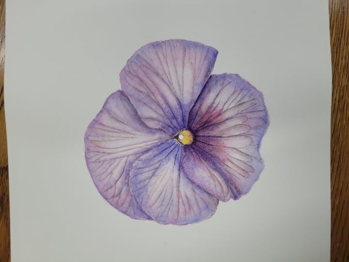
8. Purple Pansy - Initial Details: So before we start
pansy number two, the first thing to do is just double-check you
have everything you need. I've got my reference
photo close by. My paints exactly the same
as for the first pansy. Winsor Lemon and
dumped green-blue, perylene, maroon,
and permanent rose. I have my two jars of
water and my brushes. My paper is also nicely
protected with kitchen roll. For this pansy, we're
going to start with things a slightly
different way around. This time, we will be
starting with the details. This introduces a slightly
different technique, which I hope you'll find it
interesting and fun. Fast. I mix up a lovely natural gray, just like we did for
our first pansy. Use just three colors, yellow, blue, and
the permanent rose. Try to find a gray whose color you feel matches the Pansy, soft, subtle and warm. Test it out on a scrap of paper to ensure
you're happy with it. Now, taking your smallest brush, we're going to start by drawing in those vein details again, just as before with
the gray paint. Using the exact same technique, a gentle tickling
of the surface, ensuring that your
lines not too dark. And I was fine as you can make them keep carrying across
all of the four petals. Keeping a close eye on your
reference photo as you go until you've completed all of the visible veins in the pansy. Once you've completed
all the veins, we'll then going to add a
little bit more shadow to the Pansy before we start
applying our washes. For this stage,
we're going to use a slightly different technique
we haven't used before. You'll be using both your number two and number four brush. Pick up some of the
same gray you have used for the veins with
your number two brush. Apply this to the areas of
the Pansy that are in shadow, where the light, if coming from the top left, be reaching. As soon as you've
applied the paint, take your number four
brush that is clean and damp and blend out the
gray into the puzzle, creating a smooth transition
across the petal. It's really important
to, to this, whilst your initial paint that you've applied is still wet. You can see how the
petals in front that in this totally
thrown forwards, creating depth and shape
within the flower. We can also start to add the same shadowing
into any creases, false and curves that you
can see in the petals. Just make sure you don't go
too overboard with this. We want to aim to
keep as much of the petal as possible, white. Diving into even more detail, we can start to define some of the veins in the petal
a little bit more. If you imagine that the areas in between the veins are
like little pillows, or that the veins run
like rivers and valleys, causing undulations to form across the whole
surface of the petal. Once again, if our light
is coming from the left, then the light would be
catching the left-hand side of these little pillows and
not the right-hand side, which will have a
very subtle shadow. If we demonstrate this
using the gray paint, it will bring even
more interest to elevate up hand the
painting to the next level. Taking it from great
to exceptional. Essentially what we
should end up with is a beautiful gray scale study of our pansy already for beautiful color to
be applied on top. Which is what we'll
move on to right now.
9. Purple Pansy - Initial Washes & Correcting Mistakes!: So now we've got a lovely
grayscale painting on paper. We can start to add some color. Start by mixing a soft
purple using in-depth green, blue, and permanent rose. Mix up quite a good
amount of this. Then mix up a slightly
more blue version of the same color and a
slightly more pink fashion. So you eventually have
created three paint mixes. Finally, prepare a small
amount of perylene maroon. We're back to using our lovely
wet on wet technique now. So start by applying a water wash across
your first petal. Remember to ensure that
your brush is completely clean using nice fresh water. Then take some of your
washes and start to apply these to your petal over
the top of your detail. Keep looking at your
reference photo and try to pick out the areas that have a slightly
more pink Q. And those were slightly
more blue hue. This ensures that we have some subtle variation in
color across the Pansy, giving the finished painting
some interest and finesse. Remember as always to keep
some of that paper white, where you might expect the light to be catching the petal. We're aiming for soft and
delicate washes at this stage. Repeat this process over all four petals using that
same wet on wet technique. Remembering to ensure
the adjacent petal is completely dry
before adding water. You'll see here in this corner, I'm applying a small
amount of perylene maroon. I could see this very subtly
in this area of shadow. See if you can see this
in the picture yourself. It's very subtle and we all see color
slightly differently. As before. You may want to pause the video at the end of this stage to use my painting as an additional reference
as you paint yours. If you watch very closely
in this part of the video, you'll see how easy it
is to make mistakes. It happens to everyone. This is why I always
encourage you to keep your paper
covered as you work. Which perhaps I wasn't
demonstrating perfectly here. See how my hand just
touches my palette. I hope you can learn
from my mistake. But I'm going to use this
as a perfect example to you of how you can correct
mistakes like these. You can see I hadn't even
noticed that this had happened. There are a number
of ways that we can help in this situation. The first is that we can
try and blow it up as much of the paint
as possible with tissue paper whilst it's wet. Or we can take our magic brush, which is completely clean
and damp to start to lift off some of the paint as
we would do in a painting. An alternative though,
is to use this sponge, is called a magic eraser and a commonly used
as cleaning supplies. The gentle abrasive
in these sponges can be the perfect
tool to lift up paint. We put a small amount of
clean water onto the sponge. And then using a gentle
scrubbing action, we can lift the paint
from the paper. Now here, unfortunately
the mistake happened on part of my painting. A good thing in one sense
because we can cover it up with paint when we
paint our third pansy. But it does mean I have to be extra careful using
this magic eraser. It does damage the
surface of the paper. The paint reply later may
not lay down quite as well. I can be a little bit
more aggressive with this area outside
the painting itself. And essentially here
I'm aiming to get all of that stain removed. The final option available to you if this happens on
a painting that you're working on is to cover up
with another illustration. You can either add
another flower or leaf to that area or even a little. Be. The moral of the
story is don't despair. If something like
this happens to you. Most of the time it's
fixable and it's honestly an inevitable part of the painting process will
happen from time to time. So after that little interlude, our first layer of washes
is definitely dry. Now my paper is properly
protected again, we can start to
mix up some color for our second layer of washes. I'm looking closely at my
painting and the reference and working out what color I
feel my painting needs, choosing quite a blue hue
to mix for this next stage. I also prepared a little
bit of the Winsor yellow, which we will apply
at this stage to repeating the process
of laying down water fast. I am then applying some
of this lovely purple across the Pansy, particularly focusing on
areas of shadow. This time. You can see my brush
frequently following the direction of the veins
as we did in the last pansy, continuing to bell shape
and form across the petal. If you look closely
at the center of the petal on our
reference photo, you may notice that amongst
the darker purple hue, there is a very
subtle yellow glow. I'd like to capture
this if we can, but it's not easy. What I'm gonna do is take a small amount of
the Winsor yellow at this stage and apply it to the inner part of the petal
where we can see that yellow. Just be careful at this stage
not to mix the purple and the yellow together on your paper whilst
they're both wet, just drop the yellow in. Otherwise you risk
making another gray or a brownie
color on your paper. Continued to add any
more shadows and definition you need to
ask the paper is wet. Remembering to stop working as soon as your paper is dry or drying to prevent a harsh
lines across the petal. Repeat this process
across all four petals. Keeping those highlights and striving for subtlety of color. I'm going to speed up the
video a little bit now so that you can see me painting
the rest of the pansy. Well done. I hope you please
go pansies your file. Next, we'll move on to adding
some of the final details.
10. Purple Pansy - Final Details: Now that we have our
washes laid down, we can finish the painting
with some final details. The first thing we
will do is add in this lovely dark
centers to the petal. So start by mixing up a lovely
bright pink that matches as closely as possible to
that center burst of color. And a strong more blue
purple color too. I'm going to start
with this petal folds initially using a wet on wet wash and the dark
purple to add in that deep hue that I
can see in the center. Then that brighter pink as it extends towards the
outside of the petal. I am then moving on
to the other petals. If you feel that there are
areas of the petal that need more color in
addition to the centers. Then you can go ahead and
add that now as well, like I'm doing here. Repeat this process
over all four petals. Once again, I'm going to speed
this process up a little bit so that you can see me painting the majority
of the flower. Notice how when we overlay the pinky purple wash
across the yellow center, you get that blend of
colors that we see in the flower without ending up with a muddy
brown gray color. It's a lovely effect and
only achieved by layering paint on the paper rather
than mixing on the palette. Here, I'm just lifting off a slight highlight
where my watch has creeped a little too far. Once you're happy with
your final washers, we can paint the very
center of the flower. Just like we did for
our first pansy, makes up a lovely green to
paint in the center sphere. Remember to keep that
lovely little highlight. These details, make
all the difference. Then clean your brush to
ensure that you are picking up pure Winsor Lemon and painting that lovely vibrant
yellow center. And using that mix of
Winsor lemon and perylene maroon to create that
beautiful little shadow. Here, I have taken some purple. I'm just feathering
that transition from yellow to purple slightly, just like you can see
in the reference photo. I'm taking some of that gray we used for our initial details and using this to define those lateral has either
side of the stigma. And finding that very, very dark black
point in the center. I'm also using some of that yellow and
perylene maroon mix to add the color above
the green sphere. The final thing we
need to do is add in those striking dark
blue purple veins. Here. I'm mixing up strong mixes of the indent three in blue and
permanent rose. One that is slightly more
strongly blue than the other. Then using my smallest
brush and just like before, we can draw in
these little veins. Remembering to keep looking at your reference photo to be
as accurate as you can be. To finish off, I have mixed the gray with a small
amount of purple. And I'm going to define some of those pillows that we
described without gray ion. He may not need to
complete this stage, but I felt my needs a
little extra definition in certain areas. I really feel like
this just adds a little bit more complexity and interests of the painting. Really drawing your eye into look at all that
beautiful detail. I also use this stage, do any other tidying up
and crispy of the edges using either my size two brush on my magic brush
when necessary. There you have it. Your
second pansy is now finished. We can move on to the final one, a lovely blue one, to join this little duo.
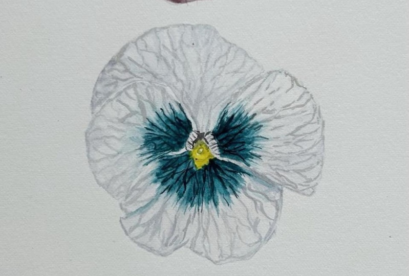
11. Blue Pansy - Initial Washes: For our last
beautiful blue pansy, we're going to add
a little bit of French ultramarine
to our palette. Then I'm going to mix some of that French ultramarine
with a little water, creating a milky consistency. I'm then also going to
make another mix of French ultramarine with a
little bit of permanent rose. Then after cleaning my brush, I'm going to take some
permanent rose in pure form and create
another little mix of this. In this pansy, we
will also be using a small amount of the
indent three in blue. Once again, like
our first Fancy, we're going to start with some bright washers using
a wet on wet technique. I'm going to start by applying just a pure French
ultramarine and the pure permanent rose to create a lovely bright underpainting
as we did before. As always, remember to keep those highlights where you imagine the light maybe hitting the petals and search
for the tones you feel having more blue hue and those
that have a more pink hue. One thing to be
mindful of hair as the color transition
across the petals. You'll note that you have
the very dark center, but then the petal lightens
before darkening again towards the edge of the petals
and then lightening again. We'll try and capture
this. If we can. Continue this process across
all four of the petals, you can see and
don't be afraid to be bold with the amounts of
color you're putting down. Long as you have those
highlights kept clear. This pansies like a joule. So we will need to have lots of that bright
color on the paper. After that first layer of
washes is completely dry, I'm going to apply
a second layer just as we have done with
a wet on wet technique. But this time I'm going
to use predominantly the mix of French ultramarine
and permanent rose. If you feel that you need
to add a little bit more permanent rose or
French ultramarine across the petal
to then please do. Just keep a close eye on
your reference photo and add what you feel
you're painting needs. Pay particular attention to
the areas that may be in shadow and begin to
darken up their centers. Remembering that soft transition of color across each petal. If my purple mix
starts to blend too far into the areas I'd
like to keep pale. Then I use my clean, damp size four brush just to
lift off some of that paint. Remember to keep your
edges as crisp as you can when you're applying
each layer of paint, your pans, you should be
looking really bright now. And so we can begin
to add some of that detail that you are now
so well-practiced. Stop.
12. Blue Pansy - Details: To begin this stage
of our painting, I'm starting by mixing a fairly strong mix of
French ultramarine and a small amount of permanent rose to create a
lovely rich purple. Once again, the technique, you know so well now I am using my smallest brush and laying
down those fine details. I hope you're finding
this process a little easier than when you started. If you're gaining confidence, try very slightly adjusting the width of the
lines in this pansy. A little bit thicker and
darker in the middle, making them as fine as he
possibly can right at the edge. Be mindful of which
direction painting the veins in feels best for you. You can always turn the paper to make it easier for yourself. Keep going just as before, until you've completed
the whole pansy. Well done. Now as I'm
sure you've guessed, as you get familiar
with this process, we can move on to adding our
final washes onto our pansy.
13. Blue Pansy - Final Washes: We're now going to use our final washers to both
continue to add depth of color, but also to soften some of
that detail into the petals. To start with, I'm going to
make some lovely dark washes. This is once again the mix of French ultramarine
and permanent rose, creating a nice
rich blue, purple. Mixing a good amount
of it onto my palette. I'm also going to take some
of the in-depth green, blue, just pure because it's
already the perfect color for that center color of
the bottom three petals. Apply the wet on wet wash
carefully across your petal. You may notice that some
of the paint picks up a little bit from the
paper. That's okay. To try and reduce this, you can avoid
dragging your brush too harshly across
the paper surface. Instead of imagining
that you are just moving the water
across the paper. Some paints will be a
little bit more staining. Either pick up less from
the paper than others. For this reason, if you're
working on your own projects, it's always a good
idea to test out the technique and the layers that you're going to
use for your project. I'm starting here by applying the indent green-blue to
the center of the petal. Looking closely at the
pattern and lifting off any paint that creeps into
the middle of the petal. To keep that lovely
butterfly wing effect. I meant adding some of
the French ultramarine and permanent rose mix across the areas of the petal I feel need
a little more color. You can see that when I do this, those veins settle into
the paper once again, that although they're
still visible, they look more natural
and as if they are truly within the petal itself. Continue the process
across all the petals. Notice that I'm trying to keep that lovely pale light around the edges of the petals that you can see in the
reference photograph. It's easiest to demonstrate this line where the
petals are overlapping each other rather than on the outside of the petal itself. Although we can add the line on the outside of the petals using our smallest brush and a
relatively watery pale pink mix. And you will see me doing
this at the end of the video. I'm going to increase up the speed of the video
from this point. So you can see me applying the washes to the
rest of the pansy. Here you can see me tidying up the edges of the petals and continuing that
lovely white edge with a dry brush technique, just giving an indication
of this color change. While we are so close to
finishing our trio of pansies, just that final
sensitive focus on now.
14. Blue Pansy - Final Details: Well, the final chapter
of our project, putting the last details on
our last pansy. Well done. If you've come this far, here, I have mixing up some
pure Winsor lemon and a mix of Winsor lemon
and indent three in blue. Finally, a mix of Winsor
lemon and perylene maroon. I'm sure these colors
will be familiar to you and what you would be
expecting as they are, just as they were for
the first two pansies. I'm starting with the
lovely yellow center. And show your brushes
cleaned that you're applying pure yellow and apply it directly to the
entire yellow center. Then once again, use your mix of Winsor yellow and perylene
maroon to apply the shadow. Here, I'm just
blending the shadow out with my clean
size four brush. I have just mixed a gray hair using the yellow and a mix of purple to add in that dark
shadow above the stigma. You can see how this instantly
gives the painting depth. I'm adding a tiny amount of
this behind the stigma and using it to add some detail
to the lateral hairs as well. Then finally I'm adding the
green mix to the stigma. Remembering to keep
that little highlight. Last but not least, we can
paint in those lovely veins in the petals with the dark
mix of in-depth in blue. Look carefully at the
reference photo to see how far this darker
coloration extends. Note also how I am
bringing these veins across into the
yellow a tiny amount, just like in the photograph. Repeat this process across
all of the five petals and do any other tidying up of the painting that you
feel is necessary. Then you have your final pansy is complete and you
have your trio. Thank you so much
for joining me in this painting of a
trio of pansies. I really hope that you
enjoyed the class. Please share your work
in the project section below because I'd love to
see what you've created. Don't forget to follow
me on Skillshare if you want to be kept in the
loop about my next class. You can also see more of what
me and sky are up to you. And my YouTube and
Instagram pages. See you soon.
 Helen Cousins, Botanical Illustrator & Teacher