Transcripts
1. Introduction: [MUSIC] In this class,
we're going to focus on doodling simple leaves
for relaxation. If you love the idea of doodling simple botanicals
to help you unwind, then this will be a great
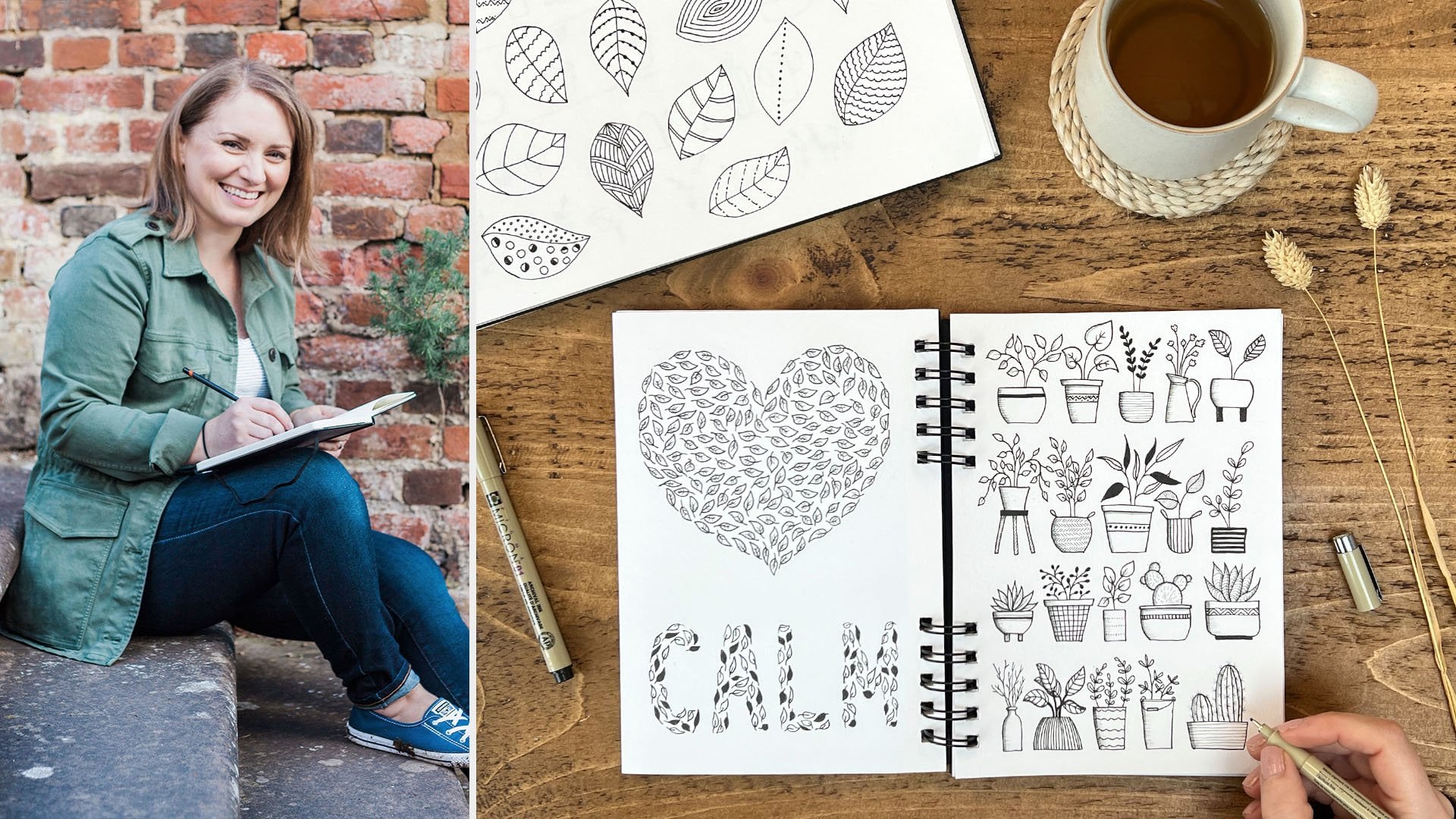
starting point for you. Hi. I'm Shalone Stephens, an artist and author, specialized in watercolor, illustration, and
modern calligraphy. I'm also a clean doodler
and a top teacher here at Skillshare with over 18 classes. You may have already seen my introduction to doodling
class for beginners, which is a great general
starting point if you're completely new
to doodling or drawing, but you do not need to take that class before
you start this one. This class is aimed
at anyone who wants to start
doodling botanicals. You do not need to
have any experience at drawing or doodling, the only things you should
need to take this class are a pen or pencil and
a piece of paper. This leaves class is a start of a series focused on botanicals, showing you how to
simplify them so that they can be really
relaxing and enjoyable. I will show you how to
break the leaves down into simple shapes and create endless varieties by changing simple elements like the shape, size, details, or distribution. We will doodle a whole
page of leaves together, to give you inspiration
for more doodling. Then I will show you a few ways that you can apply them to fun little projects,
like dividers, to add underneath your titles, bouquets and ways for cards or journals and really simple but lovely
gift tags and bookmarks. I'll also be giving you a look into sketchbooks to give you more inspiration for other simple yet beautiful
doodles and designs. I hope you are ready to
start some doodling. Grab your pen and paper
and let's get started.
2. Supplies: Let's talk supplies. As I mentioned in
the introduction, you really only need a pen
or pencil and some paper. You can still easily get started with whatever you
already have at home. For paper, you can use
any paper you have. Some printing paper will
be absolutely fine. I like to use sketch
books for my doodling. These don't need to
be anything fancy, you can get some really
cheap sketch books from your local arts and craft stores or even from the supermarket. When I'm using pen or pencil, I'm really not that fussy
about what I'm using. In this class, I'll be using this A4 sketchbook for
most of the doodling. This is an Art Deco
sketchbook with paper that is 150 grams per square meter which tells you how thick it is. You'd see this as 150
GSM on the label. Just to give you a comparison, printing paper would
be about 80 GSM, so this sketch book
paper is a bit thicker. Most normal sketchbooks will
be 80 and 200 GSM in weight. I tend to like to go for the slightly thicker paper in the sketchbooks because I just like having that thickness, but it also means that
you won't be able to see the pen through
on the other side. Sometimes I also like to use mixed media sketchbook
for my drawings or I like this small skin
mini pocket sketchbook. This is actually a
watercolor sketchbook, so it does give me
the option of adding some color with
watercolor to my doodles. But it's also got this nice
texture and thickness, so you can doddle on either side and you won't
be able to see through. As I'll show you
throughout the class, I like to doddle especially
leaves in my journal. This is a Scribble
& Dot journal. This one has these dots on it as do a lot
of bullet journals, which just really helps with
layout and composition. Also just so you can keep your
texts in a straight line. The other paper that
I'll be showing you a bit later on
in the class is Bristol paper and
this is 270 GSM. Fairly thick again, but this
has got a smooth surface. I'll be using this for some of the gift tags and bookmarks
later on in the class. In terms of pens, again, you can use
whatever you have. If I don't have my nice
fine liner pen handy, I'll just grab
whatever's nearby, whether that be a pencil
or a biro or anything. I like to use these uniball pens and these Pigma
Micron pens because they both have a nice flow and they also vary in thickness. These Pigma Micron
pens you can get in sets from the smallest, which is 0, 05 to 08
which is the thickest. I'll be using this
02 in this class for finer details for the
leaves and the uniball pen, which is slightly thicker. I'll be using the micro or the fine pen for the outline or for
slightly bolder leaves. I'll also be using a pencil on some occasions
throughout the class, if I just want to map out something before we
actually put pen to paper. It'll be useful to have
a pencil handy as well. The other things that you'll
need throughout the class include a rubber or eraser and something circular to draw around for when
we get to the resection. I have these metal
circles which are from my die cut machine and I have
them in different sizes, but you can easily
find something that's circular around the home
that you can draw around. Perhaps a draw or a bottle or a small plate depending on
how big you want it to go.
3. Tips: Before we get started
doodling our leaves, I wanted to share some
quick general tips with you so that you
can get the most out of doodling these leaves
as a relaxing activity. The first one is
to keep it simple. If you're a complete beginner, and worried about starting, just start by keeping
everything really simple. Doodling can be especially great for those times
when we're busy and overwhelmed because
it doesn't require time or decisions or pressure. Just taking a few minutes to doodle the simplest of leaves and just repeating them
can still help you to relax and get you started. Starting really
simple will give you more confidence for going
on to experimenting more. My second tip is to focus on the process and
remember to breathe. My main goal when doodling is
to relax and enjoy what I'm doing to find a few minutes
of calm in my busy day. Whilst I'd also like to create something that's
nice to look at, that's not my ultimate priority. If you find you are a
bit of a perfectionist, then you may just need to remind yourself of this
every so often to allow yourself to focus more on the process and how
it's making you feel, how it's calming you, rather than the end result. I've mentioned this before, but seeking perfection
in your artwork is the enemy of relaxing and
being creative in general, because it would just
make you frustrated and less motivated
to keep going. One way we can feel
more connected in the moment is by taking a few deep breaths when we get started to feel calmer
and more grounded. I talk about breathing a lot, especially in my watercolor
for relaxation class. But it's so important
to help you feel relaxed and it can be very easy to hold your breath when
you're drawing or painting, especially if you're worried
about getting it just right. Keep checking in
with your body and your breathing and slow
down your pen strokes in rhythm with this
and make sure you release any tension that you're
holding in the shoulders. This can include in
your hands if you tend to hold the pen really tightly, just try and loosen
that grip a little bit. Focus on the goal of
relaxing so you can enjoy what you're doing
and remember to breathe. My third tip is, don't worry about
being realistic. These generic leaves are some of my favorite to doodle because you can just make them
up without having to think too much about
what you're doing. There were just endless
variations that you can doodle just by changing some
of the elements slightly. I'll show you how to
do this in the class. You don't need to
use a reference, they don't need to be realistic. There is absolutely
no pressure here. Finally, look for
inspiration all around you. There is so much inspiration all around us that we might
not have noticed before. Keep your eyes open, especially when you're
out and about on walks or looking at different
plants or even patterns. Whenever I go on a walk, even on the school run, I'm always looking at the
gardens or trees that we pass to see the different
plants and leaves. You'll be amazed at how
much variety there is. Again, going back to
the last tip that these doodles do not
need to be realistic. You don't need to recreate
what you see on these walks. But keeping your eyes open
can really help to give you more and more inspiration for different versions of
doodles you can make. I also find inspiration
from my past work. For example, I
might look through my sketchbook and see a particular element
that inspires me, like the contrast between
these two leaves, and then decide to use
that in a future piece. I hope these tips
have been helpful. Let's start our doodling.
4. Practice 1: Shapes: If you have watched
my introduction to doodling for relaxation class, then you will have already
practiced doodling some of these simple
leaves with me for the potted plants and started to look at
how we can vary them. Now we're going to go into
this in more depth so that these leaves can stand
on their own and we can create much more variety. Don't worry if you haven't
seen that class yet, you don't need to
before you do this. To start with, we'll look at individual shapes
of the leaves so that I can show you
how to vary them to achieve a wide range of results. I'm sure you've
doodled leaves at some point in your
life and it probably resembled a basic shape with two curves either side and coming to a point at either end. We can add a small stalk here to just let us know which
way the leaf is facing. This is a very simple basic
leaf shape to start with. A variation of this shape would be to curve the base
so it's more of a teardrop shape and
something as simple as this change can make your branch look quite different
once it's finished. Because this curve at the base can soften the overall
look quite a lot. We can also flip this
so that the point is at the base and the
curve is at the top. This is one of my
favorite styles to doodle because it has a much
more gentle feel to it. Another variation is
that we can bring the base off a little and
then bring it downwards, bringing it back up
to that point so that it resembles a heart shape, and we can also add some lobes, bringing it in a few times, curving at the top, and then doing the same
on the other side. There we already
have five variations of the basic leaf shape
and at each of these, we can vary even more by just changing that
starting shape. We can elongate them, making them thinner or we can make them wider and shorter. We can also change the
size of the pen we're using to make a
more delicate leaf. I think this is a
really great way to exercise those creative muscles, trying out different variations
in a really simple way. Let's start with the first one. I'm going to draw a little
arrow. We can elongate this, making it thinner or we can make it shorter and rounder or we can switch
to a smaller pen. With this, I'm going
to do the same shape, but I'm going to make
the lines a bit wobbly here so it looks
much more delicate. Let's do the same with this one. Again, you can elongate this, making it taller and thinner. We can make it
wider and rounder. We can make it much
more delicate. With this one, we can always
make it like a circle, like a eucalyptus leaf. These look like
small variations, but once you've turned
them into a branch with multiple leaves on they
can end up looking really quite different which
is really nice. For this last one as
we make it taller or we can add a lot more
of those lobes in. We could also sharpen up those curves so it ends up
looking quite different. This is just an example of a
few different variations of the basic shape plus how you
can change each of them. If you have any other ideas and inspiration
that's coming up, you can add them in right now or any more changes for
each of the shapes. In the next class,
we'll move on to adding different types of
detail within these leaves, which again, will
change them even more.
5. Practice 2: Details: Now we have all of these different varieties of the basic shapes of the leaves. We can think about
different ways that we can fill them in. I'm going to use my smaller
Size 2 micron pen for this, just so the details are a little bit finer than the outline. [NOISE] One way we
can add some details, which will be the
suggestion of a vein is to start from the base and do
a flicking line upwards. When you flick this, you just quickly move the pen forward and lift
it off the page, and it means that line
will taper slightly, getting lighter towards the
top so it's quite delicate. We can draw a line straight down the center from the
top to the bottom, and then add some veins on either side slightly
curved upwards. We can start from
the base and use multiple flicking
lines and a bit higher in the center
and this just gives it this nice effect of a
shadow at the base. This is what I like
to use quite a lot. We can add that center line, and then instead of having these solid lines for
the veins either side, we can do these flicky lines, just curving upwards
as we lift the pen up. We can also do the solid veins
but with with less veins. With this one, I'm
just going to do them where it reaches that lobe. We can draw some vertical
lines all the way along. We can just do one single line
from the base to the top. We can also color the
whole leaf and so for this I'll use the thicker pen. [NOISE] This can create
some lovely contrast, especially when you
have a design with lots of different branches, it can really stand out. With these more delicate
leaves at the bottom, we can continue with these delicate wobbly
lines for the veins. Instead of having a
really straight line, just use a really light touch. The pen isn't as straight. It just gives it a
more delicate feel. I encourage you now to
continue filling in these leaves on your own using the same details we've
already practiced because they will look different within a different leaf, or you may have had
some inspiration of your own for how to
fill these in. [MUSIC]
6. Practice 3: Distribution: Now we have an idea of the variety of leaves
that we can make. We can start to
think about how to create branches out of them. The size of the leaves that we choose to use and the way we distribute them along the branch can create very
different results. If we use our first
leaf shape as an example with the curved
edges and the pointed top, the very basic shape, we can use larger leaf
sizes making them quite big and just add
perhaps two leaves. Start with a curved
line agile leaf and then partway up bring another branch maybe going a bit higher and add another leaf. There's one way we can
keep it really simple. We can draw a curved
line for the stem, add one of these leaves
at the top probably a bit smaller and
then going down each side add a small stalk curving upwards and then another leaf and then
on the other side at the same position do another one and then just carry
on working your way down. So this branch is very
simple and very uniform. We can start again with that curve line with
the leaf at the top. But this time we can make these leaves appear at
alternating points on the stem and remember each of these can be adjusted by varying the
size of the leafs, bearing the number of leaves so you could have these
a lot closer together and smaller lot more of them or you could have just
a few of them and that again will make it look a lot different which
is really nice in a design with multiple branches where you want to create a lot of contrast and difference between all of the leaves
that you're doodling. Another way you could
do it as curved this line perhaps making it more of an S shape and your leaf at the top and this time we can bring these
stems off but add perhaps two or even three leaves coming off of them and maybe some of them
will still have one. Bring this up and maybe
have three on this one and maybe just one
curling in there. And then we'll want
to bring out a bit more to balance out so I might do one with two one there and then just
add one more in here. That's a bit more random with a lot more
leaves coming off the edge. Again it's quite a different
look to the others. We can draw part of the stem and I like to do
this when I want to create a more random look a bit more of a chaotic look with the
leaves with some of them overlapping this center
branch so then I would draw a leaf and then
bring this stemmed down, curving round back to that
main branch and then you can carry on this line and I'll
add another one off here. I might do one more curving round the top here. Bring this up and
then add one at the top and then you
can just fill them in and another one through here. Because as you go along just keep looking back
at it and thinking, is there anywhere that needs
a bit more balanced to it. I might bring another
leaf down here. You can also do the leaves overlapping one another
so if I added one more in here you just
drove up to the leaf, follow the pen through over the paper obviously
without touching and then carry on down which gives it
a much more organic look. You can vary the sizes of
the leaves within a branch. If we start again with that curved line we might want to start at
the top with a small leaf and another thing you
can do is connecting these leaves directly
with that center stem so removing these stocks and that will again
create a different look. What we're going to
do with this one is as we move down we're going to make these leaves
slightly bigger. We can also make them different sizes as they alternate
down the branch so start with one at the top or perhaps to a small one
and then a large one all the way down and obviously they
don't have to look realistic this is just
about doodling for fun. Again I encourage you to
continue filling your page up. Just thinking about
different ways you can vary the branch using the same shape of
a leaf rather than thinking about copying
something directly. I know a few students
have said to me they struggled
to come up with the ideas themselves and it's easier to replicate something. But I think doodling is a great way to just be able
to sit down with your pen and paper and have the freedom to try different things
without the pressure. Continue practicing these with this leaf shape to see
what you can come up with. Vary the sizes of the
leaves, the distribution, the number of the
leaves there are lots of different ways
that you can vary them and then in the
next video we move on to creating a whole page of different leaves
together. [MUSIC]
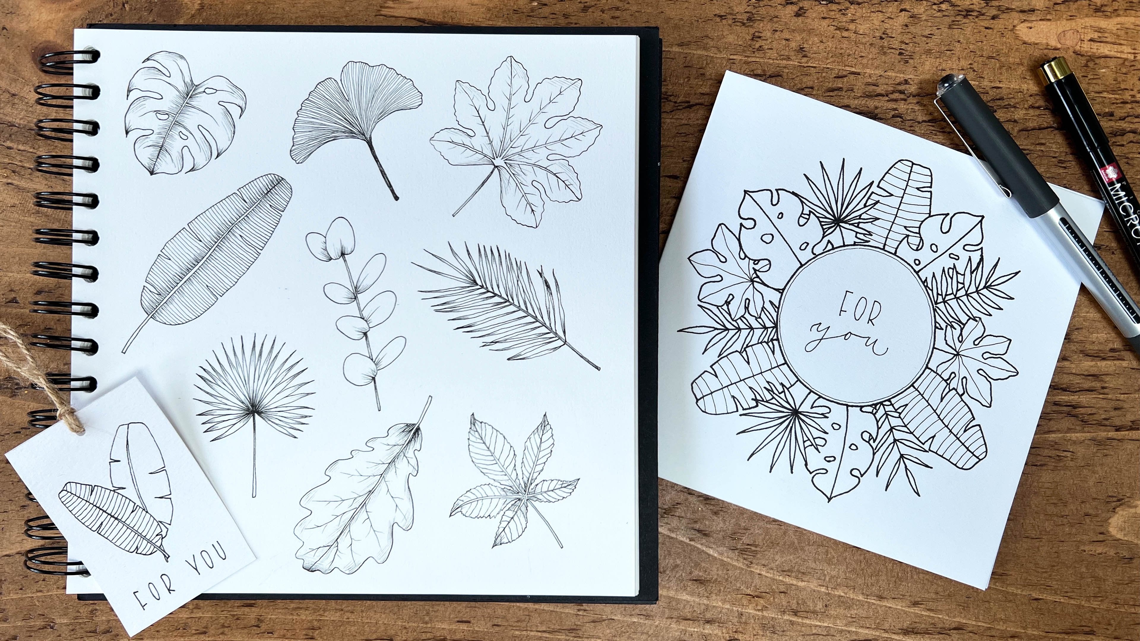
7. Projects: Page of Leaves Part 1: Now that we have covered all
the basics for how to create variation in our leaves so that you know how to
design them on your own, we can now practice
doodling a whole page of different leaves
together to help you get started with your own doodles. For most of the outlines, I'll be using my
uni-ball pen and then switching to the Size
2 for the details. But for some more
delicate leaves, I'll start with the 2. We can start with a fairly
big leaf up in the corner, and I'm going to do
one of either side. With this one, I'm going to
stick with this uni-ball pen, and I'm going to
draw a line down the center and then
small lines either side. This is going to give
quite a bold look. Now as all these points meet
at the top and the bottom, it creates this darker area, which gives it more of a
shadow, which is nice. That's our first leaf complete. Now let's do one with
the rounder shape. We can have two of
these next to each other and do one
slightly taller. I'm starting with a point and then rounding it at the top. I'm going to connect
these to the center line directly and have them
coming off at the same area. I'm just going to carry my pen through this leaf so I
can go underneath it. Then switching to
my smaller pen, I'm going to just draw a line straight through
each of the leaves. Going back to this
basic pointed shape, I'm going to do a branch now which is
probably a bit more random, maybe with some
overlapping leaves, especially going
over that center. I want to be filling
in this area here. I'll start with this branch leaning up towards the
left and then I'm going to draw this leaf in which
can overlap the center line. This one I'm going to make it a bit more wobbly line to
give it that delicate look. Then carry this pen
through and then curve it round so this
branch is an S shape. Then do one at the top
which are leaning over. To balance it out, I'm going to do another
one coming off here. I'm going to bring this up. I'll bring one off here as well. I just do one more here. I'm going to do another one at the top because I
feel like this is bending over a bit too
far. It looks a bit odd. I'm going to bring this up in the middle then
add one in there. Then to balance out, I'm going to fill in this gap. With a Size 2, I'm going to continue with this slightly delicate
wobbly line through the center and then adding these curved lines for
the veins either side. Going back to my uni-ball pen, I think I want to use the curved lobed leaf
for the next one. I might use the elongated
style of the leaves. I'll start by curving the stem round and then
do the top one first so I have a quite tall leaf, and then add some sides. It got a little bit
wider. That's fine. I'm doing this alternating, so they're not sitting next
to each other on the branch. Let's do one more. With this one I think
I'm just going to keep to my uni-ball
pen and then just do this flicky line
through the center. Stepping back and
looking at my page, I feel like I want a
bit more contrast now. I think the next
branch I'll put in, I'm going to color it in, which means I probably want
it to be fairly small. I'm going to add this in here. For this, I'm going
to use the same curved with the
pointy base shape. Start at the top, again, making it quite small. This time to make it
different from this one, I'm going to give these small leaves these short stems
and make them alternating. I'm just going to bring
that down a little, and then I'm going to
color these all in. For the next one, I want to use a bit of a different shape. One that we haven't used
is that heart shaped leaf, so we can use that here. I'm going to start with
an S-shaped branch, and then draw the
first leaf at the top. I might make this a bit higher. I'm going to bring it down, and then I'm just going
to add some on the sides. I might do a longer stem
here so that I can add two, and they can be
slightly overlapping. It's really nice to
have them pointing in different directions so it's a nice contrast to the
more uniform branches. For this one, I'm
going to draw lots of veins quite close together and, as they go down,
just curve around so it reflects the anti-shape. As you do these ones, just remember you're breathing, especially as we're focusing
on repetitive lines. Make sure you're not
holding your breath. Relax your shoulders, relax your grip on your pen. Sometimes you can be so focused you don't even realize that you're
holding tension. As we do these, I'm sure you'll be discovering some favorites or some ideas or different ways you can do it, and everyone will have
their own preferences. It's just about experimenting
to discover what yours are. Going down to this corner, so I want to look
at the whole page and these bigger ones,
they're quite sharp. They've got a lot of the
pointed tops to them. So I think I want
something a bit larger that's a bit
softer and rounder here. So I'm going to start
with the branch, do this halfway up
to allow myself that overlap again,
and then I'm going to do a rounded leaf, and then bring that down and
connect it to the middle. Then I'll continue that branch up and draw the leaf at the top. Now we can fill this in, so we'll probably
have a few coming off each damaged side. Going back to my smaller pen, I'm going to do
these flicky lines at the base for this one. I feel like these details can really transform your branch. Sometimes they don't
look like much when we've just got
the outer shape. Once you've added some more
delicate details in them, they can look really lovely. We've got some space here, so I'm going to
fill this in with a leaf that has variation
of sizes within it. So going back to our last class, we had a branch that
started quite large at the bottom and the
leaves were getting smaller as it got to the top. Again, I'll just start
with this curved line. For this, I think I'll use the teardrop shape because
we haven't used that yet. Again, that's going to add some softness with
that curved base. Starting fairly
small at the top. Then just getting gradually
larger as we move down. For this one, I think
I'm going to do a similar shading as we've done with this one
with the flicky lines, but I'm going to do it at
the top and the bottom. So adding it at the base and
then also from this point.
8. Projects: Page of Leaves Part 2: So again, standing
back from the page, I can see that I've got three branches here that are all veering
off to the right. So to balance that
out, I'm going to do one here which is
facing towards the left. For this one, I think I want
something a little more delicate with small leaves, bit more randomly placed, so I'm going to start
with the branch. Again, slightly S-curved, I'll add a small
leaf at the top. This is going to
have the two points, the top and the bottom, and then, I want quite long
stems coming off this. We can have multiple leaves, so I'm going to bring this up. Then, I'll add a
few as we go along. So I'm going to make this bush here
at the bottom, so this one is going
to be a bit shorter, with fewer leaves on. Just add a small one inherits well just
to fill that space, and then probably just
have to up there. So again, I'm going to do a
long one coming from the base. I'm going to do this one overlapping because I wanted
to fill that gap there, and then I'll have another
short one coming off at the top with some
branches coming down and a little bit
up there just to fill in that gap as well. With these I'm just going
to use the smaller pen just to draw a line down the
center of each leaf. So going back to
my uni-ball pen, I think that I want to have a colored in leaf here again
to give it some contrast, that's the only
one colored in at the minute and
that's quite small. So I want to probably
fill this one in first, just so I don't smudge this one, so I might go for another softer curved leaf here just to keep the page
looking nice and soft. So I'll think I'll do
either one or two coming off by side, keeping it very simple. So with this one, I'm going to use
this same detail with the flicking lines because that's one of my
favorites to do, with this style of leaf, I think it really suits it, but feel free to choose another detail to
experiment with. So now, I filled in that gap, I'm going to go
down to the bottom, and do a more contrasting leaf. So I'll curb it
to the right so I can keep it out of
the way at this one, and I'm going to do some long thin leaves with the
pointed ends for this one. These are going to
have the stems, but there can be a bit more sporadic not necessarily
pointing the same direction. I might add another one here just to balance
that one out. I'm just going to
color these ones in. Feel free to turn your page
as much as you need to, especially when coloring in. Make it more comfortable. Obviously, I'm keeping my paper straight for you so you can
clearly see what I'm doing. Might look a bit
awkward sometimes. But if I wasn't filming, I definitely be moving
my paper around. So up here, I'm going to create another branch
similar to this style. I really like these
delicate leaves. But this time, we can make it
look different with perhaps by adding a lot more veins to it and distributing
them slightly differently. So I draw my branch very long. Again, wobbling this line a bit. This one, I'm going to
bring underneath this one. So come up slightly
and then down, and I'll add another one
onto this same stem, and again, I'll have one
coming up and this is going to go underneath, overlapping. I might just have one
more at the bottom. So for this one, I'll start
with that line in the middle. I'm going to keep these
veins really close together. So again, remember
to just go slow, you don't need to
rush this focus on your breathing. This part of it. When you don't have to think
about what you're doing, you don't have to
think about the design or if it's in the right place. This can just be really calming, and all you're doing
is just repetitive lines filling in the outline. When you get to doing these
ones that go underneath, always try and do
one which is whole, and then that will help guide the smaller ones
getting underneath. Otherwise, you might
find that you've got it at the wrong angle or
in the wrong place. This is quite a
nice thing to do. Whenever you've
got a few minutes. You don't have to fill
in a whole page at once. You can just add to it and you can pick it
up and put it down, which is one thing I
really love about just using a pen and paper
or pencil and paper. Just keep it lying around the
house somewhere accessible, and then just pick it up. When you've got five minutes. If you are having
a cup of tea or waiting for something to cook, is always pockets in your
day where it can be so easy to just pick up your phone and scroll or look at the news. When if you used just
those few minutes, just to do something really
simple and relaxing. It can make you feel so much better for
whatever is next in your day. Something for you,
something to help calm you, something to help focus
on your breathing. Something you enjoy, and then when I've
created these pages, I love to keep them as
a reference as well. So if I want to
create something in my bullet journal or make
a gift tag or a card. I can just have a
look back and think, you need this leaf. This branch will work
nicely with that. Especially if you're not
feeling particularly creative. You can always look through
your work and hopefully, it should inspire you.
9. Projects: Page of Leaves Part 3: Next to fill this gap, I think I'm going to
use this style of leaf because we've only got
one of those so far. I want to create a
fairly big sized leaf. So maybe I'll just have three are the leaves
on it like this one. I start with my
branch coming down. Then because of this
leaf coming here, I want this one fairly low so I might have
this one higher up. Then this one can come off here. So with this one to make it look even more
different to this one, I'm going to draw the
lines down the center, sticking with my uniball
pens so it's a bit bolder, and then only having
two veins either side reaching up to those lobes. Now, we've got some fairly
small spaces to fill in. I can probably fit a fairly
decent size one in here, and then I'll probably
have a thinner one here and a smaller
one here as well. Just to fill in those gaps. So I'm going to draw a branch
going off to the right here with this
teardrop shaped leaf. Fairly decent size
leaves on this one. Then I'll have two here. It's going to go into
that one slightly. Then again, I'm going
to do two here. Then I'm going to
have one coming down and it's going to go under this just coming out the end and
then one going up. Probably not going to
come out the other side. Because this one's
facing down so much, I think I'm just going
to do another one. I'm just going to keep
it really simple with just that flicky
line for the vein. In this small gap here I want
something fairly delicate, probably with this
roundish shape. So I might have two
branches like that. See how this pans out. Then using the smaller pen to add in maybe just a
line again like this one. Up here, I'm just going to add probably a two leaf branch. Bring this over and
then bring that up, and then have the curved leaf. Actually I might
add another one in, see how it looks. Maybe one more down here and just one more
on the other side. Then for this one we can
do a similar detail like that and actually
I'm going to use my smaller pen so
it's different. So starting down the center and then drawing lines either side. It's a little bit more
delicate than the other one. We can fit a few more lines in there because they're finer. I think it's really good to have a flexible attitude to your doodling and let
your doodles evolve. Obviously initially I wanted
to do a two-leaf one, I didn't think they
look quite right, so I wanted to add more. So just don't get so set
on what you're doing. We've got one more space here. I think I want a colored in one, so I'm going to do
fairly tall stem going up and have quite
small leaves on it, which are going to come directly off the stem alternating. There is our page complete. I hope you've enjoyed this. I hope it's also shown you that there are so many different
varieties you can make. You can make a page of doodles
like this every day for a year and come up with different ones,
different variations. Obviously, you will
find your preferences. I love to do these
delicate ones with the wobbly lines and
the round ones which have more gentler
calming field to them. But I really enjoy
doing all of them. I hope you found some that
you've liked and it's inspired you to continue
experimenting further.
10. Projects: Dividers: I love using simple
leaf branches as dividers in my journals
or in my notes. They can sit directly underneath the titles and just break
up the page nicely. Here are a couple of
examples in my journal. This one's for a task list, and a slightly different
version for reading list. These dividers are a
really easy way to add a little bit of
creativity to your pages, keeping it simple and minimal. I know that for me, I would love in an ideal world
to have a journal that I spend lots of
time decorating with lots of beautiful
drawings and decorations, but I know I just don't
have the time to keep it up and it just adds
the pressure when I really want my journal
to be something I use regularly
without any stress. Using simple ideas like this
is a really nice solution, if you also find you
struggle for time to dedicate to decorating
your journal, or if you'd just like
to keep things a bit cleaner and more
minimalist looking. Here are some more examples of different dividers
that you can use. We can base this on the
leaves that we've already practiced in the previous videos and just simplify
them a little bit. I think it's nice to keep
these dividers fairly simple and not too distracting. There are a few ways that
we can design these, either using single branches
or two branches together linked like these ones or with a small
gap in the middle. Then we can also think about positioning underneath our title so we can keep the dividers
quite small and subtle, having them shorter
than the wording, having them in the same length, or having them longer
for more of an impact. We can have them off to a side, which is a really nice effect, or we can use two branches, like I showed you in
the previous page, linked together or with
the gaps in the middle. Grab a blank piece of paper, and we can fill this in with
ideas for our dividers. I love having these
pages of inspiration that we can refer back to with lots of different ideas on. They're always useful when I want to do something
in my journal, perhaps if I'm stuck
for idea or want to say what I've liked
doing before. We'll just start
with the shape of the branches that we can
use underneath the title. We'll just start by
drawing the branches without the leaves to give you an idea of the
different ways that you can create that foundation, and then we can go back and fill in with the leaves at the end. For the single
simplest of branches, we can just use a C curve. We can use a small C
curve or a larger one. I'm keeping these fairly shallow because I want them to sit nicely
underneath the word. Then we can also do
this upside down, so the other way around. If you need to, if
you're more comfortable, you can always draw these
out in pencil first. That's absolutely fine, too. Those are simple C curves, and then we can also
use an S curve. Again, keeping it
fairly shallow, or we can make
this a bit deeper. We can also use these S
curves off to the side. They're quite nice for that, just like the example I
showed you earlier here. For this, we can just practice writing a word as our title. Then I'd usually start just left of the center, curve up, and then round and then finish roughly in line with the word at the bottom edge or just above. As I showed you, we can
also use two branches. The simplest way to do this
is to have two branches coming off in the
same direction. If we had a main branch, we can have a small
one coming off. Again, once we filled
in these with leaves, you'll see the effect much more. If we're going to have two
branches linked together, we would just cross them
over slightly in the center. I'm not going to make
this crossover too large, I want it to be fairly subtle. These can be a little
bit trickier because we want these to be
fairly symmetrical. Again, you can go back to using your pencil for these
just to get that right. When we're placing this
underneath the word, we just want to find the
center point within the word, and then have this center
point roughly matching, which is really useful if
you use dotted or gridded journals because you can
count the squares or dots. Again, we can do this
the other way around, just having that
small crossover, or we can use those S curves. I'll do the S curve
the other way around as well just to show you. Then we can also do two branches leaving
that gap in the middle. I'm just going to do
this title again, just to demonstrate how
I would position this. Again, it's about finding
that center point, leaving a small gap, and then starting
off to the right. So I'd have two of those curves. Again, we can do this
the other way around, and we can do it with
the S curves as well. We can also change the
positioning of these curves. For example, with the C curves, we could keep it fairly flat in the center and then just
having it curved upwards. Here we have a dip
going downwards, but this is quite
flat in the middle. So it can create quite
a different look. Again, practice that
the other way around. Then again, we can do that with the S curves as well,
so going downwards. In terms of adding your
leaves to these branches, one thing to definitely
think about when you're drawing the branches underneath your title is to make sure you leave enough space to
actually add the leaves because you don't
want the wording and the divider to be
too crammed together. So make sure you need
a decent enough gap. There's a fairly small gap here, so these leaves have
to be quite small because I don't want to go
too close to that word. The other thing is, if you want them to
look quite even and fairly balanced with
these single ones, it's a bit simpler. You would draw this
leaf at the end, and then you may want to just make this a bit longer
just to balance it out. You might want to
think about that when you're doing these
S curves as well because if you have a fairly
big leaf coming up here, you might want to stop
this line earlier so that the top of that leaf is a bit more even with
the rest of the branch. With these two branches
linked together, I quite like to have
them fairly symmetrical, especially in the center. So if I were to start the leaves around
here on this side, I would aim to do
that the same on the other side because I think this ends up looking
quite a lot nicer. Now we can go through and fill these branches in with
different leaves, and you can think
about which styles of the branches you prefer. If you've got small
space like me, you can add some more in and experiment with
different designs. Then like I said earlier, you can keep these somewhere
that you can refer back to when you're
journaling for inspiration. I'll let the video roll whilst I'm filling
in my own branches, and then in the next video, we'll look at how we can turn our leaf doodles into
cute little leaves. [MUSIC]
11. Projects: Wreaths Part 1: Another lovely way to use these leaves is to
create a wreath. You can try out lots of different designs
in your sketchbook, perhaps referring back to the practice sessions and page of leaves again for inspiration. These can be incredibly relaxing because they
can be repetitive. Also, the shape of the circle tends to evoke a feeling of communists as circles can represent safety
and wholesomeness. Here are some more
examples in my sketchbook. You can make these as simple
and repetitive as you like, or try out different
styles and make them more delicate and detailed. I like to use these wreaths in my journal for either
monthly cover pages, here is one example, or you can add them
to a layout like this and add a nice
motivational quote or some nice lettering inside. In this video, we'll draw
six wreaths together, all in slightly
different styles, from very simple,
and repetitive, and uniform to slightly
more detailed and delicate with different
styles just to show you what kind of
options there are. Hopefully, this will give
you lots of inspiration for how to design your own wreaths. I usually like to
start my drawing, the circle in pencil first
to give myself a guide, and you should be able to find plenty of circular things around your home of different sizes that you can draw
around for this. I like to use these
metal circles from my die-cutting machine. This one I'm using is roughly
two-and-a-half inches. I'm just going to
start by drawing out my six circles
with my pencil. The first wreath we're
going to do is going to be very simple and repetitive. These are some examples
of what I mean, and some more here. These two are
obviously starting to get slightly more detailed. I'm using my uni-ball pen. The first thing
I'm going to do is just trace over this
pencil line with my pen. As I said in an earlier video, feel free to move your paper
around as much as possible. I would be moving my paper
around now to enable me to be as comfortable as possible to be able
to draw this circle. The reason I started
with this is because I know that I'm doing a
simple wreath and none of the leaves are going to be
overlapping this circle, so it's fine to start this way. For this one, I'm going to do the upside-down
teardrop shape leaf. I'm going to do two at the
same point on either side. I'm going to leave a small
gap and then do another. I'm just going to work my way around the circle,
just repeating this. One thing I really
love about wreaths is this repetitive motion. It's repetitive action. You know that
there's an endpoint. You don't have to think too
much about what you're doing. We can just keep going. Just every so often pausing, taking a step back, checking that
everything is balanced. It can be easy to suddenly start making that gap smaller as you go
around or larger. Just keep checking
every so often. As we get closer
to this endpoint, we want to start to think about how many more
we can fit in here. Either I can have one here
or I can try and fit two in. I will just go for
one in the middle. That's the main wreath done and then I'm just going to add my details with my finer pen. With these really
simple wreaths, they don't take too
much time at all. That just took us a
few minutes to do. Adding these to your journal, or to a gift tag, which I'll show you a bit later, or greetings card, or just doodling them for fun
doesn't have to take long. That's our first
wreath finished. For our second wreath, we're going to move
on to something slightly fuller and more
organic, like this one. This will take us a
little bit longer. I'm going to use my size two for all of this because I want
it to be a little bit finer. For this one, I do want
some of the leaves to overlap that circle line. I'm not going to draw the
whole circling first. I'm just going to
draw in gradually. I'll start just with
part of the line, and then I'll fill in
some of these leaves. For this one, I'm going to
have either one or two, or three leaves coming off
of each of these stems. I'm going to bring
this circle lineup a little bit more and then have another one which is overlapping even
more than that one. I want some of these
leaves overlapping each other as well to give that more organic look. I'm going to continue a little bit more with the circle now. You can always come back
at any point and just check the circle is looking balanced and add an odd
leaf in here and there. I might come back and add a
leaf in here a bit later, we'll see how it goes. I'll do another one
overlapping here. This one again is
quite repetitive in the sense that
we're just working around the circle doing the same thing
adding either 1, 2, or 3 branches every so often, just drawing a leaf in which
overlaps that circle line, drawing a little bit more circle and adding some more leaves in. The more you do this, the more you'll get
a better eye for composition and balance and
where the leaves should sit. Now I've completed the circle. I'm just going to
stand back and have a look and see where
there are some gaps. There are some small gaps here, and I want some
overlapping leaves to bring this piece together. This looks a little bit
thinner on this side, so I'm just going to add
a couple more in here as well and then maybe up here. I'm happy with that. I'll just add one more
in here the last one. Now I'm just going to go
around and add in my detail, which is just going to be a flicking line coming up
from the base of each leaf. Then I'll just give it a
few minutes for the pen to completely dry before I
erase the pencil line. Don't be tempted to
do that too quickly because you might smudge
and ruin your work. I know that I've
been impatient in the past and done
that too many times.
12. Projects: Wreaths Part 2: For the next wreath, we are going to do a slightly different style where we have gaps in-between
the branches. These three are
examples of this. We'll use two different leaves, and I'll show you how to
divide your wreath up roughly so that you have the
same number of branches. You can see here in this
example, I didn't do that. I didn't divide the wreath
up and I've got two of the plain branches here
sitting next to each other, while ideally I would have
liked it alternating. It's not a big deal, but I'll just show you
how to prepare for that. The easiest thing
to do is to break the wreath up into an
even number of branches. For this we'll do
eight branches. We can just put a mark roughly at the top
and bottom and at the side. That's now in four
even sections, and then we'll just do another
mark in-between those. Now it's in eight sections. For this one, I'm going to
use two at the same branches. We'll color one in and
we'll leave one blank, but you can use alternating
branches if you'd like. For this, I'm just
going to start a little way above that
mark and I'm going to finish just before the next mark and that will leave a gap. Start with a line and then I'm going to draw my
leaf at the top, so the leaf ends just
before that line. I'm going to draw leaves at
the same point going down, and I'm going to have three. We can just repeat this now. We can color this one in, and then we'll just
carry on doing the same all the way around. This one I'm going
to color in again. Probably at this
point you're turning your page to make it easier
for you to draw these, which I would definitely be doing and definitely recommend. Just be careful not to smudge these with
your hand as well. That one is done. As before, please don't be
tempted to rub out those pencil lines for
a good few minutes, especially because
we've colored these in, so there's a lot more ink
that needs to dry there. For the next wreath, we are going to
do one like this. It has two laurels up each side with a gap at the
top and they're crossing over at the bottom. We're going to be using lots of different
branches within here. It's quite different to the ones we've done
already so far. For this one, I'm just going to grab my pencil
again and just mark a point at the top of the circle on both sides where I want the leaves to stop, just so it looks
nice and balanced. Using my unit ball again, I'm going to start with
the two top branches. I'm going to draw
the line partway up, and then I'm going to draw a fairly big leaf coming
up to that point, and then some more leaves on the other sides at
alternating points. This one have five leaves on. I'm just going to mirror
that on the other side. Starting roughly the same point, and then drawing
the top leaf first. Now I'm going to
leave a small gap and then draw in a rounded leaf. This branch is going to
come all the way down. When we get to the center point, it's going to bring it
down in that slight curve. I'll do the same
on the other side. Bring this down
and cross it over. Now, I'm going to fill this
branch in with more of these leaves on
alternating points again. Now in this gap, I'm going to do
another leaf style which will be similar to
this one but longer stemmed. I'm going to have this, coming off here, so it joins up and then add in a few more layers and these is going to sit
underneath that leaf below. I'm going to color these ones in to add some contrast and so we can easily see that that leaf is distinctive to the others. I do the same on the other side. Start with that longer
leaf which touches this bottom branch just
so I can join them up. This is just one way to do this. You can play around with lots of different
styles of leaves and try out different processes for adding them in and
see what works for you. You start with a pencil, and then obviously
a lot easier to adjust your design as
you go along them. Now I'm going to grab
my size 2 pen and just add some details
to these leaves. I'm just going to
add the flaky line to these bigger leaves at the top and then the shading at the
base of these ones. I think I'll leave
that one there. I like the simplicity of it with just the three
different branches. If you'd like to add a few more, you can add some smaller ones
like in this example and they just sit behind the
leaves that are already there. These are just a
rounded leaves coming off in a few different places.
13. Projects: Wreaths Part 3: For the next wreath, we are going to again use this Laurel style but with these wobbly lines going around. For this, I did try out a few different options
to see what I preferred, having the leaves going a
bit higher and a bit fuller, especially in the middle. These ones come off to the
edge a little bit more, which I quite like the look of, and have the contrast of the darker, smaller
leaves within. This one, I left that
little gap in the middle. Again, these leaves
come off to the side slightly and then this is just a different style of
leaf with more detail in and I use a thicker
pen for these lines. For this one, we're
going to stick to the wreath like this. I'm starting with
my uni-ball pen again, and because some of these leaves will
be overlapping, I'm not going to draw the
whole circle in to start with, but I will start
with my pencil and just mark out where I want
the leaves to go up to. I don't want them
to be too high, so probably about
halfway or just below. I'm going to start with the
first leaf at the very end, so just curving the line off, and then bringing
that leaf outwards. I'm going to do the same
at the end, and that just gives us the finishing point for where those branches end. Now we can just go ahead
and fill in the leaves. Again, I'm going to be using either one or two stems for each of the leaves, and then
overlapping a few of them. I'm going to get a little bit
sparser as we move towards the center point so that
we can have a gap, there. I'm going to continue the pen around and then on
the opposite side, I'm going to start the leaves again facing the
opposite direction. Now we've done the main leaves. We can just have stand back
and see, is it balanced? Do we want to add
anymore in the center? I might just add
another one in there. Maybe another one, but fairly low-lying so it doesn't
give it too much height. I'm happy with those leaves. I'm going to switch
to my size two pen. For these, I'm going to add in slightly more detail
to these branches. I'm drawing that full line
with two veins either side just to make it a little bit different
from these ones. As I've said before, take your time with these, fix on your breathing, relax, there's no rush. Relax your shoulders. Now we've done leaves. We can draw the circle in and I'm going to
draw three circles. They're going to be
slightly wobbly, slightly organic for
different effects. I'm going to start
at the top here, this leaf in this pencil line. Lightly, I'm not moving too far away from that
center circle, and then for the next one, I'm just going to move
slightly over and crossover, bring it so they're quite close together but they just crossed over at two
different points. Then I'm going to do one
more on the other side. I'm going to bring this
up a bit higher, and then round, and then I'm going to draw another line
along the stem, either side of the stem
where there are no leaves. I don't want to go
over the leaves. This is just going
to add to that and then along the
bottom here as well. That's that wreath finished. We can go back now and take out some of
these pencil lines. I'll leave this
one until the end. For the final wreath, we are going to
do one like this. It's got the same three
circular lines going round, which we'll draw first, and then we're just going to add in two sections of
leaves either side. It's a really nice,
delicate look. I'm going to start
with my size two for those circles and then roughly following the
circle line around. I'm just using a light touch, so it's quite wobbly, all the way around. Then I'm going to
do another one, crossing over occasionally
and joining up, and then one more. There we go. I want these branches to be
about this size, I think. I'll start with a
small leaf here just as a marker point for where
I'm aiming to finish. Then these are going
to have longer stems so then they can have
more leaves coming off. You see that's quite long stems, so I can probably fit maybe
three leaves on this one. I'm pressing slightly
harder just so I can see this line a bit better, so I know where to bring
the leaves off of. You can do the odd one on
its own and then have the longest stems with 2, 3, 4. I'm going to do the
same on the other side. I'll probably start about
here so I'm just going to put a mark, and then end about here. I'll just draw that end leaf in so I know where to finish. These leaves are definitely less uniform but more scattered and delicate than some of
the other ones we've done. There are our six
different wreaths. Hopefully, that's
given you lots of inspiration for the
different types of wreaths that you can create. Obviously, this was the
most simplest and quickest. This is fairly quick as well. Depending on how
much time you have, you can just spend a
few minutes just doing something really
simple or you can really get involved,
and do something a lot more detailed with more details that takes a bit more time. In the next video,
we're going to be moving on to gift tags.
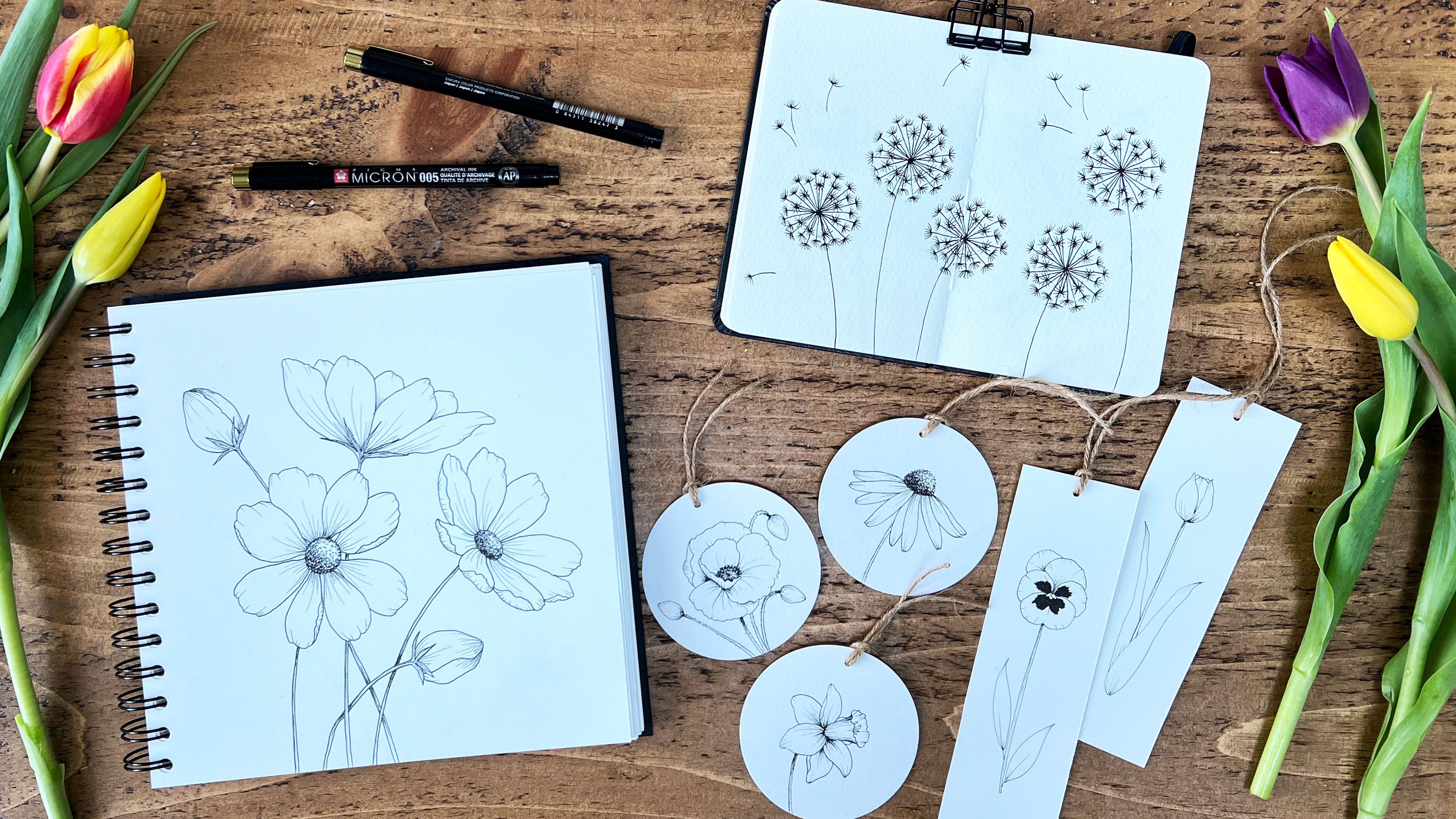
14. Projects: Gift Tags: Using our leaf doodles, we can make some really
lovely symbol gift tags to add to our presents. These can take just a
few minutes to make. So really handy, especially if we haven't got
a gift tag to use or if we just want to add a nice
handmade touch to a present. For these, I like to use fairly thick card so
they're not too floppy. I sometimes just take a page out of my mixed
media sketchbook, if I haven't got any
white card lying around, or I might use Bristol card, which is much smoother. It can be handy to
prepare a stack of these gift tags if you're
likely to make them regularly. I'm a big fan of
batching jobs like this, having lots of templates
for gift tags, or bookmarks, or polaroids
when I'm painting, as it just makes things
easier and quicker every time so then you can just
grab a blank tag and doodle your design on it. For these tags, I like to use either circle tags or
the rectangular ones, and you can see I've got
two different sizes here. You can make your tags
whatever size you like, depending on how big
your present is. For example, you can see
this slightly bigger present I've got the larger circle, and for the smaller one, I've got a slightly
smaller circle. For these circle gift tags, I actually use these punches, which are super easy. You just put the card inside, press it down, and it
will pop out underneath. I've got these in two-inch
and a three-inch. This is the smaller two-inch and this is the
larger three-inch. For the rectangular gift tags, I just draw this out with a pencil and ruler
and cut them out with scissors or with my craft
knife and a metal ruler. In terms of design, here are a range of examples. There are so many ways that
you can make these and it's really fun experimenting
with different designs. You can make it really simple, just using one branch and
maybe add some lettering, or you can make it much
more delicate and detailed, either by making something
like a bouquet like this one or having more
branches coming off, having different
styles of branches in a border like these or filling up the whole
gift tag like this one. In this video, I'm going
to walk you through how to create three of these gift tags. The templates that
you'll need are one rectangular gift
tag, and as I said, this is two inches by two
and three-quarter inches or seven centimeters
by five centimeters, and then I'm going to
be showing you how to create two with a
circular gift tags, and both of those
will be three inches. If you don't have
a circular punch, which I don't expect you to, then you can just find something roughly
around three inches, draw around it, and the cut it carefully
out with scissors. For the first gift tag, we're going to be using
the rectangular template, and we're just going
to be creating one branch with some
lettering underneath. Here are three examples. These two I used my Size 2 pen so the lines are a
little bit lighter, and this one I used the uniball. So it depends how bold you
want your gift tag to be. I'll be using my
uniball pen for this. Whenever I add lettering
to a gift tag, I like to grab my pencil
first and map out that lettering just so I know that it's in
the right position. I want to make sure it's not too crammed
in at the bottom. So I want to leave a gap at
the bottom, so come up a bit, and then just lightly, I'm just going to map out
these words just for you. Then I'll just stand
back and check it, and I'm happy with that. I might just make
this a bit higher. For the leaf, I'm going to
go straight in with my pen, and then I'll come back
and go over the lettering. I'm going to leave this
space up here blank, that's where my hole
is going to be, and I'm going to start with a bit of a space
above the lettering, and then draw an S curve, and then that top leaf. I'll do two this side. One here, another two there, and then perhaps
just one more there. I might just do one more on either side at
the bottom overlapping. I'll go to my Size
2 for the details. In terms of process
for all of these, just think about
what you prefer, what makes you feel
most comfortable. If you want to draw it
all out in pencil first, there's absolutely
nothing wrong with that. I'm switching back to my uniball
to do the lettering now. I'm going to give this a
decent amount of time to dry before I erase that pencil, especially because this
is Bristol card and it's my thicker uniball pen so the pen will take a
little bit longer to dry. I can also just add in that
hole punch at the top. This is my Fiskars hole punch, and then I'll add some twine to that and then it
will be ready to go. For the next gift tag, we're going to use the
three-inch circular tag. So here's my template. This is the design that we're
going to be basing it on. It's got this lovely bouquet, and I love drawing and
doodling these bouquets. They're really simple and
really delicate and pretty, and they're also great for
adding to your journal. Here's an example as
a cover page I did, which is really nice. Again, very clean and minimalist looking and doesn't
take that long. Then here are a couple
of more examples in my sketchbook which have a bit more contrast with
those darker leaves. I'm going to use my Size 2 pen, and I'm going to start with
the lines of these branches. I tend to like to use an odd number of branches, so perhaps five or three. Five I find works quite well, and I like to give it some
height in the middle, and then as we move down, make these branches quite a bit shorter and more delicate. We'll start with the lines first and we'll have
all these crossing over just above the base where we can add in
the bow at the end. I'm going to start with a
curve going up to the left, and then I'm going
to have another one which will curve
off to the right, but it will end
slightly earlier. Do another one going
off, so I'm starting just to the right
of that first one, curving off to the left again, crossing over, and then I'm going to add
those two smaller ones. A lot of these leaves are going to be overlapping
each other. I'm going to start with
the longest one with this upside-down
teardrop shape using either two or one leaves. I'm not going to take
this down too low. I think I'll finish about there. Then for the second
longest branch, I use the more
pointy shaped leaf, and these will start to
overlap a little bit. For the one on the left, I'll do the lobed leaf. This is coming off of alternating points
along the branch. Then I'm using smaller leaves for these branches
that are lower down. Hey, so now we can go ahead
and fill in some details. Add some shading to
these rounder leaves. I may add a line down these. We've got a little gap here, so I'm just going to fill
that one in as well. I'm going to color
these ones in, these small ones, and I might color these
lobed ones in as well. I'm just going to
grab my uniball pen because these are a
little bit bigger. Then I'm just going
to add that both, so two loops and then
two curves coming down. As I did for this
one, I just added some small dots all
the way around, so I'm going to do that as well, just to give it a nice border. Finally, I just want to
add that hole punch. So I'm going to
try and line it up so that branch is in a line,
and then add it there. There is our second
gift tag made. For our third gift tag, I'm going to use this
circular template again. Again, this is three inches and we'll be doing
a design like this, filling up the whole of
the gift tag and it's going to have a nice contrast
between the empty leaves, the blank ones, and then the ones with
the detailed veins in. I'm going to start
with my uniball pen. I'm just going to start
from any edge and just draw a wobbly line
towards the center. Then I'm going to start with a leaf overlapping that
line and bring it in. Then carry on that line, bring it up, and then
add a leaf on the end. Now we can just go ahead as before and fill in these leaves. Again, for the leaves, I'm
using that wobbly organic line. You can have either 1, 2, or 3 of these leaves on each branch. Once we've done that first one, I'm just going to move it
round and I'm going to draw another branch coming up
from a different direction. Again, a wobbly line,
just a little way in, and then I'm going to have a leaf overlapping to give it that
really organic effect and carry on this line
through that leaf, and then add one at the end. Again, just go ahead and draw the leaves
and they can come off the edge as well, which is fine. Now we've got these
two gaps here, so we can just draw
instance smaller branches. I got a bit of a gap here, so I'm just going to add
another leaf in there. Then here I'm also going to
add in that shorter branch. These can all
overlap each other. Then if you've got any gaps
at the edges like this, you can just draw the the
tip of the leaf coming in. There's the foundation. I'm just switching to my
Size 2 now and then we can just draw some of these delicate veins
into some of the leaves. I'll roughly be alternating
which leaves I choose to do the veins in, but it
doesn't really matter. It's nice especially
when you have overlapping leaves to keep one plane and one
with the veins in. It just makes them stand
out a little bit more. I feel like there's quite a
lot of the plain ones here, so I'm just going to
add veins to this one. Just stand back and
have a look and I'm pretty happy with that. Then you just need to find
somewhere which has a bit of a gap for the punch, so I'll probably do it here. Going back to the first one,
I'm just going to now erase that pencil line as I'm pretty confident
that that is dry. We have our three gift tags. I really hope you've
enjoyed making these gift tags and you
feel inspired to make lots more and design your own
and realize how simple they are and how lovely
it can be to add that handmade touch to a gift. I'd really love to
see your gift tags. So please do share
them with me in the project section along with your other products
from the class. In the next video, we are going to be moving
on to making bookmarks.
15. Projects: Bookmarks: Another way to turn
these leaf doodles into something you can use is to
make them into bookmarks. If you see my watercolor
for relaxation classes, you'll know I love to
make bookmarks because it means you can use them around
the home and see them more. I always find it relaxing to look at these little
pieces of art and try to incorporate
them as much as possible into daily life. They also make lovely gifts
for friends or family. Just like with the gift tags, I'd recommend some
fairly thick card so that these are not floppy. I made these all out of the Bristol card which
I showed you earlier, which is 270 GSM. It's also nice and smooth. You could also use
standard card, mixed media paper, or watercolor paper if you wanted to add some
watercolor backgrounds. I've made these using a
couple of different sizes. These are slightly
taller and slimmer and are 4 centimeters wide
by 18 centimeters tall. These ones I wanted
to be slightly wider, so I also made them slightly shorter because I
wanted to be able to fit the branches coming up from the bottom
next to each other. These ones are 5 centimeters
wide by 16 centimeters tall. You can make your bookmarks
whatever size you like, depending on your design
or your preference. I just drew these
out with a ruler and pencil and then cut
them out with scissors, or you can use your craft knife. In this session, I'm
going to take you through my process for making two
of these different styles. We're going to be drawing
something similar to this one with the branches
coming up from the bottom, and then doing one similar
to this one with the leaves scattered and coming in from the edge with this
border around. For both of the bookmarks, I'll be using the
slightly wider template, which is again five
centimeters by 16 centimeters. For this first design, we want to leave a
gap at the bottom and then just a small gap
either side as well. I'm going to be using
my Size 2 Micron pen. Starting from the bottom, I'm going to draw in
the branches first. I want that first one to
be going up fairly high, it's going to be
the tallest one, and curving around
slightly to the right. Now I'm going to draw in
the one on the right, which is the medium height one. This is going to curve
slightly inwards. Then finally, the shorter
one in the middle. It's going to have
slight curve to it, but it's not going to
bend over either way. Now I'm just going to go down and add in all
of these leaves, just like we have now
quite a few times. We can use either 1, 2, or 3, or you can choose a different leaf
style for this one. I don't want get too close
to this edge because I don't want it to
look too crammed in. If you're fairly close you can just bend the leaves over a little bit more so
they're not too close. Then as we get
towards the bottom, I'm going to make these
leaves slightly smaller. We can do the same for
the other branches now. I'm going to make
these slightly smaller again as we move towards bottom. Now it's just the
one in the middle. Then again, just adding
in those smaller ones. Then we can go in and
add in our details, so whatever details you like. I'm going to do that
shading at the bottom. That's our first bookmark made. If you wanted to, you could make a
small hole punch at the top and add in some twine, which can look nice as well. For our second bookmark, we are going to draw these branches coming off in
all different directions. Here's another
example of this using a much more delicate
smaller leafed branch, and you can see
for both of them, I've added the
contrast of having either the planar leaves
and the vein leaves, or the slightly
darker shading in alternating branches
just to give it that extra
interesting contrast. For these ones,
the first thing I would do is grab my
pencil and ruler and just draw out a very light border around the edge so that it
don't go over it. For this, I'm actually
just going to use the small lines on my
ruler and line them up, and then just draw a line. I don't want this
border to be very thin just to give that extra
white space around the edge. Make sure you're doing this quite light
so it's easy to rub out. Again, I'm going to use my
Size 2 Micron pen for this. We'll use the bigger leafed
design similar to this one. I'm just going to start
at the bottom with a fairly big branch. These leaves are going
to be quite large. As you get towards the edge, just think about where
the next one might be and then take it
up to the border. Then we'll do the
big ones first, and then we can fill
in the small ones. I'm going to draw another one in a different
direction up here. I want to leave space
between each of these branches because I think this white space
looks really nice, so I'm not going to
overlap the branches. I'll have another
one coming up here. Then I imagine there'll
be a leaf about here, so I'm just going to draw
the tip of that there. Then I'll draw one
coming downwards. We've got the
biggest ones in now. We can start filling
in any gaps. I'm going to bring
a leaf up here, and then I'll have another one part of a leaf coming there. Another leaf coming in here, just the top of it. Then maybe one here
and up in that corner. I might just do a small
bit here as well. Now we can just go round and alternate the details for these. I'll start with the veins. This one is just going
to be more plain and I'm just going to
do that flicky line. I'll do that for these as well. Then this one, I'll
add the veins in. I've just done that one
at the corner as well. That's our second
bookmark complete. Just wait for the pen
to completely dry before erasing those lines.
16. More Inspiration and Conclusion: There are so many
more ways that you can do with your leaves, either just for fun or for
decorations in your journal. I like creating these pages
in my journal to refer to when I need a little
bit of inspiration. This is just full of ideas
for what we can do with our leaves and some
we've already covered. We looked at the dividers for our headings and one thing I didn't show you was how
you can actually just use one single leaf
underneath the title, which can be really nice. We looked at the wreaths, so using them for
our cover pages, or for quotes or just
generally for decorations. We can add small accents to our titles or use the
leaves as bullet points, or we can make
really nice borders, and these work well for
cover pages as well. These edge borders are lovely within our
journals as well, or we can just add
simple leaves to frames within our layouts. We can also just use
the leaves to fill in any gaps that we have
within our pages. I like to add a small branch or leaves in my long form journal, which I mainly just use for writing just to add a
little bit of decoration. Here is my mini sketch book, which I've already
shown you snippets of. You can add watercolor to the background of
your leaf doodles and fill in shapes
like this heart. There are lots of ways
that you can combine watercolor with your
doodling in lovely ways. Here's an example of a border using lots of
different types of leaves. Usually start with
a bigger one in the middle and
then work outwards overlapping alternating
which ones sit behind which and adding
in some contrast. This is an example of just
taking one leaf shape, so there are there simple
lobed leaf shape and filling a whole page of different designs
with that leaf shape. Thinking about different
details, different sizes, different distributions
within the branch, all the things that we went
over in the practice session. This is a really fun way to just exercise those creative
muscles without any pressure. Similar to one of the
gift tags we did. This is just a lovely way
to fill a whole spread starting with one large branch, adding in another,
and then ending by filling in the gaps
with those smaller leaves. Here are a few more dividers. Then just thinking of lots of different
ways that you can add different leaves in
a downwards border. This is another repetitive
design just using three different details
within to add that contrast, and then a couple of bouquets
which I showed you earlier. It can be really fun to add
your leave doodles towards, either within the lattice
or as borders outside. Here I just sketched
out the letters for calm with my pencil
and then just went around and brought these leaves spanning
outwards for each one. This is a really nice
design that I like because you're keeping a
lot of whitespace in here. I think it just
looks lovely on its own or it would actually
work really well in a journal for really
minimalist design where you could have the text just keeping to one area of the page. This is a border which
I haven't yet finished, but just as an example of the contrast from the
earlier border I showed. I was inspired by that
to create something with similar leaves
and a similar effect. Then here are just lots of little bouquet designs
and experimentations. Some of them have just
got the same leaves, just with contrast or using just simply three
branches of different leaves. Just another repetitive
fun way to fill a page. I really believed that there are an endless variety of
simple leaves that you can create and have so much fun playing around with
different designs. I really hope this
class has given you a good grounding for how to get started and given you plenty of inspiration for what
you can use them for. Please do share what you have created in the project
section of the course. I would really love to see
them and do let me know which type of leaves or which application you
enjoyed the most. I would also be really appreciative if you
could take a moment to leave a review for the class and let me know
how you found it, and this will also help other
students find the class. You can also tag me in any
of your work on Instagram and I will share
it in my stories. If you enjoyed this
doodling class, then do keep an eye out for the next in the series where we will look at how to simplify and
draw more specific leaves, including popular
and common ones like oak and eucalyptus, and also lovely tropical leaves. Make sure you're following
me here on Skillshare to get notified when
that class is out. If you enjoy creating
for relaxation, why not check out
my watercolor book, Watercolor for the Soul, which has over 20
simple projects inside plus a beginner's
guide to getting started, and lots of tips for using
watercolor as a way to relax. [MUSIC] Happy doodling, and I look forward to
seeing what you create.
 Sharone Stevens, Watercolour, Illustration & Lettering