Transcripts
1. Introduction: I'm Leanne, I'm a freelance
illustrator and designer. As an illustrator, you
really need to put your best foot forward when
it comes to your portfolio. This is often the
first impression that clients good of you
and your capabilities. Potential clients need
to get a feel for your style and what
you have to offer. So how do you build
a portfolio of personal work that really
showcases the scope and the range of your
abilities in a way that doesn't become
too time-consuming. In this class, we'll
be illustrating a themed collection
in a way that really represents
your unique style. In the class project, we'll be using a
common theme and color palettes to create
a collection of graphics. This will allow you to showcase your illustration style and also show the versatility
of what you can create. Heavy further with
a consistent style has helped me lead clients like Adobe and serious woman. Building up your portfolio
can feel daunting, especially as a creative. Often you feel impostor syndrome or you sick and guess
what you've created. And sometimes it's just
confusing to break through all the clutter and
find your unique voice. This class is for
you whether you are established or just starting
out as an illustrator. And you'd like to build
up a portfolio that really represents what
you love creating. Following the steps
in this class, I will help you improve your workflow so
that you can spend less time that create more that really
represents your style. I'll be drawing on my iPad, but you can follow along in any medium and apply
these principles. So let's get started.
2. The Class Project: The class project
will be to create four graphics as part of a collection to boost
your portfolio. With a urine established Illustrator or
just starting out. This will really help you create a more impactful portfolio. You can use any of
my fourth theme prompts to get you started. Or you can come up
with your own ideas. Once you've put together a mood board based
on your theme, we'll go ahead and start
creating the rough sketches. This will determine who
three to four main icons, UI elements that we'll be using throughout the collection. You will learn how to use
your illustrations to curates a graphic collection using
different compositions. I've even thrown in
a bonus graphic just to show how versatile your
illustrations can be. Once you understand
these principles, you can create your
project and share with both me and the rest
of the class members. Remember that you can
start sharing your work in progress and update as you go. This is a great way
to get feedback from both myself and your
fellow students. Are you ready?
Let's start off by understanding what is
means by a collection.
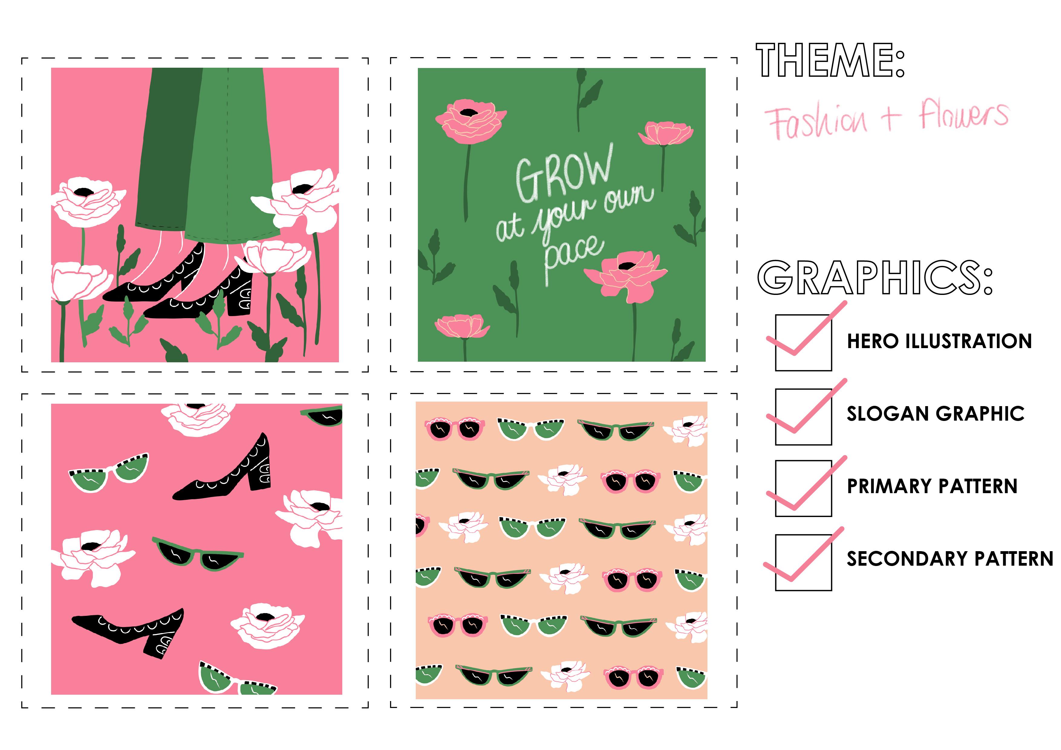
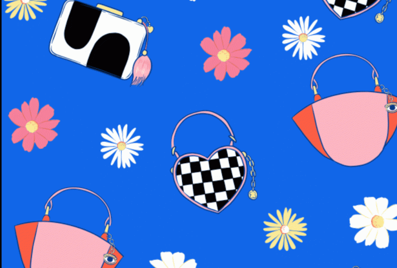
3. What is a Collection?: In this class, we want to
create a themed collection to represent your work and
to build up your portfolio. But what is a collection? In this case, I'm referring
to a group of graphics that look like they belong together
and compliment each other. I'm doing this by using
the same color palette, the same theme or
subject matter, and using common elements in icons throughout
the illustrations. We are going to create a
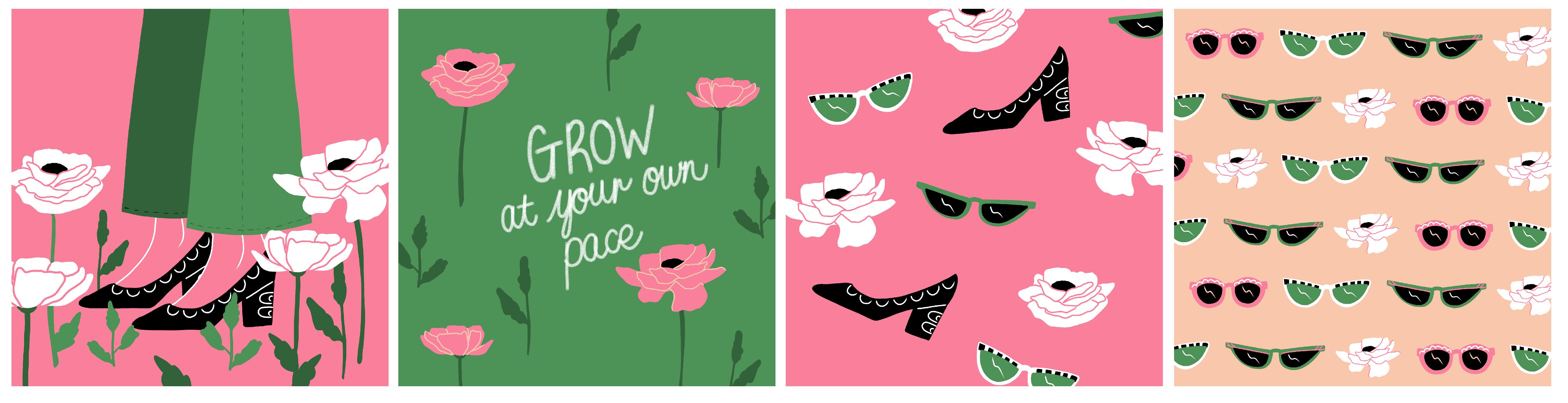
collection with four components. A hero illustration, slogan, graphic, primary Patton,
and secondary pattern. Knowing how to create a cohesive collection
will not only bam pop your portfolio, but you can also use it to
create a product range. Here's an example of some
notebooks are designed, printed, and sold
based on this concept. Another great addition to your portfolio is to
create product mockups so that potential
clients can see how your illustrations would
look in the real-world. Now that you understand what
a collection consists of, let's choose a theme
and get started.
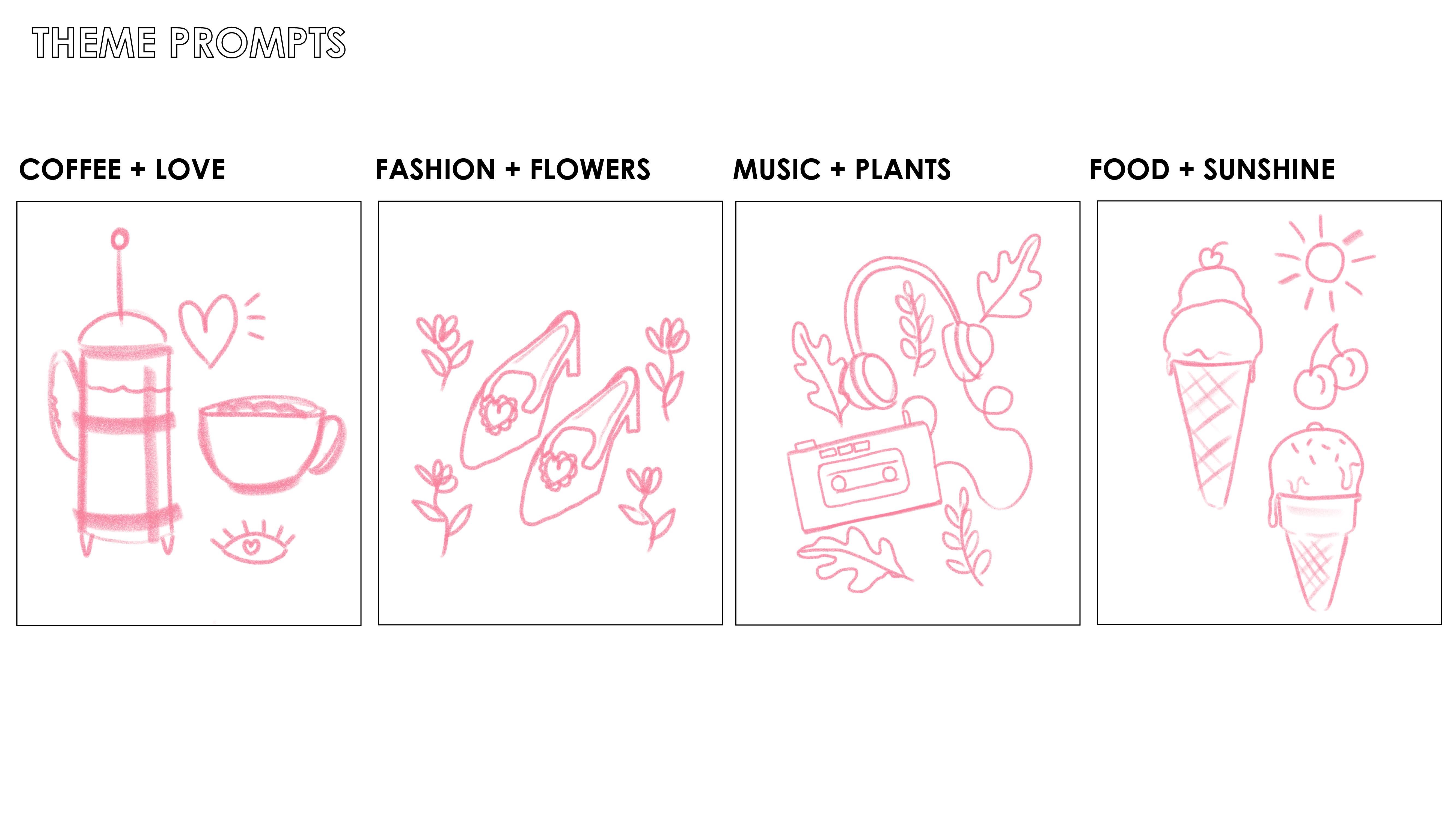
4. Choose a Theme: To get you started, I've created for theme prompts, coffee and love,
fashion and flowers, music and plants, and
food and sunshine. Feel free to use your own theme. But if you would like to use
my prompts are available for download in the
project resources section. Now it's time to create a mood board based on
the theme you've chosen.
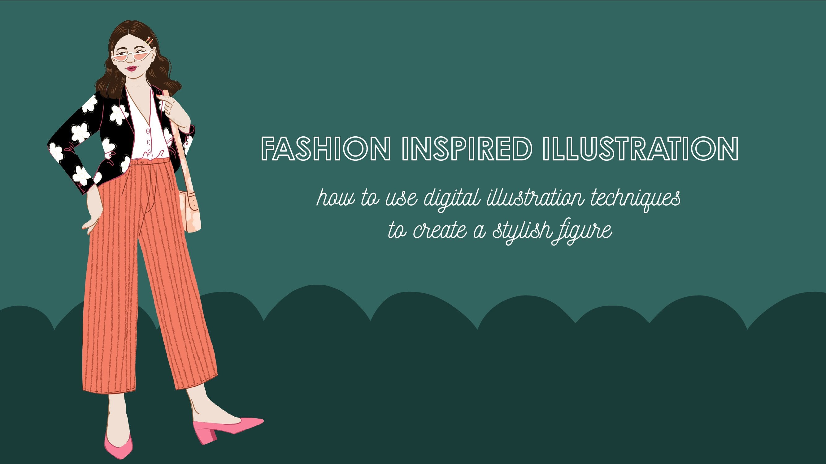
5. Moodboard: The theme I've chosen
is fashion and flowers. Some heating over
to Pinterest to have a look for
some inspiration. I'm going to have a look
at some beautiful blooms that I can use as icons. And then also on
the fashion side, maybe look at some shoes
and some sunglasses. While I'm busy browsing. I'm also keeping an eye out for any color combinations
that catch my eye because I'm also going to be choosing my
color palettes. By creating a mood board. You help organize your
thoughts before you start, and it also gives you
direction and a color palette. So here you can see
in my mood board, I've really honed in on the bride's pink and
green combination, which I think is lovely. And then I've also added in a peachy tone to balance it out. Now that we've got
our mood board, we can get started on
our concept sketch.
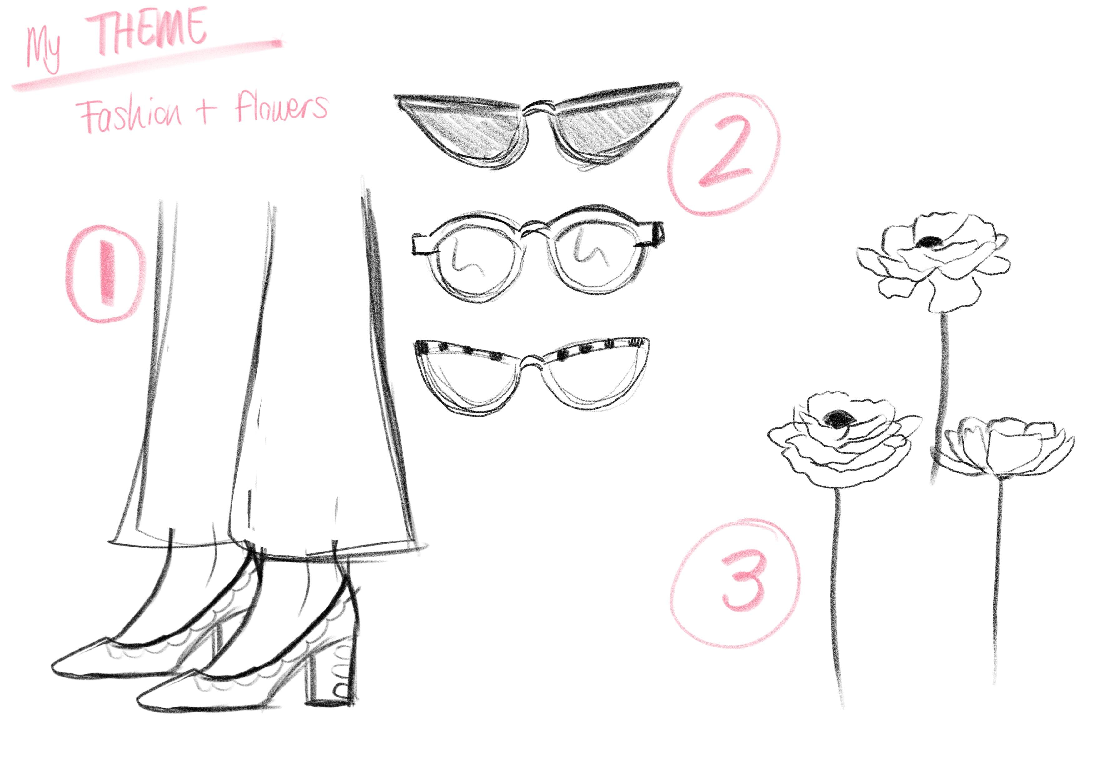
6. Concept Sketch: Now it's time to start
drawing out your sketch. So depending on the theme you've chosen and mine is
fashion and flowers, you will start drawing out around three elements that you'd like to include
in your graphics. I know that the three
elements I want to include our shoes sang
glasses and flowers. So that's what I'm busy
sketching out now. Don't worry if you're not
quite sure what you three main elements are going
to be at this stage. Just sketch and enjoy it and see what you like and what
looks good to you. So here we have my
three elements. I've got shoes, sunglasses, and I've got flowers. So next up, I'll be planning
my graphic layout or composition of the full
graphics that I'll be creating.
7. Graphic Layouts: Now onto planning
our collection by sketching out the
graphic layouts. You can use the graphic
resource layout templates and the project resources
to get you started. I'm going to put this
downloaded JPEG into the file. I'm working on Adobe Fresco and drag it down is
the bottom layer. This means I can
continue working in my file that has
the rough sketches in. A good tip is to keep your
original illustrations is the bottom layer just above the JPEG so that you can
always refer back to them. It really helps to keep
your layers organized. Because I'm using each icon
and element more than once, I'm going to duplicate them. This makes it quick and
easy for me to move them around and play around
with compositions. I'm starting with my
hero illustration. Your hero illustration should
be a standalone graphic. And I've chosen to create
a woman standing in a field of flowers
wearing some high hills. The hero illustration
has more than one of the elements that I'll be using throughout this collection. So we've got the shoes, we've got the flowers, and then I've also drawn
some extra little leaves to add into the scene. Next up, I'm creating
the slogan graphic. This is a short
phrase that I'll be hand-lettering and then I'll be pulling elements such as the flowers and the
leaves into this graphic. If you're not confidence
at hand lettering, you can also just type also phrase and embellish
it in your style. You'll need to set
the stage that we are not drawing any new elements. We are simply using
the existing elements, duplicating them and using them in a different way
for each graphic. Next up, I'm creating
the primary pepsin. This will include
all three elements that I've drawn for this theme. So I'll have the
sunglasses, the shoes, and the flowers play around with scale and also different
angles to see what looks good. The first pattern recreates
it was an all over prints. We now going to create
a line repeats print. So I'm going to create lines
out of the sunglasses. I'm also going to decrease
the size of the sunglasses so that they're
on the same scale as the first pattern I did. This makes sure that there's some variety within
your collection. Now we have created all
for graphic compositions. We have variety even
though we've used the same icons and
elements throughout. Let's recap the lesson. We've learned how to create for graphics to make
up a collection. Firstly, we created
the hero illustration, which is a standalone graphic. We then created a
slogan graphic using hand-lettering with only
one elements included, which was the flower. We then created a
primary pattern, which was an all overprint. We used all three
elements in this pattern. Lastly, we created the
secondary pattern. This only needs to use one
or two of the elements, and remember to
change up the scale. So in this case we created
a line repeat pattern. Now that all the
planning is done, we're ready to start with our
full color final graphics.
8. Hero Illustration: We will now be using our chosen color palette to create our full
color illustrations. Let's start off by
creating a new canvas. I'm going to choose
two thousand, one hundred, forty thousand,
one hundred pixels, just because I'd like to have it slightly larger in
case I wanna use it for something other than
social media or my websites. I'm going to place an
image into the art board. And this is the
reference image of all the compositions
we've just created. I've taken down the opacity of the reference image two so
I can draw on top of it. And now it's just a case of creating the full calligraphic. You can do this in whatever
medium you work best in. If you are working digitally, remember to keep your
layers separate. This means you can easily change colors and play around
with the composition. I hope this has inspired you to start your hero illustration. Next step, we'll be using these elements to create
the slogan graphic.
9. Slogan Graphic: The slogan graphic I'm
going to create is actually using the
exact same flowers. Therefore, all I'm gonna do is duplicate the artwork
and work from there. I am hand-lettering the phrase, grow at your own pace. Choose a phrase or
a short sentence that suits the theme
that you've gone for. If you're uncomfortable with hand lettering or if it doesn't
really suit your style. Consider using a font, whether it's a script font
or a very basic block font, and interest in
Beta-sheets or add onto it in a way that suits the
theme that you are portraying. Once you've created the phrase, you'll be adding in the
elements that you've already created just by
duplicating them. So I'm adding in all the flowers
that I've already drawn. And I'm just positioning
and seeing what works. To get more use out
of the three flowers, silhouettes that I've created. It's a good idea to mirror them. This tricks the ion
to thinking it's a new shape and not
just the repetition. Once you've added in
the background color and you generally happy, It's always good
to look back and refer to your first graphic. In this case, I'm
thinking I need to bring through a pop of pink onto this graphic so that
it carries through some of the look and feel
of my first graphic. So this is where
I'll tweak around, play with the flowers
and makes sure that the color palettes is
coming through strongly. Notice that I've kept to
the tight color palettes and the pink and green are
coming through nicely. Now it's on to creating
the primary pattern.
10. Primary Pattern: Once again, I'm going to
duplicate my art board so that all the icons I've
already drawn or inlay, some of them are
in hidden layers, some of them already visible. So which ever way you working? Just remember to streamline your time by duplicating
way possible. You'll remember that
I've already created the flowers and I've
already created the shoes. So the last bit
for me to do is to create the two
sunglass silhouettes. Now that I've drawn
the sunglasses, I've created all my
elements in full color. So that means all
I have to do is pull up the shoes
and the flowers. And that'll give me
everything I need to create this all overprint. I'll be playing around with different angles to
create an all over pattern that looks interesting
and is also a balanced. We're almost there. We've created three graphics in the form of a hero illustration, a slogan graphic, and
a primary pattern. Now it's on to creating
the secondary pattern.
11. Secondary Pattern: It's time to create
the secondary pattern. Once again, I'm going to
save time by duplicating the artwork so that
all the graphics I need or within the file already. I'm also going to hide all
the layers I don't need. And I'm only going to
pull up the sunglasses. I'm going to create a
line repeat pattern, meaning that I'm going to
create a line of sand grouses, three varieties and name
just duplicate them. This means that I
do have to create one more sunblock
silhouettes to, so there's more variety. Now that I've got the
three elements and putting them side by side
to create a line. I'm also going to
play around with color and see what works. To help me decide on
the background color, I decided to go back referred to all graphics and I saw that maybe I should bring
through some of that peachy tone to lift
the color palettes. I think that looks a lot better. I also decided why
not bring in one of the flowers I've already
created as part of the line. This will then create a
little bit more interests when I start
repeating the lines. So at this stage,
as you can see, you really are just playing
around and you'll really get a feel for what works with
the elements you've created. Once you're happy with all
the items in the line, all you do is
create a pattern by repeating the line downwards, reimbursed to the
move the line to the left and to the
right each time. So they some variety. And they we go,
you've created all for graphics as part
of your collection. I am going to throw in a quick bonus pepsin to show you how to use what
you've already created, but make it different just by
playing around with scale.
12. Bonus Graphic: As you know, this class is all about building your portfolio, but in a way that doesn't
take up loads of time. So I've thrown in
this burners pattern to show you how easy it is to create additional graphics from what you've already drawn. So again, I'm duplicating
an art board because the only elements
I'm going to use is the flowers that I've
already created. And a tip is that you can create these additional graphics just by playing with scale
of an existing icon. So in this case, all I'm doing is
taking the flowers, blowing the map to
be a lot larger. And in placing them
within a Patterson. To add depth to this pattern, I decided to add a dark green squiggly
line behind the flowers. And they, we go just like that. I've got an additional
pattern to add to my portfolio and that sits with the rest of the collection. Next up, we'll be
wrapping up the class.
13. It's a Wrap!: And there we go. Thank you so much for joining in this class. We've covered how to
build up a collection of illustrations to
boost your portfolio. We've looked at how to use a mood board and the same
color palettes and theme throughout so that
you can create a collection of
illustrations that show your unique style. We've also looked at
how your workflow can help you save time by using the same icons and
elements across different graphics in a new way. Please upload your projects
so that I can have a look as well as
you finish students. I'd love to see you
all the graphics that you've included
in your collection, as well as a link to your
portfolio if you'd like. If you enjoyed this class, please do leave a review. Also, if you'd like to connect
with me on social media, please do so at love to
see what you're up to. Until next time. Keep on creating, believe
in yourself and enjoy it.
 Leanne Van, Freelance Illustrator & Designer.