Transcripts
1. Introduction: Welcome to portfolio boost. Hey guys, I'm hearty Fowler. I am a professional concept artist and illustrator with over a dozen years of experience in the industry. I'm also the founder of digital painting studio. So it's great to have you as part of our community. Let's dive into portfolio boost. So your artwork is awesome. Now what, how do we make that big break happen? Your portfolio is how the world sees you as an artist. In fact, it's practically all that matters, not your diploma, nature resume. If your work rocks, you will be successful. Viewers make up their minds about your work within seconds. So if you are pursuing an art career, we need to get your very best work right in front of your prospective clients eyes as soon as possible. And unfortunately, so many talented artists miss out because their best work is buried in a confusing portfolio, loses their viewers attention and just doesn't give them results. This many cores will give you some really valuable do's and don'ts while building your portfolio, let's maximize your chances for success. So welcome, Let's show the world you are awesome artwork. I'll see you in the lectures ahead.
2. Selecting Work to Include: Let's talk about selecting work for your portfolio. So one of the most common questions I get asked is, should I put this piece in my portfolio? Should have put that piece in my portfolio. Which categories? How many images? These are all really important consideration. So when selecting work for your portfolio, I want you to change one fundamental mindset. I want you to totally switch to the point of view of the art director who we want to be looking at your work. Try to mentally project yourself completely into that art directors point of view. So art directors are usually sifting through dozens, sometimes hundreds of portfolios trying to fill a job, they get a lot of practice reviewing portfolios. So whenever you are making a decision about which piece of art to put into your portfolio. Think about it from the only point of view that matters, the art directors, if you include an image in your portfolio, will the art directors see it in, say, this type of image can solve a problem for me. This can help advance my project because that's all an art directors job is to keep a project moving forward. So be that solution. Include work, the chosen art director that you are the answer, they can finally stop searching. The artist has been found. So what this all comes back to is, instead of just including art, that might be your favorite, think like an art director, include what your client would want to see, not necessarily just your preference. And I'll teach you how to spot and know the difference, how to really achieve that distinction in the lectures ahead.
3. Choosing a Platform : Let's talk about choosing a portfolio platform. This can be kind of daunting because there are just so many options. Some of the popular ones are Wix, Squarespace, site 123, go daddy, web.com and network solutions. And honestly these are just the most prominent ones. There are so many options. Any of these can work beautifully for you. I want you to keep some main priorities in mind when shopping around. And regardless of the platform that you pick, this is what you need to be focusing on when building your portfolio. First of all, and most importantly, does it make your work look good? Does it have a clean aesthetic? Does it display your work prominently? That's huge. Also in maybe equally important ease of navigation, we want there to be the fewest clicks possible between when a client first clicks on your link to when they are seeing your best work. So ease of navigation, something very intuitive and straightforward, very important. So keep those in mind when selecting a platform. And I will come out in favor of one platform in particular. And I am not affiliated or sponsored in any way, but it's art station. You can get a really beautiful free portfolio put together within about an hour. It puts a large amount of art right in front of your viewer just immediately. That's really great. It's got a nice clean interface and it shows big thumbnails, so you just instantly get that awesome pop, beautiful art and color. But the biggest value of art station is it's got this great built in community for artists. So you don't really have to worry about much. Seo or marketing. Art directors are already looking there. So it's a great place to keep your art. That's the one that I recommend, especially if you are a beginner trying to launch a career. So while each platform has its pros and cons, different price ranges, any one of them can really be supercharged and optimized. And I'm going to show you exactly how to do that. Had a think about that in the lectures ahead.
4. Portfolio Psychology: Let's get into the really useful stuff. Let's talk about portfolio psychology. What do we want your perspective client to experience when they visit your portfolio? And there are a number of things that we need to carefully consider and that will guide how we build our portfolio. The first thing, attention span. So remember our directors are sifting through dozens, sometimes hundreds of portfolios. Impressions of you and your work are formed within seconds. So it actually building your portfolio, every decision you make should be designed to put your most mind-blowing targeted work right in front of your prospective clients face as easily, as quickly and with as few clicks as possible. Think of it this way. Every time the client has to click something, your odds of success drop dramatically. Portfolios with lots of navigation or different sections, like For Illustration, one for sketches and ink and photography page after page of clicking in searching, it ends up leaving your perspective client confused, a little frustrated, and they are just ready to dismiss your work and move on to the next candidate. So it's great if you're into lots of different kinds of art. But the most common mistake with beginner portfolios is making a portfolio that contains too many broad categories that require too much navigation and just end up confusing your client. Count the clicks it takes to get from a link to your very best work. Keep that number is low as possible and your odds of success will go way up. Another way that we can optimize is by targeting client needs. When a client visit your portfolio, ideally, we want them to just look at a handful of your best images and just go, yep, this is the artists that we need. We want them to see your work and feel relief. This is the artist who can solve my problem. And we do that by creating a targeted, focused portfolio. Now when I say focus, I don't want you to limit yourself. You can definitely include many different subjects, many different genres. It's great to include characters, creatures, environments, vehicles, any number of things. It's good in fact, to show that versatility, it's a huge advantage. But what we don't want to do is have that mash up of lots of different broad categories of art. So again, for example, don't include photography in graphic design in a concept art portfolio just kinda muddies the waters. And this is where a bit of a gut check comes in for many artists, you sort of have to decide what kind of artist am I. Am I a concept artist? Am I an illustrator, a comic artist, a manga artist? And I know it can be a tough decision to just pick a lane, but you should really try to stick with one thing and not let all of those other art categories that you may be passionate about really dilute your portfolio. We don't want a client to come across your work and be like, This is an amazing concept artists, but there's all this other stuff and it just kind of makes you seem like a jack of all trades, but a master of none, and it just leaves a bad impression. So let's build a targeted focus portfolio that is the perfect answer to our clients.
5. Appearing Professional: Let's talk about how to appear professional. This is another one of those key things that we need our portfolio to communicate. The most important way to show professionalism. Do amazing work. Now I know that is very obvious, but the quality of your work is the single biggest factor determining your odds of success when a client comes across your portfolio. More on that later in our course recap. But that is huge, obviously, other than the sheer awesomeness of your work, we can communicate professionalism some other more subtle ways. The main one is having targeted work. So remember, we want to avoid too many categories, muddy the waters. Very important one, we need to avoid fan art. That's another thing that I get asked about quite a bit whether or not fan art should make it into your portfolio. For the most part, the answer is no. And look, we all love drawing Batman and the Mandalorian. But when an art directors sees a portfolio full of that fan art, all they can imagine is a kid copying a comic book cover and it just gives him the wrong impression. It does the opposite of what we want our portfolio to do. So with very few exceptions, I would say if it comes from an intellectual property that you did not actually work on, I would leave it out of your professional portfolio. Let's show your client that you can come up with really awesome original ideas and render them beautifully without any nods to existing art captions, this is a pretty minor detail, but if the client is interested enough in your work to really start stocking you and looking into the details, the captions that you include can really play a deciding factor. We want every image that we include in our portfolio to make our client think that we are in established professional, regularly creating work for high level clients. But what if I'm not an established professional lie? No, not really. We never want to say anything that isn't true, but we can still create the impression of an established career even without overtly overstating our credentials. And here's an example. This is big Eddie. This is an image that I created for myself years ago. It was purely a portfolio piece to try and show some skills that I had been working on. And this is something I purely invented. But instead of saying, Hey, I made this up, or I just invented this for my portfolio, which would have made me look very amateur. What I said was this, this is a character concept that I developed for a futuristic mafia IP. That's it. I didn't overdo describe anything. I didn't say anything that wasn't true. It works perfectly. After all, it is a futuristic mafia, IP. Technically true. It's just an IP intellectual property that I totally invented. So be truthful, but a little bit of fake it till you make it is going to be part of launching any art career. So frame your descriptions, lead that impression in that more professional direction and you will have better results. And finally, never be self-deprecating. We have all done this is artists. When artists show their work, there is this powerful instinct to start pointing out all of the parts of the image that you found lacking. And look, every artist since forever feels that pinch of anxiety when they show their work. It's totally natural. But fight this instinct to be self-deprecating. Never publicly say anything negative about your own work. This goes for portfolio captions, but really anytime we are showing work for critique, where especially to a client for approval, we never want to be self-deprecating. Think of it this way. If a viewer sees your work and then they read a paragraph about how bad do you think it is? There's no way they can ever see it in a positive light. They might think your work is amazing, so don't talk them out of it. Project confidence when describing your work and in general, saying less is often better since it gives the viewer more space to come to their own conclusions.
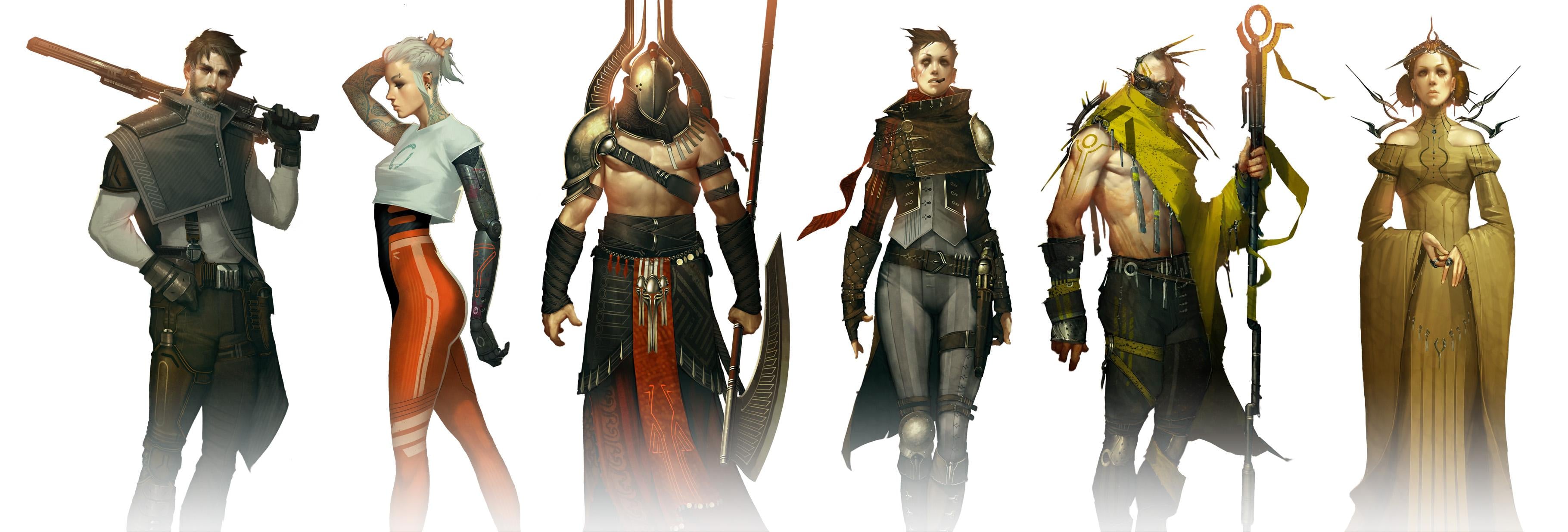
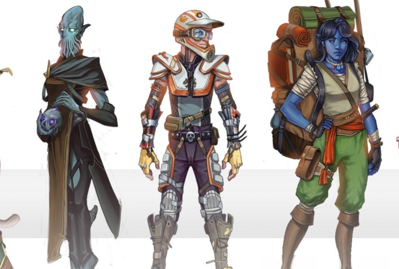
6. The Call Back Hack: So what is the best portfolio? Well, in my opinion, the best portfolio is no portfolio. Here's something that I do that I've had a lot more success with targeted example sheets. These are awesome. You just compose together a handful of your favorite projects from a given category into a single image like this character sheet. And instead of posting this somewhere or just passively waiting for a client to find you. You use these sheets when you're actively applying to a job post. And you can make these for anything. You can do, characters, creatures, environments, vehicles. You should make one for every type of category of art that you want to go after. And then you just drop them into an email, right? A quick paragraph and you're done. This has huge advantages. It puts your best work right in front of your client immediately. There is no navigation, there are no cliques. They don't have to look through any pages to try and find the work that you want them to see. It just shows your best stuff immediately. My rate of at least getting a reply is much higher with these targeted example sheets then with any portfolio that I've ever tried. So I strongly recommend that you build a few of these and keep them handy in case that perfect job post comes along. Give this a try.
7. Making a Targeted Example Sheet: Hey guys, as we finish this mini course, let's do a quick hands-on exercise. Part of this, I want to actually walk you through the process of creating one of these targeted example sheets. So we're going to put together a character sheet. This will be a really great way to just walk you through the general process of how to use a digital painting app to construct one of these. And we'll also talk about some design considerations so that these sheets have as much impact as possible. To start with, what you should do is bring up each document for each character or creature or environment, whatever it is you're making a sheet out of. And we're going to make a single layer out of this. So of course, during the process of rendering something complex like this, you're going to end up with quite a lot of layers. And I've got them grouped into a folder here so that we can expand those to see all the layers or just close it to have a look at the folder. Kind of a nice way to keep things neat and organized. I'm going to make a copy of that folder by dragging it down to this, the new folder or new layer button. And then I'm going to hit Command E to merge that because what we're trying to do get a single layer. We want the entire character to be flat. On one layer, we have certainly kept the folder so that all those layers are still there. It's kind of a non-destructive way of working. But for our character sheet, all we need is for each character to be one layer. So that's the first step of the process. I'll hit Command a to select all, and then we will copy. Now let's jump over to the character sheet. Now I have a bunch of other characters already pasted in here. It's the same process. So to bring this last queen character in, I'm just going to go to edit, paste. And here she is. Now we want all these to be approximately the same scale, or at least that's what I'm choosing for this design. So I'll hit Command T and we will scale her down so that she seems to be about the same scale as the rest of the characters on this sheet. That seems roughly right. And to keep things organized, I am naming each layer so that I know which one is which. And now we can very easily select any layer and we can compose these on the page. And I'm just going to start lining them up. It'll be kind of like a mug shot line up or something, but we're just moving these around to see which ones look best next to which. Now, as I'm doing this, I am considering a few different things. We want there to be a wide variety of genres. So we can see lots of different stuff going on here. We've got sort of a, a sci-fi Star Wars type look at something very Cyberpunk, something very steam punk, something kind of historically researched, like a god of war or an Assassin's Creed looking thing. Lots of different genres here so that we are showing versatility. That's one of the best things we can do with these character sheets. We want them all to have really good-looking art, whether a character sheet or creature, or environment or vehicle. But we want to show that we can do more than one genre. We don't want it to just look like a single flavor. Otherwise we risk looking like we're only good or comfortable with one thing. So that's a really important thing. We've got some very different genres going here. Another thing that I want to be conscious of is color. We've got quite a nice variety of colors here. Something very muted. Next is something very saturated, like this bright orange. Something very refined and elegant next to something that's just all grungy and grimy and hardcore. So there's some fun contrasts that we can use there. And it makes the whole group end up feeling like this really fun collection of very polished things that look cohesive, but at the same time showing a lot of variety. It's a very powerful finished product. One other thing that we have to keep in mind when composing these is we don't want one character's accessories to sort of impose on the other. So let's look at this guy at the end. For example. I don't want them to be facing this way because he's pointing his blaster, dangerous thief close to the head of the character next to him. So we definitely want it to be working this way. It's just little things like that that we have to keep in mind. I've made another one of these that had a Viking with a big acts like this. And the way he was holding it, it's sort of looks like he's about to chop the head off of his neighbor. And that's not what we want. These are just some design choices to keep in mind as you are composing your example sheets, variety, color, different genres. We want to show competency in a lot of different things while making it feel cohesive. Now that we're showing that variety, let's start working on that cohesive and polished effect that we are going for. And one of the ways that I love to do that is by creating a bloom effect. Now this works best, or it really, it only works on a white background. So it's this effect of making it seem like the sun is kind of baking through in making our characters look very dramatic. It's that lens flare effect. So I'm grabbing a very soft brush because we're going to very softly paint in a soft glow kind of around the heads of these characters. Let me show you what I mean. So we've got our brush spacing at about 25, it's at max or 0 hardness. It's as soft as it can possibly be. This new layer that we're going to paint on a named it bloom. And I'm going to set that to lighten. Lighten does a very important thing. It lets us paint, but it won't show up where there is any white. So it's sort of only brightens things. If I put that back to normal, you see it paints orange in the whitespace. We don't want that. We only want it to be lightened. One other important thing that I've done is I've changed my brush mode to color dodge. What that does is every time we paint, it becomes both more saturated and brighter very fast. So it makes it give us that kind of sunny glow effect really prominently. And that's very important to get this effect to work for you. So every time I tap the stylus and paint, again, it's making this more bright and more saturated. And as you can see, it gives these characters this nice bit of polish, this refined glow. It just makes it feel kind of warm and dramatic. For some reason when, when something has a spotlight behind it, it just makes it look heroic, kind of important. Like there is something that really needs your attention. It's, it's sort of just this instant drama bit of polish that we can add. And it also does this really nice job of making all of these characters kind of tie together. It just unifies the whole group in a really good-looking, polished way. And that's what we want. We want these sheets to make our characters look as polished and finished and impressive as we possibly can. Because the whole point, the whole advantage of these examples Sheets is that we are showing our very best work to our potential client instantly. When they look at this whole sheet of characters, we want them to just instantly smile and say, Yep, this is who we had been looking for. And that's what all of these little polish steps can really do for us. Of course, we need the work itself to be outstanding. We need this to be only our very best stuff. And I'll be honest guys, there are characters. I have done that just didn't make the cut. I didn't want them to be on my example xi. This is the best stuff that I have, and that's what we should use. Let's check it out with and without the bloom effect. See that nice little bit of extra polish and finish that that ad. It's really nice. You can definitely go overboard with this. So use a bit of restraint here. You can always lower your layer opacity if it's feeling too strong. But it's just a nice way to make the whole group feel cohesive and feel very polished and cool. One final way that I like to visually tie the whole group together is I become really fond of having just a simple geometric shape somewhere in my image is kind of a framing device. So for this group, I'm just going to put a stripe across the background. So I've created a new layer underneath this bottom character. It's, it's basically the bottom of the layer stack. And I'm going to fill that in with a gray color. Let me do this again. I've used the rectangular marquee tool to drag out this shape. And then I'll just hit option Delete. And it fills in this gray color. And I will move that around to see where I want it to be. If I hit Command T, I can resize it a little bit. It might actually be a little darker than I want it to be so I can lower the opacity. I want it to be something that we're only subtly aware of. And I think that that is just about perfect. It ties the whole group together, but it's not to attention getting. If you have a personal logo or a signature, this is a good place to put it to. You can kind of leave it on the margin. One of these places. Here's a similar approach that I did for an environment sheet. Same basic ideas. We want there to be our very best work, but we also want a nice variety. We want it to feel cohesive, but show versatility. So I've got several genres going on at the top here. I've got this Cyberpunk background, but we've also got some different stuff. There's more of a sunny natural landscape in the middle. Then we kind of come back to Cyberpunk stuff at the bottom. On the bottom I'm showing both a finished painting, this round window, Cyberpunk loft illustration, combined with some concept art. So showing some versatility of skills there too. We can do the actual ideation process, but we can also bring it to a very polished painting. So we want to show as much skill is much versatility is many different bits of value that we can demonstrate to our prospective clients is possible. And then finally, on the right side, I've got this nice tall bookend of an environment. Just to show you one more genre is kind of Victorian historical looking place, but also something that's very warm in color. To balance out those really cool Cyberpunk type color schemes on the other side. So it's the same general process between character sheets and environment sheet. I hope you'll give this a try doing something actually practical and hands-on, even in a mini course like this can help to really cement the lessons that we've learned. So actually going through the motions of building one of these for yourself can really help these lessons to really sink in and become part of your knowledge. So definitely give this a try. You will love the results.
8. Course Recap: I hope there's many cores has been really helpful guy. So to summarize, remember to always think of your client's point of view. Make a targeted, focused for folio. Present yourself professionally with these three simple mindsets. You are already elevating your work above countless other portfolios out there. You are using the portfolio like a professional as a tool and advertisement putting your best targeted work in front of your client. And not just is this repository that catches things that you happen to find interesting. Now in closing, remember, do good work. As important as portfolio presentation is? Of course, this is the most important factor determining your odds of success. If your work is already Stellar and you are ready to launch a career, go get him, share some success stories with us, post on our community. We would love to hear about your progress. But if your work still needs a boost to get to that level, digital painting studio has some amazing resources. And that all starts with concept art academy, specifically designed to give you portfolios. You'll need to stand out in a competitive market. We learned to do by doing, which is why this is a project-based Academy. You will be coached in supported every step of the way. And my promise to you is that while we work together, you will have these moments where you put down your stylist, look at your screen and say, this is good. I did that. So thanks for checking out portfolio boost. I love helping and interacting with artists or reach out if I can ever help. In the meantime, good luck with your work. Bye for now guys.
 Hardy Fowler, Digital Artist