Transcripts
1. Preview: welcome to painting machines. My name is Hardy Fowler, and I'm a professional illustrator and concept artist. I'm calling on all artists out there with a passion for creating cool looking vehicles, robots and weapons. If you've ever dreamed of making a career out of this, I'm here to tell you that the dream is really you can make a living doing this. All you need is a killer portfolio tow launch you into an amazingly fun and rewarding career. This course could get you there. I'll show you all of my professional level techniques and tricks that will demystify the entire process of creating hard surface art. With Adobe Photoshopped, this stuff is way easier than it looks. In an easy to grasp, step by step process, you'll learn digital painting techniques. It will have you amazed at how sophisticated, beautiful and realistic your machine are can be. But this course is so much more than just a painting. Demonstration will teach you everything you need to know to start thinking like a machine designer to tie it all together we offer responsive support and loads of other course. Resource is to make sure that every student can take their work to new heights. You can do this. Don't miss out on the chance to turn your machine art into a professional level product. It just might lead to a dream career so enrolled today. Grab your stylists and let's paint cool stuff.
2. Introduction: Oh, hi, everyone. This is Hardy and welcome to the painting machines. Course, this is gonna be a Superfund and super valuable course for any artist so good on you for signing up. Let's check out some prerequisites for this course you definitely needed have completed art fundamentals and Photoshopped fundamentals before getting to this point for this course will assume that you're comfortable with basic art principles and photo shop operations. Most of what we'll do in this course is in the intermediate skill level range. But we're going to take things one step at a time, so no one should worry about being out of their debt. Machine painting is a super cool skill to have. I mean, imagining in painting robots and spaceships is just fun. The best part is you can really make a living doing this. All kinds of entertainment industry clients create a huge demand for artists who can imagine and render awesome looking machines thes air skills that you can really bank on and they will make you much more valuable art professional. Let's take a look at the course outline the lectures ahead will focus on concepts and theories to get you thinking like a machine artist. These include machine painting, overview shaped language, form and function and visual design. Once we've covered, those subjects will do some machine rendering exercises to give you the tools to bring your ideas to life. These include line and shape, shiny metal and putting it all together. From there, we'll tackle five awesome machine art projects to put our skills to use. I'm really excited to share this course with you guys, and there is a lot to dig into. So kick back, grab your stylists and let's bring some amazing machines to life.
3. Course Overview: Oh, hi, everyone, This is Hardy. In this section, we will take a broad look at the art of machine design. It discussed some key guiding principles. Machine paintings, which in this course incumbents is vehicles, robots and weapons are most commonly used. Is either concept are or promotional illustrations for movies, video games or tabletop games, just to name a few. This entire facet of concept art is also referred to as hard surface, along with character, environment and creature design. Machine design is one of the central pillars of a concept artist skill set and perhaps the most in demand. If you're like me and you grew up filling sketchbooks with X Wings and Terminator drawings , that a lot of this course will be like hanging out with an old friend. I mean, come on, this stuff is just cool. A successful machine artist is able to pair a creative and effective design with a beautiful, realistic and compelling rendering. Design and rendering are the two legs that this subject stands on, and one cannot stand without the other. So how do we define success? What makes a machine painting cool? Well, here's a checklist of core goals to keep in mind great machine paintings capture the following a recognizable role or function. We need to know what this machine does as soon as we look at it. Is it a utility machine or a war machine? The features that we design into our machines need to God the viewer to the correct conclusions about function. Solid design, both visual and engineering. Our machines need to be visually beautiful in order to capture. The viewer's attention we accomplish is by keeping design fundamentals in shape, language in mind. In terms of engineering, we need to use a lot of common sense to make sure that our machines seem like they could work in. Real life will go into this in more detail later on. Personality. No boring machines even something heavy and utilitarian can and should look cool. Since machine design can be so wide open, there's a whole world of possibilities that the artist draw upon. For inspiration, try giving your machine an animal or human characteristic a spider like mech or ah, hulking snail like armored vehicle or just a few examples. The more personality your machines have, the better. So keep these general guiding principles in mind as we move forward
4. Shape Language: Hi, everyone. This is Hardy. In this lecture, we will take a look at shape language. Shape. Language is the use of geometric shape elements in artwork to achieve a desired visual impression. So, basically, if we know how certain shapes communicate certain ideas, we can use shape language to make our viewers feel a certain way about our artwork. This could be incredibly useful in character, creature and machine design. Let's stick with three primary shapes for our discussion Circle, square and triangle. Each of these shapes can be associating with certain attributes. Circles seem friendly and approachable. They are non threatening and trustworthy. There are no sharp edges, and everything has an easy, smooth curve to it. Circles can also imply feminine squares are dependable, stable and solid. They seem static and sturdy or even boring. Squares can also imply masculine triangles are aggressive, dangerous or threatening. The sharp edges imply both motion and speed. Let's take a look at some sketches that make heavy use of each of these primary shapes For its shape. Let's take a look at a cartoony face, a machine and an animal first. Let's take a look at a sketch of a very circular human face. Now these air exaggerated, but you can see almost every element of the face is based on a circle. It gives him a very friendly, non threatening quality. It also reminds us of around baby's face, which almost everyone will associate with harmlessness. For a circular vehicle, let's check out the Volkswagen Beetle. It is perhaps the most circle heavy design ever for a car, and it certainly seems friendly and harmless. Just about every element of the design is a circle or a curved line for our circular animal . Let's check out this hedgehog now. This one is a bit of a contradiction, but I included it because I wanted you to see how powerful the visual effect of the circle can be. This animal is covered in spikes. By all logic. We should be afraid of it or repulsed by it. But almost everyone who sees one of these things wants to pick it up and give it a hug. They're just adorable to us, practically solely because they're just one big circle their entire body shape, their eyes, ears, nose, all circles and our trust of circular shapes will make us pick up something that will probably poke our hands next. Let's take a look at some square designs. I've sketched a very square human face. This guy seems very sturdy, masculine and perhaps dependable. He's also quite static. There is no movement and nothing much going on with him, predictable and even boring, but enjoyable nonetheless. Next, let's check out this semi truck. It is designed almost entirely out of squares and rectangles. It seems very heavy and utilitarian, a dependable and sturdy machine that performs an important but unglamorous tasks for our square animal. Let's take a look. A cow. Another sketches, an exaggeration, but it really captures the essence of a cow. It is heavy, slow and somewhat boring. It's sturdy and dependable, but again performing an unglamorous task. Finally, let's examine some triangular designs This triangle based cartoon face shows have the aggressive, pointy sides of a triangle can make a face seem dangerous, evil and villainous. You can find heavy use of triangles in almost every Disney villain for our triangular vehicle. Let's take a look at this fighter jet. Everything about this machine screams fast, aggressive and dangerous. Triangular shapes imply movement and sharpness, and this machine really communicates both triangles. Air very useful when you're designing a machine or a creature that needs to look deadly sleek and fast, take a look at this shark, for example. It is composed almost entirely of triangles, its nose fins and, most importantly, teeth are all triangle shaped. We're hardwired to recognize pointy shapes like teeth or blades as a potential danger. So remember that whenever you're designing something that needs to be scary or dangerous now that we discussed each shape in some detail, let me show you a few pieces of my own artwork that have made heavy use of these shapes. Some of the shape language is a bit more subtle than others, but it's there if you know where to look as a bit of homework, start trying to see shaped language in some of the artwork or images that you see in media or advertisements. It could be really eye opening in a valuable exercise to a character artist
5. Form & Function: Oh, hi, everyone, This is Hardy. In this lecture, we will take a quick look at how form follows function in machine design. This is an incredibly useful concept. It will make your machines much better looking and more believable. First, let's talk about engineering. One of the things that always intimidated May about designing and painting machines as a beginner is that everything seems so technical. It seems like the artist who make these awesome images must have advanced degrees in engineering or aeronautics in order to pull this off right. Well, good news. No rocket science degrees air required to make awesome machine art. We're going to become masters of engineering for art. Basically, this could be summarized as it doesn't have to work in real life, but it has to look like it might. All this takes is some common sense and good observation skills. For example, the guns that we designed need to fit naturally in a human grip. Robots that we design need to have joints and limbs that move in a way that makes sense. Engines for vehicles need air intakes and heat exhaust Vince with rivets and welds, tying it all together all of these cool little details come together to make your machines seem like something ready for the assembly line that covers form. Now let's talk about function. Each machine that we design and render needs to lead the viewer to the correct conclusion about what this machine does. Let's check out these two robots. One is a war machine. In the other is a utility vehicle, shape, language, color scheme and details such as guns and rockets versus drill bits and grass for hands. Tell us what each machine does. Make decisions about these visual clues early in your design process in your final product will have a clearly identifiable function and will be believable and relatable to your viewer.
6. Visual Design: Oh, everyone, this is hardy. In this section, we will discuss visual design and how to make your machine designs look amazing. Setting function and engineering aside, machine art allows for all kinds of shapes and lines that can be practically anything. Work within a few parameters and machine aren't takes on the spirit of a purely abstract design project. Wings, air foils, sites, pistons antenna. Use these elements in any way you need to help your visual design. Let's check out some core principles that we've touched on earlier shaped language and design fundamentals. As we learned in the Shape language lecture, we can use geometric shapes in our designs to evoke a reaction in the viewer. Ah, large, frumpy, utilitarian vehicle can use lots of square shapes to seeing heavy, dependable and masculine. A war machine can use predatory, angular shapes and triangles to make it seem aggressive, fast and even dangerous. Beyond these simple shape language fundamentals, let's check out two very important design fundamental concepts that relate to machine designed repetition and balance. Repetition is similar elements used in sequence. It's always adds a really nice visual rhythm to a machine design. For some reason, our eyes just find it pleasing to be able to hop along a series of repeating shapes. Another benefit is it engineered. Man made objects like machines, often have segmented parts that repeat, so using this design technique looks cool and adds engineering credibility to your design. Balance is another very important concept for machine design. This is the distribution of visual weight in an image. When designing machines, it's important to balance large, heavy shapes with more visually active pockets of smaller shapes. Our eyes like the interest of visually active areas, but they also need areas to rest. Large, visually calmer shapes are perfect for this. I'll let you in on a perfect application of this principle that works in almost every machine design. I call it guts and covers guts for lack of a better term. Refers to all of the inner workings of machinery, pipes, gears, joints, wires, all of the nuts, bolts and clockwork that makes a machine function. These air visually very active and detailed parts of a machine rendering they could be fairly labor intensive. So fortunately we only have to show subtle indications of these areas, and most of them are hidden by their counterpart, which is covers now. Covers are the large panel shapes that make up the outer surface of a machine. These air much larger shapes, but they have a lot less going on in them. There are a great visual resting point. They make our life much easier by covering up all of the complex guts within. They also make really cool flat areas to apply decals or other paint details. Basically, we use guts and covers to balance each other out, and it makes our design better looking and easier to render. So now that we've checked out these general design principles up next, we'll take a look at some rendering techniques to help us bring our designs to life.
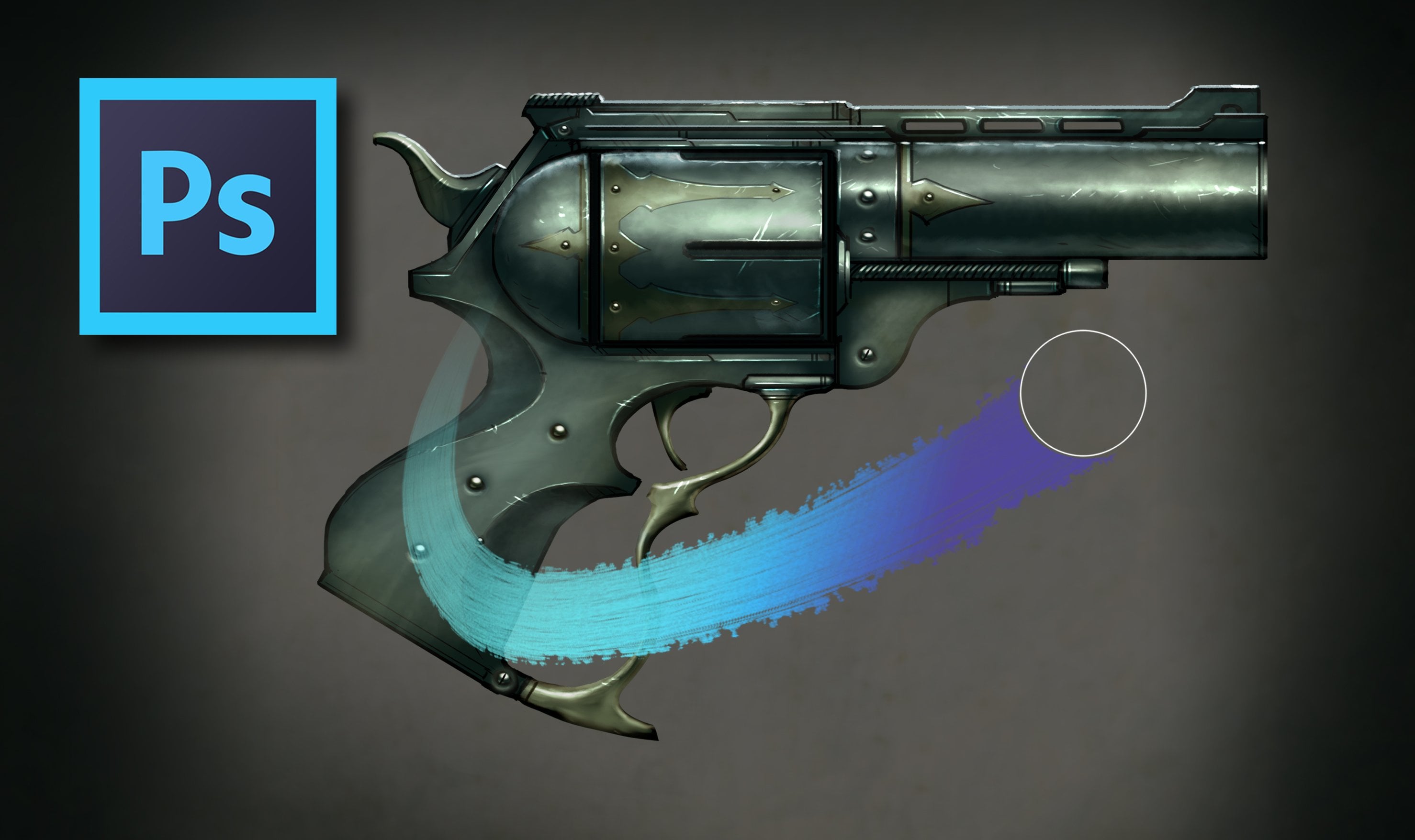
7. Rendering Exercise - Line & Shape: Oh, everyone, this is hardy. So far we've gone over principles and theories about machine designed. So over the next few lectures will learn some specific techniques for rendering cool looking machinery actually making the marks that will be our machine painting. This is a set of tools and techniques that will work for just about any machine painting you might be hired to do. So I hope you find these lessons valuable. As I mentioned earlier, Machine painting can kind of be an intimidating challenge. It all seems so detailed and technical. After all. The stuff we're drawing has perfectly straight lines, curves and repeated elements, parts and components manufactured with mechanical precision. How are we ever supposed to draw these shapes with only our steady hand well? Fortunately, the digital medium makes this much, much easier. Straight lines, geometric shapes and repeating identical objects, which are very difficult to render with pen and paper, become a breeze with Photoshopped tools, and I'll show you had a effortlessly incorporate them into your workflow with a few fun and easy exercises. First, let's take a look at lines in shapes. This first exercise will show you how we can make perfectly straight lines in geometric shapes with Photoshopped tools. Let's go over this worksheet and recreate all of these items. First, let's makes him perfectly straight horizontal lines With the brush tool, you can make perfectly horizontal lines simply by holding down the shift key. Once the line is finished, just let go, and then you can start a new one with the same technique. This is a great way to make perfectly parallel lines is often occur in machines. This works with any line thickness or any brush tip shape. Also note that weaken. Simply copy these lines if we need to to create two perfectly parallel lines. Just select the lines you want a copy, hold down Ault and shift and then move them down. With the move tool. Photoshopped will automatically make a copy a super handy keyboard shortcut. Next, let's check out a really cool way to make polygon shapes with a technique known as shift clicking. First of all, we'll need to disable shape dynamics from our brush editor so that we have a uniformed line thickness. To do that, just hit F five and bring up the brush Editor will then uncheck the shape dynamics box. This takes away the pin pressure sensitivity, so be sure to turn this back on before you resume normal painting to shift. Click. Tap down the stylist in a starting point and it will make a solid dot. Then simply hold down shift and you could make straight lines from one point to another. Uses technique to go all the way around the shapes you want to create, and you'll always have straight lines. This could be really handy if you have a large mechanical panel to render one more line technique. I want to show you involves the clone stamp tool. Let's make some simple lines using shift clicking like we just did. Now let's hit S on our keyboard To bring up the clone stamp tool, hold down Ault to sample an area we'd like to copy and then simply paint in a perfect copy of the line. You can do this as much as needed to achieve the desired effect. This tool has all kinds of great applications and machine painting. Any time when you have a repeating element, the clone stamp is your best friend. Okay, now let's shift gears to some shape creation Now these look kind of like bad abstract art in this worksheet, you may be wondering what use these are an actual machine painting. Well, most of the time we used these shapes is when we need to make a selection to paint within. Remember that any time you command click on a layer in that layer window, it creates a selection off all the pixels in that layer. That means that any shape we create on a layer can later be used as a selection to paint within. I'll show you what I mean when we get to our super cool projects later on. For now, let's check out how we can make these shapes. Let's start by using the pin tool P on your keyboard. Shortcut. The pin tool takes a little bit of getting used to tap and hold your stylist, and you can manipulate thes handles that appear to make any curve you want. Follow along the contours of this shape. Then you can see how you have total control over every curve. This vector tool precision is very useful when creating perfect machine curves. Also note that you can change two straight lines just by hitting Ault on any of your anchor points. Whenever we create a shape with a pin tool, it creates what is called a path. Pastors similar toe layers, and you can edit them in the path tab next to the layer tab to turn any path into a selection, make sure that it is selected and then hit this dotted line icon at the bottom of the window. This turns your path into a selection. See the marching ants. Now we can fill this in just like we could with a marquee selection by hitting option and delete. One last thing to note on this shape is that we can create new selections within the shape and simply delete them out. This is how you put holes and shapes you might make. Remember, you can hold down shift to make multiple selections at a time. Hopefully, you can now imagine the power and complexity of shapes you can create. Okay, for our last exercise on this sheet, let's check out how to make Radio Lee symmetrical objects. This is really useful when you want to create gears or saw blades or maybe windows. Anything with radial symmetry, that is, it's the same from the center point can be created. Using simple photo shop operations with a little practices will become very easy, but describing it verbally will get kind of wordy and repetitive. So bear with me. It all starts with a simple shape, chooses carefully, since it will be repeated over and over for our purpose. Let's make a simple rectangle in, skew it slightly by hitting command T and then control to bring up the other transform operations I'll use distort to give this shape a slight tilt. Okay, great. Now we've got our base shape on its own layer. Let's drag this layer down to the new layer icon, which will make a copy now with the move tool. Let's move this copied shape down a bit. Well, then hit command T to bring up free transform. Once again, I'll rotate this shape 180 degrees, so it is the exact opposite of its copy on the topside. Next, let's hit Command E to merge these two shapes into one layer. After that will copy this new merged layer hit command T and hold down shift to rotate this new copy 90 degrees, as you can see. It now becomes a simple process of copying, rotating and then merging down. So let's merge down and copy once again. If you hold down shift, it will keep the rotation at regular intervals. A few more copies later, and we filled in the entire circumference with Radio Lee. Symmetrical shapes. Cool to finish this one off. Let's make some simple circular shapes on the interior. Use the circular marquee tool and hold down shift to make a perfect circle. Next, let's make another circle selection on the interior and deleted away. Finally, I'd like to show you how to put a stroke line around any selection. Let's make one more circle selection with a marquee tool. Then we go to edit and stroke. This brings up a new dialogue that gives us some options. You can pick any thickness, but let's stroke 11 pixels for this worksheet. Well, there we go. I hope you can see the possibilities here. Give this worksheet to try and your machine projects will have a very solid line in shape. Foundation
8. Rendering Exercise - Shiny Metal: Oh, hi, everyone, This is Hardy In this extra will take a look at how to render shining metal. So let's get started. I've set up a document here, and we're going to start by making some basic silhouette shapes for this exercise. We're gonna render a sphere and a cylinder to look like three dimensional shiny metal material. A very cool thing to note because with just a sphere in a cylinder, those two based shapes can really cover a lot of ground on a machine. Rendering just about everything you might need to render is often a variation on these 23 dimensional shape. So this is good stuff to know. I'm creating a new layer called metal rendering and with our chalk brush ready to G o, I'm switching my brush mode to color dodge. Very important color. Dodge is always the brush mode you want to use when rendering shiny metal. So now that we have that done, I've got an almost totally gray kind of slightly greenish yellow hue. But but just about gray color and with a low flown opacity, 10% for each. I'm just dropping in some tones here now is you notice. Color Dodge builds up both value and saturation very quickly so you can see things go from low value to very high, super bright, almost blown out value very quickly. So that's why this blending mode or this brush mode rather work so well for shiny metal because it gives you those huge swings in value. That contrast that makes something look very shiny and reflective. That's what we want with shiny metal. So I did a little bit of blending there just to kind of ease some of that incredibly textured rendering. You don't want to totally kill it because that nice, modeled, textured brush work really does make it look realistic. But with that, our sphere looks pretty good. So we're gonna jump over to our cylinder here, basic rendering techniques to make this look three dimensional, just like in our our value exercise and art fundamentals. But essentially, ah, highlight a core shadow and a reflected light on each. And that's all we really need to make this look three dimensional. And the color dodge brush mode gives us that huge bright contrast that makes it look shiny . And just like that, we have some pretty believable metallic looking objects. Looks like we're looking at a ball bearing and a lead pipe or something to add a little bit of an accent. I've created a new layer and called it edge lighting, and I'm still in color dodge brush mode, noticed and just adding a little highlight on the side of this sphere like we have some bright spotlight kind of behind it and making that a little bit irregular to make it look like there some texture to that sphere again just to add interest. Gonna feather a selection on these reflected light areas and change the hugest a little bit to get this some color interest with metal. A challenge often is to make sure that there is some color information in there. You know what, all of your medals to just be flat gray or too monochromatic. So little steps like that of changing a a reflected light you can really help up next, we're gonna add some lines and seems this is also always a great next step after you've got a good, basic shiny metal rendering. So I've got this on a new layer and essentially we're just carving some lines into our shapes. I'm carefully making these elliptical curves to follow that that spherical shape and same on this cylinder wanted to look like it's wrapping around. That will really help reinforce the three dimensional shape that we're going for. And just this is just add interest Machines often have little seems where panels come together, where to articulating joints kind of slide over one another. So even if it doesn't necessarily have a concrete engineering function, you can always find a good use for these. They always look good. So I made a copy of all of those layers. Grouped emerged it altogether because now, on one merged layer again, also with color dodge brush mode, we're gonna add in some little scratches. So with that gray color, I'm just doing some brush marks here. Ah, very small brush to make these little narrow scratch and tick marks just to make it look like this. This is kind of ah, weathered piece of metal. It's been dinged up over the course of its life, always adds interest. Now again, if you want something that look shiny and new, you should skip this part, maybe make it brushwork a little softer and more regular, but this is often a really cool way. Teoh add some personality and a lot of interest to any kind of machine rendering shiny metal or any material. Really, Really. These scratches and little chips and paint always make it local. Another thing I want to show you is how we can repeat a simple shape to make it look like ah threaded part or some part of ah machine that has a rolled lip edge or something. Let me show you what I mean again, painting kind of a thicker, elliptical curve around this cylinder. And I'm gonna do a little bit of rendering to make it sort of match that cylindrical rendering we've got going on over here. A little highlight. Now that I have that done, all I have to do is copy this layer over and over a few times. And just like that, it looks like this is some kind of a pipe that has a threat Attend that that screws into some other parts. So a super cool little way to add some interest. One of those ways that photo shop really makes life easy. Next, let's ah, let's look at a cool way to add some rivets so painted in just a tiny circle. Essentially, what I'm doing here is rendering a very small cilla sphere shape just to make it look like a rivet shaped kind of a rounded object. And with a clone stamp tool, we'll just sort of copy that a few times just to add some interest. So we'll definitely put these techniques to a very cool you center projects coming up next , so I hope you find these helpful.
9. Rendering Exercise - Putting it All Together: Oh, everyone, this is Hardy. In this final rendering exercise, we will put all of the rendering techniques that we've learned into a very quick many project, and we'll learn a set of steps that can get you from blank canvas to polish finished product on any machine project, for our many project will render a few simple shapes to look like cool, complex mechanical parts. The steps that will follow for this in all of our core project, our sketch and concept. This is where we come up with the idea and solve all of our design challenges. Rough color in this step will block in our sketch and start adding in basic color texture in detail. Next will use photo textures to add interest in color variation and will paint in some details. Net brings us to final Polish in this final step will add accent colors and or decals, and we'll find tune the details for a great looking finished product. Okay, now that we have our game plan, let's dive in and start. There's cool exercise. Always find it's best to just dive right in on a blank canvas and just start making shapes . I'm gonna start with a simple rectangle using the marquee tool. We're just gonna work in silhouettes for our design here. Even though this project is not much of a design focus, we're just going to do a very simple silhouette shape. And we're gonna focus on how to do some cool rendering techniques on the interior. So subtracting away some little triangular shapes with the lasso tool just to make this look kind of cool, gonna make it a little bit bigger and maybe add some hydraulic looking piston type things into these little negative shapes that are carved out here. Maybe some pipes air something cool like that again, not really worrying about designed at all with this. Just trying to make a cool looking silhouette before I start Leinart. I think I'm gonna use, um, elliptical shapes and just select the inverse to kind of trim away the ends of this rectangle and make it look more like a cylinder. I think that will be a little more interesting. And you can see how, with just a few selections, we can make a fairly complex looking shape silhouettes air so powerful in that regard in a great design tool So give that a try. Make make some shapes of your own. No, no need to necessarily follow this shape. This is just a suggestion, but ah, lot of power in those silhouettes and marquis tools. A great way to start a design. So I contracted the selection and deleted away the interior. So I shrunk the selection by six pixels as you saw and then just deleted away the inside. And that's essentially how we converted that silhouette in tow. Line art. I did make a copy of the silhouette before I did that. As you can see, we still have layer one over in the layer window and that that's something we can use to command click and make selections from any time. So I'm doing a little bit of interior line work in my layer. One copy that will be my line aren't layer, but I've kept that silhouette just in case I need selections, and I'm adding a few little interior points of interest. I think this will be a neat little ventilation window. Something like that. I'm copying these elliptical edges and copying them inwards just toe to make a neat little metallic lip edge type thing, also using the clone stamp tool whenever I need to repeat thes perfect line. So that's a great way to get this. Mechanical perfection is the clone stamp tool whenever you need to curves to match exactly a great way to go. So with a few more details, I think our concept is finished. So I'm going to use that selection and fill in this silhouette with this really dark scion shape that always uses a base. It will go ahead and fill that in, and now we're ready to start our rough color phase, make a copy of my Leinart and then merge that down to the silhouette as well. So let's start by making a new layer and call it covers. Now covers are the external panelling that occur on most machines, and they cover up most of the surface area, and most of the designs that I do. So we're gonna do that first pretty easy. They're usually just basic shapes, and essentially I'm just rendering a cylindrical type of rendering here. So ah, highlight. Of course, shadow and little reflected lights down at the bottom. Just around this out make it seem like a round cylindrical mechanical objects. That's all I'm painting in here. Very simple. So now I'm gonna start subtracting away these areas that I want to be the guts, the inner workings that show up from underneath. And I want that vent area to be empty too. So I'm gonna delete that away from the cover area. So there we go. We've got some pretty cool covers painted just like that. Simple shapes. That's all we need. I'm gonna add a little bit of a highlight to some of these edges just to make it look like a nice sharp edge again, A little more detail to the cover, but the covers air really The easiest part. Just flat color. For the most part, I made a new layer. My call that guts. And I'm gonna start by making event. We're gonna do this just with some simple rendering and then by repeating this layer So I'm gonna do one little vent slat here, a race away the bottom to give it a hard edge and maybe a race away this corner to make it look like the part where it's it's seated in the side of this cover. Then we're just gonna copy it again. Ault shift and the move tool and you can move things within a layer so you can see I copied that several times very quickly, and it very quickly looks like a realistic event with some slats there. Ah, cool way to repeat a shape and get a neat looking mechanical detail. So next let's add some shiny metal gonna switch my brush mode to color Dodge. This is a great way to make shiny metal, so check it out. We're gonna we're gonna select with the magic wand tool these little lip edges on the end and then on our shiny metal layer, we're just gonna make some marks. And as you can see, color dodge makes these marks get very bright and very saturated really quickly. So that's the difference in those brush modes. And it makes a really rich looking high contrast. Shiny metallic look. It's nice to have different kinds of materials in your piece, so there's not too one note. So shiny metal like this is always a great thing to include adding a few little details like some scratches. And I think these little piston shapes could probably be cool with this shiny metal treatment as well. So keeping in color dodge brush mode rendering in a few little cylindrical shapes. And I think we're on our way here. We've got some nice, different materials going on. So with a little bit of repetition down to this other piston, I think we're just about ready done with a rough color phase. So up next, we'll bring in our photo textures and we'll start our texture in detail later. So off camera I've pasted in this layer group called photos just a few from my library. These are all available to you, and I've copy that entire group. And as you recall from our previous lecture, we're gonna mask out that group within the silhouette of our shape. So once we have that masked out, we switch the group to soft light blending mode, just like we did in our are soft light photo texture lecture. And I'm just transforming around this photo texture within this shape to turn and fine tune it a little bit. Don't necessarily want it to be quite as active is the photo. So I'm stretching a few things out, transforming things, copying them just to make it all look. Ah, a little bit interesting. You kind of take what you want from a photo and and leave the rest so that it doesn't get too too complicated. And I think that's perfect. A nice metallic texture looks like Cem paneling, and a few little differences in color on the interior gives it a nice detail. I like to run a paint daubs filter on my photo textures. Often it just makes him look a little more painterly. Makes it makes a lot more with your artistic brushwork from the rough color layers going to use this little braided metal type shape. Justo, our photo, rather just to give these pistons a little bit more of an interesting texture. Give a little tooth to them, and I think that's looking really good. So I'm in a group. Everything so far make a copy and then we'll merge that altogether. So I've got the entire illustration so far on one layer and have created one more layer on top of that called it lines. This is a good part to start just carving out some line work. You've got a lot of pain and photo textures in place by now. So it's cool to have some little mechanical. Seems where metal panels come together where little rivets and welds happen. Great details to include in any mechanical project. So remember that lines layer always a cool way to go Next, we're gonna add some rivets. So I've created a circle and filled it on a new layer, created another circle and we're gonna stroke that about eight pixels. Actually, I'm gonna go thicker than that. Let's do about twice that. Perfect. So I'm gonna erase away the top so that it looks like sort of a counter sunk rivet set into this little bit of a whole. Isn't that cool? And we can copy that a bunch of times, move them around again, using that move to a copy function Ault shift, and then you just move it. And I think our rivets at a lot of interest. So after our lines and rivets, I think we're just about ready to enter our final Polish face. So let's get this this cool looking mechanical object a paint job. I'm filling in a new layer with a pretty bright color, and I set that to multiply mode notice the layer mode is on multiply. We're then gonna mask the entire thing out. And I'm just gonna paint back in where I want this orangish paint color to be revealed. So this could be kind of anything. It's just sort of like giving your machine a slick race car paint job at the end of your rendering and notice. I've put that under the rivets layer because I didn't want the rivets toe look like they had paint on top of them and then using black to kind of mask out some little scratches. Always a supercool detail Teoh. Remember to include on your paint layer. And next, I think we'll use, um, de cows just to give this guy some final pop. So I've pasted in a few things from my decals page, and there's certainly available to you, but I'd encourage you to make your own. They're super easy and fun to make with photo shop. A lot of these air just fonts or objects that I made with simple selection tools, so give them a try. I think you'll enjoy, but basically just a few little shapes. Some words like caution or no step often fit depends on what kind of machine you're doing. But with a few little modifications and selection transformations, we can move these objects, make them fit the shape that they belong on. And that's about all it takes to go from a simple concept silhouette shape all the way to a pretty polished looking mechanical object. So even though this has no real design, you can see it's a very cool, well rendered object that's believable. Is something complex and mechanical. So I hope you found this demonstration helpful. Now you have the roadmap that will follow in our core projects. Up next, let's put these techniques to use.
10. Project Briefs: Oh, everyone, this is hard. In this section, we will discuss project briefs. Is a concept artist or illustrator? You first need to thoroughly understand the finished product that your clients want. Good communication is key, and this often comes in the form of a document called a project Brief that comes from the client. This is just a set of instructions and Web image visual references outlining the vehicle, robot or other machine that they want you to create. Briefs could be many pages along or just a few quick sentences. Depending on how much creativity the client is leaving up to you. They need to communicate that general ideas like machine type and function. But they also need to give you an idea of the feeling and attitude that the machine is to convey. Bet to get you all familiar with this process. I've worked up some Project Breeze is a starting point for our main machine project, so let's check those out for our projects of choosing a good variety of fairly mainstream machine ideas so that we can explore a lot of design and rendering solutions that you might encounter in your own work. Check out the descriptions and references below and see what kinds of ideas start coming to mind. Do a Web search together your own visual references as inspiration, but not for copying. Don't let these Web images influence you too much. We're going to rely on our own visual memory and design knowledge to come up with new and even cooler designs. So don't let Web images limit you. We need to make sure toe work within these provided brief guidelines. So read carefully and always feel free to ask your client to elaborate. If anything is unclear, questions are your friend. So now that we have our project briefs and we've already discussed all the elements of successful machine art, it's time to start our first project. So grab your stylist and let's dive in.
11. Pulse Rifle Project - Sketch: Oh, hi, everyone, this is Hardy. Okay, We're about to start our very first machine project, the pulse rifle. This one will be super cool and fairly simple. So it's a great place to start putting together what we've learned before we start sketching. There's one more concept that I want to introduce, and that is designed language. This is the overall scheme or style that a project assumes. It is the some of the design elements that we use in a project, and it needs to be fairly consistent from start to finish. A simple way to keep this in mind is to start every project with a small thumbnail that you fill with a handful of design elements and try to limit your design to Onley these elements . I think this is a list of parts that you can use to construct your design for. This project will stick with very angular rectangular lines and shapes, horizontal and vertical lines with occasional 45 degree angles. This will make our design very masculine and solid looking. That's just what we're after at the beginning of each project. In this course, I'll show you this small window that will contain the design elements it will use for each project. Okay, now that we've discussed design language, let's dive in. Okay, here's the blank canvas. We're just gonna jump right in and start making marks. I've got a sketch layer set to about 30% opacity, and I'm just painting with black with my standard Photoshopped chalk brush and the design language thumbnail that we create really helps us at this very early stage because it it gives us a few parameters to work with. Sometimes a blank canvas is just so intimidating because there are so many possibilities that it just paralyzes you. So if we set those parameters, give ourselves some some guidelines to work within, suddenly everything becomes a lot less daunting. We kind of have a road map to follow, and it gets us over that early hump that makes things a little bit difficult. But I'm definitely going by the playbook here, a lot of horizontal and vertical lines to make those rectangular shapes in some of those 45 degree angles. So we're definitely following our design language thumbnail pretty carefully here. Beyond that, Just purely visual design stuff. I'm definitely also thinking about all of that art for engineering stuff that we discussed in our concept lectures. So this is a gun. It's a pulse rifle. A weapon, obviously. So we needed to look slick and cool. But it also needs to have some functionality. Things met so that it will make sense when it's done. So guns like this, at least a rifle will fire a bullet. And you need to have a way for bullets to be fed into its firing chamber. The part of the gun that actually makes the bullets fire. So I'm keeping things in mind. Like, where would a clip or a magazine go? Uh, those bullets would have to go up into the barrel and then kind of be ejected out of the top once the round is fired. So I am by no means an engineer or an expert on firearms, but it's very helpful to know just a little bit about how these things work and really the basics of it, or or that the bullet goes in, it gets fired, and then the empty shell has to be ejected somewhere. So for a rifle or a machine gun like this kind of weapon, that's about all you have to know. But you want to make sure that the magazine and I've sort of got an early indication of that at the bottom, the clip holding all the bullets. You want to make sure that lines up well with the barrel so that those bullets can be fed upwards towards the barrel and shut out the front. So I might be making this sound more complicated than necessary. But just trying to remind you all that you need to keep those art for engineering concepts in mind. So at the top of our gun here, I've got a little space where those empty shells can kind of fly out of the top. So that's that's just about gonna cover it. We don't need to be anymore complex or get into the engineering any more than that. But those bullets have a way to be fed in, and the empty shell casings have a place to be ejected out of the top. And once you have that, that's about it. I'm using my clone stamp tool to create some of those nice repeated design elements. Going back to our are balanced design fundamentals notice. I've got quite a lot of large panel shapes, and I'm trying to balance those out with a few areas of highly visually active areas. So there's our guts and covers kind of visual design balance step being covered there. So I'm adding this sort of stock to the back. The part that that you hold against your shoulder, uh, put a lot of thought into how the grip would be. I wanted it to look kind of comfortable and ergonomic. It's probably the only part of this weapon that won't be strictly made out of those 45 degree angles and rigid horizontal and vertical lines. So a little bit of curve to those just to make it look like it would fit comfortably and in the grip and back here. Just keeping with those 40 fives and horizontal and vertical lines to make this stock part against the shoulder really fit. So using the clone stamp a good bit to make perfectly parallel 45 degree angles. But beyond that, just trying to balance out these large heavy panel shapes with some smaller pockets of visually active areas. And I think we're well on our way here before we start painting this a little later on. I'm going to do a little fit test to make sure that this would fit comfortably in the grip of a human figure. And I would definitely encourage you all to do that as well. But for now, just sort of adding details and refining things as I go a little bit erasing away and sketching back in cleaning up lines where I may have gotten a little bit sketchy with this first project notice. I've gone for a directly side view, so there's practically no perspective involved in this at all. This makes things so much simpler because you can make perfectly straight lines just by holding down. Shift is you remember in our lines and shapes exercises. So 90% of the lines in this drawing so far are either perfectly horizontal and perfectly vertical. And I accomplished that just by holding down shift so it makes things super easy. Of course, we don't have that advantage when we're doing perspective drawings. You have to be a a little steadier with your hand and keep perspective grids in mind. But to start with, we're going for this nice direct lateral side view that will make life a lot easier for us . I definitely recommend starting with a project like this where we don't have to consider perspective too much, adding in some details, just making this little grip for the other hand, where it will sort of grip that side and steady the gun is is the soldier takes fire and adding a few little details. But I think this is coming together nicely. It makes sense in terms of art engineering. We can see the magazine and the ejection spot at the top, adding a few little items like rivets and bolts that sort of make it seem like there some machinery that works to make this gun function the place where we put the bullets in all these little rivet holes and kind of assemble it together again. I have no idea about the engineering behind this, but I'm very good at art for engineering, so we're making it look like it could be something that works so kind of tricking our audience in a way. But hopefully that's good news to a lot of beginners who don't feel like they have toe have advanced degrees in any kind of engineering in order to make this stuff look cool and look kind of plausible, like it might be riel. So just clone stamping around a few more details. But I think this is basically in place before I get too far. What I'm gonna do is jump over to a character painting that we did in another course. So this gun is being designed to fit with this space hero character. So I pasted it into my image here, and I'm just shrinking this and sizing it to fit in her grip. I want to make sure that all the proportions I've got on this gun fit well and fit naturally in her grip. And it looks like we're just about perfect. Maybe a few very subtle adjustments there, but the two hands fit together. Naturally, the stock of a gun isn't sticking out anywhere Weird. In fact, the only thing that I think I want to change is that the top of the gun looks a little bit boring. So I'm gonna add a few kind of bells and whistles here. A few details, maybe some site, in case she has to hold it up for ah, long range sniper shot or something like that. So adding some sites to the top, always a good way to to make a design look a little bit cooler. Some neat functionality details, and they just look cool. So notice I am not letting this site cover up that spot at the front where the shells reject again. Another functionality thing that I'm trying to keep. Keep in mind. I don't want anything to cover up where their shells pop out, because that wouldn't make sense. So little. Details like that are just about all that you need. What kind of a soft spot for where the I touches get a little functionality like that. But with that, I think this sketch is just about ready to paint, so we'll do that. Step up. Next, we'll start our rough color.
12. Pulse Rifle Project - Rough Color: Oh, hi, everyone, this is Hardy. In this lecture, we will continue our pulse rifle project with our rough color phase. So let's get started off camera. I have added in a few little extra details this little bracket thing near the front of the gun and a few little extra items just to polish it up. But other than that, just the way we left it. So using my magic wand tool, I'm selecting the outside and then I'm going to select inverse. And now we have a selection of this interior shape, which I will then fill in on a new layer with this nice, dark scion color. So this is how we block in our sketch. And just like that, we've gone from Leinart to a blocked in silhouette and we're ready to proceed. Make a copy of that sketch layer so that I can merge down the original onto that silhouette . Okay, we have our sketch superimposed on our silhouette here and now I'm just gonna take a moment to clean up some of these edges. You can see a little bit of that brushwork still on this blocked in silhouette and a lot of it looks a little bit messy, so I'm going around with my polygon lasso and I'll do some shift clicking with the eraser tool just to really carve out some very crisp edges. One. A lot of these two look perfectly machined flat and just man made very solid. I'll also take this opportunity to add some cool little contour details. You can sort of notch out some little did it to you, and there it makes it look like a cool machine product rather than something organic. So one of the challenges of machine painting is that everything should look kind of rigidly linear and clean and crisp. You don't really have all those organic shapes that you can get away with with character or creature painting. So easy time to just use your your selection tools and shift clicking to makes him perfectly straight and clean lines and even carve outs and cool little contour details. So just in this subtracting away here, you can see some of these cool little information we've added to the the outer edge of our gun here, already looking a lot more refined and sophisticated just in silhouette form silhouettes air so powerful I think a good 80% of all the information that we need to know about this weapon we can already see here in the silhouette. So make sure you're very happy with this phase, doing a little clone stamp there to add a repeating element. But as I was saying, make sure you're very happy with this phase before proceeding to anything else, because I need to have a very solid design at this point. And the silhouette can really help you refine that. But I think we're in good shape here, uh, subtracting away a few little negative shapes just to add some complexity. And I think we're ready to start painting so darkened our background layer, and I'm going to start a new layer. We're gonna start painting in our covers here. Remember our whole design balance element? We do covers and guts, so I'll start with these covers. First. These large panel shapes that will be kind of, ah, flat metallic type of material, so grabbing this pale, barely greenish gray color, and I'm just going to start painting in sort of a flat metallic color, and I added a little bit of a notched edge there you can see there's a sharp cut from light side Teoh semi dark side, and that makes it look like that panel curves upwards towards the light source. So these subtle changes in value can really end up having a big impact on the way these shapes take form. So cool stuff to experiment with and also this is a good design opportunity were sort of defining which parts of our gun will be. This lighter cover color and, of course, will be leaving the more visually active guts part for later. So covers and guts. It's all about keeping it balanced, and I really should probably come up with a better term for that than guts. But it just seems to work kind of all of the complex interior clockwork of a machine. But for now, we're just doing these pretty easy flat panel shapes, thes covers and subtracting away a little plane there for the hand to fit in with that, to look like a nice natural grip in a little bit of fine tuning over here on the trigger side as well. But for the most part, we're just adding in this grayish this light valued grayish color and just sort of dropping in tones. Making these light panel shapes sort of fit and will come back in a race away and refine is things start taking shape. Also do a little bit of line work, too. But these were sort of our broad strokes making our big decisions about where we want our light colors and where we want those darker, visually active guts parts to show through. So going mainly with the main body of the gun having a nice large panel on the upper side. And I'm having this trigger grip area the A cover area, too, and also the other grip near the front of the gun where the other hand goes. So picking those three main areas is are our main panel areas of interest in doing a little bit of experimentation back here on the stock, seeing if if there's an opportunity for that. But I think I'm gonna move past that. Maybe a little bit of fine tuning back here, but no big panel shapes back there. I think for the most part, you don't want to totally cover your machine. Designed up with panels. It is a little bit tempting, since they're really the easiest part to render mostly just flat shapes. But I got to say some room for that more visually active, complex clockwork stuff, too. So doing a little bit of fine tuning here, using the erase tool with not full opacity just to sort of round out some of these panel edges so that they don't come to a super defined point. Also erasing away some little seems here. All these little lines and edges look like little seems where two parts of the metal kind of come together, and you can do this with shift clicking or any kind of ways to get perfectly straight lines . It's a little tough to free hand these, but give it a try if you have a very steady hand. But for the most part, just trying to follow my sketch and you can see me referring back to that sketch layer that we saved just to make sure I'm following the original plan, adding a little bit of interest by breaking some of these panels into smaller sub shapes and adding a little cash shadow. As you can see up front just for a little extra interest refining things a bit. That this grip was looking a little bit too dark, using a little bit of smudging to to to smooth things out if they might have gotten a little bit messy or rough during your rendering. But for the most part, this is very simple stuff. Just getting these basic shapes laid down, carving out covers versus guts, kind of making all those decisions, switching to ah flattened kind of cala graphic brush. But it really doesn't matter as much as it seems to guys. Most of these effects can be achieved with almost any brush in photo shops default library . So I do switch from time to time. But is I was beginning to paint with Photoshopped. I always felt like surely there's some magical brush for every type of technique that makes this seem super easy. But it's actually much more about technique than it is the individual brush that you're using. You can do ah, painting practically in an identical way, with two different brushes, and they wouldn't look that different. The brush is not quite as important as it seems, so I hope you're paying much more attention to the techniques that we're showing here, but we're coming along nicely. I've got our main cover shapes just about rendered in. And we're doing a little bit of refinement with some line work going to subtract away this bracket shape near the front. Think we're gonna do that in a different material? Racing away a little cash out of there And this is looking nice, taking on some complexity and dimension again are racing away little lines just to add detail. Little seems where different parts of these metal elements kind of come together always makes it look very credible and interesting as a machine. All these little panels that come together kind of lets the viewer think about how this might have been assembled or how maybe you take it apart to clean it or service it things like that. So something as simple is a collection of lines. Suddenly gives gives your machine all of this interesting detail and kind of back story for your viewer to remember. So, uh, doing some some good old lazy copying and pasting here just to make some some shapes for this site up top. And just like that, we've got a pretty convincing cylindrical type pattern going on, but it's got some angles, too. Gonna do a little clone stamping to bring some of that to these other pieces of this site mechanism on the top of the gun. And I think that's looking very cool. We kind of clone stamp and then erase away to make it fit, always sort of adding and subtracting as we dio, I'd say these cover shapes air coming along really well. We're not super worried about color at this point, a kind of ad paint in a later step paint meaning color. So it's mostly about model and getting our forms. Maybe defining are dark and light areas of our design at this point, but we're gonna find tune the actual colors, the Hughes and saturation later on. But with that, I think we're just about good with cover. So I'm gonna name that layer white and then for my guts layer, I'll just call that dark metal. But for all intents and purposes, it's covers and guts, so grabbing a different color, this one darker, a little more blue, and I'm going to start filling in some of these areas that I've left empty and kind of fill them in with Cem some clockwork, a little bit of detailed metallic inner working type stuff just to give it some nice contrast with those relatively flat, large, heavy panel shapes of again. That balance that I keep referring to is so important. Balancing covered and guts visually active areas with large and relatively flat areas because our eyes, like all that cool looking detail, all the little machinery and clockwork, it is cool to look at. But if that's all you have going on in an image, if you just render it to death and include tons of detailed machinery, it just starts to look like total chaos. The I need somewhere to rest eventually. So that's why I try and teach that balance concept so heavily and you'll hear me repeated a lot throughout this course. But it it really is. Ah ah, good pro tip, a secret that will help your work be so much better and more refined looking And well, of course, save you from the beginner's mistakes that I made where I used to think that if you just rendered something enough, if you put in every bit of time you possibly could on every step. It would make your painting better if I quit her. If I decided to take a shortcut. I always thought I was just being lazy. But that is not the truth. You need to apply everything in art artfully, even your time and effort. Believe it or not, Sometimes a painting that has so much detail in it it starts to look belabored. It loses all of its expressiveness and whimsy. It starts to look kind of dead. So definitely don't fall into that beginner trap that I did, uh, nest, not necessarily rendering everything. Or, I should say, rendering everything as much as possible is not necessarily a path to success. So try and keep things free and loose and expressive. Don't spend a huge amount of time on anyone. Step and make sure you don't render something to death so much that it it loses all of its expressiveness and personality. But I think we're doing well here. Still keeping a lot of our expressiveness of brushstrokes are looking nice and textured. We've got a good contrast between those large panel shapes and the visually active guts and clockwork, so adding some detail to this this dark area, these these guts And I think that's working really nicely, gonna repeat this element over a little bit. I changed my clone stamp to sample all layers, as you could see, and we're just going to carry that across. But I like the way this dark metal and light metal is working together. So up next, I think I'm gonna add 1/3 material. We can consider this part of the guts to, but I'm gonna create a new layer and add some shiny metal, but that these materials are pretty flat in appearance. So I've switched my brush to color Dodge, just as we did in our shiny metal rendering exercise. And I'm just gonna add a few areas where we have some really shiny metal showing through. We'll add another material kind of vary things up a little bit in our gun. It should look really cool at Cem pop and attention getting detail. And as you can see, once you get just a few areas defined, it becomes really easy. Teoh, either copy and paste or clone stamp. Use those areas elsewhere. It's kind of a way your picture takes on Mawr and mawr complexity because every time you create something, you can just sort of copy it in, transform it, make it, make it work somewhere else for you, your it starts sort of growing exponentially all of the cool things that you can achieve and thank goodness for Photoshopped because it it only takes a small amount of time to get this seemingly huge amount of work on the page. So a real advantage of the digital medium. So just a little more shiny cylinder shapes here on the barrel and in a few other areas. And I think our rough color phase is just about done. So up next, we'll add some texture in detail, and we'll start really bringing this project of life.
13. Adding Photo Textures: Oh, how everyone This is hardy. In this lecture, we will take a quick look at how to use photo textures to enhance your paintings First, a quick word of caution. Photoshopped makes using photo textures so fun and easy that an artist can really get carried away and end up way over doing it. Don't fall into this amateur trap. Remember that we're using photos on Leah's a subtle texture in order to enhance our paintings. Don't rely on photos too heavily. Okay, with that being said, let's check out this really cool technique. Once again, I have our humble sphere rendering exercise from art fundamentals. I've given it just a bit of color so that you can see how photo textures interact with the color painting beneath. This is a very simplified example, but when using photo textures in a real project, at this point you would have your painting very nearly finished design is complete and it's fully rendered in color. All that remains is final polished, and that's where photos come in. Check out this layer group called photos I've pasted in to cool texture photos for my library. One is a crack sidewalk in the others and old brick covered in little green bits of algae or something. We're gonna use these two photos to punch up our sphere and make it more interesting, colorful and rich. So I'm going to make a copy of this entire layer group, and I'll rename the copy photo textures. Next, we're going to mask out this entire photo texture layer group so that the photos can only be seen within the silhouette of the sphere. We do that by command, clicking on the sphere layer over here, which creates a selection. We then go over to the layer mask icon and click it as you can see now, the photos in the photo Texture Layer group are Onley visible inside. The sphere will never have to worry about any of these photos going outside of the seers shape up. Next is the important part, so pay close attention to this step with the photo texture Layer group selected. We go to this drop down menu, which changes the layer blending mode. We then go down to soft light as you can see. Suddenly the photos interact with the sphere layer below in a whole different way. We can see the color and rendering form of this fear below, but we're still getting all of this cool texture from the photo. Pretty cool, right? Let's do that one more time just to make sure that you've got it so jumping back to normal blending mode and then once again we select soft light to achieve the desired effect. Now you certainly noticed that there are quite a few different blending modes. But with very few exceptions, this is the only one that I really use very regularly. Once we have soft lights set for this entire layer group, we can start to manipulate the photos themselves to fit the shape. Better for this exercise will transform them to seem to fit this spherical shape more naturally. So I do that by hitting command T to bring up the free transform function. If I hold down control and click, it brings up all of these other great transform options for this one. Let's use my favorite the warp function. As you can see, it divides to transform into nine subsections that weaken, bend and manipulate with lots of control. They make this flat photo seems spherical. Let's just bend the corners to kind of wrap it around. After we're done with all four corners, weaken. Do some subtle bending to the interior lines as well, whatever you need to do, really, to make the texture fit the underlying shape. And as you can see, once things start to fit together, they start to look really realistic. So let's try this again with this mouldy brick photo. We just hit Command T to bring up the transform function. We then control Click to bring up the other, transform options and select warp. From there, it's just a matter of bending things around to fit the underlying shape, and we're left with a pretty realistic looking finished product. This technique is applications across the board on just about every course that we teach here. Characters, creatures, environments, machines just about anything convey a fit from the punch that an artfully placed photo texture can provide. I hope you found this useful. Now let's put it to good use back in our project.
14. Pulse Rifle Project - Final Polish: Oh, hi, everyone. This is Hardy. In this section, we will add detail to our pulse rival project. Now, we've just learned some really cool techniques for adding photo textures to our project, and we are gonna do that in this lecture. But first, let's add some really cool details. Let's get started. So we've got our color step. Just about done are rough colors are all in place. So before we get too much farther, I thought we'd find Tune a little bit. So doing a little bit of color balance and brightness and contrast adjustment. And it's a good thing because we still have these these layers individualized. We can manipulate each material independently. So just doing some subtle variations, making that flat cover metal a little bit brighter. Adjusting the dark metal is, well, just making sure that all of these colors really gel together. Wanted to look nice and cohesive. Ah, great opportunity to experiment with some wildly different color schemes if you want to try something different but mostly just fine tuning here, using the history brush toe to go back in my history panel just so that there's a little bit of hue variation just some some cool stuff to give it a little more detail, some subtlety, but next I want to add some rivets, so have created a new layer, named it Hardware and just filled in a small circle shape. And I'm just going to stroke around the outside about four pixels. Maybe a little smaller than that. Let's try to pixels, and as you can see it, put a light line around the outside of that circle. So using the history brush and selecting earlier, we're gonna paint back so that we were kind of a race away that stroke so that it's only showing that lit edge on the bottom. Now with a new layer, I'm creating a smaller circle, and I'm going to stroke that with a light color as well. So there we go. And since this is on its own layer, we can erase away the top part. So it sort of looks like that little bolt in there is in shadow, and I think that looks awesome. Looks like it s of death. So now that I've got one of those, I'm just going to copy this over and over and had these super cool little rivets kind of all over the place. Now I tend to get a little bit carried away because this is just so easy and they all look so cool. So make sure you restrained yourself a little bit. Otherwise, Ah, I end up covering every machine project with way too many rivets. But this is definitely an incredibly cool way to add a lot of awesome engineering detail and just make it look really cool. And in machine gives it a lot of engineering credibility. I'm gonna manipulate this ribbit, try and make it a little nob looking thing that I'll put up on that site. That looks really cool. So you can sort of repurpose some of these things for multiple different uses around your project. So another one of those ways that photo shop makes life really easy for machine painters. I thought I add a cool little vent here. This is sort of near the end of the barrel, so that sort of makes sense is, ah, sort of art for engineering. It's plausible that this part of the gun would need Teoh let off heat. So making a little rectangular window with some kind of a little metal shape inside just to give it a little detail and a little bit of settled to hear doing another stroke so we can have a highlight edge on the bottom. And I think that's looking cool, manipulating this metal part. That's just about right. I'm gonna manipulate this shape a little before I repeat it. I think just a distort, we'll just give it a little bit of a slant, make it a little smaller. There we go, and I'll just copy that a few times, and we've got this nice repeating element event. So with the addition of that hardware layer, we've added a ton of really cool interest to our project, and I'm repeating that little vent shape elsewhere again, just making life easy. So next let's give this really cool gun a slick paint job. I want to add a really bright accent color, so I'm going to create a new layer called paint and selecting the silhouette of the gun, a filled in kind of an orange color, and I've set that paint layer to multiply notice. It's in multiply mode, and I'm asking out the entire thing. So a mask that I filled it entirely with black, and now I am painting back with white to sort of reveal this orange accent color in a few select places. So this is where you kind of decide what kind of race car paint job you want to put on your machine. This is pretty much the way I do color for all machines. Do it in more or less monochromatic grayish tones to begin with and then save all of your color design for one of these later steps so that you have a lot of control. And you can really add a bunch of pop really make this thing sing, and I think this is looking super cool. I really like this orange color as a great accent. Contrast beautifully with the relatively grass tones of the rest of the gun. So adds a lot of interest, really doing what I wanted to do. Another really cool thing is, once you've got your paints filled ends of where you want the color to be, you can come back with black paint and sort of fill that mask back in. So we're sort of painting in little scratches that that hide that orange color really makes it look like chipped paint anywhere where there's kind of an angle where this gun may have been slammed down on a table or if somebody needed to use a screwdriver on one of those bolts, all these cool places where you can add this little chipped paint to make it look really cool and also just vary the hue a little bit at some shadows. I'm actually just painting in with a very big soft brush, just painting in a little bit of this orange color for some very subtle shadow and Hugh adjustments. So not not being too heavy handed with this, but just making it look pretty pretty neat, just adding a little extra color subtlety. So next we're gonna add secondary light sources, and I'm switching to that flattened calligraphy brush once again. And I am just going to go around the underside of this gun with sort of a grayish color and just bounce a little bit of light under there. Don't want it to be totally black on the edges, because that tends to sort of flattened things. But if we treat our edges with a little bit of reflected light sort of all pointed towards some bounced light source beneath the gun. It really makes this gun seem much more three dimensional, and it adds a lot of cool perimeter detail to these places that were sort of leaving black . Otherwise so a great opportunity to add some really nice detail. These were the things that really make it seem professional level when you're scrutinizing that finished product. So when you're so close to the finish line, it's never a time to rush things. So just take your time, really puts him effort into these final steps toe to turn a good painting into a great pain these little steps, or what will do that? So adding these little bounce light sources just around things out also adds a lot of atmosphere makes it seem very moody. And, um, I'm also gonna have a really bright kind of spotlight to this topside. So oftentimes several secondary light sources can really add a lot of interest. And this really bright, almost white sort of yellowish light source certainly does that, and doing a lot of shift clicking is always on this. This painting Justo to have things perfectly straight. There's great photo shop tools that make perfectly straight lines so easy. So whenever you see me do a long, perfectly straight line, that's because I've got shift held down on the keyboard. But I think the secondary lights look great. So up next we will add some photo textures and final polish to our painting. So we're going to follow the exact same technique as we did in the adding photo textures layer. So I've pasted in this skirt photo and for some reason, this kind of leopard print on this skirt really makes a cool effect in metal. So I have made a group. I have masked out this photo group so that it only exists inside the silhouette of the gun . And now I'm going to switch that group too soft light. That is a super important step, and you can see it completely changes the way that photo interacts with the layers beneath it. I'm gonna brighten that a little bit, and we get all of our rendering that we've been working on. And we also get this cool texture showing through. So just manipulating this photo a little bit, transforming it and enlarging it, I don't really want it to look like there's a leopard pattern on the gun, but I do want some of that model defect to show through and isn't that awesome? It looks just like kind of textured, modeled metal and not necessarily at all like the source photos. So photo textures can often come from very unlikely places. So do some experimenting, and you'll really be happy with the results. Now it's time for a little final polish. So I've merged that group together after making a copy of all of our layers in a group so working on this merge layer and I'm just doing a bit of bright ning, I've switched my brush to color dodge, just like we do with shiny metal. And I'm doing a little bit of selective put painting with with this color Dodge Bright Ning just to add a little bit of pop everywhere that it needs it. So adding a nice bright orange shine to this sort of end of the barrel and then, with my brush tool still in color dodge, I'm going on to all of these little metal edges and adding little scratches and nicks and bumps, just little things toe add interest, make it seem like it's had a rough life, maybe been beat up a little bit. All of these little imperfections make it seem much more rich and interesting. So take your time at thes final steps and really add some pop again, these air, the cool parts that'll make it hold up. Teoh. Even close scrutiny make it seem like a really professional level rendering. So take your time here again. Shift, click if you need to make perfectly straight edges. But, ah, that's the basic idea. Just using this color dodge blending mode to make these little parts shine just a little bit more. You sit restraint here, another one of these areas that can easily carry you away. So so take your time. But but don't overuse this that that's Ah, another beginner trap that that I certainly fell into is this color dodge mode looks so cool that you could really get carried away. So a word of caution there, adding some little highlights to some of these little edges panelled edges that I've carved out with those black lines earlier really look cool with a little highlight bounced underneath him and with that guys, We're getting very close to a finished painting. So a few little details here at the end, some shiny spots just to make this this image sing. And I think we just about have a finished painting. I hope you've enjoyed this one. Congratulations on completing the pulse rifle project. Hope you found this to be a really cool introduction to machine painting. Let's take a look back at our project steps and see how far we've come. We started with a simple sketch focusing on design language. We then blocked in and did a rough color painting of our covers and guts. After that, we added hardware in detail with an added photo textures and final polish to finish things off. All in all, we went from a blank canvas to a supercool finished product that we could be proud of. Hope you've enjoyed this project. But this is only the beginning. Join me for our next project where we'll build on everything we've learned here and take it to the next level
15. Corsair Project - Sketch: Oh, hi, everyone. This is Hardy. And welcome to the course air Project. This is gonna be a really cool steampunk type car design. I think you're gonna like it a lot. So let's get started. So I've got a blank canvas once again, we're gonna try something a little bit more challenging this time. We're going to design this vehicle to exist in three Dimension, so this is gonna have some perspective involved. So we're gonna start by making a pretty simple perspective grid. So our pulse rifle project was just directly from the side. There was practically no perspective involvement in that won it all, But But there will be for this one. So I'm just copying that single line that I made kind of merge and copy just like we did on the line in shape exercise. And Photoshopped has some really easy ways to make perspective Grids. You just free transform with command T. And then you can transform distort this into a perspective plane. So I'm kind of imagining sort of a floor for this car that we're gonna designed to sit on. So I'm distorting these four corners of these lines to sort of fit in that space, and that looks about right. Just something you can imagine four tires sitting on. We want to be able to see. It's sort of from the side, but sort of from from above as well. Just ah, good way to showcase as much of the design as possible. So you kind of gotta already be able to imagine your design a little bit. When you get to this step and I'm just dialing the opacity way down, just set it back to 20%. Rotate that a little bit just to make sure I capture some of those top lines of the car. And, of course, this is all really easy to adjust. So this will be sort of a two point perspective type thing that that first set of lines will define the lines going from the front to the back of the car. And I'm going to do another perspective grid here for another vanishing point just to show the lines that go from the left to the right. So we want, for example, the car's front fender to be in line with the headlights and their side view mirrors to match up in correct perspective. So that's what this is for. It looks a little bit confusing and in some of these line patterns overlap so much that it becomes kind of unintelligible. But this is just for a reference. We're just making. This is something that will be very low capacity in the background. And there you go. I've put it in a group, and I've set that to a very low opacity. So I think that will do it for a basic perspective grid a little bit of fine tuning, but I can pretty much see the three dimensional space that I want this car to be designed in. So that's about all we need. Have knocked it back to very, very low opacity, so that's a good base point to start with. So now let's start our sketch layer and get started designing. So I've set my sketch to sort of low opacity about 40% and we're just starting to drop in some basic shape. So at this point, we're thinking about design language. Now for this project, I have set up a design language of a lot of these kind of teardrop shapes. Sort of this nice, smooth curving lines that thes wheel wells will sit in. Wanted to have kind of a curved top to the hood. So a very sleek, non threatening and in kind of feminine type quality. But but we also wanted to look very elongated and fast. So sort of a mix between circle and triangles, a speed and also Kerr venous and sleekness. Uh, definitely a cool design language. And it fits with this style that we're trying to do here. So imagining Cem cool steampunk type designs where it's this really elongated, Roadster looking design of a car where the front grill is a really main selling point, kind of a memorable design feature and even the doors, the windshield. All of these design elements have these cool, curvy lines. It's sort of taper off. Give it a really sleek look and I didn't really like that grill up front. I think I'm gonna try something a little bit different in this far wheel. Well, doesn't seem to fit very much, and, uh, that would be pretty cool to go with a convertible type look. So I've got the hood folded back down there in the back, a little seat in the inside some cool headlights. I think for this front grill, I might go for a big round effect. Obviously give it a big cool hood ornament. The car from that movie, the League of Extraordinary Gentlemen, is definitely an inspiration for this. But I certainly want to do something new and exciting here, So I don't want to follow that to directly, but adding a little more detail. Even these headlights sort of follow that teardrop shape, which essentially is just a circle with the edges, flared out. So a circle that has got it some elements of a triangle to it and that really encapsulate SAR entire design language here, circle and triangle kind of working together. And it's a pretty cool look, really like this is looking, already adding some details, really refining things. We can still see that perspective grid just barely visible in the background, and it's just a gentle guide to make sure that all of the parallel elements add up. So things like the headlights, the sides of the bumpers I've got to make sure that those symmetrical objects all work in this correct perspective grid. So that's why we took the time to set that up before we start, and we'll do that on all of our projects that have have perspective involved. So trying to decide what kind of a cool steampunk feature I'd like to have on the back thought about a big smokestack like this was somehow steam powered or something like that. But that might not quite fit with what I'm going for here have all kinds of ornate metal work in mind for that. That's always a really cool feature of these steampunk designs, really ornate engraved metal work, really sleek Look kind of that Victorian art form along with with Art Deco influences. So we're gonna sort of meld all those things again. This is sort of all just coming from my own visual memories, just movies, books, drawings that I've seen, ah, lifetime of experiences that inform all of these cool ideas that you can come up with. So feel your way through again. At this point, we're just a racing away, transforming as much as we need to trying to come up with a cool design that will fit in perspective. I always have a really hard time drawing these perfect circles for tires in perspective. So I've just created a new layer, and I'm just going to use the Marquis tools to make Cem perfectly round wheels. And then I've just free transform those into place with Command T and then the distort function. So a super easy way to get some realistic looking wheels that will be perfectly round in the correct perspective plane. So rather than agonising over trying to free hand those curvy shapes, often times it's easy to just let these nice photo shop tools do that work for you. So these wheels are actually kind of tricky. I'm coming up with a different approach to this, really. I'm thinking I might want them to be flared out a little bit. Not necessarily Just hiding under the wheel wells on them to be out a little bit. Get this car a little bit more interest. Not not such a standard. Just four wheels under the car look, but something a little different, so sort of hiding the wheels under the car in the back and for the front. I think I'm gonna have the wheels flared out to the side, so it'll almost look like a two wheeler in the front and sort of, ah, one wheel in the back kind of triangular tire pattern. I think that might be kind of cool. And also, little little gimmicks like this make our design a little less boring. So finding sort of a feature for this design something memorable. And I think this arrangement of the wheels will certainly accomplish that for us. So just making this parallel on both sides, anything that we do on one side. We want to make sure to copy on the other side and the correct perspective plane, of course, unless your design is asymmetrical. But for this one, mostly it is symmetrical, and just playing with these wheels shapes a little bit trying to decide what I do. But this was the main design challenge. Sometimes everything just falls into place, and for the most of the body of the car, that really went smoothly for me. But I'm having to find Tune quite a bit for these wheels. I can't quite zero in on the look that I'm going for, and that happens a lot in the design process, so don't be discouraged. Photo shop is infinitely re workable, so you can always just attack something from a different, different angle. If it's not working for you, just try something new. If if you're hitting a wall and actually even after I get thes tires in place, I'm actually going to try something a little bit different at the end of this lecture. But for the most part are sketches in place. So up next, we're going to come at this with a second pass will do our thinking past to get everything nice and refined with ink. We're basically just going around everything for a second time, so I'm just going to create a new layer and call it ink. So we're leaving this layer of 100% and this time, instead of really exploring with our brushwork, were kind of just tracing what's already there. But we're being much more crisp and deliberate with our brush strokes. So really, really push that stylists in and make every mark like you really mean it. Very deliberate and crisp brushstrokes. Once we're done with this past this, Leinart will look much more refined and polished, so this is a great step to submit a concept. Get your idea in front of a client or a teacher. If this is student work, and just make sure that the idea has approval before you get onto a full painting. So ah, good intermediate step just toe. Submit an idea for approval, and it will be nice and polished and professional looking, even at this step. So notice I'm using the clone stamp and even copying things a little bit again. In machine painting, So many things have identical or repeating shapes that those tools really make it seem more realistic. So even though you feel like you might be lazy copying and pasting, you shouldn't because these things really are identical in machine paintings and they should look that way in your artwork. So don't be afraid or don't feel guilty for using copy and paste it. It's not a short cut. It's just a correct way to make things look the way they should is a real machine would. So just taking my time, getting some of these details on the headlights right again using the photo shop tools to make perfect circles when I need to just copying and shrinking those moving them around and suddenly we have a pretty sophisticated looking little headlight Well there. And that really fits with this steampunk design. What this to be some pretty cool, ornate metal work. And I think I might make these parts on the front of the car kind of shiny, already thinking ahead to what kind of materials we're gonna have this look like in the finished product. So this is coming along really well and again, just just making Chris brushstrokes tracing what's already there copying and pasting over to the far side just saved a ton of work by doing that. And also it it guarantees that the the parallel objects on either side are symmetrical, so works really well. Another huge advantage of painting digitally versus traditional media is you can save yourself a lot of rendering, and you can guarantee the things that are supposed to be identical on either side. Do, in fact end up that way. So of really handy use of the digital medium painting in a grill shape again using those Photoshopped functions to make those lines perfectly parallel and transforming them into the correct perspective. Photoshopped makes that really easy as well and just adding some little details. I want this designed to be very recognizable is a traditional car. I don't want to get so far out there that it looks like a spaceship or anything. But I also want to find ways to make sure it's not just boring. And, you know, some old timey looking car really want to push the design, try and make something really creative in new here, So that's what we're going for. It sort of a balance you need to strike, needs to be familiar enough to be identifiable and relatable, and it also needs to be creative enough to not be boring. So that's the balance I'm trying to strike here and just free handing around these tires probably should have done some perfect marquee tool circles. But I think it's OK for this one. And as I said earlier, I end up taking the concept for the wheels in a different direction. So it doesn't really matter anyway, going for sort of a star shaped kind of hubcap looking wagon well, shape here, but it looks a little bit too flimsy. There's just too much air showing through doesn't quite match with the solid look of the rest of the car so we'll end up going in another way for that, but for rendering purposes, just kind of thinking this in tracing what's already there. And and certainly that process is that process You guys should all be following, but we're getting there. This car is mostly rendered in looking very sharp, much more refined with this inking pass Chris blinds, and it's looking very professionally presented so soon will be able to turn off the perspective and even the sketch layers because there's so much ink on the page at this point that it it kind of stands up on its own, picking this cool little middle wheel under the back of the car. Justin Indication. It's not super visible from this angle, but didn't want to include something that would be cool to have some little handles in little details here on the door. Also wanna give it kind of a cool, ornate metal work for the windshield. Everything in steampunk it seems like the metal work is super ornate and just taken a step farther. A lot of artistry and even the most mundane mechanical parts. So that's it's definitely a hallmark of of this style that we're going for. So now that the sketch fate line Excuse me sketch layer is turned off, I'm just coming back around this and adding a little bit of line. Wait one of defined those larger shapes a little bit more so thicker lines can make the big shapes stand out from all the interior line work gives it a little more of a professional look. Good. Good presentation tip there. Just tracing these main shapes, beefing up those lines a little bit so that those main forms will pop. But coming along very nicely. I want to make sure that this back wheel doesn't get for God. It's gonna be mostly in shadow, but still, this card definitely does need to make sense. We need to have it stand up. Always need to make sure that your machines have a realistic sense of balance and adding a little more interest to this car by adding these these intake pipes or something going into the side and making those perfectly parallel is, well, an identical really. So I just copied them a bunch and they look they look identical like they should and there in the correct perspective plane. So I think our thinking pass is just about done here. A little side note. I did redesign the wheels a little bit, so I wanted to show you what I came up with off camera. I had to work at that a lot because something just wasn't right to me. But I ended up adding one of these tear shaped design elements to the outside of the wheel . Thought it gave it a much sleeker look made it look just a little bit more like a fantasy vehicle, not quite so traditional. So I think that's a great way to go, and it will certainly help our painting, which will do in the next step.
16. Corsair Project - Rough Color: Oh, hi, everyone. This is Hardy In this section, we will continue our Corsair project with our rough color step. So let's jump in off camera noticed I've pasted in a splash background layer. We're gonna distort that a little bit to fit into our perspective Grid. If you like to learn how to do a splash background, we have a video on that. I'll put that in the extra section at the end of the course, but just a very simple background for are designed to sit on. I'm gonna mask that out a bit. Just sort of wanted to be a floor for this car to sit on, and nothing more will leave the top of the screen white. And I think that's working pretty well. So now that that works, we will use our ink layer to make a selection. So I've used my magic wand tool to select the outside. I then select inverse, and we can fill in a new silhouette layer with that dark scion color that I always use is my base. So we'll make a copy of the ink layer and then merge. Ink in that silhouette together gives us a nice base to start our painting. So for this rough color step, we're actually going to do some templates. So I made this rectangle at the top of the screen and I'm gonna paint it to look kind of cylindrical, so sort of Ah, highlight at the top. Ah, core shadow in the middle and a little bit of reflected light at the bottom. Let's give it a nice highlight at the top two. So we've got this cylindrical painting pattern that I am just going to sort of copy and warp and transform with those free transform tools to fit these various shapes. Because in a way, this entire design is made up of a lot of cylindrical shapes. The main body of the car, the little wheel wells, even those little wheel cover out on out on the tires. Those air all basically cylinder. So this can save you a ton of pain and trouble of of hand painting in all of those areas, if you just make a template, something that it will fit and you can copy it over and over. And just like that, with just a little bit of tailoring, we've made this cylindrical rendering that just took a few seconds. Basically paint in the entire body of the car, and we'll repeat this process for the wheel. Wells is well, so again command T to bring up free transform. And I'm using warp to make this cylindrical shape fit that nice, curving teardrop shape of the wheel well, and it's astonishing how much of the car is already filled in just with a few operations. So I hope you find that that little trick extremely handy. It's a big time saver, and it also makes let's Photoshopped do a lot of the heavy lifting. Rather than trying to paint these modeling shapes into this this shape, you can just use the template in the photo shop transformed tools to kind of make it work for you. So using the polygon lasso to sort of make some selections painting a few highlights want those to be nice straight lines. So, really, for this part, it's incredible how little actual painting there is to get you started. You can use these Photoshopped tools to really make life easy, just sort of copied and pasted that wheel well, cylindrical rendering and brought it out here to this little wheel cover out on the edge of the tire. And just like that, we've got a lot of the main paint job of our car finished. Now we're gonna do tons of fine tuning to make it all look a little more polished and realistic. But a big part of starting a rough color painting is sort of just throwing stuff out there , getting your main color statements down, defining your main forms. And we've really got that already finished here. A lot of this is gonna be fine tuning and just sort of feeling it. Making these things look nice and refine, putting everything where it fits, keeping our lights sewers in mind, too. I'm sort of going for a light source from the upper right corner of the pages. It is now, and and that's something you want to keep consistent throughout. So using the Marquis tools to make a little selection want this edge of the wheel well to kind of roll up towards the light source. Give it a little extra detail, painting that into to give a little more texture. Don't want all of these cylinder shapes to be too flat. And Grady in like always wanted to have some tooth to it, make it look painterly. Always a cool idea. And, ah, using the Marquis tools to clean up some of these edges as well. So a lot of this is just dropping in large areas of color and then going back to fine tune things a little bit. But ah, great way to dive in and get your basic color statements on the page. And you can just sort of let the process almost takeover for itself. Sort of getting into the zone of creating art always the best part where you do your best work, when when your your creative brain kind of takes over and you can really switch your mind off, listen to some music and just let let the creativity happen. So what I'm gonna do now is start creating some shapes. I'm gonna erase away some of this. This covers layer because I'm gonna have some shiny metal material on my next rendering past. But what I'm going to do now is start creating shapes that will that would be used as a selection. So switching these two this bright orange color just because I wanted to stand out. These orange shapes are gonna be part of the painting, but I am creating them all so that I can command click on their layers and use them as a selection. Remember, anytime you have a layer, the pixels in that layer can be made into a selection. If you just command, click on their layer image over here on the layer panel. A super handy way to make selections and, well, it's not super funder. Interesting. Making all these shapes, it does end up making your machines look much cleaner and more professionally rendered. So there is definitely a situation where these steps are worth the time. And I'm just sort of carving out carefully drawn edges to where I want thes shiny metal parts of the design to shine through. So we're just using these shapes is a selection eventually. So that's that's what's going on here. If you jumped ahead and noticed, suddenly we're painting the car bright orange. You might freak out and wonder what on earth you missed, but we're just using these as selection. So no worried filling things in here so that I can command, click and get a nice, solid selection don't want anything left out. But every part of this car that will have a nice, shiny kind of chrome. Look, I'm gonna go ahead and make a selection. Even these little pipes going into the hood here and again use Photoshopped tools, toe copy and paste things wherever it it makes life easy. And don't forget these little pipes here on the edge is well, I think the polygon lasso tool would be good. Give me some nice straight lines again whenever you can. Use Photoshopped tools to make life easier and prevent yourself from having to make some kind of long, difficult series of brushstrokes, by all means do that. That's what these tools Air four. And they're super handy for digital painting. You can kind of let the software do the heavy lifting for you. So another little teardrop design element. Want to repeat that on the the side view mirrors here. So we're always sort of keeping design in mind that headlight wells, the mirrors and the wheel covers. All of them have that same design elements. That's what's giving this. Ah, nice, cohesive look, really making everything gel together. And with just a few more selections. I think we were just about got this job finished. So again, I'm not gonna actually use this layer for anything other than keep it around so that I can command click on that layer image and make a selection. So there we go. I just made that selection deleted away. The covers layer in those selected areas. So now that pain is showing through and I can start my new layer, So this will be the shiny metal layer. And really, let's call this the guts. We've got our covers rendered in time to add some guts, some of the under belly, the inner workings and more visually active detail areas of our design. So again, using that template method doing a shiny metal rendering with my brush in color dodge mode upon that little scratch area of that rectangle. And we're just sort of copying, pasting and transforming these these shiny metal renderings into these shapes that we've made. So this will all really make life easy. We can just transform copy over and over again and and make this shiny metal rendering just work for us over and over again. And you can already see how that's working. We've got a nice shine. Equality Teoh those areas that contrasts nicely with the relatively flat paint job, kind of that pearly quality of the main body of the car. And as you can see, we can use this shiny cylinder rendering over and over again. It just keeps working. It's definitely a great time saver as well. So, uh, anything worth worth saving Time is always worthwhile, especially in a professional setting. When time equals money, shortcuts like these can really be your friends. I hope you find this really helpful and rendering these pipes. Once I've got one painted in carefully, just copy and paste it a few times, and suddenly it works perfectly for its identical brothers next to it. So ah, great way to save time there as well, and also gives it engineering credibility because in reality, structures like that on a machine would be identical and repetitive. So it all really works in your favor. A great great tips to keep in mind, doing a little bit of clone stamping just toe paint in that door Handle wanted that to be that shining chrome color as well, and coming up with something cool for these little piston things going under the hood. I think that works nicely, jumping around a little bit just to refine things with ease. Hood ornament areas that the headlight wells to have a nice bit of detail. I want to do something kind of cool for this hood ornament. So doing a selection, a racing away, trying to get some linear elements going on in that. But basically we're just jumping around trying to find cool ways to make make all of these shiny metal materials work for So even that side view mirror. I still had that selection on that, those orange shapes that we made. So I was able to just drop in that cylinder template once again and just a race away the outside by using a selection command, clicking that layer in selecting the inverse. So I hope all of these selections makes sense because they're really worthwhile. Seems like sort of it an extra step, like you're making a template, but they really help you out in the long run. So worthwhile thing, sometimes just trying to free hand. All of this can can end up being so, so difficult machine elements or so a lot of perfectly straight lines and curves just makes it a little too hard to free hand. So this is kind of a really nice workflow to to make that possible and make your work look much nicer. So it just made some parallel lines in this grayish color, trying to make some rubber tread looking material for the tires. So now we've got really our main metal structures painted in, and I'm adding these other sort of extra materials. So the tire rubber certainly falls under that category, Going to do a bit of rendering for this leather seat in the background. Wanted to be kind of those ribbed looking leather leather segmented kind of thing with with some stitching in it wanted to look kind of cool, And it also will bring some some warm colors, which which this design is definitely low on. So a tiny bit of contrast just a nice warm leather material to contrast with, with all of these other pretty cold metal textures going on, what that wheel to look like. It's curving around kind of a bucket seat, make it look comfortable, and certainly with any machine design you definitely want the overall goal to make this thing look cool. I want the audience to want to just jump in and floor the gas pedal on this thing and take off. So hopefully that's the feeling that's coming across. But you want these things to seem cool and captivating, and, uh, I think we're getting there. But little details like the seat and and just anything you can do to create the overall impression of what it would be like to drive this vehicle. That's always a huge plus to make it resonate with your viewers. So one more detail wanted to add, Ah, a little bit of detail on this metal grill under this main circular shape. I've got upon the front because, But the way we have our perspective set up the front of the car is coming out at you so prominently that all of these details on the front really need to be our main selling points. And we're gonna do tons of detail work on that in our coming lectures. But for now, I think this is looking pretty good, a little bit of rendering on the glass, just some kind of streaky shapes to make it look like reflections, and we will erase away a little bit to make that fit. But guys with that, I think we're just about done with our rough color. We will start refining this in the steps ahead.
17. Corsair Project - Texture & Detail: Oh, hi, everyone. This is Hardy. In this lecture, we will add texture and detail to our course air project. So let's get started. I'm just going to do a little bit of fine tuning to our rough colors here before we put that step behind. It's just brightening things up a bit. Always a good time toe. Look at your project with fresh eyes at this step and just see if there's anything you could do toe. Possibly improve this before moving on. Sometimes it's easier to tackle these things earlier in the process, so just going to smooth out a little bit of this brushwork where some of that modeled texture look isn't quite what I want. I want this to be pretty smooth. We're gonna let the texture come through with the photo textures that we're gonna add in just a moment. I think that's just about right, using a soft brush here just to smooth a few things out. So now that that is done, um, also notice I've put everything in a layer group just to kind of organize things. So with that, we're gonna paste in a photo and start using photo textures. This is just a bucket that I had in a garage. But this thing has been my best friend. I've used this maybe in hundreds of illustrations. So many cool uses it as a cool metallic texture. But also useful for this project is it has those little ribs will use to really sell that Art Deco look. So I've put it in a layer group called photo textures of command click the silhouette and created a layer mask. So now this bucket photo only exists within the silhouette of our car here so it won't ever go outside the lines. And now I switch that photo texture group too soft light. So the blending mode is soft light. And just like that, the texture shows through. But we can still see all of our rendering underneath, so I can't say it enough. This is just such a handy blending mode for adding photo textures. So I'm just gonna transform things a little bit even pasting in new versions of this because I want that rib look of the bucket, that kind of little linear part Teoh be a design element for some of these things. I think it fits perfectly here on the wheel well, over on that wheel cover really looks like these really need bits of metal work detail. So it's a really good fit for this. Very lucky that I happen to have that. And of course, this is available to everyone taking the course. So feel free to use this photo for anything that you might like, but it's got a nice, grainy texture, and even even these rib parts really can end up in useful as well. So just like that, we have added a ton of richness and extra realism. I ran a little paint daubs filter just then just toe to give it a little more of a painterly look. Adding some of that texture to this windshield is well, just for a little extra polish, but basically just fine tuning inside of our photo texture layer group. I've put everything in a group and copied the groups that I could merge it, so I now have the entire car illustration on one layer. We're gonna kind of begin adding some details and doing a little bit of fine tuning, cleaning up some of these lines as well. So now I'm gonna add some lines in details. Just little seems so. I've started by making a selection of those negative shapes that we made an orange in the previous lecture, and I just stroked a line around the outside just to give some of those shapes of border kind of starting with a little line work and with a sort of squashed circle shape, calligraphy brush. I'm just adding in some little lines. Little seems where the panels might meet or little vents things like that. That's what this step is about, just adding detail. And I'm using a pretty small brush, also referring back to the sketch layer a good bit, because I want to make sure that all the things that I had come up with all my ideas in my original design don't get obliterated as I paint on top, because you could really forget some of the cool ideas you had is you get far along in a painting, so that's why we keep that layer. Don't don't merge it down to the silhouette without making a copy, so that you can refer back to it later. Make sure you don't lose any of your ah original creativity, but just using the clone stamp to repeat some of these lines, making sure everything looks perfectly symmetrical. Where it needs to again gives it that engineered machines look and just repeating little elements here. These little metal things that make make the front grille look look cool and interesting again that ornate metal work is such a hallmark of steampunk design. So we want to make sure to capture a little bit of that. And, of course, this being a tutorial project, I don't want it toe go on forever. So feel free to spend much more time on your projects than I am here. I'm trying to move it a pretty brisk pace just to keep things engaging and informative. But by all means take these as far as you possibly want. But make sure to keep things loose and expressive to note. No over rendering, just adding a little more detail to this front hood ornament in grill area. And I think we're gonna do a pretty neat feature for that front circular grill shape, maybe some kind of cool radio lease of metrical grill pattern tons of cool possibilities for that. But for now, just adding these little detail lines shaping things up, adding some cool mechanical details, making sure this tire is nice and round as it should. And I'm gonna add a little metallic shape to the edge of this wheel. Well, wanted that to have a perfectly curved edge, but also a good opportunity to paint in some additional shiny metal around this little wheel. Well, make it make it look a little more interesting. So adding Cem cylindrical type modelling to that shiny on the top course shadow in the middle and reflected light on the bottom. And just like that, we have a nice added shiny border to that wheel. Well, makes it look much more realistic. Now let's tackle. These headlights were basically just going to use circle selections with the marquee tool that I'll just be modifying. So I've stroked the outside here and struck the inside, actually, in erasing away. That's how we add those little highlight borders to the bottom side. And I'm just using this selection in modifying it over and over again to create new circle shapes, adding a little shiny kind of glass part. I'm actually gonna add a little bit of blue to the bottom to give it a little reflected light, starting to build that cool, glassy type quality another circle just bringing that in. We can kind of go layer by layer. Just we keep building up complexity. You could repeat this process over and over again and just keep telescoping these little it orations of this circular shape over and over. So that's really it. Just the marquee tool, some clever use of strokes and transforming selections. And that's that's all I'm doing here. It seems like it's happening practically automatically, but all it is is a little bit of modification of photo shop operations. So a really cool way to get a nice machine look without having to do too much hand painting . And just like that, we have a pretty neat highlight. And now that I've done all that cool work, I'm just gonna copy this. We're gonna just ride this wave as much as we can at these little small under highlights, maybe the blinkers or something like that. But that's such a nice solid shape with created with those headlights. I'm probably gonna use that as much as I can, but there we go looking really nice there heading a little more detail to these little piston shapes on the side of the hood. Um, clone. Stamping these details just to see if I can get away with using that that texture anywhere else always want to get as much use as we can, but that that's looking good. I think we might start giving a little attention to this front grille feature shape. So I first thought about kind of scalloping out the front shape, but ah, might might end up leaving that. So let's start with our Radio Lee symmetrical design feature we're gonna have here. Remember this from our lines and shapes exercise. We just merge and copy and rotate this shape over and over again. And that's how we create these cool designs with radial symmetry. And already it's, ah, super cool kind of pointy, detailed grill shape. I'm gonna do another round of shapes on the interior just to add a little bit of complexity , so sort of round two for this same process. But it's happening quickly here. But of course, we demonstrate that process and nice slow detail in the lines and shapes rendering exercise , but pretty much the same exact process. And we've got this super cool radio lee symmetrical shape that will bring a lot of interest to this grille on the front of the car. So I'm gonna make it flare out a little bit using the warp tool just to make that fit that shape decided to remove that shadowed scalloped part and just leave it kind of nice And Spiric als Oh, that looks super cool as a ton of interest and really becomes our signature feature for this design. And that's great cause its right front and center where we want it to be so really coming along. Well, just checking my perspective lines, making sure that none of these detail lines or straying outside of the grid that we've set up, I think for the most part that's going really well. But, um, I've got shape dynamics turned off because I'm doing a little bit of shift clicking here to get these perfectly straight lines. And at this stage, I'll turn shape dynamics on and off pretty rapidly. Just do that whenever I need it on. Of course, F five brings up the brush editor, and you can just check or uncheck that shape dynamics box A little more detail here in the wheel. Well, wanted some of those little pistons and axles that we can see under the wheel. Well, to have a little bit of detail. Not too much, though, getting a little interest to the top of this little wheel cover thing. But God, you can see this has really come a long way. Just in this video, A rough color step. It kind of looks a little cartoony, but in this lecture, this is where we really make that leap from something that looks kind of schematic are comic book E, and it starts looking like something kind of believable. Issa Riel a really thing. So ah, really exciting step. That's always one of the most fun parts for me. Then add some rivets now, So just painting in a circle to be a little spherical, rendering shiny metal treatment, and we're just gonna repeat this over and over again, adding a little shadow and highlight around the rivet so it looks kind of driven into the metal counter sunk in there, and I'm just gonna repeat this shape over and over again, and we're gonna get a lot of really good use about it, so just sort of repeating it again. You can copy a shape by using the arrow tool, which is V for your shortcut. If you hold down Ault and shift, then you just kind of move it to the side and it will make a copy. Or, of course, you can use the clone stamp tool like I'm doing as well. So lots of different ways to repeat the same shape over and over again. Photoshopped makes that extremely easy. And this rivets step is certainly one of the best possible uses for that. So with just a few modifications of that rivet shape here and there, this really works pretty much everywhere. And you can see ads. All this really great steampunk character makes it look like you spent tons of time rendering all of these little details when, as you can see, guys, this just takes a few seconds. If you can take the time to render one cool shape, he could really get a ton of mileage out of it. So I hope you find that interesting. I'm gonna try another kind of shaped like this. I think that wheel well are, we'll cover out on the side needs just a little more interest. So just creating a circle with some little stroked lines on the inside. And I'm going to use this to be kind of the hinge for a few things that convertible top. Maybe make this this angle of the top a little more interesting and even use. It is the entrance for these little piston shapes as well, so it's amazing. Once you take the time to render a nice little shape, you can get so much mileage out of it. And really, the original intention for this is to make that that we'll cover look a little more detail on that. That is what will do. But getting a lot of other fund uses for this before getting to that point adds a lot of a lot of finish to these parts of the car that that seem like afterthoughts but always really nice to add as much as we can. Very nice. So here we go, finally adding, adding this little circle shape to the edge of this wheel cover, and I actually think I want to move it to the center, make it look like it pivots around the same rotation is the actual wheel, and that's looking awesome. I think that's exactly the effect I was going for, adding a little more line work just to polish things up just a little bit, a little bit of detail. Some of this seems like it leans a little too heavily on the photo texture, so I wanna come back and paint that a little bit. Photo textures are so awesome that they're actually easy to get carried away with, and kind of an easy amateur mistake to avoid is just make sure you come back and paint on top of those photo textures a little bit. We always want our finished product to look much more like a painting than like some kind of photo manipulation. So photo textures, air, not a crutch there, just a sort of a handy tool or framework Teoh shape your painting, but you don't want to lean on them too much. Also, they provide a ton of really nice, really nice color variation as well. So but a copy this headlight shape. I love that shape so much, I'm gonna make some little rivet looking things down here at the bottom of the grill. Just want to fill that with his much detail as possible. And actually, I think it might even use this shape for a few other things later on. But grabbing this little ribs shape and pasting it up top here on this hood ornament, I thought that was a nice, solid looking form. So we're gonna use that again as well, Kind of shaping it to fit the curve of that. That runner that goes behind the hood ornament that looks supercool, maybe paste one going up and down as well. Just to shape that up didn't quite like the rendering, the way itwas. But this certainly helps. Makes it much more solid looking And just like that, a pretty detailed looking, ornate hood ornament. Exactly what we're going for. So I hope you find that pretty handy. But guys were just about wrapping up our texture and detail step gonna add a little copy of that headlight toe to form that little wheel that we barely see under the back of the car. But I think we're about done with this step
18. Corsair Project - Final Polish: Oh, hi, everyone. This is Hardy. In this section, we will finish off our course air project with some final polish, so let's get into it. So we've got all of our texture and detail added, It's time to just do a little bit of a paint job treatment to this, make it look extra slick. So I'm going to do that with a multiply layer. I've created a selection of the entire silhouette and I'm gonna try this kind of muted blue color. So we're gonna fill that in and set that blue layer to multiply, and this will kind of dark and everything, but give it that blue color. We can still see our rendering underneath, but it adds that blue color, so I only want the covers parts to show. So we kept those orange shape selection. So I've created a mask and just masked out where those shiny parts were. And now I'm painting on the mask a little bit, kind of hiding the parts where I don't want this blue paint job to show through. So that's all there is to it of have knocked back the opacity. Didn't want it to be quite as intense kind of a muted steel blue that really seems to fit perfectly with the kind of period and style that we've got going on here. So next we're gonna add some really cool highlights with color dodge. Another good part of our Polish process used to add extra pop. So I'm using kind of a almost perfectly gray color. And I switched my brush to color dodge. And with the chalk brush, I'm just very carefully kind of scratching in some little shiny highlights, very selectively just here and there where this where these metal texture seems to be facing directly towards us and the light source. So this this could start feeling so cool that you can get carried away. So a word of caution used these very, very restrained They can get away from you if you put these little highlights everywhere. I had a teacher called told me once it looks like a Christmas tree. If you have highlights everywhere, don't want it to be super sparkly. Used these sparingly and they will really add some punch to your project. And I'm loving this already. Even in this video, we've come a long way just ah just to add a lot of pop and interest to this car, and we're so close to the finish line, it's really coming out. Well, I hope your police with your projects as well. But using this mode to just brighten a little bit overall, polishing up some of these little crone areas just adding a little bit of extra shine wherever I think it could need us. Even in this leather here. Now that we have this blue paint job, I think that nice, warm brown leather color really especially helps balance things out. So I'm really glad that we have that material in there just for a little contrast, a little more shining up, kind of polishing things up. And now, lad Cem, Secondary light sources just sort of spotlight coming from above here, adding a little light. Catching the top of this wheel well, part of the car's body, and we'll do a little bit of reflected light as well. But this is just sort of to round things out at a little bit of interest in make these edges make sure they don't flatten the forms out, really want to make everything look nice and round in three dimensional, especially since we've come so far. One thing I should have mentioned at the beginning of this lecture is right before this step. It's a great time to take a break from your project. You always want to hit your final Polish phase with a really fresh mindset. So if you're feeling a little bit bogged down and machine painting can be very taxing to an artist, cause it's very technically demanding, if you are feeling bogged down, definitely take a break. Especially before you get to this final Polish stage, cause this is really our last crack at making this project look as great as it can. So a great time to take a break and come back at it with fresh I. So I've gone ahead. Emerge those layers together to and just doing a little bit more bright ning with color dodge just anywhere that might need some pop. Especially now that we've added these secondary light sources kind of shining those up is well. These metal textures have so many cool opportunities just to add little gleaming twinkles that that make them seem super cool in this style of design really lends itself to that. Well, what I'm doing now with a smudge tool is just going around the entire perimeter of the car in just treating the edges. If things were too sharp around the edges, it can kind of flatten things out. So all I'm doing is a tiny bit of smudging now, doing another quick multiply layer just for a little bit of a shadow and to add a little bit of warmth to these darker areas just for a bit of color model modulation. But that's a pretty optional step. You don't necessarily need that. So now that our cars pretty much all finished, we're gonna make a cool cast shadow. So I've made a selection of the entire silhouette of the car, and I'm using the transform functions to kind of manipulate this dark shape underneath will end up knocking back the opacity, but to start with, you can really just use the silhouette shape of the car and kind of squash it down with some free transform and some distort functions. And as you can see, I'm having to find Tune that a little bit to make everything add up in this perspective, because Photoshopped can't really compute those things all on its own. But I think that looks well, really. Anchors the design into its background, makes it look very present, and that's what we want. So running a few blurs on that just to fine tune a little bit. In his one final little enhancement to that shadow. I think I'm gonna come back and add some even darker parts. Just hand paint. Those just to, ah, make it seem like there some contact between these tires and the ground. One last little Polish item is a bloom effects that will create a new layer, and we can only do this over a white background. But if you paint in some some color setting your mode toe, lighten, it kind of glows like this. That's a little sheen and Cem instant drama to your image, so I hope you've enjoyed this one. Let's take a look back our project steps. We've come a long way with this one. We started with a rough sketch to get our basic idea. We then inked it in and then blocked that in to create our rough color painting. From there, we had a texture in detail and then finished things off with a paint job and some final polish. All in all, we went from a blank canvas to a finished product that we could be proud of. I hope you enjoy this project. Join us in our next project will build on everything we've learned here and take it to the next level.
19. Spaceship Project - Thumbnails, Sketch & Concept: Oh, hi, everyone. This is hearty. Welcome to our Apogee spaceship project. We're gonna get this process started by doing something a little bit different. We're going to do some silhouette thumbnails just to get our design process going. So let's get started. So I've already got one silhouette of a spaceship done here just to give you a basic idea of what we're going for. But this is the process that I use. We're basically just using Marquis tools to start putting down just basic shapes. And we're gonna use thes silhouette shapes, new layers, kind of adding, transforming and distorting all of these really basic shapes to kind of add a little bit more complexity at each step. So as you could see, we just started with a big rectangle. But then we add little air foils and and wing tip shapes things like that just to start adding in complexity. And as we go weaken, weaken, sort of start to refine things. I'm racing away corners, making these shapes just a little bit more complex as we go. But the silhouette is such a powerful design tool, it can give you a really big picture. Look at the whole design without having to do any interior detail. You can already get a really good sense of these two ship designs already, and we just put in a few minutes of work on each, so it's incredibly liberating. You can get tons of ideas out on the page with very little work. So I would really recommend this tried and true design method. We're gonna fill this page up with designs. I'm gonna try and get at least six on this page so that we have some choices to make. We'll end up picking the winner and taking that to the next phase, where we'll refine it and turn it into a Leinart sketch. But for now, we're just using these basic rectangle shapes to make all of these main body shapes little extra fins and then adding and erasing away little details to make. This silhouette is interesting as possible, but already you can see I try to start every design with one main strong shape, and then we kind of build in around it. So it all goes back to that design fundamental concept of balance. We wanna have large, heavy shapes and then punctuate those with little areas of visually active shapes going on , so you want these things to balance out. So that's why each one starts with a pretty large shape. And then I sort of decorated with the smaller things wherever the design needs it. A good tip if things were looking a little bit stale. If something just isn't quite working, just try grabbing a random area of this silhouette and transform it. Just either shrink it or enlarge it, do something kind of radical to it to make it seem a little bit different. You'll be amazed at how suddenly new ideas jump out at you. All I'm really doing here is is using big shapes and subtracting things out, kind of coming up with one overarching design for each. Each iteration here, and that's about it. So this one I'm working on now it started is just a rectangle that I subtracted out an oval from, and that's really all we need to get going. Now you can see on adding in all of these little engines and fends kind of imagining places where the cockpit would be a little bit of art for engineering. Things have to factor in his well, so of course, these ships for this project it the brief is This is a spaceship, so we don't have to worry too much about aerodynamics or wings. It doesn't necessarily have to really fly. It's in space, after all, doesn't really even need wings. They're sort of just. There is a cool looking design element, and to help the the audience realize that this is an aircraft makes it easily identifiable . It's a lot of times when we design spaceships. That's really the only purpose the wings have. But good to keep little art for engineering concepts like that in mind. You can kind of let yourself off the hook on a lot of this stuff, but keep basic functionality in mind. Needs to have a cockpit, needs to have engine some kind of propulsion. And a lot of these little wings are just cool design elements to sort of lead the eye in certain directions, make this thing look fast and aggressive. All of these cool, angular shapes making it seem very sleek, and that brings me to design language she probably realized by now, but the rectangle is pretty much are based design language shape. So I am starting just about every design with that rectangular marquee tool. And even all these fin shapes are essentially rectangles in a little distorted trap is oId type shape. So that is our design language here. I'm actually worked up another sheet where Oval and Circle is the main design language, and that gives it a much more alien looking vibe. So if you're going for a basic humanoid type spaceship, rectangles and angles are a very good way to bring that across. They look very angular and masculine and not not really, is alien as those avoid shapes do, but certainly a cool way to see how changing your design language at the beginning can give you a completely different results. So here is a look at the Oval based ships just to contrast with what we're doing here on our project. But we just about got all six done, so I would recommend you just sort of look at these in a while. Maybe come back to them later that we'll see which one is the strongest design, and we'll carry it forward to our next phase. Okay, so after reviewing these for a while, I have kind of decided that I like all of them, except for this 1st 1 that I did. And I'm sort of glad that that happened here in the demonstration because that happens a lot. Sometimes you just need to get that first bad design out of the way. And then you settle into a rhythm and can really start doing some good work. Because, honestly, I really like the way most of these look. However, we do have to pick one. So after checking these out for a while, I have decided to go with this one. I just think it has the strongest overall shapes, very fast, aggressive quality that I really like. So let's carry that forward to our sketch fate. I'm taking the winner, taking that silhouette and putting it in a new document cause we're actually gonna have to enlarge that a good bit. It's gonna have to fill a full size illustration document, which I should say this is a good time to mention. I usually work at about 10 by 14 inches at 300 DP I So that's that's a good standard resolution that I used As you can see, I'm doing a little bit of fine tuning sometimes. In fact, just about every time when I enlarged designed to full page size to start really working it out, I noticed a few areas where it could be improved. So doing some fine tuning, adjusting a few things here and there on this design, just finding ways to make this is cool is it can be. And now that we're we're sort of moving out of the pure abstract freedom design part that we start with, it's time to start asking ourselves some important questions about what we want this ship toe look like. First of all, let's talk design language here is that design language thumbnail that I work up for every project. So mostly these elongated, rectangular kind of distorted triangle shapes. But we're also gonna factor in kind of a circular rotating pivot thing. I want this big engine shape near the bottom to kind of rotate. That'll be cool if it looks like this thing could rotate that engine to sort of take off and land and then rotate backwards when it wants to fly fast. So I think our silhouette work is done. So what? I've done is make a copy of the silhouette just to keep it for selection purposes. And with that copy, I contracted the selection a few pixels and then deleted the inside. So that's how we go from a silhouette to Justin Outline. You just make a selection, contract the selection and then delete the inside. So now it's time to start defining some of these main shapes. Let's start thinking about covers and guts. Always find it good to find out where the covers should be first. So the's big panel shapes that will kind of break this ship up into its main parts. And, of course, in between those large panel shapes is where we'll put all of the guts design elements, all of the little pipes and thrusters, little things that look like they make the machine work. So big engine nozzles, things like that. We're certainly going to include some cool details like that. But for now, I'm trying to work out this big, functional aspect of how I want that main part of the engine in this little wing shape to be able to rotate sort of a design feature. I wanna be a A main selling point for this thing as far as what this ship does have let that fairly non descript that the brief calls for this to be a deep space research vessel. But that basically means not a warship. So we'd like this to be about 100 feet long. It could maybe carry a crew of scientists, maybe something around five or six people. So it's gotta have enough space for people to pilot it. So we're working out a little glass, cockpit like area up near the front. It's gotta have sort of a cargo bay for whatever kind of stuff they might need to carry. Things like that are good to keep in mind. What is this ship's purpose? Obviously, we wanted to look cool, but that doesn't always mean you have to add missiles and machine guns to it. In fact, guns and missiles things like that. Weapons. They're always so automatically kind of cool looking that it's much more of a design challenge to try and make a utility or civilian use type ship. I try to always do that, and I certainly teach that way first, because if you can get good, it making these utilitarian type. Vehicles and machines look really cool. Look, even really aggressive and kind of wicked looking than guns and missiles. War machines will be no trouble at all for you because that stuff practically just sells itself. I can't really explain it, but for some reason, even very young kids automatically especially boys, I should say, automatically look a guns and missiles and it just fascinates them. So we're gonna try and steer clear of those really easy design challenges and do something a little more sophisticated here if we can. So thinking the main mission of this ship will just be research. It's kind of a science ship. Or maybe cargo transport things like that. So sort of a nondescript, space faring vessel that's not necessarily aggressive or a warships. I long meandering way to get to that conclusion. But it still needs to have engines still needs to have little antennas for sensors to see how far it's got to go before it gets to starbase. Whatever things like that, all of these little fins, in case it has to land on a planet, those consort of help steer it through the air. So some kind of aerodynamic considerations can come into play. But of course it doesn't have to pass. Ah, in engineering test, too, Really be able to fly or anything. In fact, I'm fairly positive that this wing configuration would not get off the ground. So space allows for a lot of leeway when you're designing aircraft. And even if you were designing just an earth bound aircraft, you'd have a little bit of leeway on that as well. Remember, art for engineering means it doesn't really have to work. You just have to convince the lay person that it is. It has to look plausible, but not really really ready for somebody to try and build and fly. So as you can see, we're sort of moving beyond just the basic cover shapes. I'm starting to fill in some of these smaller areas with these little details, the guts that inner clockwork, all of the little conduits and pipes, engine nozzles, things like that that will make this ship seem like it's a riel working machine that can carry people through outer space. So adding a little bit of detail to some of these large cover shapes to you don't want them to be all just flat and boring. But in just about every project, in fact, in absolutely every project that will do, you'll notice that difference between covers and guts. That's a really key designed, balanced feature that I talk about over and over again, cause it's one of the most important ways to guide both your design and your rendering designed. It has to look balanced. We need both of those elements to make it look cool that also for your rendering. It makes it so much easier if you just define these large open cover shapes and then just basically fill in these little gaps with kind of random, cool looking mechanical stuff. So, as you can see below that cover shaped kind of behind those little those little fends underneath the cockpit, I'm just sort of adding in all sort of little tubes and in shapes, they aren't really anything. Guys I could make up reasons for what they're function is, but basically I'm just populating these little areas with visually active shapes, filling in some line work, drawing some straight lines as if it was some kind of a pipe or a hose that's bringing coolant to the engine. Anything like that. I confess. I just don't know enough about engineering or aeronautics to speak intelligently about this stuff, but it doesn't matter. I can still draw a really cool looking spaceship because I know about engineering for art, and I know how important design balances. So don't be intimidated by this stuff because I don't know what I'm doing, either. And it can still look really cool, even if you don't hope that's helpful and comforting to anybody who might be a little intimidated, drawing something this seemingly complex because it's sort of, Ah, fake it till you make it type situation. If you can convince everybody visually that this looks like something plausible and riel than it is, that's all there is to it. And it's, ah, an awfully fun art form as well. I've been drawing spaceships my whole life. I've always had a fascination with him. I think most of us have Anybody who saw Star Wars as a kid has probably been drawing tie fighters and X wings ever since. I'm certainly in that category, but it's it's become much more fun in my professional career to try and design things on my own, and it's very tough not to be derivative of such iconic spaceships like that. When anybody says Spaceship, you probably think of a few iconic ones yourself. You might think of the enterprise from Star Trek or maybe the Millennium Falcon, or maybe just the space shuttle from NASA. So coming up with your own designs means you really have to go back to the basics. Design language design fundamentals like balance and repetition. All of these machine design principles that we discussed in the concept in theory, part of this course. That's how you go back to the beginning and really designed your own material from the ground up. It all is informed by the ship's you've seen in your life all of these design influences that you may have encountered in your life. And that's great. It should. But when we go back to the absolute beginning, design fundamentals and design language, that's how you know you're coming up with something original because it all starts from scratch. It's a blank canvas, and you're only using those other influences is sort of ah style guide, so a really cool way to make sure that your designs or both original and effective, jumping back to sort of the technicalities of what I'm doing here, filling in those those guts parts, especially these little thruster nozzles. I want this to look like where the engine burn happens, where that fire could kind of come out of this thing when it needs to jump to a fast speed or something like that. So really adding some detail back there, and we'll we'll use photo textures and all kinds of cool stuff to make that look really interesting and realistic. But for the most part, this design is really starting to come together. I've got all of these cover shapes defined. I've got a nice cockpit area defined sort of these interlacing hexagon shaves, which was part of the design language that we set out in the beginning. I think that rotating, curving vertical takeoff and landing engine idea is working to that really looks like it could rotate. That's just what I want. So for now, I'm just refining things, adding little details, a little bit of line weight work here and there, little antennas sticking out just toe. Add some functionality and art for engineering cues there, But this is looking really cool, and I think it's gonna make for an awesome finish painting when we get to our next steps. So looking ahead just a little bit will come to our rough color. Step after that will add photos and details just to make this start seeming complex and realistic and then final polish. So really, the design work and really the Leinart defining all of these little intricate shapes. This is the hardest part of the whole thing. Once you've got your design laid out, your brain can kind of relax a little bit. The rest of it, with some practice, will start to seem just a little bit automatic. You can listen to music, do whatever, and just let the creativity take over your hand starts kind of painting without you really thinking all that much. And the steps that I'll teach you here can kind of become a formula. You always know what step is ahead. Know what you have to do in order to consider the current step done, and it really makes life easy. So once you get your design nailed down, the hard part is really over, and you can just sort of have fun and let things happen naturally. Always a really fun part of the project. Just refining things a little bit. I might try one of those radial symmetry type patterns for this little rotating wing part two. So making little middle notes for cool design ideas that I want to add in later adding a little exhaust vent here. Another little engineering detail. They don't want to have some kind of spotlights in this somewhere. So I'm gonna figure weighs somewhere near the front in case this ship came across something in space that it needed to light up with headlights. That that would be cool always adds personality. But for the most part, guys, this design is just about done. So up next, we will block this in and start our rough color painting.
20. Spaceship Project - Rough Color: Oh, everyone, this is Hardy. In this section, we will continue our Apogee spaceship project with our rough color steps. So let's get started. So we've got our sketch in our design, all finished off camera. I've pasted in a splash background, which is available to you all. So now we're going to turn our sketch here into a silhouette. So I've used a magic wand tool to select the outside, and then I selected in verse and filled in that dark sigh in color on a silhouette. After that, I made a copy of the sketch just a keep It is a backup, really, and then merge the sketch in the silhouette together. So that's the layer I'm working on now is kind of the sketch emerged on top of that blocked in silhouette gives us a good base to start our painting from, and I'm just sort of cleaning up the outer edges we've done in our previous project. It's also a good opportunity to sort of carve out some little notches here, and they're just little extra details. Metal work, kind of little evidence of engineering's. Every once in a while, you'll see me a race away a little Div. It kind of makes it look like some kind of cool contour detail, even painting in some little wires here. Little details like that really give it some scale. So if you're doing something that's supposed to be pretty massive, like this spaceship which is big enough theoretically to carry lots of people into deep space than then we wanted to seem really huge. So we've we've finished with that step and I'm gonna start just making some shapes for our covers layer. I usually like to define the cover shapes first, just because they're these big, large panels, and it allows us to sort of fill in the guts rendering later on in a much easier way. So this large panel shape is definitely the biggest. So I'm using the pin tool to make these nice straight lines and curves. The pen tool is really great for that thes vector tools make that very easy, but switching over to just the polygonal lasso tool for this other shape, and I'm actually subtracting away some other things that I could just paint in this little rotating wing part I think these little fins upfront would make for a cool cover as well. So really, just making some decisions. I could have gone a number of different ways on what is a cover panel on this and what's not. But just basic color design. Just picking what seems to look cool. And with a slightly darker version of this color, I'm just painting in a little bit of detail. A few shadows. I want that rotating wing to have a little bit of dimension to it. So got it, casting a shadow on sort of that lower engine part. And here I'm just darkening things a little. Didn't want it to be too light and bright, and we'll just do a little bit of rendering. I've got a chalk brush and just really heading a little bit of texture. Don't want it to be a perfectly flat color shape and making that wing kind of come to, Ah, nice chiselled edge near the front and adding a little bit of highlight here. Using my selection tools toe. Make this curve shape a perfect circle and contracting the selection a little bit so that I can actually paint some little rolled edges. Notice. I locked the layer on covers for that, and that allows me to paint on Lee within the pixels that are already there. So after contracting that selection, it gives it said, cool, little darkened edge around the border. And that really makes it look like this. This panel has some dimension. It's not just wafer thin, it's it's actually a thick piece of metal. So just using some polygon and marquee tool selections to make Cem perfect geometric shapes , just adding in some highlights to get these panels a little bit of dimension. It's a super fun way to just quickly add, add some different planes to these structures and make them seem three dimensional because they seem a little bit flat. If they're nothing but flat color. And theoretically, on a ship like this, you could have a perfectly flat panel. But I just wanted to show you guys some interesting ways to make this look pretty cool. So notice I'm sort of locking and unlocking these layers from time to time without it without it locked, you actually paint outside of the pixels that are already there. When you do lock it, it it keeps the paint that you had on Lee within the pixels that are already there. So another cool selection tool way to make sure that the pixels you want to add are only going where you want them to. That's what it's all about. Is just finding quick and easy ways to control what you're adding, getting the paint to go the way you want it to, that's that's really what it's all about. After all, once once we're done with a good painting, it will just be a painting where all of the pixels went exactly where we want it. So simple is that really adding a little bit of dimension? Kind of want this post cheerier part of the engine, the part that's deeper in in the spacecraft to look a little bit darker just to add some depth? But with that guys, I think we're getting just about done with our cover step, carving out a few more little details. But for the most part, I think we're ready to add a new layer, and I'll call it guts and we will pick a different color. I like to differentiate thes two, so they're going to try something a little bit darker, kind of ah, brownish gray, and I'm going to start with this rotating pivot point for that engine rotator thing, and then we'll just start adding in some little dark guts areas on this side of the spacecraft. I like the dark color because it contrasts well with the really bright covers, and that's just a basic design choice from the beginning for me, we're gonna, of course, add some complexity that later on. But for the most part, I'm just sort of separating these in the light and dark. And, of course, when they're on their own layer, you can adjust this as much as you possibly want. You could switch that the cover panels to be neon pink if you decide later. So basically, we're just rendering these differently now just to make them look different to us as we g o . But we can refine our design a good bit, so you never committed to anything that once again doing some little lasso. Tool selection is just trying to add a little bit of dimension, and it's nice to have those perfectly straight lines when we apply paint. So that's why these little lasso tool polygonal selections really make it look nice, but basically just kind of trying to go from front to back and get get some kind of tone on just about every part of this ship. And of course, we want our guts design elements that we're working on now toe look a little more complex. We want them to be made of a lot of small, visually active shapes. And, of course, that's for contrast with our very broad and in simple panel shapes. So that's that balance that we're always after in design and rendering it all has to carry through and doing a little bit of smudging. Got these engine nozzle shapes and, of course, photo textures it will add later on will make this all seem really complex. And that's what I wanted to look like wanted to have a lot of contrast with the flat panel shapes. But for now, just adding in some basic tones, it's pretty monochromatic. Our photo textures will add color variation as well. So another good benefit of that don't want anything to be too bright and colorful. Thought this needed a pretty muted color scheme overall. Well, of course, add a little bit of paint detail ing later on, kind of give it a little bit of color interest. But for now, you can see I'm sticking with pretty muted tones, and I think we'll stick with that for the most part, even even up to the final. Nothing too bright, adding in another circle selection here just to add another shape to that rotating engine element. And I'm sort of just jumping all around. I actually like to try and hop around a good bit. If you spend too much time on one part of the ship, it's sort of you lose your creativity. You get so bogged down in these minute little details that that it actually starts that you lose sight of the big picture. And that's a danger we try to avoid. So jumping around working on many different areas in a short amount of time can really help you stay fresh notice. I've added a new layer. I'm adding a shiny metal element here just to give a little bit of color differentiation and some different materials, one of this to look like a few little pipes and maybe little conduits bringing whatever to different parts of the ships just to add a little bit of material interests that shining. It's really add some variety. And it was looking a little bit too, too dark and muted, so I wanted to add some interest there. So another material, we're gonna add a little bit of glass to this cockpit, and I thought I'd try something kind of orange. So we're gonna add some shiny nous here. First, I'm gonna erase away these little canopy shapes. Wanted it to look like kind of interlacing hexagon shapes to some angular little polygon sticking together. Nice, angular shapes. Think that's a cool look, but fine tuning this a little bit and switching my brush to color Dodge actually, to try and try and make this super bright, but experimenting with a lot of different things. This is actually kind of a challenging step because you want wanted to look shiny and interesting, but I think this bright orange that I'm adding is actually getting a little bit too intense that we might rework that later on. But just experimenting for now, seeing what looks cool. And I like the value contrast and certainly the color interest adds and a good bit. But we're gonna find tune this a little bit, just seeing what kind of little erased shapes these little frames for the glass that we can add. Actually, just noticed this shape I can add for a little secondary window down below. Maybe there's a copilot. Or maybe the pilot needs toe. Look down something like that. So little extra window thought that added some interest. We'll try Color Dodge again. See if I can add a really bright sheen to this glass. Make it look like it's curving around, and that does look cool. But I'm not quite sure if it's a fit for our design. So we'll revisit this later on, adding a little more modeling to some of these other shapes just to try and add some complexity and blending in a little bit, trying to give that glass texture a little bit of a little bit of interest, smudging things around a little bit just to see what we can do to make this look is cool is possible. A few little scratches here and there, little shiny highlights just to make it make it interesting. I think this glass will certainly be an eye catching part, and it also makes it kind of relatable whenever you see the glass cockpit. It sounded kind of makes you think about the pilot. The people who might occupy this, like you can seem kind of waving out the window, and that's really good. You want your machines to have that personality have have, have those relatable things, make you think about who might be flying this thing. What it's used for, things like that with you saturation. I'm just adding a little bit of variation, trying to try different color schemes for this glass because something is just not quite right to me. And, of course, photo shop allows you to rework these things is many times as you possibly want, So a really cool way Teoh manipulate things. We'll come back to that. But for now I want to create one of these radial lee symmetrical patterns for my little rotating engine part. So I started by making a shape. This is basically exactly what we did in the lines and shapes exercise, so I've just made that shape, and I'm just copying it and rotating it in every time we copy and merge down and rotate, we have a new set of shapes were sort of adding exponentially every time we do this. So as you can see, you can go from a single shape to an entire array in moments. It's a super easy way to come up with these cool designs. And I thought that would add a lot of interest to our little rotating engine part down below. So trying a few things, but I think this is good for the most part. So I moved that into position of made a copy of it in case I want to use that pattern for something else. But I'm gonna move that into this little rotating engine part, and I think that adds a lot of interest Pretty cool might actually use. It is ah, highlights. I'm moving it into this dark area right under the cover, and I will turn that layer off. But command click it as a selection, and then I can paint inside of it on the guts layer. So just like that, we've got a really cool looking, radiantly symmetrical pattern going around that rotating engine feature. So always a cool thing to add to your design as a ton of interest. This is looking good guys, we've got our basic colors in place. We've got covers and guts, well differentiated. I think the only thing I want to rework is this glass layer. It's just a little too saturated and bright, so I'm gonna come back at it with a little bit more of a grey approach and treating it more like kind of a shiny metal texture. So ah, bright highlight near the middle and then kind of a reflected light on that side towards us . So working a little bit differently here and just in normal mode, this time with a bright color. I didn't really bother with color Dodge this time and then just scratching in some little details, a little dings in the glass and things like that glass stones that have sort of shiny, overlapping lines to it sometimes, and I think this is working much better. It's a little bit of a cool color, slightly bluish, and I'm even erasing away some little subtle indications of stuff going on in there. But I wanted to be extremely so. I want this class to be pretty opaque, like it's shiny. Will just say it has to reflect away all that cosmic radiation or something like that, so you can invent some kind of pseudo engineering. Excuse for just about any design choice you make. And that's certainly what I'm doing here, smudging in a little bit, just refining this glass shape to make it look as cool as possible. But overall, I think that's a much better fit. It's got a really cool, bright highlight. That material is very different from any of the other rendering on the page, so it will be very eye catching. So for now, we're gonna erase away some of these cool little borders for these panels of glass the way they fit together. And that's a great opportunity just for some cool, linear design work. Make this look like a really neat cockpit with all these glass panels kind of interlocking . So just making some basic decisions, doing this on a mask so that I'm not actually erasing away any of these pixels. I want anything I do here to be undoable so that I could just fill this mask in with white and be back to my full glass, rendering very easily so masks there are often a great way to go instead of a racing, but with just a little more refinement on that guys, I think a rough color phase is just about finished. So in the steps ahead will add texture and detail and bring this one to a finished product .
21. Splash Background: Hi, everyone. This is Hardy. In this section, we will take a look at how to make a cool splash background. These have tons of applications. That can be a nice presentation for a figure painting or character painting. They can also make a cool background texture for a website or graphic design project. Lots of applications for the So I think you're gonna find this useful. Let's get started. I've got my documents set up here. It's just a blank white background, but I've pasted in a brick wall photo that I took. And I like this because it's got some cool, vague textures. You can see a few areas near the top here and some out towards the side. A lot of neat sort of nondescript textures. I'm not so interested in the brick patterning for this one, but I like those rocky looking, vaguer textures those we're gonna make a great splash background. So first we need to add a little bit of color with some simple Grady INTs. I've created a new layer, and I've called it color, and I'm going to sample a gray with a little bit of warmth to it, right out of that photo so you can see it right there, Gray with just a touch of yellowish orange. And I'm going to switch to my Grady int tool, put it on linear Grady int mode and said it to normal. Got it in about 30% opacity. I've filled in the background color with that color and now switching my Grady into multiply, I'm just gonna pull some linear Grady INTs from each of the four sides and start doing it at angles. Basically, I'm trying to very gradually buildups, um, slightly darker colors out towards the perimeter. I wanted to be lighter in the middle, and that's that's the way we sort of draw attention into the middle. I'm going to select that center color and do a radio Grady int setting my brush back to normal here. Just sort of some circular radio Grady INTs to make that center point a good bit brighter. And that looks just about right. So now we're gonna do some photo tech Cering gonna make a copy of this brick wall photograph and then put it in a layer group. Now I'm going to set that group too soft, light blending mode very important soft light. So now I can play with this photo within the soft light layer group and we can start manipulating it. And I really like it. Look, the way it looks on this upper left corner, that area is just perfect. So I'm going to copy this photo and transform it to try and get that texture in all four corners. And as I go all kind of a race away so that the parts of the photo that I don't want to use aren't covering up the other corners. So all sort of copy transform and a race is I go, I'll flip this one vertical. I'm just hitting command t to bring up these transform menus and then you just hit control . If you want to do the other options, like flipping or warping and gonna rotate this one just like that, we've got all four corners covered with that nice kind of pebbly texture can erase away this part on it Looks like one of these layers is covering up that first corner. Whoops. Nope, not that layer. That's the one. There we go. So we've got a pretty nice, vague, stony texture going on here. I'm gonna merge all of those copies together and do a little bit of clone stamping. Just hit s on your keyboard to bring up that tool. And I'm just going to sort of cover up these more descript parts that show these bricks or that little window sill. Just gonna clone stamp those out so that the whole thing is pretty vague, just a soft, stony texture. And I think that's just about perfect. Sort of looks like it could be a canvas or some kind of Rockwall background, something that's not super attention grabbing because again, it is just a background. But it's a nice look in a very professional presentation. So just gonna name my layer group here for these photo textures. And here's a look at the original photo. Very cool stuff. So we're gonna make a copy of these. I'm gonna group the color and the texture layer together, make a copy of that, and I'm going to merge the copy. And what I'm gonna do next is use money, Marquis whips, rectangular marquee tool, and I'm going to transform that squash it down so that we may kind of the suggestion of a floor. There we go. It looks like it has kind of a spotlight in the middle because it's darker out towards the edges. And I'm just going to race away a little bit so that the horizon isn't so distinct. And there we go. That looks great. Here's a look at our finished product. It's a very nice texture, nothing super attention getting. But it will make a very nice, clean, professional looking presentation for character art. So here's a look with a character in place. As you can see, I've added a cast shadow beneath the feet, just a sort of anchor him in place. But it gives your character are very nice professional presentation, so I hope you find this useful.
22. Spaceship Project - Texture & Detail: Oh, hi, everyone, This is Hardy. In this lecture, we will add texture in detail to our Apogee spaceship project. So let's get started off camera. I've pasted in some really cool photos that we're going to use as textures. So put those in a photo group just to organize him a little bit and all kinds of cool little engine parts that I took in a space museum recently. And these are all available to you if you'd like to use these in your own project. Another thing I've got here is this kind of panel texture that I make made. I sort of pieced this together from a lot of different metal textures just to make all these little square shapes to make it look like tons of welded together shapes. So I'm putting that in a new group, and I have masked that out so that all of these photos will only exist inside the silhouette of the spaceship. Then I changed the layer group too soft light. That's a crucial step. We turn this layer group too soft light, and that's what lets all these photo textures show through, and we can still see our color rendering underneath. And from there it's just a matter of manipulating these photo textures to fit the shapes correctly. So a little bit of transforming. I'm doing some distorting here just to make that cool panel texture fit these cover shapes and really bringing them all around Teoh ads of interest copying it to have different scale . And this is when this project really starts to take on the look of this super massive, complex machine. And that's what we want. So these photo textures at so much detail and really add lots of lots of dimension and interest to our color rendering here. So I'm clones stamping this texture around a little bit. But now I'm just going to start dropping in some of these other photos in from that layer. So I've gotta photos Layer Group set up in this photo texture group set up. You can set this up in a number of different ways, but I I like just being able to grab one out of the photo group and just drop it in. So I'm just copying these things and trying them out in different places, racing away just seeing which parts of these photos might look cool in parts of the spaceship. So adding these really nice looking little pipe details to this front part really want to fill out the guts part of our design here with all these really intricate mechanical parts , you know, add a ton of scale and really make this ship look complex and interesting and believable is a mechanical functioning object, which is what we're going for. The other great thing about these photo textures is that since there is color in the textures, we're getting that color information is well, now we don't want it to turn our ship into some strange, overly bright color scheme. We still have our basic color scheme showing through, but it it allows for all of these subtle variations in color to show through. And in fact, that red bit that got on the rotating engine part is kind of a happy accident. I sort of like the way that that looks. So I'm gonna let that show through just at a tiny bit of color, variation and interest, and it that was totally unintentional. So sometimes techniques like this can allow for all of these really great happy accidents to occur things that you didn't plan on but just sort of take place and make your design better and just oh, great, I'll keep that. So you always want those things toe happen, and this technique is away toe really steer things towards that. He can also end up with unexpectedly cool, different forms that end up in your design. So there's sort of a rounded barrel shaped to that front area underneath the cockpit now because of those shiny highlights and that reflected light. So I might actually sort of change that for make that more of a barrel shape sticking out on the side. But as you can see, it can get to be quite a lot of layers cluttering up in your photo textures group. So at the end of this process, after we're done transforming in, erasing, making things fit, I'll end up merging all of these and might even run a filter on them to make them seem a little more painterly and not quite so photographic after all. At the end of this, we want this whole thing to look like a nice, cohesive painting. We don't want it to seem like a bunch of photos collaged together. So there we go of I've just, ah merged all of those photo textures together, and we're just sort of doing a little fine tuning here, adding, in some complexity wherever it seems like it needs it, especially in these these guts part, for the most part, that that panel texture that I developed does the job for our covers. But all of these guts, you actually need to do a little more time with the photo texture work, because that's where all these little interesting, visually active details need to occur to sort of balance out everything else that you've got going on. So lots of detail, lots of little shapes that are very visually active, contrasting with the relatively flat but big and heavy panel shapes. So I hope that makes sense. I really like how that that texture we've got on these covers, it gives it a sense of scale. It suddenly looks like they're hundreds of little plates welded together to make this massive ship a really cool detail and certainly brings a whole new level of scale. Wanted to seem very big. We'll do that later on as well, with some decals will add Cem written words on the side. And if we make those small, it makes it seem like this thing is so massive that it was hard to write large letters on it. So all of these little subtle clues kind of giving a suggestions of scale and really give it an epic, massive feel. So I've started a new layer called Line, and I'm just adding some little linear details. Kind of little seems in these panels areas where these shapes kind of fit together adds a lot more detail. We're sort of starting to get into the the third level of detail ing and fine tuning here, so we've got a rough color in place. We've now got photo textures to give it a lot of subtlety and realism, and now it's time to come back with our our painterly work and do some nice Leinart to make this seem realistic. So, as you can see, I'm using the clone stamp whenever I need two lines to be perfectly parallel. That's how you get those kind of nice pared lines, something very hard to do freehand. But the clone stamp makes it a breeze. You can just copy the line right next to it, and it'll kind of perfectly match its partner. So again, all these little shapes, just little metal seems where two panels come together that that makes just about any machine design look cooler for some reason, these little lines carving out shapes, you don't want to chop things up so much to where they seem like we're looking at so many different panels, but just little little lines going through them to kind of mark borders. This is also a great place to start refining things a little bit because a lot of these guts areas, especially in the front of the ship here, they're just so loosely defined. Right now, it's just sort of a bunch of vague photographic texture, detail and some color. So with these lines, you can suddenly kind of carve it out into multiple shapes, really make it look like something that has a really form stroking that circular selection as well to make that perfect circle line shape as well. So all of these nice little linear details we want the used to be perfectly straight whenever possible, and that's that's what the's Photoshopped tools were made to do so. A huge help there, defining things a little bit more here in the cockpit, adding a little more detail to this glass shape. All of these little things. You can zoom way in, get get way out into the pixels if you want to. But for the most part, this. This is usually enough to to sell the idea and to make things look adequately complex and fine in detail. So these novel shapes in the back I think we'll we'll certainly had a little more detail as well, but just jumping around, really. I've grabbed a highlight color, so I'm kind of going to do the same kind of treatment. But at a little bit of ah, highlight is if their little panel edges that air, grabbing a little bit of light sticking up. So that's what the's brighter color lines do. I think I just grabbed our color. Excuse me, are cover value there to make that to make that color selection? What's a little vent shapes? I used the clone stamp tool to copy some little vent covers sticking out. I also want this part of the engine to maybe catch a little more of that light from above, kind of jumping ahead to secondary light sources. But that's OK. Little vent grills sticking out of the front Clone stamp makes this so easy. Once you have one of those shapes defined, all you have to do is just copy it over and over again, and I even just cut and paste it there to make that super easy. So this is coming along really well to finding things a little bit. All those little random shapes jumbled together in the front with just a little bit of line work, you can kind of separate them from one another, maybe even at a little shadow here and there to make one seem like it's it's defined from the other. So a supercool step that that really makes thes photo textures start to really jail with your painting underneath. In fact, I'm not even really seeing the photos that much anymore. It's starting to all look like one nice, cohesive painting, and that's exactly what we're going for. So we'll just continue to refine here a little bit of smudging, just a little bit of paint treatment. This is where all that rendering practice that you've done to this point comes into play. I'm gonna add a little bit of dimension to this little area, maybe some color dodge to to make it seem round like it's sticking out. That was one of those happy accidents that resulted from that photo texture that we used, and it's really working. I like how that part of that cockpit sticks out. Things can sometimes get a little bit flat. So it's. It's a great thing if you can add some extra detail. So it looks like we bumped out that part of the front of the ship towards us a little bit. Gives it some more dimension. Makes it a lot more realistic. Using a little bit of shadow here toe, add some curves and definition. Teoh some of these parts, doing some clone stamp to just to add some little repeating elements. Make these guts parts really complex and interesting, and it looks like it takes a ton of work. But once you just paint a little bit, get some cool looking refined areas. You can copy it and use it in different ways. It's almost like your images take on a an exponential sort of change, you can do one area. Well, copy that, and then just keep copying it and changing it. And you can go from practically a blank or very simple state to something that's almost finished in practically no time. So that it a little circular joint looking thing to these fins, and I'm just gonna make this work force anywhere we can. So copying and pasting this or really just dragging it around. If you want to do that quickly, hit V toe, hold down the move tool, and then you hold down Ault and shift. And if you just move that circle to a different part of the campus, it makes a copy of it. So that's what I'm doing here. And it it really added so much detail. Looks like we got all kinds of little pipes or drains, little bolts or joints, all kinds of cool mechanical possibilities. As you can see, I just copied the entire rotating engine part to to make this a little thin near the top of the ship, interesting as well and copying shapes, air racing away some little bolts, rotating things to make them look different. So this is a phase in the project when things can really take off and start developing very quickly because we've got things rendered to a level that if we just copy and paste it, it's already looking pretty refined. So any any entire areas that we grab to copy and paste are looking finished enough that they didn't look cool. Even if we use it again, I hope that makes sense. Grab that entire panel, for example, just to make this Finn at the top look kind of interesting and for trying a few different things to make this little circular joint shape look cool, suggesting that that that thin at the top can rotate and move depending on what the ship is up to and trying a few other things just to make this thing look like it comes out of some kind of a hole in the ship, maybe even is on a track. It can move back and forth things like that. So trying out some copying and pasting Teoh any part of the design that I'm really liking, I'll often grab that and see if I can kind of get some more mileage out of it. Use it elsewhere to see how cool we can make it look. And that's a really great way to go from something simple or are not refined to something almost finished. Take a look back at the beginning of this video and see how far we've come in just a short amount of time. The rough color phase was basically just a little bit of paint separating our two main materials that covers in the guts and then with photos. Suddenly we've got just thousands of different colors and values going on all kinds of subtlety to our materials. It looks like different kinds of metal. The glass looks really defined, and then with our paintwork on top of that, we've added all these really cool lines made all these areas of the ship seem defined and distinct from one another. So this is a really exciting part of the process, and and it starts developing so quickly that it's it's really very exciting, I hope. I hope you guys are having these kinds of results with your with your projects as well. I hope this is kind of an ah ha moment, cause I remember this being very exciting for me when I realized that once you get to this step, things become so quick and easy that that it's it's really possible to create incredibly complex results without nearly as much work as it looks like it takes. So that's a really a really important part of the process that I hope is coming across, because that's that's maybe the main thing that I would like you guys to come away with is that sense of excitement, cause if you're really psyched about your work and your loving these techniques, if they're working for you, then you're going to stick with it. You're gonna keep doing these projects, and that's where real improvement comes in. That's when you go from from one level to another. So I really hope, if anything, you take away that kind of excitement from this project. So adding a little bit of detail to these nozzles on the end kind of the burners, the jet jet engines on the back here and doing a little bit of detail want that to look like a nice, rounded, shiny edge. So doing some repeating elements with a strong highlight there just to make it clear that that's a rounded type of thing and, of course, just copying that down to this smaller jet engine at the bottom here. Seeing if I can get this this shape to work for me again on the top of the ship, just sort of jumping around in refining things. But guys, that's about all we really need to do for this phase will add a little bit of a final polish in the next lecture, but check out how far we've come looking great and I'll see you guys in the next lecture and we'll finish this one off.
23. Spaceship Project - Final Polish: Oh, hi, everyone, This is Hardy. In this sexual, we will finish off our Apogee spaceship project. So let's get started. So we've got it all textured in detailed. It's really just time for a few more bells and whistles in a cool color paint job to make this thing look really awesome before we call it finished. So to start, I am gonna make a little rivet, just basically a circle with a little stroked circle inside that I've erased away kind of to make it look like a little counter sunk ribbit inside of a hole. So once we make one of these little shapes on a layer, we can basically just copy it over and over again. As you can see, it sampled it with the clone stamp. And just like that, we can scatter these little rivet shapes all over the ship. They just had a cool little fine detail to to various areas where where it might need a little bit of help to look a little more interesting. So I always love making these rivet shapes near the end. It's a great thing to keep on a layer to, because we want these rivets to exist under our color paint job that we're gonna add later . So you want to have the option of keeping these rivets on a top layer so that none of that colored paint stays on top. So ah, good tipped it to keep in mind, but basically just copying those around a little bit. Another little repeating detail that I want to add is a few little repeating thin shapes, kind of little aerodynamic structure. So it made a little raised area and a ridge, and then I'm just using the clone stamp on that to make these little copied aerodynamic shapes. I'm not even quite sure what to call these little ridges that you see on aircraft sometimes , and as long as they repeat perfectly, it almost doesn't really matter what shape you make them, because they automatically look very mechanical and man made and engineered as long as they are perfectly symmetrical. So I'm just copying this around, putting it in a few places where it'll make things look a little cooler. Little details like this little bells and whistles that you add at the very end of a project can often ever really huge impact make sure toe Save some great creative energy for this last push, and we're gonna have a really strong finish for this project. So those air coming along really well right now I'm doing just a little bit of fine tuning . Sort of seen a few areas I wanted to smooth out just a tiny bit. But up next, we're gonna We're gonna sort of continue doing a little bit of fine tuning to these contour edges. Some of the little parts that we can see out on the perimeter could use just a little bit of polish. I'm adding even a little pipe here. Just little details that you can see creates a little negative shapes. Use those silhouettes to your advantage, especially when you want something to look huge. Like this spaceship. Little details like that on the on the perimeter can really add a lot of impact doing a little selection here, adding a little bit of bounce light and doing a copy and paste here just to get a little extra detail under this wing little open engine panel thing. So another one of those examples where you can just copy a cool looking area from one part of your design and just paste it in, make it work for you somewhere else. And that's how we build super complex looking large objects without much effort at all. So I hope that technique is really paying off for you guys. I certainly enjoyed in my work, but just more fine tuning, really subtracting away shapes. I did merge everything onto one layer here just so that I could start this step. But up next, we're gonna add some secondary lights just toe and a little bit more roundness to our edges . So I've grabbed an almost white off white color and on a new layer, I'm just gonna go around the top is if there's sort of ah spotlight lighting up this top edge. This will help round things out on the top of the spaceship here, make it look a little more three dimensional and also adds a lot of atmosphere and mood to it makes it look really interesting. And if you go in, zoom in a good bit and use fine detail with a pretty small brush, it it actually really helps this scale to if you have some very small little marks here when you zoom out, it really helps the ship look more massive, just like we're going for. And I've turned off shape dynamics every once in a while so I could do shift click inducing perfectly straight edges. But that's working really well. Really like that spotlight. So I'm going to try a little bit of a reflected light. Things kind of bouncing up on this underside of this ship, just a sort of ah, darker gray color just to make some of these edges on the underside of the ship shine a little bit again just to make things look three dimensional round things out when you think about it, it's just an abstraction of that basic sphere rendering exercise that we did an art fundamentals just, ah, highlight a core shadow on a reflected light. But of course, here we're doing some pretty significantly more complex applications of that. But the principle is the same. So once you understand one, you can definitely carry that forward to the others. But I think that secondary light is really adding a lot, so I'm just doing a little bit more trimming of this outer perimeter, and with that, I think we're good. One detail that I definitely want to include in this spaceship is to include a spotlight. So I'm going to create a new layer, and we're gonna make a really cool spotlights of switched my brush to color dodge and with a great color, all you have to do is with a few brushstrokes. He could make this really bright light. And I've sort of carried some brush strokes out to make it look like this ray of light pouring forward. The more times you tap, the more strokes you make with that color dodge mode, the more the brighter and more intense that spotlight looks. So a supercool application of that I really like it on the front. So I'm just checking and see, seeing if it looks cool somewhere else, trying some different blending modes. But I think normal is working just fine. And I really like the placement there, so I think I'm gonna keep it near the front of the ship. Looks supercool. Just helps you imagine some cool back story where maybe the ship is inspecting something out in space. So I'm loving that, and that's a really easy, really quick technique for adding a lot of interest there. So I've grouped everything, made a copy of the group and then merge down, sort of flattened that entire group. And I'm just doing a little bit of color Dodge Bright Ning to certain areas of the ship here. So just brightening up some planes that I want to be sort of facing mawr into that light source, just making things look a little brighter here and there. This is where you add pop right here near the very end of the project, a little little shine to make things more interesting, and it really can help a lot. Now that's another one of the spots where we need to have a little bit of restraint and caution because it can start looking really cool really fast, and you can get carried away. So definitely be careful there, or or these colors can get really blown out in a short amount of time. But wow, I really love the That shine we've added to that circular engine part really makes it interesting. He could also you use color dodge to add some little scratches here and there. They just sort of Brighton, the color that's already there. So it's a really nice way to just add little tick marks, scratches just toe at a little wear and tear our ship a little more personality when it doesn't look brand new. We wanted to look like it's been places and has a few bumps and bruises along the way. So always a cool detail to include on just about every machine design you come up with unless it's really supposed to look brand new and right out of the factory. I think I want this main panel shape to have a little bit more form to it. So I'm gonna brighten this upper edge that I've just defined with the lasso tool just to make that seem a little more three dimensional, like it kind of curves into that open part. I think that's really cool. That adds a lot. So I'm gonna redefine that are further defined that with a little bit of scratch work on the outside attempting some little negative shapes, sort of erasing inwards here to see if any of that looks cool, adding some little pipes and stuff in those negative shapes just to add further interest in detail. But up next, we're gonna add our paint job. So I had created a new layer and set it to multiply, and I have clicked on the covers layer that we still have saved and filled in that shape. So that's really all we did was fill in a selection of the covers layer with a nice, cool blue color. And then I set that to multiply. And as you can see, I've mask the entire thing out, and I'm now just painting back in with white to reveal that dark blue color on the multiply layer. So that's the way we apply paint. It's all on a multiply layer. And since we still had our our selections from the covers layer, we just command click on that to define our layer mask. And here I'm using the brush tool on that mask, painting in black to sort of add little scratch marks, chipped paint to make this look even cooler. And one of the last things to do here is add some decals. So I painted in a few things from my decals page, which is available to you, and I'm just gonna place these in a few places around the ship. He's at a tremendous amount of scale. It's just a lot of fun, adding little words and symbols to your ship. If you've ever put a model plane together, anything, it's a very similar experience. It's just fun to add little stickers to your ship and make it look cool. And that's all we're doing here. This page is available to you guys if you want to use it. But these were all very, very easy to make with just Marquis tools and in selections, The lasso tool is Well, that's how I made just about all of these little symbols. And, of course, a lot of these air just Photoshopped fonts. But by all means use this page. However, you'd like Teoh like adding the word caution. Not a step. Little things you can observe in machines in real life, on equipment and aircraft, all kinds of things like that. But basically you can say just about anything. It just needs to look cool, and I think he's certainly do so. I especially like these horizontal lines kind of assemble for caution and that that looks really cool. And of course, we've gotta add our ship name here, So I decided early on to name it Apogee. Just a cool word in my opinion. And I've used that with the type player. And then rast arise the type player you goto layer rast, arise, type, and then you can move it around and transform it like pixels. And that's how I put it in place, adding a big number to the side here. I thought that would be kind of cool is well and will rast arise? That is well, same technique layer rast, arise type. The only thing about this is once you add words, you are sort of committed to a left or right orientation. Otherwise the words will be backwards. So I have decided that I want the front of the ship to be on the left side of the page. One last thing I'm doing here with Deke Ailing is working up a very quick logo, just some sort of an abstract wing design. But just something I wanted to add in. I think I'm gonna actually use this white shape that I've made as a selection. So of course we can command click that and then I'm going to reveal back in that blue paint , so I've still got that paint multiply layer on a mask. So I'm really doing is creating a pattern for a selection here, and that'll work just fine. Re sizing a bit, see what looks cool. But there we go. I've made a selection out of it, and that's looking really nice. So with a little bit of fine tuning, kind of scratching out some of these things to make it look like wear and tear, like the pain has been chipped a little bit over the years, and those decals have added a lot going to use that logo shape by apogee as well. I think I might like one of these caution stripes to be yellow. So adds a little color interest to that side. Siris of Caution stripes. It really like the way that looks now on a mask. I'm just against scratching out some little dings and paint chips on these decals to make them look like they're not just brand new. Also don't want him to be so perfectly white or they don't quite look. Riel sort of sets them into their environment. If you scratch away a little bit, even even let them fade a little bit and it adds a lot doing that to all of these little decals. Note. No detail gets overlooked, especially here. It are nearly finished product. But this one has really come a long way. We've gone from a a simple silhouette on a screen thumbnail all the way here to this massive, cool and complex design. So I hope you are very happy with your spaceship project. I certainly had a great time with this one and feel like we covered some really great valuable stuff. So always a fun one for May. I could draw spaceships every day if if I could. It's super fun And always a great creative outlets, I hope. Hope you have enjoyed this as much as I have, but just doing a little bit of final fine tuning, copying and pasting little areas that looked cool. Kind of like this little backwards swooping antennas that we've got there. So, copy, Does I like this little blue panel here, so I'm gonna put that in a few extra places where some of these contours looked a little overly simple. But you could just keep going with this. It it's basically infinite in its possibilities. Copying that one more time up here by this ship nozzle, making it look like some little joint shapes, something kind of curving around that jet engine. And I think that looks super cool. Maybe one more application of this down around the rotating shift wheel. There's copy this little thing and put it down around the rotating part. But guys with that, I think we just about have a finished product. Congratulations on completing the Apogee Spaceship project. Let's take a look back at our project steps and see how far we've come. We started with a rough silhouette and chose our winner. We then turn that into some refined Leinart. From there we block things and ended a rough color painting way, then edit photo textures in detail and then took it to a final Polish stage. All in all, we went from a rough concept to a super polished finished product that we could be proud of . I hope you enjoyed this project up next. We'll take everything that we've learned here and take it to the next level
24. Service Bot Project - Sketch & Concept: Oh, how everyone This is Hardy and welcome to the service spot Project is gonna be a really fun when. So let's dive in. I've got the blank canvas and the best thing to always dues to just jump right in and start making marks for this one. I think we're gonna use silhouette is our design tools. So rather than sketching lines around the campus, I'm just going to start blocking in shapes kind of like we did with the spaceship project. But we're going with just one main design. Try here, not a whole page of thumbnails. So just trying to show you guys several different ways to come up with these initial concept phases. So as for our subject, we're going for a service spot, basically a humanoid robot. We want him to be friendly, kind of designed Teoh interact with people. If you can imagine, see Threepio or maybe a K to eso one of these Star Wars protocol droid types. You're not far off from from the exact type that I'm going for here. So that's what we're designing, basically, just making him essentially humanoid, but giving him some interesting, slightly exaggerated human feature. So extremely long, gangly arms, some exaggerated joints, really thin, tapering wrists and ankles, just kind of exaggerating interesting parts of human anatomy to try to make something kind of cool also saw. I also thought that some, some kind of wide, hulking shoulders would be interesting for him to, even though I don't really want him to be designed for heavy lifting or labor or anything like that, I would still like him to look kind of powerful, something that might balance out sort of a mild demeanor. I thought that would be kind of an interesting twist, So he's definitely top heavy, even kind of aggressive in a lot of his shapes. So the great thing about these silhouettes is you can just notice things, working or not working as Ugo and use the lasso tools to just transform things. So as you can see, I just did the position of the arms very easily just to set them out a little bit wider. Change the angles just to make things a little more interesting, have that kind of hulking, inset shoulder look that I'm going for, and I think that's working really well. I also like how his head is kind of set low on his shoulders like he's hunching forward a little bit again, definitely getting some inspiration from all the great Star Wars droids. And that's certainly what what I'm designing in mind for this one. Something that would be very at home in a universe like that. But basically just a fun side five project and cool looking robots are a great thing to have in your machine art portfolio. So we definitely need to do a few robots. In our course here. This one is is sort of ah, straight up science fiction type one were not necessarily work worrying so much about engineering. This doesn't have to be anything plausibly riel. So in that that Star Wars level of reality in our next project after this one, we're gonna try something with a little bit higher standard of realism. Hard SciFi zits known something that has a very plausible look, something that pays a little more attention to the art for engineering steps that we've mentioned in our concept lectures. But for now, we're just gonna have fun with this, make it look cool, have a nice looking design and and make its its appearance really match what we're going for, and I think this is coming along well. The silhouettes air so handy for quick conceptualization. You don't have to worry so much about any interior details. You just worry about proportions, General, look, all these nice design things that we can focus on, and you also do want to keep perspective in mind. So for our pulse rifle project and our spaceship project, we did them from direct lateral views. There was no perspective really factored in there but for our car project, as you'll recall, we did that from sort of a 3/4 view, and we did after factor in perspective and that 3/4 view is back here, so definitely want to keep perspective lines in mind for this one. Here's a look at the general perspective grid I am trying to do. Let's do a little liquid fly and then I want to show you that perspective grid. Just something basic. Teoh. Keep in mind, Teoh. Keep those lines those vanishing point line. So whenever we have any structures that are the same on either side that hands the wrists with hips, the shoulders, etcetera, those all need to agree in this perspective plane that we've set up so a little bit of extra detail, a little bit of extra time, making sure that those details work will really help you out a lot. And I think the silhouettes about ready to go So I've made a copy. I'm going to contract the selection by a few pixels and then just delete out the middle. And that's how we turn a silhouette into a line drawing Super easy. So I've kept a copy of that silhouette and I've got it in the background, set on low opacity. I just like to have that gray silhouette in the background just to keep my main silhouette shape really strong. In my mind. It helps helps really make the design feel very concrete. But I've started a new layer, and we're just going to start figuring out some of these interior shapes Now. I haven't really spoken about design language much up to this point, but here, the basic pieces that we're gonna be using here he's basically a lot of cylinders and ovals . But one repeating design element that I want to use is this kind of paddle shaped essentially just an oval at the end of a rectangle. I think that's a really cool shape, and we can use that in a lot of different ways. Kind of reverse out some little cutout shapes to make him a little interesting one right here on the shoulder, for example, one of those kind of carved out circular shapes. I think that looks really cool when designing a human ord robot like this. We actually have to pay pretty close attention to the human anatomy inspiration that we're using since after all, this guy is just a and it's a basic approximation of a human anatomy, we need to make a lot of those things stand through. So, as you can see, have sort of implied a rib cage in his chest, there's gonna be an indication of some kind of a pelvis, just little areas where the joints come together, just like they do in a real human. You really wanna use those? Make it a nice abstraction of that human anatomy in your humanoid robots, you definitely want those things to show through. You can have things like a little spinal column in the back ribs, cool things like that. Things that look like muscles. And of course, the face becomes a very important communicator in this project. To using some of those paddle shapes here on the middle of the chest and needed out on the arm and right here on the face, that's gonna be our main one. Gonna put a little indication of some eyes and again in a humanoid robot, the face is so important Such a very expressive part of the robot, obviously. So we want to take care to design that make sure we're really hitting our design goals and giving him the look that we really want to achieve for this guy. I want him to seem basically friendly, but not particularly cute or cuddly or anything. I just wanted to seem maybe even a little bit apathetic. He's just sort of here to work and do his job. He is looking at you attentively trying to communicate that he is here to help you if you need anything. But that's about the extent of it. Don't want him to seem cute or anything, necessarily Just basically friendly or a bit neutral and perfectly circular eyes are a great choice for that because they just sort of communicate basic neutrality. They're just unsympathetic and just sort of staring out and hit MySpace like a robot of this kind would be expected to do. And also, it's sort of an iconic look. There are so many great robot designs that that you can all imagine that have used this circular I for this type of robot. So it's, ah, time, time honored tradition. And I think it works really well for this guy. So I've used that paddle shaped design element from our our design language list toe add a few more interesting elements. So the center of the chest out on the arms and even here on the pelvis, kind of the middle part in between his legs, where we're gonna make that look really cool. I'm gonna try something different to work out his midsection. I'm gonna make a repeating set of lines, do something I copied, and I'm gonna just distort that into place. Makes a nice, perfectly symmetrical repeating element to satisfy our our design. Fundamental of balance. We have lots of nice, wide open covers areas, so I'm trying to add some interesting guts areas as well and that's what this is doing for us. And, of course, with the distort tools. It makes it really easy to just add that in, copy it a few times and then distort it into place. And as you could see, I did a little bit of warping, too. To give his belly just a little bit of a curve makes it look really neat, like you can imagine the roundness of of his belly, which again is a nice analogy to human anatomy. And that's that's what we're going for here. The Human and human bodies is the ultimate reference for for this kind of robot, so it uses many of these cool little nods to that as you can, and I've used liquefied to adjust those shapes just a little bit. But I think that's working really nicely. And I'm starting to get a nice differentiation between the covers, parts and some more detailed, visually active guts elements happening underneath those covers. So working out a little bit of art for engineering stuff on these joints the knees. I want to make sure that they articulate together in a way that makes sense so that we can imagine those knees actually working. And of course, if if somebody in our art pipeline would need to make this guy into a three D model for a video game or a movie, then we want to do that. Three D artists a favor of having this stuff basically our art for engineering sound. And it needs to sort of make sense the way it all fits together. So that so that a model of it could actually appear to function again. It doesn't really have, too. It just has to look like it has to. That's the great part about art for engineering or engineering for art, rather a few little final details on his toes here. But I think this design is coming together pretty nicely. We've got a good balance between pretty wide cover shapes, and we've also got some really nice, more visually active guts areas to balance that out. So that's that's really ah crucial design challenge that we have to meet with each and every project that we do. So now that I've got these basic shapes blocked in, he's looking really nice. I'm coming back with sort of some second level details. Just a little bit of line art to make him look cool. I'm experimenting with a little mouth, but I think I'm gonna leave this guy without a mouth. I think those eyes on his face make him close enough to to human to be communicative and relatable. Don't think we really need that mouth. So adding in just a few little extra details, some Cem panel shapes just little things toe make these covers areas a little more interesting and add a little bit of visual activity here and there to make him look cool. It also helps to kind of solidify the forms you've established. If there's some little interior detail on top of the shape and if it's in the correct perspective, just makes it look a lot more solid. So I'm getting a much more really sense of his chest and in mid section, and I think that's looking really cool. A few little more interior details here, but that's the basic idea. Once you've got your your main shapes in place, you could just sort of add these little bells and whistles to make it all more interesting and make it appear more functional. I think this guy's coming a long way. We've come a long way from a blank canvas and some simple Leinart. He's starting to look like a pretty finished design, and he's definitely checking all the boxes in our design goals. So I think we're off to a really nice start before we finish off our concept phase. There's one more thing I want to show you, and it's a really cool and easy way to get your Leinart in a really polished, presentable state before sending it to a client or a teacher. So let's check that out. I've added in a few little splash background elements one little floor area, and I've also added this cool little paint stripe that will put behind him Justus, a neat little background design feature. Now, remember, I saved one of these silhouette layers, so I'm gonna use that and fill it in with this kind of nice off white gray now creating a multiply layer, which I'm gonna fill in with this blue color in adjusting capacity so that it's not too intense, kind of a great out blue. I've then masked out that entire blue layer, and what I'm gonna do now is just paint in white on that mask and reveal in certain areas that I want to be blue. Now you'll notice I am doing this exactly along the lines of our covers and guts. I'm gonna leave the covers. Is that gray color and paint in the guts area with this grayish blue. And that gives our client a really, really keen idea of what we what? We're envisioning exactly which parts are gonna be the complicated guts and which are just covered. So this is just a cool little extra polish step that literally just takes a couple of minutes. And it can make your design seem a lot more professional and polished, given a much better chance of being approved. So sometimes little extra miles like this Congar a long way and it will make your clients very happy. So I wanted to be sure to show you this quick, little extra step in case you want to, but feel free to skip it if you're not interested
25. Service Bot Project - Rough Color: Oh, everyone, this is Hardy. In this lecture, we will continue our service spot project with our rough color step. So let's get started. So I'm gonna put this Polish sketch area in its own layer group. I've added in that splash background that we've used before, and that's certainly available to you. But next up, we're basically just going to get to a blocked in silhouette for this guy. So I'm gonna turn that silhouette layer back into this dark scion may be adjusted just a little bit, but basically a dark scion color and what I've done has saved a copy of our Leinart and then merge the Leinart down onto the silhouette. So I'm just working on one layer here, and what I'm doing is just treating the edges, finding little areas that could be cleaned up a little bit on the outer edges and even notching in some little points of interest. Like these areas where those those segments in his midsection kind of linked together just cool little areas where you can subtract away a few little interesting parts. I also found a few little opportunities to add a few interesting things to so little finger curled up in the background there, behind that hand, little things like that. But basically this step is just cleaning up the silhouette. Anything that might not have been super polished on your sketch layer. Now's a great time to just do a little work on that silhouette. Make sure it's looking rock solid before we start adding any pain. But these were just very minor things. Little craftsmanship, things. So I think what I'm going to do for this one is go ahead and just define all of my covered shapes. So I'm doing that by just making some lines, defining these borders kind of like when you were a kid and you were coloring something in a color book. Sometimes you would go around the outside and outlined at first same exact principle here. And remember, we had that silhouette layer that we can command click any time to get a selection of our robots silhouette here, so you never have to worry about coloring outside of the lines of the main figure. If you just command click on that silhouette, it makes a selection for you. Super handy, but just defining these edges. And basically it's the same edges we defined in that polished Leinart step where we added the blue for our guts parts. But here were defining the covers. Same general principle, though, and this is starting to look pretty cool already. This is when you can start really seeing your design come to life because you have these main color statements starting to appear before your eyes, and that's always a really exciting part. And now that I have the main lines to find, I'm just gonna come back with a larger brush and kind of fill in these main bodies of the cover shapes Don't have to be quite, is careful. Once you've got those borders defined with that outline, you can you can come back with a larger brush. And as you can see, it goes pretty quickly once you have the outlining done just blocking these areas, and I think that's looking cool. One thing I'm leaving out at the moment is the head. I want the head to be this cover color, but ID like the opportunity to be able to manipulate that independently. So I'm gonna do that on its own layer. Look, can't forget this hand here I think he's looking kind of cool. I always designed and really do rough color in this is kind of off white grayish color, even though in the end of this project I think we're gonna end up with a different color statement. This is always a nice, easy, neutral type of color to paint with. So I'm using Cem selections, making some patterns that I'm going to use later. And here's that paddle shaped from our design language. And I'm gonna use that to subtract away some or crisp and defined shapes from this robot. So I'm just using this is a selection. So once I command, click that and erase away. You can see it. It subtracted away that perfect paddle shape from our image. So I'm gonna hang on to a lot of these these patterns that I make because we can use them over and over again. In fact, it's good to use the same ones that makes your design language look consistent. So hanging on to that little paddle shaped pattern and it will definitely get some use out of that later on. So here, on a separate layer, I'm just blocking in the head And there we go. I think we've got our main covers defined. So for now, I'm actually gonna turn off my covers layer that I just blocked in. I think I'm just gonna use that as a selection. So it looks like we just did all that work and then made it invisible. But as you can see, what we can do now is paint within that selection without any worries about going into the guts part. We're Onley putting paint where we want it. So that's a super handy thing. And that's what all that work defining those covers areas went to. But I'm basically doing these thes renderings like a basic cylinder shaped keeping these rounded three dimensional shapes of art robot all these big shapes that make up his basic form in mind here. So rendering a series of spherical shapes in cylindrical shapes to define his his main torso and his arms here. So this is where we start making him look a little bit three dimensional. I've got our light source kind of on the near side, so right now in the upper right corner. So that's why that that shoulder on the near side is sort of the brightest part of him right now. That's where I want the light source to be really, really shining. I also wanted to make his face really, really illuminated as well. So that's the thinking. They're just establishing our basic lighting scheme and using the selection that we made with that covers layer to define these things. They got what this edge around that little paddle shaped in his torso to kind of stick up so adding some brighter value there. But this is basic value rendering guys. It's sort of all goes back to that basic sphere, rendering that we did in art fundamentals, where we have a light source with ah, highlight, of course, Shadow and some reflected lights that will add later. But that's really the fundamentals of three dimensional illusion of three dimensional rendering. So I'm I'm adding a little bit more underneath, actually used some of that covers layer Teoh add a little more tone under it so that he doesn't look quite so fade from from white to black quite so easily. And now I'm just copying some of this paddle shaped pattern into parts of his arms and legs , just Teoh, give Cem some selections that I can use for some additional shape manipulation, copying these and transforming them around to use them in different areas. Once I have these all in place, all I have to do is command click and then I'll have a selection form. So I use that that same handy trick over and over again. So there we go. Now that I've got those selections made, I can paint inside of them. And as you can see him, adding a little shadow to kind of carve out that paddle shaped makes it look much more interesting. At first, we just had very straight cylindrical shapes, and now we're adding these second level details of subtracting away. Those little paddle shapes make it look like it's sort of flat on one side. So now the all important head, this is the most expressive part, and with the humanoid robot, that's really critical. So I'm adding some rendering, basically just making it around egg shape right now. But that highlight kind of at the top of his forehead. And then I'm going to use his paddle shaped pattern once again to subtract out sort of a flat area on the front of his face. So using that as a selection and then all pain in a little shadow, I think that's perfect. It gives him a really defined flat face that's directed right at us, makes him seem really relatable, is a character, and he's definitely engaging the viewer at this point. So oh, that careful thought we put into our design is really working well with this rendering that we've chosen to. So sometimes you have to really keep the big picture in mind for projects like this, especially with a humanoid type robot, because it's gonna be very relatable. So as you can see, I've started a new layer called guts and that we're just going to start rendering in some of these these guts areas that it sit under the covers, and I'm using a darker value here. It's just sort of a brown color. This is on its own layer, so we can certainly adjust this if needed. Don't even worry about what color your picking. Really. You could do this in neon pink or yellow if you wanted. For now, we're just trying to do kind of a cool value rendering of of these interior shapes, the guts shapes. And I want these little segmented abdominal areas to look really cool, too. So again, just thinking of three dimensional lighting schemes. We want that light source to be consistent throughout. So as we've established with our covers, it's coming from above and to the right. And that's what we're gonna make it. Make it agree with here in our guts layers as well. So I think these segmented midsection parts are kind of going to be the main signature guts part for this guy. So I'm putting in plenty of extra time to make those same kind of cool. And for now, assed faras materials go. I want this to be sort of a flat, metallic type of material, maybe even kind of plastic, so there isn't much shining is to it. We are gonna include a shiny metal material in this project. But for this one, I wanted to be kind of flat and dark, kind of like a dark plastic that you often see in this kind of machinery and just adding these little splashes of color here in there just for interest. And I kind of like the way these colors air working. Actually, now that that's in place, we're gonna do a little bit of shiny metal works. I've created a new layer, and I'm gonna switch my brush to color Dodge. And with that same gray color, I'm just going to start adding in some really bright metallic shapes. And remember, with color dodge every every time you tap your brush, it builds up really quickly. It gets more saturated and more bright, so you have to be very careful with this. Or things can get totally blown out in basically a few brushstrokes. So using that basic shiny metal rendering scheme where we had the brightest highlight in the middle, and it's right next to this darkest shadow, and then there's some reflected light so you can see I'm repeating that basic scheme over and over again. Super bright highlight in the middle, very dark area right next to it, and then a little light reflected light on the other side. And as you can see, it works every time. Looks like really shiny metal, so I hope you find that helpful again. This is all stuff that that we covered in the early rendering exercises but sometimes it doesn't click until you're putting it to some really cool use on a project. So I hope you're all having some good ah ha moments when you get to these projects. I know this is this is definitely the fun stuff for May, And I hope these techniques air super valuable to you a little bit of extra attention here , making these little articulating knee joints kind of work together again. It doesn't have to really work in terms of engineering, but we do want this to look sort of plausible. And I'm doing a nice lazy trick of just copying that hip shape and putting it on the other side, doing a little bit of warp to make it match that perspective and kind of curve around his body. I've stroked a circle here on this near elbow just to have a nice, perfect circle what that elbow shaped it to have a nice, perfect geometric quality and just doing a little bit of selection tool work to make sure that looks nice and authentic. And I think that really does work sometimes adding, in these these selection tools, shapes really takes your design to a whole new level of professionalism because those perfect shapes make it look so much more realistic, something that's definitely engineered and implausible. And that's what your audience will really like, something that seems believable but has all the cool personality and in relatable parts that they're looking for as well, using the clone stamp tool to see if I can get some more mileage out of a lot of these shapes that have made. But as you can see, once I take, go through the trouble to add in those perfect circle shapes, I really make the most out of it by copying it and pasting it, using it elsewhere, really making these little knee circular shapes look a lot more realistic and stand up. I think I can even use it on these knuckles, too. So there we go lots of cool uses for for just about any part of your image. Just gotta learn to identify these these things that can be useful more than once and put him to work for you clone stamp. Once again, just add some little details to these ankle shapes, but I think our shiny metal material is adding a lot to this already. It's good to have different colors, but you also want a nice contrast between the types of materials that you're including. So, having these really Matt low, low, shiny nous materials contrast with this really bright and shiny metal texture really adds a lot of interest and make sure your design more interesting. So I think our rough color is looking really great up. Next, we will add a few photo textures to get this guy some more realism in detail. We're gonna use a lot of the same textures that we've already used before but basically have just got them pasted into a group that I've called photos and we're gonna kind of grab these individually and move them into a new photo texture group. So here's a look at the ones that that were using kind of some stuff from that space museum in my good old trusty bucket photo that I've used over and over again. And these are all available to you. So what we're gonna do is grab this 1st 1 Let's start with this cool rocket engine looking thing and I've pasted it onto a new layer. What I'm going to do next is hit command G and put this new layer this new photo into its own group. So there we go. It's in group One. I'm not gonna command click on the silhouette of our robot and make a selection. After that, I hit this add layer mask icon, and you can see it used the entire selection of the robot to mask out this layer group. So the photos inside this group will only be visible within the silhouette. Then we turned the layer group too soft light. That's the key step. And that's what gives us his cool effect, where we can see all the photo texture details. But we don't lose any of our rendering underneath, and it gives it this really cool. Complexity makes our rendering look much more rich and interesting, all kinds of cool little color variations, and it also allows, or some cool, happy accidents. I've got a nice little color modulation going on where we had that cool little reflected light kind of visible on the dark side of our character. So that's working really well for me, a racing back. And as you can see, I did a little hue saturation adjustment just to fine tune things a little bit. But from here I'm essentially just dragging photos from one group to the other. That's why I keep that photos Layer group so that I have them all organized in one place, and I can just copy them into that soft light group whenever I want to add them. But for the bucket texture, this is a really great one for deuce. Um, General modeled metal looking, texture it. It's kind of a nice grain. Equality just gives the metal surface of any machine. A nice grit makes it look very tactile and realistic. Kind of enhances the reality. And I think these cool little wires and hose pipe looking things look cool in some of these little almost hidden guts areas. So this area where the head in the neck meat, I think they're definitely be some little condo. It's things like that supplying circuitry, electricity, whatever to the robot's head, all kinds of stuff like that art for engineering that could be made justifying just about any way you can imagine, but transforming these and copying them around. But that's the basic idea. We use photos to add some color and some detail interest to our figure here, and it's it's looking really cool. So on the steps ahead will add some extra detail and final polish, but this one is on its way.
26. Service Bot Project - Detail: Oh, hi, everyone. This is hardy in the sexual. We'll add some details to our service spot project. So let's get started. So now that we have our photo textures all in place, it's time to start going over the top of all this and start painting in some details. We're gonna polish this guy up, give him some nice, crisp paintwork, Justo sort of even out all these textures that we've added. A lot of this process is sort of going back and forth between loose application of paint, really expressive stuff and then kind of tightening things back up. So this is definitely one of those tightening up phases, So I'm gonna make some of these little joint lines a little more geometrically perfect. So I've created a new layer called lines. And as you can see, I created a new oval shape, and I just used a stroke to make an oval shape, and I'm gonna try and make a more perfectly curved joint for the shoulder here. So I did a little bit of adjustment to my painting layer as well. But I'm just using this stroke to give it a nice, perfectly curved joint and I think that looks much better. Little details like this really gives. It gives it a much better sense of craftsmanship. Makes it seem a lot more drafted really, really correctly and professionally. So I think these steps air really worthwhile. And as you can say, I should also say we also merged our entire painting together onto one group So you can see that group to that I made and then copied it. And then I merged at groups. I have everything on one layer underneath these lines layers that I'm adding. And I'm just called this layer lines because that's essentially what we're doing here is just painting In some lines, I've turned off brush sensitivity or excuse me pressure sensitivity so that I could do some shift clicking and get some perfectly straight lines. And I'm gonna be sort of turning that on and off. You want the pressure sensitivity sometimes to give your lines and expressive fluid quality . But if you want perfectly straight lines, you can do that shift click technique that we talked about in our rendering technique section. But doing some or use of those elliptical selections and then using stroke, you just Goto edit stroke for for things like that, and we're just sort of looking for cool places to add these little lines. Seems where different panels would come together, just areas to sort of break up these large, sort of boring panel shapes. Give them some more engineered and and scifi detail make it look really cool and interesting, because once you've established these really solid base forms, as we've got here, for the most part, you can kind of do all this fun, little, intricate stuff heading in these second and third level details to make it seem really interesting and hold up to scrutiny. Even if somebody zooms way in to check this guy out in detail. You want there to be some interesting stuff there, but it also gives the zoomed out project a really nice effect makes it seem super polished and put together. So I think you'll be pleased with this step. And it it's a lot of fun, too, adding some some details to this midsection to want these repeated elements. Toe will be kind of identical. I want them toe to mimic one another with these little segmented, articulating midsection shapes. I want you to be able to imagine those shapes kind of folding in on one another. If this guy has to sort of bend over at the waist things like that, you want all of these little joints and moving parts that you've established to really seem like they could work. You want your viewer to be able to imagine these movements happening. And I think segmented shapes are a great way to do that because they sort of imply movement . They're identical looking things that we can imagine working together in sequence. So all kinds of sort of underlying psychology behind lots of these things that it just makes sense to us artistically. But But there is a reason for all these things why they look cool, but mostly just just carving out these neat little lines and breaking these big shapes up into smaller shapes. As you can see, I'm referring back to my sketch every once in a while. That's why we keep that layer. One copy at the top just is a reference you can get kind of far along in a painting, sometimes in sort of lose sight of your original expressive sketch. So you never want that to happen. Hang on to that sketch. And if you feel like you've gotten kind of lost out in the pixels doing all of this fine rendering, it's always a good time. Teoh, take one more check back at your original idea and make sure you're staying true to it. Because oftentimes your best work comes out in these super expressive early phases, and they're kind of just happy accidents. So you wanna make sure you don't lose track of that magic. Want to keep it? Make sure it shows through in your finished product, but I think this is adding a lot jumping back to the beginning of this video. This this guy's already looking way, way more complex and interesting, and all we've done is just paint on some black lines here and there. Toe. Make all these little indications of joints and panel seems all kinds of cool stuff going on that we didn't have just moments ago. So a quick step. Ah, lot of fun, and it has a lot of interest in detail. Make sure you're rendering seem much more professional and interesting. So a great step trying to just capture just about everything that I included in my early phase, and I think he's looking great. Got this little access panel looking thing in his chest just to make it look cool, adding in some little scratch marks. Little, little interesting things going on on the surface. Maybe this little panel on top. If you need to adjust his personality or something, you can access his robot brain. Whatever fun little back stories like that are always great. So now let's add some rivets, just like we've done in our earlier project. I'm going to start with a circle shape and then stroke another circle inside and then sort of a race away the tops, that it looks like it's setback in shadow a little bit. I think that's just about perfect. So once we get one of these done is, you know from our earlier projects, we can just copy it and use it over and over again. Transform it a little bit if it needs to fit a different shape. But as you can see, I'm just using the move tool holding down option and shift, and every time I move it, it creates a new layer with that object so you can see our layers are really starting to add up. All of a sudden, all of those layer 12 copies. But we're gonna merge all those together a really easy way to do that. You can use the clone stamp is well, but this is another cool way, and it gives you a little more control if you want each of these elements to be on its own layer to transform or anything like that. But adding these little things toe all these little guts shapes to great way to break up some of these panels makes it look like thes seems have little little spots that you could tighten with an Allen wrench or something. If you needed this guy's arm to be stronger or anything like that, it gives it a lot of art for engineering. Credibility makes it seem cool and also just adds a lot of neat, fine detail. And since we're just making a copy of one nicely rendered object, it is so easy to just cover your painting with these cool details, and I use it with rib. It's a lot, but you could make a little air vent any kind of repeating element that that machines could have air vent access panel just to name a few. Of course, on a plane, you could add little Finn wing shapes, little aerodynamic elements, things like that. So along those lines, I'm gonna make kind of a slightly more complex version of a rivet sort of, ah, access panel type thing. I wanted to have a shiny metal surface, but look like it's something you sort of access by twisting, and I think that's gonna look really cool. So we started with just a base circle, gonna fill that in. And I'm just gonna use Marquis tools basically to create sort of a few layers of complexity here. So now that I have this basic circle shape made, I'm just using selections and a new new circle marquee to sort of paint the inside. And actually, I'm adding a little shine to the outside first. And as you can see, I painted on the outside and then trimmed away What I didn't want by by again, just using selection, selecting inverse, getting rid of everything on the outside of that circle to give this a little complexity. I'm then stroking a little highlight around the other side, erasing away decides that I want to be in darkness. And as you can see, it looks like this cool, little raised, shiny metal circular object. And we're gonna add a little more complexity to this. I'm adding some little scratches, things like that to make it seem like something riel and trying to echo this paddle shape. I was thinking, I use that to make it some sort of a key type of, Ah, entry here. There's something kind of cool looking and I wanted it to sort of echo that basic design language that this shape could be used. But to tell you the truth, guys, I might be overthinking this a little bit. This looks pretty cool, and I think I could echo these shapes, maybe make something radio, Lee. Symmetrical and kind of a triangle shape. So it looks like that radioactive symbol. But, um, I'm not really sure if that's working and it's it's sort of an odd little teardrop shape that I'm ending up with here, so that's kind of cool, but I'm going to try something else here on another layer. Just have a much simpler approach. Taking a circle and essentially just splitting it in half with with a a line down the middle. And that looks like a much easier to understand panel shape. Looks like something you could grip with your fingers in turn. I think that's what I'm gonna use. So we'll still find a use for for this one that we did. But for our main shape, I'm just gonna use this new and that I make think that looks awesome. And again, once you make something we've taken the time to craft this carefully, really get you some mileage out of it. So I'm using these shapes, copying them, manipulating them and using them anywhere I can think of. And if you take the time to do these little selection based renderings, well, make them look like shiny metal objects that have highlights and little seems little access points like this. It really looks cool. And you can start toe really see that art for engineering stuff come through. Is that part of a project when it starts to really take on a life of its own, when you can start copying and pasting things over and over again because it suddenly looks like this has just taken so long to render. And it's so thought out in every detail you can really start to convince your audience that you're some kind of master engineer artist who can come up with all these cool little robotic bells and whistles that make this guy seem like a riel. Riel Robot. So really cool tricks here. And this is that fun part of the project when everything starts to take on a life of its own. And I even use that shape t kind of imply our eyes. And I'm not sure if I'm gonna leave his eyes is just straight little panel shapes. But we've got a nice little basis here we can use. This is sort of the the kind of bumped up part of the eyes will have little lenses on the interior. But this works is a nice base, and it lets us envision our eye shapes that we're gonna use. So let's do that next. I'm gonna fill in just some black ellipses to kind of fit on the inside of these. And as you can see, it gives it that nice metal rim to his eyes that we've used that panel shape. For inside of that, we have to make some design choices here because the way you treat your eyes can can have a big impact on how your character reads. In fact, just now is these sort of lifeless black circles. It's almost a little scary. He looks a little soulless and intimidating, so I definitely want some kind of lights going on and there to sort of switch on his personality. So make another circle shape. And I think I'm just gonna try painting in white, kind of a glow in the middle, sort of like Iron Giant or something like that makes it seem like his eyes can look in a certain direction. I think that looks great. It gives him a lot of personality, sort of brings him to life almost literally it. It's sort of switching the lights on inside of him make him seem activated or whatever, and it also makes him really engaging. You can feel him looking at you, and that's just what we want to think. Those eyes came out really well. It's a little bit of a glow, added another layer and did a Gaussian blur just to make them glow a little bit. But guys, I think these details air really, adding Cem, pop, tons of engineering, credibility and visual interests. We've had a lot of success here. Hope you're enjoying the details you're adding here and are getting a lot out of these techniques. But this is a valuable step and a lot of fun. So up next, we'll finish this guy off.
27. Service Bot Project - Final Polish: Oh, hi, everyone. This is Hardy. In this section, we will finish off our service by project with some final polish. So let's get started. So we've got a nicely rendered painting. We've added photo textures and some details to make him look really crisp and cool. So now we just got some final polish. This is the really fun part where we just kind of bring this project home. So I'm taking this opportunity toe, take a second look at the big picture, do a little color correction, and I'm seeing some areas where we could add a few little shadows. So kind of anywhere we can add extra detail round out his form a little bit. Now is the time, because this is really our final step before we say goodbye to this one. So I want to make sure everything is its very best. So never too late to do a little more form work. And that's what I'm doing here. Even revise your design at this point if you want. Photo shop is infinitely forgiving. So I've got everything merged on one layer once again and I switched my brush to color Dodge. I'm gonna add some little shiny pop areas where I want the I t catch. We can also do some cool little metal scratch work. But as you can see, I'm just using this toe to brighten things up. Add some pop wherever I want that light source to really burn on this guy. So ah, supercool step and use. You can see him adding little dings and scratches. It gives this robots and really cool back story like he's He's then, whether he's had some bumps and bruises in his useful life or whatever kind of back story you want to come up with. But scratches and dings like that something that makes something seems used an interesting adds a lot of back story, something that viewers really relate to so always a valuable step. And it's it's really fun, really. Make sure your guys start to seem lifelike and realistic, but for the most part, just using this color dodge to add little highlights. Add some rims anywhere we have, these seems, and we want a little highlight toe to go with it. That's a great use of this, but I've got a really nice shine right on the corner of his forehead before that little carved out, paddle shaped And I think that's really working perfectly. Just what I wanted. So color dodges a really fun way to do this. I'm also going to start copying entire parts of this illustration and see if I can use it somewhere else. So I thought this arm was looking a little boring. So, as you can see, I just copied and pasted that entire center line of his his midsection, and I'm just re using it. So just like that, you could start toe, grab entire parts of your illustration and move it somewhere else if you want to. Seems you can make these things work for you as much as you can, but I think that's looking great. So up next is maybe my favorite part. We're gonna add a paint job to this guy. We're gonna make him a color, basically is essentially gray for the most part in this step. So what we're gonna do is create a new layer and fill it with a color and then set that layer to multiply. And as you can see, he's kind of this mustard yellow. That's what I'm going with for this guy. I think it will be very appropriate for his personality, and I'm just masking that out. You can see I've added a layer mask to this paint layer that I have added so that we can let the guts layers show through. And also, I'm going to sort of hide away some of this. I don't want all of his covers to be this yellow always like to have a little variation. So making the top of his head let that that white ish gray color show through maybe pain in that access panel at the top. Just cool little areas. You can add stripes, any kind of D cows. You can use Teoh with your paint layer, and it really makes him look cool. Give them on a neat color scheme. It's always this part where it's like we've built a really cool race car, and now it's time to give him a slick looking paint job just to make him look awesome. And already this is added. So much interest in personality do a little asymmetry, maybe color on one side, but plain on the other. Little things like that really make your design pop And also this is one of my other favorite parts is We can use black pain on the mask to sort of hide away this paint layer with little scratches. So again, little dings and divots, things that make him look interesting. And you have to be a little bit smart about how you apply these, where there seems, or areas where there's sort of a raised edge where it's likely that this guy has bumped into something. That's where you want those scratches to really happen. So these sort of high points on these little planes I've defined, like on the leg here that's where the scratching would occur wouldn't necessarily have a big old gash in the middle of a flat plane. It's much more likely to happen on the edges, so if you can really get those little details right, it adds a lot of realism. But essentially, I'm just using the brush toe to do little tick marks. There's not much special to you could use photo textures to make super realistic looking scratches if you wanted, but, um, this really works justus well, and you have lots of control, just adding and removing color essentially with this layer mask, hide and reveal. So a super handy function of photo shop. And of course, anything you do that you don't like, you just undo. So I think that's looking great. Up next, we will add some decals. So I'm gonna paint paste in. Excuse me of some details from the decal sheet that's available to everybody if you want to use mine. But these are all just basic photo shop selections that I've used to make these shapes simple stuff. So I am copying and pasting things out of this pasted in sticker sheet, basically, and I'm just getting used one element at a time to try and give this guy some cool little decals. I like this little circle with the dot in the middle. Kind of looks like the power on symbol thought they would look cool on the top of his head . Definitely, really cool. And I'm also made a logo for this guy that I think will work well. It sort of fits his personality, not really sure what it's meant to signify necessarily, but I think it fits well and I'm sort of warping that into place, make it fit the contour of his body here. And actually, I like this logo a lot. So I wanted to be a little more prominent. Put it out here on his chest panel. I think that looks cool. Looks like whatever company made this guy. He's very proud of their corporate branding or whatever has a lot of cool back story adding some triangles warping that, distorting it to make it fit. And now that I've got all of these things in place, I'm gonna add a number always cool to have some kind of actual writing anywhere on a machine. If it's just a unit number or a caution sign, something like that always adds a lot of of interest. But once again, you have to be careful because it commits you to a left or right orientation. So, as you can see, I just use those white layers as a selection, and I'm back on my paint layer. I'm just hiding and revealing paint within that shape so it makes it look super real, like they just stenciled out these little parts of this robot. They didn't necessarily paint white. They just sort of massed away the paint when they were adding these things to him and guys with a cool bit of detail. That adds, If you go back to the beginning of this video, you can see how far we've come with just these few very easy final Polish steps. So now we're going around this one out with some secondary light source is a really cool part. So Manning Cem spotlighting to his back shoulder. I wanted to seem like there's a very bright light above and behind him. I use that lighting scheme a lot. I'm not sure what the appeal is it it just gives it a very cinematic quality, like there's some bright spotlight. Seems like he's in a photography studio or something like that. You don't necessarily want that to be the back story you're telling. But it has this really nice cinematic feel when there's some very bright spotlight shining on them from above and behind makes him seem really important and epic. So to counter that out, I'm adding Cem bounced lights and reflected lights on the dark side. Another great thing that the secondary light sources do is gives you an opportunity to really round out. Your edge is a lot of the edges that we do here, so crisp and sharp that it can sort of flatten things out, make it seem less three dimensional. But if we add a little reflected light or a spotlight to those edges, it makes him seem really nicely rounded out. So that's working well. I've created a new group, copy that and merged it so that now I can treat the edges with a little smudging. Same logic, Really. You want those edges to not be super sharp and crisp, doing a little bit of final fine tuning to this guy. But guys, he's just about there, some erasing, correcting anything that seems that miss and finding new opportunities to add details. Some little wires here sticking out of his hydraulics and on his joints, little things that make him seem interesting. Last minute details. This is also a really nice time to take a break, believe it or not. But because you are so close to the finish line, it's often tempting to just jam this one out the door and get it to your client. But you always want to make sure you're putting your best foot forward, so take your time. Take a break. Come back at it with fresh eyes if you want to. But for now, just doing some color dodging, adding a little more pop. Sometimes it's cool to do that again after you've added your color paint job, because the color dodge really could make those color seem intense. Let's get this guy cast shadow. I basically just used his silhouette and squashed it with a transform tool, and now I'm using a little motion blur. Just like that. It's essentially a perfect copy of his shape cast down on the ground. So sometimes I do that this way. Sometimes I just do some simple paint at the bottom. But for now, I think this perfectly faithful cast shadow works well. Also, make sure it does match the light source you're going for, so I think that all adds up well. But he's looking really great, added a little glow behind him for some extra drama again, just to make him seem important. Like he's in the spotlight gives you your machine a really epic feel and now just some final cool presentation stuff going on in the background. But for the most part, I think we've come a long way with this guy. One more thing. I'm gonna add a lighten layer and adding a little bloom effect, just a glow behind his shoulder and maybe a little bit on his eyes to make him seem extra important. But with that, I think we just about have a finished product. Congratulations on completing the service spot project. Let's take a look back at our project steps and see how far we've come. We started with a simple silhouette, which we then converted toe Leinart concept work. After that, we blocked him in an edit rough color. From there we had a detail step in. Finally, some paint and final polish. All in all, we went from a blank canvas to a finished product that we could be proud of. I hope you enjoy this project. Look forward to taking everything we've learned here and applying it to our next one. I'll see you there
28. Survey Drone Project - Sketch & Concept: Oh, hi, everyone. This is Hardy. And welcome to the survey drone project. We're gonna start with our concept face, so let's get started blank canvas once again and we'll just start adding some rough shapes . I think I'm gonna use a similar concept processes we did for the spaceship. So gonna use, um, geometric shapes to come up with a cool looking silhouette and just a general concept. So start with just a rectangular marquis and now I'm dropping in just some little leg shapes trying to figure out this guy's basic structure, broad strokes. What I'm thinking about for this one is he will be a survey drone. So he's gonna have the robot job of being essentially a walking camera. He's he's gonna be kind of the scout machine that goes out ahead and looks around, see what's going on in the environment before his his human counterparts join him. So I want his his function to be very clear. So his head I've got up top. I'm essentially gonna make that just a walking high tech looking camera and then son of a kind of a cool little tripod leg system at the bottom for this one, we're doing something just a little bit different. We're gonna call this one hard science fiction, and the thing that makes that difference is that this is plausibly something that could really exist in the not too distant future. So I am paying a little more attention to art for engineering, and I'm not being quite so wild with my design elements. I don't want it to look like it's got all kinds of magical technical science fiction stuff going on on it. I want it to look like it. It's something that might be engineered today. So it's very plausible looking limbs and machine elements, things that make it look like something you might even be able to buy in a of text door something today. But we just take it a little bit farther to make it seem like it's something that might exist in the not too distant future. That's essentially what hard SciFi is all about, something that's very plausible, and you want your viewer to maybe wonder, Does this thing really exists or something like that? Could it exist very soon? Things like that, that's that's what I consider to be the thing that separates hard SciFi from the other versions. And what will separate this robot from our service spot that we just finished in the last project. So as you can see, I'm just using the brush tool to block in these shapes and then just making selections and manipulating things until it gets to a silhouette that I like. And already this is coming along really nicely. I've got a cool tripod scheme going on. That camera looks like it's on kind of a little swivel chassis type thing so it can look all over. That definitely fits with our brief and what we're trying to communicate here, and it looks like something. Although it's it's lacking a whole lot of detail, it does look like something that could plausibly exist. You always see those M. I T. Robotics competitions. I'm definitely keeping those things in mind, and it's always a great idea to do a little bit of Web research before starting these projects is to get inspired by things like that. That's certainly what I do trying to make these limbs look like they they articulate in kind of a logical way. I want him toe look like they could really move with little pistons and servo motors, things that you'd really see. And another thing I want this project to do and color will play a role on this is I wanted to look like it's made to operate on Planet Mars. So we're gonna give it kind of, Ah, a reddish color scheme, maybe some corporate logos, things to make it seem like it was sent there by some space exploration company. And that that all really helps that hard SciFi very plausible aspect that we're going for maybe an antenna. So Dickinson signals back to home base or wherever little little cool background details that make this all seem to fit using that warp tool a lot tubes incredible, how powerful that is and how easily you can manipulate entire parts of your design just by . But changing a few elements kind of adjusting his posture here to want those those three legs to be set in a way that fits with perspective make it seem like he's really sitting on hard ground here when his legs to have a nice, solid footing. And also you could come get wild at this step in a just entire new elements. I think I'm gonna flatten that head down a little bit. Make him a little sleeker. May be giving the impression that he could go pretty fast, get some sort of angularity Cem triangle shaped language going on there. And I think that's working really well. He's He's starting to look very sleek, like something that could just be deployed and go run off into the canyons of Mars and send back data so cool stuff for hard science fiction movies and definitely ah, worthwhile design and a great portfolio piece to have something more plausible like this. So I think our silhouette is coming along really nicely. At this point, I think we will start turning him into a Leinart. So once again, I go to contract selection and just delete about six pixels in, and as you can see, he suddenly an outline. So I'm gonna create a new later layer and start doing some interior line work. So I've got just a normal default brush set up. There's really nothing too special about the brushes I'm using here, but I just want to start defining these main shapes. And here's where we started thinking of guts and covers once again, sort of coming up with these big panel shapes that define his main masses. And then we will fill those those gaps in between with some really detailed, visually active guts stuff, just to give it that nice balance that we're always looking for but for the most part, just to finding some cool looking panel shapes and obviously his head or camera area will be kind of his most communicative and expressive part, especially when when the robot is meant to be a camera. You can really kind of humanize it, because the I sort of seems very human, the way he looks around trying to capture images. It's a very human kind of quality, so that's that's always a cool thing to try and factor in. I keep thinking of of the character Wally from the Pixar movie. He was essentially just a pair of camera goggles. It rolled around on tracks and and he certainly was, Ah, very memorable and very communicative and identifiable character. So use things like that to your advantage, trying to think about some joints here where these three legs kind of come into the main body Mass. Just working out a little bit of art for engineering stuff. But essentially, our job is pretty easy. If we just divide these main large shapes into smaller shapes, it starts. Toe workout makes him cool looking, little leg joints, ways that his his legs can pivot, maybe on multiple axes. Give him a lot of maneuverability. And again, the more you can work out at this phase. If this was to be a three D video game or movie asset later on down the pipeline than those three D artists will certainly thank you if you can have all these things at least sort of worked out. And that's definitely what we want to do. A lot of times in this pipeline, you're just a cog in a larger machine. A team member, and you won't always make The jobs of those you're working with is easy as possible, and they will want to work with you Mawr. And that's how we succeed in this business. So definitely want to do all we can to be a great team player and do our best work at this early phase were always the tip of the spear. The very first step, and that's a big responsibility. So it's worth taking the extra time to really get these details right and try toe. Really think about that art for engineering step very important and also a ton of fun to figure out. That's That's really what makes painting machines so much fun as you get toe sort of walk in two worlds as an artist and somebody kind of inventing some cool machine that you might not have thought of before. So it's a really fun, fun part of this process, but I think we're coming along. We've got these main limbs defined in a pretty good way, doing a little liquefy. See if I can make that triangle shape on the shoulder, and that brings me to shape language. I've got a set of shapes that we're using. Here is our main shapes. You can see this sort of angular, triangle type of shape that I've got going on, repeating that a good bit were also using the rectangle heavily got some little joint shape , so we're sticking to this similar stuff. You see a lot of of abstracted rectangle type triangles, these little angular shapes. It gives it a very human, kind of masculine Taryn type of design, and that seems to fit with what? Ah, lot of thes space exploration vehicles look like these very angular 45 degree angles. They look very plausible. So we're kind of echoing that, what this to look like, something that NASA or Space X might actually come up with and deploy. So that's working really well. These these design elements really fit with the brief that we're working with. They also look really cool again with with three legs. I'm trying to keep things sort of symmetrical in all three limbs. So I've got a little shoulder guard shape covering each one of these three legs. Just a little extra detail to make that look cool. But now that we've got these main forms blocked in its, it's time to start getting into these smaller details. And again, we don't have to be super detailed at our Leinart phase. We're gonna let the photo texture step fill in a lot of this guts detail, but it's good to have a plan, and certainly Leinart is the easiest way to get those rough ideas out there. But as you can see, it it a certain level. It just becomes scraping in little lines, dividing large areas into smaller subsections. Things like that really makes it look cool. Start seeming like you. You thought about hundreds of little pipes and circuits inside of this machine when all you've really done it's just used a few lines to separate one area from another area. A very cool process. And it's amazing how quickly you can get from something that seems relatively simple to something that seems incredibly complex, all with the power of the digital medium. You can copy and paste things, transform things, reuse things. It's all amazingly effective, it making work that seems incredibly complex, very simple to execute, with a little bit of practice. So I hope you find these techniques is amazing is I do When I when I learned them, adding some sort of third level details little lines to separate these planes think I want this to be sort of part of his camera back here on his head, maybe a battery pack or a range finder, something cool like that and just sort of refining things as I go here coming along very nicely that I really like this head, shape and time to define the all important I This is where his camera will be. This is sort of the part that will humanize him and make him interactive, really engaging and identifiable to our human audience. So I think that's working perfectly. Just one big kind of convex circle out there is Ah, nice big lens and that will give us a good opportunity for a little material variation later. Sort of like the glass cockpit we had on our spaceship. It was kind of the only material of its kind, and it was very eye catching. So I'm gonna try and pull off something like that with this glass lens on the front of his face, too, just to give it a cool variation. Give it some contrast, heading in some little indications of wires, little details and those guts sections. Something about this this foreground knee joint was not quite working. So I'm gonna rework this obits if I can make it kind of too little spherical shapes that interact with one another. But I'm correcting that on that silhouette to cause we're gonna use that silhouette is a selection, and I certainly wanted to be a selection that matches everything else I've got going here. I don't like that much better. It's cool. When you have these two circular joints kind of sandwiched next to each other, you can really easily imagine those two things kind of articulating, pivoting off of one another. It really makes sense in terms of engineering or art for engineering, seeing what kind of cool little interior details I can add to this chest. But guys, you can see our design is essentially taking shape here. From here on out, I'm just sort of adding little bells and whistles, trying to define some of these gut shapes. But we've got our main panel covers in place. We've got a lot of the guts to find. It looks like there are all kinds of little inner workings making this guy function. His legs work in a very plausible way. You can really imagine him kind of skittering across the sandy surface of Mars, so we're right on target with our brief, and I think he's coming together very nicely, adding some or little line work Teoh a few areas just toe add interest. Really. Leinart is often the step that we pause at and submit to a client for approval. Before we start a full pain, you never want to do a complete painting and send it to a client or a teacher without any kind of intermediate approval before you get to that point. So at this point, once our design is essentially, there were just sharpening things up, making this design look as sharp and refined and professional as we can. So So I'm taking this extra time just toe Edinson bells and whistles really make this look like something cool. So this little kind of handle gear sprocket looking design I've made, I'm going to copy that a few times. I think that works really well. It looks certainly looks cool is part of these knee joints. Could you try something similar with with kind of a little panel shape here again, with just a few manipulations and copying and pasting, you can turn one corner into four corners very easily and add a lot of complexity and interest to these essentially just simple cylinder shapes on his legs. I thought those needed a little more additional interest and and at at a little bit of a cool, cool detail to this relatively simple part of the design, and I'm just refining that a little bit. Trying to make that seem is cool, is we can. This is our last chance, really to get this line art design and his good a condition as we can before sending it off to our client. So we want to put our best foot forward doing a similar one of these little joints here, like having multiple overlapping circular shapes. Sometimes it really helps to find that that pivoting point looks like a really nice rotating mechanical elements. So that's certainly what we're going for here. And that's really starting to sell me that these little joints could could pit in a natural way. The more we can inspire that kind of that kind of imagination in our viewer, the better off we're gonna be a little air intake here on this relatively empty part, these panels shades sometimes get so wide and so calm visually that it's good to add little details like that. So I thought a little air and take in that very large, empty section of his chest part could really benefit from a little bit of extra attention similar here, up on top of the head. What, this top of the head part to have a little more interests and some cool little mechanical details going on behind that antenna. I've got my silhouette on just to try and look at it in a different way. Sometimes I can help your Leinart image. It really defines the interior verse of the exterior of your character very clearly, but I think this is working well, guys, this design is essentially finished a little more fine tuning in. We're essentially there. So before we start our rough painting, why don't we try one of these professional presentation type elements again? So once again, I have put in a splash back ground floor and this cool little paint stripe thing in the background, and I filled in the silhouette with that off white gray color. And just like in our service spot project, I am just painting in the guts parts with this blue color on a multiply layer and that just defines our covers from guts, makes our design a little easier to read, and it looks very professional. So if we're about to send this off to a client. This is a great way to make otherwise very simple Leinart look a lot more polished and refined. Looks like it's very well thought out. When you do, these things kind of gives it a cool, schematic type quality. It will really help sell that design. So a presentation tool that I really recommend if if, if you're using this professionally also gives us some early indications of what our color scheme might be later on, and that's that's always very helpful. But with a few more little splashes of paint, a little bit of value work to define some of these shapes. I think this design is essentially finished and it's looking great. So up next we will block this guy in and add some rough color.
29. Survey Drone Project - Rough Color: Oh, hi, everyone, this is Hardy. In this section, we will continue our survey drone project with our rough color steps. So let's get started. So we've got a nice, polished, refined Leinart concept and we're ready to go. So even actually set aside all of these little polished Leinart steps in their own layer group. I really want at this point is the silhouette and the Leinart, and I'm gonna turn the silhouette back into this dark sigh end base color and turn my Leinart back into flat black. So off camera, I've added in the splash background that we use in most of our project that's available for download if you want to use this or you can certainly make your own. But at this point, I am just gonna go around and clean up this silhouette, make sure that all of these little negative shapes all the edges look nice and refined, doing a little bit of brushwork. But it's a lot of deleting using selection tools to make edges look nice and perfect. I think that's good to go. So next I have started a new layer, and I'm just going to start defining these cover shapes. Always easiest to get these big panels out of the way and start filling those in. So using some lasso tool with the polygonal mode selected just to make some nice, clean shapes here just to start filling things in. And as you can see, I've gone outside of the main silhouette of the figure. And that's okay, because as long as we have our silhouette, we can use a command click selection and select the inverse and delete anything outside the lines. So as you can see, there are a 1,000,000 different ways to achieve the same effect. So I'm just sort of making selections for all of these big cover shapes. And then I'm just going to trim away anything that's in the outside. So I'm trying to show you guys kind of a variety of ways to get the same effect, basically. But this lasso tool can make really quick work of giving you some nice clean edge is where you want them, and then we'll just trim away anything on the outside later. That's what I'm doing here, and already we can start to really see that the color scheme for this guy it's cool seeing the dark shapes of the guts parts in these nice light color areas for the panels that covers, and I think that works well, so we'll select the outside of the silhouette, delete away everything that we're not using, and it's nice and filled in in the middle. I am making some special selections for these to cover shapes because they kind of stick out in front, this little shoulder piece in this neck piece. Since I've got some overlapping covers there, I thought it would be easiest to do those on their own layer. So that's one sort of unusual part of this guy. But for now, it's gonna move over to sort of a value painting. I've got these covers selections made. So with a command clicks election on that covers layer. I know that I'm on Lee working within these panel shapes that I have established. So it becomes a pretty easy job of just painting things in. So I'm trying to add some shadows, sort of defining these these rough shapes defining my light source, and I think as we usually do, I'm gonna have the light coming from above and kind of to the right side of the page is it is now, and I think that's working well. Just shining, defining some shadows to the panel shapes that I've established on their own layer. They will be casting a bit of a shadow, so this was just a little more complex. We've got some overlapping panel shapes. It's not quite as cut and dry as simple covers and guts. We've got got some layers going on here, but that's part of what's gonna make him look cool. So establishing some cast shadows, these covers casting shadows down onto the covers underneath got this leg on the far side. Want that to be a little bit darker than the others, but adding some some pretty hard value edges just to make some of these, these leg shapes seem pretty pretty pretty contrast. E, I guess. Have a nice, punchy value scheme. Want them to seem round two and again, adding some shadow to these far legs what, that one leg in the foreground to be really bright and relative value to the ones in the background. So that's what we're doing here is just some broad strokes using the lasso to look and start toe, get into some more fine detail here, make some of these shapes look a little more robotic and add some cool tech detail. I'm contrasting the selection on these foreground panel shapes to just to add a little bit of darkness to the side. Give him sort of a rolled edge that they don't look so paper thin adds a little bit of dimension there. I think that's helpful. Also bringing up the value on those just a little bit so that they stand out. So that's pretty much all we need for our basic cover stuff. We've got some general values, a few little cut lines to make it seem interesting. So now I'm gonna jump in and start painting some guts. What? There's to be a darker color, practically using the same color scheme we did when defining the main colors for our service spot. Kind of a nice dark color for the guts, this light off white gray for the for the covers and again we'll actually do. Our color design is one of our final steps. So for now, just basic grays and browns to define this robotic looking stuff going on, and we'll give it a cool, slick race car paint job at the end. But for now, just adding in some dark little indications of some values. A lot of this stuff is sort of hidden in shadows, which is such a handy way that we make use of this covers and guts set up because it's such a nice, nice way to make all of these little intricate difficult to render parts kind of hide. And you only need a little suggestion of them. I'm adding a new layer. We're gonna add a shiny metal material. I think that'll definitely fit with the look. We're going for here, and it will give us some nice variation in our materials. So I want thes joints where the knee joints come together to be that nice, shiny, reflective metal. It will also use this material in a few other places, but I think that's gonna had a lot of pop really make it look plausible is a hard scifi object and also just visually beautiful when we have these areas of high contrast to to go along with the pretty flat, matte finish of the main covers. So always cool to have a variety of materials, and that's certainly what we're achieving here. Looking out cool. That shiny pop is hope you guys will really give Cem practice to the shiny metal rendering exercise that we have in the beginning of the course, because that's really such a valuable rendering technique for coming up with these. These different materials in your robots and variety is often what makes it look so cool and really set your rendering apart helps you bring your design the life to its fullest. Kind of smudging these around a little bit, seeing what kind of shapes I can get out of these shiny little textures. Sometimes the forms that you've come up with start to sort of evolve in your mind as you're rendering them, so feel free to go with it. These little happy accidents are really the greatest part of this photo shop rendering technique. You can take any kind of little step you make and just go with it. You never know where it's going to take you. Sometimes some of your favorite parts of your design happen almost by accident. You have to just learn toe, identify those opportunities and run with them. But ah, super fun way to help Photoshopped work for you getting using the clone stamp tool whenever we can just to make things look perfectly robotically symmetrical. But I think a rough color looks really great. Why don't we take it to the next step by adding some photo textures? So I've got my folder that I used last time we got our bucket and some cool looking stuff from the Space Museum and these were all available to you. But this will really fit with our hard scifi robot here that we want this guy to look like . He might have even been built by NASA. So the same people who built this cool rocket engine stuff this will fit really well. But just start with. I always like using this bucket texture because it gives a nice, grainy metallic quality, adds a little bit of tooth to all of this sort of flat color that we've got going on. So once again, I'm gonna put that in a group, and then I will command click the robot silhouette. I'm gonna rename that while I'm at it. And now that I have that selection made, I could go back to the group and I will click on this layer mask icon, and that just masks everything out. So anything we put in this layer group will only exist inside of that silhouette. That's what makes it sure that nothing will appear outside of the lines. And then we set the layer group too soft, light blending mode, and that's the key. We've done this in every project, but that's it's such a cool step. It's something I wanted to repeat for you guys. So it's It's really good technique to remember the basic Am just jumping around, using the clone stamp to splash in this texture wherever I think it will work. Well, that's looking really nice, adjusting the color a little bit, didn't want it to be quite so brown, and I'm running a paint daubs filter on it as well. Wanted to look a little more painterly, not quite so photographic, but I think that gives our image and nice tooth just a little bit of interest to the material. So it's now it's time to start grabbing some of this more complex looking machinery and use it to make our guts stuff look really intricate and interesting. and give it a lot of really neat color variation as well. So just transforming these pasted in photo shapes, seeing where they kind of look cool in the underbelly of this robot all kinds of cool little pipes and conduits, little hoses that look like really intricate machinery and clockwork. That's definitely what we're going forward. Gotten a lot of really great use out of that space museum stuff for this exact kind of application. So feel free to use it. All kinds of little unexpected color variations can happen as well. So you never know what what might look cool. In fact, I really like this little Siris of bolts that look like they're kind of bolting a panel down. And I'm gonna actually use that here. I think that looks nice. I'm gonna increase the brightness, and the huge is to make that fit that that material just a little bit better. But there we go. One of those happy accidents. I wasn't planning for that at all, but it looks really realistic and looks like it fits that little stretch of the robot's head beautifully. So I'm gonna go with it. Adjusting the brightness a little bit really want that to fit. And with a few little brightness or Hugh or color balance adjustments, you can make these photos fit with just about any color scheme. And they also keep that kind of variety that modulation to their color so that things start looking a lot more complex and rich. You can already see turning that photo texture layer on and off. We get a lot of more color variation, little subtle hues that look a little different. But with that guys, I think our photo texture step is looking really great. So up next we'll start to add some detail to this guy.
30. Survey Drone Project - Detail: Oh, hi, everyone, this is Hardy. In this lecture, we will continue our surveyed your own project with our detail steps. So let's get started. So we've got a nicely rendered set of rough color, and we've added some cool photo textures to give its, um, variation and Cem detail realism. So now we're going to start doing some more refined painting to start adding detail, make this look really cool. So I've created a new layer, and I've called it line, and what I'm gonna do is start to sort of recapture some of these cool little details that I had in our initial concept sketch. So I've turned the line art layer on which we saved, made a copy of and I've got it on extremely low opacity, so you can just barely see it there. But I want to kind of trace some of these or at least be inspired by them when I'm adding these details. But with this line layer that I'm doing now, essentially, we're just splitting up a lot of these large shapes into smaller panels. We're giving this covers type material a little bit more interest, wanted to seem rich and interesting like it has some dimension. I wanted to seem like they're multiple panels coming together like this guy is made up of 1000 different parts that were assembled in a factory somewhere, and we can achieve all of that with some simple Leinart. So that's all I'm really doing. I've got pressure sensitivity on brush. Tip shape turned off her shape. Dynamics turned off rather in the Brush editor, so that I could do shift, click and create perfectly uniform lines. That's how I'm sort of jumping all over the place with these perfectly straight lines. Whenever I need a good curved ellipse, it's best to just do kind of a quick flick of the wrist, and you can hit undo as many times as you need. But when I want those little cylindrical leg shapes to look curved, a quick flick of the wrist is the best way to achieve that. I found find you get a nice, more even curve if you can do that, But this is a cool step. Guys were just sort of adding little definition in some interest to these areas. Later on, we'll let all kinds of cool details like rivets and air vents things like that to make this seem really mechanically credible. But for now, it's really just simple line work, straight lines or nice curves to make it seem like all these large panel shapes are assembled out of different pieces. And thats what starts giving it these really credible mechanical details that art for engineering credibility that we're after. Also on these shiny metal parts, simple lines through these shiny metal things start making it seem like they're really bolted together. Little metal fittings that come together so always a really powerful way to apply this line step is to make it really work for your shiny metal step. And I really love how just those few little lines that we've added, adding a ton of interest in detail to our shiny metal parts and all of this great guts stuff going on. It already looks incredibly complex in this area. In the center of all of his legs, it looks like there's so much high tech engineering and computer circuitry, servo motors, all kinds of things going on under there, and you guys have have watched this process unfold. All we really did was apply some rough color and then a few photo textures. And now we're just refining that with some Leinart. And that's all it takes to give this incredible illusion of complexity and interest when essentially, we didn't even have to think about any of it. So I hope hope you're finding this technique really useful and powerful. It takes a lot of the intimidation away from from rendering machines like this because anybody can do it. It's kind of just a formula that we follow, and it gives the illusion of complexity and really slavish rendering that you've put in so much time on this when you don't have to. So I hope this demystifies the process for you and you can recreate it and really impress your clients and maybe even move up to that new tear that that you're hoping to. I'm really liking the way that that back leg joint is looking, So I thought I'd copy that whole thing and bring it over to the front. This is always a really fun part of a machine project when things start looking so rendered that you could capture them and just copy them elsewhere. So I think it's time to add some rivets the same exact technique we've used on lots of our projects, where I just make a circle and then a stroke circle on the inside and we erase away to have a little shadow makes it look like this cool little rivet or bolt. It's inset in a little hole kind of counter sunk in there, and I'm just using the clone stamp to just stand thes rivets around wherever they look cool . I can get kind of carried away, so I just want to advise some caution not to overdo it. Don't want to end up with a design that's just totally covered in rivets. But for the most part, these air so cool that I tend to like to use them a lot and they add a lot of credibility gives you just the idea of some cool little area that you could stick a wrench in and torque up if you needed to make some kind of adjustment to the way the machine is performing. Doing sort of a variation on that kind of an inset little button type thing, maybe if you need to reset this guy or something. One of those buttons that you don't want being pushed accidentally, so it's sort of counter sunk in there. I don't know something I see in computers a lot. So it seems sort of plausible here and helps us with that at that art credibility for our hard SciFi type project. And I'm stretching that, transforming it, finding all kinds of cool little spots to stick this little shape. I think it's it's really helping. So essentially, just a variation on rivets trial, different kinds of shapes, guys, circles and and elongated pill shapes are just the beginning. I'm gonna do another larger circle shaped kind of like we did in our service spot in a different way to do that, just doing some shiny rendering kind of, ah, highlight side. And then I'm going to do a dark center just to give it a nice ah, nice shape. Wanted to be one of those little handles you can turn. So just a circle with a rectangle carved out of the middle of our shiny stuff. Give it a little shadow, and that's all there is to it. With a little bit of detail, I might add a highlight, maybe even a few little hints of scratches. But just like that, we've got this pretty neat looking little panel thing, this little metallic handle that weaken turn. If if maybe we need Teoh a just one of the knee joints or if there is some kind of a panel on the interior of this robot that needs to be accessed for repair just gives it all kinds of cool engineering credibility. I also think it makes a nice end cap for this little cylindrical, shiny thing sticking out of the side of his head. Maybe that's a battery or a power cell. Something like that. You could pretty much find a cool, quasi plausible justification for almost any kind of addition you want to make a long as it looks cool art for engineering. It just has to convince people that it might be be a working object. Doesn't really have to make perfect sense to an actual engineer. Just has to look like it could. And there we go. I think those additions air really helping. We've got some really nice details going on here, and our rivets and little shiny metal additions that were adding to the outside are making this guy looks so much more refined and solid. All of these perfectly geometric shapes that we add really kind of balance out the more free hand stuff that we do with the Leinart. So all of the perfect geometry that you can achieve with photo shop. That's what makes your machines seem really realistic. And it it counters out the free and expressive design work that you can do. Freehand really starts to make it look solid and implausible. So I've copied that little panel shape and used it as a base to create a nice lens for kind of our signature feature for this guy's this lens for his camera, his eye and this Well, this is what will make him really relatable. So I've got this on its own layer, kind of a little elliptical shape that I've just used sort of a jewel lighting scheme, a bright highlight and then a little bit of light, kind of bouncing around in the inside. And that's all it takes tow to make a pretty convincing looking lens shape, and this guy is really coming together. Look how far we've come from the beginning of this video, when he was just rough color in some photo texture. And now, with all of these cool, little extra details, we've added so much interest in life, I think I'm gonna add a few little shiny metal pistons. So in a similar technique to what we did with the rivets, I'm just gonna create an object. Kind of doesn't have to be anywhere in particular. And I've just made a shiny cylinder I'm going to do with that is copy it and use it in a few places to make a cool little shiny hydraulic piston or anywhere where you want some sort of a little metal tool. Maybe it's an electrical conduit, all kinds of explanations that could be plausible for this kind of thing. But once we make kind of a nice looking object like we've done with the rivets and the little circular panels, we just copy. Those find all kinds of interesting ways to apply those to various parts of our image. And I'm just deleting away some little lines, make it look like seems a little hole in this one by the neck just to make it look cool. And I think that adds a lot. So now is a great part, like I said earlier, where we can start copying entire parts of our project in finding cool ways to to make it work elsewhere. But before we get too far along, I'm seeing a few opportunities to add some highlights. So I'm making a nice cut edge selection with the polygon lasso tool, and I'm switching my brush to color Dodge. We're just gonna punch this up. It's gonna make a nice, bright plane, sort of facing directly at the light source, going to do something similar on this shoulder portion of these covers just to give it some interest. And since we still have those shoulder cover shapes on a layer, I can sort of subtract away that selection and make sure I'm only applying this effect to right where I want to. With just a few little cut lines, you can see you can add all kinds of new dimension even to these little leg pieces. Makes it look like their kind of angular have these little cut lines where there's a plane facing directly at us. And since I'm in color dodge mode, I'm gonna add a few little ticks and scratches. Maybe a little highlight back here to this dark battery part or viewfinder. I'm starting to think this darker thing, like might be more like a battery, but I guess it doesn't really matter. It sort of is whatever it looks like. That's a great part of that art for engineering stuff. But just trying to find ways to make this this part look a little more interesting. Thought he could use some rivets that would make sense. If we had this important battery pack, it would be sort of bolted in place. And if if you have to change it, you need to get a special tool, things like that. All kinds of great ways to add some art for engineering in just a little highlight edge. Since this is so close to his head and his face, as it were, that's important to make that look cool. The jumping around adding some more scratches will do plenty of that when we had our paint job in the next steps, but for now it just is a cool way to add all kinds of little dings, and weathering makes it look like this guy has been working out in the harsh Martian landscape for a while, a few little value corrections just ways to tune up Some of these shapes, especially these peripheral shapes that start looking a little bit on interesting. It's always a good idea to add just a little bit of polish to them. Don't want anything to be too overlooked. Some little vent shapes going on on on the head there by that little access panel. Maybe the computer and his head gives off a lot of heat. So little plausible engineering things like that rendering a little vent shape, a little louver panel. And I'm just copying that over and over again. And just like that, we have a pretty believable little air vent going on on his chest. So this guy needs toe. Either exhausts, um, heat or take in some air to cool his power motor. What? Whatever things like that, but little little engineering details are really fun to do. And, of course, at a lot of plausibility, doing a little bit of value correction. Sort of want the I to be drawn to the brighter parts, so I tend to try to darken things a little bit out on the corner and that's what I'm doing . Even the back of his head is a little bit dark so that it can set up these nice, punchy values. On the front of his head was cool plane changes and all the interesting stuff that the the main light sources shining on. Doing some experimentation with grabbing a few parts of this guy and seeing if we can paste him around make a cool little reuse of some of these elements that we already have. I think that's working pretty nicely, wondering if I wanted to sink in this, I just a little bit mawr. It was looking a little big and bulbous like That's kind of cool, doing a little bit of fine tuning just to make that work. Taking a big look at everything, I think this guy's coming together beautifully and are coming steps. We're just gonna add some paint and final polish, but for the most part, this guy's really nicely colored. We've added a lot of really great mechanical details, a lot of material variation, and he looks like a really plausible, hard science fiction engineered object. So we're really covering our brief nicely here and with a few more of these little kind of battery packs sticking out in an angle in his head. Just add a little more interest, like this guy's getting very close to having his his color steps essentially finished. So maybe a few more little repeating elements and little kind of aerodynamic looking striations in his his metallic body. Here, just to add some interest, I think that really helps anywhere this looking a little boring. You can add these little repeating details, and it just makes it look so much more thought out and engineered. Looks like something realistic. You can actually even start to feel these little bumps on your fingers and your imagination . Cool little details that make things Seymour, rial and personal for your viewer adds a lot of interest. And again, just refer back to your original sketch. If you kind of lose sight of these things, you could get a little lost out on the pixels, doing all of this really fine rendering. So always keep that sketch a copy of it, at least handy and make sure you never totally lose sight of your original idea. But a few more little variations on the rivets some different sizes here. And I'd say This guy's getting just about finished. All copy. A few more of those around make it look cool. But, guys, for the most part, I think we're ready for our final Polish steps. I'll see you in the next lecture.
31. Survey Drone Project - Final Polish: Hi, everyone. This is Hardy. In this lecture, we will finish off our survey drone project with some final polish. So let's get started. Okay. We've got a really cool, detailed, nicely colored, very plausible engineered looking object here. So let's give him a supercool slick paint job. So I've made a new layer and set it to multiply, and I filled it in with this nice burned orange, very mars like color. So that's how I'm going to sell our whole Mars aspect of this design. And as you can see, I've created a layer mask to mask out all of these guts part. I only want this paint to apply to the covers after almost machines. You don't see them with paint on their gears and clockwork only on the external covers. And I'm actually going to selectively hide some of this paint color to just to make this guy interesting, just like we've done in our other project. So I thought it would be cool to have some of those shoulder panels and his face here to be that white color showing through. But we want this really nice Martian orange to show up everywhere else on the color going on the cutters. And as you can see, I've grabbed a brush and I'm just using that to make some little paint scratches here. I wanted to look like he's just had some wear and tear. Maybe he's been in a lot of Martian dust storms, and his pain is just getting eroded away. So these scratch marks are always such a really fun way. To add a little bit of imagination and back story to your machine makes it look really cool . You could imagine all the use that he's gotten, and it's just interesting looking so really cool. You want that to be on these edges where airplanes kind of come together because that's those are the things that really stick out. A few scratches and flat panels is fine, but for the most part, its edges that get all the bumps and scrapes that lead to chipped paint. So an important detail to remember very cool you can zoom in really puts him fine detail on this. Maybe some of these bolts have been scraped with a screwdriver too many times. Things like that. I could go on and on, but I think that's looking great up next, I think we'll add some decals. This is always the fun part of building a model plane when you're a kid is putting these stickers on to make him look cool. So I've just pasted in this decal sheet and this is available to you all. But I encourage you to make your own if you have any other ideas. And I'm just going to start adding these shapes in a few areas where they look cool and I made a logo specifically for this guy, we'll add that somewhere else just to make it look like some kind of space exploration company. But basically just doing some experiments here, seeing if there are cool places that I can add all these interesting little decals shapes. It's always cool to have a little warning sign. Maybe this is battery pack behind his head has high voltage or something. So you want to be careful when, when servicing this drone not toe shock yourself things like that you want toe, really add some some credibility because these are things we've all even subconsciously observed in machine designs in real life is that they have these little caution things these little, his little things to tell that they're they're human operators to be careful of. I don't think I'll put that logo right on that nice, bright shoulder panel. And there we go. Whatever future space exploration company or government sent this guy to Mars, there is their logo showing showing where he comes from. There's a cool little circular power symbol, but for the most part, guys, just a few of these are all you need. If you put too many on their can start looking like a sponsored NASCAR racecars of things. So had a little restraint with this, and I think you'll be more pleased with the results, but adding a number here to the side of the head just toe to give it a little more interest , always good to have some kind of writing. But as I've said previously, you have to be sure that you like his left for right orientation because once there are letters or numbers on him, you are kind of committed to that. So there we go. I use those decal layers as a selection and then of sort of hidden away that paint color. So we're sort of making it look like these decals were in embedded into the paint scheme, except for this little power symbol that when I left his white paint and with a little masking, I'm just sort of adding some scratches to this stuff. Make it look like even the decal ing has gotten a little bit eroded over time Is this guy's been doing his job? I think that looks great just in these very early steps, these few little final Polish details Look how far this guy's come already, and I'm really happy with how this one is turning out. So adding a little bit of secondary light similar lighting scheme is we've done in our other projects. I like to have this really bright, nearly white but off white color shining from behind. So a light source kind of shining somewhere from above and behind just makes him look very cinematic and important. Maybe that Martians sunrises shining down on him. It evokes all kinds of cool ways to imagine this guy's environment, and it makes him seem very important cinematic, very epic. And that's always what we're going for. A little extra attention to these panels on the top side of the head, even giving him a pretty thick highlight on that. That part of the head that I want to really catch that light makes it look really cool. So it's worth taking the time to do a few selections to make these seem kind of perfectly straight, very mechanical and hand wrought. So that's That's what we're after here. And that really adds a lot. I love these secondary light sources, and of course, they do a great job helping us round out our edges on bouncing some little gray, less bright lights onto these undersides of some of these guts and covers that aren't aren't really in the light source but just rounds out those edges. We don't want anything to seem flat with all the trouble we've gone through, rendering everything to look so nice and three dimensional you wouldn't want and in a Nim proper, edged to really kill that effect. So a little bit of highlight out on those edges or even some smudging, which which will do to treat those edges that really adds a lot, makes it seem really rounded out and refine it as a lot of nice charm. and makes it seem more painterly or hand rod and gives you that nice expressiveness that we want just about every piece of art we make to have so a worthwhile step for sure. Adding these these little last 1% details to make everything look really is nice and finished is we can. We've come so far. So it's also may be a good time to take a break. If you're feeling low on creative energy, you definitely don't want toe do any bad lazy work at the end. So if you need a break, come back and finish this one strong. I usually do that in my last last five toe, so five or so percent of the image, it's always a good place for a break. Make sure you to that last step with his much energy and creativity is, you can have a really strong finish, so I've made a group of everything and copy that, and I'm urged the copy, so I'm working on one layer here just to treat some of those edges. I deleted away some of those parts that were sort of rough, and now I'm adding a few little peripheral details some stuff out on the contour. Maybe some large hydraulic lines or some wires that are sticking by just to make make him seem like he's. He's a riel walking, talking robot. So maybe not talking. But those wires that bring power to his limbs, power his head, his camera, all really great details, tohave attending a little bit of, ah perspective adjustment here. I thought maybe that top of his head was sticking up too much, but I kind of like it the way it was. Maybe just a really subtle adjustment. They're pretty cool. And as you'll notice, I often flip the canvas left for right. I set up a custom keyboard shortcut to do that, but I'm not sure if I've mentioned this before. It's a really cool way to make your design always stay fresh in your minds eye. If you flip it left for right, it seems like it's something brand new. So any kind of mistakes air weirdness that you can't quite put a finger on those really pop out at you. It's a great way to make sure you're doing everything right. If you're doing something strange and you flip it sometimes it really jumps out at you what the issue might be. So here I've got everything merged once again, and I'm doing some color dodge work to really add some pop especially want this orange to have a few areas where it is really burning bright and shiny. So on the head, the shoulder in this leg that's coming out towards us, a great opportunity to really make this beautiful color really start to sing. And I like the way this is working a lot. It really adds a whole new element. They makes him seem really rich in compelling a lot of interest there and a little bit of shine at it. Elsewhere in our project. Just little places where we can add some pop really make these points of interest start to seem really interesting and and shiny gives it that contrast that our eyes always seek out . So a great weight of lead the viewer's eye around to really show them which you feel is important. These main selling points of your design and certainly this bright orange color will be a very memorable part of this design. It helps back up our brief to really gives him that Mars feel that we're after and also makes him seem more plausible from an engineering standpoint. So just smudging around a little bit of that color Dodge brushwork just to make sure it all fits in. Don't wanna lose any any texture or rendering, but I think we're good guys. It's time for some very final Polish steps, like a cast shadow. So I have made a selection with the silhouette of our character just filled in this background color. And I've just squashed that down with free transform and with a little warp modification is you can see it makes a perfectly faithful shadow. It really works well so you can do that with the brush tool. Or in this more, I guess, mechanically accurate way that I've just done so with a little bit of a motion blur and a bit of a Gaussian blur just to soften things up very subtly, it really makes a very convincing, almost three D art type of cash shadow. So I hope you find that useful doing a little bit of mask work to block that out. I don't want it to be so I catching in the capacity can be knocked back to. I'll add a little bit of a glow behind our character again. It just leads. The eye makes him seem important and epic. So little glow there really helps. And finally, a little bit of a bloom effect, where the light is so bright behind him that it's sort of shining some color through, and I'll do that with You can do that with practically any color. But if you can see it gives just this little lens flare kind of makes him seem a little more epic, like there's some bright light shining behind him really makes him seem important and cool . So I definitely recommend giving that a try. But guys, for the most part, I think we have a finished product. I hope you're enjoying this one. I hope your projects have turned out really well, but I think we will just about call this guy finished. Congratulations on completing this survey Drone project. Let's take a look back at our project steps and see how far we've come. We started with a simple silhouette concept that we then converted into Leinart. From there, we block things in and did a rough color painting. After that, we added texture in detail. And then finally, we took it to a final polish step with a cool paint job. All in all, we went from a blank canvas to a finished product that we should be very proud of. I really hope you've enjoyed this project in all of our machine painting projects. Stick around for our course recap in some opportunities for continued ways to learn to do amazing machine heart.
32. Course Recap: congratulations on completing painting machines. We've covered machine art concepts and theories, including machine painting, overview shaped language form and function and visual design with ended several fund rendering exercises to get our hands used to make machine painting marks. These included line in shape, shiny metal and putting it all together. We then put these lessons into action over five awesome machine painting projects Pulse rifle course, air Apogee, Service pot and finally, survey drone. Put some of your work so that the entire course community can see your rock star skills. If you want to continue creating full machine art projects to continue to build your portfolio, check out this page of new machine briefs that I've put together to give you a good starting point. These air similar to the assignments that you might receive from a real world client. So they're great practice. If you'd like some more practice on your rendering skills before taking a crack at your own designs, I've got this cool robot project all set up for you to practice Painting. Machine art is a fun in worthwhile skill to pursue, so I hope this course has been a step towards a lifelong passion for all of you. Keep that it knew Awesome work. That's it for painting machines. Thank you so much for enrolling and for being part of our community. Be sure to check out our other courses covering a wide variety of digital painting disciplines. There is an awesome world of art out there, and it can use more awesome artists like you. In the meantime, good luck with your artwork and is always paint cool stuff.
 Hardy Fowler, Digital Artist