Transcripts
1. Introduction: Let's do a seven
day art challenge. A seven day art challenge. Yeah. You hate daily
challenges. What's this? But you only need
10 minutes a day. You can't do anything
in 10 minutes? Well, maybe not you. I am you. Eh, tough crowd. We're going to take seven
days to smash through our hesitation and
create with courage. Hi, I'm Shelly Scale. I'm an artist and illustrator, and like most of you, I'm guessing, I'm short on time. What helps me make
art when I don't have much time is creating
with confidence. And that's what this
class is all about. Develop our capacity to be
daring when we're creating, making the best use of our time, not through productivity hacks or doing more work in less time, but by using the time
that we set aside for art to actually make
art without hesitating. You don't want to waste
your precious time agonizing over every mark. Life is too short
for that nonsense. So by the end of this class, you'll have created
seven bold pieces of art from the abstract
to the figurative. We'll be making loose pieces
full of movement and energy. We're gonna lay down
bold color like this. We got squiggly little shape. We're going to make
fearless lines like this. With our whole arm, loose gestural mark making. We're gonna add some shading. No fuss, no muss. Like this. And Tada, we got a
blobby little guy. We've got mass. Dimension, form. We're gonna make
things, and it's gonna be super quick, easy, and fun. You don't need any fancy
materials to take this class. I'm using kids' art supplies. You don't need a lot of
time to take this class. Each prompt takes
less than 10 minutes. And now you're out of excuses. So come take this class if you struggle to make
time for your art. Come and take this
class if you want to be braver in how
you make this art. And come take this class if you just want
to draw with me. It's all in real time, so
you can totally do that. So stop hesitating and
come join me in class.
2. Class Project: Hello again. So what are we
going to do in this class? We are going to develop our art confidence
over seven prompts, work through daily or at a
cadence that suits you better. Each day we make a
different artwork that responds to
that day's prompt. We will follow a
super simple formula for making art quickly
and confidently. We're going to do color, we're going to do lines, and
then we'll have a thing. The prompts are arranged
to build on one another. Through developing
an understanding of shape, line, and mass, and then using that
to create leaves, flowers, mountains, and trees. Along the way, I'll share what I've learned about
working boldly, as well as practical
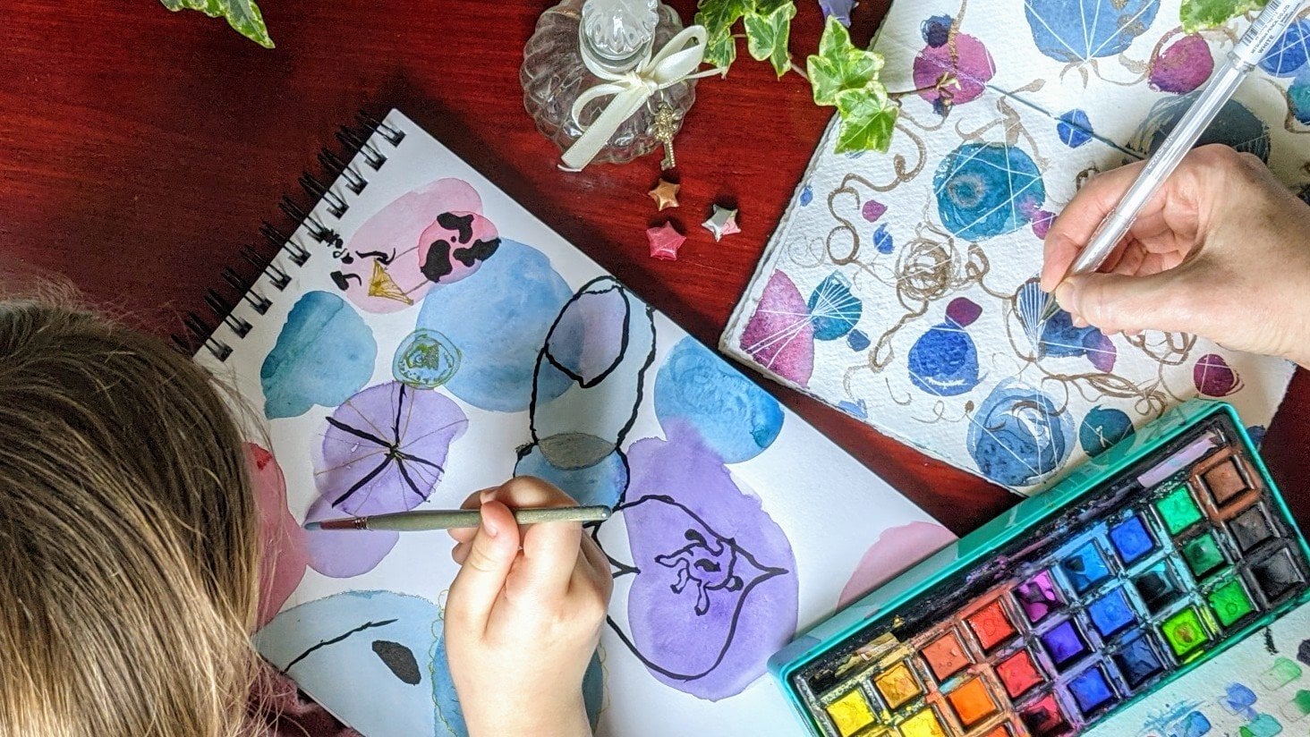
advice about composition, line work and shading. There are no specific materials
required for this class. The only thing is really that you need
to be able to layer them and that they dry fast enough to be
practical to work with. Use what you're
comfortable with. I'll be using paintsticks, highlighter pens, paint pens
like poscas and a brush pen. If you've never used
paintsticks before, you are in for a treat. They are marketed primarily
as children's art supplies. But I think they are so
much more than that. They look a little
bit like a glue stick or a giant lipstick, and they work in pretty
much the same way. You twist them up
to get them out. It goes on tacky and gushy. You can blend it, you can scratch into it. But then within a
minute or less, it's dry enough
to work on top of with more paintsticks or
pens or whatever you like. I highly recommend them.
I love working with them. How you interpret each prompt, the materials that you use, the colors that you pick, all of that combines to give
you artwork that's uniquely yours and I'd love it if you could share that
in the project's gallery. If you'd like to share what
you've made on Instagram, feel free to tag me. My handle is at Shelly scale. My aim for this
class is to give you the tools and experience to
create art with confidence, to be brave and daring. I hope you find it a fun
and emboldening experience. If you've got any
questions along the way, feel free to pop them in the discussion section of this class and I can
pick them up from there. Are you ready for
your first prompt? Come join me there.
3. Playing with Shape: Happy Little Blobs: Hello. This is Future Shelly. Not your future because
we can't time travel yet, but Future Shelly versus the Shelly who's making
the art in this video. So for our first prompt, blobs, I want you to pick out
a couple of colours, two or three and an outline
color, something dark. So this exercise is designed to be a gentle introduction to this experiment that we're
conducting with ourselves to encourage our confidence and
our boldness in making art. I'm just going to start
making some shapes on a page. There's no need to
overthink this. We're literally
just making blobs, so there is no right
or wrong shape. Just make a shape, color and
move on to the next one. This is the first prompt. I wanted to make it super accessible by making
it just be blobs. We're making colors on a
page that don't have to have any particular shape or color or shading and with a little bit of linework thrown in for fun. I was playing with the
pressure of the paintstick and the angle to get the
smoother outline. But having done that, I decided
that it looks too smooth, so now making it messy again. Some of my shapes are half
on the page and half not. Some of the shapes are
completely on the page. I'm using a variety
of sizes of shape. I would encourage you to experiment with all
of these things. Once I've made as many marks as I want to with my first color, I'm going to move on
to my second color. I'm going to have a bit of
fun taking advantage of the fact that these
paints sticks are semi transparent so I can
layer them on top of one another and they dry quickly enough that I'm able
to do this now. Looking at the page, I feel like that upper right section
needs a little bit more, so I'm going to make a tiny little pink shape
up there as well. I like making it a bit messy, going outside the edges. I think that gives the
picture something, something that I enjoy anyway. You might want to also
experiment with that. One of the other things
with paint sticks that's really fun is how you can smudge them and smooth them out a bit like if you
were using pastels, soft pastels, but these are
more sticky on your finger. And so I'm enjoying
smoothing these out. This isn't a required
part of the process. I'm just doing it
because it's fun, and I like having fun
with my materials. I hope that you can find
ways to have fun with your materials because surely that's got to be part
of the point of this. Alright, I'm going to dare
you now to join along with me and make an outline just
using one continuous stroke. So no overthinking, do it. Be bold. It doesn't matter if it's misaligned, if it's wobbly. It's all good. That's
the marks that you make. It wasn't my intention to add blobs to the lines when I
first started doing this, but these two lines
don't join up. And so in joining them, I made it into a
little tiny blob. And then I noticed where the other lines didn't
quite line up, too. I wanted to smooth those out. So I ended up just giving them all their own little tiny blobs. Which kind of fits the theme, but it wasn't what
I set out to do. And I think that's one of the delightful things about
art is the things that happen that you didn't plan for and how the results
can be pretty cool. I mean, sometimes they can be awful. I'm not going
to lie, right? But that's what
experimentation is about. You try and sometimes
you get a winner and sometimes you don't
that's right. The point is that you were
bold and that you tried. So I also encourage you to
experiment with things. Maybe they won't work, and that's okay, but
maybe they will. And how great is that? And I've got more posca on me. Alright. That's me
done with this. When you're done with it, I'd
love to see what you make. And when you're ready,
come join me for the next prompt. W
4. Playing with Line: Squiggy Scraggly Marks: Hello. This is still
Future Shelly. Still not a time traveler, though. Or maybe I am. Ooh. Future Shelly is reminded that past Chelly got
brought a cup of tea by her lovely husband.
How nice is that? I invite you to have a drink of your own choosing your
preferred beverage, if you will, whilst
making some art. And today, I think
I'm going to use a whole double page
spread for this. We're working on boldness. We're working on lines today. And what's more bold than a big bold line that covers
a whole double page spread. So that's what I'm
going for today. I'm going to look at
working with the kinds of lines that I don't tend
to draw by default. For me, that is straight
lines and crooked lines. Most of my default arm and
hand movements like to make smooth, curvy,
undulating lines. I'm not a fan of the
straight line, it seems. But, you know, they're useful. They're good for
mountain ranges, craggy, rocky old mountains. They're good for
craggy old trees. They're good for drawing stars. There's plenty of good
uses for these things, so I'm going to take
this opportunity to practice drawing lines
that I don't tend to draw. I encourage you to practice with whatever lines you want
to get more bold in drawing. We can have straight
and crooked lines, but we can also have chunky
lines and skinny lines, squidgy lines and squiggly
lines, scraggly lines. All kinds, they can be smooth
and soft, can be rough, they can be large and bold, over two pages or
small and delicate. They can be hesitant
or courageous. And because of the
theme of this class, I would encourage you to work on your courage and your
boldness with line making. That's what I'm doing today. So I'm going against
my muscle memory and that's how I get
better at things. Something else
worth talking about is what you use
to make the line. Are you doing it
just coming from your wrist on kind
of small scale, or are you getting
your elbow and your shoulder into
it and working on a much larger scale or more
quickly or with more gusto. And we're practicing being bold because
practicing boldness, practicing anything is
how you get better at it. So let's be bold. I'm not drawing anything
in particular here. This is an abstract piece. But I guess what I had in my mind when I was doing
this was I was thinking about jaggy lines on particular kinds of trees that have got those crooked branches. And so when I was
looking for something in my mind to inspire the kind of lines that
I'm drawing here, that's what I was thinking about was those kinds of trees. And in thinking about
those kinds of trees, it made me think
about texture and how these trees often
have quite rough bark. And how fun that is to draw. So although that's
not I'm not making a representation of that
kind of tree or branch here. It certainly was the
sense that I had in my mind when I was making
the marks on the page. That's where I was
drawing inspiration from. I shake up my paint pens and test them out on a bit of
scrap paper first to make sure that I don't get a bigploge of paint where I don't
want it on my work. Sometimes that can happen
with these kinds of pens. So if you're using
these kind of pens, I would encourage
you to do the same. I mean, happy little accidents
are fine, but, you know, it's a frustration
that's avoidable, so, you know, you might
want to avoid it. And as I'm making this picture, it's reminding me that it's actually quite good fun
to make lines like this. They're full of energy. They're not slow and steady. They're vibrant and
energetic and a bit chaotic. And that's a fun whole thing
in and of itself, as well. I quite like adding
these darker lines in to give more contrast
and more definition. I think it makes it more
interesting to look at. And it's also sun
to draw, right? And we've got to chase
the fun if we're going to be doing these
kinds of activities. Now, I got to say, I don't particularly
like what I ended up with here, and that's okay. Sometimes we do, sometimes
we don't be honest, I was really tempted
to re film this and keep going until I made
a piece that I did like. But I decided not to do that because I felt this
was more honest. It was more
relatable, that, yes, sometimes you do make art that you're not the
biggest fan of. And maybe I'll come
back to this at some point and work
on it some more, add some more stuff
to it to turn it into something that I find
more visually pleasing, but maybe I won't, right? Maybe I'll just leave this
as an exercise that I did to get more happy with making
big confident jaggy lines. So if you end up making
pieces that you don't like, it's not the end of
the world, either. It's okay. Be like me. We can live with these things. It's fine. When you're ready, come join me in the next lesson for our next prompt.
I'll see you there.
5. Playing with Form: Lumpy Lil Dudes: Hello. In this lesson, we're going to be looking
at giving something form, making it look like it has mass, turning something flat into something that has
three dimensions. And to do that, we're going
to need three colors, one for the base,
one for the shadows, and one for the highlights. I'm going to go for
an orange blob. You pick whatever
color you like. I'm going to draw some lumpy
little dudes on the page. Well, they don't look like
lumpy little dudes yet, but they will once we add
some shadows and highlights. My coloring in here
looks sped up, but it's not, I assure you. I was coloring it
in really quick. It's one of the
nice things about paint sticks that you can
lay down color really fast. I'm deciding probably
like every artist since the dawn of time that the light source is
in the upper right. That means that the
lower left side of each shape is going to be
the most dark side of it. That's going to be where
I put my shadow colors. It also means that the
highlights are going to be in the upper right
of each of the shapes. When you're figuring out where to do your
highlights and shadows, you got to decide where
your lights coming from and then apply your shadows and
highlights accordingly. I'm doing my shadows
and highlights as curved lines because the shapes that I've drawn
themselves are curvy. The shadow and the
highlight will follow the shape of the object. I'm also doing the
shadows and highlights, not quite on the edge, but a little bit
in from it because that gives it more of a
sense of being curved. You can experiment with that
and see how it turns out. I taught a whole class on giving something form
using watercolors, if you want to go into
more depth on this. But I feel like this should give you a good
grounding and look, you can take any abstract shape, add in some shadows and
highlights and B Boom, you've got a lumpy little
three dimensional guy. All right. I'm going to
use a dark pen again to add some extra
contrast and definition. And I'm just doing
one fluid movement for each of the shapes
with this pen line. Trust your hand to make the kind of lines
that will work here. The more you trust it,
the better it'll get. I'm using my white pen to add some extra highlights
into the highlight area. This makes it look more shiny, perhaps even a little bit of a reflective texture, perhaps. Experiment with this yourself and see what you think of it. Okay, I am happy with my quick little
blobby little dudes. I think they all look like
they've got dimension, they've got really
interesting textures, which is super fun, and it
didn't take much time at all. When you're done, I'd love
to see what you've made, and when you're ready,
come join me in the next lesson for our next
front. I'll see you there.
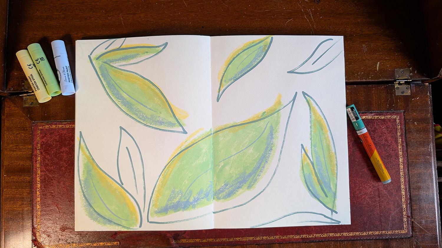
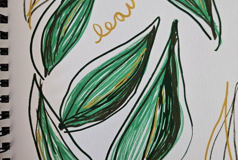
6. Big Bold Leaves: Leaning Into Dimension : Hello. For today's prompt, we're going to be working
on big bold leaves. I want you to pick
out three colors, your main color, your
shadow, and your highlight. I'm going to pick colors based around green and
real leaf colors, but that's not required. So I'm going to use the
green for my main color, the blue for the shadow, and the yellow for
the highlight. I'm going to do this as a big
bold, double page spread, and I'm going to start by blocking in where I
want the leaves to go, fill up the page in a way
that looks pleasing to me. I'm looking at the
page and seeing where my eye gets drawn
and in those spots, I'm adding more leaves. This helps make the composition feel right without being
overly technical about it. These big flowy shapes are
definitely my happy place. My hand likes to make
these movements. If you've taken my other
class on painting leaves, you'll be familiar
with this as well. But these are just
such fun shapes. Marinoel Worm has a class where you make a leaf dictionary, I think she calls it,
and it's super fun for expanding your leaf
structure vocabulary. I highly recommend it. I really enjoyed that class. I'll put a link below. Now I've got the
leaves all colored in. I'm going to add shadows onto the lower edges of the
leaves with the blue color. This doesn't have to be precise. I think looseness here actually makes it look
more interesting. That's what I'm going
for. I encourage you to experiment and see
what you like the best. I'm also doing a
quick swoopy line down the middle of each
leaf to give its structure, being bold and confident with
these marks, try it out. It's super fun. All right. Once I've got those in, I'm going to add my
yellow highlights, and I feel like this is where the leaves really start to pop. Again, you don't need to be precise or careful with
the placement of these. I think letting your
hand be free and trusting where the marks go will lead to more
interesting results. I'm going to outline these. Being careful to not actually
follow the actual outline. I think a slightly
misplaced offset outline adds even more visual interest. I've used a slightly darker
color again to ramp up the contrast here because that makes it more interesting
to look at as well. To give these lines energy, I'm outlining each leaf
with one continuous line, one sort of bold,
big pen movement. Like I did in the blobs lesson, I'm also adding in some outlines
where there's no color. I think of these as
kind of ghost shapes, and I use them to balance
out the composition. There's no rule that I follow
when I'm adding these. It's just wherever I think
they might look good. So I just dot them
about here and there until I'm happy
with how it looks. And that's me done. I've got a bunch of happy little leaves. I hope you've also got a
bunch of happy little leaves, and I'd love to see
what you've made. When you're ready,
come join me in the next lesson or our next
prompt. I'll see you there.
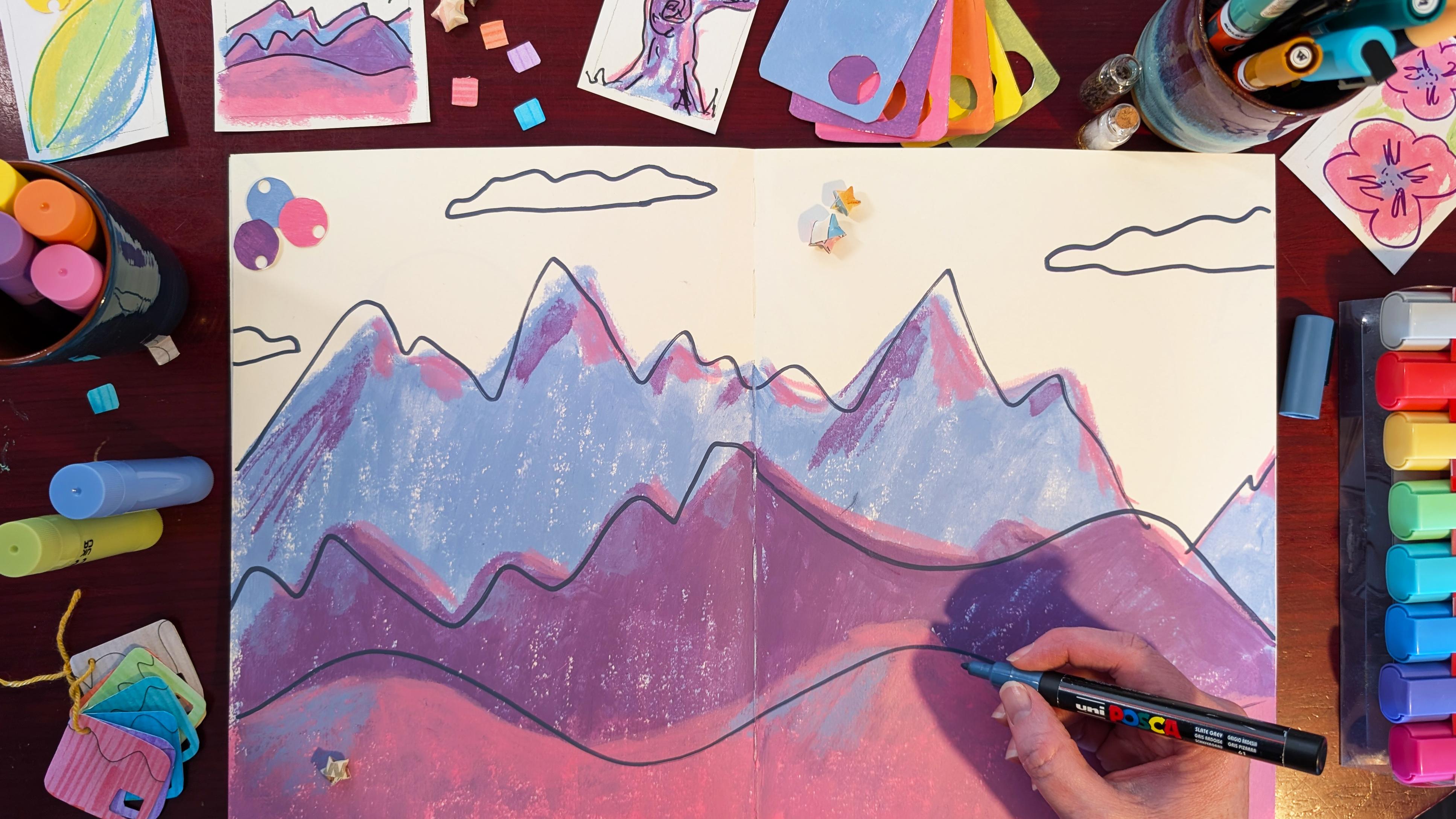
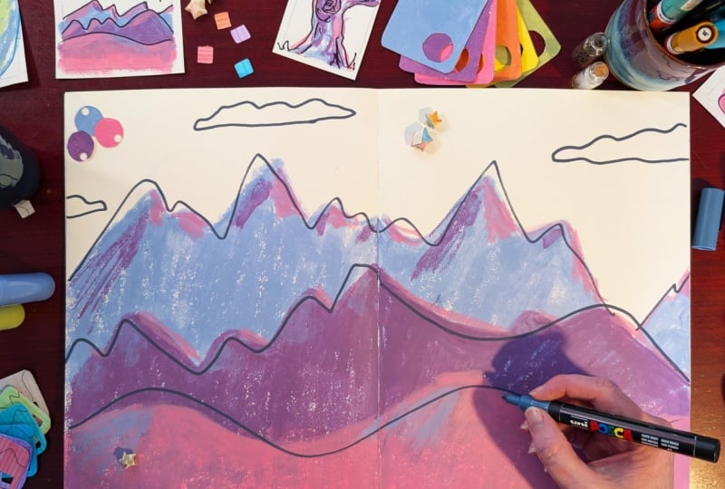
7. Bumpy Lumpy Mountains: Leaning Into Perspective: For today's prompt, we're going to be looking at landscapes, and I want you to pick three
colors, your main color, your highlight, and
your shadow color, but we're going to use them a little bit differently today. You also want one
dark outline color. Let's start with
a bold jaggy line near the top of the page. This is going to be our
furthest away mountains. I'm using this gray blue color because it's quite desaturated, and I think that's good
for far away things. If you look at faraway
things like mountains, they do tend to not be as boldly colored as
things closer to you. This color works well for this. I'm not going to color all the way to the
bottom of the page, but I am going to
color down past where I'm thinking of drawing
the next mountain line. I think that will make it quite interesting with the colors
and the way that they layer. I encourage you to
experiment with your materials in the same way. I'm not doing this from
reference, I should say. This is just out of my head. We've got jaggy lines for
the faraway mountains, and then as they come
closer to the viewer, I'm going to make them
more smooth so they're more like undulating hills. I'm going to use the colors to transition from the
background to the foreground, with the foreground being
the lightest color, so I'm going to use
the pink for that. The purple being in the
middle, the midground, and this desaturated gray
blue for the background. I'm doing it in this order, particularly because if you mix pink and blue together,
you get purple. It makes sense to
me to have purple in the middle and blue and
pink on either side of it. I think it makes a nice
graduation in color. Drawing the next
mountain line in, I'm going to make it a bit smoother than the one
that came before, but not totally soft
and undulating. I'm going to save that for
the last one, the third one. It's worth pointing
out that I'm being careful to make sure
that the shape of this mountain range
that I'm drawing now is not the same as the one
that I did previously. I don't want them to look
like copies of one another. I'm deliberately trying
to put peaks where there's troughs with the other one and make the
shapes different. Because in nature, you don't see identical mountain ranges, so it would be really weird
to have that in a landscape. Just like I did with
the blue layer, I'm coloring the purple layer down below where I think
the pink is going to go, but not all the way to the bottom because I want to get that kind of overlapping, layering, interesting
texture thing going on. Now I'm onto the last layer. These are the undulating hills. I'm using a gently
curving line for this, no jaggy bits here, and I am going to color the pink all the way to the
bottom of the page now. I'm imagining that there's
a low sun somewhere that's going to be painting these hills and mountains
with a little bit of light. Because I'm sticking
to a limited palette, I'm going to use my pink
color to represent the light. This is the high light
color that I'm using, much like when we did the blobs. This is where the lights hitting off of these
made up mountain ranges. H For the shadow color, I'm going to use both
the blue and the purple. I can't use the
blue on the blue so much because it won't
stand out too well. I'll use the purple for that, but I'll use the blue
as the shadow color on the purple and the
pink hills and mountains. And I'm just guessing where
the shadows would be, namely on the opposite side or angle from where
the highlights are. This is how we make
made up shapes have form by taking a guess
where the shadows would be, where the highlights are
and then adding them in to turn something flat into
something with dimension. I I'm going to layer pink on top of pink to make the highlights more
vibrant on these hills. I don't really have
another option for my highlight color here, so I'm just going to have to
make the pink more vibrant. And I think I'm done with the colors now to add just a
little bit of line working. I'm picking a gray paint
pen because I think it tones in really nicely
with these other colors. And I'm going to do outlines for each of the
mountain and hill lines. But like usual, I'm being a
little bit careful to not actually draw exactly where
the color outline is. So I'm respecting the hill line by drawing quite close
and quite similar to it, but I'm not being super
slow and careful. This again, ties
in with boldness, which lets us be quicker
with our art making, because we're not
hesitating over the lines. And I think that
freedom of making the marks comes across
in the finished piece. It gives it a kind of energy. As I'm looking at this piece, I feel like there's
something missing. My eye keeps being
drawn to this spot in the upper right where the furthest away
mountain dips down. I could put anything in here, like a moon, a sun,
a bird, dragon. But I'm going to go for a cloud. So that it doesn't look strange, I'm going to give this
cloud a couple of friends. And that way, we've got three
clouds across the page. I've got one kind of that's cut off by the
edge of the page, which I think helps the
painting look more complete. Uh, accidental little smudge. What would Bob Ross say,
happy little accident? Okay. Right, um, done. So this landscape was a little bit longer than
some of the other pieces, but I think it was worth it. Nice, big, bold,
double page spread, full of color and interesting
lines and textures. I'd love to see what you've
made for this landscape. When you're ready,
come join me in the next lesson for
our next prompt.
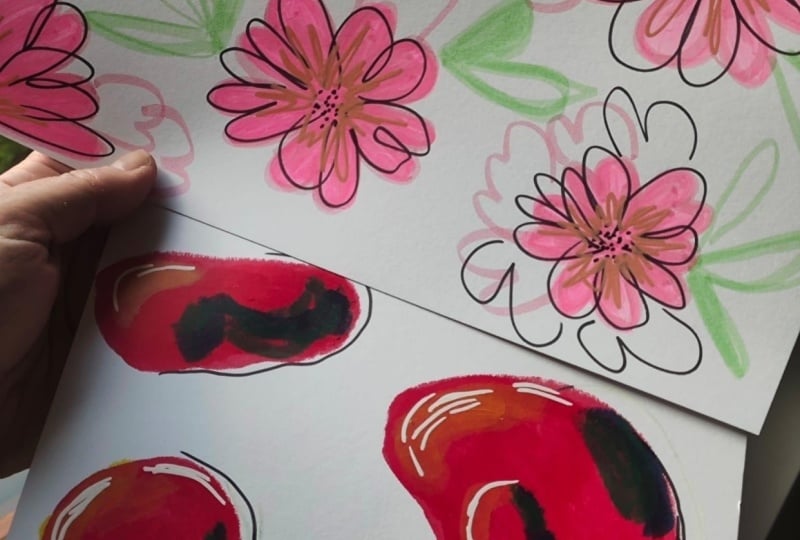
8. Bright Breezy Flowers: Leaning Into Composition : Hello, friends. Welcome
to my living room. For today's prompt,
big breezy flowers, we're gonna play around
with composition using flowers and leaves as our
way of exploring that. So grab a couple of colors that you want to
use for your petals, a color for the leaf
and an outline color. And then let's get started. We're going to play
with composition by not going in
here with a plan, but by just making a mark, making a flower, having
a look at the page, seeing where our
eyes get drawn to, and then making our next
set of marks there, and then continuing on in that manner until the
picture feels right. I don't usually
start in the middle of a piece of paper
when I'm making art. I tend to go in a corner, so it feels a little weird
being so close to the center, but I'm just going with it. Drawing my flowers,
I'm going to give them five petals with the
love heart petal shape. Like when I use
the paint sticks, I'm not fussed about coloring within the lines
that I've drawn. In fact, I'd go further
than that to say, I may be quite happy to go outside the lines that
I've drawn because it means I can color in quickly and get on with making the art. It also gives the picture
a bit of freedom, I think, and I like it. I like the look for
this kind of work. I definitely think
there's a place in time for coloring in
the lines, for sure. Just when we're
practicing boldness, that's not the time. My dad visited an exhibition recently that had samurai armor, and I noticed some
flower details on the armor that I thought were gorgeous and quite interesting having flowers on something
that's used for war. And it struck me that the
shape of the petals on the armor were in the
shape of little hearts. So I thought today when
I was drawing flowers, I would use that
same petal shape, that heart shaped petal shape. You can use whatever
petal shape you like. This was just what
was on my mind when I sat down to draw. I also decided to use highlighter pens today
instead of my paint pens. I just felt like them
and they were handy. I'm making flowers of different sizes to
add visual interest. I want to make it not look too much like a
repeating pattern, so the different sizes
also helps with that. Not that there's anything
wrong with repeating patterns. It's just not what
I'm going for here. Like in some of
the other lessons, I quite like it when
things go off the page. I'm definitely having some of the flowers and other elements
go off the page as well. If you've never tried it
before, do give it a shot. I think it really
helps make a piece of art look more I don't know, advanced or developed
or something. There's something good about it. These little extra petals that I'm adding in that
I'm not coloring in. I hadn't intended on doing it, but as I was working
on the piece, it just occurred to me that
it might be interesting. And so I'm trying it out, and I like it. And that's one of the fun things about not having
too much of a plan. When you set out, it gives you freedom if you're bold
enough to take it. This is a brush pen. I love these. I first learned how to use them
with a class here on Skillshare by Marinol
Worm I love them. They give so much texture, they're interesting
to work with. Yeah, I would recommend. I'm using this instead
of my paint pens to do the outlines, the
misaligned outlines. It gives a different
look because of that variability of the
thickness you can get with it, and I thought it might look nice with the highlighter pens. Maybe take a moment here to
enjoy just putting dots on the page to represent the fun things you find
in the middle of flowers. And add in any other
floral details you want at this point. I hadn't planned on doing these extra petali
shapes either, but it just occurred to me as I was drawing
and I thought, why not? I did it. So grab the second color you are going to use
for your flowers, and we're going to
layer this on top now. The use of a small number of colors also helps a piece look
really well put together, even if it's not designed,
this isn't designed, but by using a small
number of colors, it gives it that cohesive feel. This is like a kind of
fun problem solving game because there isn't really a right or
wrong way to do it. It's not like a math problem. It's just whatever looks
right to you in the moment. And that's the fun thing
is figuring that out. And now for my pastel
green for the leaves. I have no idea what kind of leaves actually go with
this kind of flower, and it doesn't matter
because I'm not making something that's meant to be
a botanical illustration. So I'm just doing some
really simple pairs of leaves here attached
to the flowers. I'm just dotting
them about wherever my eye gets drawn
to on the page. To me, that says there's something missing
in the composition. I'll just add a little
thing there to help the eye move more freely around the page so it doesn't
get stuck anywhere. I'm just adding a
little leaf in here, a little there, filling in any gaps that I
think need filling. And that's me done.
Here are my flowers. I would love to have a look at your flowers when
you're done, too. And when you're
ready, come join me in the next lesson
for our next prompt.
9. Big Craggy Tree: Leaning Into Texture: Hello, and welcome to my studio. I actually don't
film here that often because I can't control the
environment very well here. You'll hear lots of
background noises, probably. You'll definitely hear
the ding of the tram, the Edinburgh tram,
which goes past my studio every few minutes. But I thought it might be
nice to film a lesson here, and I was going to the
studio today, anyway. So yeah, welcome to my space. So in our final prompt today, we're going to be
taking everything that we've been learning and practicing so far and
really honing on texture. You're going to need three
colors, your main color, your highlights, and
your shadows and a light in a dark for your
outlines and your highlights. Today's prompt is tree, and I'm looking here to communicate the
essence of a tree, not any one particular tree. There's no reference
image for this. It's just a tree
that's in your head. And for me, the trees I
think about are full of texture and rough bark and jaggy branches and things sticking out all over the place. Um, you know, I think about when I used to climb them
as a child and, you know, the branches I would hold onto and the little holes I would get my feet into
and onto such like. So that's what's in my head when I'm doing
this kind of tree. Maybe you're more familiar
with other kinds of trees, and you want to communicate the essence
of those kinds of trees. Please do. I'd love to see them. I've drawn the main
body of the tree in now and I'm going to
use this purple to add some dramatic shadows and some more branches and just
more details into the piece. As with some of
the other lessons, I'm just guessing at
where the shadows would be because I don't
have a reference image, but I figured they'd be on the underside of the branches because light from the sun is usually overhead or
maybe not in the winter, but they're rarely
lit from beneath. Also, the trees I'm
familiar with often have these big knots on the trunk, so I'm doing a nice big
juicy wiry knot in here. They often have lots of branches sticking out here
there and everywhere. I'm adding them in as well. Now, picking up the pink to
use as my highlight color. I'll do that on the upper side of the branches since
the shadows were underneath and just.it about on places where I think
it might catch the light. It's totally okay if
your shadow lines or your highlight lines
or both don't actually line up with where you put
the main body of the color. I think it gives it charm, so don't worry about
matching those. That'll just slow you
down. Just go for it. Now time for the pens. I'm using this to add more
definition and more contrast. So I really want to emphasize
some of the shadows here. I'm also adding squiggly lines around the base of the tree to suggest the ground and kind of attach the tree to
the Earth, if you will. So I'm going over some
of the purple bits with this darker color to
really deepen that shadow. Stepping back and
looking at the tree, I think I want some
highlights in here. The white that I'm using here, I really love this
white paint pen. It works really well.
It's very opaque, so it layers nicely. So I'm just dotting the
highlights about here and there, wherever I think the picture could do with some
additional light. And now I'm going back in to darken that knot
down a bit more. I want some more shadows,
more texture here. And I'm just having fun
with scribbly lines. I highly recommend it. And I'm done. I'm quite happy with this
big old gnarly looking tree. I look forward to seeing
what you come up with, what your essence
of trees look like. And that's as done. This was the last prompt. So when you're ready, come join me in the
next lesson for some thoughts about where
you could take this. I'll see you there.
10. Taking It Further: Hello again. In this lesson, I'm going to talk about where
you can take all of this. Firstly, just keep laying down color and
adding line on top. Find the things that you like
to draw and lean into that. Just keep making
art. On good days, you can make it
more complicated. I made this on a good day. And on me days, simplify it. On bad days, don't bother. Unless, of course, it
makes a bad day better, in which case, have at it. As you keep showing up, you will develop confidence because you get into
this virtuous cycle. As you make more art, you get better at it and seeing your improvement makes you
want to make more art. Then by doing that,
you get better, which makes you want
to do it even more, it's just a wonderful
virtuous cycle. Keep going. When you do go away
and make more art, please come back and share it. I'd love to see what you make. I'd love to see
where you take this. And that says just about done. Come join me in the next lesson, which is our last lesson, and I'll share some final
thoughts. I'll see you there.
11. Final Thoughts: Hey, you made it. Well done. Thank you for joining
me as we worked through our seven prompts to develop
our artistic boldness. We followed our
super simple process for developing our confidence. We put down color, we put lines on top, and
then we were done. We used this approach
consistently as we explored shape and
line and mass, and then continued
as we played with leaves and flowers and
mountains and trees. We looked at how to make objects appear to
have depth and form, how to use different textures
to enhance our pieces, and we explored how to
make compositions feel complete and mature
quickly and intuitively. I would really like for
you to take away from this lesson is that you
can trust your hands. You can trust yourself. Even if the lines
and colors don't go exactly where
you wanted them to. This is more than
compensated for by the freedom and sense of life your pieces will have if you allow yourself to
create without hesitation. If you want to find out when
I release another class, you can follow me here. There should be a little
green follow button up there. If you click on my name, that will take you to my profile that has my other
classes on there. If you want to hear
about the other bits and pieces I get up to, you can join my
quarterly newsletter. That's also linked
in my profile. If you could leave
this class a review, that would be super helpful. It can flag to other
potential students what a class this is and if
it's the right fit for them. Thank you again for joining me to practice creative courage. I hope that you've
enjoyed this time and that I'll see you in another
one of my classes soon.
12. Bonus Lesson: Bloopers: Gonna tell you a story
about how I recorded this entire lesson
without that light on, so it's not really useful. At least, it was just one lesson and
not all of the lessons. That would be Very, very, very. So I didn't have
voice recorder on. Ah. I think I need to be
checklist. So that. I'm like, turn the camera on, turn the sound recorder
on, turn the light on. Okay. My throat
made a weird noise. Ah. We're gonna start again. That's what we're gonna do.
Okay, let's try that again. The lessons are arranged. Practical advice on composition, linework, and something else. Let's just guess what that is. Hey, you thinking that was
loud. Let's do that again. No, let's do that
looking at the camera. You're a distraction. I'm gonna turn you
away away again. We looked it, I think I'm just
going to reap on this one. Tons Thank you again
for no channel.
 Shelley Skail, Artist, Illustrator, friendly nerd