Transcripts
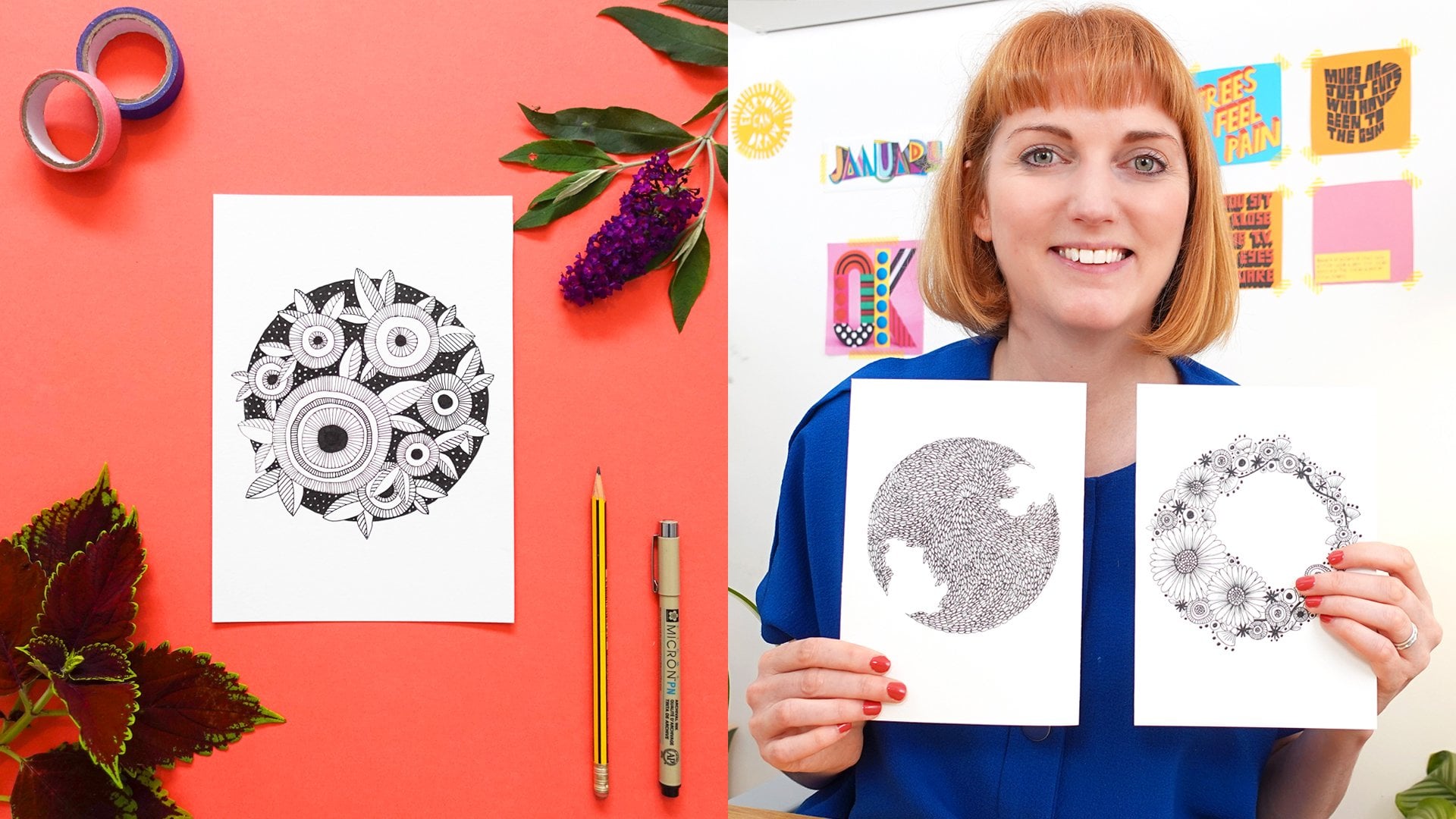
1. Introduction: Hi. If I'm a sofas for
designer based in Finland and someone who deeply believes in the quiet
magic of drawing. Whenever the world feels
too loud or overwhelming, I come back to art. There's something incredibly
soothing about drawing one line after another
slowly and patiently. It's c my breath, center my mind, and somehow
brings me back to myself. For me, is a kind of therapy. My own way to slowing down in the world as
always asking for more. In this class, I want to
invite you into that space. We'll create a simple
black and white floalart inspired by the bold and
beautiful, potty flower. You don't need to be an artist. You just need to show
up with your hands, your eyes, and a little
bit of space for yourself. Let's draw something
that not only looks beautiful, but feels peaceful, something you want to keep frame and return whenever
you need a quiet moment. Are you ready? Let's begin.
2. Class project : Your class project is to
create black and white. Drawing up the Boutique flower, combining structure, texture,
and your creative touch. You start from the
reference photos, sketch, ink, and then frame it. You can also download a
sketch as prepared if you refer to trace or have
a base to build on.
3. Materials: Before we start drawing, let's take a quick look at
the materials we'll be using. You don't need anything fancy, just a few simple tools that I personally use
every time I draw. First, you need a
piece of paper. I'll be using A four size, but feel free to choose whatever size feels
comfortable for you. Next, grab a pencil and
an eraser for sketching. I like to keep my sketches light so they are easy
to refine later. Then you need a drawing pen. I'll be using micron 03, but you can use any fine
liner that you have on hand. Finally, if you'd like
to display your artwork, you can prepare a frame
or a display board. I use simple A four paper
frame that allows me to rotate and correct several
pieces over time in it. That's all you need, just
basics and your quiet focus.
4. Finding Inspiration: This part of the process, I usually start by
just sitting down with a cup of coffee and letting
myself brows slowly. I begin by typing protein
flour into splash and pines. Two of my favorite places to
gather artistic references. They're both full of
beautiful images and I really enjoy the quiet
moment of scrolling. And letting inspiration
come to me naturally. When choosing a flower
for this project, I knew I wanted
something bold, unique, and structured and the brote
immediately stood out. It has this powerful
presence just still holds such
a quiet elegance. There's something
geometic about it, but also very wild. Find that balance
very beautiful. I ended up picking
two reference images, one of the clothed for t
bad with soft symmetry and ano of a full open bloom that feels more
dramatic and expensive. Then I brought them
together using Canva, just to see how the shapes and form might combine
into one composition. You see me playing around
with the placement and scale. This part doesn't
have to be perfect. It's just about getting
a feel for what works and what feels
visually interesting to you. You can do the same
either fight and combine your own
images or feel free to use the sketch I included if you rather focus on the
inking and details. Let this be a moment to follow your eye and what draws you in.
5. Technique : In this lesson, I'll walk you through the two
main techniques I personally use in almost all
of my floral line artworks. The first is broken
hitching a technique where short broken lines are used to texture and depth by
varying the length, direction and spacing,
we can suggest shadows, highlights, and a sense of
movement within the pals. The second is stippling, which is all about
using small dots to create soft transitions
and tonal values. But by playing with how close or far the dust
from each other, we can add dimension
and gentle shading. Perfect for capturing the
quiet beauty of flowers. These are the only
two techniques I usually use in my work. I love how minimal they are, yes how much expressions they can bring to a
simple line drawing. In this class, we'll be
combining broken hatching and stapling to create a flower
piece that feels rich, textured, and uniquely yours, all we just pen and
paper. Let's get started.
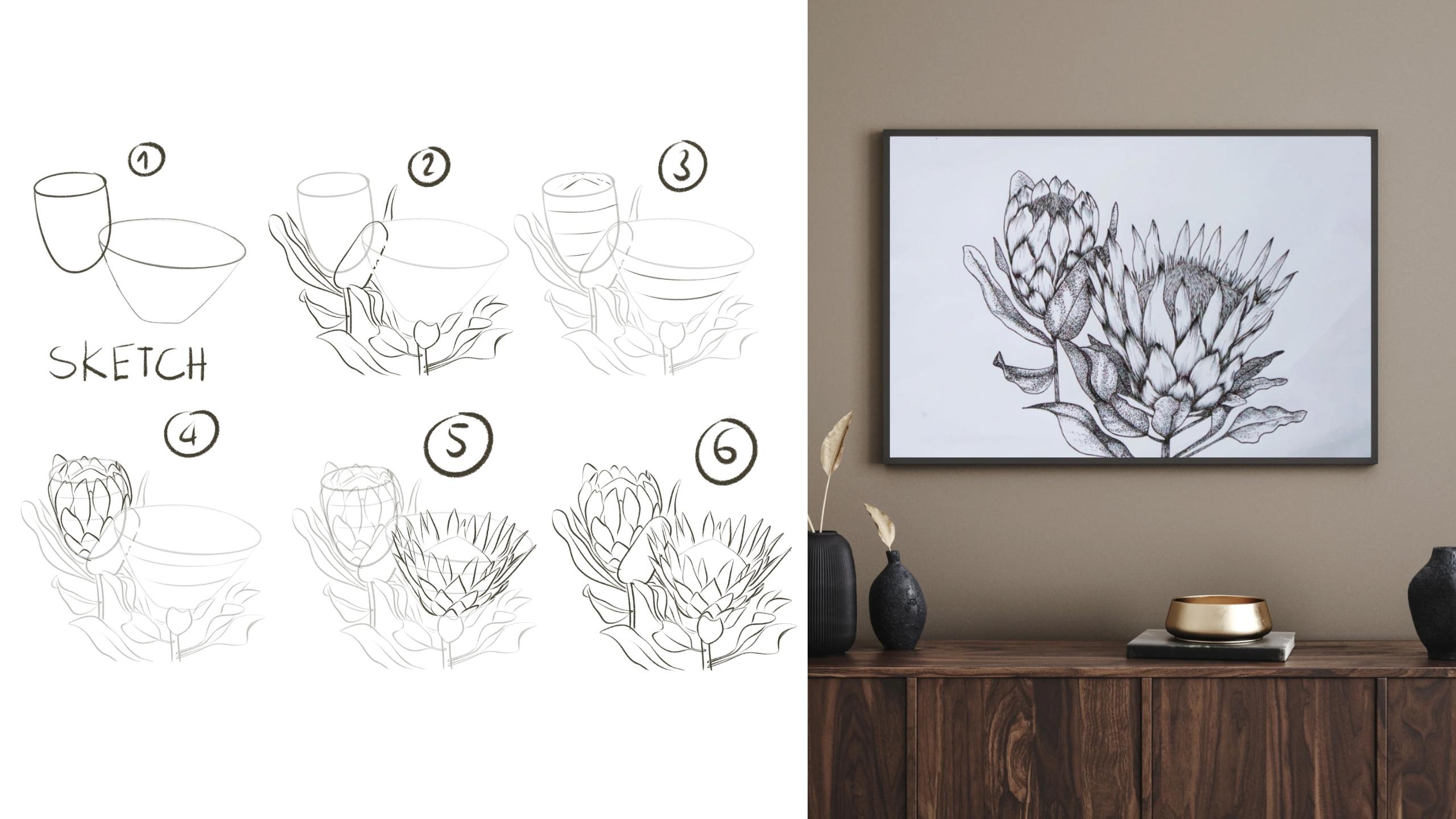
6. Sketching: All right, I'm starting
really loose here, just using an oval shape
to place the first flower. This will be the one
that's a bit more closed, so I'm keeping compact. I'm drawing very lightly, so it's easy to adjust
things later if I need to. Now I'm placing
the second flower. This one will be the open bloom. This one is wider and flatter. I like to be both flowers
at the same time. It helps me keep the
composition balanced. Now I'm sketching the stems. I usually go with a single
sweeping line first, then branch out to the leaves. I'm not worried about
perfection here just feeling out the
movement and flow. The leaves on Bote are
thick and soft looking. I'm giving them white,
gentle and curves. Some will point
outward other call it. I love adding a natural variety. For the first flower, you notice I'm adding these little guidelines
across the oval. They help me keep the
barrel directions consistent and spit out evenly. Here I'm adding some overlapping
petals at the base of the closed flower just very
simple barrel shapes for now. And now I'm building
the oval bloom. I spent more time shaping the center and building the
layered barrel structure. I usually draw a few of main ge barrels first just
to set the structure. These are tall, pointed, and they flare out a bit, almost like a crown. Then I just fill in the
rest barrel by barrel. Still very light
linear pressure. There's a rhythm in this part and I try to follow
it with my hand. Even if a line isn't perfect, it still has energy, that's more important
to me than precision. Oh Now I'm adding some details at the
base of the big bloom. The little petals that sit
underneath and wrap around, they help anchor
the flower and make the whole thing feel
fuller at this point. I'm mostly just checking
the overall flow, seeing if the sheeps connect well and if it feels balanced. I actually like leaving
some of the sketch lines. They remind me of how
the piece came to life. That is for the pencil sketch. I'm happy with the layout in. Now it's ready for ink.
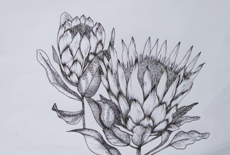
7. Inking: Now that I'm happy
with the sketch, I'm starting to go over it
with the migran 035 liner. This is one of my
favorite parts. It feels almost like
drasing your own energy. I usually begin from the
top gently outlining each better with slow seedy
lines. There is no rush. I let my hand follow the sketch, but I'm not afraid to
adjust slightly as I go. This flower, the one
that's more closed, is strong layered structure. So I'm being a little bit more intentional with the
line weight here, wiring the brussre
bit to keep it alive. Once I finish the outer barrels, I start working my way down to the smaller
overlapping parts, the sepals, the
base, and the stem. Sometime I pause
and lift my hand between strokes just to make
sure I'm not tightening up. As a drawer, I'm not
aiming for perfect lines. Instead, I think of it
like a conversation. I sly is a response to
what's already there, and that's what keeps the drawing feeling soft,
personal, and present. After inking a section, I gently erase the
pencil ice underneath. That part always
feels a little like cleaning up a quiet space so the final lights can breathe. Now I'll move on to the second flower and repeat
the same midful process.
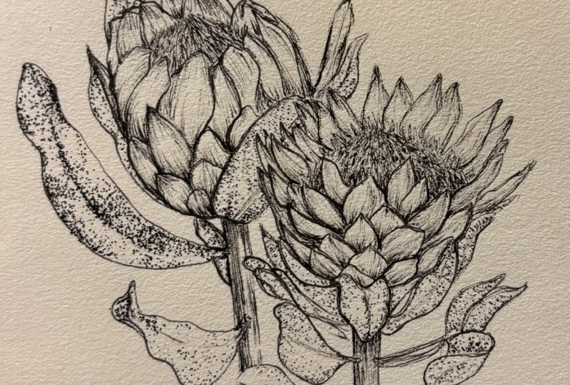
8. Adding Details - Flower 1: Now that I've finished outlining the shape
and the barrels, I'm starting to add
some depth using one of my favorite
techniques, broken hedging. I like to begin at the bottom
barrels and work my way up. Each line is short and gentle. I keep my breast relaxed and
let pain more naturally. Where the shadow fall, I simply add more lines closer together,
overlapping slightly. The trick here is to but
darkness slowly with the ron. You don't need to fill every space just enough to
give a sense of weight and stature is one of the most soothing parts of the process just
drawing line by line. It's almost meditative and every Bro becomes the
leader world of his own. Now that I've finished
shading the beetles and moving on to the center of the Boutique and stamment area. But before I ink it directly, I want to show you
how I approached it. Here I'm using a separate
sheet of paper to demonstrate. I start by drawing
a chino inverted, struck, almost like a
soft blade of crust, but shorter and more delicate. I vary the direction. So leaning left, some right, some more upright to create
a natural textured effect. Next, I go back to
the actual piece and scatter sriangular base lightly with a pencil. This helps me to find the area where the
statement will see. Then I divide that sriangle
into smaller wedge sections, almost like sun rays pointing
out from the center. Once I have that structure, I begin feeling it in using the invert the strokes
I just showed you. Letting them overlap
and tap off naturally. Some strokes are longer, some are short, and that
variation keeps it organic. I like this part because it feels like everything
is coming together. Light, shadow,
softness, and contrast. When I finish, I usually step back and breath because there's something about watching these little marks
turn into foam. It's quiet margin, really. Now that I've finished
the main body of the flower and moving onto
the leaves and the stem. For the leaves, I'm using
the stippling technique, which means I'll be adding tiny knots to create
the depth and shudder. Bit metal takes time, but is one of the most
meditative parts of my brussels. There's something common
about adding dot by dt, slowly watching the
form take shape. I always imagine that the light is coming
from the top left and slightly to the front as if a soft morning light is
touching the barrel. With that in mind, I decide
which parts of the leaves will be in the shadow and
will catch the light. The shadowed areas, I place my dots closer together
and build up the density gradually and the
lighter areas are more spat out with fewer dots
creating a gentle contrast. This creates a soft credent and brings the leaves to life. From the stum, I go back to
the broken hedging technique using short uneven
lines to but texture. This helps the stem feel
more crowded, organic, and just a little bit wild, like a real stem would
be in the nature. There is no need to rush this part all about
patience and intuition, letting your eyes
enhance by the rhythm. It's not just drawing, it's also quiet space to
breath and be present.
9. Adding Details - Flower 2: Now I'm moving on to
the second flower, the larger one in the front. I'll continue using
the same pain micron 03 and apply the same techniques we used on the first bloom. For the shading, I'm using the
broken hedging techniques. Again, start from the base of each bal and
working overboard. The areas closer to the center of the
flower will be darker. I build up the line,
density there. The more lines, the
deeper the shadow and I keep the lighter
areas more open and air. For the center of the
flower, the statement, I'm using the same method I showed earlier on
the separate paper, starting with solved
inverted V shaped strokes that flow in
different directions. Then dividing the
triangle shape into smaller wedges with pencil
and filling each section with those strokes to create a
textured dimensional look and filling in each section with those strokes to create a
textured dimensional look. Even though we're
repeating the techniques, this flower is much larger, so it takes a bit more
time and attention. But this is where you can
really fall into the rhythm. Each line becomes
a quiet care and the whole flower
starts to feel live. Now it's time to move on to the leaves around
the larger flower. I'm using the stippling
technique here adding small basen dots to
be texture and form. As always, I imagine
the light is come from the top left and
slightly to the front. I left I make the left
side of each leaf lighter and add more dots to the right side where the
shadow would naturally fall. I build the shading
slowly closer to the dots to darker the area and
in the lighter zones, I let the paper breath. This process takes time, but it creates the softness
that I really love, almost like the leaves are resting in quiet for the stumps, I go back to the broken hedging, just short sketchy lines to
keep that natural texture. Now that we've finished both flowers and all
the surrounding leaves, take a step back and look
at the overall piece. You can see how
the combination of the broken hedging
steeping creates a sense of softness and depth. The consistent light direction ties everything together in each detail as to quiet
organic energy of the artwork. I hope this process has been as calming and fulfilling
for you as it was for me.
10. Finished artwork: Now that your
drawing is complete, it's time for one of
my favorite moments. Iving it home. You see in the video, I gently open the
box and take out a simple paper frame I've been using to collect
my line artworks. It's nothing fancy, but there's something really crowding about sliding your artwork into place. Almost like telling
it, you belong here. As you frame your piece, take a quiet moment to pause and really see
what you've met. It isn't just ink or paper, it's the reflection
of your time, your energy, and your focus. Each line holds a breath. Each dot carries stillness. You can hang it somewhere
you see every day, a small corner of your home, your studio, or even
just beside your desk. Let it be soft. Reminder that in the middle of everything you took
the time to create, you chose to create. And if you ever need a
moment of calm again, you know where to return.
11. Final thoughts : Thank you so much
for being here and sharing this quiet
creative moment with me. I hope this simple act
of drawing just lines and stillness give you a sense of calm even
just for a little while. For me, art is more
than just drawing. It's gentle reminder that beauty doesn't have
to be allowed. Sometime that sometimes
the most beautiful thing we can do is just
pause and create. If you made something during this class, I would
love to see it. Please share your
class project in the class project session
no matter what stage it at. If this class brought
you even a bit of peace, feel free to come back to
it anytime you need to slow down and you don't
need to be perfect. You just need a pen, at a bit of paper, and a few quiet minutes.
Keep practicing. Now see you in the
next class. Bye.
 Phuong Lempinen, iPad artist| Surface pattern designer