Transcripts
1. Introduction: I am current a creative
specialist with over ten years of experience
in graphic design, TD modeling, and
event visualization. I have worked with
corporate clients to design sturning booth for
expose and trade source. Today, I'm excited to share
my skills with you in this step by step blender,
plus photosft course. In this class, we will
dive into blender and learn how to design professional
the tools from scratch. We will cover everything from
basic modeling techniques to advanced details
like texturing, lighting and rendering. You are complete beginner or someone with a liter
blender experience. This course is
designed to help you master the process
one step at a time. This class is perfect for
designers, freelancers, or anyone looking to expand their skills in
TD and Photoshop. Don't worry if you are new
to Photoshop and blender. All you need is a computer, the blender and
Photoshop software, and a passion for learning. Will guide you how to create
design for corporate client, how to create design
that is tall and create a print ratifies so
that after approval, you can share those
files with your client. And they take three D
model as a reference and apply those print radifils edit in Photoshop in real world. By the end of this course, you will have created your
own custom three D tool ready to impress any client or showcase in your portfolio. Plus, you will learn
tips and tricks that make your design
truly stand out. I can't wait to see what you
create. Let's get started.
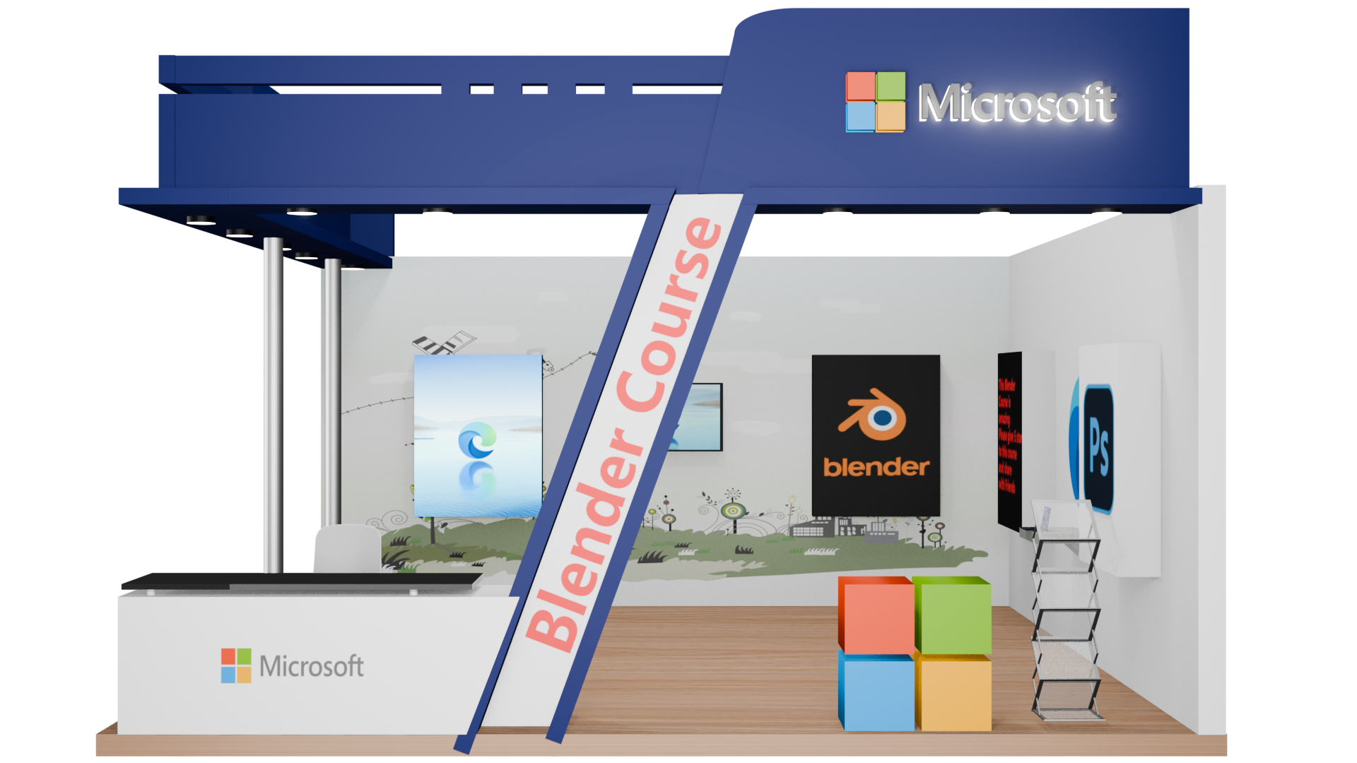
2. Understand the client needs and Project details: Let's think of a scenario in which we get a mail
from our client. If you are working in
a corporate company in event management company, you get a mail from the
client, and it says, Dear Karen, I hope this
email finds you well. We are excited to
collaborate with you for our upcoming
expo and required your expertise in
desiding a toll that align with our branding
and company vision. Below are the details
for the project, and they have shared the
details for the project. That is the project
requirements. First of all, we need to see how much in width and height and we have to design our stall. So the dimension of
the stall is length is six meter and width six
meter, height is ten feet. Purpose of the stall showcase our latest
product services. From which company you have got this mail, you get the idea. So in this scenario, we are focusing on
Microsoft Company. Why Microsoft Company? Because it is well
known and it has all the guidelines
available on their website. So it is easy for
me to explain you. It is easy for you also to find these guidelines online so that we can create
our own stall. So you will get your
portfolio ready and your project
ready so that you can share your portfolio
to your future client. We will discuss
everything step by step. Showcase our latest product. So what is the
purpose of the store? So they are going to showcase
their Microsoft product. We will discuss everything in
depth in upcoming lectures. So right now we are reading
the mail and understanding what their needs are and what
we need extra if required. Create an interactive visual appealing experience
for visitors. Okay, so branding guidelines, we have to align to the branding
guidelines in this case. Use our brand colors, logos prominently, attached logo file
and brand guidelines. In this scenario, they have attached the logo file
and branding guidelines. So this is a Damo mall
that I have created. It is the real mall that I have always got from my client. It is the actual work that I always do with my clients
and in the company, they have attached the
logo files, and if not, you can find the logo files
in the web or Internet. We will read the
brand guidelines in upcoming lecture and understand
how these brands work. Clue is space for banners,
product displays, and a digital screen. So they want space for banners, product display, and
a digital screen. They want to incorporate
band guidelines in all of these things
and in the stall also. Create a professional and modern aesthetic that reflexs
our brand entity. Elements to include,
what type of element they want in
the stall or booth. You don't have to get confused
if I say stall or booth, so these both terms are same. Elements to include. R is absent desk, Okay, shelving or counter
for product placement. They will need a shelf or a counter so that they can
put their product to display. Microsoft is a software
developing comp. What they will show,
they will show a laptop with the
Microsoft installed in it. And all the features
they will show as a demo in those laptop to the customers or to the visitors that visit the Expo
or their stalls. An enclosed storage area, okay, they will need
a fridge for that. That is 1 meter X 1 meter, a square type of it's
not like a fridge, I think, enclosed area. Basically, they need a Almira with the height,
1 meter, and the 1 meter. For materials and staff blowing enclosed storage area for materials and staff blowing. Comfort table setting
for client meeting, small table and two chairs. They need a small table and two chairs for our
meeting purposes. So it is extra print
design requirements. What are the requirements
for the print design? Banners, signs, for walls, pin ready design requireds. Okay, so they need a
print ready design. So we have to create
a print ready so that we can share the
print file later on. They need that
printip file from us. Backdrop design, backdrop
design for our tag innovate inspired
lead, they need a backdrop design
with this tagline. Standis highlight key features
of our product services. So they need standi. So you have to ask them how
much standis they need, and you need to ask
them any images or creative design that
they have already prepared. Ask them to share
with you. If not, you have to create on your own. They have shared the deadline. They need pre design on this
date, this is an example. And final design rendered in print file, they need that date. They usually take the guidelines
around one month before. You have one month to share the design and
print ready files. In all the cases, you
must have to share these designs within
three to four days so that they can
plan accordingly, and the changes
they will share on regular basis until
before the printing. So you have to take
care of that also. And this is all we need to know. So let's get started with the bl
3. Installing Blender 4 Latest Version: We are going to use Blender in this case, and why Blender? Because we get the idea to
create the design later on. First, we need the dimension of everything in which
branding will be displayed. So for that, we have to create a TD model before designing
any of the parts. So first of all, let's start
by downloading Blender. Go to website,
Blender, download. You have to search for Blender, download on Google,
search for it, open the first website
in your browsing search. Go for Download. And
if you have MacOS, Linux or other version, you have to download
for Windows. Right now, I have a Windows, so I'm downloading for Windows, so I'm downloading
it for Windows. So it's downloaded, and we
are going to install it. Let's install DoubleClick. I accept next next install. So it get install. Right now, I'm using
a 4.3 version. Don't worry if you
have a older version, it will work fine. And if you have a
upcoming latest version, it will also work on them because with every
update in the blender, they only add options
and Open blender 4.3. So we have a blender and
import 4.2 new left right, ok and import save.
4. Understand Importance of Stall and Marketing Why Stalls : This is interface of blender and I don't want you to
be scared out of it. And the method I will show you, they are not complex. They are really simple
method to create. If you don't know how to use blender and if you have
never used blender before, this is the perfect
course for you. You don't have to go anywhere, simply copy all my step
and you will good to go. I discovered the power of
designing stores for client, cooperate clients,
expose and events. These are industries where
network is everything. Networking events, stores, and branding will never
go out of demand. Every company needs
a strong presence, and stores are a big part learning blender and combining it with tools like Photoshop, coral row, Illustrator,
Premiere Pro, and after effect opened up
a whole new world for me. My earnings, the shoot
up exponentially, companies pay really well for high quality TD design and
professional branding. I will share everything I
have learned step by step. Whether you are beginner or
already have experience, you can earn a handsome amount as a three D and
graphic designer. When you open the blender, you will see three main section. That is, three D viewport. Sidebar and timeline. This is where you will create
and manipulate object, the side bar on the right, which stores detail about
your objects like dimension, material and modifier, the
timeline at the bottom, which is mostly
used for animation, but comes in handy for
organizing your workflow. On the left hand side, this is where you will grab
tools for moving, rotating, scaling, and more. And up here and up
here at the top, you have got tabs for
different workspace like modeling, sculpting and ranging. Don't forget the outliner. Think of it as a word eye view of all the
object in your scene. That's a quick intro
to blender interface. It may look complicated now. With some practice, you will feel like you know it already. We will start using this tool to create something amazing. So stick with me and let's unlock the power
of blender together.
5. Organise our work and folder: Let's start by saving your
project files and create a separate folder
so that you can organize everything while
creating this I toll. If you have not done this, you will face many
confusion later on. So first, we are going
to create a folder, name it propidy
because naming is the most important part which will save ton of time later on. Right now, let's
create a folder. You will see this floater
window too much because it will show what I'm typing
here and it is really important for you to
check what I have typed. So if I miss mentioning the
button that I have pressed, at least you can see here. Or here, like you can see here, I have seen some lack in here. If I press some button in here, sometimes it will appear here and sometimes it
will appear here. I'm using both of them. It might get confusing for you. Don't get confused
with both details. So as a beginner, you
will not face any issue, which keyword I have pressed, which shortcut I have used. You will not face any problem
while using the software, the blender, as
well as Photoshop. Right now I'm creating
a folder which name Microsoft stall and
create a folder. Three D files. I will create another folder, Control plus C plus N, paint files, new folder, design. That's all we need. Not TD file, we can
name it project files. Why project files? I will save three D project here and also Photoshop
project here. Let's start by
saving the project. Go to save a and copy this
path and paste here directly. Delete, paste, press Enter, and the path has been open, print file, project file, and name it Microsoft
stall, Enter, save. So we save our project and
we don't have to worry. You need to remember
you have to press control after some time or
after three or more changes. Why? Because somehow, if we lose the project or the
project has been crashed, software has been
crashed, somehow, anyhow, at least you
have a saved file. So you don't have to
work again on that. So it is better for us to
save our file time to time. And this rule apply
for everything, whether you are creating TD, creating design, editing
video, anything you are.
6. Blender Interface Overview: Let's understand the mouse first how we are going to play with
the interface of blinder. If you press the middle key of mouse and keep holding that, you can play with the
three D dimension here. For the left click, if you click on the object on
the left hand side, you can select or deselect the object as shown
on your screen. Right click will show
the options here. And if you select the object
and press right click, there are some
options. You can see. Now if I want to move this
cue, how we can do that. We have to select, move, and select this arrow. It will move with the dimension in which our
arrow has been pointed, as you can see, with the side. Okay, control. In the same place.
Control as safe. So if I want to scale up I
can do that also scale up. And if I want to scale
in the Z direction, that is Z direction, X
direction, direction, you can see the green
denote y direction, blue denote, Z direction, red denote X direction. So I want to scale up in the Z direction in the Y direction in the X
direction. I can do that also. So now we are going to transform with the
transform option, all the rotation scale and move, these three options
has been combined into transform, as you can see. If you see rotation,
you can see this one. And all these arrow curve boxes, small boxes has been turned into And the combination of these three,
you can see here. Now, press shift and
keep holding that. And now press and
keep holding middle. You can see without shift, you can see, there is a change, and by pressing Shift, you can change it in
the one direction, and you are not changing
the camera here or view. You are actually
shifting the view, the total view of that, as you can see, Got it. So let's control Z again. All these three
options we are going to use prominently
in this course. I have made a little bit change here on the right hand side, on the left hand side,
because in the middle, it gets confusing and blend with the actual view of our project. For you, I have changed
this dimension. I hope you can see better now, and right now you can see press controllers,
save the project. Let's get started by
creating our firsttll. On the right hand
side, if you see, this is a small arrow. And whenever you click, there is a pointer
has been changed, and click it, and you will
see item tool, view, polygon. We will later on
talk about this. Right now there is a
item transformation. All the things that
we have seen here, you can see here in
the number form. And if you click here, you can see the location
has been changed if you displace it
and the rotation, you can see the rotation. And now you have seen
the scale factor here. We are not going to
use scale factor because we have to take
care of the dimension, how much dimension we are using. So that's why we need to change the
dimension accordingly. And accordingly, simultaneously,
they both will change. So we have to take care
of the dimension only, not the scale in these projects. You can see. Now
go for our tools, we are not going to
use this right now, and for the viewport, we
will talk about it later on. As we are going to use it one
by one, all these options, we are going to talk about them briefly on
upcoming lectures. Let's go for the
item and close it. Now on the top,
right top and side, you can see viewport, viewport shading, viewport wire, and viewport and viewport here. This is with the light, and it is a rendered view. As you can see, the change
in the light. This is light. This is camera, and
this is the object. Viewport and viewport. Let's select this and press
zero on your number lock. Keypad, and you can
see the view This is the view that our camera has been looking at, and
this is the light. All these options are here
on the right hand side. We will discuss everything
in upcoming lectures. This is just an overview for the blender course so that you get familiar
with the software. So let's control
Z again and make them at the center. Now, Controls save. Now let's open our
email what we have got.
7. Understanding the standard dimensions: In the email, we have got the length and width
and height is ten feet, 106 meter and six wide. It is really important for you to understand the
dimension structure. Let's start by understanding
feet and meter. Open Google and search
for meter, two feet. As you can see,
there is a meter and all the dimensions here and foot and all
the dimension here. So for the meter and foot, we are going to convert
every meter thing to food. Before we start
designing our stall, let's talk about something
super important. Dimensions in the
world of stall design, everything is usually
measured in feet. For example, a table might be three feet and 2.5 feet. This is the standard way
measurements are used. So it's important we follow
it too. Now here's the thing. In blender, the default unit for measurement is in meters, and you will see
dimension written as M. But to make things easier
and avoid confusion later, we are going to treat
1 meter in blender as 1 ft, 1 meter foot. That is one equal 1 ft. This way, everything
we design will match the real world measurements
used in installs. So every time you see a
dimension in blender, that says, for example, two meter, think of it as two feet. This will keep things simple and help us stay aligned
with industry standards. So adding to this, let's clear up something
really important again, how to work with real world
dimension in blender. Tall dimension in the real world are often given in meters. As you can see in the example, we have six meter width, six meter length,
and height ten feet. Right. So in blender and
for practical purpose, we will convert this
dimension to feet since most stall elements like table and banners are
measured in feet. To work with this in blender, we first need to convert
these meter into feet. So 1 meter equals to 3.28 feet. So 6 meters tall would be approximately 19.68
feet on each side. When we enter 19.6 18 blender, we are actually treating
it as feet, not meters. To summarize, take real
world dimensions in meter, convert them to feet using the formula meters
into 3.2 X equal feet. Enter the feet value in blender and T as feed
for our project. So the dimension we
have added here, and the platform will be around eight inch to
ten inch in height. So let's convert inch into foot. And that inch into foot is 0.83 enter. So this will be our
platform for our stall. Let's make it above this grid. And now let's start by designing in our
upcoming lecture. Thank you for watching.
8. Create Basic structure of 2 side stall or Booth: Last lecture, we have understood about the basics of blender. We understood we have
generated a platform, which is six by six meter, and we have converted
six meter into feet, and here is the dimension
that is 19.68 meter, which is equal to feet. We are calling here is feet. So 19.68 feet and 19.68 feet
in X and Y direction, both. After this, we have
to create wall. Now up platform, we don't
know what we have to create. So we have to find a
reference from which we get inspired and create a
stall for our client. So let's search on
Internet to get inspired. Let's go to Google and go to PinterSt Open PintrSt and open LinkedIn and
search for Stall. In the Pintrs, as you can see, there are many
designs that has been shown to us by Pinterest
search engine, and on the LinkedIn, we have to find it here is a the wall booth with a table in between
and a browsure stand and ID that is around 22 inch and let's go to Pinterest because we have found many
examples in the Pinterest. So here is the
Pinterest example, and I like this one. This one I like because it
is a little bit complex, and for the example that
we are going to see, it is perfect fit for us. And these are very advanced. You can check them. After
generating that difficult one, we will going to
take many of them. Right now we are
working on this one, and let's save images, and we are going to save it in the folder that we have
generated that design and name it as
reference and save. So we have a reference
created here. And with this
reference, we are going to generate our stall. As you can see, this
is a two wall stall that is wall number one and wall number two
and two sides are open. And it has a facia with
the branding of Gdeg, and we are going
to brand it with Microsoft lights are here and it has a fancy
design above it. It looks difficult, but it
is easier than you think. Trust me, it is a
LED and panels with a light in the
background so that the design are highlighted. So let's generate wall that is Shift plus D, and you can see,
it is duplicated. If you click Shift D, as you can see, it's duplicated and I have not clicked anything. I shift I just press Shift
plus D and the cursor, it is just moving
with the cursor. Once you click it, it will release that object where the point is
located like this. And right now control that
and press Shift D again. And again, just
press right click. Now, as you can see, it released the object on the same place the first
object was located. Now, select move tool and move
to the above. You can see. We have a object with
the same properties at at the last object. Now in the transform section, transform section, rotate it
90 degree and move it here. As you can see, we
have a dimension, and we are going to delete that. Now you know how to
duplicate the object, but right now we need
to add the object. So I have deleted
that object and you can see it is a
simple one object. Now, once you press SIP plus A, there is a option when you open here and you have
to select for mesh, go to be, and there is another cube that
has been generated. Now let's change the
dimension of this cube. That is, first, we have to check for the dimension
that is right and back inside. Now for the height, we have to change two meter to ten meter. That is ten feet that has
been given in our male. The height is ten feet. And for the ten feet, the height is ten meter because
the M is denoted as feet. And for the width, we are going to use 19.68. That is 19.68 and
keep it two and the X direction will
be around 19.6, eight. Now it is the same. Now
it is same as this one. And the width is going
to be around 0.4. You can take 0.4 or five as a standard width because
in the actual area, we don't know how much
width it will get, but for the standard purpose and the weight which will be
allocated on our wall, at least walls are managed to
handle that weight on them. So I'm taking a standard
weight here and let's keep it round. Y. This. And with that control
save and shift D, like I have told you how
to duplicate object, Control D, release, and
we have a duplicate here. So just arrange it a little bit. Now we have a duplicate here, and this wall has to
be rotated into -90, as you can see, -90 is better. Just go with it and place it here. Just a little bit. Now we have a two wall
are standing here. I think this is too much wide. Let's make it 0.4 standard one. Now let's start
with this design. That will be our phase. Now add a wall that
is around shipped A. Q change it here and let's go to transform
and select for dimension. We will check for the
dimension here later on, but right now we have to create it so that it will perfectly fit keep it around 0.4, yes, and make it around 0.3. Now, it will be around 19.68. That is the dimension of our base You can see if it's getting
outside our base or not. Yes, it is perfectly fine. Now, Shift D, right click, leave it here and rotate it by 90 degree and position of it
has been shifted to here. You can see here. Now, let's make it around half. Make it around it will be
around as you can see, the table should be
around 2.5 feet. That is, height will be 2.5 feet and width around three feet
here, three feet here. And below that, it will be
around approximation 2.5 feet. So let's have 2.5 feet here. And it is around three
feet. Approximation. It is via approximation. So as you can see, there is a slant height. So I'm just taking
extra edge so that I can create a slope here and it will be around three
feet on the dimension. As you can see, and
it is not a three
9. Create Slant wall complex structure: Let's understand
the dimension of this toll and the dimension of our toll that we are
working on are different. So we have to work
accordingly and a little bit of hit and triil. So right now, let's
make it around that is seven feet two. Let's take it
directly eight feet. And now let's duplicate it, release it and just
move it forward. So we have a so we have
total height is around. That is two meter, that is two feet here and two feet plus eight
feet plus eight feet. That is 16, eight plus
eight, 16 plus two. So we have two feet here, two plus eight plus eight is equal to eight
plus 816 plus 218. So we have a total of 18 feet
of height and 19.68 -18. So it's equal to 1.68, left. So the area is between
1.68 left in between. So let's duplicate it. Press Shift D, release it, press it, and now
make it 90 degree. And let's we into
Y and 90 degree. And now let's make
here and turn it around 100 get around 100. Let's a little bit of 1110.
Let's change it here. And now let's increase the size, select this, increase the size. It will be around ten feet, so we have to directly
take ten feet here and change yeah. It is slightly slant, so we have to take or let's change the dimension than Let's locate a little bit. Here. Here. So I'm using this
location panel here, okay? So let's Now, let's change the
dimension little bit here. Select this and go to
object to edit mode. As you can see, we
are now in edit mode. Now select this selection mode. As you can see,
this is a pointer. We are going to select pointer. And if you select Edge, we are going to select Edge. And if you select phase mode, it will select to phase. So these are vertex. These are edge, and
these are phase. So right now we are
going to select vertex, select this one, press and whole sift and
select this one. Now, press G. It
is the sort cut. As you can see, now it's moving. But we want it to move
in a Y direction, as you can see
here, Y direction, let's press Y, and now see it's only moving
to the Y direction. But we want here, the
width of the border will remain same and
only this will change. So we have to select
select phase, press control R,
and as you can see, once you press Control pius R, you can see a little bit
of box appeared here. Once you press, once you
scroll up and scroll down, you can see there many
boxes are up here. So what are these boxes? Let's use it and you
will get an idea. I just simply left click
and move it forward. And just click again, as you can see, there is a
cut has been added in this. Let's Control Z again. I'm just repeating the process so that you get a better idea. Press control piezas R, click it, as you can see,
you can move forward. And you can see this is
known as loop cut and slice. Once you open it, you
can see number of cut here and you can
see the smoothness. Let's control plus R again. Once left click, now move it
upward, select again now. Let's select above and press G, as you can see, as you can see, the size below this
loop cut remain same and the size above this
loop cut is getting changed. So right now, let's
control Z again and press select text
and press G and Y. As you can see, now I have
make it inside the edge, and we can't see
anything around here. Let's again, here's
a sharp edge. As you can see, there's
a one sharp edge. Now let's select
this one press tab and you are now into
the Object mode again. Now select this one
and press tab again. It is a shortcut.
When you press tab, you will directly go into
Edit and Object mode. Now select this one. Go to Edge select edge, and press G and Y. Move it a little bit forward. You can see now it
has a edge around it. Now, press tab. You can see there
is a edge here. And once you go to edge, you can see we have
generated an edge like this.
10. Create Second Slant wall and Table Structure: We have generated this border. Now let's create another
border for this one. First, we have to
go to Object mode. As you can see seen
in the object mode, and now select this one. Shift D duplicate and right
click, move it forward. And as you can see, it
has parallel moved here. Now let's select
and with this one, go to Edit mode, select this edge tool and
just select a press X, which is a shortcut, press X. And delete for edge. Now, this delete edge, select X simply select the edge X delete X delete. Delete. Not this one. We are going to delete this one. Edge, edge. So this area has been
left out with no face. Now press, shift select this
edge edge, edge, and edge. We have selected all the edges. Now, right click Fill. We have filled the edges, as you can see, Now, press E that is
extrude and extrude it a little Okay. Now XE, that is now press G and move it
in the Y direction. Little bit of direction and press G again in
the z direction. Let's see if it's
working or not. No, I don't like this one, and let's control Z Press. I just control that until the first step that
I have extruded. So right now there
is no extrude. First, let me tell
you what is extrude. Once you press E, there
will be extrude happen. And what this extrude is, it will just create another
object above the object, but this object is
connected to this one, but it has a separation
between them. It is just like a loop cut. In the loop cut, we make a
cut in between the object, and in the extrude, we just create another object above that object. That's all. So right now, let's
make it extrude disappear and simply
go to object mode. Make it move it forward, press G, and Z, move it forward. As you can see, press G and x, not X, press G and J. Move it forward, go to. This one, press,
go to edge mode. Select edge, press G, and Y, move it forward. That's solved. Now, let's make it press tab, select this one. By selecting tab, I just
entered the object mode. Now let's go to transform
mode and I just have to select press G and Z for the z direction and press G and Y for
the Y direction. Now let's check if
there is gap here. I think there is a little
bit of gap and move G and Y direction. Got it. As you can see, and press this one, press now go to
tab, select edge, and press G, and Y,
move it forward. Now let's check this
out and compare it with the reference image
that we have available. Yes, now it's working fine. Now, go to object
mode, as you can see. Now we have a basic framework
that has been generated, and let's check for the
dimension of the table. According to this, our table should be different, I think, because according to
the size of this, our table should be in the dimension of a little
bit higher than that. Press Shift plus A, mesh at cube Now let's move that cube and just make it a little bit
in that dimension. As you can see, it is around. It is around 6.3 feet. So let's make it 2.5
feet in the height. Make it 2.5 feet. And I think it is not 2.5 feet. It is around 4.5 feet. Maybe not. It is
around 2.5 feet. Why? Because of the dimension. Let's take it 2.5
feet and with that, let's Go to Object mode, select H and press G, make it Y to move
into Y direction. Yes. Now we have a table that
has been generated. So it has a two side table. So right now we are just going
to use a one side table.
11. Create Glass Material for Table: Now we are going to create the table completely
with this class. So on this edge, let's create a basic cube again, press Shift A, mass at cube. And with this cube, let's change it dimension according to our table and make it this
here above the table. And now make it make the
size of it this around this, make it point to one and
make it around this one, move it down towards. As you can see, the
dimension of this are same Now let's move it a
little bit, move forward. Control save. Now our glass
has not been created. Right now, it has been created. So before that we are
now going to move it here and let's press shift and this
time we are taking a cinder cylindrical shape, and right now, let's transform it and
first move it here, move it here, move it here. Now let's transform
it completely. As you can see, move. And now let's scale a
little bit. Now move it. As you can see,
if I zoom it out, you can see the
cylindrical shape on which our glass
material will be placed. So for that reason, I'm just creating this and let's move it backward
a little bit. Move it down now let's duplicate it, control a duplicate, Shift D and leave it by
pressing right click. Move it backward, little bit. Now let's delete. Sorry, shift plus T, right click and move
it on the right side. Or let's control, select this
and duplicate both of them. Shift T, and right click
and move them forward. Let's. So we have a glass
material. Update it. Let's. Now let's place our
glass object here. As you can see, we have
placed our glass object. Now, let's select this object and go to Shader, go to Shader. Once we go to Shader, we are now in the
glass properties. And now we have to change
the material properties, and it is really
important so that go to right hand side on
the object properties, you can see there is a material, and once you click on material, you will create a new material and just click new material. Once you click it, new and there is a tab
has been generated. Now you double click it
and name it glass table. Just click Principle BSTF and make it glass BSDF
Now Control as save. Now one last step is here. Once you go to render mode, you have to render engine,
select two cycles. If you have a graphic card,
it will work very fine. So just click it
once you click it. Here is our glass material
that we have generated. As you can see, transparent. Four cylindrical
material that we have created is now visible, just like a glass or a
transparent material. Now, let's go to GPU compute. Make it to GPU compute. I have a CPU compute, so that's why it's getting
so perfectly fine. As you can render fast. We have a glass material. Make it to Eve again. So in the layout section, I just shifted our
light bulb and change the light bulb to 13000 so
that it is clearly visible. So right now, let's make
it to this our layout. Now let's go to viewport
again and viewport again. We have a basic workflow
has been generated. Now,
12. Create Fasia for Stall: Let's create a facia here. Once you create a facia, let's start by
creating this one, go to here and just create
a facia of this one. So now we are going
to create this one, press Shift A, add Q. Make it forward. Yes.
Now, make it forward. And now go to transform and just simply
make it a rectangle. Move it here and get a bit of higher around this and just move it a
little bit down. And now let's go to Edit mode, select this edge and
Control B, Control plus B. As you can see, the
difference here, it's making a bevel. This is a shortcut
to make it bevel. So just click it and you can see the width height segment, increase the segment, so it
will get smooth around edges and material should be around this says Okay. So now let's click outside, select this one, this edge, and press G and move
into the Y direction. Yes, like this. And now let's Go to this, make it a smooth edge, right, click Smooth shading. That's all. And keep
shading edge, no tab. Control ZD right,
click Auto Smooth, es or Control ZD. Right click. Just simply select it. Right, click Shade auto smooth.
13. Create Complete Fasia Structure: Is no gap in between
and there is a pattern that has
been laid out. So we can just simply select this control plus
D D and click it, make it into 90
degree of separation. As you can see, I
just rotate into X direction that is -19, sorry, -90 and make it to the width
should be around like this, go to Object mode, transformation and select it. Once you select it, just
click and select it. Go to tab Object Mode, and select, press G, move it upward in
the direction Nope. Not in the Y direction. That is Z and Y direction. Control Z and move it to the direction that is transform, move it into this direction. Now, simply delete these
edges or move them. If you want, let's
select Vertex, select the press
X, delete vertex. Yes. Now, make it Vertex, press G and press Z and press them,
move it forward. And as you can see, press G and Y, move forward. That's all. Now, press tab, go to layout mode, and we have generated our and
we have filled this area. Now, let's select this one. It has a width. That
is a higher bid. So let's change the
width of this area. Let's suppose take
it one or 0.8 and move a little bit backward and a little
bit down. Got it. So now we have
created this area, and I think it should
be a little bit higher. So let's scale it
above and select, move it a little bit higher. Now, Let's. Now let's select
this one, control, shift the right click and rotate it on the X axis
that is 90 degree. Move it upward and make
it a little bit lower in size and move down here. As you can see, it
is in between them. So just right, click here. Sorry, just click here, Contosive D, just duplicate it, rotating to the X axis again on the 90 degree and make
it move on forward. Now, make scale bit
higher, as you can see, it just go inside it and just move a
little bit in between it and let's check it around here and here. So we have Let's simply change dimension using
the location tool. Now. Now, let's add another facia these are small structure that has been
generated above it. Now let's add them. So as you can see,
this structure has a height similar to this and have a little bit higher
height above them. And it is same the height of this box is similar to this box. So let's make it a
little bit higher again. So press S that is Shift, that is a shortcut for scaling, so I don't want that to happen. So control Z and scale
it, scale it above, move above, and just add
a small box around here. Let's duplicate it again. Shift D, right clip, leave it down, and
now move them. Scale down. Move it like this and
simply again, same process, Control D, right click, move it, scale down and as not as just move it by
selecting the move cursor. You can see. So location should be around a
little bit. Yes. So it has a location
of let's with 5.2. It has a 5.3, make it 5.2, so it will get the same height. It has. So now let's generate
these boxes. Shift select this one, Shift D leave it here and again, scale down like this, make it a box and
just move it down. That's all. Shift
D, like this one, Shift T, release
it, just move down. Again, shift D,
move it, move down. Again, shift T,
release, move here. So we have generated
this structure. Now, Let's create another box here like this one. No shift. Let's duplicate it again, Saft, right click, it duplicate and now rotate it on
the wide direction. That is 90 degrees and zero
degree on X direction, and the height should be around one or two, according to this. So it has a height of 3.44, so we can make it
3.44 on the axis. It has a high tone Z and it
has a high tone X. Why so? Because as you can see, there is no rotation in it, and there is a 90
degree rotation. So it is changing
dimension according to it. Okay. So let's make
it move forward. Shape D, press tab and select
gas select this phase, and press G and Y.
Y, not Y. Press X. Yes. Same like this, press tab again, select this one, press tab
again, go to edit mode. Now select this phase, as you can see, phase, and press G and XO
to X direction. That's all. Now press tab again. We are into object mode. Now let's move it to the
little this direction. And press go to tab, edit, and select this pace, press G, and Z little down. That's all. Now, the basic structure
has been generated. Now let's add this box here. Simply press control
a press ship plus A at cube cube should
be around here. So it is around two
feet or 1.5 feet. So make it like that. So height should be
around 1 ft or 1.5 feet. And the dimension should
be around three feet or you can make it two feet make it here and make it. The scale is around it. Yes, that's all. Now,
it has a dimension. That is press, go to tab. After selecting the
phase of this cube, now select this phase and
press I and make it inward. That's all. Now, let's That's all. Now, let's control as save. We have a basic structure
has been generated, and now it has a
move to press tab, make it move to middle of it. Now, let's drink some water.
14. Create Pole to support the structure: Now let's get to another step. Now let's add two
pool around here. So like this one, simply just select this and the process of
slander will be same. So I'm just copying it. Control, plus not control, Chip plus D and move it here. So the process will be same. So just scale it a little bit because the thickness of the pol should be
higher than this one. So I'm just grating. So just make it. It will be down
and make it high. Move it above. It here. And just move it down
and just go to tab. Select this phase, move
it upward. That's all. Press tab again and move
a little bit forward. Let's change the
material property here. So once you select it on the layout mode in
the object mode, go to object material, this material property and select new and name
it BOL Paul and just select for the metallic
property and make it higher. That's all you have to do. Now let's go to shading mode. As you can see, it has
a metallic property. C, it has a metallic
property right now. So now, just go to layout
and simply shift D, right click and move it forward. So we have a two pole
that support this design.
15. Create LED lights: We are going to add this,
this, this, this, this. These five areas we are going
to add at Shift plus A Q Q. Make it around here. I'm just creating a
basic layout right now. I'm not checking the
dimension right now. We will check for the
dimensions later on. So right now I'm just making them accordingly. And let's Yeah. Move them a little bit around
here and just add a screen. We will add a screen later on. Shift D release, copy it around here and
one, two, three, four, hit D, copy it, rotate it 90 degree and move it backward. Ship D. I just copy
it here again. So two on this world,
two on this world. All these things
has been generated. You can ignore this
one, this one, this one, this one, because we will clear it out later on. Now let's add lights. As you can see, we
have to create lights. Right now we are going
to create passive A, press cylindrical shape, and with this cylindrical shape, we are going to simply let's select this slander
and go to material. In the material property, press new with this new light and it simply click
here, make it black. Are we seeing anything? Yes. And now, press tab or go to edit mode. Go to select this phase and
select this phase again. Now again, click plus here. New. Now click LED Light. I just naming it randomly so
we will not get confused. So right now, let's
go to shading mode. In this shading mode, first, let's select this principle
node and go to emission. And with this emission, select this one, this. Yes. Now, as you can see, is there any emission
in that? Right now? No. Right now, is there
any emission in that? No, because we have not assigned anything
to this phase yet. So everything will be
black remains black. So what we are going
to do is that select this and select this light. We have selected this emission. We only have to assign this property to it because
we have two properties. This is the main
category property, and this is a
subcategory property. So just assign it and you
can see there is a change. Everything will black
and it is white. Now we are going to
change its properties, go to composition, simply select this and go
to composition. In the composition, what we have done is that we have just
simply cracked this thing, use nodes. That's all. And in the nodes section, we have simply add this
glare effect, Y searching. Shift A, search, I just searched for glad and
just put it in between them. So right now, if
you see shading, there is no effect in it. So let's increase
the strength also. Let's make it seven. There is a change. So what
we are going to do is that, let's change our property
of our composition. And once you select it, so let's make it stick to bloom. So we have a bloom effect
here and let's make it, go to shading mode again. As you can see, there is a bloom light
available right now. As you can see, there
is a tab extra. If you don't know how
to add extra tab, you can do like here. Just this is the arrow
and just drag it here, and you will see a
extra window pop up. So what I'm going to do is here, select this one and
select for compositor, and you can see
compositor menu here. Just bring it down. Right now, we are going
to change everything directly here and we don't have to go to
composition setting. Right now, let's
change it directly and use different
different options. As you can see, ghost effect, and we have streaks. These are streak different. Let's use this one. Yes. And fog mix. So now simply let's
change the size of it, press a mall it down
and go to layer. You can scale up and scale down in the
layer section also. So let's go to Y. Just put it here. As you can see, we
have added this here. So if you go into
render section, you can see there is
no change in here. And if you go to cycles
in the render option, go to cycles in the
render with cycles. PoE and try to render it again, press F 12, but directly, we have a bloom effect
right now, as you can see. So F 12 is the shortcut to
rendering thing like this. As you can see, in the render
section, render image. This is F 12. This
is the shortcut. We will discuss it later on. So just copy all the
light, just duplicate it, shifted and shipped shipped D. They're getting pop off. We will Change it later on. Or we can do this right now. Go to scale and just do it. That's all. A little bit more. Yes. Now it's working fine and the position of this should
be around a little bit down. Okay. Now, let's
duplicate this and then duplicate this duplicate
this, duplicate this. Okay, so all the lights
have been perfectly set up. So you can see, and let's delete this one, and we have a light. Let's have tilt, and we have a blooming light which
bloom our image. You can see there's
a plum effect. So let's change this to cycle and see after
removing the lights. This is what bloom
effect has done. As you can see, there is a
dim life effect from each of the light has given
to our stall. This is just D small light
effect that we have given. And if we change the
emission and everyone has their own strength
and they will bloom like a bright star. Can see it looks
really, really nice.
16. Learning Standee Design: Before we jump into
branding our stall, there is something we
need to understand first. Branding glines these guidelines are likely the rule of the game. They define how a brand's logo, color, font, and overall
style should be used. And, trust me, whether
it's Microsoft, Google or any other company, following these guidelines
is not just important. It's not negotiable. To help you understand how
to apply these guidelines, we are going to
design a Sandy using Microsoft and Google
branding guidelines or graphics branding rules. Why? Because learning from
the best will give you a clear idea of how to make your design
look professional, coercive, and aligned
with a brand's identity. Creating a Sandy is the
perfect starting point. Once you master this, you
will be able to apply these branding concept to
large elements like stalls. And remember, branding is the
foundation of every design. It's makes your
work stand out and ensures that the client's identity is
represented perfectly. So let's start by creating our standing with these
guidelines in mind. Once you are done,
we will move on to apply branding to
the entire stall. Ready? Let's design
something amazing. We are going to use photo
17. What is branding and Why Standee Important: Hello, everyone. Welcome
to this first lecture of this course of standi Design
for corporate client. I will teach you how to design effective standis for corporate
client or big companies. Standis are an essential
part of corporate branding, and we will focus on creating
designing that communicate a company's message clearly and professionally.
What is branding? Before we dive into
standi design, let's talk about branding. Branding is the foundation of any design process for company. It's not just about
the logo or colors. Branding represent the
face of the company. Gives customers both
existing and potential a clear understanding of the company's identity,
values, and message. Think of it as the first
impression a company makes, and we as designers
have the responsibility to make that impression
impactful and memorable. Why branding is
important for standis Branding plays a critical
role in designing standis. A well designed
standi that is EIP E stands for eye catching, I stand for informative, P stand for professional. It grabs atenson quickly. That means eye catching. Informative, it delivers the
right message effectively. Professional, it reflects
the company's credibility. We will cover all these
three point in depth incoming lectures while
we design standis. In the upcoming lectures, we will explore how to incorporate branding
elements like colors, fonts and layout into
your standi design. You will have a clear
idea of why branding is important and how it acts as
the backbone of any design. Let's move on and learn how to apply these concepts
step by step.
18. Why Branding ?: So we are going
to use Google and Microsoft as our prime examples. Why these companies
because they are the industry leaders with a
strong focus on branding, and their branding
guidelines are easily available online.
You can read it out. You only have to search
Microsoft guidelines or Microsoft design guidelines, Google guidelines, Google
design guidelines. These guidelines will
help us understand how to maintain consistency in design while working with big corporate and by studying them,
you can improve your skills and learn the professional
standards of branding. Please give five star to this course and share
with your friends. This course is actually not
available and no one going to teach you this part of graphic design how
to use guidelines. Let's start by exploring
their branding guidelines.
19. Understand Microsoft Guidelines: Can see the link miicrosoft.com, legal intellectual property
trademarks. No hanks. Okay. And for the Google
Brand Resource Center, you can search for it. About Google Brand
Resource Center, guideline is sponsorship. So I've searched for
the sponsorship, how we can use Google
with the sponsors. Let's read some of
the basic guidelines that Microsoft follow
and Google follow. Let's start with Microsoft. To deeply understand
how these things works, we are going to read
all these things Microsoft trademark
and brand guideline. Thank you for helping us protect our trademark
and brand assets. Microsoft is grateful for the trust that people
place in our product. So in the Microsoft,
as you can see, what Microsoft is
trying to tell us, and you have to learn
and you have to understand what Microsoft
branding is all about. Once you read it out, you will understand how
Microsoft work, how it want to be visible in
the eyes of their customers, or any company, not about Microsoft or any
corporate company. So let's read. Microsoft
is grateful for trust that people place in our products,
services and experiences. These trademark and
brand guidelines, trademark guidelines
detail how you can help us protect
Microsoft brand asset, including logo, name,
app, and product icon. And the trust that
they represent. We have created these
trademark guideline to help clarify proper uses
of our brand asset. Microsoft reserves
the right to take an action necessary to
protect them and as a result, protect its customer
and the public. So Microsoft is trying to thankful the people that
we are using the Microsoft, and it is all about trust. Let's understand
that is all about trust that we place as a
customer in our Microsoft. Okay? So Microsoft
Band set including the Micro tdf T. Okay. And that is icon, logo design, Ts font name
and Microsoft software. Product service soundsmgs
and any other brand. So what type of cis you
should have in your mind? If you are going to
work for a company, what type of question
you should ask? And what type of
details you should ask? That is what type of
lovo they are using, what type of icon
they are using, what type of designs
they are using. If there is any previous design, please ask them to share
with you so that you can understand them
properly and deeply. Trade dress, that is what type of design that they
are using commonly, and what type of
phone they are using, please ask them if they
are not available online. Phone that is typography. Okay, so let's move forward. Property asset on
exclusive microcompany, these trademark guide
which time to time detail. Uh, many users
include our logos, app and product icon, and other design will
require a license first. Okay. So it's actually a legal
term that they are using, so we don't have to use them. We need to check for example of government
trademark g right. Example of branding asset required for authorizing
a Microsoft. So these are the icons, and these are the
Microsoft logo lockups. First, understand about
the logo, Microsoft logo. C specific brand and product guidelines section
for more information. So there is brand specific
guidelines that we are going to cover in this
upcoming lecture or we are going to see
in upcoming details. While we read it
out, we are going to see the specific link
they will provide us. Okay. So like this Microsoft, you will get these information
for the other companies. If there is any PDF
or any guideline, they will show they will show you or they will provide you. If you can't find a
proper guidelines on the Internet for
the specific company, you can ask the client directly, what are the guidelines? They will share with you the PDF version of
the guidelines. Actually, PDF version is commonly used in the
corporate sector. Now that trend has been
converted into online section. As you can see for Microsoft, you can see it online. For the companies, you can
also see details online. Microsoft Logo Lou. These include logo, Lou
for flagship offering, which are offering
that are aligned to and signal Microsoft
long term strategic intent. They include Microsoft 365, Microsoft Azure,
Microsoft Surface. Among others see specific brand and product guidelines
for more information. So Microsoft trying
to tell us with a Microsoft Logo
plus 365 or Azure. 365 it's kind of
trusted by Microsoft. It is going to be a long
term uses by Microsoft. And for Azure Microsoft, two are the part
of the Microsoft and they can't be
separate from Microsoft. Microsoft product
icon, these are the icons that Microsoft use. These include app icon for products such
as Microsoft 365, Microsoft Dynamic,
Microsoft Azure and others. Specific band line,
we are going to see specific band and product guideline section for
more information. Okay. Let's Microsoft software authorized service
provider badges. So designation or relationship between the product
and the Microsoft. These are all the dos and
don'ts for the Microsoft. And these are all the legal terms that
companies share online. So we are going to use
and we are going to see brand guideline,
intellectual property, right. This is the same
product trademark PD. Specific brand and product
guidelines section. And I hope there is an A. Okay. If you come down, these are all the legal
term that Microsoft is using and specific brand
and product guidelines. This is the term that we
have seen before two times. So let's check it out.
20. Company Provide its guidelines details on their website in PDF: Certain brand assets have specific brand and
product guidelines, providing guidance
on how to use them. Several of these specific
brand and product guidelines are published below, and other maybe
provided to you by relevant Microsoft contact in the context of your
relationship with Microsoft. As you can see, we have already discussed and they
have already shared that an executive
with the company will share the detail with you, or you can search it by online. Or Microsoft's specific
brand and product guidelines are incorporated in
these tech guidelines. Okay? This is the
Microsoft Windows 11. Sky pink Microsoft
Surface. Let's see. Microsoft Logo third
party uses guidelines. Okay, these are the PDF, so these are the PDF that
they have shared with us. Now let's read them out
how to use Microsoft. So use requirement, thank you for interest in including Microsoft logo in your material. The Microsoft logo
is more than name. Okay. Microsoft logo is more
than a name and symbol. It's one of the most
recognizable elements of the Microsoft identity. It is a beacon of
the quality, trust, and empowerment that Microsoft levers to the world every day. As a general rule,
a formal license is required to use
Microsoft Logo. Okay. So these are
the legal term, our supply consort of Microsoft. Third party Microsoft logo. How you can use the
Microsoft logo. Use the positive version, that is logo type in gray. Okay? On light backgrounds, a white background
is preferred when the logo is at its maximum size. Okay. White or black backgrounds are preferred for
the Microsoft logo. As you can see,
they have clearly mentioned the
guideline for using the Microsoft logo or
the logo of the company, not just Microsoft, the
logo of the company, how we can use, they have
clearly mentioned here. It's not just about Microsoft in each company,
in every company. In all the companies, we will going to see
these types of uses. Got it? The Microsoft logo comprised of the
symbol and logotype. That is symbol and logotype. The symbol and logo type
must be used together. Logo type and symbol
must be used together. You can't separate them, okay? Because they have
clearly mentioned. Now use the reverse version
that is logo type in white on dark background. Logo type, that means Microsoft
that is written, okay? Logo for light background, get logo for dark background. So they have also shared
the detail for the logo, Microsoft logo guidance,
minimum size and clear space. Let's understand what this means is before moving forward, what they have shown with the windows and for the Microsoft trademark
guideline 365, these are the details,
how we can use these details and for the edge, how we are going to use because these okay,
as you can see, Microsoft H H, H, H, they have the four
types of logo we can use. Okay and for the Skype
by end guidelines uses, we can't use this logo
and this Skype Team. Only icon we have to
use for the Skype. Okay. For the Bink trademark, Microsoft Bk icon
name logo. Got it. As you can see, three things
and Microsoft Surface, all these are part
of the Microsoft. So we are going to cover the main aspect
in the Microsoft, that is Our Microsoft, the main company we
are going to cover. As you can see the minimum
size and clear space, these are two ways to measure the minimum size of the logo. We are covering it very slowly. I just want you to understand
how these things work. If you want to skip
them, you can do so. And if you really skip them, you actually don't really understand how this
company works, how corporate sector works. You have to understand how
these corporate sector works. That is why I want
you to understand and say part by part,
focus by focus. I know it is actually
boring, and at first, it is actually boring for me, too, for reading
all these things. But after read them out, you can call yourself as an creative expert
for that company. And they will after
reading all these things, they will ask you how we
can use our guidelines. At first, you are asking them how we can use
your guidelines. But after reading them
and after creating them, they will listen to you
and you will become an expert once you create or
have completed any event.
21. Uderstanding Logo Guidelines for Digital and Print purpose: These two ways to measure the minimum size of the
logo. So let's move forward. Minimum size and clear space. These are two ways to measure the minimum size of the logo. On a screen 16 PX
that is pixels, print 5.5 M. This is the lowest size we can use for the Microsoft logo for the
print and for the screen. They are shared
for both of them. So right now we are
using it for print media on screen 72 pixel
for print 25.5 Mm. For the vertical part, we can use only 5.5 Mm. And for the horizontal part, we can use only 55.4 m of dimension for the Microsoft logo for horizontal and vertical. It is really basic
to understand, but I'm going to
explain what it means. Let's understand it on oral
row just to give you an idea. I'm using a oral row. Because it is more
specified for print media, but we are going to
create it in Photoshop, so you don't have to
worry about that. So I have a different
course for the oral do, how we can create
all the standings in Coral Do, also
in Illustrator. I have different
different courses for the different
different software, so you don't have to
worry about I'm using it just to give an
idea for the size. So use box and create color, remove none. Okay, so this is the box, and let's understand
four millimeter. Let's check 5.5 and 25.5. For the millimeter, te 5.5. And 25.4 MM. And for the AFO size, as you can see, this is the Microsoft logo we
can use the lowest. This is what band guidelines
have teach us right now. We can't use the size of the
Microsoft lower than this. If we are going to use this, we are not aligned with
the brand guidelines. There is some exceptional
case we can use, but right now we are
going to use this size. Okay? It is just to give you
an idea by height on skin, the simplest would never, okay, they have shared
this information. Make the logo standard
by giving it space on all sides equal to write
the height of the symbol. That is, this is the symbol. And let's understand
by so for the symbol, let's understand it has
a symbol of plaque. Let's understand this is
a symbol of Microsoft. That is Microsoft,
and this is the logo. For each logo, there has to be some space that we can see
a safe margin for the logo. There has to be a safe
margin for the logo. So once you duplicate it, there has to be a
safe margin, TTT. Taste. So this area is the
safe margin for the logo. It is not perfect, but I hope
you understand what I mean. This is the safe
margin for any logo or for specifically
Microsoft logo right now. Got it. So this is
the Microsoft logo, and there has to
be a space between the Microsoft logo and any content that you are
using besides Microsoft. Things to avoid. They have clearly mentioned
things to avoid. That is, don't make the
logo a single color. Okay. Avoid background that provide
insufficient contrast. Got it. They have clearly
mentioned it in the start page. Don't place logo over
busy background, that is busy background, that means a crowded
background or as you can see, this is the example of
the busy image that they mean it or busy
background that they mean. Microsoft, don't use one
color white or black logo in a full color communication. That is as you can see,
background has color, and in front of the background, we can't use a single
color of Microsoft. Don't compress or
stress the logo. That it means don't compress
or stress the logo, any kind. Got it. And don't add effect
like shadow or gradient. Don't ever use shadow
on logo and gradient. Don't alter the symbol. Do not alter the symbol.
Hope you understand. Don't alter the symbol. That is that it means don't re arrange
the element of the logo. Don't rearrange the element. Got it. Now, more
things to avoid. Things to avoid, more
things to avoid. Microsoft, achieve more. Don't attach tagline to
any kind of the logo. Got it. Don't use a tagline. Don't create new
version of the logo. Do not recreate
the logo, please. Don't add anything to
the symbol. Got it. Don't add anything
to the symbol. Don't create new logo with element from the Microsoft logo. Okay. So it only means don't
create any kind of new logo. Please don't work on the logo. They have already
worked on them. Oh, the logo should not be
contained within the box, circle or other shape.
I hope you understand. And right now, our Microsoft, if you can imagine, this
is a Microsoft logo. We can't actually use this yellow color
background for this logo. Got it. So we are
going to remove this. Now we are good to go and
align with the guidelines. The logo must never
appear any other symbol. Got it, or combined
with any other name, logo or icon to create
a co branding logo. For the co branding, they
have said that we can't use any kind of logo plus or any kind of these
things, we can't use them. Don't create title
pattern with a symbol. Do not write in the
Microsoft logo. Don't create pattern of ties to simulate the
element of the symbol. Huh. So they are telling that we can't use our icon as a pattern. Any kind of pattern,
we can't use them. Finally, this is the guidance that we have covered
for the Microsoft. So let's create a
Microsoft Itandy in the upcoming lecture.
Thank you for watching.
22. Collecting material to design standee right file to download logo and fonts: In this lecture, we are going to collect information
about the Microsoft. That is the logo file, typography, icon,
all these things. As we have covered the
guidance for Microsoft, let's understand which type of branding element they
are using that is font. Let's start by finding
the logo first online. Search for Microsoft logo, and a search, and our
Internet is not working. Microsoft. Let's go for it. Original file is SVG. SV is the file
format that is for print it is used for
principle purposes and original file SPG right
click Save as. SVC document. Yes, this is the light logo. Right click save Images. We have image, PNG here, and the size of the
PNG is very low. No issue. Let's find out Microsoft font font
library typography. Microsoft topography. Download and install custom
Ford to you with office, add a font Cloud. Microsoft Corporation
phone Foundry. Microsoft font. So I have search which type
of font Microsoft use. Microsoft use variety
of font including SegoUI Calibra Skip
SegoUI the default. The default font for Microsoft
operating system and used in many Microsoft plans,
including Microsoft Team. Out Sego UI variable is okay Microsoft supplied Mono spade two typography phone,
Microsoft support. Let's search for both of them. I font. Font download. And Monospace to
typography font. Seg Sego. Okay, Sego Microsoft,
the company Sego in its online printed
marketing material, including recent logo for
the number of product. Okay, this is the main
font that they are using. SegoUI is the main font
that Microsoft use, download font for PC,
SegoUIUI bold, Install. I don't know for sure, 100% that they are
using SegoUI or not. So which type of phone that I have found for
the Microsoft is the SegoUI if you don't know
if they are using it or not, you only have to ask the client that please
provide the phone. I can't find it online or please provide the name of the phone that they are using in the MIC.
23. Get design inspiration and udertsanding proper use of guidelines in the internet: So now we have
readout guidelines. We have font, we have
icon in high quality. Now we need to
understand which type of design that Microsoft
used in the event. So let's go to first
Google Microsoft event. Search for the Microsoft event. Let's go for the images. And which type of images they are using and which
type of graphics they are using Cosoftnt Microsoft,
Microsoft, Microsoft. Actually, they are using
a very simple background for each of the, so this type of corporate
office meets event technology, as you can see the gap between them, Microsoft build, copilot, Microsoft, Microsoft
as you can see, which type of
background they are using unless your
business potential. Microsoft, another company
and third company, and there is a
separation between them. It is very important
for you to understand Microsoft Rs and this
is the standard design. So they are using a
very simple design. Only have to stick
to the guideline and use a very simple
design for Microsoft. Got it. It's not
only for Microsoft. For any company, they use a very simple and
minimalistic design, and you don't have to
create a very messy type of Strandy design
for the company. Like this, very
messy. Very messy. Cluttered. It is actually
cluttered design. Let's go for a very simple
design for Microsoft. So right now, I'm going to use a gradient design for the Microsoft Stndy
something like this, Microsoft or
something like this. This is the standing.
Let's save it. Save image. Save. Let's find out in our upcoming lecture
why I have saved this image.
24. Explore linked and Pinterest and Download images according to the theme: Get the more ideas about the design of the standing
for the Microsoft. Let's dive into LinkedIn
and also open Pin trust and search for Micro Soft event. Search for Micro soft. Standi design and search for
Microsoft standard design, and we can't find anything. So it is not our lucky day to check for the standard design. And right now it is
not our lucky day that we have found any Sandy
for the Microsoft. That's create our own. So let's go for the pick way. Yeah, they will provide you a dam or they will provide you a library so that
you can download image specifically
for the event. Let's ask hat GPT that give me event them text for the Microsoft Event. Keep it in three to four words and technology based related to. Okay, got it. I hope. Chat JBT will provide us. Give ten shots. So if there is any event, you will get the
theme of the event. Okay, let's understand
which type of theme Chat GPT has provided us. So right now, empowering tomorrow's tech, innovate,
beyond boundaries, future driven solutions,
reimagine, redefine, revolutonize, revolutionize,
revolutionize to take care. Revolut transforming
tech together, next gen innovative
inspiring digital futures, building tech bridge, pining the possible
accelerated digital horizon. Building tech bridge.
This is what I like, and I'm going to use it. So for that, there
has to be a bridge. Is there any bridge
available in Pixaway? Is there any technological
bridge available in Pixel Way? Let's start for Pixel, and I hope we found
something amazing. That is technology Bridge. Technology PIT bridge. Okay. We have found something. And this is nice, but I don't like it. This is something. But it's more like a
cinematic look of the movie. And yes, this is something
kind of diverging. Let's go for the technology. It's look like a bridge, but we can't use it because
it is a paid version of Itok
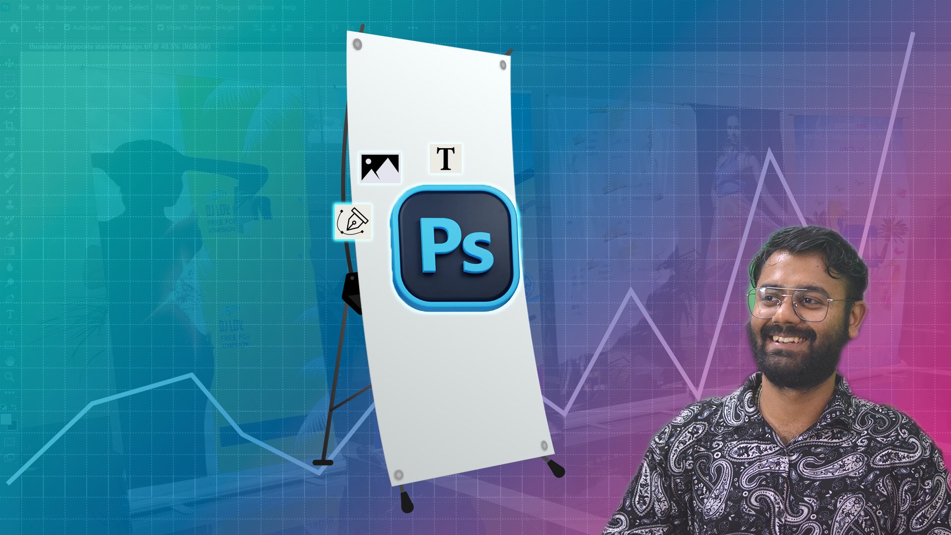
25. Setting up your project in photoshop: This amazing Hello. Welcome back to this amazing course in which you are going to learn how to create Sandy for a corporate
client in Photoshop. You can create
anything in Photoshop. If you are new to Photoshop, here's a quick overview
what is Photoshop. So Photoshop is used to
edit and create images, as you know, it made by Adobe, and it is really popular
for editing photos, creating graphics, combining
images, adding effects. And now we are
using it for Sandy. So let's start how it will work. You have to understand the
overview of Photoshop. If you don't know how to
use Photoshop before, and if you have no
idea how Photoshop will work, then it's okay. You don't have to
worry about anything. It is my duty to tell you
how to use Photoshop. If I have not teach you
how to use Photoshop, then it is not my right to teach you how to create Standi. As you have already
installed Photoshop, you will see this
type of screen. This is the home
screen for Photoshop and you will see all
these type of projects. You have to create new file
and check for the print. And there is nothing
you have seen. You only have to check for the right place and
check for inches, pixels, centimeter,
millimeter points, pixels. So we are working on inches. Okay? So it is really important, that is, what is the size
of a standard standi? That is three X six. That is three feet width
and six feet height. And there are two
types of standi which we will cover
later on in depth. It is just a overview. There are two types of standing
that it roll up standi and flex standyO we can
say fabricated is standy. Right now we are going to create a roll up standi after that, we can create flex statndy
or fabricated standy. In the end, we will give
some kind of bleed. I will tell you later
on what is bleed. You don't have to worry
anything about it. Width and height, width three, height, six, and press create. Wait, wait, wait. You
don't have to create anything right now because
we are working in inches, so we have to create
it into feet, and the dimension of feet
and inches are different. 1 ft is equal to 12 ". So you have to convert
these inches to feet. That is 12 into three, 36, 36 inch width, and four height, 12 into six, 72, that is height. And you don't have
to worry about the CMYKN RGB for the standing. You just only have to create
let's delete this one. And you have to work on this. So the dimension of this is image adjustment,
image image size. This is the dimension
of your Canvas. So in the Photoshop,
it is Canvas. Let's save it. That is saves and select your file
where you want to save
26. Create your First Standee Desing in Photoshop: The text that we are going
to use in our standing, we have already used
the Chat GPD to give us an idea and building
tech bridges, this is what I love,
and for the text, you don't have to
be large enough for the text because the
size of the standing, you have already seen the
size of the standing. As you can see the table, it should be around
2.5 to three feet, and the size of the standing
is double of the table. If you are using a computer,
you also have the table, and it is around 2.53 it is the standard
size of the table, and the size of the standing is about double of the
size of the table. That is a height
is almost double. So your height should be around 5.5 or six or 6.2. I don't know. So the height of the
standing is more than you, and you don't have to worry why the size of the standing
is more than you. So I hope you get the idea. The size of the text should
not be that big. Okay. If you have put it here. Controls and double click. Building tech bridge. Select tall, increase the
gap between the tags. Select Let's make the color is black. And I like this one. You always have to be
aligned in the between. And how we can do that, there
is a align option here. And if you have not
seen this window, there are tools and options. As you can see, window, the panel that I have selected for option has been removed, and for the option,
press select again. So the window so the panel has been appeared
by selecting the options. So right now, let's select it, and we have two options here. First, click on
these three dots. And align to Canvas. And let's see press again, and you can see now this
option will light up. So what I have selected, whenever you press this, it will align to Canvas. That is canva This is
our canva and press it, and it will get to
between the canvas, as you can see, but
right now we want it to be and now select the logo. Let's reposition it.
And now select it. As you can see, it will get
in the middle of the canvas. Middle in the canvas, Slactis
middle in the canvas. And right now, Slacts
gradient would be slightly bit down and uh, we have created our stande, and right now it is
not that good enough. So what I'm going to do is that. As you can see, this area
is not looking good, and let's stretch it
out a little bit. So as you can see, it is visually
appealing right now. A little bit. Click, press flip horizontal. Nope. Yes, now it is visually
appealing right now to me because that area was
looking very odd to me. Building tag bridges. Let's create extra
gap in between them. Okay. Good. Press Control S. So we have saved our istndy Could not
save this document because. Okay. So we could not save
this document right now. Let's image. Let's go to Image, Image size and the
resolution of this K to 72. That's all you have to
do. And now press Okay. And now you can save the photoshop file that
is not exceeding two GB. You don't have to
worry about it at all. So now for the image, image size, it's nothing matter. Okay. So your size is already
around 36 " and 72 ", so you don't have to worry
about the resolution. If your computer can't
handle this much pressure, so you can use this resolution. You don't have to
worry about that. For the printable, whenever
you try to save the file, let's go to the image image size and make it around 150 at least. And it will give you the
sharp image, via printing. You will get the
better result with a sharp image. That's all. And if you have not done that, you don't have to
worry about that. We have created one standi. Let's save it. If you
want to give the client, and a faster way to give your standi option to the client is that you
can give the screenshot. That is, in your keyboard, you can see a print skin button
and you can simply select it and it will take a snaps out of your standing
and you can send it too. And you only have to press Control V that is pasted
in your WhatsApp chat. It is just a shortcut for you if you are
using a WhatsApp. You only have to
press Control V, and it will automatically
paste the image that you have taken
the screenshot of into your WhatsApp
chat. That's all. So for the email, let's export. Quick export as PNG or export as Click select for JPET or PNG. It is your choice. Quality could be
around two and export. You can see we have
exported the file. This is the standing
that we have created, and it look good, really good. And after printing, it
looks actually amazing. Right now, we have done a
small mistake in our standing while I was checking my
standing in the image. It is actually a
big mistake that we have done as a
graphic designer. And as an expert,
as you can see, the background is black
and the Microsoft is gray. It looks good to us. I can understand that. But in the eyes of the branding, and if you are seeing from the glasses of your branding
expert branding designer, then it is really,
really big mistake. In the photoshop, let's go for the tool rectangle tool here and just get a rectangle
above the Microsoft. And Go for the Microsoft,
this one. Okay. And press Alt press Alt, keep pressing the Alt and go
in between these two layers, and just clip it. So you have done a
clipping mask, okay? This is just a clipping mask. And if you want to remove
the clipping mask, press Alt and you can see extra crows
appear in this icon. Just press it again and you
can see it just clip clip it. So let's clip mask it. And now it looks amazing to me. We have to go for the export, quick export SP NG. Okay, so we have a 15 ambo file. It is a high resolution file. You can see the resolution
is really sharp. Right now, it looks amazing. So we have created a
fabulous Sandy right now. One standi we have created. Let's work on another stand
27. Getting Started with 2 Standee but it is Sponsorship Event Lets Research First: File new. Again, create another standing with the resolution
of 72 right now. Okay. So we have changed the resolution while we
have created the file. So let's create it and
import another image. So let's get into the case where we have Microsoft and Google. Both have co branding or co
sponsor to each other. So there is an event which
have two sponsor, which is Microsoft and Google, and you have to create
a standi for them. So it is a collaboration
between Microsoft and Google. We already know the
Microsoft guidelines. So we have to read
out a little bit of Google guidelines
also, in that case.
28. Understand Google Guidelines and Collecting Materials: On your Internet and go
for the Google guidelines. But first of all, we
are going to save this as for Google
graphic guidelines. And the first page I have
seen Google Brand Center, and you can see brand
element guideline, Google logo. Use
appropriate color. Don't modify the logo at
the proper clear space. It is same as Microsoft. The space between them,
don't overcrowd things. Okay, keep it clear hierarchy. Don't overstate Google role, product or product name. Google Ads specialts, adhere. Don't use our name in yours. Don't try to incorporate our product name in your
product or company name. Okay. Such as GML Inbox,
Sweep, Google Ads, Google Pro use Google
product name to show how your product or service is related
to our product. You can use like this
Google Ads specialist, but you can't use like this
Google ads or Google Pro Guy. Google ads Google Pro guy. You can't do this because it
looks like one logo to me. Or to any type of viewer
or customer to Google. Use language that clarifies,
don't confuse things. Invoke sweep for Gmail. I don't know what that means. So it is really confusing
for me. So product icon. In most cases, you
are welcome to use our icon in our material, but make sure to keep
the relationship between our product and
fruitful and clear. Additional approval
may be required. Some products, okay,
maintain a hierarchy. Don't highlight our icon. So you have to maintain
the hierarchy. What that means
is for the title, it should be big and for
the subtitle or tag line, it should be a little bit small, and it is not like show
of Google products. And for the body, the
size of the text, you can see the difference, the title and the text or you can say the
title and the body. Keep the relationship clear, don't overstate or
our relationship. As you can see, keep
the relationship clear. But that means is, for example, work with or service we offer. That's a simple term. Don't use our icon without proper contact that
makes our relationship. It is about the
typography in most of the cases and in the
hundred percent of the cases, you will get the typography. You don't have to be worried
about the typography. So they will provide
you the typography. You only have to use
that creatively. Okay? And for you, it
is very important for you to read all this for the typography also
because you are the one that using
the typography. And whichever you have created, it will show up to
the customers of the brand B distinct
from Google. Don't copy our visual style. It is similar to Microsoft. Don't use brand color in
your logo or icon, clearcut. Don't use our brand
colors as decoration. You can't use this type
of decoration, okay? Okay. If I have not that I
have in mind that let's try to create this one into a Rangoli style of holy
colors decorating things. Actually, I will going to
create a decorative style. So right now, I'm not going
to decorate anything, so I will keep it simple. These are the product and
these are the services that Google offer and
guidance and overview. Wacu Brand center
press resources, Google has shared its
images that we can
29. Design 2 Standee in photoshop: Let's keep bring it here. Mm mm mm. No. No.
Imported in here. Let's delete this one, delete, control as
save delete it. So for the Google,
bring it here. And for the Microsoft
Control Copy, bring the Microsoft here also, size of the Microsoft, open this one again
and select this, click select this,
press Shift click, right, click, Convert
to Smart Object. Slack this, copy, go to
our stranded design. Here. Tilt. Control plus R, you
can see the ruler up here, bring it here. And if you want
it to be removed, just bring it here. That's all. So for
this and for this. Let's make it a little
bit smaller. That's all. Press enter, selected. Enter, remove it. And in the middle, how we can distinguish them rectangle and
add a rectangle, bite rectangle here and keep it a little
bit. Press shift. Now you can see keep
pressing shift. If you lose the shift,
as you can see, the size of the rectangle will increase or decrease in
a ratio from all the side. But if you press shift, the size of the rectangle will
change from one side only. Okay. Now it's up here, okay. But let's select this,
select this, select. You have to be visually clear that if it's looking
okay or not, you have to see from your eyes. So right now, click the dot and align
not to Canvas right now. Slaxen keep it slaxen. So what that means is the layers that we have selected
here that it's mean. So alignment right now, we are not going for alignment. If you click for the alignment, you can see they all merge into into between into
mid of each other. Okay? So control Z and
keep it distributed. Not vertical, we are going to distribute it
horizontally. Select. Select, press shift arrow. One, two, three, four, five, keep press and
select press shift, two, three, four, five, six, seven, six, seven. Now you can see, and the size of the rectangle should be a little
bit higher than them. Should be Not much, you can check for
the guidelines, as you can see a proper
space between them. You can check for the
space using a rectangle. So this is the rectangle
and press Alt. It will make a copy for you, drag it out and release
the Alt. Now you can see. The distance between them is, yes, it's almost same. So select Google. Google, and this. Control G, it will
create a group for you, and now you can select the group slag dot, align to Canvas and
try to make it here. Okay. As you can see, it's aligned to Canva
in between the canva. So we have created a Sndy. So only we have here is that
just copy and paste it here. Built bridges. Wow. We have created a Strandi. That's all you have
to do. We have created second Sndy here. Or you can give the second
option to your client. If they like it,
they will print it. If they don't, they ask
you to create another one. You just have to try to
be creative. That's all. Building tech bridges. That's all you can Yep. Nope, we can't do that. So building. Let's make it. Yes. It. One more. Or you can create another layer of tag bridges that you can do. Okay, so we have created another
stande with two options.
30. Design 3 Standee in photoshop: Let's use this standi here and back out, hide it. Just delete extra space between them and the size of the standi and the
color of the text, not the size of the
standi. Let's make it. Mm hmm. Black. Nope, it's not looking good. We can change it. And it's not looking
good to me right now. And let's select a
paragraph and keep it here. Here. Let's increase the size. And because we have
to give the space. So while the printing, our tags will not
cut out because we have to give extra
margin for the printing. That's what I mean. Okay, building tag bridge, we can create this
type of standing, and let's decrease little bit of space between
them. That's all. Yes. Now for the Google, what we can do is here, we can add extra rectangle here. And make it black. If your company allow this, then you can do it and you
can give it as an option. But if they don't, don't give that. Okay. So make it align
to it a little bit. This is the third standi
that we have created. Okay, we have created
third standy. Let's change all the standy Sandy T, save.
31. Create fabricated standee and How to give extra margin: Now let's convert this standi
into a fabricated Indy. I will give you an idea for
the one and you can create for another one and share
your example with me. And please give five star
rating to this course. Thank you. So right now, Control
Shift S and make it fabricated
EstandPreated, stand safe. So how we can convert it, you only have to
select for Image size. And for each side, you have to give three
inch bleed to each side. That is, if you give inch to right hand side and left
hand side, three inch bleed. That is three inch bleed this side and three
inch bleed this side, three plus 36, you
have to make it 42. And for three inch bleed this side and three
inch bleed this side, three plus 36 and make it 90. That's all you have to do. And it is automatically,
actually, as you can see, make it 90, remove the link
button between them. So 42 and 90, we have created a
three inch bleed here. Okay. And I don't think it
has done its job really well. So let's control because I feel like it somehow stretch the
size of the text and image. So what I'm going to do is here, press new file and create
touch Sandy, that is 42. And 72 plus six is 78. Okay, that's what
I have done here. Though the mistake that
I have done there, as you can see in your
screen that I have done a big mistake in creating
the size of the image. Why have shown this to you? Because sometimes we
have done this mistake. And as an expert,
I'm not a machine. I'm just a human, so
I can do mistakes. Okay? So I hope you are getting
the good idea by creating the standing because it
is a printable media and you can't just do
control ZadOUndo button. There is no undo button here. One time the printing has been
done and it has been sent to the client and client have printed out and use
it in their event, they can't just undo it and
you can't just undo it, and it will impact your overall services
and your credibility. So you have to be very careful about it before sending
it to your client. You have to check it twice or at least
four or five times. Okay? So with 42 and 78 created now select these files. Copy it and paste it. Make it slack canvas between between between between. And we're sip Okay. As you can see, what
is different between here a little bit of
size different here. Okay? And there is an extra
margin in between them. You can see that.
Select it selected. So it is the extra
margin that we have given it for the
fabricated standi. So our fabricated standi
is perfectly created.
32. How to save in right way so printer can understand: Press Control S and
you have to save it, and you have to give and
while you are saving it, you have to give your printer
the information also. That is three, that is width. Every time you press a
number in the starting, it always denote you the width. And the second number will
always denote with the height. So for X six feet fabricated with
three inch bleed. Each site. So the person who are
going to print this file, they will read the
size of the standing, and they already
knew that you have given the bleed so for the person who will
going to print your file, they don't have to give
the bleed to your file. One time I forgot to give
the bleed to the files, and they have created
abled on their own. And what they have done it, they have stretched the size of the text like we
have done before. While creating the standi, they have stretched the size of the standing and the
size of the text had been stretched out the image stretch and
the logo was stretched. And hopefully, that
was not my mistake. It is the mistake of the
printer and the person in your company have not seen
that during the printing, they just print it and give them to the client
during the event. I have seen my original file to them that this is what
I have shared with you, and it is not my mistake that the printer has changed the size of the image
and gave it to you. So after that happened, I realized that I always have to give extra bleed in
fabricated standi. You also have to
give that. So we have created a fabricated standi
33. Create Mock Up for the client: Now let's save our Sndysave 36 fabricated, three inch bred, each side. So we have save our
fabricated standi here. So what I'm going to do is
that and how we are going to visualize is that file new 19 2010 80, create, bring our image here. For the extra margin, select tool, crop tool,
and just crop it out. Okay. Now we have our standing
here and image. Let's use Enter. So press control and transform it like it and
transform it like this. Wow. So this is our standing, and you can see how our
standi will look like. It is just a visual
represent for you to give to the client that this is how standi will look like,
and they will approve it. So we have created a fabricated standy and roll up strandy. It's just a roll uptndy
that it will just roll up. It will just like open. It will open up. That's
just a roll up Itandy. You just have to
go to a shop and check for the Itndy yourself. You will get the better
idea how these things
34. Bonus Lecture understanding and Creating Side Panels: Let's get to the bonus lecture, and what we are going to
do here is that we are going to create a side
panel for an event, and it is really important for
you how these things work. There are two types
of side panels. One is fabricated side panel and one is large type
of screen side panels. So you can see side
panels in event. Search for it, images. You can see different
types of side panels in an size of sit panel will
different for different sizes, as you can see the
site panel is here. This is sit panel, and it
is a digital side panel. I can see that, and
it is a screen. So in an event for the
branding purposes, there is a site
panel you can see, and I hope you have gone to an event like this and you
have seen a side panel or a branding or you can see marketing type of
strategy you can see. It is same as
fabricated standing. But the size of the site panel will differ according
to the size of the all. That's all. The size of the site panel will differ
according to the size of the
35. Bonus Lecture Creating Side Panels for an Event: Is not much you have to
do for the side panel. You just have to create
a new file with 48. That is four feet. And for the eight feet, you have to multiply by 12. That is 48 96 and
plus six plus six, that is 102 and plus
six, that is 54. Why added six here
for the extra bleed. The extra bleed three plus three plus three and plus three. So extra bleed I
have given here, just have to delete it, copy, and paste, control that, go for the image
size and make it 72. Control pase. Now you have created just had to a little bit bigger in the side panel
because as you can see, the size of the hole
is big and people will see how it will appear. So you have created
a side panel. This is the extra margin, and we are going to
remove this also. Okay. So we have created side panel for our event also and
for the standing. This graphic is just to
give you an overview. The side panel and the
standi should not be same. You can use the same
colored theme option, but you can't make
them same or if the client says that you
have to make them same, you can do also
because right now client is doing things according
36. How to save standee for print generate PDF: Have given the final
touchu to our standi and we have made it in
a fabricated standing, and we have also made
it a roll up standi. Size of this standi is 42 by 78, that is a fabricated standing. So this process is same
for both of the standing. You only have to save this file, press Control Ship plus
S and save your file. As a Photoshop, if your
printer has a Photoshop file, you can give them
a Photoshop file. And there are two types
of file we can give them. One is PDF and one is DIF. So first of all, let's look
at photos of PDF file. And for photo PDF file, let's try to copy the path
and whenever you save, if you lose your path, you at least can find your
path by directly copy that, and you have to only
paste in the directory. And Walla the file
path you have copied, you can directly open it. So you don't have to
worry about that. And whenever you try
to save the file, you also can paste it here. Okay? The same directory. So right now, let's save as PD. Okay. And you don't have
to change anything. Just see if you have
a compression on, no, keep it high quality output, no color, et cetera. Okay. So you don't have to edit anything
in the Photoshop, you just have to
save it as a PDF. So right now, the
saving process is on. You can see size of
the PDF will depend on the size of the
image that you have imported in your photoshop file. So this is what we have printed. The size of the PDF
is generated 136, and it is high quality if
you double cicat and it will open in your Tom or any
PDF viewer you have, as you can see,
high quality PDF. So your fabricated
Sandy is ready.
37. How to save standee for print generate TIF: Or second option is control sift a or second
option is go to file, save as, and save as DIF. So the file name will same
as the photoshop file name. That is three by X
feet fabricated, three inch bleed
each side, save. You don't have to
do anything and compression none. Keep it, okay. Increase. Okay. The size of
TIF, let's check it out. Here is the TIF file, and the size of the TIF is 173, and the PDF is 136. TIF is a high resolution image. You can open it and I hope
it will open. Yes, it is. Sometimes it sometimes the
image will not open in your common sometimes the image will not open in your
common image viewer. So the person sitting on the printing chair will only
redirect it to the printer by pressing Control P.
That's all he will do and he will not change anything
or he can't change anything. And sometimes if you
get the PDF version, and they will ask you to check
if it is printable or not, you have to check it
for printable size. Light click Open in Photoshop, check for Photoshop
here and just once, as you can see the size of the PD the layers that
we have generated, it automatically
generated the layers in the PDF version and
the size of the image. You can see it is the same size that you
have received in PDF. It will depend on the PDF
in which software the PDF has been saved or the
PDF has been generated. So for autoshow film open it as a layer or it can open
a single image for you. Okay? So for TIF, in the Photoshop, it is
also open as a Photoshop. As you can see, in the TIF, the Photoshop also have opened
it as a layer based file, not as a single image. It will open as a layer
based or as a single image. It is also depend
on the version of the Photoshop that the file has been saved in which person. You can see this is what
we have changed last time, and that's it for this course. And I hope that you get the better result for how
we can create standing as well as side panel for our corporate client or
event management company. As a graphic designer for
event management company, how we can create all of
these branding elements. Thank you for
taking this course, this side current, your friend. You can ask me any
question, anytime. I will be available.
And I request you to share your review five star
review, positive review. It will help me a lot to share this knowledge with
many of you who want to learn these type of
skills and use it in their company or for
their freelance work. I hope you like this course. Thank you for
taking this course. See you in my upcoming courses.
38. After Design Standee: Alright, we have just wrap
up designing the standi. And let me tell you
it's masterpiece. You have handed over the
paint ratifs to the vendor, and soon your design
will come to life. That's a big win right there. Right now, it's time to get
back to where we left off. Our stall design in blender. This is where all the skills you have learned
so far will come.
39. Texturing the Stall and Branding the Table: Now let's start by asking. You can find this file
in the design folder, and there is a orange, green, blue, yellow, gray. These are all the
colors that Microsoft is using in their
branding and you can use them and try to create a combination
of these two colors. Let's try to add color in this, and then we will try to
add color in another one. So let's try to color
by selecting this, go to Object mode and go to viewport shading and
just select Object, go to material, new
material, and Wall. And I'm just using green color, wall green and try to add color
try to add hexagon color, and you can see what is
the hexagon color in the green seven FBA hashtag, seven FBA, zero, zero. Press Enter. Yes, we
have a green color, same as this highlighted here. And now, try to add
this same color in this wall two and simply go to material and try to go shading In this shading
panel, select green wall. You can see that we have
already created a green wall. So by go into shading
panel and you can see here this ball and just select
it and select wall green. And automatically
the color has been allotted to this wall.
It is really simple. Okay. Now, let's add this color to this wall also. So this wall and
select Go to shading, go to Wall and select this here. Now, we can select
automatically here. Now select this one, go
to Wall, select this. Yes. Now, let's select this one. Go to Wall and green, select this, select
Wall process is same. Select, select wall. Yes. Now let's give this
area a red color, green and red
combination, orange red. We are using a orange red. Let's try F 25022. New double click Wall red base color, hash tag, F 25022. Enter. Okay. We have this orange color. I don't know why,
but I like blue. 00ae, F, select zero 0a4ef. Am I right? A for
F. Let's Enter. Yes, green and blue combination. It's, it's looking nice. Let's give this color also. Now you can select it
by this from here also. Simply select this and red. Okay. We have named the red, but we are using the blue color. So please don't get confused and simply use this as a blue. Yo. Now we have a blooming structure
with different layout. Now let's go to this and with this, make it blue. And now. One wall should be in green, and one wall should be in blue. Is it looking good? Yes.
Oh, no. We don't know yet. If we can give this a printable color or we can
just create a design on it. We can check it later on. So right now I'm just
giving it a color. That's all I'm doing. Green. Green Slack and t. All right. I think it's not looking good, and let's make it green. Green. Yes. Hmm. We can change the color later
on if we don't like it. I'm just giving you an
idea how we can use that and let's make it blue. So now for the table, I'm using white color, and I'm going to use this table dimension and create a printable design file for it. Let's check what is the dimension of it and
we have a dimension of Y and X direction. Y and Z direction. So we have a width of
7.3 feet, not meter, it's just feet and 2.5
feet in height in length. Let's change it. So let's create So let's
create table first. And now, I have downloaded
a Microsoft SVG file. It is a printable file
and high quality file, so you don't have to
worry about that. It is just a vector file, not a pixelated file. So I am using right now, let's open Photoshop file new and we don't have
any feet input here. So we are using inches
here and 1 ft 2 ". Let convert 1 ft two inch. So as we know, 1
ft equal to 12 ". So we have a height of 2.5 feet. So our 2.5 foot, it will be around 30 " and 7.3 foot will be 87.6 ". 87.6 inch and create our file. Now, let's import this
Microsoft file here. I have imported this file. I just directly then drop
here and it will just open up and let's create it
around here like this. Yes. Se like this. Yes. I have aligned it in
the middle and just save. And right now, I'm
not just saving it as a PDF file or TIF
or PSD version. Why? Because I am
using a image in here. So we need a smaller
size of image. Let's exports and change
it to JPEG resolution, keep it low and size, make it around 50% And export it. And we are
going to export this. We are going to export
this in our design folder and naming it as table branding. These are table branding, press save now we have saved this table branding
file in our design folder. Let's select this.
Now in the blender, select our table first control
as save and go to shading. In this sading section, we have a material that
we have generated by selecting new and name it table. Simply drag this image in our blender, in
the sading section. You can see this is
the editor type. So this is the point, press this and connect
it to the base. As you can see, there
is a change here. Now, go to UV Edit. And select this, you can
see there is a change. But before that, we have to
change something important. Right now, this Microsoft is working on this table
in hold this table. Okay, right now, we
have not assigned this front area to our image. So select this again, new table, front, go to edit mode, select this one, this phase, select table front and assign. Okay, as you can see, the image that we have
selected is gone. So first, go to this, go to shading and
delete this image. And now, select this drag
image again and select here. As you can see, same thing we are seeing
right here again. So let's select UV edit. These are UV mapping. So we are going to UV map it. So let's select this
scale and scale up. But first, as you can see, we can't see any color
and any texture here. So just scroll up
or scroll down. You can see simply drag your cursor hair and
scroll up and scroll down. You can move it to the left. Now select this, and
you can see the change. Now, let's rotate it. You can see, I'm rotating
it to the 90 degree, and you can see. It's just working
on the front angle. And I'm just using a moving
tool. Let's move it out. Select, select both
point, select, select this point, move, select these both, move, and select these both. Move. And now Zoom in simply select. Select. I'm using a middle
mouse to move it, as you can see, T
clicking, middle click. Moving here. You can see, we
have a Microsoft. But I think there is something. There is a change.
Let's go to layout. As you can see, there is a
change here. Can you see that? There's a little
bit of change here. Let's see how we can change it. Edit mode. I think it
is because of this. Yes, it is because of that. Don't worry. We are
just adjusting it. Let's go to shading. And go to UV Map. As you can see, they are four point and they
are four point here. The reason it just getting distorted because the
point we are using here is not just a
perfect rectangle, as you can see, it is not a perfect rectangle and it
is a perfect rectangle. That is why. If we change the shape according
to it, you can see, we are getting into it and now see it is now perfectly
fine, as you can see. Now let's go to layout, go to object, yes. Yes. Now we have perfectly
Microsoft branding done.
40. Change the colors according to client: We are getting deep
into the world of TD. So on Google, I have
searched for g logo. Okay, so I have found
it on the Wikipedia. It is the first logo and
simply right click SVS Image. And you can see it
has a SVG format. Now, let's save it. And now let's open it. Do we have It is a PNG format, but not a SVG format. So let's open it, open it. And try to download
original file that is SVG, Save As and SVG document, save. Why I am using a SVG format, you will get to
know in some time. I don't know, but I
really don't like this, and it's getting
really irritating. And so let's change it to app, and make it white. And as you can see, I have downloaded this PDF
from Microsoft website, and let me tell you one thing. I like this blue color. So let's find this blue
color. How we can do that. We can use Canva for
that or Photoshop, whatever medium you feel, it's easy. You can use it. So I'm using Canva
right now and I'm just taking a snapshot of it. I took snapshots paste it. And element you can add headline and select color. Now go for add new color, pick the color, and you
can see here is our code. Now, let's paste this code
here and make it white first. Let's use change this white to White and Change this to Blue. Let's change this white to blue. Paste. Wow, as you can see, we are using the same format. We are using the same
wall green on everyone. Like the material that we have created is same for everyone. Whenever we change
the material itself, all the places we have used
this material will chain on. So let's make it white here. Light glass table, table. Red fall. Let's use this red
fall and it become white. Now we have blue color and make it blue hair also use green. Let's see if we like it or not. Green green. Do we like it? A little bit. Let's
make it green also. Here. Yes. Now it's look a little bit better. Let's brand them. So let's understand what is the
dimension we have here. So here, the dimensions are 360 1 ft.
41. Branding the panels: Photoshop, this is 360 1 ft. This is 361. So we have to
create a graphic for this one. So we have to adjust
dimension for this one, and we have same dimension
for all these boxes. So right now, let's
open our photoshop, change foot into inches, and we have 1 ft.
Let's calculate it. And we have our
calculator with 12 into the foot number
that we have right now. So we have 360 1
meter, multiply 3.61. Which is 43.32 ". So let's add width 42.32 ", and the height will
be around 4.59 foot. Remove 4.59 foot
into 12 ". So 55.08. So it is 55.08. This is the height,
and let's create them. So we have created
this hardboard. As you can see, it
is the rectangle, and it is the rectangle here. And now let's adjust. I will try to add a
logo of Microsoft here. Why not? Let's I think we
can do something better. Let's do it. So right now, let's Ad edge logo here. Microsoft Edge. And we have. And as we already know, Microsoft Edge should have this, and let's try to open it up. I'm using Coral door right now. It is a version that, Okay, the file is corrupted
and we can't open it. So let's try to open
it in Illustrator, if we can open it. Most probably it will
not open because once the coral is corrupt, it will not open and if it open, then I don't know. Wow. So we have this. And let's simply copy. I just open it in Illustrator. I want you to just If you have
Illustrator, you can use it. But if you don't have,
I just simply provide you the Photoshop file, so you don't have to
worry about that. So let's hope for the best. And yes, we have edge It is a pixelateed file. So in the print Saxon, it might get pixelate because the image size is
not that high resolution. So I request you to ask the client that is
Microsoft, in this case. I will ask them to share
the original file with me. But right now, we can ignore it. And let's use Clam tool. And I was using healing
tool and it's not baking, so let's increase the size. Okay. Now, let's see. Press Alt, select this and
release At now, paste here. So now, that's I'm assuming that you know a basis of Photoshop
right here, okay? So you know how to use
Press tool and clam tool. So press save, and I
just save it here. That is PDF file, and I just name it gH ground. So let's paste it, and let's export it
as a JPEC In the JPAC let's scale it 50% again
and export it export here. Edge background. Let's save it. And now
let's give it a material. Now select this box
first new box black. And now change the
color to black, and again, press plus sign. New Double click
Edge back ground. Now, press tab and
go to Edit Mode. Now select this pace, select this and select face. Now select this edge
background and assign it. Now, once you assign it, you can see the
change in the color. Now, go to shading simply drag this here
and connect it to pace, and you can see the change. And now, go to UV editing
after you go to UV editing, just scale further and rotate
it 90 degrees antilog wise. Now, use Move tool, select this move sec this, move Slack T, move, SlaTs, move. You can see the change here. Let's zoom it. Middle click, use
mouse middle click. Move tool select T. Move Air. Move here. Move here. Move here. As you can see, controls now, let's go to layout. So we have a layout here. So we can do one
thing here also. Let's try to give it a light. Let's change this. It is just an
experiment purpose, so let it emison
and go to shading. Surface nop
displacement, thickness, volume, surface, all
Eve, all strength. Nope. It's not working. And let's add this color. And I just simply add this to emission and make it
strengthful, as you can see, The strength of it little
bit. And let's see. Yes, it is a light type of Okay, now it's getting amazing. So let's further. Yes, little bit of strength. And make it volume. Okay, displacement, nothing,
thickness, nothing. A cycle all yes, add another graphic
here and save it first. Now go to this place, and let's select graphics. And here, I'm just adding
a text current rate. No, I'm just using a this blender course is amazing. Please give five star to this course and share
with FA friends. So it is just a marketing thing, and please don't consider it
with Microsoft guidelines. So simply make it awesome. So let's increase it. And let's change the
background further. So you change the background too. Looking cool. Okay. So let's save it. And it is a second. So let's group it two, and group it One. Okay. So once you unhide it, you can see this is the second first, and
this is the second. And let's try to create another. Let's Get Microsoft here and you can just
use this Microsoft. I don't know if it will work, but I think we can do better. Let's try to add Blender logo and Photoshop logo. Okay. So I'm using a Photoshop logo here
and simply save it. And now Blender and Photoshop. Try to add a
background in Blender. So it is not within
the guidance of Microsoft because we are using a different company.
It is just for fun. I'm just adding a space here, and I know you will the idea
how we are doing it just simply take a box, change the color. Let's change it and
just simply press alt, and you can see this sign
in between them plunder. Okay. So now let's save it and name it Group three, and just simply at
a logo Photoshop. That's all. File, export, exports in make it
export name as Ps, export done, and
export this one also. I can write, click and
export it directly. Simply blender. I just exported
it, and now, yes, we have this thing right here and now add new box two, now add again, new box two, front and add Simply drag. This blender again. Now we can see we
have a blender. But first, what we
are going to do is that we are going to change
the color of this black, the whole color and assign it. So for assigning it, let's go to Edit mode, select this face, select this
box front and assign it. Now we can see the difference. Now let's change
the texture here. And 90 degree antilog wise. Okay, so why this getting 90 degree because we are using a
different dimension. That's why. So
it's not an issue. So let's move it. Move it. I'm getting it roughly, so you can make it
perfectly if you want. I'm just using roughly. So it doesn't matter. So right now go to layout, and you can see we have edge, we have Blender and looks cool. And we have two more
boxes right here and let's change them
first new, first, new and box three,
box three, front. And now go to edit mode, select this face, select this
box front and assign it. Now go to shading mode, and the shading mode, you can use this refraction. Let's see what this
refraction do to our image. Do we have a fourth number? I think we have Edge
and we have Blender. We have Potoshop. And what about the fourth
group that we had? Photoshop blender. Okay, this is the
one we forgot about. Let's quick export as B&G and doesn't care about
the name right now. And let's go to this and just see what we are
getting the result. So right now, let's select
this rotate it 90 degree and We see the result. Let's increase and move. This is the settings. So let's change to setting
to diffusion roughness. Et's delete this background
diffuser, amionGlass, glossy. Let's use glossy. What
is there any difference? Maybe there will some
difference here. Now let's go to again, this section, and let's
add Photoshop file here. So let's new select box four, select New box for front, and now add this image of Photoshop that we have
created in Photoshop. So just bring it here, and now nothing happened. Why? Because we have
not assigned this. So go to edit mode,
select this phase, and select phase, and select
this and now assigning. Okay, so we have assigned
we have assigned it, right? Yes. So go to Uva it and
see what is the problem. Okay, that is the problem. Now, change it to 90
degree and select this and select this
and select this, move it like this, as you can see,
we have put shop. So now, go to Layout and
we have branding done.
42. Add Logo using SVG: Now let's create a logo here. So what we are going
to do so we are going to do a new material. No, we are going to create a
new material. Go to shading. In the shading menu, let's
create a new material, till it and just new above
and now change it color. Now, let's give it a logo
that will bright up. For that, we are going to input SVG file into the blender. So now let's import SVG file. Can you see? Is there any SVG? Yes, there is SVG. So to enable SVG, you simply have to go to edit and preference
and go for SVG, Scalable vector format,
SVG, you have to enable. Okay, if not, you
have to find it online like this, get extension. And in the extension menu, you have to search for
extension and search for SVG. Import SVG, cut direct,
freestyle PG exporter. As you can see, there is
a extension available. So let's import
SVG cuts directly. Import SVG cut directly, and you can see extension
has been installed. Import object based on
directly of SVG cuts, and you have to
enable it, like this. And then the information about
the import will show up. So right now, let's
select for SVG format, SVGs Grease Pencil,
SVG as directory, and SVG as vector graphics. So I have to use SVG
vector graphics. And what I think, I think I might
change this size. I think change size here. Let's add Windows logo here. I'm searching of
Windows logo for SVG. Windows in SVG. If it's open, yes, it's opening, and let's open with No let's Microsoft Windows Logo
let's open it in Blender. Now Import Blender,
windows, import. Where is our import
go? Let's size for it. Yes, here it is,
Windows and just move it upward and scale it. And I hope it worked fine. Yes, it's working fine. Let's increase it further
and rotate it 90 degrees. -90 and no, -90 not working. Make it 90. Now move it here, here and here. But before that,
let's extrude it. Select this, go to
Data and go to shape, shape, go to geometry. Within Zometry that's
offset it, as you can see. But change these curves
to extrude. Let's one. As you can see, it's
extruded Let's make 0.01. It's extrude, little bit. Yes. Now move it. Move it downward. A little ward. Yes. And make it. And now, make it black. The material should be black, black, black. Make Black. Black. As you can see, now, we have a tapped
here. As you can see,
43. Add Logo using SVG and illuminate it: Duplicate. Sit tea. Leave it behind. It slapped. And now Let's now use node and now
make it emission. Duplicate it and delete this, delete now new select emission. Now we have emission of blue and go to this, and we have emission right now, as you can see, a
little bit down. Yes. And amission will be with the strength
of you can see, we have amission behind it. Now let's go to this Again, now we are using this process again on this right hand side, add a Microsoft logo here. So file that's import SVG and add this
Microsoft import it. I don't know where it goes. So search for that, select all of them,
move it forward, scale up, scale further, and rotate it in 90 degree. Yes. So these both
are different. So let's make it 90 degree. I don't know why, but
let's make it 90 degree. Make it rotate 990 degree both. Yes. Keep it directly. 90, as you can see. Here the
options has been displit. So I just make it 90 degree. And now let's control save. Now let's move both of them. Move, move, rotate in the 90 degree and now move and scale down and move, scale down a little
bit again and move. Okay. So what I'm going to do is that simply extrude all of them. So let's extrude
the same process, select and go to curve. In the curve section,
go for geometry. Symmetry 0.01. Extrude 0.01 enter. 0.01 extrude 0.01. Where is the extruden? Yes. Gas 0.01. It means that you can directly change SUV into three D format. It's very easy and it is really handy to
use this feature, and it will help you a lot. Let's once you
Let's move it here. It's getting confusing. Yes. Just duplicate safety. Duplicate. Yes. And now, once you change and now let's change the material property and delete this one,
I just delete it Do we have a shading, p and
do we have a layout? No? So for Microsoft, let's give it a new name
and with name it. Let's Nope, surfacemiemision is tan high, and save just select this
one with this used nodes. But it's changing
in both of them. Let's select it and
delete this one. Yes. And now use node. Now emission, select color. We can emit a white color also, but I like to change
the emission to different color so that
we don't have to worry. I'm using a difficult method. Okay? So you just
watch and copy. So let's new emission, slack color. Yes, yes, emission
instant approximate two. Again, process the same, delete new select emission, color, pinpoint the color here. Emision instant two
now select this one, delete new material change
to emission and color. I will pinpoint now
emission will be two. Now let's move Backward. Yes, a little bit further. Now, let's select all of them. Backward, Backwards. And move here. As you can see, we
have a perfect match. Now, let's change it. And here you can see it's working
perfectly safe and here. Or we can just delete
it, delete it. We can just use this You will know one side make it. You will get to know easily. And now let's move it. Total. Yes. Why we used it? Because
it's a window logo. So why we have used it? Let me tell you something.
44. Why we added the logo: So what we are going to
see, as you can see, the thing we have created here, if you just take a cue and
it had the dimension of 2.5, and you can just place it
here and approach this, just increase this and select this and increase
the height a little bit. That's all. Now it has
the height of 2.5 feet. Now, how we can use it. I have a prime example that
we have done a event before. So I just deleted that. So you can see this
is the prime example. This is an autodax company, and as you know,
it has a product. It has many product with
a software company, and it has many product which is one of the product that
it has generated is AutoCAD and you are mostly familiar with
the AutoCAD software, and the AutoCAD software
manufacturer is Autodesk. We have done our project
AldSkin in the behind, and this is the logo
that we have created. First, it was generated
in three and after that, we have created in
the real world. This is how we can
use this logo like.
45. Add Brochure stand: Now let's add a browser. Now here comes a small
challenge that we have to search all our
TD stuff online. And we have to search for
brochure, brochure, strand. Ready. Free. We can create it, but if we want to
reduce our workload, we can download it. So here is a browser
stand and its free. And you can see CZ Tata is a website we can
find our stuff. So let's click it and
go to Free Download. First, we have to login
to download that. As you can see, we have two files that
we can download it. Let's try ABX. It doesn't matter which
file you are using. I just download it
in design folder so that you can find it online. So let's copy and let's file import and search
for APX format. And we have AVX here
and just click it. Let's paste our folder
destination folder path, which we have copied from here. So let's select it
and I'll click it. And now let's check
where it is located. Yes, here it is. And now just
increase the size of it. Move it here and just
increase the size. Yes. Let's move it here, and the size of it is very big. We can decrease the size a little bit. Yes. It is about three feet, approximation three
feet, as you can see, it is, we can increase and decrease the
d size of it like this. Let's make it three feet. No. Let's make it four feet. Yes. Now let's move
it upward. Yes. Now we have a Browser stand updated here and
let's see how it's
46. Adding Backwall Design and Plasma: Let's try to create
a wall background. So for the wall background, we are not using
any graphics here. We simply use a image, but we have to check for the dimension of the image so that we can give a
print file later. So for that, let's
select it and we have dimension of 19.68
feet and ten feet, which is not meter
and which is feet. So let's open Photoshop. In Photoshop, press
go to File New, and add a width of 19.768. It is almost similar,
so it doesn't matter. And let's take the height
of ten feet and create it, select this paint skin this
and gab and go to paste. And now, just select
this color 1868. Okay. This is the color and just use a Photoshop Windows
brand guideline, and we have a Microsoft Edge. Let's create a wall
with its logo. To, we have a guideline
for Microsoft Edge. Use this brand guidelines, color how we can use this color, Microsoft Edge, Microsoft Edge. Yes, dark blue, dark
gray, light gray. So we can use this type of logo. Simply print skin it, click it, paste it, and we are going to use
a dark blue color for it and just check if we can
find it one for that. Let's take a light gray color and just delete and
just add this color. Yes. And make it in between, select it, go to. Now we can put this logo here or here if people are coming from this side or if they are
coming from this side. I don't think they
come. Yes, they can come from this side also. And let's add a logo here, and we can add a screen here. Let's export it, file, export, export as and export as JPEG
and export export design, edge wall, B crowd. Now we can see where
we have saved it. Yes. And let's go to this
wall or this wall, it's up to it's your choice. I'm just selecting
this wall and again, adding new material, go to
new material side wall. And just go to Shader. Before Shader, I'm going
to select edge mode and select this edge and just
sidewall, go to assign. I'm just assigning it like
this and just import it. And with this, I'm just adding this again
and go to UV editing. Now I just
counterclockwise it again, at 90 degree and zoom in select move to
move, select this. I've just select a
move and just move it here. Select this. And how I'm playing this around, I'm just using a
middle click of mouse. The click inside our scroll. I'm just repeating all the step. You can see So we
have a problem here, a little bit of
problem why or how. Let's check it out. It is not
in the middle. That's all. And I want it to
be in the middle. So let's go to layout and
go to object mode here. And as you can see,
I just want it to move a little bit left, a little bit left. That's all. Now it
is in the middle. Yes. And now let's add a TV here. So for that, for the LCD skin, we should have to understand how we are going to
use the dimension because it will get a little bit confusing if we are
using this in feet. Okay. So for that, now let's go to our Google. And in the Google,
just calcate, delete. And now let's go to foot in inches or metered into food. No, food into meter. We were using every time. So for 1 meter, we have 3.2 foot. So the dimension of 42
inch, 42 inch plasma. So this is the size of
the 42 inch plasma. And for the height, let's
take it around 60 centimeter. Why? Because I already know. So I'm just taking a
round figure of it. Okay. So four,
let's go to images and search for the for
the 42 inch dimension, we are taking around 100
centimeter around of figure. Why? Because we
want a gap between our plasma and all the stuff
we are using on the wall. That is why for all the
graphics that we are using. So I just taking
100 centimeter for safety side and 60
centimeter for this height. By the 42 centimeter plasma is standard that we always
use in our stall, and we can take it around
52 inch plasma also. Let's take it. It's 50 inch, and you can take it
around 20 centimeter, and the height should be around 70 centimeter
of height we can take. This is the height of the plasma because we are using
without strand, a 42 inch here. So the size of the 42 inch
should be around 100 hundred, that was 93 and 60. 160 we are using. So let's add Shift plus
A and add a cube again. With this cube, it has the
dimension of two to two meter, which is two to two feet, let's convert centimeter
to meter first. So let's convert to centimeter and hundred
centimeterhul be 1 meter, and 60 centimeters
would 0.6 centimeter. So let's add it to
100 centimeter. And now convert this
centimeter to foot, which is around 1 meter
is equal to 3.28 foot. So in the real world
and in our software, we are using
different defent like I have already
explained you before. That is confusing. You can
check that lecture again. So just 1 meter is
around 2.38 foot. So let's take the width of this is 3.28 foot. And 0.6 meter is 1.96
height, 1.96 height. What I have done, I simply
convert centimeter of this dimension to meter and to convert into
centimeter to meter, we simply divide by 100 because 1 centimeter is
equal to 100 meter. It is a basic math
that we have to use. If you are confused in this, you can find formula online
and you can find it easy. Width should be around 0.3. And just paste it here. And one more thing new. Try to add that up black color
and just move it backward. I've just edit it here. So we have a 42 inch
plasma with this plasma, go to tab, select tab, go to this and just press I. I just what I have done, I just invert it, insert phases. That's all I have done. So let's go to object, and you can see let's within
edit mode, not object. Within edit mode, we
have a phase here, and let's create another
material and select new and just give it TV and assign it, and you can change the
color of As you can see, go to Object mode, and you can see, we
have a tab here. So let's just select it, go to Edit mode, select and go to our image section and we can
use edge background here. I'm just using it
as an afference, go to UV edit select it. Before that, I'm going to
use this shading and just shading into this and
just increase it. Let's move it, rotate into
90 degree, move it downward. You can see it is a
little bit stretched. Yes. Yes. Yes. Yes. Move it a little bit. Select, move. Okay.
47. Add laptop stand, Laptop and Chair: Add a laptop stand here. So let's create a
laptop stand now. Just select a cube. With this cube, just move it. And with this scale factor, just move it downward, and now move it backward,
attached to the ball. Done. Give it a different color so that we can defenst it later. Yes. So we have a laptop
stand created. But with this, I just
wanted to get a support. So what I can do, I just
simply duplicate it, right click, just duplicate
it. I just rotate. I just rotate it
into 90 degrees, select -90, move it
little bit down. Backward. Why don't these charts
little bit down. I'm just selecting a down and little bit
rotation like this. Move it backward. Just Yes. I just give it a dimension. Let's go to object, edit, and with this edit mode, go to this selection mode
and just select these two, press G or just
move it downward. Yes. I just hide it.
That's all I have. And now just select this
one and go to object again, duplicate D, and just right
click by releasing it, and now again, move it here. That's all. So I just give it a stand here and now we
can put a laptop here. So let's find a laptop online. Yes, we can find it on I
Sketchfab, search on Sketchfab. I'm just Googling it TOT. So what type of laptop we can
use, I just downloaded it. Let's download this one. This model is free, and
you can use any type. I'm using as USD set,
just downloading. I downloaded it, and now
let's go to our folder, and let's see if it
is Zip file or not. This is the ASUS
rock that we have downloaded and just
go to file and now go to import and Witch
file we have downloaded UST, Universal in Description,
project file. Let's copy this path, select and paste it in you can find your
path like this also, go to backward and go to Microsoft Distall
Design, and here is it. I'm just copying it
because I just find the easiest way to use or
it is the fastest way. So import USD file. Okay, so Oh, wow. So we have a laptop. So that's select it and
simply scale it down. Now, move it down. This a laptop, which is, I don't know, around more
than the size of our Earth. So right now it is more
than size of our stall. So just use a flashlight of Dimon to make it small. Move it. And I think it is
the size of an atom run. And now just scale it a
little bit. That's all. Move it downward, press
shift and move downward. You can see this like
this, like this. Yes. So we have
laptop placed here. So if you want to move
it anywhere else, and if you select it, you
just can't select it. So let's go to this
selection scene selection. And here you can
see whichever we have created a cube or we have generated
any type of object, it will appear here
and go to here. And in this section, you just check for the scene. This is the scene here. And if you double click it, you just select our laptop. That is how you can select
it again and again. So it will be handy for
you once you use it here. So just add it here. And now we have a
laptop stand here and let's increase the
size of it a little bit. Move. Okay, so it is
levitating right now. So just select this, make it move downward,
left that soil. And now, yes, we have
now better result. So now let's add a chair here. And again, we are going
to find it online, and let's find it chair, which type of chair we can use. We can use a professional
looking elegant chair. You can use this
type of chair also, or we can use high table Simple office
chair should be enough. We can use this type of
chair also if we want. This type of chair
we can use also. Let's use a simple chair here. Simple office chair
would be enough. So let's use it. P
download and download. Let's wait for
some second again, download in file
format, download. And you can rename it so that
we will not get confused. Go to File, again, same process, FVX and hare three D, and now input it. Now let's increase the
size of our chair here. Move it. Rotation. Then just decrease the size a little bit, which is around the
brokes around the table. Yes. Yes. So how
it will look like. Just move it a little bit
in but doesn't matter. So let's check for the scene. Yes, perfectly fine.
48. Clean up space and extra edges: Select it, go to edit. And now let's refine all the extra edges that we
have not cared about before. So just go to edit, select this object, go to edit, and just select edges. Press G, g4g4 move shortcut and just press
Y into the Y direction. Yes. Now press Tab again,
select this object. Now press G, not G. Control. Press, tab, select
these four edges, press G, and press
Y. Move it inward. That's all. And now
let's for this, go to tab, select this object. Again, press tab, select
our edges and move Inward, press G, and then Y. Move inward. Yes. Now it is
perfectly fine a plain wall. And now let's press tab
again, just slat this, press tab, select four edges, press G and press X. This time we are using X. Why? Because we are using
into the X direction. Okay. And if I press Y, it will move into
the other direction. Press G and Y. As you can see, it is the Y direction. Press X, it is the X direction. You can check it by. You can see this is the red
and you can see this is the red and where is
the red is going here. And the d is here. And for the Y, it's
this side, this side. Y, Y, positive Y, negative Y, positive minus negative X, positive X, negative X, positive X, negative
Y, positive Y, and positive z,
positive z, negative z. So just go to tab, select this, press
tab, select again. Press G and X, move it inward. That's all? Yes. Now for this, I can move it go to tab, select this object,
move it inward. That's all. Yes. Now
we have extra here, just take it a little
bit of move upward. Just move upward. Yes, it is now fine, perfectly
49. Client side changes Case color change: Let's change the
diamond color too. Let's try to change the color with a green wall. Yes, it's now look fine. Black, it looks odd because we have a blue adjacent blue wall. Why not? Give it to a blue
wall and it looks nice. And according to the
brand, we can use a dark
50. Give light to Scene and Render to view and adding texture to floor: Right now we are
going to use a light, and let's check for bulb
here, Dub have bulb? Nope. And for that, let's press sift A, select light and go to Aa. Once you select it
and move it upward, press S for a scale. I just scale it, and we have
a light properties here. Here is a bb bulb, make it 1,000, as you can see. Yes, we have a light now. Make it 3,000, so it will
become Love you 3,000. Okay, so Tony Stark is
not working right now, so let's make it 7,000 yes, it's working a little bit. Fine. Let's make it
a little bit upward, and just duplicate it. Shift D, duplicate and with this with this, move it slap slapped it. Transform. Go it. Go it. Move it. Yes. And again, press
Shift D for duplicate, right click and move
it around here. Move it. Move it here like
this. Move it around here. So as you can see, we have a light a
proper light has been given to our object. So let's add now let's
add press go to, go to this camera, press
O on your number keypad, press zero, and you can
see it has a dimension. And by selecting this, you can move the location of it PthPyTsPs But we are going to use a move tool here, and by selecting zero again, let's change it 90 degree
and changes 90 degree. Move Yes. So it is now inside the frame. So let's press 12. I don't like it. Why? Because as you can see, because we don't have
a separation between our floor and the wall. So let's create a floor here, select floor, go to polygon. And it is an extension that I have downloaded
from online. So just go to polygon. Here is a website polygon, and you can download
their extension here. Four Blender. You can see
four Blender, go to Blender. You can see download
Blander addon. You just download it. Okay. And after downloading it, you just have to go to file go to edit
preferences, add on, and install from disk, click it and select
that file with a zip folder and just
install from disk thatsO. And after installing it, you have to find that search
here and search for polygon. You can find it here,
and after that, you have to enable it
ThatsO like this. Got it. So as you can see, this is the polygon library
that I have used before. So I have already installed it, so I'm not using it again. For this, go to search for free. And in the free axon, we
see many many polygon here, polygon texture and polygon
objects, you can see here. You can make it little bit applied two K.
Just download it, just click it, and it
will get download. And after that, there is another option which says apply two K. You just
have to apply it. For applying it, you just
have to select the object, so it will apply on that. So now let's click F 12 again. As you can see, we have
a floor right now, which is perfectly fine. See, we have a
different margin here, so let's change this a
little bit move around here. Yes. Move it item. Yes, cool. Now, let's press F 12. Yes, now it's look professional.
51. Render different camera Angle: Go to this section, press, select this camera, shift
deduplicate, move it left. Why don't just
move it like this. And then go to view
because if we select zero, it will automatically switch into one first camera
that we have selected. So we want to select
it into second camera. So let's go to local camera. Select camera from here, camera one and camera 001. Now this is the second camera. Now you can move like
this and just rotate it like this, move it. Let yes. Now go to F 12, as you can see, is our image. So within the Microsoft, I think there is
a glare here and I don't think where
is the glare. So let's increase the
strength of it a little bit. So with this, go
to shading mode, try to emit and just
select it again. Go to shading. Yes,
there is a mission. Can stand it further. You can change it
later one by one. I'm not getting into it. I'm just giving you an
idea how we can do it. So just like Microsoft, you can edit all of
them one by one. Let's go to F 12 again, go to layout and go to F 12. Yes, now it's looking good. Give it another view, which is from this side. Ship D D view. Select camera two
and press zero. Now go to item. Move it zero. Yes. With this camera,
press zero again. Move it backward. Now, select F 12. This is the view,
as you can see, and it has a little bit
of extra area here also. So let's increase this area. Move. Yes. Move it a little bit. Yes, it's perfectly fine
and pressed F 12 again. Here it is. Now, let's go to cycle, go to render and
go to E to cycles. I have selected a third camera
and F 12 I have pressed. Now it's rendering in
cycles render engine. Save it. Select save. You can see we have a side view available
here and just open it. Here is a perfect side view
that has been generated. There is a little
bit of problem here, as you can see with the chair. We can delete it
anytime we want, so we don't have to
worry about that. We can add extra
camera angle on above. Let's make it expressive t, right click and just move
it in that direction. Just move. Yes, now item zero degree and select another camera, which is 0.003 and press in
the above section, t zero. Now let's move it left above away from the stroll. Why we are showing this view because we can see the space, how much space we have left and if client want to fill this space up a little
bit, we can do so. So let's just simply says. And with this press F 12 again. Like we have a view, which is camera angle three
already been selected. So let's press F 12, which is shortcut
to render the view. Or we can do render render
image. Cutting this. Why? Because I'm just wanted
to render extra view, which is select
this camera angle.
52. Add Complex Texture Design: So we have another options
and we have another design. So we need to incorporate
a design here. Let's create a
dimension for this. We have a dimension
of 11.3 feet. We don't have to worry about the z direction because it is adept and it is not
noticeable right now. So we need to check for
the X and Y direction. So in this case, we have X direction
of 11.3 feet, and we can design it, create a new design. And with this design, have
the dimension of 11.3 feet. If we convert it into inches, we need to multiply it by 12. So for 12 into 11.3. So 135.6 is the height and 1.53 into 12 is 18.36 18.36. Create. So we have a dimension
according to this. Now let's create a dimension, and let's add a text message here I just use a text option here
and let's say. Blender. Make it a little bit up but
now you can save it. Before we save it,
let's save it into Photoshop file and wall. A I naming it, save file export, export as exported
in this folder, and we have a folder now. Now let's add a material. Let's select this object, go to Edit mode, select this phase, select this
phase now go to material. We have a wall red and
now add a new material, new give it a print
name and assign it. After assigning it, let's go to shading and just
dragon drop here. Again, the same process, connect it, we can see
the difference right now. You can see we have
to select this. If you have a select in this, you have to select this
and now go to UV editing. In the UV editing, you can see, we have a different output here. So let's move it. And after moving it let's just see if it is working
perfectly fine or not. No, it's not working. So we have to just
rotate it 90 degree. We have option here
-90 and just move it. Now you can see a
difference here. So we have to rotate
it like this. Now, let's select, move it, select, move I'm
just using a mouse. That's all I'm using. No any shortcut,
select it, move it. Now you can see. So
we have a bend here. As you know that we have changed the dimension of
it a little bit, so we have to change
it like that also. Just duplicate it.
Move it outside, and let's see what
we can do here. Why I have done this,
you will understand it better. I'm using it. So let's move So this is how we can use it. So just go to tab, slack this. Again, tap slack this space. We have you reading like this. Somewhat like this. Yes.
Now it's working fine, and you can selective,
delete this area. And now let's go to F 12. Yes, we have a blender course right here, which
is highlighted. So using this basic blender
and Photoshop tutorial, you can generate this type of luxurious stall and start earning right away. So
we have created our
53. Some important words before presentation: Far, we have covered some
amazing ground in this course. We have combined the
power of Photoshop and blended to create a fully branded TD stall for our client. From designing,
studying graphics to building all structure in TD. We have brought a
vision to life, a vision that can actually
be built in the real world. This Pujk isn't just
a learning exercise. It's a game changer for
your portfolio. Think about you have designed something that can be used in real life. Clients love that
kind of skills. But here's the challenge. How do you present this to your client? You can't just send them
the three D blender file and expect them to
know what to do. Clients need to see
your work in a clear, professional and accessible way. That's where PowerPoint
slides come in. By creating a well
structured presentation, you can showcase your
design from every angle. Front view, side view, top view, and even detail it helps your client understand your design and give
you feedback easily. If any changes are needed, when preparing your slide, here what's to include
rendered view, high quality images of your design from
every perspective. Second, branding details
how the graphics are created in Photoshop are integrated into a
three D design. Third, callout. Add text boxes to highlight specific features like
branding placement, lightning or dimension. And remember, it's not
just about visuals. Make your presentation
interactive and engaging. Add notes and label explaining certain design
choices were made. This shows your
expertise and help the client to see the thought
process behind your work. Also, don't forget
the dimensions. We have already discussed
how we are working in fit for better real
world understanding, including dimension
in your slides is crucial for the clients to visualize the scale
of the stall. Now another important part of the process is print readiness. For elements like
standis or banners, you will need to include
print ready files. This ensures your designs can go straight to production
without any issue. And these as downloadable files as referenced in
your presentation. So what's the takeaway here? It's not just about
creating the design. A professional
presentation boost your chances of impressing the client and securing future projects.
Think of it this way. A beautiful design without a professional presentation is like a masterpiece
hidden in the dark. By learning how to showcase
your work effectively, you are not just
delivering a project, you are delivering confidence. Now let's dive into the exciting new chapter
where I will guide you step by step how to prepare client presentation for
your three D design. Trust me, this skill is going to take your career to the
next level. So let's guess
54. Create Presentation and Give to client proffesionally: After rendering
out all the views. So I just have to open
up my PowerPoint. Let's open up PowerPoint. In the PowerPoint,
there are section, and I assume that you know
the basics of PowerPoint. So in this section, give the name in the first
PowerPoint, like Microsoft. Underscore Stall mockup. Now with this, duplicate this slide, decrease the size to 24, make it bold. Reduce the size here, decrease the size to 32, make it in the middle. In this, just front
view, duplicate slide, B Control plus D, side view, duplicate Control
plus D, upper view, duplicate E. Let's add. I just delete that. That's all. So let's add our image
that we have generated. So in the stall, go to
print Fs or project file. Let's add our view, select this. This is the image and
simply view right click, bring to send to back
and change the color of this font to go to home white. Again, add this front view. And let's copy it, copy it, name it at side view, and just paste it
here, copy, paste. Front view. Control jet. I'm just
pressing Control jet, Control V and Control C.
That's all control jet. Now, add a pve. Right click Send to
back, change the color. Now let's add our branding
details that we have saved. This is the banding detail
that we are going to use, and this is this. Let's add select all of them. This is the view
that we were using. So just bring it here, select all of them, give us
shadow so that it is not. This is the one that we are using and give it a shadow also. Now, these are
with the dimension of Let's s this one and
check for the dimension. This is 3.6 1 ft and 4.6 feet. 3.6 feet. 3.64 0.6. So just name it down, copy it, control C, and control V, change
the color to black. Size 4.6 feet g three point. So width is 3.6 X Width 3.6 width
height, 4.6 height. We have a back wall.
Let's add a back wall. Size is here. Now di in presentation. Let's duplicate it. Delete, delete, delete.
Give it a shadow. This the size, and it has a size of 19.7 19.7 width. 19.7 feet width and
height is 1010 pig. Okay, so now we have
added the wall here. Now duplicate this
again, delete this. Now add table wending table branding. It is 7.7 0.3 feet and high 2.5
meter, 2.5 meter. Now, it has a Microsoft logo. So let's add a Microsoft logo. We can add a backdrop here. Let's use a simple image. You can add anything. I'm just giving you a reference because it looks at empty space. So let's give it a background
for the background. You have to first understand
that you must have a high quality of this
image or any kind of image. After that, you can use them. If you can't provide the
high quality of that image, then that will be a problem. So you better have to keep the high resolution before
you show to your client. So I have selected this object and go to Edit mode,
select this phase, and now go to material
this Add new material, new just assign
this go to shading. In the shading tab, I
just add this image, and this will be changed into
UV iting in the UV editing, let's take it to -90 and increase the size of it. Let's move it here. Move it here. Control set. Just select this one, move to upward, select this
one, move to downward. Now let's go to layout object. Now, let's add. Simply select F. With this, let's go to print Ps again, not print files, project Pis. Add this view two. No, right now here. Just duplicate it first. Yes, I have already
duplicated it, so I don't have to
worry about that, yes. Let's just add here. That's all. Now, paying
it to Aba you can say hit Option A. Option B. That's all you can do
with this duplicate it, delete this and add that image, which I have downloaded
at this image here. That's all you have to do. Done. Now, control a, saves and
save it to our main folder. Let's save it. Microsoft
Stall mockup, save. Done. So we have professionally
created our store, and we are ready to share
this with our client. Now, let's check our PowerPoint. This is our PowerPoint.
55. Create Print ready files for stall and share with client: Only if our client have given the green sheet for this and we are ready to go
with the print file. Now let's create the print file. Let's open Photoshop
in which we have created the images
and the backdrop. Let's create and simply
save it as TIF or PDF, like we have already discussed
while creating a standing. So you only have
to save it as PDF. You can name it according
to the size that you can see in your blender. You just have to name it
according to that 10.7 feet and 0.3 feet. Not one we are going
to create here. Three feet, let's name it again. This is our print
file, as you can see. So simply, you have to
right click Rename. So more properties, rename 11.3 FT X, 1.53 feet. So we have named it correctly, and it's now working
perfectly fine. You have to save all of these
files in the PDF format. This is just an example. You have to save all of them
using these photos of files. Okay? Like table branding. You just have to control shift, press PDF and save it.
56. Final Lecture Render with or Without Background: So I'm just repeating
all the process again and again because I just
want you to understand. You can skip them because
it is just a video, so you can skip and make it fast forward or slow
according to your needs. So if you want to
share an image, but without a background
to the client. Okay? You want a
white background or no background,
how you can do that. You just have to shift plus A, add plane and just scale it out. You have already
dried up plane here. So with this render view, let's go to Eve
so it get faster. So just increase this size. Move it a little bit down. And with this, go to edit mode. With the added mode,
let's select this edge, and now select this and press E, E for extrude and press Z, Z for one plane. Now we have added
an extrude area in it with this,
select it again. I have selected this
edge now,rolPlus B. With this, you can
see it is a bubble. If you lose it, you
see the options, extra options here.
Let's add segments. Shade shape. And let's add right click. Go to Object mode, right click, Shade Smooth. That's all. Now, see
what we can add here. Yes, we have a white background, but not like that. So let's go to this camera view. And with this view, press zero on number pad. And you can see we
have this background. Let's select this object, increase the size, move it, and you can see, we have area with a
white background. You can hide and unhide it. Okay. If you just click it
and hide from the camera, disable in Render
as you can see, it's already shows, or
you just can hide it. And also, you can
do one more thing. Hide it, hide from camera also. And if you want to render it in a PNG format so
that you can change the background according to
you, you can do that also. Just go to Render and go to film and you can see transparent. Now press F 12. Here is a transparent
background. Now save save as, save as view save as. Now you can see we have a transparent image
of our installed. Here is a transparent image. You can change the
background according to you, as you can see, it
is transparent. One more thing which
might helpful. So in the color management, also in the render, if you see in the output, you have to check for color
management and override it and just select any
kind of color display. If you select AGxOd Standard, you can see many types
of information here, and you just have to select for the look and medium and
high contrast images. As you can see, they
are high contrast, select for the high contrast. And once you render it out, you will see in your
safe folder, AP. There is a difference
in the output. It is a simple one and it is the rendered one
with the contrast. As you can see, with
contrast, without contrast. It is like a dull image, as you can see, very dull image, and with high contrast, you can see a very polished
image and in high contrast. You can share it with your client and client will
go a love it, as you can see. So it is important to share with your client
a high contrast image, so it will just pop
up in their eyes. Also, you can check
for the render, go to Eve and select
for the cycles, and just render it out
again. Wait for the render.
 Karan Rathore, Creative Technologist: Video Editing, AI, and 3D