Transcripts
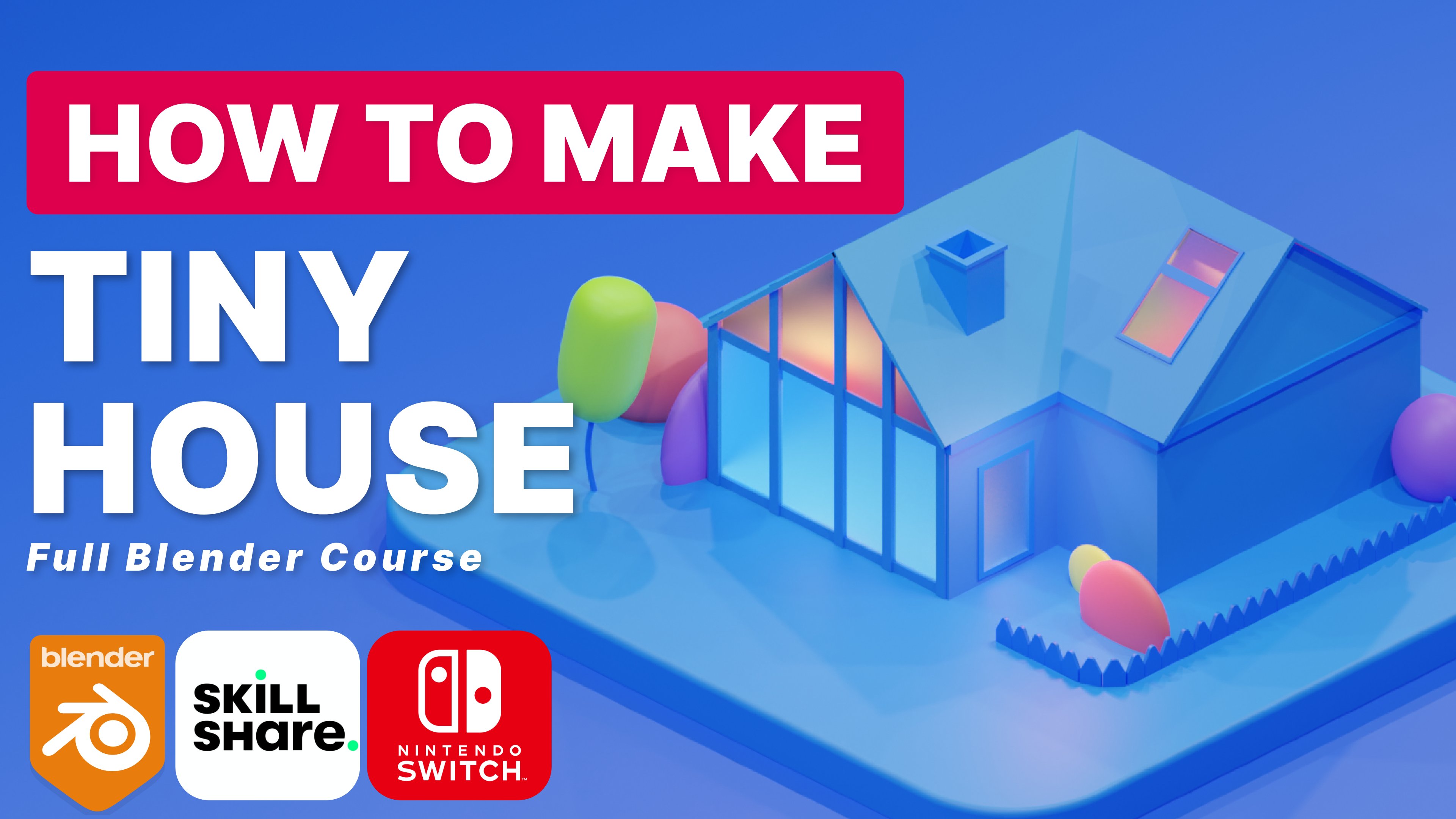
1. Intro: Hi everyone, welcome back. This is my new blender class. My name is Kathy, and today I'll be your teacher. So the topic today, we will be designing
an office space, a YouTuber office space, or YouTube or setup
a living room that also can be used as an office. So I got direct inspiration
from Sheldon Solomon. And I've got to say
his work is absolutely incredible and I always
try to replicate it. So let's see how close I
can get in this video. I'd like to see you do the exact same because
I know you can. Now if you've got a natural
ability for blender, you've got a natural ability for 3D design or architecture, interior design, and
this is perfect. The purpose of this course
is mostly to give you the basic skills to propel your knowledge and
your blender career. The amazing thing
about this course is that I'm breaking it down. I'm using simpler
design techniques to create something that
looks truly amazing. So even if you're a beginner, you will benefit in multiple ways with this
course because the principles I'm showing you
can be translated in so many different formulas. So long-term a course
like this can actually be extremely beneficial
to you, you. And for me as a teacher, as I teach, I tend
to learn a lot more. I tend to learn faster. I also tend to improvise a
lot and try out new things, find new challenges, and
solve those problems, and show you how to
solve those problems. We all run into a problem. And especially as 3D designers, I want to teach my students
how to solve those problems. So they're really amazing thing about this course is that it benefits you and it benefits me because I gain more
experience and you gain more exposure as
well as experience. Now this course is primarily
created for all levels. Beginners can partake, advance intermediaries can
partake in this course. That's what's really nice. He teaches everyone
something different. And I'm using different things that I haven't been taught, but I've just figured
out on my own. So do not worry if
you're a beginner, you can still join
in on this course. The tools we'll
be using today is our free software blender. That's a free 3D software. You can use it for animation, part to touch her
character design, interior design, the list goes on, It's
absolutely incredible. Will also be using
the ISO cam add-on. That's also free. I'll show you how
to download it. And additionally, we'll
be using Blender studio. And additionally we'll
be using Blender kit. That's basically a free add-on, will also be used
in Blender kit. This is a free add-on that
essentially allows you to add many different free
materials to your artwork, to your 3D environment
in Blender. And it's been incredibly useful, and it's been incredibly
efficient at saving time. So let's just run through the skills that you would learn. Once again, the basic
formulas to Blender, an introduction for beginners,
for intermediaries. And the most important
thing if you are an intermediary and you're starting to level up your skill, you're starting to
feel more confidence. This is where you can
challenge yourself and you've got a list of things that you will learn
in this course, how to create different
objects such as couch, TV, Stan, monitor screens, gammas. How to set up your enlightened
to give it that touch, that crispy look in the renders. Because you want your renders
to look absolutely crispy. I do as well. So overall, we will be creating a studio space and living
room, studio space. It's going to be
really exciting. I do hope you
enjoyed this video. Do hope you enjoy
the entire course. If you have any questions, any problems you run into, leave a comment in
our community page. That way I can reach out, try to help you
fix these issues. If you need any, if
you need any help, I can always offer feedback. Additionally, always remember to post your work in
the community and resource page that way
you can share with the community and I can give you some feedback on how
well you've done. So I do hope you
enjoy this course. I'm looking forward to
seeing what you create. I'm super excited actually. I really love to see
what people create. Take my ideas, take my designs and turn it into
something of your own. I'm looking forward to this. So let's get this thing started and I'll see you in
our first lesson.
2. Donwload Blender And ISO CAM: Everyone, the first
thing we would like to do is to download blender. We need the core software. This type it on Google. This is the official
site for Blender. They've got plenty
of material and they also have their own
courses that they provide. What you'd like to do is go
to the download section, download Blender for
your specific machine. If you're on Apple silicon, you can download the
latest version of Blender if you're on
Windows or Linux, you can also download
their version of Blender. But if you've already
got Blender installed, you don't really have to worry. The next thing that
we like to do is to download Blender
isometric camera. That's the ISO
camera from GitHub. This piece of software code
is created by Jason Carter. Very handy, very useful
piece of software. Get this installed as an add-on in your
blend of software. Additionally, we would also
like to download Blender kit. This is quite essential
if you'd like to add specific materials
to your design. There are a host
of free materials, all from Blender kit. And essentially, once you
download this application, you get it installed on
your blender software. It's basically
essentially an add-on. From there on, you can use whatever material
you'd like to create, whatever beautiful
environment you need. This is not essential, but I do recommend it. Everything that I recommend
downloaded in this video, it is quite useful and it does make your life
easier in Blender. So it's good to take the
time just to download these. And then we're ready
to get started.
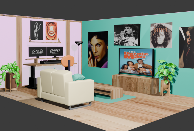
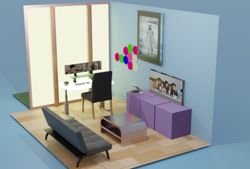
3. Basic Room Desk, TV and Computer: Today we're creating a
really cool office space. It's slash and apartment. I got this inspiration from
Sheldon's YouTube channel, one of his newest tutorials. And I thought You know what I've designed as office before. Let's design an updated a setup that is uploaded recently. And I think this is
as friends as setups, so this would be
very interested. So first thing that we need to do create a new blender file. Of course, let's
add a normal cube, as you can see it as cube
is pretty tiny of course. Now from the top, I just
want to move my cube into the center of our object. And let's, let's move
it down a little bit. So now essentially
what we can do a, scale our cube up, let's scale it up to, let's say around four. Let's move it up on the z-axis. And let's tap into our cube. We're gonna get rid of
some of these faces. Let's press X and let's
delete some of these faces. Delete the top face as well. So this is the general idea
that we will be working with. Let's scale this on the y-axis. So that's looking pretty good. This panel will be our window. This panel will
essentially be our wall. Let's press a to highlight
everything once again. And let's scale this on
the x-axis a little bit. Not too much art. Say, now that we've got
our simplistic design, let's just save this. Let's just call it 2023
living room setup. That's what we'll
call it for now. Ideally, you want that
to be on its own file. So now that we've
got our design, Let's tab back out
into object mode, and let's Shift a
and add a plane. Now this plane will be our desk. So let's press S and X and
scale it on the x-axis. Let's press S and Y, scale it on the y-axis. Let's scale it up a little bit. And we want to press G
and Y and move it along. Essentially we're just moving
it along into the corner. So this is this is
where our desk will be. Move it up just a little bit and possibly just move
it up a little bit more. And if we tap in, what we can actually do
is just extrude desk. Now, that's looking much better. Additionally, we're going
to want a TV stand. So let's add another cube, and let's scale this
cube on the y-axis. This will be our TV stand. Let's move it along towards
the back of the wall. Let's move it down
just a little bit. And of course, let's
scale it on the, on the Z-axis just a little bit and let's move it upwards. Let's scale it along the x-axis. And that's looking,
looking somewhat better. Let's move it along to the back of the wall just a little bit. That will be basically
our, our TV Stan. Now this data, we can
actually just duplicate this desk Shift D to
duplicate right-click. And now we can move
this desk along. Let's move it along
on the y-axis. And what we want to do
is essentially to rotate this desk on the
x-axis 90 degrees. Let's rotate it once again, pressing R, z, and we can
actually rotate it like that. Let's rotate it on 30
degrees once again and move it towards the back of the world because
this is our TV. Let's move it up a little bit. So that starts to look better. But I think our TV is possibly
a little bit smaller. That's for one. So let's scale it down, just
move it down a little bit. And our TV Stan is possibly, it's possibly a
little bit too short, so let's, let's scale
it down a little bit, and let's select
both of these and move it down just a little bit. We want to give the
desk some space. Let's press Control S
and save everything. Now that's so far is
looking surprisingly good. Next up, we'd like to
give this desk some legs. So let's go to top
view by pressing F7. Let's shift right-click to
add our cursor Shift a. And what we'd like
is a little cube, so it doesn't look
very small right now. But once we scale this down, then we can actually just
expand it using the z-axis and essentially lower it and continue to adjust
little by little. Now it's in the
floor a little bit. So what we want to do is just move it up just a little bit. And let's tap in and we want
to create some loop cuts. Let's create a couple of
loop cuts just around there. Well, actually one loop cuts seems to be fine at the moment. Now we can actually
just extrude this plan. It's the same thing
with this at the back. We can extrude this one as well, possibly make it a little
bit longer if we want. So that right there, already
looking somewhat better. Now if we go to wireframe, we can actually look
from the top and we can actually move this face down. Just a little bit. Reason I'd like to do this
is because we can now insert this face and
move it up a little bit. Insert this face once again
and move it up a little bit so that right there is
already looking pretty good. Now what we can do is
simply duplicate that. Actually what we can do
is add a mirror modifier. If we go to the modifies tab
on the right-hand corner, we can add a mirror modifier. Now once we've got x
selected, there we go. It's allowed us to mirror object to the other side on
the right-hand side. And by clicking the mirror
object onto the plane, that actual desk, that allows us to do that really
simply and easily. Now what this desk, we can
actually do something else. Let's duplicate our
desk. Right-click. Let's rotate our desk on
the y-axis 90 degrees. And let's move it to the back towards the wall. There we go. That's looking good and let's move it up just a little bit. Now we can actually
just scale this down, scale this down, scale it
along the y-axis of course, and scale it down just
a little bit more. For now, that will do as our first wallpaper
or war poster. Now on top of our desk does. There's monitors, of course. So in order to
build our monitors, let's first add a few objects
to the top of our desk. First is the monitor holder. So let's add that by duplicating the desk once
again, right-click. Move this upwards just a
little bit, not too much. You went a little bit of space. And let's, let's reduce the size first by
using the z-axis. Reduce it just a little
bit, not too much. And reduce it on the
y-axis, of course. And then let's reduce
it on the x-axis. And then of course, let's move it backwards
towards the wall. And if we want, we can
move it a little bit higher just to give
it a bit more space. Let's duplicate this
object once again. And let's rotate this ladies and gents 90
degrees on the y-axis. And let's scale this
down using S, z. Let's scale this
down a little bit. There we go. And then we can move it down to the, to the
left-hand side. We can even scale it a
bit more on the y-axis. And same thing with this one. We can mirror this one
to the other side. So if I click, if
I click objects, of course mirror object, click there, there we go. It is mirrored. We can actually move
this towards in by pressing G and an x. Move this in just a little bit. And of course now we
need our monitors. There was actually two monitors. So let's duplicate this. Once again. Let's rotate this on
the x-axis, 90 degrees. This will be our monitor,
believe it or not, let's move it up
G, Z to move up. And let's scale
along the x-axis. Then we can actually just
scale it up a little bit more. So like I said, there's
actually two monitors. So due to that fact, what we can actually do is just to possibly even
duplicate these monitors. We can either mirror or
we can just duplicate. I think we can try with
duplicates in from the top view. Let's move this
along on the x-axis. Once again, not bad,
not bad actually. But let's move this along. Alert a bit more. Not bad. If we wanted to, we can actually just rotate this just a little bit inwards. Some people like their
monitors to be rotated, but for now we'll just
leave it straight. Let's not rotated at all. Let's just leave it straight. That looks good. Two monitors. These monitors, however, they need to be
they need to be moved up. And then let's not forget
we need monitor legs. So let's duplicate
these legs right there. Let's move this
upwards and let's rotate this on the
z-axis 90 degrees. That's looking good. And let's scale this down
on the x-axis, of course. Now these are like Apple
Pro display monitors, of course less tab. And let's go to wireframe
and let's add a loop cut. Add a loop cut to the
bottom-right there. Possibly even alert a bit lower. We go back to normal
view to solid, and then let's go
to Face Select. And now we can just move this out. Go back into object mode. And now we can just move this to the back a little bit more. Let's make it look a little
bit realistic, right? Got two monitors right there. That's pretty good. But I
think this is a bit too high, so let's, let's scale this down. Honestly, don't know
what we were thinking. Let's move it down into
the desk little bit. Let's move down our
monitors and our duplicates it handles
and everything done. And we'll keep it
right there for now. Let's save our file. Now on our wall, There's actually a, there's actually some
light panels on our wall. So underworld, we're going
to design some light panels. This should be very
interested in. So let's add. So if we've got a circle, what we actually want from
our circle is a hexagon. So we've got six right there, and I think
that'll be good. So let's move this along there. Let's rotate this onto
y-axis 90 degrees. Let's tab into edit
mode and let's fill that space and let's
extrude a little bit. Let's tap out back
into object mode. And now we can just scale
this down a little bit. So now we've got that,
that's looking pretty good. Let's go into wireframe mode. So now what we want to do is essentially attach this
to the back of the world. But let's scale this
up a little bit more on the x-axis,
just a little bit. And let's move it to the back
of the wall right there. That's looking
pretty good. So now we can go to the side view. If you click the button in
the top right-hand corner, you can actually go
to the side profiles. Now we can just start
with patterning this out. So if we're going
to wireframe mode, we can actually just move
this along towards the side. And essentially you can just have this whichever
way you'd like. So let's keep it above the
desk just a little bit. And let's duplicate. Let's put this one
on top right there. Let's duplicate once again. There's duplicate once again. And let's put this one
right around here. And let's continue to duplicate. And we continue to
duplicate it and we just essentially start, start designing
this out and write. They're starting to look
pretty good in my opinion. So that looks pretty simplistic. Let's save our file and let's go back into, into solid model.
4. Room Coach and Chair: Now truth be told, I did
want it to add a couch, just a little bit of
a thought and idea. So if we select all of this and we moved it up a little bit, we can perhaps add a couch. We can try, Let's attempt. Let's add a cube. And let's scale this cubed
down almost like a cushion. Lets move it upwards. And let's rotate it on the
y-axis just a little bit. And let's duplicate this cushion
and let's move it along. Let's select both and move it
forward just a little bit. Now by only having one, we can duplicate this and rotate it on the
y-axis like that. Move it, move it backwards. Now we can actually just scale this up
words. There we go. We can scale this along. And let's, let's move it
down just a little bit. We don't want it to be
too wide or too high. Now with this one, we can
duplicate this once again and rotate on the x-axis 90 degrees. Move this one down
just a little bit, scale up just a little bit more. Scale this one down, just a little bit
more, scale it down. That's that's looking pretty
good. I'm not going to lie. Let's scale this one
down on the x-axis. Let's scale this one down
on the y-axis is actually, and now we can actually just, just rotate this a little bit because it's a bit
tilted at the moment. We don't want it
to be too tilted. We can actually just
mirror this object. This object to the
seat right there. Samira is not working right now. So what we'll just do is delete mirror and let's duplicate and move the duplication
downwards just a little bit. Let's make sure that it's not to detach and let's rotate
a little bit more. Now with these, if we
add a solidify modifier, will this with these
cushions selected, we can click Control
to that we have it. Let's tab into edit mode. And now this is where
it gets really fun. Now we can add some loop cuts, starting with these ones. Let's add some, some loop
cuts right about there. Let's add additional loop
cut right around there. And an additional loop
cuts right about there. And of course, loop cuts
going, going upwards. There we go. Let's add
loop cuts going upward. I don t think the loop
cuts needs to be too bold. But essentially, that's the
principle we will be using. Let's scale this down. By the way, Let's scale
this down on the y-axis. So it doesn't, it doesn't
create any problem. If we've got, if we go to, if we go to the
top of the object, then we can actually see
that what we need to do is actually just move it
down just a little bit. Anyway, with our back cushion, It's the same thing control to. And just add your loop cuts. Add your loop cut to
your heart's content. However many loop
cuts you'd like to satisfy the look that you're trying to you're trying
to get from your couch. But we're just going for a
simplistic couch to be honest. Now with this is the same thing. Control to tab into edit mode. And we add some, some loop cuts. Let's zoom in just a little bit. Additional loop cuts. And let's add a loop cut
in the middle as well. Let's, let's move this
up just a little bit. And another one towards, towards the back left
corner this off actually. So with those selected, we can actually
delete these two, these two reference
if we wanted to. We don't have to,
but what we can, let's press X, delete
these two references. Let's duplicate this and let's
move it along the y-axis. Let's duplicate this and move it along the y-axis once again. Now with this at the back, we can actually just scale this out on the wax
who's a little bit more so it actually fits. It doesn't, doesn't
look too out of place. We can add a couple of cushions. Let's write select right
there with our cursor. Let's add a cube right there. And let's scale this down. Let's scale this
along the y-axis, and let's scale it
down a little bit. Scale it along the y-axis. Let's scale it along the y-axis a little bit more.
You know what I mean? Let's bring it inward
on the x-axis. Let's move it up a little bit. Let's continue to scale it down. Now we can click Control two, and it's the same thing. We tab in, and we just
add some loop cuts. We can add loop cuts in
whichever way we'd like. We can really do some
truly amazing stuff right here with this, with a simple piece
of technology. But with everything selected, we can possibly just
rotate this on the, on the y-axis, rotates
it like that and, and bring it backwards
a little bit. Possibly just rotate
it a bit more, allow it to look a
bit more authentic. Bring it out words of
the couch. There we go. That's looking a
little bit better. And if we wanted
to, we can just, now we can just add, add
some additional loop cuts. If we tap out, we can actually use Shade Smooth that and we can duplicate and move it
along just over there. We can actually deduce, just rotate this and we can
actually just rotate those on the x-axis, 180 degrees. So that's how does that look? Honestly, I don't think
it looked too bad. I think it could be way
worse with our coffee table. Let's move this out
a little bit more. And now with our couch, of course, let's,
let's move this along. Let's move it along right
in front of the television, essentially, right around there. That tends to look better. Same thing with the
rug, of course. Let's move it along
right in front of our TV stand right there
with our coffee table. We can do the same thing. Let's just move it along on the y-axis, right around there. And let's save this. So
that's basically our room. Kind of finish. Now with our coffee table, we'd like to just add a
simple, a simple book. So we add a cube. I know what a, what
am I thinking? Add in a cube, but you can use a cube for
almost anything. Let's just scale this down
into the size of a book. This book will be square. I just decided to make
this book squared. The other book on the left
will be a normal size. Let's scale both of
them down on the, on the z axis. And let's move them down a little bit just to rest
on top of the coffee table. And let's put one of these
book Beneath the coffee table. Actually we can put to
bending if the coffee table. So I've got a couple
of books right there. Now in this office, I did manage to
spot a brown chair. So we're going to create
a brown chair and I'm just going to
improvise this as well. First, we want to
create a circle. With this circle, we want
to add a few more vertices, possibly up to around 30
vertices. There we go. Let's tab in. And let's, let's, let's
fill, Let's insert. And then we can move these
upwards just a little bit. Yeah, this is a
very interesting, interesting chair, but it's
a brown chair and I thought, You know what, this
looks really nice. Let's insert a little
bit more and let's continue to create our
couch right around there. Actually, within this setup, there's actually a mirror. There's actually a mirage
thinking about adding a mirror, possibly around there
on the left-hand side, right there, but I also
don't want to overdo it. So let's continue to
create our chair. On top of our chair, we want a cube. This cube will
essentially be RC. Let's scale this
down a little bit. And let's, let, of course
move it down. So far. It's looking bizarre,
not going to lie, it is it is looking
bizarre because I'm just, I am simply improvising. Honestly. I'm simply improvising. Let's scale this down
a little bit more. Let's honestly scale this down
a little bit more as well. I certainly don't want
this to be too big. Let's go back into object mode, and let's click Alt, and let's click on vertices
for number one vertices. And let's select
all vertices less. Extrude these vertices. We can extrude them
downwards just a little bit. Then what we wanna do is move this out of the ground
just a little bit. The real question is, how
does this chair move around? But I just really
liked the design. So click on the cushion. Of course, there's another
question on the top. There's another cushion at the
back and at the head rest. Let's duplicate this
and let's rotate on the x-axis 90 degrees, and let's move it
backward on the y-axis. Move it upwards on the z-axis. And let's scale this down because this part is,
is pretty skinny. And let's just, let's just tilt it backwards
just a little bit. Speaking of backwards,
Let's just go, Let's just bring it backwards
a little bit more. In fact. In fact, let's
bring it backwards, even, even some more. And let's, let's bring
it down because it's, and then there's actually a
cushion at the top as well. So let's duplicate
this once again, and let's scale out
and let's bring it upwards, like like there. Let's, let's bring it
forward just a little bit. So let's save all if
this were the first one, Let's click Control to, wow, that's so goods. Goods, so far, my goodness, It does not look good. Now, our front is actually, is actually pretty bold. So let's add a loop
cut right there. Once again, I'm just, I'm just improvising
and sometimes improvising is how you learn. Sometimes seriously,
it really is. And let's just create
another loop cut for the back right there. Now if we go into X-Ray mode, That's what Alt Z. We can select these bottom
vertices right there. Let's click out,
and let's click G. And let's, let's bring
it upwards a little bit. Let's create another,
another loop cut. Once again, Alt Z. Select these vertices
right there. Let's bring that
up a little bit. I'm honestly just Just improvise and see to
really see what happens. Now within all, if there's, there's some
additional vertices. Let's create some vertices
right around there. Let's create another
one right around there. And with these, we can actually just bring this down a little bit timeframe
with these ones. We can actually just
bring that down a little bit safer with these right here. Let's just bring that
down a little bit. And obviously, with these two, I really want to bring
these two down even. Now at these vertices,
right, right there. Let's select these vertices
and let's see if we can move these backwards somewhat. That's because these vertices
right here, actually, I want to move these vertices
downwards like that. That adds a really
interesting thing. Is it like it, it makes, it looks interesting,
but not sure if it's, if that's a good thing. Now, let's click in our leg. Go to Face, Select the face. We want to carry this face up a little bit more
into the chair. Actually, it's honestly starting to look like a barber chair. So I'm not sure if
that's a good idea. At the end of the
day, I might end up changing a few things. Anyway, let's continue with
the back of the chair, control to the tab
into edit mode. And it's really and
truly something similar. Just follow what I do
with the width my, my loop cuts and you get a sense of what I'm trying
to accomplish here. Let's bring that backwards. But really and truly this part
of the cherries is really, really skinny, to be honest. Let's click on this and let's
hide the head rest for now. Now within this chair, we want an additional
few loop cuts and let's add Around
two right there. And let's click on number one. Let's move these backwards. Let's move these ones
backwards as well. Let's move this one backward. I'm just trying to give
it some character. I'm not sure if you
can if you can tell, but like in the center of
the chair right there it is, it needs some character. And if we go to Add select, let's select this
inner, this inner loop. And let's see what
would happen if we, if we brought it
backwards and forwards. So that's actually very
interested in right there. Very interesting. Let's
go to vertices selected. Let's see if we can bring
these, these vertices forward. So it turns out that we can. So let's do the same
thing on this side. And let's do it all at once. Let's bring this, this lower vertices
forward just a little bit. So that is looking
somewhat good. Let's bring this down
a little bit more. Now with everything selected, let's bring back our cube. This is our headdress and
let's click Control to. Now headdress is very skinny, so let's scale this
down on the z-axis. Headdress is very skinny indeed, let's tap in and let's create
some additional loop cuts. These loop cuts are very
interested actually. Now if we carry out some
additional loop cuts, like around, around there, possibly along there as well. We'll be able to, to select these inner loop cuts and basically bring them
out just a little bit. Let's select a few more. You can see that I'm
doing them gradually. I'm not doing it all
at the same time because I want it to
have characteristics. Let's bring that out
even more a little bit. Let's create an additional
loop cut right there. Let's create an additional
loop cut right there. I really and truly with this, with these edge loop cuts, we can bring these backwards. So if I select all of
this edge right there, we can actually just
scale this down a little bit and bring it
backwards a little bit. So I'm not sure how well
that works unfortunately, but I'd say if we do
that on the other side, it could look pretty good. So Shift and Alt, and let's select these
loops right there. And let's bring that down, scale it down SY, and scale it down. That is pretty good. Now with our leg, we can just add a
solidify modifier. And this will basically basically give it some
width, some substance. So basically we are almost
there with this one. Next up is creating the
handles, of course. So if we click number
one of our number pad and shift right-click to
add our cursor right there. Let's add a cylinder. Let's add a curve. This will possibly
be a, a, a bezel. So if we add a curve, we
can actually add a path. Let's tab in there. We got, we've got vertices. So these two vertices, let's select these
two red vertices and n essentially bring
them upwards. Let's bring them towards us. Let's select everything and
let's move it downwards. So since we got
everything selected, of course we want
to move this down. Now with these two top ones, we can actually move this
down a bit more actually. Then from the edge we can actually then legs make sure that we've got
everything selected. Move it down even
more, like I said, with these two right there, Let's select these two vertices. And now we can
actually just extrude. If I select all of those
edges at the bottom, we can move this backward, Gy, move it backwards
a little bit. Let's select everything
by pressing a. And let's move this along. Let's move it along upwards. Select all of those bottom
vertices of course, and let's extrude, Let's
continue to extrude. And let's scale those
vertices in words, these two edge vertices, Let's now scaled them
inwards using the x-axis. Of course. Now with
the two top vertices, Here's a nice trick
that we can do. We can extrude these backwards using the y-axis right there. And now within our, our, our curved path, we
can add some depth. We can actually turn this
into like a wire and system, but it's like a black metal. So we don't need it to be too thick, possibly around four. And let's fill caps. And as you can see,
if we fill caps, those holes are now covered. They're completely covered
and we can offset this, but we are not really
trying to try to offset it. So let's keep it
at zero and width. And let's select all vertices, and let's press S and X and
let's scale it inwards. There we go. Let's move it along
on the x-axis. Keep the cap full. And let's save our
document by pressing Control S to save
document, Let's tap out. Now from the top view. With this area, we can
create our arm cushion. So let's add a cube. Everything we can do with cube, and let's scale this
cube on the y-axis. Let's move it backwards
just around there. Let's scale it down
on the x-axis. So I scaled it down on the
z axis and let's scale it along the x-axis right there. Let's scale it down a little
bit more on the x-axis. And let's move it up
a little bit more. So now because
that's our Amarise, let's save once again, and let's press Control E. And then we can start
adding some loop cuts. Let's go into edit mode. Tobin. Let's create some, some more, some more loop cuts. So add a loop cut to
the top right there. That's the first place. Let's add a loop cut
right there as well. And let's add another
one just around there. Now with everything selected, we can now move this upward and move this to the
back just a little bit. And let's click on vertices
number one for vertices, select all of these
vertices G and Z. To move these down, look at that, that
looks pretty good. And if we select all of
those in x-ray mode, we can actually move this
backwards just a little bit. Let's save that. Let's go into object
mode and let's, let's mirror a nice way
to speed up the process. Let's mirror this object. Where would we like
to mirror it to the other objects?
On the other side? And there we have
it a little chair. But the only thing that I don't like is honestly these legs, I'm not even sure if you
can describe that as a, as a ligand fact, but nevertheless, it is a chair.
5. Room Objects, Lamp: Now on our TV standards, actually a music player. So let's scale a TV
stand a little bit more. On top of my music
stand right there. We would like to add a cube
to that, to that area. This would be quite simplistic. Let's scale our cube down, and let's scale
it on the z-axis. Once again, it's
like a briefcase. Let's scale it a
little bit more. Now if we tap in, we can actually add a loop
cut right about there. Let's add an additional loop
cuts right around there. So without object, Let's
continue to scale this down. Let's bring it down towards the, towards a TV stand a little bit. The face less just insert. And let's, let's bring
this down a little bit. Now if we click number one, we get vertices selected
the inner circle. We can actually, we can actually bring this inner circle out just a little bit. We can duplicate
set in a circle. We can move it up a
little bit and we can scale this up a little bit. So it looks like a
old-fashioned music player. Now, back into the top mode, we can actually just move, just scale this up. Basically we click the back face obviously have your
clip number three, have your face selected. And we can actually
just scale this up. Now, we can actually do is we can back in and
obviously we can add a, another loop cut
right around there. Now what the top alone, we can actually
move this forward. So at the top alone
we can actually just move this forward. Kind of like, kind of like that. So that's, that's pretty cool. And now we can do, we can
bring it down somewhat. Now with these two
vertices on the edges, we can actually select those. And we can scale those on the y-axis out
just a little bit. Now we've got two
additional vertices. With these two vertices, we can actually move
this forward on the, on the z-axis, on
the x-axis, my bad. And of course, let's, let's move it out
just a little bit. There we have it. Now if we go into X-Ray
mode, there we have it. We can actually select these ones right there,
just those ones. And the back one right
there as well. There we go. And now we can actually press
P and separate this object. This will be, so
let's press Option. Let's press Option Z and we
can Exit x-ray mode and save. Now next up, what
we'd like to do is to make our TV stand look
a little bit better. So let's tab and let's
add a few loop cuts. Let's start with two luke
cuts and let's scale these loop cuts on the
y-axis. Just like that. Let's add an additional
couple of loop cuts and let's scale them along
the y-axis as well. Now if we go to Face Select, we can actually do extrude these faces just a little
bit, not too much. So let's extrude this
one just a little bit. And it's the same
thing with this face. Let's just extrude it
just a little bit. Same thing with the,
with the other one. Let's extrude it
just a little bit. Now that is starting
to look better. If you tap out back
into, into object mode, you can clearly see
that looks pretty good, quite authentic and make, it adds that extra touch. Let's save this. And let's put our cursor in the
middle of the floor, and let's create a mat. So that's another plane. Let's scale this plane on the, on the y-axis, just a
little bit like that. Let's scale it up and let's, let's move it down
just a little bit. Now because this
is a little mad. We're going to want to basically just
extrude a little bit, but by a fraction,
seriously, a fraction. So that right there
is pretty good. You can clearly see
that it's extruded, but it's a tiny amount. Now, let's create another plane. Now this will be
our coffee table. Let's scale this on the
y-axis, kinda like that. And let's move it
up a little bit. If we tap in, Let's
go to edge select. And let's extrude these edges
downwards into the floor. That does look like
a big coffee table. Let's go back to Face Select, duplicate this and let's move
it down just a little bit. This will be basically be
our glass coffee table. There is a glass coffee table. And let's move this along, basically in front of the TV. Let's go back to Add select. And what we'd like
to do is to Bezier, this controlled me to
bezel these edges. Now, that's looking pretty good. Let's select all, and
let's scale on the z-axis, and let's move it up. Just haven't level just a
little bit right there. Let's scale it along the y-axis. Let's just make it a little bit more, a little bit smaller. And let's add a
solidify modifier. I submitted. If you modify it, gives
it some some substance, gives it some weights,
makes it look better. Let's save our file. That's looking
pretty good so far. As for our poster, let's, let's tap into our
poster that's first. And Glasgow to Face Select and less just extrude. There we go. And let's just
press I to insert. There. There we go. That looks pretty good. And if we extra, we
can extrude outward, so we can extrude inwards. Let's extrude inwards just a little bit because
this is a poster, we want to give it some
additional authenticity. But it doesn't have
to be by much. It's literally by a fraction and that some of the
smallest strings We'll make the big differences. Now add the window, this panel, this panel right there, that's a huge glass panel. Let's separate that panel. Actually before we separate this panel, let's just insert. Let's press I after you
click face select, insert, and then we can actually
just press P to separate. Now we've got a completely
different panel separated. That will be our glass panel. Now right there, we
will add a few pillars. So let's click seven
and a number pad shift right-click for curses select, and let's add, and
let's add a cube. There we go. Let's scale this down
just a little bit. And then we can scale it upwards as scale
it down a little bit more and move it
upwards essentially. And let's scale it a
bit more on the z-axis. It's a lot of scaling
and let's just move it into position. And that tends to look
a little bit better. But now it's a bit bulky. So let's first, let's
select it first of all and press S and Y to basically scale it down just
a little bit like that. We wanted to have some width, but certainly not too much. We don't want it
to look too bulky. Let's move this towards the, towards the back of the
wall just a bit more. If this needs any
additional scaling, we will have to do this
a little bit later. Let's get it a bit
more on the x-axis. And now what we'd actually
like to do is to add a mirror modifier modifier. And let's, let's go
to mirror object and select the glass object
that we've got right there. Truthfully, I think this setup would look so much better if if the setup is in the
middle of the glass panel. Seriously. And that's that's
probably not a bad idea. So for now we can
actually just move this towards,
towards the center. So let's select everything. Of course, select the monitor
to monitor holders as well. And let's press G, z and move this along. So every click number
one and number pad, we get the front face of view. And we are able to basically adjust this to a point
where it looks very, very nice and functional. There we go. That tends to look pretty nice. So we can actually just move this along
a little bit more. Now that that tends
to look really, really bad ***, I'm
not going to lie. Now let's save this
document, of course. And honestly, I have
consider adding a few more, a few more posters. If we duplicate shift D, right-click and then G to
move this secondary object, you can actually move it around. It's the same thing from there, duplicates and
then press Y axis. And we can actually
just move these alone. Move it along a little bit more. We don't want to fill the
house with too much posters. But perhaps we can scale
these posters down and we can just put them around
the TV like that. So that's an option. But so far, this is
our our office space. Now within the home,
There's actually a really nice, really nice lamp. So we're going to attempt
to create, settle down. Let's go to the top view. Let's shift right-click
right there. And I'm completely, I'm completely improvised
and right here. So let's shift a. I have no idea what I'm
really going to create, but let's, let's go with a cylinder and let's
move it up a little bit. Let's go into edit mode, Face Select, scale it down. And let's, let's
move this upwards. Let's do that once again, let's scale it down a little bit more. We want that to be
pretty **** skinny. Now that we've got this, we can actually choose, we can actually just
extrude once more and essentially move
this outwards and extrude once more and continue
to move this outwards. So let's extrude
alert a bit more. And let's, let's scale this out, this face right there. Let's extrude once more. Let's continue to scale
this out just like that. And let's all click. Let's click Add,
select an alt click, this bottom loop right there. And then we can, we
can simply do this. That tends to look like
the lamp that we've got. Now face select
and we can insert this and extrude it downwards. Then we can just separate that right there
and click on it. Now we can do whatever we want, but essentially, the light will be going through
that lump upwards. Now for the rest of the
object down here, once again, Ed select Alt, select
this entire loop, and let's, let's scale it down. We can possibly do the same
with this one at the bottom. But I have no idea
how this will look. I mean, tends to look
a little bit strange. But then again, not the
worst that I've seen. And if we select all of that
and we we bring it down. Yeah, not the worst I've
seen could be worse. Now, if we right-click and we click on Shade Smooth,
There you have it. That looks actually if
we add bezel to this, I know it's puzzled a
little bit already, but if we add bezel,
then we shade smooth. It actually, it
actually looks fairly nice so that right there
a funny-looking lump, but nevertheless, an
interest in land.
6. Balcony and Plant: Now on our desk, we do have
a few, a few accessories. First one is a desk mat. Let's just add a decimal. A simple plane will do. Let's scale this down
a little bit more. Scale it along the x-axis. Let's scale it out a bit more. And let's move it along on the
x-axis, right about there. And let's scale this along
on the wax souls as well. And now if we tap
it into edit mode, vertice all Add Selected
with n vertices. Click Control before for basil and then V to bezel
the edges of course, but it's not working too well. So what we need to add is
a couple of loop cuts. There we go. And let's, let's scale
these loop cuts on the x-axis right around there. Now, in edit mode, if we
click one, we get vertices. Let's select the edge
vertices once again. And now if we try to bezel
this control, control B, and then click V,
We can measure this almost a more suitable radius. Select all, and of
course we want to extrude it the tiniest amount. Not a lot to be honest, that will honestly do. Now on this test.
They do have a, a Mac, of course. So let's get another plane. And let's, let's move it up a little bit and let's
scale it down. This Mac Pro is one of
the, one of the big boys. Let's tab in, Add selected. And let's bezel this edge light that select all
with a once again. And let's move this upwards. It'll be low poly as well. Doesn't need a lot of detail, but it's right there
under right-hand corner and we're just going to move it under the
desk, just around there. Everyone is using distinct
these days and it seems to be it seems to be the
king in the space. So back in our desk, let's add another accessory,
another plane. Let's scale this plane down. Let's move it up. We've got this plane
move up a little bit. Let's tab in, and
let's, let's move it. Let's, let's adjust it. Let's move it down
just a little bit. So this would be like an apple. Actually, let's let bezel
the edges first Control V and V basil these
edges not by a lot. Let's select all and let's
move it up just a little bit. Let's select all once again. And let's scale this down
because we don't want it to be we don't want
it to be too big, but it is wide on the x-axis. So let's scale it on the x-axis, and let's scale it down
a little bit more. I think that's about good. The only thing is
that the edges, these edges right there. Let's go into extra mode. Let's select all
of those properly. That's a little bit flatter. So let's, we can actually adjust it live data and
bring it down, not the cell. It's actually gotten
messed up right there. You can see on the
right-hand side. So let's click Alt Z once again, and let's select
the correct one. Let's start back over. Select those and select those. And let's move it down. Believe it or not, I'm still get something is still wrong. There we go. Like something is wrong. So let's try it once again by selecting those and shift
select those as well. Alt Z to Exit x-ray mode, GZ and move these down. There we go. That's
looking better. How long did that take us? Well, let's let's
move this along. It's actually on the
left-hand side, no idea why. But with this simple design, what we can actually do is duplicate towards
the right-hand side. And now we can scale this. Now we can scale this
up a little bit, sorry, scale this
along the x-axis. Let's select some of
these vertices and let's, let's move them out. But first we need to
be an X-ray mode. Let's select some of these
vertices once again. And so if I click, if I click S Y, I can actually just adjust
these a little bit. And while it does make it look
a little bit more rounder, it actually, it actually
fixes are symmetrical issue. So it looks a bit
more symmetrical, but it's extremely round. Let's Alt Z to come out of that. This can be our keyboard, essentially, several
cliques, seven. Now we're just going to create some keys, some quick keys. So it's gonna be very random. Let's create our
first key, big cube. My goodness, What
was I thinking? Let's scale this cube
down just a little bit. The keys are actually, the keys are
actually fairly big. I'm not going to lie. So
that's the first key, That's the escape key. Now let's duplicate
this, move this along, and from there on out, we can actually just,
just duplicate this. So let's actually array,
array modifier account. Let's, let's give it some space. I believe right there,
there's about four keys. And additionally,
duplicate this. Move this along the x-axis. Once again. Duplicate these, move these along the x-axis
once again, and let's add. A few more keys. So select our keyboard
and let's scale this down now that we know the size
that we are working with. Let's move this along
the right-hand side. We do have a keypad, so let's, let's adjust
this a little bit. Let's move this down. Of course. Let's add another
one right there. Let's give these
plenty of space. Actually, all of these keys, they need to be within the
keyboard a little bit more. I swear they do. And because the
keyboard is slanted, each of them need to be in the keyboard a little bit
more than the other ones. So let's just adjust
it like that. While this is taking
it to the next level, this is proper customization. Now with these two, Let's move these along. Let's bring them out there. And because they're
array modifier, Let's just add some
additional array. Let's duplicate once again. Let's bring this down. This is just, this keyboard
is not meant to look nice. It's meant to be the most boring keyboard you
can ever imagine. Let's bring it down even more. And that's mostly because it
will be in the background. Let's duplicate once
again, bring this down, and let's reduce
this array modifier because some of these keys
will be different colors. So we want to keep
the attention to detail looking really nice. Let's duplicate this.
Let's move it along. Let's get rid of
the array modifier. And let's scale this
out on the x-axis, because this is our space bar That's continue to scale it out. And let's duplicate,
carry this along. And let's add some additional
keys right around there. Let's duplicate, bring this one upwards and bring it across. And of course, let's
reduce this count to one. That ladies and gentlemen
is basically our keyboard. Let's scale our keyboard
down even more. On the y-axis. Let's move it up a little
bit on the y-axis. Like you can see
from the side view, we got to adjust these
keys just a little bit. Let's, let's go into X-Ray mode. Let's select all of
those keys right there. And let's bring
them down a level. Let's bring these
ones down a level. And same thing with these ones. Let's bring them down. So there we go. Now it's actually looking
not too bad actually, that actually looks pretty cool. You know what I mean? If you don t think it
looks cool then, oh, well, there's a little plants on the right-hand side, right? Right around there. But it's a smaller details, so I'm not sure if I'll
add the plant just yet, but the last thing I
have to do is just add a big plant and then
add a smaller plant. So let's get that done. Next phase of our
object is obviously creating the plants
and stuff like that. But we do have an additional
little objects to create, a little accessory to
create on our desk. This is just a tiny
little objects. So right-click put our
cursor right there, and let's create a cube. I just love using my cubes. And let's scale this
along the x-axis. Let's scale this down
on the, on the y-axis. Of course. Let's scale it up on the x-axis, scale it up on the z-axis
just a little bit, and let's move it along. Let's bring this object forward. And let's rotate this object. On this object, There's just
some tiny little button. So let's duplicate this and let's bring this
duplication forward. And let's scale it down. Let's bring it backwards
just a little bit. And let's move it along. Move it upward, and let's
move it along, of course. And let's create an array
modifier right there. Let's, let's give these buttons
some, some, some spaces. That's actually
looking pretty good. Let's bring these buttons
backwards just a little bit, and let's duplicate
these buttons, bring them down,
bring them forward. Of course, duplicate them
once again, bring them down. And let's bring these, bring these buttons forward. Let's create a couple of
vertices right there. Scale these along the x-axis, Alt Z, and number
one for vertices. And let's select these vertices. Let's see if we can
embezzle these. Now with these, with these four vertices
selected at the top, I believe we can just
do something like that. That looks, it looks
pretty good actually. Same thing with these two
bottom vertices right there. Let's, let's do that once more. Yeah, that looks, that looks pretty good, nice and simple. Save that. Now outside the
window there is actually some, some fake grass, I would say. If we tab in Face Select, let's duplicate
this right-click. And let's bring this upwards, Gy, let's bring it up where it, Let's scale it down
right around there, bringing upwards a
little bit more. And I scale this on the y-axis, bring it up a little bit more. And let's bring the floor up
just a little bit like that. It says like last
minute improvise. So let's select the floor
from the bottom. And let's. Extrude these. Let's select those and let's
extrude this a little bit. You can see it creates a
little bit of a problem, but we can fix that by
clicking number two and Alt select these
edges right there. Select these edges. So Alt select isn't
working, but we can just, we can just press
Shift and select all the fat and
filling the face. And there we go, we've got a full replacement
is the same figure, this one out here, Shift to select all of those
individually and fill. I'd say that's pretty cool. So the top of this face, we do need it to be grass. So face selected, we can actually separate
that would be grass. Additionally, there's some
sort of barrier at the back, but it's not too complicated. We just duplicated this. So there we go. We've got a duplication. Let's right-click set
origin to geometry. And then let's rotate said geometry on the
x-axis 90 degrees. Bring it backwards on
the y-axis and scale it down on the, on the x-axis. So it needs to be scaled
down just a little bit more. There we go. That's looking
pretty good now with these barriers right there, Let's duplicate this
and let's bring it out words out here as well. Now, let's scale
this down. So low. If this were just
like we're actually reusing a lot of,
a lot of parts. That's what we're doing. Let's move this, move this along the x-axis, move it down there. We can actually get rid of the mirror modifier and instead add an array modifier
less ad about four. And let's separate these as, as far as the eye can see. Okay, maybe, maybe not that far, but that's about good. Let's save control S. And actually, this
tends to remind me a lot of the original setup, Designed shelf and
original setup. Your reminds me a
lot of it is it is very similar similar
type of apartment. But the difference is is
like this is way easier because I'm just using the knowledge that I've
learned from Blender. I'm not trying to
do anything fancy. I'm just using the knowledge of learning that that's
almost there. Now we've got to
create our plants. So let's shift, right-click
on our cursor right there. Let's create a lead to, I would say a circle. Let's tab in. Let's scale this circle down. And let's fill this circle
while we're tapping. Let's, let's move
this out words. And let's, let's bring
this spring this upwards. Alt. Select this edge you
want to click to, you want to click Edge Select, and then Control B to
essentially bezel, face select the interface and zoom in and then bring it down. Select all it is. That's pretty **** big, so it doesn't need to be bad, bloody robots, I would
say just around there, dots. That's pretty good. So next to it, we're going
to create our leafs. Let's create a plane. Let's scale this plane down, that scale it down,
and let's scale it on the x-axis,
just drawn there. Less tab. And let's add a
couple of vertices right there. Let's move these vertices up. This will be our plants. Let's tab in and let's quit
number 14 vertices select. And essentially what we
wanna do is scale this down. So let's exit. Let's go back into object mode. Click Control two. There we go. Now if we tap back in, we can start to make some
additional modifications. So let's add a couple of vertices right in the
center right there. With these vertices, we can adjust even
more if we wanted, but we are going to scale these vertices down
in the center. And then we are going to
extrude downwards a little bit. Now I've got
everything selected. Now let's go back
into object mode and let's move our leaf up. So let's scale these, these loop cuts down. Let's add an additional loop cut in the center right there. We can actually move this
down just a little bit. With these two loop
cuts in the middle, we can actually just move this down a little bit like that. With the innermost loop cuts, we can actually bring
these towards us just a little bit more with the outer
loop cuts while vertices, actually I should say vertices. Yeah, let's bring this out
of the ground a little bit. So now we can add one of
my favorite modifiers. On the right. Click modifiers, solidify modifier will
give us a given substance. Now that we've got a little
bit of substance that's actually looking pretty good. We can level up our
viewport on Render, make it look a little bit
better and shade smooth. So now this will be our
base for our clients. So let's rotate this, but I want to rotate
this on the y-axis. Rotated a little bit
more on the y-axis. We're tapping with some
of these vertices. What we can actually
do is select these vertices and essentially
bring them upwards. Can bring them upwards
just a little bit more. Back into object mode.
There we have it. That's way better. Let's rotate this
around the y-axis. Let's move this along
into our little pots. Let's move this along
in the, in the center. Let's rotate it on the z-axis. And let's, let's move
it up a little bit. Now we can start
to duplicate and rotate on the z-axis and
essentially move it along. Now from the face view, we can adjust it in length and
we can adjust it in width. So that is, that is pretty cool. Let's move it up a
little bit more. Move it, move it backwards. We can duplicate this one. Rotate once again, scale up. And we can obviously with our
with our solidify modifier, we can we can increase
the thickness. There we go. We can increase the thickness, increase it to around 20, increase this thickness
to around around 15, Increase, Increase the
additional thickness around 16. And let's, let's move
this along and let's, let's continue to rotate. Let's rotate this
one once again. And let's adjust
it. There we go. That's looking pretty good. And obviously I
select all of those. And now we can just do,
do something similar. All of them Once again
and duplicate and rotate once again
and move it along. Of course. Now in the, in the
innermost circle, we can add some of
these tall branches. So let's, let's zoom it down and let's extend it on the z-axis. There we go. Now that, that's starting
to look quite amazing, I'm not going to lie that,
that looks pretty nice. But these are, these
are all used just by, just by having some
simple geometry with this back one
right out there. And let's scale the supports. We can scale this,
scale downwards away. This one. We can scale this
downward as well. We can rotate this one. Just like that. That writer is looking
a little bit better. So we can just continue to
duplicate and scale down, move this into the center. And we can move this
down a little bit. Let's duplicate once again, and let's, let's rotate. Let's move this
just along there. Let's rotate this. Add a little bit
of authenticity. Let's duplicate once
again and rotate. You can guess, I wanted to bring this one just around there. I think that's, that looks
like a brilliant plant. I think it looks like
a brilliant plants, but let's duplicate these. Let's duplicate what
we can duplicate. That is pretty good. Looking at all of that. That's basically
everything done now we've just got to add material, and that's pretty simple. Now if we want, we can select as many of
these as possible. And we can just duplicate
the entire object and add a much tinier
plants on our desk. I'm selecting all of this. I will Shift D to duplicate
and bring it up to the desk. So right-click then G and Z, move it along, bring it up to the desk
area, bring it across. And if we zoom in, we
can move up a little bit more and just
shrink this down. There we go. We've got we've got our little a little desk plants. Possibly make it a little
bit bigger and move it up along just
just a little bit. That's looking quite sharp. With these monitors. I do believe I'm
going to need to separate these these faces. Same thing with the
one on the right. Select face and
separate these faces. So let's save all of that. Next up is adenoma material. Okay, ladies and gents. So now we can actually add our material and
detail to our room. So with these three posters, I think I would like
to scale them up. Once again. I know we scale them
down in the beginning, but now it's time
that I think we probably want to scale them
up once again, not too big, however, I can probably give it a really decent sides if I'm
being completely honest, we can perhaps scale it
on the z-axis as well. Carry this up just a little bit and scale it out a
little bit more.
7. Light And Cameras: So from there on, we can see where it takes us. So let's start by
adding some materials. So first thing that
we need to do is to create a second screen. On the left. This is basically a secondary
viewport to there we go. This one on the left will
just be our, our render. Not to mention
within this render, we would also like
to use Our camera. But the particular
camera that I use would be the we've got a few
different cameras. We've got game. I saw cam. So that's that's that's a
camera view port right there. But if you view
this from the top, we can actually just,
just rotate this. So let's try once again, I want the camera to be
somewhere, somewhere out there. Okay. That's not that's not
too bad actually. Now within our camera
on the right-hand side, we can actually then
move this upwards alone. We can actually move this
along the various vertices. There we go. We can move it
along under various vertices. I think for now that
camera work for us, so we're going to
keep it open on the left-hand side while we model everything
on the other side. Now on the right-hand side, we would like to go
into our render tab. We've got cycles, That's what we were
rendering everything in. And of course, GPU, Of course, on the left-hand side, we can start rendering
immediately. First, what we'd like to
do is to add some lights. So let's add an area
light in the center, Bray, right about there. Let's let's view it
from the top view. Let's move it upwards
just a little bit more. And on the right-hand
side, click on your, on your light section
and let's increase the light to about
4,000 for now at least. And that's looking pretty good. Let's duplicate this
slide and let's move it. Move it along with
these two light units. Let's duplicate them once again. Let's carry them along. Let's continue to
duplicate them. And let's carry them along our, our render with a
light units there. Let's duplicate these ones.
With these light units. We are going to do the same. Let's select them,
Let's duplicate. And we would like to bring
this one up on the x-axis. Let's duplicate once again, bring these down on the x-axis. So that is looking pretty crazy. But the worst that we can do, or the least that we can do, like what we have is just to remove a few
lines like this one. We can just delete that one. For now. Let's delete this one as well. Now let's create a new plane. Let's set the center. Let's add our cursor
to the center. And what we'd like
to add is a plane, and this will basically
be the last plane. I think we've got to add. This will basically
be the floor. Let's scale this
up to around ten. And then we are going
to want to scale this along the y-axis
first, I believe. Let's scale it a little
bit more on the y-axis. Then let's scale it downwards. On the x-axis. That's bring it
downwards just a little. And then let's
essentially lower. So we just move everything out of the floor just a little bit and I'm just double-checking
that it all looks good. And truth be told, I think it all looks good. Let's scale this down. We don't want it to,
I don't want it to be outsiders proportion
unnecessarily, right? So on the left-hand side, we are in rendered mode and that's, that's what
it looks like. So a lot of our light units are actually really **** bright. So if we bring this
down to possibly, let's start by given the
floor a golden brown color. That's usually what
we set our floor to, like, the golden
brown, brownish color. Now from the top
view, I just think the lights are probably
a bit too bright. So let's just lower these these lights
somewhat to around 2000. That's slower as many
of these lines as possible to just around 2000. Now actually I'd say
the light on the, on the outer edge could be a little bit, a
little bit brighter. Possibly this one there as well, possibly can be around 4,000. Now first I'd like to get
a render just like this. So let's take a quick render and then we'll get back
to model and everything.
8. Add Material One: Ladies and gents, Let's
continue with our designing. Now with the interior floor. We would like to separate the
anterior floor of course. But let's say, right. But let's separate the
outer edges as well. Let's, let's just do
that. Let's select it. Now. Thankfully, we've got to
now thankfully we do have blender kits and got will help us with a lot of materials. So we're gonna look
for some oak floor and see what we can get. It's it's a little bit dark, but really and truly this
is the moment when you can deviate from the project. You can try different
things. Let's keep trying. And of course, the reddish
reddish floor could work. This one. It could work. We could
keep this one temporarily. Let's see what else we
can find out there. So once you've got
blender Kit installed, this is where you
can just experiment. Of course, if you've
got your own materials, you can add that as well. Okay, that's a bit
more interesting. I think, dark polish, this, this looks a bit more, a bit more interesting compared
to the original design. Now the floor mat, it's It's a bit gray is a
little bit of a gray matter. So let's see if we can
find something similar. So that's actually
quite interesting. I've tried out that
one right there. It's linen. But honestly, if we
cannot find any finger, we like, we can honestly just
work with something else. So let's delete that and let's add a new material
colleague Gray, and it's basically just
a dark white material. Now in terms of the couch, it's actually a creamish color. So if we can find
something that's similar, so let's just try our
own colors for now. And honestly, no
one really wants a gigantic orange couch. If anything, we're probably
going to have to work with a black couch. Let's call this dark one. I was honestly thinking
of making the couch possibly a yellowish
type of color. But to be honest,
I'm not too sure. But if we can find the correct black color
for this couch, it could actually
work pretty neat. So that's starting to look
a little bit interesting, to be honest, not asked
for our main plane. Let's go back to the
original color that we set. It's like a golden top of color. But we will, we will adjust that just a little bit to
make it look a bit better. Because right now
it looks orange. And ideally, we wanted
to look a lot better. Now, our chair, that's a very specific type
of Brown Chair, honestly is kind of like a, a a dark chocolate brown. Okay. So I've tried the
liquid chocolates, and to be honest, that tends to, tends
to look pretty good. I didn't think it
would look too good, but that's the thing
about blender. You never really know. This. Arm rests should well, the metal should be metallic
and it should be dark. So we want to bring
the darkness down. And naturally we want to
make it very metallic. Bring that up and
bring the roughness down a little bit as well. Now of course I
want it to be dark, but possibly not too dark. Now the only problem is with the liquid chocolates
from a distance. It looks good. Seriously? From the distance,
it looks good. But the closer you get, as the more disappointed
it becomes. Honestly, at that stage, I'd be better off making
my own, my own material. So let's try our own material. So this is obviously
a type of dark brown. So what I'm doing is just
simply change and everything. So our new or new material. Now in this slide, it might look a little
bit too orange, so we can actually make it a little bit
darker if we'd like. And also realize
that we can perhaps try a brown color for our rug. That's actually not the worst. It's not looking,
it's not working ideally to what odd like now, our desk legs, obviously that's that's metallic and
it's a dark metallic. So we can use metal. Metal dark. Once again, let's
create our glass, Let's call this glass tube. And let's change the
surface to glass. Let's make sure that it's
transparent for wine. So we've basically turned on
the IOR just a little bit, just to make it a bit
more transparent. But if we've gone
to a top-down view, what we actually want
to do with this glass is possibly expand
it a little bit. So let's type in, let's select, and let's expand a little bit. Let's tap out and let's
adjust this some more. Now remember, this
needs to be grass, so it's kinda like a
fake grass terrain. So let's see what we can do. I have a little bit of
experience doing this actually. For some reason this
grass tends to look okay. Yeah, the most simplest
grass. And it looks okay. Solar panels outside. We want those to be, to be dark as well and metallic. So metal dark will do. And I think all of them
to switch to metal dark. Now with this one right here, our pillar right there, we actually want to do is
bring this pillar to the edge. I think it would look
better if you've got like four pillars there
instead of just two. So let's, let's bring it out. And instead of a mirror
modifier, Let's delete this. Let's add an array
modifier, and we need four. Of course, let's bring
this down a little bit. Let's bring it down
even more gradually. So I think, I think that
tends to look pretty good. Now with this, we
want a new material, let's say white metal. So this will be
almost Silverlight, but perhaps not to silver
because my reference image, It's, it's not two silver. Let's bring the roughness
down just a little bit. I'll probably do for now. Now the desk is white. Let me just add,
the desk is white. So personally I think
we could do with this, but let's say Ray White. Basically we don't want
it to be too wide. So we'll add a certain
grayish blend to it. And with the handles, we would like these
to be silver. And silver is just basically
dark gray but metallic. And with the monitors, it's it's it's a similar thing. It's a similar thing for
those silver monitors and for our, our Mac Pro. It is also silverfish metallic. Now, how about our lamp? That's, that's a
very good question. So let's save our work. What we've got so far,
it's looking good. Let's tab and let's use
X-Ray mode and truth to be told for the majority
of this design. I do believe for the majority of this
design we can actually, we can actually
separate this now, now that we've highlighted it. And we can, we can use this. Let's go back out. X-ray mode. And this should be dark metal. Metal dark, and the lamp
should be, should be glossed. It should be a transparent
type of glass. So we've already got one glass, but let's create a secondary
glass or a third glass just in case we need
this to be a little bit different and we would like it to be a little
bit transparent. It's hard to tell right now, but once we put a light
system within there, that should help make
it a lot easier. So glossary for the
top as well and look at that now it
looks super transparent, is kind of interesting actually, let's, let's zoom in on that. Look at that, that looks soon. Super interested. Anyway, let's not
forget that we also have our coffee table,
which is glass. So another glass, glass for, let's change the
surface to glass. And let's zoom in. This should be really cool. That, that already looks cool. Not going to like that. All ready. Looks cool. Yeah, let's go
with that for now. I think it's obvious that
there is something there. Coffee table of sorts. Okay, now without TV Stein, that needs to be glossy, white. And there's actually
a surface for this very specific thing. Essentially turn
it into a mirror, which is quite interesting. But we might not use
this in the end. That looks very interesting. Now, looking at that, it's glossy, it's white, but perhaps we can
make it even more glossy without ruining
it, of course. So now it's starting to look
a little bit to metallic. So let's bring that back
up just a little bit. And this is essentially what
it is most of the time, it's just experimenting until you find what suits you best. Our music player,
this should be, I don't, I don't think there
needs to be like metallic. I think it can be
if we turn down the spectacle OR we turned
onto roughness as well. May kids a little bit more dark. That's, that's more interesting. A little bit more dark,
turn it onto spectacle. That's, that's very interesting. And now with the top layer, That's just really dark objects. So let's, let's
call that dark O2. Maybe don't work. And this one actually
needs to be very glossy. So we're turning down the roughness because
this is like a, a a desk probably can keep the spectacle around
where it is already. I think right There
should be able to tell the difference
between what's, what's glossy, turned down the roughness a little bit more. But these are all details
in the background. You know, it's,
it's not gonna be super easy to tell
detail to detail. So anyway, Next up our display. Let's separate this display. This is our TV display. This is quite
excited and I've got something really cool
to put on this display. Let's save our file
and with our posters. It's a similar thing. I believe these are yeah, let's get d-separated
one-by-one. We just get the separated, separate once again, tap out
into object mode and select. There we go. So with the TV itself, we can go with silver. Let's save what we have so far, looking good so
far, I would say. So without display,
let's go into, let's add something to
this display, shall we? So our display new, let's add a image
texture, I believe. So let's go to texture and
let's go to Image Texture, connect the color
to the base color. There we go, nice and simple. Now I've got a ton of different wallpapers and
stuff that we can use. But what I thought about
using was The Last of Us, because that's the
series that everyone is watching right now,
including myself. By the way, shout out
to you if you play the game with everything, I think we just need to
rotate it essentially. So naturally, I'd like it
to be on the other side. You can clearly see that we needed to be on
the other side. So what we can do is that we can move this along the x-axis and then select
these two vertices and move these on
the x-axis as well. Move them back down. Essentially, that way, everything
fits everyone's happy. Move it into place, makes sure that there
is no overlapping. How does that look? Not too bad, I'd say
not too bad at all. Now, truth be told, I I really couldn't find
all the wallpapers. So let's separate
our final wallpaper. I actually forgot about
that one for a moment. Let's separate that one. That's going to shader new. And it's the same thing. Add a texture. And that will be an image
texture and connect the image texture color to the base color of the principal. So this one we're going
to use the blonde poster. This was a poster in in shell
von friend's apartment. So I thought, You know what? Let's let's try to be as
realistic as possible. So if we do that, and then
obviously we want to, want to trim this
down a little bit. Move that along. There we go. That's looking good. You got to admit that
that looks dope. Now for the other image texture, I couldn't find all
of the wallpapers. So at a certain point, I was
just like, You know what? I'll just find some
other wallpaper and use some other wallpaper, including my own wallpaper pack that I've been working on. I will be using some
of those as well. First, we want to add this Miles Morales because you know, that's that's our duty. So gotta we gotta put miles on the world because
he's always on a wall. Let's scale this down and let's scale it up on the
y-axis as well. But of course that
doesn't make any sense. So let's let's
bring this within. I don't know if you
saw my mistake there, but easy correction,
we just bring that in. And obviously we don't
want any, any overlapping. So let's scale this
down a little bit more. Let's bring these two vertices
upwards just a little bit. And let's bring these two
ones across on the right. And these two ones bring
them across on the left. Ear works. That honestly works. Now, how about the next
one? The next one? Same thing. Add an image texture. What wallpaper should
we use for this one? Now, we've got a few cool or
paper back to the future. So we can use all three of those wallpapers if I'm
being completely honest, There's going to UV, UV editor. And it's the same
thing. First of all, we'd like to rotate everything. And then of course we
want to scale this down and scale it along
the y-axis first. Then scale it along the
x-axis just a little bit. So that right there alone is
looking way better already. But you see the problem that I'm that I just I just
realized his dad. Of course. Of course the image are, they're kind of the
wrong way around. So let's G and X to
bring this across. And then select
these two vertices, G and X and bring those
across just so that the wallpapers are in
the correct order. Everything is spelled correctly. Now to the next one to
back to the future. It's the same thing. I'm not 100% sure if this is the most efficient
way to get this done. It is the way I'm using
because I honestly, I don't think I've had
this issue previously, but such is life. And you just have to
start to go with it. You just have to
learn, learn along the way for our third wallpaper, what could we add? Now I've got an interstellar
interstellar photo. These are some of
my favorite movies, actually Spider-Man
Into the Spider Verse, Back to the Future,
into Stellar. I honestly just typed in movie wallpapers and I saw these ones and I was
like, Wow, that's dope. Let's try this Porsche. Porsche. Okay, so that doesn't look
it doesn't suit everything. I think it'd be
best if we went to the interstellar
because everything just makes sense
with Interstellar, it's a similar case. We've got to rotate. Then to scale this down. Then we have to, of course, same thing that
we did before, g, x, move this across. Select goes to underwrite
gx, move those across. And then with these
two at the top, we can just move these
up by pressing G and Y. Move those at the top. G and Y, move the two bottom
ones towards the bottom. I say that that looks
pretty **** Dolby. Wallpapers, wallpapers,
wallpapers, ladies and gents. Think about these
wallpapers is that they're not fully attached to the wall. So we're going to need to move these back a little bit more. Same thing with these ones. Let's move these back
and I'm pressing G and X to just move these towards
the wall a little bit. That way it looks
like it's attached. Looks a bit more authentic. Now we can just put this
in dark, I do believe. Yeah, let's just put these these wallpapers
that are in white. We put the the frame and the
dark colors such as black, dark really brings
everything together. I mean, look at that,
that's absolutely stunning. That is absolutely stunning. And you know, what I just
realize is that with the TV, we didn't give the TV a frame. But I'd say that's the
least of our worries. What were the TV we can we can
probably just make the TV, the TV the same dark color
as well because given that it's against a white wall. Yeah. I'd say it's justified.
9. Add Material Two: Now with these two, with these two displays, Let's see what we can do
with the left display. We would like. We're going to use
my wallpapers. So this is where the
fun begins for me. So we're going to add another
texture, image texture. In fact, let's connect the colors and we will
use my wallpapers. I've really been digging
the orange one lately, so we're going to
check that out. I think that's probably a perfect match if I'm
being completely honest. But once again, these monitors, I didn't really give
them a frame which is, can be a little bit problematic. And you know what, with the max, let's, let's give them
a dark color as well. Let's give them a
metal metal dark. I don't know something, something to contrast, but
it's a little bit too dark. So perhaps we
create a new color, name it, dark, gray. And essentially roughness. We turn to roughness a bit up. We turn to Metallica bit up. Let's keep this back to
coal right around there. And let's just make it
a little bit darker. But perhaps more metallic, kinda interesting
to find something that's fully suited for this. But honestly, perhaps we stick
with silver on this one. So if we tap into the, into the, into this
display, we quick one, We can actually, but at
the same time we can just keep it keep it
like that if we want. But it's up to you if you
wanted to create a boundary, but I don t think that's
absolutely necessary. Now for this additional one, Let's add another image. So you can really add
any image you choose. Now because it's a Mac display, I've decided to add
basically something, something familiar along with
my own, my own wallpaper. I think that's quite
well-suited for our desk. It's gray white. For the top of the desk, it's actually it's
actually like walnut. It's like a wooden, the top of the desk is like
a wooden tub of deaths. So the rest of the
desk is white however. So we'll try to find walnut. If we can find some
nice walnut material, that'd be quite helpful. But of course, as usual, it needs to, it
needs to look good. There's a little
bit hard to find the right color, but honestly, I think this might work
the rustic varnish. And with the two, with
the two legs below, same thing, but
with our desk mat. However, with our decimates, that is a grayish cloth. However, finding the right
one is proven to be, That's not too bad actually, that's surprisingly not too bad. So that's sweeter fabric. So yeah, as far as that goes, that is not too bad. Now with these two, we need to, wow, we
need to lower these. So first, let's,
let's lower this one. And with everything, let's just, let's just select it
all because we're going to have to lower these as well. So at these, we can, we can lower these as
well around there. That tends to look pretty good. Now as for keys,
majority of keys are actually, are actually white. So we can perhaps leave
them as they are. But these keys at the, towards the end are
actually, are actually dark. The entire keyboard
is actually dark. I'm using dark one. Now naturally, if you
wanted to spice things up, you could add different colors. You could make these keys read, just name it red one. And these keys, you can
give them another color. Can honestly give these
keys a bluish color, perhaps blue one. Now with this little
thing right here, this will give this
dark one as well. And I've noticed that the colors seems to be,
seems to be different. So we're going to work with
some different colors. So let's, let's say purple. Purple tends to be a nice color. So we're going to work
with purple on this one. But naturally we
probably want it to be like a darker purple. But if anything,
we might want to give this somewhat
of an emission. So what if, what if we, what if we use mission? And it was, it was
a purplish color. That color already looks
somewhat interesting. And let's say the next one, perhaps give this
one a blue emission, but perhaps a light
blue of sorts. With this one, we
can probably give it like a yellow admission, a yellow emission basically turn up the strength
on this one, not bad. The only one I think that
looks a little bit out of place is the purple emission. So change it or change it around a little bit until we find
something, something cool. So that's green. Now, how does that look? Honestly, it looks interesting. That's what I've summed
up my work to be. It looks interesting. Let's scale it down
and let's solve, Let's save what we have so far. Now looking back at this, this, this monitor, nice realize it can probably be a little bit, a little bit softer. So it looks more
silverfish and metallic, kind of like Mac
studios usually look. Now, one of the things
that we do have left is this right here. So let's take this light
duplicate and let's, let's move it there. Let's turn down the
emissions to say. 500 and let's, let's bring
down this slight unit. And additionally, let's
rotate said Light unit. And let's, let's move it across. We can actually reduce this
down a little bit or we can, we can make it as
bright as we want. But if we zoom in, let's
see how this affects our, our entirety of light. So now let's not
forget that we do have some additional
light panels on the left. And this is, this should
be fun because these are like orangeish light, sort of like a
yellow type of like an orange yellow tablet. Like an orange. I don't know what that means. Anyway. Commission yellow two. And let's go to emissions and let's get us a yellow color. But the important thing is
to turn up that emissions. And now we just have to
select everything else and just change it to a
mission to yellow to, I should say, there we go. How does that look? Let's take one final look. How does that look? It doesn't look
too bad, actually. Doesn't look too bad. But now truth to be told, what I actually want
to do is to duplicate this panel right there
and move it outward. Just a, just a fraction. And let's turn this
into an emissions. Now that we've got that
light that it's on, it's on for four beams. It's a pretty bright emissions. We've got to find a way
to add that light effect, but without, without
ruining our glass. Okay, I see what the problem is. So let's undo what we just did because we basically changed
our class to emissions. Instead, what I should have
done was creates a new, a new material and
let's call it emission. Let's move this submission
up to around 25 and let's, let's reduce the size. Now, truth be told, I'm still
experimented with this, not too sure how
well it will work, but nevertheless, I'm always
one for experimentation. So now that we've got that
emission light right there, we can fully max this thing out and see what we
can get from. It. Can get almost any
type of light, a bluish type of light, purplish type of lights. Something read something yellow. Now that's not the entire fact. I was looking for
it, to be honest. That is not the entire
effect I was looking for. So let's duplicate
these, these panels. Duplicate these panels, and let's move them on the y-axis, but not by much, literally, not by much. Let's undo that and let's add that emission
we just created. And let's see what that does. So if I zoom in, it doesn't
look the best either, it doesn't look ideal. So that was worth a shot. So let's delete. Let's
just keep what we have so far now with our plant. While I've managed to confuse myself right
there just a little bit, we haven't got much left to do, to be honest with this plant, let's first, let's shade smooth. And for material, we've got, we've got brand materials. So let's add a brown
material or we can just we can possibly go
with a black material. Yeah, that doesn't look too bad. Now if we tap in and
we go to Face Select, select the innermost part
of the plant structure, separates the, the
face of that area. And essentially is
because we want to, we want to use it. Let's put that
into brown because it's like simulate and dirt. Now these leaves will be green, dark green, and some
other types of green. But with this face right there, Let's just scale this down so it doesn't affect the
bowl too much. Looks like the ball is still
being affected however. So perhaps I was just using,
using the wrong color. Perhaps we should try dark one. That looks much better. Now, let's scale
that up once more. Okay, brilliant. So now we can continue. That green actually looks okay. So that'll be our
dark green color. So what I'll try to do is
to fill in all of this. But essentially it can be any color you want
your plan to be. I've created plants of
many different colors. So that's our plants
and our green color. But you can change some of the leaf colors to
different types of green, light green, dark green, and essentially find
something that suits. But to be honest, we are almost there. So things that we have left
is mostly our our books. I don't think there's
anything left apart from the
books, to be honest. So that's the good news. Now before we do that, let's just, let's just
duplicate a couple of lights. These lights to be exact. And let's bring
them down and let's rotate them on the x-axis. And let To carry them along,
along the y-axis, carry them forward and scale them along the,
along the x-axis. And then turn these up
as much as possible. Turn these up as
much as possible. But you can clearly see it
doesn't make a big difference. So let's, let's delete
anywhere like I was saying, it's time to create
our book covers. So let's tab in Face Select
and let's separate this face. Same thing with this one. Tab in Face. Select, separate this face. Now we've got a few
other books underneath. So tabbing, Face Select and
separate, separate phase. Once again to have out. Let's add a texture, and this should be an image texture and
color, the base color. I'm just using some book colors. Well, book covers that
I am familiar with. So there we go. Let's scale this up and let's
move this along. Let's scale this
down on the y-axis, scale it along on the x-axis. That's our first cover
as secondary book cover. Another image,
texture, of course, color to color. Let's open. This is a book that I've
been reading currently, and it's absolutely
brilliant so far. So let's move this
along, along the y-axis. Let's move these ones
along, along the x-axis. Move these ones along, along the x-axis as well. So let's rotate these
and let's make sure that we get the proportions
are all correct. So that does look much better with the books underneath
or the books on the top. You can add whichever
book covers you'd like. But that is essentially it. I think so far, so good. It looks absolutely amazing. Next up is perhaps
just the floor itself. We probably just need to change the colors just a little
bit, just like that. That looks somewhat better. Perhaps a little bit
darker of course, but that does look pretty good. Now when render, I like to
set mine to around 6,000, my noise threshold
is like 0.005. Not truth to be told, I'm
not 100% sure on the mat. That is the one part. I'm not 100% sure on. So it's possible that we could just possible that we
could just give it a dark, dark color, but that honestly
it doesn't match too well. So perhaps perhaps
a brown color. Yeah, perhaps a color like that. So that is very interesting. That is it for this tutorial, but I do hope you've enjoyed it. I hope you've learned
in this tutorial. If you have any
questions, obviously, leave a comment and I'll try
my best to get back to you with an answer or a solution. But I hope you enjoyed
today's tutorial, so thank you for watching. Remember to share
your version of this creation within the
resource and community section. I look forward to seeing
what you create it. So thank you for
watching and I hope you enjoyed it and I'll see
you in the next one. So now all you have to do
is to render your file. Just click on Render Image and your image will begin to render. So that's my image right there, just rendering right now. And let's see what
it turns out to be.
10. Outro: So big. Congratulations to you
for finishing this blend. Of course, absolutely excited
to see what you've created. Please remember to leave
your work, post your work. Let's share it with
the community. In the community
and projects page. I'm looking forward
to seeing what you created and a big
congratulations to you. Seriously, if you've got
any feedback control chart. If you've got any feedback, constructive criticism,
I welcome it. Please leave a comment. I do hope you enjoy this. I do intend on
making more content. Remember to leave
a review as well. If you think there's
cross was pretty good. I always welcome
reviews that way I know what to improve
upon if you have any, if you run into any problems within the course,
please leave a comment, let me know and I can look at improving it in
my future courses, or perhaps modifying the course to make sure that it
suits our students. Say, I once again, thank
you for taking my course. I hope you enjoyed it. Really proud to see
that you've finished. That's a big step. Plenty more costs
to come on Blender. And I hope and I'm looking
forward to that certainly. And I will see you
in the next one. Thank you. And I will
see you in the next one. Thank you for watching.
 Kitai / Polygon Arcade, Creator, Designer & Animation