Transcripts
1. Trailer: Picture this, you have a beautiful flat
illustration style that is consistent and unique
to your artistic voice. But now, imagine being
able to introduce gradient effects
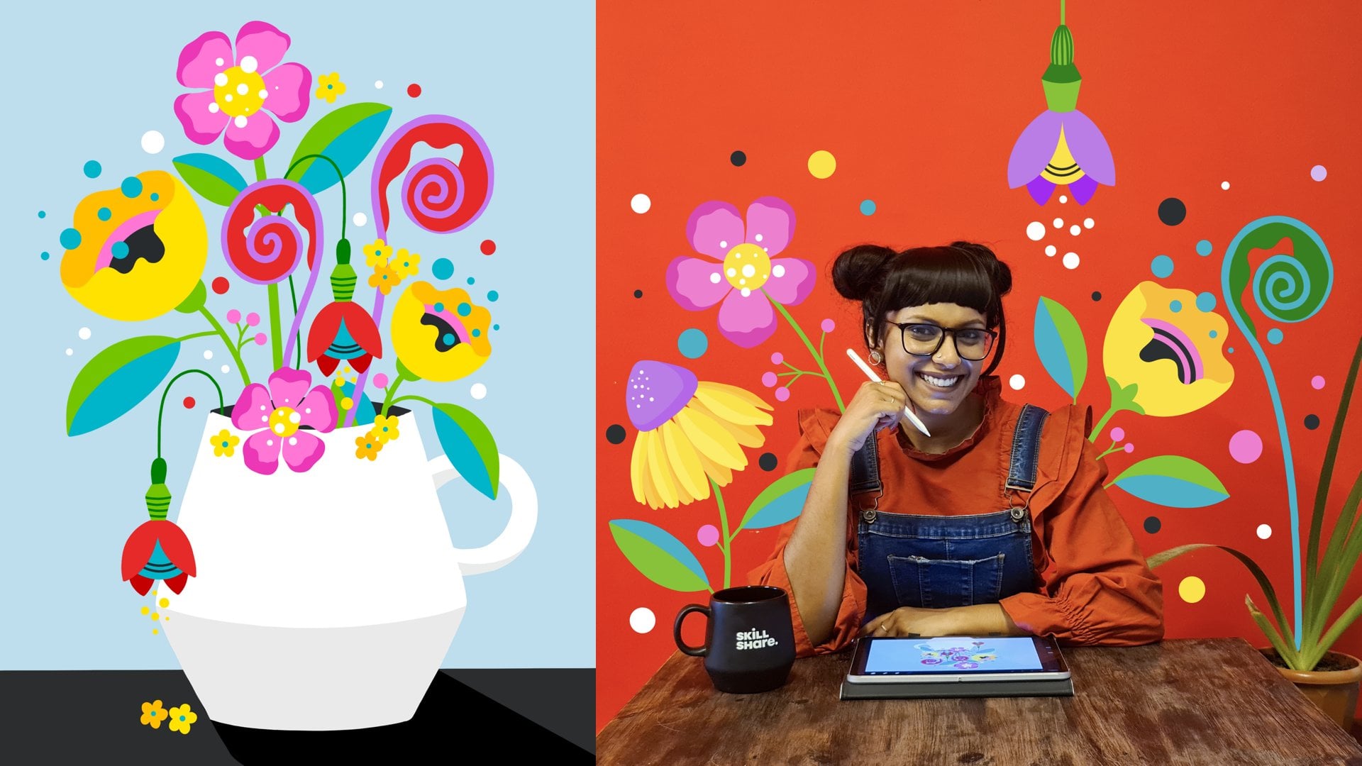
without compromising the integrity of your style. Hey, I'm Vinitha Mammen and I'm a freelance
lettering artist, illustrator and muralist and Top Teacher here on Skillshare. And I'm going to teach
you how to create fun faux gradients
that you can use to enhance your illustrations with most likely nothing more than your usual
tools of creation. In this fun class, we will explore techniques
that allow you to blend two blocks of color without physically mixing
the colors together. The ability to create
the illusion of blended colors opens up a
world of possibilities, giving your artwork
depth, dimension, and a captivating visual appeal. These techniques are
particularly useful for illustration mediums that
are challenging to blend, like acrylic paint
markers for instance. However, they can be applied
to any opaque medium, including acrylic
paints, pen and ink, acrylic gouache, or even digital drawing
tools like Procreate Adobe Fresco Illustrator,
you name it. We will start by delving into the basic concepts that
define a real gradient. From there, we will dive into the exciting realm of
blending without blending, exploring various methods and approaches to creating
faux gradients. By the end of this class, you will be left with a ton of new expertise and ideas of fun, innovative creation
techniques that you can incorporate in your
artistic practice. This class works for
artists at any skill level really. I will be demonstrating the techniques using
acrylic markers, but you're welcome
to follow along with me using any opaque drawing or painting medium of your choice or your favorite
digital drawing tools. So what are you waiting for? Join me as we discover how
to blend without blending.
2. Class Overview: So you've decided to explore
faux gradients with me, and I'm so thrilled to have you! Welcome to Blend
Without Blending! Now before we jump
into the class, I want to just quickly give you an overview of what you can expect from this class in
terms of how it's structured, what the class project
will be, and so on. First, I'll take you through
some more details on the materials you need to
get started on this class. And then we will take a
closer look at what makes a gradient a gradient so that we can figure
out how to hack them. Once this is done, we jump right into exploring the
different techniques. I will demonstrate to you
multiple variations of four blending techniques using different elements like dots, lines, and other shapes. Throughout these demo lessons, I will be using acrylic markers to show you the
different techniques. But you are of course,
welcome to use other opaque mediums or even your favorite digital
tools to follow along with me. I'll be giving you more
details and ideas on mediums, surfaces and colors you can
use in the next lesson. So stay tuned for
that. But irrespective of which medium you
choose to go with, it is important that
you follow along with me and actually
try the techniques to really understand
and get a hang of what works and what
doesn't, okay? So don't just watch, get your supplies and
actually do. Cool? As for your class project, there's three parts to it. One: Your recreation of the techniques that I
demonstrate using your medium of choice. Two: Four
additional variations that you explore and
discover on your own. And Three: An illustration or pattern incorporating any of the techniques you
tried out in this class. Okay? You will be getting more information and ideas about these later in the class, but for now you have a
sense of what to expect. Don't forget to finally share your class projects with
your fellow students and myself through our
project gallery, so we can all see and enjoy
what you come up with. All right? So, shall we go
ahead and get started?
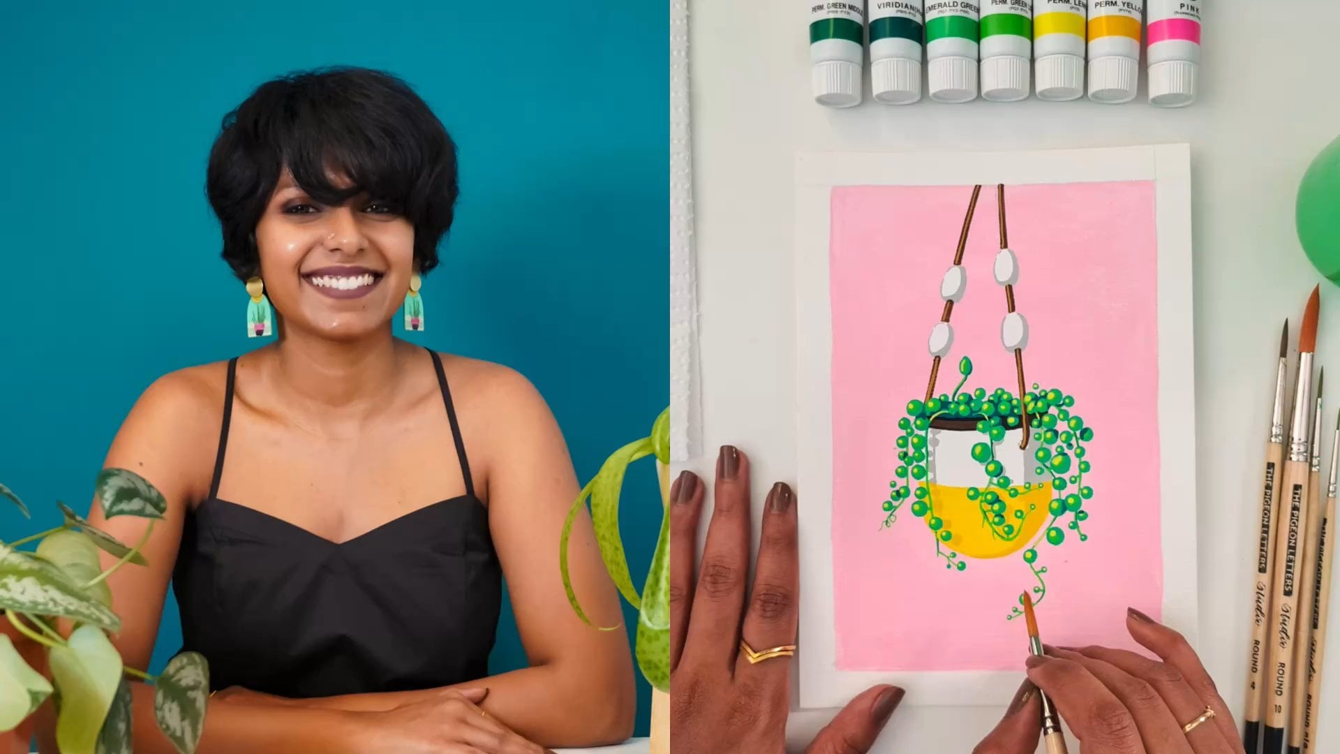
3. Getting Started: Now I want to take you through a few things to get yourself
set up for the class. A couple of different
options you have in terms of
drawing mediums, and also give you some tips to make the most of this class. As I said, I will be demonstrating
using acrylic markers, specifically from
the POSCA brand. These are basically
acrylic paints in the form of a marker. But the techniques
I show you are not exclusive to POSCAs
and you can apply them to a range of mediums like acrylic paints or
acrylic gouache paints, pen and ink or even nail art! You can even go digital
using drawing programs like Procreate, Adobe Fresco
or Adobe Photoshop. And vector based programs like Adobe Illustrator or
Affinity Designer. So basically, anything
where you can layer colors on top
of each other with full or at least
almost full opacity and coverage will work. What these techniques
will not work very well with, is something like
watercolors for instance, because it's a
transparent medium. Or traditional
gouache because it reactivates the
paint underneath when you lay a
color over another one. Acrylic gouache is fine, but traditional gouache
may not work that well. So, to get the best results and
really enjoy the process, my recommendation
would be to pick an opaque painting
or drawing medium, or go digital with an app or program that
you're comfortable with. In fact, you could
even try these out using different materials
that you have at hand, a mix of traditional
and digital even, so you can see how it works
on all of them. Quick note about pen and
ink: if you're using black, or any colored ink
for that matter, on white paper to create
the gradient effects, you'll also need a white gel pen to draw over the colored side. Cool? I will be using
these POSCA markers. I have them in a
couple of sizes. If you choose to go
with acrylic markers, you don't need all
these different sizes. It's definitely helpful,
but it's not required. In fact, I use this big one only to fill in the
background colors. So, these three are really what I will be using to
create the gradients. If you're going to
get just one size, I would suggest you go for
one of the smaller sizes, so you can build up the
thickness as required. Now moving on to the
drawing surface, if you choose to go traditional
and not digital, that is. You can use whatever
paper or surface that's suitable for
your medium of choice. You'll be exploring a lot, so I wouldn't recommend that
you pick anything that's very expensive or that
you feel precious about. You can also think of ways to upcycle surfaces that are lying around in your homes or studios like pieces of
cardboard, for instance. This is what I decided to do. I had a whole set of
my business cards that are no longer
useful as business cards because I had to update
the information on them, and I've been looking
for ways to use them. This seemed like the perfect opportunity to repurpose them. I simply painted one
half of the surface with one color and the other half with another, to prep
them for this class. That's another idea in case you have something similar that could use a new life. And whatever surface
you choose to go with, you can either have them as individual cutouts like these for each variation
we'll be exploring, or just leave it
as a large sheet, where you'll do
them side by side. If you choose the latter option, you can just draw some
rectangles or squares across your sheet and divide each of them
into two halves, each half filled in
with a different color. So, just fill each side with
two different colors in the same medium that you plan to use throughout
this class. This way you're ready
to dive in to trying out everything that I show
you throughout this class. I will be demoing about
12 different variations, but I would recommend that you leave some extra room for trial and error and exploration. If
you're doing this digitally. I even have a file set
up for you that you can use straightaway on
Procreate or Photoshop. You can download this from the resource section
of this class. All you need to do is, pick a basic brush without any
texture or size variation, like a monoline brush, and follow along with me. Now when it comes to
choosing your colors, you can, of course, choose
whatever colors you like. These techniques will
work with any two colors. But for it to look like an effective gradient and not just two colors sitting
next to each other, for it to actually
look like a gradient, a little bit of color
theory can help. So, I have this handy
color wheel here. And what I recommend
is that you pick colors that are next to each
other on the color wheel. So, in technical terms that would
be called analogous colors. Colors that are next to each other on the color wheel create the best looking gradients, as opposed to something
that's opposite to it. Say you take red for instance. The color that's directly
opposite to that is green, which is called its
complementary color. See if I move this over to red, what is directly opposite to it, which is green in this case, is complementary to red. So, if you put complementary
colors next to each other, they contrast too much. And that gradient would
not look so effective. Instead, with red if you use an
analogous color like orange, or pink, that would be more effective. Similarly, orange and
yellow could work well. Or with blue, you can
use a dark blue and a light blue, or blue and purple. So, just a little pro-tip for you, because to create
effective gradients the color choices
also play a part. So go ahead and gather your medium, or mediums of choice, pick your colors and prep the surfaces that
you're going to use. And meet me in the
next lesson. where we learn about the
anatomy of a gradient.
4. Anatomy of a Gradient: Before we go in and try to
create a faux gradient, let's do a little
breakdown of what makes a gradient a gradient.
So what is a gradient? A gradient is a gradual blending from one color to
another, right? How do we achieve a
gradient? For example, how do we go from this to this? Whether it's done digitally
or with paint on paper, the actual methods of achieving a gradient
might be different, but at the very core of it, the idea is the same. Both the colors extend into each other to form this sort of
gray area in between, for it to look like a gradient. So the red gradually
extends into the pink, and the pink gradually
extends into the red area. Right? This gray area is
what we're interested in trying to recreate. With mediums that are
easily blendable, like water colors or
even acrylic paints, we can physically get both
colors to mix gradually. Either directly on the surface
or on a separate palette, which then gets applied
on the surface. But with other mediums
like acrylic markers, this is a little more
challenging. And sometimes, even if you are working
with a blendable medium, maybe you want to create in a more flat style or you're not into traditional
shading methods. In these situations,
we can try and hack that gray area in between
by finding ways to get the colors to extend
into and interact with each other without physically forming a third color or a
series of other colors. It's a visual effect. It just looks like a blend. It's not actually a blend. If you look at it up close, you'll be able to see that, but you're creating an
illusion of gradient. Okay? So we'll be trying out
different techniques to get these colors to extend into each other using elements like dots, lines, and other shapes. I will show you how to do
this in the coming lessons. But irrespective of
what elements you use, there are two
factors that help us to create the illusion
of a gradient. The size of the elements, and
the distance between them. Gradually changing the size or the distance or both, is what helps us achieve these
gradient effects without actually
mixing the colors. Okay? You will see exactly what I mean as I show you the
different techniques. So, without further ado,
let's jump into the first set of techniques
on how to blend with dots.
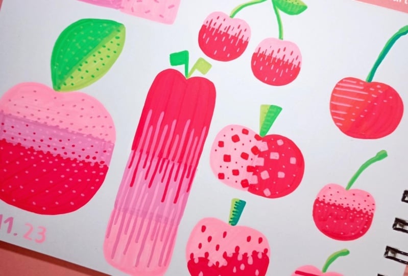
5. Blend With Dots: All right, so now that we
have dissected gradients, let's get to figuring out
how we can fake them. I trust you've gathered
some supplies that you have at hand to
follow along with me. Let's officially begin
blending without blending. The first technique I
want to show you is the most basic version
of this, using dots. Here's where you learn
the fundamental idea that we'll be using
throughout this class. The rest of the
lessons are basically an extension of the
same basic concept. So let's see what that is. I'll pick one of these cards
I have prepped and ready. And I'll pick these
acrylic markers in the same two colors, the light blue and
the dark blue. And of course, I
have to shake and pump each marker
before I use them. Now we start working
from this center. This centerline
between the two colors is nice and defined right now. And our aim is to undefine it, because we want to slowly
extend the dark blue into the light blue area to
create that gradient effect. Right? We'll start by
adding in some dots here, right around the center line peeking into the
light blue side. You can keep it random. It does not have to be
evenly spaced out. Okay? And then we'll add more dots
here, kind of close to each other, some even touching each other. And slowly, as we go out, we'll increase the distance between the dots.
Because we know that varying the distance between the elements helps us
create a visual gradient. Right? So that's what we're
doing. And eventually, just sprinkling the
dots here and there as we get to the outer areas. So here we go! Cool? Now, we'll pick up
the light blue pen and do the same thing
on the other side. Okay? Start by adding some
dots along the center line, but to this side. Then keep continuing with more
dots close to each other.. Slightly more spaced out now. And as we go outward slowly, just sprinkle them
in here and there. Okay? So that is the basic idea. Now once you have
this much done, you can even go in
and adjustments. Like where you see a
bit too much dark blue, you can go in and add some
more light blue dots, and of course, vice versa. The good thing
about these markers and any opaque medium
for that matter, is that you can go in and
fix things to our liking. So make the most of that,
and make adjustments so it looks like a nice
gradual change in color. It's a visual thing, right? So there's no formula as such. You just go by what you
see and tweak as you go. All right, so that's basically it. Let me show you once more
so you can have a recap. You start by adding dots
along the center line, like this, dipping
into the other side. And then you do more dots
close to each other. Then slightly further apart, and finally sprinkling them in very spaced out as
you move outwards. We start by adding
dots in the center to extend some of the
yellow into the pink. Then we continue adding
dots that are close to each other and gradually space them out more as
you go outwards. Then you can take a good look at it and make adjustments
if you think you need to. And done. Easy peasy, right? This is the basic idea behind how we will hack
the gradient effect. By slowly and gradually extending both colors
into each other's spaces. Now so far we used just a single sized marker
to create our dots. So the dots were basically all
pretty much the same size. We know there are
two factors that help us to create the
illusion of a gradient. The distance between
our elements and the size of the elements. So far we've only
played with distance. Now let's look at what we
can do with size as well. Let's pick out a couple of different sizes in both colors. Okay? I have these large ones, medium ones and small ones. And I'll start with
the biggest size first and we do the same thing basically. Start by adding dots to the center
line like this. Try not to create a very
straight line with these dots. The more irregularly
they are positioned, the more convincing
the gradient will be. Keep them a little
bit haphazard. Okay? So now with the
medium sized pen, continue adding dots,
moving outward, and spacing them more as we go. So it's not just the size
we're varying here, it's the size and the distance. It's both. Right? Finally we go with the smallest one and sprinkle
some tiny dots in. You can go back
and forth between these sizes to adjust the
gradient effect if you need to. I think this one can actually use a lot more density of dots in general. So I'm adding in
some more of each size. Then of course, we do the
same thing on the other side. Largest size first as we
start from the center. Then with the medium sized pen, we do slightly more
spaced out dots. Finally, with the smallest pen, we sprinkle in tiny dots
as we move outward. That's it. So this is what varying booth size and
distance gives you. Now let me show you
one more variation, and this time we will
do varying sized dots, but with a single pen. So if you don't have
multiple pen sizes, I'll show you how you can still create that
size variation. So I'm going to pick just
one size of pens, which is the smallest
sized POSCA pens I have. You can do this with
pretty much any sized pen. The scales of the dots will
just vary accordingly. Okay? So yes, let's do this. We'll start from the center
again with the bigger dots, and this time we'll
actually draw circles and fill them in, instead of just
tapping to place a dot. So this is how even with
a small tipped pen, you can get dots as
big as you like. Right? The downside to
this is that it's a little bit less intuitive as opposed to how you were
letting your hands just place dots without
thinking so much before. Now you have to pause to consciously draw circles
and fill them in, which takes away
from the randomness that comes from
just going for it. It's almost too mindful. Sometimes the result
could look less organic and a little
bit more forced. But it is definitely
a workaround when you want to make it work with
what you have at hand. Okay, so now we'll start
reducing the sizes of our dots and increasing
the distance between them. Now, one good thing about
this method is that you can progressively vary
the sizes of your dots. You're not just
stuck with a small, medium, and large anymore. You can have in between
sizes if you want to, which means better control. So that's there. Pros and cons of
using this method, right? And somewhere about now, we start making the
dots really small. Pretty much just tapping with the pen tip to
sprinkle them in. Okay? And now again, you can go back in and
make adjustments, if any. And then proceed to doing the same thing on
the other side. And there you go!
Generally with these, the further they are from you, the more convincing a
gradient it will be, and the closer you go, the more you see the details
that make it look like a gradient. Right? Awesome! So that's blending
with dots for you. We've looked at three
different variations of using dots to create
a four gradient. One: using only distance between the dots to create
the gradient effect. Two: using both distance between and size of the dots using
different sized pens. And three: using distance between
and size of the dots, but with just a single pen size. Dots are the most basic way
to create faux gradients. In traditional pen and
ink illustration methods, the technique of using dots to create gradients is
called stippling, and this is essentially
a variation of that. As I said, these will be the
same basic concepts that we will be basing the rest of the lessons in this class on. So, don't skip trying these
out and maybe even doing some exploration of your own to see what else
you can come up with. Okay? So now let's hop on
to the next lesson, where we will learn
to blend with lines.
6. Blend With Lines: So we now know the basic concept that we'll be using for all
our techniques in this class. Irrespective of what elements we use to create
our four gradients, what we'll be doing is finding ways to make that
center line less defined and the colors to gradually extend into
each other's spaces. Let's explore a couple
of different ways in which we can do
this using lines. The first one is very
similar to how we used dots, but this time with
little line segments. Okay? So here's how that looks. I'm using the medium sized
pen and I'm just going to draw some little lines
along the center like this, with spaces between
them that are just about as wide as
the lines themselves. Cool? Then here, right
next to the spaces, we'll draw another set of lines. And then another next to that. You don't actually need to be so precious about it, you
can be more random. This is the result of me
trying to slow things down to show you, so it looks less
random than ideal in fact. All right, so we'll start spacing
them out a bit more. Just little lines
randomly like that. And space them out even more
as you move outwards. Similar to what we
did with the dots. And eventually, just very sparsely
sprinkling in some of it. Okay? And then again, you can go back in and add
more wherever required. And we do the same thing
with the light blue on the other side.
In the center, we go in just at the gaps. Okay? Oops, that became a bit
too thick, but that's okay. We can fix it later. That's the good thing with using opaque mediums like this. Everything is fixable,
which is awesome! So yeah, we'll add more lines next to that and then start
spacing them out. Finally, just sprinkle them in. We're using lines
of approximately the same length throughout, but you don't need
to measure anything. Just eyeball it and keep going. Now, we need to wait for this
to dry for a bit so I can show you how I correct that
little mistake I made. Cool, so now this is dried. I can go in with my
dark blue pen and just paint around these parts
that became too thick. Or even just paint
over the whole thing. It's like erasing
that whole bit. Once that dries as well, I can go in with the light
blue and just draw again. That's it. It's
like the mess never happened. And there we go. That's one way to use lines
to blend without blending. Let's try another
one. For this one, we'll need pens in
different sizes. I'm going to pick the
red and pink markers in three different sizes. Then with the biggest
of the markers, I'll draw a vertical line
next to the center line, leaving a little bit of a gap. Cool? Then we'll take the medium one, and increase the gap a little bit, and draw another line. Finally, with the thinnest one, and leaving some more space, draw another line like this. Then similarly on
the other side, biggest marker first, draw a line next to the center line. It doesn't have to be perfect. As you see, mind goes wonky every now and then
too, and that's okay. Then with the medium sized pen, and leaving a little bit more
space, draw another line. Finally, with the smallest pen
and a slightly bigger gap, one more line just like that. And there we go! We have
a nice gradient. Soo? Even though there are
distinct lines here, we cannot really see
the center line. We've created some
confusion as to where the red ends
and the pink begins, which is the whole point, right? What we did here
is basically using both size and distance to
create that gradient effect. Now, what happens if we remove the size factor and
just use distance? Can we still create that nice
gradient? Let's find out. This time I have both
colors in just one size. Okay? We're going to
try what we just did, but keeping the pen
size and in effect, the thickness of
our lines constant. So in this case, we're
only playing with the spacing between the lines. Okay? First we'll get very close to the center line
and draw a line like that. Then we'll space it out more, and draw our second line. Okay? Then space
it out some more, and draw another line. And maybe one
more, even further away. Okay? And then we'll do the
same thing on the other side. A line very close to
the center line first, and then progressively
getting more spaced out. Okay? So that's it! This also creates a gradient, but not as effective as the
other one, in my opinion. Let's take a look at
them side by side. They're both definitely
gradients of their own right, but I think the size
variation really does help. But of course, if you don't have multiple sizes of
markers with you, you know how to hack it, right? You can always draw
thicker lines with the thinner markers to still
create that size variation. Cool. So moving on, how about we
switch things up a little bit and try creating some
blends using horizontal lines now? So, I have my medium
sized markers here. First I'll start drawing some lines till about
three quarters of the width- so three fourths of
this pink section. Okay? So somewhere around here, and we'll bring it till
about here, roughly. Okay? We don't have
to be precise at all. And then the next one, after leaving a
bit of a gap like that and keep adding more
lines just like that. We're just eyeballing
everything. All right? Then
in between these, we'll do some shorter lines that are about half the
width of this section. Okay? So roughly about
that much. Okay? We'll do one here as well. And in between all the
other longer lines. Then, in between each of these
lines, even shorter lines, so about one quarter of the width. So like that. Okay? Similarly, now we do this exact thing with
pink on the other side. This time we'll offset
the lines a little bit so that it's in the spaces
between the yellow lines, so that it looks like an
extension of the pink side. Just below the first
long yellow line, we draw our long pink line
that reaches till about here. Okay? Again, here, just
below this yellow line, so that it looks
like the pink is extending into the yellow
through this line. That's what we want. Okay? Below or above, doesn't matter. Both work just fine in fact. Just stick to one
of the two throughout. That's all. I just
went with below. So I'll be starting all of my pink lines below
the yellow lines. Cool? Now in between these, we'll do shorter lines that are
about half the width. Again, just below the
corresponding yellow line. Keep going all the way down. Then finally, the
shortest lines. Again in this space is
between the other lines. By the way, these three-fourths, halves and one-fourths are really just a guide to make it more
straightforward for you as you learn. The lines can
actually be any length, so long as there is
that gradual variation among the three sets of lines. Okay? Don't think that
this is the only way to do it, it is not. You can apply this method in so many different ways depending on the scale
of what you're creating. Cool? So, there we go. We have a nice gray area in
between the two sides, right? With the closely
spaced lines here, then slightly apart, and then even more far
away from each other. So that's another fun one. Now let's try another one. This time I've once again picked out different sizes
of both my colors, and I'm going to start
with the biggest one. But again, remember if you have just one size to work with, you can always build up the thickness into
whatever size you want. You don't need the
different sizes to achieve these effects. Okay? So we'll start with short
and thick lines first. So about one fourth of this
width, just like that. Then keep adding
more thick lines like that, at roughly
even spaces. Okay? Actually I think we
can go even closer here. Let's add one more in
between each of these lines. Now with the medium pen, we extend these same
lines outward. This time about
half of the width. Okay? Just like that. Then with the thinnest pen, we extend these lines even more, bring them up to about
three-fourth of the width. Yeah? See how the gradient
is beginning to show through? Now with the light blue, we do the same thing. Again this time we will
do these lines in the gaps between
the dark blue lines. So, it looks like we're pulling
from the light blue section. All right? So again short
and thick lines first.. Then we extend those with
a slightly thinner marker. And finally with
the thinnest one, extend them a bit further. Just like that. So there we go! Yet another way to
use lines to get a faux gradient. For
these horizontal lines, what you're essentially
doing is taking what is like this to slowly
be like this. Okay? So that, there's this
interaction between the two that creates an
illusion of a gradient. So, try these out if you
haven't already and also start thinking
about other ways to use lines to create gradients. There's so many different ways you can use this basic idea. So try. And don't be afraid to fail. It's okay if it looks nothing
like a gradient in the end. Do you think I just came up with these out
of the blue and got them to work right
away? Absolutely not. I messed around with
so many variations and tweaks till I found
what works for me. And I'm sure there's so many more that I haven't
yet discovered. All I'm trying to do
here is sow some seeds. Okay? I want you to water them and let them grow
and make me proud! Cool. So let's go to
the next lesson and take this to a whole
other level using shapes.
7. Blend With Shapes: All right, so we've
learned some techniques to create faux gradients
using dots and lines. Now we're going to
look at shapes. The concept, of course,
remains the same. We're trying to get
the two colors to extend into each
other progressively, so that it creates an illusion
of a blend or a gradient. Let's see how we can apply
this concept to pretty much any shape you'd like,
starting with squares. So let's draw some squares! Starting along the center line, we'll first draw
some partial squares just peeking in from
the other side. I'm essentially
drawing full squares, but because it's partially
against the same color, you can only see parts of them. But this is our way of undefining
our center line, right? We just draw some squares randomly along here
in different angles, but more or less the same size. We'll leave some spaces in
between them so that we can accommodate the peaking
light blue squares too when we get to
the other side. But we don't need to
overthink it at this point. Okay? Just have fun drawing
some imperfect squares. Cool? And then we'll draw more squares next to
these partial ones. Some of them can be touching
each other and some well, not touching, but we'll keep them fairly close to each
other at this point. And then we'll
start spacing them out a little bit more gradually, still keeping them all
in different angles. Okay? Then we just sprinkle a few more as we
get to the outer areas. All right? So that's that. And we do the same thing
on the other side. Start with peeking squares
along the center line in random angles. Draw more full squares next
to those partial ones. Gradually start
spacing them out more. Finally, sprinkle.
There you have it. It looks like the
two colors just exploded into each other
in little squares. Right? I think this creates
a very cool visual effect. And what's awesome about this is that you can do it with
pretty much any shape. Don't believe me? Let
me show you some. I think you get the
drift, don't you? Different shapes,
same exact method. So it's just a matter of how creative you get
with the shapes. Now I want to show you
one more variation of what you could
do with shapes, and this is one of my favorites. So what we did so far are all just throwing these
shapes in random angles and random positions, right? What if we got crazy
organized instead, and did a checkerboard?
Let's see, shall we? I'm using the smallest
sized markers that I have. And we're going to start
from the center again. And we're doing a
checkerboard, right? So it's a pattern of squares. But we will start our first row with half squares, so
essentially rectangles. You'll see why very
soon. It will all make sense, I promise. So we'll start with a
tiny little rectangle like that, that's roughly
about half as tall as it is wide, so
something like that. We'll leave a gap of
the same width and do another similar rectangle
then keep adding more just like that. We're
just eyeballing it. It does not need to
be perfect at all. But if this scares you,
you can always use a pencil and ruler to
draw a square grid to guide you before you go in with your paints or ink or
whatever medium you're using. Okay? No stress. So now we'll draw a square here, right next to where our
first pink space was, and this time it'll be
a full square. Okay? And like that, we do a full row
of alternating squares. Now for the next row, we will start breaking up
the pattern a little bit. So we'll do this one. We will not do this one. And instead, we jump to the
next position. So here. Because we want to gradually
fade into just pink, right? So again, we skip this
and we'll do this. Then the next row, we'll do directly above the squares
that we just skipped. So one right here. We are messing up the basic
checkerboard by doing this. But that's okay, because
that's what we want to create our gradient effect. Right? And then one here, just above
where we skipped a square. And then at this point we
will not care about the pattern and just sprinkle in some random
squares like this. Still in roughly the same
angle though we're not going fully rogue.
So just like this, a few here and there
to taper it out. And of course the same on the
other side with pink. Again, we start with a row
of rectangles first and now you'll see why. As you
draw these rectangles, you'll notice that
you're completing both the pink squares and the red squares
in between them. See? Now you see why we did just half of the
squares initially? If we did full squares instead, these two rows would
form rectangles instead of squares and then it will not look like a
checkerboard anymore. Right? Moving on, we do full alternate
squares in the next row. And then we start breaking
up the pattern by skipping every other square in what should have been
an alternating pattern. So one more here. And then right above where we
skipped a square. Here again, and we can do a
partial one right here. Now, time for some
random sprinkling. And done! So see? Even though my squares
were far from perfect, it still looks like a nice handmade
checkerboard gradient, which is exactly what we want. So there you have it. Some
ideas on how to use different shapes to
get faux gradient effects. If you haven't been
following along with me, pause and take a shot at these. I'm sure you'll have a fun time just messing around
with these ideas. In the next lesson, we're
going to look at ways to take these ideas further through playful exploration for
your class projects.
8. Explore Away: So there you have it. We
now know some cool ways to hack a gradient even with
difficult to blend mediums. I trust that you've been trying out the techniques
I've been showing you. But if you haven't, now would be a great time to pause
and catch up on that. Because it is by doing
that you'll find yourself inspired
to explore more. There is so much to explore
with something like this. So many variations and
endless possibilities. And for you to be able to actually incorporate these techniques
in your artistic practice, you'll need to be able to
find ways to make it your own. You know, in ways
that work for you. So that's why I want to
encourage you to explore and discover some techniques on your own as part
of your project for this class. I would love
to see you come up with four new faux gradient effects based on the techniques
I showed you. Or even something totally new if the idea hits you.
You can also of course, let yourself go wild and
come up with more than four. Now, I don't want you to be
intimidated by this, okay? When I say come up with
your own gradient effects, they don't have
to be phenomenal, or groundbreaking,
or drastically different from what
we did together. The goal is to tickle your
creativity and to stretch your new found knowledge
even a tiny little bit. To show you that the
possibilities are endless if you just spend some
mindful time on it. I'll let you in on something.
I hadn't discovered some of the variations I
taught you in this class until all the exploration I did when I sat down to develop a
curriculum for the class. So sometimes it really
is just about taking some time to let
yourself try different things. Whether they work or
not is not the point. I'm telling you, there were several failed attempts too
when I did my exploration. And chances are there will be
some in your case as well. And that's okay, because it's
those failed ones that lead you to successful ones. Right? So explore! Here are some ideas to get you started in case you feel stuck. You could try using dots in a more organized pattern and
see what you end up with. You could see what happens
if you use tiny, scattered, horizontal lines instead of vertical lines to create
your gradient effect. Another thing you can try
is organizing other shapes, like hearts or triangles into
the checkerboard approach. Or you could try
the shape technique with other shapes altogether, like stars or leaves or whatever else you
can come up with. You could even see how you can doodle to create
faux gradients, if that's your jam.
So, lots of options. Lots of possibilities. So don't be afraid to mess up. Just explore away and show us what you
discovered along the way. Okay? In the next lesson, we'll talk about incorporating these techniques in your artwork.
9. The Bigger Picture: Did you have fun
exploring and discovering your own twists to what we learned? Now before
you leave this class, I also want you to try
and use what you learned in a way that's relevant to
your unique art journey. So I want you to incorporate any of the techniques
that I showed you or that you came up with on your own in a piece of artwork. It can be an illustration, a pattern, or anything
you want it to be as long as you find a way to use a gradient effect
somewhere in it. Think along the lines of
what you normally do. But now reimagine it
with some gradients. Okay? And see what
you end up with. Again, the goal is not
to create a masterpiece. But unless you try, there's going to be no
masterpieces, like ever. Right? So try. Okay? Again, you can use any suitable
medium of your choice, any size, any colors. I would love to see how
these techniques I taught you come together in the
context of your work. Now if you're a beginner
or if you don't feel like you've
discovered your style, then just create something. No need to overthink. Just start by drawing
anything that you feel like. And as you add color to it, think of how you can incorporate some blending without blending. Cool? Deal? Now when you're done,
don't forget to upload everything you did in this
class to our project gallery. So that's your recreation of
the techniques I showed you, what you explored on your own, and finally, your piece of art incorporating any
of these techniques. I would also love to know which of the techniques that
you tried was your favorite because there's always that one variation that really
excites you, isn't there? So let us know through
your class projects. I cannot wait to see
what you come up with. And I'm sure you'd be curious to
see each other's creations too. So make sure you check out
what your fellow students have created and show them some love by commenting
on their projects. Okay? Make the most of this fabulous global creative
community that you have access to right here and
connect with each other. Also, if you share your work from this class on Instagram, don't forget to tag me in your post so that
I don't miss it. I definitely want to see
everything, all of it. Because seeing you apply, what you learn from me
is what keeps me going. Right? So I will
let you get on with your projects and wait very eagerly to see
what you come up with.
10. Final Thoughts: So we've arrived at the
end of this class! We've learned so much from
what defines a gradient to different ways
in which you can create an illusion of a blend using dots, lines, and pretty
much any shape you want. You also used these techniques to come up with your
own variations and then incorporated
what you learned with me on this class
into a piece of artwork. I hope you're mega proud of
yourself because I definitely am. Irrespective of what skill
level we're at, investing the time to explore
something new and making it our own is what takes us
forward in our art journeys. And that's exactly what
you've done today. Congrats on making that happen! I hope you've picked up a lot of little ideas throughout this
class and you're feeling inspired to come up with new and exciting ways to
blend without blending. You can apply these
techniques in a lot of different ways to enhance your
illustrations or patterns, with depth and dimension, and
eye catching visual appeal. So please never stop exploring. If you enjoyed this
class, please do take a moment to leave
a written review. It would mean so much to
me and my class to get your feedback
on how we're doing. And don't forget to follow
me here on Skillshare to be notified right away
when I publish a new class. In the meantime, a whole collection of classes
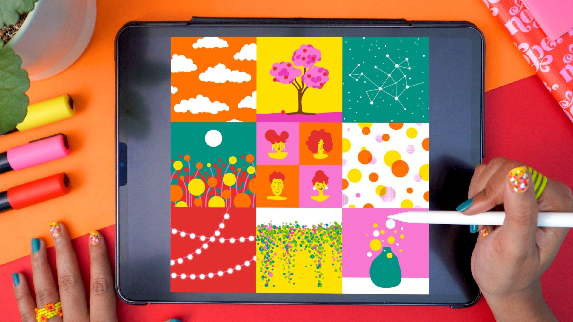
that you can check out, ranging from lettering and procreate illustration to
watercolor techniques. I also share new work
as well as behind the scenes, process videos and
tutorials on my Instagram. If you want to be in on what I'm up to, that
would be the place. Thank you so much for sticking with me and for doing the work. It's been an absolute pleasure! So until next time, bubye and happy creating!
 Vinitha Mammen, Illustrator | Lettering Artist