Transcripts
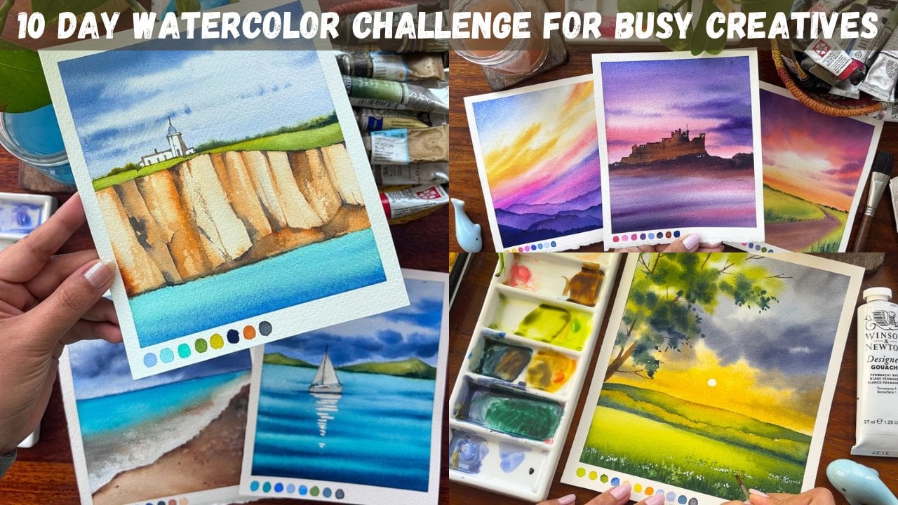
1. Introduction: Working with a single color is the ultimate shortcut to
mastering watercolors because it strips away the
overwhelming distraction of color choices and forces you to face the medium's biggest challenge
value and water control. When you aren't worrying about which blues or yellows to mix, you can focus entirely on the core mechanics that
make watercolor work. Hi, I'm an Ruth Kara, an artist instructor, mother, Skillshare to teacher and
brand owner of brant parcels, where we manufacture handmade, sketchbook, artist way
pins and much more. Today is all about
the balancing act of water control and value. First, we will build
a value chart and practice the act of layering
translucent glazes. Then we will dive into two hands on exercises, creating moody, misty backgrounds,
crisp pkgrounds and using salt to texture
and organic flopt. A final project, an
atmospheric landscape of misty hills and a glowing
illuminated pathway. The water and paper is ready. Let's start creating
2. Materials Required : Let's see what all
materials we need. I'm starting out with
a ceramic palette, one well for mixing
the colors and another for keeping the
darkest of the value. Will have a pencil, which
has a sharp edge and eraser. Along with it, keep
her washy tape handy. From the paper
perspective, it's arches, 300 GSM, 100% cotton,
cold pressed paper. I have two smaller sheets
where I would be experimenting with my colors going from light to dark and another for glazing, where I would be using the same mix to
create darker values. I would be using limited
number of brushes for all the exercises, as well
as my final painting. I'm going ahead with
a Rafael zero brush. This is kind of a mop brush. Either you can use this or you can also use
this flat brush. As a wash brush, I have
size six and size one, the Vinci Colinski brush, as well as a nice tip
Kolinsky brush from Escoda. I have been using it.
Now I'm really not sure is the size six
or size four Kolinski, but I think, as far as I
remember, it is size six. I think it's more than five
years have been using this. Keep a board so that
you can stretch your paper and the paper
doesn't buckle at all. This is the reason I have asked you to keep a washy tape handy. This is all you need from
the materials perspective. Let's move on to
the next chapter where we are going to
discuss about the color.
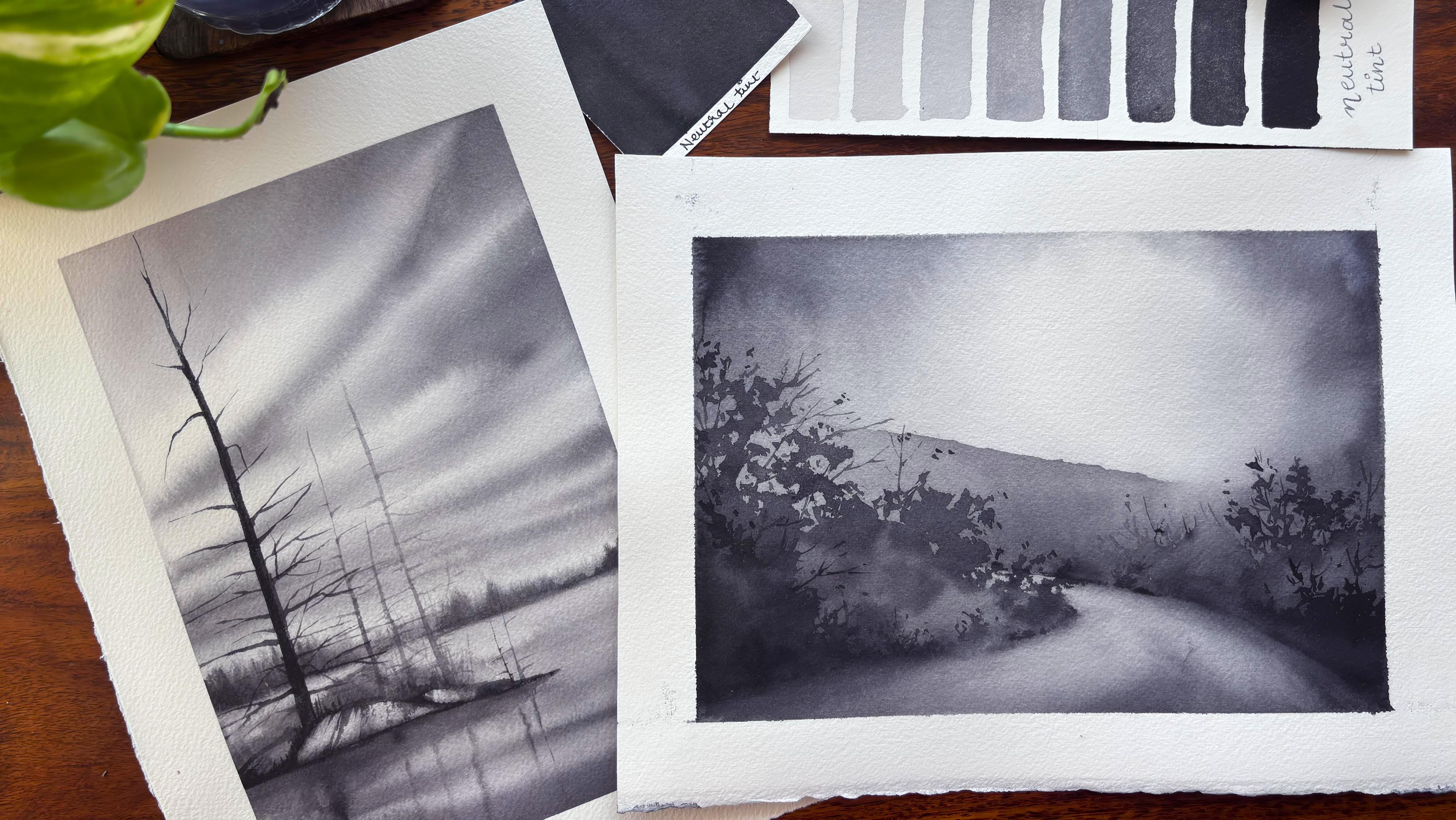
3. Dynamic Value Chart - Part 1: Here is a practical
Blueprint for a monochrome watercolor
chart using neutral tint. Because watercolor
relies on the white of the paper rather than the white paint to
create the light, your value chart is essentially a roadmap of water
to pigment ratio. What I'm doing at this moment is picking up a very
small amount of pigment in my brush
along with the water to create the lightest
value of the neutral tint. Though you have
basically three values, one is your pale gray, mid tone gray, and deep slate. This can be further
expanded into five, like the white of the
paper, pale gray, mid tone gray, deep
slate, and near black. Again, if you want to
further break it down, you can have a breakdown
the way exactly I'm doing over here and you can
create various values. It can be eight, ten, 12, 15. How many values you
want to create, you can go ahead and do that. Dynamic value chart exercise. Instead of just
painting flat squares, try these two interactive
chart layouts on a scrap sheet of 300 GSM watercolor paper
to master your water control. Here are various boxes
which I have paint, and now I am trying to mix some water along
with my pigments. Every time you go up
in these squares, your pigment to water
ratio needs to decrease, which means that your
pigment should be more and your water should
be less on your brush. Now, this can go by around ten, 15% every time whenever
you are going up, your pigments should go higher and higher and higher
in the process. As we reach the last box, almost we will have the
color of the neutral tint. You can further go up and
make it absolutely jet black your only paint available on the paper rather than
mixing any water with it, I would leave that
decision up to you how many sheets
you want to go. But this practice exercise is great for anyone who is
starting out with watercolor. Creating values in a monochrome
watercolor painting, using neutral tint is all about controlling the ratio of
the pigment to water. Since watercolor is a
transparent medium, you don't use white
paint to make a color. Every time you
want to use white, it would be the white of the paper or else
you will go with a very light value of neutro
tin to create that white. Here I'm going into my third
box where I've increased my pigment ratio compared
to the water in my brush, and hence the color
that you see over here is darker than
the first two boxes. This way, every time I increase my pigment
to water ratio, you will see that the colors
go darker and darker. We would be working mostly
in a wet on wet environment. You are dealing with a
dynamic balancing act between two moving forces, the water already sitting on your brush and the water
loaded inside your brush. The secret to control
values in a wet on wet is a fundamental law
of physics in watercolor. Water always flows from areas
of higher concentration, wetter to areas of lower
concentration that is dryer. Control your value and
prevent your darks from dissolving into
a chaotic puddle, you must master the
thickness rule. The golden rule, paint thicker
than the paper to inject a specific value into a wet
wash without losing control, the mixture of your
brush must have less water than the
paper currently holds. If your brush is
wetter than the paper, water rushes out of the brush, pushing away the
existing paints, creating uncontrolled
rooms, explosion, faded values, also known
as cauliflower effect. If your brush is dryer, thicker than the paper, the paper greedily pulls the
pigment out of your brush. The value stays
saturated, stable, and expands with beautifully
soft controlled edges. Now you can see I'm into
my second last box, and the colors have
become way more darker. It is the darkest value of the mepton which I'm
creating at this stage. The last value would
be the darkest though you can have further
more values where you are just squeezing
out paint from your tubes and then just applying it on the paper
to create the black. While we work on the last value, let's just understand a bit
more about paper wetness. Before choosing
your brush value, look at the paper at an angle against the light
to see it shine. Each state requires a
different brush moisture level to achieve your desired
value. The mirror shine. Paint will spread aggressively and dilute by at least 50%, as this is fresh puddle
or glass like paper. The satin or the egg the heavy puddle has
sunk into the paper. It looks very smooth
and uniformly glossy, but water isn't sloshing away. Paint spreads softly but
holds its general shape. The mat slate. The
shine is gone, but the paper feels
cold to touch. It's rapidly drying.
Value behavior, high risk of ruining
your values, introducing a watery
brush here will instantly create backgrounds
or cauliflower effect. Now we have a full value
chart of Nutritint. Let's use it in our
future paintings.
4. Dynamic Value Chart - Part 2: Anemic value chart part
two is all about glazing. Let's understand first
what is glazing. Painting a transparent
layer of watercolor over a completely dry
previous layer is one of the most powerful
ways to build depth. When you use a single paint
and water makes, for example, a consistent bit tone coffee
mixture of neutral tint, you can achieve an
entire spectrum of values purely through
optical layering process. Here is a science
behind how it works, followed by step by
step mechanics to pull it watercolor particles act like sheet of colored glasses. When you apply one
layer of your mix, a certain amount of light
passes through the paint, hits the white paper, bounces back through the
paint and reaches your eye. When you apply a second layer of the exact same mix over
the first dry layer, you are effectively stacking two sheets of colored glasses. The light now has to
travel through two layers of pigment particles
to reach the paper and two layers on the
way back out because more light is absorbed and less white paper is
allowed to shine through. The value automatically darkens, even though the paint mixture in your palette never changed. I usually achieve it by
adding a large pool of water into my painting
palette well and then add the pigments into it to create one single
value and then using that value to my advantage for creating various different
values or mid tones. Always remember you can
only add the pigments onto your paper when your first
layer is completely bone dry. Do not try to introduce your
pigments when your paper is still wet or has some
kind of moisture in it. I have this golden rule of glazing only on bone dry paper. Dry watercolor paint can be reawakened and dissolved
by water at any time. If the paper is damp, the gum arabic hasn't
fully locked down. The moisture from
your new brushtrope instantly dissolves
the underlying paint, lifting it up off
the paper fibers. Instead of two
crisp tack layers, the two colors blend together into a single muddy
chaotic mess. Another way to look
at it is water naturally moves from wet
areas to drier areas. If your first layer is
still drying and you introduce a fresh
wet grease on top, you are introducing a
sudden surge of new water. This new water will
violently push the semi dry pigment particles of your first year outward, creating ugly jack, uncontrollable rings known as cauliflower blooms or backrms. Once these forms
dry into the paper, they are incredibly
difficult to fix. Now we are onto our last layer. This is a very small exercise, which I did introduce to you. You can have more and more
of these boxes coming in, and the last box can be
absolutely jet plaqTough glazing, I usually use for mid
tone to darker areas, as well as creating shadows
wherever necessary. We will be using
this glazing method in our first painting as well, I will give you a few ideas about your future paintings that can be done very easily with the help of one single
monochrome color. Let the paper dry
off completely, and then let's have a final look at both of these exercises.
5. Practice Exercise - 1: When learning watercolor,
students often get overwhelmed by trying to manage too many
variables at once, color mixing, water control, composition, and tonal values. Stripping away the
complexity of color allows a bigner to master the core
fundamental of the medium. Here is a quick
analysis of the same, but before we do that, let's just go ahead and start with our graphite
marks on the paper. I would be adding
a horizon line. Now, this horizon line is
absolutely not straight. It is going to differentiate
our sky from the land. The land is basically
snow laden, and we are having
trees in the distance. Now, because the trees which
are at the distance have lighter tonal values compared to the ones which are
in the foreground. This is what we are
going to follow. It is a simple rule of perspective and what
we usually observe. While we continue
to draw the trees, let's understand a bit
about tonal value. Single most important lesson this exercise teaches
is the value, how light or dark or colorless. In watercolor, value is not controlled by
adding white paint, but by adjusting the ratio
of water to pigment. Simplifying the palette by
using only a neutral tint, I usually don't try to actually work with vibrant colors
to make the painting work. It's all about the success of the piece that relies
on the contrast between the light washes and the darkest of the
duck, creating depth. Looking at the two landscapes that you would be doing in this, the distant mountains and the trees are
light, watery gray, while the foreground
elements are rich concentrated
near black dry. This teaches how to
use value to create the illusion of three
dimensional space on a flat surface, understanding water
control via wet on wet. The wet on wet technique
is famously unpredictable, which exactly why Wigners need to practice it in a
controlled environment. Learning paper moisture, this
exercise forces any student to observe how wet the paper is applying paper to
dripping wet paper, create soft, highly
diffused beads. Perfect for our hazy skies
and distant misty mountains, which you would be learning
in the next exercise. Applying paint as the
paper begins to dry, yields slightly sharper,
but still soft edges, ideal for the
midground, foliage. Building timing skills. Watercolor is highly
time sensitive by working on these small
surfaces or you can say on these small squares of Wigner or anyone who is
starting out with watercolor. This practically
gives you a window of opportunity from when to introduce your pigment
before the paper dries, and it doesn't create any
harsh unwanted backgrounds. Confidence in edge control. A great watercolor painting relies on the balance
of soft edge, bloody, blended transition, and hard itches, sharp
defined lines. In the left panel, the
misty background trees blend softly into the atmosphere while
the foreground branches have sharper, more defined edge. Los takes high reward practice. Psychologically, staring
at a blank page with a massive palette
of colors can cause creative paralysis
for any bigner. Reduced anxiety, eliminating color
choices removes a massive layer of
decision making. For any bigner when
I was also learning, it is like, not to
worry about the greens. Why does it look natural, why it looks artificial or
if the blues are muddy, they only have to focus
on tone and moisture. I also did the same
at one point in time. Quick wins because these are
small single colour studies, they can be completed
relatively quickly. This allows for
rapid repetition. A bigner can do three to four of these
in single sessions, learning from each attempt and building confidence rapidly. As a watercolor artist, when I was starting out, I really did few of
these practice sessions, and it helped me
initially a lot. I also try to introduce then
some limited color palette. Now, limited color palette
feels very natural when you are starting out with
watercolors, initially, you work through
one single color, and then you move to limited color palette of
CPR, ultramarine, et cetera. It strips away the chaos of watercolor and
highlights its poetry. Okay. Let's start
out with the sky. I would just apply
clear layer of water on the sky area and once I have introduced this clear
layer of water, I would start out
with my neutrotin. I'm going to leave the
middle part a bit white. White means I would be using
the white of the paper and then adding a misty an
outlook for the sky area. I'm taking a lighter value, which is really
runny in terms of having less of pigments and more of water and then applying it in and around the horizon line. I would also take a bit of
it towards the top right and the left creating some more of the
darker tonal values. Though the whole
of the painting is done in a light misty effect, at least the sky area. Hence, do not try to
introduce a lot of dark values for the sky
as it is at a distance, and because of these atmospheric
particles, et cetera, we really can't see
everything in detail or in really darker values when it appears quite
distant from us. In case it is very close to us, which is basically
the foreground tree, you will see more of detail
appearing over there. Od size six brush with
more of neutral tint and start introducing some of the darker values
here and there. I would move this boat
to quite an extent. If I don't move it, then what will happen is
the color will sit at that particular place
where I have introduced it rather than it moving
towards the left, towards the right, and creating an effect
of mist on its own. Here we have to do less work
and rely more on water. Watercolor comes
with the name water, which means that the color will come next first
would be the water. If you can play with water, I can tell you half of your
problems are absolutely sold. So start playing with water and start enjoying this medium
called this watercolor. I really don't like hardages and hence I would go
ahead with my soft, damp flat brush to make this part look more
soft and even. I will not introduce any
kind of water, et cetera. It would be just a damp brush that would play the
whole of the role. We might have to go over it
four to five times and six times to just make it softer. But if it doesn't happen
and you are not getting or the colors keep moving
into the snow area, you can also use a
tissue to just cap off any extra liquid or any extra pigments
wherever it is flowing. Applying some light
tonal value colors for the snow area from
the left to the right. Now, even the snow area can't
be absolutely in white. Hence, there has to
be some amount of lighter value of colors
that we have to introduce. Over time, what happens is even the snow
starts showing up the ground and it also melts because of which we should introduce a bit of
color here and there. You will observe that
I slowly build on the background first and
then the foreground. Now, why I go from
background to foreground, the foreground is
the darkest area, whereas the background comes
as the lightest of the area. Once this part is done, we will go ahead and
start introducing some of the darker tonal values
even for our foregrounds. I want to cover
my background for the sky as well as
the snow together, let it dry off and then start introducing the dry trees
for our background. You can always use your
flat blending brush for taking off any
extra pigments from wherever it is necessary
and even blend out the areas where you think
that it's important, rather than just
sticking to the fact that we have to work in
this particular way, use your wit and use your intuition to
work with watercolors. Watercolors is one medium where it is more about intuition and water flow rather than you trying to
control the medium. Let the paper dry off and then start out with
your background tree. There is not much that we have to do in the
background tree. You go ahead, take a very light, pigmented watery mixture and then start out with
the tip of the brush. You can also go ahead with a size two brush in
case you don't have a Kolinski optimoT kind of a brush that I have
from the brand escota. Do not think about the
brushes that I'm using. I have accumulated it over the years of my
painting exercises. You can also keep
them for yourself or accumulate it over
time or buy it once, or even not buy at all, and just rely on thinner and the thicker brushes for completing any
of your paintings. Let's do a quick breakdown
of how tonal value function. High water to pigment ratio, the background trees utilizes
a very dilute wash of the neutral tint because the paint is heavily
tinned with water, the white of the paper
shines through the pigment, creating a soft translucent
pale gray tone. Value layering for
depth there is a subtle variation even
within the background layer. The tree farthest back are
absolute lightest gray, while the slightly closer
background elements are just a fraction darker. This subtle shift establishes depth before the
incredible dark, high contrast foreground tree
is introduced on the top. By keeping the background
pornal value light and soft, it prevents those
tree from competing with the sharp dark focal
points in the foreground, successfully creating a sense of immense three dimensional
distance in a limited space. While you make the
background trees, I would like to just
add a bit about the brush stroke mechanics
and moisture control. The fine detail brush, a long slender detailed
brush is used to construct the intricate
branch networks. The flexibility and the length
of the bristle allow for long continuous fluid strokes
without breaking the line. Vertical pull and lift. The trunks are established using a steady
bottom to top pull. By subtly lifting the brush and varying the pressure
as it moves upward, the line naturally
tapers perfectly replicating the organic
thinning of the tree trunk. Control fluidity. The paint consistency in
the detail tray is kept fluid enough to flow smoothly
off the synthetic bristles, yet dry enough to prevent bleeding into the
surrounding dry paper. This ensures the
fine twig detail remains crisp against the
soft background wash. The piece beautifully
captures a serene, minimalistic winter scene
as you see over here. By keeping the color
palette restricted, like monochromatic grays,
deep charcoal tone, you can also use the blues like your ultramari or your Prussian
blue, even your indigo. This would emphasize shift entirely to form,
texture, and light. The contrast between the
soft sweeping slopes of the snow covered round and the rigid vertical geometry of the stark winter trees
creates a balanced, visually calm piece
that actually handles the atmospheric
perspective in a great you should understand
that atmosphere has a very important role to play in any painting that you
actually attempt. The atmosphere where you have the trees way far away
from your eyes will be way more lighter because of the particles or the way
you see those trees. They are far away
from your eyesight, whereas something that is
very close to your eyesight, even it be a small plant
will appear more darker. I always love to branch out
my trees wherever possible, because trees are usually having lots and
lots of branches, whether they appear in the background or they
appear in the foreground. They are completely dry, and as you go towards the top, the trees will become thinner. The trunk will become
more and more thinner. There will be more and
more branches that will appear while they are
towards the bottom. It would be more thicker
in shape and size. I will go ahead and now work
on the foreground tree, but before you do that, make sure that your background
tree is completely dry. Now background tree
drying is very important, or the colors from your foreground tree will move
into your background tree, making the whole painting
look more messy and muddy. Along with it, the values will also change which we
really don't want. We want the values
for the foreground to remain more darker and for the background to remain
more lighter because of the perspective and
atmospheric reasons which I have already stated as we
were painting the background. Mm while you paint this tree and the
branches along with me, let's understand why slow
and control movement is essential for painting trees, managing surface
tension and paint flow. Watercolor relies on
a delicate balance of moisture between your
brush and the paper. Preventing skipping if
you pull a fine liner or a rigor brush too quickly across co pressed
watercolor paper, the bristles will skip over
the microscopic ridges. The texture or the
tooth of the paper. This creates broken choppy lines instead of a solid
continuous trunk. Controlled capillar
reaction moving slowly allows the pain to flow consistently from the belly of the brush down to the tip
through capillaryaction. It gives the paper time to
absorb the pigment evenly, ensuring a smooth
fluid line from the base of the tree to
the tip of the branch, achieving organic tapering
and line variety. Trees in nature are
rarely perfect, straight or uniform, but they do follow a strict
rule of growth. They are thickest at
the base and taper down to the fine
point at the tip. Gradual pressure release. To mimic this, you
must start with a slight downward pressure on the brush to
splay the bristle, creating a wider trunk and
slowly lift the brush as you move upward to taper the
line into a razor thin twig. Doing this slowly
allows your hand to execute a smooth,
gradual transition. Micro movement, painting
slowly gives you the control to introduce
tiny natural imperfections, subtle bends, knots, and
changes in direction that make the tree look alive rather than like a rigid, artificial
straight line. Strategic layering moving
slowly allows you to visually judge where a branch should intersect with the background
element in real time, controlling overlaps because
watercolor is transparent, every stroke is permanent
once laid down. A slow stroke ensures that you
don't accidentally overlap branches in a way that looks messy or structurally
impossible, preserving the clean silhuts against the misty winter sky. I will just go over
the pencil marks with the help of my brush
wherever necessary, and then we will create
some dry leaves. You will see how easy
it is to create, as well as putting some dots here and there
that usually shows the soil which comes up from in between the
snow laden places. This you will see,
whether it be rocks, whether it be some kind
of soil that shows up. These things happen in nature, as nature cannot always
have snow laden areas, some of the areas will
always always peek through. Making some more
small dry plants which are closer to my eyes and they are done with an absolute
darkest of the value. I will use my flat
brush that is damp in nature and apply it in
some of the spaces. Then I will touch my
thinnest of the brush in those spaces to create
leaf like structure. This tip really allows my
colour to not move a lot and only be concentrated in some of the spaces where
I am introducing it. The tip of the brush doesn't
have lots and lots of water. Hence, it is easy for me to control the color and the
moisture on top of the paper. This part is all
about water control. You have to introduce some water and then slowly
add a thin brush, which introduces
very little pigment or drops of pigment
here and there. Then you actually go
ahead and just add one or two dots of this brush or touch
this brush to the paper, some of it will move around
because of the water and some of it will become
loose leaf like structure. I'm super excited to witness
this beauty altogether. I would be introducing
some more of these loose leaf structure more in an impressionist style, where we are not adding crisp kind of
leaves here and there. It's only simply adding
one or two drops, and they look more like leaves, but still not exactly drawing
the leaves to the core. That's the beauty of watercolor. The way you want to defect, it will come out exactly
in the similar fashion. Go ahead and add a few more
plants here and there. You will see that the
whole concentration of the tree that is the foreground
one is on the left side. I have not introduced
trees everywhere, so that the whole painting
looks organic and it's not taking the
viewer's eye everywhere. It's concentrating on
the left part mostly. Okay, I guess I'm happy
with how it has turned out. Let's have a final look at it. Don't forget to upload any
of these practice sessions. In the project carry, I would be eagerly waiting
for each one of them.
6. Practice Exercise - 2: We are on to our
practice exercise, too, and here we are going
to create a misty, beautiful background mountain, along with a floral
field in the foreground. Let's start out with
a graphite mark and a basic sketch before we
create the final painting. Using the unique behavior of salt on a wet on
wet watercolor wash is one of the most
organic ways to capture the textured landscape, and this texture is
all about adding the fluoro fields
in our foregrounds. When salt crystals are
dropped onto damp paper, they act like miniature sponges, drawing the water and
pigment towards themselves. This create delicate
star burst like bleats that perfectly mimic
distant wildflowers, frosty ground and dense foliage. There's a very important concept which I'm going to
introduce in this part, and it is all about
adding the fence. The perspective of fence in this painting is the single
most important element for transforming a flat
two dimensional piece of paper into a deep three
dimensional landscape. Without that fence, the
painting would look like flat band of mountains,
fog, and fields. Linear perspective
and spatial scaling. The fence acts as a
linear depth gouge for the viewer's brain by utilizing the rules of
linear perspective. The scale shift.
Notice how the fence post closest to the
right edge is the tall, thick and highly detailed. As the vent travels
towards the left, each subsequent post becomes
dramatically smaller, thinner and closer together. The visual funnel. Even though there is no explicit perspective line
drawn on the paper, your pain automatically connects the tops and the
bottoms of those posts. Now, this creates an invisible, convergent diagonal line that point directly towards
the background. This instantly mimics how human eyes perceive objects
receding into the distance. The entry point, the large
crisp foreground post acts as an anchor
on the right side. It grabs your attention
first because it has the highest
contrast, the pathway, because the fence zig zags or the step down in size
across the field, it forces your eyes to
follow its path inward. It physically pulls the viewer out of the foreground through the middle ground
field and deposits them right at the base
of the misty mountain. This movement creates
a psychological sense of walking through a
physical three D space. Beyond its shape, the
sharpness of the fence is what makes the background
look so distant misty. This is called
atmospheric perspective, the contrast room, the fence is painted
with the darkest, crisp and most opaque pigment
in the entire composition, pushing the background away. By placing a hyper sharp, dark object right in front, it acts as a baseline
of comparison. Your brain looks at
the sharp fence, then looks at the soft
pale bleeding tone of the mountain and concludes
the mountain must be miles away because it
is so hazy compared to this fence post right
in the front of me. Without that sharp
foreground anchor, the misty mountains
wouldn't look misty. They would just look
like faint paint washes. The fence provides the
structural reality that makes the rest of the
atmosphere believable. Let's go ahead and add
that mountain right now. You have seen how I
have added my fence. It is a very easy process to make it a bit more
lively and atmospheric. I have added a small bird
on the second fence. I will go ahead and apply a clear layer of water
on the entire paper. Once I have applied the water, I would start by
adding a pale wash or a very tone down wash of the pigment and
water into my painting. I will start from
the sky area and then move into the ground area. In the last painting,
you would have observed that we started
with the sky area and slowly moved into the bottom part without
applying much of water. But this painting is
done in a separate way. We are going ahead and parle working through
the entire piece. You will see that this
piece comes together faster compared to the
last one, as well, it has way more details in terms of the fence
than the mountain, the foreground, floral
fields, et cetera. Okay, I guess I'm happy with how I have
applied the color. Now it's time for
water to do its job. Watercolor is made out of
water first and then color. So let's allow our water to do all the magic that we
need in this painting. I always stick my
paper to a board so that it's easier
for me to move around. I will just take off any
extra water pigments that's there on the
paper and take it towards the right side
so that there are no backgrounds or cauliflower
bit in our painting. Before I add any
further darker value, I would go ahead and
test it on my paper and then start adding from the
right towards the left. You have to anyways, add more darker values
into our foregrounds. Always remember foreground
is closer to our eyes, hence more pigmented value
needs to be added there, whereas background is
far away from our eyes, which can be more
misty and atmospheric. And By the way, when you stick a sheet of
watercolor paper to a board and tilt it to move wet paints
across a wet background, you are engaging in
a beautiful dance between fluid dynamics, gravity, and paper
capillary action. In advanced watercolors, water is just a medium to
dissolve pigments. It is the active vehicle, the boundary control, and
the timing mechanism. I would ask you to
just understand a bit more as we continue to paint
our mountains, et cetera. The path of least resistance, wet paints will only travel
when water already exists, the boundary where your wet wash meets dry paper acts
like a physical wall. By tilting the boat, you use gravity to slide
the freshly applied paint, but it will seamlessly glide and pull only within
the pre wet tracks. Soft versus hard edges because the background
is already wet, the newly introduced paint
doesn't hit a dry barrier. Instead, the water
in the background immediately begins to dilute the edge of the moving paint, creating those signature
hypospt radiants that are perfect for skies, mist and distant hills. By the way, after applying the darkest of the
values on my mountain, I went ahead with my
flat brush and started adding fresh water
or clear water into my painting as I did
not want the colors to be same or the values
to be same everywhere. I want to always play with
my values to a great extent. That's one of the
reason introducing some clear water
changes the value while the paints do come down from the top of the mountain
towards the bottom area. You can see how I am adding slow the darker or you can say
middle tones at this moment. I would also work with the contrasting dark
tones at the end. Again, introducing the
darker values or you can say the darker mid tone values as of now into our
foreground area. This will become lighter as we are working on a wet surface. If you are working wet on wet, the colors will be one or two shade lighter than
what it appears now. In case you are
working wet on dry, it would almost
appear the same or one shade lighter
than what it appears. I would be using salt for creating the foreground
floral fields. It's one of my favorite ways
to go about and believe me, this way, you can really
create something amazing. Always use the resources
that are available with you, whether it be clear
water splattering into this foreground or going
with the salt effect. These are something that you
can create textures with and they appear great to the eyes of a viewer who is
observing your painting. Now I will go with my thin brush and start adding straight lines. These straight lines will appear as grasses
in the distance, as well as in the
foreground area. Creating wildflower meadows has always been one of my favorites, but creating it in one single color was definitely challenging
when I started out. Here, you do not have a lot of options for creating
the wild flower fields, whereas when I created
the same thing in one of my spring season series earlier in one of the
Kerche classes itself, it was way more easier. I played with the
vibrant yellows then some bright reds,
greens, et cetera, to create the magic
quickly on the paper, whereas what I am doing now
is splattering using salt. And creating a similar effect
with one single color. When we work with a
wide range of palette, colors do a lot of
heavy lifting for us. The vibrant advantage if we put bright red poppy against
a vibrant rain field, the two shapes instantly separate because of
the hue contrast. Even if the wet paint bleeds slightly or your brush
strokes are sloppy, the viewer's brain
instantly identifies the flower because of the color are
fundamentally different. The monochromatic challenge
in a single color painting, a flower and the grass behind it are made of the
exactly same pigment. If they bleed into each other, they don't look like
flowers in a field. They just blend into
flat muddy puddle. You have to rely
entirely on position, timing, edge control to
keep your element distinct. This is something which
I have learned is very, very important, as
well as the value. The margin for error
is zero in this case. With vibrant colors, a slight mistaken
value can be masked by a beautiful shift in temperature like adding
a warm yellow highlight. In a single color piece, if your foreground flowers are the exact same value as
your mid crown mist, your painting instantly loses its three depth and goes flat. You have to master exactly
how much water is on your brush to hit the
precision tone required. You need a perfect
radiant scale for the absolute white of the
paper, highest light, through soft, misty
gray background and up to the intense
velvety dark tones, that is the foreground detail. Now I will move on to create the foliage in the similar way we did create it in our
left side of the painting, applying some water
with the help of our flat brush
and then making the paper moist enough
so that whenever we are dropping some dots of
pigpens here and there, they would create some bleeds, as well as some of the
areas will remain dry. It's a mix of wet on wet and wet on dry kind of method that gives us a perfect outcome
for the foliage or the trees, plants, et cetera that are
not very close to our eyes, but also not very far
away in a distant space. We will continue this process
for some more time and then blend our colors
with the help of the flat brush
wherever necessary. I will just add some
music for you to follow along and paint with me. I can see some beautiful blooms that have been created
with the help of the salt, and believe me, this is
one of the best ways to add the darkest and the lightest of
the tones together. Okay, time to add
some lines here and there drop in some of the tots. This is basically to show that, yes, there is some
foreground roses, I will go ahead and keep
adding some shorter lines, shorter brush
strokes, that's all. And then you will get an outcome which looks
absolutely fantastic. When you add the salt, do
not get overboard with the idea that you have to
drop in a lot of salt. Now, this point should
be taken as a very, very important part
in the whole of the painting because we
are only going to drop it a bit here and there as the floral fields or the wildflower fields are
not created by humans. It just appears in nature. Some of the areas will have more brighter
flowers and some of them will not have such
bright areas of flowers. So while you create this, make sure that there are some bunches of flower
that appears together, and some places do not have it. Which can only happen if you do not sprinkle
the salt all over. While I continue to create
some more lines for my foliage and then add some
more branch like structures, it's for the foregrounds, as you were already
observing over here, for my background, misty pads, I did apply these lines
while my paper was wet, whereas now I'm trying to add
these lines once my paper is dry as they appear
more crisp to our eyes. Okay, finally, it's time
to start with our fence. Now, this is a very, very important aspect
in our painting, as I did tell you even earlier, this would appear the
darkest in the value paving way for the lightest
of it in the background. You will observe that when something recedes
into the background, it needs to go lighter
and lighter in value compared to the ones
which are in the forgraund. I would be adding some of the barbed wire to this
fence so that they come together and they are not
actually breaking anywhere. If they break anywhere or
they are not straight, it means that they
are not attached to each other and
will become wobly. If you have this barbed wire, they will appear one after another in a very
aesthetic and nice way. Perfect linear direction. The long continuous
horizontal wires act like a visual highway. They stretch across the
paper, creating sharp, clean, parallel perspective lines
that instantly guide the viewer's eye deep into the midground
of the landscape. The bird is also sitting
in the foreground, hence it is also being done
with a very dark value. I'm using the tip of my brush, whether it be for the barbed
wire or even for the bird, blending the bottom
part of these so that they blend absolutely
into the background. I will again add the barbed
wire over here moving in, but I would make it a
bit more lighter in value dip my brush into water and take off
all the extra pigments. You can see how it is being created over here, and slowly, the colors will become
more and more lighter as it appears into the background. I'm really happy with how
my fgrounds are appearing. Now it's time to add
a bit of lightest or I would say lighter tonal
value background or foliage will drop in some of the
moisture onto the paper with the help of a blending
brush and then start adding the colors at now, this is not a highly pigmented
value that I'm adding. Some of the areas are
lighter and some of the areas are darker in
the similar way we have created our leaves for the trees and then blended with the help of
the blending brush. That is the flat
brush which we have used even earlier for
softening up the space. Always remember, less is more. So don't try to work
more on top of this. There's a really
small piece of paper. We are going to
only work through the areas which are
absolutely needed. I would add some lines for the background foliage and
the foreground foliage, which appears on the absolute
right hand side. That's it. This is with the help of my
thinnest brush size one, size zero, size two, whatever is available with you, use that for creating this and then blend it into
the background area. Simple easy process. Let it dry after this, remove the te pattern angle and have a final look
at your painting. Hope you are enjoying it. Do not forget to upload these exercises in
the project section. I would be waiting
for each one of them. Now let's move on to
the final painting in this monochromatic
watercolor painting class.
7. Monochrome Pathway - Part 1: Is the final project which
we are going to work on, and it has a beautiful pathway. To create this pathway, we are going to first
define our horizon line, which basically separates
our land from the sky area. We will be also adding
a small distant hill, which actually goes into the mist or blends
into the mist, as you will see once we move
forward in this painting. My sketch is always a framework
for a future painting. It helps me to guide
through the entire process, and it's easy to
manage the colors, paints when I have a sketch
already ready to work upon. If I'm really not satisfied
with what I did draw, I will use my eraser to
erase out that part. One thing that you will see that the horizon line is way below
the middle of the paper, I usually place it either lower or higher than the
middle of the paper. This is also known as
the rule of thirds. It's a foundational structural guideline used in sketching, drawing and composition to break down a blank
surface outcome, the blank pate syndrome, which is often said as, and place your focal points exactly where the human eye
naturally wants to look. Rather than centering
your subject, which can often make a
sketch feel static, rigid, or like a formal portrait, the rule of thread
introduces movement, balance, and visual tension. Deconstructing the grid. To use the rule of thirds, mentally divide
your sketching page into three by three grid, which means nine equal halves. This leaves us with two critical
elements for our sketch, four intersection points
and four tridlines. If I ever have any confusion
about my sketching, I usually go back to
this kind of a rule, place your primary subject or the most detailed
focal point of your sketch directly on or very close to one of these
four intersection points. Over here, I am trying to place it towards the right side, the pathway, and it is actually covering one of the
intersection points. According to this rule, you should never
place your horizon light directly across
the middle of the paper. It splits the drawing
awkwardly in half. If the sky is your main feature, place the horizon along
the lower one third line. If the foreground terrain, water or texture is
your main focus, place the horizon along
the upper one third line. In portraits or figures, align the vertical axis
of the leaning body or a prominent structural feature along either the left or the right vertical, one third line. If a character is
looking to the right, place them on the left
vertical one third line. So they have breathing
room to look into the open two thirds
space of the sketch. When I begin my layout, I usually go light
that is either with a two edge or a four edge pencil before committing to any
structural contours. It takes 5 seconds but completely changes the
weight of my composition. I am adding some amount of my foliage into the
foregrounds on the left, as well as on the right, which appears just in and
around my pathway. This would be more of a wet on wet painting where
we are starting out with a misty background for the sky as well as
for the bottom area, slowly moving into
more darker spaces. I would add a lot of water
on my paper and start expanding it into the dry spaces with the help of my flat brush. This is a very easy exercise. You have to just
do a cross swatch and then let your paper
have a sheen on it. Now, since this
would be more like a movement of water
to create the mist, I would like to add more
amount of water at this stage, slowly moving into the darker or metones as we continue to progress in this
watercolor journey. As I said earlier,
and continue to say, nutritent and monochrome
watercolor painting is a fantastic idea because it essentially
functions as a cheat code for
mastering values, structural depth,
and water control without the distraction
of color theory. In case you do not have this, go ahead with any of
the other shades, either it be ivory
black, lamp black, or bluish gray, event, you can go ahead
with paint screen. The biggest challenge with
standard black paints is that they aren't actually
neutral when diluted. For example, ivory black
often dilutes into a warm, yellowish brown gray, while lamp black dilutes into a
bluish gray color. The neutrotint advantages
scientifically formulated to scale
down from a deep, near black to palest mist gray
without changing its hue, because it represents perfectly neutral across all steps
of your value scale. What you see on your palette is exactly what you
get on the paper. So many of us always
tape down our paper. Do you really know what's the important aspect of sticking taping or stretching
your watercolor paper to a rigid pot? It's one of the most
vital steps because it fundamentally changes the
physical architecture of the paper when it gets wet. While it's a common
belief that keeping the paper tat helps
water flow smoothly, the actual mechanics comes down to a basic law of physics, eliminating valleys
to control gravity. Here is exactly why a flat secured surface dictates
better water movement. Watercolor paper is made of
cotton or wood pulp fiber. When you introduce water, these fibers act
like tiny sponges. They expand and swell. If the paper is loose, it cannot expand outward, so it expands upward, causing the paper to
wrap, buckle, and ring. The tape board advantage
is very simple when paper is firmly taped or
stretched to a board. On all the four edges, the expansion is restricted. As the wet paper dries, it shrinks back down, pulling itself completely
like a drum skin. This ensures the
surface stays flat, allowing water and pigment to glide smoothly and evenly across the page under your
direct control rather than grab the whim. Now I have started applying some of the darker values in and around the space where
you have the road area, as well as towards the
outer parts of the sky. You will see that some area
I'm keeping in white as I want the paper to
look absolutely misty, gloomy, kind of a feeling. For the scenic beauty, I'm extremely happy with how
it is turning out though you might not understand what we are trying to
create at this stage, and these might look like blobs
of colors here and there. But after the final outcome, you would be seriously
happy to paint this pathway where there is light from
the bottom of the sky, or you can see from the
sky directly falling over makes it look
absolutely stunning. I do have a lot of
water on my paper that helps me to move my
colors in a great way. And since I have already pasted, or you can say tape down
my paper to this board, I can seriously move
it in all directions and control the direction of
water to a greater extent. Some of the areas where I
want to lift off my color, you can always use your
brush and once done, just allow the paper
to dry off and slowly, you can introduce more colors because this has
turned out di light. I want to introduce
more and more shades, though it seems
like that my paper did not dry off completely, but still I'm
retouching this area. As you can see, there is a cauliflower effect because
of the puddles that we had, so those are things
needs to be fixed. In case you are not hamming
those issues as I have, you can go ahead with what
you have already created. My paper had this
amount of water, which actually led to this issue of creating cauliflower
effect or back runs. It happens. It does happen in
the process of watercolors. These only I always say
as happy accidents, and I really accept
it from the bottom of my heart whatever
happens is for a reason, and if this is happening, that is also for a reason. Let's go ahead and apply some more of the darker
values here and there. Once we have applied
the darker values, you can use your flat brush
or any other kind of brush which can lift up or soften up your colors
in few of the areas. Slowly, I will continue to paint these darker areas
along the pathway, use my blending brush. It can be your flat
prending brush, it can be your round
blending brush, whatever is available
for showing the pathway, not great Okay, I guess
this is something that I am super excited and happy to
share with each one of you. You see how beautifully
the colors are spreading. You can see how beautifully
we are moving in a path that guides us to the
final step of this pathway. Okay, great. Let's continue
to paint through it. There is less at this moment. We will move on
to the next video where we are going to
complete this painting. I did break this
painting into two parts. As as one single
part, of course, it was becoming
really, really long, and I did not want you
guys to stretch it. You can always break your paintings into
various parts and then go ahead with the
final aspect of what comes. Great. I guess this is how
we have finished it off. And I think just cleaning up
the sides would be great. I can see that some of my
paints did seep into my areas, which I did tape them, but that's absolutely okay. We always do not need to have an outcome where the white
of the paper will be crisp. Yes, these accidents do make the paper sometimes
have or seep in the color and create some lines or some dots absolutely
random here and there. Not on the painting, but
on the date paper area. I'm really going bold at
this stage and introducing some mid values compared to
what we have used earlier. Mid values are
equally important. We need to add these mid tones, as you can say, and create
some of these pushes. These are in the photographs, and they have to
be way more darker compared to whatever you
create in the background. The background here you will see will be
way more lighter. Either you can call it a hill, you can call it a mountain. The way you perceive your
painting is most important. Keeping a tissue or a paper
towel in your hand while painting isn't just for
cleaning up accidental spills, it is vital mechanical
control tool that directly dictates how much water and pigment enter your painting. In watercolor, your brush
acts like a fountain pen, and the tissue is
the brake pedal. Here is exactly why keeping a tissue nearby is
absolutely critical. Regulating the brush reservoir. When you rinse your
brush in water, the metal band and the
deep hair of the bristle fill up completely with a
hidden reservoir of water. If you go straight from the water cup to your
palette or paper, gravity will pull that
hidden water down the hairs instantly diluting your paint mix and
flooding your paper. Gently fix the heel of
your brush to a tissue, suck out the excess
hidden moisture, leaving the brush
perfectly primed to pick up rich accurate values
without accidental dilution. I also use my tissue to control
the water on the edges. I continuously go ahead and clean the sides so that
there are no back runs. Let's move on to the next
part of this painting.
8. Monochrome Pathway - Part 2: Now my paper is completely
dried out and I'm starting out with the
second dry layer. Now, this layer is very important and vital
in our painting. You will see as we
progress with watercolors, blending it out in
various places to create that misty effect comes handy for any kind of monochrome
watercolor painting. I am going ahead and extending my paints to the left,
as well as to the right. You will see I will keep either a blending
brush like this, which can hold a lot of water or else you can also use a flat
brush for your reference. Now, this brush really helps
me to move my colors to a great extent and then blend it with the
paper completely. The paper already has a
layer of color in it, and when I start blending
it with this brush, the colors move into the space which is already wet because of the
blending brush. Initially, when I started
out with watercolors, this is not something that I wanted to create
or I wanted to do. But as I progressed, I felt that this is something that can act very
handy and create amazing outcomes like
the littered pathway or else you can also create
some misty, cloudy effects. Watercolor is a fine balance of wet on wet and wet on dry. Always, you cannot work wet on wet nor you can always
work wet on dry. Hence, you have to
work in between these two factors of wet
on wet and wet on dry. I love the fact that I can
really blend these two parts together and create
something that really suits my soul
to a great extent. Believe me, watercolors
is something that I can do anytime, and I am already in
love with this medium. This medium is something
that I cannot tell you. How beautifully it makes me feel from inside whenever
I work on it. Okay, trying to create some
of the darkest of the values as these bushes or you
can say foliage is very, very close to my eyes. They have to be in the
darkest of the value compared to whatever we see in the background
or at a distance. This is as per the
rule of perspective, which we did explore a lot in the first two paintings or
the exercise paintings. I have moved on to
my liner brush now. This liner brush will help
me create something and nice foliage or some plant
like effet here and there. I do use it in an
impressionist style where I'm not trying to actually show each and every
plant separately. I will just go ahead in some of the spaces
creating those and then help it blend with my blending brush
to the background. This is something that I
have learned over time. You do not need to create
every part and every detail. You just need to show it
in a way which you would like or you would want to
create for your viewers. Watercolor art is a style of representation of a photo
or place. Why I say this? Because this is an
extraordinary medium for representation because it does not just copy a photograph, it translates it into a language of light
mood and atmosphere. When you recreate a photo
or a place in watercolor, you are moving away from the rigid mechanical
replication and instead capturing the
feeling of being there. It translates light
into true luminosity. In oil acrylic or
digital photography, white is created by piling
on heavy opaque pigment. In watercolor, the white is the actual paper shining through the transparent
layers of pigment. When you represent a place using a single beautiful
pigment like neutral tint, the paper acts as a
natural light source. It mimics the true
physics of nature. Light traveling through the air, hitting a surface and
bouncing back to our eyes. This gives you representation, a glowing ethereal quality that a flat photograph
simply cannot match. Atmospheric perspective
comes naturally. Camera lens often flatten a landscape making
everything look uniformly Watercolor naturally mimics
how the human eye perceives distance through dilution
and edge control by simply adding more
water to your brush, you can make a background
mountain range recede into soft misty gray. As you move closer
to the viewer, you tighten your edge and deepen your value into rich
charcoal and neoplts. This organic shift from soft
to sharp and light to dark creates an immediate sense of deep breathing space and
airness within a frame. The beauty of controlled chaos, when you paint a
place in watercolor, you enter a partnership
with water, unlike a photograph where every
pixel is locked in place, Watercolor moves, blends and settles in the paper fibers
in unpredictable way. The soft smoky blooms
you get in a wet on wet environment perfectly
captures the chaotic, organic texture of
nature like moving mist, dense foliage, rolling
clouds or ripples on water. You aren't manually painting every single plate
of brass or leaf. Instead, you are
letting the water create the impression of them, making the representation
feel alive and fluid. It strips away noise to
reveal the core narrative. A photograph often contains
too much visual clutter, unwanted street signs,
distracting colors, or busy texture that pull
focus from the true mode. Representing a place
monochromatically allows you to simplify a complex
scene into a clean, striking val map by focusing entirely on
structural depth. The rule of thirds and the contrast between deep shadows
and bright highlights, you elevate the scene. You strip away the noise
and present the view with the poetic quit essence of
that specific moment in time. The loose foliage which
you create right now on the dry paper is something that is very helpful in a
painting like this. Move your brush and apply various pressures at
few of the places wherever you think
it is necessary and create a few lines that
looks like branches. Do not create branches
each and everywhere, nor you have to create
leaves in all the spaces. This is something
that I always say. The impressionist style is not about creating
everything in detail. It should be
somewhere in between loose as well as the dry effect of leaves and trees where you get the impression
of the foliage, but yet do not create
everything in detail. This is something that I
have done a lot over time. Initially, when I started
out with watercolors, I wanted to create
everything in detail. Over time, I have realized there is a fine balance between these loose aspects as well as something that you
can create in detail. This fine balance, you should always always strive
for a better outcome. I will just continue
with the foliage and add some background music
for your reference. This will help you
to just calm down, relax and enjoy the process
of creating the foliage. There is less to
explain at this stage, using the tip of your
brush for creating the branches and applying
some pressure for creating these
loose foliage part that looks like leaves
or bushes closer to you. Already created the
detailed bushy effect which we wanted for the foliage, and now it's time to
apply some clear water. We will also apply some of
the colors as you see me doing it over here and then extend it towards the top areas. Not all the places, I would be applying equal values or equal
amount of colors. Some of the values
will be lesser, some of the values
would be more darker. Though you can put it as even, you may not also put it as even. I like to play with the value to a greater extent in
most of my paintings. Hence, I will do this part
also in a similar way. The foliage area is wet at this moment towards
the bottom part. So I keep on adding
some of my colors. These are the deepest
of the values and not apply the similar shade
or colors everywhere. I choose as I progress, I'm not here to create everything
at this current moment. These are the last seven to
8 minutes of my painting, and whatever I create at
this moment is going to decide in terms of making or breaking my painting
to a great extent. See you can overwork in a painting or you may
work less in a painting, but the optimal work
is something that I always say is
difficult to strike. You might feel that it can
come very handy initially, but everything takes a while and everything takes
some time to sink in, whether it be watercolors, whether it be
understanding any of the other mediums like
oils, acrylics, et cetera. We all have our style of
developing watercolors. If you are still looking
out for that style, I think you can strike
it as you progress. I can say I have
been working with watercolors almost
for seven years now, and still my style is evolving every now and then whenever
I paint with colors. Currently I am in between, you can say the loose and the dry effect that you
usually get in watercolors, but over time, I
may shift out to absolutely loose effect or
maybe more dryer effect. As humans, we have this
tendency to shift from more, I would say, dry
style to more of the loose style or from the
loose style to dry style. It all depends how you see
how you want to perceive a particular area or a particular view and then
replicate it on your paper. Let's add the darkest
of the value towards the bottom part
on the left side, we will add it as we progress, some of the foliage blues here and there,
continue to do it. It's still not complete. We have some odd time about four to 5 minutes before we finish off
the entire painting. I always like to blend my
colors with the help of my flat brush and
move it outwards. Finally, I'm at a
stage where I'm finishing off the
complete painting, and then we will just blend out the edges wherever it is
necessary with the clear water. I do have always two
sources of water, one for cleaning up the
areas and another for using it for my brushes because I want to take
out all the pigments, et cetera from my brushes. Hence, this tissue then two sources of water
palette becomes very, very important in any
watercolor journey. Tim to introduce the darkest of the dark value for
the left side, as you see, I go very slow
with my watercolor paintings. Yes, I see how my
middle tones have appeared and how the tones that are about to come even for the ones that is
just new to my eyes, the foliage should be
in quite a dark shade. But if that doesn't happen, I have to go ahead and again, work on these few areas here and there to
make it more even and look like it is having that rule of perspective,
pretty strong in it. You have to work as per
the eye coordination. If the eyes, anything
that appear to your eyes, I would say, closer
has to be the darkest, and the ones that appears farthest away from your eye
has to be the lightest, which is basically the sky first and then it
moves to the hill. Then next, it comes to
the pathway, far away, the foliage that
is a bit far away, and then the foliage which
is nearest to the eyes. This is how the whole balance should if this
balance doesn't work, then the whole painting
will look flat and uneven. We have to bring this plane into a three dimensional
effect where the pathway looks
like it's coming from the background and
moving it towards us. I'm to just work
on the right side of the painting a
bit more as I feel, again, this part has become lighter compared
to what I wanted. Hence, making a bit more darker
is very, very important. Continue to work on
the loose foliage tots bit of pressure here
and there, making it darker, some few lines to
show that, yes, there are some of the
stems of the plants and then blending it as we go towards the bottom
area of this pathway. Know many things
might have appeared very iterative and you might have moved from left to
right or from top to bottom, creating various values,
understanding value chart, understanding glazing, moving from one layer to
second layer to third layer, as we have worked out here. And then, again, you can use all the learnings in
your future paintings. If you have liked this, please drop me a feedback. I would be really happy
to receive what you feel about the whole of
these painting parts, exercises, then the
final paintings, initial techniques, et cetera. As well as it does
help me to even structure my classes
in future better. You did paint along with me to go ahead and upload the project
in the project gallery, along with the exercises, I would be more
than happy to share my feedback and look at
what you have created. Let the painting dry off
after this and have a look at the final painting after
removing the tape pattern angle. You can frame this
painting or give it as a gift to your
near and dear ones. I think this is one of
the paintings which can be even replicated
on bigger size paper. Waiting to see you all
in the next class where we create something more
meaningful and beautiful.
 Dhritikana Nath, Watercolor Artist and Instructor