Transcripts
1. Welcome: Hello and welcome
aspiring artists and watercolor enthusiasts. I'm thrilled to have
you here as we embark on this exciting journey in
the world of watercolors. Hi, I'm Chen Call. I'm an artist, illustrator,
and art educator. My work has been used for books, wall arts products,
and even tattoos. Since I started my
watercolor journey, I have come a long way. Today, I have a strong
community of like minded watercolor
enthusiasts on Instagram, Pinterest, Facebook,
and even skillshare. Over the course of this class, we will explore the
fascinating history, origins, material, and a wide array of
watercolor techniques. By the end of the journey, you would be equipped to create two beautiful watercolor
masterpieces. First, we will delve into the rich history
of watercolors, tracing their origins from ancient civilization
to modern art. Then we will discover
the importance of selecting the right material
for your watercolor journey. We will explore the various
types of watercolor paper, paints and brushes,
helping you make informed choices for
your creative endeavors. We will cover
everything from washes, layering to wet on wet, and wet on dry techniques. You will have the
chance to practice and refine your skills in
each of these areas. Next, we will learn about
color theory and color mixing. There we will play around with the different pigments and learn about the characteristics. Finally, our ultimate
goal is to create two stunning
watercolor paintings of this pureful
floral landscape. You will apply the
techniques you have learned throughout the course to bring these masterpieces to life. As you progress
through the class, keep in mind the long
term benefits and takeaways that extend
beyond the course duration. You will develop
a unique means of artistic expression
through watercolors, allowing you to convey
emotions, stories, and experiences On paper, I can't wait to see your
artistic talents Bloom. Let's begin our exploration
of watercolors.
2. Class Orientation: I'm so excited to have
you in this class. Let me give you a little bit of an introduction to the class. The class starts with exploring the history
of watercolors. Then we get into the details of the different materials that
are used for water colors, the papers, brushes, and paints. When we learn about paints, we get into the details of the pigment
properties and how to read these properties
on the paints, based on these
pigment properties. We also explore the color
mixing and color theories. That would be your first
mini project or exercise is to explore the paints that you have and understand
their pigments. Have two exercises for that. First we do a transparency test, and then we do a staining test. I encourage you to try
these out as well. Next we get into the details of the techniques
of watercolors. That is definitely something
that you should try it out. Techniques are the fundamental
elements of watercolors, and the more you practice,
the better you will get. Finally, with all the learnings from the different materials, the exercises that we
did to test our paints, the color mixing,
and the techniques, we will create two beautiful
floral masterpieces. First, sit back, relax, and listen to the
history of water colors. It's quite interesting actually.
3. History: The origins of watercolor
painting can be traced back to ancient civilizations
where it was primarily used for decorative
and illustrative purposes. In ancient Egypt, watercolors
were employed to create colorful illustrations
in manuscripts and on papyrus scrolls. Similarly, Ancient China
watercolor painting played a significant role
in the artistic tradition. The use of watercolor
techniques in Chinese art can be traced
back to the Tang Dynasty, where it gained popularity for its expressive qualities
and versatility. One of the most famous of all Chinese landscape paintings, the Emperor Ming Huang traveling
in shoe, is shown here. Watercolor painting made
its way to medieval Europe through trade routes
and cultural exchanges. Renaissance artists such as Albret Dure, Leonardo Da Vinci, and Hans Holbein the Younger
recognized the potential of watercolor as a medium for both studies and
finished works of art. Du was a pioneer of watercolor painting and exploited its
expressive potential. Over the years, Du painted extremely realistic
watercolors of plants, landscapes, newts, and animals. The 18th and 19th
century are often referred to as the golden
ages of watercolor painting. During this period,
watercolor emerged as a distinct and respected
medium in its own right. Several factors contributed
to this development. One of them was the formation of the Royal Watercolor
Society in 1804, which marked a
significant moment in the medium's history. Prominent English artists,
such as Thomas Griten, John El Cotman, and JMW. Turner were instrumental
in elevating watercolor painting to
a respective art form. Turner in particular
was known for its innovative use of color
and lightened watercolor, pushing the boundaries
of the medium. As you can see in this
artwork, the romantic moment, which swept through Europe in the 18th and early
19th centuries, had a profound impact
on watercolor painting. Artists like Casper
David Friedrich in Germany and John Constable in England used
watercolor to convey the emotional and spiritual
aspects of the natural world. Constables watercolors were also remarkably free of their time. The most mystical Stonehenge
and its double rainbow is often considered to be one of the greatest watercolors
ever painted. The 18th and 19th
century were marked by a surging
exploration and travel, and watercolor
played a vital role in documenting these journeys. Explorers and
naturalists carried watercolor sketch book
to record the flora, fauna, landscapes and indigenous cultures
they encountered. Notable artist explorers such as John James Audubon
and Thomas Baines used watercolor to document the diverse landscapes and wildlife of the New
World and Africa. The late 19th and
early 28 centuries witnessed the emergence of impressionism and
post impressionism. Both of which had a
significant impact on watercolor painting. Impressionist artists like
Claude Monet and Burke Moreso, as some of the most famous
impressionist painters who used watercolors
to their medium. Post Impressionist artists
such as Paul Sian, continued to explore the
possibilities of watercolor. Sizan's watercolor
still Lives and Landscapes exhibited his
mastery of the medium and his innovative
approach to form and color in contemporary art. Watercolor continues to evolve and adapt to new trends
and technologies. As we look back on the
journey through time, we can appreciate
the contributions of countless artists who have explored the possibilities
of watercolor, pushing its boundaries and
enriching the world of art. The artists that
I've mentioned in this lesson are just a few, and there are so many more who have influenced the
watercolor world. In the next lesson, we will learn about the
different materials, starting with the paper.
4. Paper: Watercolor paper is a
fundamental element in the world of
watercolor painting, playing a crucial role in determining the outcome
of the artwork. Early watercolor paper were often handmade of
various materials, including cotton,
linen, and hemp. The 18th century saw their advancement in paper
manufacturing techniques, leading to the creation of
dedicated watercolor paper. In this lesson, we will learn about the
various properties of watercolor paper that is important for
an artist to know. Let's first start
with the composition. What is watercolor
paper made of? The first is the wood pulp. The most affordable
watercolor paper, as well as those found in
many watercolor sketch books, but they are not as
durable as cotton paper. Then we have the cotton papers. Cotton linters are
the purest source of cellulose and their fibers are longer than the
wood free pulp, Making a durable paper that
can take heavy treatment. Most 100% cotton
watercolor papers are made using cotton linters. Then we have a blend of both. A percentage of cotton
linters in these papers adds strength and durability
while being more affordable than
100% cotton papers. Finally, we have the
cotton rag papers, which are made with
recycled cotton textiles. Cotton textiles are made using the longest fibers
of the cotton plant. Cotton rags make
even stronger paper than cotton linters alone. My got to paper is always
100% cotton watercolor paper. This is 100% cotton and it has amazing water holding capacity. That's the reason why I
prefer this Archers is another brand which has 100%
cotton watercolor paper. But these 100% cotton papers tend to be a little bit more
expensive for practice. I'm okay with using paper
which is probably a mix. For example, I have
this travel journal which is not 100% cotton paper. But it works well for
just practices which doesn't require too
much water treatment and layers and washes. But if you're painting
something which has landscapes with
a lot of layers of water and you want something which needs
to hold a lot of water, I would highly recommend
using 100% cotton paper. The next property of
watercolor paper is acidity. What is acid free and
why is it important? The natural
deterioration of legnin, which is a natural
part of the plant, sells and paper causes the paper to become
acidic and break down. This makes most cheap, normal paper unsuitable for
long term use in storage. That is why we have
the acid free, also known as the archival paper that can last for more
than 1,000 years. The next property
of watercolor paper is the texture watercolor paper. Textures can be classified
into three different types. First, we have the
rough texture. This type has a
pronounced texture, making it ideal for artists
who want to achieve a more textured and expressive
look in their paintings. Then we have the cold pressed, which is also known as the knot. This paper has a
moderate texture, providing a balance between
smoothness and texture, making it a popular choice
among watercolor artists. Finally, we have
the hot pressed, hot press Paper is very smooth, enabling finer details and
more precise press work. The choice between
rough, hot, pressed, and cold press paper
is entirely upon you and the style of
painting that you're into. Usually for landscapes, people prefer a rough rugged
paper because it gives more textures for very
detailed botanical artwork. They would prefer
hot press paper. I prefer the cold press because it is somewhere in
between the two. It gives the texture, but it also allows me to add details. Some of the coldpress paper
can be quite rough as well. It really depends upon your choice what kind of
paper you want to select. The final property of
the paper is the weight. You will see that
watercolor paper weight is depicted in many
different forms. The metric method to measure the weight and grams of
a single sheet of paper, calculated to be exactly 1 meter square grams
per square meter, or GSM, is the best way
to measure the paper. Ideally, a 300 GSM paper is the best to get started
with watercolor painting. However, most
sketchbooks come with lighter paper of around 200 GSM, which is okay for your on
the go painting or practice. The weight of the
paper is important, especially when you have artwork which requires a lot of
water holding capacity. Again, 100% cotton papers
hold a lot of water. 300 GSM papers would be nice and thick and will be holding
a lot of water as well. But if it's anything
lesser than that, then you will not be able
to do too many layers because thinner papers don't
really hold water that well. Water colors is all about water. A 300 GSM paper is the minimum, I would say, that you
require, even for practice. In conclusion,
watercolor paper has a rich history and
comes in various types, each with unique
characteristics and properties. I hope with the information that you have learned
in this lesson, you are able to choose the perfect type of
paper for your artwork. Next, we will
explore the brushes.
5. Brushes: The use of brushes for painting traces back to
ancient civilization, with early brushes made from materials such
as animal hair, plant fibers, and feathers. Over time, brush
makers experiment with various animal hairs and synthetic fibers to cater to different techniques
and preferences. In this class, we will study
the watercolor brushes. The choice of brush
that you use for your artwork highly
depends upon your style. But it is always good to
understand the different shapes as well as the hair types for you to make an
informed decision. Let's start with studying
the anatomy of a brush. The brush can be divided
into the handle, where you will see the size
as well as the branding. Then we have the crimp. On top of that, we
have the ferrule, then the head can
be divided into the belly as well as
the tip or the point. Now let's look at the different
shapes of the brushes. What a color brushes
come in various types, each designed for specific
purpose and techniques. We have the round brushes. These brushes have a pointed tip and are versatile
for various stars, such as detailed work
washes and fine lines. Then we have the flat brushes. Flat brushes have a
straight edge and are ideal for broad strokes washes
and precise lines. We have the mop brushes. Mop brushes are
full rounded shape, and are excellent for
applying large washes, blending and softening edges. The rigger brush. The
rigger brush have long fine hair suitable for creating fine lines,
details, and calligraphy. We have the special fan brush. Fan brushes feature a
flat fan shaped head, making them useful
for texturing, blending, and foliage effects. It's also good to mention the brush brushes have a white flat head made
from soft, natural hair. They are popular for
broad washes and glazing. Of course, the list of the
type of brushes is very long, but these are just some of them which you might use more often. The second aspect of watercolor
brushes is the hair type. Watercolor brush.
Hair types play a crucial role in
determining the brushes, performance, durability,
and versatility. The choice of brush hair affects how an
artist applies and manipulates watercolor
pigments on paper brush. Hair type can be
classified broadly into natural hair brushes as well
as synthetic hair brushes. The natural hair brushes
made from animal hair, whereas the synthetic
hair brushes are made from synthetic fibers. Even if you are opting for
a synthetic hair brush, it is always good to know
the characteristics of a natural hair brush that you want from your
synthetic hair brush. Let's talk about the
different characteristics of the natural hair
brushes first. First, we have the sable hair. Sable hair brushes
are priced for their fine quality and have a long history in brush making. The term sable refers to the
hair of a Siberian weasel, priced for its fine point
and water retention. Sable hair is known
for its ability to hold a large amount
of water and pigment, allowing for a long, continuous stroke without
frequent reloading. They do have a fine point
which makes it ideal for detailed work
and delicate lines. The other aspect of checking hair is the
spring or the snap. They return to their original
shape after each stroke, providing control,
responsiveness to artists hand in
natural hair brushes. We should also mention
the squirrel hair brush. Squirrel hair brushes are
made from hairs of squirrel. Squirrel hair holds a substantial amount of
water and pigment, making it ideal for
creating soft washes and blending Squirrel hair brushes
are exceptionally soft, though allowing for smooth
and gentle brushwork. They have less nap or spring compared to the
sable hair brushes, which may affect the
control and detailed work. They're best suited for large
washes and backgrounds, landscapes and
expressive loose styles. But these days, more
and more artists are opting for
synthetic hair brushes. Synthetic hair brushes
are very high quality and mimic the natural hair
brushes very closely. They're more durable and
natural hair brushes and less likely to damage
over rough handling. They're great for big
ness and artists on a budget or artists seeking
cruelty free options. Understanding the
characteristics of different watercolor brush
hair types is essential for artists to choose
the right tool for their specific needs. Whether it's the
precision of sable hair, the softness of squirrel hair, or the versatility of
synthetic brushes. Artists can leverage
these characteristics to enhance their
watercolor creations. In the animal hair brushes, there are many different types. But I've only covered
the sable hair as well as the squirrel hair. Because those are more
relevant to watercolors. You even get a blend of synthetic plus
animal hair brushes, which might be a little bit more affordable than pure
animal hair brushes. Go ahead and explore the various brushes and see
what works for you, pest. In the next lesson,
we will get into the details of the paints that
are used for watercolors.
6. Paints & Pigments: Watercolor painting is
a captivating art form known for its translucent, fluid, and vibrant qualities. Watercolor paints come
in various types, each with unique
characteristics that cater to different artistic
preferences and techniques. The primary distinction revolves around their form
and composition. Watercolors are made up of finely ground pigments suspended in a binder made
with gum Arabic, distilled water,
and other additives to preserve and
stabilize the paint. Now let's look at
the different types of watercolor paints. Watercolor paints can
come in tubes, tube. Watercolors are highly pigmented and can be easily
reactive with water, making them ideal for vibrant
and expressive paintings. Then we have the
pan watercolors. Pan Watercolors come in solid, dried form within a
small pan or half pans, portable and convenient for plan air painting or travel pan. Watercolors are activated
with a wet brush, and their consistency
is often lighter and more transparent compared
to tube watercolors. Liquid watercolors are
highly concentrated pigments that come in bottles
with drop or pipits. They offer intense color
and are commonly used for techniques like pouring
and dripping liquid. Watercolors are
versatile and can be diluted to achieve various
level of transparency. I think we should
also mention guache. Guache is a unique type of watercolor paint known
for its opacity. It contains a white pigment
which makes it more opaque than traditional
transparent water colors. Guache is often used
for illustrations in design where solid color
coverage is desired. Lastly, we have the
watercolor pencils. Watercolor pencils are
water soluble pigments. In a pencil form,
artists can sketch with these pencils and then blend the colors
with a wet brush. They are useful for
detailed work and adding fine lines or accents to
watercolor paintings. Now let's take a closer look at the properties
of watercolors. Properties, or watercolors,
are actually defined by the pigments which are used
to create those watercolors. The good news is that we
can read these properties. They will be defined by
the different brands. But the bad news is that each brand has its own way of
defining these properties. For example, I have
an indigo which is from Ns and Newton Cotman which is a
student great watercolor. I have the indigo
from Shinhan PWC, which is an artist's
great watercolor. Both these colors will
have different properties, even though they are
called indigo because they are using different
pigments in their mixture. Now how do we know that? Let's get into the details. Every color will have a name which is called
the common name. In this case, indigo is the common name which will
be mentioned on the tube. Even in PWC, it's called indigo. They may look similar,
but like I said, depending upon the
pigments which are used, they have different properties. When I say properties, that means things
like light fastness, staining, granulation,
permanence, et cetera. Before we start looking
at the properties, we need to know the pigments, how to read the pigments. Look at the back of
this tube, for example. For the Shinhan, you can see the indigo pigment
is defined here, which is P B 66. Now
what does that mean? Each pigment is defined
by an abbrevation. Pb stands for blue. Similarly, we have PW which
is for white, Y for yellow, PO for orange, PR for red, PV for violet, B for blue. Like I mentioned, PG for green, PBR or NBR for brown, and PBK for black. Now let's look at
the pigments for the student grade cotton color. Here you can see the pigments are used are three
different pigments, PBK seven, PB 29, and PB 15. Usually, student grade
paints will be made with different pigment mixtures to
make them more affordable. Artists grades as much as
possible will stick to a single pigment to make
it more rich in color, but also more expensive when you see these pigments
based on their mixture. Since PWC uses only one pigment, while the student grade uses
three different pigments, they will have
different properties. Now let's look how to
read the properties. Sometimes the
student grade paints will be skipping
on these details. You might sometimes
find it online, but that is not
guaranteed either. But for the artist grade paints, you will definitely
have these details either online on their
color chart or on the tubes starting with Winsor and Newton
professional grade colors. In this, the first property
will look at as permanence, which is defined at
the front of the tube. With permanence,
a mentioned here, paints deteriorate over time
when we have the permanence. In this case, it is
defined by alphabets. Aa is extremely permanent, which is the most durable. Then we have A, which is defined by these two tubes,
which is permanent. Then we have as well, which is moderately durable. In general, as long as
you take good care of your paintings artwork,
it should be fine. Permanent is good to know, but probably not
something that should be defining the way you
choose your pigments. The next property is
the transparency. You can see that the watercolors are defined by four
levels of transparency, transparent, semi transparent,
semi opaque, and opaque. Now let's look at
the tubes again. In the case of the
Quinacrodone Gold, this is a transparent pigment. As you can see, it
has a blank square which is a transparent
pigment symbol. When I look at the cadmium
free deep red tube, has a opaque symbol which
is completely black square. This is how you can read
the different tubes. By Vincent Newton. Now let me show you
another brand which is the Shinhan PWC Paints, which is another of my favorite brands
for the Pre WC brand. You can see that transparency is defined the same way
as Winsor and Newton. We have four different
transparency types. Here you see the
term light fastness is used instead of permanence. The difference between light
fastness and permanence is that permanence is a
more holistic term which looks into not just
the degradation of paint or pigments over time
by exposure to sunlight, but also the degradation of
paint or pigments with age. However, light fastness
is only looking at the degradation of paints over time with
exposure to sunlight. In case of Winsor and Newton, we are looking at the
overall degradation of the paint over time, while in case of PWC, we're looking at only the light
fastness of these paints. Similarly, there's
another brand, which is the Schminke brand, which uses different notations to indicate its properties. Light fastness are
defined by stars, but in this case they have
six different levels, and five stars being
extremely good. Then transparency is again defined by four
different levels, which seems to be
common across brands. But in this case, they also have a triangle that defines
sustaining semi staining and non staining
properties of watercolors. This is slightly different
from the other plants. The staining property of
watercolors basically means how easy it would be for you to pick up the paint
from the paper. I know these properties
are too much. We're going to do a
little bit of a test in our next lesson to understand
these properties better. But for now, all
you have to do is understand how to read these
properties on the charts. There is one more property of paints which is called
the granulation property. Now this is not
shown on the charts, usually because some of the marketed as
granulating paints. Granulation is actually
just a natural property of certain pigments to
agglomerate on the paper. This is not a lack of quality, but it can be used consciously
for special effects. For example, you can see here, I have used granulation to create these
dramatic landscapes. To sum it up, we have four
different properties of paints, transparency or opacity. Staining or non staining. Light fastness,
or the permanence of these paints and granulation. Next, we will have two
short exercises to test your paints for transparency
as well as staining.
7. Exercise 1 Paints Test: So let's do a test
of transparency. I have these four
colors with me. The quinacridone
gold, opera rose, yellow ochre, and
cadbium yellow, pale. They are all of different
transparency levels. The quinacridone
gold is transparent, opera rose is semi transparent, yellow ochre is semi opaque, and cadmium pale
yellow is opaque. For us to test transparency, what we will do is make four lines with a
permanent marker, which is not water soluble. I have this paper with me, which is the watercolor paper. Let's start with the
transparent color, which is the Quinacridone gold. You can see the
black line that we created is quite
visible from the paint. This property is important for us to know about paints because we use paints to layer each other up on
watercolor paintings. For you to know
which one will be, the top layer will
be the one which is more darker or more opaque. This property is
important in that aspect. This is Quinacridone gold
and this is how it behaves. Now let's see a semi
transparent color. The semi transparent paint
I have is the Opera Rose. It's very difficult to see
the difference between a semi transparent and semi
opaque, in my opinion. But we'll try again. I'm making a thick consistency, but not too thick of the paint. You can see this paint
lays more on the black. The black is less
visible than it was in that one because this
is semi transparent. You can still see the black, but not so much. In fact, let's wait for it
to dry and see how it looks. Next, we have a
semi opaque paint. This one is the yellow Oca, and let's see how this behaves. But you can see the paint
is settling in more on the black as compared
to the other colors. It is closer to
opaque, I would say. I can almost completely hide the black if I want,
but not fully. That's why it's semi opaque. Something like this. Okay, now
let's see an opaque paint. For opaque, I have a
cadmium yellow pie with me. You can see in one
stroke I could cover so much of the black and it's covering the black
line completely, almost. This is a test for opacity. If you buy some
new paints and you want to test for opacity, this is how you will
test it. All right. The next test that we want
to do is the staining test. I have three colors here, again with me, which have
the staining information. I use Minke because they give the staining information
on the tube itself. But for Vince and Newton
and some other plans, you might have to go online and check their
staining information. And the easiest thing to do for staining test is
actually do it yourself. And probably keep a record of it yourself because it's handy. And then eventually it is. An important aspect of water color is for you to know why staining information
is important because this gives
you the information whether this paint can be easily lifted from
the paper or not. By lifting, I mean picking up the paint from the paper is
basically for techniques like this where you want
to show a little bit of the white area to pop out of your paint and
show a highlight. That technique is important,
the lifting technique. We will learn more
about it as we go on. For now, we want to
know how to test your paints for
staining property. Now, I have three paints here. One has the information of a
triangle without any color, which is non staining color. Then I have the semi staining, which is the half
triangle semi staining. And then I have the
staining color, which is this one which has
a triangle with full color. Let's test all of
this. Let's start with the non staining. Non staining paints will be
the easiest to lift from paper because they
don't settle into the grains of the paper easily. That could also be the
property of the paint itself, the pigment that is used
to create that paint. Let's see this color, which is the galaxy brown. Let's swatch this.
I'm going to make three swatches of this
different colors. And then I'll wait for them to dry up before I lift it out, to see how easy it is
to lift out a paint. When in a semi dry condition, Usually a wet condition paint
might be easy to lift off. It really depends upon
the pigment actually, this one is a non
staining and I'm going to let it semi dry. Before I do the lifting test, I'm going to do the semi
staining paint swatch as well. This is my semi staining paint. Finally, I'll swatch
the staining paint. All right. Now
let's do the test. What I'm going to do
is take a dry brush, it's actually a damp brush. Wet your brush a little bit. It's then tapped on the paper to remove
all the excess water. It's a clean, damp brush. I'm going to pick up the paint now and see how this behaves. This is dried and
non staining paint, and you can see it lifts
off pretty easily. This property is
important especially for botanical art when
you want to show highlights and this is how
you would use this technique. Okay, now let's do the same
thing for the semi staining. While we were waiting
for it to dry up, I marked all of
them semi staining. One is the one in the center. I'm going to try and lift
it off with the brush. You can see it does lift off, but it leaves a little
bit of residue behind. It's not as clean as the one which we had in
the non staining one. Finally, we have
the staining one. Let's do the same
thing for that, try to lift it off
with the damp brush. You can see the staining one has very similar look
to the semi staining, but it does leave a lot
more residue in some areas. For example, in this area. It is not lifting off easily. This is a property
of the pigment which is used to
create this paint. It's good to know this
information because lifting is an important technique
in watercolors since we cannot have white
paint in watercolors. Lifting is the only way
for us to show highlights, For you to know which paints are staining and which are for you to be able to plan
your artwork accordingly. It is important for you
to know your paints. I hope with these two exercises, you have a better
understanding of the paints. In the next lesson, we will
explore the color theory.
8. Exercise 2 Colour Mixing: Theoretically, it's
possible to mix any colors with just
three primary colors. Red, yellow, and blue. Mixes made from
two primary colors are known as secondary colors. And mixes which are made from three primary colors are
known as tertiary colors. In practice, however,
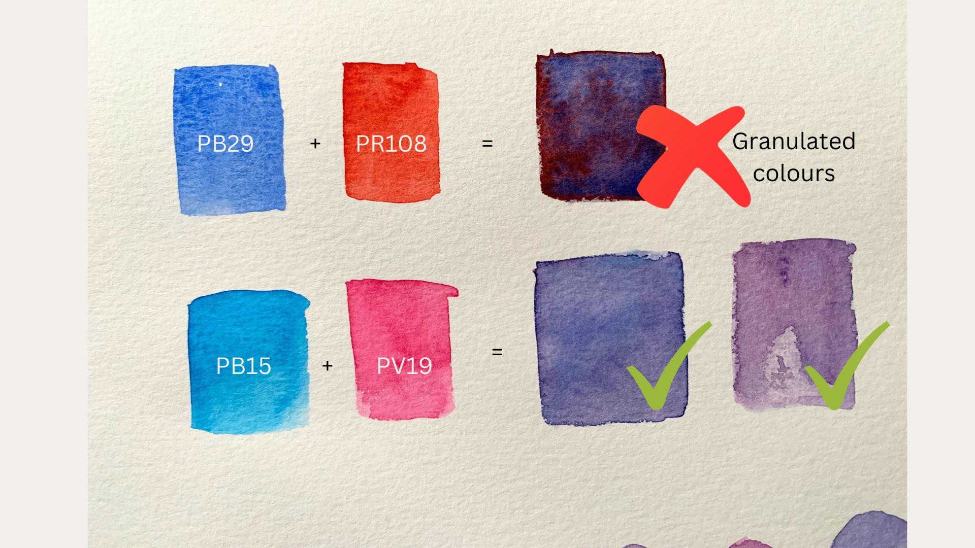
especially for water colors, it can be difficult to find pigments pure enough to do this. Watercolors have this tendency of mixing into muddy colors. This is because the pigments don't get along with each other. They don't really mix to form a secondary color
that we desire. Hence, it is even more
important for us to understand the pigments which are being used in these paints. What we recommend generally
for water colors instead, is to have six primary colors, which is three cool
primary colors and three warm primary colors. Let me use Winsor and
Newton as an example. They actually do mention the three primary colors as well as the six extended
primary colors, both for the professional grade as well as the cotton series. I would highly recommend
you have a look at that and select the pigments and not the color names from
the brand that you use. Then experiment with
the color mixing here. In this example, I have
three primary cool colors on top and three primary
warm colors at the bottom. I have created this color
wheel by mixing them together. This is a great
exercise for you to understand how your
colors behave. As you can see,
three primary colors on top create lighter, brighter shades of the
mix secondary colors, while the three primary
colors at the bottom, which are the warmer colors, create slightly duller mixes. Your own palette or
choice of colors will evolve naturally as you
try out new colors, different brands, and
different kinds of paintings. In the next lesson, we will explore the different
watercolor techniques.
9. Exercise 3 Watercolour Techniques: In this lesson, we will explore the various techniques
of watercolor. These techniques
of watercolor are the fundamental elements of starting with
watercolor painting. I encourage you to
follow along with me. The first technique that we will see is the wet on wet technique. The idea about wet in wet technique is that
the paper is wet, and on top of that,
you apply wet paint. Here I've added water
in the shape of a leaf. On this wet paper, I will drop wet paint. Hence, this is called
wet and wet technique. The wet in wet technique is usually used to create the
first layer of an artwork. The wet in wet technique
can be a little tricky to control since the paint will do its own thing
on a wet paper. But it's also really fun and
the essence of water colors. I encourage you to go
ahead and try it out. The more you paint, the better you will get with
this technique. Now the next technique
that we will see is the wet and
dry technique. This is nothing but wet paint which is added on dry paper. This is usually used
to add top layers or details like here I'm adding the wins for the leaf using
the wet and ray technique. Now the next technique that we will see is the
lifting technique. A lifting technique is slightly more advanced
technique, I would say. It's something that
requires more practice. Usually, this
technique is done to show highlights in
your watercolors. I had mentioned that
before that we don't have whites in watercolors. For us to show these
highlights and whites, we need to know how to lift
the paint off the paper. In this technique, what I
do now is use a damp brush. This brush does not
have too much water. I have just dipped
it in my jar of water and removed all
the excess water. Using this damp brush, I'm going to touch up the areas where I want
the highlights to show, which makes the paint wet again. Then I'm going to use this paper towel to dab
and lift out the paint. This will show the
paper underneath, making it look like
a highlighted area. This technique definitely
needs some practice. Go ahead and try it out. Now let's look at the
glazing technique. In this technique, you
basically add light wash or light layer of another color on top of your artwork to
give it a different tone. Here on top of the leaf, I'm adding a yellowish tinge to give it a little bit
of a sunlight effect. At the second half of the leaf, I'm adding bluish tinge to
give it a shadow effect. You can use this technique
to show shadows or sunlight. Or if you want to have a
reddish tinge during sunset, something like that, that's
when you will be adding a glaze on top of your
artwork. All right. The next technique is called
the masking technique. This technique is
generally used to show smaller details which you cannot do through
lifting technique. In watercolors, it's
very difficult to save your whites because we don't have a white color
in watercolor. There are times when you want really minute white or
lighter areas to be there, which can't be done very easily unless you use
this masking fluid. I have this masking fluid pen which is slightly easier to use, but you will also get masking
fluid in a liquid form. If you have a liquid
masking fluid, then I would suggest you
use an old brush to apply it on the paper because it can be damaging to your brushes. What I do now, I have this first layer
which I've added of a lighter tone of green. Then on top of that I'll add masking fluid to add the
minute, smaller details. Then once the masking
fluid is dried up, I'll add the darker
top layer on this. I'll let this layer
dry up as well. Once the entire
artwork is dried, I'm going to remove this
masking fluid using an eraser. Once it's off, you can
see the minute details, the smaller white dots that
I wanted the leaf to have showing through this is not easy to achieve through
the lifting technique. This is when you would probably want to use a masking fluid. Now let's look at
the final technique, which is called adding
a wash. For this, I'm going to be using
an oval wash brush, which is slightly bigger brush. But you can even use
a hake brush for this or a big flat
brush to add your wash. Adding a wash is basically just adding your
background layer. This is very handy for
landscape paintings. The wash can be of a single
color or of multiple colors. I'm going to add blue, yellow, and slight bit of
red for the sky and some green for the
ground to create my wash. This would be my first layer, or my background
of my landscape. On top of that, you can then add more details and textures. This first layer for
landscapes is called a wash. Next we are ready for
our class project.
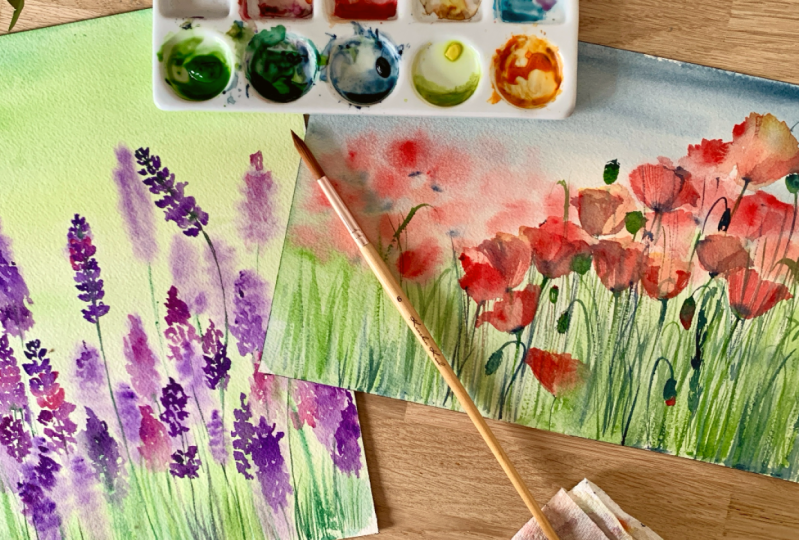
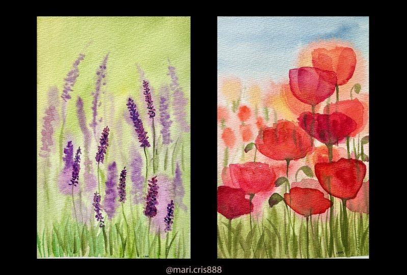
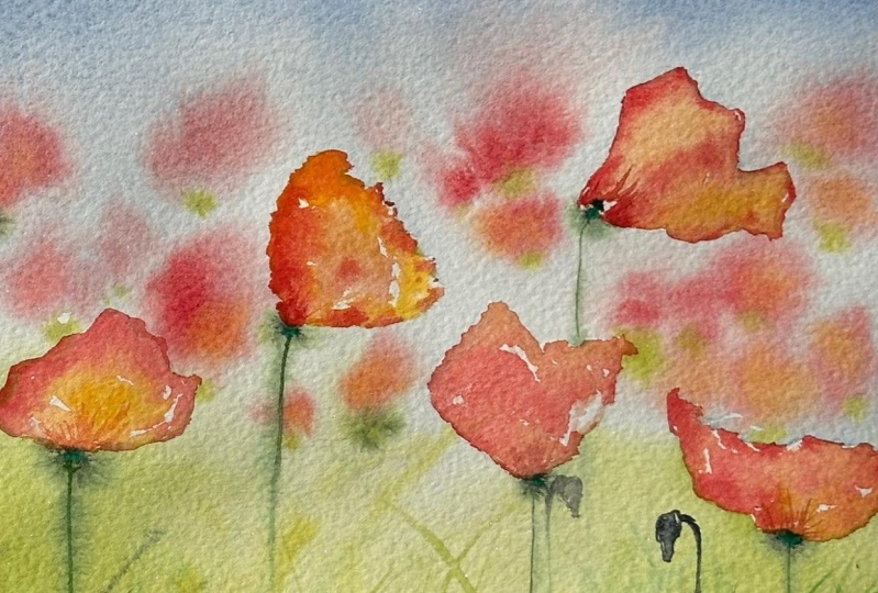
10. Class Project Poppies: For this artwork, I will be
using a cold press paper. This is from arches, but you can use any
cold press paper. Just make sure it has 300
GSM like we had discussed. Because we are going
to do a lot of water treatment to this with a lot of layers
in this artwork. Then the brushes I'm
using is a rigger brush. This brushes for making
those long grass. Then two round brushes, 4.6 this is from my
brand oval wash brush. To lay down the first wash, you can even use
a big flat brush or a hake brush
for that process. Then for the paints, I have three colors which are approximately similar
to the ones that we see on the reference photo. We have cadmium deep red by
Vincent Newton Cotton series. The indigo, as well
as the sap green. Like I mentioned, your color
names might be different. Just pick something
which works for you, then I have this palette
with my paints ready, jar of water and per towel to da all my brushes
with the excess water. Let's get started.
What I'll do first is approximately draw the
flowers that I want to make, especially the ones which
are in the foreground. The ones which I
want to see clearly, I'm going to start drawing them. I have one here which
I want to show. Poppies are actually
pretty easy to paint. But it is the process
and all the techniques that we have learned through
the class that is important. I wanted to choose some subject which is fairly easy to draw. Then there's one poppy here
which is turning this way. I'm going to draw that as well, and I'm going to keep
it very loose and not too detailed depending
upon how this turns out. It's a reference photo, I'm
not copying it exactly. This one beautiful poppy here which is
flowing in the wind, it has a very dramatic
looking poppy here. We'll keep this one as well, then maybe I want to make one poppy here
as well like this. This is just rough idea. We can of add more
poppies if we want later, but this is just a rough idea of where you want to
place your flowers. Once this is done, I'm
going to start putting in the wash. Look at the scene clearly and approximately what we want
to do is a gradient wash. In this case, the
top would be indigo. It'll be a darker
wash at the bottom. I'm going to keep it
very light indigo. And then later when
it's almost semi dry, we're going to drop
some red color on that. Let's start with that,
your wash brush. Take some indigo. I'm going to first actually wet the paper. We're going to do wet on wet technique that
we had learned. I'm going to wet just the
top half of the paper first, put a good layer of water. See approximately this darker indigo background is
on top till here. Let me just mark it. It's somewhere here. It's
not half the screen. That's how you do it. Then I'm going to
drop the paint. This is wet on wet.
Just wet your paint. Make a little bit of
a wet consistency. Drop it at top, which
is the darkest stadia. Since the paper is wet, it's going to just
pull the paint for the rest of your artwork. I have a poppy here which
I didn't want to paint. I'm going to do the
lifting technique. Now, for that, I'll take
a dry, damp brush dry. I'm just taking a damp brush
and I'm picking up the paint from here because I want
this poppy area to be white. I wasn't supposed to put it, I'm just correcting a mistake. It's not really a technique, but I'm going to use it
then I'm going to continue this gradient wash for the paper till here
I want darker wash. Just something to note, and you'll probably
learn as you go, that watercolor dries up
much lighter actually, than what you see. Whatever you are
painting right now, it will turn out to be
much lighter than that. But as you practice, you will know how it behaves
and you'll get better with how much you want to
put in watercolors. It's always a good idea to
keep it as light because you can always add layers of paint, but you can't wash out layers. This is like a gradient
wash that I've put I want it to be darker here as well.
It's quite dark here. I'm going to just
drop the paint on my wet paper with the
wet on wet technique. Now, at the bottom
of the paper here, I'll wet the paper. It's supposed to be greenish. I'm going to just
first wet the paper and it's going to be
very lightish green, Not too much, but I want that background to
be painted before I start adding the details
on the foreground. Again, just a wash.
A light wash? Try to keep your
poppies untouched. I know I'm not doing a
great job with that. It is difficult. There's
the other option of using a masking fluid to just mask your poppies out when you're putting your background. I don't have a
masking fluid liquid, that's why I'm not doing that. But if you have a
liquid masking fluid, go ahead and put it
on the poppies so that they don't
get painted over. The red that I have,
the cadmium deep red. It's pretty opaque. I will be able to work with it. But if your red is not, it's not opaque
enough, actually, then you might want to
mask all poppies out. Okay, the wash is done and
the paper is still wet. So what I'm going to do
is take my brush and start dropping
some tinge of red. Make those blurred flowers
in the background. You actually want this
blotting effect to happen so that you get that
blurred poquet look to it. You need to make sure
you do this step when the paper is wet again, we're doing wet on
wet technique here. When the paper is wet, I also want to do some
grass with my rigger brush. Rigger brush is like
thin and long and it's very handy to make foliage. I'm going to just do this
while the paper is wet again. I want a bouquet effect. Not too detailed
grass at this moment. Try to mix it up with
some indigo as well. You don't want just one
colored, this thing. Indigo gives a little shadow
to this grass as well. It gives some dimension where you see the paint
is drying lighter. You just take some paint
and start dropping it to give it a little bit
more texture and depth. I don't want paint which
doesn't have any shape to it. I want some flower
shape to come to it. Now that those blobs
are drying a little, I'm going to start
dropping paint. You need to be constantly here
monitoring your paper and see how it's behaving and start adding more and more flowers. Poppies have this black tip. What I'm going to do is
just drop very lightly. Very lightly,
because my paper is still quite wet in some areas, you don't want it to be
spreading everywhere. This will give a
little bit more flower like effect to your poppies. Just take it on the tip of your brush and drop
it at the base of this flower to give it
more flower effect, not just random blobs. Go ahead and add more grass. You can use the round
brush itself if you want, or if you have a rig. Even a script liner brush will work really well for foliage. Actually, there are
a lot of options. Go try out whatever
works for you. I'm just adding the
grass while I wait for the rest of the paper to dry. Okay, my paper is
completely dry. Now, I will start making
the more detailed flowers. Again, I can see that
one of the flowers has a little bit
orangish tone to it. I'm going to mix
yellow to my red and bring that orange color out. This is the flower
that I'll paint first. I'm just painting the first
layer for this flower, which is an orange tone. You can actually just
put yellow if you want. The water colors can be layered or mixed on the
paper itself as well. If you put red on top of this, it'll automatically
become orangish. I'm just going to put the
first layer as a yellow. That's the transparency
or water color that you can play with. Then I'm going to
put red in some of the areas to give
it a orangish tone. This is the wet
on dry technique. Then I'm just picking up some paint to give
some highlights. Let it dry, then we
can add more details. I had drawn one
flower here as well. I'll just add that detail again, wet on dry first layer. And then on top of that we add more details again in
this case as well, I'll put a yellow color first. And then on top of that
I'll lay the red to give it a oranges tinge so it
has the sunlight effect, Sun light showing through. Once it dries up. Then you can add one
more Led on top of this. Then I'm going to start adding the poppy seeds or the buds. Okay, let's add the poppy
seeds or the buds again. Take some indigo mixed with saarine or whatever it is
called on your palette. And I'm just adding these little buds
something like this. This one has a bud. I'll just add that detail next. I'm just going to start adding
more and more details to this to make it feel complete. Like I said, it's a
personal preference at what point you feel it's complete because there are so many things that you
might like and want to add. For example, I want to add
this little turned bud here. There are some stems
and which is detailed. So I'm going to
start adding those. Make it all yours, make it
unique to your own style. And add as much as you
want or as little as you want when it comes to
details in this last layer.
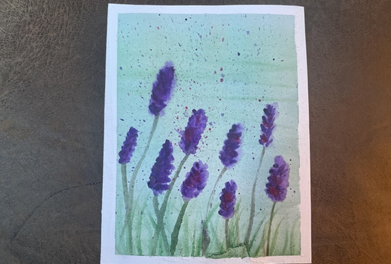
11. Class Project Lavenders: For this next project, I would encourage you to try painted on your own
without any instructions. You can watch my
process and pick out the different techniques
that you recognize. Try to use those
techniques and create this piece on your
own happy painting.
12. Final Thoughts: Congratulations on
finishing the class. Watercolor painting nurtures
creativity and patience. It's a journey where the process is as rewarding as
the final result. Remember, there are
no mistakes in art. Only opportunities for
growth and exploration. If you like the class,
do leave a review. And don't forget to
post your exercises, as well as class projects in the project gallery until
next time, happy painting.
 Kanchan Kaul, Artist and Illustrator