Transcripts
1. Intro: Hi everybody and welcome
back to my Skillshare class. We'll be getting
into Watercolor, Painting Portraits
on YUPO paper. Now, if you don't know
what YUPO Paper is, it is quite close
to hot press paper. But the difference is that
it's basically plastic. So every watercolor
paint you get on top, it doesn't get absorbed
like cotton paper does. So if you'd like that looseness, that abstract characteristics
of watercolor painting, then you'll definitely
love this class. And another difference in YUPO paper is that you can undo the things
that you've done. So in watercolor painting on cotton paper or any kind
of watercolor paper, then whatever you paint on top, you can't really undo things. You can get it. You
can soak it up. And you can use
some Magic erasers, but you can't really
erase things. But with YUPO paper you can. In this class I'll be sharing with you the techniques
that I've learned from this pass a year of Painting Portraits
on YUPO Paper cells. Share you some of those specific
application things that I've learned specifically
for YUPO paper, as well as the basics of
watercolor application and color theory and how I go through the process
of finding Inspiration, sparking my final piece. And then we'll get into the
final project of painting, a portrait on YUPO paper. So I hope you enjoy. And let's dive in
2. Materials: Okay, so let's get
into the materials that you definitely need fault by the ones that you might want to kinda have to
play around with. And sorry for my desk, It's so dirty, but this is what happens when
I'm having FUN. Okay, So you need two
jars of clean water. One would be for
cleaning your brush, and then one would be
for using directly into the palette or into
the, onto the paper. And then you'll need YUPO paper. It's different from
regular watercolor paper because it's basically plastic. And I really like how it
quite different in style. Yeah, it's just lovely. And some watercolor
brushes would be good. So here I have the DaVinci. I have some Princeton
velvet touch and also Raphael brushes.
So these are good. Then I helped a watercolor
palette and here, so you need watercolor paints. This is my watercolor palette
that I just love using. And then you'll need
some paper towels or towels that you can
wipe off your brushes. And from here on I'm going
to explain the ones that things that you might want to have around to play around with. One is a bristle
brush to get white, as well as white acrylic. And also it's really nice to have some spray
bottles like this and just activate the water
paints, the watercolor paints. This is alcohol. Any kind of alcohol
will do this. We'll create different
textures on the YUPO. Then some Watercolor scraps to test around with the colors to see what do you like to
use for the final project. And then an eraser with a
very thin tip like this. It'd be very cool. It's to create some
textures as well. This is called the Mono Zero. And this is my watercolor
brush holder. I just love it. I mean, it myself. Okay, So these are all
the materials that you would need and the things
that you might want around. Okay, let's get started.
3. Watercolor Techniques: This will be the first lesson. Be just aware of not
touching the paper. They YUPO paper as much
because when you do touch it, it's going to leave a
grease and that Greece, you cannot really get off. So be very aware of that
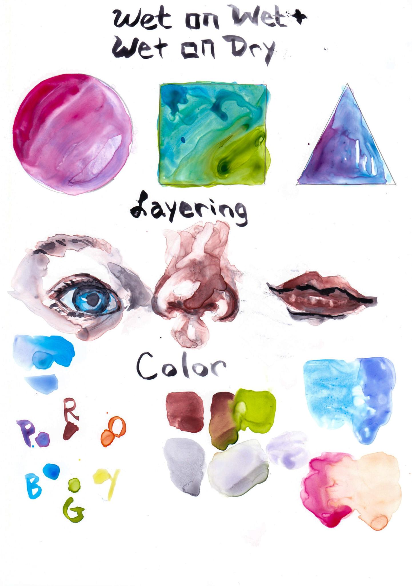
and don't touch too much. Now we're going to work with
the basics of watercolors. So we're going to work on wet on wet techniques and wet on dry. Now, I've put some
shapes here so you can see in kinda
follow easily. I'm going to work with this very beautiful color
called the small blue. So initially wet on wet just means working
on a wet surface. So I'm going to with
my clean water, I'm just going to put some water here on within the circle. Then I'm going to add this.
Didn't want it's blue. So wet on wet means just applying watercolor
on a wet surface. So it could be water or it could be already like
pigment that's laid out. So there this is wet. I'm going to go in
with another color. Now, that's gonna be a
wet on wet technique. And one of the
keys about YUPO is that you just have to
let go of control. Like you can't be in the mindset of like I'm
going to control it. You just have to let it flow is like an Art of letting go. So I'm just gonna
wait until that drives and let's work
on a different color. I'm going to sap green. So I'm going to wet
the surface now next without any water, add it. So that's initially wet on dry, but let me get some water, spread it out evenly here. And then I'm going to get another different kind
of green and add. So that would be a
wet on wet technique. Again. Just play around this, play around with the colors and see what kind of
effects you can create. I could even dry out my brush
like almost completely, and then go into
paint and add depth, a bit of dark pigment and
make lines like that. Okay, so for this next bit, I'll show you a technique. So I'll be using this eraser. I'm going to make
like vertical lines. You can't see them, but I am basically like as if I'm
erasing vertical lines. This will create a surface where the eraser will
be on the YUPO paper. And what happens
when you go over it? It's going to create a texture. Basically, it's
not going to allow any water on that surface. I'm going to wet the area
because we're doing wet on wet. Then I'm gonna go over
with a cobalt blue. Now, isn't that pretty? So there you can create
textures like that. You could even use a
bit of alcohol and then spray a bit and then just see how all
that pigment just flows. It's almost like it pushes
all the pigment out. So it's quite pretty okay. So I'll be adding a bit more of next
in-depth thrown blue. And this would be a
wet on wet technique. Okay, So now I'll just wait
until everything dries up. So it's almost dried. So I'm going to work on the
next technique of wet on dry. Now, I've used purple and pink here is very crucial with
YUPO paper that you wait, let it completely dry until
you go over the next layer. Or else you'll be scooping up the layer that
you've already put on below. And it's better to kinda
work like gouache. Which means that if you
don't know gouache, It's like opaque version of
watercolor, they say, but Basically, unless you
wait for the next layer, for the first layer to dry until you go to the next layer, what happens is that you'll
be scooping the underneath. And also you have to
use less water or else you'll be scooping
that under lying layer. So be aware of that. Now we're going to work on
the wet on dry technique. And I've used smart
and a purple here, but I'm going to go
inside with red, different color and see. I'm going to be working wet on dry because I haven't laid out any water underneath and
this is almost dry now. So that's just wet on dry
technique right there. This is a lot of pigment. I can do a bit of a wash. I'm going to spread it,
dip it into water again. And then they're almost
looks like a planet. I really liked
that effect there. Now I'm going to do the
same thing, wet on dry. Now, I'm going to
use a blue for that. I'll go back to a cobalt
blue that I use right here. And using more pigment, next, bit, too much water, Suppose going to
add more pigment. And then I will spread it again. Now, because I've added
more water now it's making the underneath layer kind of emerge again and reactivate. So some bits like here, I really liked this effect. I'm going to leave it, so
I'm going to work around it. Not this is a technique
that you might want to use. Maybe I'll add a bit more
pigment right there. Maybe I'll go even
darker with the theory, little blue, green shade. Even add a droplets. Then for here, I
will use a purple. Think all use a different
kind of purple. And again, I like this
whitespace that I've got, so I'll work around that. Then. I will add some
water and spread it. And I'll leave a bit of that right there
because I like it. Okay. So this is the wet on
wet and wet on dry technique. Now we're gonna be
working on layering. And initially we're
going to be using all these techniques
we learned up above. We're going to work with the portrait that you
might want to be using. So here I've got my son's
eye, nose, and mouth. It looks a bit weird, but we will start
practicing layering. So before we're not getting
into the color yet, but here, I quite like to
use cerulean blue first for the
whites of the eyes. Whites are usually not white. And always remember
to let things go. It's okay. Like the
great thing about YUPO paper out of my friends
are scared of using it. But the great thing about YUPO is it's almost
like oil painting. Because of the fact
that you can erase. Well, in oil painting, you kinda add the
whites at the end. Whereas like with YUPO paper, you can erase them by
scrubbing into them. And you can even like just skip this whole thing off and work on a new
painting if you like. Some of the staining
colors might stay on for quite a long time. And then they, I mean, they wouldn't come
off unnecessarily. But you could scrub
these off pretty well. Okay, so here I'm using Indian red for those
reds and skin color. Now, I don't realistically
paint as much. I like a lot of
abstraction in my work. So I'm using Indian red. And I'm also going to
use a neutral tint. Non-neutral ten is
basically grays. But yeah. I mean, skin has a lot of grays and the shadow areas tend
to have a lot of grace. So you can make your
mix your own grays. I'll go into that and
the color section. But here I've just wet on wet as well as wet
on dry. As well as Mingling. Now, what
mingling is, is, Let's see. Suppose I have this
color right here. But I'd like to mix a
cobalt blue, this color. I just connect these two colors in the middle by putting water. Initially, it's quite different when you mix these two colors. I'll get a cobalt blue, and I'll mix a small two points, blue, Dumont school,
I forgot one. And then you'll get
this if you mix it on the, on the palette. So it's quite different. And I really liked
this technique, like not mixing on the palette, but during the mixing on the surface that
you'll be working on. Okay, so I've done this. The eyes, I, maybe I'll add in some cobalt blue in
there and the eyes. And I'll let it just
dry for awhile. I'll work on the nose. The nose has a lot of red. In my opinion. I'll go here. Now. If you want to mix really, really realistic skin tones, you could always
do that by mixing, I would say like red
and green and yellow. And you pretty much get
like the skin tone. Okay. So with the nose, the nostrils tend to be darker, so I'm just going to add less water and more
pigment on the nostril. This is the shadow. So I'll be adding a bit of
the neutral tint right there. Maybe I went a bit too
dark, but that's okay. Remember you can always
erase it if you want liter. And if you don't like, like a certain area has too much pigment and
you want to erase it, but you just wanted to
now just add water. You see, just by
adding that water, it's like pushing
the pigment out and keeping the water here too. I want more white there. Maybe a bit more
white here as well. It'll push it elsewhere. And that creates like a
really cool effect as well. Don't worry if you
think like, oh, this doesn't look like I, the first layer is really
just playing around with the colors and being
abstract as much as you can. It just becomes more and more. I like or nose like or whatever like that you're painting later when you add layers and layers and make it more realistic. So there's a whitespace there. So I should have done the eraser rubbing
there, but it's fine. Then add some
shadows right there. Some shadows right
there as well. There's many shadows there. I'm going to lift it
up by drying my brush. When you don't have much
water in your brush, your brushes going to scoop up that water
and pigment together. Okay, so we're going to let, let this layer can try up and
work on the second layer. I'm very impatient when it
comes to letting things dry, but we're going to
start working on this. So we're going into
our second layer. So I'll be using this
cobalt blue again. And I'm going over on the
darker bits of the eyes, spreading them out a bit. And then going in with
the Indian red here. Again. It's okay if I mingle a bit of
colors, urine there. I like being loose
and unpredictable. When it comes to Painting. There's a bit of red there. And for the eyebrows, I tend to like to not put
too much emphasis on it. More kind of think about
the bone structure Of what's going on. Think, add a bit more. Maybe that's a bit too much. But there's no need to panic. Just soften the
surroundings and add a bit of water to
spread it around. And I'm going to
add pupil there. Okay. Then I'm going to
move on to the nose. When it comes to layering, I tend to work upon three
to four layers in total. It can depend on my patients
as well as like if I add it enough values on the
first two layers or not. But yeah, I think I tend to pretty much work in
three or four layers. I like to add that bottom bit. Guess I didn't really
need to do that. And you see those black dots. These are like pigments
that are more blocky. Basically what's happening
is that because I love using granulating colors. Some or some pigments are
more granulating than others. And when you do use
granulating colors, sometimes it reacts on YUPO paper as come
becomes quite visible. So if you don't want that, there is a way of
just of winning it by mixing the pigment quite a lot before applying it
onto the paper. That tends to solve the
problem quite often, but sometimes it doesn't
because it could be using mixing these neutral tint that I'm using is
not granulating. And the one that I'm using here, the Indian Rand I
think is granulating. So that could just create
this effect, so to speak. It's more prone to happening. There's a bit much
coming in here. Bit more red. Okay, so I'm going to work on
the layer right here again. I think for just
exercise purposes. I wouldn't go into further
explaining this bit. I'm going to drop in the darkest darks. Lashes. Think I should have used
less darker color, but Okay. So that's the I think I should've
waited for it to dry, so let me let it dry and then we'll work on
the third layer and tones you typically
need read the little yellow,
greens and purples. I like using Indian
red, the PR one-on-one. This tends to shift
more on the cool red. When I say core,
it means it's more like on the purple and
blue on the color wheel. On the contrary, when
we use warm red, it shifts toward the
orange and yellows. When we talk about complementary
colors for our red, it would be the opposite
of the color wheel, which will be green. You can mix these two colors. When colors are too vibrant, you want to desaturate the color to make
it look more muted. I tend to use a pigment called
neutral tint by M Graham, which slightly shifts
toward the cools. Cool purple shaded grace. Yes. Now, when mixing
with green doesn't necessarily equal gray, hence, I like to have a neutral tint on my palette or either
do warm-ups like this, where I determine exactly
what colors I will use for the final piece
and mix them together, these colors to see
what it creates. Okay, so here I mixed the
Indian red and sap green. Okay, so here I've
laid out a swatch of the Indian red and also the
swatch of the sap green. And I'm doing the
mingling technique here. And as you can see, as it mixes, it doesn't create
exactly a gray but a muted color of
the red and green. Now, if you don't
have a neutral tint, this is a tip for creating
a color you exactly need for the shadows of the skin tone with
a limited palette. So here you can see the
muted color is more like an orange with the Indian red and
green sap, Sap Green. I've made a swatch of that. So what's the complimentary
of orange? Blue, right? Then I decided, okay, what kind of blew
can I mixed two this muted orange to create something that more it looks like the M
Graham neutral tint. I've decided paints gray. I quite like to use
Payne's gray for my skin tones sometimes to create like if I'm don't want to quite
use the neutral tint. Here. I mix the Payne's gray
into the the muted color. We create it with the Indian
red and the sap green. And it's looking more
like the neutral tint, but it's still more green,
greenish gray, right? So I've decided to
add more purple because I think it needed to shift to where it's
more of the purple. So I've added cobalt
violet hue and look, it looks much closer
to the neutral tint. So whenever you want
to create a color, ask yourself, what
color is this? Okay, and what do I
want the color to be like an add more of the color. You want to see The Voice Recorder
ran out of battery. So here I am doing a voice-over. Okay, So when
creating skin tones, you typically need read
the little yellow, greens and even purples. I like using Indian
red, the PR A101. This tends to shift more on
the cool red when I say core, it means it's more like on the purple and blue on
the color wheel. On the contrary,
when we use warm red is shifts toward
the orange and yellows. When we talk about complementary
colors for our red, it will be the opposite
of the color wheel, which will be green. You can mix these two
colors when colors are too vibrant and you
want to desaturate the color to make
it look more muted. I tend to use a pigment called
neutral tint by M Graham, which slightly shifts
toward the cools, cool purple shaded grace. Now, when mixing with green doesn't necessarily equal gray. Hence, I like to have
a neutral tint on my palette or either
do warm-ups like this, where I determine exactly
what colors I will use for the final piece
and mix them together, these colors to see
what it creates. Okay, so here I've
laid out a swatch off the Indian red and also the
swatch of the sap green. And I'm doing the
mingling technique here. And as you can see, as it mixes, it doesn't create
exactly a gray but a muted color of
the red and green. Now, if you don't
have a neutral tint, this is a tip for creating
a color you exactly need for the shadows of the skin tone with
a limited palette. So okay, here you can see
the muted color is more like an orange with the Indian red and
green sap, Sap green. So I've made a swatch of that. So what's the complimentary
of orange? Blue, right? So then I decided, okay, what kind of blew can I mix to this muted orange to create something that looks like the M Graham neutral tint. I've decided paints gray. I quite like to use
Payne's gray for my skin tones sometimes to create like if I don't want to quite
use the neutral tint. Here, I mixed the Payne's gray
into the, the muted color. We create it with the Indian
red and the sap green. And it's looking more
like the neutral tint, but it's still more green,
greenish gray, right? So I've decided to
add more purple because I think it needed to shift towards more
of the purple. So I've added cobalt
violet hue and look, it looks much closer
to the neutral tint. So whenever you want
to create a color, ask yourself, what
color is this? What do I want the
color to be like an add more of the color
you want to see. And another side note on, be very careful of how much
colors you mix on YUPO. Yupo, especially I just feel
like it tends to carry, get very muddy easily if
you mix too much colors, which I think is the
same with any kind of watercolor paper
that's out there. But I think it's more, a much more possibility
of getting very muddy. So just be aware of
4. Color Theory: So I go into much more detail about
colors and other classes. But the color wheel
is basically, the primary colors would be
the red, blue, and yellow. So here I've used the Indian red and then
transparent pyrrole, orange. And then Nicole tight, tight. Titanic. Say that the
yellow and then sap green. And then cobalt blue. And then I think that
was the imperial purple. So these red, blue, yellow or the primaries because you can't
mix to create it. The orange, green, purple
are the secondaries. And everything in-between these, like the red orange
robe be the tertiaries. So when you do think about the color
palette that you choose, I'm really into the
limited color palette recently and say my subject, in which case, the final
project would be of my my son. I usually have the portrait as well as some other elements. Like it could be flowers, it could be butterflies. It could be a lot of
different elements that I could add
to the portrait. And I tend to want the
ice to go to that. In which case, I want
the subject to have a more neutral kind of
like less vibrant color. The voice recorder
ran out of battery. So here I am doing a voice-over. Okay, So when
creating skin tones, you typically need read the little yellow,
greens and purples. I like using Indian
red, the PR one-on-one. This tends to shift
more on the cool red. When I say Cool,
it means it's more like on the purple and
blue on the color wheel. On the contrary,
when we use warm red is shifts toward the
orange and the yellows. When we talk about complimentary
colors for our red, it would be the opposite
of the color wheel, which will be green. You can mix these two
colors when colors are too vibrant and you
want to desaturate the color to make
it look more muted. I tend to use a pigment called
neutral tint by M Graham, which slightly shifts
toward the cools, cool purple shaded grace. Now, when mixing with green doesn't necessarily equal gray. Hence, I like to have
a neutral tint on my palette or either
do warm ups like this, where I determine exactly
what colors I will use for the final piece
and mix them together, these colors to see
what it creates. Okay, so here I've
laid out a swatch of the Indian red and also the
swatch of the sap green. And I'm doing the
mingling technique here. And as you can see, as it mixes, it doesn't create
exactly a gray but a muted color of the
red and the green. Now, if you don't
have a neutral tint, this is a tip for creating
a color you exactly need for the shadows of the skin tone with
a limited palette. Okay, Here you can see
the muted color is more like an orange with Indian
red and green sap, Sap green. So I've made a swatch of that. So what's the complimentary
of orange? Blue, right? So then I decided, okay, What kind of blue can I mix to this muted orange to create something that looks like the M Graham neutral tint. I've decided Payne's gray. I quite like to use
Payne's gray for my skin tones sometimes
to create like if I'm, don't want to quite
use the neutral tint. Here. I mixed a Payne's gray
into the, the muted color. We create it with the Indian
red and the sap green. And it's looking more
like the neutral tint, but it's still more green,
greenish gray, right? So I've decided to
add more purple because I think it needed to shift to where it's
more of the purple. So I've added a cobalt
violet hue and look, it looks much closer
to the neutral tint. So whenever you want
to create a color, asked herself, or is this okay? And what do I want the
color to be like an add more of the color
you want to see. I want to keep a limited palette and I
really love cobalt blue. So I'll be using that. It's good to kind of play around with colors and
see what you like, what speaks to your nose. I even have this. My own meal is palate, which is the colors
that I really love using some sometimes
for inspiration, I'll just look at
this and be like, okay, what color
so I want to use, so cobalt blue is one of my
favorite colors I want to use dot farm my son's eyes. But I'm really I
really loved this. I'm caller calls smoked
by Winsor Newton, so I want to use that. I got the reds and the blues. I want to keep it to that. I really like a bit of
saturated, very vibrant colors. So I think I'll use a bit of this quinacridone
coral. I think yes. For some bits, and also to
brighten up the tones a bit, I want to use this transparent
pyrrole, orange as well. So color is relative. It's really good to
kind of be like, okay, I want to use
these vibrant colors. But most of the place
that covers around it, I want to use a very
neutral, muted colors. So these standout is like a part of working
around with color. So color can really have
a powerful message. So be intentional with the colors that you choose.
Okay, so that's it. Let's go to the next lesson. Another side note
on be very careful of how much colors you
mix on tuple, tuple, especially I just
feel like it tends to get very muddy easily if
you mix too much colors, which I think is the
same with any kind of watercolor paper
that's out there, but I think it's more, much more possibility
of getting very muddy. So just be aware of that
5. Inspiration: So I'd like to get into how I work around inspirations
and how I get started. Usually, I go to
Pinterest quite a lot and all kind of scroll around to see what gets me like, what I like. And this is my current favorite. I'm not too sure
who the artist is. I don't think it's a nice us because somehow when I looked, I don't know, it could be her. I'm not too sure, sorry
about who this artist is, but I'd like how It's almost like this face
is emerging from the water. And I just love it. It's made from YUPO paper. And this is where I
kinda was like, Oh wait, I could do portraits, I love portraits and I could
do Portraits on YUPO paper. So one of my inspiration, as well as this is an artist called agonist muscle
who's painted this. I really love her work. I went to a workshop. I loved the way everything
is quite loose. It's not quite to details. And I love how she is, is to elements and how work like here you can see
there's butterflies. There's The butterflies
have different values. They mostly use the same color, but they have different values. And the focal of interests
kinda goes towards, or this dark blue butterfly
is around her chin. And I just love it. It's really pretty. Somehow I'm really into
see angels right now. They're so cute. There's just like really
interesting creatures. So I quite like to add
that as an element. Those are basically my three Inspiration is at the moment
I have so many others that I'm thinking about creating a Skillshare class
related to these. But for now, it's these three things that
I'm being inspired. One is YUPO Paper Portraits. One is agonist muscles like
use of elements of animals around the subject
and see angels. So just get into some, just try scrolling
through some Pinterest and what kind of speaks to you the most
and just save those. And then from there
you I'm sure you can get an idea of what
you'd like to paint
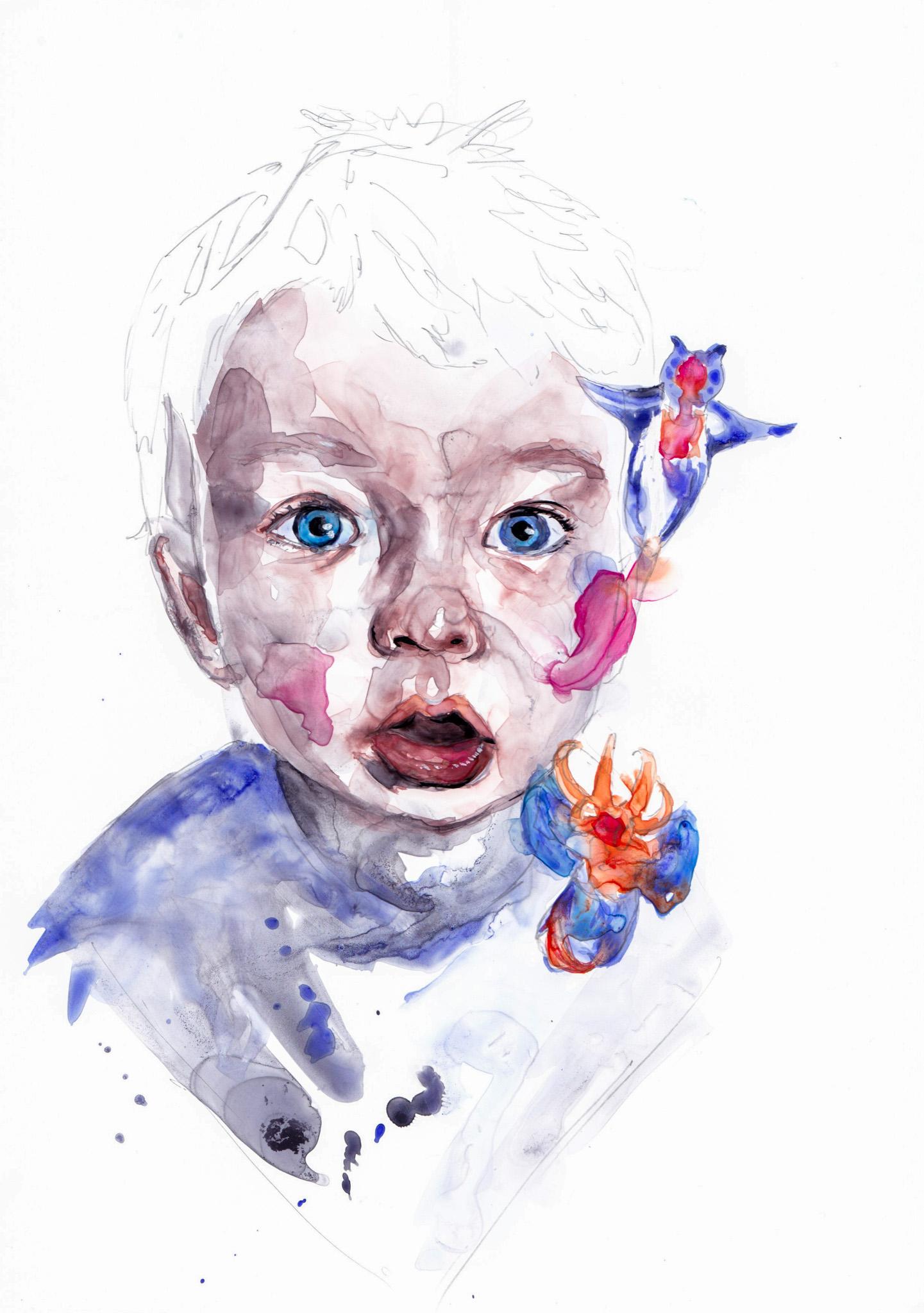
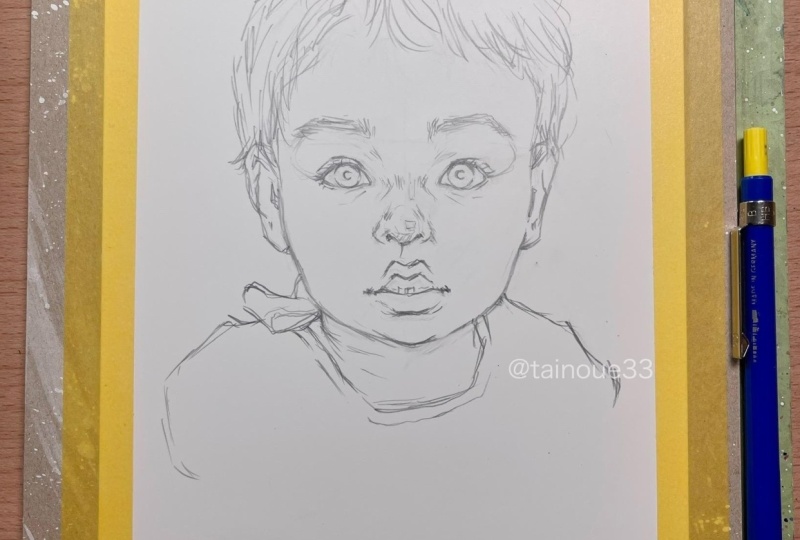
6. Final Project 1: Okay, So this will be
the final Project. I've already sketched out my son's portrait
on the YUPO paper. Now I mentioned this again. Don't touch the YUPO paper with greasy hands or else though, whatever water or pigment
you get on the paper, it's going to just rejected
and you wouldn't get any layer on top of that place you've touched
with your greasy hands. Okay. So if you need
the reference photo, it's in the materials sections
on the resources section. So you can always look at that. Here I'm testing out
some swatches of the colors that I'll
be using. On the left. The mueos palette is
something I keep in my book of all the colors that I
just love for inspiration. I'm testing out the
quinacridone coral, the transparent pyrrole orange, the smart, as well
as the cobalt blue, and also the neutral tint here. And finally, I'll
be using some of the Indian red for
the skin tones. Now, I'm going to be
keeping this final project, the painting very simple with the colors like
I'm trying to limit. This is a limited
palette for me actually. So I'll be using the
Indian red as well as the neutral tint
for everything that surrounds like
basically the skin. And the main focus is going
to be on the sea angels. So they're going to have
very vibrant colors like the quinacridone coral, as well as the smoke. Now, I'm also thinking about
using these neon colors, the pink especially
I just love it, but it's quite close to the quinacridone coral
that I'll be using. So I'll just keep
it for later to see whether I'll actually
use this or not. But it'll be cool because when you hit a black
light or something, it's going to just
glow in the dark, which I quite like just idea of. I'm also swatching
this orange just in case to see if
I like it or not. But I just thought the
transparent pyrrole orange ball just do magic. So we'll be working
on the first layer. I'm getting into
the neutral tint, working into the shadows, the dark, relatively darkest
darks of the reference. For the reference, just look
into the resources section. I have photo of my son right there so you can kinda follow
with my instructions here. So I am just laying
into the darkest darks, the shadows neutral tint. If you don't have that, you
have to kind of color mix them on your palette and create
these grays for yourself. I have. If you go back
to the previous warm-up, the color Theory bid and you'll
see how you can do that. So I'm just working
in those shadows. I try not to go too
dark at this stage. I mean, I can pretty much go
into the neutral tint with a very like less water and
get more of the pigment. But I don't necessarily do that because
YUPO paper is not. You can always erase it. So it's not as difficult as watercolor paper
in terms of like you can't get those whites back. I just want to, I liked the way of working
like building up the layers. I'm actually adding some of the smart the violet into
some areas right here. Because the, as I mentioned earlier
in the warm-up section, like layering, but
I did mention about the whites of the eyes
being not quite white. So I'm adding small into
the whites of the eyes. I'm adding a bit of that same small Dan areas
that look a bit purplish. There's always like purplish
bit of the skin tone. So that's where I'm adding. I'm going into the lips
right here with Indian red, as well as the corners of
the eyes which tend to be on the red ish color. I went overboard with the bottom of the lip
where they're shadows, so I'm wiping off. You can always wipe off, like if you have too much
pigment and water flowing. And again, I repeat
this over and over, but don't be afraid of having no control over how
the pigment and water works. I must say I did use a bit too much water
in this first layer. I will still kinda
getting the hang of the YUPO paper because
I haven't been using it for some time. So I'm wiping off my brush on getting
that excess water out of my brush and then lifting
some pigment and water away. Now here I'm working into some mix of Indian red
with the neutral tint, and I'm working into that
midtone values that you see. I often referred to values
because it's so important. You have to know. Like you have to be able to see the values in a reference photo For Drawing, for painting,
for everything, basically. So I really encourage you to look into the values
if it's difficult, always make the reference photo black and white,
like a monochrome. So you can see exactly where the darkest
darks and lights. You can go crazy with the color, but you could never
quite go crazy with the values because or else
you wouldn't know what it is. Here. I'm adding a
bit of the color. I wanted to create a bit of a symmetrical shape
at the bottom, kinda holding up the YUPO
paper so it drips on purpose. And I'm creating all these
strokes right here and some splashes because I just loved that effect
when I'm painting. I've added neutral
tint with smart sign, keeping this limited palette. I'm not going crazy with
the colors at this stage. I'm just using all the colors that I've selected beforehand. I'm adding a bit of neutral can around the sea angel as well. And I'm being careful not
to go over the sea angel. I'm working my way
around it because I don't want to cover up that bit with neutral
tint or else, when I do cover on the next layer with the
very vibrant colors, it's going to have
the under layer of the neutral tin and it'll look muted and I just
don't want that. I want it very vibrant. Now I'm working
into the ears here. And this kinda starts
to become the, The scary stage, the
ugly phase of painting. I think you might've heard about the Painting curve before, but it starts off
really good and then it dips because likely, and then it goes back again. So I am aware that, oh my God, it's starting to look ugly. What
am I going to do? But I keep in mind
that it's okay. I can pull everything back in after layer upon
layer after it dries. I'm going to lay that layer
again and it'll be fine. I'm adding cobalt food to the eyes and adding
more pigment, more saturated
concentrated pigments, and to some areas to create
more of that dark color. The values are there. My son starts looking like
a horror movie. And I'm just like, okay,
this is going to much. So basically the problem
that I had here is I've used too much water and I should've
waited for it to dry. Maybe I should've just
left it for it to try, but we all get
impatient sometimes. So that's exactly what
was wrong with me. I was very impatient. I wanted to add the
valleys quickly. Yupo paper. You
just can't do that. I mean, if you're doing like landscape or something,
maybe it's okay, but because portraits
are very specific, I mean, maybe even landscapes,
you can't do that. But anyways, portraits or
gotta get that line correct. You gotta get that
value correct. So, yeah, I think I should've waited for
another layer, but anyhow, I'm scooping up the
mess that I've created as much as I can
with a dry brush. Scooping it up, cleaning
my brush, scooping it up. I'm just like repeating that. I've let the layer
dry and now I'm going into the second layer and I'm adding the details around the eyes with
the Indian red. I'm getting more of
that value inside, making sure the
lines are correct. And this basically, like I
mentioned in the warm-ups, you have to be
mindful of not using as much water as you
did in the first layer. Because if you do,
you're going to lift up the layer that you have
underneath more easily. With YUPO Paper, this, you can't really round it. You're gonna live
some of that up. Like, yeah, it's
going to come off. So try to use less water every time you
lay on the next layer. And I'm adding in more
of those shadows here. I start mixing work the Indian
red with the neutral tint. I'm not really getting
very dark with the values, but I'm mixing those two. It gets a bit darker than the initial layer that I
use with the Indian red And because it's watercolor, the more urine layer at, the more it's going
to add value. It's never subtracting, it's
adding more of those value, no matter how transparent
the pigment is. More water and less
pigment it is, you are always
going to add value. So don't worry too much about how it might not be too much pigment
and more of the water. Delete that. But anyways, yeah, so here I'm adding
more of the dark. It's just like adding more and more values
onto the Painting. And yeah, the nose is
one more thing i've, I pay attention to is I tried to create different
brushstrokes from the first, initial layer. So I don't do the
same brush stroke over the existing underlayer
as much as possible. And I create some movement with the brush stroke and it's, it's totally fine
to have some of those brushstroke lines to show. I just think that's
the beauty of watercolor and
painting in general. Now I'm working into more of
the values inside the eyes. I'm adding more of
those cobalt blue. Yeah, just to make
those values darker. And I'm not too afraid of
mingling the other colors. So I have the Indian red
around the corner of the eyes, the line, the
contour of the eyes. But I'm not scared of mingling
the cobalt blue with it. Because sometimes just mingling the colors together, I mean, if it leaks into
the other parts, it just creates
like a cool effect. So I'm not too
worried about that. Now I'm working
into the lips here, making the putting some
layers into the shadows. I'm not, I don't necessarily use the neutral tint so quickly into the shadows because then
I can work up the values. So here I'm using Indian red, which eventually later we'll add the neutral tint
because it's the shadows. But, but I don't worry too much because I just work
gradually with the layers. I'm adding more layers
around the mid tone to the light values because it's on the right-hand
side of the face where the the light
sources coming from. Well, it's pretty much
coming from center, right? But anyway, so I'm creating
all the mid tones, like layering more on their. Now I'm going into the chin a bit because there's
more shadows there. So I've I'm underneath the lips, I'm adding more of the neutral
tint as well as the chin. I'm adding more of
the Indian red. And I'm going into
the shadows of the left side of
the face where it's creating like almost
like a cast shadow. From here. From here forward. I'm just initially just, I'm just adding more
and more values. Layers. Here. Boom. Here, I'm creating more of those
contour lines that you see on the side of the face. So I tried to make a
contrast wherever you could see that slight
like core shadow, as well as the bit of a light area that creates
the contour of the face. I'm making sure I create
those differences here. From here on, I'm just
basically layering. That's the whole bit,
just adding values, continuing to add values. Do a bit of the
mingling technique as well as wet into wet. On also, I do a lot
of palette mixing, which means it, the
mixing is on the palette between the neutral tint
and the Indian red. So, yeah, I'll come back later and let's just
enjoy painting. Until yeah, let's just concentrate on adding more values
to the Painting.
7. Final Project 2: The first layer has dried and now I'm getting into
the second layer. Now I'm starting to work
into the eyes more because I believe the eyes says a
lot about the person. And I put a lot of
concentration on the eyes of a portrait because I
just feel like that's how the portrait will
look really good. I'm getting into the eyes. I'm adding more of
that cobalt blue inside and creating more values. I'm also going to work
into the pupil of the eye. And I tend to use the Payne's
gray, which I didn't, I wasn't supposed to like
add into the palette, but I just happen to use, I think I use the Payne's gray. Okay, so here I get
into the pupil of the eye and I am using, I'm using that neutral tint to get really dark values
for the pupil of the eye. And I don't really concentrate too much
on how the shape is, because at this point, it can mingle into those surrounding
areas a bit sometimes. But I tried to be
mindful not to do that. But if it does, I'm not too scared because
I know I can get back those whites later or either just soak it up with my brush. But here I am using
this really tiny brush. It's that Raphael, I
think the size is zero. And I do use this
brush again later on when other than like creating
this contour of the eyes, I do use it for the eyelashes. Because if you don't have
a really pointed brush, it tends to look
really fake and come up too thick for the
actual look of eyelash. But anyways, that for later, I'm just going inside a pupil. And when I do work on the eyes, I tried to work on the
left and then the right. It's never like okay,
I did the left. Now I'm going to
something different. No, I always do it. Like I switched the
left and right, um, because I want to make it as close as possible to the reference
photo and I don't want to zoom out of that
detail that I missed and it wouldn't look as balanced if I did work on
other things first, I'm adding more values
on the shadows. And next I am working on the clothes or the bib or the color,
whatever you call it. Again. And I'm also
splashing some water to create that effect. It because somehow I feel like there's not enough
going on in that area. Because eventually,
keeping in mind that things are going to be
added for the C angels, like the colors are
really going to bring the eyes into those see angels. I just feel like there
needs to be more happening. At the bottom bit. I'm
adding a bit more. And I think as I
was creating this, I got a bit of the small blue
on the right corner of the, around the right of the eye. Below the right of
DIE. It's okay. I don't mind these kind
of happy accidents happen and I don't care so much, but if it does bother you, then you can always erase
it and wipe it off. Take a brush and scrape it
off because it's YUPO paper. We're working on
the third layer. Everything has dried. Well, for the most part, As I'm pretty impatient, I am going to get into more
pigments and less water. Again, as I mentioned,
many, many times, you have to use more pigment, less water as you
build the layers. This could be said the same with just using regular paper, but YUPO, even more so. Again, I'm working, starting
to work into the eyes again using pretty much
only neutral tint. I'm creating the shadows
out the top bit of the eyes because naturally the shadow will be
casted on the top of the eyes when there's light
coming from a top source. Well, that's how I think of it, but I don't know if people could argue
against that, I suppose. But anyway, so I'm
putting in more shadows right here and working
into the eyes. And again, we're just
building layers and values I've come to a point where I think the painting of the face and the closed spit is
pretty much finished. Now. I haven't waited for it to dry, but I'm going to work into
the sea Angel's here. I'm using the small blue
because that's what I think would be a great
color to use for the violet blues of the
sea angel reference photo. And I'm working into this
color and at this point, I don't really mind,
again too much, whether this color will mingle
into his face too much. Because sometimes that could
create quite a nice effect. But I'm working on
the first layer of the sea angels with
the small blue and covering up the places that this color I think we'll look, we'll look the best. And I will be working on the second C angel
the same way as well. Now that I've let the
third layer, I believe. Yeah, dry and small. I'm blue section of the
scene joules are dried. I'm working with the
color quinacridone coral here to create
those very bright, vibrant colors you see. And I'm also adding a bit
of that quinacridone coral on the cheeks bit because I just feel like it creates
that watery, kind of almost
surreal effect to it. I just thought I liked that
idea of blending a bit of that cheeky, rosy color. But I'm smudging it
a bit right here and kinda being abstract and kinda adding a bit
of water to get those explosion of
colors going on. Okay? The reason why I
waited for the smart, the violet bit of the sea angel to dry up
is because when you use, when you mix the smallest
width is quinacridone coral. It's not gonna get muddy, but I just want that clear
differentiation of the violet, blue, violet bit of
the scene, Joel. And the inner kind of red, fiery orangey bit of the
inner body of the sea angels. So that's why I make
sure the layers dry. Before I work into that. Here I'm adding the second
layer of the small on the outer body of the
scene job because I think it had to have more
values added to it. Yeah, I do pretty
much the same thing for the bottom see,
enjoy as well. So here I'm adding some of
that transparent parole that pyrrole orange
that I've added to the sea angels for the top. Because I think for some reason like I think the
top bit of the lips tend to be more orangey and the bottom bit tends to be
more like magenta color. For the bottom lips, I'm
using the quinacridone coral because I just want to keep
my palette very limited. So I'm using the colors
available that's closest to those two colors
to orange and magenta Here I'm adding more values
into the eyes because I want some time for
the ice to completely dry whatever value
add I add onto it. And eventually what I'll
be doing is I really love to add the whites of the eyes
with some white acrylic. So I'm adding more
values to the eyes. So I have enough time to let it dry and add
the next layer. Adding more values
to the sea angels. Now, just being mindful of kind of layering more colors on top and kinda blending
in some areas that seems like it
has no color as well. And I'm adding some neutral tint as well for the darkest
darks of the sea angel Oh yeah, I've just noticed that some darkest darks at the
eyes should be even darker. So I'm adding a bit
more neutral tint here, as well as the pupil of the eye, which I really don't want to add too much because once
you add that white, it might bleed into it. I should've waited, but
of course I'm impatient. I'm going to add the whites
of the eyes in there. I basically blew it. It's blood into stroke. So I'm just tapping in with my paper towel sucking
up whatever kinda white mixed with neutral tint and
just basically layering that neutral tint again
because I'll have to let it dry it and rework the
white again on top. So that was my fault. But don't be like me, learn to be patient
and let it dry. But anyway, so I go to, I have to just mix some cobalt blue again and kind of buildup that layer again because I just wiped off
pretty much a lot of the bit of the eye that I
already created, the values of. I fled the eye dry. I use a dryer and now
I'm going in with acrylic white and look at that. It just so magical, it looks so different once
you use that acrylic, white acrylic to bring
in those whites. I also add some whites on
the underneath the eye, the eyeball like there's
this white lining, the inner corner of the eye, but that usually
tends to be white. Adding those inside as well. Again, I'm working
on the right eye or the left eye and
adding those whites. Sometimes the inner corner
of the eye has those whites. And sometimes it's
because depending on which way the subject is looking at and where
the light is hitting. So be mindful of looking
at your reference, making sure where the
whites are actually are. In here, adding some whites
onto the lips as well, and some on that corner
of the mouth as well, and so onto the eyebrows
because my son is quite fair. He has blonde hair and some of his eyebrows with the light on, it could turn like look white. So I'm adding a bit of white. And just basically
wherever I see, like a very light
value and just adding, being mindful of where the lightest light of
the reference photos
8. Tips: Okay, So let's talk
about Varnishing. Now. I do varnish my
Watercolor Portraits on paper. When I'm not going to frame them behind a glass that
has UV protection. So here I have a UV
protection include a fixative for this painting. I didn't varnish it yet because
it's just been painted. I usually wait for a day or two during the summer
months to let it dry. This depends on the climate
but just kinda touch it, see how dry it is. I like the natural look of no fixative and just the YUPO paper
itself with a color. So I do highly recommend just
leaving it and framing it. That's the best way to like keep your paintings with all
the colors that it has. Like looks like right now. So I recommend doing that, but if you do want
to protect them, then I will suggest this way
of doing what I did here, which was basically
laying it vertical and then having a
distance between the paper and the
fixative and spraying it evenly down and
letting the first layer of the fixative dry and
then going over it for another layer and letting it dry this way it
has a bit of that. It's not too glossy. It's like it has that
Matthew look a bit, but it does get uneven. It's so difficult so you
have to practice like spring fixatives on YUPO paper. Now this is one of
my first paintings and I don't like it as much. So I wasn't, I was
like kinda okay with experimenting with
a different way of Varnishing at the time. And this one, I laid
flat on the floor and then I didn't have too much distance between
the paper and the fixative, and I basically just
pile on that fixative. So that's why it has
dislike, glossy look. And it did it lifted some
of the pigments above. So it does look a bit different from what
used to look like. I don't really suggests this, but this is quite
a personal choice if you like that glossy look. But just be aware, just test out few different
ways of Varnishing and see which kinds you like. So hope that was
helpful for you. Okay, so I like to show you what erasing looks like
on YUPO paper. Now, I'll be working on few
of his paintings that I did. Here. I have smoked, I don't remember
exactly what colors I use for everything, but here I have
smoked and I have, I think I believe
that was cobalt blue. And I'll be erasing these. And also I have sap green here. And I have, let's see, Indian red right over here, as well as sap green. So the reason why I have these swatches right
here that I usually create is because you can see the staining bit
of these pigments. So this is like a bit
staining when there's like a half of the circle is like black means
it's a bit staining. If that was covered with like the whole
circle was a black, it would be staining. This one is half, this one, sap green is half, and Indian red is not staining. The cobalt blue is. And I believe the
smart wasn't staining. So just to mention
to you what the staining what kind of
effect it might create. It might leave it there, it might not let,
see what happens. Now. Here I have a magic
eraser, aka melamine. Um, it's like a very
delicate abrasive, so we'll be using this. I don't have any
new ones around, so I'll have to use this. This is a regular sponge right here soaked up in
a bit of water. So we'll see what that does. Let's, let's just
use this first. So I have a regular
spawns right here. We're going to try
to work into this. And I'm going to use, just look at that. Like what? That's right. This is the
fund bit of YUPO paper. Like you can pretty much erase that whole pigment off
of the YUPO paper. And just so if you do have a painting that you
don't quite like, No worries, just erase it. So there that got erased, the cobalt blue and the cobalt blue and the small that was
pretty easy to erase. So that's gone. This was, I believe the quinacridone. I think I use quinacridone
and then death throne, which is staining as well. So let's see what that does. And just to let you
know the whenever you draw the pencil
marks on YUPO paper, it's not going to be the
easiest to erase now, you have to be careful with that Erasers does do the job. But what happens, as we all
know from our experiment, was that it's not gonna get that water or the pigment on
top of that erased section. So it might not so
absorb any water on top. Okay, So there it got erased. Let's just do the
rest of this one. This one was sap green. And I think even
the little blue, it could've been Thaler and
delos are really staining. So let's see how that goes. I didn't even have to
use the melamine really. But I could see there's a bit of the
sailor left, right there. The yellows are so staining, so I'm not surprised, but let's go in with the Mela mean and see how
much I can lift off. Okay. So yeah, I do see
a bit of green there as well leftover, but okay. It it pretty much
erased everything. And let's try. Let me just erase this
whole thing Actually. Now that I don't
really need this. Now that I don't really need
this whole thing anymore, I'm just going to use
it as my next portrait. So I'm just going to
dab in this bond, just erase everything now, let's see. Oh,
that's interesting. I never noticed that
the neutral tint that I used is staining. It is quite staining. So you never know until you actually try to
erase everything. So I do recommend like
if you get one piece of YUPO paper just for
experimentation and just see how much of the pigment that you're
planning to use. I'm sorry, Some ambulance
going pass by. Okay. So I got most of it. You raced. But I do recommend getting one YUPO paper just
for experiment use. And basically whatever paint that you want to use
on your palette. This tripe, layering it on
YUPO paper and try erasing it. And once it's dried and see how much you can
actually take off. And maybe that could help you distinguish what
colors you want to use. So now I'm going in with the melamine and it's
actually erasing the the pencil marks as well as the
staining neutral tint. So amazing, isn't it? Amazing? I have to say. I'm not going to take a video of the painting though we'll
be doing on this one. But I will show you like maybe in the
resources section of what the final painting on this erased YUPO paper
turn out to look like. But this is just wonderful. Just erases everything. There you have it happen
erasing everything, but I think you'd get the idea. You can go over with the
sponge first and then work your way into it with
melamine on magic eraser. Yeah. I don't think I mentioned
in the beginning, so I'll explain something here. So if you're YUPO paper kinda moves around
and you don't like it. I suggest you basically just
get some water sprayed on your table and it'll
stick to it like that. It's not going to move around anymore because basically
it's created this suction on, It's almost like a silicon
suction bowl for toddlers. Many people understand
what I mean, But yeah, it just
sticks to it like that. So this would be a
good place to start. If you're starting with the portrait painting
or the warm-up section
9. Outro: I hope you enjoyed the
captivating world of YUPO paper and you made some beautiful
pieces throughout this class. Now, if you did, it's your time to shine. Please upload those whatever artwork that you've
created from this class. I'll be happy to look into it. I love to see what you
can create and also, please, please leave
a review for me. It's good to have feedback
from everybody so then I can create better
classes in the future. I want to get into that loop of creating better classes and getting to know what
needs to be changed. So, yeah, thank you so much
for taking this class. I hope you enjoy it again and
see you next time. Bye bye.
 Miwa Gardner, Watercolorist- Watercolor for Relaxation