Transcripts
1. Introduction - Class Overview: Welcome to this loose
watercolor floral class designed for beginners
and intermediates. We'll explore how
to control water, create soft transitions, and mix a palette that brings
your bouquet to life. You'll see each step clearly
from the first washers to the final details and
learn how to paint florals that feel fresh,
flowing, and expressive.
2. Lesson 1 Inspiration / mixing colours : Hi, everyone. Thank you so
much for joining this class. And I want to talk
to you through the inspiration for what
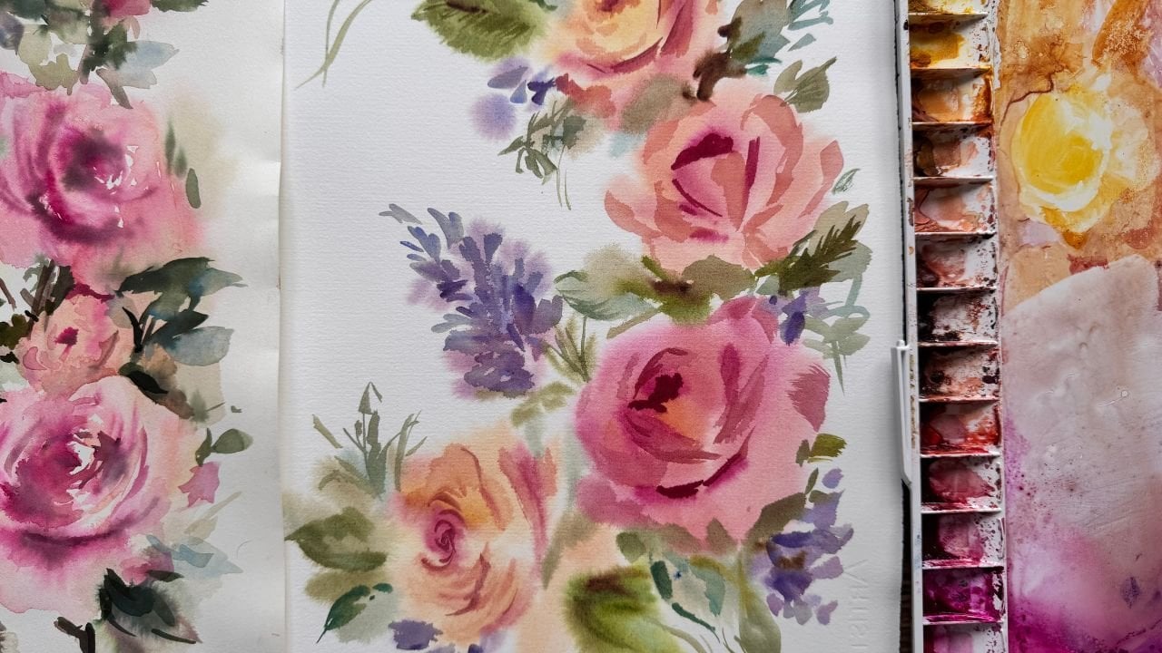
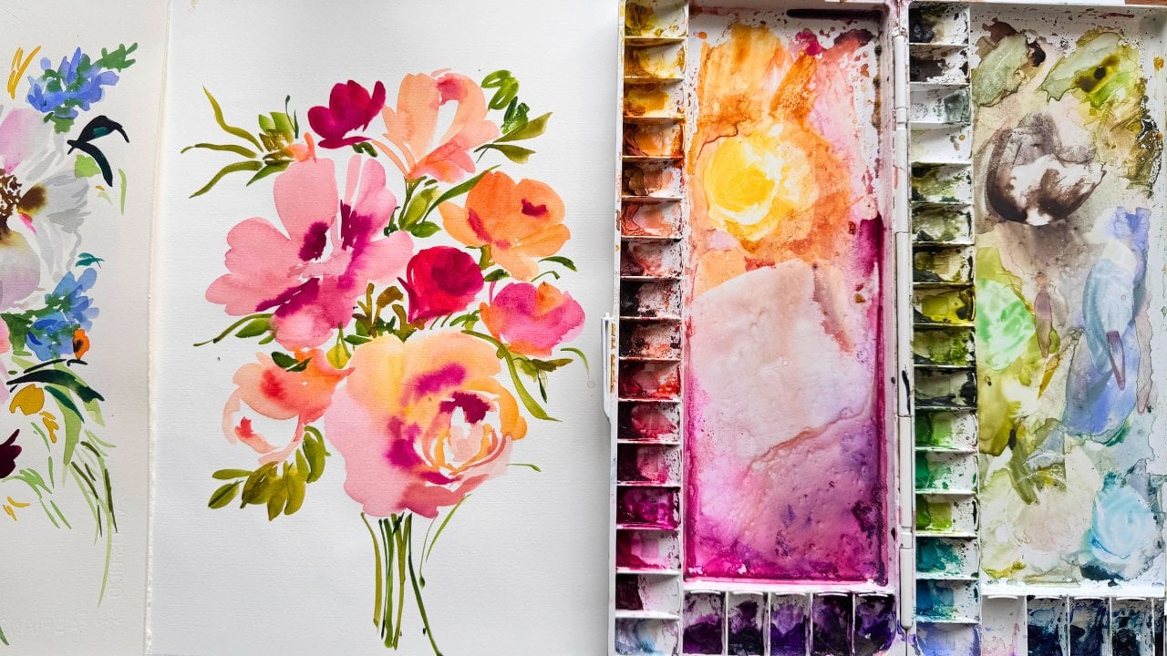
we're going to paint today. So, these were some of my paintings that
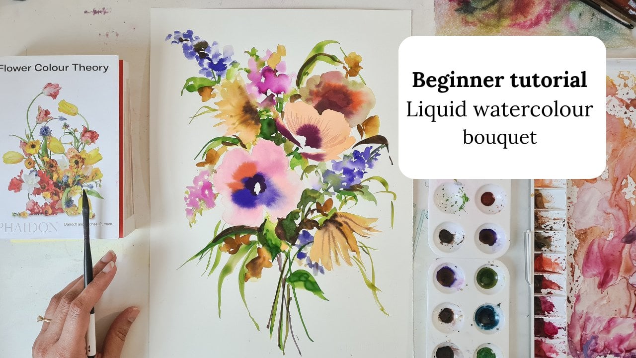
I did a while back. And we are going to try and create a kind of really flowy, floaty, inky, bleedy painting and let the colors just flow in all sorts of different directions and
just let it do its thing. So this was the main one that I wanted to take
inspiration from, from because of its
colors and also just the contrast and the lights and the darks in the way that
I've put this together. So colors are going to
be from this one here, but I just wanted to show
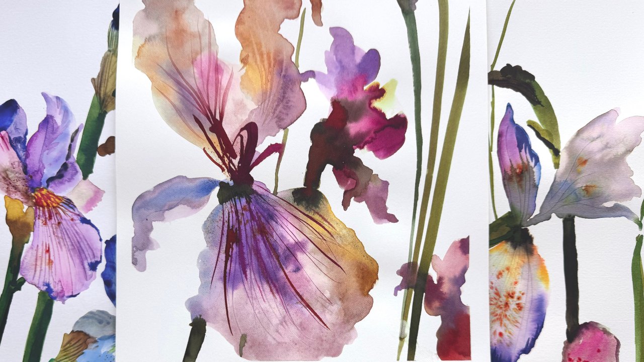
you some other examples of ones that I did that have a slightly
different mood to them. Still the same
kind of technique. And so we want to
aim for getting really dark areas
of the painting and then contrasting them with the very light areas
of the painting. And this was one that
I did a long time ago. But there's parts of this
painting that I really love, and I just wanted to
show you this bit here. And that's what we're aiming for very dark contrasting
areas next to the very pale areas here. And we're looking at
silhouette shapes, and we're looking at just capturing the essence
of the flower through silhouette and hints of detail. So that is a bit of
kind of background as to why I wanted to
create this class because I just loved this style, and I thought it
would be nice to draw inspiration from some of my
old and previous paintings. So colors I'm going to be mixing are going to be based
on this painting here. And let's get started
in mixing the colors. So I've got some
scrap paper here, and You can see. This
is fairly diluted, so I'm not too worried,
but if you can, just get some clean water. And the first thing
I'm going to start off with is some Ecoline. And this is 337 light rose. And I'm going to
do two lots here, one with three drops and
one with a little bit more. And the reason for that
is because I'm going to be adding water to
this to lighten it. So we've got some
different tones happening. Then I'm going to go in with this doctor PH
Martin's hydrous. And it's the magenta. And I'm going to do two
lots of this as well. So one is going
to stay the same, and the other one I'm
going to make much darker so we can get this
kind of deep maroon color. And then I'm going to add some deep sepia
Ecoline to that one. And one drop of Ecoline black. So so far, the only
two that have not been in the Ecoline set are the Ecoline deep sepia and the doctor PH
Martin's hydrous. So you can buy them separately. And then we're going to go
in with some lemon yellow. And this is the Ecoline again, And with that, I'm just going to add a bit of one drop
of light orange, which is also in the set. And Sepia, which is also
in the set one drop. And then I'm going to go
in with some ultra violet. And I'm going to do two lots. One will be much darker. Go to add some black
to the ultraviolet. That will be three drops. Um I'm wanting some gray. So far, everything that I've used has been from the set apart from the two that I mentioned, which was the deep CPA and the
doctor PH Martin's Hydres. And then I'm going to
start with the greens. So again, this one
is from the set. And I'm going to add and
I'm going to add a bit of deep sepia, two drops. Then I have a pastor green, which is not in the set. It's a 666. And I'm just going to
put that in there with a hint of Ecoline sepia. Just a drop. I'm looking for
some golden brown. So I'm going to go in with
my lemon yellow again. I'm going to mix it with
light orange from the set. And I'm going to go in
with deep sepia again.
3. lesson 2 - Testing colours out for a harmonious painting: So let's test these
colors out, then going to just add
a bit of water to the ones that I want diluted. I feel like that pink
needs warming up, so I'm just going to add one
drop of lemon yellow to it. It's better. I feel like it is a bit of a trial and error thing
when you're mixing paints and you just have to
go with what feels right, so I'm just going to drop in
a little bit of this light rose back in to
that diluted one. That's better. Then this is the very dark. Color that we're wanting
quite like that. Each time you're dipping
your brush and paint, you just need to make sure
you give it a good wash. So we've got lots of
nice pinks happening here, which I'm pleased with. And we're looking for a kind of dull yellow That's fine because we've just
added a bit of CEPI to that, so I'm
happy with that. I'm looking for a very
light gray as well. That works well. And
as for the blue. Well, it's not really blue. It's a bluey purple. I think that works out fine. I'm going to add a drop of
ultramarine to that one, just to give it a bit more color because when you add black, it can dull the
color down a bit. That's better. And then That's slightly lighter. Maybe we could just add
a bit of water to that, dilute it a bit more. And we're looking for
a golden brown color. Happy with that. Now we've got two greens, a light and a dark. I think the dark needs
to be a bit darker. So I'm going to have
just one drop of deep sepia and a bit more green. And I think maybe there seems to be
enough blues and pinks, and we've got
neutral color there, and we've got some yellows. To tie everything together, I would probably just
add sepia on its own, maybe four drops. And that kind of ties all of these colors
together, I feel, because it's complimentary
to the ultra violet, but then it's also
within the same family as the pink tones. So I think I'm happy with these. Just might add maybe one
drop of light orange to the golden brown just to give it a bit more of a
golden color to it. Okay. So we've got the
colors mixed up, and we are ready
to start painting. Just notice how I've
tried to get darks and lights on all the kind of different colors
that we're using. And there's some
neutrals in there. And if you're struggling
with using dark colors, this is a good way to kind
of get practice with that. So I've got some
very dark greens and then some contrasting maroons and very dark purply
blues, as well.
4. Lesson 3 - Equipment & tools / overview of techniques and getting started : So I just wanted to quickly go through the equipment and tools. I'm using fabriano
artistico watercolor paper. That is the best one I
found for holding water, absorbing water, and just allowing the colors
to bleed really well. Um, I've got a link to
that in my PDF file. In terms of brushes, I am using the Philbert
Sable and around 12 sable. You can access these
brushes on my website. So alternatives would be the
ten sable and two sabound, which is an alternative for the six Robert Simmons
brush that I have. So these are all the brushes
that I will be using today. And that is all that you
need to know for equipment. Now, I just did a really quick just warm
up painting here. And there's a couple of
things that you need to know about the techniques
we'll be using today. So the first one is about going in quite heavy with
the paint on the page. And that's this one here. And then using another
color and using water to mix and let the colors bleed within the two
marks that you make. That's the second technique. And then the third
technique is actually just applying water clear water
and dropping the color in. So first, you're going in dark, then you're letting the water and colored paint
drag and bleed. That's the second technique. And then you're just going in with clear water and
dropping the color in. That's the third technique. And I'm going to be doing that throughout this whole painting. Um, and just letting the
colors flow and bleed and just see what
happens because every painting is always it's
such an unknown outcome, and it's always interesting to see what will
come out of this. Even though I've planned it, it's always a different outcome. So yes, I'm really excited, and let's get started. This is the 11 by 15, and you can get
access to this on my website on the
PDF shopping list. Okay, so first
thing I'm going to do go in light. I'm going to just get a
bit of color on my brush. And this is the light rose. Okay. Then I'm going to go into my round and go into that mahogany maroon
color that we created and just give this flower a bit of depth. Then I'm going to go in with some golden brown. And this is the
second technique. First one was applying paint
directly onto the paper. Second technique is now adding color onto the page
and connecting it with water. So And you're not trying to be really
precious or neat about it. Some really nice things
happening here where the waters just spread and
it's taking the ink with it. Then I'm going to
go in quite dark. And I'm just making
just shapes really, where some parts of the shape might be
darker than others. Dropping darker colors
within that shape. And you can just
also just lift away parts that you don't want Then I'm going to go in with clear water and drop some coloring. And to make sure you get a tiny bit of control
over your paint, you can go in with a smaller
brush, and, you know, I know we're not trying to get full control of the paint
and letting it do its thing, but sometimes if you just want to drop a bit of painting where you don't
want to spread loads, you just use a smaller brush, and that's all we need.
5. Lesson 4 - Wet on wet bleeds and filler flowers: And then parts of the painting might
need to be filled in, and you don't have to fill
them in with a proper flower. You could just fill
them in some marks. So I'm going to go in with my blue bluey purple and sepia. Then I'm probably going to try
and get this on this side. I'm going to use my
Filbert for that. Make sure you're
applying clear water. Drop in some color. Going in a bit darker
in the middle. And maybe a hint of this
maroon in there as well. Now you can connect these two together with
a bit of green. You know, you don't have
to be neat about it. This is just about letting the pink flow and
seeing what comes out. Then I'm going to just
add some small buds. And maybe do a hyacinth. So I'm going to go in with
a water down ultra violet.
6. Lesson 5 - How to paint loose and colour harmony : So my camera stopped recording, and I was still painting, and the only new thing you
can see is this bit here. So I'm going to
show you how I did that on another piece of paper, and I'll just show you how
unpredictable watercolor can be and how you can try
and make it work for you. So I'll just do it here. And I'll just do it slightly
smaller than I did so I went in with my golden brown. Watering that down on the page. Then just gonna go in with Gena Mix that in. Then I'm going to go
in with the maroon. And so the beauty about
watercolor is it's never going to look exactly like the thing
you're trying to replicate. So then I just went in with
Green got the stem in. And then I did it here, but I wasn't able
to do it on mine. It's really unpredictable, but sometimes you can just make
it work to your advantage. So I loved what was
happening here. And just to make it work for me, I just went in with some darker ultra violet just
in the middle there, just to give it an
impression of flower. So what I did here
was I just went in with my ultraviolet, made the shape that I wanted, and then mixed in
a little bit of green and let the
water just spread. And it was spreading and
doing its own thing, and it gave this kind
of three D effect. So I'll just show you
a way that you can do that on this page. C. I'm just going to get
big drop of water and just drop it in there and
just let that spread out. It didn't work
quite as well here, but you just can't
predict these things. So here, what I'm
going to do is I'm just going to work into it. And that's going to dry. Then when that dries,
you can just go in on the very inside and just give the
impression of a flower. So I'm going to leave
that to one side, and I'll show you
once that's dry. So now, We are going to work on
filling in this here. So I'm going to go in
with my small brush, and I feel like this
part here needs pink. And I'm just making some
shapes and dropping in color, a bit of yellow just to brighten parts of
this painting up. Then I'm going to go
into gray 'cause we haven't used gray
very much so far. And then oh I'm going to let that dry and then work into it like I have there. So we're not trying to
be really precious here. This is about having
fun and just loosening up and trying to enjoy the process because when
you start to do that, then you're gonna want to
paint more and more and more, and that's when the
practice comes in. And then that's when you
start to find your style, and that's when you start to
have painting breakthroughs. So I'm gonna go in here
with a bit of pink, starting with my
clear water first. And just making marks, really. Then maybe a bit of gray
down below, actually. And if you're in a
habit of working small, just get a big brush. Sometimes I tend to
lean more towards my sixth round and without
realizing I do that, and it just it just makes me feel
really tight in my work. And so it's only when I really stand up and paint that I'm aware of the little
habits that I have. And I just try and kind of
loosen up and let go of them.
7. Lesson 6 - Finishing touches and foliage: We need a bit of pink, and I'm going to
go in and see how, I've just kind of
I've got this magenta happening here and I've just balanced it out with
some more here. So I've just made some marks. I'm going to go in with
a water damp brush and just spread that out, and it just looks like a bud. Very abstract bud. Now, could go in with
a bit of yellow? So again, you're just filling in parts of the painting to
give impressions of flowers. Now, I think we need some lighter areas, so
I'm going to go in. Just get some leaves. You're just filling in
spaces with dashes. I feel like maybe we could do with some yellow on the top. I'm just going to get
my small brush and just make some stem marks. Trow up the coloring to
get really light contrast. This is for, like, details, things. What you could do is make sure your brush is
as clear as it can be. Just keep spreading that
color with the water. Again, you want the
tiniest amount of paint in a brush and just
dab that in there. That's it. Uh, then that
looks like it's drying up, so I'm just gonna
go in with a bit of golden brown and just just to kind of give the impression that the
flower is opening up, and there you have it. So I hope that you
found this useful. And I'd love to see what
you create on Instagram, share your work, and I'm
really happy to give advice if you want,
send me a DM. And I hope you've
picked up something valuable and I hope that
you have found this useful. And most importantly,
I hope that you've enjoyed the process because
that's what it's all about. So anyway, thank you so much for watching and
painting along with me, and I look forward to creating
some more of these videos. And I'd love to see what
you have come up with so.
 Sophie C, null