Transcripts
1. Trailer: Welcome to Exploring Line Weight! : Sometimes a line takes you
from point A to point B. But every line you draw has
a potential story to tell. Line weight can help
give it a voice. Hi. I'm Josh Migoski, a top teacher here
on Skillshare. I've been drawing and
painting professionally since 2000 and I have a degree
in art education. Welcome to class, part of
my drawing basic series, in which we'll be exploring
line weight together. The ability to adjust
pressure while drawing allows you
to manipulate lines, adding thickness and intensity, giving contrast, dimension,
and expression to your work. This class will help you fine
tune your pressure control as we explore the endless
possibilities of line weight. We'll begin with
a quick exercise to help you dial
in your pressure. Then we'll explore five of the many ways to apply line
weight to your drawing. Think of line weight as an
instant drawing tool kit. Finally, we'll pull it all together in a fun illustration, covering more uses
for line weight, creating a dynamic,
expressive drawing. This is a beginner
friendly class and intended for both traditional
and digital artists. Subtle use of pressure, can take your mark making and
drawing to the next level. Being able to instantly change weight, without
changing tools, helps you be spontaneous, and the technique
makes you more aware of your hand in the
creative process. Using varying pressure
can bring out the natural expression
of your voice. So are you ready to explore
the story in your lines? If so, grab a pencil,
and let's dive in.
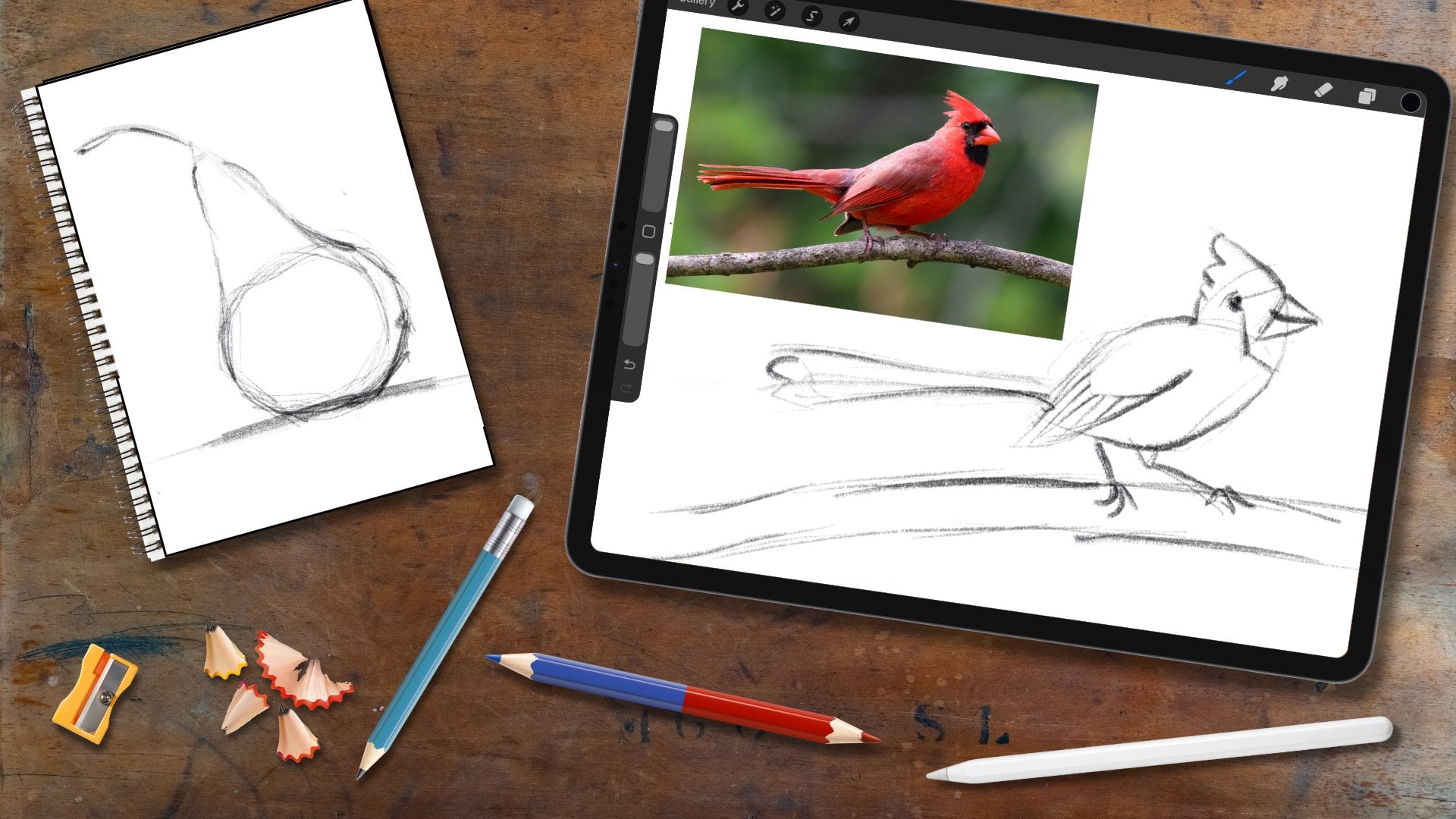
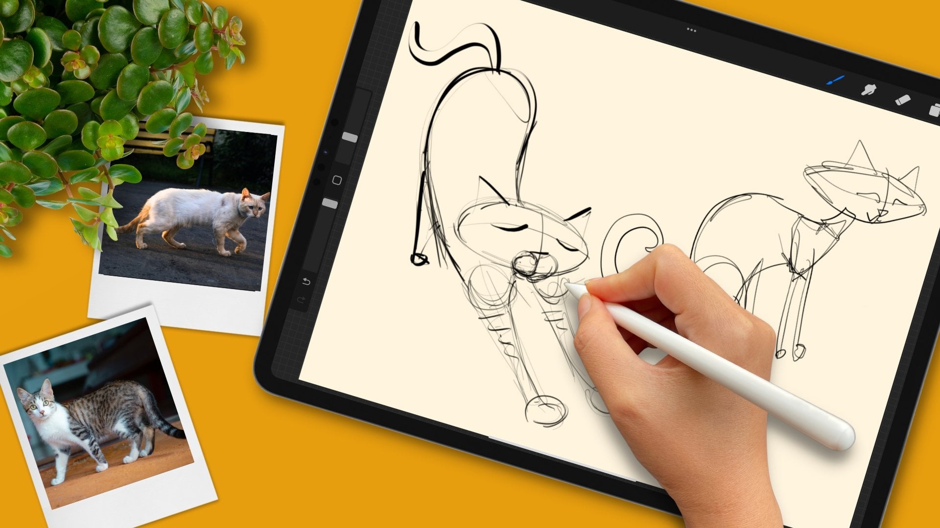
2. Materials and Class Project: This class is for both
traditional and digital artists. The materials are simple. For you traditional
artists, work in pencil. This class is all about the pressure you
apply to your line. And pencil responds beautifully
to that varied pressure. Anything in the B
range is great. I'm working with a B. If you have an HB, number two, you can see that also has
that pressure response. You can go bold
and light with it. So number two is great. And any ordinary
sketch paper is fine. You don't need fancy paper. For you digital artists, use your favorite
digital app and a pressure sensitive
status or pencil. Choose a brush that
responds well to pressure. You want to see that range from light and thin
to heavy and bold. So what's the class project? Line weight is
fundamental to drawing. So what we do in class will immediately apply
to your own work. Share any drawing you ever own, incorporating line weight. Also, feel free to share anything we do
together in class. I've shared step by step
instructions on how to upload projects along with other notes in the class Guide, which is available for download and the projects and
resources section. Sharing projects and reviews helps other students find
and learn about the class. And I thoroughly
enjoy your projects. Keep them coming.
Thank you for sharing. Follow me to the next
chapter and we'll break down the basics of line
weight. See you there.
3. Line Weight Basics: Draw a simple little tulip. We have a ground. Our tulip is growing in a
little flower pot. Let's add a stem and a blossom, and the blossom is also
not very complicated. Just a simple little
tulp drawing. Now, when we talk
about line weight, we're talking about the
strength of a line, and that strength has a range. And typically, we write and
draw in a medium strength, a medium line weight. Now on one end of the range, we have line weight, which we get by using
lighter pressure. The more we ease up on that pressure, The
lighter, the weight. Let's draw a wavy line that
starts in your medium weight, and then gradually eases
into a lighter weight. We'll gradually ease
up on that pressure. And we're using a
wavy line because it puts your awareness
in your hand. When we draw with line weight, we see it and feel it. Start with a medium weight, and it doesn't have to match
that medium weight exactly. Just relax, medium weight, and then we'll ease into a lighter weight using a light pressure and just
let that line weight fade. That's medium and light weight. And then on the other end of the range is heavy weight
and to get a heavier weight. We increase the pressure. Again, start with a
medium line weight. And then gradually
add more pressure. Until you get that
very bold line weight. So that's our range. And all you have to do is
adjust the pressure. Now, let's draw a line using
that entire line weight, starting with that
very light pressure, gradually increasing it until we get to that very
heavy line weight. And again, it'll be a wavy line. Start with a very
light pressure, hardly touching that page. And then gradually
increase that pressure. Until we end with that
very heavy line weight. And we can see that
entire range from the very delicate and light
to the heavy and bold. You can notice where your original tulip
falls with a net range, which is interesting to notice. Now let's do the reverse. Let's go with a very
heavy line weight and end with the light. So we'll start with a heavy
pressure and ease up. So we start with heavy pressure. And then we ease up into that very light,
gentle line weight. Again, we see that transition
from heavy to light. Now let's go with a
alternating line. We'll go from heavy to light, heavy to light, heavy to light. So we'll start with
that heavy line weight, and then ease up
back to the heavy, ease up, firm,
gentle, firm, gentle. And we can very clearly see that transition from the heavy
to the light line weight. There's two things that play. The heavy weight, of course, is very bold and intense, while the light line
weight is delicate, and also notice the
thickness of the line. The line is wider with our heavy line weight and thinner with the
light line weight. Very line weight is dynamic. Because of that, line weight has many practical applications
you can use in your drawing. Follow me to the next
chapter and we'll apply line weight to this tulip in five ways that will transform the simple little
drawing. Meet me there.
4. Five Ways to Use Line Weight: Think of line weight
as a tool kit that you can access simply by
adjusting pressure. We'll highlight
five ways to apply line weight with
quick variations on our little tulip drawing. The first application
of line weight we're going to look at is
to show contrast. Let's do a medium line
weight for the ground, and the pot will be a
lighter line weight. So we'll ease up on
that pressure ale bit. A light line weight for the pot, and the stem will be a taper, and the taper goes
from heavy to light, and as you go into the
light, you lift the pencil. If you watch from the side, it's heavy into
light, and you lift. Think of that pencil as
a little paint brush, that's licking the page, and that gives us
that beautiful taper. So it's heavy to light and lift. Then we have the blossom, which is a make that
a heavy line weight. A nice heavy line weight there. A, we have contrast. We have the bold blossom
and the very delicate pot. If we look at the stem itself, there's a contrast
in that taper, and that makes it look like that blossom is just delicately
balanced on the stem. Let's add to our tp blossom
with a medium line weight, and then top those
off with a bold dot. Nice, heavy weight there. And we can see that
contrast in action as these various line
weights play off each other. But you might be thinking, the top is a bit heavy
compared to the bottom, and we can use contrast
to adjust that. Simply by making a bold mark very heavy line
weight down here. And suddenly that drawing feels more balanced,
more restful. That is contrast. Very powerful. Next is light and shadow. Once again, draw that ground
in a medium line weight. This time, Imagine
a light source coming from that direction, which means that
the pot will have a dark side and a light side. So I'm changing up my
line weight there. This will be dark as well, and then the top will
be in the light, so that will be a
light line weight. Here's our dark into
a light line weight. And then this will do in
a very heavy line weight, something like that because
the top overlaps the bottom. There will be there's
a little shadow down there. A heavy line weight. Creates that effect of the overlapping parts of the
pot with that little shadow. Beautiful. Then
we'll do our stem, and the blossom will
be darker here, and then these will
be alternating between dark and light. Darker, and then that
will be in the light. That's dark in the
light, hey light, heavy, and then the side is in the light and it
curves away from the sun. As it curves away from the sun, we'll add a heavier line weight, and we'll gradually go
into that heavy weight. We go from light, and
right about there, I'm beginning to curve
away from the sun, so I begin to add some pressure and we have that nice
transition into the shade. That is light and shadow. And Next is depth. Let's go ahead and draw that entire tulip all in
a medium line weight. The ground, the pot is
all medium this time. The stem and the blossom. That's all the same
medium line weight. And now we want to
show the depth. We want to show a tulip
in the background. And when things are
in the background, they look smaller, and they fade into the
distance a little bit. So we'll use a
lighter line weight to show it fading
into the distance, and we'll make that
tulip smaller. So we have that
illusion of depth. You can see that fading
into the background. And if we have something in the foreground that's
coming towards us, we can use a heavy line weight. And I'll just do a little bird here and that very
heavy line weight. We have foreground, middle
ground, and background. A with altering the line weight. To give us depth. Next up is texture, and line weight is wonderful
for adding texture. Let's do a medium line
weight for the ground, medium for the pot, and medium
for the rest of the tulip, the stem and the blossom.
It's all medium. Because this is all in
the same line weight, it looks very flat. And sometimes that
is a look you want, but texture can make a
flat drawing dynamic, and we can use line weight to make our texture
look more lively. For example, We can add
petals to the blossom. I'll do a medium line
weight here, match that up. Then this petal, I'll do in a light very light line weight. We have a little bit
of contrast there. Already, our tulip is
a little more dynamic. Let's add pattern in here. Patterning is also a
way to use texture, and I'll use a very light
line for my pattern. They're just little scallops. And it's a way to add
some substance to that section without a
lot of bold line weight. There's a density of light
lines, and together, they give us some substance, without the intensity
of heavy lines. Now, shading is also
a form of texture, and you may have done hatching
before, or cross hatching. When that shading is
done in the same weight, it can look flat and sometimes that is
the effect you want. However, we can use line weight to give some
dimension to our hatching. We can go with a taper, heavy to light for, heavy to light, and you can see that it gives that
pot a rounded effect. You can see that curve. Let's do it on this side, heavy to light. That makes that pot look
rounded, dimensional. We can use line weight in
cross hatching as well. For the cross hatch will go heavy and gradually go lighter, and that'll add to
that dimension. H and then gradually
easing up with each line. That emphasizes that
curving surface, and it also suggests
a light source, line weight can enhance most
any kind of shading you do. Now we haven't drawn
any grass yet. However, another
form of patterning is using different weights. This was a single weight,
and for this one, we'll use two weights, we'll alternate between
heavy and light. When we do that,
create a pattern. We can do an organic pattern, changing our line
weight as we go. Together, they make a texture. They combine visually giving
us an organic texture. I love doing these
kind of marks. And we could do endless
varieties of texture. It's a wonderful way
to use line weight. Very expressive.
Very expressive. And expression is our
final application. Take a look at your drawings. They're expressive, and there's two things that make
them expressive. One is the contrast, and the other is the marks. The different line weight
within those marks. When we've done
the ground so far, It's been a simple line. We haven't given
much thought to it. This time, vary the line
weight within that ground. You can vary it anyway you want. Simply by varying that weight, we've taken that from a
line to an expressive mark. This pot is expressive in part because it's
broken into marks. And each mark has energy and personality that we
express with line weight. And some of it's
very deliberate, and some of it's just how your hand naturally
crafts marks. Just like in your writing. There are tiny shifts of line
weight within your writing. That's just something
you instinctively do. So when we draw that pot
with individual marks, each mark has its own energy. And sometimes we use that
energy very deliberately. We're playing with
it. And some marks simply have personality
because that's how we draw. That's how it comes out,
just like our letters. And there's those
tiny shifts that we naturally use when
crafting marks. And when all of those marks add up, they make a statement. And that pot becomes
a statement. It's your statement and
it's your expression. Now, we said that another way. These drawings are expressive is through the contrast itself. And we can make a simple
statement now with contrast. The bottom of the tulip will
be a lighter line weight, and the middle is heavy. And that contrast feels like a statement.
It's expression. So that is expression. Now, really, all of these
are using contrast, whether it's showing
light and shadow, depth, texture, and all of them are expressive because
you're putting yourself into the marks. You do this simply by
adjusting in the moment, which also allows you
to work spontaneously. Follow me to the next
chapter and we'll do a drawing together combining
all these elements. When you put them all together, you get a very dynamic
expressive drawing. And I'll share a
few more insights about working with
line weight as well. See you there.
5. Illustrating with Line Weight: No. In this lesson, we'll take the techniques. We learned in the
last two lessons and use them in a
single drawing. I'm creating an
underwater scene, and I'll walk you
through how I would apply line weight to
each of the elements. You can follow along creating the same scene or draw your own. Keep in mind. There's
no right or wrong way as to how you apply
these techniques. It all comes down
to how you want to create and what
you want to express. Let's dive in. There
will be a ground, a large fish, and a small fish. And when you do the ground, Vary that line
weight a little bit. Just to give it a little
more personality. Now we'll do the large fish. We'll draw the body first and we'll leave
room for the tail. Imagine light filtering
down from above, which means that the bottom of the body will be a heavier
line weight than the top. So I'll ease up a little
bit here for the top. And I don't want to
go too light for the top because the
fish are the subject, but I still want some contrast. Notice there's a space for
the mouth and the tail. For the mouth, why not use some line weight and give
it a little character. You can see that shift in line weight gives it a
little bit of personality. And watch this taper. That simple taper
warms up that smile. Now, the tail will be a v shape, and I want to show that the tail is thicker near the body
and thinner as it goes out. So I'll ease up on that pressure as I head
out from that body. You can already sense that
the tail is thinner out here. And it's a V shape. The V
will come down about there. It's a little longer on
top than the bottom. Because we're further
out from the body here, we'll start light and
then gradually increase the pressure. Right about there. I start to add a
little pressure, and now I'll head back out,
decreasing that pressure. I'll add a little
bit of weight there. A bit, just to bring
out that structure. There's more structure here and there's a
structure point there, and the fin is thinner out here. We'll do a similar thing up top. This fin will have two
points, two peaks. It's a bit heavier at the body. Ease up on that pressure. Head down into the valley, add some weight, Release that pressure on the
way out of the valley. Head back down, add
a little pressure. Again, if you need to tweak it a little bit adjust
it, that's fine. There'll be two fins down
here that work the same way, heavier near the body, Lighter away from the body. And I went so light on those
that they're translucent. Onto fish number two.
This is our small fish. Mine will be a tear drop shape. Again, light is filtering
down from above, which means that the body
is a little bit heavier. On the bottom. I'm
leaving room for my tail. Less pressure on top.
And there's our body. I think this mouth will be
a laughing little mouth. Again, I used a little bit of line weight variation there to give it a little
more character. And this tail will
work the same way, but we'll be using curving
lines for this one. It's still a V shape, but
it's a c curving form. So we'll start at the body and have the
weight ease as we curve. Same thing down here.
Ease up as you curve, that graceful, gentle curve, and then this V Is two arcs. We start light, add some pressure, release
that pressure on the way out. The top will be a
curve with two bumps. Havier at the body,
easing up into the curve. I'll curve down. That's
bump number one. Come out of that curve, easing up on that pressure, then increase the
pressure at the body. We have our three
pressure points, and then our lighter areas where that fin is further
out from the body. These two will curve. They
will go something like that. A little heavier at
the body ease out. Now let's add some
features to our fish. Let's add the eyes
and we'll sketch out the shape size and
placement with a light line. That's another use
for line weight is sketching as we start
light and build up. Once we have that size
shape in placement, we can go ahead
and add that eye. I'm adding some extra weight
here towards the back. Just for a little contrast. I'll do the same
thing with the pupil. There's a medium
weight, and then I'll add some extra
weight towards the back. That gives that eye
a little dimension, a little more character. We'll add a little reflection
which brings it to life. Let's do the same thing here. It'll be medium line weight, heavier towards the
back and ease up again, and then the pupil heavier towards the back
and ease up again. And that little reflection. We'll continue with
those fish in a moment, but now let's look at the
rest of the composition. Let's add some hills
in the background, and because they're
in the background, these will be a
light line weight, so that those hills reced. We want to show that depth. So draw those in a
light line weight. And I'm using an extremely
light line weight because there will be sea
weed in front of them, and I don't want the sea
weed in the hills to clash. Now, once everything is drawn, we'll go back and adjust things. Like I might want to add a little extra weight
here, for example. If we decide that those
hills are too faint, we can add a little
extra weight then. But for now, just put those
hills in very lightly. Let's draw that seaweed now, and when we do, we'll imagine it moving
three dimensionally. It's moving back and forth in
the currence of the water, but it's also moving
forwards and backwards. I'll show you what I
mean. If I was to draw a zigzag in a single line way. It shows that movement
left and right. But it's very flat because
it's that one line weight. If I was to do
that zigzag again, changing the pressure, so I'm pressing down,
easing up as I go. Gentle, firm, watch
what happens. I'm changing up
that pressure from light to hey, gentle to firm. And that zigzag is
more dimensional. Because of that play
of light and dark, it looks like it's dancing, and I can do it again this time. Lifting that pencil
right off the page. Really showing that movement. We can do another with
very fluid curving lines. And as we draw those
curving lines, just change the pressure
from heavy to light, light to heavy, and
with a nice taper. It looks like a ribbon. We
can do something similar. But this time, there's a loop. The top of the loop
is very light. And then I'll add some pressure and cross that light line. So you have that
contrast between the light line and
the heavy line, which is very dimensional. So just play with that pressure. See where it takes you.
Experiment with it. Play with those loops. Think three dimensionally.
It's not just left, right, up, down, but it's
forwards and backwards. It's rising and
falling line pressure. And remember, there's
no right or wrong way to apply this stuff. Explore, experiment,
and express yourself. Now, let's do some
bubbles, bubbles. The bubbles are
lighter on the top, heavier on the bottom, and
then they lighten up again. And I'm not closing the
circle. Leave it open. Lighter on the top,
heavier on the bottom, and then light again, and
don't close that circle. When we leave that circle open, it looks very delicate, and it catches the light. Remember, we have that light
filtering down from above. It's a very nice effect. That was a little heavy there. But that's better. And we can do some
very light ones in the background as
well, drifting along. Maybe some overlapping. While we're doing the
background, let's add a. That fish will be a
light line weight to show that depth to show that
it's in that background. Let me add a little weight here on the bottom,
just a little bit. I don't want to overdo it because it is in the background, but I want to show
that light again. We can do another one here. Let's do a long narrow one. And maybe a little touch of
extra weight on the bottom. That didn't turn out too well. And there has to be yes. I can't let that go. Okay. So our composition is
coming along very well. We haven't done any texture yet. Let's do some texture. This fish will have scales. And the first row is
a medium line weight. The second row will be
a heavy line weight. The new row touches the
center of the previous scale. So each of these points is
where the new scale ends. That's how they build brick
walls, the same pattern. And this creates a very
dimensional pattern because there's really two
patterns happening at once. We have the scalloping, the scales, and we also
have the striping. We have the medium,
heavy, medium heavy line. And when you put the two
together, it's very dynamic. Very dimensional. The small
fish will have stripes, and these stripes will show the contour of the body,
so they will curve. Imagine how rounded
that body is. I'll do a stripe back here, and they will be hash marks. And they start darker, and they gradually become lighter to show that
light from above. I'm also showing that curve. There's two things
happening at once. It's curving to show the
contour of the body, and it's also showing that contrast between
the light and dark. Let's do another one.
Heavier towards the bottom. Then I lighten up,
and at the same time, I'm curving to
show that contour. I'll quickly do one more. Gradually lightening up. Heading into the finish here. And we can add a little
texture to the fins as well. These will have a spiral and that spiral
will have a change in pressure to make
it more dynamic. I'll have one this way now. I will do a a couple
on the tail here. Should I add some here?
Yeah, I think I will. That's better. These fins
will have some lines, and these lines will be
tapered to show that fin, thinning out as it goes
away from the body. I'm easing up into
a nice light taper. Let's see how would this
work. It'll fan out. At heavier at the base, and lighten up, and
they'll fan out. And we'll do the same
thing down here. And I can't resist adding a little decoration here,
a little personality. Just playing a little
bit. Beautiful. So all of the elements of
the drawing are there. And this is the point
where we pause, take in the whole drawing
and see if we need to add any weight anywhere to make it read the
way we want it to. So one thing to check is, does the subject stand out with all these different
things happening, all these different
weights around it? Now, looking at mine, there might be a couple
little things we can adjust. Like I mentioned that earlier. I can add a bit of weight
there to define that tail. Just a little better.
Same thing here. Just a bit. And I like this translucent effect.
I'll leave that. This fish stands out fine
even with these translucent. But I might add ale bit here. And when I do, I'll
be very cautious because we want to maintain that effect of the light
shining on top of the fish. So I'll just add a little
bit. I'll sneak up on it. But I think that little
bit of definition helped. And these eyes are focal points. So we can always make those a little bolder if you want to. Make those eyes stand
out a little bit. But it's all minor
adjustments, incremental. Now check the background. How does that background read? It should look like
it's receding, but does it fade too much. These might be a
little too faint, as we mentioned a
few moments ago. So we can always add a
little bit of weight, just to give them a
little more dimension. And again, I'm being
very cautious. I don't want to overdo
it all at once. I can always go back again add a little more if
I think I need to. Now, this fish is another
background element, and it doesn't really look like it's part
of the composition. I'm going to use another
strategy with this one. I'm going to add some texture. And I'll use a light
line weight to do that. And with that
additional texture, it gives the fish a little
more visual weight. There's a little
more presence there. So instead of using a heavy
weight to give it intensity, I'm adding more information
to give it some density. And now it blends in a little more with the rest
of the composition. Another thing to
check is balance. Is it balanced, left to
right, top to bottom? Left to right, I'd say
it's pretty balanced. There could be a little more
information with this fish. But overall, it feels good. Top to bottom, this feels
a little bit empty. So I'll add some starfish. But I don't want to compete with the subject by using a heavy
line weight there. We just want some
presence there, but we don't want it to
draw attention to itself. So we're using line weight
strategically here. And now it feels more
balanced top to bottom. I'm going to stop here,
but you can keep going. Keep playing and experimenting
with that line weight. You created a
dynamic drawing with that contrast and expression that line weight
gives your marks. We played with light and shadow. Texture, sketching. We showed movement,
translucence, structure, created balance,
and were spontaneous. And you used your voice, and it's a beautiful voice, and line weight
naturally brings it out. So let's move on to the
last chapter where I'll share some brief closing
thoughts. See you there.
 Joe Smigielski, Intuitive Artist, Degree in Art Ed