Transcripts
1. Introduction: Hello and welcome to the
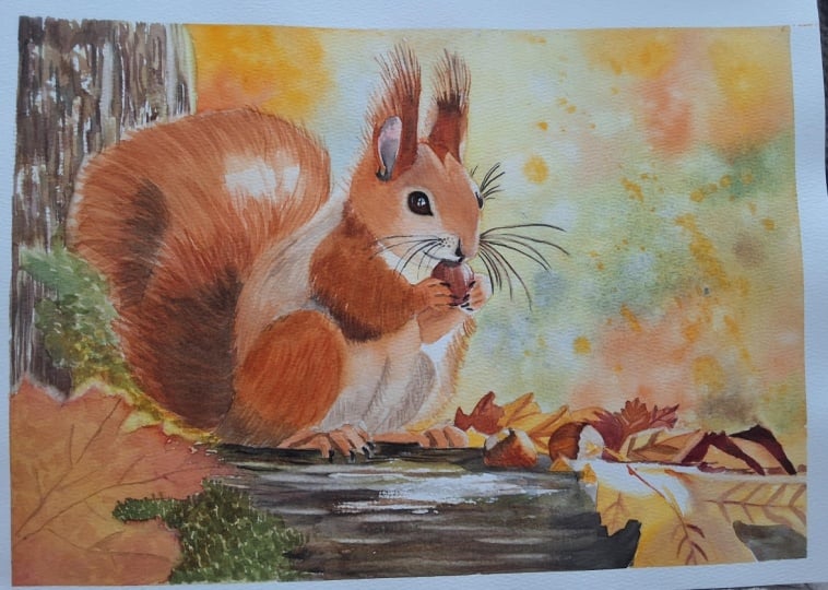
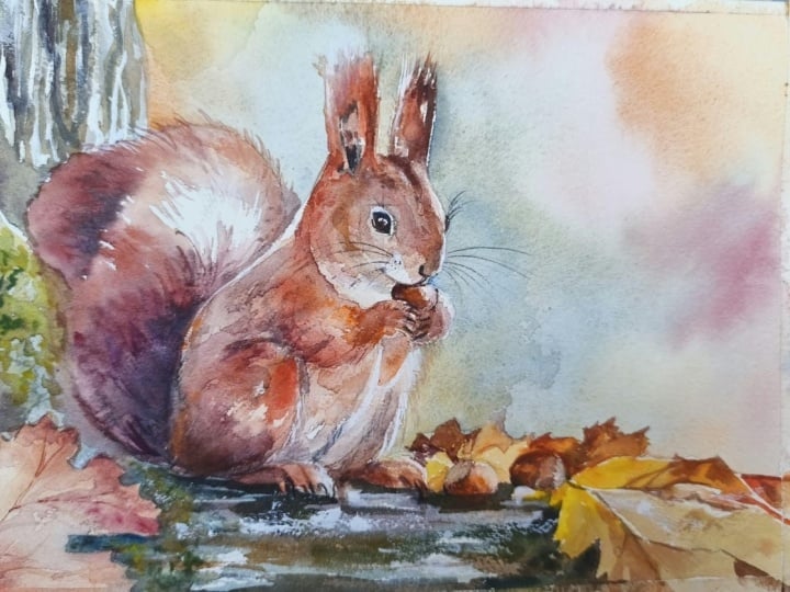
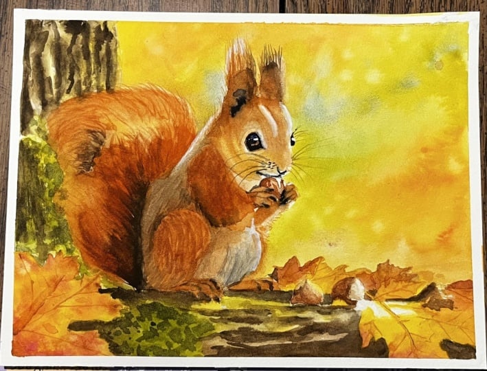
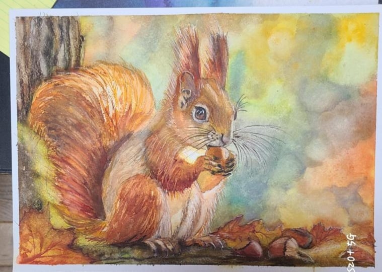
watercolor tutorial. In this class, we'll be painting a charming squirrel surrounded
by warm autumn colors. With its soft fur, fluffy tail, and beautiful
seasonal atmosphere, this subject gives us a wonderful opportunity to
explore natural textures, warm colors, and glowing light. Although the squirrel may
look quite detailed at first, we'll approach the
painting gradually and build everything
step by step. We'll start with the
lightest colors and larger shapes and then
slowly develop the forms, textures and darker values. As always, there is
no need to rush. By working in layers, we'll be able to gradually
bring the squirrel to life without getting overwhelmed
by all those little details. One of the main things
we'll focus on in this tutorial is creating
the impression of fur. Instead of trying to paint
every individual hair, we'll use a combination
of soft washes, carefully placed brush strokes, and changes in tonal value
to suggest the texture. We'll also pay attention to the direction in
which the fur grows, as this will help us
describe the form of the squirrel and make it feel
soft and three dimensional. Warm autumn colors will give us a wonderful opportunity to work with beautiful earthy tones and create a harmonious
color palette. We'll use our
reference as a guide, but as always, we don't need
to copy everything exactly. Our goal is to understand
the main shapes, colors, and values, and then interpret them in
watercolor in our own way. This tutorial is suitable for watercolor painters
who already have some basic experience with the medium and would like to
practice painting animals, natural textures, and
more detailed subjects. I'll guide you through
the entire process from beginning to end, so take your time and enjoy watching the painting
gradually come together. So gather your paints, prepare your brushes,
and let's get started. I hope you'll enjoy painting this little autumn
squirrel with me.
2. Painting Plan: Before we start painting, let's take a quick look
at the entire process so that you know what to expect as we move through the tutorial. We won't be using any masking
fluid in this painting. We'll begin with the background, establishing the soft
colors and creating a nice foundation for
our main subject. Once the background is finished, we'll move on to the tree bark. We'll start with a
light first layer to establish the basic colors then gradually
deepen those colors while building more texture. In the following layers, we'll add the darkest
tones and more definition, which will help us create characteristic texture and
irregular shapes of the bark. Next, we'll move
on to the leaves. Again, we'll begin with a
simple first layer to establish their colors before adding more definition and
smaller details. After that, we'll
paint the hazelnuts and gradually bring
those elements of the composition together. Then we'll finally move on to our main subject,
the squirrel. We'll begin with a
light first layer to establish the basic
colors and forms. Once that layer is dry, we'll gradually build the
texture of the fur by adding individual hairs
and darker areas. We'll then focus on some
of the darkest elements, including the eye, the paws, and the inside of the ear. The strong dark values will add contrast and help bring
the squirrel to life. Toward the end, we'll apply a unifying glaze over
parts of the body. This will help soften
some of the fur texture, intensify the colors, and bring the different
layers together. Finally, we'll add the
last small details and make any necessary adjustments
to complete the painting. So that's our plan. We'll work
gradually one section and one layer at a time until everything comes together
in the finished painting.
3. Background: Before we begin painting, let me quickly explain
how I prepare my paper. I attached it to a piece of
gator board using staples. The staples will keep
the paper securely in place and help it stay flat throughout
the painting process, even when we use
quite a lot of water. I also applied masking
tape along all four sides. This isn't necessary for
keeping the paper flat. The staples will
take care of that. The tape is simply
there to create a nice clean straight border around the finished painting. For this stage, I'll be using a cheap flat brush for mixing and preparing my
colors on the palette. To apply water to
the background, you can use any large
brush you have. This time, I decided to try
my new Princeton oval mop. And for applying the colors, I'll mainly be using my size 12 silver black
velvet round brush. Before wetting the paper, I want to prepare all the
colors I'm going to need. This is important because
once the paper is wet, I want to work fairly
quickly without having to stop and mix
colors along the way. I'm preparing separate petals
of transparent yellow, Windsor yellow deep, burnt sienna, and transparent orange. I'm also mixing
transparent yellow with ultramarine blue to
create a natural green. And finally, I'm preparing some ultramarine
blue on its own. Now that the colors are ready, we can start by applying clean
water to the background. I'm using my large brush and carefully working
around the main shapes. However, you don't have to
be extremely precise here. If you go slightly over the pencil lines,
that's perfectly fine. Some of the background color can extend into the
main shapes because those areas will eventually be covered with additional
layers anyway. After applying the
first layer of water, I can already see that some areas are beginning
to lose their shine. So I'm going over the
background once again. I want to make sure the
paper stays wet long enough for us to
apply all our colors. We don't want petals of water
sitting on the surface. What we're looking
for is a nice, evenly wet surface
with a visible shine. I'm also using a
paper towel to remove any excess water that has
collected on the masking tape. This will help prevent
that water from flowing back into the paper later and
creating unwanted blooms. Now we can start
adding our colors. I'm beginning in the
upper left corner with transparent yellow
and Windsor yellow deep, particularly near the tree. From there, I'm
transitioning into some warmer orange tones and then introducing just
a touch of blue. At this stage, I want the colors to blend naturally
on the wet paper. I'm not trying to create any
specific shapes or details. The goal is simply to establish a soft, colorful background. As I move lower, I'm starting
to introduce more greens. I'm looking at the reference
photo for inspiration, but I'm definitely not trying to reproduce every color exactly. The reference gives us a general idea of where we
might place our yellows, oranges, greens and blues, but we can interpret those
colors quite freely. I'm also trying
to leave the ears of the squirrel
mostly unpainted, especially the ear on the left because it catches
quite a lot of light. Moving towards the right side, I'm continuing with
a mixture of yellow, orange, green, and blue. I want to create that
beautiful variety of autumn colors without defining
anything too clearly. One important thing
here is to allow the pigments to move and
blend naturally on the paper. Try not to use your brush to
blend the colors together. Think of your brush
mainly as a tool for delivering paint
to the wet surface. Once the paint is there, let the water and
gravity do the rest. I like to pick up the board and tilt it in
different directions, encouraging the pigment
to move and mingle. Because the surface
is evenly wet, the paint will follow
the water and create those soft transitions without
visible brush strokes. On the right side, I'm
introducing a little more green, as well as a more
neutral mixture created with ultramarine blue
and burnt sienna. This helps balance some of the brighter yellows
and oranges. We can also add a
little more variation by splattering some color
onto the wet background. Here, for example, I'm adding
a few splatters of yellow. As I approach the
leaves at the bottom, I'm lifting the bottom edge of the board so that the
painting is tilted. Then I can drop some
paint near the leaves and allow it to flow away from
them and into the background. Again, I'm letting gravity create those soft
transitions for me. You don't have to be
particularly careful around every individual
leaf at this stage. A little bit of background
color extending into those shapes won't
cause any problems. If you notice paint or
water collecting along the edge of the paper
or on the masking tape, simply remove the s
with paper towel. Once all the colors
are in place, I like to lift the board and tilt it in different
directions for a while. This encourages all the
colors to mingle and creates much more natural transitions across
the background. A if some of the paint has traveled too far into the squirrel or the leaves, you can also use a
clean paper towel to gently lift some of it while
everything is still wet. You may also notice the beautiful
granulation created by the ultramarine blue. I really like this effect
here because it introduces some subtle texture into what would otherwise be a
very smooth background. I think I'd like a
little more brown in a couple of areas near
the leaves at the bottom. I'm dropping in some
additional color there while the
surface is still wet. Finally, I'm dipping my brush in clean water and adding
a few water splatters. These droplets will
disturb the pigment slightly and create another subtle texture
in the background. And now we need to
leave everything alone and allow this layer
to dry completely. Once the background
is completely dry, I'm going to use
my scrubber brush, which is Windsor Newton
Galeria size four. If you followed any of
my other tutorials, you may already
know that I like to call this brush
my secret weapon. We're going to use it now, but it will also become
particularly useful again, during the final stages
of the painting. I'm dipping the brush
in clean water and removing the excess
moisture on a paper towel. Then I'm gently
rubbing over some of the harder edges left
by the dry paint. This allows me to soften
those edges and create smoother transitions
between the background and the unpainted areas. We don't need to
soften every edge. I'm just looking for areas where the transition feels a little
too hard and distracting. And with our
background finished, we're ready to move on to the tree and apply the
first layer to the bark.
4. Initial Layer on the Bark: Now that our background
is finished, we can start working
on the tree bark. In this part, we'll apply the first light layer establishing the basic
colors and shapes. We'll also begin suggesting the direction of the
light by preserving some of the brightest areas and introducing a little
green for the moss. We won't be adding
any details just yet. At this stage, we're simply
creating a foundation that will develop further
in the next layers. For this stage, I'll be
using a brush size ten. Before we begin,
I need to prepare a more neutral
beige brown color. I'm mixing burnt sienna
with ultramarine blue, which gives me a nice, neutral brown that
isn't too warm. I will also need
a warm green for the moss that we can see
growing on parts of the tree, and I already have some green
on my palette so I'm simply adding a touch of
transparent yellow to make it a little warmer. We'll begin with a
very light tone. At this stage, keep in mind that our light source is coming
somewhere from the right. As I apply the first
layer on the bark, I'm leaving some
areas unpainted, particularly along the
right side of these shapes. These white areas will represent the strongest highlights where the sunlight is
hitting the tree. As I work, I'm shifting between my beige brown mixture
and the green. There's no need to make these
colors completely uniform. Allowing them to
change slightly across the tree will already start creating some
natural variation. Here the tree is behind
the squirrel's tail, and as I bring the
paint towards the tail, I don't want to
create a hard edge, so I'm softening the paint and allowing the color to
gradually fade away. While the surface is still wet, I can also drop in slightly
darker brown tones, particularly along the left side of some of these bark shapes. Remember that the light
is coming from the right, so introducing slightly
darker values on the opposite side will begin to suggest their three
dimensional form. At this point, don't think about any details
or bark texture. All we want to do is
establish the main colors, define the larger shapes, and suggest where our
highlighted areas will be. As I move further down, I'm shifting towards green to suggest the moss
growing on the tree. I'm keeping this green
very light and again, allowing it to fade as I
approach the squirrel's tail. We're still working only
with our lightest stones. Think of this layer
as a foundation. We're establishing
the basic colors and suggesting the main forms, but we're not trying to
describe any details yet. From here, I'm
shifting back towards a slightly darker brown for the areas of the bark
that are more in shadow. Also, don't worry about creating
perfectly smooth washes. Small imperfections
and variations in the paint can actually
be very useful here. We're painting an organic,
irregular surface, so these variations
will contribute to the natural appearance
of the bark later on. Now I'm moving down
to the section of the tree underneath
the squirrel. And here I need to work a
little more carefully around the squirrel's feet so
that I preserve its shape. Again, I'm shifting
between browns and more neutral grayish tones. Most importantly, I'm
continuing to leave some areas of white paper where the sunlight
is hitting the tree. These untouched
highlights will be very useful as we develop the bark
in the following layers. On the left side
close to the leaf, I'm introducing some green again to suggest another area of moss. Then I'm filling
the remaining area with the light
beige brown tones, keeping everything
fairly loose and simple. That's all we need
for this first layer. We now have our basic colors. The main shapes are established, and we've preserved the
lightest highlights. At this point, we can
leave everything to dry completely before continuing
with the next layer.
5. Finishing the Tree: Now that we have the first
light layer on the bark, we can continue
developing the tree. We'll divide this
stage into two parts. First, we'll deepen the
colors and start building more texture in both
the bark and the moss. Then we'll allow
everything to dry before adding the
final darkest details, particularly in the area
underneath the squirrel. Let's begin by
preparing our colors. We'll need a much
darker brown which I'm mixing from burnt
sienna and pains gray. I'm also preparing a
more neutral brown again by mixing burnt sienna
with ultramarine blue. For the moss, I'm mixing
transparent yellow with ultramarine blue to
create a natural green. If I need a darker
version of this green, I can simply add a
touch of pains gray. I'm starting with a dark
brown and applying it to the darkest shadow
areas of the bark. Notice that my brush
strokes are quite irregular and I'm deliberately leaving
small gaps between them. We don't want to cover everything with a
smooth even layer. These irregularities will help us create the natural
texture of the bark. We can also start introducing
some dry brushing. For this technique, I'm using less watery paint and holding my brush almost
parallel to the paper. Instead of painting
with the tip, I'm dragging the side of the bristles lightly
across the surface. Because of the
texture of the paper, the paint catches only on the raised areas and creates
a broken, irregular mark. Type of texture would be very difficult to achieve
if we simply held the brush like a pencil and painted everything
with the tip. Using the side of
the brush gives us something much more
organic and natural. Of course, we don't have to
use dry brushing everywhere. I'm combining it with
regular brush strokes, switching between
the two depending on the kind of texture
I want to create. If I accidentally go over the
masking tape with my paint, I'm just cleaning it off. Isn't essential, but I like to keep the tape relatively
clean as I work. Now I'm picking up some green
and moving into the moss. Again, I'm leaving gaps
and creating lots of small irregular shapes and marks rather than painting one
solid area of green. We want this part of the tree to have a natural varied texture. I'm also adding a little more transparent yellow
in some areas, particularly toward the right. This creates a warmer
green and helps suggest that those parts of the moss are
catching the sunlight. As I approach the
squirrel's tail, I'm softening the edges and allowing the
green to fade away. Later we'll have some hairs from the tail
overlapping this area, so I want to leave enough room to create those
soft transitions. As the paint on the
bark begins to dry, I can pick up a darker brown and add it to the
most shadowed areas. This gradually
increases the contrast and gives the tree more depth. I also want to introduce a little warmth into some
of the lighter areas. For this, I'm using a very light mixture of burnt sienna and
transparent yellow. I'm applying it here
and there across the bark to suggest
warm sunlight. I can use this mixture to fill in more of the
remaining white shapes, but I'm still leaving a few
areas completely unpainted. Those will become our
brightest highlights. Later in the painting,
we'll also use the scrubber brush to bring back even more light
in some areas. On the moss, I'm adding a darker green towards
the left side to create more shadow and make the texture feel more
three dimensional. Now I'm moving down to the
lower section of the tree. I'm starting with
my dark mixture of burnt sienna and paints gray and applying it near the leaf where we
have a strong shadow. From there, I'm shifting
into green and using a stippling technique to create
the texture of the moss. I'm applying a few short
irregular marks with the brush. I'm continuing across
this section of the tree using different
shades of brown and green. I'm combining regular brushstrokes
with the dry brushing, leaving some of the
lightest areas untouched, and gradually building
up the texture. Underneath the squirrel, I'm making the values
noticeably darker. The strong shadow will
eventually help separate the squirrel from the tree and gives us a greater
sense of depth. F As I approach the hazel nuts, I'm working a little
more carefully. Here I'm deliberately placing some darker shapes around
them to suggest cast shadows. I'm also darkening the
area on the right, close to the leaf and adding some more dark brown directly
underneath the squirrel. At this point, we've developed
enough color and texture, so I'm going to leave
everything to dry completely. Once it's dry, we can
add our darkest details. Now that everything
is completely dry, I'm going back to my
size ten brush and the dark mixture of burnt
sienna and paints gray. I'll begin with a strong shadow directly underneath
the squirrel. Notice that I'm using mostly horizontal brush strokes here and leaving small
gaps between them. Again, these broken marks contribute to the
texture of the bark and prevent the area from looking like one
flat solid shape. At this stage, I'm also being much more intentional
with my brush strokes. Instead of simply developing
general color and texture, I'm deliberately
placing darker marks in specific areas
to create shadows, cracks, and irregularities
in the bark. Of course, we are
not trying to create a hyperrealistic
representation of every crack and every piece of moss that we see in
the reference photo. We're creating an
impression of the tree. The reference is
there to guide us, but we're interpreting
what we see and translating it
into watercolor. Using the same dark tone
mixed with some green, I'm now adding lots of irregular
brush marks to the moss. These darker marks
create another layer of texture and helps give
the moss more depth. There's also one
small very dark area in the bottom right corner. This is simply a
part of the bark that we can see behind the leaf. So adding that dark shape now. Finally, I want to bring a little more warmth
into the lightest areas. I'm using a very light
orange tone and applying it along the upper parts of
some of these lighter shapes. The subtle warm color will help suggest sunlight
hitting the bark. With that, our tree
is finished for now. We have a good range
of values from the untouched highlights
to our darkest shadows, as well as plenty of irregular texture in both
the bark and the moss. Can leave everything
to dry completely, and in the next part,
we'll move on to the leaves and apply
their first layer.
6. First Layer on the Leaves: Now that everything
is completely dry, we can move on to the leaves. In this part, we'll
apply their first layer, establishing the main
autumn colors and creating a foundation for the details that
we'll add later. Before I start painting
the leaves, though, I want to make one
small adjustment using my scrubber brush. I'm going back to the leaf
in the bottom left corner. This leaf is out of focus
in our reference photo, so I'd like to create a similar effect by
softening some of its edges. It's not necessary,
but we can do that. Dipping my scrubber
brush in clean water and removing the excess
moisture on a paper towel. Then I'm gently
rubbing back and forth along the edge to
reactivate the dry paint. Once the pigment
has been loosened, I can dab that area with a paper towel to remove some
of that activated paint. This creates a much
softer, less defined edge. Again, this step
isn't necessary, but I think it adds a nice
touch to the painting. A combination of
soft and hard edges always looks beautiful
in watercolor. And in this case, it also helps create a subtle
sense of depth. Now we can prepare our
colors for the leaves. I'm starting with Windsor yellow deep and burnt sienna and mixing them together to create
a warm yellowish brown. Next to that, I'm also preparing some permanent sarin crimson, which we'll use to introduce
some richer reddish tones. I'm picking up my
yellowish brown mixture and applying it using the
wet and dry technique. I'm starting on the main body of the leaf and gradually
working towards the edges, filling the entire shape
with this base color. While this layer is still wet, I'm picking up some burnt sienna and dropping it
into a few areas. I'm not trying to blend
it with my brush. I'm simply placing
the color onto the wet surface and allowing
it to spread naturally. Then I'm doing the same with
permanent Alyzarin crimson, particularly around some
of the tips of the leaf. Let the colors mingle on the paper and create
your own variation. We really don't have to follow the reference
photo exactly. At this stage, I'm much
more interested in creating a beautiful autumn leaf than reproducing every
color variation that I can see in the photo. I'm also picking up some more
concentrated burnt sienna and adding a few small
spots here and there. These little imperfections
help make the leaf look more natural and give it that characteristic
autumn appearance. Once the paint is
applied to the leaf, we can move on to the group
of leaves on the right. I'm beginning with
Windsor yellow deep and gradually applying it to the leaves moving
from left to right. The most important
thing at this stage is to establish the
main basic colors while preserving the white areas where the strongest sunlight
is hitting the leaves. These untouched areas will become our brightest highlights. I'm shifting between
burnt sienna and warm yellow as I paint the
different leaf shapes. Again, the colors don't have to match the
reference exactly, and neither do all the shapes. The photo is our
inspiration and our guide, but we don't have to
follow it too strictly. Also perfectly fine if the color from one leaf flows
into another. Remember that we're only establishing the basic
colors at this stage. We're not trying to define every individual leaf
or at details yet. We'll have an
opportunity to separate and refine these shapes
in the next layer. I'm also introducing
some transparent orange. At this point, we have
a beautiful range of autumn colors from
yellows through oranges and warm
browns to deeper reds. On the leaf on the
right, I'm dropping in a little permanent sarin crimson to introduce another
variation in color. Now, I'm picking
up yellow again. This time, I'm
using a mixture of transparent yellow and
Windsor yellow deep, and I'm moving on to the last main leaf in
the bottom right corner. I'm applying this yellow as the main base color
while carefully preserving all those white areas where the sunlight
is hitting the leaf. These highlights are important, so I want to make sure I don't
accidentally cover them. Once the yellow is in place, I'm dropping in some
transparent orange to create more variation and allowing the two colours to blend
naturally on the paper. Finally, I'm picking up some more concentrated
burnt sienna and adding a few small dots and irregular marks
here and there. Just like before, these
darker spots create beautiful little
imperfections and make the leaf feel
much more natural. And that's all we need
for this first layer. We now have our main
autumn colors in place while still preserving those
bright sunlit highlights. Let's leave everything
to dry completely, and in the next part,
we'll come back to the leaves to add more
definition and details.
7. Finishing the Leaves with Details: In the previous
part, we established the initial color of our leaves and preserved
the brightest highlights. Now we can take them
one step further. We'll deepen some of
the colors at veins, shadows and small
imperfections and gradually give each leaf
a little more definition. For some of the details, I'll be using the scepter
gold size zero brush. This is a liner brush very
similar to a rigor brush, and it's excellent for
painting long thin lines. If you have a rigor brush, that will work
perfectly well, too. And if you don't have either
of them, don't worry. A small regular round brush with a good point
will also do the job. I'm starting with the leaf
in the bottom left corner. I'm picking up an orange
brown mixture and using my liner brush to paint the main vein running through
the center of the leaf. Again, if you compare my leaf
with the reference photo, you'll notice that they
are not identical. Actually, this area is completely different
and that's intentional. We're interpreting what
we see rather than trying to reproduce every
little detail exactly. The basic structure
is quite simple. I begin with the main
central vein and then at smaller veins branching out from it towards the
edges of the leaf. Try to keep these
lines fairly thin. The veins are an important
part of the structure, but we don't want them to
become the main attraction. They should support
the shape of the leaf rather than turn it
into a little roadmap. Once the veins are in place, I'm switching back to
my size ten brush. Now using various oranges,
browns, and reds, I'm going to deepen some of the shadows and add more
variation and texture. Working wet and dry, beginning with the shadow along one side of the main vein. Notice that this isn't a perfectly straight
or even shadow. Its shape is irregular
and I'm allowing it to change as it
moves along the vein. I'm creating similar shadows alongside some of
the smaller veins. The subtle changes in
value help describe the uneven surface of the leaf and make
it feel less flat. With a more concentrated
dark brown, I'm deepening some
of the shadows alongside the vein and
near a few of the tips. The tips of the maple leaf are also slightly darker
and more reddish. So I'm introducing some
red in those areas. I'm not trying to outline
every tip precisely, suggesting that change in color. I'm also adding a
few random spots and irregular marks
across the surface. Autumn leaves are
wonderfully imperfect, so we can use those little
marks to our advantage. There's really no need to make everything neat
and pristine here. This gives us a wider range of values and makes the
texture more interesting. Now I can move on to the
group of leaves on the right. I'm switching back to my
size zero liner brush and mixing Windsor yellow deep with permanent
Alizarin crimson to create a darker
reddish orange. I'm looking for the main
most prominent veins, the ones that stand out to me when I look at the reference. We don't need to paint every single vein we
can possibly find. A few carefully chosen lines are enough to suggest
the structure. A For the large leaf in the bottom right corner, I'm shifting toward more
yellowish and brownish tones. I'm painting the main
vein first and then adding the cast shadow
that runs alongside it. The vein is catching
the sunlight, so by placing a darker
shadow next to it, we can make the lighter
vein appear more raised without having to
paint it very heavily. Often in watercolor,
what we paint around a light shape is just as
important as the shape itself. I'm continuing to add a few more thin veins to the leaf and to the
surrounding leaves. Again, keep these
lines delicate. If they become too
thick and dark, they can very quickly overpower
the rest of the leaf. A Now I'm mixing a dark brown from burnt
sienna and paints gray. With this mixture,
I'm painting some of the negative spaces
between the leaves. This is a very useful technique because I'm doing
two things at once. I'm darkening the spaces
between the leaves, but at the same time,
those dark shapes are defining the edges of
the leaves themselves. Instead of painting an
outline around each leaf, we can use surrounding negative space to create
the shape for us. Looking at the
leaf on the right, I feel that I could
use a little more red. So I'm mixing
quinacredon red with burnt sienna and applying the warmer deeper color
over parts of the leaf. I'm also using the same mixture on the leaf behind
the hazel nut. By making this leaf darker, we can visually push it
further into the background. This is one of the simple
ways we can create depth. Later, more prominent
shapes tend to come forward while darker and
less defined shapes can recede behind them. I'm adding a little
more quinacrodon red towards the tips and
then dropping in my dark mixture of
burnt sienna and paints gray at the
very ends of the leaf. While the paint is still wet, I'm allowing those colour
to blend naturally rather than trying to control every
transition with the brush. On the leaf to the left, I'm introducing some
orange to make it a little less prominent and push
it visually further back. I'm also adding an orange shadow to the leaf behind
the two hazelnuts. These small value
changes help separate all the overlapping elements and gradually make the
composition easier to read. Finally, I'm using a more
watery brownish orange mixture to apply a soft shadow to the large leaf in the
bottom right corner. I don't want to make this
leaf too dark because I still want to preserve that beautiful
impression of sunlight. And with those
final adjustments, our leaves are finished. We've added more color
variation, veins, shadows, and texture while keeping those bright highlights
from our previous layer. In the next part, we'll move
on to the hazelnuts. We
8. Hazelnuts: Now that our leaves
are finished, we can move on to the hazelnuts. In this part, we'll
establish the basic colors first and then gradually build up the darker
values and texture. These are fairly small elements, but adding a little
attention to their form and surface will help them fit naturally into the
rest of the painting. For this stage, I'm switching to a slightly smaller
size aid brush. Before I prepare my colors, I'm spraying the paints on my palette with
some clean water. Simply reactivates
them and makes the pigments softer and easier
to pick up with the brush. I'll begin with a
light neutral beige, which I'm mixing from ultramarine
blue and burnt sienna. Sing the wet and dry technique, I'm applying the slight mixture to the upper part
of the hazelnuts. I'm also leaving a few small
areas completely unpainted. These little areas of white paper will become
our brightest highlights. While the paint is still wet, I'm picking up a small amount
of Windsor yellow deep and dropping it into the right side of the
color I've just applied. This introduces a
warmer tone and helps suggest the sunlight
coming from the right. At this point, I want
this first layer to dry, so I'm using a hair dryer
to speed things up. If you're using a
hair dryer, as well, remember to give the paper a moment to cool
down afterwards. Ideally, we want the paper to return to room temperature
before we continue. If you start painting
on warm paper, the water will
evaporate much more quickly and your paint can dry before you've had a
chance to work with it. I am preparing two
brown mixtures. The first is burnt sienna
mixed with transparent orange. This will be our main warm
brown for the hazelnuts. For the second mixture, I'm combining burnt sienna
and transparent orange again. But this time, I'm adding
some ultramarine blue. The blue neutralizes and darkens the orange
brown mixture, giving us deeper brown
for the shadow areas. I'm picking up the
first warmer mixture and applying it to the
hazelnut on the left. As I paint, I'm
leaving the right edge unpainted to preserve
that strong highlight. M. While this color
is still wet, I'm dropping in a little Windsor yellow deep on the right side. Again, this creates a warmer
transition toward the light. Then I'm picking up my darker
brown mixture and applying it along the left side and underneath that upper
part of the nut. This begins to create
a shadow and gives the hazel nut a much more
rounded three dimensional form. I'm repeating the same process on the hazel nut on the right. Since we're working on
the hazel nuts now, we might as well paint the one held by the squirrel
at the same time. For now I'm focusing
only on the nut itself and ignoring the
surrounding paws and fur. I'm applying the
main brown while leaving the right edge
unpainted for the highlight. Then I'm dropping
in the darker brown where I can see the
strongest shadows. Now we need to let
everything dry completely. You can simply leave
the painting to dry naturally or use a hair dryer again if you'd like
to speed things up. Once everything is dry, I'm switching to a
smaller size four brush. This will give me a
little more control as we start adding texture
and smaller details. I'm preparing a darker mixture of burnt sienna and paints gray. I'm also mixing
burnt sienna with quinacradon red to give myself another warm
reddish brown option. Using my size four brush, I'm starting on the
hazel nut on the left. This time, rather than simply filling the shape with color, I'm paying attention to the
natural structure of the nut. My brush strokes are following the form
and creating thin, mostly vertical marks
across its surface. The direction of your
brush strokes can be very helpful when
describing form. Here, these vertical lines
not only create texture but also reinforce the
natural structure and rounded shape
of the hazel nut. I'm introducing some of the
darker mixture as well, particularly along the
left side and underneath the top section where I want
to strengthen the shadows. Near the top, I'm creating
a more irregular edge using short brush strokes pointing towards the upper
center of the nut. We don't want this area to look perfectly smooth or geometric. A few uneven marks make the transition feel
much more natural. I'm repeating a similar process
on the second hazel nut. The second layer allows
us to deepen the colors while gradually introducing
more texture and definition. Now I'm mixing Windsor
yellow deep with some of my orange
brown and using this color to paint the lines in the upper section of the
hazel nut on the right. Notice how these lines radiate
outward from the center, a little like the
ribs of an umbrella. Following the direction helps
describe the structure of this part of the
nut without having to paint every tiny
detail individually. I'm adding some of the
same warm color and similar marks to the
other hazelnut as well. Finally, I'm returning
to the hazel nut held by the squirrel and repeating
the same basic process. I'm adding the main brown with vertical brush
strokes that follow its form and then
introducing the darker brown into
the shadow areas. At this stage, we don't need to push the details any further. Once the squirrel and
its paws are painted, this hazel nut will
become much more integrated into the
surrounding shapes. With that our hazelnuts
are finished for now, let's leave everything
to dry completely. In the next part, we'll
finally move on to the star of our painting and apply the
first layer to the squirrel.
9. Initial Layer on the Squirrel: Now that the hazel
nuts are finished, we can finally move on to the main character of our
painting the squirrel. In this part, we'll apply the first layer of
color establishing the main warm and cool tones while preserving the
brightest highlights. We're not going to think about fur or small details just yet. For now, our goal
is simply to create a good foundation for the
layers that will follow. I'm starting by spraying all my paints with clean
water to reactivate them. I'm also cleaning a
section of my mixing space because I want to prepare some fresh colors
for the squirrel. The first mixture is Windsor yellow deep
with burnt sienna. This creates a warm
ochre color that we use in many of
the lighter areas. Next I'm preparing a generous
pile of burnt sienna. There's still a little
transparent orange left on my palette, and I'm happy to let some
of that mix in as well. It will simply make the
brown slightly warmer. I'm also mixing burnt sienna
with ultramarine blue. This gives me a color, slightly bluish or
steel brown color that will be useful in the
more neutral areas of the fur. And finally, I need
a very dark brown, almost black, which I'm mixing from Burnsiena
and paints gray. For this first layer, I'll be using a brush size ten. We'll begin by applying clean water over almost
the entire squirrel. I want to paint this first layer using the wet-on-wet
technique because it will give us soft color
transitions and importantly, more time to introduce and adjust our colors
before they dry. There are a few areas that
I'm deliberately keeping dry. I'm not applying water to the
brightest area of the ear, the eye or the main
white highlights on the squirrel's body. I want to preserve the whiteness of the paper in these places. There's nothing we can paint later that will be
quite as bright and luminous as untouched
white watercolor paper. So whenever we have
very strong highlights, it's worth protecting
them from the beginning. This is also one of the
advantages of working wet-on-wet. The paint will only travel
where the water is. So by keeping those
highlighted areas dry, we create natural boundaries
that help preserve them. Once the water is applied, I'm picking up the
lightest of our mixes, the worm ochre and starting on the upper
part of the tail. There is a lighter highlight
running through the tail, so I'm trying not to cover
that area completely. Even at this very early stage, notice that I'm
already thinking about the direction and
natural form of the fur. I try to apply my paint with brush strokes that follow a
similar curved direction. Not painting
individual hairs yet, but the directional
brushstrokes can already begin to suggest
the structure underneath. As I move toward the
lower part of the tail, I'm switching to my
burnt sienna mixture and introducing a richer brown. The fur along the
squirrel's back is color and more grayish. So here I'm using the mixture of burnt sienna and
ultramarine blue. That color color gives
us a nice contrast with the warmer ochres and
reddish browns in the tail. I'm adding a little more ochre
towards the upper part of the tail and strengthening the burnt sienna in
the lower areas. Remember that we're
going to build these colors gradually
with several layers. However, we can
already introduce some stronger colors
at this stage. Because we are
working wet-on-wet, the paint will disperse
into the water, and watercolor also becomes noticeably lighter as it dries. So what may look
fairly strong right now will become
much softer later. I'm also introducing some of my darker brown suggest the deepest shadow
areas within the tail. Again, I'm not trying to
define individual hairs. I'm simply establishing
the larger areas of light and shadow. Now I'm moving on to the body. I'm beginning with the
worm ochre on the legs, paws and head and
then introducing some burnt sienna and allowing those colors to blend
naturally on the wet paper. In the lower part of the body, I'm adding some of my cooler
grayish brown mixture. Throughout this process,
I'm intentionally staying away from the widest
highlighted areas. I want these untouched
shapes to remain luminous and give us a
strong sense of sunlight. And I should probably
warn you at this point. The squirrel may not look particularly impressive
after this layer. That's completely normal. This is only our initial wash. In fact, I'm afraid I
have even better news. The next stage may look even
worse, but don't panic. Once we bring everything
together with a unifying glaze and
at the final details, all these separate layers
will start making sense. So for now, trust the process. Watercolor sometimes
needs to go through a slightly awkward phase before
it decides to cooperate. I'm adding some Mrburn sienna to the head and ears while
continuing to preserve the bright highlight
along the right side of the face and most of the
light area on the left ear. I'm also adding a bit more
color to the paws and feet, again, leaving the right edges lighter where they
catch the sunlight. As long as the
surface is still wet, we can continue
introducing darker tones. I can still see a
shen on the paper, so I'm dropping some
additional dark brown into the tail to strengthen
the deepest shadows. If you're not sure whether your paper is still wet
enough to continue, tilt your board slightly and look at the
surface from an angle. If you can see that
characteristic shen, there is moisture on the paper, and the color should still
be able to move and blend. I'm also adding a little more burnt
sienna here and there, while the surface is wet to intensify some of
the warmer areas. And now it's time to stop. At this stage, continuing
to adjust the paint as the paper begins to dry can easily create
unwanted hard edges, so it's better to leave it alone and allow everything
to dry completely. In the next part, we'll
deepen the colors and begin suggesting the texture of the fur by introducing
individual hairs.
10. Deepening the Colors and Adding Fur Texture: Now that our initial layer on the squirrel is
completely dry, we can start developing the
colors and most importantly, begin creating the
texture of the fur. In the previous
part, we established the basic colors and larger
areas of light and shadow. This time, we'll build on
that foundation with lots of elongated brush
strokes that suggest individual hairs and help describe the
direction of the fur. Before I begin, I've also changed the water
in my container. I like to do this from time
to time between stages, especially when the water
starts getting quite muddy. Now, let's prepare our paints. I'm starting with a generous
paddle of burnt sienna, and at the bottom
of that paddle, I'm adding some
Windsor yellow deep. This gives me a range
of warmer browns and ochre tones that I can
easily move between. I'm also preparing some
transparent orange some ultramarine blue and our familiar dark brown mixture of burnt sienna and paints gray. I'll begin with my
size ten round brush. I'm picking up burnt sienna and gradually starting to add
individual hairs to the tail. The goal here is
definitely not to recreate every single hair that we can
see in the reference photo. We would probably be here until next autumn if we
try to do that. Instead, we want to create
the impression of fur. What matters most is the
overall visual texture, the direction of the hairs, and the changes in tonal value. I'm using the tip of
my size ten brush to create lots of thin
elongated brush strokes. Notice that I'm following the natural direction
of the fur. The hairs curve around the tail and form larger flowing shapes. So my brush strokes are
following those same curves. Some of these strokes can
remain clearly visible while others can merge together and create larger patches of color, and that's perfectly fine. We don't need thousands of perfectly separated lines for the viewer to understand
that this is fur. In the darkest areas, I'm switching to my
dark brown mixture and gradually
strengthening the shadows. I'm working my way
through the tail from the darker lower section toward the lighter
upper section, adjusting both the color
and tonal value as I go. At this point, I'm switching to my size four scepter
gold liner brush. The longer bristles of
this brush are much better suited to create these
elongated flowing marks, so it makes the process
a little easier. As I move toward the
upper part of the tail, I'm using lighter tonal values because this area is
catching more light. Again, don't become too focused on every individual
brush stroke. Paint plenty of them, but concentrate
mainly on two things their direction and
their tonal value. If those two elements
are convincing, our eyes will interpret
all these marks as fur. Also, don't make every
stroke perfectly parallel. Let some of them cross, change direction slightly
or curve differently. Real fur isn't arranged
with military precision, so a little irregularity will make the texture
look much more natural. And yes, we have
reached another one of those slightly ugly stages. At the moment, all
these individual marks may look quite harsh and
perhaps a little strange. That's okay. This is
our middle layer. First, we established
the basic colors. Now we are deliberately
exaggerating the fur texture, and in the next stage, we'll apply a unifying
glaze over these areas, which will soften everything, intensify the color, and bring all these separate
marks together. Now I'm moving
from the tail onto the body and repeating
the same general idea, starting from the lower part. I'm using different
shades of brown and adding elongated brush
strokes to suggest the fur. Just as before, the
direction is more important than reproducing every
hair from the reference. Look at the larger flow of the fur and allow your
brush strokes to follow it. As I reach the back,
I'm switching to a cooler more grayish mixture of burnt sienna and
ultramarine blue. If you notice any
darker patches in the reference that particularly
catch your attention, don't be afraid to
introduce those with a stronger darker mixture. We're gradually building
the tunnel structure, so these darker accents will help give the
body more form. I'm continuing to develop
the texture around the arms, legs, and lower
parts of the body. This is one of those stages
that is much easier to demonstrate than to describe precisely because I'm constantly
looking at the painting, comparing different areas,
and making small adjustments. If something looks too
light, I add more color. If an area needs more texture, I add a few more hairs. If a shadow needs
to be stronger, I deepen the value. Think of it as gradually sculpting the squirrel
with color and texture rather than following a strict sequence of
individual brushstrokes. The important thing is to keep those brightest areas in mind. We still want to preserve
the lighter parts of the fur where the sunlight
is hitting the squirrel. Now I'm switching
to a smaller size eight brush to work on the head. The first thing that catches
my attention is the ears. I'm applying some burnt
sienna first and then introducing darker brown
into the shadow areas, allowing the two
colors to mingle. Where I want a
softer transition, I rinse my brush, remove the excess water, and gently run the damp brush along the edge of the paint. This reactivates the edge slightly and allows
me to blend it away. Now I'm applying
different shades of brown to the head while
leaving the area around the eye and the right
side of the face much lighter because these
areas are catching the light. I'm not adding much fur texture to the head at this stage. The hairs here are much shorter than on the body and
especially the tail, so we don't need
the same abundance of long brush strokes. For now, I'm concentrating mainly on getting the colors
and tonal values right. We'll suggest some of the
finer hairs in the next part. Mm I'm also adding a little more brown to the arm. And here I've noticed something
that I want to correct. I left too much white
space underneath the arm. The area is supposed to represent very light fur
catching the sunlight. But at the moment, the white
shape is simply too large. Ideally, I should have
brought the background a little further into
this area earlier. But that's really not a problem. I'm simply picking up
some green that matches the surrounding background and extending it slightly
into the white area. This makes the highlighted fur smaller and gives it
a more natural shape. Little corrections like this are completely normal during
the painting process. We don't have to
predict everything perfectly several
layers in advance. Sometimes it's only when the surrounding
colors and values are in place that we can clearly
see what needs adjusting. Finally, I'm adding just a few more brush
strokes to the fur and introducing a touch more brown into some of those
color grayish areas. I think that's enough
for this stage. We now have much more color, stronger tunnel values,
and plenty of fur texture. It may still look a bit harsh, but remember that we haven't applied our unifying glaze yet. For now, let's leave
everything to dry completely. In the next part, we'll
turn our attention to some of the darkest
elements of the squirrel, the eye, the pause, and
other small details that will really start bringing
our little character to life.
11. Darkest Tones Eyes, Paws and Ear: Now that we've developed the colors and
texture of the fur, I want to establish the darkest
values in the painting. In this part, we'll focus
on the eyes, the paws, the inside of the ear, and a few other
small dark accents. There is an important
reason why I want to do this before continuing
adjusting the fur. At the moment, we
don't really have our darkest values
established on the squirrel. By putting those darkest
tones in place now, we create a reference
point for everything else. Once we know how dark
our darkest dark is, we can judge all the other
values in relation to it. This gives us a much
clearer tunnel range to work within when we
return to the fur later. For these smaller elements, I'll be using my size
four round brush. I'm going to start
with the eye and the first color I'm picking
up is clean cobbled blue. You don't have cobalt blue, ultramarine blue will
work perfectly well, too. Using the wet on dry technique, I'm applying the blue to the
upper part of the eye while carefully leaving
a few tiny areas of white paper untouched. These little white
dots will become the strongest
reflections in the eye. The blue itself represents a subtle reflection of the sky. Although the eye is ultimately
going to be very dark, I don't want to paint it
as one flat black shape. When we look closely
at the reference, we can see hints of blue
and brown within it. By establishing those
colors first and then layering the
darkest stones on top, we can create an eye that feels much more
luminous and alive. Now I'm picking up a yellowish
brown mixture of Windsor yellow deep and burnt CNM and applying it to the
lower part of the eye. Again, try to preserve that
little white highlight. If you accidentally paint
over it, don't panic. We can always bring
back tiny highlights at the very end with a
touch of white guash. Watercolor may be
unforgiving sometimes, but thankfully we
have a few tricks. Once the blue and
brown are in place, I'm drying the eye
with a hair dryer. When everything is
completely dry, I'm returning with
my very dark mixture of burnt sienna and paints gray. Now we can start defining the darkest shapes
within the eye. Take a moment to
look carefully at the reference photo before
applying this color. Notice where you can
still see the blue, where the brown
remains visible and where the deepest dark
shapes actually occur. There's also a small brown
area along the left side and another warmer area
underneath the white highlight. I'm trying to preserve
those subtle variations rather than covering the
entire eye with dark paint. You can begin with a
slightly lighter version of the dark mixture to establish the shapes first and then gradually deepen
the darkest areas. There's no need to jump immediately to almost
black if you're not completely sure where
those dark shapes should go. I also feel that the blue
could be a little stronger, so I'm adding some
more cobbled blue to intensify that reflection. The eye is a very small
part of the painting, but it has a huge effect on the character
of the squirrel. Once the eye starts
looking convincing, the entire animal suddenly
feels much more alive. And we shouldn't forget
about the second eye. We can see only a part of it, but that small dark shape
still needs to be there. Next, I'm adding the dark
shadow around the nose. With this dark color
which is the cast shadow, I'm actually also creating the shape and form of the nose. From the nose, I'm
painting a thin line underneath and creating a
gentle curve for the mouth. Then I'm adding a
slightly darker tone underneath the upper lip
to suggest a small shadow. Another very dark element
appears inside the ear. I'm adding that small
dark shape now, which immediately gives the ear more depth and helps
describe its structure. Now we can move on to the pause. I'm keeping these shapes
quite simple, small, dark, slightly curved marks, suggesting the individual
fingers and claws. And yes, at this stage, those little hands may look slightly questionable.
That's okay. We're still building
the painting, and once the surrounding fur is adjusted and
everything is unified, they will make much more sense. I'm also taking a
look at the feet. There are several areas here
that need stronger shadows, so I'm using my dark brown
mixture to deepen them. At the same time, I'm keeping
a light direction in mind. The upper and right sides of the feet are
catching more light. So I want to preserve those lighter areas rather than darkening
everything evenly. Now that our darkest
values are established, I can also see a few places in the fur that could use
slightly stronger shadows. I'm adding a few darker
spots here and there, but I'm not making any
major adjustments yet. And that's all we
need for this stage. We now have our darkest
reference points in place, which makes it much
easier to judge the rest of the tunnel values
throughout the squirrel. Let's leave everything
to dry completely. In the next part, we'll apply a unifying glaze over the fur. This will soften some of those
individual brushstrokes, bring the different
layers together, and intensify the
colors even further.
12. Unifying Glaze: Now that we have established
our darkest values, we can return to
the fur and finally start bringing all those
previous layers together. In this part, we'll apply a unifying glaze over
most of the squirrel. This will intensify the colors, soften some of the fur
texture we created earlier, and make the entire squirrel
look much more cohesive. For this stage, I'll be using
my size ten round brush. As usual, I'm
starting by spraying my paints with clean
water to reactivate them. Now I'm preparing a
fairly large amount of burnt sienna mixed with
transparent orange. I'm adding plenty
of water because the consistency is
very important here. We want a transparent, watery mixture rather than
thick, concentrated paint. I'm loading my brush with this mixture and
starting on the tail. What we're applying now
is a unifying glaze. A thin, transparent
layer of color painted over the layers
we've already created. Because watercolor
is transparent, this new layer doesn't completely cover
what is underneath. Instead, the previous
colors, values, and brushstrokes remain visible through it while the glaze sadly changes their overall appearance and connects them visually. This is exactly why we created such pronounced fur
texture earlier. At that stage, all those
individual brush strokes may have looked a
little too harsh. But now as we apply this
transparent layer over them, some of those edges
naturally become softer. We can still see the
brush strokes underneath, so we don't lose the direction
and texture of the fur, but everything begins
to look softer, fluffier, and less fragmented. Instead of seeing hundreds
of separate marks, we begin to see them as part of one continuous coat of fur. As I apply the glaze, I'm making sure to soften
the edges where necessary. I'm also continuing to
vary the tunnel value. A unifying glaze doesn't
mean that we cover everything with exactly the
same strength of color. The lighter parts of the tail, I'm keeping the glaze
much lighter so that we don't lose that
effect of the sunlight. I'm also varying the
color slightly as I work. In some areas, I'm picking up a little more transparent
orange while in others, I'm using more burnt sienna. The important thing is to keep these mixtures
transparent and watery. Now I'm moving into the cooler grayish
area along the back. Here I am applying
more brown over the gray because this
is a transparent layer, that cooler gray from the previous layer
doesn't disappear. It still shows through
the warmer brown on top and the
combination creates a much richer and
more natural color than we would get from
a single mixture. I'm continuing the
glaze over the arms and legs and then
moving into the belly. The belly has slightly
different coloring, so here I'm shifting toward more neutral beige tones rather than using the same
orange brown everywhere. At this stage, it's useful
to stop thinking about every individual section and look at the squirrel as a whole. Compare the tail with the body, the body with the head, and the worm areas
with cooler ones. We want all these parts to feel as though they belong
to the same animal. Now I'm moving on to the head, and here I want to be a little more restrained
with the color. We don't want to go completely wild with our
oranges and browns. The goal is simply to deepen the existing colors and bring them together without making
the head overly saturated. I'm also trying to preserve the lighter area
surrounding the eye, as well as the light area next to the nose where
the whiskers grow. These lighter shapes
are important because they help define
the features of the face. I'm adding a slightly darker
brown around the nose and gently blending that color upward into the surrounding fur. At this stage, don't
be too worried if some areas become slightly
darker than you expected. In fact, for what we're
going to do next, I would rather have an area slightly too dark
than too light. The reason is that we're
going to return with our scrubber brush and lift
out some of the highlights. Those lifted areas will have
beautifully soft edges, which is exactly what
we want for fur. So if you can see some
hard edges at the moment, don't worry about those either. We'll soften and refine
everything in the next stage. I'm adding some darker brown to the ears to strengthen
their form and then introducing
transparent orange into the areas where the
sunlight is warming them. I'm also bringing
a little of that orange down into the
surrounding areas. Repeating the same color in different parts of
the squirrel helps connect everything and creates a more cohesive
overall color scheme. Finally, I'm adding just a few darker
accents to the ears, and I think that's enough. Now, compare the squirrel with how it looked
before this glaze. The fur texture
is still visible, but the individual
brushstrokes no longer feel quite so separate or harsh. The colors are richer, the transitions are softer, and all those previous layers are beginning to work
together as one. Let's leave this layer
to dry completely. In the next part,
we'll bring back some of the light using
our scrubber brush, soften selected areas, and then focus on the final
details of the head.
13. Details on the Head: Now that our unifying
glaze is completely dry, we can start refining the squirrel and adding some
of the smaller details. In this part, we'll focus
mainly on the head. We'll add some individual hairs, but just as importantly, we'll use lifting
technique to soften selected edges and bring back the beautiful effect of
sunlight around the squirrel. For this stage, I'm going
to need three brushes. The first is my Windsor
Newton galeria size four, my scrubber brush. I'll also use a regular
size four round brush. And my size zero liner
brush for the finest hairs. Starting with my size
four round brush and picking up a light
yellowish brown. First, I'm painting
some elongated hairs extending from the ears. These longer hairs create that characteristic pointed
shape of a squirrel's ears. I'm allowing some of
the white paper to remain visible between
the brush strokes. You can even deliberately
leave little gaps within this area because
the strong sunlight is shining through
those fine hairs. When painting individual
hairs like this, I find it easier to move the
brush from the ear outwards. You finish the stroke and lift the brush away
from the paper, the line naturally becomes thinner and tapers to
a very fine point. That gives us
exactly the kind of delicate ending we want
for individual hairs. Before I continue
adding details, though, I want to soften the back
edge of the squirrel. This edge is catching
strong light, and at the moment, it still
looks a little too harsh. This is where our scrubber brush becomes particularly useful. I'm dipping it in clean water, removing the excess
moisture on a paper towel. Then gently rubbing back and forth along the edge
of the squirrel. This reactivates the dry paint. Once the pigment has loosened, I dab that area
with a paper towel to lift some of it away and look at the
difference this makes. Instead of a hard painted edge, we now have a beautifully
soft transition that creates the impression of
light glowing around the fur. There are also a few remaining
pencil lines in this area, and I can remove some of those with the scrubber brush
at the same time. This is one of the reasons
I like this brush so much. We're not simply erasing paint. We can actually use lifting as a painting technique to control our edges
and create light. Now I'm switching to my
size zero liner brush and adding some very fine
yellowish hairs along the back. I'm also moving slightly inward, particularly in the area behind the ear and adding a few very
short thin brush strokes. This suggests the denser, shorter fur in this area. I'm making the mixture just
slightly darker so that these tiny brush strokes remain visible against the
underlying color. Now I'm returning to the scrubber brush and
continuing around the head, looking for other areas that could benefit from softer edges. First, I'm working
around both ears. I don't want to soften the entire outline
uniformly because a combination of
hard and soft edges is much more interesting. Instead, I'm selectively
lifting paint in the areas where the
light is strongest. On the right ear, I'm lifting a little more paint along the right side to create
the impression of sunlight. Also softening the
area where the ear transitions into the
back of the squirrel. This suggests that this part is catching more light as well. At this stage, notice how the character of the
painting is slowly changing. We're not making any dramatic
adjustments anymore. Instead, these small refinements are making everything
look more polished. The transitions between
colors are becoming smoother. Edges are softer where
they need to be, and the light is beginning
to feel much more natural. I'm picking up a
darker brown and returning to those elongated
hairs on the right ear. These darker hairs help define that characteristic
pointed shape while still allowing the lighter hairs and highlights underneath
to show through. From here, I'm gradually
moving down the face. Once again, I'm using
the scrubber brush to lift paint from some
of the lighter areas, making them both
softer and brighter. I'm softening the
right edge near the eye and then moving
lower towards the nose. These soft transitions create a beautiful impression of glowing light along
the side of the face. I can also soften the
lighter ring around the eye. I need to be careful here because I don't want to pull any of the very dark pigment from the eye into the
surrounding fur. I'm working only on the
brown edge around it. Moving further down, I'm lifting a little pain from the
lower part of the cheek. The slightly lighter value
creates a subtle effect of reflected light and helps
give the head more volume. I'm also softening the area next to the nose where
the whiskers will grow. I want the transition
here to be gentle rather than defined
by hard edges. Looking at the reference, I can also see a
few lighter patches in the fur underneath the eye. So I'm lifting some small
soft shapes there as well. Now that I look
at the eye again, I feel that the light ring surrounding it is
slightly too large. So I'm picking up some brown
and carefully painting around it to make that light
area a little narrower. This is another good example of why I like working gradually. We can soften something, look at it in the context, and then adjust it
again if necessary. Nothing has to be perfect
on the first attempt. After applying the brown, I'm making sure to soften the transition so that
we maintain that gentle, fluffy appearance
around the eye. Finally, I'm switching back to my small liner brush and adding just a few short brown
brush strokes to the front of the face between the eyes
and above the nose. The hairs here are very short, so we only need a
few delicate marks to suggest their texture. I also owe you a
small apology here. At some point, my camera
decided that it had done enough work for the day and stopped recording
without telling me. During that missing section, I used the same
liner brush to add a few more hairs to the
belly and the legs. As you can see here,
I really didn't add very much just a few thin,
slightly wavy lines. But those small marks are
enough to enhance the soft, fluffy appearance of the fur. And that's all for this stage. The squirrel is now looking
much softer and more refined, and we've brought back
that beautiful light around the head and body. In the next part, we'll
add the whiskers, enhance the glowing
sunlight effect, and make our final adjustments
to finish the painting.
14. Final Details and Glowing Light: We're almost at the finish line. In the previous part, we
refined the squirrel's head, softened some of the edges, and brought back more
light into the fur. Now we'll use the same idea in a few other areas
of the painting. We'll enhance the
effect of glowing sunlight at the whiskers
and a few final hairs, make our last small adjustments, and then our painting
will be finished. Let's begin with the
scrubber brush again. This time, I want
to look at some of the white highlights that we deliberately preserved
throughout the painting. Ever we leave an area of completely white paint
surrounded by much darker paint, we create a very
strong contrast. That alone gives us
a bright highlight. But if we soften the transition between that white paper
and the surrounding color, something quite
beautiful happens. Instead of looking like
a simple white shape, the highlight begins to look
as though it's glowing. I absolutely love this effect. I think it works especially well in this painting
because we are trying to capture the feeling
of a warm sunny autumn day. That soft diffused light can really help create the
atmosphere we're looking for. I'm starting with a hazel
nut and gently softening the edge around the
white highlight with my scrubber brush. Notice how quickly the character of that highlight changes. Soft, slightly
blurred transition makes it look almost as though a very strong dazzling light is shining directly onto the
surface of the hazel nut. We still have the white of the paper providing
our brightest value, but now that white
blends softly into the surrounding color instead of being separated by a hard edge. I'm repeating the
same process on some of the leaves and
the other hazel nut, selectively softening the edges of the brightest highlights. As always, we don't need
to soften every edge. Keeping a combination of hard and soft edges gives the painting much more
variety and interest. I also want to bring a little
more light into the bark. I'm using the scrubber
brush to soften some of the existing edges and left out a little more paint
in selected areas. This creates a few
additional highlights and helps reinforce the direction of the sunlight
throughout the painting. Now we can add some
of our final details. I'm switching to my size
zero liner brush and picking up a dark mixture of burnt sienna and paints gray. Above the right eye, there is a few very
fine elongated hairs, almost like little eyebrows. There aren't many of them, but they are extremely thin. This is a perfect job
for a liner brush or any other brush that allows you to create very delicate lines. I'm adding just a
few of those hairs, keeping the marks
light and fine. Now we have reached
one of those moments that requires a
reasonably steady hand. The whiskers. I'm rotating
my painting slightly so that I can move my hand
in a comfortable direction. Don't hesitate to rotate your painting
whenever you need to. It's much easier to adjust
the paper to your hand than to force your hand
into an awkward position. Ideally, I want to paint each whisker with one long
confident brushstroke. I start at the point
where the whisker grows from the face and move
the brush outwards. As I reach the end
of the stroke, I gradually lift the brush
away from the paper. This naturally makes
the line narrower and gives us that beautiful
thin tapered end. Try to keep your hand steady and make the movement smooth. Once the whiskers on the
left side are in place, I'm adding a few tiny dots near their base to suggest the points where they
grow from the face. Now I'm rotating the
painting again so that I can comfortably add a few
whiskers on the other side. And unfortunately, my first whisker here came out a little
thicker than I wanted. For a moment, I considered
simply leaving it, but the more I looked at it, the more it bothered me, so I decided to correct it. Once the paint is dry, I'm carefully lifting some of the dark pigment from the
widest part of the whisker. And then I can replace that
section with a thinner line. Even at the very final stage, if one little detail doesn't
turn out exactly as planned, it doesn't necessarily mean
we have to live with it. There's usually
something we can do. Before I finish,
I'm returning to the upper left corner and lifting a little more paint from some of the highlighted
areas of the bark. I just want to strengthen the impression of
sunlight there. And now I think we can finally call this
painting finished. I'm going to sign it and we
can officially celebrate. Now I'm removing
the masking tape to reveal our clean
white border. And of course, while
removing the tape, I noticed one more thing
I wanted to change. Apparently, he finished
is a flexible term. I feel that the top
of the tail could use just a few more individual hairs to make it look
slightly fluffier. So before I completely
put my brushes away, I'm taking my liner
brush and some brown and adding a few fine hairs along
the upper edge of the tail. There, now we're finished. After removing all
the masking tape, I still need to release the painting from
the gator board, and for this, I'm
using a palette knife. I carefully slide it under the edge of the
paper and underneath each staple and
then gently lever the staple upwards until it
comes out of the gator board. I continue around the painting until all the staples
have been lifted. Once the painting is free, I use scissors to cut away the outer margins
containing the staples, and this is where
that masking tape we applied right at the
beginning pays off. After trimming away
those margins, we're left with a beautiful, clean, white border around the finished painting.
And that's it. Our autumn squirrel is complete. In the final part, we'll
take one last look at the finished
painting and briefly summarize what we've practiced
throughout this tutorial.
15. Summary: Congratulations on completing this autumn
squirrel painting. I hope you enjoyed working with all those warm autumn colors and watching our little squirrel
gradually come to life. Let's quickly recap some of the most important things we explored throughout
this tutorial. We worked from light to dark, beginning with simple
base colors and gradually adding stronger
values, textures, and details. This gave us plenty of
room to make adjustments along the way and slowly
build up the final result. We used dry brushing, stippling, and directional brushstrokes to create the different
textures of bark, moss, leaves, and fur. Instead of painting every individual hair on the squirrel, we focused on the direction of the fur and created an
impression of its texture. We preserved the white
of the paper for our brightest highlights
and gradually developed darker values
to create form and depth. Establishing the darkest
tones also gave us a useful reference point for judging all the other
values in the painting. Unifying glaze helped soften the fur texture and bring the different layers of
the squirrel together. We also used the
scrubber brush to soften selected edges
and left highlights, creating that beautiful effect of warm glowing autumn sunlight. Throughout the tutorial, we treated our reference photo as inspiration rather than something
we had to copy exactly. We simplified shapes,
adjusted colors, and selected the details that worked best
for our painting. Thank you so much for painting this little squirrel with me. I hope this tutorial gave
you some useful ideas that you can take into your
own watercolor paintings and perhaps also reminded
you to trust the process even when your squirrel goes through a slightly
questionable stage. Thank you again
for joining me and as always, happy painting. Bye.
 Krzysztof Kowalski, Watercolor artist