Transcripts
1. Welcome to the Class: Autumn, the season
of cozy warmth, vibrant colors, and
endless inspiration. Imagine immersing yourself in
the vibrant hues of autumn, capturing the warmth and serenity of the
season on the canvas. As nature's palette
unfolds vibrant hues, dance across the
landscape, golden light, whispers inspiration and
crisp air sparks creativity. Welcome to autumn
Light in the woods, a comprehensive watercolor
class where you'll discover the secrets to
painting breathtaking enchanting autumn forest. Hello, everyone. I'm
Ehuaia an engineer, a watercolor artist,
and an art educator. The changing seasons
inspire me to capture the beauty of
nature on my canvas. Join me on this
artistic journey, where together we'll explore autumnal color
palettes and textures. In this class, you'll learn the techniques to paint
the warm autumn palette, the lush enchanting green
forest in the background, the details on to the ground. You'll also learn how to add the tree trunks into
the foreground, and finally, you'll also learn how to add the autumn foliage. We will also explore different
tonal values to create a beautiful depth and bring out the natural essence
in your painting. So yes, get ready with
your art supplies, unleash your creativity, and let autum's beauty inspire
your next masterpiece.
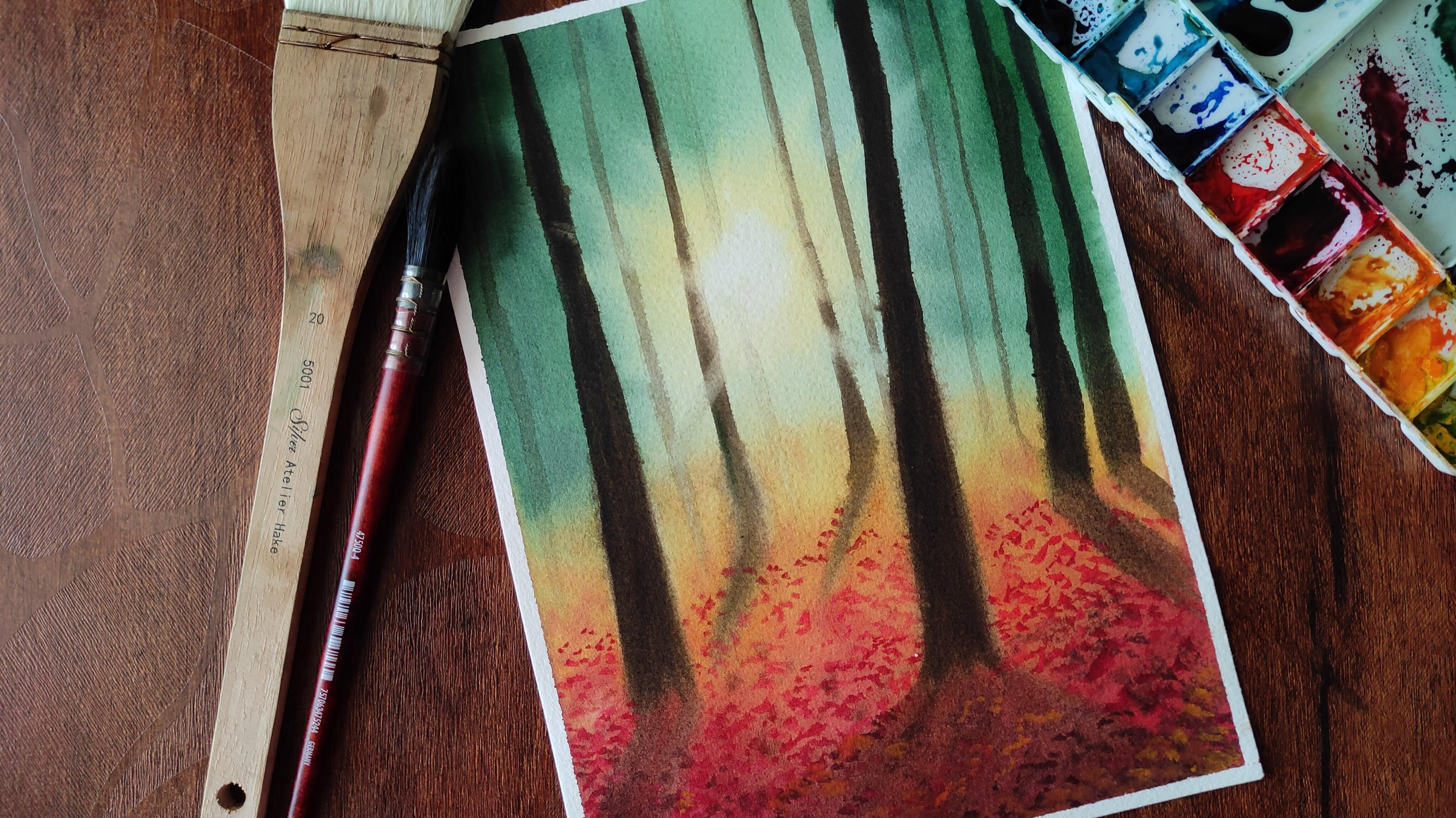
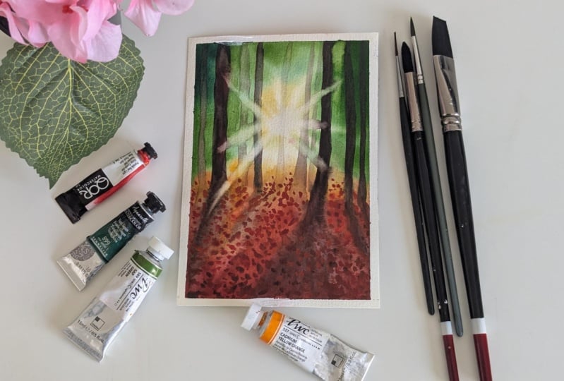
2. Art supplies: All right, so let
us take a look at the art supplies that you will
need. First is the paper. I'm using the paper from the
brand Saunders Water foot, which is 100% cotton
watercolor paper, and the thickness of this
paper is 300 GSM 140 B. So you can see the
texture of the paper. It is not very much texted. It is lightly texted since
it is a cold press paper. So choose any paper
of your choice. Just make sure it is 300
GSM, 140 B thickness. Alright, so this was
regarding the paper. Now, moving on to the
size of the paper. So I'm going with a
size by seven by 10 ", but you can choose
your own size. So it depends if you want
to make a smaller painting, go with a smaller size. All right. So next,
you will need a board. Either it can be a plastic board or a wooden board
to fix your paper, and you will also
need a masking tape. I don't have one over
here to show you, but yes, you'll need
a masking tape. Next is a watercolor
palette or you can go with tubes or pants
whatever is your choice. Detailed colors will be made in the next section, so
you can watch that. Then you'll need
two jars of water. One has to stay always clean
to pick up fresh paint, and the other to wipe off or remove all the dirty
paint from your brush. So that was about
the jars of water. Next, you'll need brushes, obviously. So basic brushes. One is the flat brush to
apply the background wash, that is to wet
your entire paper. So go with any flat
brush that you have got. All these brushes
I have used here are from the brand
silver black velvet, but you can choose to go with any natural or any other
brushes that you have. Next is the size number 12, to add the background washes, then we need size
number eight brush, and then finally, you will
need a size number six brush. So these are the basic brushes
that you will be needing. All right, so yes. Next up, we have is obviously the pencil and eraser to add
the pencil sketch. And then finally, you will need cloth to wipe off the
excess amount of paint. So that's it guys for
the art supplies, go grab them and I'll
3. Colors: All right, so now,
let us take a look at the colors that you will need
for this particular class. So all the colors
that I'm going to use for today's painting are from
the brand white knights, but you can go with any other
brand that you have got. The first color is
the dark green, which is from white knights. The dark green in
this painting is used for adding the
background lush forest. If you don't have dark green, you can take any of your
green and add a little bit of paints gray and create the particular shade
that you want. Alright, so next up to create that sunny effect or the sun rays and basically
the light in the woods, we will be going
with Indian yellow, and we'll use a little bit
of Indian gold as well. These two are my favorite shades for creating those warm tones. Alright. If you don't have
Indian gold, Indian yellow, just go with any basic yellow that is present in your palette, and if you don't
have Indian gold, add a little bit
of cadmium orange, and you can create that as well. Next up, you're going
to go with sepia. So this is basically to add
all those bold tree trunks. So if you don't
have sepia again, you can go with
transparent brown or any other brown
that you have got. So this is another
beautiful shade for creating those woody
effects in your painting. The next color that we're going to have is basically
to add the foliage, you will need a set
of different colors. So first is the crimson. So this is another bold, vibrant color. So no worries. If you don't have crimson,
you can go with the red, and you can mix a
little bit of blue to create a shade like crimson. Next up, you can have cadmium
red or cadmium orange. Basically all the bold tones. Whatever yellows and reds you
have got in your palette, you're going to bring
them out because this is the autumn class. Alright, so next, you'll
need some transparent brown, and you'll also need yeah, this is the transparent brown. So if you don't have
transparent brown, there's a basic brown
in your palette. You can just go ahead with that. So basically, I'm going to
mix this brown or paints gray into the crimson and
add the darker foliage. Next is the cadmium orange. This is another beautiful
shape. All right. So these are the colors that you will need for this
particular painting. So go grab your
colors and get ready, and I'll see you soon
in the next section.
4. Pencil Sketch: Hello, everyone. So let us
start with the pencil sketch. So the pencil sketch is
going to be super easy. We're just going to add the
branches in the forest. So the tree trunks, usually. So it's pretty simple. You have to just go ahead and
place your trees randomly. And the one thing to make sure over here is the
rule of perspective. So when you are
planning your sketch, basically, when you are
trying to paint the trees, don't place all of your
trees in the same line or don't add it in such a way that all
the trees look same. So make sure that the tree that is more front or
more visible to you, that should be thick and tall, and the trees in the background should be a little thinner. And they should be
appearing lighter. The placement of the
trees is what matters the most when you are
painting trees or forest. That way, the rule of
perspective is achieved, and it makes your painting look more realistic and natural. You can wait for me to
complete the pencil sketch. You can pause the video or even take a screenshot probably, and then you can go and complete the pencil sketch for yourself. All right. So just
to watch me and then you can create a
pencil sketch for yourself. All right, so that was
the pencil sketch. I hope you have completed yours, and I'll see you soon
in the next section. And
5. Wetting the Paper: Alright, guys. So now that
our pencil sketch is ready, it's time to wet the paper. So it's a very important step. I mean, wetting paper is really
an important step when it comes to the
watercolor paintings which involve the wet
and wet technique. So I cannot emphasize
much on this, but this is really, really, really
important stem guys. So now you may ask
me a question, how long should I keep
wetting my paper? Now that totally depends upon the temperature
of your room, the country that you live in, and so many other factors, and even your paper
matters, okay? So if you're going
to use a 300 GSM, cold pressed watercolor paper, obviously, you have to, like, wet it minimum four to
five times, probably, so that your paper
fibers are fully soaking wet and it remains wet for a longer
duration of time. But if you're going
with a lesser GSM, not a cotton pressed, I mean, a cold pressed
watercolor paper, then you have to wet
it several number of times so that your paper is fully enough to hold all those larger washes
that you're going to do. So it all depends
upon several factors. So just keep one thing in mind, wet it in such a way that you can see a sheen on
your paper, okay? So for some people who
are from the humid areas, what I would suggest
is just wet the paper, let it stay for some time, and then before
it starts to dry, you're going to
apply another layer, and then you're going to apply
another layer if needed. So you're going to do
this multiple number of times until you can see that clear sheen or
that shine on your paper. All right, so just take
your own sweet time, let it be 20 minutes or even
15 minutes or even longer. Just make sure not to skip this step and make sure you
wet your paper properly. Okay, then I'll see you
soon in the next section.
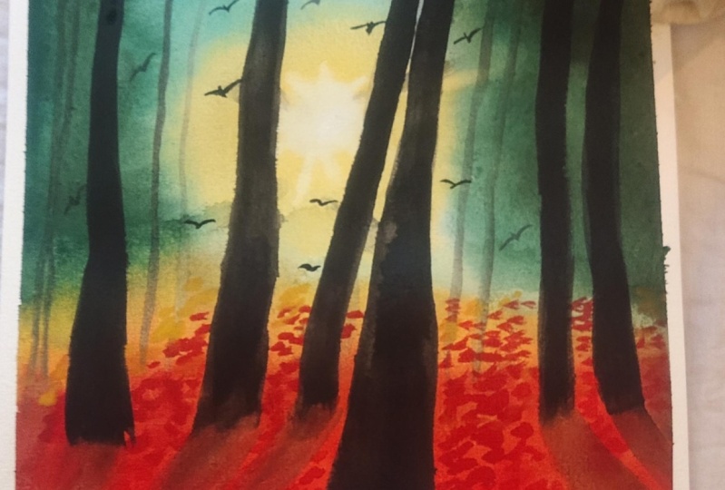
6. Painting The Background Forest: Alright, guys. So now that
our paper is finally wet, now, let us get back
straight into the painting. Alright, so let us start. So we're going to be painting
the background forest, and it's going to be
completely wet on wet. Let us start by painting the lush green forest
in the background. So for that, I
will be going with my sap green from white Knights, and I'm going to mix a little
bit of paints gray into it to make it a little
bit darker in tone. Okay. So make sure to go with
some kind of dark green, which has a little bit of
tonal values of, you know, your paints gray or you can mix a little bit of brown if you want to get that earthy tone. Okay. Just make sure you mix the colors and use it so that, you know, it does not
look really flat. It looks natural and nice. And always, like I say, do not go with a darker amount of tonal value in
the first place. Start by adding the colors very lightly and gently
onto your paper, allow them to spread on the paper automatically
and organically. And then as you Go ahead. You can build up the colors and increase the tonal
value of the colors. So you can see I started with a gentle wash of that sap green, and as I'm moving further, I'm just adding more and
more deeper tonal values. It is just a simple step. You need not achieve
a perfect blend here. Just go ahead and drop your
sap green in random places. And you can see in the middle of the
picture or the painting, we're going to have
that glowing sun, which is going to be lit
from the back of the trees. So we want the center
portion of the painting to remain a little lighter to
show that sunlight glow. And towards the
edges of the paper, we're going to keep
the forest lush green and a little bit darker, okay? So for painting the sun, obviously, you need
a yellow color. Basically, you do
not go directly with opaque kind of yellow. Choose to go with something like Indian gold or Indian yellow. So for example, here,
in this painting, I'm using the Indian
yellow from white knights, but it's absolutely fine. If you do not have Indian
yellow or Indian gold, you can go with your cadmium yellow or any yellow
for that matter, and, you know, just try to
create that sunny effect. So just mix your yellow and
your orange hue together, play around and see
so that you get a nice golden effect
for your son. Okay? So just watch me while
I'm creating the sun rays, and then you can
wait for some time, or you can just watch
my video first, and then you can start
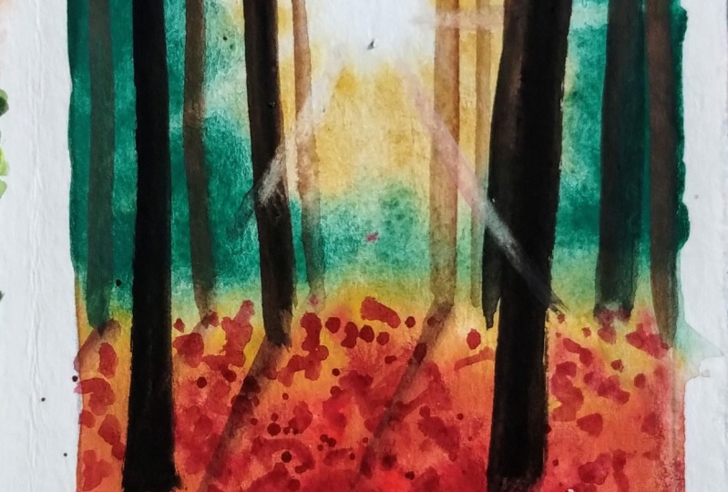
painting for yourself. So that way, you know, you don't commit any mistakes. All right. So yes. Now the next part
is to create the sun rays. So for creating the sun rays, it's again, very
simple. Lifting method. So you're going to paint, and you're going to keep on lifting the sun rays
diagonally from the inwards and pull your paint brush
towards the outwards. And each time you do this, you're going to clean your brush on the paper to
make sure you know, you're not lifting other colors from the other parts
of the painting. All right, so just see
to it how I'm doing, and then you can paint for yourself. All right. So now that we have created that lush green forest with the sunlight
hitting from the back, now it's time to finally
paint the bottom region, basically the land region. So now we're going to make sure that the sun is
hitting the ground. So we want some of that yellow the sun rays
falling onto the ground. So we want to show this
effect onto the ground. So for that, I'm going to
choose my Indian gold, again, from white knights. So you can go with the same
color that you use for your sun and make sure you mix a little bit of
orange juice so that, you know, it appears
a little bit more natural and more realistic. Okay? And if you feel
like you need to correct your sun rays or if you feel like the rays
have disappeared, now is the right time to
pull up those, I mean, to lift up all
those extra colors because once your
paper has dried, you'll not be able to do that. Okay. So just have a look
at your paper and make whatever changes you want to do at this very given
moment of time. So now you can see, I'm going ahead and dropping the Indian
yellow onto the ground. Now, as we move
towards the ground, I mean, towards the viewer, we're going to add more and
more deeper tones like, the maple leaf colors
like your red, your orange, or even
crimson, for that matter. So just go ahead and
create a blend of these colors and make your
ground look more realistic. It should appear as though the leaves have fallen
down onto the ground. So I don't want to have
a flat wash over here. Just keep pushing and pulling
the paint from top and from bottom and from all
the sides and create that blend of beautiful
autumn colors. Alright, so you can see now I have started
adding the crimson, and I'm directly
mixing this crimson with the Indian gold
that I added earlier. This kind of creates a blend, and it creates a
different shade, which is neither orange nor red. But it is somewhere
in between that. So you're gonna
create this blend. Alright? So just watch me, and you can paint
this for yourself. All right, guys.
So now it's time to create a depth
in your painting. So first, we started
with Indian yellow, and then we added a
little bit of crimson, then we added a
little bit of orange. So now it's time to
create that depth. How do you create depth in your painting by adding
darker tonal values? So you can go with
either brown or your Van **** brown or burnt umber, burnt
sienna, anything. Okay, to create that
little deeper effect towards the edges or the corners of your
painting. All right. So while your paper
is still wet, you can make a mix
of different colors, explore different
color tonal values, and just keep adding them, pushing and pulling
all the colors into each other and create a very nice blend and just
create your own magic guys. So you need not use the exactly same colors
that I'm showing here. Just try out what
works for you well, and then just go ahead with it. It all comes from your
imagination. All right. So now you can see, with the
help of the tip of my brush, I'm slowly trying to create some texts,
some leafy patterns. This way, when the paper dries, you can actually
see those textures being created in the background. So if you want to
create some textures or add some beautiful patterns
onto your painting, now is the right time when
your paper is still wet, you can just play around
and go ahead and do it. All right, so I'll just
keep adding these texters and I'll see you soon
in the next section.
7. Painting The Trees - Part 1: H all right guys, so now that our
background is dried, let us start painting
the tree trunks. Painting tree trunks is really therapeutic
process for me, and it's really very simple. You have to just follow the organic shape of the
trees and just paint them. So I have already told you while making
the pencil sketch, the trees should be
of different sizes, and you should always keep the rule of perspective
in the mine. That is the trees which are closer to the viewer
should be thick and tall and the trees that are
in the background should be appearing a little lighter and thinner, almost
like disappearing. Okay, so you can just watch
me first how I paint it, and then you can go ahead. So for painting the trees, you can go with any
dark colored brown, or if you don't have
a dark colored brown, what you can do is take a
little bit of brown and mix that with your paints gray and create your own
version of dark brown. That is what you can usually do. Or else, in this case, I'm going with the color sepia, which is from white knights. So it's up to you guys. Like I have said,
always explore, play around with
the colors and see what works well for
you. All right. So now you can see along
with the tree trunks, you should also add the shadows. Otherwise, if you
just leave it flat, it's not going to look
realistic and natural. So you can see
there's a sunlight hitting from the
back of the trees. So obviously, the shadows are
going to fall down, right? So the shadows should
be a little tilted. That is, it should
be a little slanter. So the bottom region of
my paper is still wet. So I'm just painting
the shadows first, and then I'll add
the main branch. All right. You can see
for the first tree, I have already
created the shadow. For the second tree as well, I have created the shadow, and the shadows should not be
as dark as the tree trunk. So if the tree trunk
is bold and brown, the shadows should be one or
two shade lighter than that. Normally when you walk on the ground and when the
sun is falling on you, you usually see
your shadow, right? So it's not dark. It's a little faint. Okay. So yes. And remember, do not make all the
trees straight. The tree trunks are a little crooked and give them
a nice organic shape. So starting from the
top, it should be thin. And as you come down towards closer to the
user or the viewer, it should get broadened. So I hope you have
understood this. And if you have
not, then just wait for me to complete
the entire procedure. And then after you have
watched the video, you can pause and
paint it for yourself. All right, so just
keep watching and yes. All right, guys. So now that we have painted the
foreground trees, it's finally time to add
the background trees. Meanwhile, if you want
to adjust the shadows of some of the trees that
you have added previously, you can do that, as well. All right. So yeah, moving to the background trees. So for painting the
background trees, I'm going to be using
the same sepia shade that it's going to be lighter. How are you going to make it lighter by adding lots of water? So just go with a
lighter shade first. Okay. And then slowly, we're going to build up colors. Even the shadow of that tree
should be lighter, right? Now, why it is
lighter because A, it is in the background and B, it is closer to the sun. So the sun rays are
directly falling on the tree trunk of the
background trees. You can see the first half of the trunk is dark
and in the middle, I'm making it lighter because that's where
the sun region is. That's where the sun
rays are falling. Again, as I come down
it's going to be, again, a little darker. Okay. And similarly, you're
going to add the shadows. So this was the main
essence of this class to make you understand how to bring out that depth
in your painting, how to make your paintings look more natural and more realistic. And once you have
completed your painting, you can just take a step back
and see at your painting. You'll be really able to
see that glowing sun, that back rays of the
sun from the trees. All right. So you can see how I'm lifting off the paint
from the tree trunk, which is facing
towards the sun rays. All right. So in
the similar manner, I'm going to be adding
another tree trunk. Again, it's the same process. Go with a lighter shade of sepia or brown or whichever color
you're using for the tree. Then you're going to
add darker shades of brown onto the top and onto
the bottom of the trees. Then the tree trunk that
is facing towards the sun, you're just going to lift
off the paint from there. This is all about painting foreground trees and
background trees. I think I have a part
two coming up in the next section and I'll see you soon in
the next section.
8. Painting The Trees - Part 2: Alright, guys. So in
the previous section, we painted some foreground trees and we added some
background trees as well. In this lesson, again, we are going to
paint more trees, some more trees which are still more further away from us, and they're really light
and they're really thin. So you can see that. I'm just picking up a little
bit of the same shade sepia. And the trees this
time are really thin compared to the ones that we added in
the last section. So this is what I
was talking about, the rule of perspective. So imagine if I
would have painted all the trees in same shape, same size, and same color. It would really look very flat. There would be no natural and realistic look for
your painting, and it would be
absolutely really flat. So this is what I was talking about the rule of perspective. And the tonal values, everything everything
matters over here. So the placement of the
trees also matters. Remember not to go overboard. Otherwise, you'll be filling
the entire background, and the lush green
forest will be lost. So always keep it minimalistic and stop when you are
satisfied, right? So you can see this particular tree
trunk that I've just added now on
top of the sun. You can see it's so
light and in the middle, there's no tree trunk at all. So be careful when you're
painting right in the middle of where the sun rays
are present. All right. So yeah, I think I'm pretty
much satisfied with how my autumn forest is looking at this
particular point of time, if I have to adjust
any tree trunk or if I feel some color
is being lacking, I'm just doing that right now. But if you are completely
satisfied with yours, then you can just stay and
wait for the next step. Alright, so yes, so far so good, and I'm really loving it. Okay. So maybe a little
bit of brown over here. To make it look more natural. Since this tree is very
close to the viewer, it has to be more not detailed, I would say, a bit
more darker and bold. So what happens is when you're painting on the wet on wet, usually the paper is still a little wet because
it is 300 GSM, cold pressed watercolor
paper, right? So it tends to appear
darker initially, but when it dries, it's
going to fade away. So always make sure to paint
using more tonal values. So that's why I say
first start with lighter tone and then
gradually build up. Alright. So yeah, look
at that glowing sun. It's looking damn
gorgeous, isn't it? So now, we're going to create
a little bit of sun rays. Initially, we added
the sun rays, but I think it's kind
of disappeared now. So in this lesson, we're going to also learn how
to get back those sun rays. All right, so all you have to do is take a clean brush and start lifting the colors from the tree trunks that
are closer to the sun. This way, it'll give you the appearance as though the
sun is hitting the trunk. You can see I'm lifting
off some color from there since it appeared really
dark in the initial stages. I'm just picking up all of that paint, basically
lifting that. Now if you really feel like that white center part of
your sun has really vanished, now you can just wet your
brush and just try to lift off that particular paint
from that particular area. Similarly, you can create those diagonal sun rays and try to lift
some of that pain. Alright, so just keep
watching how I do that, and then you can do
it for yourself. All right, guys. So now that
we have added the sun rays, now I think we'll
be reaching on to the final stage of the painting that is
adding the foliage, and that's my favorite part. So can't wait to see you
in the next section.
9. Adding the Foliage: Alright, so let us start
adding the foliage, and this is my favorite
part of the painting. Okay? So again, there's no particular rule
to add the foliage. You can just do it in
whatever manner you wish to. But again, don't go overboard. That is what I would like
to suggest over here. Alright. So first, I am
picking my small size brush. This is size number six, and I'm picking some
of that crimson, or you can also go with
red if you have cadmium. Just randomly start adding
some patterns like this. So with the help of
the tip of your brush, just hold the brush at an angle like I'm
holding at the moment, and then try to press the tip of the brush
against the paper, and create some leafy patterns. So it need not be perfect. It has to be completely
natural and organic. And when you start
adding the foliage, do not add all the foliage at a particular place or
at a particular point. You have to just keep
switching between different places
under the tree trunks around the tree trunks, maybe onto the
shadows and so on. And also, there is a rule of perspective that needs
to be kept in the mind. The foliage that is
closer towards the sun, they should be appearing lighter because the sun
rays are falling on the ground and they're
also falling on the leaves which are
present on the ground. The foliage which is present
closer to the viewer, they can be darker, darker and even bigger
in size probably. Alright, so maybe now I'm going to grab a little
bit of darker shade. So as I said, play
with the tonal values. First, go with lighter tone, then start picking
up some darker tones by mixing some paints
gray or even some brown. And we're going to
add more colors. So just keep watching
how I paint, and then you can paint
it for yourself. All right. So now
that we have added some foliage on the
top and in the middle, it's time to add some foliage on the shadow regions
of the tree trunks, basically at the
bottom of the paper. So as I said,
towards the bottom, it should be a little
darker to show that depth. So I'm going to take some sepia. You can go with dark brown
or even some paints gray. Mix that with your crimson, create a nice maroon shade. And we're just going to drop this paint onto
the bottom region. Again, we're not going
to go overboard. If you feel like your
painting is looking beautiful at this particular stage,
then please stop it. Just do not follow me blindly. Okay? I'm just gauging my paper. I'm just seeing where I
need to add the leaves, where it is looking a little bit blank or are there
any empty spaces? Just have a look at your paper, have a look at your painting, take a step back, and
then you can decide. So now you can see I'm
picking some cadmium orange, and basically, I'm going
to add this cadmium orange onto uh, bottom regions. Leaves are of different colors. Since it is autumn, you all are familiar with
the autumn colors. It's basically all
the warm colors. So just go ahead and drop them. So to create if you don't
have cadmium orange just mix a little bit of white gush or white watercolor and
that also works well. This is the foliage and I'm
quite happy and satisfied, and I'll see you soon
in the next section.
10. Wrap Up + Thank You: Alright, it's a rap, guys. I would firstly like to thank each one of you who
made it till the end. I hope you love your
painting as much as I did. Just look at the sun rays, look at the lush forest
in the background, and look at all those
beautiful tree trunks. And most importantly, look
at the autumn colors, the foliage falling
on the ground. Isn't it so magical
and gorgeous? Thank you guys for joining me in this beautiful
journey of painting the autumn woods and about
posting your class projects. If you're going to
try this painting, then I would highly
recommend you to post all your projects in the
class project section. I would be personally
reviewing each of the class projects that you
guys are going to post. It would be a great
pleasure for me to see your version of creating the autumn woods and
I would give you the feedback so that it would be helpful for your future
paintings as well. And if you're going to
post us on Instagram, then do tag me using
my Instagram handle, and I would love to share your beautiful creations
with the world. All right, then, so I'll see you soon in the next
class until then. Bye bye. Take care.
 Aishwarya Shetty, my__paint___story | Watercolour Artist