Transcripts
1. Introduction: Hi guys, my name is Kate, and I love painting
with watercolor. And today I would
like to paint with your autumn
mysterious landscape. I don't know how the weather
looks like in your area. Button bearing today
is super gloomy, rainy, MTS a little
bit mysterious. And I would like to
share these emotions, review through this
watercolor painting and through this lesson. If you want to learn
more about me, my creativity way, about
my life as an artist. You can check my
Instagram channel. This is my nickname. I would be really, really
glad to subscribe. But let's return to our
today's watercolor lesson. In this lesson, you
will learn how to prepare pencil drawing
for watercolor painting. How to paint with wet
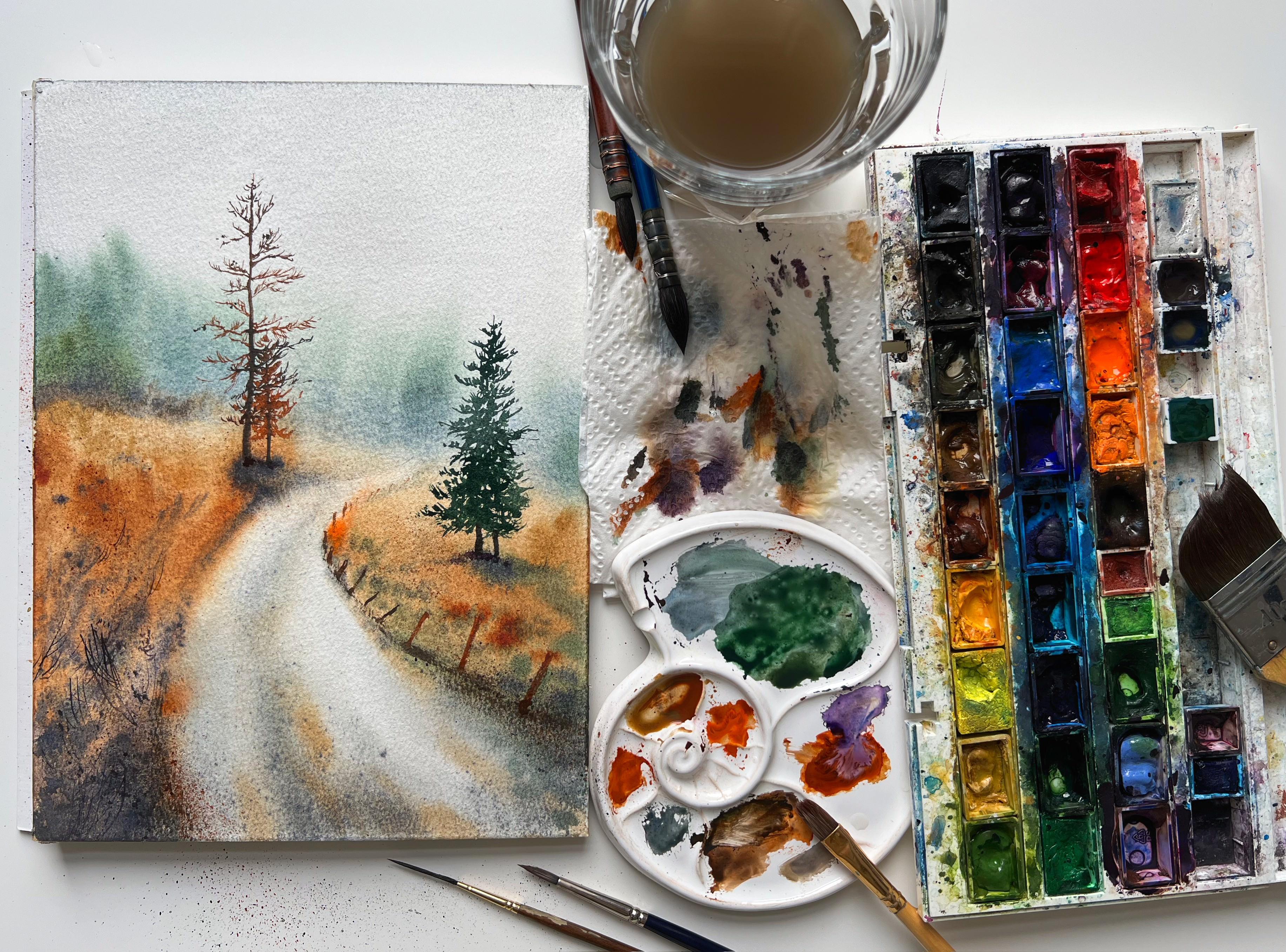
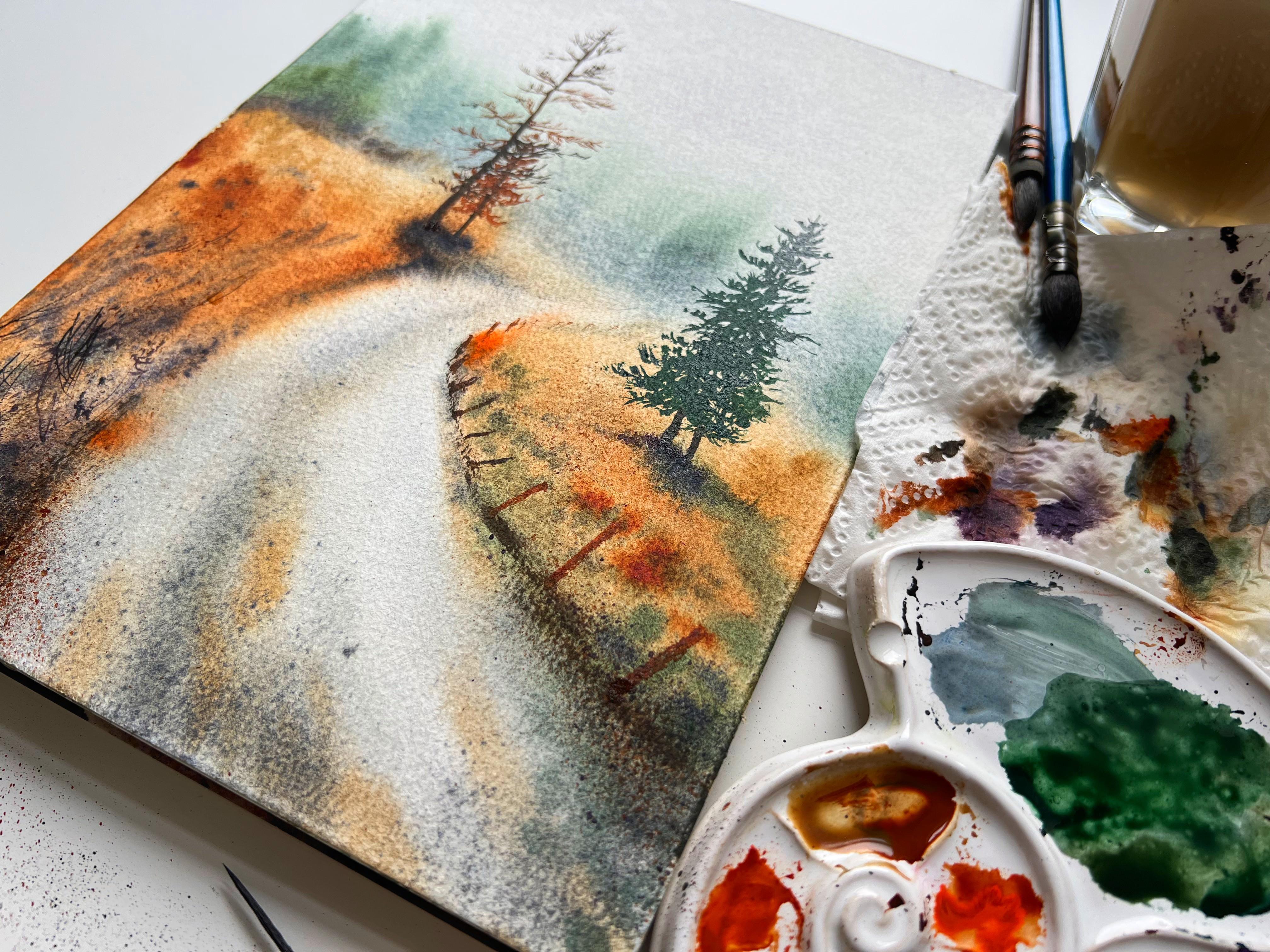
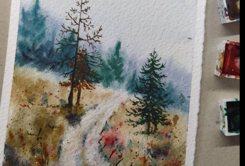
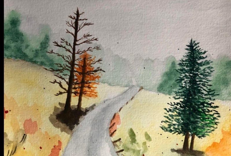
on wet technique. How to create grass texture. How to use granular watercolor. How to paint with clean water, how to draw trees. As a result, you will
paint this picture. So let's get started.
2. Step 1: pencil drawing: I start with a pencil drawing. First outline the horizon line, and then I move on to drawing. There ought to
economy perspective. It's important to draw an
expansion of the road at the age of the sheet and
narrowing towards the horizon. I also mark the trunks of trees with stride
vertical lines. Another curved line depicts
the forest in the background. And I divide the
foreground by color spots. For these, I draw lines, the borders between different
shades of green and brown. Since the watercolor
is transparent and easy shows the
pencil drawing. I tried to keep it as minimal as possible to make the pencil
drawing even less noticeable, I use an eraser.
3. Step 2: wet on wet: I will paint the sky and the background in
wet-on-wet technique. This technique allows you to
make smooth fields of color, mix different shades directly on paper without transitions
that are visible to the eye and allows you
to bend the background slightly blurred to focus the viewer's attention
on the foreground. To begin, I moisten the upper part of the
sheet with water. Then I paint over this guy with a mixture of amber
and cobalt colors. At the same time, I make a light gradient
transition and try to leave a saturated
color exactly at the top h of the
PayPal to remove the borders of the stroke that have visible
to the eye right? Now, I tilt the clipboard and let the paint spread
smoothly over the sheet. To represent the forest. I add a little more cobalt to the mixture that they
used to paint the sky. They paint over the space with the forest to make it a
forest more saturated. And very often the color I add green with a small
synthetic brush. I paint the forest again, but this time I tried to
highlight individuals, sharp tops of the trees. I also add granola watercolor to give it a painterly feel. Saturated color breaks up into small particles with pigment upon contact with
water on a sheet. While the background
is still wet, I smoothly move on to
painting the foreground. To do this, I paint a horizontal line with
burnt sienna color. Due to the fact that
the paper is still wet, the layers smoothly flow into one another, living no borders. To make your painting look
interesting and picture segue, you need to constantly change
the colors that you use. You should add a little color
or add a dark brown one. Then I move on to painting the road with a mixture
of amber and cobalt. I begin to paint over the
road in its darkest part, in the middle and on the sides to more accurately
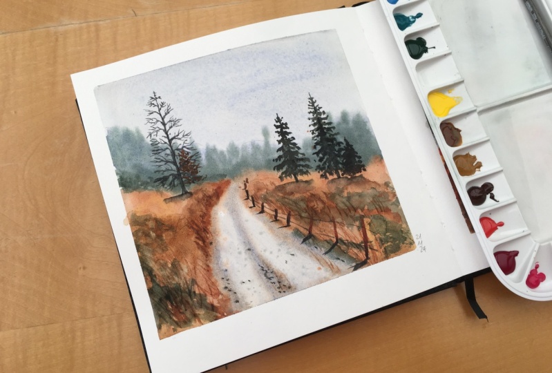
portray the road, it's important to look at the reference and
notice where the color becomes more saturated
and where on the contrary, it weekends, e.g. at the bank of the road, the color becomes
almost transparent, but where there ought widens, the gray color gains
its saturation. To represent fallen
autumn leaves. I add burnt sienna. You can even put a few bright orange or
yellow brush strokes to depict freshly
fallen bright leaves. I also tried to work with
the texture of the field from the very beginning to
depict blades of grass, I take the brush far away
from the base and make it vertical strokes
to be the tip of the brush to paint the shadows, I use some inky purple tune
dry granola watercolor. Since I want to get a dark
saturated shades on the sheet, I take the paint on the
brush quite quickly. With this color. I depict shadows along the road and near
the blades of grass. By adding a little more
green to this mixture, I get the color of red grass, which also fits perfectly
into our picture. To make the texture of the
grass more unpredictable, I use a bristle brush. It's very convenient
to add small splashes with such brush or just
make rough strokes. Once again, I go over
the shadows with a dark purple brown color to make the picture
more contrast. I also slightly dark and the lower edge of the road
using watercolor splashes. The last step is to
add a few drops of pure water to the top of the field to
represent a delight. Because the paper
isn't your dry, clean water can easily push the watercolor pigment out of the paper and make white stars. Before moving on to
painting the trees, it's important to completely
dry the first layer.
4. Step 3: trees: To paint the trees, I use a thin synthetic brush and the brown, orange
watercolor shade. I said painting
the tree from the top and gradually
make the branches longer and wider to make
them look more natural, look at the reference
often and slightly change the shade of
brown that you use. A common mistake when
depicting trees is painting branches
parallel to each other. If you go outside and study
the branches of trees, they are rarely
parallel to each other. Raise them, they
intersect randomly. Your task is just to display these covert behavior
on the paper. Take more time and calmly sit on the painting
of the trees. Don't trash anywhere. Treat this process as meditation
and the study of nature. Behind this tree, we can see a smaller tree of
almost the same shade. I paint it to. Basically append the
bag tree between the branches of the
front standing one, of course, these
trees periodically merge into one spot of color. But it's important to leave
air and space between the branches in order to convey the elegance
of these trees. In green brown, I bent the
Christmas trees on the right. These trees are already denser, so there will be less air
space between the branches. However, tried to
paint with the tip of the brush to capture the
character of the theme, pine needles, my strokes, I still go Arctic and I tried
to avoid parallel lines. The branches of this
Christmas tree at the top look up and then gradually
turned down to the ground. If you can depict
this in your picture, then your painting will turn
out to be very natural. The last step is painting
the rickety old fence. High gain, take a brown, orange color and pain,
slanted vertical lines. To convey their perspective. The pen sticks
should decrease in height towards the horizon and the distance between
this ticks should also gradually decrease the horizon. The fence becomes
almost invisible, so you don't have to
paint it in detail. Don't forget to paint a
dark shadow from the fence at the bottom to better connect
the fence to the ground. That's all. Thank you
for watching my lesson. I really appreciate that. To trust me as a teacher. Don't forget to
subscribe to my skills. Channel to be the
first who knows about new watercolor lessons and feel free to upload your artwork in students
projects section. We can discuss it. You can ask me anything
and I can share my watercolor experienced with
you through this section. You can share this lesson
with your friend just to enjoy some time together
with watercolor painting. Thanks again for your time, and I hope to see you soon. Bye.
 Ekaterina Azeeva, watercolor artist