Transcripts
1. Introduction: Hi, I'm Dara from watercolor mental and welcome to atmospheric watercolor painting techniques and landscapes. Atmospheric perspective or aerial perspective is a crucial but little known technique which allows you to create depth and mood in your paintings. In this class, I'll show you how to use wet and wet watercolor techniques to add an atmospheric element to your paintings. This allows you to create a soft and romantic filter landscapes by allowing you to push back objects into the distance or pull them closer to the viewer. I'm going to also go through how to alter the mixture of paint and water in order to create blurry and soft shapes in the background. I'll also show you how to layer darker values over the top of lighter ones in an already wet area. This class is aimed towards beginners with six full landscape demonstrations, which I'll help guide you through step-by-step. There are scans, drawing, and tracing templates included for each demonstration to help you transfer your drawing over quickly and easily. You'll be able to follow along in real-time to my drawing and narration videos. In this class, I generate my demonstrations in real time. I explain every technique I use in the context of the painting, such as layering into wet areas to paint shadows of a tree. I'll be going over the basics of wet-in-wet watercolor painting. Also talk about what materials you need, your options and which ones are using. Recommend. If you have some brushes, watercolor, paints, and paper, then you're set to go. So join me in this class. Let's create some beautiful atmospheric paintings that you can be proud of.
2. Materials Required: So before we get started, I'm going to be talking a bit about materials. So the specific materials that I'm using in this class. And I'm also going to go through some recommendations myself in terms of what you need. So I'll keep this short because I keep my mu2 is very, very basic and that's essentially all that you need. So the paper that I'm using here, It's actually a 100 percent cotton watercolor paper. So it comes at a textured sort of grains. So I'll recommend getting a code to medium press, even a rough, sort of textured watercolor paper. The reason being is with a lot of these atmospheric Witton where defects that work a lot better if the paper has a decent size, sort of texture to it. So definitely in terms of hot press paper or completely smooth watercolor paper, I wouldn't recommend that for this class. Look at something that has a little bit more texture. So cold press Slash medium or rough paper and a 100 percent cotton as well, if you can, because I do find that the wet and wet effects work a lot better when you're using a 100 percent watercolor paper, or say cotton paper, because essentially the paper dries a lot more evenly and you just get a lot more kind of consistent effects when you're dealing with cotton paper rather than cellulose paper, which tend to tense actually leave little puddles of water in areas and just dries a bit funny. So that's what I'd recommend in terms of paper. So I'll talk a bit about paints now. This is what I've got here, and I've got a bunch of different paints. I've got yellow is here, so I'm going to Naples, yellow, bit of yellow ocher. I've got little bit of lemon yellow here which is running out. And I think I've also got here a bit of cadmium yellow, but I haven't used much of that. It's pretty much run out. Bit of lemon yellow is fine. So a broader sort of yellow and a bit of Naples yellow, which you can always mix up by adding lemon yellow to a bit of white quash that just gives that kind of creamy yellow, creamy sort of color. In terms of blues, were three different blues. I've got cobalt blue, I've got some Boolean blue and ultramarine blue here. I've got a little bit of some earth colors. So this is basically a bit of burnt sienna, raw umber. Over this side, I've got a CPU over here. In the red section. I've got a little bit of permanent red there. I've got some common which is a pinkish red and a bunch of greens here. I think we've got emerald green hookers, green is something else. Also got a few other bonus colors, essentially just some sap green, which I consider basically convenience colors that I don't have to mix up a green. Also farm is sap green. It's such a vibrant color. I find it quite difficult to mix a sap green by itself, a very vibrant green. So having it come fresh out of the tube and the convenient well, and that makes things easier, especially when I'm doing a lot of green areas. And in terms of a general dark color, I also use a bit of neutral tint. So neutral tint is it basically a color which darkens every other color without altering its inherent qualities. So if you want to essentially just darken up a color, but in the neutral tint is good. I sometimes use niche, we tend to as a shadow color as well. And I mix it up with either some red or a little bit of blue, depending on whether I want a warm colored shadow or a cooler sort of shadow. And that works really well. And the last thing I talked about was before was just a bit of Guassian, a little bit of whitewash helps because at the end of the painting sometimes I like to put on some little highlights, or I do use the white quash and I'm mixing with the, the, the yellows, bit of the green, sometimes a bit of the blue digits add a bit more body to that color. So it's just an optional thing at the end. It's not a 100 percent necessary. And what you can do, you can mix up a bit of that, wash with some of the hansa yellow or the lightest sort of yellows to make a creamy yellow as well. So we'll stop talking about paints now. And I'll go on and a little bit about brushes, the brushes that I use. So here are essentially all the brushes that I have in my set. And I'll talk a bit about each of them and what they're used for. So over this side, I have a bunch of round brushes. So I use these round brushes to essentially get on smaller details or even add on things like bushes, larger tree trunks and things like that. Anything that's a bit smaller than an entire wash, I still want to have some control but still have enough water on the brush. So this makes decent sense. Come in different sizes depending on the object or the figure that I'm trying to paint him. So obviously, if we If we're painting a larger figure, always try to use a larger brush, the largest brush you can in order to get that figure in accurately. So that's what all these are. Round brushes are essentially detailing and getting in some more shapes in here that are just small enough, smaller than an entire wash and allow you more control. So this year is a water color mop brush. This is what I used essentially to get into large washes, large clouds. I want to pick up a lot of paint and just get that section all at once. This is what that brushes for. I use it a lot for skies, for the ground, clouds, things like that. I've also got a bunch of these flat brushes here. And flat brushes are interesting brushes because you can use these essentially as a replacement for all your round brushes and the mop. So the large flat brush at a three-quarter inch here can go through and do a lot of these skies with that three-quarter inch. And then I can pick up the smaller ones and get on details even on figures by using the corner of the brush. So you sort of has a little edge in the corner there so you can get on bits and pieces of figures as well with those. I also find that really good for hard edges. Things like if we're trying to get in large tree trunk and a specific direction has some really nice sharp edges when you're using those brushes. These are a couple of bonus brushes that I use for minor details. And this is a little rigger brush, and this is to get in small branches, small little details and areas of the painting that I can't get in essentially with the smaller, smaller round brushes. This also allows you a little bit more, I guess, sporadic sort of movements to get an a bit of character and your, and your branches and things like that. This here is a fan brush and you see how essentially all of the little bristles splayed out like that. And I use this essentially for one purpose and that's to get in bits of grass, smaller blades of grass, indications of little bits and pieces. And it really helps save time rather than picking up a little round brush, trying to get an every little blade of grass or little twig or something like that. I also find that you can use it to get on larger bushes and things. Just sort of pressing it onto the page and shifting it around a bit. So you can use this almost, almost like a round brush as well, like a funny sort of squished round brush. So That's about all that I'll talk about in terms of materials. Now, there's a few other miscellaneous materials that are mentioned. I do keep a little container of water and this one's a little bit dirty because I've just been painting. But that's really important with watercolors. Just get something that can hold about 500 mils to a liter of water, have a towel as well. Details going to help to control the amount of moisture on your paintbrush, which is super important. If you want to achieve specific effects like clouds or you might want to get into sharper sort of edge there. And of course, and a pencil for sketching.
3. Techniques: Wet and Damp Paper: Okay, In this video, we're going to be doing a really quick demonstration on the different wetness of paper and how you can achieve different sort of effects by just letting that paper dry a little bit but still remaining slightly wet. So I've got two squares here that I've just quickly drawn up and wet and damp. And what we're gonna do, we're gonna use a normal sort of brushed and have to be anything special. I've got a mop brush here and all I'm doing is I'm just wetting this area. I've got a little bit of color in there. But I'm just trying to get in essentially just some clear water in the background. However, when you're doing a wash, you can always actually start out with a color on top, a very light wash of blue. If you're doing a sky or came to start out with a light wash of yellow, that kind of thing. So essentially what I'm doing is I'm just wetting this entire area. Okay? And I'm gonna go straight into this side here. So I'm going to pick up a little bit of blue just to illustrate the point and drop that in like that. And as you can see, and if we use a smaller brush, even something a bit points here like this one, you'll notice that the color spreads quite, quite a lot compared to the deck which I'll show you in a moment. But haven't little bit of a play around and look at that. You drop that in and depending on the sizing of your paper as well. But you get a lot of these sort of soft sort of effects here, which is really good if you're doing things such as clouds. Literal sunset areas where we're trying to blend in a bit of blue with the yellow, that kind of thing or maybe some distant sort of mountains. Okay, but as you can see, you really getting quite an interesting mix here. And it's all very loose, abstract kind of feel essentially. Okay? And that's what happens when you go straight in and the area is going to large concentration of water. And you can keep on working on this area of fact. And if you want, you can pick up a little bit of extra blue, little bit of sort of darker color and drop that in like this. This is some purplish kind of paint mixed up a little bit of a purplish sort of painting them, you know, going a bit darker as well, just to show you, you can drop in a bit more. And when you dropping in paint through here, what you wanna do is make sure that the paint and the consistency of the paint you're adding in, it's a stronger consistency than the area that's already there. So you've got a really wet area. It's okay to add more of a watery mix, but if that area is starting to dry and you can just see that little bit of sheen. If you start adding a very watery mix into that, you'll find that you get this sort of Bloom effect. So if you add too much water and you'll get this kind of thing. So you might be able to just see that these tiny little blue like effects like it, like that. Okay, so that really depends on what you're aiming for and your paintings. And there's some people really like those blooms. And they use it for implying different shapes and really soft, you know, sort of flowers and things like that. I do use it as well. But yeah, if you try and get something that's a little bit more cohesive and joined together. Make sure that you really keeping in mind that the quantity of paint, the thickness of the paint is a little bit thicker. So there's less water on the brush and there is other paper, essentially as what I'm trying to say. And so this bit of paper, it's still fairly wet. And you can tell by looking at the paper on a slight angle that that area in there has got a lot of water. It is still hasn't dried. And when you're using a 100 percent cotton paper, this tends to be the case. You can really just keep going in and dropping in more color, hearing their strengthening some areas and you know what I love to do as well as leave some of those lighter areas too, so we're not trying to eliminate all those lighter areas. Okay. Brown and a bit of green and who knows what in this corner to add a bit of darkness in this corner like that, even not there. So there's really a lot you can do before that paper begins to dry. So this is essentially what I'm demonstrating here. Just a complete we need me, you've got that paper is really wet. And you've seen that it's starting to dry now because when you put in more color, these thicker sort of color, it doesn't spread as much, still sort of sinks into the page nicely. But what you don't get is that immediate bloom like effect when you pop that color into just spreads rapidly. So as the paper begins to dry more and more, that's what happens. And this is sort of important for you to keep in mind when we start going through the demonstrations and things like that just so that you know, that, you know, the timing of when you go in with that brush is so important. So if you doing some soft clouds, you want to go in really quickly at the start, maybe you want to add in some smaller clouds later on or the paper is damp. But yeah, so that's the sort of effect that I'm talking about when you're just going when wet now I'm going to go straight into this area which is still damp. And I'll highlight what happens here. So let's pick up a little bit of blue. Just a little bit of blue on the brush. And I've got to make sure I've got enough water in here as well. And I'm just going to drop that in like that. And you'll notice firstly, that you do get an edge to this area, but it's still blends. So you still get a bit of blending into the background. This bit here, this bit of paper, you still got a bit of pooling of water. But on this side it more kind of demonstrates the point C can get a little bit of structure here in terms of a structured shape with these mountains that I'm putting in here. And we can go in and for example, am I putting a bit of yellow here? This is turned into it to another color that I pick up a bit of this, this warm color. Drop that in there like that here. Just to get in a bit of like a sky mix there, like that. And we might go into the foreground just picking up some green, dropping that green in here like that. And you find that you can actually get a little bit more structure. So here the paper is actually dried. So you can tell because the brushstrokes that you put on, they retain their shape and they don't spread. So you might find this is the case when you're painting watercolors and you're waiting for it to get to that dance stage. That there will be parts of the paper which should dried inconsistently depends on the paper you haven't. Especially when you've got this peg that backwards all the way, because this is a fairly thin paper, so it's something to definitely keep in mind. But when you're working on damp paper, It's almost like you've got a slight edge of control over working on completely wet paper like this stuff on the left. And even if I go in now and pop in a bit of darker color with this brush, notice it's still damp. Still damp. And I'm able to get in extra details still without it blooming all over the place. So that color more or less stays put and expands out a little bit in the areas that I put it down. Okay. And you can see here the mountains, a little bit more defined V-shape. This is very important when you're looking at sort of atmospheric painting, arrow perspective with the objects in the background. These mountains, especially you want to push them all the way back. That's a really important thing to do. Make sure using your wet and wet to at least get the soft edges and make that color nice and light, slightly bluish tint. And that will push those mountains back in the distance. And there's a few other things you can do as well. You can add in some little clouds like that as well, some blue clouds on the horizon line as well, maybe coming downwards. But larger ones, especially at the top that you can drop in there. Okay. And this shape you can continue to sort of play around with while the paint is wet. This whole area is still damp. Okay. Other things you can do, you can drop in little bits of color here as well into the foreground and getting areas of texture. Little bits of darkness and inconsistencies. That could be bits of grass, that could be rocks like a log, a tree log or something like that here. And just adding a bit of variation into this, into this mix having is this damp sort of mix. And another thing you can do is you can get in sort of softer shapes in the background. So if you want to look at maybe getting in a tree or something or really softer looking tree in the background, you can pick up a bit of brown, drop petty in like this. And you can get a little bit of a shape of this tree is tree branches going across and away and upwards, that kind of thing. But it's still going to spread a little bit. So it will blend in a little bit more and the edges will be kind of ferrari. So you want to combine things like this with maybe some other trees that are a little bit more structured. But it does work for those distant trees off in the distance. If you want to just guess, downplay how they look, the details, push them further back into the distance. That kind of thing. It really works quite well. You can also use it to make a bush or something like that. Just dropping in a bit of green there or something like that, you know, letting that sinking. So you still got a combination of this soft sort of shape, shapes along with a little structure. So I'd say just experiment around with this. I think it's really important to play around and make sure that, you know, you've had a try with different kind of wetness of the paper wetness. So really important whether it wait for a little bit, you might wait five minutes here, you might wait one minute here, you might wait ten minutes on another one. Just so that you understand you going with that color, what the paper's gonna do. Find a lot of the time people went into the actually start on their painting before they figure out how the techniques work, what's going to happen? And this is your way and a fantastic way I've learned to just practice and learn how to be able to predict what these little techniques would do when you actually execute them.
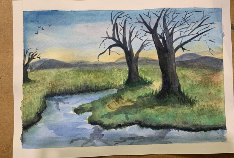
4. Techniques: Wet-in-Wet Tips: I wanted to talk a little bit about atmospheric or aerial perspective and how it sort of fits in when we talk about wet and wet watercolors. So just to give you a really brief understanding, brief overview, atmospheric perspective basically refers to the Halley atmosphere affects objects as they recede. So when you're looking at things like a mountain or a tree kinda thing you noticed as it goes into the distance, there's a bit of reduced clarity. The values get a lot lighter. Colors get a little bit grayer. And always to this, to the bluish end of the color spectrum. So when we're talking about wet-in-wet watercolor techniques, one I'm going to show you is how we're going to imply atmosphere and the receding of these objects and I guess things in the distance to imply more depth in your painting. And it's one of those techniques and sort I guess tools in your painting toolbox that you can use when you're doing these type of atmospheric landscapes where you want to create a sense of, I guess, heaviness in the air, bit of smoke, a bit of mist in the background, obscuring some of the background objects. And as we move forwards, having a bit more clarity. So that's one of the things we'll go through, and I'm going to illustrate that through a few of these demonstrations here. So the first one here with the clouds, what I'm gonna do is just quite quickly, I'm going to just add in who's putting a bit of water here? I'm going to add in a little bit of blue. This is just some throughly in blue to light wash from really one-quarter one-quarter color, three-quarters water. Okay? And what we wanna do is we want to get some clouds that appear in little bit heavier at the top of this scene. And then we want to have some clouds that I guess a little bit lighter down the bottom. Okay? So what we can do is essentially just pick up a bit of color. I'm just getting some blue, maybe beautiful, beautiful brown mix that in blue and brown to get a darker sort of color. Okay? And we can add in something like this up the top there. Okay, so just the darker shaped cloud. And notice that paper is quite damp, so it allows this to spread around this large sort of shapes that we're putting in up the top. Okay, and I'm going a little bit darker up the top for these clouds, maybe they could be encroaching storm clouds, Who knows? And we can swap over to a smaller round brush as well if you want to get in tiny bit more detail into this area. So I can just pick up a little bit more of that color and essentially just drop that into some of the areas of the Cloud to imply a little more darkness, a little bit more structure in some of these areas like that. Okay. So we've got these big clouds that is hanging hanging over the top of the scene. And what we can do is we can get some smaller clouds in. But I'm going to lighten this mix by adding a little bit of water to it and drying off the brush. Drying off of the brush is really important after you dilute this as well, if you add in too much water here, what happens is that you're going to end up with Bloom's areas of the sort of white white sections where the, the water just goes out from that point and you don't want that, you want it to just all the paint to essentially mixing very nice and lightly. So notice that this little cloud that I put in here, it's very soft, slightly lighter than the stuff on the top. And I'm going to carry this down. It's very important to leave some of this previous washing as well, some of that blue. Okay? As you move down, you know, just sort of stumble your brush around to get a bit of random effects, random cloud-like effects. Sometimes the more precious you are with it, the more difficult it is to actually cut in the shapes of the clouds. But you can already see through this quick demonstration how the clouds at the top up here, a little bit closer than the clouds here, just from using a little bit more color tone in these areas here with these larger Clouds and less. And Tony for the ones below. So just a little technique. When you're doing clouds and sort of implying a bit of depth in your clouds as well. Okay. So we'll go over to this next one here. We're talking about sky, sky and land. And what we're gonna do, we're actually just going to go over the entire sheet of paper first, but just pick up a flat brush and it doesn't really matter. I tend to go between flat brushes in round brushes just depending on how I feel. And we'll go through thing with flat brushes, you can get in some sharper sort of shapes. So I'm reading this area with a bit of water first. Okay. The whole area just with a bit of water and it's kind of bluish water to what we can do here is start adding in a little bit of the sky like that. I can maybe add in a little red, tiny bit of red in here. Let's try some, maybe some purplish color for the sky. Okay, just some little reds in the sky. Just to change this side up a bit. Okay. So we've got some clouds running through there and maybe some darker clouds up in the corners. That kind of thing. Remember, you can sort of weight little bit for the paper to dry and then continue on as well. Okay, so that you get some sharper sort of cloud shapes. And what we can do here is work with the wet on wet and pick up a little bit of brown. So this is what is it? Raw amber. And we can put in a little bit of this sort of ground here in the bottom. It could be a mountain or something there in the back. But I'm carrying this wash all the way down and notice that I'm letting it blend in at the back. But the sky. And I'm also trying to just darken it a little bit more as we get to the front. Okay, but for the stuff in the back, we're just letting that essentially melting. Alright? And that's what I was talking about before when we're trying to make objects in the background a little bit lighter, it's probably best practice to also make some of these objects a little bit bluish in nature, but sometimes you do get seems like Rocky Mountains and things like that which all have a warmer sort of feel to them. But what you can do instead of making those and those mountains and rocks cool, Where's your scene to the background? Just lighten them a little bit. And as you lie to them, that's going to increase that sense of depth in your painting as well. And adding in some dark bits in the front. Like what I'm doing here. It really does make a difference to help some of those areas in the background sort of pop through and recede into the distance. I mean, say like that. You also find that near the front of the scene. You're gonna get more detail. And you're gonna get more kind of textures while on the ground. So that's what I'm doing here. I'm just adding in a few little bits and pieces. Could be shrubs or, or who knows. But you don't get as much of that as you recede into the distance. Okay, That's another, another kind of technique. Now, we're gonna move on to this third one here. We're going to talk about Sky, land, and mountains, very similar to this one actually. So what I'll do first, kind of similar to the other one, we're going to go in with a flat brush and I'm going to get in a bit of the sky. Let's go for some of the blue, little bit of blue there. Pick up, pick up some more. And we want this area of the sky to be pretty light as well. So I'm just going in and really to fuss around all too much, get enough of that coloring there. Okay, and we're gonna go over these mountains as well with some water, tiny bit of water through here, carry that water down and across the page like that. And after that down page here just kind of a light layer of water near the bottom as well. But more so on the amounts in these areas. And we're going to just drop in a bit of color to indicate some clouds. I'm going to get him and maybe read or something in these clouds. So we get some purplish looking bits, okay. Drop some more of that darker color in there like this. Let that cloud kind of work its way through the same there. Okay. I don't want to overdo it as well. And what we're gonna do here is we move down, is we're going to pick up a little bit of blue. So I've just got some ultramarine here. I'm going to drop that in just like that. And it's probably a little bit too dark and just lighten that up. And we're just going to drop it in and we're going to have this obviously still wet still kind of dad here at the back. And what's put that it's going to achieve is essential now this blue to sort of permeate and spread out the back as what we're doing. Like this. You can play around with it a little bit, just modify the tone in air is, but essentially you just want these mountains to be quite light at the back and that's going to push them further back. And also having it in a kind of cooler tone, cooler hue. And it also helps as well. And as we move down the front, I'm going to pick up a little brown. It's dropping a little brown here. Just like that. Maybe some of the yellow to just mixing it into lighten up that area a bit more, more. So in the back of the mountains where we've got a touching the ground, just adding in a light wash of this brownish yellow color because we don't want for there to be too much darkness in the lane at the back. This is going to provide imply that perspective, that depth of objects receding into the distance. And again, similar to that one, we can add in a bit more color here in the foregrounds. Who? Okay, So we kinda get this effect. We've got dark to light to light to dark. Here. You get a blue. Check in a bit of blue there as well. There we go. I have to be all over the place, some little lines and things going out to the back. Okay. And that's essentially how you do some loose kind of mountains in the background. Push those mountains back and get this feeling of, I guess, heaviness in the air. So another thing, or do as well is I'll show you how to put in some trees. Now I tend to use a smaller brush at this stage that has a quite a fine point because the area here at the moment is still damp. So if we go in with any kind of paint, remember it's going to spread. If you want some sharper looking trees going through, wait for the paper to dry completely or almost completely. And then you can go in with some paint and it won't spread. But I'm going to show you what's essentially going to happen. As we put in a little paint through here. It's going to be fixed sort of paint, I'd say about half to three-quarters paints or one-quarter water. And I'm going to drop that straight in to try to get in a kind of tree or some branches coming in from the side. Just like that. And notice how the branches kind of melting with the sky. Okay, so you can have big here that's slightly dry it off because that bit of paper is dry. But you get these sort of looser sort of branches that melting. And overall, if you do it this way, the trees are almost slightly out of focus. Okay? And you get, I guess the effect of having some detail without overwhelming the entire painting. Okay. So it's kind of understated. I find what's great is when you combine trees like this with some sharper looking trees later on in the painting. And remember to keep these trees in the background once I'm doing here right at the very back, keep them really lights as well. Not too dark because you want these to be lighter than the ones here. The ones here at the front going to be darker because they're closer. It's going to be more details, more textures as well on these branches and things like that. So that's another way for you to imply, as I said in the beginning, a sense of perspective, extensive arrow perspective atmosphere through this. Okay. And what decreasing levels of details and complexity as you move further back, if you look at a lot of paintings, lot of landscape paintings, you'll find some of the, the artists imply they usually simply saying techniques as well, lightening that sky as it moves down. Adding lighter objects in the background, little trees, less detail. Because if you have a lot of detail here in the background, what's going to happen is the eye's going to be drawn straight to the background of this section. And it's not going to have that sense of depth. Okay, so little bits and pieces like that. And if you've got objects that are closer. You can just make them a little bit darker. I'm just mixing up a bit of green and brown. There we go. That could be I don't know, that could be like a rock or something like that. They're a bush here, closer to the front, like that. Like this. And a little bit of a shadow coming over to that side of the painting. So that right-hand side. And we'll have another one here, another one here, little ones in the background like that. And notice that these objects are also a lot Doc or these bushes and wherever there is a lot darker than the other bits and pieces in the same because they closer and anything that's closer, you just going to need to darken that down. Okay, so I'll leave that for now. But I hope that illustrates a general point here with, I guess, decreasing levels of complexity as you move back using wet and wet watercolors to push back shapes into the distance and to de-emphasize some of these branches. And waiting to a little bit later, where the paper is almost dry. And then adding in these darker shapes here in the background so that they still blending the composition. You don't have anything that sort of sticks out, looks too sharp. But you're able to get these darker, concentrated areas because the paper hasn't completely drive it into the paint, not going to spread all over the place. So timing is really important. And you kind of have to look at that. Think about the painting before you even start. Think about which bits and pieces that you're going to do first. So we're gonna do the sky first and we'll do the mountains. That then we can do the ground. Well, that's all drying. We can put it put in the trees while that's drying. This area here should almost be dried and then you put in the rocks and things here in the front. So I always think like that when I'm painting. Now, final one here, what I'm gonna do is I'm going to be going through just a really quick demonstration on painting a sunset. So let's grab a gentle brush. I've got a flat brush here. And what I'm gonna do is I'm going to start off actually with some of the warmer color first. So I've got a bit of red here. It's putting a bit of red there on the horizon line and maybe some yellow. And the reason why I start with a breadth-first is because when I start grabbing the blue, I find that I connected gently mix green. So I'm really trying to just getting a lot wash over the top here with some reds, with some yellows. Just quite quickly dropping that in there. Okay, We're making it lotsa down at the bottom as well. And then as we move up, just a little bit more darkness, little bit more strength up the top here. Okay? And what we're gonna do, we're gonna go in with some of this darker color and a bit of the blue up the top. Say it's a little bit, then drop that in and let the orange and warmer colors just mix in nicely with the oranges. So just like that, let, let it all mixed together. But touch on, touch on to the sort of joining point here. Very, very lightly. You don't want to go into far because what's going to happen is that you're going to get complete mixing around and kind of muddy sort of colors. So I'm letting it mixed, but I'm also taking care to not over overdo it. Okay, So we can also add in a few little clouds as usual, like that here. And I can even add some smaller ones as you move down like that. So I don't want to overdo it. They're keeping that top section, a little DACA. A Faun is really important. And as we move down the page, I'm going to go grab a little bit of this red with brown and just getting a bit of a bit of a wall color here for the ground. Like this. As we move out to the back, I'm just going to lighten these wash and little k sub I. Just some little lights are at the back than the front. Okay. And we're going to move down a little bit of a warmer color here, but we're also making it darker than the sky so that it comes forward a bit more. So I'm going to blend in completely with the sky. And I've got a bit of a soft edge as well because I've gone in and put this sort of brown on while that area has still wet, this area has dried up a little bit, so you're gonna get a sharp edge like that. But I wanted to say popping some mountains in the distance or just some indications of that. You can even still do that here. Get a nice blending around there in the background. Just like that. So and maybe we can imply a bush or something here in the foreground. Just quite simple. Shapes and things. Okay? Just like that could be anything really. But essentially darkness. Few more shapes and things in the foreground really does help. Can even use a larger brush to pop in a bigger tree shape like this coming across and just grab some neutral tint bit of brown. And might wanna get a tree that just runs through the entire scene like that here. And bits of branches that fly out to the side and we can do the same here on this side. Okay. And you notice you're gonna get some areas where the branches just start melting into the areas of the sky which are still wet. And then you've got areas like this with the branch is here where we've got these sort of semi dry bits or even dried bits. Combination of both. Really quite beautiful. Have areas of just softness combined with areas of, I guess shop details and little trees and things here in the back ground on and on what they are. But this could be like an area of more trees and things off in the background. Okay? But I'm sure you get the idea. So have a practice of these different saints and get used to get comfortable going into areas of, of wit. And I'll find that lot of these techniques, lot of these exercises that we run through, they prepare you significantly for an actual painting. And these are actual paintings anyway, just almost little studies, but you learn so much from them. So please give this a go poke. This has been helpful.
5. Cottage Scene: Paint the Light: Okay, We're going to get started on this one. I've already put in the sketch and believe it or not, the most complicated part of the pacing or complicated pots I basically the trees, some of these bits of grass, things at the front. We've even got some DACA sort of trees with lots of sections. We're going to have to go in with a few different lighting is for the background. I want to get some nice wet on way to fix the House. And a few figures here that I've added in, especially in the sort of meet grand a month at another one closer but who see how we go it but let's get, let's go ahead and get started. So what I wanna do first is with the sky, I actually want to get that in a more vibrant sort of blue, maybe just assume truly in blue. But I want to start off just by pumping in a really light wash for all the trees in the background. We're going to also do some of these bits and pieces here at the front when onto wet I'm going to do bit of scratching work as well. Get some stems and bits of grass, blades of grass in. So I'll pick out just to get that ready before we begin. So what I'm gonna do first is start off with a lot wash of color, and I'm going to add in a few different colors as well in here while the paint is still wet. Just got a normal Mach brush here. And I'm just going to wet this area of the sky. But first, I'm just going to draw pain. Just clear water, clean water. No, no for the whole lot but just some bits and pieces. Especially the house here. We do want that area to be in a wave, no sort of sharp edge on that point. So let me just try to be more careful. They have a sharp edge. And another thing you can do is also if you've got a spray bottle, you can sort of just spray into areas and it's also good for later on. Okay. So I'm gonna pick up a bit of sap green and just drop that straight in to the background here. I want it to be pretty light. So very, very light wash of the sap green just to start off with. And so bringing that sort of through that a whole section on pretty much just going to go through the home as a whole thing. Adding a tiny bit of yellow at RCA, actually a little bit of lemon yellow just to keep it pretty brought with yellow curry cancelled, have dulled down things a beat. So I'm going to just go ahead and bring that sap green all across to that right-hand side down here as well. All right. As we go up as well, I just like to pick up a little bit of other sort of greens. I've got some emerald green here. And I'm going to drop that in to that left-hand side just to get some dark bits in on the page because we've got a load of basically just a load of that set green there. We want some sort of dark greens on the left. But I always start off with a lot wash of any color to begin with and then dropping some of these other colors lighter so that you essentially can get a nice sort of light wash in the background. It's where you essentially popping in light for the painting. So it's very important time for you to cutting around for some of these figures like this. Maybe good. And as we get around to the halfs, I'm just going to darken it down a little bit. So 0, 0, so I need to pick up a smaller brush. I'm going to number eight round brush. Yeah. So what we can do is just pick up a little bit of that color and move that across. I'm going to keep that Ruth, why we must change it to be light. It put a bit of red, sort of rusty sort of look into it afterwards. But I just want to get that nice sharp edge on the house like this. Popping a bit more of the sort of opaque green. This is emerald green that I'm dropping in here. Okay. I'm especially behind the house so that I can just get a shop as sort of edge there for the roof. And this side as well, we've got another section of the roof. They're sort of cut around like that and drop that grain in here. Okay, bit more strength. And move that color across the page there and down. And notice I'm just using a few different grains adheres well, you can mix them up. If you don't have too many grains, you can actually just mix a bit of Dhaka colorings of the greens itself. And you'll get just a DACA once it just a bit of blue in there, that works as well. Now I'm going to get the sky in while I'm at it. So just a little bit of sullying. Then I'm going to mix up here really carefully so that it doesn't tend green and Latina little bit turquoise Sea, but I wanted to be, you know, definitely blue. So dropping that into the sky and we've gotten these section here, which is already kind of gap that allows these to kind of blend and mixing to that wash underneath. So it's really important that you wet your page first just sort of damping off some of those edges. So you can get the sort of effect like that. And that's basically it. I'm not going to, I think I'll do anything else with the sky. The rest of it here is just popping in a few bits and pieces for the trees in the background. So I'm just going ahead and dropping in some little indications of trees and bushes and stuff like that. And you might want to add in some neutral tint as well to your grain to just dock and off in some areas in order to get a bit more contrast. And some pots here we're sort of gets a bit more into the sky. You can sort of dark and that down a bit. But really everything else. Just need a little sort of light wash in some areas like that and you don't want to get rid of all the green, that lovely light green this in the background. So this larger brush really does the trick to imply detail. This shape. So the general tree shape as well. And you know, we do have larger trees here to the left-hand side. So this is where I'm just going to add in a bit more kind of darkness in this section in them. If it gets a bit too much, I can just use the spray bottle. And again, just dampen that area down. I think it's looking okay at the moment. So I what I wouldn't do too much for the time being. And some of these stuff here with the trees. And so she going up, I'm going to probably add in a few. And we don't dry brush strokes later on. Okay, so we're gonna go in and just a few little bits and bobs here. Okay? And what I wanna do is, well, is kind of just work my way down the page. And the spray bottle is really useful for these because I'm just going to keep this bottom bit, little bit wet here. Okay. And while I'm at it for the house, I'm just going to put in some small details essentially, just to get in some darkness in there. So little bit of burnt sienna, I'm mixing up tiny bit of this burnt sienna and maybe neutral team to dock and these down. Okay. Give me just a quick test like that. Okay. Looks all right. Maybe more red. More of that burnt sienna in there. Okay. So it's going to go around and cut the section like that. And we've got some of the windows here which I'm going to leave and white as well just in that section like that, the pot where it kind of connects on to the roof top. I'm just going to join that on like that. Bring that down the page here. And like this, trying to get it in with a few quick brushstrokes. Hey, okay. And we've got to sort of section of light here with the verse sort of hits the lot. So this section is, so underneath I'm just going to dock and down with this makes here just the neutral tint. Essentially, and a bit of brown, albeit of that umber mixed in there. But I do want it pretty dark in this sort of section, just to imply the darkness underneath the building. That and this kind of carries on all the way over to this side. So even this part of the building here, underneath here, even that's pretty doc which I'm kind of getting as well. No, it doesn't have to be the same color as well. I'm using a little bit of purple here to say, just join that along. Ok, and off made up this bit of the house he just did putting a bottom section like that, getting the impression of lots of coming from the right-hand side. So just dropping a bit of that darkness, seeing like that. And for the rest of it, essentially what I'm gonna do is just keep continuing on with the screen. So we've gotta be here and maybe it'd be here. Okay, you just join that OLAP. Keep that light on the roof and that section there. The rest of it we can go in pretty loosely, just dropping in some of these lots of green colors. So joining on to the house so that it's not sort of this isolated bit of Doc missing there. Already gone over that figure accidentally got That's all right. Great. So continuing down the page, what I'm going to do now is just stopped picking up a larger brush. I've got a one of these lodge a mop brushes and pick up a bit more of that green. And we can pick up a few different sort of greens. But I'm going with a sap green first just to bring a nice sort of wash through this area and then joining the background with the foreground. So important. Having a little bit of yellow in there as well. And I'm actually playing to go back in with some quash a bit lighter. So if that some of that disappears, that's really not a big deal. Coming down to the front like this, I'm going to add a bit more DACA sort of green here in the front. Like that. Yeah. Fantastic. We're gonna give the whole thing a little bit of a spray, especially at the top there. So I can maybe getting a bit of texture and bits and pieces up top. Now I wanted to actually bloom in some areas. Just looks more interesting. Note in the whole know, not everywhere, but just in some spots and grades and some more condo brushstrokes running down the page as well. Some of these probably be too large, but just some of these vertical sort of brushstrokes and things like these just to getting the impression of some blades of grass, blades of grass and things coming through these Saying that can turn into like a logic bush or something like that. Then at this point it really doesn't have to be accurate at all. We just want to have some vertical lines running through here and just a bit of that mixing wet on wet where we can ideal. So lots of pick up some blue and dropping a little bit of blue through here as well just to get some dark greens and variations of tonal variation through here, I think that's an important sort of thing to do. Keep things interesting. And at the bottom, especially where I just want to create a bit more darkness in some areas. The blue really just makes it possible for that to happen. So you can also use neutral team. That's not a huge sort of deal, but just some of these vertical strokes running through. Very helpful thinking what we can get up the top here, just note again, it's just experimenting around and popping in some additional colors while the paint is still. I'm wet and have a, have a step back and just look at the painting from a distance as well. And that's really the only way that you can tell if it's working out or not. So really always larger sort of painting, loggers and sort of A3 sized painting. It's always good to take a step back. Did move the screen down this side. Left-hand side like that. Little strokes going upwards there. Bits and pieces underneath here as well. The paint is just starting to dry off in areas. And we've got these really sort of damped sections in here which are perfect for me to go through. And adding some final bits of color through here. Before we let it all dry off. This section. Here, I just want to define that again. Near the house. M bits of green near the front of the house here as well, just for these tiny shrubs and bushes and things like that. So I'm just actually putting it a bit more color through there. Joining that on more. And kind of looking at the bottom as well to see if this is dark enough in the areas that we want, because this is really a chance to get in any of this stuff weight into widths, because if we start doing it lighter, it's going to look a bit funny. I just, for the next step, I just want to get in some sort of dry brush strokes running through this section. But getting in some of the darkness here, so important, I'm picking up a bit of purple as well just to very, very up some of the colors in here. But I just wanted to be a little bit darker down the bottom as well. So just moving my brush kind of up and down to experiment and play around and get a few these interesting marks in Dhaka sort of mocks as well in areas. Okay. Can even put in a little bit of red or something in there too. It's not a huge deal. There are some of these yellow flowers and things in the background, which I'm going to get in later on with some white wash paint. But this all the stuff here just adds variation to the foreground, creates additional interest. And the darkness is really required in pots of the foreground as well. So that we've got this. And gradient essentially of sort of lotsa to Dhaka. And this is all with the number eight round brush. And just look how loose I am. I'm just getting some of these strokes coming down like that. Some areas doing what I need to do. And I'm going to pick up a bit more yellow dropping some salts like this. Okay. Well what I wanna do is, well, let's just give a gift, the sole little bit of a sprite down with the little spray bottle so that we can get and some interesting kind of a fixed down the bottom. Just get it to kind of mixed together more. Hoops to doc. Doesn't matter. We'll just pick that off and continue on. K. And spray bottle, just a little bit of a spray through there. Like that. Let it blend and mix. Even into the background. I think this section here, you just need a little bit more green, little bit more color through here to live in that section. Okay, we'll leave this to dry and we'll get back to it in a moment. Okay, so this is all essentially draw it off now. And before I forget what I want to do is just getting a tiny bit of color onto the roof. So it's quite subtle, just a little bit of burnt sienna and yellow ocher mixed together. Just a little light sort of color here for the warmth of the roof. Just to imply bit of sunlight bouncing off and not do wanna getting some sort of dry brush strokes as well as you can see. It's not completely flat colored sort of paint running through there. Okay. Can also do this at the beginning. You don't have to do this. Rod DMARC I'm doing now. It's just it's just a preference. Okay. But make sure you keep it pretty lot. Don't go overboard with this sleeve. Little bits of white specks running through there as well. I'm going to give me some little dry.
6. Cottage Scene: Add the Shadows: Okay, so what we're gonna do, we're gonna go through with the second layer and essentially just getting a little bit more detail for some of these trees here, some shadows maybe running back into the distance. Maybe some of these mounds and bushes and things, a bit of the fence, just all the remaining details essentially. So I actually feel like starting off over here where we've got some of these branches that I drew in earlier. Just feel like doing some detailed work to begin with. So what I can do first is pick up a little bit of green. We can go whichever green really, that's an emerald green here. And I'm just dropping a little bit like that here, just going over the top of that previous layer. And it's almost keeping that brush a little dry as well. You don't want it to be too wet. Okay. So that we can get in these impressions of leaves and things like that. Some of them actually go away up into the mountains and further up into the back like that. But I actually don't wanna get too many of those going through this section and loved that area there, the back. So that is fine. And then I'm going to go pick up a bit CPR mixed with burnt umber. And let's have a go. I think I actually need a bit of neutral tint as well for this section just to dark and down some of these tree branches. Okay, and this one goes straight into the ground here. They're behind that figure. There's another tree maybe here. And I'm just using the references are really rough guide for the shapes of these trees. It's not crucial that you get them in exactly as the reference photo looks. Trees all look very different. And it's one of those things that you can sort of get away with unless there's a specific tree that just looks particularly interesting to you. Kay, so just popping that in like that. And I also like to use a small rigor or even just one of these little tiny little round brushes. They're good for just little details like this. And bits and pieces. That's about all they could for, but very important to have a small brush at times with you for this, this sort of work. K, Yes, neutral tense, quite important actually. And also, I do want to get in a tiny bit of color behind the house is sort of, you know, around here. Maybe you're just going to darken off spot like that. We can just get in bit of darkness behind, behind there and maybe here not through the whole thing, but little bits and pieces like this just helped to bring the house out. Okay. So just going ahead. Small little details, more neutral tint. We need. And then having some sharp as sort of lines. Some of the branches as well as nice. I know some of them. I've got in quite loosely at the, at the base here and just sort of dry brush them on. But always remember that it takes a combination of different brush strokes to create an interesting sort of shape. And with trees and things like that, you might have some that are hitting the life and some that aren't. So it's just important to have a mixture of those in here. Okay, So there's actually a bush or something here in the foreground. So I can just go ahead and. Indicate indicate that if I can hit something like that. Okay. It's too much just scratch it off and continue on. And some of these bushes and things, I'm just going to go ahead and putting a bit of shadow on the left side. Because I'm just imagining that lots who was coming in from that rod and saw it as well. So this is this is going to help carry that all the way through there. Having a look at just some other areas that we might want to dropping as well. Okay, So maybe we could have another sort of a dry brushed tree shape here or something like that. And here, for instance, just sort of hitting behind the house. They're fat. And the trick is leaving enough of that previous wash on as well. So have a look down this side. I'm going to pop in a tree here, maybe a tree here, something here as well. And getting the leaves is promo, these is big because you just go to, and if you look, what I'm doing is just dry brush, bits of dry brush here and there. Okay? So unless you imagining sort of shapes of trees here in the background, but not overdoing it as well. Because like I said, we want some of these beautiful wash to show through this little wet and wet stuff here in the background. So little bit of dry brush near is certainly helps. But don't over do it. And, you know, over here. And I'm just continuing on keeping it fairly lot. And now I can still pick up a bit of that neutral tint to pop in a small shadow and maybe a tree trunk or something like that at the base here. Some of these trees and things, bits and pieces. And just kinda lots of that being full bat speed to dock those tree. And bases have some kind of coming in it too. Predictable sort of angles. Night, I'm going to invent a few, put a few here as well. And you know, the great thing is we've got all these shadows that run to the back. If we're just managing the loss was coming in from the right. The kinda sort of go over to the left, but I'm putting them on a slot little angle like this. And to keep things a little bit more interesting. But they all kind of go straight into the into that mountain elevation, elevated sort of area at the back there. And we've also got some bushes and things use I'm just going to pop in an indication of just the little green bush or something here. And use this to sort of join up some of the shadows. And the shadows are just separated going through the middle of all this. So I'm going to mix up that color. Again. I'm just going to pop in a little bit of emerald green running through here to just keep things more interesting. K and this section here, just a bit of dry brush, but keep that texture and some more bits of work like this. And this is sort of an opportunity to get in some larger strokes for these trees, which are just little bit, I've got larger sort of fan branches and things coming up. So I'm just trying to imply these, you know, brushstrokes. They almost dry brush strokes here and leaving in some of that previous wash. So as I said, the important things to make sure that you've got pasta that previous wash through left in the page. Does that is so important, It's gives you that full range of times in your painting. If you don't have that, things just end up looking so flat. And yeah. A little bit of dry brushy can't just indications of Trees and things in the far distance. And like I said before, really don't want to overdo it. Soon as it starts looking good, that's when you want to stop. Generally. I've got a bit of neutral tint here and I'm going to mix that down. Some green bit of emerald green, draw that brush off. And I'm going to just try getting some dry brush strokes here that left-hand side. For these tree, he is largest neutrino. It's going to create a lot more darkness in this section as well. And fans, a little dry brush and bits and pieces in here. Stand back, have a look at it every now and then. So crucial. You're looking to close it a painting you often miss out on the overall look, the overall composition and balance of everything. So that's why it's so important. Okay? Some of this darkness sort of carries on down here and joins up with the bottom of the page. But if you look at what I've done, I've created a shape, a doc, a shape that just runs all across through to the front. Who joined it all up here and indications of trees and things like that. Down the bottom, we've popped that in bits and pieces there as well. So that just gives an extra layer of detail. Bit more neutral tint or feel like it just needs a little bit more darkness. Some of those areas up the front and popping a bit of that green. Okay. Right now what I'm gonna do, I'm gonna let just re-wet the bottom a little bit. And the reason for that is I want to get some sharper lines running through for some parts of it and some softer lines again. So let me just keep this part of the sprite, they sort of get it. But then he get a bit of that color, sorry bit of that water running through here. Well, it completely. And then what I'm gonna do is I'm just going to pick up a little bit of sap green here on the left. I'm also going to pick up some yellow. You get a lot sort of wash. And then let's go ahead and indent some of these scene acing. We have a combination now of some, essentially some lotta mocks. Some of them kind of shopper looking pen, some of them more looser and wet on wet. So it's exactly what I want to create. More varied brushstrokes running through this point and tie section. Now if it gets too much, you can always grab the spray bottle and just go back there again if you feel like areas just to to shop looking. But this helps to getting some little individual bits of detail and blades of grass, that sort of thing. And also just vary the way that you move the brush, that you sort of got some strands going in opposite directions. And we'll kind of like what I'm doing. He sort of just moved that brush around randomly in areas to get this effect. And continue on here. And it's not the end. We're going to go in afterwards as well with a tiny bit of squash as well. Okay, but we're just going to continue on with that tiny bit more of that emerald green a look the same old green. It's slightly opaque as well. I'm just a little bit of that running through them. I'm going to dilute that down. I don't want it to be too strong. I just spray down the paper a little bit if you feel like it's getting a bit too overwhelming in some areas. But remember again that once this dries, it's going to look a lot better and it'll mellow out a bit. This is the part where we can also start putting in some bushes, shrubs, that kind of thing like this. And this could be a shrub here. Put another one here. Just made that one way too big. Okay. Just having some spots of darkness in areas really helps US that tissue to lift up on areas as well. Okay. And give this a really quick dry final part here. What I'm gonna do is I'm just going to go through and get all the final bits of detail and color, things like that in here just to finish off the painting. Now, one thing I've noticed is that this house does need to have some darker shadows. So I'm going to go straight and just pop on this doc a sort of it's really neutral tint that I'm using here. And just watered down a bit. And I'm going to go through and redo this area of the roof again, coming down and getting in. She's cutting around these windows like this. And join that on as well here to the bottom pot like this. So distinction here, we'll just get it to join on to this part of the middle part of the house here that pays in the front, then every guy detail and in some areas as well, I don't mind if it kind of just blends a bit more into the background. So even here, you can just sort of do that kind of thing. And the roof top as well, what I like to do is just pick up a bit of burnt sienna, dry off the brush and risking getting some kind of lines running through the roof like VCE, it's kind of really just some perspective lines for the roof tops. But it can also serve to imply some rust or something like that on the roof. So little bit of little bit of that bird Sienna dropped in there. It does help, keeps things a bit. It gives it a little bit of texture to the rooftops like that. Mom even pick up a smaller round brush kinda like what I had before. Pick up a lot mix of neutral tint, just a very lot mixing and go in and do this sort of thing, just getting some lines running through like that. That one's probably a bit too much there, but we'll make do with it. This yeah. That one here. Detail on that one, the small detail heat and could be a door, can be a window who knows. A little bit more darkness underneath the roof top sections here as well. And underneath here. K gray tin them, stopped moving on to that left-hand side is a small kind of fence that just runs through this whole area. And I'm just going to pop that in there. Just this doc a column just running through the same. So it just runs behind some of these figures and joins onto the front of the house. He got like a fence or something. There's well, just joining this on having a few kind of these little Lou would impose an air is here really helps create some interest. Let's have some horizontal lines now running towards this side. Finish off that fence. Yeah, a lot of these stuff we're doing now, It's just, it's essentially just drawing. We've also got a conduit of pole, pole that runs through the building. So I'm just going to go ahead and get that in. Like this. Comes down to rant here. And we've got maybe another one that runs up here. Maybe one that runs behind the trees or something here. Another one here. And this one I'll just extend further down like this. Then another one that runs up the hill here. That little bit larger. The controlling these up just with blue line like this. And break the line up. It doesn't have to join in all the areas, just some spots. Okay. I'm going to get a bit of color into the figures. Just a bit of a mix up a bit of blue, bit of cerulean blue with the quash dropping a bit of color for this figure, there is a figure here as well. Can barely see that figure, and I'll add it probably be read as well for this one. There's another one here to the right that just a bit of color for that figure. 1 hii two couple in the background. Too small little figures like that. Neutral tint and I'm just going to draw pain. They had lakes while the paint's still wet. Purposely just dry brushing, eating as well near the bottom so that it doesn't stick out too much like that. Tiny bit of red paint for the heads too. Hey, now just for the bottom below, I'm going to be adding in a bit of yellow squash in sections just to bring out maybe some indications of these flowers and things here in the foreground. So not in all places, but just little dots here and there, like this. Just a little bit of yellow squash. You can mix up whitewash with a bit of your yellow as well. And this will soften down and look much better once it's dried as well. Just little, just little dots It's on doing for these and just indications of flowers here, the background. So we've done the front. I'm just going to add in a few more larger indications, keeping this spacing of them random so that we're not dealing with the same shapes all over the place. So we're just scratching the scene. In some areas. Oops. That was a bit too much. Can also getting some little red flowers as well. If we just mix a bit of what kind of like a warmer color, pinkish color, some areas like that. And I think I'll call that one finished.
7. Painting: Country Landscape: Okay, so for this first scene, I thought we'd start off with something really simple and straightforward. So we've got a bunch of houses here. I've really just sketch this in just a few minutes. And they're not really too accurate as per the reference photo. I've just put in a few little circles here to remind myself there are some trees just to run the houses. But essentially we've got a lot of the houses or a couple of them here. Some of them with a bit of light on the sides. Some really nice sort of clear skies with a bit of yellow here in the foreground. We're going to add in some different strokes or show you how to practice a lot of wet and wet effects through this. So the first thing we're gonna do is we're going to just wet the sky and just essentially getting a clean wash of water. So I'm just going and reading this entire area like that. And you know what, you might as well just wet the entire sheet, come to think of it. So I just want everything to kinda melt together and wetting the paper like this will just ensure that we get a nice smooth sort of transition. So just wetting this whole part like that. Make sure that we've got enough water on there so that when you look at the paper from an angle, it has a sort of glycerin to it glistening, sort of shine there. You don't have to use a brush as well. You can use a spray bottle and spray the paper down to, I just want to get this paper sufficiently wet before I begin. And the water is actually slightly yellowish because I've excatly mix a bit of yellow in there, but it's not gonna make much of a difference. It's a very, very slight. Now what I wanna do is pick up just some light wash of cerulean blue. And it's really important to keep this pretty light case. So let's drop that into the sky like that and tested. And the trick is we wanted to leave little bits of the whites on the paper. So I don't want to, I don't want to get rid of all that white. And the reason why is because we want to imply some sort of lighter clouds and ears and here, and this is really the best way to do it. Just wedding with like what we're doing here. Going around, leaving bits of the whites in there to sort of mix around. So look at that. It's just all mixing in and painting itself essentially. So don't really have to do much. I mean, yeah, the other thing you might wanna do is add in a little bit of additional darkness. You know, you've got some errors in the sky that you want to just darken up a little bit and you can go back into that area while you or the paper's still wet. So you can alter things around like what I'm doing here. It's really, really a great time to be able to do all this. So I'm going to stop touching the sky every now. And we're gonna go further down. What I'm gonna do is just pick up a tiny bit of, and let's have a look. Maybe just a sort of maybe just to kind of warmer color, more of a grayish color. And I'm just going to add in a tiny bit of color like that for the mountains there in the background. Kind of blend a little bit, little bit of that onto the sky as well like that. And also what we're gonna do is I'm going to pick up a little green. So number 10, round brush here. And I can just pick up a little bit of sap green and just drop that in here. I want a tiny bit of brightness here in the background for these trees, we can also use a bit of emerald green to just make sure that you've wanted it down enough. Okay, It's just a tiny bit of green in for these mountains like that. And for the houses, what I wanna do is just popping a little bit of warm color. So I'm going to grab myself a bit of yellow. So just a tiny bit of this. What is it? Lemon yellow thing here. And a little bit of this as well, which is burnt sienna. And I'm just going to drop these colors in and let them kind of mix into that house area. I don't want to imply any series details or anything. You just want to get colors. Ok, and it's really important to just have some decent warmth in this bottom area for the houses because later we'll be using some cooler colors going over the top. And it does help to have these warmer ones running through. And we can still kind of play around with these areas here. For example, dropping a little bit more darker bits of green into these mountains you in the background. Just being careful, again not to overdo it so that it overpowers the houses and things. So just tiny bit here as well, little bit of green. And in the background look at that. You've got some trees, essentially implying some small trees just running through. Soft women with trees. And I've even got some that go behind the house. We ended up here too, so we can just drop in a little bit of color like that. Let it do its thing. So wet in wet work really at this stage, we're going to go over the top of that later on with another wash. So this is all we need for now. Just a little bit of detail. Tiny leaves that are coming up the top. As we move down the page, what I wanted to do here is pick up little bit of green highlighted in green because we do have some areas here. There are some green areas and also a little bit of kind of burnt sienna just trucked in here. Like that. I mean, the case of crops that have dried up or something, a little bit of warmth through this era. Remember this whole area down the bottom is, is completely wet. So now I'm going to pick up a bit of yellow. And this is just some lemon yellow over here. I'm using my number 10 brush to dropping that lemon yellow. And you can use different kinds of yellow to sort of mix things up. But I do use to use lemon, yellow and yellow ocher quite a lot. So this is a bit of yellow ocher. So more kinda more subdued sort of yellow. And drop that in. Let it blend and look how it's kind of connecting with the midground as well in the background area. Okay. Just a lot wash over that whole locked in a gravid bit of bit more lemon yellow as well. Drop that in here. Okay, we just want this to be a kind of backing wash for everything. Okay? Now, while this is all, what I want to do is to start picking up a little bit of burnt sienna, just a tiny bit of burnt sienna. And I'm actually going to use my little rigger brush here and have a little play around and see if we can drop in some areas, just little rows of darker sort of areas in here. Very, very light. Bits and pieces running through. Okay, while the paper is still, still wet, it's, it's perfect time to do this. So just tiny little rows like this, just to indicate the natural sort of rows of these bits of grass and things that are forming some lights and dark areas. And having obviously this done in wet into wet makes it very, very subtle. So you can barely see what's happening, but it is just melting in as well to the page. Okay. And and another thing is that it's not eliminating that yellowy color in the background was sort of just laying over the top and letting it mix on its own. Okay. There's all other things, few other things you can do as well. You might think a cow, I want another bush or something like that in here, so you can add one here while the paper is still wet, just a little indication of something like that. We can pop another one here. Another one here. That what else do we have to have a couple of yeah, something like that. Okay. And it's gonna kinda keep things interesting and fluid as well. So it's all going to look like it's running together. And the good thing is we've also got some of this other kind of darker brown bits, areas down here, which I'm going to just drop in and have just this slightly dark areas near the house and below, here, underneath as well. So we'll just very soft indicative work and not trying to put in really much detail here, just implying things that are going on. And I'm trying to get as much of these small details in wet into wet as well. Like some of these little trees over here. And what you do is that you pick up the paint and the paint has to be pretty thick when you pop it on. So you almost just putting a little bit of water into that palette, into the paint, picking it up, it's about three-quarters paint to one-quarter water and dropping that in and that way the color will spread too much. Because if you drop in too much water in here with the paint, it's really going to just bloom and start looking to just gonna move to week. So that's what I'm doing. I'm just picking up little bits of darker paint, making sure that it's got very little water in it. And then going around the houses. Okay. And popping in small details for these trees and just going around the houses as well. But I'll probably need to go through and do this one more time later on. Just to get a bit more contrast between the houses and trees and things like that. So go ahead and continue on. So even these trees here in the background over here, they're a little bit darker and often the things that a larger shape, I'm just going to pick up a larger brush to imply those shapes. It's just going to make it so much easier this way. Now we've got a couple of layers here. We've got that layer behind which is very soft sort of shapes. Them have got this soft, softer dark shapes here in the front two. And this is just a technique that we use and just continue on essentially infant pop a little bit here again, we can imply little bush or something like that. Coming across. And where's my little rigger brush? You can pick up a little bit of red paint or just a little bit of burnt sienna and dry off the brush. And this is what we can do, just dropping little stroke sort of going upwards here as well. And this is going to indicate a tiny bit of, tiny bit of texture going on. Okay, so they're just tiny little bits of grass or things going upwards like that. It's going to just melting and look very, very subtle as we go. And another trick you can use as well, these are little brush like this, and little little fan brush which I use. And I'll just drive it off pickup that mix that thick mix of burnt sienna and dry it off and then just tap it on the paper like that. And you can get in this effect that I'm showing you now, almost very slight marks, very, very subtle sort of marks for blades of grass and things like that. And it doesn't look like much now. But when you start layering it all in, start getting a little bit of the the dry brush strokes on over the top. It all combines together and it looks quite nice. And you have a combination of these different brushstrokes. Okay, fantastic. Now, I think I might leave this to dry for a little bit. But always remember you can go in here while the paper is still wet and we've added so much water to it before that we've really got ample time to sort of play around with the shapes. So play around until you're quite happy with how it looks. And once you're ready to continue, give it a dry and we'll start on the next step. Okay, so everything's all dried now. So here comes the second layer of what we're gonna do. And I'm going to be using a number eight RAM brush days, a mountain here in the background that I want to pop in really, really lightly and habits sort of with a sharp edge going all the way in here and it's blending downwards. Okay, then over on this side what we're gonna do is we're just going to use that round brush to cut around some of these shapes, some of these little houses and things. So firstly, what I'm going to pick up is just a little bit of ultramarine blue. So little bit of ultramarine, even with a tiny smudge of red in the ages to kind of turn it a little purplish. Okay, but mainly blue, very light sort of blue, purple color like that. And what I wanna do is just drawing the outline of this mountain here in the background like that. And we can leave in some bits, some sort of white bits in there as well. Okay. Just haven't been painted like that. And continuing that onwards down to that right-hand side. There, we've got all these sort of trees and bits. And the way to here. And you can just leave bits of this tree popping out and back like that. Okay. Leave it, leave it that way. Then there's a bit of dry brush. So just drawing that brush a little bit on the towel and bringing that downwards. Okay, because I want to keep little bits of light on those mountains there in the background and essentially bring this wash down. But at the same time adding a touch of green at the bottom. Like this. There we go. We can also add this stage. Start putting in a tiny bit more green and dark green here to outline the background of these trees. So this sort of mountain in the front, like just like this. So slot, little wash to indicate some extra darkness like that, can even put in a little brown or something in it to them and let it blend up widths and into that largest mountain shape in the background. That okay. But really for most of these, you just want to let it dry and leave that edge at the bottom. I'm just going down to the bottom over here. Just cleaning it up would be drawing it off there. I'll want it to have a sort of sharp edge like that. So what we're gonna do now is I'm going to go have a play around on this side for the houses and things. So I want to pop in a lot more darkness around this area of the house. So just to cut around the rooftops. So when I know you've got a tree sort of sticking out over on that side, so I'm going to leave that there. But wherever the side, you're going to be cutting around the house, the edge of the house. They're just popping in some green behind the yellow like that. We can also use a little purple in there as well. Because we've got some yellow. So just trumping around that has like that. Okay, with those docs and creating some contrast there. That tiny bit of color like that. And not have this window is actually a little darker in here as well. Just a little bit of darkness in that window. We've got this has the rooftop of that house here as well, which I'm going to get in and at the bottom, just adding some burnt sienna, very basic like that. Okay. And essentially just go around and adding some DACA sort of tree shapes, the bits and pieces, like what I'm doing here. Few more here in the front. Like that. The cutting around the business is quite important. And just leaving the the rooftops, that yellowing of the rooftops. And I also like to put in some small, maybe some shrubs or things like that here underneath in front of the houses. Again, this is something that in him show what it is. I think there's like a hedge or something, so I'm just adding a little bit of detail, a little bit of darkness in there. And sang goes over on the right-hand side. I think there's some kind of fence. I'm not sure exactly what it is. Okay. Now the thing Can Do, you know, obviously we've done all these bushes and things went into weight. If you want to emphasize one more down the front, or you can do is just again go over the top of everything. If the brush like that, then you can do a little shadow connecting to that left-hand side because we, again, we just implying little shadow coming from the left because we've gotten a lot source on the right-hand side. So we can even do it now the sort of Bushi or something and connect that on some smaller ones here. Like that. Just sort of making things up as we go. Now I'm using bits and pieces from the reference as well. So we've got a combination of different shapes and areas of interest in hearing dog and, and gas. Some of these trees here in the background just a really saw it too well, that type of it is a little damp when the paper is slightly damp like that, that will still spread around a little bit. But you have a bit more control. As well compared to compared to it being completely wet. And decided I'll put in some sharper looking branches and things over here on this side because lacking, I think some sharp shapes in bits and pieces running through. So I just want to mix it up a little bit. And branch going up like that. Here next to the house. Integrand here for like a shrub or maybe fence posts or something that we can pull up being some fence posts potentially lead to lights or too little bit of detailing for the house. So I'm just going to put some vertical or horizontal lines running across the house like that. Then on the roof top, we have some kinda coming down like this. That one. You can either leave it or, or do the same thing that I've done here and that song, I think I'll just, just leave it to show you what it looks like with that. And really just the rest of it now is just picking out little bits of paint. So we've got some little bit of burnt sienna here. New brush strokes for the, for the kinda grass and shrubs and things here in the foreground. So this is going to help to add some texture to the foreground, connect things up as well so that you've got areas in the painting which just joined up in leading you in, say, don't want just this whole section here to be completely yellow and that lot yellow color. You want it to sort of slowly start to change or have little bits and pieces like this in it. That if you look carefully, connect on two areas in the background, lead the eye through the painting. I'm doing this rather quickly, but you sort of get the idea. Very lives as well. You don't want to overdo it. And try to keep things quiet random and the sporadic as well so that it doesn't look too manufactured. Some bigger ones here in the front like that. But the main thing though, is you do want to keep that lovely yellow color showing through in the backgrounds that don't have to do it. And with the sky, I'm just going to add in a few little birds up there. Little v shapes. And just hovering around at the top. Like this helps them break up that sky bid. Well, what I'll do is just quickly while I can just dock and out that some faunal dark hitters with neutral tint around the house to add further, just draw it out. Mole. It's a darkness in here that's underneath. It says well, again, the signs. Okay. I think we're finished.
8. Painting: Dreamy Landscape: What we are going to do is, okay, so for this one, we're going to start with a loose sort of same here. There's a sky which we're going to paint in wet into wet. Most of these shrubs, trees, bit of the waters or the reflection from the sky or wet into wet. And those show you just how fun and simple it is really to get started on this. So first things first, I'm going to be picking up a mop brush here. This is just a normal watercolor mop brush, and I'm going to grab a bit of lemon yellow. If you don't have watercolor mop brush, you can pick up any large sort of brush, calligraphy brush. It could be a large, a flat brush, whatever works to just getting a large amount of watery sort of paint into these areas. So first things first, I'm just gonna go straight in to this bottom section where we've got brides, area of the sky. And I'm going to go in quite sort of light in this area and just spread this around. I'm going to put in a little bit of red as well, just near the horizon line, a tiny bit here. We can also mix up a tiny bit of purple with that, just a bit of red and a bit of the ultramarine little bit of that purple just going through the bottom. That first about what we wanna do is really just try to keep this area's lot as possible, using lots of oranges, lots of yellows to begin with. So that's what I'm doing. And going through, especially near the top region, I'm just gonna make it pretty lived, almost just water with a bit of yellow mixed in their tiny bit more yellow. I like that. Water that down a little bit. And that's through this section. This is where I'm going to stop picking up a little bit of PRB will be live. Bit of blue here, tiny bit of Prussian blue. To the look. I'm going to mix that in with a bit of Pi will read to create a purpley sort of color. Okay, I'm dropping a bit of that here. Like that. Especially near the top sections. That Britain here too. Just to try to mimic some of these clouds, these clouds shapes. And you want to just check in a little bit of it like that as well. I'm just sort of flip the brush onto the page. And really I was doing that to get some sort of softer areas of the clouds and okay. And I think really that should do it. I mean, the last thing you could probably do is pick up a little bit more of that purplish color and sort of shifted around. You can do with areas here which the bloom and spread a little bit. So you can kinda tidy up bits and pieces, but don't overdo it, let it mix and sort of change around and do its own thing. I think that's the best course of action a lot of times. But I do want to get into a little bit more purpley sort of color mixed in here. Okay, good ideas also, if you have a little bit of a spray bottle or something like that and you can kind of dropping some of these color. We'll just encourage it to spread is what I'm trying to say by just spraying the spraying some of that water through this section. But I do want to get that carry on just that left side of the page like that. And what we're gonna do, we're gonna move our way down the page again and I'm going to pick up just yellows. And this is going to be kind of a back-end color, especially over here. Okay. Just a little bit of lemon yellow dropped in to carry that area of the sky down. Okay? And also mixing a little red bit of carmine through this section like that. And we've got essentially just a bit of yellow and a bit of red mixed down the bottom to indicate a reflection of the sky. It's going to be a little bit darker than the sky as well. So I'm just picking up a tiny bit more of the orange so that I can drop it in and create. Just a bit more strength down the bottom. Just make sure that mixes as well like that. And we'll continue this on. So a bit to the left hand side like this, and a bit to that right-hand side, I'm putting more red in some of the corner areas as well. Just because it's a darker hue around the edges. And we mainly want to preserve that sensory regions here we've got a reflection of the sky and showing through nicely like that. I've also put in a bit more yellow in here if you feel like you've lost some of that strength previously. So I think that should do the trick for now. So what I wanna do next is I'm just going to go in and we're going to use a brush, probably a number 10 or you could use a number eight round brush. Another option you've got is also picking up a number eight flat brush. And I'll show you just a different effects that you can get with them. Now, while this whole area here is pretty wet. So you have essentially, you know, you can tell if you look at the paper from a sort of angled is a glistening sort of effect to show, essentially showing that there's water still sitting on the surface, still drying and going a bit of target a play around, but you kinda wanna get in that color as soon as you can. So first things first, what we can do, and you might think as well with the clouds, there might not be as strong as you want. So you can go in even little bits and pieces like this and adding some little sections up the top to indicate some of these clouds, especially running across like this, the distance there and cutting across the page like that. I think different times we pop in some of these other color in here and really makes a difference to those clouds shapes adds a little bit more interest as well. So have a bit of a play around. And just using purple here, That's always just a bit of purple. Typing that into the page at certain areas like these. Too dark and very slightly. And some areas. Just be careful with the water content as well. Don't want it to be too wet, otherwise you're gonna get some blooming. Areas, might risk it over even on, on this side because the area has dried already. So you notice I might get some bloom effects that will make do. So. Let's go in with color now I'm going to use a little bit of brown. This is just a bit of raw. Umber also got a bit of sepia over on the side. And we'll grab a little bit of this cobalt blue, just going to mix these together and drop that in here. Let's look at that. This is a flat brush, number 8, flat brush. And I just want to trap it in like this. Okay. Very deliberately like that. Shape, this area of the tree, the tree line in the back and we can drop in some purple sort of as well. I've just mixed up a little purple. But if red and the blue, violet ish, viola kind of color coming down the back like this. And it actually comes further down the page all the way down to a point. Let's look. So finishes around about here. And then we've got a kind of a lighter sort of areas as well. So I'm going to add in some more red, create a more sort of and drop that in here. Just as it touches the water. This is just a bit of this struggle grassy area here in the front. It's a light purple, pinkish color. That's very hard to tell them that reference photo, but it was a bit of that in there like that. Let it soak in and do its thing and grab a little bit more of that and start to feather it in a little bit as we go down the page. So come around here and just feather that in. Finish this section off so that there is this sort of reflection like effect. And the water a bit of sharpness in the water like that. Okay. So we'll do the same thing on that right-hand side. And we're adding a bit of this color. And it is actually a teeny bit softer on that right-hand side. So I'm going to be using just a slightly less concentrated bit of paint for this bit of pink and a little bit of blue in here. And I'm just going to fill that in very gently. There's a larger sort of tree or shrub coming up along the side like that. And then again, we've got this bit of area down the bottom here, which is just warmer kind of color. We can also add in a bit of green in here, just change it up a little bit. We can kind of reflections on the water too. But up in the front is where you also have a bunch of all these other shrubs and plants on mixing up good a green. Let's drop in some of that in here. Little bit of green. I've got some emerald green as well. And we can drop that in like these pages with a round brush that I'm using here. And I wanted to be pretty dark as well. So mixing in just a few other colors in here to help it come out towards the front. Okay, just want some darker shrubs in here. So try to keep these very thick. The paint that you're using here, almost as thick as you can get it. Just drop it straight in there and getting some of these little strokes, brush strokes, coming through the page. And if you want to get some smaller ones as well, just pick up a smaller rigor like this. And you can go ahead and feather in some little strokes like this as well, just to indicate some other bits of shrub and things sticking out as well, this is really important, just getting a variation of these lines running all the way through. The same throughout the sides as well. Keeping things interesting. And notice here as well, unfortunately they leave the background is kind of faded a little bit in. And this is where we can pick up more of that paints, bit of that pink and the purple paint. And it can't just drop that in and let it sort of mix a bit like that. And that should strengthen that area Up. Okay. Sometimes you do get that it's paint was a bit too runny when I went in the first time around. So I'm just going to rejoin that along as well and a bit to that left-hand side too. Okay, fantastic. So here we're going to just adding a little bit of an outline to some of the water. I'm just picking up for this pinkish Bu, sort of paint here. And I'm going to drop in a little bit of darkness along the edges of the water here, a little bit here as well. And underneath here, it's kind of outlining the edges of where this grass and everything like that just hits the water. So really just just using a thicker kind of paint and the paper is still slightly wet here. So this is actually creates some sort of Lost and Found edges, I suppose, where you've got some sharpness but in also some blurriness as well. So essentially what I'm doing here. And we can go ahead Kate, picking up some more of these other paint that we've got, darker sort of paint and feathering that in some areas. Let's have a look where it was. Can we pop in a stroke? You sort of look around and see there's maybe some here bit here. You can even use a little water bottle and keep on always on me to give it a spray in some areas to encourage some texture like effects, softness in areas. Okay. I don't want to over do it as well, so I'm just being careful over the side of extensive sprayed and largest one clump of it. So That's what's going to happen. We'll get areas which will stick out a bit more, but we will make do that while the paper is still wet, you've got a lot of options essentially to keep going in and changing things up, adding in extra bits of detail without it overwhelming the entire scene or so this sticking out. So that's why I'm doing what I'm doing yet. Just know where I am. I feel I could add in a tiny bit more detail or a tiny bit of I'm sort of shrub or something like that here. I'll sort of play around a bit. You've also got some little areas such as this area here where we've got some sharpness in these branches and things that come at this sod of the page. So I'm just indicating little bits of detail like that. Because it helps to give some variation to all the softness here. Down the bottom. It's just very soft. And think having some of these is going to help just capable variation to what we're looking at. Some of that going upwards more. I look, it's so quick, I'm not even really bolted. That details here. And we'll go and also here as well, maybe some little bits and pieces, things sticking out. Wow, you've got some of these wet width kind of areas. I think it's nice to see if you can blend the in a few little tweaks and bits and pieces here. Holding this brush right at the end as well. So that the strokes are quite loose and they don't overwhelm and stick out too much. So that's what I'm doing, just it's just a bit of disruption here. Essentially to adding extra detail. We don't need to wet while we can. Another thing you can do is you can also sketch out some highlights. Okay? And I tend to use a little pocket knife. You can use a credit card or anything kind of shot to do this as well. But for instance, I might wanna getting sort of a stroke here in the paper needs to be slightly draw. You're almost thinking about a damp is a kind of dampness of the paper still. And we can scratch out little bits of paint here and there. To help. Again create more interest in some areas of the painting. I want to do it throughout the whole thing. But just in some sort of areas are fond, it does help. It's kinda just highlights, really adding some little highlights. Okay. And the scars should be pretty much dried. Now I'm going to just use a small round brush, number 6 round brush to see if I can put in a couple loop goods and things here in the background. Using the leftover doc paint. To do this. I want to use a small brush. I've got a number four round brush here. Spear that gray paint leftover on the palette. And we can go in and dropping some of these birds. Like this helps to break up the sky and makes it look a bit more interesting. And also having some larger birds as well does help like that. Too many. Okay? And essentially these paintings finished that early on. The thing you might wanna do is just look at a few other areas here that you think. You might want to add in additional bits and pieces while the paper is still slightly, slightly damp. But apart from that, and you moralist is finished them. What I'm doing here is that I'm picking up a bit of this paint, drying the brush off, and then just sort of feathering the paper a little bit and you get these little dry brush strokes running through the sections. And I think this is helpful to indicate some very subtle sort of blades of grass and things like that. No, I also use a fan brush too, which can speed up this process. So I've got an example of it here, just this little fan brush. And we can pick up a bit of this brown and blue, this green, mix it together so it's quite thick. Then we can just do this kind of thing. And that loose strokes here and there. I do find that with the fan brush that you don't, you're not able to really get as much accuracy with individual strokes, it's quicker. But when you're using a smaller brush like this, you can actually get an individual bits of grass and stuff in there. I find it's just, you can get a bit more accuracy with these, especially with these these bits of grass and things near the water. Just want to be teeny bit more careful with that. Really light strokes as well. Helping to connect up the foreground and the background. Loader kind of feathering them. Shauna, try and do very lightly like this. And some of it overlapping with the orangey sort of colors here as well. In the water. Now in the water there's some little reflections to very, very subtle reflections that we can try to get enough, don't want to do with just looking at how, how they address coming sort of like these little little ripples and things being reflected off. This section on the background. Tiny, subtle. It's in pieces like that. But it helps this what I'm doing here, it helps to kind of draw out the water bit more so it creates a kind of boundary. Remember all this is still, a lot of it is still wet into wet. And anyway, it's just very, very paper is just kind of a damp consistency. And technically there are some, a larger waves here and little ripples and things. So we can add summing here over that left-hand side, but I also don't want that to be overwhelm the composition. So what I'll do is I'll go back in, grab some of these other paints. Bit of grain, bit of the brown. And again just feather, some of these feathers, some of that in like that. Bit more here in the foreground to little bits and pieces. I do have some wash here too, which is great actually because we can get some kind of lotta, lotta stripes here running through some of these regions, even here in the background. Tiny sort of milky colored lines like that. We don't want to overdo it as well. Okay. Say and I think that's it. We'll call that one finished.
9. Lavender Fields: Add the Light: Okay, I've put the drawing in 3D, which is basically a composite of two other drawings of this scene. Very beautiful. Sort of rows of these lavender growing here in the foreground and sort of in the background of that building as well. That'd been a bunch of figures here just to make things a little bit more interesting, I did think the same looked a little bit bare without just a few figures in the foreground. Just like to do this. And I've added some small ones in the back as well. So a lot of the color scheme I'm going to use here is basically just going to contrast some of this yellow here and the building perhaps little bit more yellow on this building at the back. I'm just going to warm it up. But skill maybe emphasize a little bit more of that yellow here. And I'm going to try and get a kind of purple moving down to kind of warmer color, maybe a pink or yellowish color here. And then we'll go around and do all the darker bits later. But the yellow and the purple, that's going to be the complementary colors I'm going to use here to just make the painting look a bit more vibrant. So first things first, I'm going to pick up a large brush. And I've got a large calligraphy brush here, which I'm going to be using for this first, initial wash. And I want to pick up a kind of purplish color. Actually know what it will do. It will start off with more of the bottom areas for some, maybe a little bit more of the yellows. I do feel that if we go on with the, the purpose for us and might kind of upset some of these colors down the bottom. And I don't want it to mix all too much. Some got a bit of this yellow, it's a bit of just a little bit of lemon yellow. And I'm mixing a bit of this yellow ocher through here. So I'm just going to color this area in and I'm not worrying really too much about the buildings in the background or the trees as you know, all this stuff on the back. We just want to get in a warm color over these buildings. And I think even this one as well, what I'll do is I'll actually just at some gray and things into it as well. But I want this all to be just general sort of shape that goes across. So really that yellow ocher and this lemon yellow here, like that. Great. You beautiful cutting around those figures. It's a pieces running down the back. I'm just going to bring this all the cross. Like this. Might want to add in a bit more yellow as well in here, just thicken that up. And that's section. Okay, really want to try to emphasize that at Fabian. Here is also, I don't know what the Cs, but it's a gate or something like that which I just want to copy. I'm going to be to color him Dan. Now, this area down the top, this is where we've just gotta take m equal k. I'm going to spray that down a bit of water. So just over here because I didn't want that to kinda dry. Hot edge just like that. And what I'm gonna do is I'm going to grab a larger brush, pick up some more of these lemon yellow, and then just drop this in here on the horizon line. The horizon line, but just the area of where the sky is. Just like that. And I'll also soft and down a little bit of this area down the bottom. I don't want this to dry the bottom just yet. So just a bit of water in there is going to help it more lemon yellow. I'm picking these colors straight up from the palette. I'm trying to let most of this mixin here. And obviously we've got all these trees and stuff here as well. And mountains in the background. It doesn't matter all that much. If we basically at the yellow first because we can easily turn that degree in later, spreading into blue or just emit a green over the top of that. So I'm going to go over the top again with this yellow. I might actually add a tiny bit of maybe a little bit of white washing here just to give this area a little bit more body. But normally do this. But sometimes it can help. Even maybe a bit of this Naples yellow up here as well that could help. Okay, just really wanted to soak in and going up a little bit further. But really at the top, I'm going to start popping in most of that purplish color. But before that happens, I just really want to make sure I've got a nice sort of even wash of yellow up here. Okay, so what I'm going to start doing is adding in a bit of purple. So we can mix this up essentially, I'm going to grab, I've already got some pre-mixed purple here. But really if you've got a bit of blue, bit of red, mix that together. Try that out the top like that. And doesn't kinda look vibrant enough in my opinion. I'm just gonna add a bit more, little bit more red, tiny bit more red in there. And you're always kind of got to alter it around and adjust as you go. So let me just swap to a smaller brush, just a smaller calligraphy brush. I think this is just going to help me control the brush wrote a bit better. Okay, little bit of that color through there. At the top. You can't want it to be thicker and darker at the top of the page. And as we move down, that's when we can add a little bit more water and lighten that a bit. Fair bit. Say, just keep dropping this scene. Maybe a bit of ultramarine blue as well. We can drop that in there too dark in some areas. But all this area down the side like this, I'm just going to drop in more of this purple. Let that kind of blend down with some of this yellow. Okay. And like I was saying before, you just want to create a little bit, a little bit more darkness on the top. So I've got more kind of blue that I've mixed in with that purple. And that's what I'm doing here. I'm just sifting in, dropping in a little bit, especially in the edges. All this wet on wet work is so important. Little brushstrokes, little tiny indications like that make a huge difference later. And all sort of blends in and looks more organic. And I've got a bit more blue here. I can drop in a bit more blue and more of that purple that we can dropping as well. Like that. Just in some areas, let it let it blend and do its thing. Here. This area down the bottom, I'm just gonna keep that big wet as well. It's almost starting to draw just near the bottom of these buildings. And I want that to disappear. It goes really, really subtle sorting blend. But it's allowing that yellow to show through, which is really, really what I want. And now I do want some thicker sort of beats up the top as well. I'm just going to drop in a tiny bit of sepia tone to be a CPA with the blue just a little bit. Okay. We can also add in some clouds just by picking up a bit of, a bit more of that purplish paint and just adding in a little, few little inconsistencies and things like that. Through this region. Normally you want a bit of darker paint as well. I'm just trying to mix up. We can do is just mix up bit of that purple with some neutral tent and just drop a few little darker sort of indications like this in areas and you'll barely be able to kind of notice this once it's all dried. So you just just want to create some little bits and pieces like this. Okay, fantastic. Think I'll leave there of the SCOM. I go back into it later, but I'm happy with how it looks at the moment. And we're going to start moving our way downwards. And firstly, what I'm gonna do is I might just gives this area just a little wet it down with some water. So bringing that down from the buildings, just a light wash and Nina, if we go over these figures as a big deal, but this is like a kind of purplish pink color coming through here. Really, really light. Okay, we just want to wet this area of the paper so we can do everything below. And wet on wet techniques. Dirt. And firstly, what I'll be doing is going through with a light wash of sap green just in some areas. So what I want is just for that green, some of that green to show through on top. And also below all the sort of purple colors of the plants, lavender and things like that. So we want to leave enough white on there because it's not going to be, because most of it is essentially going to be purple. But this is important to have some of these green sort of mixed into it as well. Just covering this tree here as well. We don't want to leave that white. I'm not worrying too much about the figures at the moment. Normally I pay bit more tension cutting around them. So look how live time just, I'm keeping this green. I'm really, really want to make sure this is understated. And not only that, we're going to have that little bit kinda cutting across in areas as well. Just in here. There's a lot of areas of white in here. And what I'm gonna do now is I'm going to pick up a smaller round brush. I'm going to number 8 and number 10 round brush, which I can use for this. And we're going to drop in some of these. It's a purple, lavender. Okay, and it's all going to be really loose. So let's try to soft sort of purple first running through there. You can always experiment with your purpose as well. So if you've got a bit of red, a bit of blue, you can just mix that up to see if you can come up with something interesting. But we want this pretty pre-sold light to begin with. Okay, So again, this is all wet in wet technique and sort of weave it in and out of the green like that. And what I'm doing, weave in and out of that green lit it mixes well. We're just going to be quite easy to be honest because most of this is just a still wet. So just filling in sort of these middle areas. Kinda purple mix. It's all mixtures of different kinds of purples that I've got. I've got a few that I've put together. But really just if you've got some blues bit of red mix that together, you can get so many combinations of this sort of color running through. Maybe go at turning a big green down this side. Oops. Really, it's just, the first step is just to get in a little quick wash of this stuff first Here. Hand a little bit of that red coloring here as well. Again, a contrast with the green. So we've got kind of two complementaries running by each other. We've got all this purple in the sky and then we've got kind of like this reddish, reddish purplish area here at the front. But it's mostly going to be purple, but it's almost close to read, which helps as a complimentary. Okay. So that's almost, it's almost what I wanted to look like. But what I want to do finally is just we want to add in some darker purples and things while we can because this area is still wet, remember, so these areas here, especially at the front, they're going to be a lot darker and a little bit more mixed in an erratic K. I do like these lightest sort of rows here in the back that just look quite nice. Letting that all spread out. Try not to touch that or too much. But it's important also just to leave some of that green running through to so some of this stuff here. Let it do its thing. And then some areas you can kinda upset it and drop. But if color and things in here and restate areas, it's hard when you're painting wet on wet, it's a you're always having to sort of go back into it and fiddle around a little bit, changed things up. But it's a magical sort of time where there's so many things. You're only able to paint at this particular moment. Just darkening up more of this left-hand side here. I'm also going to just make these rows so we would be closer to one another like this. While this top section is almost draw it, I'm just going to spray little bit of water through that area and let a bit of maybe some of it sort of jump around a bit. So there's some logic droplets. And I just want that sky to have a few little inconsistencies and maybe some blooms in there as well. Okay. So do that while the paper is still damp. Okay. Just go back, gain more of this purple. This got to be patient that this sort of stage down the front, I'm going to drop in just some darker purples. Picking up a bit more of that paint that I've got and I'm adding it in or I can show that we've got some dark areas down the front. You can never know how exactly this is going to look like as well once it's dried. All this weird stuff. A little bit of interconnected bits like that is going to help us kind of come in these sections like this. Using this brush movement to create on this to beautiful shape. Notice how I'm just continually adding into it, altering it, changing it around. That's kinda what you you have to keep on doing till you get it to the point where you're happy with it. And I actually loved this stage of the painting has spent a lot of time in it, sort of playing around and hoping that it will slowly add more and more detail. But this sort of movement here, I think what I'm trying to do is just replicate the shape of these bushes. Lavender. That would be more here. But again, just being careful not to eliminate all that green running fluids so important. The only time that you can do it. Now we've got shadows coming in. Remember from the right-hand side here. So I'm going to just darken off a little bit in the right-hand side of some of these some of these little bushes just to indicate that light source coming from the right. But it's probably, I mean, all of this is probably going to get lost anyway. And just some subtle variations like this. Just that little bit of extra peaking on that right-hand side, I think. Could help darken that down a little bit more. That gives it a bit of dimensionality. Now I'm also doing my best to just find the areas down the front to dock and as well, creating that sense of depth in the painting. Okay, I'm going to leave this for now and let it dry off. And also I'll spread a little bit around the areas to just get a few little spots of water droplets and things, soften it down a bit. Okay. Kinda what we did up the top and then wait for it to dry. Okay, so everything's dried now. And basically the next step going to be working on is these buildings, especially these mountains in the background as well. I just want to get in a bit of detail the back of the mountains sort of cut around these buildings. So I'm going to be mixing up little bit of this green, just some sap green. Okay. I've also got all these other grains here in the, in the back too. I've got a little bit of this stuff here, which is emerald green. I'm going to use a bit of little bit of this really, we're just going to mix up a few different variations of even got some Hooker's green here. And we want to make this area pretty dark. So that we've essentially got a nice kind of cut around for these buildings. So I'm going to be using a smaller flat brush to try to do some cutting around works. So just around this section here, I'm going to pick up some of this color and just drop that in like that next to the rooftop. Which is kinda gotta do this all in one. Go, Dots years. Will that ever go? Whoa, section like that. Think that looks all right. So here in the background we're going to use a few different greens here and we're going to go all the way around the back here. Kinda way the mountains start off the top like that. A shop looking mountains here in the background. And I'm going to leave a little bit of light and things just indicate maybe there's some bits and pieces here. Okay? But the little bit of this green as well. There's a kind of, not sure what this is. It's a type of hedge. It's a little bit of a hedge just over here. So just some lines agreeing on that side. And on the right-hand side, I'm just going to darken that down more like that. It's in the dark. And of course, connect that up, connect that shape up a little bit with the stuff in the background. We've also got darker sort of tree here, which I'm going to indicate quickly like this. Nothing too over the top. Okay, and we can always add little bit more detail. Here's want to get an, a basic color. And a good thing to do here is just start working on some of the shadows and things of the buildings. So we wanted to kind of blend in and mix. So that's neutral tint, a little bit of blue. I'm just going to go over the top of this building a bit here. Darkness. Obviously because this side is in the shade, the light source coming from the right bit of cutting around this figure here to use the head of that figure. Okay. Join that up, leave some little highlights and things showing through. That should be good. And let's have a look. There's also a little bit of shadow here. Underneath the rooftops. Use a smaller round brush for this. Just drag that along the top like this. Okay, fantastic. And I'm gonna go ahead and do the one on the left as well. Another good thing while you add it, I just like to just dropping a bit of darker paint in here. Even if the bit of blue here works as well, just so that we've got some variation in these bits of tree and things in the background. Just these mountain tops. So it's important to vary up these tones a little because we've got darker trees in there. So it's very important. Okay, so just a little bit of that. I'm going to stop now.
10. Lavender Fields: Add Shadows: And, and I'm actually going to mix up something that's kind of a sepia surrogate of them, burnt sienna. And I'm going to pop in just indications of some shadows running through here and all. I'm going to mix it up as well and put some dark areas in. Qe. Cut around these figures are lots on the buildings. So I'm not going to call it all mean leave out little highlights. And I just indicating maybe the sun catching on to that part of the building. And you could have darkness here, just underneath and around the top of that figure. That and a bit of darkness here being cast by that showed here to the left. And it's kind of coming across casting a shadow like that. Okay, If you've got a shutter here as well. That, and the important thing is just to connect up everything. So the shadows OLS to connect it to the lotta, sort of the daga, daga, sorry, lots of shadows on the building connected to these darker shadows that are being cast to the right. So for example, this one here, I'm just going to move it down that color and just add a bit of that shuttered choline here. And I'll probably dock and down that shadow anyway on that right-hand side doesn't mean I've got to keep it that way. I should have left a bit more light damaged and lift off of it my finger here as well, there's a little bit of a shadow being cast on the edge of that building. That's going downwards. Like that. We've got a beat here underneath rooftop and a little bit down the bottom here. Okay, Fantastic. Now I'm going to start working on the background trees and stuff like that. Say inner, same sort of trick that we used before just speaking up some DACA kind of paint. If green paint. And I'm dropping that in just behind, like that. Coming around the yellow of the buildings. And Amman even putting, thinking now I should probably have put in a bit of purple something around he ages to draw out these buildings a bit more. But that's all right. Look, it's always for next time. Next time. The more green. The interesting thing is when you have these bits of purple and things next to the yellow of the rooftops of the building. You just get a lot more vibrancy because it just draws attention to those combination of colors, the complimentary colors. I'm going to darken it down. A third bit is well, sections in here, not too dark. And then it sort of spread and mixed in there. And I also like to leave hopefully some little highlights and things. At two. You've got all these larger sort of trees here. And there. We've got a bit of a light source coming in from that left-hand side. So I'm trying to draw, leave out some little bits and pieces and little highlights here. To help out with that. This sod on that rod is a little bit too dark, actually. I'm going to just color this period and also see if we can maybe lift out some sections here. And we can lighten it a little bit and maybe dark in a bit on that side too, just to even these two sections out a bit more green. Here. Again is the sort of show what it is. Little wall or something that I popped in here. Before we leave in, there may not be anything really to the viewer. Purchased shapes. Essentially. And quite like that, I like having a bit of that brightness due to that light cutting across to Lou, there was some shrubs and bushes and things down here as well, kind of connecting up. So I'm going to drag this down the page like that and leave some of these some of those highlights and anyone that action it more green, kind of darker green as well. Here. Try my best to add a bit more darkness. Ran the edges of these buildings. Is will this point doing this will help to draw out the law to be better, helps to frame it. I still think this one on the right's just gotta to have a few more bits and pieces in here. Little inconsistencies as well. Like this, how this one on the left-hand data done part of it went into wet and some of it I've just been wet and dry. I'm going to redo a bit of this stuff in the foreground. I'm just going to darken it down a little bit more that purple for just some of these areas. And actually what I'll do is just I've got a large mop brush and I'm gonna just wet this area quickly. Go over the top like that. And I don't want to get rid of that previous wash them do this really quickly so I don't upset, try not to upset that previous wash, but I might. And really from here what I can do is again, just drop in more of that purple because I've realized now it does need to be darker. So really this is the last part of last chance opportunity to drown that down a little bit. Okay. Have some of this stuff as well. Be more the darkness of it, be more net right-hand side of the bushes to indicate to, especially those. Just be the shadow. A little bit here running down the side of spilling too soft in that down with a bit of water. I want that all to be too much. Spray down this bit, a little bit more here. This is going to read a little bit more sharpness these rows. And when it's all the hole where air is still wet, you don't have to worry too much about getting everything perfect. Then if it starts looking a bit funny down the back, you just remember that it all kinda blends in after awhile. Bit more blue. I need a bit more blue in this mix. And dropping little bits coming in that right-hand side as well. No blue, red. This previous wash has pretty much completely dried. And what I wanna do is try to get him a few strokes here of herbal. So essentially just a little bit of wet on dry here and just indicate maybe a few little areas of 11 sticking up. So you wanna make this wash really, really large. Just some of these little bits of paint left over here on the side here. It's probably about a quarter quarter paint to three quarters water. Okay. And you can just sort of do this sort of thing, just popping a few little strokes, kind of going up in the same like this. I don't want to they don't want to overdo it as well. So keeping it pretty sporadic. And if you have a little brush like this, this is essentially a fan brush. What you can do is use this to do it quickly. So just going to pop in a few little sort of strokes here and there. Running through. Okay, just like that. And it helps. I just give a bit more depth to the painting and having these little strands that could be bits of grass as well. Running through just these little green areas, but having just a few of these strokes running through, so crucial. Just separate out these different rows and have them continue on further down the back as well. Remember this is all going to drive a favorite lines that too. So don't worry too much if it's looks a bit much to begin with. And again, I'm just trying to get in this circular kind of semicircular sort of brushstrokes that are run across like this. This helps to indicate a roars. Okay, and I'm using this fan brush because it just makes it a lot easier to do it. Just click on. Okay, so go ahead and do that until you feel you've got just enough detail in essentially. And what I want to work on now is a little bit of these buildings again. So we're going to put in more details. So especially on the top of the buildings and some of these yellow areas, what I'm gonna do is get a little bit of burnt sienna and draw that brush down. So the quarter, quarter, quarter, sir, three-quarters water, one-quarter paint. And I'm going to adjust, drag the brush on the side across the roof like this. After drawing that brush off. And this is going to get a little bit of that texture onto the roof, okay. Because we don't want it to be completely completely yellow. So this is just going to give it a little bit of texture and help just areas of the roof stand out from the Sun. Give it a bit of, bit of body. A little bit up here as well. Same here just with some of these areas, just a little bit of dry brush, it doesn't have to be too much effort. They're just bits and pieces like that. If we go over it, again, light up this one here as well. Just little bits like that. It indicates just the tiles on the roof. Because the paper is quite textured already. This is a rough, rough papers, so the effect is emphasized even more. So going to work through and get the rest of these docks in. So we've got a little bit more darkness running underneath this building here, just in this section like that. So I'm going to just put a little bit of darkness like that underneath. And then we've got windows and things as well. Another door here, which we can drop into like that. Another sort of window and few little bits and pieces here. So I'm just going to just tack that on really quickly like that. And I don't want it to too overwhelming that quick suggestive strokes here for Windows. And I'm gonna do the same thing also for these other building here on the left. So darkness there. It's just neutral tint. So you can use any kind of dark color. But I do use neutral tint. It's just easier for me to pick up. Because I've got some mixed up on the palette already and skimming through and just putting in little bits of this darkness to indicate some of the windows on the buildings really quickly. You know, the trick is to just get it in, to try to just pop in and get it roughly in the right place. The first guy, easy, ease and E7 done and forgotten a little bit here, this little chimney or whatever that is, kind of a shadow running across like that. This one as well here, tiny bit a shutter running like that. Too much I know. And feed more darkness underneath the roof top areas. This is blue shades here. Swell. Emphasize a bit more than shutter. Maybe be more darkness here on this side. And move that shutter to here. Darken up bits and pieces. Picking up some small details. Underneath the roof. Top here is a little shadow here as well, just darkening the tool. Okay. Just think probably around this top section. I just need to add a bit more alert, really light wash, something like that. Connect that on like that. Okay. All right. And I'm going to mix myself up. A doc is sort of green. I mean, I've already got some Hooker's green side anyway, so we're just going to pick up a color and drop them into these trees here on the left, I'm going to go to be pretty doc. More dock on the right-hand side. But in the reference you've essentially got in a completely dark. And we can leave a lot running through there and that'll be due. That is another sort of shrubs here on this side, some daga trees. And interesting thing is that there's a little shadow being cast over to the right. And it makes up this grayish color here, just whatever was left in the palette, maybe dropping them into blue, blue, throw. We are blue. I'm going to carry some of these little shadows across here. Just pause these figures and simplify them down a bit. I actually have another one and imaginary one coming in here as well. Just running through the back. Good. Okay. Time to get in some little colors for the fee is so kinda pick up a few different colors. Use some white quash for this figure here, just to add in. Get back into that white paper. And we'll also mix up a bit of cerulean blue in there too. And I'll use this color for maybe one of these is huge, this larger one there. Just a little drop of color. Okay, I'm going to make these ones, a lot of these figures pretty simple. So just a bit of pink for this one here is a shirt or something like that. And, you know, we've got other thing is in as well. There's another one here. I'm just going to darken down. Darken this down a bit more, Maybe adding a bit of blue, dark blue like that. And we have another bit of darker blue to this figure here. Joined them onto each other. And it's this one here on that right-hand side. I think I'll use a bit more goulash and this one. Just drop that in. That. Maybe be rid going through that thing as well. There's also a thing you think is at the back which I'm probably going to get in with a smaller brush. So I've got a little brush here. Number four, round brush. And I'm going to go and actually just use some neutral tint to dab the color neutral tint. And but I doubt it down a little bit. Add a bit of water in there and just dropping. Feel these figures here that back. And then we have cool it down a bit more, haven't, that one's a bit more bluish like that. There's a figure there as well. Maybe a figure here. Okay. And these other ones, I'm just going to pick up pretty much some very dark neutral tint and work on getting these legs suggest trumping the main, especially while the paint still slightly wet as well. I find that helps just to sort of blend the legs EIM and it is this figure here. And I'm just popping in some legs like that very quickly. That could be some shorts, that person be wearing some shorts or something who knows? There's a bag is popping a little bag or something that they already on two, then you're just drawing a line to connect that up like that. So they will collect make person's holding onto my bag. I don't know, little bag or something for these Figure 2. This one here. Same story. Do I like that? Using different colors, adding little prompts and things like back onto the figures that just makes them look a little bit different so that they just appears different sort of individuals running through this thing. And just to get the ones here in the background as well. So just say indications of some legs here that one sort of walking that direction, maybe there's one here. Will barely see the ones back there. Lakes here. This one's just standing up right at the till. And important thing is that I'm also dry brushing these on so that it's not completely too overpowering. Little bit like that. These legs here for the speaker, like this. And we should probably be a little bit darker. So what I wanna do is I want to get an, a very light shadow, another, it's probably going to go over some of these plants and things like that. But I I do feel like it just need some shadow here on the right-hand side that kind of anchor these figures down to the ground mole. I'm going to use against fluid and neutral tint, maybe some blue, tiny bit of blue mixed in there. Okay, and I'm going to try this out. So join the legs kind of like luis and just through impression like that. Okay. Just running to that right-hand side there. Just to help anchor these, these figures to the ground a bit. Don't overdo it. And proportion of paint you're using is about again, a better quarter. Paint. Three-quarters water. Here. Very quick touch. But of course, just trying to be accurate at the same time. Some of the background there we go. And we also got all the shadows of some kind of know what it is. But there's another tree is something coming in from that left-hand side. We're just going to imply it's not really a tree there, but I'm kinda pretend that there's one in the middle. Like that. Some new pretend shadows coming in. Okay. Fantastic. Add a little bit of half is some of these figures just quickly. At one, like that. One can have a bit of a longer hair. And notice the position of the hair as well. So this one I've put MOS there on the left-hand side. It kinda looks like a hits turn to the right so that there's little details make a difference. They would go this one's facing forwards. That when they almost lost, almost lost where these ones will have to use a bit of coercion. Amy regain some of those highlights back later. Great. Lost minutes, sorta choice. I think I want to get in some daka. Daka we can trees, maybe one coming in through here. Okay, so just a doc, a sort of tree from the H and going upwards like that. And probably get some of these intersecting with the with this building. I may regret it to just give it a try. Other branches going up or darkness on some of these other ones. Here on the left. Few final touches of of quash, white quash. That's all I'm going to be using here, a speed of paint mixed into it. And what I wanna do is just pop on some very quick highlights. The left shoulders and things like that or some of these figures helps to bring them back out again. Even do it on some of the buildings areas of the buildings that you want to add some extra highlighted areas. I wouldn't do it. That's the thing. So just use it sparingly. Otherwise everything starts and you can too opaque and end up regretting it. And they can even have some white running through there too. And if you feel this error is maybe a little bit too mixed up, too many, two bits of dark, too much darkness in here. You can sort of add in little spots, little bits and pieces. They could be. We know they could be. But it's just something I always like. The breakup. Air is where there are and darkness, large areas of darkness and dropping some other colors in there to have a full range of times. And I'll I didn't a few more birds up the top is in places. So you, essentially you just doing these little v shapes in the sky, but you want some of their wings kind of spurred a bit further. Some of the birds, the, hang around in, in small clumps and things like that as well. So you want to try to get the sort of random effect. I wanted to probably be doc. It's okay. Oops. Few more in here and this helps to break up the sky. And also think I'll add in just a little bit of colorful the faces. You use a whole different bunch of times here. I'm just going to use a bit of red. And you can, you see brown would have been C Ph depends on what kind of skin times you want in there. But a little bit of red helps. Just felt that there's not enough color in that area. Try and get a nice reddish color, but I am paint brushes to Duddy. Little bit of red here for the face. Let me go to some of these other ones too. Yeah. I'm not a 100 percent necessary. And you really wanted to make sure it's just a very light wash on much like a pink wash running through that. Which is why I'm just trying to lift out a little bit of paint, help this run down the page more as well. And into the body. Sometimes the more that you try to make it look like a person, the less it looks like a person. Okay. Just day telling me to that. The hand the arm of this person's friend as well with a bit of this red, you can barely tell what's, what's happening, but just a tiny bit of red there. That maybe this person here. And that's it's finished.
11. Painting: Mountain Landscape: Make a start on this one. And it's an interesting thing that lots of little flowers here in the foreground, in the middle section of the painting. And that's what I'm really going to focus on a little bit more just showing you how to get in 70 soft wedding let flowers, some of these smaller ones in the background. I'm going to use a little bit of gouache to show you how to do that and also just a bit of the background. So I've really simplified this down and there are a whole bunch of mountains in the back. But what I'm doing, I'm just putting one sort of general layer of mountains in there. I don't want it to be and too complicated. So we'll go ahead and get started for this one. And what we'll do first is pop in a bit of the sky wash. And I'm going to be picking up a little bit of this blue and mix it with a tiny bit of pink, bit of magenta. So it's really just a bit of ultramarine blue. And a bit of magenta. Just want to get a really basic sort of purplish color. And let's drop that into the sky over here. Okay. What I get some purple sort of hues in here because we've got some of these yellow flowers here in the foreground. So I thought just a little bit of that touch of purple in there, we'd look nice. So I'm going to go through and through this section of the mountain. So I'm going to get in as well. Just as general wash all the way down. And you can always go ahead and add a bit more coloring here, just making sure that there's enough sort of variation in the sky. But I do want most of this to be pretty flat. So not aiming for there to be a complicated sort of sky. Going through here. Anything I might do is just adding a little bit, a little bit of darker paint to get sort of sky wash, sorry, a Cloud, large cloud running through. So let's just try that real large sort of cloud shape and very basic as well. Bit more blue, bit more red. In here. Here we go. Something like that. Get beat down there. That's about it. So as we move down the page, I'm going to grab some green. This is just some sap green I've got from the palette. There's even some portion mixed in here left over from that previous sort of wash. And I'm just going to go over the top of that layer of the mountains. Cover that completely. And down the front, this is where we just want to add a little bit, a little bit more light. In some areas. Essentially, I'm just going to pick up some yellow ocher as well to kind of drop into this section. But most of it is actually green. We've also got some kind of these blue, light, blue, light purple sort of flowers here in the foreground. So I'm just going to drop in a little bit of color through here. And, and just darken it down the front as well. And we'll go over later in some darker sort of wash as well. But for the most part I just want there to be more green down the bottom and a few other colors thrown in there as well. To keep these areas mixed up the beads. And especially down the bottom where I do want there to be more more darkness, especially, say, just popping a bit of that color in like that. And you might even want to go back into the sky if you feel that there's we want to pop in that cloud a bit stronger like this. While the paper has slightly dry it off. And it won't be able to just identify some of these clouds and little better. Okay, but I don't want to overdo it. Okay? So this is all pretty much the first wash. And what we wanna do here is look into some areas where we might be able to imply some soft, softer sort of shapes and softer tree shapes and things and unthinking sort of near the. The background, I'm going to go in and getting some of these mountains. So I've got a flat brush, number 8, flat brush gonna go pick up a bit of this blue, bit of this cobalt blue, mix that in with a bit of red. So I can have juicy sort of purple, make sure it's pretty thick. And what we're going to work on now is just getting in some of these background mountains. So, and it's just a bunch of trees here, but behind the trees we've got these mountains rei, over here in the back like that. And I really think that might be a bit dark, but I'll go with it does spread out a fair bit. So there's no need to panic. Hoping this will kind of dark and down a bit as we continue on the painting later. But just wanted to get some background, soft kind of background colors for these mountains out there. Pages to real lights wash like that. And it's probably it's probably going to blend in more than anything. Just trying to strengthen up some areas a little bit more, especially these areas on the left-hand side two, which is melting. It really depends when you go into the painting, if you go into a little bit too early, what you find is you get it just blending in and spreading a lot more. So there we go. I've got a bit of that running through now. And just going to put many, putting a few little quick lines and things running through the painting. Almost like directional lines just running through while the paint is still wet. This helps to indicate bit of the the I guess the elevation of the land so sort of comes down and goes up again. Barely be able to see this later. It's just a little, little bit of work that I've put it over there. Another thing that I want to do is to actually start getting in some small areas at the bottom here for just using a bit of squash. So I'm going to grab a smaller round brush for a couple of small round brushes here, number 6 and I've got a number four. And we're going to start dropping in a little bit of white gouache in areas. So what we can do is, I do have a fair bit of whitewash that's mixed up here on the palette already. Always got some sort of squeezed out on the side like that. And what you need to do is essentially just mix it in with some of the watercolor. So right here I've got a bit of this yellow and lemon yellow, and I'm mixing that in with a bit of that white quash, okay, to get any kind of a creamy sort of yellow color. Just dropping a bit over that, there will have to grab some new whitewash. I'm just going to squeeze a bit out here. We'd been easy to use because there's no other paint mixed into it. Okay. And the trick is we want to drop it in. Just got interrupted in here with a few other colors. Okay, so I'm going to use this small round brush is clean it off a bit. Because really this white quash and play around, dropping a bit of that white wash like this. Just in some areas. Let it spread around blooming. In areas like that, let it do its thing. The great thing about using quash is that you kept that opaque kind of quality to it. And you can't get with the watercolors themselves. So this is just a little bit of whitewash and I'm adding some water in here as well to encourage it to bloom a bit and create some nice little effects. What you can do as well, if you've got a spray bottle, you can just sort of give the painting a little spray over the top. And, and that will just create a bit of this sort of Blum, Blum like effects here in the background. And which adds to the overall kind of atmospheric package to the paintings. So you see it all started Uhm a little bit. And we'll go through, and I'm going to mix in a tiny bit of yellow with that white quash. Like that. Yellow, that white quash. They're very subtle. Okay, and this is just to indicate some of these little yellow flowers. K. Remember this is going to spread a bit as well. Oops, and I've dropped in, it, accidentally dropped in a bit too much water in there, but we have to make do with it. We can get some different colors as well. So got some blue bit of ultramarine blue. And I'm going to mix around just talking to be at here like that and get some other sort of bluish colored flowers down in the corner, the edges like that. Okay. The painting is still wet. Okay. Probably be a bit more blue in there. They're mixed in with that quash. You just get this sort of almost like a pastel sort of color. And that forms. So just drawing them, they almost circles really they just little circles overlapping with each other. And we've got larger ones in the foreground to indicate the other kind of blue flowers and things like that here I change it up, then have to use the same colors I'm using. But we're going to add a few little ones in here as well. Just let them disperse in everything else like that. They were add a few more there in the distance. We've also going to need to mix up a little bit more white, dropping some of that here with the yellow and the back area. Little bit of yellow, some of those areas and white. Just in the background. That is indicating just very small bits and pieces. Little flowers and things. Bit more yellow. And I'm picking up as well. It's very hard to see it because we've got a green light green here and the background, what I tend to do as well as I just add a little bit of water onto the paint brush and drop it in here with the yellow, encouraging that area, of course to bloom and little. So that's another way that you can try this, try this technique. Little bit of yellow and drop it in with some with a droplet of water. Like that. I mean areas and you can get hopefully some little bloom effects in the background. Another thing you can do, if you've got a little another brush, just grab the bit of that paint with the water. Make sure you've got a little water and that brush. Give it a tab like this. And the paper and look at that. You've got all these little tiny little dots indicating flowers. Okay, that's what you wanna do. Make sure you've got enough water on there, of course, and just co-head tap on areas. And little shortcut method. Getting a few those looms and flower-like effects here in the foreground. And let's get in a few more here in the edge, in the corners like that. I've got. And when it dries, it does look a lot less vibrant as well. So I'm just trying to I'm just trying to get them in a bit more little bit more vibrancy at the moment. And you can get some nice little blue ones in as well. Little lavender, ish, lavender sort of colored bits. And then we go We just picking up that paint in, tapping it and blending it all in nicely like that. Tomos autopilot when you're doing it this way. Okay. Great. I mean, if you think of any, you can find any other bits that you want to add in. Go ahead and do it while you can. Put in another lighter sort of flour here, over here. Maybe another one here. Dark and that went up, maybe adding a little bit of a darker one over this side as well there. So we've got things largest shapes here in the foreground, like that. But this sort of effect here is really what I'm looking for with the wet on wet watercolor. Just really light colors. And these nice little micro blooms that we're getting by tapping the paintbrush in and dropping little bits and pieces in k, I think I'll finish off with the yellow. Just add in a bit more of that yellow over the top to complete everything off. I think we've got a lot going on in here and lasting won't want to do is sort of overdo it. Fantastic. So one other thing I want to do is also there are some little bits and pieces here, trees and things like that that I want to just drop in with the smaller brush. So smaller trees essentially here over in the distance. And I'm going to pick up a bit of brown and a bit of green just mix to give. I'm hoping there is still a little bit damp. So let's just try that out. Okay. Here we go. Here's a little bit of dampness doing. They're essentially it's one of it's dried off already. These are some of those trees that are leaning up towards the sky. And then we've got, of course, some of these other ones like that here to the side. So it appears a lot of this area has already dried. We're going to have to just work with it and hope that it turns out okay. We've got some areas which are not drive, which are going to look a little bit more softer. So especially these areas here to the left. But the ones on the edge of the paper that they're definitely dry it off. So this area here you can see it's all very soft. And the strokes that I'm getting in there just blending, blending in case. So really also want to make sure that I'm keeping this area quite loose and unchanging up some of the colors as well. And the shape of the trees. And not all, they're not all the same in the middle, placed in the same area. That one's a little bit too far down. That's okay. Something like that. Just some trees off in the distance. And we've got some that are reaching up little, maybe a little bit higher than the others like that. Okay? But task touching, go touching, go, don't overdo it. That some trees here on the left-hand side as well. I'm going to use the same paint and add maybe another one here. A bit more neutral tendon years. Well, I have a few trees. They're kind of these pointy soda tops like that. Another one there. Another one maybe here. Oops. Few little marks and things over in the center it will just joining up these shapes. Let's try and give a bit of the path or something going through showing the undulation of these mountains and things. I'll also start adding in a little bit of shadow being cast to the left-hand side of these trees. While I can kinda like this, that they all blend together nicely. There. Look like sort of shapes on enjoining onto each other like that. So nothing too complicated. Okay? Great. A little bit more work in the foreground. And I'm going to pick up some maybe a bit of green here. And we can just draw and maybe stems of some of these stalks, bits of grass reaching out of the ground like this, k and keeping it in a pretty light as well. This is a rigger brush and this is what I'm doing. I'm just putting in too little strokes like these vertical strokes and they're waiting wet work, not through the whole lot. Just threw some little bits and pieces and need that because two strong like these kind of indicating the stems of these flowers and bits of grass as well, running through hand and the background. And the great thing is that these little bits and pieces helped to connect up the painting so that we don't have a sort of disconnected foreground. K. Something like that. Guy has almost dried. Just thinking whether it's time to put in some, some little bids or something like that here. And the distance. And just draw up winning coupling and see what happens. Sometimes if you drop them in a little bit earlier, they considered a bloom and everything like that, but it's actually quite dry here that you melt into the paper, into the stem. Heritage. It's actually quite nice. That looks almost like a house or something, the rooftop of a house. And if you sort of imagine what might be going on in here, or I could just indicate something like that. Little house or something here. And we could put, maybe that could pull something. Another poll here. And I loved it. This is just indicative. Look. Okay, maybe another one here in the foreground as well. Just a hole or something running through the same like that. And casting a little shadow to that left-hand side. Looks a bit much. Let's use the fan brush now to pick up a bit of this green that we've got here. And I'm going to just dropping a little some little indications of shrubs and things like that. Something like this running through. So just looking at it like grass is vertical lines essentially running through this same sum down the front, that would be nice. Few more bits and pieces. Then you see darker ones as well. He got this layering effect with the softness in the background. And then you've got obviously some of the harshest lines, the bits and pieces here with the Poles and the sharper sort of trees joined together, you get some nice contrast. So it's always a good idea to combine those two elements are suppose, I think, to come generally quite happy with this. With the, the poll. I feel like I really don't like that anymore and get rid of that and just raise it like that because the paper is still wet. It could be just a clump of trees over here being sort of casting some shadows to the left. There. More water to mix into this area. Her courage, things that blend a bit more. A few little lines and bits of pieces just running through in different directions. I think that's nice. Let's hop and some little shadows. I'm going to use a bit of neutral tint here mixed in with the grain. And this is essentially just going to be for some shadows on the left side of the trees. And then once we're done with that, I think I'll call it a day. So a little bit of shutter here to the left, left of the tree. Yeah. Maybe go more here. And so we'll look at some of these ones. He's a bit of and this to the left, that very basic sort of shadows really like that. But I think they're going to be necessary actually. Just to contrast that with all this, the softness and lighter areas down the front, especially bringing the user to sort of bring it across. Create almost like a from us like a boundary between the oldest to the top and the bottom will leave and the softness running through the bottom like that. And having a few middle the doc, it's a grass maybe joining on. That. Can also use the little fan brush. Pick up a little bit of that green again, just to help join up these two areas. And I think I'll call it done.
12. Painting: River Landscape: Okay, we've got a same here, really loosely based on this reference photograph. And what I wanna do is actually get rid of a lot of this snow in the background. I feel like I actually want it to be warmer at the back rather than have all the snow there. So I'm gonna get rid of that and I'm going to add in mountains and larger mountains in the back half from that, the composition is very similar with this river running through the sands of the same like feces, some kind of reflections of the tree which I like here, but also I loved the shadow that just as cost and this is sort of mound of and grass and roots and things like that here as well, which is fantastic. So I've taken a little bit of time, maybe a couple of minutes to just sketch in the approximate location of these trees and this river. So we're gonna go ahead and get started. And the first thing we'll do is again, going with a very light wash of color. And I'm thinking what we want to create in terms of the sky and I want to make it pretty light. And we'll actually go through, perhaps with a little bit of several bit of yellow. We'll go through with a bit of this, some Naples yellow and a little bit of this yellow ocher. I don't want it to be to sort of brought. Okay. So I don't want it to be completely blue as well. And this is why I'm adding in a bit more warmth and then trying to get it to sort of reflect some of that warmth further down the page here. So I can bring that down. If you think you want to brighten things up, just add a bit of lemon yellow through that section. And that will sort of increase it a little bit. A wedding, a little, usually little bit of carmine with the yellow. Oka. You did a timeline. So it is Trump on that in there, but most of it's just yellow, are warm colors, so we can use a bit of English rate as well. Some spots here, they're okay, but we'll drag that around. And This guy in quickly like that, I don't want to mess around too much. Okay. And what we'll do for the top section of the sky, I'm just going to pick up and move cerulean blue and mix that in with some of these quash soda. I've got kinda just a little bit more simple Jude down loads on this turned into a TOO like hello. Let's drop that into the sky and hopefully allow that to blend in a little bit with these, these yellows editing just underneath. Okay? And the Guassian also add some little trick, winning wet it. I find that sometimes you can sort of end up with a weak color of the end. But if you add in just a little bit of gouache with your blues, you tend to get a little bit more strength in whatever area that is intensive, a bit more body to that paint. So it is called body color after all, wash. So that's what I'm doing here. And finding some spots and drying off the brush as well. I'm just trying to sort of heading few bits of blue and things down the road as well, just to encourage a little blending and like that. The top section, I'm quite liking that many things that I want to darken down. Some bits and pieces like that on the top. Okay, not too much, a little bit of darkness there. And we're going to continue straight on with all of these yellow down here. Oops, extend. We got in green. We'll make do with its me, just see if you can pick up more of that yellow drop that in here like that. So I can move this around a little bit. If it's too much. They're really just using a lot of yellows here. And it cannot pick up a tiny bit of this. Yellow ocher and lemon yellow to just dropping here. Okay, Where the, the path of the water comes in. What I'm gonna do very quickly as well, using a flat brush is I'm going to pick up some green and blue, getting a really dogs would have color green and blue, but mainly green. My putting a tiny bit of red in there as well. And we'll do, which is dropping this in the background here where we've got these. We call these little mountains here in the background. Okay, very, very quickly like that. And I'm doing this while the paper is still wet so that they blend in at the back. And we got a nice sort of soft look for those background bits and pieces trees. I might have to go a bit higher for this one of externally left in a bit of white there for the sky. That's right. Um, I wasn't anticipating that, but we'll work with it. Decay. And I'm just going to go and continually just adding a little bit more darkness here that my body to this area where the water sort of starts. Just darken it down a little. And I'm going to pick up some symbol in blue. So it's mixed up or that up tropes some of that sullying blue in. It doesn't have to be just cerulean blue as well. I kind of mixing some cobalt, cobalt as well, but just make sure these areas still fairly light. And I know you've got all this yellow and things as well. Having a bit of that mixing is completely fine. So just leave some areas where it's maybe some little white, it's white in there. But for most of it, just let it in mixing. That's completely fine. Okay, just remember to keep it fairly light. And this mixing effect is just going to keep things fluid. It's no big deal. Okay. So getting that little wash loss when you wash, notice I'm working quite quickly as well because I want to get in some bits and pieces and shrubs and things to this area while it's still wet. Okay. Can even dropping a little bit of darkness up there too, if you'd like. So let's have a little play around this section here. So I've got myself a number eight round brush and what I'm gonna do is pick up some greens and have a bit of a play around here. And we've got essentially shadows running all the way across the page just sort of down here, indicating bit of that light source coming in from that top right-hand corner. So I just want to add in here the moment, a bit of texture and areas in the background for potentially grass and stuff like that that are just indicating in and this especially where we've gotten near that banks here. I also wanted just dark and some sections too while I can, and I'm using combinations of greens and browns is just a tiny bit of burnt umber, little bit of burnt umber. And I'm just adding it in here like that. So that we've got a bit of strength. And supposedly we've got dark areas in here. Okay, so we can also add in a bit of blue to dark in this area up, specially where it hits the water. We want it to be significantly darker. So this is what I'm doing or just a lot of this is just wet into wet work. It looks great doing it this way because it all blends together. It doesn't look completely out of place. And if you just drop that dark line in, all, everything's dried to near. One of the most important parts of, I guess, using wet-in-wet watercolor techniques. It allows you to join everything up and achieve that level of beautiful kind of softness. Bit of darkness here. Some areas underneath like that. Okay. Too much. Looking around. You've gotta be careful as well that you don't overdo it. So, so do what I mean, put in too much dark painting, all the lighter bits just suddenly disappear. So definitely be courageous, but don't start going all over in this area. Remember this area underneath here is essentially the darkest section of the painting. So we want a thick sort of paying running through this section only. And we've also seen in the trees which we're going to do. Essentially bit of winning wet will do. And in some of the branches will do. Wet on dry as well, but mostly I just wait for that section to dry a little bit more so that I can go in. I can go into it with a bit more confidence knowing that the, the paints not going to sort of spread all around, everywhere. So great. What we can do as well, well, I sort of way for that area to dry a little bit as we can go in with a couple of smaller brushes to get in little details, little shrubs and things like that. So I've got some brown here, just mixed up just the light brown. And we can just drop in some indications here of these little I don't know what they are, I guess, shavings and things. It's a tree leaves and stuff that have fallen off, but it's really just so subtle you can barely tell what's there. Okay, And I will just dry my brush as well. And going back in there very quickly, if you notice, I'm not trying to get much detail in at all, mainly just trying to get some textures in here quickly while the paint is still wet, because it's about the only time that you can really do this. Okay? And yes, I'm here that it's almost you've got some dry brush areas and then you've got some other areas which are quite just melting in. Okay. And, uh, what this to melt in a little bit to this darkness down below as well. So I'm actually adding in a little bit more water to these sections to encourage perhaps some bloom like effects. If you just explained it that way, just a little bit more water on these strokes and hopefully they kind of move downwards. Okay? And see what we're doing here with these little bits kinda blooms that just creating a downward like effect like this. Okay? And I'm going to speed things up. We're going to pick up the, this little brush here. This is a fan brush, k, bit of green in here and a bit of brown. And I'm just going to feather some of this in like this. And little bits of texture like that. Even some of the background. But notice areas of this have already dried. In fact, I'm accidentally gone too far, too high with some of those strokes, but we'll make do we have to work with what we got? I do like the fact that they are, these ones here. A tiny bit more sharper as well. Okay. Neat contrast. You need some sharper ones also to contrast with some of these some of these soft disorder shapes. So that's why I'm doing it. Just adding more sharpness and contrast some of these areas. Okay. All right, so I'm going to go into these trees now and try my best to adding some details here for the trees. And I think what we'll do is use a smaller kind of round brushes, this one to do the base. I'm going to pick a pretty dark color, just some burnt umber here and maybe a bit of ultramarine blue. Mix that together and drop that straight in here. It's got to be pretty dark. Okay? And the base of the tree just here. And remember it's going to sort of fade into the, to the blending a little bit as well to the ground. So all this stuff, hearing the sides and all the branches, this is going to look a bit more sharper because the area here has essentially dried. So I'm just trying to gain a few strokes for these larger branches first. Okay, and I'm using that reference picture and very loosely, I'm not sure want to copy the branches. Exactly, just a few little strokes like that. Then we'll go into this one that's dropping a base like that. Okay, it's kind of interesting, sort of base. Then you've got a bit of a branch offshoot there to the right, some of this and then goes up here. And this one is well, sort of comes up out of the scene. So much detail on here, to be honest, it's quite overwhelming, but we just want to get in some of these larger branches. And then i'll, I'll show you what I do with the smaller brush to add more details, but the larger brushstrokes I tend to do first like that. Now I'm going to get in this shadow at the same time while I've got it because I do want a bit of sharpness in this area for the shadow, but then also wanted to blend in. So that's just a bit of this area for the shadow. And bring that down like this. Okay. There we go, Just a bit of that. And we've got a bit of a shadow here running across that tree. And some of that shadow is going to blend in as well. Okay, Fantastic. I think I have to outline that base of the tree a little bit more later on. But this should do the basic trick. And here we can go in and with the smaller brush and start adding in extra detail. So I've got a rigger brush. Essentially when the rigger brush is great for this sort of this sort of work, just pick up some darker colored paints and mix that all kind of round and essentially just use that rigor to draw on some smaller branches running off like this. And really trying to just get these in with some random, randomness in here as well. But also keeping in mind the composition. We do want to make sure that you are connecting everything up. When I say connecting, I mean, this tree here is not too large and the branches are kind of disrupting the entire scene. So I'm kind of looking at it from a distance. You can stand up, have a quick look at what you're doing and just make sure it's looking all right. Now even this one here, few little branches just going upwards and connecting on to this tree here really helps. So you've got these interweaving little branches and things like that. Smaller ones as well running through which help create the illusion of extra detail. Really a lot of detail in these and these branches. And you can go on forever to do these. But I'm just trying to shortcut this process like that. You'll almost you draw a line and then you make that line splinter off into two other lines. That's how I tend to do these trees. Like that, splinter off, go off and sort of tangents at times just sort of move that brush around in a random sort of fashion. Gone a bit overboard on this end. But that's okay. Largest sort of tree. And you know, we've got some trees over here as well. But I'm going to again simplify this down and make these appear like they're further back in the distance as well. Blue beads here like just joining up on the ground, really just put some grass and things to help feather these trees in and make it join on to the ground. Byetta as well. I find that the fan brushes really such a great shortcut for this. Just make sure your car trying to create a bit of variation with these strokes, these brushstrokes. You hear that try and create a bit more darkness underneath this side here as well. Where we've got the case, this large mass of of land and organic matter that's touching the water. I just want this area to be darker so I'm picking up some neutral tint, dropping that in with the fan brush and hoping to get you in a bit of the texture like the effects as well. In this region. Another thing I'll do is I'm going to just try to give him a little reflection on the water for the tree. Okay, so we've got that bit of the tree and then we've got sort of this bit here as well, little bit of that reflection. And then kind of the branches and things moving off in the different directions that they are. Phone That's helpful. That just implied bit of reflection on the water. Okay. We can also do the same thing. Just knew his small little indications, these little reflections coming in from the background. Hey, I can even put in a few little strokes like that. I don't want to overdo it though. And also for this side, I'll do the same thing, just adding a bit more little bit of darkness at the base. And it's some areas here to just draw out the darkness a bit more. But I still want to make sure I'm leaving some of that softness in the backgrounds. Soft darkness have its sharpest sort of bits and pieces that I'm doing now. So important to have a combination of both. I mean, look at this tree. I want to fix anything out for just dark in any bits of the tree. Darkness, bit more, darkness in the base. Strengthen. Some areas a bit more like that. We'll get this one as well if you like. That shadow needs to be emphasized a bit more like that. But then hopefully linear blending or to the section, I don't want it to stick out of. Another thing you can do. You can sort of scratch out some little highlights in the grass. I think that will work for this section, especially just a few, maybe some little bits and pieces here, especially around this tree. Help it blend in a bit more. Little bit around the edges of the water. This is trying to keep it quite loose as well and one to some off tangents as well to indicate some messy bits. And this grass and stuff growing here. So I don't want it all to look the same. Even section. And a tree, some little highlights and areas too. Okay, fantastic. What I'll do as well as pick up that fan brush again and add in a little bit of quash, little bit of quash, and a little bit of the green to get kind of opaque, sort of wash color. I'm going to just try to drop in a few little strokes like this. It's almost doing the same thing as what I did with scratching out before. Some of those little highlights and things. Just a different technique. And really you don't want to overdo it as well. Just be careful that you're using this quash very sparingly. Some bits and pieces here. And maybe even on the tree, I'm going to just want to get it to blend in a bit more. K. And again, I want to just drop in a few little birds in the sky to finish everything off. So a little bit of this gray leftover on the palette. Find some spot in the sky to add in these little birds and try and make it quite spontaneous as well. Somehow managed to find a way into these branches again. But this is just like these little, these running through the sky like that. Different angles, some with the wings spread apart a bit more, flying different directions, maybe some little clumps as well. And essentially essentially that's it. So after this, I'm probably going to go through and play around with these trees a little bit more and adding some extra detail. And especially with this larger one, just work on the grant is a bit tiny bit more like I'm doing now. But essentially we are finished.
13. Class Project: Your class project is to draw and paint. You're an atmospheric landscape. This can be as same featured in one of the class demonstration videos, or based off one of your own photographs of scenes you've observed outside. You can also refer to the skin drawing and painting templates attached below, which will allow you to trace the drawings if you choose to do so. I recommend drawing each scene, free hand drawings and important step in improving your painting skills. It provides you with an opportunity to compose and plan your painting. Complete your drawing lightly and loosely in pencil so that it would show through in the final painting. This is especially important for background details such as mountains. Once you've finished the drawing, use the watercolor steps and processes included in the class demonstrations to complete your painting. Once you've finished, share your final painting and progress shots to the class by uploading it, I'll provide you some constructive feedback on your painting. If you ask if you have any questions or need more help or tips, please let me know. I'm happy to help.
 Watercolour Mentor (Darren Yeo Artist), Art Classes, Mentoring & Inspiration!