Transcripts
1. Introduction: Hi, I'm Dan promoter elements. Or if you're looking for a class that will give you confidence and help you improve your drawings and watercolor paintings. This is a sketching on a regular basis is a really important but often overlooked way to learn how to draw and paint. Sketching allows you to experiment and practice in a fun and lower pressure environment. All you need is some paints, a sketchbook, or some spare paper. In this class, you learn how to draw and paint 12 different landscapes scenes. By the end of the course, you understand how to convert any reference photo into a pencil sketch and watercolor painting. This course is designed to increase your confidence in executing different watercolor techniques, as well as give you ample practice to build strong painting habits. But who set you on the right track and watercolor painting. I'm excited to get started. So let's have some fun panic.
2. Materials Required: Okay, in this video, I'm gonna be talking about some of the materials on using this class. It's going to be good for you to understand the difference between some of the papers that I'm using, the paints, that kind of thing if you want to achieve similar results and also if you're looking for recommendations for material, sorry, the first sketchbook I'm gonna be using is this one here is the Stillman and burn gamma series. And the paper isn't specifically in watercolor paper. I think it's cellulose. It's about a 150 to 200 GSM. And turn to the weight of the paper. I find that it's pretty good for general sketching. If you're trying to get multiple washes, you're gonna run into some problems. But apparently here you can get very similar paper in other types of sketchbooks. Four, maybe five to $10, something like that. So you don't need really good watercolour paper to do any of these kind of sketches. I think the main point of this class is to just get you used to practicing different watercolor technique. So that when you start doing more serious painting, something that's a little bit more time-consuming and thought out, you're going to actually be able to execute these techniques a lot better. Sometimes people forget that. Just like any kind of trades person, you need to know how to execute these techniques and get practice doing it rather than wait until you're doing your action painting and try to figure it out then. So this is the main sketchbook that aren't going to be using just to show you how to translate some of those reference photos into these paintings. The second sketchbook that I'm going to use is this one here. This is the most skin sketchbook to a 100 GSM paper, twenty-five percent cotton and semi 5% cellulose. Here are some examples of the paintings that you're going to be going through. So it's quite decent paper for sketching. It's quite a bright color. I find that the paint does on top and quite vibrant. Sf actually cut it out of the schedule just to make it a lot easier to fill him. So if you're thinking of a decent sketch book, these are available in most countries as well. So this is just to show you, I guess a little bit of Middleground when you talk about watercolour paper. So there's a bit of cotton contents and other refined this is nicer to use than just normal sketch paper. Lastly, I'm also going to be using a sheet of this stuff, arch and watercolour paper. So it's a 100% cotton just to give you an indication of the difference and how it looks like when you're using cotton papers. So you find that the paper can take a lot more washes, is less warping and generally speaking is easier to execute large washes and get lot of wet and wet effects. So you'll be able to see this demonstration in the class later. In terms of paints on using this stuff here, palette Ashaninka paints. I got a really long time ago. Most of the wells here are intact as the original paints left in there, but I've also just replace some of these here that I've used, mainly the blues and the darker browns here with some mid yellow paint. And basically I just squeeze it out into the squeeze it out of the tube in here to refill those wells. But any type of student grade or artist grade water color paints or climb, or in need to start off with just a few primaries. If you look at the main ones that I use, basically blue, red, and yellow. So yet three primaries, maybe a really dark color like a brown, that's going to be fine. You really don't need even that just the three primaries are gonna be fine for the class is better to get three good artists, great primaries, and to get a whole set of cheaper watercolor paints. But at the end of the day, just use what you've got. This is not a class to create kind of masterpieces. We're trying to just practice our watercolor techniques do with funds. In terms of the brushes that are going to be using. I've got a few here that I just keep in this little case. And the main ones I use are a bunch of these flat brushes here. So this is a three quarter inch flat brightnesses. And number 12 flat brush, put a smaller flat brush hiddenness and number was number six. So lot of people don't use flat brushes all that often in watercolor painting, I don't see them use so often, but I do when I'm painting buildings or find that it's just great to get those straight lines and edges. So it's just something, it's a personal choice. Otherwise, you can use things like a large calligraphy brush to do washes. Large brush like that. You know, these work fine for larger areas. They can hold decent amount of paint. But usually when I'm doing a large wash. Are they use this on a larger mob scroll brush or just one of the larger flat brushes to do sky washes and cover larger as a buildings and that kind of thing. Use a small round brush to get in a lot of the smaller details. So things like figures, details and cars and buildings and things like that. It just allows you to really get into those smaller areas. So any kind of round brush would do. I've got tons of them just as long as you've got one with the good point. Last but not least, you're gonna need a pencil and I've just got a mechanical pencil here. I used this pretty much everything. It's got an arrays on the back that will just use this other rays that are caught. My pencil case. So find that mechanical pencils a grade that just allow you to have the convenience and not sharpening. And they are user-led, HB lead so that the lines just showing through as much. But apart from that, that's really everything that you need for this class. If you just got to get three things, I would say just get yourself a sketchbook, decent sketchbook. It doesn't have to be watercolor paper. But if it's labeled as suitable for watercolors or if it's a thickness that's above 200 GSM, that's going to be completely fine for this class. V3 primary paints and just a couple of flat brushes and a smaller round brush that's going to be completely fine.
3. Paint a Simple Landscape: So firstly, I want to start off with some really simple sketches. And really we're just going to have some sky and land and maybe some trees coming in. So just to get you used to doing a few basic washes. So we'll start off first by doing just the border. And I'm going around just making a quick quick border like that. Not a big deal. And if you don't need to get it a 100% OK. And what we're gonna do is just around the middle part or slightly below the middle point. We're just going to draw in the horizon line. And that's it. So firstly, what I'm going to start off with, and I'm planning the sad as well. I'm gonna go in with some blew up the top bit of Cerulean Blue. Then I'm going to go down and faded into a bit of orange. And we can do this the opposite way round is only the orange gene first, let me get that blue wins. So it really depends on what your preferences. Sometimes people prefer to get in the orange bits of it. It doesn't mix in with the blue color when you start playing around in the pallet. So if we just start off with the blue first and I'll show you how we go. And for the ground, wu think about just adding in a bit of green and brown in this. Rubbing the normal flat brush, this is a three quarter flat brush. And I'm going to pick up a bit of Cerulean Blue and touch that into the top section of the paintings. And so we need something like that. And let's just carry this washed down the page, adding in a little bit more water as well as I moved down, I'm going to add in a little bit of darkness of the top, picking up some of the leftover paint and things on the palate. And most Cerulean Blue here. And just carry this all the way down the page like that. Okay. Well, the pageant a slot slides as well. Ok. So around this point is where you want to add in a bit of those yellows and oranges, picking up a bit of orange and yellow mixed together. And just go into here first very quickly. And join that up with the sky. Like that. Just want to encourage a bit of mixing. Maybe teeny bit more yellow in here. And this area of the sky and law. Okay, well let that do its thing. And down here with the ground is I'm thinking we'll get some green. It was set green in. But I'm also gonna mix birds he enter into. So we use three different colors but a bit see you in a bit of Sap Green and maybe a bit of yellow ochre as well. Okay. So we'll go in maybe with some of these cnf first, hear varied around green. Then we're just gonna leave a tiny bit of white on the horizon line as well. That we're just going to carry this wash downwards. Being loose. We can add in a bit of blue and other bits and pieces in here as well. More yellow, yellow ochre running through here. And let's go with some more that set green. Yeah. Some of the blue mixed into that. Really good exercise to just practice and color mixing. On the paper literate people spent too much time mixing the colors on the palette. And you get these amazing blends and doing it that way. Just going doc I down the bottom. And that just helps to eight with that sense of perspective and depth painting. Gonna give the whole thing and quick dry. Now what I'm gonna do is I'm gonna add some mountains in the background, shop and looking mountains. And for that, I'm picking up some of that certainly in blue again. And maybe adding a tiny bit of rate in the, and just to kind of purplish color. Cobalt blue and red works well too. So just have a play around. Get a color that you'll have you. Ok. And what I'm gonna do, I'm just gonna go in quickly and adding some mountains with this flat brush to come in like this. And the back. Doc enough little bit mall Dhaka. And I'm just going to getting some moose kinda mountains, heavy running around the fact ground. Try not to make them to dock as well. But just has to be darker than the other layers. Put on the page. Currently. Men can always just adding little bits of texture and Dhaka spots in here too. Like these. Ten the base and see what it's gonna do. Great. Okay. All right. Now I'm going to pick up some dark upon which she's basically, but if these sepia mixed in with some Prussian blue, and I'm going to try and get in some trees and things coming in from the side. So we'll go round here and just getting some loops, branches coming in like that. And the trick to this is not to spend too much time sitting around just going in practice. At the end of the day, this is where you just want to experiment around with your brushstrokes. Remember this is just a sketch. So I have something like that coming in on this side and we can try another one coming in from this side to you and get this one going up into the sky. Can even at trees background say we let one just kind of rooted here. For instance, we can get one and then I'm gonna put one in here. So just have a little play around and essentially that's it. And then grass or something like that. Very quick dry brush strokes in the foreground. And that's finished.
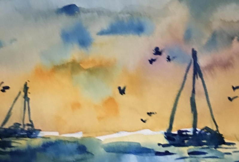
4. Paint a Simple Boat Scene: Okay, so for this one here, what we're gonna do is boat sane. And first thing we're gonna start off by placing the horizon line around here like that. And I'm gonna sketch in a couple of boats in here. So let's try and get this one right here. General silhouette and mast going up like that. Some of these little lines and things running downwards and get another one over here too. And the mass will make this one a bit smaller because it's in the distance. Okay. So when needing and even put a little one at the back as well, you can put a little one here and keep this one much at all, just a little indication like that. And that's all we mean. Going to start off firstly by getting little wash at the sky. And I'm thinking of getting in some magenta is a bit of magenta here and also some orange. So just pop that in quickly. Bit of orange here in magenta, kind of a pinkish color around the page and need a bit more orange in here, it's just not right enough in some areas. More orange, tiny bit more orange, especially near the horizon line like that. And test it. And the rest of it we can just move up, get that magenta running through, and mixing nicely. And as we get to the top, what we're gonna do is just gained some of these tools in blue and get that to mix in like this. Carry this up the page. And then a little suggestions of clouds and things. And to all the papers still wet, we can just pick up a video please. Paint left over on the palate is dropping little suggestions of clouds and things like this. And play around with some error. We wet to give it a bit more interest. Sometimes these inconsistencies not looking quite nice once the dried. So just have a little play around. I felt great. And now it's moving down into the water was getting a little bit of orange first. Just mirror the sky. Just a warm color. Anything really that's warmed. And some of them blue, like this. Really quickly. Just getting a few Lu, Lu running through here as well. Just imply some waves, ripples in the water quickly. Pretty little. Repos like that. While the pipe is still wet as well. All right, time to do it. Because this paper dries so quickly. I've gotta do it fast. Okay, let's draw this all off. Alright? And what I'm gonna do is just go in and the quick little silhouette for the boats. So we'll mix up a blue and a bit of this purple and brown or whatever it is really and just spend some time mocking out these boats. So it has to be pretty dark. Unification then took the Mostyn maybe these near is here as well. And again, that's one of them will get in the others. And this one here on the side. And let's try this one here. Just to make distance and we see what's going on. Let's just have some little small shadows, reflections underneath. That is a little bit of detailing. Some birds around somewhere near the water as well. And we finished.
5. Paint a Night Beach Scene: We're going to just start off by doing a quick rough border around the edges. This page of paper hears and A4 size paper. So it's pretty small. And we're just going to draw in a quick little border like that. Okay? And looking at the reference picture, we're gonna get into horizon line around here. And that's just very roughly sketch. It will only take you a couple of minutes max. And from here we're just going to getting some of this headland here, and it kinda goes up the corner. Then we've got some trees and things like that that come out that front. Don't need to get that into detailed. But what we can do here is also just implies some of the water, but it's quite dark really up front. So what really paying too much attention to what's going on, we can get that in lighter, but that's pretty much all the work that you need to do in terms of the sketch. So many get straight into it. Let's put your paper a slight slot. And what I'm gonna do is just pick up darker pigment. And we'll start actually with a bit of Cerulean Blue, goes straight into the sky like this. And using normal flat brush is bringing that across like that and coming down the page. And I'm getting a little bit loaded down the bottom. We're going to do is just doc and up the top section as well with a little bit more Cerulean Blue and sepia. Just a little bit Dhaka. And we'll go down the page and just lighten things up these. And then we come down here. We want to just grab a little bit of this large colored orange pants is picking some up from the palette quite quickly and then get a bit of the yellow in it as well. And let's try that. Okay, that's looking good. And we'll get that to kind of blend being beaten. The go, do its thing. And then see what happens. In a little bit more yellow here, like that. Smell. We can even go into the mountain errors and that of the deal. And as we move down to the water, really what we wanna do is just make it a favorite Dhaka. So gonna be peaking up beat of the Prussian blue. Actually, if some Prussian blue. It just needs to be little bit doctrine the sky. So going like that, if it touches some of the orange, it's really no big deal. Let it bleed into the bottom section like this. And I'm also going to just warm up a little bit of the area here. On EBIT of the fam orange, this side here maybe a bit of yellow ochre as well. Just to round where the sand is. And she's going to get the blue, bring the blew down. And there we go. Can good. And it will just kind of blend in a little bit with the sand like the swell is still wet. K and carry that down the page. A bit dark and near the front, like that. All right. It's going to give it a quick lose speed up dry with my hairdryer. And we're gonna get in the spirit of headland in quite strong. So I'm gonna go in with burnt sienna and a bit of this blue. It's a Prussian blue. And we're just gonna get it in like this. Not too much work. Just over the top. And I'm just using a flat brush as well, makes it a lot easier to get in the shapes. And merely from here, we're gonna do is just get in some of the trees and things coming up from the corners and Trina bit looser with my brush strokes. Now let's add a bit of brown in there, for instance. Coming out like that. And it all kind of just sticks out of the front side. Now I just want to make it dark and just grab some sepia. We've suddenly this Prussian blue, again, getting quiet doc, and start moving into the foreground. And then just really getting some darkness in this area that just really indicating some trees, shrubs, just dark areas near the front end. And so that all you need to do something like these small paint coming in like that. K. And use round brush. Brush. And I'm gonna do is just pick up some of these darker paint now. And just indicates things like little branches, that kind of thing just coming out in certain areas. That's just to kinda help more with some detailing that go into the speed here. Make those edges a bit more ruffled up like that. Making go in and start maybe outlining areas of the water. And a huge deal detailed in the horizon line. Little goods lying around. But really that's just a quick little watercolor sketch. Let me take you ten minutes maybe.
6. Paint a Beach Scene: Ok. Do another little beach landscape these time during the day time. So it's sketchy and the edges like this. This is a really good way to practice, especially when you get areas with water meets sand, and you just try and get those really soft edges as well. So we start off with a quick sketch and it's getting the horizon line here. And we've got some water coming in here and sort of goes up a little bit close, then it goes away. So something pretty simple like that. There's actually a couple of figures walking around here, which we can get in very basic little representation like that. And then maybe we get another one here. Standing a little bit higher up. This will come along like that is sitting on the beach and the kind of thing he had to we don't need to worry too much about them. And it's getting some of the headland at the back side comes out and stops just near the water here. So I should do the trick. In this sum. Softer sort of clouds in the sky is. So let's start off by just wedding the top part of the paper. And it's kinda bluish because use some blue paint Anatolia. And so we need to do is just sort of wet that area. And just going to go in now with these grayish sort of painting style indicating some clouds or things like that. Stopping in wet into wet and see what it does. And a good way to practice clouds. And let's get some larger ones coming up the top like that perhaps. And his little ones here. Something like that. Okay. Suppose you want to add a little bit of darkness to the bottoms of these clouds as well, just to give them a bit of and put a body around here. And the bottom kinda looks a bit stormy now. K. And as we move further down, I'm going to just add in some more blue water is and this would be two docs i, something like this. Blends into the Scott as nine big D little. Just wanna get it in quickly. Oops. That cross down the page here. Okay. And I'm going to pick up some of these. Yellow has been of yellow Boca. And just do a little bit of cutting around some areas of the waves, but not all of it like that. So just as a bit of white and some areas, I glad I let it join into other areas. And really just move that along the page. Turning is turning a little bit green in areas, but not a big deal. We just get some more of these color in here mixture using bit of buff titanium. And in this section to slightly opaque looking color k. And fully headland and the bag. It's smoking a big kind of brownish green because we're just getting some color on top first. Courage it to do some blending will go back into it lidar. Okay, so that's looking all right. And you can do things like adding some little dark areas of the waves on police. Knife. Time permits. We'll just get some literal repurposing things going through like that. And fill this area here, you can always pick up a beautiful painting stops for a tweaking that onto the paper as well just to create some textures in the sand or something like that. K, right? That a quick dry and we're gonna go into some of the headland now. Picking up some brown, brown, stuck that in there. Maybe Dhaka, some CPI, cobalt blue. The CPI would do the trick. Okay. There we go. And let's carry these washer cross indicating the headlines. And if the color owing can leave some yellow spots in there as well. That we good. That's the headland done. And you're just adding the VDS indicate kind of shed that person's wearing legs here today wearing a hat or something. And the other person in that emit to put one leg in front, the other one. But then we can just get like a little pretend shadow going to the left-hand side. Just like this. Hands coming out to the side. Lag a bit longer. But I think we've got to figure over here as well. He hasn't drag it, so I'm just going to add that figure in here instead. Just, oops. Moving, just funny. Free standing here. Another person here. The middle one that sitting down. Maybe another person sitting here. So just indications of people. A few little bits. And that's it. It's done.
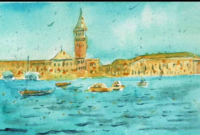
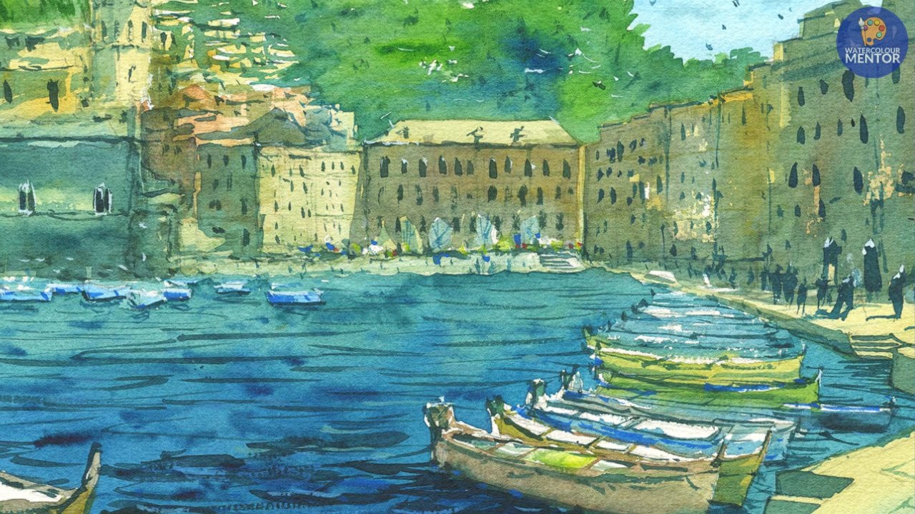
7. Paint a Venice Scene: Okay, we're gonna do a really quick sketch of St. Mark's in Venice. So let's get in the border first and we'll bring that down just around here. Cross that. And then you get the horizon line in around here. Great. And what we're going to try and do this, reduce all these building down, buildings down into smaller, more simple shapes. So I've got the DOJ is panelists here, goes up around that hides and which is kinda getting quick. Little. Roof and sides of the buildings is areas and buildings behind here is well, no, we don't need to getting everything, just the little bit of detail. They're just starve a heres where you need to pay a bit more intention. So we've got the the tower here, so we're going to get that in like this, just a quick little sketch. So break it down into shapes. I'm just looking at them as rectangles, squares, that kind of thing. And so I now get this bit here with the little windows sticking out. And we've got another big on top like this. And then we've got this sort of triangle pot on top like that. That's all you need. And they saw this section into the left here. Like this. It kind of to know what it is. It's another fielding XTO and comes up around here and shunt goes on bitter, they're actually, and this is with three stories like that. And then we've got this larger beauty. This roof just goes all the way across. Not going to worry too much about that. We'll get that all in a big silhouette. And what we can do as well as maybe getting indications of some boats and things like that. So we'll just try to get into this one's kind of Bosch. Somebody like that in passenger but and we get the little boats maybe over here in the background that just indicated some trees there. But apart from that, we pretty much ready to get started. Flat brush three-quarters. First thing I'm gonna do is just getting a lot wash of yellow or RCA EBIT of Naples yellow as well on the buildings. And we'll get in just a quick little background color. This needs to be kind of a warm color that still really not wash. And get to bolt in. And you might want to put it in a bit of that Sienna through these one is, well, sienna will go these buildings in the background. Just a tiny bit of blue to those buildings would be new fad blue because they're in the distance there. And again back to the yellow and Naples. And Naples yellow. Which is kind of getting the silhouette, the stability and quickly like that. It's actually other buildings over to the right-hand side, which I can just apply like that as well. So that's pretty much the buildings down. I'm gonna get in some lots of colors for this. Put just a little bit of yellow in here and fold the other goods. We can just go in adding a tiny bit of color like that. This is just a bluish-gray down column. And we can stop now working on the sky. So really thin wash of just a really thin part of this is just a Cerulean Blue. So try that out. Okay, that's about the consistency I want. So we'll go do bit of cutting around. And this is the hard bid because you need to make sure you're not going other than the areas of the buildings that you have just colored in yellow. So bit of cutting around like that and bring that wash down the page here. So what we are doing, Leave bits of whites in here as well. We don't have to cover absolutely everything. Okay? And you start to see that the buildings beginning to emerge from Elise using the same flat brush. Just for ease and make things quicker as well. Nearly done. Let's just go over to the side that finish off this area of the sky here. Comes down to around here. So we're pretty much done with the sky. I mean, there's little things you can do it you can add and, you know, areas of high concentration of pigment, for example, just in corners and things like that. Just mix up a bit of this and paint that you've got left on the palate and just things like that. And if you want to add in some clouds, you can just pull out some clouds by lifting out paint as well like this. But generally speaking, don't need to worry too much. And you can just leave it as that blue wash that we had before. And oops, let me just redo this bit now. Okay. Now I'm just gonna start working into the water. And we're going to mix up a bit of this blue with the Naples Yellow bit of turquoise, see sort of color. And think about the border just needs to be darker than the sky. So they'd have cutting around everything here. We've got some boats and that sort of thing going on. So I'm just doing a bit of cutting around work like that. Leaving some areas of the boats. Just a lotta sort of area there. Cutting around, bringing this wash down the page. This move water through here actually k down to the bottom. This, we're just going to add more blue as we get down to the bottom as well. Try to talk in this up a bit more. And you know, so what I wanna do is just getting some bits, water running through some speaking up into this grayish blue paint from the palette. And just getting a few little bits, pieces like that. Painting. Iv, it's impressions of Wave, so that kind of thing. And it got smaller and the back stroke that painting there. Okay. Now what I'm gonna do is just get in some little windows and things. Cpm mixed in with blue. Blue, we're just gonna get a darker color. And this isn't kind of coffee consistency, paint and just kind of getting little indications of windows and things like that here. I mean, I'm not going to pay too much attention. These actually windows and doors here, very complicated. And little sketch. We don't want to spend all day doing them. And but they just little bit of indication there. It's fine. Maybe you can indicate the flows a little bit as well like this. Underneath the roofs. Like that as well. Little bits and pieces sticking out from the roof. Just so we need to do that. Little windows and things in the background of three here. The three here like that. Now these twins caught just lots of little windows running across each globin. And I'm just using this round brush to just add in tiny little details, glue windows. And it's not gonna work at all. Okay, just like that. And you'd have detailing on the tau and now just skating some of these little windows like that running down the side indicate some of these little eaves and sort of being at the top. Just doc and these slightly, just a three live wash array like that. Bit of the Sienna here. Well, maybe people will see you in a here studying little details of that. It's not too important. Oops. Okay. Grants. And let's just work on these boats and little bit more so we can maybe getting a sale or something like that for this one, I'm just outline some little details on this boat here and anchor it to the ground by adding a bit of darkness underneath will like that. You know, you can do things like add small ripples and waves to the water. Just like these two fronts like that. I forgot to getting some of these trees areas here. So I'm just going to pick up a bit as Sap Green Trump adding here is to apply some little trees and shrubs, dropping the bit of blue at the bottom to change it up. That going with the feed beds. And tend to also hanging around the, the tops of these taus. And we can add a few more like that in spirit him around. And I can just outlining some of these flows and things on the building's roofs. For instance, here. I think that coding in the back beat Dhaka so that the yellow pops out. And things like that are in this building as well. Really just keep on going. Ok. But I will say that's finished.
8. Paint a Simple Jetty Scene: What we're gonna do now is a really quick sketch of the boat house or kind of passing the JD. And if things so just storing the little box first so that we know the edges and just come around the sides. Okay, so we're gonna make the horizon lines run the meter, meter here. And what we're gonna do first is actually just kind of look at where the water comes in. You can see it sort of start out the back here and then move across, finish off around here. So, and so we need to do is just kind of mock it off as a bit of headland Up the back, which we can change later on. I'm just really quite simple, just something like that. And the rest of it is just this kind of J that comes in and is quite high. And then it comes in here, goes straight, and then there's a new kind of house. Can be a bullshit. I'm not sure what it is and just sits on top here as well as another section above. So we'll just drew an ICT in like that. And what I'm doing is low as just reducing the shapes down to just really basic things like rape tangles, clad. It should kind of go up around. He had read more, but the rest of it is just these little bits of the Jedi that go out and is sitting on these little bits of wood. And then just adding in some small details. Well I can that really hand tool it gets to here. And really these beads, they just did be Tula, follow these sort of hadn't. So we'll work with that. So we made for this sketch. And first things first, I'm going to go into the sky and getting a tiny bit of yellow. And a bit it's read, just mixed in around here. And you bid more yellow will go if the hazards as well. Every guy, beautiful orange 10A, just the Walmart kind of color to start off with. Near the horizon line. And people are easy, it would be nice. And K. And just going to move up now and pick up a little bit of red and blue mixed together. So we can get a kind of a purplish color. And we're going to bring that up, mix that of being. That and get more of that purple here. And I'm just going to add some cobalt removed as well with cobalt blue sky. Just make it darker up the top. So we need to do that. And just continue on to this side. Small quibble blew up the top. Just lift off, hang in some areas as well. It's a lot of bits and pieces running through the sky. That okay, great. Now we're going to start working on this area now. So tiny bit of warmth in the water, just the backup water there. And for the rest of it, we can just gonna get in blue. And I've used the viscerally and blue plus cobalt blue. Just need to make it a little bit darker than the sky wash. Maybe good. Just move that down the page. Nice and quickly like that. I mean, it's a nice wooden wit mixing happening on the page. And over on this side, I'm just going to dilute this down. So I add a layer of water here like that. I'm just going to leave a bit of Watson there as well. Hope that sort of bleeds through a little bit and then I'm gonna get some Gallo, Oh, come mixed with a tiny bit of buff titanium so that we can getting some stand indications of sand and things like that. And let that oh, mixed together and do its thing like that. And you give us a quick dry Bono step. I'm just gonna get in little silhouette of the houses in the back. So I'm going to be mixing up a grayish colors, so good. Blue, red, and a bit of yellow together here. Just kind of grayish color. And we'll just kidding that silhouette quickly of the top of that little house. This one as well. And merging the bottom of the Jedi heirs of it like that. The guy moved that all across the page to the left-hand side. And I'm just referring to the reference picture quite loosely as well. Just get told. And as we get closer to the shore like this, then we're just going to draw now the top sections of bid at okay. Great. And forgotten about that headland. Back. Not to worry. I'm just getting a few little bits and things in the sky that is starting and putting in Dhaka areas underneath the houses, underneath areas of the roof, that kind of thing. And your little reflections in the water is well repose kind of thing. You see indications of some waves coming in that and then some, and you know, who knows its seaweed or something washed up here. To show that. It's finished. Really quick sketch.
9. Paint a Japanese Temple: Okay, so I'm going to start off with this sketch and it's actually a temple. I think it seemed Japan, I can't remember exactly where, but what we're gonna do first is we're just going to get into a little bit of this line here where the buildings run underneath and I'm thinking I might actually simplify these buildings down a fair bit or even obliterate them completely. Just have some loose indications in there. Don't want that to be part of the paintings. So just going to get in some liberal mountains over in that side. But everything in the front here just told a little shrubs and things that's going to mostly covered ops. So you've even got this, and the middle of the page, we've got this kind of nouns and running in the background. So we're going to just get that in little silhouette and the background. And here's the most important part. We've gotta just getting a decent sketch indication of this. Here, the tempos. So just gonna simply putting some basic details, I'm just simplifying this Dan until kind of triangular shape kind of flares out on the edges like that. I k, and the top of, top of the temple, which is going to get in some little details like these. And so one of these we're going to get in with the brush later. Any help? And the name, sort of cutscene beaten in this area here and a rectangular sort of section. And this area here. Kinda when people, people can sort of stand around inside. And we're gonna go and do the autumn pods. Gets the same width as the top sections. So it's going to put that in what we cleaned like feast, come out Assad here, but it is covered also by another building. So little bit of detailing underneath. Really not much. Just enough there. And again, just one of these little areas like that, which I'm just going to draw in quickly. And we're going to get in on the last sections that did come out like that. Again covered by this other building that's here. And then this section here is sort of pointed. It comes out, it hits the second round, the second task story of this tempos I remember just use other buildings as kind of a guide reference point. Okay, so this one here, there's actually another section of a second building running inside like that. For now, Coffee's area that runs them autumn here. So we're just getting a few little indications like that is a new craft walkway or something like that here. Rocks, trees here. It looks like there's a rock wall underneath here as well, which we can indicate the later on. For a basic sketch. This should pretty much do the trick. Even sort of thinking with our 1a, get the mountains coming out the back. Ok. So starting off with the large brush, eyelashes and normal more pressure, guess, I'm going to pick up the UDFs Cerulean Blue and start off just getting some color into the sky. And now this has to be the largest part of the painting. So remember, don't make it too dark. So start off right at the top. And I wanted to be a relatively flat wash on working with the paper and working with the paper completely flat. So it's probably not going to draw a completely flat because of that anyways. So just going to move one of these colored down, but we're just cutting around, but it cutting around the buildings. And so nothing to see here. That if you get that left hand side, then we will be cutting around again the tempo here. Okay? So that should do the trick for the sky. What I'm gonna do is just getting some basic colors down buildings and also for the trees and shrubs and things like that. So a lot of colors in here and kind of fair reddish color, these greens, all kinds of things really. So we'll start off in the corner just with the Sap Green. Like that. And they'll just make, see you in a bit of brown here too. And just want to make this quite loose and focus mainly on getting and some lots of colors in here. So I get a bit of a yellow chunk dropping in to, you know, we've got some sienna which we can drop in like that and just add in a bit of red here. And I wished just wanna getting some really sort of errors and we can just define it later on. And speed of orange put too much on this, so I'm just trying to spread it out a little bit more green. Come through. Just some lots on col is here. Conor's room. Okay. Cool down some areas that, and also there's this kind of rock wool which just going and getting a bit Dhaka. Yeah. Like that. We got and think the Times Good now for me to get in this mountain. Mixing up a bit of cobalt blue here on the palette. Let's give that a try. Just needs to be a little bit darker than the scar wash. And going through doing that mountain, he hit the sky. That's fine as well. And even if there's positive, they're completely dry. K These going on. Cut around the buildings. Very important. And then as we move further down, you know, this is where we were deciding whether to put these buildings, you know, not in. I'm going to actually just go over the entire area in this lawsuit blue. And then later on, we can actually get in some indications of these buildings. We need to. But I'm thinking of actually leaving it quite simple, just leaving them out completely. Kay? And notice I've also left a little bit of white in there as well, so you don't have to cover the whole thing up upon leaving some areas of what actually makes it look more interesting and creative orange here. To let you just need to put in a bit code, these little shrubs and trees sticking out like that. And I just wanna get a bit of blue paint. Thank Lu Bu to add in here. And we go. All right. And while I'm doing QI is just adding in some background colors. To the buildings underneath that's getting a bit of these sort of Coca Cola and feed mole orange. Think through some of these areas here is going to be helpful. In orange here and here. Underneath the roof. Areas actually is kind of orange color that permeates through. Psi is going to get that in. And then I stopped working on the roof as well. This has to be dotcom. That's just bring that down like that. And then we're going to actually go over in a second layer in a moment, but still just trying to be careful to leave. Saw that previous color coming through. And I swapped now to a little round brush because it's going to predominate getting, we won't detail steps in yellow in here. Well, it more blue. That is doing good work here at the top of the temple. And discovering it mostly in lease. And nearly edge is just wanting to gain some voodoo. One is that. And we can even start getting in these top section two. And good, just a little bit of detail like that. So we need that dropping limited color underneath the earth, here and underneath here that Docker. So let's get that in more darkness. They're coming down further. I just want to talk cannot beat Moore's will. Just meet here a little more detail. And here we can just put in the bottom area like that just quite quickly. And I'm going to work this on to this side here of the ten goals. Getting the kinda dark areas underneath that. And the guy just the indication. And Dan, darkness around here to sorta creeps in. Need of Beyond Earth. Indications that just touch and go here. Yeah. Yeah. And indications also like that. And stop putting things like that in this side of the root, we can get some new lines running, thrust down like that. Assad is quite hard. The munchies late that we've got this sort of thing going on on the sod is well, for these roof underneath and not let that dry off would be first. And start just indicating some kind of shrubs and things popping out from here. Just joining on to everything else is trying to be more green in this section. Document down a bit. And underneath here. Can well, one small just indicate these wall. And maybe guy and shrub on the right-hand side. We don't want to get rid of these nice orangey tone running through this side. So just be careful to leave that there and adding some other commas around here to indicate it's a green dock areas at the shrubs that we've gotten even who bits and pieces coming out. Branches and things as well, just indicate things like that. It's going to help keep it interesting. It moves around some of these little shrubs and things. That it's really just a layering exercise. We feel that it starts looking like what you trying to paint. And I'm doing this very loosely as well. Okay. And now comes the issue of the little buildings at back end them. Well, I'm going to do is really just pick up blue tiny bit of throughly in blue. And now what this down a fair bit. And from here I'm just going to do is adding the second layer of mountains and running through like this so that these pins hopefully draws off so you can Bailey So to see what's going on in there. And there's actually a second layer coming across like that or over the top. And there's a few different areas of mountains just going across the back. You can just barely see them. So I'm Sean soft in the edges. Well, so that it's not too obvious that I wanted to detract from the rest of the single sketch, K. And underneath here, I'm just going to try to indicate some little buildings and things. This is just a flat brush that I'm using, a small flat brush. And it's, it really helps to just getting the shape of the buildings and it makes it easier when you're using a brush that's shaped is the object you're trying to paint. Just makes less worldview. If I use the round brush for these, it would take me a lot longer. And I don't look as convincing. So just embed. That could be buildings, that could be anything really say something like that. Does the trick. And just having a look now to see what else we need to do with the painting and thinking there's actually some dark areas through left. And I want to say just in here, there's some darkness there and here as well. So just have a look. The painting and yeah, just find areas that you think need to have that proper title, that color, putting there for it to make sense, that are in probability to f to follow the reference picture exactly as I always say, but having a good range of different times as well as marks on the page, it really helps. Oh, just kinda have it add up to something that looks quite interesting. The last thing I really need to do is just getting this wall and it's going to be more work there. And you just getting some more darker colours underneath this area like that. The temple is another tempo running across the sod and other building. They're just getting these really dark paint. And also to edit a bit more detail here. Little bit more detail. To define the shape of the temple, More specially the top of it. And really tighten K though not to overdo it. Bottom area here. Let's get some new directional lines as well. So I couldn't even ones ten then bottom like that as well. Is just a quick indication. Try working on this little little fence is something like that should do it. And with the rocks and things, I'm thinking dry brush. Going on like that side of the brush. You k some texture. And I leave it as that. They're flying around. Use the digit was that one problem? And then we go into this just a quick little sketch.
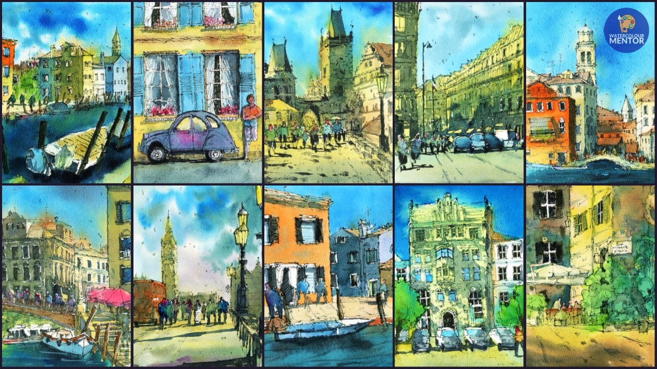
10. Paint a Crosswalk Street Scene: Okay, so we're gonna use this reference picture, the right-hand saw to me just as a general reference for this loose sketch. And what I wanna do is just getting a bit of the corner buildings and the left side of the buildings here and mostly kind of Ross are the buildings. So if we start here in the kinda horizon line, maybe be closer here. And we'll just draw it out like that. And that's the horizon line here. We can have little buildings kinda just running up this side like this. And finishing off around. Maybe just a B, the area here and maybe if that building there and these little blue shades and I kinda think is buildings basically kind of got some nice little windows and stuff running a solid lot. Fats kinda goes No MOOC because again here and that strike. And then we've got this one, cross psi, a little bit of detail there, but I'm not too fast. And just moving up now with the S1 on the sides and leaving a little bit of that sky showing through. And a lot of these buildings are just going to be completely colored in. So that's why I'm not spending too much time drawing in the details. But for some of the buildings like this one, it's nice to just have a little bit of this side showing through so we can get in some windows in cloud that running through the photos and painting and and we're going to shops and that kinda thing here. Going to poll running through here. And all that stuff we can get in. Lighter anyway. But also there is this interesting kind of footpath That's thoughts around about here. And carries on to the kind of footpath here of the building just around there. You can really see it because these cars and kind of just want to cover that mainly up with cars anyway. So I would do some of these little shapes signify cause and we get in more details later, just get him to go get smaller in the background like that. And basically with these more, just outline it like this. And as we start getting to the edges, we just want to fan out. Fan and I like that. So initially it Scott's completely vertical the two lines and then you just slowly changes that it fans out more and that's how you get it looking a bit more. Correct? Intensive perspective. So. And there's actually people walking, pedestrians and stuff like that and each weekend getting lighter. But we'll make a start on this now. And what I wanna do is just getting a bit of that blue sky wash the tiny bit of throughly in blue in the sky. And then not too much us and around. Just quick little indication like that. With these sort of sketching pi b, really kind of going to that area too much anyway. So I just get the coloring and a play around it a little bit. But most path and I'm already too much you can do. Cite skies in, and now I'm going to go straight into all these yellow icon. So cutting around some areas of the sky. And you know, you can leave a bit of white in areas two like that. And this basically cut through like that. I'm thinking will make the sun come from directly above. And, and it's just mix up a whole bunch of warm colors. Really is just Naples. Yellow or normal lemon yellow as well through here. Maybe it Naples Yellow. We can try that just a warm color. You can even pick up some red, drop that in here as well. And just cut around some of these cars down the bottom, which you want to do is just doc and up a bit too easy. You can see just doing this sort of thing. And the bottom. Okay? And getting that foot path like that. And that's pretty much it for that sort of the buildings. So I'm gonna go to the other side now and pick off a bit of that yellow again, drop that in here. And again just cutting around, you can let it mixing some areas that's not a problem. So we'll just leave it a tiny bit of water on the edge that areas so that it just doesn't mix together to one big thing. And continue on. This bits could've been challenged, paints on just mopping up an area like that. Think it over here. It is done at the bottom. You can just do a bit of cutting around as usual. Great. So that's the buildings first wash. Kind of done. What I wanna do is, well, it's just move downwards into the cars and some of the foreground to just want to get this all only one guy. So I think what I'll do is firstly, I'll start off with the colors of the ground. So become a beautiful blue, red, and yellow to have a grayish color. We don't want it to be old to dark as well. So let's drop it, drop that in and it's going to be around. Just the same tone is say, this, these kind of buildings, them a little bit darker. And remember we're gonna cut around these areas. Okay, so leave it white, showing through like this. And then just go and cut around the font. This is really great practice. And go through this kind of thing. Oops, and leave those cars whites as well. If you go over them, it's not a huge deal, but just fun that it makes a difference. Light up. You'd be able to see what you're doing and be more accurate. So yeah, we're doing just is just going through them. Main things, just getting, getting errors of these footpath in. And so we're doing, we've colored. And it's always great to do one of these sort of sketches before you start a full painting if you're gonna do something larger, and I kinda thing because then have a chance to practice and get the composition right. Okay, let's pretty much good to me. And I'm going to add in some yellow on these cars. Just underneath. Whoops, it's starting to mix and I want that to happen yet. So I'm just going to be yellow here. Just a tiny bit like that. And then that one to really just do imply the colors of these calves that and Chile maybe on the roof as well in some areas we've just kind of repeated that yellow coming through. That gives the soloist very picture. R is the time where we just going to get into some more details for the buildings and the cars hold the dock areas. Ok, so of a sofa, little flat brush. And what we're gonna do is just them into the side of these pivoting like that. You've got something quick and easy. And then we sum the bottoms of these buildings here. Coming down like this. Theta is the side of the building is well, moving down. And see, we got the ones in the background. Kind of a bluish color and we can go in with a very large wash. And the main reason we do this is just to bring out some of the yellow buildings in front. So I'm just do basic thing like that. And maybe go on a bit of detail there. And we'll do the same food some of these buildings on the other side. So I'm just going to get some top news coming through the top like that. And it beat here that maybe it was like a shop or something. And we coat the sea area. And that's kinda of Dhaka disputing running down the left-hand side. So more on that building. And then really we don't need to do too much else. Ok, maybe this edge of this building and do something like P. And I don't want to do it and I'm going to start moving on to the cause moments. So let's get a bit of Dhaka paints, ultramarine blue plus a bit of sepia. And we're going to use kinda cream consistency of paint. And with these, I'm just going to indicate we use things like that. It just has to be quite thick. We use maybe like these kind of grill as well. And so you really need to do maybe the sides of the little mirrors. Just mock at the bottom. So thumb to help. Anchor them to the ground like that. And really just to try and think, we can start putting in little windows and things like that on these buildings as well. This is all I'm going to do, just literal strikes like that. Running vertically. Name can actually put some of these little lines to indicate the floors as well. And this might be the ground kinda flaw here. And this is little windows running up this side, this building like that. Lots of new. And so many of them and often stop looking at the reference picture. Because I just want to get some bits and pieces, but don't want to spend all day doing it. On the side a few here. And we can also get these kind of horizontal lines that run through the building like that as well. Is directional sort of lines to help mark out the buildings and give them a bit more detail. So I'm a little windows it, so it's got lots of little lines running down the side. And we can trial said that getting a pedestrian walking along the street of fees that we can get the heads, you just going to put them all in one color. Maybe one in front here. Just walking through. And we get another one here. Another one here, and a little shadow underneath them as well. And right now, that's just a really quick extreme. Sane.
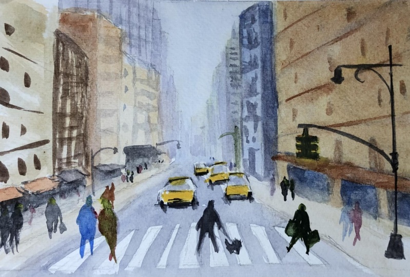
11. Paint a New York Street Scene: So this same here, I've actually got a picture of New York thickness is Manhattan. And what I'm gonna do is I'm gonna actually start off with just the horizon line. I thought it would be really good photo because you can see the lights cutting across part of the page here. And we've got sort of areas of light and dark. We've got some cars, we've got some figures that we can shift around, but a lot of the buildings, I really just want to get in the silhouette as a general guide. So let's get started and pop in just that area where the buildings and disappear off in the distance. Interest around. Here, to be honest, a lot of it's quite faded off in the distance, but we just need a put in a little guiding line there. And he hasn't ebbed away on this. A little fence come in to this side which we might be able to get into a bit of detail there for that fence, but we want to focus on the big shapes. So these two big shapes over here gonna make a difference. And firstly, I'm going to start off sort of in the middle here and get a building in the distance like that. And let's just continue working. Let's have a look. Now I've done this a bit too small. So again, just using this as a reference, HIS actually has to be a little bit taller it goes. So if we see where the horizon line is, where the top of this building finishes, it should be just below the middle point, so bad here. So we can just alter that, this sort of figure and bring this other building up like that. Ok, so it's really important to get some of those initial buildings in and more or less correctly, because that's going to form the basis of all the other buildings. And a lot of these other stuff here. It's really just hidden miss and, you know, we've got little signs and France of buildings and things like that, which we can just implying like that. But I'm not going to really spend too much attention on that. The main thing is just the shape of these buildings. So we're gonna get in this part, we will sign board or something. And then behind the sign board we've got this big building that just goes straight up. Let's have a look. It kinda comes down here is about the same width is the sign board. And we're going to build the building just sort of popping out here and coming down. And I'm just giving these other ones here on the side. So we've got this building coming in like that side of the building sort of showing through. And we've got more areas like these coming through as well. In other part of the building that just goes up like that. So, you know, I'm really not trying to be too accurate here. And a lot of this stuff really is just gonna be obliterated and colored and it's got a bit of a sign or something here. So, so look good position, relative position of it is sort of around here and shouldn't be pumped that in like that. There is some windows we can get in here and not society that you can't hoping any other Windows, I'll just make some other ones up. So this one's sort of covered building here that's covered with the sludge solid, but they're actually windows going across so we can change that up a bit lighter. And really at this point, things are looking pretty good. And I just want to get into facade of this building like that. Something like that would just pop in some figures to some quick little. Because as a lady here and she's holding some kind of bags so we can just getting rid of that detail. And there's also another fella he ages squawking, threw me out. Like that. Another person here and I kind of walking the the saints. Just a little indication there. We'll get it more accurately in lighter with a paintbrush. And because some other figures sort of just walking through as well. So it's really quite a bit going on. We don't want to getting every single person in things like that, but just a few. And the footpath comes off a roundabout here. Enjoy that in quickly. And then we've got, let's get to it in his car in here side of it. This is just it knows yellow taxis coming off their current level. We'll Harry, he had in the back of the car not going to not going to put too much detail until it just something simple like that. And we might want to just get it another one kind of front to here so that keep things interesting. And the distance skin another car sort of here. Remodel wanted to get another car here. Keep it looking kind of busy, busy sort of string, same like that. And couple we use here the back. And I want to just put in a car coming in here, another one. So it's up to you. You just have a play around and find what you think looks good for you. What you want to put train the same. You know, there's a lot of things you can do here and doesn't have to be exactly as the reference photos or even this little part of the car here. It's just really quiet. In the way but we'll be fine. Okay. This one he is probably just kinda need to be detailed teeny bit more. Right? Todd, to get in some of these other buildings. There are some other ones behind here and I mainly we've just got this gigantic shape and pseudo starts off here, comes in and we've got a bit that comes up here. I think that that comes up in front side of the silhouette of that going on. Then we've got this sought of a building coming up as well. And this just constant in front of the other buildings in them. There's quite a large building sort of forms part of this one as well. So which is true to size, kind of down these little recall shades or something like that up to the top. And it's just churning out signs that and you've got just the areas of shops and things behind that which is quite dark. So we get this cause and probably what lotto in then we've got the signposts, songs and things hanging off these buildings to like that. Something like this. Ok, so I think that's going to be generally all rightful for stop and down discreetly. K handsome little marks in the right here. I kinda like an indication of where they're going. And let's make a start. So firstly, I'm going to wet the entire sheet of paper. So I want to get a quick wash running through the entire page to begin with. And Firstly, I wanna getting just the main colors that are running through. So just what this whole bit of pipe it down, I haven't even type it off or anything like that. Move that time the page is speed of paper is pretty old. It's a bit of Arches paper, cotton, watercolor paper. So the sizing is doable, right? I've had it stored away for a few years now, so I think it should be i k, but we'll figure that out once we get into the painting. Okay. So sheet of paper is pretty wet and the way you tell is just look at it from an angle and you can see it sort of Gleason away. And what I wanna do is start off with a little bit of Cerulean Blue for the sky. So just dropping that in quickly like that. It's really light warships Cerulean and really nothing too detailed there. And we're gonna go through and getting some of the colors of these buildings now, so good of yellow. And just going to drop that in here too, the buildings. Okay, oops, forgotten to do the sky actually I have Assad's Speak up a little flat brush. Flat brush, most Cerulean Blue. If these colors mix together as well. Don't worry too much. Just tron and getting some really basic colors to begin with. And can I say, get to bolt down. Okay, so that's the sky was so going back into yellow again is just dropping some of the yellow for these buildings, keep it pretty light. So we can still see the pencil marks showing through that's important in a neat those for lighter. It's dropping that through. You're going to move that down to the foreground as well here. Encourage you. But if mixing in the top area, just drop that in nicely like that, you know, sometimes I like to just mixing a bit of gray or something at the bottom two. That's just going to help with the perspective. Again, wherever this side it needs to be Dhaka. So I'm thinking we'll do that a bit light. I will get an Gollum with his shop is shadow. So let's just get a nice kind of washed to begin with. Some general colors. First, i k, they saw out of the building to just use a bit of this grayish color to yellow is through the air as well. Be two blue, beautiful cobalt blue actually will be better. And just get that kind of mixing through. Even put inhibited red as well. 0 here is just to getting some background colors. This we doing enough. No tron and getting any deform shapes. K. And I see a lot in these booting up here. Some of these ones. I was taught that wash is pretty much complete doc and they speed up here, but maybe that's popular teeny bit to read. The base like these. They didn't do its thing. And the bottom area, gray, whatever it is you're running through here. It was a quick try. The paper is actually more or less droid. These slightly damped in some areas. But I'm gonna just go with your anyway and you don't have to get a complete withdrawal. Sometimes you get some interesting slightly softer edges, the background, but that's drawn off really nicely. Picking up now a flat brush, I'm gonna start working on the buildings in the background. And that's getting some Cerulean Blue with a bit of cobalt blue. And this has to be pretty light in the background. So just having a look at where I've actually drawn in these buildings, it's hard to see now. That's one here coming in from the side and it kinda just goes down and touches events. Yes. So that's all I'm going to do for that one. There's another one kind of infact here which I'm just going to quickly get in his will like that and something quick and leaving a bit of that yellow still on the papers. We'll that's really important. And then we've got this other building that's directly coming up to the side here. So it's dropping some of these Cerulean Blue and, and cobalt blue mix. And if you've got little areas like this with a paints R1, sorry, the going to be to dry brush left on, just leave it and let it do its thing. Because that's just going to make it look more interesting. At the end of the day, I was at the college, everything in and then going down, just trying to get these old in one big shape. There's a building here. Sort of cuts in front like that. So just going to let me just try to imply that side of the building. Okay? And what I wanna do is just get this impression of this side of the building being sort of caught by them live. So that's why I'm just paying a bit more attention here. And I want to leave this side. I want to leave this side. Sorry, than lotta. So just this area here to the left and I'm painting on, just leave that bit of yellow there. And I'm going to mix in some of the other paint and things like that. Through these little MIX. Red going through a bit of cobalt blue. Coming through here as well. That is going to go up and get these larger beauty and coming out the top as well like that. And bring this wash down the page, sort of hits around here. And there's more little bits and pieces that you can just try to imply and try getting just. Here is we had a lots and just reflecting off to the side of buildings and things like that. So I don't feel like you have to kind of collect everything. And is this bit here as well which we can try to get in like that, was a big target here. We have a look at this section. Can do do it something like this. And yellow running 3t as well. A lot of the stuff I just want to give in wash over the top. So just adding some colors. But even shaking what colors to be honest with you, it comes through here. And that's a little sod of the building as well. And I know it's not really implied on the reference picture, but you can do that, just adding, leave that loose side of it and bring some of this down just to the area of the horizon line is here. And you don't have to be just stop around that area. We're going to mix up a bit more of the sort of grayish colors will know I'm doing just mixing our proud primary submitted. It a blue bit, a red, and a bit of yellow. So I'm doing OK. And I'm quite happy actually without us turned out just as a general pace, but I think we're gonna need some more darkness in this area, especially because it's and it's in the foreground. We just want to bring this in more, bring this forward more. I mean, that's why Anja tronic drop in a bit of extra painting here. If you brush strokes and things like that. And we'll go through and do this side now. And I'm picking up again a bit of blue. Oops, dropped a bit of pain there and simply noise. But are these blue again? And it's just a tiny bit darker actually that these buildings. And it's just getting. Some of these going on. That no, not really fussing too much. Okay. And I'm gonna get the soul in again in just one beak shape. That's the trick. Tried to paint in the lodge shapes that you see. Condense it all down. Because if you start looking at each individual buildings and you're going to be sitting here forever. And we went up much fun doing that. Okay. Continuing on bit of red bias on this side. And the load is kind of reflections and things coming off the side, but I'm going to not bother with that. Larger brushes is going to be easier to get in this shape over here. And flat brush just to gain side of this building. And kind of got to know which areas you can. I guess I go on a little bit little bit more loosely than others. But where you've got air areas within the buildings actually touch the sky. You have to make sure that those are just a little bit sharp and the king so that they make sense and might swap to a little calligraphy brush now. And these calligraphy brushes going down and just try and get a bit more detail around this area. But it blew through here. And I really just want to mix up some primaries on the palate. And let that do its thing. Mix together by itself on the pipe. And is getting some yellow here is all just sort of mixed together then K. Okay, so let's bring this washed down. And it actually has to be Dhaka, especially these area. So we're just going to imply small darkness on this side of the building. And I'm doing that by adding some more blue bit of ultra Marine in the corner like that. And just bring that down here. And it's just try to add some darkness in things here. Leave out bits and pieces as well. Oops, this pace, this bit around the sides already drawn so we can't really go into it too much. We're gonna go down here, oops, cut around some of these little signs and things like that. So I've kind of gone over one here, but that's just another one coming in here and leave a few mocks and things like that. I'm just straighten this out like this. I k. And a lot of these cars are actually going to be in the dark. So although I'm kind of cutting around them at alignment, I think we might thinking whether I should change the shadows like Cannes do, do that soul cut around them to begin with? And this solid line up. And never thought about this before. Sometimes when you're painting, you just come across these scenarios where you have an opportunity to just make a decision and literally change and good. And I'm gonna do now let's get a bit of this BU, bring that down. Carry a little bit of this color off to the side like that to just imply the path. And there's little path here is well, like that. Thinking what I'll do is just get a shutter cutting across, but who have areas as well with the lot is hitting the top of these cars. I think that's gonna, nasa will have part of it kind of looks skewed. And let's have a try and see. That's getting some color. Blue or red. Mainly blue, that East indication of some shadows here cutting across like that in between the cars. Maybe just a bit coming down here. And I'm going to close there is drawing this beta. And then we'll have another shutter kind of cutting cross. So let's get and beach sort of coming in here letterhead and coming across here to footpath, the area. Go to these shadow because well, we just need to indicate that something weak and the like that. Here. Just doc in this whole area and the front. Doc and it further. And I think that would do it. I'm just going to dock and this side of the car a little as well. Just so that it makes sense that the shadows coming in from the left like that and do it for this one to something like that. We're still going to be able to save it when the screen and that sort of thing. And, you know, we've got a guy here as well, which I think I think I'm just going to obliterate that light up, but for now I'll leave that to do it's kinda thing and dry off. Okay, so the last step here, we're just going to be putting in the darkest areas of the painting and just a few other colors at the magazine and that kind of thing. So let's go ahead and just want to work on these cars a little bit more. So just mixing up some darker paint. It blew and a bit of sepia and just work on these wheels a little more. And another one at the back here. Just drawing it up a bit. And we can start just adding in some dark areas. The right-hand side of the car detailing. Okay. And there's even this one here, the solder becaue, which we can just indicate a beat like that. This HEA behind just getting the wheels underneath like that. That's an important pot. And this one here, let me, I'm done. The wheel here. We'll hear another wheel at the front so we can just connect these. Air is a kit that bit of a shadow running through as well. And it's actually a bit of a wind screen going on. That side. And then something I forgot to do is just dark and decided the car. So that it makes sense and it will shatter, makes sense like it's coming from the left. Here we've got a larger car or something like that here. Again, I'm just going to add some rough details like that. Debian motorbike or something like that. Okay. It a details for these buildings. Now, so I'm gonna just try getting dry brush to indicates and the edges of the buildings and the sign boards and things like that. I'm really not too fast. I mean, it's looking fine as it is at the moment, but things like windows, and you can just try to try brush them in like that. Sign mu signposts, sign board I think has a lot of that is kinda facade of the building coming down like that. Like that, being pretty quick with these. And then we've got the loose onboard the little windows. You can pop in like that. Really goes through and it was much as you like, really just grab the flat brush. And now we can just try to get some dark areas in this spot, especially It's where it heats the ground. Cut around the field is that and the ones in the background, we don't need to really add too much detail. I mean, you can get away with how it looks even at the moment, but I'm just putting some literal separations like that. You can also do little mocks running across the buildings just indicate like the flaws. But don't make them too detailed in the background. Because that's just going to detract from the rest of the painting. So that all say on a du for this section. And we'll go over to the left-hand side. So again, let's have a look at with this building kind of starts to pop out. So round bat here. So I'm going to use the flat brush and just draw in a line. Coming down the page like these. Stronger before read in there. That great. And this is doing is I'm just indicating the front of the building that and just indicating little details that may or may not be there. And really just dry brushing some of these seem leaving BY that previous wash. Showing mixing up a dark, dark here, your CPU and ultramarine. Kay? And underneath here just need to dock and that a bit more. This is the side of a building coming down here. And then just a little bit of dark spots in the background to help kind of draw attention to the caused lot coming off these cars as well. Kay, we blew that. Great. Now we can just put in indications that Windows using this flat Prussia as well that are not, again, trying to emulate the reference photo, but just a little bit of indication like that's going to help. We can get some kind of lines running across like this just to indicate the side of a building. And this one here as well. Notice the directions of these lines as well as common off on a slight angle. And this one is just strike that. We got a few more here and some of the background. So that all think I'm gonna do for those bits and pieces. And the last thing I'll do is just get in some figures in getting some colors and things like that if you want pink or something like that. Here. And we'll go in the sky. You have orange on them. On another figure here crossing the road. That really up to you. Another person there. Someone here is, well, we just did it in a bit of red. Oh, magenta to mock the heads of these figures. So just adding a little bit like that. Two strong, let me dilute that down a little. This connected onto the body. Getting some legs too long. That some hands joining on those person carrying a bag or something like that. Since walking. And this person's just standing still. And this one's walking across the street. These and this one was walking forward saying this one. Well, that could be walking into the distance here. Nice. And just try to indicate the shadows underneath. So just walking, just get it kind of coming towards the right-hand side, just a quick indication like that. Running through and maybe get some, hey, hey going on. Talk a CUDA. Just add in a few little bits and the background to finish it off. And one thing I forgot is just these little fence that's running here. So this can be roughly indicate something going on here, but again, I'm not so fast. There's other things you can do. You can pop in traffic light. And with the doc has sort of paint. You can get in and beat one here. For example. I'm running across the street and we've got the sort of area that we've got ten pose and things running through is well, and we can ply like that in the background. And I'm just going to redefine the cdr of the path and the shadow underneath the car. Another thing people like to do, sometimes things just sort of do this with these little mocks running behind the cost that it kinda looks like the cars come from that particular direction, just gives that sense of depth to the painting as well. And then I can put it in a few other directional lines and things. Bits and pieces running through the painting. Just trying to edit 20 little shadow running on the right-hand side of this feed is 100% necessary. That and I'll say we're done.
12. Paint a Statue of Liberty: Okay, so we've got this interesting landscape here of New York and the Statue of Liberty. So I thought I'll give this a try and sketch this out. So let's get him some of the code is first week indication like that. Just bring that one up and bright and make this sort of very here. Just where this statues sitting on. And it goes around the half way mark would just because before the halfway mark here. And we've got three kinda skyline in the back ground. So just try to work on this statue. And just looking really at the moment that the areas that it's sitting on. Just a bit of detail like that and just really of reminder of where I need to shine. Lights are on and getting emitted darkness. So v, We've got it sort of the platform stops around here. And the end goes about here. Look, some other section. It goes up like that. And then down again. To get the same exactly. I'm just just look at it as just the shapes that are sitting on top V Java. And he would go be a statue. So start ringing a big little detail. He especially, and when we got, when we start getting up to the top, it's quite important. And then took a look, kinda comes out of it. And we want to just read in a teeny bit like that. Then that. Yet, right? In this section here, k is below the interest that you sitting on. Sorry, enough space in here. Let's try so probably not left enough space, but we'll do a bit of a sketch like that. Then. Silhouette, reaching up to the sky. And Yeah. Indication on the back as well, like that. I can now write the heads to be. So we'll just reduce that down a little. And that sort of goes upwards here. It's kind of in line with this thing through the body. So just reposition. Kind of cool. And that just about covers it, has little bits and pieces here. Some trees in the background there, which we can emphasize a little. And rest of it is just this New York skyline. Never been to New York before. I really wanted to go for all this. Drama happens. So I hope I can one day once things are a little better, but with the, with the skyline, all I'm trying to do here is just getting channel indication. Now, if you're living in the city, you probably recognize some of these buildings, but someone like me who maybe has a general idea of what it looks like. It's not really going to be two apparent if you've got a building or something like that missing from the from these areas are just trying to get in some general structures and buildings here just mark out also where the water finishes off. But here is building here. Remember all this is going to be putting quite quickly afterwards. Just as channel silhouette. The sketches really make for great practice and preparation for when you spending time doing a longer painting with more detail, you can definitely, definitely get some great practice out of these buildings in front like this building here. And I think that just about does it. So let's get into the sketch and what to start off with a kind of wash in the sky. And then we'll make the buildings warmer. So first thing I wanna do is wet the entire area. And this is just going to make it easy to get some really loose colors running through the whole sane. And I want to make it actually a kind of a sunset scene. Just a bit warmer down the bottom may not be an actual sunset, but I think a bit more interesting with the warming caused. Combining together a bit. So get that water in there, just some clean water over the top and start popping in some spirulina in blue in the sky. Slow. Just a bit like that. Too strong. So I'm gonna spread that out. And areas like this do its thing. And just around the statues and the buildings, I'm gonna get in a little bit of this yellow, it's beautiful. Yellow Kuk and blend that in while the painting is still wet like this. Until the statues. Well, just a bit of 13x showing through that. Let me go ahead and let that all do its thing. Moving down the page, I'm going to just dark and this color up more have some cobalt blue cobalt blue mixing a bit of this gray leftover on the palate as well. So there is not to the right. So we're gonna do just getting that quick layer like that. Really just using large flat brush to get in all this water. Like that. Say I don't want to do also is again, just added some little ripples of water. So I'm going to be picking up some cobalt blue mixed with CPR and make sure that it's thick, almost like a creamy consistency before you attempt this. And what we're gonna do is just drop it in like that, like this guy here. And this is going to spread out a bit. And to make it look a bit more interesting. Just some indications of waves, really. Ten, don't ever do it. I want this nice little Wash to show through in the back as well. Join some ladies up a little bit as well. I don't want to constructed. And we got so first wash done saved. Let's give it a quick drive like I want to do with the buildings and the statute as well in the foreground. So picking up my number four round brush, just a small around brush here. Mixing up a kind of reddish and a blue kind of aroma Gray, I suppose you could call it. And going to just go in and start adding in some of the docs QA, testing that out, see if it's dark enough, really needs to be Dhaka like that. And all I'm doing here is that I'm just getting these area of shattered here. And we'll do the same for the section, just as in the reference photo like that. And then, you know, there's an area here is we'll casting a shadow. So we can just start adding in literal darkness underneath this wall down and boredom is, well, here is a little platform. People so to standing. So just joining it up through the water for V8 first. And I'm gonna have to go for lambda to make it stronger, but just mock out way. You want it to be near here, that's Docker as well. Just get that in. Again, just joining things up. And this some little windows areas here, which I'm going to intrinsic has, so we'll just get that in. That in the background is dark trees. So I'm going to just get in the green and the Sap Green and apply those trees. And also good thing about this is that it's going to help draw out the area of the statute because it's because it's Dhaka like that. Let's just give it a set Green, different mixes of sap, green and blue. Like that. Then it do its thing. And we'll do the same thing here over on this side to that. Cutting around work. And I'm all emphasized. I mean, he's really in the in the reference photo, but that's okay. Sometimes you have to do that. And let's go back to the statue. Getting a good mix with color three He now and just seeing, and let's get some little sort of dark areas. Lot of it is this creamy kind of color. See yellowish and sandstone color. So we want to leave a lot of that. They just work on getting in little areas of shatter underneath like this. And here we've got the statue and we're going to just go up in imply a shadow on the left-hand side like that. Okay. Reaching up. Mostly just going to go back into that yellow Erica and pick up a little bit of that so I can dock down. I'm gonna use a flat brush Actually. This is kind of make it a lot easier. Just to dock and down the left-hand side at Monash, dissolve away some of the other paint that term. We can still go back into it later. We want just a little bit spatially dot on the left hand side. So I need to imply that k, Here's Well, just talk on that a little bit. Then. K. And what I'll do is just add a tiny bit of this buff titanium to the statue. This isn't off-white sort of color. And do you think and to help, again, just indicating scenarios here. Right hand side of the statue with it. You know, windows and things like that. Entrances. And here's what else we got here. Okay. So I'm going to work a bit now on the silhouette of the buildings in the background. And what have I got off? Just got a little flat brush here. And I'm gonna make this predominantly blue. What does this cobalt blue? And also trying to leave out a bit of the white showing on the right hand side of buildings. So let's get a flat brush that's a little bit smaller. To try side. One of the buildings behind, maybe go beep going on like that. And they're actually Dhaka than the statues. So if you look at the reference, you see what I mean. Okay, so let's, let's get that in like that. Remember, really important to leave out areas of The yellow showing through. Can you kind of imagine it as the right hand side with these buildings have a little shadow, sort of light coming off them. So it's kinda keep things look in a bit more interesting. That bringing that down there and leave at it's in pieces. And again here top of that building there. And then we've got some of them bottom areas do want to just lead will be in sunny areas. Feel that darkness. Neither base. We Dan Hill, Pat literally say mostly you want it to be just a sort of mid time. And we'll just continue on. Again leaving bits and pieces and bits of the yellow on there, to imply a little bit faster now. And leave out this pig here that could be a building. And then just a bit more darkness, strengthen some areas as well, that's going to help. And I want to just get in some sharper waves and maybe a boat or something in the background. So it gives us a quick try first. It's getting some darker blue going through the water. The trick is at the back, just again, make it smaller. Little waves. As they hit the back. That's going to make it more convincing, smaller and lies on the back. Like these trees in the same brush, which makes it kind of harder to do, but it will manage. Right? So like that. And you're gonna get in a silhouette of a boat, a couple of boats, and see how we can just think it looks a little bit there, but he is just something like these monies to be in the dark. And that can be a boat. And we might have another one up back, lay something here, maybe one here, for instance. And getting the mast as well. Some very basic indication like that. And some of them can be Thompson votes. That pretty little errors on the building as well. If you want to define some areas of them, can do that. And then we separations like this. Having a look back at the statue, It's up to you. All right, at the moment actually, you sat in a few birds. And I'm not just leave it as that.
13. Paint a London Landscape: Okay, so we're gonna get into this, gets straight away. And firstly, going to start by drawing in red on the bottom of the bridge. But we've just getting a quick square around the painting first. Just a really quick order. And we want to make it around here. Having just have a quick look at the reference picture but on site just around here. Yeah, that finishes around there is an boat and around this side here, I think it's just a passenger but a fairy or something like that. And pretty easy to get it in. It's just a bunch of boxes on top of a little thing like that. And really from here, I'm just going to draw this top bit. Rich. Coming across. Finishes just around way this boat starts. But what we can do is that we can start putting in and here's the bridge size, 1234 K. So for sort of sections, and this one goes up like that, saying this one here like that. And you go to this section that comes in down there. Whoops. And it goes a bit further here. Then just joins up with this section here, kind of goes up. Then you've got this little bottom bit here that joins up to the top section like this. And that becomes the top of the bridge. Bottom. And just repeat this patent along the bridge. As we go along. Maybe guys, just something quite rough like that. And there's all this sort of stuff over here. Now what it is, but there's a bunch of trees, so I'll just quickly get that in like that. And now what we wanna do is just getting a quick sketch of this kind of silhouette of the buildings. Really, I just want to check out way a starts. I ran this thinking one here. That's where you want to just get in. And these are the kind of duty. I had a lot of detail. And then, you know, you don't wanna get too called down. And, and that sketch like this as well. Parts of the sun, the restoration, I think at the time the photo was taken. So that is a lot of things going on. Sort of cover it up, so okay, Santa have to carry on as usual. And just pretend there's a buildings there. And we've got this hot as well, sort of comes up like that. There were sections that connect that down like that. And just have a look, what else we need to get in. This is all just going to be big silhouette When we start actually painting. So I'm hoping just to get in most of the detail, actually in the brush height us. Move that over its bits and pieces sticking out. Here, we've got them big bands. We need to just put in a bit more detail in this area. So just trying to mock out some general guidelines at the moment. And seeing whether it makes sense or not. And section that comes down like that. And then put a movie, it comes in like that. And we've got another section here. A little bit of detail on the clock. Buildings here in the background as well. I think that does it for a quick little sketch. What I wanna do is just getting a lot washed over the entire painting. So what I'll do is just wet the paper. Especially the sky area, really important. Just a bit of water into the sky like that. And you're going to be picking up bits of gray and leftover paints mix together. And we induces drop that into the sky like that just to create some clades. Everything all mixed into one. And this will create some three. And soft looking clouds running through the sky. Wet on wet. Which is fantastic. Saying is put a bit over here. And then maybe one over here, paint and that area. And just with that one inch flat brush going over like that will make the clouds smaller as they come down like this. And a few up the top there. If I can get into a bit more, into this guy actually cobalt blue. And drop that in some areas. That k and soft enough. Some spots. These just anywhere that you think looks a bit irregular, detracts and smooth it out a little bit like that. Okay, so what we'll do now is just go into some of these buildings and then actually this water's pretty much dried off. But I'm going to get in yellow bit of yellow ochre over the top of the mode of these buildings. And the reason why is because been ingoing lighter with the kind of cooler colors and having just the beauty of these warmer column below, it's going to help. And then just really roughly getting in is silhouette like that. You can almost see whats going on already. This some trees here. So I'm going to just imply bit of green, dropping a bit of blue here too. Like that. The green and blue in the corner. And for the rest of it, we're just going to continue on with that kind of a yellowish just yellow ochre then using in Washington, Erica. Well, the cross, and it's referring to the reference picture every now and then. And just getting in some of these buildings. And we'll add some more details on later. And this last one here comes up more bits and pieces on the top. And then sort of areas here as well, so that should do it. And then It's just a warm color that's going to work fine. You can use a bit of orange in there as well, will bend Sienna is to darken up some areas. Just having a look and saying, I can add in some quick little shadows and things. Dark areas that maybe loosely on the right-hand side of some of these buildings. And okay. So I'm going to move down now into this little bridge. Again just using the flat brush. And I'm mixing up a bit of gray paints, really just native yellow, orange, blue here as well. And destroying the sum on the bottom like that. And keep it general shape of that bridge going on like that. You don't need too much detail here. Okay? So we need it's kind of like a bluish gray color like that. And it will blend in here to the top like that, which we can kind of get into a bit more detail later on. But I'm happy with how that sort of looks at the moment and behind the bridge, or just want to add in some little bit more yellow in here as well, so that it's not just completely white, suggest a warm color. Lifo bit of white. And to separate the bridge, you can have it blend together in some parts. But for now let's just have a little bit of white and all the birds. I'm gonna get it in also in a kind of wall color. Let me just getting a bit of blue up top here, can leave a tiny gap for the white to show through. It's just gonna help separate out that boat. And what we're gonna do now is just getting some blue, cobalt blue and dalda down a bit with some of the gray. And we're just going to now. And in some of this water so that it makes in some areas that bit more cobalt blue that covering around this boat. And I switched to a larger flat brush. Spring is washed down the pages a little bit too broad and it's going to dial that down a little like that. We're going all the way down to the bottom. And this just makes sure that the bottom is the Mintaka. That's always locked. Darker paints in here too. So just picking up a bit of CPI mix that in the blue and cobalt blue and just dropping some sort of streaks running through these, this era. He used kind of draw it a bit funny. So see how that works out later. Areas of it just pools. So she, when you're using very lightweight paper and you tend to get this happening. So just a little bit of this indicative work is great, but you really can't do too much with them a very lot, right? Pedicle like this. Okay, so That's looking pretty good. I want to give this Quick Draw before we start with faunal step. Ok, now to get into some final that details and bits and pieces on the silhouette in the background. I'm just going to mix up some gray paint, just makes you three primaries together. And I'm going to go over this entire thing again just to bring out some areas. We've got some chimneys and things as well that we can get in like this, really implying what's going on. Nothing too detailed here, but leave a bit of this nice green and, and funny little wash affects from the previous layer that's really going to help. You know, here we've got an area of the building sort of going up. And the Z top parts as well like these, which we can get in doing a lot of sort of drawing work with you. Brush honestly. So just that side of the building that's called the shadow wanted right-hand side. We've got the little area down the bottom here. We can just, oh, stop getting in a little bit of darkness on side of cloak. Them. Just do indications like that. Can bring that down. Night into darkness down the bottom. Guessing what's going on down the bottom because it's still on the construction construction and some of the maintenance of something at the time. So just try to soften the edge a bit is well, bring some detail back into taught to suggest a bit. More careful here. It's going to be more careful in them. Tom is a bit. Let's get in single paint off the top. That in bits and pieces. Mystic enough, grease. The speeds darker. That literally indications. Okay. And we'll just start going to the bottom areas now. So yeah, a lot of this is just them trying to figure out what areas you can bring out. Adding a tiny bit more detail. Maybe you feel is necessary or not, that's up to you. So I'll like to get these little hairs on top of the buildings like that. That really helps you skin to bringing this down a bit mole. Notice I'm leaving some of that previous wall shears moments helping the side of the building which is kind of Dhaka. And areas where there is darkness. Really just looking at areas of light and dark in the painting. It's one of the Talmud won't even show what on painting. It's more important to just looking at the shapes and Dagestan back every now and then, just to have a look. And we're going to really shatter the lead in this area here is going to be taka. As we move down. Turn through as well. Schizont, red, yellow. Now to the left-hand side and a little bit more work here. We get that. In these. This is just a bit of guesswork. It came over here. Just to the right hand side again, implying that we will shatter. Some really good practice. And a detailed look at this section again. I just want to add in some more detail. More detail. Feel this is important just to define. Seeing as it is a quite an obvious subject. And innovative brushwork size like that. And really just getting in that kind of Darkness under the bridge. I'm mixing up a bit of a blue and a sepia. And just going to more darkness here. That will also take this chance to kind of outline the top of the breach to paint across like that. Some little reflections coming off. Items here in this little boat edge. Whatever it is. That smoking. Now, just for some areas that you might want to emphasize, I'll get some more darkness and to think what would be good is if we get some just literally indications of windows and things. And and I don't really know where they ought to be honest that I want to look at the reference picture and to figure out we, every single little window is but just a glance at it and try to figure out some of the areas that would benefit from a splash of color in there. A little bit the architecture and tried to figure it out in a very general sense. Similar looking, he is little windows all over the place. And no day trying to figure this out. Just Paul Paul coming. And there's also kinda cars and things under the breach, which I haven't really gotten that, do this sort of thing and not even be able to see it after it's tried. To be more detail. Going in. And a couple of little birds flying around this small little windows we can fit them in. And it's finished.
14. Paint a Street Scene: Okay, so we're gonna do another straight c. Now the difference between this one and the one before is that we've got a shedder running across the bottom of the painting and also down the meter was Well, so what I'm gonna do first is just getting generally the RAS and law. So I think put it around here. And we just draw that in quickly like that. And we're gonna do is we're going to just getting some structured also to the path so we know so one side of the path, so to hit her and hear and saw it sort of finishes here. So let's just get that in like that. And the other side kind of goes there and he'll say something like this is a bunch of cars as one larger car here. And you can always emphasize them more as well if you need to. And there's even a car that's down a lane or something down here as well. So I just try to get in detail and that caused sort of sideways and hits a building. And I just read to that a bit, actually coming out to like here. Okay? And some of them we use underneath like that. And what we're gonna do is just get this building in here. So actually comes out, bad points. Wrap that oath. And the main actual composition elements that you gotta worry about is just these lodge shapes of buildings. Now if you just simplify it down, you got this Lodge here rebooting. So left cost and a lush law Sharia, he get that all in one go. And then we've got these buildings to the right-hand side is going to be more careful. All because areas of sunlight and things. So I just, I'm gonna get this warning coming down here like that. So he finishes off behind that car. Then we've got reaching down like that. And really the rest of the buildings here or not. And that important. So just some basic structural details in the background. But really be too worried. Just thinking mainly of these buildings here in the foreground. But again, we do want to make sure that these buildings and areas and the background are quite loose and they are still present essentially. Ok, so just get these area here at the back. And just kidding. Another sort of building running through here as well. And really just a lot of things going on in there, but let's not get too bogged down. And I'll start getting in this building first to the left, and it's around the same height as the end of this beauty may be a little bit taller, such as Duran here. That and looking at where it sort of finishes up as well, saying perhaps around here and it's going to top of the roof, sticks out that and comes down like this. It's simplified, but that's what it is. And this is actually a photo of Chinatown. And I've just realised, say, look at these buildings of more complicated. It is simplified down triangle here and here and underneath, like that. Oops, it's a little triangle. It's always What I'm trying to do when I'm looking at buildings, just reducing them down into simple shapes. Ok, because a lot of this you won't even be able to notice once we go over lambda. Okay? I think that's gonna do it. Enough detail pencil wise. You know, there's a little light that's coming up here and finishes here. And in blue bins objects or a nine down the side here, which we might just get into imply b to be shadowed and figure walking across a road. And like that. Put his head facing this way more and just get the legs in. It looks like walking. And with that foot forward. And, you know, we've got other people when things like that, walking along the footpath sort of in the background. And so this one's just a lot closer that on the buildings as little signage areas and a little balcony here like that. So these are just little considerations. Basically just leave these the previous wash collar. And so we're gonna get started. And what I'll do is, well, I might just put another car here to balance it out. I feel like there needs to be something here. Solve the painting. And then we'll see what we do with this figure as well. Okay. So getting into the sky, I'm going to be picking up some ultramarine, dropped that ocean generating. Think I'm running out to get it similarly and instead, keep it very light, that's way too dark. So I'm gonna just spurt out that column mall like this. Okay, and we just leave out the building's cutting around the buildings. Little bits and pieces. That is why the drawing is really important, just forms a guide for you later on. And no way to go. Even if it's just a very rough guide. That's important. Too much paint and would just water that down again and goes, oh, ran about to here, say OK. That's looking all right. And we're going to start getting in some colors for the buildings. So a bit of yellow here for the side doesn't matter too much. On the right-hand side because we're going to make it darker anyhow. But the left-hand side, which is going to pay more attention. So just getting an upper yellow ochre. We're gonna getting some burnt sienna too. Just to give that icon of lots of wash and warmer wash to start off with. And notice I'm just leaving a little bit of area here of watt. And the reason is, is that it doesn't go into the skies and mixing. And if you get areas of mixing, SRR. And I get it all over the place. Just gonna doll these down and just getting very thin wash back. Not too strong. You also just want to dock and up at the bottom of the buildings like this as well. We can do this V lambda as we do the entire shadow. And it's getting some of the colors here to the left. Them yellow and a bit of red mixed in here. This needs to be pretty light. The student ply is area are vast sunlight that bit more yellow. And some areas like that, that's been a carry that through to the back like that. And that kinda round these figures. We can kinda doc and off the back of the building here more. Because that the air is in shadow. And then cooled down. That error is trying to add more yellow through to that mix. And I want to carry this wash down as well. So we'll capo these figures. It's not a huge deal. I don't want to ruin a nice wash by leaving Apple figures. So I'm just going to add that in. Just a load of PCL at f color like that. Let it do its thing and mixing the bit of this gray at the bottom two. Yeah, and so I really want to do just move this across to the other side. And thing. Right? So happy with how that looks. I'm gonna give this a really quick derive. Okay, time to getting some of these buildings on the right-hand side which never doc and them down and I'm going to go over the top with a bit of these lose but of cobalt blue. And also going to mix it with a bit of Ben and sienna. You'd be written k. So let's have a look at the strength. That's okay. And I'm just gonna go quickly on the left-hand side like that. And being wary to leave some areas of yellow is showing through. Like that can just do imply maybe a bit of sunlight coming through. Case. Really. For most of this, you just want to go over the top and then get this all in one big shite. Okay? And we do the shadow at the same time. We're just going to bring all these down like that. And the car. And we can start getting beat up the shadow showing through, cutting through like that. And we got more blue sepia shape. Just running through that bottom area. Has to be quite OK. Ok. And what I'm gonna do now is just gonna be getting some of the shadows on the side of the buildings. Drop that side a little bit. And just a beautiful kind of reddish paint in there, the blue mixed in. And I'm going to just get that sought of building marked off like that to show that it is in shadow. And so and need to make it come down more actually. And then here, okay. And stop putting in little areas here, something to smaller flat brush. It's hard to do now. And just adding in just little shadow, shadows underneath some areas like here. Then look, you got some good days. The sign separating out these building in front, like that detail running through this figure in as well. It's more in the background here. Couple others. Just get some more details to the cause as well. Couple, we use iCloud and another chi here. I kinda think. Ten other ones here, too. Shadow running to the left-hand side of these cars. And we saw it needs to be more of the shadows. And I'm just going to be like that. Beta k detail is feta, he might be holding something. There's another one here in the background. And links. Going to detail these buildings at the mall. Just adding smoother little signage and balcony and things like that. You can just play around. We didn't somebody dies as well. The buildings sort of building behind here. That's just getting that. I quickly kind of cutting around section. Kay. It gets indications of windows, that sort of thing. So I can add to this one here, needs to be talked to K. I get a bit of a shedder running through some of these big as shrub was something coming in from the side and a few little beds. So I want to just add in some small windows here, maybe some direction of lines. But let's have a little bit sad in some windows on top to kinda signage here as well. And those sort of sign bit of detail. Wind dies or something like that. And perspective. There's both of these, this building do the same thing for this one, is something like that. And we'll weigh windows, dogmas underneath me. The area, some of this and then darkness running through that one as well. We can try to get a couple of lampposts coming up. Really started pushing out because this not too many layers that we can start changing. And this sort of paper, but something simple like that is doable. That is carrying you put another one here. Simple lamppost. Carries some further down that he's just playing around and experimenting with different techniques. Really. Someone just leverage that.
15. Class Project: Okay, so for the class project of actually uploaded all my original paintings into the project section as well as the reference pictures that I've used. Now, I prefer to use the reference photos because that's just going to allow you come up with something a bit more original and your own flair or as well as get you used to and practicing how to transfer reference photograph into a painting in a NAS sketch. So if you want to use my original paintings and sketch off those completely fine, but I would recommend you to try actually using the reference photo is actually going to get you a lot more benefit. And that's something I do even every day. I'll pick a reference photo or from any of the free reference websites and just try something new. And that gets you use to looking at a photograph, looking at with shadows and when a Lives area off. So it's just going to be good for you to get your head around that. Okay. So once you've gone in, sketched through the drawing and you can follow along to the demonstration as well, because I do go through the drawing. Just follow along and use the techniques and tips to paint in the rest of the sketch. So again, you don't need to, I guess when I'm using a sky like this and you know, just making mostly flat. If you want to actually add some clouds, go ahead and add the mean, give it a try at the end of the day, this is a class about experimenting, just pushing your boundaries to try something new and spontaneous. And again, not being too bogged down in all the details, so fine a lot of the time. Just do something, add a little bit of detail and let it be. And when it dries often you look at it and think, Okay, that's great. Actually, I'm glad I left that, but if you go into it while you're painting and keep trying to correct things. And that's when you run into issues and things start looking overworked or areas of the painting just look on balanced. So have fun. That's the main thing. I want you to get out of this class. And if you finished all the demonstrations in this particular class or unlucky to do is hit on some of the free reference photo websites and pick up a few photos of any kind of saying that you wanna paint and give it a try just using the same process that I do, sketch the photograph and tried to paint it. So once you done, upload it to the project sections and really interested to see what you all come up with. And if you have questions as usual, just leave a message and the discussion or the projects section, we'll now I will get back to you.
 Watercolour Mentor (Darren Yeo Artist), Art Classes, Mentoring & Inspiration!