Transcripts
1. Introduction: Hi, my name's Darren from watercolor mentor. And in this class what I'm going to be going through is how to reduce down a seemingly complex scene from a photograph into something that's quite loose, vibrant, and interesting to look at as a painting. So lot of times you can sit around trying to paint something and you might spend hours just trying to get in all the little details this class is for people who are interested in just getting a nice impressionistic representation. Seen. The techniques that I'll go through here you'd be able to use for pretty much any watercolor painting that you decide on. However, it is more targeted towards people who are looking to reduce down a building type seen maybe you have some figures and birds learned out of paint water. So a lot of these elements are cover in the class itself will talk about how to use wet on wet watercolor techniques to do just some soft ripples and waves in the water and just how to go over the top with some sharper waves. I talk about different tones, making sure you're getting into lightest and darkest values of the paper as well as some mid tones as well, balanced, loud. So if you're interested in learning how to simplify down a difficult scene and about an hour so that you can paint this beautiful scene of chink away terror. Then make sure you watch this class and enroll.
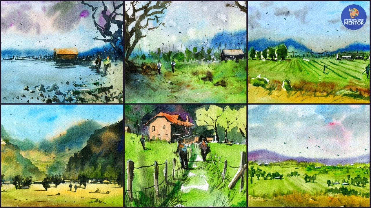
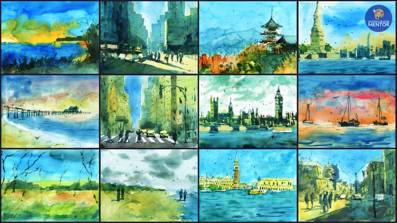
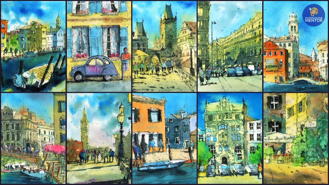
2. Materials: Okay, so for this class, the materials that I use, essentially a 100% cotton watercolor paper. So the main paper that R uses, Saunders, Waterford, it's up to you if you want to use other brands. I don't find them to be too different though. I've just gotten quite used to the sizing on Saunders. So that's the paper that I use. If you don't have a 100% cotton watercolor paper, the next best option is to get something like cancer and more info or some type of cellulose watercolors cellulose paper. So normally just show up as watercolor paper, be labeled as that, but it won't say that it's a 100% cotton. So that's your next best bet. And in terms of the paint brushes that you're going to need, you only need four paint brushes to complete this painting. I've got three flat brushes here. This is a three quarter inch flat brushes is a number 12. And this is the number six flat brush. Just allowing you to get the different shaped objects in and also to feel different tasks, even larger brush here to do backgrounds. So that's going to help out. The other brush that I use is a number for a Skoda. This is just a normal round brush. And as long as it's a small brush that's got a fine tip like this. That's gonna do completely fine. That's just for some minor details and small objects that you can't getting with the flat brushes. But truth be told, if you only have the three flat brushes, you'd be completely fine as well. The paints that I use, these Ashaninka paints, and in fact, some of them I've replaced with other brands because I've used the mapper already. But as long as you've got some oddest grade watercolour paint, you completely fine. If you've got some student Greg watercolor paints, they work fantastic as well. Just with the artist grade ones, the pigment load is a lot higher. So that's about all that you need for the class really came to get started painting. So let's begin the next video.
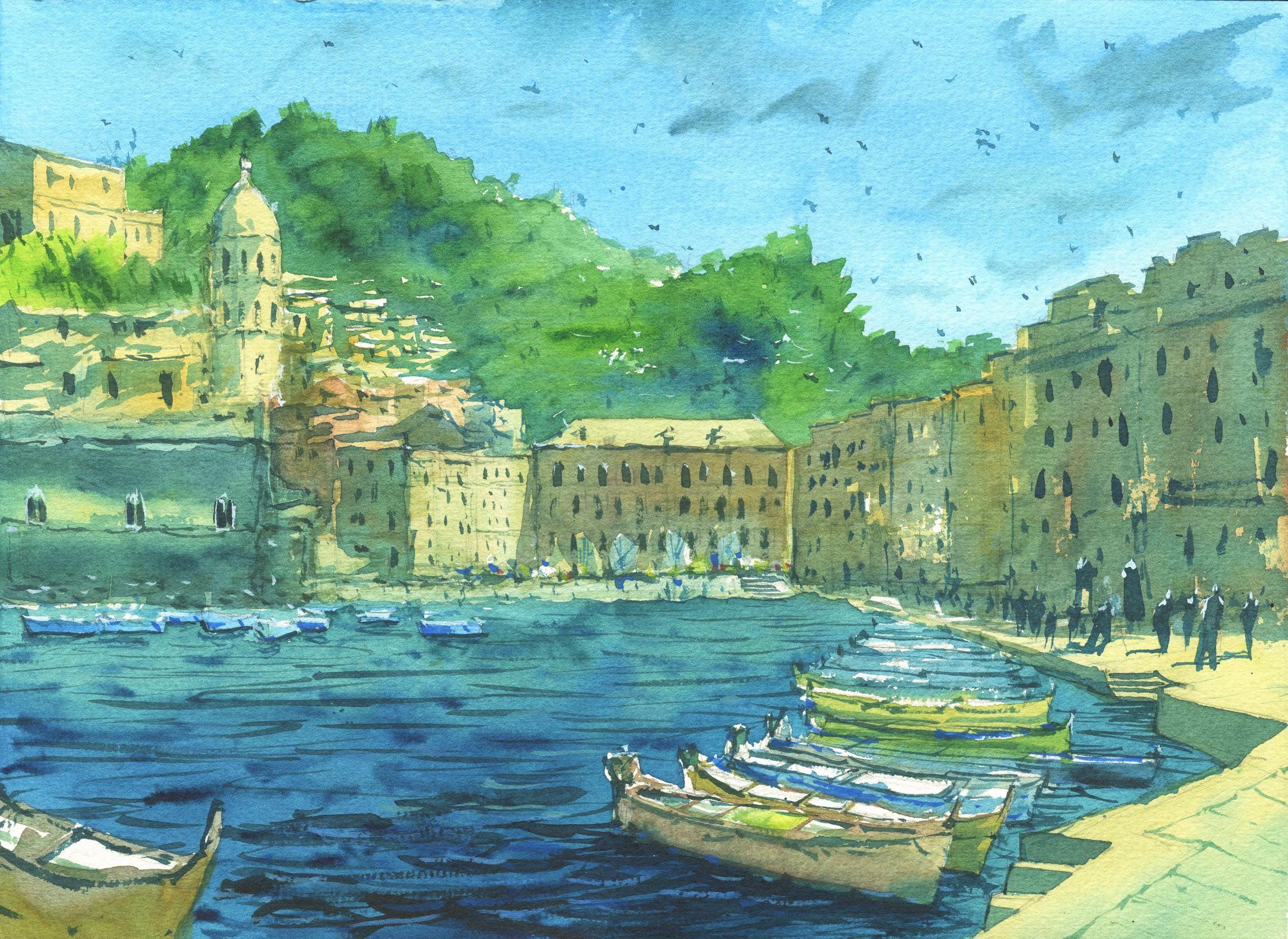
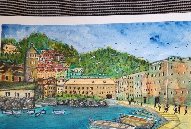
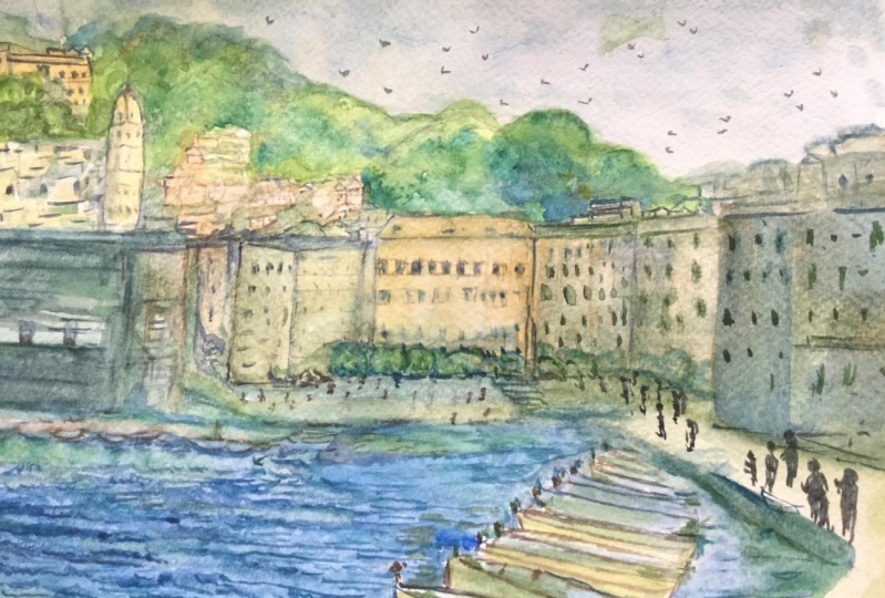
3. Demo: Painting the Light: Okay, so this is the same that I put together. Just a quick little sketch of ChickWeight terror. And you'll notice I've added in some boats here in the foreground, some very loose birds have ended a bit more detail into these two here. There's one over here as well. A lot of this is just quite loose and detail is going to be doing with the brush, but mainly just the shapes of the buildings. You need to make sure you have some sort of structure here so you can get in that silhouette and just mocking out with the water ends. So gonna get straight into it and go into the sky first. So I'm picking up similarly in blue sky and really getting fair bid on the psychologists, the good puddle of it here. So I don't have to really go back into it, light up. And we'll start off on the top like that. And this brush is actually quiet and takes up a lot of water. So I think this is going to be fine. So moving this wash down the page and cutting around these buildings as well. Kind of gotten over that one nutrition have done but just some of these bushes and trees. The distance where the mountains are. So just go over those. Cut around them in the blue. Work your way down the page. This and write donkey, I'm actually just going to add in some border to further lots in that area. Little bit of cutting around. And there we go. So in the photo, it's pretty much is blue. But what you can do if you do want some clouds, you can go and just pick up gray or blue. And you can drop it in. Just some suggestions and things like that. If you'd like. And down the bottom will make the class a little bit smaller. And the top area. But just another thing you can do for the sky that make the clouds near the top of the larger it helps to. Okay, we'll leave that for now and go straight into buildings. And we're gonna be using a combination of these two flat pressures of good number 12 flat brush in a three-quarter flat brush. And really just putting in the warmer colors in there. So let's have a look here. This is like a kind of knife whose yellowed and not just dry off this section of the palate when it gets rid of those blues mixed together. And paint brush. Pick up villages, Naples, Yellow. Put that in there maybe beneath this yellow ochre. In the day. I'm just looking for some warm colors. And this is a bit of burnt sienna on the side. Let's go in and try and probably started with here and just getting some of these yellow like that and just goes through and gets some color onto these buildings. More night was yellow on this one here, like that. Just on the dome. And roughly around the sides like that. And it's getting some of these later with his boot sienna color here. A lot of these really is just putting it, making sure that there's some kind of background coloring here. Not a 100% fastest to what color I'm using, as long as it's a warmer color, that does help move that washing it further down. On the side that's moreover yellows. So I'm going to get that in clad. And innovative Naples, yellow or green roofs here like that. And write that down a little and getting rid of these grayish color for the roof here. And write down further as well. Just getting in some base colors to just get rid of that white of the paper. So we need to do and some little buildings up here as well, which I'm going to indicate. This is sum, yellow America. Its general shape of the building. And around this. And we're going to just mix up similar, this grayish color leftover in the palette and move these fairly down. Wow, I also adding beautiful lake was yellow here to just encourage it to blend through as well. Just indicate little patches of light that goes through. I'm here in red here compared to here. And I'm going to warm it up again with some yellow just coming up here. Leaves, leaves some areas broken up areas. And a little bit more of Naples, Yellow and peace-building here. And there's also some little buildings and things in the background. I wanna indicate. This really just some colors going through a bit of sap green in this area to indicate some of these trees. Then that in, and I'm also going to cut around these buildings a little bit anxious. You use that to shape the surrounding buildings. Just very loosely, nothing too. And let's go back into the section here. And pretty much the largest area of the painting, the Sea area. We're going to just getting some orange now. So picking up bit of cadmium orange and going through this building like that. Just cutting around some of these little tree shapes of different like that. More orange sleep more. And the guy kinda what I'm looking for and the roof is going to be a light wash of Naples yellow. So we need to do something like that. And coming across to these ones, small orange working through that still leave a little sliver of light in the middle of these two buildings like that. And we just work my way through alternating with some different colors and warmer colors anyway. I'm just gonna go over the top in a darker color, lighter color as well. So it's getting a bit of detail like that. And we'll do these ones here as well. As kept that in sienna running through as well like that little bit. And then come down to this section here like that. And we're just going to cool it down a bit with some gray here. The shattered, which kind of comes across to the side, but I'll get all that in a little bit lighter, just that's just more of an indication for now. The path we need to get some Naples, yellow. Because yellow icon. So let's merge all these together. That launches getting this whole thing here. Similarities and steps and walkway. And then we'll go over the darker color later on. And, and i finishes like that comes across here. Kay? Just doc and a little bit more towards foreground. So look what else we need to add in this bit of the wall here. I'm going to get in a crystal light gray color is leftover in the pellet. Here. We've been more Dhaka, something like this. Because remember this is going to dry lotsa here and it's really dark in there as well. So just a quick indication of what's going on. Okay. Now, this area of the trees and things like that, we're actually going to need to get in a Febby Dhaka. And interesting things that we're also going to be mixing some of the lighter green. So starting off with a bit of Sap Green mixed in with a bit of Prussian blue. If you've got cobalt blue, that's fine as well. And anything we can darken the grain. And I'm starting off here with a flat brush, testing it out like that. And we'll just start hears will get rid of some of these excess paint. Let's connect. Just give me a bit more leeway for this area here. And some cutting around would remember this area needs to be and the buildings significantly darker as 2pi of cutting around work. Oops, this kinda ran that. That do you think it needs a bit of blue in there? Swell. Moving towards the middle of the page now, going to go through. And actually what I'll do is just grab kids, have sap green lights up, green here on the palette. And I'm going to get into some lighter areas night just before everything else. Stop doing everything else. Reported, and maybe use some of these gray as well. Coming in through here. Maybe cutting around work, indications of things and bits of roofs and stuff like that here. Really not pay too much attention to what is going on in there, but making some kind of squish shapes, I think is important. Swapping now to a little round brush. Because I think this is just an area where I need detail. Detail, a little bit more side will go through and just getting some k. We got 100 direction like that. New indications. Flat brush again, it's going to be a tiny bit of blue in there. In blue, just checking their change things up a bit. Just a little bit there as well. Cutting around. Let's have a look at kind of finishes off. Here. This building in the center. Here we are set grains dropped off. Go into it quick enough earlier. I'm just going to read this section. Pick up some more green. And that's mix this in like that. I do want to just dark and more ran the roof as well here. Anywhere that you can start. I'll guess, skipping areas of the paint ha, leaving a little bit of why that, surprisingly that helps as well. Just imply bit of detail. Calling on Saturday, the blue in here. Peter, certainly in blue like that. Up here, maybe in this sort of section as well. Do its thing. Go back to the Sap Green and mix that in that some trees, indications of trees and things are running up to the hills. And further down. I'm just going to be more careful with the building's cutting around the buildings. This this one here's well, detailing on that. Okay. All right. Redo this year seems to try and off of it. Funny. My chance you get to read, touch up Samir is feel free to just go in and modify as much as you want. But remember, there's still a chance later on when we're going to go through and getting some of the darker parts that you, that you need to get everything all in here. And I'm just going to try to define these tiny more strokes and maybe it's a round brush visa, booth dry brush. Brush strokes. Just kinda help. Next step. Some of these boats. And what I'll do is just work on getting in some basic colors. One in the front. I'm going to go and use a red and warmer colors. Fine. Let's go in and get that in. Like this. Kind of a warmish color. And as we go down, I'm going to mix in a little bit of blue. At the base. There is a turning green and time it a blue at the base here, but is not that strong. Something like that. It blew. Let it do its thing. And on the top section, using a round brush, just getting in some more of these warmer colors to work with. More red in the and just shape and define the beads. So we're trying to do now. And the back of the boat actually is this. We've got this kind of moda. And we shall indicate quickly. And took a look Now is this boat here? Sorry, I'm just thinking what actually goes through and try some different colors. Orange, like that. The base of the boat. And will keep getting like that. K detailing. Excellent school, just getting the new engines on the back of these boats quickly. I'll probably detail it more later on. And certainly in blue. Now, here on this at the back. And I find alternating between warm and cool colors that really makes a difference. And keeps things looking interesting. Your paintings. Not spending too much time on this. Just want to get it in. So pick up another color here. This looks like a kind of purplish gray mixed up. And the mix that I'm using is fairly watery. It's very light time. So just going through changing things up as I go. This one's actually a lot darker. It's up to you. You can use whatever colors you like. This is kind of your time to keep things interesting. There's try even a bit of yellow key which you can pick up and get that in there that you can just repeat that further up may be yellow or Yucca as well, like that. To getting the shape of this bird. Leaving some whites in-between. And continuing along. Again, gonna go pick up some surly and blue. Get that voyage in like that. A loose sort of strikes. Or maybe good. And I think that more or less does the trick. These ones at the front. And chronic get intermediate details for these boats in the background as well. So some truly in blue that we want to get a stronger mix just appear that similarly in blue as well. Much like that. It can be vote there. And we've got one here. I need to put too much attention into these because they're quite far in the background. But I do find that it just helps having some there to give the ones in the front sense of scale as well. But as you can see, I'm not spending very much time to define them to even add something like that, that distance. Okay. Excellent. And one thing I've forgotten as this one in the front. And actually gonna make this one a darker blue. With a flat brush. Actually change on line will go in with the red. It's probably going to turn into a purplish color. Still warm color is fine. And it's getting better. Vindication of that boat. The orange here, the bottom. Leave that as is for now.
4. Demo: Painting Water & Shadows: Now what I'm gonna do now is I'm going to go straight in to the water and cut around some of these boats. So to show you what I do, say, mixing up Cerulean Blue plus some Naples Yellow. And this is giving me a teal color, which is what I want for all the water. And making sure that I've got enough of it. Give that a try. Ok. So start off at the backs, kinda does turquoise color here, leave some bits of Y in areas as well. That k and time is really of the essence with this. Because you don't want to sort of fiddle around too much. But at the same time, you want to have enough detail and then just making sure you're cutting around the shapes properly. So I'm doing just going around some of these buds quite loosely. May not be perfect. But just making sure there's a little bit of that lighter sullying bloop kinda just sticking out from those bytes. And we can work with later times. It helps just to add in, for example, just to become mics here so that it stays on the page. Width waiting for us. Might not leave that there. And just keep going into the section is make sure that you're going lighter as well. Or the back area cutting around here. Here, the back somehow that I leave that as is. And moving down the page here, I'm going to just again, thank sure that I leave areas of paint, this section like that so they can come back to it later because this is, see me some time to do these boats on the right-hand side. And here we I came with a round brush. That brush. I mean, cutting around. These boats. Do just docking and cut through that. Like that. The water is going to be easier if you start doing the speed at the front first. Do you think we need to talk in that? It will be okay. And oops, come around these stairs as well. Little steps there. Some darker blue section as well because it's closer to the front. Okay. Now we've got the rest of these that we're gonna just bring down on mixing up some more Cerulean Blue. Is, well, I want to make sure this is a TED.com. And we'll carry these down the page. And again, just cutting around. Here, isn't the boys like that? It's your chance to do this now and pretty loose as you can see, I'm not fiddling around too much. We can add in the details later on. Cutting around boats and remove down into the front. What I'll be doing is adding in some paint, Prussian blue, cobalt blue work as well. Outline that bottom section of the boys like that. Sitting on the water. And let's get the rest of this in like that. And this is going to dry logic as well. So it doesn't look a bit dark at the moment, but we'll be fine. Cutting around. Getting there to the front. Almost done. We are now important step. We're gonna get some darker cobalt blue and mixed together. What I'm gonna do is just drop in some waves. So things like this, just a little bit of this color just do imply waves. Let the melting, we will record things like that. Let me change the shape of them around, but I'm using my, my arm to draw the easing really helps later on to just add some character to the painting. And I knew the back, you just want to make them smaller and a little bit closer together. And while the pipe steel weight is just a fantastic time to go in and do this. The only time you can do it. Maybe some darker ones as well, bigger ones at the front. And always remember. Because it's just again, helping with the perspective. Excellent. Leave that as is. I'm happy with how the water is turning out. Now. The important part now is just bringing everything together and adding in the shadows little bits of highlights and things like that. So I'm really going to get straight into it and try to get this done in one guy, the building on the left we start off with, and I'm mixing up. We've got some blue to red as well. Let's get enough of it. Bit of cadmium red feed of blue, booth, obese, yellow, mixed DNA, blue in there as well. So we just get a doc, a mix of paint like that's going to be just starting off with first and what will be the Brush size as well? I think they should be fine. And we'll get in the sod of this building. We're standing here that comes down and hits the blue trees and stops there. And we've got areas of these buildings here as well. I would just get that aims to imply what's going on. And also start to adding newbies who shatters and things underneath these birth they refuse well, that and as I said, just a shadow underneath, for example. So, just so just remember to leaving some of that yellow. You don't want to completely obliterate the whole thing. Adding in the shadows is one as well. And this don't say little shadow up the top there. Moving down the left side of the building. Maybe guy, really all that. It takes that. And now we're moving across and getting in this shadow on this building. Bernice is really sure what it is. It's larger, larger wall. So just look at the shadows. The building stood at the shadows of the wall. Intro to someone. They mean like that. When we actually document law at the base. Well, all the way down to where the boys start by mostly going to leave sliver of light at the bottom. Some clean water here, too soft and this edge like that does preserve that bit of yellow. K. You are going to work on some of these buildings here. Just doc down the sign, the sign of this building. Simple look here. Darker colors here as well. That mics coming around. Also. This here it needs to be darker at the back. Here. We've got something that paint. This is really important because you want to leave at light on the right-hand side building. Very careful to do that here. So we can get in some window is later on. And this building here, we can talk and down. She's going to use a bit more Re mix, warmish color, hand. Just work my way into it. Remembering to leave that roof at the same color. Here. Getting rid of the shadow cabinet across supporting like that can lead these trees here, get them in a lighter shade later on. And dock in this area. Really, I'm just using this as a general silhouette, not bothering too much about all the little details. And here you can even see how I'm dry brushing areas just leave bits of the previous wash on there as well. Keeps things interesting. And simple way to, I guess, getting some complicated buildings because we don't want to secure all day. Moving down to the front now, more dry brush leaving in some of these background gives it character. I don't think that you have to color everything in k and it kind of finishes of here. I want to dry brush a little bit more. And I'm also going to indicate shadow here to the building like that. And maybe here to the base. Doc in that up beat more middle steps, steps. So I'm gonna do, just do some quick strokes with the flat brush. We'll get these ones into the front to easier with a flat brush. So maybe this bottom one. You'll be done. Some of the dogs here of the walkway kind of extends up the back. Indication. Here.
5. Demo: Painting the Darker Areas: So for the final part of this painting, you'll notice that this is just the really dark areas that are missing. So things like the window's going to be the detailing on the boats, some shadows and few things like that really important to make sure you get those into complete the painting and get the lights and the darks, dogs docks in most a little figures that I've drawn in here. Then I'm going to add in at the end. So what I'm gonna do, I'm actually going to mix up a layer of mixture of paints. Really just my primaries to mix together to get myself really nice dark color. And this is going to help a lot. Just to bring out a little bit of extra detailing at the ends. And it's getting a bit more of that balloon CPR in there. Okay? So firstly, what I'm gonna do is Chris gonna add in little details and the boats. And I'm picking up just a lighter wash of these color. And what I'm gonna do is I'm just going to indicate this area here in the boat and top of the boat. And they didn't like that. Give it a dimension and make it be more vicious. And you've got these big theory of the boat here as well, also the back of the boat. And it's getting just the indication of that motor there. Do the same for these ones. Just again, indicating some details. Bottom of the boat. Just kinda dark in that like this. And we'll do it for this one is well here. We might want to also just adding a little bit of detail like that. You can to just megabit movies. Okay? Now the boat here can in that bottom there, area there like that. Just defining a bit more and keeping things loose as well. K can never be S1 here. And just saying, give indication like that, this one here, that this one here. Okay. So that's a fair bit of detail here in the front 19, just getting some little details in the poets as well like that. And this one here to the front, nearly forgotten about that. But one important, well, let me go to the beat of detailing, still keeping it this right Earth. And what we're gonna do now is some of the boats in the background, just same thing goes just a little bit of shadow underneath the boat. At that distance, the reflections are not so visible. You might get a little few little repos underneath, but there's really not much there. So next step I'm doing now is unwilling get gains some darker ripples in the water. And we also want them to be wet on dry. But some winner with waves and ripples in the water, but I'm going to finish it off here. And so let's start with this boat here. We're just using this sort of motion. Sort of had lifted right motion. I'm using my my hands. Sir. I'm using my arms as well stead of my hands to move the paint brush just to give it a more looses sort of feel. Let's go all the way here to the foreground. Now really getting it as dark as we can. And emphasizing this area underneath the boat especially. And maybe some areas here and the water. Smaller repos like that. And this is also going to help to define these boats at bit more parts of the voids anyway. Just create a bit more contrast. Brush strokes in this area. As we move to the back, I'm just going to make them small. And so Saran here, but then I just create a little sort of reports like this near the back. And again, the trick is just using. My arms to move the brush. That's going to create sharp lines. And they're going to be straight in the same direction as well. And just make sure you're doing that. And some more bigger ones in the front of these larger ones that maybe I've connected up by anything I won't do is really emphasized the shadows and reflections of the spike in the foreground here. That's that one needs to be pretty obvious. And maybe go some in the back here. And just making them would be smaller. And come back like that. Really, really sort of notice them. That's going to create that feeling of depth in the painting. He just touch some areas. Again. Another one coming in like that. Okay. Let's just leave that as he's for the front. And then we're gonna go and add some details. Buildings. And really feel like starting with the towel walk and I'll draw the Brushing little bit. And it's getting some of these windows. So that's 11 window. Number one. Actually here, another one here. Maybe there and the light. So just dry brush like that makes a difference. Just implying goes When does and it has a beta of one here. And I'm just at line like that. And so little detailing as well underneath these areas here. That's gonna help to just keep that beat IV dimensionality. Define it more. And the top of these little dime two like that. And maybe add a little bit of darkness around the sides here. Bring it out. And we're going to repeat really this window here, another window here. No, no, not following the reference. Exactly as well, just using it. Generally. Putting some of these details like that. And building up back here that has a kind of area. They are not going to just popping. Oops. Going to touch this area with my palm away for the bottom node problem. And we're going to work into these buildings such as to be detailing there. And a couple of quick brushstrokes and a Windows, whatever their lines to connect up. And bottom of the wall is actually little breaks things on that. And I'm just going to use some dry brush and at least indicate them. Lu separation here as well. And said look, I'm going to say we got much really here. Double windows, Miss section. We wouldn't kinda comes further down there. And the window is actually a little bit softer because they are in direct Sunlight's. He's gonna indicate something on that. Not even bothering much with the details. Underneath him section name, Guardian two. Okay. And we go and let's have a look into this area. Here is the beauty of darkness, OK, that actually, who's actually going to bring out some of these details and emphasize some edges. And I don't want to bother too much common until it's adding some windows and things like that. The section like this sum here. So we'll just use the reference picture to pick out a few new towns. Can that. And you've got the sun, the building here in the direct sunlight. Well, some windows, things like that. And there's some areas here behind as well. Some little windows and things. In these Pretend buildings. At the back. We just implying some details, not much. Really that's going on in there, but some indication of that Zui You need the shutter, you become an across. Here just underneath maybe this building there. Tend to look this main building. We got a whole bunch of these windows all over the place and we're just going to put them in quite roughly not going to spend all day for bringing adults going on. That ten is three floors of these windows. Just remember, keep that in mind and use some. So we have combinations of some dry brush strokes like I'm using now as well. Some trees in the full front of the building, which covering some of the windows. And I've indicated them there as well. Underneath the roof there's a bit of a shatters. Let's get that in some of the tops of the buildings as well. And it's just imply some date house there. So just think where else can we going maybe be there? Just the indication of the side of the wall? Am and I'm going to dry brush a little bit of that in like that. Okay. And can I get more dark underneath here? Really the tree is just some dark areas near the wall. Just like that. Decay, some shade. That that's all you need to really do. A tiny bit there. And actually goes people and things like that here in the show which we can try to pop in, be lighter and more buildings. And let's get this done. And we got just a few little pieces like these dry brush, this building here. The dry brush that we got just a few windows, let's get those on. Big window at the top layer. And then there's a layer of these building have windows here. Hoops just to soften that often larger windows. So we need to do. And there's also some kind of larger doorways here. Here as well. Down the bottom ism darkness Daniel short, that is essentially wall, goes up to about here. And I'm just going to mark off some of the buildings to some of the blue areas, diviners, wherever you cone, or some of the buildings and making it up in some areas and not king at the reference all the time. K. And while I'm at it, let's pop in some figures. So I've got 11 guy here and walking in this direction. Someone here. Someone here, maybe but someone that some shadows being cast over to the left-hand side like that. Some people here and just get some indications of some figures. Smaller distance as well. So make sure you indicate that you barely see what's, what's going on. Just peers. So the little blobs like that. And it's people here on the beach. And the beach me, people here near the water. Just gonna indicate a few blue dots here. So we need to do I don't want to spend all day reading out what's going on in their funding. Everything moves, just trying to make these figure and more proportionate, resample. Okay? Add some birds. Picking out some air is. Here, we've got paint, splatter paint or something like that. You can just turn them into birds anyway, really. Sometimes you gotta be a highlight left. Say here. Turned that into a bill. Here as well. Keep him varied. It's important to do that. So they're not all exactly the same. Sum with their wings facing downwards or upwards. K. And last thing we're gonna do is just add some few little dry brush strokes into these back. Area t indicates some trees. Just in here, some dark areas of the forgotten to kind of do that before. One time to stick out too much. So dry brush strokes is what you can do. Pick out some areas. Just emphasize really being able to notice. But there are little details in there that you best off indicating. Rather than drawing, painting every little thing. Looking at what else we need to do, maybe just some definition here on the tops of these buildings. That well, for the most part, I think this is just about finished. Is picking out areas. There are few need to be detailed more. So at least pretend tree branches coming up like that. So little repos, it's tries to sum. Sum t. What you wanna do from now on is really just finding bits and pieces you feel you want to add on, but it must unnecessary and finishing it off now with whitewash. So here, one thing I would probably do is just dark in this boat, the bottom of the boat, neither France, I pick up some bread, a little bit of red, Tao that down and just go over this one needs to be darker. Okay. Saying these are the ones to the bottoms of the boats. What I'm gonna do is just use a little bit of push now to some faunal highlights to the painting and this cosh pallet. So picking up some of these yellow gods and tiny bit here and a bit of color into the boat. Yellow in there. That often little pad. And the rest of it is really just being grade down. One need kinda wanted to put a bit of a splash of color in there. And also here is umbrellas and that kind of thing, just little bits of color that I thought would be nice if we added in. So if we just add in some, maybe read also in here. Don't over do it. And little bit of blue. And it makes that with some wide and just a tiny bit of this. And then we'll do that right here. Well, just to get in some of these just indications as lot of waves maps. But main thing is now we're going to pick up some guage, some whitewash. Why anymore? Mix that in with some of these blue. Again and we can get some of these effects like that. Suddenly through lots of repose going over the top is not regain. Your is not regaining though the lives back, but you next best thing you can do. And in little bits and pieces here, too much, but just a few little middle ones. And last step, some white highlights. Picking up some whitewash, pure whitewash. But I've got on the palate and little bit of water in there, but it's mostly just straight from the tube. And a few figures here is, let's get it. Highlight that. Number one. There. Too much. Try this off. Putting things. Here. The background as well. See indications of a bit of detail That's catching onto some of the windows solder. This tell them this is Windows, is Windows. Some bricks as well. And I will say that's finished.
6. Class Project: For the class project, you find a free reference pictures, royalty-free reference picture of this scene of Chin criteria. So what I want you to do is just sketching loosely the main elements of the saints. We wanna get in all these buildings at the back, but reduce them down into larger shapes and then slowly flesh out the details and pencil. But remember just a very loose pencil sketch. A lot of the details will be done in the actual painting. Remember to get the boats in as well. That's probably one of the most important bits they need to be fairly accurate, especially as you move down to the foreground. Once you're done with this and you're happy with the amount of details that you have in there. And you've got enough planning for you to start with the painting, continue on and use the tips and techniques in this class, as well as videos to make your insane. And once you done, upload that to the projects, I'm really looking forward to seeing what you guys come up with. And as always, if you have questions, any difficulties, feel free to leave a message in the discussions or in the projects.
 Watercolour Mentor (Darren Yeo Artist), Art Classes, Mentoring & Inspiration!