Transcripts
1. Introduction: Hi, I'm Elizabeth,
and welcome to my Piet Mondrian inspired class. In this class, we are
going to be looking at a wide range of works
that Mondrian created. He is best known for his neo plasticism pieces that are part of the
destile movement, which was really focusing on stripping art down
to its very basics. So these pieces are
where Mondrian and several other artists that are part of the distil movement, we're exploring primary colors. So the traditional primary
colors of red, yellow, and blue and black and white, and really kind of stripping
it down to lines and shapes. So really kind of eliminating
the subject matter, eliminating any expressiveness
and really kind of getting to the
basics and core of what he felt art was about. But there is so much
more to Mondron than his neoplasticism pieces. And in this class, I want to focus on the work
that came before that. When he started
going from all of his traditional art training
and background and began to look at the world in a different way and explore different ways that he could
interpret in particular, I'm talking about
his tree paintings. Trees were something that he
did a lot of artworks of. There's a whole range of
pieces that are trees, but they're all very different
as he began to go from representational
realism and exploring different other art techniques that he was coming
across and playing with. And then as he gradually moved towards
complete abstraction. You will find some trees in
those neoplasticism pieces, and you would never
know it unless you knew the background
of that piece. There's a whole
range of works that go from realistic
representational to abstraction that
explore different ways that he was breaking
down the elements of how we represent a tree on the canvas and we are going to explore
that in this class. We are going to lean
into abstraction. We are going to lean into
the basic elements that compose a tree and the play of color and bold graphic line and take ourselves on a journey as we explore
how to go abstract. We are going to be
using oil pastels for our class project because
it's a really fun way to get those bold rich colors and
play with blending and kind of mimic the oil paint that
Mondrian was using at the time. This is a really fantastic class as part of the artist series. We are looking to artists
of the past to get inspired and kind of exploring some different things that
they were working through and working with and different
concepts to art making, and then how we can
weave that into our own artistic practice and layer in our own aesthetic
preferences as well. I really hope you're
going to join me in this fun class as we get inspired by the abstract
journey of Piet Mondrian. See you in class.
2. Class Project: Thank you for joining me in the Piet Mondrian inspired class. In this class, we are
going to be looking at the ways that Mondrian
began to explore abstraction as he gradually moved toward the completely
abstract pieces that are part of his
neoplastism theory that was part of the
decile art movement. Mondragan was a traditionally
trained artist, and you can learn all
about his background, his education background and
kind of see the journey that his art career
took by going over to the projects and
resources section of class. I have a Google slides
presentation that cheers a bit about his
life and a whole lot about his art to kind of help you get inspired and kind of
see the journey that he went on as we explore how to approach this in our
own class project. So for our class
project, we are going to be focusing on the trees that he created and the ways
that he began to abstract them as we explore
our own means of abstracting. You don't have to do a tree
for your class project, but it's a really
great way to start doing this because trees are something that we're
all familiar with, and we can kind If we think about the structure of a tree, it lends itself really
well to the idea of gradual abstraction
as you work on how do you represent a thing
without representing the thing and kind
of what can you leave in and what can you
take out and when can you distort as you lean
into abstraction. We're going to be
using oil pastels on basic paper to
create our project, and we're going to
map out the tree ahead of that with Sharpie. The materials for class are very basic and straightforward. But I think you're
going to have a lot of fun exploring abstraction, especially looking
to something that is very relatable object, a tree, and kind
of following along the lines of Piet Mondrian. And then you can
kind of decide in your exploration and
throughout your class project how much you want to lean
into abstraction and how much you want to stay more
towards representational. It would be really fun
to explore a couple of these pieces and kind of explore how abstract can
you get it to go. And then if you want to
take it even farther, you could explore how could you take all the ideas that you're learning about how
to abstract and play with color and bold marks. To then abstract something else. It would be really, really
exciting to see folks explore a very literal representation of
the class project, but then also apply
that to something that's more personal
and more every day. Wondering was also very
inspired by the Cubist, so we can see a lot of that influence in
the early parts of his abstract journey. So you're going to have a
really fun time checking out all of the ways that
he expressed himself in art and all of the
different stages that he went through as he worked his way from
traditional realism, all the way to
total abstraction. So let's head it
over to the next lesson to talk a little bit more about the materials
we need for class. Son.
3. Materials: The materials for a class
project are very simple. We're gonna be using
some drawing paper or mixed media paper. I've got some oil pastels, variety of colors, and
then I've got a black, sharp ear permanent marker. The permanent marker is what
we're going to be using to draw the foundation
of our tree, and then the oil pastel
is what we're gonna be using to kind of
mimic the use of paint as we look to
the abstraction of trees that was explored by
the artist Piette Montreal. Bless out of Victoria
next lesson to begin learning how to abstract
trees. See you there.
4. About Piet Mondrian: So the first thing I'm going to do is I'm going to look at the different ways that Piet Montreon has abstracted trees. He drew trees for the entirety
of his artistic career. He learned drawing
from his father and he learned painting
from his uncle, and then he went to pursue a formal education
in art after that. And then from there on out, he was constantly absorbing
the art of the world. So traveling to Paris, getting inspired weaving in and out
of different art circles, exploring different art
styles and techniques. I was out of Paris when
World War I happened. He was traveling
at the time, and he couldn't go back to Paris. So he, as well as several
other artists that found themselves no longer
able to go to Paris, which at the time
was the center of the art world for most people, they began forming
their own collective of artists and sharing
artistic ideas and coming up with new philosophies
and different styles of art were created because
of this isolation that happened because of the war and because People who
might not have been put together in the
same location with time to consider creativity and artistic approaches
were finding themselves together and able to have
these conversations, and new art movements and
styles came out of this. Through the course of this, the dstyle movement was created, and a part of that
was neoplasticism, which is the abstraction
within the dstyle movement. So neoplasticism is a
philosophy of art making that Mondrian crafted to explain his art at the time that he was really delving
into abstraction. So he, along with other artists involved in the D
Stille art movement, and those who dabbled
also in neoplasticism, are really the forefront of abstraction and kind
of figuring out how do we take representational
idea and manipulate that and kind
of distill it down to very basic elements that inspired by something
representational. So in this case, we have
Mondrian and his trees. So we can look at all
the different ways that he has gradually
worked its way towards ultimate
abstraction with the subject matter of the tree. And for this class, I
really kind of wanted to dive into the middle zone. But you can decide to take this as abstract as you want to. His later pieces,
although some of them are trees, we
wouldn't know that. They're vertical and
horizontal black lines, and they're blocks of
geometric shapes of color. He only was using red, yellow, and blue, the primary
colors and black and white. So everything was
stripped down to the very most basic elements.
5. Drawing Abstract Trees: So for this one, I want to jump a little bit further back into his history when we can still kind of see the
aspects of a tree, but you decide which
way you want to lean. Do you want to lean
it more towards someone looking at
your piece and saying, that is a tree to someone
saying, could that be a tree? Is that a tree or is
that something else? You can kind of decide where on the abstraction of tree
spectrum you want to go? I'm going to go
somewhere in the middle. And what I want to do for
this one is I want to use my sharpie to kind
of start mapping in the bull black
lines that were the beginnings of
Mondrian's abstruction. So he really understood trees. He really looked
at a lot of trees. He was painting from trees and
seeing trees in his world. But they're all just
so filled with kind of a wonderful playfulness
and life as we think about all the different characteristics that
trees can have. So I'm going to start
with mapping out some basic line shapes and kind of getting the structure
of my tree started. When we think of
how we draw a tree, we start with the trunk
and we go up like that. And then in its
most basic sense, it's a bunch of Vs that are
then broken into a bunch of other Vs. You know, when we really get
down to what is a tree and how is
it constructed. This is the most elementary
way to think about it, but it's just a bunch of Vs, put together, and
then they overlap, behind one another,
obviously it's a three dimensional object
that is growing in nature. So this is the most
basic idea of a tree. So we can kind of see how
that leans itself towards abstraction when we look at Piet Mondrian's
abstraction of trees. He also plays a lot
with line weight, and it's got there's some
very strong line in there. So that's a really
fun thing to do. So kind of I'm looking at what he's doing and
playing off of that. So this is where
I'm starting from. I've got the essence of a trunk and kind of going out to
the boldness of the tree. I do want to play with
these being a bit darker. So I could have done this
part with the oil pastel, but I wanted to have a
little bit more control over my black lines, and I also wanted them to not get smudgy at this stage anyway. Because once you put
down black oil pastel, you get it everywhere. It's just the nature
of oil pastel, like a color picks up
color and moves color. So by doing this part
in permanent marker, I can keep this definition. I can cover over it. I can also go back over it
with oil pastel also. But for now, I want to really
have control over putting these lines where I
want them to go and knowing that they're not going to smudge into
my other colors. He also has some really
interesting things in this abstraction where
he is doing a lot of bold color because
he was influenced by the Fav artists
from the early 1900s, there was a lot happening with the expressionist and
the impressionist and the post impressionist. There's a whole lot happening
with color in Paris during this period of history
when he was first starting to find his
way into abstraction. Some of his pieces have
a ton of rich color. Some of them are
very monochromatic and very stripped of color. And we can find
examples of all of that within the trees that
Mondrian created. I also think about that. Do we want to go more muted and stick with neutral colors? Do we want to have
some play of colors? Do we want to do a nod to his later work
with neoplasticism and style movement and just do the primary colors
with black and white. Or do you want to do
colors that speak to your own personal
aesthetic, what you like? I really enjoy all of
the pieces by Mondrian, and I do really like his
very abstract pieces later on that have just the primary colors
in black and white. But my personal art
aesthetic is to really have some fun,
bold, playful colors. I also think of trees as
being very happy things. I really love being
out in nature, being around trees, is something that
brings me a lot of joy. I grew up in an area of
Michigan in the United States, where we had a lot of
geography variation, a lot of big hills,
a lot of forests. And when I've been in
places where it's been much flatter and much more
open, a lot of fields, farm land, I have
felt a difference, you know, in my
comfort level there. When I go back to
the woods and I go back to the forests
in northern Michigan, I have almost relaxing
feeling that comes over me. So I really love trees. I think they're a
really important part of thing that brings me joy. So I really want to have that joyfulness in the
tree that I create. Got my really, really
bold black lines. Now I'm going to start to
kind of play with ways that I can go in here with
thinner lines. I might even get out a couple of different markers so that I
can have some variety here. I'm playing off the
idea of the Vs, but I also don't
want to be stuck to just doing straight lines. I want to kind of have that
play of curve lines also, and I want to very
the length and have a ton of different variety
here with what I'm doing. Some of his pieces have
a real rhythm to it. A lot of his later pieces
are called composition, and then it gives it a
number or description. That's interesting because
other artists who have done that idea in their naming of their pieces were often
referencing music. That is something
that Mondrian was inspired by and was
utilizing in later pieces. If we think about the trees, how are they composed? What aspects do they have? That we can play off of. How do you want to
make your tree up? Then I'm just kind of
adding as much as I want to get until it feels
like it's in a spot of completeness for this stage. That may be all I want
to do for that part. So I've got my black marker in. I've mapped in my tree. Now I want to play with the
blending and meshing of colors to start filling
in the rest of my paper. You don't have to fill in
all of it and you could play with doing this on
different colored papers, but I really like the boldness
of the black and white, and that is also a nod to
his neoplasticism aesthetic. So I want to kind
of have a play of that as well as some fun color. So starting out with the
black and white feels like I've got a foundation
of Mondron happening. And then from here,
I'm going to play with some of the ideas that he
had in his abstract trees, as well as what brings me joy and happiness when
I go on with the colors. So let's head it over
to And Dex Lawson, where we will begin
adding color to our abstracted
trees. See you soon.
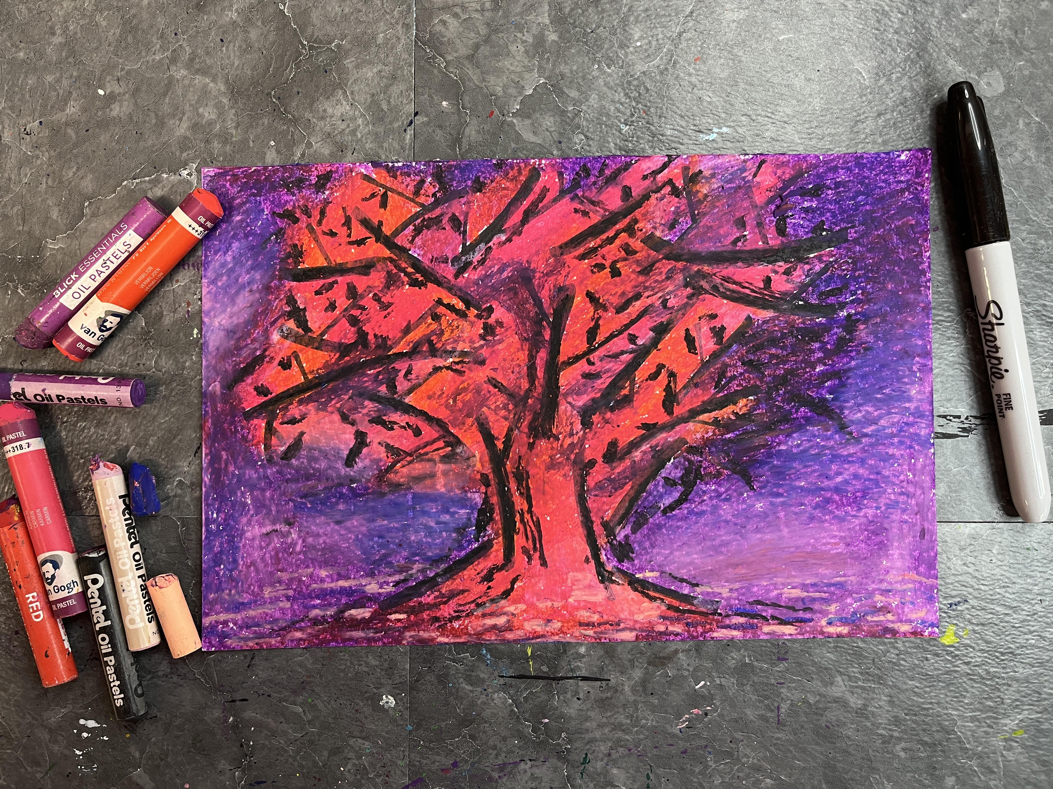
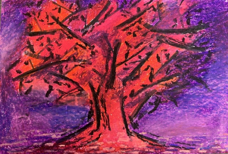
6. Adding Oil Pastel: So one of Mudron's most, when he was starting to get
into really expensive trees, he's got a picture called the Red tree, and I
really love that. I love it. He has that
really bold red tree. So I'm going to do
a little bit of a nod to that and
kind of start out with some red and kind of
start building up some color. When you're doing oil pastels, you really want to
push pretty hard, and we're going to build up
a bunch of different values. These oil pastels
are kind of dry, so I'm going to grab another
set of pastels I have. So the different brands
that I've got here, these are pentel oil pastels. I've had these for
several decades, so I think that's why they're not going on as
smoothly as I want them to. Another brand that I really like if you're looking to
get some oil pastels. These are ones that
I would always get for teaching my high
school students. These are the Van go set, a really nice quality brand. But really any kind of
pastele works great. Let's start building
up some color. This has more of a
red orange to it, but I like that because
I want to play with this idea of really bold color. I'm just going to start
doing patches of it. Because I don't want to
make the whole thing solid. I want to have that
play of value and blending that Mondrian
has in his paintings. I'm just going to get in a little bit of
this color all over the place as I define my tree. It's totally okay if it
goes over my sharpie. All right. What other colors
can you play in here? I also really like pink. I also really like pink, so
I'm going to throw some pink in this pink happens
to be really bold. It's not a bright light pink. It's a bold, dark pink, so that looks it blends in well. I kind of meshes with the orange in a really
nice way, which is great. I also have some sections where the color in my background
is going to show through. And I think I want to do
a purple for that because I really love red
and purple together. So let's see what happens when I started to put
some purple down. And when it meets
the other colors, I'm going to let it
blend in a little bit. So there's kind of a softness
when the two come together. I also don't want to have just a solid patch of purple
in the background. I really want to play
with the value changing. But I want to build up
that base color first. And then I'm just
going to kind of keep going back and forth. Between colors. Mondrian did this
blending of color, but he also had a lot of
stuff where he was looking at the marks of impressionist
and post impressionist. So the mark making on
there is really cute. So I also kind of want
to play with that, too. So I'm going to just kind of block in my colors
and then layer up on top of that some of the different marks
that he used. It's interesting because those
marks completely go away and he strips things down to the primary colors
in black and white. But since I'm being inspired by a full range of
Mondrian and looking to his earlier
abstractions of trees, it works pretty great to play with those
marks in this piece. Feel free to incorporate
any marks that you want to. You don't have to feel like you have to only use marks
that you see in his work. You can absolutely incorporate whatever mark making speaks to your own personal preference for your art or just however
you're feeling that day. As I think about
lightning up and jargoning up my
background color, I'm going to play
with dropping in some blues and also
dropping in some white. To give the lightness
and darkness because right now this is a
really fun bold play, but I really want to
get that rich thickness of color and fill in all the
white. You don't have to. That's just what I
personally want to do. I also think I'm
going to grab some of my other oil pastel colors and keep working back in to fill in the whites
within the piece. I'm not worrying about it
going over the sharpie line. The great thing is, oil pastel
is an opaque dry medium, but the Sharpie is so dark
that it might get a little bit of mellowing out where I've gone over it and where I haven't it's not
going to go away. So it just helps unify it a bit by going over it
with oil pastale. But if I have any areas where I don't end up going over it, that is fine too, because it's
still going to look great. All right. Did that. Now I want to go in. I've
got some lighter pinks here. I'm going to use that to kind
of go in to my pink areas. Now, this is a very light pasta. This will show up on my sharpie a little
bit more, that's okay. That doesn't bother
me. And probably also go over the
sharpie later on. I really want to crisp it up. But I do like the fact that
it kind of pulls it together, which is more true to
what a tree would be. Like we have the leaves and
then we have the branches. But usually, because of the different shapes of the
different parts of a tree, we can see some of the
branches through the leaves, and some of them are a
little more obscured or come completely masked. So having that
lightness actually is a more accurate representation of trees and how
they look in nature. Now I want to play with
my background to darken it kind of around the
tree in some spots. More so so that the tree really stands out against the sky. Then the great thing is I
can go back with my purple. Oil bulls, it's a lot of
back and forth to get the colors to work together if you're going for
a more smooth application. But you can always
do the marks on top to the smoothness and then
you can build up your marks, which we'll do in a little bit. Right now, I just want a lot of color fill and I want to
have some nice blending. I want to unify it
a little bit more. I'm going to take some
red and I'm going to put that into the purple as well. Just help unify the two. I want the definition, but
I also want some unity. I'm going to use this light
purply pink down here. You could use white
also if you have a more limited range of
colors for your pastels. This is working to fill it in. It's also working to
lighten it a little bit. I can go back and
forth to soften. Awesome. I want to go
back in a little bit. Tie in some of the pink spots that aren't quite as filled in as the rest. All of my colour is laid down. Now I want to add
a little bit of the texturing that
Mondrian plays with. I'm going to go really bold and I'm going to
do a little bit of that with my black up in my tree and just add in some
additional oil pastel marks. I don't want to
do it everywhere. I just want to play
with that idea of one of those
smaller branches. This is also where I can
go over some of my Sharp, bring back some of that boldness too and give it a little bit
more of a pantry effect. Almost like these were
brushstrokes that we put down. We want to kind of
resist the urge to do, like, everywhere. So we just kind of
have a little bit. It's going to help unify what's going to happen in
the background, too. This is not a step
you have to do. It's just kind of what
I feel like my needs. Awesome. I want to do a
little bit kind of down here. I'm going to let it smudge
in a little bit, too. It's going to be kind of
like painterly brushstrokes. I kind of embracing
the boldness. Awesome. I am loving this. I want to do I'm going to do a little
bit more with marks, but I think you
need to do it with a light color so that
it will show up. I'm going to go in and
add some marks down here, kind of getting inspired
by what was happening in the bottom of
Mondrian's red tree. This also works really great
because these marks are going to help define the land, the ground that the
tree is growing out of. I kind of play with
sky versus ground. Awesome. I love this. Ah. Okay, I'm going
to push some of my lights even
lighter and then kind of fade out the pressure so that it blends in
with what's happening. Around it. Awesome. Then I want to play
with darkening too, but I think my purple
isn't quite dark enough. I'm going to go ahead
into some blue, it becomes a blue violet. Give a little more drama. Yeah. I love it so much. I'm going to do a little
bit of purple inside. Actually, it's not
going to turn up. I'm going to do a little
bit of blue here and there, just to add a little
bit of darkness. So I lost a little bit of that. And then this kind
of helps so, yeah. I love this. I am so, so so excited about this. Alright, I think it's done.
I'm really happy with it. So I started with my blackbll
lines and kind of built up my abstract tree baseline. And then I chose my colors, and I started kind
of going in and mapping in where I
wanted my colors to go. I built those up to really
have kind of an overlay of colored blocking
and then started playing with how I could get
those to blend together. And then as I
started working back into my tree and my background, I started playing with We can I lighten things and where
can I darken things? And then I started
going back in with really bold oil pastel
marks to kind of add a little bit more texture to my tree, more painterly marks. And then I went in with
a little speckling of marks at the bottom, alluding to kind of the work
of the impressionist and the post impressionist that he was looking to in that
part of his career. I can't wait to see how your abstracted Mondrian
trees turn out. And if you happen
to explore this, this is just the
beginning of exploring abstracting trees, and you could really abstract
anything that you want to. But abstracting the trees is a really fun way to go about it. But I could definitely see this becoming much like Mondrian. He, like, gradually abstracted
more and more and more. Would be really fun to see if there were
any students that started wherever they wanted to begin their abstracting
trees journey, and then if they wanted to keep exploring this in new ways, whether that was in different
subjects abstracting them, or if it was in continuing on the road similar to
Mondrion's trajectory in art. Let's head on over
to the next lesson to wrap up the class.
See you there.
7. Final Thoughts: N. Thank you so much for joining me in the
Piet Mondrian inspired class. I hope you had so much
fun exploring how to go from representational
art into abstraction. I hope you're feeling
a little bit more comfortable distorting
your subject matter, ways that you can
leave stuff in and ways that you can take
stuff out and how you can distort and warp and modify things to represent
them in a new way. And I hope you had a lot
of fun playing with how to do that with bold
marks and fun color. Can't wait to see how your
class project turned out. So be sure to head on over to the Projects and Resources
section and share your project on the
student gallery and check out the
work of others. It is going to be a really beautiful student
gallery as we explore abstraction and our own
ideas behind how to approach it as we get inspired by Piet Mondrian's journey. I would also really
appreciate it if you took the time
to leave a review. It's a fantastic way to share your thoughts with myself
and others as we all kind of consider our own
artistic journey and how this class helps us kind of branch out of
our comfort zone, explore some things that
maybe we were curious about, but we didn't know
how to get there, and ways that we can see incorporating
this in the future. It's a fantastic way to help students who are considering
taking the class, reflect upon your own
experience in the class, and give me feedback
for future classes. So thank you so much for
taking the time to do that. I would also love
to stay connected beyond class and
in future classes. So be sure to follow
the beyond Skillshare. Had them over to
my YouTube channel to subscribe there so you get notified of different
things that I'm up to artistically,
art journeys I go on, art adventures,
sketchbooking in the wild, what's happening in
my art studio and all art related fun things that I'm sharing
over on YouTube. You can also share and
connect with me on Instagram. If you post your
project to Instagram, I would love it if you tagged me at Elizabeth
Undersquare Welfare. I would love to follow you on your artistic journey anywhere you happen to share it and stay connected as
part of our great, big, wonderful, creative
community worldwide. Thanks again for taking class, and I hope to see
you in another class real soon till then.
 Elisabeth Wellfare, Artist, Art Educator