Transcripts
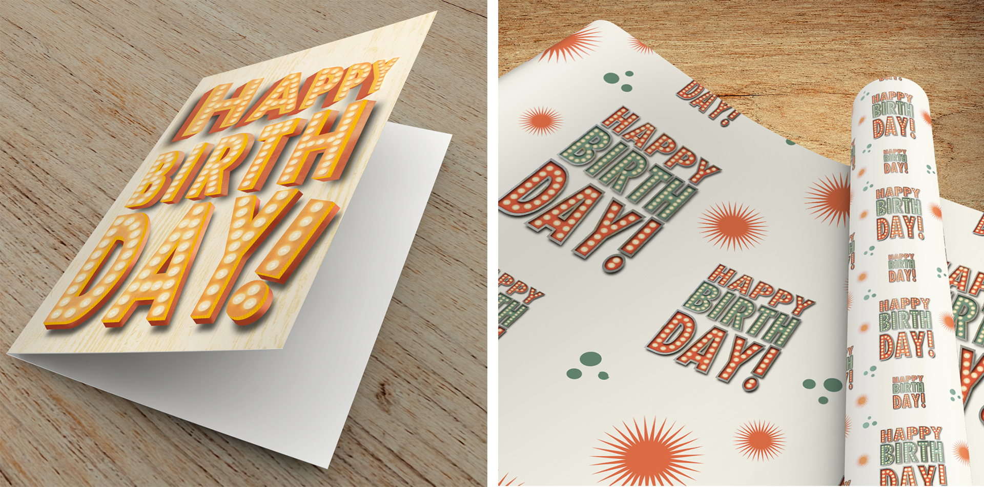
1. Hello and Welcome!: Over the last 10 years, I have photographed just about every vintage sign that I've come across. While I admit to being partially driven by a not so tiny obsession with texture, the bigger reason, they're amazing. Even if they aren't quite in the same working order they once were, they're truly works of art. Their colors, their textures, their combination of shapes, they aren't just advertising the building they're standing next to, they are celebration. I wanted to come up with a way to bridge my love of photographing the signs with my love of textural illustration. What better place to do that than Procreate? Hi there, I'm illustrator and photographer Tracey Capone and welcome to my class where I'm going to show you step-by-step how to create your own vintage-inspired light up marquee signs using Procreate. These illustrations can be used as whimsical home decor, unseamless patterns or as a celebration of milestones on greeting cards and wrapping paper. I'm also going to show you how you can easily animate your illustrations so that you can use them on social media accounts, your website, or as one of a kind animated e-cards for friends and family. We'll start by creating a basic sign so we can concentrate on how the build up the background elements like the texture and shading. I'll also show you how to add and texturize text using masks, as well as how to create a simple string of glowing lights. Next, we'll focus on creating individual marquee letters. We're going to talk about best practices when choosing fonts or lettering to use for the most impactful illustration, how to add realism using shadow and texture, and how to evaluate the overall composition to make the approach to adding lights to each letter as quick and painless as possible. After that, we're going to get more complex and create a layered sign. We'll talk all about planning out your signs so that your layers are created properly for maximum impact and minimal frustration. I'll show you how to add simple touches like shadows for optimal effect when creating a realistic layered sign. Finally, in the last section, we're going to animate our lights. I'll show you how to plan out your animation so that you can layer accordingly upfront. Then we're going to animate our lights three ways; a simple blink, a flickering light, and the looping single light. We'll also talk about different ways to save your animations depending on how you plan to use them, as well as the pros and cons of some methods over others. When you take this class, you receive a set of free Procreate brushes and stamps that are created just for the class. The set includes three marquee bowl brushes that are sourced from a real marquee bowl, four seamless textured rest brushes, two grungy stamp brushes, and a set of more than 30 sign shapes that will get you up and running, creating your own signs in no time. I'm also going to provide you a two color palettes that I created and a collection of free use images that I sourced from Unsplash, Pixabay, and Pexels to help you add beautiful depth and texture to your designs. For the class, you're going to need your iPad and Apple Pencil or compatible stylus and the Procreate app. The class was intended for someone with some experience with Procreate, as we won't be going through the basics of the app. So if you are brand new to Procreate, I recommend checking out any one of the fantastic intro classes that you can find out there on Skillshare. I can't wait to see what you create. So grab your iPad and pencil and let's get started.
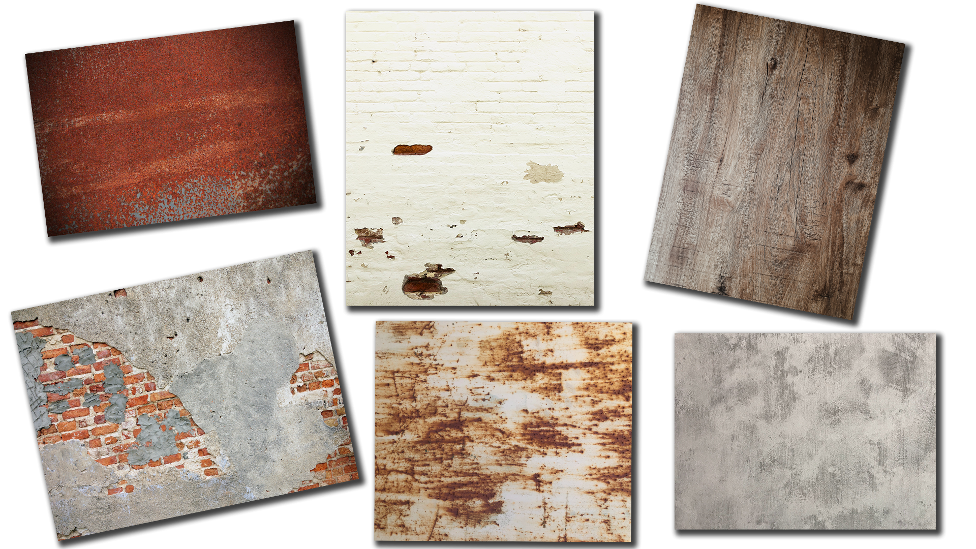
2. Downloads & Resources: The downloads for the class can be found in the projects and resources section of the class itself. Now you will need to access this through a browser rather than the Skillshare app. Once you get to that page, just click the link at the top and it's going to take you to a downloads page. You'll need a password to access the files, and I'll put that password up on the screen right now. When you access the downloads page, you can either scroll through for additional information about the class or simply jump to class downloads and it'll take you right to the files. The first download is for the Procreate brush pack that I created just for this class. It includes four rust brushes and two grunge stamps, more than than 30 sign shapes including both the background and their corresponding outlines, and then finally three marquee bulb brush stamps that are sourced from a real marquee bulb. I've also included two color palettes that I put together for the class that includes colors for the actual sign shapes themselves, as well as rust and metal colors to help add texture to your designs. Then finally, I've pulled together a collection of free use images from Unsplash, Pexels and Pixabay that include rust, wood or brick and cement textures to help add additional depth and dimension to your designs. Now if you have your own textures you'd like to use, please feel free to use those. I pulled these together to give you a good head start though. Now I do want to mention that all of these downloads are automatic. If you have Dropbox on your iPad, they're automatically going to go there, if not, they're going to go to the downloads folder on your iPad. Either way, go ahead and access the Procreate brush file and then import it into Procreate. In the next video, we get started creating a simple sign shape with lights. I'll see you there.
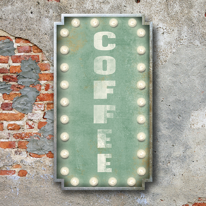
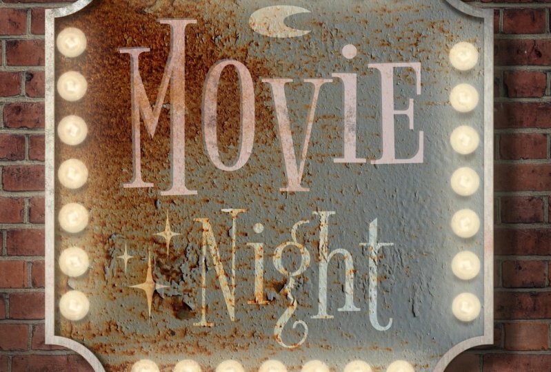
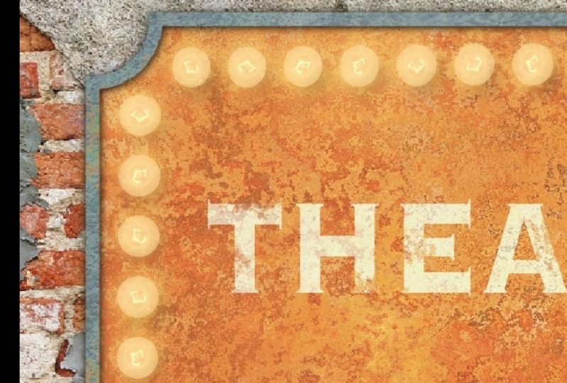
3. Creating a Simple Sign with Lights: In this video, we're going to create a basic sign shapes so that we can focus on building up the background layers using texture and shading. We're going to add some texts that will texturize using a combination of a mask and brushes. Then finally, we'll create a basic string of lights that we're going to light up using one of the adjustments in the adjustment panel. Let's get started. First things first, I need to set up a new document. Now, this is going to be a static illustration. I don't plan to make an animation out of it, which means I could potentially print it. I want to make sure that my DPI is at least 300. You go to the plus sign and I'm just going to choose one of my presets here, 10 by 10 at 300 DPI. Go ahead and set up your canvas at whatever size you'd like. The first thing I want to do is add my brick background. I'm going to use a texture image file for that. I'll go up to my actions, go to Add, Insert a file, and I want to find one of my brick files here. Go ahead and place this one. I'm just going to size it up. That's in place. I'm ready to begin creating the actual sign. The first thing I want to do is get myself a number of layers because I'm going to be adding shading between layers to give dimension to the sign and make it look more realistic. I'll go ahead to my brush set. I'm going to make mine the concaved rectangle cutout. I'll go ahead and select that. I think I'm going to use this pinkish-red in the marquee palette. I'll go ahead and stamp that out. I want to make my sign vertical. I'll go ahead and size that up. The next thing I need is the rim that's going to go around the outside and then we're going to create some shading between the two. I need to grab a new layer here. I think I'll select this gray color here. Choose the outline that goes with that one. I'll just go ahead again and size this up. I want to line it up with the original shape. Now that I have my sign shape in place, I'm ready to begin adding some shading to start giving some depth and dimension to the sign. Now there's a couple of ways that you can approach this. You can grab the built-in airbrush in Procreate on a darker color, and start brushing in some shadow in here on the back of the sign, as well as adding a drop shadow underneath. I'm going to put it a little differently and that I'm going to use duplicates of these shapes to create my drop shadows. The first thing I'm going to do is duplicate my rim shape here. I'm going to choose a darker color. I'll go back to my layer. I'm going to select the bottom layer, turn on Alpha lock with a two-finger swipe, and I'm going to change the color of it to that darker color. I want to make sure I turn off alpha lock because I need to add a blur to this in a moment and I won't be able to do that if I don't. The next thing I need to do is determine which direction I want my shading to go in because I want my entire illustration to follow that. I'm going to assume that the light is coming from the top left in my illustration, which means by the majority of my shadow is going to be down into the right. I'm just going to go ahead and tap down. Right now I'm working on the inner shadow, not the drop shadow. I'll tap down and to the right a little bit. I want to make sure that I don't come beyond this first trim because you'll see a gap then. I'm going to go up to my adjustments and choose Gaussian blur and layer. I want to bring the blur up to about six or so. I'll do 6.5 or six. I'll change my blend mode to multiply. That's the best blend mode to use for shadowing. I'm just going to drop my opacity to about 70. Now, if I were looking at the sign head on, there would actually be shadowing on all parts of the sign, including the right side and the bottom. But it's going to be less over here and at the bottom than here because this is closer to the light source. I'm just going to use this same shape. I'm going to duplicate it. Now I'm going to just bring this to the left a little bit and up a little so that you can see it coming up from the bottom. I don't want it to be as obvious as that on the left, a little bit more here. I'm also going to turn and my blend mode down just slightly there to about 60. Now right now, I have some of that shading coming outside because of course, I move those two layers over. I could technically use those as the drop shadow, but I actually want to create something with more depth. I wanted to have the appearance that the sign itself is a lot deeper than the recess and the top of it. I'm actually going to take these two layers. Clip them to the sign shape. Now I'm left with nothing outside. I'm going to go ahead and select this layer and duplicate it. I'm going to use the duplicate to create the drop shadow. I'll select my bottom layer here. Again, turn on Alpha Lock and change it to that dark color. Turn off alpha lock because again, I'll be using a blur. I'm just going to drag this down. I wanted to be a lot deeper than the depth here, because again, this line itself, I want it to have the appearance that it's a lot deeper than this recess and turn off snapping for a moment. Sometimes I find it gets in the way. I'm going to place it about there. Again I'll go to my Gaussian blur and this time I'm going to bring it up to about 15. I'll go ahead and change it to multiply and just drop the opacity slightly to about 80 percent. We have our shadow on our sign. At this point, we're ready to begin adding our texture. I'm going to be using a combination of texture image files and brushes to add some texture to the sign. The first thing I want to do is pull in one of my texture image files to add to the sign itself. I'm going to go to my rust texture, I'm going to choose this one. I want to make sure it's above this layer. I'll rotate it. The reason I like using rust textures like this is when it has a differing patina in it, you can have some fun with the colors and get some really good results by doing that. I'm going to go ahead and place this right about there. I want to make sure it's clipped to that sign. I'll just change the blend mode, I think to hard light. I like the texture, it's getting me, but it's boring color-wise. I'm going to go ahead and try changing the color of the sign to something else and see if I can get it to come through there. I think I'm going to choose this teal color. I'll change this to Alpha Lock and again change my fill color. You can see that it pulled through the patina underneath because I have this set to hard light. Again, go ahead and play around with blend modes and some of your colors because you're going to get some really fun results when you do that and turn off alpha lock. Now the only problem with that is that it really dulled out my texture and I want this sign to have a little bit more brightness to it. I'll select my texture layer and I'm going to go back to my adjustments and choose Hue, Saturation, Brightness on the layer. I'm going to pull up the saturation slightly, as well as the brightness. I like how that looks. I'm going to call the sign itself done. I want to do the rim next, but I don't want to add anything else to this because I don't want it to detract from the text that we'll be adding from it or distract from the lights either. Let's go ahead and add something to the metal rim. I'll go ahead and choose Insert a File. Go back to my metal textures. I like things like this one because when you have different colors in it, it really adds something to small spaces like we're working with right now. I'll show you what I mean in a second. If I go ahead and move this around, because there is a different color here, it lends to the reality or the realism a little bit and that it looks like this age a little bit more than this one. Again, have fun with your textures and try different ones and see how they work out. We need one more thing with this. First I'm going to change the blend mode of this to overlay. Then I'm going to go ahead and add another layer that I'm going to clip. I want to add a little bit of color to the outside here. I'm going to choose just teal color and one of my rust brushes. I wanted to look like it's oxidized a little bit. Just hit it in spots. I don't want to go overboard with it. I just want a touch of color here in there. Think I'll also choose maybe one of the rust colors. Then I'll change the blend mode and see what I like best. It's probably going to be hard light again. I'm going to go with hard light and just drop the opacity a bit. Again, I'm just trying to add a little bit of color and I wanted it to blend with that a bit. I'm going to call this texture done for my sign and we're going to move on to the text. Go ahead add the texture to your sign using a combination of texture image files, brushes, and of course, just play around with the color and blend modes. I'm ready to add my text. Now, text is going to add its own layer. I don't actually need to worry about which layer I have chosen. I just want to make sure I'm at the top so that the text is sitting on top. I'll go up to my Actions and I'm going to add text. I want to get my keyboard here. I'm going to type out coffee. I also want to change the color of that to something lighter. I'll choose this cream color. I want to go back in to my text editor because I want my text to be vertical. I'm going to go ahead and tap that. I'm also going to change my font. You can choose any font you like. The cool thing about this is we're actually going to leave the text layer as a text layer. If at any point you don't like the font that you chose, you can always go back in and change it. I'm going to go ahead and choose one of the ones I have on my iPad here. You can find a lot of really great fonts for this type of illustration out on sites like 1001fonts. Just make sure that if you're going to sell your work, that you choose commercial fonts only. I'm going to go ahead and place this. I also want to make it a little wider. I'm going to turn on free form here and just to widen that and then make it bigger. I want to make sure that I'm leaving room for my lights around the edge. I like this, but it looks like I just slap some text on top of my sign, which is exactly what I did. I need to texture this also a little bit. What I want is for it to look like somebody painted it onto the sign. I wanted to take on some of the texture of the sign beneath it. The first thing I'm going to do is duplicate the rust texture that I have attached to this sign. I'll go ahead and duplicate that. I'm going to move it up above my text and then clip it to the text. Now because this is a colored texture, it's actually changed the color of the text itself. I want to remove the color and just keep the texture. With it selected, I'll go up to the adjustments, Hue, Saturation, and Brightness on the layer. I'm just going to take out all saturation and maybe bring the brightness up just a touch. Then I'll go ahead and play around with the blend mode on this. I think a hard light is going to be it, I'll just drop the opacity, maybe overlay. No, we'll go with hard light. It's subtle, but it's taken on the texture of the sign behind it so that it looks like somebody painted that on. But I'm not done with this. I actually want to texturize this a little bit more using a mask and some brushes. The reason that I'm going to use a mask is what I mentioned previously. I'm going to keep my texts layer as a text layer. If I were to use my eraser with a textured brush, it's going to rasterize my text, which means I can't make changes to the text. I can't go in and change any of the other aspects in the text editor. I'm going to go ahead and add a mask to that layer instead. I'll make sure that my brush is on pure black. I'm going to select this gritty grungy stamp brush and just tap the top of my text here. I'm just moving around just so that it's uneven [inaudible] there. Then I'll grab one of my rust brushes. I want it to look like it's peeling away in spots. I'll just go ahead and hit it again. I want to make sure that my brush is on pure black. Now one thing I think I'm going to do is just brighten this up a little bit. Let's try, here we go. I want it to stand out a little bit more. I like how the text looks. I like how it looks like it was painted on and it's aged and blending into the background. At this point, we're ready to begin adding our lights. We'll do that next. As part of a brush pack that I provided with the class, there are three marquee bulbs. The bottom two are intended if you plan to add light to the side of your sign so there's a sideways facing and an upright one. Then the top one is front-facing. They are also an actual marquee bulb that I took a photograph of and they work like any other brush. Let me go ahead and select the front-facing one, that's the one I'm going to be using here. I've just selected this off-white color. Let's get a nice size there, draw down and hold. It's going to snap into a straight line just like any other brush. If I hold my finger down, it's going to snap it in a 90-degree angle. The same works for a circle, as well as an arch. Whenever I lay down a shape, it's going to give me the edit shape, which means I can then also use these little handles. But I'm also going to show you how you can use a combination of the selection as well as the transform tool to make changes as well. The first thing I want to do is make sure I'm on a layer and I'm going to just drop the size of this slightly. I'll start with my left side here. I'm just going to draw down a line, hold, till it snap into a straight line, and then I'll tap my finger down. Now, I don't need to go ahead and do the same thing on this side. This is on its own separate layer, which means I can go into my selection tool, copy and paste. Grab my transform tool and with snapping on, I can just drag this right across and place it where I want it and just maybe tap it into place. I've got the left side and the right side all done. Now I just need the upper and lower. I'm going to go ahead and pinch those two together. I'm going to put this on the next layer. I'll start at the bottom here and I think I'll just do six. I'll hold, put my finger down, I'll get a straight line. I don't know that that's exactly straight. I think I want to move this side up just a touch. Try that. There we go. I'll go ahead and grab my selection tool because again, this is on its own layer. Copy and paste. Use my transform and drag it up to the top. When we get into creating marquee letters where you have a lot of repetition of particular shapes throughout your lettering. This is going to come very in handy because otherwise you have to do this with every single letter and there's no reason to do that. We'll get a little bit more into the whole selection tool and transform tool in the next video. We have all our lights in place and I've gone ahead and pinch this together. Now, I want to give it a little bit more depth before I light them up. There's a couple of ways that can approach that. I can take the same approach I took with my sign and I could duplicate this layer, grab a dark color, turn on Alpha Lock and change the fill layer to that color, and then just tap this out so that I have a nice shadow underneath. The alternative is I could actually grab my airbrush and do it and I'm going to do that instead. I'll delete that layer, add a new one. I've moved Procreate soft brush into this pack here just so that I have it available. You'll find it down in the airbrushing pack. I'm going to make this a little smaller and I just want to add a little bit of a shadow at the bottom right of each bulb. And it looks pretty harsh right now, but we're actually going to knock this back, both with a blend mode as well as changing the opacity. I have all of my shadows and plays. I just need to knock this back a little bit because that looks a little overdone. The first thing I'm going to do is just add a little bit more of a blur to it. Since it's on its own layer, I've just used Gaussian blur and I'll just drag that up to about I think 4.5 or five. Then I'm going to go ahead and change this to multiply and drop the opacity of touch. I'm not looking for a big shadow, I just want an off, so you can see it. Let me turn that off and on. You can see the difference it makes just having that slight touch of shadow underneath. We're set to start lighting up our lights. Now what I typically do, even if I am not creating an animation out of it, I create two separate layers of light, one that I consider off and one that I consider on. Because one, it leaves it open to be able to create an animation if I want, and the other reason is it gives me a source of comparison. Let me go ahead and duplicate that layer. I'm going to group these two together. This is my off layer. I'll select this and we're going to use the Bloom adjustment to do this. But first let's take a closer look at how Bloom works. I've stamped out a large version of the marquee vault light and I want to take a closer look at how Bloom works before we actually add it to the other layer. I currently have this on its own layer. I'm going to go up to my adjustments and choose Bloom. Since it's on the overall layer and I don't need to focus on a particular spot, I'll go ahead and choose layer. The first thing that I want to do is to basically turn it on. I'm going to slide my finger across and I'm bringing it up to about 50 percent or so. Now you can see that lit it up. The problem is it's a little muddy in the center and we're losing that filament, which makes it look like a marquee bowl. I'm going to use some of the settings here at the bottom to make some adjustments. The first setting on the bottom is transition. What this does is tell Procreate basically where you want the Bloom. If I pull it all the way down, the Bloom will only be on the highlights in the image. If I pull it all the way up, it's going to evenly spread it across the highlights, mid tones, and shadows of the source image making up that brush. The next thing is size. This is actually going to give more of a glow or less of a glow. Hopefully you can see that on the video. I'm going to pull that up to about there. It's going to give me a nice glow around the bulb. The problem is the middle became muddy again and you can't see the filament. Well, that's where burn comes in. I'm going to go ahead and pull that down a touch. I'm keeping that glow around the edge, but it's knocking this back a little bit. I don't find myself changing transition very much when I'm using Bloom, I do is change size and burn a lot. Just play around with the settings until you get it exactly where you want. But in a nutshell, that's how Bloom works. Now that we've taken a closer look at how Bloom works, let's go ahead and apply it to our own layer for our lights. I have the other two grouped and I'm going to go ahead and make sure I have that one selected. I'll go up to Adjustments, Bloom, and Layer. First things first, I want to turn it on, bring it to about 50 percent, and I'll go ahead and zoom in a little bit. That's already looking pretty good. I think I'm going to try pulling my transition down to about 85 percent. Then I'm going to play around with the size. Sometimes it actually helps if you go to extremes and go back and forth and keep coming in closer and closer. It allows you to see exactly where it's at, a little easier than if you make small increment changes. Go right about there. But now I've lost that middle, so let me pull burn down. I don't tend to change transition very much, but I do play a lot with size and burn. Go ahead and just adjust yours, however it works best with yours. Sometimes it helps to zoom out too. I'll go ahead and accept that. Let's go ahead and turn this on and off so we can see the difference and this is where the off version comes in handy. If I turn that off and on, I like how well it's lit up. The only thing is because of the texture I have behind it, I'm not really seeing the glow as much as I would like to. I'm going to go ahead and add another layer beneath the on. I'll grab a yellowish color. Again, select the airbrush. Just like with the shadows, I'm going to go ahead around and add a highlight or a glow around the edges of my lights. Now, this looks garish right now because I'm putting in a pretty intense way. We're going to knock it back just like we did with the shadows. I'm going to go ahead and finish this and I'm going to speed it up. I'll see you on the other side. I have it behind all of them. Again, this is really intense and that's not what I want to leave it at. I'm not really careful about how I put it around, and the reason for that is because of the texture, the light would actually dapple differently depending on where you're at. I really just add the circle around and I'm not careful about how I do it. I'm going to go up to Gaussian Blur and just blur this out a little bit more. I'm bringing that up to about eight. I'll go to my blend mode and change this to screen and then drop my opacity. Let's just turn this off and on. That's just the glow. What I like about doing this is that it goes over the edge. If you ever looked at a marquee sign, if there isn't edge and lights come up to about it, you can see some of that glow on the edge of the sign as well. I think that adds a little something. Let's go ahead and group these two together and then turn it off and on. I'm going to call this one done. To recap what you've learned in this chapter, start simple and build up your sign shapes as well as your background. You can add shading using either the airbrush or a duplicate of the shapes like we did here. Next, pull in some texture and you can do that with a combination of texture brushes or texture image files. Either way, play around with the colors and the textures and the blend modes because you may find yourself surprised at some of the outcomes. Next, add some text. If you leave it as a text layer, then you always have the flexibility of changing the font, as well as other things. If you want to texturize the text without having to be rasterized, just go ahead and add a mask and use brushes to blend it into your background. Finally, add some lights using the marquee bulb brush. You don't have to reinvent the wheel and recreate each line. You can use a combination of the Selection tool and Transform tools to duplicate your lines to finish off the sign. Next, add some shading beneath your lights to give them a little bit more depth. Then use the Bloom function under the Adjustments to light them up. If you find they're still not quite where you want them, don't worry about it. Just go ahead and add a little bit of soft light beneath your lights and play around with the blend modes. In the next chapter, we're going to get a little bit more complex and focus on creating individual marquee letters. I'll see you there.
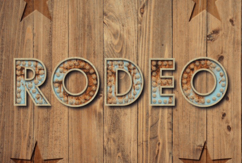
4. Creating Individual Marquee Letters: In this video, we're going to focus on creating individual marquee letters. Now we will be applying some of the same techniques we learned in the last chapter, but in this one, I'm also going to show you how to create a layer stack out of a font so that you can use the outline that's created to form a dimensional letter with shadow and texture. We'll talk about the best practices for choosing a font or your own lettering when creating your marquee letters. Finally, I'll show you an additional way to add the atmospheric glow behind your lights by using a copy of the existing Bloom layer. Let's get started. I've gone ahead and set up a 10 by 10 at 300 DPI canvas, go ahead and set yours up to whatever size you'd like. I'm going to start by adding a background texture, and I think I'll go with one of my wood textures. I'll go up to the Actions menu, Add and insert a file, and once I have this background texture placed, I'm ready to begin adding the letters that I'm going to turn into marquee lights. Before we do that though, let's take a closer look at some of the best practices when it comes to choosing a font or your own hand lettering for this project. Now we'll all be using a font to create my marquee letters in this class, you can also use your own hand lettering. The best practices that we're about to talk about applied to both. The easiest way to approach creating the marquee letters is to use lettering that has an even amount of space throughout the letter itself, as well as consistent spacing throughout the entire font alphabet. This is an illustration that I created previously and I chose the font Futura set on bold style to give me a nice amount of space to not only show the lights, but also the texture behind them. You'll notice that there's nice even spacing throughout each letter and then the actual spacing is consistent across all five letters. Now if you are working with a font or lettering that does have tight spaces, I don't recommend trying to squeeze smaller versions of the lights into the tight spots because it may end up being more like a dot than an actual light. Instead, get creative with the placement of your lights because as long as you're consistent across all of your letters, it's going to read beautifully. Let's take a look at another example. This is the sign that we're going to create in the next chapter when we get into the complex signs. If you take a look at the font that I chose to create the sign in the middle here, they have those tiny little spaces that would be very difficult to fit lights into. Instead of trying to jam smaller versions into the tight spots, I instead decided to create smaller versions of these lights and place them in the thicker parts of each letter. Again, because I was consistent across all four letters, it still reads really well. I'm back in my canvas and I'm ready to begin adding my letters. Now, I'm going to create an entire word, but you can create a single letter if you'd like, and again, I'll be using a font, but feel free to use your own hand lettering. I'll go up to the Actions menu, Add text, and I am going to type in the word hello. Let me make this a little bit bigger. It's already the color that I want, but I definitely want to change the size here, and I am going to go ahead and change the font. Right now this is the Eina font, that's pretty standard, but I want to choose Futura instead, and while I like the standard Futura font, which is this medium style, it gives me the nice even spacing so I can add my lights. I don't think that it gives me enough room to not only add my lights, but show the texture behind them, so I want to use a bolder version of this font. I'll go ahead and select Bold under the style. This isn't a variable font and there are numerous variable fonts out there, so always check your style section here when you're choosing your font because you may find that while the base font works nicely, one of the other options is going to be an even better choice. I'll go ahead and hit Done, and now I'm ready to create the rim layer, the outline out of this, I want to duplicate my text layer, go back into the edit text mode, and I first want to change this to this gray, that's going to be the color of the rim, the outline. Right now it's a solid shape, I need this to be an outline, so go back into the text editor, and I'll tap that button right there, the O, and if I zoom in, you can see that it turns it from a solid shape to an outline, and that's when I'm going to add my shading underneath to give myself some nice dimension. At this point, I'm ready to begin adding my shading and my texture to my letters. Now one thing I did do is change the color of the background because it wasn't quite reading the way that I wanted to, so it's a little bit darker. I'm going to follow the same process to add the shading and the texture that we did in the previous chapter. I will duplicate that rim layer. I want to choose a nice dark color, so I think I'm going to choose black. I'll rasterize this text and then turn on Alpha lock with a two-finger swipe. Tap fill layer, turn off, I'll pull up and then I'll just tap this down, and to the right, I'll go up to Gaussian blur on the layer, and I'll bring this up to about five or six. I'll change my blend mode and dropped my opacity down to about 80 percent. Again, if I were looking at this head on, you'd see a slight shadow coming from the right and the bottom, so I'll go ahead and duplicate that, grabbed my bottom layer here, and just tap over to the left a little bit, and then up and I'll drop the opacity on that one to about 70. Now I just need to clip these two into place. I'm going to clip them to that base layer and I'm ready to create my drop shadow. I'll duplicate that base layer and follow that same process, going to rasterize the text, turn on Alpha Lock, already have the dark color chosen, turn alpha lock off, and then I'll just drag my shadows down to the right a lot more than the other. I want to add the Gaussian blur to the layer. Now, this texture has a lot of really fine lines. If I'm bringing my blur all the way up to 15 like I did with the last one, I lose a lot of that drop shadow, so I want to be careful about how high I go because I still want it to show up, so I'm going to keep this at about 12 or 13, and then I'll go ahead and change my blend mode to multiply and drop the opacity a touch. Great, so we have all of the shadows. Now we just need to add the texture, so we'll go ahead and do that next. I'm going to start with the texture on my base layer, go ahead and select that, and I am going to choose one of my rust textures in here. I'll try something different this time. I like how that looks, that's nice and rusty, but I want to knock that back a little bit so I'll change the blend mode to something like soft light, and I'll just drop the opacity a touch. I don't want it to be too intense because I don't want it to compete with the lights. But I feel like this needs a little bit of color, so I'm going to add another clipping mask and grab my favorite, the teal color, and one of my rust brushes. Think I'll use the grainy rust, and I'm just going to hit this in spots really lightly. I just want it to bleed in to the rust below, let's me zoom in a little bit so you can see it. I'm not being too heavy-handed with it. I just want it to look like there's a bit of a patina on each of the letters. Now I'm going to keep both the opacity and the blend mode exactly as it is because I, again, I wasn't heavy-handed with this, so I don't really need to knock it back too much and I really like the color as it is. I think I might just add a little bit more to the O here and maybe a little more to the H. I have my texture on my background all set. Let's go ahead and add some texture to the top, again, I'll insert a file. Now, I've been using a metal texture, but you could also use one of the rust textures, play around with it and have fun with it because you'll get different outcomes each time. This just happens to be one of my favorite textures to use for the rim layers, and I'll change this to overlay. Now, I'm not going to add any color to the outer rim, I'm going to leave it as is. I'm all ready to begin adding my lights and before I do that, I've taken all of my word layers, my text, my shadow, and my texture and put them in a group, and I do that to stay organized, but also to set myself up for animation later because I'm going to need to group things together in order to do that. I'm going to approach adding the lights to these letters the same way that I did the sign in the previous exercise. I'm going to give myself an on and an off version. Again, the reason I do that is mainly so that I have a source of comparison. I can decide if I need to make any adjustments to the on version once I've created it, but the other reason that I do it is so that if I do decide to animate this down the road, it's all that much easier because the likely animation I would create with something like this, some of our key light would be some version of off and on. When you're creating your own, keep that in mind because it doesn't hurt to have an off version [inaudible] even if it's turned off for now, because if you do decide to animate down the road, you're that much closer to being able to do it. I'll go ahead and add a new layer for my lights. I have the off white selected and my marquee bulb chosen, and I'm going to start with the H here, and again, just like the previous exercise, I'm going to copy and paste wherever I can. I'll start with this upright and then copy and paste into all of the other uprights in the rest of the word. Let me see what size I have there. I think that'll work nicely. Just going to draw down, I'll do eight and push that up a little bit. Hold my finger down to get a nice upright there, and because this is on its own layer, I can grab my transform tool and just place it exactly where I want it. Now I'll go ahead and copy this and paste it to all the other uprights in the rest of the word. I've gone ahead and cut and paste wherever I could. Now, I would normally pinch these together and go ahead and fill in the rest of the letters, but I'm actually not going to do that. I'm going to keep all of these layers separate in case I need to move any of these uprights. I already have the layer broken out there, so I don't need to use my selection tool to do it. I'll give myself a new layer. And I want to fill in the blank spaces here. In the case of the H, I think I'll be able to fit four in this crossbar. Sometimes you just need to use Edit Shape and it works a lot better. I'm going to pull this out a little bit. Now, one thing I will mention about filling in the spaces on your letters, you will find it difficult, if not impossible to line up your lights with the uprights and the crossbars. What I typically do is try and aim for a different spot. So I created eight lights here, knowing that the space between the middle two would line up nicely with these lights. I'm not trying to line up this way. I'm just lining this up with this space in between. If I want, I can go ahead and make this a little bit longer, and if I back out, the spacing looks nice, it still reads nicely even though these two lights here are not all lined up. I'm going to go ahead and do the same thing with the E. I'll give myself a new layer and I'll pinch all of these together once I'm done. Now, I already know with this one what's going to happen is this light is going to be so far up that even if I line up my lights with this middle, it's going to look a little strange. We'll go ahead and do three here. Give myself a line, [inaudible], and just back out. Unlike the H that reads like a nice little triangle, this looks really strange. So what I'm going to do is I'm going to find that upright, which is right here. I'll grab my transform tool and I'm going to set it to a free form. Just bring this down slightly. I don't want to do it too much because it'll squash the lights. I'm actually doing a negligible amount so that you don't see that, I can get it lined up a little nicer with this one here, so I'm going to tap that down a little bit. Bring this bottom up. Now let's back out. I think that reads a lot better. Now I can go up to my top layer here, use my selection tool to copy and paste. I'll just drag this down all the way to the bottom because it may be difficult to see this in the video. This bar here is actually shorter than these two. So I'm going to approach this a little bit differently. I want to go ahead and copy and paste it into the bottom because I know that matches this one. I'll give myself another layer, then just draw out what I can fit in this space. Now, in this case, it is lining up nicely between the space in between these two. So I'm going to leave that as is. If I back out, I think that reads really well. I might be able to use a copy of this for my L's. Let's just see what happens. I'll go ahead and duplicate it and then drag it over. Now the same thing is happening here that happened with the E. I could bring this all the way down, but that kind of reads a little strange. So I'm going to go ahead and place this in the middle and I'm going to find the upright for that L, which is probably this one here. Then just do the same thing that I did with the E, but I'm only going to bring the bottom up. I'm not doing it a lot because if I do it too much because I'm on free form, it's going to squash the lights and I don't want that. I just want to bring the bottom up just slightly without going into the shadow too much up there. Just to line that up better. Now I could, go ahead and copy and paste this and move this over. But I think when I'm going to do instead is I'm going to get rid of this last layer here. I'll remove that. I'm going to pinch all of my layer lights together. I'll take my selection tool and I'm going to select that L. Copy and paste and then just drag this over because I already know it set the way I want it to. So there's no sense in starting all over again. Now both of these could probably come down a little bit. Let's go ahead, just tap it down a little, select this one again, tap it down a little bit. It was squashed a little bit too much at the top. I'm going to snap all these together and give myself a new layer because I'm ready to create the O now. Now, because I'm using a brush, I can create a perfect circle simply by letting it snap into a perfect circle and putting my finger down. It may sound like it's really easy, but you might find yourself doing undo and redo until you get it just right. What I find easiest when creating an O like this, is keeping my pencil towards the center of the O rather than the outside and coming in. I'll go ahead and choose my brush. I'm trying going to go ahead and draw my circle out. Now, this is one of the things I meant. This is too much of a gap. And even if I use my edit tool, it's not going to give it the way I want it. It's going to have that weird space. I'll just delete and start over again. I'll try and do it so that I can complete my shape nicely. There we go. I'll tap and hold into a perfect circle, then drag out. Now I'm still getting that space, but I'm going to show you, I'm going to correct it in a moment. I have this on its own layer so I can use my transform tool to move it exactly where I want and maybe make it a little bit bigger. Let me put it on uniform. I just want to move this bulb. So I'll just use my selection tool, tap to select it and just move it where I want it, and we're all set. The spacing on my O is not exactly the same as the rest of the letters and I'm not worried about that because this is such a vast amount of space and because it is round, it reads differently anyway than the really harsh lines of the other four. So because it's close enough, I'm actually fine with that. If I try to squish anymore lights in there, it's not going to look good. I am going to call this word done, and at this point, I'm ready to light them up. I'm going to create an on and off version of this so I'll duplicate my layer. In this case, instead of using the soft brush on black to add this shadowing behind my bottom layer, I'm going to duplicate that layer, turn on Alpha Lock and grab black, and I'll just change this to black, remove Alpha lock, and I'm going to tap down into their right to bring my shadowing down the same direction as the rest of the shadows. I'll give this a bit of a Gaussian Blur and make sure you take off the Alpha Lock. I'll change this to multiply and I'm going to leave the opacity where it's at. Now, these two here, I'll group together as my off version of my lights. And again, I'm making sure to group them because if I wanted to animate this later, it's going to make it easier. So these are off lights. Now I'm ready to light up the next layer. I'll go up to bloom, layer, and I'm going to drag this up to about 45 in this case. It's a little lower than the last time because we're going to add another layer of bloom right after this. So it's about 45, I'll play with the size and the burn. There's the on and off. But I still don't feel like I have that nice atmospheric glow behind my lights. So because they're curved, they have a nice diffused glow across the texture behind it. I'll go ahead and turn that back on and I want to duplicate this. I'm going to show you a different way that you can add the atmospheric glow beside the soft brush. I'll take this bottom layer and I'm going to turn on Alpha lock because I want to change this to its yellow color, tap and fill layer, and again, make sure you turn Alpha lock off. I'll go up to bloom on the layer. This time I'm going to bring it up to about 50. It's going to look a little harsh, but we're going to knock it back. I'm going to put in size and burn again. Now, I could change the blender to this to add and see how it looks, but I think it makes it a little harsh. I think it needs screen and drop the opacity at touch. Once I've done this, I'll show you the difference between the two. This is on without the glow and this is on with it. Now I hope that's reading well on the video. It just adds another touch and you can always adjust the opacity of it if it seems too harsh, but that's another approach to adding your atmospheric glow behind your lights just to give you that extra little oomph to the on version. I'm going to go ahead and group these together, rename them on lights. Let's take a look at the off version now. I think that looks really good. It's reading nicely as a light. I also like that the additional glow is hitting the rim here, so it gives it a little more realism to it. I'm going to call my HELLO sign here, done. Go ahead and create your own. You can create a single letter or a full word like I did here, if you would like, you can also use your own hand lettering. Just keep some of the best practices in mind that we talked about. To recap what you've learned in this video, I showed you how to create an outline out of the original font so that you can create this nice rim layer with shadow and texture. We talked about best practices when choosing a font or your own hand lettering. Remember the easiest approach is to use letters that have nice even spacing throughout the letters, as well as consistent spacing across the entire alphabet. But if you do have tight spaces, you just need to use some creative placement rather than trying to jam smaller versions of the lights into those spots because they may not read well. Finally, I showed you how to add that glow behind your lights by using a copy of your original bloom layer. In the next video, we're going to up our game and we're going to create a complex layered sign. I'll see you there.
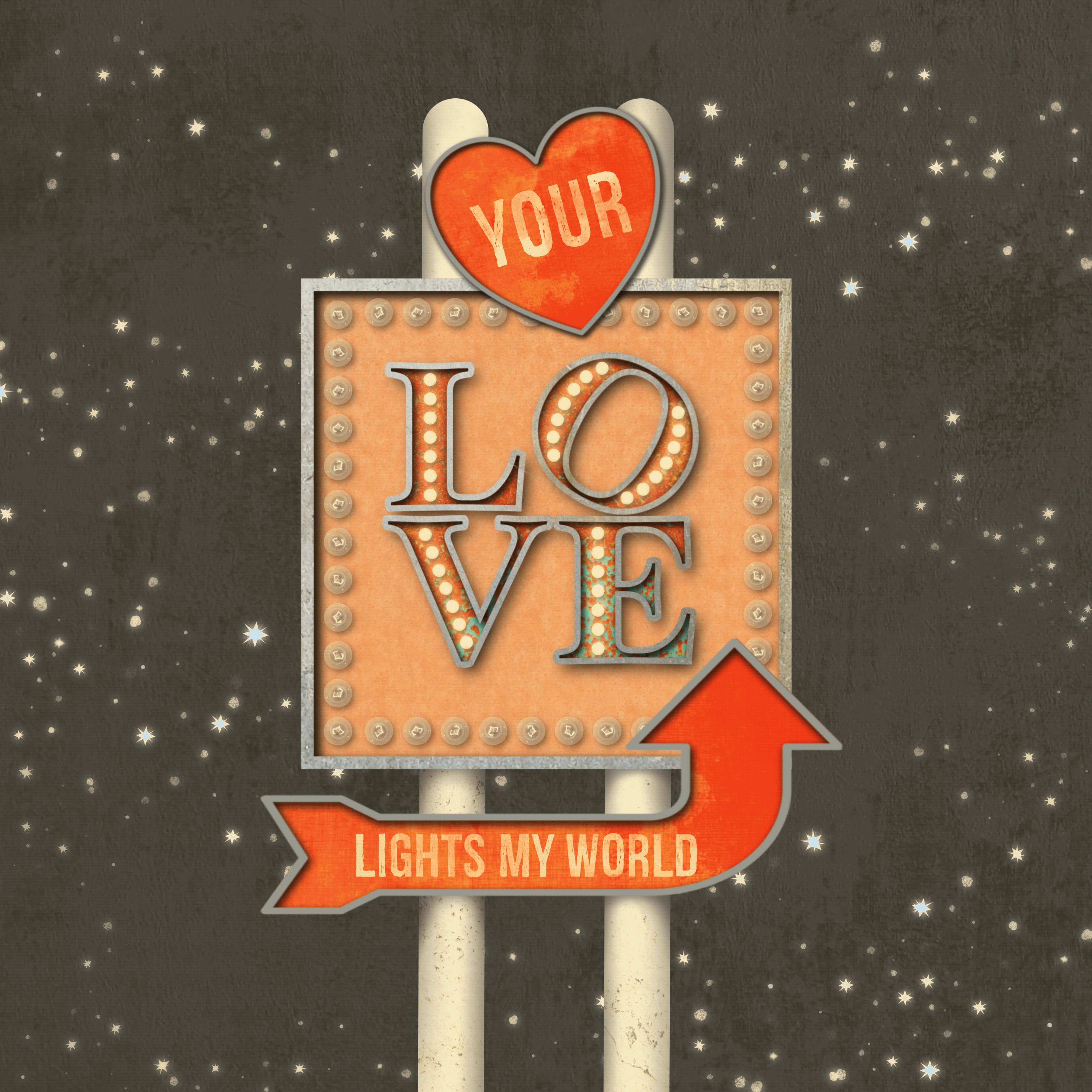
5. Creating a Complex, Layered Sign Part 1: In this chapter, we're going to use techniques that we learned in the last two and add a whole other layer to it quite literally because we're going to create a complex layered sign. Coming up, I'm going to show you how I plan out my complex illustrations including taking any potential animation into account. We'll add a combination of both marquee letters and texts lettering. I'll show you how to add shading to all of my elements to emphasize the layered effect and finally, we'll discuss how layering a complex sign can change how we animate it down the road. Let's get started. When it comes to creating a complex sign whether you write it out physically here in Procreate or on paper or you simply give it some thought. I recommend sitting down before you actually begin creating and decide how you want your sign to work at the end, as well as what you plan to do with it. The reason I say that is first, these complex signs can end up with a lot of layers, and you're stacking groups on top of one another. You want to make sure that the way that you approach it is going to make it as [inaudible] as possible so you're not having to undo and redo and erase things and start fresh. Just a little planning can go a long way in making it a lot easier to create this. Then secondly, if you do plan to animate this because you are working with a lot of layers and groups, you want to have an idea as to how you want your animation to work, so that you can make sure that you are creating your layer stack in the right way to make it animate exactly the way you want it to. This is a sketch I created for the sign I'm going to illustrate in this chapter and normally I don't physically draw this out, but I wanted to show you my thought process as to how I want the illustration I'm going to create to work, both as a static illustration as well as when I animate it in the next chapter. I'm going to create a love themed sign that I could use as a Valentine's e-card or on social media and it's going to have that Route 66 feel. There's going to be various layers. The very background is going to be a night sky with stars and some texture. The middle ground, which is also ultimately going to be considered part of the background is going to be these poles with this square sign on it. On that square sign is going to be a set of blinking lights here on the outside once I animate it, as well as a set of the marquee letters. I'm going to give a nod to my hometown, Philadelphia, and recreating the love sign. If you haven't seen it as a stacked sign where the L and the O sit on top of the V and the E. These lights are going to remain static while these blinks. Finally, I want to have two foreground elements, this heart and this arrow, and they're going to have some of the distressed text on both of those but no lights. Now the reason I'm designating those as foreground elements is because ultimately they are going to be static. I don't want them animated at all in the next chapter. This is where some planning comes in. I know that I need to ultimately tell Procreate that I don't want these to animate it all. I'm going to keep them separate from the rest of the background elements because ultimately they're sitting on top of some elements that are going to animate. The background's going to be static. My lights here, which are going to be sandwiched in the middle, are going to be blinking and then these two foreground elements are going to be the top of the sandwich, and they're going to remain static. [inaudible] into this that I need to keep those in those three separate and distinct groups and it's going to make a lot more sense once we get into creating this and finally once we animate it in the next chapter. Let's go ahead and get started. I've created a canvas at 10 by 10 at 300 DPI. Go ahead and set yours up to whatever size you'd like. I mentioned I'll be animating this in the next chapter to use it either on social media or as an e-card, so technically I don't need it to be at 300 DPI. But if I do decide to print this as a static illustration, I have that option since I've set it up that way. The first thing I'm going to do is add all of my basic elements so the background sky and the sign shapes and from there I'll go ahead and build it up with some texture and dimension. I've given myself and number of layers, and I'm going to start at the very bottom here and add my background sky, so I'll grab this dark gray and just drop that into place. Now I will be adding stars and texture to this, but I'm going to wait until the sign is in place and done so that I know exactly where I want to put the stars. I'll go up to the next layer and start creating the sign itself and I'll start with the two poles that everything's going to be sitting on. I want an off-white color for that and the monoline brush works really well for this. I'll drag down a line and hold, snap it into place and then I'm just going to copy and paste this and drag it across and that's my two poles. Now I will be adding texture and shadow to this as well but for right now I'm just going to snap these two together. They don't need to be on two separate layers and I'll just place this in the middle. Let's go ahead and add the rest of the sign shapes. Now I will be grouping everything and labeling them once I get them in place. I don't tend to do it as I go, I do it right as soon as I'm done, at least a group of items, so I grab this light pink color and the square sign. This is ultimately going to be the star of the show. It's what the marquee letters are going to be sitting on, then the heart and the arrow will be sitting on top of it. I'll add my rim layer. I'm following the same process that I did for the simple sign in the first exercise and the vintage letters in the last one. Let's go ahead and add the heart next, I'll grab this reddish-pink and I'll follow the same process. Now ultimately this heart is going to be tipped at the end, but I'm going to wait until I have all of its elements in place, including the text before I do that because it'll make it a lot easier. I'll grab that gray and again, add the rim. Let's go ahead and add the arrow in the same way. Now the arrow's going to be vertically flipped, and it's going to have the [inaudible] but I'm going to put it in place first and then do it because again, it just makes it easier. I'll grab the new layer and the gray. I want to select both layers vertically flip them. I'm actually not going to horizontally for just vertical. Move it over to here and bring it down, and I actually wanted on free form and just drag out because I want this to be a longer sign that comes to about there, and I'll bring it up. Again, it's going to sit a bit on top of the sign, and ultimately I'll be adding some distressed texture to it. Go just a bit past, it matches that. I have my basic sign elements in shape in place at this point. I'm ready to start adding the texture and shading to this. Now, I'm going to be following the same process that I did in the previous two videos. I'm going to go ahead and speed it up at this point, and I'll see you on the other side. We have the basic shapes in place. I've added the texture and the shadowing. There's one final bit of shadowing that I wanted to add, and that's to the poles. Right now they look pretty flat. They just look like I took them on the line brush and added some texture to them. I'm going to add another clipping mask to them. The first thing I want to do is add a little depth here and here. It looks like I didn't clip my one layer there. Underneath my square sign, I need to add a little bit of shadowing, and I also need to do it under the arrow here. I'll grab my soft brush, and get a little bit bigger. I'm just going to do a little U-shape here. I'm going to come down a little farther on one side, and I want it to be more intense towards the closest part of the sign. It's creating little gradient. It's really intense right now but I'm going to knock it back with an opacity change. I'll do the other side here. Again, I'm pressing down harder when I'm closest to the sign. I'll change this to multiply, and just drop the opacity. Now I don't want to add my shadowing for the arrow on the same layer, because if I do decide I need to move the arrow, it makes it a lot easier to have everything on a separate layer. I've just added another clipping mask and I'm going to follow the same process. Once again, I'll change this to multiply and drop the opacity a bit. Now, that's a touch better, but I still don't have that rounded feel. I want to add one more clipping mask to this, and what I'm going to do is add some shadow to the outsides of both the poles. I'll go ahead and turn off my other layers, for right now just so that I can see these better. I'll select my soft brush again, and I'm going to keep my brush outside of the actual shape. I just want a little bit of shadowing on both sides. If you've ever looked at a light pole, you can see that there's a little bit of a darker shade at the very edge of both sides, and that's what lens to the whole rounded look. Again, I'm keeping on the outside, I'm going to make this a little smaller. I do my other one here. I'm going to put a little bit of a shadow at the top of both of those. I will be adding a shadow under the heart as well, possibly. It just depends on where it lands, but I'm not going to do that until I add everything to it and tip it. We'll leave that go for right now. Then one final one over here. I'll change the blend mode. Drop my opacity. Let's turn everything else back on again. Feel like these are a little too intense. Still it's just knock those back a bit. Great. We have all of our sign shapes in place. The texture and shadow, which we added in the same manner that we did with the marquee letters in the last chapter and the simple sign previous to that. At this point, I'm ready to start adding my other elements, like my text, as well as my lights. Let's go ahead and do that. I'm going to start with the text on the heart and the arrow. Now I don't know if you noticed when I split everything up but I grouped everything by the basic sign shapes. I have my arrow, heart sign, the square sign, and the poles together. For right now the background sky is on its own. I'll group that once I start adding the stars and texture to it. For right now, that's just the basic organization I'm going to keep, and it makes it easier to know exactly where I need to place certain elements. It's going to get further organized in the next chapter once I add the animation to it. But for right now this is a good start. I'll go into my heart sign and tap the top layer. I want to add some text. It's already chosen the font that I'm going to use, which is called Redgar, and I'll put a link to that in the download section. I'll just change what it reads though. This is going to read your. This priority has some distress in it. The font was created that way, so I'm not going to add further texture to it, but I do want to add a mask to it. Again, grab one of the grunge stamps and just tap away certain spots on it. Let's do the same thing with the arrow. I'll choose my top layer, add text, and I want this to read lights my world. I did mention this is going to be a Valentine's theme. Forgive its sounding a little cheesy. Let's go ahead and make this a little smaller. I'm going to do the same thing as I did with the heart text. I'll add my mask and just stamp away some of the pieces. I don't want it to be too much. That looks good. I'm going to go ahead and close up my arrow shape here. The next thing I want to do is add my outer lights to the square sign. I mentioned when I was talking about the sketch layer that my outer lights are the ones that I'm ultimately going to animate in the next chapter, which means I need to keep those separate of everything else. I'm going to add a layer at the very top of the stack, and this is going to be just for these outer lights. I'll choose my off-white color here, and my marquee bulk front. Let's just see what size we have here. It's way too small. Let's try again. I'm going to approach this the same way that I had done previously. I'm going to create one side and then copy it on the top, and then copy it to the bottom. I'll just go ahead and draw down a line and hold, copy this, and then tap it into place. Now, because I have this on the very top layer, they're sitting on top of the arrow. This is where designating a foreground element is going to come into play with the animation and I'll show you what I mean in a moment. Let me just go ahead and finish these lights. I'll draw another line here, and hold. I'm going to bring that up just a bit and then duplicate it, drag it down, and line it up with the bottom there. Let's snap all of that together. This is going to be what we duplicate to create the off and on versions and then ultimately animate. Now, I want these tucked under the heart and the arrow. But when it comes to the animation, I don't want the heart and the arrow to be animated. I'm going to move these up to the very top so that the lights tuck underneath. But when we get into the animation part of it, these are going to be grouped together and I'm going to tell Procreate that those are the foreground elements. They stay perfectly static, the lights here are going to blink and everything underneath it is going to stay static because that's the background. Hopefully, you can start to see we're building this up a certain way, it's what's going to drive what we do next. I'm not going to light these up just yet, I'll do that once I'm done creating the vintage marquee letters, and we'll do that next. Before I begin creating the marquee letters, there's a couple of things that I wanted to mention. When I went over this sketch, I mentioned that I would be animating the lights on the outside of the sign here with a simple blink. But the lights on the marquee letters are going to remain static. They're going to remain on throughout the animation, which means I need to set them as either a foreground or a background element so that I can tell Procreate to keep them out of the animation. Now for [inaudible], these are going to be sitting on top of my square sign. I'm just going to place my text to create the marquee letters inside the square sign group. I'll just open that up and tap that first layer. Now there's a couple of ways that I can approach adding the text. If you recall we're going to be giving a nod to the love sign in Philadelphia, which is a stacked sign that has the V and the E on the bottom and the L and the O on the top, and the O is slightly tipped. There's a couple of ways I could approach it. I could create a single layer for each letter so that I have individual control over each letter. Or I can create a single line of text and just use a combination on my selection and transform tools to manipulate the letters how I need to. That's the approach I'm going to take because it's the easiest approach when it comes to creating the outline for the rim layer, adding the shadowing, adding the texture, and so forth. I'll go up to Actions, Add text. This is actually already the font I plan to use. This is called Hoefler Text, and it's on the style black. It just gives me more space. But I want to, of course, change what it says. We'll go into my text editor, and this is going to read the love. Now I can start creating that stock sign. I'll turn my caps lock on, type an L and an O, hit return, and then type the V and the E underneath. Now, obviously, these are too far apart, but once I'm done adding all of my elements, I can use the selection and transform tools to move everything down, and then finally tip that O, but I want to wait until that's in place because I don't want to rasterize my texts just yet. I also want to change the color of this. I'm going to select it, and I'm going to choose that same color as the heart and the arrow just to keep everything consistent. I'll place this up here. Now I need to create my rim layer for my outline so I'll duplicate that text, go into the editor, change the color of it, go back into the editor, and change it to an outline. At this point, I'm just going to go ahead and rasterize both layers because I need to create my shadowing, and there's no real need to keep it as a text layer because remember if I were to change this word because they're marquee letters, I'd have to change the lights anyway, so there's no benefit to keeping it as a text layer. I'll just rasterize both of these. Now I'm going to add my texture and shading. Because I'm going to follow the same process I did previously, I'll go ahead and speed that up and I'll see you on the other side. I've added the texture and most of the shading to my letters. I went ahead and played around with some of the colors and blend modes and opacities, and I'm liking how this looks, I'm almost ready to add my lights. Now one thing you'll notice is I didn't add my drop shadow yet, and the reason that I didn't do that is because I'm going to be selecting some of these letters and moving them around. If I were to put the drop shadow on first, it would be impossible to choose every bit of the drop shadow for an individual letter. It would end up looking like I just took a piece of the shadow out, it looks funny. I recommend doing the drop shadow after you manipulate your letters. What I'm going to do is select both of these groups. I also grouped the rim layer and the background letters together. I'll select both of them. Go to my selection tool and I'm going to choose the rectangle, and the first thing I want to do is select my L and my O. Use my transform tool, it's going to temporarily turn off the texture, and I'm just going to drag this down. I don't want it to touch the V and E, but I want it pretty close to it. The next thing I want to do is I want to select just my O. I'm going to keep those both selected because, again, I need to have all of the elements, the rim, and the background. Let me try and do this with the square. I want to make sure I only get the O and not the E or any part of the L either. I'll use my transform tool, and I'm just going to hold my finger down and snap that to about a 30-degree rotation. I still have both of those selected, I'm going to make this a little bit bigger because this is going to be the main focus of the final illustration. Now that this is in place, I can add my drop shadow behind my lettering. I want to go into my background layer, duplicate it, and I'm going to follow the same process. I'll turn on Alpha lock, fill it, turn it off, I'll bring it down, and slightly to the right, use a Gaussian blur, and I'm going to keep it at about nine or 10. Change my blend mode, drop the opacity a touch, and then I'm all set. I have the letters in place with their texture and all of their shadowing. I'm ready to add the lights to them next. I want to add a layer above the two of them. I'll grab my off-white color and select my marquee bulb. Now I want to start with the O, and the reason that I want to do that is because, again, I'm going to be using some creative placement here since I'm not going to be placing lights in all areas, I'm only going to focus on the larger sections of these letters. The O is actually not as consistently spaced as the rest of these. It has a little bit of a pinch at the top and the bottom, so I want to make sure that the size I set my lights at fit the O, and then I'll use that same size in the rest of them. Let me just see what size I have here. I hope that's going to work. I'll just draw down a little bit of a curve and hold, so I've created an arc. I'll use my Edit Shape and just move it exactly where I want it. Now, I can just duplicate this because it's on its own layer. I'll select, copy and paste, just going to flip it and then drag it over to the right. Let me tap this down just a bit and here we go. Let me turn off snapping, sometimes turning snapping off actually helps. That letter is done. Now, again, I'm going to keep the same size light for the rest of the letters so that I keep the consistency across all of them. I'm also going to aim to create the same number of lights. I'll go over to my L and just pinch these two together. I'm going to give myself a new layer because I may just be able to copy and paste into the rest. I have seven over here, so I'll try and fit seven in here. I'll hold, tap my finger down. It's on its own layer so I can just place this exactly the way I want. I'm going to copy that into the E, tap this up a bit. Let's go ahead and copy that again and try just turning it to get into the V. I'm going to turn my snapping off because it's not quite 30 degrees. There we go. Let's back out. I think those look good, once they're lit up, they're going to look even better. Next up, let's go ahead and light up all of our lights so that we can complete our sign.
6. Creating a Complex, Layered Sign Part 2: Since we're already working on the marquee letters, let's go ahead and do those first. I want to snap all of these together. It looks a little funny because they're not actually completed so it doesn't necessarily read love here in the layer stack. But again, I'm going to create an off and an on version, so I'll duplicate that. I'm going to duplicate this one again because I want to change it to a darker color so I can create my drop shadow. Again, you can take the other approach of adding the shadow using the soft brush, it's up to you. I'll use my snapping and just tap this down. I want to bring it down this way a little bit. Set some Gaussian blur. Make sure I turned off Alpha Lock which I didn't. Then I'll change my blend mode to multiply. I have my off, I'll group those together. I'm going to rename this off marquee. Because I have two sets of lights I'm being as specific as possible. Let's go ahead and light up the on version. I'll go into Bloom and Layer and I'm going to bring this up to about 45. When you use the same process I did in the last video. I'll bring it up a little further. Play around with the size and the burn. Accept that, and I'll duplicate this. Grab my bottom layer. Again, I want to first change the color, I want to make it this yellow. Turn off the Alpha Lock and add another bloom to it. I'll just drag that up all the way to about 50. Let me just adjust the size. Let's group. Actually it's first change this one to screen and maybe drop the opacity, just a touch. I'm only dropping it about 85. We'll turn that off and on. That's regular on and that's on with bloom. I like how that looks. I'm going to group that together and rename this on marquee. Ultimately, it doesn't really matter because I'm not going to be animating this. But if I decided to down the road, I at least have them separated out. Again, I'm going to have that waiting in the wings should I want to do it. I'm done lighting up those lights. Let's go ahead and focus on lighting up the other set. I'll duplicate it. I'm going to follow the same process. At this point, I'm going to speed it up and once again, I'll see you on the other side. My lights are lit and I'm ready to animate them in the next section. Now, I have renamed the on and the off to on and off blink because I know those are the two that I'm going to animate. I don't want to group them together because ultimately they need to be separate once I animate them. But I'll show you in the next video in the animation video how I continue to organize things to set that foreground and background element. Before I do anything else though, I want to complete my background sky. I've given myself a couple more layers and the first thing I'm going to do is use my stardust brush and it's in the set that I provided. I just want to just hit it in spots. I don't want these to compete too much, but again, this is a night sky, so I do want to play into that a little bit. One final thing I'm going to do these stars is I want to give it a nice glow so I'm going to use the bloom. I'll bring this up to about 50. You can see it's already adding that nice sparkle around the edges of the stars. I'll play with the size and the burn. I like how that looks, I'll accept that. I think I'm going to just drop the opacity, just a touch, or let's try what screen looks like. It's not really making much of a change. I'll keep it on normal and I'm going to bring the opacity just down to about 84 or 85. Again, I don't want it competing with the sign, but I do want it to be part of that night sky. Then one last thing I'm going to do is I'm going to add a texture image file to add some texture to the sky. You can use a brush if you want, sometimes I'll use a gouache brush to add some additional texture almost like a milky way feel. But I'm going to use one of the textures that I provided from the free use image pack. I'll go into my concrete and I like this one. It's going to be very subtle. I'm going to drop this down to overlay and bring my opacity down. I just want a touch of texture in the background. If you wanted to, you could add texture over the entire thing. You would simply add that to your foreground elements so you could place it at the very top of the layer stack and maybe put it in the arrow group or you can create its own group. Ultimately, you just need to tell, Procreate when you animate, that you want it to be a non animated part of it. Now, that I have everything in place, one final thing I want to do is tip my heart layer. I have that group selected. I'm just going to tip it slightly, not a lot. It's still sitting over the top of the sign as is the arrow. What I like about this approach and having this set as a foreground element is I don't need to erase any of the lights underneath because as you recall until we move this to the top, some of the lights were sitting over top of it. I could have used a mask to mask them away instead of moving everything in the heart and arrow grouped up to the top. But what I like about this is it lends to the realism because in reality they're not going to remove lights. They're still going to be sitting underneath the layered signs. I like how it's peeking out from underneath or peeking out from here as well. I'll take one final look. I think everything is looking good. I'm ready to animate this in the next video. But before we do that, let's recap what you learned in this one. In this video, we talked about planning out your sign in advance, whether you do it physically on paper or here in Procreate, or just give it a little bit of thought. It's a good idea to think ahead as to how you want your sign to look, as well as whether you plan to animate it and where you're going to use it, because that's ultimately going to drive how you set your layers up. We added a combination of both marquee and text lettering to our layered signs that we could have both in place. I showed you how I shade all of my elements, including the background poles, to really emphasize that layered and rounded feel in some cases. Then finally, we talked about how layering your complex sign can ultimately change how you animate it down the road. In the next video, I'm going to show you three ways to animate your lights. I'll see you there.
7. Animating Your Sign: In this chapter, I'm going to cover the basics of animation, assist in Procreate. I'll show you three different animations for your lights, a simple blink, a single light that isn't quite working right while the rest remain lit, and a single rolling light. I'll show you how I plan out my animations ahead of time to ensure that my layers are set up accordingly, and then finally, I'll show you how to adjust settings on the animation to get it just right. Let's get started. I'm back in the complex illustration that we created in the previous chapter and this is the one that I'm going to add these simple blink to. If you remember, I'm going to have the lights on the outside here blink and the lights on the marquee letters remain static. I'm pretty close to where I need to be with my organization for the animation. I have things that need to be separated out. There are a few things though that I need to combine because again, I need to tell Procreate what I want to remain static and what I want to remain animated. Before we do that though, I want to take a closer look at the animation assist interface so that you understand how it works. I'm here in a previous animation that I created. This is a simple blink animation where it's just turning the lights off and on. The reason I wanted to open this up is because it's already set up for animation and I want to take you through the animation assist interface before we get into organizing the layers of the complex sign because I think that'll help you understand exactly why we're setting things up the way we are. First things first, the way that you turn on Animation Assist and right now it's already turned on, is to go up to your Wrench, Actions, and under Canvas you'll see Animation Assist. You'll toggle it on. This menu is going to pop at the bottom and you can turn yours on and off here with play and pause. There's a settings menu, which we'll talk about in a moment, and then you can add additional frames using that. Now the frames at the bottom here are directly driven by how you have your layers or groups of layers set in your layer panel here. If I tap through, you can see it changing the location on the frames at the bottom here, and it's running through the animation. If I add a layer, it's going to add a frame, just like it would if I added a frame down here. Let's take a look at the settings in the animation interface. The first three options here are loop, ping pong and one shot. Loop is the standard so it's going to continuously loop through an animation until you shut it off. Ping-pong is going to take it backwards and forwards indefinitely again until it shut off and then finally one shot is going to take it one time through the animation and then stop. That would come in handy if you're creating a title graphic for something where you just want it to run through once and be done. The frames per second is going to allow you to change the speed of your animation. I can bring this all the way up, or I could bring it way down and slow it down. I'll show you how that's going to come in handy later when we create our light that's broken. Onion skin and Procreate's animation interface were just to like traditional hand drawn animation cells that are created and then viewed stacked with a light box. What it lets the animator do is see forward and backwards so they can see the progression of the animation. When it comes to these marquee signs, It's not really that handy because they're so simplistic. It would come more handy when it's a more complex animation where something is moving around the screen. You can see the progress of your animation so that you can line it up exactly the way you need to. These last four options have to do with the onion skins. You can set the number of frames. The number of frames that you want to see forwards and backwards, and you can set the opacity of those as well. But again I'm not going to focus any attention on the onion skins because I don't find them necessarily handy when it comes to creating these signs. I'm back in the complex illustration and now that we've taken a look at the interface, I want to go ahead and set up this document to get it ready for animation. Again, this is going to be a simple blink and my outer lights here are going to blink and the inner lights are going to remain on. I want the rest of my animation to stay static. The other complexity to this, is I have the heart and the arrows sitting on top of everything and I don't want to have to erase anything away here. So I need to tell Procreate that these are going to be foreground elements. All of that is going to drive how I do my final organization in my layer stack here. Right now I have my heart and my arrow as two separate groups. I'm just going to select both of those. I'm going to group them together and then I'm going to rename this foreground. I'm going to leave my on blink and my off blink completely separate of one another and I'm not going to group them with anything else because that's going to be the difference between off and on and that's what's going to be animated. Then finally, everything else here is going to be grouped together as my background. I'll rename this background. My background and my foreground are going to remain completely static in my animation and Procreate is going to know to set this one and this one as my animation because I'm going to tell it to. Let me show you how to do that. Now that I have this organized and you can hopefully see how staying organized throughout the process of creating your illustration helps you be that much closer to animating your illustration and upon the back end. I'll go ahead and turn on Animation Assist. Once again, my frames have come up. Now, while I do have a background group and a foreground group set, if I turn on play right now, it's going to run through all four of those frames because I haven't told Procreate that I want anything designated as background or foreground. The way that I'm going to do that is I'm going to tap on my frame and I'm going to toggle on background. I'm going to tap on this frame and I'm going to toggle on foreground. Now you can see that the illustration itself looks just the way it normally would. Now if I turn on Play, it's animating the two in the middle, which if I go to my layer stack are off and on. That's great. It's a simple blink. It's blinking exactly the way I want it to as far as it's the light that I want blinking, but this is way too fast. Let's go into Settings and I'm going to take my frames per second down to about two or three. That's much calmer. That's much more like it would in real life. I think two's probably better. I want this on a regular loop because Ping-Pong is not going to make a difference. If I just do one shot, it's going to turn it off and on and then be done. Loop is the correct setting for that. That's it. That's exactly how you can set up a simple blink with your marquee signs. Again, I can't emphasize enough that if you stay organized through the process of creating them, you're going to find it so much easier to create your animation on the back-end. As you're going along and creating this, even if it's a simple sign, make sure that you're grouping things together. Create an off-version of your lights for yourself because even if you don't animate it, it doesn't hurt to have it sitting there in the background. But if you do decide to animate it, It's already there and you don't have to create it on the fly. Then once you're in there, just think about how you want your animation to work and set your layers accordingly. That is the simple blink. But what if we wanted to create one where we have one light that's on the fritz and blinking and the rest remain static. We'll take a look at that next. I'm here in the simple coffee sign illustration that I created at the beginning of the class. I'm going to use this to create the broken light that's going to flicker while the rest of the lights remain lit. The problem is I didn't plan ahead with this illustration. I have an off and an on version and that's great except I don't want all of them to blink. Right now if I turn Animation Assist on with this, and I designate this a background layer, and hit Play, it's going to make all of the lights blink. If that's what I was aiming for, that would be great. But I really only want one of them to blink. In fact, I want it to be a flicker while the rest remain static. I could go into my layers and single out one of my lights, select it and perhaps cut and paste it onto its own layer except I've, added all of the bloom and all of the drop shadow to my lights, which means it's going to be next to impossible to select a light and all of the drop shadow and bloom elements without it looking funny. Instead, because I didn't plan ahead and didn't set up my layers accordingly, I actually need to delete my own layer. I need to delete the drop shadow, and I need to start over again. What I'm going to do at this point is designate a light. Let's just say it's going to be this one. This is the one that's going to be broken. With that layer selected, I'll go ahead and select this light. Again, it's really easy because I don't have any bloom or drop shadow on it. I'll three-finger swipe down and cut and paste. That's brought it to its own layer. Now I need to drag this out because this is what's going to be animated and this is going to be moved into my background. But now neither one of them are lit, so I need to start over again. I'm going to go ahead and light up all of my lights the way I want them to. I'm going to follow the same process that I showed you in the previous exercises. I'm actually going to do that off camera and I'll come right back to you. I've gone ahead and I fixed my layers. Let's take a look at how that changed things. Previously you saw me select one of the lights and break it away from the others and I set it as its own single light. That's right here. I have both an off and an on version. If I tap that, you can see it's only turning one off and on. My other lights, I went ahead and recreated the bloom and the drop shadows on them and they're right here. I didn't worry about breaking those out into two separate and distinct groups because I could very easily task the on versus off without having to do that. These are going to get delegated to the background layer anyway. Right now what I'm going to do is I'm going to select both the original background and static lights. I'm going to group those together, and this is going to become the new background layer. Now, I have the off and the on version of that single light. If I were to turn on Animation Assist and hit Play, it's going to just make that single light blink while the rest remain static. What if I wanted to have a flicker? Let's turn this off. What I need to do is I need to create a number of additional frames that are going to be on or off versions. The way that I'm going to do that is I'm going to just randomly choose to duplicate certain ones. I'm going to duplicate that off and pull it up. You can see it's adding frames down here. I'm doing this randomly because if it's a flicker, It's going to remain on for a little bit and then off for a beat, and then perhaps on for two beats, off for three. I'm being really random about how I'm adding this. Each time I duplicate something, I'm dragging it up if I need to. I'm going to have it stay on for three beats. I'll duplicate another off layer and drag it up. It's continuously adding layers down here at the bottom. Now one thing to caution you, you need to make sure that you watch how many layers you have left in your canvas. Go up to your canvas information layers. I can see that I still have 23 available to me, so I'm actually fine. I'm going to do a couple more here and then I'll show you how it's going to flicker. Let's do one more off. I think that's good enough. If I hit play, it's really slow, so it's not really reading the way I wanted to. Let me go into settings though and pull up my frames per second. You can see it's doing a Morse code thing because I set it to have, for example, three off, and two on, and then one off, and then two on. I was random about it. It reads more as a flicker. I feel like it's not quite there. So I'm actually going to add a couple more of each one. I think I'll just duplicate that and move that between there. It's not flickering off enough. When it comes to this flicker, just play it, set your frames per second where you want and just see if you need to add anything else and then just hit Play again. That's much better. There's no formula to doing this. It's a matter of adding the layers, playing it, changing your frames per second, seeing if it's reading the way you want it to and then adjusting the randomness of the on versus the off variation. I'm going to leave all of these separate of one another again because they're all going to be animated. I think they're frames per second is good. Let's just see if I can adjust it a little bit more and back out of this. I think that's really nice as a flickering light. You could do this with more than one light if you wanted to. You could certainly have one light completely off and that stays off statically. It's all in how you set it up in the very beginning. It's all in how you plan it out. That's what's going to tell Procreate how you wanted to animate at this point. In the case of when I was creating this, I actually knew I was going to create just a simple blink out of it, but I wanted to use this as an example so that you can see where you're going to end up doing a lot of redo and undo and duplication. You're going to waste time if you don't think ahead of time to how you want things to look. Let's go ahead and take a look at how you can create a single rolling light using the Animation Assist. This is a simple illustration that I created previously that just has a simple blink on it, so an on and an off, I actually want this to have a rolling light. I want my off version on my lights to become static. They're not going to animate at all. I want that single light to travel over the top of each of the on versions so that it gives the appearance of that single light is just rolling around the heart. The problem is that's not how I have my layer setup at this point. Just like with the previous sign, I need to make some adjustments. Now the good news is I'm in a much better position with this than I was in the last one. While I do have to recreate some things, I don't have to completely recreate them. Let me first turn off the Animation Assist. I'm going to, of course, delete the on version because we're going to recreate that. I'm going to duplicate my off version and I'm just going to turn this off That's going to be waiting in the wings. The reason that I'm duplicating that is because I am going to cut away one of these lights to designate it as the single light. But I want this to be what's my final off version and that's going to move into my background layer. I'm just going to turn it off for now. I'm not going to touch it because I want it to remain as is. I'll go into this off version and I'm going to remove that drop shadow. I want to select this layer. Then I'll grab my selection tool and I'm just going to select one of the light, so it doesn't matter which one. I'll go ahead and three fingers swipe down, cut, and paste. Now I've got that single light on its own layer. I can just delete that one. If I turn this back on, the rest of it comes back. I also, if I turn that off, that doesn't have a blank space. That's the other reason that I duplicated that. I don't want it to have a blank spot and have the lit like around the rest of it. Every time it passes past this point, you don't see anything there. I need a fully intact off version. Now the next thing I'm going to do is I'm going to group my off version with my background. This will become my new background. Now I just need to recreate the on version of this single light. Let me turn it back on. I'll duplicate it. I don't need to create a drop shadow for it because I already have the drop shadow here. All I need to do is create the two blooms. I'm actually going to delete that for now. I'm going to hit this with a bloom. Bring this up to about 45 or so. Play around with the sides, it's a little too much. Here we go. I want to create that second bloom underneath it to give it that highlight. Make sure I turned off Alpha lock, I did not. Then change the opacity and the blend mode, that's really [inaudible]. Now I need to group this together. This is the one that I'm ultimately going to duplicate and move around my canvas. This is going to become my on light. At this point, I want it to travel to each of the off versions. Then that single light is what's going to become animated. The first thing I want to do is I want to duplicate that group. I'm going to take that duplicate and I'm going to move it to that light. I'm going to turn snapping off because this is on such a weird diagonal, it's actually easier to turn it off. I'll duplicate it again. I'll move it on top. I'm going to keep doing that all the way around. I have duplicated that on version as many times as I need to to move it across the heart. I do want to mention one thing that you may have seen me rotating it as I went around. The reason I did that is because when you use the brush version, it's set with a rotate so that that filament rotates as you go around until it looks more random. If you just duplicate and keep pulling it around, every single filament is going to be in the same direction and I didn't want that too. I was just rotating as I went. It's a really tiny touch, but it's one that can be noticed. Right now it just looks like a standard lit sign. Of course, I want a single rolling light. Let me go ahead and turn on Animation Assist again. Now, because I have that top layer selected, I'm just going to move this one it's off a little bit. That is the only one that's lit. If I hit play, it's going to follow my layer stack all the way around. But it's going to keep that off version completely intact because again, I made a copy of it and moved it down into the background layer, which I designated as static. I can change the settings on this to change my frames per second. I think it really fast or bring it back down slow. That's it. All I had to do is take my original simple animation, make a few tweaks, make some duplicates of that single light, and by telling, Procreate what I wanted to do, tell it what's the background and what it needs to animate, I was able to create that single rolling light. One final thing I wanted to show you is ping pong because this is actually where this would work. If I set this on ping pong, it's going to go backwards and forwards as soon as it gets to the beginning and end. That's it with our three versions of animation. I know it seems like it can be complicated, but again, with planning upfront, it can be super easy. To recap what you've learned in this chapter, we talked about the basics of the Animation Assist interface in Procreate. I showed you how to create three different animations, a simple blink, a single light that's flickering, all the rest remain on, as well as a single light roll. I also showed you how to take an existing illustration and tweak it if it's not quite where you want it to be. But that also demonstrated the reason that it's really important to think ahead if you plan to animate so that you can set your layers up correctly ahead of time. Then finally, we talked about how to adjust the settings on your animation such as loop versus ping pong or changing the frames per second. You get it exactly where you want. In the next video, we're going to talk all about saving your animations. I'll see you there.
8. Three Methods for Saving Animations: There are multiple ways to save animated illustrations in Procreate, and each has its own pros and cons. In this video, we're going to take a look at the three methods available and talk about when you may or may not want to use them. Animated GIF is the most versatile option as it's the most widely used. Now, there are a couple of issues with using GIFs. The first is that partial transparencies don't work with GIFs. In other words, all pixels must be either fully opaque or fully transparent. There's no in-between. If you have a drop shadow under your GIF, and you're trying to save it with a transparent background, the drop shadow's not going to work. What's going to happen is you're either going to end up with a very dark black blob behind the rest of your illustration or it's not going to show up at all. Now, if you're using it on a website and you know the exact color value of the background element of your website, you can potentially create a small shape in that color to place behind the animation. In my own personal experience though, even when I've had the exact hex value, it hasn't always matched perfectly, and I've ended up with a faint line around my animation. The other issue with GIF says that they have a lower visual quality than other methods. When you're saving as an animated GIF in Procreate, you're given the option between max resolution and web ready. Now, I will say that while web ready does provide a much smaller file size, it also degrades the animation so much that I've never found it worth using, so I always save it max resolution. You can also change your frames per second here in the save function as opposed to going back into your illustration. Finally, dithering and per frame color palette refer to the colors in your illustration. GIFs can only handle up to 256 colors. If you have an animation that's really color heavy, so something way more color heavier than this, you might run into some issues with some funny spots when you're saving it. The first step is to try turning on dithering. What dithering does is take two pixels and create basically a third fake pixel that acts as a dot that fills in the space and it can help smooth things out. If that still doesn't work, try turning on per frame color palette and see if that helps. I personally have never found the need to use that, but again, it's an option if you need it. Animated PNGs are visually higher quality than GIFs. The good news is partial transparencies work and they accept a much larger number of colors than GIFs do. Problem with animated PNGs is that most sites don't accept them. There's really no benefit at this point to saving as an animated PNG. Finally, animated MP4s work similarly to GIFs and PNGs, but they use JPEG encoding to create their frames, which means transparencies won't work at all. If you try to save a drop shadow with an MP4, that drop shadow is going to become a solid shape behind the rest of your illustration because again, it uses JPEG encoding and transparencies don't work. A plus to using MP4s is that their file sizes tend to be a lot smaller than JPEGs and GIFs which is why sites like Facebook typically prefer overall posts to be in MP4 format as opposed to the others. You're basically playing a movie on a loop. To recap what we covered in this chapter, GIFs are the most widely used. They're the most versatile, but they don't accept partial transparencies and they can be visually less appealing. Animated PNGs tend to have higher visual quality, but they're not really accepted anywhere, so there's no benefit to using them. Finally, animated MP4s use JPEG encoding to create their frames, so transparencies don't work at all, but the benefit of using them is that their file sizes tend to be a lot smaller. At the end of the day, no one format is perfect, they all have their pros and cons. When you go to save your animation, just think ahead to where you plan to use it and whether the site that you plan to place it on is going to accept your format or not. You may have to do some tweaking to your animation or you may have to forego some things, but there are at least three options to choose from to try and accommodate your needs. In the next video, we're going to take a look at the class project, so I'll see you there.
9. The Class Project: The project for this class will be to create your own vintage inspired Marquee sign using the process that you learned in class. You can try any of the signs that we created from the simple to the complex or just create a set of Marquee letters. Once you've done that, try lighting them up and use some of the animation techniques that we covered at the end of the class. It's always helpful for future students to see what they'll learn when they take the class, so I would love it if you would consider sharing your project to the projects and resources section on the class itself. You can create a cover photo for your project. I recommend uploading screen prints of your static illustrations. I'll show you a quick and easy way to do that in a moment. For the GIF files, make sure that you save your file as an animated GIF and you'll be able to upload it to the project section. There's a really quick and easy way to take a screen print from your iPad using your Apple Pencil. All you do is swipe up from the bottom corner to the top and it's going to give you this little crop box. You can crop in to wherever you'd like, hit Done. It's going to give you the option to save either to your photos or to your files and from there you can share to the projects page on Skillshare. In the next video, we're going to wrap up the class. I'll see you there.
10. Final Thoughts: Here we are at the end of class. As always, thank you for trusting me with your time and creativity. I hope that you enjoyed creating your own vintage-inspired marquee signs just as much as I do. Now if you have any questions about anything that you watched, please don't hesitate to ask in the discussion section below. If you share your illustrations on social media, please feel free to tag me at the handle on the screen as I'd love to share your creations with my own followers. If you love digital texture as much as I do, come join my Facebook group dedicated to all-things digital texture where you can ask questions, share tips and tricks, and share your work all in a friendly, non-judgmental environment. Finally, I'm going to be adding tons more class content to my Skillshare channel so be sure to hit "Follow" on my profile so you'll receive notifications whenever I post a class. Thank you again for joining me and happy creating.
 Tracey Capone, Illustrator, Photographer & Designer